
Becca Hillburn's Blog, page 2
July 9, 2020
The Big Launch

This Saturday, July 11th, 7" Kara Volume 2 is going live on Kickstarter!
And I am super excited!
I've been talking about 7" Kara Volume 2 A LOT, and have been steadily working towards launching the Kickstarter for awhile. In fact, my work on 7" Kara has been the inspiration behind both the Intro to Comic Craft series and the Watercolor Basics series, and I hope they have inspired you to try watercolor and pursue your own comic goals.
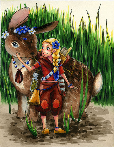
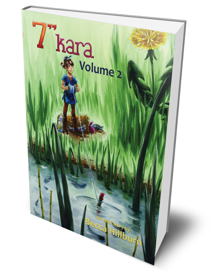 A 3D mockup of what 7" Kara Volume 2 will look like.
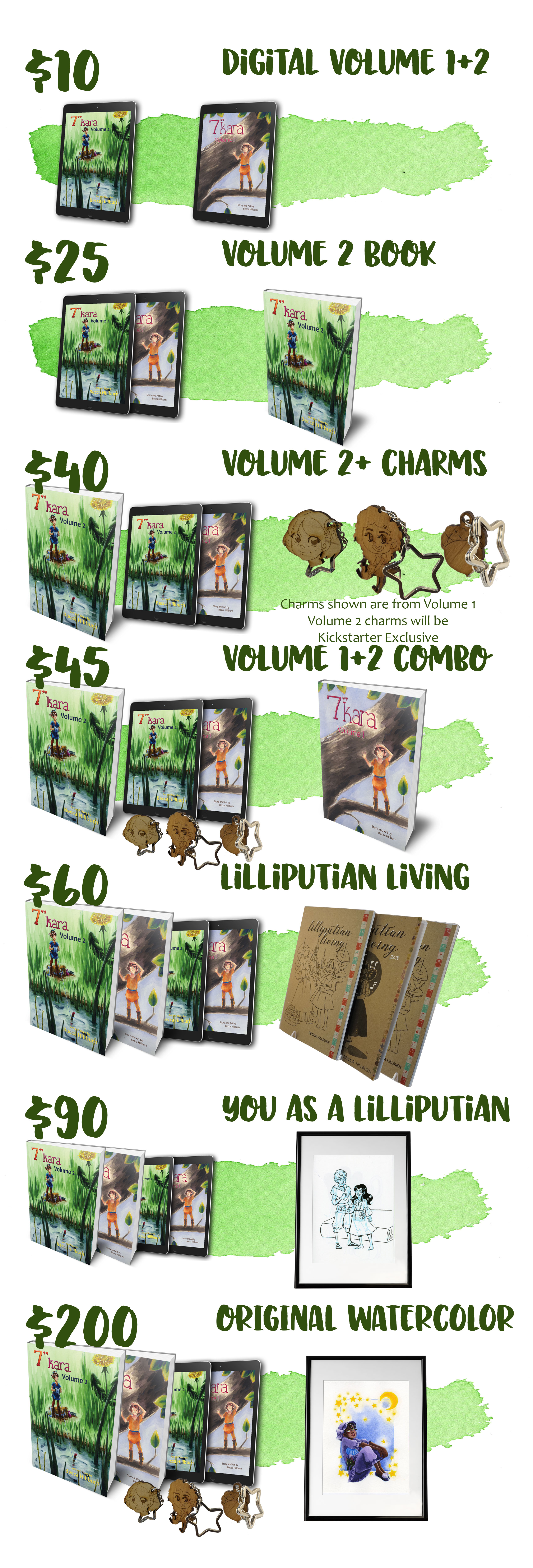
I have lots of awesome tiers (pledge packages) for people interested in supporting 7" Kara! You can pledge and receive pdf copies of Volume 1 and 2 (readable anywhere- phones, tablets, computers!), print copies of Volume 1 and 2, original watercolor art and custom inked sketches, adorable wooden charms! I'm also putting together packs for homeschool and classroom use- activity packs, coloring pages, and even virtual classroom visits!
I realize some of y'all might be new to Kickstarter, but may have heard of it. Kickstarter is an online platform that allows individuals to help fund projects and ideas they're excited about. A Kickstarter can be held to fund a new tabletop game, to help an indie studio finish an indie video game, to help musicians fund the recording and editing of a new music video, to help raise funds and attract further investors to tech projects, and of course, to help fund comic projects!
Comic Kickstarters are a bit different than other Kickstarter campaigns, let's use tech Kickstarter campaigns as an example. For most Kickstarters, most pledges are just donations towards an idea that backers would like to see come to fruition. While there may be tiers that result in fulfillment, those tend to be the very expensive tiers. Comic Kickstarters are really more of a preorder system with the funds raised used to cover the printing and shipping of the book and additional materials. So with comic Kickstarters, you can purchase physical rewards at a much cheaper level.
Once the Kickstarter campaign is over, the funds raised go towards the manufacturing and shipping of the rewards offered. In some Kickstarter comic campaigns, the artist sees some income or profit, but most run pretty lean.
I'm Kickstarting Volume 2 of 7" Kara to offset the costs of printing Volume 2 in bulk. I've talked about using Print on Demand CreateSpace (owned by Amazon) to print Volume 1 in the past, but the cost of printing Volume 1 this way is too high to allow me to earn income from the sales. I have also personally sold almost every copy of 7" Kara sold- and while that sounds charming, it really means that I'm paying a lot of money and time to table at conventions in the hopes that I can sell a few copies of 7" Kara.
Kickstarter will allow me to crowdfund the necessary upfront funds to print Volume 2 in bulk, which affords me a much lower individual book price. This also allows me to offer Volume 2 at a more reasonable price to fans and customers. If the Kickstarter goes well, I'd also like to reprint Volume 1 through an offset printer, and print Lilliputian Living (my Lilliputian worldbuilding zine) as a small perfect-bound book.
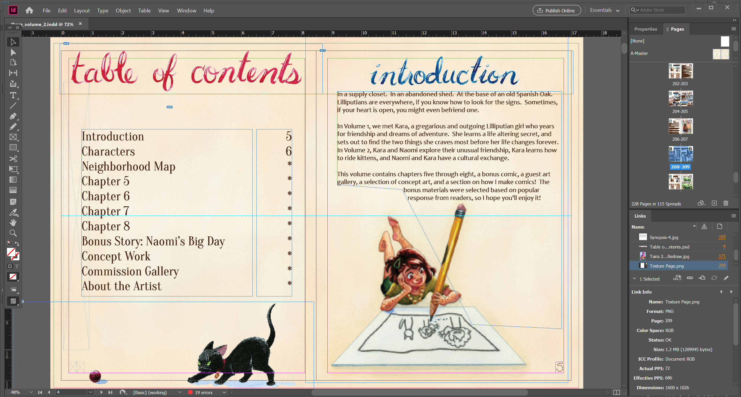
My goals for the 7" Kara Volume 2 Kickstarter are threefold:Raise the funds to print Volume 2 (and hopefully reprint Volume 1) through a local offset printer. This would bring the cost per volume down significantly and would allow me to offer a wholesale price to libraries, bookstores, and comic shops.Offer pre-orders for Volume 2 and orders for Volume 1 via Kickstarter. Most conventions have canceled this year, and most of my teaching engagements have done the same, so this would offer a much-needed source of income.Attract attention to my work via a successful Kickstarter. Within the comics community, a successful Kickstarter campaign is an important hallmark of a comic artist's career.You can help make those posts a reality by backing the Volume 2 Kickstarter on Saturday!
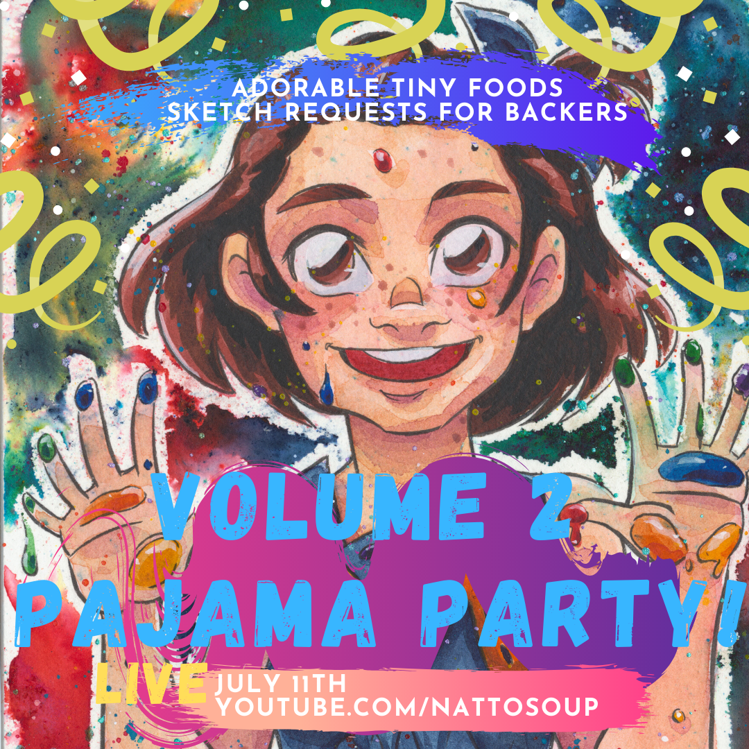
On Launch Saturday, I'm hosting a virtual Pajama Party on Youtube to celebrate the launch. First day backers at the $25 Volume 2 Physical Book tier (or higher!) get free sketch requests all stream long. So if you want to see your character or portrait drawn live, back on Day 1!


July 6, 2020
Laying Out My Graphic Novel
Although planning, writing, drawing, and painting 7" Kara is almost all me, I'm really fortunate to have a partner and fiance who's been very involved with the layout and publishing aspect of Volume 1 and Volume 2. In this post, I'm going to say 'we' a lot-referencing work Joseph and I have both done to prepare Volume 2 for Kickstarter.
I've talked about Affinity Publisher before, and I still believe it's a viable option for smaller publications. But since we want to find an offset printer to print Volume 2 (and reprint Volume 1) we need to be able to submit an INDD, a Postscript, or a PDF file, depending on what the printer requests. I haven't figured out how to get a Postscript or PDF out of Affinity Publisher yet, but it's pretty easy with InDesign. So although I was initially uncomfortable and struggled to use InDesign, I'm glad I spent the time to acclimate myself with the program.
If you'd like to follow my progress on 7" Kara, I have a mailing list that delivers updates right to your inbox! And if you enjoy 7" Kara, I would love it if you'd join me on Kickstarter for Volume 2!
Volume 1 was originally laid out in Adobe InDesign (we paid another artist to lay it out, and received the full file in return) so we used Volume 1 as a base. Since all assets save for fonts were created by me, and we'd purchased licenses for the fonts, we could reuse assets as needed. Of course, that didn't stop me from wanting to freshen things up with a few new touches here and there.
Brand New to Volume 2:
I decided the section headers needed a new, handlettered font, so I went with watercolor brushlettering.

Whole new Cast of Characters page with thematically relevant character borders.

New page borders.
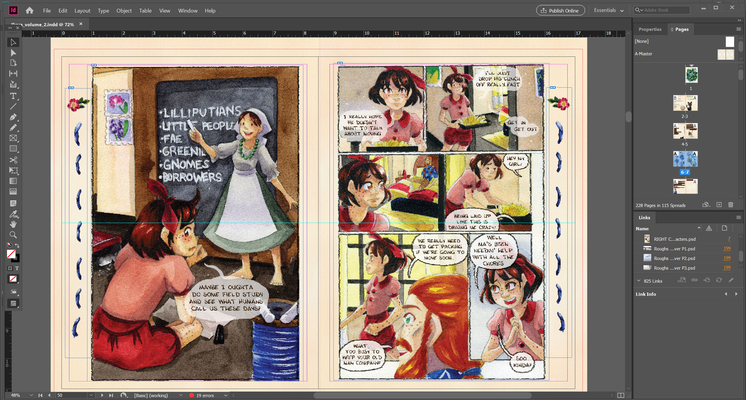

And of course, a whole new bonus chapter!
It was really important to me that Volume 2 continue the work of Volume 1 beyond just continuing the story. In Volume 1, I had an in depth concept section that was well received by parents- many raved about how it inspired their kids. I wanted Volume 2 to continue to inspire, so I dedicated space to Making 7" Kara. Since I've spent years writing and recording tutorials that are free to access, I didn't want this to be a full tutorial section, but a walk-through that might inspire someone to learn more.
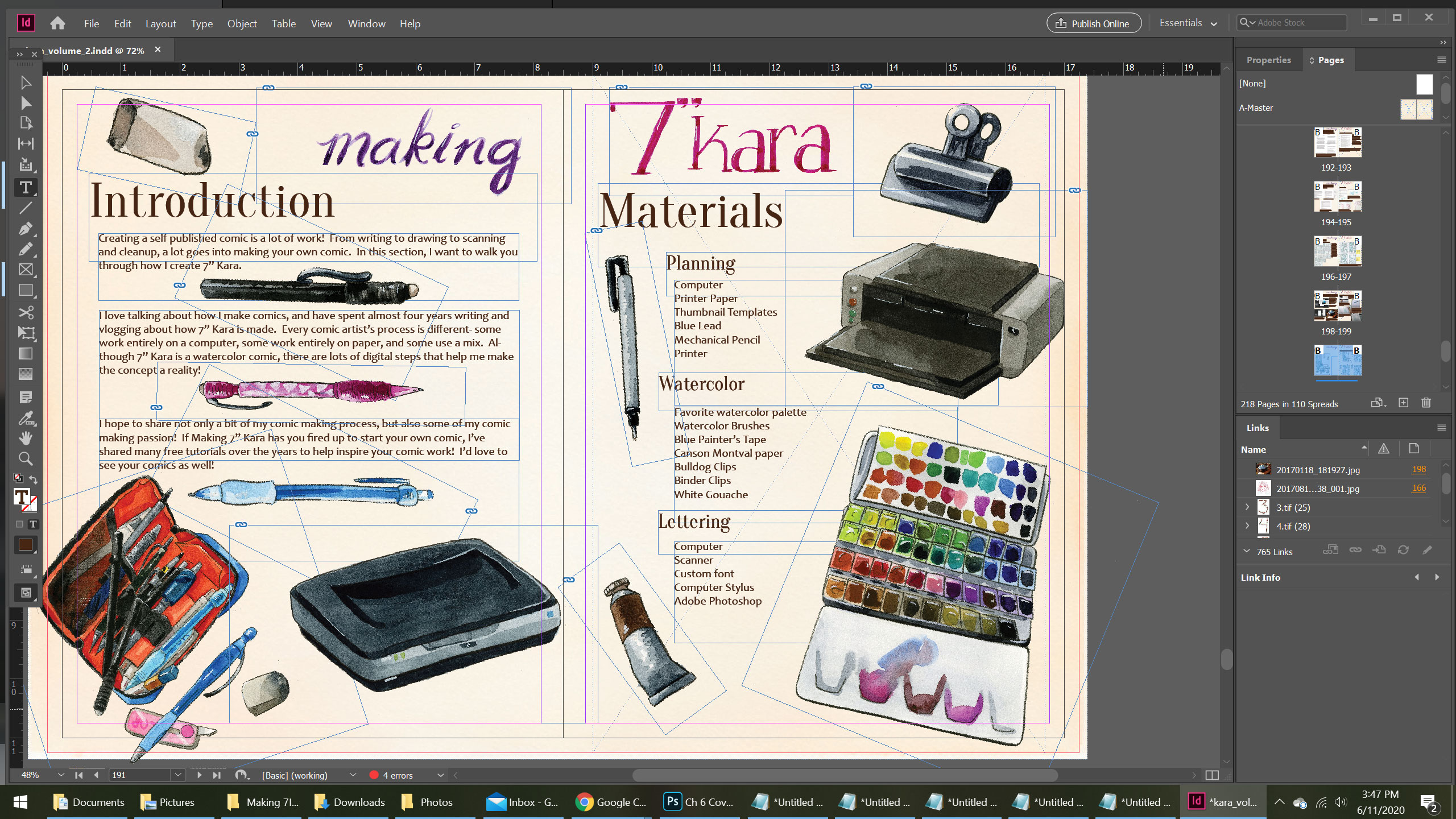
I also wanted this how to section to be visually engaging, so I'm hard at work creating even more custom illustrations for Volume 2.


Compared to Volume 1, Volume 2 is going to be a big book! Every chapter is almost double that in Volume 1, and I'm working on a lot of great bonus content to make it fun and interactive.
To make Volume 2 a reality, I need your help! The pages are drawn, the book's almost entirely laid out- but we still need to print it! I want to raise funds AND offer pre-orders at the same time, and I think Kickstarter's the way to go! A lot of comic artists use Kickstarter to fund their comic projects, and while I've participated in many anthologies, this will be my first solo Kickstarter adventure.
Volume 2 hasn't launched YET, but we're launching in early July! If you follow the project on Kickstarter, Kickstarter will let you know when 7" Kara Volume 2 has gone live. And of course, if you follow this blog, I'll be sure to announce it here as well. Not only will you be the first to receive a physical copy of 7" Kara Volume 2, with three never before shared chapters, but we have other great incentives including original art and even classroom materials!

July 2, 2020
The Wait is Over! 7" Kara Returns from Hiatus!

Tomorrow! 7" Kara returns as a webcomic from a year long hiatus! We'll be starting Chapter 7, and I can't wait to share it with you guys!
I am so excited to be able to share 7" Kara again, and even more excited that the webcomic's return coincides with the Kickstarter launch for Volume 2. We haven't launched quite yet, but keep an eye out for the launch announcement next week! I have big things planned!
Last year, I put 7" Kara on webcomic hiatus while I worked on completing chapters 8, the Bonus Naomi chapter, all additional book illustrations, and laid out Volume 2. It was a difficult decision to make, as I had three chapters worth of pages I could upload, but I wanted there to be special incentive for people to back the Volume 2 Kickstarter when it launched. Now that the launch is just around the corner, I can start sharing pages with you guys again!
I hope you'll check out 7" Kara if you haven't yet, and if you enjoy it, please consider giving me your support and backing the Volume 2 Kickstarter !

June 29, 2020
Removing the Background from Watercolor Illustrations-Digitally Correcting Watercolor Pages Part 4
Part 1 focused on Color Correction as well, but this segment provides more information on basic color correction. Part 2 talks about resizing elements and correcting tone digitally. Part 3 covers lettering and ballooning in Photoshop.
As of now, there isn't an elegant way to thread Tweets on Blogger, so I hope you guys will bear with me. I want to archive these tutorials in a way that's easier for casual readers to find. I recommend you click through to the thread- images are larger and easier to understand. However, this post makes it easier for artists interested in this information to find these tutorials and collates the information in a way that can be searched by Google.
Color Correcting:Read Thread Here
Awhile back, I talked about color correcting watercolor scans using Photoshop, and applying digital corrections. Today, I'm going to cover that a little, and also talk about cutting w/c illustrations from a bg page to use as spot illos.
—
I'll be using these illos for Volume 2. pic.twitter.com/D4cYe1kqwR
June 25, 2020
Increasing the Contrast on Inked Pages- Digitally Correcting Watercolor Pages- Part 4
Sometimes when painting, your watercolors can leave an opaque layer on top of your inks. This can make the whole page feel dull. If you scanned your inks before you started painting, you can layer them on top, using the Multiple mode, to recapture that clarity.

 Top: Scanned inks, scanned at 600DP.Bottom: Left: Original Scan, not color corrected or adjusted. Right: Color corrected scan.
This is a pretty simple procedure, but it does take patience and a keen eye, as watercolor illustrations can shrink or warp while painting, and it may be challenging to match the two scans.
Right now, there isn't an elegant way to share my tweets, so I hope you guys will bear with me and endure the ugliness. Tweet threads are also linked, for a more organic way to pursue the topic. You don't need a Twitter account to see the threads. To view the images, I HIGHLY recommend clicking the provided links- Twitter is able to serve up large versions of the images so you can see what's going on.
Increasing Lineart Contrast Digitally Thread Readable Here
Correcting pages! Already finished with color correction, now I'm layering lineart scans to increase my lineart's contrast. pic.twitter.com/wIyc8Gzzyg
—
June 22, 2020
Lettering and Balloons- Digitally Correcting Watercolor Pages Part 3
This is a topic I've talked about a few times on this blog, so at the bottom of the post I'll include more links and information on lettering!
It's important to me that the text look like it was handlettered and part of the page, so I use several resources to help make that happen. I have a custom Kara font based off an alphabet I created in color pencil, I use a scan of Montval watercolor paper for the correct texture, and I rely on the Clone and Stamp to create the body of the word balloon. Last, I create a border around spoken word balloons using a custom color pencil brush.
In the end, I have a finished page that looks like it was painted traditionally from start to finish.

 Left: Original scan. Right: Color corrected, lettered scan.
As of now, there isn't an elegant way to thread Tweets on Blogger, so I hope you guys will bear with me. I want to archive these tutorials in a way that's easier for casual readers to find. I recommend you click through to the thread- images are larger and easier to understand.
Creating Word BalloonsThread readable here
I'm doing balloons today, and thought I'd walk yall through my process! Many people assume my pages are traditionally ballooned and lettered, but nope! All digital! So I'm starting with a lettered page- I may adjust placement, but most of the text is on the page. pic.twitter.com/2xS7OqfPjs
—
June 18, 2020
Resizing Elements and Tone Correction- Digitally Correcting Watercolor Pages Part 2
The main tools I rely on for these types of corrections are the Stamp and Clone tool. I fill gaps by creating another layer, Cloning from our source layer, and then Stamping onto our new layer. To help mesh the corrections, I'll use a rough edged brush (usually my custom color pencil brush) to erase the edges a bit so it doesn't stand out too much as a patch.

 Left: Original, unaltered scan. Right:Finished and adjusted watercolor page.
The other type of correction we're covering today is adjusting the tone of the paper. This is a simple correction digitally- but a handy one to know, and can be useful for intensifying shadows for dramatic effect.
For this type of correction, we're mainly relying on creating a new layer, setting that layer to Multiply, and using a dark blue or purple for our shadow color. This is a great time to use a watercolor brush as well- although I frequently rely on my custom color pencil brush for this, as it replicates watercolor pencil nicely.
As mentioned in Part 1, there isn't an elegant way to share my tweets here on the blog, so while I'm sharing these threads here, consider this a preview- I really recommend you click through.
Resizing and Correcting Heads: Thread Readable Here
I'm doing some surgery on a page from chapter 8, and wanted to share the proceedings because why not. So Rowan's head in this frame is too large, and I want to resize it. First, I'm going to select the head and manually resize it, leaving an ugly gap. pic.twitter.com/sKkknbSU9w
—
June 15, 2020
Color Correction-Digitally Correcting Watercolor Pages Part 1

 Raw Scan Vs Finished Page
Correcting traditional media digitally takes practice and some finesse, but once you have a routine down, it becomes much easier. I haven't talked about digital corrections a whole lot on the blog, mostly because it's just a pain for me to document. I'd like to remedy that by sharing some of those Twitter tutorials over the next few weeks.
Right now, there isn't an elegant way to share my tweets, so I hope you guys will bear with me and endure the ugliness. Tweet threads are also linked, for a more organic way to pursue the topic. You don't need a Twitter account to see the threads. To view the images, I HIGHLY recommend clicking the provided links- Twitter is able to serve up large versions of the images so you can see what's going on, whereas Blogger cannot. I can't rehost the images, as Twitter saves files as Large JPEGS, which no other service (including Blogger) recognizes as an image format.
These examples are from various chapters in 7" Kara Volume 2 and cover a range of corrections I make when digitizing pages.
When making corrections, I prefer to use Photoshop. While other graphics programs may be capable of some of these adjustments, I am not familiar enough with them to be able to provide more affordable alternatives. If you have any experience- please feel free to contact me about a guest post!
Scanning Pages
When I started 7" Kara, I used a smaller Canon scanner designed for scanning film strips. It does an excellent job scanning, but sometimes has trouble with larger images. At the time, I would scan in two halves, and use Photoshop's Automated Photo Merge option to try to stitch them together. Often, this process would fail, and I'd have to try to stitch them together digitally- a time consuming and frustrating process.
Joseph purchased me a large format Epson scanner as an engagement present. While I love my scanner, and the large format makes life a LOT easier, it's a $2000 minimum investment, so it's not something I would recommend straight off the bat.
I scan my watercolor comic pages at 600DPI (dots per inch) which makes for huge files, but allows for higher fidelity images that are easier to correct than their 300DPI counterparts.
Overview of my Color Correction Process:
Copy original layer, hide first layer. Copy that copy, and hide the first copy. All color adjustments will be made on this third copy.
Adjustments- Hue/SaturationMove it over to the left a couple pegs, as my scanner tends to scan warmer
I may also increase the Saturation a bit, as sometimes my scanner desaturates
Duplicate this adjusted copy, set the duplicate to Multiply under Color Modes. Decrease the opacity down to usually around 15%- I usually compare this to the Original watercolor.
Color Correcting Scans Thread 1 readable here
While not all pages need significant changes, it's nice to be able to use the eternal edit feature of Photoshop to be able to tweak glaring mistakes that were unfixable in watercolor. Left is the scan, right is the corrected version (inclu color correction) pic.twitter.com/TfDvypmg2E
—
June 1, 2020
Stonehenge Aqua- Hotpress, Coldpress, and Black Review
You have a few more options beyond Hot and Cold though. You can get Stonehenge Aqua in 300lb and 140lb, in 'blocks' (bound only on two sides with inexpensive adhesive), pads, or sheets, and you can even get it in Black (keep reading for my Kitchen Sink review of Stonehenge Aqua Black!)
And shoot, Legion makes it easy to try out their papers- they offer cute lil mini pads in singles or packs.
Although I'd known about Stonehenge Aqua Hotpress and Coldpress for awhile due to Artsnacks samples, I'd blown them off until Kabocha convinced me to give them an earnest, full size try.
Stonehenge Aqua- 9"x12" Block, 140lb
Coldpress- Size not available on Amazon, $18.15 on Blick
Hotpress-$20.79 on Amazon, Size not available on Blick
Black- $23.13 on Amazon, $17.99 on Blick
Stonehenge Aqua Hotpress Vs Coldpress:
Stonehenge Hotpress Demonstration
Pros:AffordableGreat if you're impatient and don't want to use too many washes or layersDries fairly fastSmooth texture may be easier to controlFor a hotpress, can take a lot of water well, but really shines with drier applicationsA good paper for watercolor illustration
*Kabocha's FavoritePros: Great for Inking
Cons:While it can handle a lot of water well, a coldpress it is not. Sedimenting pigments may look 'dirty' on hotpress, as there's no valleys to fall intoMay dry too fast for wet into wet techniques to work the way they would on coldpress
Verdict:
It's biggest flaw, to me, is that it's not a coldpress, but as a hotpress, it's amazing. When I recommend a hotpress paper- this is the one!
Stonehenge Coldpress Demonstration:
Pros:AffordableA good paper for watercolor illustrationLikes water and wet into wet applicationsStudyTakes ink well*Becca's Favorite
Cons:Sometimes has a mind of it's own.A more textured coldpress than some (I like this)
Verdict:I actually paint on Stonehenge Coldpress pretty frequently now, as it's an economical alternative. It is definitely NOT Arches, and has a mind of it's own, so I wouldn't recommend this as an Arches dupe. That's not to say it's a finicky paper- but it seems to have less sizing than Arches, and may get kinda pulpy or reminiscent of painting on fabric. I don't find these issues to be too prevalent, just something I keep in mind when I'm painting.
A note about the 'blocks':
These blocks are bound using adhesive on two sides-if you like to work really wet, I recommend you remove the paper from the block and restretch before painting.
Stonehenge Aqua Black- Kitchen Sink Review:
Pros:Opaque and metallic watercolor and gouache are gorgeous on this paperDye is fast- will not bleed or reactivateCottonrag- fairly uncommon with colored watercolor papers
Cons:This paper seems a bit softer than the white Stonehenge Aqua, and is less welcoming to mixed media applicationsPOSCA markers eat this paper up
Verdict:A decent paper with limited use, but economical enough to have around just for fun.

May 28, 2020
Saunders Watercolor Paper Review
If you enjoy this blog, I recommend you go to the top and hit Subscribe- this is a free service that delivers my blog posts to your email, so you get them automatically every time the blog updates! I would also really appreciate it if you hit Share on posts you enjoyed and share them with others on your favorite social network!
Saunders Watercolor Paper
I'm always interested in finding good papers for illustration. A great watercolor paper really makes painting a delight, and I like having options beyond Arches. My search for great watercolor papers has introduced me to a lot of favorites- Canson's Moulin du Roy, Blick's Premier Watercolor paper, Stonehenge Aqua, and Saunder's.
In the past, I've taken a look at Saunder's Bockingford watercolor paper, a higher end cellulose paper. While I enjoyed painting on it, I didn't enjoy it more than painting on cheaper cottonrag papers like Fluid 100, and it was a bit too pricey to replace my favorite cellulose papers for watercolor sketches.
The parent company, St Cuthbert's Mill, is an English paper mill that produces watercolor paper, printmaking paper, and papers for digital art printing. My friends in the UK may be able to find St Cuthbert's Mill products at a more reasonable price- imported art supplies always tend to be pricy in the US. Availability is a bit iffy- you wont find St Cuthbert's Mill products at say Michaels, and you probably won't find them at many dedicated art supply stores either- checking the website, their international stockist are 'under' and 'maintenance'
St Cuthbert's Mill claims that Saunder's is a superior quality watercolor paper, and boasts the Royal Watercolour Society's endorsement. This cottonrag paper is available in Hot Press, Cold Press, and Rough press, and has been buffered with calcium carbonate to help prevent discoloration. Saunders is available in White and High White, and is suitable for use with watercolor, gouache, acrylic, pastel, pen and ink, pencil, charcoal, and printmaking. (Source)
Sizes included sheets (22"x30", 40"x60"), rolls (60"x33), and blocks (10"x7, 12"x9", 14"x10", 16"x12", 20"x14"), but you're most likely to find it in sheets and smaller blocks here in the US (Source)
This paper is mould made, and has been buffered to a pH of 7-9, with internal and external sizing (external is gelatine). The blocks are similar to Arches and Blick Premier- glued on four sides, and you may need a knife to remove sheets (Source)
 Watercolor illustration created on Saunder's 140lb Coldpress watercolor paper
Readers know my art is more illustration and comics, and my needs are different from many other watercolor artists. I feel the video below does an excellent job getting into the nitty gritty of painting on this paper, so I highly recommend you watch it if you're looking for a deeper review!
Saunders Watercolor Paper- 9"x12" block bound padOriginally purchased at David's Art Center in Metairie, Louisiana
9"x12 (Prices reflect time of writing)
$40.77 on BlickSheets on Blick
Compared to Arches
$35.22 on Blick
Saunders Vs Arches Coldpress- both papers stretched
Saunders$40.77 Thicker More like cardboard Arches$35.22 ThinnerA bit more like painting on fabric
Pros:A sturdy, heavier 140lb watercolor paperCan really stand up to a lot of washes, a lot of waterHandles multiple layers of watercolor wellColors are vibrant and cleanExcellent for wet into wet techniques
Cons:
Kinda pricey compared to Arches or StonehengeLimited availability- may be difficult to find
Thoughts:
In order to print bluelines onto this paper, paper had to be removed from blockRan through printer with no issues or misprintingInk dissolved cleanly from paper- not really visible during painting
I really enjoyed painting on this paper- it's a bit like painting on cardboard, but in a really positive way. Once this paper has been stretched, it's not liable to buckle or cockle, and it dries taut and flat. It can take A LOT of layers, as well as fairly fine detail.
Verdict:
While I really enjoyed painting on Saunder's, due to the price and some difficulty finding it in local stores (neither Jerry's nor Plaza carry it), I probably will not purchase it again. I find it similar to Cheap Joe's Kilimanjaro, which I also enjoy using, and will probably purchase more Kilimanjaro before I buy another block of Saunders. Saunders is available in sheets (which I never get around to cutting down), but not available in pads, which makes it inconvenient for running through a printer to print bluelines.
Some watercolorist have very different experiences from my own, so I recommend you check out some of the second opinions below!
Second Opinions: Painting WatercolorsParka BlogsWet CanvasLife Imitates DoodlesHandprintScratchmade Journal


