
Becca Hillburn's Blog, page 53
October 1, 2015
8 Ways You Can Make Your First Inktober a Success
Inktober starts tomorrow, and like many of you, I'll be participating this year! Since this is my third year doing Inktober, I thought I'd share some tips to help make your Inktober a great one!
Ways You can Make Your First Inktober a Success
Do a little prep ahead of time
-Make a list of things you'd like to draw and ink
-Find a montly challenge to inspire you and work from that
-Flip through your sketchbook and mark pages (sticky notes work great!) you'd like to ink, or scan/print bluelines/ink
-Pick a technique you'd like to focus on improving, such as drybrush, using a real brush, or inking on the go.
Set up a strategy
- Find a plan of attack that works well for you. For example I like to do the sketching the night before, when I'm tired and perfection isn't necessary, and do the ink in the morning, after my warm up. This requires me to be one day ahead, but I find it easier to force myself ot complete something I've already started.
-Decide ahead of time what you'd like to use your Inktober sketches for, and use the appropriate materials.
-If you already ink often, pick a material you don't use. For example, I ink almost daily with brushpens, so I'm going to do a lot of my Inktober inking with a regular brush. I'm also going to try and use some of the specialty inks I don't use often.
Make necessary accomodations
-Have a show this month, and know you're going to miss a couple days? You can either plan to finish those pieces early, forgive yourself for the missed days, or you can keep inking into November. Whatever works for you is ok.
-You can also prep sketches a few days in advance if you need to, Inktober isn't so much about the sketching AND inking, it's mostly about the sketching. It's totally ok to use things from #Sketchtember or even earlier. It's really all about making sure you ink something every day, so you can level up your inking skills.
Make plans for end of the month burn out
-You don't have to knock it out of the park every day (unless you want to). You can ease into Inktober by starting with fun, easy pieces, ease out of Inktober with fun, easy pieces, or try to mix it up every day.
-Keep at it! Even if it doesn't seem like you're improving, or you don't like what you've been producing, keep inking pieces. You'll definitely notice growth by the end of Inktober.
-If possible, don't allow excuses to keep you from completing that day's piece. Once you have a row of completed inks to admire, it's going to be so much easier to keep pushing through.
If You're Feeling Uninspired
-Go through old sketchbooks and ink favorite sketches
-Check out the #Inktober hashtag and see what your favorite artists are doing
Use Inktober pieces for Other Things
-Make an Inktober Ashcan
-Designate November as the month you color all those inked drawings
Use the Social Media Hashtags for Community Support
#Inktober should work for just about everything
Above all, try not to stress out about Inktober too much! It's ok if you want to do fanart, it's ok if you want to color your inked pieces, it's ok if you're making a comic for Inktober, or working on an existing one! The most important this is you are making art.
Other good hashtags:
#showyourwork
#artistsontumblr
#artistsoninstagram
#artistsontwitter
#inks
#aminking
#amdrawing
Please consider donating to this blog or purchasing from Natto-shop (http://nattosoup.com/shop) if you want me to continue publishing quality content. All materials tested were purchased from my own pocket. Keep on Truckin' Nattosoup is not under any sponsorship.


September 30, 2015
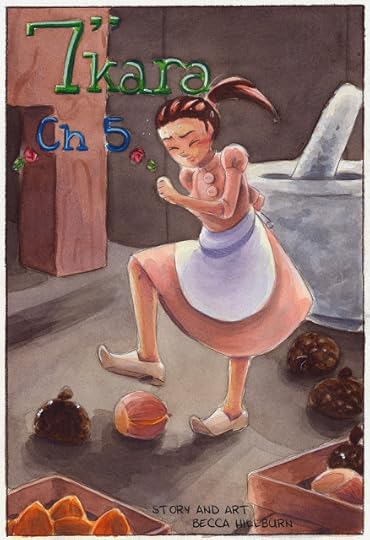
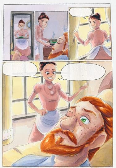
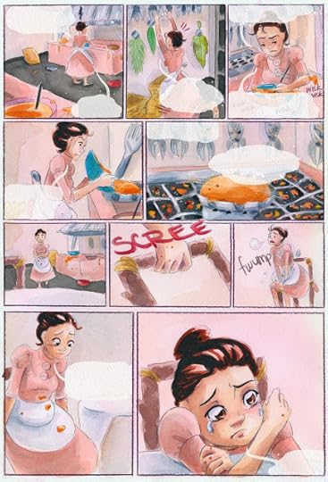
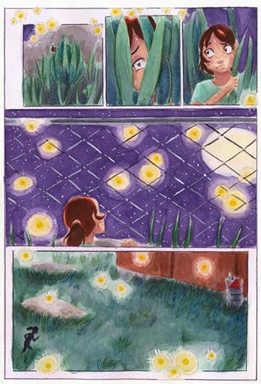
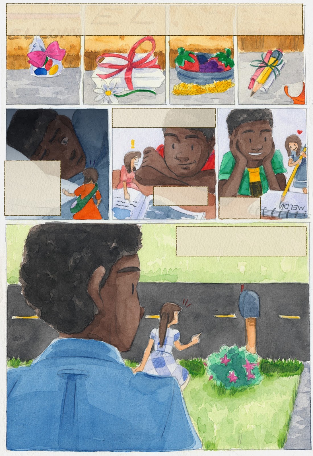
7" Kara Chapter 5 Sample
It's been way too long since I was able to share 7" Kara process or updates. This year has been crazy with conventions and freelance, but now that things are winding down, I've made time to finish Chapter 5. It's been painted since January, but I went ahead and scanned it, color corrected it, and lettered it! If you're interested in watercolors, and would like to know how to get the best digital results from your physical pages, keep an eye on this blog, as I'm working on a post detailing my process.
Volume 2 isn't finished yet, and Chapter 5 won't be available for purchase as a standalone chapter, but you CAN show your support by purchasing a copy of Volume 1 from the Nattoshop. Volume 1 has four full chapters of 7" Kara, plus a bonus chapter and a concept section, and every copy you buy from my online shop comes with a sketch and thanks in the back of the book, and a cute Kara wooden charm. Writing this blog takes a lot of time away from working on Kara, so if you enjoy the content here, please consider showing your support and purchasing a copy for yourself, a friend, or a loved one. If you already have a copy, please consider taking the time to write a review on GoodReads. To leave a written review (the most helpful review of all!), hover over your star rating, and a dialogue box should pop up asking if you'd like to write a review.
Please consider donating to this blog or purchasing from Natto-shop (http://nattosoup.com/shop) if you want me to continue publishing quality content. All materials tested were purchased from my own pocket. Keep on Truckin' Nattosoup is not under any sponsorship.
September 27, 2015
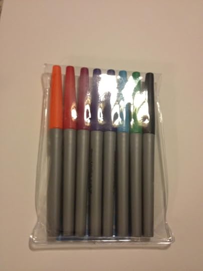
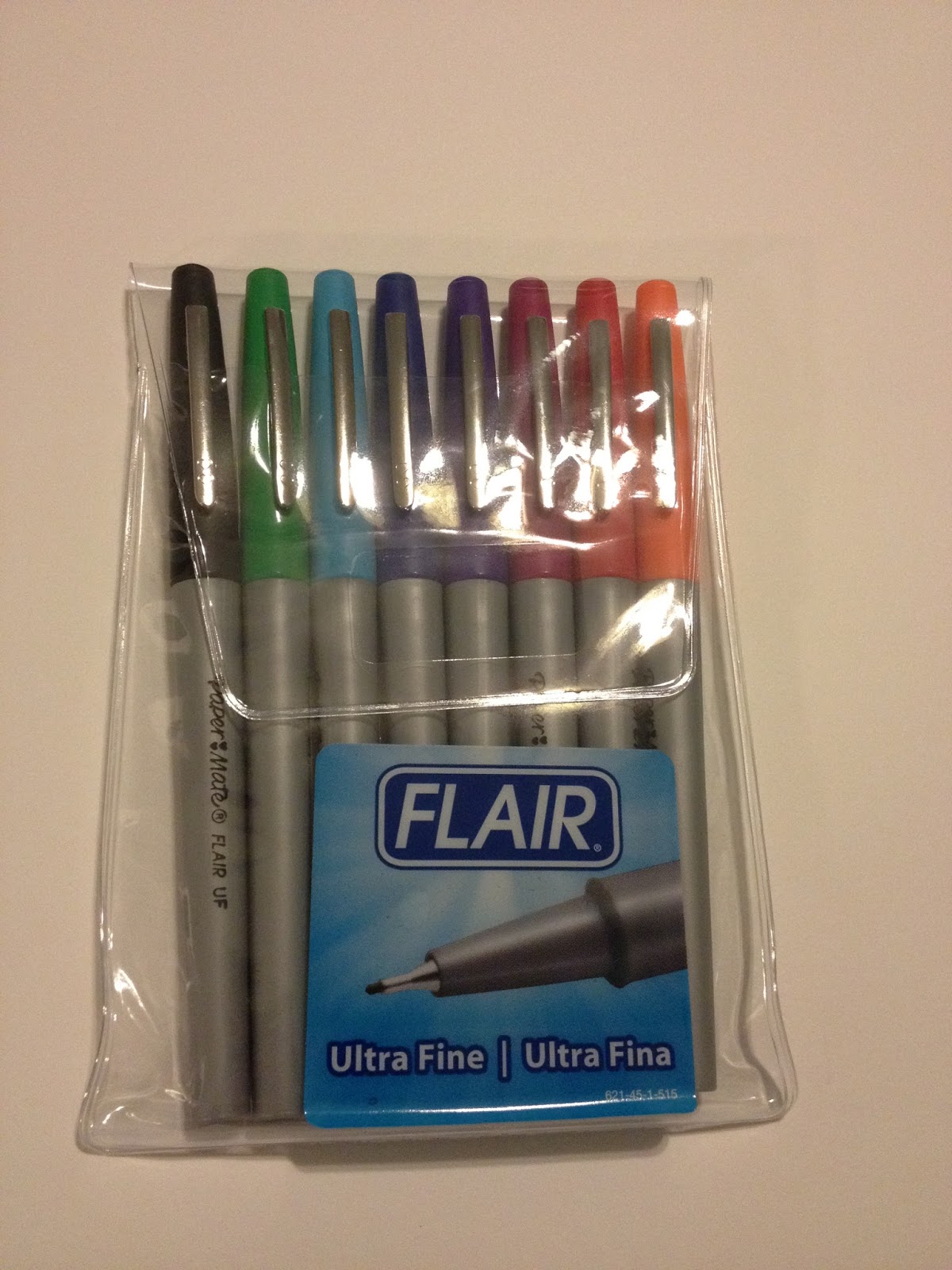
Walmart Art Supply Review: Papermate Flair Ultrafine
I went into the Luling Walmart hoping to find Zig Millennium technical pens in the scrapbooking section. These were the pens I used for inking comics back when I was in high school, and they've only changed superficially since then. I wanted to see how they'd stack up against Copic Multiliner and Sakura Microns, the technical pens many comic artists currently use for inking, but unfortunately, my Luling Walmart didn't carry them, or really ANY technical or fineliner pens in their scrapbooking section, so I scoured their writing supplies instead.
The pickings were fairly slim- a lot of wooden and mechanical pencils, many rollerballs, but only a handful of fineliner or marker tipped pens that weren't Sharpies. I ended up scouring this section on three separate visits, hoping that fresh eyes would turn up something new, and I found something new each time I looked. On my third, and final trip, I finally found these Papermate Flair Ultrafine pens.
Not too terribly long ago, I reviewed Papermate Flair's Ultrafine cousin, the Papermate Flair with the porous point. I pulled it out for comparison a little later on in this review, but Luling Walmart only had the Ultrafine version of the Flair.
These pens are pretty easy to get, you can find them at Walmart, Office Max/Depot, Target, Amazon, and even Jetpens. Below is my Amazon affiliate link. Your purchase through my link helps support this blog financially, so if you're in the market for Papermate Flairs, you should consider giving my link a shot.
The Packaging
The Papermate Flair Ultrafines I purchased came in two types of packing- a cardboard and plastic blisterpack, and a resealable plastic envelope


I really like when pen sets come with reusable packaging- I tend to keep my pens in them even if I have other storage options. This sort of packaging is particularly useful to young artists who may not have a bunch of art supply storage laying around, waiting to be filled, and are just starting to assemble their own arsenal.
The basic stats
Felt Tip PenSet of 8 ColorsWaterbased InkAcid Free (on paper)Metal reinforced pointUltrafine tipThe Pens
I mentioned at the start of this post that I've already reviewed Papermate Flair's larger porous point pens. That pen (dirty, because it's been kicking around my graphite covered pencil case) is at the top, the Ultrafine fineliners I'm reviewing today are below.
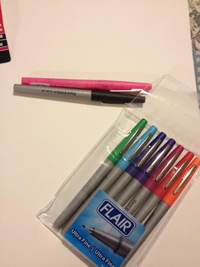
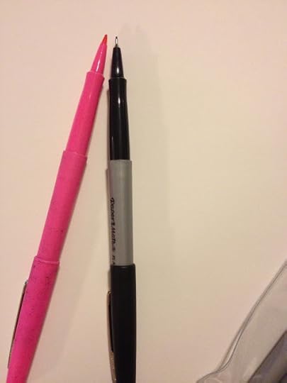 Left- Papermate Flair large point, right- Papermate Flair UltrafineAs you can see at a glance, the porous point Papermate Flair differs significantly from the Papermate Flair Ultrafine pens. Like most fineliners and technical pens, the Papermate Flair Ultrafine has a metal sleeve around the porous point (possibly felt) nib. The nib on the Ultrafine is much much smaller than the Medium point Flair, and though the two pens share body moulds, they are visually very different, as the Medium is a solid body color, whereas the Ultrafine introduces a silver body.
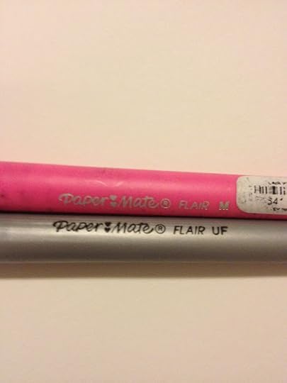
Both pens bear the Papermate Logo, and the size is denoted as either M(edium) or U(ltra)F(ine)

And ultrafine it is!
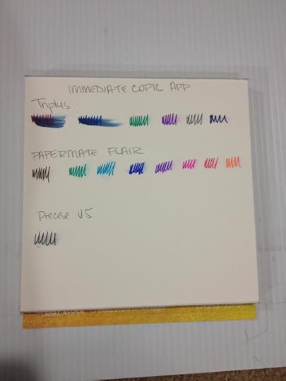
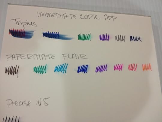
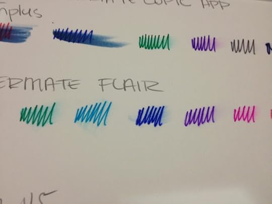
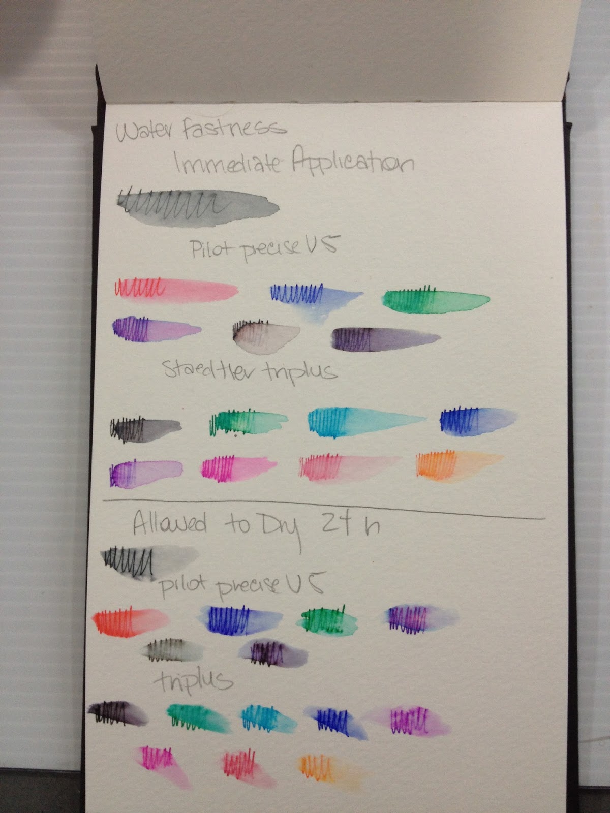
Immediate Water Application
When writing pen reviews, I often don't test water-safeness- I assume most pens are NOT watersafe until I read otherwise. For this application, I wanted to make sure I hit all the relevant bases, as these reviews are intended for artists just starting their collection, and they really need to get the most bang for their buck.
These tests were done in my swatchook, a Strathmore Watercolor Journal.
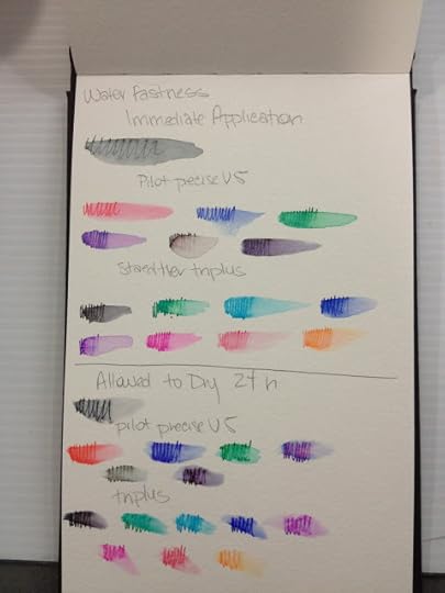 Papermate Flair Ultrafine pens are at the bottom of the three demos, and were not labeled.
Immediate water application causes the ink to run drastically, but the effect is almost like a watercolor marker or brushpen, and could be utilized for color application. Most of the inks tested held their color even with water, and though all pen points were chosen as fineliners, and the marks made reflect that, the color distribution is generous.
These pens should not be used to ink work intended for waterbased markers or watercolors, unless you want the lineart to bleed into the coloring.
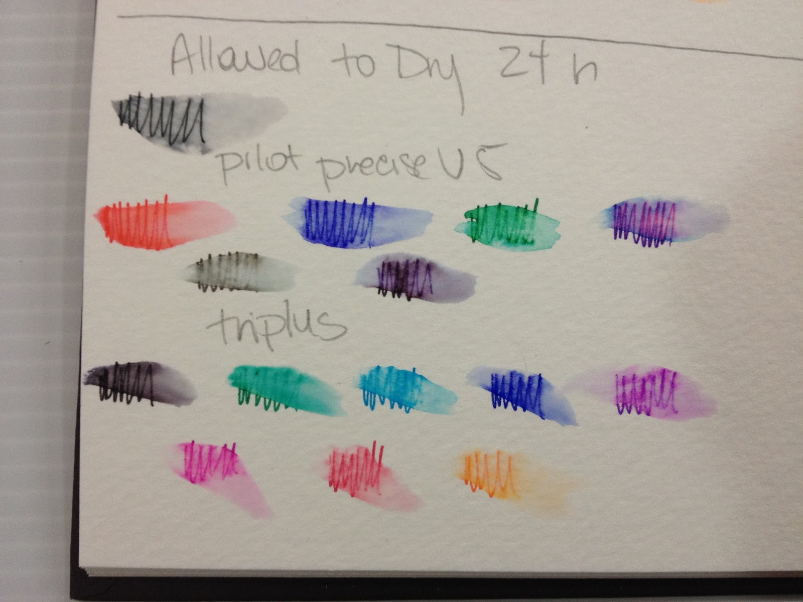
Water Application after 24 Hour Dry Time
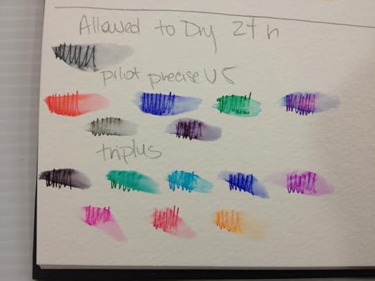 Papermate Flair Ultrafine tests at bottom of pageEven when the ink has been allowed to fully dry over night, there is still significant bleeding when water is added.
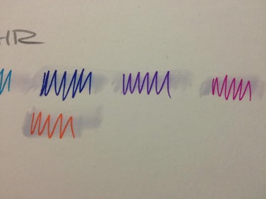
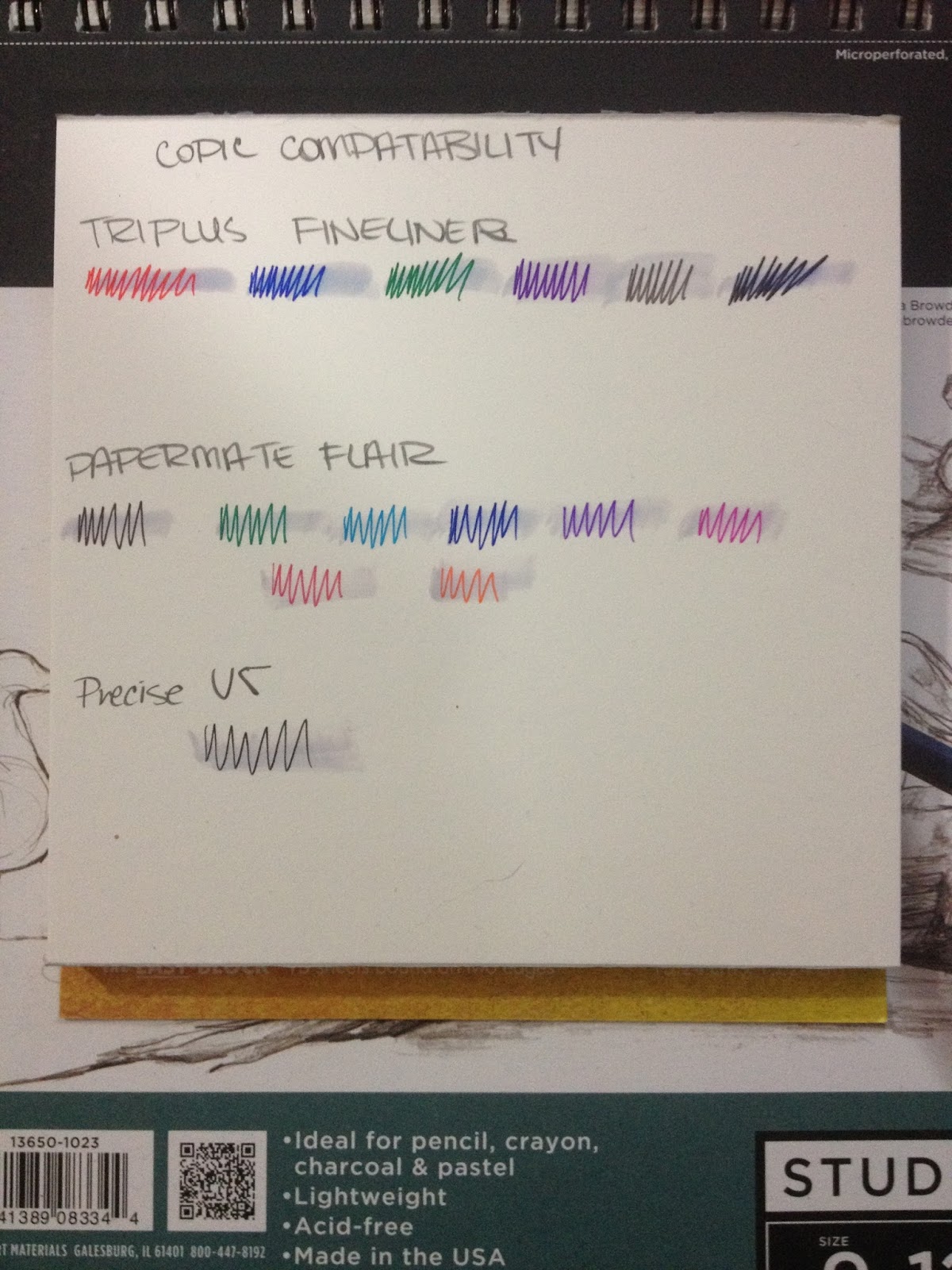
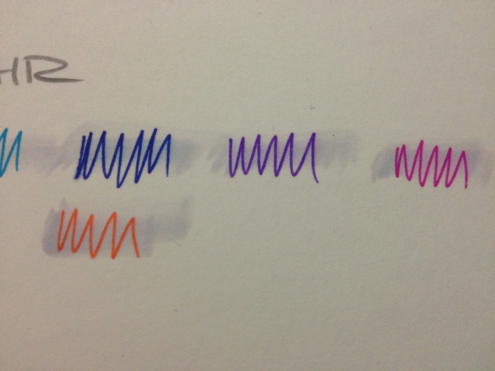
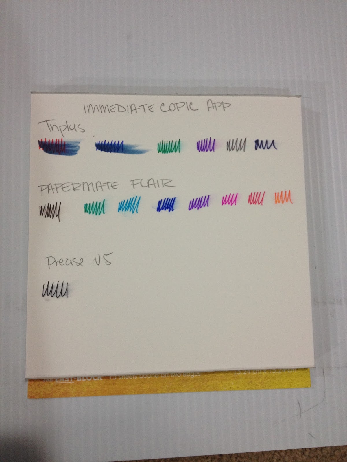
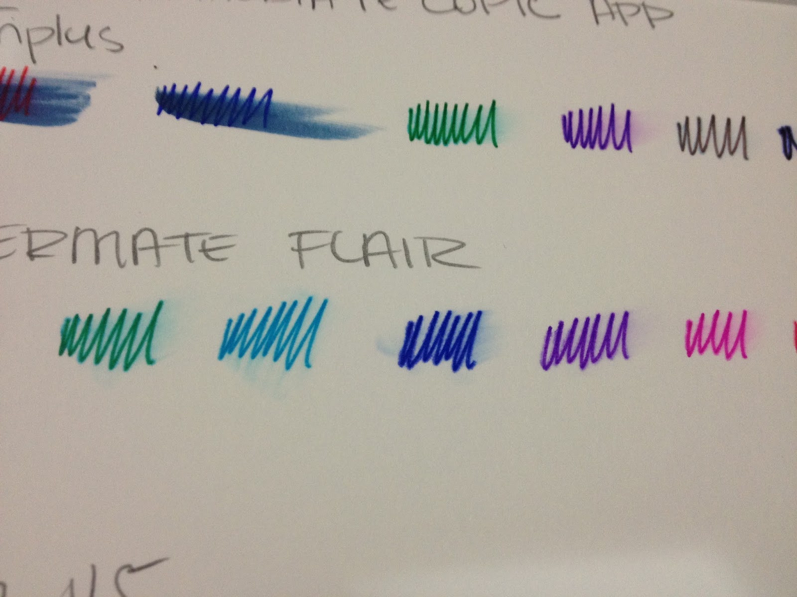
Immediate Copic Marker Application
These tests were done on Fluid's Hotpress watercolor paper, which has a plate like smooth finish, but does not have the same clay coating that Plate Bristol has.

Copic marker was applied immediately after pen ink was applied. I used a light gray so that you could not only see that Copic has been applied, but also see if any color migration happens with application.
There is slight, but worth mentioning, color migration when Copic marker is immediately applied over Flair's ink.
Copic Marker Application after 24 Hour Dry Time
I opted to use a Colorless Copic Blender for this test, so you could see how much the inks from Papermate Flair blend when Copic alcohol is added.
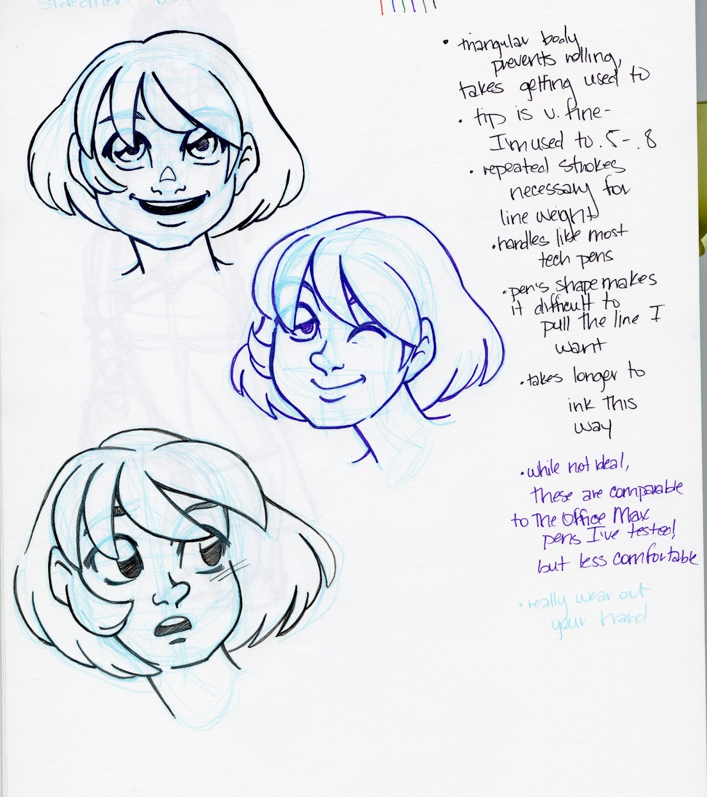
The Field Test- Inking over Bluelines

It's really hard to pull clean, straight lines with these pens, for some reason. I'm not sure if it's because I'm trying to ink with them the way I would with fude pens, rather than the loose, hatchy style I usually use for tech pens, or if its the pens themselves.
I really, really don't like inking with these pens, but keep in mind that I've moved away from technical pens almost entirely.
Inking over Graphite and Erasing
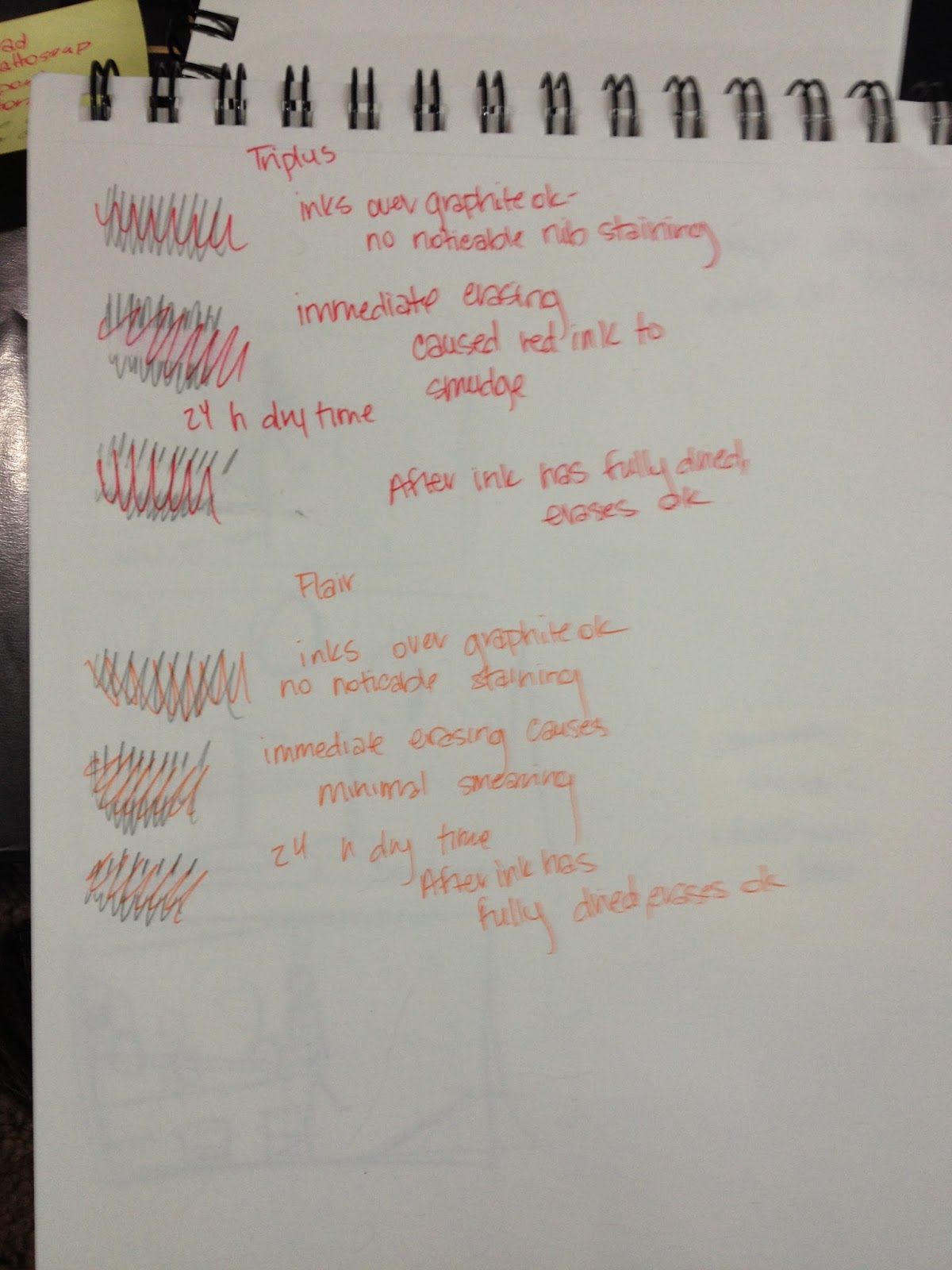
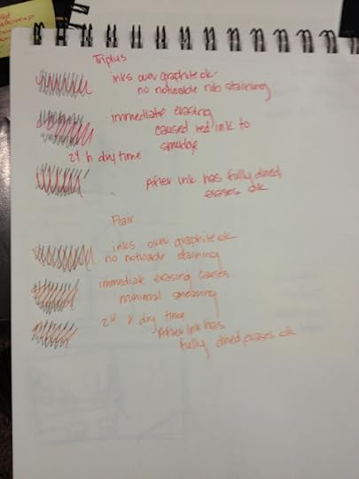 Papermate Flair is at the bottomI did three tests- a test to see if the graphite would stain the Flair's nib, or discolor the ink (top test), a test where I erased the graphite immediately after inking (never recommended, but sometimes a sad necessity), and a test where I allowed the ink to dry overnight before erasing. If you can't read my awful handwriting, here are my notes:
Papermate Flair inks over graphite ok, with no noticeable staining.
Immediate erasing causes minimal smearing
Graphite erases with no smearing once ink has dried for 24 hours.
The Verdict
I think I like the porous point Papermate Flair better than the felt tipped Papermate Flair, as at least the porous point's nib has a little give to it.
These pens are great to doodle with, add a hint of color to your notes, but may be difficult to ink with. They are not water or Copic safe, but you may be able to use this to your advantage.
These pens aren't really designed to be used for illustration or comics, and you may have some difficulty getting the results you want.
Please consider donating to this blog or purchasing from Natto-shop (http://nattosoup.com/shop) if you want me to continue publishing quality content. All materials tested were purchased from my own pocket. Keep on Truckin' Nattosoup is not under any sponsorship.
The pickings were fairly slim- a lot of wooden and mechanical pencils, many rollerballs, but only a handful of fineliner or marker tipped pens that weren't Sharpies. I ended up scouring this section on three separate visits, hoping that fresh eyes would turn up something new, and I found something new each time I looked. On my third, and final trip, I finally found these Papermate Flair Ultrafine pens.
Not too terribly long ago, I reviewed Papermate Flair's Ultrafine cousin, the Papermate Flair with the porous point. I pulled it out for comparison a little later on in this review, but Luling Walmart only had the Ultrafine version of the Flair.
These pens are pretty easy to get, you can find them at Walmart, Office Max/Depot, Target, Amazon, and even Jetpens. Below is my Amazon affiliate link. Your purchase through my link helps support this blog financially, so if you're in the market for Papermate Flairs, you should consider giving my link a shot.
The Packaging
The Papermate Flair Ultrafines I purchased came in two types of packing- a cardboard and plastic blisterpack, and a resealable plastic envelope


I really like when pen sets come with reusable packaging- I tend to keep my pens in them even if I have other storage options. This sort of packaging is particularly useful to young artists who may not have a bunch of art supply storage laying around, waiting to be filled, and are just starting to assemble their own arsenal.
The basic stats
Felt Tip PenSet of 8 ColorsWaterbased InkAcid Free (on paper)Metal reinforced pointUltrafine tipThe Pens
I mentioned at the start of this post that I've already reviewed Papermate Flair's larger porous point pens. That pen (dirty, because it's been kicking around my graphite covered pencil case) is at the top, the Ultrafine fineliners I'm reviewing today are below.

 Left- Papermate Flair large point, right- Papermate Flair UltrafineAs you can see at a glance, the porous point Papermate Flair differs significantly from the Papermate Flair Ultrafine pens. Like most fineliners and technical pens, the Papermate Flair Ultrafine has a metal sleeve around the porous point (possibly felt) nib. The nib on the Ultrafine is much much smaller than the Medium point Flair, and though the two pens share body moulds, they are visually very different, as the Medium is a solid body color, whereas the Ultrafine introduces a silver body.
Both pens bear the Papermate Logo, and the size is denoted as either M(edium) or U(ltra)F(ine)

And ultrafine it is!
Immediate Water Application
When writing pen reviews, I often don't test water-safeness- I assume most pens are NOT watersafe until I read otherwise. For this application, I wanted to make sure I hit all the relevant bases, as these reviews are intended for artists just starting their collection, and they really need to get the most bang for their buck.
These tests were done in my swatchook, a Strathmore Watercolor Journal.
 Papermate Flair Ultrafine pens are at the bottom of the three demos, and were not labeled.
Immediate water application causes the ink to run drastically, but the effect is almost like a watercolor marker or brushpen, and could be utilized for color application. Most of the inks tested held their color even with water, and though all pen points were chosen as fineliners, and the marks made reflect that, the color distribution is generous.
These pens should not be used to ink work intended for waterbased markers or watercolors, unless you want the lineart to bleed into the coloring.
Water Application after 24 Hour Dry Time
 Papermate Flair Ultrafine tests at bottom of pageEven when the ink has been allowed to fully dry over night, there is still significant bleeding when water is added.
Immediate Copic Marker Application
These tests were done on Fluid's Hotpress watercolor paper, which has a plate like smooth finish, but does not have the same clay coating that Plate Bristol has.
Copic marker was applied immediately after pen ink was applied. I used a light gray so that you could not only see that Copic has been applied, but also see if any color migration happens with application.

There is slight, but worth mentioning, color migration when Copic marker is immediately applied over Flair's ink.
Copic Marker Application after 24 Hour Dry Time

I opted to use a Colorless Copic Blender for this test, so you could see how much the inks from Papermate Flair blend when Copic alcohol is added.
The Field Test- Inking over Bluelines


It's really hard to pull clean, straight lines with these pens, for some reason. I'm not sure if it's because I'm trying to ink with them the way I would with fude pens, rather than the loose, hatchy style I usually use for tech pens, or if its the pens themselves.
I really, really don't like inking with these pens, but keep in mind that I've moved away from technical pens almost entirely.
Inking over Graphite and Erasing
 Papermate Flair is at the bottomI did three tests- a test to see if the graphite would stain the Flair's nib, or discolor the ink (top test), a test where I erased the graphite immediately after inking (never recommended, but sometimes a sad necessity), and a test where I allowed the ink to dry overnight before erasing. If you can't read my awful handwriting, here are my notes:
Papermate Flair inks over graphite ok, with no noticeable staining.
Immediate erasing causes minimal smearing
Graphite erases with no smearing once ink has dried for 24 hours.
The Verdict
I think I like the porous point Papermate Flair better than the felt tipped Papermate Flair, as at least the porous point's nib has a little give to it.
These pens are great to doodle with, add a hint of color to your notes, but may be difficult to ink with. They are not water or Copic safe, but you may be able to use this to your advantage.
These pens aren't really designed to be used for illustration or comics, and you may have some difficulty getting the results you want.
Please consider donating to this blog or purchasing from Natto-shop (http://nattosoup.com/shop) if you want me to continue publishing quality content. All materials tested were purchased from my own pocket. Keep on Truckin' Nattosoup is not under any sponsorship.
September 23, 2015
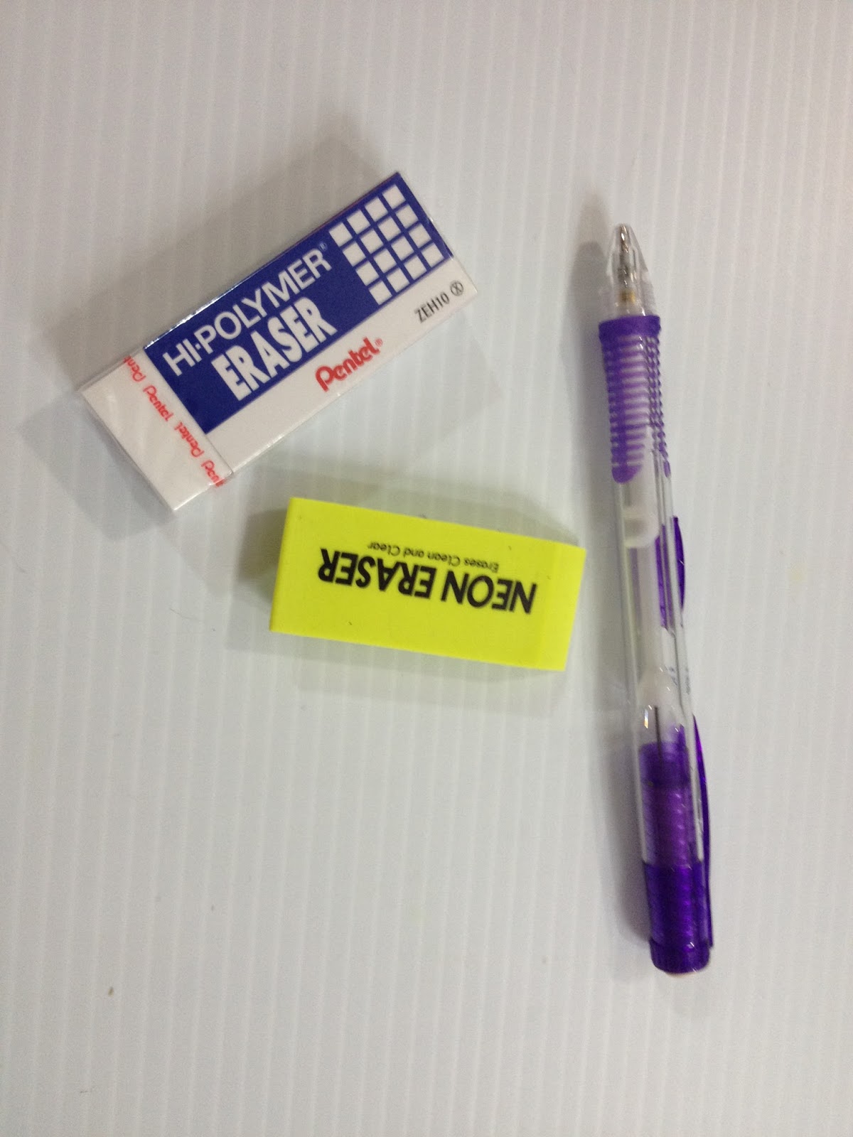
Walmart Art Supply Review: Pentel Hi Polymer Eraser and Neon Eraser
This post is one of a series of posts that feature art supplies I purchased from my hometown, Luling, Walmart while I was in town for Mechacon. It was inspired by the fact that kids, teens, and 20 somethings don't have many options for quality and affordable art supplies in the New Orleans area (and yes, I AM aware that there are art supply shops there, I've shopped at several of them, and they're greatly overpriced given their lackluster stock). So I wanted to see what I could get at Walmart, put what I buy through its paces, and let you guys know how these supplies fared. As almost always, I purchase these materials out of my own pocket, and one of the ways you can show support and appreciation is to give me a tip in my Paypal (sidebar right). You can also show appreciation by writing to Pentel about this review, sharing this, or any post to your social networks, or emailing me.
This post is part of my series on art supplies from Walmart, which is part of a larger series about art supplies from big box stores commonly found across the US. My goal is to introduce readers to easily found, affordable supplies that are a good stopgap between school-grade supplies and the expensive art supplies they read about, but may not be able to afford. During the process, I hope to introduce myself AND my readers to supplies they may not have considered before, and hopefully encourage you guys to suggest good supplies I may have overlooked.
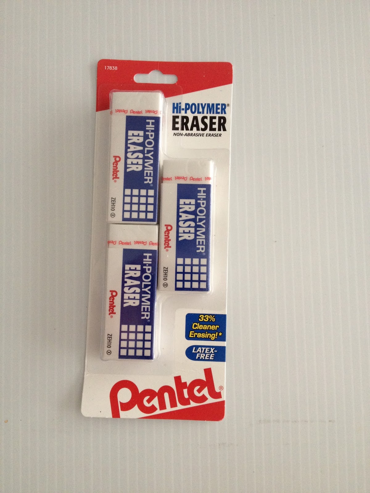
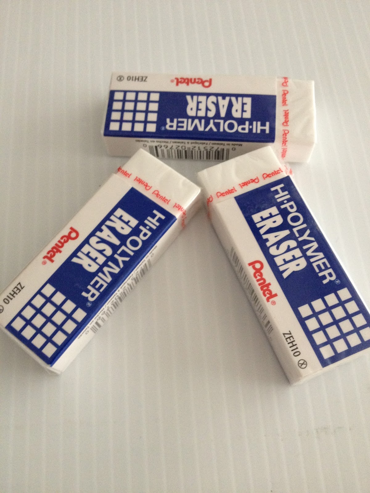
Pentel Hi Polymer Eraser- $1.46 for three
I've mentioned Pentel's Hi-Polymer Erasers in the past, I believe, as a good, easy to find alternative to Mono erasers. In this post, I'm going to pit the two side by side, so you can see that this easily available contender is no slouch in the erasing ring.
The Packaging


The nice thing about these Walmart reviews is that I can finally read the packaging, and either laugh at the things they consider selling points ("Block style is perfect for getting into little corners", "Comes with a protective sleeve to keep you and the eraser clean"), or take the claims as challenges to prove or disprove ("33% cleaner erasing!"- what constitutes a regular eraser to Pentel, who hail from the land of super erasers?)

So despite coming in a cardboard and plastic blister pack, these erasers are INDIVIDUALLY sealed for freshness, which is a little annoying.


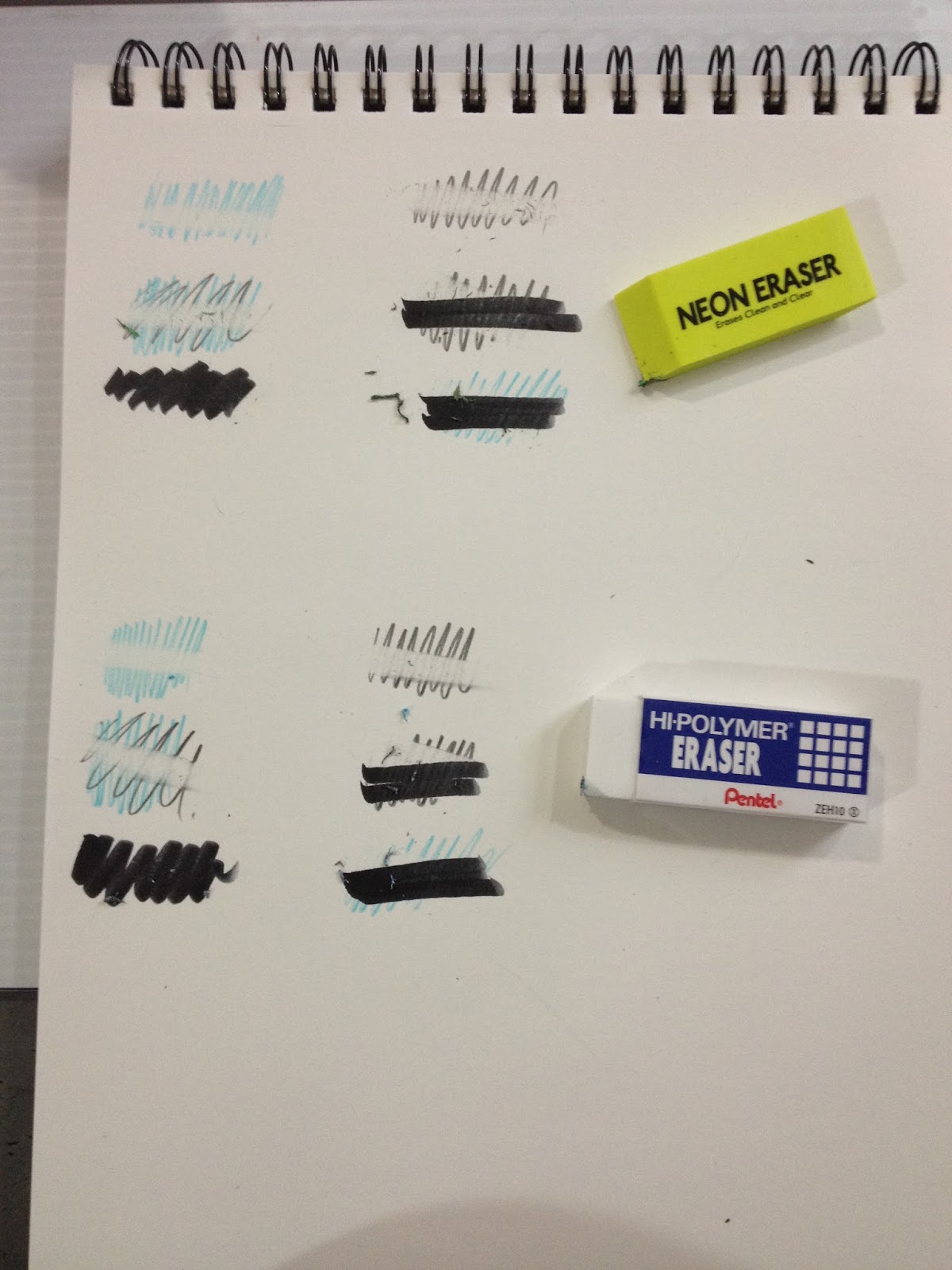
The Field Test

The field test for both erasers is set up the same way, and was done at the same time. I created a variety of circumstances you would encounter when erasing- erasing bluelines, erasing just pencil, erasing pencil AND bluelines, erasing the pencil out for under the ink, erasing over ink, erasing bluelines from under ink. You want any eraser to clean up graphite and non photo blue lead cleanly with minimal smudging of the surrounding area, but you don't want it to pick up the ink you're using. As usual, I allowed my ink (from a Kuretake No. 6, I believe) to dry overnight. Papertype does matter for erasers, but I'm using a pretty common yardstick- regular 60lb sketchbook paper (Blick Sketch, my favorite). Please keep in mind that papers with a smooth finish will be more prone to smearing, and it may be more difficult to erase on papers with a rough finish. Now that I've found a basic standard of measure for comparing erasers, I can finally go through the dozens I bought while in Japan and after, and share that here with you guys.

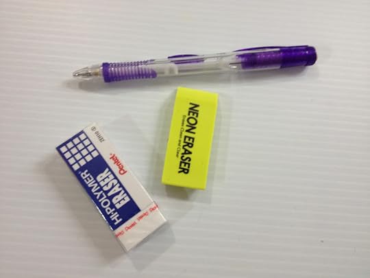
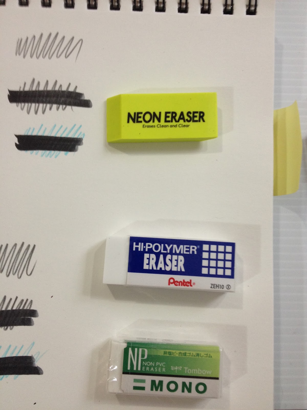
For size comparison, I threw in a 'large' Mono eraser- the type I regularly use for my own art. This Mono eraser is from Jetpens, and is $1.65 plus tax and shipping.

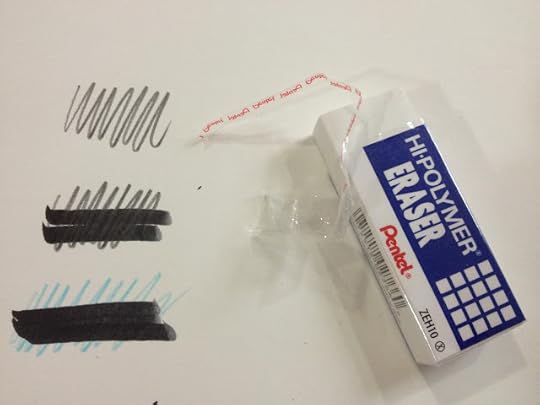
The Pentel Hi Polymer eraser erases bluelines fairly cleanly, leaves some ghosting with graphite, has a little bit of smearing with graphite over bluelines (this is pretty common), and does not pull up the black ink.
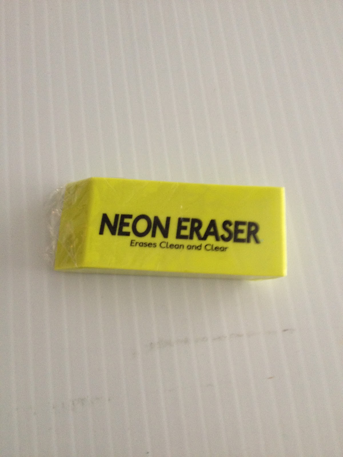
Walmart Neon Eraser- $0.26 for one
So in an attempt at being fair, I decided to grab an eraser I wasn't sure would be any good, but figured others might think it was passable. This neon eraser is pretty non descript, despite the bright color, and is produced by Walmart for Walmart.
It has a plastic feel that would have been a little disconcerting in the past, but after years of using white vinyl erasers, I figure it's at least worth a shot. It will either smear graphite and non photo blue lead everywhere, or it'll do the job it's designed to do- erase.
The Packaging

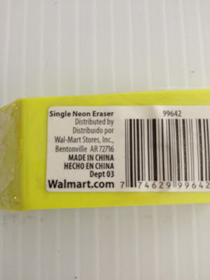
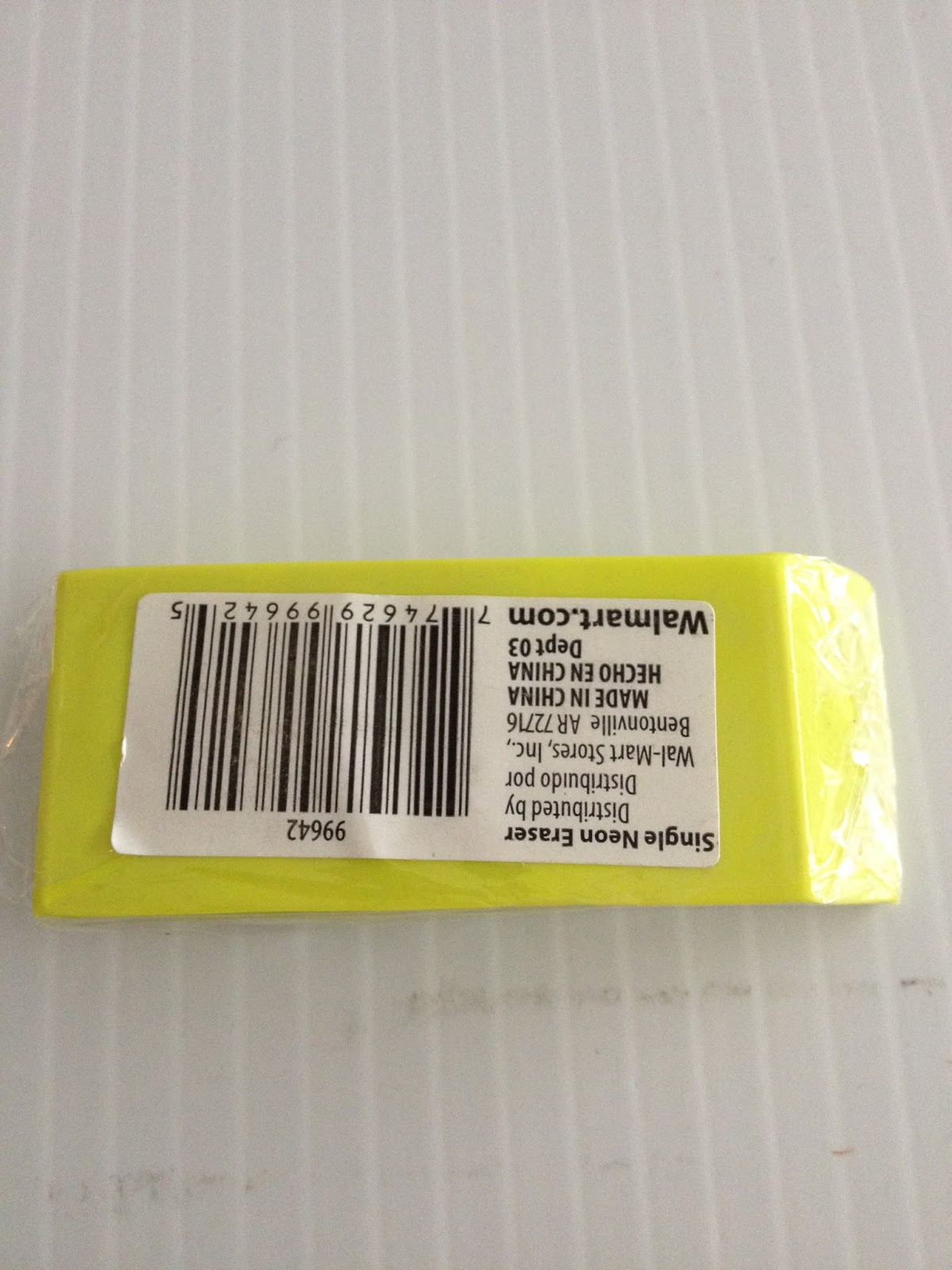
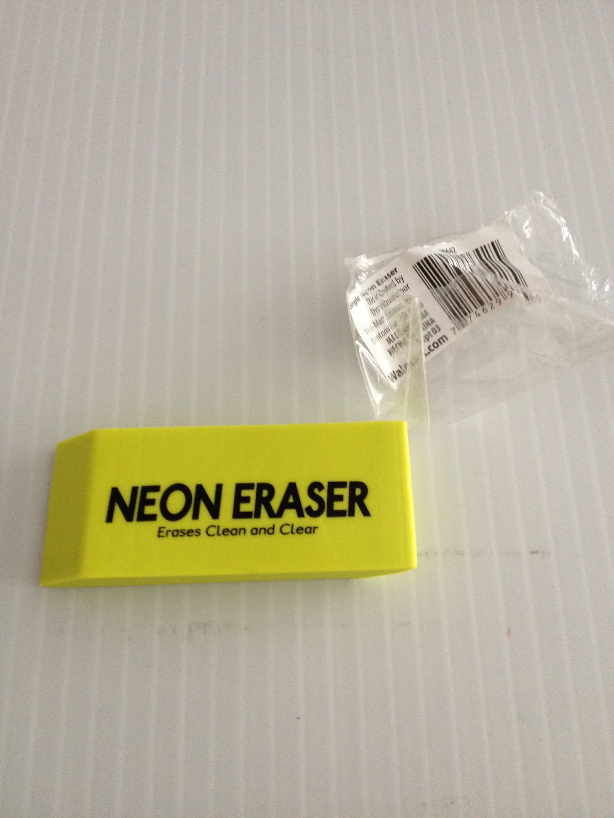
The Neon Eraser, which promises to erase clean an clear, comes shrinkwrapped in plastic, which might seem ridiculous, but you have to keep in mind I bought it from Walmart.

The back has a barcode and vendor information.

The shrinkwrap was removed fairly easily, although I did have to utilize the metal tip of my Clearpoint mechanical pencil to get the plastic started.
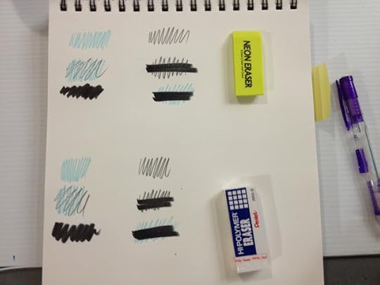
 The Neon Eraser performed better than I expected, in that I expected it to smear graphite and blue lead all over my paper. It doesn't perform as well as the Pentel Hi Polymer, and for your money, I recommend skipping the Neon Eraser and grabbing the 3 pack of Pentel instead.
Please consider donating to this blog or purchasing from Natto-shop (http://nattosoup.com/shop) if you want me to continue publishing quality content. All materials tested were purchased from my own pocket. Keep on Truckin' Nattosoup is not under any sponsorship.
This post is part of my series on art supplies from Walmart, which is part of a larger series about art supplies from big box stores commonly found across the US. My goal is to introduce readers to easily found, affordable supplies that are a good stopgap between school-grade supplies and the expensive art supplies they read about, but may not be able to afford. During the process, I hope to introduce myself AND my readers to supplies they may not have considered before, and hopefully encourage you guys to suggest good supplies I may have overlooked.
Pentel Hi Polymer Eraser- $1.46 for three
I've mentioned Pentel's Hi-Polymer Erasers in the past, I believe, as a good, easy to find alternative to Mono erasers. In this post, I'm going to pit the two side by side, so you can see that this easily available contender is no slouch in the erasing ring.
The Packaging


The nice thing about these Walmart reviews is that I can finally read the packaging, and either laugh at the things they consider selling points ("Block style is perfect for getting into little corners", "Comes with a protective sleeve to keep you and the eraser clean"), or take the claims as challenges to prove or disprove ("33% cleaner erasing!"- what constitutes a regular eraser to Pentel, who hail from the land of super erasers?)
So despite coming in a cardboard and plastic blister pack, these erasers are INDIVIDUALLY sealed for freshness, which is a little annoying.

The Field Test

The field test for both erasers is set up the same way, and was done at the same time. I created a variety of circumstances you would encounter when erasing- erasing bluelines, erasing just pencil, erasing pencil AND bluelines, erasing the pencil out for under the ink, erasing over ink, erasing bluelines from under ink. You want any eraser to clean up graphite and non photo blue lead cleanly with minimal smudging of the surrounding area, but you don't want it to pick up the ink you're using. As usual, I allowed my ink (from a Kuretake No. 6, I believe) to dry overnight. Papertype does matter for erasers, but I'm using a pretty common yardstick- regular 60lb sketchbook paper (Blick Sketch, my favorite). Please keep in mind that papers with a smooth finish will be more prone to smearing, and it may be more difficult to erase on papers with a rough finish. Now that I've found a basic standard of measure for comparing erasers, I can finally go through the dozens I bought while in Japan and after, and share that here with you guys.

For size comparison, I threw in a 'large' Mono eraser- the type I regularly use for my own art. This Mono eraser is from Jetpens, and is $1.65 plus tax and shipping.

The Pentel Hi Polymer eraser erases bluelines fairly cleanly, leaves some ghosting with graphite, has a little bit of smearing with graphite over bluelines (this is pretty common), and does not pull up the black ink.
Walmart Neon Eraser- $0.26 for one
So in an attempt at being fair, I decided to grab an eraser I wasn't sure would be any good, but figured others might think it was passable. This neon eraser is pretty non descript, despite the bright color, and is produced by Walmart for Walmart.
It has a plastic feel that would have been a little disconcerting in the past, but after years of using white vinyl erasers, I figure it's at least worth a shot. It will either smear graphite and non photo blue lead everywhere, or it'll do the job it's designed to do- erase.
The Packaging
The Neon Eraser, which promises to erase clean an clear, comes shrinkwrapped in plastic, which might seem ridiculous, but you have to keep in mind I bought it from Walmart.
The back has a barcode and vendor information.

The shrinkwrap was removed fairly easily, although I did have to utilize the metal tip of my Clearpoint mechanical pencil to get the plastic started.


 The Neon Eraser performed better than I expected, in that I expected it to smear graphite and blue lead all over my paper. It doesn't perform as well as the Pentel Hi Polymer, and for your money, I recommend skipping the Neon Eraser and grabbing the 3 pack of Pentel instead.
 Please consider donating to this blog or purchasing from Natto-shop (http://nattosoup.com/shop) if you want me to continue publishing quality content. All materials tested were purchased from my own pocket. Keep on Truckin' Nattosoup is not under any sponsorship.
September 20, 2015
Summer Art Dump Part 3- Returning to Nashville, Dealing with Depression, Working on Another Style
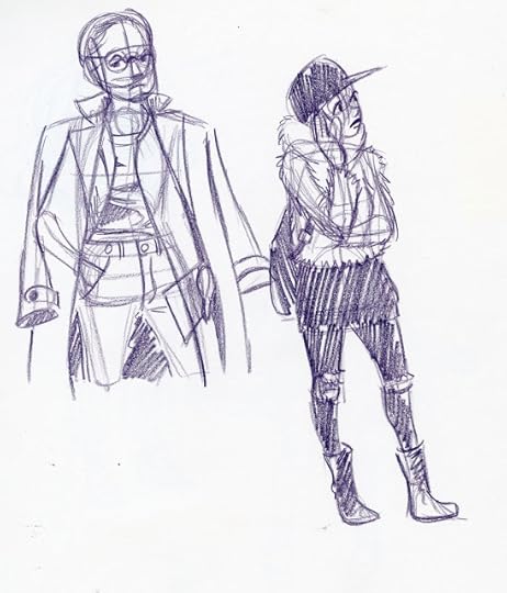
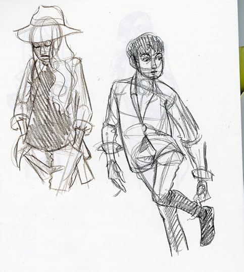
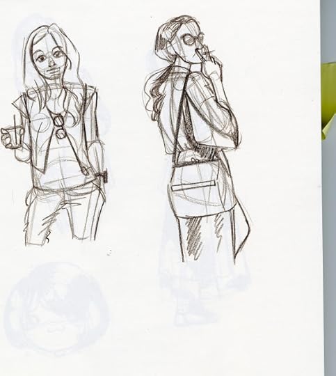
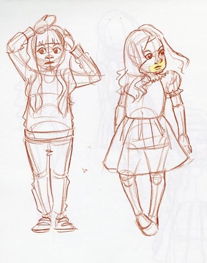
In between the sketchbook pages of Summer Art Dump Part 2 and Summer Art Dump Part 3, I went to Louisiana for two weeks to visit family and to attend Mechacon. While in Louisiana, I went to the Paradis branch of the St. Charles Parish to sketch for the kids, but other than that and Mechacon, I didn't do as much drawing as I normally would at home. It's always hard to make time for sketching while visiting family, but even though my output dropped, I still made sure to draw daily.

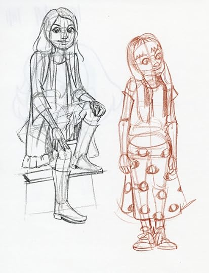

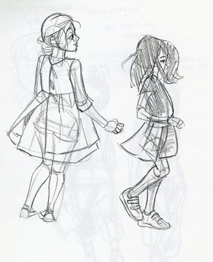
Although Mechacon went really well, and I had lots of energy the week after Mecha (put to use prepping for the Walmart Art Supply Review series, the Dollar Tree Art Supply Review series, and the Target Art Supply Review Series), by the time I got back to Nashville, and the solitude of working from home, I was pretty spent. I spent the next couple weeks struggling with reoccuring depression, an all too common malady I battle with, which entirely sapped my creativity and almost sapped my desire to draw. At best, I was simply drawing from reference while working on larger projects that I could not afford to postpone.
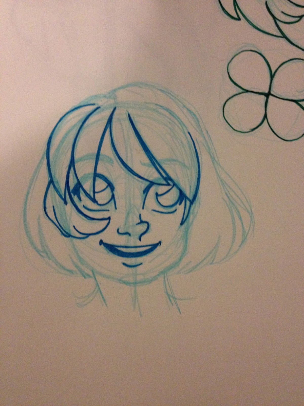
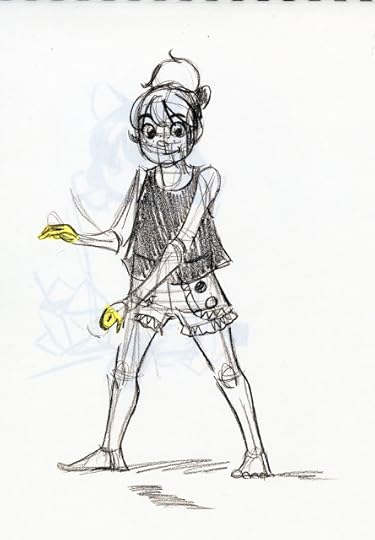
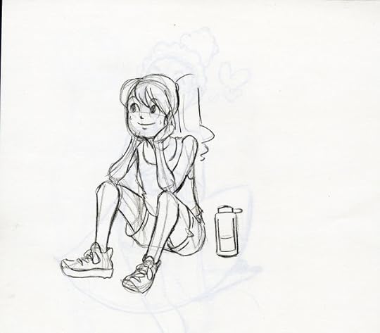
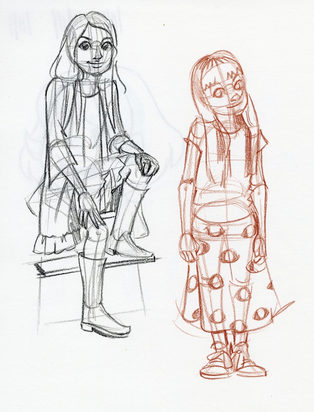
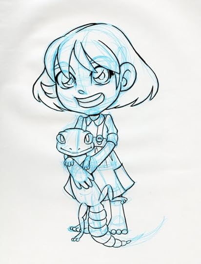
 I posted step by step drawing and inking process for the Kara on the right on my Instagram as I was drawing it.


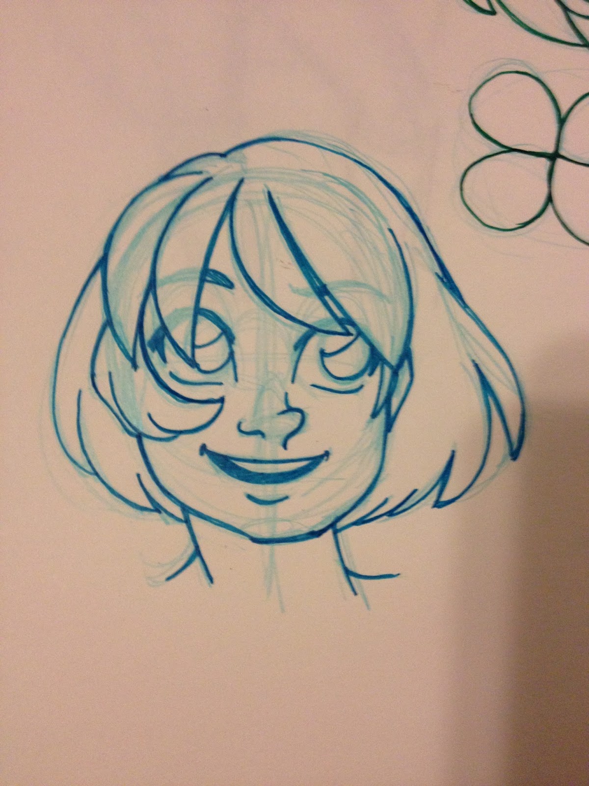
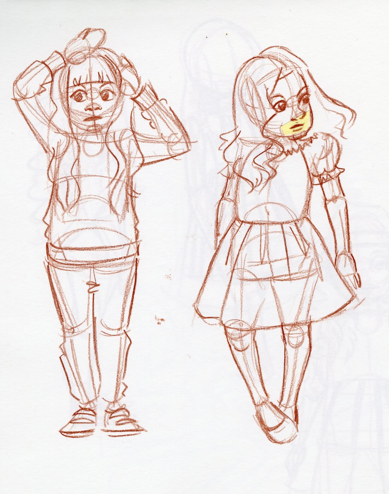
 I plan on making a new banner when Gizmo Grandma is printed and ready for distribution. It'll be Kara, comparing art supplies. I posted the step by step sketching and pencilling process on my Instagram.

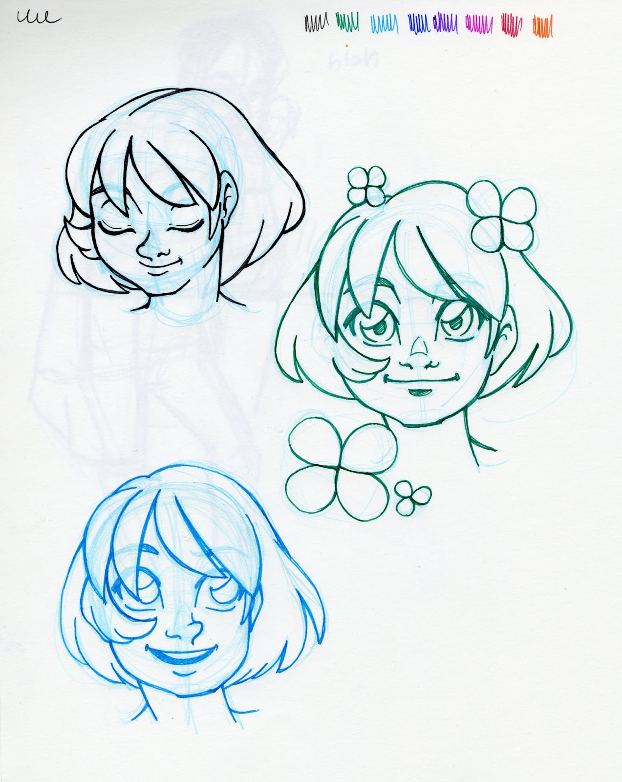
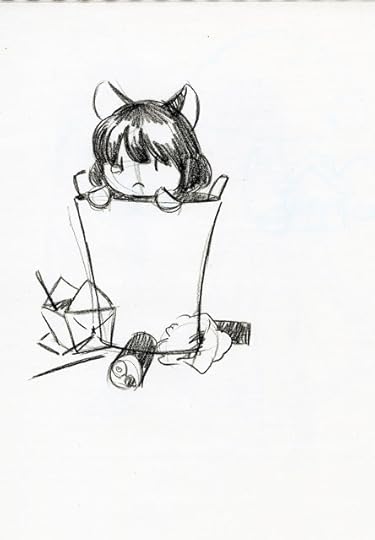
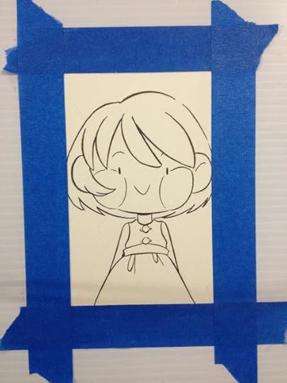
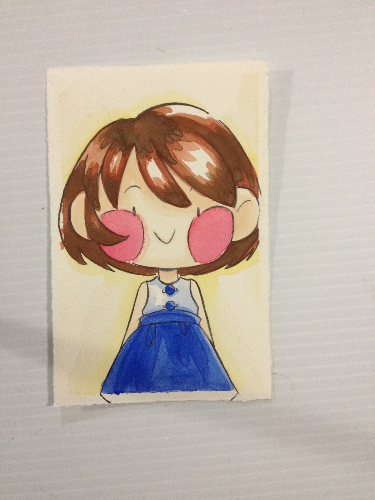
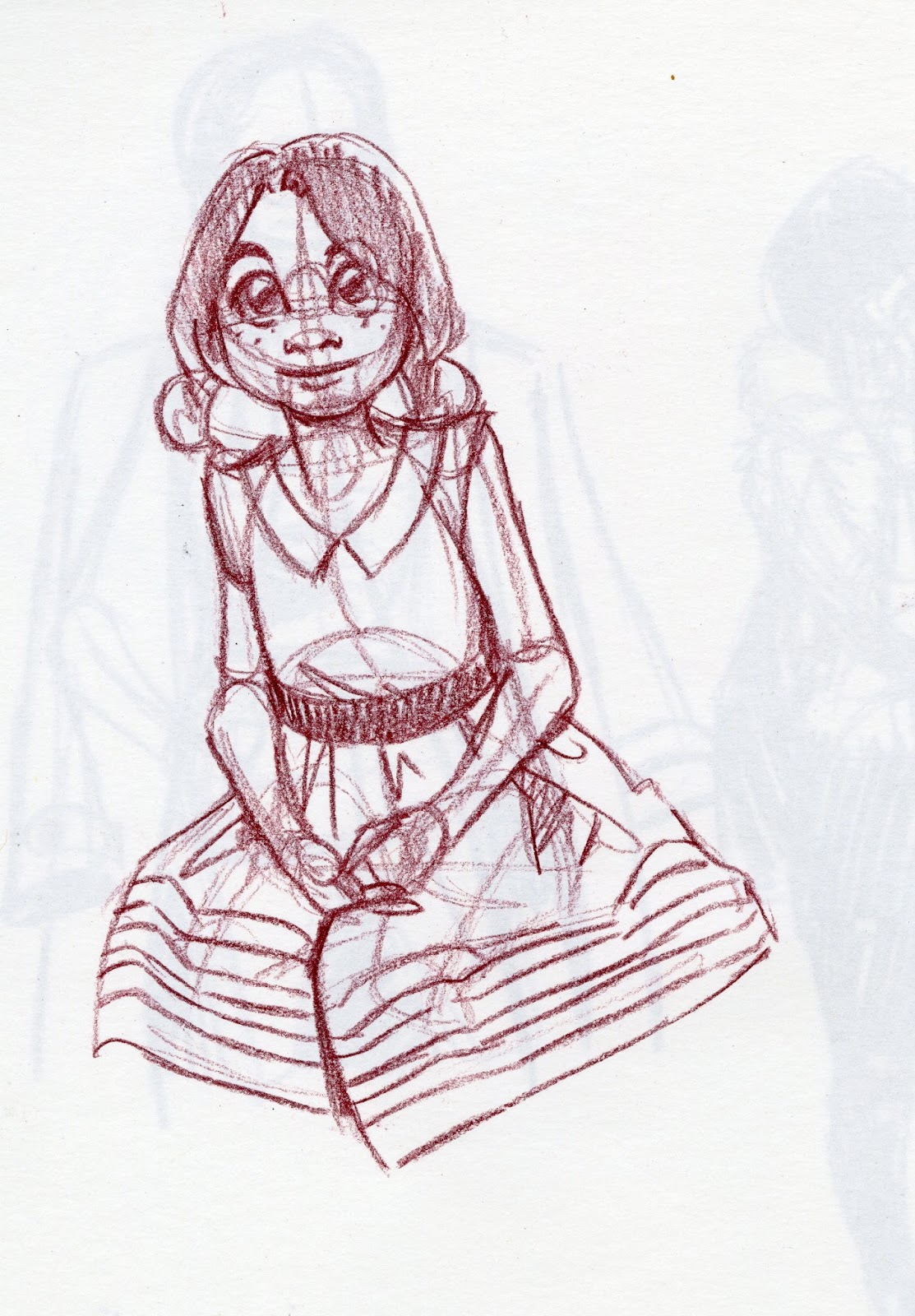
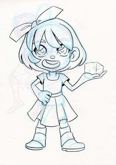 A chibi illustration I did so I could post process to Instagram, both sketching and inking.

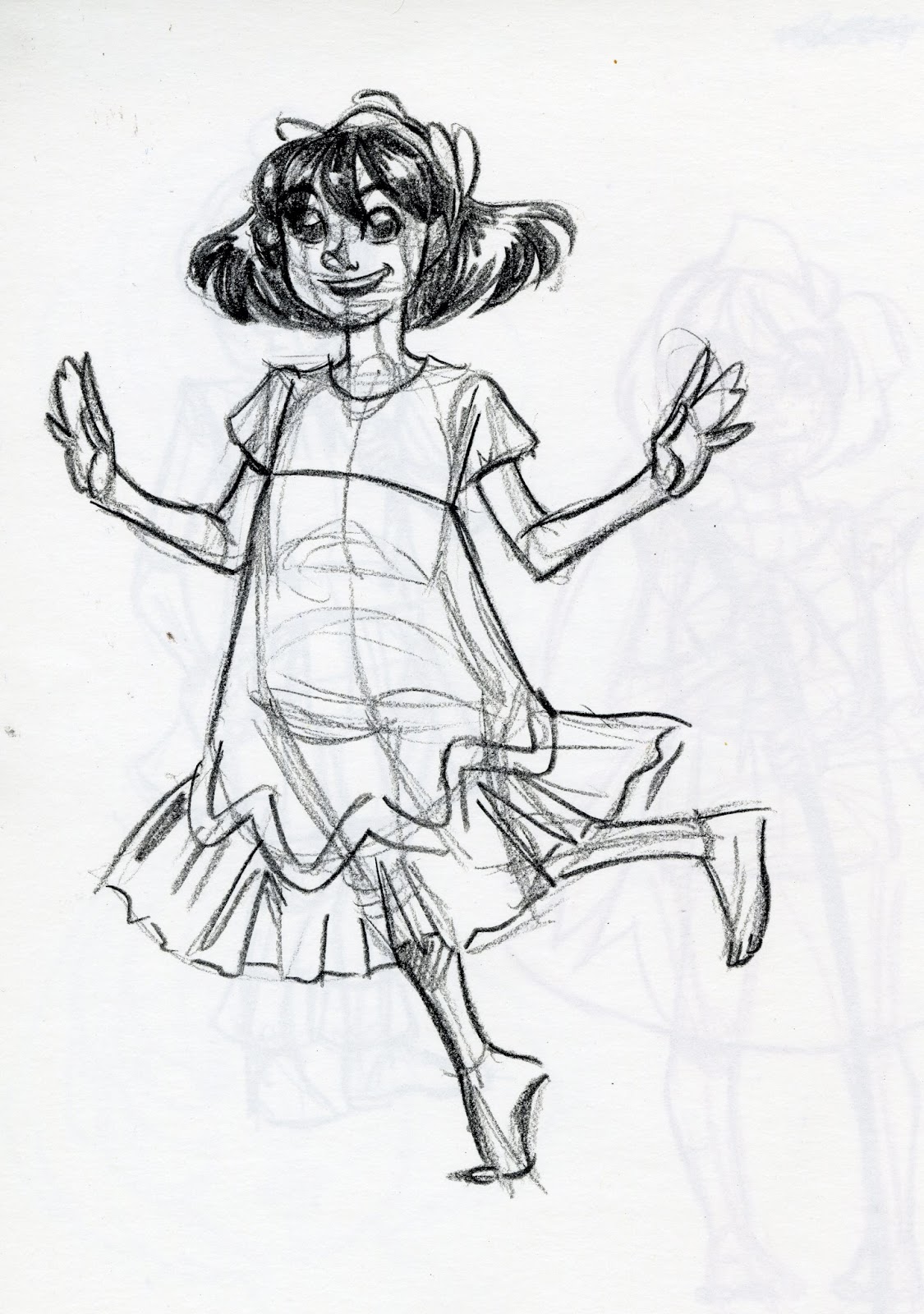
 Another paperchild of Kara. You can check out the whole thing on my Instagram.

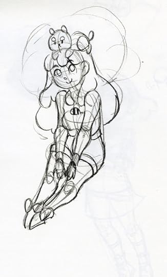
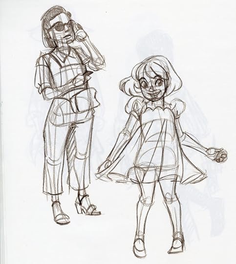
When the fog of depression finally started to lift, I decided to put effort into coming up with a more cartoony, more gestural B-style, and opted to do that mainly through drawing fanart of some of my favorite characters.
 Card Captor Sakura and baby Amethyst as a witch.


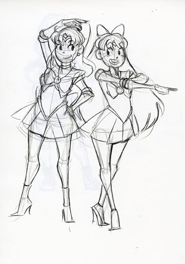 Sailor Jupiter and Venus
 Teenage Bulma
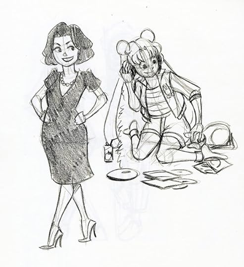 Selina Mayer (Veep) and Usagi

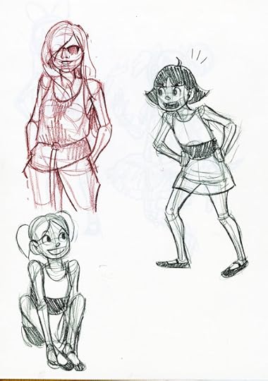 Referenced warmup, Bubbbles and Buttercup
 Blossom and Madoka
 Bee and Puppycat
 Tina Belcher
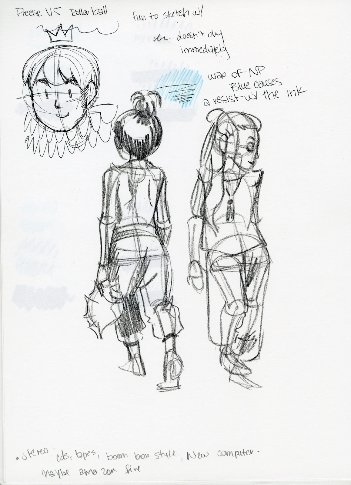
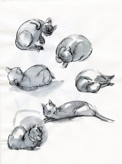 Faux inkwash studies of my cat, Bowie, done using the Pilot Precise V5, which I reviewed as part of my Walmart Art Supply Series. The post should be up here soon.
 Louise Belcher
 DeeDee and Mabel
 SasamiIf you're having trouble with feeling motivated, creative, or just tapped out, I strongly recommend that even if you're just drawing from reference, that you continue to draw daily. It's often hard to keep pushing, and you may wonder if it's even worth it, but when motivation returns, or you feel inspired again, you'll be frustrated that you let your muscle memory atrophy if you don't practice as much as possible.
Welp, now I'm caught up on the Summer Art Dump, and considering it's taken me almost a month to get all three parts posted, I'm sure I'll have even more sketches to share by the time this post goes live.
Please consider donating to this blog or purchasing from Natto-shop (http://nattosoup.com/shop) if you want me to continue publishing quality content. All materials tested were purchased from my own pocket. Keep on Truckin' Nattosoup is not under any sponsorship.


Although Mechacon went really well, and I had lots of energy the week after Mecha (put to use prepping for the Walmart Art Supply Review series, the Dollar Tree Art Supply Review series, and the Target Art Supply Review Series), by the time I got back to Nashville, and the solitude of working from home, I was pretty spent. I spent the next couple weeks struggling with reoccuring depression, an all too common malady I battle with, which entirely sapped my creativity and almost sapped my desire to draw. At best, I was simply drawing from reference while working on larger projects that I could not afford to postpone.
 I posted step by step drawing and inking process for the Kara on the right on my Instagram as I was drawing it.

 I plan on making a new banner when Gizmo Grandma is printed and ready for distribution. It'll be Kara, comparing art supplies. I posted the step by step sketching and pencilling process on my Instagram.
 A chibi illustration I did so I could post process to Instagram, both sketching and inking.

 Another paperchild of Kara. You can check out the whole thing on my Instagram.

When the fog of depression finally started to lift, I decided to put effort into coming up with a more cartoony, more gestural B-style, and opted to do that mainly through drawing fanart of some of my favorite characters.
 Card Captor Sakura and baby Amethyst as a witch.


 Sailor Jupiter and Venus
 Teenage Bulma
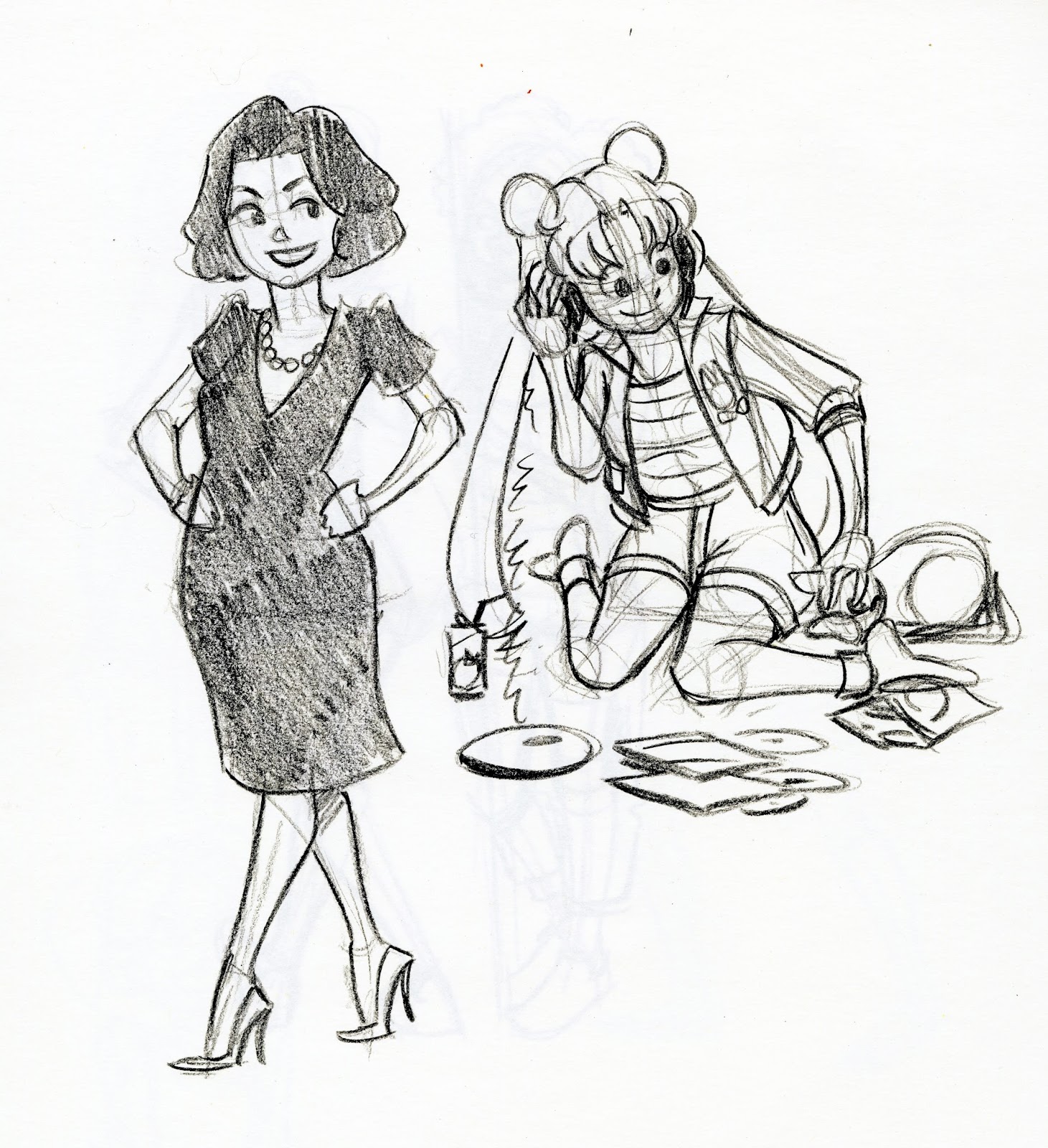 Selina Mayer (Veep) and Usagi
 Referenced warmup, Bubbbles and Buttercup
 Blossom and Madoka
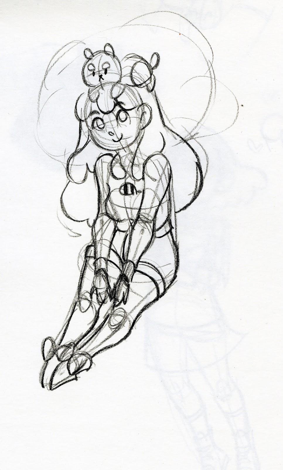 Bee and Puppycat
 Tina Belcher
 Faux inkwash studies of my cat, Bowie, done using the Pilot Precise V5, which I reviewed as part of my Walmart Art Supply Series. The post should be up here soon.
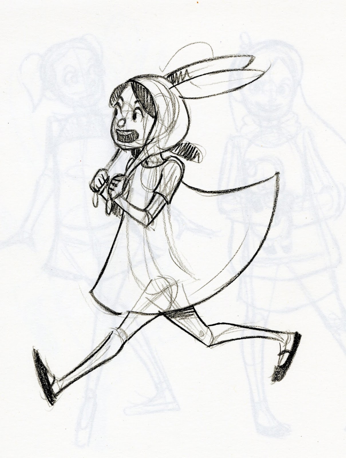 Louise Belcher
 DeeDee and Mabel
 SasamiIf you're having trouble with feeling motivated, creative, or just tapped out, I strongly recommend that even if you're just drawing from reference, that you continue to draw daily. It's often hard to keep pushing, and you may wonder if it's even worth it, but when motivation returns, or you feel inspired again, you'll be frustrated that you let your muscle memory atrophy if you don't practice as much as possible.
Welp, now I'm caught up on the Summer Art Dump, and considering it's taken me almost a month to get all three parts posted, I'm sure I'll have even more sketches to share by the time this post goes live.
Please consider donating to this blog or purchasing from Natto-shop (http://nattosoup.com/shop) if you want me to continue publishing quality content. All materials tested were purchased from my own pocket. Keep on Truckin' Nattosoup is not under any sponsorship.
September 16, 2015
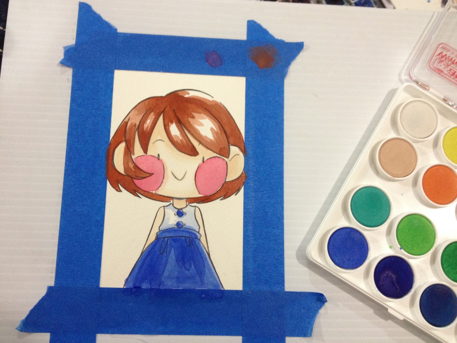
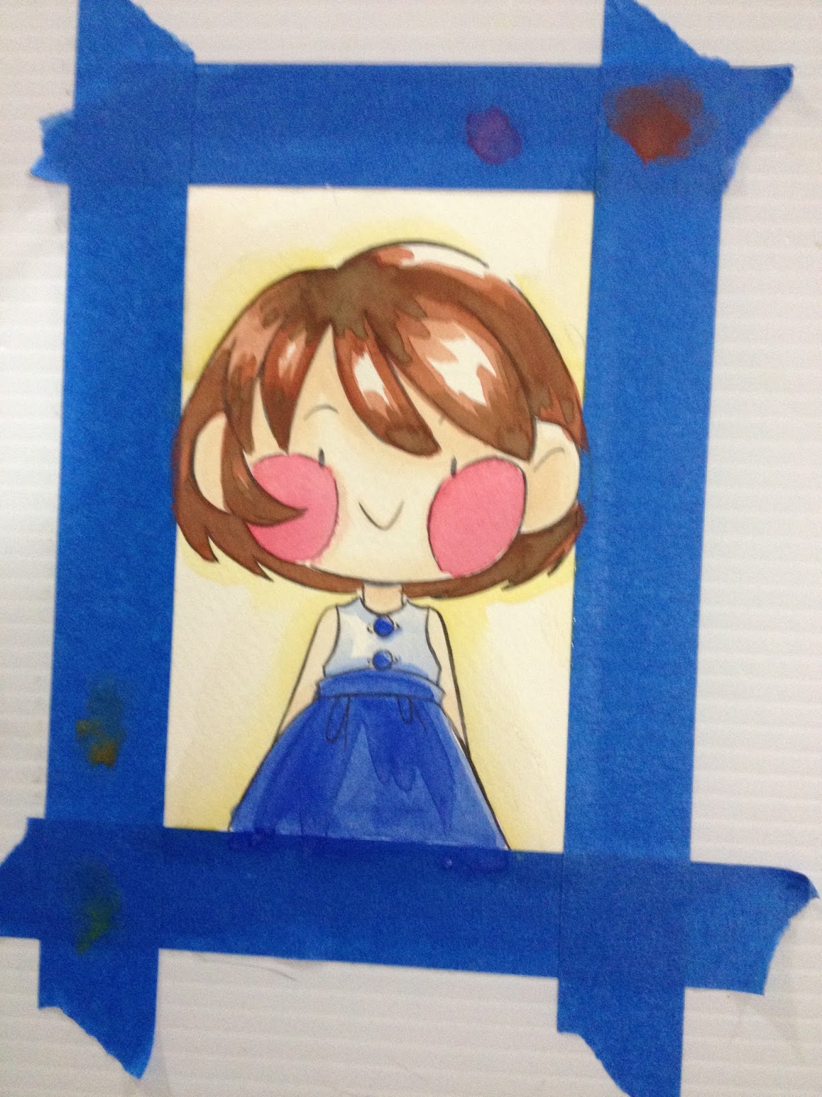
Art Supply Review: Angora Watercolors
On occasion, I take the time to write a watercolor review, as I know many of my readers are watercolorists, or would like to get into watercolor. I've written posts about assembling a palette over time that works to your needs, but these reviews focus more on affordable, ready assembled sets aimed at beginners or travellers. If you enjoyed this post, please consider checking out my other art supply reviews in my Reviews tab above. If you would like to purchase a set of Angora watercolors for yourself or a friend, please consider supporting this blog financially by using my Amazon affiliate link for Angora watercolors.
As this blog is completely unsponsored, and I receive no financial compensation from companies to write these reviews, nor do I receive donations from manufacturers, I really depend on the goodwill of my readers. If you benefitted from this post, please consider contacting Royal Talens with a link to this post and your thoughts. I would also sincerely appreciate it if you sent me an email with your thoughts, questions, or thanks.
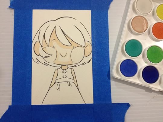
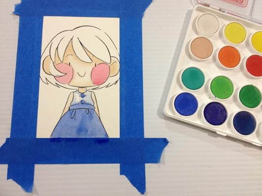
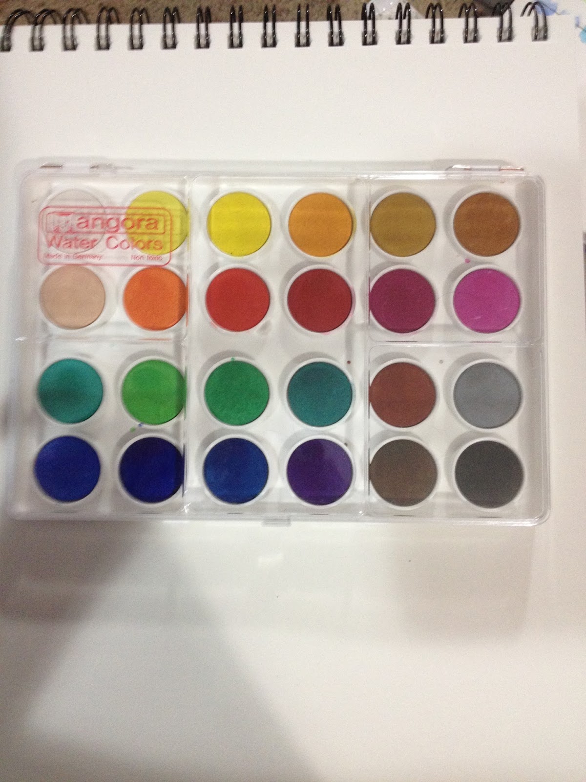
While in town for ALA, I went with Heidi and Joseph to the DickBlick only a couple blocks away from the Marcone Center. Although my bags were crammed, I have a weak spot for art supplies, and when I saw this Angora set of watercolors, I thought the colors were bright and opaque enough that it might be an ok substitute for gouache.
I was hoping for decent opaque watercolors, and thought that this set, with it's bright colors, might be just the set I was looking for if I handled the paints properly. At less than $17 for the 24 color set, I figured that even if it wasn't perfect, it was still worth a shot, so I went ahead and bought it. If you're looking for a set of your own, you can order 12, 24, or 36 pans from Blick.
The barcode on the back of the box says these are from Canson, but I've also seen them credited to Talens. The Blick site is no help, simply mentioning they're made in Germany. Talens makes a variety of art supplies under a number of sub brands including Rembrandt, Cobra, and Van Gogh. While these are not gouache, Royal Talens does make gouache that I would like to play around with in the future. I can't find the Angora sets under the watercolor section of their website, but I did find something fairly comparable. I'm also reminded of this set by Loew Cornell on Amazon.
The Paints and Package
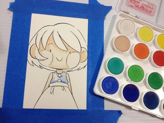
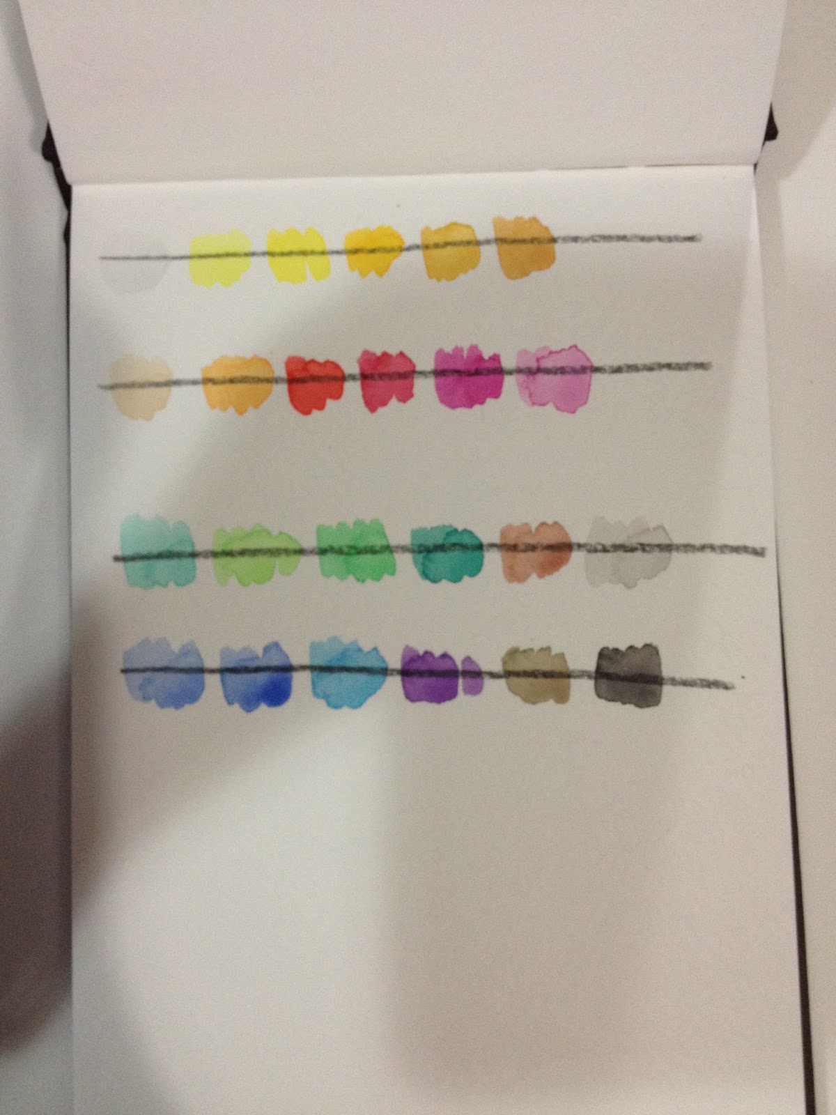
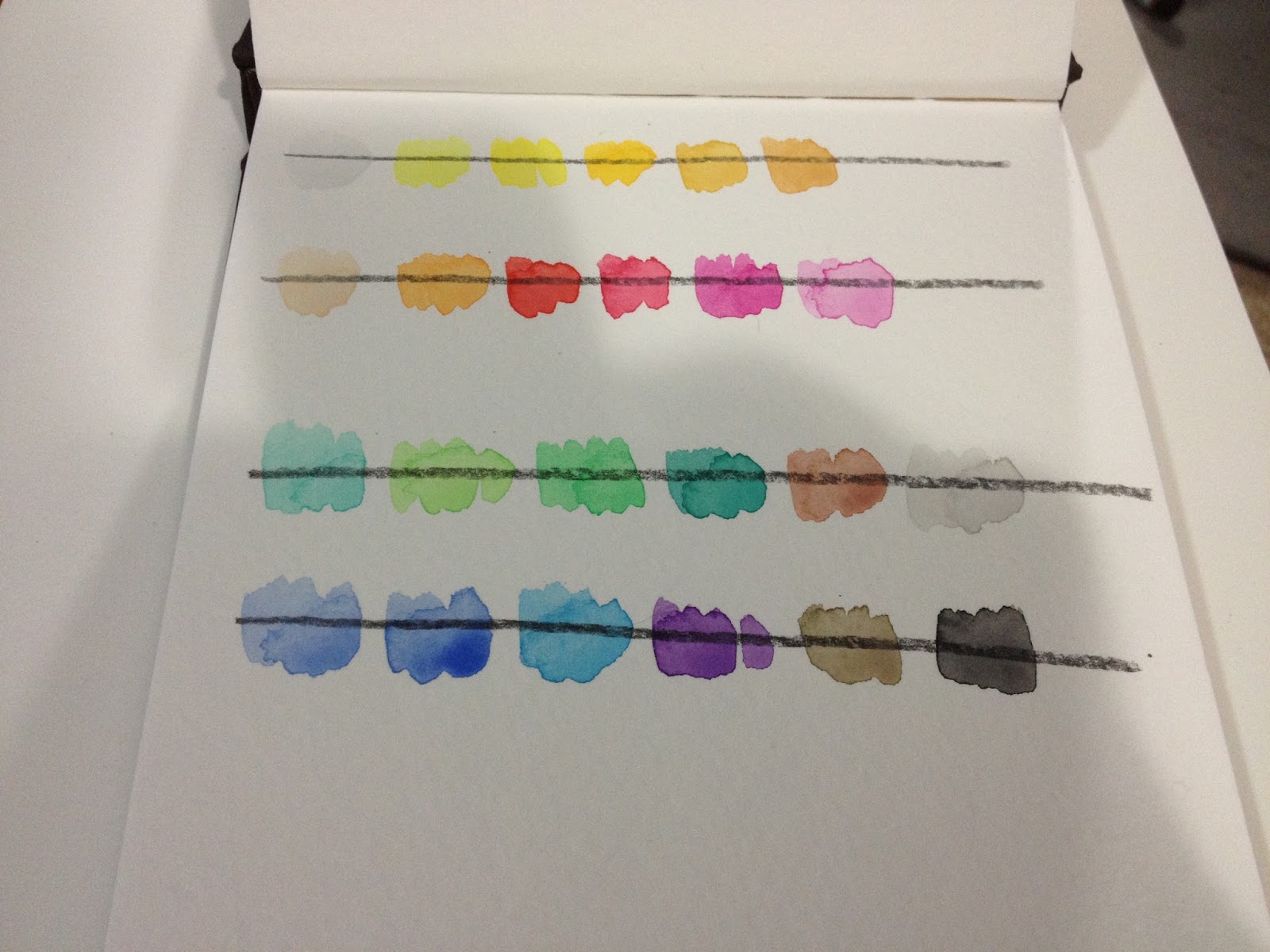
The paints are cakes set in plastic wells in this set. The clear lid can be used as a palette, but there are only three large mixing areas. The set does not come with a brush of any sort.


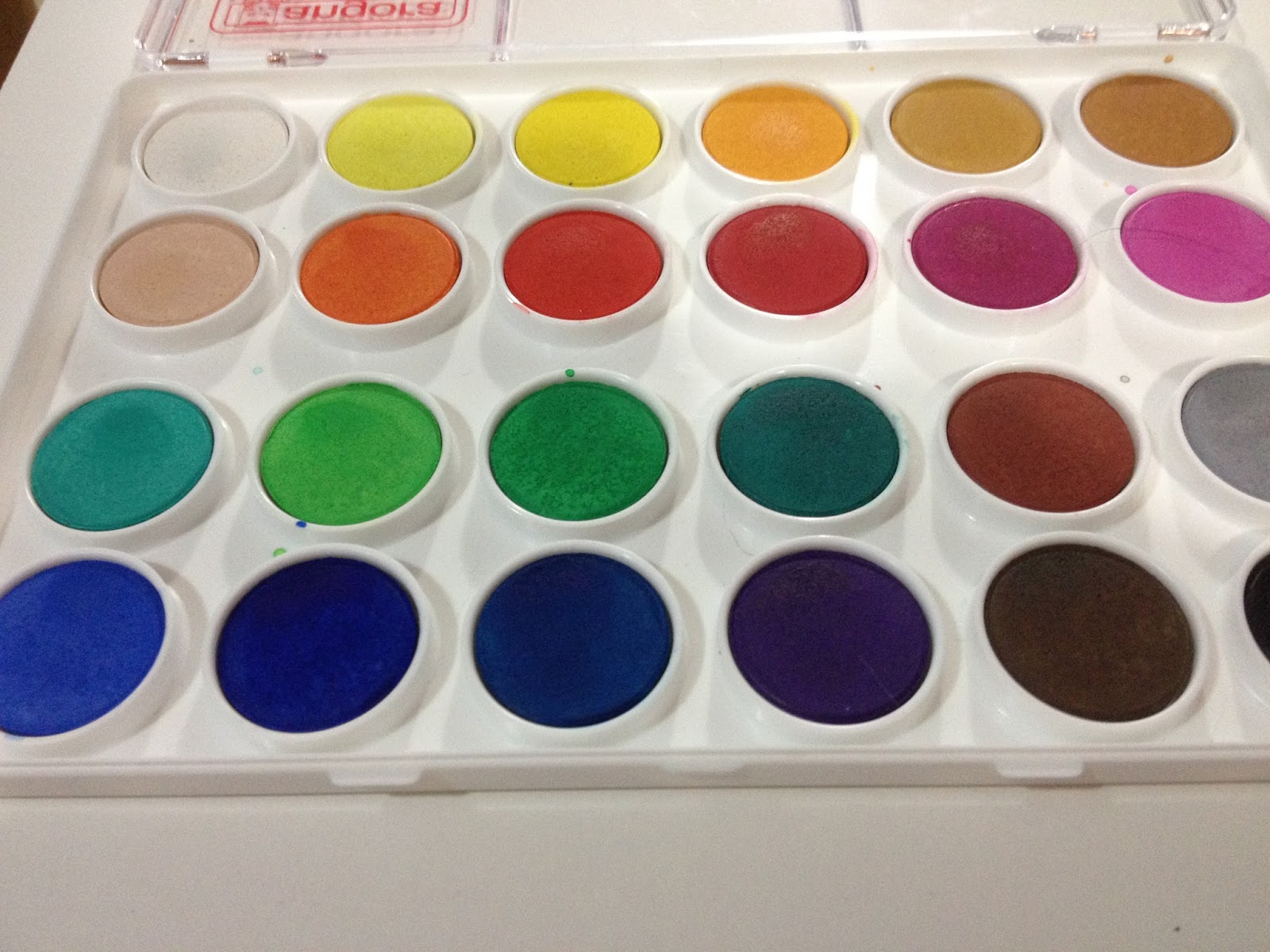
The individual cakes have color variation when inspected up close, and look like they may provide muddy color rather than clear pigments.
The Field Test
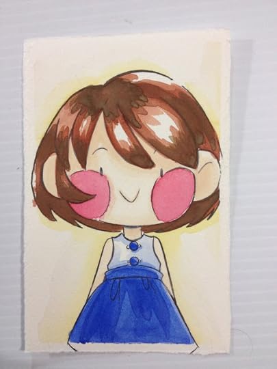
I swiped the paper with a black color pencil beforehand, to test the opacity of the paints. Many cheaper brands will add white (chalk, perhaps) to make their lighter pigments seem brighter, and I was hoping that ALL of these paints had enough chalk to make them opaque.


The colors were swatched directly from the set using a clean wet brush, and as you can see, the colors aren't as intense when applied to paper as they were in cake form. You can also see these are not really opaque pigments, which puts them in a difficult category- they are not opaque enough to be considered pan gouache, nor are they clear enough to be watercolors.
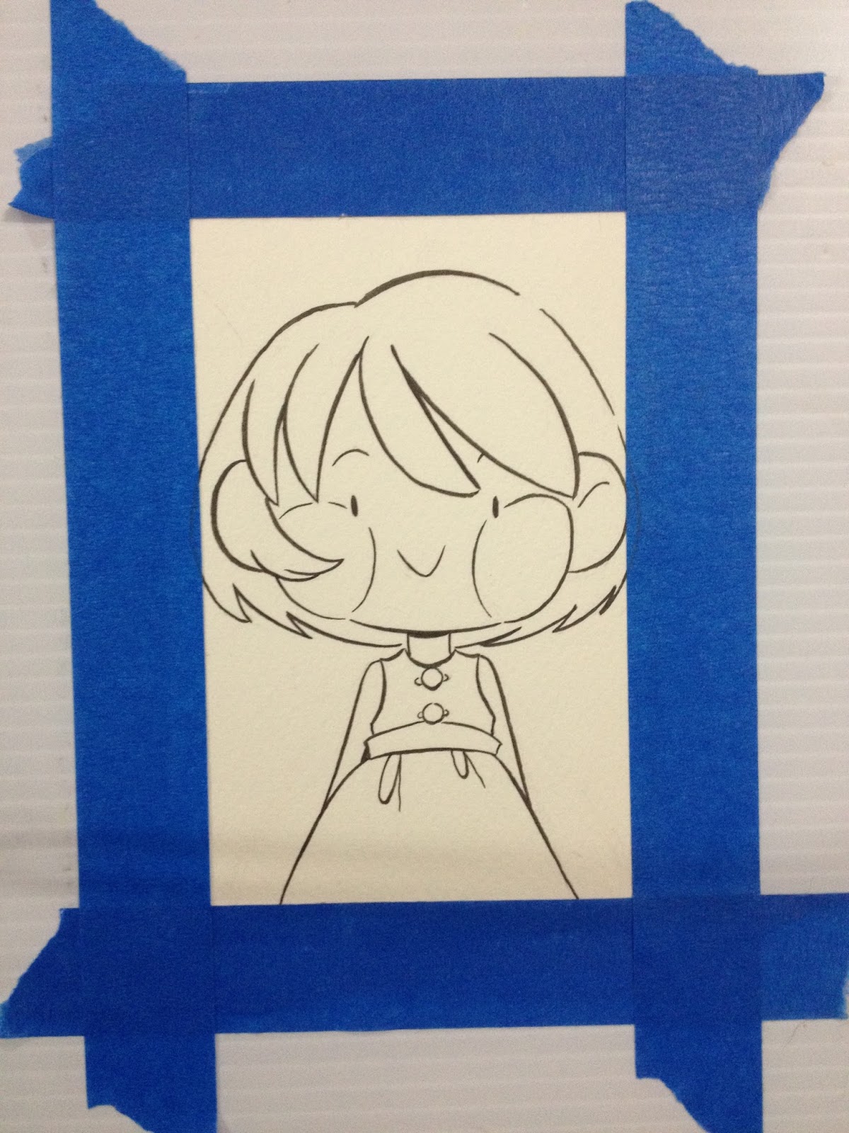
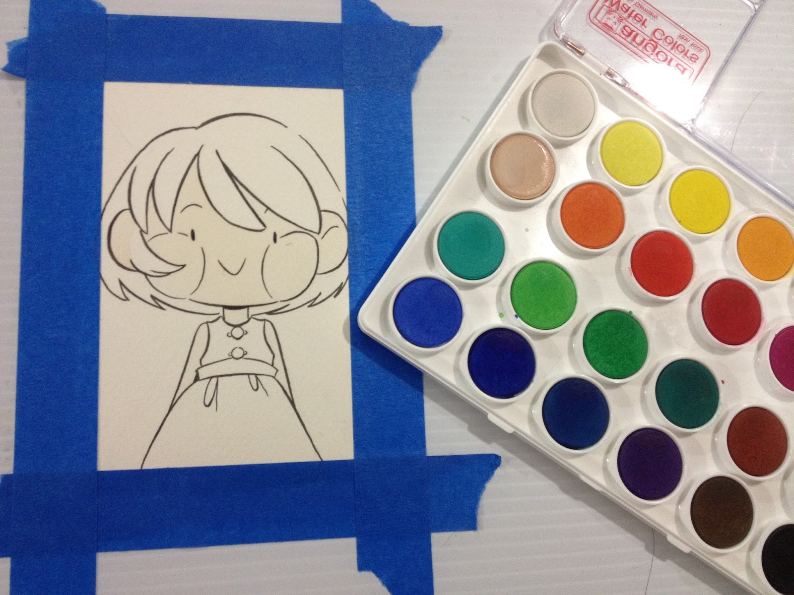
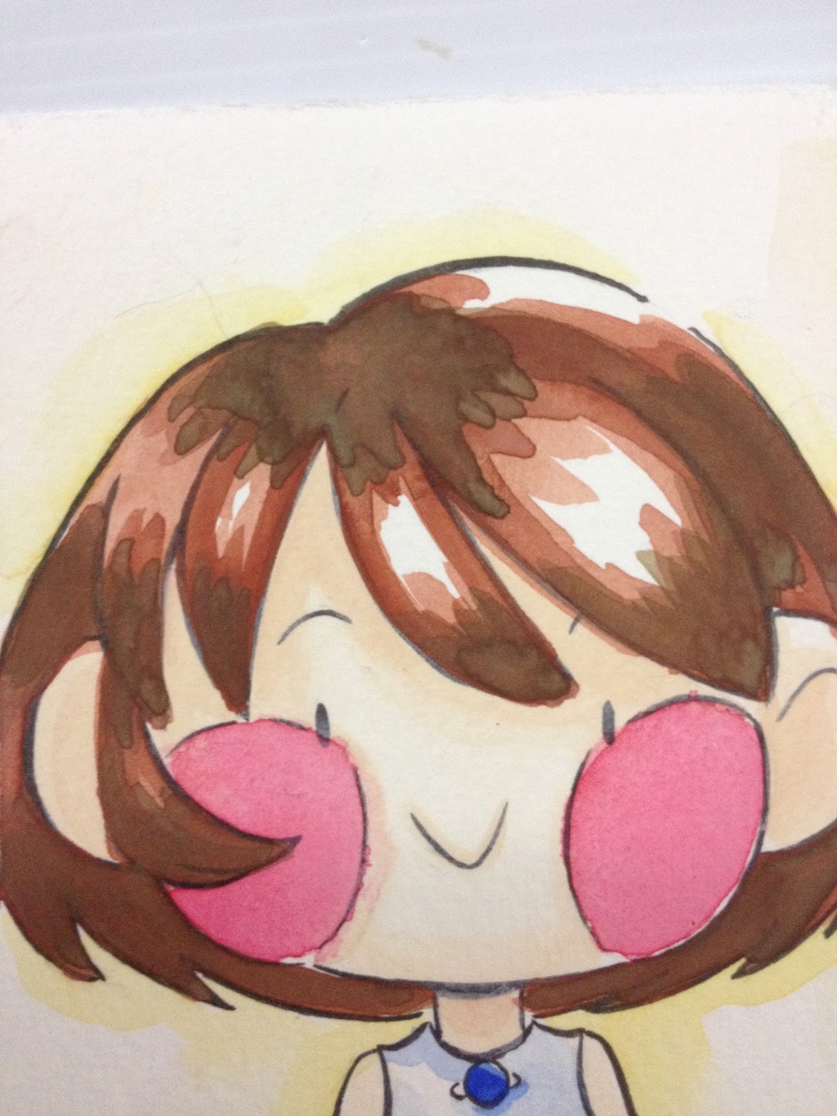
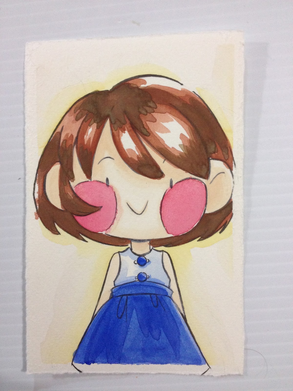
Practical Use
With chalky watercolors like these, it's best if you keep your linework simple, because too many layers can make the piece get muddy fast. I will be applying colors pretty much straight from the palette. If you want darker, more intense color, add a drop of water to each cake, allow it to absorb, and then start painting.

The peach that comes pre-mixed is very light, but layers ok.
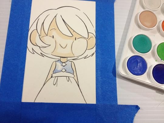
I applied the shadows on the shirt while the paint had not fully absorbed the water yet, so the pigment I picked up was very light.
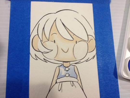

Once the cake had a chance to absorb some water, I started painting in the skirt. You can see how big a difference allowing the water to absorb can make.
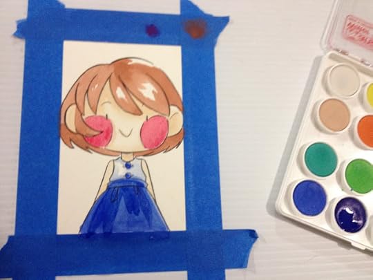


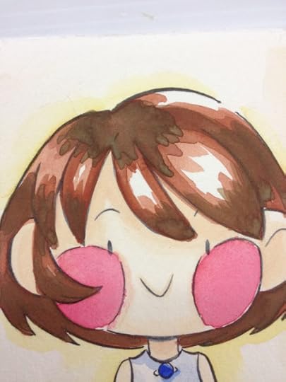
As you can see, the layer of Sepia I applied over the initial layer of brown is rather muddy- not nearly as dark as I would like.

The Verdict
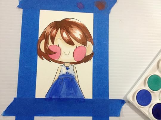
These watercolors were not opaque enough to achieve what I really wanted, but not transparent enough to be decent watercolors. While they weren't particularly difficult to work with, if you're working with simple designs, if you want to paint more complicated pieces, this type of watercolor will get muddy very fast. If you're looking for a similar set, Sakura Koi watercolors perform about as well as the Angora watercolors, and include a decent waterbrush. These are the watercolors I use for the mini watercolors I sell at conventions.
Did you find this post useful? Did you enjoy it? How about sharing it with friends on Facebook, or Tweeting it to your followers? The links above the post make sharing SUPER easy- you don't even have to leave the page! If you really liked this post, or any of my posts, how about sending me a tip via Paypal using the handy donation link in the sidebar, or writing me an email? It would definitely make my day!
Please consider donating to this blog or purchasing from Natto-shop (http://nattosoup.com/shop) if you want me to continue publishing quality content. All materials tested were purchased from my own pocket. Keep on Truckin' Nattosoup is not under any sponsorship.
As this blog is completely unsponsored, and I receive no financial compensation from companies to write these reviews, nor do I receive donations from manufacturers, I really depend on the goodwill of my readers. If you benefitted from this post, please consider contacting Royal Talens with a link to this post and your thoughts. I would also sincerely appreciate it if you sent me an email with your thoughts, questions, or thanks.
While in town for ALA, I went with Heidi and Joseph to the DickBlick only a couple blocks away from the Marcone Center. Although my bags were crammed, I have a weak spot for art supplies, and when I saw this Angora set of watercolors, I thought the colors were bright and opaque enough that it might be an ok substitute for gouache.
I was hoping for decent opaque watercolors, and thought that this set, with it's bright colors, might be just the set I was looking for if I handled the paints properly. At less than $17 for the 24 color set, I figured that even if it wasn't perfect, it was still worth a shot, so I went ahead and bought it. If you're looking for a set of your own, you can order 12, 24, or 36 pans from Blick.
The barcode on the back of the box says these are from Canson, but I've also seen them credited to Talens. The Blick site is no help, simply mentioning they're made in Germany. Talens makes a variety of art supplies under a number of sub brands including Rembrandt, Cobra, and Van Gogh. While these are not gouache, Royal Talens does make gouache that I would like to play around with in the future. I can't find the Angora sets under the watercolor section of their website, but I did find something fairly comparable. I'm also reminded of this set by Loew Cornell on Amazon.
The Paints and Package
The paints are cakes set in plastic wells in this set. The clear lid can be used as a palette, but there are only three large mixing areas. The set does not come with a brush of any sort.
The individual cakes have color variation when inspected up close, and look like they may provide muddy color rather than clear pigments.
The Field Test
I swiped the paper with a black color pencil beforehand, to test the opacity of the paints. Many cheaper brands will add white (chalk, perhaps) to make their lighter pigments seem brighter, and I was hoping that ALL of these paints had enough chalk to make them opaque.
The colors were swatched directly from the set using a clean wet brush, and as you can see, the colors aren't as intense when applied to paper as they were in cake form. You can also see these are not really opaque pigments, which puts them in a difficult category- they are not opaque enough to be considered pan gouache, nor are they clear enough to be watercolors.
Practical Use
With chalky watercolors like these, it's best if you keep your linework simple, because too many layers can make the piece get muddy fast. I will be applying colors pretty much straight from the palette. If you want darker, more intense color, add a drop of water to each cake, allow it to absorb, and then start painting.
The peach that comes pre-mixed is very light, but layers ok.

I applied the shadows on the shirt while the paint had not fully absorbed the water yet, so the pigment I picked up was very light.

Once the cake had a chance to absorb some water, I started painting in the skirt. You can see how big a difference allowing the water to absorb can make.


As you can see, the layer of Sepia I applied over the initial layer of brown is rather muddy- not nearly as dark as I would like.
The Verdict
These watercolors were not opaque enough to achieve what I really wanted, but not transparent enough to be decent watercolors. While they weren't particularly difficult to work with, if you're working with simple designs, if you want to paint more complicated pieces, this type of watercolor will get muddy very fast. If you're looking for a similar set, Sakura Koi watercolors perform about as well as the Angora watercolors, and include a decent waterbrush. These are the watercolors I use for the mini watercolors I sell at conventions.
Did you find this post useful? Did you enjoy it? How about sharing it with friends on Facebook, or Tweeting it to your followers? The links above the post make sharing SUPER easy- you don't even have to leave the page! If you really liked this post, or any of my posts, how about sending me a tip via Paypal using the handy donation link in the sidebar, or writing me an email? It would definitely make my day!
Please consider donating to this blog or purchasing from Natto-shop (http://nattosoup.com/shop) if you want me to continue publishing quality content. All materials tested were purchased from my own pocket. Keep on Truckin' Nattosoup is not under any sponsorship.
September 13, 2015
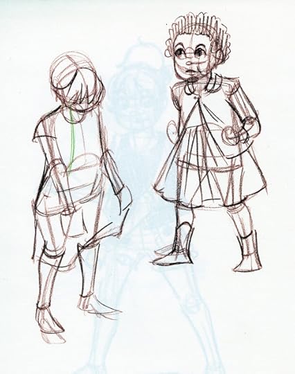
Summer Art Dump Part 2-Pre ALA, At ALA, Post ALA, Daily Referenced Warmups and Cool Downs
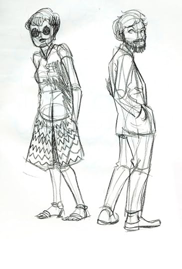
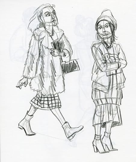
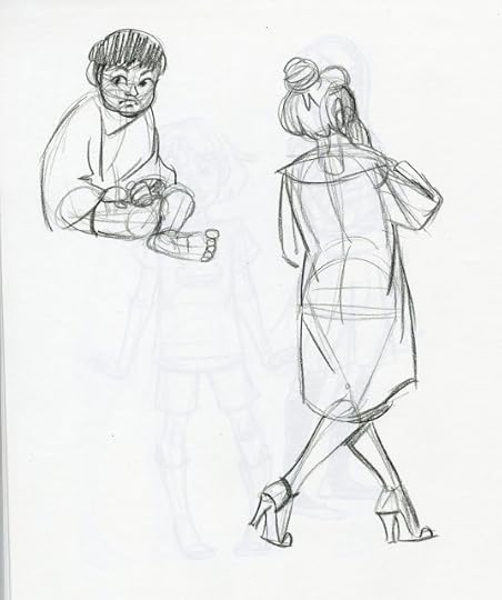
Although I was busy prepping for, attending, and unpacking from ALA, I still made time to sketch every day. Most of these are referenced from The Sartorialist, as I'm always trying to improve how I draw clothing. Most of these are also drawn with black color pencil, a technique I talked about in Part 1 of the Summer Art Dump.


 Ramona and Beezus from the beloved Beverly Cleary series


 Kara pencil children. These are displayed with her interacting with the pencil that drew her on my Instagram. If you haven't checked my Instagram out yet, you should, I post all sorts of goodies, including exclusive things and daily drawings, all the time!


Please consider donating to this blog or purchasing from Natto-shop (http://nattosoup.com/shop) if you want me to continue publishing quality content. All materials tested were purchased from my own pocket. Keep on Truckin' Nattosoup is not under any sponsorship.


 Ramona and Beezus from the beloved Beverly Cleary series


 Kara pencil children. These are displayed with her interacting with the pencil that drew her on my Instagram. If you haven't checked my Instagram out yet, you should, I post all sorts of goodies, including exclusive things and daily drawings, all the time!
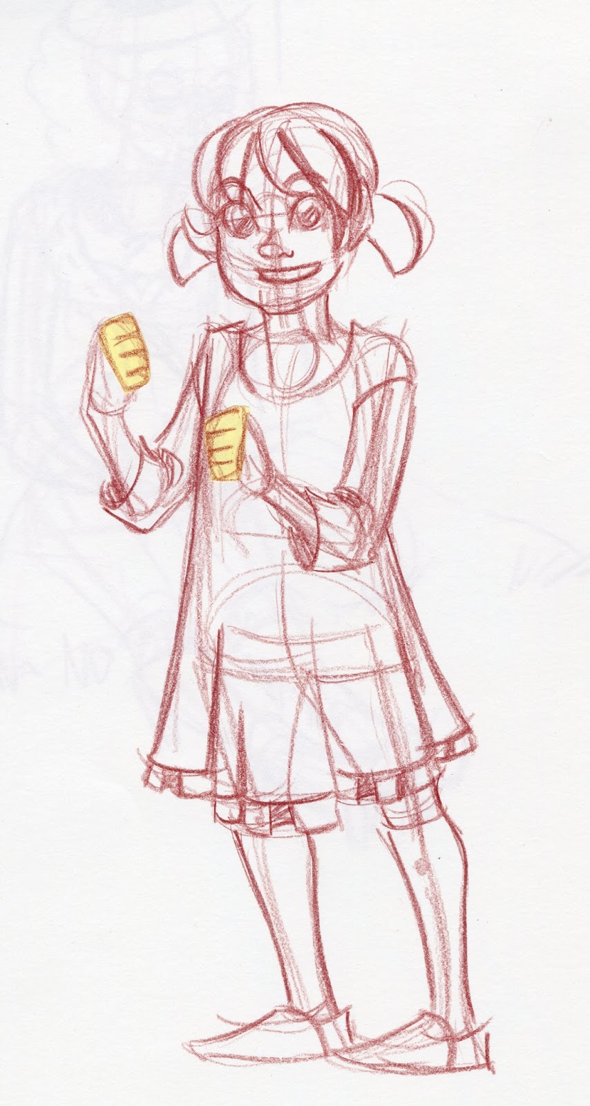


Please consider donating to this blog or purchasing from Natto-shop (http://nattosoup.com/shop) if you want me to continue publishing quality content. All materials tested were purchased from my own pocket. Keep on Truckin' Nattosoup is not under any sponsorship.
September 9, 2015
Walmart Art Supply Review: Waterbased Markers
While browsing Walmart looking at art supplies, I wondered if, used properly, waterbased markers could be used as a replacement for Copic and other alcohol based markers. While there are some fundamental differences between waterbased and alcohol based markers, I hoped that although I would be sacrificing the colorless blender, I could still blend and layer these markers if I was careful about drytimes.
This wouldn't be the first time I played around with waterbased markers. Many watercolor markers are basically waterbased markers- same binder (water), similar dyes, similar dispersion method, different tip options. Most of us have used waterbased markers since we were wee little kids, and part of the reason Crayola touts supreme washability is that many kids, myself included, may have decked the halls of our home in Crayola scribbles, applied directly to wallpaper.
Once you leave childhood you may find it difficult to achieve desired affects with the waterbased markers you have easy access to. Waterbased markers cause streaking, and paper pilling, and its rare to hear that waterbased markers such as Crayola or CraZArt markers are the marker of choice for any professional or serious hobbyist artist. I hoped to find a place in the artist's arsenal for these maligned markers, as they're the first marker most young artists have any experience with, and often they're the first one they can afford.
I briefly explored the history of Crayola in my Crayola Washable Watercolors review, so I suppose I ought to explore CraZArt. These markers are not mine- they're my mother's, but while I'm in Luling she's graciously allowed me to swatch them and give preliminary opinions.
Cra-Z-Art is a company that focuses on a variety of creativity boosting toys and activities, including superlooms, knitting kits, an ice cream maker, and lots of art supplies. They hold the license for the retro Snoopy shaved ice machine, the Crystal Surprise Pets, and Magrific, a magnetic building set.
Originally known as RoseArt, Cra-Z-Art boasts a history spanning back to the 1920's, and they appear to proudly do a little of everything.
If you're interested in either Crayola markers, Cra-Z-Art markers, or helping to financially support this blog so I may continue to do reviews, please considering purchasing your own set of markers through my affiliate links, or consider donating a tip to my Paypal, linked on the sidebar.
Crayola Affiliate Search Link
Cra-Z-Art Affiliate Search Link
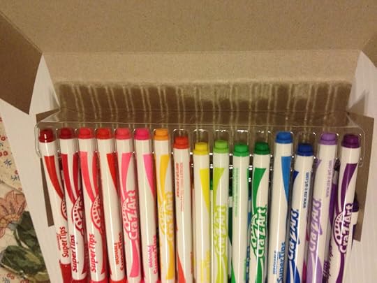
Crayola Markers Versus CraZArt Markers
I had these Crayola markers as a teen, but I was never very good at using them. I've seen some artists really put them to good use online, and while I HOPE I've improved, I seriously doubt I'll be as good as someone who'se continued to use these markers for years.
Crayola-Packaging


The back of the box lists the names of the colors, but these are not printed on the bodies of the individual markers. This makes it difficult to swatch colors, unless you intend to keep your markers in the same order you swatched. The package, a plain cardboard box, is a little lackluster compared to the reusable plastic sleeves these markers used to come in.
Cra-Z-Art Packaging


As bad as the Crayola's cardboard box is, travel-wise, the Cra-Z-Art (a reincarnation of RoseArt?) markers come in even worse packaging. The plastic box is flimsy and the corners are sharp, it woudln't be hard to give yourself an accidental plastic-cut if you mishandled or dropped the box. The markers don't want to stay in place either, because they're held in place by very shallow trays.
Crayola Markers


The bodies of the markers are plain white plastic, embossed with a silver Crayola SuperTips stamp. They do not display color name or color information, which would've been useful.

Cra-Z-Art Markers


Even attempts to gently unbox these markers results in a disruption in the marker order.
The Cra-Z-Art markers feature bright body graphics and the marker's name, which makes swatching these markers much easier.

The Crayola markers look like the knockoffs by comparison- generic labeling on the body of the marker, markers don't have the name of the color on the body.

The Markers Side by Side
 To the left: Cra-Z-Art, to the right, CrayolaOther than superficial body design differences, these markers are pretty much the same. Same size, same generic marker body with a color cap and a color post, same 'Super Tip' that isn't so super compared to Japanese brush tipped markers.

 To the left: New Crayola SuperTips purchased for this review. To the right, older Crayola Supertips in the older reusable plastic case.
I'm not sure why Crayola abandoned the plastic envelope case- it does a better job of keeping markers in place, holds up better to wear and tear, and you can better see the markers through it. The older case shown in this review is also unique in that it offers a couple different variations of certain marker colors-one normal, and one unscented. When I purchased a set like this in high school, it was the best of both- 50 entirely different markers, no scented variations, and the reusable plastic case.

Initial thoughts comparing the two brands:
Note: Tests were made in the UCreate Sketchbook and the Art1st Marker Pad I bought at Walmart, so I am also collecting notes on how these products perform as well.
The Crayolas feel cheaper than they did when I was a teen, but $7 for 50 markers doesn't exactly bode well for professional art quality. Although both packages really tout that supertip, it's not the Japanese super brush I've come to expect with alcohol based markers. The Crayola's body is plain white with gold lettering, while the Cray Z Art markers have decorated bodies that match the marker color and the cap, and this makes the Crayolas look like the knockoff. These markers are basically built along the same lines, and may use the same source for the plastic body.
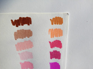
Crayolas 50 Markers- Swatching on Sketchbook Paper

Pens body colors that differ greatly from their swatches


 The packaging has changed over the years, from a reusable plastic sleeve to a box that has plastic inserts to hold the markers in place. I miss the plastic sleeve- it's what I had growing up, and holds up better than the box does with repeated use. The color names aren't marked on the individual markers, but listed on the back of the box, but the markers are staggered, so there isn't a direct correlation between back of box listing and the actual marker lineup. I swatch all my materials (and I recommend you do too!), but even so, this discrepancy is confusing. For your reference and mine, I swatched the entire first row first, then the entire second row.
There are some MAJOR discrepencies between cap and color, let alone marker color and shown color on the back of the box. The difference isn't so bad with the true reds and oranges, but the difference is HUGE with the purples and pinks.
According to my mom, who's helping me with some of these tests, and has used the Crayolas for years, some markers vary in actual color between sets. The variation is slight, but if color consistency is important, you should be very careful with these markers, and make sure you swatch every batch. This color consistency between sets is an issue should your marker run out mid-way through coloring something, and you switch to a fresh one that has an entire different shade within the barrel, despite the cap and post being the same color as the original.
Swatching on Pacon Marker Paper

Swatch a little better on the Pacon paper- less absorbent, so the markers seem juicier and more vibrant. May be able to blend on this paper.
Blending still not possible, even on marker paper, which starts to pill if I try. Would I be able to blend if I used a Tombow ABT or Kuretake Blender? These are also waterbased markers.
Attempts to Blend on Marker Paper


There's no flex to the nib, which SHOULDN'T be surprising, but dang it, I'm spoiled now. They are indeed capable of both fine and fat lineweights.
CraZArt Markers- 64 Markers- Swatching
Swatching on Sketchbook Paper

And finally, we hit the inevitable dry marker in a set of brand new markers.

 I'm testing these with the generosity of my mom, who bought the pack for herself to see if she liked them, and agreed to let me include them in this test. These are not included in the price breakdown shown in my introduction post.
The box these came in are awful- they were mixed up at time of purchase, and refuse to stay organized. This is because the plastic holder insider the box is very shallow, so the markers tend to fall out of it. You can't remove colors without them getting out of line. Holy smokes, testing these will drive me absolutely nuts.
Although these were tested the day they were purchased, they already feel dry and muddy. In fact, one of these markers was totally dry. The markers, in general, feel fairly scratchy when applying color to paper. If you've purchased markers that turned out to be dry, you can reconstitute them fairly easily by following this tutorial.
The color listed on the barrel does not match the color of the actual marker, nor does the barrel or cap reflect the hue inside. There are also not enough differences between colors in some markers, especially in the browns.
Wider variety of grays in this set- four grays: a light blue gray, a dark blue gray, a greenish (when dry) gray, and black gray, which is very similar to the black marker included.
Swatching on Pacon Marker Paper


Also seem juicier on the marker paper, since it isn't immediately absorbed. The dry marker is still dry though, and leaves a mark that reflects this. The flaws in the marker packaging makes these really annoying to swatch.
I realize that most people won't be using these markers to make serious illustrations, but knowing how many teenagers have limited funds, I wanted to see how these markers could be used for more than coloring pages. Below are a couple Field Tests for the Crayola Supertip markers. This is no means a definitive list of ways they can be used, it's simply meant to give you a starting point and some inspiration.
The Field Test (Crayola)
So CAN waterbased markers be used like watercolor markers? Can Crayola waterbased markers be used as a decent replacement for watercolor markers? I'm going to use some Langston Prestige watercolor paper to find out.
Faux Watercolor Marker Swatch Test
I used a natural hair brush (a Blick Master sable, I believe) with a cup of clean water for these swatch tests.


 These markers blend decently on watercolor paper. Blended with a Tombow ABT colorless blender
These markers perform surprisingly well as watercolor brushes, comparable to brands that sell their markers at $1 a pop, rather than 50 for $7. The only colors that seperated out are the purples and one brown, so these already perform better than the Akashiya Sai watercolor brush pens.
Ink Compatibility Test
Practical Test- As Watercolor Markers

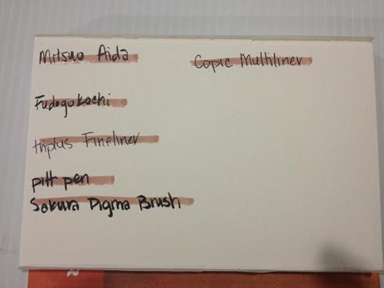
This test was inked on Fabriano watercolor paper with a waterproof Mitsuo Aida, and the ink was allowed to dry overnight before progress continued.

I'm going to use the Royal Langnickel brush set from Walmart to paint this test.


As these markers aren't labelled with a name or identification number, it's important to keep your swatches nearby for reference.


For a watercolor application, the included peach works fine as a skintone, if heavily diluted.


Direct application with the marker is fine, but make sure the paper is fully dry before you add more layers, as the stiff Supertip can cause damage to wet watercolor paper fibers.


For the most part, I relied on the palette I made out of masking tape for color application. As with my watercolor marker reviews, such as Tombow ABT, Zig Graphic and Art Twin, or Marvy LePlume II, one applies the ink to the palette, and mixes in water using a clean brush.

Can be blended with water on a masking tape palette, or can be directly applied to the paper and blended out with water. These actually blend better than A LOT of the watercolor markers/brushpens I've tested, like the Tombow ABT's or the Akashiya Sai. These also handle layering impressively well.
As stated, you can apply directly to the paper and blend out, but be careful, as the nib can abrade wet paper fibers.
As Waterbased Markers on Pacon Paper- As though They Were Copics

The peach that's included with the Crayola Supertip 50 pack is awful- it's too dark and flourescent to be useful as a skintone. I can't find the Multicultural pack in Supertip, so if I revisit Crayola markers, it will be with a jumbo pack of Multicultural markers in tow. I'm happy that more companies are introducing better options for skintones, I just wish those options weren't add ons. As a kid, the majority of what I drew were figures, so it makes sense that a variety of good skintones would be important to include with any pack. Given how close some of the colors in the 50 color pack are, I can easily see just leaving those duplicates out and including the skintones instead.
Crayolas are not really meant to be used on marker paper, it seems. Streaking is really bad, and the old technique of small, scribbled circles that works so well for streak free coloring with alcohol based markers is completely useless here. Saturating the paper to avoid streaking is also not a great option, as the paper is already showing stress from a single application. Your layering with Crayolas (probably most waterbased markers) is pretty limited, and should be planned ahead of time.


Given how dark the skintone is already, adding blush is pretty impossible. Retrospectively, I think I probably could have used this very light shell pink as a skintone, I think it would've worked out better than the included peach.


If you're coloring a large space that includes a lot of small details, you may find it difficult to use the Crayola Supertip markers if you're used to larger alcohol based markers. The issues are twofold- the nib is small, the widest mark you can make is still very small compared to the marks you could make with a Japanese brush nib, and the barrel of the marker is smaller than the barrels of most alcohol based markers. This small barrel caused even my little hand to cramp from clenching to marker for too long.

Coloring Kara's hair was probably the easiest part, as streaking isn't an issue if you color with the grain of the hair, and leaving a highlight was very easy to do.


The hot peach skin isn't so noticable if you're using dark colors for everything else, but it still bothers me. Crayola Supertips are fine for flat color, and you can occasionally add an additional layer of color, but if you would prefer delicate, very rendered pieces with lots of layers, I recommend the watercolor marker technique outlined earlier in the post.
The peach is awful for a skintone- it's much too intense and fluorescent, Crayola could consider introducing an off white peach as a Caucasion skintone (I know how ridiculous it is to whine about Crayola not including Caucasion skintones, I apologize). Maybe I'll have to buy the skintone set and see if it's any better, but I'm pretty sure that's only available in the jumbo markers. After watching this fantastic video by edalineeilynd on using Crayolas to color in a manga style, I can't wait to get my hands on some skintone markers and try out her techniques!
Crayolas are NOT alcohol based markers, and can't really be used the way you would use alcohol based markers. Alcohol based markers have a binder(alcohol) that immediately evaporates, so they can be layered immediately. Crayola WATERbased markers use water as a binder, and that takes awhile to dry. If you try to apply another layer too soon, the paper will start to pill.
If you're interested in cheap alcohol based markers, check out my review section in the tabs above. In the upcoming weeks, I plan to test out Bic's Mark It's that I've ordered from Amazon (they arrive Sept 1st, so it's going to take awhile) as I've been informed by numerous reputable sources that they can be used as an alcohol based marker replacement/supplement. While these aren't part of the Walmart Art Supply Review series, as I didn't buy them at my Luling Walmart, these markers are easy to find.
The Verdict
I have so much respect for people who can actually bend Crayola markers to their will. You guys are true masters of art and making it work. If any of you art supply-benders are in my audience, please drop me a line, so I can show off yall's hard work at the bottom of this piece.
Regardless of brand, I ALWAYS think there could be a wider variety in skintones.
These markers are all so different from their cap colors that I highly recommend you take some sticker paper labels, make a dot of the color on the label, cut it out, and apply it to your marker, so you know what the true color looks like.
Did you find this post useful? Did you enjoy it? How about sharing it with friends on Facebook, or Tweeting it to your followers? The links above the post make sharing SUPER easy- you don't even have to leave the page! If you really liked this post, or any of my posts, how about sending me a tip via Paypal using the handy donation link in the sidebar, or writing me an email? It would definitely make my day!
Please consider donating to this blog or purchasing from Natto-shop (http://nattosoup.com/shop) if you want me to continue publishing quality content. All materials tested were purchased from my own pocket. Keep on Truckin' Nattosoup is not under any sponsorship.
This wouldn't be the first time I played around with waterbased markers. Many watercolor markers are basically waterbased markers- same binder (water), similar dyes, similar dispersion method, different tip options. Most of us have used waterbased markers since we were wee little kids, and part of the reason Crayola touts supreme washability is that many kids, myself included, may have decked the halls of our home in Crayola scribbles, applied directly to wallpaper.
Once you leave childhood you may find it difficult to achieve desired affects with the waterbased markers you have easy access to. Waterbased markers cause streaking, and paper pilling, and its rare to hear that waterbased markers such as Crayola or CraZArt markers are the marker of choice for any professional or serious hobbyist artist. I hoped to find a place in the artist's arsenal for these maligned markers, as they're the first marker most young artists have any experience with, and often they're the first one they can afford.
I briefly explored the history of Crayola in my Crayola Washable Watercolors review, so I suppose I ought to explore CraZArt. These markers are not mine- they're my mother's, but while I'm in Luling she's graciously allowed me to swatch them and give preliminary opinions.
Cra-Z-Art is a company that focuses on a variety of creativity boosting toys and activities, including superlooms, knitting kits, an ice cream maker, and lots of art supplies. They hold the license for the retro Snoopy shaved ice machine, the Crystal Surprise Pets, and Magrific, a magnetic building set.
Originally known as RoseArt, Cra-Z-Art boasts a history spanning back to the 1920's, and they appear to proudly do a little of everything.
If you're interested in either Crayola markers, Cra-Z-Art markers, or helping to financially support this blog so I may continue to do reviews, please considering purchasing your own set of markers through my affiliate links, or consider donating a tip to my Paypal, linked on the sidebar.
Crayola Affiliate Search Link
Cra-Z-Art Affiliate Search Link
Crayola Markers Versus CraZArt Markers
I had these Crayola markers as a teen, but I was never very good at using them. I've seen some artists really put them to good use online, and while I HOPE I've improved, I seriously doubt I'll be as good as someone who'se continued to use these markers for years.
Crayola-Packaging


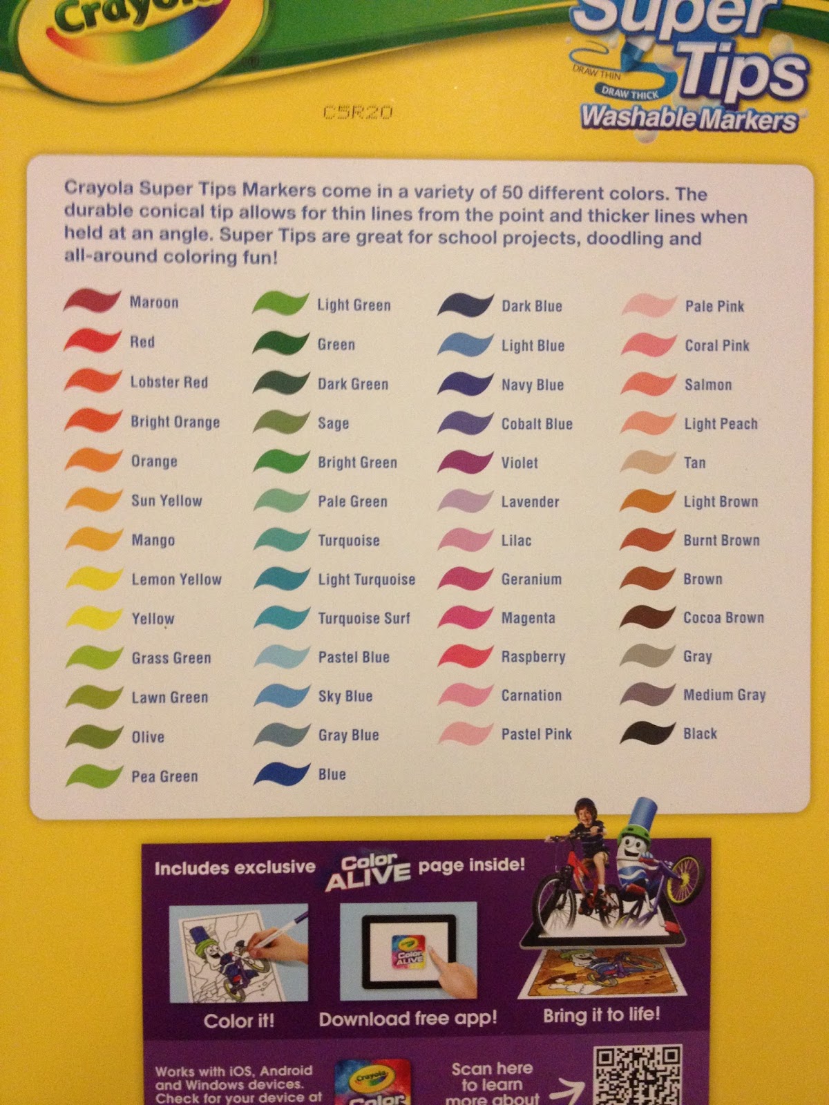
The back of the box lists the names of the colors, but these are not printed on the bodies of the individual markers. This makes it difficult to swatch colors, unless you intend to keep your markers in the same order you swatched. The package, a plain cardboard box, is a little lackluster compared to the reusable plastic sleeves these markers used to come in.
Cra-Z-Art Packaging
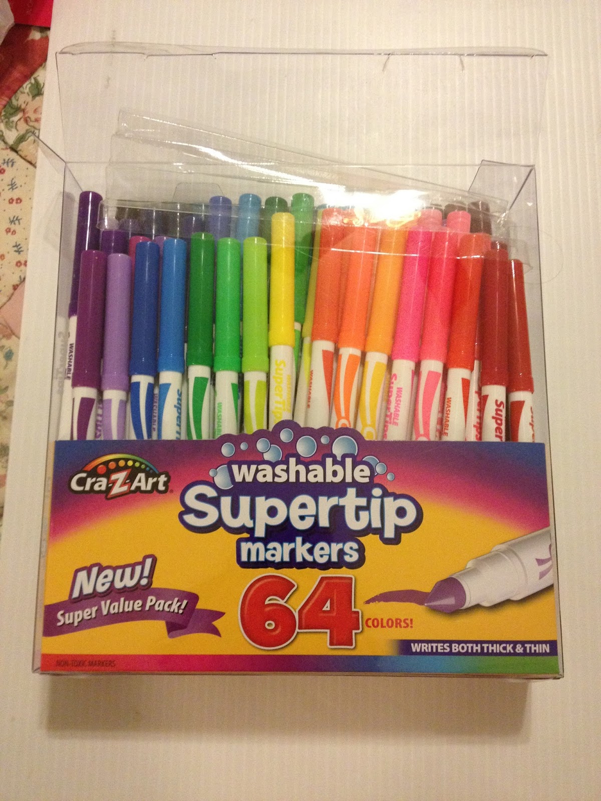
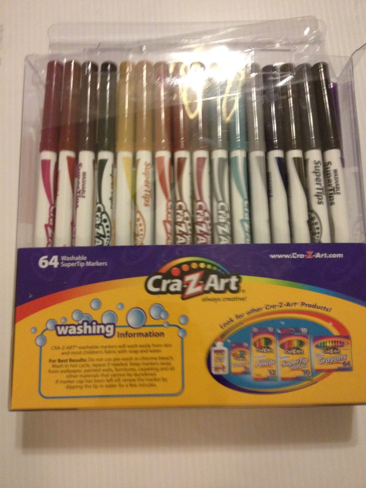
As bad as the Crayola's cardboard box is, travel-wise, the Cra-Z-Art (a reincarnation of RoseArt?) markers come in even worse packaging. The plastic box is flimsy and the corners are sharp, it woudln't be hard to give yourself an accidental plastic-cut if you mishandled or dropped the box. The markers don't want to stay in place either, because they're held in place by very shallow trays.
Crayola Markers
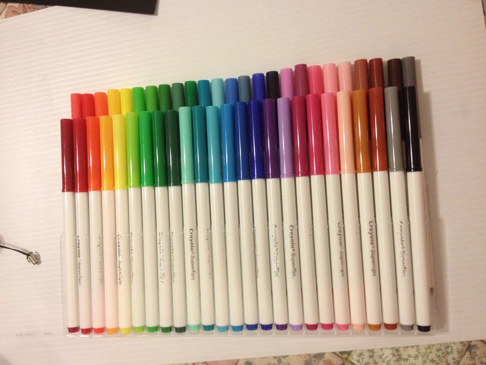
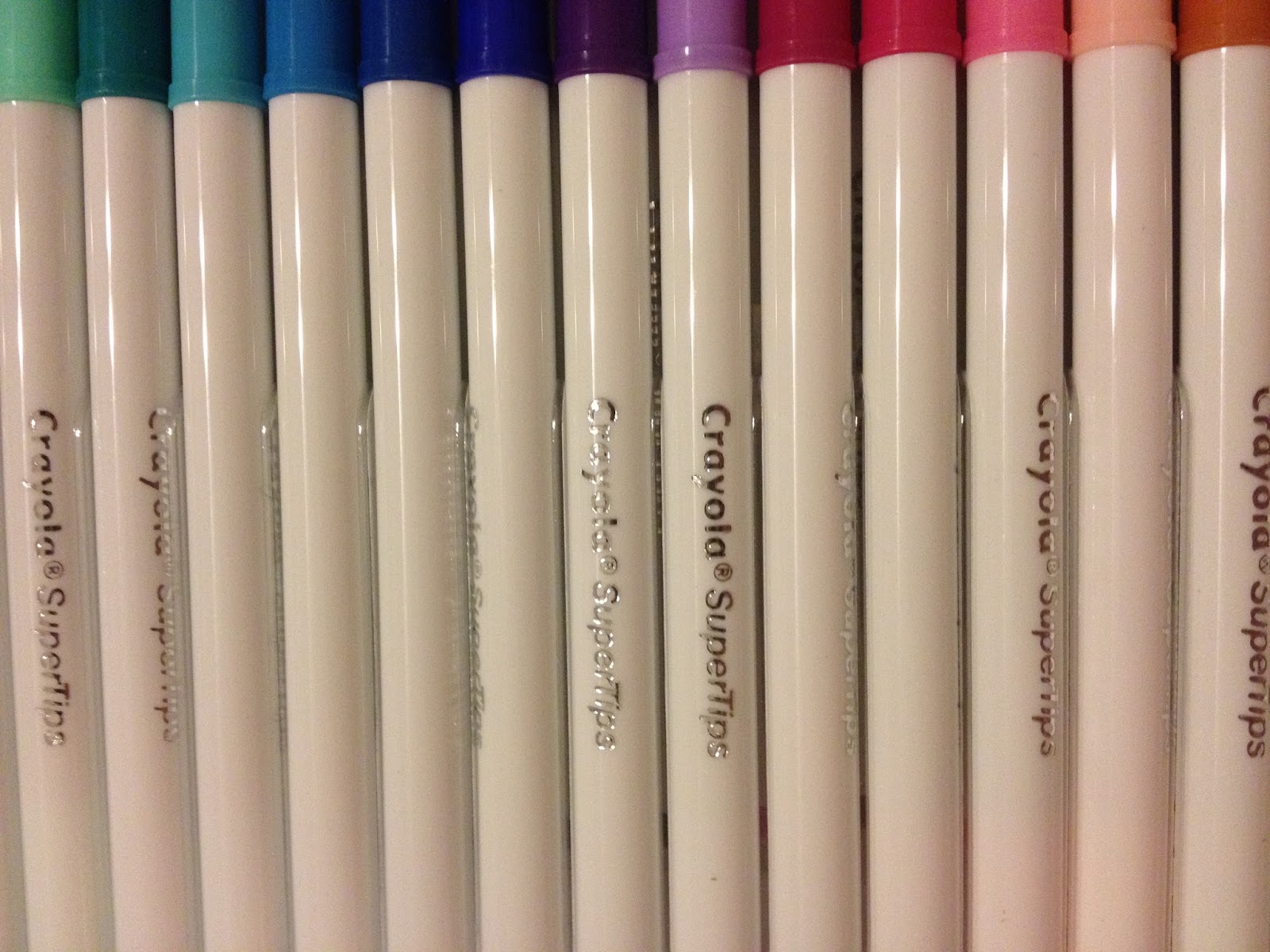
The bodies of the markers are plain white plastic, embossed with a silver Crayola SuperTips stamp. They do not display color name or color information, which would've been useful.
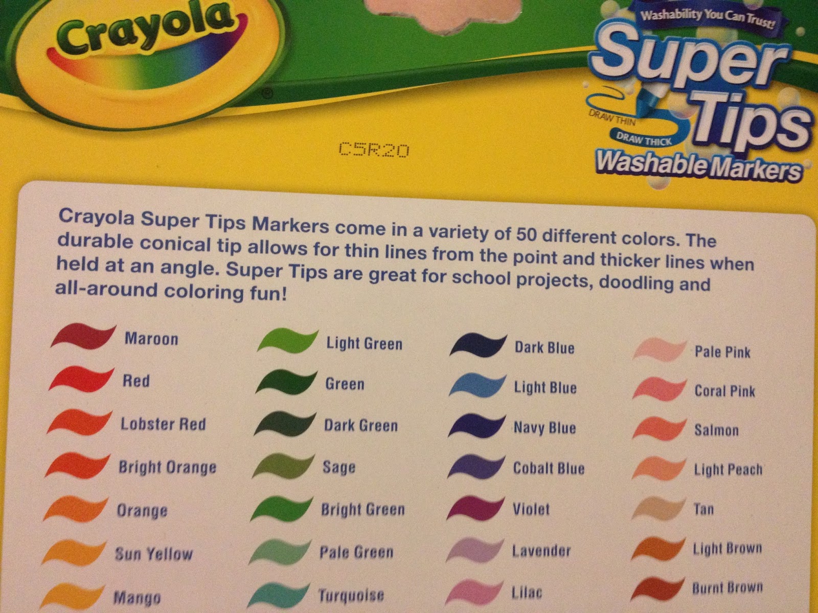
Cra-Z-Art Markers
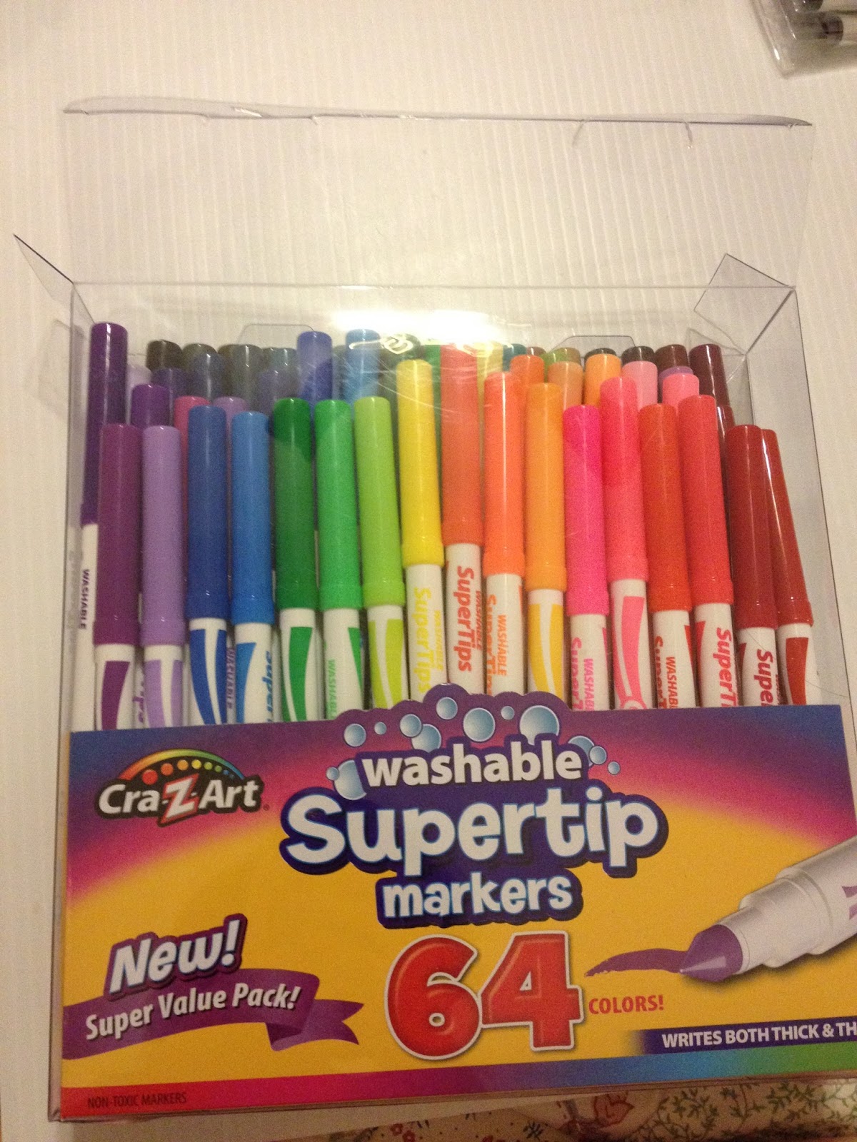
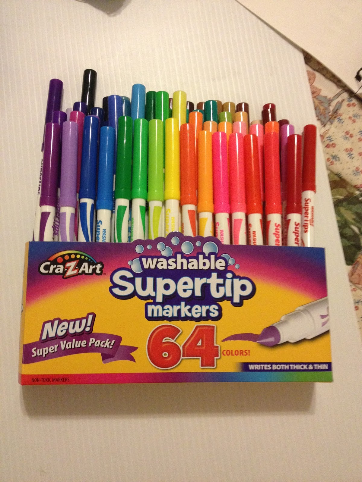
Even attempts to gently unbox these markers results in a disruption in the marker order.
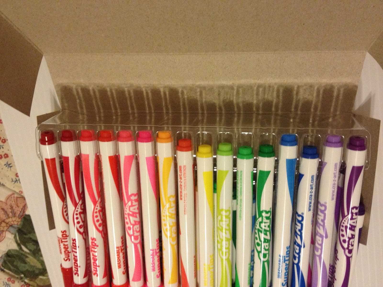
The Cra-Z-Art markers feature bright body graphics and the marker's name, which makes swatching these markers much easier.
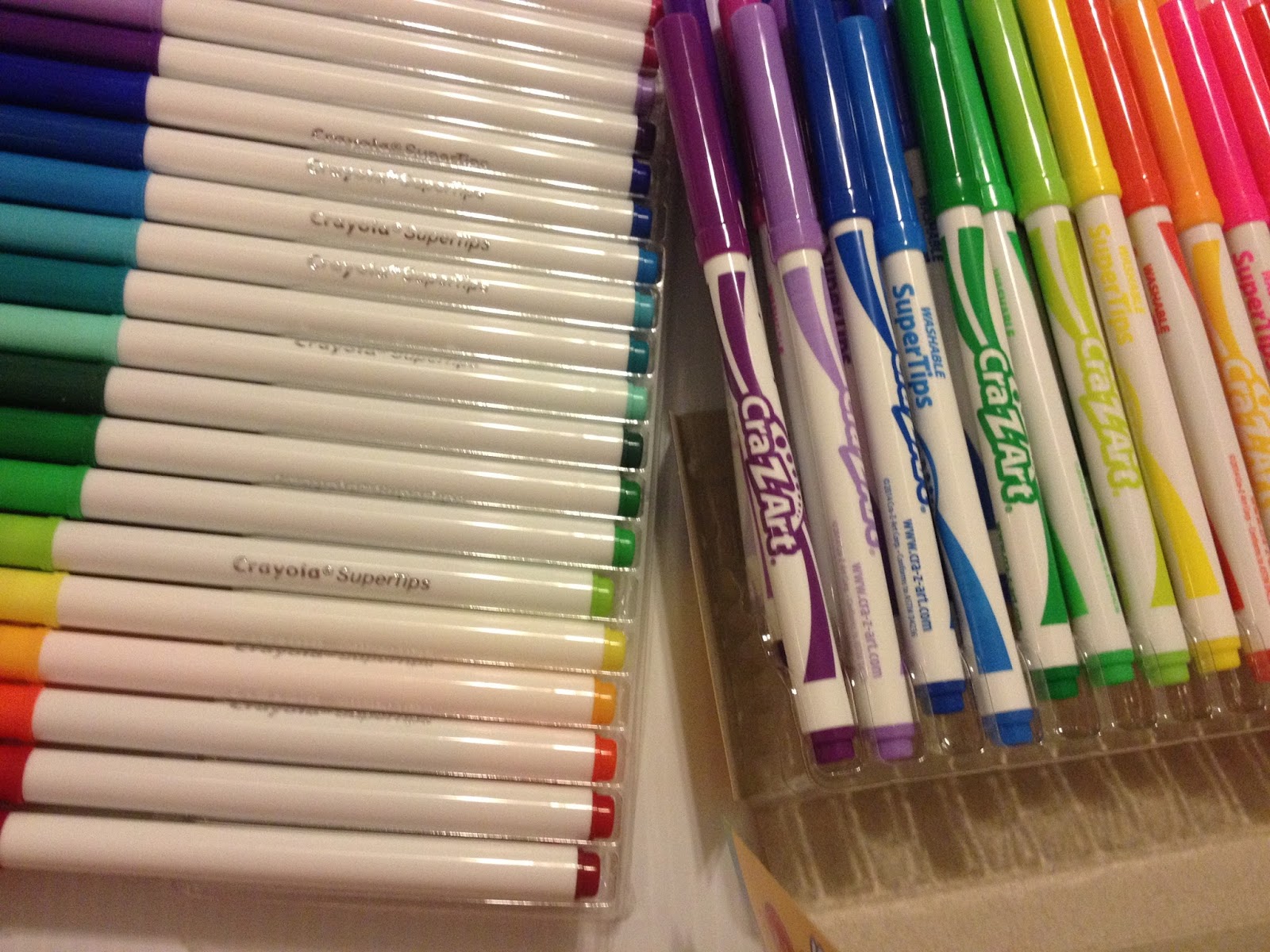
The Crayola markers look like the knockoffs by comparison- generic labeling on the body of the marker, markers don't have the name of the color on the body.
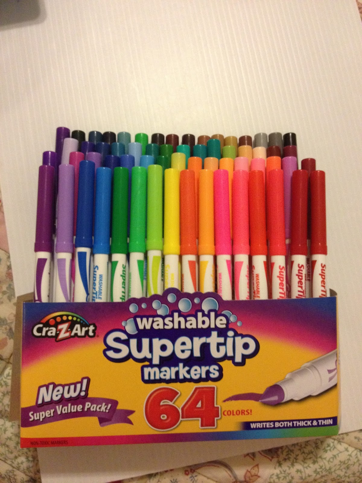
The Markers Side by Side
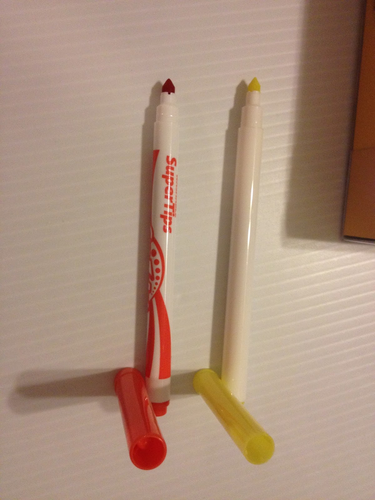 To the left: Cra-Z-Art, to the right, CrayolaOther than superficial body design differences, these markers are pretty much the same. Same size, same generic marker body with a color cap and a color post, same 'Super Tip' that isn't so super compared to Japanese brush tipped markers.
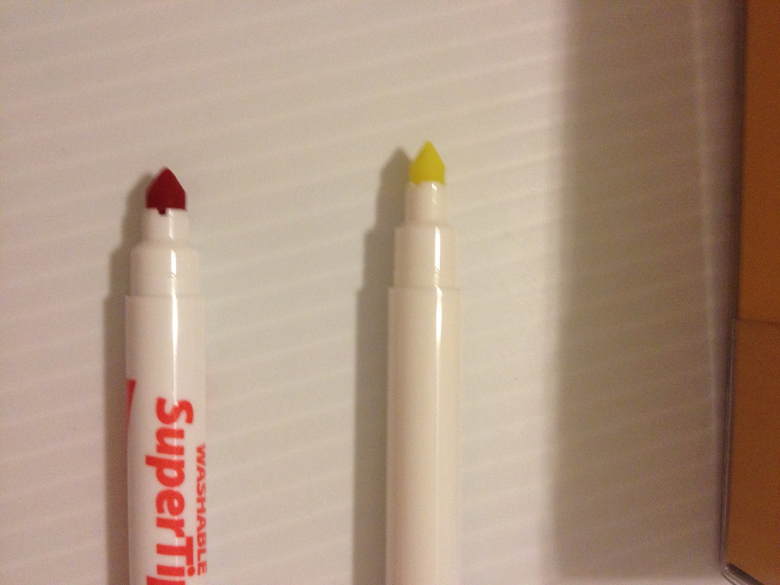
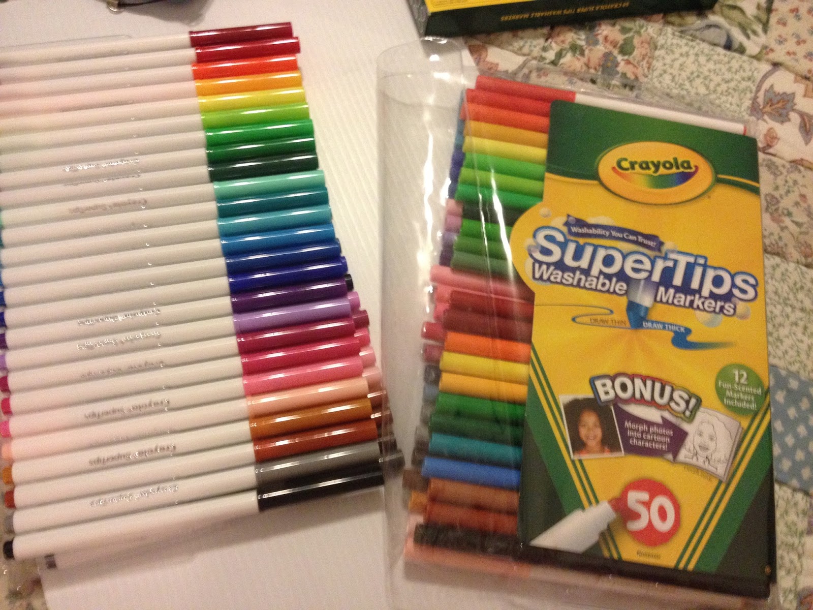 To the left: New Crayola SuperTips purchased for this review. To the right, older Crayola Supertips in the older reusable plastic case.
I'm not sure why Crayola abandoned the plastic envelope case- it does a better job of keeping markers in place, holds up better to wear and tear, and you can better see the markers through it. The older case shown in this review is also unique in that it offers a couple different variations of certain marker colors-one normal, and one unscented. When I purchased a set like this in high school, it was the best of both- 50 entirely different markers, no scented variations, and the reusable plastic case.
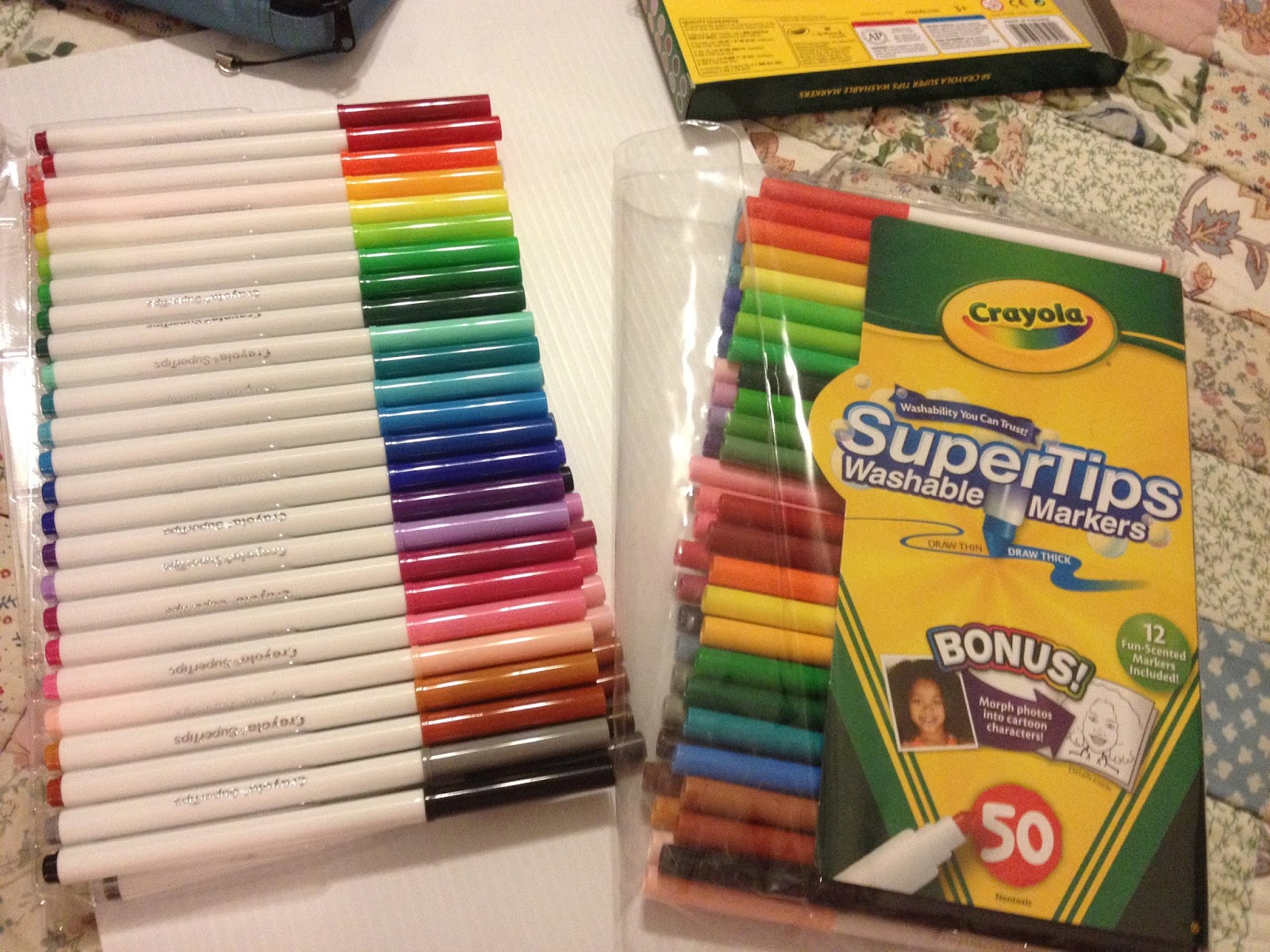
Initial thoughts comparing the two brands:
Note: Tests were made in the UCreate Sketchbook and the Art1st Marker Pad I bought at Walmart, so I am also collecting notes on how these products perform as well.
The Crayolas feel cheaper than they did when I was a teen, but $7 for 50 markers doesn't exactly bode well for professional art quality. Although both packages really tout that supertip, it's not the Japanese super brush I've come to expect with alcohol based markers. The Crayola's body is plain white with gold lettering, while the Cray Z Art markers have decorated bodies that match the marker color and the cap, and this makes the Crayolas look like the knockoff. These markers are basically built along the same lines, and may use the same source for the plastic body.
Crayolas 50 Markers- Swatching on Sketchbook Paper
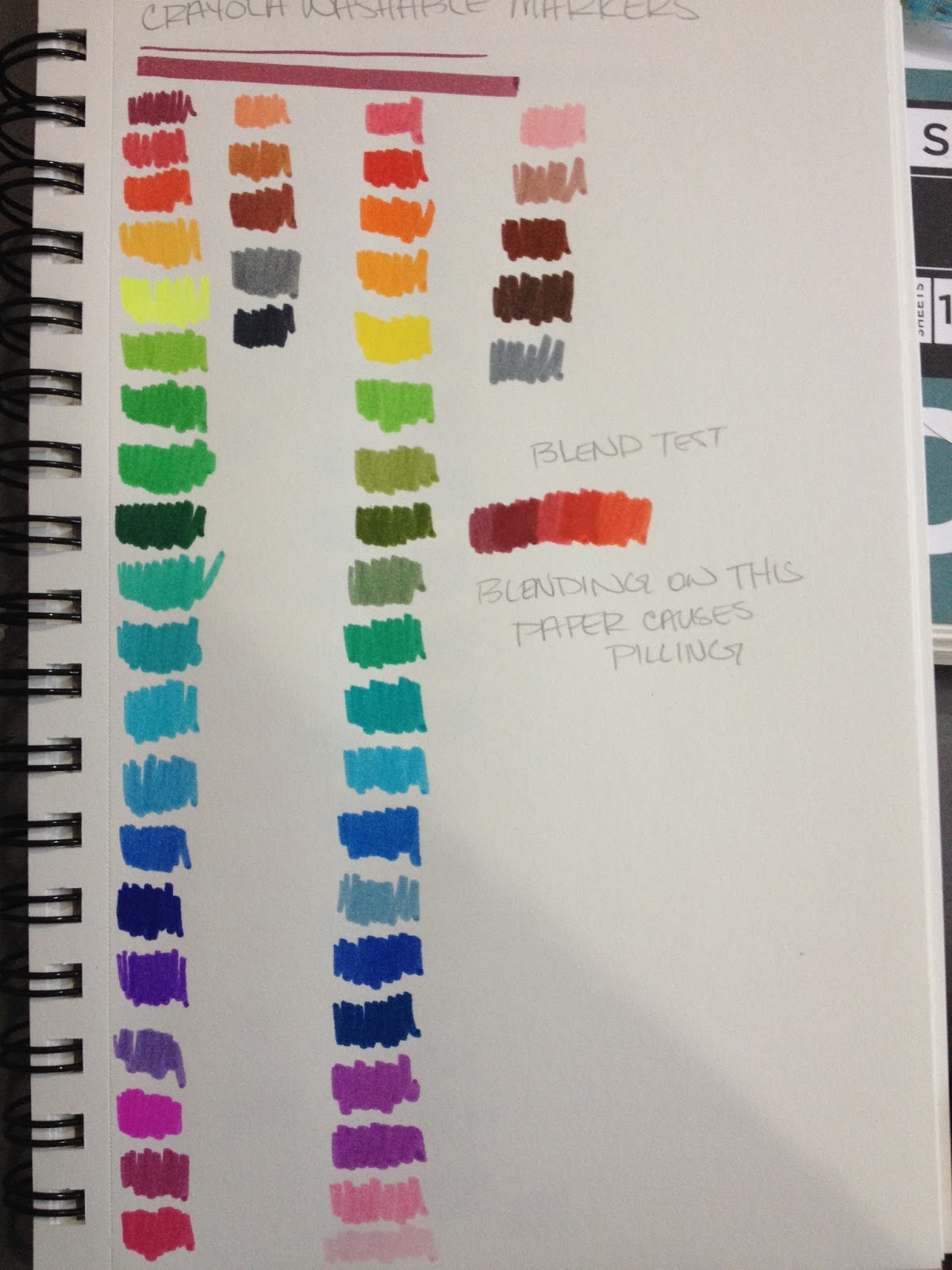
Pens body colors that differ greatly from their swatches
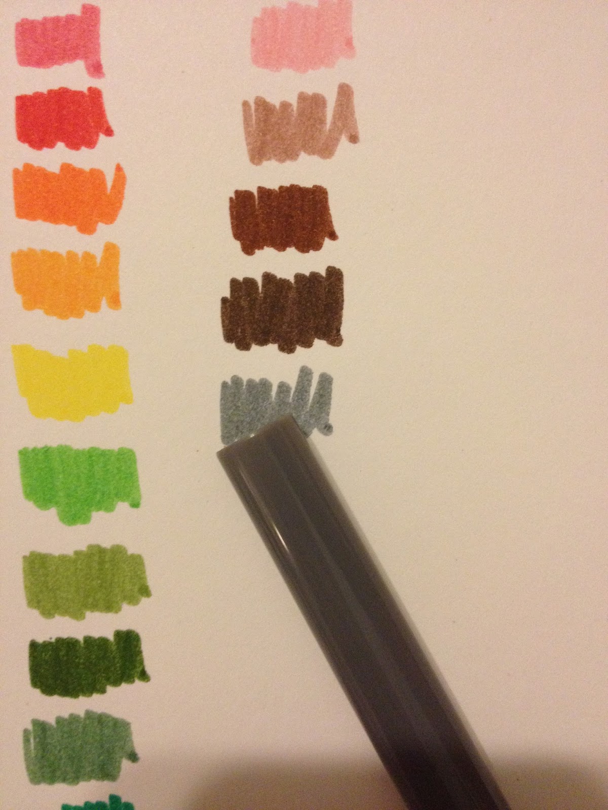
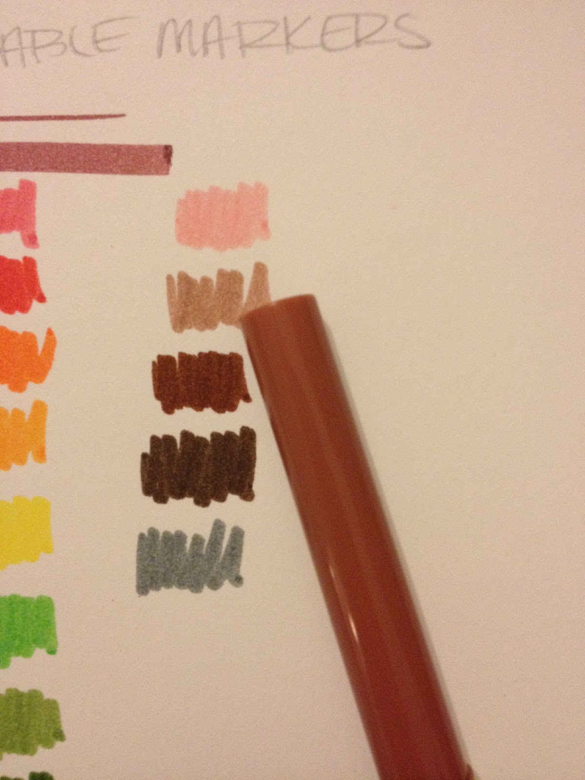
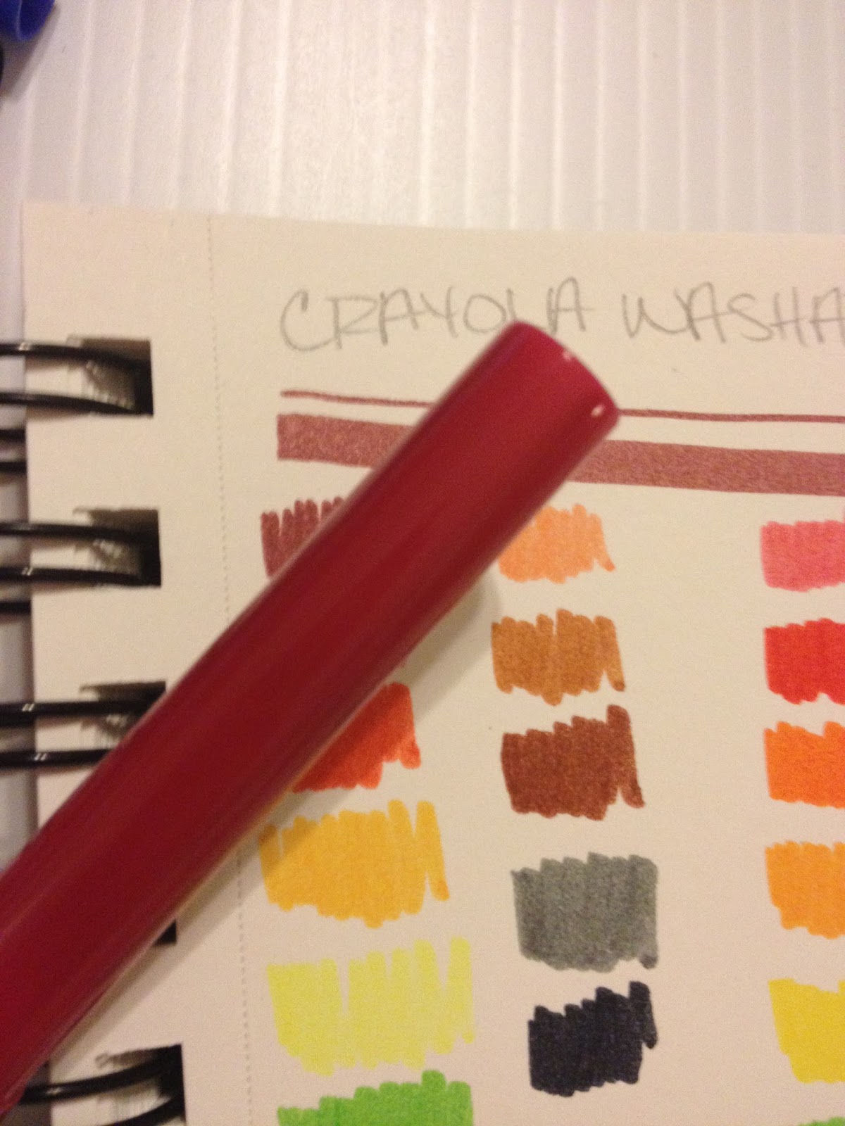
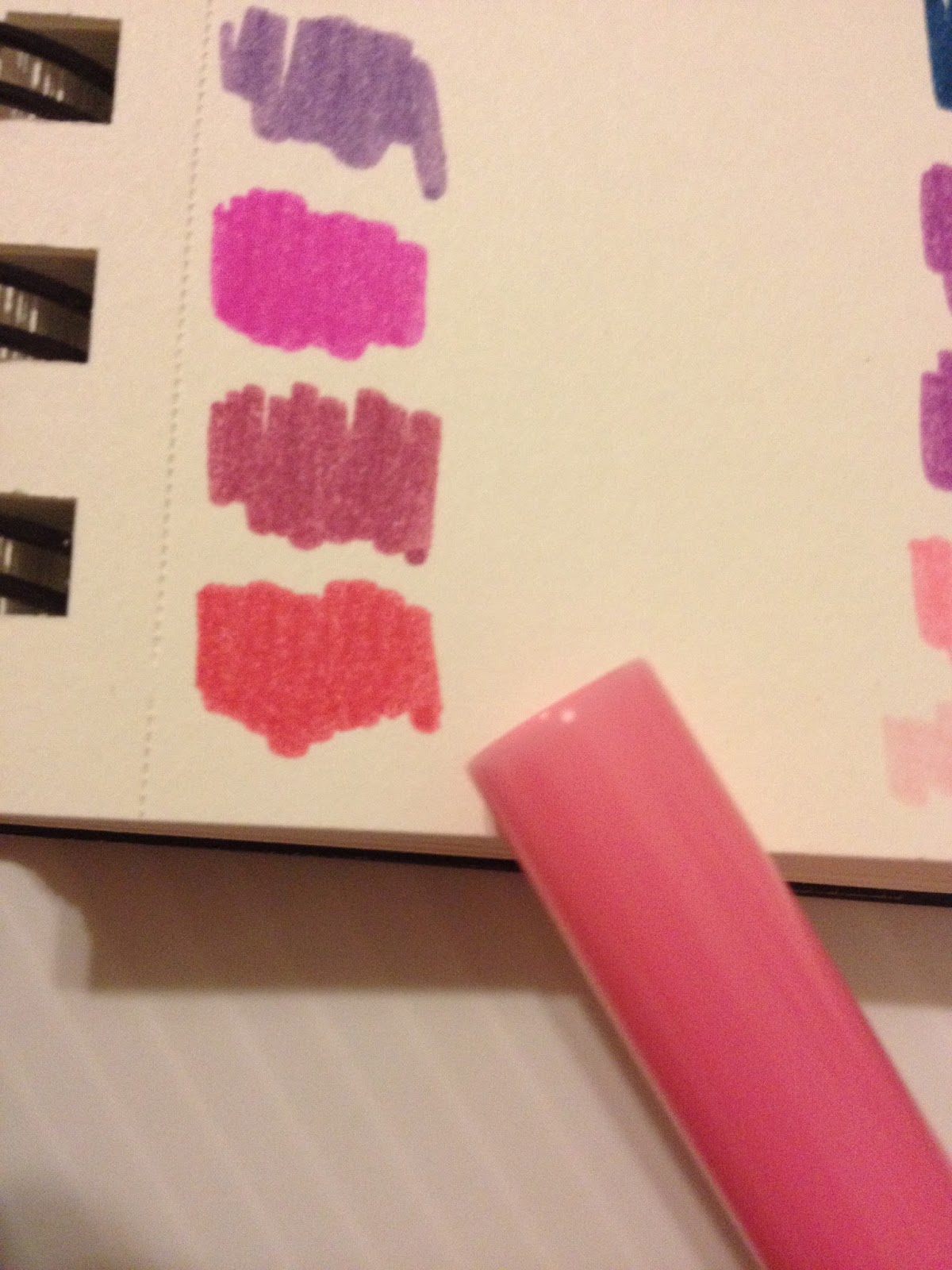

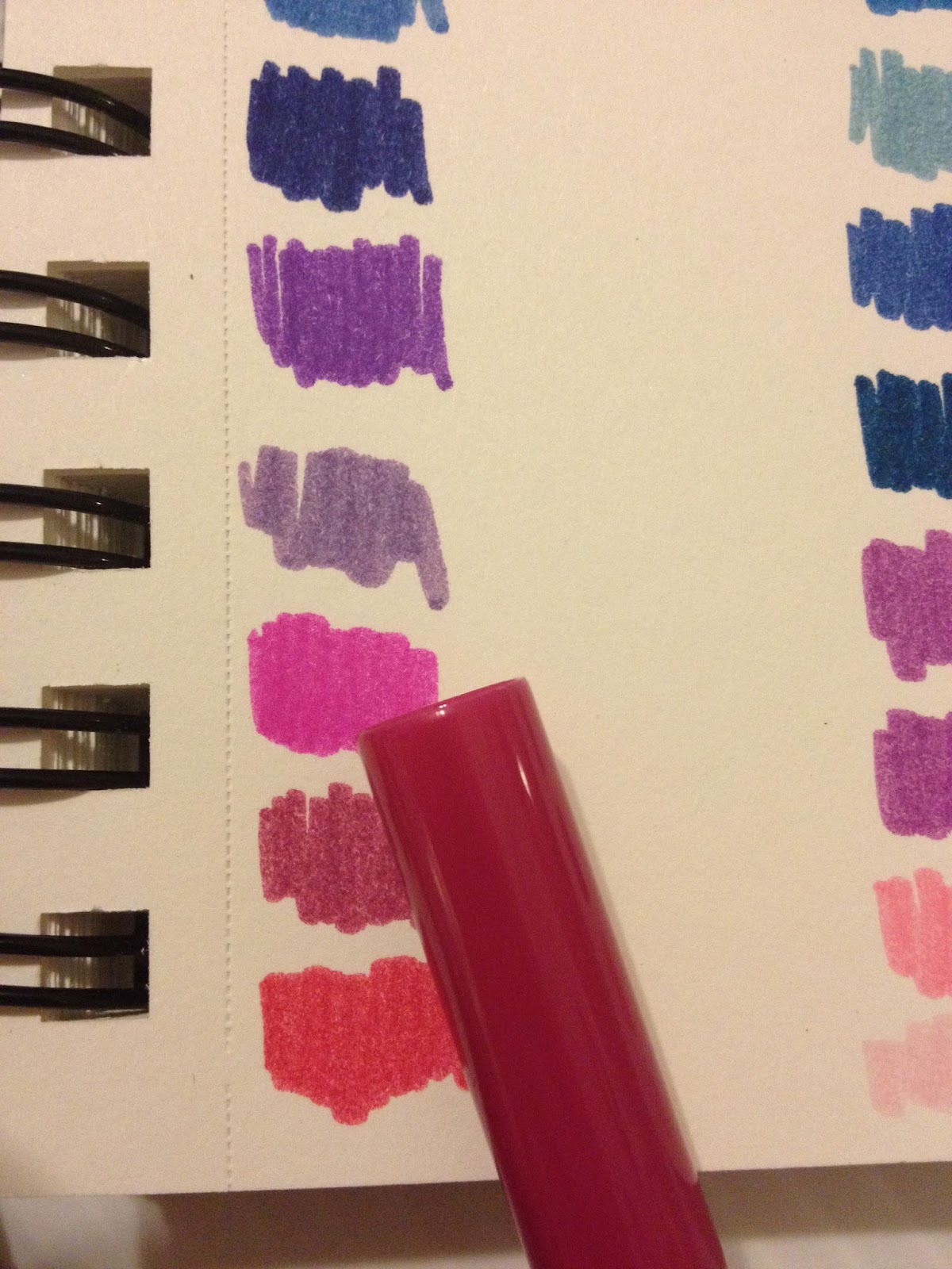
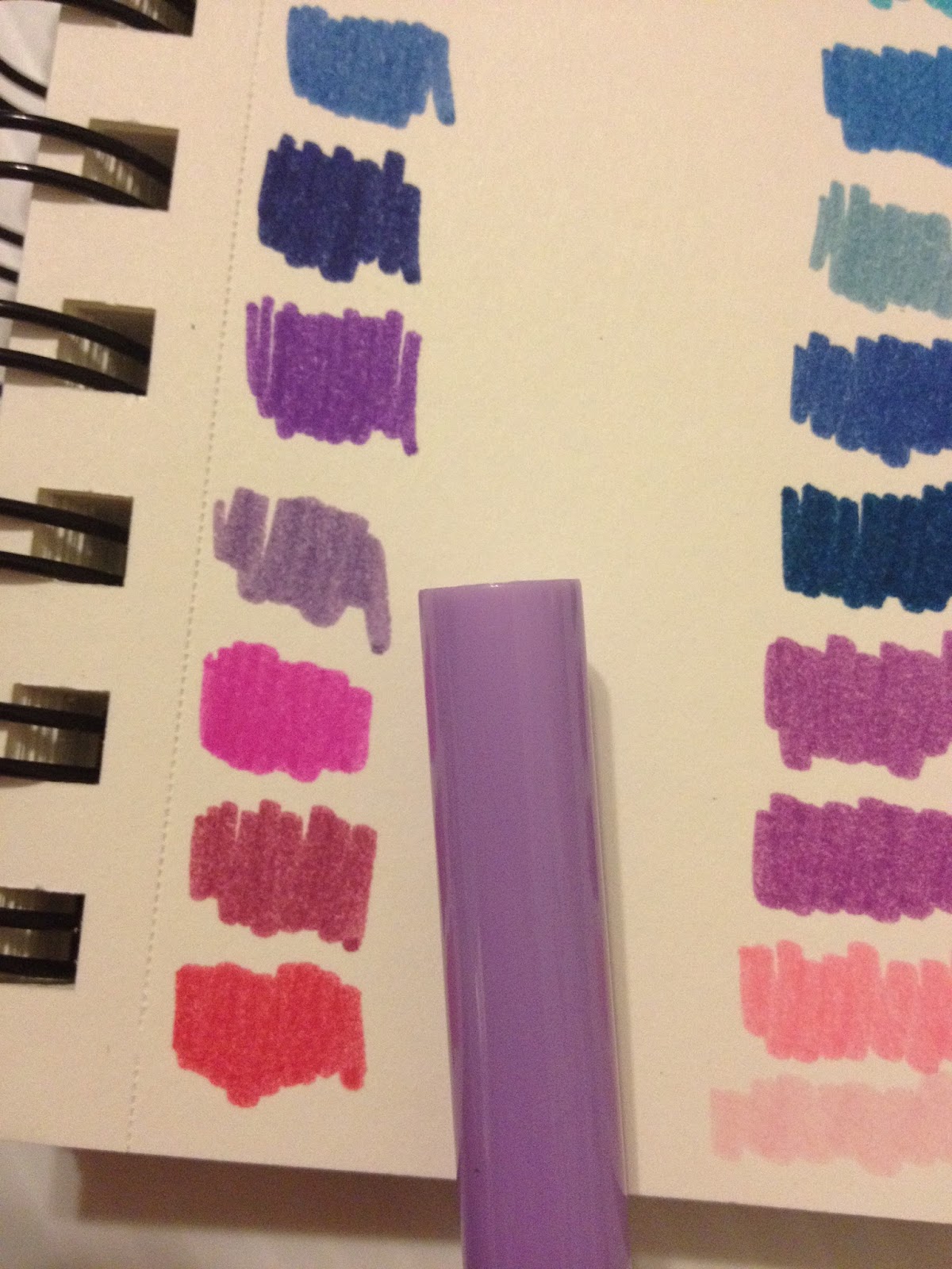 The packaging has changed over the years, from a reusable plastic sleeve to a box that has plastic inserts to hold the markers in place. I miss the plastic sleeve- it's what I had growing up, and holds up better than the box does with repeated use. The color names aren't marked on the individual markers, but listed on the back of the box, but the markers are staggered, so there isn't a direct correlation between back of box listing and the actual marker lineup. I swatch all my materials (and I recommend you do too!), but even so, this discrepancy is confusing. For your reference and mine, I swatched the entire first row first, then the entire second row.
There are some MAJOR discrepencies between cap and color, let alone marker color and shown color on the back of the box. The difference isn't so bad with the true reds and oranges, but the difference is HUGE with the purples and pinks.
According to my mom, who's helping me with some of these tests, and has used the Crayolas for years, some markers vary in actual color between sets. The variation is slight, but if color consistency is important, you should be very careful with these markers, and make sure you swatch every batch. This color consistency between sets is an issue should your marker run out mid-way through coloring something, and you switch to a fresh one that has an entire different shade within the barrel, despite the cap and post being the same color as the original.
Swatching on Pacon Marker Paper
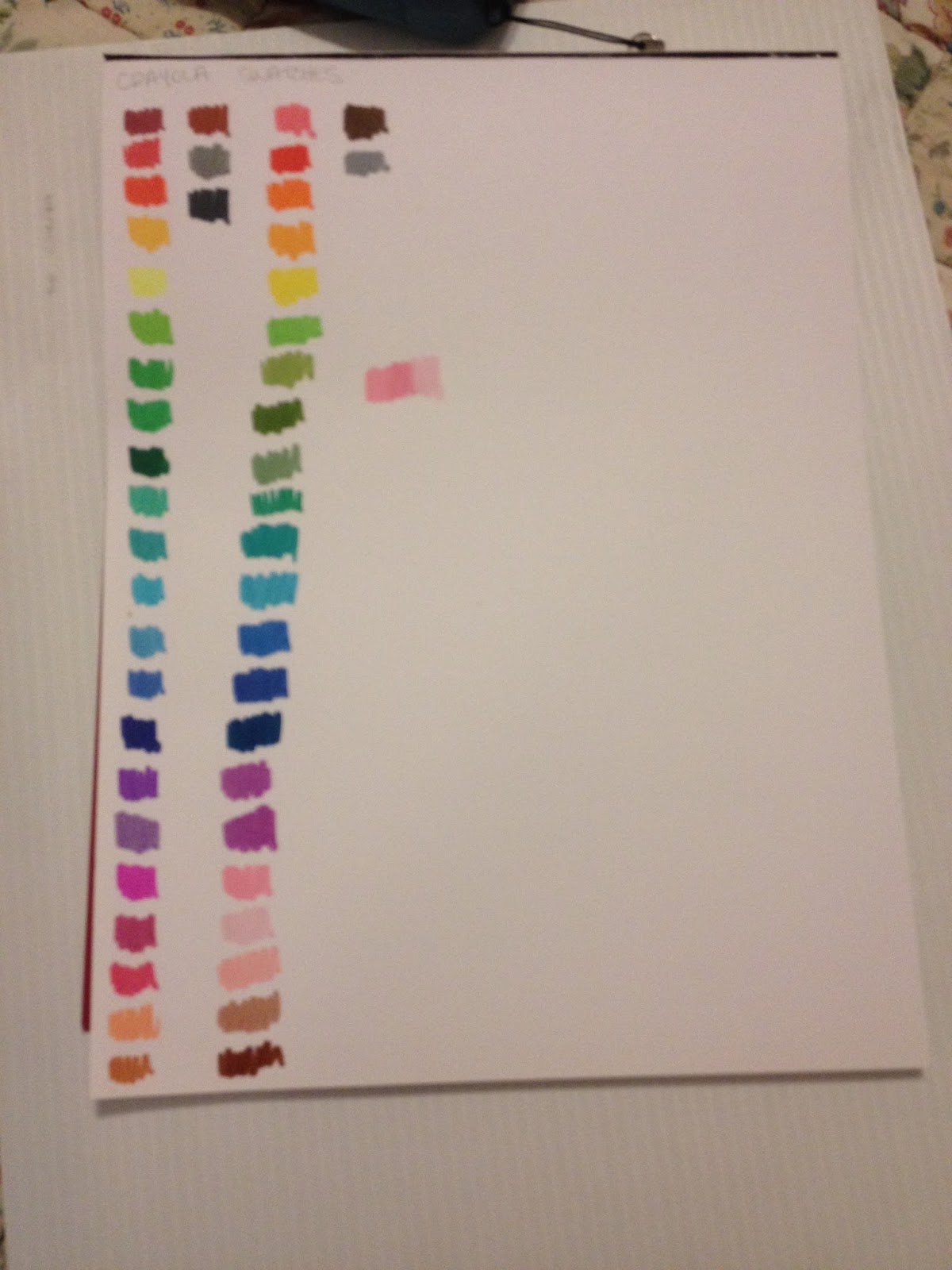
Swatch a little better on the Pacon paper- less absorbent, so the markers seem juicier and more vibrant. May be able to blend on this paper.
Blending still not possible, even on marker paper, which starts to pill if I try. Would I be able to blend if I used a Tombow ABT or Kuretake Blender? These are also waterbased markers.
Attempts to Blend on Marker Paper
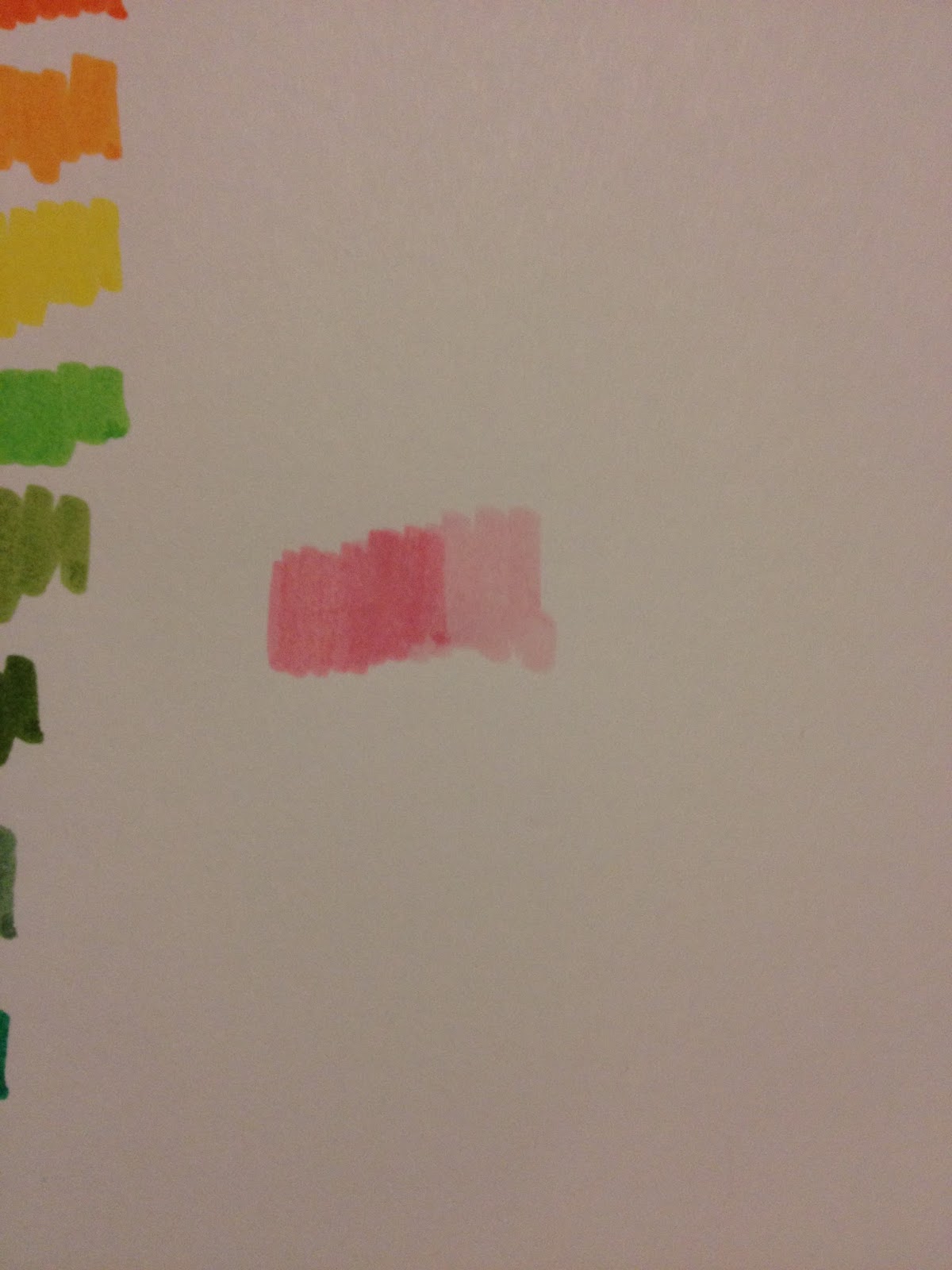
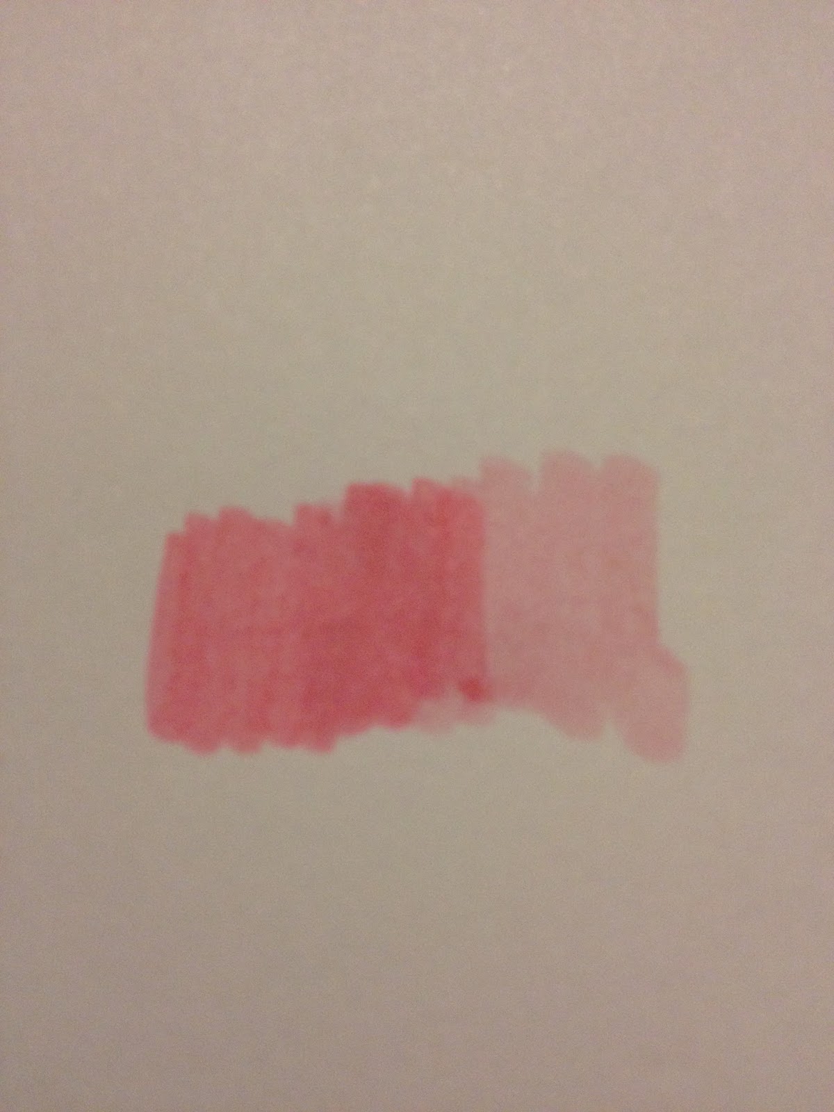
There's no flex to the nib, which SHOULDN'T be surprising, but dang it, I'm spoiled now. They are indeed capable of both fine and fat lineweights.
CraZArt Markers- 64 Markers- Swatching
Swatching on Sketchbook Paper
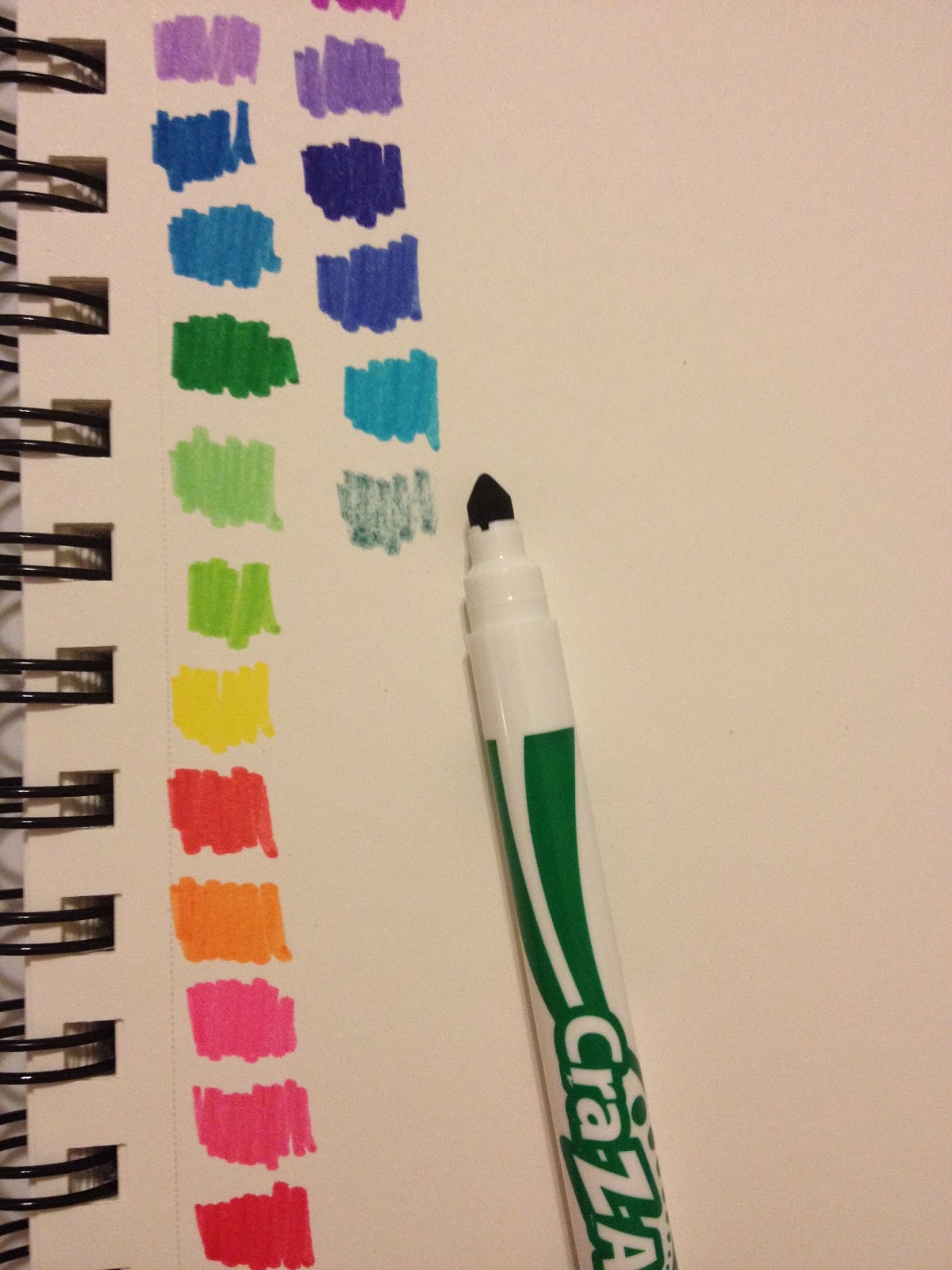
And finally, we hit the inevitable dry marker in a set of brand new markers.
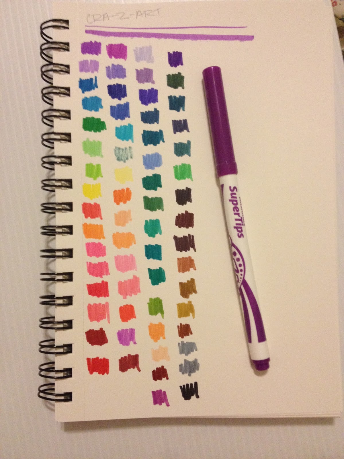
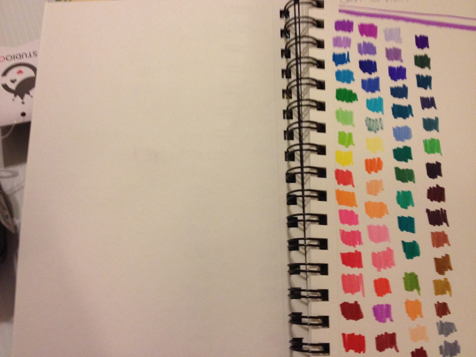 I'm testing these with the generosity of my mom, who bought the pack for herself to see if she liked them, and agreed to let me include them in this test. These are not included in the price breakdown shown in my introduction post.
The box these came in are awful- they were mixed up at time of purchase, and refuse to stay organized. This is because the plastic holder insider the box is very shallow, so the markers tend to fall out of it. You can't remove colors without them getting out of line. Holy smokes, testing these will drive me absolutely nuts.
Although these were tested the day they were purchased, they already feel dry and muddy. In fact, one of these markers was totally dry. The markers, in general, feel fairly scratchy when applying color to paper. If you've purchased markers that turned out to be dry, you can reconstitute them fairly easily by following this tutorial.
The color listed on the barrel does not match the color of the actual marker, nor does the barrel or cap reflect the hue inside. There are also not enough differences between colors in some markers, especially in the browns.
Wider variety of grays in this set- four grays: a light blue gray, a dark blue gray, a greenish (when dry) gray, and black gray, which is very similar to the black marker included.
Swatching on Pacon Marker Paper
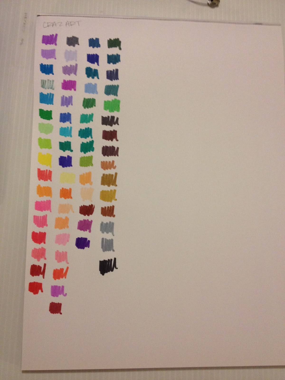
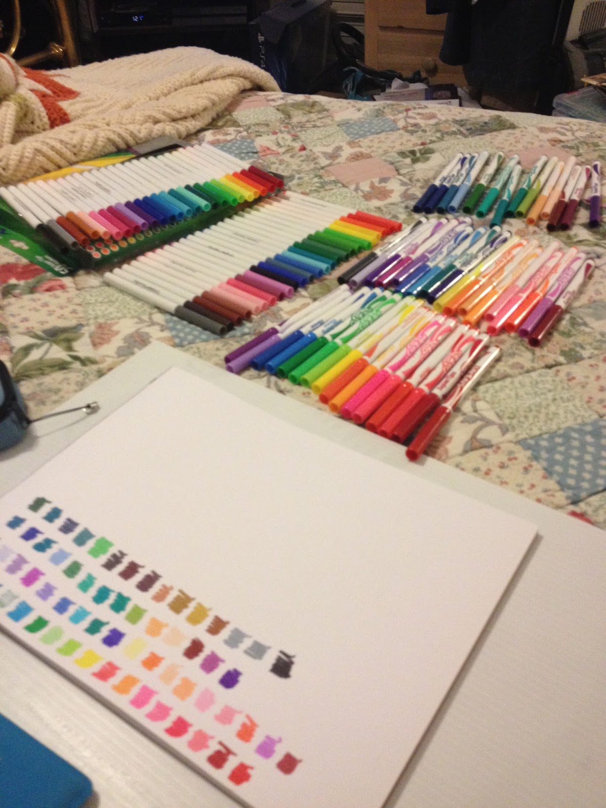
Also seem juicier on the marker paper, since it isn't immediately absorbed. The dry marker is still dry though, and leaves a mark that reflects this. The flaws in the marker packaging makes these really annoying to swatch.
I realize that most people won't be using these markers to make serious illustrations, but knowing how many teenagers have limited funds, I wanted to see how these markers could be used for more than coloring pages. Below are a couple Field Tests for the Crayola Supertip markers. This is no means a definitive list of ways they can be used, it's simply meant to give you a starting point and some inspiration.
The Field Test (Crayola)
So CAN waterbased markers be used like watercolor markers? Can Crayola waterbased markers be used as a decent replacement for watercolor markers? I'm going to use some Langston Prestige watercolor paper to find out.
Faux Watercolor Marker Swatch Test
I used a natural hair brush (a Blick Master sable, I believe) with a cup of clean water for these swatch tests.
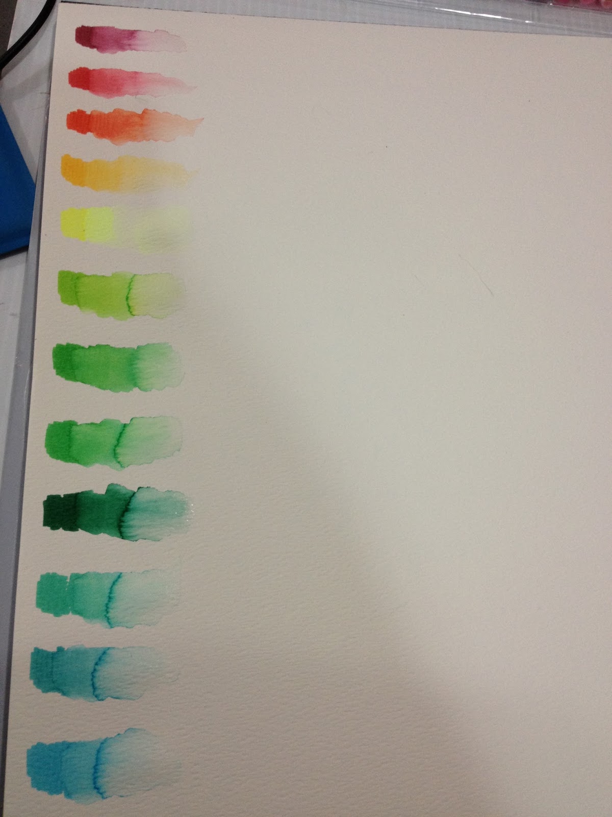
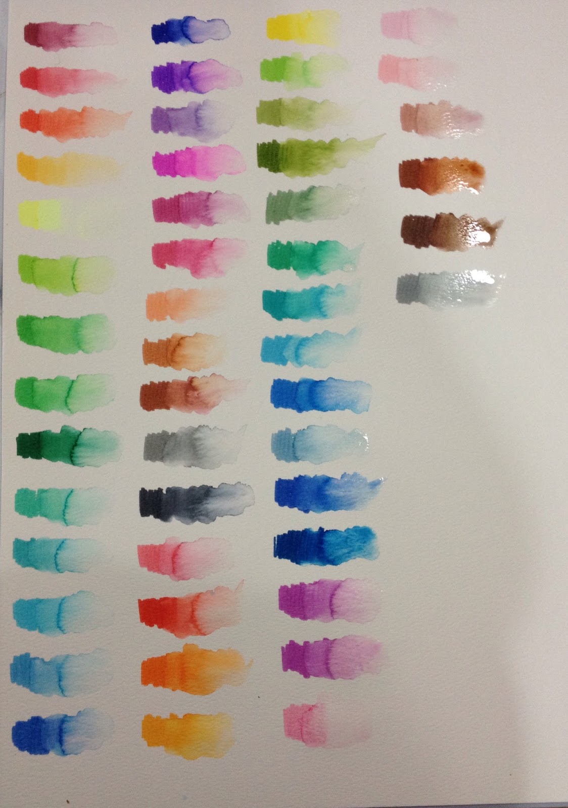
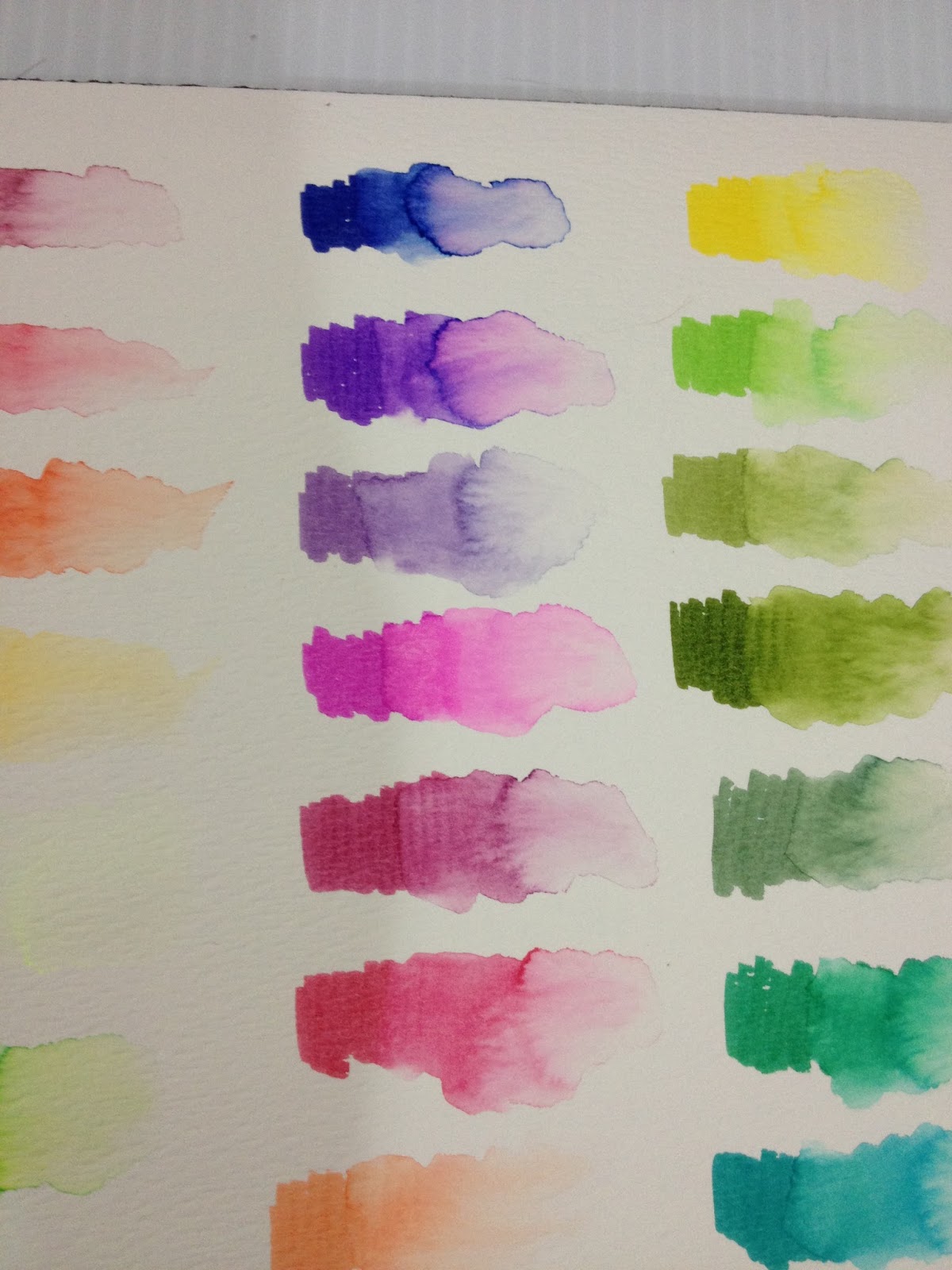
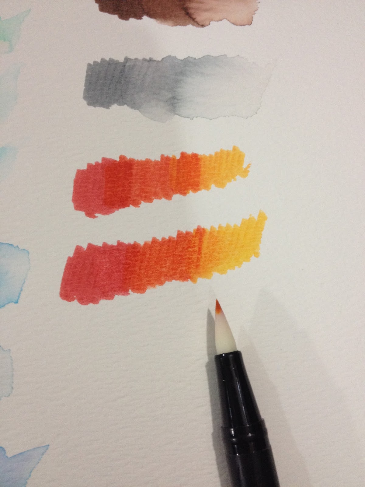 These markers blend decently on watercolor paper. Blended with a Tombow ABT colorless blender
These markers perform surprisingly well as watercolor brushes, comparable to brands that sell their markers at $1 a pop, rather than 50 for $7. The only colors that seperated out are the purples and one brown, so these already perform better than the Akashiya Sai watercolor brush pens.
Ink Compatibility Test

Practical Test- As Watercolor Markers
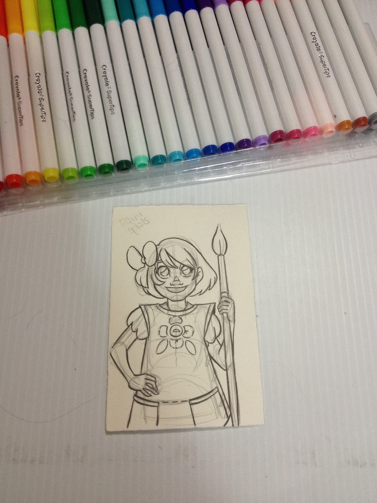
This test was inked on Fabriano watercolor paper with a waterproof Mitsuo Aida, and the ink was allowed to dry overnight before progress continued.

I'm going to use the Royal Langnickel brush set from Walmart to paint this test.
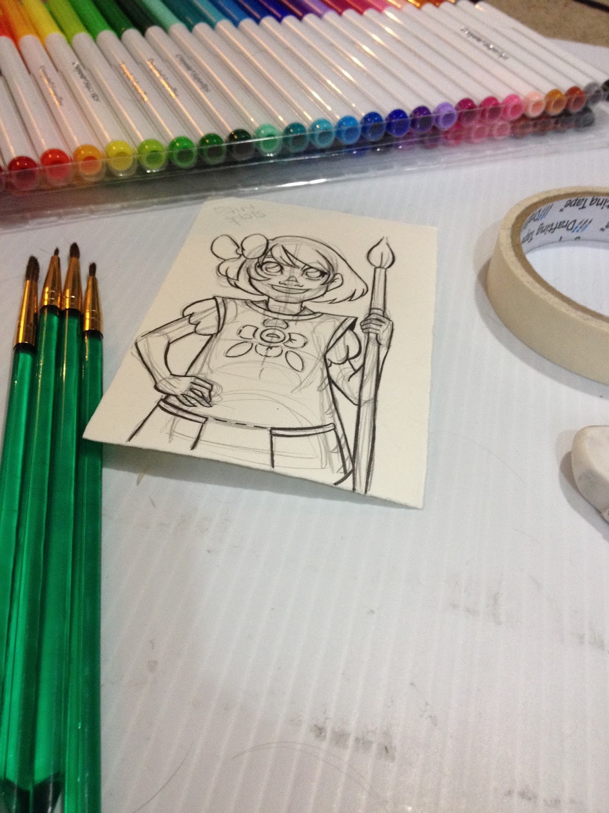
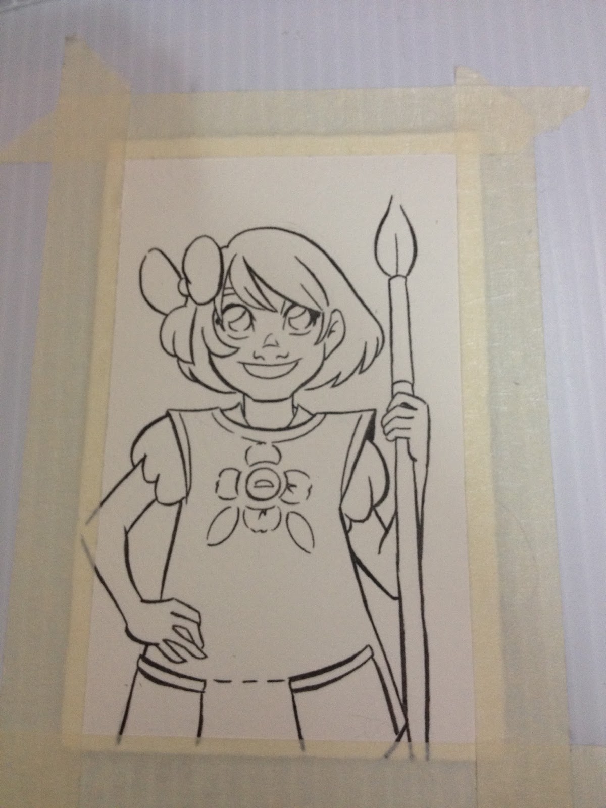
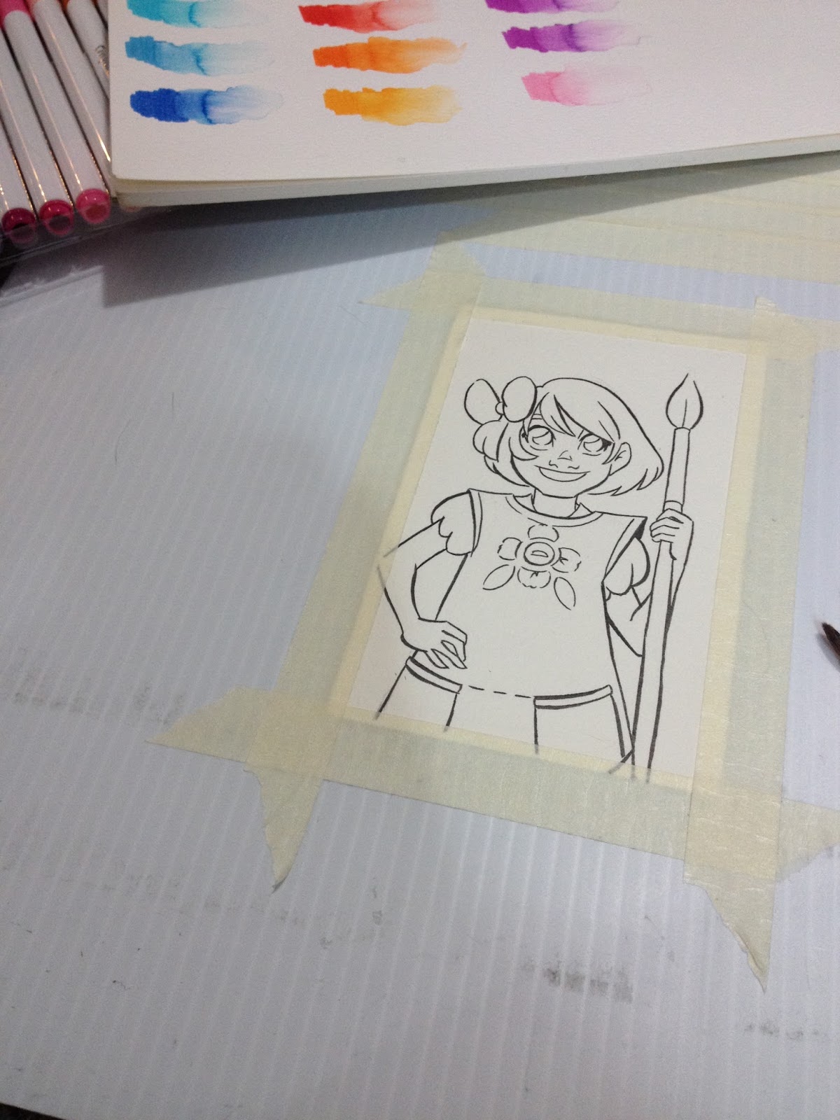
As these markers aren't labelled with a name or identification number, it's important to keep your swatches nearby for reference.
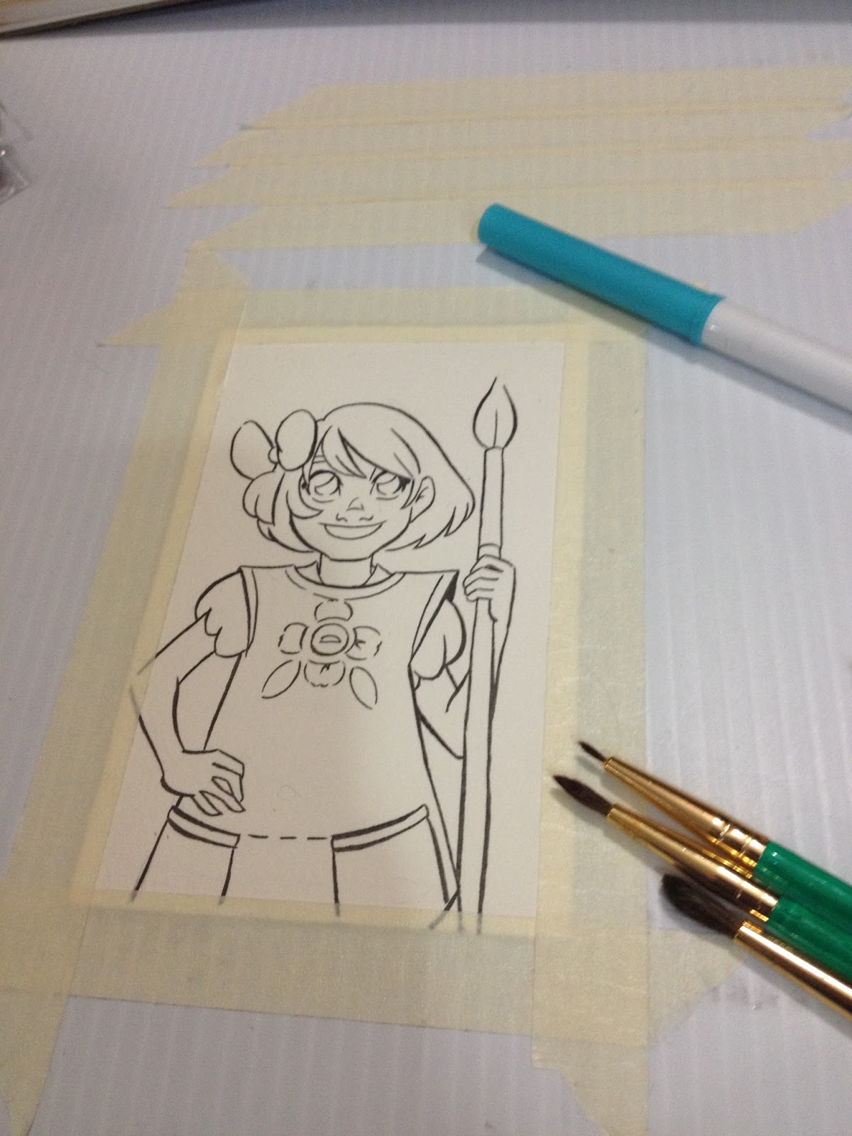
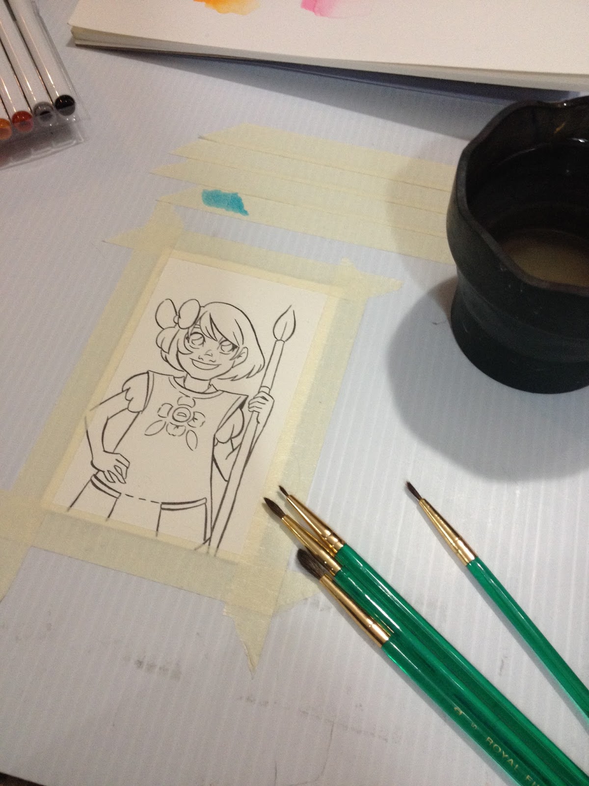
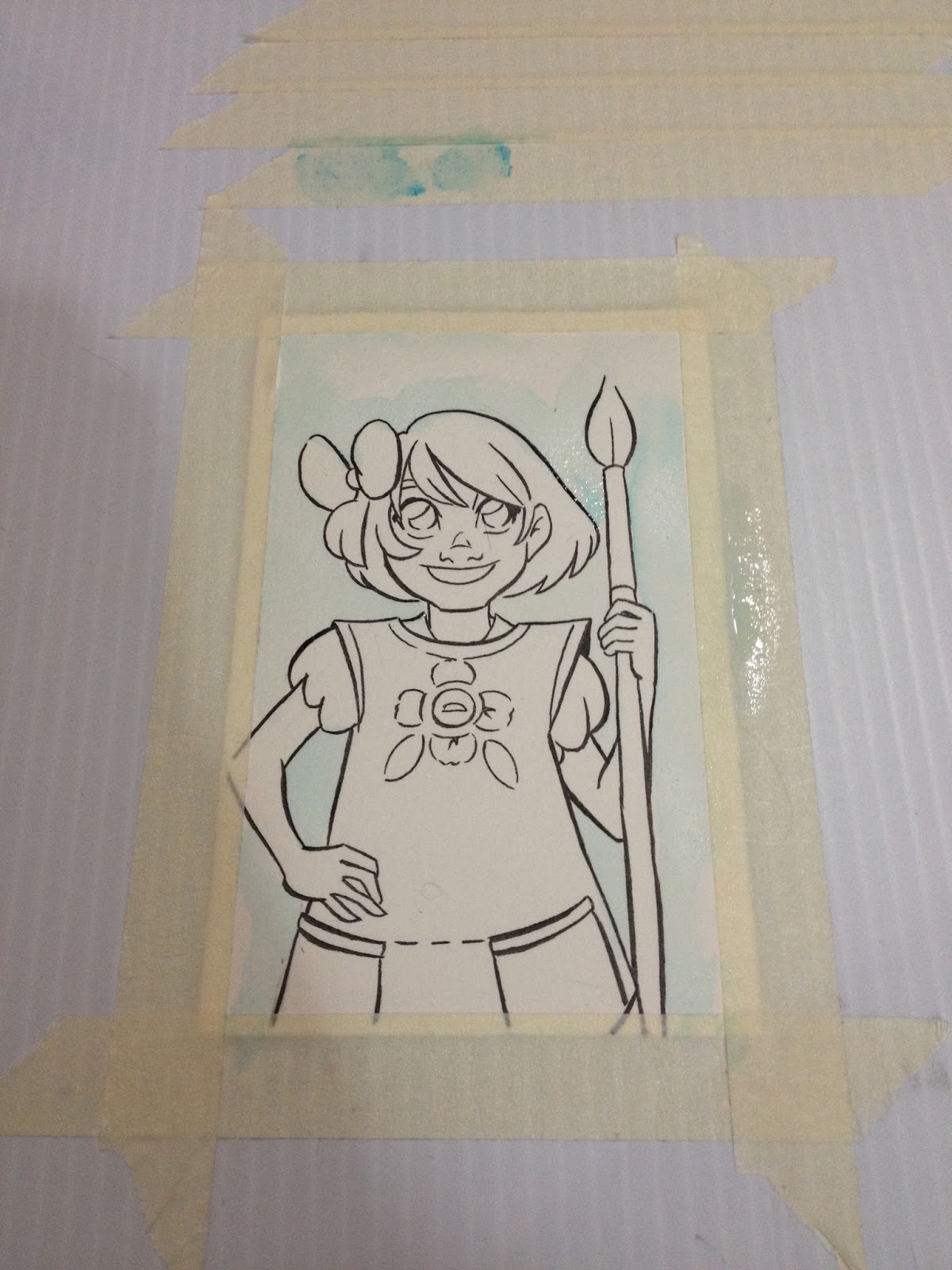
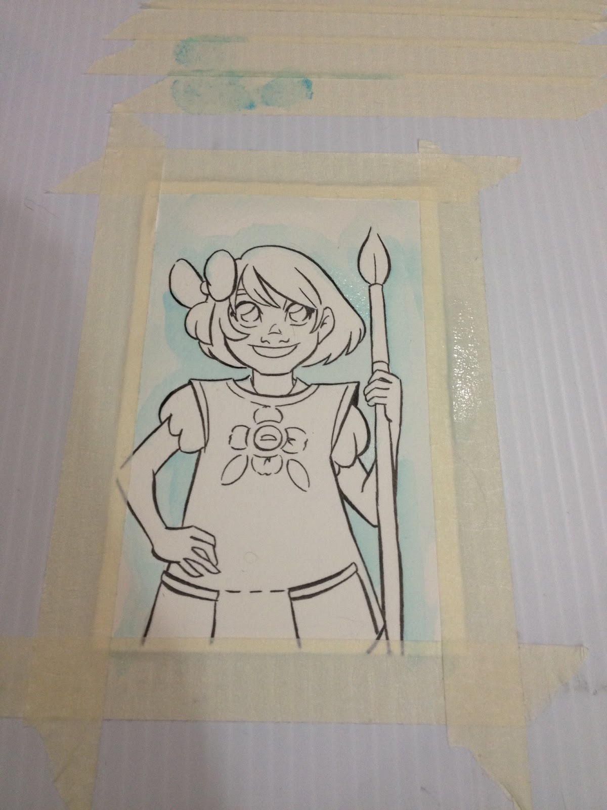
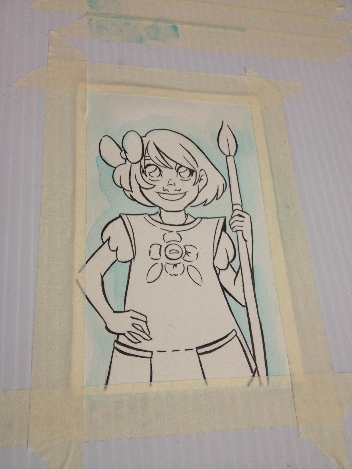
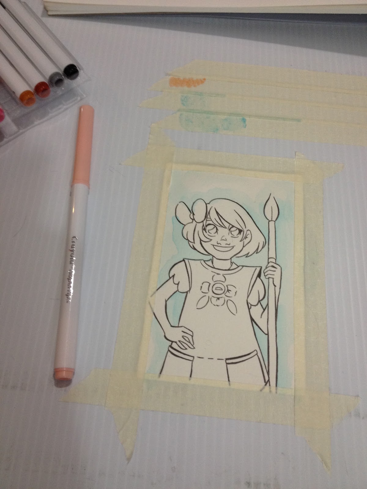
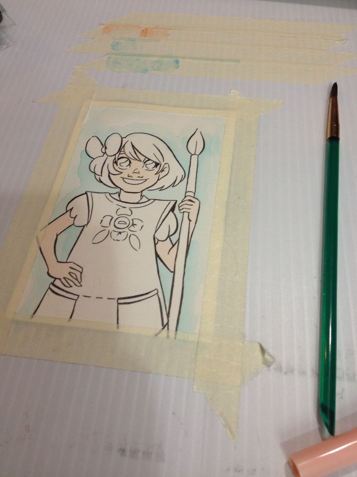


For a watercolor application, the included peach works fine as a skintone, if heavily diluted.


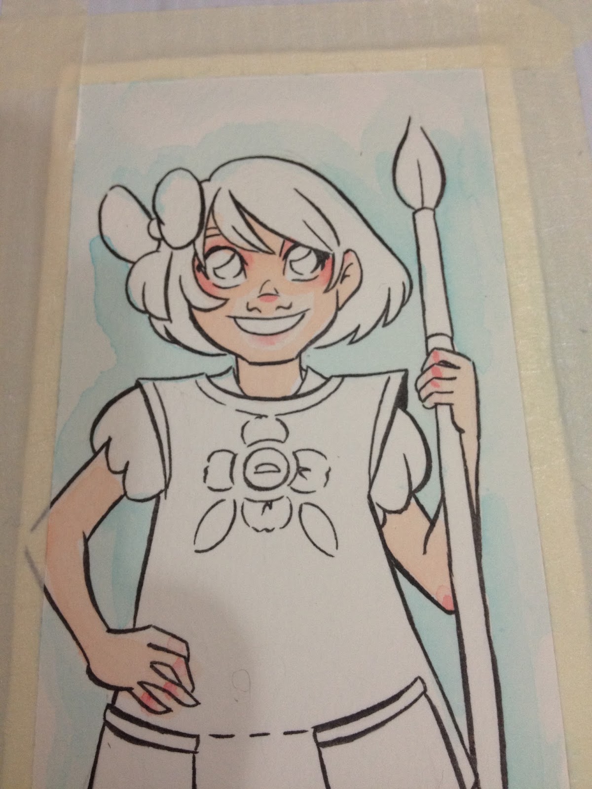
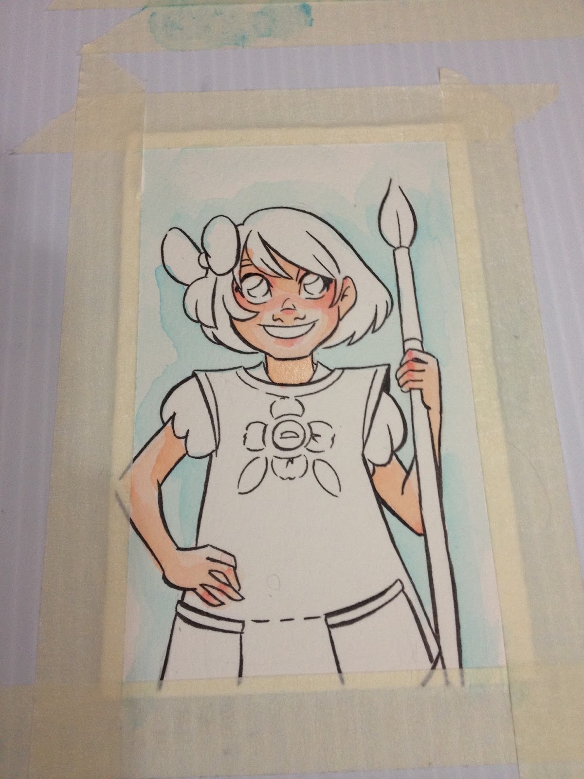
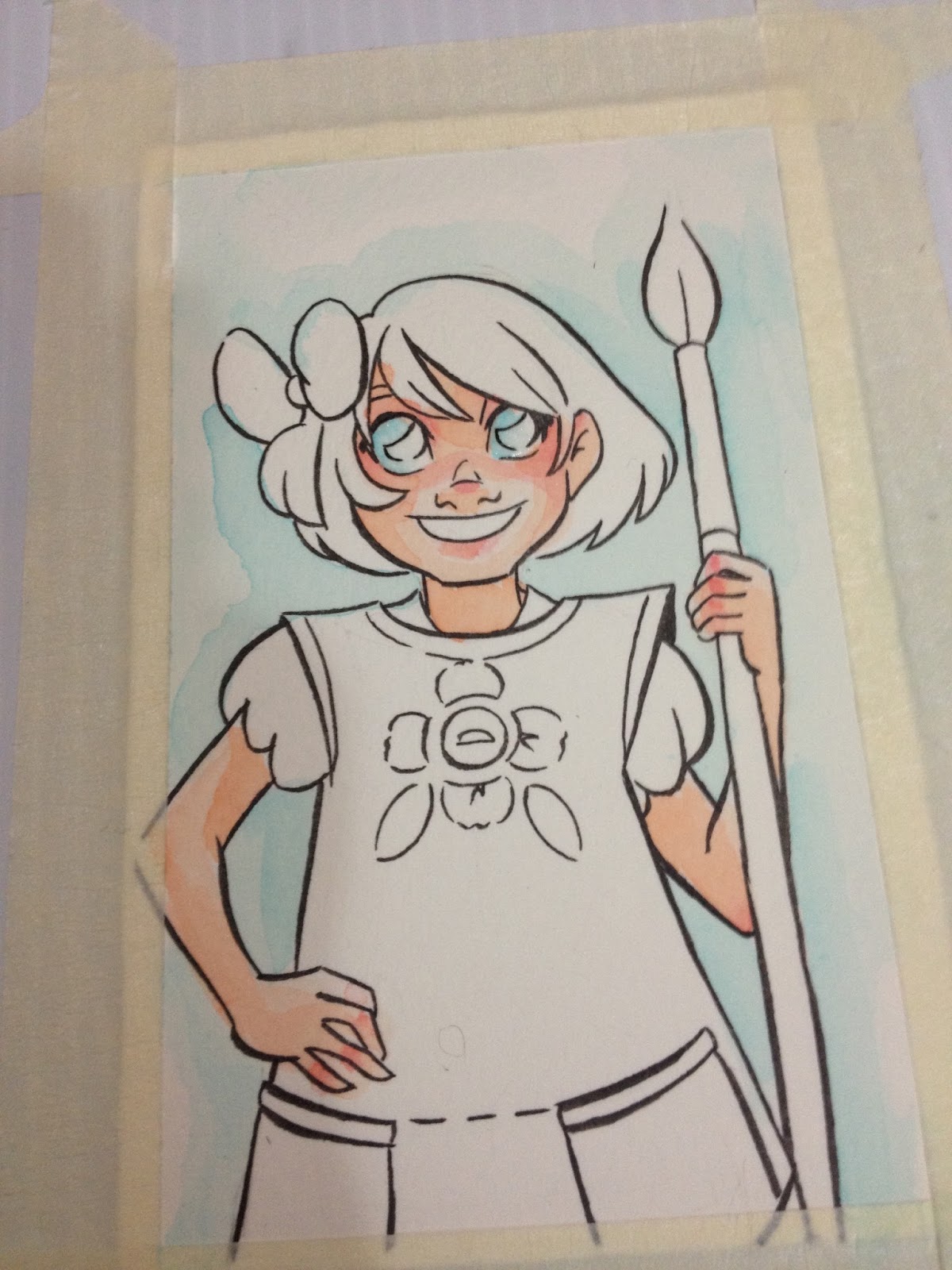
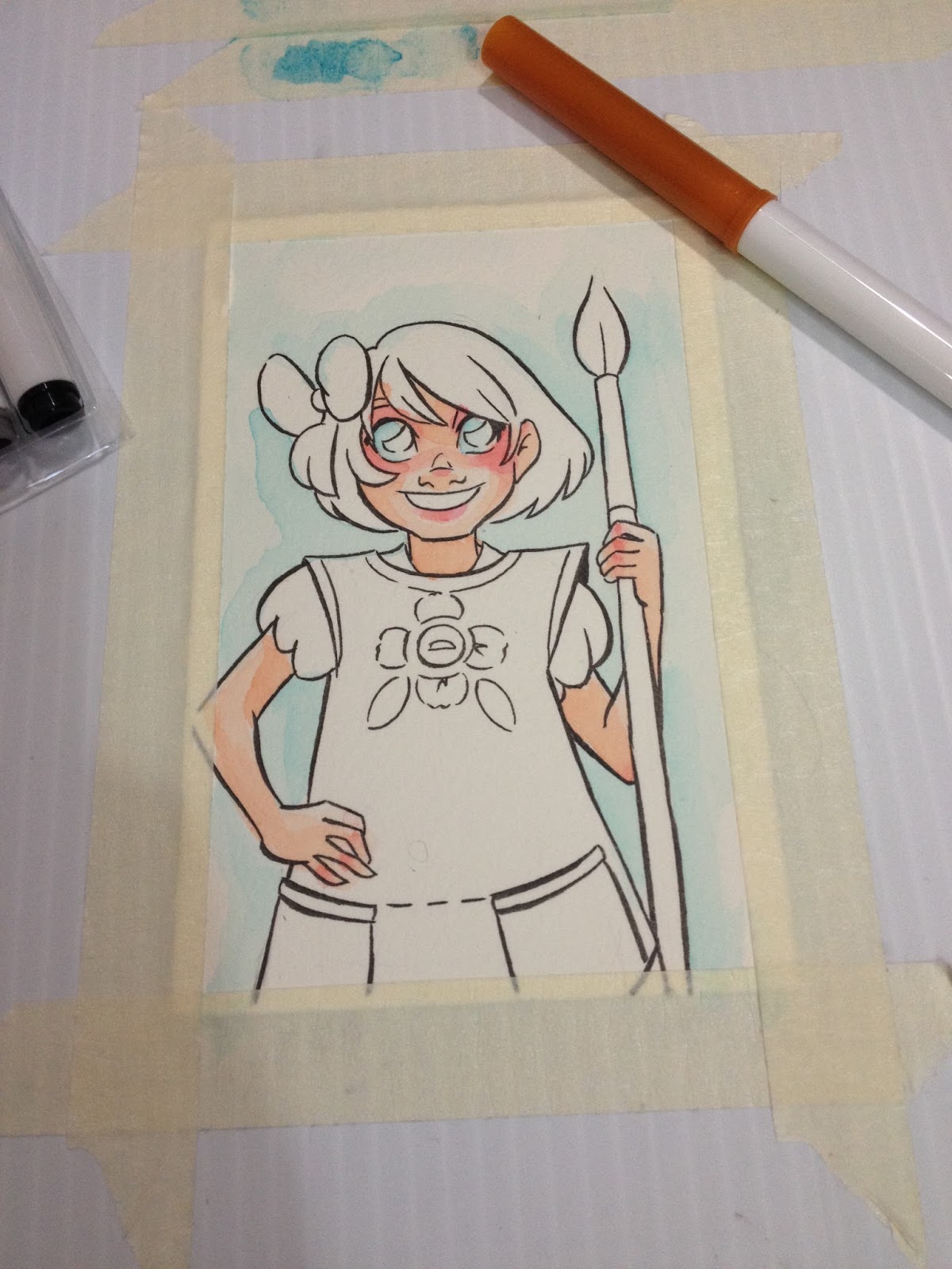
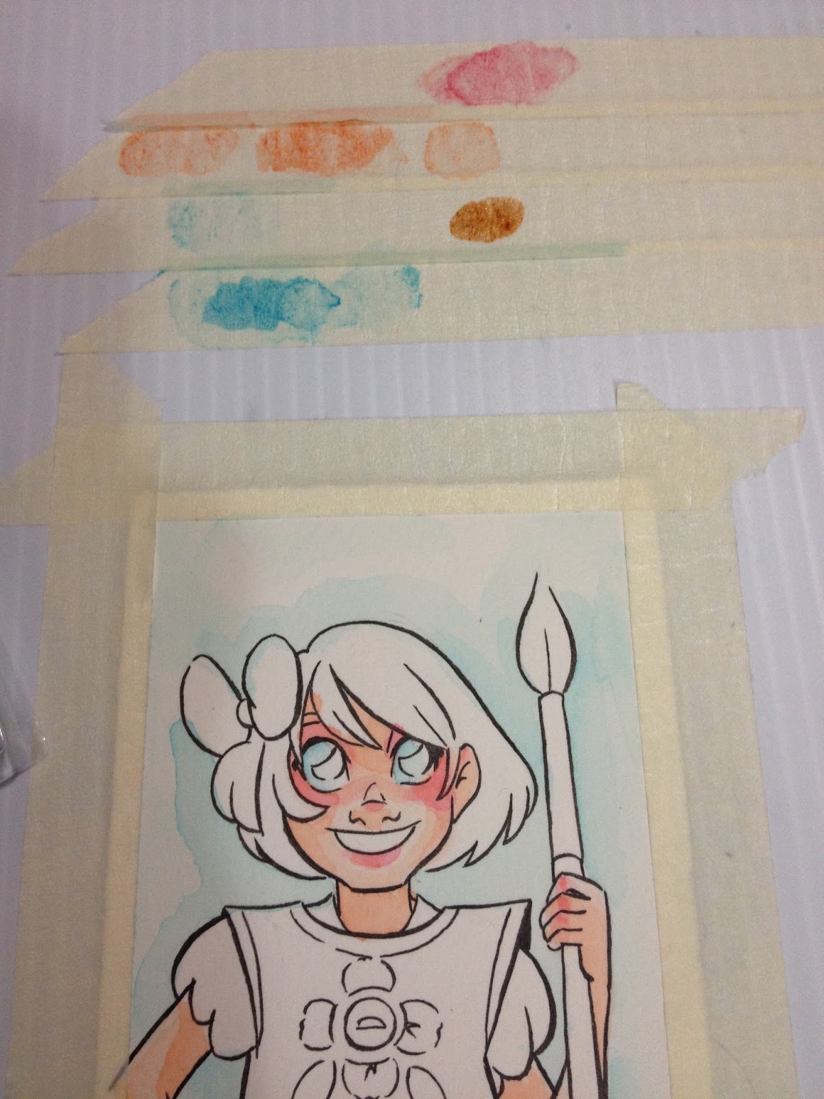
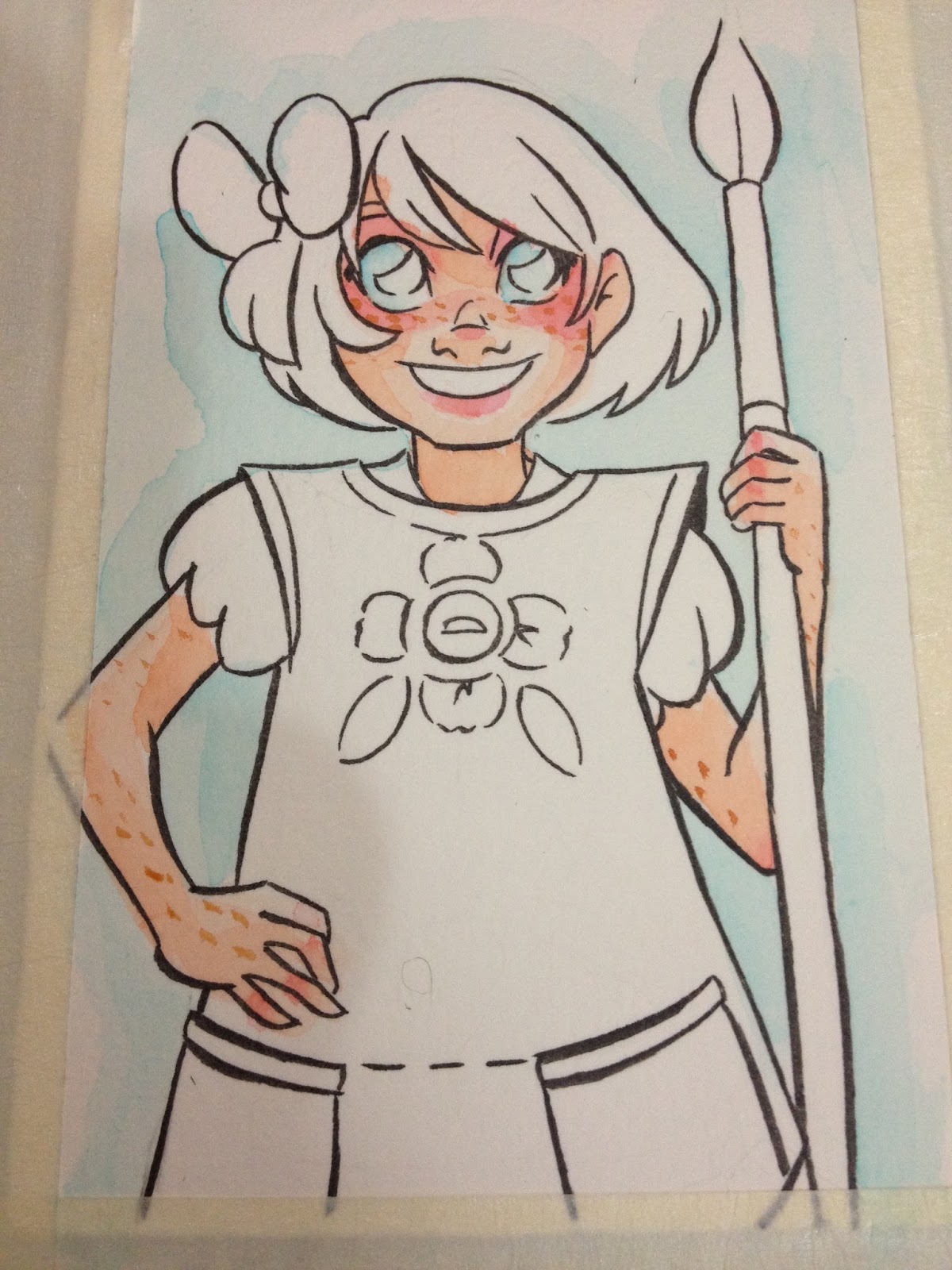
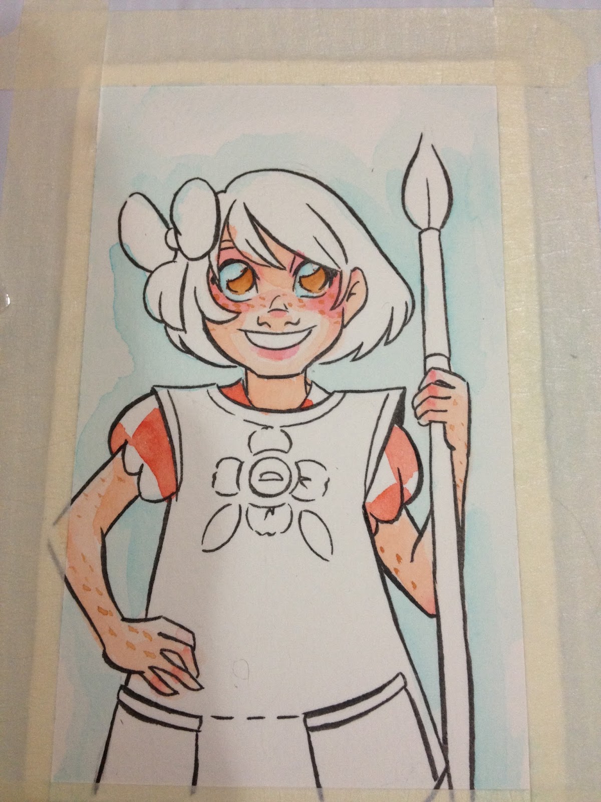
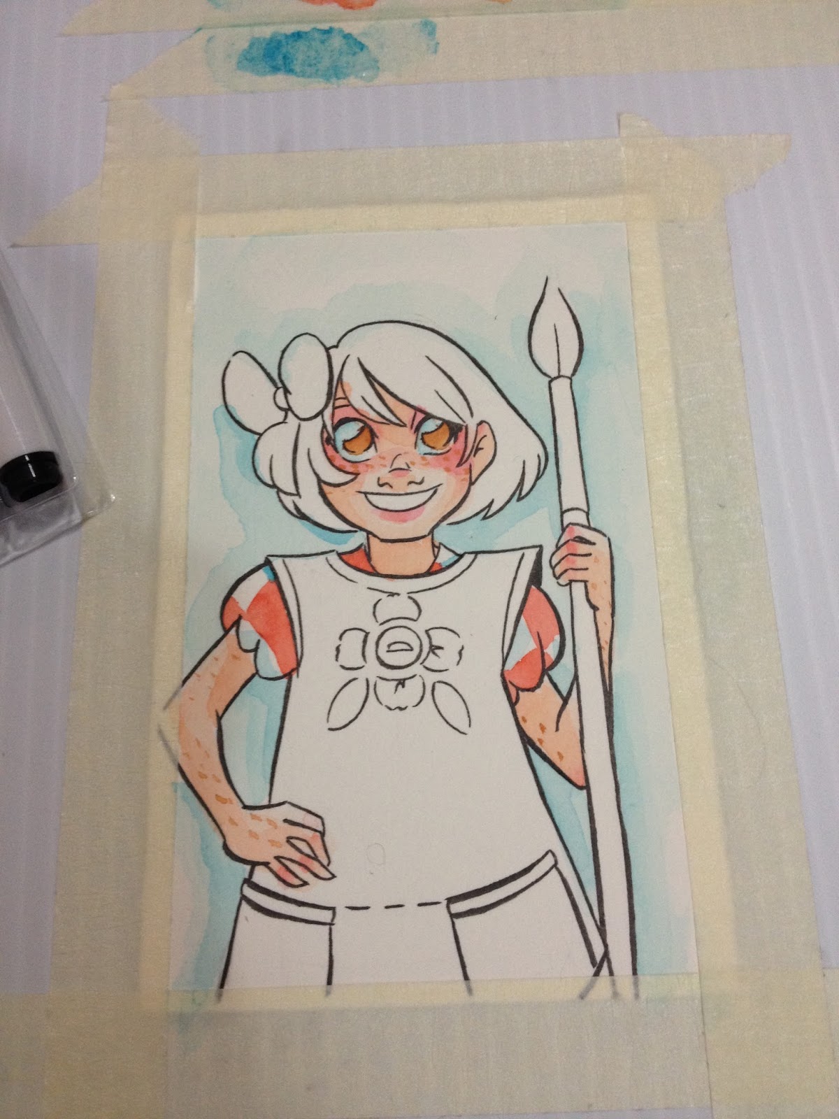
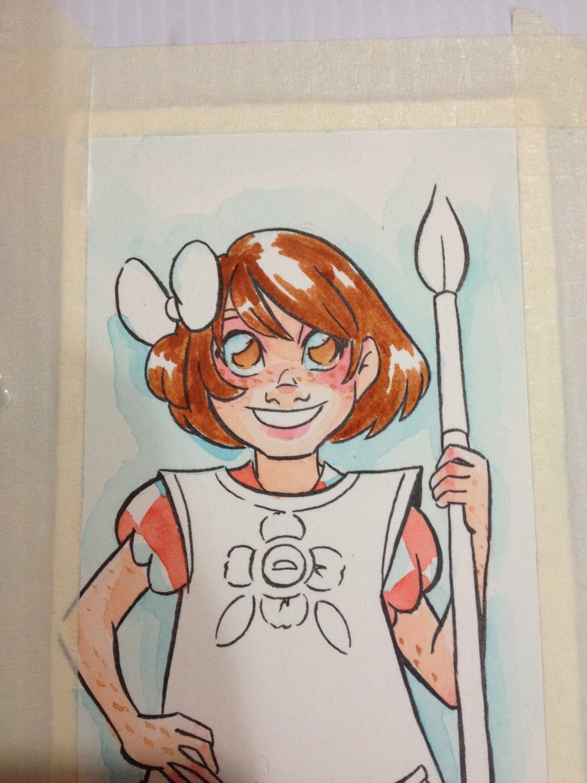
Direct application with the marker is fine, but make sure the paper is fully dry before you add more layers, as the stiff Supertip can cause damage to wet watercolor paper fibers.

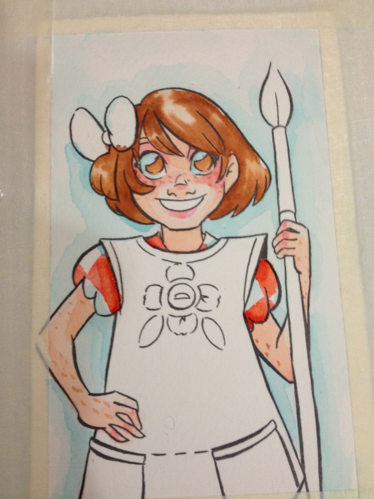
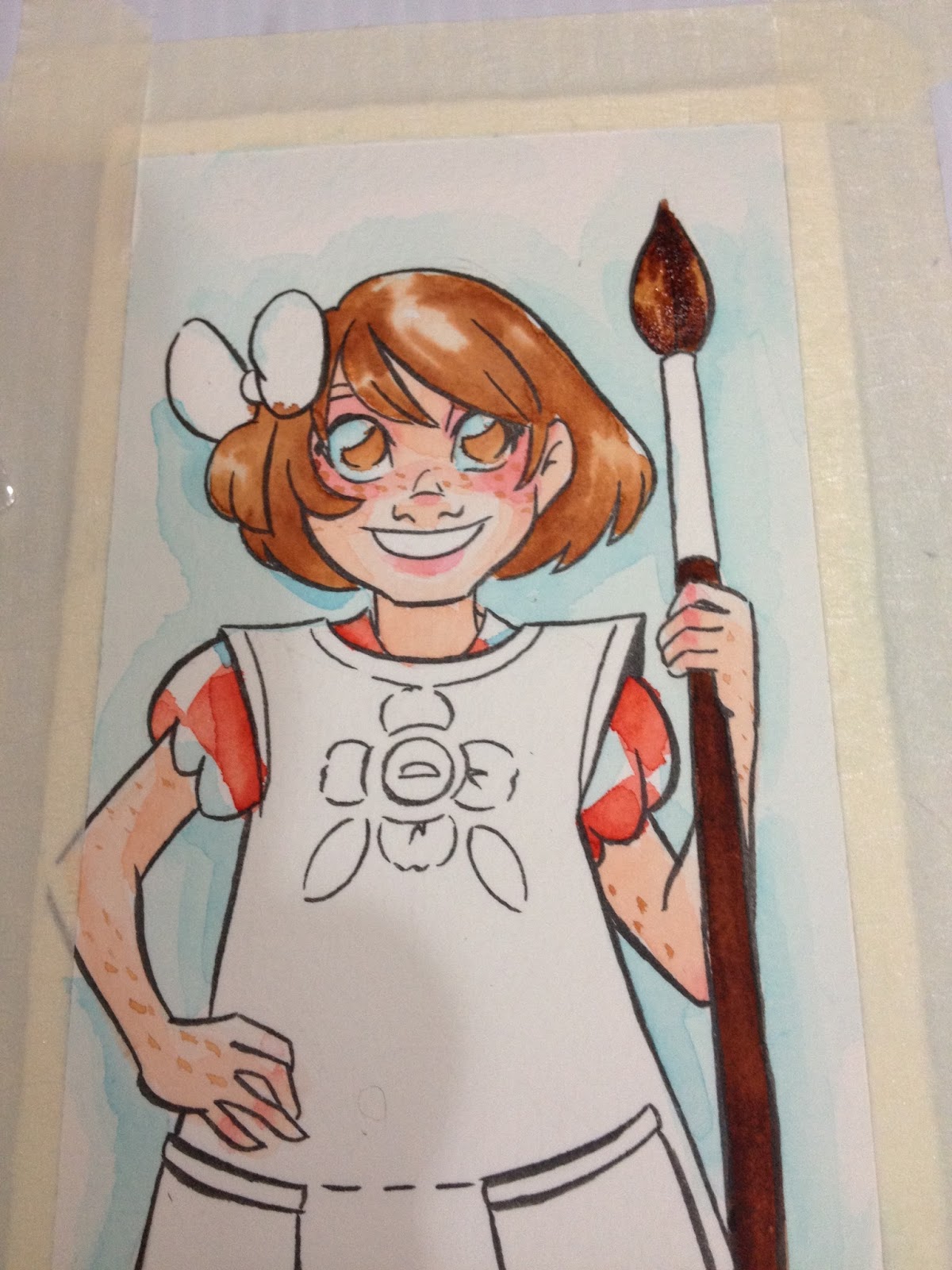
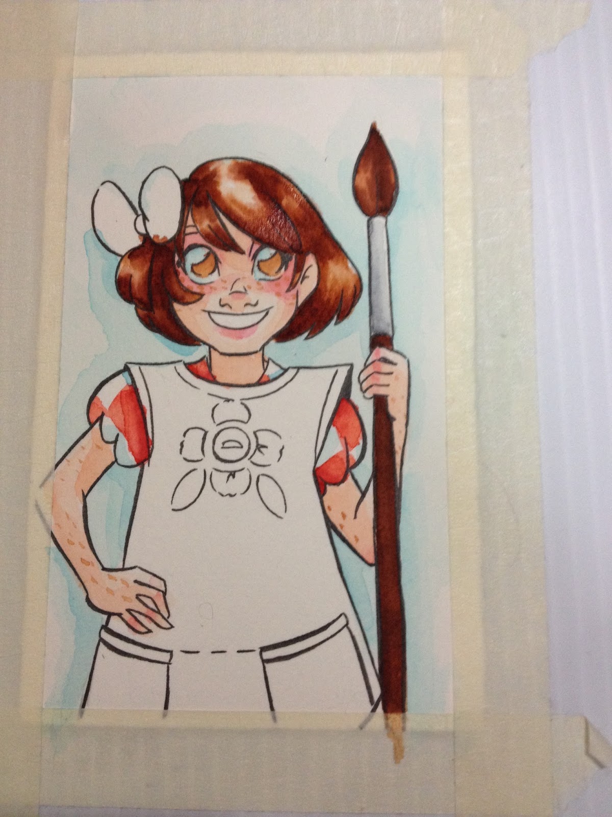
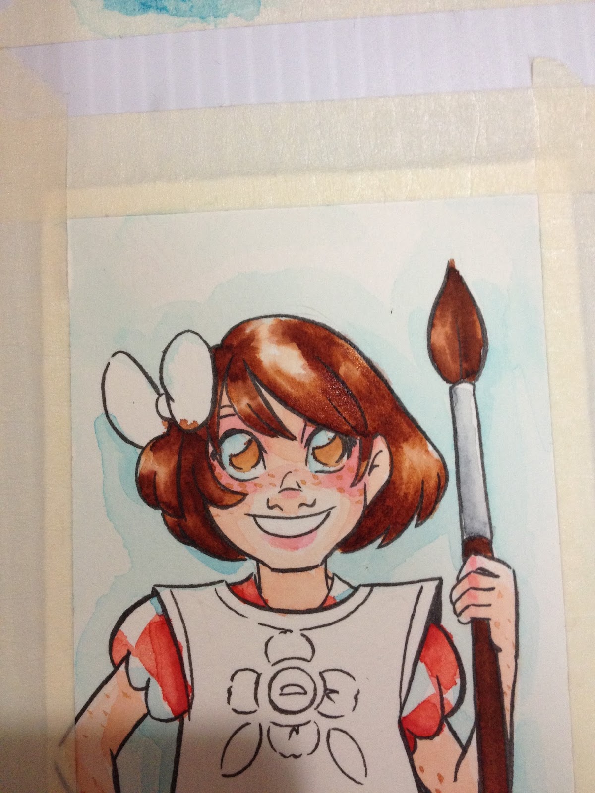
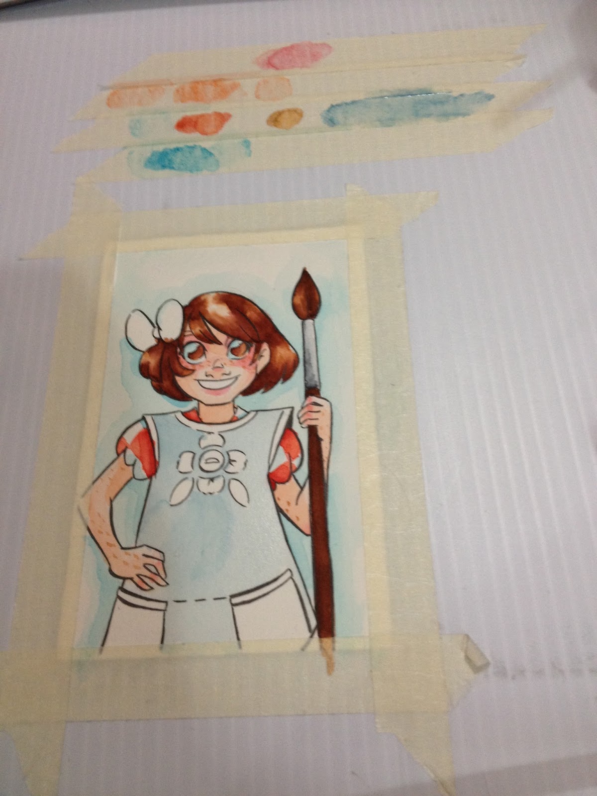


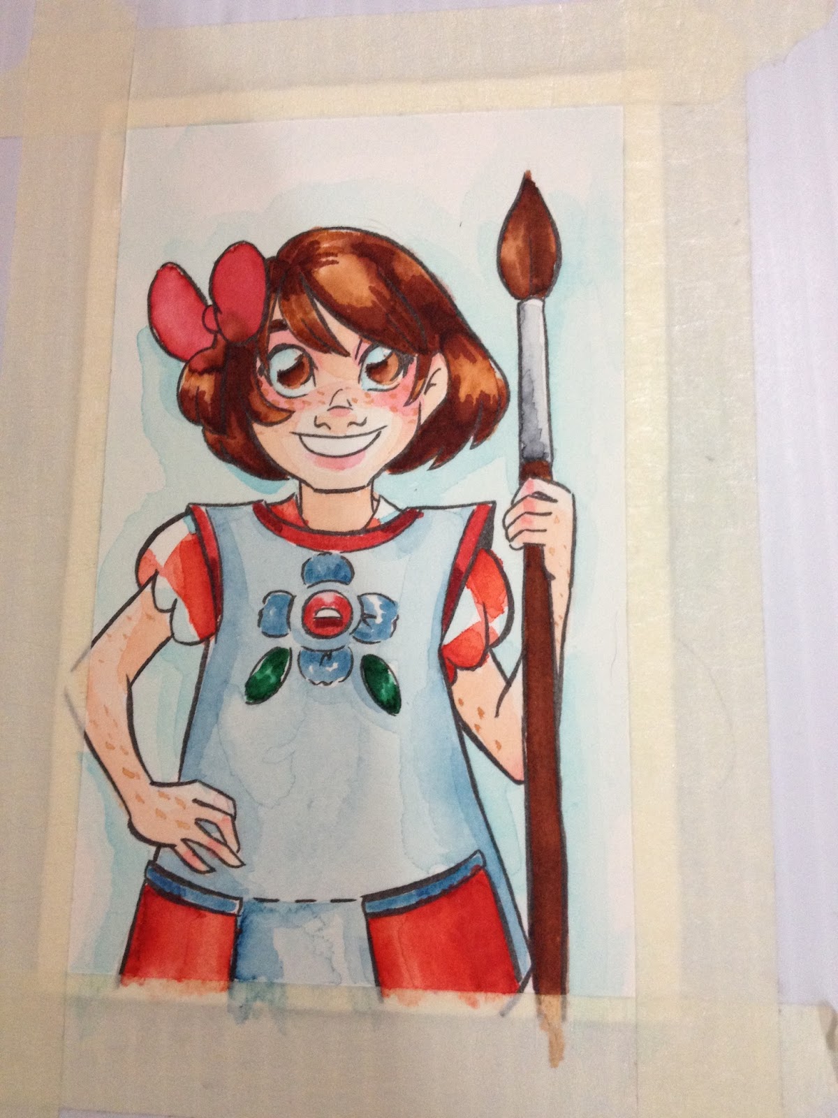
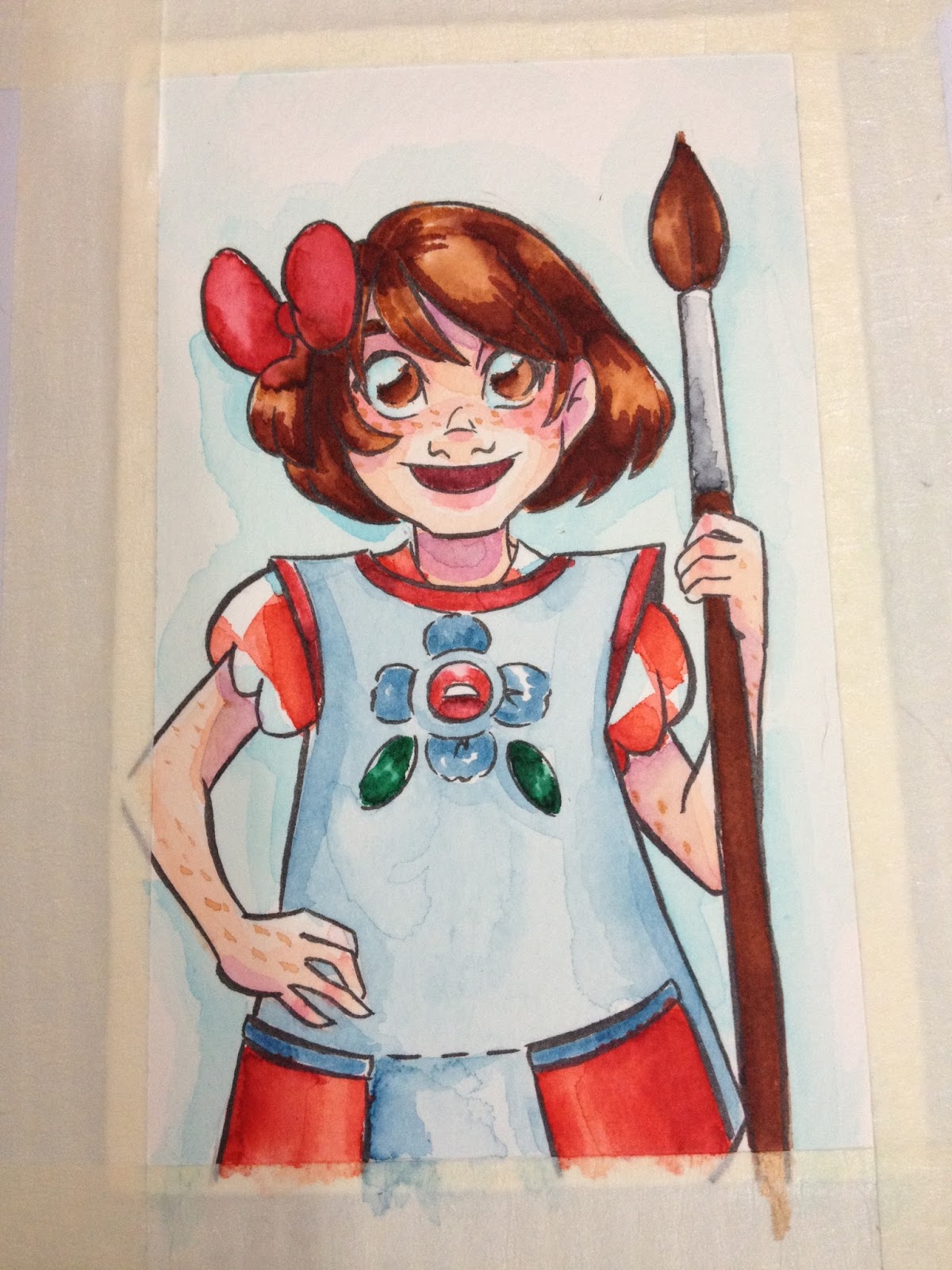
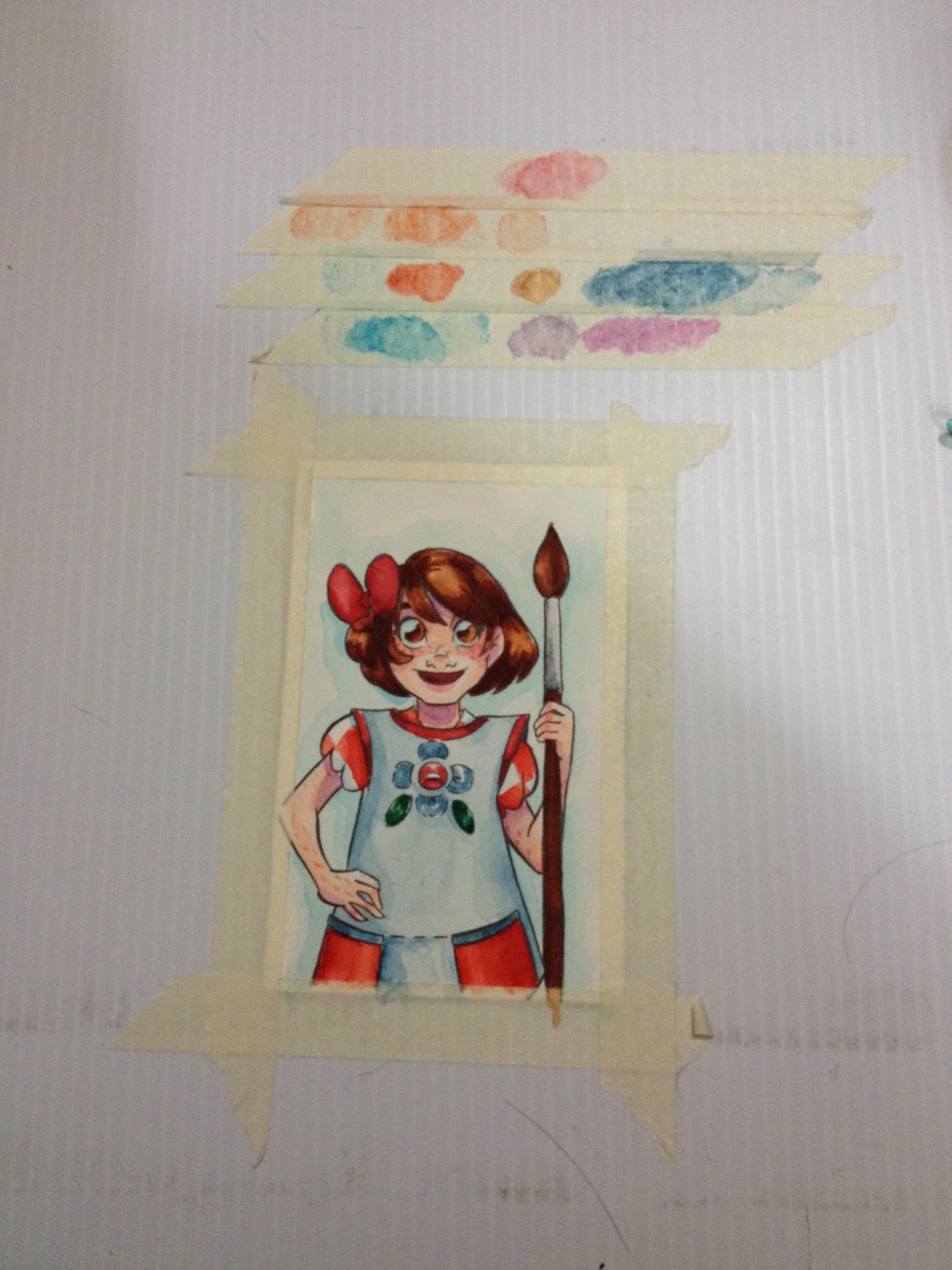
For the most part, I relied on the palette I made out of masking tape for color application. As with my watercolor marker reviews, such as Tombow ABT, Zig Graphic and Art Twin, or Marvy LePlume II, one applies the ink to the palette, and mixes in water using a clean brush.
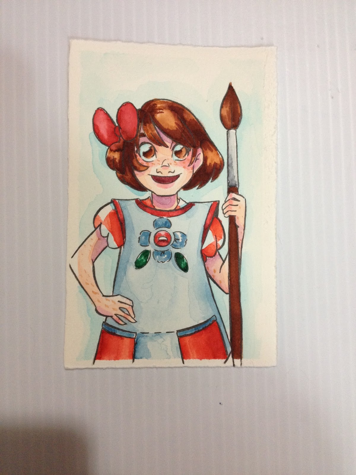
Can be blended with water on a masking tape palette, or can be directly applied to the paper and blended out with water. These actually blend better than A LOT of the watercolor markers/brushpens I've tested, like the Tombow ABT's or the Akashiya Sai. These also handle layering impressively well.
As stated, you can apply directly to the paper and blend out, but be careful, as the nib can abrade wet paper fibers.
As Waterbased Markers on Pacon Paper- As though They Were Copics
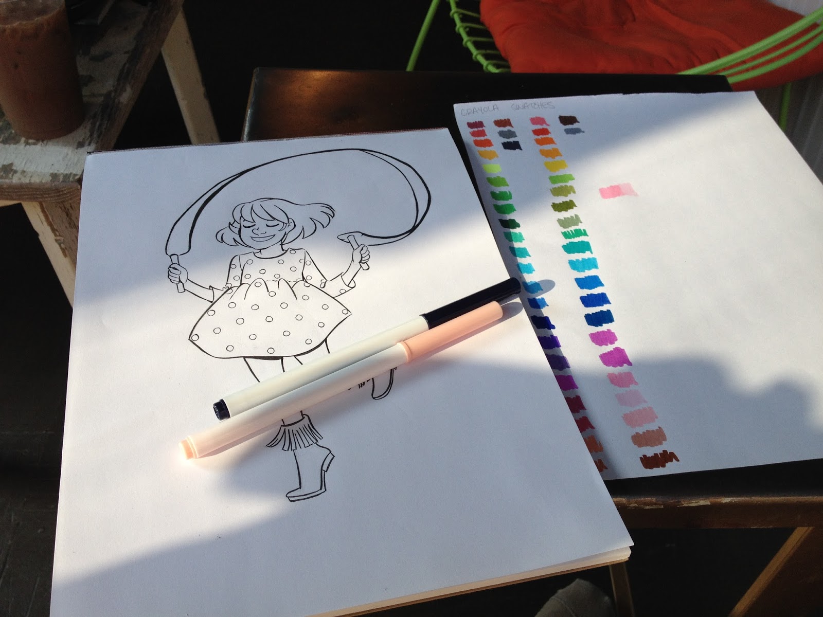
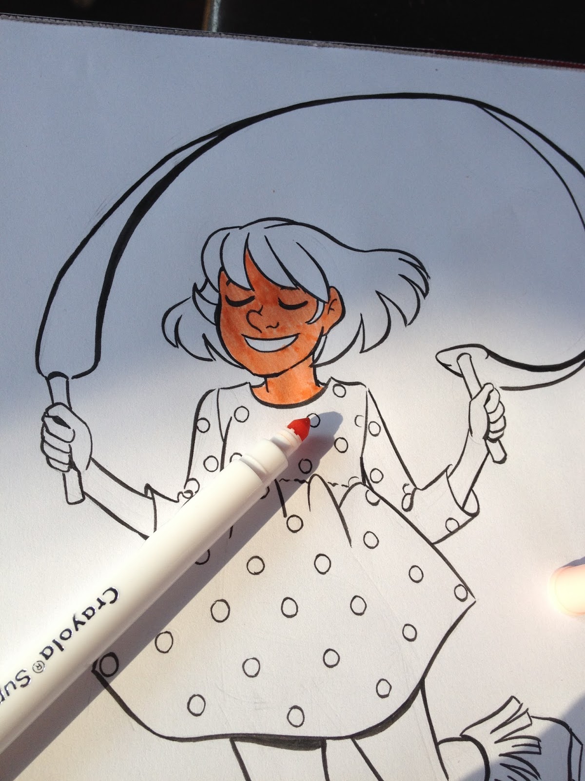
The peach that's included with the Crayola Supertip 50 pack is awful- it's too dark and flourescent to be useful as a skintone. I can't find the Multicultural pack in Supertip, so if I revisit Crayola markers, it will be with a jumbo pack of Multicultural markers in tow. I'm happy that more companies are introducing better options for skintones, I just wish those options weren't add ons. As a kid, the majority of what I drew were figures, so it makes sense that a variety of good skintones would be important to include with any pack. Given how close some of the colors in the 50 color pack are, I can easily see just leaving those duplicates out and including the skintones instead.
Crayolas are not really meant to be used on marker paper, it seems. Streaking is really bad, and the old technique of small, scribbled circles that works so well for streak free coloring with alcohol based markers is completely useless here. Saturating the paper to avoid streaking is also not a great option, as the paper is already showing stress from a single application. Your layering with Crayolas (probably most waterbased markers) is pretty limited, and should be planned ahead of time.
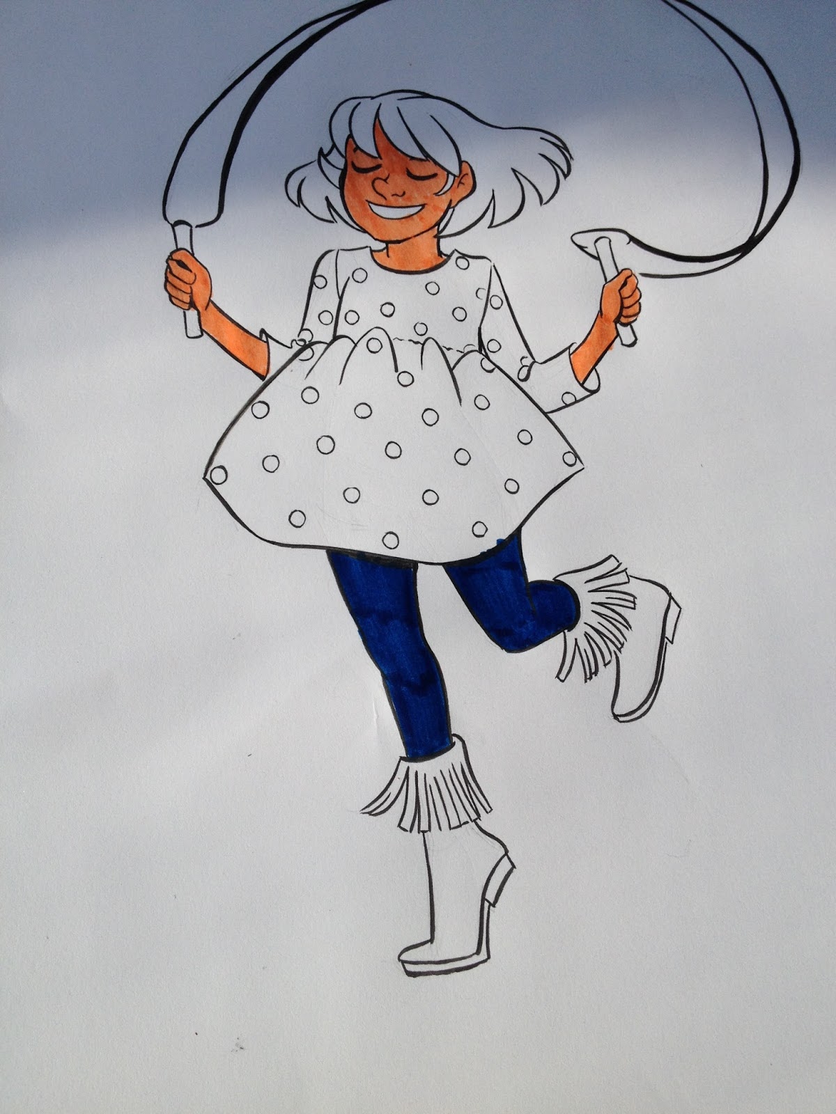

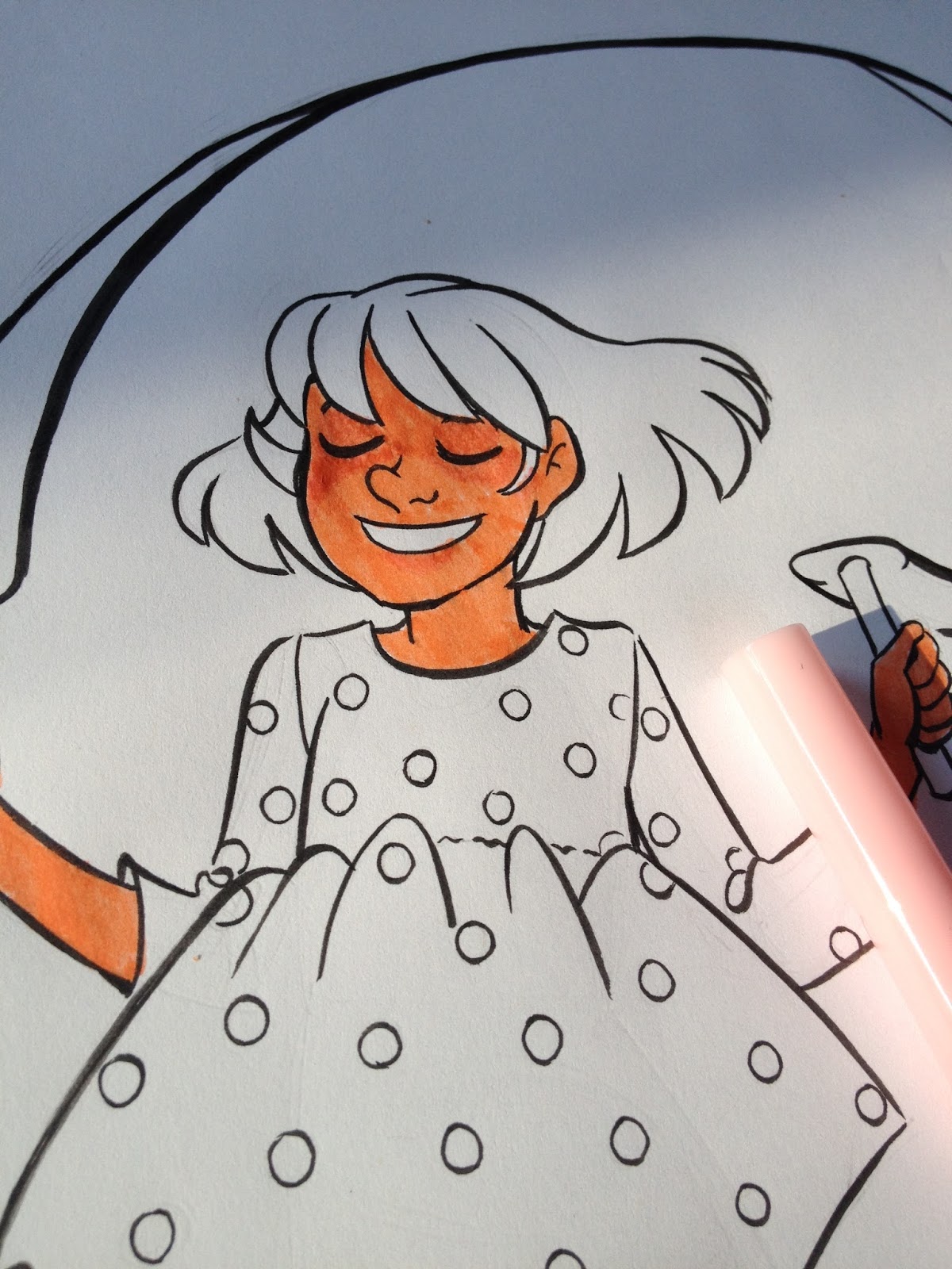
Given how dark the skintone is already, adding blush is pretty impossible. Retrospectively, I think I probably could have used this very light shell pink as a skintone, I think it would've worked out better than the included peach.

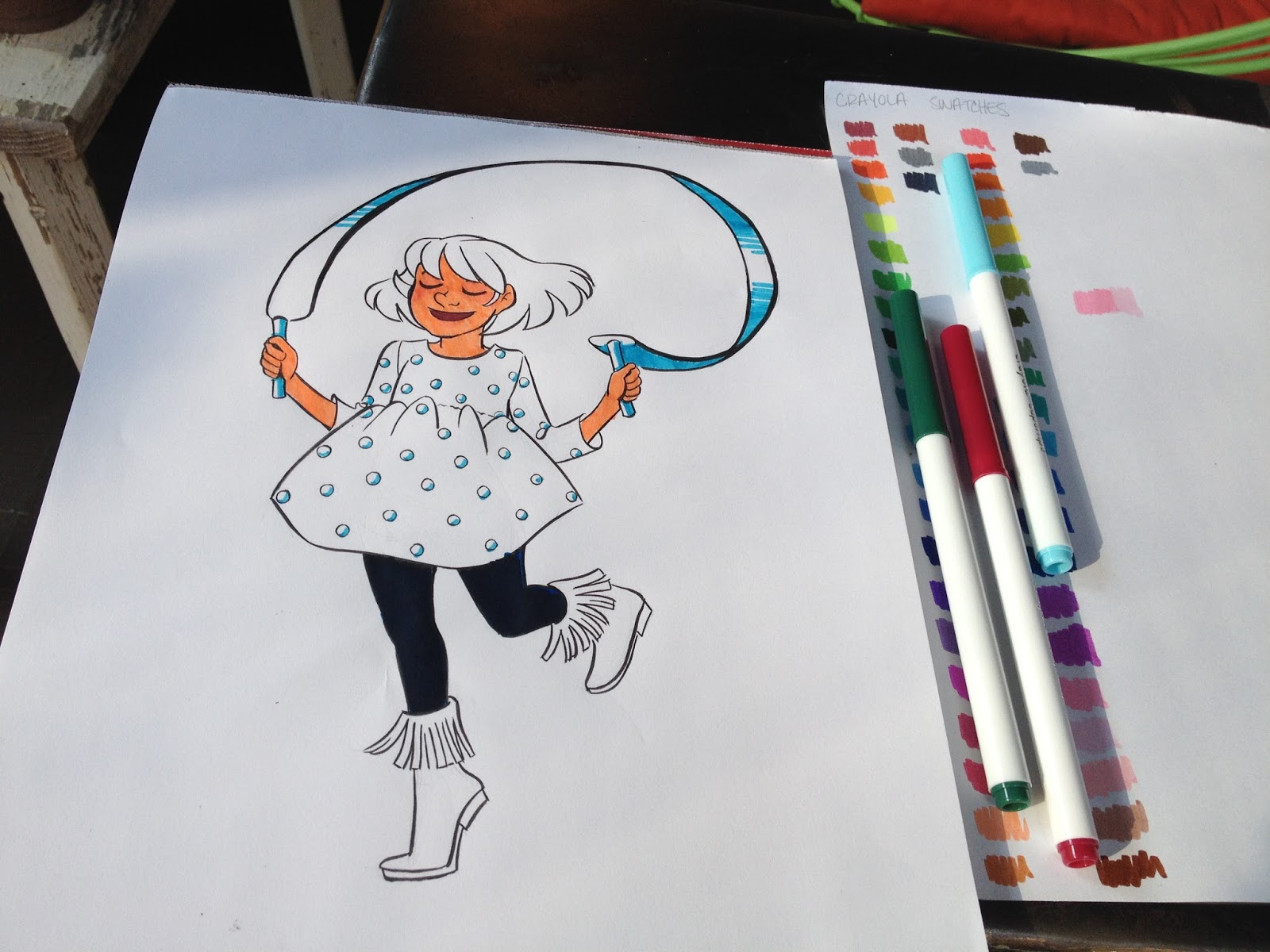

If you're coloring a large space that includes a lot of small details, you may find it difficult to use the Crayola Supertip markers if you're used to larger alcohol based markers. The issues are twofold- the nib is small, the widest mark you can make is still very small compared to the marks you could make with a Japanese brush nib, and the barrel of the marker is smaller than the barrels of most alcohol based markers. This small barrel caused even my little hand to cramp from clenching to marker for too long.
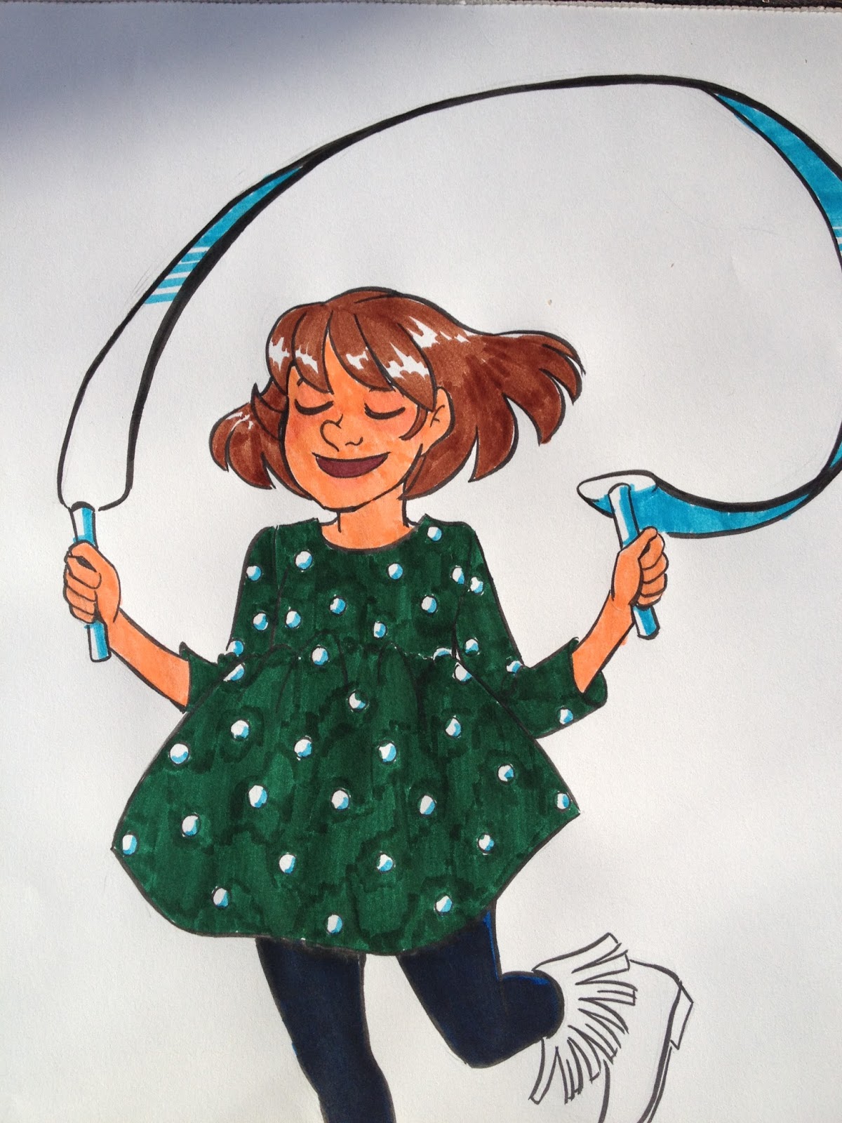
Coloring Kara's hair was probably the easiest part, as streaking isn't an issue if you color with the grain of the hair, and leaving a highlight was very easy to do.


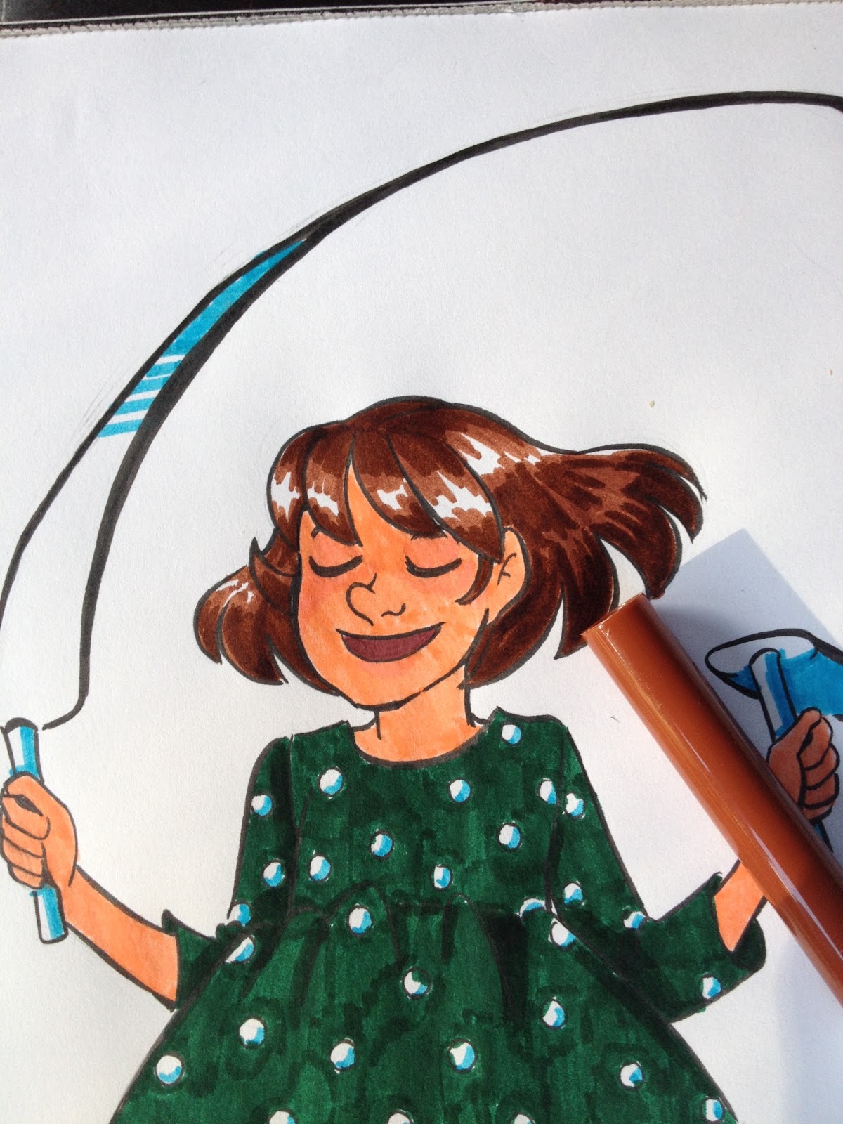
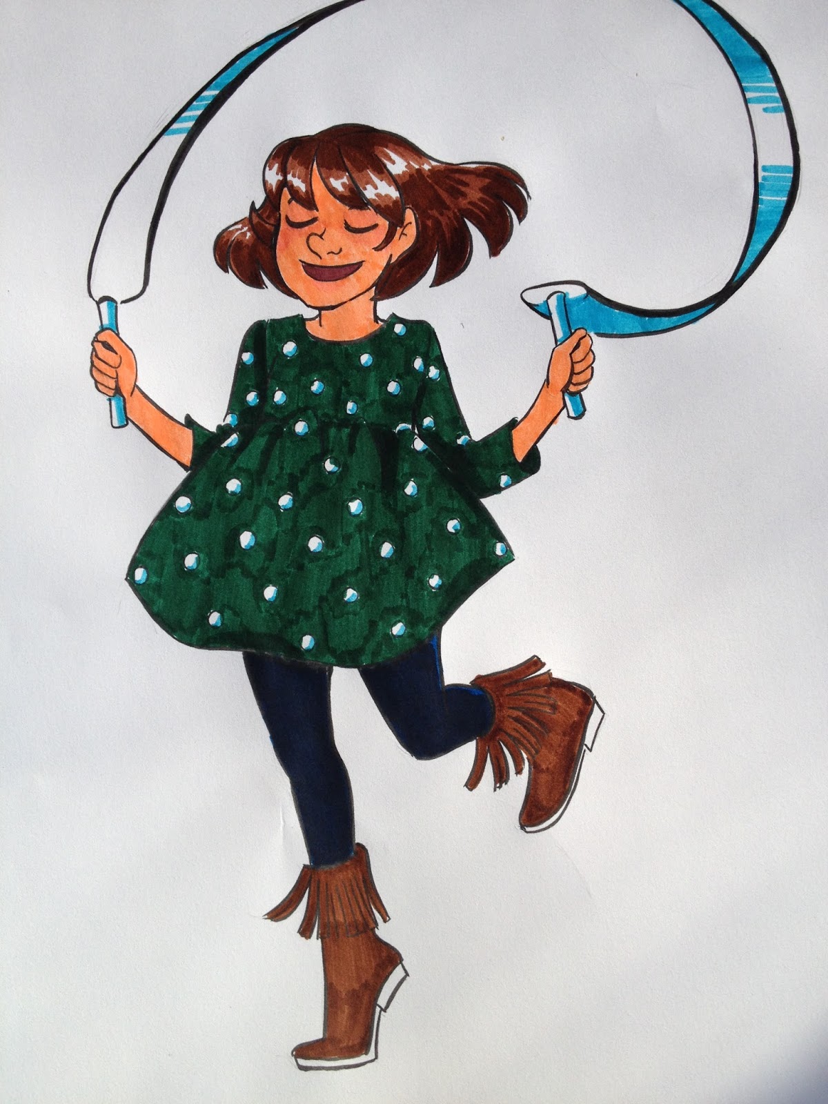


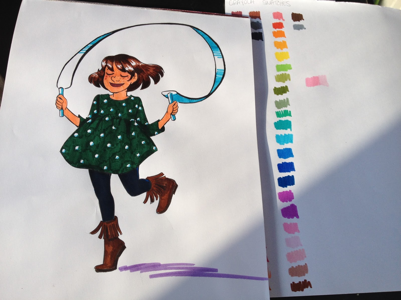

The hot peach skin isn't so noticable if you're using dark colors for everything else, but it still bothers me. Crayola Supertips are fine for flat color, and you can occasionally add an additional layer of color, but if you would prefer delicate, very rendered pieces with lots of layers, I recommend the watercolor marker technique outlined earlier in the post.

The peach is awful for a skintone- it's much too intense and fluorescent, Crayola could consider introducing an off white peach as a Caucasion skintone (I know how ridiculous it is to whine about Crayola not including Caucasion skintones, I apologize). Maybe I'll have to buy the skintone set and see if it's any better, but I'm pretty sure that's only available in the jumbo markers. After watching this fantastic video by edalineeilynd on using Crayolas to color in a manga style, I can't wait to get my hands on some skintone markers and try out her techniques!
Crayolas are NOT alcohol based markers, and can't really be used the way you would use alcohol based markers. Alcohol based markers have a binder(alcohol) that immediately evaporates, so they can be layered immediately. Crayola WATERbased markers use water as a binder, and that takes awhile to dry. If you try to apply another layer too soon, the paper will start to pill.
If you're interested in cheap alcohol based markers, check out my review section in the tabs above. In the upcoming weeks, I plan to test out Bic's Mark It's that I've ordered from Amazon (they arrive Sept 1st, so it's going to take awhile) as I've been informed by numerous reputable sources that they can be used as an alcohol based marker replacement/supplement. While these aren't part of the Walmart Art Supply Review series, as I didn't buy them at my Luling Walmart, these markers are easy to find.
The Verdict
I have so much respect for people who can actually bend Crayola markers to their will. You guys are true masters of art and making it work. If any of you art supply-benders are in my audience, please drop me a line, so I can show off yall's hard work at the bottom of this piece.
Regardless of brand, I ALWAYS think there could be a wider variety in skintones.
These markers are all so different from their cap colors that I highly recommend you take some sticker paper labels, make a dot of the color on the label, cut it out, and apply it to your marker, so you know what the true color looks like.
Did you find this post useful? Did you enjoy it? How about sharing it with friends on Facebook, or Tweeting it to your followers? The links above the post make sharing SUPER easy- you don't even have to leave the page! If you really liked this post, or any of my posts, how about sending me a tip via Paypal using the handy donation link in the sidebar, or writing me an email? It would definitely make my day!
Please consider donating to this blog or purchasing from Natto-shop (http://nattosoup.com/shop) if you want me to continue publishing quality content. All materials tested were purchased from my own pocket. Keep on Truckin' Nattosoup is not under any sponsorship.
September 6, 2015
Walmart Art Supply Review: Crayola Washable Watercolors
This post is one of a series of posts that feature art supplies I purchased from my hometown, Luling, Walmart while I was in town for Mechacon. It was inspired by the fact that kids, teens, and 20 somethings don't have many options for quality and affordable art supplies in the New Orleans area (and yes, I AM aware that there are art supply shops there, I've shopped at several of them, and they're greatly overpriced given their lackluster stock). So I wanted to see what I could get at Walmart, put what I buy through its paces, and let you guys know how these supplies fared. As almost always, I purchase these materials out of my own pocket, and one of the ways you can show support and appreciation is to give me a tip in my Paypal (sidebar right) or to consider buying YOUR materials through the affiliate link I post on relevant posts This affiliate link is for Crayola Washable Watercolors.
As this blog is completely unsponsored, and I receive no financial compensation from companies to write these reviews, nor do I receive donations from manufacturers, I really depend on the goodwill of my readers. If you benefitted from this post, please consider contacting Crayola with a link to this post and your thoughts. I would also sincerely appreciate it if you sent me an email with your thoughts, questions, or thanks. The only way I can write content that you enjoy is if you let me know what works for you, and what you want to read.
It's a great sign for artists when the package touts "washable!" so proudly.
I think there are few sights more 'back to school' than the basic pack of Crayola Crayons and the plastic, self contained packaging on Crayola Watercolors. Crayola Watercolors (or one of their market competitors like Rose Art, or CraZArt) are a first introduction to watercolors for many aspiring artists.
The package has changed very little in the 30 years I've been kicking around this planet- 8 poured patties of color, 1 plastic brush, a case that doubles as a small palette. At the start of the school year, those little patties of color are all so perfectly distinct in color, by the end, they're all a muddy mess. Unfortunately, few brands are as snidely referred to by professional, practicing artists (myself included) as Crayola, and I decided to find out if this first brand for many was really as difficult to professionally paint with as we'd all assumed.
So as familiar as most kids (and adults) are with Crayola, what do we really know about the company, or about the product I'm testing today, their Washable Watercolors? I must admit, as ubiquitous as the brand has been in my formative artistic years, I know very little.
If you can't find Crayola watercolors at a store near you (which would be surprising), you can find them for sale on their site-the same set I used for this demo. The site claims that these are formulated for easy clean up (what, 100% soap? What pigments/dyes are they using that don't stain and are non-toxic?), promises vibrant colors for mixing and blending (more on THAT in the review), more paint than other comparable brands, and 8 colors and a paintbrush. I can't verify whether or not Crayola is really offering more paint per pan, and I don't really want to paint all over my clothes to see if these do or do not stain, but I can vouch that Crayola did indeed include 8 watercolors and one brush in this set.
Crayola has a Portfolio series that I may check out in future reviews, and at a glance, it looks like it's aimed at teenagers who aspire to become artists. If you would like to see some of these products reviewed here, I recommend you write to Crayola with links and request that they send samples. You can do that here.
Crayola has been owned by Hallmart since 1984, and is best known for it's crayons, although they make a wide variety of other products, including Silly Putty. The company was founded by Edward Binney and C Harold Smith in 1885, and the original products sold were industrial colorants like carbon black and red iron oxide. Crayola introduced their line of wax crayons in 1903. Crayola's Portfolio subbrand is not their first foray into professional artist materials, in 1903, Crayola also launched it's Rubens line, and intended to compete with the Raphael line of European crayons. (Information via Wikipedia, as I can't find historical information on the official site)
The cleanup instructions on these are pretty simple- dampen a sponge with water and wipe stain from outside to center, for that hard to clean carpet. I assume you can pretreat affected clothes and just pop them in the wash.
My first real surprise came from the fact that the included brush no longer features plastic bristles splayed every which way, but actual hair in a metal ferrule. When did THAT welcome change happen? The plastic bristled brush was one of the features I dreaded- it was pretty much impossible to paint with when I was a kid, you mostly just smeared paint on the paper using the brush like you would a basting brush.
The Package

Isn't this nostalgic? The packaging Crayola Watercolors comes in has changed very little over the past 25 years. The cakes are still contained in a plastic tray, which is housed in a reusable plastic case. The labelling is all on a cardboard insert, the package itself contains no information.


The cardboard insert is removable, leaving us with just the basics- a plastic package that doubles as a palette, a brush, and 8 cakes of poured watercolor.

The brush is natural hair, and fairly soft, with no glue to help preserve its shape during transit.

The tray the cakes are on is completely removable, and I suppose you could use the bottom of the package as a large wash.
The Brush
Crayola's included brush has changed a fair amount over the years. When I was a girl, Crayola Watercolors looked like this:
 Image SourceNote the stiff plastic bristles set directly in the stiff plastic handle.
Now Crayola makes a wide variety of brushes:
[image error] Image Source Image Source
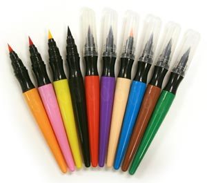 Image Source
And the one included with my watercolors looks like this:
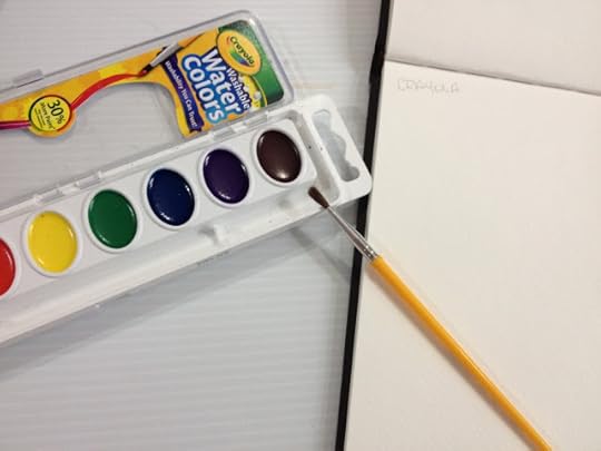
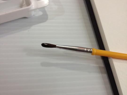
This brush is remarkably improved over the brushes of my childhood! Real hair fibers (maybe even squirrel), real metal ferrule with a couple crimps. Same plastic handle though.
The Paints

So the paints appear to be poured cakes, and I'm guessing they're bound with glycerin. I'm not sure what Crayola uses for color, because dyes tend to, well, dye, and pigments also have a tendency to stain, and remember, class, these paints are WASHABLE! Swatch Test
Top row is straight from the palette, no water added, bottom row is after water has been absorbed for a few minutes.


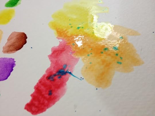
Straight from the palette, using Crayola included brush, water hasn't had a chance to be absorbed
Colors handle like they include...soap? What on earth is the binder for these? I know they're non toxic, so they're probably dye based, not pigment based, and I assume since they dont want kiddos om nomming these, they probably don't have a sucrose based binder like many real watercolors.
Some colors perform better than others- yellow, green, and blue are all ok, red is fine, 'black', orange, purple, and brown are disappointing.
When wet, these colors tend to blend with a little persuasion and additions of water, and dry a little glossy, which I find disconcerting.
Included colors appear to be:
Sepia, Crimson Hue, a really bad orange that is closer to yellow, Lemon Yellow, Sap Green, Pthalo Blue, Red Violet, Burnt Sienna
Colors are actually listed as:
Not listed on package.
After water has settled in, but straight from the palette:
Colors are slightly more intense, but still handle like they're bound with soap. After the cake has absorbed water, sepia becomes black, orange still handles poorly, purple is much more vibrant, and burnt sienna is more intense as well.
These are going to be a joy to work with for the field test.
When dry, paints seem to sit on top of the paper, rather than soaking in, which is troubling.
Note: I'm going to clean and condition the included brush, and try to use that exclusively for the field test. WISH ME LUCK.
Washing and Conditioning the Brush

Here is the brush with conditioner in it. I let it sit overnight for the conditioner to work it's magic.
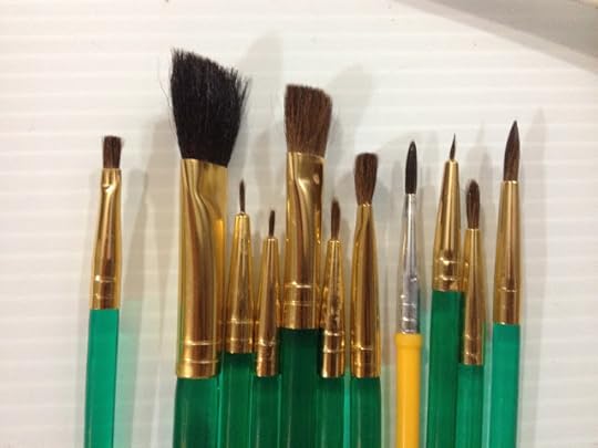
And here's a shot of my Crayola brush hiding amongst the Royal Langnickel brushes. I used both types for this review.
The Field Test
I drew Kara cranky as a pre-emptive. If this turns out badly, Kara will have a reason to be angry.


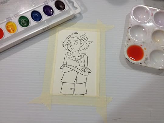
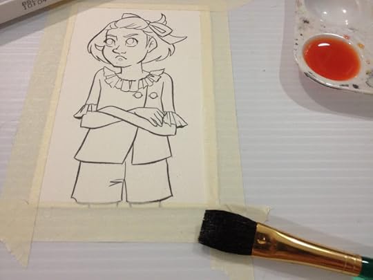
So let's start with a wash! I decided to use the large wash brush from the Royal Langnickel set to apply a very watered down orange wash.

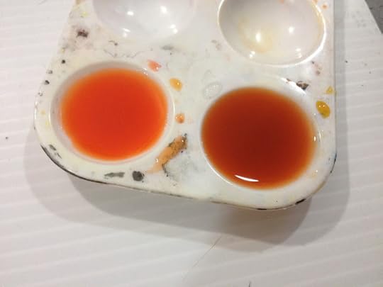 The orange for the wash (left) and the skintone mixture of yellow, red, and brown (right)

The Crayola Washable Watercolors seem to take a very long time to dry (perhaps because they just sit on top of the paper)

 What they paints look like once they've been activated.


You can see where the color pooled and dried darker- like the rings soap bubbles make.

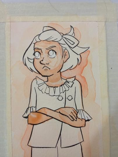

Perhaps surprising to no one, it's hard to predict and control how these watercolors will dry, where they pool up, and what colors dry darker in what situations. It's difficult to mix colors dark enough, and they don't really layer very well, although, as shown above and below, you can soften some of the lines with gentle scrubbing with a wet brush.


As time passes, pigments/dyes settle to the bottom of the palette and can't easily be reintegrated with the color.


The top layer of Kara's hair, and Kara's shorts are colors straight from the Crayola cakes. The best way to get saturated, vibrant color is directly from the cakes, it's very difficult to mix colors this dark using Crayola Washable Watercolors.

 To the left: Crayola's included watercolor brush, to the right, Royal Langnickel's size 2 Round.


Adding freckles was fairly easy, adding cheek blush was much more difficult, given Crayola's long drying times, tendency to pool on the surface on the paper rather than being absorbed, and unpredictale drying habits.
Because these don't include a raw sienna, I have to mix my own skintone. When I was in highschool, using a good ol' 12 pack of Crayola pencil colors, I would blend a skintone out of yellow, red, and brown. I decided to try that with the watercolors. This takes a little swatching and trial and error, as I've become accustomed to judging a skintone based on how it looks in the palette, and this one mixed a lot darker than I'm used to. These watercolors also seem to take longer than others to soak into the watercolor paper.
These are difficult to work with, don't layer properly, and are hard to blend out. Crayola Washable Watercolors have very poor pigmentation, and it takes a lot of mixing to get any color, let alone decent color saturation.
Another Opinion: Art Food Kitty- Cheap Vs Expensive Paint
The Verdict
If you're painting with Crayolas and you're frustrated with watercolor, you're not alone. These watercolors aren't meant for any sort of serious use, and aren't even really a good basis for learning how to use watercolors. I expected to have difficulty working with these, and I'm not able to even perform basic layering, which is fundamental to how I paint. If you're looking for cheap watercolors to learn on, and you're limited in your options, I recommend the Daler Rowney Simply Watercolors I reviewed recently over a box of Crayolas.
If you MUST use Crayolas, I do at least recommend a direct application for best results.
Also, the newer Crayola brushes are VASTLY improved over what they included in the set when I was a kid, and it's not a half bad brush. The bristles are a natural hair, maybe even squirrel, can be conditioned, and it forms a point when the brush is wet. So well done on improving your brush, Crayola.
It might seem ridiculous to some of my readers that I'm holding Crayola up to my almost-usual standard, but considering how many kids don't have access to actual art education, many of them enter high school thinking Crayola makes artist quality watercolors, and blame themselves for their inability to get anything out of a basic set. I wanted to see if I could make anything with them. There's two fairly prominent trains of thought regarding art supplies- a good artist can make anything work, and bad art supplies really hinder your ability to produce. Given that I review art supplies for a not-living, I am in the second camp, although I will admit that I am regularly amazed by what people can do with the most sub par materials I can only wonder how far they could fly with materials that didn't fight them every step of the way.
Did you find this post useful? Did you enjoy it? How about sharing it with friends on Facebook, or Tweeting it to your followers? The links above the post make sharing SUPER easy- you don't even have to leave the page! If you really liked this post, or any of my posts, how about sending me a tip via Paypal using the handy donation link in the sidebar, or writing me an email? It would definitely make my day!
Please consider donating to this blog or purchasing from Natto-shop (http://nattosoup.com/shop) if you want me to continue publishing quality content. All materials tested were purchased from my own pocket. Keep on Truckin' Nattosoup is not under any sponsorship.
As this blog is completely unsponsored, and I receive no financial compensation from companies to write these reviews, nor do I receive donations from manufacturers, I really depend on the goodwill of my readers. If you benefitted from this post, please consider contacting Crayola with a link to this post and your thoughts. I would also sincerely appreciate it if you sent me an email with your thoughts, questions, or thanks. The only way I can write content that you enjoy is if you let me know what works for you, and what you want to read.
It's a great sign for artists when the package touts "washable!" so proudly.
I think there are few sights more 'back to school' than the basic pack of Crayola Crayons and the plastic, self contained packaging on Crayola Watercolors. Crayola Watercolors (or one of their market competitors like Rose Art, or CraZArt) are a first introduction to watercolors for many aspiring artists.
The package has changed very little in the 30 years I've been kicking around this planet- 8 poured patties of color, 1 plastic brush, a case that doubles as a small palette. At the start of the school year, those little patties of color are all so perfectly distinct in color, by the end, they're all a muddy mess. Unfortunately, few brands are as snidely referred to by professional, practicing artists (myself included) as Crayola, and I decided to find out if this first brand for many was really as difficult to professionally paint with as we'd all assumed.
So as familiar as most kids (and adults) are with Crayola, what do we really know about the company, or about the product I'm testing today, their Washable Watercolors? I must admit, as ubiquitous as the brand has been in my formative artistic years, I know very little.
If you can't find Crayola watercolors at a store near you (which would be surprising), you can find them for sale on their site-the same set I used for this demo. The site claims that these are formulated for easy clean up (what, 100% soap? What pigments/dyes are they using that don't stain and are non-toxic?), promises vibrant colors for mixing and blending (more on THAT in the review), more paint than other comparable brands, and 8 colors and a paintbrush. I can't verify whether or not Crayola is really offering more paint per pan, and I don't really want to paint all over my clothes to see if these do or do not stain, but I can vouch that Crayola did indeed include 8 watercolors and one brush in this set.
Crayola has a Portfolio series that I may check out in future reviews, and at a glance, it looks like it's aimed at teenagers who aspire to become artists. If you would like to see some of these products reviewed here, I recommend you write to Crayola with links and request that they send samples. You can do that here.
Crayola has been owned by Hallmart since 1984, and is best known for it's crayons, although they make a wide variety of other products, including Silly Putty. The company was founded by Edward Binney and C Harold Smith in 1885, and the original products sold were industrial colorants like carbon black and red iron oxide. Crayola introduced their line of wax crayons in 1903. Crayola's Portfolio subbrand is not their first foray into professional artist materials, in 1903, Crayola also launched it's Rubens line, and intended to compete with the Raphael line of European crayons. (Information via Wikipedia, as I can't find historical information on the official site)
The cleanup instructions on these are pretty simple- dampen a sponge with water and wipe stain from outside to center, for that hard to clean carpet. I assume you can pretreat affected clothes and just pop them in the wash.
My first real surprise came from the fact that the included brush no longer features plastic bristles splayed every which way, but actual hair in a metal ferrule. When did THAT welcome change happen? The plastic bristled brush was one of the features I dreaded- it was pretty much impossible to paint with when I was a kid, you mostly just smeared paint on the paper using the brush like you would a basting brush.
The Package

Isn't this nostalgic? The packaging Crayola Watercolors comes in has changed very little over the past 25 years. The cakes are still contained in a plastic tray, which is housed in a reusable plastic case. The labelling is all on a cardboard insert, the package itself contains no information.

The cardboard insert is removable, leaving us with just the basics- a plastic package that doubles as a palette, a brush, and 8 cakes of poured watercolor.
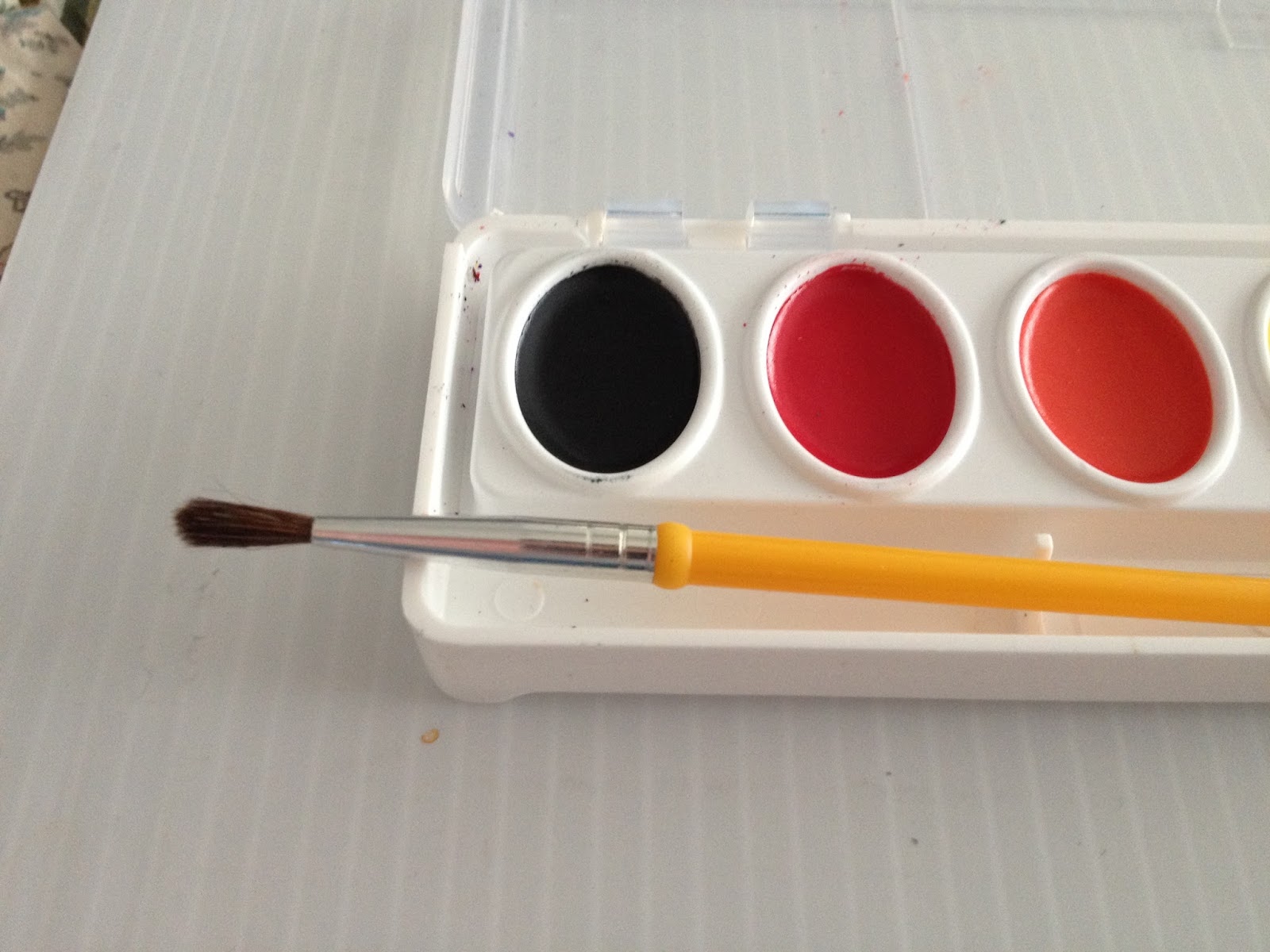
The brush is natural hair, and fairly soft, with no glue to help preserve its shape during transit.
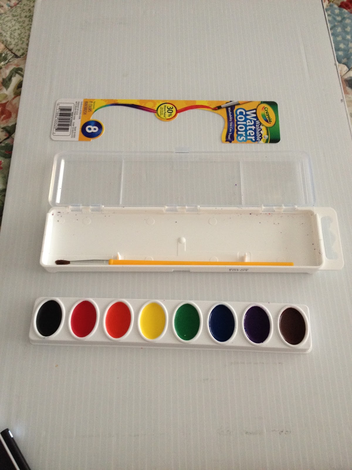
The tray the cakes are on is completely removable, and I suppose you could use the bottom of the package as a large wash.
The Brush
Crayola's included brush has changed a fair amount over the years. When I was a girl, Crayola Watercolors looked like this:
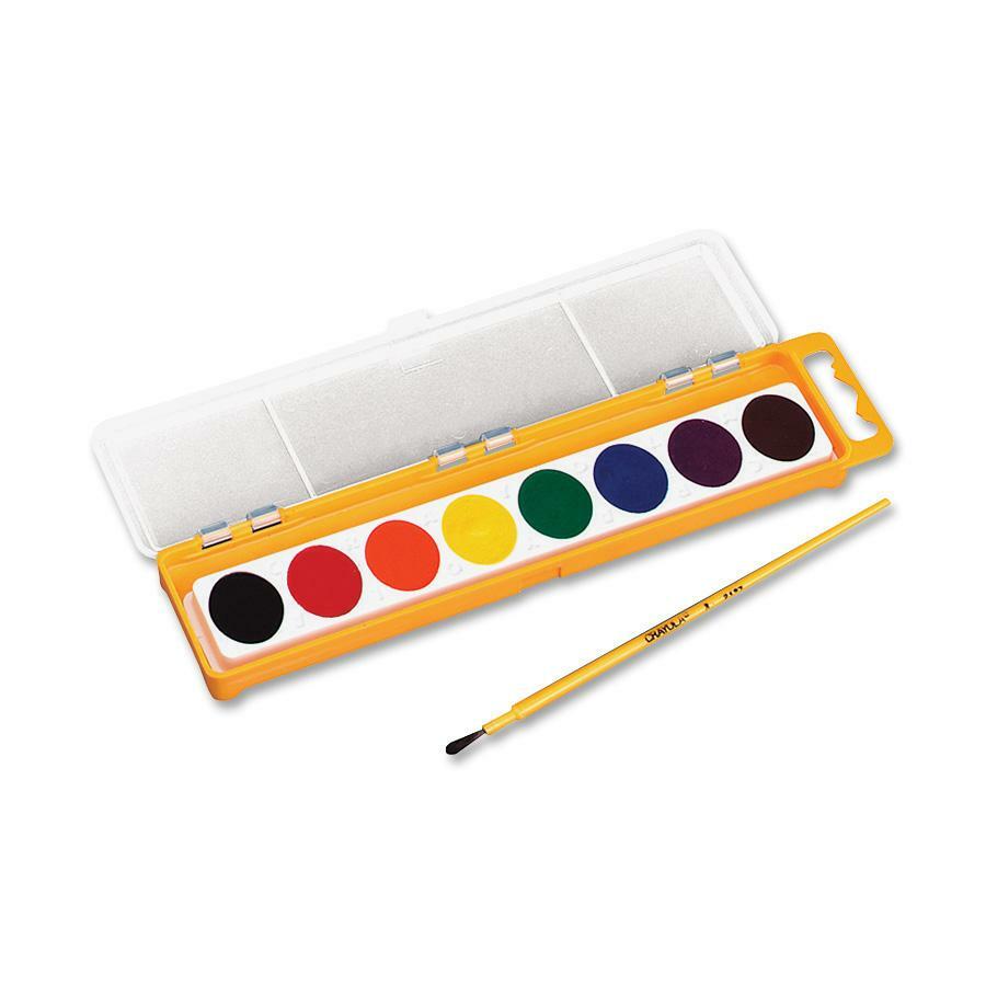 Image SourceNote the stiff plastic bristles set directly in the stiff plastic handle.
Now Crayola makes a wide variety of brushes:
[image error] Image Source
 Image Source
 Image Source
And the one included with my watercolors looks like this:
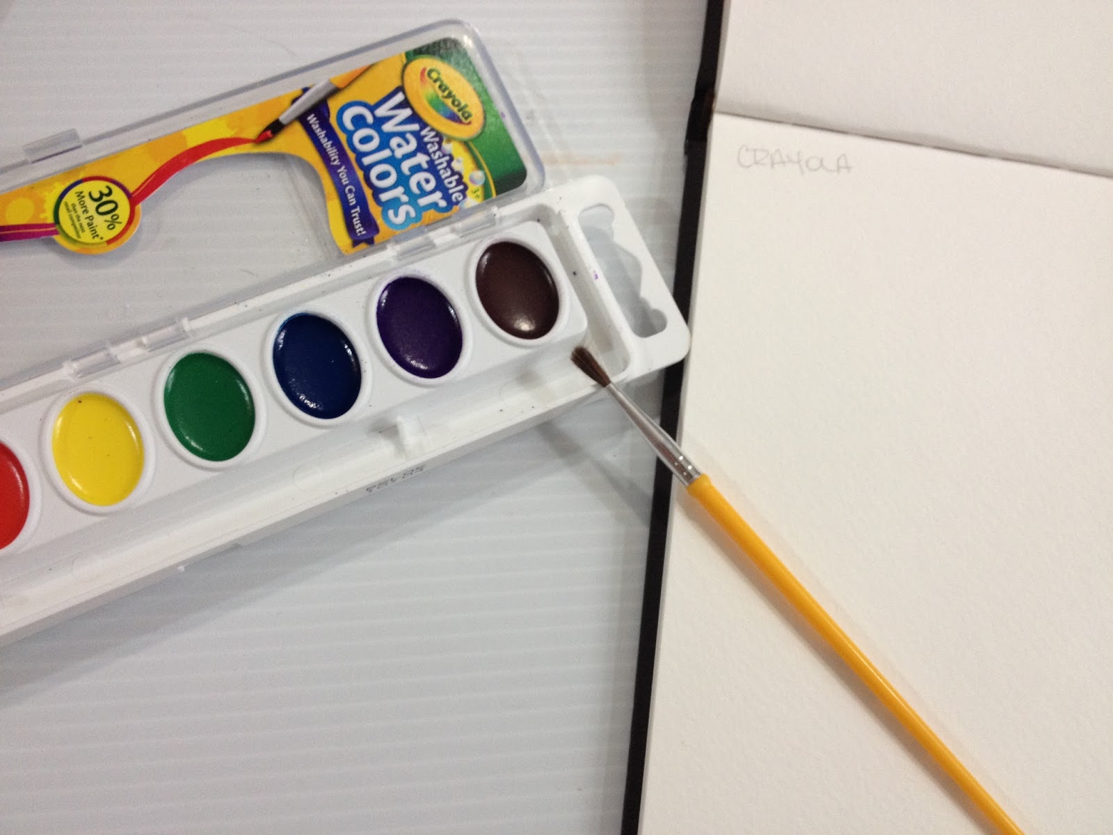

This brush is remarkably improved over the brushes of my childhood! Real hair fibers (maybe even squirrel), real metal ferrule with a couple crimps. Same plastic handle though.
The Paints

So the paints appear to be poured cakes, and I'm guessing they're bound with glycerin. I'm not sure what Crayola uses for color, because dyes tend to, well, dye, and pigments also have a tendency to stain, and remember, class, these paints are WASHABLE! Swatch Test
Top row is straight from the palette, no water added, bottom row is after water has been absorbed for a few minutes.

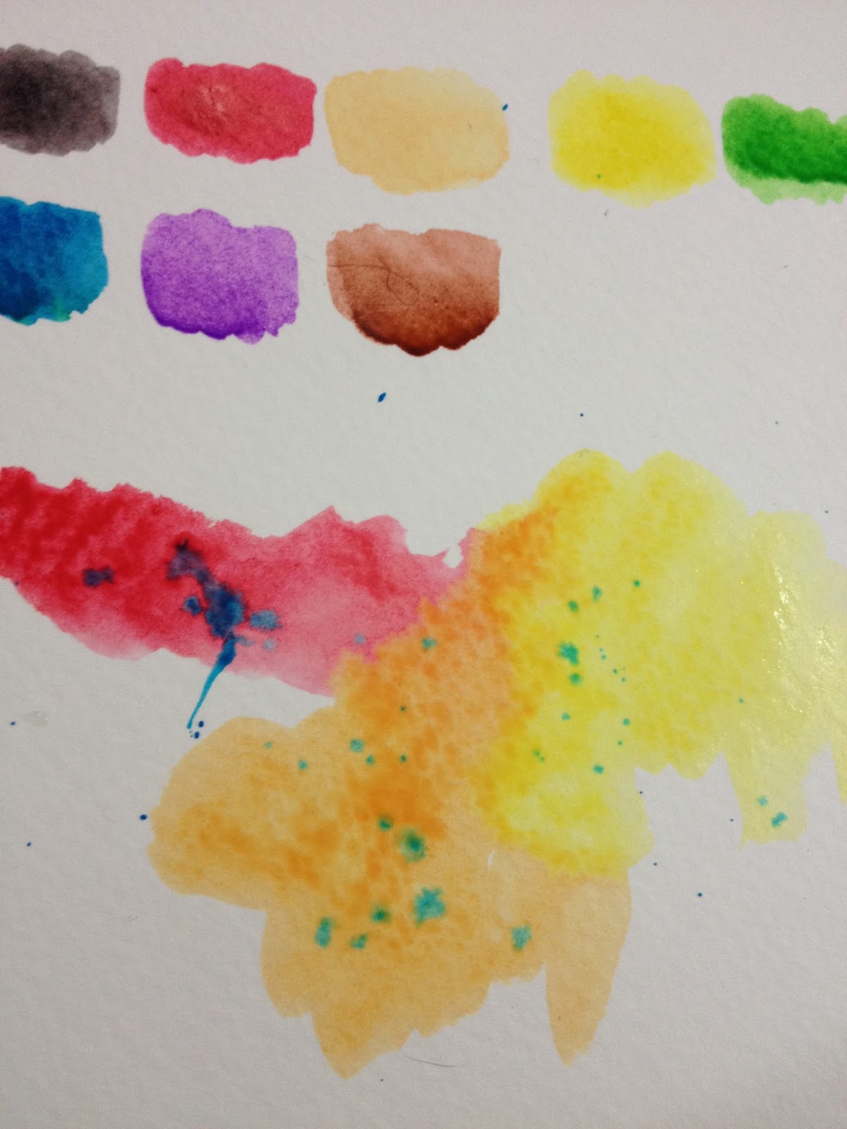

Straight from the palette, using Crayola included brush, water hasn't had a chance to be absorbed
Colors handle like they include...soap? What on earth is the binder for these? I know they're non toxic, so they're probably dye based, not pigment based, and I assume since they dont want kiddos om nomming these, they probably don't have a sucrose based binder like many real watercolors.
Some colors perform better than others- yellow, green, and blue are all ok, red is fine, 'black', orange, purple, and brown are disappointing.
When wet, these colors tend to blend with a little persuasion and additions of water, and dry a little glossy, which I find disconcerting.
Included colors appear to be:
Sepia, Crimson Hue, a really bad orange that is closer to yellow, Lemon Yellow, Sap Green, Pthalo Blue, Red Violet, Burnt Sienna
Colors are actually listed as:
Not listed on package.
After water has settled in, but straight from the palette:
Colors are slightly more intense, but still handle like they're bound with soap. After the cake has absorbed water, sepia becomes black, orange still handles poorly, purple is much more vibrant, and burnt sienna is more intense as well.
These are going to be a joy to work with for the field test.
When dry, paints seem to sit on top of the paper, rather than soaking in, which is troubling.
Note: I'm going to clean and condition the included brush, and try to use that exclusively for the field test. WISH ME LUCK.
Washing and Conditioning the Brush

Here is the brush with conditioner in it. I let it sit overnight for the conditioner to work it's magic.
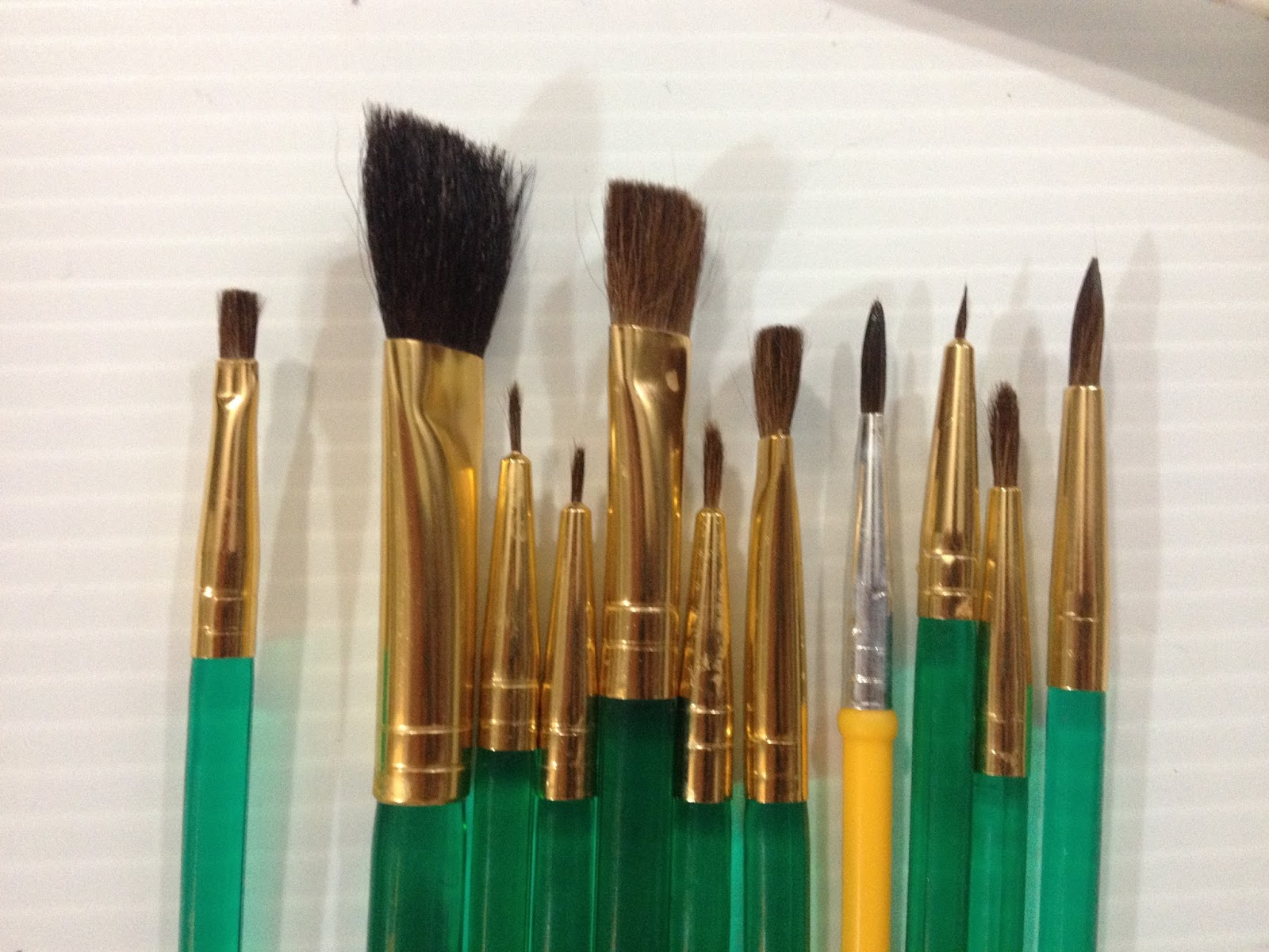
And here's a shot of my Crayola brush hiding amongst the Royal Langnickel brushes. I used both types for this review.
The Field Test
I drew Kara cranky as a pre-emptive. If this turns out badly, Kara will have a reason to be angry.
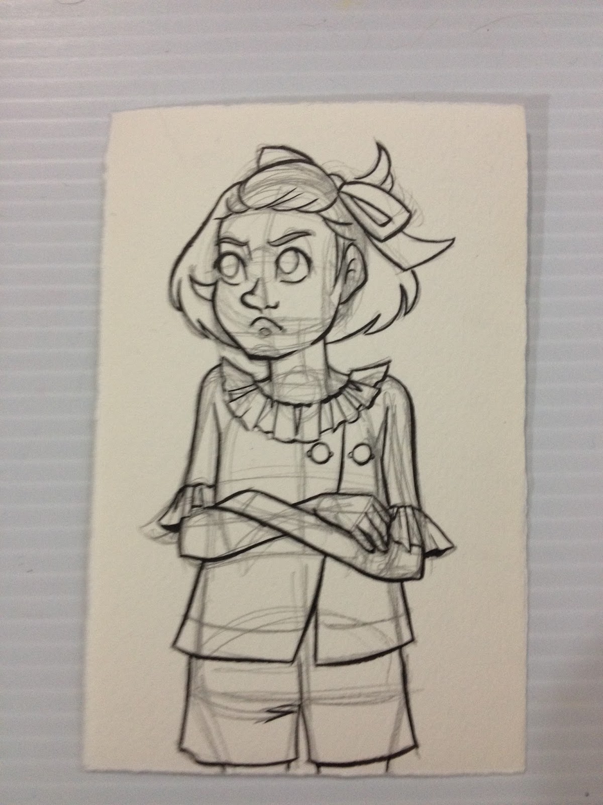

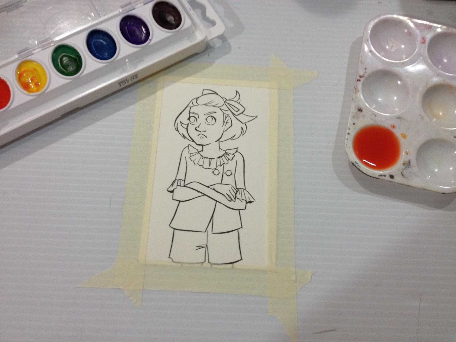

So let's start with a wash! I decided to use the large wash brush from the Royal Langnickel set to apply a very watered down orange wash.
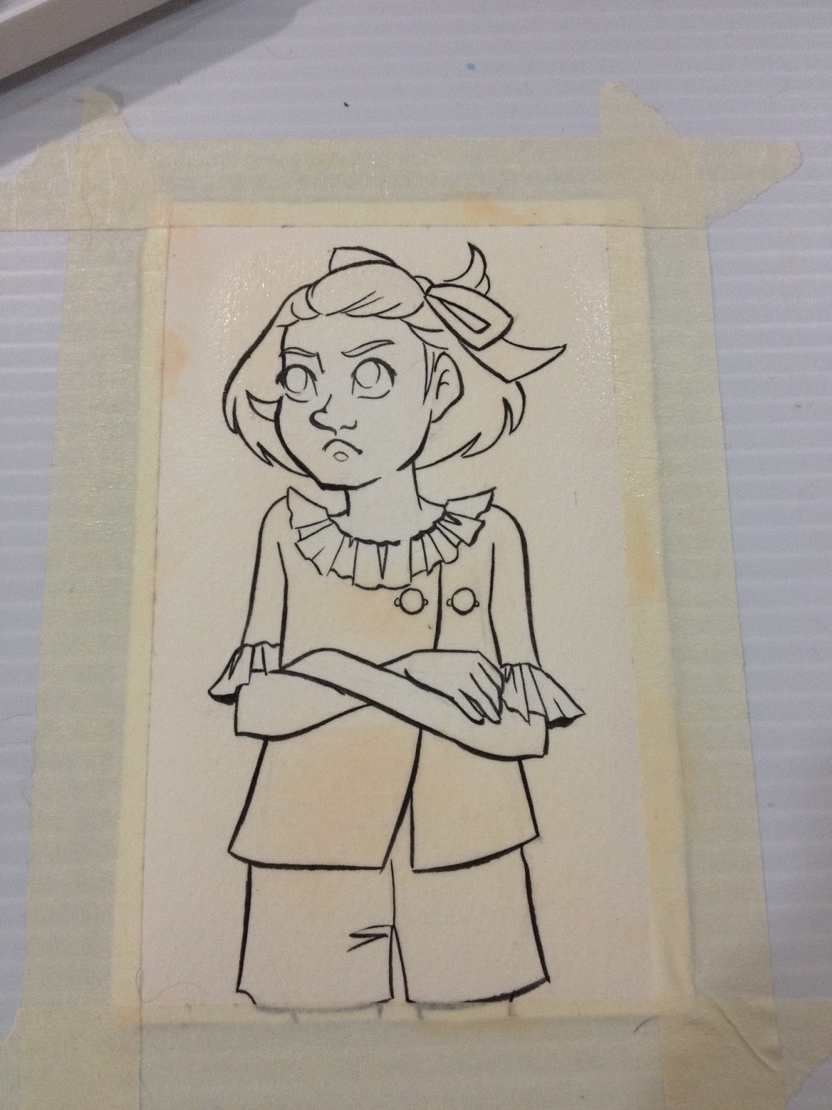
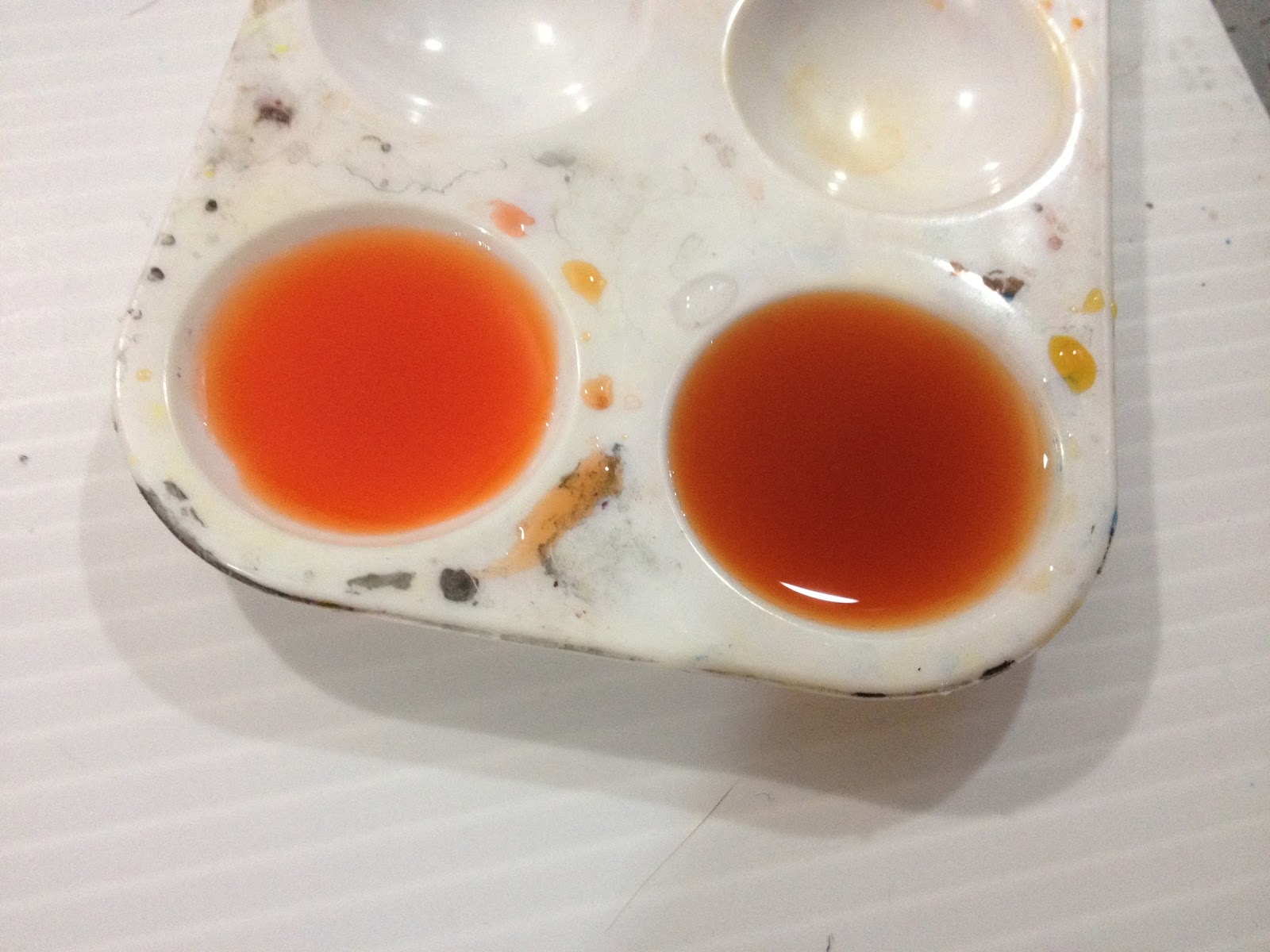 The orange for the wash (left) and the skintone mixture of yellow, red, and brown (right)
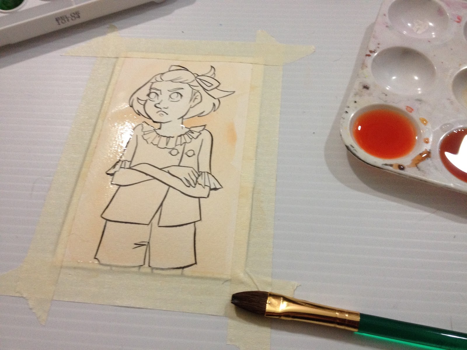
The Crayola Washable Watercolors seem to take a very long time to dry (perhaps because they just sit on top of the paper)

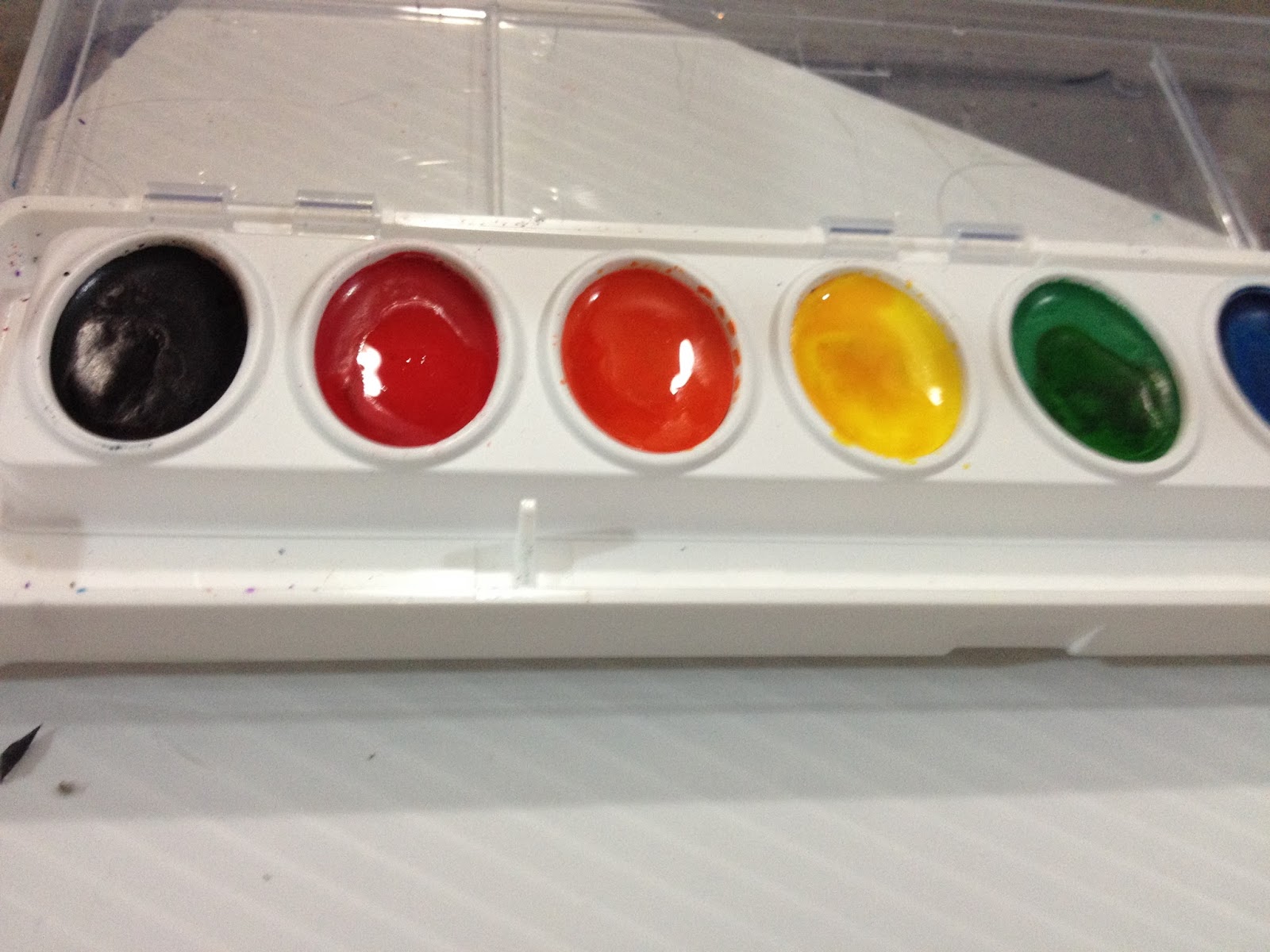 What they paints look like once they've been activated.
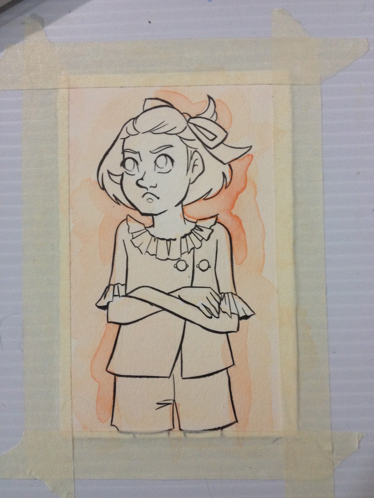
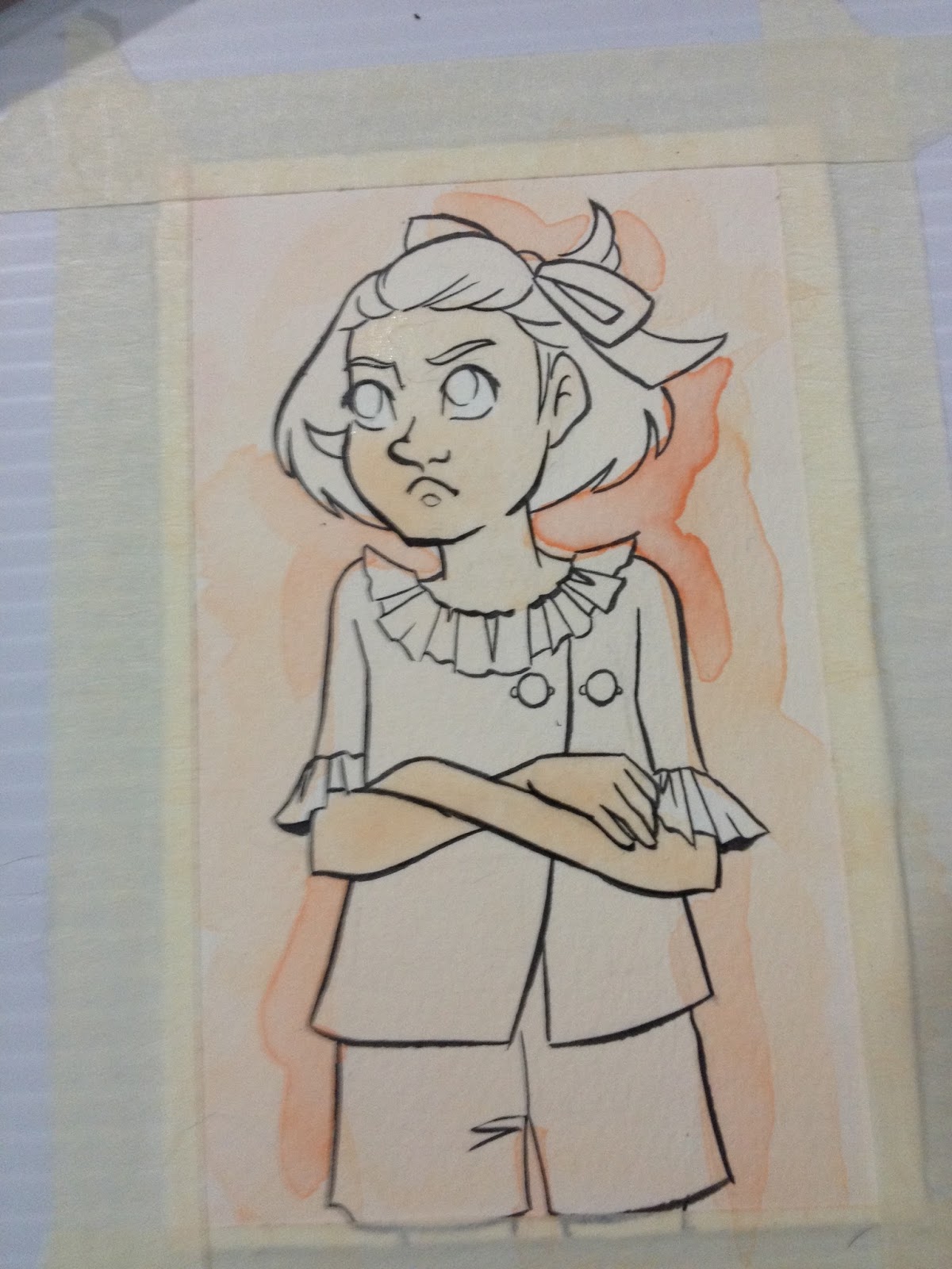
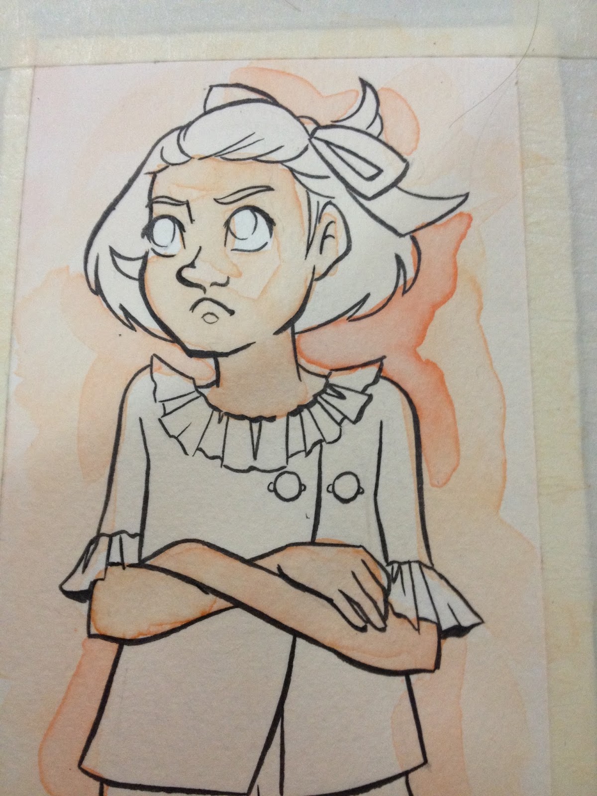
You can see where the color pooled and dried darker- like the rings soap bubbles make.
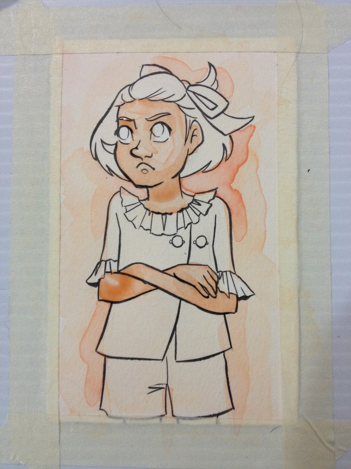


Perhaps surprising to no one, it's hard to predict and control how these watercolors will dry, where they pool up, and what colors dry darker in what situations. It's difficult to mix colors dark enough, and they don't really layer very well, although, as shown above and below, you can soften some of the lines with gentle scrubbing with a wet brush.
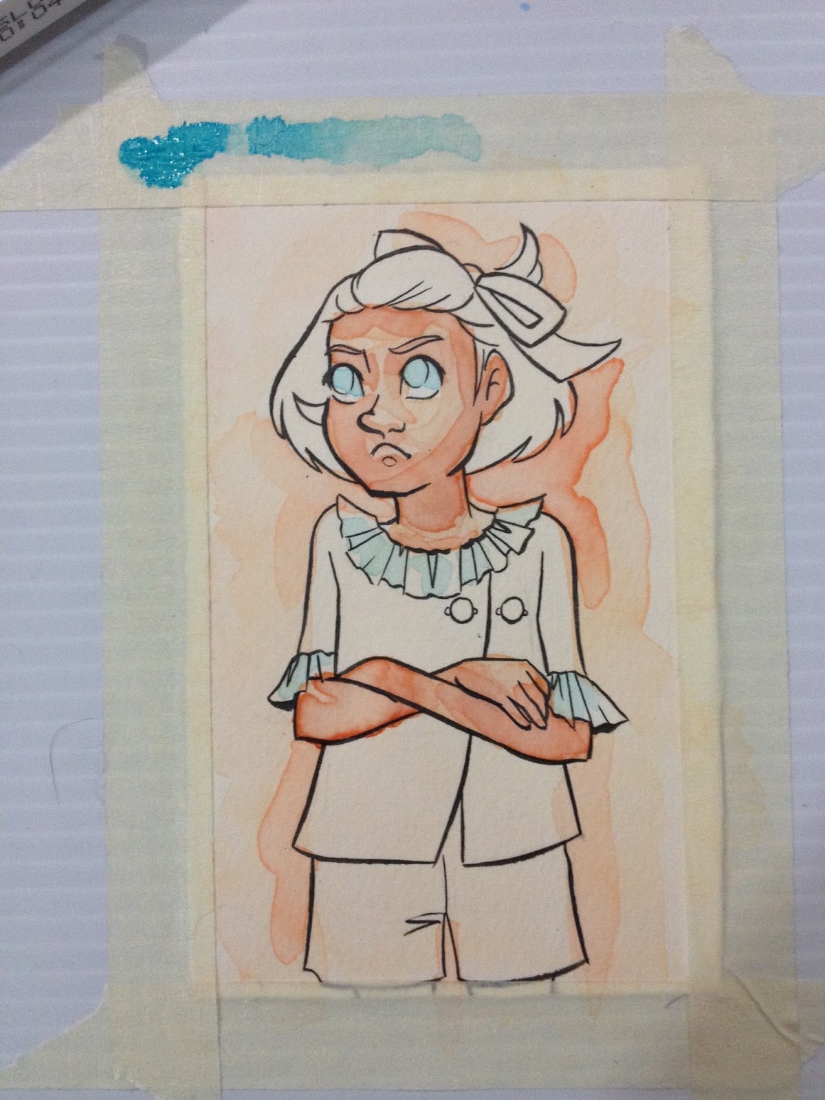
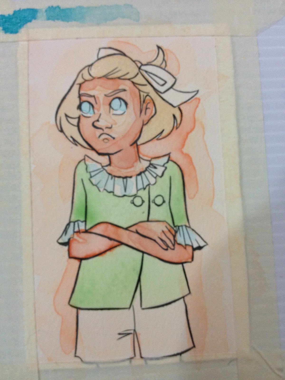
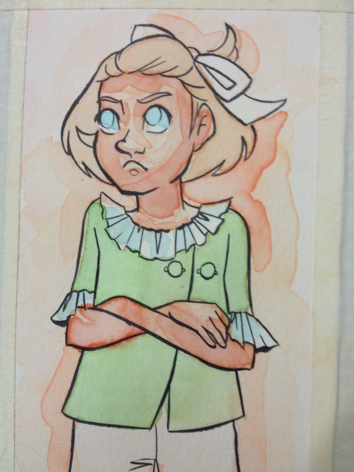
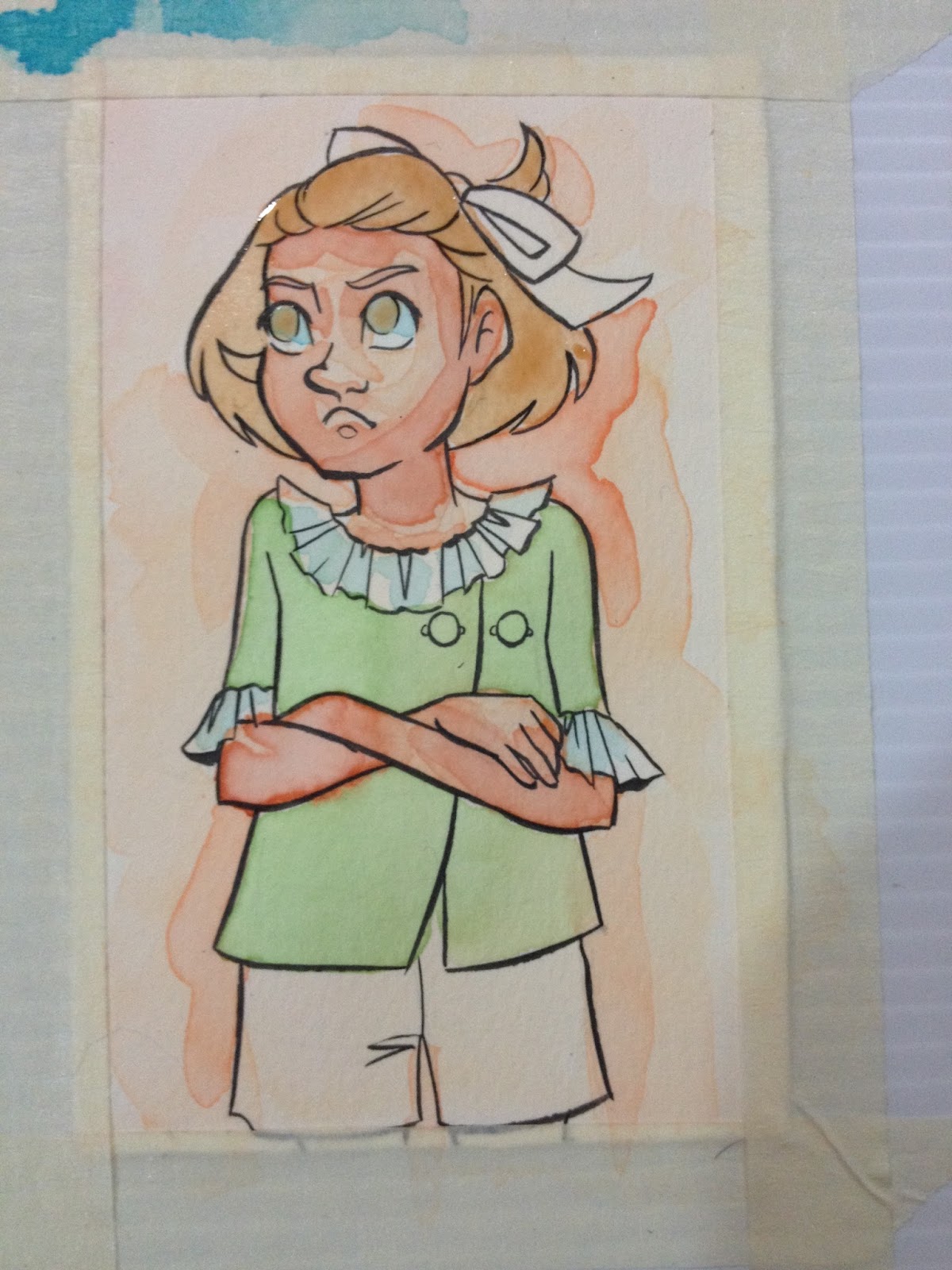
As time passes, pigments/dyes settle to the bottom of the palette and can't easily be reintegrated with the color.
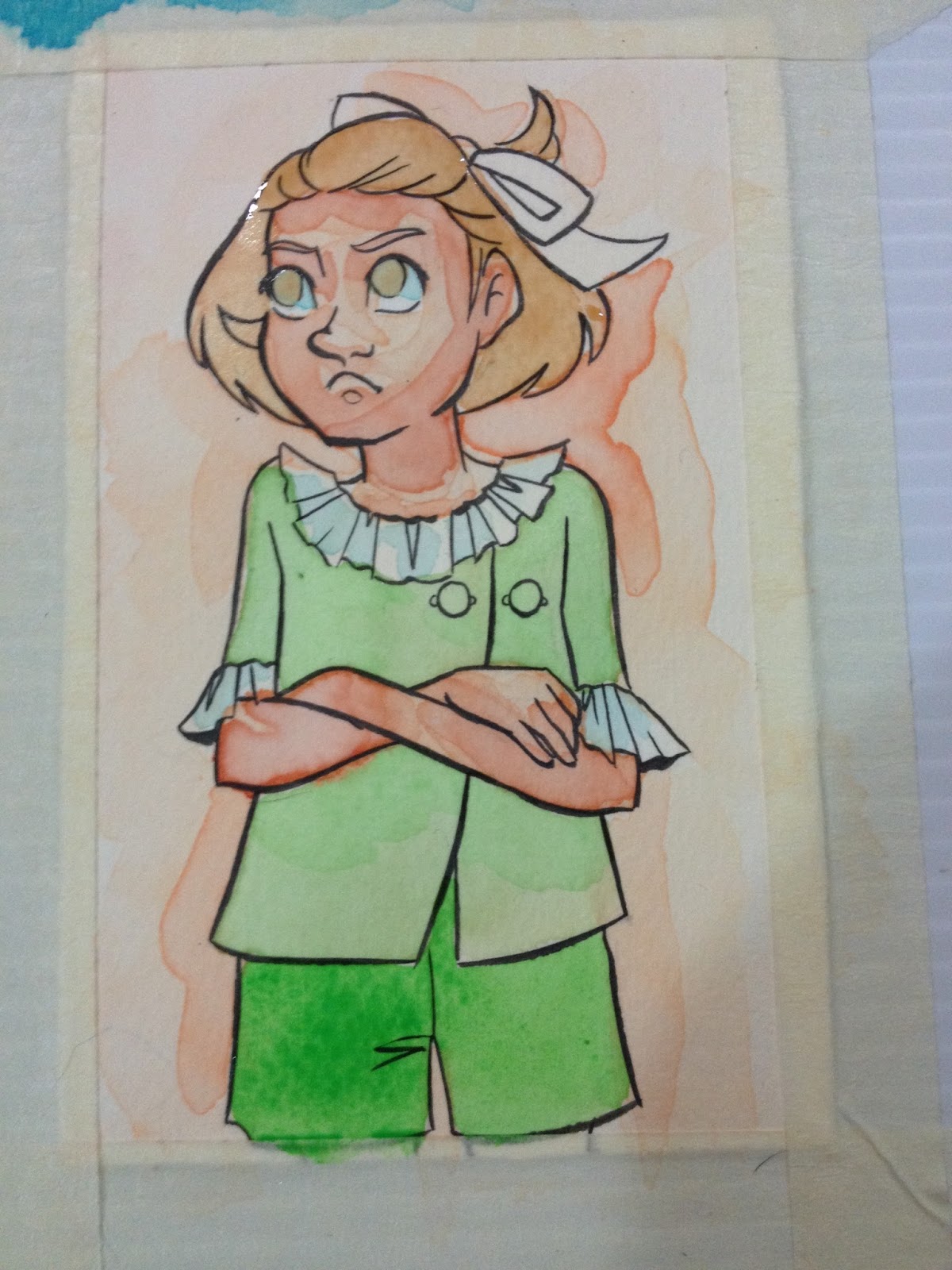
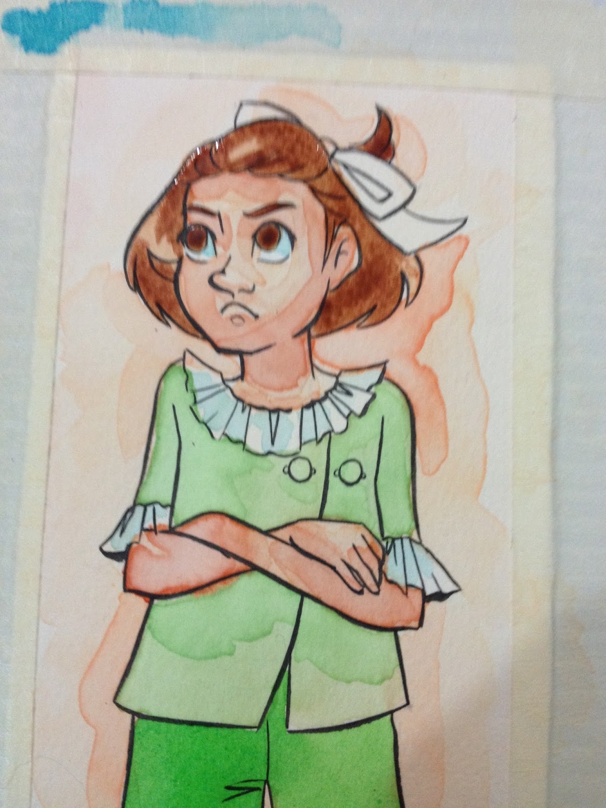

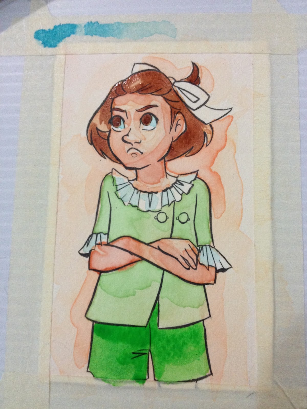
The top layer of Kara's hair, and Kara's shorts are colors straight from the Crayola cakes. The best way to get saturated, vibrant color is directly from the cakes, it's very difficult to mix colors this dark using Crayola Washable Watercolors.

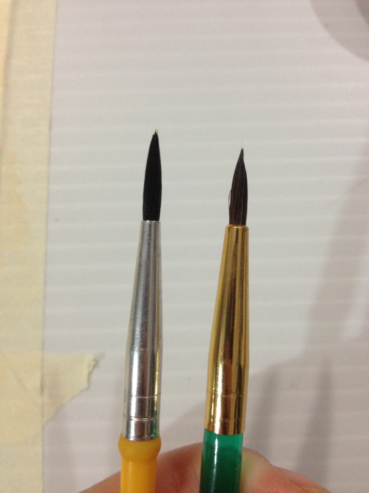 To the left: Crayola's included watercolor brush, to the right, Royal Langnickel's size 2 Round.
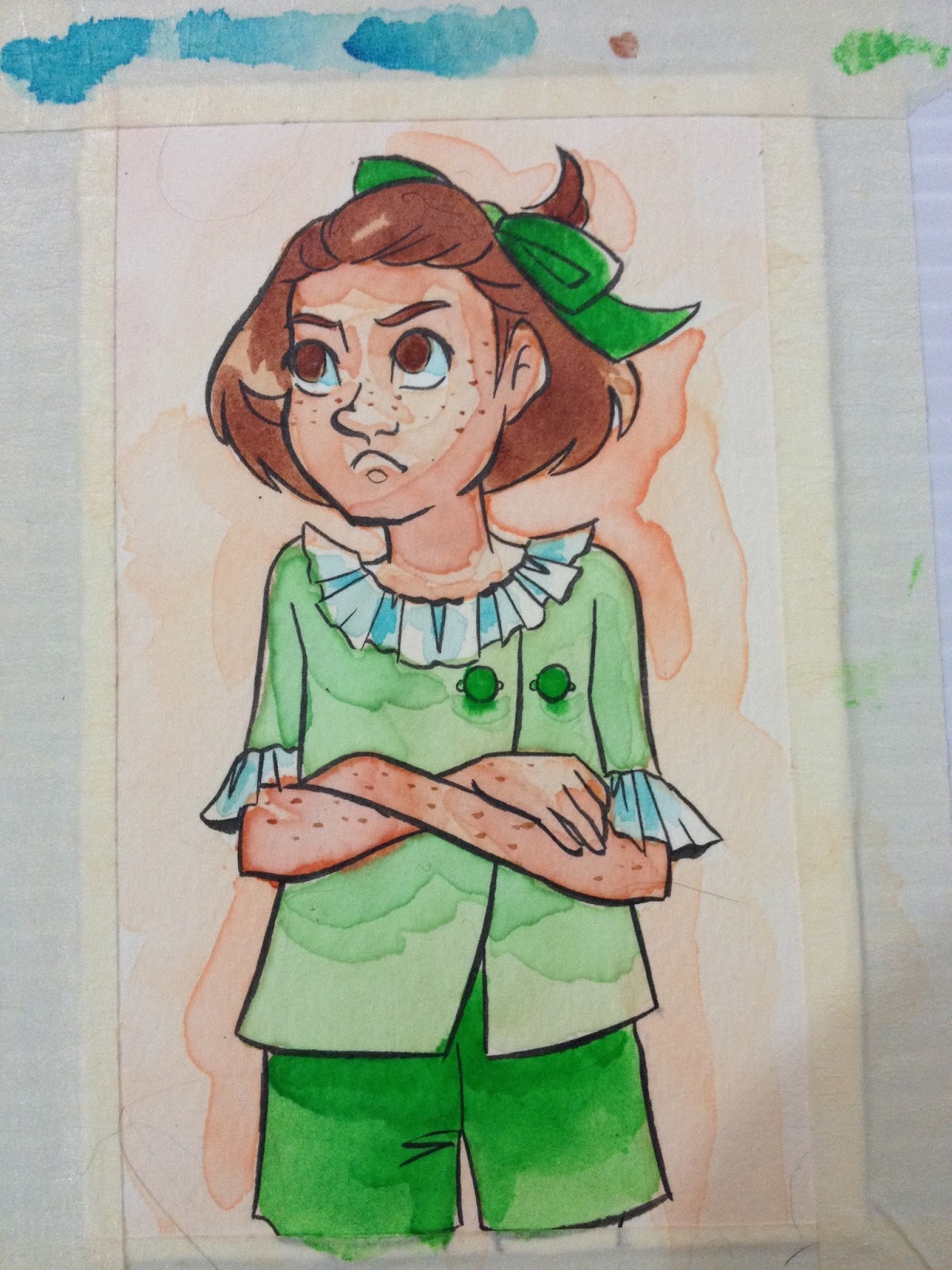
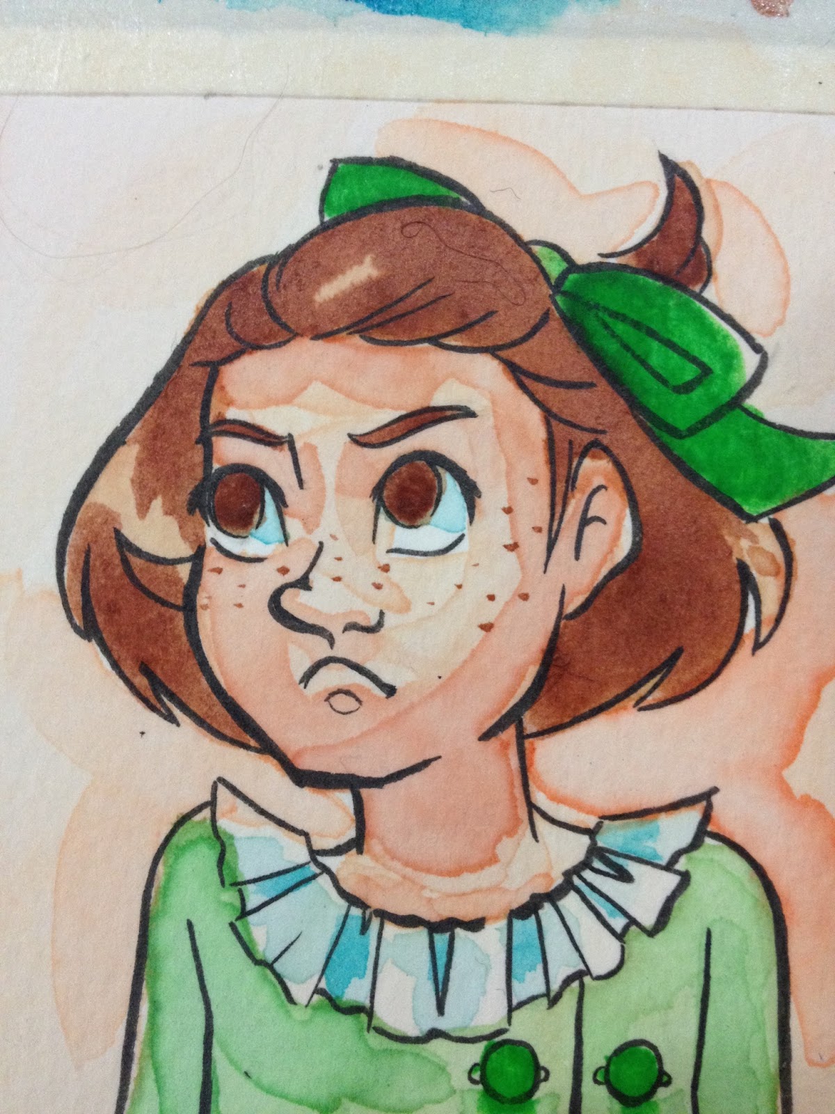
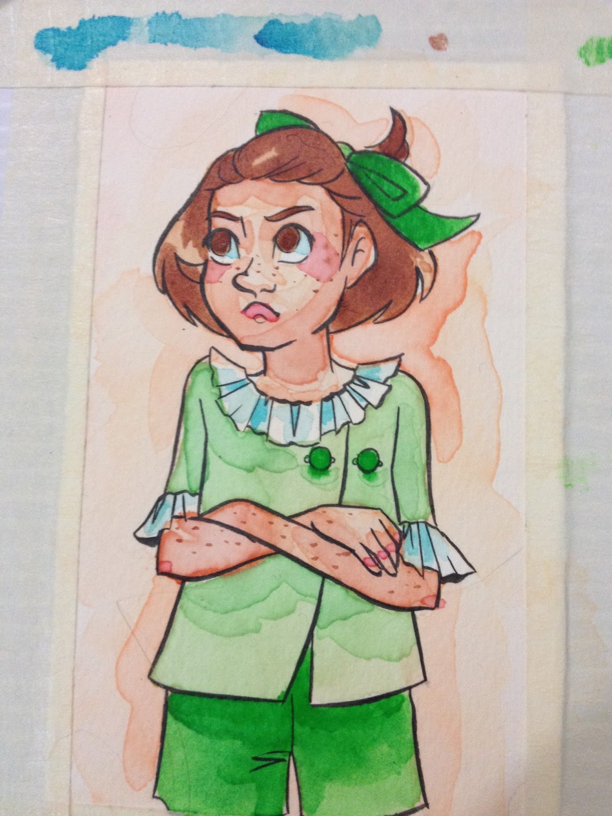
Adding freckles was fairly easy, adding cheek blush was much more difficult, given Crayola's long drying times, tendency to pool on the surface on the paper rather than being absorbed, and unpredictale drying habits.
Because these don't include a raw sienna, I have to mix my own skintone. When I was in highschool, using a good ol' 12 pack of Crayola pencil colors, I would blend a skintone out of yellow, red, and brown. I decided to try that with the watercolors. This takes a little swatching and trial and error, as I've become accustomed to judging a skintone based on how it looks in the palette, and this one mixed a lot darker than I'm used to. These watercolors also seem to take longer than others to soak into the watercolor paper.
These are difficult to work with, don't layer properly, and are hard to blend out. Crayola Washable Watercolors have very poor pigmentation, and it takes a lot of mixing to get any color, let alone decent color saturation.
Another Opinion: Art Food Kitty- Cheap Vs Expensive Paint
The Verdict
If you're painting with Crayolas and you're frustrated with watercolor, you're not alone. These watercolors aren't meant for any sort of serious use, and aren't even really a good basis for learning how to use watercolors. I expected to have difficulty working with these, and I'm not able to even perform basic layering, which is fundamental to how I paint. If you're looking for cheap watercolors to learn on, and you're limited in your options, I recommend the Daler Rowney Simply Watercolors I reviewed recently over a box of Crayolas.
If you MUST use Crayolas, I do at least recommend a direct application for best results.
Also, the newer Crayola brushes are VASTLY improved over what they included in the set when I was a kid, and it's not a half bad brush. The bristles are a natural hair, maybe even squirrel, can be conditioned, and it forms a point when the brush is wet. So well done on improving your brush, Crayola.
It might seem ridiculous to some of my readers that I'm holding Crayola up to my almost-usual standard, but considering how many kids don't have access to actual art education, many of them enter high school thinking Crayola makes artist quality watercolors, and blame themselves for their inability to get anything out of a basic set. I wanted to see if I could make anything with them. There's two fairly prominent trains of thought regarding art supplies- a good artist can make anything work, and bad art supplies really hinder your ability to produce. Given that I review art supplies for a not-living, I am in the second camp, although I will admit that I am regularly amazed by what people can do with the most sub par materials I can only wonder how far they could fly with materials that didn't fight them every step of the way.
Did you find this post useful? Did you enjoy it? How about sharing it with friends on Facebook, or Tweeting it to your followers? The links above the post make sharing SUPER easy- you don't even have to leave the page! If you really liked this post, or any of my posts, how about sending me a tip via Paypal using the handy donation link in the sidebar, or writing me an email? It would definitely make my day!
Please consider donating to this blog or purchasing from Natto-shop (http://nattosoup.com/shop) if you want me to continue publishing quality content. All materials tested were purchased from my own pocket. Keep on Truckin' Nattosoup is not under any sponsorship.
September 3, 2015
Walmart Art Supply Review: Daler Rowney Simply... Watercolour
Daler Rowney is a brand I think most artists are passingly familiar with, but perhaps few of us really use. I know the Luling Walmart has sold their products off and on over the years it's been open, but while I'm fairly sure I've worked with their products before, I can only really remember buying their acrylics in high school, and I've never really enjoyed working with acrylics.
The website lists a lot of products, from paints (watercolor, acrylic, oil) to even luggage. Daler Rowney seems to offer three lines of watercolors on their site: Artists' WaterColour, AquaFine, and Simply Watercolor. I'll be testing the Simply Watercolor, found at my Luling Walmart, in this post, but may revisit Artists' Watercolour and AquaFine at a later date. The Artists' WaterColour line seems to be their premium line, with 80 different colors available in 5ml or 15 ml tubes, or in artists' watercolor pans. These colors are available in a variety of sets. AquaFine is aimed at students and hobbiests. There are 37 available colors in the AquaFine set, and colors are available in 8ml tubes, or in half pans. Colors are also available in sets. SimplyWatercolor is Daler Rowney's bottom of the barrel line, with a strong focus on being 'affordable' rather than good. These are probably intended for children with an interest in art who have parents with no interest in spending the money necessary to acquire decent supplies. SimplyWatercolor are available as 12ml tubes, pans, and even poured cakes, although my Walmart only had a couple beaten up boxes of the 12ml tubes in 12 packs on offer.
Upon exploring the site, I realize I own and regularly paint with a few brushes produced by Daler Rowney, such as the Sapphire Watercolor brushes and Robert Simmons brushes. I believe these were purchased at Michaels a few years ago- I did not see any of these brushes at the Luling Walmart.
The pack I purchased features:
12 tubes12ml or .4 US fl. ozColors include:
White
Lemon Yellow
Vermillion (Hue)
Crimson Red
Cerulean (Hue)
Ultramarine
Sap Green
Viridian Green (Hue)
Yellow Ochre
Burnt Sienna
Burnt Umber
Black
These tubes were made in England
According to the back of the box:
The Packaging
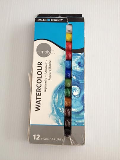
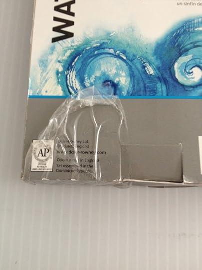


The packaging was already wrecked when I bought it, but the other box on the shelf wasn't in much better condition. I'm pretty sure both have been purchased and returned, which doesn't really bode well.
The watercolors are stored in a plastic tray that holds them in place. The watercolors come in metal tubes with a twist cap reminiscent of a toothpaste cap. The cap has a little piercer to open the watercolors, so we'll find out soon enough if these watercolors were purchased and returned.
Despite the box looking like it'd been kicked around Walmart for a week, the tubes are all unopened at time of purchase.
The Paints


All of my caps ended up with paint on the piercing piece.
 This is something you don't really experience with more expensive brands of paint. Be careful when opening your paints, some of them may have been compressed during their time at Walmart, and may be under pressure.
The Swatches
Straight from Tube
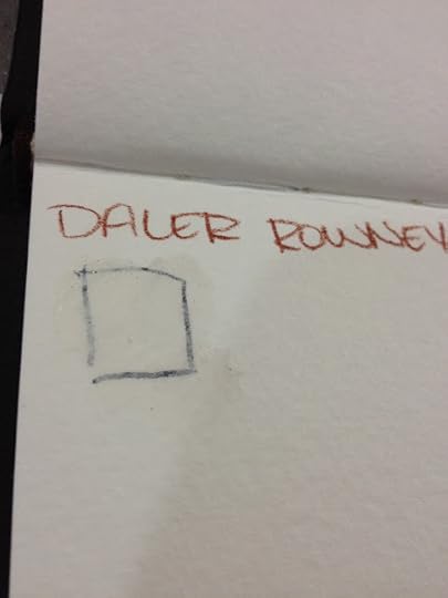
Even straight from the tube, the Chinese white is wholly unimpressive. Generally, I just rely on white gouache for my white highlights.
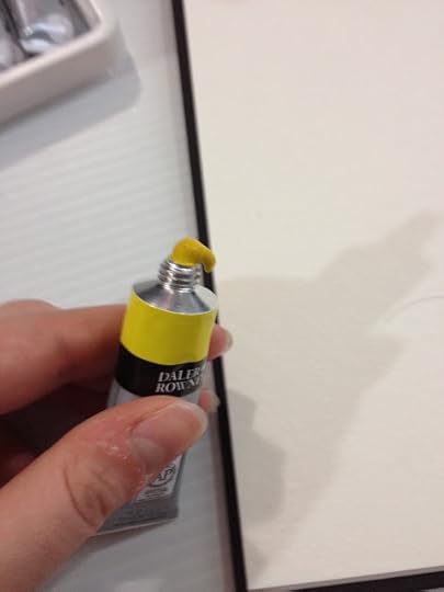
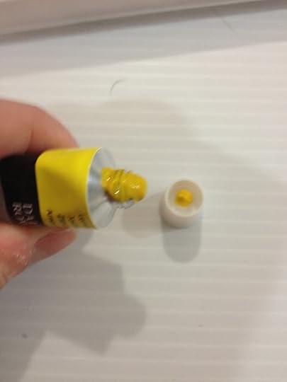
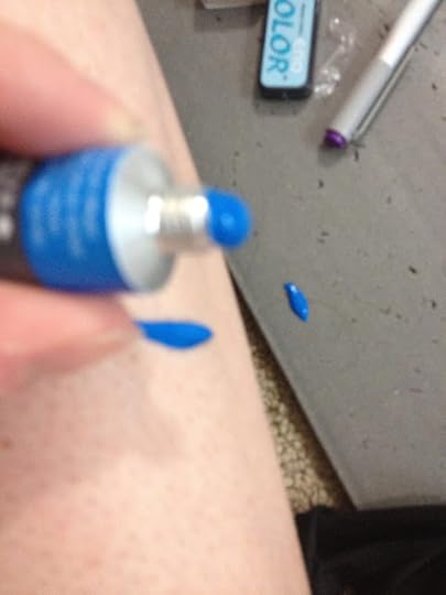
As soon as I pierced the blue, it squirted all over my leg and anti fatigue mat. Now you see why I warned you to be careful!
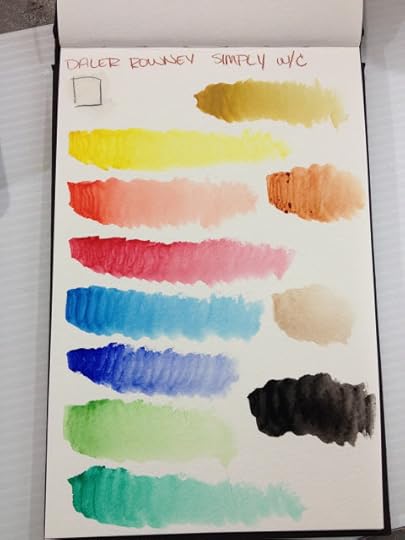
All of these paints are very liquidy- I'm curious what binder they're using, and often with higher quality paints, they do separate over time. There appears to be no separation with these, and I'm curious as to how Daler Rowney managed that. I've heard that lower grade watercolors use glycerin rather than sucrose or honey, but I can't seem to find any verification- if you guys have any links on that topic, please send them in!
Straight from the tube, the black performs the best- the pigments dissolve quickly and coverage is even. The other colors perform exactly like what they are- student grade watercolors, although they're definitely a step up from kid's watercolors like Crayolas (stay tuned for that review!)
Allowed to dry and used on palette

Making portable, dry watercolors is fairly easy. While tube watercolors do handle a lot differently than watercolors that originally come in cakes and pans, most tube watercolors can be dried and reconstituted successfully. I wanted to see if Daler Rowney Simply Watercolors could hold up to drying and rewetting, so I simply applied a little dot of paint in each well of a palette, and allowed my little paint dots to dry fully.
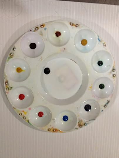
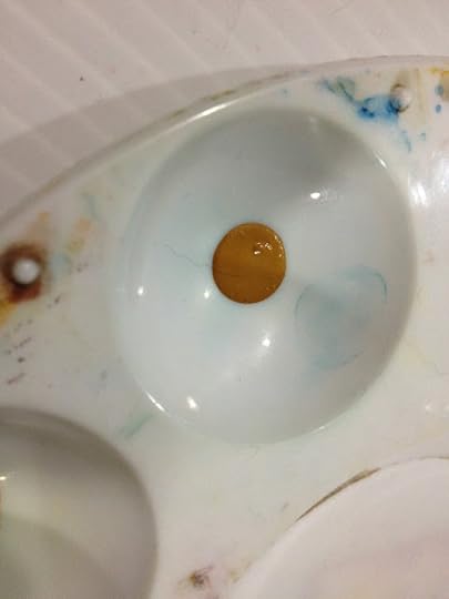
Although they look wet, these are now fully dry, and ready for swatching!
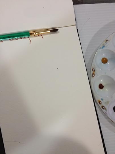
For the rest of this review, I'll be using the Royal Langnickel watercolor brushes. The review for that is coming up soon, so if you're interested in how those handle, keep watching this blog.
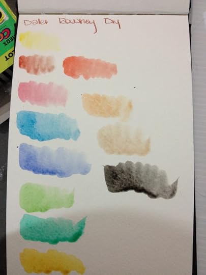
The reconstituted Daler Rowney Simply Watercolors are much less saturated than the color straight from the tube, which may make them easier for you to work with. I prefer my color less saturated, as it allows me to build up layers.
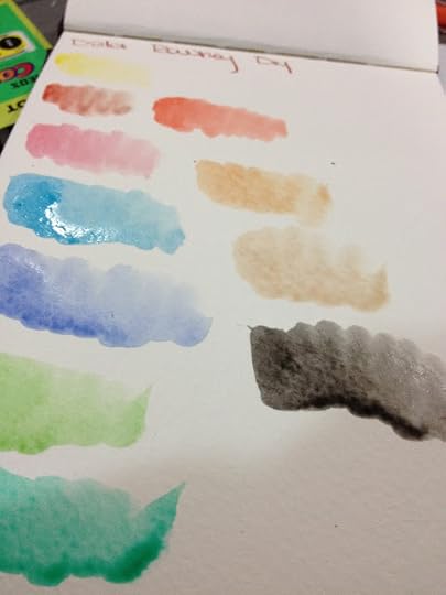

The dried watercolors reconstitute ok, the browns are a little stiff, but as always, if you pre-wet your watercolors with a drop of water, they should mix up pretty quick.
I am REALLY curious about what pigments these paints use, because the tubes release color pretty quickly given the price, and the dried colors are slow to release pigment even after they've been activated.
The Field Test
So my setup for this field test includes the dried palette I prepared ahead of time, my swatchbook for color reference, a clean watercolor palette, and the test piece that's been masking taped to my plastic gatorboard, which serves as a support.
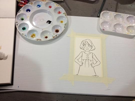
As mentioned above, I'm using the Royal Langnickel brushes for this Field Test- it gives me an opportunity to test them out along with the Daler Rowney watercolors.

Already, the lost saturation is causing issues, as I had difficulty mixing up a skintone dark enough.
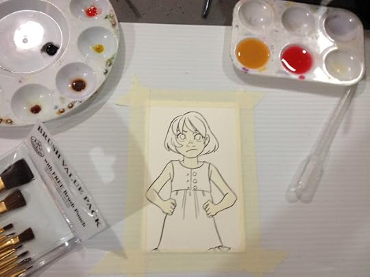

When I was starting out, I put a drop of water into each well, to give the paint an opportunity to absorb the water. This reduces the amount of scrubbing you'll have to do to release pigment later.


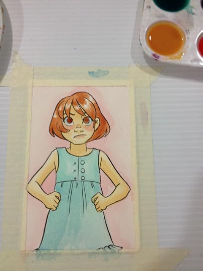
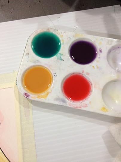
This set, as large as it is, doesn't contain a purple, violet, or red violet, so you'll have to mix your own.

The pigments don't mix well at all- the pigments in the cerulean blue fall to the bottom of the palette, which leaves you with uneven color distribution.

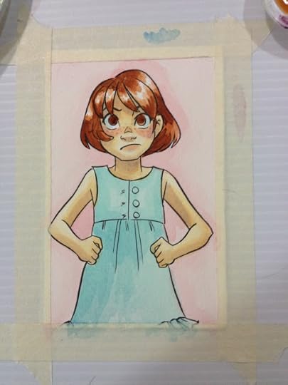
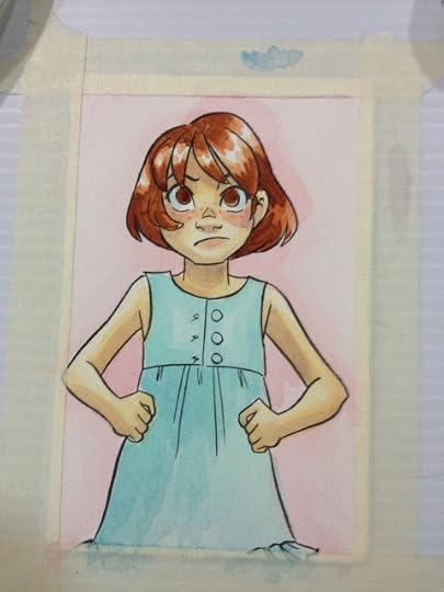

The sepia included really isn't dark enough, so I mixed some black in.

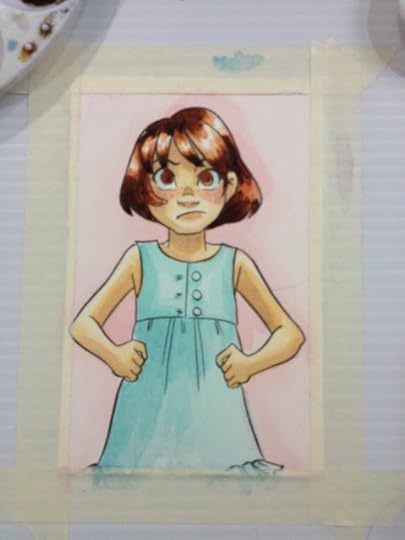
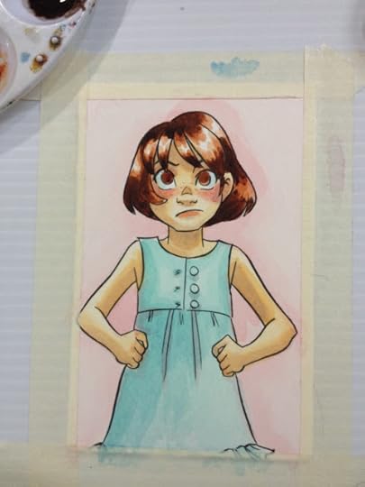

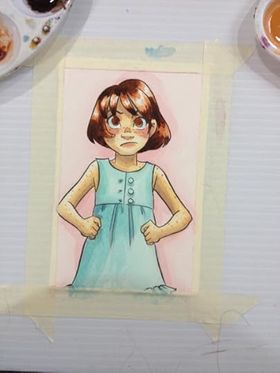
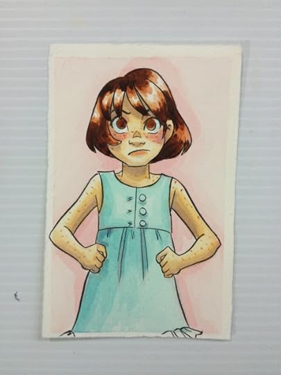
So far though, they don't handle that poorly, just a bit pale. This may be due to the fact that cheap watercolors tend to have more binder than actual pigment, but if you want intense colors, mix straight from the tube, not from a dried palette.
The Verdict
While these aren't great watercolors, they aren't bad either and they are a definite step up from student grade watercolors like Crayola. I wouldn't say these are comparable to Winsor & Newton, Holbein, or Daniel Smith, but are more like Van Gogh, Cotman, or SoHo. Not a bad way to get started- it gets you used to working with tubes, setting up your own palette, and practicing real watercolor techniques that aren't possible with many brands of cheap cake watercolors.
Did you find this post useful? Did you enjoy it? How about sharing it with friends on Facebook, or Tweeting it to your followers? The links above the post make sharing SUPER easy- you don't even have to leave the page! If you really liked this post, or any of my posts, how about sending me a tip via Paypal using the handy donation link in the sidebar, or writing me an email? It would definitely make my day!
Please consider donating to this blog or purchasing from Natto-shop (http://nattosoup.com/shop) if you want me to continue publishing quality content. All materials tested were purchased from my own pocket. Keep on Truckin' Nattosoup is not under any sponsorship.
The website lists a lot of products, from paints (watercolor, acrylic, oil) to even luggage. Daler Rowney seems to offer three lines of watercolors on their site: Artists' WaterColour, AquaFine, and Simply Watercolor. I'll be testing the Simply Watercolor, found at my Luling Walmart, in this post, but may revisit Artists' Watercolour and AquaFine at a later date. The Artists' WaterColour line seems to be their premium line, with 80 different colors available in 5ml or 15 ml tubes, or in artists' watercolor pans. These colors are available in a variety of sets. AquaFine is aimed at students and hobbiests. There are 37 available colors in the AquaFine set, and colors are available in 8ml tubes, or in half pans. Colors are also available in sets. SimplyWatercolor is Daler Rowney's bottom of the barrel line, with a strong focus on being 'affordable' rather than good. These are probably intended for children with an interest in art who have parents with no interest in spending the money necessary to acquire decent supplies. SimplyWatercolor are available as 12ml tubes, pans, and even poured cakes, although my Walmart only had a couple beaten up boxes of the 12ml tubes in 12 packs on offer.
Upon exploring the site, I realize I own and regularly paint with a few brushes produced by Daler Rowney, such as the Sapphire Watercolor brushes and Robert Simmons brushes. I believe these were purchased at Michaels a few years ago- I did not see any of these brushes at the Luling Walmart.
The pack I purchased features:
12 tubes12ml or .4 US fl. ozColors include:
White
Lemon Yellow
Vermillion (Hue)
Crimson Red
Cerulean (Hue)
Ultramarine
Sap Green
Viridian Green (Hue)
Yellow Ochre
Burnt Sienna
Burnt Umber
Black
These tubes were made in England
According to the back of the box:
Simply Watercolors
Simply watercolours are affordable, basic colours that an be used to paint on all conventional watercolor surfaces. All 24 colours in the range have been formulated to give affordable colours while still providing bright transparent colours, all the colours are intermixable giving endless colour possibilities.
The Packaging


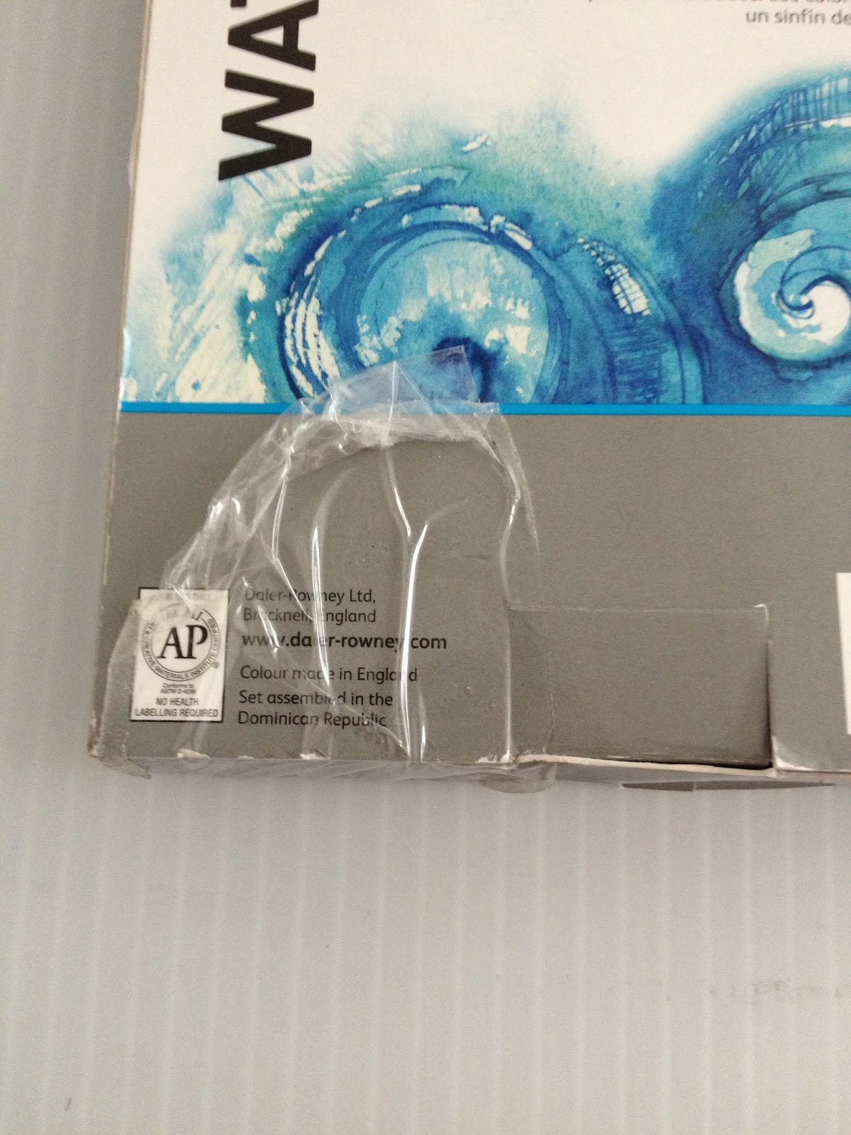

The packaging was already wrecked when I bought it, but the other box on the shelf wasn't in much better condition. I'm pretty sure both have been purchased and returned, which doesn't really bode well.
The watercolors are stored in a plastic tray that holds them in place. The watercolors come in metal tubes with a twist cap reminiscent of a toothpaste cap. The cap has a little piercer to open the watercolors, so we'll find out soon enough if these watercolors were purchased and returned.
Despite the box looking like it'd been kicked around Walmart for a week, the tubes are all unopened at time of purchase.
The Paints
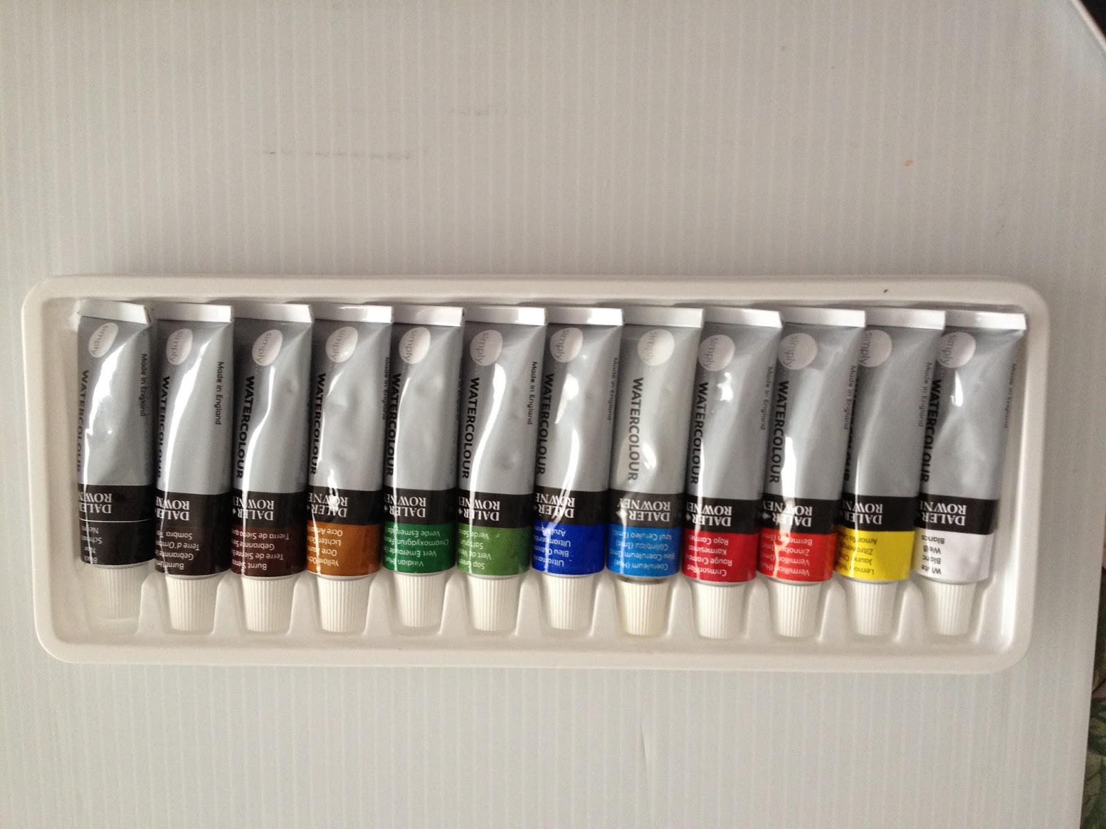

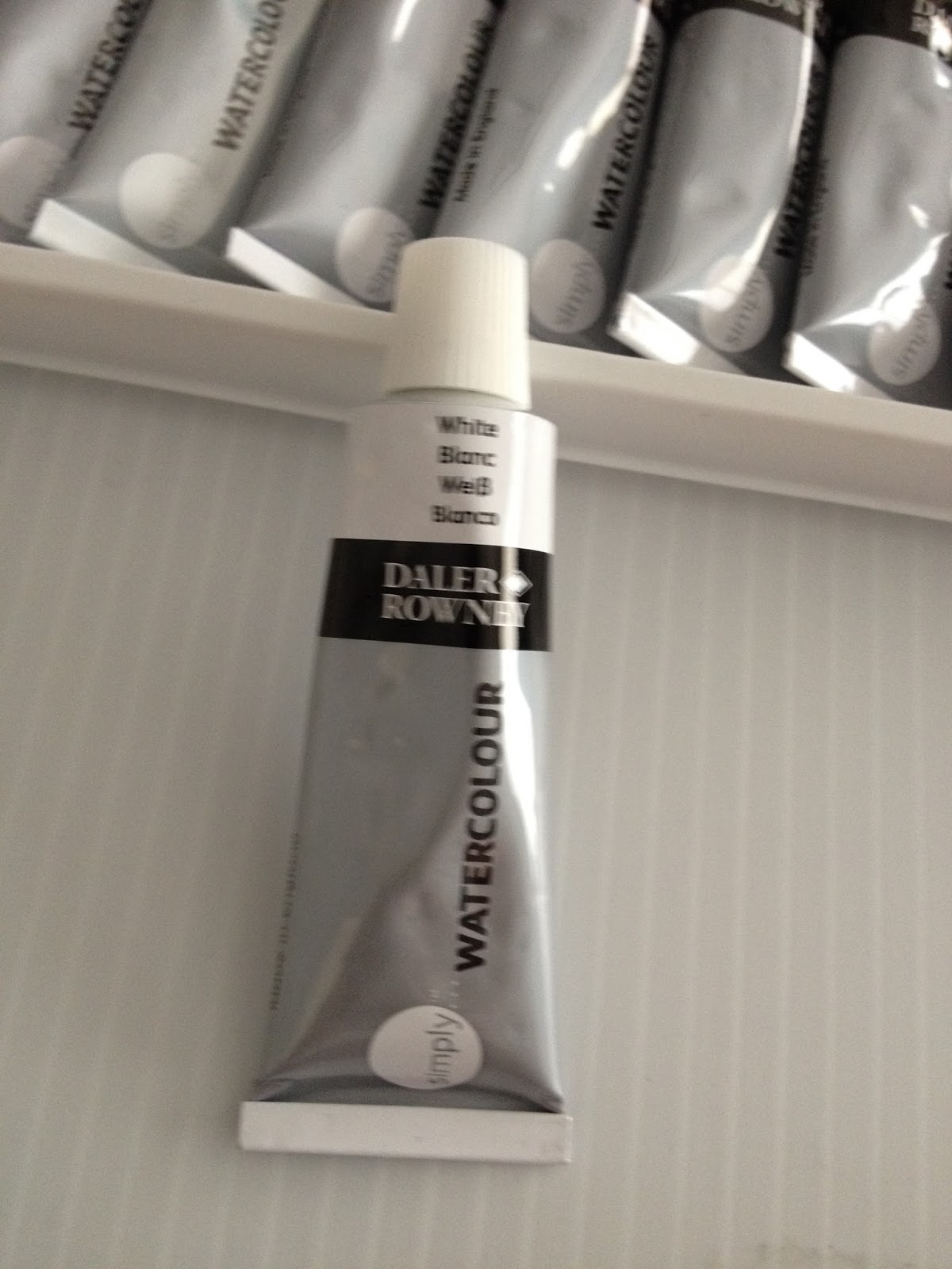


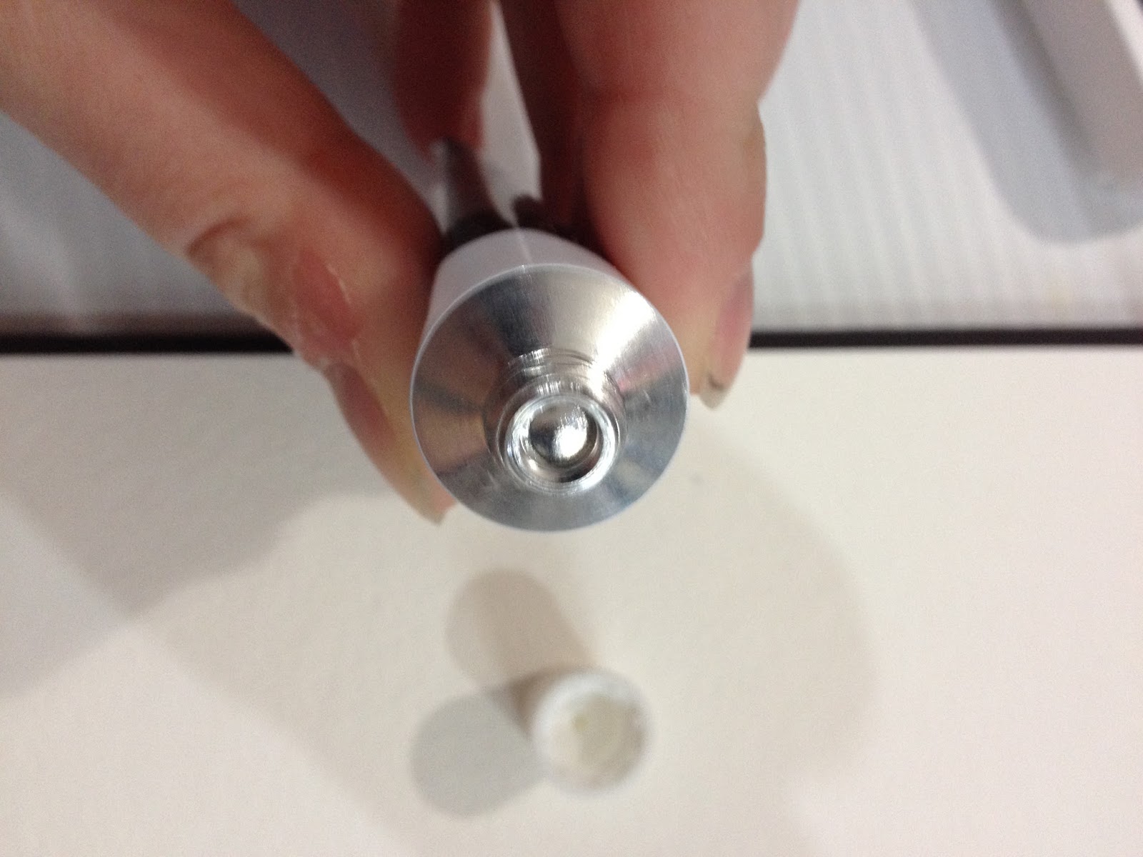

All of my caps ended up with paint on the piercing piece.
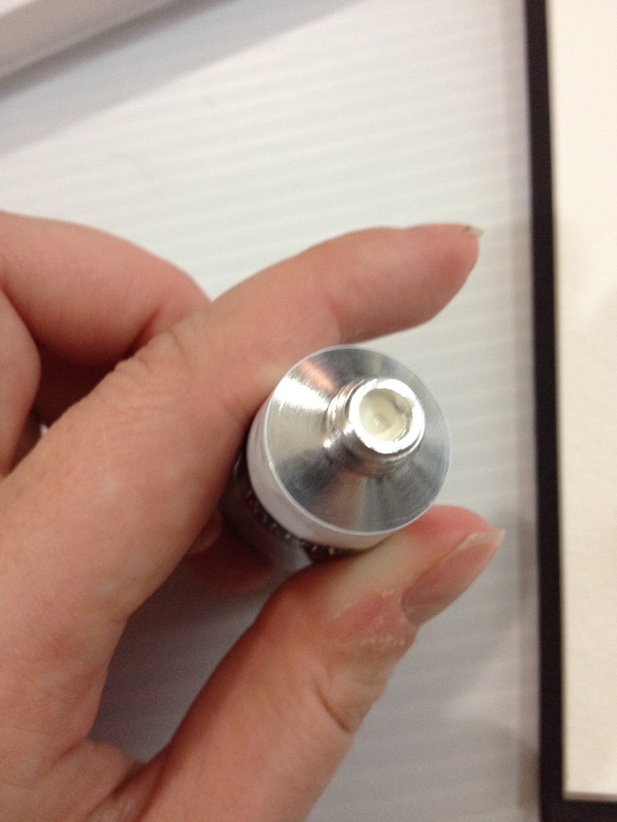 This is something you don't really experience with more expensive brands of paint. Be careful when opening your paints, some of them may have been compressed during their time at Walmart, and may be under pressure.
The Swatches
Straight from Tube
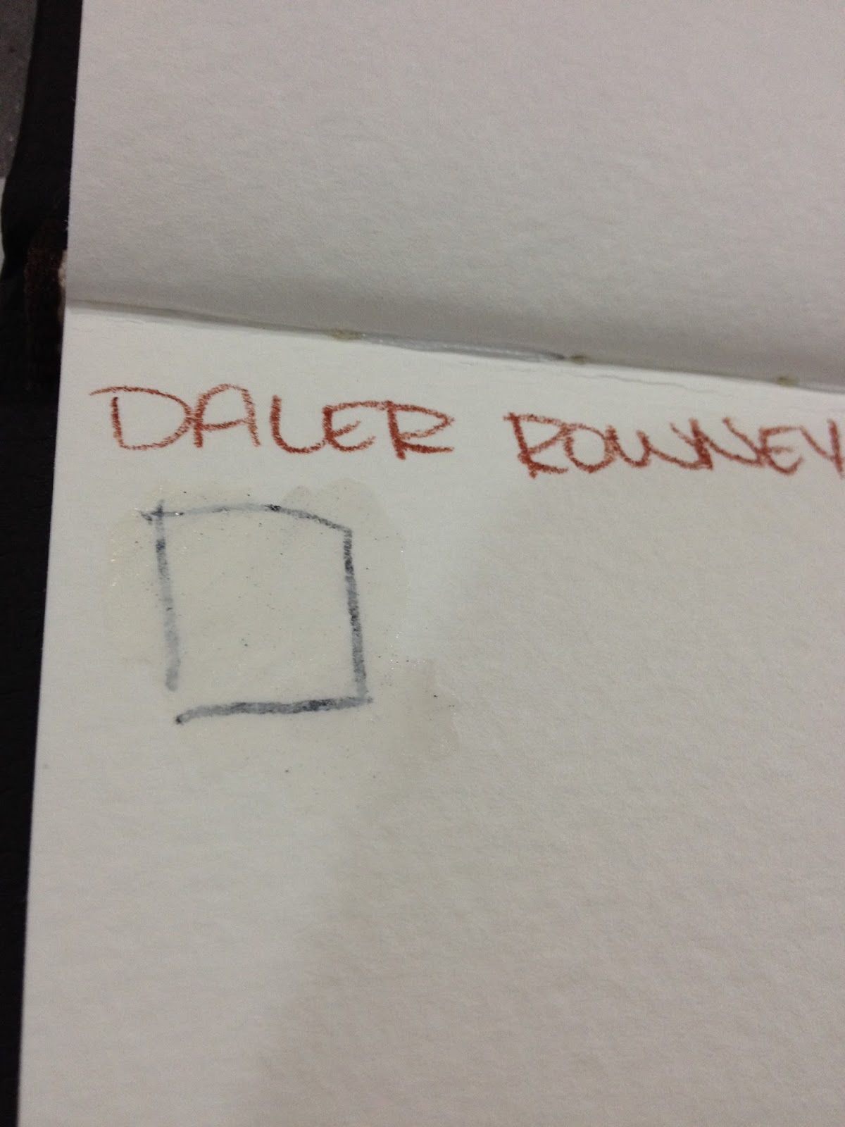
Even straight from the tube, the Chinese white is wholly unimpressive. Generally, I just rely on white gouache for my white highlights.

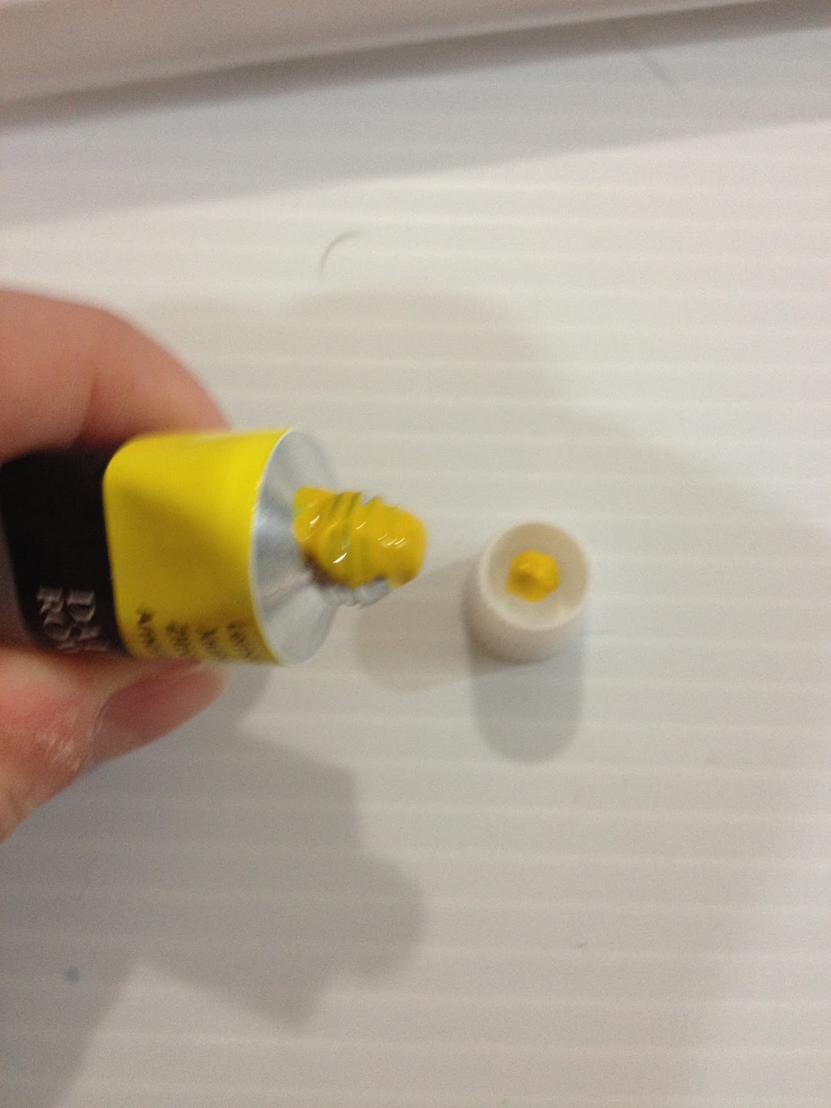

As soon as I pierced the blue, it squirted all over my leg and anti fatigue mat. Now you see why I warned you to be careful!

All of these paints are very liquidy- I'm curious what binder they're using, and often with higher quality paints, they do separate over time. There appears to be no separation with these, and I'm curious as to how Daler Rowney managed that. I've heard that lower grade watercolors use glycerin rather than sucrose or honey, but I can't seem to find any verification- if you guys have any links on that topic, please send them in!
Straight from the tube, the black performs the best- the pigments dissolve quickly and coverage is even. The other colors perform exactly like what they are- student grade watercolors, although they're definitely a step up from kid's watercolors like Crayolas (stay tuned for that review!)
Allowed to dry and used on palette
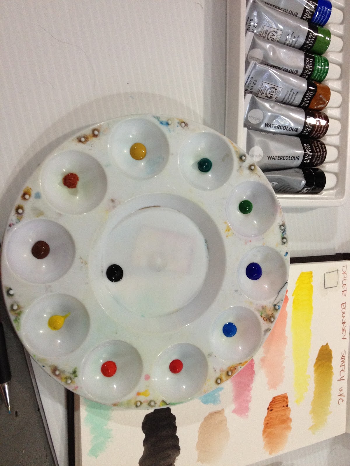
Making portable, dry watercolors is fairly easy. While tube watercolors do handle a lot differently than watercolors that originally come in cakes and pans, most tube watercolors can be dried and reconstituted successfully. I wanted to see if Daler Rowney Simply Watercolors could hold up to drying and rewetting, so I simply applied a little dot of paint in each well of a palette, and allowed my little paint dots to dry fully.
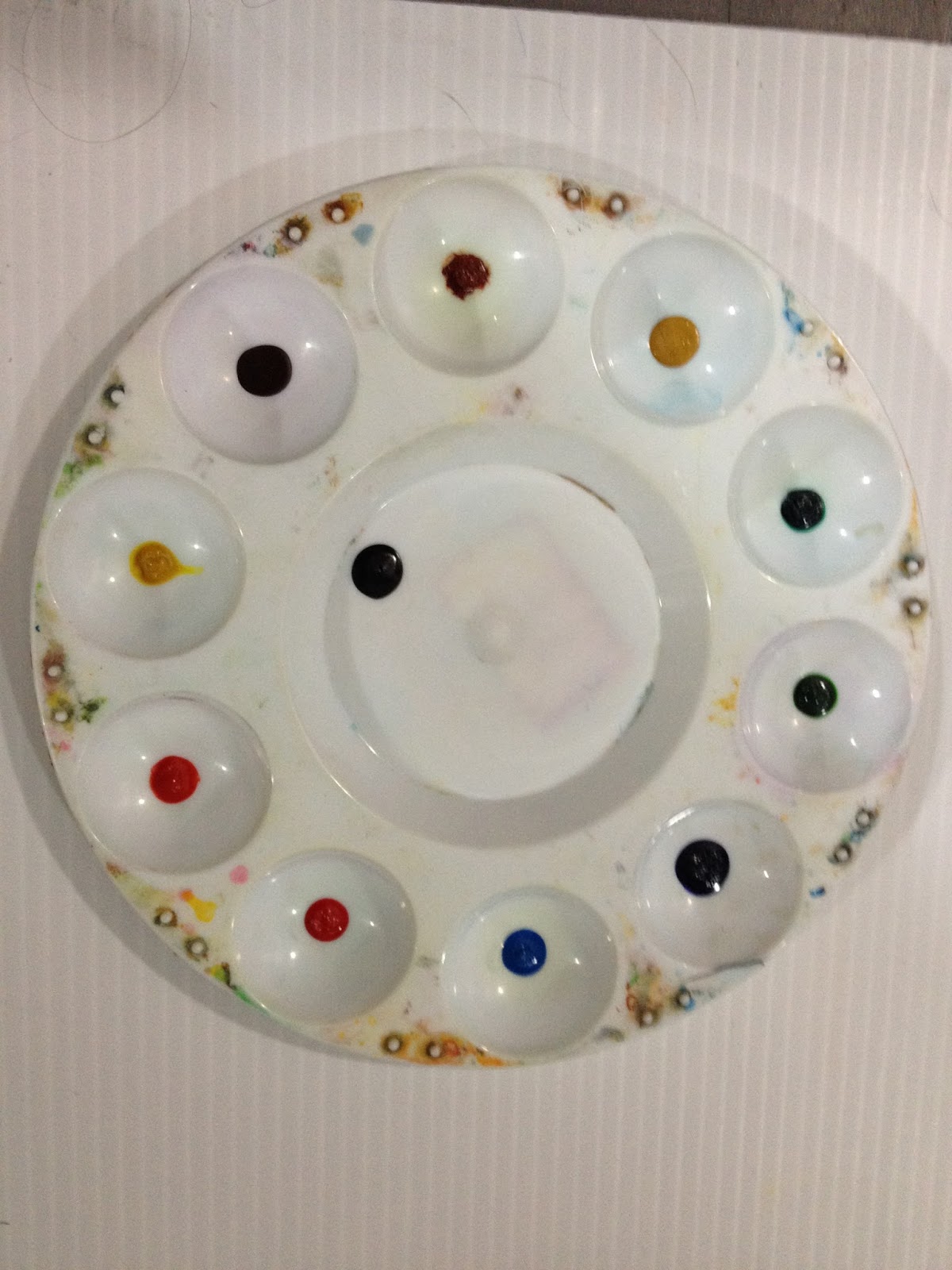

Although they look wet, these are now fully dry, and ready for swatching!
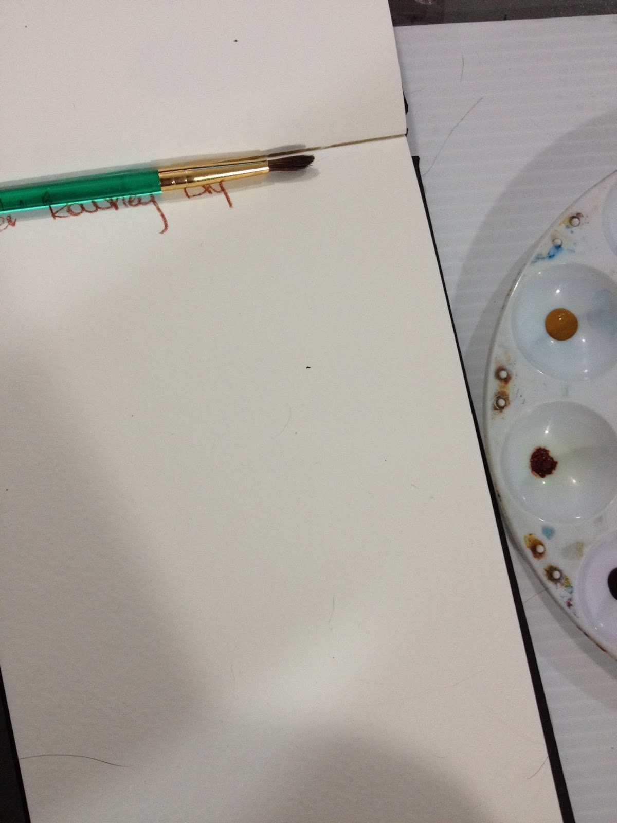
For the rest of this review, I'll be using the Royal Langnickel watercolor brushes. The review for that is coming up soon, so if you're interested in how those handle, keep watching this blog.

The reconstituted Daler Rowney Simply Watercolors are much less saturated than the color straight from the tube, which may make them easier for you to work with. I prefer my color less saturated, as it allows me to build up layers.

The dried watercolors reconstitute ok, the browns are a little stiff, but as always, if you pre-wet your watercolors with a drop of water, they should mix up pretty quick.
I am REALLY curious about what pigments these paints use, because the tubes release color pretty quickly given the price, and the dried colors are slow to release pigment even after they've been activated.
The Field Test
So my setup for this field test includes the dried palette I prepared ahead of time, my swatchbook for color reference, a clean watercolor palette, and the test piece that's been masking taped to my plastic gatorboard, which serves as a support.

As mentioned above, I'm using the Royal Langnickel brushes for this Field Test- it gives me an opportunity to test them out along with the Daler Rowney watercolors.

Already, the lost saturation is causing issues, as I had difficulty mixing up a skintone dark enough.

When I was starting out, I put a drop of water into each well, to give the paint an opportunity to absorb the water. This reduces the amount of scrubbing you'll have to do to release pigment later.
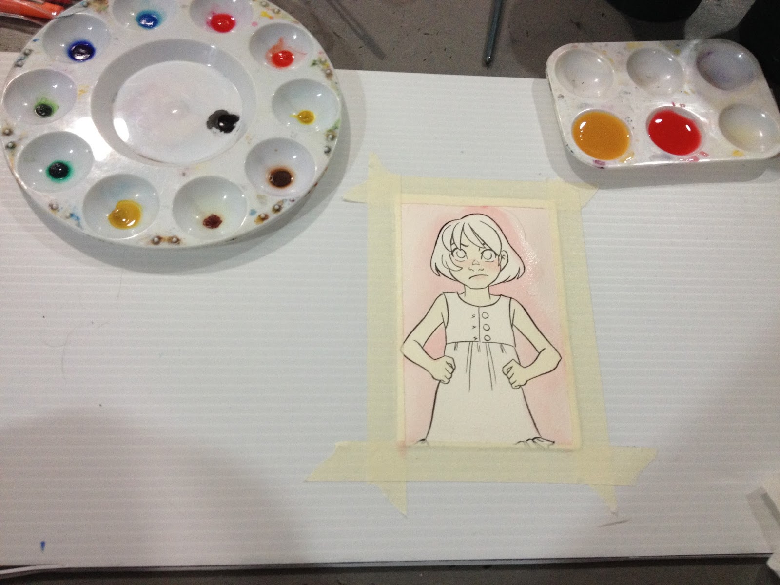
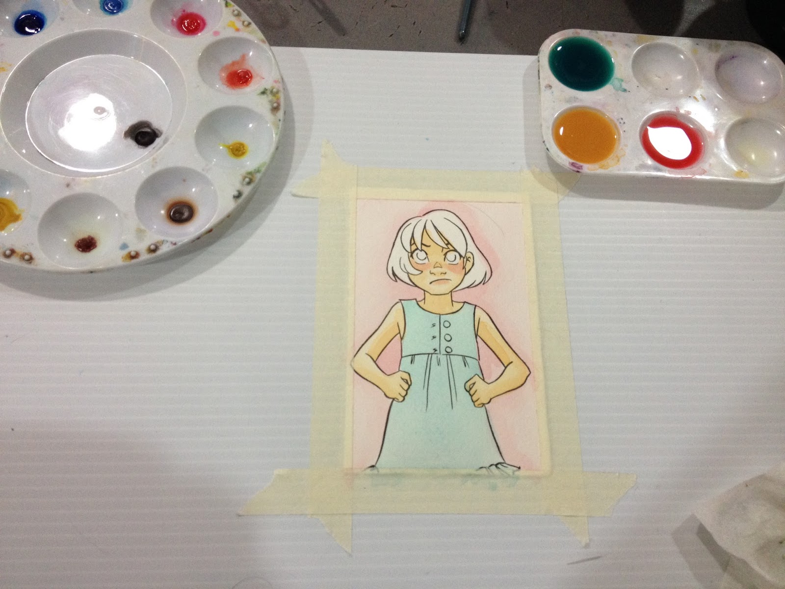


This set, as large as it is, doesn't contain a purple, violet, or red violet, so you'll have to mix your own.

The pigments don't mix well at all- the pigments in the cerulean blue fall to the bottom of the palette, which leaves you with uneven color distribution.
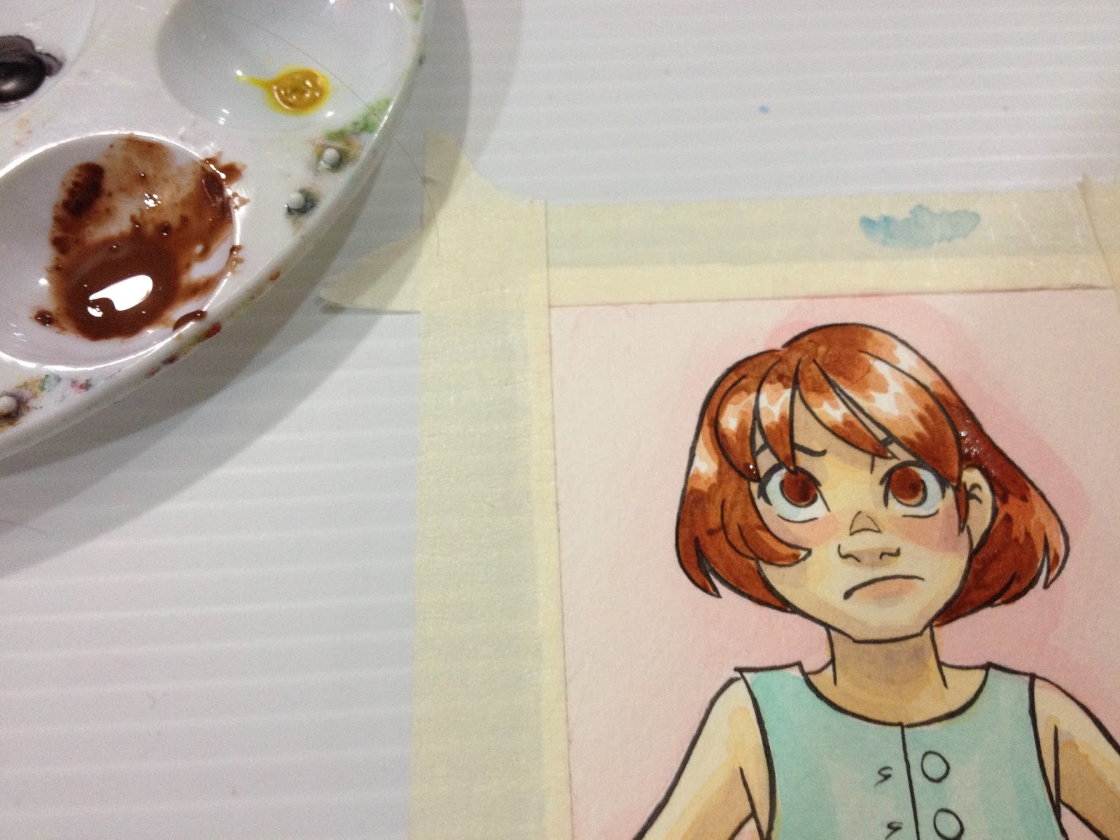
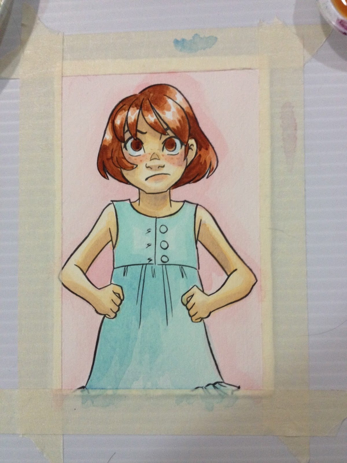
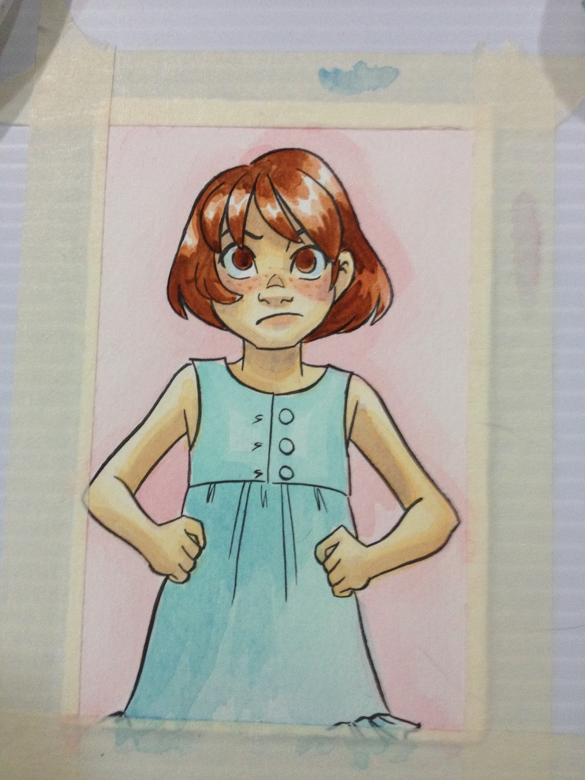
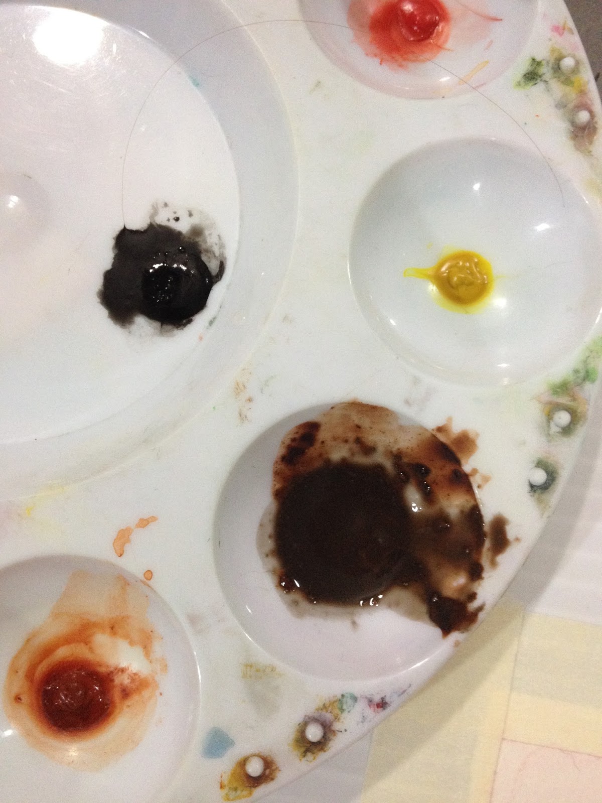
The sepia included really isn't dark enough, so I mixed some black in.
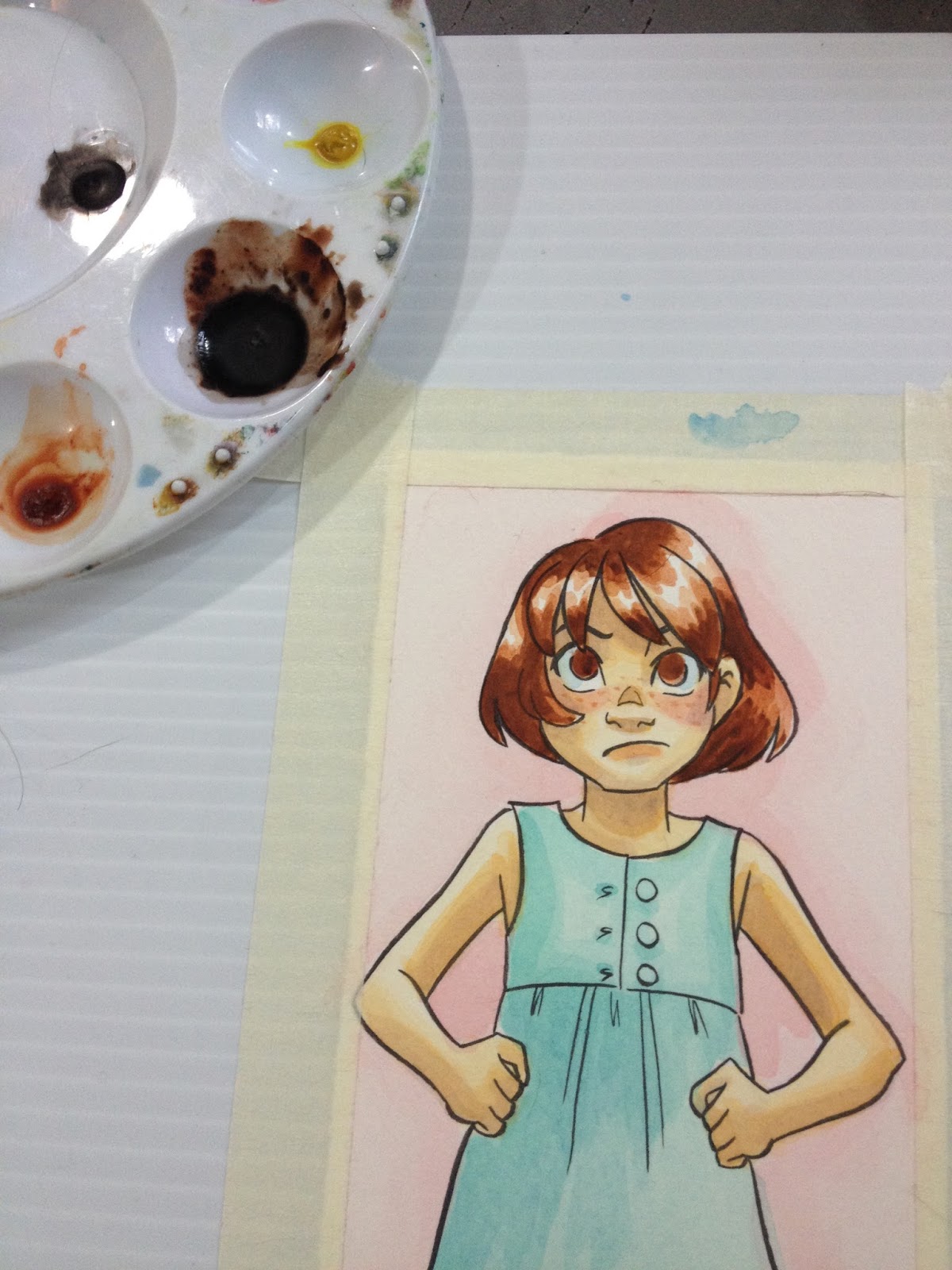

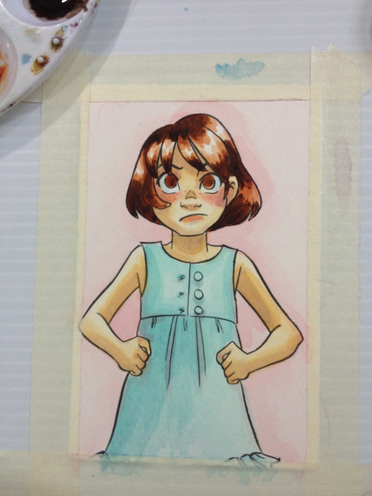
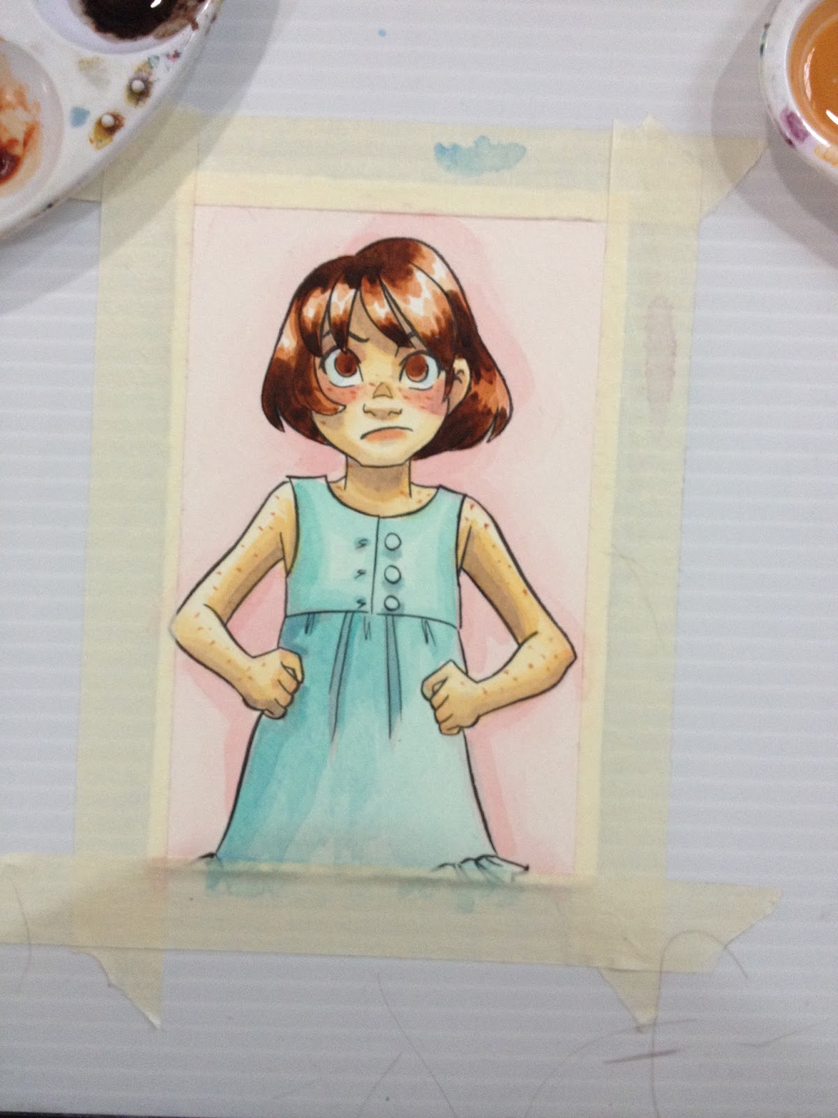

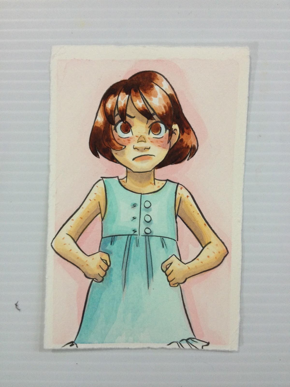
So far though, they don't handle that poorly, just a bit pale. This may be due to the fact that cheap watercolors tend to have more binder than actual pigment, but if you want intense colors, mix straight from the tube, not from a dried palette.
The Verdict
While these aren't great watercolors, they aren't bad either and they are a definite step up from student grade watercolors like Crayola. I wouldn't say these are comparable to Winsor & Newton, Holbein, or Daniel Smith, but are more like Van Gogh, Cotman, or SoHo. Not a bad way to get started- it gets you used to working with tubes, setting up your own palette, and practicing real watercolor techniques that aren't possible with many brands of cheap cake watercolors.
Did you find this post useful? Did you enjoy it? How about sharing it with friends on Facebook, or Tweeting it to your followers? The links above the post make sharing SUPER easy- you don't even have to leave the page! If you really liked this post, or any of my posts, how about sending me a tip via Paypal using the handy donation link in the sidebar, or writing me an email? It would definitely make my day!
Please consider donating to this blog or purchasing from Natto-shop (http://nattosoup.com/shop) if you want me to continue publishing quality content. All materials tested were purchased from my own pocket. Keep on Truckin' Nattosoup is not under any sponsorship.


