
Becca Hillburn's Blog, page 52
October 19, 2015
Figure Drawing Demo
Many of you have requested through a sidebar poll that you're most interested in new Tutorials, with Figure Drawing and Anatomy being a popular choice. Many moons ago, I wrote about my process for drawing figures in the post Anatomical Construction for More Cartoony Figures. That post was predated by two other anatomy posts- ASE Panel- Anatomy Presentation and Anatomy of a Clay Man.
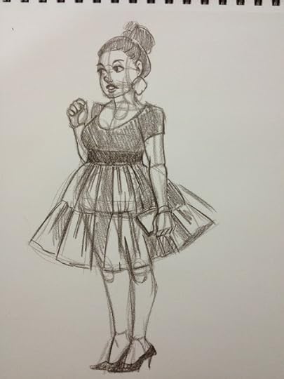
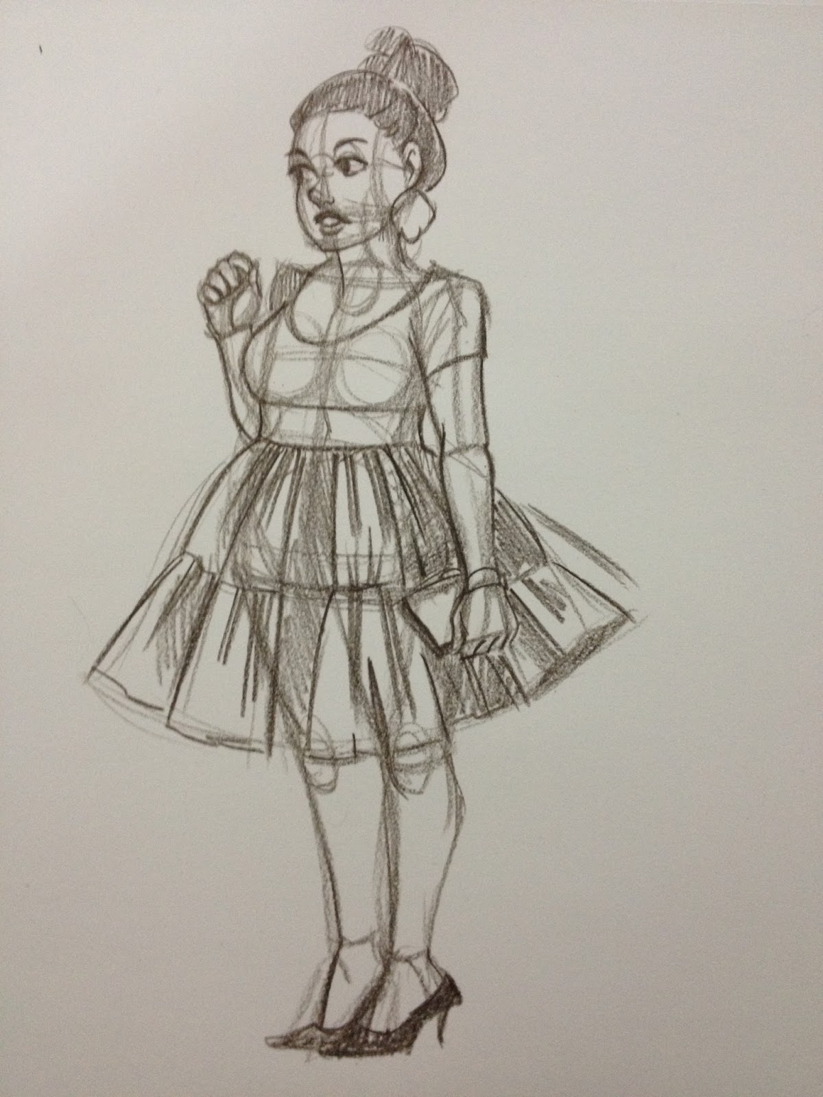
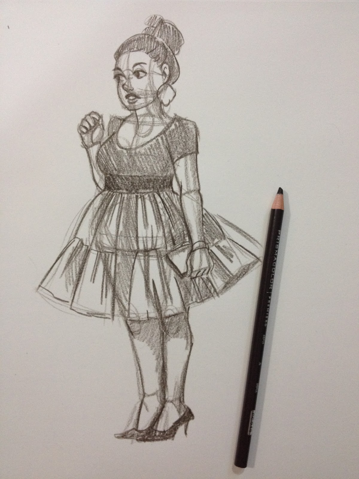
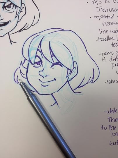
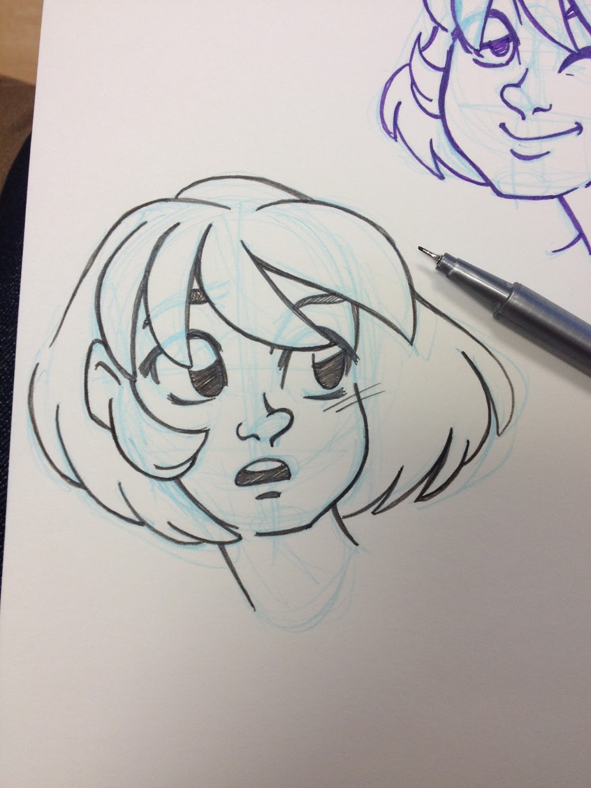
Today I'll show you guys how I went about sketching the below image, which was drawn using reference of a plus sized model from Pinterest. I've found that traditional figure drawing references (including those I linked at the bottom of this post) lack a variety of body types and poses, so you may find it helpful to search for bodybuilders, plus size models, and dancers to help develop your range.
My method for breaking down human anatomy hasn't changed much over the years- I think it's a very flexible method that works well for drawing all sorts of figures- stylized, cartoony, realistic- all you have to do is modify the proportions you use, the level of detail you draw in, and the features you choose to exaggerate. I use this method when drawing from reference for study purposes, and when creating figures and poses from my imagination, and I think it's a good way to internalize and memorize the human body.
My method of drawing the human figure comes from three major sources- Glenn Vilppu's Glen Vilppu Drawing Manual, Andrew Loomis' Figure Drawing for All Its Worth, and from the Constructive Human Anatomy class taught by Professor Paul Hudson at SCAD Savannah three years ago. You can find links to purchase Figure Drawing for All It's Worth and The Glen Vilppu Drawing Manual at the bottom of this post, as well as additional resources you may find helpful.
I highly recommend daily figure drawing practice, and if you have access to it, drawing the figure from life. Many schools offer open figure drawing sessions where you pay a small model fee, and there are Meetups for sketching groups of all sorts. If you live near a coffee shop, you can also sit and sketch passersby for hours for only the price of a cup of coffee.
If you browse my sketchdumps, you'll see many examples of figure and facial studies, some clothed, some nude. There are many more you don't see, simply because sometimes it's tedious to scan page after page of studies. For the most part, these studies aren't for show, they're simply to help me stay limber when it comes to drawing figures, and to help me become familiar with a variety of poses and to help improve how I render clothing.
Materials
SketchbookPencil color of choice (I'm using Prismacolor's Espesso)Pencil SharpenerReference Image
Process
Work Big to Small- General to Specific. Don't get caught up too early in refining something that may not work to benefit the whole.
Assemble the Materials

I like sketching with color pencils because they offer the inability to erase (much like pens), but you can get a variety of tones and stokes from a single pencil. I find wooden pencils to be more flexible than mechanical pencils, so if I'm practicing, I tend to prefer wooden pencils. You may use any color you wish, but I highly recommend dark browns, warm grays, and reds. Some of my favorites are:
Terra Cotta
Sienna Brown
90% Warm Gray
Tuscan Red
Black Grape
Sepia
Dark Umber
Although I am currently using Prismacolor, you may use any brands or colors you enjoy or are comfortable with.
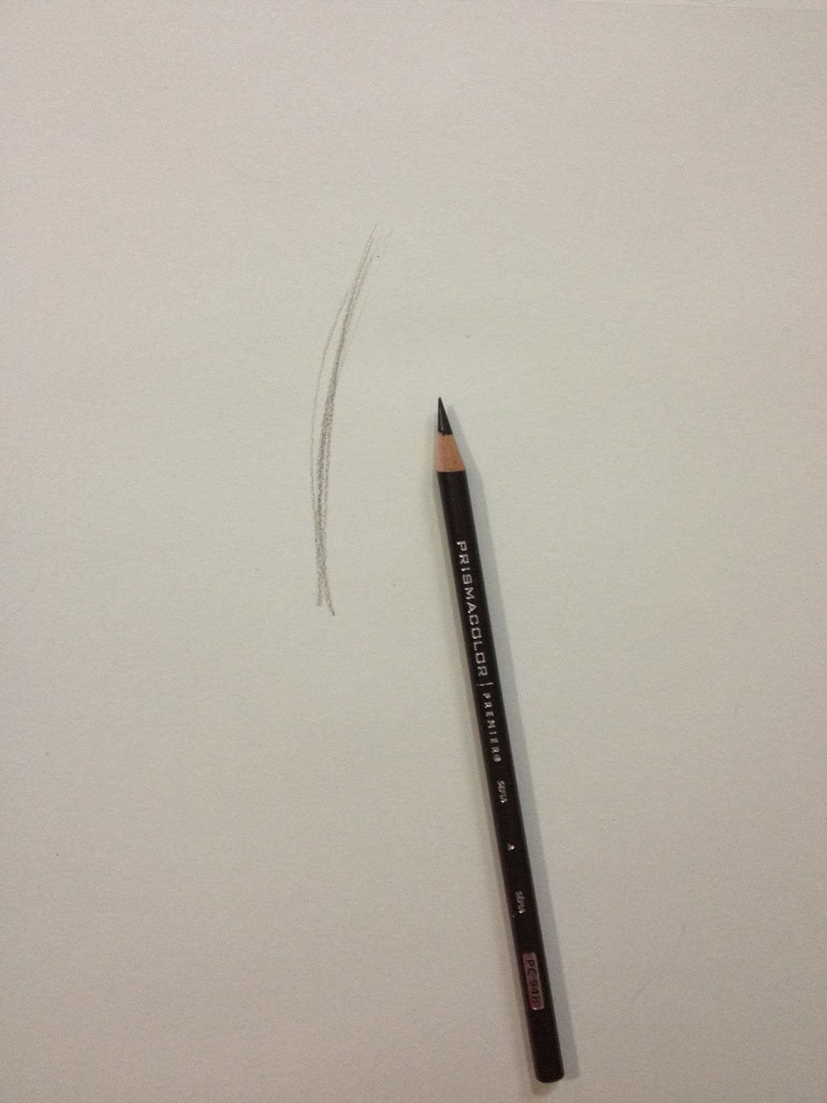
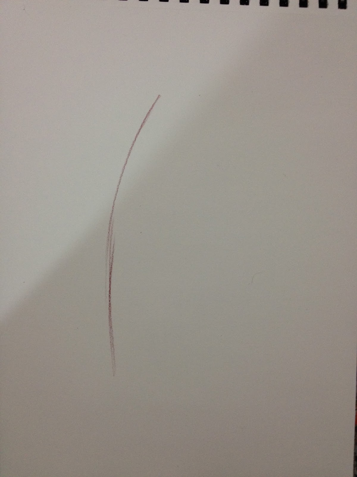
Step 1: Determine Line of Action

Unfortunately this isn't a great example of a line of action, but your line of action is the very essence of your gesture, the line that the torso, and to a lesser extent, the legs, will follow. I find that establishing a line of action helps me create characters and figures that seem to have actual weight.
For a better example of line of action, keep reading, as I provide another demo at the bottom of this post!
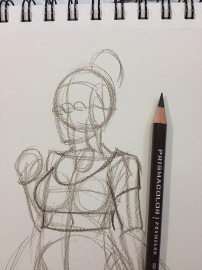
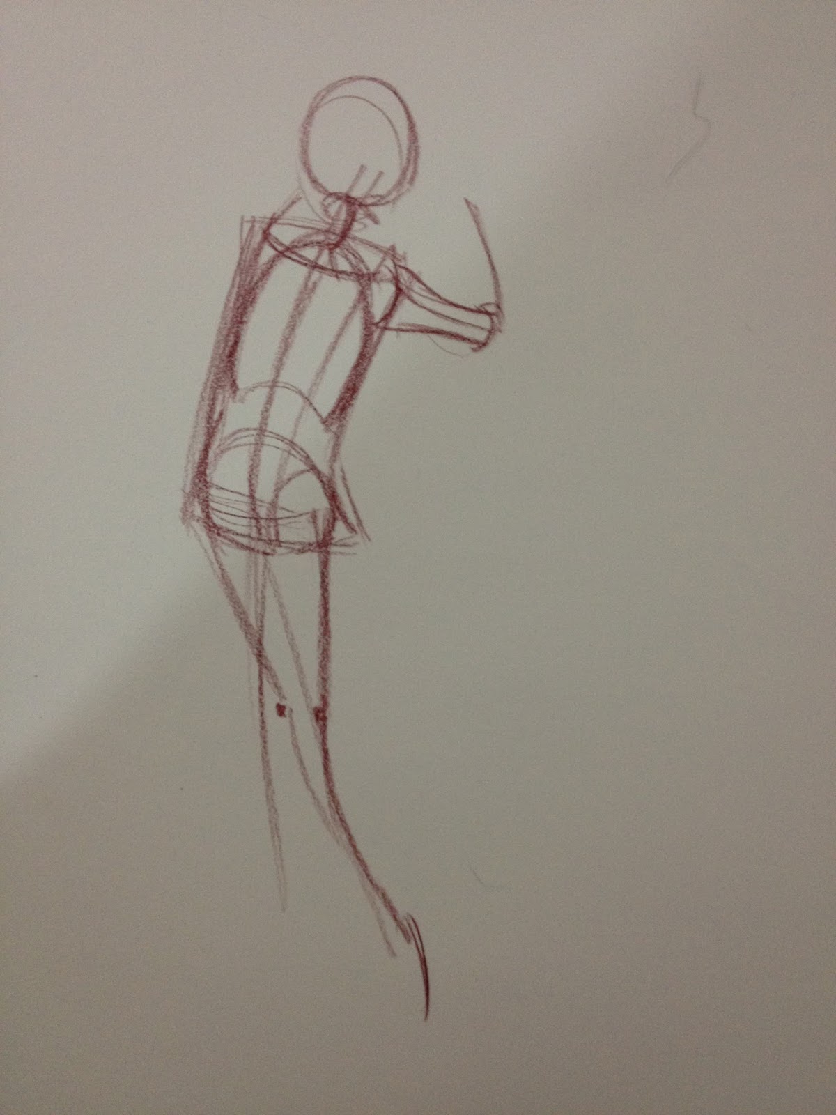
Step 2- Boxing in Basic Shapes/ Creating a Skeleton
My current method of blocking in shapes is based on the techniques outlined in Andrew Loomis' Figure Drawing for All Its Worth and Glenn Vilppu's Glen Vilppu Drawing Manual. I've included the relent Figure Drawing for All Its Worth for your reference. I highly recommend looking into both books.
Example pages from Figure Drawing for All Its Worth
[image error] Original illustration from Andrew Loomis' Figure Drawing for All It's Worth. Web image from IllRef
 Original page from Figure Drawing For All It's Worth. Original image from my own collection.
[image error]
Original illustration from Figure Drawing for All It's Worth. Scan from IllRef.Blocking in the figure is fairly simple, but a vital step in how I construct figures. Male or female, child or adult, your basic torso shape is a variation of a rectangle. For a woman, it's usually going to be an hourglass, but if you're working from reference, I recommend not just assuming (which reinforces bad habits), but to actually draw the body type you see.
Original page from Figure Drawing For All It's Worth. Original image from my own collection.
[image error]
Original illustration from Figure Drawing for All It's Worth. Scan from IllRef.Blocking in the figure is fairly simple, but a vital step in how I construct figures. Male or female, child or adult, your basic torso shape is a variation of a rectangle. For a woman, it's usually going to be an hourglass, but if you're working from reference, I recommend not just assuming (which reinforces bad habits), but to actually draw the body type you see.


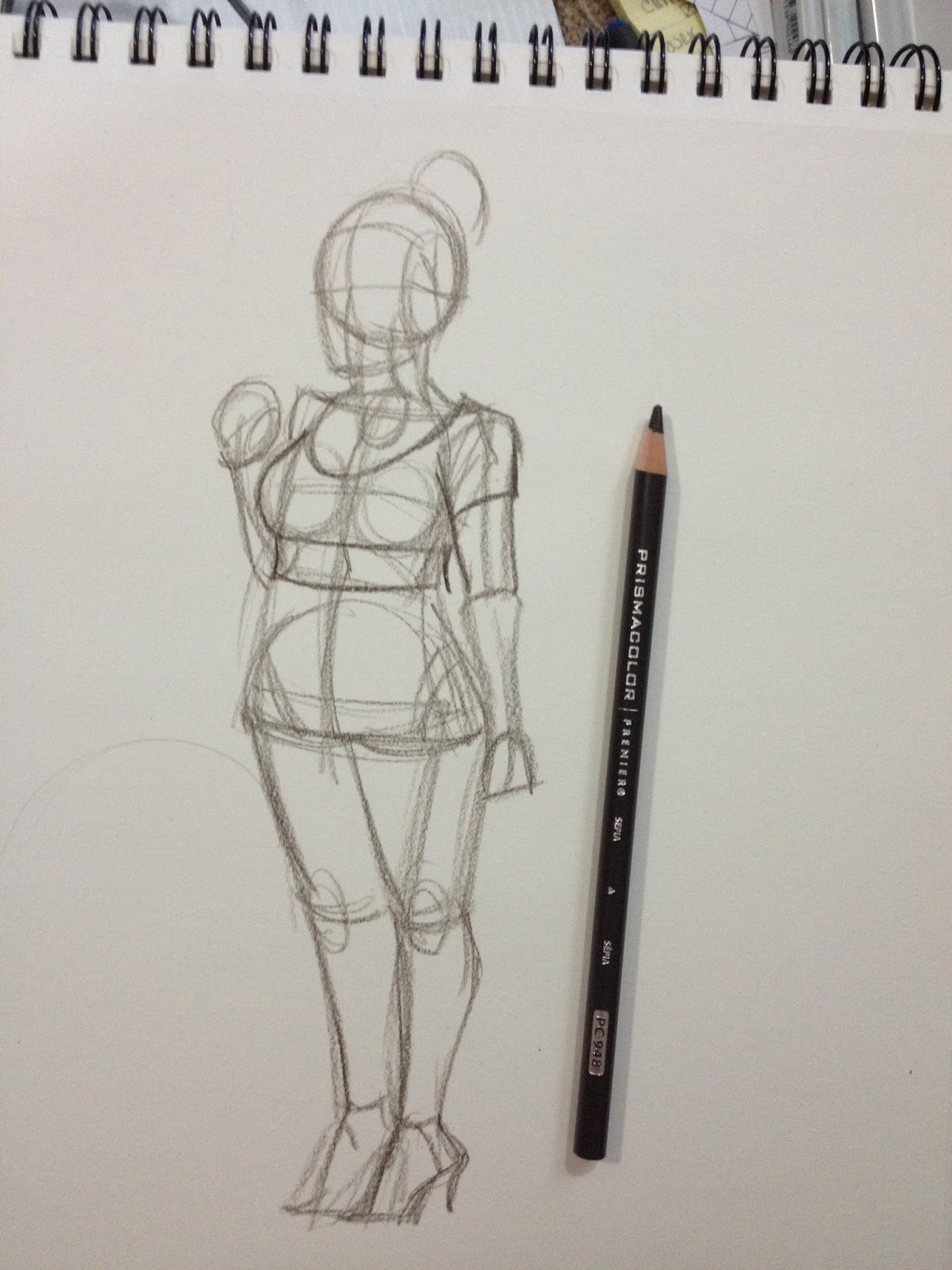
I block in the ribcage and pelvic box.

As well as the arms and legs. Right now, the arms and legs are just gestural sketch of the bones, to help me solidify the pose before I start adding too many details. Basically, the sketch at this point is my roadmap.
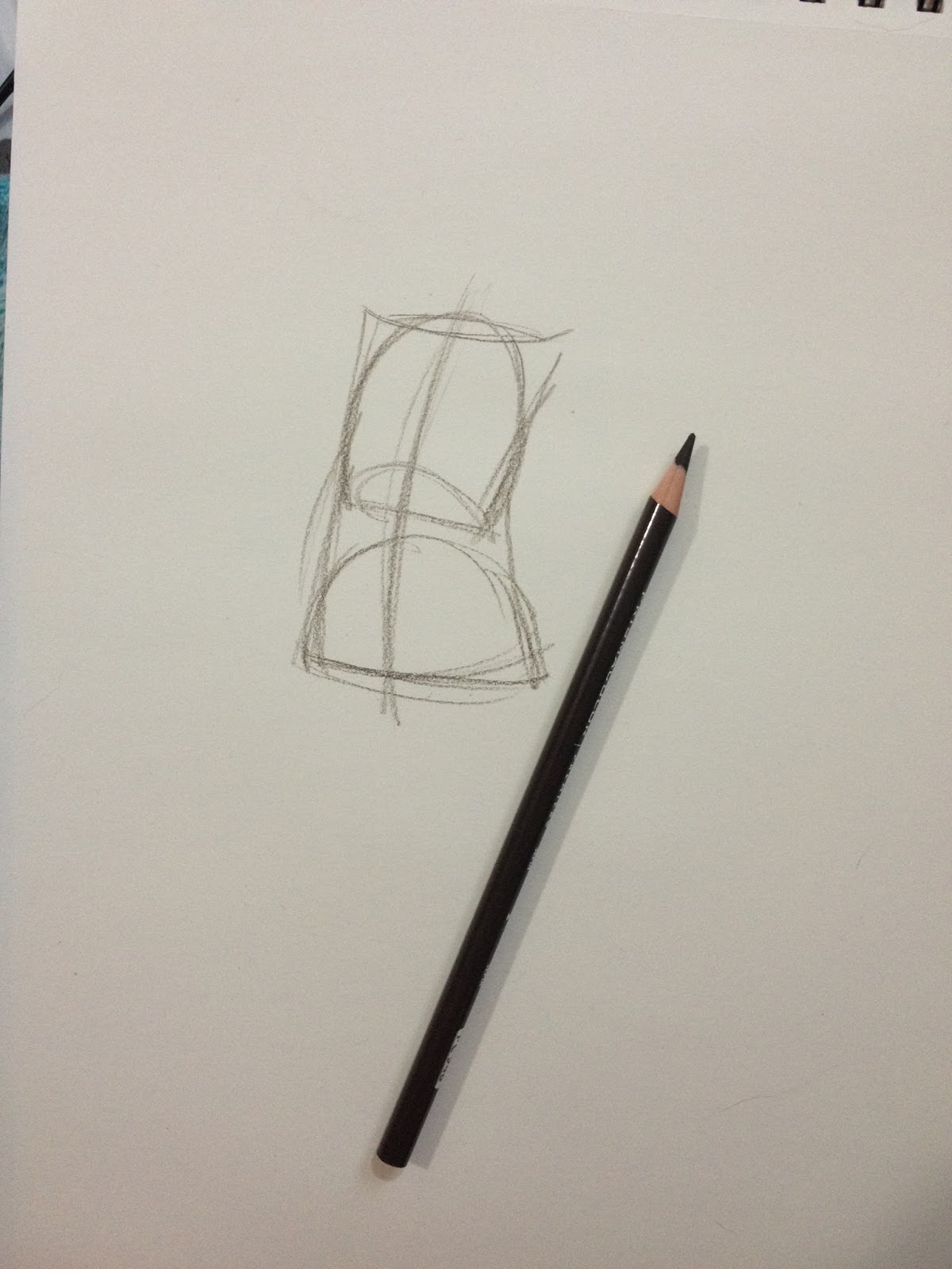
Step 2: Using Cylinders to Define Form
At their most basic, our arms, legs, and neck are just long cylinders. Generally, they are wider at the top, or where they meet the body, than they are at the bottom.


I find it really helps to block shapes in from general to specific. Not only does your entire drawing develop at roughly the same rate, but it prevents you from over investing in any one area. If you feel the need to really investigate a particular area, you can always do a sketch on the side.

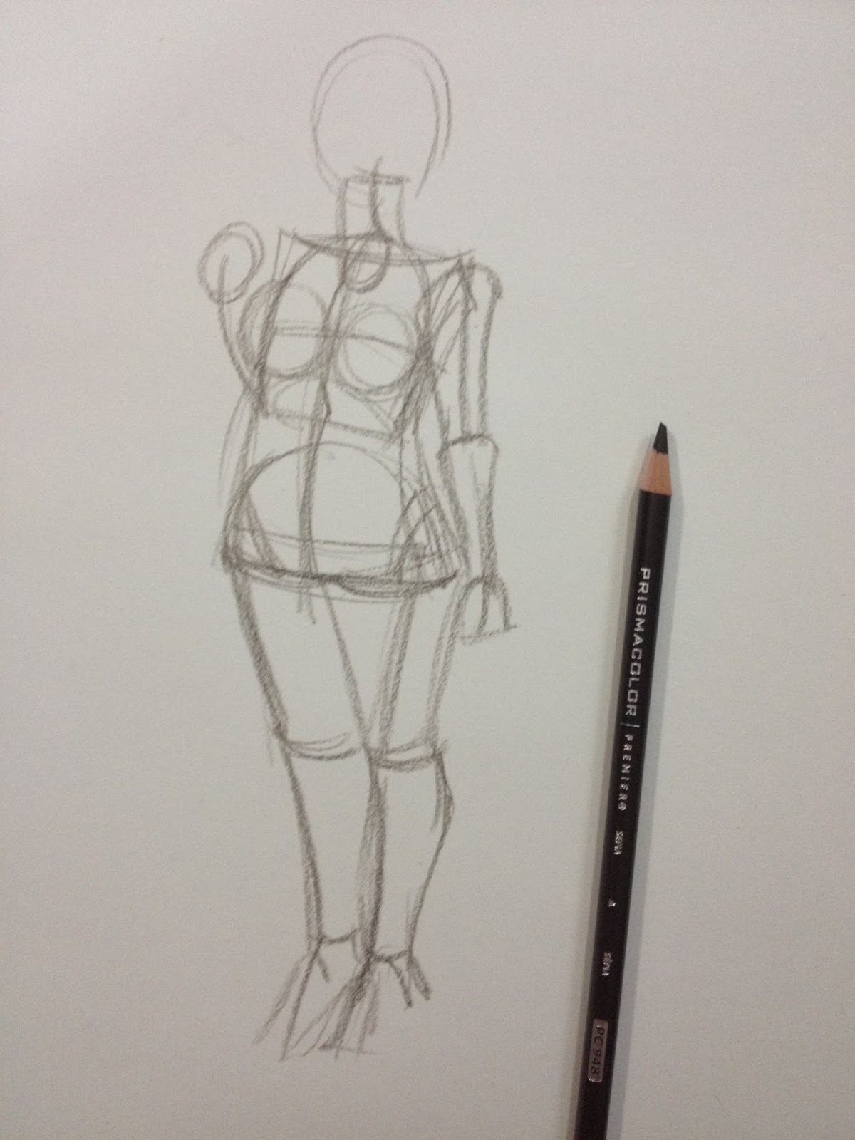
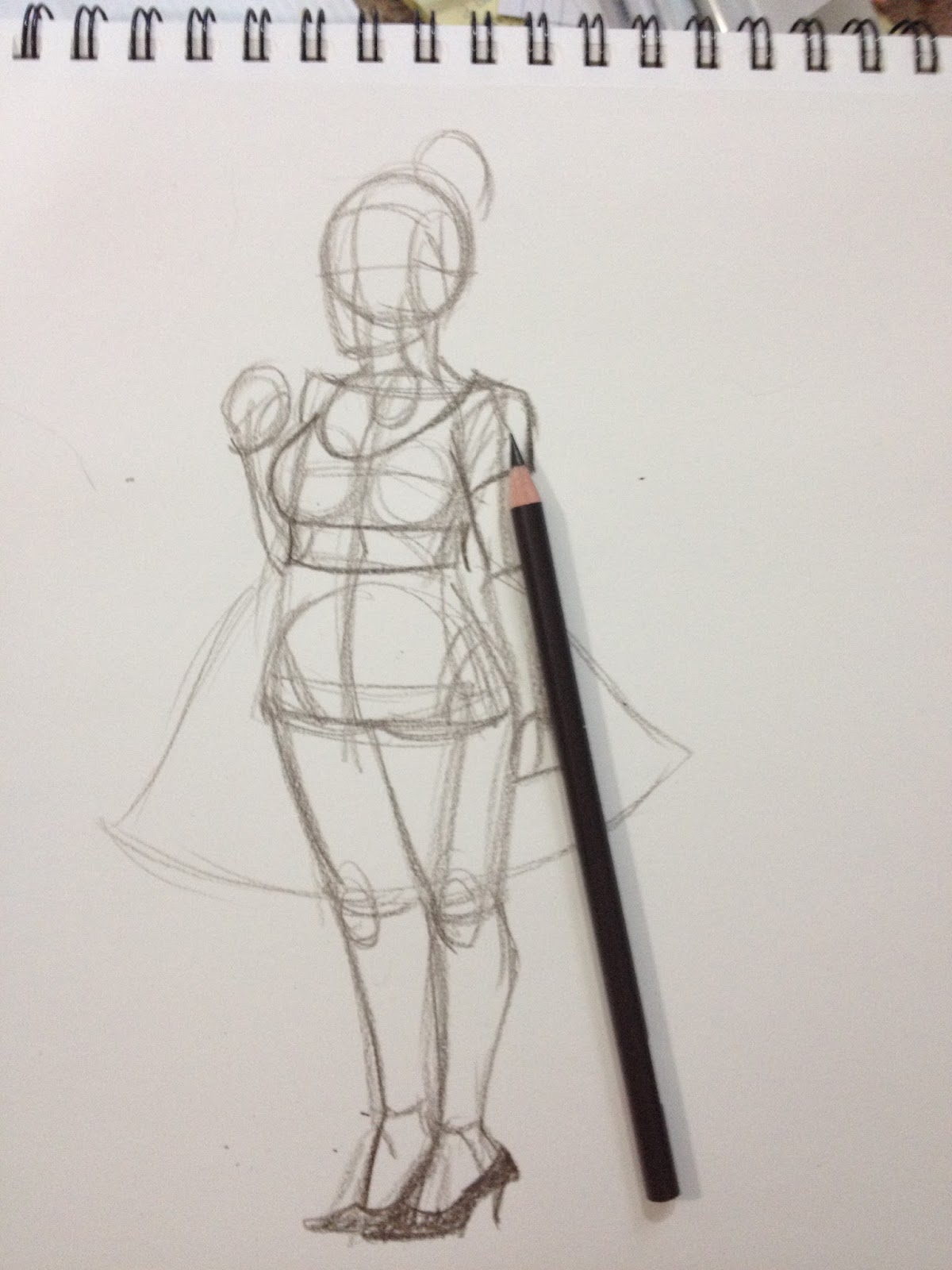
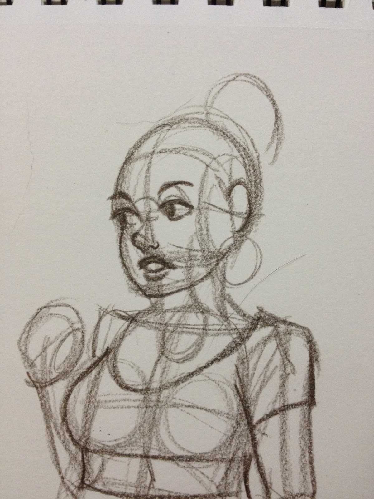
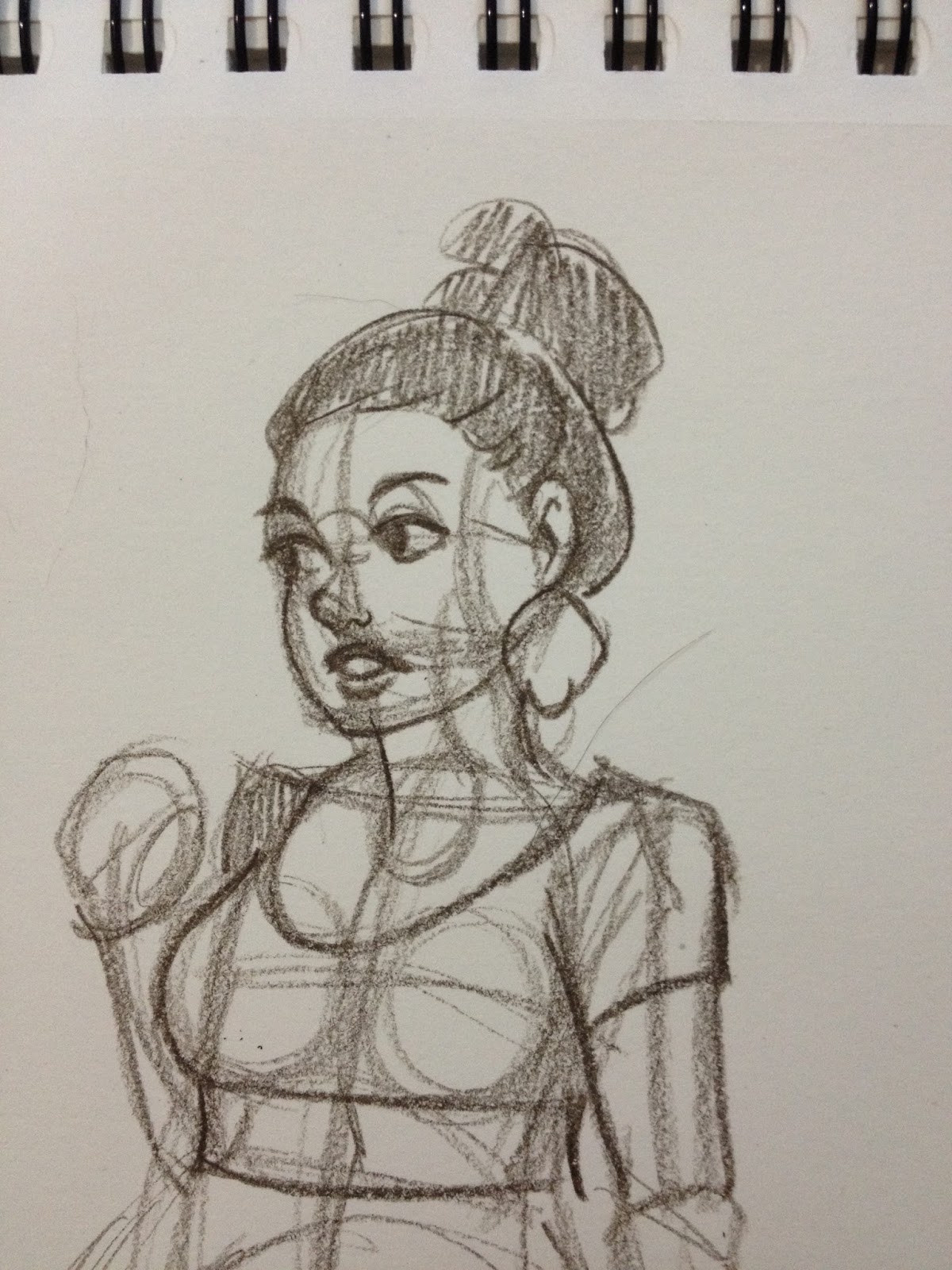
Step 3: Blocking in Features- Clothes and Hair
As with all other forms, I recommend starting general and working towards specific- blocking in shapes and working towards adding folds.
Depending on what you're trying to practice- gesture vs. realistic pose, you may want to plan your clothing in with your initial gestural sketch. For this sketch, I'm studying how the body is built, so while clothing is important, its not my primary focus.


In this outfit, the shows, skirt, and bun are the defining features, with the heels influencing the subject's pose.
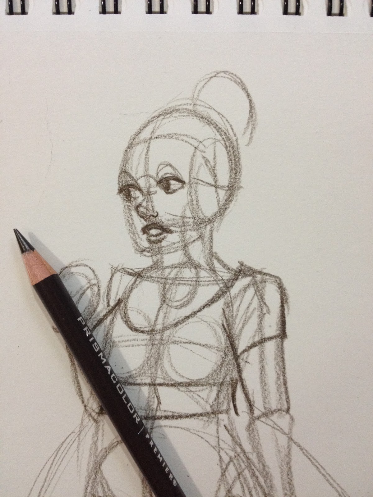
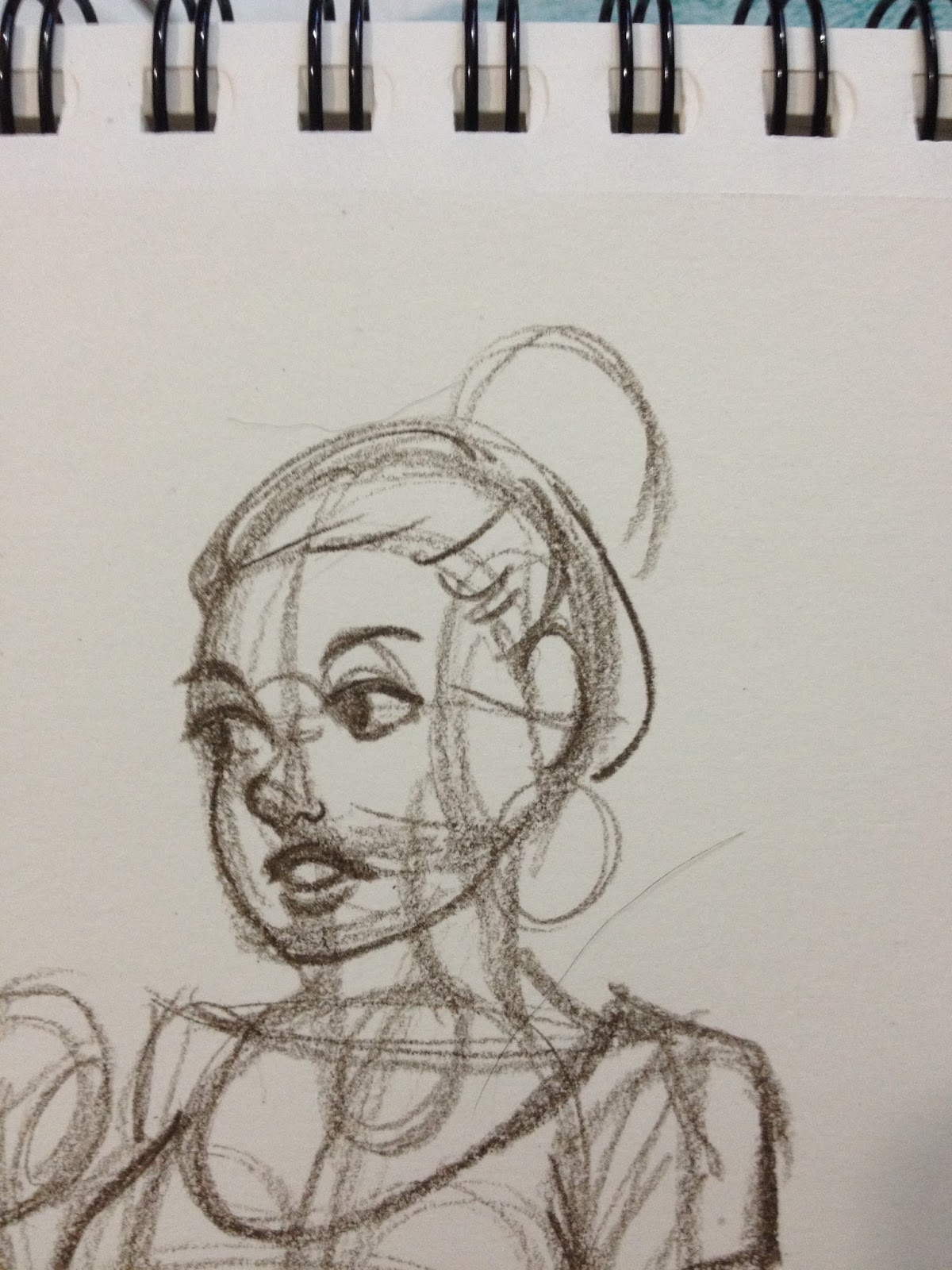
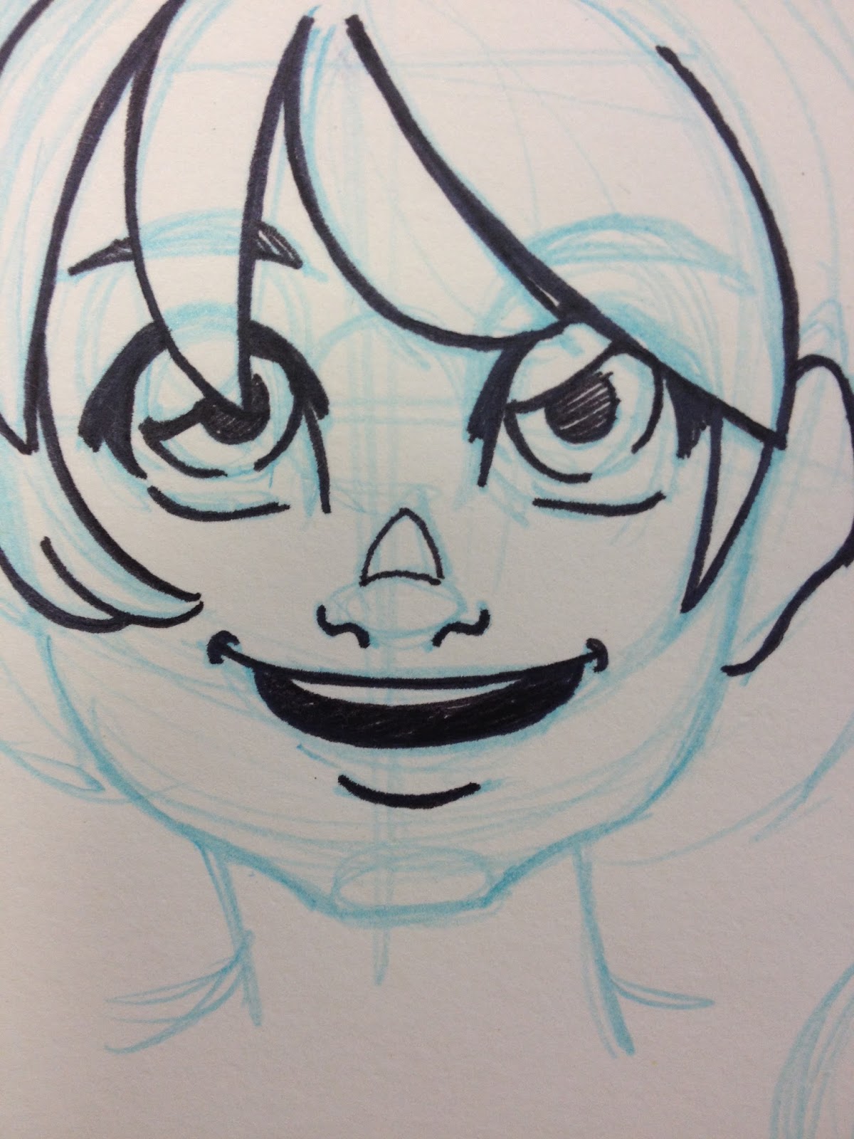
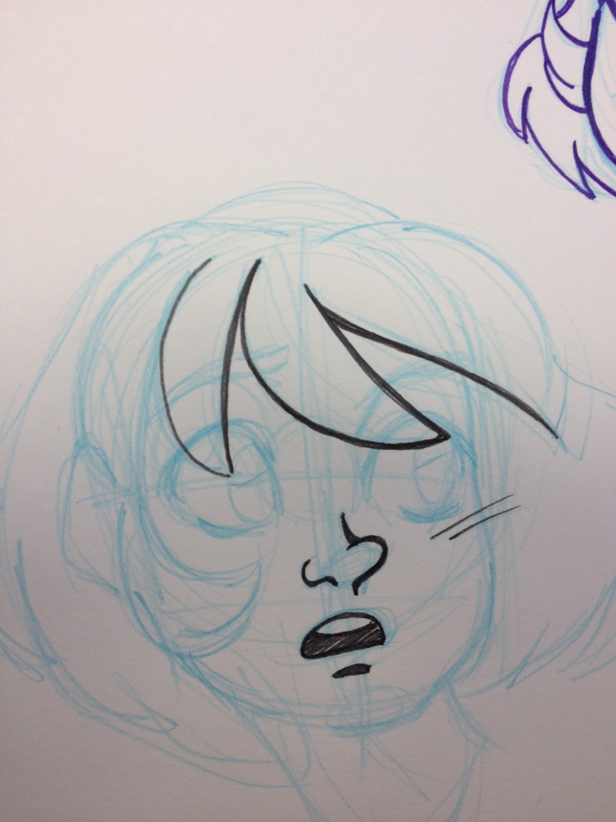
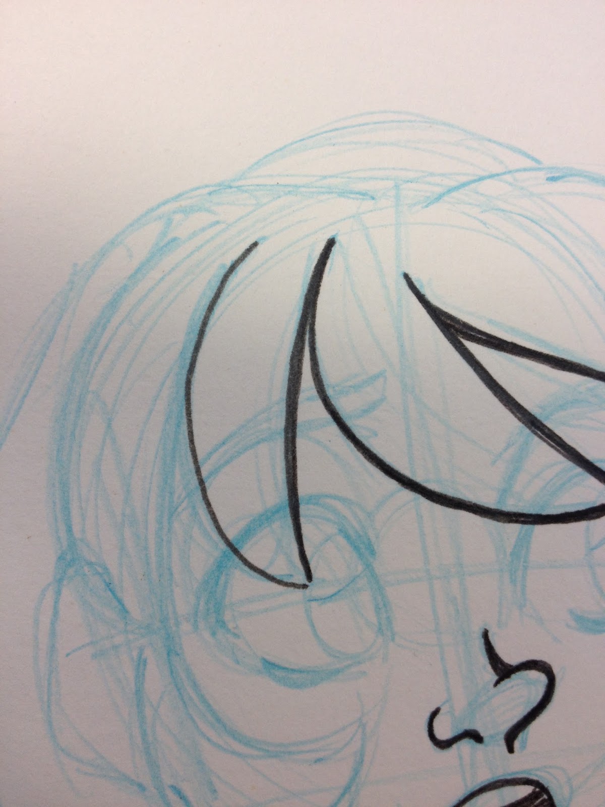
Step 4: Blocking in Facial Features
I've written about how I construct faces a couple times in the past (Facial Anatomy and Construction and Bits and Bobs- Anatomy Continued) and since its been a few years and a few things have improved, I'll probably revisit this topic for you guys soon.
The gist of how I construct faces is through division. The skull is a ball with a spade on the front. You divide the face in half both horizontally (across the ball) and vertically across the spade. The face is five eye widths wide at it's widest, and you can place the eyes by putting one eye width in the middle, and then two on each side, as shown below.


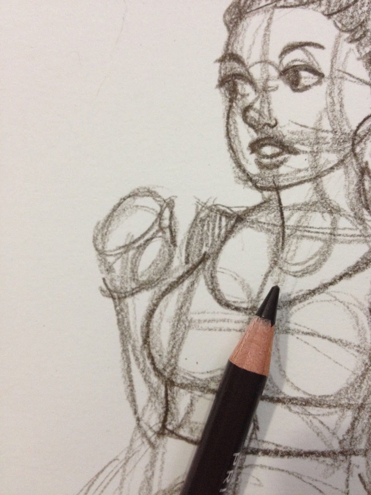
Step 5: Defining Forms with Shadows
Refining hands is the next step in my figure drawing process. I start by blocking out the basic shapes of the hand- the palm, the thumb, the fingers.


And then I block in the fingers. I find it's easiest to break hands down this way, rather than trying to draw the fingers in early, or in too much detail, as the lines can quickly overwhelm the small area.
Details in clothing is one of the last major stages of blocking in the image.


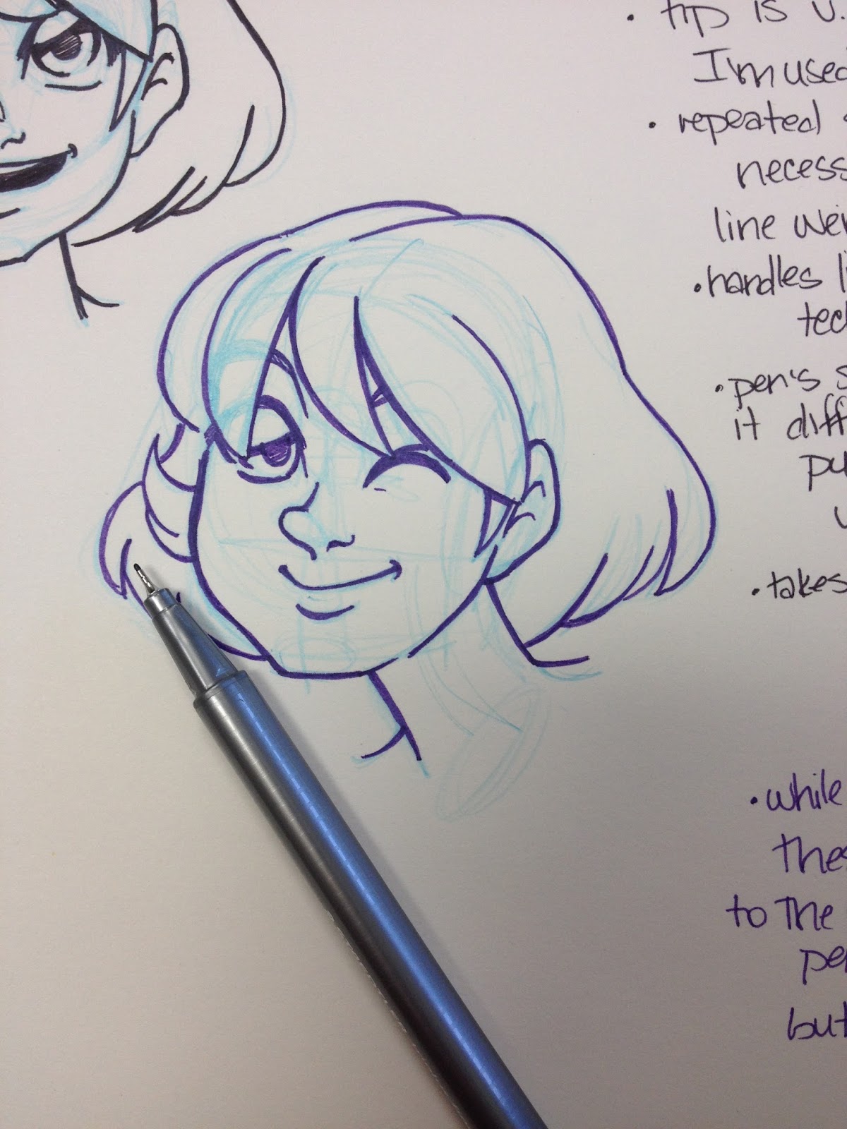
Step 6: Applying tone to help define forms
This is where using a color pencil really shines. You can apply a variety of smear free tones easily and quickly with a dull pencil, and apply sharp details with a sharpened pencil. When refining the face, I always prefer to work with a freshly sharpened color pencil, but when applying mass tones, such as the shadows on the skirt or the subject's hair, I prefer a dull pencil.


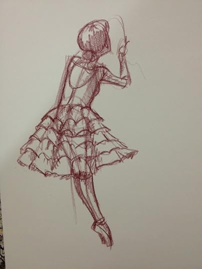
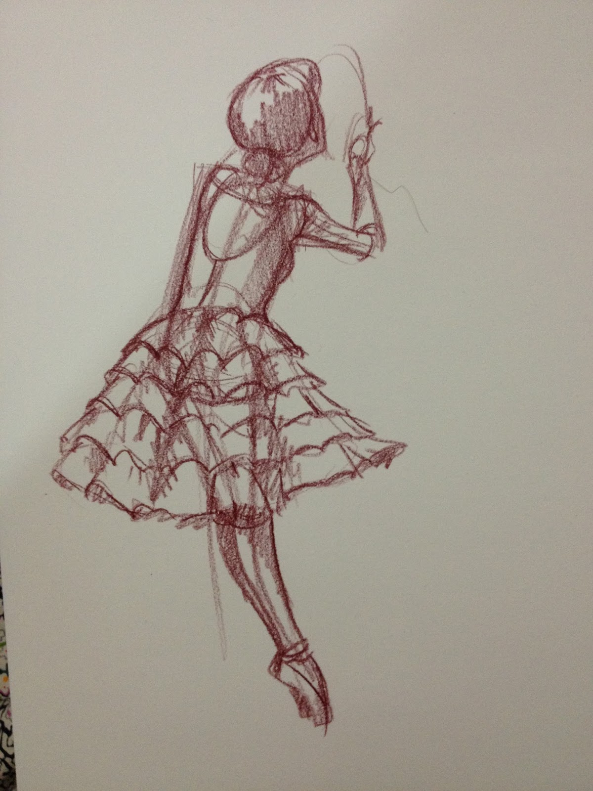
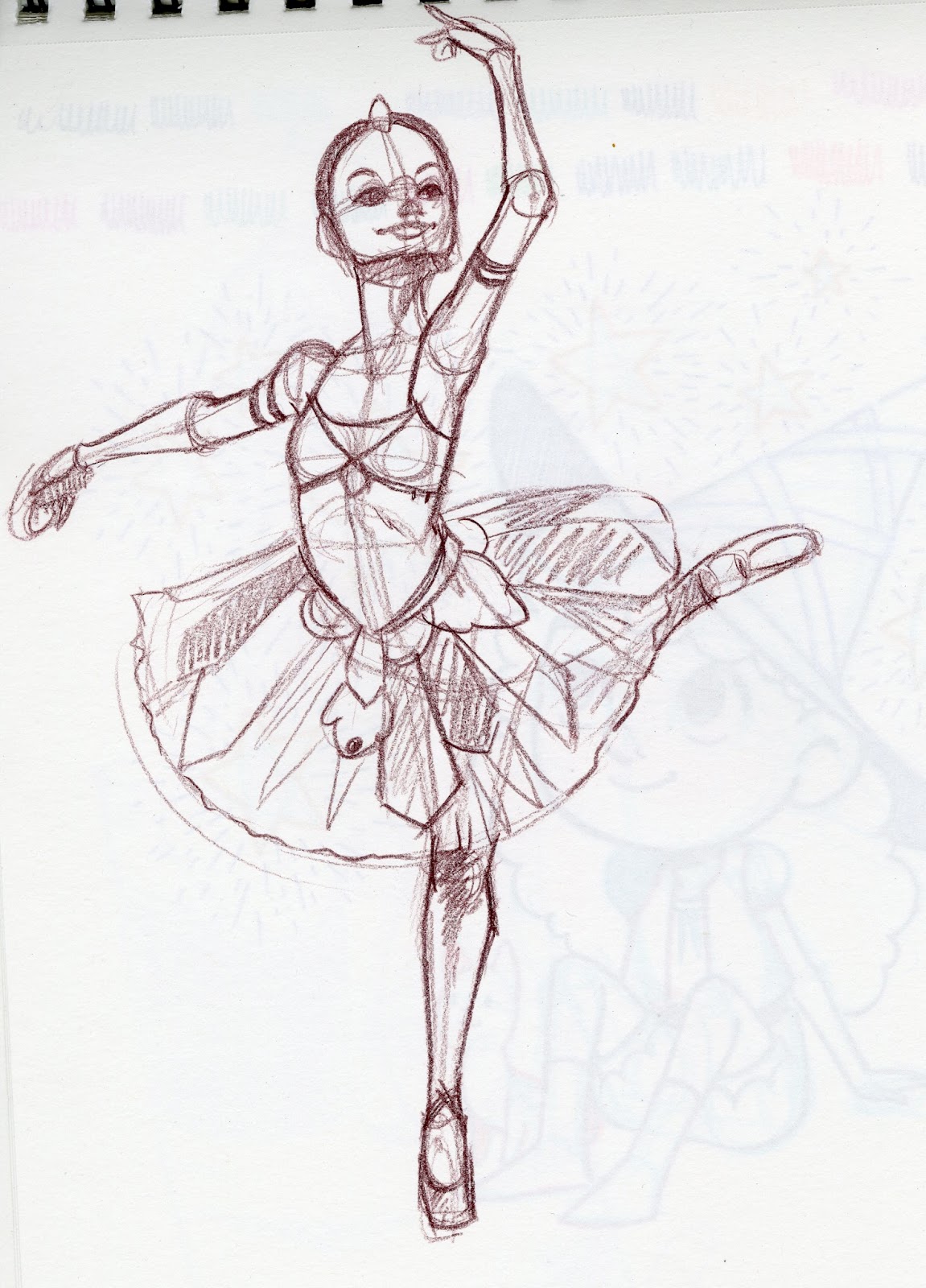
Example 2- Line of Action Demonstration
Establishing a good line of action is particularly important for figures that are in motion, or are not supporting their weight evenly with their feet. Since this demo's line of action is kind of a pitiful example, I went ahead and whipped up another mini example to show you guys how important establishing line of action can be. In this example, I'm sketching a ballerina.

Nice long line of action that goes from head to the natural point of gravity on the floor. In the image Im referencing, the dancer is leaning on her partner, but I opted not to draw the partner. She is not supporting herself, so her line of action does not meet up with where her feet are.

Thats the basics of how I construct figures, both for study and for illustration. If there's any area you'd like me to go over in detail, please send me an email and let me know! If you'd like step by step construction for other types of figures (kids, different body types, even animals), or if you'd prefer a video tutorial, please send me an email or a tweet, and I'll be happy to oblige.
Additional Resources
Figure Drawing for All It's Worth - Andrew Loomis
The Vilppu Drawing Manual - Glenn Vilppu
Favorite References and Figure Resources
Illref
Humanae
SenshiStock
Pixelovely
The Sartorialist
Please consider donating to this blog or purchasing from Natto-shop (http://nattosoup.com/shop) if you want me to continue publishing quality content. All materials tested were purchased from my own pocket. Keep on Truckin' Nattosoup is not under any sponsorship.
Today I'll show you guys how I went about sketching the below image, which was drawn using reference of a plus sized model from Pinterest. I've found that traditional figure drawing references (including those I linked at the bottom of this post) lack a variety of body types and poses, so you may find it helpful to search for bodybuilders, plus size models, and dancers to help develop your range.

My method for breaking down human anatomy hasn't changed much over the years- I think it's a very flexible method that works well for drawing all sorts of figures- stylized, cartoony, realistic- all you have to do is modify the proportions you use, the level of detail you draw in, and the features you choose to exaggerate. I use this method when drawing from reference for study purposes, and when creating figures and poses from my imagination, and I think it's a good way to internalize and memorize the human body.
My method of drawing the human figure comes from three major sources- Glenn Vilppu's Glen Vilppu Drawing Manual, Andrew Loomis' Figure Drawing for All Its Worth, and from the Constructive Human Anatomy class taught by Professor Paul Hudson at SCAD Savannah three years ago. You can find links to purchase Figure Drawing for All It's Worth and The Glen Vilppu Drawing Manual at the bottom of this post, as well as additional resources you may find helpful.
I highly recommend daily figure drawing practice, and if you have access to it, drawing the figure from life. Many schools offer open figure drawing sessions where you pay a small model fee, and there are Meetups for sketching groups of all sorts. If you live near a coffee shop, you can also sit and sketch passersby for hours for only the price of a cup of coffee.
If you browse my sketchdumps, you'll see many examples of figure and facial studies, some clothed, some nude. There are many more you don't see, simply because sometimes it's tedious to scan page after page of studies. For the most part, these studies aren't for show, they're simply to help me stay limber when it comes to drawing figures, and to help me become familiar with a variety of poses and to help improve how I render clothing.
Materials
SketchbookPencil color of choice (I'm using Prismacolor's Espesso)Pencil SharpenerReference Image
Process
Work Big to Small- General to Specific. Don't get caught up too early in refining something that may not work to benefit the whole.
Assemble the Materials
I like sketching with color pencils because they offer the inability to erase (much like pens), but you can get a variety of tones and stokes from a single pencil. I find wooden pencils to be more flexible than mechanical pencils, so if I'm practicing, I tend to prefer wooden pencils. You may use any color you wish, but I highly recommend dark browns, warm grays, and reds. Some of my favorites are:
Terra Cotta
Sienna Brown
90% Warm Gray
Tuscan Red
Black Grape
Sepia
Dark Umber
Although I am currently using Prismacolor, you may use any brands or colors you enjoy or are comfortable with.
Step 1: Determine Line of Action
Unfortunately this isn't a great example of a line of action, but your line of action is the very essence of your gesture, the line that the torso, and to a lesser extent, the legs, will follow. I find that establishing a line of action helps me create characters and figures that seem to have actual weight.
For a better example of line of action, keep reading, as I provide another demo at the bottom of this post!
Step 2- Boxing in Basic Shapes/ Creating a Skeleton
My current method of blocking in shapes is based on the techniques outlined in Andrew Loomis' Figure Drawing for All Its Worth and Glenn Vilppu's Glen Vilppu Drawing Manual. I've included the relent Figure Drawing for All Its Worth for your reference. I highly recommend looking into both books.
Example pages from Figure Drawing for All Its Worth
[image error] Original illustration from Andrew Loomis' Figure Drawing for All It's Worth. Web image from IllRef
 Original page from Figure Drawing For All It's Worth. Original image from my own collection.
[image error]
Original illustration from Figure Drawing for All It's Worth. Scan from IllRef.Blocking in the figure is fairly simple, but a vital step in how I construct figures. Male or female, child or adult, your basic torso shape is a variation of a rectangle. For a woman, it's usually going to be an hourglass, but if you're working from reference, I recommend not just assuming (which reinforces bad habits), but to actually draw the body type you see.
Original page from Figure Drawing For All It's Worth. Original image from my own collection.
[image error]
Original illustration from Figure Drawing for All It's Worth. Scan from IllRef.Blocking in the figure is fairly simple, but a vital step in how I construct figures. Male or female, child or adult, your basic torso shape is a variation of a rectangle. For a woman, it's usually going to be an hourglass, but if you're working from reference, I recommend not just assuming (which reinforces bad habits), but to actually draw the body type you see.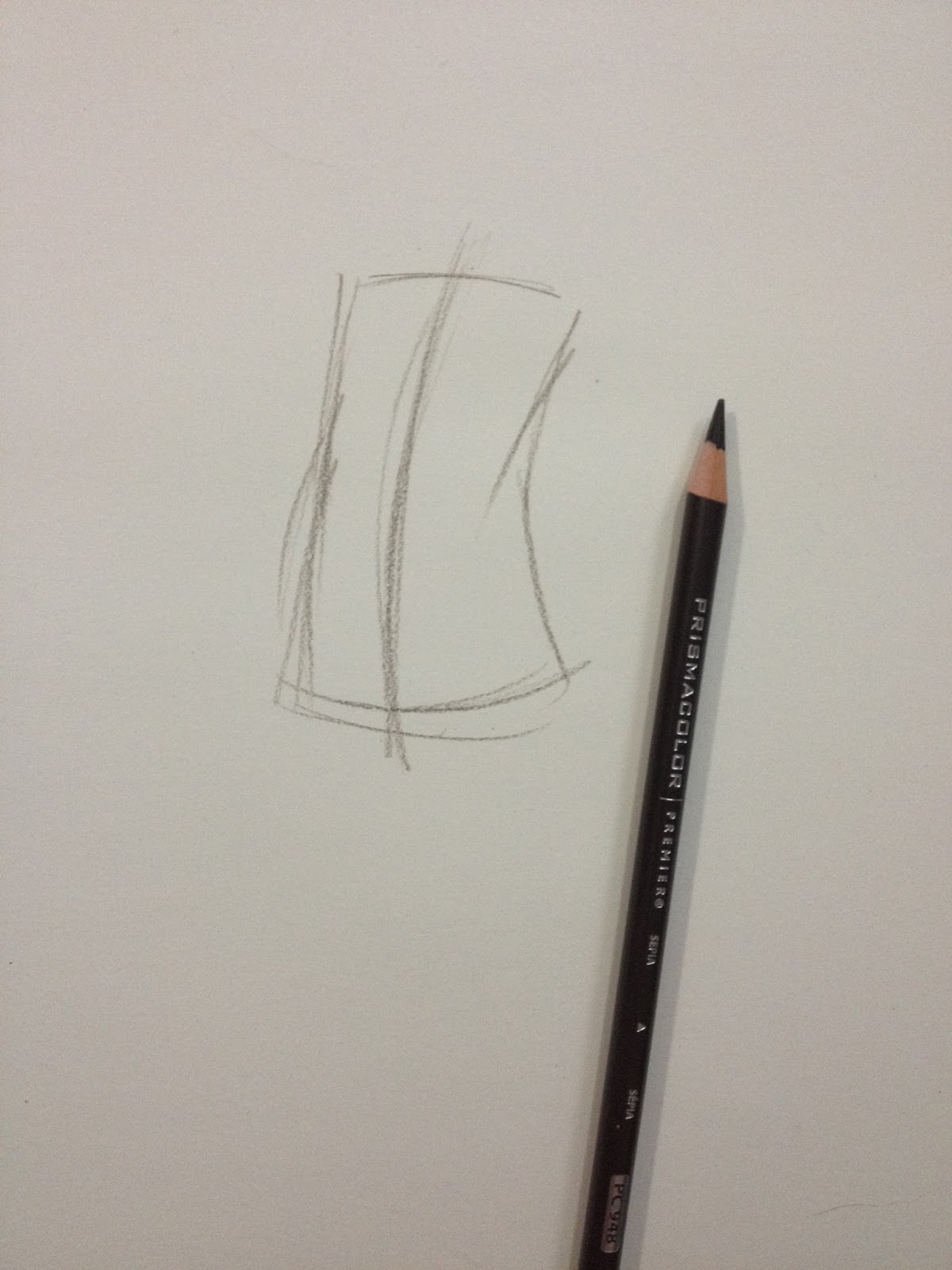
I block in the ribcage and pelvic box.

As well as the arms and legs. Right now, the arms and legs are just gestural sketch of the bones, to help me solidify the pose before I start adding too many details. Basically, the sketch at this point is my roadmap.
Step 2: Using Cylinders to Define Form
At their most basic, our arms, legs, and neck are just long cylinders. Generally, they are wider at the top, or where they meet the body, than they are at the bottom.

I find it really helps to block shapes in from general to specific. Not only does your entire drawing develop at roughly the same rate, but it prevents you from over investing in any one area. If you feel the need to really investigate a particular area, you can always do a sketch on the side.

Step 3: Blocking in Features- Clothes and Hair
As with all other forms, I recommend starting general and working towards specific- blocking in shapes and working towards adding folds.
Depending on what you're trying to practice- gesture vs. realistic pose, you may want to plan your clothing in with your initial gestural sketch. For this sketch, I'm studying how the body is built, so while clothing is important, its not my primary focus.

In this outfit, the shows, skirt, and bun are the defining features, with the heels influencing the subject's pose.
Step 4: Blocking in Facial Features
I've written about how I construct faces a couple times in the past (Facial Anatomy and Construction and Bits and Bobs- Anatomy Continued) and since its been a few years and a few things have improved, I'll probably revisit this topic for you guys soon.
The gist of how I construct faces is through division. The skull is a ball with a spade on the front. You divide the face in half both horizontally (across the ball) and vertically across the spade. The face is five eye widths wide at it's widest, and you can place the eyes by putting one eye width in the middle, and then two on each side, as shown below.


Step 5: Defining Forms with Shadows
Refining hands is the next step in my figure drawing process. I start by blocking out the basic shapes of the hand- the palm, the thumb, the fingers.

And then I block in the fingers. I find it's easiest to break hands down this way, rather than trying to draw the fingers in early, or in too much detail, as the lines can quickly overwhelm the small area.
Details in clothing is one of the last major stages of blocking in the image.


Step 6: Applying tone to help define forms
This is where using a color pencil really shines. You can apply a variety of smear free tones easily and quickly with a dull pencil, and apply sharp details with a sharpened pencil. When refining the face, I always prefer to work with a freshly sharpened color pencil, but when applying mass tones, such as the shadows on the skirt or the subject's hair, I prefer a dull pencil.

Example 2- Line of Action Demonstration
Establishing a good line of action is particularly important for figures that are in motion, or are not supporting their weight evenly with their feet. Since this demo's line of action is kind of a pitiful example, I went ahead and whipped up another mini example to show you guys how important establishing line of action can be. In this example, I'm sketching a ballerina.
Nice long line of action that goes from head to the natural point of gravity on the floor. In the image Im referencing, the dancer is leaning on her partner, but I opted not to draw the partner. She is not supporting herself, so her line of action does not meet up with where her feet are.
Thats the basics of how I construct figures, both for study and for illustration. If there's any area you'd like me to go over in detail, please send me an email and let me know! If you'd like step by step construction for other types of figures (kids, different body types, even animals), or if you'd prefer a video tutorial, please send me an email or a tweet, and I'll be happy to oblige.
Additional Resources
Figure Drawing for All It's Worth - Andrew Loomis
The Vilppu Drawing Manual - Glenn Vilppu
Favorite References and Figure Resources
Illref
Humanae
SenshiStock
Pixelovely
The Sartorialist
Please consider donating to this blog or purchasing from Natto-shop (http://nattosoup.com/shop) if you want me to continue publishing quality content. All materials tested were purchased from my own pocket. Keep on Truckin' Nattosoup is not under any sponsorship.


October 18, 2015
Late August and September 2015 Art Dump
For sketching, I've pretty much moved entirely to using color pencils. I like the fact that they're expressive and immediate, that playing around with different colors can have a vastly different feel for the resulting sketch. I find sketching in color pencil to be very immediate and gestural- I don't overly worry about making things perfect, because I don't have the ability to erase. If I absolutely have to redraw something, I'll use a piece of sticky note and attach that on top.
I like using Blick's color pencils when I can get them easily, as they're cheap, but I also buy Prismacolors from my local Jerry's Artarama for sketching. I've tried Jerry's SoHo color pencils, and find them to be too waxy for the sort of sketching I like to do. If you can buy Derwent's ColourSoft color pencils in openstock, and you enjoy sketching with pastel pencils but don't like the fact that they smear, I highly recommend you give Derwent's Coloursoft a try.
If I have a sketch I like and want to refine, I usually scan it, turn it to bluelines in Photoshop, and print it out on the appropriate paper. For the most part, I work in watercolor these days, so I'm usually printing it out on watercolor paper, and penciling it.
I do still use non photo blue lead and graphite for drawing- most of my Field Test illustrations were drawn with a mechanical pencil and inked with a Mitsuo Aida, and I definitely still use non photo blue lead for convention commissions. The problem, for me, with using NPB in my sketchbook is that I feel obligated to do something to it- pencil it or ink it, but using color pencils leaves me with no such compulsion.
August and September saw me still struggling with depression, so sadly most of my inspiration was sapped. I relied mostly on working from reference or doodling fanart, anything that kept me drawing every day. Its important to draw daily, regardless of how motivated you feel, because one of the keys to good drawing is enforcing positive drawing habits. The key there is GOOD drawing habits.
You can also reinforce BAD drawing habits, and that's how people like me went ten years of drawing daily with no solid improvement (ala high school and early undergrad). Whenever I find my art has stalled out, I switch to practicing subjects or techniques I'm not yet comfortable with.
However, if you're struggling with depression and lack of motivation, the most important thing is drawing daily, and the best thing you can do, in my opinion, is to work on basic skill building, exercises that don't require much creativity or even skill, just learning how to see.
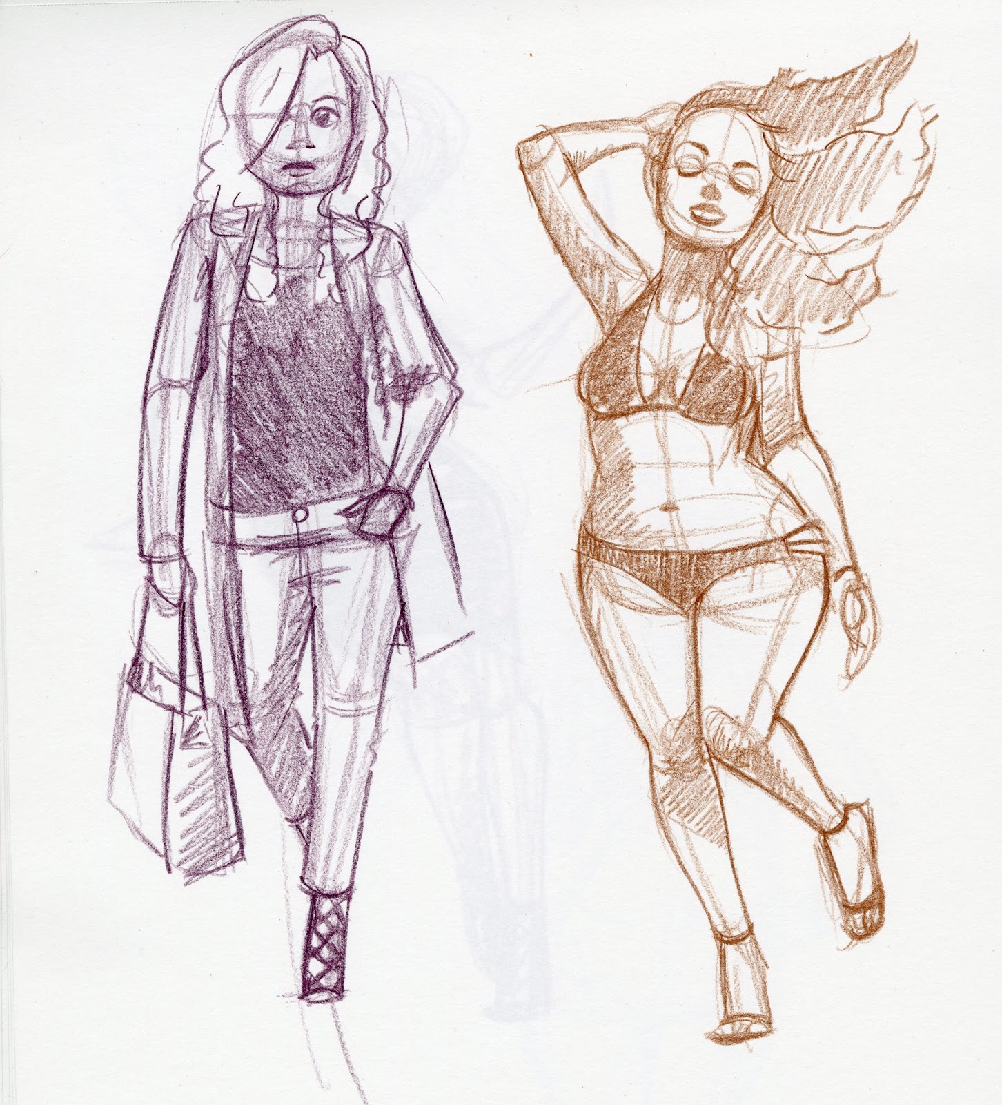
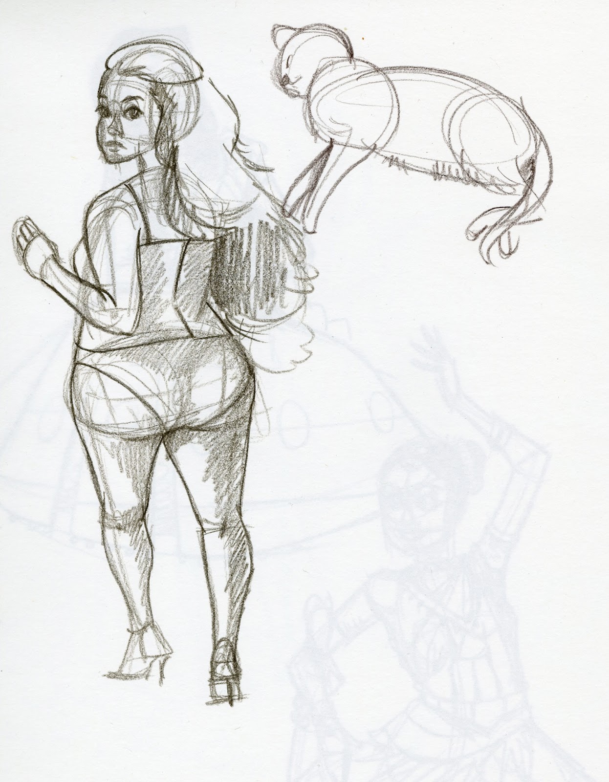
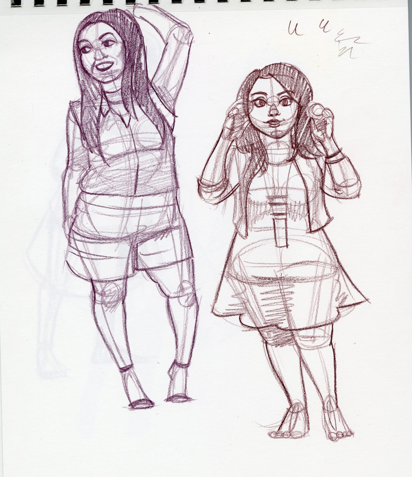
So this August and September, I continued working on developing a sub style that's a little less literal and a little more gestural, and turned my focus to drawing a wider variety of body types by drawing some plus size models. Its often difficult to find a variety of body types for study through traditional figure drawing reference sources, so I simply looked it up on Pinterest.
Fanart
 Warmup sketch from The Sartorialist, Sophie Hatter from Howl's Moving Castle (Ghibli version)
 Ponyo, Satsuki and Mei from My Neighbor Totoro
 Of course, gotta try Kara in this style.

 Princess Carolyn from BoJack Horseman


 Kiki from Kiki's Delivery Service
 ChiChi from Dragonball
 Lapis from Steven Universe
 Connie from Steven Universe

 Aurora from Child of Light
 Sakura from Gekkan Shoujo Nozaki-kun
If you liked these sketches, you should definitely check my Instagram, Tumblr, or Twitter, because I'll be inking many of them as part of my Inktober! I'll share all my inky adventures here on the blog once Inktober is over.


 An inking test for a set of fineliner pens from Ali-express.


Focus on figure work using plus size models
I've gotten bored with the lack of figure variety on sites like The Sartorialist, so I turned to Pinterest for some plus size model reference. By changing my inspiration, I found I was able to work on a problem that consistently plagues my work-oversized heads. The change in proportions meant I had to study the figure carefully, rather than being able to cheat through muscle memory, which just reinforced bad habits.


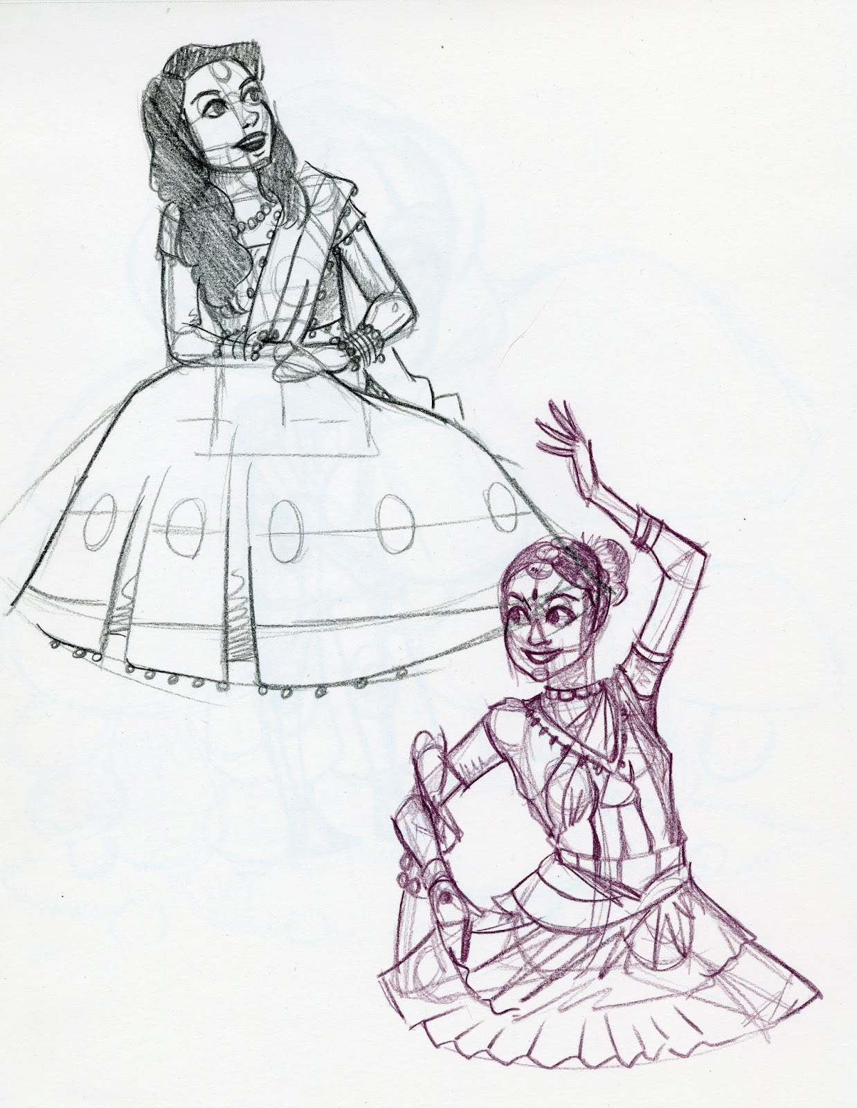
Tired of Western fashions, I also looked into some Bollywood inspired fashions for inspiration.


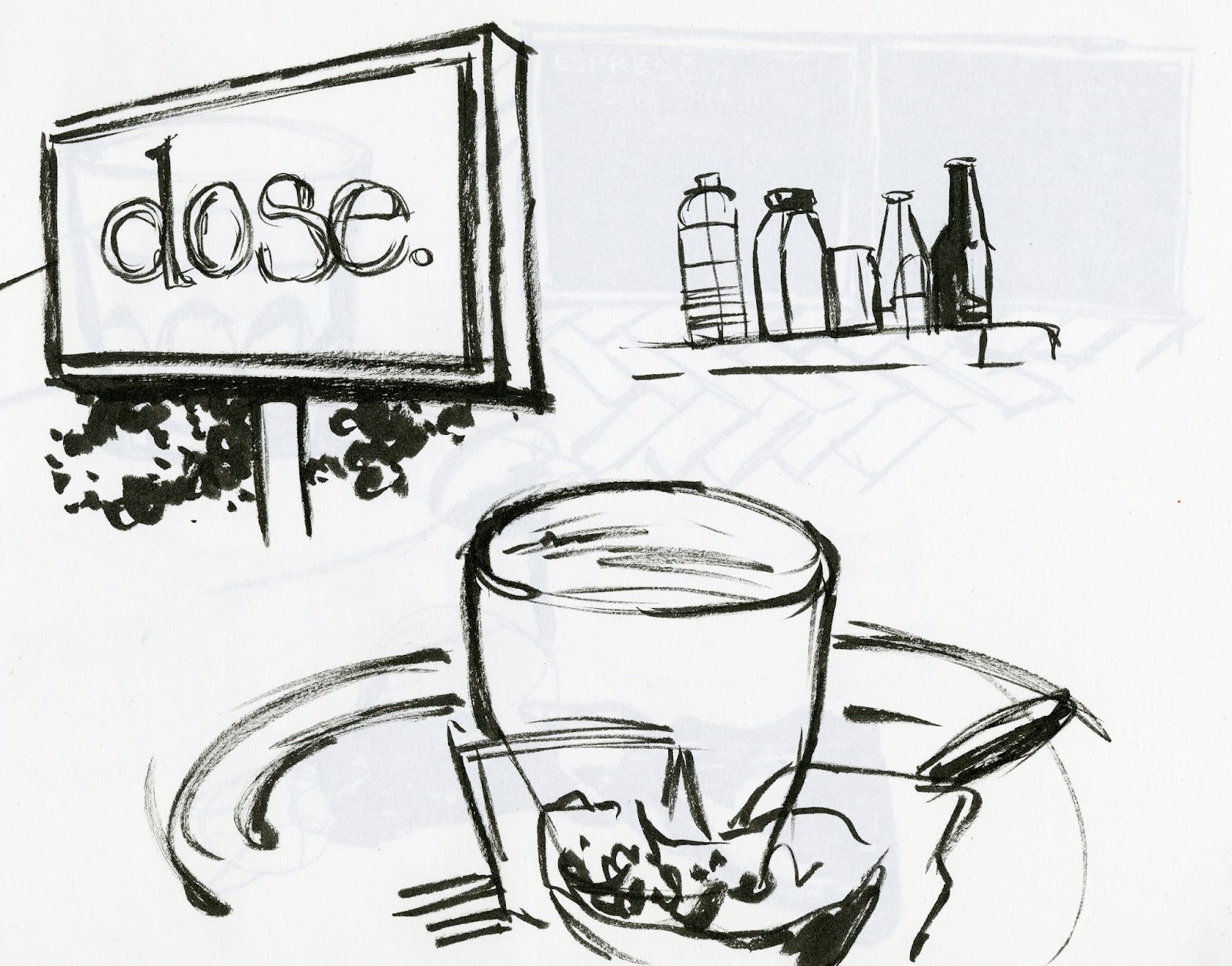
Ink Studies Outside Dose
Dose is a local Nashville coffee shop right off West End. Although there isn't really much to see in the area (it faces an interstate), I tried to do some environmental sketching.


I'm really out of practice with sketching with a brush pen, and I found that the Sailor Nagoya I was using wasn't really delivering much ink. I switched to the Pentel Kirara, which was a bit better, but I may end up fishing out a few of the other brush pens I've tested in the past to see if any are up gestural field sketching.
Since I've switched to using a variety of colors with color pencils, I've also started applying more shading to my sketches. This has lead me to purchasing a toned sketchbook, and I hope this leads to some interesting sketches soon.


Ah! An example of using a sticky note for correcting a color pencil sketch. The intention isn't to trick the viewer into thinking you've never made a mistake, but to assuage your tortured artist soul that you made a glaring mistake that ruins the whole piece for you. Use the stick part, and just stick it right on. Now you can sleep at night.


 Since Hulu has all three seasons of Invader Zim up, I decided to binge watch it, as I never had the chance to as a teenager. Here's Gaz.


So that's it for SKETCHES from August and September. Stay tuned, because I have more art to share!
Please consider donating to this blog or purchasing from Natto-shop (http://nattosoup.com/shop) if you want me to continue publishing quality content. All materials tested were purchased from my own pocket. Keep on Truckin' Nattosoup is not under any sponsorship.
I like using Blick's color pencils when I can get them easily, as they're cheap, but I also buy Prismacolors from my local Jerry's Artarama for sketching. I've tried Jerry's SoHo color pencils, and find them to be too waxy for the sort of sketching I like to do. If you can buy Derwent's ColourSoft color pencils in openstock, and you enjoy sketching with pastel pencils but don't like the fact that they smear, I highly recommend you give Derwent's Coloursoft a try.
If I have a sketch I like and want to refine, I usually scan it, turn it to bluelines in Photoshop, and print it out on the appropriate paper. For the most part, I work in watercolor these days, so I'm usually printing it out on watercolor paper, and penciling it.
I do still use non photo blue lead and graphite for drawing- most of my Field Test illustrations were drawn with a mechanical pencil and inked with a Mitsuo Aida, and I definitely still use non photo blue lead for convention commissions. The problem, for me, with using NPB in my sketchbook is that I feel obligated to do something to it- pencil it or ink it, but using color pencils leaves me with no such compulsion.
August and September saw me still struggling with depression, so sadly most of my inspiration was sapped. I relied mostly on working from reference or doodling fanart, anything that kept me drawing every day. Its important to draw daily, regardless of how motivated you feel, because one of the keys to good drawing is enforcing positive drawing habits. The key there is GOOD drawing habits.
You can also reinforce BAD drawing habits, and that's how people like me went ten years of drawing daily with no solid improvement (ala high school and early undergrad). Whenever I find my art has stalled out, I switch to practicing subjects or techniques I'm not yet comfortable with.
However, if you're struggling with depression and lack of motivation, the most important thing is drawing daily, and the best thing you can do, in my opinion, is to work on basic skill building, exercises that don't require much creativity or even skill, just learning how to see.
So this August and September, I continued working on developing a sub style that's a little less literal and a little more gestural, and turned my focus to drawing a wider variety of body types by drawing some plus size models. Its often difficult to find a variety of body types for study through traditional figure drawing reference sources, so I simply looked it up on Pinterest.
Fanart
 Warmup sketch from The Sartorialist, Sophie Hatter from Howl's Moving Castle (Ghibli version)
 Ponyo, Satsuki and Mei from My Neighbor Totoro
 Of course, gotta try Kara in this style.
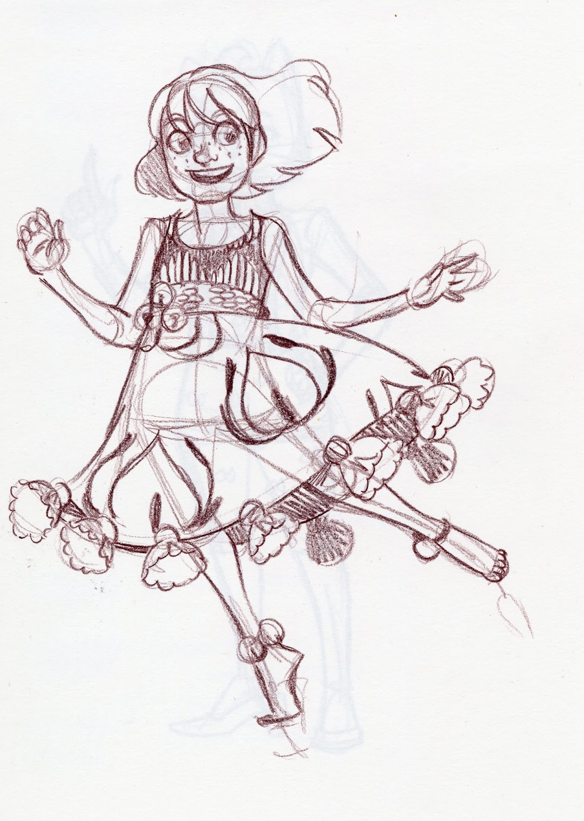
 Princess Carolyn from BoJack Horseman
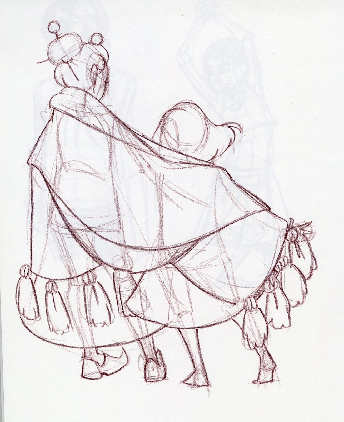

 Kiki from Kiki's Delivery Service
 ChiChi from Dragonball
 Lapis from Steven Universe
 Connie from Steven Universe
 Aurora from Child of Light
 Sakura from Gekkan Shoujo Nozaki-kun
If you liked these sketches, you should definitely check my Instagram, Tumblr, or Twitter, because I'll be inking many of them as part of my Inktober! I'll share all my inky adventures here on the blog once Inktober is over.


 An inking test for a set of fineliner pens from Ali-express.

Focus on figure work using plus size models
I've gotten bored with the lack of figure variety on sites like The Sartorialist, so I turned to Pinterest for some plus size model reference. By changing my inspiration, I found I was able to work on a problem that consistently plagues my work-oversized heads. The change in proportions meant I had to study the figure carefully, rather than being able to cheat through muscle memory, which just reinforced bad habits.


Tired of Western fashions, I also looked into some Bollywood inspired fashions for inspiration.


Ink Studies Outside Dose
Dose is a local Nashville coffee shop right off West End. Although there isn't really much to see in the area (it faces an interstate), I tried to do some environmental sketching.


I'm really out of practice with sketching with a brush pen, and I found that the Sailor Nagoya I was using wasn't really delivering much ink. I switched to the Pentel Kirara, which was a bit better, but I may end up fishing out a few of the other brush pens I've tested in the past to see if any are up gestural field sketching.
Since I've switched to using a variety of colors with color pencils, I've also started applying more shading to my sketches. This has lead me to purchasing a toned sketchbook, and I hope this leads to some interesting sketches soon.

Ah! An example of using a sticky note for correcting a color pencil sketch. The intention isn't to trick the viewer into thinking you've never made a mistake, but to assuage your tortured artist soul that you made a glaring mistake that ruins the whole piece for you. Use the stick part, and just stick it right on. Now you can sleep at night.


 Since Hulu has all three seasons of Invader Zim up, I decided to binge watch it, as I never had the chance to as a teenager. Here's Gaz.


So that's it for SKETCHES from August and September. Stay tuned, because I have more art to share!
Please consider donating to this blog or purchasing from Natto-shop (http://nattosoup.com/shop) if you want me to continue publishing quality content. All materials tested were purchased from my own pocket. Keep on Truckin' Nattosoup is not under any sponsorship.
October 17, 2015
Walmart Art Supply Review: Papermate Clearpoint
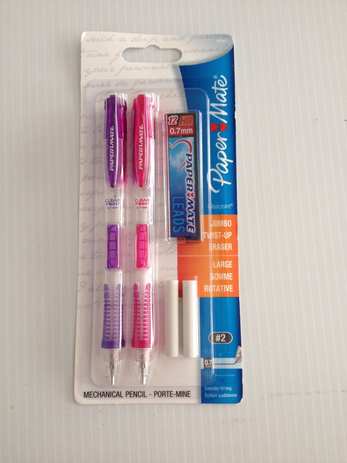
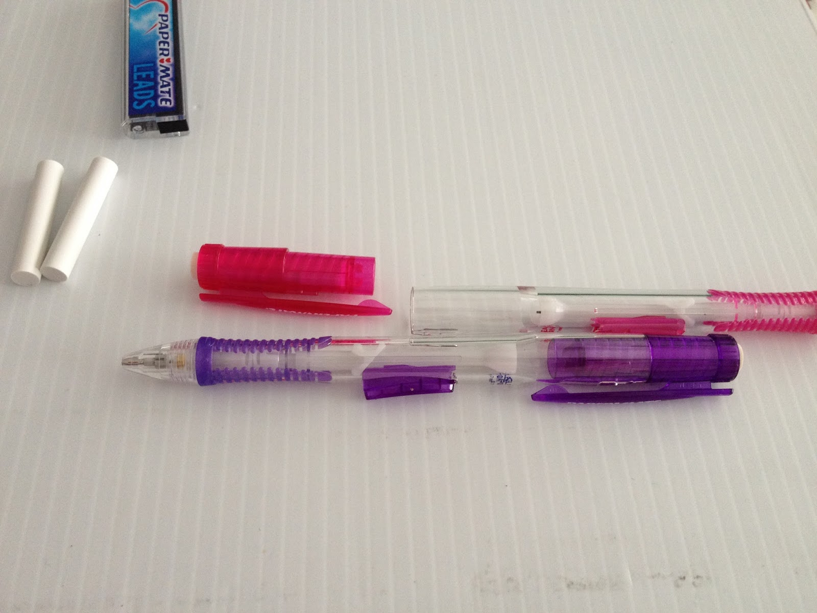
Some of the items I purchased to review were an intentional walk down memory lane- they were the same things I used 15 years ago when I first got started, and I wanted to see if anything had changed with them or with me over the years. Papermate Clearpoint mechanical pencils were my sketching pencils of choice as a teenager, back before I knew you weren't supposed to draw with mechanical pencils (bad habits die hard- I've never really drawn with wooden pencils if given the choice). They were the nicest mechanical pencils my Walmart carried back then, and are still some of the nicest, which is a little disconcerting to be honest.
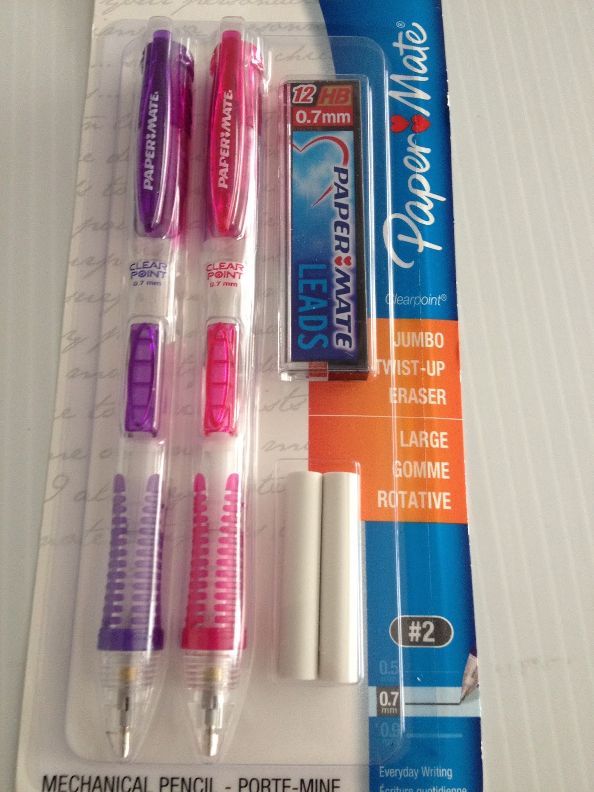
As a teen, these mechanical pencils seemed both fancy and expensive and my tastes have only grown more expensive over the years. The set I bought at the Luling Walmart included replacement erasers and a box of leads- not a bad deal for an artist looking to get their set started. You also get two pencils- quite a deal.
Walmart isn't the only place you can get Papermate Clearpoints- if you order them through my affiliate link, you'll not only get your own Papermate Clearpoints, but your purchase will help support this blog.
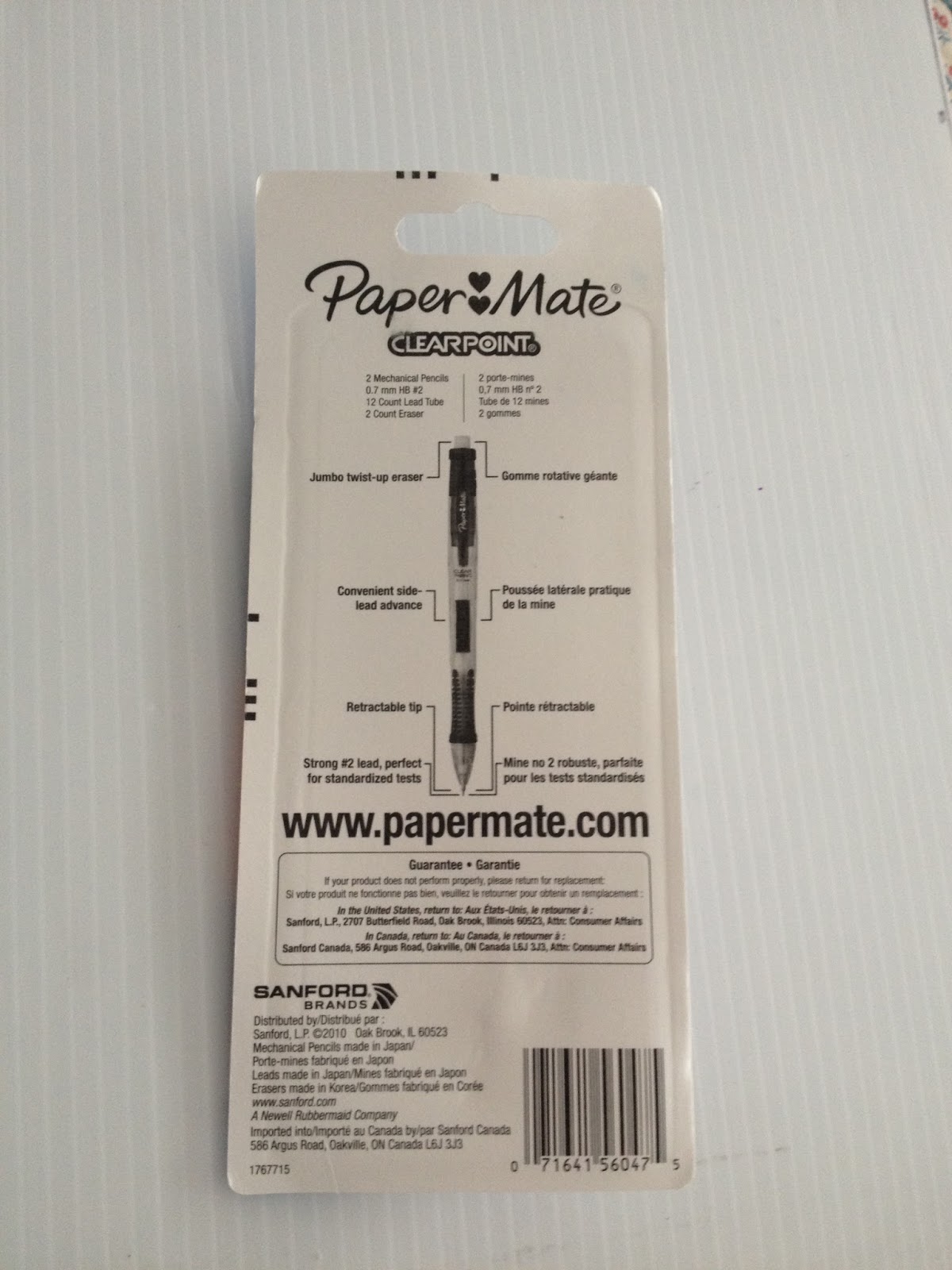
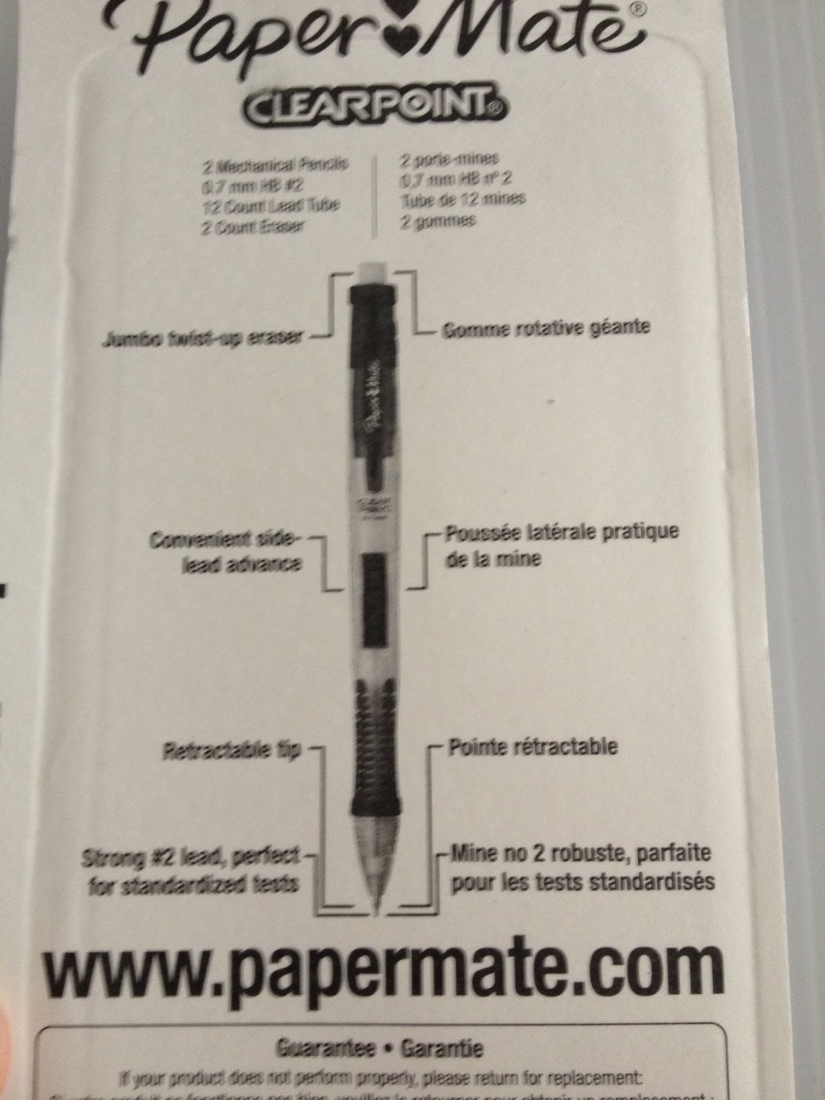
Papermate Clearpoint Features
.7 LeadSide AdvancementTwist up white vinyl eraserRetractable tip
This package included
2 Papermate Clearpoint mechanical pencils2 Replacement erasers12 pieces of lead
The Packaging


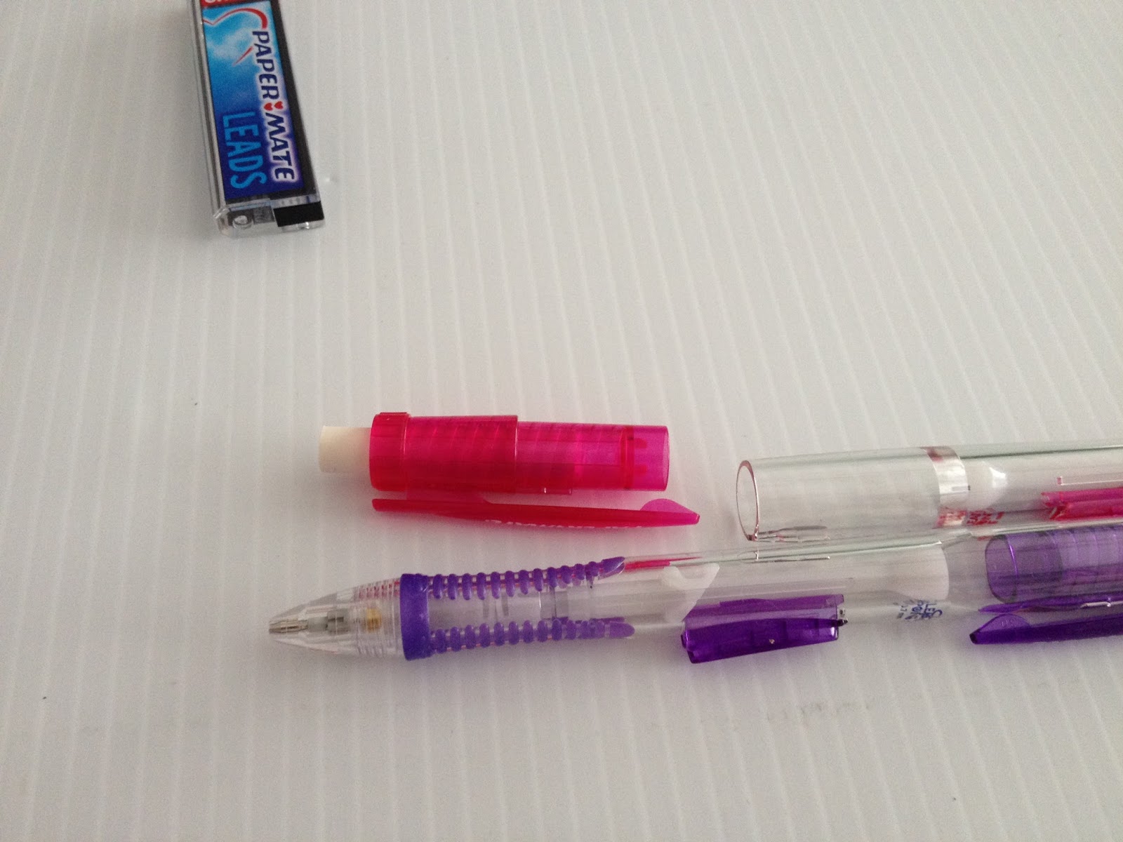
Cardboard with a plastic bubble. Nothing is new in this old town. The upside is- no impossible to open clamshell packaging. The downside is- no reusable packaging either. This package comes with two pencils, two replacement white vinyl erasers, and a box of .7 lead.
The Pencils Themselves


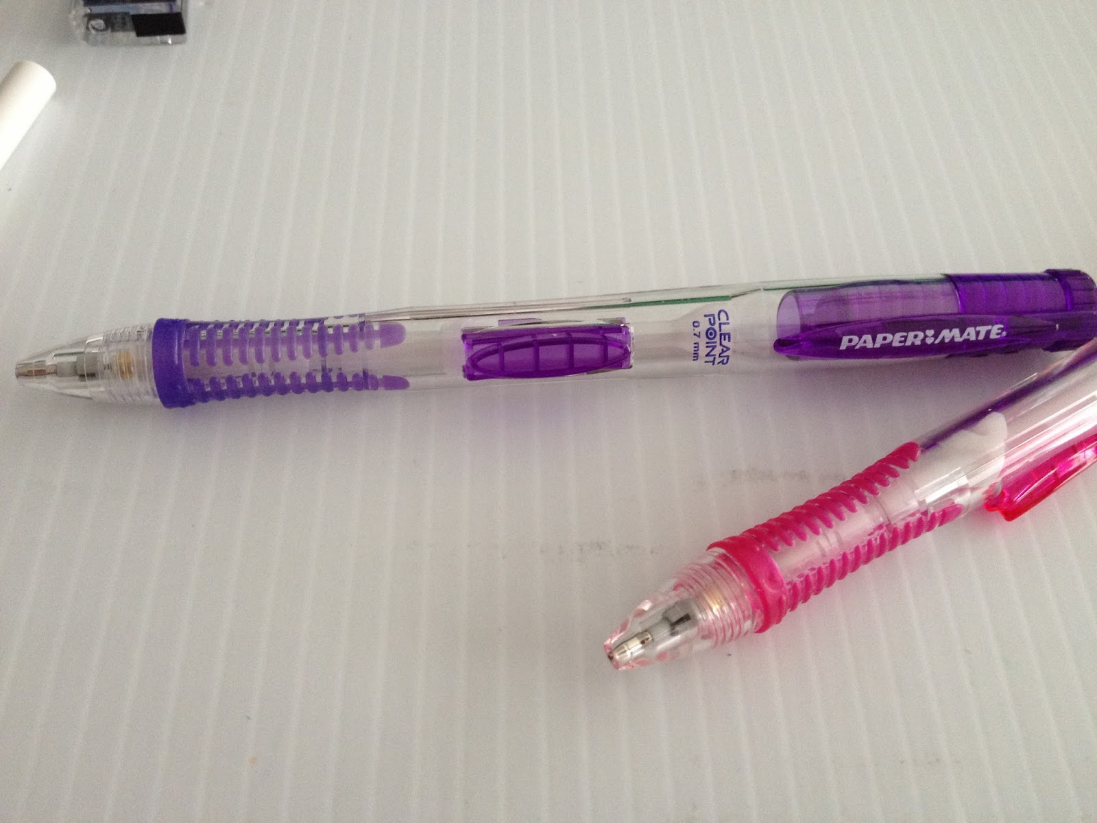
These mechanical pencils are really cute- they come in fun, bright colors, with a clear body. The rubber grip isn't substantial, but the curved body does make drawing easier.


The set I bought has clear bodies with pink or purple accents- very cute. The pencils did not come preloaded with lead, which is just as well- if anyone had dropped the package in the store, the lead would break inside the pencil. The eraser is generously sized, and twists up, and you refill the pencil by pulling off the entire pink cap at the back. The front features a rubberized grip that helps you hold the pencil but doesn't cushion your fingers from the pain of overuse, and a large lead advancement button.
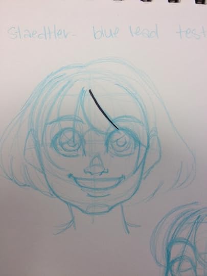
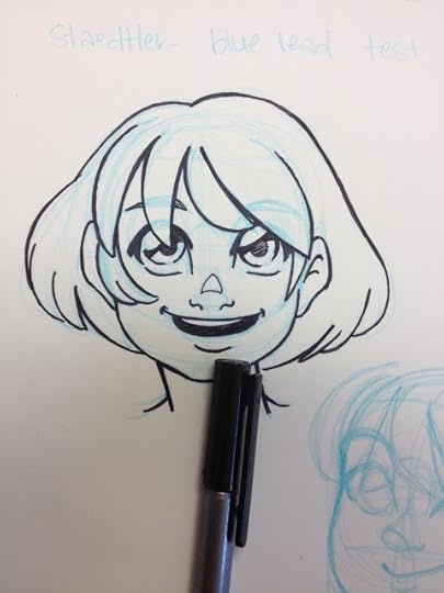
You don't have to use the included lead with these pencils- you can use any you like, including non photo blue or red lead. The non photo blue lead isn't available at Walmart, but many Walmarts WILL have the red lead.
The Field Test
 This illustration was inked, and used for the Alex watercolor test, also part of the Walmart Art Supply Review series.
I've gotten used to using thinner, heavier mechanical pencils (like the Pentel Graphgear, which is made of metal), so the Clearpoint felt a little bulky. The included lead is also much darker than I'd expected, without checking the package I'd say it's a 4B, and I expected an HB. Although the package SAYS HB, be aware that the included lead is much darker and softer.
I also had to get used to a side advancing mechanical pencil- I've become very used to back advancing mechanical pencils, and I usually advance my pencil by jamming that back advancement button against my collarbone, rather than moving my hand. I found the side advancement to get in the way of how I grip a pencil.
I don't generally use the erasers that come with mechanical pencils, but I've used the Clearpoint erasers in the past, and they perform as well as any white vinyl eraser. They may smear a bit if the graphite is applied particularly thickly, but if you are persistent, they will erase cleanly.
The grip doesn't really provide protection for those of us who clench our pencils too tightly, but it will improve your grip without cutting into your finger (the way metal grips do to my hands), and keeps the pencil from slipping (seriously though, has anyone ever had a problem with this?)
The Verdict
Honestly, the only way you'll know if a pencil is a good fit for your hand is to use it for a long time, figure out it's nuances and it's flaws, and decide if the price is worth any hassle you might've incurred. Most pencils will perform just about the same, so it's really up to your personal preferences. I like pencils that feature a back lead advancement, as I've developed a bad habit of using my collarbone to hit that back button, so I don't have to move both hand from the paper. These pencils feature a handy side advancement, which I remember really liking as a teenager, and a colored rubber grip which is really cute.
Please consider donating to this blog or purchasing from Natto-shop (http://nattosoup.com/shop) if you want me to continue publishing quality content. All materials tested were purchased from my own pocket. Keep on Truckin' Nattosoup is not under any sponsorship.
As a teen, these mechanical pencils seemed both fancy and expensive and my tastes have only grown more expensive over the years. The set I bought at the Luling Walmart included replacement erasers and a box of leads- not a bad deal for an artist looking to get their set started. You also get two pencils- quite a deal.
Walmart isn't the only place you can get Papermate Clearpoints- if you order them through my affiliate link, you'll not only get your own Papermate Clearpoints, but your purchase will help support this blog.
Papermate Clearpoint Features
.7 LeadSide AdvancementTwist up white vinyl eraserRetractable tip
This package included
2 Papermate Clearpoint mechanical pencils2 Replacement erasers12 pieces of lead
The Packaging

Cardboard with a plastic bubble. Nothing is new in this old town. The upside is- no impossible to open clamshell packaging. The downside is- no reusable packaging either. This package comes with two pencils, two replacement white vinyl erasers, and a box of .7 lead.
The Pencils Themselves


These mechanical pencils are really cute- they come in fun, bright colors, with a clear body. The rubber grip isn't substantial, but the curved body does make drawing easier.
The set I bought has clear bodies with pink or purple accents- very cute. The pencils did not come preloaded with lead, which is just as well- if anyone had dropped the package in the store, the lead would break inside the pencil. The eraser is generously sized, and twists up, and you refill the pencil by pulling off the entire pink cap at the back. The front features a rubberized grip that helps you hold the pencil but doesn't cushion your fingers from the pain of overuse, and a large lead advancement button.
You don't have to use the included lead with these pencils- you can use any you like, including non photo blue or red lead. The non photo blue lead isn't available at Walmart, but many Walmarts WILL have the red lead.
The Field Test
 This illustration was inked, and used for the Alex watercolor test, also part of the Walmart Art Supply Review series.
I've gotten used to using thinner, heavier mechanical pencils (like the Pentel Graphgear, which is made of metal), so the Clearpoint felt a little bulky. The included lead is also much darker than I'd expected, without checking the package I'd say it's a 4B, and I expected an HB. Although the package SAYS HB, be aware that the included lead is much darker and softer.
I also had to get used to a side advancing mechanical pencil- I've become very used to back advancing mechanical pencils, and I usually advance my pencil by jamming that back advancement button against my collarbone, rather than moving my hand. I found the side advancement to get in the way of how I grip a pencil.
I don't generally use the erasers that come with mechanical pencils, but I've used the Clearpoint erasers in the past, and they perform as well as any white vinyl eraser. They may smear a bit if the graphite is applied particularly thickly, but if you are persistent, they will erase cleanly.
The grip doesn't really provide protection for those of us who clench our pencils too tightly, but it will improve your grip without cutting into your finger (the way metal grips do to my hands), and keeps the pencil from slipping (seriously though, has anyone ever had a problem with this?)
The Verdict
Honestly, the only way you'll know if a pencil is a good fit for your hand is to use it for a long time, figure out it's nuances and it's flaws, and decide if the price is worth any hassle you might've incurred. Most pencils will perform just about the same, so it's really up to your personal preferences. I like pencils that feature a back lead advancement, as I've developed a bad habit of using my collarbone to hit that back button, so I don't have to move both hand from the paper. These pencils feature a handy side advancement, which I remember really liking as a teenager, and a colored rubber grip which is really cute.
Please consider donating to this blog or purchasing from Natto-shop (http://nattosoup.com/shop) if you want me to continue publishing quality content. All materials tested were purchased from my own pocket. Keep on Truckin' Nattosoup is not under any sponsorship.
October 15, 2015
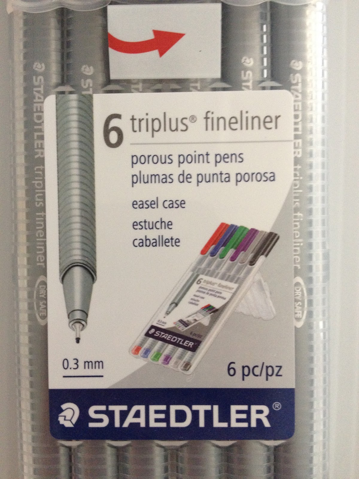
Walmart Art Supply Review: Staedtler Triplus Fineliners
I've already reviewed the Papermate Flair Ultrafine set, as well as the Pilot Precise V5 rollerball pen, so now it's time for my final contender in the inking area- Staedtler's Triplus Finelineres. These pens are sold pretty much everywhere- Walmart, Office Max/Depot, Michaels, and of course, Amazon. If you're interested in picking up a set for yourself, why not use my Amazon Affiliates search link to check out what they have? You can also get a set similar to mine by using the link below:
Your purchase through my affiliate links helps me earn money to help fund product reviews! This blog is unsponsored, and almost everything I review is purchased out of my own funds. If you want other ways to help support Nattosoup, please consider writing in to some of the companies I've written reviews for and letting them know what a great job I've done. You can also leave me a tip in my Paypal donation link, or signal boost any of my posts to your social networks!
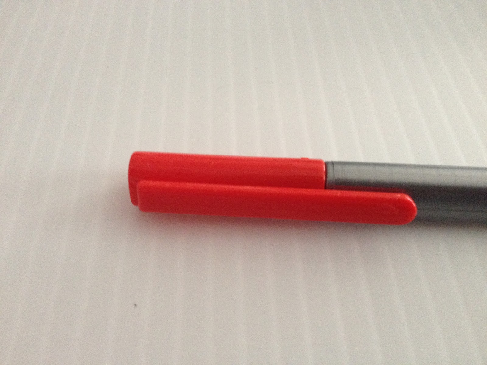
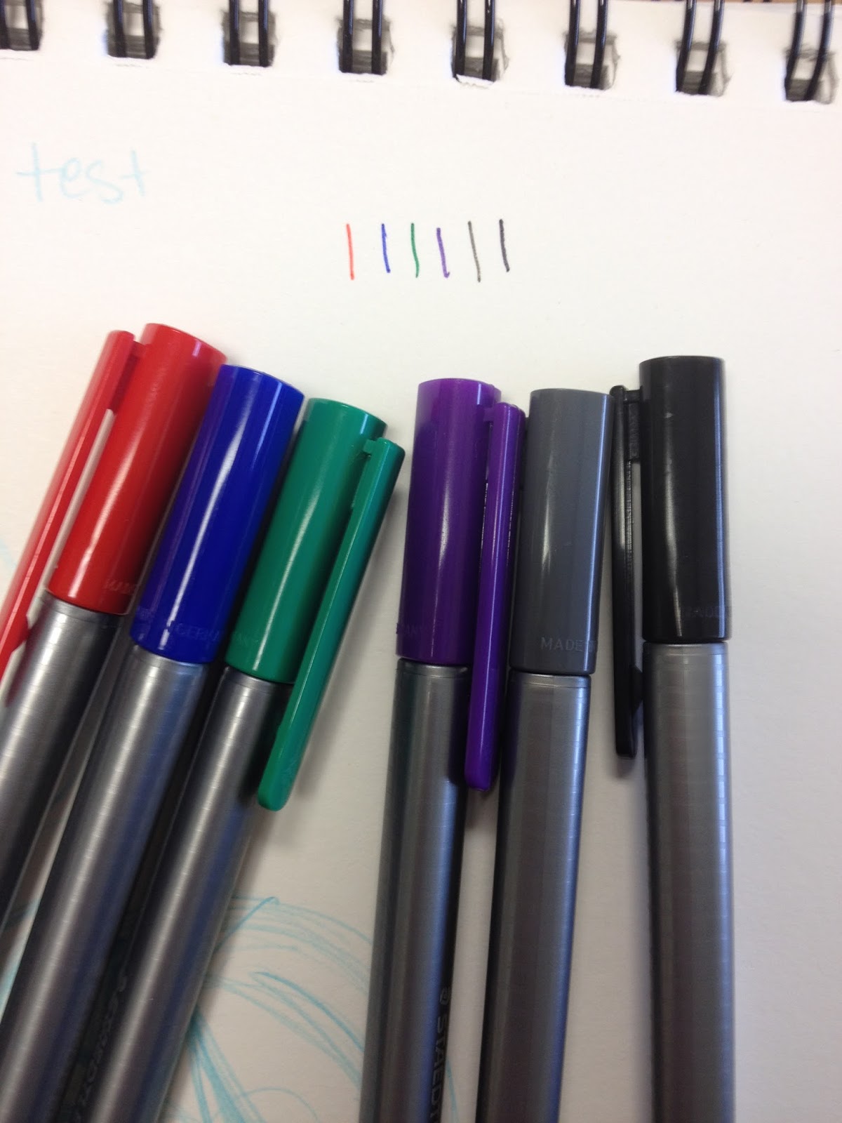
Staedtler Triplus Fineliners
The StatsPorous Point PensPlastic, reusable, easel style case.3 mmTriangular barrelMetal clad tipDry Safe: Can be left uncapped for days without drying outWater based ink colorsI had a big pack of these when I was in high school- lured in by the myriad of ink colors that came in my set. I can't say I was very good at inking with them-the issue was probably a combination of the pens and my own inability, it seems like after all these pen tests, I could ink with just about anything. I decided to buy a 6 pack at Walmart and put them through their paces to find out.
The Packaging
A bit surprisingly, these pens didn't come in any sort of blister pack, or double packaging. Just this reusable plastic easel case.


Right off the bat, I have to admit that I really liked the plastic case they came in then, and I still really like the case. It's a fairly slim, reusable plastic case that can be easily converted into an easel, to aid in grabbing pens. The pens slide right into place, with their caps just on the outside of the clear plastic packaging. This case is fairly sturdy and attractive, and I wish more pen companies offered cases like this. It reminds me of the Mitsubishi Uni set I reviewed recently, except that the bodies of the Staedtler Triplus Fineliners are more like normal pens, and have basic pen features we've come to expect.
The Pen
So for those of you unfamiliar with Triplus Fineliners, these pens feature a triangular barrel that isn't supposed to roll off your desk. They also feature color coordinated caps and end posts.


These pens also promise that they are dry safe, meaning you can leave them uncapped for long periods of time and they'll still work. Although this isn't a feature I intend to test, I can say that I have the same set of 30 from my undergrad days somewhere in my current studio, and when I checked them a couple years ago, they still worked. So dry-safe also means 'probably wont dry up from lack of use'.


Like many fineliners, these come with a metal sleeve around the nib, to protect the nib from getting crushed.

While its a little difficult to see, the caps are pretty indicative of the colors inside the pens, at least with this small set.
The Field Test
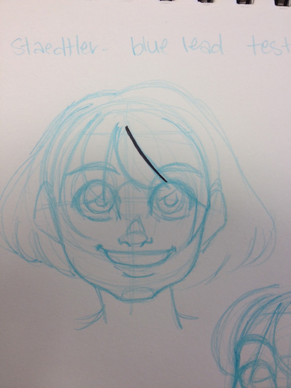
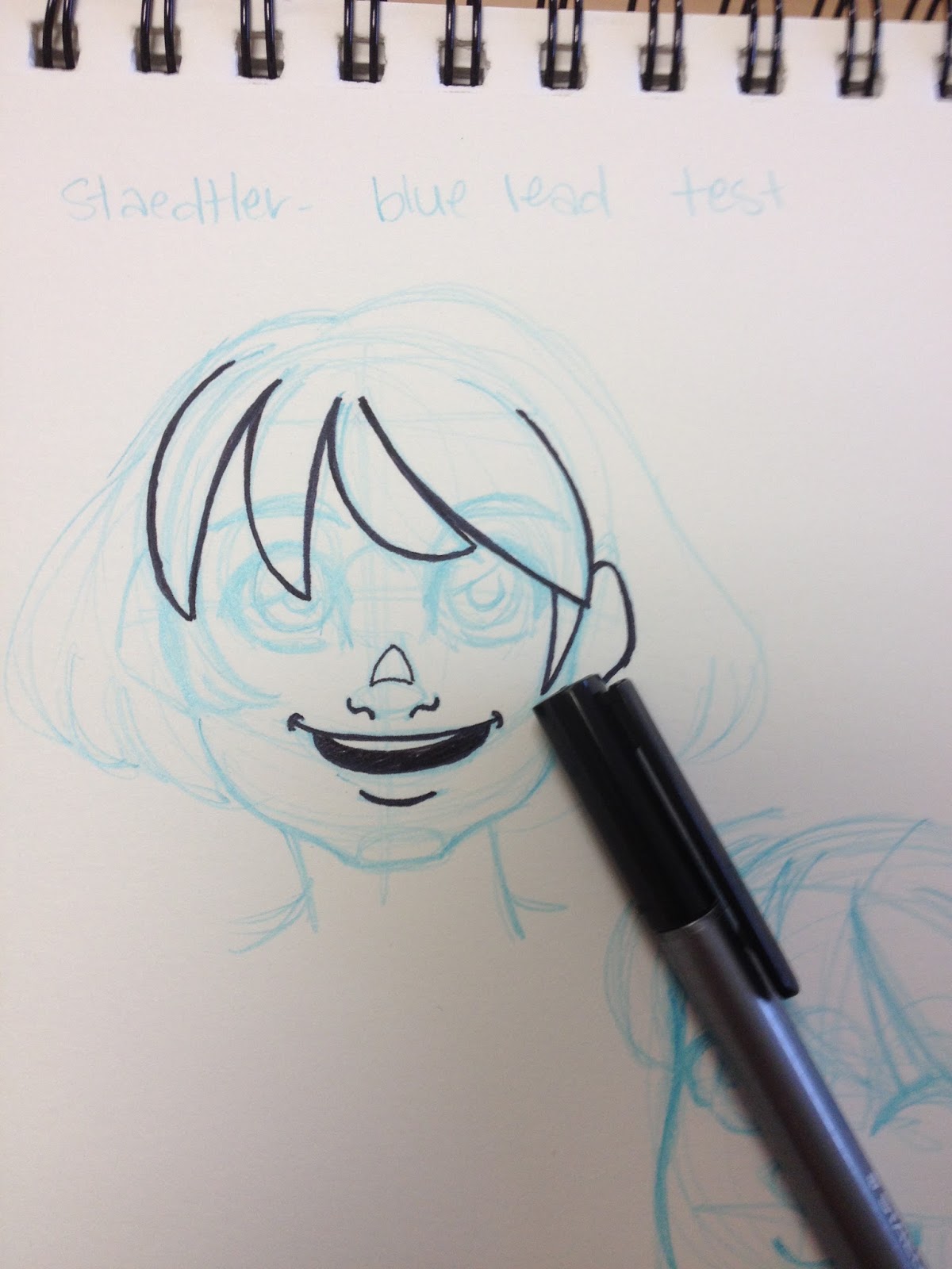
I'm going to do a number of field tests, to give these pens as fair a fighting chance as possible, including my regular 'inking over non photo bluelines', inking over pencil then erasing, and trying these out with a couple types of markers- waterbased and alcohol based.
Inking over Non Photo Blue


 Scan of inktest
I have some notes written on the side of my tests, but if you can't read my awful handwriting, I'll go ahead and transcribe that.
The triangular body, which prevents rolling, takes some getting used to.The tip is very fine, I'm used to a .5-.8 for inking at this size, this is more like a .3It took repeated strokes for me to get the lineweight I wantedThe Triplus Fineliners handle like most technical pens.The pen's shape made it hard for me to pull the sort of lines I wanted.It takes me much longer to ink with fineliners and technical pens.
These pens are not my ideal, but they handle similarly to some of the pens I've reviewed from Office Max, including the Flair and Tul.
Inking over Graphite and Erasing
 Triplus is at the top.For those of you who can't read my handwriting, like myself, my notes:
Inks over graphite ok, no noticable nib staining. Immediate erasing causes the red ink to smudge. Graphite erases cleanly with no smudging after 24 hour dry time.
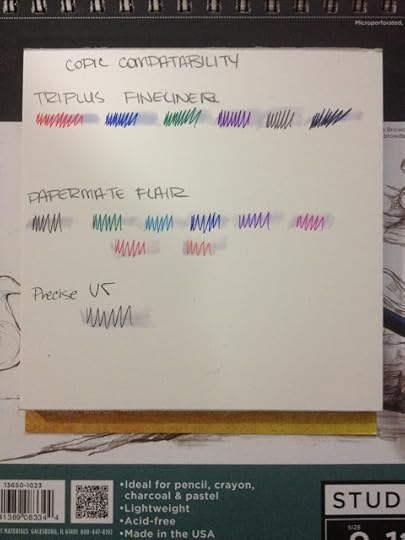
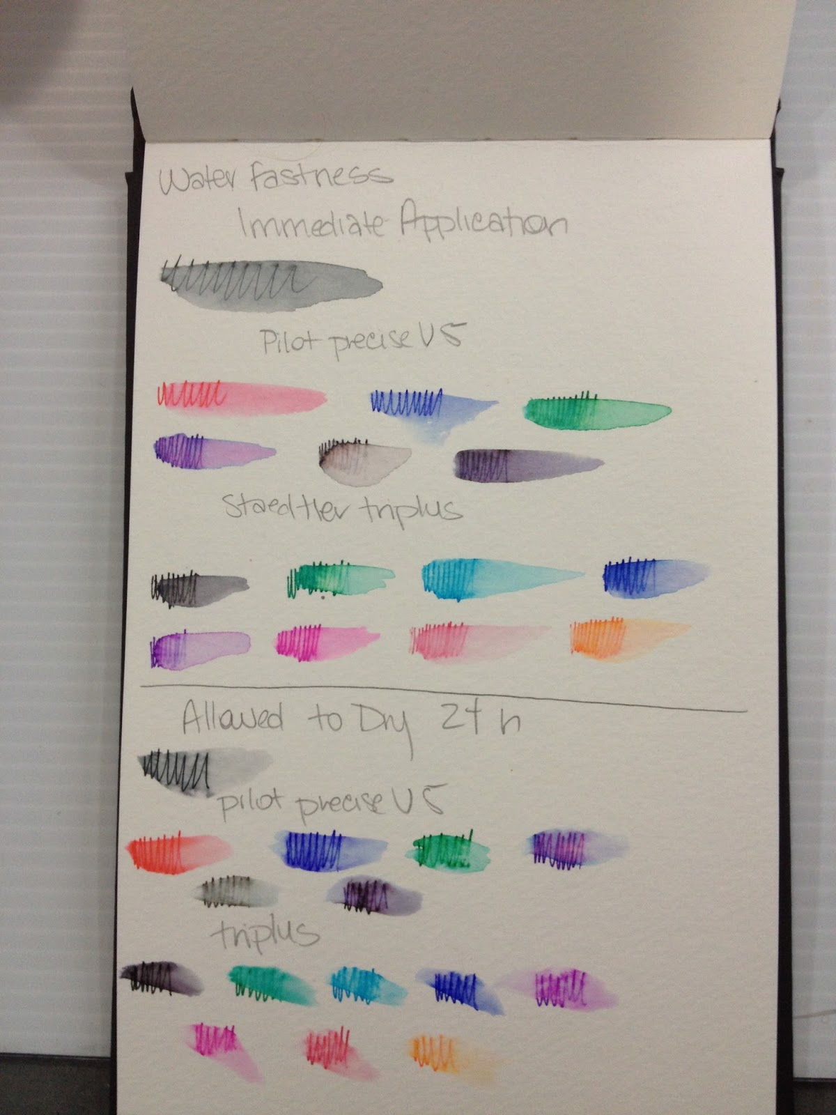
Water Tests- Immediate Application
Immediate water application causes the ink to run drastically, but the effect is almost like a watercolor marker or brushpen, and could be utilized for color application. Most of the inks tested held their color even with water, and though all pen points were chosen as fineliners, and the marks made reflect that, the color distribution is generous.
 Triplus is in the middle, all pens were tested on Strathmore Watercolor Paper
Water Test- 24 Hour Ink Dry Time
 Triplus is in the middle
Even after allowing the ink to dry for 24 hours, significant pigment migration still occured when water was added. These pens are ALMOST like watercolor pens, and could probably be used as such, something I'd like to investigate at a later date.
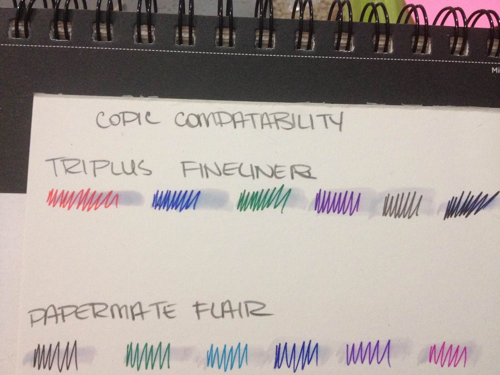
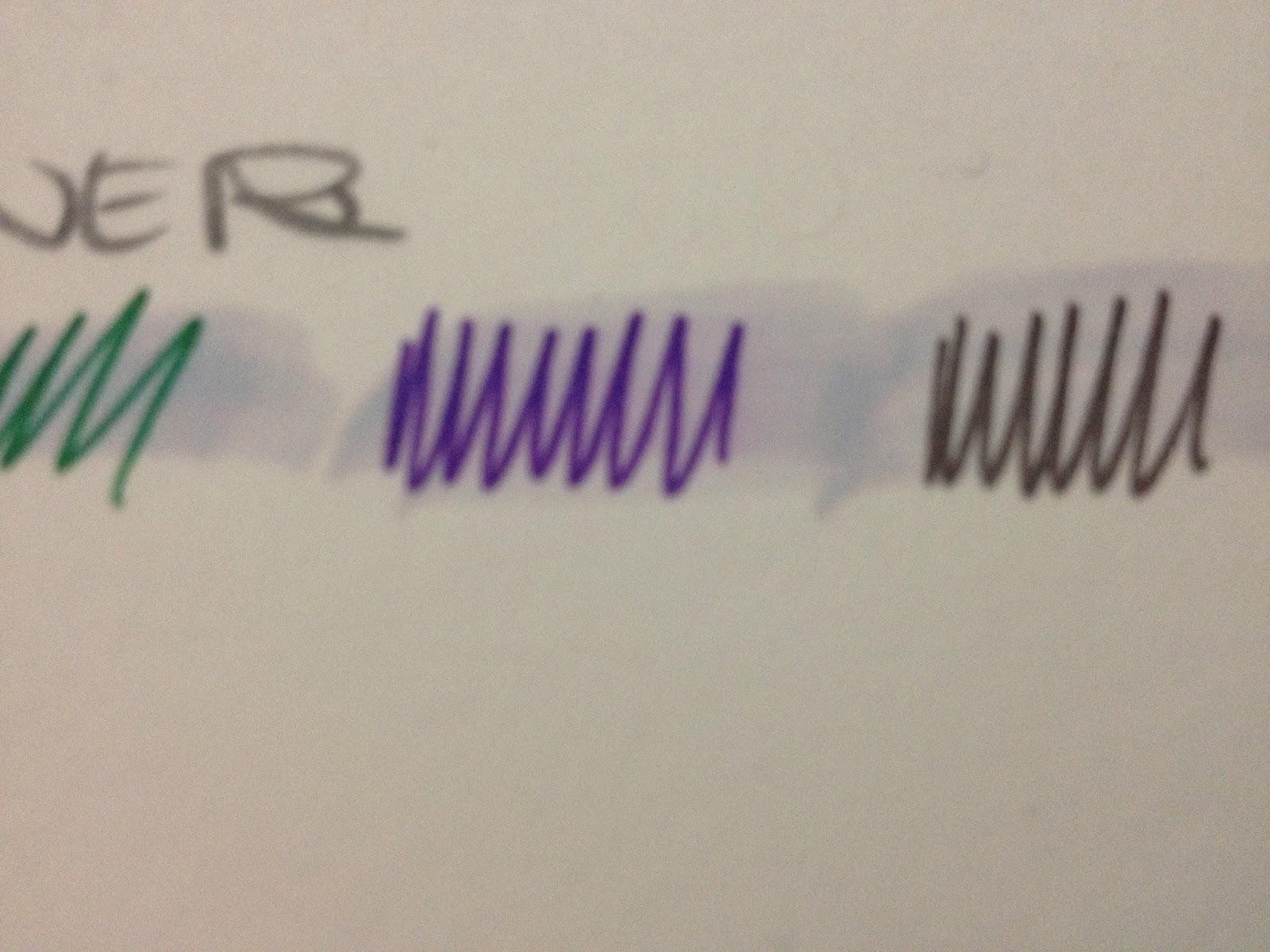
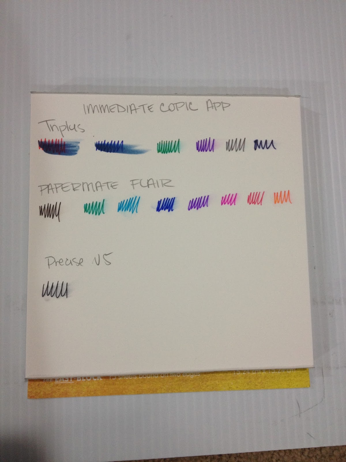
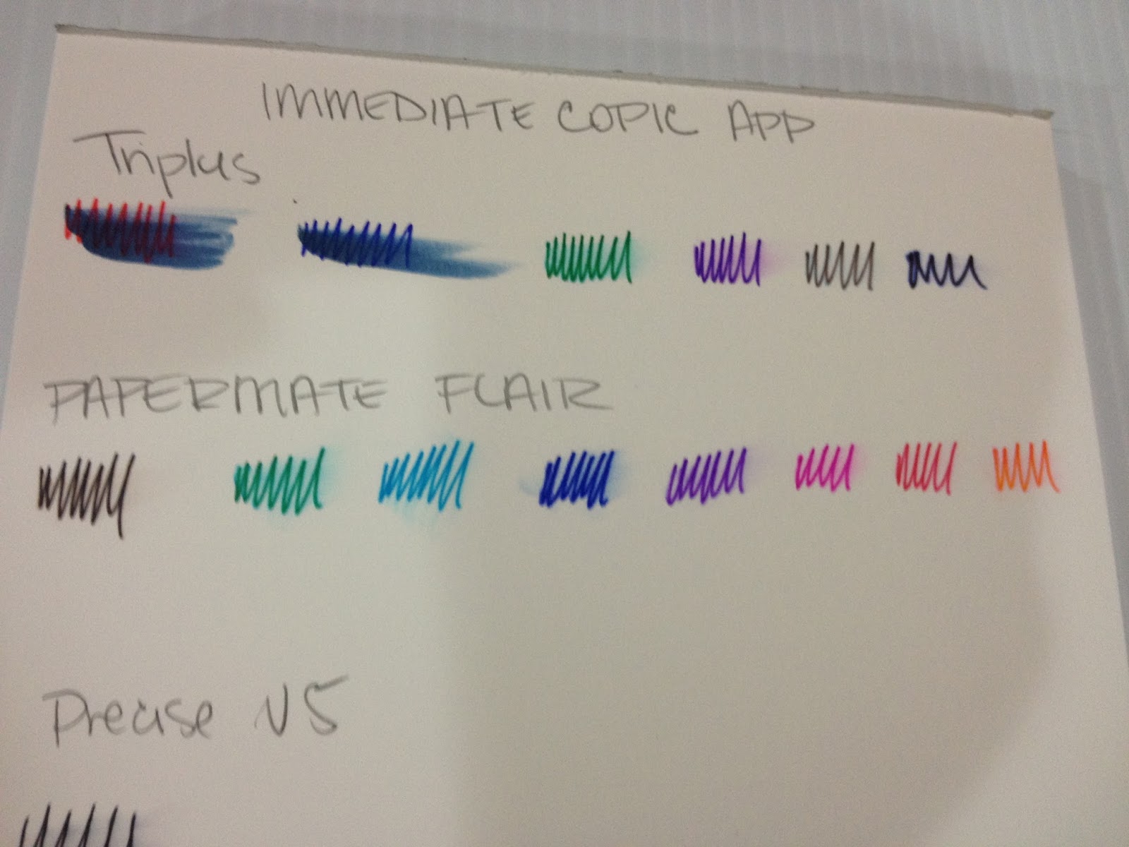
Copic Test- Immediate Application
Pens were tested on Fluid's Hotpress watercolor paper, which has a smooth finish.


Immediate Copic application causes the ink to smear somewhat, although not as much as with other brands.
Copic Test- 24 Hour Dry Time


Although after 24 hours, they are MUCH more prone to smearing, so it's probably more noticable if you use a Colorless Blender or a light color that allows the smeared color to stand out.
The Verdict
If you like to do lineart that utilizes a wide variety of colors, but don't plan on adding color to your lineart traditionally, Staedtler's Triplus Fineliners might be a good choice for you.
In the end, if you plan on doing work with markers (waterbased or alchol based) or watercolors, the Precise V5, the Papermate Flairs, and Staedtler Triplus Fineliners are not recommended. None of the Walmart pens are waterproof OR Copic-proof. If you are looking for pens that are water and Copic proof, I recommend Copic Multiliners for technical pens, and Sailor's Mitsuo Aida for brushpens. These colors do come in bright, fun colors, a multitude of set sizes, and are easily available, so given how inexpensive they are, there's no real reason not to have them in your studio if you like to create colored line art, enjoy doodling, or are into journaling/planner keeping.
Please consider donating to this blog or purchasing from Natto-shop (http://nattosoup.com/shop) if you want me to continue publishing quality content. All materials tested were purchased from my own pocket. Keep on Truckin' Nattosoup is not under any sponsorship.
Your purchase through my affiliate links helps me earn money to help fund product reviews! This blog is unsponsored, and almost everything I review is purchased out of my own funds. If you want other ways to help support Nattosoup, please consider writing in to some of the companies I've written reviews for and letting them know what a great job I've done. You can also leave me a tip in my Paypal donation link, or signal boost any of my posts to your social networks!
Staedtler Triplus Fineliners
The StatsPorous Point PensPlastic, reusable, easel style case.3 mmTriangular barrelMetal clad tipDry Safe: Can be left uncapped for days without drying outWater based ink colorsI had a big pack of these when I was in high school- lured in by the myriad of ink colors that came in my set. I can't say I was very good at inking with them-the issue was probably a combination of the pens and my own inability, it seems like after all these pen tests, I could ink with just about anything. I decided to buy a 6 pack at Walmart and put them through their paces to find out.
The Packaging
A bit surprisingly, these pens didn't come in any sort of blister pack, or double packaging. Just this reusable plastic easel case.


Right off the bat, I have to admit that I really liked the plastic case they came in then, and I still really like the case. It's a fairly slim, reusable plastic case that can be easily converted into an easel, to aid in grabbing pens. The pens slide right into place, with their caps just on the outside of the clear plastic packaging. This case is fairly sturdy and attractive, and I wish more pen companies offered cases like this. It reminds me of the Mitsubishi Uni set I reviewed recently, except that the bodies of the Staedtler Triplus Fineliners are more like normal pens, and have basic pen features we've come to expect.
The Pen
So for those of you unfamiliar with Triplus Fineliners, these pens feature a triangular barrel that isn't supposed to roll off your desk. They also feature color coordinated caps and end posts.


These pens also promise that they are dry safe, meaning you can leave them uncapped for long periods of time and they'll still work. Although this isn't a feature I intend to test, I can say that I have the same set of 30 from my undergrad days somewhere in my current studio, and when I checked them a couple years ago, they still worked. So dry-safe also means 'probably wont dry up from lack of use'.


Like many fineliners, these come with a metal sleeve around the nib, to protect the nib from getting crushed.
While its a little difficult to see, the caps are pretty indicative of the colors inside the pens, at least with this small set.
The Field Test
I'm going to do a number of field tests, to give these pens as fair a fighting chance as possible, including my regular 'inking over non photo bluelines', inking over pencil then erasing, and trying these out with a couple types of markers- waterbased and alcohol based.
Inking over Non Photo Blue


 Scan of inktest
I have some notes written on the side of my tests, but if you can't read my awful handwriting, I'll go ahead and transcribe that.
The triangular body, which prevents rolling, takes some getting used to.The tip is very fine, I'm used to a .5-.8 for inking at this size, this is more like a .3It took repeated strokes for me to get the lineweight I wantedThe Triplus Fineliners handle like most technical pens.The pen's shape made it hard for me to pull the sort of lines I wanted.It takes me much longer to ink with fineliners and technical pens.
These pens are not my ideal, but they handle similarly to some of the pens I've reviewed from Office Max, including the Flair and Tul.
Inking over Graphite and Erasing
 Triplus is at the top.For those of you who can't read my handwriting, like myself, my notes:
Inks over graphite ok, no noticable nib staining. Immediate erasing causes the red ink to smudge. Graphite erases cleanly with no smudging after 24 hour dry time.
Water Tests- Immediate Application
Immediate water application causes the ink to run drastically, but the effect is almost like a watercolor marker or brushpen, and could be utilized for color application. Most of the inks tested held their color even with water, and though all pen points were chosen as fineliners, and the marks made reflect that, the color distribution is generous.
 Triplus is in the middle, all pens were tested on Strathmore Watercolor Paper
Water Test- 24 Hour Ink Dry Time
 Triplus is in the middle
Even after allowing the ink to dry for 24 hours, significant pigment migration still occured when water was added. These pens are ALMOST like watercolor pens, and could probably be used as such, something I'd like to investigate at a later date.
Copic Test- Immediate Application
Pens were tested on Fluid's Hotpress watercolor paper, which has a smooth finish.


Immediate Copic application causes the ink to smear somewhat, although not as much as with other brands.
Copic Test- 24 Hour Dry Time

Although after 24 hours, they are MUCH more prone to smearing, so it's probably more noticable if you use a Colorless Blender or a light color that allows the smeared color to stand out.
The Verdict
If you like to do lineart that utilizes a wide variety of colors, but don't plan on adding color to your lineart traditionally, Staedtler's Triplus Fineliners might be a good choice for you.
In the end, if you plan on doing work with markers (waterbased or alchol based) or watercolors, the Precise V5, the Papermate Flairs, and Staedtler Triplus Fineliners are not recommended. None of the Walmart pens are waterproof OR Copic-proof. If you are looking for pens that are water and Copic proof, I recommend Copic Multiliners for technical pens, and Sailor's Mitsuo Aida for brushpens. These colors do come in bright, fun colors, a multitude of set sizes, and are easily available, so given how inexpensive they are, there's no real reason not to have them in your studio if you like to create colored line art, enjoy doodling, or are into journaling/planner keeping.
Please consider donating to this blog or purchasing from Natto-shop (http://nattosoup.com/shop) if you want me to continue publishing quality content. All materials tested were purchased from my own pocket. Keep on Truckin' Nattosoup is not under any sponsorship.
October 13, 2015
PSA: This Blog Also Has a Youtube Channel
Those of you who check out the mainpage for this blog are probably familiar with my sidebar, and my sidebar polls. Not so terribly long ago, I asked what you guys would like to see more of, and eleven of you voted for more tutorials. In another poll, Copic and watercolor tutorials tied for first place regarding what SORT of tutorials you'd like to see. In a THIRD poll, some of you voted that you'd like to see more artists featured here, and I'm currently working on the forms necessary for that. And at the time of writing this, I'm running a poll regarding how you would prefer tutorials be presented, but I can assume that quite a few of you would like video tutorials, and would possibly enjoy more video content.
I don't promote it as much as I SHOULD on this blog, but I have a Youtube channel with all sorts of fantastic, useful content. I started uploading interviews, tutorial, and process in 2012, and have been doing so fairly steadily for the past three years. As with this blog, my Youtube channel has no sponsors, and is funded entirely out of my own pocket, in conjunction with the donation of Joseph's time as a video editor. While Youtube ads (and the much needed revenue) are in the near future for this channel, right now it's ad free.
Artist Interviews
Joseph has interviewed artists on behalf of this blog for years, so if you're an aspiring comic or convention artist, I highly recommend you peruse those playlists, and maybe even share them with your friends. If you're interested in artist features, you should definitely check out these playlists- there's years of great content in here!
MoCCA-Fest 2012 Artist Interviews
SPX 2013 Artist Interviews
MoCCA-Fest 2013 Artist Interviews
MoCCA-fest 2014 Artist Interviews
SPACE 2014 Artist Interviews
MTAC 2014 Artist Interviews
APE 2014 Artist Interviews
GMX 2014 Artist Interviews
MCFC 2014 Artist Interviews
MTAC 2015 Artist Interviews
FCBD 2015 Artist Interviews
TCAF 2015 Artist Interviews
ALA 2015 Artist Interviews
Workshops and Panels
I've done quite a few workshops and panels with Heidi Black over the years, and we've recorded several for readers who can't make it to the convention.
Anime South East Comic Craft Panel
Self Publishing Panel
Professional Comic and Illustrator Panels (watercolor, Copic, Intro to Artist Alley, and the MTAC 2015 panels have yet to be uploaded, so there's more to come!)
Tutorials
While I plan on creating many more video tutorials, you should definitely check out the ones I already have up on my Youtube channel!
Advanced Inking Techniques
Tutorials (A mixture of full length tutorials and at-home workshops, including using watercolor markers and time lapse paintings)
As ANY creator on Youtube will request, I also ask that you consider subscribing, and liking any videos that were helpful to you. Not only does this let me know what content you would like to see more of, but it ALSO lets Youtube know that you enjoy my content, and that effects not only recommendations for other people, but ALSO effects how much of my work shows up in your Subscriptions feed.
I'm currently on really ramping up how many tutorials I upload to Youtube- I've purchased a better camcorder, an arm to hold the camera above my work, and I'm improving lighting in my studio. Once these things are squared away, I plan on creating lots of great Tutorial content- alcohol based marker tutorials and mini reviews, watercolor tutorials and mini reviews, and inking tutorials. These sort of quality improvements are not free (or sponsored!) so if you enjoy this content, or benefitted from it, please do consider donating to my Paypal sidebar tip jar. Donors are recognized in the Special Thanks section of my sidebar, and donations are always used to purchase more art supplies to review.
Please consider donating to this blog or purchasing from Natto-shop (http://nattosoup.com/shop) if you want me to continue publishing quality content. All materials tested were purchased from my own pocket. Keep on Truckin' Nattosoup is not under any sponsorship.
October 12, 2015
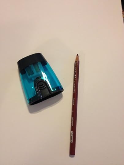
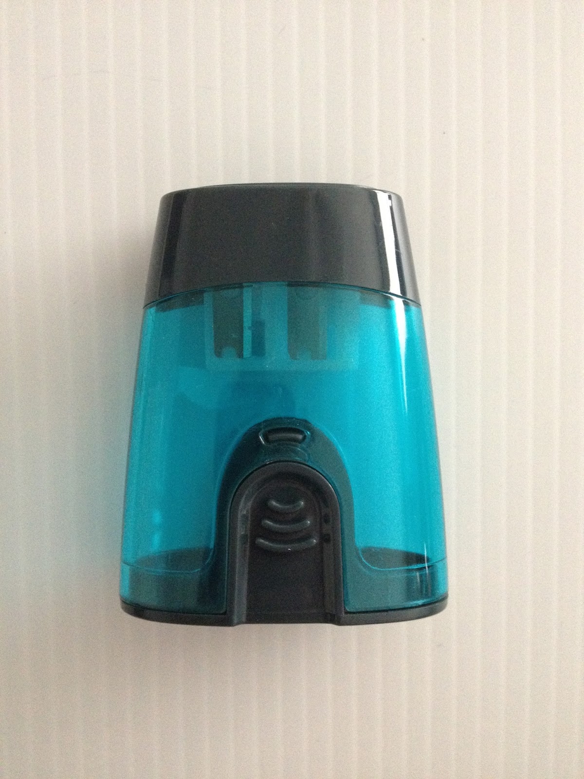
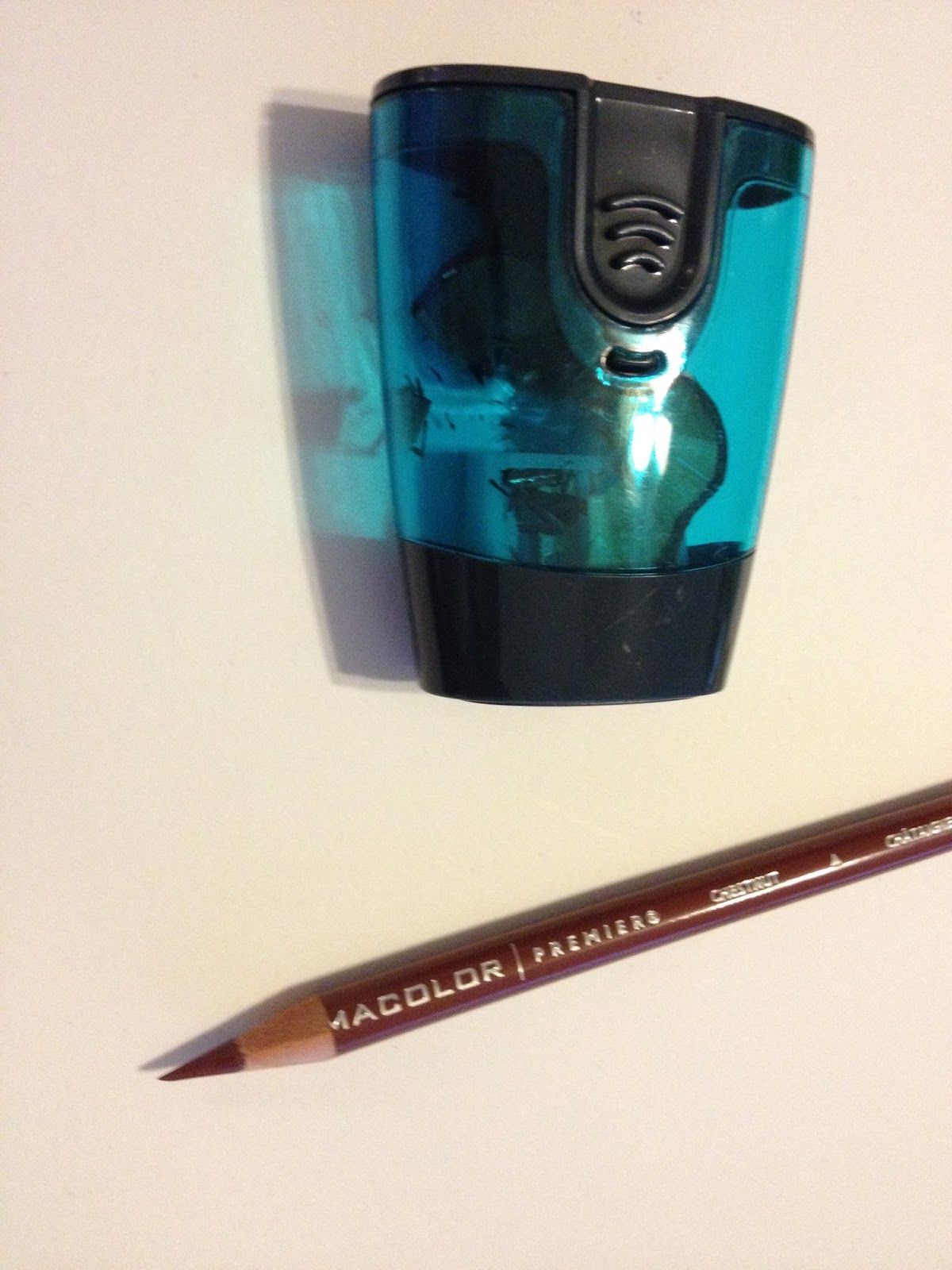
Walmart Art Supply Review: Casemate 2-in-1 Sharpener
Casemate 2-in-1 Pencil Sharpener
According to the box, it sharpens No. 2 and jumbo pencils and crayons.Casemate is a registered trademark of Walmart.
The pickings were pretty slim at my Walmart for hand operated pencil sharpeners. I didn't want something mechanical, as those tend to chew up pencils rather than sharpen them, so I grabbed the cheaper of the two hand sharpeners they had in stock. I had some doubts about it's potential performance, but for under a dollar, I figured it wasn't too big a loss.
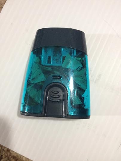
The Packaging
Like almost everything in my Walmart review, the Casemate 2-in-1 Sharpener comes blister packed in a plastic and cardboard package.
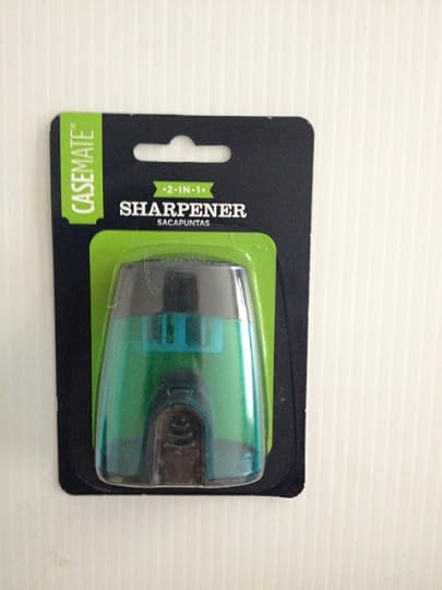
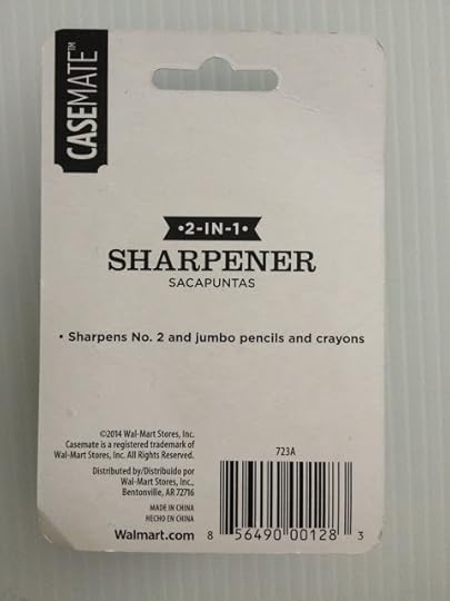
Casemate makes no grand promises- simply states that this sharpener will sharpen No. 2 and jumbo pencils/crayons.
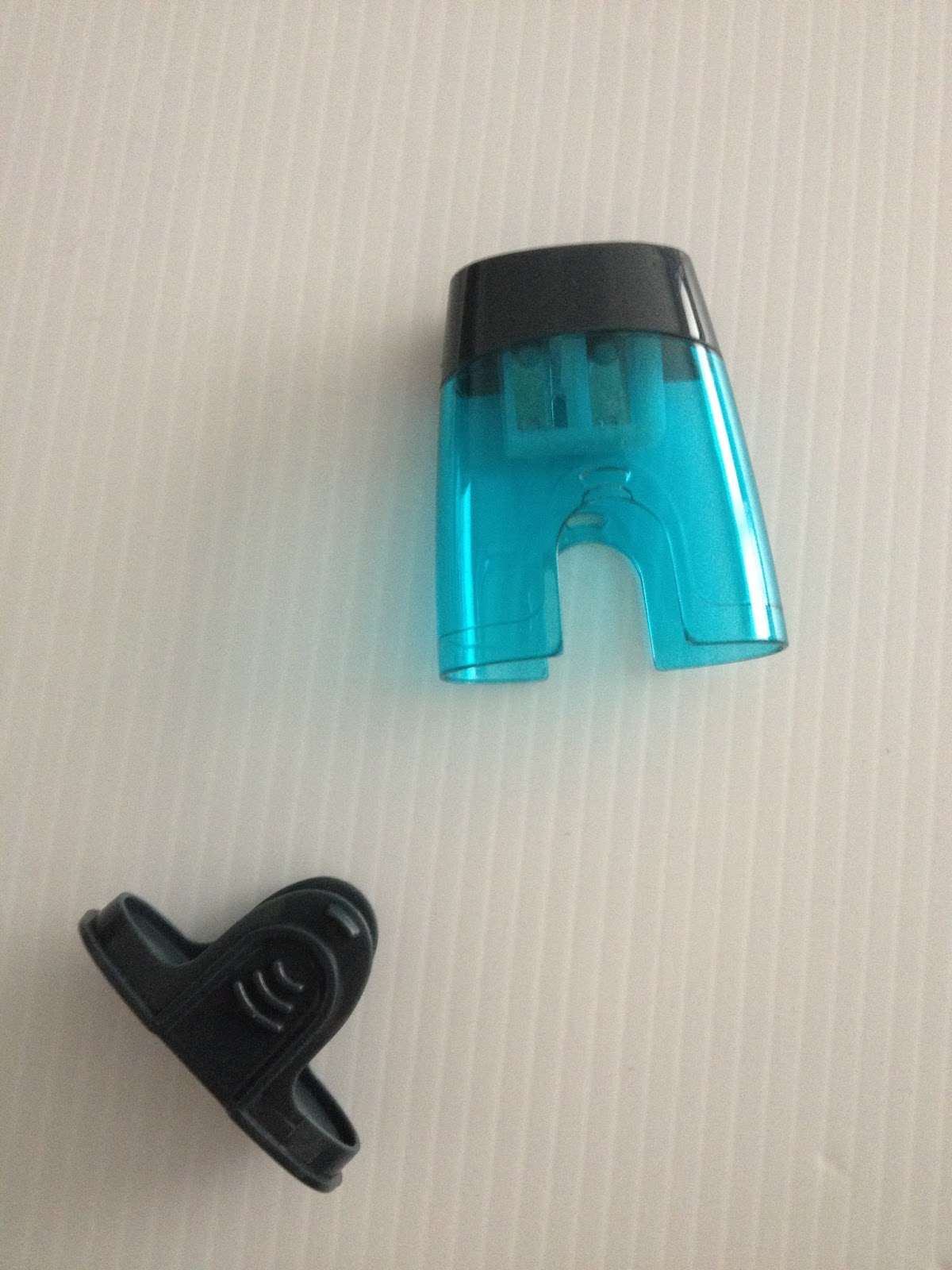
The Sharpener


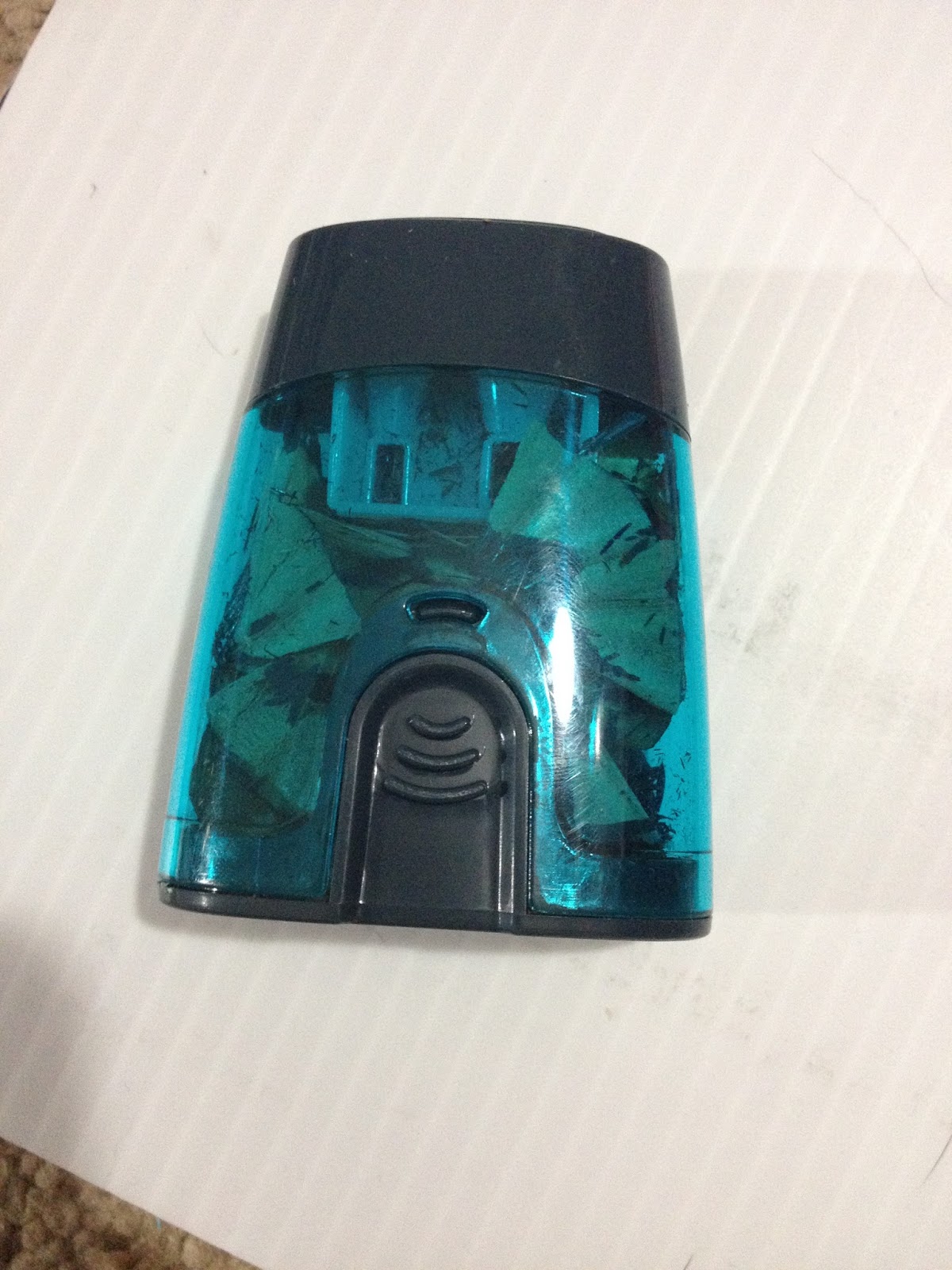
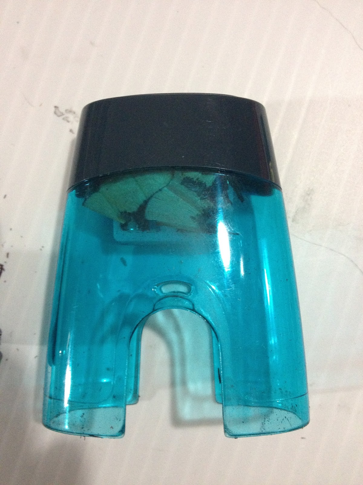
The plastic feels cheap and flimsy, but that doesn't really matter so long as the blades are sharp. This is not a pencil sharpener designed for color pencils, so be careful when sharpening those as the leads have a tendency to break off in any sharpener not designed for them.
The bottom pinches off to release the shavings, which is a little different from most hand sharpeners, where the top is removable. The top not coming off may be an issue, as it'll be harder to remove broken leads from the blades.
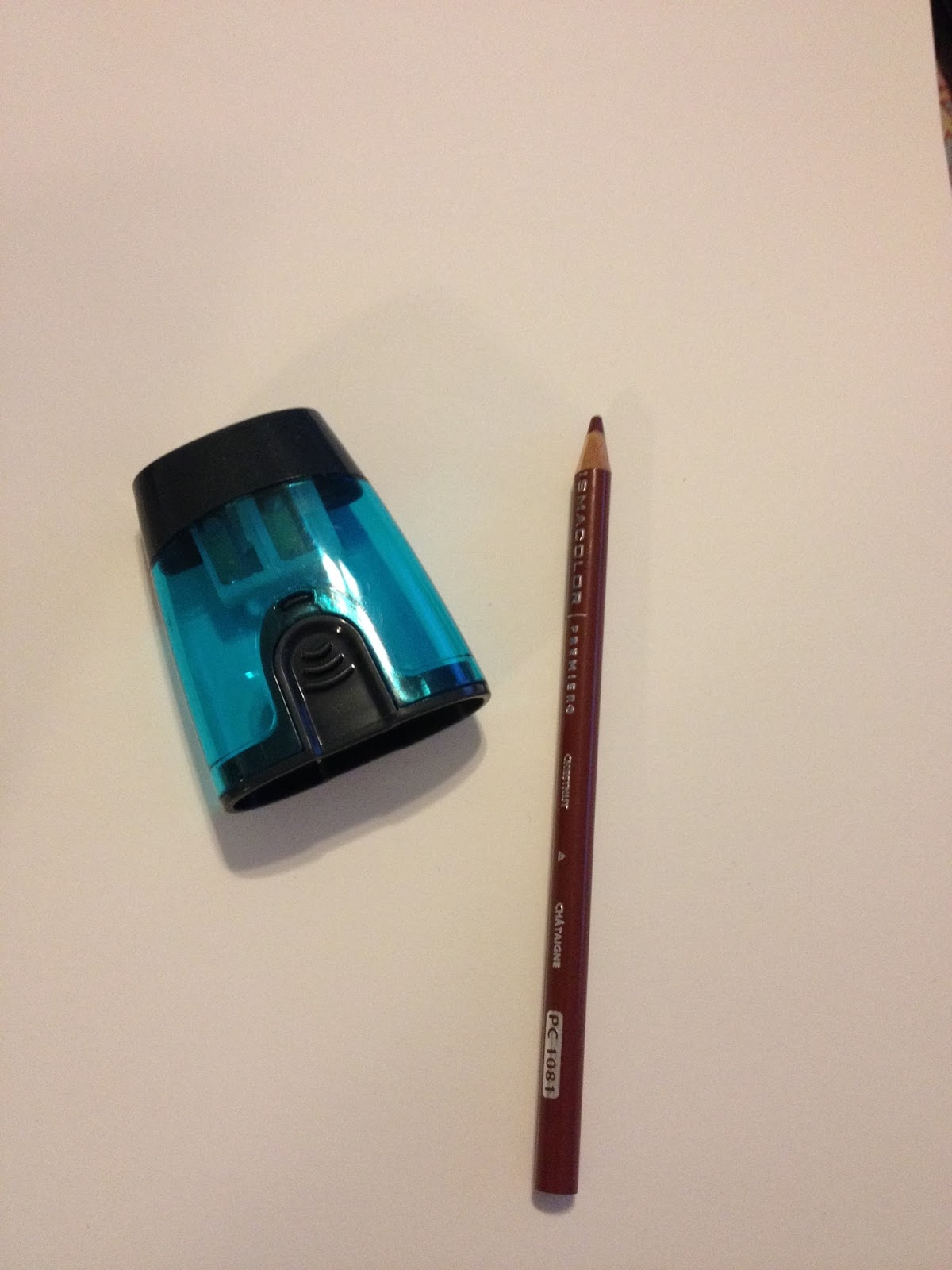
The Field Test
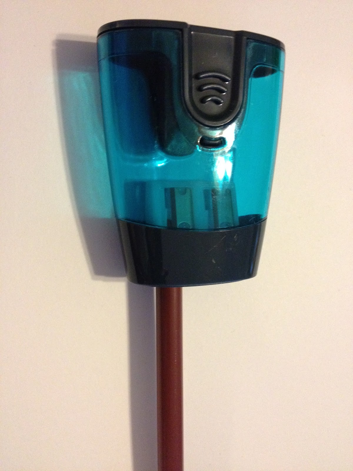
I use color pencils (mainly Prismacolors, these days) for my warmup and cooldown sketches, so I had plenty of opportunities to put the Casemate 2-in-1 Sharpener through it's paces, at least for No. 2 pencils. I don't have any jumbo pencils or crayons, so I was not able to test that sharpener. My apologies.


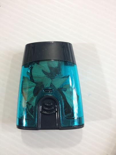

So I used my Casemate 2-in-1 sharpener for a couple weeks, instead of the other sharpeners I have around the apartment, and I found that the Casemate does a better job of sharpening fickle Prismacolor color pencils than most sharpeners I own. The only real issue is that the Casemate 2 in 1 sharpener is prone to jamming, and since you can't take the sharpening end off, you can't clear the jam. Even using a sharp object to try and scrap away the built up pencil shavings doesn't do much to clear the jams.
The Verdict
Although it eventually did jam and I couldn't clear it, I easily got my 49 cents out of this little sharpener. Although it feels cheap, it never exploded shavings all over my bag, and the razor was nice and sharp, and did a great job of sharpening even finicky Prismacolor pencils, which are notorious for having brittle, sometimes even pre-broken lead inside the wooden casing. For a cheap sharpener, I highly recommend the Casemate 2-in-1 Sharpener from Walmart.
Please consider donating to this blog or purchasing from Natto-shop (http://nattosoup.com/shop) if you want me to continue publishing quality content. All materials tested were purchased from my own pocket. Keep on Truckin' Nattosoup is not under any sponsorship.
According to the box, it sharpens No. 2 and jumbo pencils and crayons.Casemate is a registered trademark of Walmart.
The pickings were pretty slim at my Walmart for hand operated pencil sharpeners. I didn't want something mechanical, as those tend to chew up pencils rather than sharpen them, so I grabbed the cheaper of the two hand sharpeners they had in stock. I had some doubts about it's potential performance, but for under a dollar, I figured it wasn't too big a loss.
The Packaging
Like almost everything in my Walmart review, the Casemate 2-in-1 Sharpener comes blister packed in a plastic and cardboard package.


Casemate makes no grand promises- simply states that this sharpener will sharpen No. 2 and jumbo pencils/crayons.
The Sharpener


The plastic feels cheap and flimsy, but that doesn't really matter so long as the blades are sharp. This is not a pencil sharpener designed for color pencils, so be careful when sharpening those as the leads have a tendency to break off in any sharpener not designed for them.
The bottom pinches off to release the shavings, which is a little different from most hand sharpeners, where the top is removable. The top not coming off may be an issue, as it'll be harder to remove broken leads from the blades.
The Field Test
I use color pencils (mainly Prismacolors, these days) for my warmup and cooldown sketches, so I had plenty of opportunities to put the Casemate 2-in-1 Sharpener through it's paces, at least for No. 2 pencils. I don't have any jumbo pencils or crayons, so I was not able to test that sharpener. My apologies.


So I used my Casemate 2-in-1 sharpener for a couple weeks, instead of the other sharpeners I have around the apartment, and I found that the Casemate does a better job of sharpening fickle Prismacolor color pencils than most sharpeners I own. The only real issue is that the Casemate 2 in 1 sharpener is prone to jamming, and since you can't take the sharpening end off, you can't clear the jam. Even using a sharp object to try and scrap away the built up pencil shavings doesn't do much to clear the jams.
The Verdict
Although it eventually did jam and I couldn't clear it, I easily got my 49 cents out of this little sharpener. Although it feels cheap, it never exploded shavings all over my bag, and the razor was nice and sharp, and did a great job of sharpening even finicky Prismacolor pencils, which are notorious for having brittle, sometimes even pre-broken lead inside the wooden casing. For a cheap sharpener, I highly recommend the Casemate 2-in-1 Sharpener from Walmart.
Please consider donating to this blog or purchasing from Natto-shop (http://nattosoup.com/shop) if you want me to continue publishing quality content. All materials tested were purchased from my own pocket. Keep on Truckin' Nattosoup is not under any sponsorship.
October 9, 2015
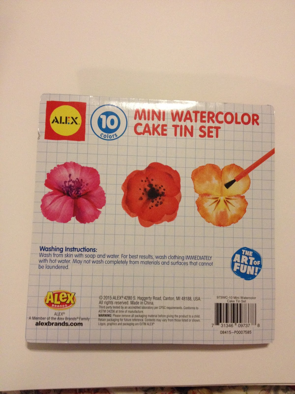
Walmart Art Supply Review: Alex Watercolors
This post is one of a series of posts that feature art supplies I purchased from my hometown, Luling, Walmart while I was in town for Mechacon. It was inspired by the fact that kids, teens, and 20 somethings don't have many options for quality and affordable art supplies in the New Orleans area. I wanted to see what I could get at Walmart, put what I buy through its paces, and let you guys know how these supplies fared. As almost always, I purchase these materials out of my own pocket, and one of the ways you can show support and appreciation is to give me a tip in my Paypal (sidebar right). You can also show support by sharing this post to your social networks, or emailing me.
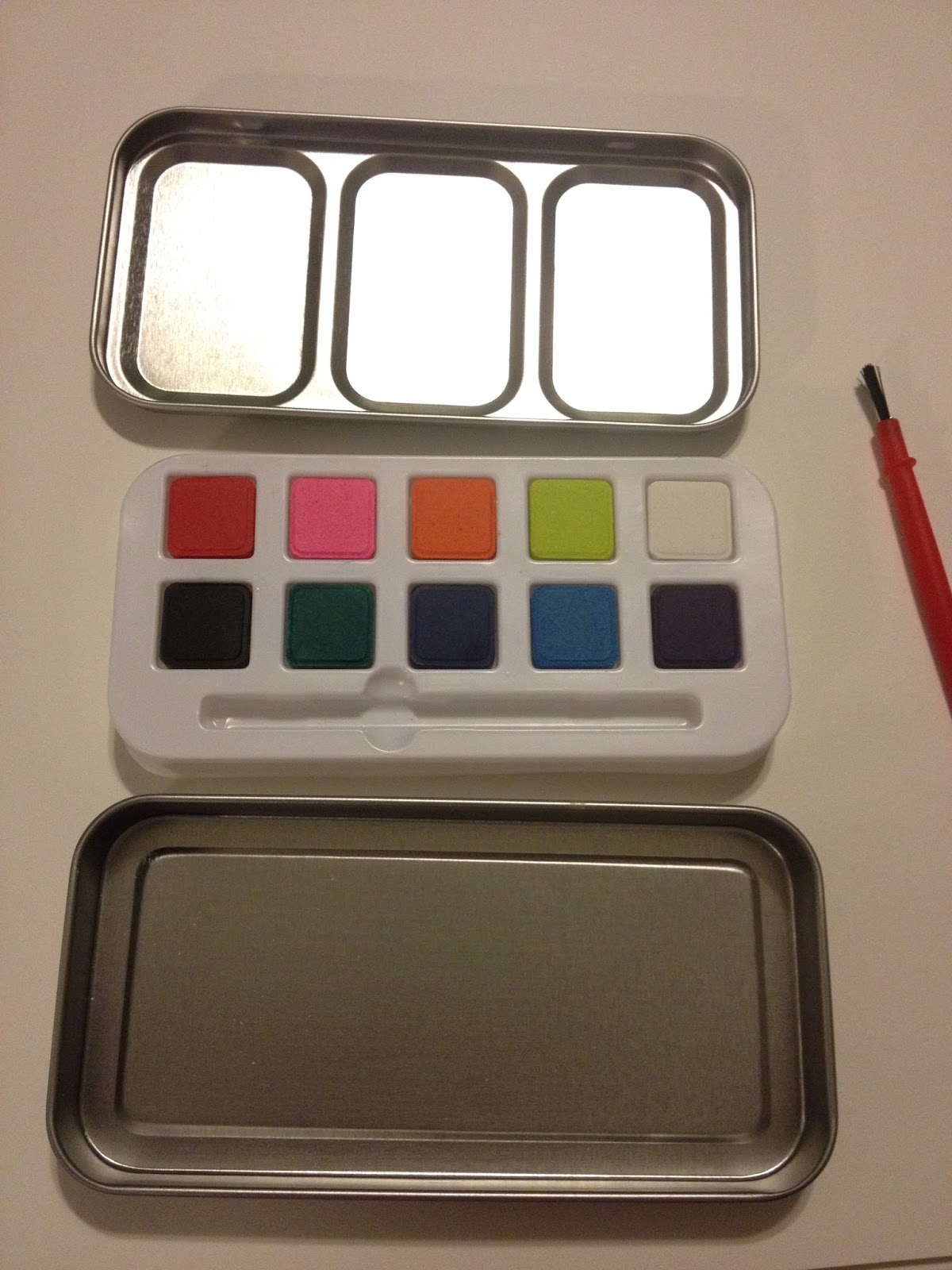
I must admit, I bought this Alex watercolor set on a whim- it was only $1, and so tiny and cute, I had to see if it had any merit at all. I was in the school supply section of the Luling Walmart, specifically the back to school cardboard displays, and although I wasn't looking, this little set called out to me. It's like most sets kids get as party favors, sets that I think are admired for how cute they are, but ultimately tossed. I figured that, for a buck, I could give this little test a whirl, and at the very least the paints could be popped out, Chiclet style, and the case filled with the paints of my preference.
Alex is actually a toy company, but they do make a lot of art supplies. Their website offers kid grade acrylic paints, natural bristle brushes, watercolors, sketching pencils, finger paints, color pencils, and even drawing sets, all way too cheap to be up to much good.
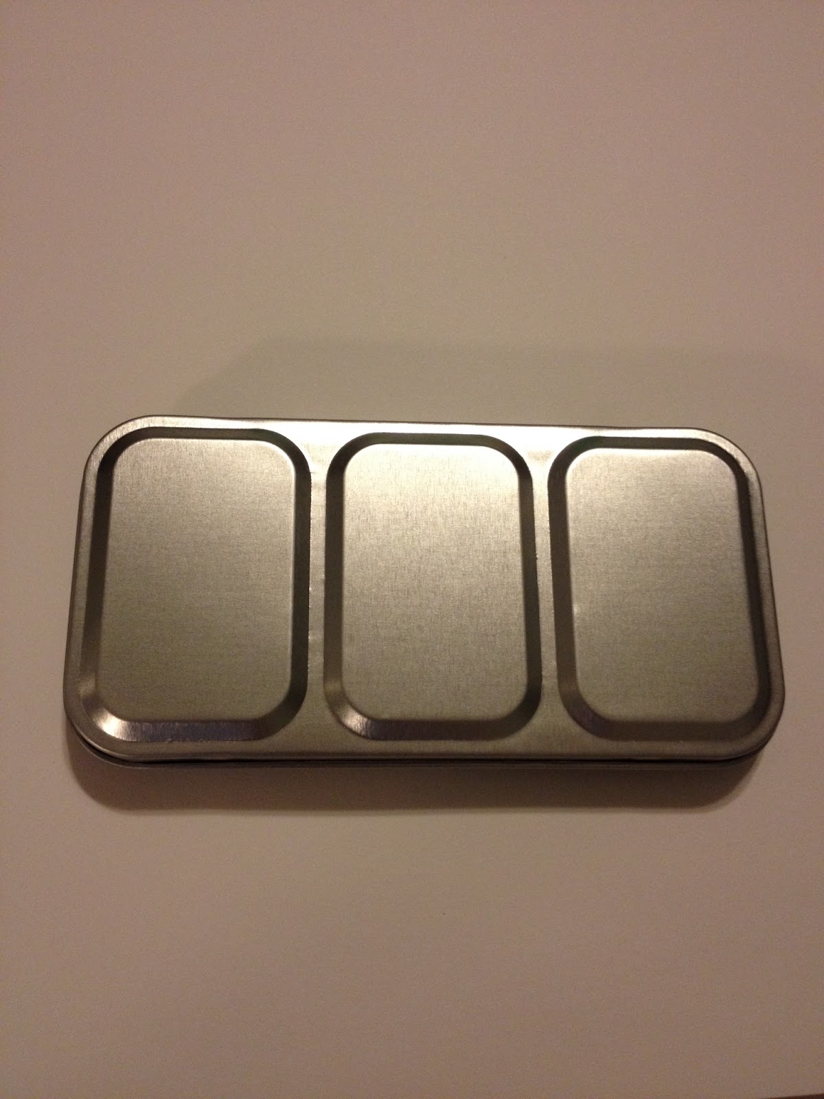
The Packaging


My little dollar tin of Alex watercolors came blister packed in a plastic and cardboard package, which are my favorite for American products, as they're easy to open. I have my doubts about being able to paint the shown flowers using either these paints or the included brush.

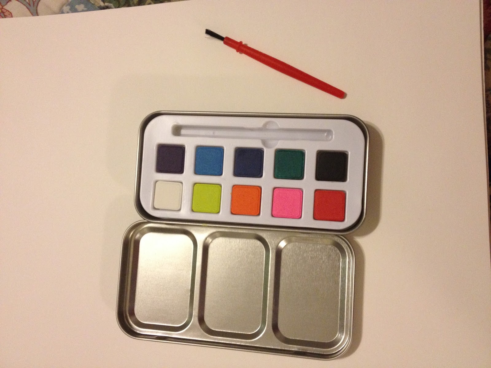
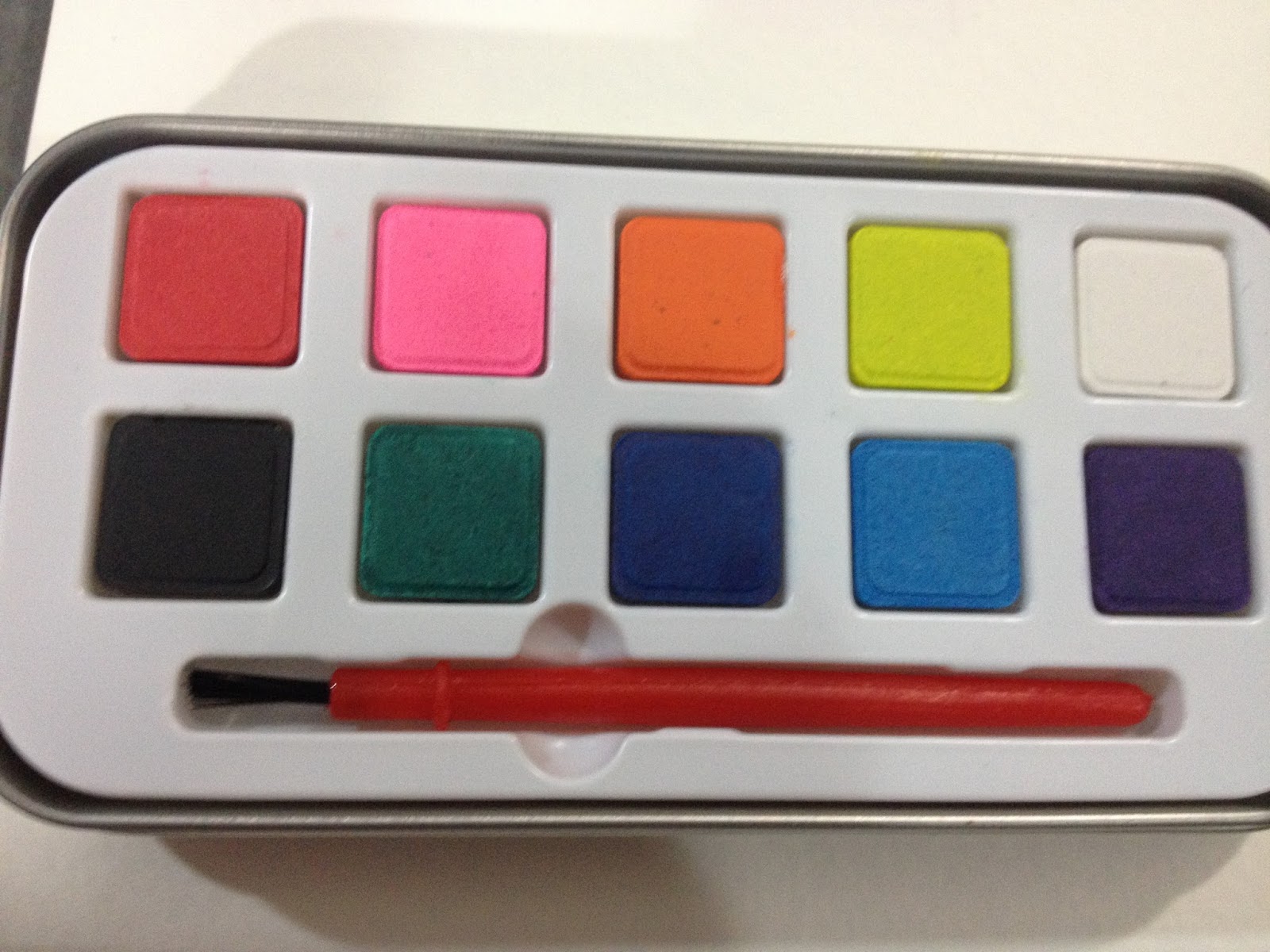
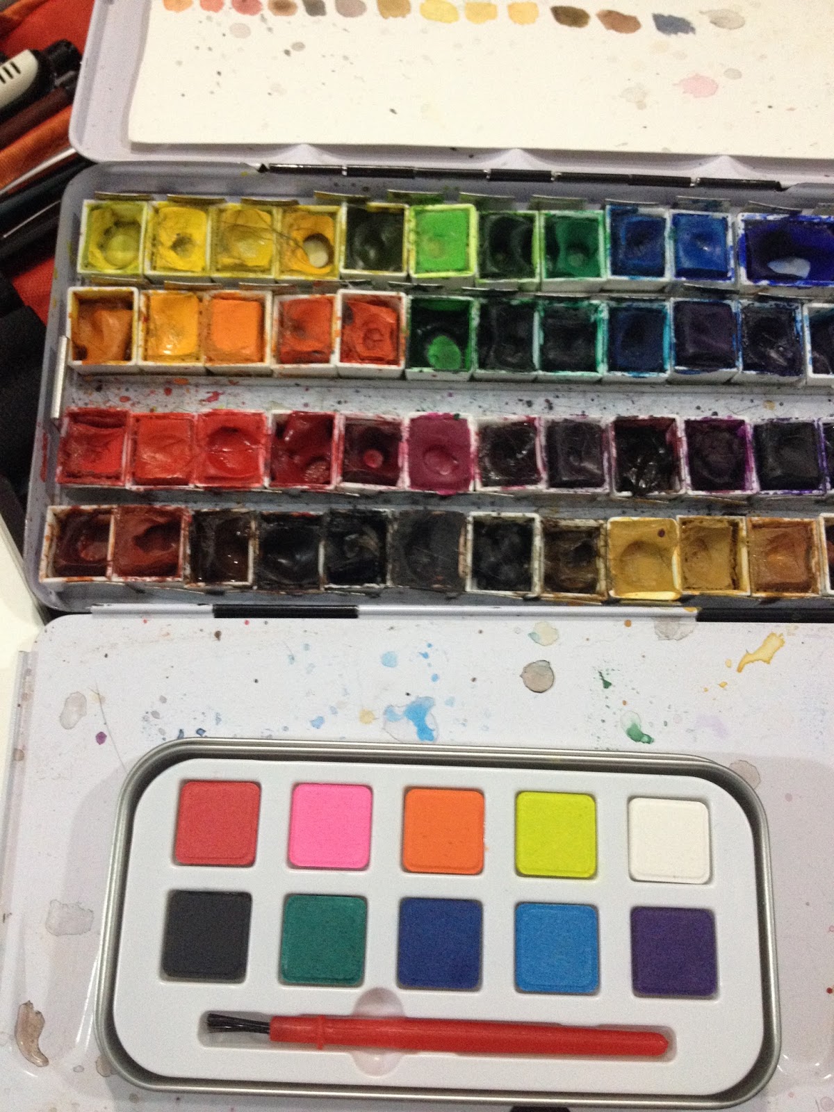
The chicklets of watercolor come in a little tin box that has wells for mixing color, and are in a removable plastic insert that feels very very cheap.

The paints themselves have a chalky quality similar to the Pelikan or Angora opaque watercolors I've reviewed here in the past.

The plastic insert is very easy to remove, leaving a plain bottom of the box. If you were so inclined, and did not like Altoids, you could repurpose this set as a mini watercolor set composed of your own favorite colors quite easily. My favorite types utilize the gum tray from say a package of Dentine Ice, and fill the holes with tube watercolor.
The Palette


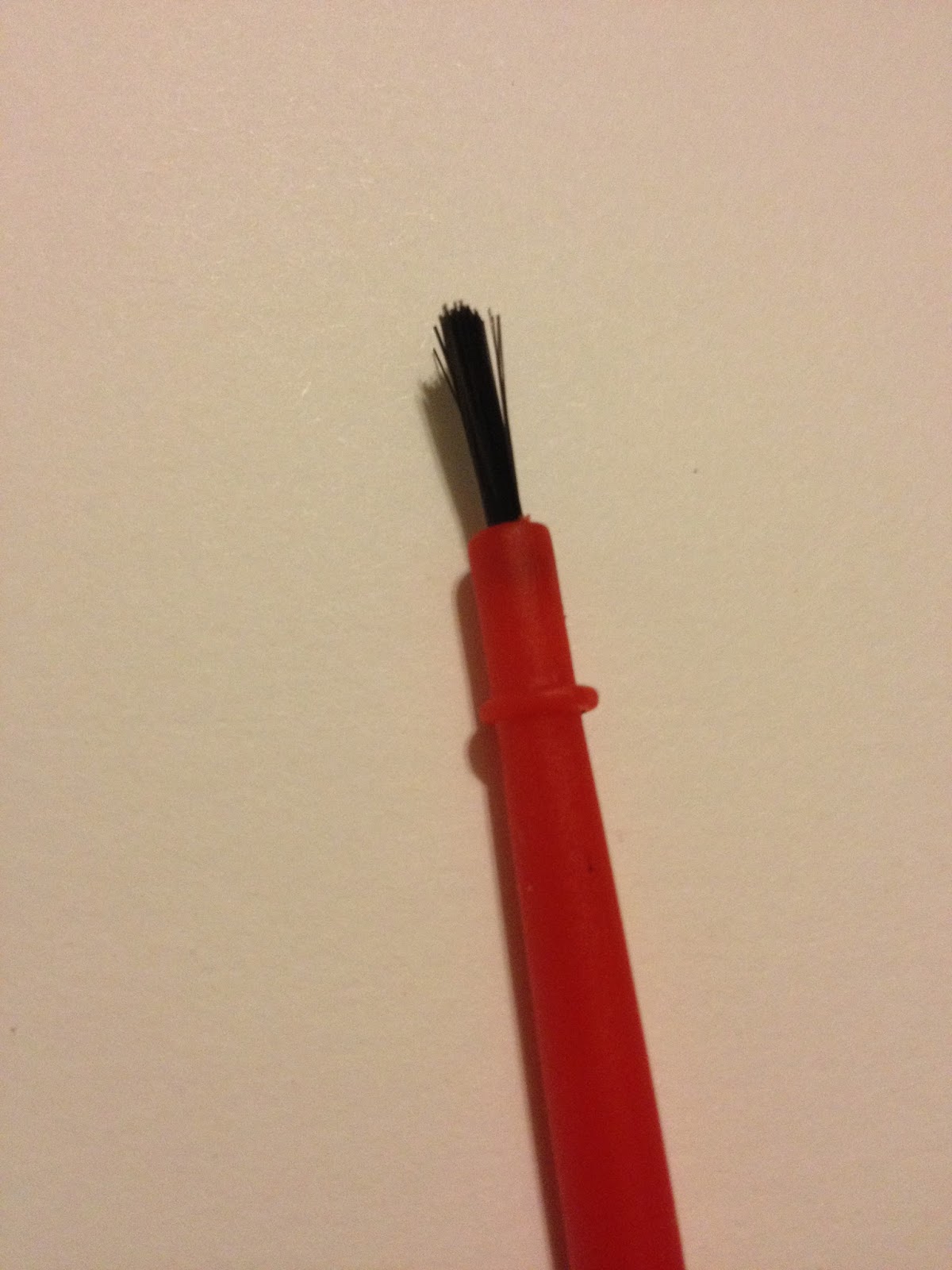
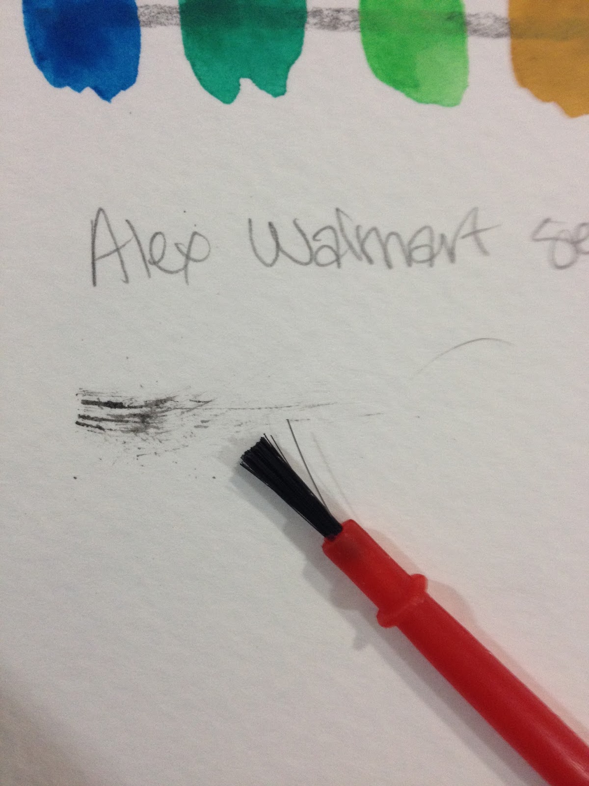
The brush is one of those plastic with plastic splayed bristles deals, and honestly, even if the watercolors in the set have merit, you really ought to toss the brush. I'm not sure why companies even included brushes like this, you'd be better off trying to paint with a toothpick.

Mark made by brush
But for the sake of thoroughness, I went ahead and tried to use this brush. The plastic bristles hold zero water, which is bad news for watercolors, and they also hold very little paint, which pretty much makes this brush useless.
Side By Side With My Work Watercolor Palette
 Above is one of the two palettes I regularly use for serious watercolor illustration- 7" Kara comic pages, Gizmo Grandma Illustrations, ect. Below is the Alex palette. As you can see, there are a lot of differences between the two paint sets.
The Field Test
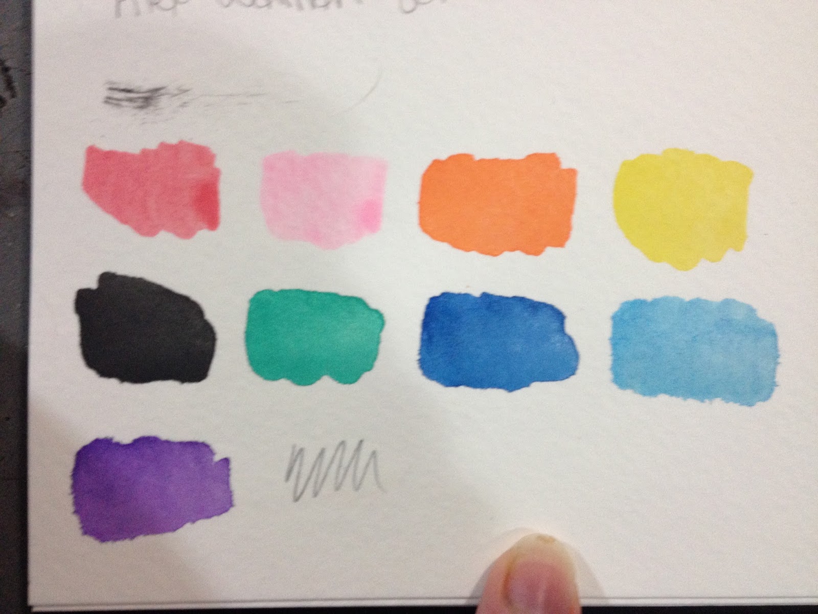
There's no brown in this set, but there is a pretty decent purple, and I'm going to try and mix a good brown for this test, along with a passable skintone.
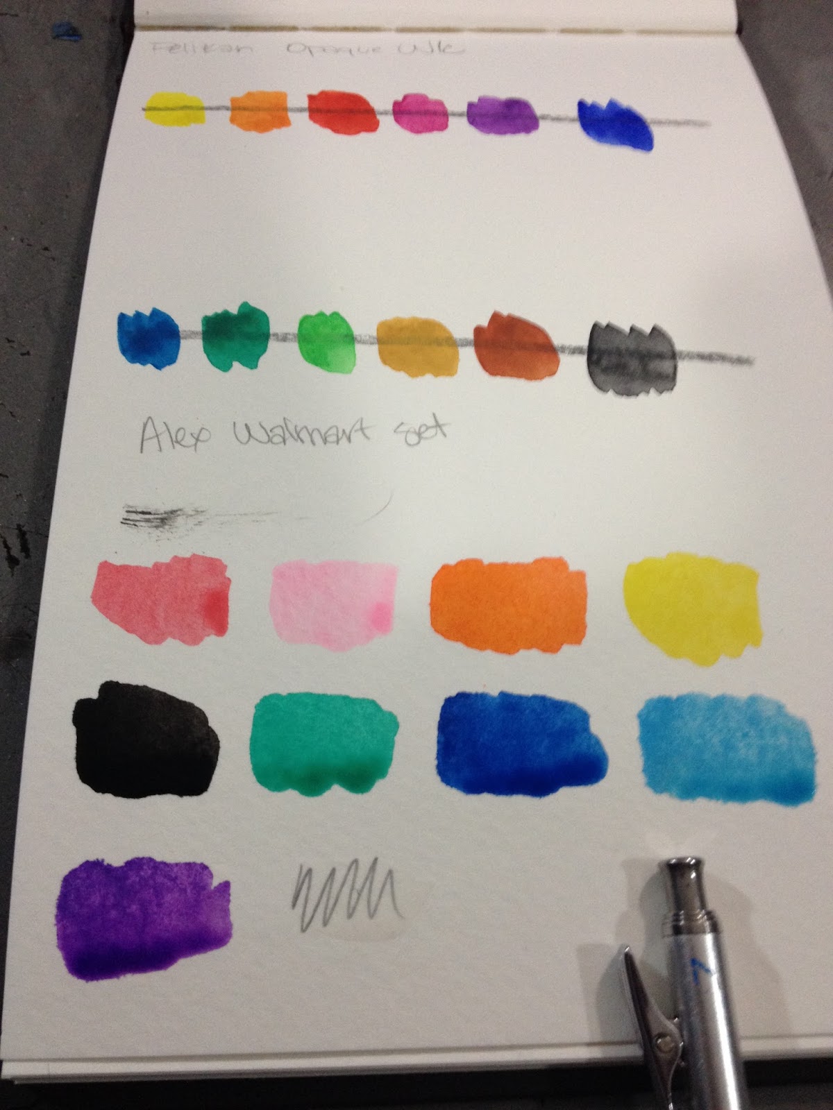
Swatches

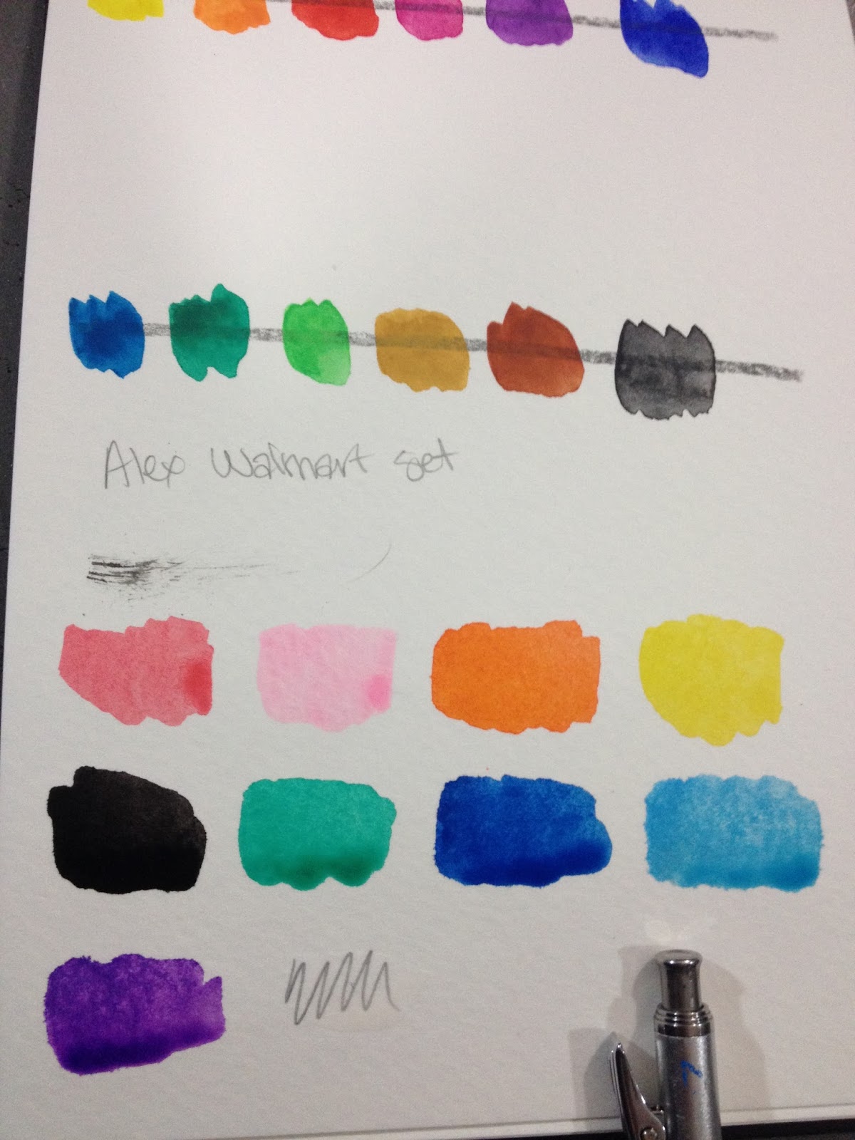
Alex swatches are to the bottom, Pelikan swatches are at the top.


The colors lose some of their intensity after they've dried, but I feel like they're still better than the colors Crayola Washable Watercolors produce. For a buck, this set isn't bad.
Practical Test
Colors used for Kara's skintone: Yellow, Orange, Red
Colors Used for Kara's Hair: Orange, the darker Blue
For darker browns, mix more blue. For darkest browns, mix in black.

I did the sketch with the Clearpoint mechanical pencil, also part of the Walmart Art Supply series, that I'll be reviewing here shortly.

And I inked this piece, as I do with most of my water-based reviews, with the Mitsuo Aida.


Although the pink is too opaque to use as a mixing color, it's not as opaque as I would've like for a streak-free, gouache like fill.


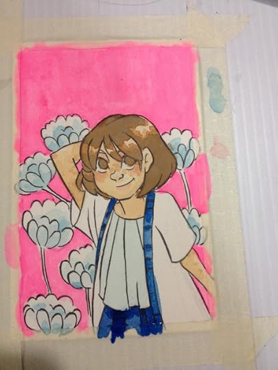

The straight from the palette blue goes down well, but does not layer well at all. As with many cheap, opaque watercolors, these are prone to feathering and bleeding.


These paints don't layer all that well, and like many chalky paints, when you DO layer, or apply detail, it spiders out and is absorbed by the surrounding area. The chalk basically acts as a ground.
It's hard to get very saturated color by mixing, the paints dont seem to contain a lot of pigment.
The Verdict
That said, for a buck, these paints are more of a hit than a miss, and are a great little treat for a kid or a teenager who would like to start an illustrated diary. The tin is cute and reusable, and all you really need is a waterbrush to start painting.
Please consider donating to this blog or purchasing from Natto-shop (http://nattosoup.com/shop) if you want me to continue publishing quality content. All materials tested were purchased from my own pocket. Keep on Truckin' Nattosoup is not under any sponsorship.
I must admit, I bought this Alex watercolor set on a whim- it was only $1, and so tiny and cute, I had to see if it had any merit at all. I was in the school supply section of the Luling Walmart, specifically the back to school cardboard displays, and although I wasn't looking, this little set called out to me. It's like most sets kids get as party favors, sets that I think are admired for how cute they are, but ultimately tossed. I figured that, for a buck, I could give this little test a whirl, and at the very least the paints could be popped out, Chiclet style, and the case filled with the paints of my preference.
Alex is actually a toy company, but they do make a lot of art supplies. Their website offers kid grade acrylic paints, natural bristle brushes, watercolors, sketching pencils, finger paints, color pencils, and even drawing sets, all way too cheap to be up to much good.
The Packaging

My little dollar tin of Alex watercolors came blister packed in a plastic and cardboard package, which are my favorite for American products, as they're easy to open. I have my doubts about being able to paint the shown flowers using either these paints or the included brush.
The chicklets of watercolor come in a little tin box that has wells for mixing color, and are in a removable plastic insert that feels very very cheap.

The paints themselves have a chalky quality similar to the Pelikan or Angora opaque watercolors I've reviewed here in the past.
The plastic insert is very easy to remove, leaving a plain bottom of the box. If you were so inclined, and did not like Altoids, you could repurpose this set as a mini watercolor set composed of your own favorite colors quite easily. My favorite types utilize the gum tray from say a package of Dentine Ice, and fill the holes with tube watercolor.
The Palette
The brush is one of those plastic with plastic splayed bristles deals, and honestly, even if the watercolors in the set have merit, you really ought to toss the brush. I'm not sure why companies even included brushes like this, you'd be better off trying to paint with a toothpick.
Mark made by brush
But for the sake of thoroughness, I went ahead and tried to use this brush. The plastic bristles hold zero water, which is bad news for watercolors, and they also hold very little paint, which pretty much makes this brush useless.
Side By Side With My Work Watercolor Palette
 Above is one of the two palettes I regularly use for serious watercolor illustration- 7" Kara comic pages, Gizmo Grandma Illustrations, ect. Below is the Alex palette. As you can see, there are a lot of differences between the two paint sets.
The Field Test
There's no brown in this set, but there is a pretty decent purple, and I'm going to try and mix a good brown for this test, along with a passable skintone.
Swatches
Alex swatches are to the bottom, Pelikan swatches are at the top.
The colors lose some of their intensity after they've dried, but I feel like they're still better than the colors Crayola Washable Watercolors produce. For a buck, this set isn't bad.
Practical Test
Colors used for Kara's skintone: Yellow, Orange, Red
Colors Used for Kara's Hair: Orange, the darker Blue
For darker browns, mix more blue. For darkest browns, mix in black.
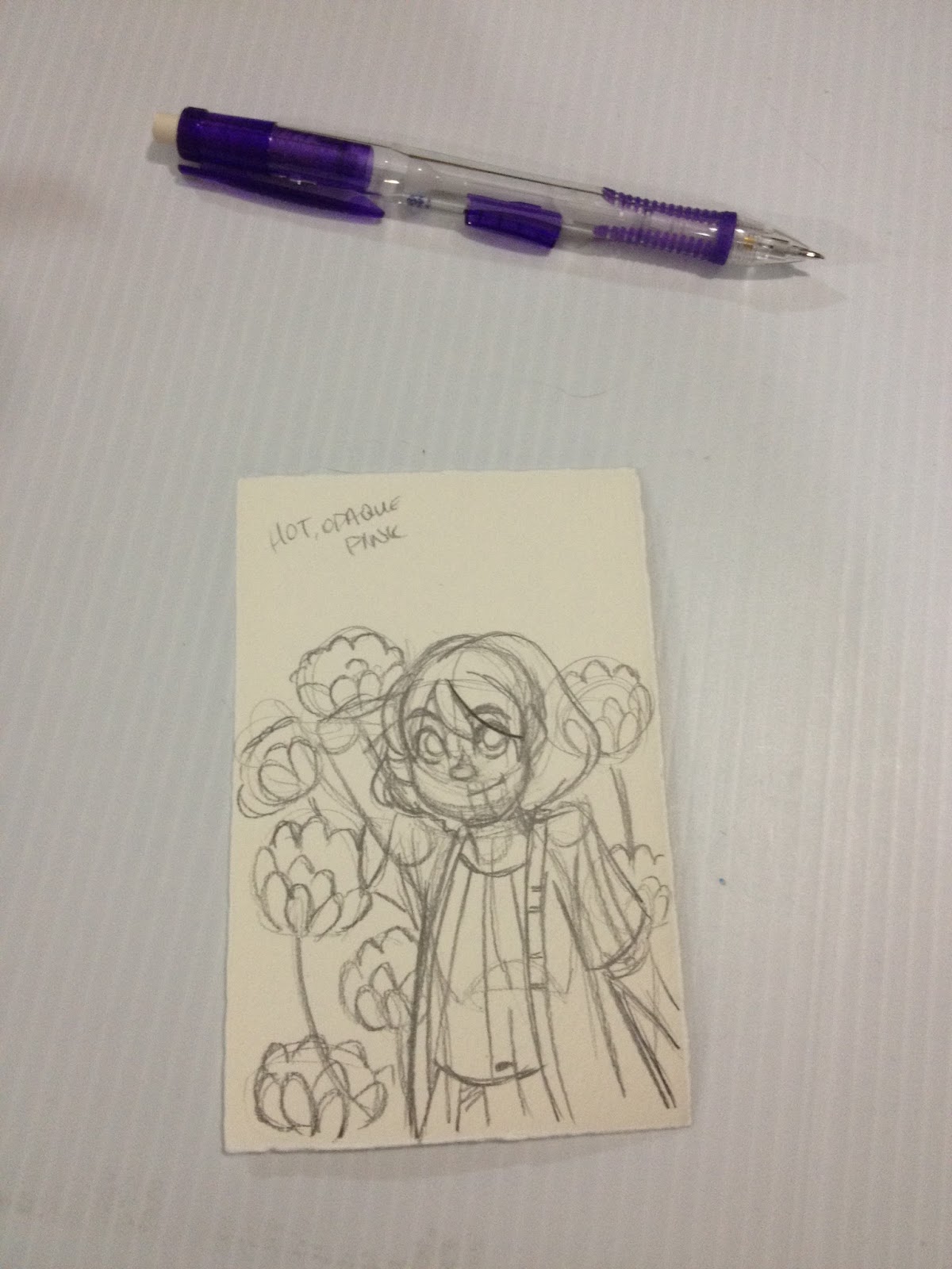
I did the sketch with the Clearpoint mechanical pencil, also part of the Walmart Art Supply series, that I'll be reviewing here shortly.
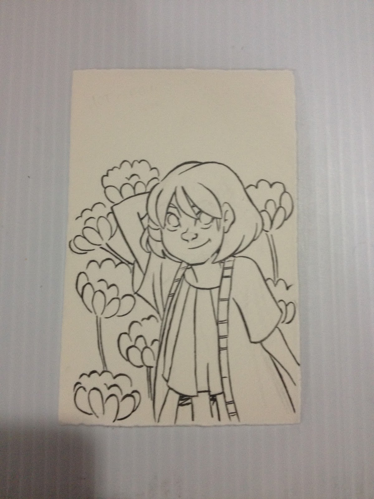
And I inked this piece, as I do with most of my water-based reviews, with the Mitsuo Aida.
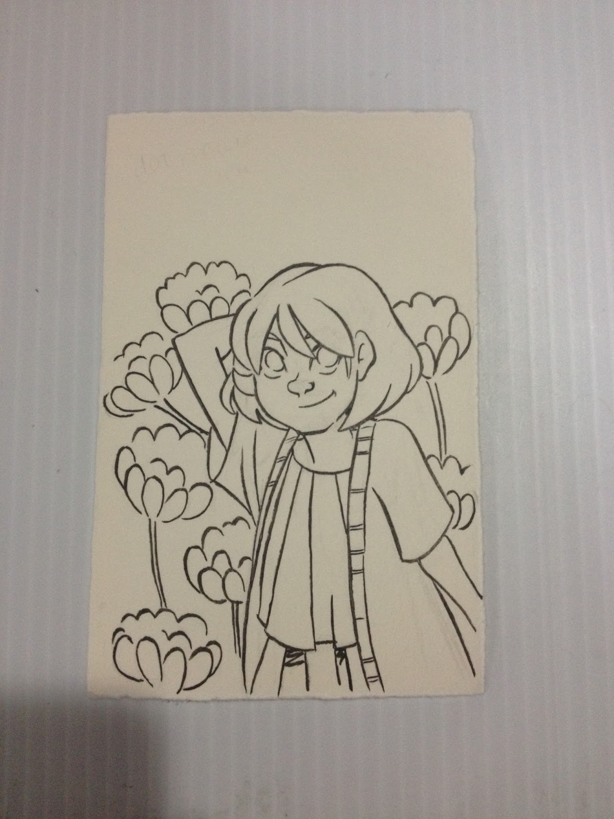
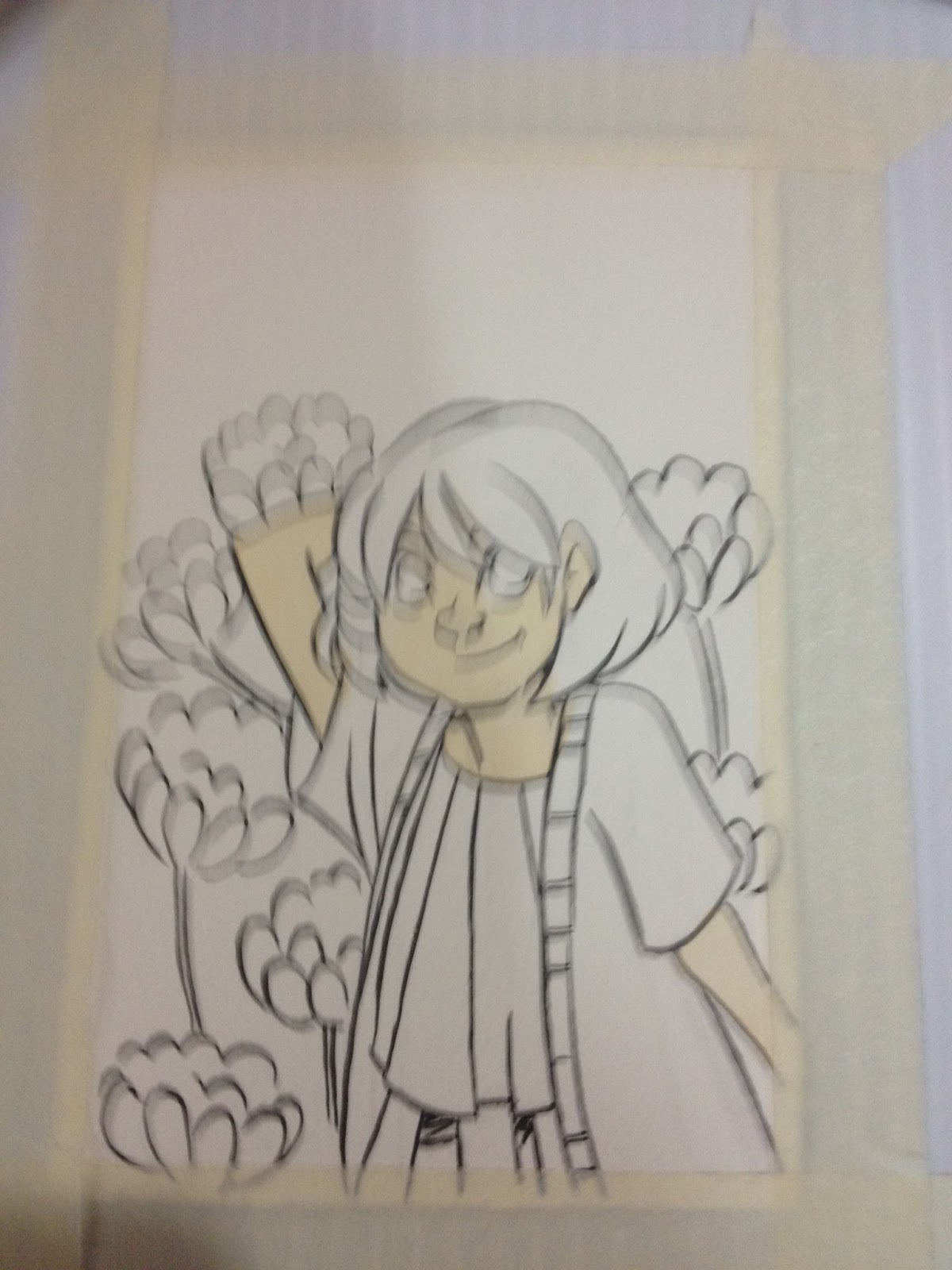
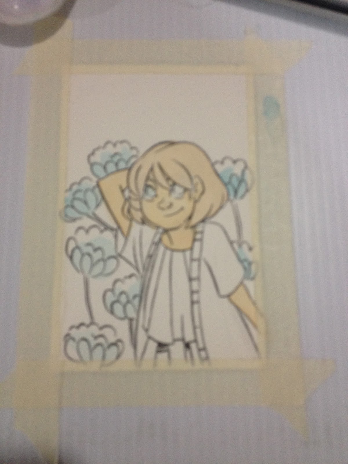
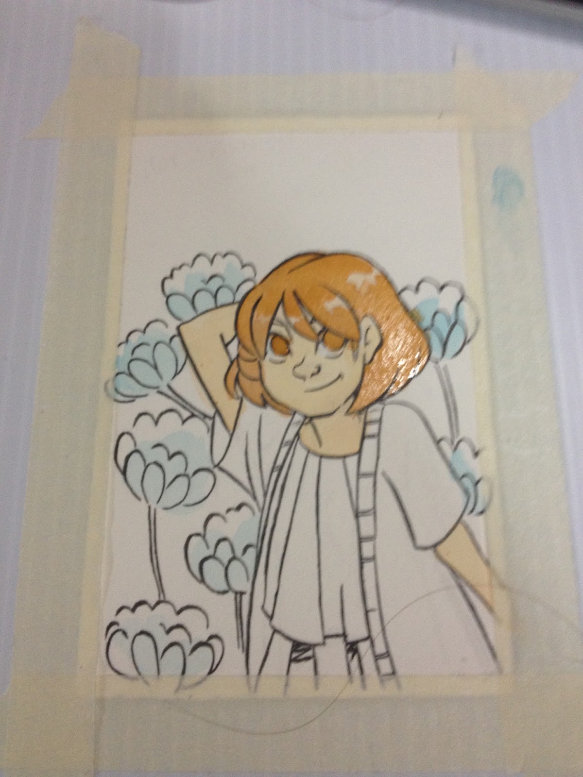
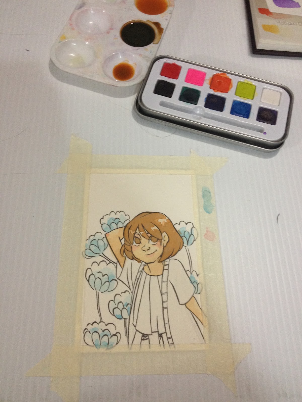
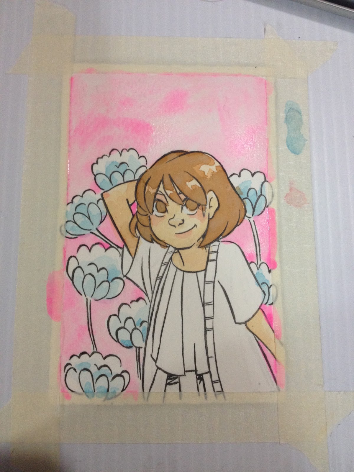
Although the pink is too opaque to use as a mixing color, it's not as opaque as I would've like for a streak-free, gouache like fill.
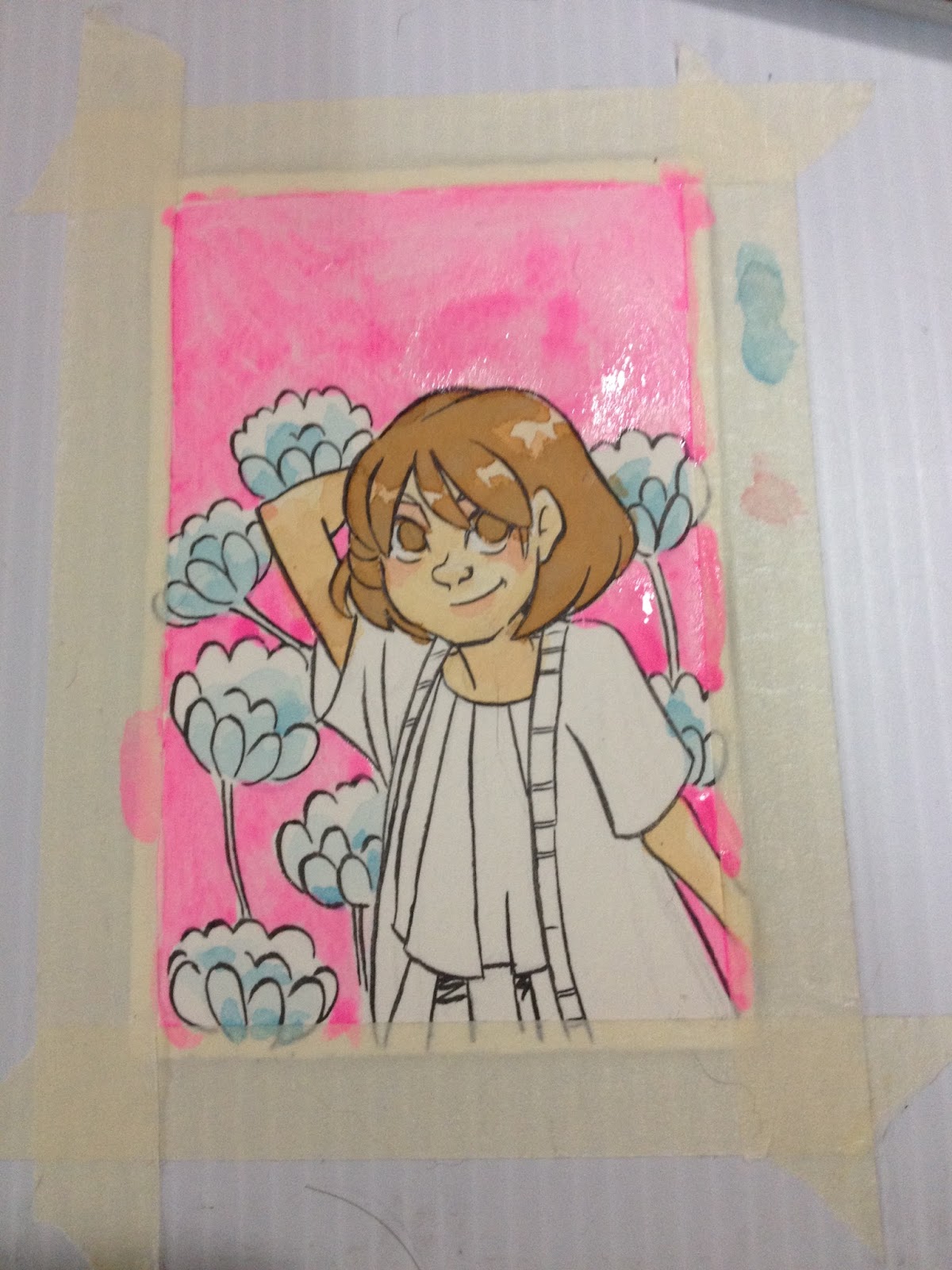
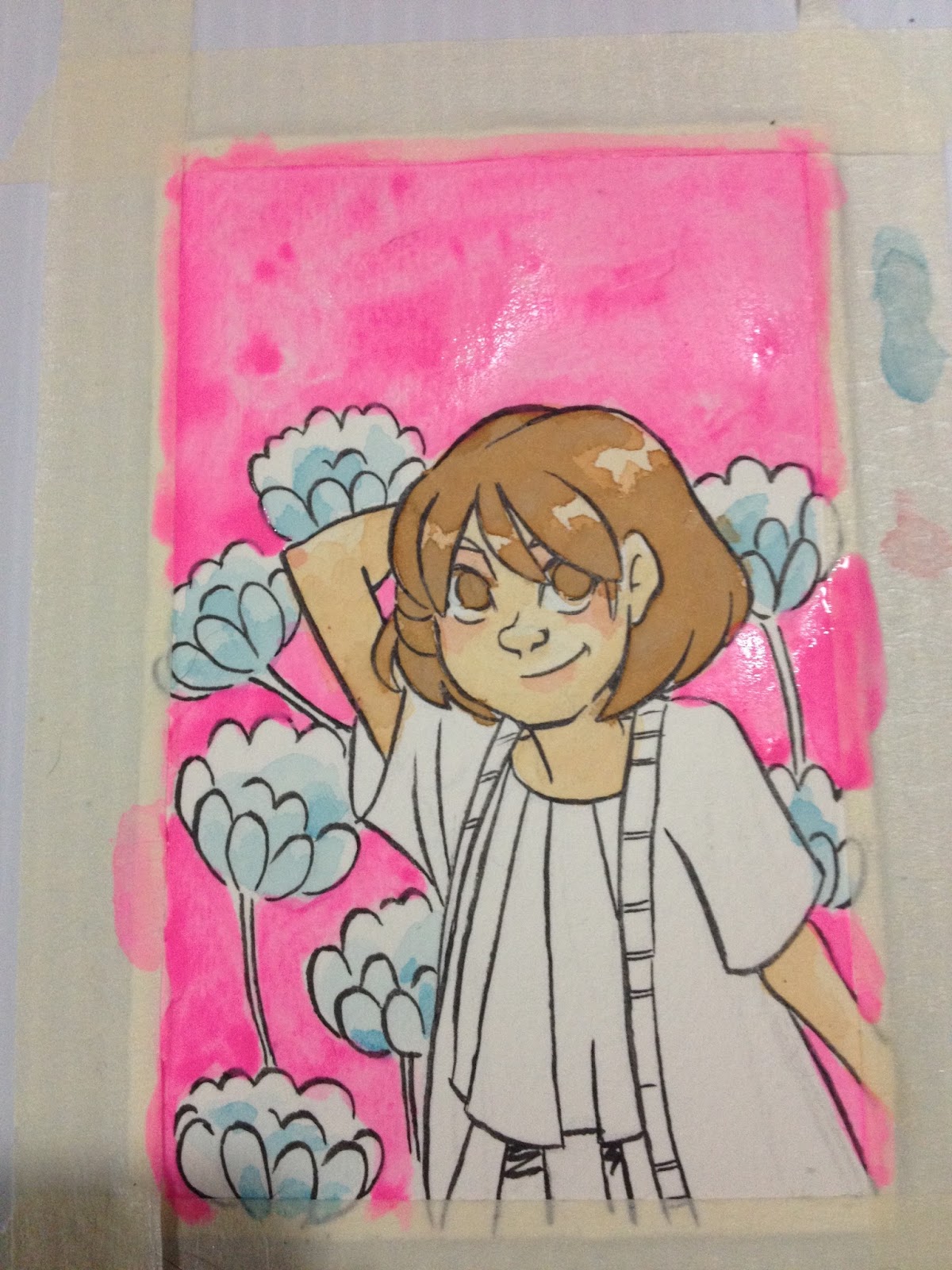
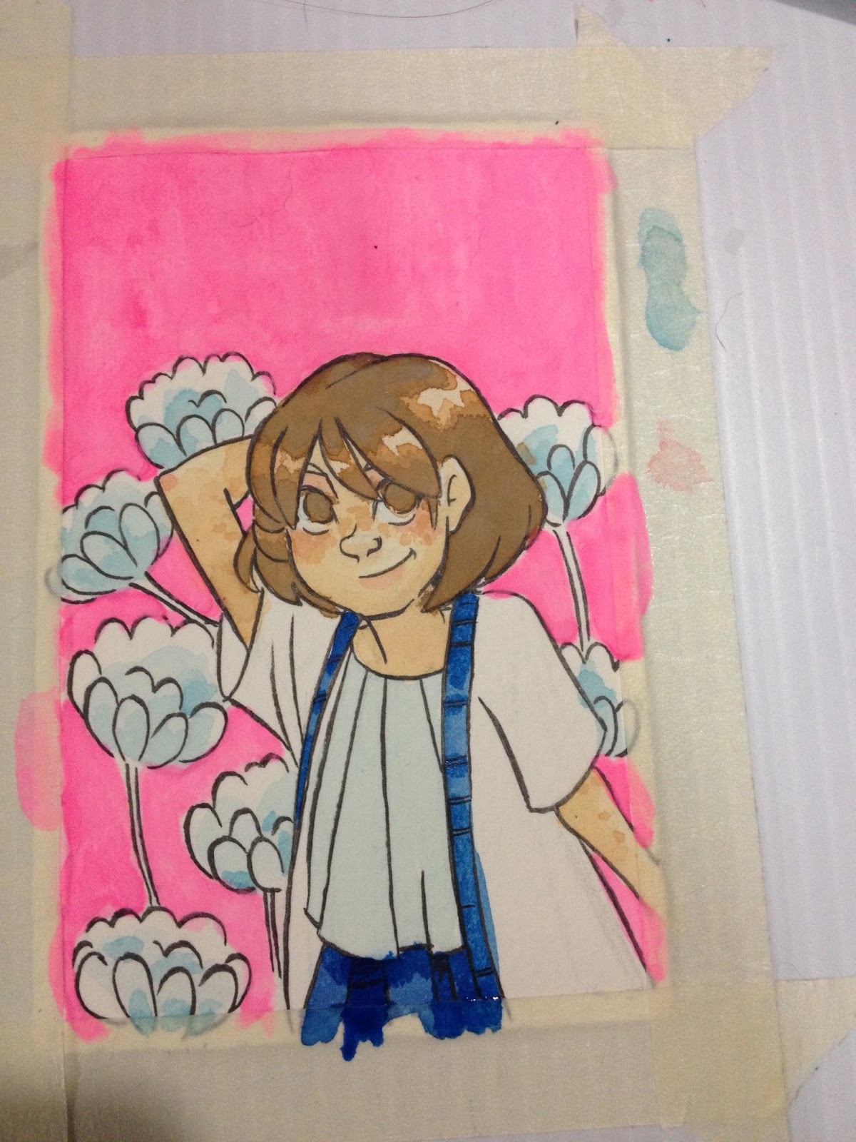
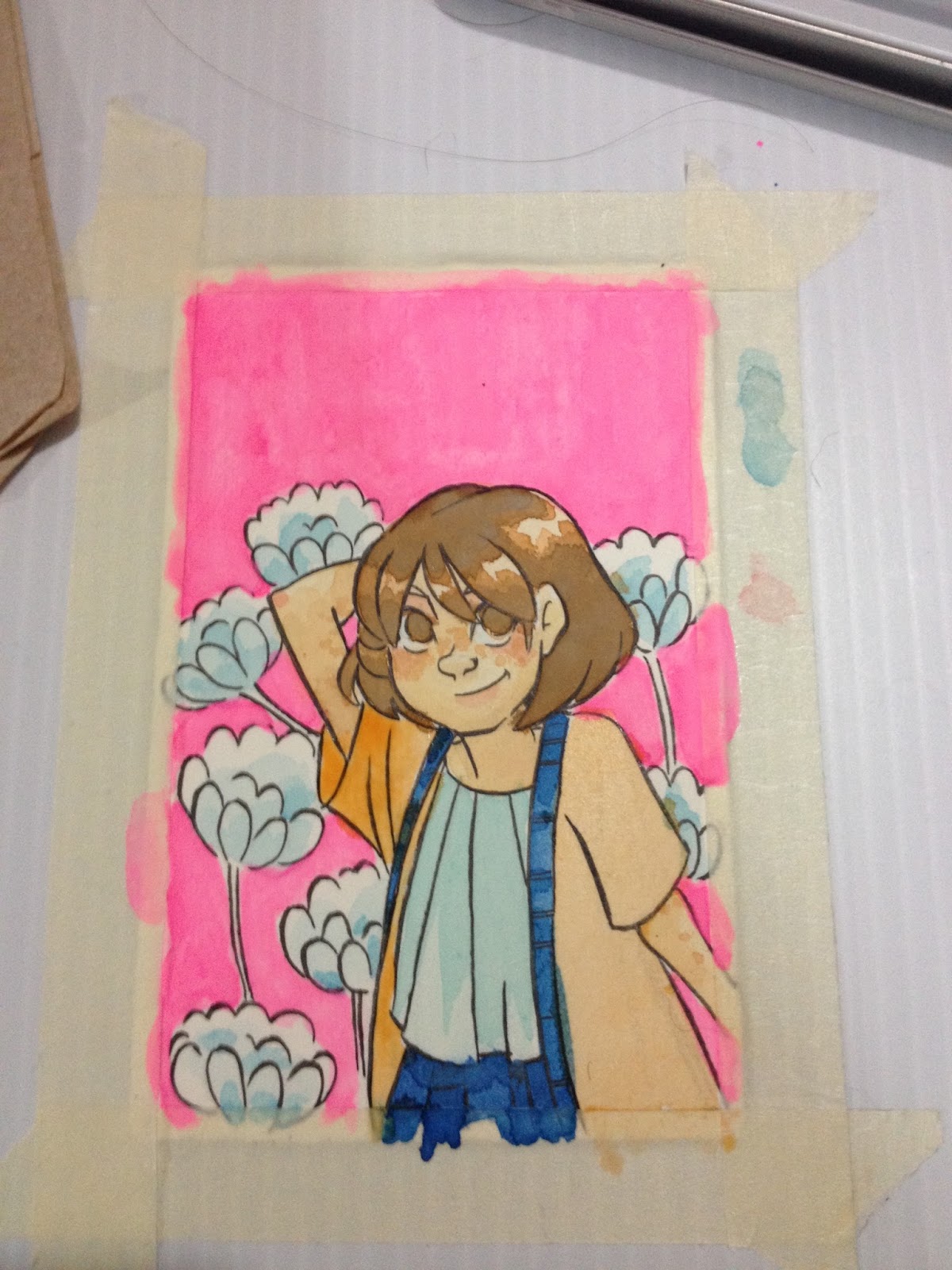
The straight from the palette blue goes down well, but does not layer well at all. As with many cheap, opaque watercolors, these are prone to feathering and bleeding.

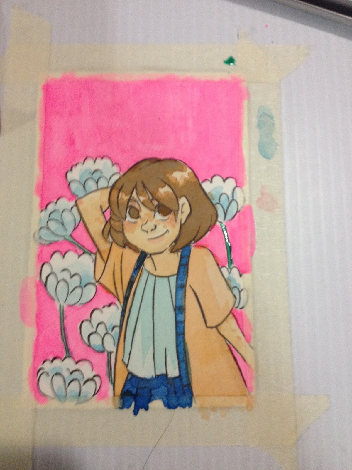


These paints don't layer all that well, and like many chalky paints, when you DO layer, or apply detail, it spiders out and is absorbed by the surrounding area. The chalk basically acts as a ground.
It's hard to get very saturated color by mixing, the paints dont seem to contain a lot of pigment.
The Verdict
That said, for a buck, these paints are more of a hit than a miss, and are a great little treat for a kid or a teenager who would like to start an illustrated diary. The tin is cute and reusable, and all you really need is a waterbrush to start painting.
Please consider donating to this blog or purchasing from Natto-shop (http://nattosoup.com/shop) if you want me to continue publishing quality content. All materials tested were purchased from my own pocket. Keep on Truckin' Nattosoup is not under any sponsorship.
October 7, 2015
Walmart Art Supply Review: Studio C Glitter Pencil Case
Let's be really honest here: There's not a lot of difference between a $1 single compartment pencil case, and a $20 single compartment pencil case. They're both, probably, going to do what they're intended to do- hold your pencils, erasers, and pens. Still, they're a huge part of keeping your supplies organized, and I thought it was important that I explore the options Walmart had to offer when writing this post.
Ideally, I wanted a smallish pencil case that had multiple compartments, or at least, elastic loops, but the Luling Walmart's Back to School section is pretty small compared to larger Walmarts. Your Walmart may have a better selection that has just such a case, or it may have an even smaller selection that offers only the binder cases (which I really wanted to avoid, just because I don't really use them). I ended up buying a Studio C zippered fabric and plastic pencil case, mostly because I love glitter, and I loved glitter as a teenager, and this is probably the case I would've gone for anyway.
The case feels really sturdy and well made, and it's super cute as well. The exterior has a clear plastic shell around the glitter, so glitter wont be flaking off everywhere, and the inside is lined. Should your pens leak inside your case, I think it would do an ok job containing the ink and preventing it from getting all over your bag. While this isn't the best pencil case I've ever used (that award goes to the Nomad I've used since graduate school), it's a pretty decent case, and I think it's a good deal for $3.97. I would DEFINITELY have used this case in high school or college, and would've loved it.


The company included this cardboard insert to help the case keep it's shape during shipping, and to prevent it from becoming horribly mangled.
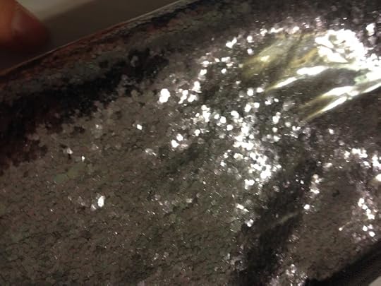
Below are some shots of my Studio C Glitter Pencil Case holding some of the sketching and inking toys from Walmart that I'll be reviewing a little later on. I wanted to give you guys an idea of how much this case can hold- there's really a LOT of room.


Even with all this stuff inside of it, the pouch isn't anywhere near full.

The Verdict:
This glitter pouch by Studio C is the perfect size for some of my travel watercolors, so I think I'll upgrade my setup a bit by switching over. I really like this case, I think it's cute and well made.
The only problem with one pocket cases is that they tend to get overstuffed, and then it's difficult to quickly find what you want.
Please consider donating to this blog or purchasing from Natto-shop (http://nattosoup.com/shop) if you want me to continue publishing quality content. All materials tested were purchased from my own pocket. Keep on Truckin' Nattosoup is not under any sponsorship.
Ideally, I wanted a smallish pencil case that had multiple compartments, or at least, elastic loops, but the Luling Walmart's Back to School section is pretty small compared to larger Walmarts. Your Walmart may have a better selection that has just such a case, or it may have an even smaller selection that offers only the binder cases (which I really wanted to avoid, just because I don't really use them). I ended up buying a Studio C zippered fabric and plastic pencil case, mostly because I love glitter, and I loved glitter as a teenager, and this is probably the case I would've gone for anyway.
The case feels really sturdy and well made, and it's super cute as well. The exterior has a clear plastic shell around the glitter, so glitter wont be flaking off everywhere, and the inside is lined. Should your pens leak inside your case, I think it would do an ok job containing the ink and preventing it from getting all over your bag. While this isn't the best pencil case I've ever used (that award goes to the Nomad I've used since graduate school), it's a pretty decent case, and I think it's a good deal for $3.97. I would DEFINITELY have used this case in high school or college, and would've loved it.
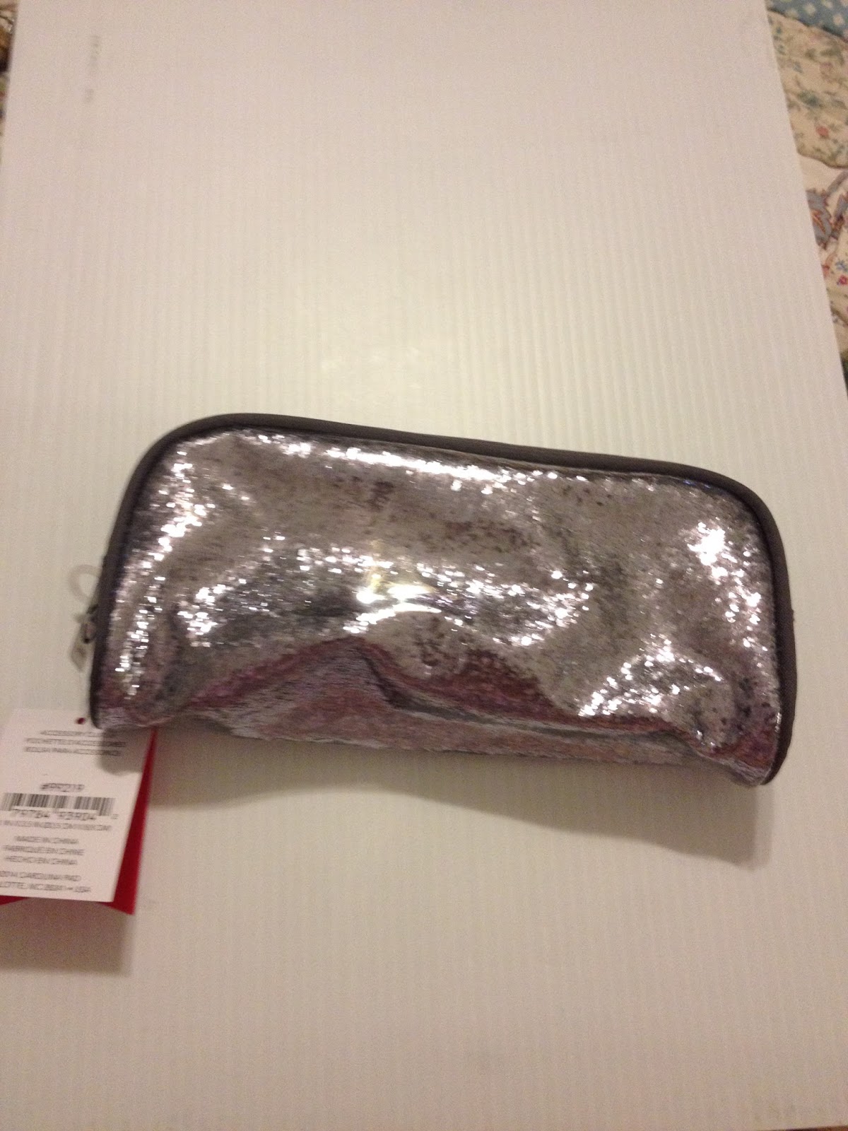
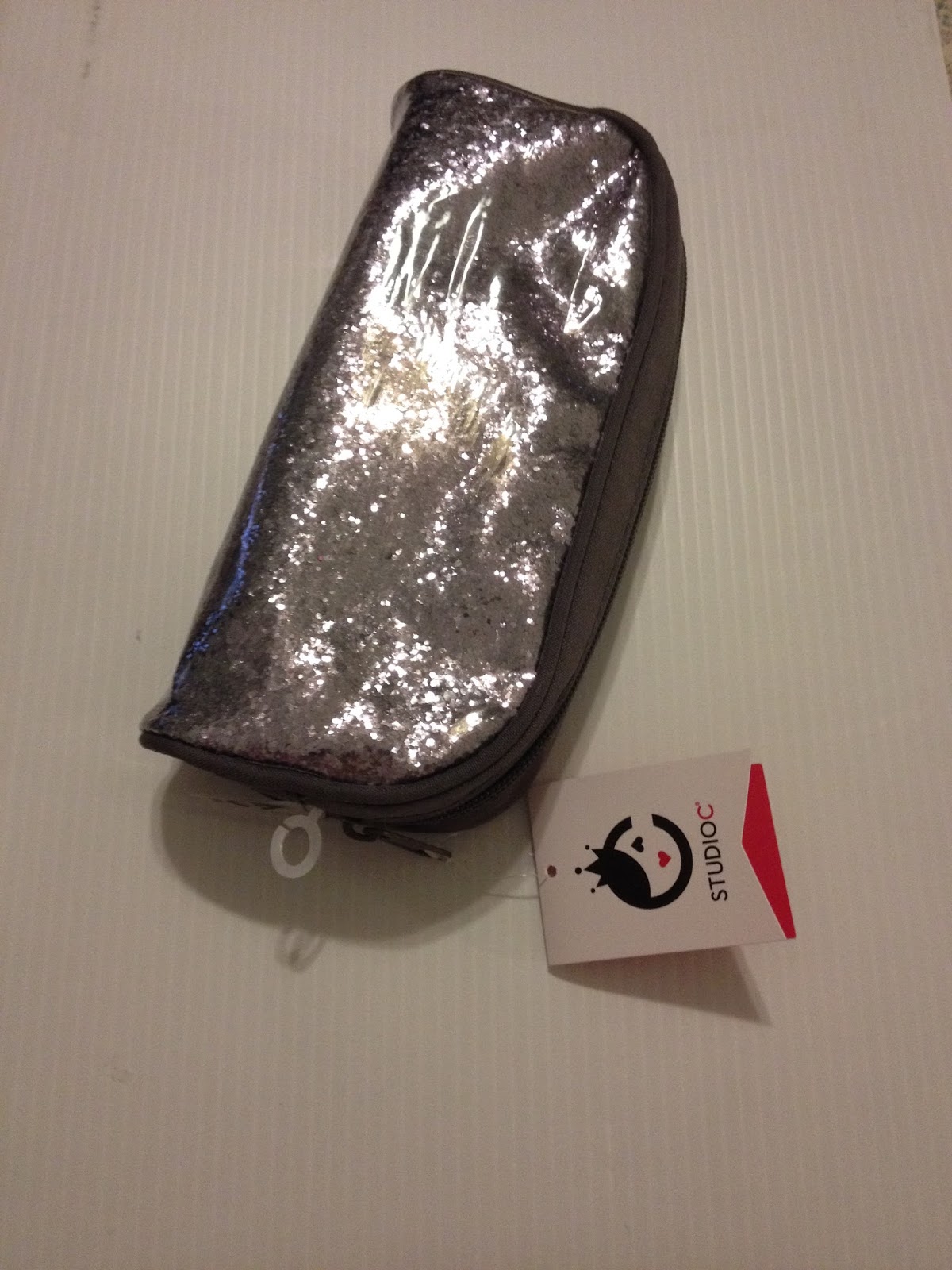
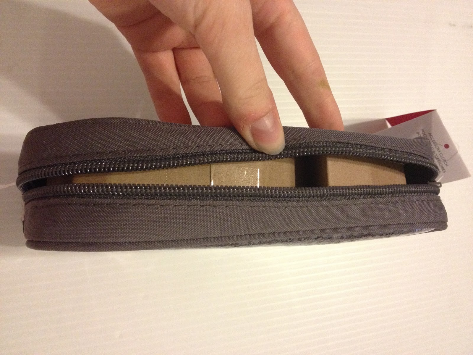
The company included this cardboard insert to help the case keep it's shape during shipping, and to prevent it from becoming horribly mangled.

Below are some shots of my Studio C Glitter Pencil Case holding some of the sketching and inking toys from Walmart that I'll be reviewing a little later on. I wanted to give you guys an idea of how much this case can hold- there's really a LOT of room.

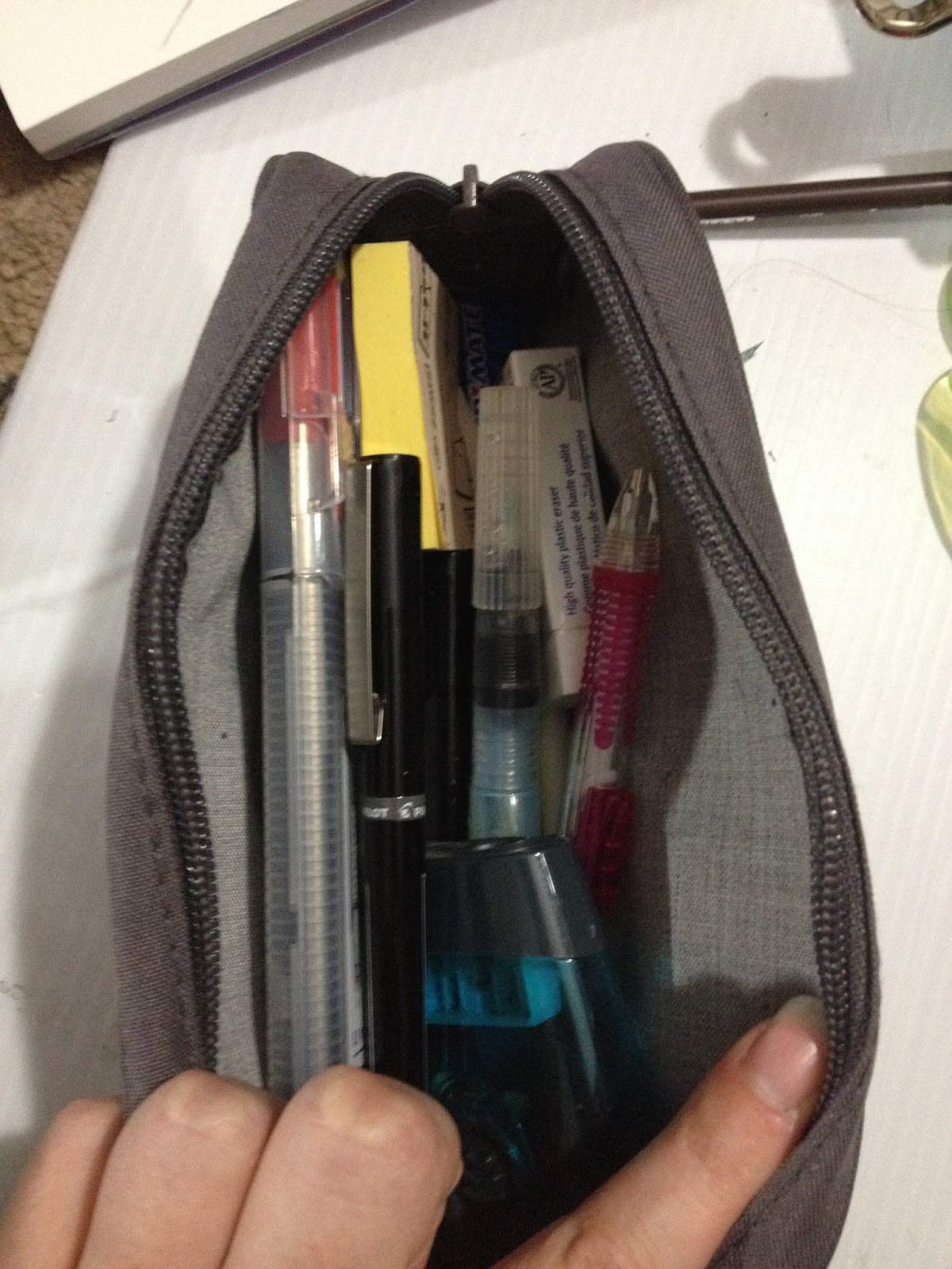

Even with all this stuff inside of it, the pouch isn't anywhere near full.
The Verdict:
This glitter pouch by Studio C is the perfect size for some of my travel watercolors, so I think I'll upgrade my setup a bit by switching over. I really like this case, I think it's cute and well made.
The only problem with one pocket cases is that they tend to get overstuffed, and then it's difficult to quickly find what you want.
Please consider donating to this blog or purchasing from Natto-shop (http://nattosoup.com/shop) if you want me to continue publishing quality content. All materials tested were purchased from my own pocket. Keep on Truckin' Nattosoup is not under any sponsorship.
October 4, 2015
Watercolor Marker Video Workshop
Interested in using watercolor markers, but not sure where to start? Confused by all the brands available, conflicting reviews, insufficient information? Fear not, this video should point you in the right direction!
By popular request, I created a video workshop on how I use watercolor markers. At the bottom of this post, I've assembled an affiliates carousel of the materials I used (available on Amazon), but if you'd like to follow along, you'll need:
GatorboardMasking TapeWatercolor PaperIllustration on your watercolor paperWatercolor brushes or waterbrushWatercolor markers of your preference
Basic Process
1. Pencil an image on nice watercolor paper that doesn't have too rough a texture (Fluid pads, Fabriano pretorn watercolor paper)
2. Ink with Sailor Mitsuo Aida waterproof brushpen. Available on Jetpens. Allow to dry overnight.
3. Erase pencil lines with Mono white vinyl eraser, available on Jetpens, brush away eraser crumbs with drafting brush.
4. Affix to Gatorboard with white masking tape.
5. Create a side palette with masking tape on gatorboard. Could probably just use the plastic Gatorboard, but it might stain.
6. Apply ink to side palette, wet brush with clean water, begin to apply background.
7. Allow layer to fully dry, begin additional layers, as covered here.
Watercolor Marker Workshop
You Can Find the Supplies I used In the Carousel Below:
Purchasing art supplies through my affiliate links and carousels helps support this blog, and enables me to make more content like the Watercolor Marker Workshop above. Videos like this one take a lot of time, experience, and energy to produce, and are a two part effort between Joseph (editing, uploading) and myself (art, raw video). If you enjoyed this video, please consider liking the video subscribing to my YouTube channel- with your support, there will be more content like this in the future!
Amazon.com Widgets
Please consider donating to this blog or purchasing from Natto-shop (http://nattosoup.com/shop) if you want me to continue publishing quality content. All materials tested were purchased from my own pocket. Keep on Truckin' Nattosoup is not under any sponsorship.
October 2, 2015
Art for Hope Nepal Process
With NYCC right around the corner, I can finally share something I'm really excited about!
Right after ALA I was asked by the phenomenal Joel Enos to participate in Art for Hope Nepal by contributing an illustration made in Autodesk's Sketchbook Pro. Although I haven't used Sketchbook Pro for more than doodles, I was happy to volunteer a donated image, as I figured I'm pretty competent with digital art programs in general, and my Surface Pro 3 makes drawing digitally much easier. I finished my illustration a couple weeks after I got back from Mechacon, and although it's simple, I'm pleased with the result, and I learned a lot while using Sketchbook Pro.
You can find out more about Art for Hope Nepal on Autodesk Sketchbook's blog and check out a few samples through this teaser preview!
Art for Hope Nepal goes live on October 7th, and you can get your copy through viz.com, kingle, kobo, Google Play, nook, and through several other sites then. If you're at NYCC, you can even check out some of the art live, as there'll be posters and four artists will be there doing signings. Unfortunately, I can't make it to NYCC this year, so I'll be in Nashville doing Handmade and Bound instead.
You purchase your own copy from And check out the Autodesk Twitter (@SketchBookPro), the Perfect Square Twitter (@PerfectSqrBooks) and Viz's Twitter (@vizmedia) for even more Art for Hope Nepal illustrations!
Here's the finished illustration, and below the cut is my process.
 Hope Whispers in Your Ear
Hope whispers dreams of happier tomorrows while today is still distraught. My piece has a young Nepali woman heeding Hope's wisdom and turning her vision forward, away from the disastrous past. For anyone who has suffered, it is better to focus on positive change , rather than linger on prior pain.
Art for Hope Nepal Process
Thumbnail

The only time I used traditional media was during the thumbnail, which was a tiny 2"x3" doodle I drew in my sketchbook with black color pencil. I took a photo of that using my Surface Pro 3, and opened it in Sketchbook Pro.
Blueline Sketch
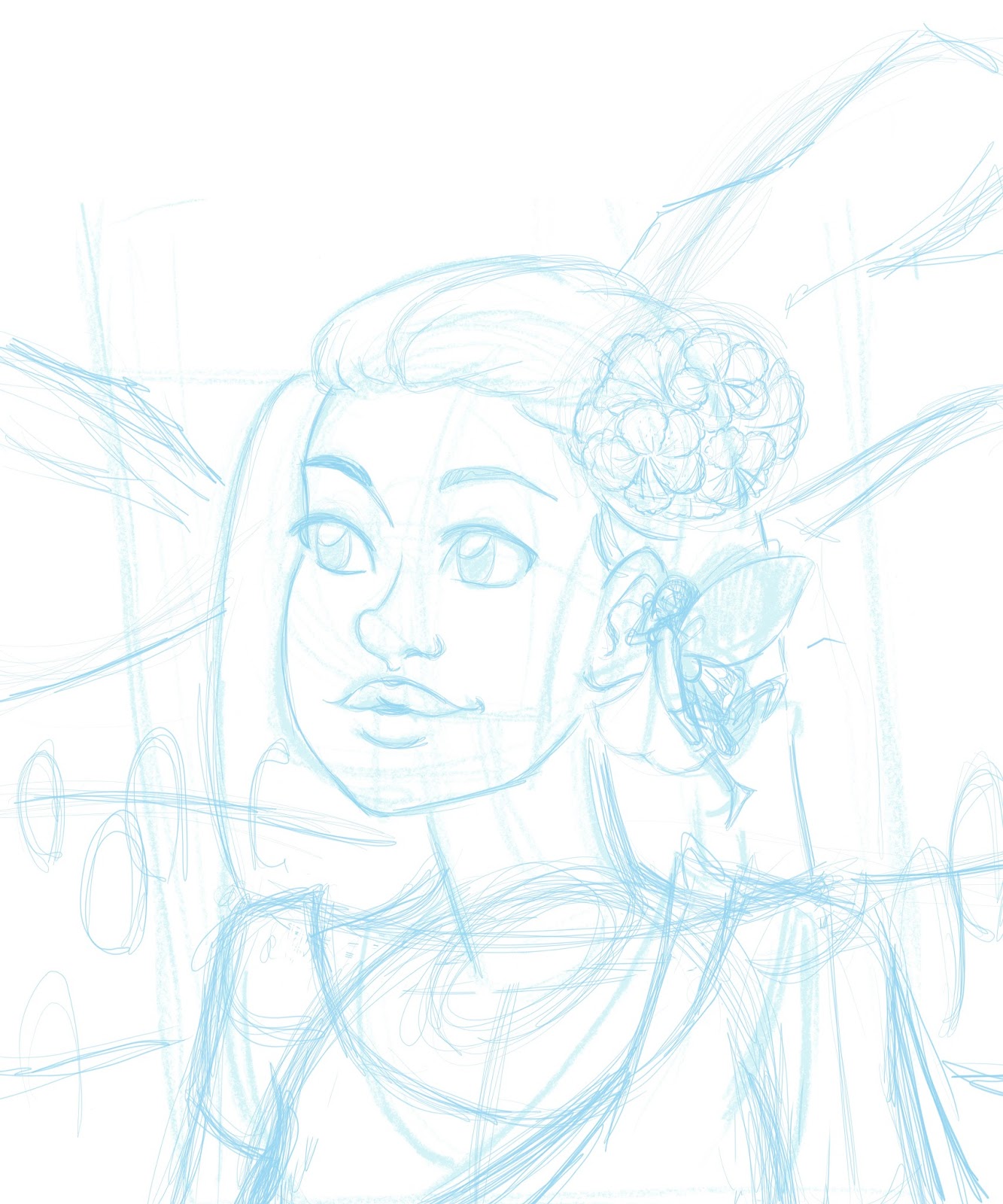
Tightening Up Bluelines
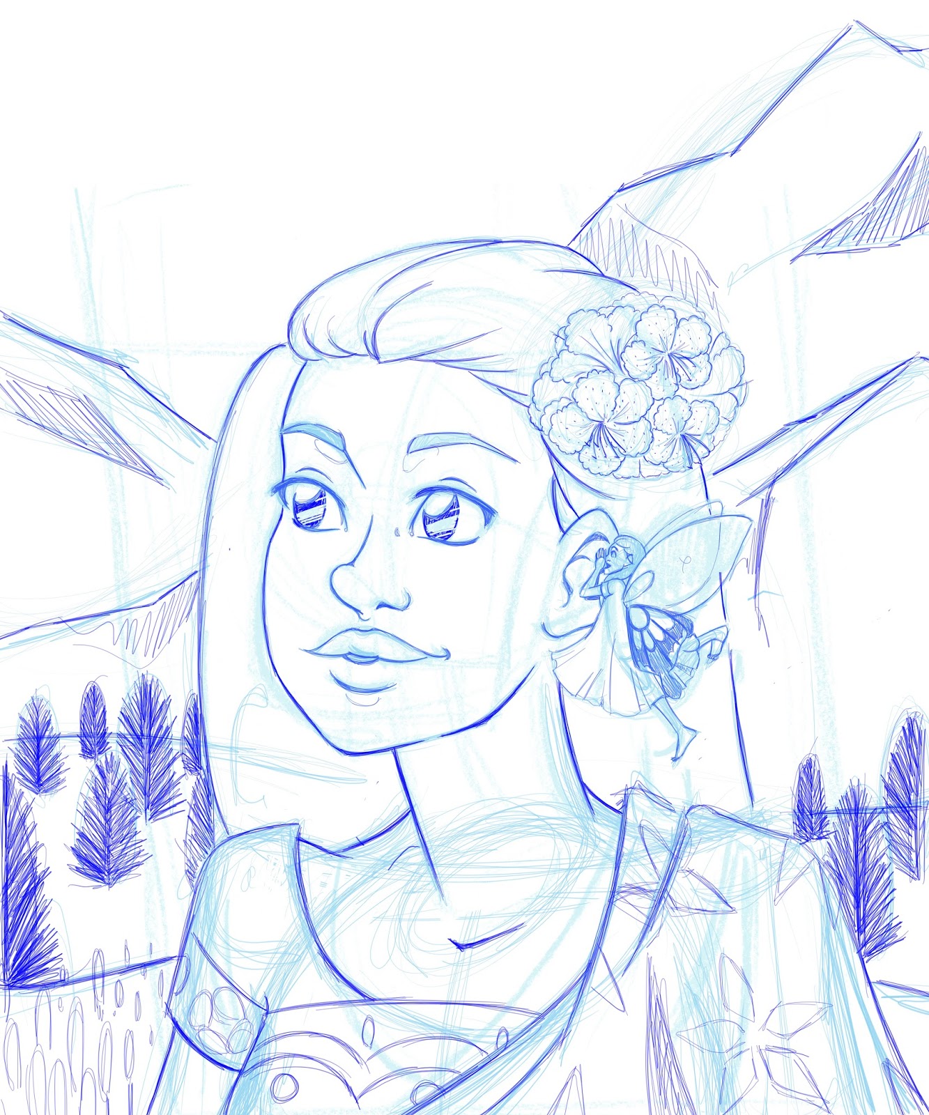
Blocking in Colors


Normally I color after I've completed the lineart, but I wanted to try doing lineart influenced by the object's color. I know a few tricks for doing that easily in Photoshop, but since I am far less familiar with Sketchbook Pro's magic tricks, I opted for the old fashioned method.
Colored Lineart

Detailing Background

The reference I collected for Nepal were mostly lovely mountain meadows, and I wanted that atmosphere in my illustration. I also wanted that high, endless blue sky, and the cloud shrouded mountains. The sky is simply a gradient layer set to multiply, and the clouds are a large brush set to very low opacity and layered.
Shading


Finished Piece

I found it easier to sketch in Sketchbook Pro than it is in Photoshop, and although I started using the program with zero familiarity with the settings or tool features, I quickly learned through experimenting how to get what I wanted. The menus and gestures are quite intuitive if you're using a tablet, and although it took me awhile to get the piece completed, I'm pretty happy with the result.
Please consider donating to this blog or purchasing from Natto-shop (http://nattosoup.com/shop) if you want me to continue publishing quality content. All materials tested were purchased from my own pocket. Keep on Truckin' Nattosoup is not under any sponsorship.


![[image error]](http://illref.com/reference/Illustrations/Male/Standing/medres/Loomis-Male-Skeleton-03.jpg)
![[image error]](http://illref.com/reference/Illustrations/Male/Standing/medres/Loomis-Male-Skeleton-01.jpg)