
Becca Hillburn's Blog, page 48
January 8, 2016
Target Art Supply Review: Sharpie Pen
Today is my younger brother's 25th birthday!
I think everyone with internet access has seen a Sharpie permanent marker, and I think almost everyone has used one. We're familiar with the bulky bodies, the stubby nibs, the fumes.
 Sorta like this one here. Image from the Sharpie siteSharpies have changed a lot over the years, and there's a lot of variety in their product line now. You can get anything from ol' faithful black and chisel industrial application to Sharpie paint markers, and even Sharpies with flexible brush tips (which I may have to revisit on this blog). The Sharpie site is pretty cool too, and the blog has lots of neat ideas to inspire you, so it really seems like the brand is making an effort to change with the times.
The Sharpie Pen exemplifies some of these changes, but it's one of Sharpie's older renovations. Sleek body with a silver and black design, multiple nib sizes, and zero headache-inducing fumes, the Sharpie Pen has more in common with technical pens and fineliners than it does with its brandmates.
When I was in highschool, this and Zig Millenium pens were the tools of choice for inking my comics. At the time, I didn't really give a lot of throught to archival quality- my plan was just to scan the pages and put them online, and I didn't even get that far. I was limited to what my local Walmart offered- my area didn't even get a Target in driving distance until I started undergrad at UNO.
Sharpie pens aren't limited to Target however- you can find them just about anywhere. Today I'm reviewing black ink, but I also have the colored inks, so I'll revisit Sharpie pens again later. If you'd like your own set that includes both a black Sharpie pen, as well as the glorious colors of the rainbow, you can help me out by clicking the referral link below.
And if you'd like to start off simple, with just black, the link below will help you there too.
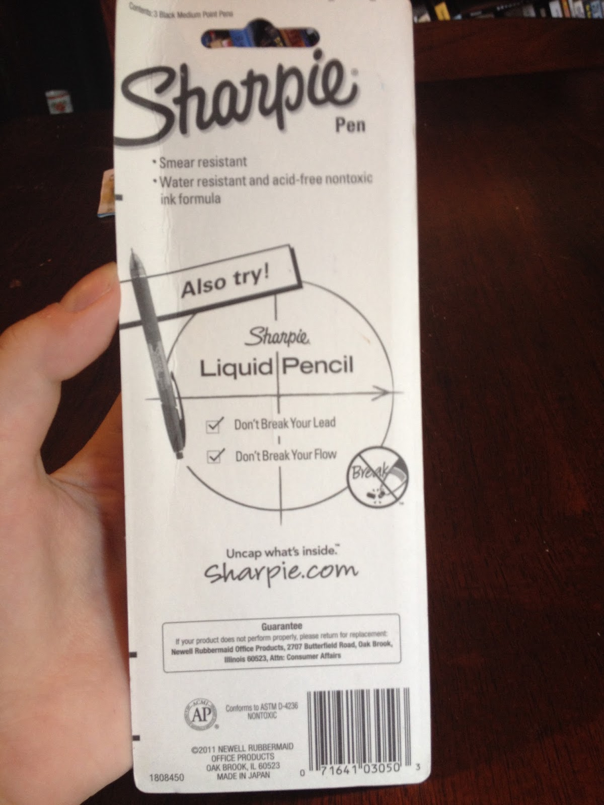
The Packaging

The package promises that Sharpie Pens are bleedproof and indictes the ink color and nib size.

The back includes a little information, such as a claim that Sharpie pens are 'smear resistant', water resistant, and has an acid free ink formula, but the majority of the back is an advertisement for the Sharpie Liquid Pencil.
The Pen
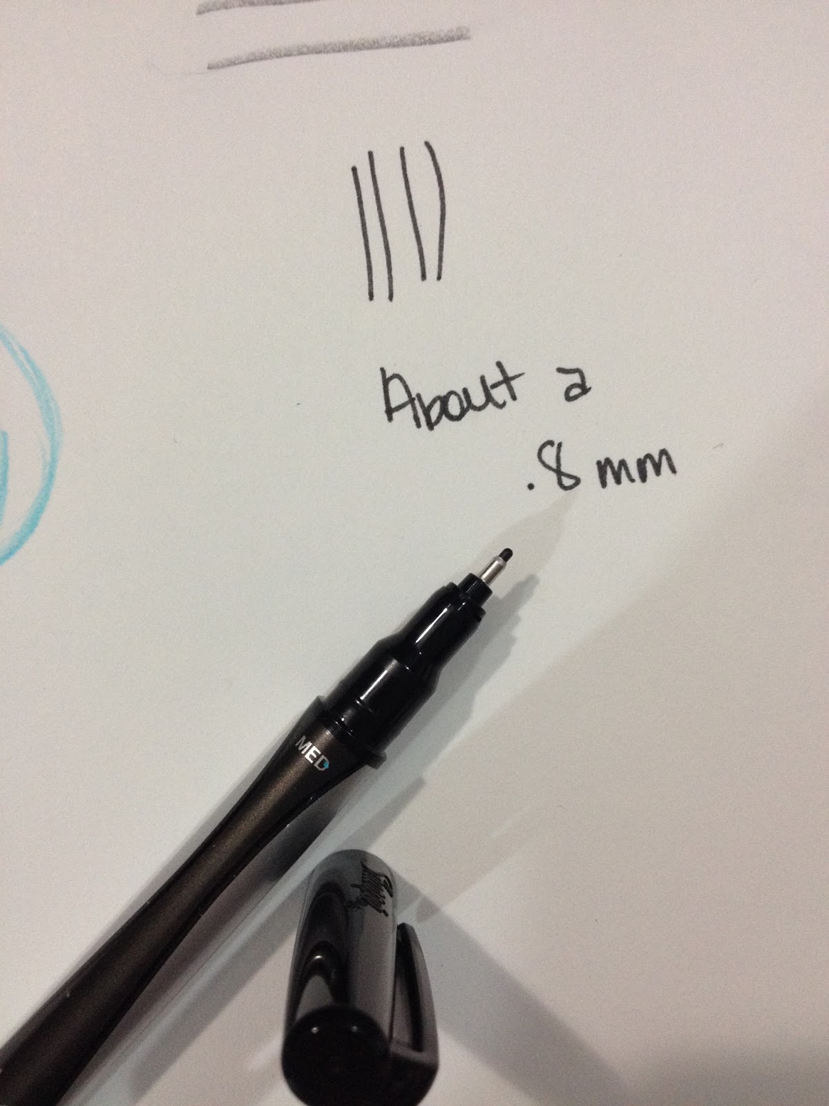
Both of the Sharpie Pens in the package I purchased from the Kenner Target are size Medium, which is about an .8. I'm assuming the fine is probably around a .5, and I'm not sure if Sharpie makes a Sharpie Pen Bold, but if so, I'm guessing it's about a 1mm, probably a bullet nib.

Sharpie Pens are built like a regular pen and feature a cap with a clip, and a post on the back.

Underneath the cap is a fairly standard fineliner felt tipped pen. There's a metal sheath around the felt tip.


Compared to Technical Pens
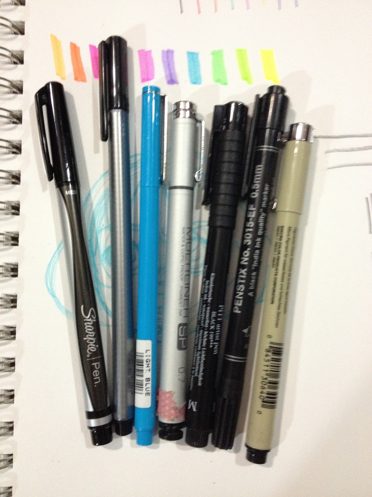
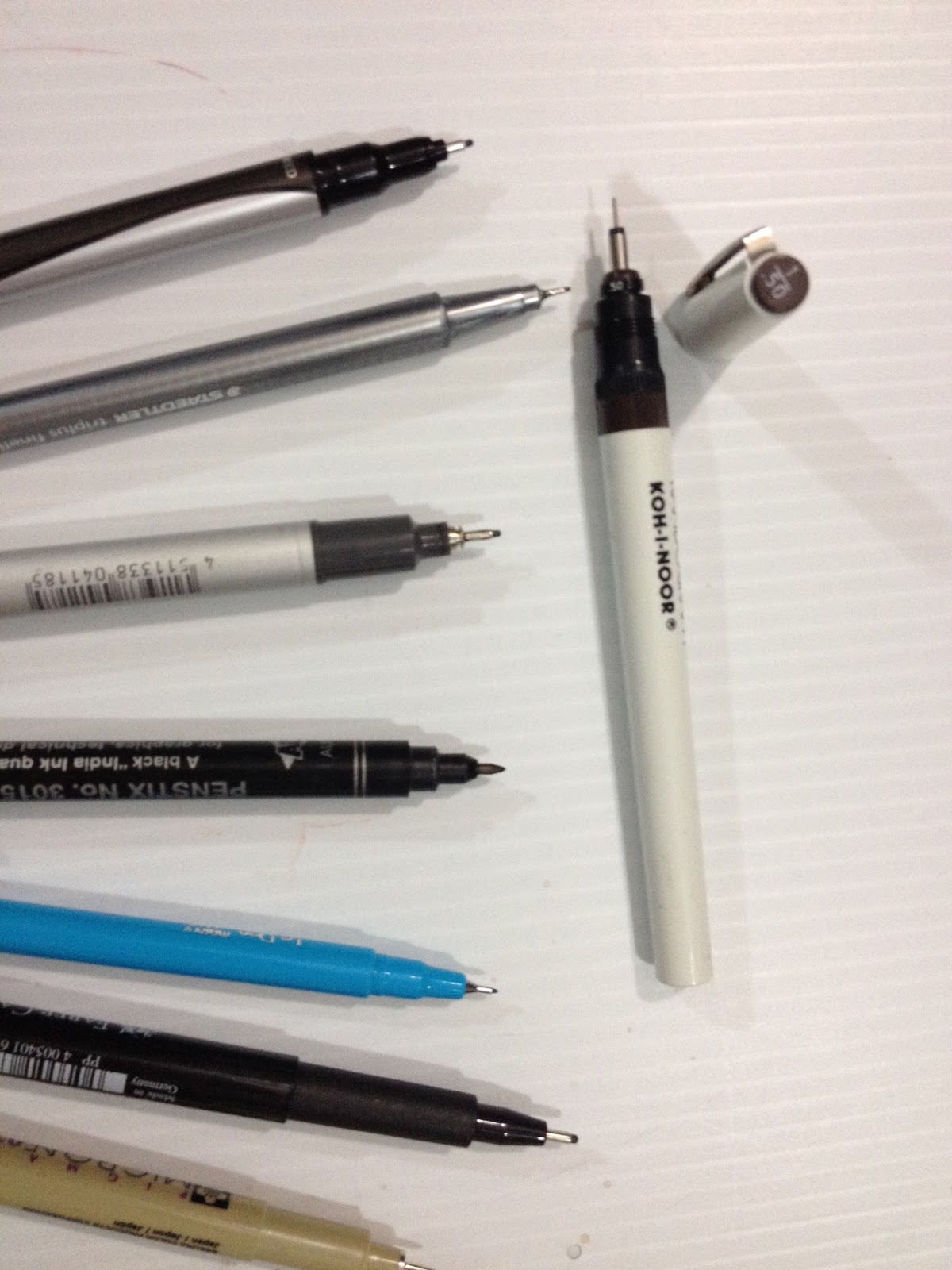
 From right to left: Sharpie Pen, Triplus Fineliner, Marvy LePen, Copic Multiliner SP, Pitt Pen, Alvin PenStix, Sakura Micron
 Top: Rapidograph
From right to left: Sharpie Pen, Triplus Fineliner, Marvy LePen, Copic Multiliner SP, Pitt Pen, Alvin PenStix, Sakura Micron
 Left, top to bottom: Sharpie Pen, Triplus Fineliner, Marvy LePen, Copic Multiliner SP, Pitt Pen, Alvin PenStix, Sakura MicronRight: RapidographNext to artist technical pens (minus the Marvy LePen), the Sharpie Pen seems to hold up. It has many of the more popular tech pen features such as a felt tip and a protective metal sheath to help prevent wear. The Sharpie Pen is not refillable, and you can't replace the nibs.
The Field Test
Inks well over bluelines, this non-technical pen is a lot less annoying to ink with than some of the other fineliners I've recently tested. Part of this is due to the larger nib size- the Sharpie Pen seems to have a .8mm nib, rather than the.3-.5 nibs that seem standard for non artist technical pens.


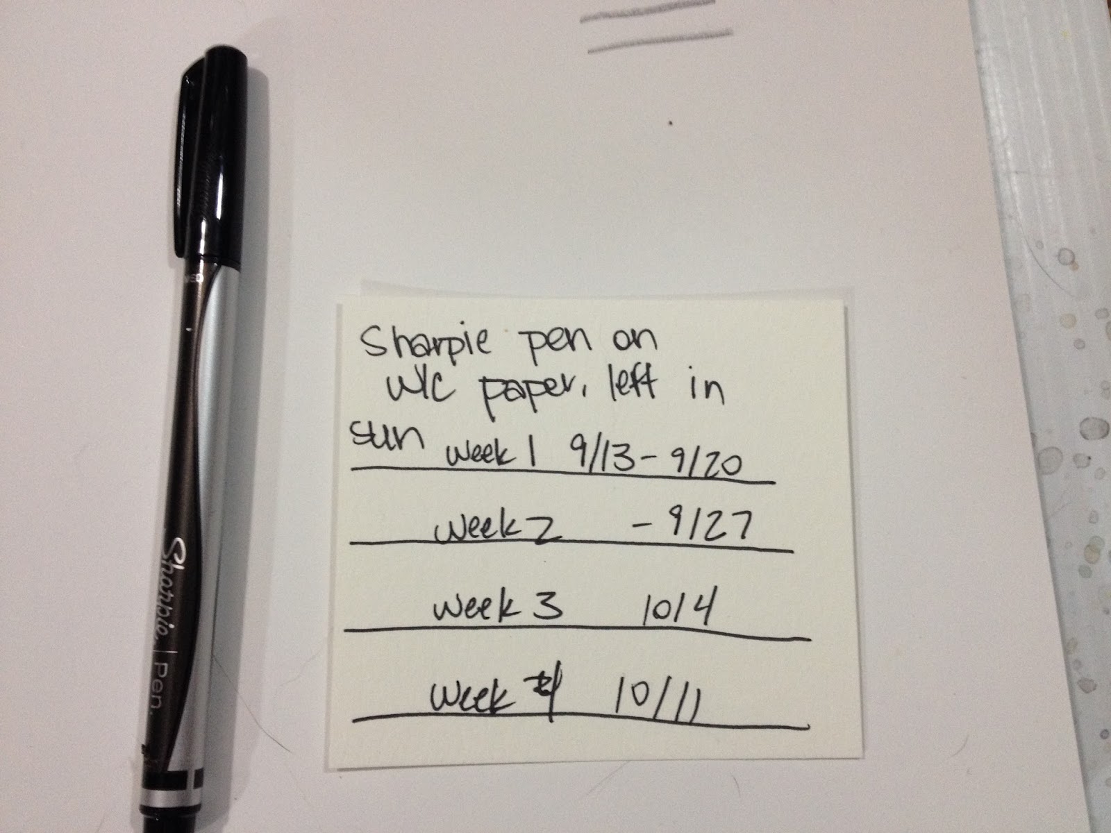
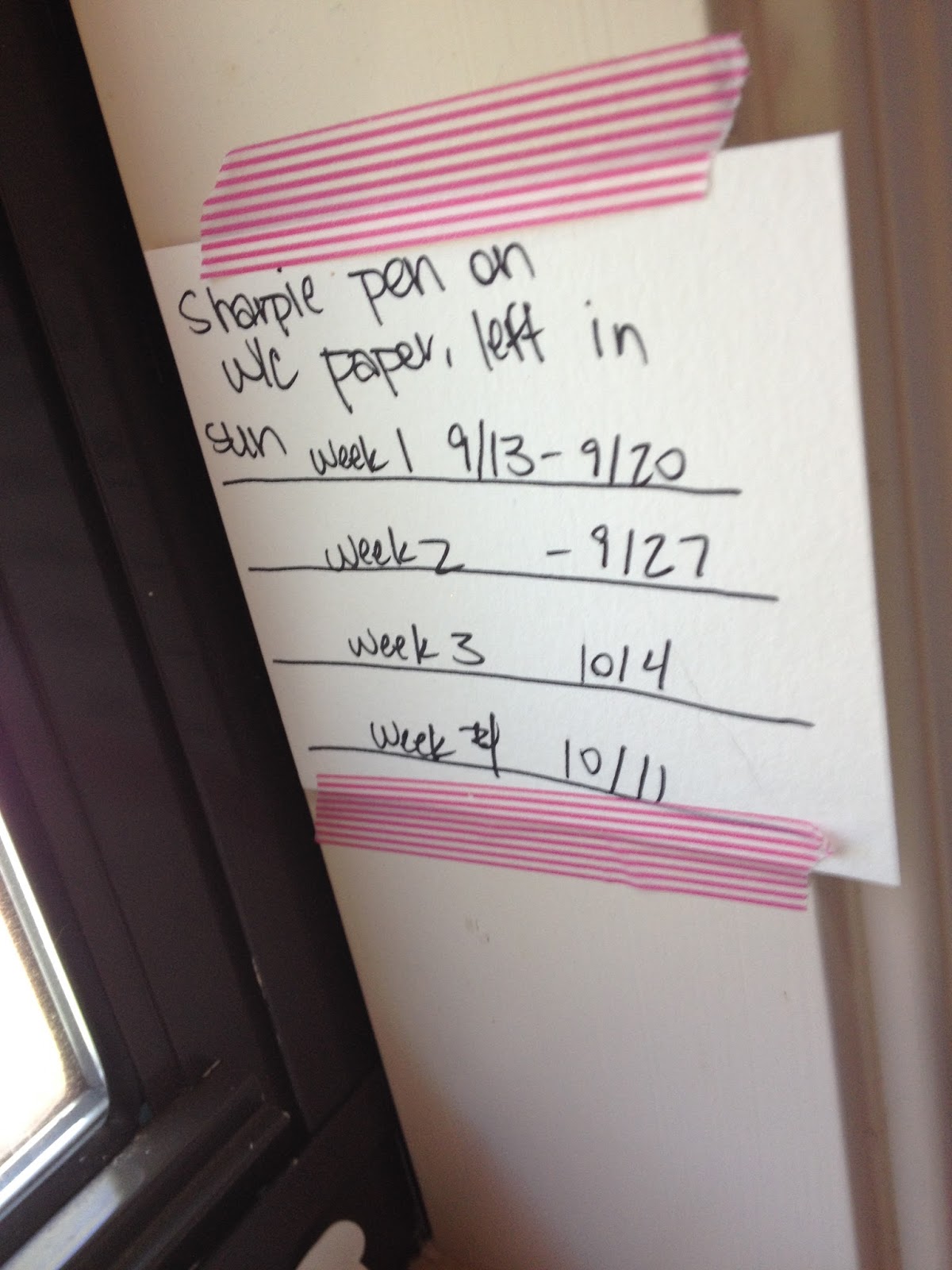
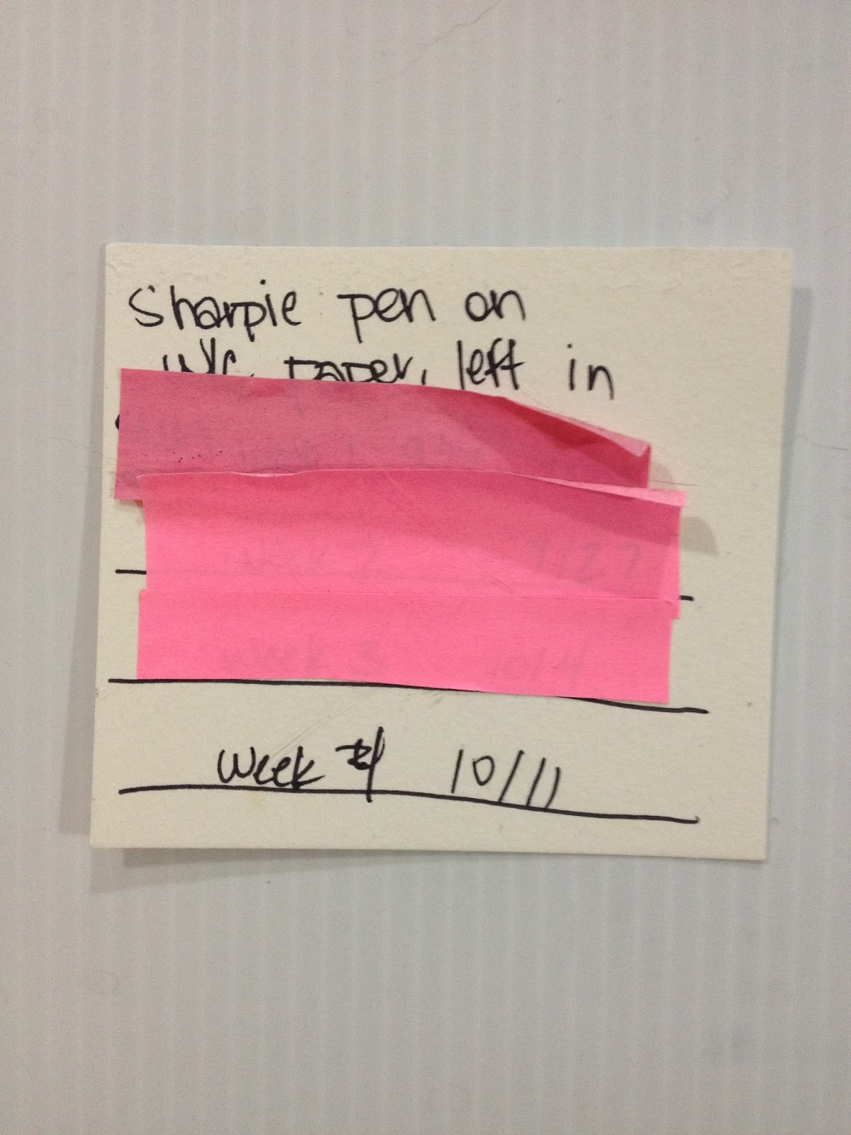
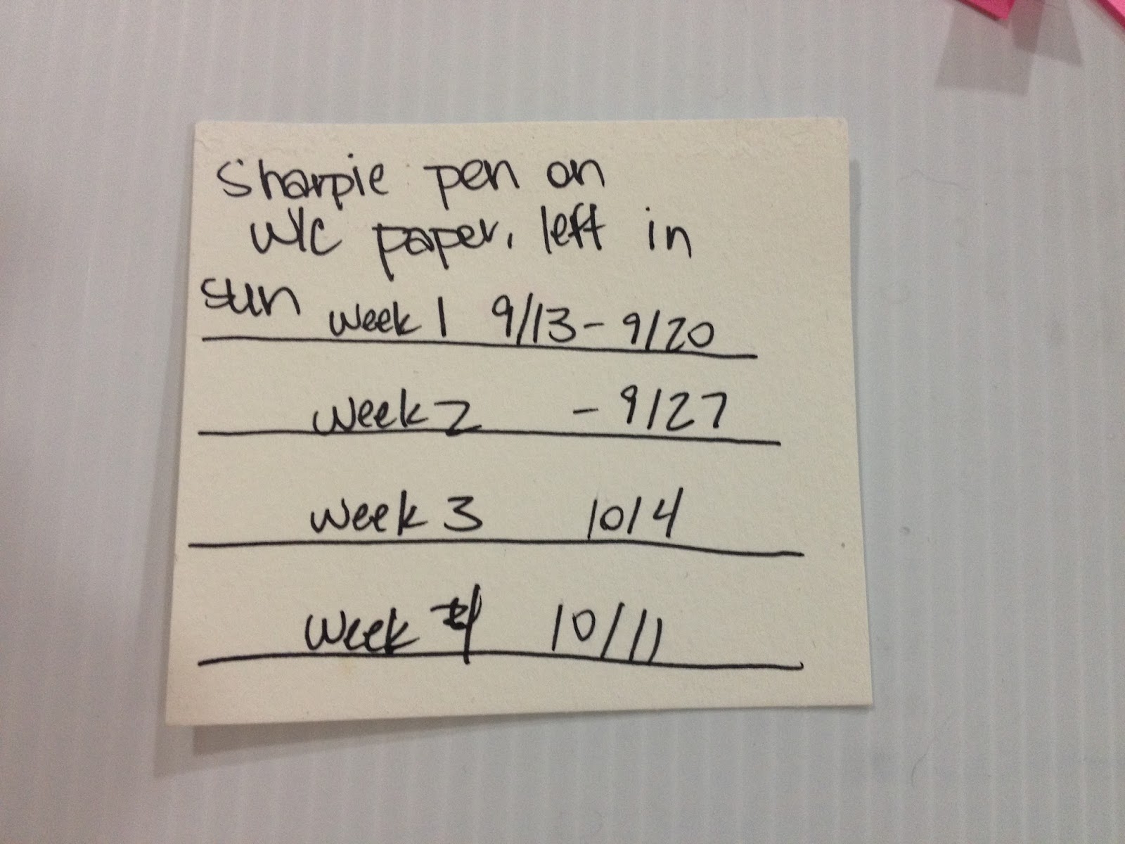
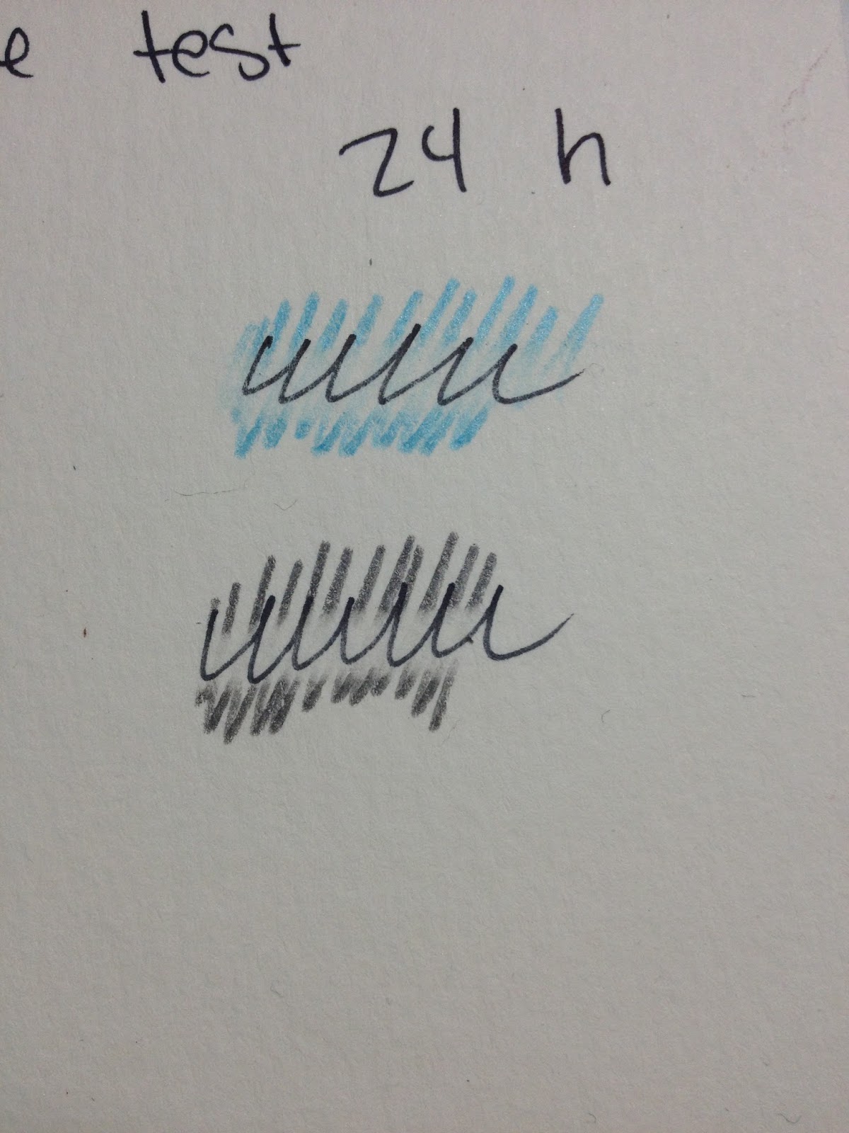
Sharpies aren't archival-the ink turns the paper yellow over time, and since Sharpie Pens are sold alongside other writing impliments, I feel like perhaps they're a little more archival than regular Sharpies. Sharpie's official website says that Sharpie pens are indeed archival. To see for myself, I created this little test on watercolor paper, and taped it to my windowsill.
Lightfastness Test
My windowsill gets light all day long, and I'd marked off weekly units. As each week passed, I covered that week with a Post-It note, to prevent it from getting additional exposure. My test was on a piece of scrap watercolor paper.
Setting Up the test:

During the test:

After the test:


There's no noticeable discoloration or bleed through on either side of the paper, despite being left in the sun for a little over a month.
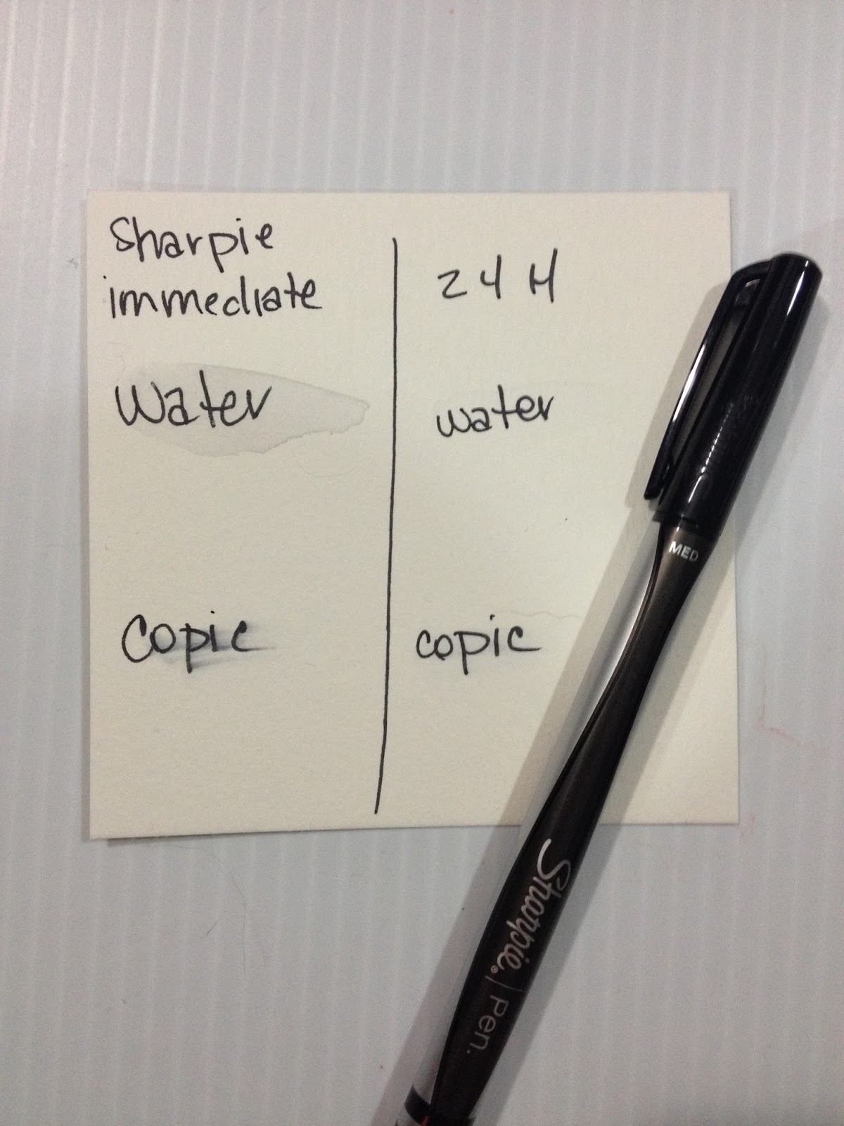
Water Test


Immediate application of water causes a little bit of bleeding with the Sharpie Pen ink, but if ink is allowed to dry for 24 hours, it is water safe.
Copic Test
Immediate application of Copic causes the ink to bleed badly, but if ink is allowed to dry for 24 hours, it is mostly Copic safe. There was a little bit of smearing, but this could also be that my test marker is running a bit dry.
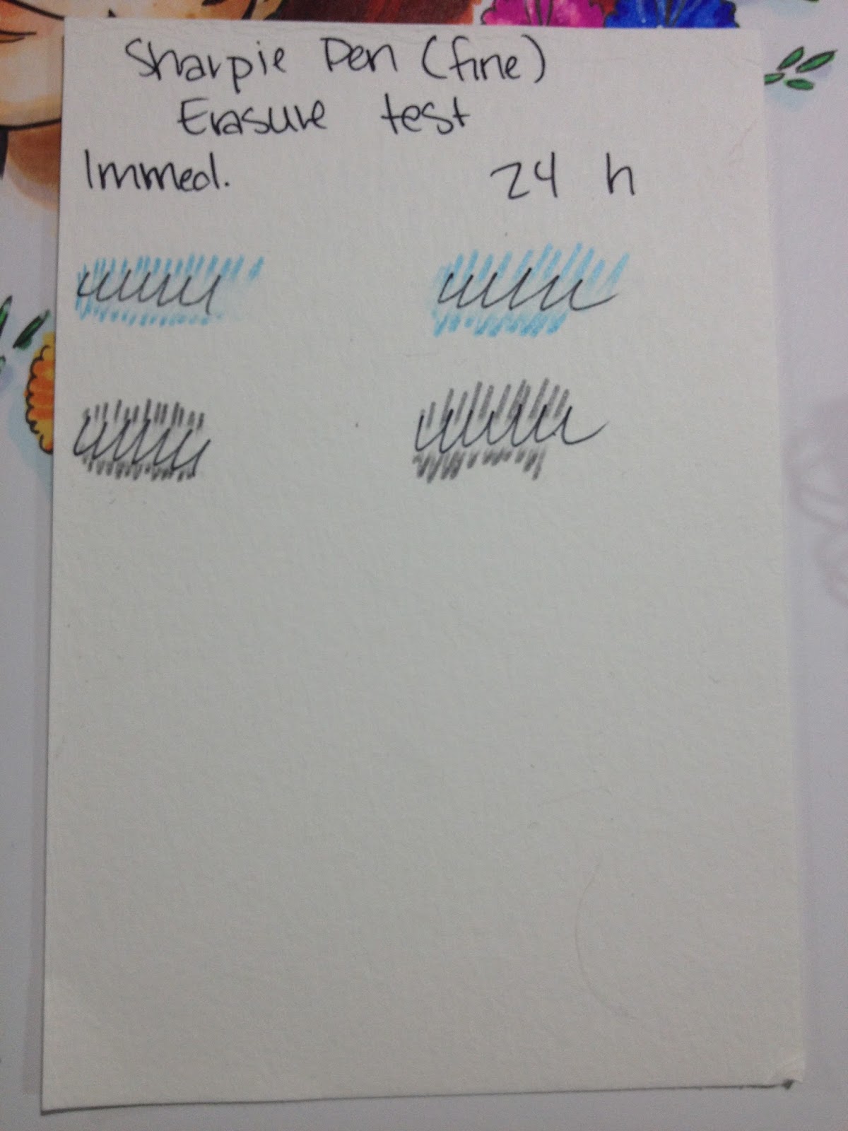
Erasing Test


General Thoughts
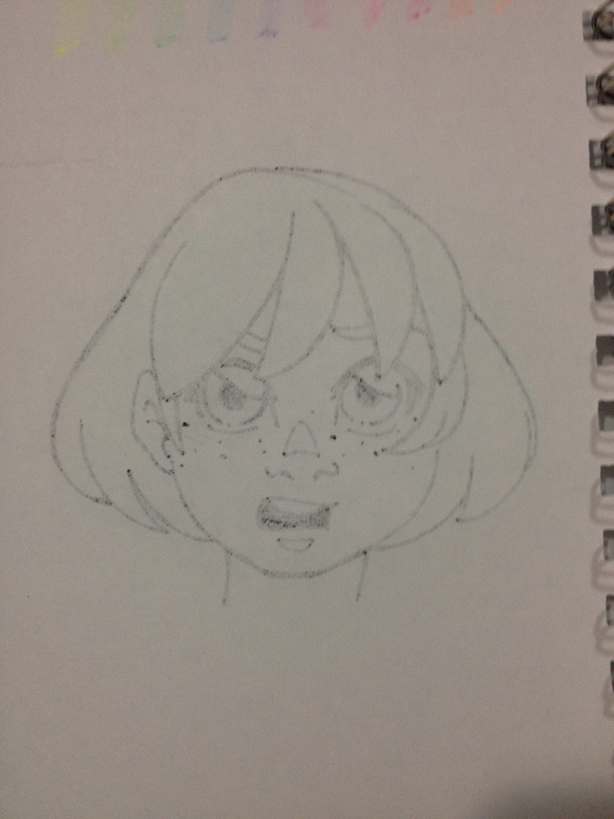
After the field test and general testing, I continued to use my Sharpie pens as writing implements and as a fineliner for still-wet floral illustration. It was the latter that ended up killing my Sharpie pen, so if you wouldn't use your regular artist fineliners to do it, you probably shouldn't use a Sharpie pen to do it, as it isn't a traditional Sharpie.


Above: Flowers were inked while paper was still damp, which ruined the nib on my Sharpie Pen.
These pens are comfortable to write with and have good ink flow, although the ink is prone to bleeding through most lined papers.
The Verdict
Sharpie Pen isn't a bad fineliner, and if your options are limited, it's definitely preferable to inking with ballpoint pens. The inkflow is steady, and the ink inside is lightfast and archival. The tip on the Sharpie Pen Medium is about .8mm, and these pens come in a variety of colors, and could be used for colored lineart. Sharpie Fine is about .4mm, and also comes in a wide variety of colors.
Please consider donating to this blog or purchasing from Natto-shop (http://nattosoup.com/shop) if you want me to continue publishing quality content. All materials tested were purchased from my own pocket. Keep on Truckin' Nattosoup is not under any sponsorship.
I think everyone with internet access has seen a Sharpie permanent marker, and I think almost everyone has used one. We're familiar with the bulky bodies, the stubby nibs, the fumes.
Sorta like this one here. Image from the Sharpie siteSharpies have changed a lot over the years, and there's a lot of variety in their product line now. You can get anything from ol' faithful black and chisel industrial application to Sharpie paint markers, and even Sharpies with flexible brush tips (which I may have to revisit on this blog). The Sharpie site is pretty cool too, and the blog has lots of neat ideas to inspire you, so it really seems like the brand is making an effort to change with the times. The Sharpie Pen exemplifies some of these changes, but it's one of Sharpie's older renovations. Sleek body with a silver and black design, multiple nib sizes, and zero headache-inducing fumes, the Sharpie Pen has more in common with technical pens and fineliners than it does with its brandmates.
When I was in highschool, this and Zig Millenium pens were the tools of choice for inking my comics. At the time, I didn't really give a lot of throught to archival quality- my plan was just to scan the pages and put them online, and I didn't even get that far. I was limited to what my local Walmart offered- my area didn't even get a Target in driving distance until I started undergrad at UNO.
Sharpie pens aren't limited to Target however- you can find them just about anywhere. Today I'm reviewing black ink, but I also have the colored inks, so I'll revisit Sharpie pens again later. If you'd like your own set that includes both a black Sharpie pen, as well as the glorious colors of the rainbow, you can help me out by clicking the referral link below.
And if you'd like to start off simple, with just black, the link below will help you there too.
The Packaging

The package promises that Sharpie Pens are bleedproof and indictes the ink color and nib size.
The back includes a little information, such as a claim that Sharpie pens are 'smear resistant', water resistant, and has an acid free ink formula, but the majority of the back is an advertisement for the Sharpie Liquid Pencil.
The Pen
Both of the Sharpie Pens in the package I purchased from the Kenner Target are size Medium, which is about an .8. I'm assuming the fine is probably around a .5, and I'm not sure if Sharpie makes a Sharpie Pen Bold, but if so, I'm guessing it's about a 1mm, probably a bullet nib.

Sharpie Pens are built like a regular pen and feature a cap with a clip, and a post on the back.

Underneath the cap is a fairly standard fineliner felt tipped pen. There's a metal sheath around the felt tip.


Compared to Technical Pens
 From right to left: Sharpie Pen, Triplus Fineliner, Marvy LePen, Copic Multiliner SP, Pitt Pen, Alvin PenStix, Sakura Micron
 Top: Rapidograph
From right to left: Sharpie Pen, Triplus Fineliner, Marvy LePen, Copic Multiliner SP, Pitt Pen, Alvin PenStix, Sakura Micron
 Left, top to bottom: Sharpie Pen, Triplus Fineliner, Marvy LePen, Copic Multiliner SP, Pitt Pen, Alvin PenStix, Sakura MicronRight: RapidographNext to artist technical pens (minus the Marvy LePen), the Sharpie Pen seems to hold up. It has many of the more popular tech pen features such as a felt tip and a protective metal sheath to help prevent wear. The Sharpie Pen is not refillable, and you can't replace the nibs.
The Field Test
Inks well over bluelines, this non-technical pen is a lot less annoying to ink with than some of the other fineliners I've recently tested. Part of this is due to the larger nib size- the Sharpie Pen seems to have a .8mm nib, rather than the.3-.5 nibs that seem standard for non artist technical pens.


Sharpies aren't archival-the ink turns the paper yellow over time, and since Sharpie Pens are sold alongside other writing impliments, I feel like perhaps they're a little more archival than regular Sharpies. Sharpie's official website says that Sharpie pens are indeed archival. To see for myself, I created this little test on watercolor paper, and taped it to my windowsill.
Lightfastness Test
My windowsill gets light all day long, and I'd marked off weekly units. As each week passed, I covered that week with a Post-It note, to prevent it from getting additional exposure. My test was on a piece of scrap watercolor paper.
Setting Up the test:
During the test:
After the test:

There's no noticeable discoloration or bleed through on either side of the paper, despite being left in the sun for a little over a month.
Water Test
Immediate application of water causes a little bit of bleeding with the Sharpie Pen ink, but if ink is allowed to dry for 24 hours, it is water safe.
Copic Test
Immediate application of Copic causes the ink to bleed badly, but if ink is allowed to dry for 24 hours, it is mostly Copic safe. There was a little bit of smearing, but this could also be that my test marker is running a bit dry.
Erasing Test
General Thoughts
After the field test and general testing, I continued to use my Sharpie pens as writing implements and as a fineliner for still-wet floral illustration. It was the latter that ended up killing my Sharpie pen, so if you wouldn't use your regular artist fineliners to do it, you probably shouldn't use a Sharpie pen to do it, as it isn't a traditional Sharpie.
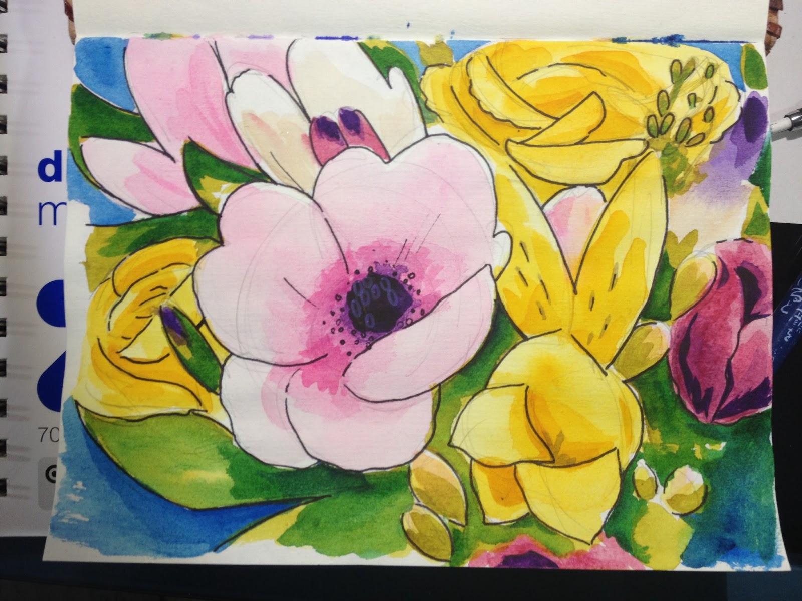

Above: Flowers were inked while paper was still damp, which ruined the nib on my Sharpie Pen.
These pens are comfortable to write with and have good ink flow, although the ink is prone to bleeding through most lined papers.
The Verdict
Sharpie Pen isn't a bad fineliner, and if your options are limited, it's definitely preferable to inking with ballpoint pens. The inkflow is steady, and the ink inside is lightfast and archival. The tip on the Sharpie Pen Medium is about .8mm, and these pens come in a variety of colors, and could be used for colored lineart. Sharpie Fine is about .4mm, and also comes in a wide variety of colors.
Please consider donating to this blog or purchasing from Natto-shop (http://nattosoup.com/shop) if you want me to continue publishing quality content. All materials tested were purchased from my own pocket. Keep on Truckin' Nattosoup is not under any sponsorship.


January 6, 2016
PSA: You Are an Artist!
I Believe In You
I watch a lot of crafting videos when working on writing reviews. I find that crafters tend to think a little differently than I do, and it's often a refreshing change in point of view. Watching these videos gives me an idea of what topics *I* should cover, and it gives me fresh perspective on what you guys might be interested in reading. Without crafter reviews, I would never have reviewed Distress Watercolor Markers, Clean Color Real Brush Markers (coming soon!), Distress Watercolor Cardstock (another coming soon!),
Unfortunately, something I hear, over and over again is the phrase 'You don't have to be an artist'. It seems to be the mantra of many a Youtube crafter.
What's so wrong with being an artist?
I get it, they want their audiences to feel like this is something anyone can pick up. They want to promote how easy these products are to use, how you don't need an art school education to put together an attractive page.
I'm on board with that- that's what this blog does. Except that I think all of you are artists. And I think anyone can be one.
To me, an artist is someone who takes the time to learn their craft, to explore new skills, to experiment with new products, and new ways of using old products. I don't think there's anything wrong with being an artist. I think anyone can become an artist, with a lot of time, the right mindset, and a willingness to make a lot of mistakes. And if you can learn from these mistakes, or use them to make something else work, then you can become an artist.
Any crafter who utilizes multiple products in creative ways to design something that reflects what they care about is an artist. Many of the products sold to crafters are just stripped down, plastic versions of the tools artists use in their studios. Your embossing and die cutting machines are just printing presses with limited functionality. Your pre-packaged, pre mixed spray mists are just watercolor mists that have been assembled ahead of time.
And if you already have these products, like Spectrum Aqua Watercolor markers, or Copic Markers, or colorful, fun papers, why not use them to explore a whole new world of art and creativity, outside the boundaries of cards and scrapbook pages?
There's nothing wrong with learning how to doodle, rather than buying stamps. Even a simple doodle is a lot more creative than using someone else's stamp, and it's ok if it doesn't work out the first time- that's what erasers are for. And a combination of creatively used stamps and your own doodles can make for cards and pages that are truly original- pieces that no one else will be able to make. Rather than reaching for your stamps and pads, reach for your Microns and Multiliners, and doodle in those hearts, those stars, those smiley faced kiddos. I believe in you!
You don't need to buy all the big brands, you don't need all the newest things, you don't need boxes delivered to your door daily, and you don't need a craftroom full of other people's designs. You are just as creative as many of those stamp companies, and when you create your own, one of a kind designs, you are really doing something special. Ditch that culture of artificial scarcity, and do it yourself.
In the future, I want to launch a series of tutorials for really basic doodles that anyone can do. I want to make drawing even more accessible, for anyone at any age.
And if you are absolutely adverse to doing doodling of your own, please please at least consider spending some of that money on a flesh and blood artist for your designs, rather than a stamp company. Commission an artist! If you're having trouble finding someone who suits your taste, consider emailing me, and I can put you in contact with dozens of artists who would love to help you with your custom designs, myself included. Many of us work for incredibly reasonable rates for designs that are exclusive to you (or your friends, if you choose to share with them).
And, if even THAT suggestion makes your stomach turn, why not ask your kids, your nieces and nephews, your grandkids, to do some drawing for you? What is more charming than the collaboration between a child's drawing an adult's flourish?
When trying to make your technique or product accessible to a large number of people, don't slur artists. We have it hard enough without people dragging what we do through the mud, or treating it like magic unattainable to all but a select few. Elevate your audience! Encourage them to be brave, to try new things, to get creative, and to embrace those mistakes. Encourage them to nurture their inner artist, and to let go of a desire for perfection every time.
Please, lets all take the 'you don't have to be an artist' out of our vocabulary. Let's change it to 'anyone can be an artist!' Let's not say 'you don't have to be super creative', let's say 'you ARE super creative, so let's do this!'. Let's stop unintentionally slamming artists who make a living (or just enjoy) drawing and illustrating, let's stop ignoring the fact that they exist and are creating, and let's learn from them. Creative people should inspire, elevate, and collaborate with one another! This is a fresh new year, so let's resolve to work together and get bigger and better things done!
Speaking of inspiration, I would love to see what you guys are up to! Send me an email, leave me a comment, or Tweet me something recent you've worked on, and I'll retweet it so others can see what you've made.
Please consider donating to this blog or purchasing from Natto-shop (http://nattosoup.com/shop) if you want me to continue publishing quality content. All materials tested were purchased from my own pocket. Keep on Truckin' Nattosoup is not under any sponsorship.
January 4, 2016
SketchBox Vs ArtSnacks- January 2016
Thanks to Denise Hillburn (my mother) for the gift of ArtSnacks for the year! SketchBox Basic subscription purchased by me out of personal funds. If you would like to help support this blog, and continue posts like this, please consider donating to my Paypal, or contributing to my Patreon. If you would like to see me review a SketchBox premium box, please consider gifting a subscription.
A couple years ago, I purchased an ArtSnacks subscription to review here for you guys. I am a sucker for blind boxes, and an even bigger sucker for art supplies, so I couldn't resist checking back in with ArtSnacks to see if they've changed over the years. Of course, I had to up the ante, so I added SketchBox to the roster as well.
As a Christmas present, my mom kindly bought me a year's worth of ArtSnacks (thanks Mom!), and I purchased a year's worth of SketchBox Basic for myself. This first comparison review is free, but subsequent reviews will be unlocked only after my Patreon has hit the very modest goal of $15 a month, so if you enjoy this kind of content, please become a subscriber. By subscribing to my Patreon, you not only unlock content for other readers, but you'll receive backer only reviews, tutorials, Livestreams, and more. Your subscription helps me purchase additional supplies for review, funds tutorials, and goes towards helping me earn a living wage for my efforts. If we can't hit $15 in a month, then subscribers will have exclusive access to that month's blog post and video reviews.
At the time of posting, this post is still missing the videos of both field tests. The videos have been recorded- just waiting on editing and uploading. While you wait, why not check my Reviews tag for the other ArtSnacks unboxings?
SketchBox: $25mo/$240 yr
ArtSnacks: $20mo/$200 yr
January SketchBox Basic includes:
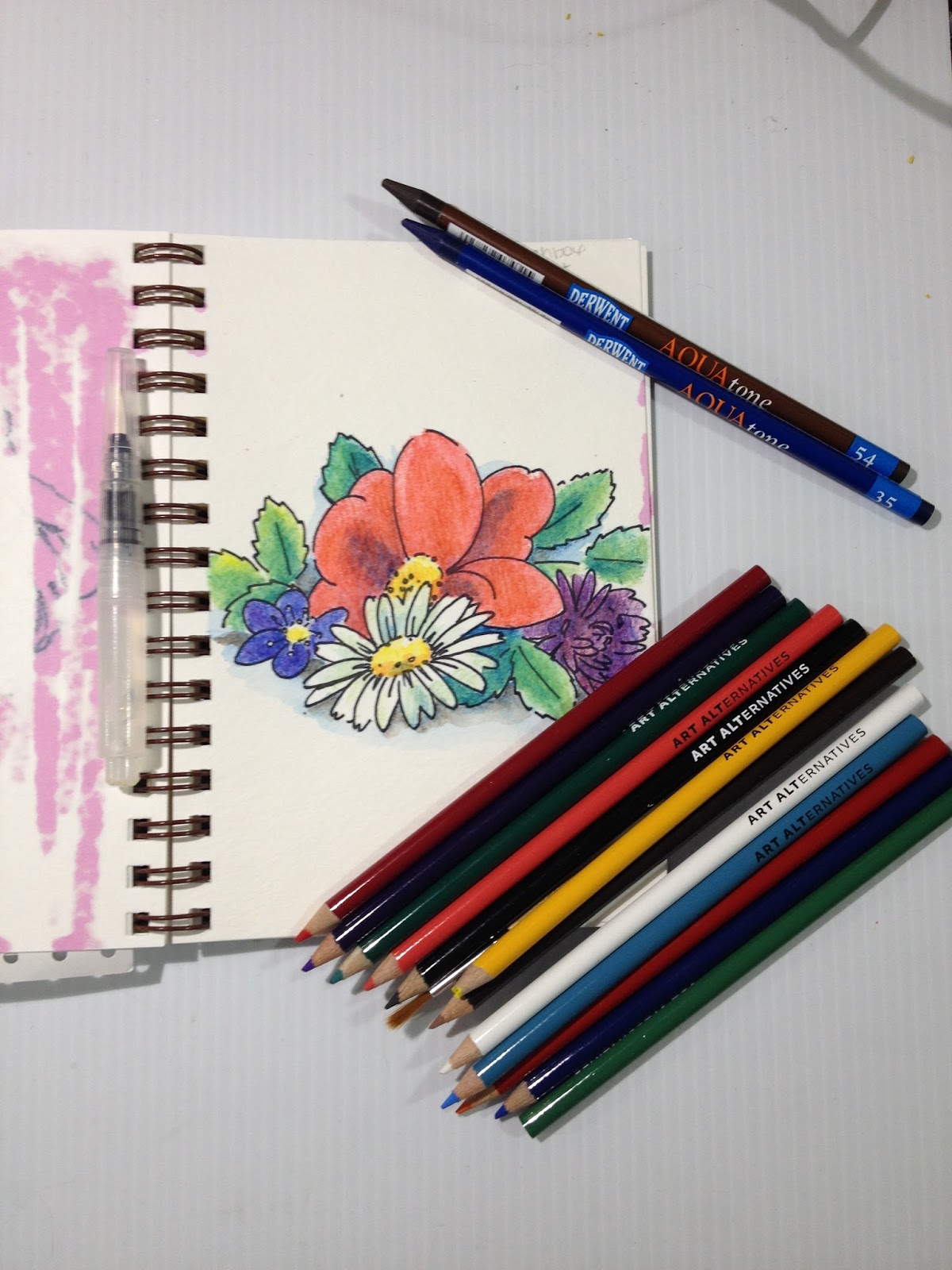
12 piece Art Alternatives watercolor pencils and brush
2 Derwent Aquatone woodless watercolor pencils
1 Sakura Koi field sketch watercolor Brushpen
January ArtSnacks includes:
Wink of Luna
Marvy LePen Permanent (alcohol based)
Krink Acrylic Dauber
Faber Castell Poly Matic
SketchBox Vs. ArtSnacks January 2016 Comparison-Nattosoup
ARTSNACKSThis month's brands are KRINK, Marvy Uchida, Kuretake (Zig) and Faber-Castell.
You can learn more about Krink
You can learn more about Marvy Uchida
You can learn more about Kuretake, and Wink of Luna here
You can learn more about Faber-Castell here
The Unboxing
ArtSnacks Unboxing January 2016- Nattosoup
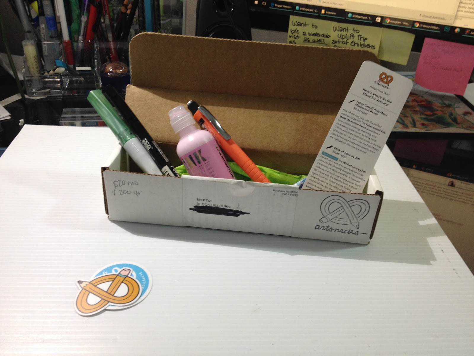
 My January 2016 ArtSnacks subscription box My box is a bit marked up, as I'd written down product prices and websites for easy reference.
 From left to right: Informational card, promotional vinyl stickers. Faber-Castell Poly Matic Mechanical Pencil, Zig Wink of Luna, Marvy LePen Permanent, KRINK K-60, DumDum (snack)


On the card:
$8.49 retail
Kick off the new year with the perfect mechanical pencil! The Faber-Castell Poly Matic Mechanical Pencil guarantees a comfortable drawing, sketching, and note-taking experience. Its body holds 0.7mm lead and a twist-out eraser at the top of the pencil. You can't miss the Poly Matic's colorful textured body when searching for the right pencil- this one is a winner.
Wink of Luna by ZIG
$9.00 retail
Staff Favorite The Wink of Luna by ZIG has left us in awe at how innovative brush pens can be. Uniquely designed to resemble a cosmetic product, the Wink of Luna will make your artwork pop on any paper. You'll fall in love with the metallic finish and soft nylon brush tip. To get the ink flowing properly, remove the safety ring from the middle of the pen, then recap. Shake the pen to loosen up the ink, then lightly squeeze the white part of the body. Ink will gradually flow through the flexible brush tip.
*Please note: The Wink of Luna is NOT a cosmetic product and should not be applied to the skin. (It looks so much better on paper anyways.)
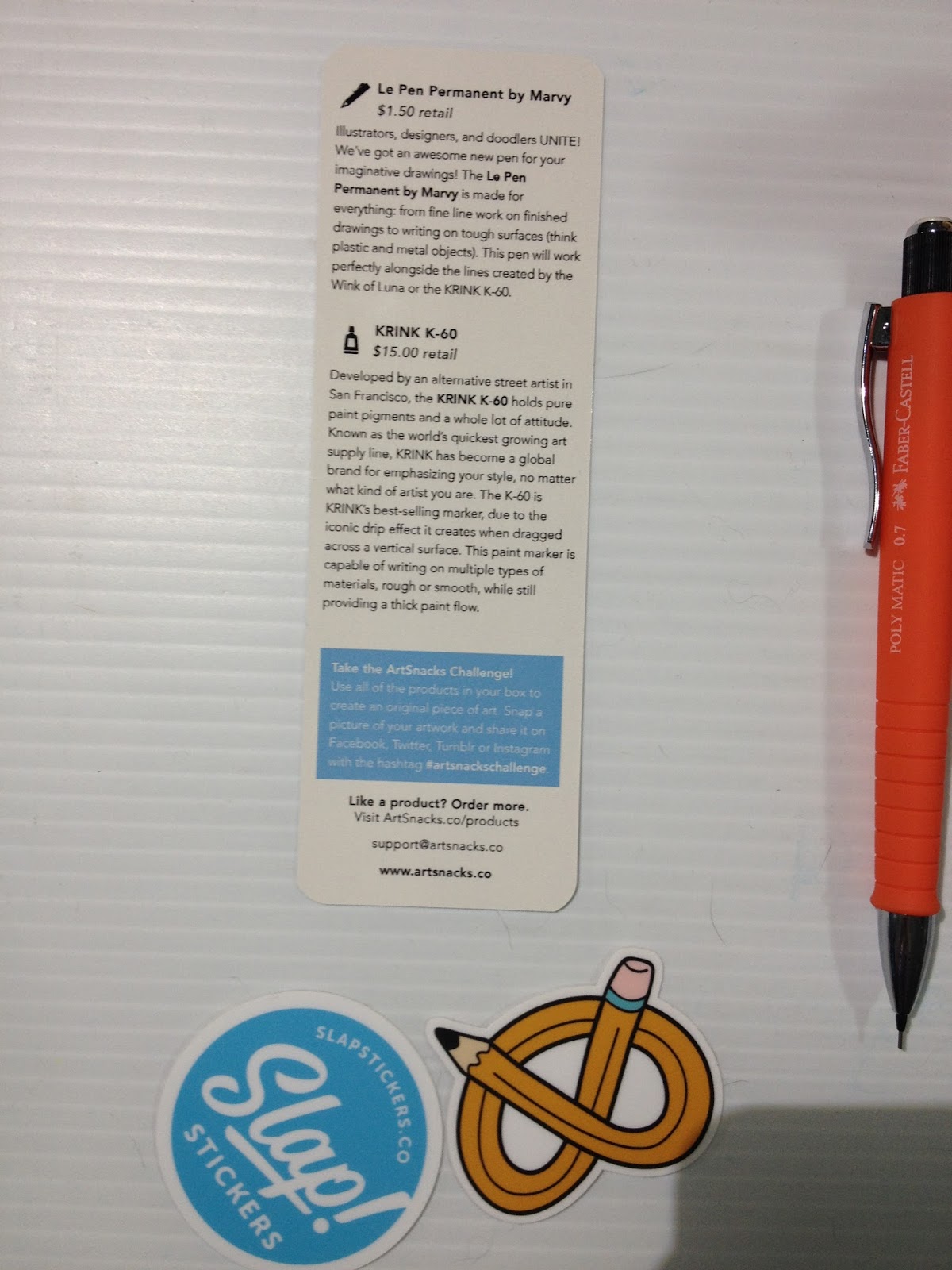
Le Pen Permanent by Marvy (Uchida)
$1.50 retail
Illustrators, designers, and doodlers UNITE! We've got an awesome new pen for your imaginative drawings! The Le Pen Permanent by Marvy is made for everything: fine line work on finished drawings to writing on tough surfaces (think plastic and metal objects). This pen will work perfectly alongside the lines created by the Wink of Luna or the KRINK K-60.
Becca's Note: This is an alcohol based permanent pen, and will not properly work with alcohol based markers.
KRINK K-60
$15.00 retail
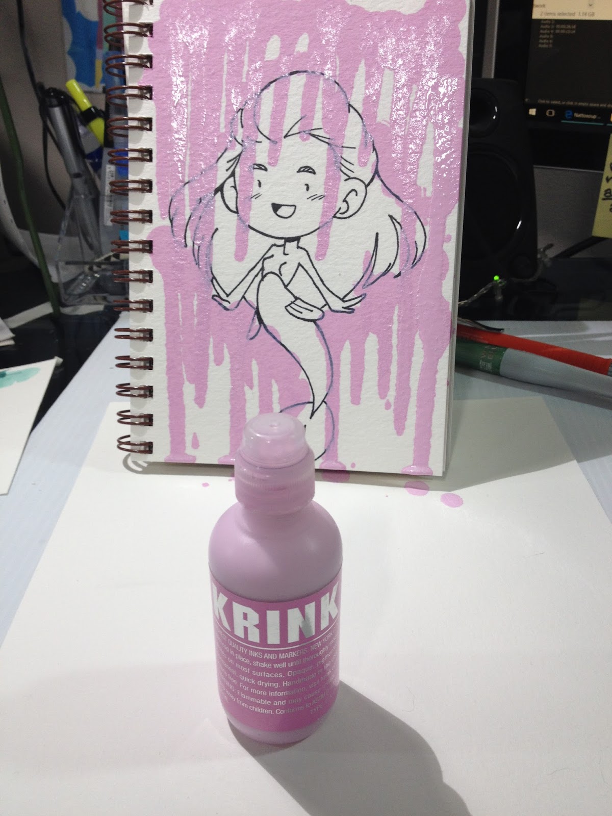
Developed by an alternative street artist in San Francisco, the KRINK K-60 holds pure paint pigments and a whole lot of attitude. Known as the world's quickest growing art supply line, KRINK has become a global brand for emphasizing your style, no matter what kind of artist you are. The K-60 is KRINK's best-selling marker, due to the iconic drip effect it creates when dragged across a vertical surface. This paint marker is capable of writing on multiple types of materials, rough or smooth, while still providing a thick paint flow.
Take the ArtSnacks Challenge!
Use all of the products in your box to create an original piece of art. Snap a picture of your artwork and share it on Facebook, Twitter, Tumblr, or Instagram with the hashtag #artsnackschallenge
Insert unboxing video
The Field Test
Insert field test video
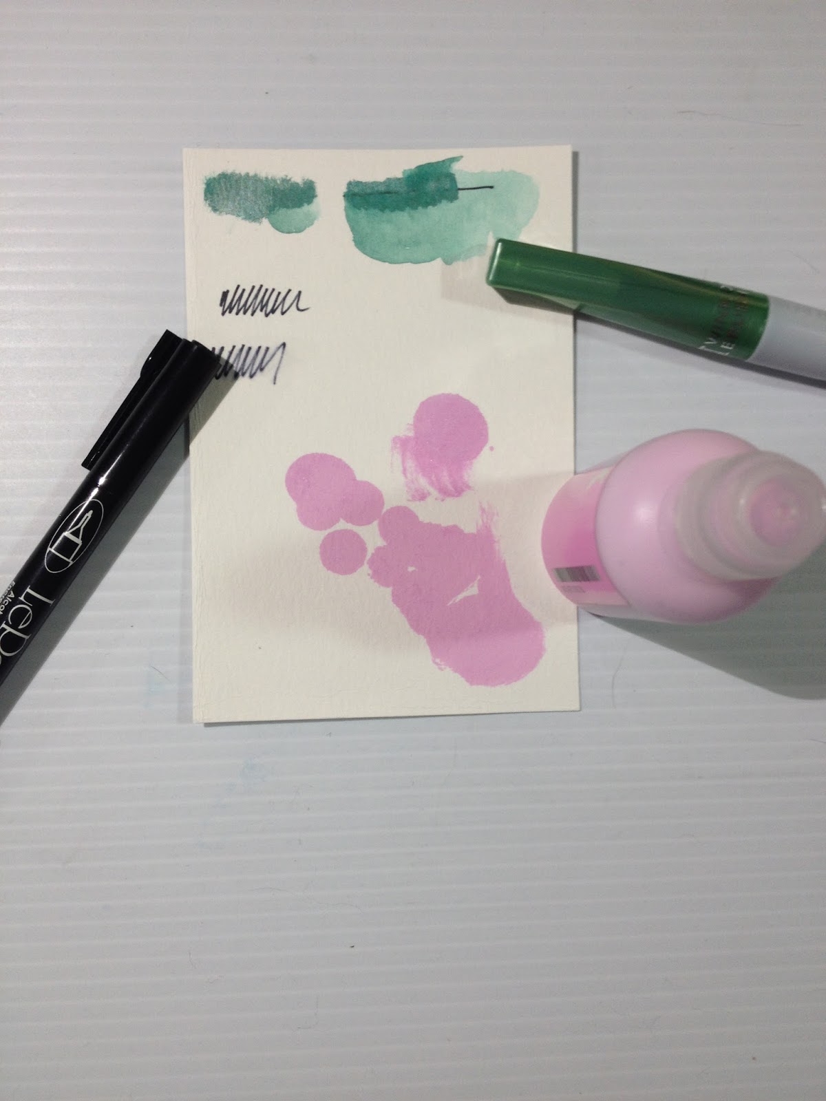
A little playing around shows that the Marvy Le Pen Permanent is not alcohol-marker safe (not surprising, given this permanent marker is alcohol based). The Wink of Luna is opaque but somewhat water soluble, and if you add water fast enough, you can even use it for a neat ink wash effect, which I'll demonstrate in the field test
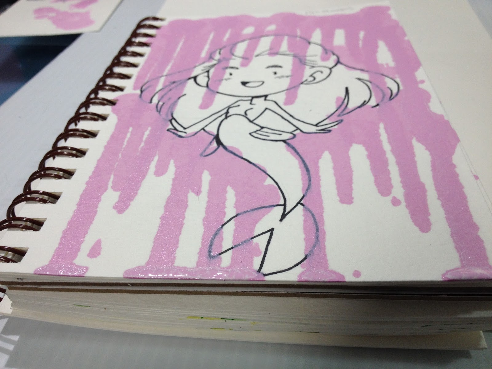
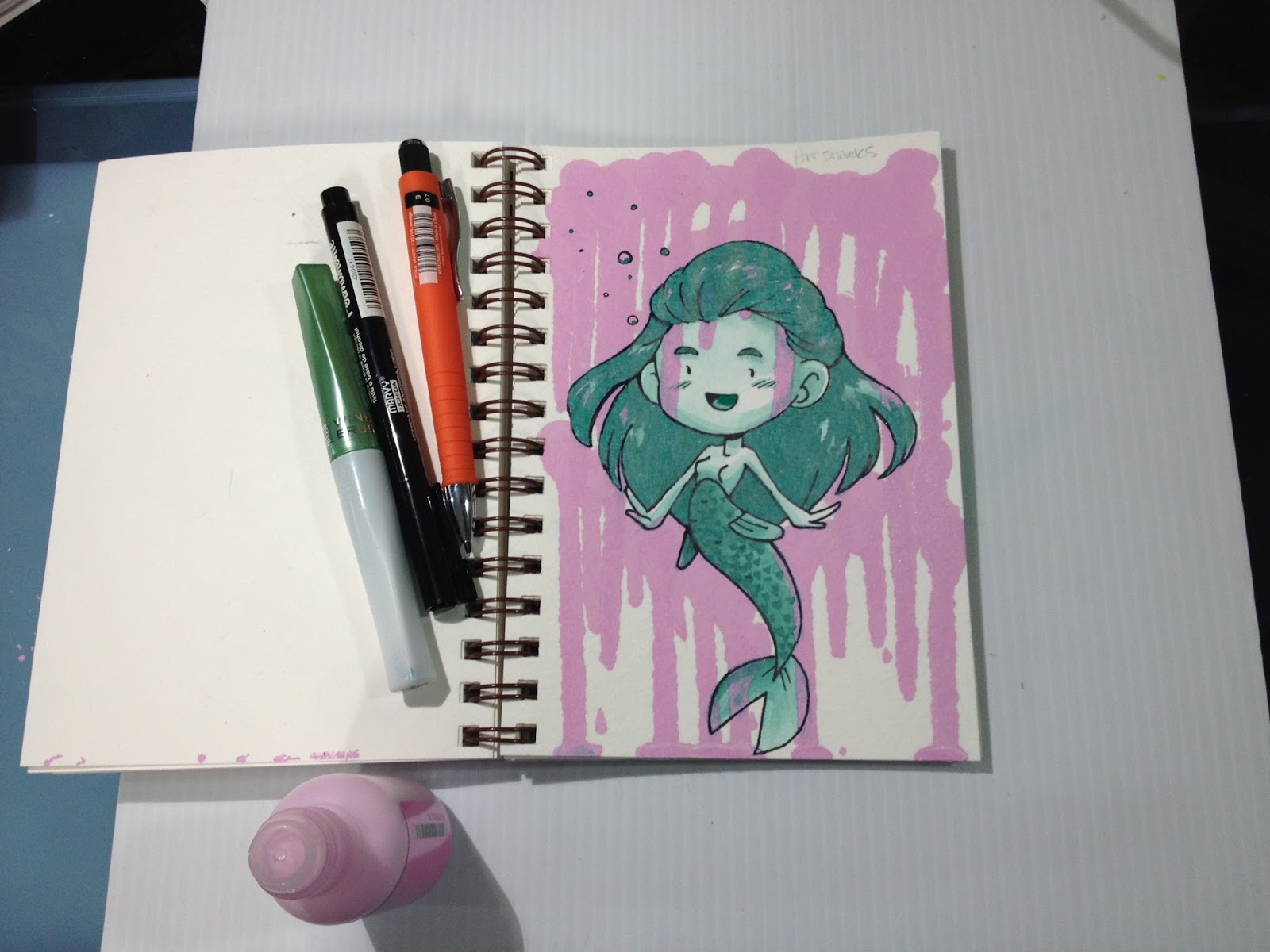
While transcribing the included card, I discovered that artists like the K-60 for it's drip effect, and I knew I had to play around with that. This caused me to rethink my color scheme entirely (originally I was going to use spot pink details, and use the green Wink of Luna as inkwash all over). Getting drips is very easy, but the acrylic will take awhile to dry. I'd set my Strathmore Visual Journal watercolor sketchbook in front of a fan for about an hour, and the paint still hadn't dried entirely. The K-60 also has a very strong smell, stronger than any of the alcohol based markers I've reviewed, so if you have a sensitive nose, please be careful and work in a ventilated area.


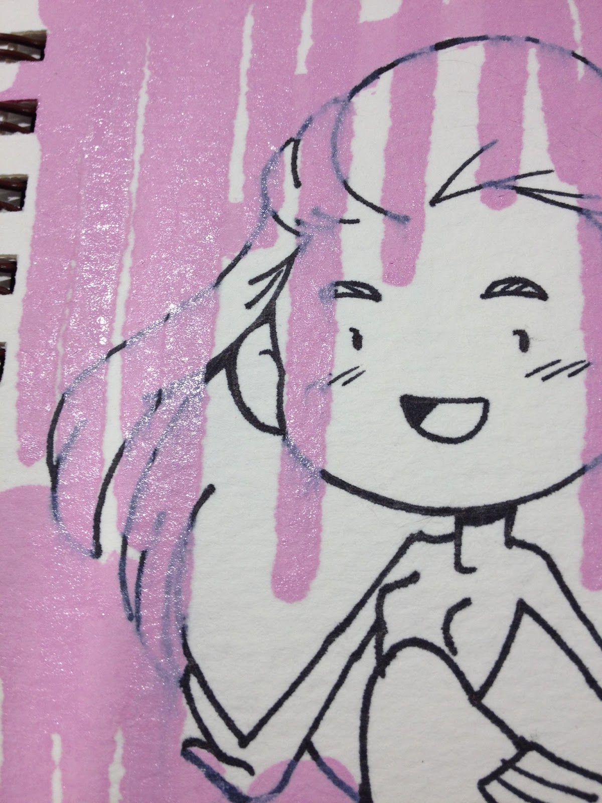
I believe the KRINK K-60 has alcohol as a drying aid, as it reactivates the Marvy LePen Permanent. This isn't a huge deal, I can tighten up the lines after the piece is entirely done.
NOTE: Due to the fast turnaround on this post, I'm still waiting for the ArtSnacks Challenge process video to be edited and uploaded. My apologies.
The Finished Piece

The Breakdown
Wink of Luna- $9.00 on Jetpens
Marvy LePen Permanent (alcohol based)-$1.20 on Jetpens
Krink Acrylic Dauber (K-60)- $15.00 on the Krink site
Faber Castell Poly Matic- $9.95 on Amazon
Total Value: $35.65
Note: ArtSnacks has started including a retail value for items on their included information card. All of these items were either spot on, or within 30 cents of the value on the card. Much appreciated move, ArtSnacks!
SKETCHBOXThis month's brands are Art Alternatives, Derwent, and Sakura.
You can learn more about Art Alternatives here
You can learn more about Derwent here
You can learn more about Sakura, and Sakura Koi here
The Unboxing
Sketchbox January 2016 Unboxing- Nattosoup
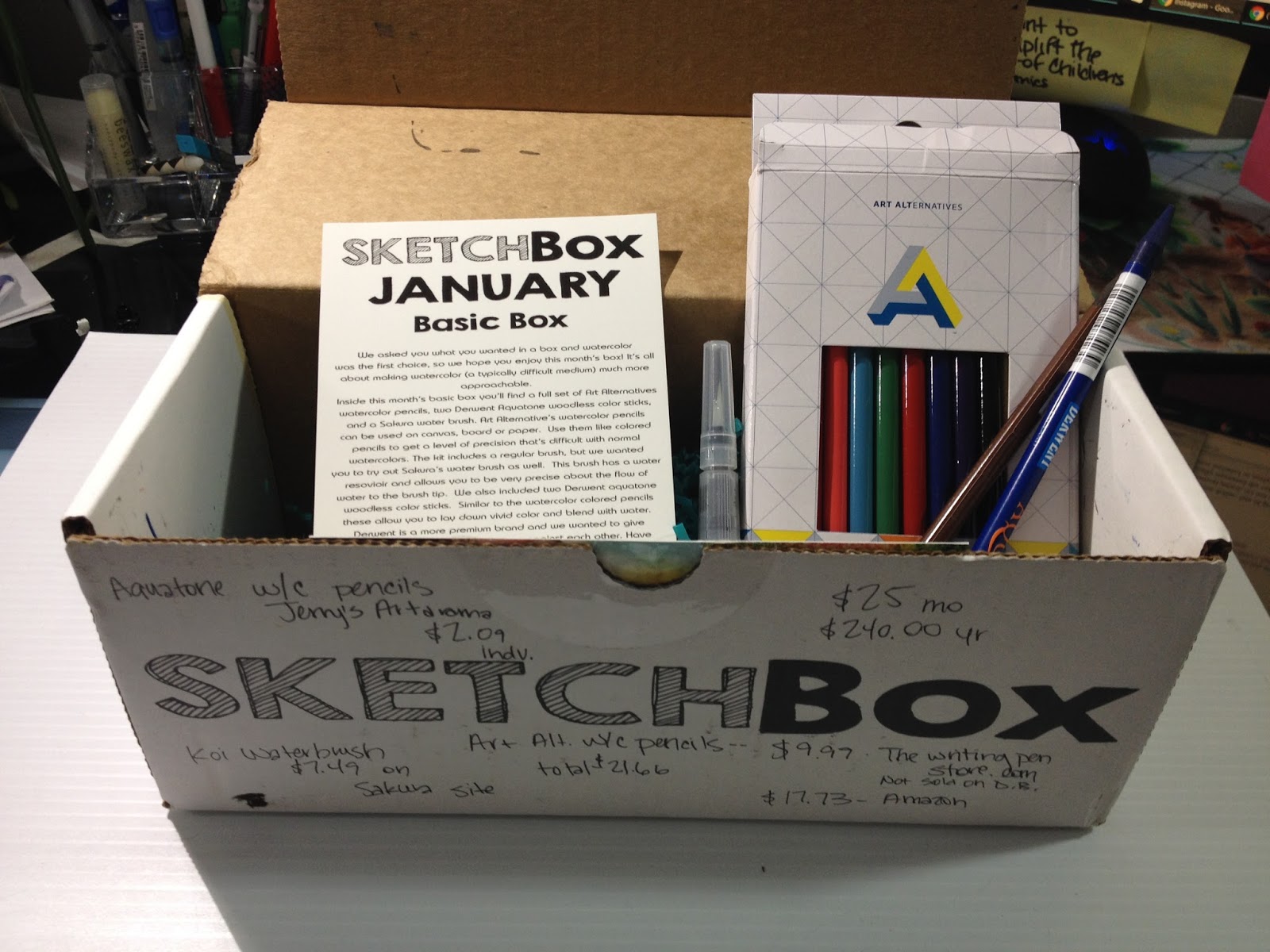
 My January 2016 SketchBox Basic subscription box
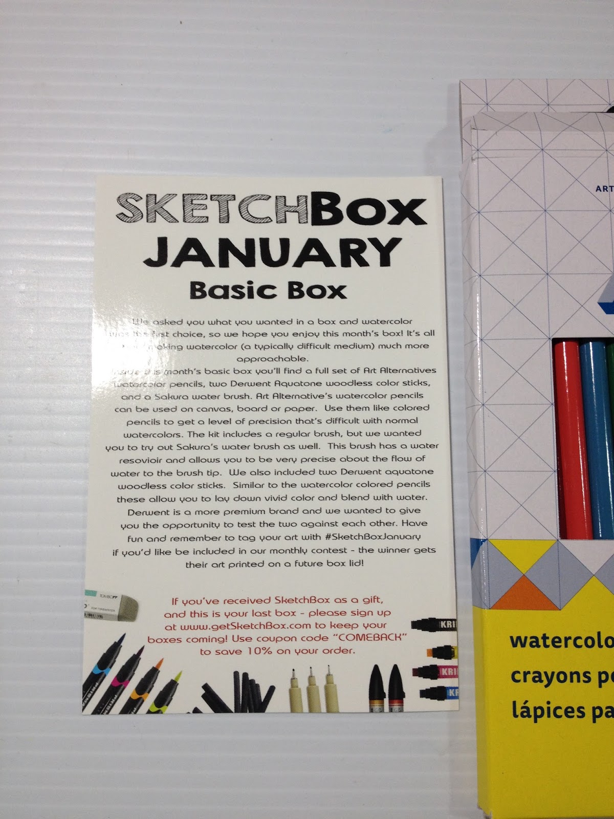
 The card reads:
SketchBox January Basic Box
We asked you what you wanted in a box and watercolor was the first choice, so we hope you enjoy this month's box! It's all about making watercolor (a typically difficult medium) much more approachable.
Inside this month's basic box you'll find a full set of Art Alternatives watercolor pencils, two Derwent Aquatone woodless color sticks, and a Sakura water brush. Art Alternative's watercolor pencils can be used on canvas, board or paper. Use them like colored pencils to get a level of precision that's difficult with normal watercolors. The kit includes a regular brush, but we wanted you to try out Sakura's water brush as well. This brush has a water resovoir (sic) and allows you to be very precise about the flow of water to the brush tip. We also included two Derwent aquatone woodless color sticks. Similar to the watercolor colored pencils these allow you to lay down vivid color and blend with water. Derwent is a more premium brand and we wanted to give you the opportunity to test the two against each other. Have fun and remember to tag your art with #SketchBoxJanuary if you'd like to be included in our monthly contest- the winner gets their art printed on a future box lid!
If you received SketchBox as a gift, and this is your last box- please sign up at www.getSketchBox.com to keep your boxes coming! Use coupon code 'COMEBACK" to save 10% on your order.
Becca's Note: SketchBox needs to hire someone to proofread their information cards before sending them out. Spelling errors, repetition, and grammatical issues are left as is.
 This month's card art is by Julie Edwards

The card reads:
SketchBox
Featured Artist
Julie Edwards
My work is nothing short of a journey into the otherworldly, where even reason and common sense do not have to apply. Fairy Tales are a huge inspiration for me in their relentless wonder and inviting nature. I think it's important to not take structure too seriously. Nothing can be more dynamic and flourishing than art that holds the very pinnacle of what may be, not just what already is. Experiencing something with as much free reigh as art is like a loophole in life, it should be enjoyed. I always do custom illustrations! Visit my pages to learn more:
www.facebook.com/JulieEdwardsArtistry
Instagram.com/myfriendsoftheforest
and www.etsy.com/shop/myfriendsoftheforest
We're thankful for the talent that Julie shared with us, if you'd like to get your art featured, email an example of your work to us at info@getsketchbox.com
Becca's Note: Spelling and grammatical errors were left intact.
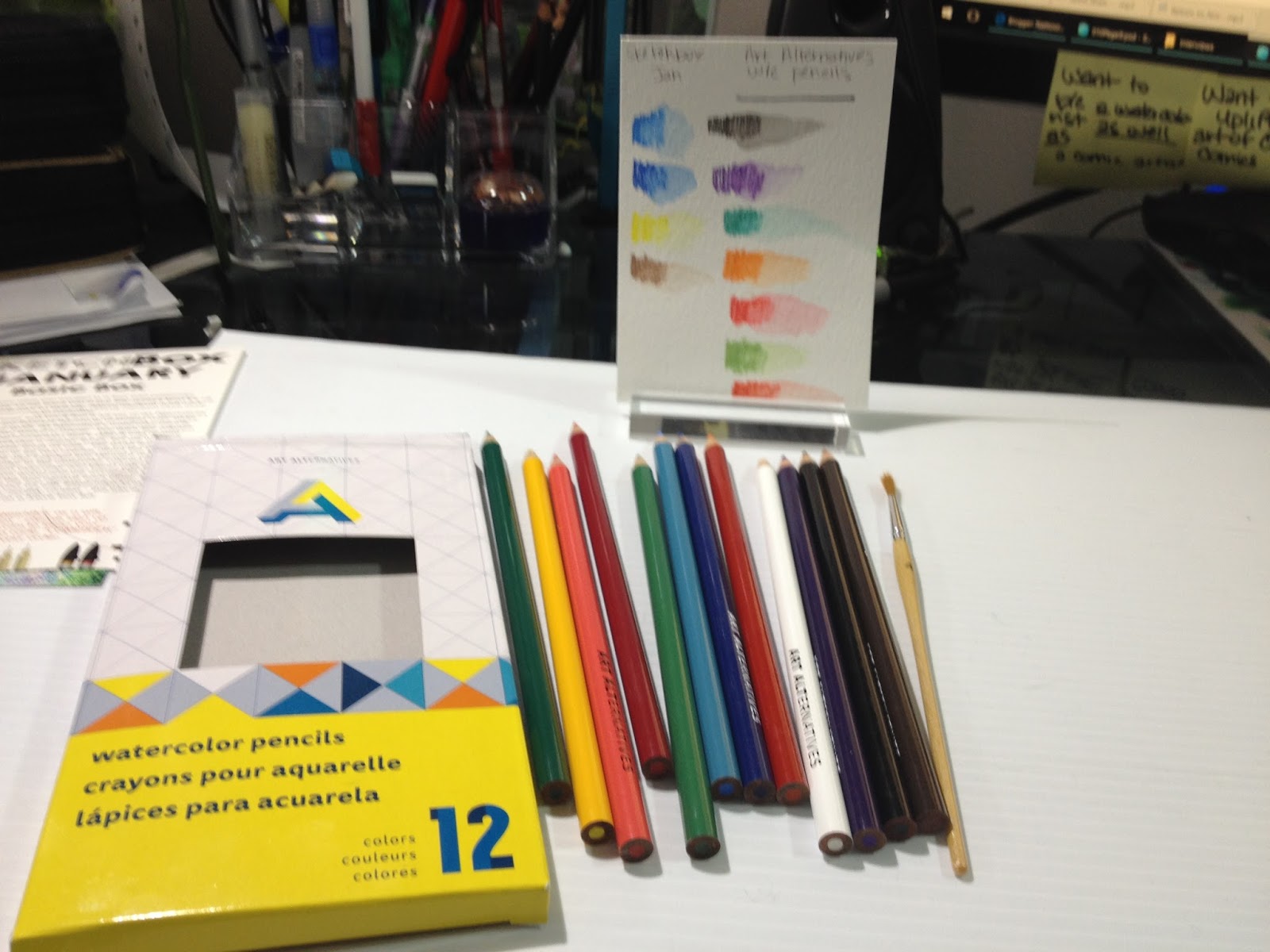
 Art Alternatives watercolor pencils, and their included brush. At top- my swatches

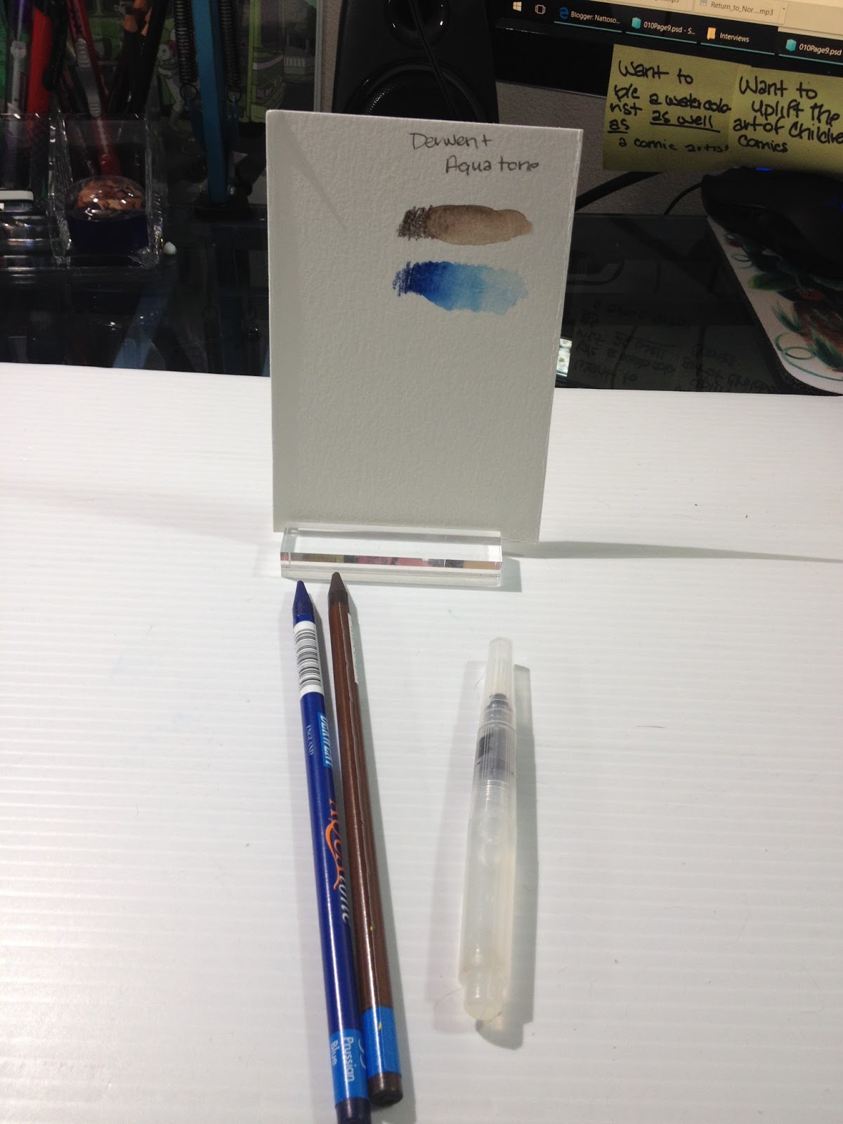
 Derwent Aquatone woodless watercolor pencils and Sakura Koi waterbrush. At top- my swatches
As a watercolor artist and watercolor comic artist, I have used watercolors, and watercolor pencils for years. Although I haven't shared any watercolor pencil reviews on here (yet), I have tested several brands, and the only brand I've ever liked is Derwent's Inktense pencils, which are fantastic but permanent after water has been applied. This Basic Box isn't the best introduction SketchBox could make, and the inclusion of Art Alternatives watercolor pencils is an invitation for harsh criticism. I'm very curious as to what the additional $10 for the Premium box buys those subscribers.
The Field Test
NOTE: Due to the fast turnaround on this post, I'm still waiting for the SketchBox Challenge process video to be edited and uploaded. My apologies.


Illustration before water was added.

Illustration after several layers of pencil color and water have been applied and allowed to dry. Attempts to build up depth and saturation of color were disappointing, as these pencils are hard, and lack sufficient pigment. The Derwent Aquatone pencils (used in the shadows beneath the flowers) perform much better.
The Finished Piece

The Art Alternatives watercolor pencils perform poorly- low pigmentation, inability to blend even with water, difficult to layer for deeper saturation. If this were a normal review, I would say to skip these and save your money, as these are difficult for even an experienced watercolor artist to use, let alone a beginning artist.
The Aquatone woodless watercolor pencils handled much better, and I'm eager to continue researching them.
The Breakdown
Art Alternatives watercolor pencils- $9.99 on site and at The Writing Pen Store
Aquatone Watercolor pencils (x2) $2.09-Jerry's Artarama
Sakura Koi Waterbrush- $5.39 on Amazon
Total Value: $19.56
Note: The SketchBox Past Boxes section only shows what comes in the Premium box, not what comes in the Basic box, so please manage your expectations. I allowed myself to get suckered in by this in November, but make sure you read the fine print and reviews from people who have the Basic box, in addition to those with the Premium box. The Premium box is $10 per month than the Basic Box. It seems like most of the YouTube artists gifted with SketchBox subscriptions were gifted with the Premium sub, so please keep this in mind when viewing videos.
SketchBox Premium Unboxing Video (for comparison) (will be updated when one is uploaded)
January 2016 Winner: ArtSnacks
Why: In January, ArtSnacks was the better value for your dollar- lots of great, stand alone full size supplies. Really enjoying the new Poly Matic mechanical pencil, it's not something I commonly see in stores around here. ArtSnacks has drastically increased the value of the included products over the past couple years, and there are more stand alone products included in ArtSnacks than in this month's SketchBox, and ArtSnacks is $5 less than the Basic SketchBox. Also, ArtSnacks includes a snack in every box, and boy, you don't realize how much you enjoy that snack until you get a subscription box that doesn't have one.
Honestly, I was a bit insulted by the inclusion of Art Alternatives watercolor in the Basic SketchBox, as Art Alternatives is not a brand known for its quality art supplies. It's a fine brand for things like palettes, portfolios, and supply cases, and decent enough for small canvases, but I found their watercolor pencils severely lacking, especially compared to the Derwent Inktense watercolor pencils I've used for years. I did like the Aquatone pencils included, I would have preferred no Art Alternatives watercolor pencils and more Aquatone pencils. Although the card included in my January box talks about wanting to make watercolor approachable, poor quality watercolor pencils aren't a great start. In general, watercolor pencils are considered to be difficult to master even by watercolorists, and poor performers may turn the unknowing further away from watercolor.
If you are interested in studying the basics of watercolors, I highly recommend you skip the watercolor pencils (especially the cheap ones) and focus on getting a good basic set. There are many available on the market, including Winsor and Newton's field sketch sets, or you can assemble your own Altoids watercolor sketchbox. If you have a friend who paints, they may be more than happy to share a spot of their favorite basics, so you won't even have to invest much until you know you enjoy watercolor painting. And, as always, if you are interested in watercolor tutorials, why not fill out my tutorial form in the sidebar with a request? I'd love to help you!
Please consider donating to this blog or purchasing from Natto-shop (http://nattosoup.com/shop) if you want me to continue publishing quality content. All materials tested were purchased from my own pocket. Keep on Truckin' Nattosoup is not under any sponsorship.
A couple years ago, I purchased an ArtSnacks subscription to review here for you guys. I am a sucker for blind boxes, and an even bigger sucker for art supplies, so I couldn't resist checking back in with ArtSnacks to see if they've changed over the years. Of course, I had to up the ante, so I added SketchBox to the roster as well.
As a Christmas present, my mom kindly bought me a year's worth of ArtSnacks (thanks Mom!), and I purchased a year's worth of SketchBox Basic for myself. This first comparison review is free, but subsequent reviews will be unlocked only after my Patreon has hit the very modest goal of $15 a month, so if you enjoy this kind of content, please become a subscriber. By subscribing to my Patreon, you not only unlock content for other readers, but you'll receive backer only reviews, tutorials, Livestreams, and more. Your subscription helps me purchase additional supplies for review, funds tutorials, and goes towards helping me earn a living wage for my efforts. If we can't hit $15 in a month, then subscribers will have exclusive access to that month's blog post and video reviews.
At the time of posting, this post is still missing the videos of both field tests. The videos have been recorded- just waiting on editing and uploading. While you wait, why not check my Reviews tag for the other ArtSnacks unboxings?
SketchBox: $25mo/$240 yr
ArtSnacks: $20mo/$200 yr
January SketchBox Basic includes:
12 piece Art Alternatives watercolor pencils and brush
2 Derwent Aquatone woodless watercolor pencils
1 Sakura Koi field sketch watercolor Brushpen
January ArtSnacks includes:
Wink of Luna
Marvy LePen Permanent (alcohol based)
Krink Acrylic Dauber
Faber Castell Poly Matic
SketchBox Vs. ArtSnacks January 2016 Comparison-Nattosoup
ARTSNACKSThis month's brands are KRINK, Marvy Uchida, Kuretake (Zig) and Faber-Castell.
You can learn more about Krink
You can learn more about Marvy Uchida
You can learn more about Kuretake, and Wink of Luna here
You can learn more about Faber-Castell here
The Unboxing
ArtSnacks Unboxing January 2016- Nattosoup
 My January 2016 ArtSnacks subscription box My box is a bit marked up, as I'd written down product prices and websites for easy reference.
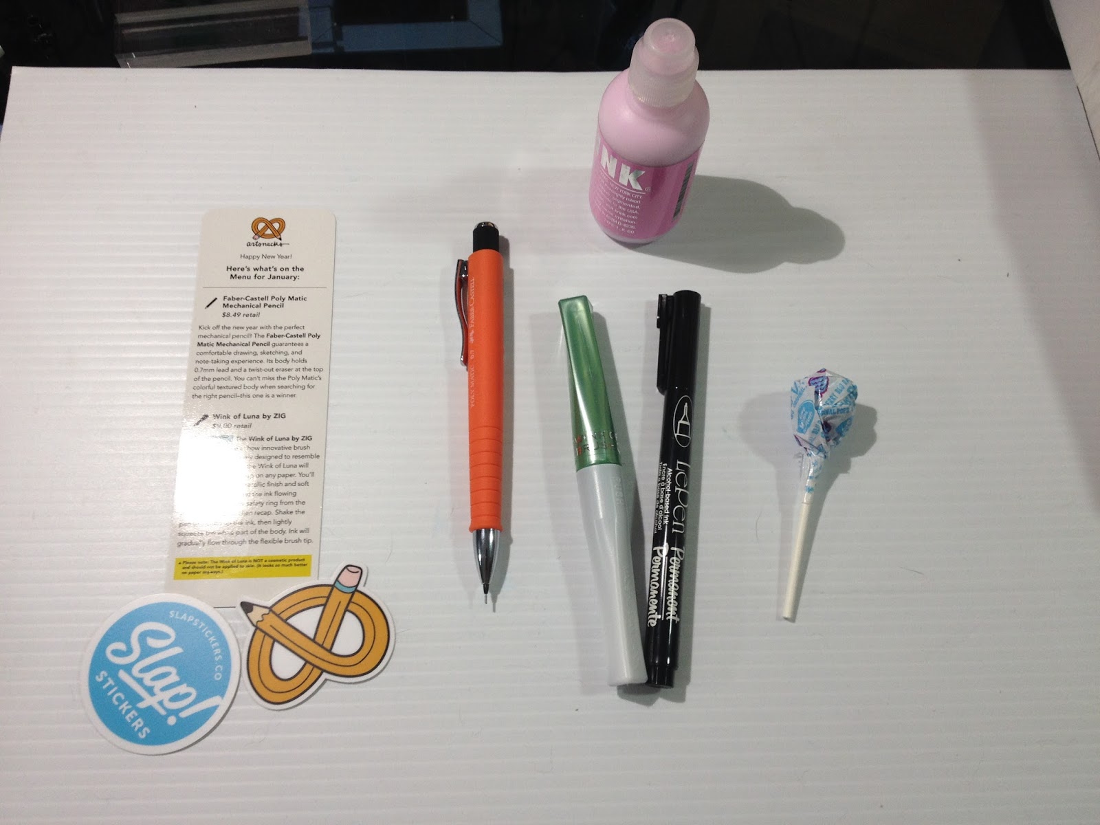 From left to right: Informational card, promotional vinyl stickers. Faber-Castell Poly Matic Mechanical Pencil, Zig Wink of Luna, Marvy LePen Permanent, KRINK K-60, DumDum (snack)
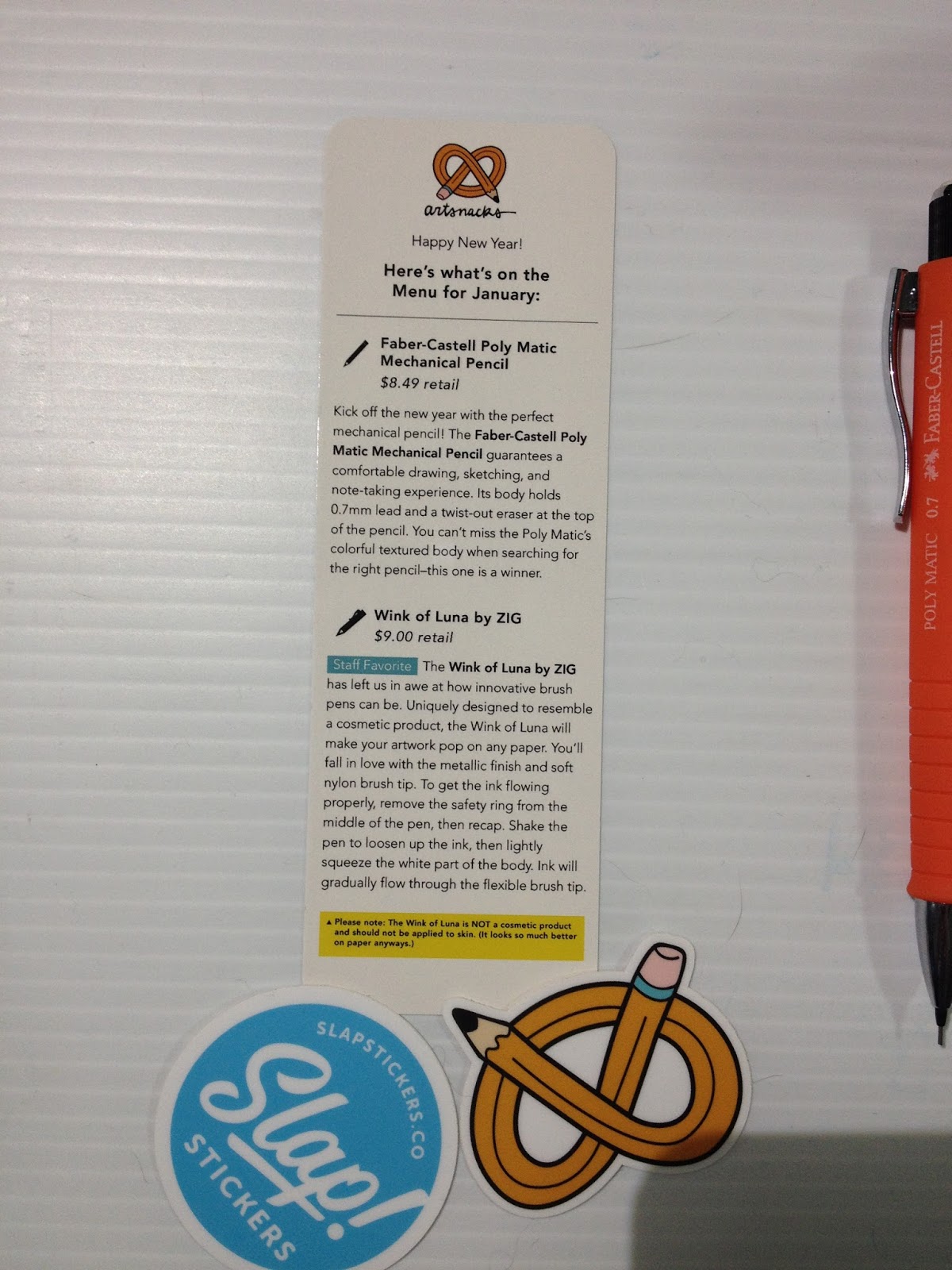
On the card:
Here's what's on the menu for January:Faber-Castell Poly Matic Mechanical Pencil
$8.49 retail
Kick off the new year with the perfect mechanical pencil! The Faber-Castell Poly Matic Mechanical Pencil guarantees a comfortable drawing, sketching, and note-taking experience. Its body holds 0.7mm lead and a twist-out eraser at the top of the pencil. You can't miss the Poly Matic's colorful textured body when searching for the right pencil- this one is a winner.
Wink of Luna by ZIG
$9.00 retail
Staff Favorite The Wink of Luna by ZIG has left us in awe at how innovative brush pens can be. Uniquely designed to resemble a cosmetic product, the Wink of Luna will make your artwork pop on any paper. You'll fall in love with the metallic finish and soft nylon brush tip. To get the ink flowing properly, remove the safety ring from the middle of the pen, then recap. Shake the pen to loosen up the ink, then lightly squeeze the white part of the body. Ink will gradually flow through the flexible brush tip.
*Please note: The Wink of Luna is NOT a cosmetic product and should not be applied to the skin. (It looks so much better on paper anyways.)
Le Pen Permanent by Marvy (Uchida)
$1.50 retail
Illustrators, designers, and doodlers UNITE! We've got an awesome new pen for your imaginative drawings! The Le Pen Permanent by Marvy is made for everything: fine line work on finished drawings to writing on tough surfaces (think plastic and metal objects). This pen will work perfectly alongside the lines created by the Wink of Luna or the KRINK K-60.
Becca's Note: This is an alcohol based permanent pen, and will not properly work with alcohol based markers.
KRINK K-60
$15.00 retail
Developed by an alternative street artist in San Francisco, the KRINK K-60 holds pure paint pigments and a whole lot of attitude. Known as the world's quickest growing art supply line, KRINK has become a global brand for emphasizing your style, no matter what kind of artist you are. The K-60 is KRINK's best-selling marker, due to the iconic drip effect it creates when dragged across a vertical surface. This paint marker is capable of writing on multiple types of materials, rough or smooth, while still providing a thick paint flow.
Take the ArtSnacks Challenge!
Use all of the products in your box to create an original piece of art. Snap a picture of your artwork and share it on Facebook, Twitter, Tumblr, or Instagram with the hashtag #artsnackschallenge
Insert unboxing video
The Field Test
Insert field test video
A little playing around shows that the Marvy Le Pen Permanent is not alcohol-marker safe (not surprising, given this permanent marker is alcohol based). The Wink of Luna is opaque but somewhat water soluble, and if you add water fast enough, you can even use it for a neat ink wash effect, which I'll demonstrate in the field test
While transcribing the included card, I discovered that artists like the K-60 for it's drip effect, and I knew I had to play around with that. This caused me to rethink my color scheme entirely (originally I was going to use spot pink details, and use the green Wink of Luna as inkwash all over). Getting drips is very easy, but the acrylic will take awhile to dry. I'd set my Strathmore Visual Journal watercolor sketchbook in front of a fan for about an hour, and the paint still hadn't dried entirely. The K-60 also has a very strong smell, stronger than any of the alcohol based markers I've reviewed, so if you have a sensitive nose, please be careful and work in a ventilated area.

I believe the KRINK K-60 has alcohol as a drying aid, as it reactivates the Marvy LePen Permanent. This isn't a huge deal, I can tighten up the lines after the piece is entirely done.
NOTE: Due to the fast turnaround on this post, I'm still waiting for the ArtSnacks Challenge process video to be edited and uploaded. My apologies.
The Finished Piece
The Breakdown
Wink of Luna- $9.00 on Jetpens
Marvy LePen Permanent (alcohol based)-$1.20 on Jetpens
Krink Acrylic Dauber (K-60)- $15.00 on the Krink site
Faber Castell Poly Matic- $9.95 on Amazon
Total Value: $35.65
Note: ArtSnacks has started including a retail value for items on their included information card. All of these items were either spot on, or within 30 cents of the value on the card. Much appreciated move, ArtSnacks!
SKETCHBOXThis month's brands are Art Alternatives, Derwent, and Sakura.
You can learn more about Art Alternatives here
You can learn more about Derwent here
You can learn more about Sakura, and Sakura Koi here
The Unboxing
Sketchbox January 2016 Unboxing- Nattosoup
 My January 2016 SketchBox Basic subscription box
 The card reads:
 SketchBox January Basic Box
We asked you what you wanted in a box and watercolor was the first choice, so we hope you enjoy this month's box! It's all about making watercolor (a typically difficult medium) much more approachable.
Inside this month's basic box you'll find a full set of Art Alternatives watercolor pencils, two Derwent Aquatone woodless color sticks, and a Sakura water brush. Art Alternative's watercolor pencils can be used on canvas, board or paper. Use them like colored pencils to get a level of precision that's difficult with normal watercolors. The kit includes a regular brush, but we wanted you to try out Sakura's water brush as well. This brush has a water resovoir (sic) and allows you to be very precise about the flow of water to the brush tip. We also included two Derwent aquatone woodless color sticks. Similar to the watercolor colored pencils these allow you to lay down vivid color and blend with water. Derwent is a more premium brand and we wanted to give you the opportunity to test the two against each other. Have fun and remember to tag your art with #SketchBoxJanuary if you'd like to be included in our monthly contest- the winner gets their art printed on a future box lid!
If you received SketchBox as a gift, and this is your last box- please sign up at www.getSketchBox.com to keep your boxes coming! Use coupon code 'COMEBACK" to save 10% on your order.
Becca's Note: SketchBox needs to hire someone to proofread their information cards before sending them out. Spelling errors, repetition, and grammatical issues are left as is.
 This month's card art is by Julie Edwards
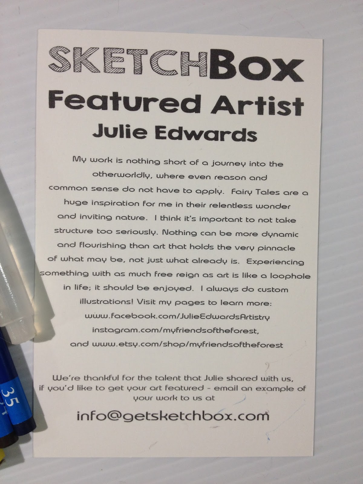
The card reads:
SketchBox
Featured Artist
Julie Edwards
My work is nothing short of a journey into the otherworldly, where even reason and common sense do not have to apply. Fairy Tales are a huge inspiration for me in their relentless wonder and inviting nature. I think it's important to not take structure too seriously. Nothing can be more dynamic and flourishing than art that holds the very pinnacle of what may be, not just what already is. Experiencing something with as much free reigh as art is like a loophole in life, it should be enjoyed. I always do custom illustrations! Visit my pages to learn more:
www.facebook.com/JulieEdwardsArtistry
Instagram.com/myfriendsoftheforest
and www.etsy.com/shop/myfriendsoftheforest
We're thankful for the talent that Julie shared with us, if you'd like to get your art featured, email an example of your work to us at info@getsketchbox.com
Becca's Note: Spelling and grammatical errors were left intact.
 Art Alternatives watercolor pencils, and their included brush. At top- my swatches
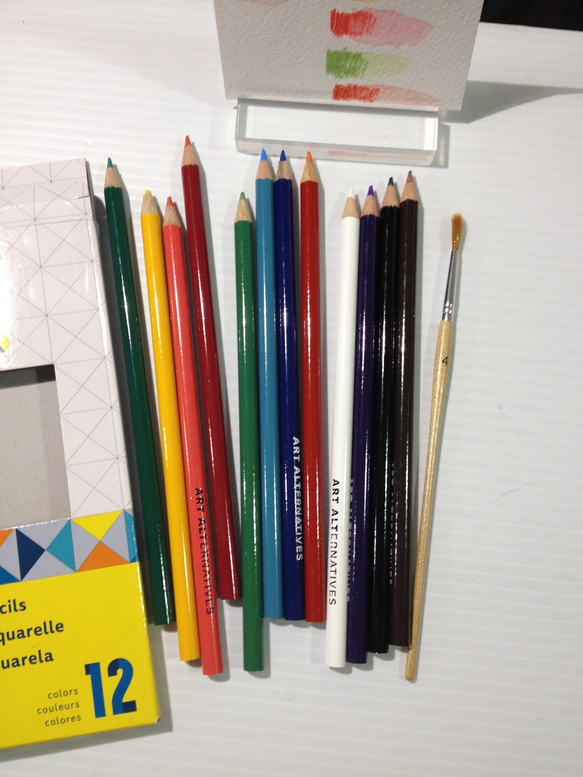
 Derwent Aquatone woodless watercolor pencils and Sakura Koi waterbrush. At top- my swatches
As a watercolor artist and watercolor comic artist, I have used watercolors, and watercolor pencils for years. Although I haven't shared any watercolor pencil reviews on here (yet), I have tested several brands, and the only brand I've ever liked is Derwent's Inktense pencils, which are fantastic but permanent after water has been applied. This Basic Box isn't the best introduction SketchBox could make, and the inclusion of Art Alternatives watercolor pencils is an invitation for harsh criticism. I'm very curious as to what the additional $10 for the Premium box buys those subscribers.
The Field Test
NOTE: Due to the fast turnaround on this post, I'm still waiting for the SketchBox Challenge process video to be edited and uploaded. My apologies.

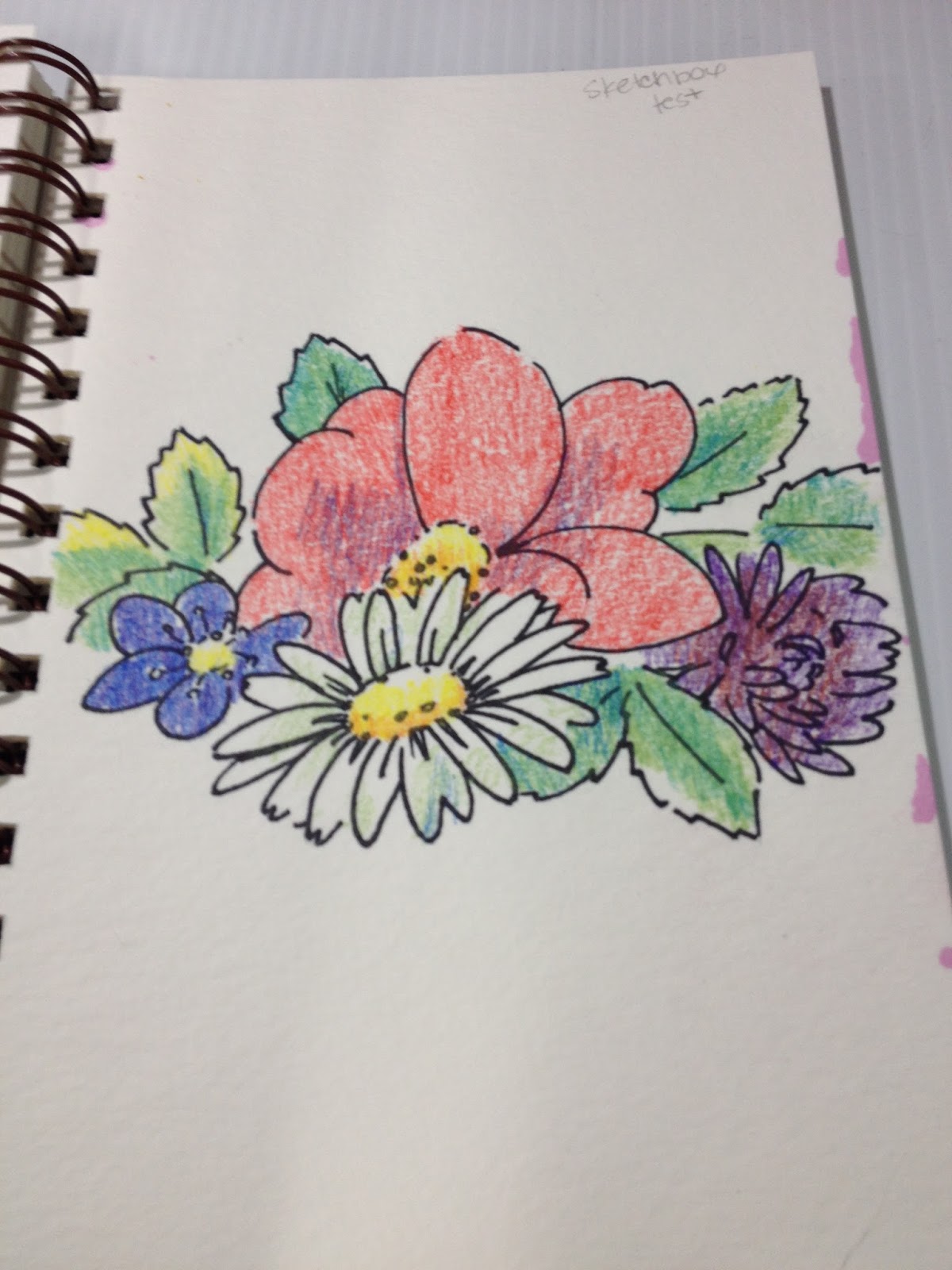
Illustration before water was added.
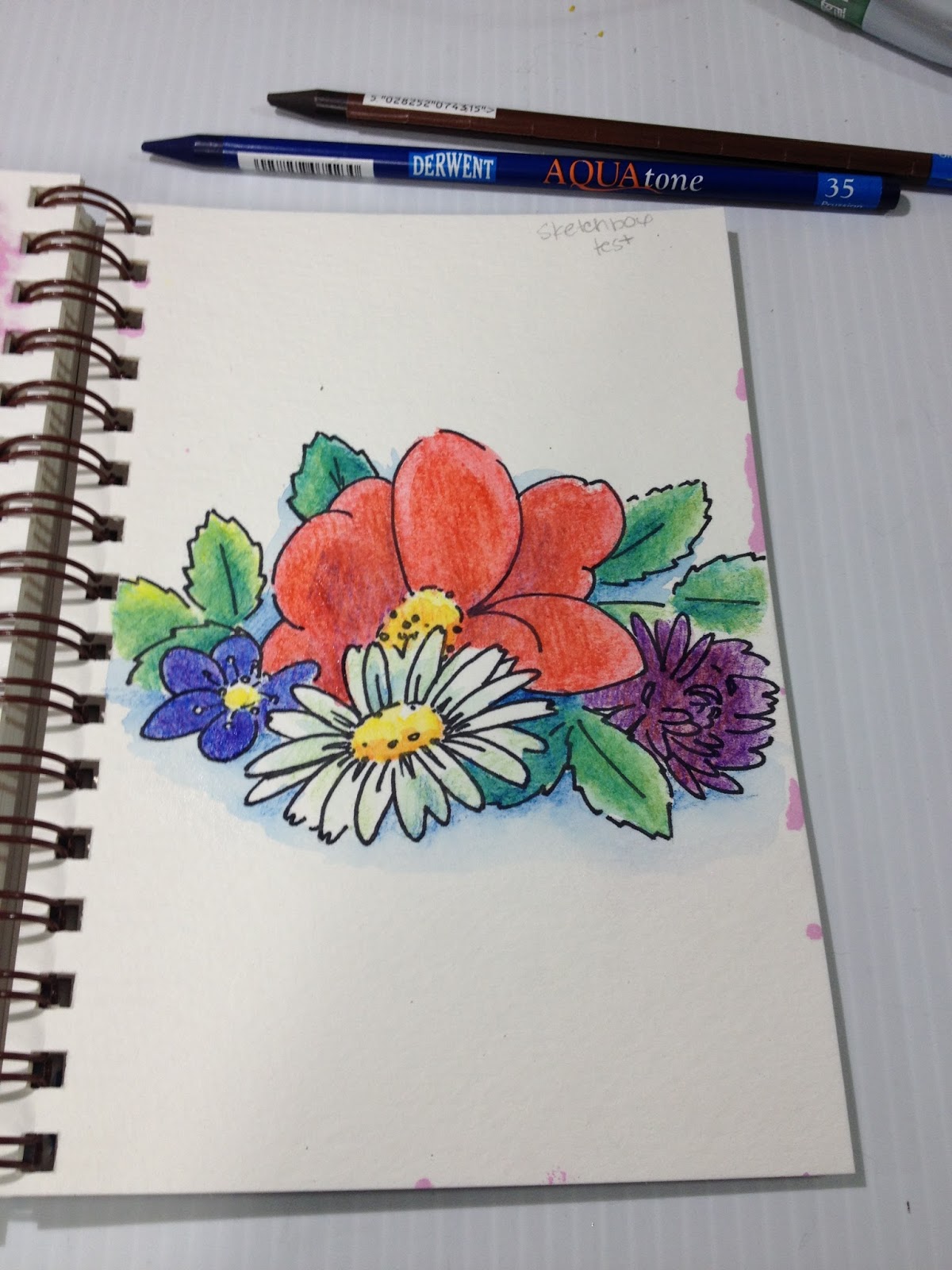
Illustration after several layers of pencil color and water have been applied and allowed to dry. Attempts to build up depth and saturation of color were disappointing, as these pencils are hard, and lack sufficient pigment. The Derwent Aquatone pencils (used in the shadows beneath the flowers) perform much better.
The Finished Piece
The Art Alternatives watercolor pencils perform poorly- low pigmentation, inability to blend even with water, difficult to layer for deeper saturation. If this were a normal review, I would say to skip these and save your money, as these are difficult for even an experienced watercolor artist to use, let alone a beginning artist.
The Aquatone woodless watercolor pencils handled much better, and I'm eager to continue researching them.
The Breakdown
Art Alternatives watercolor pencils- $9.99 on site and at The Writing Pen Store
Aquatone Watercolor pencils (x2) $2.09-Jerry's Artarama
Sakura Koi Waterbrush- $5.39 on Amazon
Total Value: $19.56
Note: The SketchBox Past Boxes section only shows what comes in the Premium box, not what comes in the Basic box, so please manage your expectations. I allowed myself to get suckered in by this in November, but make sure you read the fine print and reviews from people who have the Basic box, in addition to those with the Premium box. The Premium box is $10 per month than the Basic Box. It seems like most of the YouTube artists gifted with SketchBox subscriptions were gifted with the Premium sub, so please keep this in mind when viewing videos.
SketchBox Premium Unboxing Video (for comparison) (will be updated when one is uploaded)
January 2016 Winner: ArtSnacks
Why: In January, ArtSnacks was the better value for your dollar- lots of great, stand alone full size supplies. Really enjoying the new Poly Matic mechanical pencil, it's not something I commonly see in stores around here. ArtSnacks has drastically increased the value of the included products over the past couple years, and there are more stand alone products included in ArtSnacks than in this month's SketchBox, and ArtSnacks is $5 less than the Basic SketchBox. Also, ArtSnacks includes a snack in every box, and boy, you don't realize how much you enjoy that snack until you get a subscription box that doesn't have one.
Honestly, I was a bit insulted by the inclusion of Art Alternatives watercolor in the Basic SketchBox, as Art Alternatives is not a brand known for its quality art supplies. It's a fine brand for things like palettes, portfolios, and supply cases, and decent enough for small canvases, but I found their watercolor pencils severely lacking, especially compared to the Derwent Inktense watercolor pencils I've used for years. I did like the Aquatone pencils included, I would have preferred no Art Alternatives watercolor pencils and more Aquatone pencils. Although the card included in my January box talks about wanting to make watercolor approachable, poor quality watercolor pencils aren't a great start. In general, watercolor pencils are considered to be difficult to master even by watercolorists, and poor performers may turn the unknowing further away from watercolor.
If you are interested in studying the basics of watercolors, I highly recommend you skip the watercolor pencils (especially the cheap ones) and focus on getting a good basic set. There are many available on the market, including Winsor and Newton's field sketch sets, or you can assemble your own Altoids watercolor sketchbox. If you have a friend who paints, they may be more than happy to share a spot of their favorite basics, so you won't even have to invest much until you know you enjoy watercolor painting. And, as always, if you are interested in watercolor tutorials, why not fill out my tutorial form in the sidebar with a request? I'd love to help you!
Please consider donating to this blog or purchasing from Natto-shop (http://nattosoup.com/shop) if you want me to continue publishing quality content. All materials tested were purchased from my own pocket. Keep on Truckin' Nattosoup is not under any sponsorship.
January 3, 2016
2015 In Review
It's become a bit of a tradition here to look back on last year's resolutions, accomplishments, and disappointments, and see how far I've come in one year. Here's my list of resolutions from last January. As a recap, I'll repost them here, with an X indicating resolutions I've kept.
Try to keep a daily journal(X) Participate in more anthologies, especially those organized by artists you don't yet knowDo things with/ for the shoujo artist group(X) Go to TCAFArrange a shoujo artist meet up (request members bring ashcans to share w/ the group)(X) Make a 2015 Ashcan for TCAF(X) Wooden charmsFinish 3 more chapters of 7" Kara before the year endsFinish Gizmo GrannySubmit portfolio to more opportunities(X) Table at fewer cons (X) Sell more than $1k at a conHave a better attitude online and in personUpdate this blog more often with process postsPitch to Sparkler with the Real Life Tales of Comic Craft Teach comic classes at local library Contact teachers about talking to their classesSketch more from life (X) Travel for pleasure moreSpend $ more wisely(X) Do more art videos for YouTube Go thru clothes, donate what doesn't fitDo something to help the comic community in NO(X) Renew old friendshipsLearn to stand on my own two feet
I had some pretty high production goals this year in terms of 7" Kara and Gizmo Grandma. Of course, like any set of goals, reality is often very different from what you imagine, and despite putting Kara on haitus to finish Gizmo Grandma, additional images and last minute corrections doubled my G.G. workload, and I was not able to achieve either goal this year.
I did cut back on conventions this year, but I also cut back on my convention reviews, opting NOT to write about ALA, Mechacon, or Handmade and Bound due to issues stemming from depression and a lack of reader engagement. If readers are interested in these shows, you can contact me directly. Other than TCAF and ALA, conventions seemed to go more smoothly this year, and I did well at two of my favorite conventions, MTAC and Mechacon.
While at ALA, I DID talk to many librarians and teachers, but none followed up (and unfortunately, my depression got the best of me for the back half of the year, so I did not pursue them), so while I did somewhat pursue that avenue, it did not result in anything. Emails to the Nashville public library system regarding free comic classes for teens went unanswered. If that's something you'd be interested in attending, or know someone who would enjoy that, I would appreciate you asking on my behalf. Perhaps Nashville's library system may reconsider if some local interest were shown.
It felt like a lean year this year, and while the blog more than doubled its daily pageviews (from 600 to 1200), reader interaction seemed to decrease greatly. While struggling with depression, I tried to increase opportunities for engagement by introducing bi-weekly sidebar polls, discussing the blog on my Twitter more often, cross posting relevant posts to Tumblr, and increasing my engagment on Instagram. Unfortunately, these things have had little result on real engagement.
Things Accomplished
6 page inkwash comic, Pretty Paladin Critical Missy, completed and published in the gaming anthology about female experiences, Chainmail Bikini4 page watercolor comic, Knight School, completed for the as of yet un-Kickstarted anthology 1001 Knights30 approximate watercolor illustrations painted for the children's book, Gizmo Grandma, plus scanning, digital color corrections, and revisionsRevamped the Nattosoup Youtube channel in earnest with reviews and tutorialsReestablished a solid update scheduleProduced a 2015 AshcanProduced Favorite Fictional Femmes Inktober minicomicProduced Magical Girl March minicomicBroke 1k at MTACBroke 1.5k at MechaconMet Studio KaiXju at TCAFNew charmset of 13 wooden charmsTested out Artscow products at my convention tableIntroduced my Kara portfolio on my convention table, increased book salesContributed to Art for Hope: NepalIntroduced ready made watercolor originals to the shop
Disappointments
I had been told that ALA was THE show to sell children's books, but it seems that recent changes across the board make that much more difficult if you're an unknown without a publisher's backing. While there seemed to be a lot of interest, there were very few sales. I was really hoping that meeting librarians, particularly children's librarians, would help me place Kara and possibly arrange workshops, but unfortunately I'll have to find another venue for that.
The 'children's sauna' at TCAF made me so heatsick that it was difficult to get up and meet people, and the children's section had severely reduced foot traffic due to table layout blocking the entrance and the oppressive heat. TCAF wasn't what I had hoped it would be.
Massive burnout set in right after TCAF, triggering depression from August until November. This depression made it difficult to interact properly on social media, respond to correspondence in a timely manner, and killed a lot of my creativity. Although I'm still struggling with this depression, it's lessened enough in intensity that I can interact and work again.
Most disappointing of all, my life has changed very little in the past two years in any measurable way, despite multiple efforts on several fronts. Perhaps my efforts are not enough, and I need to increase my output, but I have no idea where to focus for best results. I feel as though I throw myself at everything until I'm worn out and frustrated, with little to show for the effort. I could really use some help, and some emotional support from my fellow artists, but I feel like I've exhausted most avenues, and don't know where to turn anymore.
Please consider donating to this blog or purchasing from Natto-shop (http://nattosoup.com/shop) if you want me to continue publishing quality content. All materials tested were purchased from my own pocket. Keep on Truckin' Nattosoup is not under any sponsorship.
January 2, 2016
Sad News
My Surface Pro 3 died today, and while I'm trying to contact Microsoft about replacing it, I'm out of a computer for the time being. My Pro 3 was a work and blogging computer, and while MOST of my files are safe, all of my blog notes (but not photos) are going to be lost, as there's no way to recover files from the computer. Replacing the Surface Pro, even with Microsoft's replacement plan, is an unexpected cost of $350 and a lot of my time, so if you enjoy this blog or my YouTube, now would be a great time to show your appreciation by donating. I don't intend for this loss to disrupt my posting schedule for either service, but I will lose a lot of time rewriting over a dozen reviews. If you'd like to help, but don't want to donate, now would also be a great time to check out my shop (listed above) and purchase a mini comic, copy of Volume 1, or a commission.
Please consider donating to this blog or purchasing from Natto-shop (http://nattosoup.com/shop) if you want me to continue publishing quality content. All materials tested were purchased from my own pocket. Keep on Truckin' Nattosoup is not under any sponsorship.
Please consider donating to this blog or purchasing from Natto-shop (http://nattosoup.com/shop) if you want me to continue publishing quality content. All materials tested were purchased from my own pocket. Keep on Truckin' Nattosoup is not under any sponsorship.
January 1, 2016
2016 New Year's Resolutions
It's become a yearly tradition for me to share my New Year's resolutions, and reflect upon the past year. This reflection is intended to help me grow as a person and an artist, and to help me keep track of these goals in a public place (accountability). For the most part, I try to only list things I know I can accomplish through my own pursuit, so rather than listing "be published in five anthologies", I might say "apply to five anthologies".
My theme this year is financial stability and growing my career as an illustrator and comic artist. My 20's are quickly coming to an end, and I've spent the last year incredibly frustrated about how little has changed in the past three years. I want to continue to turn my focus away from anime conventions as a major source of income, focusing on just a handful of shows that are rewarding emotionally and financially. Anime conventions aren't really a sustainable income for me, and attending so many hasn't really built the audience I'd hope to have at this time. I could make a lot more money at anime conventions if I devoted more attention to high profit margin items like fanart prints, but that's not the path I want to take as an arist. Instead, I'd like to focus on completing Gizmo Grandma and Book 2 of 7" Kara this year, and promote my comic as my main focus. Ideally I'll launch a Kickstarter campaign for Book 2 at the end of this year, but more realistically, it will be at the beginning of 2017. I want to start making a living off the work I've put into this blog and into my Youtube Channel, so this year I'm going to focus on monetizing both of those in a variety of ways.
If you'd like to help me achieve that goal, the easy way to do that is to use my affiliate links when you're interested in purchasing a product, clicking on my ads from time to time, and sitting through 30 seconds of ad on my Youtube videos. You can also keep an eye out for my upcoming Patreon launch, which will give backers the opportunity to decide which tutorials and reviews the blog and Youtube will focus on, as well as exclusive giveaways, and original illustrations.
Continue to produce more Youtube content aimed at helping others, ideally on underserved topicsCollaborate with other artists and YoutubersFinish Volume 2 this yearEngage blog readers more, build a better communityInspire and encourage other comic artistsDo fewer, but better conventionsWork towards monetizing my content so I may make a living wageWrite more about 7" Kara progress on here and other platformsLaunch the blog and Youtube channel's PatreonFinally finish Gizmo GrandmaPurchase and utilize a laser cutterStreamline convention production to increase marginsComplete a wider variety of monthly challengesComplete more non-comic watercolor studiesProduce more tutorialsContinue to fight anxiety and depressionSpend less personal money on items for review(X) Blog redesign (Completed in Dec 2015 as a present to self)Connect and build relationships with other artistsSeek out more OFFLINE job and display opportunitiesStop judging your own worth by how much other people do or do not care about what you produceTry to have a more positive attitudeQuantify your improvement this year, and set specific improvement goalsDecrease reliance on social media for support and companionship, focus more on reaching out to friends when help is neededFind and do things that are rewarding to youFinish Louisiana Travel Book projectDraw a wider variety of thingsWrite and publish the reviews for all the products you reviewed but didn't post in 2015. Clear out that backlog.Cut back on reliance on social networks like Twitter for support or encouragement.Find an illustration agency to represent my workContact companies whose products I review often for free samples of new productsTry to participate in online large scale comic discussions more oftenTry to increase the variety of your work to appeal to a larger audience
Please consider donating to this blog or purchasing from Natto-shop (http://nattosoup.com/shop) if you want me to continue publishing quality content. All materials tested were purchased from my own pocket. Keep on Truckin' Nattosoup is not under any sponsorship.
December 31, 2015
November Watercolors
For a long time, I was so busy working on Gizmo Grandma, blog stuff, and convention prep that I found it difficult to find time to work on larger personal pieces. Of course, it's important to MAKE time, lest you start forgetting your reasons for making art in the first place, as it certainly started to feel for me.
These two pieces are buffer art for Volume 2- pieces that help accommodate double page spreads, help with chapter spacing, or could be used as section title pages. When assembling Volume 1, I ended up creating a lot of assets like these last minute, so while working on the chapters that will be published in Volume 2, I've tried to also create additional art. While I know some comic readers don't care for the inclusion of additional art (it's been referred to as padding), some really appreciate the inclusion, and I tend to fall into the latter camp. So many self published comics feel a bit anemic compared to the price (due to the high costs of self publishing), I'm happy for any additional comic-related content the creator throws in.
These were painted on Arches Cold Press watercolor paper with Winsor and Newton, Holbien, and Daniel Smith watercolors, using natural hair watercolor brushes.


Below is the design for this year's Christmas Card. If you'd still like to receive one, albeit post Christmas, please fill out this handy Google form!

Below the cut is a mish mash of painting process!

For the illustration of Kara in the grass, I played around with keeping things as loose as possible. Cold press Arches watercolor paper is fantastic for this, as the cotton paper holds moisture, and colors mix freely without becoming muddy. Pigments also stay very vibrant, unlike on many of the woodpulp papers I've tested over the years.


For my Christmas card, I wanted to play around with looser spray bottle techniques. The method is incredibly simple- you fill a spray bottle with water and a bit of the tube watercolor (or premixed pan/cake) of your choice. I like using Holbien's watercolor spray bottles, as they're designed FOR watercolors and the pigment particles wont clog up the nozzle, but if you'd prefer to buy in bulk, these spray bottles should work as well.
NOTE: I've found that iridescent, pearlescent, and metallic paints/mediums with large flakes will clog up even bottles designed for watercolor, and are best flicked on with a toothbrush!


Gold ink was flicked on using Liquitex Freestyle's Splatter brush.

The last illustration is pretty straightforward, although I did knock in basic shadows first.


Please consider donating to this blog or purchasing from Natto-shop (http://nattosoup.com/shop) if you want me to continue publishing quality content. All materials tested were purchased from my own pocket. Keep on Truckin' Nattosoup is not under any sponsorship.
These two pieces are buffer art for Volume 2- pieces that help accommodate double page spreads, help with chapter spacing, or could be used as section title pages. When assembling Volume 1, I ended up creating a lot of assets like these last minute, so while working on the chapters that will be published in Volume 2, I've tried to also create additional art. While I know some comic readers don't care for the inclusion of additional art (it's been referred to as padding), some really appreciate the inclusion, and I tend to fall into the latter camp. So many self published comics feel a bit anemic compared to the price (due to the high costs of self publishing), I'm happy for any additional comic-related content the creator throws in.
These were painted on Arches Cold Press watercolor paper with Winsor and Newton, Holbien, and Daniel Smith watercolors, using natural hair watercolor brushes.


Below is the design for this year's Christmas Card. If you'd still like to receive one, albeit post Christmas, please fill out this handy Google form!

Below the cut is a mish mash of painting process!
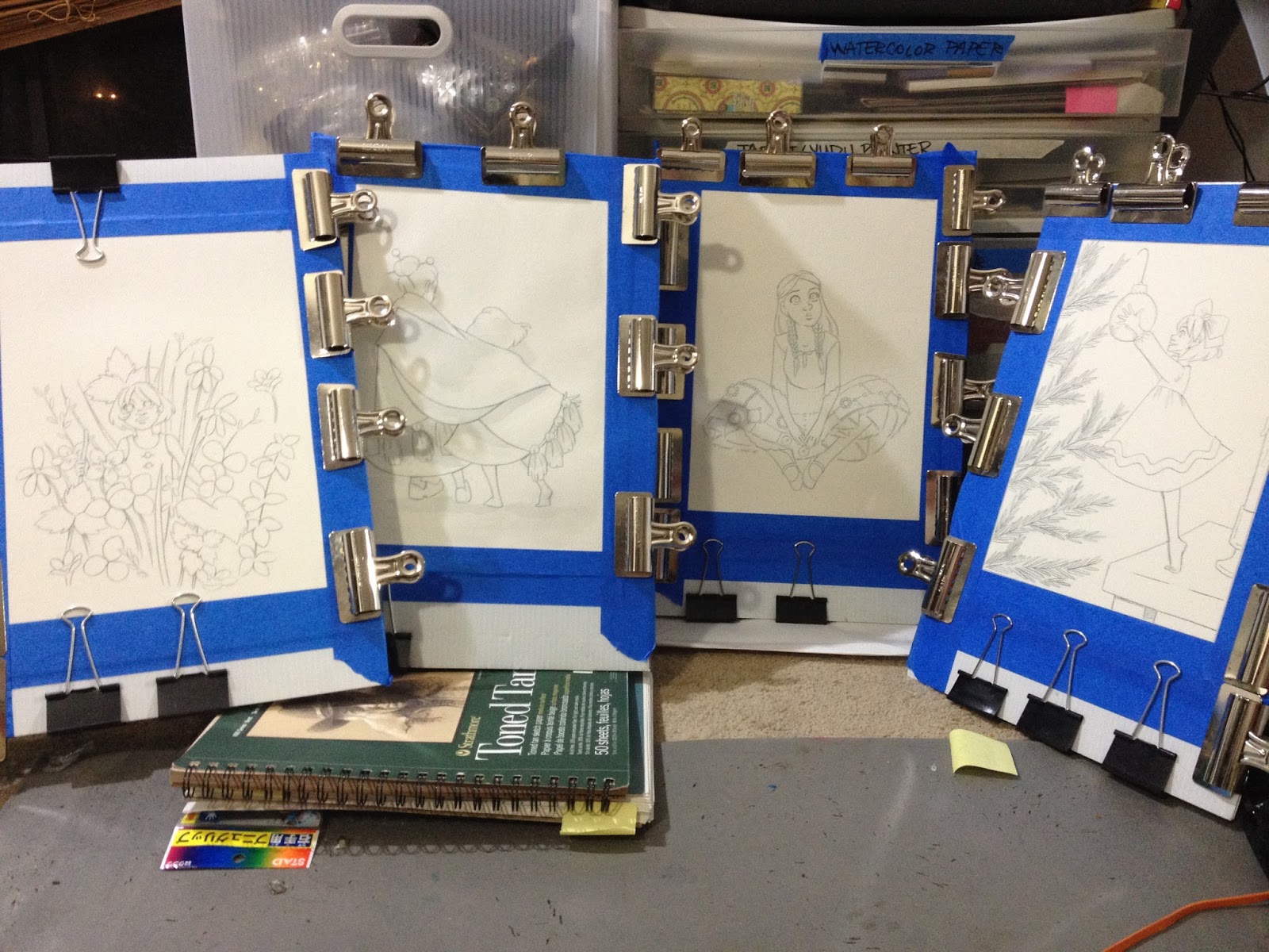
For the illustration of Kara in the grass, I played around with keeping things as loose as possible. Cold press Arches watercolor paper is fantastic for this, as the cotton paper holds moisture, and colors mix freely without becoming muddy. Pigments also stay very vibrant, unlike on many of the woodpulp papers I've tested over the years.

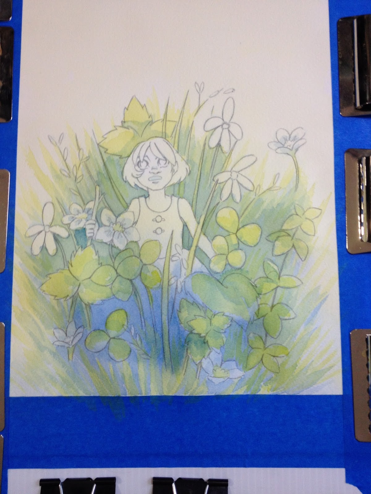
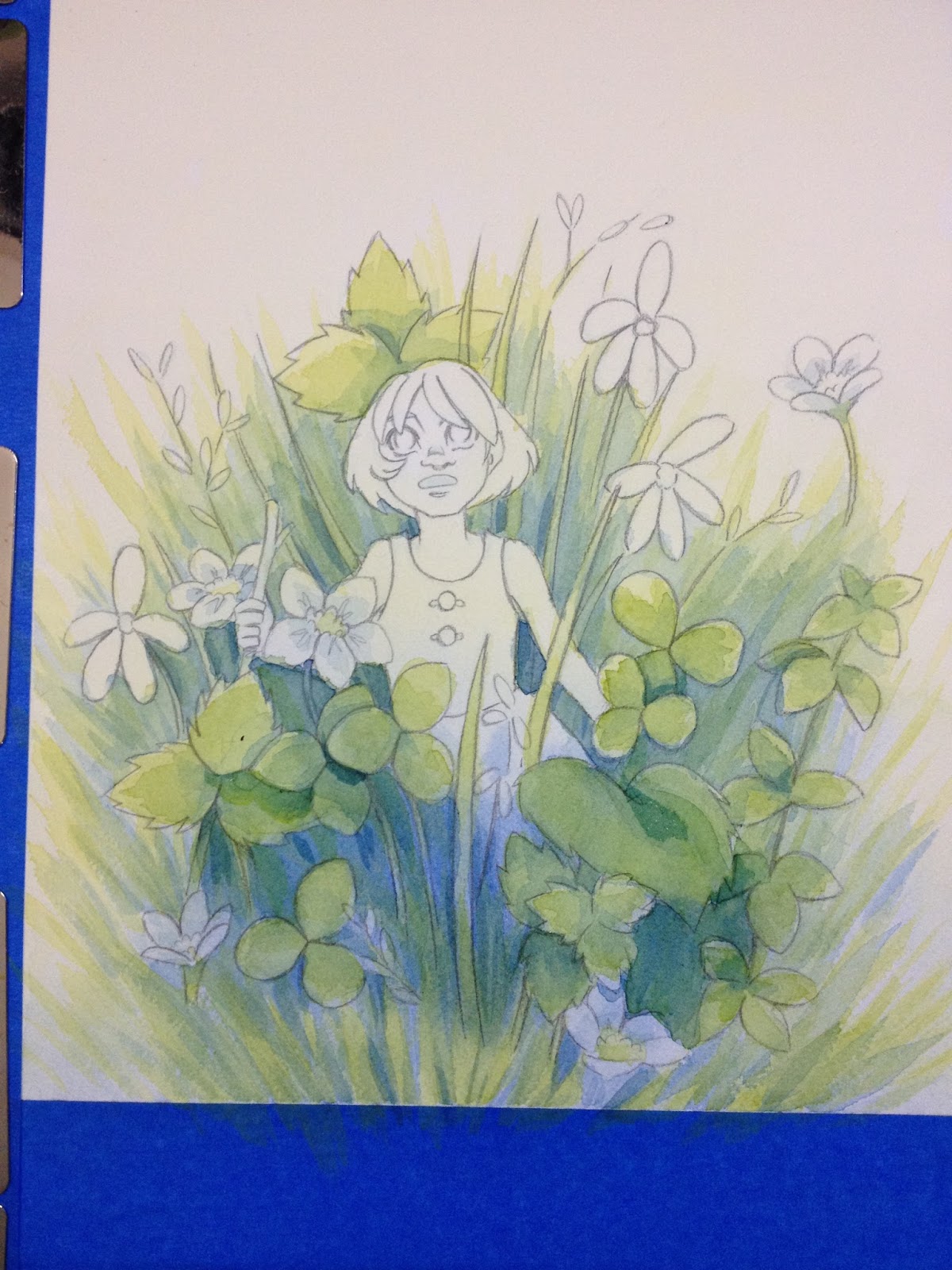
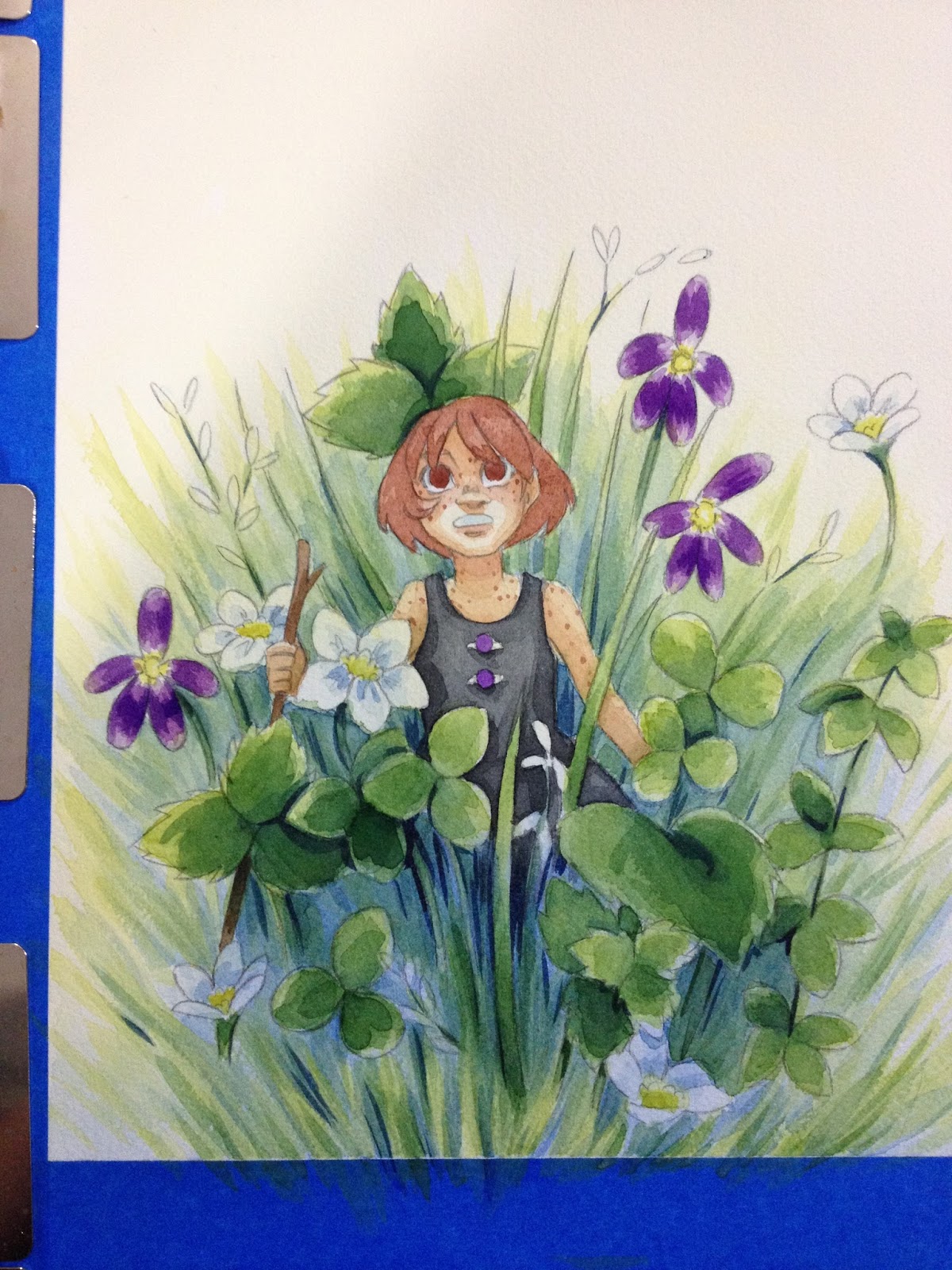
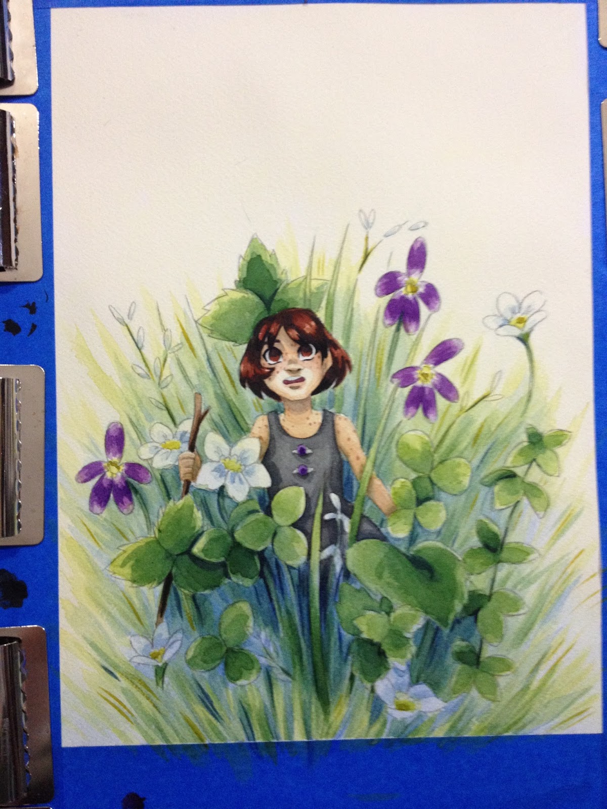
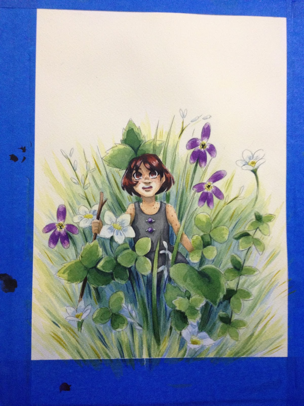

For my Christmas card, I wanted to play around with looser spray bottle techniques. The method is incredibly simple- you fill a spray bottle with water and a bit of the tube watercolor (or premixed pan/cake) of your choice. I like using Holbien's watercolor spray bottles, as they're designed FOR watercolors and the pigment particles wont clog up the nozzle, but if you'd prefer to buy in bulk, these spray bottles should work as well.
NOTE: I've found that iridescent, pearlescent, and metallic paints/mediums with large flakes will clog up even bottles designed for watercolor, and are best flicked on with a toothbrush!
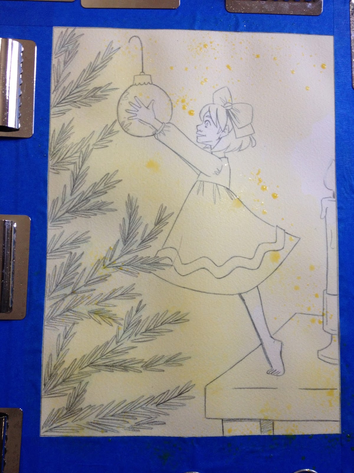
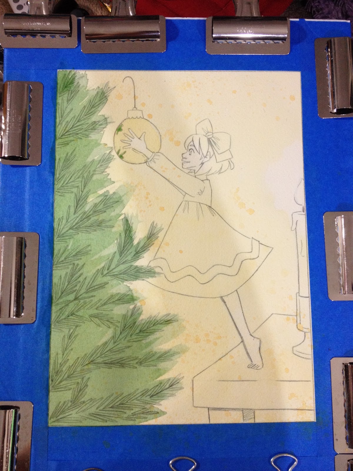
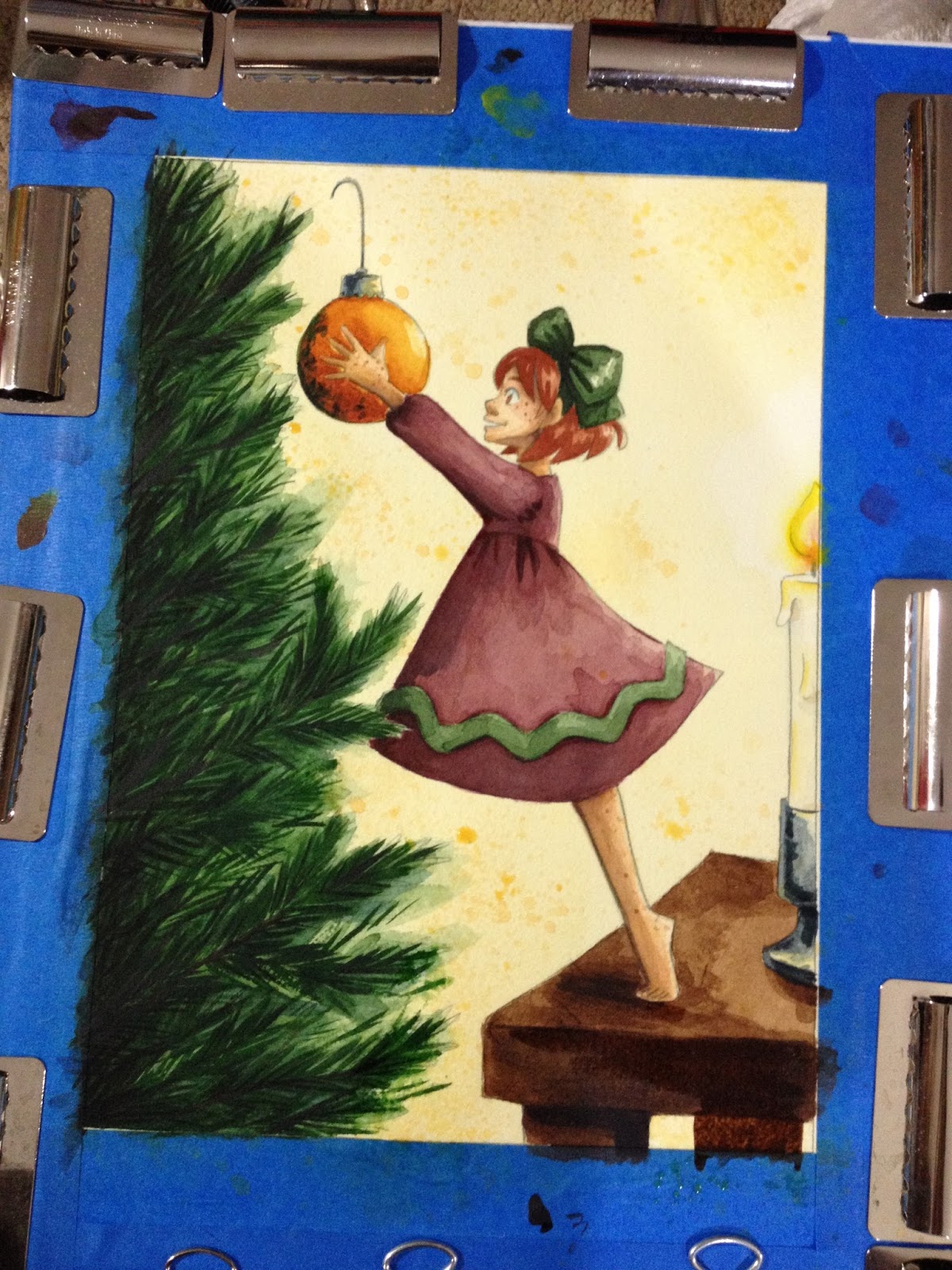
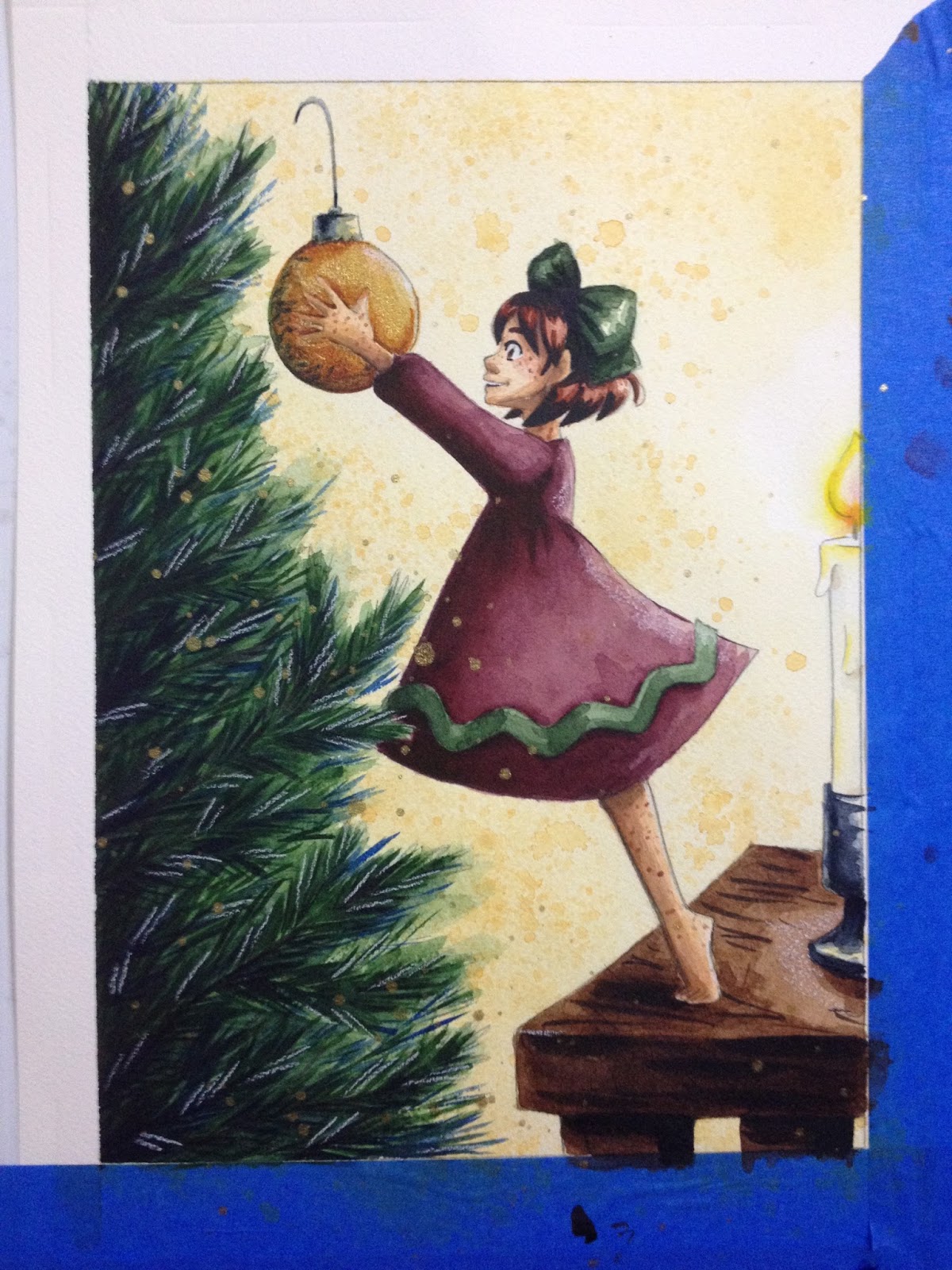

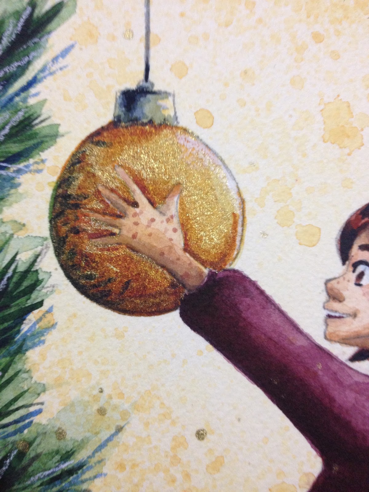
Gold ink was flicked on using Liquitex Freestyle's Splatter brush.

The last illustration is pretty straightforward, although I did knock in basic shadows first.
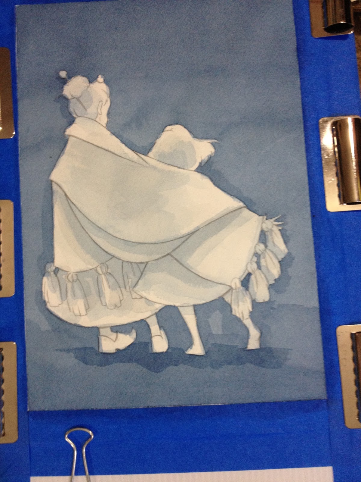
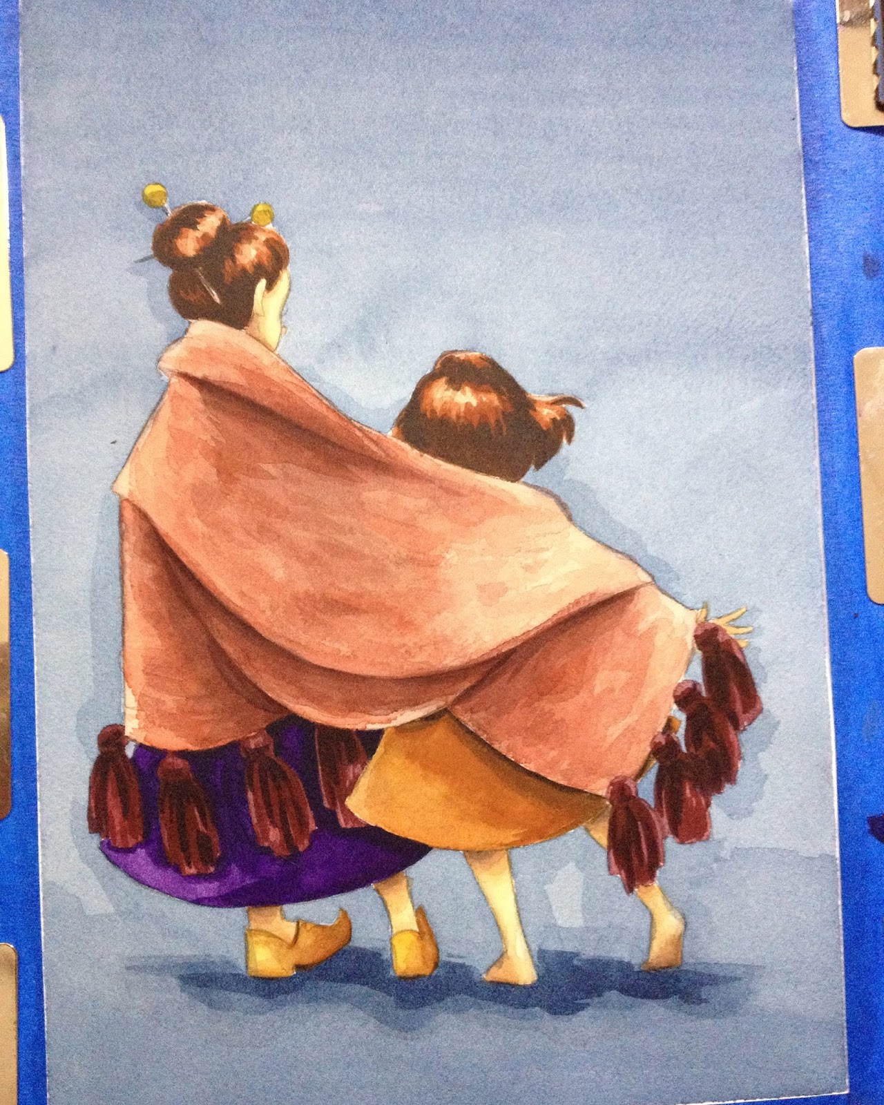

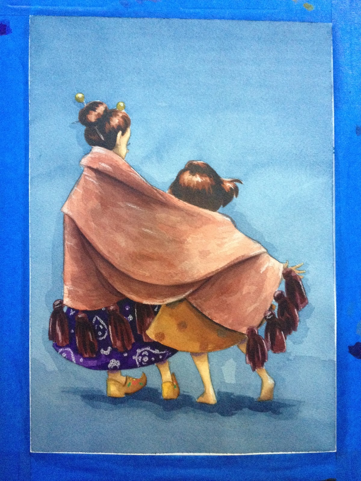
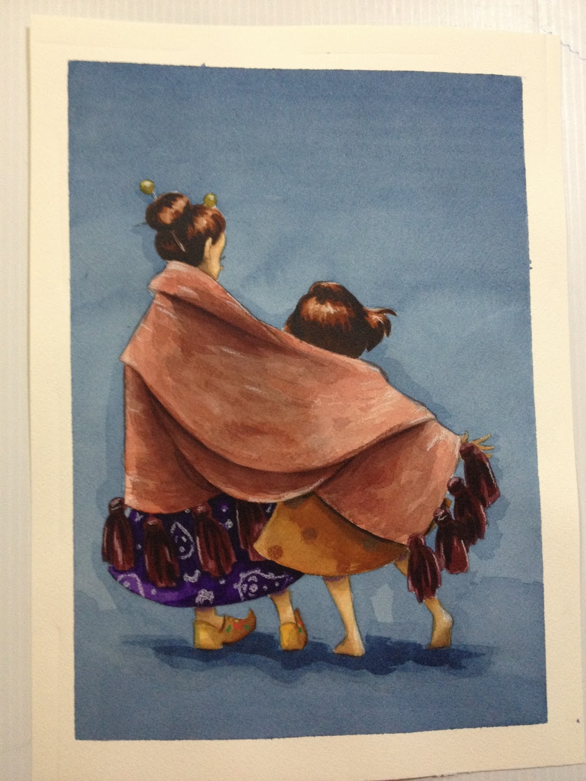
Please consider donating to this blog or purchasing from Natto-shop (http://nattosoup.com/shop) if you want me to continue publishing quality content. All materials tested were purchased from my own pocket. Keep on Truckin' Nattosoup is not under any sponsorship.
December 29, 2015
Target Art Supply Review: Up and Up Watercolors
I've already reviewed Target Up and Up's washable Supertip markers, with interesting results, so it's time to compare and review another Crayola contender- Up and Up's washable watercolors. These were the only watercolors the Kenner Target offered. I've checked a couple other Targets since purchasing these, and still haven't found anything other than what Up and Up or Crayola offer, and certainly not anything aimed at a hobbyist or professional artist.
8 Colors totalwashabledares us to compare with Crayola
The Paints
Up and Up washable watercolors come in a plastic case/palette very similar to the one Crayola's washable watercolors came in. It includes a brush, but unlike the Crayola case, there are no individual palette wells on the clear plastic top of the case. The package comes with a paper insert with the product details that's probably intended to be disposable.


The back of the Up and Up washable watercolors case has a sticker that covers washing instructions, a disclaimer that these watercolors were not manufactured by Crayola, the Target promise, a mailing address, and a barcode.
The washing instructions are:


The colors included in this set are Black, Purple, Blue, Green, Yellow, Orange, Red, and Brown.
 Top: Crayola Washable Watercolors
Bottom: Up and Up washable watercolors This set is basically just the reverse off the Crayola set, in terms of color order.
 Top Brush: Target Up and Up
Bottom Brush: Crayola Washable Watercolor The Up and Up watercolor set includes a synthetic brush that has a crimped metal ferrule and a plastic handle. The brush is really poorly balanced, and is brush end heavy.
 Top: Crayola Watercolors
Bottom: Up and Up WatercolorsAs with the Crayola washable watercolor set, the plastic tray that holds the poured watercolor cakes is removable from the case.
Since Up and Up dares us to compare with Crayola, I've pulled out my 8 color Crayola Washable Watercolor (link) set from the Walmart Art Supply review series. Already I can see that the pans in the Up and Up set are much smaller than those in the Crayola set, and the colors are in a different order. The brush comes with a protective cap, and synthetic bristles. The bristles are held in place with glue or gel, so it'll have to be washed out before using. The brush looks like it's a size 1, too tiny for little hands. Honestly, you want to work with as large a brush as possible for what you're doing, and only move down to a smalelr size when you need to put in details. Working with small brushes from the start not only takes forever to get anything done, but also leads to muddier paintings. The plastic case doesn't have dividers on the lid like the Crayola case has, making it more difficult for young artists to use it as a palette.
The Swatch Test
Dry

I did this swatch test using the tiny brush included in the Up and Up set.
You really shouldn't encourage someone to compare your brand to the national standard if your brand is sorta crappy, at least when it comes to these watercolors. Before slapping on that challenge, did they actually HAVE anyone compare Up and Up washable watercolors to Crayola washable watercolors. Surely I can't be the first, so let's Google it! (link to google search)
Anyway, when swatching straight from a dry palette, I find the colors to be poorly pigmented and very soapy. I'm hoping that allowing the water to soak in a bit will result in better pigmentation, as it did with the Crayola washable watercolors.
Wet


Pigmentation is a little better, but paint is goopy and soapy. I am not excited about the field test.
Colors blend very muddy.
Overall
What Up and Up and Crayola have in common:
Poor pigmentationSoapy as all get out
Where Crayola Excels:
Slightly nicer, bigger brushMore colorSlightly better pigmentationBetter color blending
Side by Side Swatch Test (since Up and Up dares us to compare)
 Left: Up and Up washable watercolors
Right: Crayola Washable Watercolors
 Left: Up and Up washable watercolors
Right: Crayola Washable Watercolors
Colors were applied with brush that came in set.
Although they LOOK about the same in terms of saturation, please keep in mind that I used the Up and Up synethtic fiber brush for the Up and Up watercolors, and you can really gob on the paint with this brush. The Up and Up green is pretty underwhelming, and the yellow already looks like it was contaminated with green paint (it wasn't). The brown is very light for a brown, and the only way you can really mix it to get a darker color is to mix black in it. Both brands are soapy, but you do get more paint with Crayola, and that is actually important, as it takes so much paint to mix colors using water.
The Field Test
Confession: I dun goofed- I grabbed the wrong palette. Rather than starting all over though, I'm just going to keep working with what I've got. My apologies.

I am going to use the Target Up and Up watercolors to mix and swatch a skintone on another piece of watercolor paper, since that's an important element of these tests.


It takes SO MUCH paint to mix up any sort of saturation.I keep glopping in more paint from the cakes (its so soapy!), and it hardly changes the color that ends up on the paper at all. The brown is pretty lackluster too.
Like Crayolas, these paints take forever to dry, so if you're doing your own tests at home, prepare to wait around.
I tried to use the Up and Up skintone mix to darken Kara's skin, and like so many cheap watercolors, instead of layering properly, it made everything look chalky. I'm going to switch back to Crayola for skintone stuff for this review to prevent that from happening again.
Mixing Skintones from Crayola Washable Watercolors and Up and Up Washable Watercolors


Originally I'd accidentally mixed Kara's skintone with the Crayola washable watercolors, mixing a bit of yellow, brown, and red together (top swatch and Kara's skin). Since I'd goofed, I wanted to see if I could mix skintones with Target Up and Up washable watercolors as well. The colors are far less saturated, and it takes a lot more paint to mix colors correctly. You can mix skintones with the Up and Up washable watercolors, but it's harder to do.


I'd allowed my paints to evaporate a bit overnight, hoping that with less water, the colors would be more saturated. They are a bit more saturated, but really, what kid (or adult) is going to be patient enough to wait for water to evaporate?


This field test ended up taking much longer than it would have for better brands of watercolor, as the glycerin in the watercolors made the water take a long time to evaporate. I can only imagine this resulting in frustrating, muddy messes for budding artists.
It's harder to achieve layer delineations with the Up and Up washable watercolors, so if you're trying to build up color, these are not the watercolors for you.
The Verdict
 Left: Target Up and Up Washable Watercolors
Right: Crayola Washable Watercolors
I feel like I shouldn't have to tell adults that purchasing a set of Up and Up washable watercolors will probably only lead to disappointment if you intend to use them to attempt to paint seriously. I've heard people say that cheap art supplies are like training wheels, but that's only true if your training wheels are attached to a bike you can actually ride. Kid's grade art supplies are more like those bike/scooter hybrids you scoot with your feet- you THINK you're learning how to ride a bike, but you're still just sitting and scooting. I'm not sure what you're hoping to learn with these, but you're possibly better off just saving your money for a little longer and getting a set of watercolors that actually perform like watercolors.
If you're an adult purchasing these watercolors for a small child, I recommend you skip these and either get the Up and Up Paintmarkers, which have better pigmentation, or get regular Crayola watercolors. Neither of those products will perform like the real deal, but if you're a kid who's covering reams of paper with color, performance isn't your priority.
If you're a teenager who's eyeing these because these are all you can afford, or because your younger sibling has a set they aren't using, I recommend you try washable markers instead, and check out my Crayola review, where I show you how to use them like watercolor markers. Not all brands work for this technique, but so far I know Crayola and Up and Up will.
Please consider donating to this blog or purchasing from Natto-shop (http://nattosoup.com/shop) if you want me to continue publishing quality content. All materials tested were purchased from my own pocket. Keep on Truckin' Nattosoup is not under any sponsorship.
8 Colors totalwashabledares us to compare with Crayola
The Paints
Up and Up washable watercolors come in a plastic case/palette very similar to the one Crayola's washable watercolors came in. It includes a brush, but unlike the Crayola case, there are no individual palette wells on the clear plastic top of the case. The package comes with a paper insert with the product details that's probably intended to be disposable.

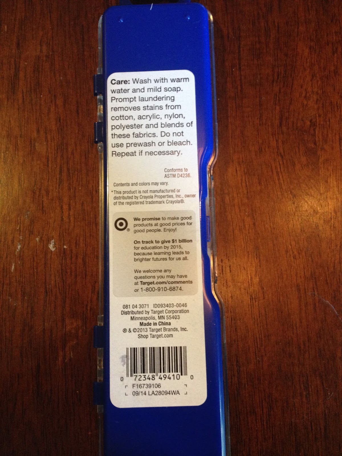
The back of the Up and Up washable watercolors case has a sticker that covers washing instructions, a disclaimer that these watercolors were not manufactured by Crayola, the Target promise, a mailing address, and a barcode.
The washing instructions are:
Wash with warm water and mild soap. Prompt laundering removes stains from cotton, acrylic, nylon, polyester, and blends of these fabrics. Do not use prewash or bleach. Repeat if necessary.
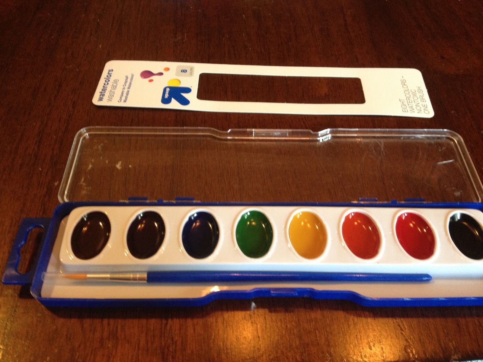
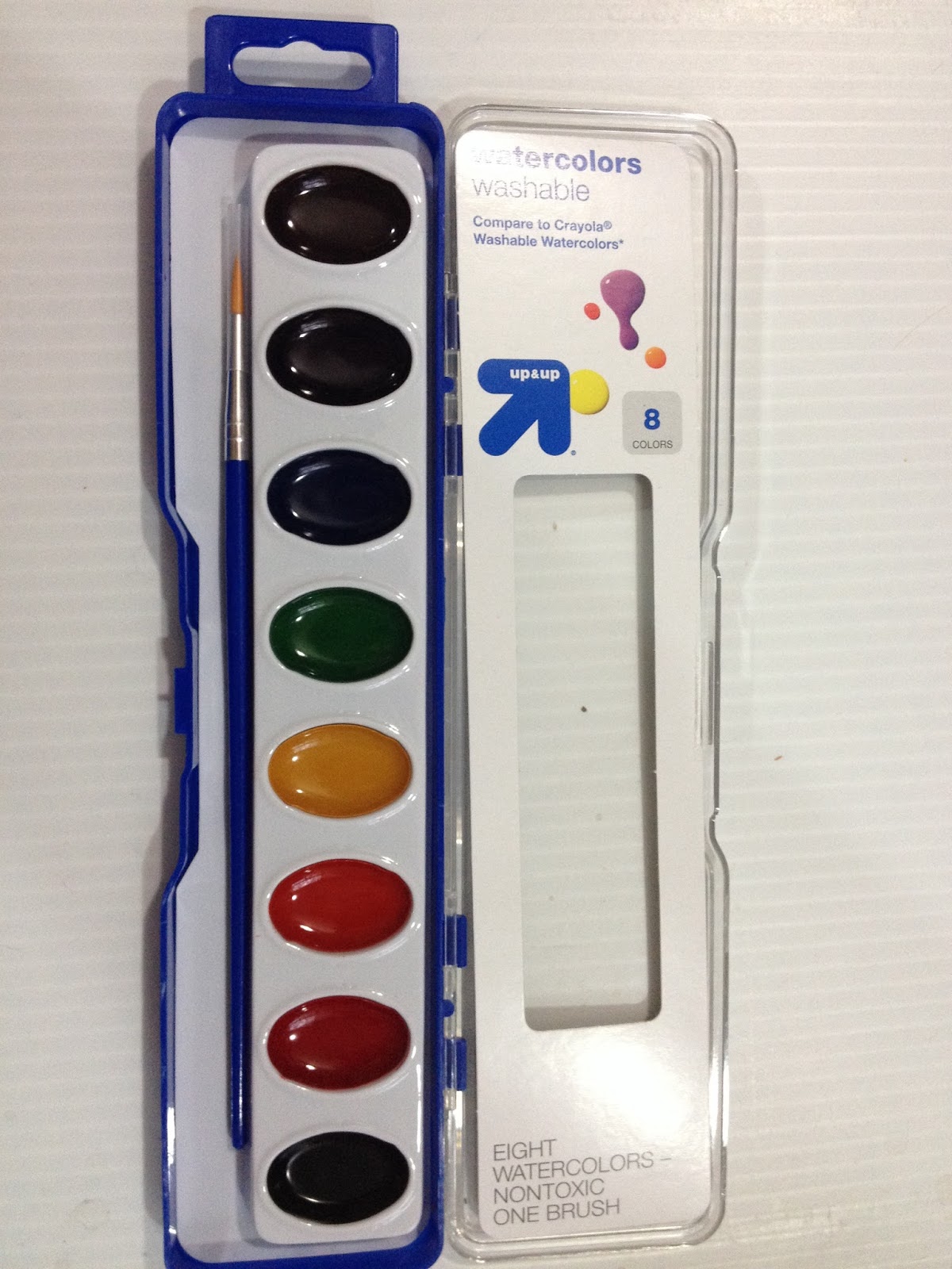
The colors included in this set are Black, Purple, Blue, Green, Yellow, Orange, Red, and Brown.
 Top: Crayola Washable Watercolors
Bottom: Up and Up washable watercolors This set is basically just the reverse off the Crayola set, in terms of color order.
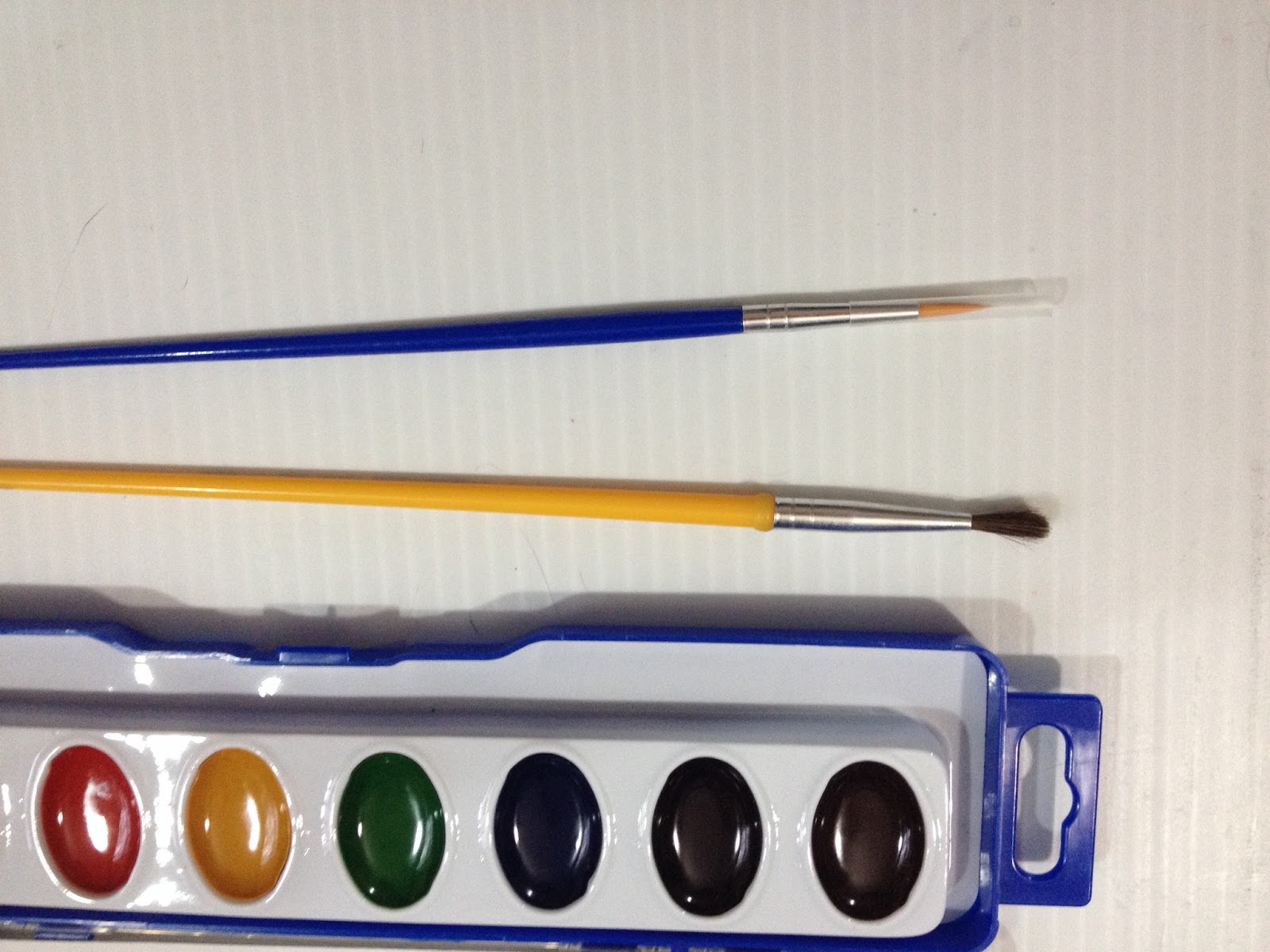 Top Brush: Target Up and Up
Bottom Brush: Crayola Washable Watercolor The Up and Up watercolor set includes a synthetic brush that has a crimped metal ferrule and a plastic handle. The brush is really poorly balanced, and is brush end heavy.
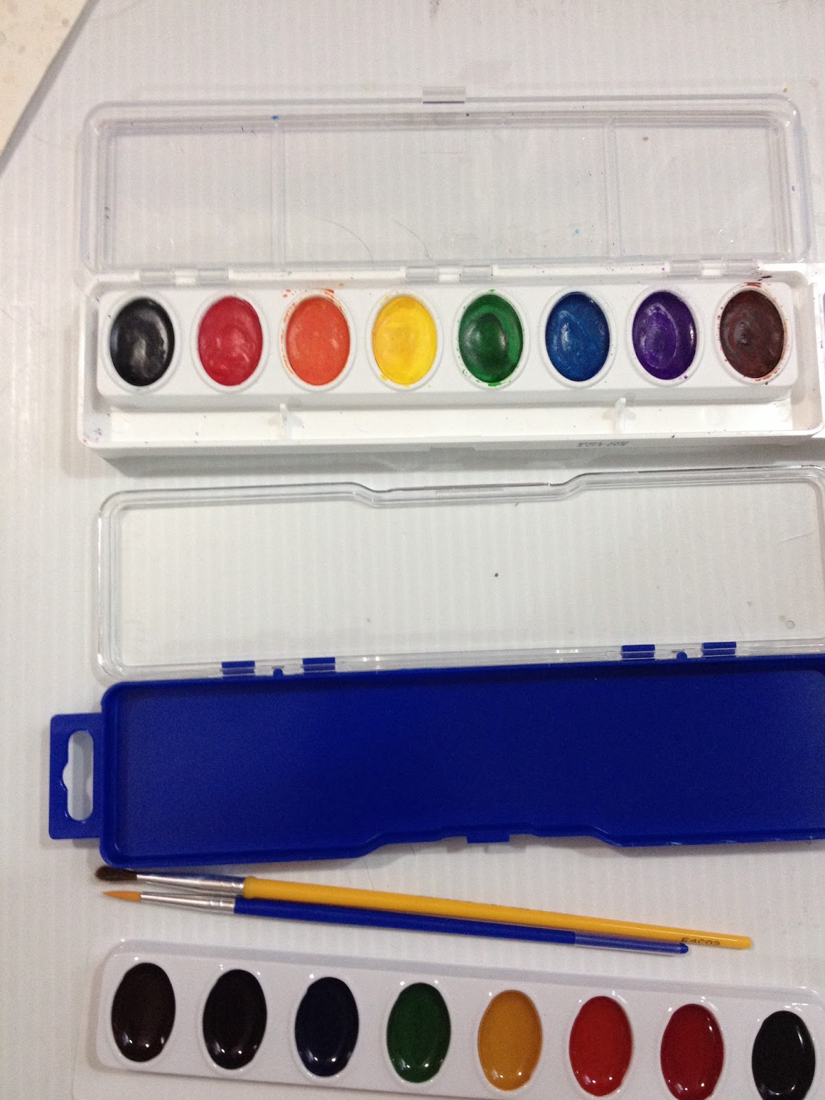 Top: Crayola Watercolors
Bottom: Up and Up WatercolorsAs with the Crayola washable watercolor set, the plastic tray that holds the poured watercolor cakes is removable from the case.
Since Up and Up dares us to compare with Crayola, I've pulled out my 8 color Crayola Washable Watercolor (link) set from the Walmart Art Supply review series. Already I can see that the pans in the Up and Up set are much smaller than those in the Crayola set, and the colors are in a different order. The brush comes with a protective cap, and synthetic bristles. The bristles are held in place with glue or gel, so it'll have to be washed out before using. The brush looks like it's a size 1, too tiny for little hands. Honestly, you want to work with as large a brush as possible for what you're doing, and only move down to a smalelr size when you need to put in details. Working with small brushes from the start not only takes forever to get anything done, but also leads to muddier paintings. The plastic case doesn't have dividers on the lid like the Crayola case has, making it more difficult for young artists to use it as a palette.
The Swatch Test
Dry
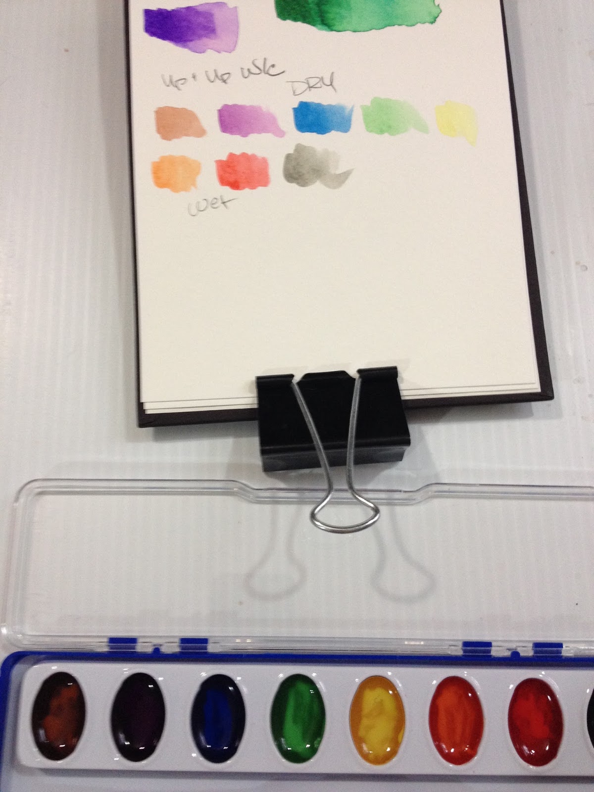
I did this swatch test using the tiny brush included in the Up and Up set.
You really shouldn't encourage someone to compare your brand to the national standard if your brand is sorta crappy, at least when it comes to these watercolors. Before slapping on that challenge, did they actually HAVE anyone compare Up and Up washable watercolors to Crayola washable watercolors. Surely I can't be the first, so let's Google it! (link to google search)
Anyway, when swatching straight from a dry palette, I find the colors to be poorly pigmented and very soapy. I'm hoping that allowing the water to soak in a bit will result in better pigmentation, as it did with the Crayola washable watercolors.
Wet

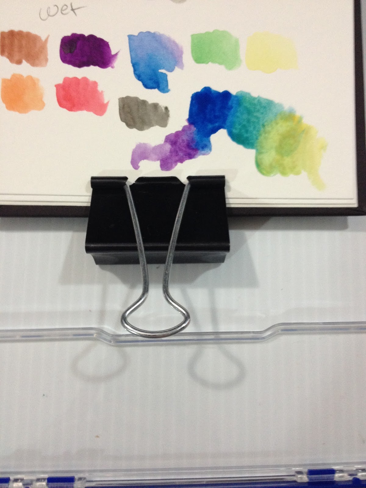
Pigmentation is a little better, but paint is goopy and soapy. I am not excited about the field test.
Colors blend very muddy.
Overall
What Up and Up and Crayola have in common:
Poor pigmentationSoapy as all get out
Where Crayola Excels:
Slightly nicer, bigger brushMore colorSlightly better pigmentationBetter color blending
Side by Side Swatch Test (since Up and Up dares us to compare)
 Left: Up and Up washable watercolors
Right: Crayola Washable Watercolors
 Left: Up and Up washable watercolors
Right: Crayola Washable Watercolors
Colors were applied with brush that came in set.
Although they LOOK about the same in terms of saturation, please keep in mind that I used the Up and Up synethtic fiber brush for the Up and Up watercolors, and you can really gob on the paint with this brush. The Up and Up green is pretty underwhelming, and the yellow already looks like it was contaminated with green paint (it wasn't). The brown is very light for a brown, and the only way you can really mix it to get a darker color is to mix black in it. Both brands are soapy, but you do get more paint with Crayola, and that is actually important, as it takes so much paint to mix colors using water.
The Field Test
Confession: I dun goofed- I grabbed the wrong palette. Rather than starting all over though, I'm just going to keep working with what I've got. My apologies.

I am going to use the Target Up and Up watercolors to mix and swatch a skintone on another piece of watercolor paper, since that's an important element of these tests.
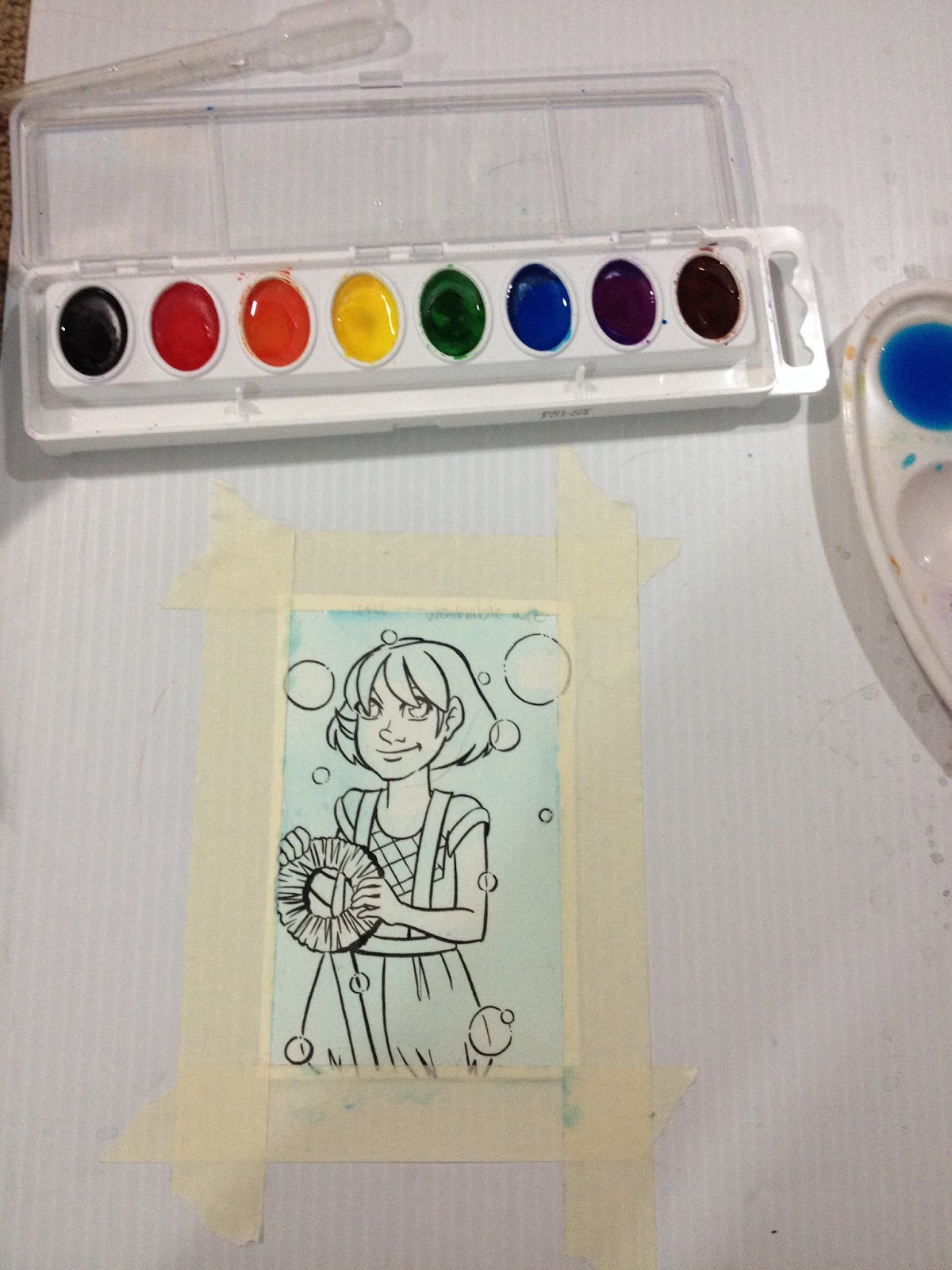
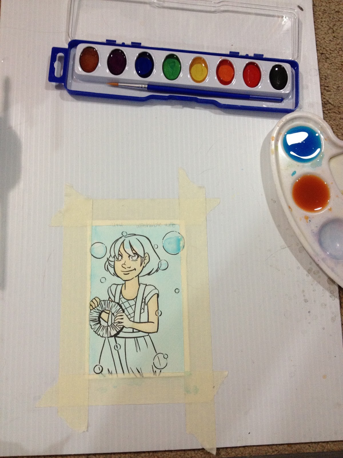


It takes SO MUCH paint to mix up any sort of saturation.I keep glopping in more paint from the cakes (its so soapy!), and it hardly changes the color that ends up on the paper at all. The brown is pretty lackluster too.
Like Crayolas, these paints take forever to dry, so if you're doing your own tests at home, prepare to wait around.
I tried to use the Up and Up skintone mix to darken Kara's skin, and like so many cheap watercolors, instead of layering properly, it made everything look chalky. I'm going to switch back to Crayola for skintone stuff for this review to prevent that from happening again.
Mixing Skintones from Crayola Washable Watercolors and Up and Up Washable Watercolors


Originally I'd accidentally mixed Kara's skintone with the Crayola washable watercolors, mixing a bit of yellow, brown, and red together (top swatch and Kara's skin). Since I'd goofed, I wanted to see if I could mix skintones with Target Up and Up washable watercolors as well. The colors are far less saturated, and it takes a lot more paint to mix colors correctly. You can mix skintones with the Up and Up washable watercolors, but it's harder to do.

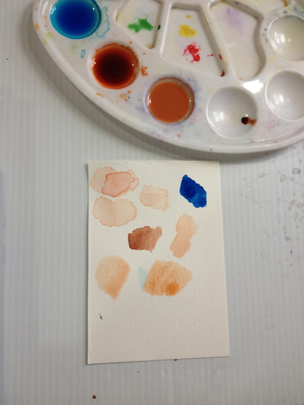

I'd allowed my paints to evaporate a bit overnight, hoping that with less water, the colors would be more saturated. They are a bit more saturated, but really, what kid (or adult) is going to be patient enough to wait for water to evaporate?

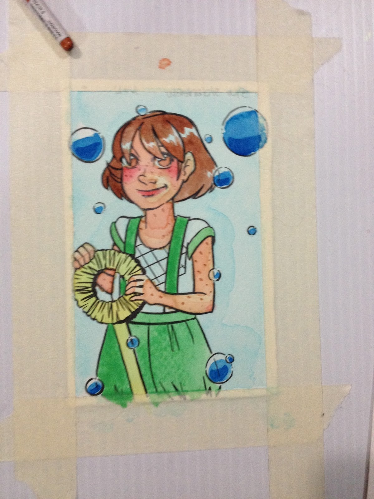

This field test ended up taking much longer than it would have for better brands of watercolor, as the glycerin in the watercolors made the water take a long time to evaporate. I can only imagine this resulting in frustrating, muddy messes for budding artists.
It's harder to achieve layer delineations with the Up and Up washable watercolors, so if you're trying to build up color, these are not the watercolors for you.
The Verdict
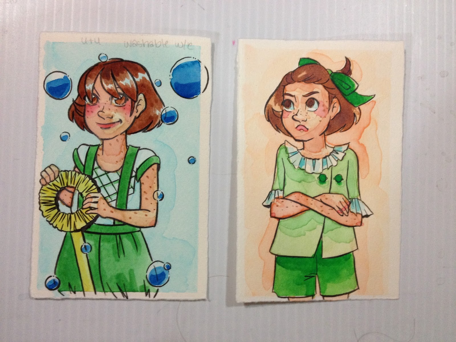 Left: Target Up and Up Washable Watercolors
Right: Crayola Washable Watercolors
I feel like I shouldn't have to tell adults that purchasing a set of Up and Up washable watercolors will probably only lead to disappointment if you intend to use them to attempt to paint seriously. I've heard people say that cheap art supplies are like training wheels, but that's only true if your training wheels are attached to a bike you can actually ride. Kid's grade art supplies are more like those bike/scooter hybrids you scoot with your feet- you THINK you're learning how to ride a bike, but you're still just sitting and scooting. I'm not sure what you're hoping to learn with these, but you're possibly better off just saving your money for a little longer and getting a set of watercolors that actually perform like watercolors.
If you're an adult purchasing these watercolors for a small child, I recommend you skip these and either get the Up and Up Paintmarkers, which have better pigmentation, or get regular Crayola watercolors. Neither of those products will perform like the real deal, but if you're a kid who's covering reams of paper with color, performance isn't your priority.
If you're a teenager who's eyeing these because these are all you can afford, or because your younger sibling has a set they aren't using, I recommend you try washable markers instead, and check out my Crayola review, where I show you how to use them like watercolor markers. Not all brands work for this technique, but so far I know Crayola and Up and Up will.
Please consider donating to this blog or purchasing from Natto-shop (http://nattosoup.com/shop) if you want me to continue publishing quality content. All materials tested were purchased from my own pocket. Keep on Truckin' Nattosoup is not under any sponsorship.
December 26, 2015
Target Art Supply Review: Up and Up Washable Markers
Up and Up is Target's 'value basic's' brand- similar to Equate or Great Value for Walmart. The brand has been around for a few years- it's a redesign of Target's bulls' eye logo, and while I usually avoid store brands for art supply reviews, I thought it'd be wise to explore what Target uniquely offers, especially since my focus during the Walmart Art Supply review series (link) was away from Walmart's store brands, and more on brands I recognized like Crayola or Daler Rowney.
When combing the Kenner Target for art supplies, I had a difficult time checking off all the marks on my checklist without resorting to Crayola. Target isn't much for art supplies, but there are a few hidden gems I think you guys should check out. The Up and Up washable markers are one of those.
The Packaging


Information on the back of the package is almost as sparse as the front. Up and Up dares us to compare their markers to Crayola Washable Classic Markers (but not the more comparable Crayola Supertips, for some reason), promises classic colors and a super tip, as well as vibrant color quality, and provides us with washing and care instructions.

Totally not reusable, the cardboard box is super thin, and was falling apart when I bought it, and has only gotten worse. Inside is a three tiered plastic tray that does a decent job of holding these markers in place, better than the tray included with the CraZArt markers. Up and Up's packaging is super generic, but that shouldn't bother me too much- as it's a store brand, generic packaging and boring, repetitive design help keep prices low.

Inside the flimsy cardboard is a three tiered plastic riser. The plastic riser is a lot more sturdy than the cardboard box, and even a few months later, my markers are still held securely in place, despite me quickly discarding the cardboard box. While this packaging is far from ideal, you can easily purchase better packaging that can be used long after these markers have run out of ink.
The Markers

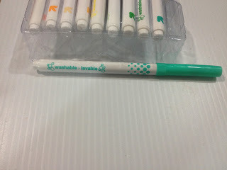
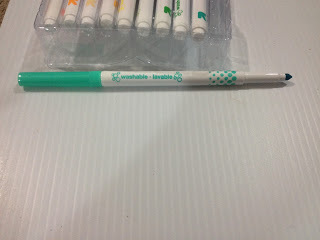
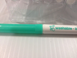
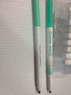 Left: Crayola Supertip
Right: Up and Up washable marker
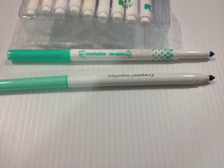 Top: Up and Up washable Marker
Bottom: Crayola Supertip
Up and Up markers are a little shorter than Crayola Supertips, but the barrel size is about the same.
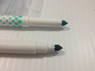 Top: Up and Up Washable Marker
Bottom: Crayola Supertip
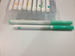 Top: Crayola Supertip
Bottom: Up and Up washable marke
The body screening looks a LOT like the CraZArt markers I reviewed not so long ago during my Walmart Art Supply Review Series. Cap doesn't post securely on the back, has strange ridges near the edge, probably to help you wedge the cap off the pen. Up and Up's 'super tip' looks a lot like Crayola's Supertip, and the Up and Up washable markers are shorter than Crayola Supertips. Big surprise, there are no color names on the markers or on the package, although body screening does match cap color. In practice, caps can be a bit hard to remove, so the ridged part near the edge of the cap does help in removal, especially given how slick the rest of the cap's plastic is. With or without cap, markers are very prone to rolling.
The Swatch Test- Up and Up Sketchbook Paper
Surprisingly low streaking, while these markers aren't especially juicy, they aren't dry either.

What's REALLY surprising is that the 'peach' is a pretty decent Caucasian skin tone, far better than Crayola Supertip's peach OR the beige included in the 8 pack of Crayola Multicultural Colors, here's hoping the browns are just as good.

Row 1:

Row 1: Ink colors are all fairly accurately reflected by cap color.
Row 2:

In Row 2, I found a pink that also works fairly well as a skintone, or as a blush or shadow to a skintone. So far, that's two more pale skintones than Crayola has. And there's another, so that's three, but it looks like there's only one pink, and it's rather fluorescent.
Row 3:

Row 3 colors are fairly true to cap.
Some of these colors are really weird, and it's a bit hard to pop them in and out of the tiered thing. There's also an almost-orange in row 2 that could be used for darker skintones that tend to be neglected. Some of the caps are almost impossible to snap back on, and take a lot of force. Given that these are marketed at kids, yours may have a hard time recapping these markers.
The Swatch Test- Pacon Marker Paper
There isn't much difference between the Up and Up sketchbook and the Pacon marker paper, in terms of swatching.
The Swatch Test- Canson Biggie Watercolor Paper (Woodpulp based)


Row 1: All of these colors react well to water.
Row 2: All these colors react well to water
Row 3: The black seperates out into grey, red, and blue, the lighter brown seperates a little bit
But as these aren't designed to be watercolor markers, and aren't even intended to be used by adults for illustration, these are minor quirks.

Even when allowed to dry fully, markers are fairly reworkable. The above swatch was allowed to dry for one hour before water was applied. The below swatch was allowed to dry a fully 24 hours before water was applied.

Blending out with Tombow ABT
NOTE: All of these tests were done on wood pulp based, cold pressed watercolor paper.


Works surprisingly well, but applying marker over ABT feels a little greasy? These will stain your blender's nib, so make sure you clean it off on a clean piece of paper or paper towel. Even without a blender, these markers can be blended together fairly well.
Blending with Marvy LePlume II Blender

The Marvy LePlume II Blender is generally drier than the Tombow ABT colorless blender, so it may be more difficult to blend. The LePlume II colorless blender also blends these washable waterbased markers, although since the brush is drier, the paper is more prone to pilling.
In general, the paper (Canson Biggie Coldpress Watercolor- cheap woodpulp watercolor paper works well for waterbased markers, I've found) is less prone to pilling than with
The Field Test
Used as Watercolor Markers


The first peach is very faint when you apply it, it's hard to build up saturation with just one color. Fortunately, I have a selection of colors that work well as peaches. These don't work quite as well as the Crayolas as a cheap substitute for watercolor markers, but they aren't bad. If you want the most saturation, you can apply the marker directly to the paper once the paper has dried, but it may be hard to get that marker to blend out entirely.
Used as Waterbased Markers with Tombow ABT Blender
Since the Tombow ABT blender works decently well with these markers, and since the Up and Up 30 piece set includes some decent skintones, I'm going to do the unthinkable- I'm going to color Kara's skin by applying the marker directly to the paper, rather than cheating like I did with the Crayola test and using the Crayola markers as watercolor markers for Kara's skin.

For some reason, even though the Mitsuo Aida ink has dried for 24 hours, the Tombow ABT Blender smears the ink a bit when I try to blend out the skintone.


Since these markers are much less prone to pilling the paper than the Crayola washable markers, it's very easy to overwork the paper. You forget that you're working with waterbased markers that require time to dry, and soon you're trying to do layering techniques you'd normally avoid, and you can't understand why things aren't going the way you planned.


None of the blues are light enough to be used to shade the whites of the eyes, and can't be blended out light enough using the Tombow ABT colorless blender.

Even intense colors like red are blendable- apply your first layer of red, blend out into the white using the Tombow ABT colorless blender. When your first layer is done, you can start laying in shadows with the same red for more intense color.


The darkest shadows can be added in with the darkest red, and blended out using the last red you applied, or using the Tombow ABT.

These markers blend and layer surprisingly well, better than the Crayola Supertip markers do. Like A LOT better. I have to assume the ink is made out of something different, it feels a little greasy, and the tip seems to just glide over areas I've already applied color to.
Field Test on Pacon Marker Paper
Pacon's marker paper hasn't performed well with waterbased markers up to this point, and I wanted to see if these magical Up and Up markers would handle any better than their competition did.


Although these markers worked well for the field test on wood pulp watercolor paper, I tried a different tactic for applying shadows for the Pacon paper test- the same technique used to apply shadows for my Crayola Multicultural skintones review.


With a shorter dry time than Crayola markers, you can add additional layers of the same color to build up shadow without tearing or pilling the paper.

Since the blue used in the other field test was too intense for the whites of eyes, I used an aqua that was a bit more subdued.

Pink is added to the cheeks, lips, and inside of Kara's elbows.


Since I knocked in all of her hair at one time, I decided to give it plenty of time to dry before adding another layer, and turned my focus to her shirt.


Once her hair was fully dry, I added another layer of brown, to show highlights.

Applying the first layer of brown to Kara's pants.

And a third layer of brown to Kara's hair, as well as shadows to her eyes and eyebrows.


I ended up blocking in the area I'd left open on the pants- there was too much contrast between the white and the brown to be believable as highlight and shadow.

Using the same aqua I'd used for Kara's eyes and teeth, I apply shadows to the white on her shirt.

As well as the dragonflies' wings.


Somewhat surprisingly, the Up and Up waterbased markers perform well even on Pacon's marker paper, perhaps due to (what I assume is) more glycerin in these markers. There's some bleed through on this thin paper, but not enough to effect the page beneath, and the markers can be layered more than other waterbased brands.
The Verdict
 Top: Up and Up Markers were used as Watercolor markers (left) and as waterbased markers (right)
Bottom: Crayola Supertip markers were used as Watercolor markers (left) and waterbased markers (right) Both markers were used on Fabriano cotton paper for the watercolor marker test, and on Fluid woodpulp based watercolor paper for the waterbased marker test.
These aren't really a replacement to the Crayola Supertip washable markers (I recommend you splurge and go for the 50 pack, it's $7.99 at Walmart), but an addition to your collection as the Up and Up 30 count Washable markers have several colors that are very different from the Crayola set. The Up and Up set has more colors that work as skintones, both as watercolor markers and as waterbased markers.
These markers aren't nearly as pigmented as the Crayola Washable Supertip markers, but they're far less likely to tear the paper up in dry applications. They're a bit hard to use for watercolor markers, but they're much better at regularly coloring without pilling or paper destruction. They layer well, and even blend a little bit, which is really surprising for waterbased markers. When water is added (like for watercolor markers) they feel soapy and it takes a lot of ink to build up layers of color. You can use waterbased colorless blenders like Tombow ABT or Marvy LePlume II to blend these markers a pretty significant amount, which is something I have yet to test with other waterbased markers.
Unlike with alcohol based markers, using a colorless blender with Up and Up washable markers spreads surface color to new areas, rather than pushing the color to the back of the paper. This means you can't really use the colorless blender to lighten up dark areas so much as you can use the colorless blender to darken up light areas.
When I first purchased these markers, I assumed they would just be a Crayola Supertip clone, but these markers held many surprises for me, and I think they'll surprise you too. Layering, blending, not tearing up the paper with repeated use? Sounds more like an alcohol based marker than a waterbased marker, and while I'm positive these aren't alcohol based markers, I think there's something besides water and ink in these barrels.
If Crayola markers are giving you a hard time, and you've disliked other waterbased markers you've tried, consider giving Up and Up waterbased markers a shot- they're unlike any other kid-grade waterbased markers I've tested yet. If you're a convention artist looking for a way to add color to your work without lugging around heavy, expensive alcohol based markers, and you want to skip the wait time of watercolors, these markers might be a great solution to your issue. If you have a kid in your life who's been eying your alcohol markers, these might make a great, non toxic, very affordable introduction to markers for illustration purposes. All in all, I highly recommend Up and Up's Washable Markers.
EDITOR'S NOTE: I went back and tested the Crayolas with Tombow ABT, and they work well too. So if you'd like a little blending to your waterbased markers, consider picking up a Tombow ABT colorless blender.
Other Waterbased Markers I've reviewed
Walmart Art Supply Review- Waterbased Markers (CraZArt and Crayola)
Crayola Multicultural Colors
Please consider donating to this blog or purchasing from Natto-shop (http://nattosoup.com/shop) if you want me to continue publishing quality content. All materials tested were purchased from my own pocket. Keep on Truckin' Nattosoup is not under any sponsorship.
When combing the Kenner Target for art supplies, I had a difficult time checking off all the marks on my checklist without resorting to Crayola. Target isn't much for art supplies, but there are a few hidden gems I think you guys should check out. The Up and Up washable markers are one of those.
The Packaging


Information on the back of the package is almost as sparse as the front. Up and Up dares us to compare their markers to Crayola Washable Classic Markers (but not the more comparable Crayola Supertips, for some reason), promises classic colors and a super tip, as well as vibrant color quality, and provides us with washing and care instructions.

Totally not reusable, the cardboard box is super thin, and was falling apart when I bought it, and has only gotten worse. Inside is a three tiered plastic tray that does a decent job of holding these markers in place, better than the tray included with the CraZArt markers. Up and Up's packaging is super generic, but that shouldn't bother me too much- as it's a store brand, generic packaging and boring, repetitive design help keep prices low.

Inside the flimsy cardboard is a three tiered plastic riser. The plastic riser is a lot more sturdy than the cardboard box, and even a few months later, my markers are still held securely in place, despite me quickly discarding the cardboard box. While this packaging is far from ideal, you can easily purchase better packaging that can be used long after these markers have run out of ink.
The Markers


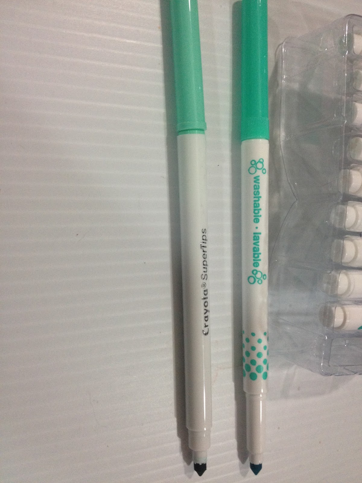 Left: Crayola Supertip
Right: Up and Up washable marker
 Top: Up and Up washable Marker
Bottom: Crayola Supertip
Up and Up markers are a little shorter than Crayola Supertips, but the barrel size is about the same.
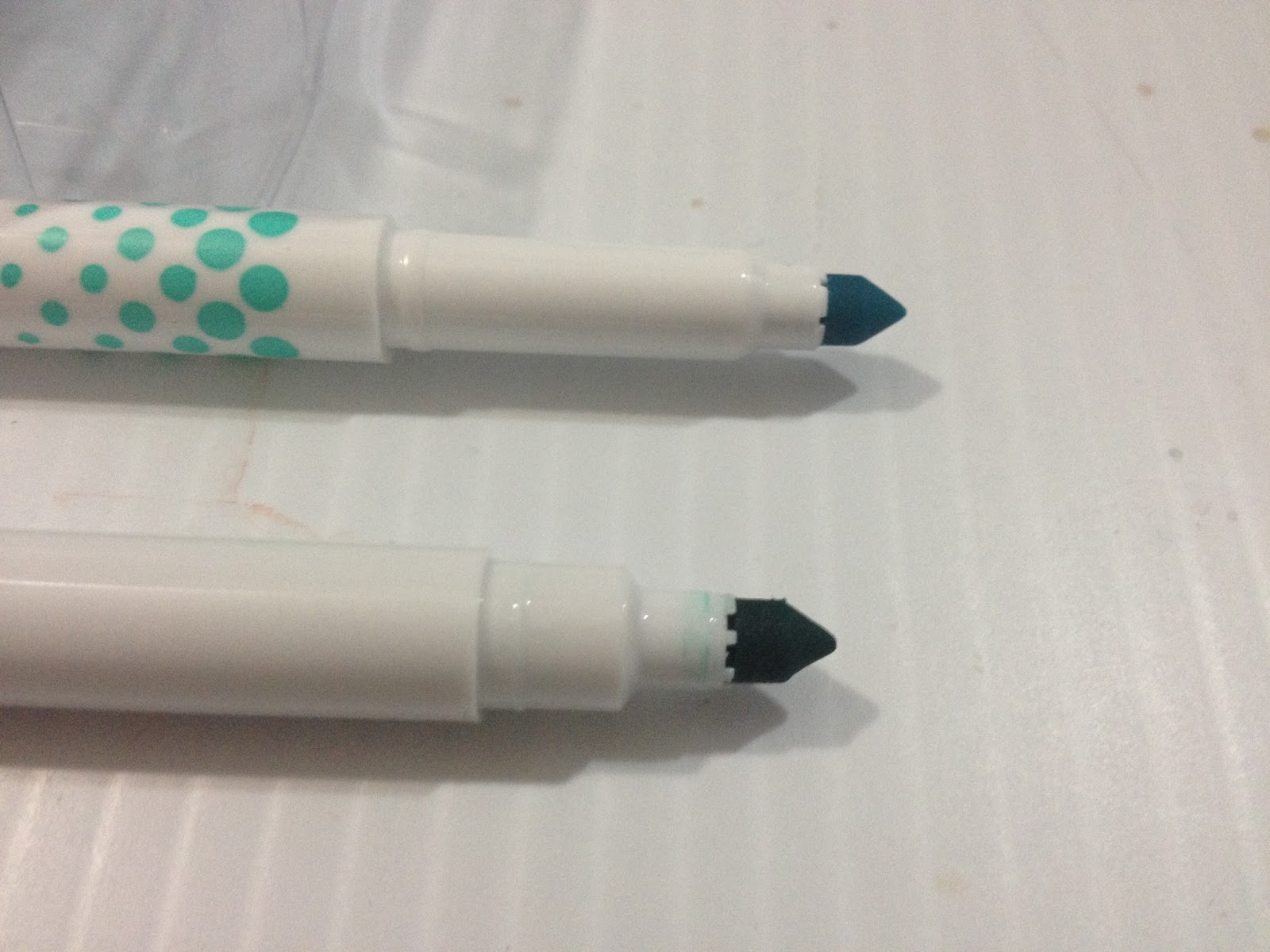 Top: Up and Up Washable Marker
Bottom: Crayola Supertip
 Top: Crayola Supertip
Bottom: Up and Up washable marke
The body screening looks a LOT like the CraZArt markers I reviewed not so long ago during my Walmart Art Supply Review Series. Cap doesn't post securely on the back, has strange ridges near the edge, probably to help you wedge the cap off the pen. Up and Up's 'super tip' looks a lot like Crayola's Supertip, and the Up and Up washable markers are shorter than Crayola Supertips. Big surprise, there are no color names on the markers or on the package, although body screening does match cap color. In practice, caps can be a bit hard to remove, so the ridged part near the edge of the cap does help in removal, especially given how slick the rest of the cap's plastic is. With or without cap, markers are very prone to rolling.
The Swatch Test- Up and Up Sketchbook Paper
Surprisingly low streaking, while these markers aren't especially juicy, they aren't dry either.
What's REALLY surprising is that the 'peach' is a pretty decent Caucasian skin tone, far better than Crayola Supertip's peach OR the beige included in the 8 pack of Crayola Multicultural Colors, here's hoping the browns are just as good.
Row 1:
Row 1: Ink colors are all fairly accurately reflected by cap color.
Row 2:
In Row 2, I found a pink that also works fairly well as a skintone, or as a blush or shadow to a skintone. So far, that's two more pale skintones than Crayola has. And there's another, so that's three, but it looks like there's only one pink, and it's rather fluorescent.
Row 3:
Row 3 colors are fairly true to cap.
Some of these colors are really weird, and it's a bit hard to pop them in and out of the tiered thing. There's also an almost-orange in row 2 that could be used for darker skintones that tend to be neglected. Some of the caps are almost impossible to snap back on, and take a lot of force. Given that these are marketed at kids, yours may have a hard time recapping these markers.
The Swatch Test- Pacon Marker Paper
There isn't much difference between the Up and Up sketchbook and the Pacon marker paper, in terms of swatching.
The Swatch Test- Canson Biggie Watercolor Paper (Woodpulp based)


Row 1: All of these colors react well to water.
Row 2: All these colors react well to water
Row 3: The black seperates out into grey, red, and blue, the lighter brown seperates a little bit
But as these aren't designed to be watercolor markers, and aren't even intended to be used by adults for illustration, these are minor quirks.
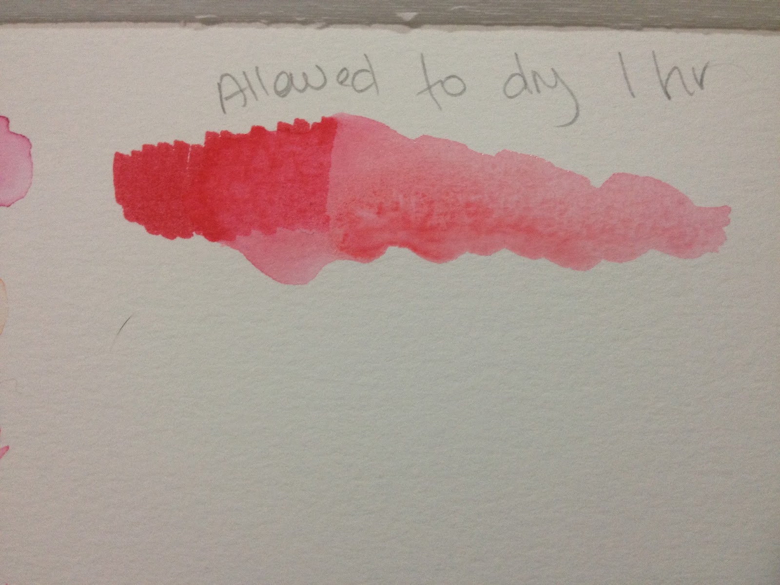
Even when allowed to dry fully, markers are fairly reworkable. The above swatch was allowed to dry for one hour before water was applied. The below swatch was allowed to dry a fully 24 hours before water was applied.
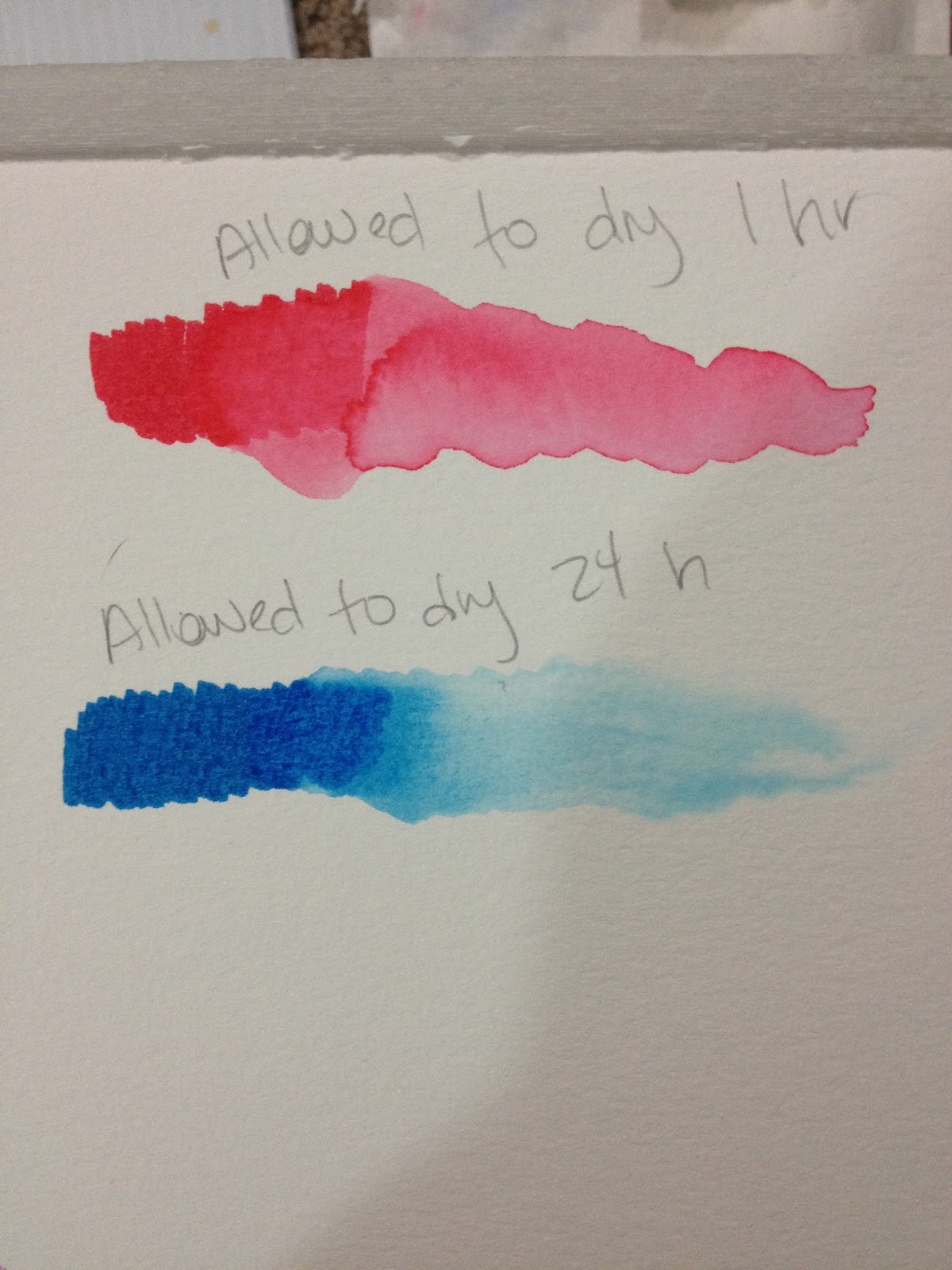
Blending out with Tombow ABT
NOTE: All of these tests were done on wood pulp based, cold pressed watercolor paper.
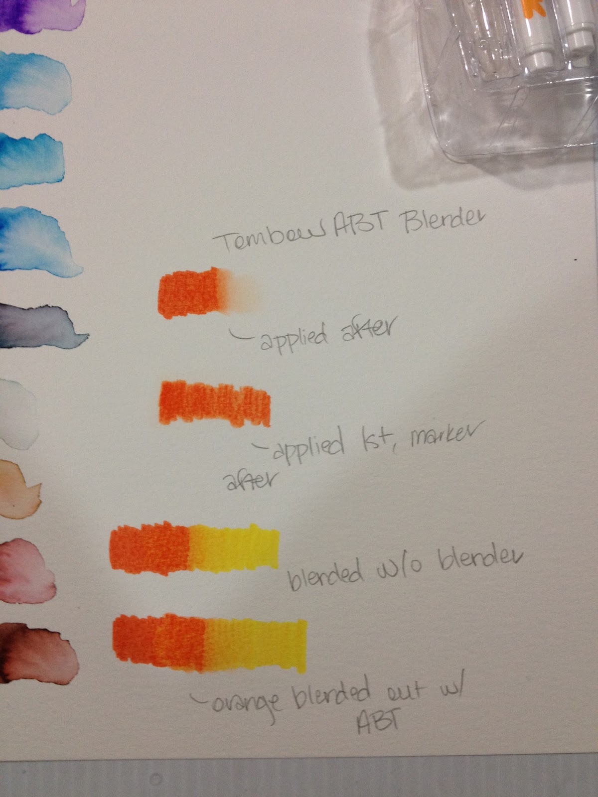
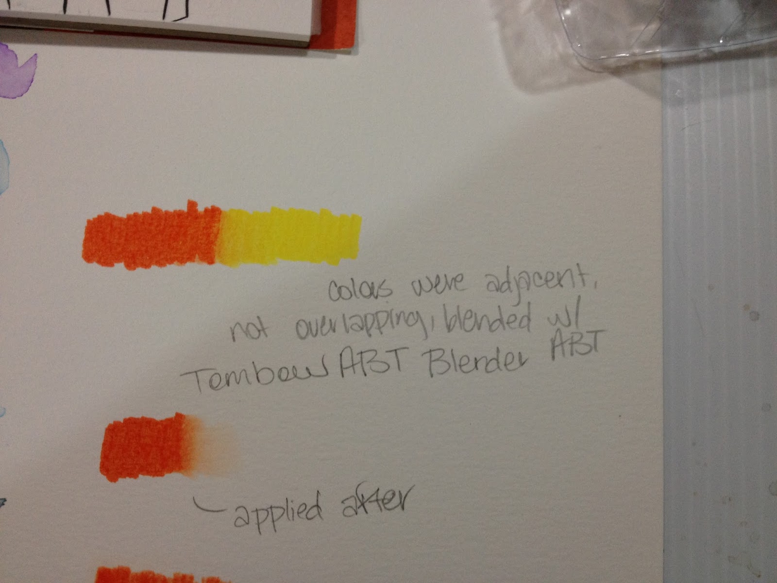
Works surprisingly well, but applying marker over ABT feels a little greasy? These will stain your blender's nib, so make sure you clean it off on a clean piece of paper or paper towel. Even without a blender, these markers can be blended together fairly well.
Blending with Marvy LePlume II Blender
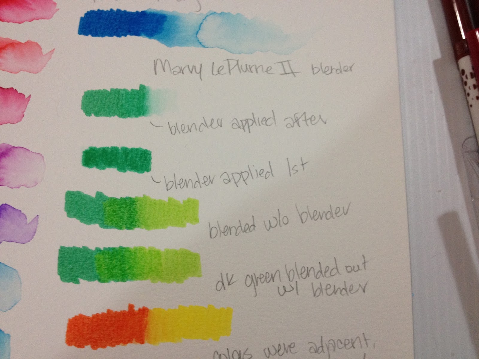
The Marvy LePlume II Blender is generally drier than the Tombow ABT colorless blender, so it may be more difficult to blend. The LePlume II colorless blender also blends these washable waterbased markers, although since the brush is drier, the paper is more prone to pilling.
In general, the paper (Canson Biggie Coldpress Watercolor- cheap woodpulp watercolor paper works well for waterbased markers, I've found) is less prone to pilling than with
The Field Test
Used as Watercolor Markers
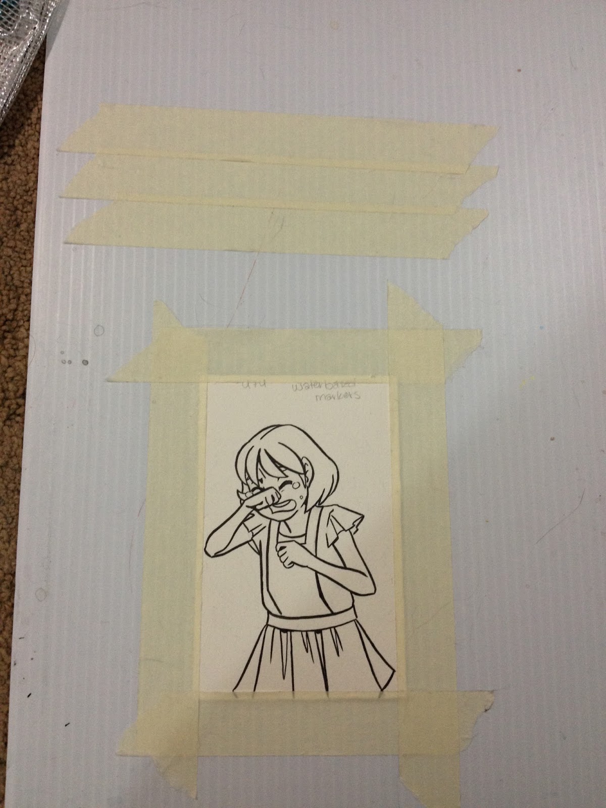

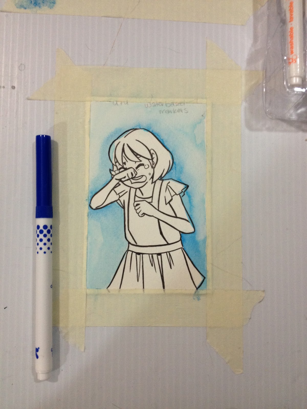
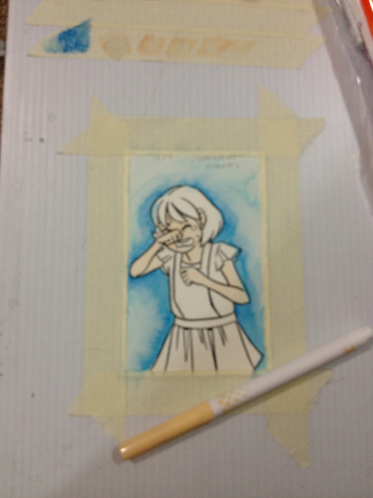
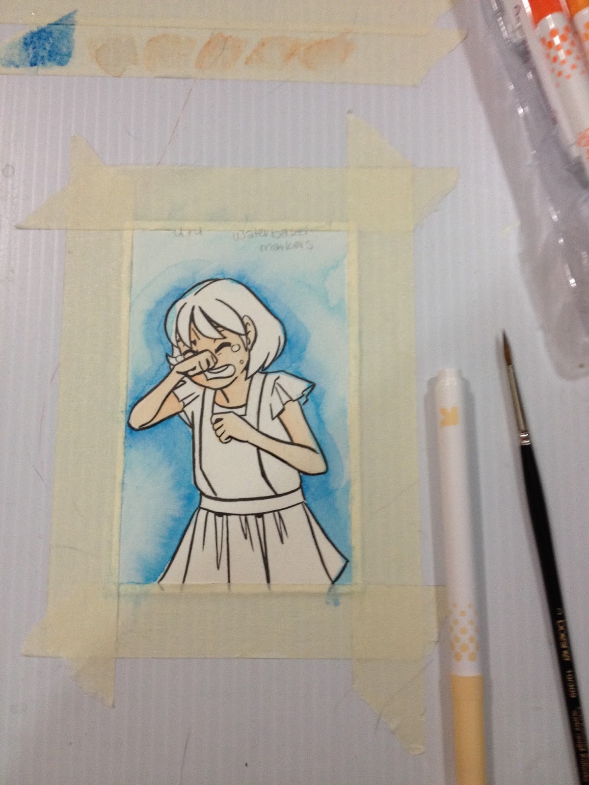
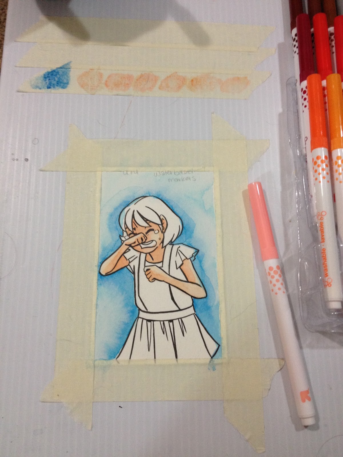

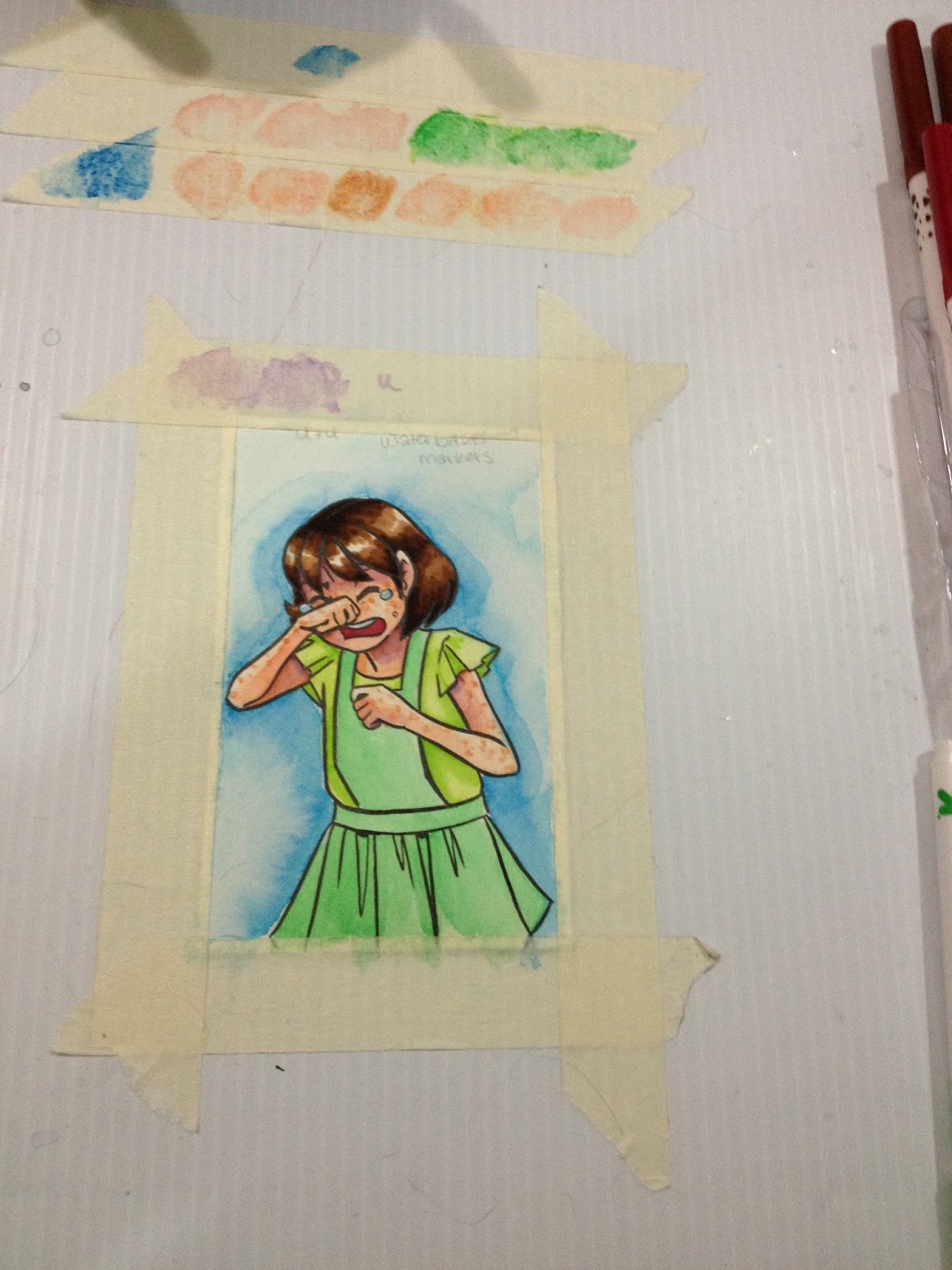
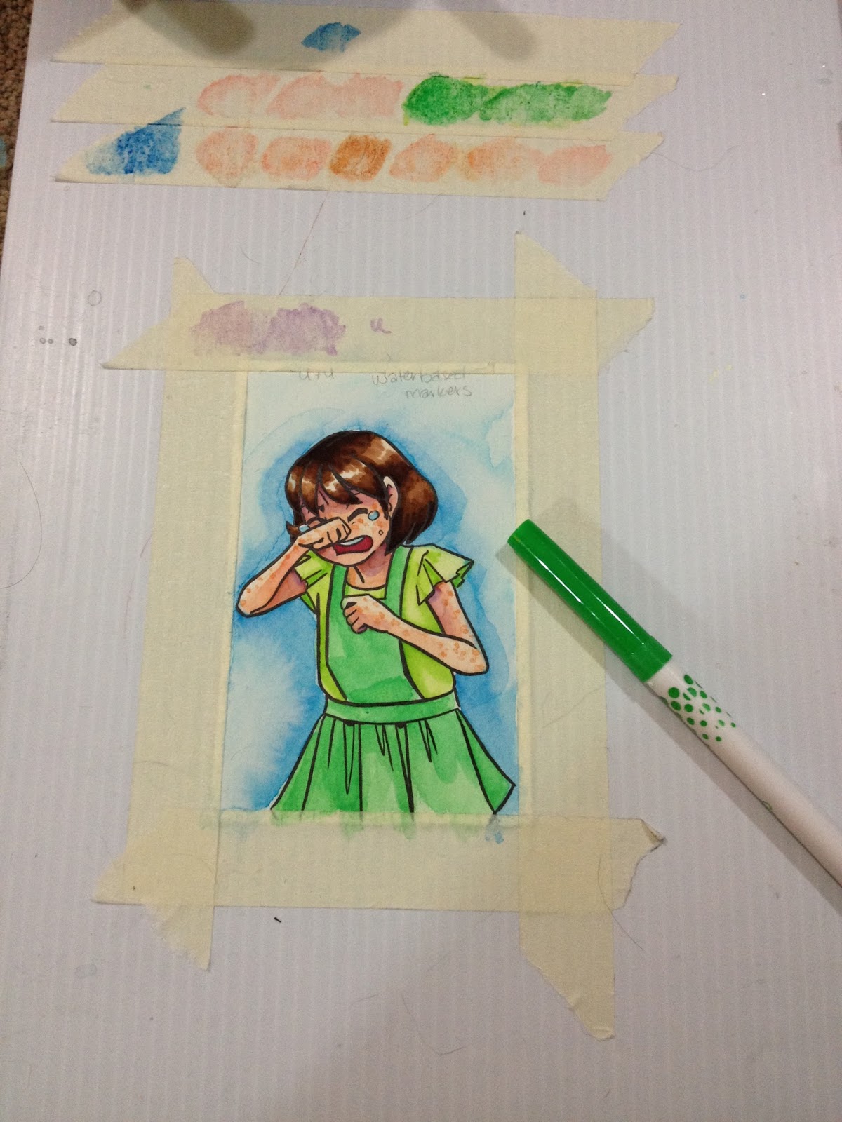
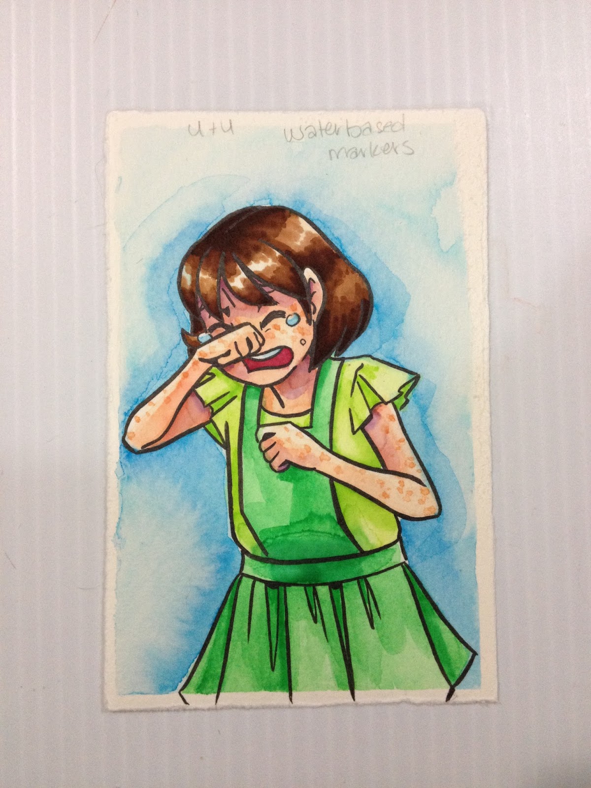
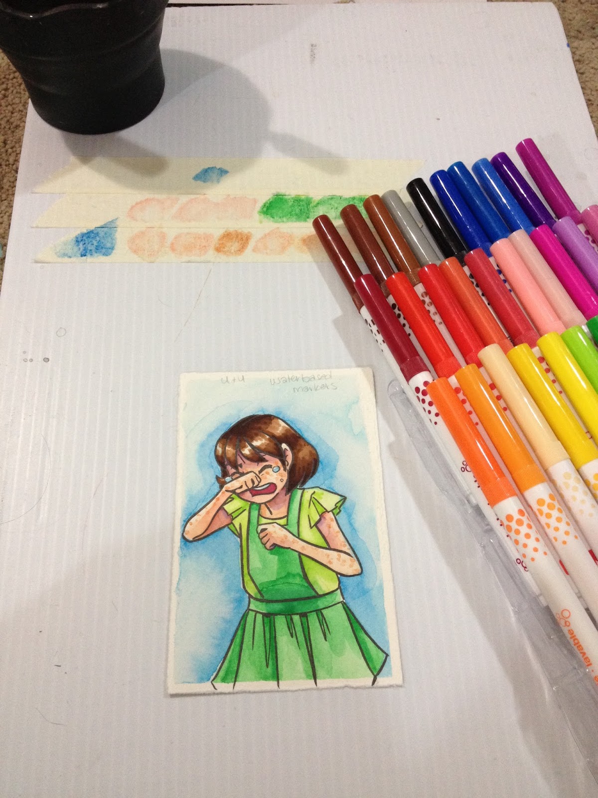
The first peach is very faint when you apply it, it's hard to build up saturation with just one color. Fortunately, I have a selection of colors that work well as peaches. These don't work quite as well as the Crayolas as a cheap substitute for watercolor markers, but they aren't bad. If you want the most saturation, you can apply the marker directly to the paper once the paper has dried, but it may be hard to get that marker to blend out entirely.
Used as Waterbased Markers with Tombow ABT Blender
Since the Tombow ABT blender works decently well with these markers, and since the Up and Up 30 piece set includes some decent skintones, I'm going to do the unthinkable- I'm going to color Kara's skin by applying the marker directly to the paper, rather than cheating like I did with the Crayola test and using the Crayola markers as watercolor markers for Kara's skin.
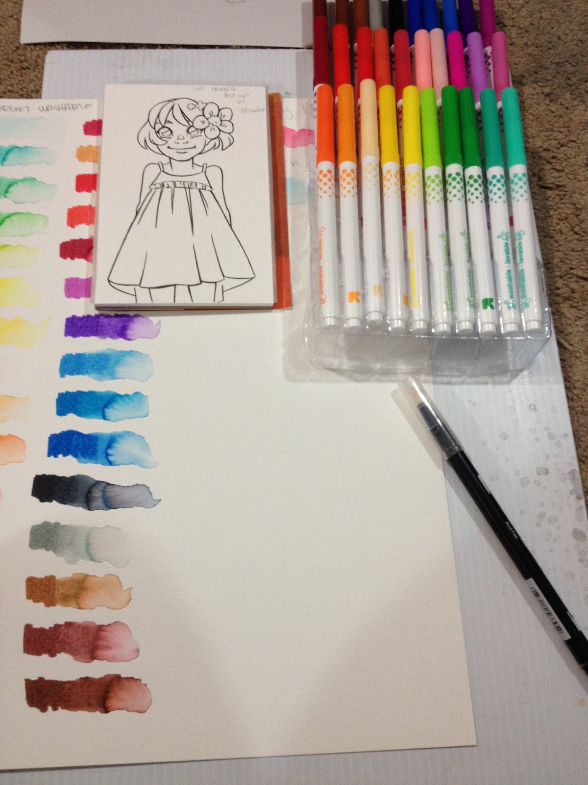
For some reason, even though the Mitsuo Aida ink has dried for 24 hours, the Tombow ABT Blender smears the ink a bit when I try to blend out the skintone.
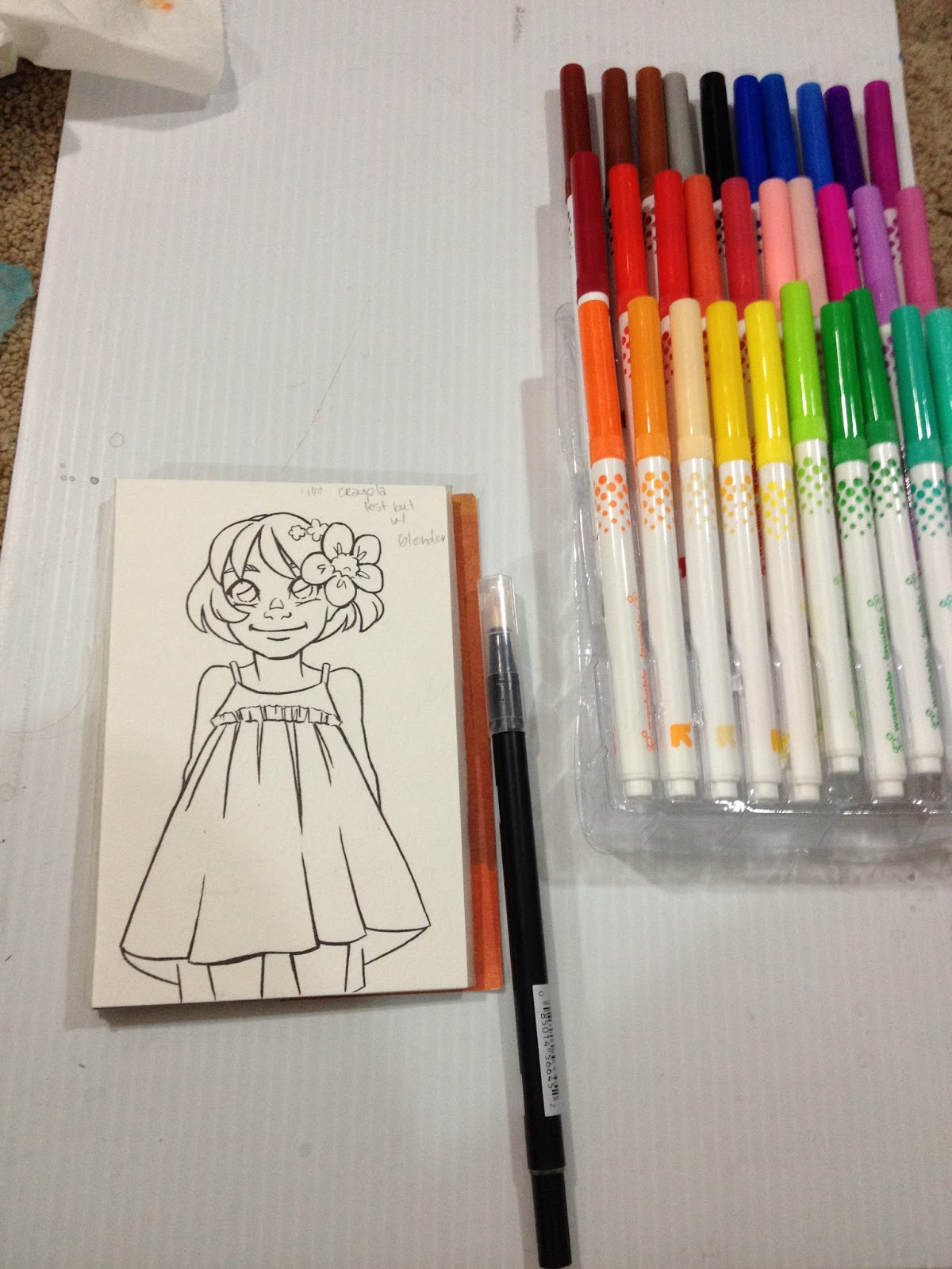

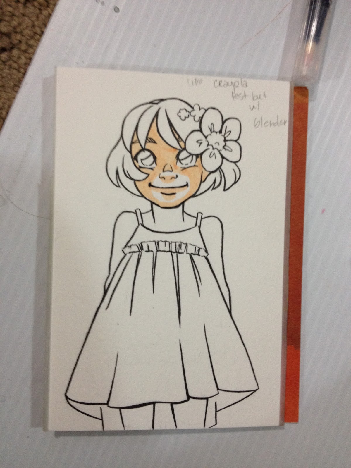
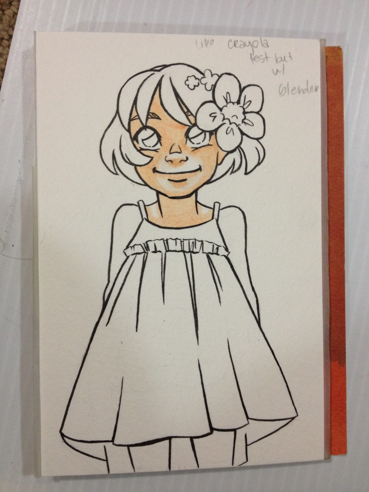
Since these markers are much less prone to pilling the paper than the Crayola washable markers, it's very easy to overwork the paper. You forget that you're working with waterbased markers that require time to dry, and soon you're trying to do layering techniques you'd normally avoid, and you can't understand why things aren't going the way you planned.
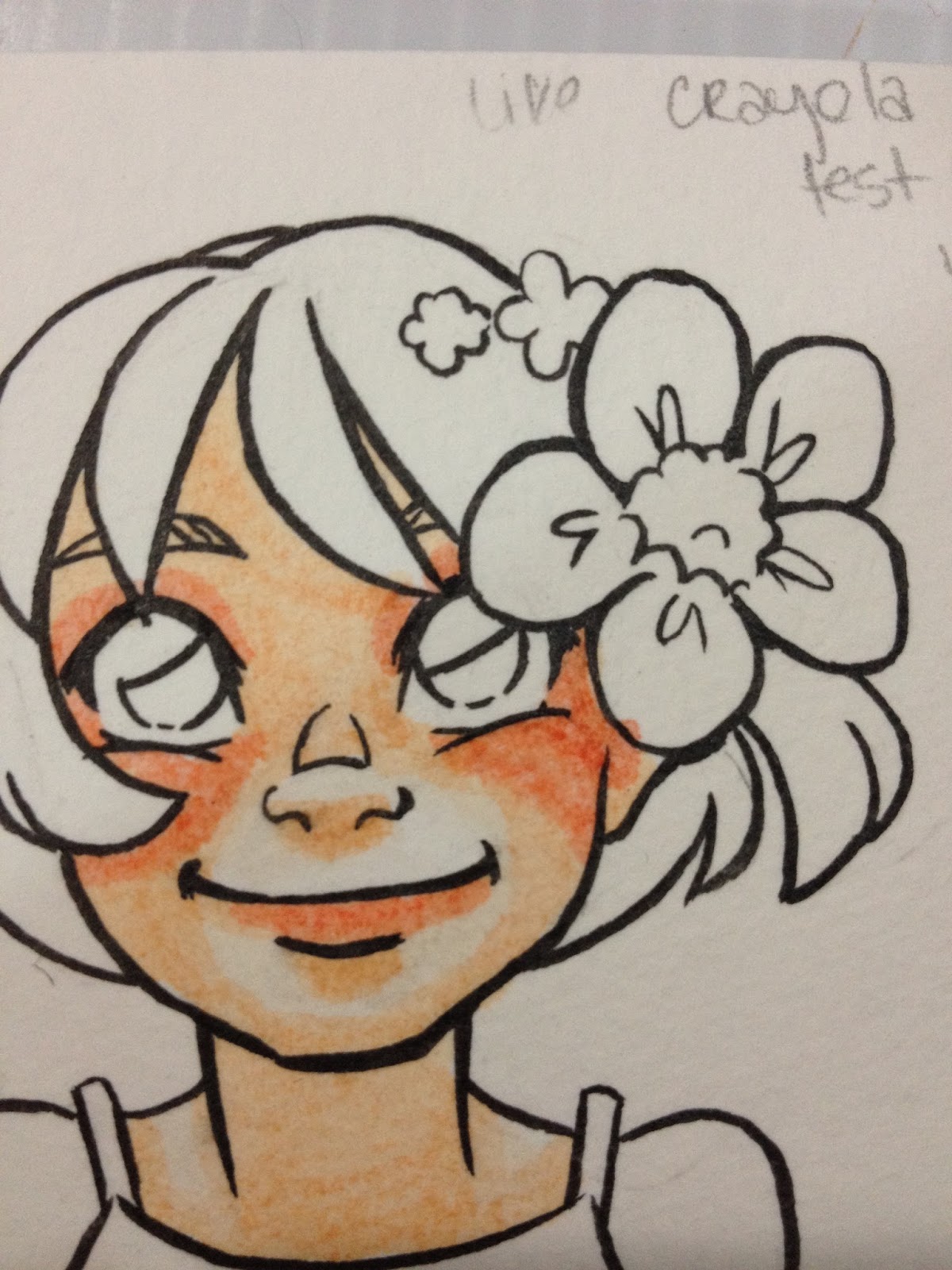
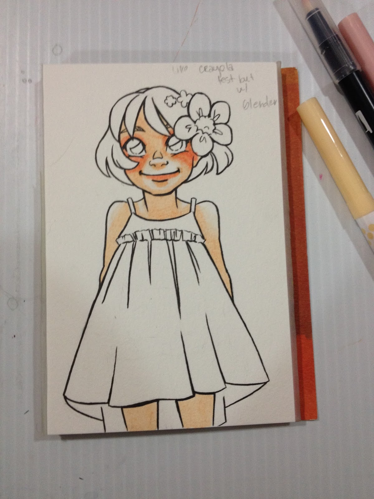
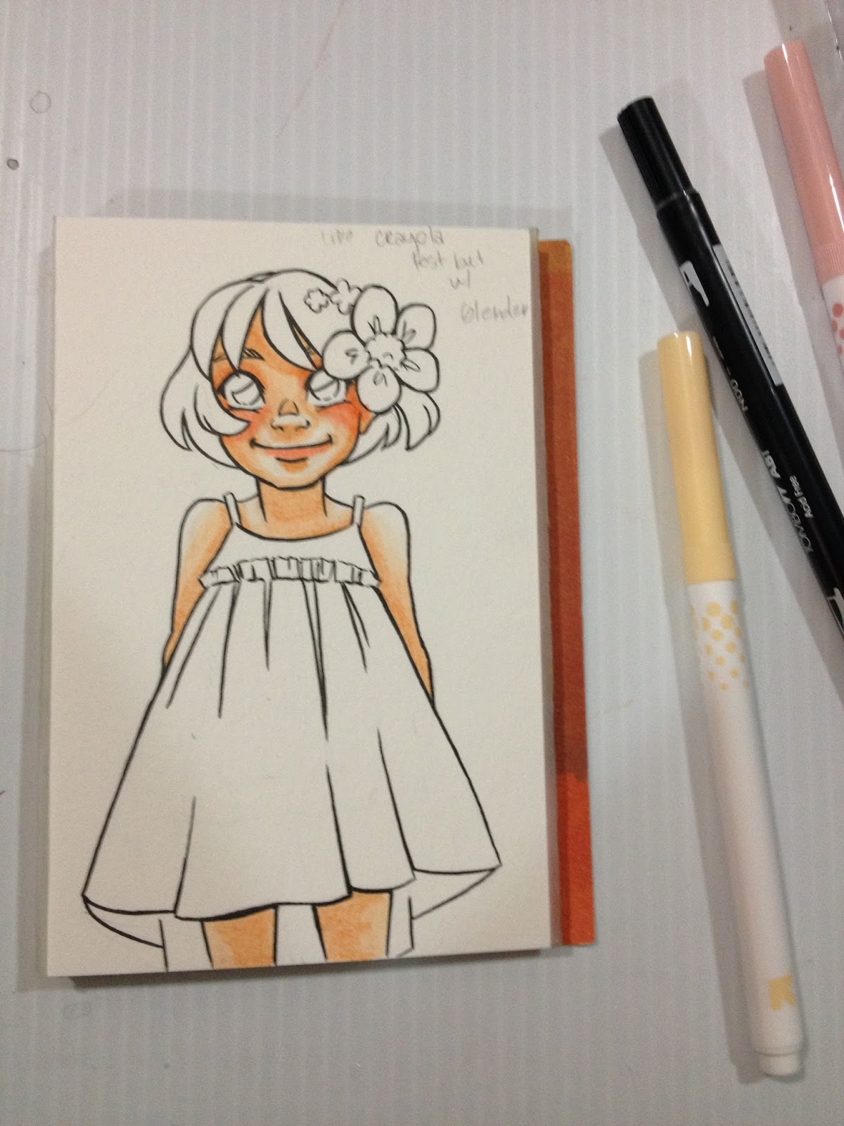
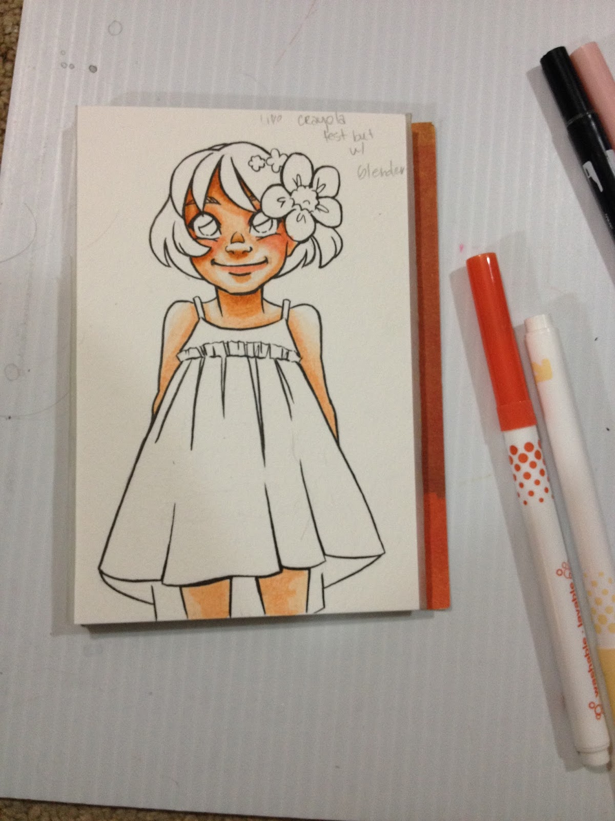

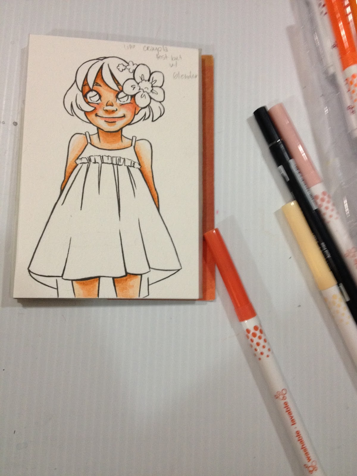
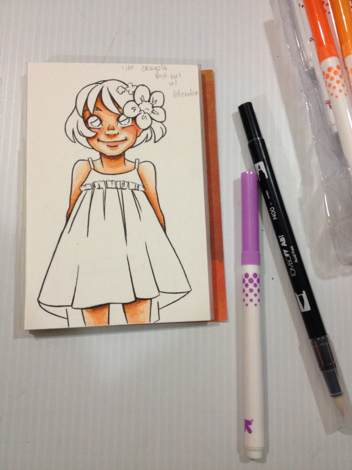
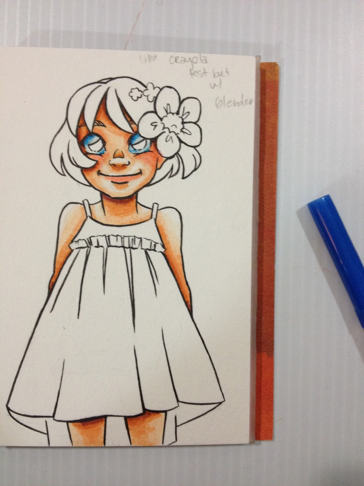
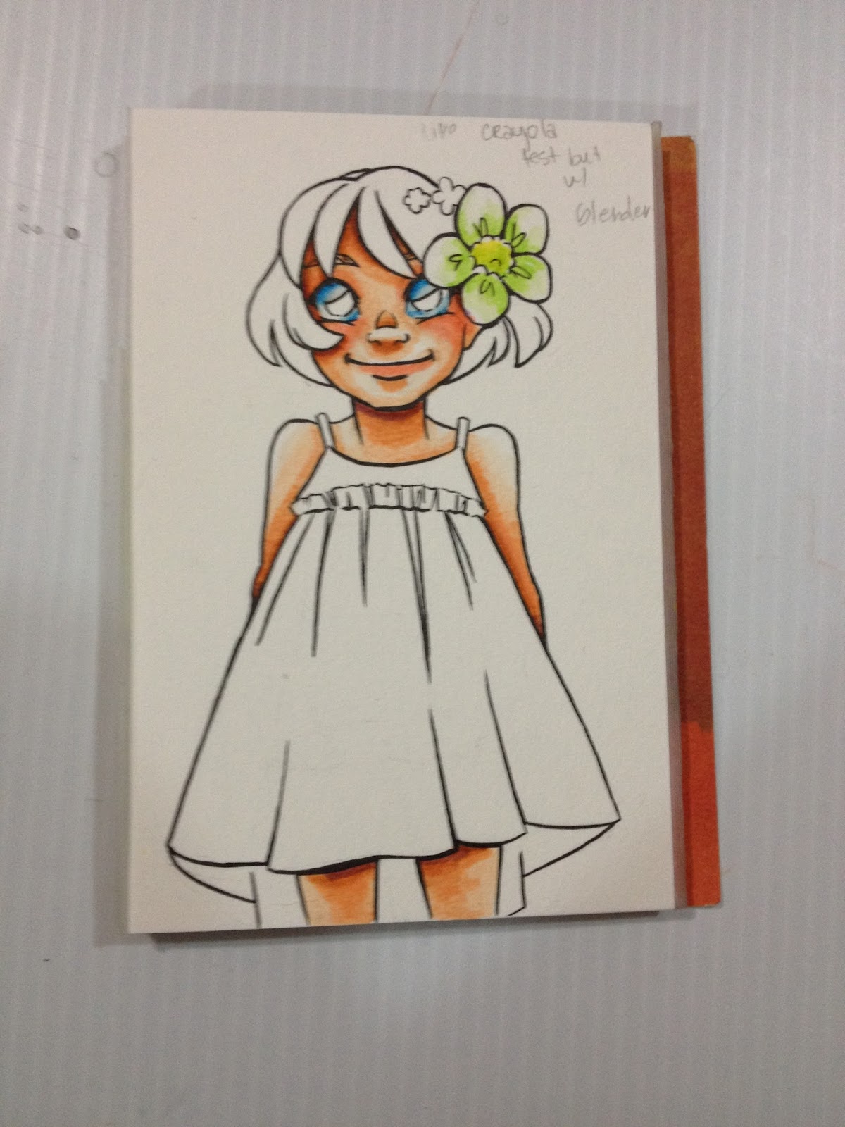
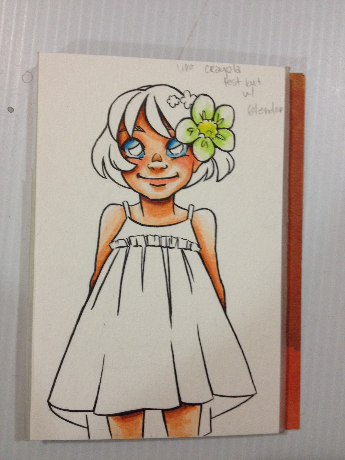
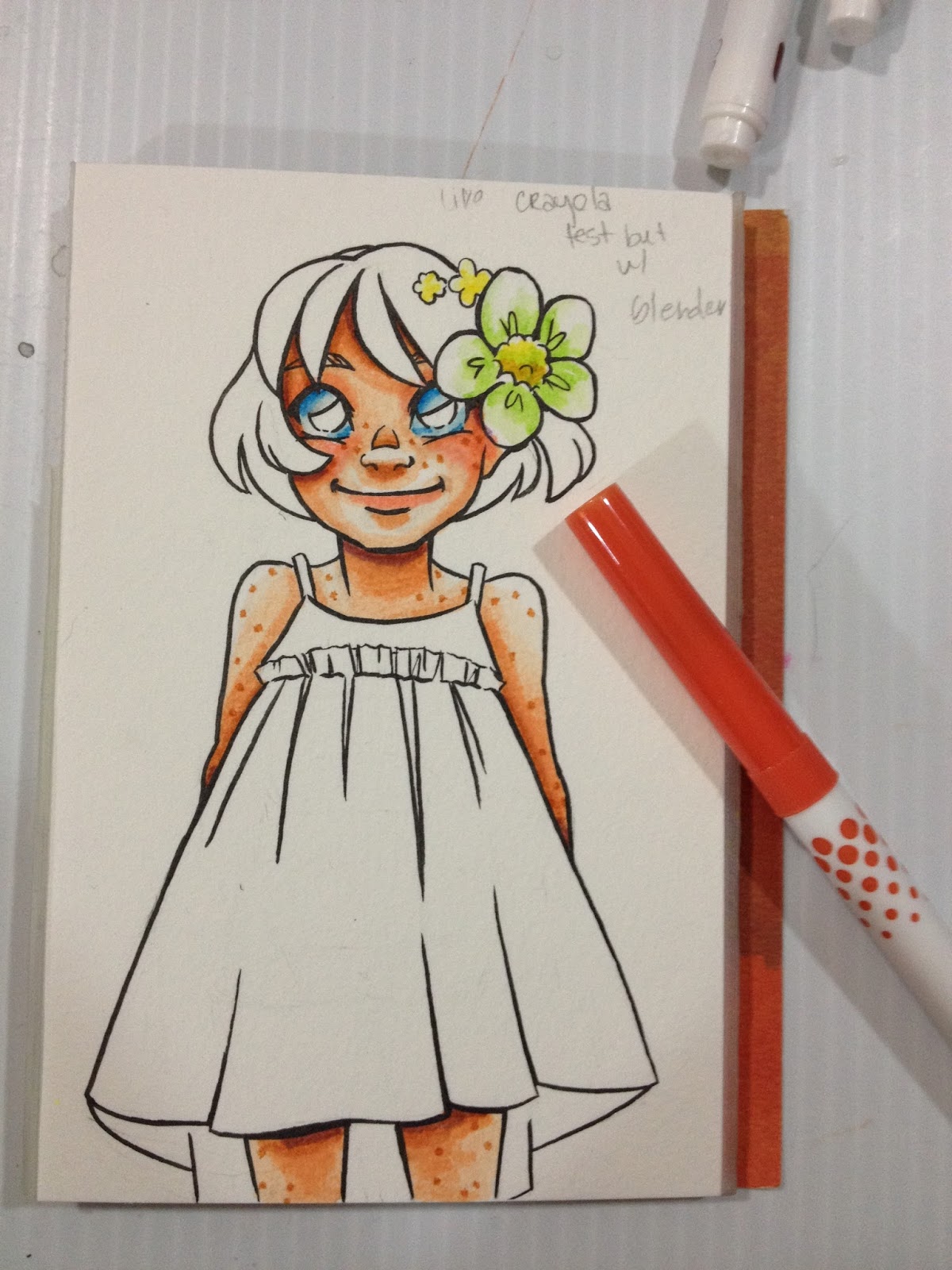
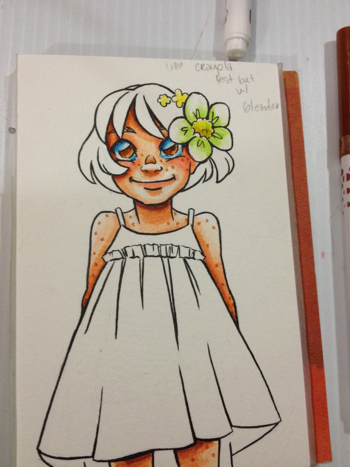
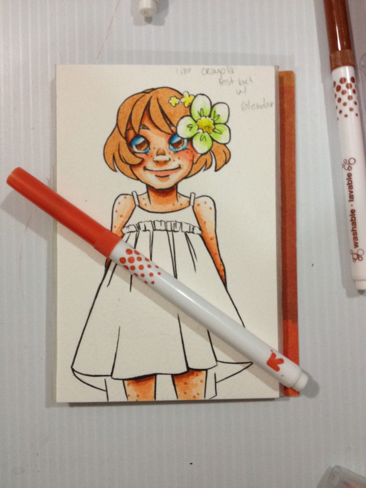
None of the blues are light enough to be used to shade the whites of the eyes, and can't be blended out light enough using the Tombow ABT colorless blender.
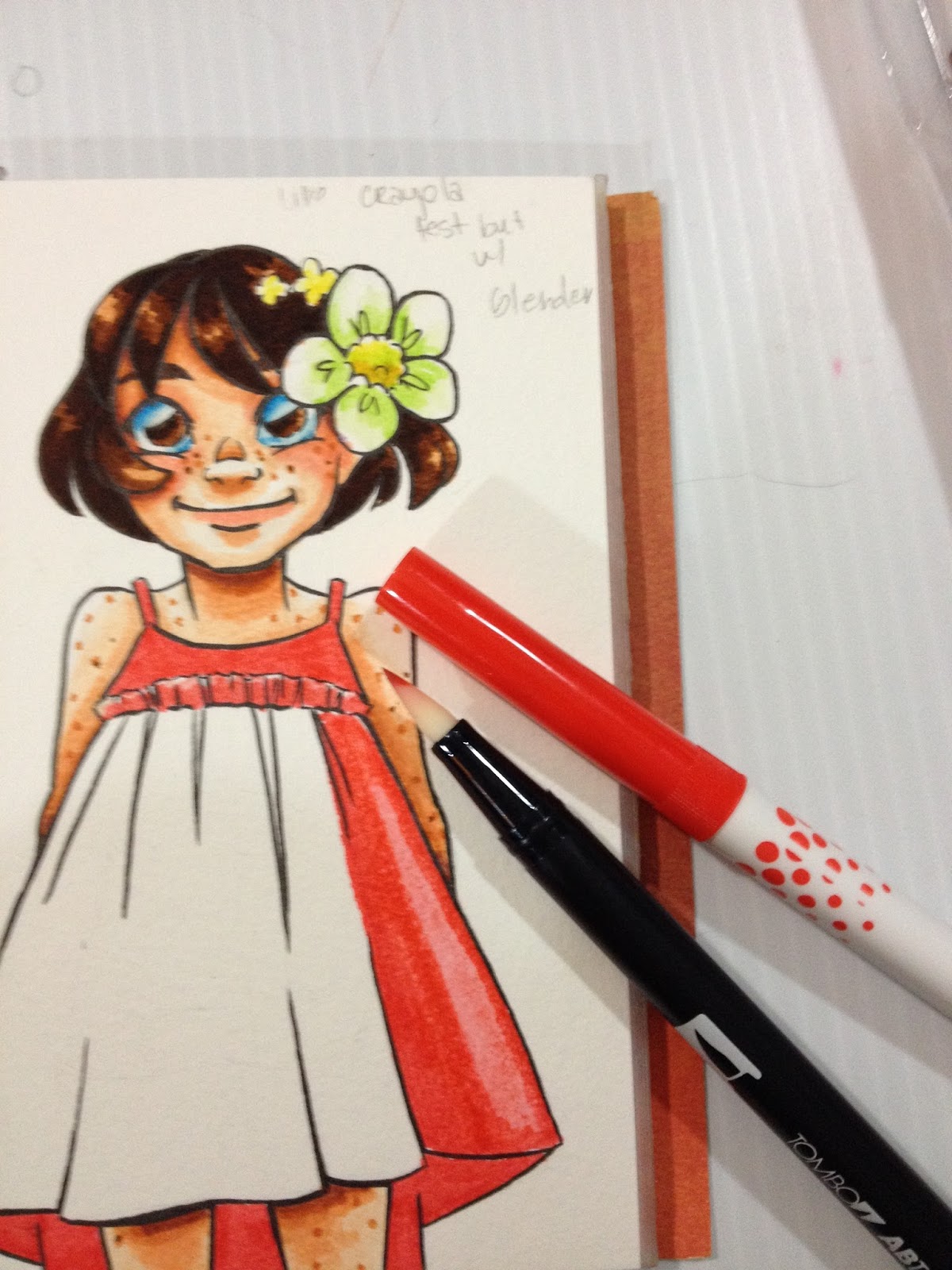
Even intense colors like red are blendable- apply your first layer of red, blend out into the white using the Tombow ABT colorless blender. When your first layer is done, you can start laying in shadows with the same red for more intense color.
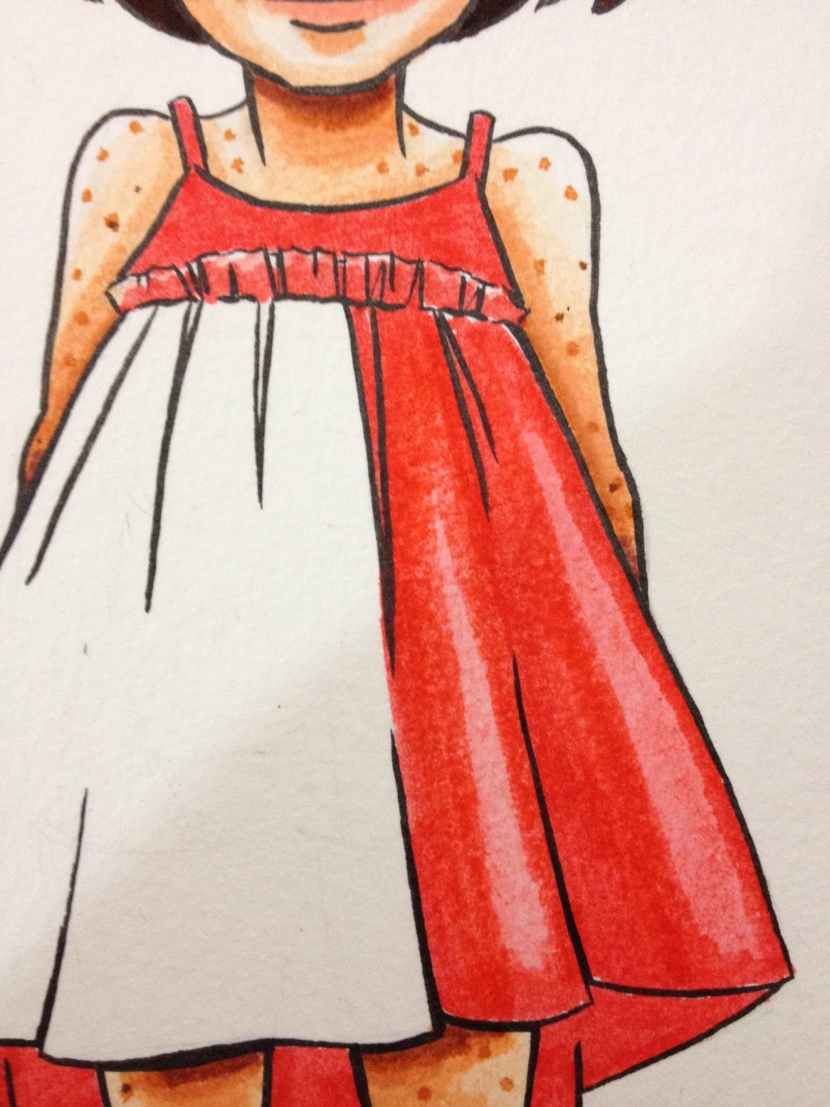
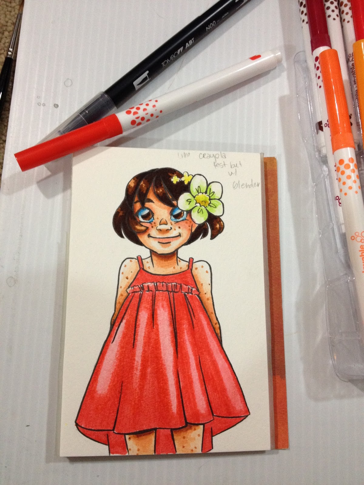
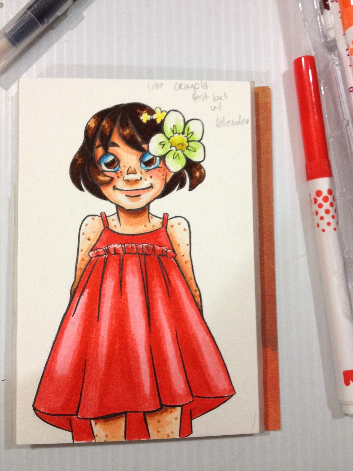
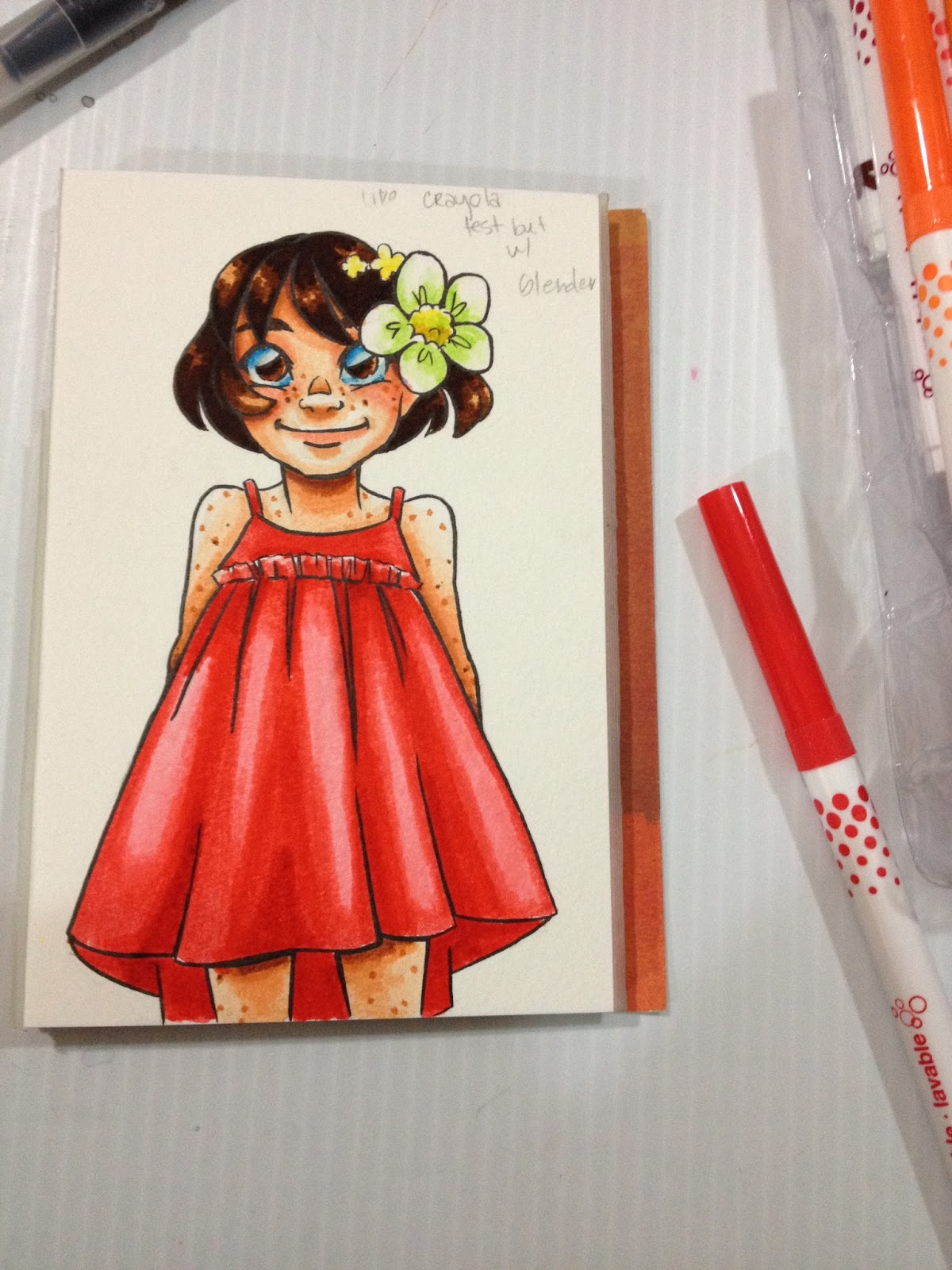
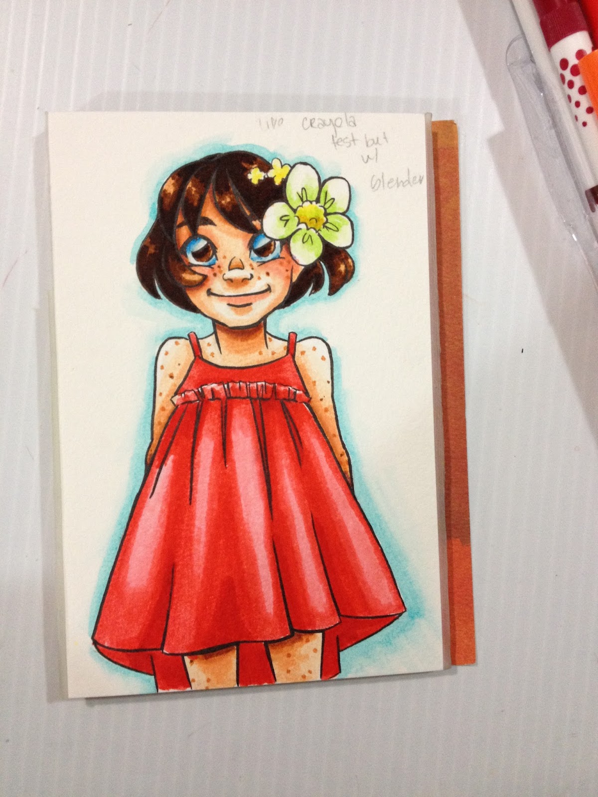
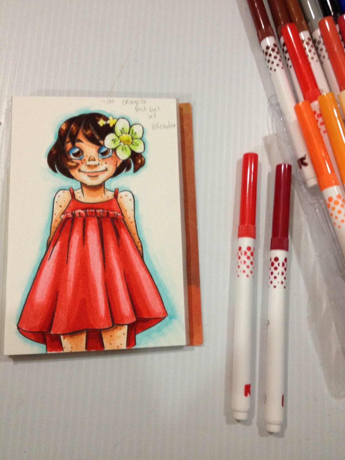
The darkest shadows can be added in with the darkest red, and blended out using the last red you applied, or using the Tombow ABT.
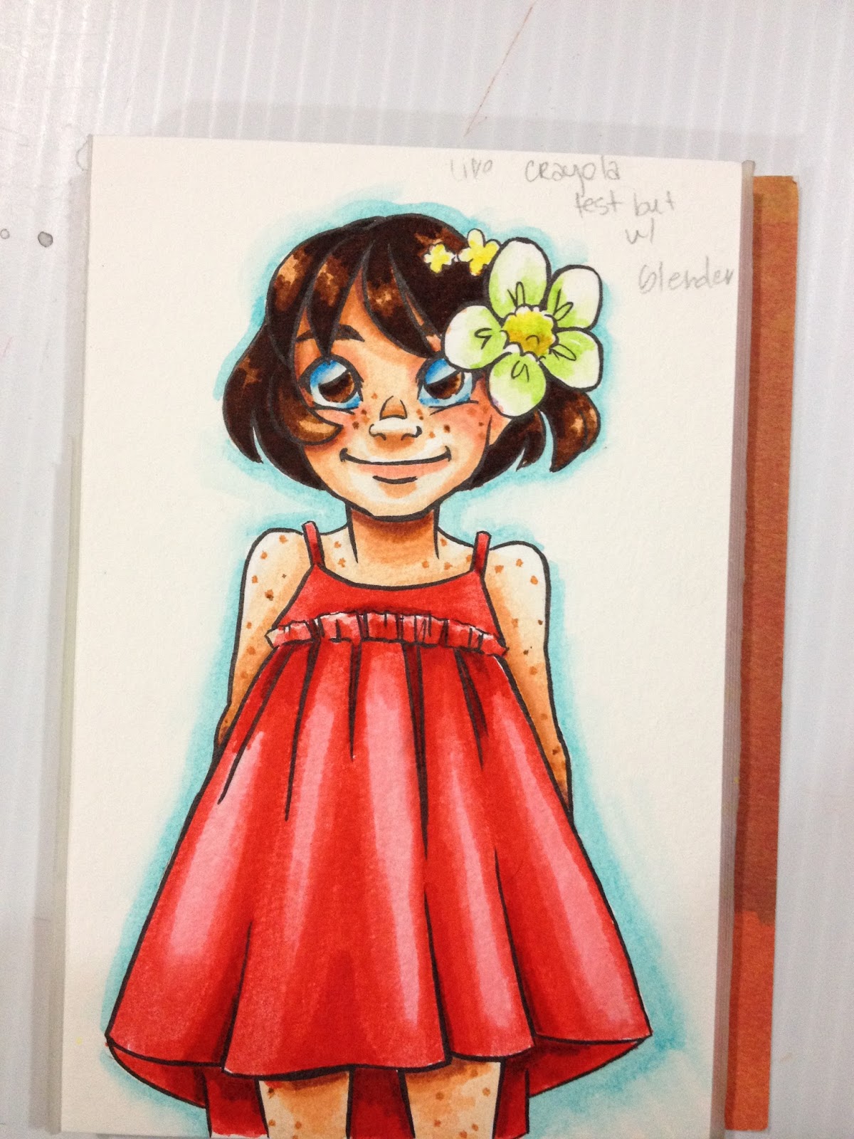
These markers blend and layer surprisingly well, better than the Crayola Supertip markers do. Like A LOT better. I have to assume the ink is made out of something different, it feels a little greasy, and the tip seems to just glide over areas I've already applied color to.
Field Test on Pacon Marker Paper
Pacon's marker paper hasn't performed well with waterbased markers up to this point, and I wanted to see if these magical Up and Up markers would handle any better than their competition did.
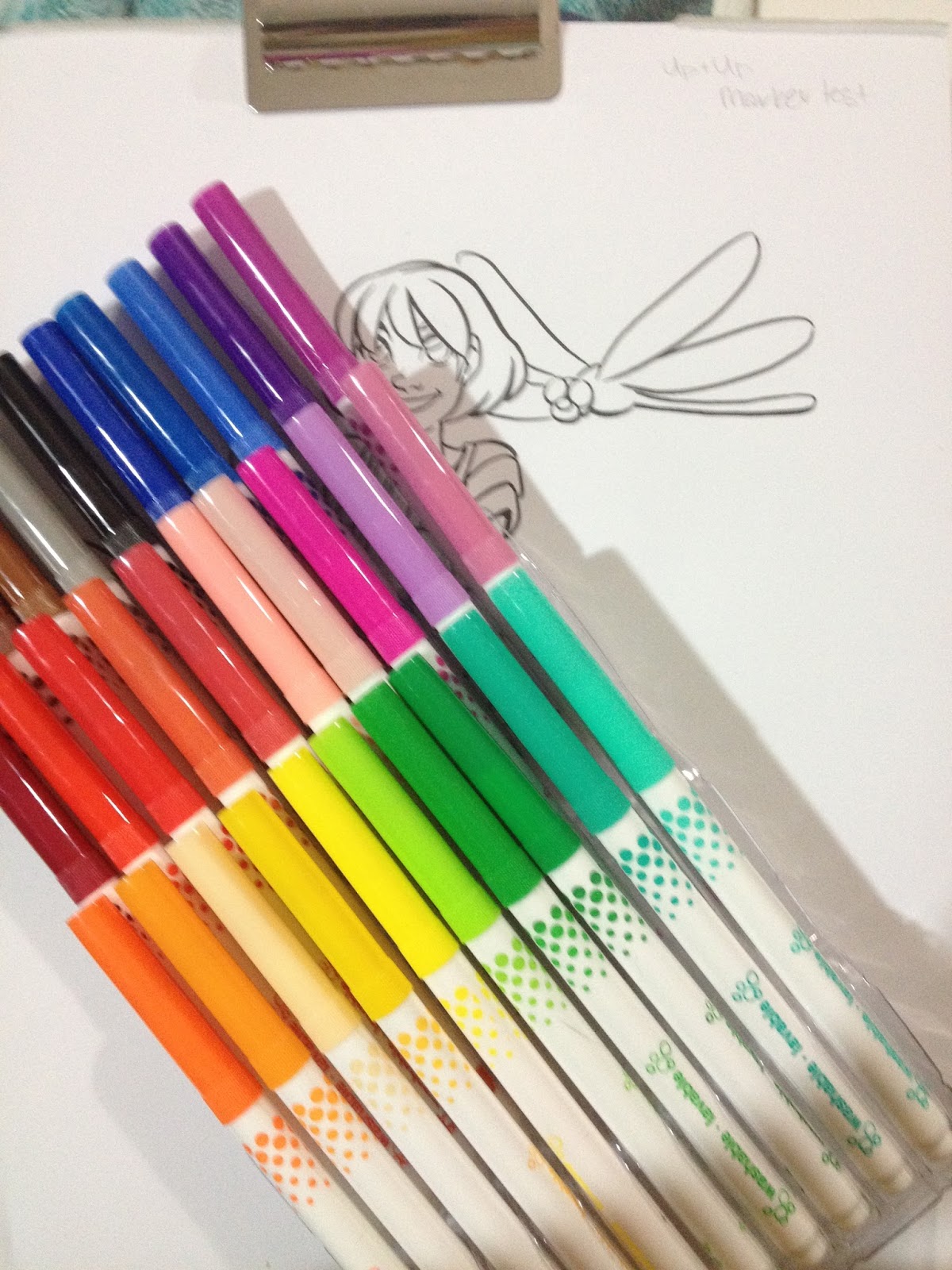
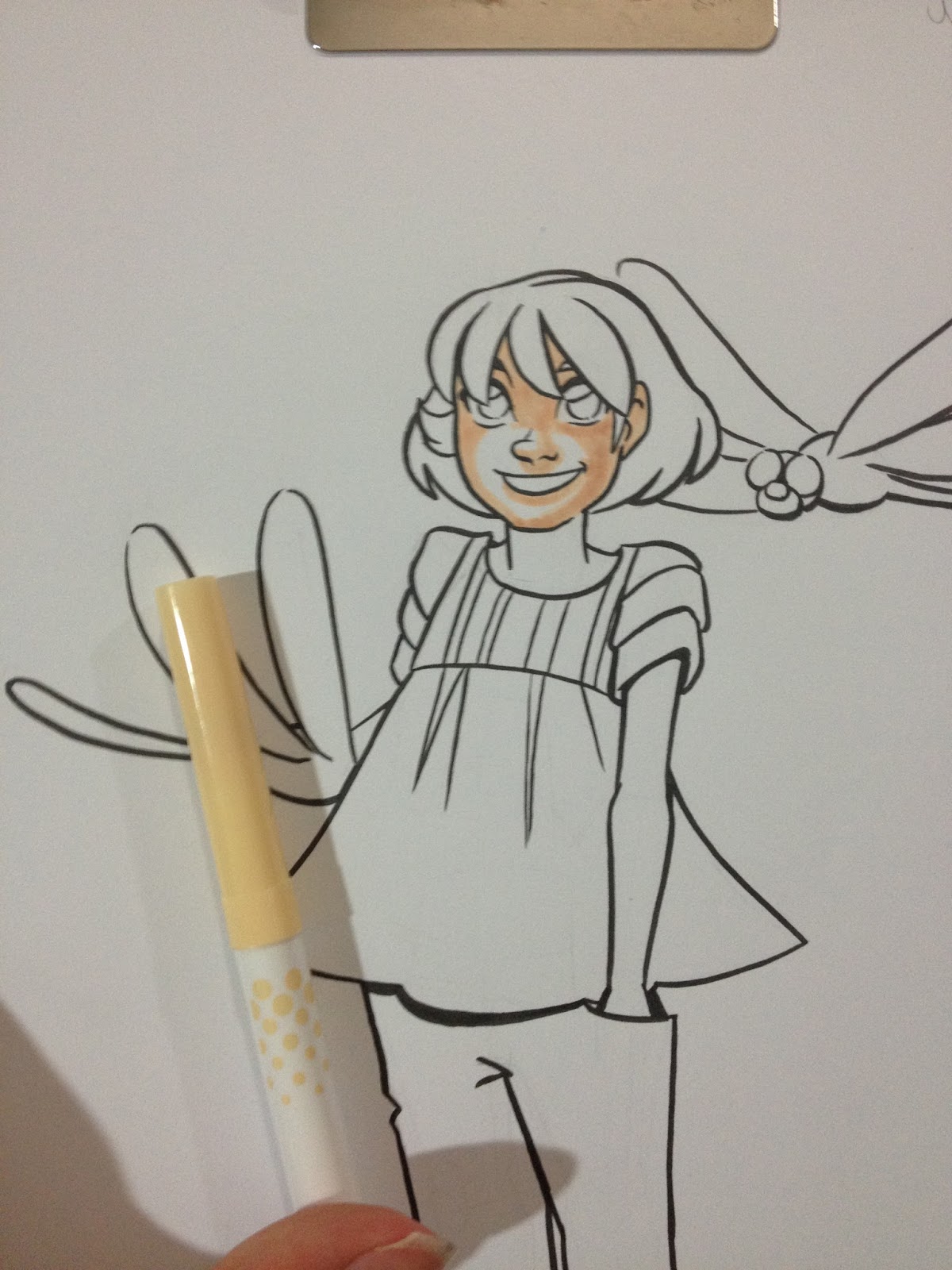
Although these markers worked well for the field test on wood pulp watercolor paper, I tried a different tactic for applying shadows for the Pacon paper test- the same technique used to apply shadows for my Crayola Multicultural skintones review.
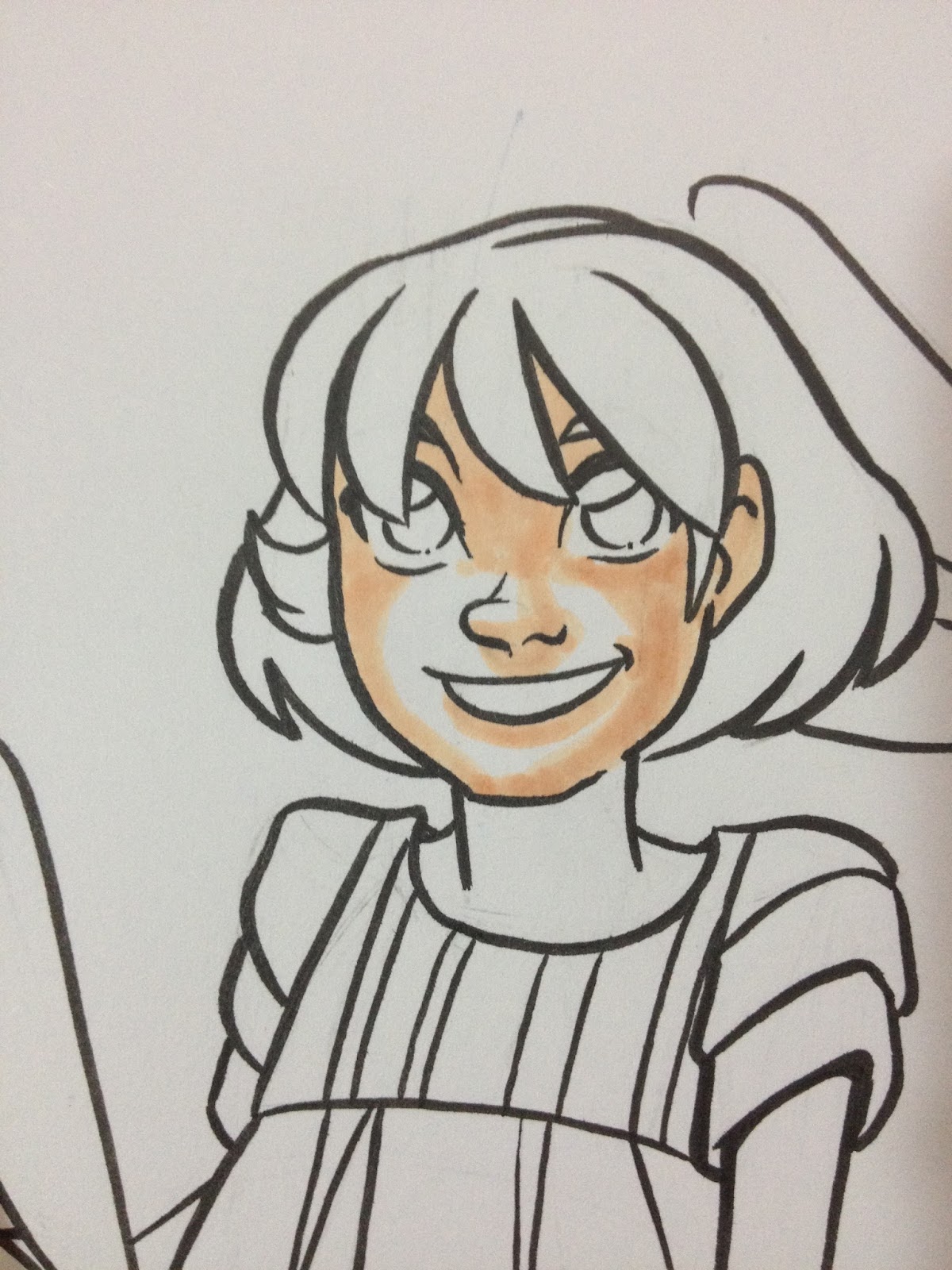
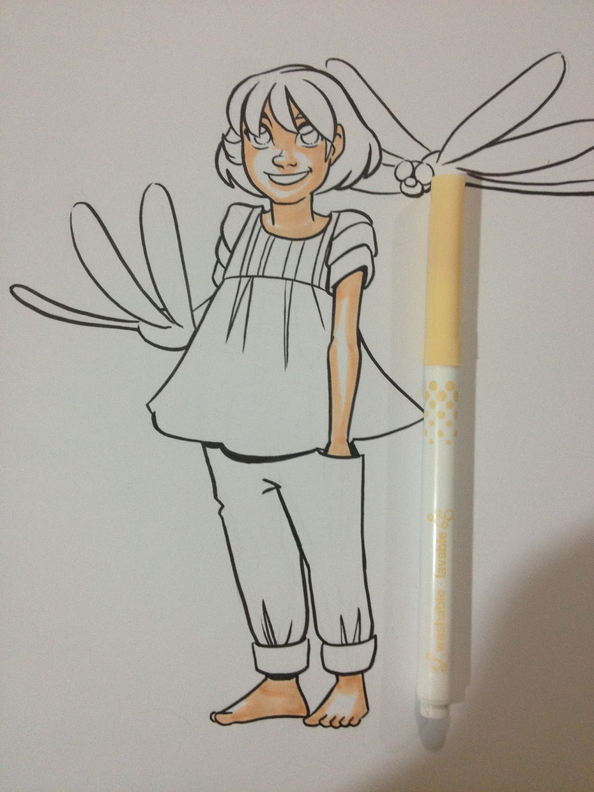
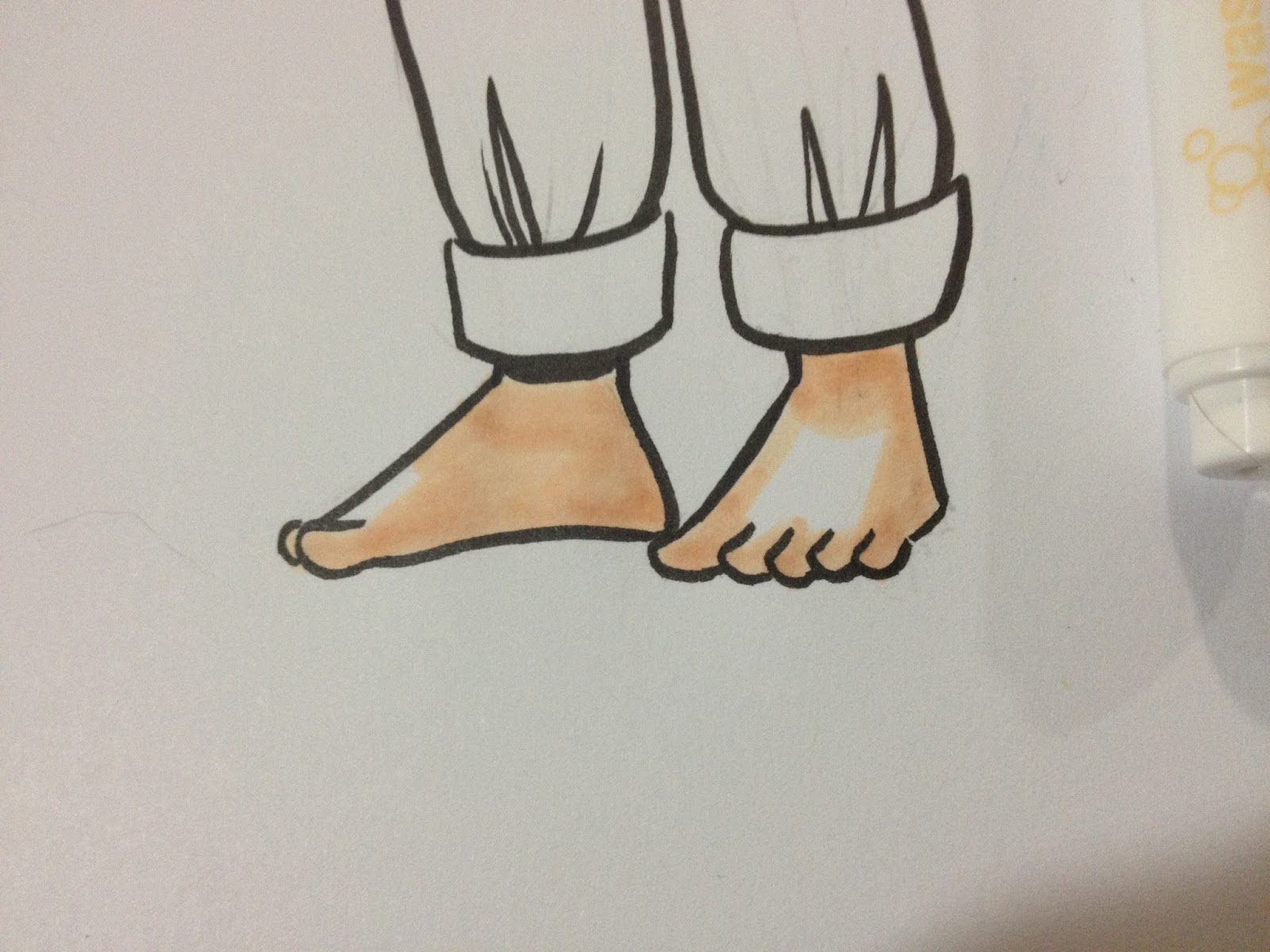
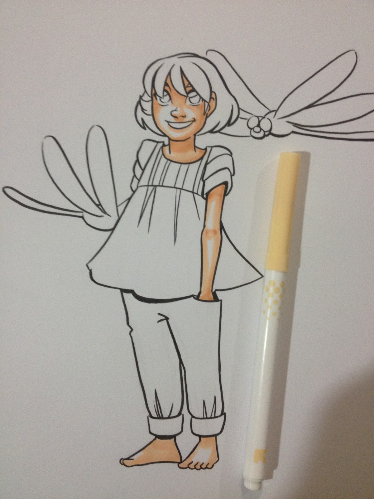
With a shorter dry time than Crayola markers, you can add additional layers of the same color to build up shadow without tearing or pilling the paper.
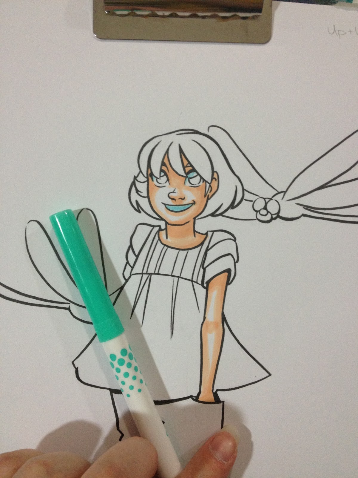
Since the blue used in the other field test was too intense for the whites of eyes, I used an aqua that was a bit more subdued.
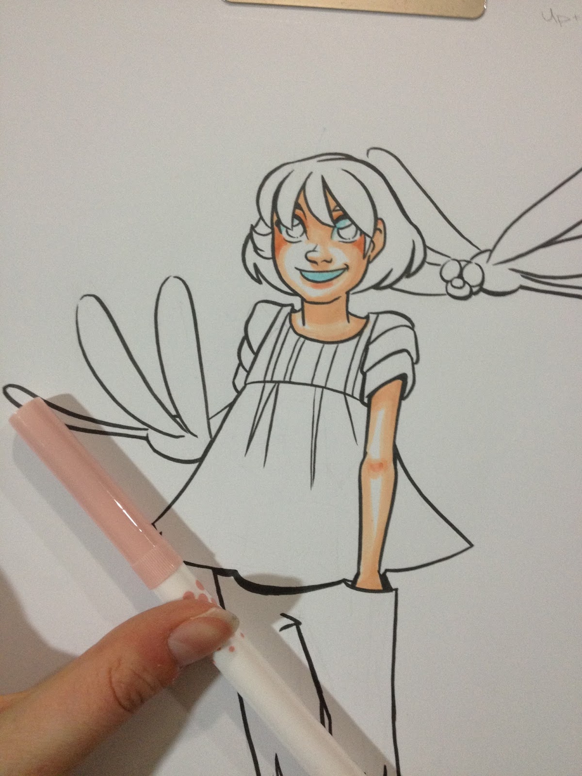
Pink is added to the cheeks, lips, and inside of Kara's elbows.
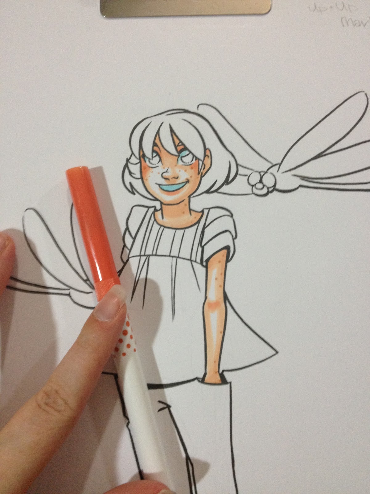
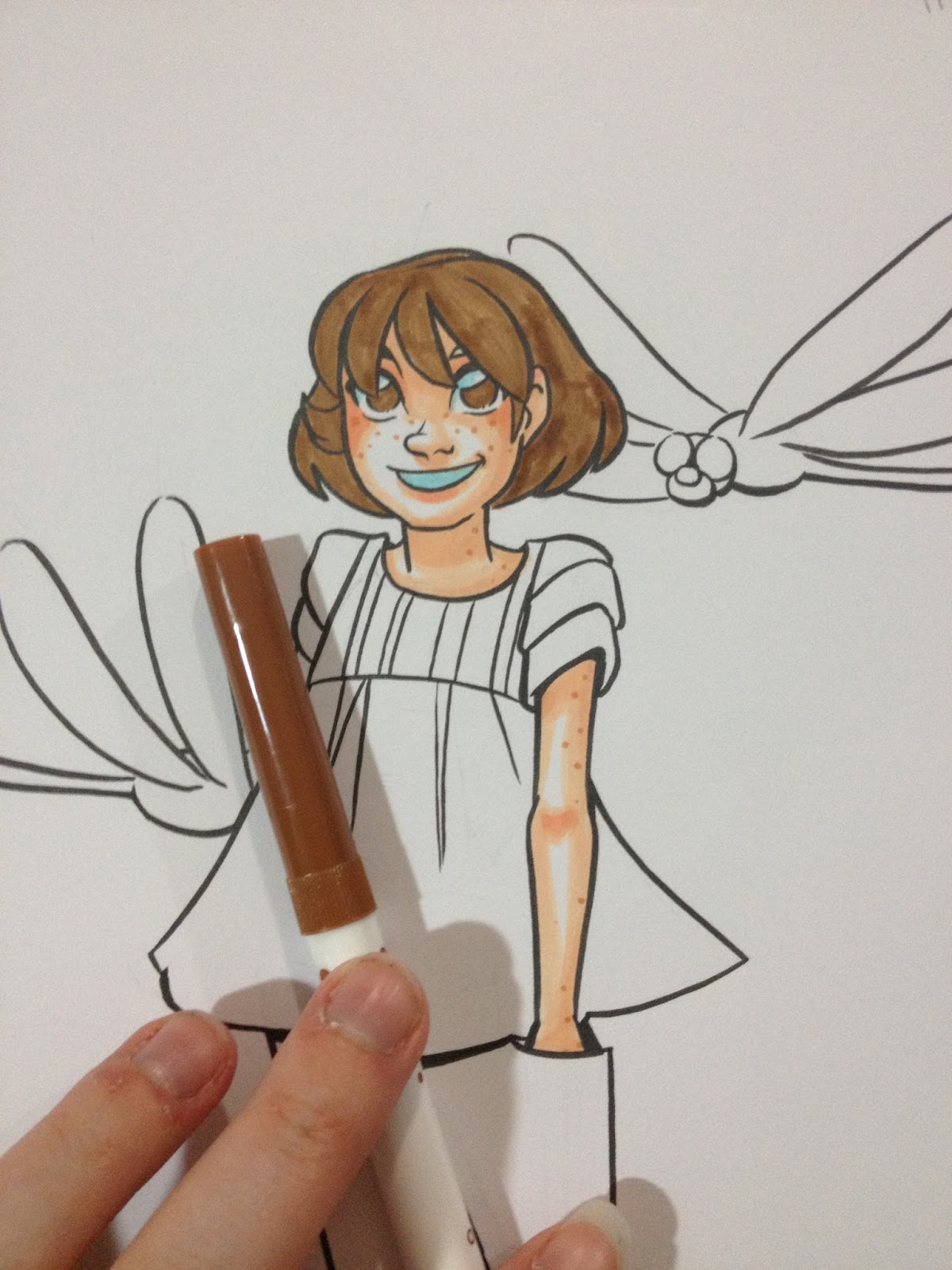
Since I knocked in all of her hair at one time, I decided to give it plenty of time to dry before adding another layer, and turned my focus to her shirt.
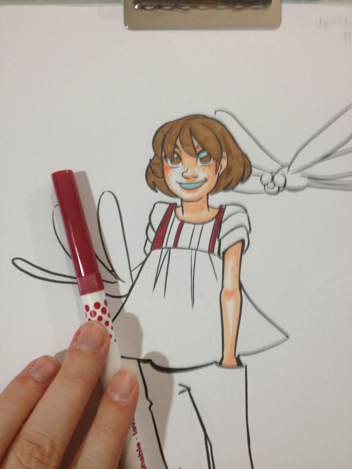

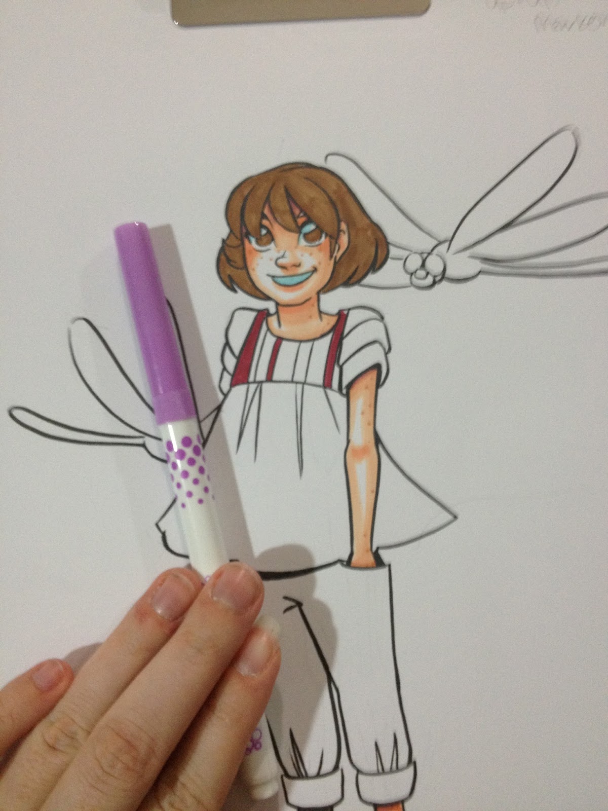
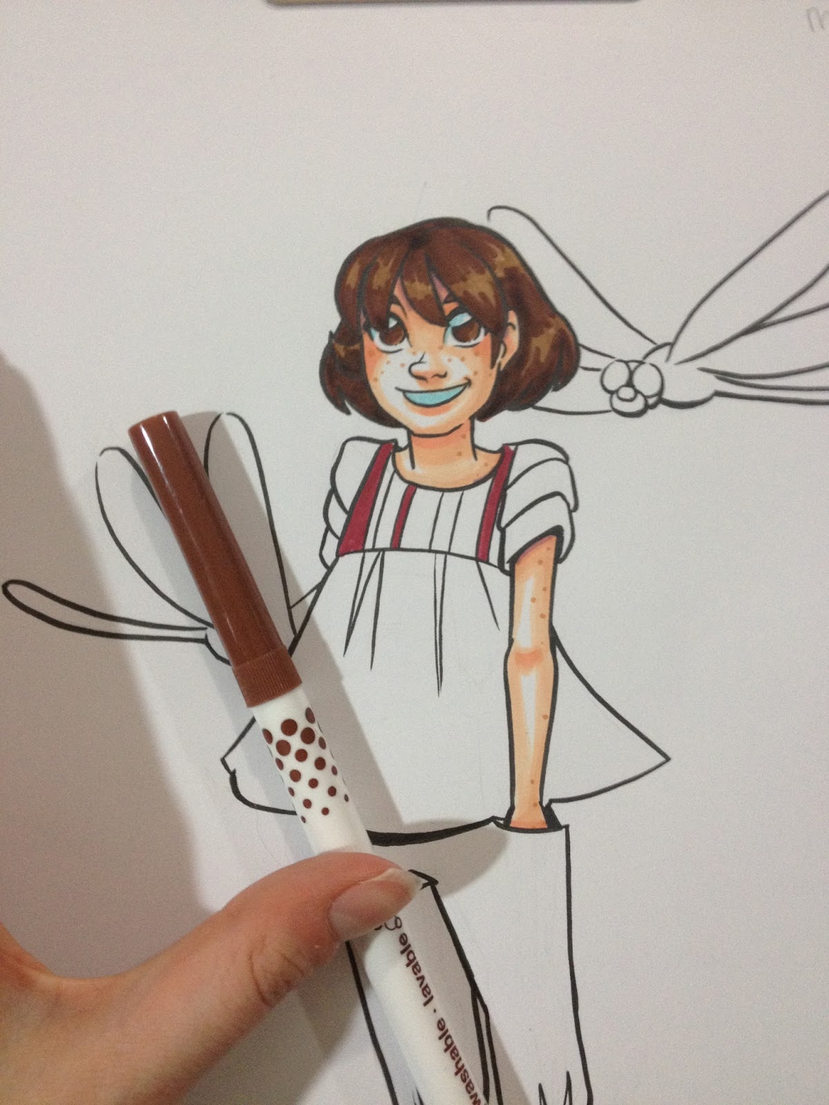
Once her hair was fully dry, I added another layer of brown, to show highlights.
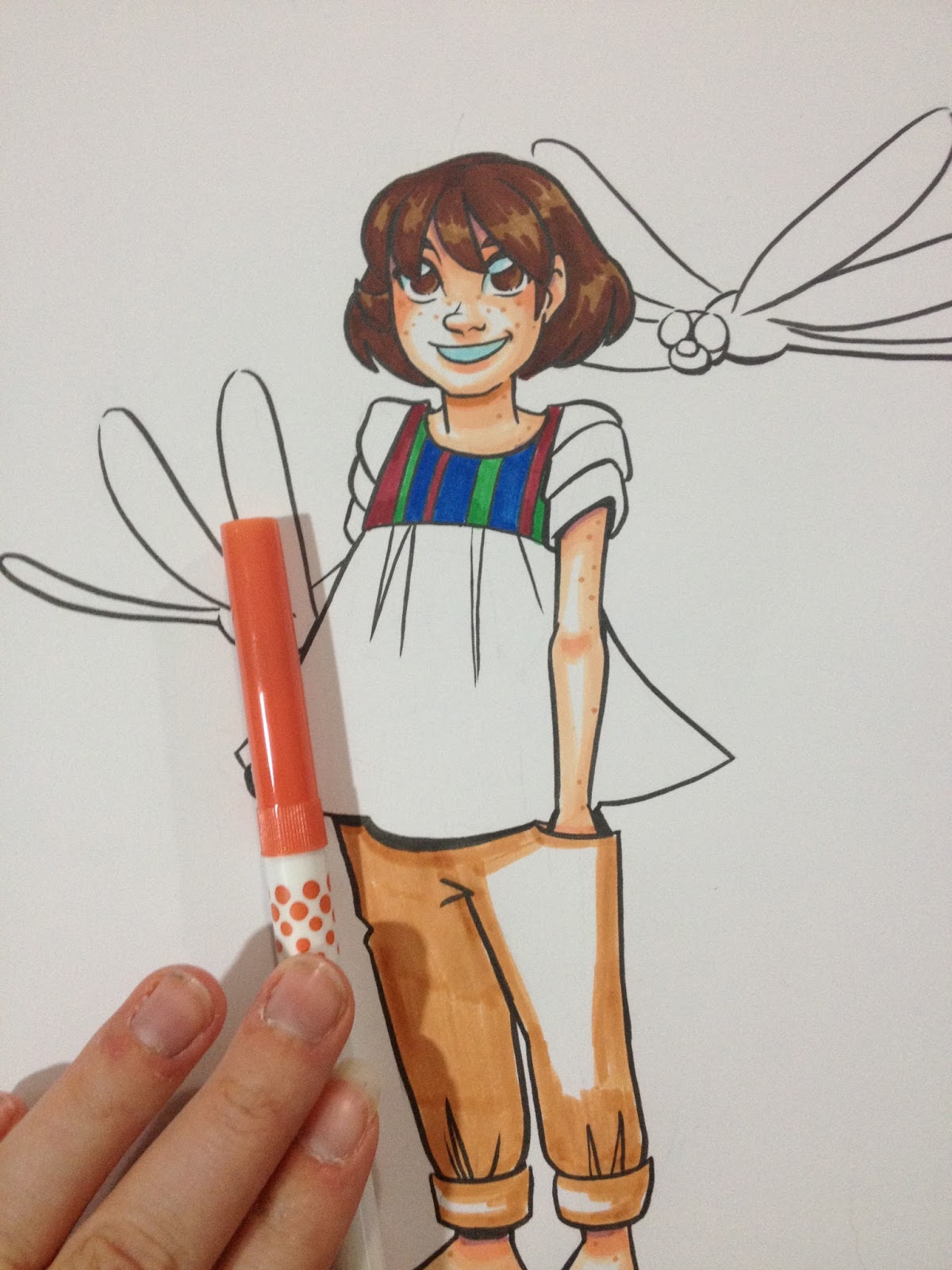
Applying the first layer of brown to Kara's pants.
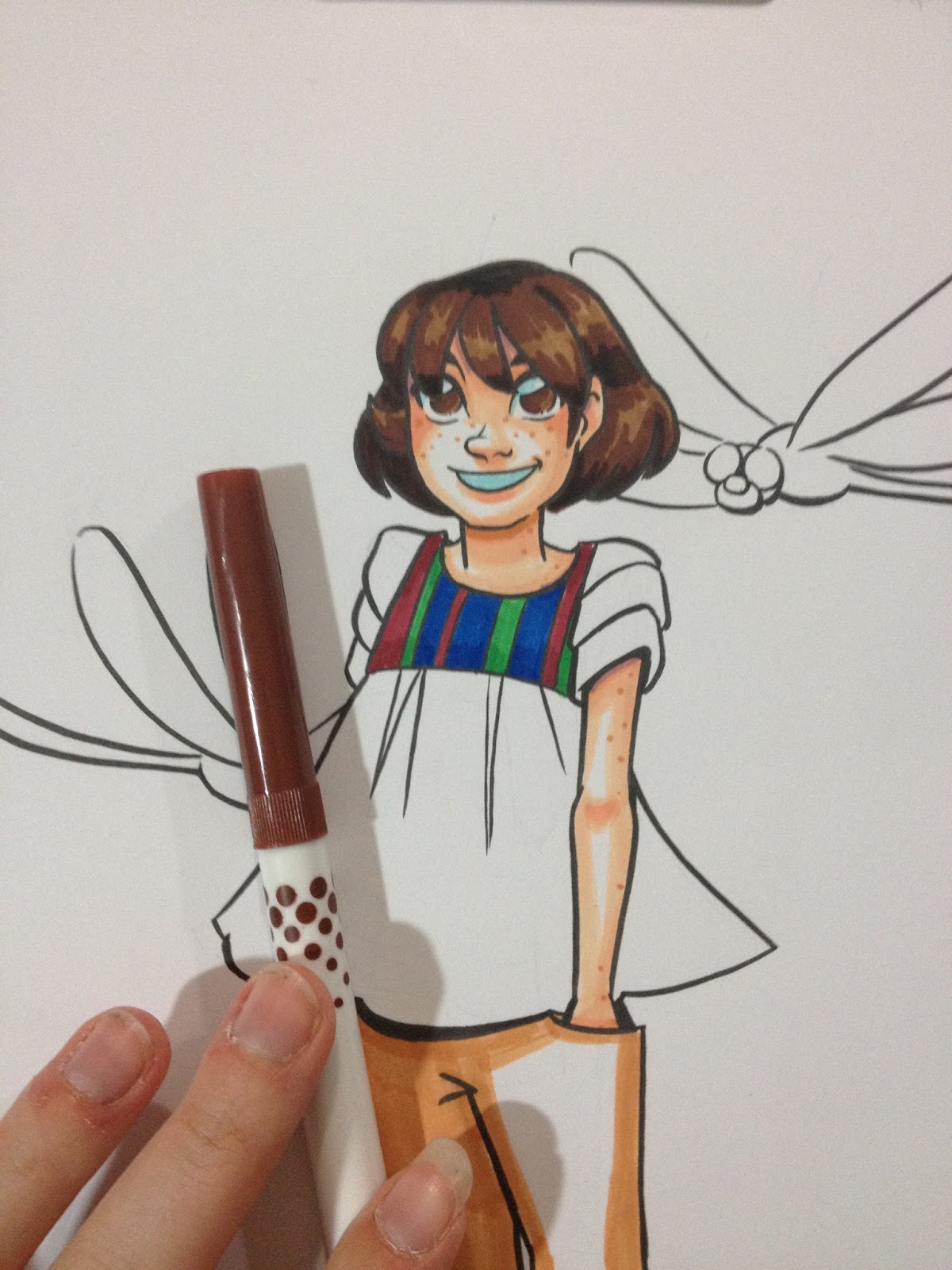
And a third layer of brown to Kara's hair, as well as shadows to her eyes and eyebrows.
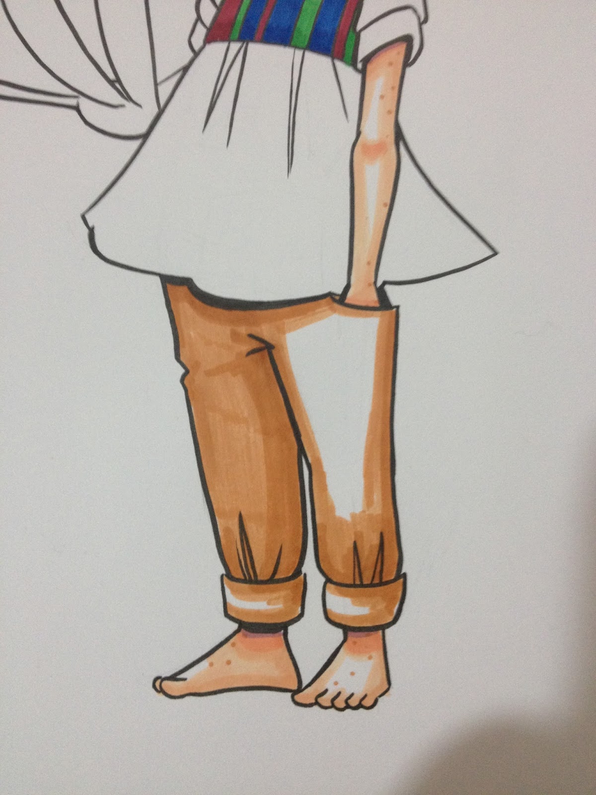
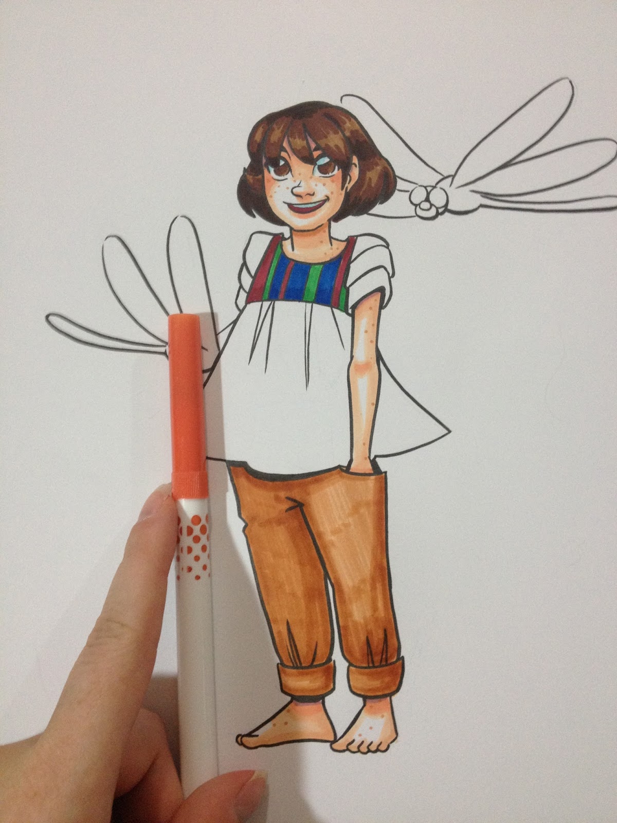
I ended up blocking in the area I'd left open on the pants- there was too much contrast between the white and the brown to be believable as highlight and shadow.
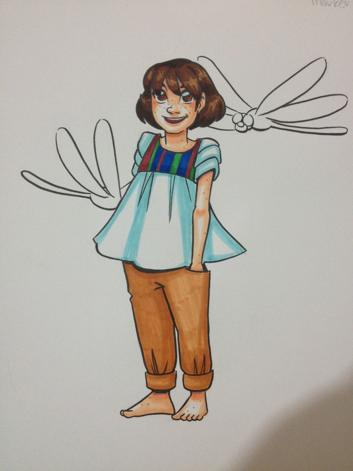
Using the same aqua I'd used for Kara's eyes and teeth, I apply shadows to the white on her shirt.

As well as the dragonflies' wings.
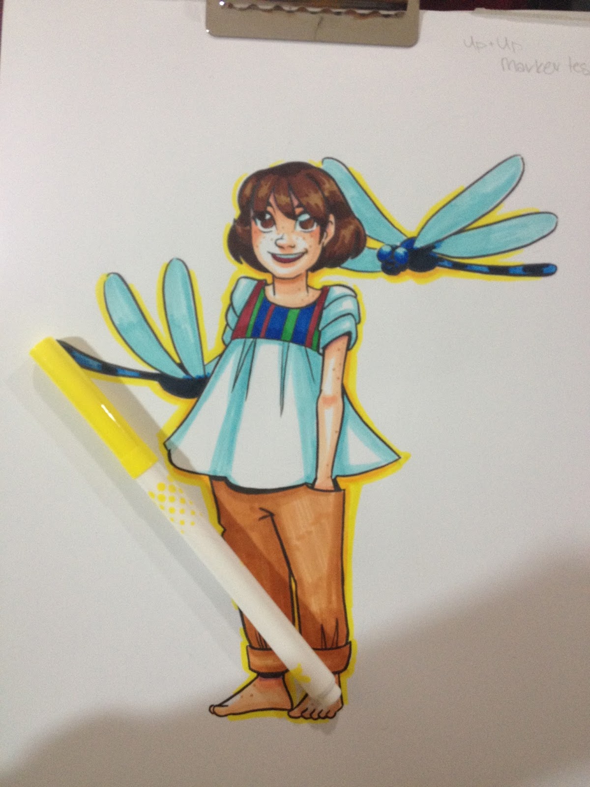
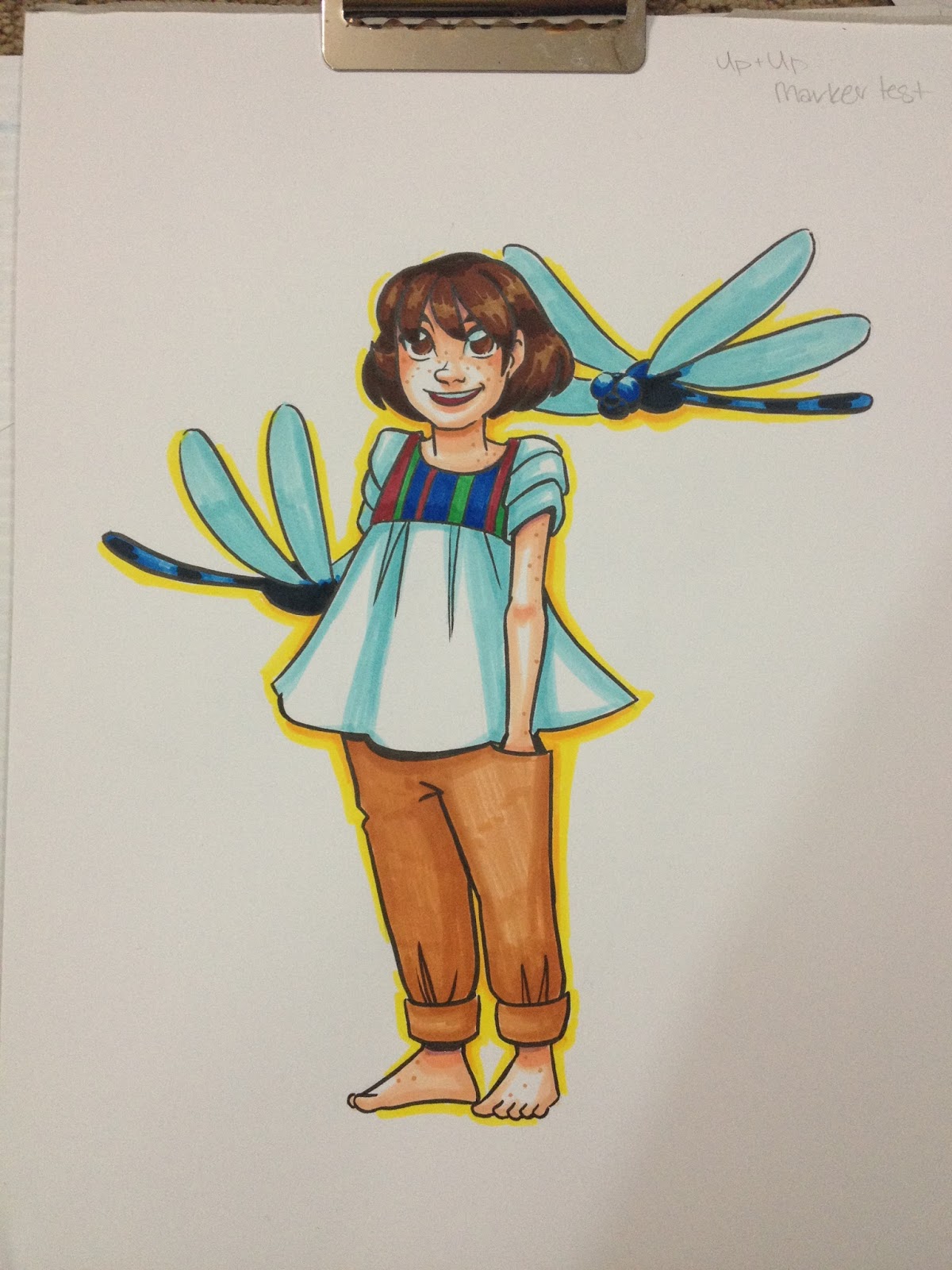
Somewhat surprisingly, the Up and Up waterbased markers perform well even on Pacon's marker paper, perhaps due to (what I assume is) more glycerin in these markers. There's some bleed through on this thin paper, but not enough to effect the page beneath, and the markers can be layered more than other waterbased brands.
The Verdict
 Top: Up and Up Markers were used as Watercolor markers (left) and as waterbased markers (right)
Bottom: Crayola Supertip markers were used as Watercolor markers (left) and waterbased markers (right) Both markers were used on Fabriano cotton paper for the watercolor marker test, and on Fluid woodpulp based watercolor paper for the waterbased marker test.
These aren't really a replacement to the Crayola Supertip washable markers (I recommend you splurge and go for the 50 pack, it's $7.99 at Walmart), but an addition to your collection as the Up and Up 30 count Washable markers have several colors that are very different from the Crayola set. The Up and Up set has more colors that work as skintones, both as watercolor markers and as waterbased markers.
These markers aren't nearly as pigmented as the Crayola Washable Supertip markers, but they're far less likely to tear the paper up in dry applications. They're a bit hard to use for watercolor markers, but they're much better at regularly coloring without pilling or paper destruction. They layer well, and even blend a little bit, which is really surprising for waterbased markers. When water is added (like for watercolor markers) they feel soapy and it takes a lot of ink to build up layers of color. You can use waterbased colorless blenders like Tombow ABT or Marvy LePlume II to blend these markers a pretty significant amount, which is something I have yet to test with other waterbased markers.
Unlike with alcohol based markers, using a colorless blender with Up and Up washable markers spreads surface color to new areas, rather than pushing the color to the back of the paper. This means you can't really use the colorless blender to lighten up dark areas so much as you can use the colorless blender to darken up light areas.
When I first purchased these markers, I assumed they would just be a Crayola Supertip clone, but these markers held many surprises for me, and I think they'll surprise you too. Layering, blending, not tearing up the paper with repeated use? Sounds more like an alcohol based marker than a waterbased marker, and while I'm positive these aren't alcohol based markers, I think there's something besides water and ink in these barrels.
If Crayola markers are giving you a hard time, and you've disliked other waterbased markers you've tried, consider giving Up and Up waterbased markers a shot- they're unlike any other kid-grade waterbased markers I've tested yet. If you're a convention artist looking for a way to add color to your work without lugging around heavy, expensive alcohol based markers, and you want to skip the wait time of watercolors, these markers might be a great solution to your issue. If you have a kid in your life who's been eying your alcohol markers, these might make a great, non toxic, very affordable introduction to markers for illustration purposes. All in all, I highly recommend Up and Up's Washable Markers.
EDITOR'S NOTE: I went back and tested the Crayolas with Tombow ABT, and they work well too. So if you'd like a little blending to your waterbased markers, consider picking up a Tombow ABT colorless blender.
Other Waterbased Markers I've reviewed
Walmart Art Supply Review- Waterbased Markers (CraZArt and Crayola)
Crayola Multicultural Colors
Please consider donating to this blog or purchasing from Natto-shop (http://nattosoup.com/shop) if you want me to continue publishing quality content. All materials tested were purchased from my own pocket. Keep on Truckin' Nattosoup is not under any sponsorship.
December 23, 2015
The Secret to Being a Creative Person
Is hard, repetitive work that nobody ever sees. Sketchbooks filled with sketches and studies, honing fine motor skills and developing the ability to see things. Long, monotonous, unsexy hours spent hunched over paper or canvas, in a messy studio, or outside on gray ugly days.
If you want to be a creative person, draw from life. Draw with whatever media you can get your hands on, whenever you have a free moment. Draw your kids. Draw your cats. Draw your mug collection. Don't worry about being 'creative' until you have an idea you want to pursue. Don't worry about impressing anyone, and don't worry about taking overpriced online classes on creativity taught by people who promise things they can't deliver.
Look at what other artists are doing, and not just the ones you like. Develop a healthy curiosity, become NOSY. Be nosy about what the birds are up to out your window, what the cats are getting into downstairs, what your kid thought of his best friend's packed lunch. Eavesdrop at cafes, take notes, make sketches. Give yourself free hours where you idly sketch or just brainstorm. Turn the TV off in the evenings, don't turn to Facebook when you're bored. Boredom is the ally of creativity, boredom gives Inspiration room to speak, and gives you the silence to hear it.
Creativity is free. You were born with it. You don't have to pay for it. Kids are creative. You don't have to be taught creativity. You just have to open your mind and your ears, let your mind wander. Creativity, like opportunity or luck, is best when you've prepared for it, when you create a nice little nest of skills, hardwork, and technical knowledge. Carry a sketchbook, or scratch paper, with you EVERYWHERE, you never know when inspiration will strike. Carry pencils, carry pens, and teach yourself not to be overly picky in the materials you use. Your muse isn't going to sit and wait for two hours for you to get out of work. Even a rough sketch on a receipt is enough to capture the magic, to preserve it for later.
If sketchbooks freak you out, draw on printer paper. If clean sheets of paper intimidate you, draw on the backs of used printer paper. Draw on paper bags. Draw with cheap colored pencils, draw with china pencils, draw with whatever works for you while you're honing your skills. Don't worry about impressing anyone, don't worry about sharing your progress until you feel comfortable doing so.
Have you ever tried to draw something from your head, and no matter what you tried, it just didn't come out right? For many, the issue isn't coming up with ideas, but being able to execute them. While your artistic ability and creativity are separate, your satisfaction with your work may be tied to how well you're able to render what you see in your head. If you're disappointed in your work, or struggle to capture that mental impression, there's a good chance you just haven't developed the fine motor drawing skills necessary to be able to execute what you imagine. That's why so many artists recommend practice by drawing from life or from reference. The more you draw from life, the larger your mental store of images will be, and the more often you draw, the more your hands will remember the correct motions.
Another issue maybe that your scope is too big. Don't go about painting a mural by just slathering paint on the wall- you need to plan for it! Draw numerous thumbnail sketches with a variety of compositions until you find one that works the best, then blow that up into a slightly larger drawing where you refine details, then project that onto the wall, and rough your drawing in with chalk or charcoal. I work on my comics in stages- scripts, thumbnails, roughs, pencils, then I paint. I can't imagine trying to draw comics right on the watercolor page with no planning- it would end up a mess.
Lastly, if the ideas are just NOT coming to you, it may be because your life is too crammed packed, you don't leave time to BE creative. If you have trouble accessing that inner creativity, maybe you ought to tone down your inner critic first, and give yourself permission to make mistakes and learn. Don't expect perfection overnight, and don't assume that by taking an online class that promises to teach you the secrets of creativity, you'll suddenly understand how to use the years' worth of art materials you've hoarded like a dragon.
I'm not going to pretend like I'm an expert on creativity with you guys. There are plenty of professionals with doctorates who study it far more in depth than I have. To be honest, I take it for granted- it's like a faucet, when I need it, I turn on the taps and let it run. Creativity is a big part of what I do, but it's dwarfed by how important prep work and research are to making that creativity count. I have a masters degree in Sequential Art, and a BFA in Digital Art, and I've been involved in the fine art gallery scene, the commercial art freelance arena, and the murky swamp that is self published kids' comics. I'm not a fan of trying to obfuscate things so I can make a profit by attempting to clarify. I'm also not into the notion of selling fake miracles- the only thing I guarantee is that if you put the hours in, study hard, practice often, and seek critique, you will improve. There's no overnight success, no magic pill you can pop, or magic class you can take that's going to make you a creative, artistic genius who's comfortable in their own skin. Believe me, if there were such a pill, or such a class, I would've taken it long ago, as would many comic artists. In order to be comfortable with calling yourself an artist, you have to get used to thinking yourself as an artist, and for many of us, that comfort comes with filling sketchbooks and producing work. My regular readers KNOW how much I draw, you've seen the sketchdumps full of studies, and that's honestly the bare minimum I need for my fingers and brain to remain limber. My super dedicated readers, the ones who follow my Twitter and Instagram, know how much I draw EVERY DAY- not a day goes by where I don't post something I drew that day. You guys don't have to follow what I do- it works for me, but I can't promise it will work for everyone- but you know my advice comes from a very sincere place.
Things I Find Helpful:
Setting limits and restrictionsWorking along a themeFinding an area I want to improve, and hyperfocus on thatFinding an audience I want to serve (or attempt to serve)Working on monthly challengesKeeping logs of ideas- in my sketchbook, on my phone, in notepads. So when I need an idea for a comic, but can't come up with a fresh one, I have lots to work withSetting hard deadlines to finish projects by
Selling seminars on creativity is like bottling oxygen, and telling people that without your bottles, they cannot breathe. You're in an oxygen rich, inspiration rich environment, so just inhale. You're going to be ok. You've got this. Don't let anyone kid you that they've got the magic secret, just behind this paywall. You were magic all along.
If, knowing this, you still want to take those sort of online classes- you want the community, the inspiration, you want to meet new artists and make new friends- go for it, you've got my blessing. But please, avoid classes where there's zero promise of one on one contact, instruction, or critique with or from the instructor. You are getting absolutely nothing but hot air for your money, and you can get plenty of hot air here, for free.
Speaking of free, Lifehacker posts articles on creativity ALL THE TIME, often with studies to back their claims. Before you pay for some nebulous e-course on creativity, why not try checking out their archive? A simple search for 'creativity' brings up all kinds of information.
Build Better Habits with an Improvisational Mindset
Set Rules for What You Can't Do During Creative Time
Form Your Best Ideas With a Monthly Idea Countdown
If You Can't Come Up With a Good Idea, Brainstorm a Bad One
Don't Brainstorm With a Blank Slate
Plan Your Free Education at LifeHacker U: Fall Semester 2015
You Don't Have Creative Block, You're Just Procrastinating
Some Fresh Inspiration
Watercolor
Vivian Swift's Blog
Paris Breakfasts
Shirley's Illustrations
Comics
Ellie of the Stars
http://sadsadkiddie.tumblr.com
And hey, speaking of creative! If you didn't know, the first volume of my family friendly watercolor comic, 7" Kara, is available for purchase! You can also see lots of last year's sketches, curated in ashcan form, in Artistically Challenged, my 2014-2015 sketchbook. The purchase of both, or either, helps me keep the lights on, keep myself and my cat fed, and even gives me a modicum of self respect. You can totally feel good about yourself as a contributor AND enjoy a really cute comic/ peek into my sketchbook. If physical objects aren't really your jam, you can always send me a tip via Paypal using the sidebar link. If you opt to do neither of these things, that's cool, you are still very much welcome to keep reading this blog, but maybe considering sharing any posts you like or find helpful to your social media of choice using the handy dandy share links above? Sharing my content with your friends and family helps me expand my audience, which is always a good thing!
Please consider donating to this blog or purchasing from Natto-shop (http://nattosoup.com/shop) if you want me to continue publishing quality content. All materials tested were purchased from my own pocket. Keep on Truckin' Nattosoup is not under any sponsorship.


