
Becca Hillburn's Blog, page 31
March 26, 2017
Alternate Sketching Techniques: Watercolor Basics
This series is also made possible thanks to the generosity and interest of my Patrons on Patreon.

My Watercolor Basics series is a longform, in depth tutorial series aimed at empowering others to pursue their artistic interests. Due to the nature of these series, which require process posts, numerous examples, and in depth research, these posts are extremely resource intense. It is only due to the support and loyalty of my Patrons that I can devote the time, resources, and knowledge to posts like this. To my Patrons, I owe my sincere thanks- without you, there would be no Watercolor Basics or Intro to Comic Craft series.
For only $2 a month, you can join the Artnerd community and help support quality content like this. Your pledge enables me to pay guest artists, purchase supplies for review, and offset some of the costs these in depth posts incur. Your support inspires me to dedicate the time necessary to writing and creating art education content.
Alternate Sketching Techniques
Having a variety of image creating options at my disposal helps me stay motivated and inspired when I'm cranking out field test after field test, demonstration after demonstration. For 7" Kara pages (which you can check out here!), I will print bluelines using waterbased ink, go over those with pencil, and the bluelines will wash away when I stretch my paper. But this isn't the only way you can create an image, and you should experiment with any method that captures your imagination.
Image Creation Options:Graphite on PaperGraphite transferInked LineartColor PencilThere are loads of ways to get your thoughts out on to paper, so if you feel hampered by pencil or ink, try sketching in color pencil!
The benefits:LooserCan work in the color of your choiceCan build up subtle tone
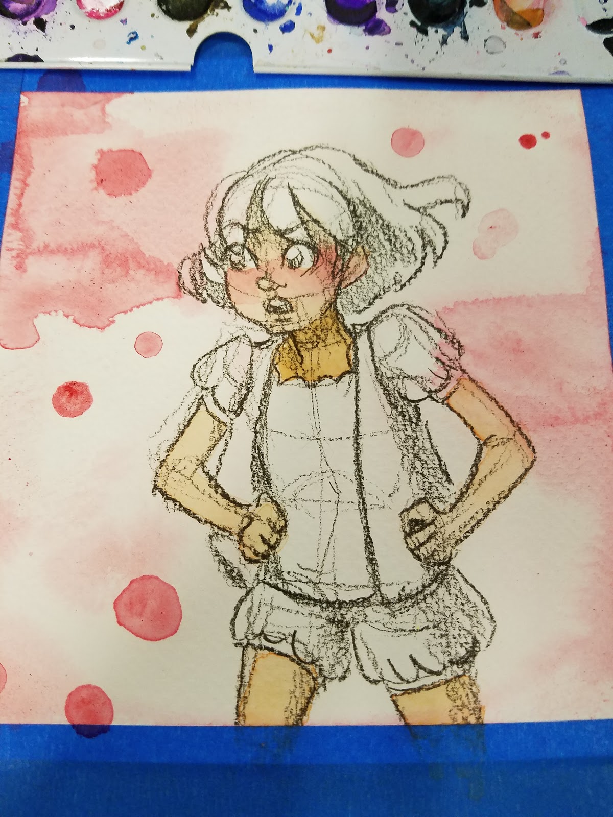
The Cons:Can't always eraseColor pencil may build up too heavyToday we're going to go over a method for image construction that utilizes colored pencils. You can find inspiration for multi-color sketches all over Instagram- many utlize colored leads such as Col-Erase, Uni-Color, or Color Eno colored leads. For this demonstration, I'm going to use something a little less water-soluble- a Prismacolor color pencil.
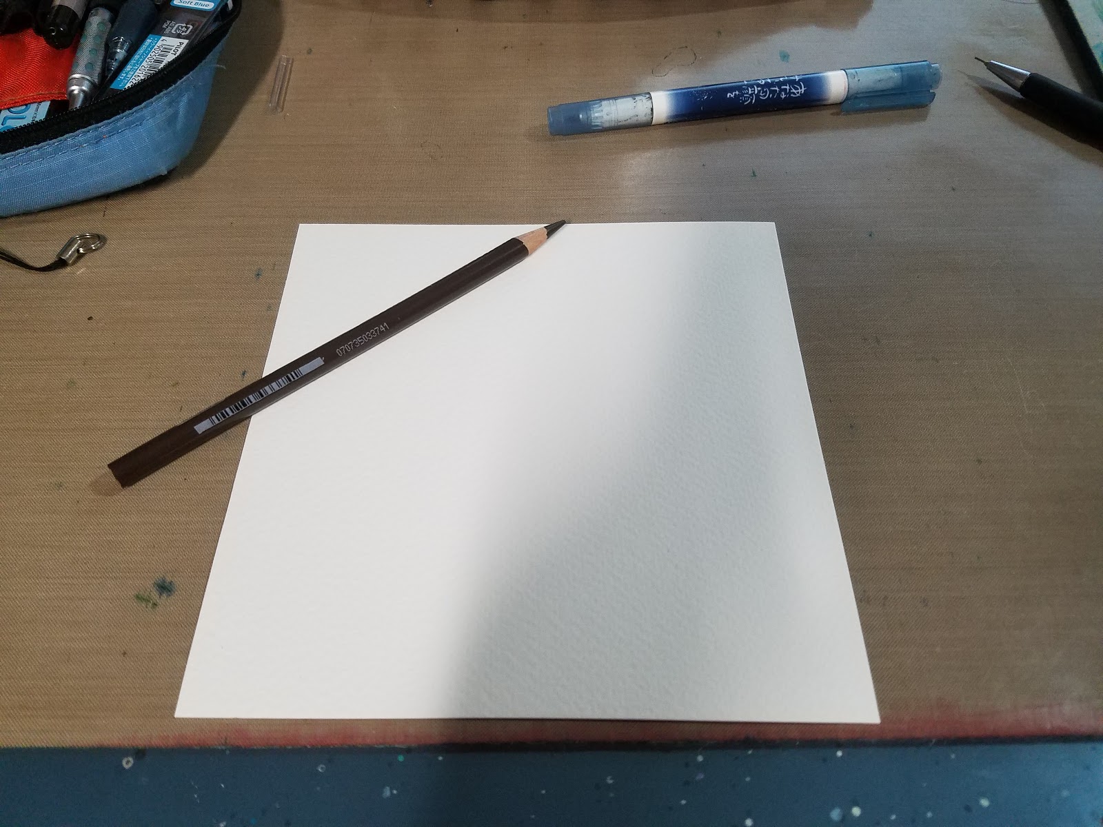
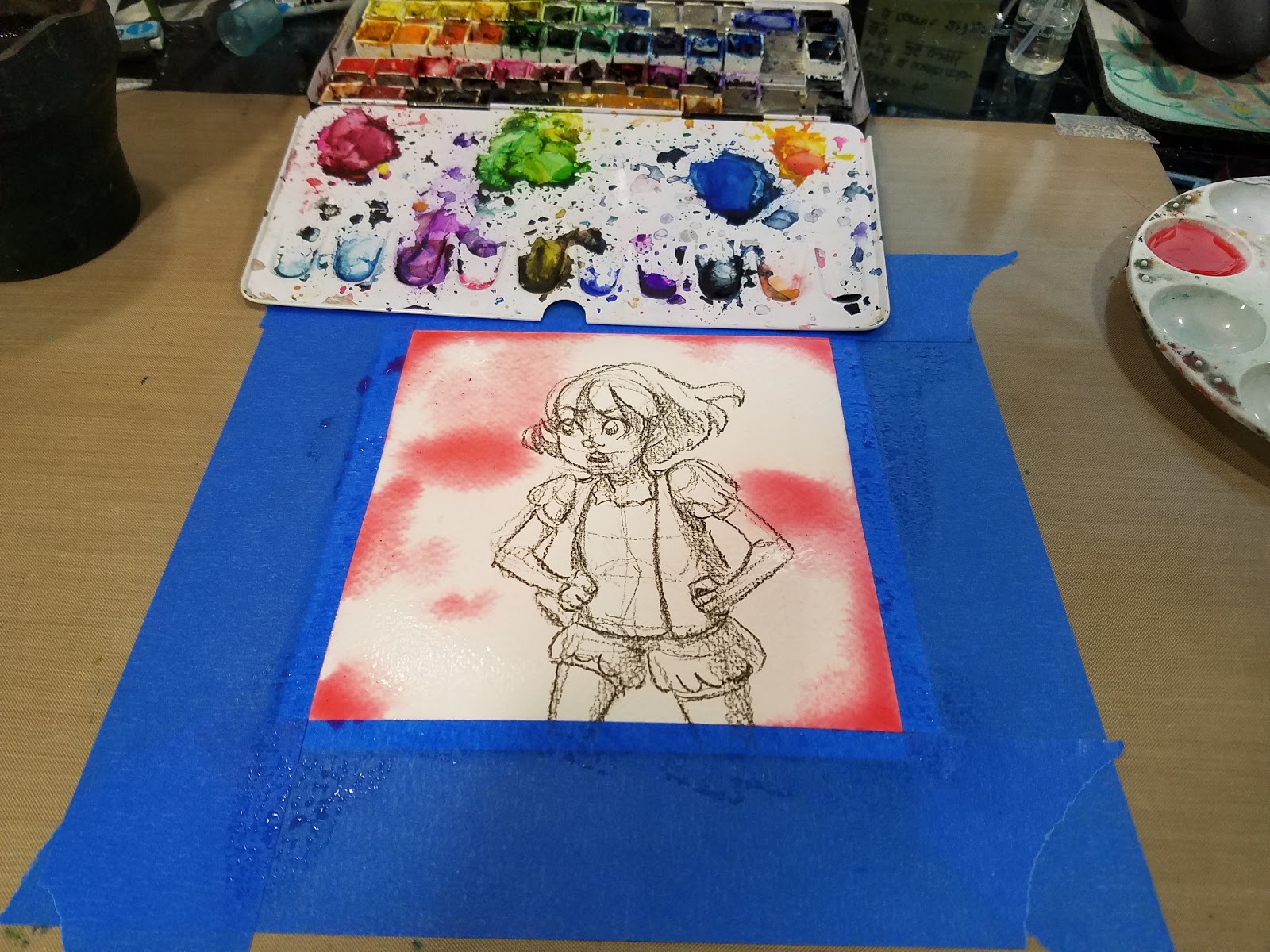
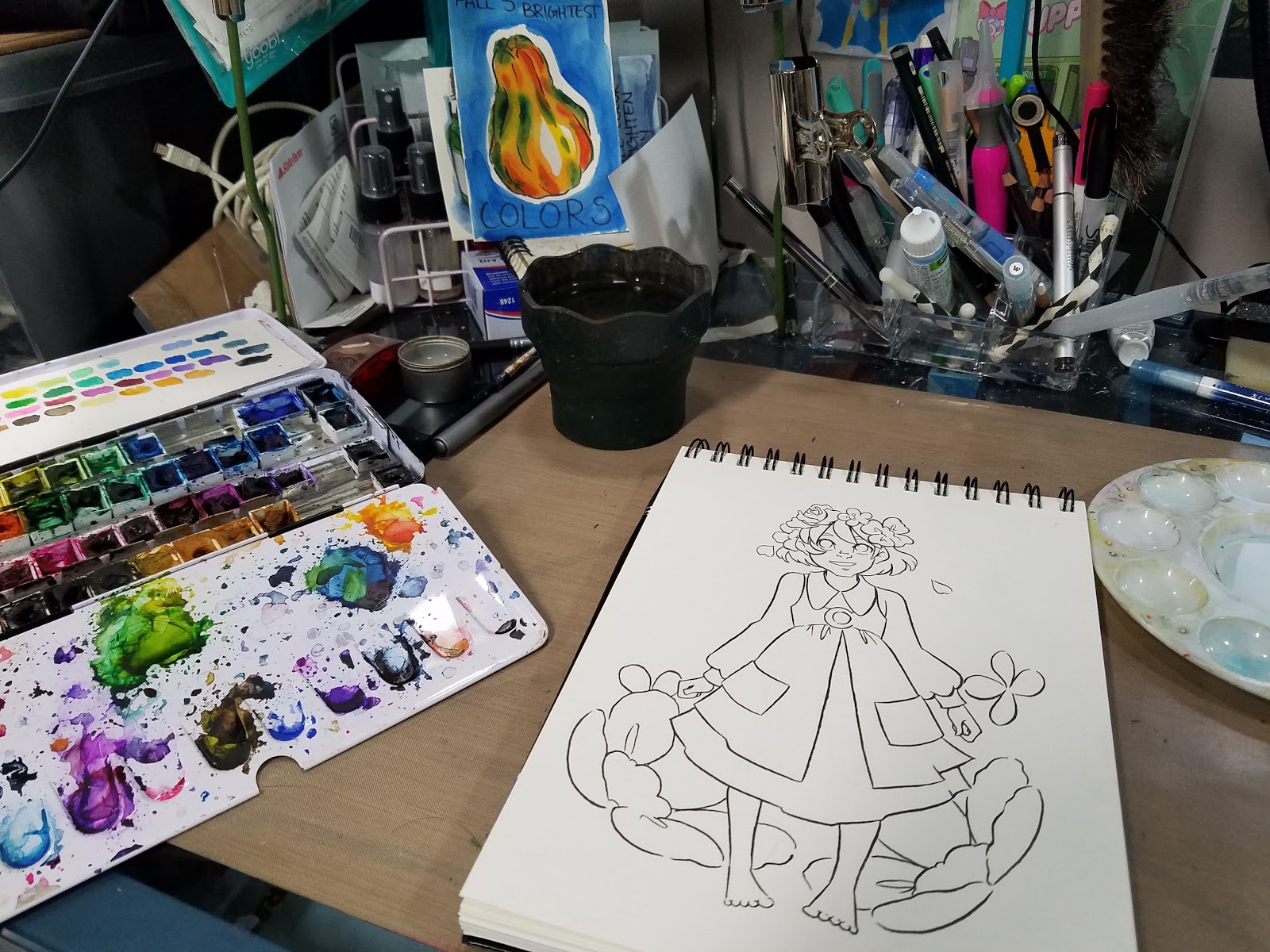
Step 1: Prepare your Materials
For this demonstration, I'm using Fabriano Studio (not to be confused with Fabriano Artistico, Studio is the pathetic younger cousin to Artistico), a cellulose paper that's about the same weight as cardstock.

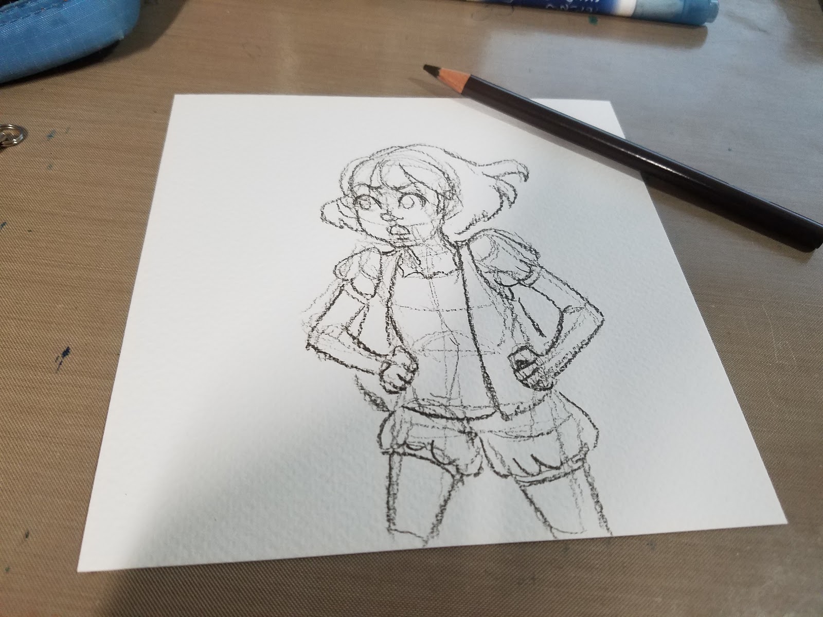
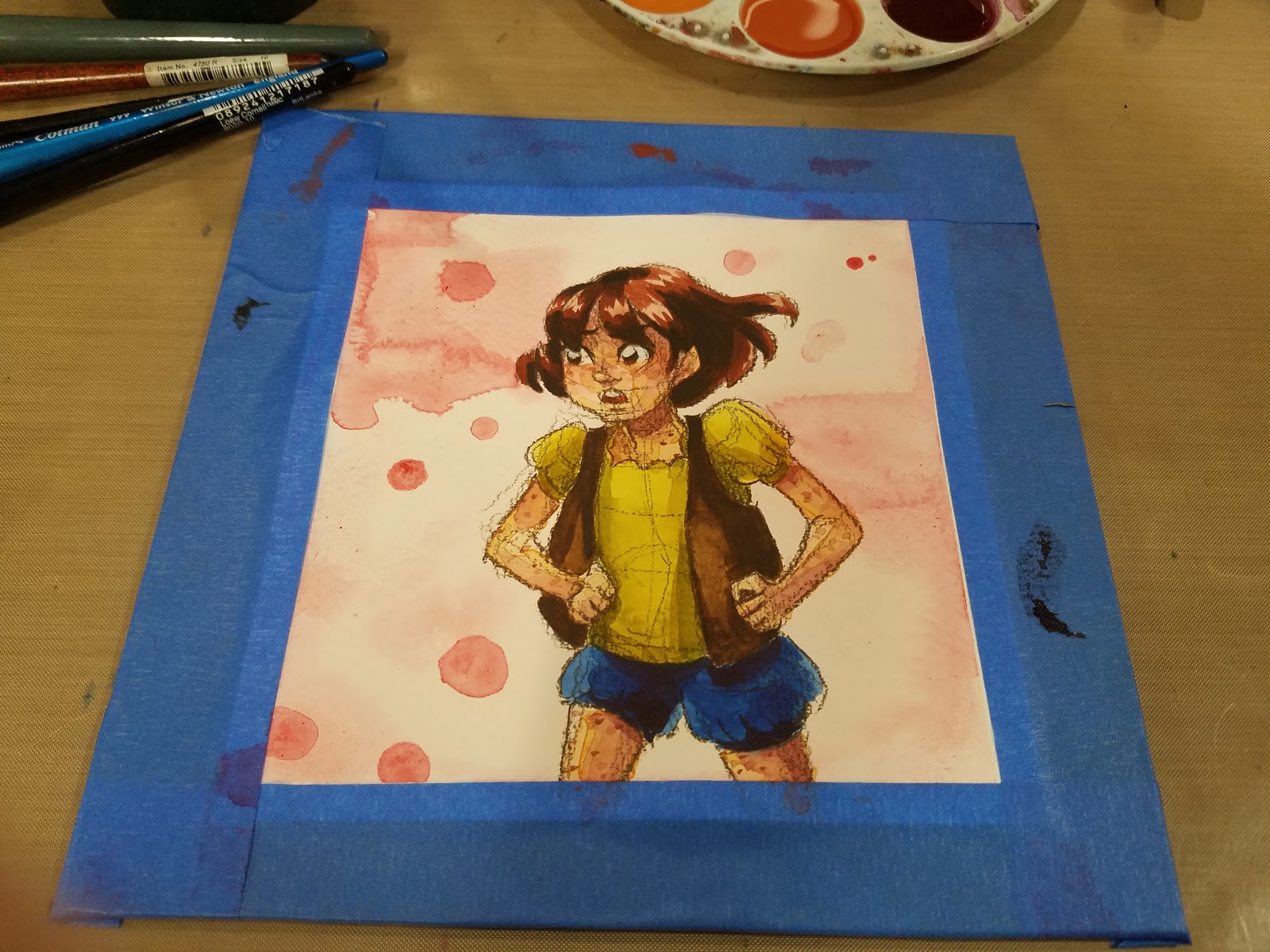
Step 2: Begin Sketching
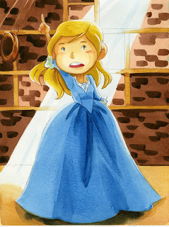
This method works particularly well if you don't rely heavily on construction for accuracy. I try to keep a light hand in sketching Kara out, as I don't want the construction lines to overwhelm the image.


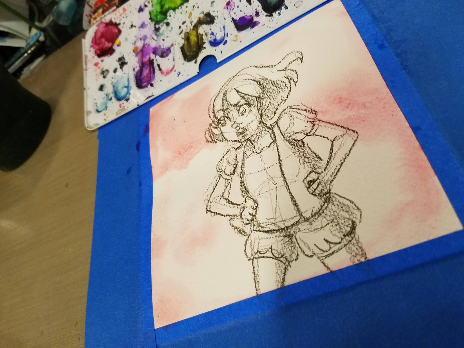
Once you've finished sketching your image, it's time to get painting!
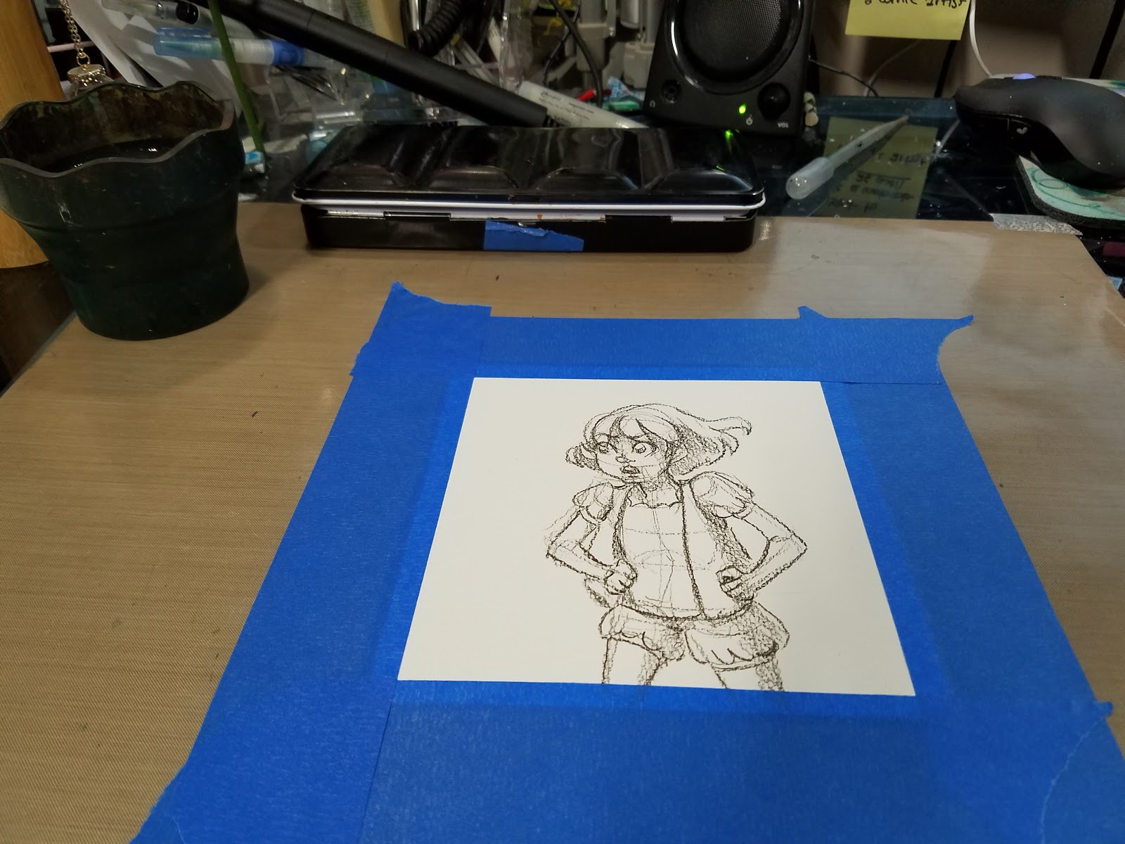
Securing Your Paper


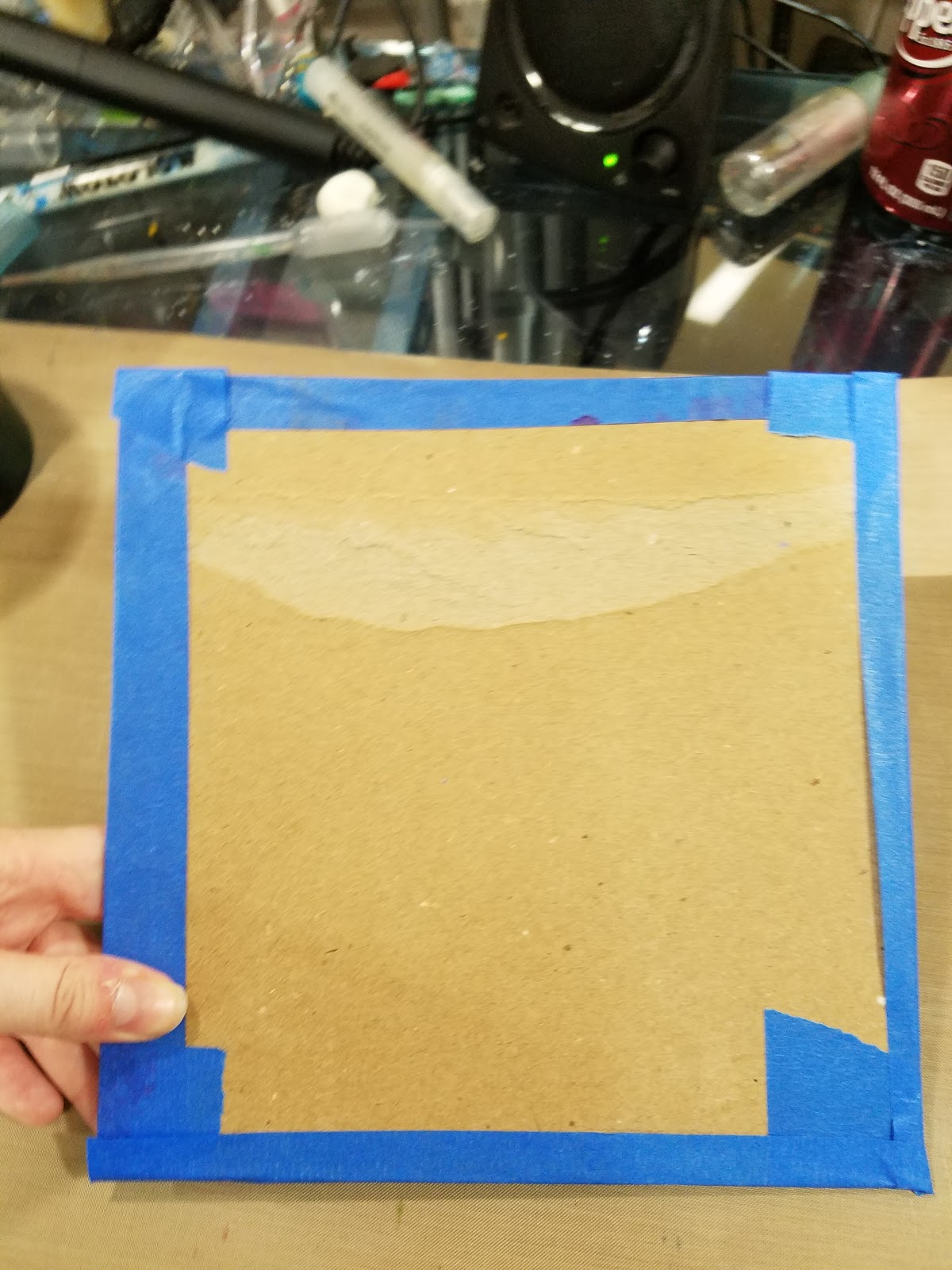
I just taped my watercolor paper directly to my Inkssentials Craft Mat, which was probably a poor idea, as at this time, it wasn't secured to my drafting table. This meant that as the watercolor paper buckled, it took the craft mat with it, as the craft mat supplied NO SUPPORT. Be a smartie- secure your paper to a hard surface!
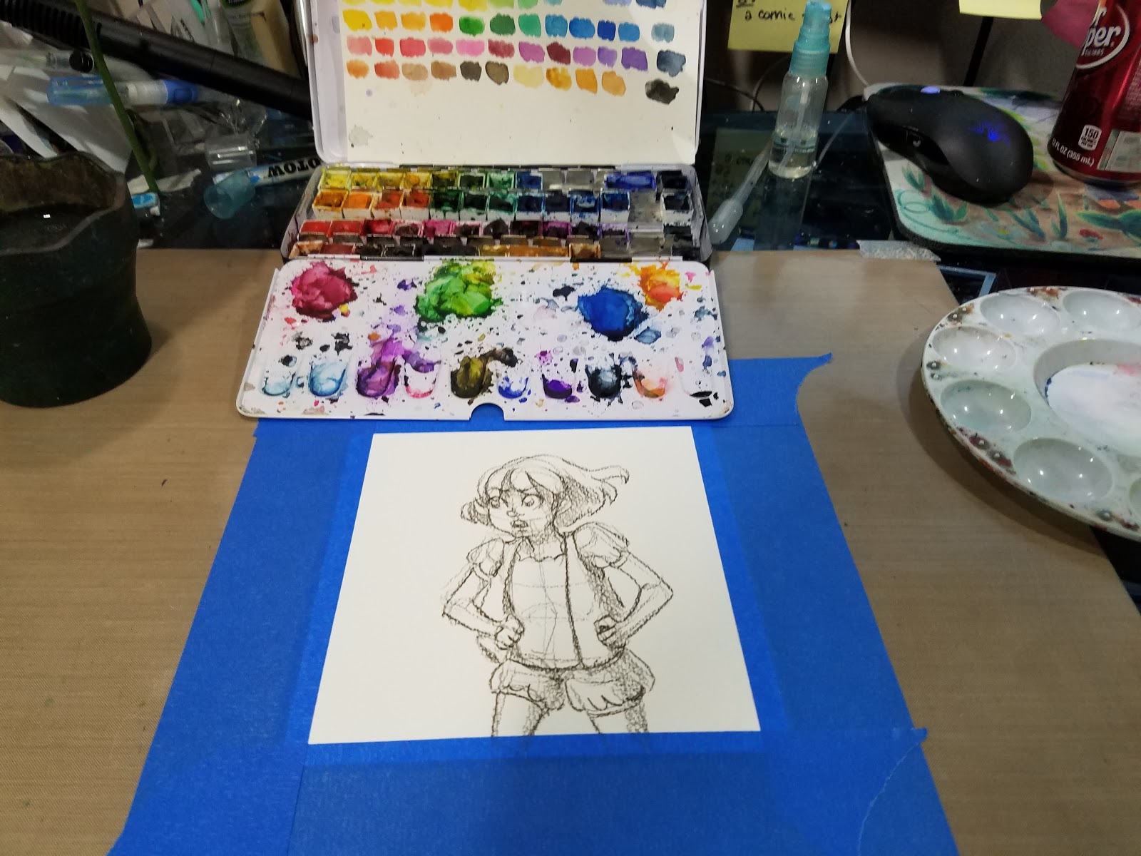
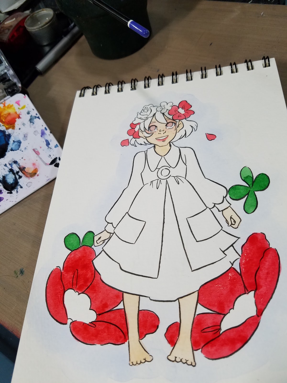
Painting
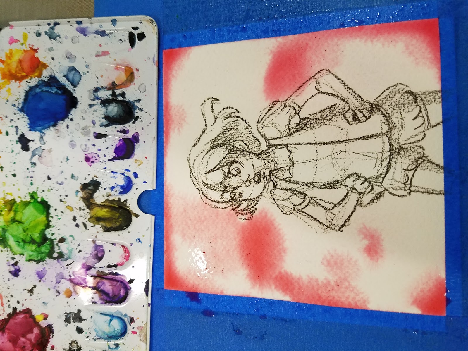
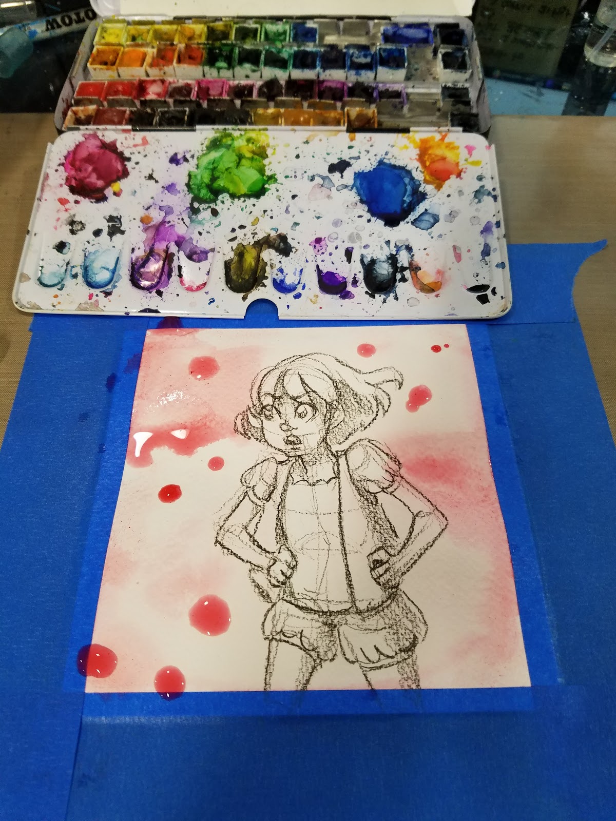
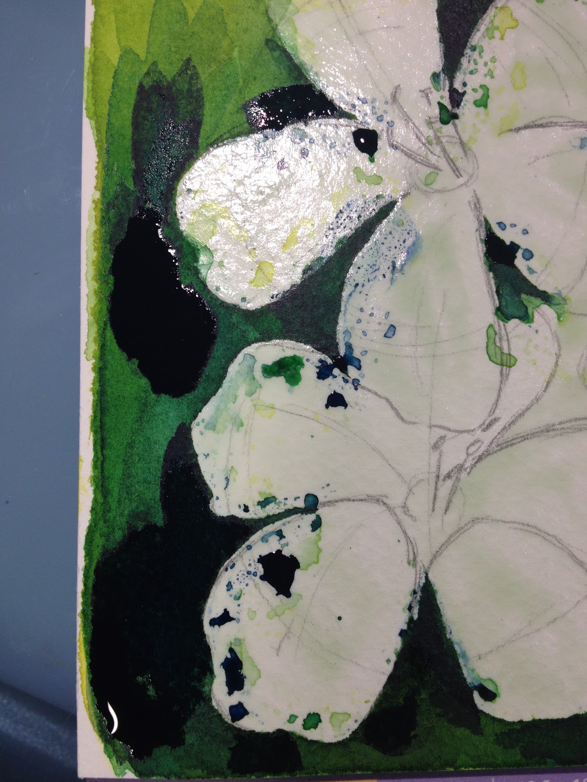
Wet into Wet Background
Color is applied while paper is still wet. Color diffuses into water for a soft blurred effect.


And of course, watercolor tends to dry lighter than it goes down.


In this case, A LOT lighter than it went down, which was pretty disappointing.

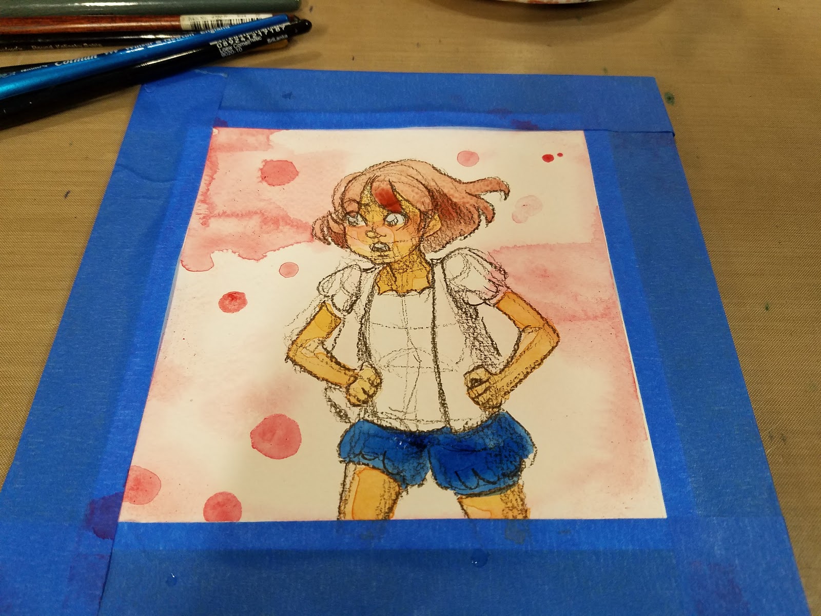
So I attempted to darken it a bit with wet onto dry (splatter effect)
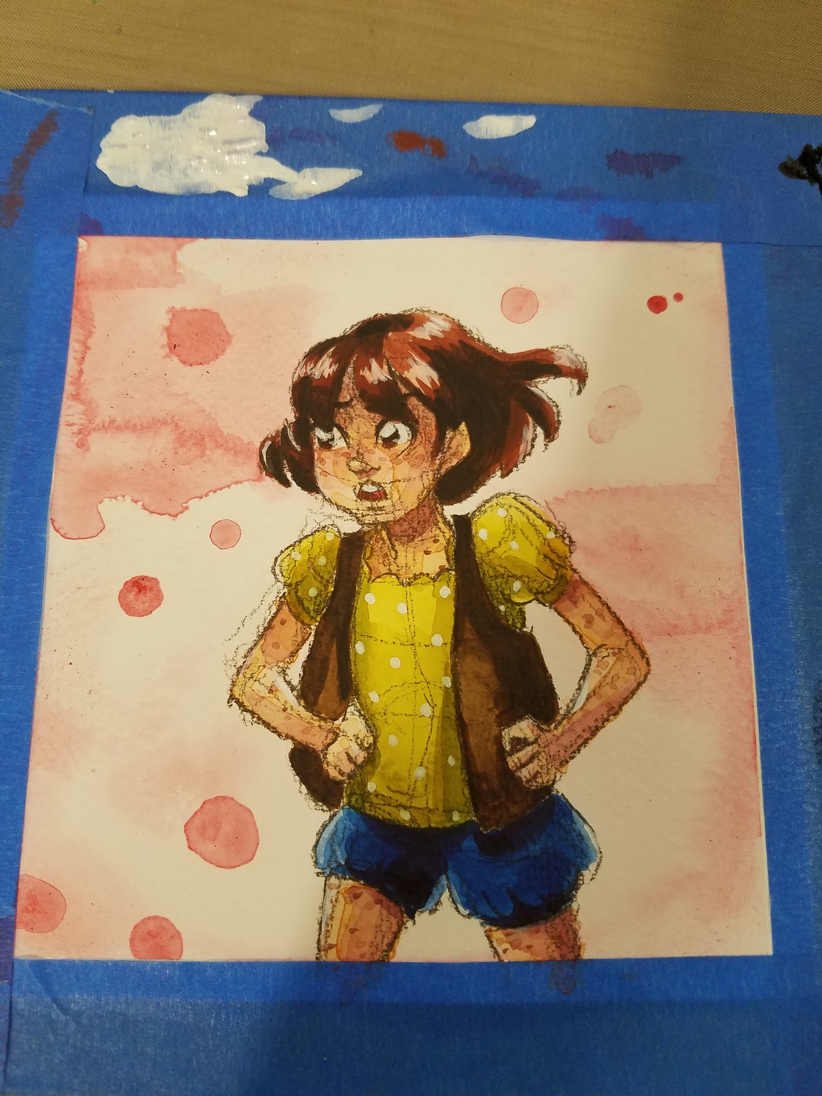
Skintone-Glazing
For a step by step glazing tutorial, please check out this post.

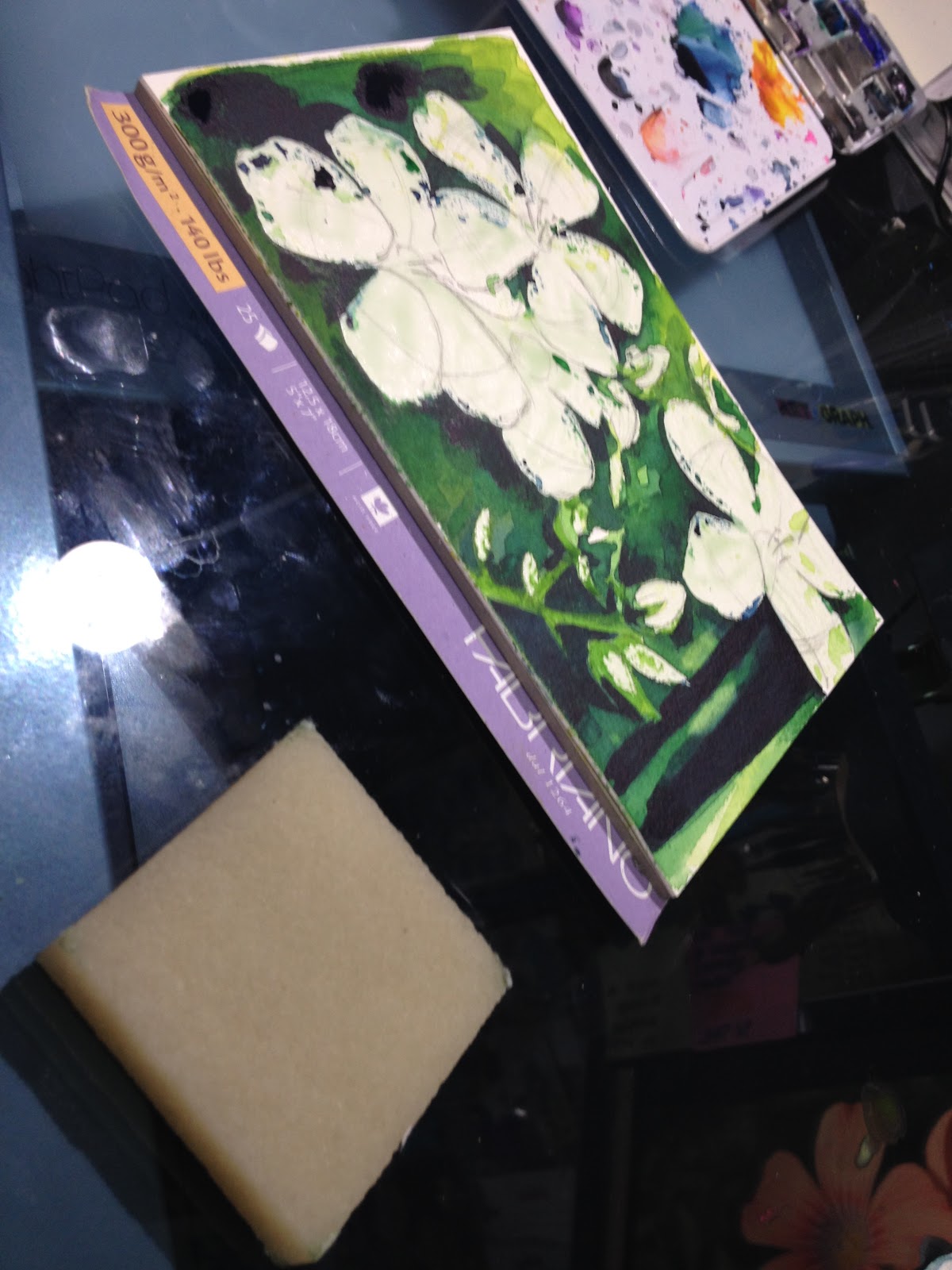
Frustrated by my Craft Mat kipping and buckling with the paper, I removed my piece from the mat and applied it to a spare piece of chipboard (from a Fluid block).


Building up Color and Tone
Just using glazing techniques at this point.


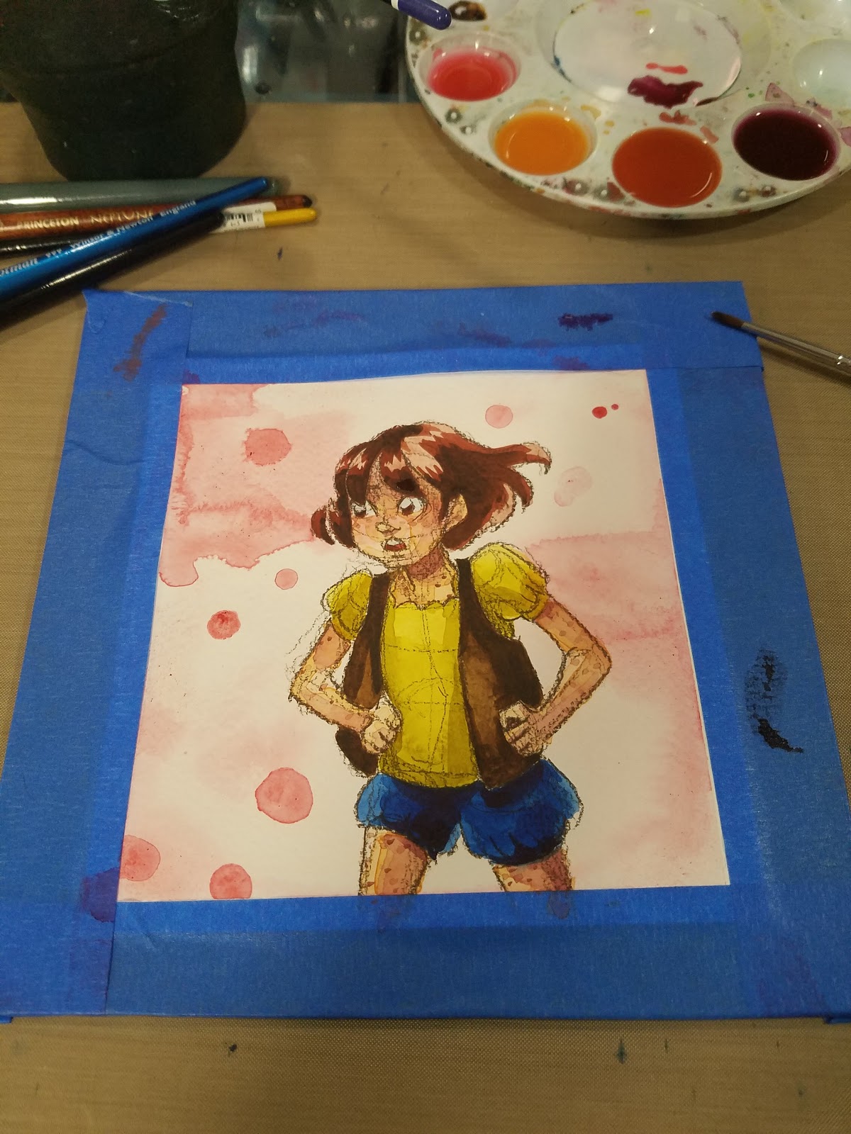
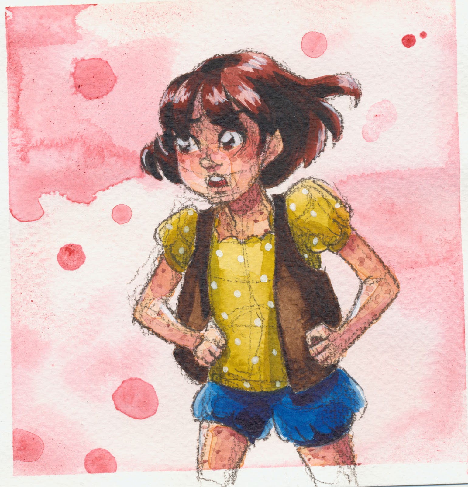
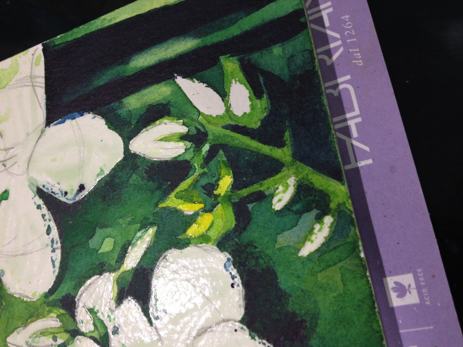
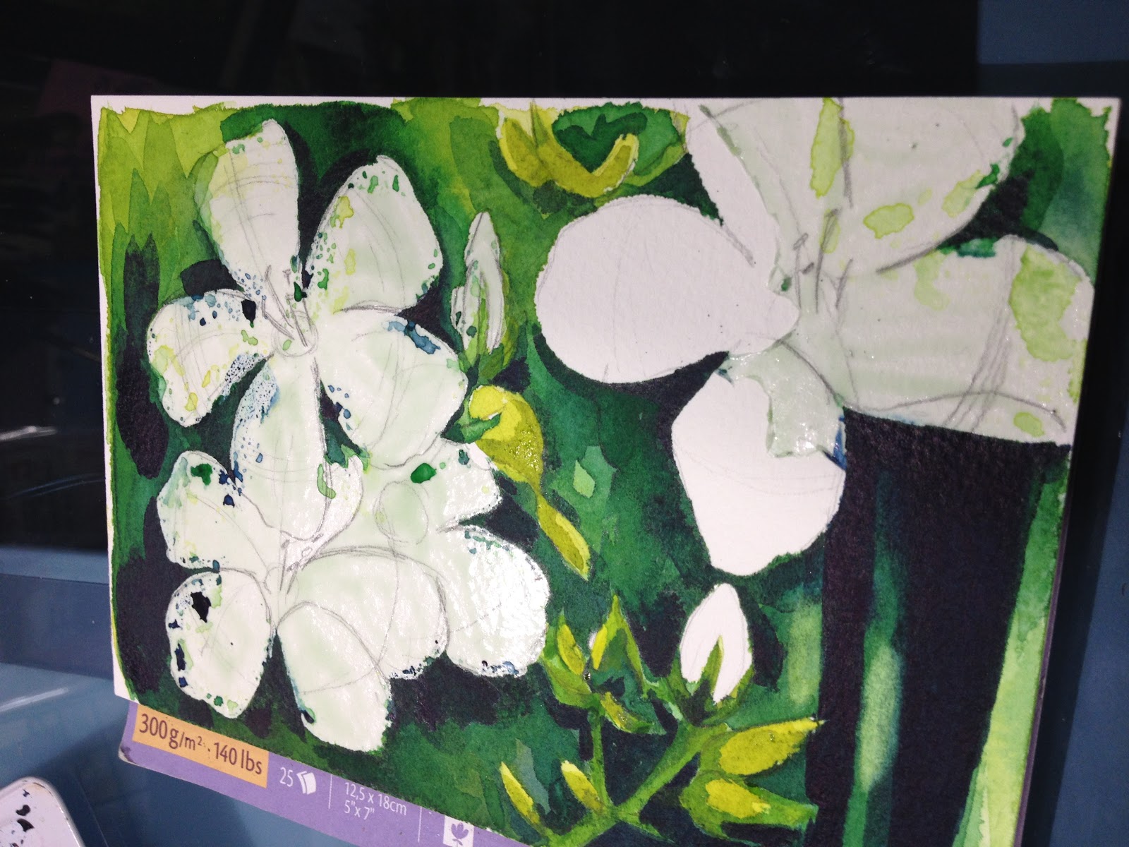
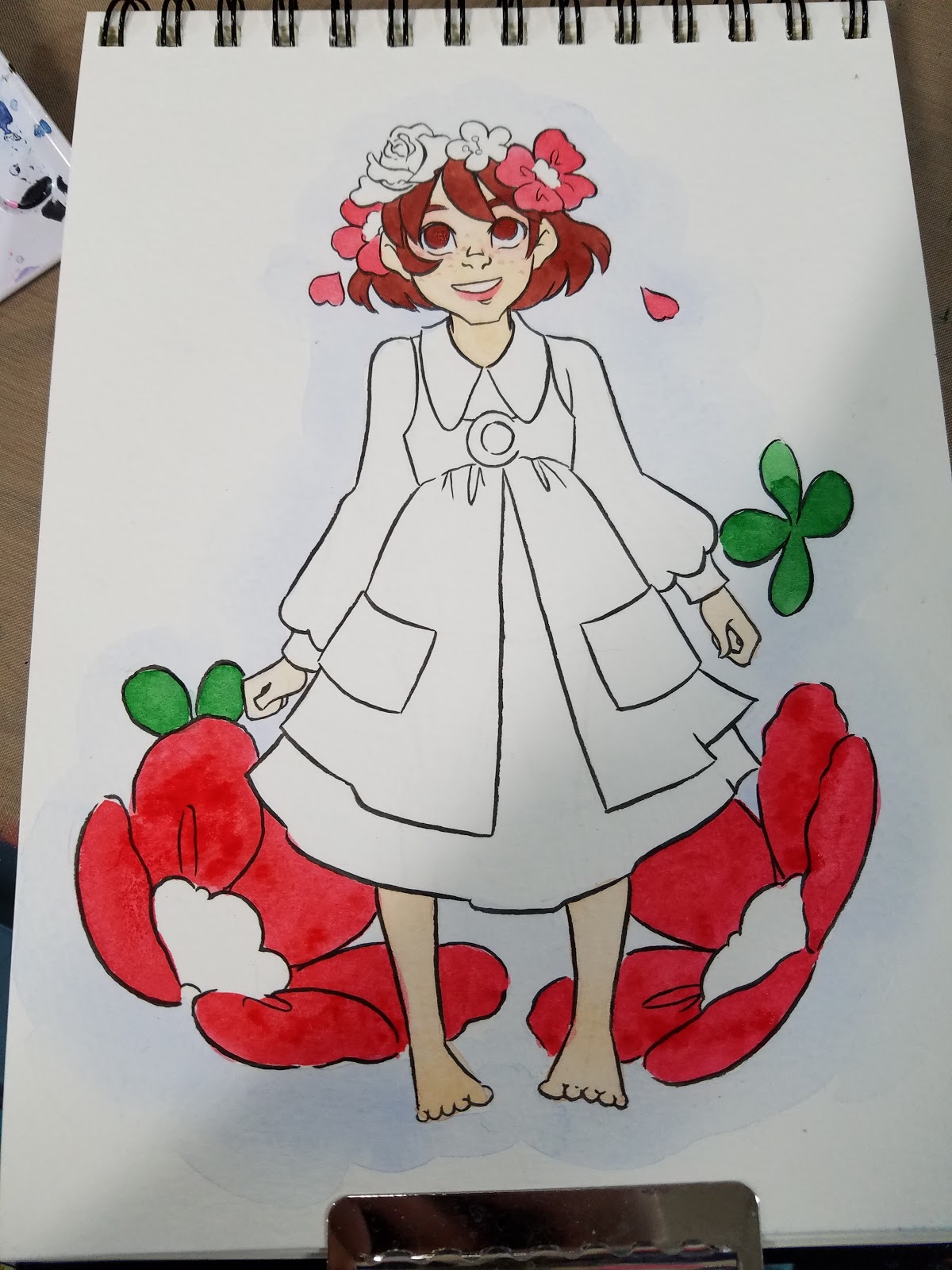
White Gouache Accents
This paper isn't really prepared to handle a lot of paint (it's a studio, which tends to be student or practice grade), so a lot of contrast was lost or difficult to build up. I opted to add some back with white gouache.


I'd love to revisit this technique and play with various colored pencils, types of lead, and paper types! I think this is a fun technique that changes up the look of your finished piece, and it's a great technique for doing colored sketches without waiting for ink to dry.
Our Sponsor
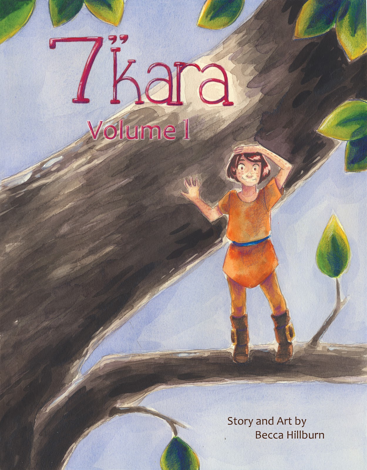
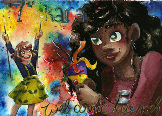
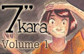
Speaking of watercolor, today's Watercolor Basic post was brought to you by the webcomic launch of 7" Kara, the comic that has inspired this series! If you enjoy my watercolor art, illustration, or tutorials, please check 7" Kara out on Tumblr or on the 7" Kara site.

If you just can't stand a cliffhanger, Volume 1 of 7" Kara is available on Gumroad and through my web-shop. Volume 1 contains the first four chapters of 7" Kara, and a bonus story, as well as loads of additional illustrations and a concept section!

Please consider donating to this blog or purchasing from Natto-shop (http://nattosoup.com/shop) if you want me to continue publishing quality content. All materials tested were purchased from my own pocket. Keep on Truckin' Nattosoup is not under any sponsorship.

My Watercolor Basics series is a longform, in depth tutorial series aimed at empowering others to pursue their artistic interests. Due to the nature of these series, which require process posts, numerous examples, and in depth research, these posts are extremely resource intense. It is only due to the support and loyalty of my Patrons that I can devote the time, resources, and knowledge to posts like this. To my Patrons, I owe my sincere thanks- without you, there would be no Watercolor Basics or Intro to Comic Craft series.
For only $2 a month, you can join the Artnerd community and help support quality content like this. Your pledge enables me to pay guest artists, purchase supplies for review, and offset some of the costs these in depth posts incur. Your support inspires me to dedicate the time necessary to writing and creating art education content.
Alternate Sketching Techniques
Having a variety of image creating options at my disposal helps me stay motivated and inspired when I'm cranking out field test after field test, demonstration after demonstration. For 7" Kara pages (which you can check out here!), I will print bluelines using waterbased ink, go over those with pencil, and the bluelines will wash away when I stretch my paper. But this isn't the only way you can create an image, and you should experiment with any method that captures your imagination.
Image Creation Options:Graphite on PaperGraphite transferInked LineartColor PencilThere are loads of ways to get your thoughts out on to paper, so if you feel hampered by pencil or ink, try sketching in color pencil!
The benefits:LooserCan work in the color of your choiceCan build up subtle tone
The Cons:Can't always eraseColor pencil may build up too heavyToday we're going to go over a method for image construction that utilizes colored pencils. You can find inspiration for multi-color sketches all over Instagram- many utlize colored leads such as Col-Erase, Uni-Color, or Color Eno colored leads. For this demonstration, I'm going to use something a little less water-soluble- a Prismacolor color pencil.
Step 1: Prepare your Materials
For this demonstration, I'm using Fabriano Studio (not to be confused with Fabriano Artistico, Studio is the pathetic younger cousin to Artistico), a cellulose paper that's about the same weight as cardstock.
Step 2: Begin Sketching
This method works particularly well if you don't rely heavily on construction for accuracy. I try to keep a light hand in sketching Kara out, as I don't want the construction lines to overwhelm the image.


Once you've finished sketching your image, it's time to get painting!
Securing Your Paper
I just taped my watercolor paper directly to my Inkssentials Craft Mat, which was probably a poor idea, as at this time, it wasn't secured to my drafting table. This meant that as the watercolor paper buckled, it took the craft mat with it, as the craft mat supplied NO SUPPORT. Be a smartie- secure your paper to a hard surface!
Painting
Wet into Wet Background
Color is applied while paper is still wet. Color diffuses into water for a soft blurred effect.
And of course, watercolor tends to dry lighter than it goes down.

In this case, A LOT lighter than it went down, which was pretty disappointing.
So I attempted to darken it a bit with wet onto dry (splatter effect)
Skintone-Glazing
For a step by step glazing tutorial, please check out this post.
Frustrated by my Craft Mat kipping and buckling with the paper, I removed my piece from the mat and applied it to a spare piece of chipboard (from a Fluid block).

Building up Color and Tone
Just using glazing techniques at this point.


White Gouache Accents
This paper isn't really prepared to handle a lot of paint (it's a studio, which tends to be student or practice grade), so a lot of contrast was lost or difficult to build up. I opted to add some back with white gouache.
I'd love to revisit this technique and play with various colored pencils, types of lead, and paper types! I think this is a fun technique that changes up the look of your finished piece, and it's a great technique for doing colored sketches without waiting for ink to dry.
Our Sponsor
Speaking of watercolor, today's Watercolor Basic post was brought to you by the webcomic launch of 7" Kara, the comic that has inspired this series! If you enjoy my watercolor art, illustration, or tutorials, please check 7" Kara out on Tumblr or on the 7" Kara site.

If you just can't stand a cliffhanger, Volume 1 of 7" Kara is available on Gumroad and through my web-shop. Volume 1 contains the first four chapters of 7" Kara, and a bonus story, as well as loads of additional illustrations and a concept section!
Please consider donating to this blog or purchasing from Natto-shop (http://nattosoup.com/shop) if you want me to continue publishing quality content. All materials tested were purchased from my own pocket. Keep on Truckin' Nattosoup is not under any sponsorship.


March 23, 2017
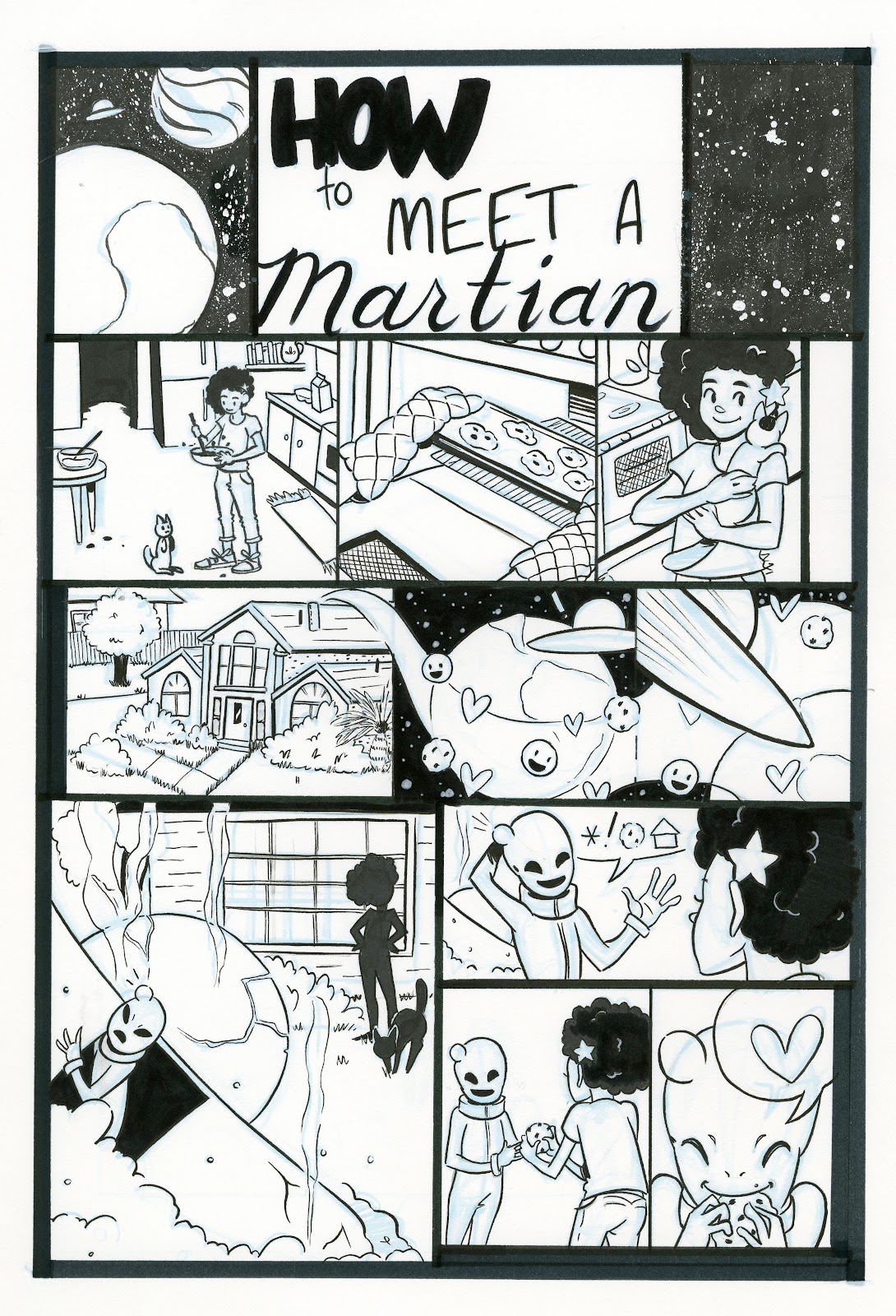
Guest Post: Kabocha and Comic Process-Linked: Intro to Comic Craft
Drawing a comic is a lot of work. It’s a process involving a lot of repetition, learning, and frustration at times.
I’ve been working on webcomics for over 12 years now, having started when I was a wee little highschool student with access to a website of my own. I’ve also got a fair amount of experience with webhosting and such, which I may write about later on down the line.
Currently, I am working on a comic called Linked, which I’ve been posting online for going on a year now. I’ve been working on this story for quite a fair bit longer, though, having gone through several iterations of the characters and plot.
My process over the years has changed immensely. When I first started drawing comics, I was working entirely in Photoshop 7. I had no idea about resolution, page setup, or anything. And thus, my final product looked something like… Well… This:
 I didn’t even sketch before drawing pages! Man, was the eraser tool my BFF…
My process at that point in time was: “Oh, hey, this is the next logical page isn’t it?” I’d just draw, without any real thought as to what I was doing. I’d just draw, throw on some low-resolution screentone (courtesy of Jen, who still has the :::Screentones::: site up), and put some text in there.
...
Fast forward about 12 years, and several changes of application and process later…

Each of these programs has their own strengths, and your process will vary for each!
Nowadays, I’m working mostly in Clip Studio Paint.
When I start a chapter, I usually take some time to actually plot things out on paper with a few doodles of key scenes, and decide what I want to hint at for later down the road. This usually works pretty well for me, although I do find myself sometimes needing to edit my own work.
I already have some preset settings for my page templates for single pages - I work at 300DPI, with a trimmed page size of 8.5 x 11. I designed my page specs based on information several printers had online regarding bleeds and margins, as well as my own preferences. While I don’t really intend to go to print, this is not a bad thing to keep in mind.
 Here’s my page margins, bleeds, borders, etc. You’re welcome.
Once I have a new page set up, I then start on sketching things out based on my script. I don’t presently do thumbnails, which could be a hinderance to me, but for the moment I’m getting along fairly well. That could change down the line, of course.
Sketching is also the slowest part of my process, because it requires the most mental legwork for some reason.
The process may also involve several hours of thinking about “What the heck am I going to do,” interspersed with putzing around on Youtube, DeviantArt and drawing things that are decidedly not comics.
Often, I’ll work on by sketching out three or four pages at a shot, and then inking and toning through them one at a time. These don’t necessarily correspond to an entire scene - it’s just faster for me and less pressure to get a few pages sketched and work through those.
Once I do get a page or three sketched, they usually end up looking something like what’s below. My sketches are generally done in a bright blue, indigo, or purple, for no reason other than it’s easier to ink over for me. ...And when you draw on the wrong layer, it really becomes apparent.
 Because I had JUST finished page 54, the text panel is the last thing I had open when I fired up Clip Studio, so don’t mind that.
Once I have my sketch loaded, I lower the opacity to somewhere around 20%, sometimes lower, and start using the Frame Border tool to create my panels.Clip Studio’s Frame Border tool is actually quite unique in that it creates masked layer groups for each panel, which saves a little work for something I would have already done for lineart and some things. On the downside, my CSP files are a lot larger than my PSDs used to be because I tone in each panel, rather than doing it for the entire file at once.
 Yes, there’s overlap. This isn’t a big problem. You can hide layer groups and such, and each group has its own background layer to them.
And now we get to working on a singular panel. Zoom in, select the layer group, and start working!

Sometimes, as I ink, I change poses and such as I go. ...I don’t recommend doing this too frequently, as this could lead to some incongruities.After I ink, I move on to black fills and toning. Usually black fills are done for hair, following this process I came up with (though I don’t always use tone).
When I lay out my text, I usually type first, then draw the text bubble to fit around the text. ...I just omitted the text here for some reason.
But in any case, I’ve at least finished a panel… And now to repeat the process for the remainder of the page.

From page to page, I do sometimes need to make little visual cues to myself beyond sketching figures.

 Usually, loose swirls, bubbles, and such indicate some form of magic in use - although it’s not necessarily clear to someone else reading my pages. These kinds of cues have become important for me to use, because they help remind myself what a panel should eventually look like.When drawing these effects, the final implementation comes down to the tools I have on hand, but has so far largely remained consistent.This is something I’ve done since… Well, almost the entire time I’ve worked on the comic:
 Page 17 - I actually kinda like the sketch better, though
And after all that inking, futzing around, and hard work, we have a finished page. I’d had a somewhat different version of it but ended up going back about two weeks after completion and revising it somewhat, based on some feedback I got from one of my beta readers.

The process isn't over just because I finished drawing the page, though! Linked is a webcomic, and so I need to prep it for web. This involves a couple of additional steps.

 First and foremost: Export that page as a flat image, such as a PNG. Usually I export to the inside of the crop marks, at 150 DPI, as an illustration. I get a little more moire from my tones, but I kinda like the look. I also find that Clip Studio does some weird resizing of tones if you let it.
Once it’s been exported, I then load the page in Photoshop (though I could do this in GIMP or Paint.Net), and shrink it to 72 DPI.
I also take steps to compress it further using TinyPNG, as a small filesize does help considerably with load times (which can affect SEO), but… Well, that’s me. Once you have your page at web resolution, you’re usually in pretty good shape!
If any of that interested you, I’m pretty easy to find on the internet.Digital Artist Resources and Materials @ Shooting-stars.orgMy current comic project, LinkedYou can find me posting art and other stuff on deviantArt and Tumblr as well!
Please consider donating to this blog or purchasing from Natto-shop (http://nattosoup.com/shop) if you want me to continue publishing quality content. All materials tested were purchased from my own pocket. Keep on Truckin' Nattosoup is not under any sponsorship.

March 21, 2017
Art Workshop at the Nashville Public Library
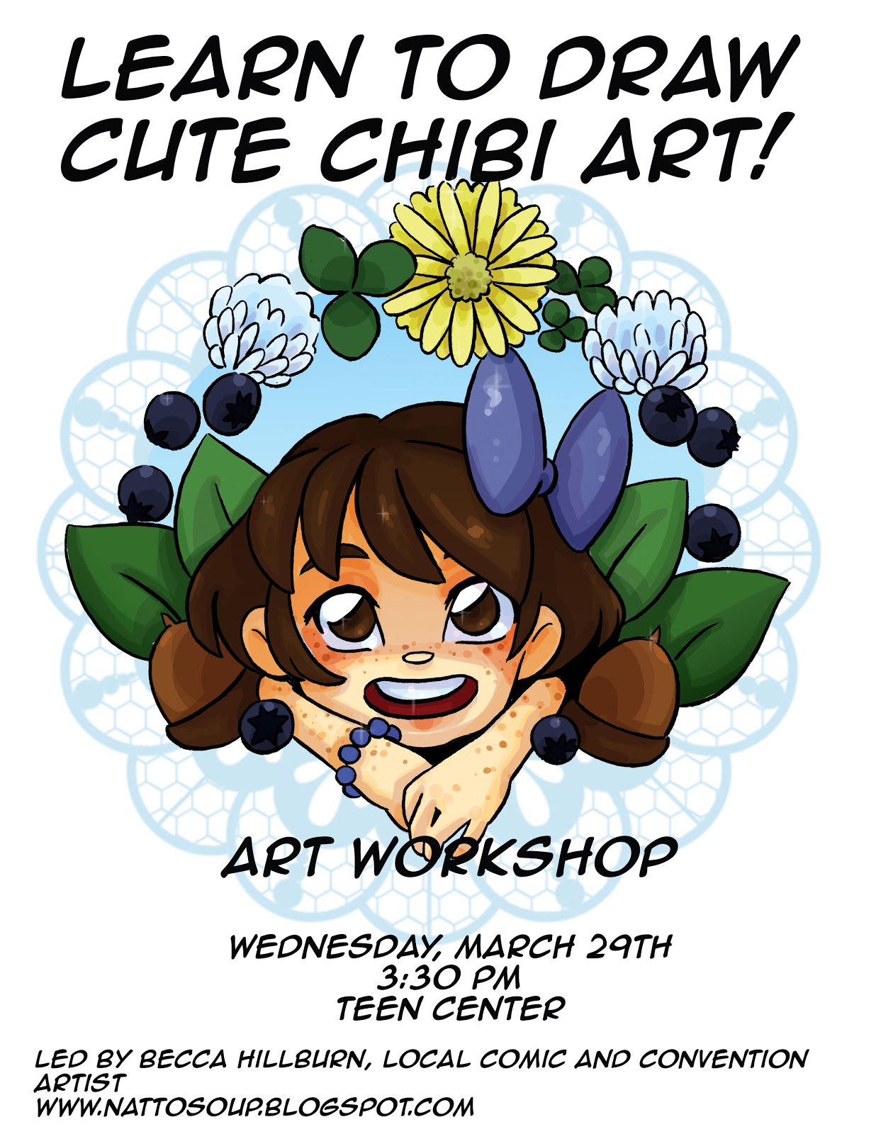
This workshop, which is free to area teenagers, will be held at the main branch of the Nashville Public Library (615 Church St, Nashville, TN 37219 ) in the Teen Center. Although supplies will be provided, you are encouraged to bring your sketchbook if you have it.
Please consider donating to this blog or purchasing from Natto-shop (http://nattosoup.com/shop) if you want me to continue publishing quality content. All materials tested were purchased from my own pocket. Keep on Truckin' Nattosoup is not under any sponsorship.

March 20, 2017
Guest Post: Joichi and Creating the Story through Characters
Before I start; I will take a moment to introduce myself. My online name is 'Joichi' and I'm author and artist of Lavender Tea comic; a slice of life story about Jasper; sensitive teen boy learning about love, friendship and how to deal with his conflicting self identity.

With that done, let's begin the lessons! How do you create character-driven stories? Well, most people like to design characters and we sometimes think of their back stories. But the main issue is; how do you place them into a story plot?
Q: Who's character’s POV (point of view), where is it from?
 If this is your first story; the easiest is to focus on one core character. What are their conflicts, strengths and development? Are they simple or complex characters? Is your main lead (protagonist) active lead or a passive lead?
 Active: Does he or she drive the events forward? Are they making self-conscious decisions
Passive: Are they letting other characters step in to make the choices? Have they always been like this, will they change through the story?
Important tip: Give your character a goal to strive for; these help push your lead to have a purpose. Include obstacles, conflicts along their way - what is preventing them from achieving it? If you are adventurous, throw a plot twist as well.
There is no wrong or right way as either method works to develop your character’s growth whether they develop a bad habit or make independent choices. In turn, the side characters should contrast with your main lead.
Q: What if you had more characters that needs to tell their story?

[This gets tricky] You'll still have your core main character but now the story has to divide its attention to the other sub 'lead characters'. A method which I've seen worked, 1) Characters that build your story's world 2) Other chars: the ones whose interactions intertwine with others. But this is up to personal storytelling, they don't have to work exactly in that order.
Try not to introduce too many characters in one chapter. Space their scenes out in various chapters, scenes.etc. There are other ways to bring in new characters.
Bad ex: 'Mr A, Miss B and Miss C all transferred to the same school. They arrived to see the main lead in action.' [Unless this story is a satire comedy, this may seem to ‘stick’ the cast as a whole rather than separate people.]
Good ex: Mr 'A' works at a shop next to the school, which the lead visits. As Miss 'B' transferred to their class, hearing this, Miss 'C' decides to ditch class.[This starts to separate each character as individuals, B and C has a chain reaction.]
Note: As the author, if you feel that there isn't enough space to talk of your epic sub-lead characters; give a spin off story or a standalone chapter with their POV.
Important tip: Character interaction and convey the story through visuals, rather than ‘spelling it out’ to the readers. This is covered by Mark Crilley’s Writing/Storytelling video. I recommend it, as he explains it really well.
Create a 'Plot Tree' for your story
 When I got the characters personalities finalized, I create a 'plot tree' diagram, where I separate the characters into groups. This can help organize your character's roles from the important ones to the support roles:In literature, there are character driven arcs which are defined as:‘The transformation or inner journey of a character over the course of a story,’ They begin and gradually transform into a new person, for better or for worse.
Character Growth:
 Art by Jean WeiChihiro from Spirited Away; she transforms from a sad, selfish child into a wiser and responsible young girl by the end of the film.
 This is good to keep in mind if you want a story aim at teens or young adults. Write a couple conflicts that appeal to the human heart and mind. Everyone changes even within a year or 3 years. But your character will take a slice of flaws with them.
Study about characters whenever you watch an animated film, an anime show or a movie. These experiences come from creative writing and making observation from real life. As viewers, you are able to take the knowledge and apply them to your stories. Good luck with story writing. Keep creating stories because your next story might be even better than your first story.
Good luck! - Joichi
My contacts
Twitter: @joichichanInstagram: joichi.makiTumblr: joichii.tumblr.comComic: lavenderteacomics.tumblr.comEmail
Please consider donating to this blog or purchasing from Natto-shop (http://nattosoup.com/shop) if you want me to continue publishing quality content. All materials tested were purchased from my own pocket. Keep on Truckin' Nattosoup is not under any sponsorship.

March 19, 2017
31st Birthday
Hey guys! Today is my 31st birthday, and I have to admit, I'm feeling a bit blue. Throughout the year, its important to set goals, and so many of my goals require your involvement. I know some of you have gotten involved with my Patreon, and that's fantastic- but analytics show there are A LOT of you, and I could really use your help!

So help me celebrate my 31st birthday by helping me tick a few goals off my list.

Take a moment to request that your local library carry a copy of 7" Kara, Volume 1. It has a Baker and Taylor number, as well as an ISBN, so with your request, this shouldn't be a problem. I cannot request that libraries carry my books, but patrons can, and this would be a huge help in getting my comic out to the kids who need it! Your library should have request forms on hand, and it only takes a moment of your time. If your library does order a copy, please let me know on Twitter- that sort of news really brightens my day!
If you haven't checked it out yet, 7" Kara launched as a webcomic in February, so please give it a read. Chapter 2 is well under way, and I've completed up to chapter 6, so there's steady updates for at least the next two years. If you like what you see, subscribe to the RSS or the Tumblr, and please do share it with your friends, family, as well as any teachers or librarians who might be interested. This is something only you can do for me, I cannot do this for myself. If you dislike waiting on updates, you can always order a physical copy of Volume 1, which contains Chapters 1-4, from my shop.

If you have a Tumblr, please follow the 7" Kara tumblr- it only features pages from the comic and some additional art, and it is family and work safe. My birthday goal was to hit 100 followers, and so far, I only have 65, so your support would be a huge help.
And if you enjoy my art, you can see it on a daily basis by following my Instagram. I post works in progress, field tests, commissions, and lots more.
I'm in the middle of a big project that ends right as convention season begins, and I've run out of posts! Efforts to solicit paid guest posts on Twitter have not been quite enough to fill the hole, so if you've ever wanted to write for this blog, please send me a pitch! I use Patreon earnings to help pay for guest posts, so if you love this blog, and would like to see it continue, please join us on Patreon! I've already spent my budget on guest posts, so any additional guest posts would be paid for out of my very shallow comic artist pocket.
I've gotten a bit burnt out trying to juggle so many things, so if you have a free moment, an email of encouragement would really mean a lot, and it would let me know that people do care about this blog, and all the tutorials and reviews that take so long to write.

If you haven't checked out the YouTube channel, please make it a point to do so- I'm sure there's something you will enjoy. I have fountain pen videos, watercolor tutorials, inking tutorials, comic tutorials, and loads of marker tutorials, all organized into handy playlists. If you watch 30 seconds of the included ads, I also see a few cents of ad revenue- and that can really add up! That money is used to help pay my bills, keep the lights on, and keep me drawing, so if you enjoy my work, checking out my channel would help me a lot. And if you like what you see, make sure you subscribe for more! I just hit 3,000 subs, and would really like to hit 10,000 so companies will consider me for sponsorship opportunities.
Speaking of sponsorship, if you enjoy this blog, please take a moment to write to some of the companies in the Support Me section of the right hand sidebar. Your good word means a lot, and they may be more likely to consider future partnership opportunities. Right now, this blog has zero sponsors, and has never benefitted from sponsorship, which means I bear all costs. Sponsorship would open this blog up to so many exciting opportunities such as reviews, tutorials, and collaborations.
If you know anyone looking to hire an illustrator, watercolorist, portrait artist, or comic artist, please send them my information! I am always looking for paying work. You can find links to everything pertinent in my Info section. Or you can hire me for your own projects! If interested, please email me- but only paying work please- I'm doing plenty of spec work already.
I know this may come across as a marketing ploy, but the YouTube, this blog, and 7" Kara are the things I care about most (besides loved ones), and seeing these ventures succeed would really mean a lot to me. I am doing everything I can to ensure their success, but I could really use more support from you. Please take the time to share this blog with your friends, family, or fellow enthusiasts not just today, but ANY time I write a post that you have found helpful or informative. I really depend on your help and support in order to continue to producing all the work that I produce that's available free to the general public, and an engaged audience would help me get through the lean times.
Please consider donating to this blog or purchasing from Natto-shop (http://nattosoup.com/shop) if you want me to continue publishing quality content. All materials tested were purchased from my own pocket. Keep on Truckin' Nattosoup is not under any sponsorship.
So help me celebrate my 31st birthday by helping me tick a few goals off my list.
Take a moment to request that your local library carry a copy of 7" Kara, Volume 1. It has a Baker and Taylor number, as well as an ISBN, so with your request, this shouldn't be a problem. I cannot request that libraries carry my books, but patrons can, and this would be a huge help in getting my comic out to the kids who need it! Your library should have request forms on hand, and it only takes a moment of your time. If your library does order a copy, please let me know on Twitter- that sort of news really brightens my day!

If you haven't checked it out yet, 7" Kara launched as a webcomic in February, so please give it a read. Chapter 2 is well under way, and I've completed up to chapter 6, so there's steady updates for at least the next two years. If you like what you see, subscribe to the RSS or the Tumblr, and please do share it with your friends, family, as well as any teachers or librarians who might be interested. This is something only you can do for me, I cannot do this for myself. If you dislike waiting on updates, you can always order a physical copy of Volume 1, which contains Chapters 1-4, from my shop.

If you have a Tumblr, please follow the 7" Kara tumblr- it only features pages from the comic and some additional art, and it is family and work safe. My birthday goal was to hit 100 followers, and so far, I only have 65, so your support would be a huge help.

And if you enjoy my art, you can see it on a daily basis by following my Instagram. I post works in progress, field tests, commissions, and lots more.
I'm in the middle of a big project that ends right as convention season begins, and I've run out of posts! Efforts to solicit paid guest posts on Twitter have not been quite enough to fill the hole, so if you've ever wanted to write for this blog, please send me a pitch! I use Patreon earnings to help pay for guest posts, so if you love this blog, and would like to see it continue, please join us on Patreon! I've already spent my budget on guest posts, so any additional guest posts would be paid for out of my very shallow comic artist pocket.
I've gotten a bit burnt out trying to juggle so many things, so if you have a free moment, an email of encouragement would really mean a lot, and it would let me know that people do care about this blog, and all the tutorials and reviews that take so long to write.
If you haven't checked out the YouTube channel, please make it a point to do so- I'm sure there's something you will enjoy. I have fountain pen videos, watercolor tutorials, inking tutorials, comic tutorials, and loads of marker tutorials, all organized into handy playlists. If you watch 30 seconds of the included ads, I also see a few cents of ad revenue- and that can really add up! That money is used to help pay my bills, keep the lights on, and keep me drawing, so if you enjoy my work, checking out my channel would help me a lot. And if you like what you see, make sure you subscribe for more! I just hit 3,000 subs, and would really like to hit 10,000 so companies will consider me for sponsorship opportunities.
Speaking of sponsorship, if you enjoy this blog, please take a moment to write to some of the companies in the Support Me section of the right hand sidebar. Your good word means a lot, and they may be more likely to consider future partnership opportunities. Right now, this blog has zero sponsors, and has never benefitted from sponsorship, which means I bear all costs. Sponsorship would open this blog up to so many exciting opportunities such as reviews, tutorials, and collaborations.

If you know anyone looking to hire an illustrator, watercolorist, portrait artist, or comic artist, please send them my information! I am always looking for paying work. You can find links to everything pertinent in my Info section. Or you can hire me for your own projects! If interested, please email me- but only paying work please- I'm doing plenty of spec work already.

I know this may come across as a marketing ploy, but the YouTube, this blog, and 7" Kara are the things I care about most (besides loved ones), and seeing these ventures succeed would really mean a lot to me. I am doing everything I can to ensure their success, but I could really use more support from you. Please take the time to share this blog with your friends, family, or fellow enthusiasts not just today, but ANY time I write a post that you have found helpful or informative. I really depend on your help and support in order to continue to producing all the work that I produce that's available free to the general public, and an engaged audience would help me get through the lean times.
Please consider donating to this blog or purchasing from Natto-shop (http://nattosoup.com/shop) if you want me to continue publishing quality content. All materials tested were purchased from my own pocket. Keep on Truckin' Nattosoup is not under any sponsorship.
March 17, 2017
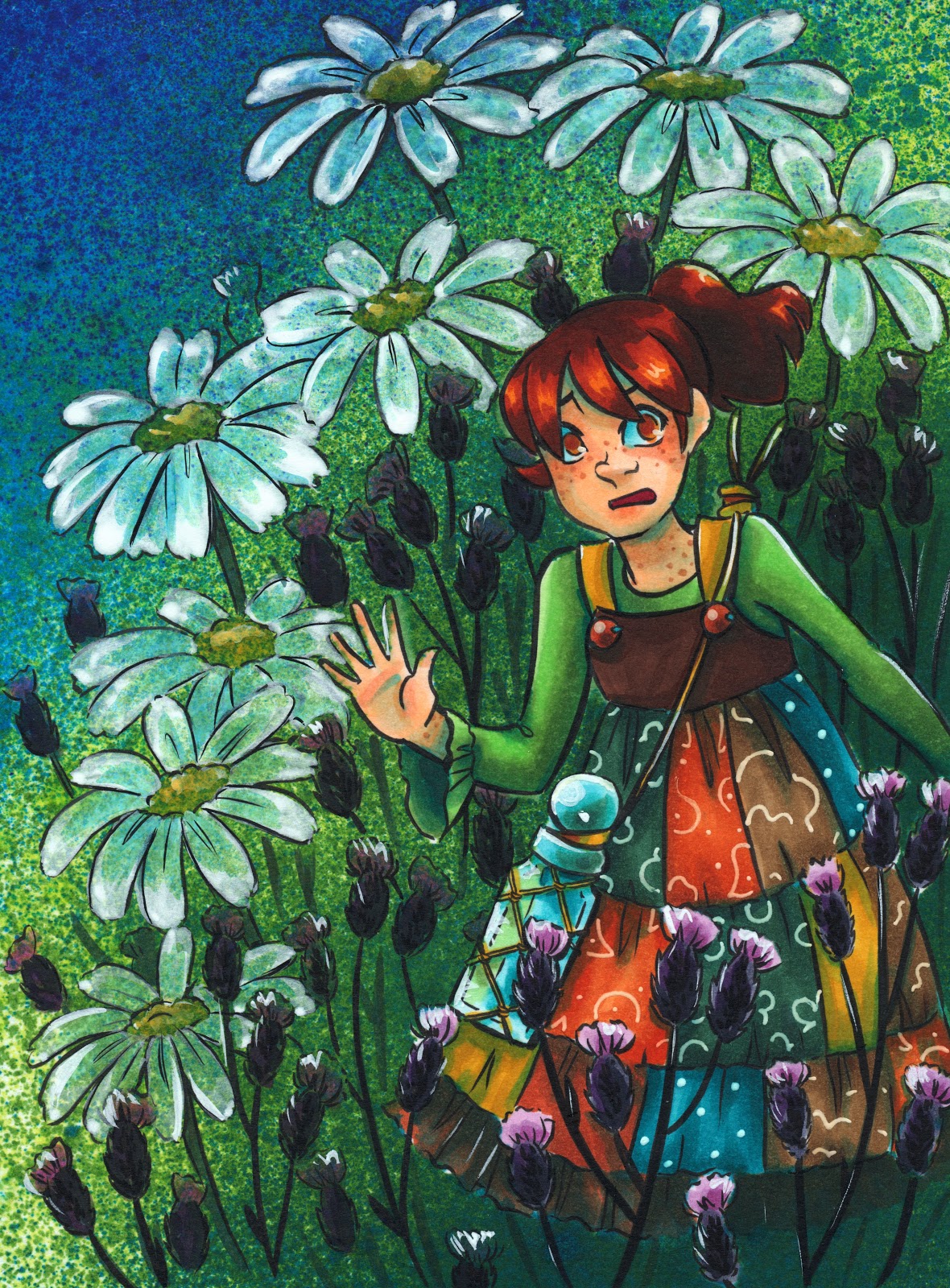
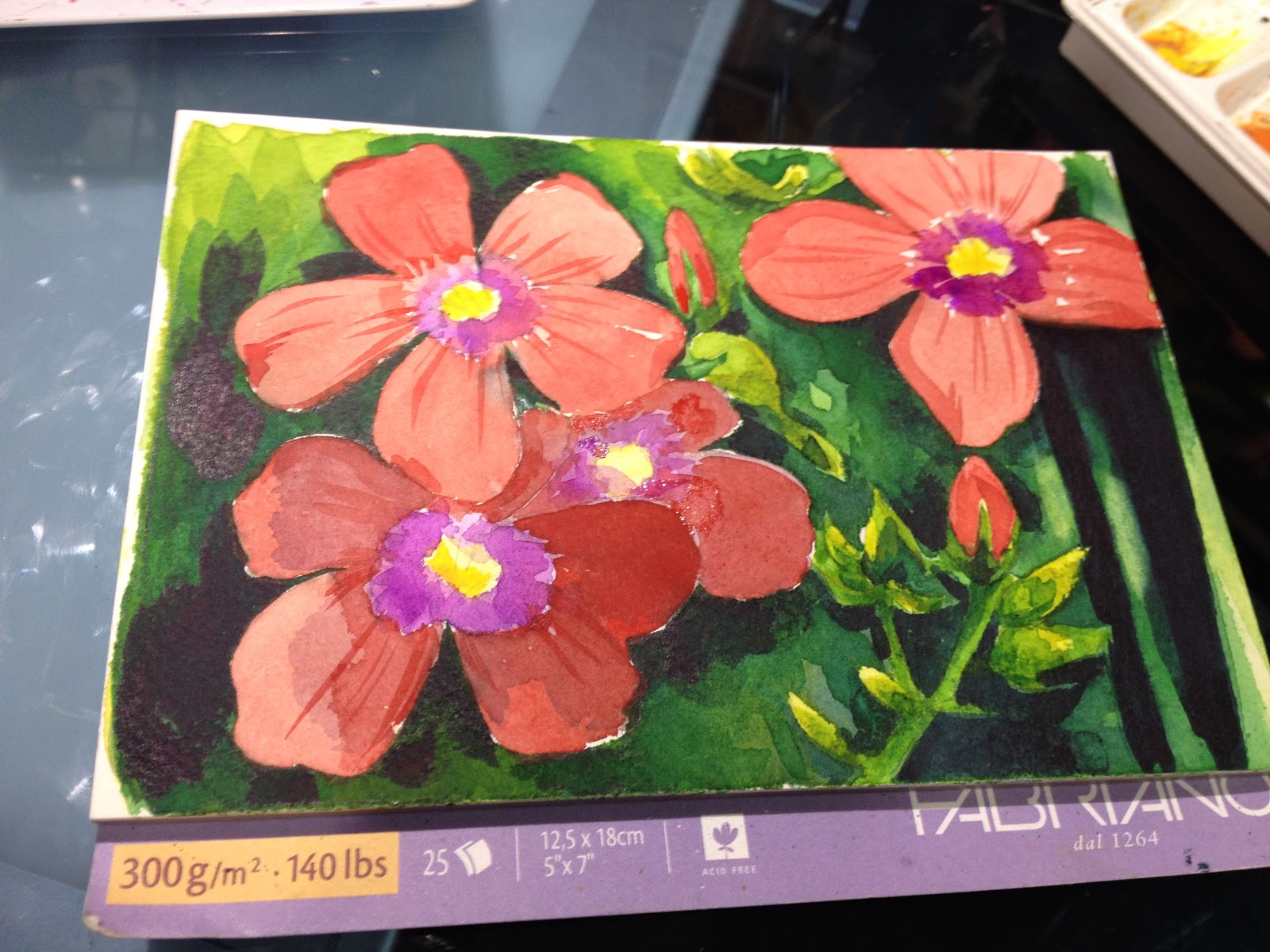
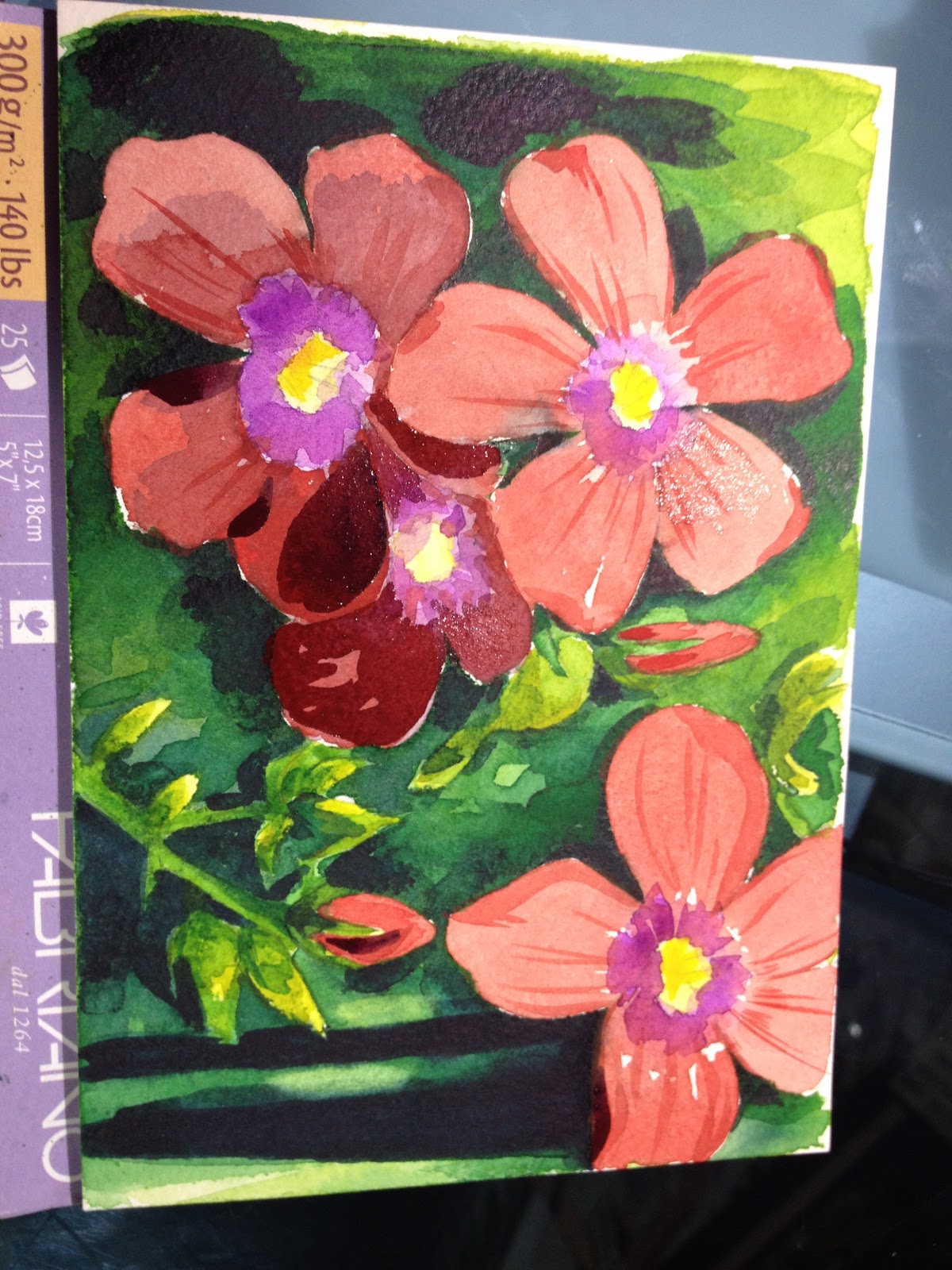
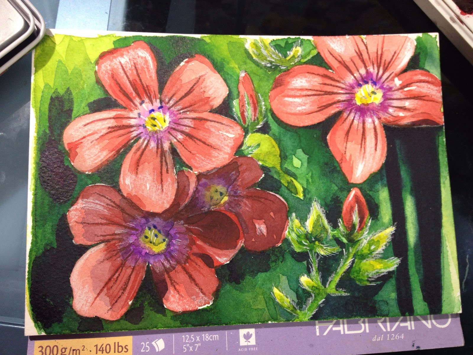
Loose Watercolor Studies: Watercolor Basics
This series is also made possible thanks to the generosity and interest of my Patrons on Patreon.
My Watercolor Basics series is a longform, in depth tutorial series aimed at empowering others to pursue their artistic interests. Due to the nature of these series, which require process posts, numerous examples, and in depth research, these posts are extremely resource intense. It is only due to the support and loyalty of my Patrons that I can devote the time, resources, and knowledge to posts like this. To my Patrons, I owe my sincere thanks- without you, there would be no Watercolor Basics or Intro to Comic Craft series.
For only $2 a month, you can join the Artnerd community and help support quality content like this. Your pledge enables me to pay guest artists, purchase supplies for review, and offset some of the costs these in depth posts incur. Your support inspires me to dedicate the time necessary to writing and creating art education content.
Loosening Up Your Brushstrokes
In several prior Watercolor Basics posts, we've talked about painting from reference. In this post, I'm still painting using reference, but my intention is for a lighter, brighter overall image. I'm aiming for graphic and appealing rather than learning or practicing specific watercolor skills/
These were completed in a 'watercolor' sketchbook from Hobby Lobby- the paper is akin to toilet paper, and can't handle water or washes very well. I'm a stubborn woman though, and I decided I'd fill the whole dang thing with floral studies, and bend it to my will.
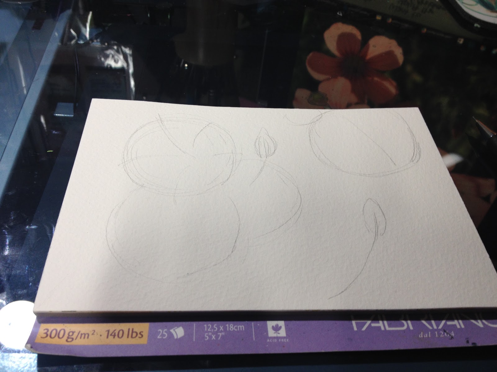
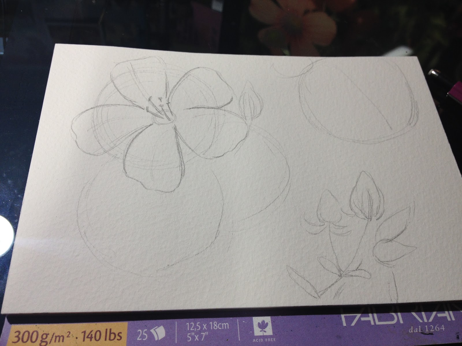
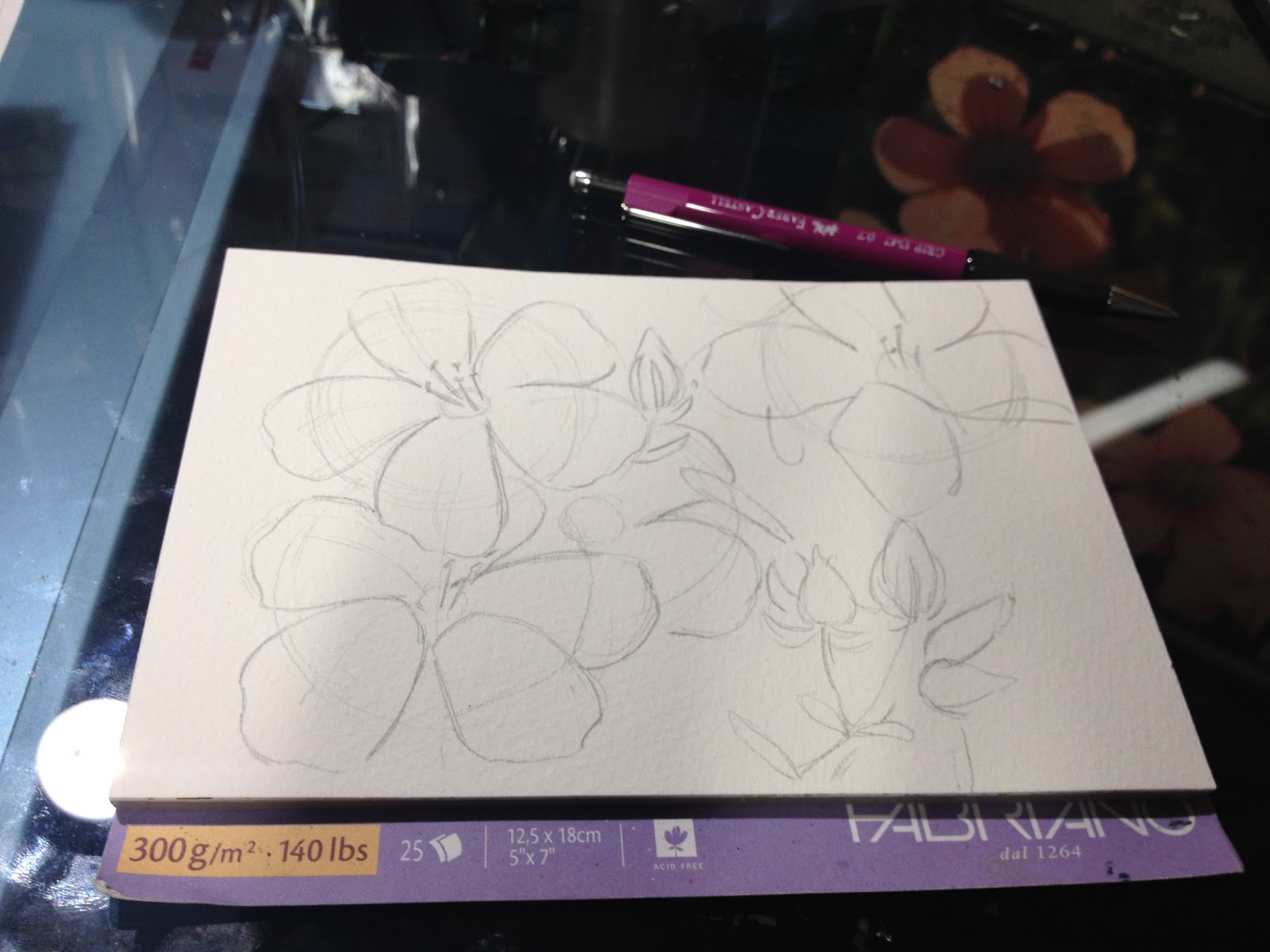
For these loose studies, I begin by finding photo reference. For these, I tended towards bouquets with a variety of colors and flower shapes. For the illustration, I begin with a loose sketch in light pencil, then begin working in watercolor. Once the watercolor has completely dried, I ink these with a waterproof, archival fineliner (the Micron 5 and the Micron 8).
The paper isn't capable of holding much water, takes a long time to dry, and won't permit reworking, so it presents a number of challenges that need to be worked around. Working with intentionally difficult materials can provide you with the experience you need to solve problems you may encounter painting your pages.
These exercises were inspired by the work of Alisa Burke.


These studies were intended to help me loosen up my approach to watercolor, to approach studies with a fun mindset, and to try something new with brighter colors and graphic lineart. Working outside of your comfort zone doesn't always result in pieces you're pleased with, but often you'll impress yourself with your versatility!
Enjoy my art? These watercolor studies are available as a set of photo prints!
Speaking of watercolor, today's Watercolor Basic post was brought to you by the webcomic launch of 7" Kara, the comic that has inspired this series! If you enjoy my watercolor art, illustration, or tutorials, please check 7" Kara out on Tumblr or on the 7" Kara site.
If you just can't stand a cliffhanger, Volume 1 of 7" Kara is available on Gumroad and through my web-shop. Volume 1 contains the first four chapters of 7" Kara, and a bonus story, as well as loads of additional illustrations and a concept section!
Please consider donating to this blog or purchasing from Natto-shop (http://nattosoup.com/shop) if you want me to continue publishing quality content. All materials tested were purchased from my own pocket. Keep on Truckin' Nattosoup is not under any sponsorship.
My Watercolor Basics series is a longform, in depth tutorial series aimed at empowering others to pursue their artistic interests. Due to the nature of these series, which require process posts, numerous examples, and in depth research, these posts are extremely resource intense. It is only due to the support and loyalty of my Patrons that I can devote the time, resources, and knowledge to posts like this. To my Patrons, I owe my sincere thanks- without you, there would be no Watercolor Basics or Intro to Comic Craft series.
For only $2 a month, you can join the Artnerd community and help support quality content like this. Your pledge enables me to pay guest artists, purchase supplies for review, and offset some of the costs these in depth posts incur. Your support inspires me to dedicate the time necessary to writing and creating art education content.
Loosening Up Your Brushstrokes
In several prior Watercolor Basics posts, we've talked about painting from reference. In this post, I'm still painting using reference, but my intention is for a lighter, brighter overall image. I'm aiming for graphic and appealing rather than learning or practicing specific watercolor skills/
These were completed in a 'watercolor' sketchbook from Hobby Lobby- the paper is akin to toilet paper, and can't handle water or washes very well. I'm a stubborn woman though, and I decided I'd fill the whole dang thing with floral studies, and bend it to my will.
For these loose studies, I begin by finding photo reference. For these, I tended towards bouquets with a variety of colors and flower shapes. For the illustration, I begin with a loose sketch in light pencil, then begin working in watercolor. Once the watercolor has completely dried, I ink these with a waterproof, archival fineliner (the Micron 5 and the Micron 8).
The paper isn't capable of holding much water, takes a long time to dry, and won't permit reworking, so it presents a number of challenges that need to be worked around. Working with intentionally difficult materials can provide you with the experience you need to solve problems you may encounter painting your pages.
These exercises were inspired by the work of Alisa Burke.


These studies were intended to help me loosen up my approach to watercolor, to approach studies with a fun mindset, and to try something new with brighter colors and graphic lineart. Working outside of your comfort zone doesn't always result in pieces you're pleased with, but often you'll impress yourself with your versatility!
Enjoy my art? These watercolor studies are available as a set of photo prints!
Speaking of watercolor, today's Watercolor Basic post was brought to you by the webcomic launch of 7" Kara, the comic that has inspired this series! If you enjoy my watercolor art, illustration, or tutorials, please check 7" Kara out on Tumblr or on the 7" Kara site.
If you just can't stand a cliffhanger, Volume 1 of 7" Kara is available on Gumroad and through my web-shop. Volume 1 contains the first four chapters of 7" Kara, and a bonus story, as well as loads of additional illustrations and a concept section!
Please consider donating to this blog or purchasing from Natto-shop (http://nattosoup.com/shop) if you want me to continue publishing quality content. All materials tested were purchased from my own pocket. Keep on Truckin' Nattosoup is not under any sponsorship.
March 15, 2017
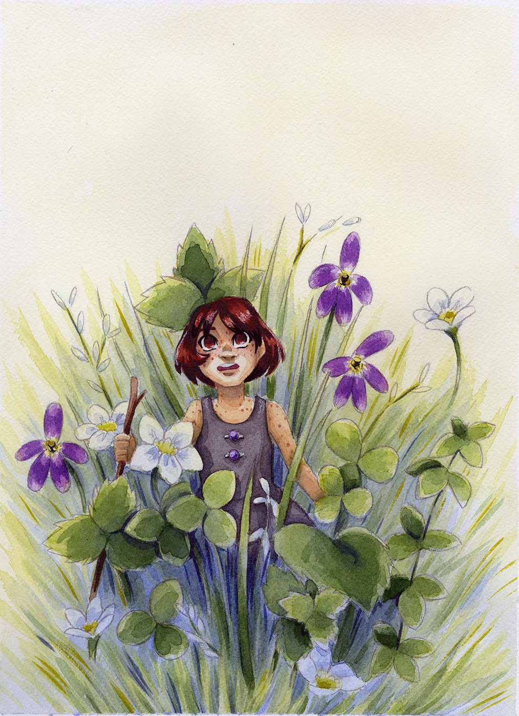
Painting Brilliant Foliage: Watercolor Basics
This series is also made possible thanks to the generosity and interest of my Patrons on Patreon.
My Watercolor Basics series is a longform, in depth tutorial series aimed at empowering others to pursue their artistic interests. Due to the nature of these series, which require process posts, numerous examples, and in depth research, these posts are extremely resource intense. It is only due to the support and loyalty of my Patrons that I can devote the time, resources, and knowledge to posts like this. To my Patrons, I owe my sincere thanks- without you, there would be no Watercolor Basics or Intro to Comic Craft series.
For only $2 a month, you can join the Artnerd community and help support quality content like this. Your pledge enables me to pay guest artists, purchase supplies for review, and offset some of the costs these in depth posts incur. Your support inspires me to dedicate the time necessary to writing and creating art education content.
Painting Foliage
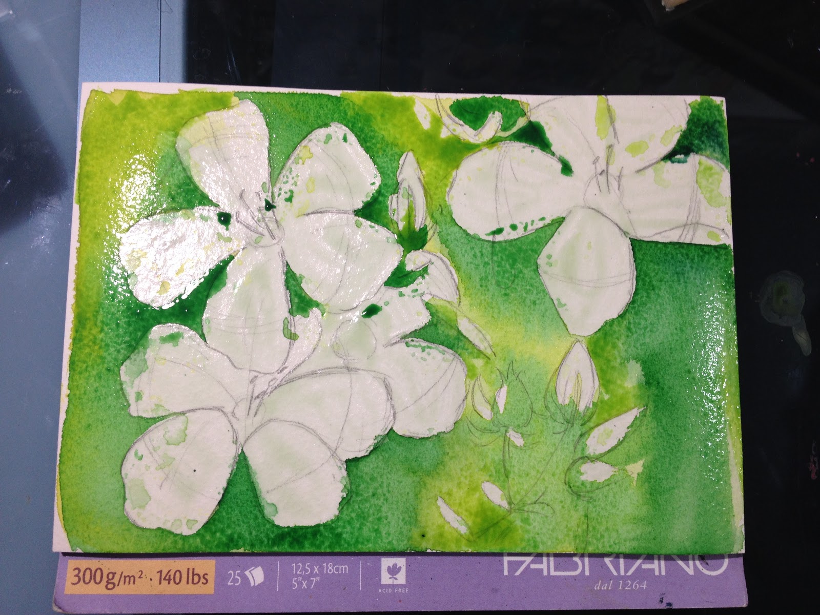
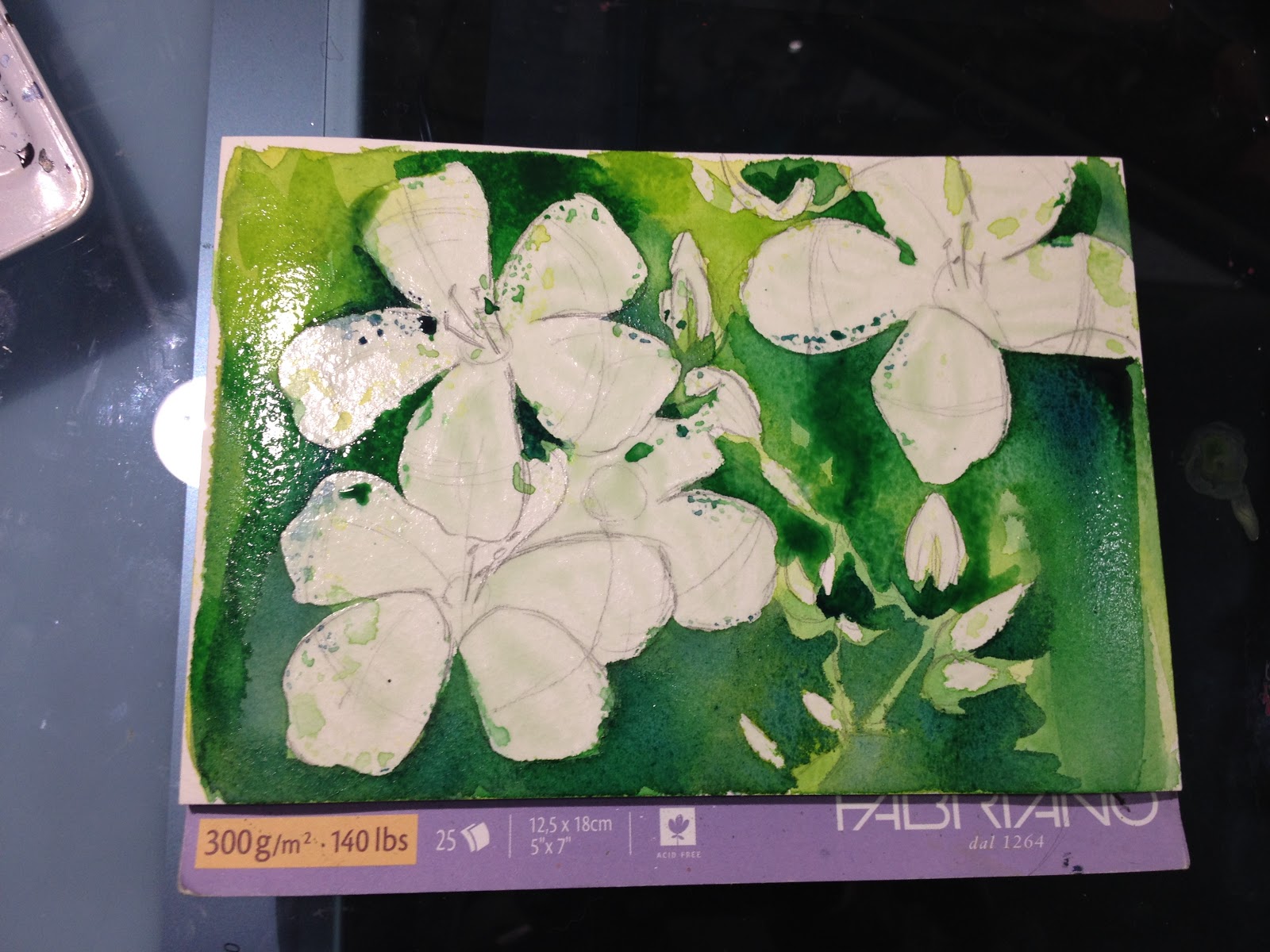
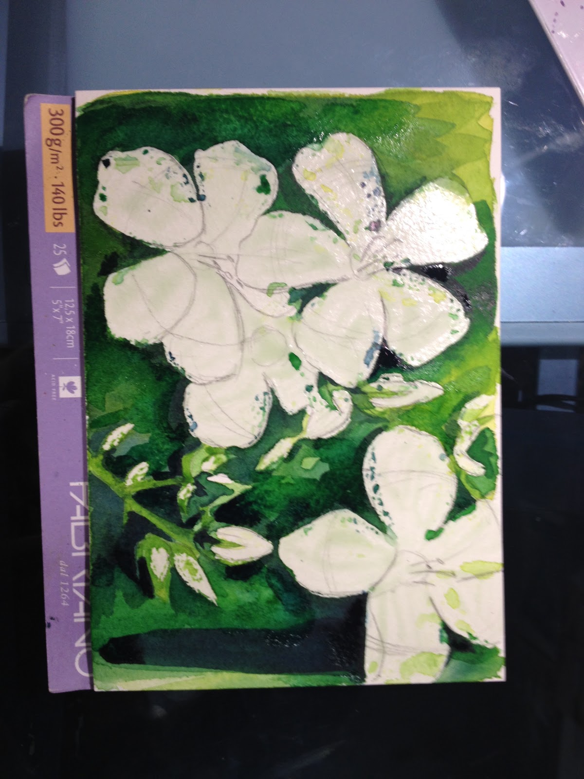
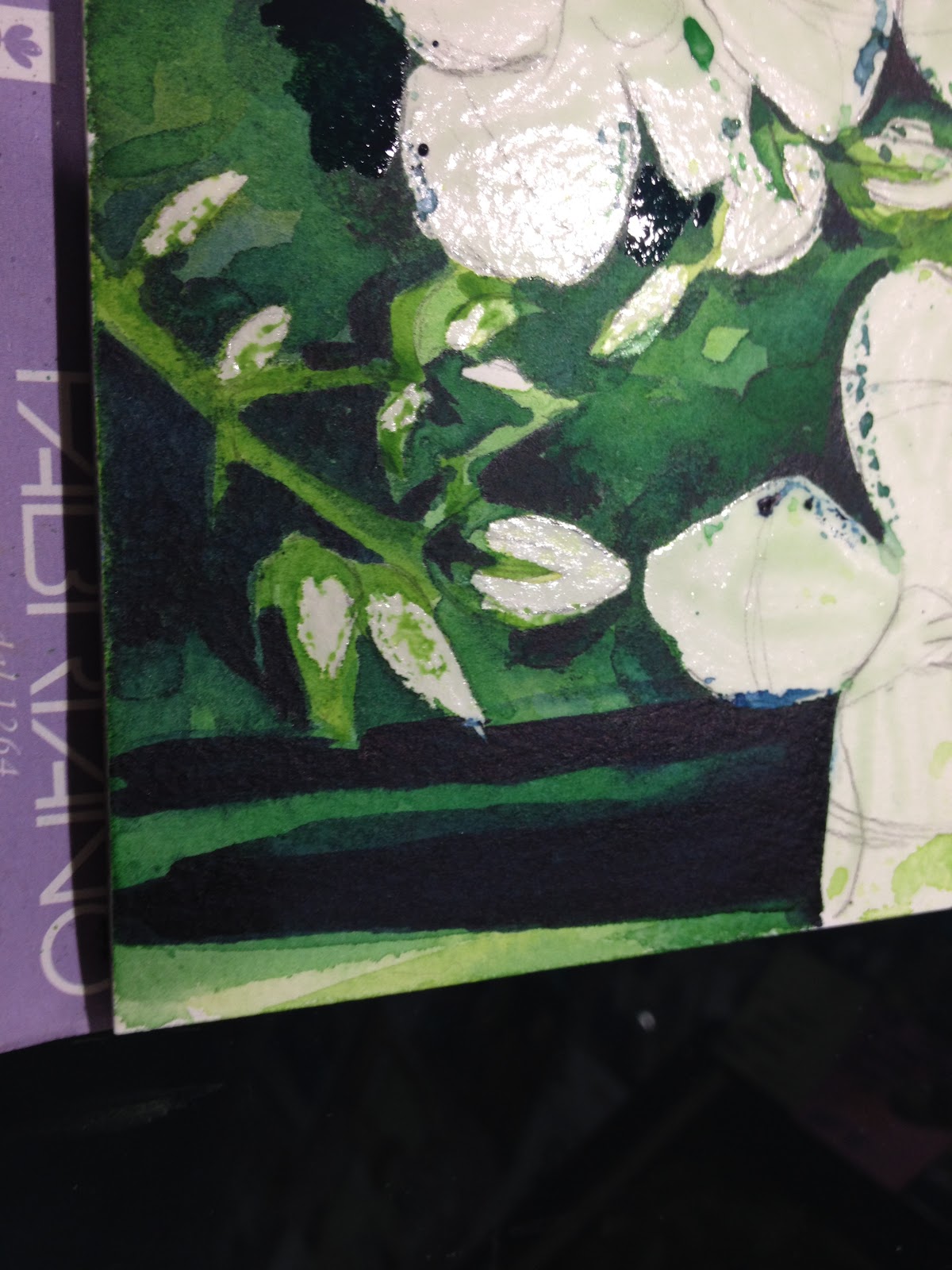
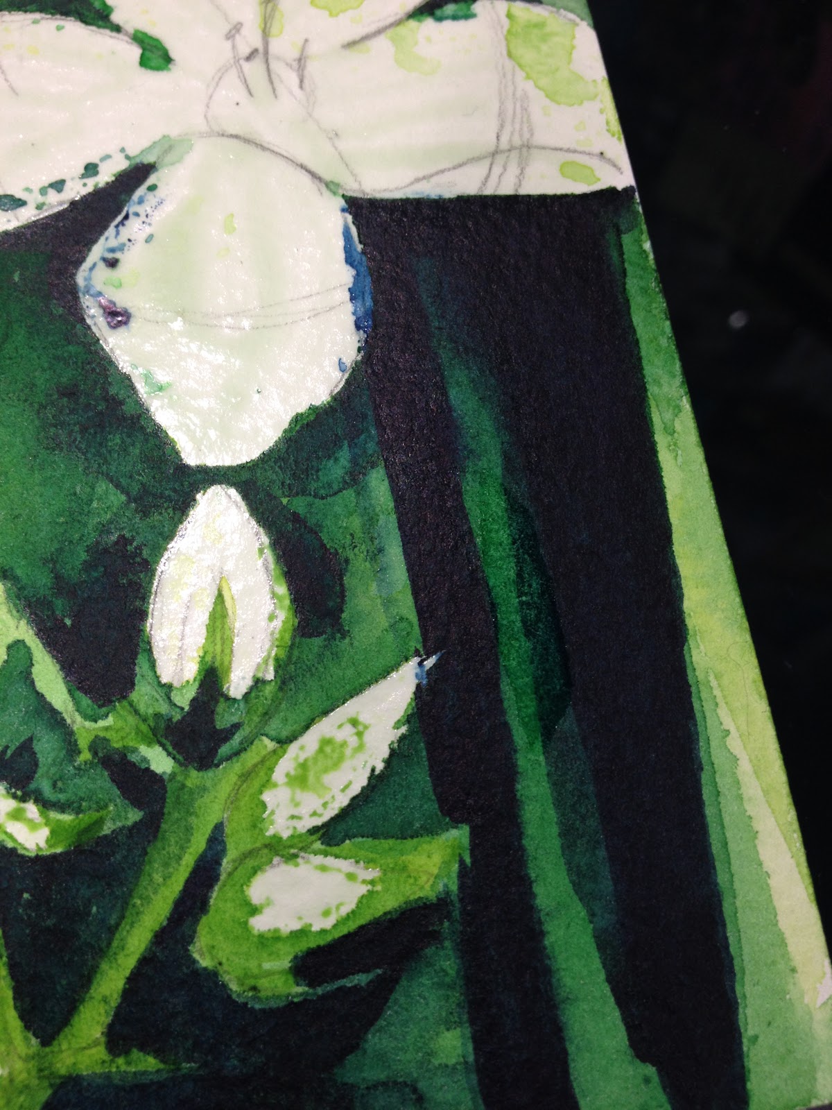
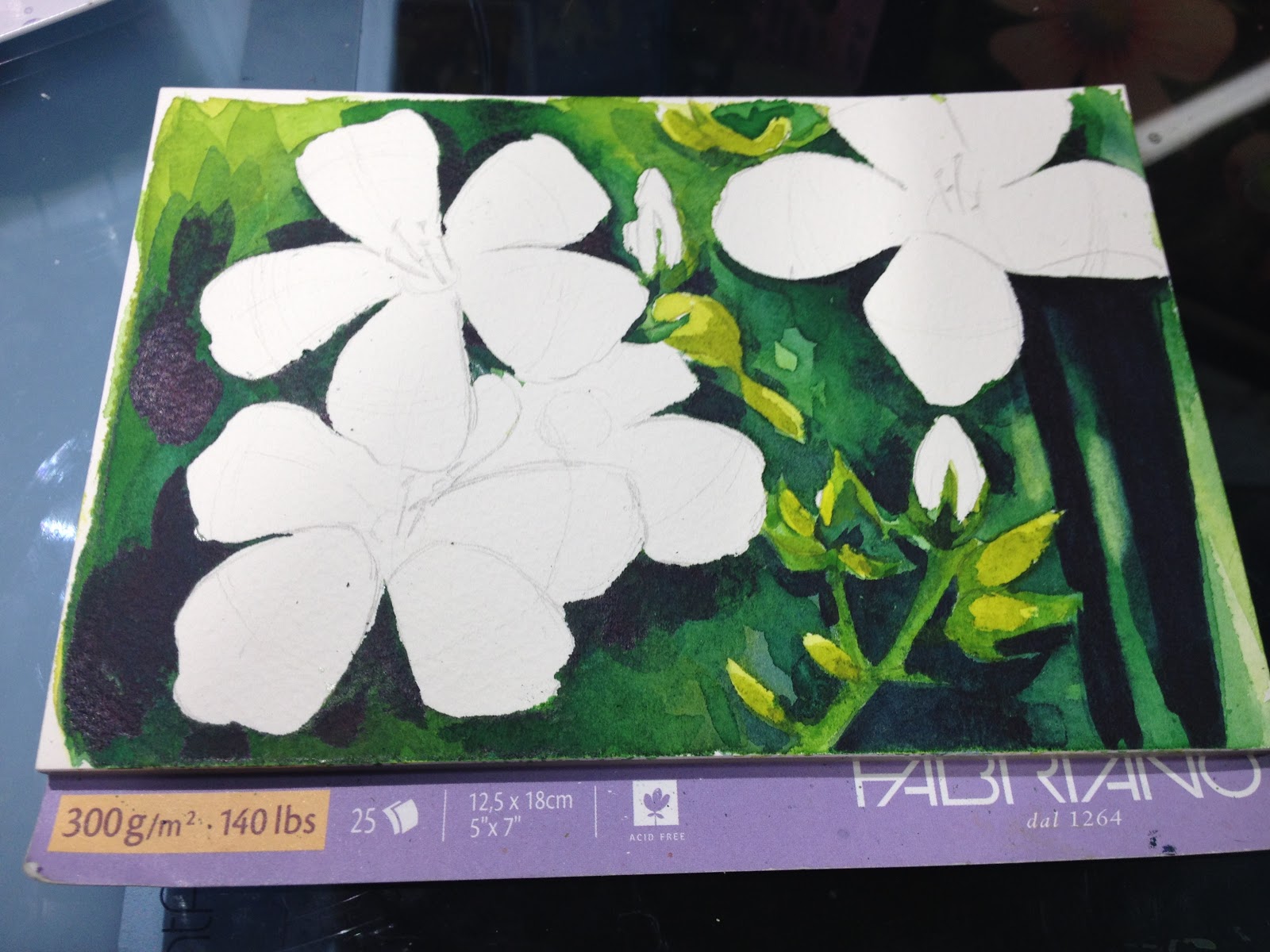
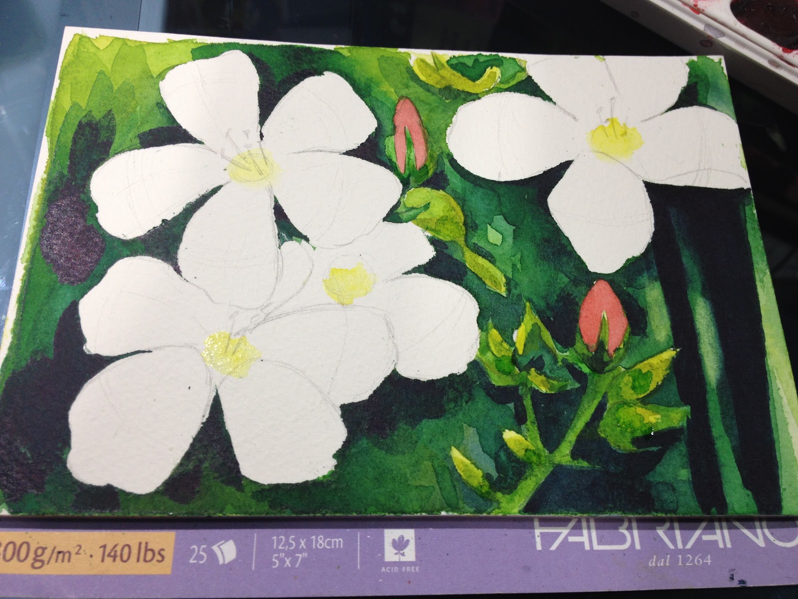
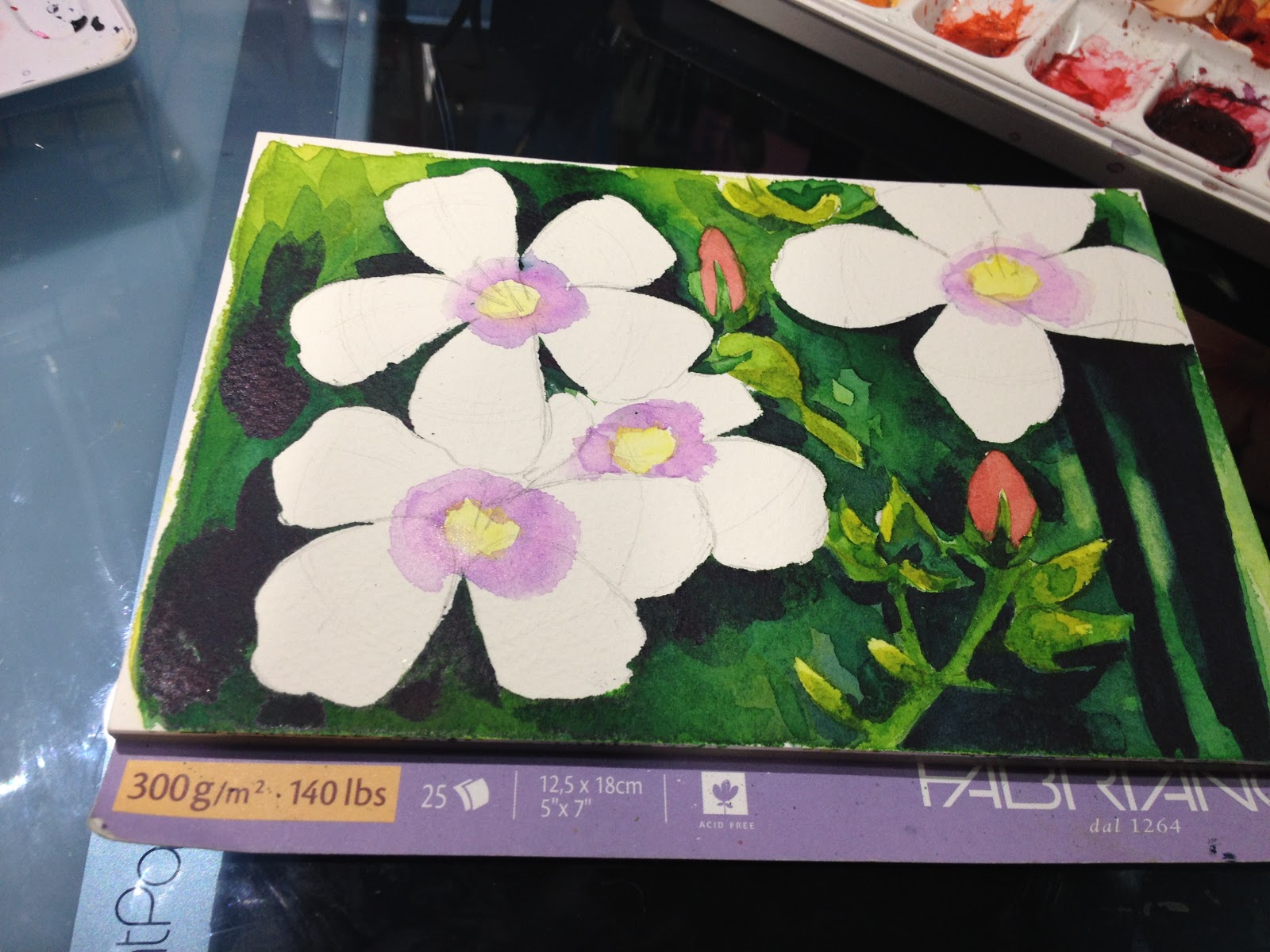
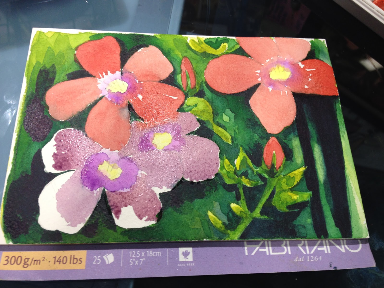
Recently we discussed the importance of painting from reference. In that post, I stated that a big part of learning when painting using reference is finding your own way and making your mistakes. One mistake I regularly make when painting greenery or foliage is what I call 'muddy swamp'. My values get lost, and the image looks like a muddy mess of greens and browns. If you struggle with this issue too, I hope today's post will pull you out of that swamp.
For painting foliage (or bouquet garni, in my case), keep in mind that GENERALLY:
Lighter, brighter greens (yellow greens) appear closeCooler darker greens (blue greens, blue) appear to recede

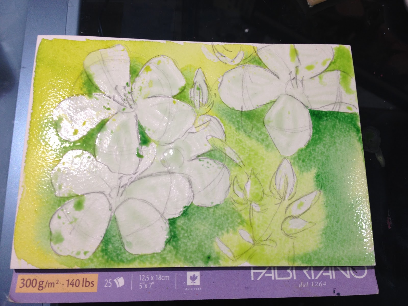
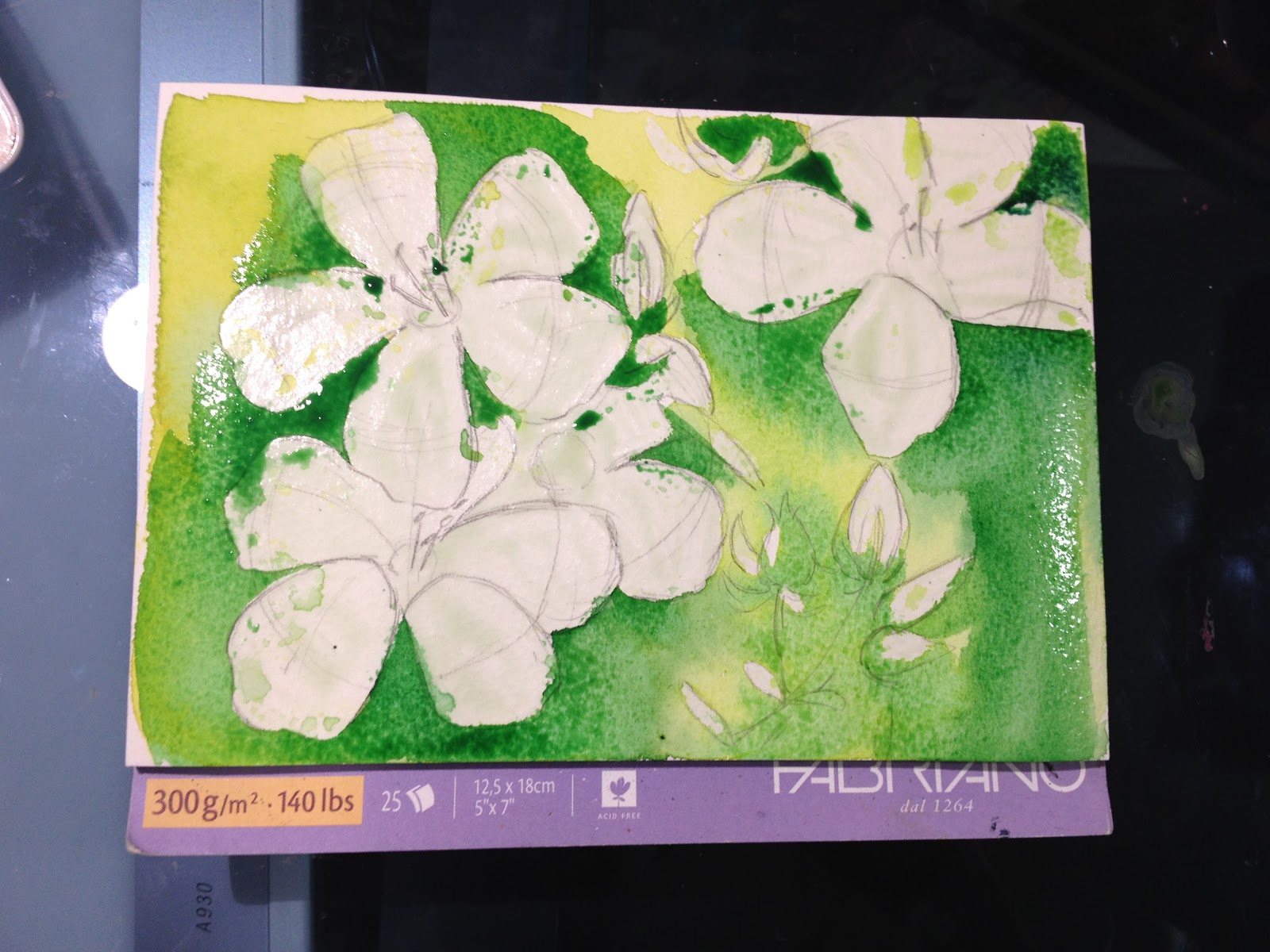
For this study, I wanted to encourage loads of wet into wet blending, and I wanted to really push the green yellow (Winsor and Newton's green gold is great for this- it has a huge range) and the green blue (Winsor and Newton's Indigo in a half pan is a very green influenced blue that works great for this)

When painting foliage, even if you want went into wet blends, its important to allow layers to dry so you can get dramatic value shifts. It's also important to mix your colors darker and cooler as you go along.
I recommend:
Start light and bright, work towards dark and cool

My palette for this bouquet garni is surprisingly limited:
Winsor and Newton Green Gold
Holbein Hooker's Green
Winsor and Newton Indigo
 It was a struggle for me to keep my hand light, and my strokes loose, but I think it paid off quite well.

Strive to maintain contrast- for me, I think of this as visual bounce or bounciness. I want my eye to bounce around the image- all values should not be the same. Of course, I painted several failed foliage studies before hitting on the sweet spot, which I've shared below.

Overworked, not enough white, not enough contrast in value.

Overworked, not enough white, not enough light values.
Muddy, messy, mush. Part of this is the paper- trying to use Strathmore's Visual Art Journal watercolor paper the way I would nice cotton rag papers like Artistico or Arches- there's a learning curve when you practice on nice and then paint on lower end. These are excellent examples of why it's important to familiarize yourself with your paper, to know its limitations.
Even these failed studies served an important purpose- they were the stepping stones that helped me learn the techniques necessary for successfully painting foliage.
Examples in Illustration


So as you can see, the time I spent completing studies was well spent, as it allowed me to tackle personal projects with confidence. Before completing a series of foliage studies, my greenery often turned into a muddy swamp, but working from reference gave me the knowledge I needed.
I hope this post has inspired you to tackle greenery, particularly if you set your comics or illustrations in the great ourdoors!
Speaking of watercolor, today's Watercolor Basic post was brought to you by the webcomic launch of 7" Kara, the comic that has inspired this series! If you enjoy my watercolor art, illustration, or tutorials, please check 7" Kara out on Tumblr or on the 7" Kara site.
If you just can't stand a cliffhanger, Volume 1 of 7" Kara is available on Gumroad and through my web-shop. Volume 1 contains the first four chapters of 7" Kara, and a bonus story, as well as loads of additional illustrations and a concept section!
Please consider donating to this blog or purchasing from Natto-shop (http://nattosoup.com/shop) if you want me to continue publishing quality content. All materials tested were purchased from my own pocket. Keep on Truckin' Nattosoup is not under any sponsorship.
My Watercolor Basics series is a longform, in depth tutorial series aimed at empowering others to pursue their artistic interests. Due to the nature of these series, which require process posts, numerous examples, and in depth research, these posts are extremely resource intense. It is only due to the support and loyalty of my Patrons that I can devote the time, resources, and knowledge to posts like this. To my Patrons, I owe my sincere thanks- without you, there would be no Watercolor Basics or Intro to Comic Craft series.
For only $2 a month, you can join the Artnerd community and help support quality content like this. Your pledge enables me to pay guest artists, purchase supplies for review, and offset some of the costs these in depth posts incur. Your support inspires me to dedicate the time necessary to writing and creating art education content.
Painting Foliage
Recently we discussed the importance of painting from reference. In that post, I stated that a big part of learning when painting using reference is finding your own way and making your mistakes. One mistake I regularly make when painting greenery or foliage is what I call 'muddy swamp'. My values get lost, and the image looks like a muddy mess of greens and browns. If you struggle with this issue too, I hope today's post will pull you out of that swamp.
For painting foliage (or bouquet garni, in my case), keep in mind that GENERALLY:
Lighter, brighter greens (yellow greens) appear closeCooler darker greens (blue greens, blue) appear to recede

For this study, I wanted to encourage loads of wet into wet blending, and I wanted to really push the green yellow (Winsor and Newton's green gold is great for this- it has a huge range) and the green blue (Winsor and Newton's Indigo in a half pan is a very green influenced blue that works great for this)

When painting foliage, even if you want went into wet blends, its important to allow layers to dry so you can get dramatic value shifts. It's also important to mix your colors darker and cooler as you go along.
I recommend:
Start light and bright, work towards dark and cool

My palette for this bouquet garni is surprisingly limited:
Winsor and Newton Green Gold
Holbein Hooker's Green
Winsor and Newton Indigo
 It was a struggle for me to keep my hand light, and my strokes loose, but I think it paid off quite well.
Strive to maintain contrast- for me, I think of this as visual bounce or bounciness. I want my eye to bounce around the image- all values should not be the same. Of course, I painted several failed foliage studies before hitting on the sweet spot, which I've shared below.

Overworked, not enough white, not enough contrast in value.

Overworked, not enough white, not enough light values.
Muddy, messy, mush. Part of this is the paper- trying to use Strathmore's Visual Art Journal watercolor paper the way I would nice cotton rag papers like Artistico or Arches- there's a learning curve when you practice on nice and then paint on lower end. These are excellent examples of why it's important to familiarize yourself with your paper, to know its limitations.
Even these failed studies served an important purpose- they were the stepping stones that helped me learn the techniques necessary for successfully painting foliage.
Examples in Illustration

So as you can see, the time I spent completing studies was well spent, as it allowed me to tackle personal projects with confidence. Before completing a series of foliage studies, my greenery often turned into a muddy swamp, but working from reference gave me the knowledge I needed.
I hope this post has inspired you to tackle greenery, particularly if you set your comics or illustrations in the great ourdoors!
Speaking of watercolor, today's Watercolor Basic post was brought to you by the webcomic launch of 7" Kara, the comic that has inspired this series! If you enjoy my watercolor art, illustration, or tutorials, please check 7" Kara out on Tumblr or on the 7" Kara site.
If you just can't stand a cliffhanger, Volume 1 of 7" Kara is available on Gumroad and through my web-shop. Volume 1 contains the first four chapters of 7" Kara, and a bonus story, as well as loads of additional illustrations and a concept section!
Please consider donating to this blog or purchasing from Natto-shop (http://nattosoup.com/shop) if you want me to continue publishing quality content. All materials tested were purchased from my own pocket. Keep on Truckin' Nattosoup is not under any sponsorship.
March 12, 2017
Practicing from Studies: Watercolor Basics
This series is also made possible thanks to the generosity and interest of my Patrons on Patreon.
My Watercolor Basics series is a longform, in depth tutorial series aimed at empowering others to pursue their artistic interests. Due to the nature of these series, which require process posts, numerous examples, and in depth research, these posts are extremely resource intense. It is only due to the support and loyalty of my Patrons that I can devote the time, resources, and knowledge to posts like this. To my Patrons, I owe my sincere thanks- without you, there would be no Watercolor Basics or Intro to Comic Craft series.
For only $2 a month, you can join the Artnerd community and help support quality content like this. Your pledge enables me to pay guest artists, purchase supplies for review, and offset some of the costs these in depth posts incur. Your support inspires me to dedicate the time necessary to writing and creating art education content.
Flex Those Art Muscles!
Doing studies from reference- and not just a few, that one time, but many, consistently over the years, has really helped me improve my watercolor game in so many ways. I do not consider myself a fine artist, and have no desire to be one, but I do respect traditional watercolor, and aspire to be considered a watercolorist as well as a comic artist. There is much to be learned from painting from reference, and even a painting that fails aesthetically is often an educational success.
Although I am walking you through a (failed, in my opinion) watercolor study, I do not expect you to copy my process- a huge part of painting from reference is learning how to handle the paints, how to build up color, and how to see the image. When relevant, I have included timelapse watercolor study videos, as sometimes watching how someone handles an image can be a huge help.
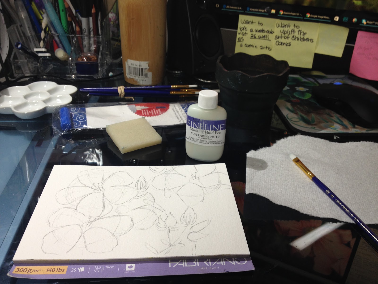
When I do serious watercolor studies, I really prefer a paper that can handle a lot of paint- ideally something pre-stretched. I enjoy using Fabriano Artistico on blocks for my smaller watercolor studies- it's a cotton rag paper that can hold A LOT of water and paint, and it's pre-stretched. I use the 5"x7", as they're small enough to complete quickly.


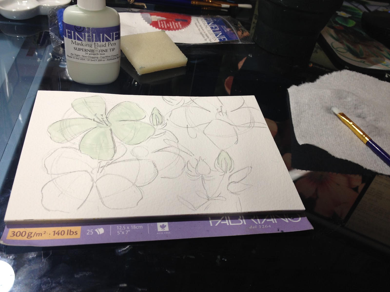
First downfall of the evening- applying masking fluid. This is back when I still thought there was some form of masking fluid that might work for me.

 Note how much masking fluid I used- I was masking large areas, rather than just working around them.
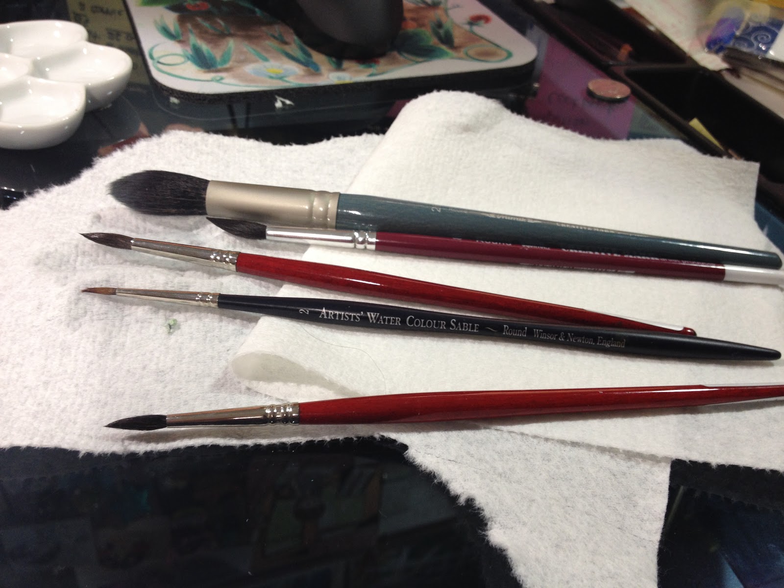
The tools of this study:
 A selection of rounds, the largest being a synthetic Mimik by Creative mark.
 Watercolor half pans, spritzed to activate them.
My intentions were good- I wanted to apply even washes of color, and not have to slow down to work around the flowers.
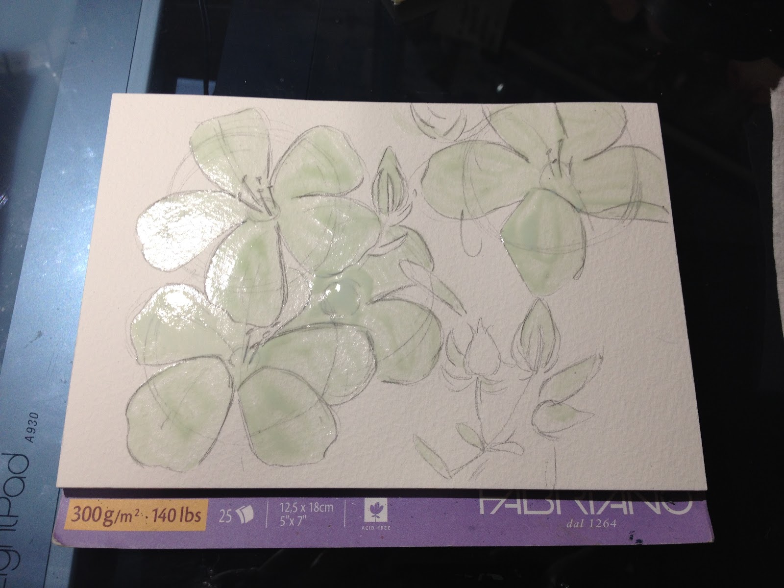
I began with olive green and hunters green. Please keep in mind that while colors look vibrant on first application, they will dull as they dry, and need to be built up.


As the piece progressed, I added in some Winsor and Newton Indigo for the darker foliage shadows.


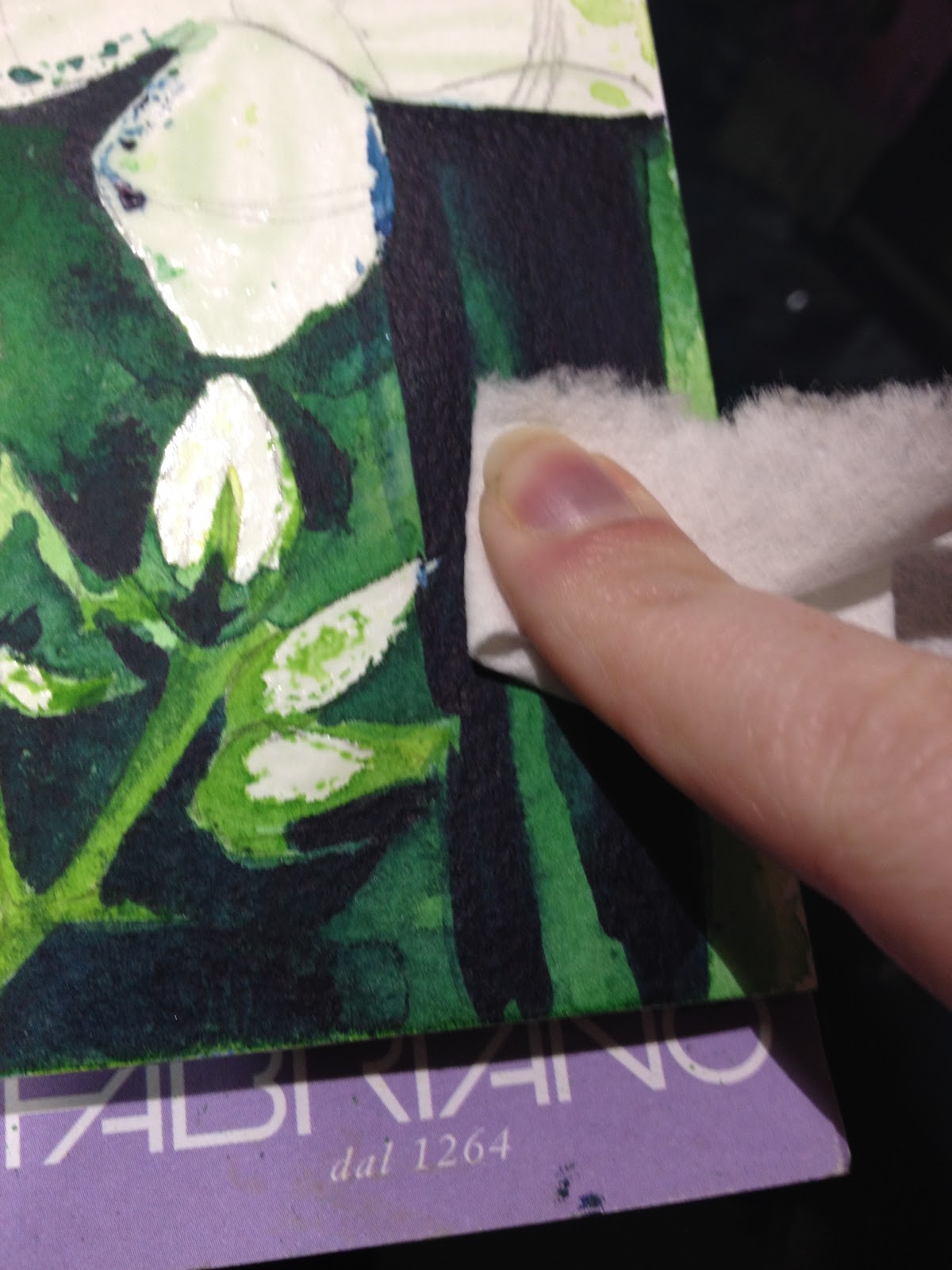
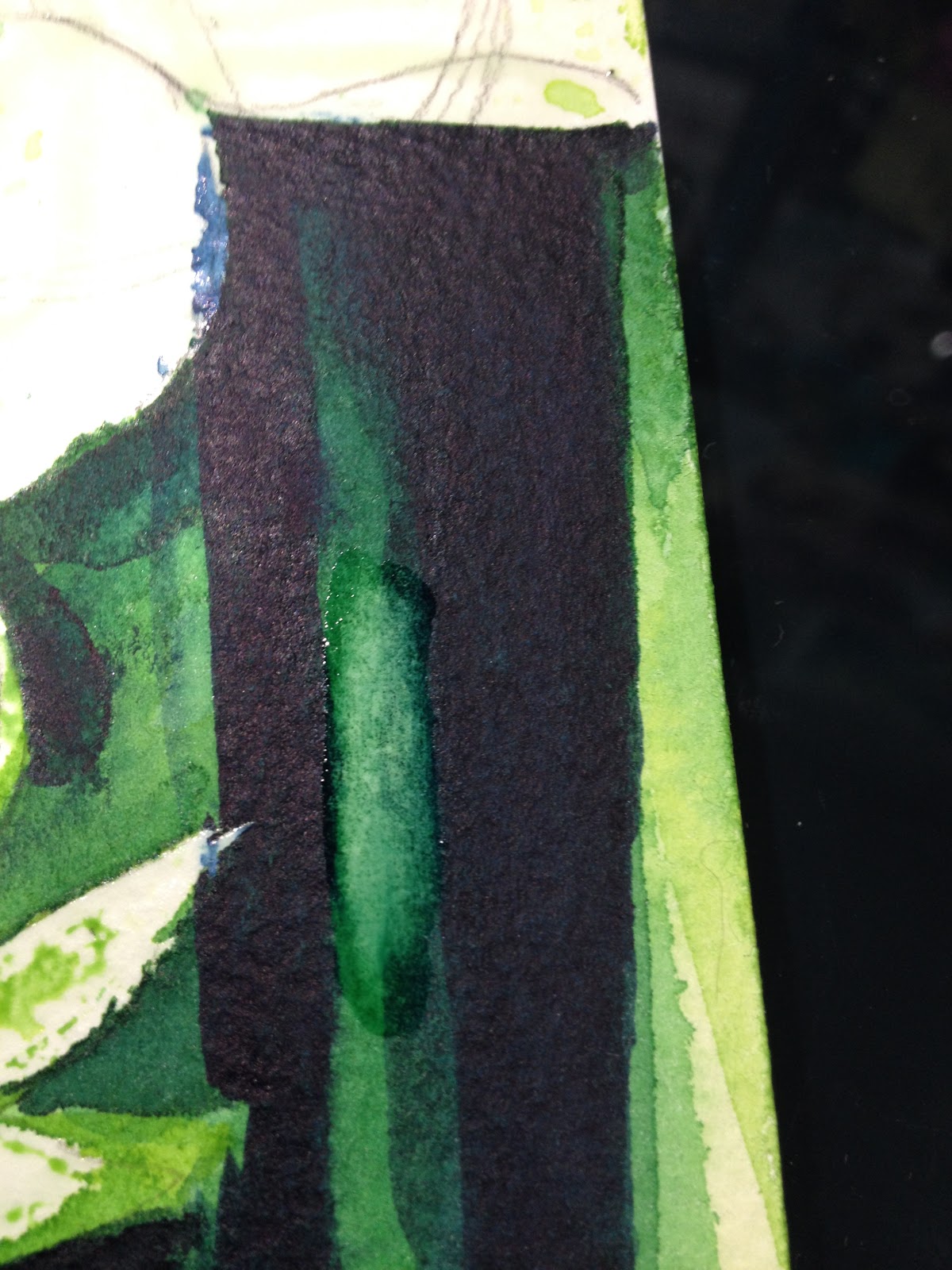
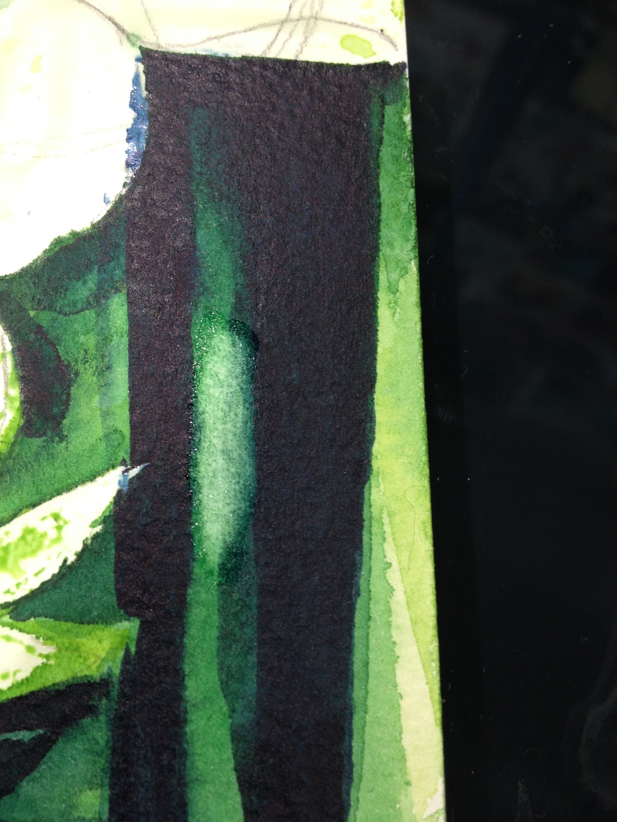
Lifting out mistakes is fairly easy on cotton-rag watercolor papers.
While paint is wet, or shortly after gently scrubbing with a clean, wet brush, apply a paper towel to absorb paint and water.


Once dry, you can replant or blend out from surrounding area.


To lift my masking fluid, I used a rubber cement eraser.


While masking fluid usually tears up my paper, this was one instance where that did not happen. What DID happen is I now had the large areas of white to fill, areas that had no color influence from the surrounding area.


In the end, my flowers stood out too much from the background, and were clumsily handled in regards to how I applied veins and small creases.
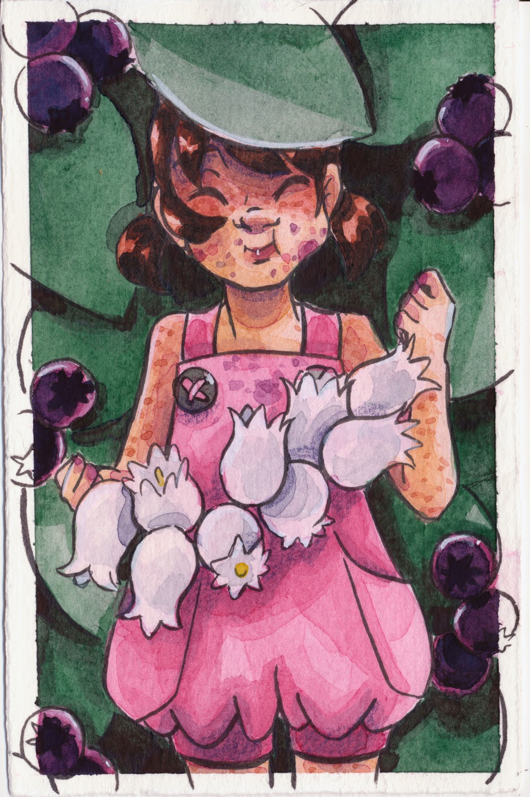
Other Examples:
Although I love painting flowers, that's not the extent of my repertoire. Painting people, especially realistic people, from reference has really helped me level up my comic painting skills. Below are a small handful of the many referenced portraits I've painted.


Watch the process!


Bonus Timelapse Process Video:
Of course, sometimes I don't have access to nicer papers, or sometimes I don't want to spend forever finessing a study, and I want to capture something quickly. Below are a selection of studies completed in a small Strathmore Visual Journal. The paper is less than ideal- cheap cellulose paper, considered a poor choice even by artists used to working on cellulose woodpulp paper, but I needed to put it through it's paces in order to review it.
Sometimes, finding a cheap paper's limits is a great way to challenge yourself, discover new techniques, and learn new solutions to common problems.


The four studies below were painted on a small (4"x6") Winsor and Newton watercolor paper spiral bound pad.


The process video!:


And while this is the Watercolor Basics series, I highly recommend you practice studies in other media as well! Mixed media: Alcohol marker and watercolor

Ecoline watercolor markers and Ecoline liquid watercolors
 Mixed media: Alcohol markers and watercolor
The below two studies were painted on Ranger Watercolor Cardstock, to help test it for the upcoming review.


Painting common household objects 'from life' (rather than from photos), poses an interesting challenge. Photos are pre-staged- the composition has been figured out for you, but painting from life may require visual resizing and restaging.

I hope I've inspired you guys to expand your watercolor limits and try painting from life and painting from reference! I've found the benefits to my comic watercolor illustration to be huge, and the practice to be relaxing and rewarding.
Speaking of watercolor, today's Watercolor Basic post was brought to you by the webcomic launch of 7" Kara, the comic that has inspired this series! If you enjoy my watercolor art, illustration, or tutorials, please check 7" Kara out on Tumblr or on the 7" Kara site.
If you just can't stand a cliffhanger, Volume 1 of 7" Kara is available on Gumroad and through my web-shop. Volume 1 contains the first four chapters of 7" Kara, and a bonus story, as well as loads of additional illustrations and a concept section!
Please consider donating to this blog or purchasing from Natto-shop (http://nattosoup.com/shop) if you want me to continue publishing quality content. All materials tested were purchased from my own pocket. Keep on Truckin' Nattosoup is not under any sponsorship.
My Watercolor Basics series is a longform, in depth tutorial series aimed at empowering others to pursue their artistic interests. Due to the nature of these series, which require process posts, numerous examples, and in depth research, these posts are extremely resource intense. It is only due to the support and loyalty of my Patrons that I can devote the time, resources, and knowledge to posts like this. To my Patrons, I owe my sincere thanks- without you, there would be no Watercolor Basics or Intro to Comic Craft series.
For only $2 a month, you can join the Artnerd community and help support quality content like this. Your pledge enables me to pay guest artists, purchase supplies for review, and offset some of the costs these in depth posts incur. Your support inspires me to dedicate the time necessary to writing and creating art education content.
Flex Those Art Muscles!
Doing studies from reference- and not just a few, that one time, but many, consistently over the years, has really helped me improve my watercolor game in so many ways. I do not consider myself a fine artist, and have no desire to be one, but I do respect traditional watercolor, and aspire to be considered a watercolorist as well as a comic artist. There is much to be learned from painting from reference, and even a painting that fails aesthetically is often an educational success.
Although I am walking you through a (failed, in my opinion) watercolor study, I do not expect you to copy my process- a huge part of painting from reference is learning how to handle the paints, how to build up color, and how to see the image. When relevant, I have included timelapse watercolor study videos, as sometimes watching how someone handles an image can be a huge help.
When I do serious watercolor studies, I really prefer a paper that can handle a lot of paint- ideally something pre-stretched. I enjoy using Fabriano Artistico on blocks for my smaller watercolor studies- it's a cotton rag paper that can hold A LOT of water and paint, and it's pre-stretched. I use the 5"x7", as they're small enough to complete quickly.
First downfall of the evening- applying masking fluid. This is back when I still thought there was some form of masking fluid that might work for me.
 Note how much masking fluid I used- I was masking large areas, rather than just working around them.
The tools of this study:
 A selection of rounds, the largest being a synthetic Mimik by Creative mark.
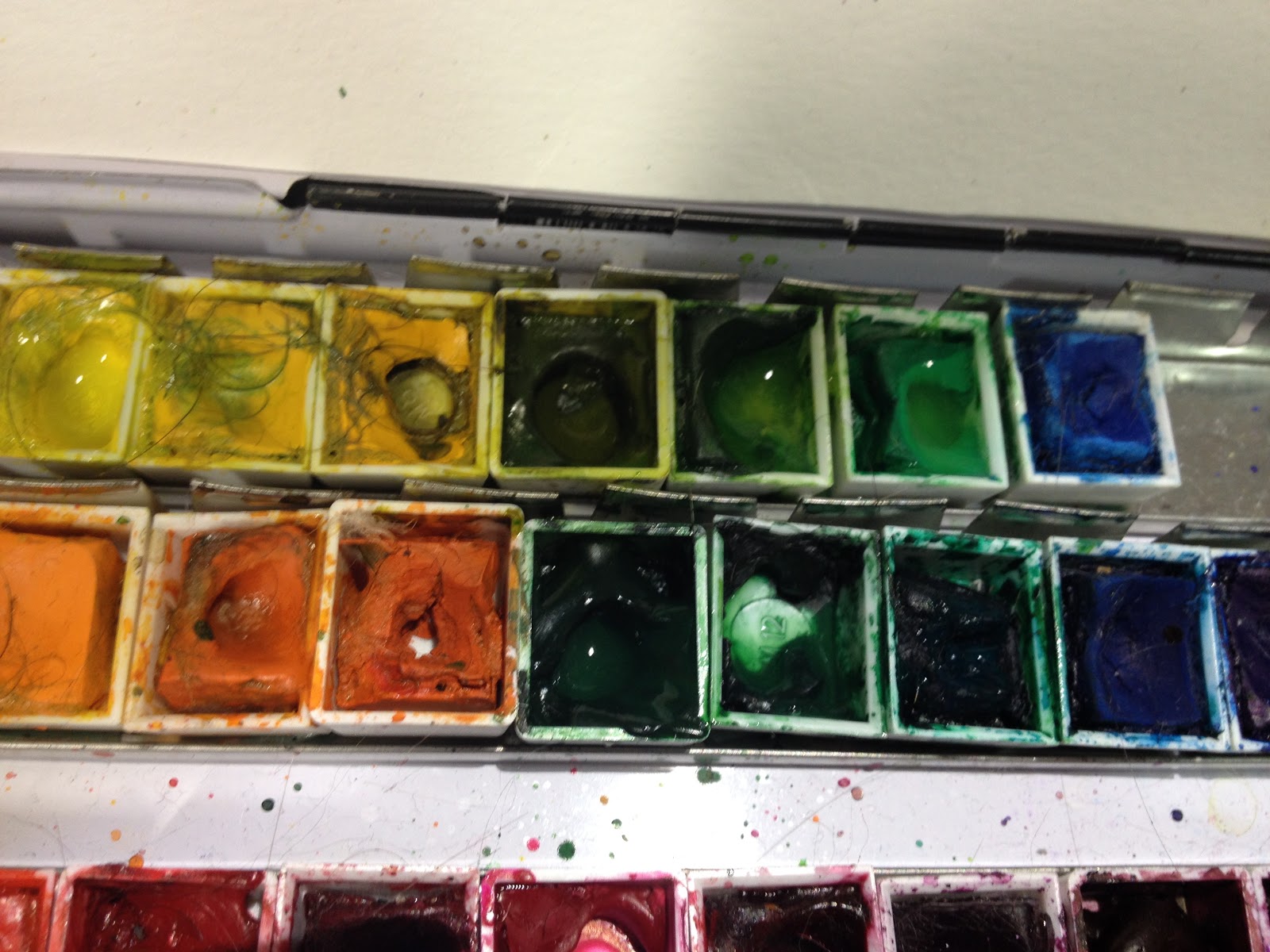 Watercolor half pans, spritzed to activate them.
My intentions were good- I wanted to apply even washes of color, and not have to slow down to work around the flowers.
I began with olive green and hunters green. Please keep in mind that while colors look vibrant on first application, they will dull as they dry, and need to be built up.
As the piece progressed, I added in some Winsor and Newton Indigo for the darker foliage shadows.
Lifting out mistakes is fairly easy on cotton-rag watercolor papers.
While paint is wet, or shortly after gently scrubbing with a clean, wet brush, apply a paper towel to absorb paint and water.

Once dry, you can replant or blend out from surrounding area.
To lift my masking fluid, I used a rubber cement eraser.
While masking fluid usually tears up my paper, this was one instance where that did not happen. What DID happen is I now had the large areas of white to fill, areas that had no color influence from the surrounding area.
In the end, my flowers stood out too much from the background, and were clumsily handled in regards to how I applied veins and small creases.
Other Examples:
Although I love painting flowers, that's not the extent of my repertoire. Painting people, especially realistic people, from reference has really helped me level up my comic painting skills. Below are a small handful of the many referenced portraits I've painted.


Watch the process!


Bonus Timelapse Process Video:
Of course, sometimes I don't have access to nicer papers, or sometimes I don't want to spend forever finessing a study, and I want to capture something quickly. Below are a selection of studies completed in a small Strathmore Visual Journal. The paper is less than ideal- cheap cellulose paper, considered a poor choice even by artists used to working on cellulose woodpulp paper, but I needed to put it through it's paces in order to review it.
Sometimes, finding a cheap paper's limits is a great way to challenge yourself, discover new techniques, and learn new solutions to common problems.


The four studies below were painted on a small (4"x6") Winsor and Newton watercolor paper spiral bound pad.


The process video!:


And while this is the Watercolor Basics series, I highly recommend you practice studies in other media as well!
 Mixed media: Alcohol marker and watercolor
Ecoline watercolor markers and Ecoline liquid watercolors
 Mixed media: Alcohol markers and watercolor
The below two studies were painted on Ranger Watercolor Cardstock, to help test it for the upcoming review.

Painting common household objects 'from life' (rather than from photos), poses an interesting challenge. Photos are pre-staged- the composition has been figured out for you, but painting from life may require visual resizing and restaging.
I hope I've inspired you guys to expand your watercolor limits and try painting from life and painting from reference! I've found the benefits to my comic watercolor illustration to be huge, and the practice to be relaxing and rewarding.
Speaking of watercolor, today's Watercolor Basic post was brought to you by the webcomic launch of 7" Kara, the comic that has inspired this series! If you enjoy my watercolor art, illustration, or tutorials, please check 7" Kara out on Tumblr or on the 7" Kara site.
If you just can't stand a cliffhanger, Volume 1 of 7" Kara is available on Gumroad and through my web-shop. Volume 1 contains the first four chapters of 7" Kara, and a bonus story, as well as loads of additional illustrations and a concept section!
Please consider donating to this blog or purchasing from Natto-shop (http://nattosoup.com/shop) if you want me to continue publishing quality content. All materials tested were purchased from my own pocket. Keep on Truckin' Nattosoup is not under any sponsorship.
March 9, 2017
One Layer Watercolor: Watercolor Basics
This series is also made possible thanks to the generosity and interest of my Patrons on Patreon.
My Watercolor Basics series is a longform, in depth tutorial series aimed at empowering others to pursue their artistic interests. Due to the nature of these series, which require process posts, numerous examples, and in depth research, these posts are extremely resource intense. It is only due to the support and loyalty of my Patrons that I can devote the time, resources, and knowledge to posts like this. To my Patrons, I owe my sincere thanks- without you, there would be no Watercolor Basics or Intro to Comic Craft series.
For only $2 a month, you can join the Artnerd community and help support quality content like this. Your pledge enables me to pay guest artists, purchase supplies for review, and offset some of the costs these in depth posts incur. Your support inspires me to dedicate the time necessary to writing and creating art education content.
One Layer Watercolor
Now that we've gone over the process for an entire watercolor illustration, you guys should be fairly familiar with my working methods, especially if you're following along with the YouTube demonstrations.
This is a straightforward technique that is deceptively difficult. You're simply applying one layer of color per area- relying on the white of the paper or working wet into wet for detail and definition. If you're used to building up forms and contrast through layers and layers of color, this technique is definitely a challenge!
Materials Used:
Watercolors (given the lack of layers, you can use cheaper watercolors if you wish- there's no glazes to make layers muddy)Watercolor paper (you can use inexpensive watercolor paper if you wish, as the paper isn't going to be saturated. I use Strathmore's Field Watercolor Notebook)Watercolor brushes (I tend to prefer rounds- they are particularly good for this exercise, as they can get into small corners)
Additional Materials:
Welled palettebulldog clips to secure your paper
Preparing Your Image and Workspace

Mixing Skintone

My preferred mixture for most Caucasian skintones is yellow ochre+scarlet lake or hue.
Applying a Light Wash Around Image
 Although the focus of this tutorial is to apply bold fields of color, I find that 'grounding' the image (especially for vignettes or pinups like the above image) with a light wash of cerulean blue only in the background helps significantly.
Working Layer by Layer, One Area at a Time
Skin

I find that even in an application such as this, which relies on saturated colors and stark white contrast, painting the skin delicately, rather than thickly, is best.
Blush

For blush, I use a mixture of Aliz Crimson mixed very sparingly.
Red Posies

Once I've established my lightest colors, I can start painting directly from my pans. For this, I recommend activating your paints beforehand, so they're ready to use when you're ready to apply color. For these flowers, I used Holbein's Cherry Red.
Green Shamrocks


One of the neater effects of using textured watercolor papers is that the paper surface will affect how the paints dry, as evident in the upper right hand shamrock.
For these shamrocks, I used Holbein's Hooker's Green.
Hair

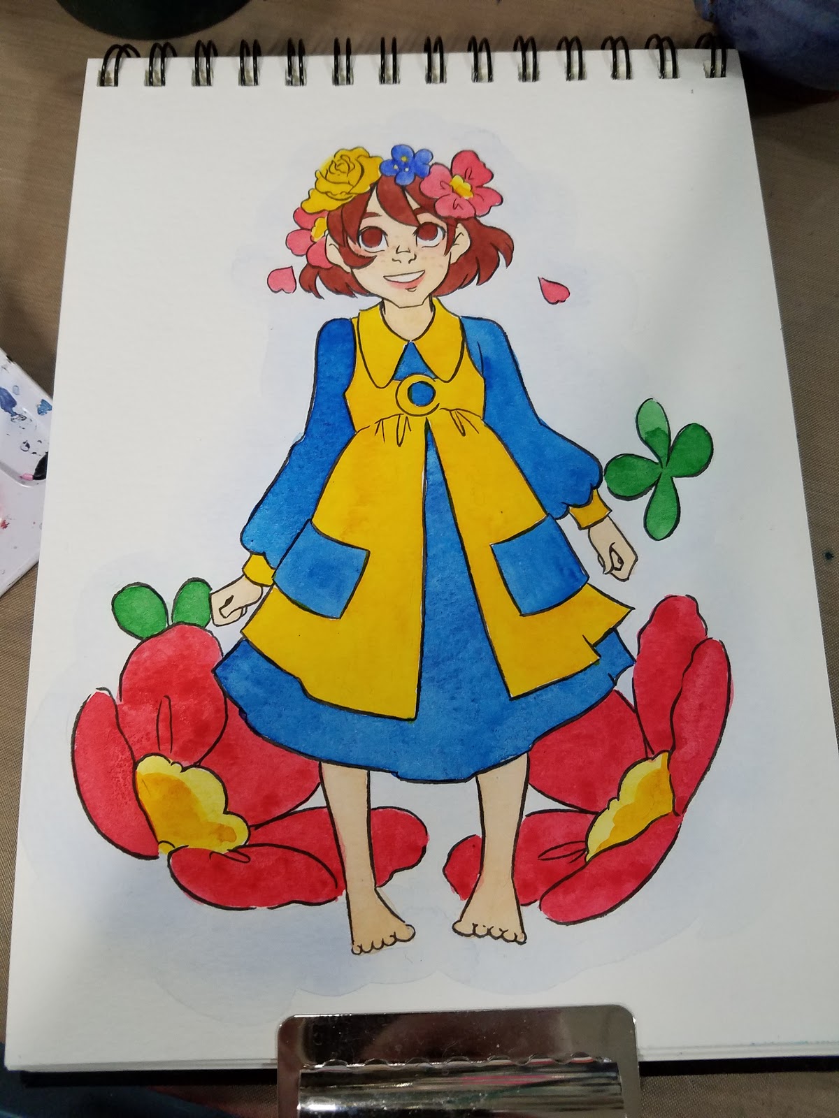
For Kara's hair, I used Indian Red.
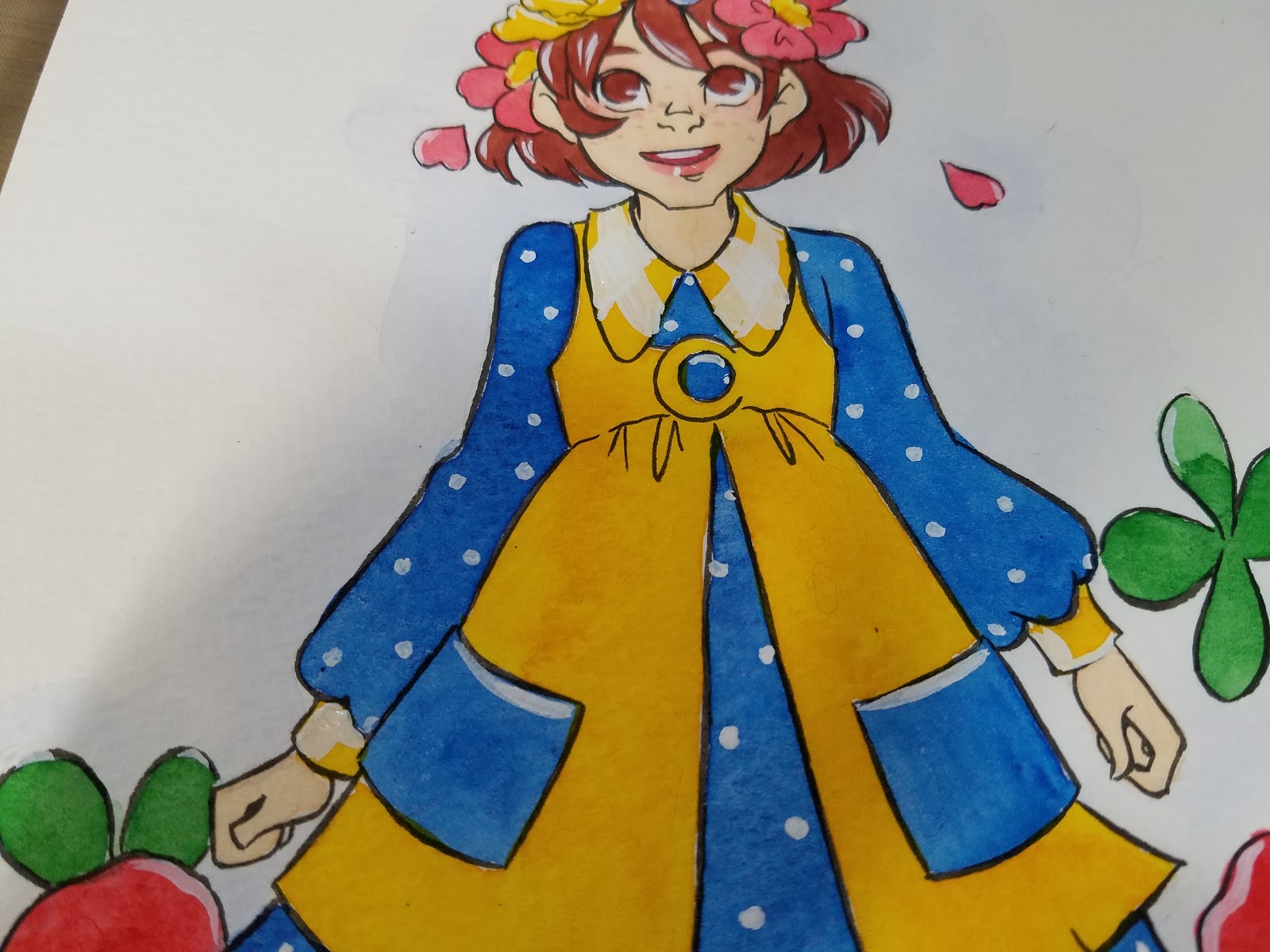
Dress


Painting larger areas requires a well kept round that can pull a fine point, yet hold a large amount of paint, some patience, and a quick hand, as ideally, you want to finish in one pass. I recommend handing larger areas one area at a time- left sleeve, pockets, body of dress, right sleeve.
For Kara's Dress, I used a blue green by Soho watercolors- note, this is a synthetic blue green, and is not light fast.
Pinafore and Flower Centers


For these items, I used Soho's Indian Yellow. I have not tested any Soho watercolors for lightfastness, so I cannot recommend them for projects that will be displayed.
White Gouache for Details

Once everything has had a chance to dry completely, thickly mixed gouache or Copic Opaque white can be used to add highlights and accents.
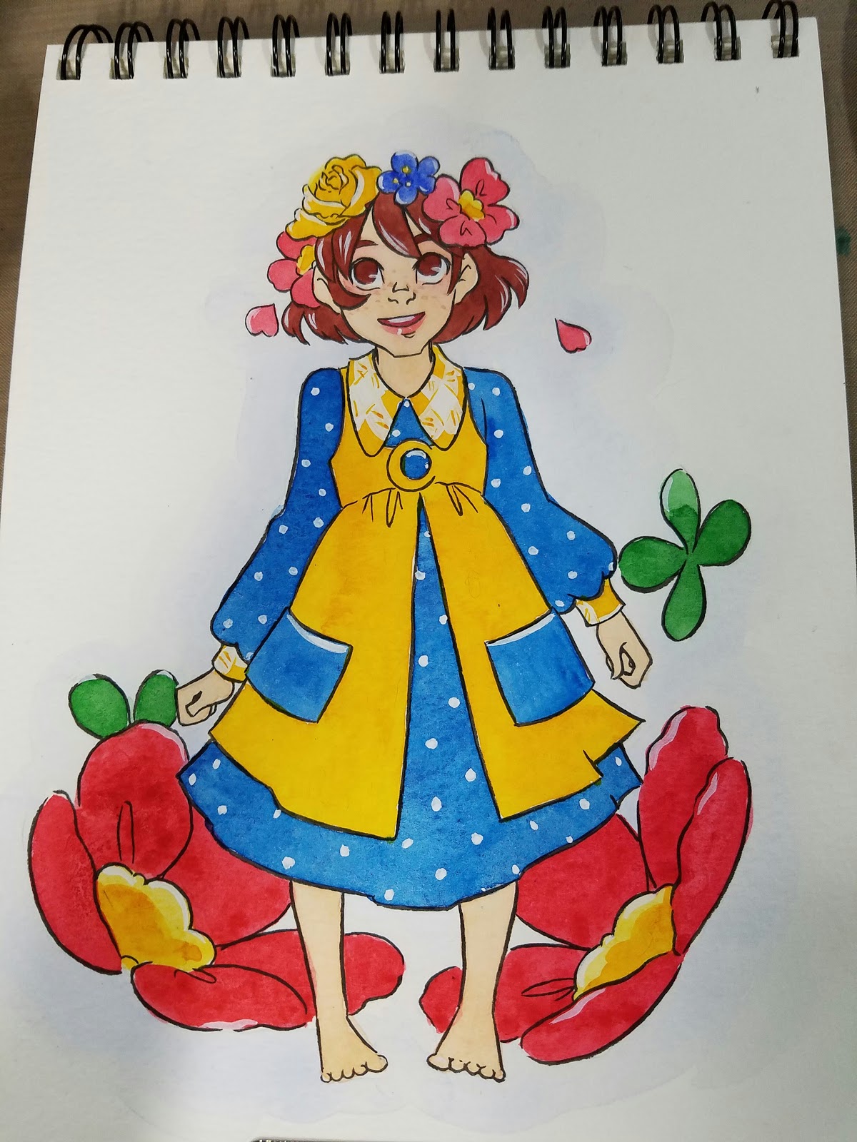
Finished Piece


The end result, in my instance, is a fairly graphic piece that stands well on it's own, and looks quite different from my regular watercolor work.
Pros:
Takes less timeMay be easier to reproduceGraphic, easy to read style
Cons:
Need to get it right on the first go round, corrections may leave blemishes that are distracting and hard to hide.Need to plan your whites (highlights) ahead of timeToday's Sponsor- 7" Kara
Speaking of watercolor, today's Watercolor Basic post was brought to you by the webcomic launch of 7" Kara, the comic that has inspired this series! If you enjoy my watercolor art, illustration, or tutorials, please check 7" Kara out on Tumblr or on the 7" Kara site.
If you just can't stand a cliffhanger, Volume 1 of 7" Kara is available on Gumroad and through my web-shop. Volume 1 contains the first four chapters of 7" Kara, and a bonus story, as well as loads of additional illustrations and a concept section!
Please consider donating to this blog or purchasing from Natto-shop (http://nattosoup.com/shop) if you want me to continue publishing quality content. All materials tested were purchased from my own pocket. Keep on Truckin' Nattosoup is not under any sponsorship.
My Watercolor Basics series is a longform, in depth tutorial series aimed at empowering others to pursue their artistic interests. Due to the nature of these series, which require process posts, numerous examples, and in depth research, these posts are extremely resource intense. It is only due to the support and loyalty of my Patrons that I can devote the time, resources, and knowledge to posts like this. To my Patrons, I owe my sincere thanks- without you, there would be no Watercolor Basics or Intro to Comic Craft series.
For only $2 a month, you can join the Artnerd community and help support quality content like this. Your pledge enables me to pay guest artists, purchase supplies for review, and offset some of the costs these in depth posts incur. Your support inspires me to dedicate the time necessary to writing and creating art education content.
One Layer Watercolor
Now that we've gone over the process for an entire watercolor illustration, you guys should be fairly familiar with my working methods, especially if you're following along with the YouTube demonstrations.
This is a straightforward technique that is deceptively difficult. You're simply applying one layer of color per area- relying on the white of the paper or working wet into wet for detail and definition. If you're used to building up forms and contrast through layers and layers of color, this technique is definitely a challenge!
Materials Used:
Watercolors (given the lack of layers, you can use cheaper watercolors if you wish- there's no glazes to make layers muddy)Watercolor paper (you can use inexpensive watercolor paper if you wish, as the paper isn't going to be saturated. I use Strathmore's Field Watercolor Notebook)Watercolor brushes (I tend to prefer rounds- they are particularly good for this exercise, as they can get into small corners)
Additional Materials:
Welled palettebulldog clips to secure your paper
Preparing Your Image and Workspace
Mixing Skintone

My preferred mixture for most Caucasian skintones is yellow ochre+scarlet lake or hue.
Applying a Light Wash Around Image
 Although the focus of this tutorial is to apply bold fields of color, I find that 'grounding' the image (especially for vignettes or pinups like the above image) with a light wash of cerulean blue only in the background helps significantly.
Working Layer by Layer, One Area at a Time
Skin

I find that even in an application such as this, which relies on saturated colors and stark white contrast, painting the skin delicately, rather than thickly, is best.
Blush

For blush, I use a mixture of Aliz Crimson mixed very sparingly.
Red Posies

Once I've established my lightest colors, I can start painting directly from my pans. For this, I recommend activating your paints beforehand, so they're ready to use when you're ready to apply color. For these flowers, I used Holbein's Cherry Red.
Green Shamrocks

One of the neater effects of using textured watercolor papers is that the paper surface will affect how the paints dry, as evident in the upper right hand shamrock.
For these shamrocks, I used Holbein's Hooker's Green.
Hair
For Kara's hair, I used Indian Red.
Dress


Painting larger areas requires a well kept round that can pull a fine point, yet hold a large amount of paint, some patience, and a quick hand, as ideally, you want to finish in one pass. I recommend handing larger areas one area at a time- left sleeve, pockets, body of dress, right sleeve.
For Kara's Dress, I used a blue green by Soho watercolors- note, this is a synthetic blue green, and is not light fast.
Pinafore and Flower Centers


For these items, I used Soho's Indian Yellow. I have not tested any Soho watercolors for lightfastness, so I cannot recommend them for projects that will be displayed.
White Gouache for Details
Once everything has had a chance to dry completely, thickly mixed gouache or Copic Opaque white can be used to add highlights and accents.
Finished Piece

The end result, in my instance, is a fairly graphic piece that stands well on it's own, and looks quite different from my regular watercolor work.
Pros:
Takes less timeMay be easier to reproduceGraphic, easy to read style
Cons:
Need to get it right on the first go round, corrections may leave blemishes that are distracting and hard to hide.Need to plan your whites (highlights) ahead of timeToday's Sponsor- 7" Kara
Speaking of watercolor, today's Watercolor Basic post was brought to you by the webcomic launch of 7" Kara, the comic that has inspired this series! If you enjoy my watercolor art, illustration, or tutorials, please check 7" Kara out on Tumblr or on the 7" Kara site.
If you just can't stand a cliffhanger, Volume 1 of 7" Kara is available on Gumroad and through my web-shop. Volume 1 contains the first four chapters of 7" Kara, and a bonus story, as well as loads of additional illustrations and a concept section!
Please consider donating to this blog or purchasing from Natto-shop (http://nattosoup.com/shop) if you want me to continue publishing quality content. All materials tested were purchased from my own pocket. Keep on Truckin' Nattosoup is not under any sponsorship.
March 6, 2017
Intro to Comic Craft: Step by Step: Character Design
This series is also made possible thanks to the generosity and interest of my Patrons on Patreon.
My Patrons have expressed interest in content on the comic making process, and I am happy to oblige. Comics are one of my passions, and they're the reason I began this blog in the first place. It isn't always easy to share comic content here, but their generosity has made it easier to set aside the time and resources necessary to doing so. Writing about comic craft in depth requires research, setting aside time during the comic creation process to document my progress, and a lot of thought, and I feel is best served through longform series such as the Intro to Comic Craft: Step By Step series. If you enjoy this series, please take a moment to share it with your friends and loved ones on the social network of your choice, leave me a G+ comment, or send me an email using the sidebar form- your feedback is important to me! If you have specific questions, please don't hesitate to ask via email.
As part of this series, my Patrons have exclusive access to behind the scenes comic creation content, including the entire plotform synopsis for 7" Kara, the 7" Kara beat sheet, the Chapter 7 Synopsis, the Chapter 7 tight script, and loads more. If you learn best from working example, joining my Patreon will give you access to those files.
Approaching Character Design for Comics
There are multiple approaches to character design, and which approach you use is up to you, and the needs of your comic.
For other methods of approaching character design, please check out my Outside References section.
My core goals when designing characters:
Represent a diverse cast without perpetuating stereotypesDesign relatable characters inspired by people I've encounteredDesign clothes that are practical and suit the characterFeature women and girls positively and prominently
Designing Characters in Batch:
Useful for shorter works, or to establish a main cast.
Momotaro- Black and White
Designing historical characters based on information gathered on site (Tokyo, Edo-Tokyo Museum, photos and sketches) during the Japan Trip.


Full comic
Critical Missy- Inkwash Grayscale
For Critical Missy, I needed to design two groups of characters- the fantasy themed DnD characters (a mage- Missy, based off magical girls, a half orc barbarian, and an elf archer), and four humans.


Designing Characters or Appearance by Chapter:
Useful for longer works that require multiple outfit changes, larger casts, or characters that evolve over time.
Pre-Comic Design:
Kara:


 Meldina:


Rowan:

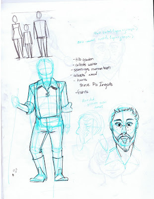

Naomi:
Original Design
Naomi Revision:


Pancake:


Tanner:


Even before Chapter 1 began, Kara as a character saw significant evolution. Early versions saw her older, and taller- a teenage Lilliputian, but my thesis research showed a need for independent, younger female protagonists. I decided to have her a little younger than originally planned, at 11 years old.
7" Kara- Color
Chapter 1:

Chapter 4:


Chapter 6:
For chapters that show a montage, cover several days, or require a costume change, I research and design the chapter's outfits ahead of time. Here are a selection of the outfits used for Chapter 6.


Chapter 7:
Chapter Seven not only covers three characters, but features a montage where Kara models a variety of doll clothes inspired by Barbie clothes throughout the decades. This required some research beforehand, and I found it handy to start a Pinterest board dedicated to the chapter.


 Chapter 7 designs in practice:

My goal is to depict Kara as a well dressed, but actively little kid. While I do often put her in dresses for promotional art, the majority of her chapter outfits feature shorts or pantaloons, as they're more practical for a small person exploring the huge outside world. I wanted Kara to represent the notion that femininity can be practical and can cover a spectrum even in a single person, rather than conventional treatments in comics, which tends to either only present the most practical, tom-boyish outfits, or overtly feminine, covered in frills, impractical ensembles.
Designing Characters En Masse:
Good for time crunches, large casts, short comics
Knight School- Color


With Knight School, what started out as a very tame pitch- grandmother knight cares for her recently orphaned grandchildren, spiralled into dangerous territory when Lady Knight requested that early contributors (even comic contributors) massively up their knight count. In the end, I had to design 13 knights, show aspects of their personalities, and make them all stand out as individuals- in 4 pages of comic.
Since I had so many knights to design, I decided to represent as many personalities and nationalities as possible. Although their names are all traditionally Germanic, Viveca, Adair, Cerdic, and Lenna are all African, Magnilda is German, Halfrida is Korean, Philiberta Irish, Karlotta and Bethilda are Indian, Minetta is Hispanic, Selma is English, and Uta is Chinese. The girls are also a range of ages, from five to seventeen.
Transition to Color:


This was an opportunity for me to embrace diversity and showcase a variety of girls who all embody what it means to be a knight by the chivalric definition. I would have loved more space to explore their personalities, but early contributors to 1001 Knights were asked to up their knight count and lower their page count (a bit cruel if you were submitting a comic)
More on Knight School
Cicada Summer- Black and White
Using tracing paper to design a large family
Materials Used:
Sketchbook
Colored Leads
Inexpensive tracing paper, torn to size
Each branch of the extended family is color coded with lead.

When designing characters, I begin with fairly basic shapes. The torso is blocked in with rectangles or hourglasses.

From there, I begin to build out the skeleton. An egg shape for the rib cage, a rectangle for the pelvic box, sticks to determine the gesture of the arms, cylindars for arms, legs, and neck.


Only after the basic form is fleshed out do I begin worrying about clothing design. For this comic, which is set in Picayune, Mississippi in midsummer, everyone needed to be dressed practically.


For such a large cast, it's helpful to have a baseline of comparison. In this case, it's the main character, a 13 year old girl.
She was sketched directly in my sketchbook, and when designing other characters, I tape the tracing paper on top.

And use this for size reference, rather than relying on measurements and hashmarks.


For large families like this one, the tracing paper can really pile up, but it's helpful to maintain size relationships and reinforce familial similarities between characters.
The crawfish boil pitch chapter from Cicada Summer requires me to design and draw 20 total characters from four different (but related) families.
Although I'm drawing my own family, there aren't photos from the time period, so I'm having to rely heavily on memory. Photos would make this much easier- so if you have photo reference, use it!
Tips for designing large casts, or casts that are related by blood/marriage
Baseline height is set off the main character. Familial relation is designated by lead color.
Tips and Tricks:
Design ahead, and make sure your designs are clear enough for you to read later.Collect reference ahead of time- this will make designing quickerTo speed up the process, pick a stock pose that shows all important features of character and use it when designing all characters.Consider using a doll or a base for quick character designsOutside References:
How to be a Character Designer: Brookes Eggleston- Character Design ForgeHow to Create Characters (the Design Process): Draw with JazzaOriginal Character Design: 30 Ways to Fill a Sketchbook: Minnie Small: SemiSkimmedMin
Our Sponsor:
If you enjoyed this sample of 7" Kara pages, you're in luck! 7" Kara has recently launched as a webcomic!

You can read about Kara's adventures exploring the human world on the tumblr or through the standalone site. Too impatient to wait? Pick up your own copy from the Natto-shop. Your support of 7" Kara helps me out in so many ways, and since Kara has only recently launched as a webcomic, your support is particularly important to me right now! So please, share it to your Facebook, Twitter, or even Instagram, and make sure you tag me @Nattosoup for a signal boost!
Please consider donating to this blog or purchasing from Natto-shop (http://nattosoup.com/shop) if you want me to continue publishing quality content. All materials tested were purchased from my own pocket. Keep on Truckin' Nattosoup is not under any sponsorship.
My Patrons have expressed interest in content on the comic making process, and I am happy to oblige. Comics are one of my passions, and they're the reason I began this blog in the first place. It isn't always easy to share comic content here, but their generosity has made it easier to set aside the time and resources necessary to doing so. Writing about comic craft in depth requires research, setting aside time during the comic creation process to document my progress, and a lot of thought, and I feel is best served through longform series such as the Intro to Comic Craft: Step By Step series. If you enjoy this series, please take a moment to share it with your friends and loved ones on the social network of your choice, leave me a G+ comment, or send me an email using the sidebar form- your feedback is important to me! If you have specific questions, please don't hesitate to ask via email.
As part of this series, my Patrons have exclusive access to behind the scenes comic creation content, including the entire plotform synopsis for 7" Kara, the 7" Kara beat sheet, the Chapter 7 Synopsis, the Chapter 7 tight script, and loads more. If you learn best from working example, joining my Patreon will give you access to those files.
Approaching Character Design for Comics
There are multiple approaches to character design, and which approach you use is up to you, and the needs of your comic.
For other methods of approaching character design, please check out my Outside References section.
My core goals when designing characters:
Represent a diverse cast without perpetuating stereotypesDesign relatable characters inspired by people I've encounteredDesign clothes that are practical and suit the characterFeature women and girls positively and prominently
Designing Characters in Batch:
Useful for shorter works, or to establish a main cast.
Momotaro- Black and White
Designing historical characters based on information gathered on site (Tokyo, Edo-Tokyo Museum, photos and sketches) during the Japan Trip.
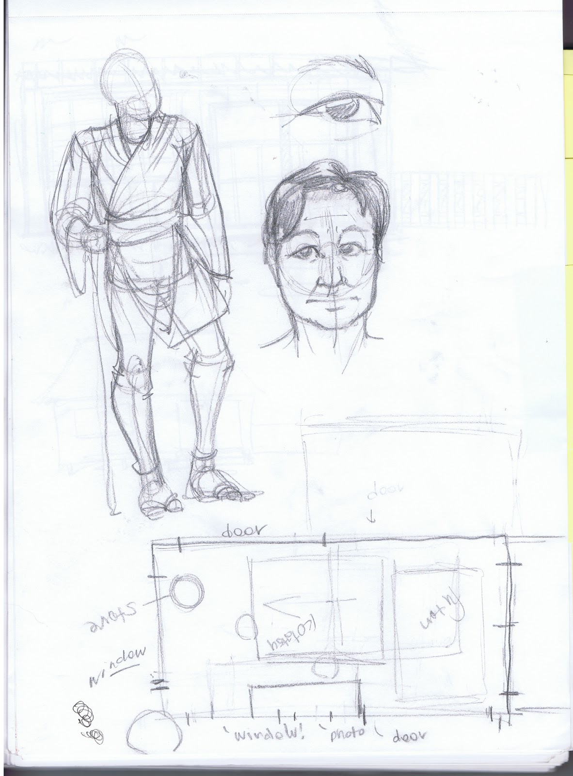
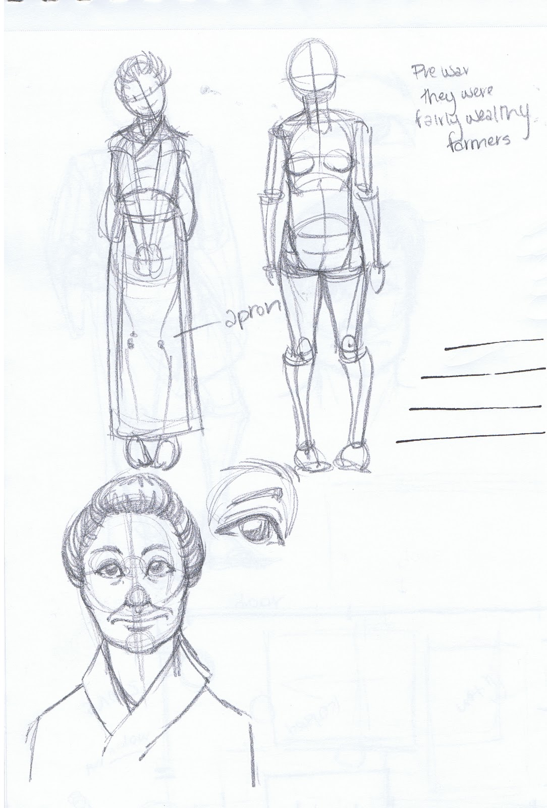
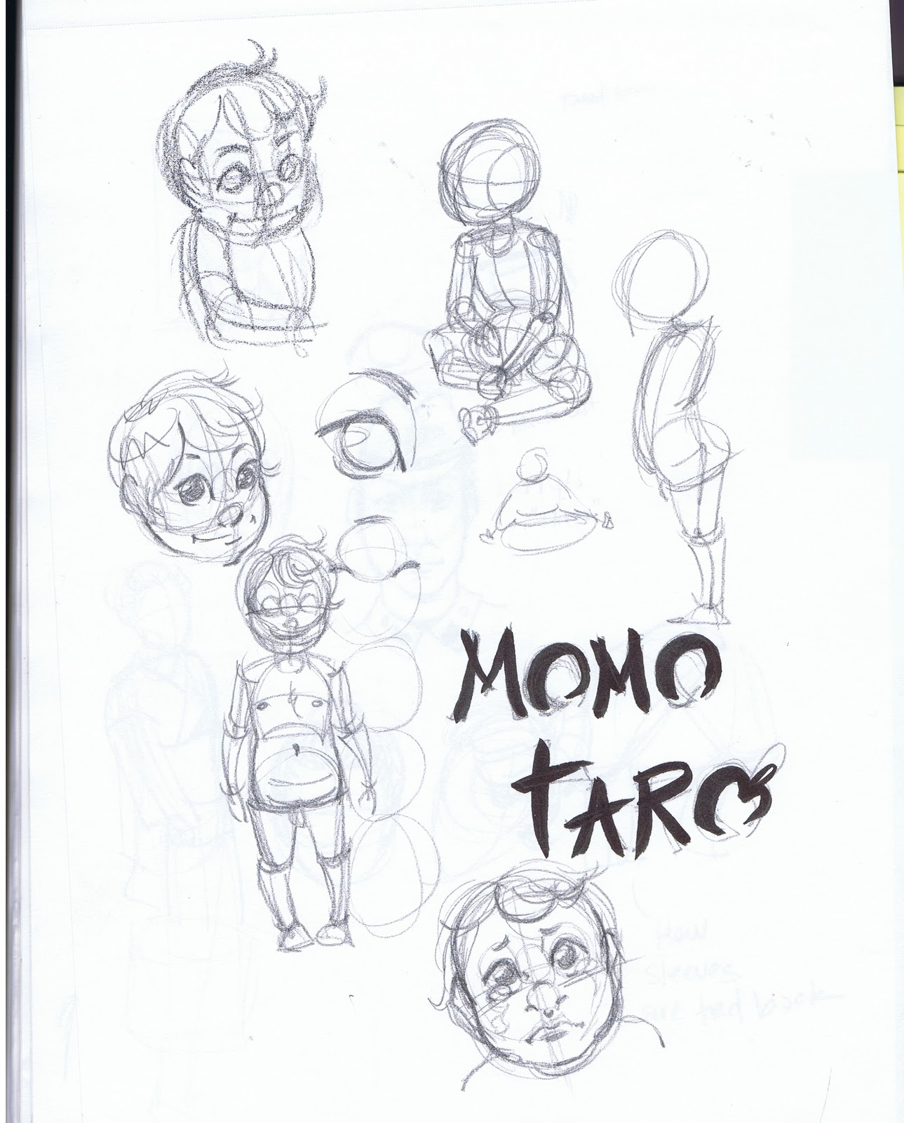
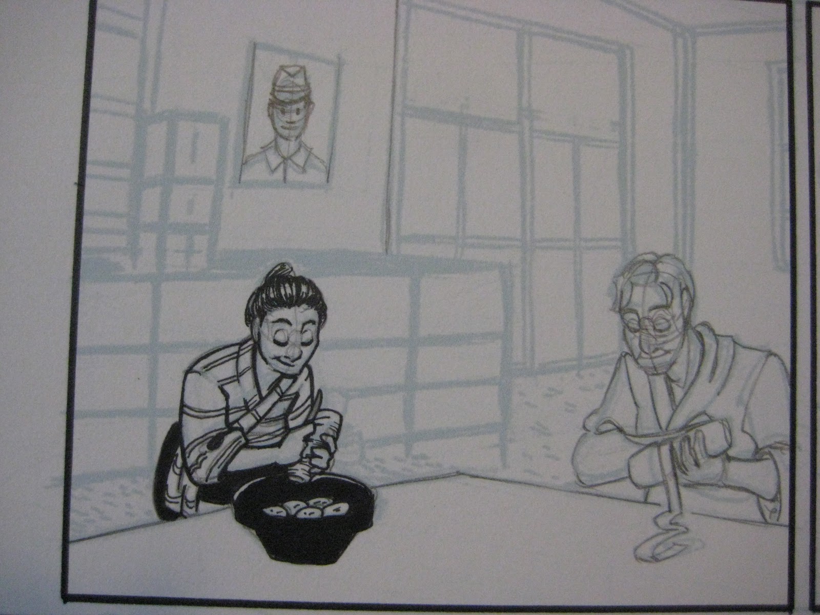


Full comic
Critical Missy- Inkwash Grayscale
For Critical Missy, I needed to design two groups of characters- the fantasy themed DnD characters (a mage- Missy, based off magical girls, a half orc barbarian, and an elf archer), and four humans.

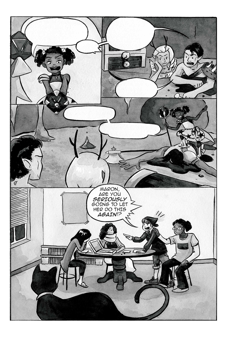
Designing Characters or Appearance by Chapter:
Useful for longer works that require multiple outfit changes, larger casts, or characters that evolve over time.
Pre-Comic Design:
Kara:
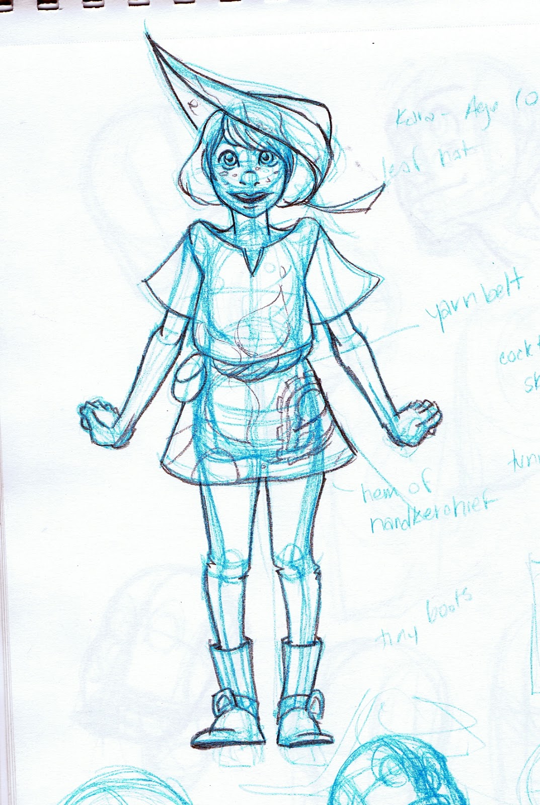

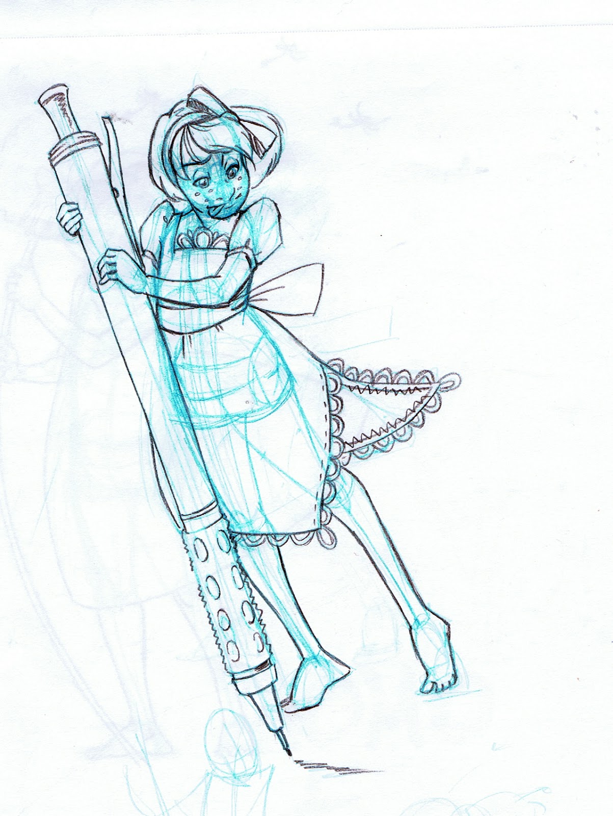

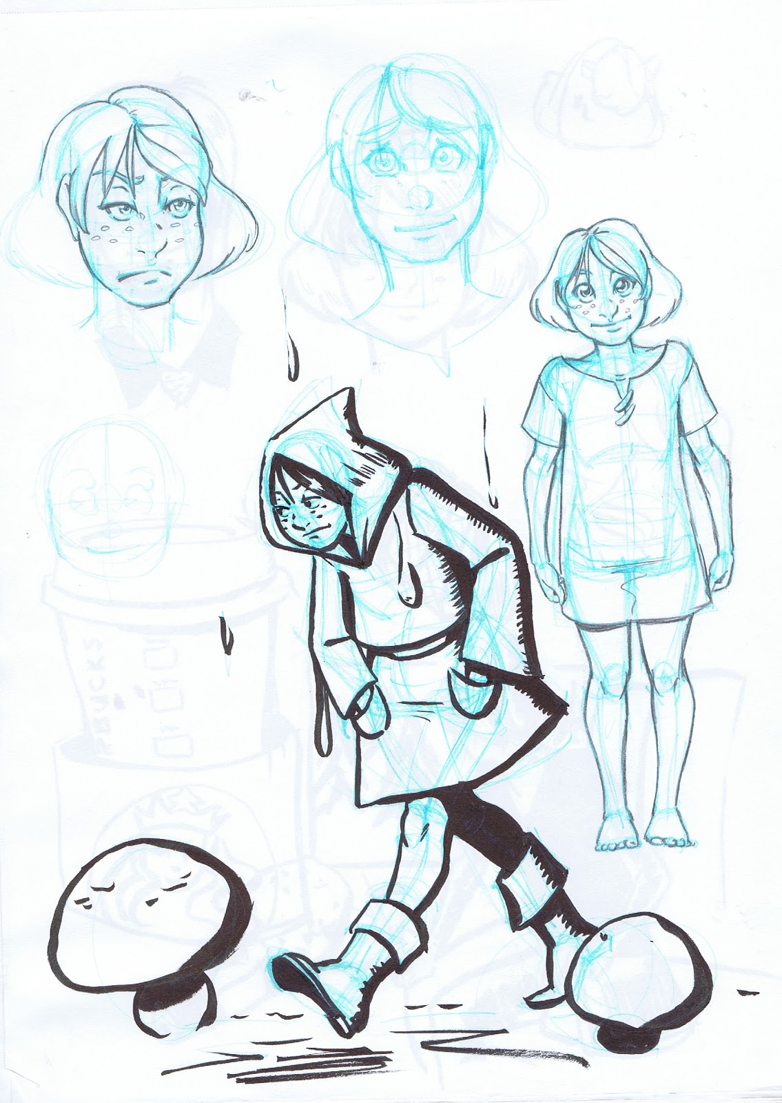

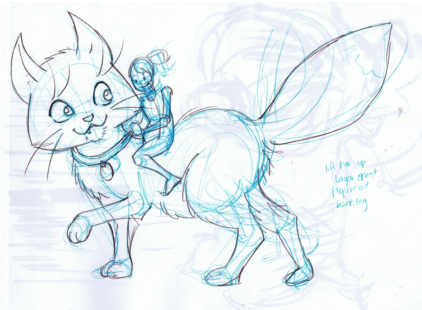
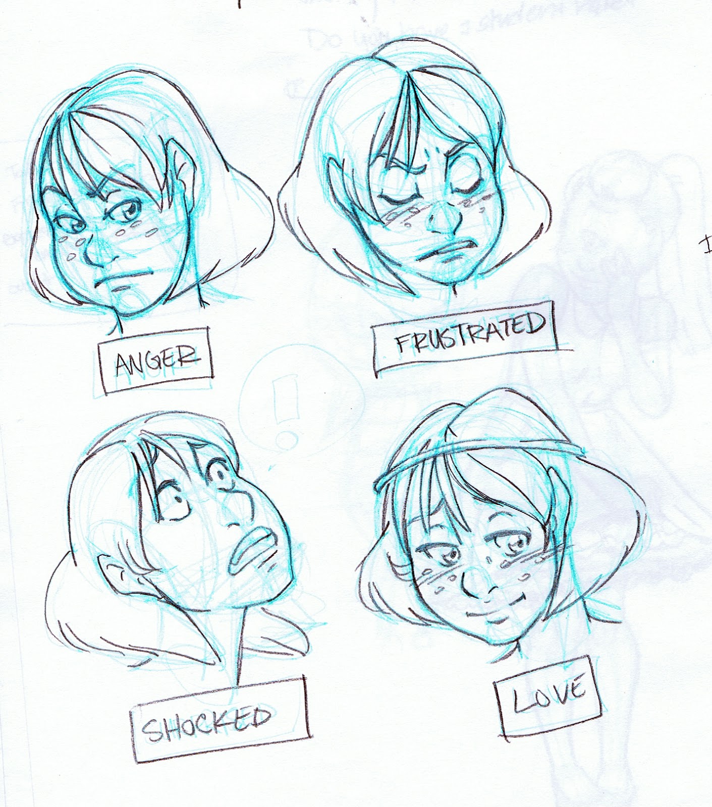

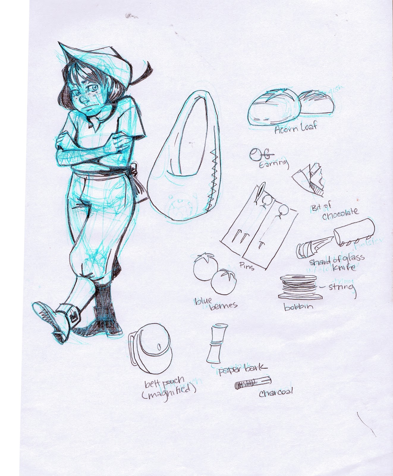 Meldina:
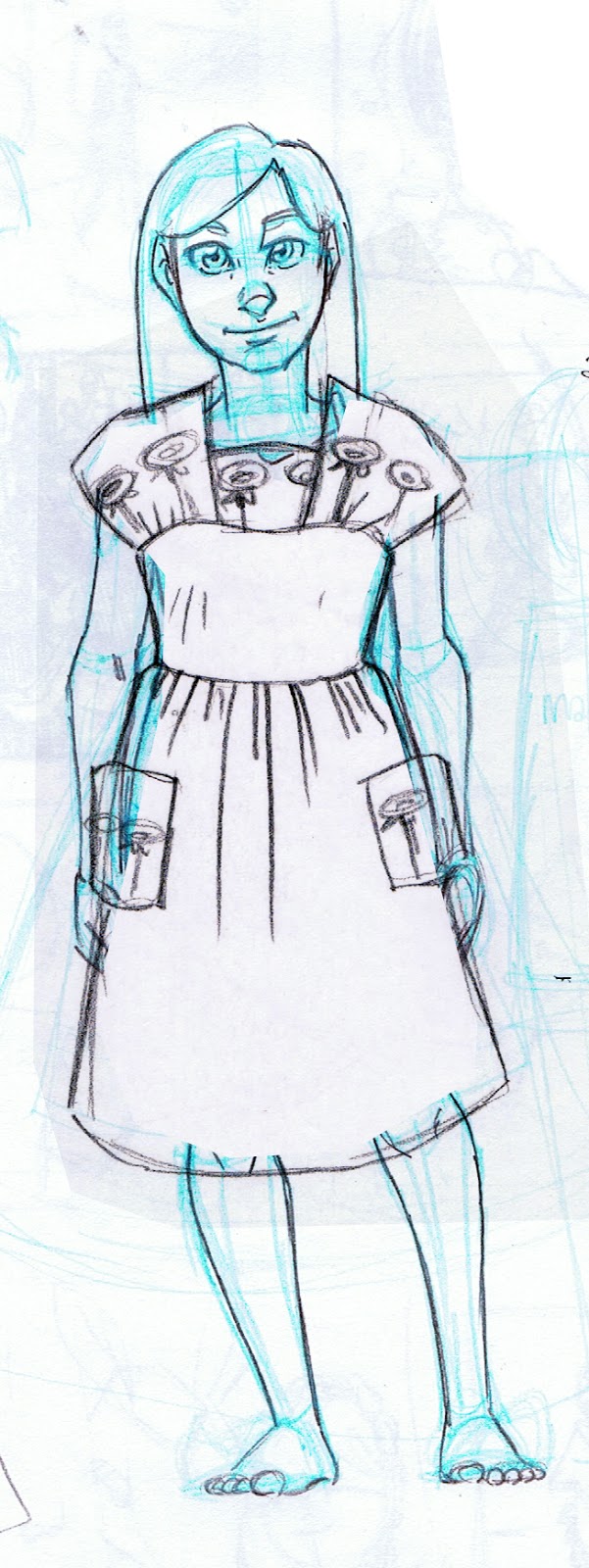
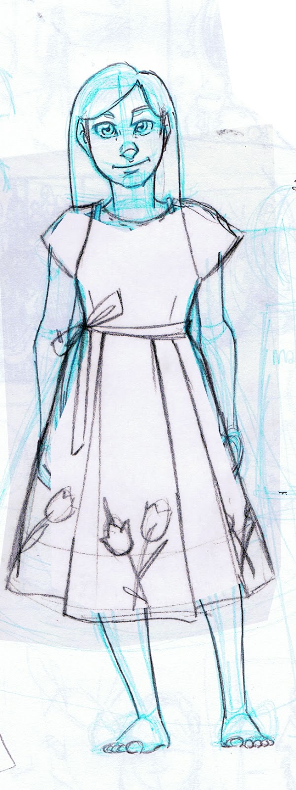
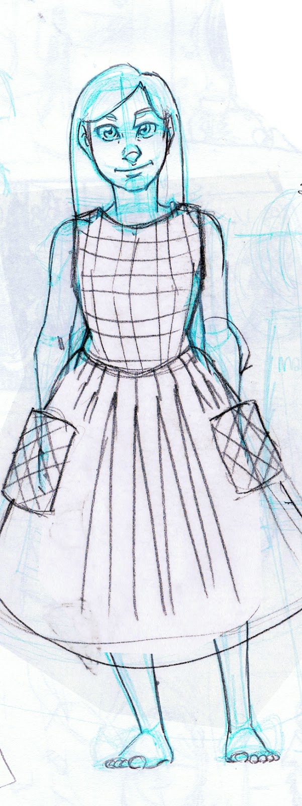
Rowan:

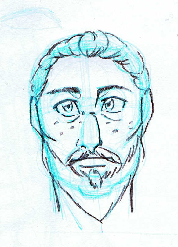
Naomi:
Original Design
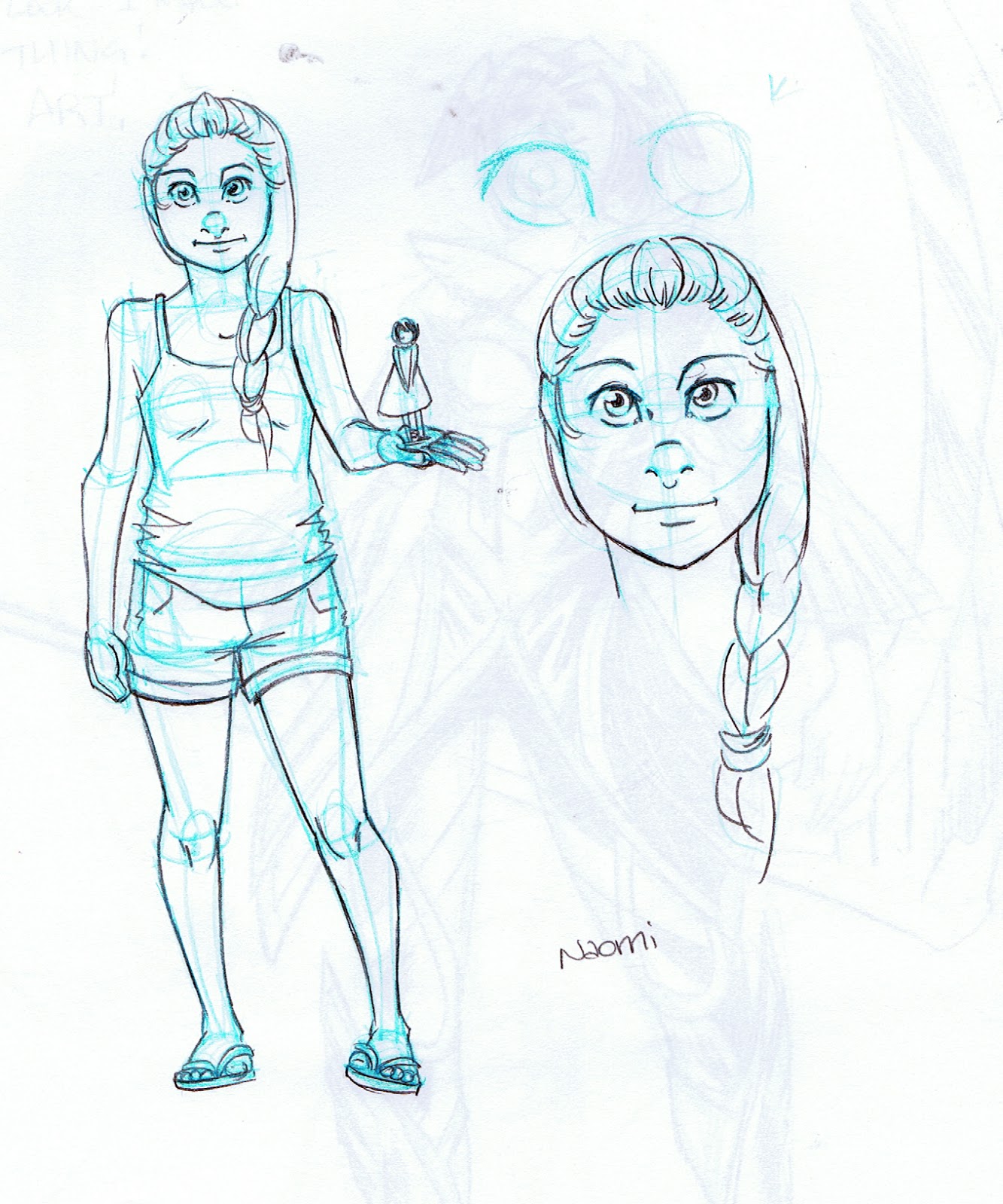
Naomi Revision:
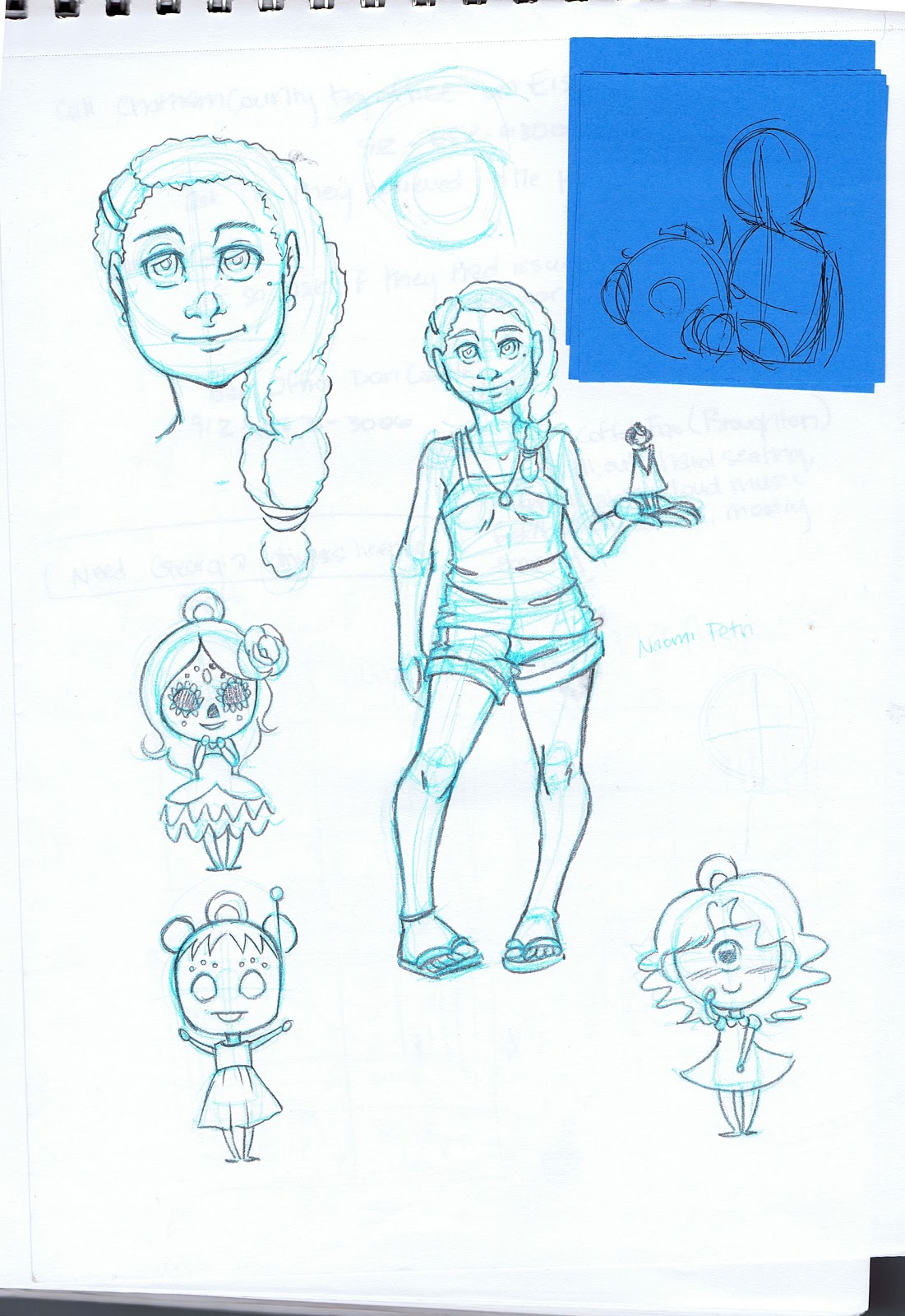

Pancake:
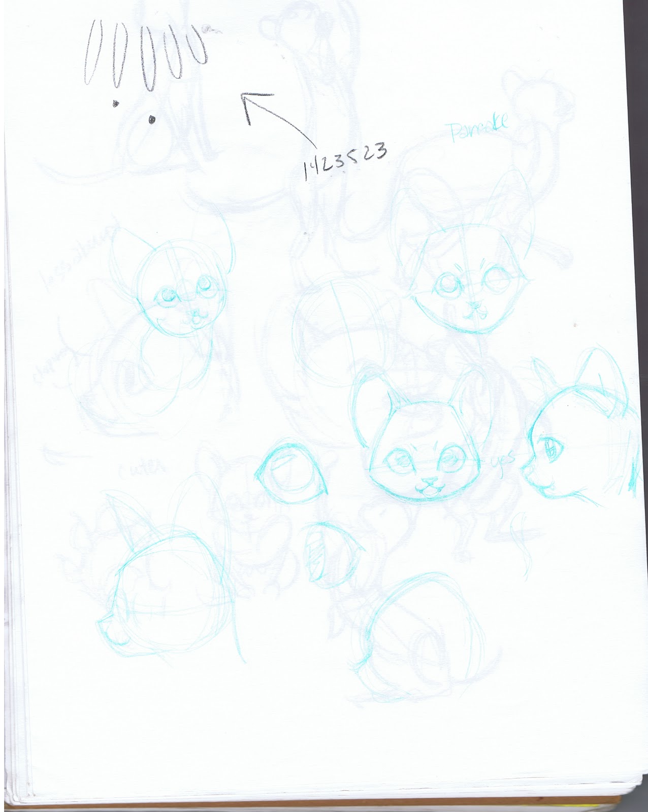

Tanner:
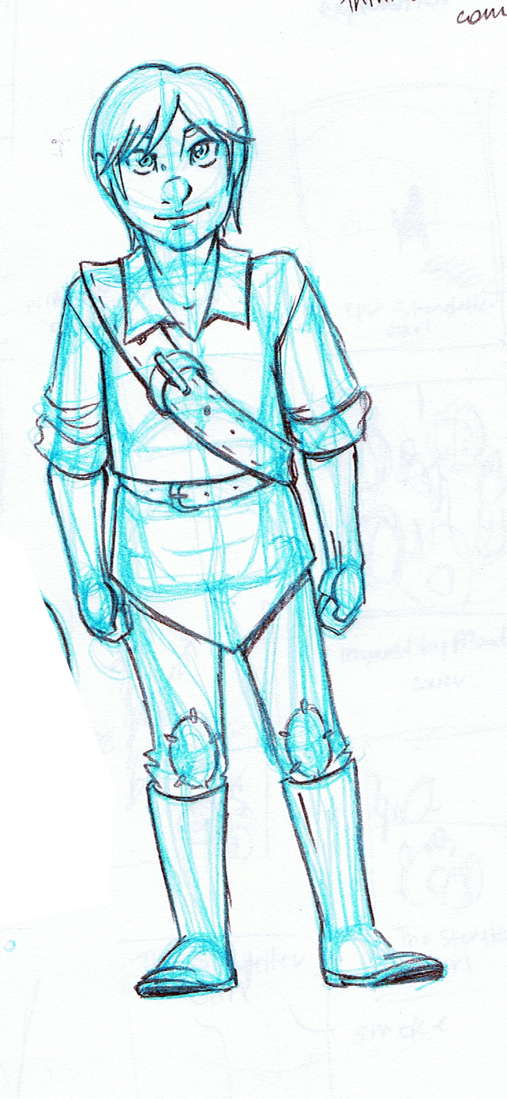
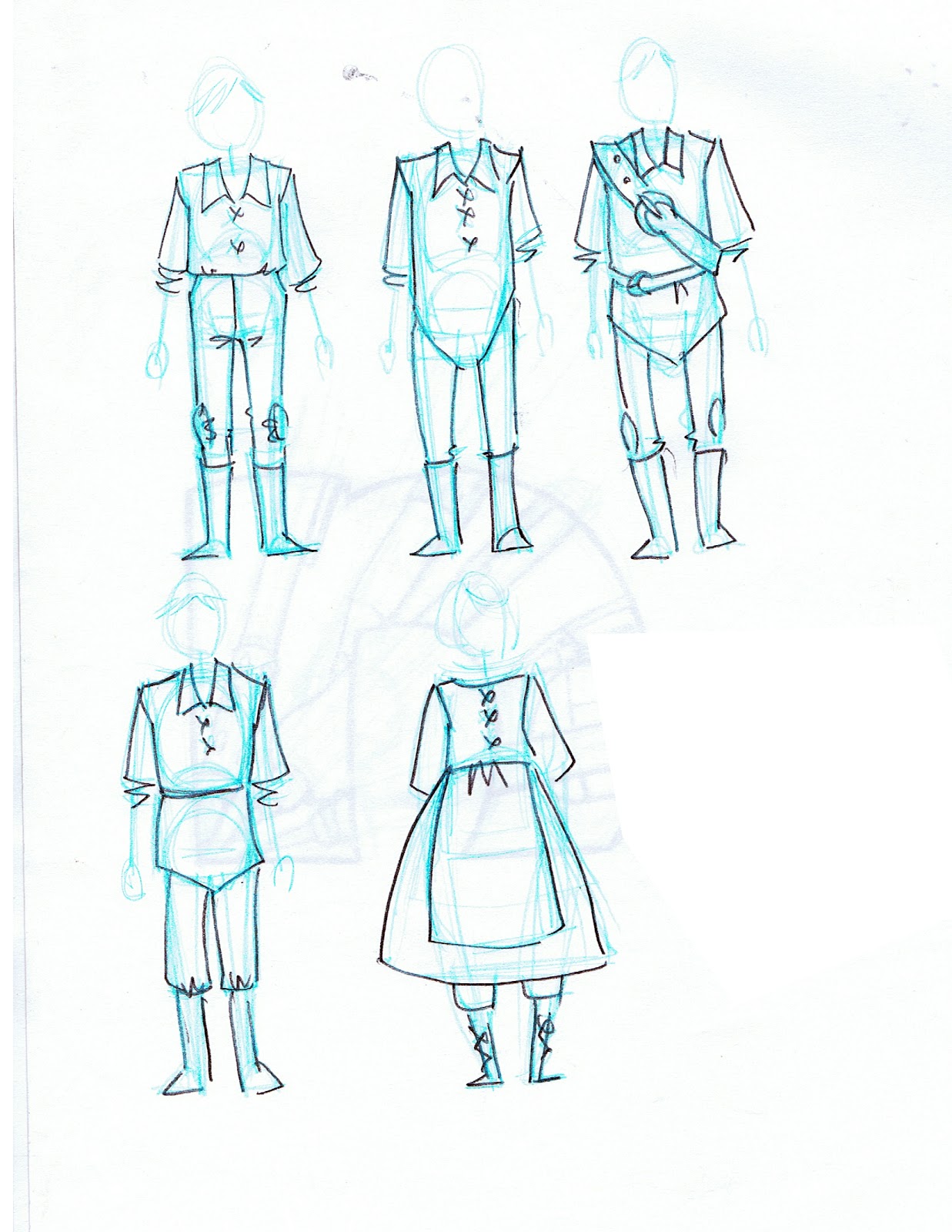
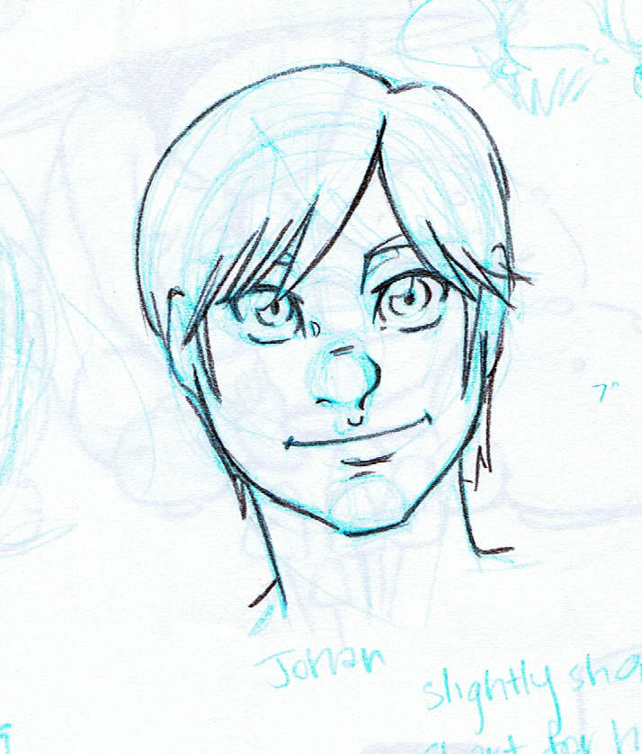
Even before Chapter 1 began, Kara as a character saw significant evolution. Early versions saw her older, and taller- a teenage Lilliputian, but my thesis research showed a need for independent, younger female protagonists. I decided to have her a little younger than originally planned, at 11 years old.
7" Kara- Color
Chapter 1:
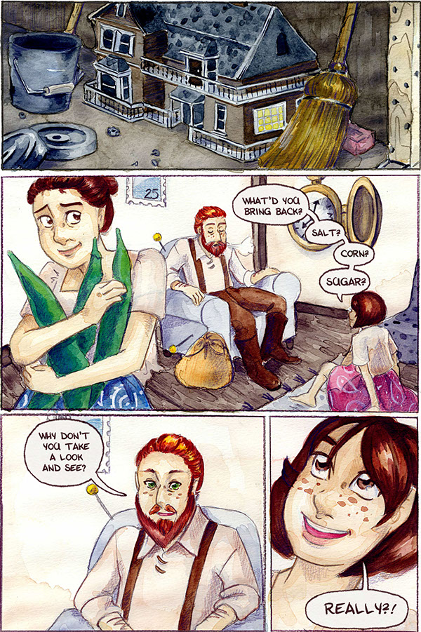
Chapter 4:
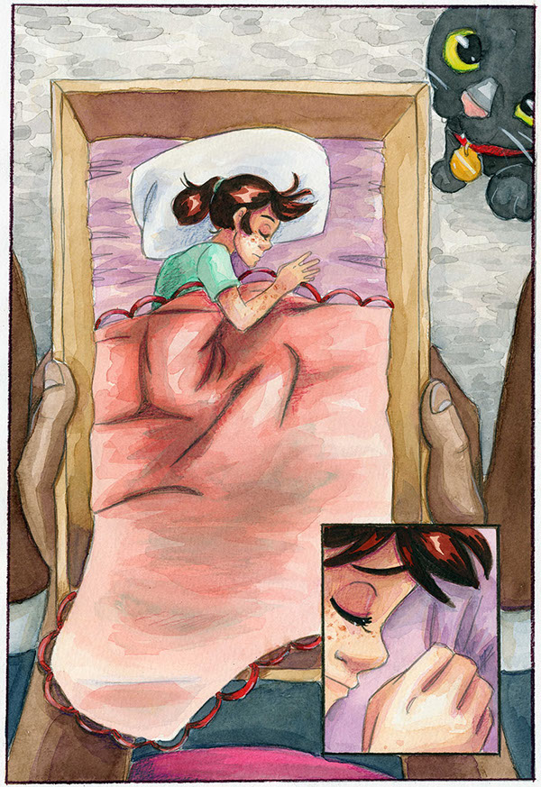
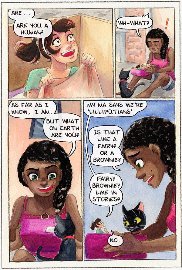
Chapter 6:
For chapters that show a montage, cover several days, or require a costume change, I research and design the chapter's outfits ahead of time. Here are a selection of the outfits used for Chapter 6.
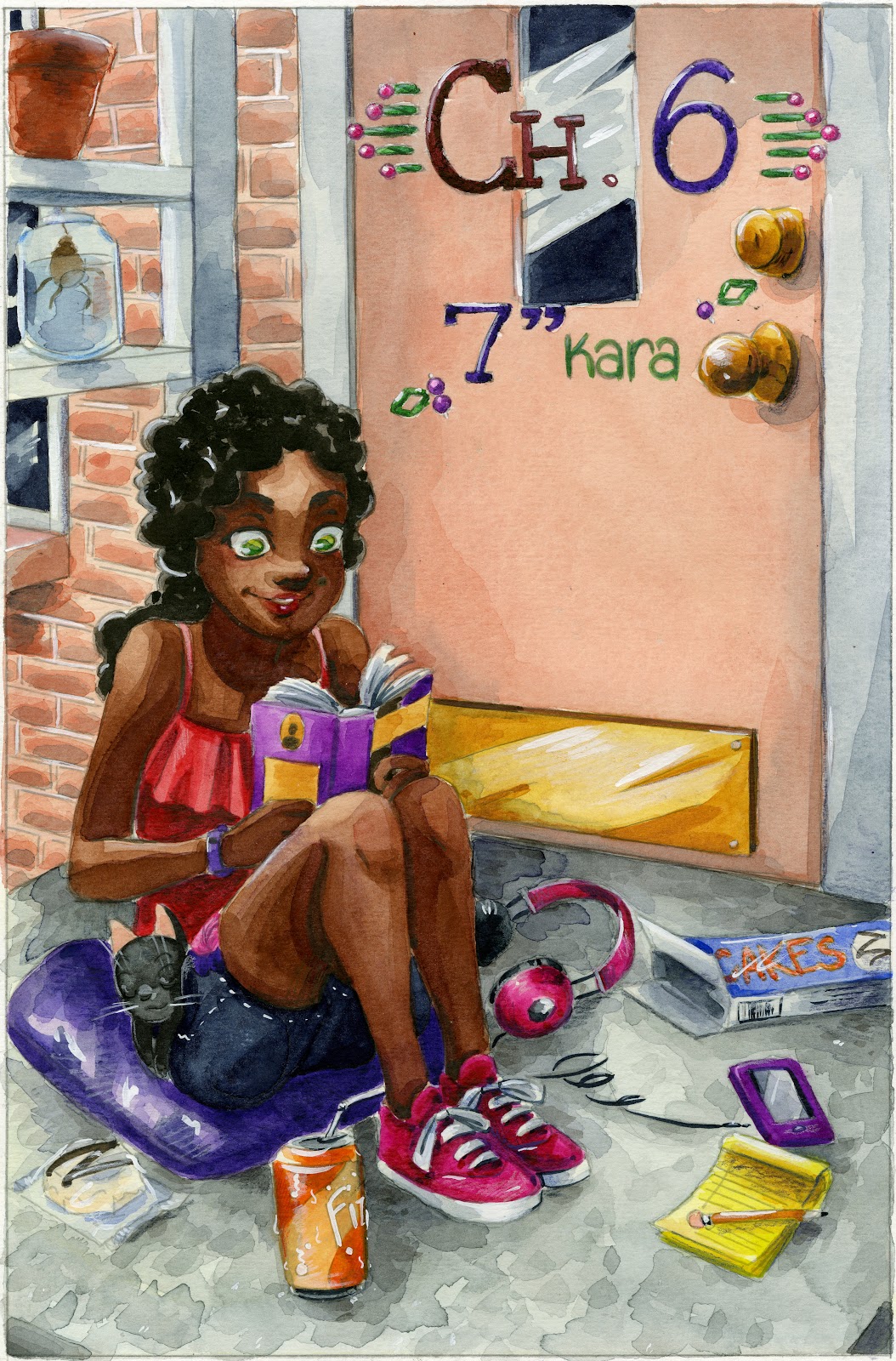


Chapter 7:
Chapter Seven not only covers three characters, but features a montage where Kara models a variety of doll clothes inspired by Barbie clothes throughout the decades. This required some research beforehand, and I found it handy to start a Pinterest board dedicated to the chapter.


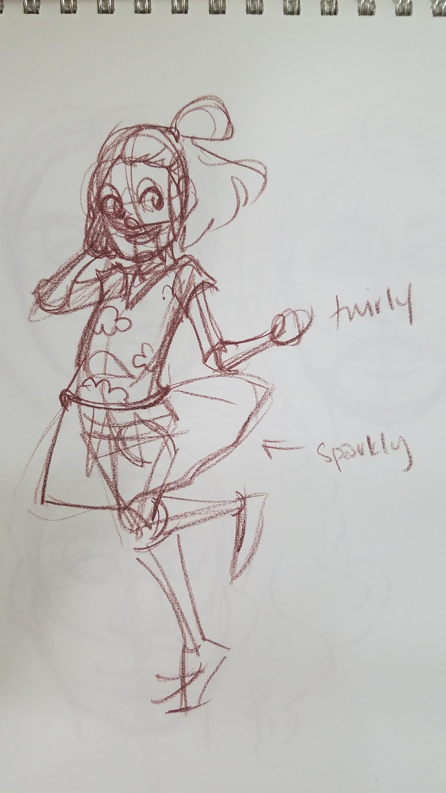
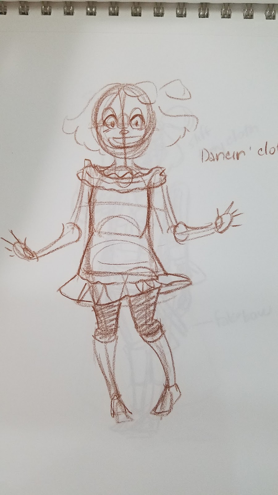
 Chapter 7 designs in practice:
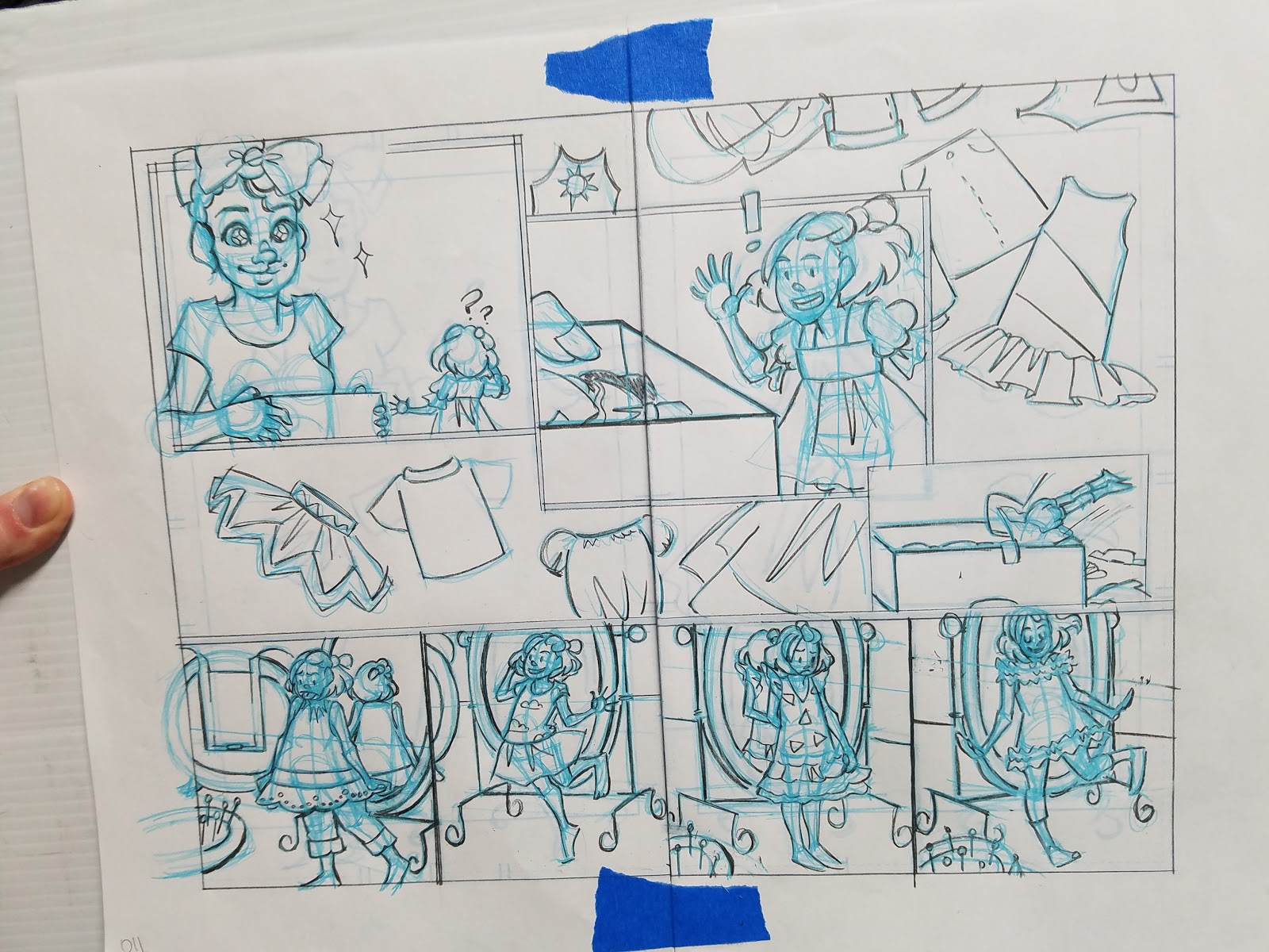
My goal is to depict Kara as a well dressed, but actively little kid. While I do often put her in dresses for promotional art, the majority of her chapter outfits feature shorts or pantaloons, as they're more practical for a small person exploring the huge outside world. I wanted Kara to represent the notion that femininity can be practical and can cover a spectrum even in a single person, rather than conventional treatments in comics, which tends to either only present the most practical, tom-boyish outfits, or overtly feminine, covered in frills, impractical ensembles.
Designing Characters En Masse:
Good for time crunches, large casts, short comics
Knight School- Color

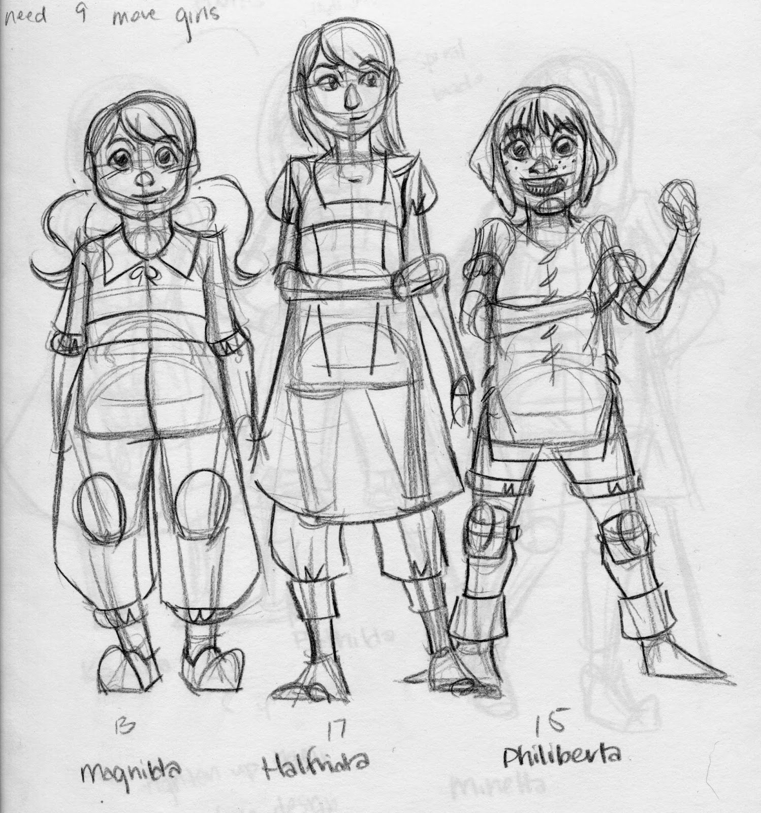


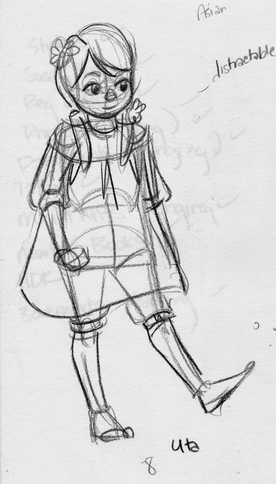
With Knight School, what started out as a very tame pitch- grandmother knight cares for her recently orphaned grandchildren, spiralled into dangerous territory when Lady Knight requested that early contributors (even comic contributors) massively up their knight count. In the end, I had to design 13 knights, show aspects of their personalities, and make them all stand out as individuals- in 4 pages of comic.
Since I had so many knights to design, I decided to represent as many personalities and nationalities as possible. Although their names are all traditionally Germanic, Viveca, Adair, Cerdic, and Lenna are all African, Magnilda is German, Halfrida is Korean, Philiberta Irish, Karlotta and Bethilda are Indian, Minetta is Hispanic, Selma is English, and Uta is Chinese. The girls are also a range of ages, from five to seventeen.
Transition to Color:
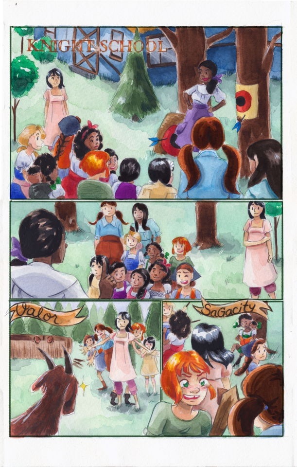
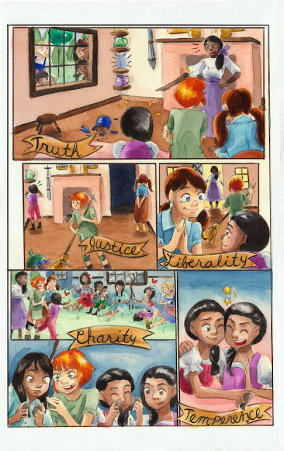
This was an opportunity for me to embrace diversity and showcase a variety of girls who all embody what it means to be a knight by the chivalric definition. I would have loved more space to explore their personalities, but early contributors to 1001 Knights were asked to up their knight count and lower their page count (a bit cruel if you were submitting a comic)
More on Knight School
Cicada Summer- Black and White
Using tracing paper to design a large family
Materials Used:
Sketchbook
Colored Leads
Inexpensive tracing paper, torn to size
Each branch of the extended family is color coded with lead.
When designing characters, I begin with fairly basic shapes. The torso is blocked in with rectangles or hourglasses.
From there, I begin to build out the skeleton. An egg shape for the rib cage, a rectangle for the pelvic box, sticks to determine the gesture of the arms, cylindars for arms, legs, and neck.

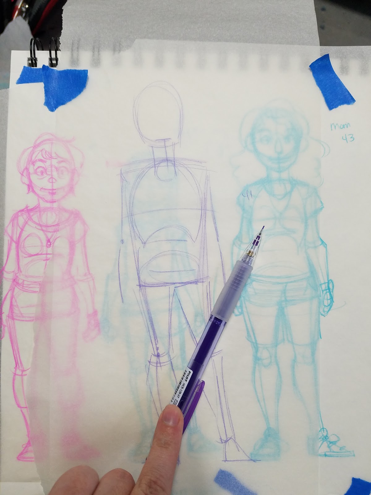

Only after the basic form is fleshed out do I begin worrying about clothing design. For this comic, which is set in Picayune, Mississippi in midsummer, everyone needed to be dressed practically.

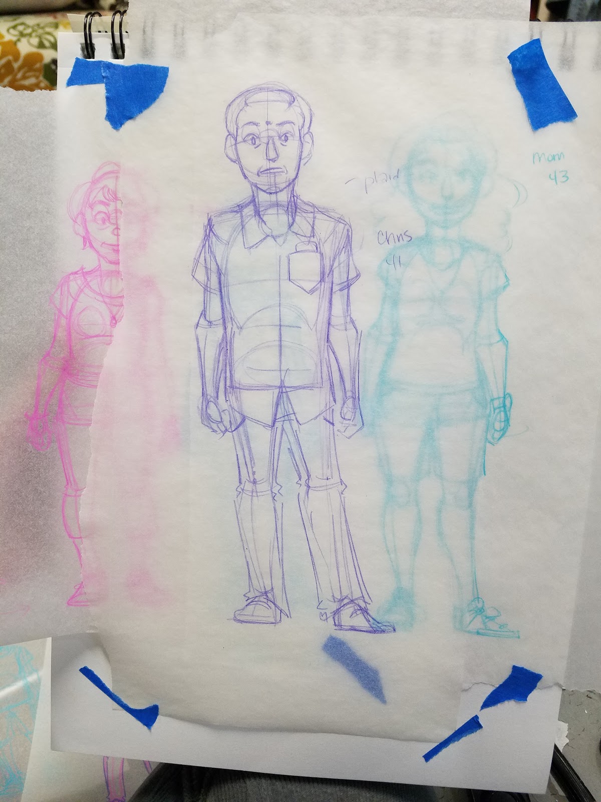
For such a large cast, it's helpful to have a baseline of comparison. In this case, it's the main character, a 13 year old girl.
She was sketched directly in my sketchbook, and when designing other characters, I tape the tracing paper on top.
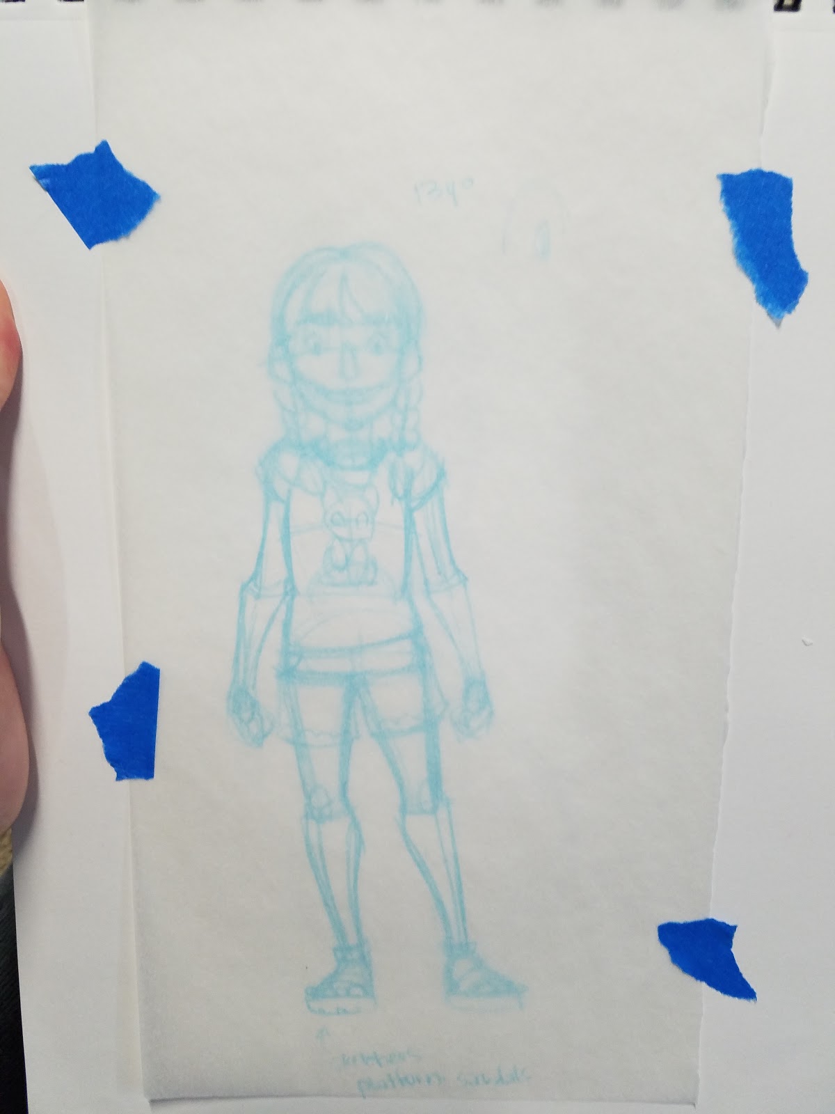
And use this for size reference, rather than relying on measurements and hashmarks.

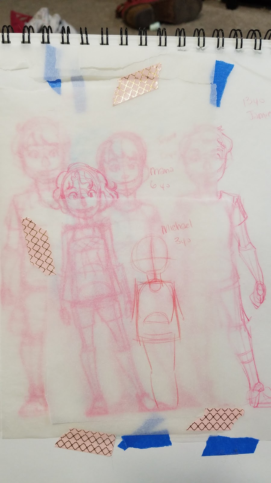
For large families like this one, the tracing paper can really pile up, but it's helpful to maintain size relationships and reinforce familial similarities between characters.
The crawfish boil pitch chapter from Cicada Summer requires me to design and draw 20 total characters from four different (but related) families.
Although I'm drawing my own family, there aren't photos from the time period, so I'm having to rely heavily on memory. Photos would make this much easier- so if you have photo reference, use it!
Tips for designing large casts, or casts that are related by blood/marriage
Baseline height is set off the main character. Familial relation is designated by lead color.
Tips and Tricks:
Design ahead, and make sure your designs are clear enough for you to read later.Collect reference ahead of time- this will make designing quickerTo speed up the process, pick a stock pose that shows all important features of character and use it when designing all characters.Consider using a doll or a base for quick character designsOutside References:
How to be a Character Designer: Brookes Eggleston- Character Design ForgeHow to Create Characters (the Design Process): Draw with JazzaOriginal Character Design: 30 Ways to Fill a Sketchbook: Minnie Small: SemiSkimmedMin
Our Sponsor:
If you enjoyed this sample of 7" Kara pages, you're in luck! 7" Kara has recently launched as a webcomic!

You can read about Kara's adventures exploring the human world on the tumblr or through the standalone site. Too impatient to wait? Pick up your own copy from the Natto-shop. Your support of 7" Kara helps me out in so many ways, and since Kara has only recently launched as a webcomic, your support is particularly important to me right now! So please, share it to your Facebook, Twitter, or even Instagram, and make sure you tag me @Nattosoup for a signal boost!
Please consider donating to this blog or purchasing from Natto-shop (http://nattosoup.com/shop) if you want me to continue publishing quality content. All materials tested were purchased from my own pocket. Keep on Truckin' Nattosoup is not under any sponsorship.


