
Becca Hillburn's Blog, page 29
May 14, 2017
Guest Post: Laurissa Hughes: Page Process for Tess and Jack
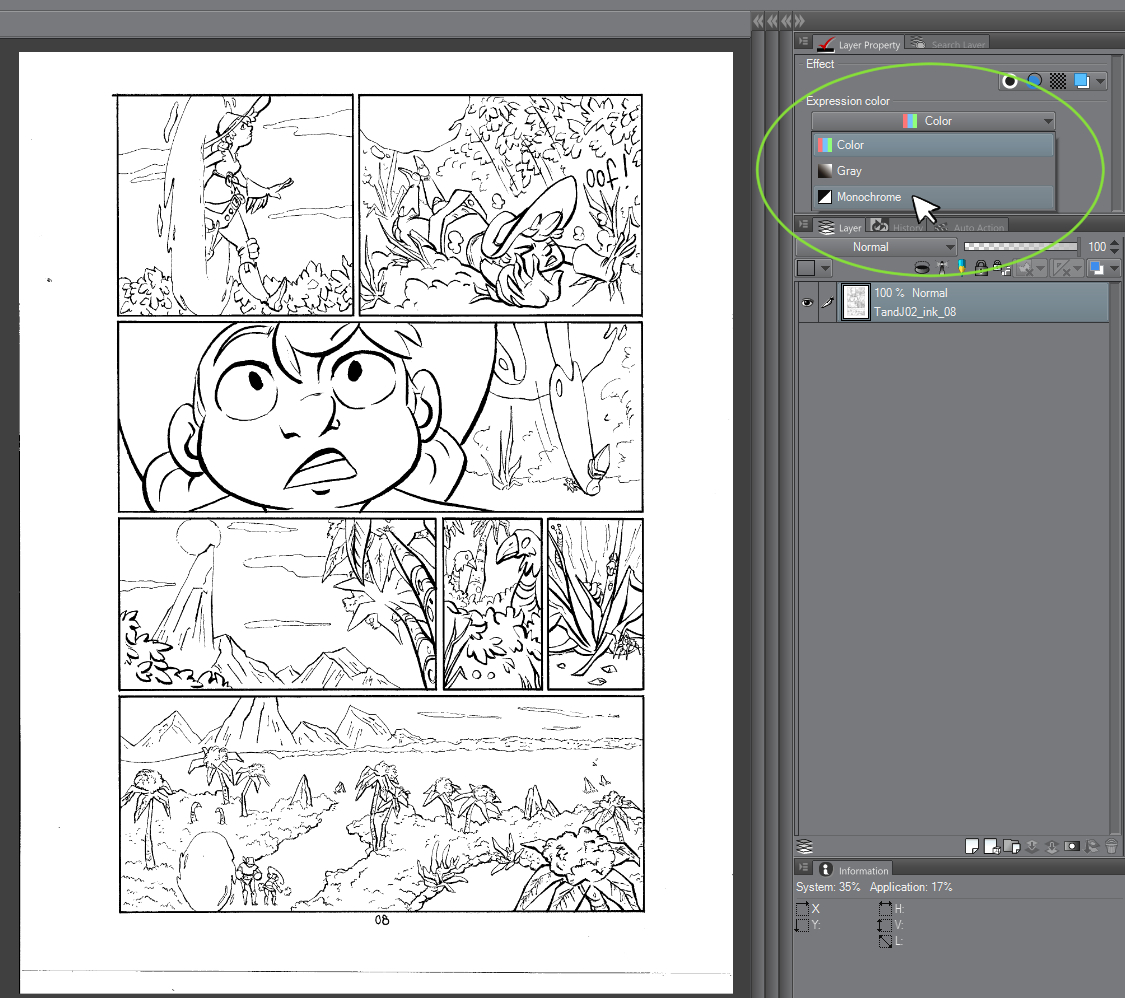
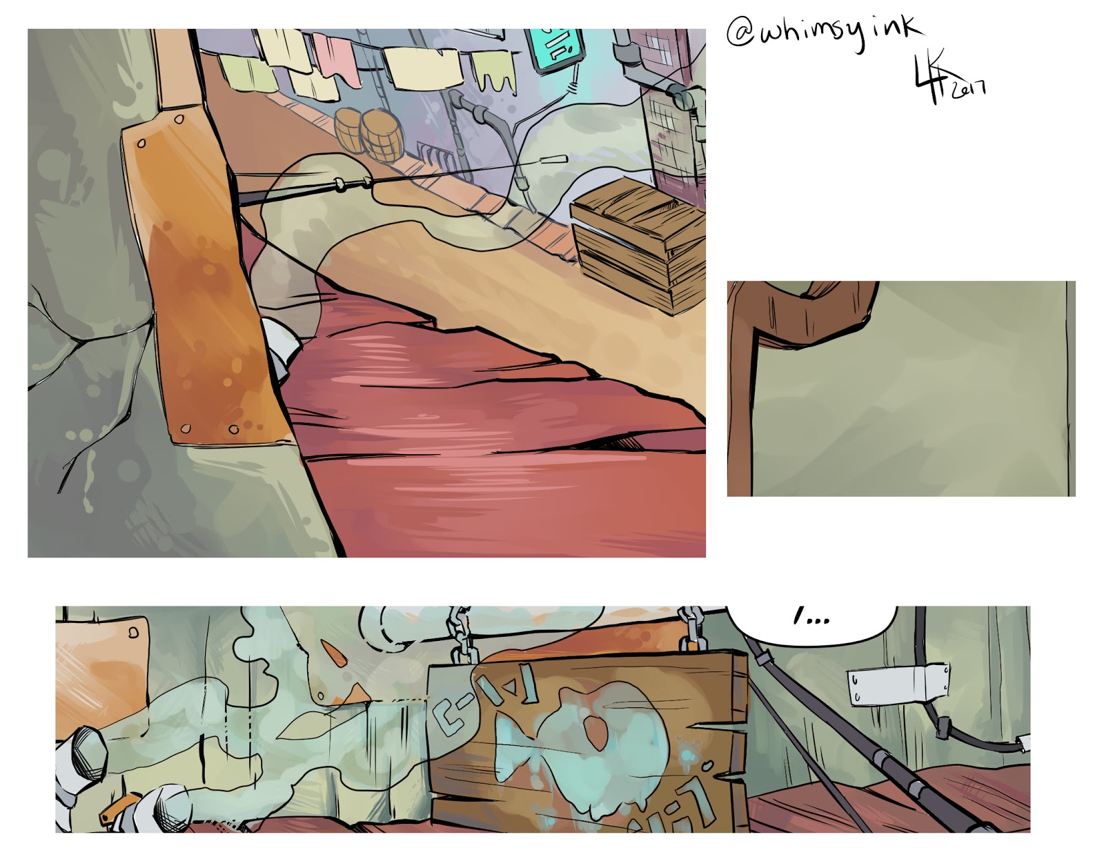
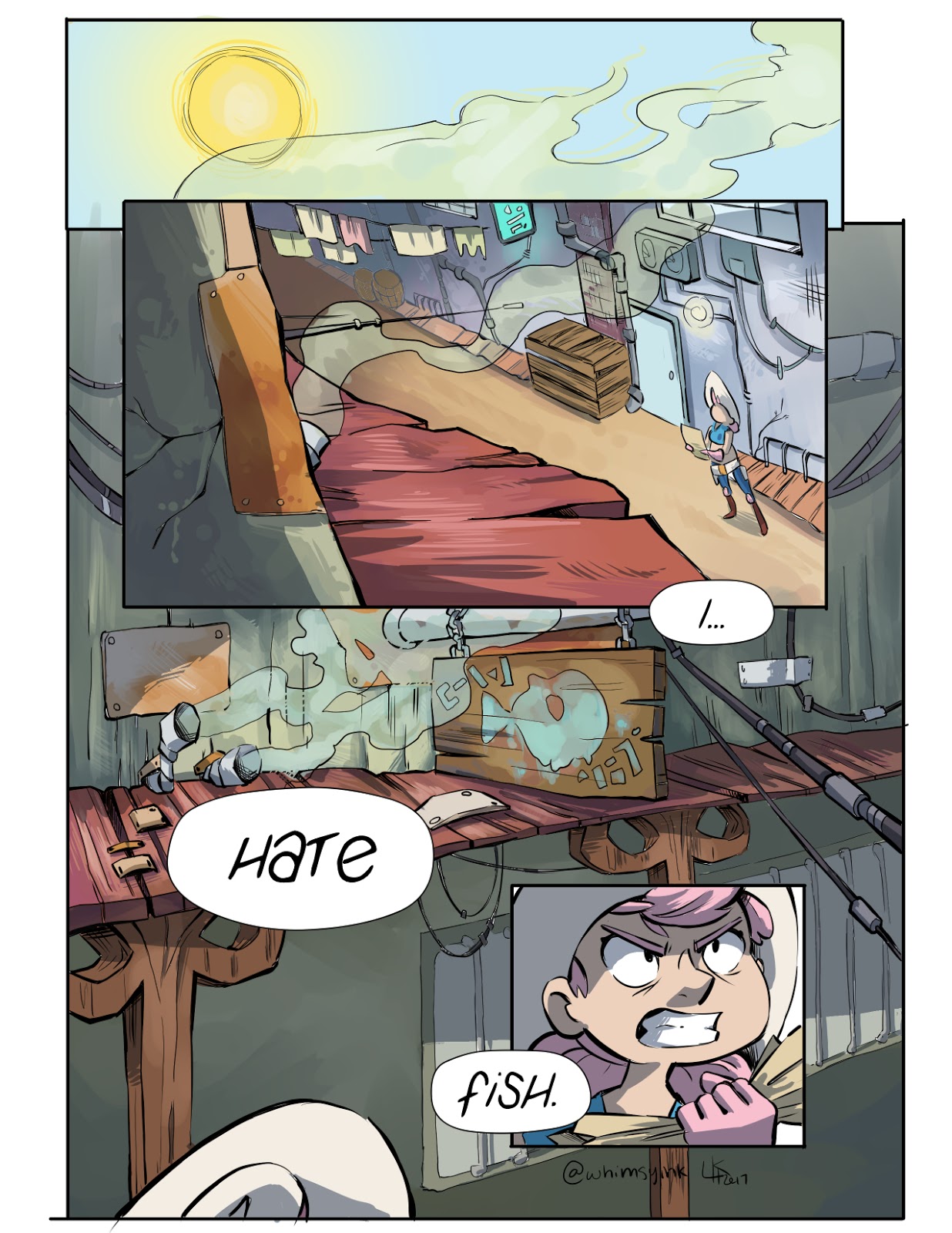
Hello! My name is Laurissa Hughes and I make a webcomic called Tess and Jack. It’s about a cowgirl named Tess and her robot partner Jack who live in a futuristic Old West. They take odd (very odd) jobs to keep themselves afloat. It’s a serial comic, so each issue can be read independently of the others and each covers a different job.
This whole thing started as an experiment in 2014: I wanted to try and repaint a digital painting I’d done in 2011 and decided to do it in a comic because I enjoy narrative art, I wanted to see how well I could hold to an update schedule, I wanted to experiment with different techniques for making comics so I’d be ready to make a longer story that I’ve wanted to tell for a long time. Due to the experimental nature of the whole thing, the process I go through to create each page has changed in every issue.

Painting from 2011, and the frame from the comic in 2014.
Issue 1: Work for Hire
I had literally no idea what I was doing when I started this, but I went for it anyway. I feel like there’s no “right” way to make comics and everyone should find their own techniques that make them comfortable. My process has changed several times throughout the issues because I’m still experimenting with the ways I most enjoy making comics and that get me the best end product!
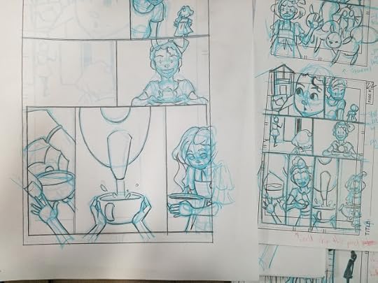
I start out my whole process with a rough outline (mostly in my head), and I draw the thumbnails. I do most of my detailed writing and solid dialogue while I thumbnail, seeing the flow of the page helps me think of how actions will play out in more detail. The thumbnails are also pretty scribbly because I’m trying to get ideas out quickly. I want to spend the majority of my time on the finished pages. My process for this part has stayed pretty much the same over the years, except now I thumbnail with page layouts in mind.
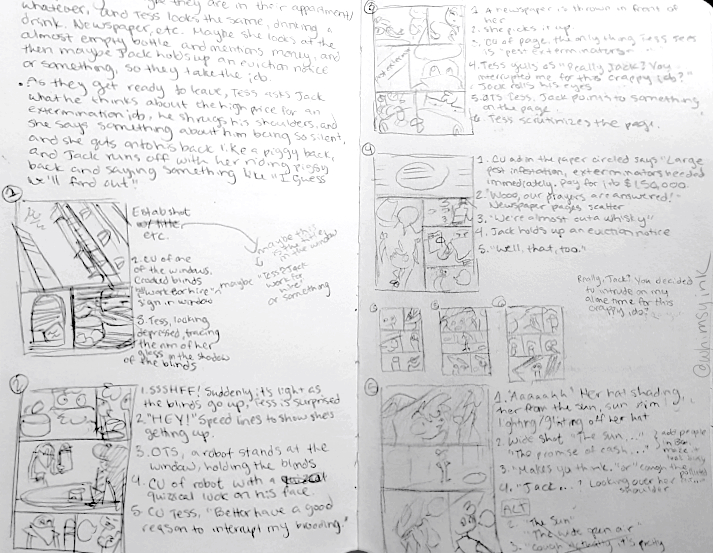

There’s some organization on the page, but I would just draw where I had space, sometimes on random sheets of extra paper lying about.

Still pretty scribbly and kind of messy, but things are laid out as if they were spreads in books. I also started to draw in a spiral notebook with lined paper because it’s cheaper!
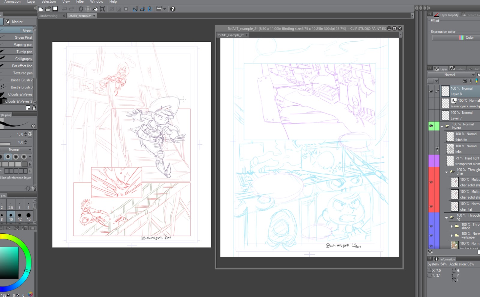
I then take the thumbnails and draw the final page at size. I draw at 7” x 10.5”, which is a pretty standard size for American comics. It’s usually a good idea to draw at 1.5 times or 2 times the size of the final page, because when they’re shrunk down for print, all of the lines look really sharp and nice. I’ve been drawing at size for all the issues, so I keep doing it for consistency throughout. If I’m drawing for a publication I usually draw and ink at 2 times the size.
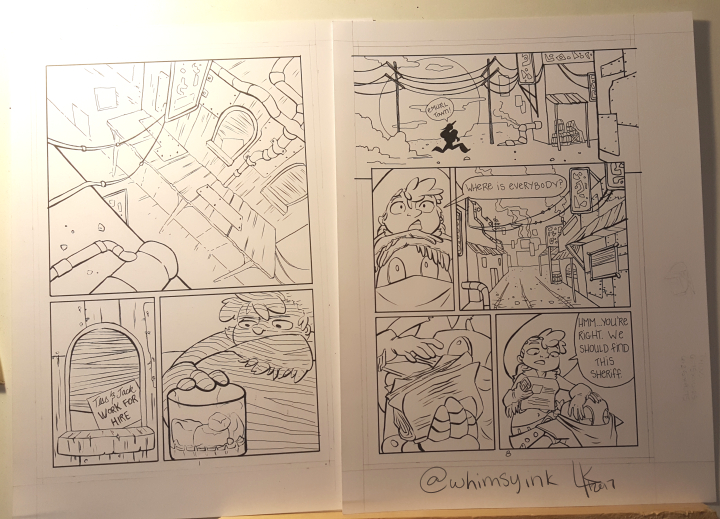
Whether or not I draw a really detailed vs. rough sketch depends on my mood or how much time I have to complete a page. Sometimes I’ll deviate pretty far from my sketch when I ink.
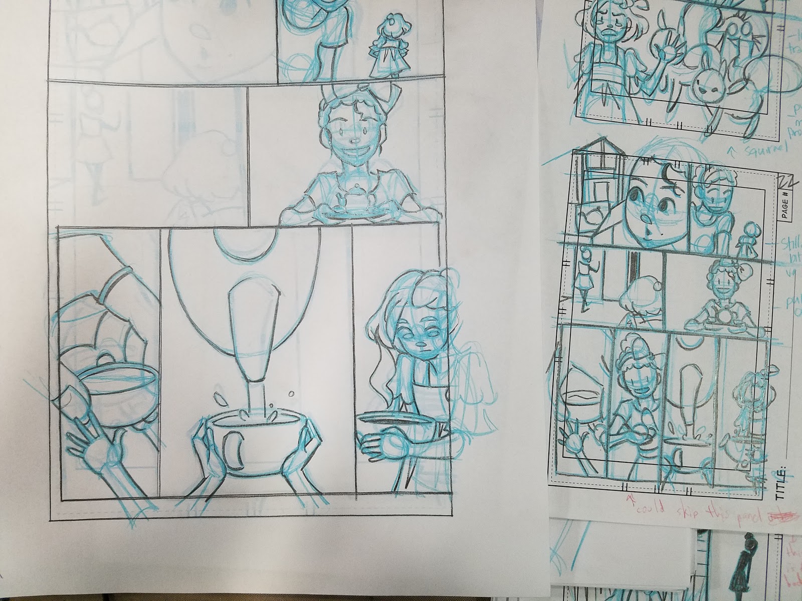
In “Work for Hire”, I drew each page with a regular lead pencil and then erased it after inking and before scanning everything into Photoshop because I hate trying to remove pencil lines or blue pencil in Photoshop.

No pencil lines!
To color Tess and Jack, I start with flat colors. I used to use Photoshop for the pages, but switched to Clip Studio in Issue Two. The flatting process has stayed pretty much the same in every issue, but became more streamlined after I got Clip Studio. More on that later.


Flatting is a process where only the solid base color is laid down on the page. After this, all the fancy painting and effects are added on. I usually start out with flats when I do a full digital painting as well!
For “Work for Hire”, after the flat stage, I would add two shading layers set to the “Multiply” blend mode. I would then take these two layers and “blend” them together where they met using the Pen Tool in Photoshop with the Opacity set to pen pressure. I never really liked the way this looked, and it always felt like a needlessly time-consuming process, but I kept it throughout the first issue for the sake of consistency.


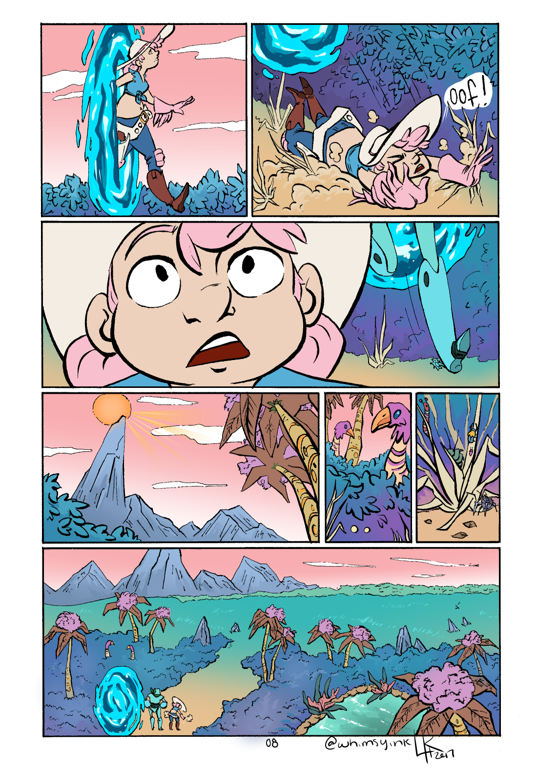
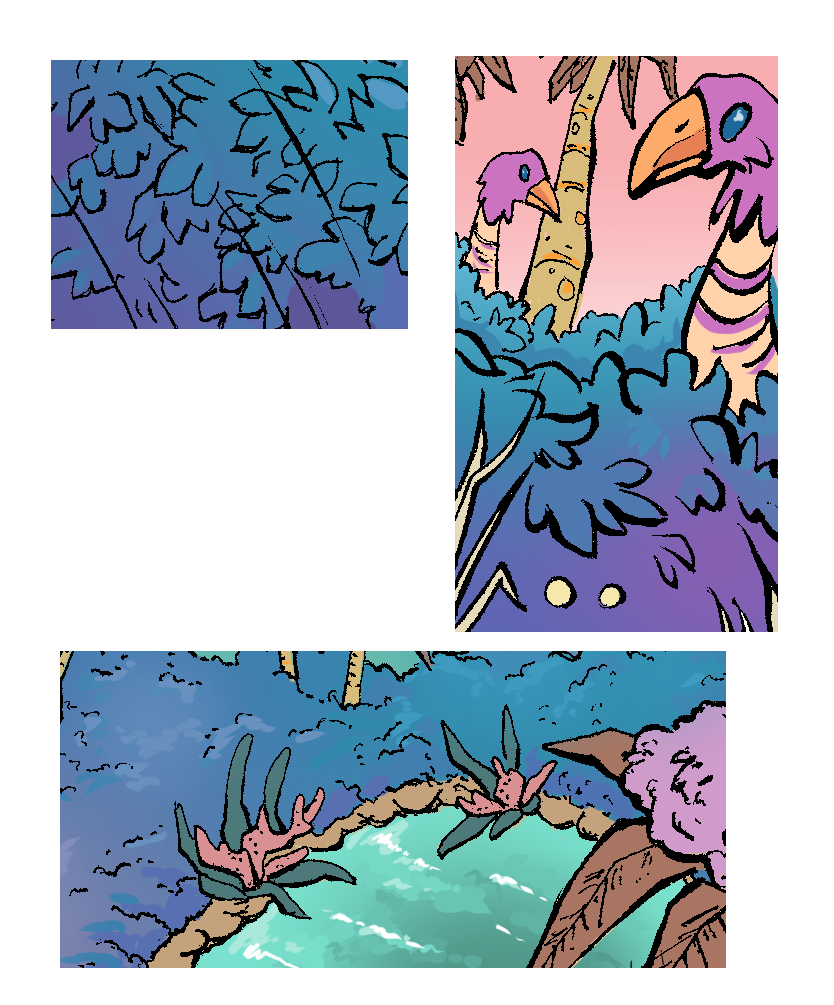
The above image is an example of where I did experiment a little bit with coloring and shading at the end of “Work for Hire”. I did some different combinations of blend modes and shading on the waterfall which was fun, and gave me some ideas for the coloring in the next issue.
Issue 2: “Lost and Found”
In the second issue of Tess and Jack, I really wanted to focus on making the colors really nice and lush, and experiment with that.
Once again, I started with my scribbly thumbnails, and then moved on to the sketching stage. I got Clip Studio pretty early on in making the second issue, and I really like the program for making comics and other illustrations. It’s nice, because it has a lot of tools specific to making comics, so it makes parts of the process more streamlined. Also, drawing digitally in Clip Studio feels much closer to drawing traditionally for me than a lot of other programs I’ve found. So that’s exactly what I did for Issue 2; I drew everything digitally, and then printed it out to ink it traditionally.
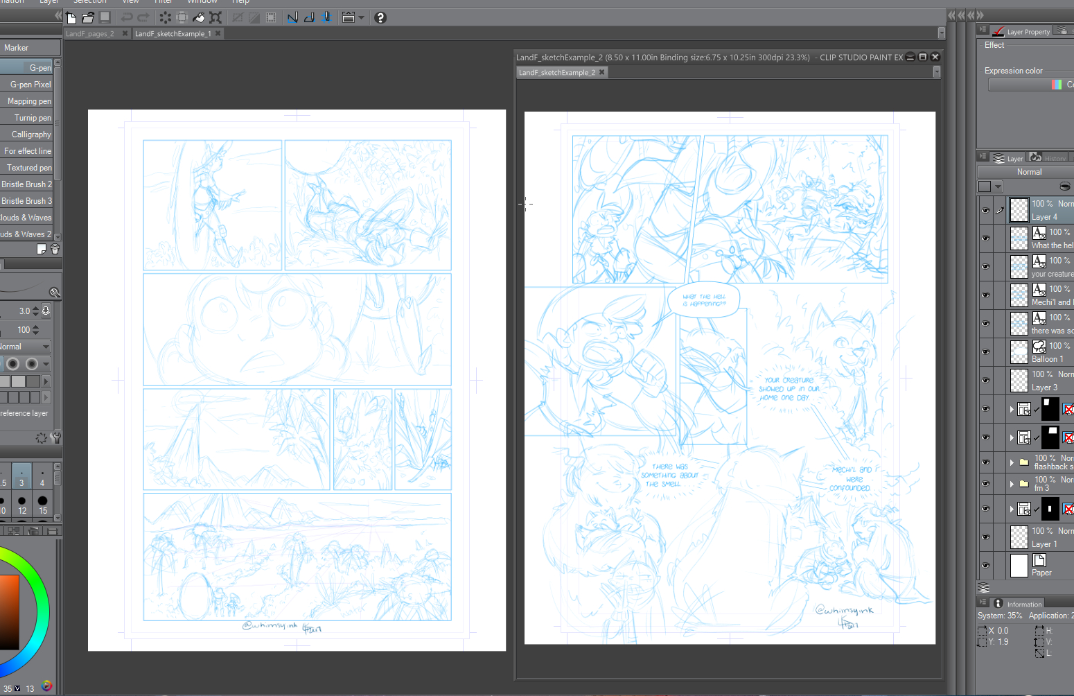

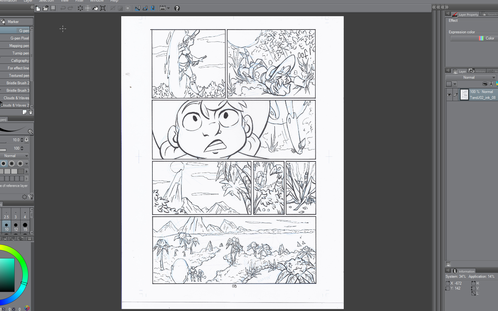
After I finished inking, I scanned everything in and removed the colored lines digitally. This was much easier that erasing all of the pencil after inking every page, plus there wasn’t as much risk of smearing the ink. I also like the look of the sketch under the ink, it’s fun to look back at and see where I’ve come from in terms of drawing improvement.
Here is the page with the blue lines still there.
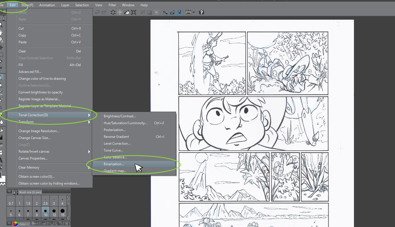
In Clip Studio, I go to Edit → Tonal Correction → Binarization
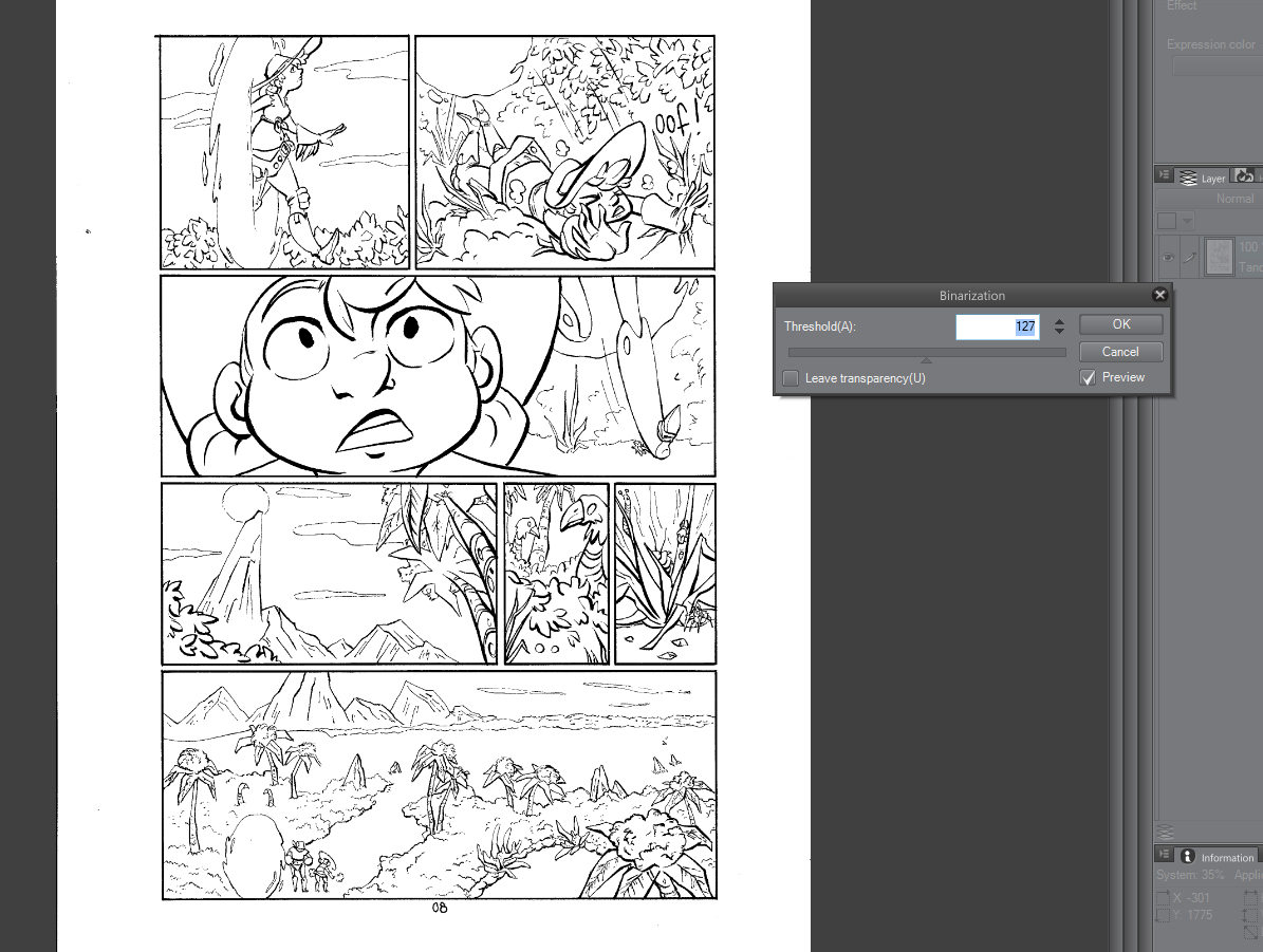
This opens the Binarization menu. I go with the default settings that open up in the window as, you can see here, it does a good job of getting rid of the blue lines.
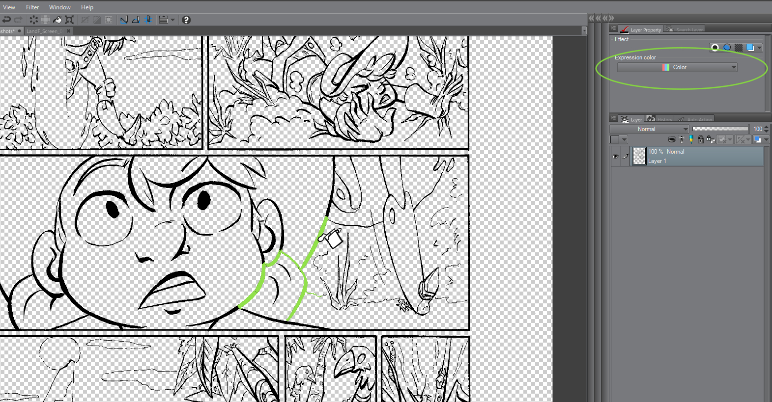
Then, in the Layer Properties window, I toggle the Expression Color to Monochrome. This makes the page channels black and white, which helps with the next step.

In the Layer Properties window, I toggle the Monochrome to just Black. It gets rid of the white background and makes it transparent.
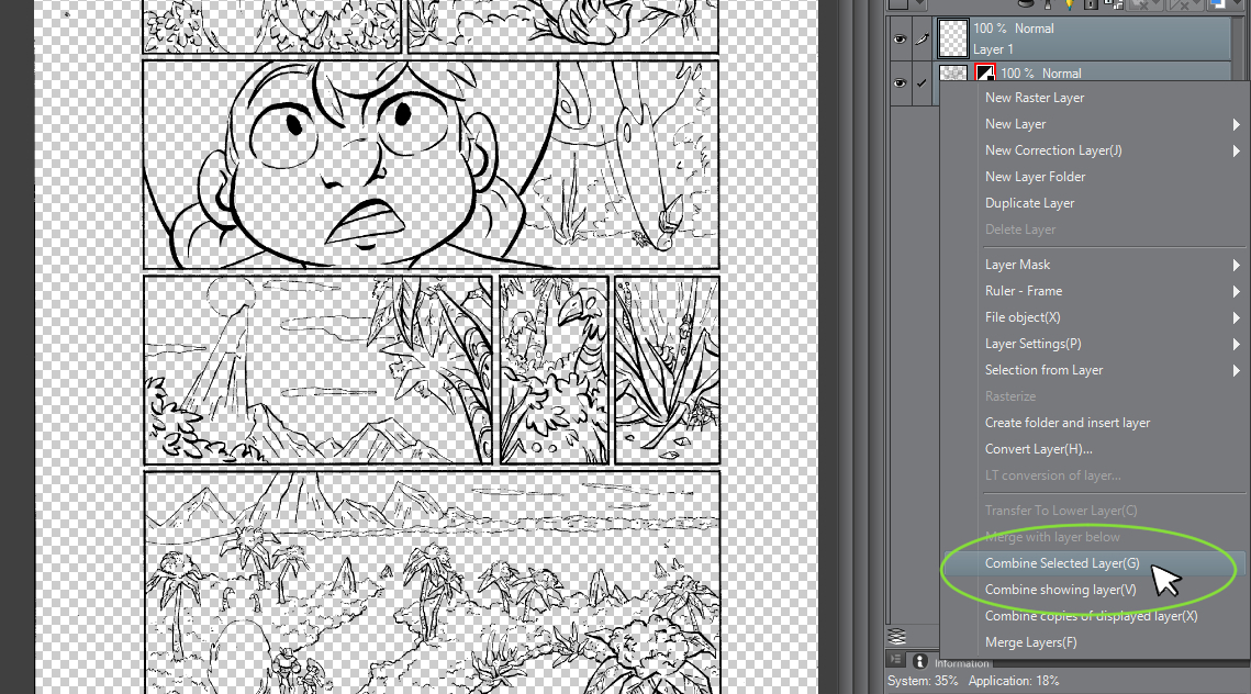
I then create a new layer and combine them.
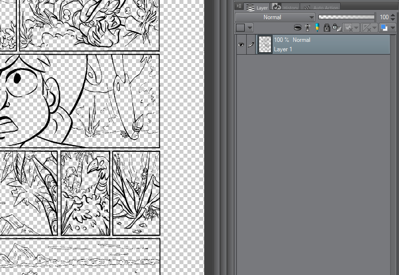
Here is the final combined layer.
The reason I combine the layers to make the default layer is because it changes the Expression Color back to Color. If it were to remain Monochrome, then any color it interprets as white presents as transparent, and any color it interprets as black is black instead of the color selected.
The Fill Tool is filling in transparent instead of a color!
Now that the layers are combined and the Expression Mode is back to Color, it’s filling in with green instead of transparent.
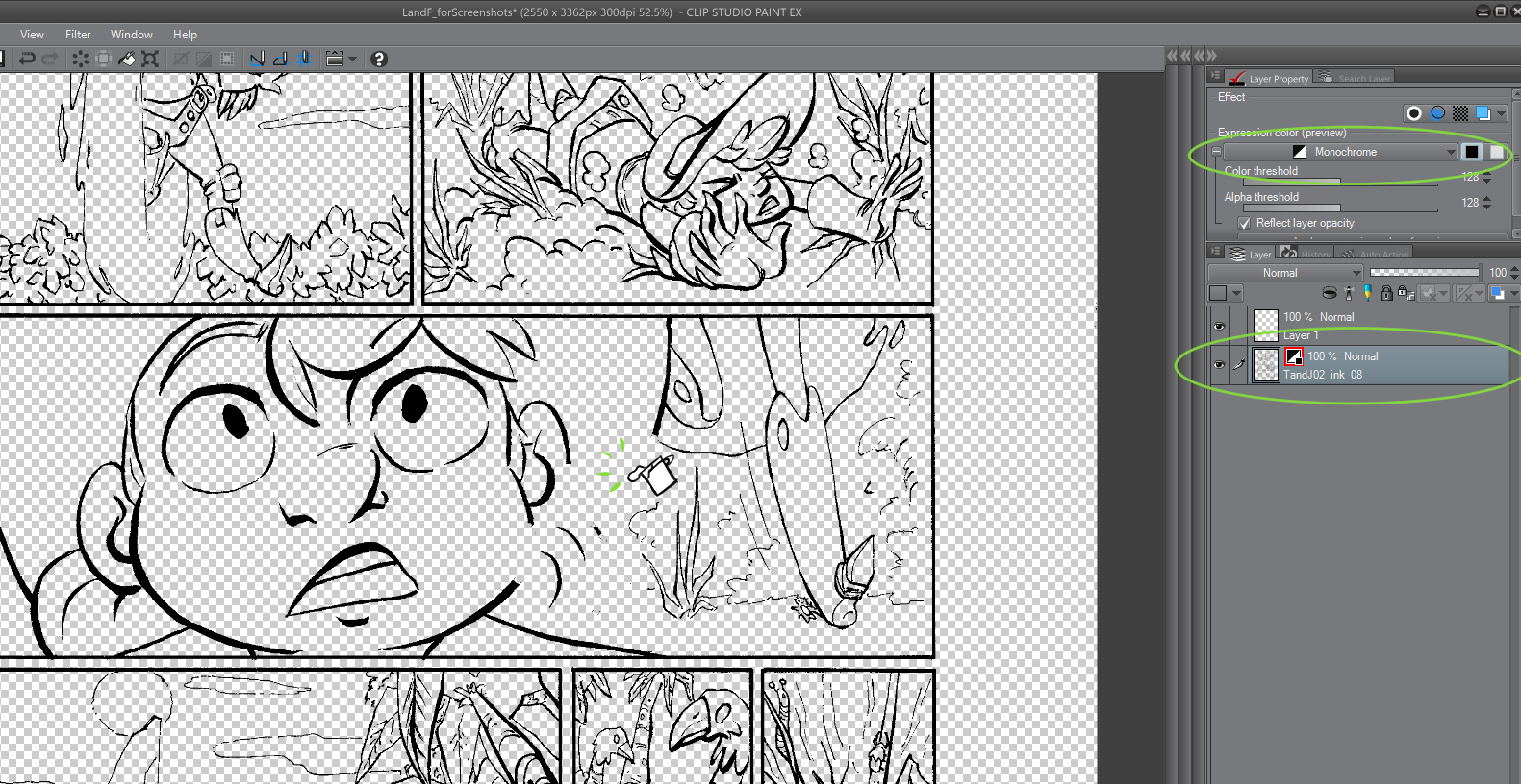
This also helps me do flat colors, because I can make the Ink layer a Reference Layer using a handy little toggle in the upper part of the Layer menu. This makes all of the black lines solid barriers, so when I fill in solid colors it won’t bleed past the black ink lines!
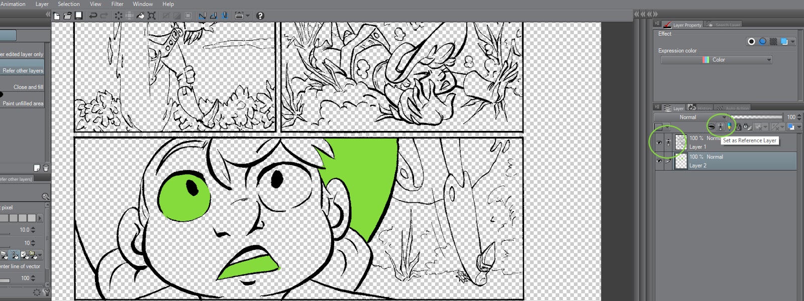
The handle little toggle in question.
Now I’m ready to flat everything, just like in the first issue. I started out just shading with Multiply layers on top of the flats and not blending them together, but then I started out experimenting with gradients. I don’t usually like to use a lot of gradients because I think they can look really jarring, but I liked how they looked using them on the Multiply layer and then breaking them up with the Pen Tool.

I started to heavily use this effect on the base color layers underneath the Multiply layer instead. I thought it worked especially well with the bushes and trees in the alternate world in the second issue. I would lay down gradients and then take the Pen Tool and draw pen strokes on top to break it up and create foliage, bark, or other effects.
A few more examples of the broken up gradients from another page.
I kept using the solid Multiply layers on top, but I tried switching the colors to fit the mood of the scenes, and I liked using different shades of the colors to create more depth in the drawings.
Issue 3: Tess of All Trades (Currently Updating)
With this issue I decided to do the pages entirely digitally because it’s less time-consuming, and I wanted to get better at inking digitally. I was worried about inking digitally because I prefer inking traditionally so much, and I think my digital inks can turn out looking stiff. There were definitely a few bumps, but I have a tablet monitor, which I think helps a lot because it feels a lot more natural. Just like any tool, it takes practice to get used to using it.

For the coloring, I didn’t really have any goals in mind for experiments, so I started out just using the same gradient technique from the previous issue. I decided after a few pages to try and use the Brush Tool instead of the Pen Tool to break up the gradients and make the backgrounds look a little more painterly. I also occasionally end up painting a little bit on the multiply layer to add a little more depth. The characters are just a flat color underneath the Multiply layers.

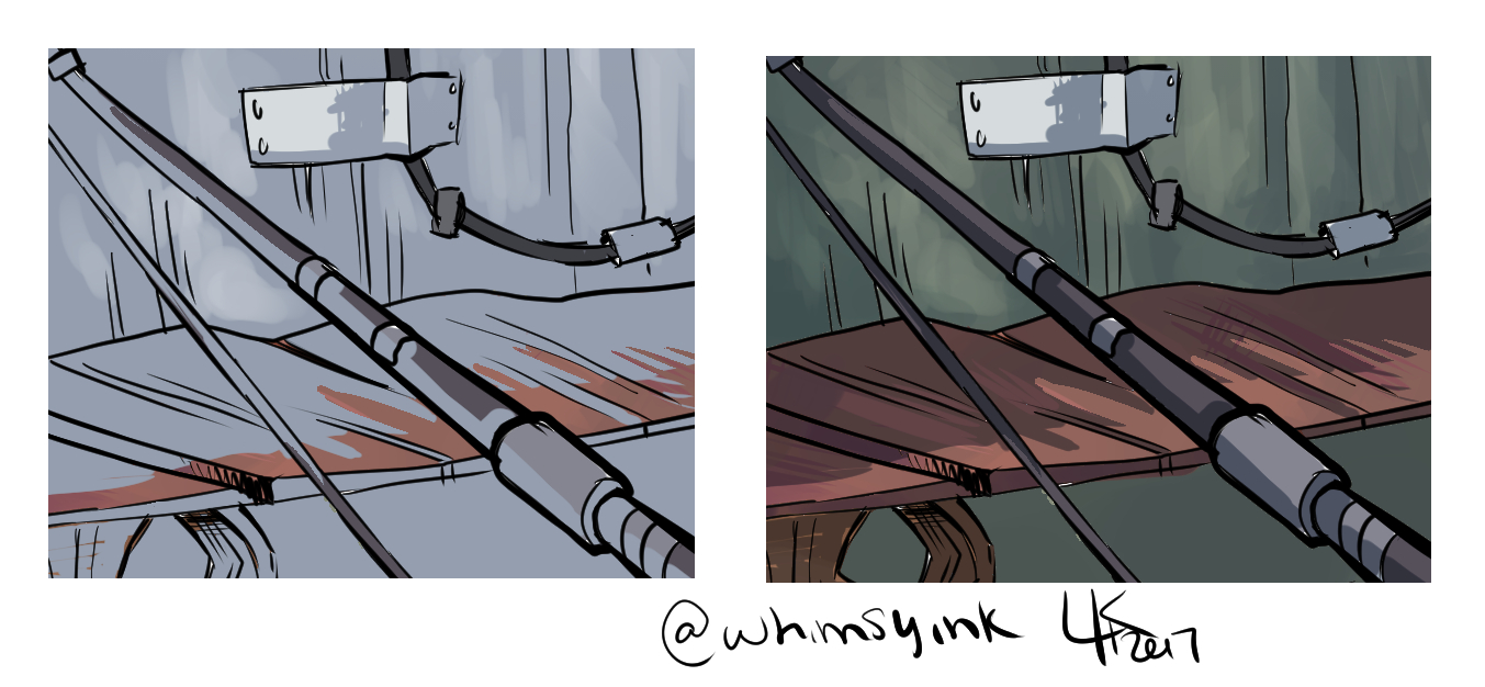
A detail with the “Multiply” blend mode toggled off and on to show the painterly look more clearly.
My goal with this issue right now is to figure out how to cut production time down a little bit, especially on the coloring. It’s all an ever evolving process.
One of my favorite things about webcomics is how they tend to evolve as they go. I like to see people’s art as it advances and gets better and better! It’s also one of my favorite things about making a webcomic, I enjoy the process and it makes me feel a little more free to experiment and grow as an artist and storyteller!
Thank you for reading! Feel free to check out my:
Twitter: https://twitter.com/whimsyink
Tumblr: http://whimsyink.tumblr.com/
Instagram: https://www.instagram.com/whimsyink/
Comic: https://tapastic.com/series/Tess-and-Jack
This post was sponsored by my Patrons on Patreon. Guest posts are paid $30 per post and Laurissa REALLY knocked it out of the park with this one. Thank you so much for sharing your knowledge, Laurissa!
Please consider donating to this blog or purchasing from Natto-shop (http://nattosoup.com/shop) if you want me to continue publishing quality content. All materials tested were purchased from my own pocket. Keep on Truckin' Nattosoup is not under any sponsorship.


May 11, 2017
Guest Post: areyoshi and Self Publishing with Ka Blam
Hello hello, dear readers! Before I get into the nitty-gritty, allow me to introduce myself. My name is areyoshi, and I’m a self-publishing comic artist. I’ve been a dedicated webcomic creator since 2009, and I self-published my first comic in 2011.
So. Getting started, I feel that I should briefly explain what self-publishing actually is. In simplest terms, self-publishing is the release of your content without the aid of a professional publisher. A good example? Ordering your book from an independent print company rather than submitting it to OniPress, Dynamite, or somewhere similar.
You may ask yourself, “Self, why wouldn’t I want to submit my story to a big house publisher? If they pick me, I’d be famous!” For starters, your mileage may vary with that famous thing. The book business can be very finicky, for more reasons than one, but I find the comic book business to be especially picky. Fear not, this is not going to be a rant about ‘the Big Two’ and inflexible art styles.
The pros:
· If you self-publish, you retain all rights to your project
· Nobody gets a cut of the profits; all money comes back to you
· You get to tell your story how you want to, without interference
· Your stock is completely under your control
The cons:
All of the above.
That isn’t a joke! Let me rephrase everything;
· Retaining your rights may limit the reach of your book
· You are solely responsible for printing expenses
· You may be missing out on valuable input about your work
· Your stock is completely under your control (so many trips to the post office…)
Truthfully, self-publishing has its good and bad qualities. Personally, I like self-publishing because it’s more about holding my book, having a tangible object, my labor of love actually being in my hands. If I happen to sell some books at a convention, then all the better.
Self-publishing may be appealing to you, but if you’re like Past Me, there’s some things you need to know before you send your book off somewhere.
Things I Wish I’d Known:
· Screen Resolution VS Print Resolution
· Live Area and Margins
· Files Types
· Where To Go
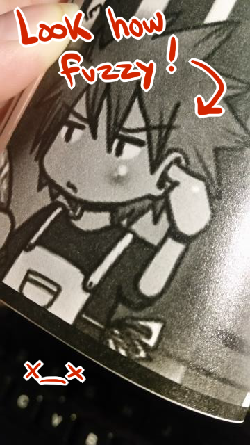
Past Me was excited to get my first self-published comic in my hands (this was back in the olden days of 2011.) Unfortunately, I was fresh out of high school and severely lacking in setup knowledge. Thus, I suffered at the hands of screen resolution.
According to our friend Google, screen resolution is defined as: “The number of horizontal and vertical pixels on a display screen. The more pixels, the more information is visible without scrolling. Screen resolutions have a pixel count such as 1600x1200, which means 1,600 horizontal pixels and 1,200 vertical pixels.”
What the heck? Alright, here’s an example…
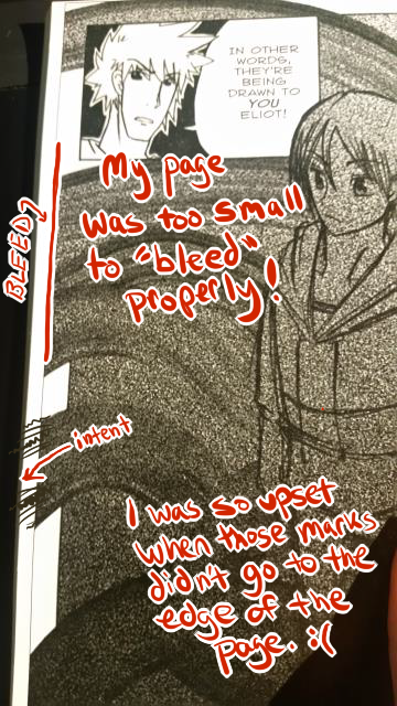
Because I drew my first book according to screen resolution instead of print resolution, everything was too small! What looks big on your screen might not be as big as you thought when it comes time to print. If you print too small, you end up with a fuzzy print quality, which, frankly, embarrasses me to this day.
Good practice is to find out what size comic you want to print. Standard comic book size is 6.75” X 10.25”. Manga is 5” X 7.5”, and Magazine size is 8” X 10.5”. I recommend picking whatever size book you want before you start drawing your pages… Otherwise there may have to be some awkward cropping down the road, and you could end up regretting your page sizing.
I have two series that I self-publish right now. One, Optical Disarray, is drawn at Manga size. The other, Third Kingdom, is drawn at Standard size. My comics are drawn digitally, meaning that I draw them directly on the computer with a graphics art tablet (I use an Intuos Pro from Wacom.)
To ensure that Optical Disarray will print without an issue, I made a 1650 pixels X 2325 pixels template file which I open for each new page. It includes a graph (for help with straight lines and paneling,) a bleed area, and a live area.
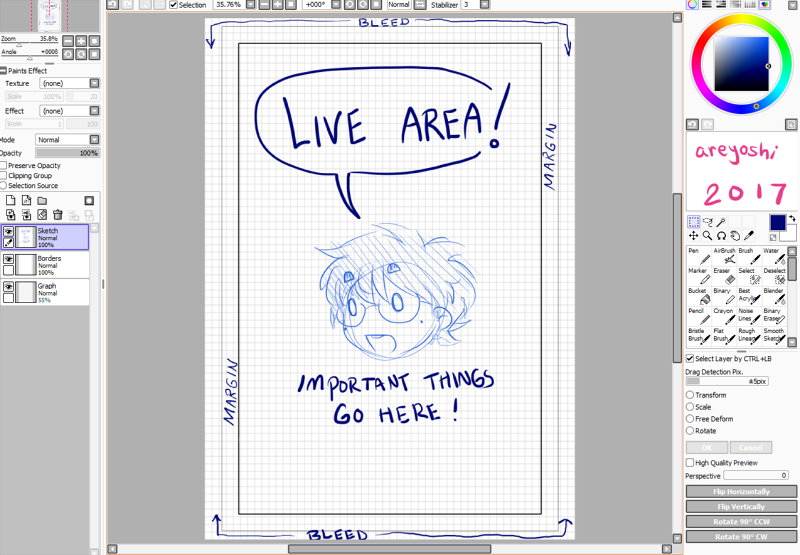
A bleed area is the very edges of your page, where it’s alright if something gets cut off at the printer. It’s very useful when you want your art to just flow off the page.
A live area is where you want any and all necessary information to go. Important expressions or speech bubbles should go here, so that they are absolutely safe from being cut off by accident.
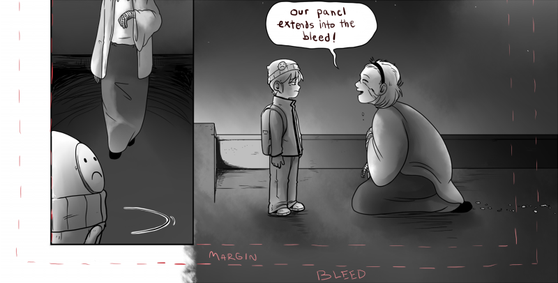
The same is true for Third Kingdom. Because it is larger than Optical Disarray, it is drawn at 2100 pixels X 3150 pixels.
When I’m finally done with all of the pages of a book, I prepare the files for printing. For many places, this means making sure final page resolution is set to at least 300 (as opposed to the usual default of 75,) and resaving the images to the company’s preferences. This usually involves opening Photoshop and changing my image mode from RGB to Grayscale. If your comic is in color, however, you should learn about the difference between CMYK and RGB and decide for yourself how to proceed. The independent publisher I go through prefers their pages to be sent in RGB mode, which isn’t really an industry standard, so I definitely implore you to do your own research.
From the beginning, I’ve used Ka-Blam , an operation based in Florida since 2005. They’re easy to work with, don’t charge a setup fee, and provide templates and easy directions to help make your experience better. They prefer their images to be sent as .TIFF files or as a .PDF. The .TIFF option is very convenient for folks who aren’t familiar with setting up a .PDF.
A downside to Ka-Blam , however, is that their customer support is only through an on-site messaging process. You get email alerts when you have a message, but it still doesn’t beat talking on the phone to quickly resolve issues when it’s necessary.
When preparing your book, remember to double and triple check everything. Files can be altered, but printing is forever.
I’d like to end this with a personal note; anyone can draw a comic, and anyone can get it published. Self-publishing is not any less ‘real’ than going through a big house publisher. You can buy an ISBN for your book. You can make deals with retailers. There are so many things you can do, and I encourage everyone to pursue the opportunities ahead of them.
Find me as @areyoshi on all social media! (Twitter, Instagram, Tumblr, etc; )
Visit my website to read my comics! areyoshi.com
Got a question? Feel free to contact me via email
Please consider donating to this blog or purchasing from Natto-shop (http://nattosoup.com/shop) if you want me to continue publishing quality content. All materials tested were purchased from my own pocket. Keep on Truckin' Nattosoup is not under any sponsorship.

Upcoming Show: Firefly Artisan Fair
This weekend, I'm going to have a booth at the Firefly Artisan Fair, here in Nashville!


The Firefly Artisan Fair is Saturday, May 13th, from 7PM-11PM on the Clay Lady's Campus (1416 Lebanon Pike, Nashville TN 37210).

I'm going to have:
Original watercolor and marker artChildren's books for sale (7" Kara Volume 1, Gizmo Grandam: A Twisty Tale)Mini Comics (Favorite Fictional Femmes, Magical Girl March, Pickin' N' Peelin')Wooden CharmsSelect floral mini prints
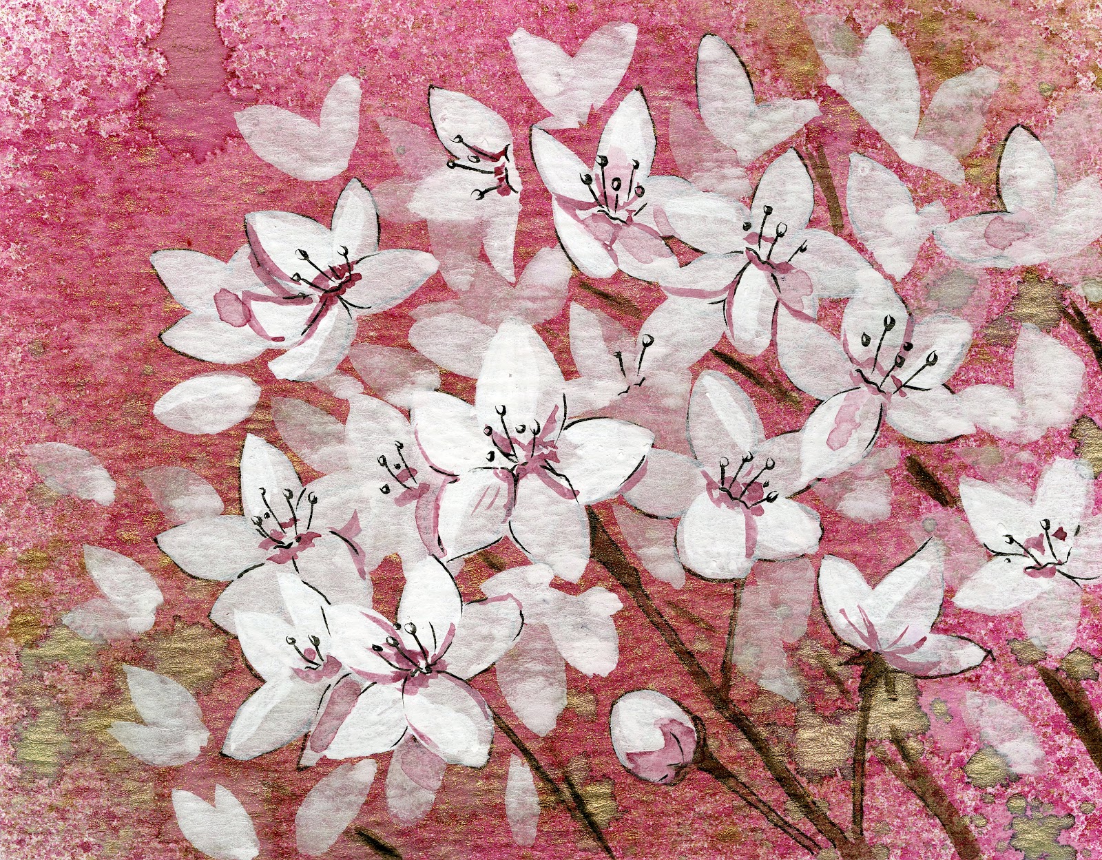
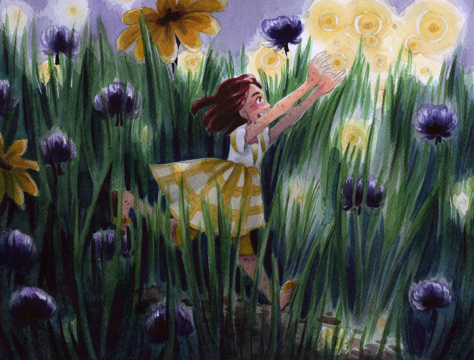 This brand new watercolor illustration, painted specifically for the Firefly Artesian Fair, will be for sale at my booth.
You guys can check out more wonderful vendors and art on the Firefly Artisan Fair's Instagram! There's going to be beautiful ceramics, gorgeous jewelry, and original art for sale! The Firefly Artisian Fair features all Nashville-area creators and creatives, so if you're in Nashville and you want to shop local, this is a great way to do it!
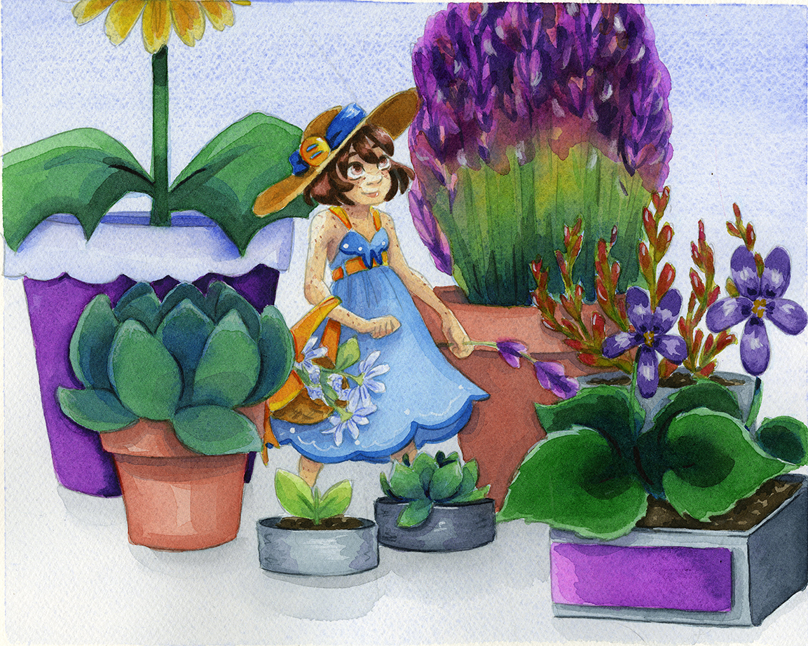
Examples of art that will be for sale:


And much, much more!
There will also be
Community feel event- firepit, smores, music, foodArtisan demonstrations, see artists making their craftInteractive art project (invite participants to create art while at the event) a large tile installation called The Nashville ClayscapeParticipants will be encouraged to engage with Firefly Friends and be creative themselves!FREE admissionFREE Valet parking available (we want to make it easy for attendees to come to this event)
Please consider donating to this blog or purchasing from Natto-shop (http://nattosoup.com/shop) if you want me to continue publishing quality content. All materials tested were purchased from my own pocket. Keep on Truckin' Nattosoup is not under any sponsorship.

May 8, 2017
Body Language: Intro to Comic Craft: Step by Step
In our last Intro to Comic Craft Step by Step, we discussed environment in depth. In this installment, we're going to discuss body language.
Body language is a form of acting and expression that can make the difference between an engaging comic and a boring and stiff comic. While not the same as anatomy (there are plenty of anatomically incorrect comics with amazing body language, and plenty of anatomically perfect comics with boring body language), an understanding of anatomy can help you know which rules to keep, and when to break the rules. For the sake of brevity, I've linked several of the resources I've created over the years, to help those of you who need a brief refresher on comic anatomy.
Figure ConstructionIt would be pointless to discuss body language without a brief mention of the importance of anatomy, and a decent understanding of how the human body works. As perspective is for environments, constructive human anatomy is for body language- knowing the basics will take you so much farther. Here are a few of my favorite resources on human construction, if you don't have a preferred method.
From the blog:
ASE Panel- Anatomy Presentation
Figure Drawing Demo
Facial Anatomy and Construction
Anatomy of a Clay Man
Guest Post: Tips and Tricks for Drawing Women of Various Body Types (blog post, NSFW)
Anatomical Construction (blog post, NSFW)
Video:
Figure Drawing Demonstration (video)
Demonstrating my Sketching Tools (video)
Intro to Comic Craft: Roughing it (video)
Chibi Kara Illustration Timelapse (video)
ArtSnacks Challenge February 2016 (video)
Outside Resources:
Figure Drawing for All It's Worth
The Glen Vilppu Drawing Manual
I cannot stress enough that daily practice and working through the two above books, as well as attending figure drawing sessions, have been monumental in helping me not only improve my art, but decrease the time it takes to draw something. While understanding anatomy is not essential to drawing comics, having a systematic method of constructing your figures will help you stay consistent and allow you to work faster.
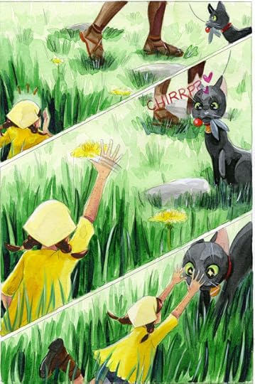
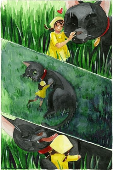
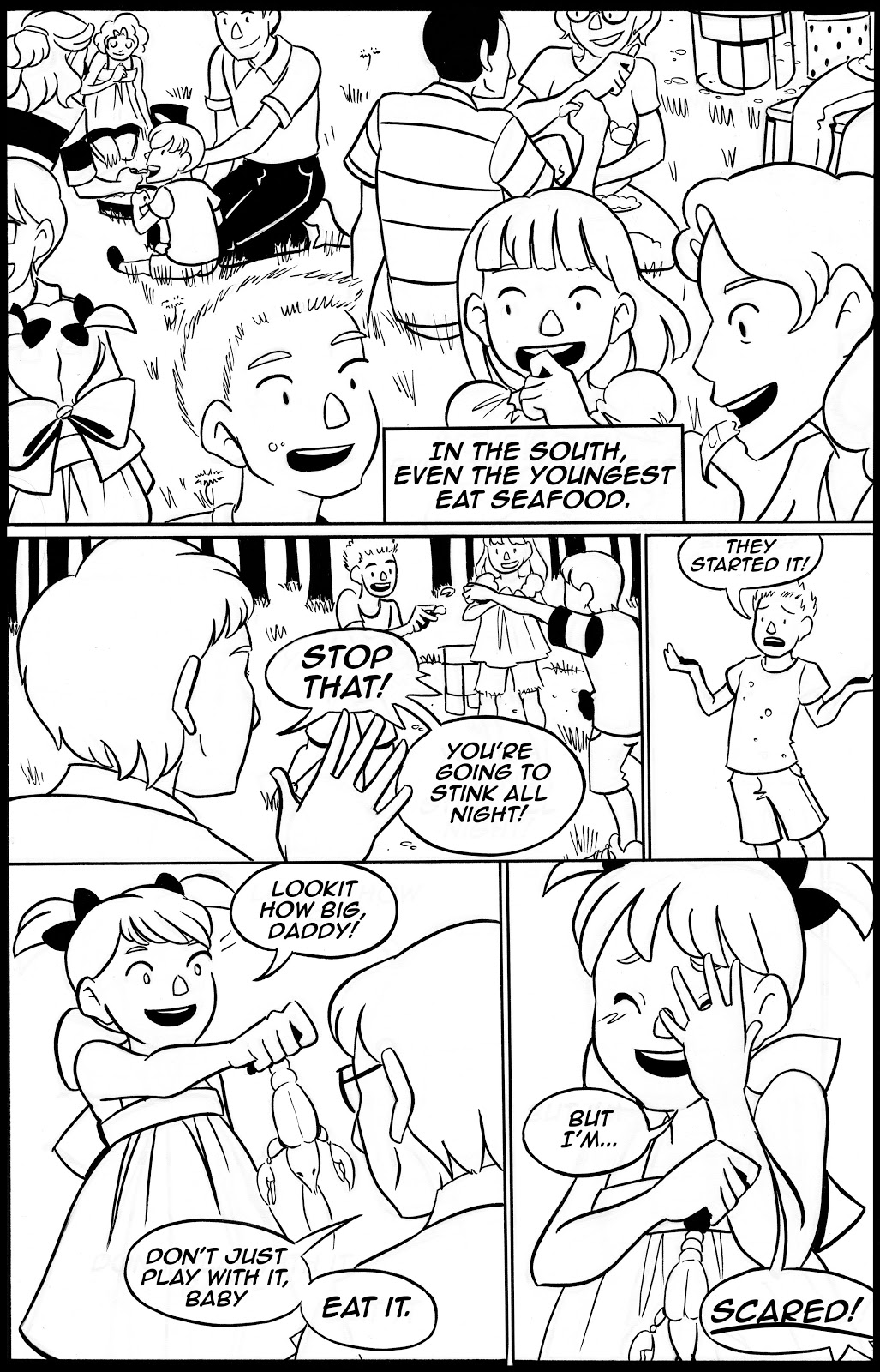
For an all ages comic that focuses on kids, character acting and body language are extremely important to 7" Kara, and to my cartooning in general.


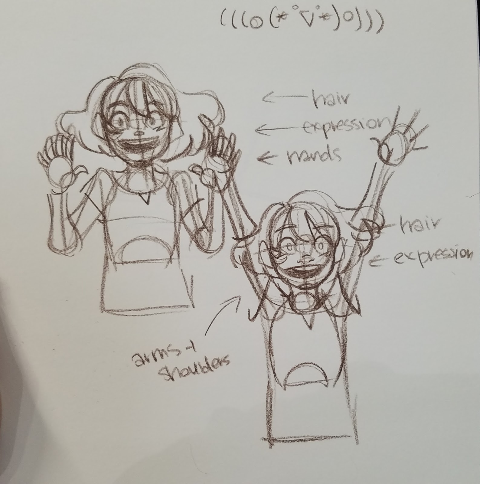
For an innocent, young character like Kara, I try to keep her movements youthful, naive, and cute. Kara in the comic tends to over react- she has no filter, and her body tends to react as much as her face. I utilize movement in hair and in clothing to further push her actions. I want young readers to be able to relate and understand her emotions quickly, and I want older readers to feel a sense of protectiveness over this 7 inch tall girl.Character Acting
Comics and plays have much in common. The environment is the set, the characters are actors, and body language is acting.
Body language begins in the script, with character direction. In thumbnails, its important to overact with your characters, because while refining in roughs, actions tend to get toned down.
Don't just rely on the face- use the whole body to tell the whole story.
Macro Expression- Entire body gesture gives clues to emotion
Micro Expression- Expression on face
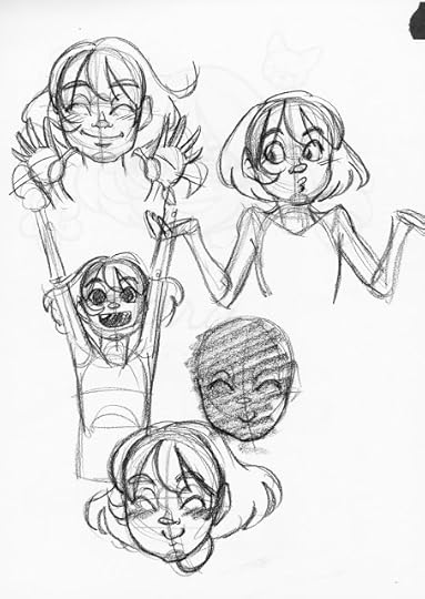
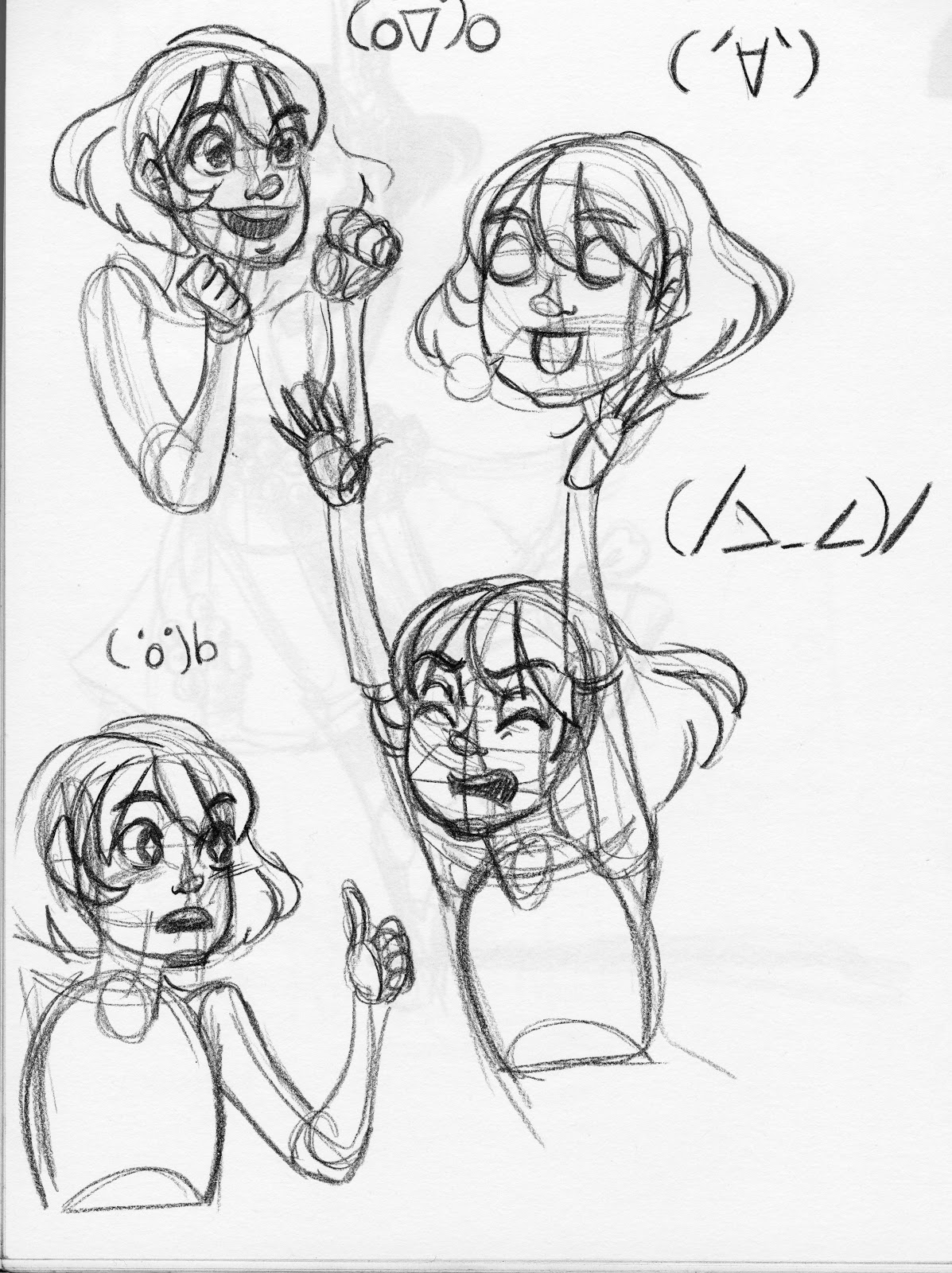
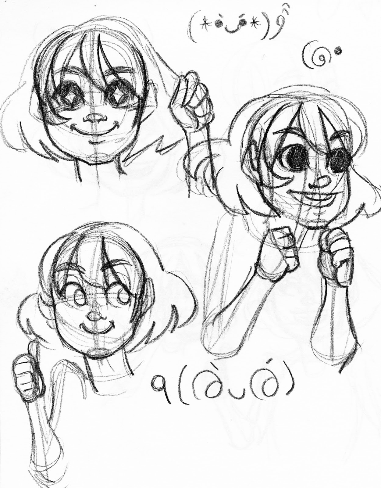
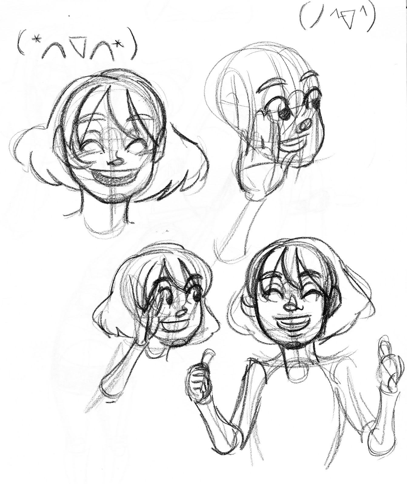
 Top is an example of an understated excited emotion. Bottom is that emotion pushed. You could continue to push this emotion even further. Over exaggerated emotions tend to come off as comical in most instances, which can be an excellent way to add a bit of levity to your comic craft.
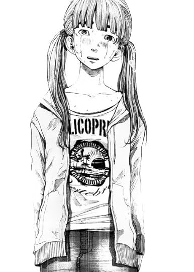
Even though this illustration is still very much in the rough sketch stage, you can still tell several things about the image. You can tell the character is female, that the image is intended to have an upbeat feel, and that she exudes energy- just from the body language.
Macro expressions:
Posture
Leg positions
Shoulders
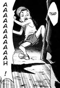 In this panel, mangaka Naoki Urasawa uses the character's (Kenji, 20th Century Boys) entire body to push the emotion (startled fright).
Ways to push character acting:
Hair is part of the expression
Studio Ghibli uses hair frequently as part of a character's emotion and expression. Fear, anger, excitment, even love all cause hair fluffs in Ghibli films.
 A grossed out Sen from Spirited Away
 An excited Ponyo from Ponyo on the Cliff by the Sea
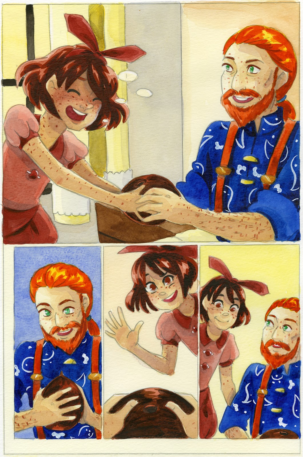
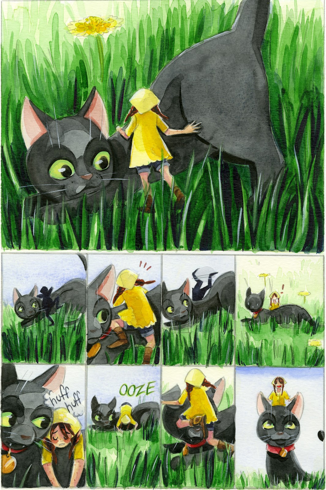
This is an action I've adopted for 7" Kara emotions.

As you can see, Kara's hair is fluffed in the first panel, to help demonstrate excitement and exertion.
Hands are part of the action


 Hands should be included whenever possible to help push emotion, as most humans gesticulate frequently.
Clothing can help convey emotion too
Just like hair, clothing can be fluffed or flattened to help convey emotion. Think of the fur on a cat- when a cat is excited, scared, or playful, it's fur fluffs out.
Push for gesture and expression, don't be afraid to go cartoony or 'ugly':
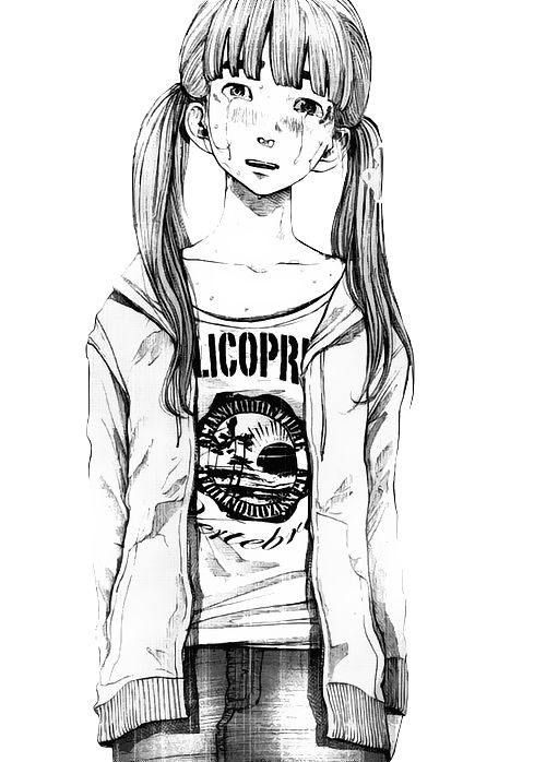
Ugly crying- Inio Asano
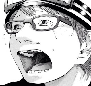
 At a glance, her crying is reserved, almost elegant loss, but if you look closely, you'll see the snot about to drip from her nose. These 'ugly' little touches, these little bits of grit, make the expression feel real to the reader.
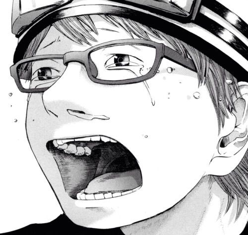
Ugly Happy- Naoki Urasawa
Hair fluffs- Studio Ghibli
Western Inspiration:
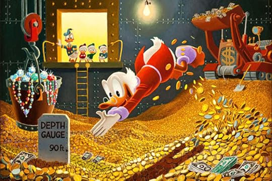
Ducktales
Golden era Disney animation is a great place to look for whole body acting inspiration. Many of us fondly remember the Disney afternoon cartoons like Ducktales.
Bone
Cartoony characters really rely on body action and expression to convey emotion, especially those with simplified facial features. Bone is an excellent example of whole-body acting.

Warner Brothers:
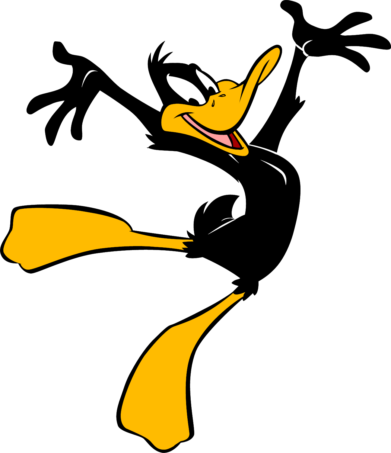
Warner Brothers cartoons, especially those from the Tex Avery era, are a fantastic resource for zany, over the top body action and clear silhouettes.
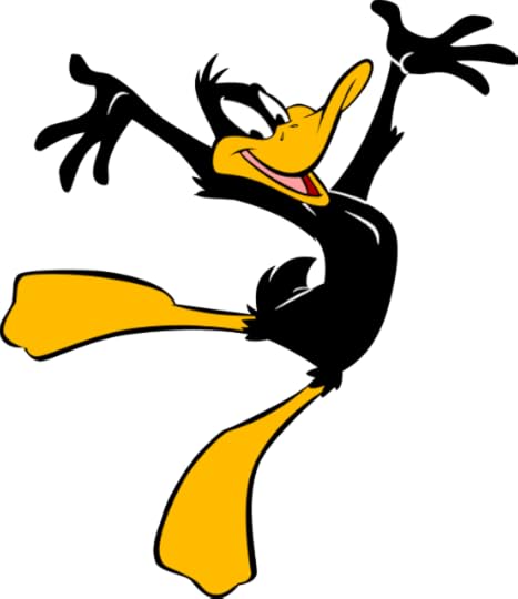
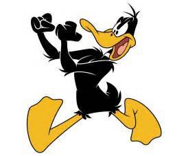
Daffy Duck has great full body acting
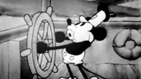
Early Disney:
Rubber hose animation during the silent film era had to rely ENTIRELY on body acting to convey story, and is a great resource for acting inspiration.
From Thumbnails to Roughs:
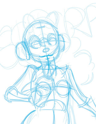
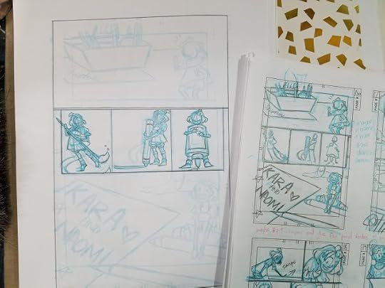
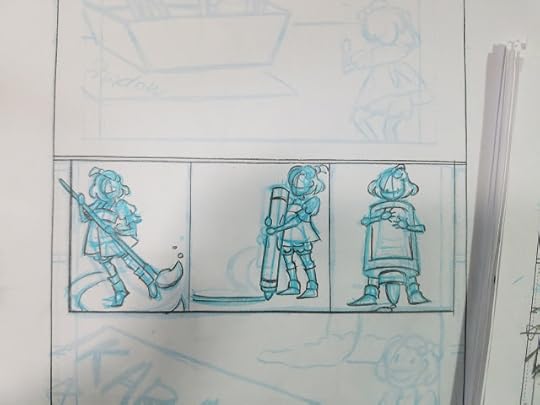
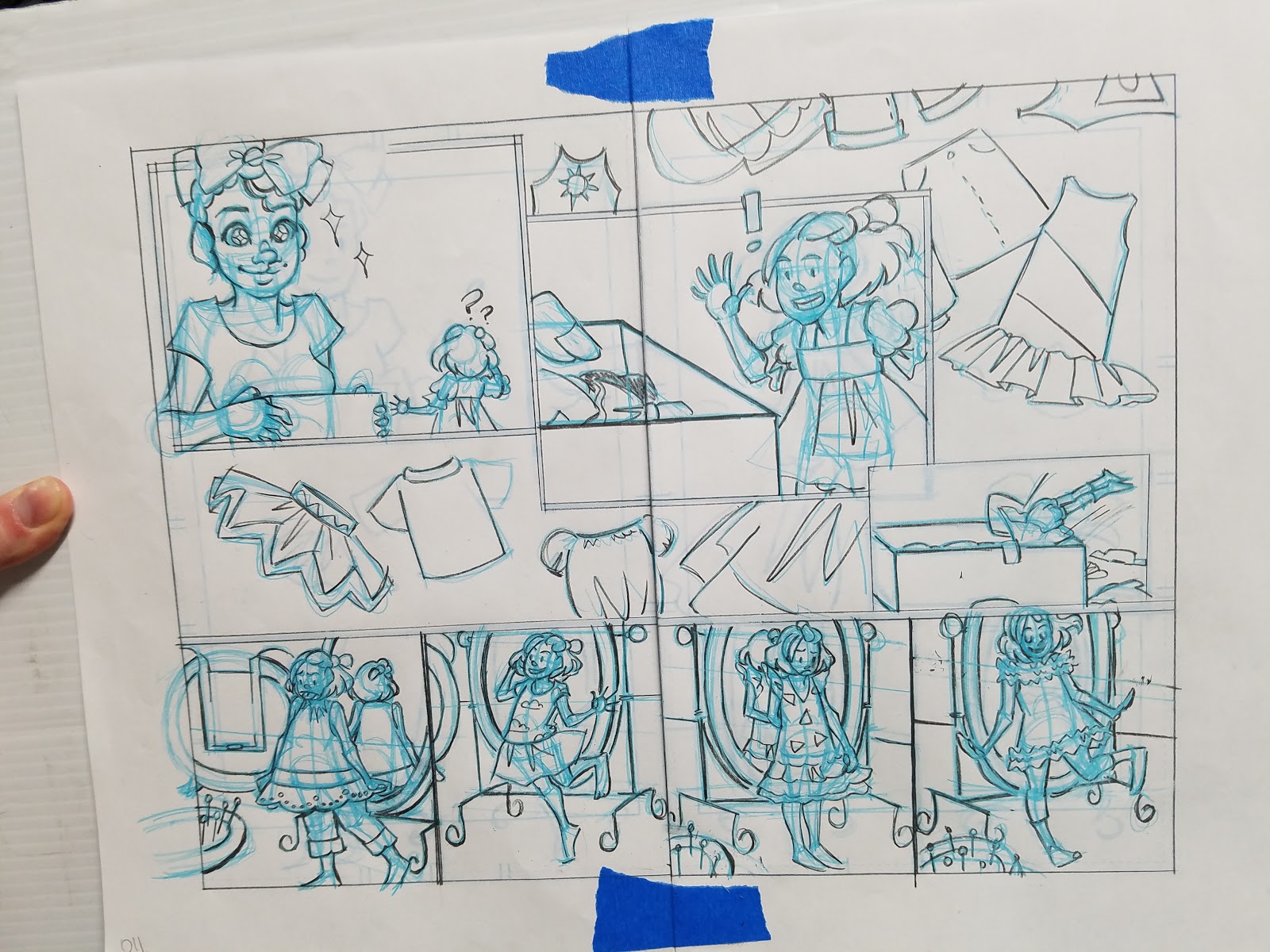
For my thumbnails, I try to push the gesture and acting as much as possible because I have a tendency to tighten things (and lose some of that action) as I work through the roughs. Here are some examples of my thumbnails vs my roughs from chapter 7 of 7" Kara.


I also utilize gestural close ups and uninflected panels.


In Various Styles:
Black and white, American Indie, Cicada Summer:

Manga and Children's Book Inspired, Watercolor, 7" Kara:
Webcomics with Great Body Language
The Meek
Harpy Gee
Family Man
Prague Race
Camp Weedonwantcha
More on Body Language and Character Acting
Temple of the Seven Golden Camels- Every few years, I fall back in love with this blog, it's always so helpful, so I can't recommend it enough.
Thinking, Processing, and Reacting
Please consider donating to this blog or purchasing from Natto-shop (http://nattosoup.com/shop) if you want me to continue publishing quality content. All materials tested were purchased from my own pocket. Keep on Truckin' Nattosoup is not under any sponsorship.
Body language is a form of acting and expression that can make the difference between an engaging comic and a boring and stiff comic. While not the same as anatomy (there are plenty of anatomically incorrect comics with amazing body language, and plenty of anatomically perfect comics with boring body language), an understanding of anatomy can help you know which rules to keep, and when to break the rules. For the sake of brevity, I've linked several of the resources I've created over the years, to help those of you who need a brief refresher on comic anatomy.
Figure ConstructionIt would be pointless to discuss body language without a brief mention of the importance of anatomy, and a decent understanding of how the human body works. As perspective is for environments, constructive human anatomy is for body language- knowing the basics will take you so much farther. Here are a few of my favorite resources on human construction, if you don't have a preferred method.
From the blog:
ASE Panel- Anatomy Presentation
Figure Drawing Demo
Facial Anatomy and Construction
Anatomy of a Clay Man
Guest Post: Tips and Tricks for Drawing Women of Various Body Types (blog post, NSFW)
Anatomical Construction (blog post, NSFW)
Video:
Figure Drawing Demonstration (video)
Demonstrating my Sketching Tools (video)
Intro to Comic Craft: Roughing it (video)
Chibi Kara Illustration Timelapse (video)
ArtSnacks Challenge February 2016 (video)
Outside Resources:
Figure Drawing for All It's Worth
The Glen Vilppu Drawing Manual
I cannot stress enough that daily practice and working through the two above books, as well as attending figure drawing sessions, have been monumental in helping me not only improve my art, but decrease the time it takes to draw something. While understanding anatomy is not essential to drawing comics, having a systematic method of constructing your figures will help you stay consistent and allow you to work faster.
For an all ages comic that focuses on kids, character acting and body language are extremely important to 7" Kara, and to my cartooning in general.
For an innocent, young character like Kara, I try to keep her movements youthful, naive, and cute. Kara in the comic tends to over react- she has no filter, and her body tends to react as much as her face. I utilize movement in hair and in clothing to further push her actions. I want young readers to be able to relate and understand her emotions quickly, and I want older readers to feel a sense of protectiveness over this 7 inch tall girl.Character Acting
Comics and plays have much in common. The environment is the set, the characters are actors, and body language is acting.
Body language begins in the script, with character direction. In thumbnails, its important to overact with your characters, because while refining in roughs, actions tend to get toned down.
Don't just rely on the face- use the whole body to tell the whole story.
Macro Expression- Entire body gesture gives clues to emotion
Micro Expression- Expression on face
 Top is an example of an understated excited emotion. Bottom is that emotion pushed. You could continue to push this emotion even further. Over exaggerated emotions tend to come off as comical in most instances, which can be an excellent way to add a bit of levity to your comic craft.
Even though this illustration is still very much in the rough sketch stage, you can still tell several things about the image. You can tell the character is female, that the image is intended to have an upbeat feel, and that she exudes energy- just from the body language.
Macro expressions:
Posture
Leg positions
Shoulders
 In this panel, mangaka Naoki Urasawa uses the character's (Kenji, 20th Century Boys) entire body to push the emotion (startled fright).
Ways to push character acting:
Hair is part of the expression
Studio Ghibli uses hair frequently as part of a character's emotion and expression. Fear, anger, excitment, even love all cause hair fluffs in Ghibli films.
 A grossed out Sen from Spirited Away
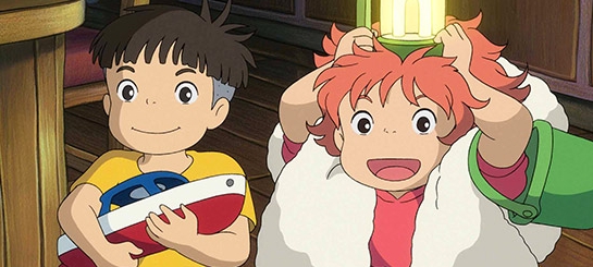 An excited Ponyo from Ponyo on the Cliff by the Sea
This is an action I've adopted for 7" Kara emotions.
As you can see, Kara's hair is fluffed in the first panel, to help demonstrate excitement and exertion.
Hands are part of the action

 Hands should be included whenever possible to help push emotion, as most humans gesticulate frequently.
Clothing can help convey emotion too
Just like hair, clothing can be fluffed or flattened to help convey emotion. Think of the fur on a cat- when a cat is excited, scared, or playful, it's fur fluffs out.
Push for gesture and expression, don't be afraid to go cartoony or 'ugly':
Ugly crying- Inio Asano
 At a glance, her crying is reserved, almost elegant loss, but if you look closely, you'll see the snot about to drip from her nose. These 'ugly' little touches, these little bits of grit, make the expression feel real to the reader.
Ugly Happy- Naoki Urasawa
Hair fluffs- Studio Ghibli
Western Inspiration:
Ducktales
Golden era Disney animation is a great place to look for whole body acting inspiration. Many of us fondly remember the Disney afternoon cartoons like Ducktales.

Bone
Cartoony characters really rely on body action and expression to convey emotion, especially those with simplified facial features. Bone is an excellent example of whole-body acting.

Warner Brothers:
Warner Brothers cartoons, especially those from the Tex Avery era, are a fantastic resource for zany, over the top body action and clear silhouettes.

Daffy Duck has great full body acting
Early Disney:
Rubber hose animation during the silent film era had to rely ENTIRELY on body acting to convey story, and is a great resource for acting inspiration.

From Thumbnails to Roughs:
For my thumbnails, I try to push the gesture and acting as much as possible because I have a tendency to tighten things (and lose some of that action) as I work through the roughs. Here are some examples of my thumbnails vs my roughs from chapter 7 of 7" Kara.


I also utilize gestural close ups and uninflected panels.
In Various Styles:
Black and white, American Indie, Cicada Summer:

Manga and Children's Book Inspired, Watercolor, 7" Kara:


Webcomics with Great Body Language
The Meek
Harpy Gee
Family Man
Prague Race
Camp Weedonwantcha
More on Body Language and Character Acting
Temple of the Seven Golden Camels- Every few years, I fall back in love with this blog, it's always so helpful, so I can't recommend it enough.
Thinking, Processing, and Reacting
Please consider donating to this blog or purchasing from Natto-shop (http://nattosoup.com/shop) if you want me to continue publishing quality content. All materials tested were purchased from my own pocket. Keep on Truckin' Nattosoup is not under any sponsorship.
May 5, 2017
FAQ Con Questions
What do I absolutely need to get started?
Kitty- $20 in ones, $20 in 5's, $50 in 10's, $60 in 20's is the bare minimum of liquid cash to keep in reserve. I usually have $50 in ones, $50 in fives, $50 in tens, $100 in twenties. While you can use a lockbox, those are easy to break into, so I carry my cash in a coupon book like this.TableclothSignageSample merchA display that gets your art up off the table, so people can see itGood attitudeArtist Alley Essentials For Under $30
Part 1: Overview
Part 2: Essentials
Part 3: Display
Part 4: Signage
Part 5: Decoration
Where did you get this (display):
Metal Grids- You can get metal grids year round on Amazon. I really like the Honey Can Do grids, and own four sets- two for Nashville, two for Louisiana. You can also find grids at Target, Walmart, and Bed Bath and Beyond during August or 'back to school', but your options may be picked over.Extra Connectors- I ordered some from Amazon that were supposed to work with my type of grids, but they are too large. Order with care. You may find yourself buying another set of grids, just to be sure the connectors work.Tablecloth- You can begin with a 3 yard length of cloth from any fabric store, including Walmarts with a fabric section. I used the same piece for years, and finally opted to upgrade with an eyelit lace panel (to hide my table front), which was generously sewn on by my mother one Mechacon.Signs- These are custom made by me, and feature the main character of my comic, 7" Kara. These were designed to provide not only pricing information, but a talking point and a commission option. They were printed on a toner printer, cut out, laminated, and cut again. I have also used hand lettered chalkboard signs (boards were purchased ready to go at Walmart, and I used chalkboard markers), and hand drawn signs in acrylic sign holders like these.Cake Stands- I purchased my cake stands through Amazon.Sign holders- I purchased my sign holders through Amazon.Decorative clothes pins- I purchased these from Michaels in the party section.Magnets (Bucky balls)- These were a gift, and acquired through Think Geek. Bucky Balls are no longer sold, so look for neodynium magnets. Be careful- they are EXTREMELY strong.Banners- I order my banners through U Make Banners, and set the grommets myself. You can read about my banner experiences here.Small bags- I recommend small, cute favor bags, like any of theseLarge plastic bags- I used to order mine from Uline, and will be searching for a new source once I run out of my current stock.
Where did you get this (merch)
Wooden charms- We currently use Ponoko to order our custom made laser cut wooden charms. We find that wooden charms are more affordable than acrylic charms, and tend to sell better with my original art on them. Joseph kindly wrote a tutorial on how to use this laser cutting service that you can read here.Books printed- 7" Kara books are printed through CreateSpace at this time, although I am eagerly exploring other options. Mini comics are printed at home, using my Dell 1760NW toner printer , assembled with this bone folder and this long arm stapler.Stickers- I print my own stickers at home, and have recently purchased a Cricut Explore Air to help with the cutting. I print my stickers using this toner based printer. Sticker Paper- I use this photo sticker paper, and am really pleased with the results. Business cards- I order my 'Tumblr' business cards from Overnight Prints, and my professional cards from Moo.Postcards- I order my Inky Fingers postcards from Overnight Prints.Mini prints- I use a combination of whatever has a deal on Slickdeals- so I've used Shutterfly, Snapfish, Amazon's printing services, and in a pinch, Walgreens.Bookmarks- I print and laminate mine at home, using a Swingline laminator like those here
How do you:
Take credit cards- I use Square at my table, although there are other options available. You can use my first time user code here: https://squareup.com/i/2E3339F1
Apply for a table- Convention table applications have gotten incredibly competitive. There are several types of shows you can apply for, and most shows fall into one of three categories:
First Come, First Serve: You apply, if they have space, you pay for the table and you're done. Incredibly hard to get into these days- even if you camp the site, poorly designed and maintained sites will crash due to large amounts of traffic. Mechacon's artist alley functions under this standard.
Juried: You apply and provide your portfolio, convention staff decides whether you're a good fit. MTAC's alley functions under this standard.
Lotto: You apply, and once the application period has ended, creators are randomly selected. SPX functions under this standard.
Creating a convention portfolio (necessary for juried shows):
I recommend creating a separate convention portfolio to display your wares.
Things to include:
Commission examples (if you take commissions)
Examples of prints (if you sell prints)
Photos of your comics and interior pages (if you sell comics or minis)
Please only include the types of items you intend to sell- anything less is deceptive.
My convention portfolio
Make everything- I have given up most hobbies- I don't drink, play video games, party, or cosplay. Drawing is literally just about everything I do with my time.
You can't be laissez faire about conventions- they're just too competitive. You really need to bring your best work, and give it your best shot, even if your art isn't the best. Customers can tell when you care about something, so as long as you honestly love it, you should do fine.
I work from home, and generally like to spend the three weeks before the show prepping new materials. The majority of my table is handmade (painted, drawn, assembled), so it takes me a lot of time to make merchandise, and my margins are pretty terrible compared to print artists.
I draw every single day of the year, rain or shine, sick or health, so a lot of my original art becomes mini prints, or art that I offer for sale.
Take commissions- I have a post specifically on offering commissions that ran recently, so please check my archive for that.
Watercolor- Check out my Watercolor Basics section for tutorials on how to watercolor.
I did a con, and I didn't make nearly as much money as you do. What gives?
Conventions take time, patience, flexibility. I've done conventions for over seven years, and have only started to make a profit at anime conventions in the past four. For indie comic cons, I'm still fortunate if I can make my travel costs back. I've recently started exploring other options, including kids events, school visits, and craft shows, but it's been a long, tedious process.
How do you make a living at this?
I don't.
I 'make a living' offering freelance (which is hit or miss, sometimes I'm busy, sometimes I'm scrounging), monetizing this blog with ads, running a Patreon to offset costs, running a Youtube channel, and doing conventions, and for the past two years, all of those stats have been in a slump. So I'm currently working on new ways to make ends meet doing what I love.
I don't do enough conventions, and do not have the desire to do enough conventions, to make a living wage ($25,000 a year here in the South). I would prefer to focus on making comic content, and conventions greatly disrupt that.
How much should I invest in my first show?
As little as you can get away with. Don't try to compete with established artists on their own turf- by making a small minimal investment, you're more flexible and can find what works for you.
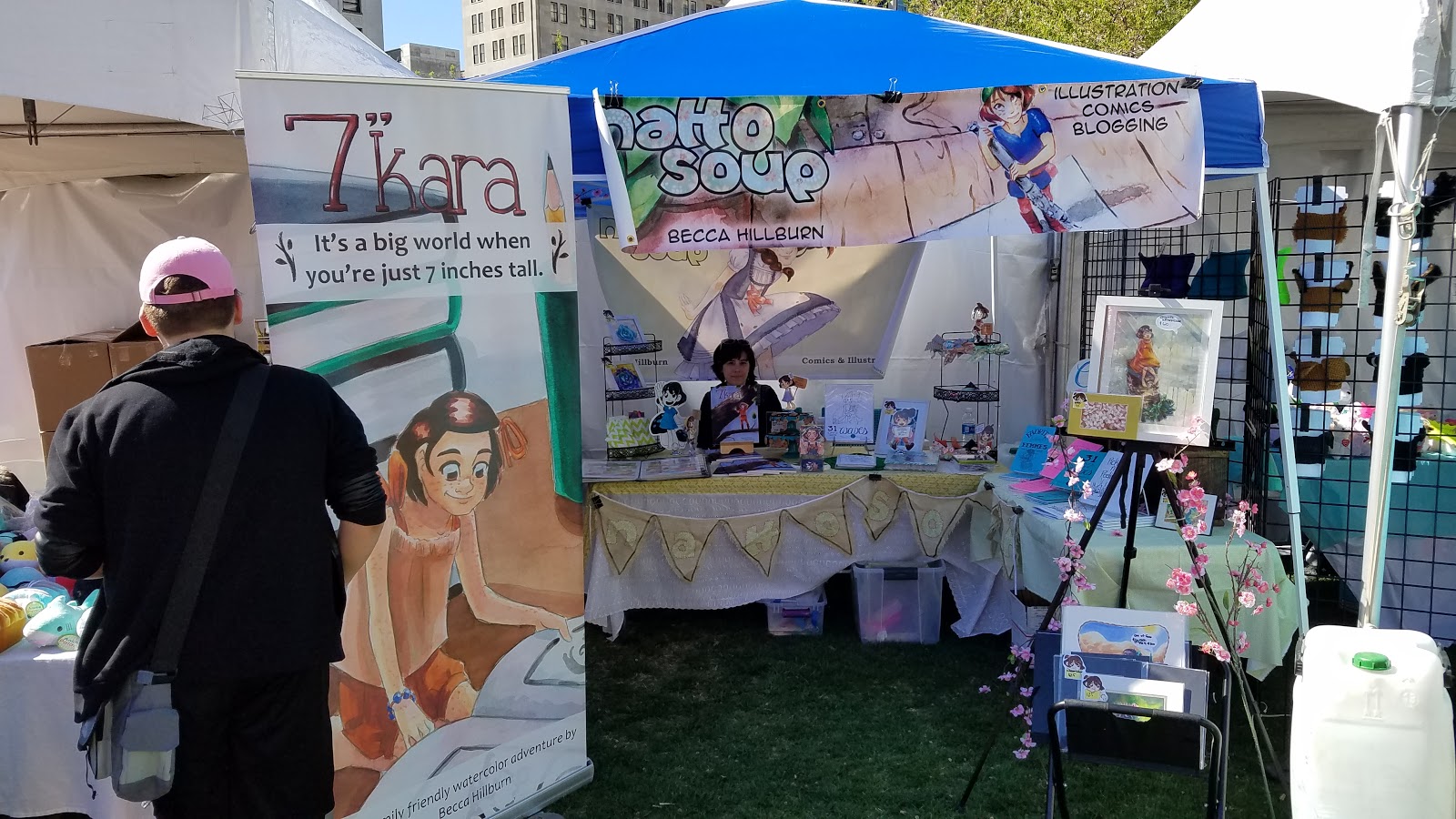
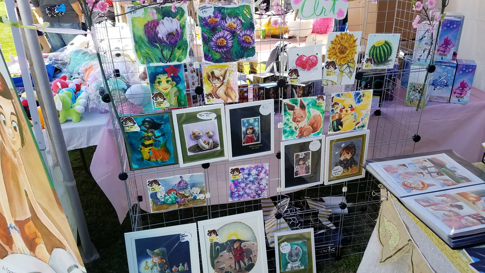
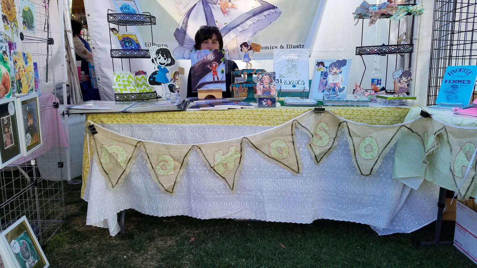
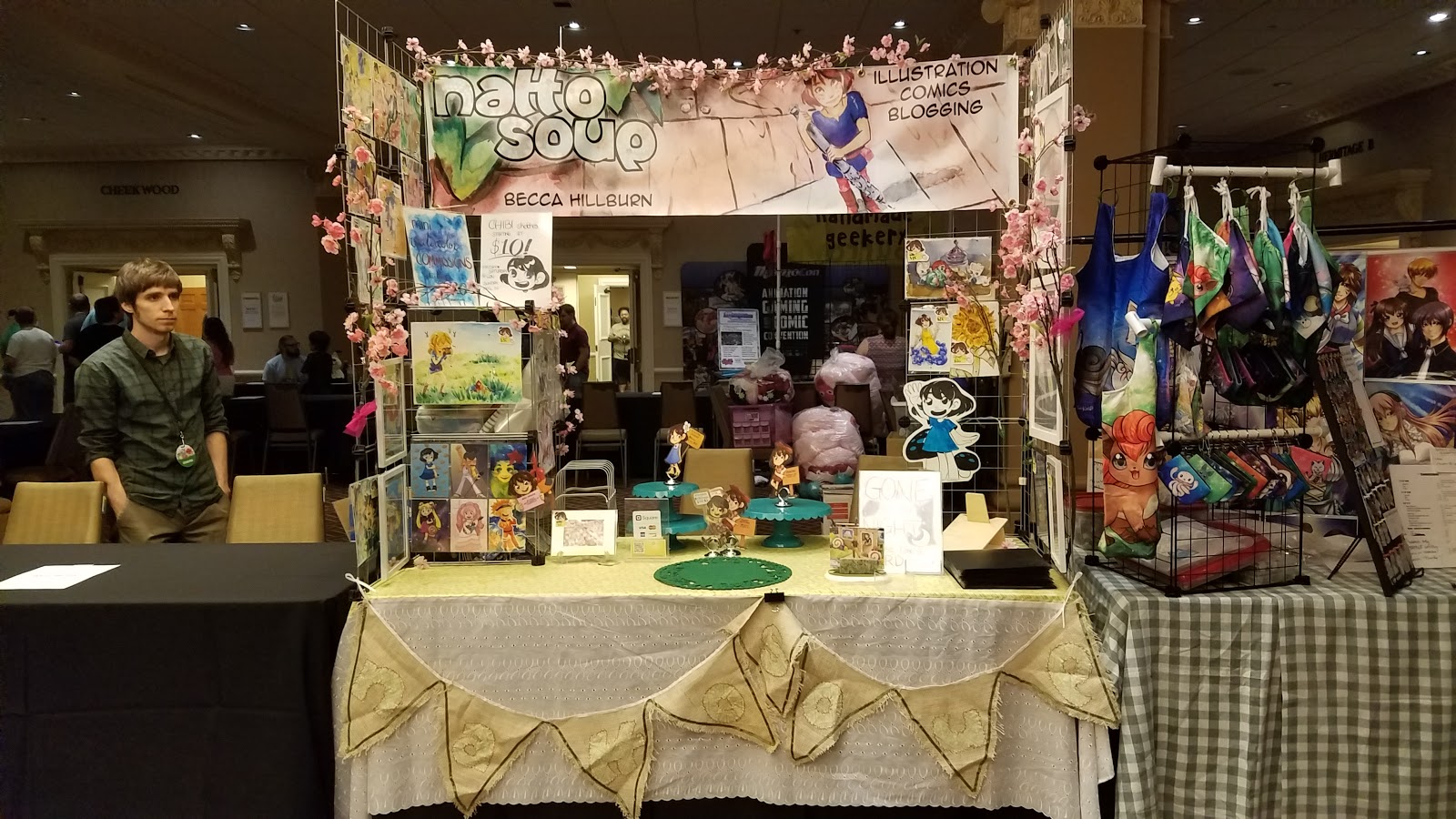
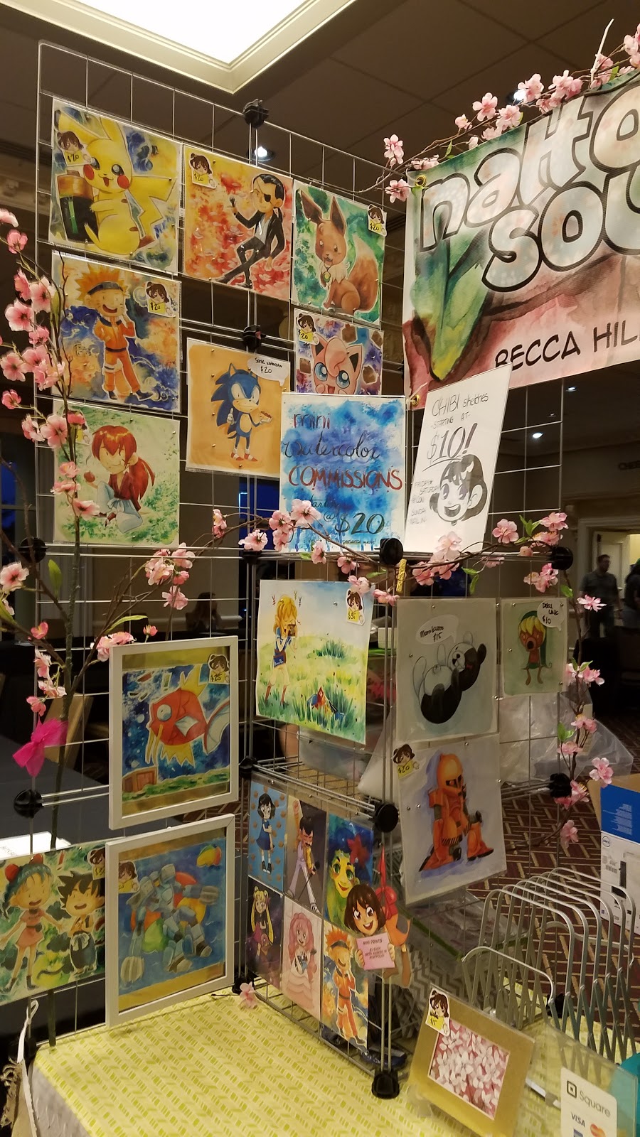
Examples of My Current Display:
Craft fair:


Anime con:


More on tabling in the Artist Alley:
Artist Alley 101:
For questions not answered here, please visit How to be a Con Artist and read our archives. If you can't find what you're looking for after searching, please send us an ask.
This post was made possible due to the generosity of my Patrons on Patreon. For more convention-content, please join my community of artnerds.
Please consider donating to this blog or purchasing from Natto-shop (http://nattosoup.com/shop) if you want me to continue publishing quality content. All materials tested were purchased from my own pocket. Keep on Truckin' Nattosoup is not under any sponsorship.

May 4, 2017
Guest Post: Alakotila and Printing in Grayscale
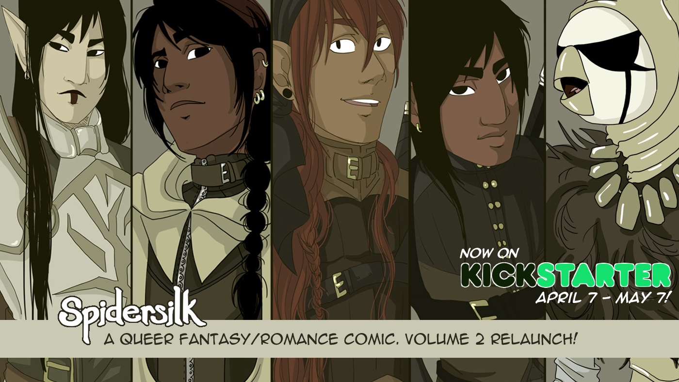
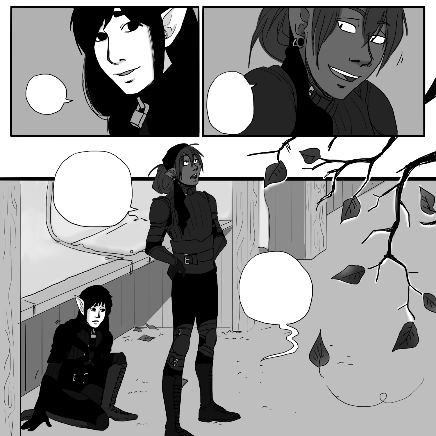
Hi everyone! I’m Alakotila, an illustrator and writer telling stories across a few mediums, including comics, games, and books. Right now my long-form fantasy webcomic, Spidersilk, is Kickstarting for volume 2. Volume 1 was successful last year, and a limited run is still available here, or you can order Volume 1 and 2 together through Kickstarter. I began Spidersilk in 2011, and there are 20 chapters online- about a third of Spidersilk!A Bit About SpidersilkSpidersilk is a fantasy webcomic about an ex-soldier who joins the thieves guild (the Orb Weavers, masquerading as a weaving hall) in a desperate attempt to belong. It’s about finding home, making friends, and accepting yourself. Spidersilk is surprisingly funny and light hearted, while still tackling serious issues.
"Spidersilk is about finding home. Loss, love, isolation, healing, and friendship were things I wanted to explore in this queer fantasy romance."Spidersilk follows the adventures of Prentice, an out of work ex-soldier (a warrior mage, no less) among thieves- completely out of his element. He'd joined out of desperation, seeking some place to belong. And while he has his strengths, they go largely unnoticed for a time, leaving him feeling frustrated and useless. In volume 2, missions fail, someone breaches the thieves code, and the early signs of an outside force chipping away at their network appear. The thieves may not have appreciated Prentice's talents at first, but they may find themselves relying on his skills after all, and soon.
Even in this chaos, Prentice believes he's found a place among the Orb Weavers. He has found friends, and perhaps more.Spidersilk takes place in a world that is post gender identity, where all forms of sexual orientation and identity are considered valid. While Spidersilk was planned before I moved overseas, I didn't launch it until I was living in Japan. The culture shock and isolation aspects became a lot stronger than planned; however, as I eased into my situation, it seemed that Prentice did as well and his level of comfort and security increased.
Finding the Right Printer and Printing in GrayscaleWhat I’m going to talk about today is my experience with not only printing a grayscale comic, but printing in general for the first time. I get compliments from other artists about the grays in Spidersilk, and it was something I wanted to protect in printing. I stumbled around a bit with that, and I’m here to share what I learned.
Spidersilk volume 2 is ready for print — that is, if the Kickstarter fulfills! I'm going to share my experiences printing a grayscale comic, but printing in general for the first time. I get compliments from other artists about the grays in Spidersilk, and it was something I wanted to protect in printing. I stumbled around a bit with that, and I’m here to share what I learned.

I asked for printer recommendations on twitter though #ComicBookHour and #WebComicChat last year, and two names came up consistently: RA Comics Direct and Print Ninja. Print Ninja has a minimum run of 250, so that was already out of the question. I went with RA Comics because of their phenomenal customer service. Once I ordered my book, they worked with me every step of the way as we battled an infuriating grayscale issue; they understood how important the grays were to me, but we two proof copies in things were looking bleak.
I edit in Clip StudioPaint (CSP) because of, yes, its incredible word balloon tool. I know create comic pages completely with CSP, but this was not the case then. Thing is, when I was opening those PSD files into CSP it was converting to RGB automatically. When I took it back into Photoshop to do the final edits and text, it still saved as an RGB PSD. I suppose I figured since I hadn’t actually changed the colors, this wouldn’t matter in printing. Nope.
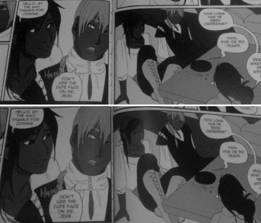
It mattered. I apologize for the graininess of this picture, but my only working camera is my webcam and I wanted to show you just how significant my RGB vs Grayscale copies were. The print quality in volume 1 is much nicer than what is pictured here!
As you can see in that image, characters melted into the background, and the background details were often lost. There were only about six discernible values of gray, and anything too dark became black. Finally, we realized I had to save my PSD files as grayscale before placing them into InDesign; even with the grayscale conversion of the final PDF on their end, something about those initial RGB PSD files was throwing the whole process off. So while I did have to convert every PSD one by one to grayscale, at least I didn’t have to sort through layers and layers of messy grays, since I really had no concept of printing when I began this comic. All 176 pages went through this.
After we figured out that grayscale problem, my next proof was sent. I approved it and had my comics in days. That’s another thing about RA Comics Direct — they are very, very fast. They also have a wide selection of paper quality and binding, and also offer neat things like lunch boxes, posters, and banners. However, printing small runs with them is pricey.
So now I am left with the decision of continuing to print with RA Comics, since I can’t guarantee the comics will look the same if printed elsewhere, or wind up printing the rest of the series (hopefully) with a new printer. For an indie webcomic artist trying to print their comic, if you’re spending as much money as I was per book with RA Comics, it’s more of a vanity project than anything. It was time to find someone who could offer a better rate. Another printer came to mind when I began looking up printers this time around: Keness. I didn’t know anyone last year who had printed with them so this took a bit of google-image searching to dig up who was using Keness and gauging customer satisfaction. Results were good. They responded to my initial questions on preparing for print. And a friend of mine (Love Debut, by Nika.) recently got her comics in from Keness, and they look great!
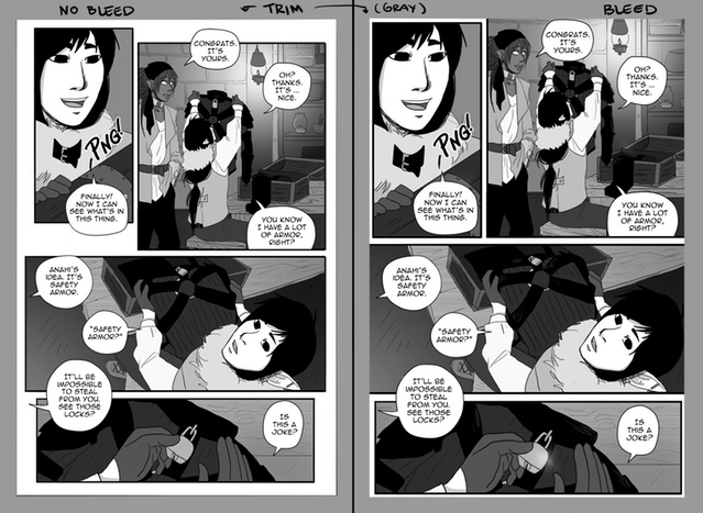
On the image above, the left side is prepping for Keness; the right side is prepping for RA Comics Direct. If you can, not only determine your comic size early, but who you are printing with. Even the trim was different between these two printers. Doing away with the full bleed was not necessary, but I feel it will make the process easier with Keness.
Keness also prints in CMYK, which means I need to learn a new pre-press print method that includes “backing blacks,” which is information I got from “Let’s Print A Comic” PDF from Iron Circus Comics. (I recommend getting it before you decide to make a comic for print!) My next step is to have grayscale Spidersilk pages converted to CMYK and see how the looks. Otherwise, I will be going with RA Comics again to preserve those grays.
In closing, don’t be afraid to shop around for printers! What suits you may not suit someone else, but it is always a good idea to get recommendations from artists you trust, especially if they’ve had to deal with the same issues (tones, grayscale, spot color, etc).I promise I'll check in again once Volume 2 has been printed by Keness, and let you know how it stacks up against RA.

And please check out Spidersilk volume 2 if you’d like to support queer indie comics, fun fantasy comics, and webcomics in general! Spidersilk is available on the Spidersilk site (part of the Ink Drop Cafe community!) tapastic, and webtoons.

The Rewards
It wouldn't be a Kickstarter if there weren't some bonus goodies in the mix! Rewards include a digital wallpaper for fans of the comic who just want to show support, digital downloads of Volume 1 and 2, physical copies of the book, and incredibly cute acrylic charms.

LINKS
RA Comics DirectKeness
Iron Circus Comics
Spidersilk Volume 2Kickstarter
You can find me on twitter, tumblr, and Facebook as Alakotila.
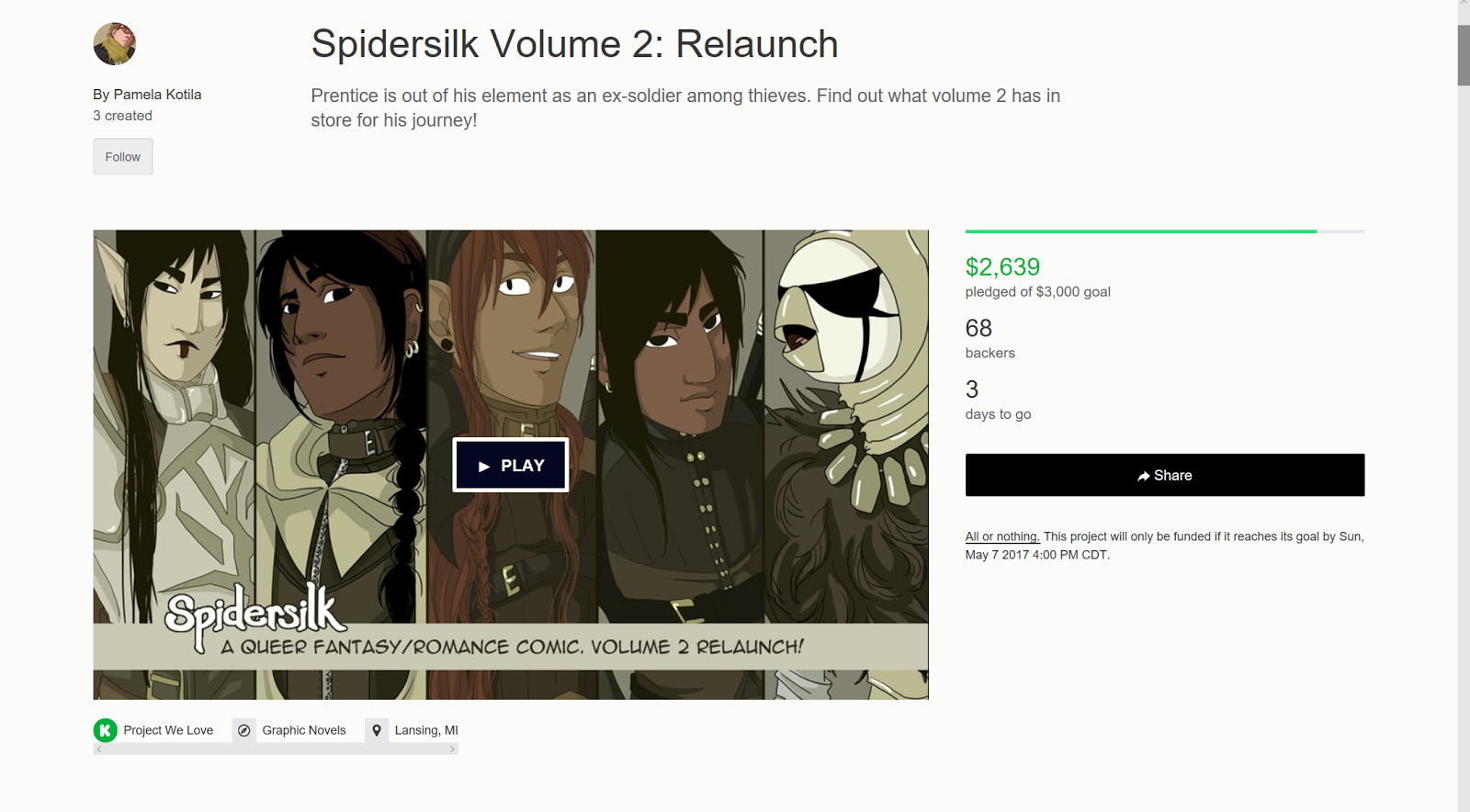 With only 2 days left, and a little over $300 left to go, help Spidersilk Volume 2 see print by checking out Alakotila's Kickstarter. Whether your're an old fan and just want to pick up Volume 2, or a new fan and want to grab both volumes, Spidersilk is definitely checking out! When I realized Alakotila was offering a commission tier, I had to up my pledge! I can't wait to see how cute Kara looks in armor!
 More On Spidersilk:The Slashpile- ReviewThe Slashpile- (older) Review
Please consider donating to this blog or purchasing from Natto-shop (http://nattosoup.com/shop) if you want me to continue publishing quality content. All materials tested were purchased from my own pocket. Keep on Truckin' Nattosoup is not under any sponsorship.

May 2, 2017
How Do You Make Money as An Artist
I usually hear this question along some variation of:
You can actually make money doing this?How do YOU make money?How do I make money doing this?Hey, I can do this! How do you do this?I'm an artist too, and I did the artist alley one time, and I made no money. How're you doing so well?
First off, all of those are real questions, and all of them come off as a little rude, so if you want to ask an artist how they make ends meet, please think of a better way to bring it up. My preferred method is
"I love your art! Please let me buy your comic/a higher end commission/an original piece of art. You seem to be a competent businesswoman, please tell me how I can emulate your success"
I think this method will work with just about any artist, as it's a killer combination of flattery+sales, and we're at that show to WORK.
But hey, I get it. Mom and Dad are riding your case about making a living, and you really want to prove them wrong. You've convinced them to spring for art school, but you have no idea what the next step is. And hey, this lady at this anime con looks like she knows what she's doing- maybe she can help!
Or maybe you're a little older than that- a new mom with a couple kids, you used to draw, but now you don't. But hey, the kids are starting school, and you have some free time, so maybe you can pick that art thing up again, and make a little money on the side. It's easy, right?
Or maybe you have this KILLER realistic style, and all your friends just love your art, and you're ready to make a little money from it. You totally draw better than this gal at the table here, so if she can do it, you can do it, and better! Except...how?
I get the hubris, I really do. We've all felt it. We HAVE to feel it, to pursue something as crazy as the arts, especially the illustrative arts in this current cultural climate. It seems like no one gets what we do, let alone value what we do, and you really need to believe in yourself just to take the plunge. And you're going to need to maintain that self confidence, somehow, over the years, or you'll belly up. And art is a game of waiting and outlasting.
Let me assure you, that while I feel like I have no idea what I'm doing, when it comes to conventions, I do know a bit. I do co-run How to be a Con Artist, after all, and I do have a Masters Degree in Sequential Art. I've led dozens of panels, and have been writing how-tos for years. So that should mean I know something about something, right?
So how do I make money?
So while I'm not making money hand over fist, and while I am VERY dependent on your patronage as a customer and your generosity as a backer, I do ok for myself, especially at conventions. I hold my own. And here's a breakdown of how I earn my keep:
Freelance: At one point in time, I made a fair shake of my income doing freelance work for Doodle Studio. I really enjoyed the work, and always looked forward to more, but unfortunately, that seems to have dried up a bit. After Doodle Studio, I illustrated a book for a writer (Gizmo Grandma: A Twisty Tale), and now that that's finished, I'm on the hunt again.
If you want to take freelance work, you're going to need a portfolio. I have two specifically for my kidlit work:
Traditional media:
Digital media:
If you happen to be reading this, and know anyone looking for an artist, please send them my info!
You're also going to have to take every single opportunity that comes up to send out your portfolio, as it's a highly competitive field, and you're going to see a lot of non-response before you even get a rejection.
I've found many of the opportunities I've applied to on Twitter, just by being an engaged part of the Twitter comics community.
Commissions: While I do not promote commissions online (literally every. single. other. artist offers online commissions, usually when they need to make rent, or the cat ate a stapler), I do offer them, and occasionally I get the chance to fill them. More commonly I sell commissions at conventions, which you can read about further below.
Ad revenue: Youtube, Google AdSense. These only work if your audience is willing to turn off their adblockers or sit through 30 seconds of ads. And that only works if you're willing to do it first.
Youtube has changed just about everything from recommended videos to how ad revenue is distributed in the past year, and my Youtube ad revenue has gone from $40 a month to $14 a month since November, despite my audience growing. A lot of larger creators are talking about greatly changing how they produce content or are considering leaving Youtube all together, so this is absolutely not a get-rich-quick option, and not one I'd recommend unless you're willing to dedicate significant time to it.
Ad revenue, regardless of source, revolves around having something to monetize. Vlog, blog, tutorials, channel, comic- those are all digital assets you can monetize. This blog has Google Ad-sense ads as well as Amazon Affiliate bounties (like ads), and I make pennies per month from ad revenue via Google Adsense.
Amazon Affiliates: While I do not do art supply reviews for financial return, this blog has zero sponsorship, unlike 90% of the fountain pen and crafting blogs out there. In order to keep a roof over my head, and see some return on my investment, I use Amazon Affiliate links whenever possible. These links earn me a few pennies on every purchase, and cost the consumer nothing additional, so you'd think it'd be win win. You can sign up for your own Amazon Affiliates/Associates account so long as you're in good tax standing with the IRS, but it may not be worthwhile if you're not constantly recommending or reviewing products.
Conventions: Although I have a table full of goodies, from ready to go original art to adorable mini fanarts, to copies of 7" Kara Volume 1 and the minis d'anni, I make the majority of my money at conventions filling commissions. While I'd prefer that the majority of those be higher end, take home commissions, it seems I am forever doomed to spend conventions with my head down and my shoulders hunched, filling at-con commissions. I'm a fast worker, so this is feasible, but it becomes much less so when customers hem and haw over what they want to purchase, or when non-customers take up excessive amounts of my time asking questions about how to be an artist.
I have a wonderful partner who serves as my assistant at most cons, and my mom fills in as my assistant at Louisiana shows, and this enables me to juggle being a saleswoman and a commission artist at the same time.
At this time, conventions make up the bulk of my income, and while I do offer fanart options, the majority of my focus is on original, affordable art. If you'd like to learn more about offering commissions at conventions, please check out this post.
You can also get an idea for how I handle conventions by watching the
MTAC Con Recap
Cherry Blossom Festival Recap
APE recap
Online: I offer almost every product I sell at conventions online through my shop or through my Gumroad. You can order stickers, buttons, sassy buttons, mini prints, commissions, and more through my shop- but that requires a lot of promotion. I constantly plug my shop here on the blog and on my YouTube, and I am almost always open for commissions, so if you enjoy my art, please do take a look. Unfortunately, this is the smallest piece of my income pie, and is extremely high maintenance.
Patreon: My Patreon supports my work here on this blog, my work on YouTube, and my work with How to be a Con Artist, and most of the funds collected from Patreon go right back into buying art supplies to review. Patronage begins at just $2 a month, and is collected monthly, rather than per update, as I'd probably bankrupt my Patrons with updates as it is. Of course, this only works well when those who benefit from my content (like you, possibly, right now) decide to make the leap to supporting this content. Like Youtube, Patreon may seem like an appealing way to make money, but it is deceptively difficult and requires a lot of good will and generosity on the part of your audience.
If you're interested in launching your own Patreon, keep an eye on this blog, as I have a post in the works that you'll enjoy!
Comic Anthologies:
Paid anthology opportunities:
Chainmail Bikini ($500 for 6 inkwashed pages)
1001 Knights (payment forthcoming, no pagerate has been released to artists as of yet)
Comic anthologies are a hot business on Kickstarter. Ever week, there's a new zine or anthology requesting your money and support. Such projects promise big dreams to their participants- exposure, opportunities, future comic work, everlasting friendships- none of which have come to fruition in my comic career. I try to do one anthology per year- I'm in it for the money.
Some pay, some do not. Some do not disclose non payment (like Ladies Night) until after work has been submitted. For Ladies Night, not only did they not pay me for my work, but I had to purchase my own copies- so basically I had to pay THEM. I would really like to see them revisit their system, because I also did not see any exposure from working with them either.
7" Kara: You would think the project I love the most, the project I spend the most time on, the reason I write the blog, record the YouTube, and help with How to be a Con Artist, would be the project that helps pay the bills, but nope. Not in the least. I do sell copies of 7" Kara Volume 1 at conventions and online, and have recently launched it as a webcomic, but the comic site isn't monetized (and won't be, for the foreseeable future), and Volume 1 costs me $9 to print through CreateSpace, and I sell it for $15+ a free Kara charm, so it's still very much a vanity project.
I do sell a few copies per con, although I think we've reached our zenith for Volume 1, and sales will probably peter out until Volume 2 is released. I hope then I'll see a resurgence in sales.
Like oh so many comic creators, I never saw the support I'd hoped to see for my work, despite years of effort, but loyal few fans, don't give up- I definitely plan on finishing the project. Just don't definitely plan on me getting rich (or even earning a sustainable income) from it.
As you can see, I have a lot of hustles going on just to scrape by. Here's an average monthly breakdown, during con season:
Convention: $500-1000 profit, depending on the type of show assuming anime)
Youtube: $15
Adsense: $2
Amazon Affiliates: $10
Patreon: $80-$100 (although for every $100 earned, I see about $70)
Total: $572- $1097 per month
As you can see, this is not a lucrative career. Illustrative art, comics, are both aspirational careers when you don't have a company backing you. Your customers are mainly other artists, other comic people- people who understand the labor. The hopefuls rarely spend money on you, they either don't have it, or assume you aren't worth it. Those are just the flat out facts, at least in my career.
I do have friends who do more than one convention a month, who sell different sorts of merchandise- geeky jewelry, prints, that have higher profit margins and can charge more for their work. There are other ways to skin this cat, but they all require work and sacrifice. There is no get rich quick scheme, no easy way up.
If you found this post helpful, useful, inspiring, or even just informative, you can help ensure that I continue creating content like this by joining my Patreon community. I am incredibly reliant on the generosity of my readers to continue work on resources like this blog and How to be a Con Artist, and I cannot continue without their support.
Please consider donating to this blog or purchasing from Natto-shop (http://nattosoup.com/shop) if you want me to continue publishing quality content. All materials tested were purchased from my own pocket. Keep on Truckin' Nattosoup is not under any sponsorship.
April 29, 2017
Ink Drop Cafe Launch
What is Ink Drop Café
Ink Drop Café was founded in 2017 by a collective of comic artists creating stories that promote the autonomy, aptitude and ingenuity of all sorts of characters. Our primary focus at this time is on character-driven comics that are appealing to women and general audiences.
Ink Drop Café officially launches today, April 29, 2017.
Ink Drop Cafe Goals
Ink Drop Café hopes to promote all members through a central site and through banner exchanges across member sites. We hope to utilize our unique resources and skills to promote one another and improve the comic community, as well as foster an environment where member comics can thrive. In the upcoming year, members hope to secure shared tables at indie conventions, sellbooks, and make new friends and contacts.
Our MembersOur members have years of experience as professional artists, illustrators, comic creators, writers, editors, reviewers, and self-publishers.
Some of us have been published through Sparkler Monthly, Chainmail Bikini, and 1001 Knights. Others have helped manage #WebComicChat, How to Be A Con Artist, and StArt Faire.
We are involved in our community and love to see it grow bigger and better. Ink Drop Café aims to provide access to our insight and allow others to contribute their own to help build a better future in the comics community.
 Becca Hillburn (Nattosoup) is a powerhouse of comics and art education. You can check out her all-ages comic, 7" Kara, or enjoy her art-education resources at the Nattosoup Art & Process Blog, How To Be a Con Artist, and on Youtube. You can also check out her online portfolio.Patreon: patreon.com/Nattosoup • Twitter: @Nattosoup • Instagram: @Nattosoup
 Cali is a tiny artist that mostly does art as a hobby, and is the creator of Chronicles of Fenaur (and two other comics; Psychteria and Hunter of Fenaur). She's a big anime fan and likes trying to bring her characters to life.
Patreon: patreon.com/CalimonGraal • Website: fenauriverse.moe Draco Plato is a full time artist and comic creator with a BA in Visual Effects and Motion Graphics, who is also the founder of StArt Faire and KhyatiX. They have a passion for webcomics and the webcomic community and hope to see the community continue to grow in years to come.Patreon: patreon.com/KhyatiX • Website: khyatix.com • Twitter: @KhyatiX
 Hame is a full time UI/UX Designer, an illustrator and draws the webcomic Somewhere in the Rain on her (scarce) free time. She has a thing for watercolours illustrations and randomly sharing art resources through Twitter or Discord.Twitter: @leilacmg • Instagram: @leila.gon • Tumblr: @encased
 KaiJu is a two-headed monster with a passion for creating worlds rather than destroying them.They were first published in Sparkler Monthly in April of 2014 with their debut work "The Ring of Saturn." Their next work "Mahou Josei Chimaka," won a DINKy award in March of 2016."Inhabitant of Another Planet," a prequel to Novae and all the previously listed stories can be found on Sparkler.Gumroad: gumroad.com/nebulaepress • Tumblr: @kaixju • Twitter: @KAIxJU
 Leanna C is an illustrator, comic artist, fan artist, and designer living in southern California. She loves to find, support, and share artists, resources, and opportunities for creators of all kinds. She is also quite fond of cats, coffee, and comics. You can find her work at:Patreon: patreon.com/frenchpressplease • Tumblr: @frenchpressplease • Store: squareup.com/store/frenchpressplease
Alakotila is a storyteller making games, books, and comics. Their current focus is the fantasy webcomic "Spidersilk," though more stories may be found here. They are the colorist with Ododon Games Company. They often teach, usually art and ESL, as well as edit. Probably wearing armor. Or maybe sweatpants.
Patreon: patreon.com/alakotila • Twitter: @Alakotila • Portfolio: alakotila.com
 Michelle is a Los Angeles-based story artist who creates the cyberpunk mystery comic Centralia 2050. She loves video games, crafting, and animals, and is in an endless fashion struggle between wearing pastels+flowers or all black+skulls.Patreon: patreon.com/michelledraws • Tumblr: @michelledrawsstuff • Twitter: @michelledrawz • Instagram: @michellestanfordart
 Respheal is a system administrator, gamer, and creator of the webcomic Galebound. She laments not being able to put more in this section.Patreon: patreon.com/respheal • Twitter: @galebound • Tumblr: @respheal
 Sam (kabocha) is an illustrator and computer tinkerer. She creates the webcomic Linked and runs the resource website Shooting Stars.Website: shooting-stars.org • Tumblr: @kabocha-chan
 Shoona Browning (they/she) is a cartoonist and illustrator who makes all ages comics with lgbt+ themes. Shoona makes the weekly webcomic Ellie of the Stars.Patreon: patreon.com/shoona • Website: shoonabee.com • Twitter: @megaloshoon
Our AffiliatesPaper Cat Press
StArt Faire Comic Magazine Nattosoup Studio Art and Process Blog
Ink Drop Café Does Not
Request ad revenue from membersForce members to participate in Ink Drop Café community events Require members to pay a membership feeRequire members to have print booksRequire members to represent Ink Drop Café at conventions
How to Join Ink Drop Café
Ink Drop Café membership is currently invitation only, although we hope to open up applications later this year. If this collective sounds like the right place for your work, and you would like to be added to the list for consideration, please bookmark our page or follow our tumblr for updates and submission information. You are also invited to join us on our forum to chat about comics, comic craft, and fandom.
New applications are voted on by existing Ink Drop Café members at this time, based on the rules listed above, as well as time of last update, how active you are online and in comic communities, and how well you maintain an update schedule.
Please consider donating to this blog or purchasing from Natto-shop (http://nattosoup.com/shop) if you want me to continue publishing quality content. All materials tested were purchased from my own pocket. Keep on Truckin' Nattosoup is not under any sponsorship.
Ink Drop Café was founded in 2017 by a collective of comic artists creating stories that promote the autonomy, aptitude and ingenuity of all sorts of characters. Our primary focus at this time is on character-driven comics that are appealing to women and general audiences.
Ink Drop Café officially launches today, April 29, 2017.
Ink Drop Cafe Goals
Ink Drop Café hopes to promote all members through a central site and through banner exchanges across member sites. We hope to utilize our unique resources and skills to promote one another and improve the comic community, as well as foster an environment where member comics can thrive. In the upcoming year, members hope to secure shared tables at indie conventions, sellbooks, and make new friends and contacts.
Our MembersOur members have years of experience as professional artists, illustrators, comic creators, writers, editors, reviewers, and self-publishers.
Some of us have been published through Sparkler Monthly, Chainmail Bikini, and 1001 Knights. Others have helped manage #WebComicChat, How to Be A Con Artist, and StArt Faire.
We are involved in our community and love to see it grow bigger and better. Ink Drop Café aims to provide access to our insight and allow others to contribute their own to help build a better future in the comics community.
Becca Hillburn (Nattosoup) is a powerhouse of comics and art education. You can check out her all-ages comic, 7" Kara, or enjoy her art-education resources at the Nattosoup Art & Process Blog, How To Be a Con Artist, and on Youtube. You can also check out her online portfolio.Patreon: patreon.com/Nattosoup • Twitter: @Nattosoup • Instagram: @Nattosoup
 Cali is a tiny artist that mostly does art as a hobby, and is the creator of Chronicles of Fenaur (and two other comics; Psychteria and Hunter of Fenaur). She's a big anime fan and likes trying to bring her characters to life.
Patreon: patreon.com/CalimonGraal • Website: fenauriverse.moe
Draco Plato is a full time artist and comic creator with a BA in Visual Effects and Motion Graphics, who is also the founder of StArt Faire and KhyatiX. They have a passion for webcomics and the webcomic community and hope to see the community continue to grow in years to come.Patreon: patreon.com/KhyatiX • Website: khyatix.com • Twitter: @KhyatiXHame is a full time UI/UX Designer, an illustrator and draws the webcomic Somewhere in the Rain on her (scarce) free time. She has a thing for watercolours illustrations and randomly sharing art resources through Twitter or Discord.Twitter: @leilacmg • Instagram: @leila.gon • Tumblr: @encasedKaiJu is a two-headed monster with a passion for creating worlds rather than destroying them.They were first published in Sparkler Monthly in April of 2014 with their debut work "The Ring of Saturn." Their next work "Mahou Josei Chimaka," won a DINKy award in March of 2016."Inhabitant of Another Planet," a prequel to Novae and all the previously listed stories can be found on Sparkler.Gumroad: gumroad.com/nebulaepress • Tumblr: @kaixju • Twitter: @KAIxJULeanna C is an illustrator, comic artist, fan artist, and designer living in southern California. She loves to find, support, and share artists, resources, and opportunities for creators of all kinds. She is also quite fond of cats, coffee, and comics. You can find her work at:Patreon: patreon.com/frenchpressplease • Tumblr: @frenchpressplease • Store: squareup.com/store/frenchpressplease
Alakotila is a storyteller making games, books, and comics. Their current focus is the fantasy webcomic "Spidersilk," though more stories may be found here. They are the colorist with Ododon Games Company. They often teach, usually art and ESL, as well as edit. Probably wearing armor. Or maybe sweatpants.
Patreon: patreon.com/alakotila • Twitter: @Alakotila • Portfolio: alakotila.com
Michelle is a Los Angeles-based story artist who creates the cyberpunk mystery comic Centralia 2050. She loves video games, crafting, and animals, and is in an endless fashion struggle between wearing pastels+flowers or all black+skulls.Patreon: patreon.com/michelledraws • Tumblr: @michelledrawsstuff • Twitter: @michelledrawz • Instagram: @michellestanfordartRespheal is a system administrator, gamer, and creator of the webcomic Galebound. She laments not being able to put more in this section.Patreon: patreon.com/respheal • Twitter: @galebound • Tumblr: @resphealSam (kabocha) is an illustrator and computer tinkerer. She creates the webcomic Linked and runs the resource website Shooting Stars.Website: shooting-stars.org • Tumblr: @kabocha-chanShoona Browning (they/she) is a cartoonist and illustrator who makes all ages comics with lgbt+ themes. Shoona makes the weekly webcomic Ellie of the Stars.Patreon: patreon.com/shoona • Website: shoonabee.com • Twitter: @megaloshoonOur AffiliatesPaper Cat Press
StArt Faire Comic Magazine Nattosoup Studio Art and Process Blog
Ink Drop Café Does Not
Request ad revenue from membersForce members to participate in Ink Drop Café community events Require members to pay a membership feeRequire members to have print booksRequire members to represent Ink Drop Café at conventions
How to Join Ink Drop Café
Ink Drop Café membership is currently invitation only, although we hope to open up applications later this year. If this collective sounds like the right place for your work, and you would like to be added to the list for consideration, please bookmark our page or follow our tumblr for updates and submission information. You are also invited to join us on our forum to chat about comics, comic craft, and fandom.
New applications are voted on by existing Ink Drop Café members at this time, based on the rules listed above, as well as time of last update, how active you are online and in comic communities, and how well you maintain an update schedule.
Please consider donating to this blog or purchasing from Natto-shop (http://nattosoup.com/shop) if you want me to continue publishing quality content. All materials tested were purchased from my own pocket. Keep on Truckin' Nattosoup is not under any sponsorship.
April 28, 2017
Dos and Don'ts, Ins and Outs of Filling Convention Commissions
Over the years, I've completed thousands of convention commissions. I'm quick, consistent, and have a few distinct styles that I work with for conventions. While I do offer more detailed commission options, by far my convention styles are the most popular options.
As a co-curator for How to be a Con Artist, I'm always pushing original content. Comics, mini comics, sketchbooks, commissions- the field is flooded with fanart prints, and if you want to be able to compete (sales wise) you need to offer something distinct. While I'm possibly gutting my own bottom line by helping you guys out, I hope you'll remember me fondly with cash at some point in the future, say at MTAC or APE.
Convention commissions sound fairly easy on paper. Get money, draw thing, repeat. But there's a lot beneath the surface that you need to take into account before you start accepting those commissions, lest you ruin the market so carefully built by artists before you.
Although I've written about conventions significantly over the years, my output on convention tutorials has just about dried up on this blog. If you'd like to see that change, join my Patreon community and help support future content.
What are Convention Commissions:
Convention commissions are commissions filled at, or directly after, a convention. Commissions are usually paid for upfront to cover time and materials cost, as these are designed to be fairly inexpensive commissions that are quick to complete.
Although convention commissions are generally completed in traditional media, there are some digital artists who also fill convention commissions.
Before you offer commissions, you'll need to figure out:
What Types Do I Offer:
For me that's:
Pencil (at con)
Ink (at con)
Copic+Ink (at con, new)
Watercolor- Basic (at home)
Watercolor-Detailed (at home)
Marker (at home)
 Pencil (at con)
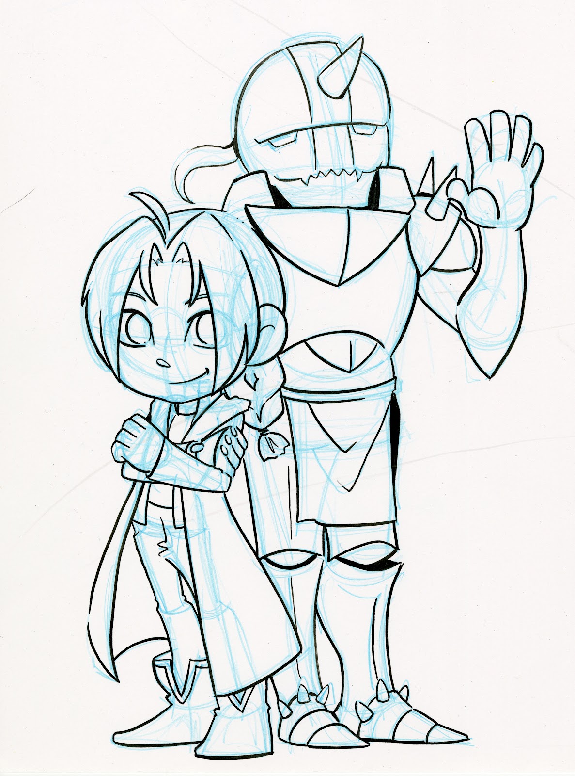 Ink (at con)
 Copic+Ink (at con, new)
 Watercolor- Basic (at home)
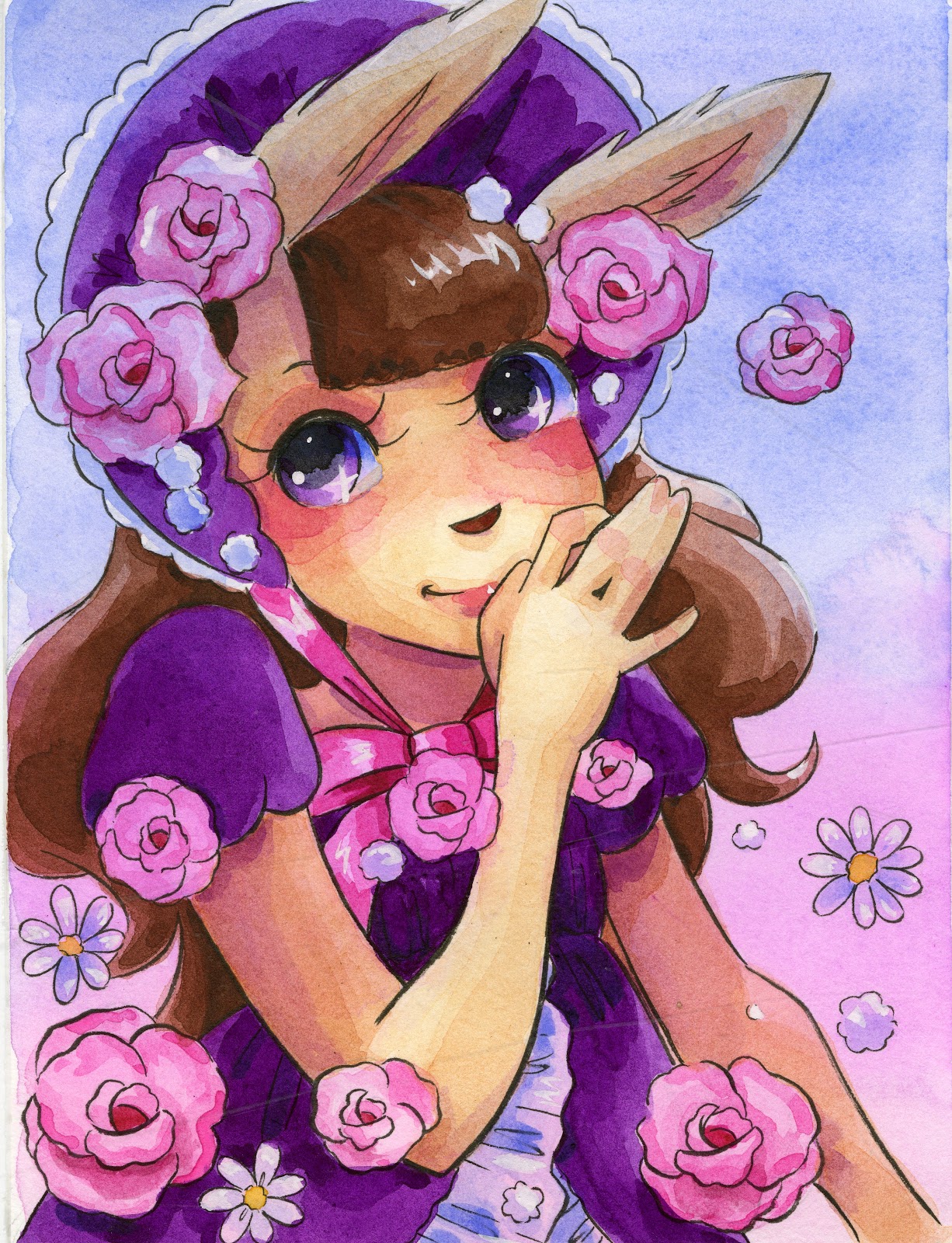 Watercolor-Detailed (at home)
What Styles Do I Offer:
For me, that's:
Very simple, cartoony (pencil, ink, w/c)
Very anime inspired, cartoony (pencil, ink, w/c, marker)
Anime inspired, comic (pencil, ink, w/c, marker)
Realistic (watercolor only)
Why do I offer commissions?
For me, the reason is:
I want everyone to be able to own original art that speaks to them, and I want people to stop buying prints from places like Walmart, Kirklands, Michaels, ect to fill their homes. I realize that most people feel they cannot afford original art, so I try to offer something at every price level, to train a new generation of people to love owning and commissioning original art. This means my prices are much lower than average, which also means I take a LOT of heat from my artistic peers, and it means that I have to work much harder to make the same amount of money. I would not recommend my methods to everyone.
Why do I price what I Price?
My prices:
Detailed Chibi, pencil- $10 each
Detailed chibi, inked- $15
Mini watercolors- price generally varies by size- always generate a custom quote
Detailed watercolors- price varies by complexity, size- always generate a custom quote
Copics- price varies by detail, size- always generate a custom quote
For me, the reason is:
Despite accusations, I am not trying to wreck the art market.
I enjoy creating art, I create a lot of art quickly, and so I often have an excess of pieces created from studying or learning new techniques. Rather than sell these as prints and having these pieces rot in storage, I price them so that they can go home and live a life on someone's wall, as a treasured original piece of art.
While I do offer more expensive commissions in realistic art styles, the main focus for customers is on my inexpensive, easily filled commissions, so that tends to get the most attention.
In the end, you need to find a pricing structure that is sustainable for you, your creation materials and methods, and your desires.
What Materials To Use:
As a SCAD kid, I am infinitely comfortable with non photo blue lead, graphite, and ink.
As an internet artist, I have developed styles with alcohol markers, watercolor, and for digital art.
So I work with what I'm comfortable with, and as I develop new styles and abilities, I test run those on my Youtube channel before offering them as commissions.
My materials:
Non photo blue lead (Color Eno Soft Blue)
Mechanical Pencils
Soft Graphite (B)
Kuretake Fudegokochi
Pentel Pocket Brush
Colored leads (color eno)
Select alcohol markers (Blick Studio Brush markers and Copic, usually)
Sakura Koi watercolor set
Fluid watercolor paper
Winsor and Newton, Daniel Smith, SoHo, Holbien watercolors
Canson Montval, Arches, Fluid 100 watercolor papers
When trying to decide if commissions are right for you, consider the following:
Do I draw well in high pressure situations?Can I draw with people watching?Do I enjoy drawing for other people?Do I enjoy other people's characters and backstories?Can I draw in one style consistently?Do I have the energy to fill commissions for the duration of the show?Can I draw using physical media, or find a way to fill commissions at the show using the media I'm most comfortable with?Can I handle filling commissions and sales at the same time?Can I draw quickly enough for this to be worthwhile?
When first offering commissions, it's wise to offer commissions you can fill at the show, to help build up trust. Once you've established that trust, you can start offering mail in, and more expensive options.
Do's:
Know your strengths, and market to thatDo your research ahead of timePromote your servicesPurchase commissions from other artists- it's good con karma!Practice commission types ahead of timeHave examples prominently displayedHave your materials prepared ahead of timeBe flexible
Don'ts:
Don't accept at-con commissions that you know you are incapable of filling to the customer's satisfaction.Don't steal another convention artist's style for your commissions. Word gets around.Don't deliver sub par-commissionsDon't work until you're wrecked - it's better to wait until you are fresh than to deliver a poorly done commission.Don't insult another artist's work to make a saleOverpromise and under deliverDefault on a transaction without delivery or refund
If you enjoy my art, and would like some of your own, you can always commission me at home too! All options shown above are also available online- email me for a quote.
Please consider donating to this blog or purchasing from Natto-shop (http://nattosoup.com/shop) if you want me to continue publishing quality content. All materials tested were purchased from my own pocket. Keep on Truckin' Nattosoup is not under any sponsorship.

April 26, 2017
Fountain Pens for Artists: Platinum Preppy
Last week, we were all about those Noodler's fountain pens (the Flex, the Ahab, and the Konrad- I have yet to acquire a Neponset- any generous donors?), this week, we're taking a look at Platinum's more affordable fountain pens.
Platinum is a Japanese stationary company who manufacture fountain pens, inks, mechanical pencils, fude pens, multipens, and ballpoint pens. Although Platinum is huge in Japan, it's fairly unknown in the West, and while I've done due diligence with fude pens on this blog, I have reviewed few Platinum products.
Today, we're looking at the Preppy, a super affordable, customizable fountain pen that I believe every artist should carry in their pencil case or everyday carry.
Preppy:
On Amazon- $4.45 individually, around $17.00 for a set of 8
On Goulet Pens- $3.95
On Anderson Pens- $3.95
Materials:
Plastic
Fixed width steel nib
Feed:
Enclosed Plastic
Sizes available:
EF
F (.3mm)
M (.5mm)
Cartridge based, can take a converter, can be converted to eyedropper fill for HUGE ink capacity
The Preppy is Platinum's most affordable fountain pen option. It features a fixed width steel nib (think technical pen sizes), comes with a cartridge of ink that matches the color of the pen, can take Platinum converters, and can be converted with a little silicone grease into an eyedropper pen. The entire body of the pen is plastic, and while I've read complaints of cracking issues, I've yet to experience any myself.

Since I'm currently working my way through waterproof, pigmented, and sometimes destructive inks, the Preppy is an ideal choice. It's a full size pen, the ink flows smoothly with no interruptions, and I have had zero issues with any of my Preppys. A close comparison would be the JetPens Chibi, which I will review at a later date, but I must say, the Preppy wins hands down compared to the Chibi. If you're on the fence about fountain pens, give the Preppy a shot.
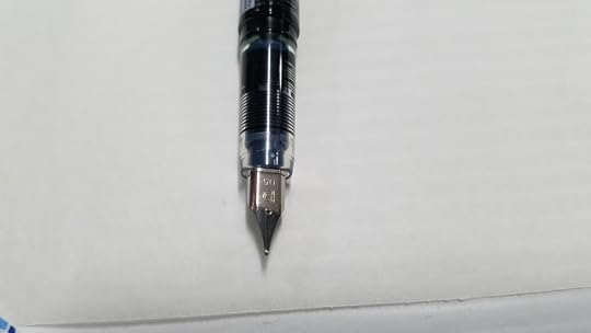
The nib has zero give to it, which might bother those who have gotten used to semi flex nibs like the Noodler's nibs, but if you treat this pen like a refillable tech pen, you won't be disappointed.
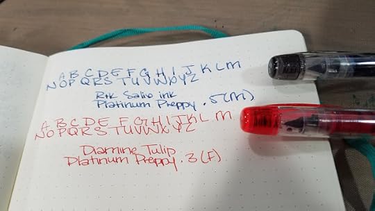
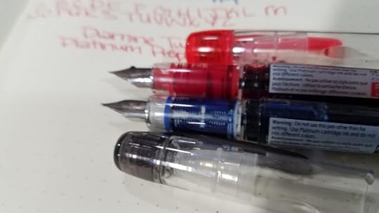
Both F and M lay down a consistent lineweight with no flex or variation. All Preppys I have encountered have juicy inkflow, and can keep up with quick sketching or with more robust inks.
Pros:
Very inexpensive
Can be converted to eyedropper
Great starter pen
Fixed lineweight
Available in EF, F (.3), and M (.5)- sizes tech pen owners are familiar with
Steady inkflow
Easy to maintain
Once converted to eyedropper:
Can hold a huge amount of ink
Holds ink of your choice, including iron gall inks
Cons:
Fixed lineweight
No flex
Surfaces the Preppy Can Easily Write On:
Cellulose based watercolor papers such as Maruman, Holbein, and Fluid
Tracing paper
Sketchbook paper such as Blick Studio and Strathmore
Japanese notebook papers


The Verdict:
The Preppy is a great all around starter pen- so inexpensive, it requires no maintenance. Once finished, you can toss it, or you can practice your fountain pen maintenance skills by cleaning it out. Eyedropper converted Preppys in a size M are my favorite, and are used as a test for dangerous and corrosive inks like Iron Gall. If it doesn't kill the Preppy, it may be safe for my other pens.
Preppys are great for more than sacrificial pens. Fill them with Platinum Carbon Black for waterproof (once fully dry) sketches on the go, fill them with your favorite inks for color coordinated notes and planners, send one filled with your favorite color as an ink sample to a friend.
More on the Preppy
Best Fountain Pen
Office Supply Geek
A Better Desk
Iron Ion
Leadfast
Get Your Own
Please consider donating to this blog or purchasing from Natto-shop (http://nattosoup.com/shop) if you want me to continue publishing quality content. All materials tested were purchased from my own pocket. Keep on Truckin' Nattosoup is not under any sponsorship.
Platinum is a Japanese stationary company who manufacture fountain pens, inks, mechanical pencils, fude pens, multipens, and ballpoint pens. Although Platinum is huge in Japan, it's fairly unknown in the West, and while I've done due diligence with fude pens on this blog, I have reviewed few Platinum products.
Today, we're looking at the Preppy, a super affordable, customizable fountain pen that I believe every artist should carry in their pencil case or everyday carry.
Preppy:
On Amazon- $4.45 individually, around $17.00 for a set of 8
On Goulet Pens- $3.95
On Anderson Pens- $3.95
Materials:
Plastic
Fixed width steel nib
Feed:
Enclosed Plastic
Sizes available:
EF
F (.3mm)
M (.5mm)
Cartridge based, can take a converter, can be converted to eyedropper fill for HUGE ink capacity

The Preppy is Platinum's most affordable fountain pen option. It features a fixed width steel nib (think technical pen sizes), comes with a cartridge of ink that matches the color of the pen, can take Platinum converters, and can be converted with a little silicone grease into an eyedropper pen. The entire body of the pen is plastic, and while I've read complaints of cracking issues, I've yet to experience any myself.
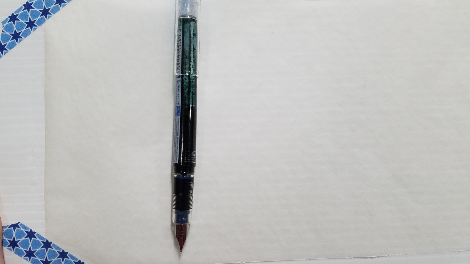
Since I'm currently working my way through waterproof, pigmented, and sometimes destructive inks, the Preppy is an ideal choice. It's a full size pen, the ink flows smoothly with no interruptions, and I have had zero issues with any of my Preppys. A close comparison would be the JetPens Chibi, which I will review at a later date, but I must say, the Preppy wins hands down compared to the Chibi. If you're on the fence about fountain pens, give the Preppy a shot.

The nib has zero give to it, which might bother those who have gotten used to semi flex nibs like the Noodler's nibs, but if you treat this pen like a refillable tech pen, you won't be disappointed.
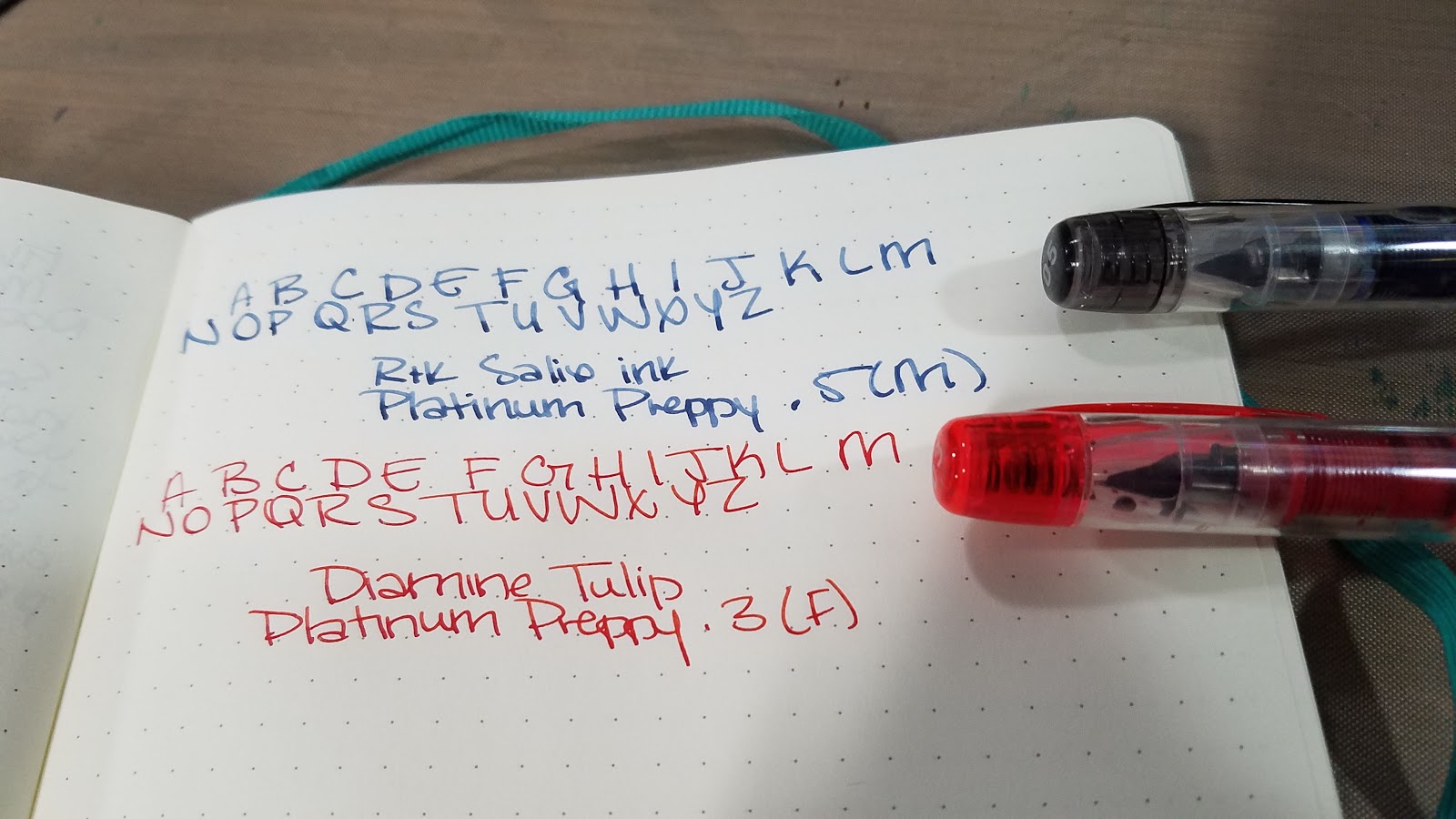
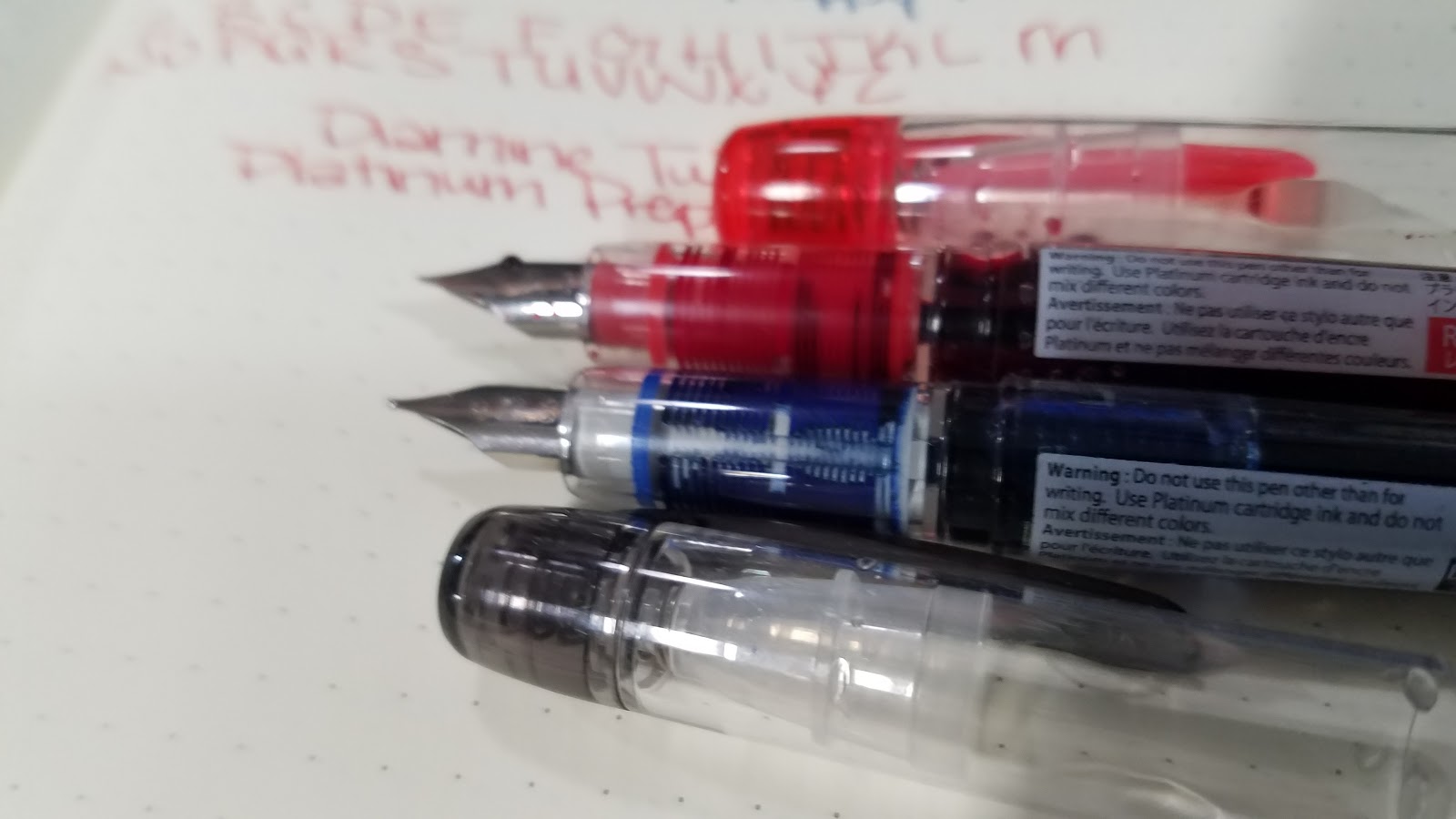
Both F and M lay down a consistent lineweight with no flex or variation. All Preppys I have encountered have juicy inkflow, and can keep up with quick sketching or with more robust inks.
Pros:
Very inexpensive
Can be converted to eyedropper
Great starter pen
Fixed lineweight
Available in EF, F (.3), and M (.5)- sizes tech pen owners are familiar with
Steady inkflow
Easy to maintain
Once converted to eyedropper:
Can hold a huge amount of ink
Holds ink of your choice, including iron gall inks
Cons:
Fixed lineweight
No flex
Surfaces the Preppy Can Easily Write On:
Cellulose based watercolor papers such as Maruman, Holbein, and Fluid
Tracing paper
Sketchbook paper such as Blick Studio and Strathmore
Japanese notebook papers
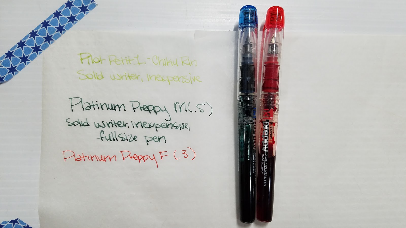
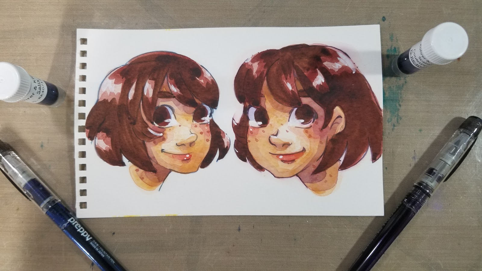
The Verdict:
The Preppy is a great all around starter pen- so inexpensive, it requires no maintenance. Once finished, you can toss it, or you can practice your fountain pen maintenance skills by cleaning it out. Eyedropper converted Preppys in a size M are my favorite, and are used as a test for dangerous and corrosive inks like Iron Gall. If it doesn't kill the Preppy, it may be safe for my other pens.
Preppys are great for more than sacrificial pens. Fill them with Platinum Carbon Black for waterproof (once fully dry) sketches on the go, fill them with your favorite inks for color coordinated notes and planners, send one filled with your favorite color as an ink sample to a friend.
More on the Preppy
Best Fountain Pen
Office Supply Geek
A Better Desk
Iron Ion
Leadfast
Get Your Own
Please consider donating to this blog or purchasing from Natto-shop (http://nattosoup.com/shop) if you want me to continue publishing quality content. All materials tested were purchased from my own pocket. Keep on Truckin' Nattosoup is not under any sponsorship.


