
Becca Hillburn's Blog, page 18
March 22, 2018
Intro To Comic Craft- Planning and Workload
Knowing your comic creation pace and what type of schedule you can reasonably keep is an important part of comic planning. Whether a webcomc or a print comic, a mini comic, anthology entry, or longform story, knowing your pace and how you can maintain it and your sanity are key to the regular production of comics.
I don't have any perfect solutions for your comic- planning comes from experience, and if you want to gain experience quickly, I recommending making lots of mini comics, trying out differnt styles, finishes, and processes. But I can share my own planning timeline, tips, tricks, and tools that have helped me plan and plot, and tricks other creators use to help keep the schedule rolling.

This post was made possible thanks to the generosity of my wonderful Artnerds on Patreon! Patreon is a site that allows you to support the creators whose work you love, all for little more than $1 per month. Patreon funds go to paying for art supplies to review, paying amazing guest creators to create posts for this blog, and paying for equipment upgrades.
Finding Your Groove:
 Red is for Youtube. Blue is for Blog. And Green means I worked on comics that day.
I learned how to judge my pace based on mini comics, anthology submissions, and maintaining this blog and my channel. Working on mini comics for various anthologies, with various needs has given me the experience necessary to judge for a variety of projects. A watercolor comic (uninked) needs a different timeline than a digitally coloreed comic, and working with a writer requires a different schedule than winging it alog.
The trick isn't just to figure out how fast you can work when the pressure's on, but also to know how fast you can sustainably work, and what workload is reasonable for you. This varies for everyone, and only experience and practice will help you find the pace that's right for you.
My comic schedule:
Watercolor Comic:
Script- Approx 3 days
Thumbnails- 3 clean, final thumbnails per day, for duration of chapter
Roughs- 1 clean, finished rough per day, for duration of chapter
Pencils/Inks- 1 Page per day, for duration of chapter
Pencils for watercolors- 2 pages per day, for duration of chapter
Watercolor- 4 pages every 6 days, for duration of chapter
Scanning- 1 day
Color correction- 1 day
Digital corrections and lettering- varies depending on length of chapter
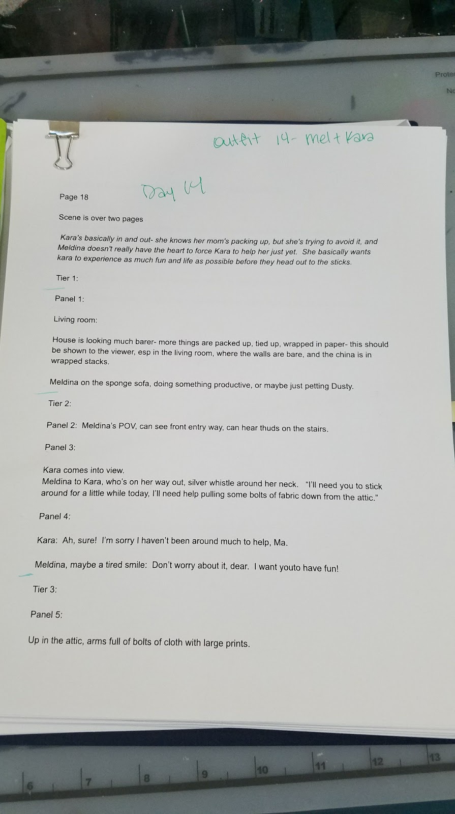
 Finished tight script, printed with notes
 Chapter 8 folder and outfit/layout sketchbook
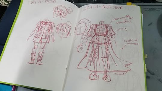 Outfit designs for Chapter 8
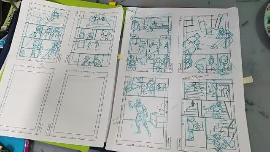 Tight thumbnails on template
Inks (black and white):
Watercolor Comic:
Script- Approx 3 days
Thumbnails- 3 clean, final thumbnails per day, for duration of chapter
Roughs- 1 clean, finished rough per day, for duration of chapter
Pencils/Inks- 1 Page per day, for duration of chapter
I try to arrange it so I'm inking the previous day's pencils in the morning, when I'm fresh, and doing pencils for the next day in the evening, with accuracy is less important
Scanning- 1 day
Color Correction- 1 day
Corrections and Lettering- Varies depending on Length of Chapter
Planning Tools:
Month view calendar
Colored Gel Pens or Highlighters to Color Coordinate
Carey Pietsch's Deadline Planner Calculator (save as a copy to edit and use for yourself)
Lists
Knock Knock Themed Pads
Diary
File Folders
File Organizer
Post Its
Tabs and flags
Paperclips
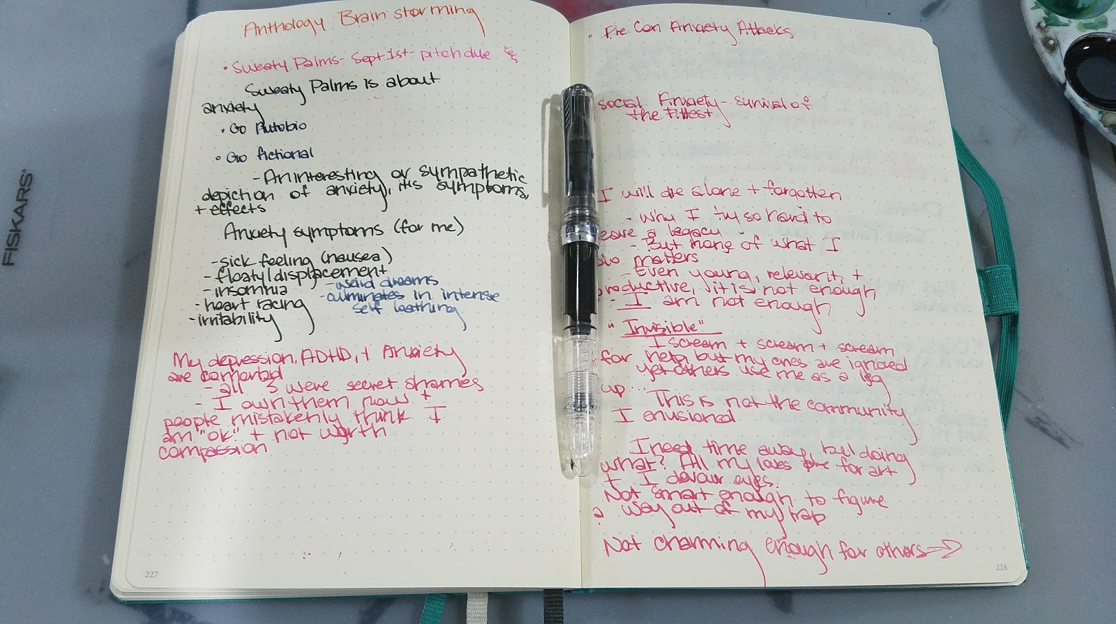
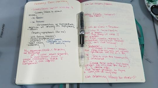 Diary with brainstorming notes for old pitch
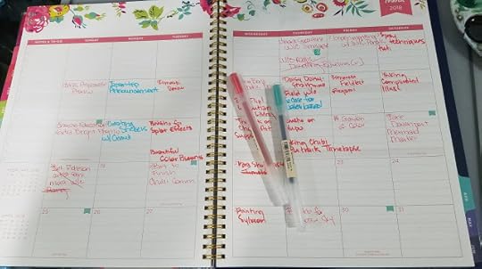 Month view planner
 Outdated to-do list for weekend
 Current to-do list for Japantrip prep
Intro to Comic Craft: Planning Cicada Summer:
Let's Make a Comic: Concept to Scripting to Thumbnails to Roughs:
What's worked for me:
Working well in advanceBuilding up a bufferScheduling content using a color coded calendarPacing my updates so my buffer is sustainable while i work on other projectsKeeping logs of how long each type of project takes, so I can better predict my timeframeBlocking out my timeframe using a calendar (useful for Cicada Summer)Forcing myself to do short projects with quick turnarounds (but please, don't do this too frequently with longform projects, you'll burn out)Filler is sometimes a necessary part of a long term project, so learn how to recycle contentCollaborating with other creators can give you additional content
What about When It Backfires:
Art Soundoff: Time Management
Dealing with Burnout
What if you give it your all, every single day, 10 hours a day, 7 days a week? Well, you will end up with a whole lot of comic. But you may also end up with a nasty case of burnout.
Burnout is something I frequently struggle with- I juggle so many things it's easy to take on just a little too much and have no motivation left the next day.
Preventing Burnout:
Be kind with how much work you assign yourself each dayTake breaks when you feel overwhelmed, stressed out, or demotivatedFind ways to treat yourselfPlan one day a week to do something fun, so you have a goal to work towardsDon't push yourself too hard once you're tiredFind, and respect, your stopping point
Leave fuel in the tank for other days. It might seem like you've got endless energy now, but save some of that for your later years. This is a marathon, not a sprint.
Once You Have Burnout:
Take a day offLeave the house- go for a walk, the mall, or the parkPlay video gamesCall a friendDraw something not related to the project you're working on (if you HAVE to draw)Read a book or comic you enjoyClean up your desk or workspaceClean up your workroom
Where to get started when you have no spoons to give
And you have to get work done by a deadline
Set a timer for fifteen minutes. Force yourself to sit down and work for that 15. If you still feel miserable, you can quit after that, but you HAVE to work for that 15 minutes. Usually you'll get pulled into th task.Make a list of everything, even minute details, that need to be handled. Select the easiest task. Do it. Continue working on easy tasks until you've hit a groove.Work on something related that you're excited aboutFeeling discouraged? Ask a friend who supports your project to give you three reasons why they like your work. This usually puts a little fuel in the tank.
ADHD and Comic Art- Time Management
Recently I've started a series- My Life with ADHD, that focuses on the effect ADHD has on my career as a comic artist and illustrator. It is with this in mind that you should read this post- these are things that work for me, and your mileage may vary. Feel free to adjust to suit your specific needs.
My Life with ADHD- A Not So Brief History:
My Life with ADHD- Challenges
My Life with ADHD- Scheduling
For me, what works best is:
Work in batch, and complete batch before moving on.
Script:
Script comes from an overarching 7" Kara synopsis as a plotform paragraph
Fleshed out into a script that includes shot direction, character acting, and expressions, because I need to capture the moment while I have it fresh in my mind- I can't count on remembering it
Script is typed and created in Google docs, because it's free, auto saves, and I can easily share it with beta readers who can easily comment. Once script is corrected, I print it out, one comic page per sheet of paper, and bind it together with a paperclip.
Thumbnails:
Print out thumbnail templates, enough so that I can draw every comic page and then also do revisions.
On the script, do layouts for the comic page, as many revisions as necessary until it feels 'right. Draw the tight thumbnail on the template, this is the 'final' version (until revisions)
Scan entire chapter when done, send to beta readers using Google Drive
Print out or transcribe comments, go through and self critique
Working thumbnail to thumbnail, break up into individual 'pages', save in new folder (usually like Resized Thumbnails). Resize thumbnails to 9"x6"
Working thumbnail to thumbnail, go through comments and make changes.
Convert to Grayscale, bump up contrast, convert to bluelines, save in new folder (Blueline Roughs)
Roughs:
Print entire chapter in batch, bind with paperclip.
Draw in panel borders on every page
I find perspective to be incredibly tedious, so I've found that if I have trouble starting on roughs, it's best if I go through and draw all the fun panels. This means I'm never really starting a page fresh- there's always some work done on it, and psychologically this is easier than starting a new page every day. It's good to have thumbnails and notes handy for changes that aren't apparent in the printouts.
When entire chapter is finished, scan, saving in a new folder (Roughs or Roughs Scan)
Send chapter to beta readers
Self critique, and take notes
Work through the chapter and make necessary corrections digitally. Save in new folder (Corrected Roughs)
Bluelines:
Convert to Grayscale, bump up contrast, convert to bluelines, resize to fit 11"x14" Canson Montval save in new folder (Bluelines)
Print entire chapter
Pencil entire chapter, two pages at a time
Paint in batches- 2-6 pages at a time
I still do perspective by hand, but many friends say using the Manga Studio tools, or creating a background in Sketchup is easiest for them, so I recommend you do whatever method works for you, and experiment with new methods when doing mini comics or anthology comics.
Recently for the 7" Kara Q&A Bonus Pages, I've been experimenting with method. Since these are easy pages, I do my thumbnailing and roughs digitally.
Method:
Create template pages ahead of time.
Select template you need to suit the page.
Letter page first (since it fits a specific format)
Sketch in around the lettering- loose thumbnails
Move lettering around as necessary to suit page
Tighten up
Convert to black and white, bump up contrast, convert to bluelines
Print on 9"x12" 300 series Bristol (smaller and cheaper than I normally do)
Pencil
Ink
Corrections
Scan
Convert to black and white, boost contrast
Drag lettering from original PSD, convert to black and white
Grayscale
Save as JPG
Release Online
For this system, I work on a page by page basis- how I assume most of my webcomic friends work. To be frank, I hate this method- its more difficult for me to predict how long the entire project will take. Working in batch allows me to set a strict schedule, and I still have some flexibility to introduce new pages.
Further Tips for Working Traditionally:
Always have extra printer ink handy and stored closebyAlways have extra cheap copy paper handy (buy it by the box and store)Always have extra Comic paper handy- I buy multiple pads at a time, and restock after I've printed my bluelines, not when I'm starting the next chapter.For ink comics, I make sure I always have fude pens, bottles of the preferred ink, gentle erasersFor watercolor comics, I make sure I'm starting the chapter with refilled or new pans, and make sure I have tubes to refill.Always a lot buffer time in production to allow for illness or other unplanned circumstancesWhen creating a traditional media webcomic work WELL in advance- a HUGE buffer (one year in advance) is best if you want regular updates. If you don't mind whether or not you update on a set schedule, work at your own pace.
Additional Resources:
Intro to Comic Craft: Step by Step: Brainstorming and Character Development
Please consider donating to this blog or purchasing from Natto-shop (http://nattosoup.com/shop) if you want me to continue publishing quality content. All materials tested were purchased from my own pocket. Keep on Truckin' Nattosoup is not under any sponsorship.
I don't have any perfect solutions for your comic- planning comes from experience, and if you want to gain experience quickly, I recommending making lots of mini comics, trying out differnt styles, finishes, and processes. But I can share my own planning timeline, tips, tricks, and tools that have helped me plan and plot, and tricks other creators use to help keep the schedule rolling.

This post was made possible thanks to the generosity of my wonderful Artnerds on Patreon! Patreon is a site that allows you to support the creators whose work you love, all for little more than $1 per month. Patreon funds go to paying for art supplies to review, paying amazing guest creators to create posts for this blog, and paying for equipment upgrades.
Finding Your Groove:
 Red is for Youtube. Blue is for Blog. And Green means I worked on comics that day.
I learned how to judge my pace based on mini comics, anthology submissions, and maintaining this blog and my channel. Working on mini comics for various anthologies, with various needs has given me the experience necessary to judge for a variety of projects. A watercolor comic (uninked) needs a different timeline than a digitally coloreed comic, and working with a writer requires a different schedule than winging it alog.
The trick isn't just to figure out how fast you can work when the pressure's on, but also to know how fast you can sustainably work, and what workload is reasonable for you. This varies for everyone, and only experience and practice will help you find the pace that's right for you.
My comic schedule:
Watercolor Comic:
Script- Approx 3 days
Thumbnails- 3 clean, final thumbnails per day, for duration of chapter
Roughs- 1 clean, finished rough per day, for duration of chapter
Pencils/Inks- 1 Page per day, for duration of chapter
Pencils for watercolors- 2 pages per day, for duration of chapter
Watercolor- 4 pages every 6 days, for duration of chapter
Scanning- 1 day
Color correction- 1 day
Digital corrections and lettering- varies depending on length of chapter
 Finished tight script, printed with notes
 Chapter 8 folder and outfit/layout sketchbook
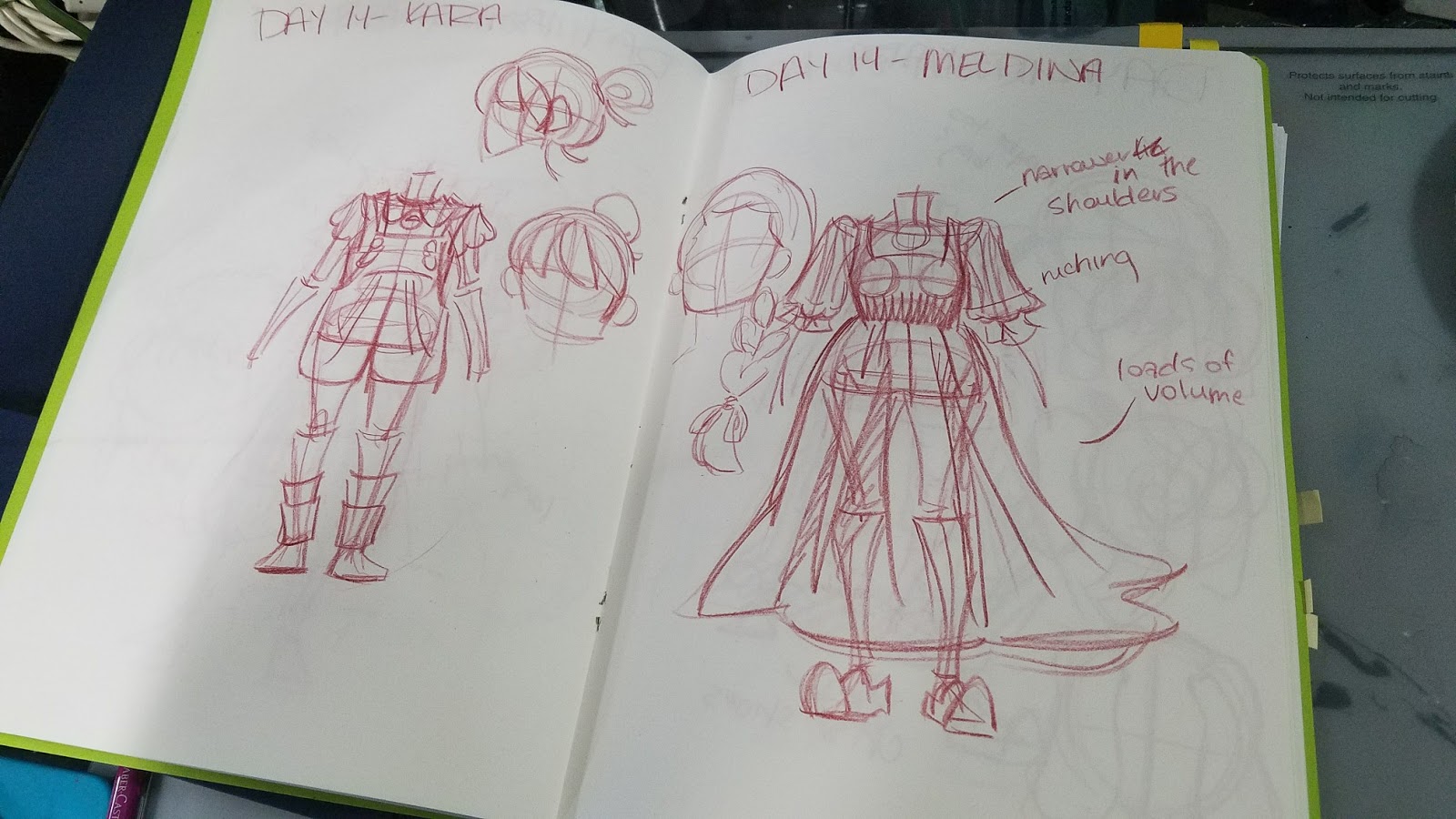 Outfit designs for Chapter 8
 Tight thumbnails on template
Inks (black and white):
Watercolor Comic:
Script- Approx 3 days
Thumbnails- 3 clean, final thumbnails per day, for duration of chapter
Roughs- 1 clean, finished rough per day, for duration of chapter
Pencils/Inks- 1 Page per day, for duration of chapter
I try to arrange it so I'm inking the previous day's pencils in the morning, when I'm fresh, and doing pencils for the next day in the evening, with accuracy is less important
Scanning- 1 day
Color Correction- 1 day
Corrections and Lettering- Varies depending on Length of Chapter
Planning Tools:
Month view calendar
Colored Gel Pens or Highlighters to Color Coordinate
Carey Pietsch's Deadline Planner Calculator (save as a copy to edit and use for yourself)
Lists
Knock Knock Themed Pads
Diary
File Folders
File Organizer
Post Its
Tabs and flags
Paperclips
 Diary with brainstorming notes for old pitch
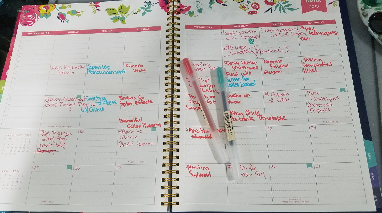 Month view planner
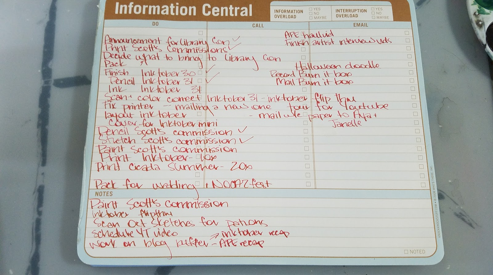 Outdated to-do list for weekend
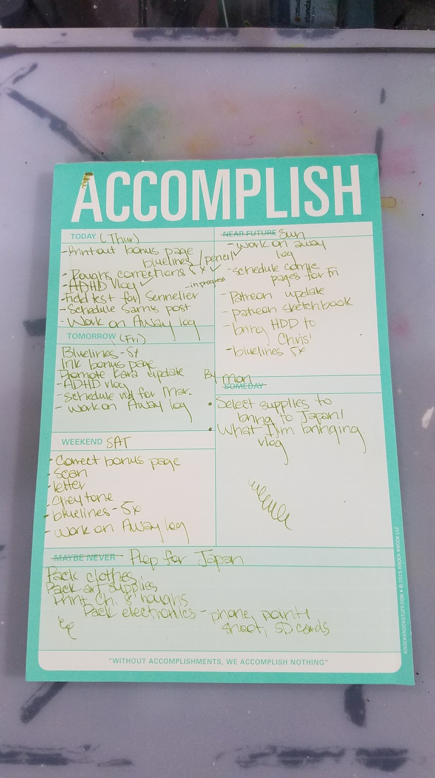 Current to-do list for Japantrip prep
Intro to Comic Craft: Planning Cicada Summer:
Let's Make a Comic: Concept to Scripting to Thumbnails to Roughs:
What's worked for me:
Working well in advanceBuilding up a bufferScheduling content using a color coded calendarPacing my updates so my buffer is sustainable while i work on other projectsKeeping logs of how long each type of project takes, so I can better predict my timeframeBlocking out my timeframe using a calendar (useful for Cicada Summer)Forcing myself to do short projects with quick turnarounds (but please, don't do this too frequently with longform projects, you'll burn out)Filler is sometimes a necessary part of a long term project, so learn how to recycle contentCollaborating with other creators can give you additional content
What about When It Backfires:
Art Soundoff: Time Management
Dealing with Burnout
What if you give it your all, every single day, 10 hours a day, 7 days a week? Well, you will end up with a whole lot of comic. But you may also end up with a nasty case of burnout.
Burnout is something I frequently struggle with- I juggle so many things it's easy to take on just a little too much and have no motivation left the next day.
Preventing Burnout:
Be kind with how much work you assign yourself each dayTake breaks when you feel overwhelmed, stressed out, or demotivatedFind ways to treat yourselfPlan one day a week to do something fun, so you have a goal to work towardsDon't push yourself too hard once you're tiredFind, and respect, your stopping point
Leave fuel in the tank for other days. It might seem like you've got endless energy now, but save some of that for your later years. This is a marathon, not a sprint.
Once You Have Burnout:
Take a day offLeave the house- go for a walk, the mall, or the parkPlay video gamesCall a friendDraw something not related to the project you're working on (if you HAVE to draw)Read a book or comic you enjoyClean up your desk or workspaceClean up your workroom
Where to get started when you have no spoons to give
And you have to get work done by a deadline
Set a timer for fifteen minutes. Force yourself to sit down and work for that 15. If you still feel miserable, you can quit after that, but you HAVE to work for that 15 minutes. Usually you'll get pulled into th task.Make a list of everything, even minute details, that need to be handled. Select the easiest task. Do it. Continue working on easy tasks until you've hit a groove.Work on something related that you're excited aboutFeeling discouraged? Ask a friend who supports your project to give you three reasons why they like your work. This usually puts a little fuel in the tank.
ADHD and Comic Art- Time Management
Recently I've started a series- My Life with ADHD, that focuses on the effect ADHD has on my career as a comic artist and illustrator. It is with this in mind that you should read this post- these are things that work for me, and your mileage may vary. Feel free to adjust to suit your specific needs.
My Life with ADHD- A Not So Brief History:
My Life with ADHD- Challenges
My Life with ADHD- Scheduling
For me, what works best is:
Work in batch, and complete batch before moving on.
Script:
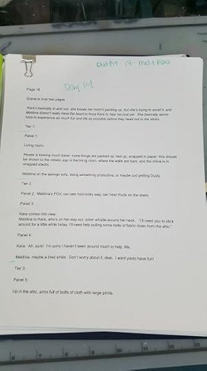
Script comes from an overarching 7" Kara synopsis as a plotform paragraph
Fleshed out into a script that includes shot direction, character acting, and expressions, because I need to capture the moment while I have it fresh in my mind- I can't count on remembering it
Script is typed and created in Google docs, because it's free, auto saves, and I can easily share it with beta readers who can easily comment. Once script is corrected, I print it out, one comic page per sheet of paper, and bind it together with a paperclip.
Thumbnails:
Print out thumbnail templates, enough so that I can draw every comic page and then also do revisions.
On the script, do layouts for the comic page, as many revisions as necessary until it feels 'right. Draw the tight thumbnail on the template, this is the 'final' version (until revisions)
Scan entire chapter when done, send to beta readers using Google Drive
Print out or transcribe comments, go through and self critique
Working thumbnail to thumbnail, break up into individual 'pages', save in new folder (usually like Resized Thumbnails). Resize thumbnails to 9"x6"
Working thumbnail to thumbnail, go through comments and make changes.
Convert to Grayscale, bump up contrast, convert to bluelines, save in new folder (Blueline Roughs)
Roughs:
Print entire chapter in batch, bind with paperclip.
Draw in panel borders on every page
I find perspective to be incredibly tedious, so I've found that if I have trouble starting on roughs, it's best if I go through and draw all the fun panels. This means I'm never really starting a page fresh- there's always some work done on it, and psychologically this is easier than starting a new page every day. It's good to have thumbnails and notes handy for changes that aren't apparent in the printouts.
When entire chapter is finished, scan, saving in a new folder (Roughs or Roughs Scan)
Send chapter to beta readers
Self critique, and take notes
Work through the chapter and make necessary corrections digitally. Save in new folder (Corrected Roughs)
Bluelines:
Convert to Grayscale, bump up contrast, convert to bluelines, resize to fit 11"x14" Canson Montval save in new folder (Bluelines)
Print entire chapter
Pencil entire chapter, two pages at a time
Paint in batches- 2-6 pages at a time
I still do perspective by hand, but many friends say using the Manga Studio tools, or creating a background in Sketchup is easiest for them, so I recommend you do whatever method works for you, and experiment with new methods when doing mini comics or anthology comics.
Recently for the 7" Kara Q&A Bonus Pages, I've been experimenting with method. Since these are easy pages, I do my thumbnailing and roughs digitally.
Method:
Create template pages ahead of time.
Select template you need to suit the page.
Letter page first (since it fits a specific format)
Sketch in around the lettering- loose thumbnails
Move lettering around as necessary to suit page
Tighten up
Convert to black and white, bump up contrast, convert to bluelines
Print on 9"x12" 300 series Bristol (smaller and cheaper than I normally do)
Pencil
Ink
Corrections
Scan
Convert to black and white, boost contrast
Drag lettering from original PSD, convert to black and white
Grayscale
Save as JPG
Release Online
For this system, I work on a page by page basis- how I assume most of my webcomic friends work. To be frank, I hate this method- its more difficult for me to predict how long the entire project will take. Working in batch allows me to set a strict schedule, and I still have some flexibility to introduce new pages.
Further Tips for Working Traditionally:
Always have extra printer ink handy and stored closebyAlways have extra cheap copy paper handy (buy it by the box and store)Always have extra Comic paper handy- I buy multiple pads at a time, and restock after I've printed my bluelines, not when I'm starting the next chapter.For ink comics, I make sure I always have fude pens, bottles of the preferred ink, gentle erasersFor watercolor comics, I make sure I'm starting the chapter with refilled or new pans, and make sure I have tubes to refill.Always a lot buffer time in production to allow for illness or other unplanned circumstancesWhen creating a traditional media webcomic work WELL in advance- a HUGE buffer (one year in advance) is best if you want regular updates. If you don't mind whether or not you update on a set schedule, work at your own pace.
Additional Resources:
Intro to Comic Craft: Step by Step: Brainstorming and Character Development
Please consider donating to this blog or purchasing from Natto-shop (http://nattosoup.com/shop) if you want me to continue publishing quality content. All materials tested were purchased from my own pocket. Keep on Truckin' Nattosoup is not under any sponsorship.


March 19, 2018
My Top 5 Alcohol Markers
My Top 5 Alcohol Markers
Over the years, I've had the opportunity to review dozens of alcohol markers. I've formed distinct tastes, and have a cadre of favorites I reach for time and again. But I've found, in the myriad of reviews I've created, my actual recommendations sometimes get lost, and sometimes change, so I thought 2018 was a great time to revisit my Top 5 Alcohol Markers!
Marker Rec Number 1: Copic Sketch Markers
Copic Sketch- Super brush, larger ink compacity, available in empty
Total Number of Colors: 214 Colors in Family
Brush Type: Foam rubber
Refillable- Yes
Replaceable Nibs- Yes
Easy to Find- Very
Where to buy:
Most art supplies stores will carry Copic markers
DickBlick
Jerry's Artarama
Michael's
Tutorials
Marker Rec Number 2: Copic Ciao Markers
Copic Ciao- Sketch's cheaper baby sister. Also refillable, replacable nibs. No empty bodies available. Color name and family not on the cap. Available in a much smaller range of colors.
Total Number of Colors: 180 Colors In Family
Brush Type- Foam Rubber
Refillable-Yes
Replaceable Nibs- Yes
Easy to Find- A bit rarer than Copic Sketch markers
Where to Buy
DickBlick
Jerry's Artarama
Amazon
Tutorials
Marker Rec Number 3: Blick Studio Brush Markers
Blick Studio Brush- Non refillable, CHEAP, available in sets or openstock, a great Copic dupe
Total Number of Colors: 97 including blender
Brush Type: Foam Rubber
Refillable: No
Replaceable Nibs: No
Easy to Find: Only available through or in DickBlick
Where to buy:
DickBlick
Review
Marker Rec Number 4: Prismacolor Markers (Brush Tip)
Prismacolor- Those Neons, true purples, blues, and bluegreens. Fills holes Copic leaves in the collection
Total Number of Colors: 200 Colors
Brush Type- Foam Rubber
Refillable- No
Replaceable Nibs- No
Easy to Find- Very
Where to buy:
Most art supply stores carry Prismacolor markers
Michaels
Dick Blick
Jerry's Artarama
Reviews
Marker Rec Number 5: ShinHan Twin Touch Markers (Brush tip)
Shin Han Twin Touch- A little harder to find than Copic, slightly cheaper, all the features of Copic markers (refillable, replacable brushes) in a different body.
Total Number of Colors- 204
Brush Type- Foam rubber
Refillable- Yes
Replaceable Nibs- Yes
Easy to Find: Not necessarily
Where To buy:
DickBlick
Jerry'sArtarama
Flax (San Francisco)
Where to buy refills: MarkerPop
Note: There are A LOT of Shinhan Twin Touch knockoffs out there- on Amazon, Ali Express, Wish, Ebay, ect.
Reviews
Honorable Mention: Crayola Blending Markers

Honorable Mention- Crayola Blending Markers- Super cheap, even sold at Walmart.
Total Number of Colors: 15 counting blender
Brush Type: Fiber
Refillable: No
Replaceable Nibs: No
Easy to Find: Increasingly so
Where to buy:
Amazon
Crayola.com
Reviews
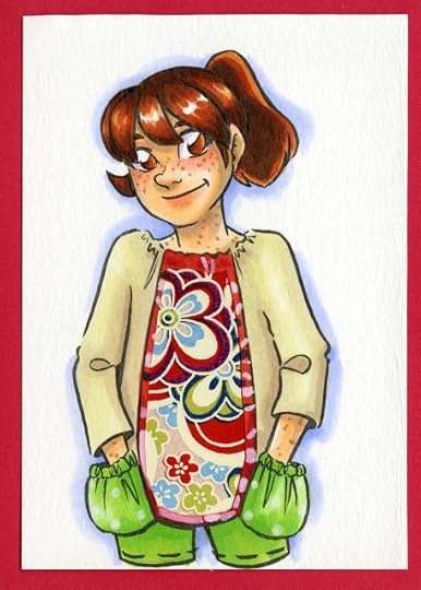
The below illustrations were completed with a variety of alcohol markers and inks.
 Copic Marker, Marvy LePlume Small Brush, Ranger Adirondack Inks, Blick Studio Brush Marker
 Copic Marker, Blick Studio Brush Markers
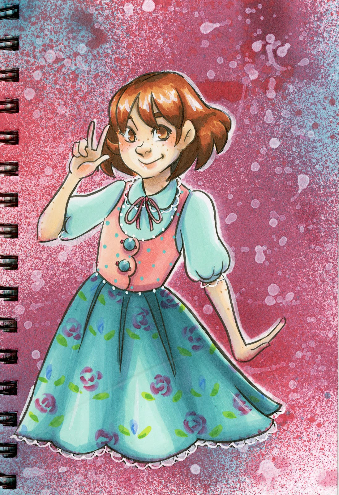
 Ranger Adirondack Inks, Copic Markers, Prismacolor Markers
 Copic markers, Prismacolor Markers, Blick Studio Brush Markers
 Prismacolor markers, Copic Markers, Blick Studio Brush Markers
 Copic markers, Shin Han Twin Touch Markers, watercolor
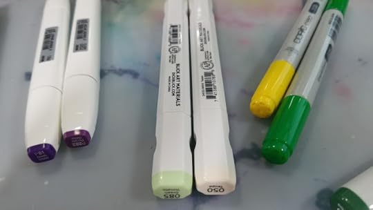
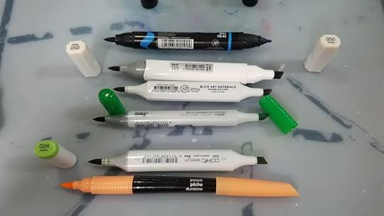
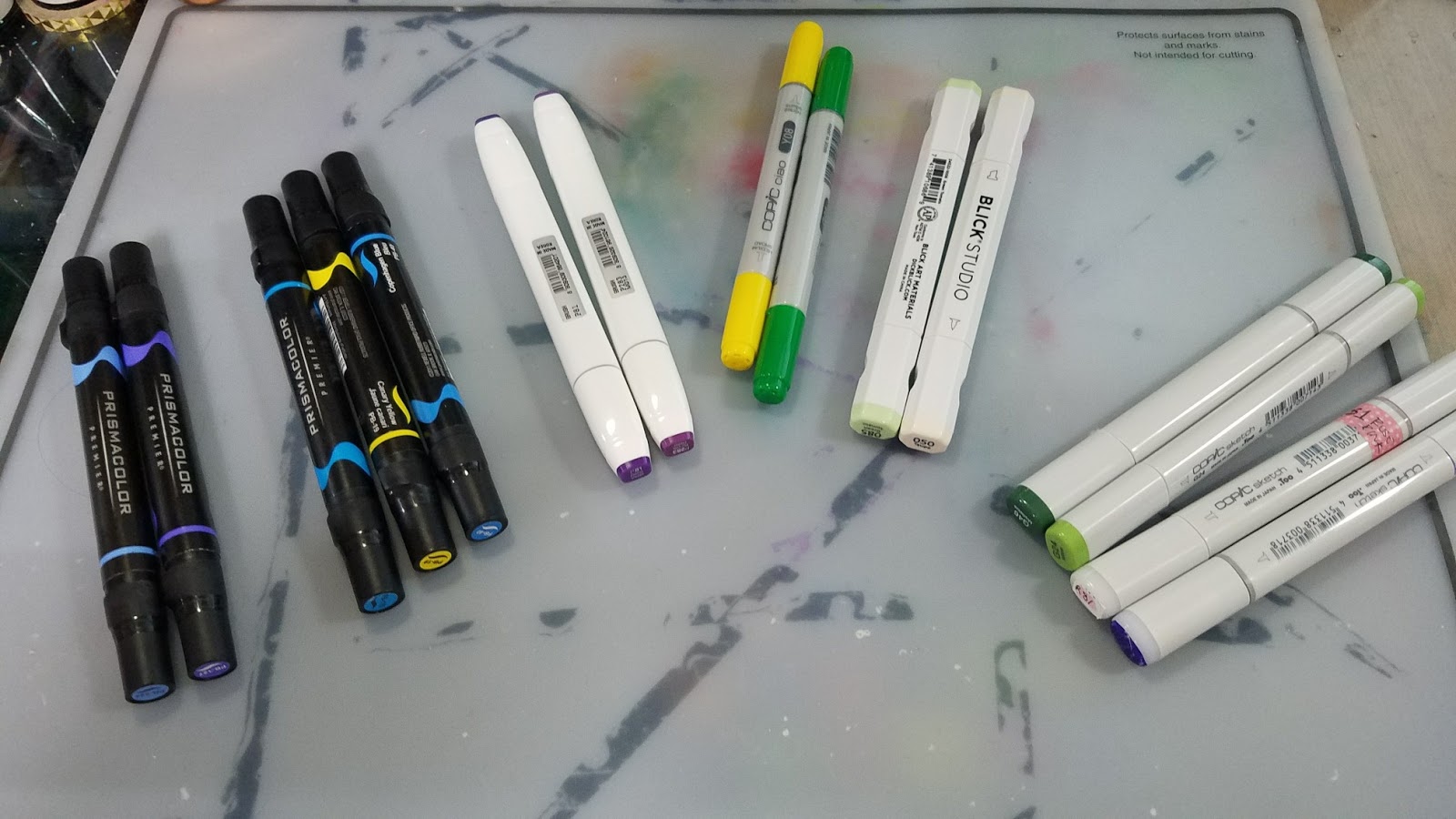
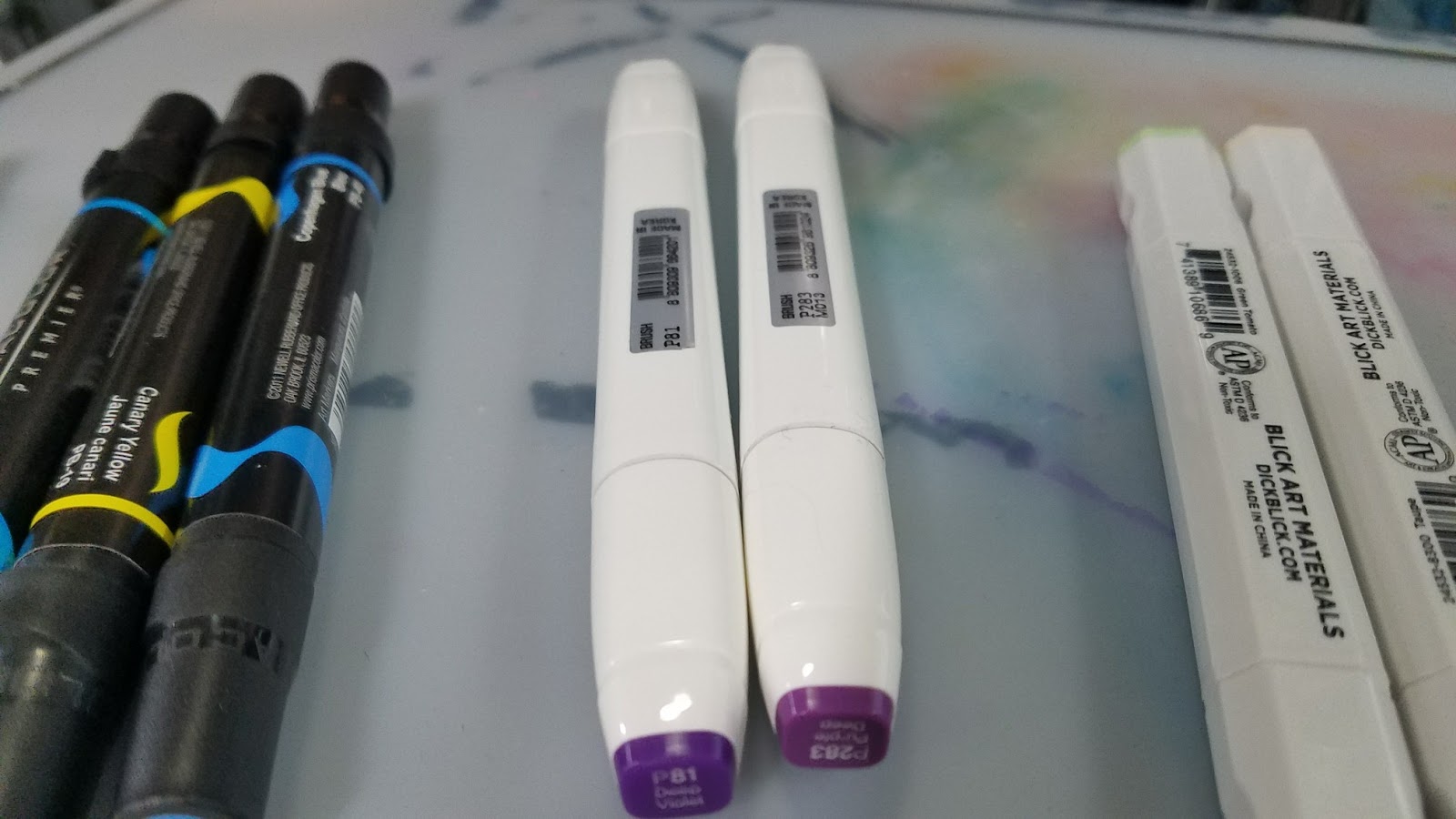
 Left to Right: Prismacolor Markers, Shin Han Twin Touch Markers, Blick Studio Brush Markers, Copic Ciao Markers, Copic Sketch Markers, Crayola Blending Markers
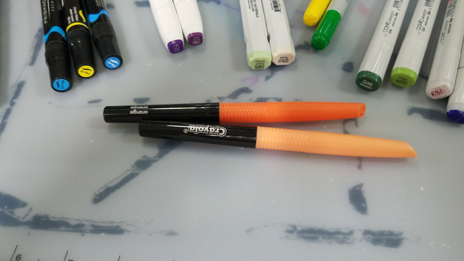
 Top to bottom: Prismacolor, Shin Han Twin Touch, Blick Studio Brush, Copic Ciao, Copic Sketch, Crayola Blending

I hope this post inspired a couple new favorites and perhaps helped inform future buying decisions.
Oh hey! Today is my birthday! If you enjoyed this post, do me a favor and share it with your friends on social media- help others find this blog! If you want to help make more content like this, head on over to my Patreon and join the Artnerd community to not only help support this blog, but gain access to comics and early access videos!

And if you enjoy my art, why not check out my all ages webcomic, 7" Kara, free to read at 7inchkara.com or 7inchkara.tumblr.com ?
Please consider donating to this blog or purchasing from Natto-shop (http://nattosoup.com/shop) if you want me to continue publishing quality content. All materials tested were purchased from my own pocket. Keep on Truckin' Nattosoup is not under any sponsorship.
Over the years, I've had the opportunity to review dozens of alcohol markers. I've formed distinct tastes, and have a cadre of favorites I reach for time and again. But I've found, in the myriad of reviews I've created, my actual recommendations sometimes get lost, and sometimes change, so I thought 2018 was a great time to revisit my Top 5 Alcohol Markers!
Marker Rec Number 1: Copic Sketch Markers

Copic Sketch- Super brush, larger ink compacity, available in empty
Total Number of Colors: 214 Colors in Family
Brush Type: Foam rubber
Refillable- Yes
Replaceable Nibs- Yes
Easy to Find- Very
Where to buy:
Most art supplies stores will carry Copic markers
DickBlick
Jerry's Artarama
Michael's
Tutorials
Marker Rec Number 2: Copic Ciao Markers

Copic Ciao- Sketch's cheaper baby sister. Also refillable, replacable nibs. No empty bodies available. Color name and family not on the cap. Available in a much smaller range of colors.
Total Number of Colors: 180 Colors In Family
Brush Type- Foam Rubber
Refillable-Yes
Replaceable Nibs- Yes
Easy to Find- A bit rarer than Copic Sketch markers
Where to Buy
DickBlick
Jerry's Artarama
Amazon
Tutorials
Marker Rec Number 3: Blick Studio Brush Markers
Blick Studio Brush- Non refillable, CHEAP, available in sets or openstock, a great Copic dupe
Total Number of Colors: 97 including blender
Brush Type: Foam Rubber
Refillable: No
Replaceable Nibs: No
Easy to Find: Only available through or in DickBlick
Where to buy:
DickBlick
Review
Marker Rec Number 4: Prismacolor Markers (Brush Tip)

Prismacolor- Those Neons, true purples, blues, and bluegreens. Fills holes Copic leaves in the collection
Total Number of Colors: 200 Colors
Brush Type- Foam Rubber
Refillable- No
Replaceable Nibs- No
Easy to Find- Very
Where to buy:
Most art supply stores carry Prismacolor markers
Michaels
Dick Blick
Jerry's Artarama
Reviews
Marker Rec Number 5: ShinHan Twin Touch Markers (Brush tip)
Shin Han Twin Touch- A little harder to find than Copic, slightly cheaper, all the features of Copic markers (refillable, replacable brushes) in a different body.
Total Number of Colors- 204
Brush Type- Foam rubber
Refillable- Yes
Replaceable Nibs- Yes
Easy to Find: Not necessarily
Where To buy:
DickBlick
Jerry'sArtarama
Flax (San Francisco)
Where to buy refills: MarkerPop
Note: There are A LOT of Shinhan Twin Touch knockoffs out there- on Amazon, Ali Express, Wish, Ebay, ect.
Reviews
Honorable Mention: Crayola Blending Markers
Honorable Mention- Crayola Blending Markers- Super cheap, even sold at Walmart.
Total Number of Colors: 15 counting blender
Brush Type: Fiber
Refillable: No
Replaceable Nibs: No
Easy to Find: Increasingly so
Where to buy:
Amazon
Crayola.com
Reviews
The below illustrations were completed with a variety of alcohol markers and inks.
 Copic Marker, Marvy LePlume Small Brush, Ranger Adirondack Inks, Blick Studio Brush Marker
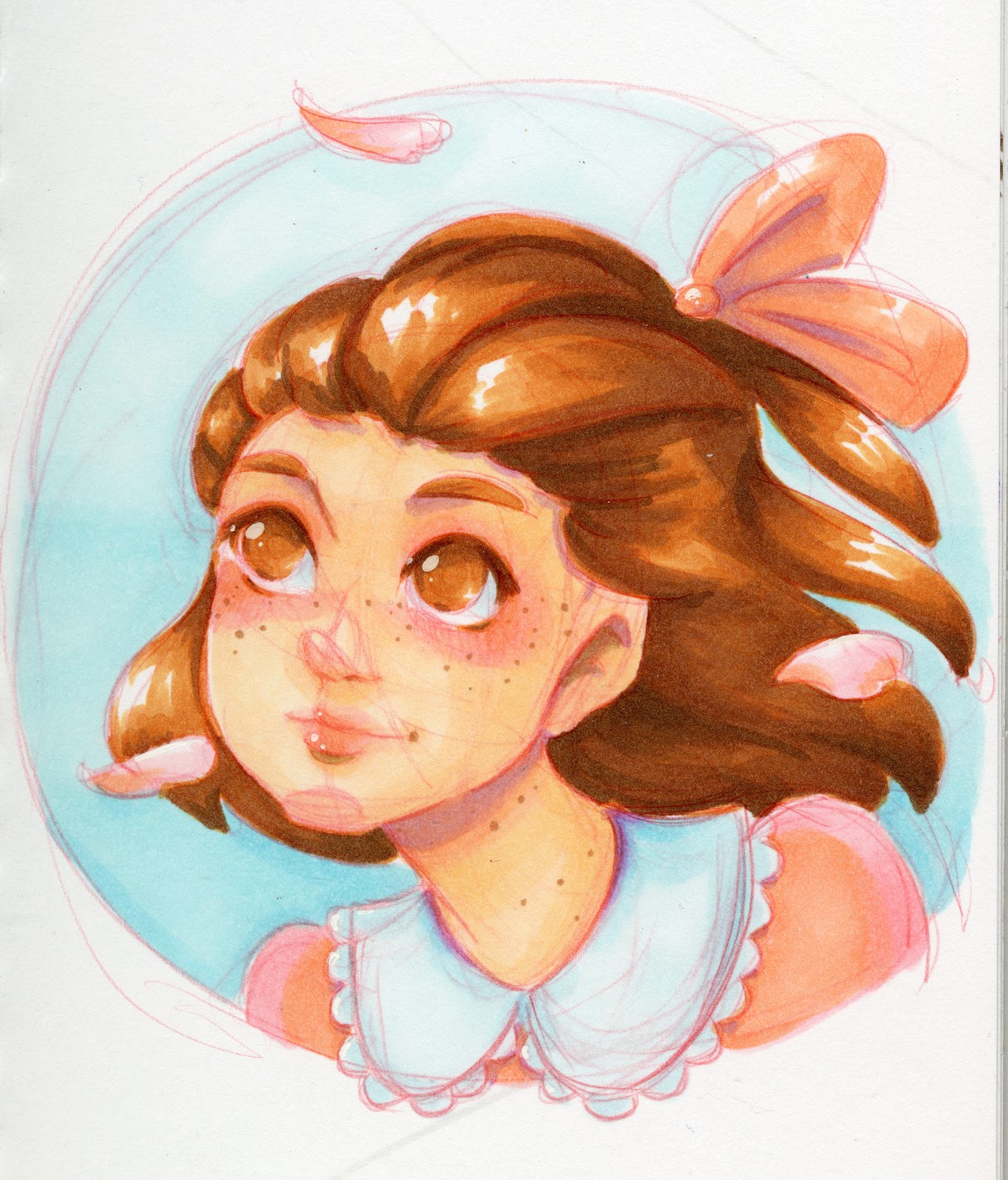 Copic Marker, Blick Studio Brush Markers
 Ranger Adirondack Inks, Copic Markers, Prismacolor Markers
 Copic markers, Prismacolor Markers, Blick Studio Brush Markers
 Prismacolor markers, Copic Markers, Blick Studio Brush Markers
  Copic markers, Shin Han Twin Touch Markers, watercolor
 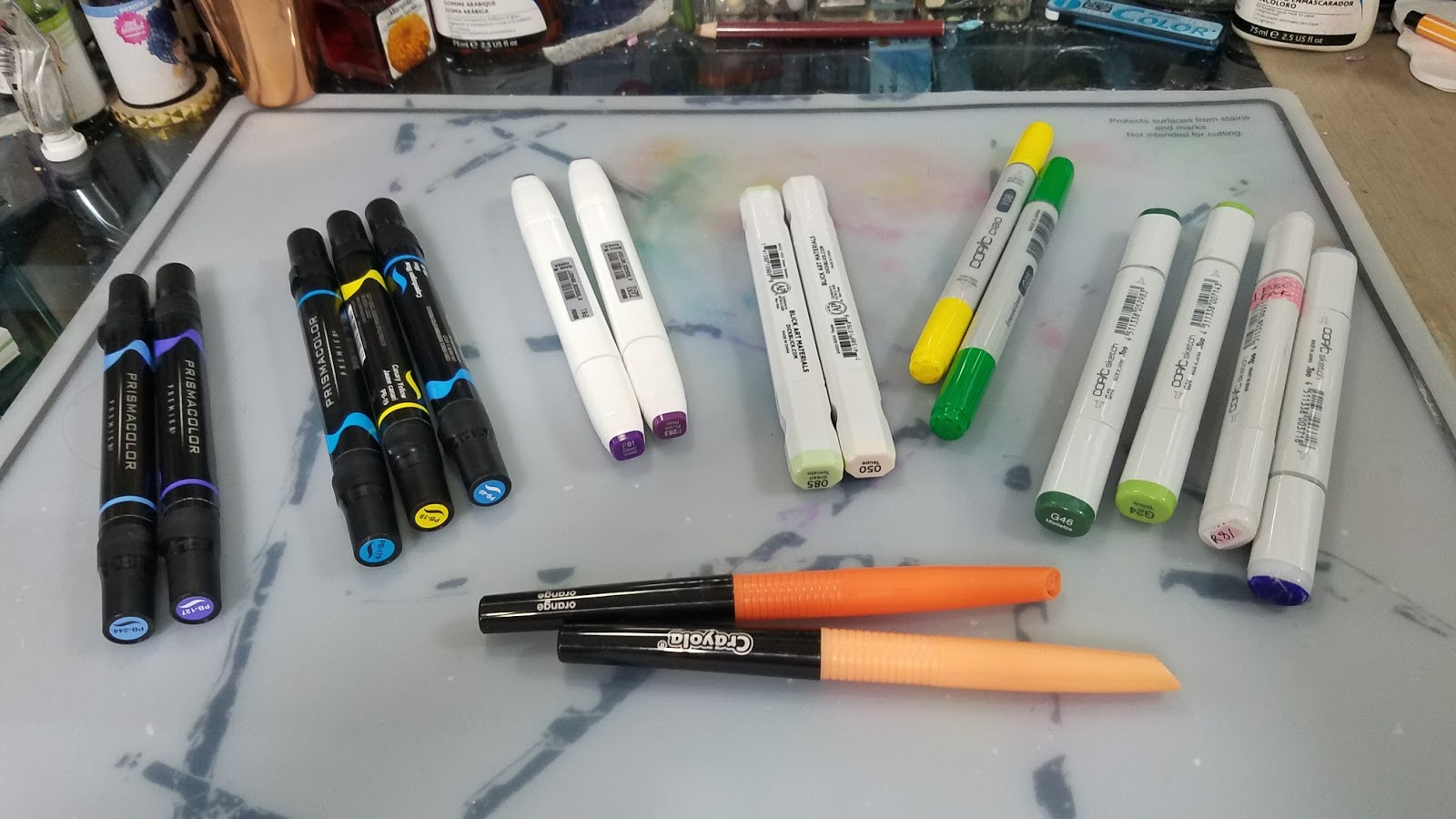 Left to Right: Prismacolor Markers, Shin Han Twin Touch Markers, Blick Studio Brush Markers, Copic Ciao Markers, Copic Sketch Markers, Crayola Blending Markers
 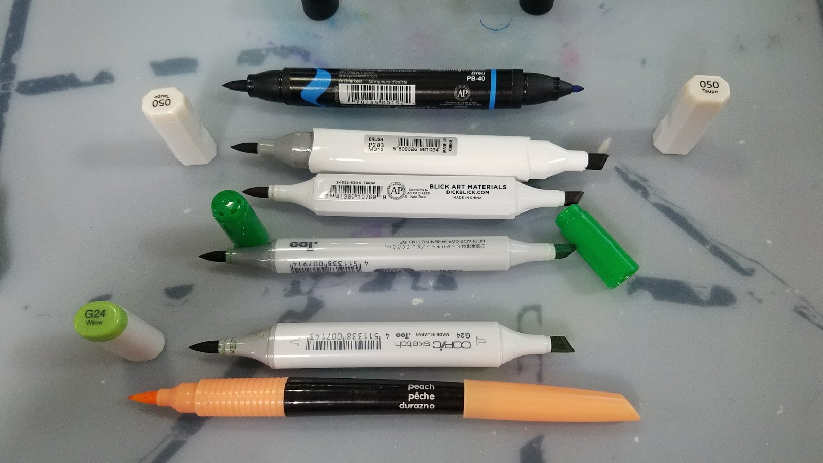 Top to bottom: Prismacolor, Shin Han Twin Touch, Blick Studio Brush, Copic Ciao, Copic Sketch, Crayola Blending
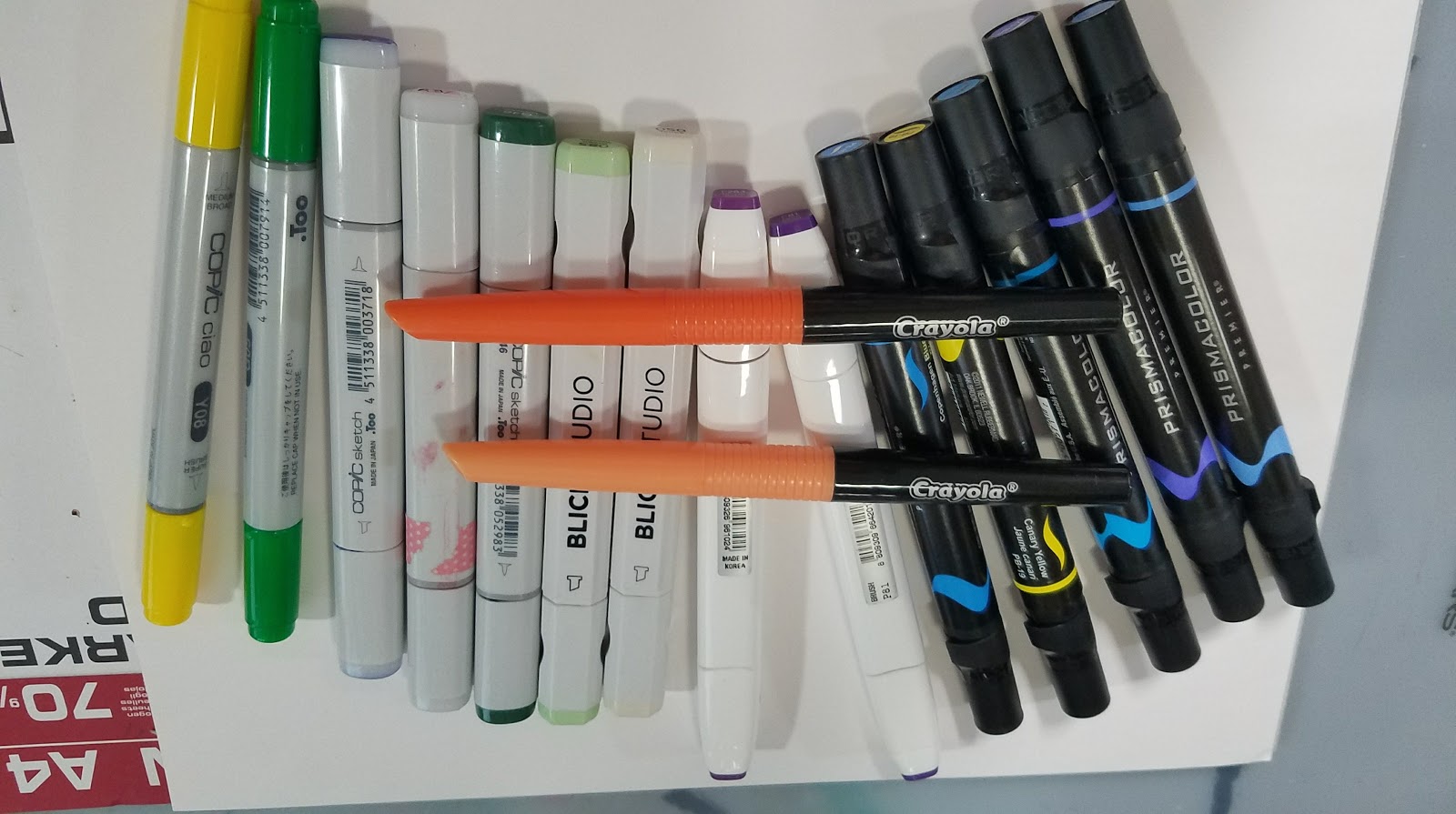
I hope this post inspired a couple new favorites and perhaps helped inform future buying decisions.
Oh hey! Today is my birthday! If you enjoyed this post, do me a favor and share it with your friends on social media- help others find this blog! If you want to help make more content like this, head on over to my Patreon and join the Artnerd community to not only help support this blog, but gain access to comics and early access videos!
And if you enjoy my art, why not check out my all ages webcomic, 7" Kara, free to read at 7inchkara.com or 7inchkara.tumblr.com ?

Please consider donating to this blog or purchasing from Natto-shop (http://nattosoup.com/shop) if you want me to continue publishing quality content. All materials tested were purchased from my own pocket. Keep on Truckin' Nattosoup is not under any sponsorship.
March 15, 2018
Guest Post: Panda’s Top Tips For Advertising Comics
Hi there!
I’m ServerPanda. My job as a professional Graphic Designer, 3D designer and advertising specialist has taken me to a lot of places over the past 8 years. I’ve worked in newspaper offices, print companies and currently I’m making my way into the employment of a large scale construction company as their lead designer and advertising specialist.
Today, however, I’m honored to be here to teach you all a little inside knowledge about the advertising industry and how it can apply to webcomics.
Advertising a webcomic outside the circles of fellow creators has proven a daunting and almost impossible task for many. Solutions seem magical and hard to pin down. Few really know what they’ve done correctly even after they have achieved it. Many attribute it to luck.
Luck may play a role. Careful planning and determination can take you much further, however! Which is why right now in this article I’ll be dissecting the how and why advertising works and teaching you to apply it to new sources: taking it outside your comfort zone and into a bright, new world! You can do this!
Did that second paragraph sound fancy and make you excited? Was it a little corny too? That’s what advertising does.
They’re called ‘Ad Words’: Words meant to be persuasive, powerful and kickstart viewers into clicking your advertisement to find out more. Usually quick and to the point, these words are made to excite people. Below I’ve assembled an image of a few of the most popular Ad Words so that you can see them. Apply some of these to your advertising campaigns (or think of a few more yourself!) and I can guarantee that people will click your work (see what I did there?).
[image error]
Next we’ll dive into a category format. I’ve had my fun with you all! It’s time to work.
PICK AN AGE RANGE, NOT A GENRE
The timeless battle of genre vs. age. Sometimes people combine the two. They do it in popular media all the time. A perfect example is any Disney animated classic: usually Fantasy for children. There isn’t inherently anything wrong with that when the audience is worldwide. Except… in webcomics an issue does unfold. The problem with us following that format when advertising outside of our comfort zone is that we sadly cannot afford to. Webcomics are already a niche: a small bite of a much bigger market. The more a creator limits their audience when they try to reign in new readers, the less success they will have. So therein lies a choice: pick between age or genre when advertising. My strongest advice is to pick the one that will offer you the highest potential readership. How will you know? Market trends! We’ll cover that one next.

FOLLOW YOUR STATS, FOLLOW TRENDS
Stats are the most important and most ignored tool available on advertising and social media sites around the world. I can’t blame people. They’re a line on a graph or bars going upwards at best. Maybe some numbers underneath. At the same time, these can become your saving grace if you keep an eye on them. If they’re low to non existent, chances are it isn’t that your webcomic is bad, it’s that there’s something ineffective about the ad. Or perhaps the chosen advertising location is a poor one. Fluctuating numbers depending on the day mean that certain days draw more people than others. On average, weekends are actually a poor choice to advertise since people are busy doing other things. The best day? Monday! People are most likely to slack off at work and check the internet at the beginning of the week! Top Tip: Keep an eye on your click throughs! You can get more if you use well placed Ad Words on your shiny graphics!

ADVERTISE OUTSIDE OF OTHER COMIC SITES
This is a hard habit to break. Even I didn’t want to do this. I mentally grumbled. I sighed. I rolled my eyes. We all want to advertise on each other’s sites and on social media exclusively, and I do understand the personal appeal to it as an idea. Growth, however, dictates that we do otherwise. Sites such as Project Wonderful have categories like: Art, Books, Film, Games, etc. It’s a good place to start to get your feet wet. Alternatively, place ads in online magazines and newspapers if you have the funds for it (which not all of us do, and that is quite fair). Other free methods can include taking a physical advertisement for your comic to game and comic shops in your local area and posting it up on their advertisement board. Or even utilizing multimedia. Streaming art has found huge success and YouTube is a great place for that. Or Twitter’s Periscope. Top Tip: I’ve had the best success with Periscope! The viewers on there come from all walks of life AND they love to comment, interact and give you lots of likes. It will also stream direct to your Twitter feed!

USE SOCIAL MEDIA
Social media is a long haul commitment. This method requires forging bonds with people. Those bonds are worth it, however, and your readership coming out of this method will be the most loyal. The more time you put into something, the more you get out of it. Out of all of them, I’ve found Twitter to be the most effective with Tumblr coming in as a far back second if you use the hashtag system to its most effective abilities. That said, I could write a full article alone on how to use Tumblr hashtags in order to get noticed. Twitter is easier and provides the opportunity to interact with readers on the fly. Use your social media to advertise updates, talk about WIPs, post art streams and just be a generally nice person! It also doesn’t hurt to do a little promotional event once in a while. Top Tip: Do a contest! Have folks like and share your comic to be entered to win a little something! An online gift card, some art, etc.!

DON’T STOP ADVERTISING
Advertising as a whole is a long term job. It goes hand in hand with making your comic and should be part of the process. Success at advertising won’t come overnight. Persistence is the key to this endeavor and there’s actually a logical reason for that! On a website advertisements are second to the content. That is a known fact in the industry. Readers will skim them at first glance and without a second thought. Because of that, one time or even twice is not enough. Repeated showings are the key to easing potential ‘customers’ into noticing your product. It’s the same as when a brand promotes to you on a social media site based on your online purchasing history. You see the ad several times. Over time it wears you down and sticks in your head, doesn’t it? You contemplate the product, or at least remember it. Our goal here is ultimately the same. We want people to remember webcomics in the same way as we all remember product ads. We want people to have our comics come to mind when they think of specific things. Persistence and persuasion are powerful tools.
In conclusion, let’s summarize everything you’ve learned today:
Ad Words: Short, powerful words made to excite and persuade.
One Not Both: Pick an age range or genre when advertising. Don’t use both.
Follow Your Stats: Stats and trends are important! Monday is the best day to advertise.
Other Methods: Use places other than comic sites to advertise on. Stream art. Use physical advertising.
Social Media: Slow and strong. Use it for contests to promote your comic!
Don’t Stop: Persistence is the key! Persuasion is powerful.
Right then! Get out there and put what you’ve learned into practice! Don’t be scared to experiment. Advertising is half figuring out trends and half keeping up with the actions themselves. Experimentation will be the best teacher in this field. On the other hand, I’m also available on Twitter to answer any questions you may have!
Twitter: @ServerPanda , @InkUnder
Website: http://undertheinknews.com
Email: undertheink@outlook.com
--------
Resources:
Stock images are from http://www.freeimages.com
Please consider donating to this blog or purchasing from Natto-shop (http://nattosoup.com/shop) if you want me to continue publishing quality content. All materials tested were purchased from my own pocket. Keep on Truckin' Nattosoup is not under any sponsorship.
I’m ServerPanda. My job as a professional Graphic Designer, 3D designer and advertising specialist has taken me to a lot of places over the past 8 years. I’ve worked in newspaper offices, print companies and currently I’m making my way into the employment of a large scale construction company as their lead designer and advertising specialist.
Today, however, I’m honored to be here to teach you all a little inside knowledge about the advertising industry and how it can apply to webcomics.
Advertising a webcomic outside the circles of fellow creators has proven a daunting and almost impossible task for many. Solutions seem magical and hard to pin down. Few really know what they’ve done correctly even after they have achieved it. Many attribute it to luck.
Luck may play a role. Careful planning and determination can take you much further, however! Which is why right now in this article I’ll be dissecting the how and why advertising works and teaching you to apply it to new sources: taking it outside your comfort zone and into a bright, new world! You can do this!
Did that second paragraph sound fancy and make you excited? Was it a little corny too? That’s what advertising does.
They’re called ‘Ad Words’: Words meant to be persuasive, powerful and kickstart viewers into clicking your advertisement to find out more. Usually quick and to the point, these words are made to excite people. Below I’ve assembled an image of a few of the most popular Ad Words so that you can see them. Apply some of these to your advertising campaigns (or think of a few more yourself!) and I can guarantee that people will click your work (see what I did there?).
[image error]
Next we’ll dive into a category format. I’ve had my fun with you all! It’s time to work.
PICK AN AGE RANGE, NOT A GENRE
The timeless battle of genre vs. age. Sometimes people combine the two. They do it in popular media all the time. A perfect example is any Disney animated classic: usually Fantasy for children. There isn’t inherently anything wrong with that when the audience is worldwide. Except… in webcomics an issue does unfold. The problem with us following that format when advertising outside of our comfort zone is that we sadly cannot afford to. Webcomics are already a niche: a small bite of a much bigger market. The more a creator limits their audience when they try to reign in new readers, the less success they will have. So therein lies a choice: pick between age or genre when advertising. My strongest advice is to pick the one that will offer you the highest potential readership. How will you know? Market trends! We’ll cover that one next.
FOLLOW YOUR STATS, FOLLOW TRENDS
Stats are the most important and most ignored tool available on advertising and social media sites around the world. I can’t blame people. They’re a line on a graph or bars going upwards at best. Maybe some numbers underneath. At the same time, these can become your saving grace if you keep an eye on them. If they’re low to non existent, chances are it isn’t that your webcomic is bad, it’s that there’s something ineffective about the ad. Or perhaps the chosen advertising location is a poor one. Fluctuating numbers depending on the day mean that certain days draw more people than others. On average, weekends are actually a poor choice to advertise since people are busy doing other things. The best day? Monday! People are most likely to slack off at work and check the internet at the beginning of the week! Top Tip: Keep an eye on your click throughs! You can get more if you use well placed Ad Words on your shiny graphics!
ADVERTISE OUTSIDE OF OTHER COMIC SITES
This is a hard habit to break. Even I didn’t want to do this. I mentally grumbled. I sighed. I rolled my eyes. We all want to advertise on each other’s sites and on social media exclusively, and I do understand the personal appeal to it as an idea. Growth, however, dictates that we do otherwise. Sites such as Project Wonderful have categories like: Art, Books, Film, Games, etc. It’s a good place to start to get your feet wet. Alternatively, place ads in online magazines and newspapers if you have the funds for it (which not all of us do, and that is quite fair). Other free methods can include taking a physical advertisement for your comic to game and comic shops in your local area and posting it up on their advertisement board. Or even utilizing multimedia. Streaming art has found huge success and YouTube is a great place for that. Or Twitter’s Periscope. Top Tip: I’ve had the best success with Periscope! The viewers on there come from all walks of life AND they love to comment, interact and give you lots of likes. It will also stream direct to your Twitter feed!
USE SOCIAL MEDIA
Social media is a long haul commitment. This method requires forging bonds with people. Those bonds are worth it, however, and your readership coming out of this method will be the most loyal. The more time you put into something, the more you get out of it. Out of all of them, I’ve found Twitter to be the most effective with Tumblr coming in as a far back second if you use the hashtag system to its most effective abilities. That said, I could write a full article alone on how to use Tumblr hashtags in order to get noticed. Twitter is easier and provides the opportunity to interact with readers on the fly. Use your social media to advertise updates, talk about WIPs, post art streams and just be a generally nice person! It also doesn’t hurt to do a little promotional event once in a while. Top Tip: Do a contest! Have folks like and share your comic to be entered to win a little something! An online gift card, some art, etc.!
DON’T STOP ADVERTISING
Advertising as a whole is a long term job. It goes hand in hand with making your comic and should be part of the process. Success at advertising won’t come overnight. Persistence is the key to this endeavor and there’s actually a logical reason for that! On a website advertisements are second to the content. That is a known fact in the industry. Readers will skim them at first glance and without a second thought. Because of that, one time or even twice is not enough. Repeated showings are the key to easing potential ‘customers’ into noticing your product. It’s the same as when a brand promotes to you on a social media site based on your online purchasing history. You see the ad several times. Over time it wears you down and sticks in your head, doesn’t it? You contemplate the product, or at least remember it. Our goal here is ultimately the same. We want people to remember webcomics in the same way as we all remember product ads. We want people to have our comics come to mind when they think of specific things. Persistence and persuasion are powerful tools.
In conclusion, let’s summarize everything you’ve learned today:
Ad Words: Short, powerful words made to excite and persuade.
One Not Both: Pick an age range or genre when advertising. Don’t use both.
Follow Your Stats: Stats and trends are important! Monday is the best day to advertise.
Other Methods: Use places other than comic sites to advertise on. Stream art. Use physical advertising.
Social Media: Slow and strong. Use it for contests to promote your comic!
Don’t Stop: Persistence is the key! Persuasion is powerful.
Right then! Get out there and put what you’ve learned into practice! Don’t be scared to experiment. Advertising is half figuring out trends and half keeping up with the actions themselves. Experimentation will be the best teacher in this field. On the other hand, I’m also available on Twitter to answer any questions you may have!
Twitter: @ServerPanda , @InkUnder
Website: http://undertheinknews.com
Email: undertheink@outlook.com
--------
Resources:
Stock images are from http://www.freeimages.com
Please consider donating to this blog or purchasing from Natto-shop (http://nattosoup.com/shop) if you want me to continue publishing quality content. All materials tested were purchased from my own pocket. Keep on Truckin' Nattosoup is not under any sponsorship.
March 12, 2018
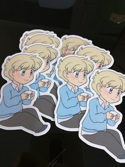
Creating Stickers with Cricut for Fun and Profit
Hello again! I'm Kabocha, taking up your valuable time here on Becca's blog.
Let's say you're looking at doing a convention, and you need some inexpensive merch. You decide to make stickers, because that's fun and popular!
You don't want to ship it off to a third party manufacturer because then you have to really worry about shipping deadlines or print time, or their pricing if you have to reorder.
Sounds like you might want a die cutting machine! The initial cost is high, but once you have it, you're really only paying for replacement parts here and there!
Full disclosure: The only die cutter I've used is the Cricut Explore Air 2 - so I can't speak to how you would go about this process using a Silhouette or other machine.
Supplies
First and foremost, you're gonna need some supplies to get started. I'm going to throw my personal recommendations at you. Feel free to change up things as you want.
Printer:
Canon Pixma TS6120
I strongly suggest an inkjet printer. Toner printers are expensive, and their color accuracy isn't too great. The Pixma met my requirements for stickers and a variety of other things, without being an irritating device to maintain.
Paper:
Printable Sticker Paper
Don't buy the Cricut paper. It's overpriced for the quantity you get -- and the Online Labels paper is actually quite good!
Laminate:
Duck Peel N' Stick Laminate
Yes, I realize this is sold with shelf liner. It's acid free and should last a good while. It's easy to cut through! Alternatively, You can pick this up at Wal-Mart or someplace similar for under $6 with sales tax.
Other types of laminate (such as holographic) can sometimes be found at your local craft store, or online. I don't recommend buying through Alibaba unless you're ready to deal with that.
Die Cutter:
Cricut Explore Air 2
This is the expensive part. But lemme tell you, this thing is kind of nice. You'll want to get a few add-ons for it to make your life easier, though:
Spatula and Scraper
Spare Standard Grip Cutting Mat
Spare Fine-Point Blade
Other supplies:
ScissorsGuillotine Cutter (optional)White vinegar (for removing adhesive from blades)Photo editing software
Preparing your Files
So, you have all the things you need to make stickers? OK, good.
Let's say you have a super cute illustration ready, and it's been set up at the size you want. For stickers, I typically go no larger than 3 inches x 3 inches at 300DPI -- so that means the max dimensions should be 900px in both directions, including any borders you have on the edge of the image.
If my image file's a little larger - that's fine. I'll usually resize the largest side down to about 2.9 inches (~870px).
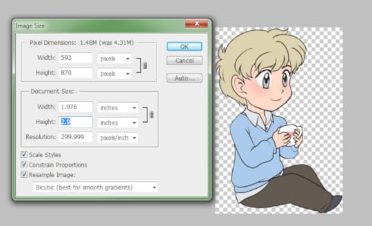
After that, I change the canvas size to add on extra space and add on a 25px white border to the image.
The white border is necessary to make sure the Cricut doesn't destroy my illustration when cutting.
Since I usually add the border as a layer effect, I then merge the layer with the border down onto an empty layer, and manually smooth out the white border for an easier cut.


You can see how the image was smoothed out.
I then crop the image to fit with its actual size and note what the dimensions are.
After this, I export the image with transparency so I can import it to the Design Space.
We know the actual dimensions will end up being a max height of 3.067 inches.
Preparing to CutThe Cricut Design space is pretty simple. If you have a Cricut machine, you can use it at https://design.cricut.com.
I am assuming your Cricut is connected to your computer, but that you have not used the Design Space. First-time users will be prompted to download the Cricut Bridge software.
When you get into the Design Space, open up a New Project.
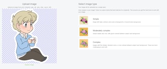
Once a new project canvas is opened, click Upload to upload your file.
The upload screen is pretty straightforward -- you can upload your own images to use for free, which is exactly what we're doing.
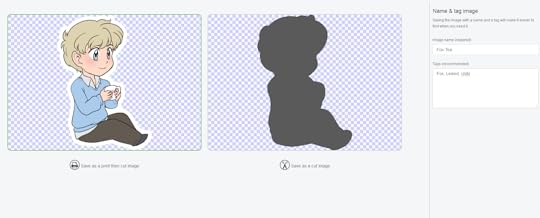
When you upload your image, you'll be presented with a few options. For simplicity's sake, choose "Complex" and hit Continue.
Unless you made a mistake when exporting your image, you don't need to mess with Select & Erase.
Hit Continue again.
On the last screen, you'll have options as to what kind of image you'll be using, and what you want to name it.
Since you uploaded something you want to make into stickers, save this as a Print then Cut image. Consider adding some tags, too, just to save yourself trouble.
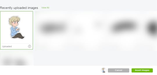
Once you've got that all done, hit Save.
You'll be taken back to the upload screen, where you can insert your recently uploaded images.
Click on your desired sticker(s) to select it, and then click Insert Images.
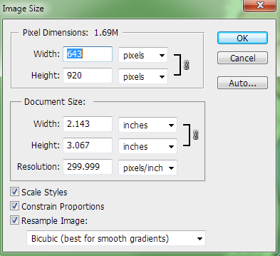
Here's why we needed to know the dimensions of the sticker before.
The Cricut Design Space doesn't recognize that you might have set a specific resolution for your image.
This is mildly annoying, but workable.
Select your image on the canvas, and change the size to match what you expected it to be. (Otherwise, you're going to have some monstrously large images.)
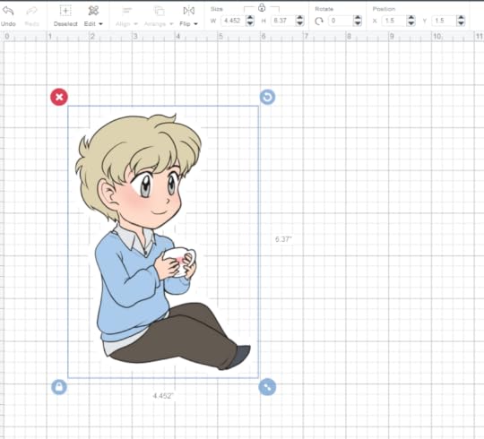
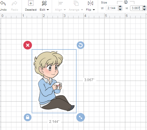 Resized, it looks MUCH better!
If you're only doing one sticker, click Make It in the top right corner.
If you're adding other stickers, follow the same process to upload them. If you're going to do sheets of the same sticker, duplicate it.
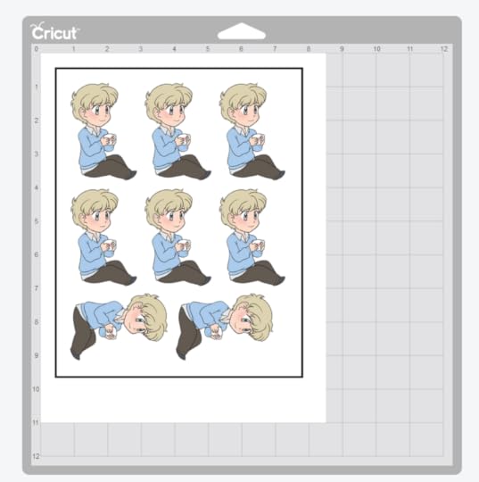
From past experience, I know I can fit about six 3inch stickers on a sheet of 8.5 x 11 sticker paper -- sometimes I can fit as many as 9.
When you click Make It, you'll get a preview of your print output so you can decide if you want to fit more images on the same sheet of paper. Cricut ONLY handles 8.5 x 11 Print then cut projects, for reference.
The Design Space will automatically adjust your images for the best fit with the paper you've given it.
If it all looks good, hit "Continue" and load your paper into the printer.
When you send your file to the printer, you can adjust your settings using 'Advanced' (I suggest doing this) -- here's my settings for my Pixma.
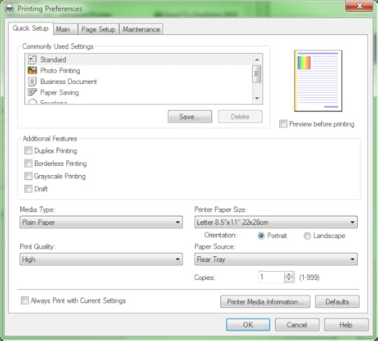
Unfortunately, you'll need to do this EVERY TIME YOU PRINT. (Unless you set it as a default setting, but... ugh.)
Applying your Laminate DO NOT EXIT THE CRICUT DESIGN SPACE WHILE YOU'RE DOING THIS.
Now that your images are printed, you'll need to apply the laminate. Notice how there's a black border around the space the images occupy -- this is the bounding box the Cricut uses to determine where to cut.
Figure out how wide and how tall that is -- you want your laminate to stay within these borders, but not overlap onto them.
Why? The Cricut scans these borders. If there's laminate on top of it, you may get an inaccurate cut due to the reflective nature of the material.
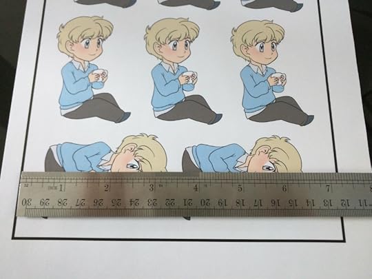
To keep it inside the borders, we'll cut a chunk of laminate approximately 7 inches wide by 8 3/4 inches tall.
Once I have my laminate cut, I start applying it by peeling a corner and placing it in a corner of my paper. Then, I very carefully peel, making sure to run my hand over the areas the laminate will now lay as I peel. This helps prevent bubbles. This video also goes over a similar process, burnishing while applying.
I typically lay the backing of the laminate over the area I just adhered it to, and run my scraper over the laminate after it's been applied to make sure everything is flat.
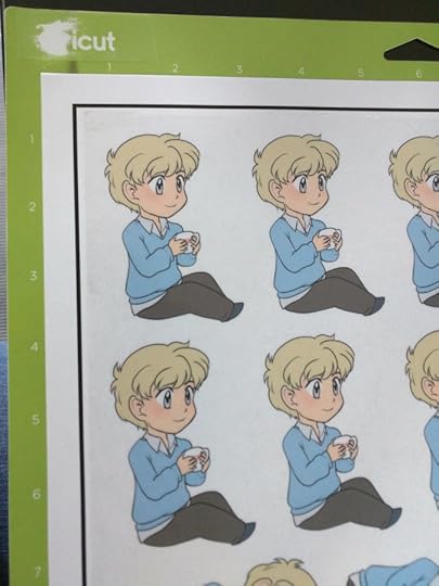
Once your laminate is applied, it's time to cut.
Finally.
Cutting Your StickersIf you've not used your Standard Grip mat before… You might want to roll a t-shirt over it or something because the adhesive is likely to destroy your paper. Just de-stick the thing.
Now that you're good to go, put your stickers in the top corner.
 Yes thank you, I know my mat is wrecked. It still works.
Typically, I set my dial for these stickers to Poster Board or Poster Board+.
Why? Because it applies the amount of pressure I need for die cut stickers. I don't have any desire to do KISS cut designs, so die cut works for me.
Follow the instructions in design space and load your mat and blade. Hit the "Go" button on your machine and let it do the magic.
Once you're done, unload your mat, remove your stickers (use your spatula if you so choose) and you're done!
After all this, bear in mind that every so often, you may need to clean your Cricut blade with a bit of vinegar to remove any adhesive residue.
If you liked this tutorial, check out the resources I have over at shooting-stars.org!
If you liked my art, maybe check out my comic at linkedcomic.com?
Please consider donating to this blog or purchasing from Natto-shop (http://nattosoup.com/shop) if you want me to continue publishing quality content. All materials tested were purchased from my own pocket. Keep on Truckin' Nattosoup is not under any sponsorship.
Let's say you're looking at doing a convention, and you need some inexpensive merch. You decide to make stickers, because that's fun and popular!
You don't want to ship it off to a third party manufacturer because then you have to really worry about shipping deadlines or print time, or their pricing if you have to reorder.
Sounds like you might want a die cutting machine! The initial cost is high, but once you have it, you're really only paying for replacement parts here and there!
Full disclosure: The only die cutter I've used is the Cricut Explore Air 2 - so I can't speak to how you would go about this process using a Silhouette or other machine.
Supplies
First and foremost, you're gonna need some supplies to get started. I'm going to throw my personal recommendations at you. Feel free to change up things as you want.
Printer:
Canon Pixma TS6120
I strongly suggest an inkjet printer. Toner printers are expensive, and their color accuracy isn't too great. The Pixma met my requirements for stickers and a variety of other things, without being an irritating device to maintain.
Paper:
Printable Sticker Paper
Don't buy the Cricut paper. It's overpriced for the quantity you get -- and the Online Labels paper is actually quite good!
Laminate:
Duck Peel N' Stick Laminate
Yes, I realize this is sold with shelf liner. It's acid free and should last a good while. It's easy to cut through! Alternatively, You can pick this up at Wal-Mart or someplace similar for under $6 with sales tax.
Other types of laminate (such as holographic) can sometimes be found at your local craft store, or online. I don't recommend buying through Alibaba unless you're ready to deal with that.
Die Cutter:
Cricut Explore Air 2
This is the expensive part. But lemme tell you, this thing is kind of nice. You'll want to get a few add-ons for it to make your life easier, though:
Spatula and Scraper
Spare Standard Grip Cutting Mat
Spare Fine-Point Blade
Other supplies:
ScissorsGuillotine Cutter (optional)White vinegar (for removing adhesive from blades)Photo editing software
Preparing your Files
So, you have all the things you need to make stickers? OK, good.
Let's say you have a super cute illustration ready, and it's been set up at the size you want. For stickers, I typically go no larger than 3 inches x 3 inches at 300DPI -- so that means the max dimensions should be 900px in both directions, including any borders you have on the edge of the image.
If my image file's a little larger - that's fine. I'll usually resize the largest side down to about 2.9 inches (~870px).
After that, I change the canvas size to add on extra space and add on a 25px white border to the image.
The white border is necessary to make sure the Cricut doesn't destroy my illustration when cutting.
Since I usually add the border as a layer effect, I then merge the layer with the border down onto an empty layer, and manually smooth out the white border for an easier cut.
You can see how the image was smoothed out.
I then crop the image to fit with its actual size and note what the dimensions are.
After this, I export the image with transparency so I can import it to the Design Space.
We know the actual dimensions will end up being a max height of 3.067 inches.
Preparing to CutThe Cricut Design space is pretty simple. If you have a Cricut machine, you can use it at https://design.cricut.com.
I am assuming your Cricut is connected to your computer, but that you have not used the Design Space. First-time users will be prompted to download the Cricut Bridge software.
When you get into the Design Space, open up a New Project.
Once a new project canvas is opened, click Upload to upload your file.
The upload screen is pretty straightforward -- you can upload your own images to use for free, which is exactly what we're doing.
When you upload your image, you'll be presented with a few options. For simplicity's sake, choose "Complex" and hit Continue.
Unless you made a mistake when exporting your image, you don't need to mess with Select & Erase.
Hit Continue again.
On the last screen, you'll have options as to what kind of image you'll be using, and what you want to name it.
Since you uploaded something you want to make into stickers, save this as a Print then Cut image. Consider adding some tags, too, just to save yourself trouble.
Once you've got that all done, hit Save.
You'll be taken back to the upload screen, where you can insert your recently uploaded images.
Click on your desired sticker(s) to select it, and then click Insert Images.
Here's why we needed to know the dimensions of the sticker before.
The Cricut Design Space doesn't recognize that you might have set a specific resolution for your image.
This is mildly annoying, but workable.
Select your image on the canvas, and change the size to match what you expected it to be. (Otherwise, you're going to have some monstrously large images.)
Resized, it looks MUCH better!If you're only doing one sticker, click Make It in the top right corner.
If you're adding other stickers, follow the same process to upload them. If you're going to do sheets of the same sticker, duplicate it.
From past experience, I know I can fit about six 3inch stickers on a sheet of 8.5 x 11 sticker paper -- sometimes I can fit as many as 9.
When you click Make It, you'll get a preview of your print output so you can decide if you want to fit more images on the same sheet of paper. Cricut ONLY handles 8.5 x 11 Print then cut projects, for reference.
The Design Space will automatically adjust your images for the best fit with the paper you've given it.
If it all looks good, hit "Continue" and load your paper into the printer.
When you send your file to the printer, you can adjust your settings using 'Advanced' (I suggest doing this) -- here's my settings for my Pixma.
Unfortunately, you'll need to do this EVERY TIME YOU PRINT. (Unless you set it as a default setting, but... ugh.)
Applying your Laminate DO NOT EXIT THE CRICUT DESIGN SPACE WHILE YOU'RE DOING THIS.
Now that your images are printed, you'll need to apply the laminate. Notice how there's a black border around the space the images occupy -- this is the bounding box the Cricut uses to determine where to cut.
Figure out how wide and how tall that is -- you want your laminate to stay within these borders, but not overlap onto them.
Why? The Cricut scans these borders. If there's laminate on top of it, you may get an inaccurate cut due to the reflective nature of the material.
To keep it inside the borders, we'll cut a chunk of laminate approximately 7 inches wide by 8 3/4 inches tall.
Once I have my laminate cut, I start applying it by peeling a corner and placing it in a corner of my paper. Then, I very carefully peel, making sure to run my hand over the areas the laminate will now lay as I peel. This helps prevent bubbles. This video also goes over a similar process, burnishing while applying.
I typically lay the backing of the laminate over the area I just adhered it to, and run my scraper over the laminate after it's been applied to make sure everything is flat.
Once your laminate is applied, it's time to cut.
Finally.
Cutting Your StickersIf you've not used your Standard Grip mat before… You might want to roll a t-shirt over it or something because the adhesive is likely to destroy your paper. Just de-stick the thing.
Now that you're good to go, put your stickers in the top corner.
Yes thank you, I know my mat is wrecked. It still works.Typically, I set my dial for these stickers to Poster Board or Poster Board+.
Why? Because it applies the amount of pressure I need for die cut stickers. I don't have any desire to do KISS cut designs, so die cut works for me.
Follow the instructions in design space and load your mat and blade. Hit the "Go" button on your machine and let it do the magic.
Once you're done, unload your mat, remove your stickers (use your spatula if you so choose) and you're done!
After all this, bear in mind that every so often, you may need to clean your Cricut blade with a bit of vinegar to remove any adhesive residue.
If you liked this tutorial, check out the resources I have over at shooting-stars.org!
If you liked my art, maybe check out my comic at linkedcomic.com?
Please consider donating to this blog or purchasing from Natto-shop (http://nattosoup.com/shop) if you want me to continue publishing quality content. All materials tested were purchased from my own pocket. Keep on Truckin' Nattosoup is not under any sponsorship.
March 8, 2018
The Case for Waterbased
 Illustration created with Pentel Brushpens in Strathmore 400 Series FIeld Watercolor Sketchbook
I've written a lot about alcohol markers over the years. I've reviewed dozens of brands, done numerous field tests, and for awhile, firmly proclaimed alcohol to be the king of markers. And while I still love Copic markers, Prismacolor markers, Shin Han, and Blick Studio Markers, my recent foray into writing about all things watercolor has given me a new appreciation for the right kind of waterbased marker.
Because the right marker, the right brush, can make all the difference.
 Illustration created with Winsor and Newton watercolor markers
Oh I get it, waterbased has gotten a bad rap, and I've contributed to that. And sure, when waterbased pretty much meant Crayola and other firm tipped markers with anemic inkflow, it's easy to see how alcohol markers, with soft foam rubber brushes and almost infinite blending capacity was the hands down winner.
But things change, artists and crafters innovate and experiment. And we end up with waterbased markers that turn the table on the old marker showdown.
Today I'm going to share a few of my favorite waterbased markers with you guys and explain why waterbased might be a great fit for your studio or collection.
 Pentel Brushpen Illustration in Canson XL Mixed Media Sketchbook
If this post seems like your jam, please take a moment to visit my Patreon and consider joining the Artnerd community! It's thanks to the generosity and support of my Artnerds that I'm able to create content like this!

The Ink Inside:
Both waterbased markers (for the most part, with one exception) and alcohol based markers (again, one exception) utilize dyes for bright, brilliant color. Dyes are colorful, beautiful, and very much NOT lightfast. If you're looking for markers for art that will stand the test of time and sunlight, Winsor and Newton has one contender in each arena- their Pigment based Watercolor Markers, and their Pigment Markers (ethanol markers). Both are guaranteed to be lightfast up to 100 years. Generally, regardless of your marker's base (alcohol, water, or water/glycerin solution) your colors will shift and fade over time. Alcohol is non-archival, and glycerin (commonly used in waterbased markers) yellows.
 Pentel Brushpens in Canson XL Mixed Media Sketchbook
Exceptional Exceptions:
In this post, I am not considering Pitt Pens to be 'waterbased markers' although, in truth, they are, and the big brush markers are most certainly used as markers. Pitt Pens come in a variety of vibrant colors, utilize India ink, are permanent once dry, and can be challenging to use for watercolor effects. You can read the full review here- I find these to be enjoyable markers and well worth investigating, but dont wish to shoehorn them into the confines of this post.
In this post I am also glossing over Winsor and Newton Pigment Markers. These are interesting markers- the only pigment based alcohol markers I've ever come across, but they are not compatible with other alcohol markers (in that they won't blend with other markers- they're ethanol based, but they could be used mixed media). You can read the review for those here.
 Illustration created with Jane Davenport Mermaid Markers
The Markers:
Waterbased markers have considerable body variety. You have brushpen bodies with nylon bristles such as Pentel Brushpens and Jane Davenport Mermaid Markers, marker bodies with dual tips (very similar to many popular alcohol markers) such as Aqua by Spectrum Noir and Winsor and Newton Watercolor Markers, and single tipped markers such as Ecoline watercolor markers (foam rubber tip in a body very similar to a Crayola).
There's a huge range of brush options as well- compressed fiber such as Aqua by Spectrum and Winsor Newton, foam rubber like Kuretake Art and Graphic Twin and Ecoline, nylon bristles such as Kuretake Clean Color Real Brush, Pentel Brushpens, and Mermaid Markers.
Alcohol markers are a bit more standard- they tend to come dual-tipped (brush and bullet, or bullet and chisel being the most common options) with either compressed fiber brushes or foam rubber brushes. Occasionally fine point is an option (old Prismacolors had a super fine point with a lovely tri point chisel). You will never see nylon bristles on an alcohol marker, because alcohol degrades nylon (so please DON'T fill waterbrushes with Ranger Adirondack or Copic Various alcohol inks!)
 Succulent illustration created with Zig Clean Color Real Brush Markers
Re-usability:
Most waterbased markers are intended to be disposed of once empty, but there are a few standout exceptions. Ecoline markers can be refilled with the corresponding Ecoline liquid watercolor (both are dye based), Mermaid Markers can be rinsed out and filled with the ink of your choice (no refills are available at this time), Pentel Brushpens do have refills available, but these can also be rinsed out and refilled with the ink of your choice.
You can make your own waterbased markers at home very simply- fill a clean waterbrush with water+a dye (fountain pen ink, DR Ph Martin's Radiant Watercolors, or even homemade dye!) at a water to dye ratio that works for your needs.
Many of the popular alcohol marker brands do offer refill inks (Copic, Kuretake, ShinHan), although finding those refills may be difficult. You can also purchase empty Copic markers and fill with the ink of your choice (I love using Ranger and Pinata alcohol inks). Copic also has various replacement brushes so you can create a system that works for you.
And while many have tried successfully to create homemade alcohol markers from various dyes+rubbing alcohol/blender solution, the only attempt I've seen that worked over time utilized empty Crayola markers and the Crayola marker system.
 Illustration created with Zig Clean Color Real Brush Markers
Watercolor Effects:
With most brands of waterbased markers, even many Crayola products, watercolor effects are easy- just add water using a waterbrush!
You can achieve watercolor effects with alcohol markers by brute forcing a couple options. You can either oversaturate your paper to get the blends you desire (losing control, and difficult to replicate layer after layer), or you can use a brush to apply rubbing alcohol or blending solution to either your markers or an alcohol ink palette. Keep in mind that alcohol dissolves nylon bristles eventually, so us a cheap brush!
 Illustration created with Winsor and Newton Pigment Markers
Blending:
With juicy waterbased watercolor markers like Jane Davenport Mermaid Marker's, or Pentels colorful brushpens, your paper stays damp longer and allows for beautiful blends of bright color without paper abrasion.
Although alcohol marker enthusiasts may claim ANY alcohol marker will blend, some blend better than others. I've found markers with juicy chisel nibs or brush nibs blend the best. Inkflow is key to preventing streaky applications!
I avoid using blender markers when possible for my art- option to blend out with a lighter color from the same family, regardless of marker composition. However, there are blender markers available for both alcohol markers and waterbased markers, if you know where to look.
Alcohol Marker Blenders:
Copic Sketch Blender
Copic Ciao Blender
Prismacolor Blender
Blick Studio Brush Blender
Waterbased Marker Blenders:
Waterbrush with water
Ecoline Blender Marker (highest recommended, as the brush is foam rubber, and won't abraid your paper)
Sakura Koi
Tombow ABT Blender
Solvent for most alcohol based markers:
Alcohol (isopropyl alcohol will work)
Solvent for waterbased markers:
Water+gylcerine (water will work)
Note: These are not cross compatibile
 Illustration created with Spectrum Aqua markers
Streaks:
On absorbent papers, waterbased and alcohol based markers will both leave streaks upon initial application, unless you're using a particularly juicy waterbased marker such as Pentel Brushpens or Mermaid Markers. Most markers require a couple layers, or a blending solution (water for waterbased, rubbing alcohol or blending solution for alcohol markers) for a streak free application on most papers.
For streak free application, both alcohol markers and waterbased markers benefit from papers with a coating- vellum and Yupo are both interesting if challenging substrates.
 Illustration created with Kuretake Art and Graphic Twin markers
Wet Over Dry:
When paper gets pills, it's due to excess moisture in the paper combined with the abrasion of applying a new layer. You may have noticed this playing around with Crayola Markers as a kid- it's hard to get layers of color without ruining your paper.
In this area, you want to be careful about your waterbased markers. I've found markers with soft tips, such as foam rubber (Kuretake Art and Graphic Twin) or nylon bristols (Kuretake Clean Color Real Brush, Neopiko 4, Pentel Brushpens, Jane Davenport Mermaid Markers) work well for layering color, especially if you use something resilient and absorbent such as watercolor paper or mixed media paper.
Alcohol markers generally work quite well wet over dry, regardless of paper and brush type because alcohol evaporates almost immediately.
 Illustration created with Ranger Distrss markers
Reactivation:
Either marker type will reactivate if its solvent is applied- for alcohol markers, that's something with an alcohol base, for waterbased markers, that's anything containing water, and often alcohol as well. This is what makes both marker-types so blendable, but it's also what makes waterbased marker art susceptible to almost anything- damp hands, stray flicks of water, a spilled cup of tea.
In my experience, waterbased markers are more reactive than alcohol based markers, and may be quite difficult to control, especially the juicier markers. I found Ecoline and Winsor Newton watercolor markers to be some of the easiest to control, as well as Crayola Signature Blend and Shade markers and Crayola Supertip markers (dryer inkflow=easier to control).
Winsor and Newton pigment watercolor markers are about as reactive as actual pan and tube watercolors, and reactivity will vary with the pigment used.
 Hydrangea created with MozArt watercolor markers
Recommended Waterbased Markers and Uses:
Crayola Supertips
Great for: Cheap watercolor markers
Review
Tutorial:
Crayola Supertips Watercolor Hack
Crayola Supertip Super Tutorial
Crayola Supertip Tutorial: Making Monochrome
Get Your Own
Jane Davenport Mermaid Markers (original 12)
Great for: Loose, fun, vibrant watercolor effects
Review
Tutorial
Get Your Own
Kuretake Clean Color Real Brush
Great For: These are a suitable alcohol marker replacement if you work small- very blendable, lovely color, can be used with water or blended color into color if you work quickly.
Review
Tutorial:
Colored Leads and Clean Color Markers Tutorial
Succulent with Zig Clean Color Real Brush
Monochromatic Magic with Colored Leads and Zig Clean Color Real Brush
Get Your Own
Zig Art and Graphic Twin Markers
Great For: Large, juicy foam rubber brush is less likely to abraid paper surface. Great for handlettering and marker techniques on coated papers.
Review
Tutorial
Get Your Own
Ecoline Watercolor Markers
Great For: Vibrant, dye based watercolor markers that have compatible liquid watercolor inks. Refillable!
Review
Tutorial
Get Your Own
Winsor and Newton Pigment Markers
Great for: Best use is for travel watercolor illustrations, or adding intense spot color. These are the only pigment based waterbased markers on the market.
Review
Tutorial
Get Your Own
I hope my enthusiasm for waterbased markers has sparked your imagination and perhaps inspired you to try a few of the brands I've recommended to find your best fit!
If you enjoyed this post, or found it helpful, please consider joining the Artnerd community on Patreon!

Please consider donating to this blog or purchasing from Natto-shop (http://nattosoup.com/shop) if you want me to continue publishing quality content. All materials tested were purchased from my own pocket. Keep on Truckin' Nattosoup is not under any sponsorship.

March 5, 2018
Japantrip 2018
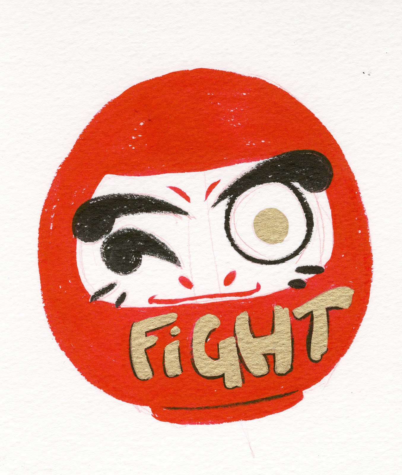
Hey friends and Artnerds! On Wednesday, March 7th, I fly out of the country to visit Japan! I'm going to be visiting Osaka, Kyoto, and Tokyo, and I'm sharing my adventures with my Patrons. I'm super excited for this trip, and while I'm looking forward to enjoying food, fun, and culture, I still have content scheduled for while I'm away. I have some great guest posts planned, some awesome videos lined up, and great stuff for my Artnerds, so if you want to see how the adventure unfolds, join me for March on Patreon!
:flag_jp:Going to Japan! Osaka•Kyoto•Tokyo:flag_jp:
I'm returning on the 22nd, and from there I'll decide what remains a Backer Exclusive, what I'll share with the public, and what's going to be edited into a recap, so don't miss a minute of the fun, join today!
I plan on having Vlogs, Shopping Hauls, a Japantrip Sketchbook, and Japanese stationary and treat giveaways for Artnerds on Patreon when I return, so I hope you guys can feel even a little as excited as I do!
Artnerds and Patrons, since you're already part of the community, fear not, I'm going to upload and schedule things so that you can watch and read at your own pace.
Please consider donating to this blog or purchasing from Natto-shop (http://nattosoup.com/shop) if you want me to continue publishing quality content. All materials tested were purchased from my own pocket. Keep on Truckin' Nattosoup is not under any sponsorship.

March 1, 2018
Swimming Pool Mermaids- A Watercolor Process
In hopes of finding more work as a children's book illustrator and kid friendly comic artist, I joined the Society of Children's Book Writers and Illustrators in 2016.
The Midsouth chapter has their conference in September, which includes contests for both writers and illustrators. I decided to throw my hat into the ring, but as a comic artist (not an official option) rather than as an illustrator, since comics are my passion and the area I'd like to find paying work within.
We were given a prompt to work from, something along the lines of Corky closed his eyes, and when he opened them, he was surprised by what he saw (I'm paraphrasing, but that's the gist), and after brainstorming, I decided to spin the prompt as a Mermaid in a Swimming Pool story.

Since this was my first SCBWI, and my debut into the Nashville kidlit illustration scene, I really wanted to give it my best shot.
For me, this of course means doing an underwater scene (which I've never really done before) with bright, fun, saturated colors that hinged around Mijello's Marine Blue (a color I'd never used before), with floating effects that really captured the feeling of plunging underwater.
Materials Used:
Canson Moulin du Roy 140lb cottonrag watercolor paper
Mijello and Winsor and Newton watercolor paints
Development:
 Roughs for Swimming Pool Mermaids
 Pencils for Swimming Pool Mermaids
 Stretching the Spread
Creating An Underwater Mood
Main color used:
Mijello Mission Gold Marine Blue
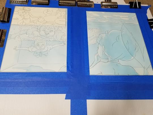
Step 1: Apply all over wash of Marine Blue to relevant panels
Step 2: After wash dries, begin building up layers of under painting in same color.
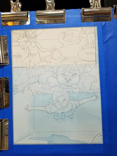
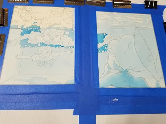
Begin developing background color and 'wave' effect (more successful on pool bottom)

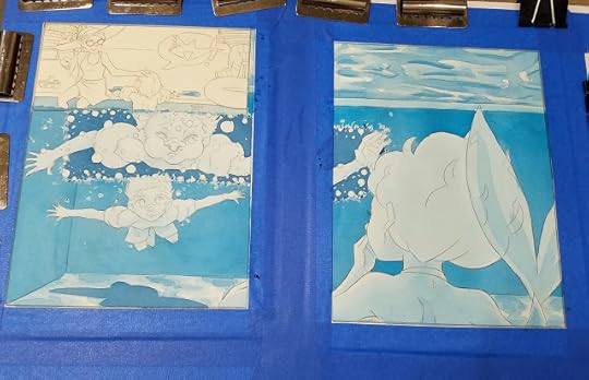
Developing local color:
Once undertone has been established, its time to begin filling in local color.
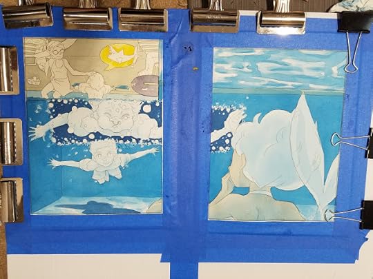
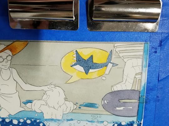
Begin Rendering Skintones:

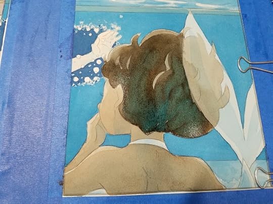
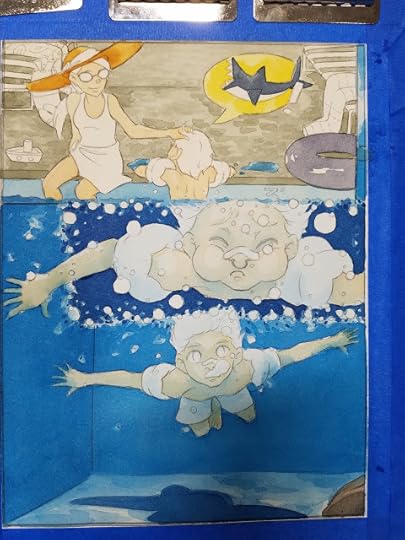
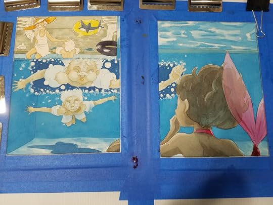
Building Up Details
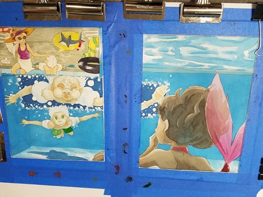
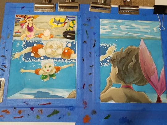
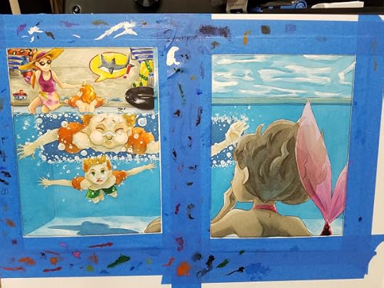
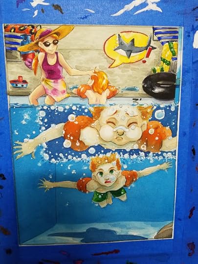
Finishing Touches:

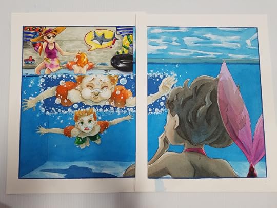
By applying Marine Blue as a toning wash, I was able to achieve an under-water pool effect without running too high a risk. Had I applied the Marine Blue as a glaze after the initial local colors were applied, I ran the risk of a muddy painting- the underglaze helped preserve the brilliance of the colors used.
Unfortunately, my piece did not place, but it was fun to paint, and I am still proud of how it turned out. I learned so much while completing this piece, I'm happy I took the time to design and paint it.

Please consider donating to this blog or purchasing from Natto-shop (http://nattosoup.com/shop) if you want me to continue publishing quality content. All materials tested were purchased from my own pocket. Keep on Truckin' Nattosoup is not under any sponsorship.
The Midsouth chapter has their conference in September, which includes contests for both writers and illustrators. I decided to throw my hat into the ring, but as a comic artist (not an official option) rather than as an illustrator, since comics are my passion and the area I'd like to find paying work within.
We were given a prompt to work from, something along the lines of Corky closed his eyes, and when he opened them, he was surprised by what he saw (I'm paraphrasing, but that's the gist), and after brainstorming, I decided to spin the prompt as a Mermaid in a Swimming Pool story.
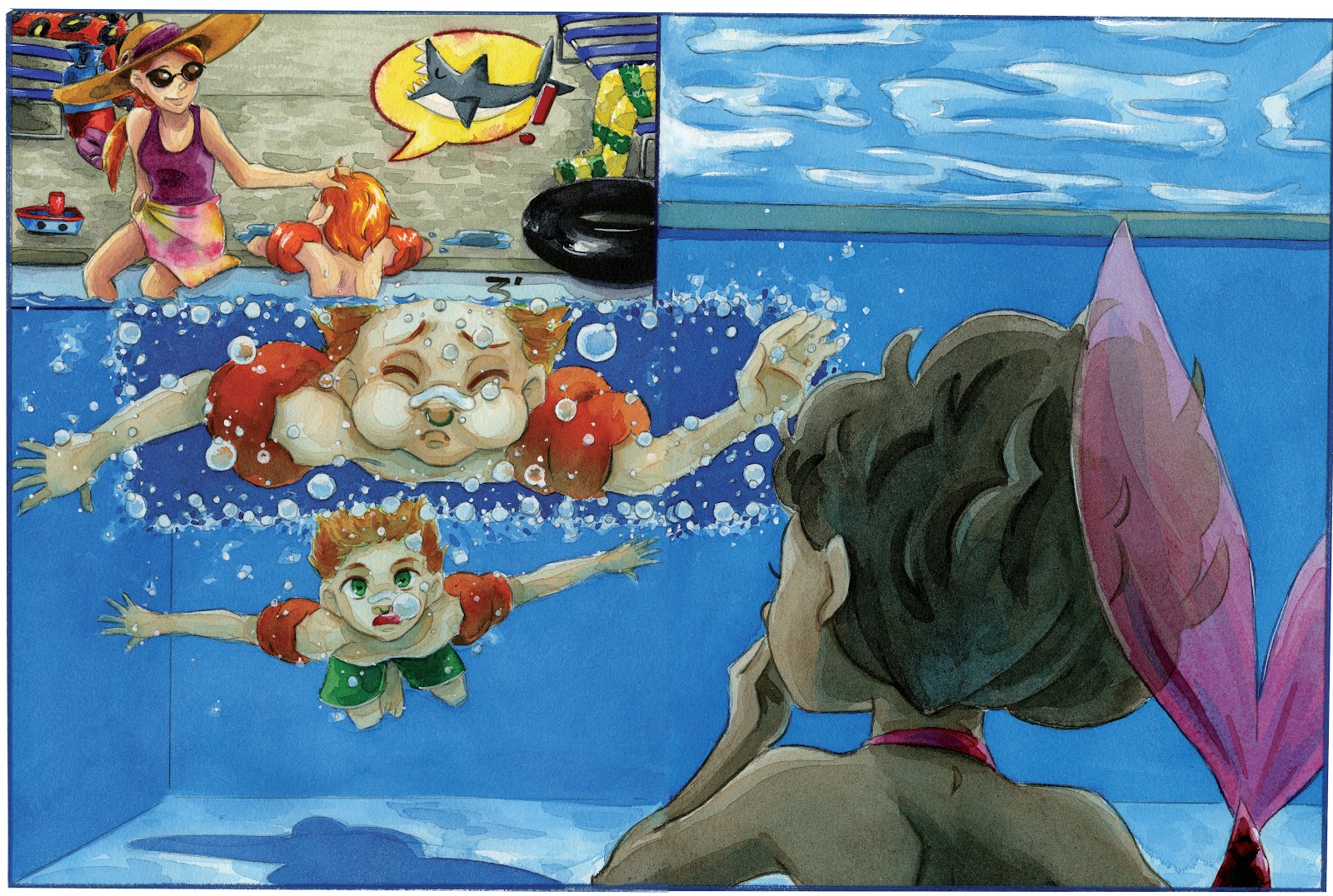
Since this was my first SCBWI, and my debut into the Nashville kidlit illustration scene, I really wanted to give it my best shot.
For me, this of course means doing an underwater scene (which I've never really done before) with bright, fun, saturated colors that hinged around Mijello's Marine Blue (a color I'd never used before), with floating effects that really captured the feeling of plunging underwater.
Materials Used:
Canson Moulin du Roy 140lb cottonrag watercolor paper
Mijello and Winsor and Newton watercolor paints
Development:
 Roughs for Swimming Pool Mermaids
 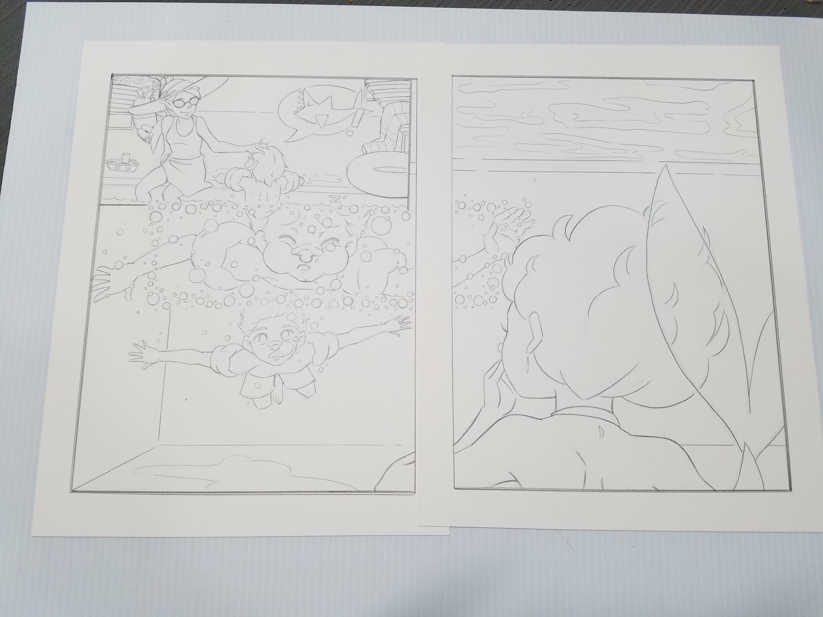 Pencils for Swimming Pool Mermaids
 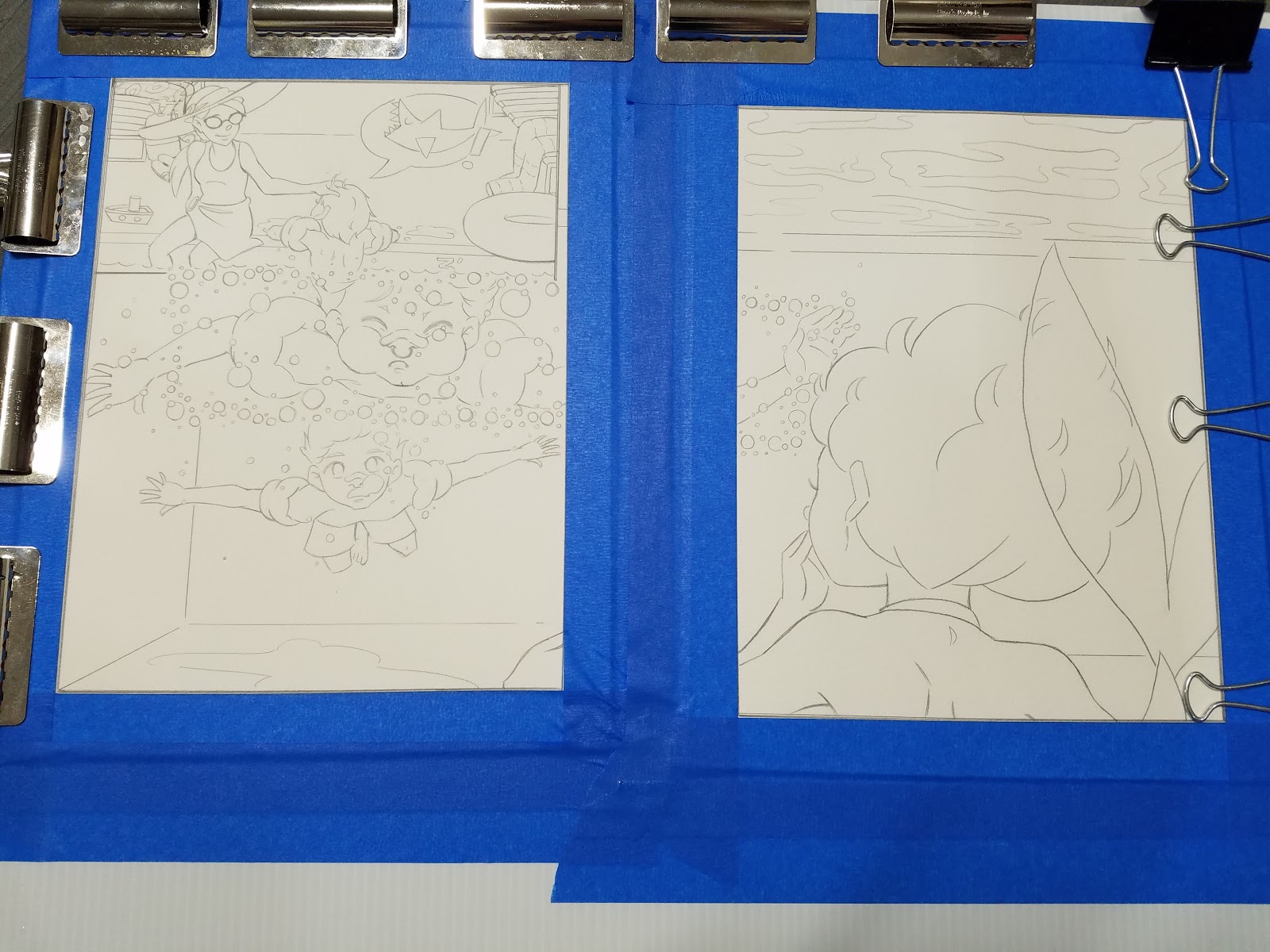 Stretching the Spread
 Creating An Underwater Mood
Main color used:
Mijello Mission Gold Marine Blue
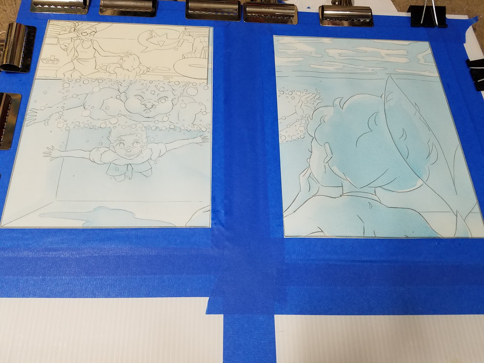
Step 1: Apply all over wash of Marine Blue to relevant panels
Step 2: After wash dries, begin building up layers of under painting in same color.

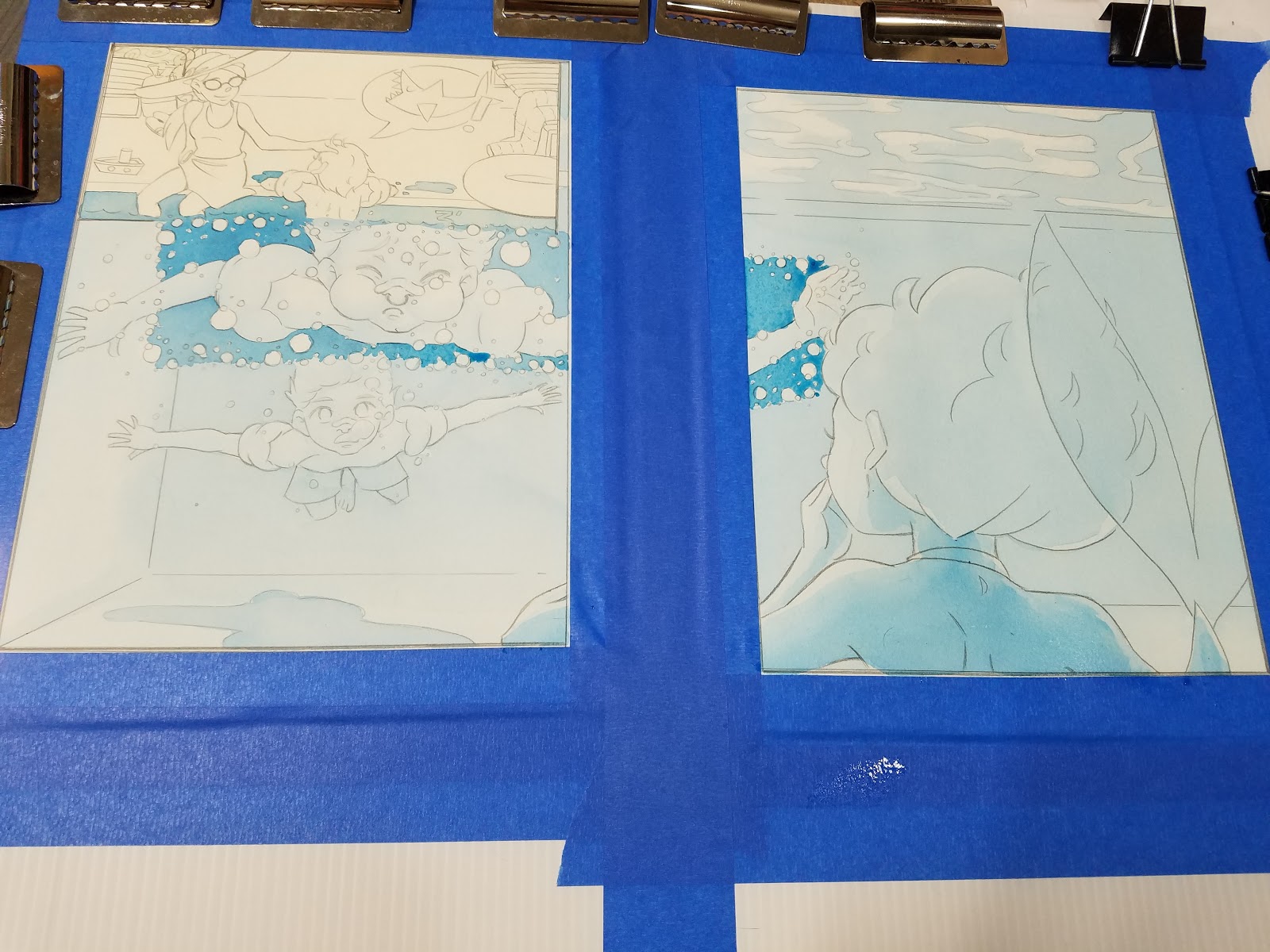
Begin developing background color and 'wave' effect (more successful on pool bottom)
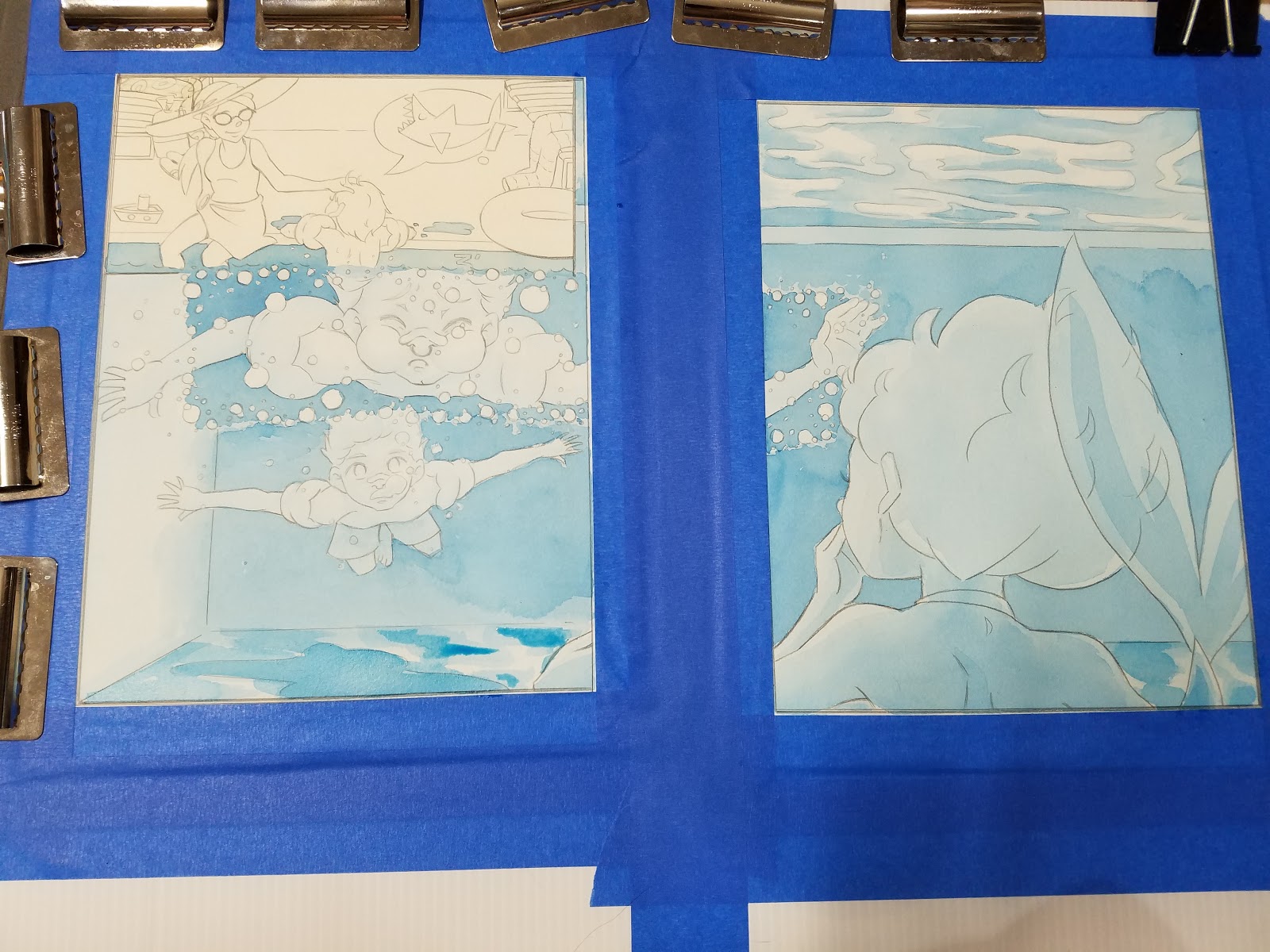

Developing local color:
Once undertone has been established, its time to begin filling in local color.
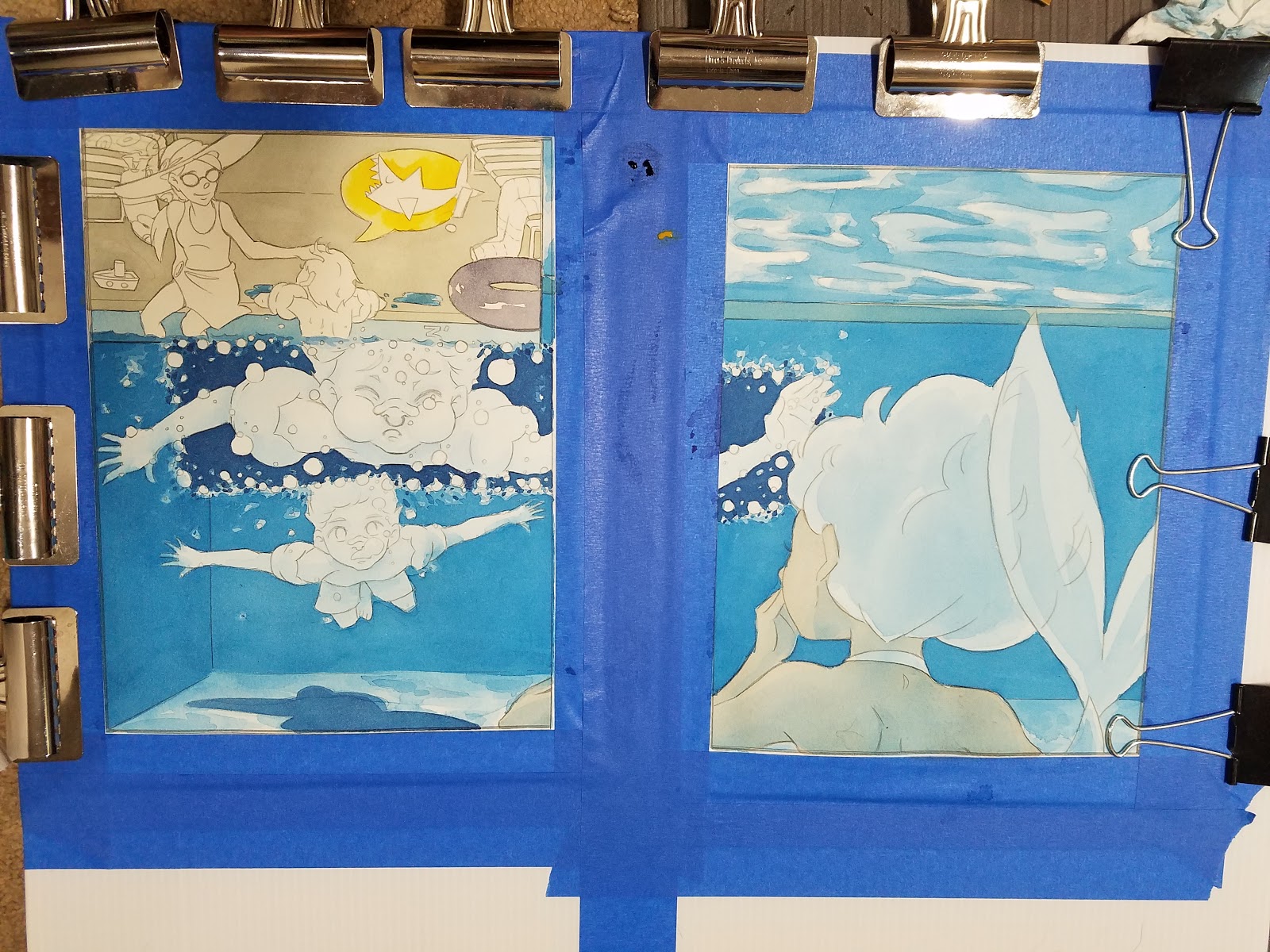

Begin Rendering Skintones:
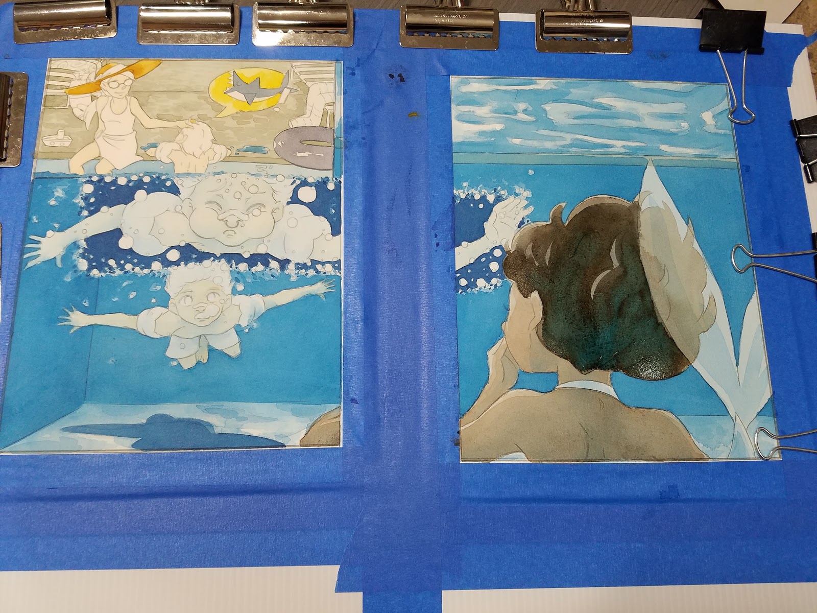


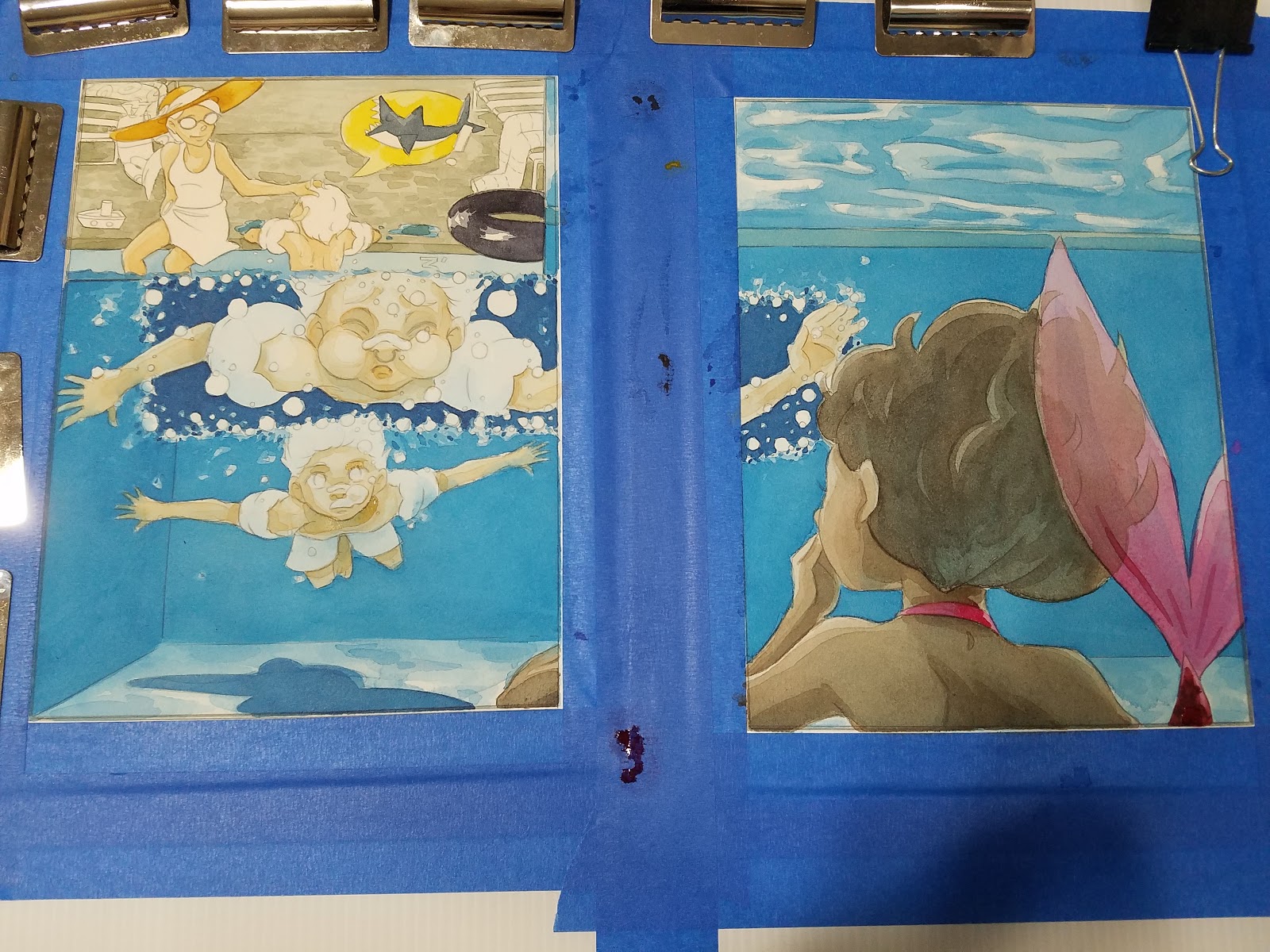
Building Up Details
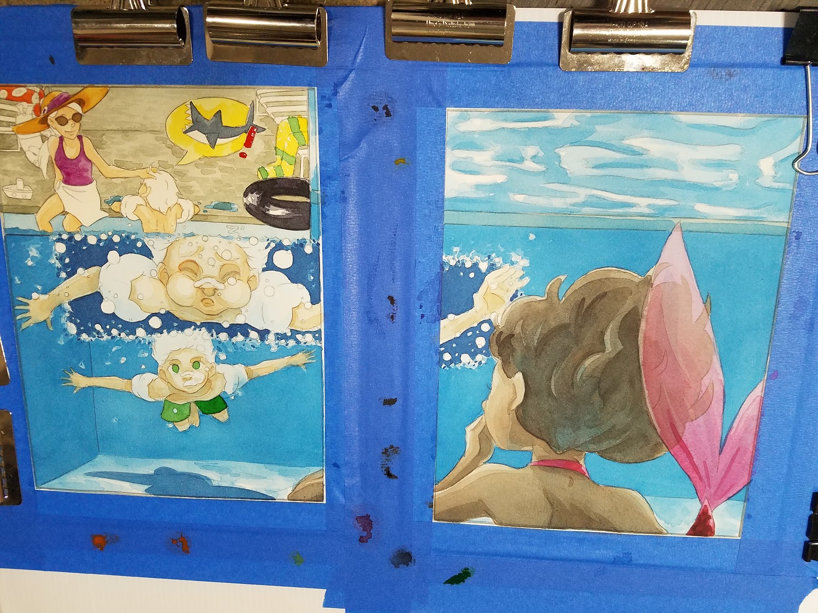
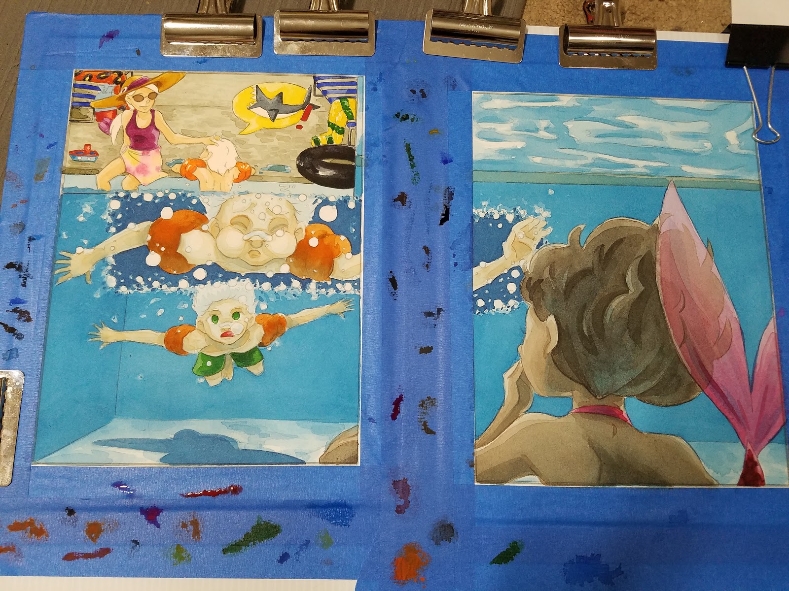


Finishing Touches:
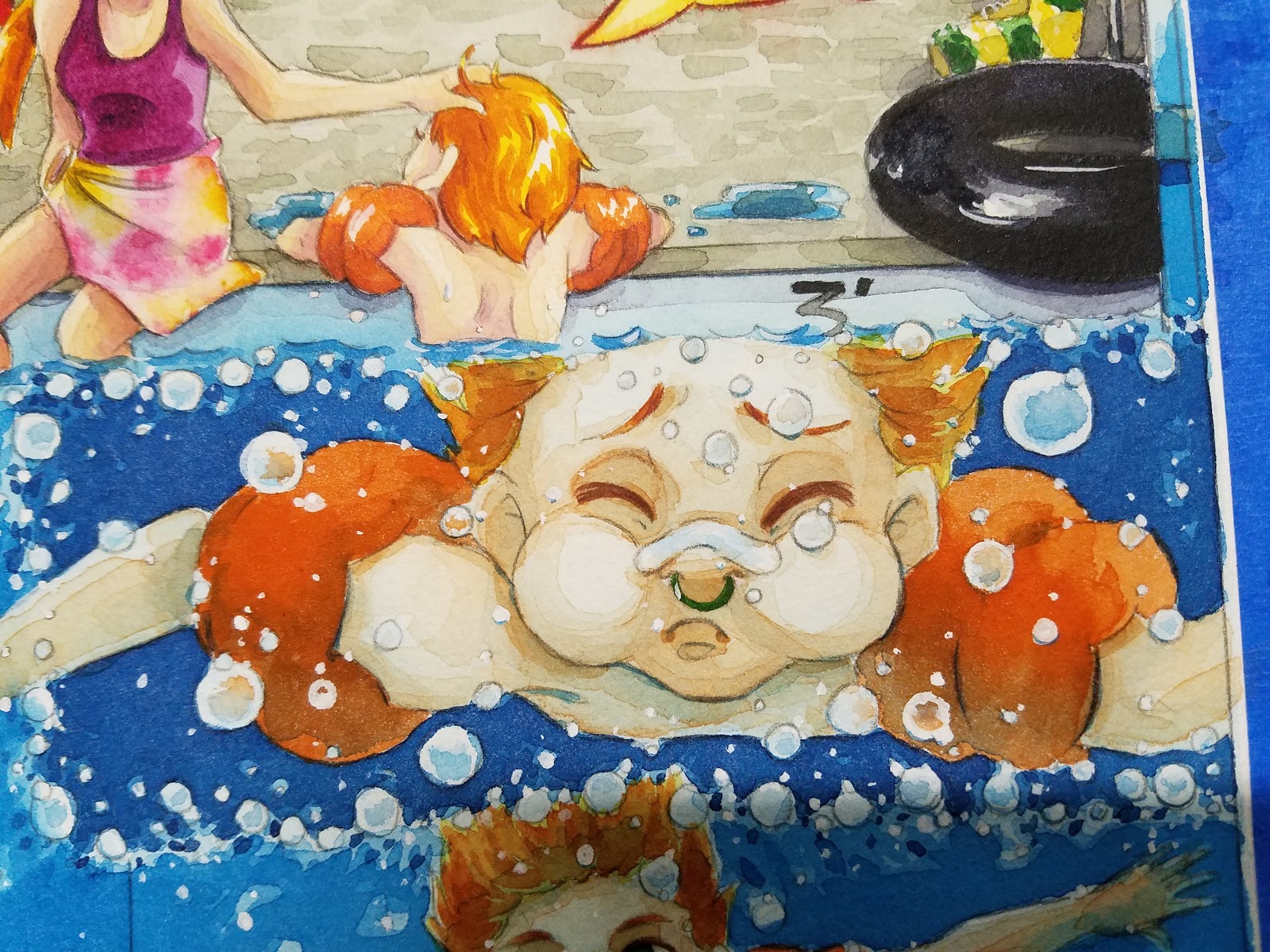

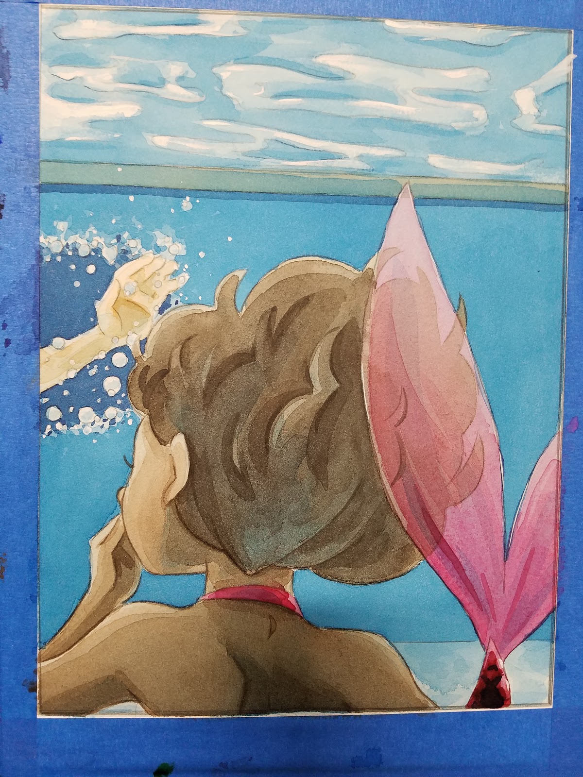


By applying Marine Blue as a toning wash, I was able to achieve an under-water pool effect without running too high a risk. Had I applied the Marine Blue as a glaze after the initial local colors were applied, I ran the risk of a muddy painting- the underglaze helped preserve the brilliance of the colors used.
Unfortunately, my piece did not place, but it was fun to paint, and I am still proud of how it turned out. I learned so much while completing this piece, I'm happy I took the time to design and paint it.

Please consider donating to this blog or purchasing from Natto-shop (http://nattosoup.com/shop) if you want me to continue publishing quality content. All materials tested were purchased from my own pocket. Keep on Truckin' Nattosoup is not under any sponsorship.
Lightfast Testing Fundraising Proposal
For years, you've asked me to do across the board lightfast tests on frequently fugitive art supplies. For years, I've said I'd like to, but demurred- it's a huge amount of time, space, and resources that I can't afford to spend pro bono. For a year, I've had a little known goal on my Patreon- Lightfast Tests, at the $500 a month community goal.
This year, I've tested out so many art supplies- particularly watercolor supplies, spanning the gamut from Obviously for Kids to Claims to be Professional but Is It? to Actually Professional and Nice. Throughout the year, I've had some serious doubts regarding the archivability and lightfastness of many of the supplies I've tested,
My Plan:
I plan to do massive lightfast tests (spanning at least a year) across several popular traditional media resources. I intend to set up a light box, and scan the swatches before and after, and share these resources to either a Patron only resource, or a public resource (depending on what my Patrons vote for)
"A giant color-fastness test on all the marker brands currently available- watercolor, waterbased, alcohol, and any weird thing I might encounter. Will be updated as new materials come out. I will even get super fancy and make a downloadable infographic for you guys that includes what the brand promises and the actual experienced lightfastness. I will share the results to a public Tumblr account for the purpose, as well as on Nattosoup Art and Process Blog."
But to do this, I'm going to need your help.
What I Want to Test:
Stage 1: Alcohol markers from the most popular brands- Copic, Prismacolor, Shin Han, Blick, Chartpak- skintones, fluorescents, and primaries
Stage 2: Watercolor swatches from popular professional brands- Mijello Mission Gold, Daniel Smith, Stage 3: Winsor and Newton, Holbein, and the DS Primatek Colors
Watercolor Swatches from Student and Hobbyist Brands- Lukas, Cotman, Van Gogh, Kuretake Gansai Tambi, Prima Marketing Watercolor Confections, Jane Davenport Petite Palettes
Stage 4: Winsor and Newton Pigment Markers, Winsor and Newton Watercolor Markers (Pigment Based)
Stage 5: Dye based watercolor markers such as Ecoline, Spectrum Aqua, Mermaid Markers
Stage 6: Liquid watercolors such as Blick Liquid watercolors, PH Martin's Radient Watercolors, Hydrus (pigment based)
Stage 7: Children's art supplies (for posterity) such as Crayola washable markers, Crayola Crayons, Crayola watercolors, and Crayola color pencils
Stage 8: Watercolor Pencils such as Derwent Inktense, Supracolor II
Stage 9: Color Pencils such as Prismacolor, Caran D'Ache Pablo, Faber Castel Polychromos, Crayola Signature, Crayola, Derwent Coloursoft
Stage 10: Sharpies, Bic Mark Its, Sharpie Pens, highlighters and other office supplies
Stage 11: Fountain Pen Inks
What I Have:
Epson Large format professional grade scanner
Canoscan Slide Scanner (great for scanning watercolor)
Bristol board
Cardstock
Sketchbook paper
Tracing Paper
Photo Paper
Cellulose watercolor paper
Cotton Rag watercolor paper
All of the art supply products mentioned above
Natural daylight lamps
What I Want to Buy:
Large weatherproof clear plastic box(es)
Dehumidifier
Humidity gauge
What I want to do:
Set up a lightfast testing box (or multiple, depending on demand) outside, and allow the sun to do it's thing. Should conditions get too humid, or the paper show signs of deterioration, I will conduct the tests inside, using daylight lamps.
I plan on checking the boxes monthly for changes in color quality, and if there's a significant change, scanning and updating the information. If there is no significant change, updates will be posted every six months.
Pros of Sunlight:
Actual sunlight
I have space on my porch for multiple boxes
Pros of Natural Light Lamps:
Consistent lighting regardless of weather
What does this mean?
If my total (all Patrons combined) raised at the end of the month is $500, I will begin working on this project. Once I begin, I will create tests for all materials within a stage, and every month we're at the $500 goal, I will start a new stage. Six months in, I'll check the progress of the light test, and update my Patrons and the Tumblr with new swatches. One year in, I will check again, do the same, and we can go from there.
So as long as we're at $500, I will continue to add new tests to the roster, and keep the information updated. Once we're under $500, I will make sure everything is up to date, and halt new tests.
Why does this cost so much?
An ongoing lightfast test of this scale takes a massive amount of time, dedication, space, resources, and art supplies. I plan on scanning before the light test, allowing the products to sit in the box for up to a year, and then scan again to compare the swatches. This is valuable information, and such tests would provide first hand, user experience proof of product claims.
Right now, we're at $161 a month- not bad at all! That $161 goes towards this blog AND the Youtube channel- purchasing materials to review, the supplies needed (such as paper), and paying for guest posts. You can check out this post to see all the great things the Artnerds helped me do in 2017!
What I Need From You:
Your support on Patreon! It can be just as little as $2 a month- every little bit helps! My Artnerds receive all sorts of great goodies, from early access art tutorial videos to free mini comics and art resources, and this would be one more amazing goodie to enjoy! I'm going to share behind the scenes setup and prep videos for these swatches, so if you want an insider sneak peek, you're going to have to join the club!
All that said, maybe Patreon doesn't work for you! That's why, as I gear up, I have this handy poll to see if perhaps Kickstarter would be a better fit.
Loading...
Please consider donating to this blog or purchasing from Natto-shop (http://nattosoup.com/shop) if you want me to continue publishing quality content. All materials tested were purchased from my own pocket. Keep on Truckin' Nattosoup is not under any sponsorship.
February 26, 2018
Alcohol Marker Review: Crayola Signature Blending Markers
Every single convention I table, I talk to artistic kids, and their hopeful parents, about art supplies. Almost every kid over the age of five wants Copic markers, because that's what the artists they admire on Youtube use. And every time, I have to recommend against that- Copics are expensive and require a bit of a learning curb, but waterbased markers require some experience with art supplies to achieve the desired effects.
For years people have asked me if Crayola makes alcohol markers. For years, I've said no. For years, I've requested Crayola consider it- there's a huge army of preteen and teenagers interested in creating manga influenced marker art using alcohol markers like Copics, who just can't afford the price tag. I am so pleased to announce that Crayola has finally heard my pleas (or just figured it out for themselves) and have released their foray into the alcohol marker world- the Crayola Signature Blending Markers. These Crayola Blending markers may be just the stepping stone young artists need to develop marker and illustration skills early, and might be good enough for crafters and convention going artists to use rather than hauling around more expensive markers.
Over on the channel, I've already released a review of the Crayola Signature Brush and Detail Markers, and I've recorded reviews for the Blend and Shade and Artist Oil Core Color Pencils (spoiler: same product, rebranded) that are waiting to be edited. And over the years, I've talked about Crayola a few times- first in my Affordable Art Supply series, and then again on the Channel when talking about watercolors. Every year, I release a series of short tutorials aimed at using Crayola supplies to their best effect, so I think its safe to say I carry a fondness for Crayola. After all, it was my first marker, my first crayon, my first watercolor, my first color pencil. Crayola is a first for so many artists, and sometimes the brunt of our jokes.

Although there is NOTHING on the package that mentions that these are alcohol markers, the smell when you uncap any of the 12 colors or 2 blenders is unmistakable. Even the Crayola site fails to mention that these are alcohol based markers (at the time of writing).
The Blending markers are part of their Signature line, a line that seems to be aimed at adults and frequently features brush lettering examples on the back. You'd be forgiven for assuming this is just another marker for Crayoligraphy- faux brush calligraphy done with Crayola markers. And I suppose you can use these markers for that. But I feel Crayola may be missing their market- these are a perfect alcohol marker for beginners- crafters, stampers, and my own bias, the aspiring comic artist or mangaka.
Y'all can't possibly know how excited I am about this development.
More about Crayola Signature
It's incredibly difficult to find official information about Crayola Signature online, so I decided to contact them through their webform on the site.
The Stats:
12 Colors available, 2 blender markersAlcohol basedSingle tipFiber BrushNot RefillableNot available openstock (yet)
Get them from:
OR
Crayola.com
The Unbox and Swatch:
The Packaging:
 The Box:
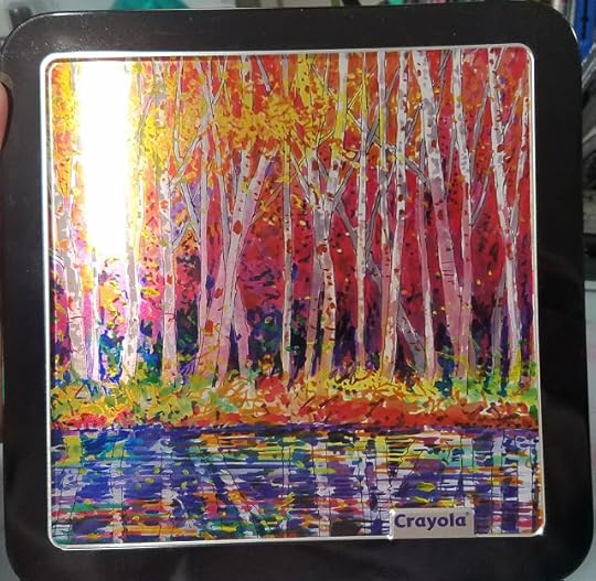
I really love the packaging used for the Crayola Signature line. The tin boxes are quite attractive, the branding minimal, and the art is beautiful dye sublimation printing, which really lets the colors shine. These are a classy step up for Crayola, and helps set the Signature line apart from their regular Crayola for Kids lineup. Unfortunately I can't find artist credit on the box, on the belly band, or online.
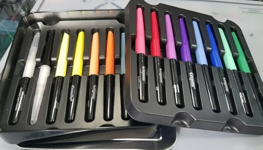
Inside the box are two thin, flimsy plastic trays. They can be kept to keep your markers organized, or you can ditch them- after all, with only 12 colors, you're not likely to get too confused any time soon.
The Markers:
The Colors Inside:
Red
Orange
Yellow
Canary
Green
Sea Green
Blue
Cornflower
Violet
Wisteria
Bubble Gum
Peach
Slate
Black

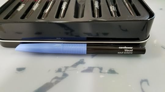
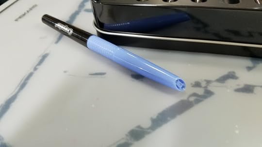
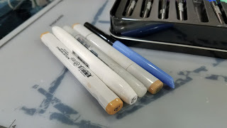 Marker ComparisonLeft to right:Blick Studio Brush MarkerShin Han Twin TouchCopic CiaoCopic SketchCrayola Signature Blending Marker
Crayola Signature Blendingmarkers are single tipped brush markers that utilize a compressed fiber brush. These brushes tend to fray and get mushy with use and abuse. The bodies are unique among alcohol markers- fairly narrow with a grip section and a vented cap. The color name is screened on the body in three languages, as is the Crayola branding, but there are no color families. In the current Blending lineup, there are two of every color- one light tone and one darker tone, and two blender markers.
The Brushes:

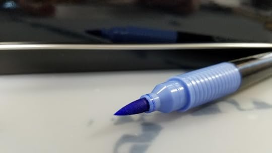
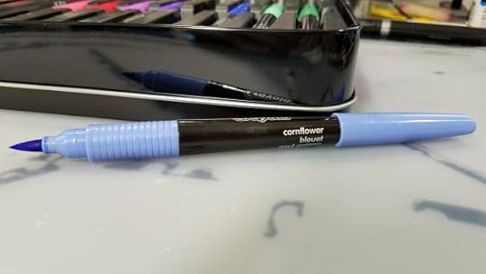
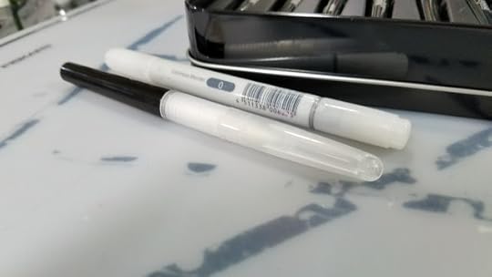 Two colorlss blenders- Crayola Signature Blending colorless blender and Copic Ciao colorless blender
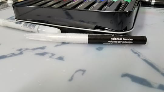
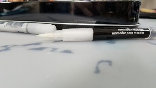
The Swatches:
The box recommends:
For this review, I've swatched the Crayola Signature Blending Markers on papers I would generally use with any alcohol marker.
Copic Marker Paper:
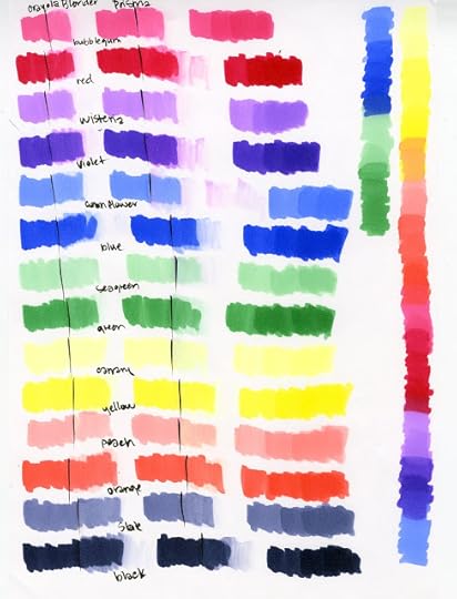
Canson XL Mixed Media Paper:
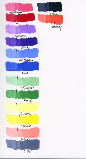
Strathmore 300 Series Bristol Artist Tiles:

The Field Test:
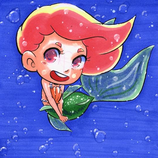 Marker illustration completed on Strathmore 300 series Bristol Artist Tile
The Field Test
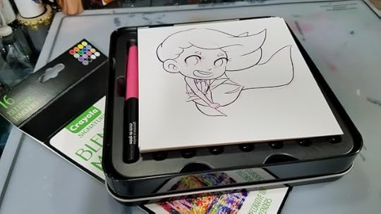
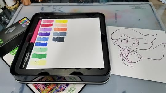

Background wash of Blue is applied to image.
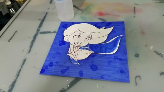
Rubbing alcohol is dripped from bottle onto image.
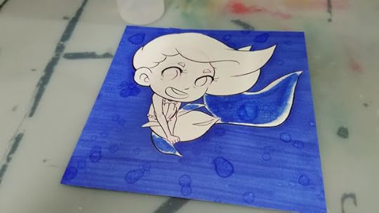
Rubbing alcohol is spritzed onto image.
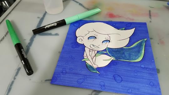
Applying a layer of Sea Green to translucent tail and fins. Applying Cornflower to eyes, blending out.
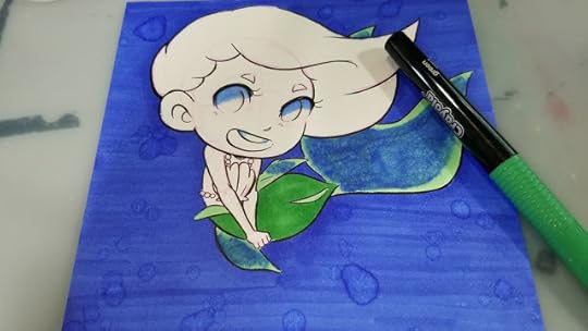
Applying Green to tail.
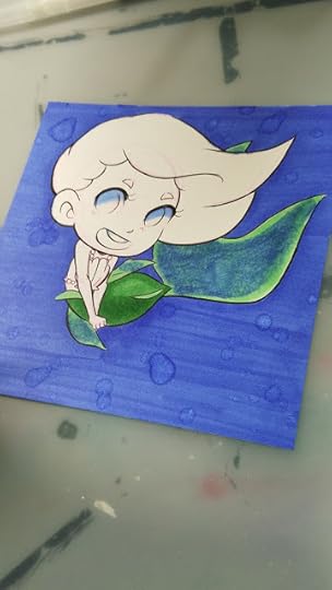 Applying second layer of Green.

Applying first layer of skintone using Peach, the only skintone in this set.
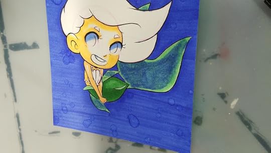
Blending out Peach, Peach gets slightly fluorescent and orange, like a highlighter. Not a realistic blend.
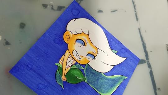
Second layer of Peach.
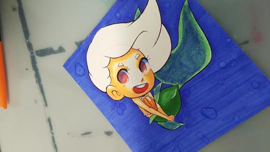
First layer of Bubblegum to eyes.
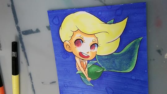
First layer of Canary to hair.
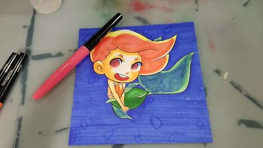
First Layer of Bubblegum to hair.
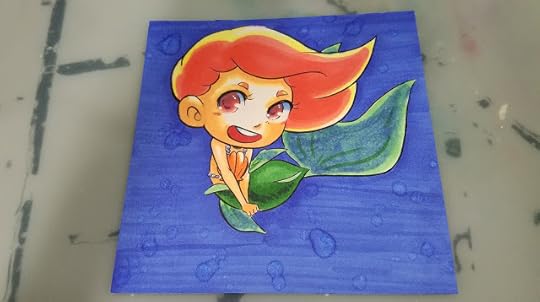
Wisteria added to eyes for depth, second layer of Bubblegum. Green fin veins added. Highlight scales were added with colorless blender, shadow scales added with Blue and Green.
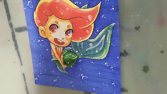
White highlights added using a Recollections Opaque white marker and white Signo gel pen.
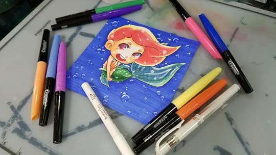
The Verdict:
These are the real deal, a true unicorn- alcohol markers from Crayola. Although its part of their Signature brand, which seems to be aimed at older teens and adults, I'm sure many young artists will be excited about this development once they find out.
How the markers handle:
The grip on the handle makes it easier to remove the caps quickly, and caps can be posted on the back of the marker.
The fiber tip markers are slightly mushy after swatching, and just get mushier with use. This makes them a bit difficult to control, and they're prone to putting down a LOT of ink. The colorless blender also causes the ink to react uncontrollably, which leads to some muddy blending (noticeable in the tail).
If you're fine with your teenager using alcohol markers (the only real issue I have are the fumes, and I trust Crayola wouldn't mark it Non-Toxic if it weren't), these are a great starter set that doesn't cost an arm and a leg. If your child enjoys these markers, they can be replaced with affordable but nicer alternatives as the colors run out. You can scope out this blog for further recommendations, but a great next step would be the Blick Studio Brush Markers.
So my final plea is this:
Crayola, please acknowledge the preteens and teens who use your supplies to create comic and manga art. Please release a Multicultural pack of Blending markers so young, talented artists can create beautiful figurative illustrations. Please consider releasing themed booster packs (maybe 6 markers each?) with color families. Please help foster a love of art, and art supplies, in these young artists, and continue to show support by releasing products designed for intermediate artists. As someone who used your Supertips for her comic art almost into her 20's, I speak from the heart.
Releasing booster sets of markers:
Allows kids and adults to buy the colors they'll useHelps keep the price downAllows kids to grow a collection as neededColors can be sold in themes- Skintones, Spring (pastels) Bold, Jewel Tones, similar to how existing alcohol marker companies distribute affordable sets of markersCould even opt to only sell these sets through Amazon or Crayola store, if shelf space is the limiting factor.
Please consider donating to this blog or purchasing from Natto-shop (http://nattosoup.com/shop) if you want me to continue publishing quality content. All materials tested were purchased from my own pocket. Keep on Truckin' Nattosoup is not under any sponsorship.
For years people have asked me if Crayola makes alcohol markers. For years, I've said no. For years, I've requested Crayola consider it- there's a huge army of preteen and teenagers interested in creating manga influenced marker art using alcohol markers like Copics, who just can't afford the price tag. I am so pleased to announce that Crayola has finally heard my pleas (or just figured it out for themselves) and have released their foray into the alcohol marker world- the Crayola Signature Blending Markers. These Crayola Blending markers may be just the stepping stone young artists need to develop marker and illustration skills early, and might be good enough for crafters and convention going artists to use rather than hauling around more expensive markers.
Over on the channel, I've already released a review of the Crayola Signature Brush and Detail Markers, and I've recorded reviews for the Blend and Shade and Artist Oil Core Color Pencils (spoiler: same product, rebranded) that are waiting to be edited. And over the years, I've talked about Crayola a few times- first in my Affordable Art Supply series, and then again on the Channel when talking about watercolors. Every year, I release a series of short tutorials aimed at using Crayola supplies to their best effect, so I think its safe to say I carry a fondness for Crayola. After all, it was my first marker, my first crayon, my first watercolor, my first color pencil. Crayola is a first for so many artists, and sometimes the brunt of our jokes.

Although there is NOTHING on the package that mentions that these are alcohol markers, the smell when you uncap any of the 12 colors or 2 blenders is unmistakable. Even the Crayola site fails to mention that these are alcohol based markers (at the time of writing).
The Blending markers are part of their Signature line, a line that seems to be aimed at adults and frequently features brush lettering examples on the back. You'd be forgiven for assuming this is just another marker for Crayoligraphy- faux brush calligraphy done with Crayola markers. And I suppose you can use these markers for that. But I feel Crayola may be missing their market- these are a perfect alcohol marker for beginners- crafters, stampers, and my own bias, the aspiring comic artist or mangaka.
Y'all can't possibly know how excited I am about this development.
More about Crayola Signature
It's incredibly difficult to find official information about Crayola Signature online, so I decided to contact them through their webform on the site.
Hi there! I'm writing a review about the Crayola Signature Blending markers (already purchased) for Nattosoup Studio Art and Process Blog (nattosoup.blogspot.com), and I'm interested in more information about the Signature line of products. If you could answer, it would be much appreciated!At time of writing, there is no MSDS available on the site for the Blending markers. For those of you unfamiliar with this term, MSDS go over manufacturing details that may affect consumers, such as toxicity. There are SDS's available for many other Crayola marker products, so I assume this is due to the recent release of the Blending markers.
When was this line launched?
Who is the intended customer?
Where can we find information about the artists who have contributed their art to the boxes?
What future products are planned for the Signature line?
Thank you so much for your time and help! I'm looking forward to your response!
Becca Hillburn
The Stats:
12 Colors available, 2 blender markersAlcohol basedSingle tipFiber BrushNot RefillableNot available openstock (yet)
Get them from:
OR
Crayola.com
The Unbox and Swatch:
The Packaging:

 The Box:
 Crayola Blending Markers offer 14 rich, saturated colors for superior blending. Featuring two colorless markers that lighten shades or remove areas of color altogether. Use them to achieve the exact shade you need or create textures and spot effects.
Crayola Signature Blending Markers work best on Blending Marker paper. Try our Crayola Signature Blend and Shade Inspiration pad!
Safety Information:
ACMI AP: Conforms to ASTM D 4236
All Crayola art materials are nontoxic.
Washing and Care Information:Stain Advisement: Crayola Signature Blending Markers are permanent when dry and may bleed through paper. Protect clothing during use and cover work surfaces to avoid staining.

I really love the packaging used for the Crayola Signature line. The tin boxes are quite attractive, the branding minimal, and the art is beautiful dye sublimation printing, which really lets the colors shine. These are a classy step up for Crayola, and helps set the Signature line apart from their regular Crayola for Kids lineup. Unfortunately I can't find artist credit on the box, on the belly band, or online.

Inside the box are two thin, flimsy plastic trays. They can be kept to keep your markers organized, or you can ditch them- after all, with only 12 colors, you're not likely to get too confused any time soon.
The Markers:
The Colors Inside:
Red
Orange
Yellow
Canary
Green
Sea Green
Blue
Cornflower
Violet
Wisteria
Bubble Gum
Peach
Slate
Black


 Marker ComparisonLeft to right:Blick Studio Brush MarkerShin Han Twin TouchCopic CiaoCopic SketchCrayola Signature Blending Marker
Crayola Signature Blendingmarkers are single tipped brush markers that utilize a compressed fiber brush. These brushes tend to fray and get mushy with use and abuse. The bodies are unique among alcohol markers- fairly narrow with a grip section and a vented cap. The color name is screened on the body in three languages, as is the Crayola branding, but there are no color families. In the current Blending lineup, there are two of every color- one light tone and one darker tone, and two blender markers.
The Brushes:
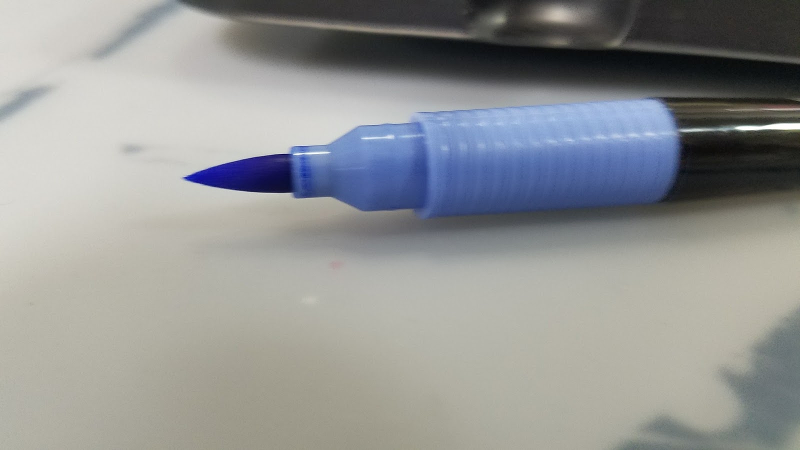

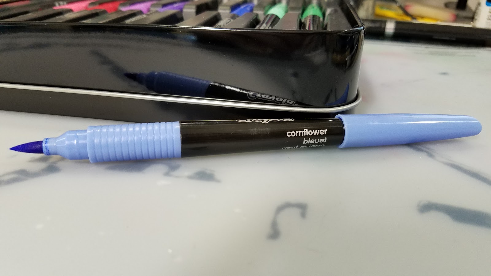
 Two colorlss blenders- Crayola Signature Blending colorless blender and Copic Ciao colorless blender

The Swatches:
The box recommends:
Crayola Signature Blending Markers work best on blending marker paper. Try our Crayola Signature Blend and Shade Inspiration Pad.
For this review, I've swatched the Crayola Signature Blending Markers on papers I would generally use with any alcohol marker.
Copic Marker Paper:

Canson XL Mixed Media Paper:
Strathmore 300 Series Bristol Artist Tiles:
The Field Test:
 Marker illustration completed on Strathmore 300 series Bristol Artist Tile
The Field Test
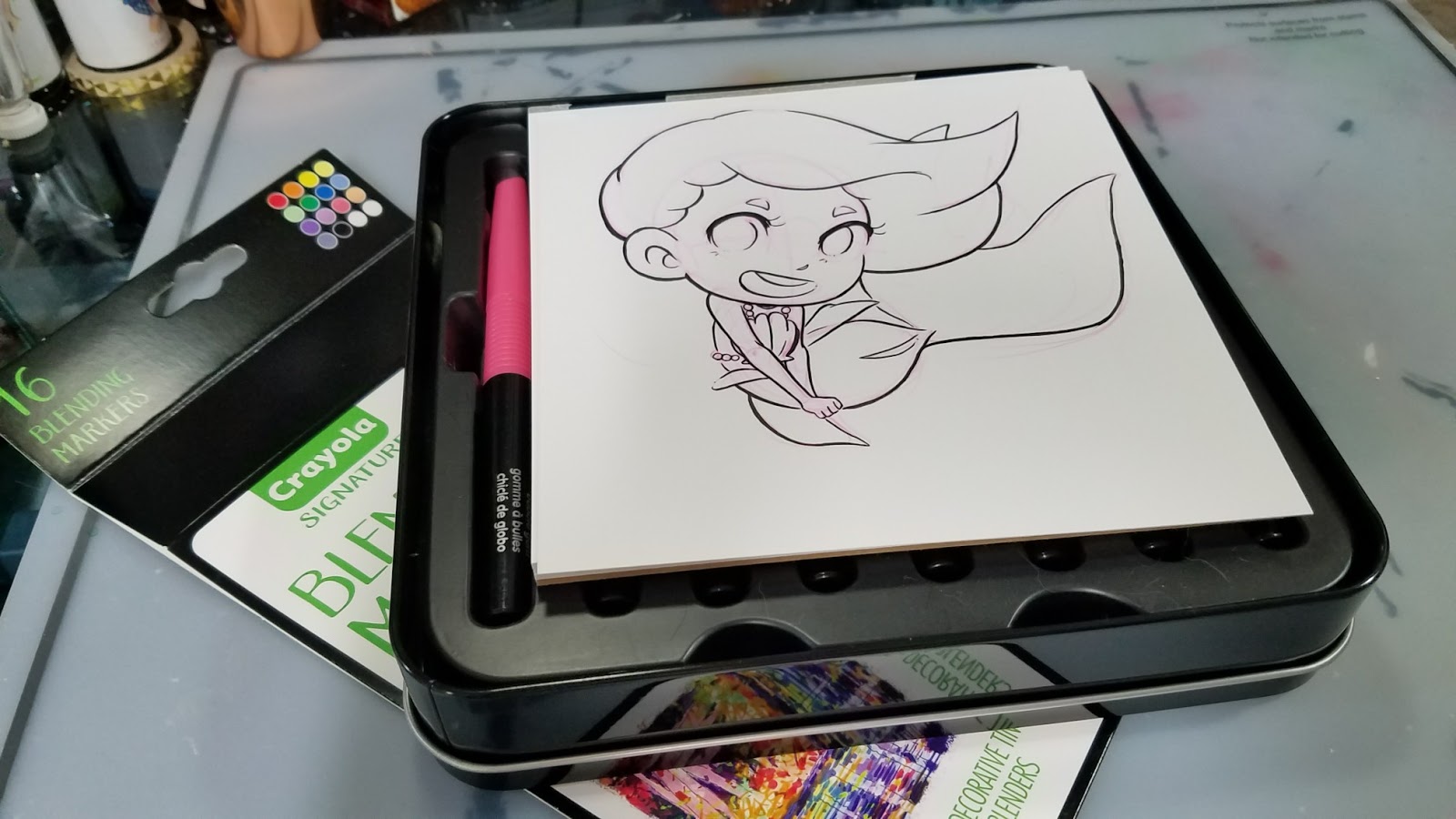

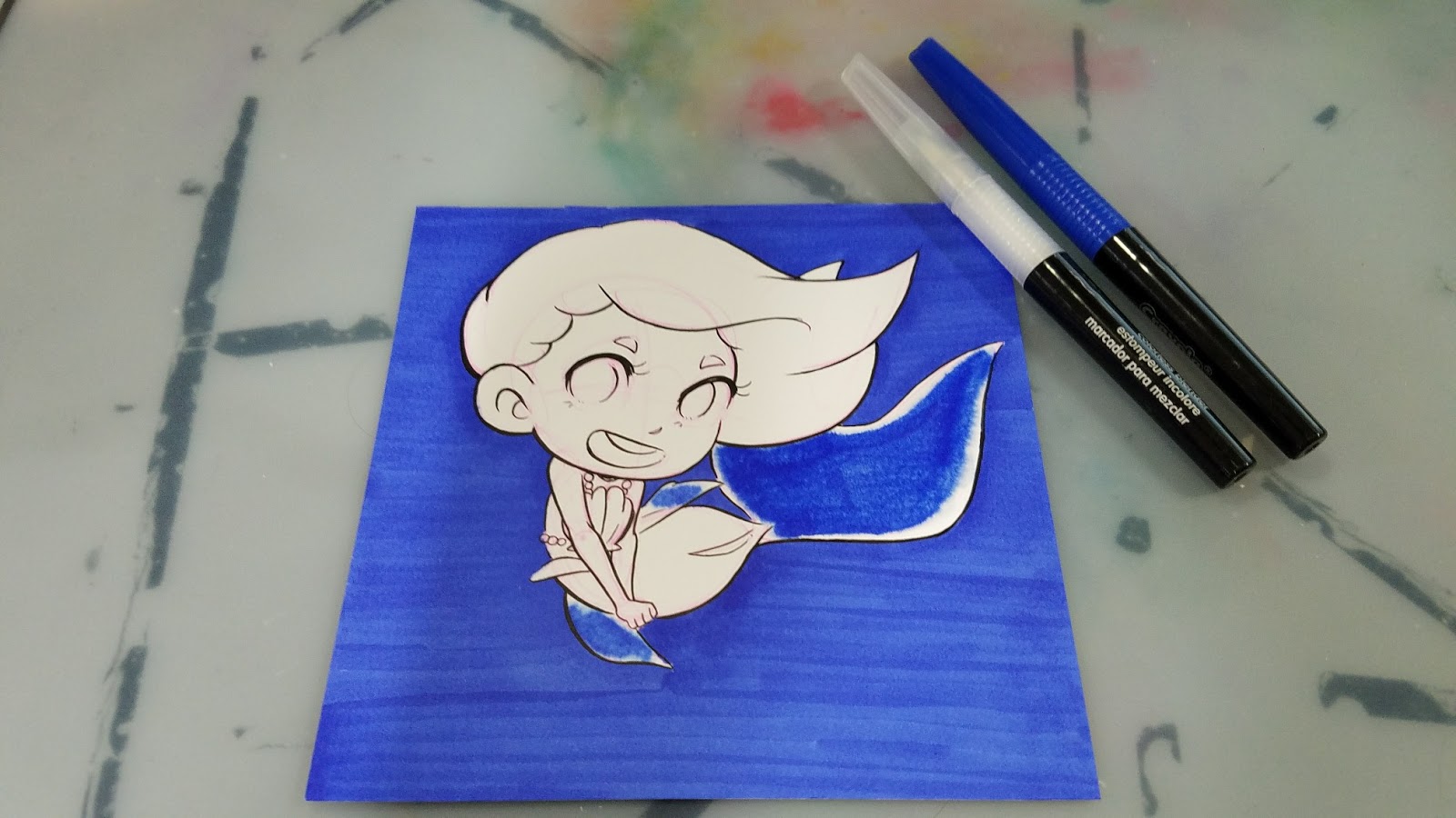
Background wash of Blue is applied to image.

Rubbing alcohol is dripped from bottle onto image.

Rubbing alcohol is spritzed onto image.

Applying a layer of Sea Green to translucent tail and fins. Applying Cornflower to eyes, blending out.
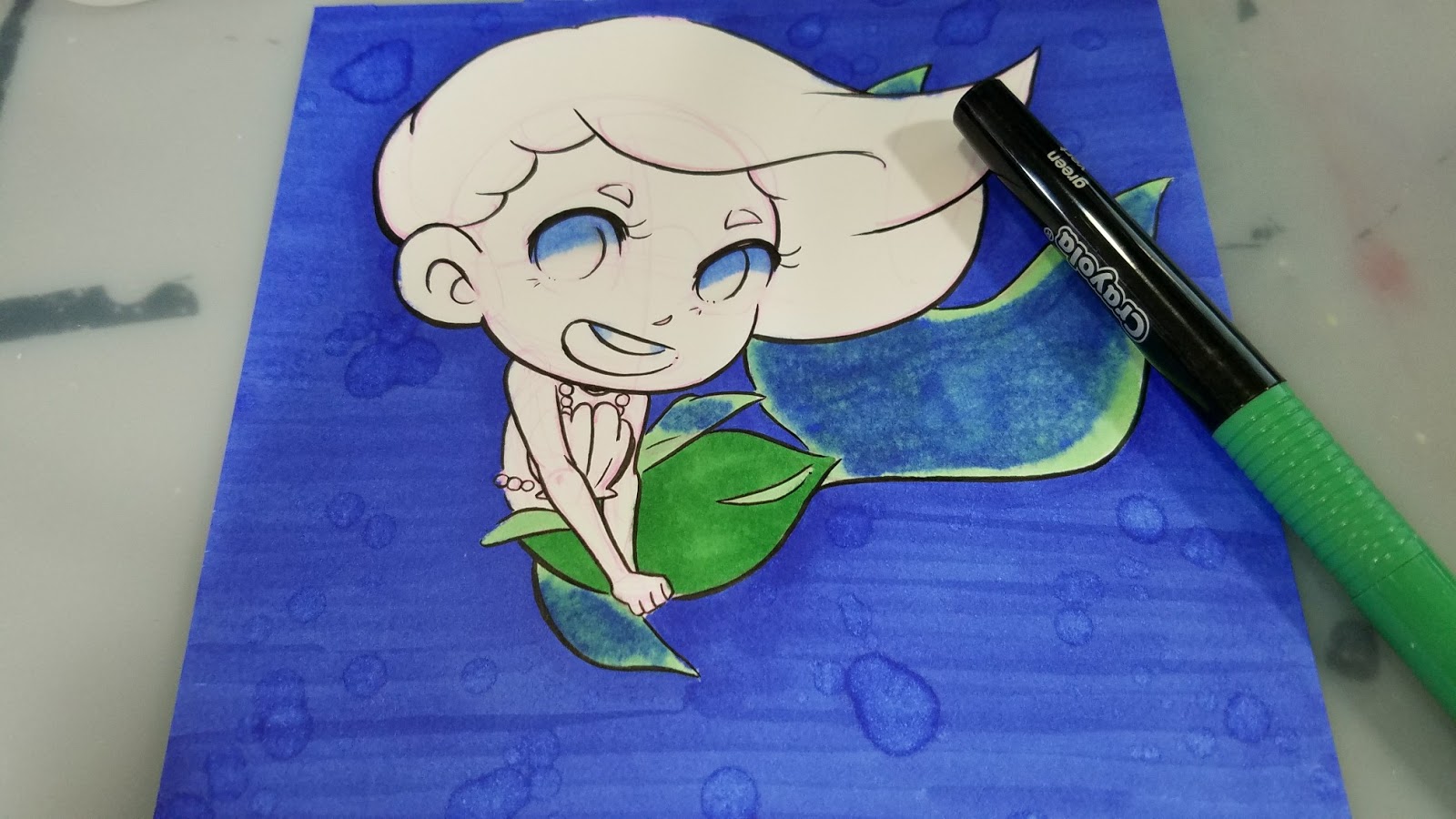
Applying Green to tail.
 Applying second layer of Green.
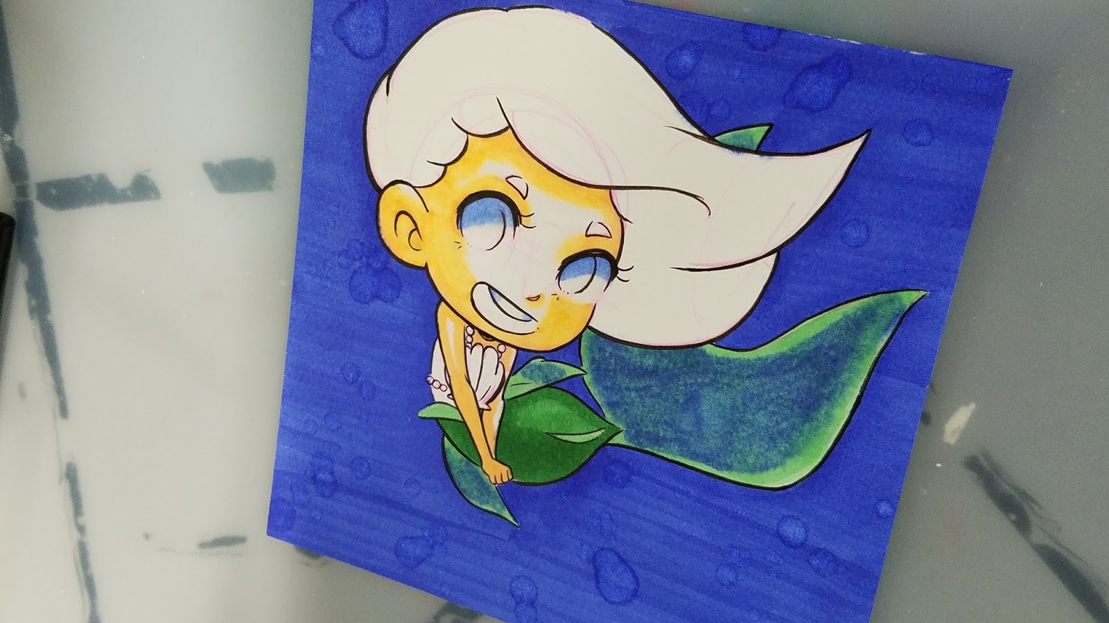
Applying first layer of skintone using Peach, the only skintone in this set.
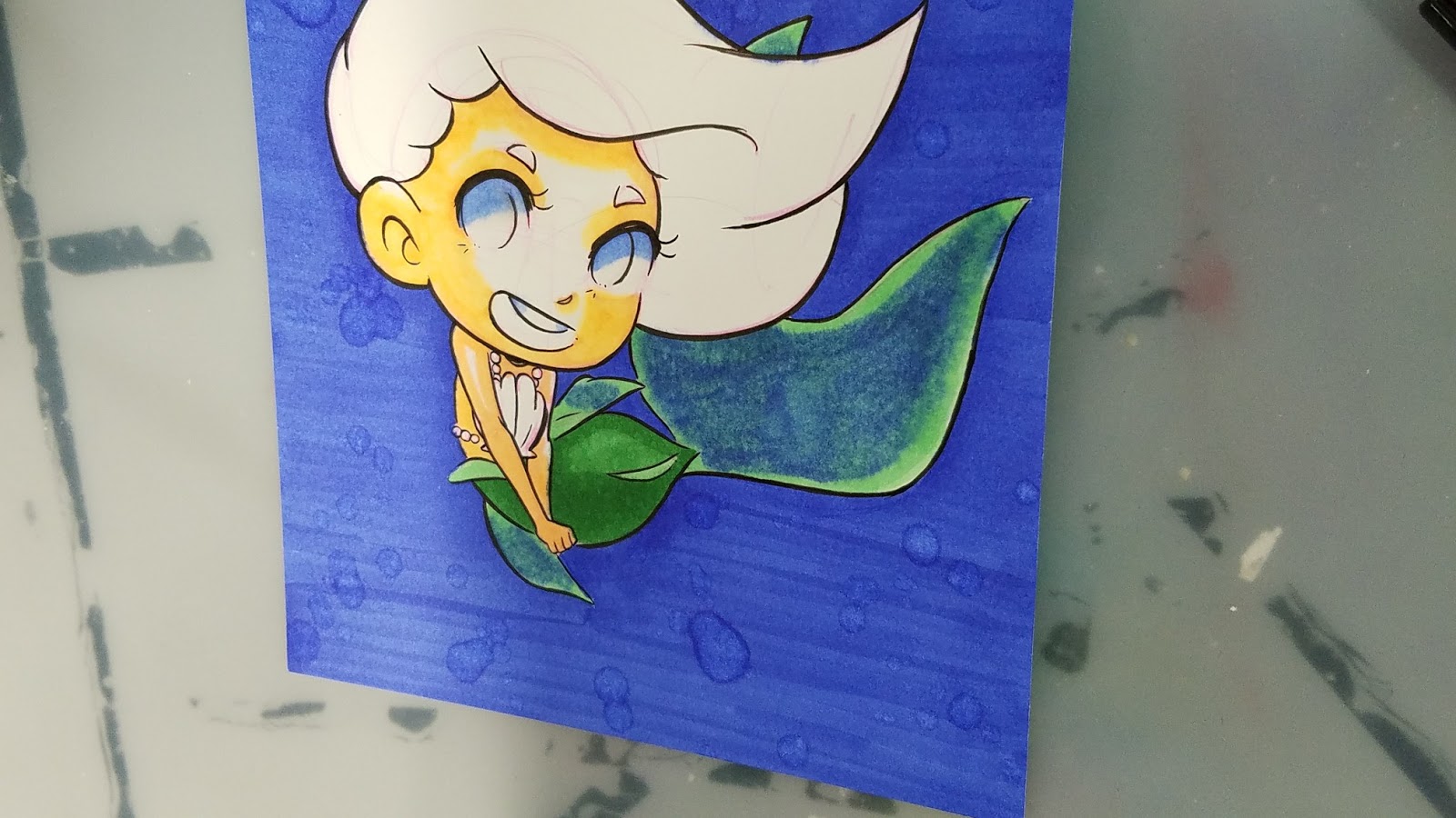
Blending out Peach, Peach gets slightly fluorescent and orange, like a highlighter. Not a realistic blend.
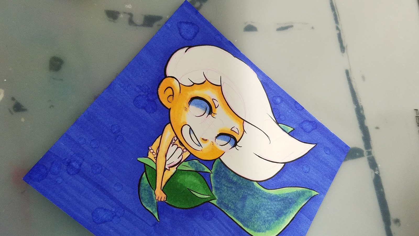
Second layer of Peach.

First layer of Bubblegum to eyes.

First layer of Canary to hair.

First Layer of Bubblegum to hair.

Wisteria added to eyes for depth, second layer of Bubblegum. Green fin veins added. Highlight scales were added with colorless blender, shadow scales added with Blue and Green.
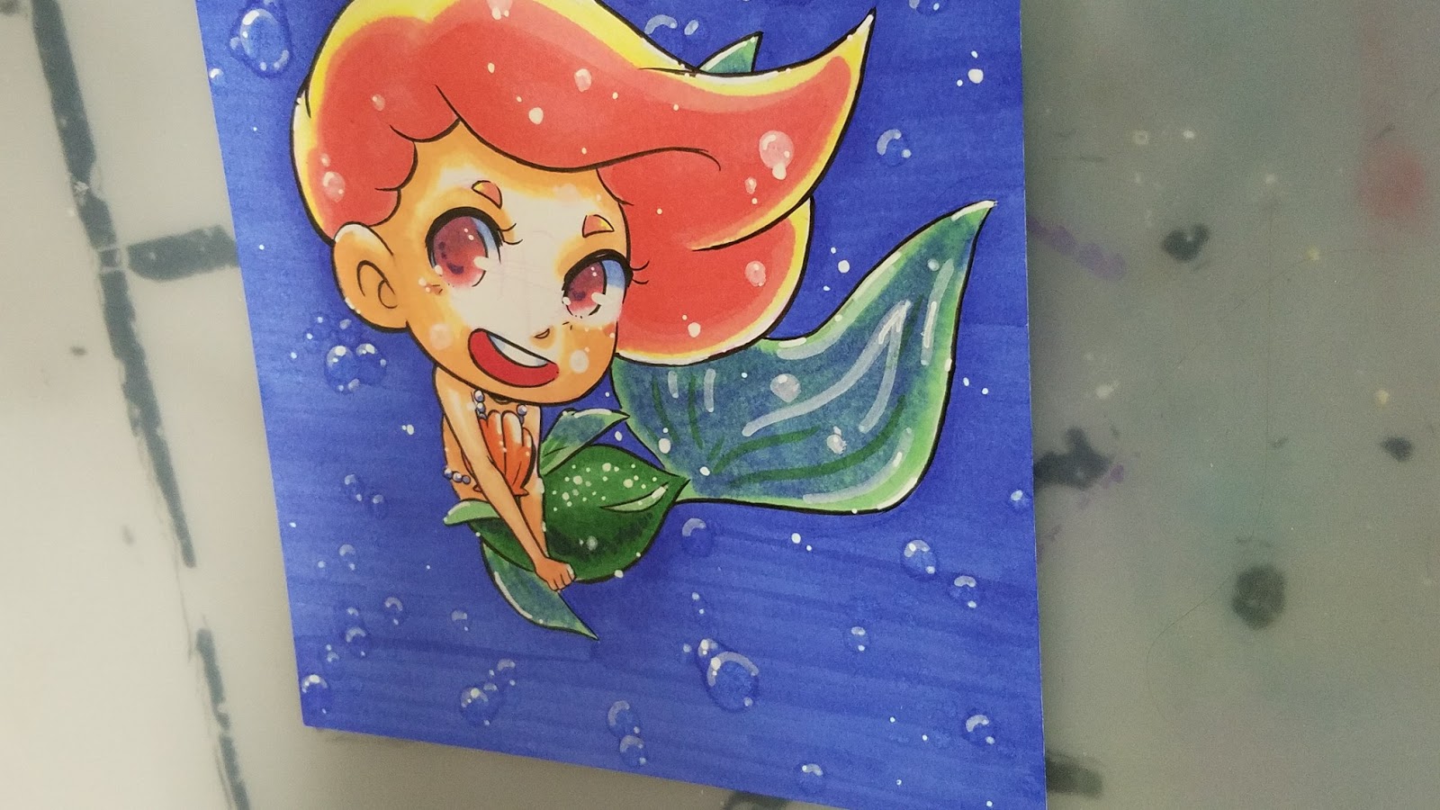
White highlights added using a Recollections Opaque white marker and white Signo gel pen.

The Verdict:
These are the real deal, a true unicorn- alcohol markers from Crayola. Although its part of their Signature brand, which seems to be aimed at older teens and adults, I'm sure many young artists will be excited about this development once they find out.
How the markers handle:
The grip on the handle makes it easier to remove the caps quickly, and caps can be posted on the back of the marker.
The fiber tip markers are slightly mushy after swatching, and just get mushier with use. This makes them a bit difficult to control, and they're prone to putting down a LOT of ink. The colorless blender also causes the ink to react uncontrollably, which leads to some muddy blending (noticeable in the tail).
If you're fine with your teenager using alcohol markers (the only real issue I have are the fumes, and I trust Crayola wouldn't mark it Non-Toxic if it weren't), these are a great starter set that doesn't cost an arm and a leg. If your child enjoys these markers, they can be replaced with affordable but nicer alternatives as the colors run out. You can scope out this blog for further recommendations, but a great next step would be the Blick Studio Brush Markers.
So my final plea is this:
Crayola, please acknowledge the preteens and teens who use your supplies to create comic and manga art. Please release a Multicultural pack of Blending markers so young, talented artists can create beautiful figurative illustrations. Please consider releasing themed booster packs (maybe 6 markers each?) with color families. Please help foster a love of art, and art supplies, in these young artists, and continue to show support by releasing products designed for intermediate artists. As someone who used your Supertips for her comic art almost into her 20's, I speak from the heart.
Releasing booster sets of markers:
Allows kids and adults to buy the colors they'll useHelps keep the price downAllows kids to grow a collection as neededColors can be sold in themes- Skintones, Spring (pastels) Bold, Jewel Tones, similar to how existing alcohol marker companies distribute affordable sets of markersCould even opt to only sell these sets through Amazon or Crayola store, if shelf space is the limiting factor.
Please consider donating to this blog or purchasing from Natto-shop (http://nattosoup.com/shop) if you want me to continue publishing quality content. All materials tested were purchased from my own pocket. Keep on Truckin' Nattosoup is not under any sponsorship.
February 22, 2018
Watercolor Markers: Watercolor Basics
Watercolor markers can be a fun addition to your art supply arsenal, but there are so many to choose from! Today we're going to talk about a few favorites, and cover the basics- hopefully you'll feel confident in trying watercolor markers after reading this post.
Two basic types:
Pigment Based
Dye Based
Pigment Based:
Only Winsor and Newton watercolor markers fall into this category. Use pigments for color, the same way tube and pan watercolors use pigments. Pigment based watercolors tend to be more archival and lightfast than dye based watercolors. These are intermixable with other Winsor and Newton Watercolors, and utilize the same color names for easy matching.
Dye Based:
The majority of watercolor markers, from the Crayola paintbrushes to Ecoline watercolor markers are dye based. Dye based markers tend to be highly water reactive (unless additives are used for slight resistance, such as glycerin), and feature brilliant, blendable color. Dye based markers tend to use fanciful, non descriptive names, so watching is recommended for color matching. Can be used on top of regular watercolors as a glaze, but would not recommending using as an underpainting.
Most markers are dye based- from waterbased intended for children (Crayola) to alcohol based markers like Copic and Prismacolor markers.
Two Main Brush Types:
Individual Nylon Bristles
Solid Brush
Watercolor Marker Overview:
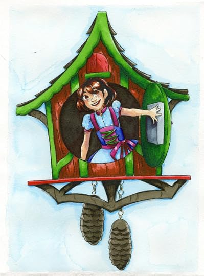 Winsor and Newton watercolor markers on Winsor and Newton Watercolor Marker Paper
Winsor and Newton Watercolor Markers:
Review (written)
Buy
Tutorial (written)
Tutorial (video)
Winsor and Newton Marker Overview (video)
 Spectrum Aqua watercolor markers on Fluid watercolor paper
Spectrum Aqua
Review (video)
Review (written)
Buy
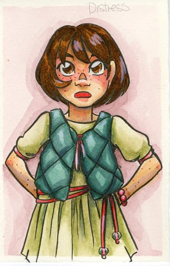 Ranger Distress markers on Fabriano watercolor paper
Ranger Distress Markers
Review
Buy
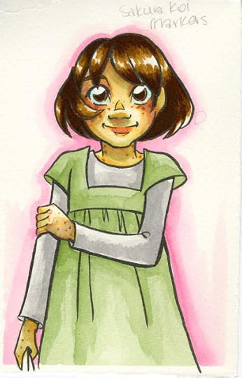 Sakura Koi markers on Fabriano watercolor paper
Sakura Koi Markers:
Swatch Test (video)
Fieldtest:
Wet Application (video)
Dry Application (video)
Buy
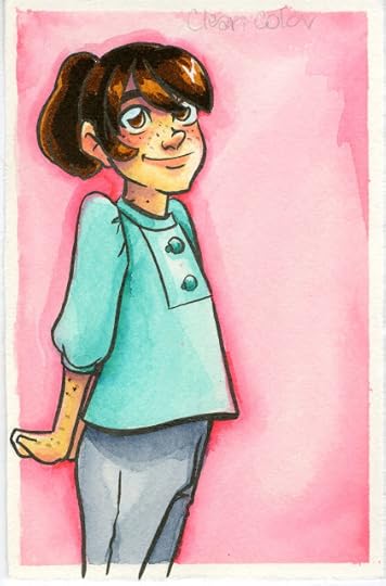 Kuretake Clean Color Real Brush Markers on Fabriano Watercolor Paper
Zig Clean Color Markers:
Review (blog)
Tutorial: Succulent with Zig Clean Color Real Brush Markers (video)
Tutorial: Monochromatic Magic with Colored Leads and Clean Color Real Brush (video)
Tutorial: Axolotl Illustration Tutorial with Zig Clean Color Markers (video)
Tutorial: Colored Leads and Clean Color Markers Tutorial (video)
Tutorial: Draw with Me- Winter Satsumas in Clean Color Real Brush (video)
Buy
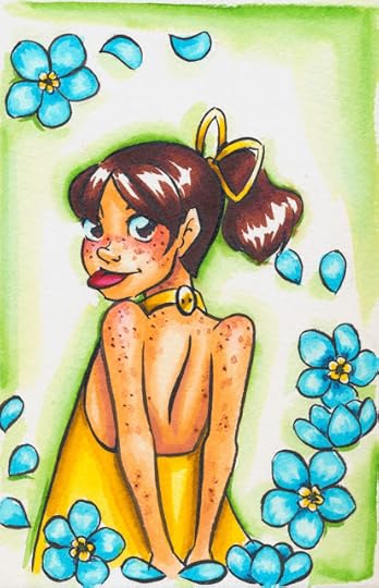 Neopiko 4 markers on Fabriano Watercolor Paper
Neopiko 4:
Review
Buy
Akashiya Sai:
Review
Buy
Pentel Brushpens:
Review, tutorial, and more to come soon
Buy
Bienfang Watercolor Markers:
Unbox and Swatch Coming Soon
Review Coming Soon
Buy
Elmer Paintastics
Crayola
Paint Brush Pens:
Unbox and Swatch coming soon
Review Coming Soon
Supertips
Tutorial Crayola Faux Watercolor Marker
Other Watercolor Marker Reviews:
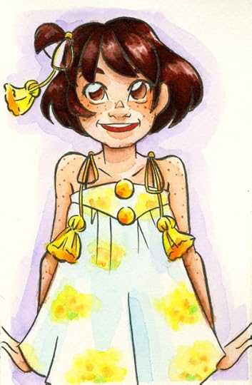 DoCrafts Artiste Watercolor Markers on Fabriano watercolor paper
DoCrafts Artiste Watercolor Markers
Review
Tombow ABT
Review
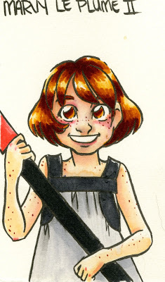 Marvy LePlume II on Fabriano watercolor paper
Marvy LePlume II
Review
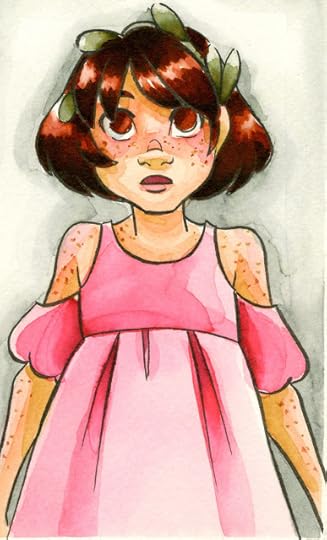 Zig Art and Graphic Twin on Watercolor Paper
Zig Art and Graphic Twin
Review (written)
Demonstration (video)
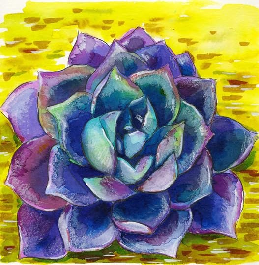 Ecoline liquid watercolor and watercolor marker on Fluid watercolor paper
Ecoline Markers and Liquid Watercolors
Review (blog)
Unbox and Swatch (video)
Tutorial: Succulents Step by Step with Ecoline (video)
Buy
 Mermaid Markers on Strathmore 400 Series watercolor paper
Mermaid Markers:
Review (blog)
Unbox and Swatch (video)
Field Test (video)
Other Waterbased Marker Comparisons:
Comparing Brush Markers for Brush Lettering
Kuretake Clean Color Real Brush Markers Vs Ichi Ban Kan
Outside Resources:
Winsor and Newton: Watercolor Markers
Blick.com- Winsor and Newton Watercolor Markers

This post was brought to you thanks to the generosity of my Artnerds on Patreon! If you enjoy art supply reviews, tutorials, and overviews, please consider joining the community! Pledges start at just $1 a month, and Artnerds get early access to videos, as well as free art resources and access to my mini comic library!
Please consider donating to this blog or purchasing from Natto-shop (http://nattosoup.com/shop) if you want me to continue publishing quality content. All materials tested were purchased from my own pocket. Keep on Truckin' Nattosoup is not under any sponsorship.
Two basic types:
Pigment Based
Dye Based
Pigment Based:
Only Winsor and Newton watercolor markers fall into this category. Use pigments for color, the same way tube and pan watercolors use pigments. Pigment based watercolors tend to be more archival and lightfast than dye based watercolors. These are intermixable with other Winsor and Newton Watercolors, and utilize the same color names for easy matching.
Dye Based:
The majority of watercolor markers, from the Crayola paintbrushes to Ecoline watercolor markers are dye based. Dye based markers tend to be highly water reactive (unless additives are used for slight resistance, such as glycerin), and feature brilliant, blendable color. Dye based markers tend to use fanciful, non descriptive names, so watching is recommended for color matching. Can be used on top of regular watercolors as a glaze, but would not recommending using as an underpainting.
Most markers are dye based- from waterbased intended for children (Crayola) to alcohol based markers like Copic and Prismacolor markers.
Two Main Brush Types:
Individual Nylon Bristles
Solid Brush
Watercolor Marker Overview:
 Winsor and Newton watercolor markers on Winsor and Newton Watercolor Marker Paper
 Winsor and Newton Watercolor Markers:
Review (written)
Buy
Tutorial (written)
Tutorial (video)
Winsor and Newton Marker Overview (video)
 Spectrum Aqua watercolor markers on Fluid watercolor paper
 Spectrum Aqua
Review (video)
Review (written)
Buy
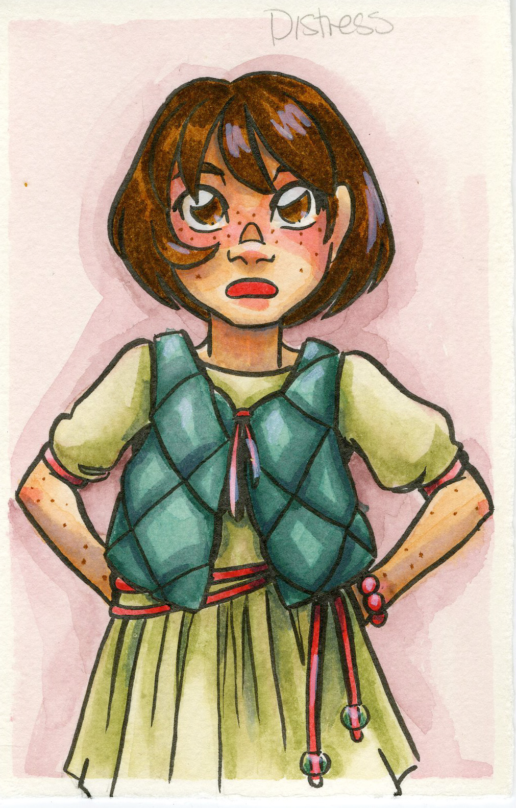 Ranger Distress markers on Fabriano watercolor paper
 Ranger Distress Markers
Review
Buy
 Sakura Koi markers on Fabriano watercolor paper
 Sakura Koi Markers:
Swatch Test (video)
Fieldtest:
Wet Application (video)
Dry Application (video)
Buy
 Kuretake Clean Color Real Brush Markers on Fabriano Watercolor Paper
 Zig Clean Color Markers:
Review (blog)
Tutorial: Succulent with Zig Clean Color Real Brush Markers (video)
Tutorial: Monochromatic Magic with Colored Leads and Clean Color Real Brush (video)
Tutorial: Axolotl Illustration Tutorial with Zig Clean Color Markers (video)
Tutorial: Colored Leads and Clean Color Markers Tutorial (video)
Tutorial: Draw with Me- Winter Satsumas in Clean Color Real Brush (video)
Buy
 Neopiko 4 markers on Fabriano Watercolor Paper
Neopiko 4:
Review
Buy
Akashiya Sai:
Review
Buy
Pentel Brushpens:
Review, tutorial, and more to come soon
Buy
Bienfang Watercolor Markers:
Unbox and Swatch Coming Soon
Review Coming Soon
Buy
Elmer Paintastics
Crayola
Paint Brush Pens:
Unbox and Swatch coming soon
Review Coming Soon
Supertips
Tutorial Crayola Faux Watercolor Marker
Other Watercolor Marker Reviews:
 DoCrafts Artiste Watercolor Markers on Fabriano watercolor paper
DoCrafts Artiste Watercolor Markers
Review
Tombow ABT
Review
 Marvy LePlume II on Fabriano watercolor paper
 Marvy LePlume II
Review
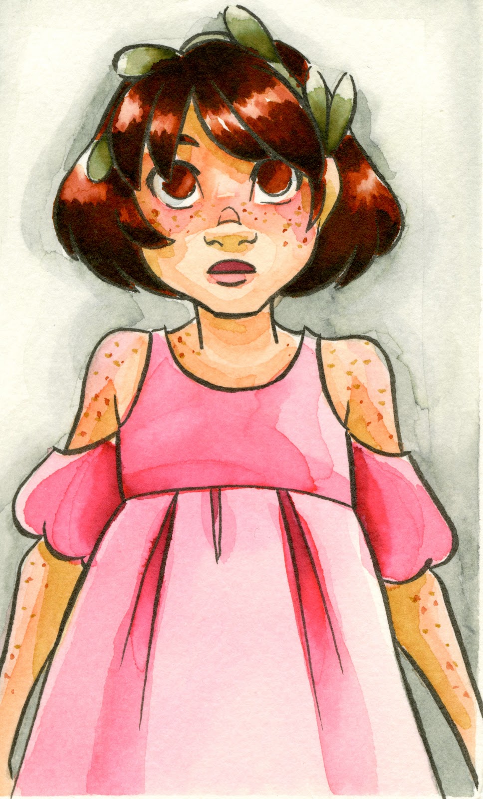 Zig Art and Graphic Twin on Watercolor Paper
 Zig Art and Graphic Twin
Review (written)
Demonstration (video)
 Ecoline liquid watercolor and watercolor marker on Fluid watercolor paper
 Ecoline Markers and Liquid Watercolors
Review (blog)
Unbox and Swatch (video)
Tutorial: Succulents Step by Step with Ecoline (video)
Buy
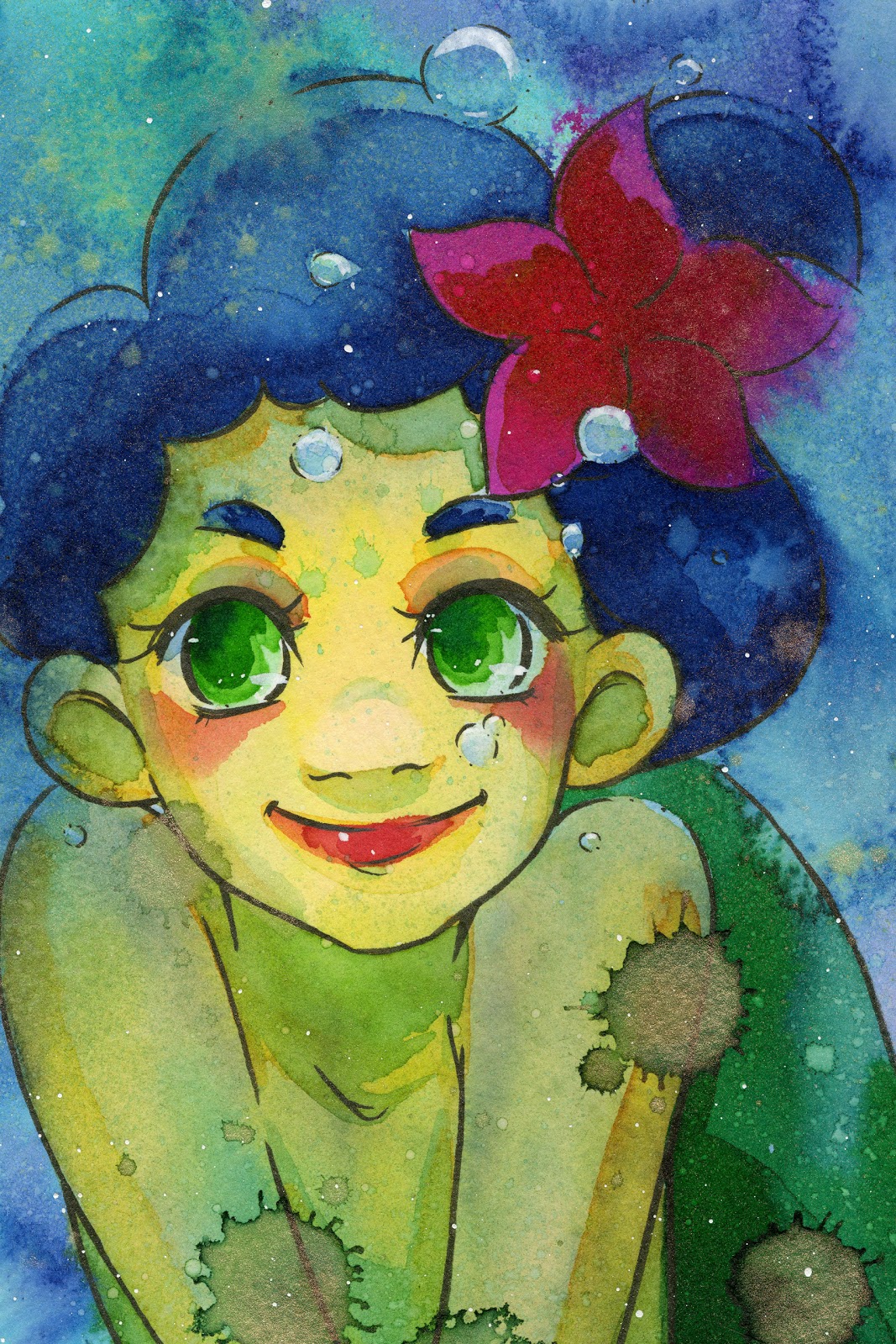 Mermaid Markers on Strathmore 400 Series watercolor paper
 Mermaid Markers:
Review (blog)
Unbox and Swatch (video)
Field Test (video)
Other Waterbased Marker Comparisons:
Comparing Brush Markers for Brush Lettering
Kuretake Clean Color Real Brush Markers Vs Ichi Ban Kan
Outside Resources:
Winsor and Newton: Watercolor Markers
Blick.com- Winsor and Newton Watercolor Markers

This post was brought to you thanks to the generosity of my Artnerds on Patreon! If you enjoy art supply reviews, tutorials, and overviews, please consider joining the community! Pledges start at just $1 a month, and Artnerds get early access to videos, as well as free art resources and access to my mini comic library!
Please consider donating to this blog or purchasing from Natto-shop (http://nattosoup.com/shop) if you want me to continue publishing quality content. All materials tested were purchased from my own pocket. Keep on Truckin' Nattosoup is not under any sponsorship.


