
Becca Hillburn's Blog, page 22
November 9, 2017
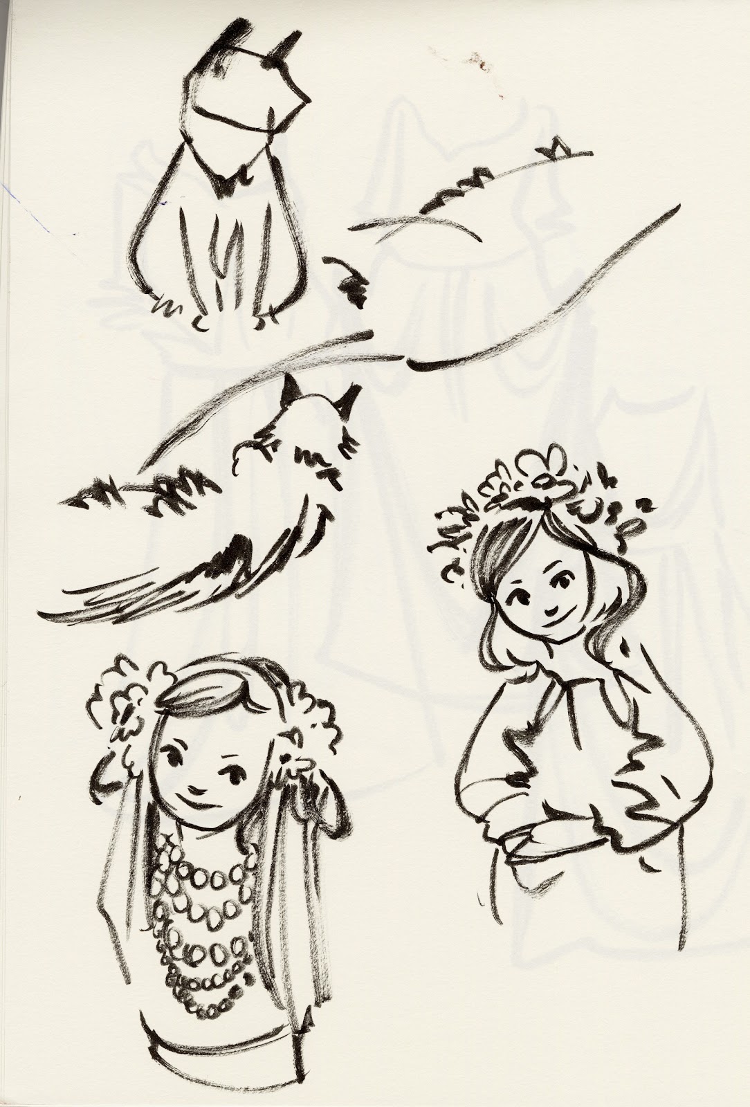
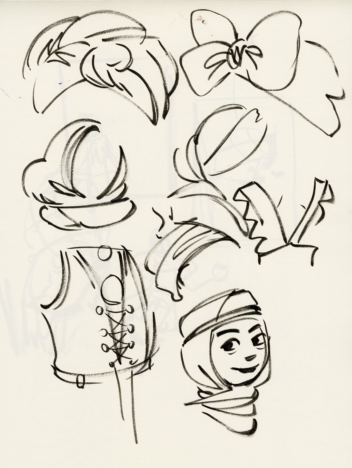
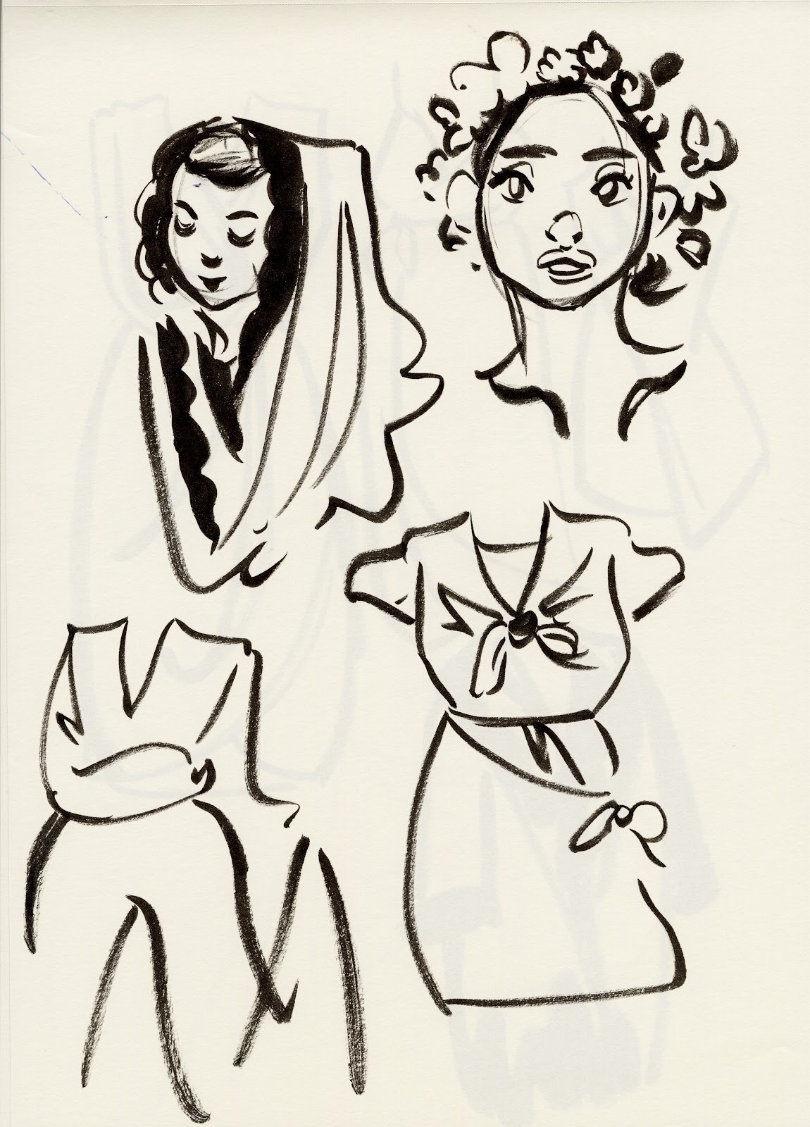
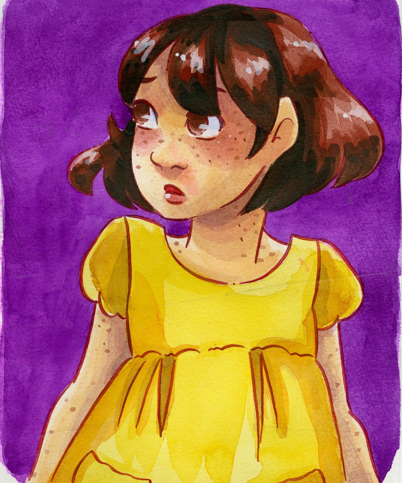
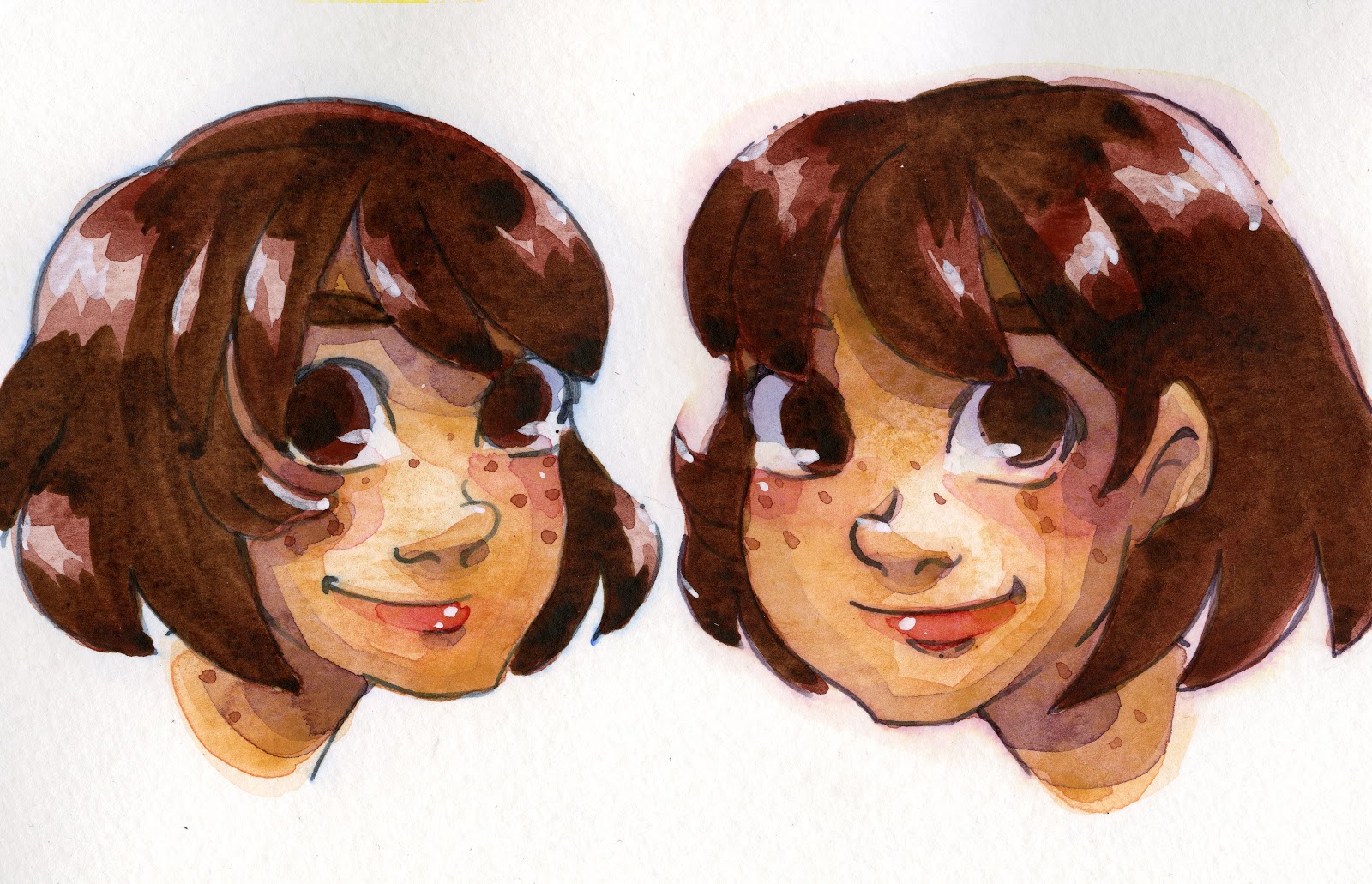
Inktober Warmup Highlights
For almost every day in October, I tried to fill three pages with warmup sketches, all done with a Pentel brushpen. Loose, gestural, and often full of mistakes, these sketches were intended to help me practice folds, figures, and faces without relying on construction. Rather than subject you to 60 pages of sketches, I thought I'd share the highlights here.
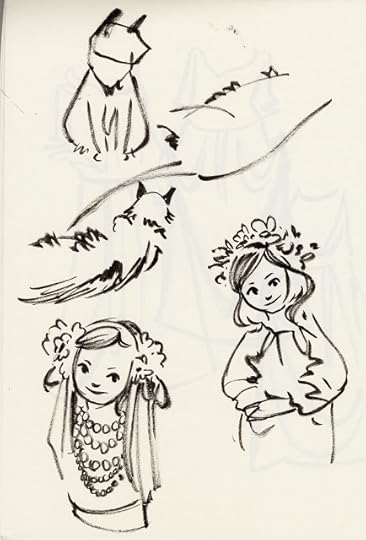
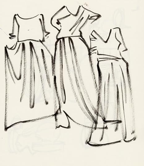
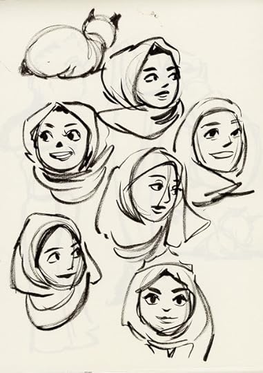
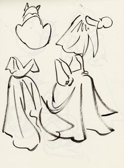
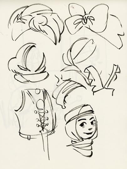
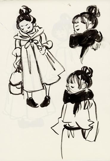
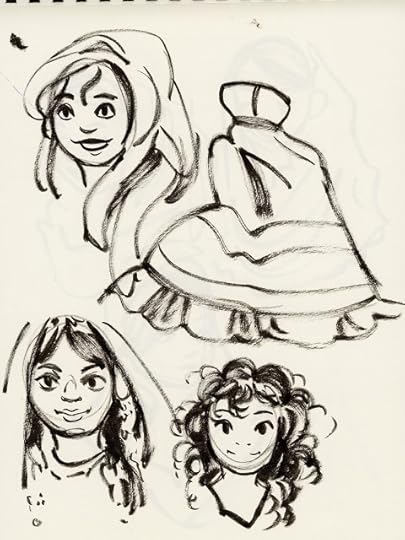
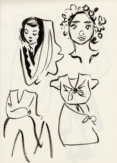

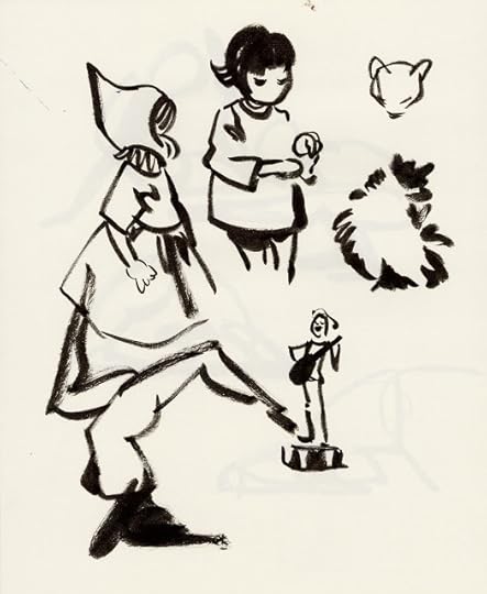
My goals for these warmups were:
Study foldsStudy shadingPractice gauging distance with eyes, not by using constructionPractice gesturePractice flow
I filled three pages per day, as a bit of a test exercise for the 600 page sketchbook challenge I hope to tackle in January 2018. I have no qualms with filling a 600 page sketchbook with studies- that's 600 pages of studies that needed to happen for my artistic improvement. The real challenge was not filling the pages, it was finding reference that hit on the topics I wanted to practice, so to slay the 600 page challenge, I'm going to need to enter prepared with topics I need to practice.

Want to see all 60 pages? How about early access to all of my Inktober illustrations, as well as monthly PDF sketchbooks including not only sketches, but finished work? Join my community of Artnerds, and you'll get access to monthly sketchbooks, as well as my library of comics and zines.
Please consider donating to this blog or purchasing from Natto-shop (http://nattosoup.com/shop) if you want me to continue publishing quality content. All materials tested were purchased from my own pocket. Keep on Truckin' Nattosoup is not under any sponsorship.


November 6, 2017
Inktober 2017 Recap
Inktober 2017 Lilliputian Living Flipthrough
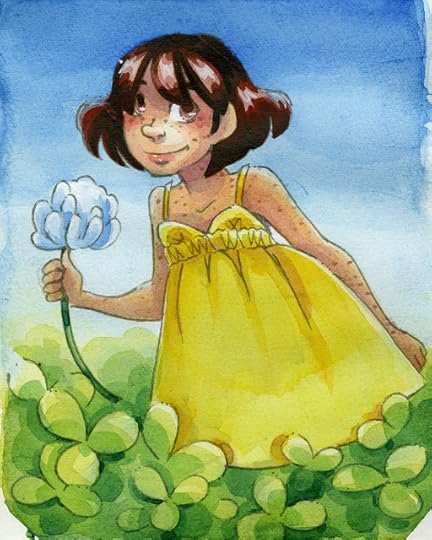
This year's Inktober had a strict theme and intention- worldbuilding for 7" Kara, my watercolor comic. I'd hoped that doing daily prompts that explore the Lilliputian side of this comic would garner interest for my work and for the comic, give me an opportunity to improve my black and white illustration, and allow me to create a richer world for my comic. I wanted to explore storytelling in single standalone illustrations, and while not every page captures this spirit, most do.
 Inktober Day 3-Seamstress
I didn't realize it at the time, but this was a huge amount of additional work to take on. Every profession required a great deal of research- into the profession itself, the tools of the trade, and deciding on outfits that suited the profession. Every day required fresh character designs- often multiple character designs, as well as set design and research. I've done worldbuilding for 7" Kara over the years, and could draw on that to an extent, but I also did a lot of additional worldbuilding and development that wasn't used for Lilliputian Living- the foods they eat, the festivals and holidays they celebrate, even folk sayings and medicine.
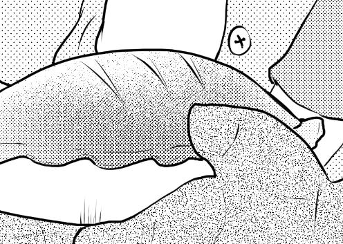
 Inktober Day 6- Weaver
And then, once the illustration was inked (usually around 9 or 10PM, at the tail end of my work day), I needed to write a worldbuilding prompt to accompany the illustration. These were shared to my Instagram.
Materials Used:
Strathmore 500 Series Mixed Media Visual Journal (34 Pages)
Pentel Pigment Brushpen (waterproof)
Pilot Color Eno- Soft Blue mechanical pencil and lead
Sakura Pigma FB
Inktober Day 1: Lilliputian Baker
Inktober Day 2: Timelapse Teacher
Inktober Day 3: Timelapse Seamstress
Inktober Day 4: Brewer
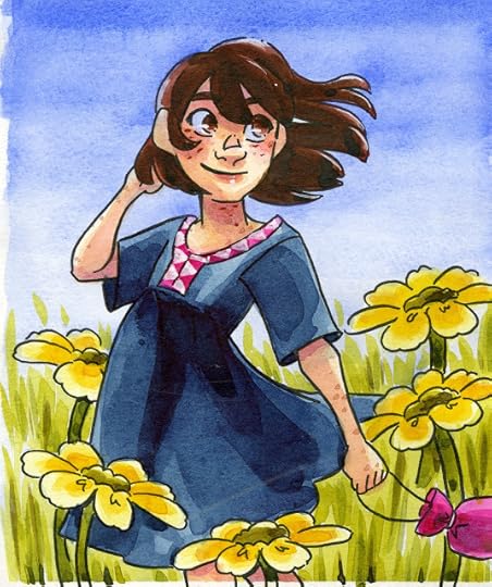
Inktober Day 5: Grocer
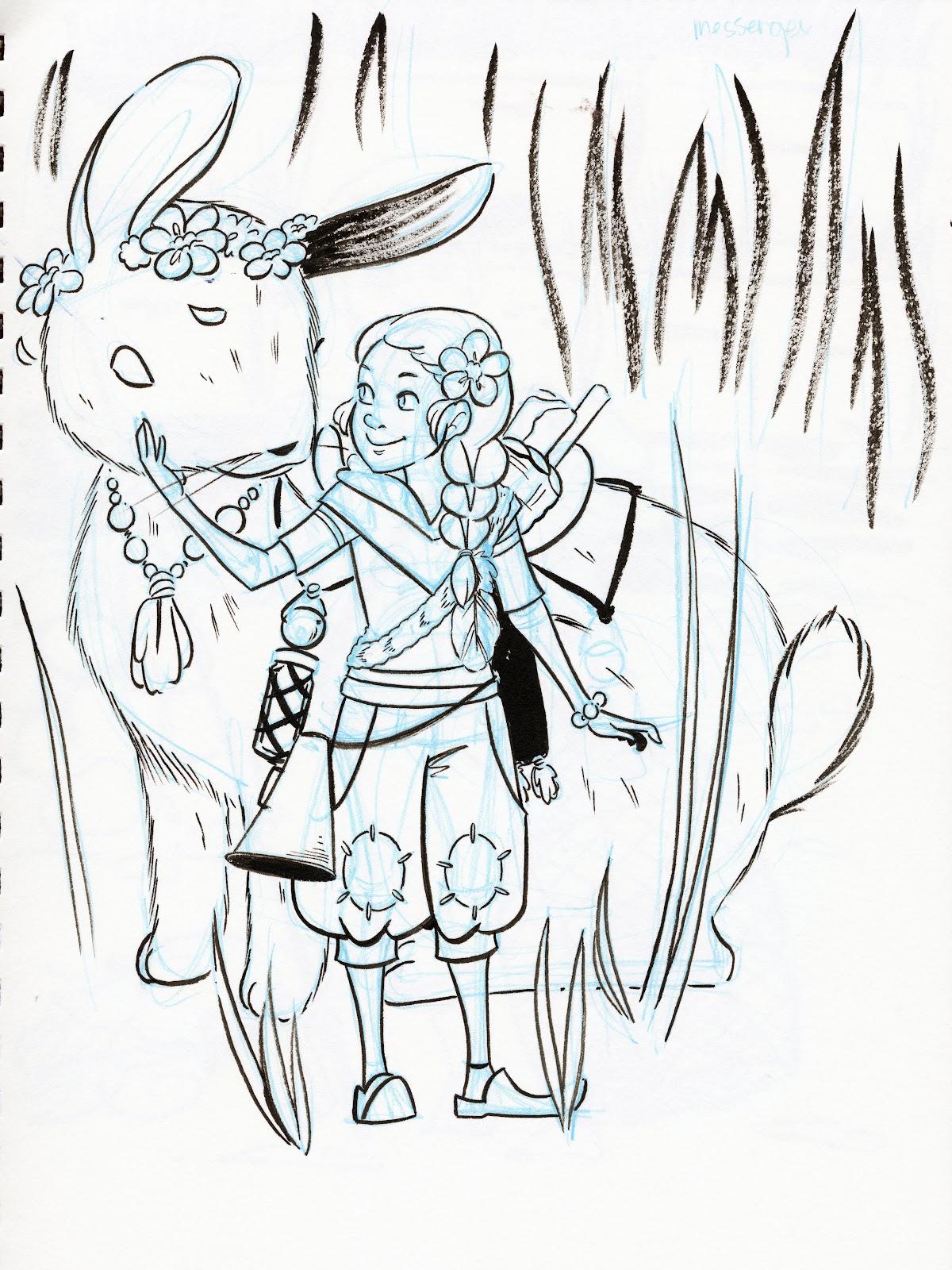
Inktober Day 23: Bunny Rancher
I found this year's Inktober to be exhausting and a bit overwhelming. While the worldbuilding prompts were fun, juggling travel and other projects, in addition to doing research and fleshing out a tiny world, was a lot to handle. Usually by the time I hit midpoint October, I'm feeling a bit burnt out, but usually hit my second wind by the 20th- this year I found myself wishing Inktober would end from the time I left for Charlotte (the 9th) until the 31st.
A big contributor to this burnout was the fact that I spent a week in Charlotte helping with a friend's wedding. Not only were two days spent in the car driving, but the remainder of my time was spent running errands, helping assemble things, helping plan events, and participating in the wedding itself. While it was a pleasure to participate, it made dealing with Inktober difficult.
 Inktober Day 9- Merchant
Another reason why Inktober was so unrewarding for me is that engagement between artists and engagement between artists and possible fans seems to be down this year. I tried to cheer my friends and fellow artists on, but dealing with burnout made that spotty at best. Another part was the ridiculous amount of drama surrounding Inktober before the event even started. For years, artists have participated in Inktober in whatever way benefits their work and workload- traditional media, digital media, involved illustrations, quick warmup sketches- whatever helps them produce work is good enough. This year, common sense went out the window, as many artists railed against Jake Parker's stance that traditional is the true intention of Inktober. Many of these artists complained that traditional art is too expensive- which is frankly ridiculous, as many artists complete Inktober with little more than a sketchbook, a few brushpens, and maybe a Copic marker to add spot color. This is a pittance compared to the tablets, software, and computers needed to create digital art. Such discourse is tiring for me as a traditional media artist who utilizes digital techniques and as an art supply reviewer.
Many artists began Inktober with a chip on their shoulders, which negatively impacted engagement and interaction between artists.
 Inktober Day 11- Messenger
These issues killed most of the fun Inktober holds for me, but finishing Lilliputian Living and sticking to my schedule was important to me, and I made completing each day's inks a priority. Of course, pushing myself to complete additional work on top of my regular workload results in burnout, and I was eager for Inktober to end.
To be fair, since regularly updating the Youtube channel, I find myself consistently taking on additional work. This year, I decided to do a handful of nib reviews for dip pens, since that's an area of the internet that is fairly untrod, and there are a lot of great nibs out there for artists to play with. There are a number of nib reviews now up, and this will continue well into November. I recorded two nib reviews per day, and released one per day, and this ended up adding a lot to my workload, without necessarily creating viable art. Hopefully these nib reviews will help other artists and eventually earn their keep.
Random Dip Pen Nib Overview:
Hunt School Nib Review:
Nib Review: Brause Steno:
Nib Review: Esterbrook 313:
Leonardt Hiro 41 Nib Review:
Nib Review Brause Rose:
Nib Review: Rubinato:
Nib Review Hunt Extra Fine Bowl:
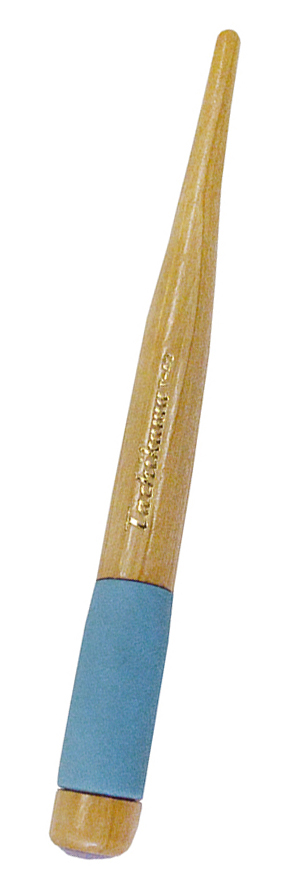
Nib Review: Tachikawa Spoon:
My Inktober work isn't done- I still need to assemble my Lillputian Living Zine. If you're interested in learning how to turn your art into a zine, keep an eye out for that post!
You can check out all of my Inktober Illustrations over on my Instagram, or you can join my Artnerd community and get instant access to my Inktober sketchbook, as well as my Lillputian Living zine.
Please consider donating to this blog or purchasing from Natto-shop (http://nattosoup.com/shop) if you want me to continue publishing quality content. All materials tested were purchased from my own pocket. Keep on Truckin' Nattosoup is not under any sponsorship.
This year's Inktober had a strict theme and intention- worldbuilding for 7" Kara, my watercolor comic. I'd hoped that doing daily prompts that explore the Lilliputian side of this comic would garner interest for my work and for the comic, give me an opportunity to improve my black and white illustration, and allow me to create a richer world for my comic. I wanted to explore storytelling in single standalone illustrations, and while not every page captures this spirit, most do.
 Inktober Day 3-Seamstress
I didn't realize it at the time, but this was a huge amount of additional work to take on. Every profession required a great deal of research- into the profession itself, the tools of the trade, and deciding on outfits that suited the profession. Every day required fresh character designs- often multiple character designs, as well as set design and research. I've done worldbuilding for 7" Kara over the years, and could draw on that to an extent, but I also did a lot of additional worldbuilding and development that wasn't used for Lilliputian Living- the foods they eat, the festivals and holidays they celebrate, even folk sayings and medicine.
 Inktober Day 6- Weaver
And then, once the illustration was inked (usually around 9 or 10PM, at the tail end of my work day), I needed to write a worldbuilding prompt to accompany the illustration. These were shared to my Instagram.
Materials Used:
Strathmore 500 Series Mixed Media Visual Journal (34 Pages)
Pentel Pigment Brushpen (waterproof)
Pilot Color Eno- Soft Blue mechanical pencil and lead
Sakura Pigma FB
Inktober Day 1: Lilliputian Baker
Inktober Day 2: Timelapse Teacher
Inktober Day 3: Timelapse Seamstress
Inktober Day 4: Brewer
Inktober Day 5: Grocer
Inktober Day 23: Bunny Rancher
I found this year's Inktober to be exhausting and a bit overwhelming. While the worldbuilding prompts were fun, juggling travel and other projects, in addition to doing research and fleshing out a tiny world, was a lot to handle. Usually by the time I hit midpoint October, I'm feeling a bit burnt out, but usually hit my second wind by the 20th- this year I found myself wishing Inktober would end from the time I left for Charlotte (the 9th) until the 31st.
A big contributor to this burnout was the fact that I spent a week in Charlotte helping with a friend's wedding. Not only were two days spent in the car driving, but the remainder of my time was spent running errands, helping assemble things, helping plan events, and participating in the wedding itself. While it was a pleasure to participate, it made dealing with Inktober difficult.
 Inktober Day 9- Merchant
Another reason why Inktober was so unrewarding for me is that engagement between artists and engagement between artists and possible fans seems to be down this year. I tried to cheer my friends and fellow artists on, but dealing with burnout made that spotty at best. Another part was the ridiculous amount of drama surrounding Inktober before the event even started. For years, artists have participated in Inktober in whatever way benefits their work and workload- traditional media, digital media, involved illustrations, quick warmup sketches- whatever helps them produce work is good enough. This year, common sense went out the window, as many artists railed against Jake Parker's stance that traditional is the true intention of Inktober. Many of these artists complained that traditional art is too expensive- which is frankly ridiculous, as many artists complete Inktober with little more than a sketchbook, a few brushpens, and maybe a Copic marker to add spot color. This is a pittance compared to the tablets, software, and computers needed to create digital art. Such discourse is tiring for me as a traditional media artist who utilizes digital techniques and as an art supply reviewer.
Many artists began Inktober with a chip on their shoulders, which negatively impacted engagement and interaction between artists.
 Inktober Day 11- Messenger
These issues killed most of the fun Inktober holds for me, but finishing Lilliputian Living and sticking to my schedule was important to me, and I made completing each day's inks a priority. Of course, pushing myself to complete additional work on top of my regular workload results in burnout, and I was eager for Inktober to end.
To be fair, since regularly updating the Youtube channel, I find myself consistently taking on additional work. This year, I decided to do a handful of nib reviews for dip pens, since that's an area of the internet that is fairly untrod, and there are a lot of great nibs out there for artists to play with. There are a number of nib reviews now up, and this will continue well into November. I recorded two nib reviews per day, and released one per day, and this ended up adding a lot to my workload, without necessarily creating viable art. Hopefully these nib reviews will help other artists and eventually earn their keep.
Random Dip Pen Nib Overview:
Hunt School Nib Review:
Nib Review: Brause Steno:
Nib Review: Esterbrook 313:
Leonardt Hiro 41 Nib Review:
Nib Review Brause Rose:
Nib Review: Rubinato:
Nib Review Hunt Extra Fine Bowl:
Nib Review: Tachikawa Spoon:
My Inktober work isn't done- I still need to assemble my Lillputian Living Zine. If you're interested in learning how to turn your art into a zine, keep an eye out for that post!
You can check out all of my Inktober Illustrations over on my Instagram, or you can join my Artnerd community and get instant access to my Inktober sketchbook, as well as my Lillputian Living zine.
Please consider donating to this blog or purchasing from Natto-shop (http://nattosoup.com/shop) if you want me to continue publishing quality content. All materials tested were purchased from my own pocket. Keep on Truckin' Nattosoup is not under any sponsorship.
November 2, 2017
Experiments and Mistakes: Masking For Marker Airbrushing
Let’s say, you have a ton of markers, the Copic Airbrush System (ABS), and haven’t really experimented too much with masking.
Becca has demonstrated masking techniques in the past for use with alcohol inks, but I’ll cover two different processes I’ve used in creating illustrations using the Copic ABS.

Supplies I used:Illustration(s) on suitable paperLace DoiliesScrap PaperFrisket Film (low tack)Nib or Brush to apply masking fluid- I used the Incredible NibMasking fluid/Liquid Frisket- I used PebeoCopic ABS + Air CanCopic MarkersX-Acto Knife (not pictured)Scissors (not pictured)Tape (optional and not pictured)- any type is fine, I used ScotchScreentone (not pictured)- I used this one
What constitutes “suitable paper”?This is gonna depend greatly on the type of mask you’re doing. Deleter’s manga paper (or Kent Paper) won’t work well with the Frisket Film I’ve got (it tears, as you’ll see). It also doesn’t take wet media super well, so liquid frisket won’t do. I’d honestly recommend using something that’s NOT super smooth. The paper that worked best in this demonstration was inexpensive watercolor paper with some tooth. You can also use Bristol board, but you may have some issues with tearing.
So, what’s the Copic ABS?The Copic Airbrush System is a useful system for airbrushing using Copic Markers. I personally have the ABS-1N setup, which I got secondhand. I usually buy the 180 Air Cans.
You can find an overview on Imagination International’s website:https://imaginationinternationalinc.com/copic/101/airbrush-system/
Illustration 1I started off with the doodle on Watercolor paper. (Stonehenge Aqua - Cold Press)
Because this is a small doodle and I don’t need to cover a lot of surface area, I’m going to use the masking fluid + a paper mask.
The paper mask does a couple of things for me:Prevents missing areas with masking fluid, resulting in weird spots where your ink might bleed through.Prevents me from tearing the paper with poor masking fluid applications.
Don’t use a paper mask with wet media.
Before you start: Maybe don’t do the things I did, and trace out something that’s roughly sized to the area you’ll be masking. It does NOT need to be precise.
Step 1: On the INSIDE of your mask area, take your nib/brush and line it with the masking fluid.
Step 2: Don’t be me. You should already rooooooughly have an idea of how large you’re going to mask (either use a lightbox, or just sketch it out). I realized this after applying the masking fluid, so I decided to fudge it.
It didn’t fit.

Step 3: Trim and make your paper mask fit. If it’s not an exact fit, this is why scrap paper is great. You can stick it together using tape or masking fluid.


Step 4: Close up holes around the edges and let it dry. At this point, I usually apply masking fluid to make sure everything’s okay around the edges.
And now we let it dry a bit…
Step 5: When it’s dry, let’s get started with our masking! I chose to use one of my smaller doilies, from one of my many explorations of the local craft store. If you can find a stencil or design made out of a paper that’s not super thin or likely to be damaged by moisture, you can reuse them for ages.

 I taped the doily down in this instance, and opted to move my illustration freely within the masked area to mask another design. At the top of the illustration, I used a darker blue.
Step 6: Additional airbrushing is done at this point. I sometimes like to layer other colors on top. This will help blur the original stencil effect AND add additional color.
Step 7: Remove the mask! ...Carefully. Don’t worry if your paper mask tears as you’re removing it. Also take care when removing the masking fluid, as marker ink on top of it may smudge slightly. (If you can peel it off, all the better.)
Illustration 2This did not go smoothly at all. The actual drawing portion of things went well enough -- I have an easy time of working on the super smooth Deleter Comic Paper, but Frisket paper doesn’t seem to like it.(I did test later on another sheet of Deleter Comic Paper -- it’s true. DO NOT use frisket paper on this.)


 Typically, when working with Frisket paper, you need to figure out about how much you use, and cut out something approximate to that area. Then, you remove it from its backing and place it on the paper to trim…
 As you see, though, the paper tore as I was peeling my trimmed area. So… I had to start again.
Much swearing was had. I’d almost decided to give up, because I really have found that I don’t like Frisket fim for the amount of effort I have to put in. Plus, I also need to make sure I’m working in good light conditions, otherwise I can barely see the crap on my paper. Maybe it’ll work better for some handmade spot gloss effects on illustrations in the future, but I’ve no idea if it will discolor.Illustration 3I decided in this instance, I was still going to work with the Deleter paper. I’m stubborn. BUT I was gonna change things up a bit this time. Instead of using actual frisket film, I’d use something a little… Unusual.
Screentone!
What’s that, you say? What’s screentone? If you missed my previous tutorial, then you might have SOME familiarity with them (at least digitally). If you want a primer, Loom’s Screentones overview is intensely helpful.
 In this case, I had a sample sheet of Deleter SE-61 handy, from some previous orders to the Deleter Mangashop.Screentones have an odd adhesive on the back -- they’re low tack, but adhere securely to the paper they’re on. If you have to remove them for some reason, they’re very unlikely to tear smooth papers.
Step 1: Cut out something vaguely shaped like your illustration from the tone. The backing paper of Screentones is generally only slightly opaque so you can see through them. Once you have it cut out, peel it off your backing paper, and adhere it to your illustration.
 This actually makes a much easier mask to work with, in my opinion, since you can see the illustration underneath AND the areas you need to remove with ease.
Step 2: Trim your screentone from areas you don’t need it to be applied. Usually as I work, I’ll often gently lift it up using the tip of my knife so I can pull and cut from the toned area.
 Once trimmed, you’ll have have something which is easy to remove, and is highly unlikely to leave a sticky residue (unless you leave it on the paper a few months…)
Step 3: Do your airbrushing.

In this particular case, I ran the Colorless Blender through the ABS, and used that to create the white spots. Some papers don’t do well with this. If done near your masked area they will wick any color under the mask and you’re gonna have cleanup to do. The Deleter paper really does seem to do a good job of it, though.
Step 4: Peel, and finish off your illustration! Once all’s said and done and colored, I’ll probably post this illustration on deviantArt or something. ;3
Like what I do? You can find more of my artwork and resources online:Website: shooting-stars.orgWebcomic: linkedcomic.com
deviantArt: kabocha.deviantart.com
Kabocha is a member of Ink Drop Cafe, a wonderful webcomic collective full of talented creators! Come sample our tasty menu of comics!
Please consider donating to this blog or purchasing from Natto-shop (http://nattosoup.com/shop) if you want me to continue publishing quality content. All materials tested were purchased from my own pocket. Keep on Truckin' Nattosoup is not under any sponsorship.
Becca has demonstrated masking techniques in the past for use with alcohol inks, but I’ll cover two different processes I’ve used in creating illustrations using the Copic ABS.
Supplies I used:Illustration(s) on suitable paperLace DoiliesScrap PaperFrisket Film (low tack)Nib or Brush to apply masking fluid- I used the Incredible NibMasking fluid/Liquid Frisket- I used PebeoCopic ABS + Air CanCopic MarkersX-Acto Knife (not pictured)Scissors (not pictured)Tape (optional and not pictured)- any type is fine, I used ScotchScreentone (not pictured)- I used this one
What constitutes “suitable paper”?This is gonna depend greatly on the type of mask you’re doing. Deleter’s manga paper (or Kent Paper) won’t work well with the Frisket Film I’ve got (it tears, as you’ll see). It also doesn’t take wet media super well, so liquid frisket won’t do. I’d honestly recommend using something that’s NOT super smooth. The paper that worked best in this demonstration was inexpensive watercolor paper with some tooth. You can also use Bristol board, but you may have some issues with tearing.
So, what’s the Copic ABS?The Copic Airbrush System is a useful system for airbrushing using Copic Markers. I personally have the ABS-1N setup, which I got secondhand. I usually buy the 180 Air Cans.
You can find an overview on Imagination International’s website:https://imaginationinternationalinc.com/copic/101/airbrush-system/
Illustration 1I started off with the doodle on Watercolor paper. (Stonehenge Aqua - Cold Press)
Because this is a small doodle and I don’t need to cover a lot of surface area, I’m going to use the masking fluid + a paper mask.
The paper mask does a couple of things for me:Prevents missing areas with masking fluid, resulting in weird spots where your ink might bleed through.Prevents me from tearing the paper with poor masking fluid applications.
Don’t use a paper mask with wet media.
Before you start: Maybe don’t do the things I did, and trace out something that’s roughly sized to the area you’ll be masking. It does NOT need to be precise.
Step 1: On the INSIDE of your mask area, take your nib/brush and line it with the masking fluid.
Step 2: Don’t be me. You should already rooooooughly have an idea of how large you’re going to mask (either use a lightbox, or just sketch it out). I realized this after applying the masking fluid, so I decided to fudge it.
It didn’t fit.
Step 3: Trim and make your paper mask fit. If it’s not an exact fit, this is why scrap paper is great. You can stick it together using tape or masking fluid.
Step 4: Close up holes around the edges and let it dry. At this point, I usually apply masking fluid to make sure everything’s okay around the edges.
And now we let it dry a bit…
Step 5: When it’s dry, let’s get started with our masking! I chose to use one of my smaller doilies, from one of my many explorations of the local craft store. If you can find a stencil or design made out of a paper that’s not super thin or likely to be damaged by moisture, you can reuse them for ages.
I taped the doily down in this instance, and opted to move my illustration freely within the masked area to mask another design. At the top of the illustration, I used a darker blue.
Step 6: Additional airbrushing is done at this point. I sometimes like to layer other colors on top. This will help blur the original stencil effect AND add additional color.
Step 7: Remove the mask! ...Carefully. Don’t worry if your paper mask tears as you’re removing it. Also take care when removing the masking fluid, as marker ink on top of it may smudge slightly. (If you can peel it off, all the better.)
Illustration 2This did not go smoothly at all. The actual drawing portion of things went well enough -- I have an easy time of working on the super smooth Deleter Comic Paper, but Frisket paper doesn’t seem to like it.(I did test later on another sheet of Deleter Comic Paper -- it’s true. DO NOT use frisket paper on this.)
Typically, when working with Frisket paper, you need to figure out about how much you use, and cut out something approximate to that area. Then, you remove it from its backing and place it on the paper to trim…As you see, though, the paper tore as I was peeling my trimmed area. So… I had to start again.
Much swearing was had. I’d almost decided to give up, because I really have found that I don’t like Frisket fim for the amount of effort I have to put in. Plus, I also need to make sure I’m working in good light conditions, otherwise I can barely see the crap on my paper. Maybe it’ll work better for some handmade spot gloss effects on illustrations in the future, but I’ve no idea if it will discolor.Illustration 3I decided in this instance, I was still going to work with the Deleter paper. I’m stubborn. BUT I was gonna change things up a bit this time. Instead of using actual frisket film, I’d use something a little… Unusual.
Screentone!
What’s that, you say? What’s screentone? If you missed my previous tutorial, then you might have SOME familiarity with them (at least digitally). If you want a primer, Loom’s Screentones overview is intensely helpful.
In this case, I had a sample sheet of Deleter SE-61 handy, from some previous orders to the Deleter Mangashop.Screentones have an odd adhesive on the back -- they’re low tack, but adhere securely to the paper they’re on. If you have to remove them for some reason, they’re very unlikely to tear smooth papers.
Step 1: Cut out something vaguely shaped like your illustration from the tone. The backing paper of Screentones is generally only slightly opaque so you can see through them. Once you have it cut out, peel it off your backing paper, and adhere it to your illustration.
This actually makes a much easier mask to work with, in my opinion, since you can see the illustration underneath AND the areas you need to remove with ease.
Step 2: Trim your screentone from areas you don’t need it to be applied. Usually as I work, I’ll often gently lift it up using the tip of my knife so I can pull and cut from the toned area.
Once trimmed, you’ll have have something which is easy to remove, and is highly unlikely to leave a sticky residue (unless you leave it on the paper a few months…)
Step 3: Do your airbrushing.
In this particular case, I ran the Colorless Blender through the ABS, and used that to create the white spots. Some papers don’t do well with this. If done near your masked area they will wick any color under the mask and you’re gonna have cleanup to do. The Deleter paper really does seem to do a good job of it, though.
Step 4: Peel, and finish off your illustration!
Once all’s said and done and colored, I’ll probably post this illustration on deviantArt or something. ;3
Like what I do? You can find more of my artwork and resources online:Website: shooting-stars.orgWebcomic: linkedcomic.com
deviantArt: kabocha.deviantart.com
Kabocha is a member of Ink Drop Cafe, a wonderful webcomic collective full of talented creators! Come sample our tasty menu of comics!
Please consider donating to this blog or purchasing from Natto-shop (http://nattosoup.com/shop) if you want me to continue publishing quality content. All materials tested were purchased from my own pocket. Keep on Truckin' Nattosoup is not under any sponsorship.
October 31, 2017
PCL Comics Expo Announcement

Hi Nashville and Tennessee friends! This Saturday, I'll be at the Putnam County Library for the PCL Comics Expo, part of the week long Cookeville Comic Arts Festival. Last year, Joseph interviewed the founder, Matt Knieling, at Handmade and Bound, and I'm delighted to be able to join them this year!
We'll be in the Downstairs Meeting Room of the Cookeville public library, and you can find out more information through the Facebook Event.
Need help finding the Cookeville Public Library? Check here for directions!
Please consider donating to this blog or purchasing from Natto-shop (http://nattosoup.com/shop) if you want me to continue publishing quality content. All materials tested were purchased from my own pocket. Keep on Truckin' Nattosoup is not under any sponsorship.

October 30, 2017
Lets Get Inky Fountain Pens: An Inktober Series
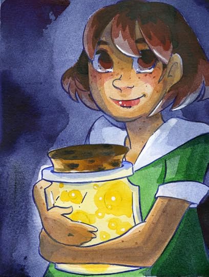
Recently we talked about dip pens in the Let's Get Inky series. While we're on the topic of nibs, lets talk about fountain pens today.
 Inked with a Noodler's Flex, filled with Sailor Storia pigmented ink in Lion, watercolor.
Fountain pens behave very differently from dip pens, but can serve as a portable option for looks reminiscent of dip pens. They range from under $3 (Platinum Preppy, Pilot Petit 1, Jetpens Chibi) to over $100, although the pens that are of most interest to artists, sketchers, and inkers are mostly under $50.
Once you've become familiar with fountain pens, and have found a couple that suit your needs, you'll find they're a versatile addition to your inking arsenal, and a fun hobby in its own right.
There's a huge variety of fountain pens available, but you don't need to spend a lot of money to get a great pen for inking.
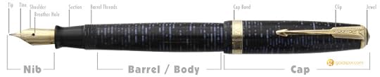
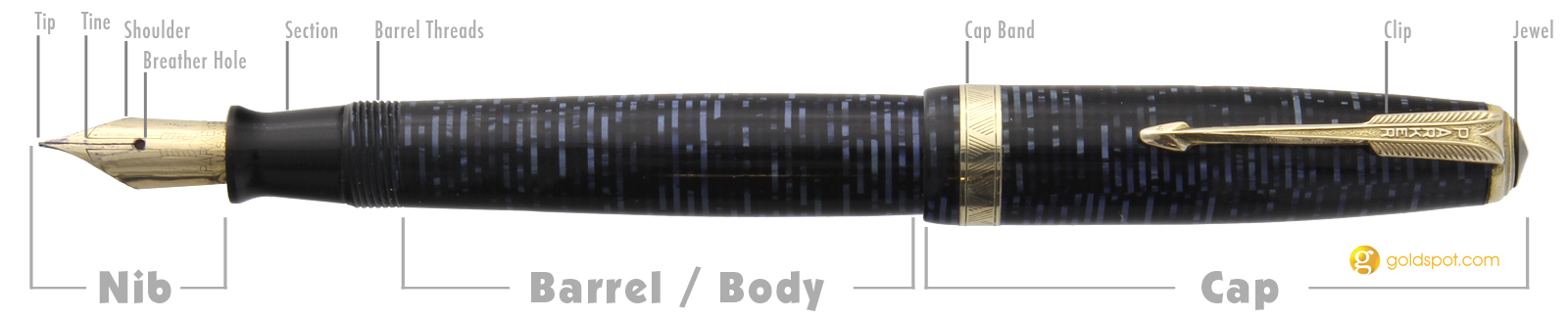
Pen Vocabulary and Parts of the Pen:
 Source
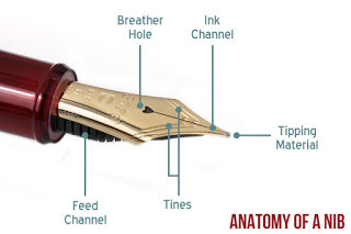 Source
 SourceNib:
Tip: Although some nibs are pointed, most have a small ball or blunted edge at the tip of the nib, referred to as the Tip. The material used to coat this is a Tipping Material.
Ink Channel:
Tine: Most nibs have a slit that allows for ink to flow and sometimes for the nib to flex. The metal surrounding this slit are the tines.
Shoulder: The shoulders of the nib
Breather Hole
Feed Channel
Barrel
Section/Collar
Threads
O Ring
Converter
Cartridge
Eye Dropper Conversion
Piston
Cap
Clip
For success with fountain pens, you need a trifecta- The Right Pen, The Right Ink, The Right Paper
 De Atrementis Document Blue Black
The Right Pen:
Introduction to Fountain Pens for Sketching
Inking and Lettering with Fountain Pens
Recommended Inexpensive Pens To Get You Started
For artists, the right pen is often not the grail pen of fountain pen enthusiasts. Artists are often interested in
Steady inkflowInteresting markmakingFlexible LineweightAffordabilityEasy maintanence
Fortunately all of the pens covered in today's post hit multiple points on that list.
Inking with Fountain Pens: Pen Overview
About Nibs:
Unlike with dip pens, fountain pen nibs are not mix and match. While you can replace nibs, it's often with another nib from the same maker, and swapping nibs between brands is fairly uncommon.
If you're looking for a truly flexible nib, you're going to have to go vintage. The closest you'll find on the current market are semi-flex nibs, or a fountain pen modified to take a dip pen nib. Although you can pay big bucks for a Namiki Falcon (the enthusiasts swear by it), I think the Noodler's pens are a better fit for most artists. If you're looking to spend a little more, Platinum's Cool is a great soft nib that has a little flex to it as well.
 Sailor Storia Magic, Inked with a Noodler's Flex
Types of Nibs:
Stub
Italic Nibs
Oblique Nibs
Semi Flex
Flex (only available in vintage pens)
The material used to make the nib often affects the writing and inking characteristics.
Steel- Most commonly used material for inexpensive nibs. Harder than gold, difficult to flex.
Gold- Softer, springier, far more expensive
My recommendations for artists are going to be nibs that make unique marks, like the Sailor Fude de Mannen, or inexpensive nibs with semi flex, such as the Noodler's Flex, Ahab, and Konrad.
My Favorite Pens to Ink With, in order of preference
Noodler's Ahab
Noodler's Flex
Noodler's Konrad
Platinum Cool
Modified Jinhao x750 with a G Nib
Platinum Preppy
Sailor Fude de Mannen
TWSBI Eco
Noodler's Pen Comparison: Flex, Konrad, Ahab
Individual Pen Reviews:
Platinum Preppy
Noodler's Flex
Noodler's Konrad
Noodler's Ahab
Pilot Prera Demonstration:
Platinum Carbon Desk Pen Unboxing:
Fountain Pen Illustration Tips:
Inking with Fountain Pens: Modified Jinhao x750:
Noodler's Ahab Field Test:
Ackermann Pen Anatomy and Review:
Ok, so maybe these semiflex pens just don't offer enough flex for you. And vintage is so daunting- you don't know what you're looking at, looking for, or how to fix a broken vintage pen. Fear not! You can convert an inexpensive fountain pen, such as the Jinhao x750 to hold a G nib
Jinhao x750 Mod:
Preparing Your New Pen for First Use:
Materials:
Cup clean water
Dishsoap
Your Pen
Paper Towels
Optional:
Converter
Pen Flush (I use Goulet's)
Add a couple drops of dish detergent to your cup of clean water. Fill your pen (if it's a converter or piston type, draw the clean water through the nib+feed+filling mechanism) and expel the water multiple times. Fill pen, allow water to sit in barrel to dissolve factory grease and solvents. Dump water, refill with clean water (no detergent) and rinse pen multiple times.
You may opt to also soak the cap and barrel. This is particularly recommended for eyedropper conversions.
Dry the pen thoroughly before first fill with ink- I usually let it airdry overnight, and may use a syringe to blast air through the feed to help push water out, depending on the fountain pen.
 Organics Gregor Mendal inked with a Pilot Preppy
The Right Ink
You should NEVER used a shellac or acrylic based ink in your fountain pens, unless you want to ruin that pen. Ideally, you would only use inks formulated for fountain pens, such as the inks listed below. If you absolutely must use another kind of ink, do yourself a favor and use it in a pen you can part with- a Platinum Preppy is ideal for this purpose.
When exploring inks, go for ink samples before buying a bottle. Goulet Pens and Anderson Pens carry ink samples that allow you to explore an ink, and an ink's properties, before committing.
Waterproof Inks:
Pigment Inks:
Platinum Pigment Inks- Platinum Carbon Black, Platinum Sepia, Platinum Red, Platinum Blue
Sailor Storia- Magic, Knight, Fire, Dancer, Spotlight, Lion, Crown, Balloon
 Platinum Carbon Black Ink inked with a Platinum Cool
Iron Gall Inks
Platinum Classic- Khaki Black, Forest Black, Citrus Black, Cassis Black, Lavender Black, Sepia Black
KWZ-
Irongall inks aren't entirely waterproof. Iron Gall inks are made up of two inks- the iron gall, which turns black over time, but is initially clear or very light, and the dye, which allows us to see the iron gall, and may influence the end color. Iron gall inks darken over time with exposure to oxygen.
Dye Based Inks:
Only a few dye based inks are truly waterproof. I've been working my way through various inks, testing waterfastness, and have shared the results on my Channel and on Once Upon a Tine.
Noodler's Inks:
54th Massachussets
Kung Te-Cheng
La Reine Mauve
 Noodler's La Reine Mauve inked with a Jetpens Chibi
De Atrementis Document Inks:
Document Black
Document Turquoise
Document Blue
Document Red
Document Yellow
Document Fuschia
Document Brown
Document Green
Document Dark Blue
 De Atrementis Document Red, inked with a Noodler's Flex
Noodler's Truly Waterproof Inks:
Pigment Inks:
Sailor Storia Lion and Dancer Swatches:
Putting Storia Ink To The Test with Watercolor:
Pigment Ink PSA:
Document Inks:
Waterproof Fountain Pen Inks: Documents and Pigments:
Irongall Inks:
Inking with Iron Gall- Rohrer and Klinger:
 Watercolor over Salix and Scabiosa
Non waterproof Inks
Although not suitable for watercolor, dye based fountain pen inks can offer a lot- bold, bright colors, fluorescents, shimmer, sheen, and shade.
Special Effects Inks:
Not necessarily waterproof
Shading Inks:
Noodler's Apache Sunset
Noodler's Navajo Turquose
De Atrementis Mint Turquoise
Noodler's Black Swan in Austrailian Roses
Diamine Marine
Noodler's Lexington Gray
Noodler's Golden Brown
Noodler's Ottoman Rose
Sailor Storia Lion
J. Herbin Vert Olive
Sheening Inks:
Not necessarily waterproof
Diamine Majestic Blue
Diamone Sherwood Green
J Herbin 1670 Emerald of Chibor
J Herbin 1670 Rouge Hematite
J Herbin 1670 Stormy Gray
Pilot Iroshizuku Tsutsuji
Pilot Iroshizuku Yama-budo
Rohrer & Klinger Alt- Goldgrun
Shimmer Inks:
Not Waterproof
Diamine Shimmertastic Inks
J Herbin 1670 Inks
The Ahab Mermaid Timelapse:
Tips and Tricks:
Platinum Preppy Eyedropper Conversion:
Watercolor Effects From Your Fountain Pen:
Easy Inkwash Hack:
The Right Paper
When it comes to fountain pen success, not all papers are made equally. There are papers designed especially for use with fountain pens, but those papers aren't necessarily the ones that appeal or are useful to artists. And many papers that artists prefer do not work well with fountain pens.
Basically, smooth, coated papers tend to do well with fountain pens, but may take awhile to dry.
Tracing Paper
Vellum
Borden and Riley Bleedproof Pen Paper
Strathmore 500 Series Plate Bristol
Watercolor Papers:
Cellulose watercolor papers work best
 Platinum Pigment Blue inked with a Noodler's Konrad
Fluid EZ Block
Maruman/Holbein Mixed Media Sketchbook
Stillman and Bern Beta
Common Favorites in the Fountain Pen Community
Tomoe River Paper
Rhodia Paper
Pen Care and Cleaning
Ink can evaporate out of your pen's barrel, so if you aren't going to use a pen for a long period of time, you should clean your pen thorougly. You can use the same methods used for preparing a pen for first use, or you can use a pen flush. I've found that Goulet's Pen flush is ideal- the bottle allows me to dose out small amounts, the complimentary sample vial allows me to soak nibs in a minimal amount of pen flush, and I can store used pen flush for reuse.
Although you can use rubbing alcohol to clean dip pen nibs, do NOT use it to clean your fountain pens- rubbing alcohol can ruin your pens, especially resin pens.
Helpful Pen Maintenance Information
FP 101- Pen Maintanence
7 Biggest Mistakes Fountain Pen Mistakes
FP 101- Fast Pen Flushing
How to Clean the Body and Cap of a Fountain Pen
More from Me
Fountain Pen Playlist on Youtube
Once Upon a Tine
Great Outside Resources:
Goulet Pens Youtube
Goulet Pens Blog
Goulet Pens- Education
Fountain Pen Network
Outside Resources and Second Opinions:
Guide to Fountain Pen Nibs- Choosing a Fountain Pen Nib
Nibs 1: The Basics
The Pen Habit
SbreBrown
Gourmet Pens
FPN: First Stop
FPN: Of Nibs and Tines
FPN: Q&A
Please consider donating to this blog or purchasing from Natto-shop (http://nattosoup.com/shop) if you want me to continue publishing quality content. All materials tested were purchased from my own pocket. Keep on Truckin' Nattosoup is not under any sponsorship.
 Inked with a Noodler's Flex, filled with Sailor Storia pigmented ink in Lion, watercolor.
Fountain pens behave very differently from dip pens, but can serve as a portable option for looks reminiscent of dip pens. They range from under $3 (Platinum Preppy, Pilot Petit 1, Jetpens Chibi) to over $100, although the pens that are of most interest to artists, sketchers, and inkers are mostly under $50.
Once you've become familiar with fountain pens, and have found a couple that suit your needs, you'll find they're a versatile addition to your inking arsenal, and a fun hobby in its own right.
There's a huge variety of fountain pens available, but you don't need to spend a lot of money to get a great pen for inking.
Pen Vocabulary and Parts of the Pen:
 Source
 Source
 SourceNib:
Tip: Although some nibs are pointed, most have a small ball or blunted edge at the tip of the nib, referred to as the Tip. The material used to coat this is a Tipping Material.
Ink Channel:
Tine: Most nibs have a slit that allows for ink to flow and sometimes for the nib to flex. The metal surrounding this slit are the tines.
Shoulder: The shoulders of the nib
Breather Hole
Feed Channel
Barrel
Section/Collar
Threads
O Ring
Converter
Cartridge
Eye Dropper Conversion
Piston
Cap
Clip
For success with fountain pens, you need a trifecta- The Right Pen, The Right Ink, The Right Paper
 De Atrementis Document Blue Black
The Right Pen:
Introduction to Fountain Pens for Sketching
Inking and Lettering with Fountain Pens
Recommended Inexpensive Pens To Get You Started
For artists, the right pen is often not the grail pen of fountain pen enthusiasts. Artists are often interested in
Steady inkflowInteresting markmakingFlexible LineweightAffordabilityEasy maintanence
Fortunately all of the pens covered in today's post hit multiple points on that list.
Inking with Fountain Pens: Pen Overview
About Nibs:
Unlike with dip pens, fountain pen nibs are not mix and match. While you can replace nibs, it's often with another nib from the same maker, and swapping nibs between brands is fairly uncommon.
If you're looking for a truly flexible nib, you're going to have to go vintage. The closest you'll find on the current market are semi-flex nibs, or a fountain pen modified to take a dip pen nib. Although you can pay big bucks for a Namiki Falcon (the enthusiasts swear by it), I think the Noodler's pens are a better fit for most artists. If you're looking to spend a little more, Platinum's Cool is a great soft nib that has a little flex to it as well.
 Sailor Storia Magic, Inked with a Noodler's Flex
Types of Nibs:
Stub
Italic Nibs
Oblique Nibs
Semi Flex
Flex (only available in vintage pens)
The material used to make the nib often affects the writing and inking characteristics.
Steel- Most commonly used material for inexpensive nibs. Harder than gold, difficult to flex.
Gold- Softer, springier, far more expensive
My recommendations for artists are going to be nibs that make unique marks, like the Sailor Fude de Mannen, or inexpensive nibs with semi flex, such as the Noodler's Flex, Ahab, and Konrad.
My Favorite Pens to Ink With, in order of preference
Noodler's Ahab
Noodler's Flex
Noodler's Konrad
Platinum Cool
Modified Jinhao x750 with a G Nib
Platinum Preppy
Sailor Fude de Mannen
TWSBI Eco
Noodler's Pen Comparison: Flex, Konrad, Ahab
Individual Pen Reviews:
Platinum Preppy
Noodler's Flex
Noodler's Konrad
Noodler's Ahab
Pilot Prera Demonstration:
Platinum Carbon Desk Pen Unboxing:
Fountain Pen Illustration Tips:
Inking with Fountain Pens: Modified Jinhao x750:
Noodler's Ahab Field Test:
Ackermann Pen Anatomy and Review:
Ok, so maybe these semiflex pens just don't offer enough flex for you. And vintage is so daunting- you don't know what you're looking at, looking for, or how to fix a broken vintage pen. Fear not! You can convert an inexpensive fountain pen, such as the Jinhao x750 to hold a G nib
Jinhao x750 Mod:
Preparing Your New Pen for First Use:
Materials:
Cup clean water
Dishsoap
Your Pen
Paper Towels
Optional:
Converter
Pen Flush (I use Goulet's)
Add a couple drops of dish detergent to your cup of clean water. Fill your pen (if it's a converter or piston type, draw the clean water through the nib+feed+filling mechanism) and expel the water multiple times. Fill pen, allow water to sit in barrel to dissolve factory grease and solvents. Dump water, refill with clean water (no detergent) and rinse pen multiple times.
You may opt to also soak the cap and barrel. This is particularly recommended for eyedropper conversions.
Dry the pen thoroughly before first fill with ink- I usually let it airdry overnight, and may use a syringe to blast air through the feed to help push water out, depending on the fountain pen.
 Organics Gregor Mendal inked with a Pilot Preppy
 The Right Ink
You should NEVER used a shellac or acrylic based ink in your fountain pens, unless you want to ruin that pen. Ideally, you would only use inks formulated for fountain pens, such as the inks listed below. If you absolutely must use another kind of ink, do yourself a favor and use it in a pen you can part with- a Platinum Preppy is ideal for this purpose.
When exploring inks, go for ink samples before buying a bottle. Goulet Pens and Anderson Pens carry ink samples that allow you to explore an ink, and an ink's properties, before committing.
Waterproof Inks:
Pigment Inks:
Platinum Pigment Inks- Platinum Carbon Black, Platinum Sepia, Platinum Red, Platinum Blue
Sailor Storia- Magic, Knight, Fire, Dancer, Spotlight, Lion, Crown, Balloon
 Platinum Carbon Black Ink inked with a Platinum Cool
Iron Gall Inks
Platinum Classic- Khaki Black, Forest Black, Citrus Black, Cassis Black, Lavender Black, Sepia Black
KWZ-
Irongall inks aren't entirely waterproof. Iron Gall inks are made up of two inks- the iron gall, which turns black over time, but is initially clear or very light, and the dye, which allows us to see the iron gall, and may influence the end color. Iron gall inks darken over time with exposure to oxygen.
Dye Based Inks:
Only a few dye based inks are truly waterproof. I've been working my way through various inks, testing waterfastness, and have shared the results on my Channel and on Once Upon a Tine.
Noodler's Inks:
54th Massachussets
Kung Te-Cheng
La Reine Mauve
 Noodler's La Reine Mauve inked with a Jetpens Chibi
De Atrementis Document Inks:
Document Black
Document Turquoise
Document Blue
Document Red
Document Yellow
Document Fuschia
Document Brown
Document Green
Document Dark Blue
 De Atrementis Document Red, inked with a Noodler's Flex
Noodler's Truly Waterproof Inks:
Pigment Inks:
Sailor Storia Lion and Dancer Swatches:
Putting Storia Ink To The Test with Watercolor:
Pigment Ink PSA:
Document Inks:
Waterproof Fountain Pen Inks: Documents and Pigments:
Irongall Inks:
Inking with Iron Gall- Rohrer and Klinger:
 Watercolor over Salix and Scabiosa
Non waterproof Inks
Although not suitable for watercolor, dye based fountain pen inks can offer a lot- bold, bright colors, fluorescents, shimmer, sheen, and shade.
Special Effects Inks:
Not necessarily waterproof
Shading Inks:
Noodler's Apache Sunset
Noodler's Navajo Turquose
De Atrementis Mint Turquoise
Noodler's Black Swan in Austrailian Roses
Diamine Marine
Noodler's Lexington Gray
Noodler's Golden Brown
Noodler's Ottoman Rose
Sailor Storia Lion
J. Herbin Vert Olive
Sheening Inks:
Not necessarily waterproof
Diamine Majestic Blue
Diamone Sherwood Green
J Herbin 1670 Emerald of Chibor
J Herbin 1670 Rouge Hematite
J Herbin 1670 Stormy Gray
Pilot Iroshizuku Tsutsuji
Pilot Iroshizuku Yama-budo
Rohrer & Klinger Alt- Goldgrun
Shimmer Inks:
Not Waterproof
Diamine Shimmertastic Inks
J Herbin 1670 Inks
The Ahab Mermaid Timelapse:
Tips and Tricks:
Platinum Preppy Eyedropper Conversion:
Watercolor Effects From Your Fountain Pen:
Easy Inkwash Hack:
The Right Paper
When it comes to fountain pen success, not all papers are made equally. There are papers designed especially for use with fountain pens, but those papers aren't necessarily the ones that appeal or are useful to artists. And many papers that artists prefer do not work well with fountain pens.
Basically, smooth, coated papers tend to do well with fountain pens, but may take awhile to dry.
Tracing Paper
Vellum
Borden and Riley Bleedproof Pen Paper
Strathmore 500 Series Plate Bristol
Watercolor Papers:
Cellulose watercolor papers work best
 Platinum Pigment Blue inked with a Noodler's Konrad
Fluid EZ Block
Maruman/Holbein Mixed Media Sketchbook
Stillman and Bern Beta
Common Favorites in the Fountain Pen Community
Tomoe River Paper
Rhodia Paper
Pen Care and Cleaning
Ink can evaporate out of your pen's barrel, so if you aren't going to use a pen for a long period of time, you should clean your pen thorougly. You can use the same methods used for preparing a pen for first use, or you can use a pen flush. I've found that Goulet's Pen flush is ideal- the bottle allows me to dose out small amounts, the complimentary sample vial allows me to soak nibs in a minimal amount of pen flush, and I can store used pen flush for reuse.
Although you can use rubbing alcohol to clean dip pen nibs, do NOT use it to clean your fountain pens- rubbing alcohol can ruin your pens, especially resin pens.
Helpful Pen Maintenance Information
FP 101- Pen Maintanence
7 Biggest Mistakes Fountain Pen Mistakes
FP 101- Fast Pen Flushing
How to Clean the Body and Cap of a Fountain Pen
More from Me
Fountain Pen Playlist on Youtube
Once Upon a Tine
Great Outside Resources:
Goulet Pens Youtube
Goulet Pens Blog
Goulet Pens- Education
Fountain Pen Network
Outside Resources and Second Opinions:
Guide to Fountain Pen Nibs- Choosing a Fountain Pen Nib
Nibs 1: The Basics
The Pen Habit
SbreBrown
Gourmet Pens
FPN: First Stop
FPN: Of Nibs and Tines
FPN: Q&A
Please consider donating to this blog or purchasing from Natto-shop (http://nattosoup.com/shop) if you want me to continue publishing quality content. All materials tested were purchased from my own pocket. Keep on Truckin' Nattosoup is not under any sponsorship.
October 26, 2017
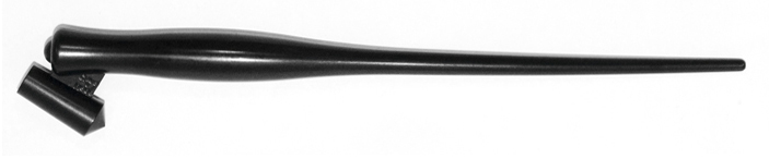
Lets Get Inky with Nibs: An Inktober Series
Inking with a nib might seem intimidating, but it only takes a little practice to get a hang for the basics. Nib inking is commonly referred to as dip pen inking, and is seeing a resurgence in popularity, especially among letterers. There's a great deal of appeal for comic artists as well, and dip pens are still very popular in Japan, although not quite as popular here in the West.
Inking with a dip pen or nib pen takes a great deal of patience, but offers more control than brush inking. Nibs can be quite affordable, but are commonly sold in sets- often with nibs you won't need. I recommend you find a store that offers nibs open stock, such as Paper and Ink Arts- this will allow you to sample a variety of nibs without purchasing sets.
Robust Inking Toolkit Guide for Professional Artists
Inking with a nib is very much about personal preference. First off, you may not enjoy it at all, preferring brushes, brush pens, or technical pens to nibs. Secondly, you might enjoy the act of inking with a nib, but hate the maintenance that nibs require. Thirdly, you may discover that you prefer some nibs to others, so I recommend you experiment widely. Even amongst nib types, there are certain brands that work better than others.
Source
Main Categories of Nibs
Flexible:
Maru (map)
G Nib
Spoon (turnip, globe, Saji, Kabura)

Crowquill
Fixed Width:
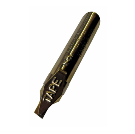
Tape
Brush
A, B, C, D
Poster
Ornamental-
Generally refers to monoline/fixed width nibs such as A, B, C, and D
Terms You May Hear:
Pointed Pen
In this post, Pointed Pen nibs have been referred to mainly as 'flexible' nibs. Pointed refers to the tip of the nib, which often comes for a point and takes advantage of twin tines flexing to release ink. These nibs were originally designed for correspondence and calligraphy. Originally used for copperplate.
Monoline
In this post, Monoline has been referred to as Fixed Width. These are nibs that only make one lineweight- A, B, C, D and tape nibs fall into this category. These nibs are not designed to flex, and additional pressure may ruin the nib.
Drawing
Although artists will use pointed pen nibs and monoline nibs for art, originally, artists used drawing nibs. These nibs were originally designed for drawing and sketching and are capable of very fine lines.
Mapping/Crowquill
Mapping nibs were originally designed for cartography. These nibs have very fine points and are similar to crowquill nibs.
Music
Music nibs come in two varieties- a three tined nib suitable for drawing the staff, and 5 pronged nibs for drawing the signature.
Scroll
Scroll nibs feature two points, and are used for decorative scrollwork or special effects.
Popular Brands:
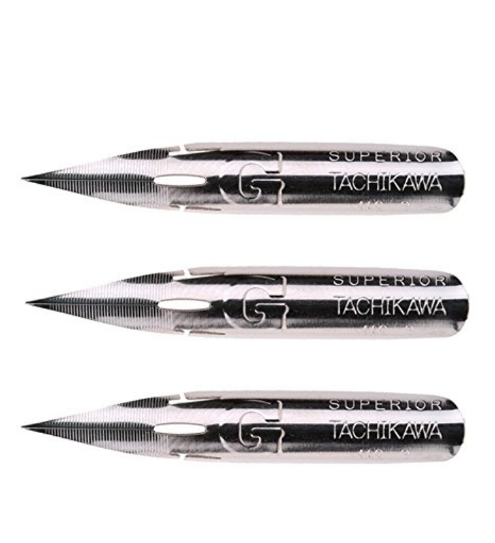
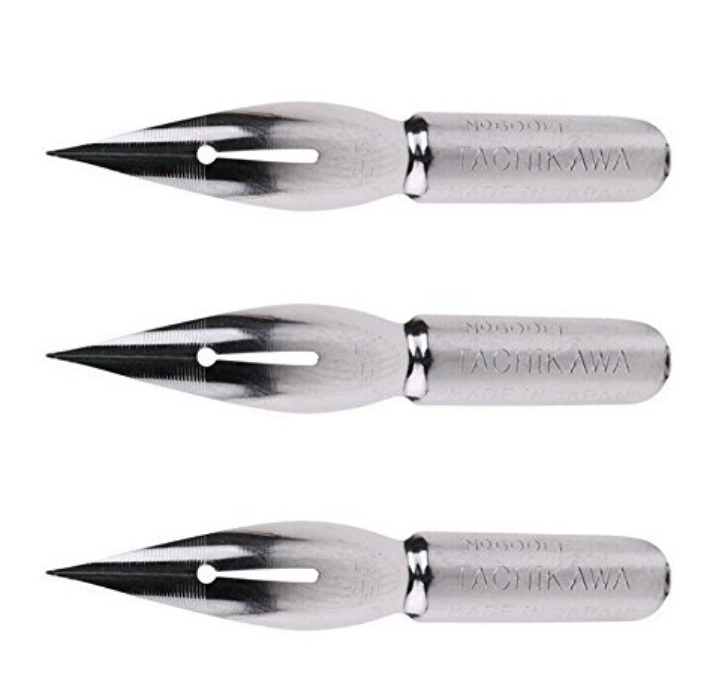
Tachikawa
Deleter
Kuretake
Zebra
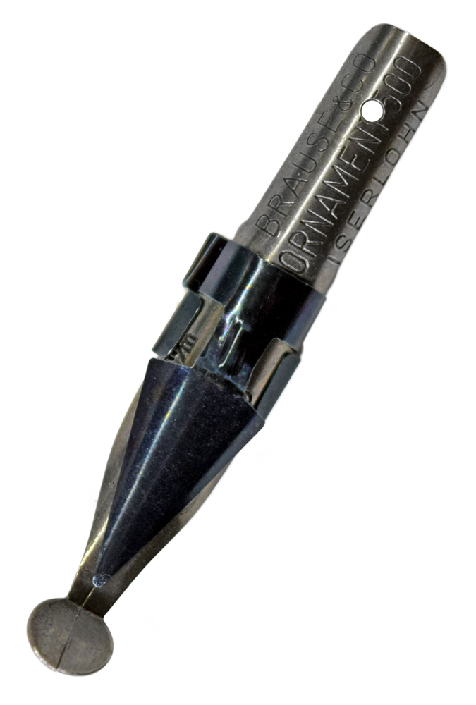
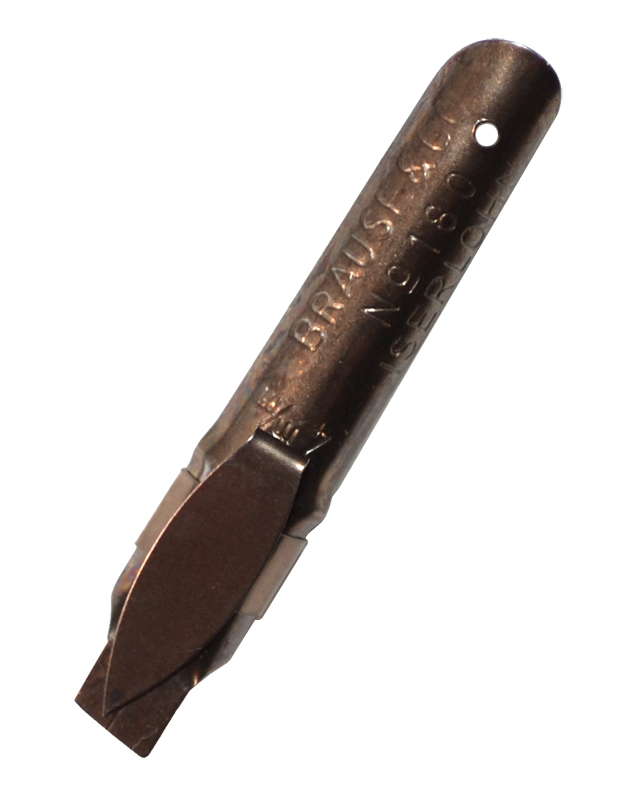
Brause
Hiro
Common Brands:
Hunt
Speedball
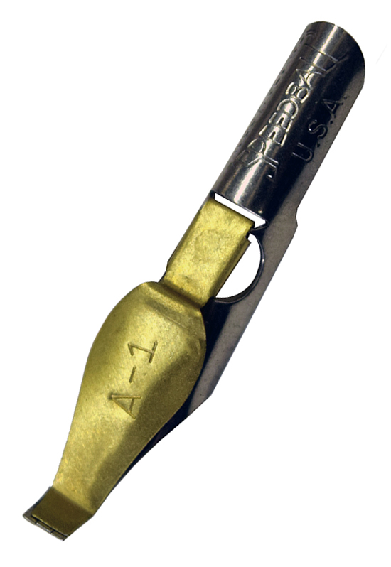
Manuscript
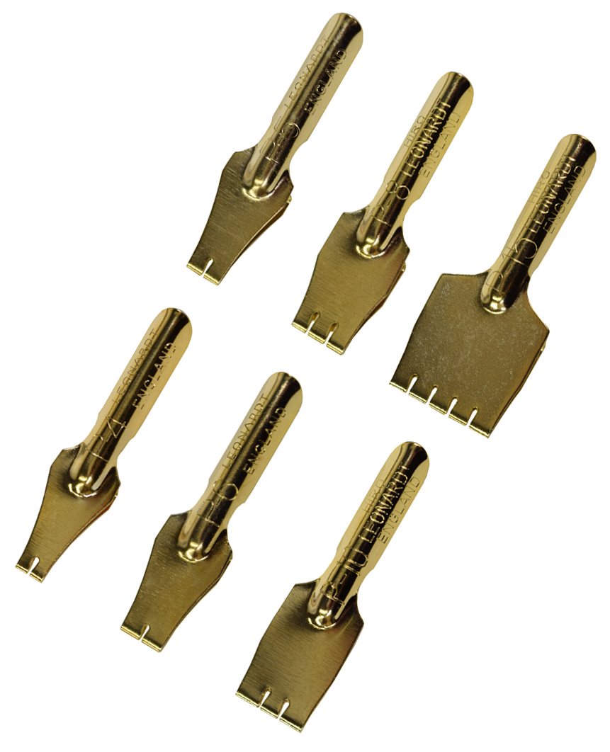
Leonardt
My Favorite Nibs:
Tachikawa G Nib
Brause Rose
Kuretake Saji
Tachikawa Tank
Brause Steno
For a wonderful introduction to inking with nibs, please check out this post- Inking Basics- Nibs!
Nibs for Borders:
Tape
Poster
Brush
Scroll
Nibs for Lettering (these are generally Fixed Weight Nibs)
Speedball A, B, C, D
Nibs for Varied Lineweight Cartooning
Brause Rose (originally used for hand written correspondence)
Brause Steno (originally used for handwritten notes)
Tachikawa or Zebra G or Student Nibs
Spoon and Globe Nibs
Manga Nibs
Kuretake Saji
Zebra and Tachikawa G and Student Nibs
Deleter Maru nibs
For an overview of various types of nibs with detailed photos, check out this post- In The Inking Supply Box
Inking Tutorials
Manga Nib Demonstration
Nib Exposure
Inking with a Manga Nib- Kuretake Saji Demonstration
Inking Your Character To Life With a Nib
Inktober Saji Nib Timelapse:
Inktober G Nib Timelapse:
Inks to Use with Dip Pens
Acrylic Inks:
FW
Liquitex
Lukas
Sumi Inks
Kuretake - Regular- Cartoonist
Yasutomo
Moon Palace
Deleter Inks
Deleter 1- Semi gloss finish, suitable for use with alcohol markers
Deleter 2- Quick drying time, alcohol marker proof
Deleter 3- Waterproof, matte finish
Deleter 4- Darkest ink, waterproof
Deleter 5- Indian style ink. Waterproof.
Deleter 6- Indian Ink Style. Fast Drying. Waterproof.
Kaimei Sol K- Alcohol marker proof.
Indian Inks- available in waterproof and non waterproof
Dr PH Martin's Bombay Inks (available in a variety of colors)- waterproof when dry
Winsor and Newton- Not Waterproof
Liquid Watercolors
Hydrus
Ecoline
Dr PH Martin's Radiant Concentrated Watercolors
Fountain Pen Inks
Pigment Based- Waterproof:
Platinum- Carbon Black, Rose Red, Sepia, Blue
Sailor Storia Inks
Dye Based- Generally Non Waterproof:
J Herbin
Diamine
Noodler's Inks
For more ink compatibility tests, check out Once Upon a Tine
Walnut Ink
This can be prepared at home by collecting walnuts, purchased as crystals, or purchased as a ready made ink.
Walnut ink is an ink made from the green husk surrounding the nut of walnuts. The Black Walnut Juglans nigra is usually used. The ink may be liquid or made of crystals that are mixed with water before use. It can be used to produce stains and darken paper to make it look older.Source
Iron Gall Ink
Iron gall ink (also known as iron gall nut ink, oak gall ink, and common ink) is a purple-black or brown-black ink made from iron salts and tannic acids from vegetable sources.
Source
Please note that Iron Gall Ink can be highly destructive to papers and nibs, due to acid content.
Watercolors
How to use watercolors with dip pens
Finetec Watercolors
Gold/Metallic Inks
Gold and Silver Mica Ink
Winsor and Newton Gold Ink
Winsor and Newton Silver Ink
Creating Colored Lineart wtih Nibs
G Nib Inking with FW Acrylic Pearlescent Moon Violet
Inking with Pearlescent Black
Inking with Waterfall Green
J Herbin Ink Swatches
Nib Holders:
Types of Holders
Oblique
 SourceUsed for calligraphy
Straight
 Source
Used for calligraphy, sketching, and inking
Brands of Holders:
Speedball
Deleter
Tachikawa
Kuretake
e+m
Brause
Recommended Nib Holders:
Tachikawa
Kuretake
Papers to Ink On
Strathmore 400 and 500 series- plate
Strathmore 400 and 500 series- vellum
Illustration board
Hotpress watercolor paper
Terms to Know
Tank- A small reservoir attached to the nib to increase ink capacity.
Cage- A spring welded onto the nib to increase ink capacity. Ink sticks to the spring, allowing the nib to hold more ink.
Other Types of Dip Pens
Folded
Handmade Folded Pen Unboxing and Demonstration:
Reed
Reed Pen Size Breakdown:
Witch
Paper and Ink Arts Haul:
Recommended Additional Materials
Dinky Dips or Dappen DishesAlcohol wipesRubbing alcoholPaper Towels (I like untextured Viva)Cup of clean waterTest sheet of paper
Tips and Tricks
With cheaply made nibs, excessive force can cause the nib to shatter. Hunt nibs are particularly prone to this.
New nibs have been coated with oil to prevent rusting. You can remove this in a number of ways:
Burning the oil off with a lighter (may cause nib discolouration)Wiping the oil off with an alcohol wipeWashing your nibs in a dish of water and dishsoap before first use
For more information about Nib Care, check out this post-Brush and Nib Care.
Excessive force can cause nibs, even high quality nibs, to 'nip' and tear at the paper
Nib Reviews:
Student Art Nib Set
Outside Reviews:
The Well Appointed Desk- Review: Kaweco Special Dip Pen
Gourmet Pens- Review: Brause Dip Pen Set
Parka Blogs: Review: Speedball Sketching Project Set
The Desk of Lori: Pen Review: Kaweco Special Dip Pen
Second Opinions and Outside Resources
Deleter Ink Difference
Difference of Deleter Nibs
Dip Nib Guide
Wikipedia: Walnut Ink
Making A Walnut Ink
Wikipedia: Iron Gall Ink
The Iron Gall Ink Website
The Postman's Knock- How To Use Watercolors With Dip Pens
The Postman's Knock- Watercolor Calligraphy Tutorial
The Postman's Knock- How to Know When a Calligraphy Nib is Done
How to Use the Finetec Palette
Which Calligraphy Nibs To Use and Why
Common Calligraphy Ink Problems + How To Solve Them
How To Prepare New Calligraphy Nibs for Use
Getting to Know the Brause Rose Nib
5 Tips for Maintaining Your Calligraphy Nibs
Six Tips for Taming Calligraphy Nibs
Richmond Illustration Inc- Inking Tutorial Part 1
Jackson's- A Guide To Dip Pens and Drawing Ink
Jetpens-How to Use Manga Nibs
The Lowdown on Calligraphy Nibs
Please consider donating to this blog or purchasing from Natto-shop (http://nattosoup.com/shop) if you want me to continue publishing quality content. All materials tested were purchased from my own pocket. Keep on Truckin' Nattosoup is not under any sponsorship.

October 23, 2017
Guest Post: Kabocha's Screentone Walkthrough
Hello, and welcome again, to another walkthrough by kabocha!
So, what is screentone?
My good buddy Loom goes over what screentones are and a bit about their history in this tutorial. If you’re curious, give it a read!
But to be brief, screentones are patterns are basically dot patterns meant to provide textures, values, or other things. They’re not limited to manga or OEL stuff, but that’s where one will find them nowadays.
If you’re interested in the technical aspects of screentones (what DO the numbers mean?), maybe you ought to check out Loom’s tutorials, as she covers high-res and low-res, as well as information on moire and overlays and using them to your advantage.
ANYWAY. How do we go from linework to a toned illustration? Welp.

First things first -- YES, I am working in Clip Studio Paint. While I’ll be referring to specific tools in this application, the general process can be applied basically anywhere you have digital tones available. (Traditional toning? Little bit of a different beast, and I cleared out my traditional tones in 2015.) First things first, when you do your lineart, try and make sure your linework is generally closed,as if you’re going to begin flatting. This was about as good as I was going to get for the time being.
Basic FillsSo, you know how in Loom’s tutorials, “value” is mentioned? It comes into play here.
Think of screentoning as being like coloring in greyscale; you know where your darks and your lights should be.
In this case, I know one character’s hair is near-black, so I’m just going to go ahead and imply that with some black fills, with highlight areas erased.I’ve gone over this technique in the past, with both near-black hair and a character who has brownish hair. You can repeat this process if you want to combine spot blacks for shadowing as well!
I added tone to make it clear his hair isn’t shiny black.In this case, I chose 60L/40% as my screentone of choice, which translates to something like 60 lines per inch at 40% value. The 60 line choice is pretty much my own preference, but 40% is fairly dark, fitting my purposes.
Now that we’ve got the darkest area of the image done, let’s move on to something else.
This time, I selected the entire area of the shirt, which would be kind of… a light brown or grey. So a much lighter tone is needed. This time, I went with something with a lower line count (50L) because 60L would produce something that looks slightly more saturated.
Next up, the bow! What color would you expect it to be? Usually I use fairly saturated (but not necessarily bright) red for this character.
I decided to re-use the 60L/40% tone -- though without any spot blacks, it looks much lighter in comparison to the hair I previously used it on.
You can repeat this sort of process through your illustration to see what all you can create.
Dots vs NoiseIt’s important to note that even if you have two types of tones with the same saturation, the TYPE of tone will make a difference in its appearance. For example, here we have a “dot” tone and a “noise” tone.
These produce different types of textures, and are worth playing with! They also will resize differently as well.

Gradiation
Workspace aside -- many applications offer gradiated screentones! Usually they come in two types of gradients -- Radial and Linear.
These are especially good for… Well, expressing gradients. Dark to light, burnt to not-burnt, and so on.
In this case, I used a circular gradient as a fill for the pie crust, as it seemed most fitting.

There are also cases where you can use Gradients for shading -- as seen here: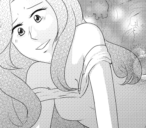
Gradient shading isn’t new, but always worth looking at here and there.
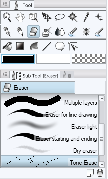
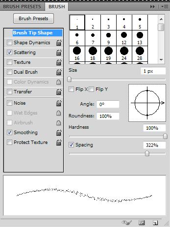
Tone ErasingNow that we have some areas laid out with screentone, one might realize… Well, I want to erase things, but I want it to be soft-shaded -- how do I accomplish that?
Back in the day, you’d grab a rough eraser, or use an knife to scrape your tones.
Digitally, there’s a myriad of ways to do this, and it will vary based on your program.
I made a Tone Erase brush in Clip Studio Paint, or you could use use the existing Tone Scraping airbrush (which puts down tone). If you use either of these in conjunction with layer masks, you can accomplish some pretty neat things.
 Yes, sometime in-between the gradient and the erasing, I added another flat tone.
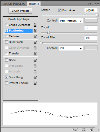
In Photoshop, you can make your own tone eraser by using the Pencil tool and using white over your screentone, or by setting your eraser mode to Pencil. Once you do this, open up your Brush window (F5), and play with the settings pictured below. Your preferences may vary, so you should experiment!
Finishing touches
And finally, now that we have the tone laid out, we can start doing things like adding shading and such. When laying down my tone, I’m going to use the tone eraser to accomplish a more soft-shaded look.
For this, I chose 75L/5% instead of another 60L tone.

This allows me to exploit moire when layering it on top of another toned area.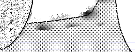
In the process of toning, I also repeated the process on the bow and in various other places to help add depth. This typically isn’t necessary, but can help!
Afterward, I added some tone to the background, as well as text, to produce the finished image!

If you’re like me, and can’t get enough screentone, you can find a myriad of resources on Clip Studio Paint’s assets website. If you search their official account, you can find some awesome goodies!
Wanna see more of my screentone nonsense? Check me out on deviantArt, or read my manga-styled webcomic, Linked!
Please consider donating to this blog or purchasing from Natto-shop (http://nattosoup.com/shop) if you want me to continue publishing quality content. All materials tested were purchased from my own pocket. Keep on Truckin' Nattosoup is not under any sponsorship.
So, what is screentone?
My good buddy Loom goes over what screentones are and a bit about their history in this tutorial. If you’re curious, give it a read!
But to be brief, screentones are patterns are basically dot patterns meant to provide textures, values, or other things. They’re not limited to manga or OEL stuff, but that’s where one will find them nowadays.
If you’re interested in the technical aspects of screentones (what DO the numbers mean?), maybe you ought to check out Loom’s tutorials, as she covers high-res and low-res, as well as information on moire and overlays and using them to your advantage.
ANYWAY. How do we go from linework to a toned illustration? Welp.
First things first -- YES, I am working in Clip Studio Paint. While I’ll be referring to specific tools in this application, the general process can be applied basically anywhere you have digital tones available. (Traditional toning? Little bit of a different beast, and I cleared out my traditional tones in 2015.)
First things first, when you do your lineart, try and make sure your linework is generally closed,as if you’re going to begin flatting. This was about as good as I was going to get for the time being.
Basic FillsSo, you know how in Loom’s tutorials, “value” is mentioned? It comes into play here.
Think of screentoning as being like coloring in greyscale; you know where your darks and your lights should be.
In this case, I know one character’s hair is near-black, so I’m just going to go ahead and imply that with some black fills, with highlight areas erased.I’ve gone over this technique in the past, with both near-black hair and a character who has brownish hair. You can repeat this process if you want to combine spot blacks for shadowing as well!
I added tone to make it clear his hair isn’t shiny black.In this case, I chose 60L/40% as my screentone of choice, which translates to something like 60 lines per inch at 40% value. The 60 line choice is pretty much my own preference, but 40% is fairly dark, fitting my purposes.
Now that we’ve got the darkest area of the image done, let’s move on to something else.
This time, I selected the entire area of the shirt, which would be kind of… a light brown or grey. So a much lighter tone is needed. This time, I went with something with a lower line count (50L) because 60L would produce something that looks slightly more saturated.
Next up, the bow! What color would you expect it to be? Usually I use fairly saturated (but not necessarily bright) red for this character.
I decided to re-use the 60L/40% tone -- though without any spot blacks, it looks much lighter in comparison to the hair I previously used it on.
You can repeat this sort of process through your illustration to see what all you can create.
Dots vs NoiseIt’s important to note that even if you have two types of tones with the same saturation, the TYPE of tone will make a difference in its appearance. For example, here we have a “dot” tone and a “noise” tone.
These produce different types of textures, and are worth playing with! They also will resize differently as well.
Gradiation
Workspace aside -- many applications offer gradiated screentones! Usually they come in two types of gradients -- Radial and Linear.
These are especially good for… Well, expressing gradients. Dark to light, burnt to not-burnt, and so on.
In this case, I used a circular gradient as a fill for the pie crust, as it seemed most fitting.
There are also cases where you can use Gradients for shading -- as seen here:
Gradient shading isn’t new, but always worth looking at here and there.
Tone ErasingNow that we have some areas laid out with screentone, one might realize… Well, I want to erase things, but I want it to be soft-shaded -- how do I accomplish that?
Back in the day, you’d grab a rough eraser, or use an knife to scrape your tones.
Digitally, there’s a myriad of ways to do this, and it will vary based on your program.
I made a Tone Erase brush in Clip Studio Paint, or you could use use the existing Tone Scraping airbrush (which puts down tone). If you use either of these in conjunction with layer masks, you can accomplish some pretty neat things.
Yes, sometime in-between the gradient and the erasing, I added another flat tone.
In Photoshop, you can make your own tone eraser by using the Pencil tool
and using white over your screentone, or by setting your eraser mode to Pencil. Once you do this, open up your Brush window (F5), and play with the settings pictured below. Your preferences may vary, so you should experiment!
Finishing touches
And finally, now that we have the tone laid out, we can start doing things like adding shading and such. When laying down my tone, I’m going to use the tone eraser to accomplish a more soft-shaded look.
For this, I chose 75L/5% instead of another 60L tone.
This allows me to exploit moire when layering it on top of another toned area.
In the process of toning, I also repeated the process on the bow and in various other places to help add depth. This typically isn’t necessary, but can help!
Afterward, I added some tone to the background, as well as text, to produce the finished image!
If you’re like me, and can’t get enough screentone, you can find a myriad of resources on Clip Studio Paint’s assets website. If you search their official account, you can find some awesome goodies!
Wanna see more of my screentone nonsense? Check me out on deviantArt, or read my manga-styled webcomic, Linked!
Please consider donating to this blog or purchasing from Natto-shop (http://nattosoup.com/shop) if you want me to continue publishing quality content. All materials tested were purchased from my own pocket. Keep on Truckin' Nattosoup is not under any sponsorship.
October 19, 2017
Let's Get Inky with Brushpens: An Inktober Series
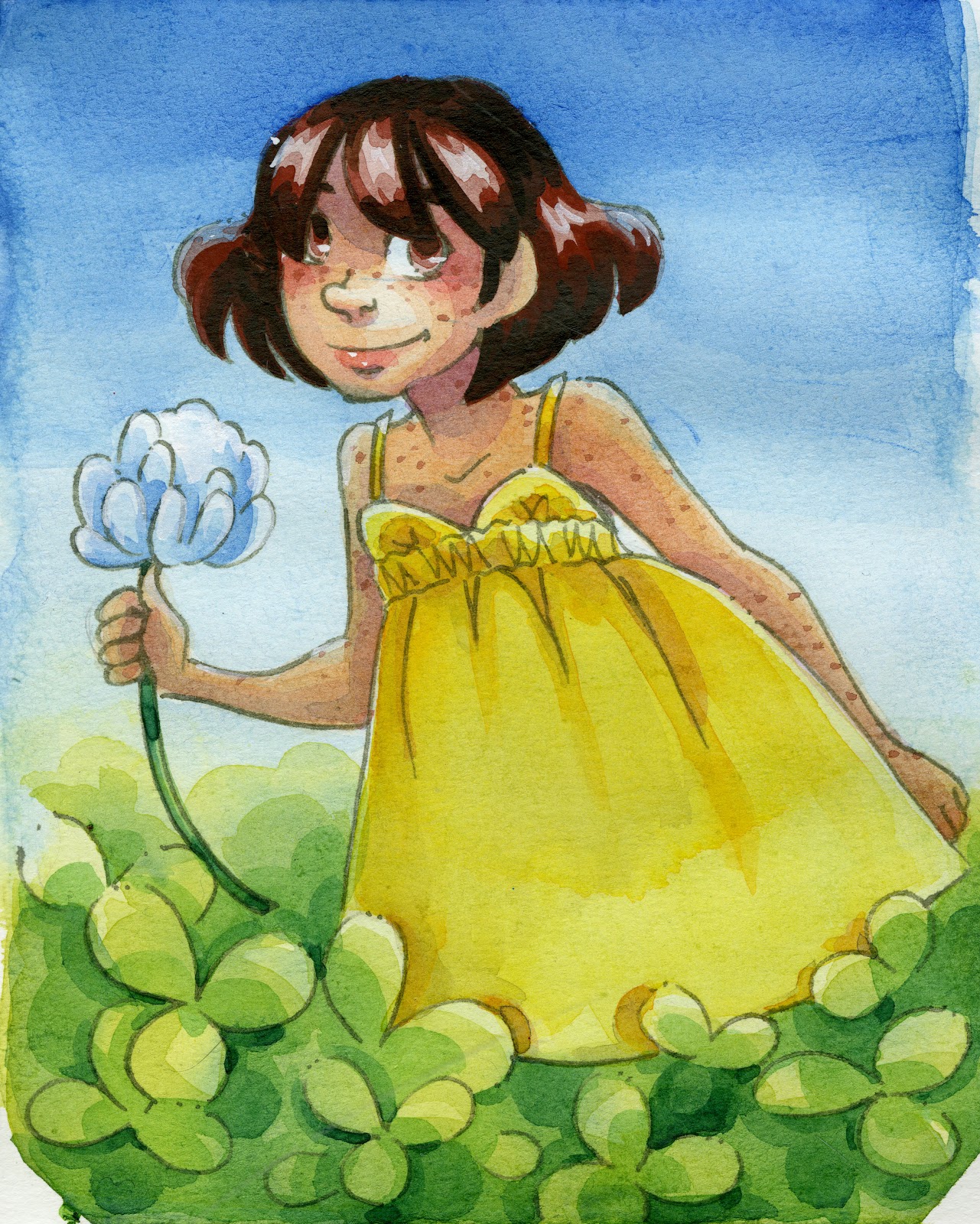
Last week, we got inky with brushes. This week, we're gettin' inky with brushpens.
Brushpens are a great alternative to inking with technical pens. They offer variable lineweight with affordability and ease of control, and are a great option for artists of all skill levels. I use brushpens on a daily basis- particularly fude pens. Fude pens, also known as sign pens, are typically used in Japan for writing kanji, and are a wonderful tool for creating expressive lines.
 Watercolor illustration inked with Sailor Mitsuo Aida on Fluid 100 CP watercolor paper
 Limited color watercolor illustration inked with Sailor Mitsuo Aida on Strathmore Field Watercolor paper
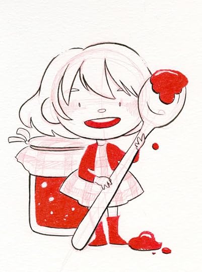 Sakura Pigma FB+ Pentel Red Brushpen on Strathmore Field Watercolor PaperYou guys might wonder why I introduced brushes before brushpens- I want you to try both! Many artists treat brushpens as an alternative to brushes, and never try inking with a brush. I feel both tools have unique traits to offer an artist, and I'd love for you to give both a try.
What's Inside My Pencilcase:
Pros to Brushpens:PortableAvailable in a variety of sizesAvailable in alcohol proof and waterproof inksInexpensiveEasy to findExpressive lineweightsEasy to useLow learning curve
Cons to Brushpens:Lack the nuance of brushesMay be difficult to pull straight linesEvery pen handles differently, may take getting used to
Brush pens are flexible and work well on most papers including:Sketchbook papers such as the Blick Studio SketchbookMixed Media papers, such as Strathmore's 500 series and 400 series mixed media paperCellulose-based watercolor paper, such as Canson Montval Watercolor paper, Fluid E-Z Block, and Canson XL Watercolor paperCotton based watercolor paper, such as Fluid 100 or ArchesHotpress watercolor paperIllustration Board such as Canson Montval Artboard, Strathmore Illustration board500 series Plate (smooth surface) or Vellum Bristol (textured surface)Marker papers such as Strathmore, Borden and Riley Pen and Ink Paper, or Bee Marker Paperand many more. I recommend experimenting to find your favorite combinations, but below are a few of my favorite combos:
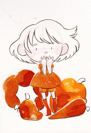 Colored Lead, Fountain Pen Ink in a Waterbrush, Sakura Pigma FB on Strathmore Field Watercolor Paper
Strathmore Field Watercolor Book or Pentallic Watercolor Journal+ Sakura Pigma FB+ Pentel brushpen (dye based, colored ink)Stathmore 500 Series Mixed Media Visual Journal+ Sakura Pigma FB+ Pentel Pigment BrushpenSailor Mitsuo Aida+ Illustration BoardSailor Mitsuo Aida + Canson Bulk Watercolor PaperSakura Pigma FB+ Canson Bulk Watercolor PaperKuretake Fudegokochi+ CardstockKuretake Fudegokochi+ Strathmore 500 Series Plate BristolKuretake Fudegokochi+ Blick Studio Sketchbook
 Commission portrait sketched with non photo lead on cardstocked, inked with a Kuretake Fudegokochi and Pentel Pocketbrush. Corrections were made with a Signo white gel pen.
 Commission illustration sketched with green lead, then inked with Copic markers. Final inks were added with a Kuretake Fudegokochi
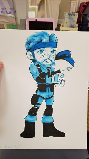 Commission illustration sketched with non photo blue lead, then inked with Copic markers. Final inks were added with a Kuretake Fudegokochi
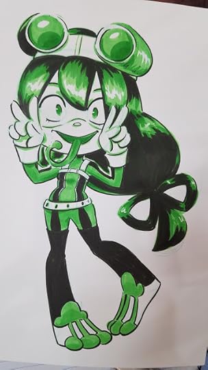 Commission illustration sketched with green lead, then inked with Copic markers. Final inks were added with a Kuretake Fudegokochi
I use brushpens frequently- for sketchbook sketches, studies from life and reference, for convention commissions, and for pieces I plan on completing digitally. I think brushpens are wonderful, versatile tools that make inking easier and more accessible, and highly recommend you give them a try.
For brushpen recommendations and reviews, make sure you check out my Brushpen hubpage, here on this blog!
Best Brushpens for Illustration:
Three Types of Brushpen:Fiber tipped- like Pitt PensFoam Rubber Tips- like fude pens or Copic marker SuperbrushesNylon Bristles- like Pentel Pocket Brush
Inktober 10 Brushpen Showdown: Felt Vs Bristles:
Brushpens can be:Piston filledRefillableDisposableEyedropper converted
Copic Safe Brushpens:Sailor Mitsuo AidaSakura Pigma and Micron pensCopic Multiliner BrushpenPrismacolor Illustrator PensKuretake Fudegokochi
Watersafe Brushpens: Pitt pens (India Ink)Sailor Mitsuo AidaSakura Pigma FB, MB, BBPentel Pigment Brushpen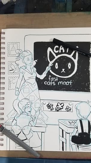 Sakura Pigma FB and Pentel Pigment Brushpen on Strathmore 500 Series Mixed Media Paper
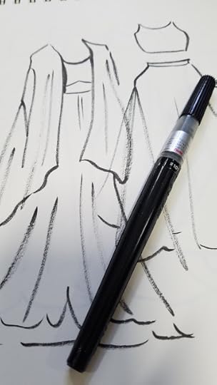 Pentel Brushpen on Blick Sketchbook Paper
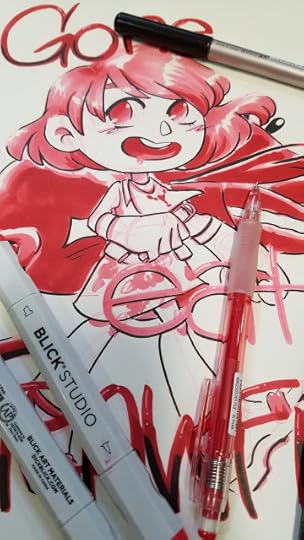 Alcohol marker and Kuretake Fudegokochi on Blick Sketchbook Paper
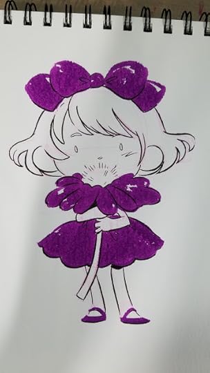 Sakura Pigma FB and Pentel Brushpen (purple) on Strathmore 400 Series Watercolor paper
Looking for brushpen reviews and recommendations? Check out my Brushpens hubpage!
Homemade Sparkle Pens? More Likely Than You Think:
Waterbrushes can be filled with the ink of your choice (barring acrylic, that's not recommended) and used as a brushpen. You can also modify a Pentel Pocket Brush to take the ink of your choice with a little silicone grease.
Hacking the Pentel Pocket Brush: Eyedropper Conversion:
You can try: Sparkly fountain pen inksSumi inkWaterbased ink for inkwash effectsIndian inkDye based ink such as liquid watercolors, fountain pen inks
Cartridges can also be cleaned and refilled using the ink of your choice, using a syringe, as demonstrated in this tutorial.
Brushpen Inking Demonstration:
Final Inktober Inks+Mermaid Sneak Peeks:
Fountain Pen Inkwash Timelapse: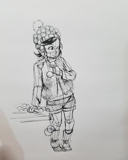 Pen and ink study, drawn from reference
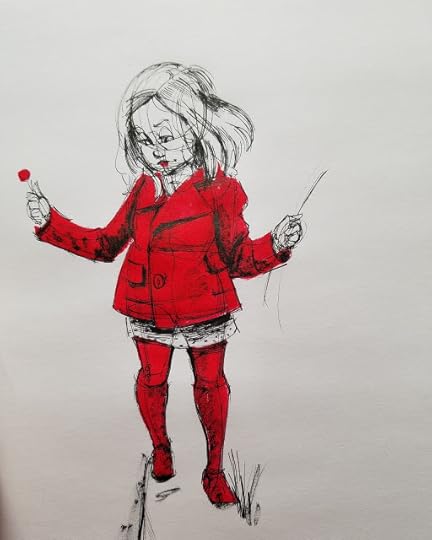 Pen and ink study, drawn from reference
And your inking doesn't have to stop with sketchbook illustrations- brush and fude pens can be useful for inking comic pages as well.
Cicada Summer: Pencils and Inks
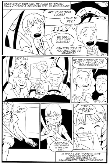 Cicada Summer, Page 1
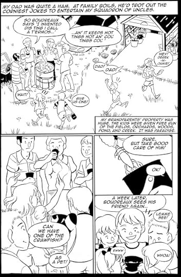 Cicada Summer Page 3
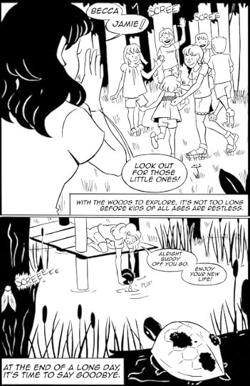 Cicada Summer Page 10The above pages were inked with a variety of brushpens, including the Kuretake Fudegokochi and the Sakura Pigma FB, MB, and BB brushpens.
 SCBWI Illustrator's Contest Spread- inked with a Sailor Mitsuo Aida, Pigma Calligraphy Pens, and Micron fineliners
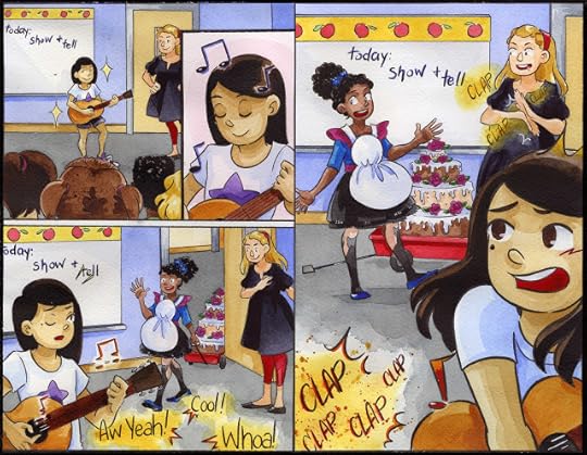 Watercolor over these waterproof pens
Tips for Inking with BrushpensIt helps to have a variety of sizes- fine for details, large for spot blacks and larger fillsNylon bristled brushpens are prone to drybrushing- inkflow can't keep up with linewidgth- you can use this technique to your advantageNylon bristled brushpens are fun to sketch with, and are great for travel journalsBrushpens for Color Sketches
Monochromatic Magic with Colored Leads and Clean Color Real Brush
Colorful brushpens usually contain dye based inks, and are very similar to watercolor markers, and are often marketed as such. For me the difference is all about the body of the pen- a waterbrush or brushpen body is typical used for these colored brushpens.
Looking to Add Spot Color? Try: Pentel BrushpenKuretake Clean Color Real BrushMermaid MarkersAlcohol markers such as Copic or Prismacolor markers
Colored Leads with Clean Color Marker Tutorial:
Axolotl Illustration with Clean Color Real Brush Markers:
If you're using refillable brushpens, they will require a degree of care to keep them performing at peak condition. This tutorial shows you how to clean an Akashiya bamboo brushpen, and the techniques used work for other refillable brushpens as well.
I hope this post has inspired you guys to pick up some fude and brushpens, and try them out! If you enjoyed this post, don't forget to support what I do on Patreon
And check out my webcomic, 7" Kara.

Please consider donating to this blog or purchasing from Natto-shop (http://nattosoup.com/shop) if you want me to continue publishing quality content. All materials tested were purchased from my own pocket. Keep on Truckin' Nattosoup is not under any sponsorship.
Brushpens are a great alternative to inking with technical pens. They offer variable lineweight with affordability and ease of control, and are a great option for artists of all skill levels. I use brushpens on a daily basis- particularly fude pens. Fude pens, also known as sign pens, are typically used in Japan for writing kanji, and are a wonderful tool for creating expressive lines.
 Watercolor illustration inked with Sailor Mitsuo Aida on Fluid 100 CP watercolor paper
 Limited color watercolor illustration inked with Sailor Mitsuo Aida on Strathmore Field Watercolor paper
 Sakura Pigma FB+ Pentel Red Brushpen on Strathmore Field Watercolor PaperYou guys might wonder why I introduced brushes before brushpens- I want you to try both! Many artists treat brushpens as an alternative to brushes, and never try inking with a brush. I feel both tools have unique traits to offer an artist, and I'd love for you to give both a try.
What's Inside My Pencilcase:
Pros to Brushpens:PortableAvailable in a variety of sizesAvailable in alcohol proof and waterproof inksInexpensiveEasy to findExpressive lineweightsEasy to useLow learning curve
Cons to Brushpens:Lack the nuance of brushesMay be difficult to pull straight linesEvery pen handles differently, may take getting used to
Brush pens are flexible and work well on most papers including:Sketchbook papers such as the Blick Studio SketchbookMixed Media papers, such as Strathmore's 500 series and 400 series mixed media paperCellulose-based watercolor paper, such as Canson Montval Watercolor paper, Fluid E-Z Block, and Canson XL Watercolor paperCotton based watercolor paper, such as Fluid 100 or ArchesHotpress watercolor paperIllustration Board such as Canson Montval Artboard, Strathmore Illustration board500 series Plate (smooth surface) or Vellum Bristol (textured surface)Marker papers such as Strathmore, Borden and Riley Pen and Ink Paper, or Bee Marker Paperand many more. I recommend experimenting to find your favorite combinations, but below are a few of my favorite combos:
 Colored Lead, Fountain Pen Ink in a Waterbrush, Sakura Pigma FB on Strathmore Field Watercolor Paper
Strathmore Field Watercolor Book or Pentallic Watercolor Journal+ Sakura Pigma FB+ Pentel brushpen (dye based, colored ink)Stathmore 500 Series Mixed Media Visual Journal+ Sakura Pigma FB+ Pentel Pigment BrushpenSailor Mitsuo Aida+ Illustration BoardSailor Mitsuo Aida + Canson Bulk Watercolor PaperSakura Pigma FB+ Canson Bulk Watercolor PaperKuretake Fudegokochi+ CardstockKuretake Fudegokochi+ Strathmore 500 Series Plate BristolKuretake Fudegokochi+ Blick Studio Sketchbook
 Commission portrait sketched with non photo lead on cardstocked, inked with a Kuretake Fudegokochi and Pentel Pocketbrush. Corrections were made with a Signo white gel pen.
  Commission illustration sketched with green lead, then inked with Copic markers. Final inks were added with a Kuretake Fudegokochi
 Commission illustration sketched with non photo blue lead, then inked with Copic markers. Final inks were added with a Kuretake Fudegokochi
 Commission illustration sketched with green lead, then inked with Copic markers. Final inks were added with a Kuretake Fudegokochi
I use brushpens frequently- for sketchbook sketches, studies from life and reference, for convention commissions, and for pieces I plan on completing digitally. I think brushpens are wonderful, versatile tools that make inking easier and more accessible, and highly recommend you give them a try.
For brushpen recommendations and reviews, make sure you check out my Brushpen hubpage, here on this blog!
Best Brushpens for Illustration:
Three Types of Brushpen:Fiber tipped- like Pitt PensFoam Rubber Tips- like fude pens or Copic marker SuperbrushesNylon Bristles- like Pentel Pocket Brush
Inktober 10 Brushpen Showdown: Felt Vs Bristles:
Brushpens can be:Piston filledRefillableDisposableEyedropper converted
Copic Safe Brushpens:Sailor Mitsuo AidaSakura Pigma and Micron pensCopic Multiliner BrushpenPrismacolor Illustrator PensKuretake Fudegokochi
Watersafe Brushpens: Pitt pens (India Ink)Sailor Mitsuo AidaSakura Pigma FB, MB, BBPentel Pigment Brushpen
 Sakura Pigma FB and Pentel Pigment Brushpen on Strathmore 500 Series Mixed Media Paper
 Pentel Brushpen on Blick Sketchbook Paper
 Alcohol marker and Kuretake Fudegokochi on Blick Sketchbook Paper
 Sakura Pigma FB and Pentel Brushpen (purple) on Strathmore 400 Series Watercolor paper
Looking for brushpen reviews and recommendations? Check out my Brushpens hubpage!
Homemade Sparkle Pens? More Likely Than You Think:
Waterbrushes can be filled with the ink of your choice (barring acrylic, that's not recommended) and used as a brushpen. You can also modify a Pentel Pocket Brush to take the ink of your choice with a little silicone grease.
Hacking the Pentel Pocket Brush: Eyedropper Conversion:
You can try: Sparkly fountain pen inksSumi inkWaterbased ink for inkwash effectsIndian inkDye based ink such as liquid watercolors, fountain pen inks
Cartridges can also be cleaned and refilled using the ink of your choice, using a syringe, as demonstrated in this tutorial.
Brushpen Inking Demonstration:
Final Inktober Inks+Mermaid Sneak Peeks:
Fountain Pen Inkwash Timelapse:
 Pen and ink study, drawn from reference
 Pen and ink study, drawn from reference
And your inking doesn't have to stop with sketchbook illustrations- brush and fude pens can be useful for inking comic pages as well.
Cicada Summer: Pencils and Inks
 Cicada Summer, Page 1
 Cicada Summer Page 3
 Cicada Summer Page 10The above pages were inked with a variety of brushpens, including the Kuretake Fudegokochi and the Sakura Pigma FB, MB, and BB brushpens.
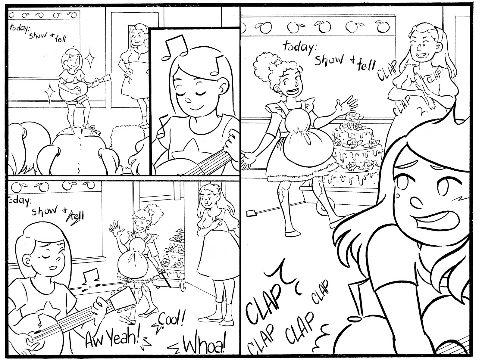 SCBWI Illustrator's Contest Spread- inked with a Sailor Mitsuo Aida, Pigma Calligraphy Pens, and Micron fineliners
 Watercolor over these waterproof pens
Tips for Inking with BrushpensIt helps to have a variety of sizes- fine for details, large for spot blacks and larger fillsNylon bristled brushpens are prone to drybrushing- inkflow can't keep up with linewidgth- you can use this technique to your advantageNylon bristled brushpens are fun to sketch with, and are great for travel journalsBrushpens for Color Sketches
Monochromatic Magic with Colored Leads and Clean Color Real Brush
Colorful brushpens usually contain dye based inks, and are very similar to watercolor markers, and are often marketed as such. For me the difference is all about the body of the pen- a waterbrush or brushpen body is typical used for these colored brushpens.
Looking to Add Spot Color? Try: Pentel BrushpenKuretake Clean Color Real BrushMermaid MarkersAlcohol markers such as Copic or Prismacolor markers
Colored Leads with Clean Color Marker Tutorial:
Axolotl Illustration with Clean Color Real Brush Markers:
If you're using refillable brushpens, they will require a degree of care to keep them performing at peak condition. This tutorial shows you how to clean an Akashiya bamboo brushpen, and the techniques used work for other refillable brushpens as well.
I hope this post has inspired you guys to pick up some fude and brushpens, and try them out! If you enjoyed this post, don't forget to support what I do on Patreon

And check out my webcomic, 7" Kara.
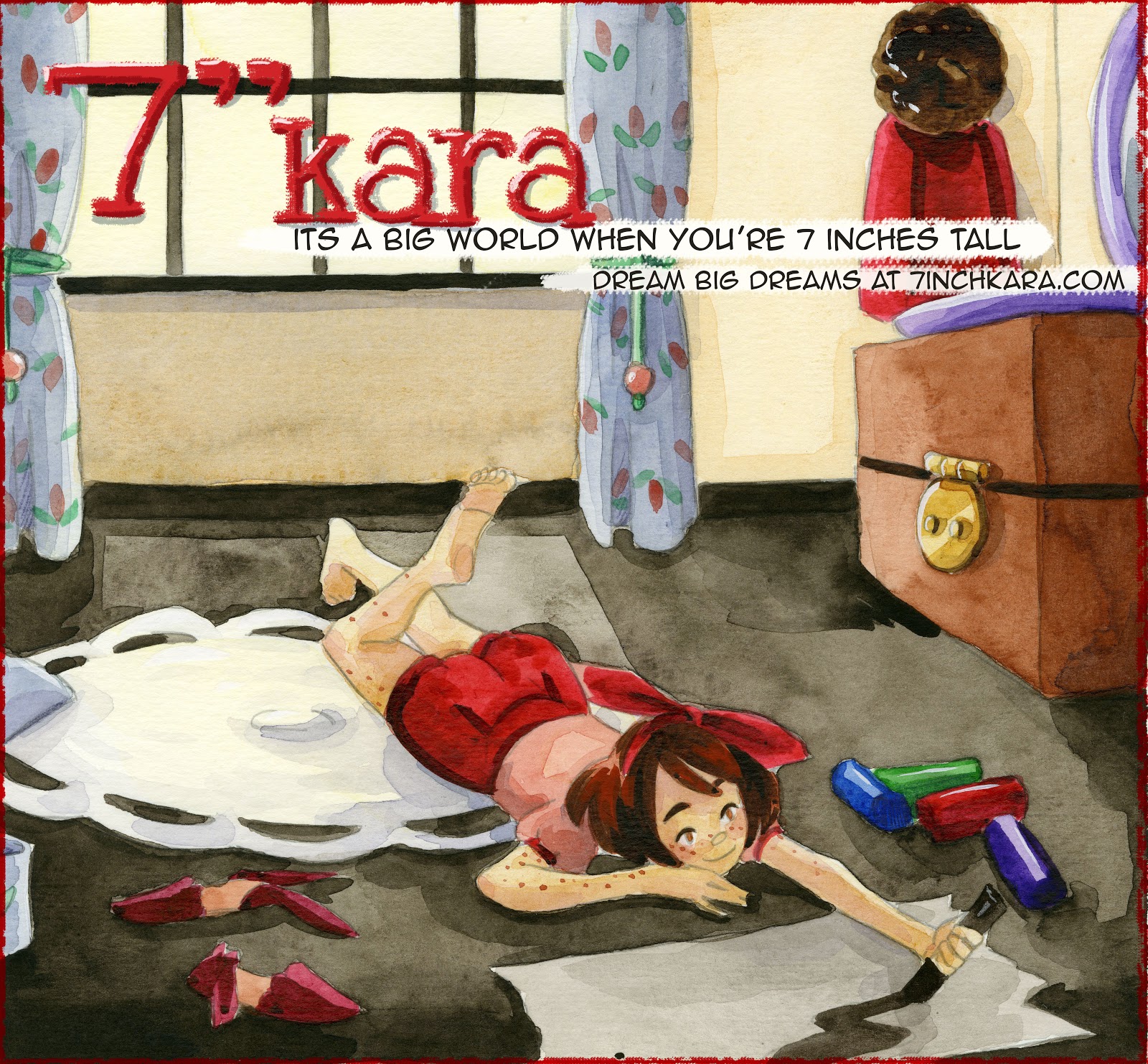
Please consider donating to this blog or purchasing from Natto-shop (http://nattosoup.com/shop) if you want me to continue publishing quality content. All materials tested were purchased from my own pocket. Keep on Truckin' Nattosoup is not under any sponsorship.
October 16, 2017
Why You Should Participate in Inktober
Why You Should Participate in Inktober
You'll produce a body of workMuch of what you produce can be used for your portfolioYou're pushing your limitsYou're learning more about time management and scheduling
How should you participate:
Whatever is feasible and reasonable for youSince this is a 'challenge', you should push yourself in some manner this can involveWorking with a medium you're unfamiliar withTrying a new styleWorking in a shorter timeframeWorking in a longer timeframeWorking along a particular themeDrawing content out of your comfortzoneDeveloping a project that's been backburneredCollaborating with friendsForgiving mistakes and leaving them visible in your workInk a comic
Small ways to participate in Inktober:
Ink old sketchesTrade lineart with a friend or a group of friendsTry digital toningFollow a tutorialEmulate an artist you admireTry crosshatchingPractice textures
Don't have time to ink, but still want to participate?
Feature one artist per day on your Twitter/Tumblr/Instagram whose inking you admireShare tutorials
Use the Hashtag- or don't- it's up to you
What materials should you use?
Whatever is feasible and affordable for you, but Inktober is a great time to try new thingsTraditional artist? Go digitalDigital artist? Consider trying traditional
Or do a mix!
Recommended materials:
Digital:
Clip Studio PaintFrendan's brushsets
Traditional:
Sumi brushesSumi InkReed PensSable brushesBrush pensFude pensColored inksDip PensG NibsCrowquill nibs
Where to share your work:
Stream it to Youtube or TwitchRecord it for YoutubeInstagramTumblrTwitterYour portfolio
Remember to:
Tag your workComment on the work of othersBe respectful and consideratePush yourself to growHave fun!
Please consider donating to this blog or purchasing from Natto-shop (http://nattosoup.com/shop) if you want me to continue publishing quality content. All materials tested were purchased from my own pocket. Keep on Truckin' Nattosoup is not under any sponsorship.
October 12, 2017
Lets Get Inky with Brushes: An Inktober Series
This Inktober, I challenge you to give inking with a brush a shot! Inking with a brush is a skill that takes practice, but can be quite rewarding.
Inking with a brush can seem intimidating. What brushes do I use? What papers? What inks? Brushes are hard to control for fine lines- how do you transition from single lineweight pens, like fineliners to brushes? Where do I buy my supplies? How do I become proficient?
Over the years, and through past Inktobers, I've written and recorded loads of information to inspire you to pick up the brush and ink! It's a pleasure to compile these resources to help others learn the ins and outs of brush inking. As always, if you have any questions, don't hesistate to email me using the sidebar form- your questions help me plan better content!
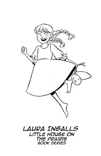
Basics For Brushes
Brushes go up in size sequentially, and can begin at 000 (far to small for most artists' use) up to 40 (huge)Most artists use 0, 1, 2, and 4 size brushesBrushes can be made from a variety of materials, but most inkers prefer Kolinsky sable for inkingBrushes handle differently from brush pens, even if the brush pens have nylon bristlesBrushes are an investment, and if well cared for, can last many years
Robust Inking Toolkit Guide for Professional Artists:
What to Look for In An Inking Brush:
Kolinsky Sable makes for great inking brushes- comes to a very fine point, holds a lot of water, and does not 'dump' ink or paint the way synthetics doBrush should come to a fine point when wet, not splayed outTip of brush shouldn't be raggedWooden handle should not be cracked- lacquer should have an even coatMetal ferrule should be crimped tightShould not shed hairsNo stray hairs
Recommended Brushes for Inking:
Creative Mark Rhapsody Kolinsky Sable (Jerry's Artarama)Winsor and Newton Series 7 (Sold almost everywhere, but you may have to ask)Princeton Kolinsky Sable 7050 (Available through DickBlick)
For more on brush selection, check out this guest post by Heidi Black.
Where to buy brushes?
IN PERSON (whenever feasible):
Dick Blick
Jerry's Artarama
Paper and Ink Arts
Online:
Jerry's Artarama
Dick Blick
Paper and Ink Arts
Prepping Watercolor Brushes for First Use:
Also applicable for inking brushes
Before inking, know what your end product will be, and what media you want to use on top of your inks.
Marker
Watercolor
Mixed Media?
Recommended Inks:
Kaimei Sol K (Copic proof, not waterproof)Winsor and Newton India Ink (both waterproof and non-waterproof are fine)FW Indian InkAcrylic Ink- FW Acrylic Ink, Liquitex Acrylic Ink (waterproof, not Copic Proof)Sumi inkWalnut Ink
Indian Inks:
There are many Indian inks on the market, so your preference may differ from mine. Most Indian inks contain shellac, which allow them to dry waterproof. Shellac reactivates with alcohol, such as alcohol markers.
Acrylic Inks:
Acrylic inks are made from acrylics, which are plastisols. Plastisols harden when dried, and will be difficult to remove if you allow them to dry in your brush, so you need to clean your brushes well after use. Plastisols are alcohol solvent, and not compatible with alcohol markers.
Walnut Inks:
Walnut inks are made from black walnuts, and are organic matter inks. This traditional ink is dark brown in color, and can be fun to play with.
Deleter Inks
Deleter 6 is alcohol marker resistant, but not waterproofDeleter 4 smudges a little with both marker and watercolor- moreso with Copic than with other alcohol markersDeleter 3 is waterproof
 This compatibility test was provided by Kabocha and used with permission.
Inking Tips:
Allow your inks to 'cure' overnight before erasing or adding colorWork with a cover sheet to protect your paper and help minimize smearing
Where to buy inks:
Dick Blick
Amazon
Jerry's Artarama
Paper and Ink Arts
Deleter Shop
What to look for in papers for inking with a brush:
A textured finish will encourage fun effects like drybrushA smooth finish is easier to controlInk dries fairly fast- does not stay wet for long periods of time- coated papers have longer dry timesThicker papers that can handle the water in ink without buckling
Recommended Papers:
Strathmore 500 Series Smooth BristolStrathmore 500 Series Plate BristolStrathmore 500 Series Mixed Media Paper- Vellum Finish (cotton based paper)Illustration board
Cellulose based watercolor papers
Fabriano StudioStrathmore Watercolor PaperCanson MontvalCanson BiggieWatercolor board
Where to Buy Papers:
Dick Blick
Amazon
Jerry's Artarama
Paper and Ink Arts
Deleter Shop
Inktober Inking Demo:
Brush Inking Tips with the ArtSnacks Inktober Collection:
Inking Your Character to Life With a Brush, P1:
Size Matters! Brush Demonstration:
Cartoony Inking with a Size 4 Brush:
Inking Demonstrations:
Animals:
Brush Inking Assignment: Chinchilla:
Scenery:
Inking Assignment: Woods:
Portraits:
Inking Assignment: Elizabeth Taylor:
Cartoony Art:
Inking Practice: Faces
Inking Sailor Jupiter and Venus for Inktober:
Inktober Day 24- Yotsuba Timelapse:
Inktober Day 25- Tsukimi (Princess Jellyfish) Timelapse:
Inking on Black Paper with White and Gold Ink:
Inking Techniques:

Inkwash: Inkwash can give your work a midtone (or several midtones), which is often helpful for establishing mood, particularly in dark scenes like this nightclub. Inkwash is fairly simple to do and is similar to watercolor. Make sure you water down your ink in a separate container (small ceramic ramekins or dixie cups are ideal for this), and strongly consider making swatches beforehand.
Drybrush: Can also give your work midtones, but I personally feel that it makes the work look kind of dirty. This can be fine for certain artstyles, but if you have a clean artstyle, you should probably reconsider drybrush. Drybrush is applied using a dried brush that has had the majority of the fresh ink removed (usually on a scratch sheet of paper). Drybrushes can be any beat up old brush that you have lying around, I do not recommend doing it with your nice brushes, and it's pretty hard to consistently drybrush using a brushpen. The best results I've had with brushpen is on vellum plate.
Source: The Inking Compendium
For more about inking techniques, and how to achieve them, check out this guest post by Sarah Benkin.
Brush Care:
Materials:
General's The Master's Brush Soap, or Baby ShampooInexpensive Hair ConditionerCupsBlue Painters Tape
For peak performance, inking brushes require not only frequent cleaning, but also frequent conditioning. Cleaning brushes strip the hairs of their oils, which can lead to spread bristles, so you're going to want to recondition them occasionally.
Restoring Damaged, Frayed, or Bent Brushes
Brushes can require a little extra TLC, be it cheap watercolor brushes or expensive inking brushes. The love you lavish on your expensive brushes can be shared with your inexpensive brushes to extend their lives.
Regular cleaning can work wonders for gunked up brushes. Although many cartoonists recommend brush soap, I find that using a bar shampoo (like in my Akashiya Brush Tip restoration post) can really work wonders on your brush without stripping natural hair brushes of their essential oils. To loosen stubborn ink deposits, work the shampoo deep into the belly of the brush, and let the brush soak in warm water.

When soaking your brushes, be careful not to just let your brushes rest in the water. Water will get in between the metal ferrule and the wooden handle, and cause warping, and ruin the brush. You can jerry-rig a tape holder to keep your brushes at just the right depth in the cup you're using. This technique can also be used to straighten a bent brush (shown in the picture) letting gravity do all the work.
With inking brushes, you should take great care to make sure the tip doesn't get damaged. After inking (or cleaning) roll the brush between your finger tips in one direction to restore the original point. Letting your brush dry splayed out will ruin the bristles.
When drying, you can tape your brushes to a counter top brush end down to protect the bristles.
 These brushes'll need some extra work (there's still ink up in the ferrule). Gunked up brushes may require repeated washes.
After your brush is clean, you'll want to restore it's tip, You can do this every time you dip it in water or ink by simply rolling it across a piece of scrap paper. Before storage, make sure you roll the tip to preserve that nice tip.
For more information about taking care of your brushes, check out this post on Brush and Nib Care.
How to Improve Your Brush Inking
PRACTICE
Practice from referencePractice from lifePractice from imaginationSkill drills
While Inking Or Before:
Warmup your hand with warmup sketchesInk when you are calm and relaxedControl your breathingListen to calming music if you have difficulty pulling clean linesDon't ink when hungry- low blood sugar can make your hands shake
Outside Resources, Second Opinions, and More Information
ArtSnacks Inktober Collection Review (written)
Make Inktober 2016 A Month to Remember
Please consider donating to this blog or purchasing from Natto-shop (http://nattosoup.com/shop) if you want me to continue publishing quality content. All materials tested were purchased from my own pocket. Keep on Truckin' Nattosoup is not under any sponsorship.
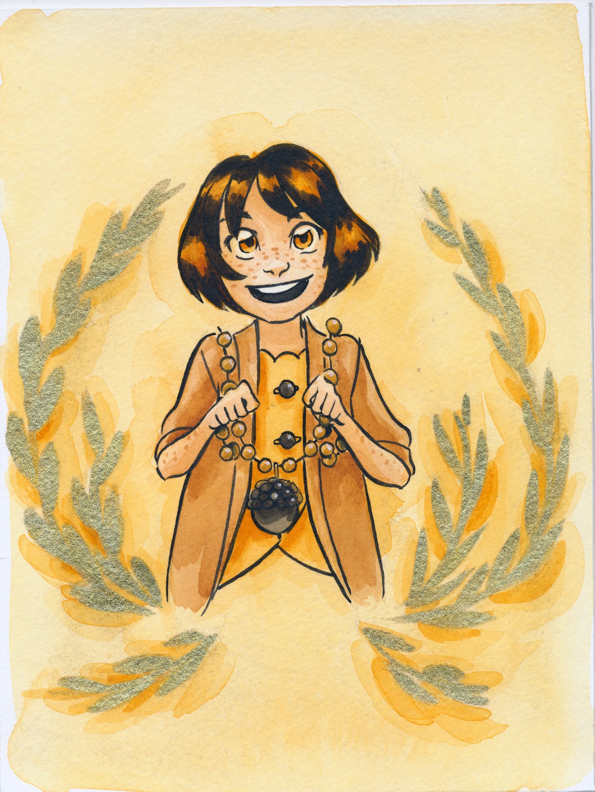
Inking with a brush can seem intimidating. What brushes do I use? What papers? What inks? Brushes are hard to control for fine lines- how do you transition from single lineweight pens, like fineliners to brushes? Where do I buy my supplies? How do I become proficient?
Over the years, and through past Inktobers, I've written and recorded loads of information to inspire you to pick up the brush and ink! It's a pleasure to compile these resources to help others learn the ins and outs of brush inking. As always, if you have any questions, don't hesistate to email me using the sidebar form- your questions help me plan better content!


Basics For Brushes
Brushes go up in size sequentially, and can begin at 000 (far to small for most artists' use) up to 40 (huge)Most artists use 0, 1, 2, and 4 size brushesBrushes can be made from a variety of materials, but most inkers prefer Kolinsky sable for inkingBrushes handle differently from brush pens, even if the brush pens have nylon bristlesBrushes are an investment, and if well cared for, can last many years
Robust Inking Toolkit Guide for Professional Artists:
What to Look for In An Inking Brush:
Kolinsky Sable makes for great inking brushes- comes to a very fine point, holds a lot of water, and does not 'dump' ink or paint the way synthetics doBrush should come to a fine point when wet, not splayed outTip of brush shouldn't be raggedWooden handle should not be cracked- lacquer should have an even coatMetal ferrule should be crimped tightShould not shed hairsNo stray hairs
Recommended Brushes for Inking:
Creative Mark Rhapsody Kolinsky Sable (Jerry's Artarama)Winsor and Newton Series 7 (Sold almost everywhere, but you may have to ask)Princeton Kolinsky Sable 7050 (Available through DickBlick)
For more on brush selection, check out this guest post by Heidi Black.
Where to buy brushes?
IN PERSON (whenever feasible):
Dick Blick
Jerry's Artarama
Paper and Ink Arts
Online:
Jerry's Artarama
Dick Blick
Paper and Ink Arts
Prepping Watercolor Brushes for First Use:
Also applicable for inking brushes
Before inking, know what your end product will be, and what media you want to use on top of your inks.
Marker
Watercolor
Mixed Media?
Recommended Inks:
Kaimei Sol K (Copic proof, not waterproof)Winsor and Newton India Ink (both waterproof and non-waterproof are fine)FW Indian InkAcrylic Ink- FW Acrylic Ink, Liquitex Acrylic Ink (waterproof, not Copic Proof)Sumi inkWalnut Ink
Indian Inks:
There are many Indian inks on the market, so your preference may differ from mine. Most Indian inks contain shellac, which allow them to dry waterproof. Shellac reactivates with alcohol, such as alcohol markers.
Acrylic Inks:
Acrylic inks are made from acrylics, which are plastisols. Plastisols harden when dried, and will be difficult to remove if you allow them to dry in your brush, so you need to clean your brushes well after use. Plastisols are alcohol solvent, and not compatible with alcohol markers.
Walnut Inks:
Walnut inks are made from black walnuts, and are organic matter inks. This traditional ink is dark brown in color, and can be fun to play with.
Deleter Inks
Deleter 6 is alcohol marker resistant, but not waterproofDeleter 4 smudges a little with both marker and watercolor- moreso with Copic than with other alcohol markersDeleter 3 is waterproof
 This compatibility test was provided by Kabocha and used with permission.
Inking Tips:
Allow your inks to 'cure' overnight before erasing or adding colorWork with a cover sheet to protect your paper and help minimize smearing
Where to buy inks:
Dick Blick
Amazon
Jerry's Artarama
Paper and Ink Arts
Deleter Shop
What to look for in papers for inking with a brush:
A textured finish will encourage fun effects like drybrushA smooth finish is easier to controlInk dries fairly fast- does not stay wet for long periods of time- coated papers have longer dry timesThicker papers that can handle the water in ink without buckling
Recommended Papers:
Strathmore 500 Series Smooth BristolStrathmore 500 Series Plate BristolStrathmore 500 Series Mixed Media Paper- Vellum Finish (cotton based paper)Illustration board
Cellulose based watercolor papers
Fabriano StudioStrathmore Watercolor PaperCanson MontvalCanson BiggieWatercolor board
Where to Buy Papers:
Dick Blick
Amazon
Jerry's Artarama
Paper and Ink Arts
Deleter Shop
Inktober Inking Demo:
Brush Inking Tips with the ArtSnacks Inktober Collection:
Inking Your Character to Life With a Brush, P1:
Size Matters! Brush Demonstration:
Cartoony Inking with a Size 4 Brush:
Inking Demonstrations:
Animals:
Brush Inking Assignment: Chinchilla:
Scenery:
Inking Assignment: Woods:
Portraits:
Inking Assignment: Elizabeth Taylor:
Cartoony Art:
Inking Practice: Faces
Inking Sailor Jupiter and Venus for Inktober:
Inktober Day 24- Yotsuba Timelapse:
Inktober Day 25- Tsukimi (Princess Jellyfish) Timelapse:
Inking on Black Paper with White and Gold Ink:
Inking Techniques:

Inkwash: Inkwash can give your work a midtone (or several midtones), which is often helpful for establishing mood, particularly in dark scenes like this nightclub. Inkwash is fairly simple to do and is similar to watercolor. Make sure you water down your ink in a separate container (small ceramic ramekins or dixie cups are ideal for this), and strongly consider making swatches beforehand.
Drybrush: Can also give your work midtones, but I personally feel that it makes the work look kind of dirty. This can be fine for certain artstyles, but if you have a clean artstyle, you should probably reconsider drybrush. Drybrush is applied using a dried brush that has had the majority of the fresh ink removed (usually on a scratch sheet of paper). Drybrushes can be any beat up old brush that you have lying around, I do not recommend doing it with your nice brushes, and it's pretty hard to consistently drybrush using a brushpen. The best results I've had with brushpen is on vellum plate.
Source: The Inking Compendium
For more about inking techniques, and how to achieve them, check out this guest post by Sarah Benkin.
Brush Care:
Materials:
General's The Master's Brush Soap, or Baby ShampooInexpensive Hair ConditionerCupsBlue Painters Tape
For peak performance, inking brushes require not only frequent cleaning, but also frequent conditioning. Cleaning brushes strip the hairs of their oils, which can lead to spread bristles, so you're going to want to recondition them occasionally.
Restoring Damaged, Frayed, or Bent Brushes
Brushes can require a little extra TLC, be it cheap watercolor brushes or expensive inking brushes. The love you lavish on your expensive brushes can be shared with your inexpensive brushes to extend their lives.
Regular cleaning can work wonders for gunked up brushes. Although many cartoonists recommend brush soap, I find that using a bar shampoo (like in my Akashiya Brush Tip restoration post) can really work wonders on your brush without stripping natural hair brushes of their essential oils. To loosen stubborn ink deposits, work the shampoo deep into the belly of the brush, and let the brush soak in warm water.
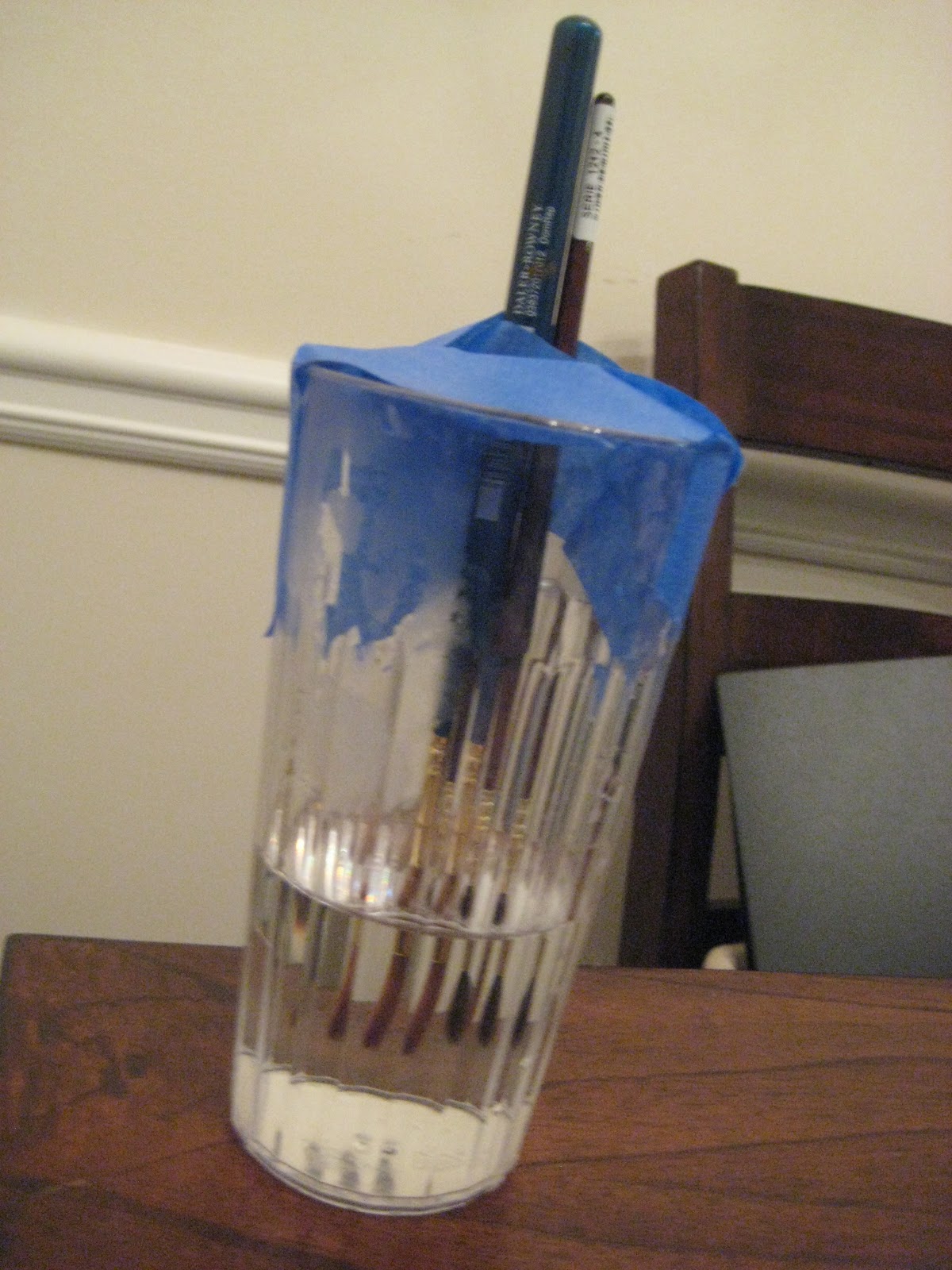
When soaking your brushes, be careful not to just let your brushes rest in the water. Water will get in between the metal ferrule and the wooden handle, and cause warping, and ruin the brush. You can jerry-rig a tape holder to keep your brushes at just the right depth in the cup you're using. This technique can also be used to straighten a bent brush (shown in the picture) letting gravity do all the work.
With inking brushes, you should take great care to make sure the tip doesn't get damaged. After inking (or cleaning) roll the brush between your finger tips in one direction to restore the original point. Letting your brush dry splayed out will ruin the bristles.
When drying, you can tape your brushes to a counter top brush end down to protect the bristles.
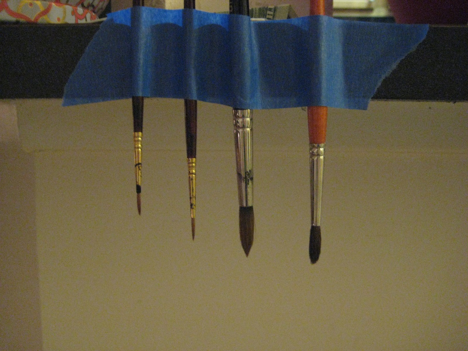 These brushes'll need some extra work (there's still ink up in the ferrule). Gunked up brushes may require repeated washes.
After your brush is clean, you'll want to restore it's tip, You can do this every time you dip it in water or ink by simply rolling it across a piece of scrap paper. Before storage, make sure you roll the tip to preserve that nice tip.
For more information about taking care of your brushes, check out this post on Brush and Nib Care.
How to Improve Your Brush Inking
PRACTICE
Practice from referencePractice from lifePractice from imaginationSkill drills
While Inking Or Before:
Warmup your hand with warmup sketchesInk when you are calm and relaxedControl your breathingListen to calming music if you have difficulty pulling clean linesDon't ink when hungry- low blood sugar can make your hands shake
Outside Resources, Second Opinions, and More Information
ArtSnacks Inktober Collection Review (written)
Make Inktober 2016 A Month to Remember
Please consider donating to this blog or purchasing from Natto-shop (http://nattosoup.com/shop) if you want me to continue publishing quality content. All materials tested were purchased from my own pocket. Keep on Truckin' Nattosoup is not under any sponsorship.


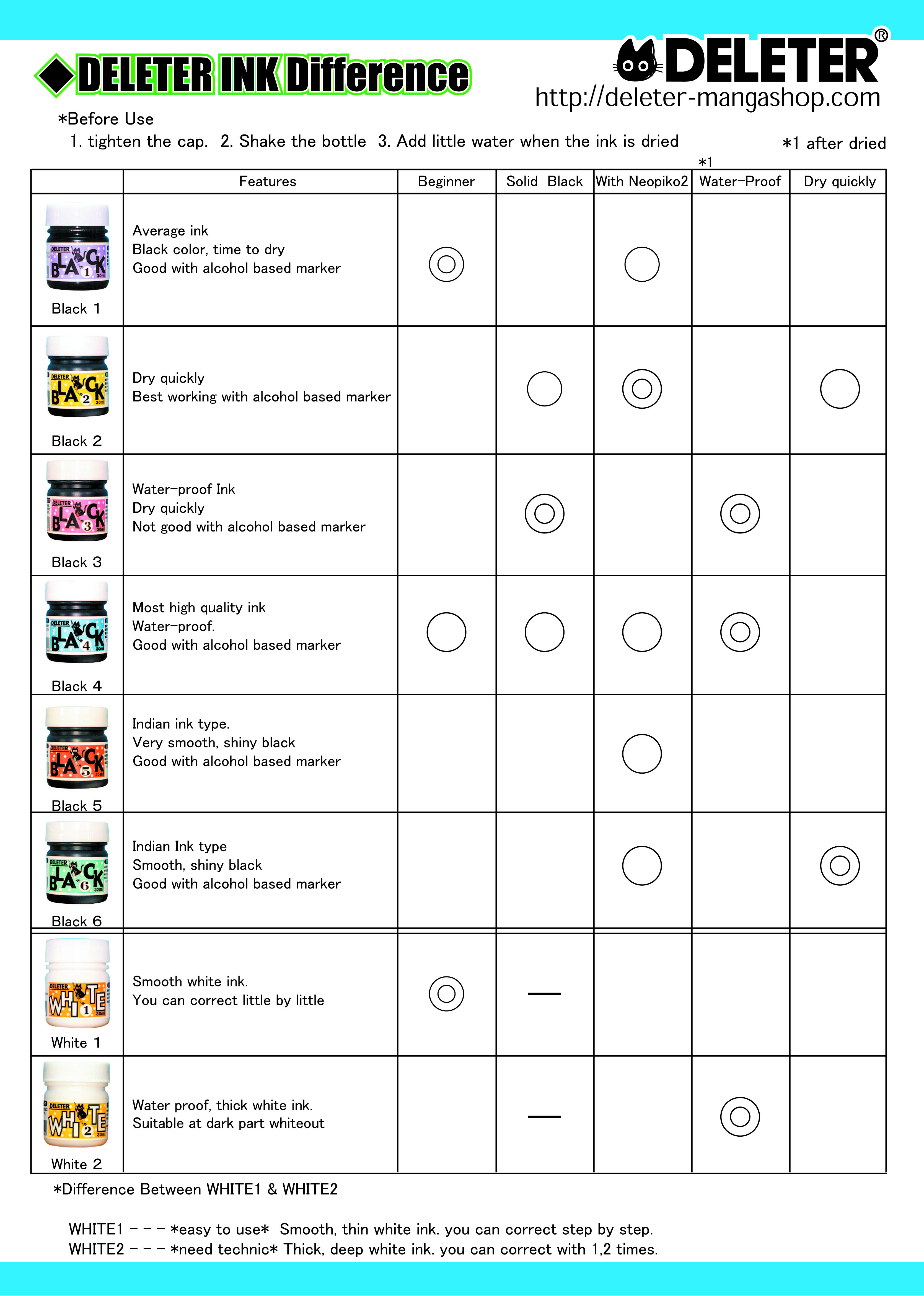
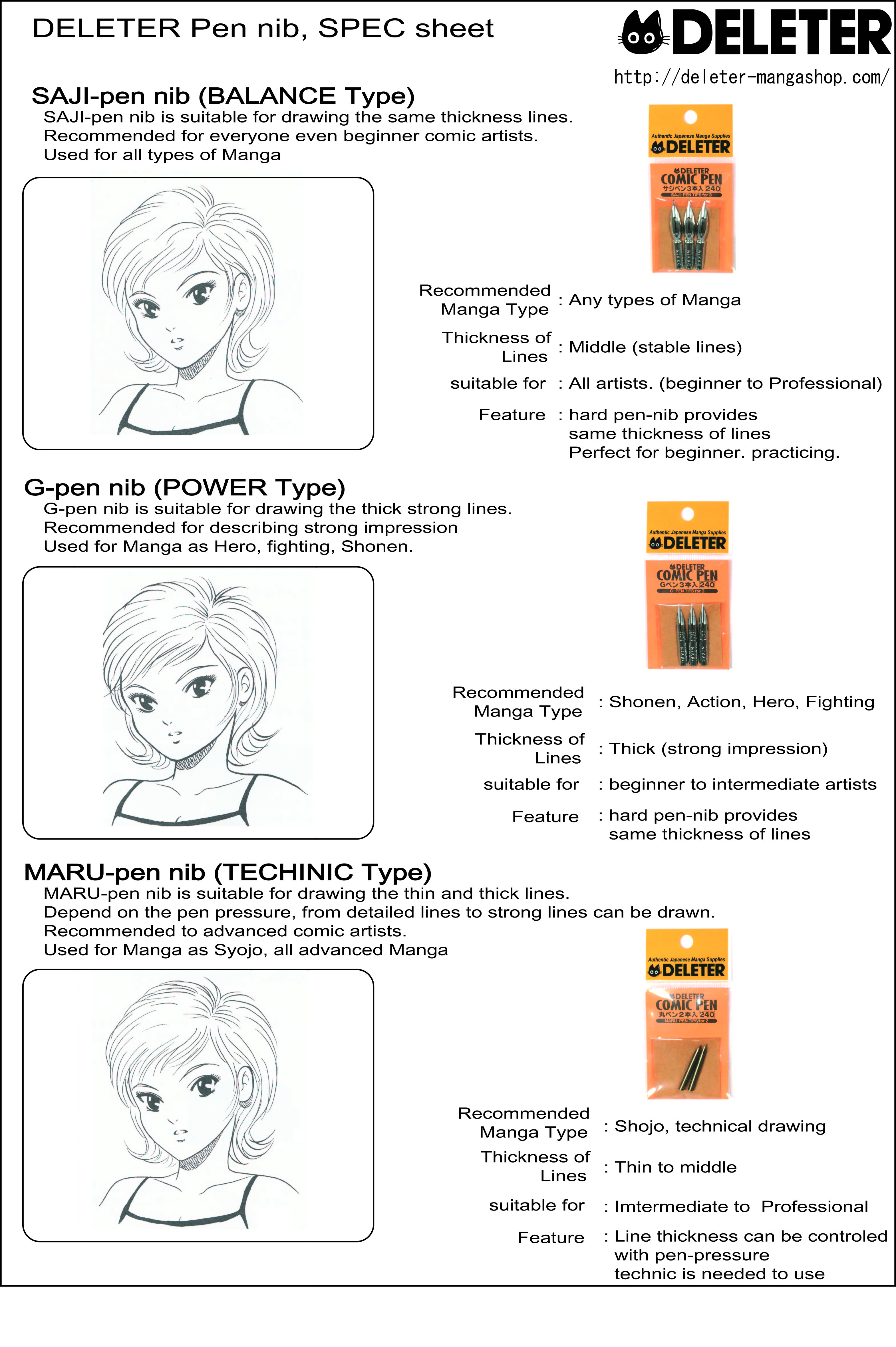