
Becca Hillburn's Blog, page 23
October 9, 2017
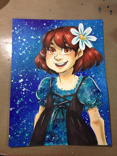
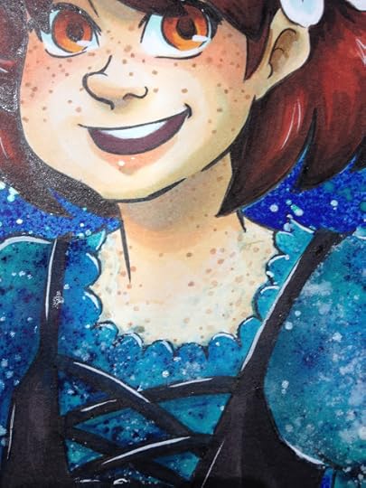
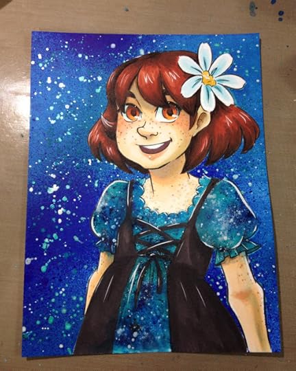
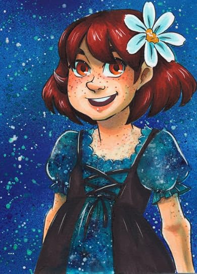
A Day in the Life of a Comic Artist
Somewhere along the way, I quit talking about my life here on this blog.
I guess that started in 2015 when my depression reared its ugly head and I had difficulty talking about my life in a positive light. Or maybe a little earlier, when I graduated in 2013 and stopped having as many adventures. I probably figured no one wants to regularly read about a comic artist who spends most of her day sitting on the floor in a two bedroom apartment, painting, and sketching. I couldn't think of a way to make that funny at the time.
So here's a little state of the studio update, a little day in the life. I'll try to remember to share my life more, even if it's just bits and pieces.
My day begins usually around 12:00PM. I'm really not a morning person, although I can be awake and functional at any time if there's a good reason. My day to day life just doesn't present one- I prefer to work in the afternoons and at night, and waking up later suits that. The first thing I do is hobble over from my bedroom into my studio- a small converted bedroom with loads of natural light lamps (no built in overhead lighting or fan), my computer, an anti-fatigue mat (for comfortable floor squatting), and a naggy gray cat.
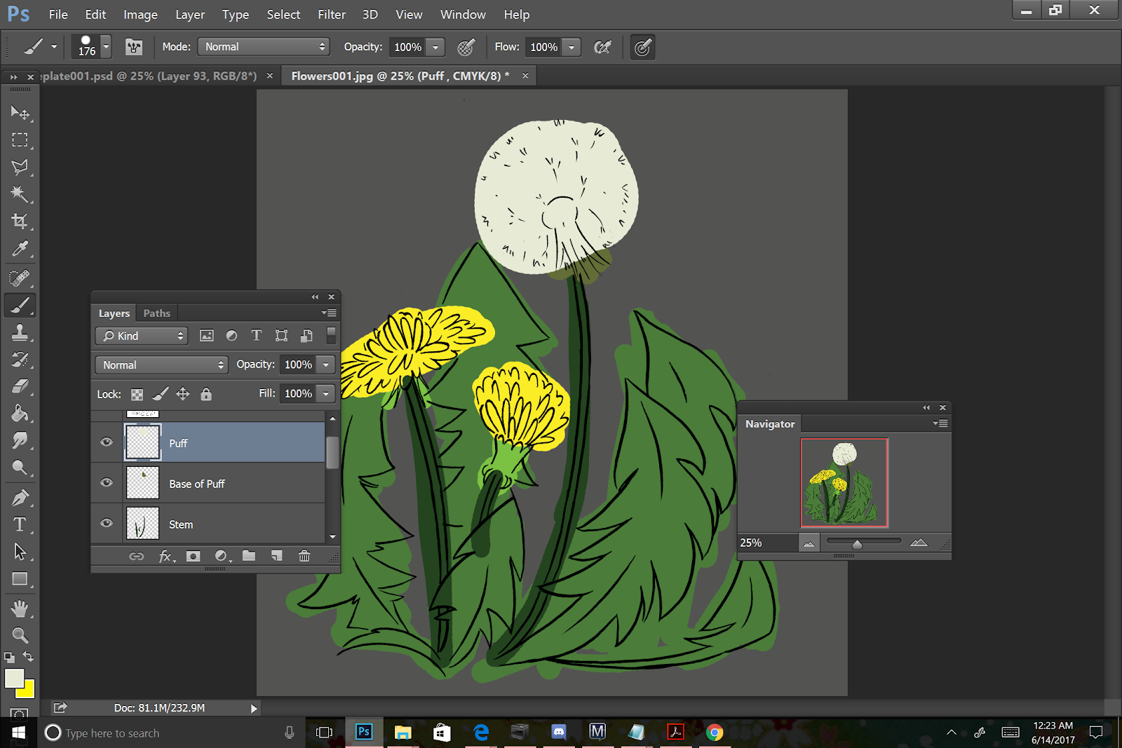
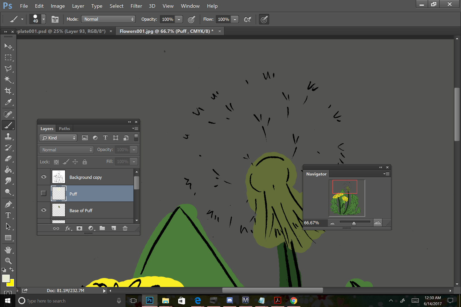
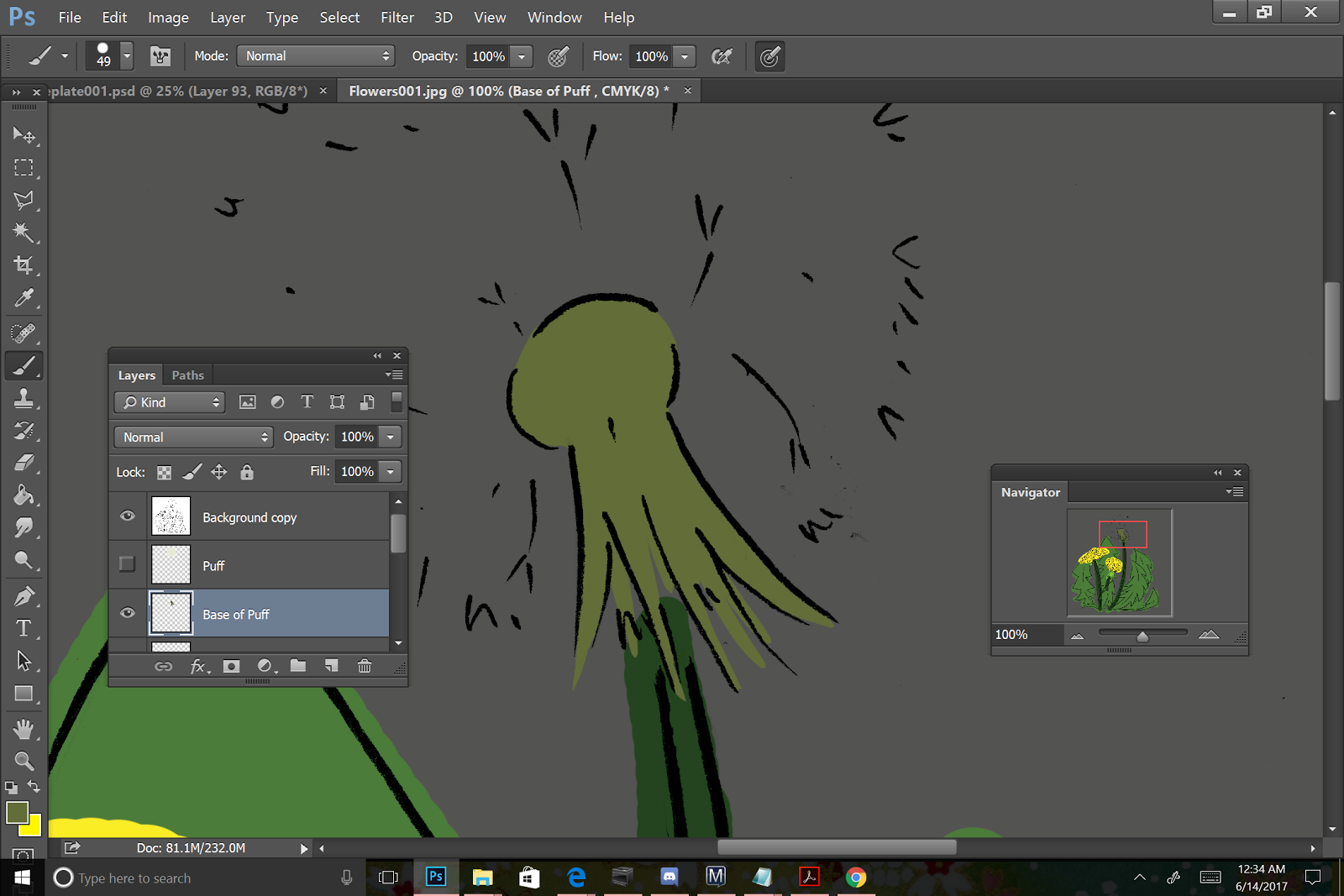
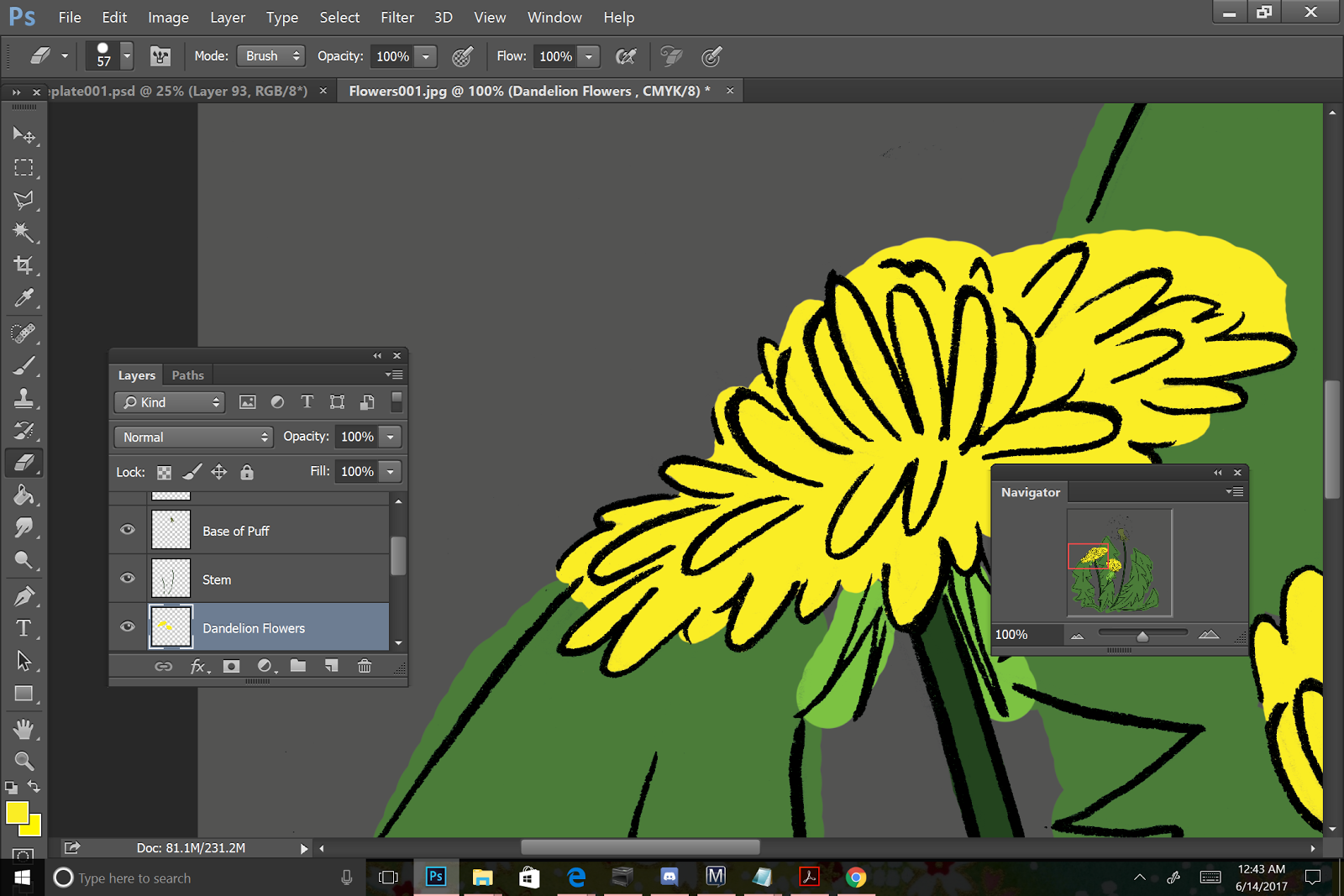
The first order of business is coffee- a shot of espresso, whole milk, and some syrup, then on to warmup sketches, almost always referenced from Pinterest. I did micro fashion warmups for the longest time, but I'm currently working on portraits of people from around the world. After my warmup, I'll begin the day's work- for September, I'm doing a series of mori inspired witches as part of the #Sketchtember movement, and I find it's best to knock those out early in the day-otherwise there's a lingering feeling of something left undone. These are done in color pencil, and quick- these are sketches after all, but some of them may end up getting refined into something nicer later on.
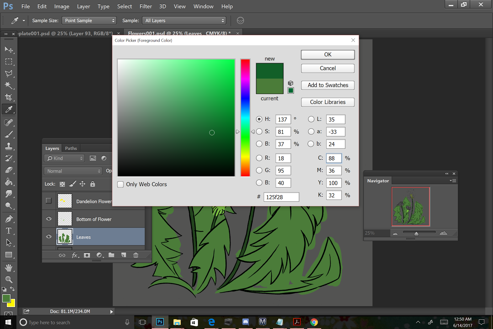
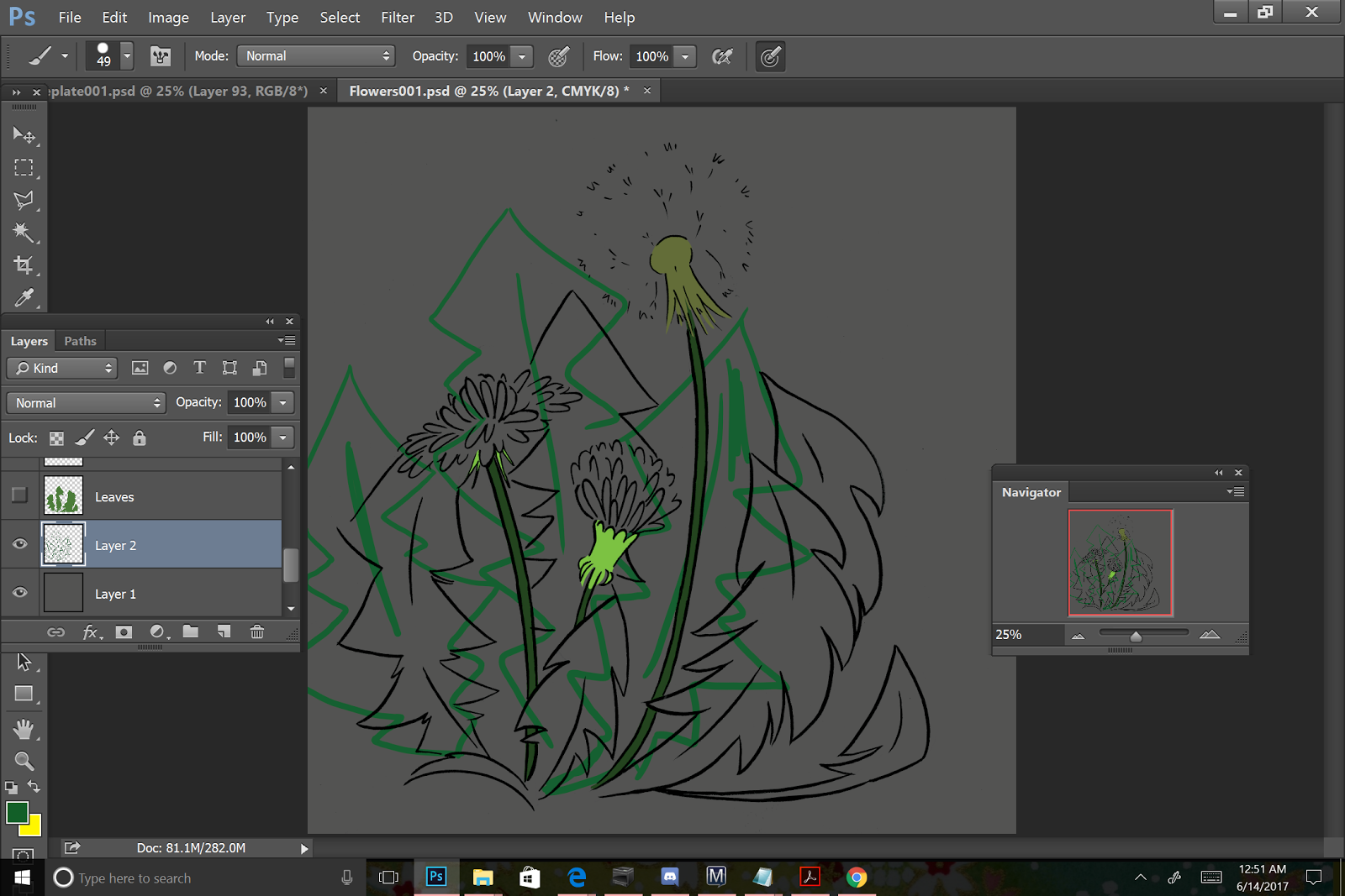
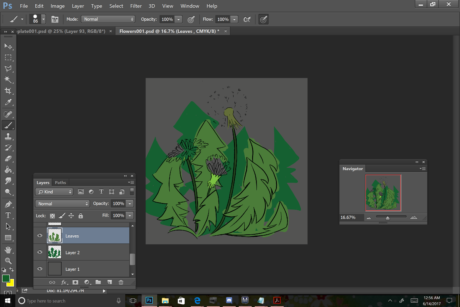
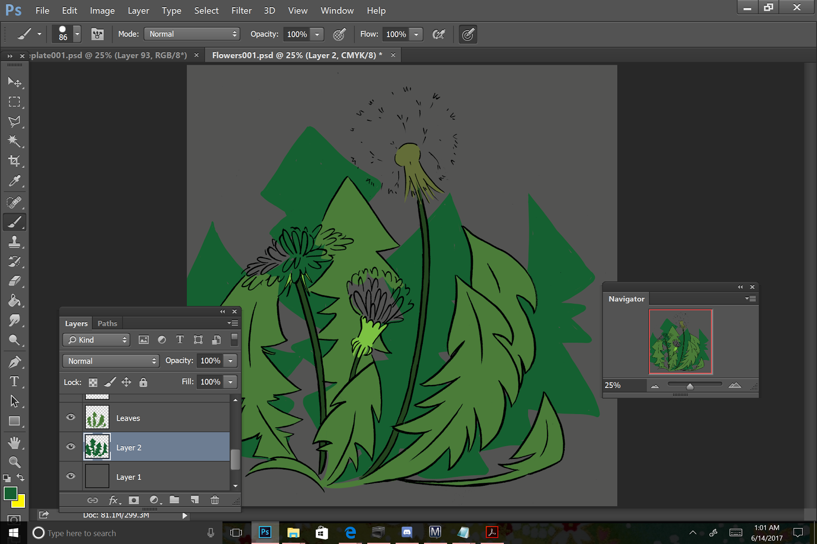
My main activity varies from day to day- some days I'm batch painting pages of 7" Kara, some days I'm working on putting together portfolios, some days I'm recording tutorials and tests. The SCBWI conference is coming up at the end of September, so I've been working on my illustrator's contest piece. For me, it's a two-page comic spread, and so far I've designed, brainstormed, thumbnailed, and roughed. Today, I'll be cleaning up that rough digitally, redrawing a lot of things, and then printing it on watercolor paper.
My days are pretty solitary, so I leave Discord, a chat app, open all day. The Ink Drop Cafe General chat usually has something going on, although I also chat individually with a few friends. Having Discord open helps me feel less lonely, although if the weather is nice, I'll usually take a break around 4 or 5 and walk over to the coffeeshop on Vanderbilt campus. This is an hour walk, and I usually call my mom on the walk over.
In the evening, I hang out with Joseph-watch TV and Youtube, cook dinner, sometimes go out and run errands. I also work on Youtube videos and blog posts in the evening, if my main activity for the day has been completed. This involves research, acquisition, swatching, experimentation, creating art for the field test, executing the field test, transferring photos or video, and taking notes.
When my work is done for the day, I share it to Twitter and Instagram. This is usually any time from 11PM-1AM, which is absolutely not recommended as a time to share work you've slaved over for long periods of time because this is the time when no one will see it. After that's been shared, I usually take a bath and read manga or comics in the tub to wind down, and sometimes play videogames in bed.
Lately, I've had a really hard time falling asleep-I usually take melatonin, but that hasn't been working. So these late nights make my schedule even wonkier.
Daily activities can also include- applying to conventions, answering How to be a Con Artist Asks, applying to anthologies and zines, applying to agents, applying for jobs in Nashville, writing descriptions for Youtube videos and scheduling videos, or creating graphics.
Generally, my week looks something like this:
Monday- Blog updates
Tuesday- Schedule Kara pages, Youtube updates
Wednesday
Thursday- Blog Updates
Friday- Kara updates, Youtube Updates
Saturday- Youtube updates, Webcomic Chat and Comic Book Hour chats on Twitter
Sunday- Comic Artists Unite chats on Twitter, Patreon update, promote that week's posts and videos on Pinterest, Tumblr, Facebook.
Weekends can also look like:
Week before convention: Prep for con, paint new watercolors, take inventory
Tuesday: Write convention announcement
Wednesday: Pack for show
Thursday: Drive or fly out to con
Friday: Con from 10am-9pm (approx, varies on con)
Saturday: Con from 9AM-9PM
Sunday: Con from 9AM-4PM
Monday: Drive or fly back to Nashville
Please consider donating to this blog or purchasing from Natto-shop (http://nattosoup.com/shop) if you want me to continue publishing quality content. All materials tested were purchased from my own pocket. Keep on Truckin' Nattosoup is not under any sponsorship.
I guess that started in 2015 when my depression reared its ugly head and I had difficulty talking about my life in a positive light. Or maybe a little earlier, when I graduated in 2013 and stopped having as many adventures. I probably figured no one wants to regularly read about a comic artist who spends most of her day sitting on the floor in a two bedroom apartment, painting, and sketching. I couldn't think of a way to make that funny at the time.
So here's a little state of the studio update, a little day in the life. I'll try to remember to share my life more, even if it's just bits and pieces.
My day begins usually around 12:00PM. I'm really not a morning person, although I can be awake and functional at any time if there's a good reason. My day to day life just doesn't present one- I prefer to work in the afternoons and at night, and waking up later suits that. The first thing I do is hobble over from my bedroom into my studio- a small converted bedroom with loads of natural light lamps (no built in overhead lighting or fan), my computer, an anti-fatigue mat (for comfortable floor squatting), and a naggy gray cat.


The first order of business is coffee- a shot of espresso, whole milk, and some syrup, then on to warmup sketches, almost always referenced from Pinterest. I did micro fashion warmups for the longest time, but I'm currently working on portraits of people from around the world. After my warmup, I'll begin the day's work- for September, I'm doing a series of mori inspired witches as part of the #Sketchtember movement, and I find it's best to knock those out early in the day-otherwise there's a lingering feeling of something left undone. These are done in color pencil, and quick- these are sketches after all, but some of them may end up getting refined into something nicer later on.
My main activity varies from day to day- some days I'm batch painting pages of 7" Kara, some days I'm working on putting together portfolios, some days I'm recording tutorials and tests. The SCBWI conference is coming up at the end of September, so I've been working on my illustrator's contest piece. For me, it's a two-page comic spread, and so far I've designed, brainstormed, thumbnailed, and roughed. Today, I'll be cleaning up that rough digitally, redrawing a lot of things, and then printing it on watercolor paper.
My days are pretty solitary, so I leave Discord, a chat app, open all day. The Ink Drop Cafe General chat usually has something going on, although I also chat individually with a few friends. Having Discord open helps me feel less lonely, although if the weather is nice, I'll usually take a break around 4 or 5 and walk over to the coffeeshop on Vanderbilt campus. This is an hour walk, and I usually call my mom on the walk over.
In the evening, I hang out with Joseph-watch TV and Youtube, cook dinner, sometimes go out and run errands. I also work on Youtube videos and blog posts in the evening, if my main activity for the day has been completed. This involves research, acquisition, swatching, experimentation, creating art for the field test, executing the field test, transferring photos or video, and taking notes.
When my work is done for the day, I share it to Twitter and Instagram. This is usually any time from 11PM-1AM, which is absolutely not recommended as a time to share work you've slaved over for long periods of time because this is the time when no one will see it. After that's been shared, I usually take a bath and read manga or comics in the tub to wind down, and sometimes play videogames in bed.
Lately, I've had a really hard time falling asleep-I usually take melatonin, but that hasn't been working. So these late nights make my schedule even wonkier.
Daily activities can also include- applying to conventions, answering How to be a Con Artist Asks, applying to anthologies and zines, applying to agents, applying for jobs in Nashville, writing descriptions for Youtube videos and scheduling videos, or creating graphics.
Generally, my week looks something like this:
Monday- Blog updates
Tuesday- Schedule Kara pages, Youtube updates
Wednesday
Thursday- Blog Updates
Friday- Kara updates, Youtube Updates
Saturday- Youtube updates, Webcomic Chat and Comic Book Hour chats on Twitter
Sunday- Comic Artists Unite chats on Twitter, Patreon update, promote that week's posts and videos on Pinterest, Tumblr, Facebook.
Weekends can also look like:
Week before convention: Prep for con, paint new watercolors, take inventory
Tuesday: Write convention announcement
Wednesday: Pack for show
Thursday: Drive or fly out to con
Friday: Con from 10am-9pm (approx, varies on con)
Saturday: Con from 9AM-9PM
Sunday: Con from 9AM-4PM
Monday: Drive or fly back to Nashville
Please consider donating to this blog or purchasing from Natto-shop (http://nattosoup.com/shop) if you want me to continue publishing quality content. All materials tested were purchased from my own pocket. Keep on Truckin' Nattosoup is not under any sponsorship.


October 5, 2017
Comparing Chameleon Markers: Chameleon Vs Copic (and other alcohol markers)
Few marker artists have a homogenous marker collection- as you collect Copics you discover holes in the color family, and purchase other types of markers to augment those weak areas. Or perhaps you started out with inexpensive markers, like Prismacolor or Blick Studio Brush markers, and are slowly collecting Copics, but you still have a mixed collection.
As an alcohol marker artist, I strongly advocate a mixed collection of markers. I have large collections of Copic, Blick Studio Brush Markers, Prismacolor markers, and now, Chameleon Color Top markers. In my alcohol marker tutorials on Youtube, I frequently demonstrate the benefits of a blended marker collection.
In depth alcohol marker comparisons like this one are only made possible thanks to the generosity of my Artnerd supporters on Patreon.

Patreons gain early access to videos released on our Youtube channel, receive backer exclusive content such as free comics, monthly sketchbooks, and more! Support starts at just $1 a month, and helps me continue to produce reviews such as this one.
Markers Compared:
Chameleon+Color Top
Prismacolor
Copic Sketch
Copic Ciao
Touoh
Stylefile
Blenders Tested:
Copic
Prismacolor
Chartpak AD
99% Isopropl Alcohol
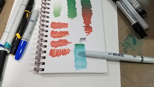
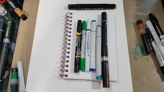
The Lineup:
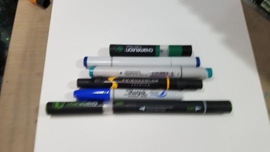
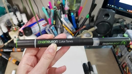
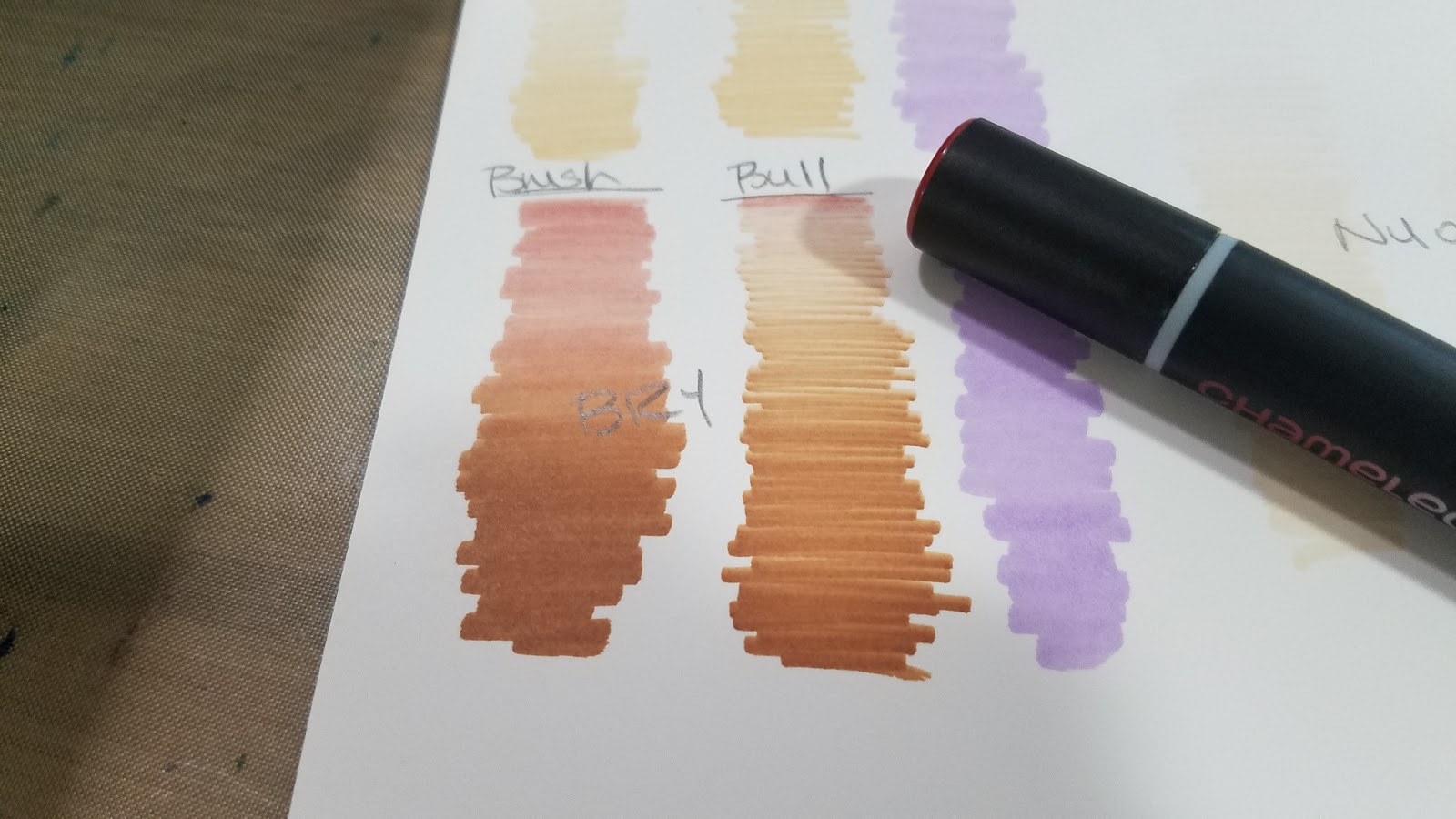
Top to bottom: Chameleon Color Top, Copic Sketch, Stylefile Marker, Prismacolor Marker, Sharpie Brush Marker, Chameleon Color Tone Marker
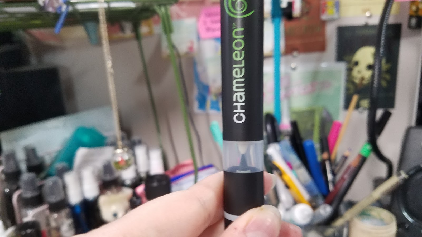
As you can see in this blurry photo, the Chameleon is the largest alcohol marker in my collection, and possibly the longest alcohol marker on the market.
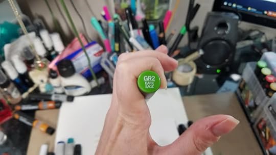
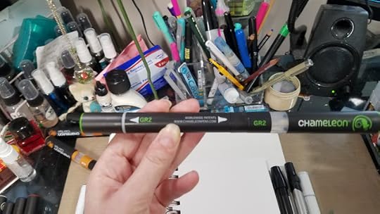
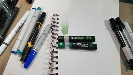
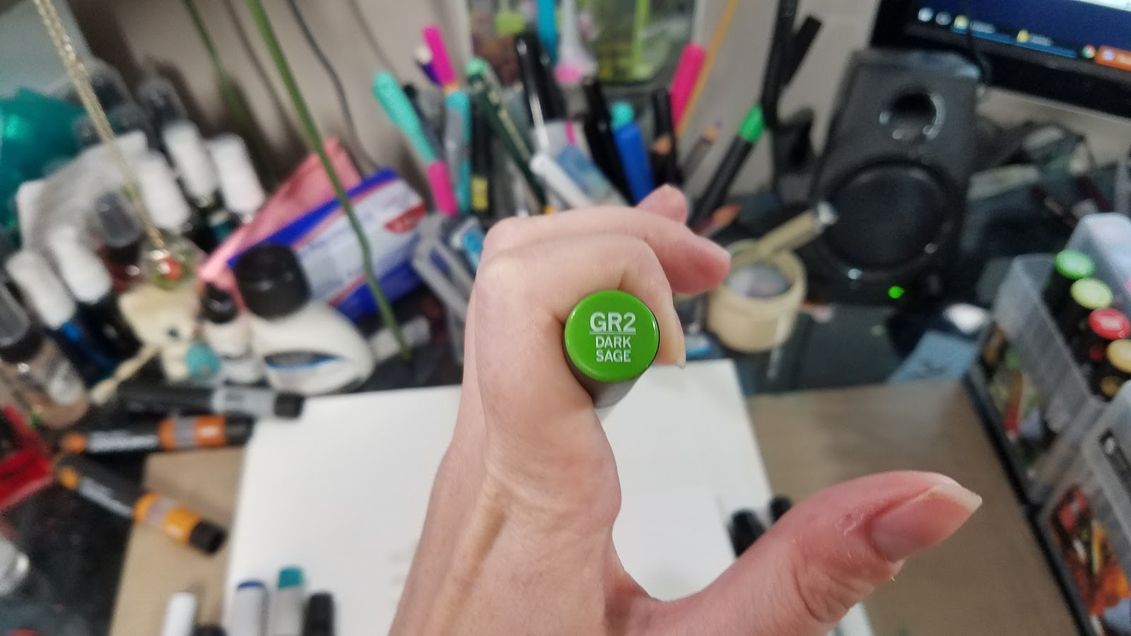
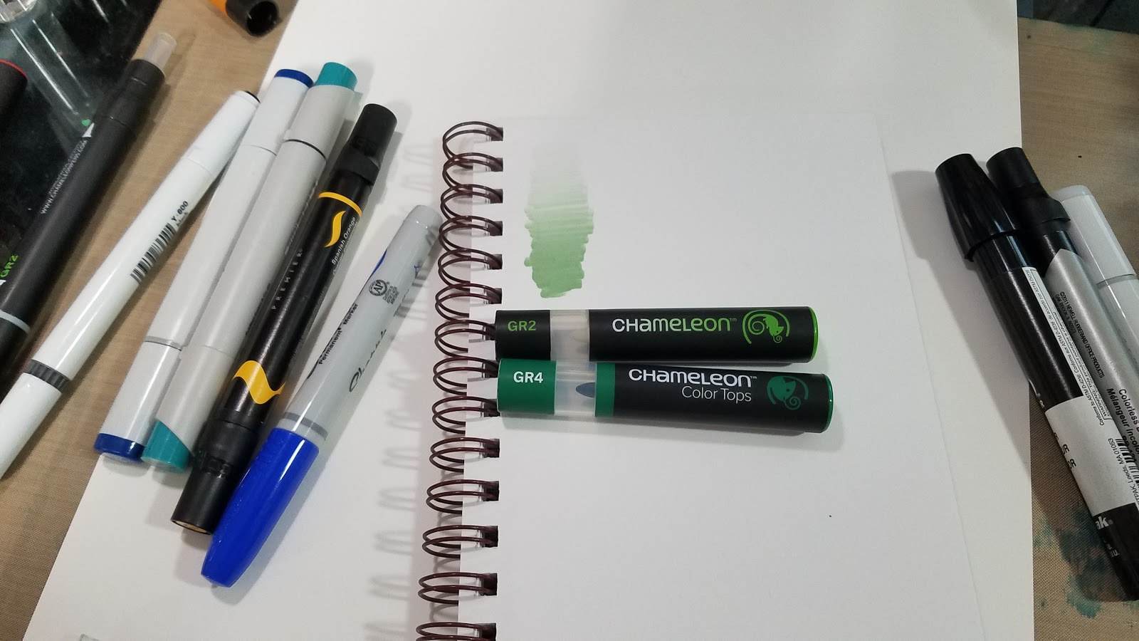
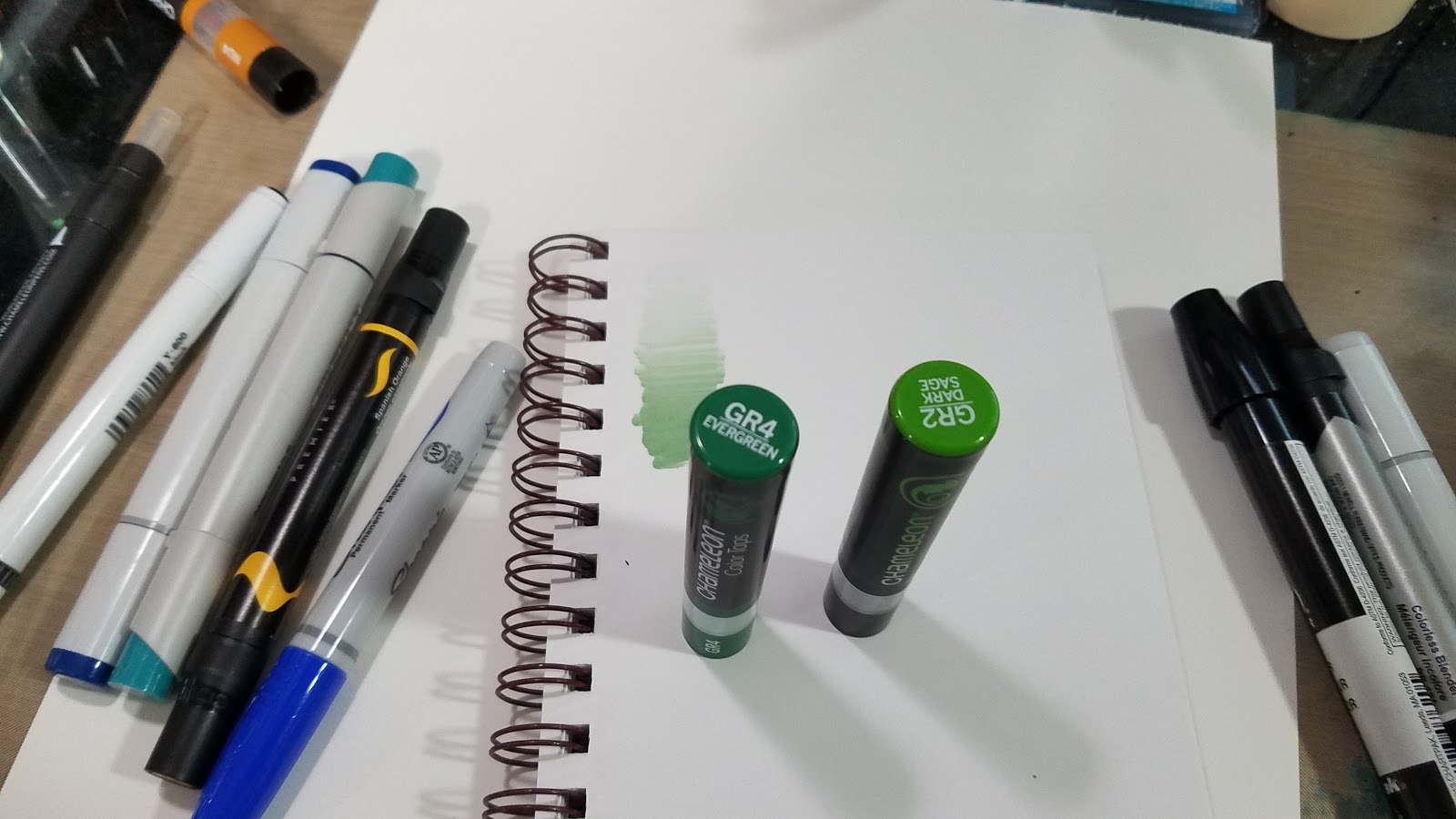
Chameleon Color Tone markers have the family name and number listed on the barrel, as well as on the two tops.
Color Number (GR2)
Color Name (Dark Sage)
A representation of the ink color is also used as the accent color on the barrel of the marker.
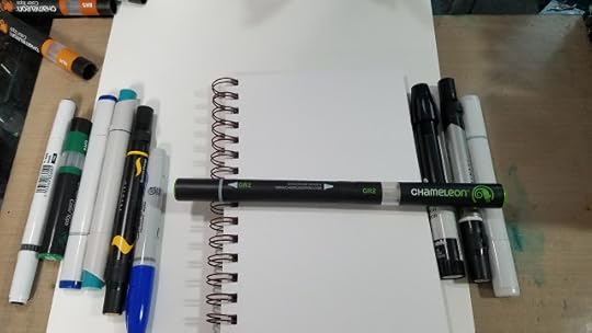
 To the left: alcohol markers
To the right: Alcohol blenders- Chartpak Ad Pro, Prismacolor, Copic
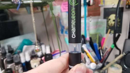
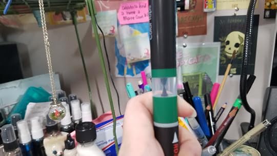
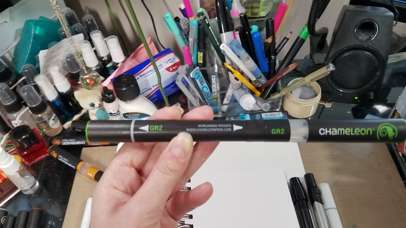
When the blending chamber and cap is removed, Chameleon is the smallest marker in my marker collection.
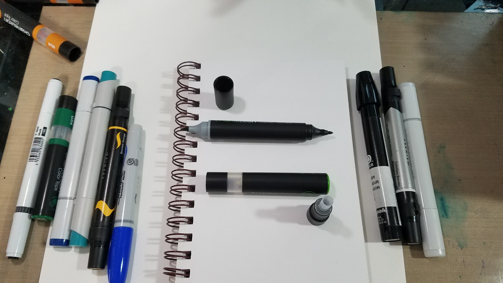
A demonstration of how the blending chamber should be held to the marker tip you wish infused. Chameleon Color Tones come with a colorless blending chamber for every marker, Chameleon Color tops are a repurposed blending chamber filled with alcohol ink.
Top: Chameleon blending chamber
Bottom: Chameleon Color Top

Demonstration of using a Chameleon Color Top to infuse the Chameleon Color Tone marker of your choice.
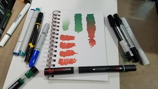
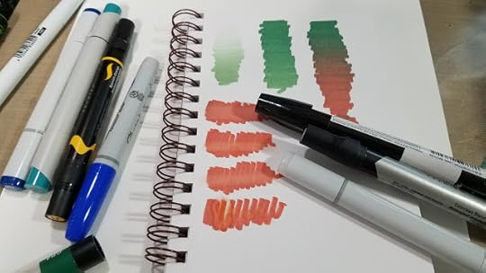
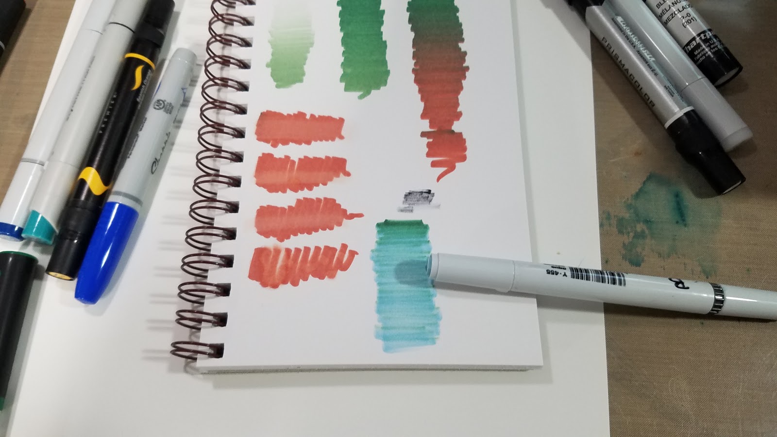
Demonstration of how color gradually blends using the Color Top (green) and the Color Tone (red)
Alcohol Blender Testing
Demonstration of various alcohol blending markers with the Chameleon Color Tone. From top to bottom: Chartpak Ad Pro (xylene based), Prismacolor, Copic
Cross Compatibility Testing
Blending demonstration- Color Top was applied to a Neopiko marker and allowed to infuse, then blended out.
Color top applied to a Copic Sketch Marker, and allowed to infuse, then blended out.
 From Left to Right: Stylefile, Uncapped Chameleon Marker, Copic Sketch, Copic Ciao, NeopikoBottom: Prismacolor Marker
 Left to Right: Prismacolor, Copic Ciao, Neopiko, Copic Sketch, Stylefile, Chameleon Color Tone
For the full demonstration, including multi marker cross compatibility testing and commentary, keep an eye on my Youtube Channel for the video demonstration.
Please consider donating to this blog or purchasing from Natto-shop (http://nattosoup.com/shop) if you want me to continue publishing quality content. All materials tested were purchased from my own pocket. Keep on Truckin' Nattosoup is not under any sponsorship.
As an alcohol marker artist, I strongly advocate a mixed collection of markers. I have large collections of Copic, Blick Studio Brush Markers, Prismacolor markers, and now, Chameleon Color Top markers. In my alcohol marker tutorials on Youtube, I frequently demonstrate the benefits of a blended marker collection.
In depth alcohol marker comparisons like this one are only made possible thanks to the generosity of my Artnerd supporters on Patreon.

Patreons gain early access to videos released on our Youtube channel, receive backer exclusive content such as free comics, monthly sketchbooks, and more! Support starts at just $1 a month, and helps me continue to produce reviews such as this one.
Markers Compared:
Chameleon+Color Top
Prismacolor
Copic Sketch
Copic Ciao
Touoh
Stylefile
Blenders Tested:
Copic
Prismacolor
Chartpak AD
99% Isopropl Alcohol
The Lineup:

Top to bottom: Chameleon Color Top, Copic Sketch, Stylefile Marker, Prismacolor Marker, Sharpie Brush Marker, Chameleon Color Tone Marker
As you can see in this blurry photo, the Chameleon is the largest alcohol marker in my collection, and possibly the longest alcohol marker on the market.
Chameleon Color Tone markers have the family name and number listed on the barrel, as well as on the two tops.
Color Number (GR2)
Color Name (Dark Sage)

A representation of the ink color is also used as the accent color on the barrel of the marker.

 To the left: alcohol markers
To the right: Alcohol blenders- Chartpak Ad Pro, Prismacolor, Copic
When the blending chamber and cap is removed, Chameleon is the smallest marker in my marker collection.
A demonstration of how the blending chamber should be held to the marker tip you wish infused. Chameleon Color Tones come with a colorless blending chamber for every marker, Chameleon Color tops are a repurposed blending chamber filled with alcohol ink.
Top: Chameleon blending chamber
Bottom: Chameleon Color Top

Demonstration of using a Chameleon Color Top to infuse the Chameleon Color Tone marker of your choice.

Demonstration of how color gradually blends using the Color Top (green) and the Color Tone (red)
Alcohol Blender Testing

Demonstration of various alcohol blending markers with the Chameleon Color Tone. From top to bottom: Chartpak Ad Pro (xylene based), Prismacolor, Copic
Cross Compatibility Testing
Blending demonstration- Color Top was applied to a Neopiko marker and allowed to infuse, then blended out.

Color top applied to a Copic Sketch Marker, and allowed to infuse, then blended out.

 From Left to Right: Stylefile, Uncapped Chameleon Marker, Copic Sketch, Copic Ciao, NeopikoBottom: Prismacolor Marker
 Left to Right: Prismacolor, Copic Ciao, Neopiko, Copic Sketch, Stylefile, Chameleon Color Tone
For the full demonstration, including multi marker cross compatibility testing and commentary, keep an eye on my Youtube Channel for the video demonstration.
Please consider donating to this blog or purchasing from Natto-shop (http://nattosoup.com/shop) if you want me to continue publishing quality content. All materials tested were purchased from my own pocket. Keep on Truckin' Nattosoup is not under any sponsorship.
October 2, 2017
Tips for Watercolor Comics: Watercolor Basics
I should note here that I consider comics to be as legitimate a form of fine art as any acclaimed novel, or any admired painting, but unfortunately, the art world, and especially the gallery system, does not consider comics to be a form of art. The distinction is theirs, not mine.
Recently the Watercolor Basics series has reached a turning point- we've begun to cover topics relevant to watercolor comics, rather than general watercolor, or watercolor for fine art. Way at the beginning of the series, I wrote a post about the difference between watercolor for illustration and watercolor for fine art. In that post, I glossed over the basics- I wanted to establish a reason why my Watercolor Basics series would focus on watercolor techniques useful for comic artists and illustrators, rather than covering more traditional watercolor techniques.
While researching for the Watercolor Basics series, I've realized that there is plenty of information for serious watercolorists, and plenty of information for hobbyists who are interested in light dabbling, and very little information for comic artists and illustrators. In most posts, I include links to Second Opinions and Outside Sources to guide those interested in the topic to more information- most of that information comes from those two camps.
Learning how to paint with watercolor in a fine art sense can help you improve greatly as a watercolor comic artist, and while I encourage you to go out and do studies and learn how to handle watercolor effectively, it's not a prerequisite to painting watercolor comics. Comics that utilize watercolor can vary from elaborate masterpieces to very simple limited color affairs.
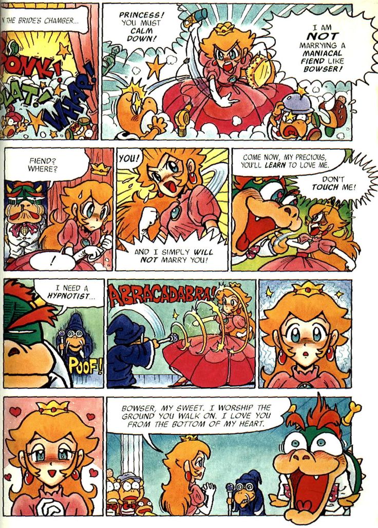
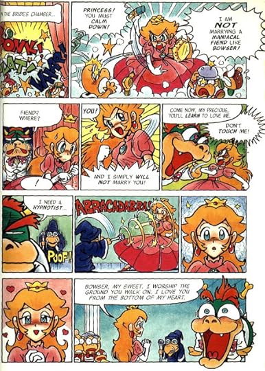 Super Mario Adventures- Kentaro Takemura and Charlie Nozawa
 Displacement, a graphic novel by Lucy Knisley
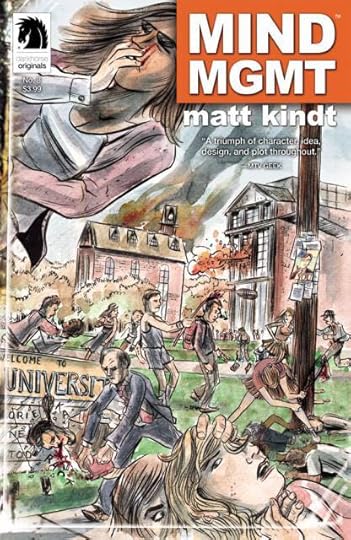 Mind MGMT, Matt Knidt
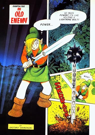 The Legend of Zelda: A Link to the Past, illustrated by Shotaro Ishinomori
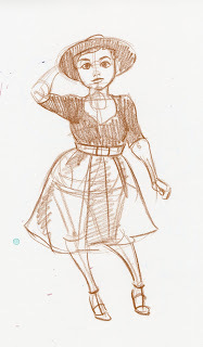
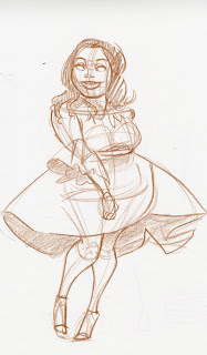
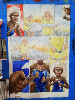
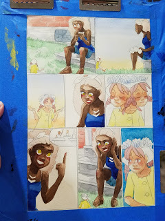
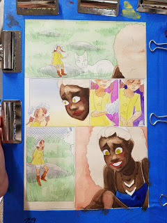
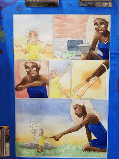
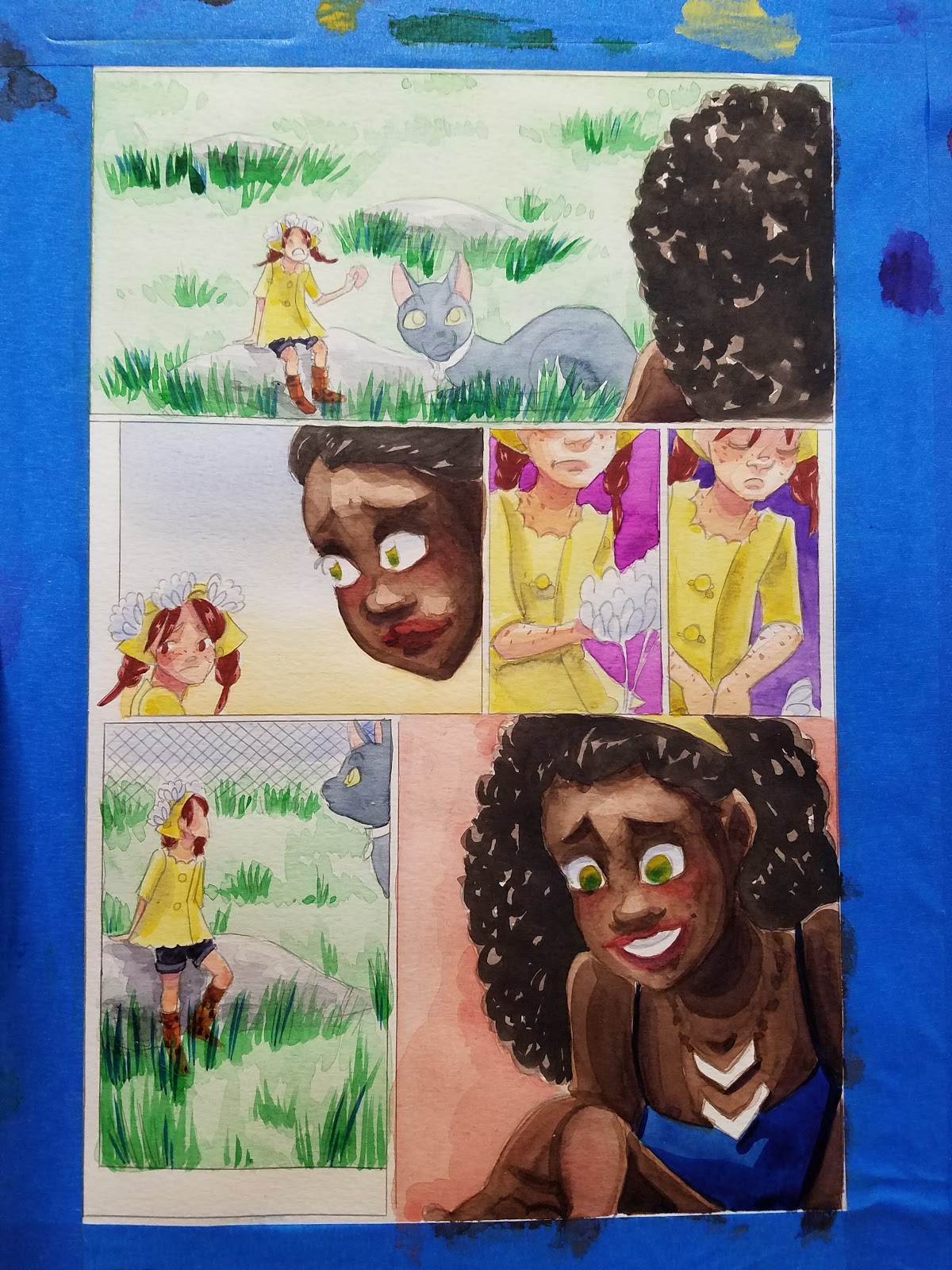
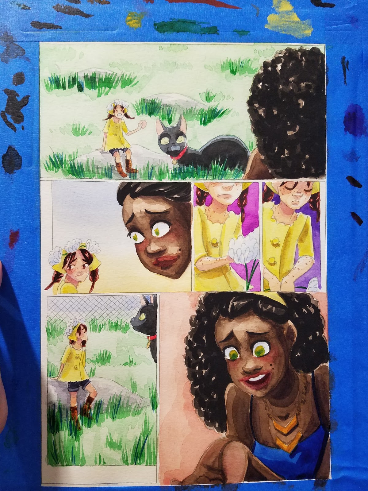
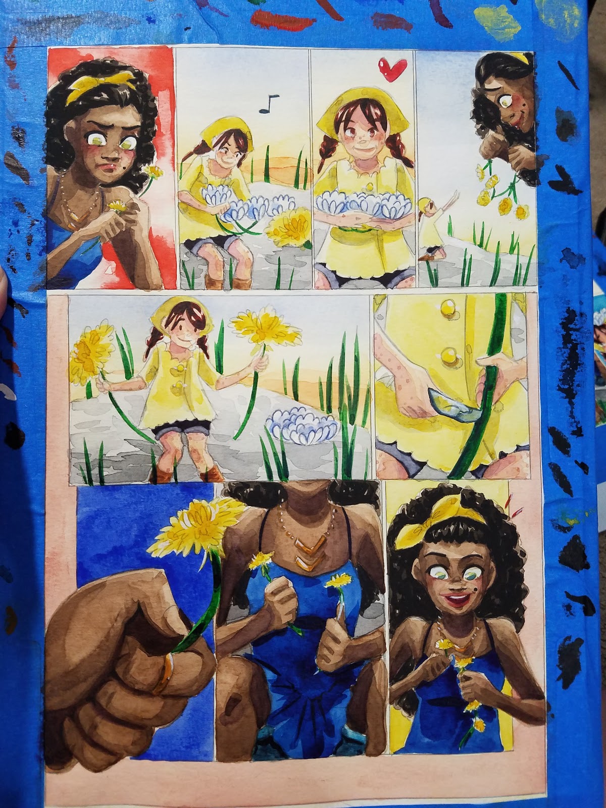
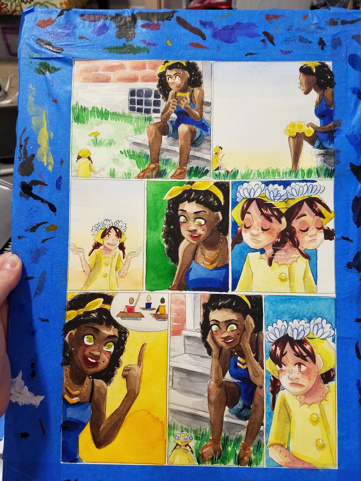
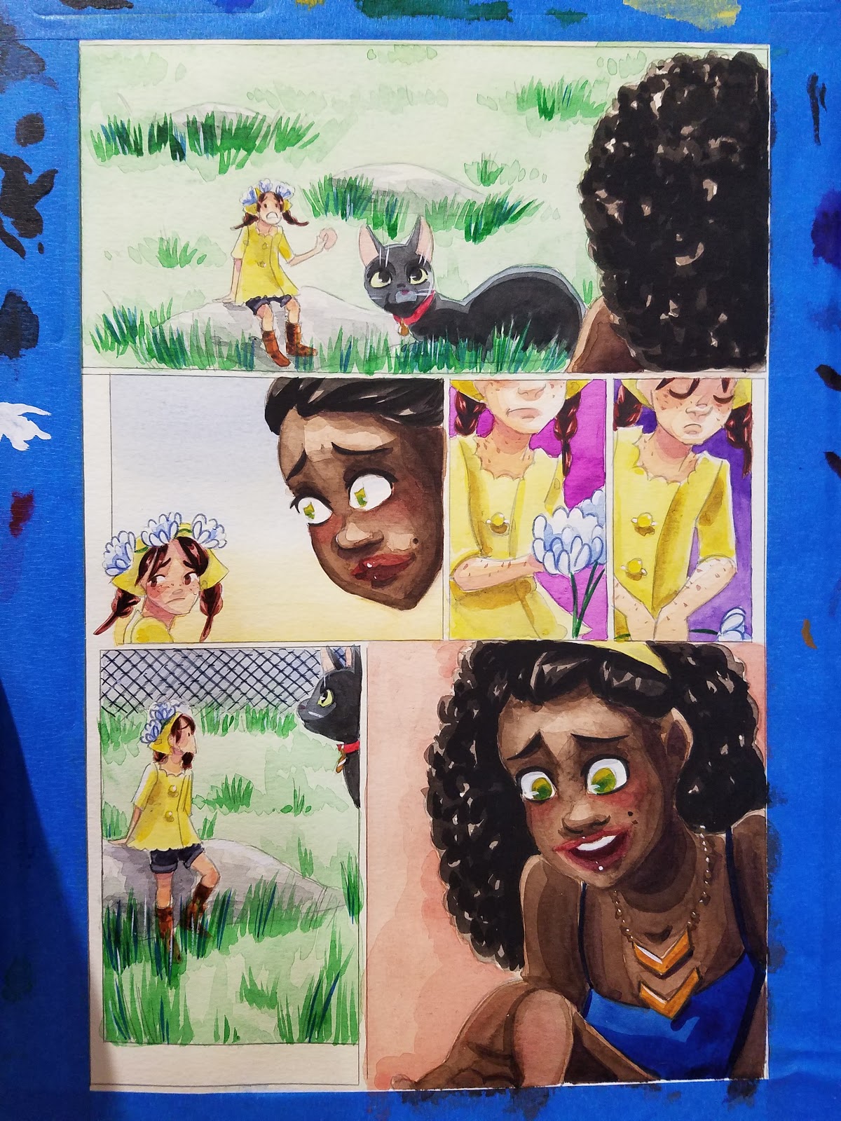
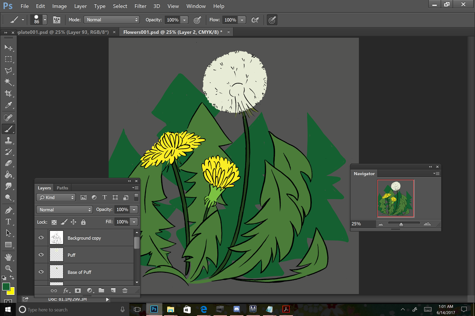
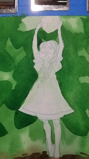
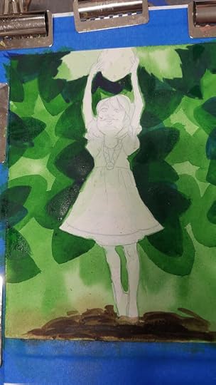
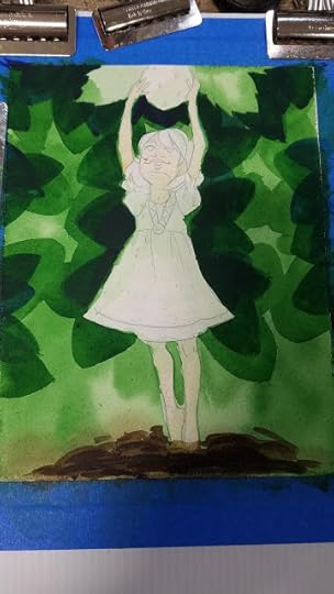
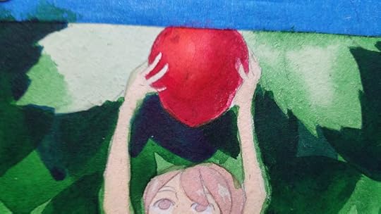
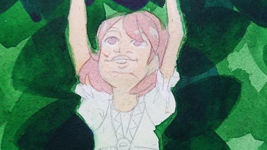
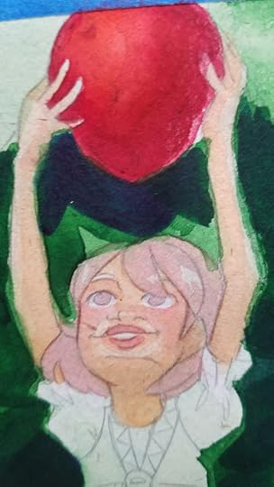
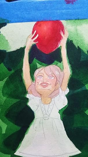
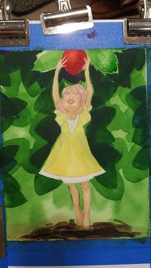
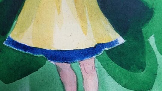
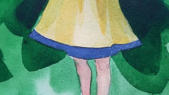
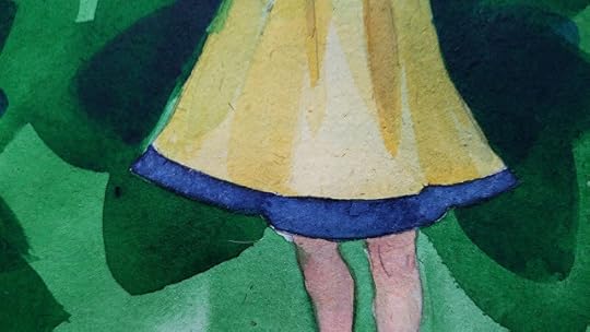
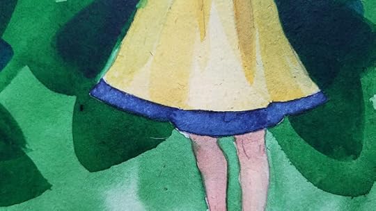
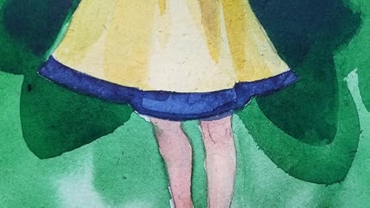
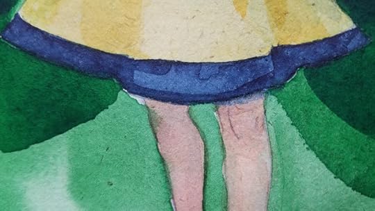
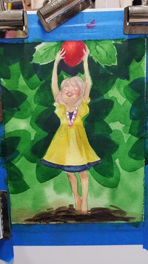
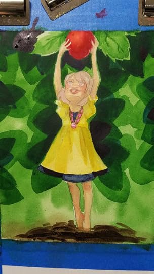
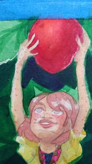
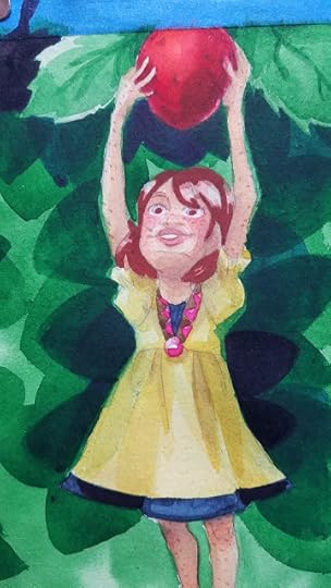
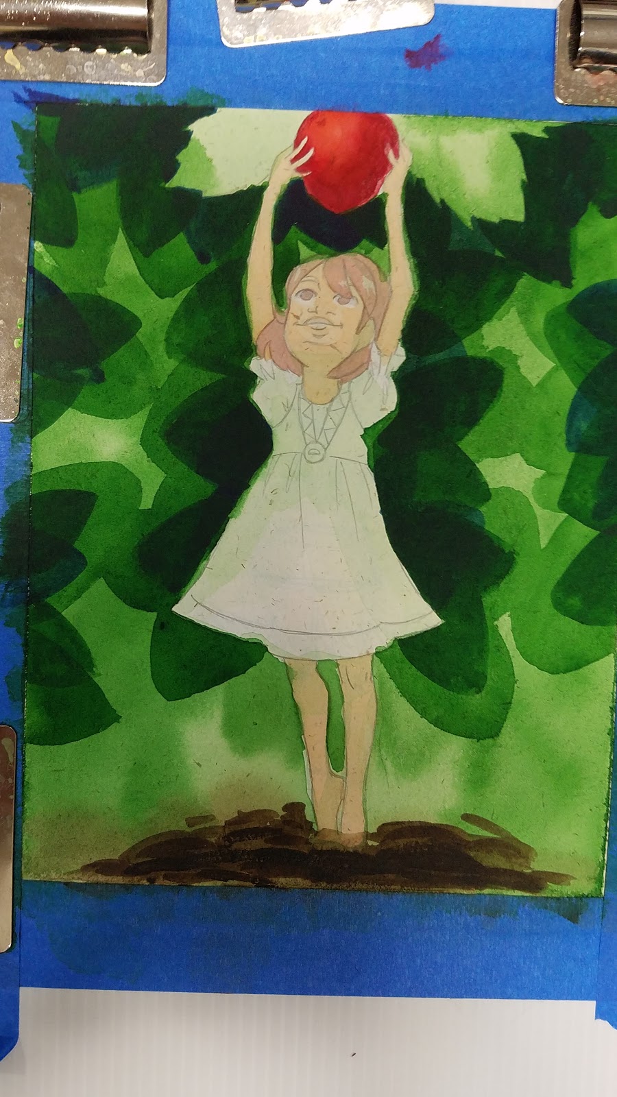
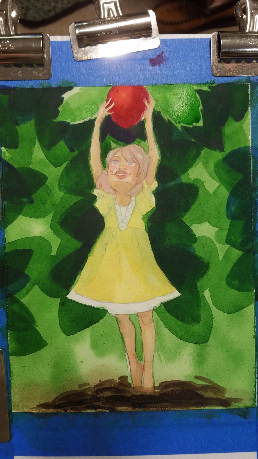
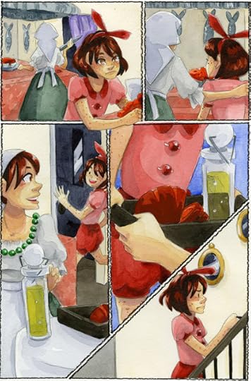 7" Kara by Becca HillburnAll of the comics above handle watercolor differently and utilize different treatments to tell a story in comic form. Some use very simple one layer techniques, some are fairly rendered out.
How Watercolor for Comics/Illustration Differs from Fine Art Watercolor
You have less time to complete a piece- comics are consumed quickly, and there's an expectation that webcomics will update frequently and consistently. Even print comics have tight timelines, so if you're going to watercolor comic pages, you need to hit on a method to produce them quickly.
Each page is multiple illustrations, so some techniques that work on standalone illustrations just won't work for comics.
Small illustrations (panels) may be difficult to execute, may require a reduction in detail.
Consistency can be a huge factor- comic pages are read quickly, so characters need to look consistent.
Affordability may be a factor, as you're using a lot of materials to complete a longform product like a comic.You may need to compromise on your papers or paints in order to complete a longterm watercolor comic project. Cheaper papers have unique considerations- cellulose papers are inexpensive, but tend to dry fast and may have limitations to wet into wet blendingCheaper paints have unique considerations- may use dyes rather than pigments or may use fugitive pigments
Lightfastness, permanence may not be an issueYour final product is not the finished painted page, but the printed bookFinal pages may never go on display, may end up stored in archival boxesDue to costs, you may find nonpermanent, fugitive watercolors to be an economical solution
Need to be able to reproduce your pages in print or online- digitizing is importantWill need to invest in a good scannerWill need to invest in physical storage-hard drives, Cloud storage, or bothWill need access to software for corrections
Often will not have exact color reference to work from (besides your prior pages)Many fine artists work closely from photo reference- this is a luxury most watercolor comic artists don't have. You can use reference, but you're going to be cobbling together multiple sources to create a single image, and this has unique and often frustrating challenges.
You can use inked lineart- this will make the coloring process much easier, but may flatten the image.
You often can't just throw away a whole page over one botched panel.Comics are too time consuming to toss a page for a single panelYou have to learn how to make peace or how to make it work
You can make digital correctionsAlter the hueAlter the saturationSeveral decent faux watercolor brushes available, or you can make your ownGood for touchups, fixing seamsYou can work digitally in addition to traditionally.LetteringAdding a shading layerCorrections
You may need additional supplies or more pre mixed colors in order to get work done in a timely mannerConvenience colorsLarger welled palettesWatercolor PencilsColored PencilsWhite Gouache
Watercolor comics aren't easy- they're time consuming and under appreciated. They aren't necessarily the best choice for webcomics, as you're limited to working in large spaces, rather than being able to work on the go. Its not something you should undertake lightly, and is definitely not a good first choice for someone who is new to comics.
That said, watercolor can be a rewarding medium. There's something wonderful and almost magical about working in traditional media, and you may find yourself with an art supply addiction.
In the end, all that really matters is that you get your pages done, and they look good. Unlike with traditional watercolors and watercolor competition, you do not have to answer to anyone else for the process you use in comics- all are legitimate methods of making work.
If you're new to my blog, don't forget to check out my Watercolor Basics series! I take you through the entire process- from selecting your materials to preparing your images, to painting your pages!

Watercolor Comics to Inspire Your Work:
Los Pirineos- Sara Woolley
Displacement- Lucy Knisley
An Age of License- Lucy Knisley
Beautiful Darkness- Fabien Vehlrmann and Kerascoet
The Legend of Zelda: A Link to the Past- Shotaro Ishinomori
Mind MGMT- Matt Knidt
Super Mario Adventures- Kentaro Takemura and Charlie Nozawa
Webcomics:
Secret Identity Shorts: P1 P2
Ignition Zero
7" Kara- Becca Hillburn
Sections of Bittersweet Candy Bowl

Please consider donating to this blog or purchasing from Natto-shop (http://nattosoup.com/shop) if you want me to continue publishing quality content. All materials tested were purchased from my own pocket. Keep on Truckin' Nattosoup is not under any sponsorship.
Recently the Watercolor Basics series has reached a turning point- we've begun to cover topics relevant to watercolor comics, rather than general watercolor, or watercolor for fine art. Way at the beginning of the series, I wrote a post about the difference between watercolor for illustration and watercolor for fine art. In that post, I glossed over the basics- I wanted to establish a reason why my Watercolor Basics series would focus on watercolor techniques useful for comic artists and illustrators, rather than covering more traditional watercolor techniques.
While researching for the Watercolor Basics series, I've realized that there is plenty of information for serious watercolorists, and plenty of information for hobbyists who are interested in light dabbling, and very little information for comic artists and illustrators. In most posts, I include links to Second Opinions and Outside Sources to guide those interested in the topic to more information- most of that information comes from those two camps.
Learning how to paint with watercolor in a fine art sense can help you improve greatly as a watercolor comic artist, and while I encourage you to go out and do studies and learn how to handle watercolor effectively, it's not a prerequisite to painting watercolor comics. Comics that utilize watercolor can vary from elaborate masterpieces to very simple limited color affairs.
 Super Mario Adventures- Kentaro Takemura and Charlie Nozawa
 Displacement, a graphic novel by Lucy Knisley
 Mind MGMT, Matt Knidt
 The Legend of Zelda: A Link to the Past, illustrated by Shotaro Ishinomori
 7" Kara by Becca HillburnAll of the comics above handle watercolor differently and utilize different treatments to tell a story in comic form. Some use very simple one layer techniques, some are fairly rendered out.
How Watercolor for Comics/Illustration Differs from Fine Art Watercolor
You have less time to complete a piece- comics are consumed quickly, and there's an expectation that webcomics will update frequently and consistently. Even print comics have tight timelines, so if you're going to watercolor comic pages, you need to hit on a method to produce them quickly.
Each page is multiple illustrations, so some techniques that work on standalone illustrations just won't work for comics.
Small illustrations (panels) may be difficult to execute, may require a reduction in detail.
Consistency can be a huge factor- comic pages are read quickly, so characters need to look consistent.
Affordability may be a factor, as you're using a lot of materials to complete a longform product like a comic.You may need to compromise on your papers or paints in order to complete a longterm watercolor comic project. Cheaper papers have unique considerations- cellulose papers are inexpensive, but tend to dry fast and may have limitations to wet into wet blendingCheaper paints have unique considerations- may use dyes rather than pigments or may use fugitive pigments
Lightfastness, permanence may not be an issueYour final product is not the finished painted page, but the printed bookFinal pages may never go on display, may end up stored in archival boxesDue to costs, you may find nonpermanent, fugitive watercolors to be an economical solution
Need to be able to reproduce your pages in print or online- digitizing is importantWill need to invest in a good scannerWill need to invest in physical storage-hard drives, Cloud storage, or bothWill need access to software for corrections
Often will not have exact color reference to work from (besides your prior pages)Many fine artists work closely from photo reference- this is a luxury most watercolor comic artists don't have. You can use reference, but you're going to be cobbling together multiple sources to create a single image, and this has unique and often frustrating challenges.
You can use inked lineart- this will make the coloring process much easier, but may flatten the image.
You often can't just throw away a whole page over one botched panel.Comics are too time consuming to toss a page for a single panelYou have to learn how to make peace or how to make it work
You can make digital correctionsAlter the hueAlter the saturationSeveral decent faux watercolor brushes available, or you can make your ownGood for touchups, fixing seamsYou can work digitally in addition to traditionally.LetteringAdding a shading layerCorrections
You may need additional supplies or more pre mixed colors in order to get work done in a timely mannerConvenience colorsLarger welled palettesWatercolor PencilsColored PencilsWhite Gouache
Watercolor comics aren't easy- they're time consuming and under appreciated. They aren't necessarily the best choice for webcomics, as you're limited to working in large spaces, rather than being able to work on the go. Its not something you should undertake lightly, and is definitely not a good first choice for someone who is new to comics.
That said, watercolor can be a rewarding medium. There's something wonderful and almost magical about working in traditional media, and you may find yourself with an art supply addiction.
In the end, all that really matters is that you get your pages done, and they look good. Unlike with traditional watercolors and watercolor competition, you do not have to answer to anyone else for the process you use in comics- all are legitimate methods of making work.
If you're new to my blog, don't forget to check out my Watercolor Basics series! I take you through the entire process- from selecting your materials to preparing your images, to painting your pages!

Watercolor Comics to Inspire Your Work:
Los Pirineos- Sara Woolley
Displacement- Lucy Knisley
An Age of License- Lucy Knisley
Beautiful Darkness- Fabien Vehlrmann and Kerascoet
The Legend of Zelda: A Link to the Past- Shotaro Ishinomori
Mind MGMT- Matt Knidt
Super Mario Adventures- Kentaro Takemura and Charlie Nozawa
Webcomics:
Secret Identity Shorts: P1 P2
Ignition Zero
7" Kara- Becca Hillburn
Sections of Bittersweet Candy Bowl

Please consider donating to this blog or purchasing from Natto-shop (http://nattosoup.com/shop) if you want me to continue publishing quality content. All materials tested were purchased from my own pocket. Keep on Truckin' Nattosoup is not under any sponsorship.
September 28, 2017
An Introduction To Working in Batch: Watercolor Basics
Before we go much further into Watercolor Basics, especially Watercolor Basics for Watercolor Comic artists, I need to let you guys in on my worst kept secret. I work in batch.
There's a difference between Batching and Working in Batch, both of which I do.
Batching- completing all of a stage of a project before progressing to the next
Working in Batch- Working on several pages at the same time, keeping everything at the same stage.
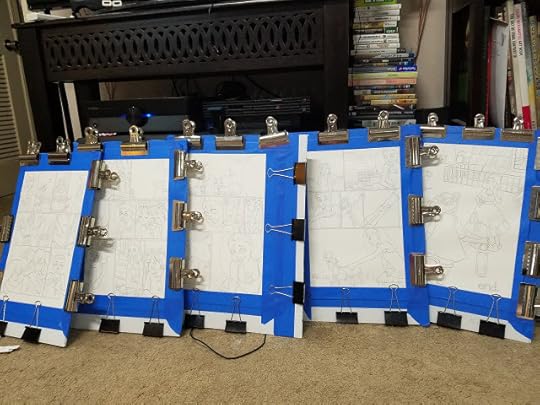
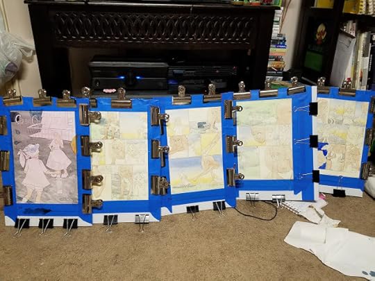
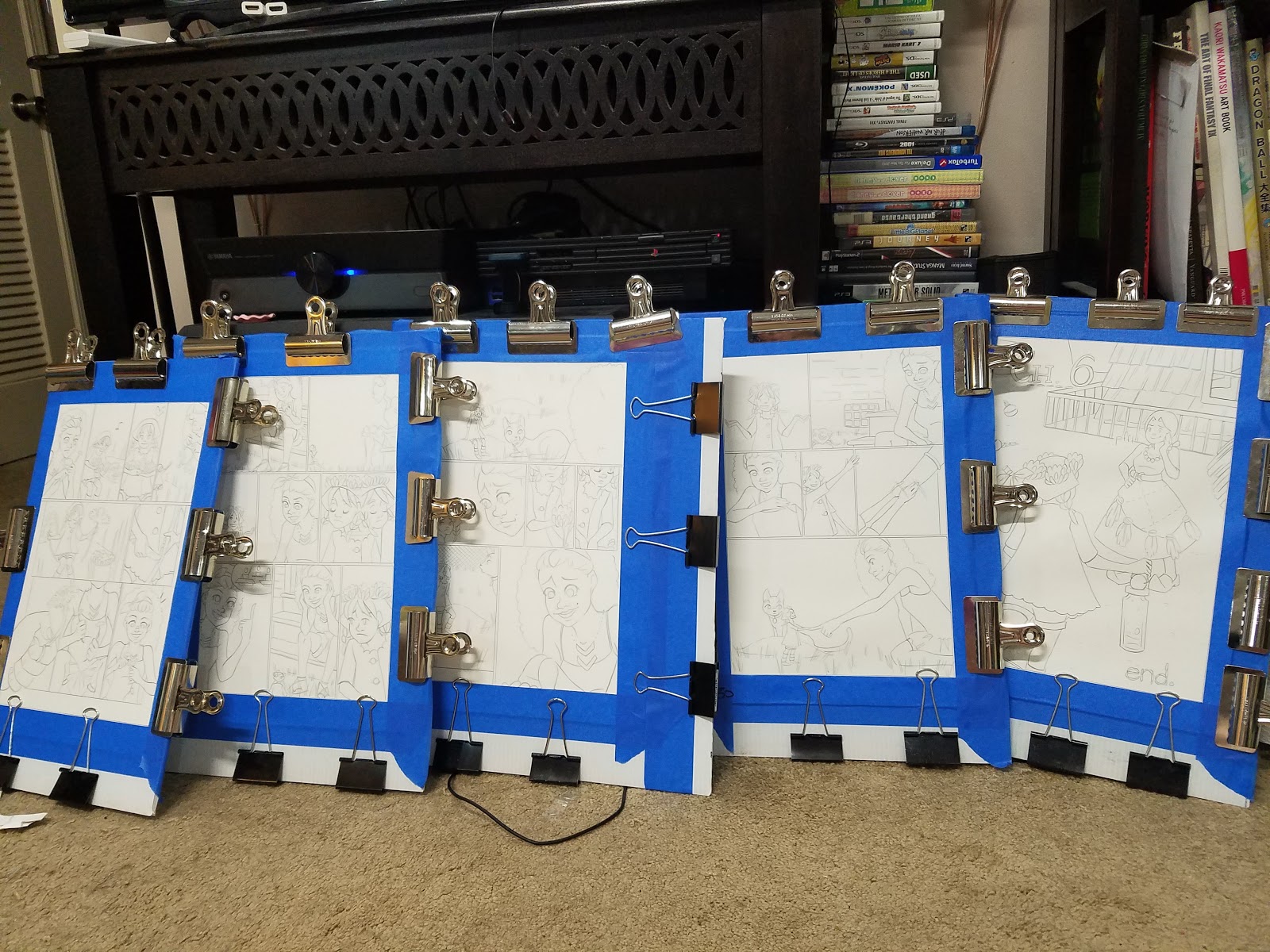
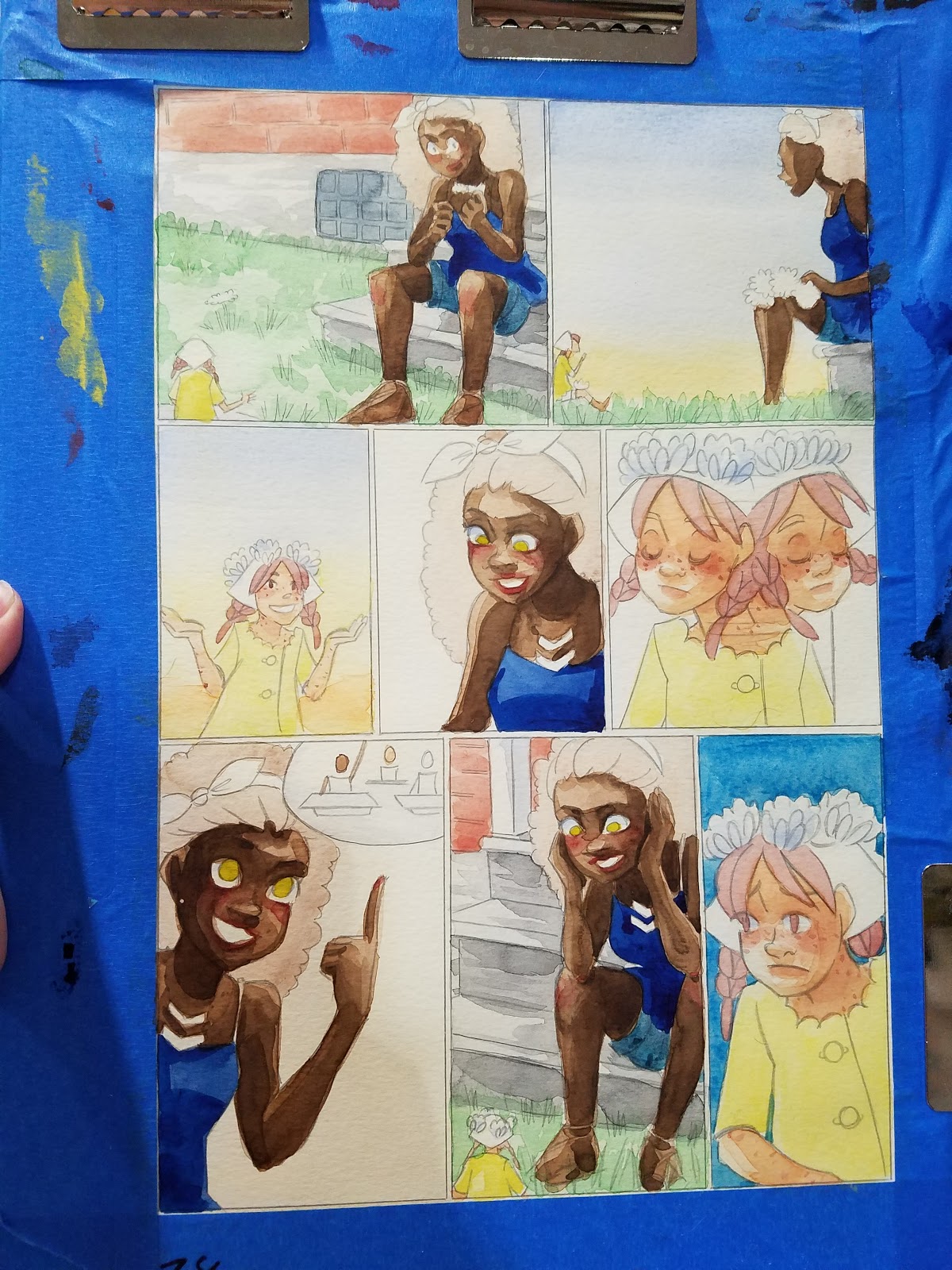
I create my comics using Batching from script until my final pencils are completed. This means I finish all of my thumbnails for the chapter before moving on to any of my roughs, I complete all of my roughs before scanning and correcting anything, I print out all of my bluelines and pencil all of my pages before I start painting. Although for some webcomic artists, this isn't a feasible system, its the only way I can keep everything straight while also juggling this blog, the Youtube channel, conventions across the country, and working on commissions.
From tight pencils on, I work in batch. This means I work on two to four (sometimes as many as six, but I usually regret that) comic pages at a time. I try to work on a full scene when possible- this allows me to mix all my colors and keep things consistent.
 Don't forget to check out my other watercolor tutorials in the Watercolor Basics series!
Why Work in Batch
ConsistencyDedicated schedule for longer projectsKeeps you producing pagesTakes advantage of in between times
Skip lightboxing- printing bluelines using an inkjet printer like the large format Canon Pro 9000 Mk II means you can go straight to pencils- stretching your pages will reactivate the printer ink, and it will wash cleanly away.
Working in batch is the secret key to how I produce 7" Kara sustainably.


Tips for Working in Batch
Prepare your work area ahead of time, clean things up, make plenty of room, clean your palettes, assemble your paints. Have everything in arm's reach.
Establishing work flow is important- once you get in the painting mindset, you don't want something trivial holding you up. Start your project with clean brushes, fresh paints, lots of palettes.
Work with two cups of water- start with fresh cups every day, your clean water will last longer.
Work with multiple welled palettes- this allows you to mix color ahead of time, and work consistently.
Do everything you can in batch- it's boring but effective. Stretch in batch, do washes in batch, this way everything is drying at the same time, or drying while you paint.
Try to avoid working on humid or rainy days, and if you can't help it, set your watercolors under a vent to dry.
Don't expect your usual level of attention- you are splitting your time and attention between multiple pages. Simplicity is key.
Create systems for how you address shadows, folds, etc. A shorthand that works visually.
PRACTICE A LOT beforehand, so you spend less time thinking about how to solve problems, and actually solve them. Practice doing standalone illustrations, doing studies, using your paints, using your paper, different papers, practice solving paint problems, creating happy accidents.
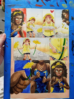
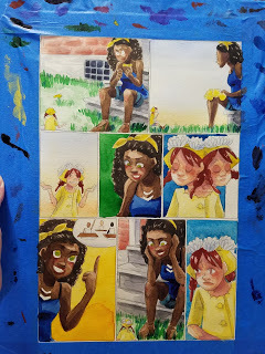
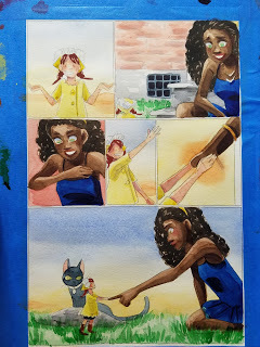
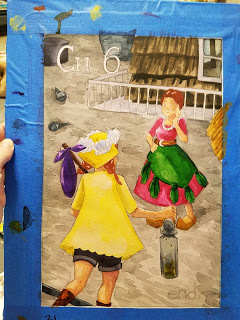
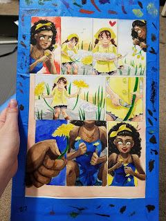
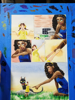
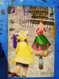
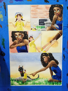
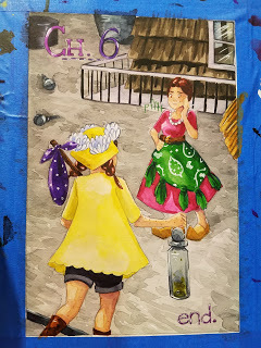
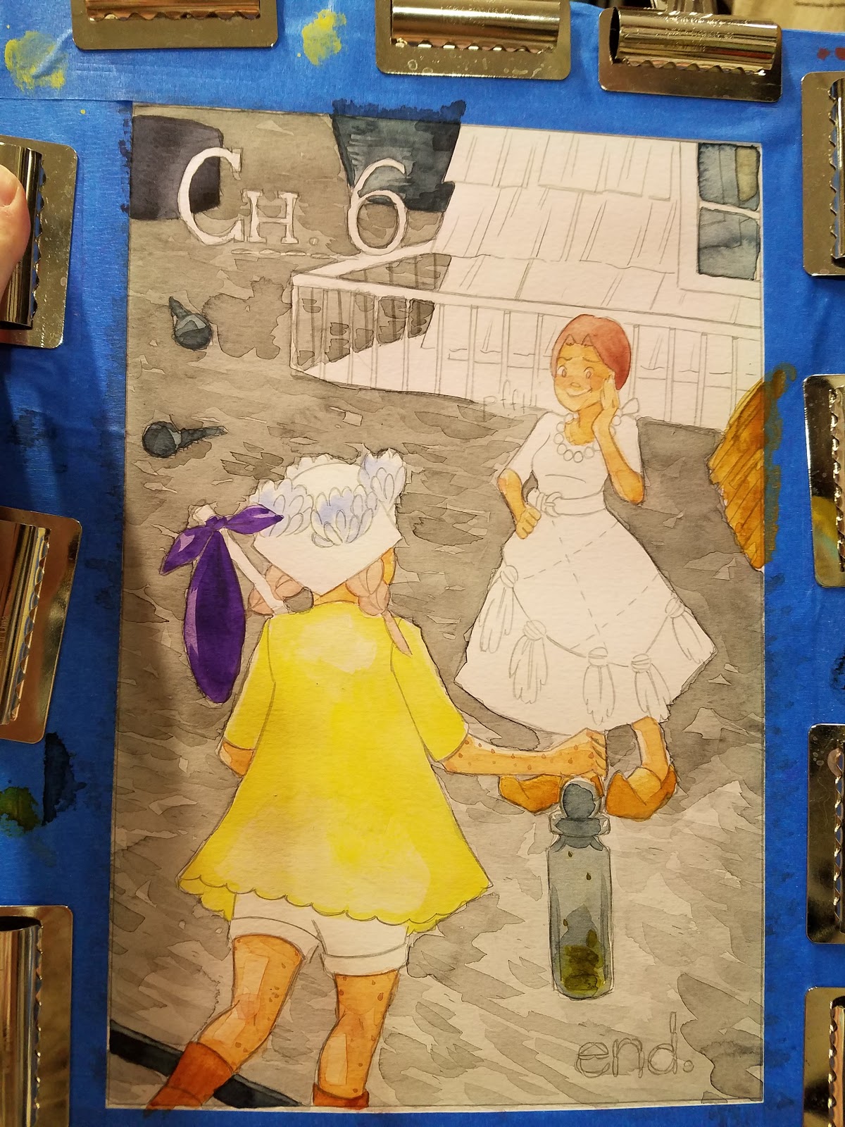
It takes time to get good at batch painting- Chapter 1 of 7" Kara was painted in two pages per batch, and Chapters 5 and 6 were painted in 2-6 pages per batch, yet look much better. A lot of practice happened between chapter 1 and chapter 5.
Give yourself time to think- you might end up painting yourself into a hole if you try to rush things too much.
I hope these tips, collected over the years while painting 7" Kara, will inspire you to try painting in batch. Batch painting can be a great solution to handling a chapter efficiently, although it may require you to change how you handle your watercolors.
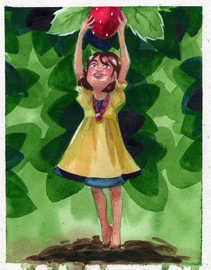
And if you enjoyed the art used in this post, don't forget to check out the source- my watercolor comic, 7" Kara, now available to read as a free webcomic!

7" Kara follows the adventures of minature Kara- a sheltered girl facing a huge move. Determined to have adventure while she's able, she sets off to explore the outside world, and perhaps meet a human. You can read 7" Kara for free at 7inchkara.com, or skip the cliffhangers and get caught up by purchasing Volume 1 from the Nattoshop.
And if you're looking for more wonderful webcomics, make sure you check out Ink Drop Cafe, a webcomic collective.

7" Kara is a proud member of Ink Drop Cafe, and the Nattosoup Studio Art and Process blog is a proud affiliate.
Please consider donating to this blog or purchasing from Natto-shop (http://nattosoup.com/shop) if you want me to continue publishing quality content. All materials tested were purchased from my own pocket. Keep on Truckin' Nattosoup is not under any sponsorship.
There's a difference between Batching and Working in Batch, both of which I do.
Batching- completing all of a stage of a project before progressing to the next
Working in Batch- Working on several pages at the same time, keeping everything at the same stage.
I create my comics using Batching from script until my final pencils are completed. This means I finish all of my thumbnails for the chapter before moving on to any of my roughs, I complete all of my roughs before scanning and correcting anything, I print out all of my bluelines and pencil all of my pages before I start painting. Although for some webcomic artists, this isn't a feasible system, its the only way I can keep everything straight while also juggling this blog, the Youtube channel, conventions across the country, and working on commissions.
From tight pencils on, I work in batch. This means I work on two to four (sometimes as many as six, but I usually regret that) comic pages at a time. I try to work on a full scene when possible- this allows me to mix all my colors and keep things consistent.
 Don't forget to check out my other watercolor tutorials in the Watercolor Basics series!
Why Work in Batch
ConsistencyDedicated schedule for longer projectsKeeps you producing pagesTakes advantage of in between times
Skip lightboxing- printing bluelines using an inkjet printer like the large format Canon Pro 9000 Mk II means you can go straight to pencils- stretching your pages will reactivate the printer ink, and it will wash cleanly away.
Working in batch is the secret key to how I produce 7" Kara sustainably.


Tips for Working in Batch
Prepare your work area ahead of time, clean things up, make plenty of room, clean your palettes, assemble your paints. Have everything in arm's reach.
Establishing work flow is important- once you get in the painting mindset, you don't want something trivial holding you up. Start your project with clean brushes, fresh paints, lots of palettes.
Work with two cups of water- start with fresh cups every day, your clean water will last longer.
Work with multiple welled palettes- this allows you to mix color ahead of time, and work consistently.
Do everything you can in batch- it's boring but effective. Stretch in batch, do washes in batch, this way everything is drying at the same time, or drying while you paint.
Try to avoid working on humid or rainy days, and if you can't help it, set your watercolors under a vent to dry.
Don't expect your usual level of attention- you are splitting your time and attention between multiple pages. Simplicity is key.
Create systems for how you address shadows, folds, etc. A shorthand that works visually.
PRACTICE A LOT beforehand, so you spend less time thinking about how to solve problems, and actually solve them. Practice doing standalone illustrations, doing studies, using your paints, using your paper, different papers, practice solving paint problems, creating happy accidents.
It takes time to get good at batch painting- Chapter 1 of 7" Kara was painted in two pages per batch, and Chapters 5 and 6 were painted in 2-6 pages per batch, yet look much better. A lot of practice happened between chapter 1 and chapter 5.
Give yourself time to think- you might end up painting yourself into a hole if you try to rush things too much.
I hope these tips, collected over the years while painting 7" Kara, will inspire you to try painting in batch. Batch painting can be a great solution to handling a chapter efficiently, although it may require you to change how you handle your watercolors.
And if you enjoyed the art used in this post, don't forget to check out the source- my watercolor comic, 7" Kara, now available to read as a free webcomic!

7" Kara follows the adventures of minature Kara- a sheltered girl facing a huge move. Determined to have adventure while she's able, she sets off to explore the outside world, and perhaps meet a human. You can read 7" Kara for free at 7inchkara.com, or skip the cliffhangers and get caught up by purchasing Volume 1 from the Nattoshop.
And if you're looking for more wonderful webcomics, make sure you check out Ink Drop Cafe, a webcomic collective.

7" Kara is a proud member of Ink Drop Cafe, and the Nattosoup Studio Art and Process blog is a proud affiliate.
Please consider donating to this blog or purchasing from Natto-shop (http://nattosoup.com/shop) if you want me to continue publishing quality content. All materials tested were purchased from my own pocket. Keep on Truckin' Nattosoup is not under any sponsorship.
September 25, 2017
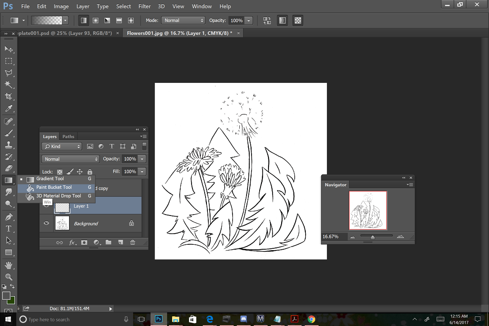
Digital Flats Tutorial: Intro to Comic Craft
 Love my art? Check out 7" Kara, now available as a webcomic!
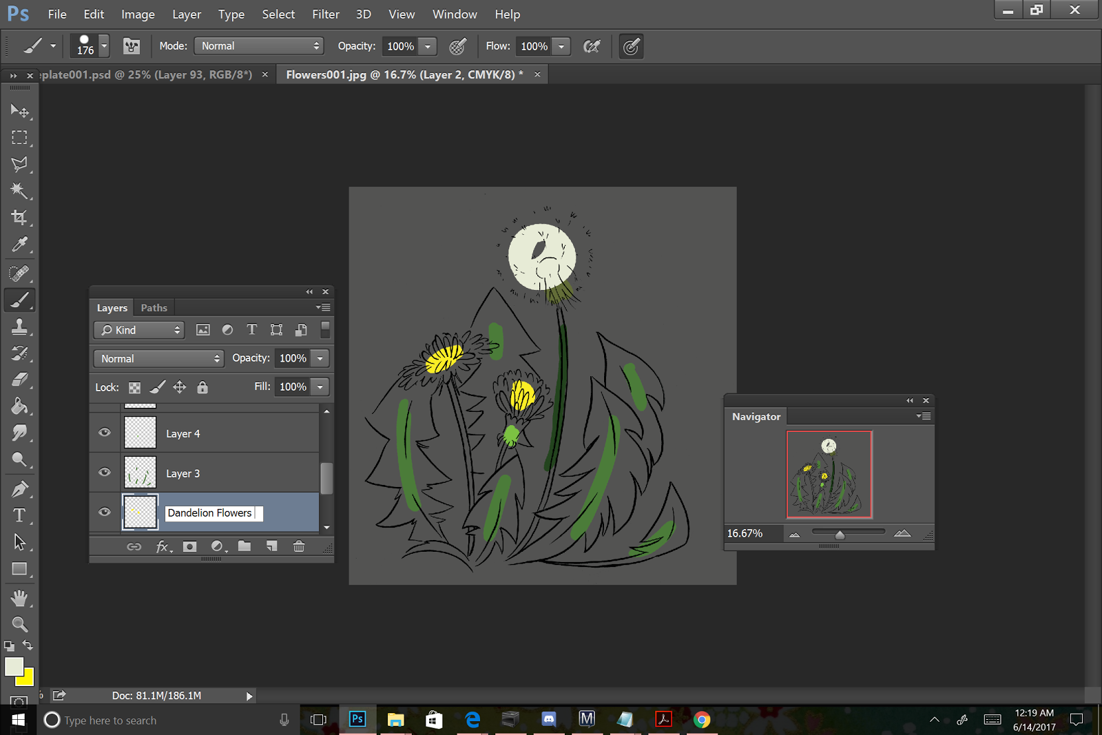
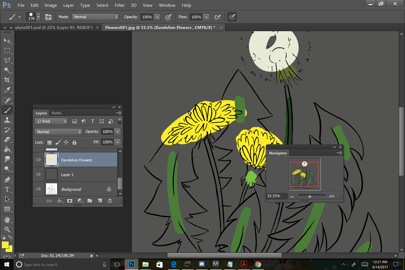
What is Flatting, what are flats?
Flats are an opaque layer (or layers) of color applied as an initial color pass on an image or comic. For some artists, the flats are the ONLY stage of digital color applied, for others, they are a fast way to select areas for later color and effects, for still others they're a
Your finished flats will look something like this:

Or if you're doing a comic page, something like this:
If you'd like to practice flatting, I have lineart available for purchase through my Gumroad.
Create a neutral background color
This allows you to better gauge how colors actually look.
After you've color corrected your inks to drop out any pre-existing bluelines or grays, you're ready to begin laying down color. I start with filling the background with a neutral color- usually a greyish brown- to help me more accurately gauge how colors work together.
If you hadn't yet, go ahead and convert your file to the mode you wish to work in.
Rule of Thumb:
For Web: RGB
For Print: CMYK
You can do this by going into Image- Mode- and select either CMYK or RGB, depending on your final destination.

For my own inks, I'll duplicate my ink layer, and turn off the original, then set the duplicate to Multiply. This will be my top layer- all colors will go beneath.
Then we're going to want to select a gray that is desaturated and neutral as our background color.

I then create another layer beneath my inks layer and fill it with this neutral gray.


This comic tutorial was sponsored by Ink Drop Cafe, the creator's collective. From comics to resources, Ink Drop Cafe has you covered! Swing by to sample our selection of webcomics, or check out our fantastic resources in the Affiliates section!

Nattosoup Studio Art and Process Blog is a proud Affiliate of Ink Drop Cafe.
Brush Settings
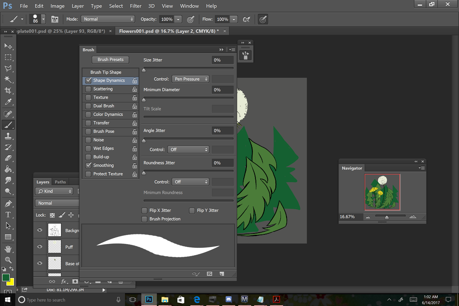
I use Basic Round, largest brush you're comfortable working with for my flats, with the control set to Pen Pressure for inking on my Surface Pro 3.

Alternate Method for Filling in Lineart
You can also create fills by selecting an enclosed area on your inks layer using the Magic Wand Tool, creating a new layer, then filling that area in with the Paintbucket. This only works for totally enclosed inks, which is why I typically rely on filling things in by hand.

Make sure you're on your Inks layer.

Select the Magic Wand tool.
Select your totally enclosed area you wish to fill.

Create a new layer.

Using the Paint Bucket, fill with color.
Every Color Gets Separate Layer
This practice has come from doing freelance digital flatting for other people. By keeping your colors on separate layers, you can easily tweak one color if necessary. After you've finished flatting, if you need to reduce your file size, layers can be grouped together and merged, or you can merge all of your color layers into one layer.

Naming Your Layers
This is particularly important when flatting for others, but can also be very useful when flatting comic pages!
For every discreet object, I create a layer and name it after the object.

Filling in Areas and Reorganizing Layers
Once I've selected colors for every object, I start filling in my objects with a large round brush.
Once all areas have been filled, I begin cleaning up my outlines, erasing anything that crossed the inked lines.
Erasing Excess

To create finer details by erasing, simply adjust the size of your brush.
When erasing, I work from top layer to bottom, and turn layers off as I go.

While cleaning up my fills, I decided I wanted to add more leaves to the background but didn't want them to have lineart- creating a softer focus for the background leaves.
I selected the green used for the foreground leaves, and then selected a darker green based on that.

And using a Round brush with the pen pressure toggle on, I began sketching leaves in the background.
And filled them in.

Other options for flatting:
Peltmade's
Multifill- Free
Flatten Pro-$99 USD
Both Flatten Pro and Multifill are Photoshop plug ins.
Other Examples of Flats


Resources and Outside Opinions
Omocha's Mega Cell Shading Step by Step
Jasmo's Flatting Tutorial:
Splicer's Flatting Tutorial
Vest's Flatting Tutorial Superman
Celesse's BPelt's Multifill and Flatten Pro Tutorial
Please consider donating to this blog or purchasing from Natto-shop (http://nattosoup.com/shop) if you want me to continue publishing quality content. All materials tested were purchased from my own pocket. Keep on Truckin' Nattosoup is not under any sponsorship.

September 21, 2017
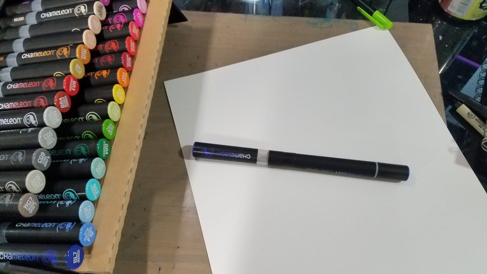
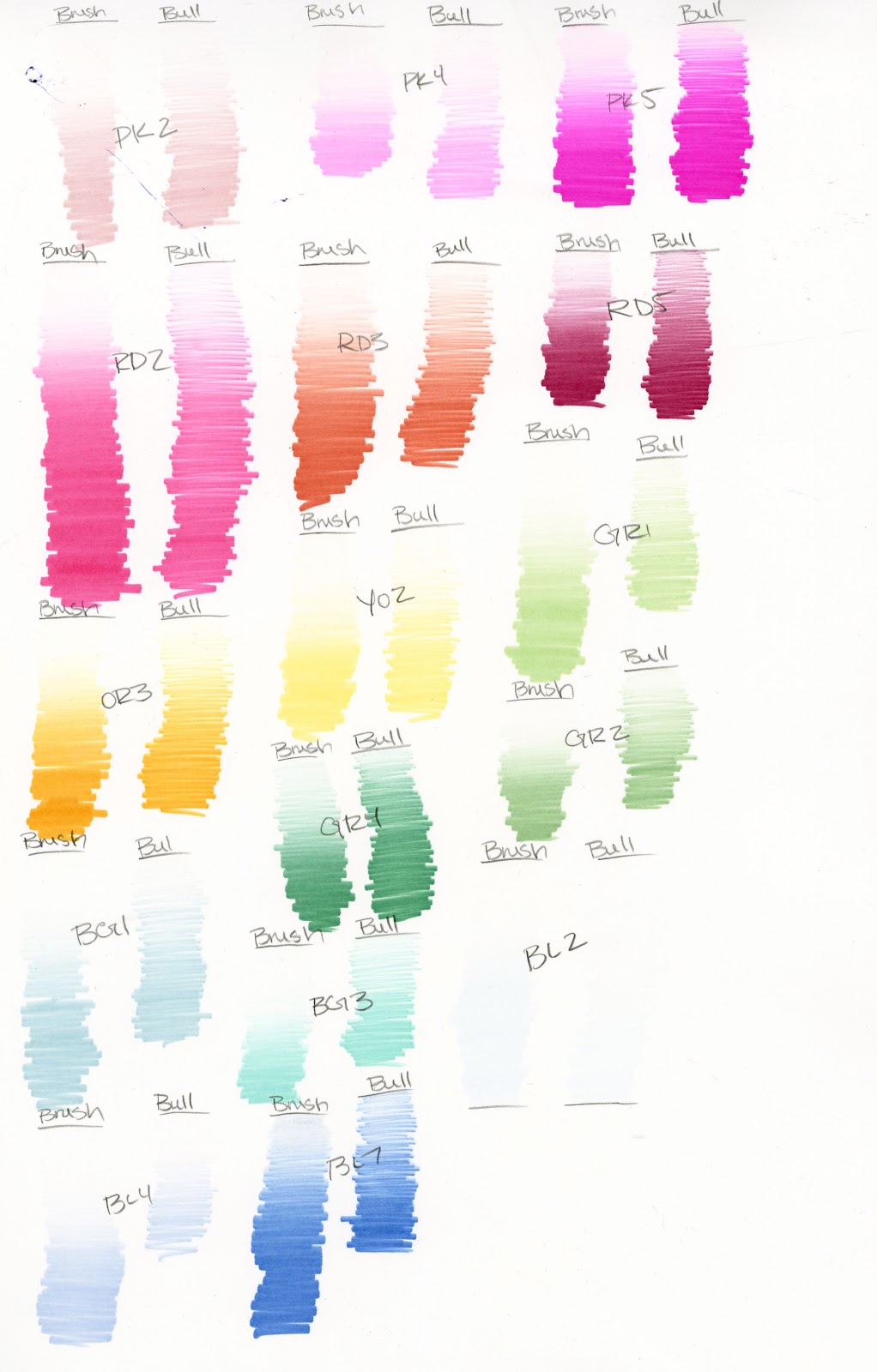
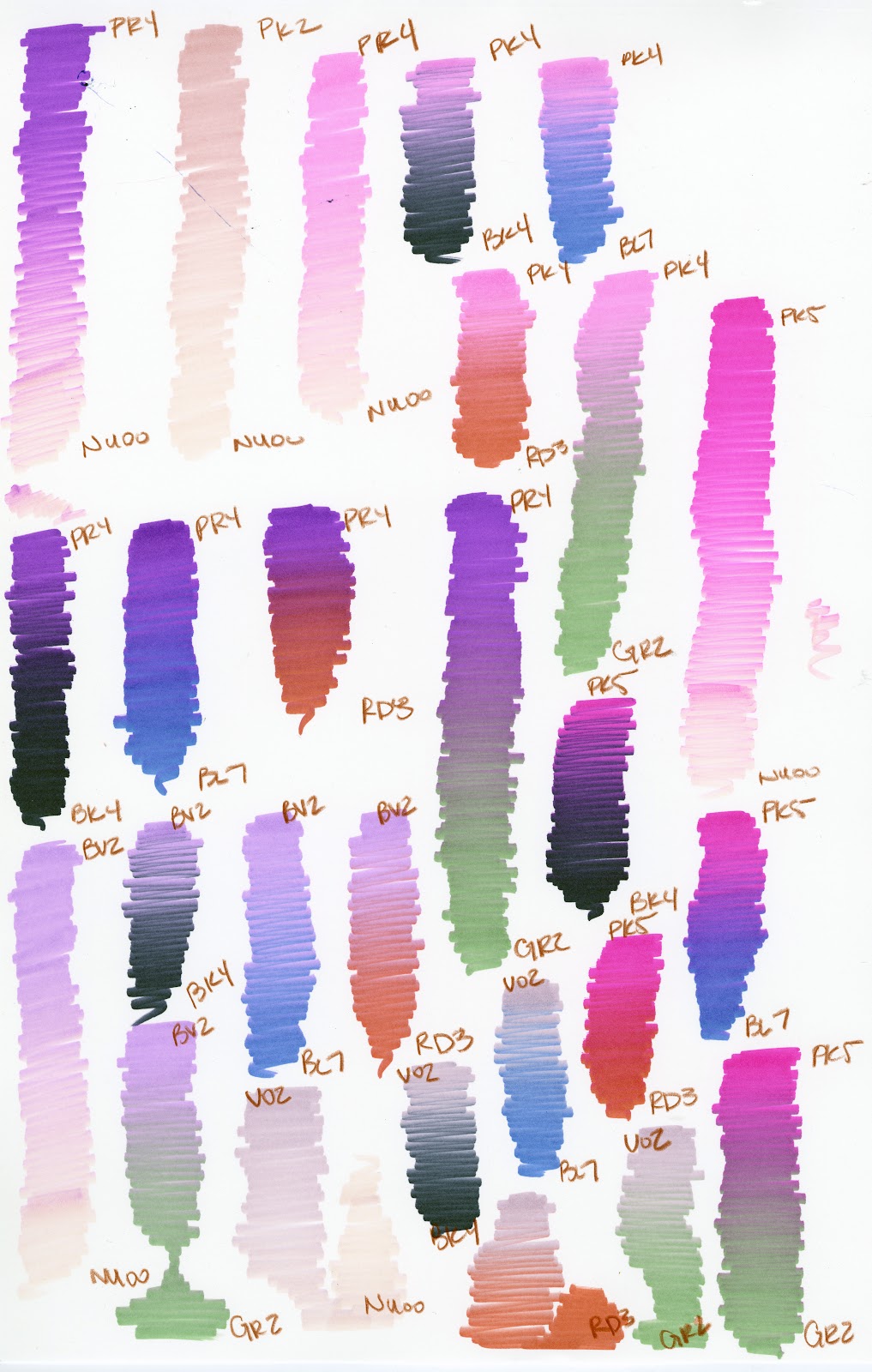
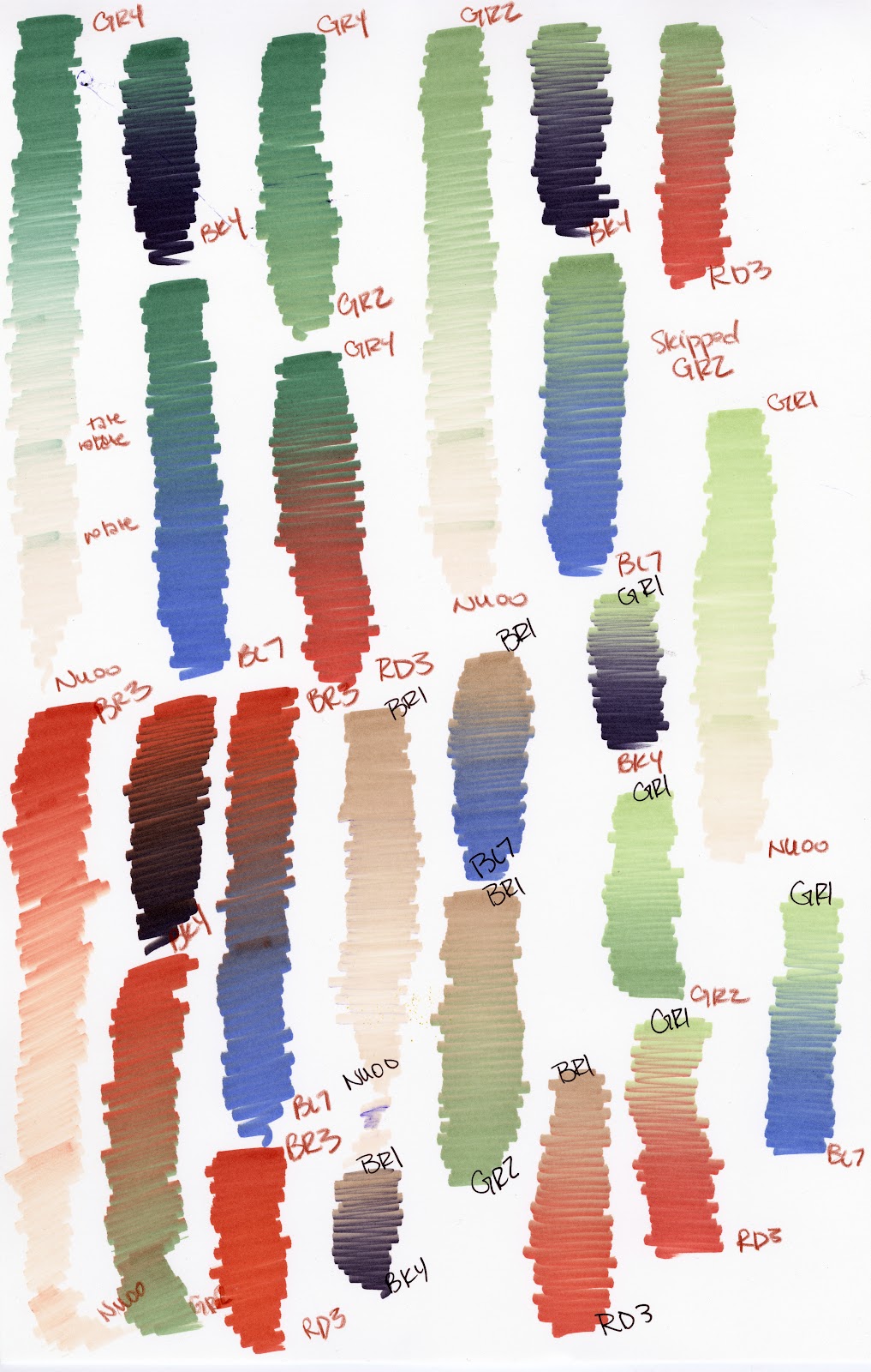
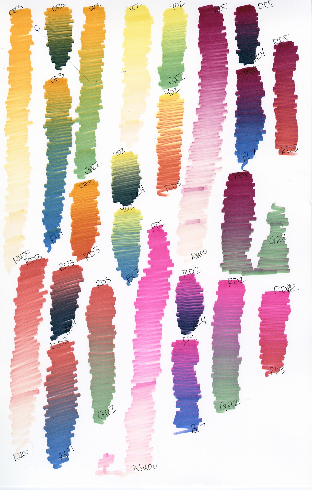
Swatching Chameleon Markers and Tops (Complete)
Previous posts in the Chameleon Color Tones and Chameleon Color Tops Series: Unboxing Chameleon Marker Tops and the Chameleon Complete Your Collection Set
If you'd like to see all 23 tops swatched with all 30 markers (that's approximately 690 swatches!), head on over to my Patreon and join the Artnerd community. If enough people request this, I'll make it a community goal and we can work towards it together!
Swatching the Additional 30 Markers:
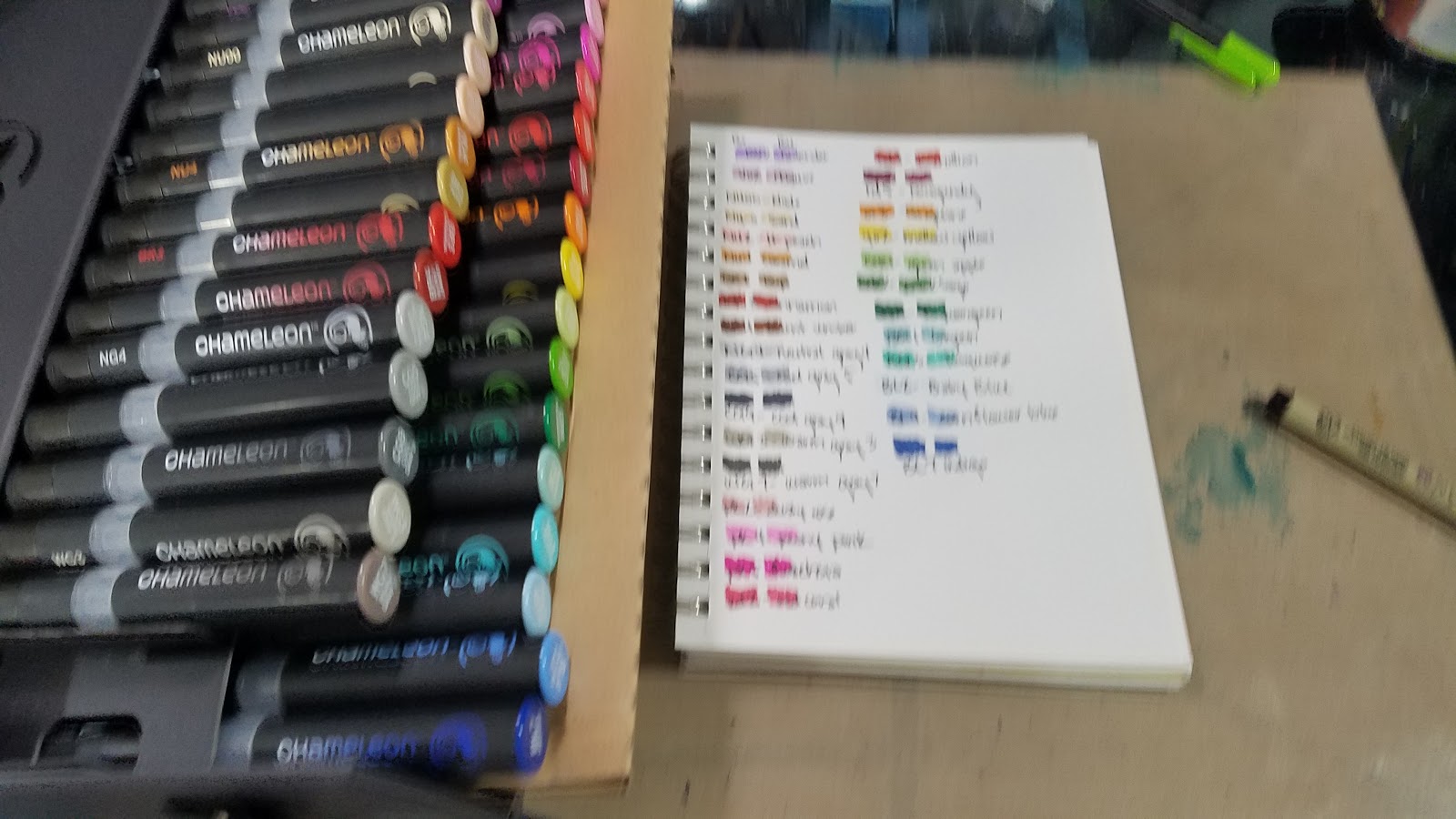
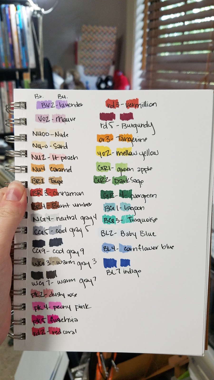
Base Swatches:
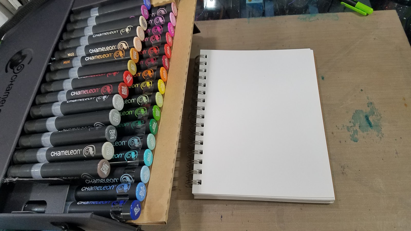
These were swatched in a Strathmore Visual Art Smooth Bristol Journal


Swatches for the 30 Additional Colors Set:
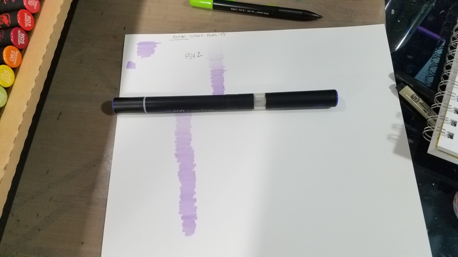
Each color was infused for a 15 second count, with the exception of the first swatch, which was a 30 second count. These were swatched onto Strathmore 500 series Plate Bristol.


Swatches for Color Tops
Swatched with select colors, to give an approximate idea how all colors in that color family would blend. Each color was infused for a 15 second count, and swatches were done on Strathmore 500 series Plate Bristol.
Colors used:
NU00
BK4
BL7
RD3
GR2
Tops Swatched:
From July Scrawlrbox:
NU4
BR5
NGr1
From IndieGogo Order:
Nature Tones- GR4, GR2, GR1, BR3, BR1
Warm Tones- OR3, YO2, RD5, RD3, RD2
Cool Tones- BL3, BV4, BG4, VO4, PR4
Floral Tones- PK2, PK4, PK5, BV2, VO2


Please consider donating to this blog or purchasing from Natto-shop (http://nattosoup.com/shop) if you want me to continue publishing quality content. All materials tested were purchased from my own pocket. Keep on Truckin' Nattosoup is not under any sponsorship.
If you'd like to see all 23 tops swatched with all 30 markers (that's approximately 690 swatches!), head on over to my Patreon and join the Artnerd community. If enough people request this, I'll make it a community goal and we can work towards it together!
Swatching the Additional 30 Markers:
Base Swatches:
These were swatched in a Strathmore Visual Art Smooth Bristol Journal


Swatches for the 30 Additional Colors Set:
Each color was infused for a 15 second count, with the exception of the first swatch, which was a 30 second count. These were swatched onto Strathmore 500 series Plate Bristol.

Swatches for Color Tops
Swatched with select colors, to give an approximate idea how all colors in that color family would blend. Each color was infused for a 15 second count, and swatches were done on Strathmore 500 series Plate Bristol.
Colors used:
NU00
BK4
BL7
RD3
GR2
Tops Swatched:
From July Scrawlrbox:
NU4
BR5
NGr1
From IndieGogo Order:
Nature Tones- GR4, GR2, GR1, BR3, BR1
Warm Tones- OR3, YO2, RD5, RD3, RD2
Cool Tones- BL3, BV4, BG4, VO4, PR4
Floral Tones- PK2, PK4, PK5, BV2, VO2

Please consider donating to this blog or purchasing from Natto-shop (http://nattosoup.com/shop) if you want me to continue publishing quality content. All materials tested were purchased from my own pocket. Keep on Truckin' Nattosoup is not under any sponsorship.
September 18, 2017
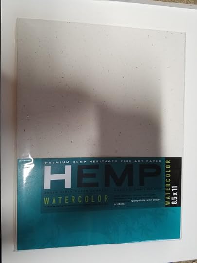
Review: Hemp Heritage Watercolor Paper: Watercolor Basics
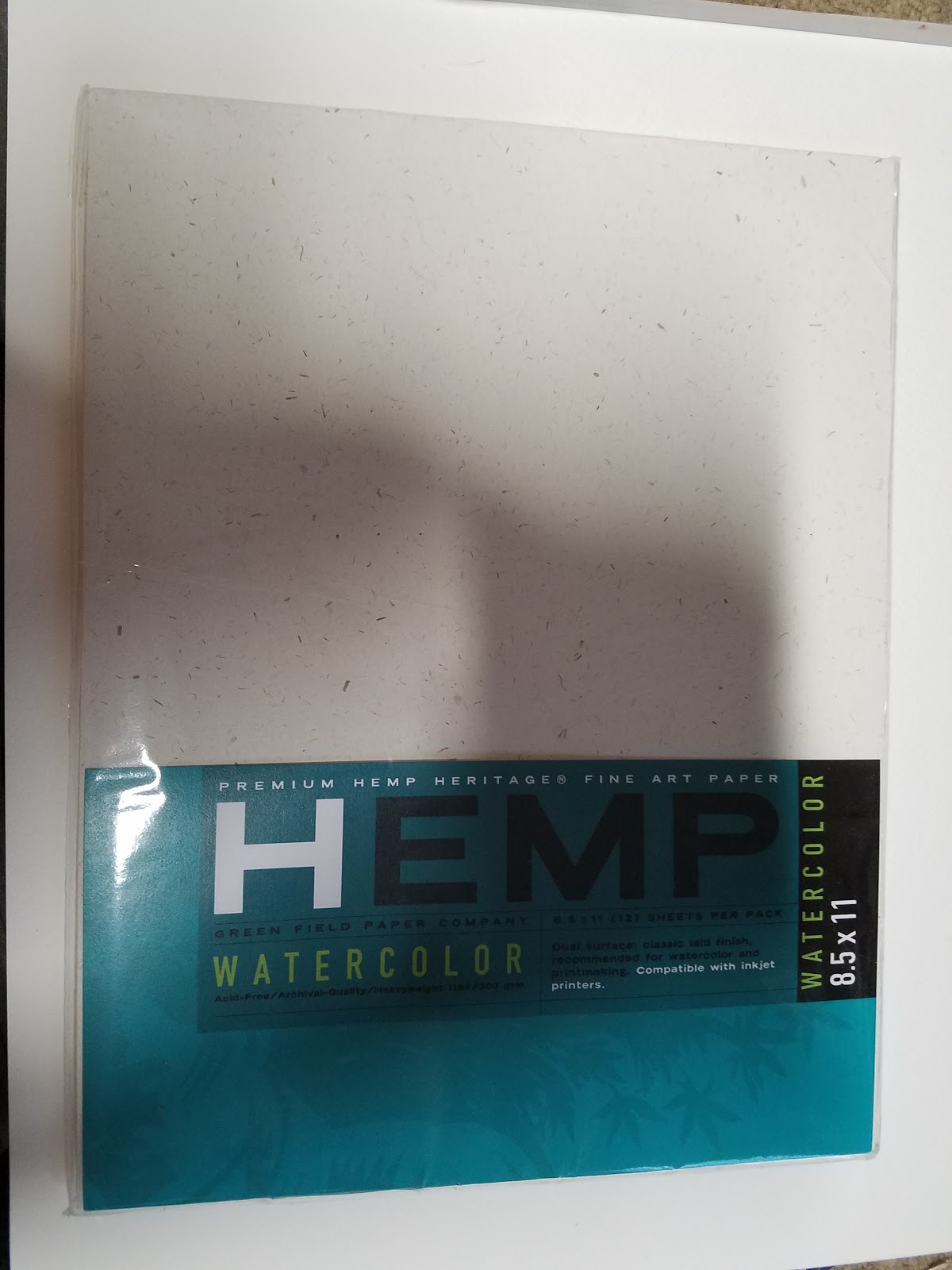
"Premium Hemp Heritage Fine Art Paper"
I'm always interested in trying new things, especially in the world of watercolor. I've tried Yupo (for watercolor, for alcohol markers, and with Pitt Pens) a synthetic paper made from plastic, I've dabbled with a variety of watercolor papers, and I'm always swatching new watercolor sets. A couple years ago, I spotted Hemp Heritage Watercolor paper on Amazon and was intrigued. I've used plastic, cellulose based, and cotton rag papers, as well as papers that are a mix, but I've never used hemp papers.
Hemp is an interesting and intriguing fiber choice that may appeal to many artists. Those who are pro hemp claim that farming it remediates the soil and consumes excess C02, that hemp grows in a variety of climates and consumes little water (source). "Hemp is a sustainable, biodegradable, and durable material that can revolutionize these industries!" (source) that can be used for cloth, paper, and industrial products. Hemp is resistant to mould and mildew and is naturally microbial (source). Hemp grows rapidly and doesn't require pesticides in its production (source). Hemp fibers are more porous than other natural fibers (which might allow for faster dry times) (source). Hemp is extremely fast growing and '1 acre of Hemp produces as much paper as 4.1 acres of trees' (source). Combined with lower water usage, and no need for pesticide, hemp seems like an ideal choice, although the earth environmental scientist in me thinks these all points to hemp being an ideal invasive species. Although hemp papers aren't yet commonly available, a few are making their way onto the market, tempting artists like myself who are used to wood pulp and cotton.
Outside of the US, hemp papers are easier to find. Hemp grown for papermaking is specifically selected to have the highest fiber content and contains none of the active chemicals of other varieties of cannabis (source)
The inclusion of recycled fibers such as recycled wood pulp can make a hemp based paper less desirable for artist use, as it can affect the lifespan of the piece (source) by altering the archival qualities of the paper.
Green Field Paper Company 'creating eco-friendly papers with a purpose since 1992'. Their products include:
Grow a Note Plantable Seed PaperHemp Heritage PaperA Wedding CollectionCustom Plantable PromotionsHOliday Collection for both personal and corporateEnvelopes- plantable envelopes and hemp envelopesBusiness Cards100% recycled gift wrapand Custom Printing
Hemp Heritage Paper includes journals and sketchbooks, stationary and office, fine art papers and pads, blank cards, envelopes, and t-shirts, custom hemp products, and large format cartons and rolls.
Within their fine paper category, Green Field Paper offers Hemp Heritage Sketch Paper, Hemp Heritage Drawing Paper, and Hemp Heritage watercolor paper in two sizes-11"x14" and 8.5"x11", and in watercolor pads 18"x24", 8"x10", and 9"x12".
The Stats:
Acid FreeArchival Quality100% recycled material25% Hemp"No virgin wood fiber"12 sheets per package110# / 300 gsm- approx 140lb
Ok, so what IS this actually made from, if it's only 25% hemp and contains no 'virgin' (unrecycled) wood fiber?
The Green Field Paper company's site's answer to this is "25% Hemp, 75% Post Consumer, 100% Sustainable." which doesn't answer the question at all. The product page offers no insight as to what the remaining 75% is, but it goes on to promote hemp as a fantastic wood alternative.
I'm having difficulty getting a solid answer as to what 75% actually represents, but there are a few clues on the packaging that lead me to assume it's recycled paper pulp. The package brags that it contains no virgin wood fiber- this means unrecycled or first use woodpulp. Given how squirrely the packaging is, and how little information is available online as to the remaining 75%, I can only assume it's 75% recycled wood pulp.
Just say that, Green Field Paper Company.
You guys wouldn't believe how many cellulose based paper go out of their way to hide the fact that they're cellulose based, without claiming to be cotton rag. This is an important distinction and one that's important for a consumer and artist to know pre-purchase.
100% hemp watercolor paper does exist (https://www.thehempshop.co.uk/100-hem...), and given that it's fairly fibrous, and used in textiles, I can assume it handles somewhat like a cross between cotton rag and cellulose, although I haven't had the opportunity to try it out myself. Strathmore makes a hemp paper that is also 25% hemp, and 75% post consumer waste fibers.
Also Available on
EcoChoices
Reviews like this one require a significant amount of investment to write. Money, time, experience are all poured into these reviews, to help you find art supplies that are the right fit for your needs and your abilities. You can help ensure I'll continue reviewing art supplies by pledging $1 a month and joining my Artnerd community on Patreon.

Your monthly pledge is membership to my little community, where I share early access videos, backer exclusive reviews and tutorials, backer exclusive monthly sketchbooks, and artist resources and comics.
Not interested in a commitment, but still enjoy my work? Send me a tip via Ko-Fi.
The Packaging:
For an eco-friendly product, Hemp Heritage Watercolor Paper comes wrapped in shrink plastic, with a paper belly band- not so eco-friendly.

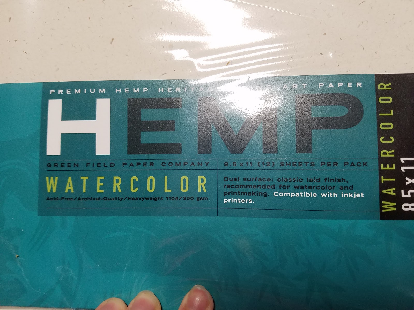
The Front Reads:
I have a feeling this paper is intended more for prints than for painting, but many of the Amazon reviews mention a difficulty in getting this paper to run through the printer. I tried on both my Canon Pixma Pro and my Dell toner printer- the Pixma Pro had no problem (but it has handled any paper I threw at it), the Dell couldn't pick it up.
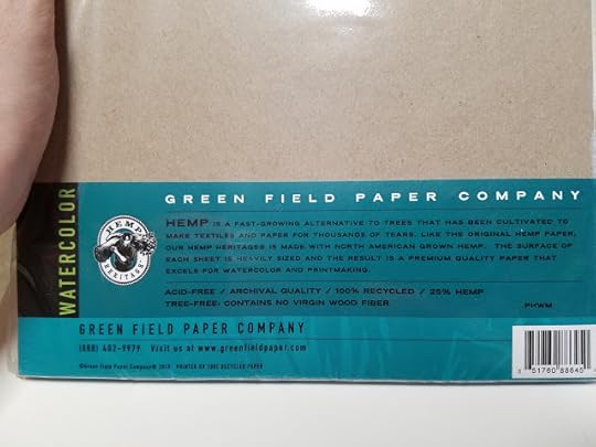
The Back Reads:
Initial Thoughts:

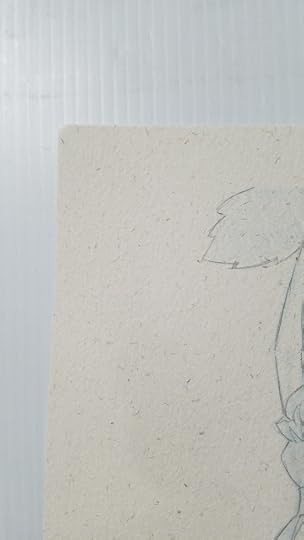
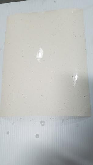
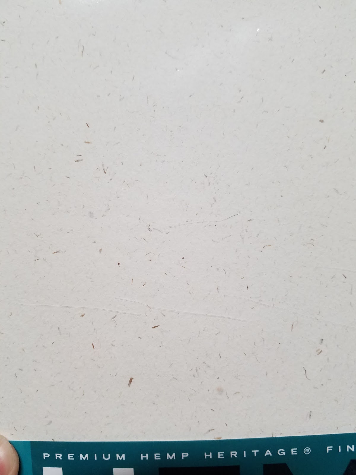
The paper is a light brown in color- quite a bit lighter than Kraft paper, and contains noticeable speckles- reminiscent of a handmade paper, but the paper's surface is very much a machine made paper- hardly any surface texture at all.
I ran this paper through my Canon Pixma Pro 9000 Mark II inkjet printer in order to print the bluelines and encountered no printing issues. That said, the Pixma Pro has never given me trouble with printing on heavier, 140lb watercolor papers, cotton rag papers, or Bristols, so it's not surprising that it could handle something only slightly heavier than most cover stock weights.
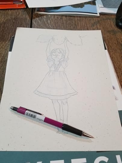
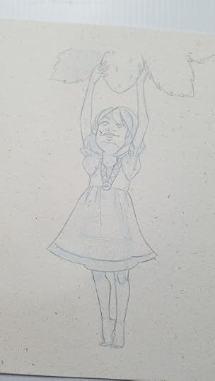
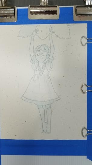
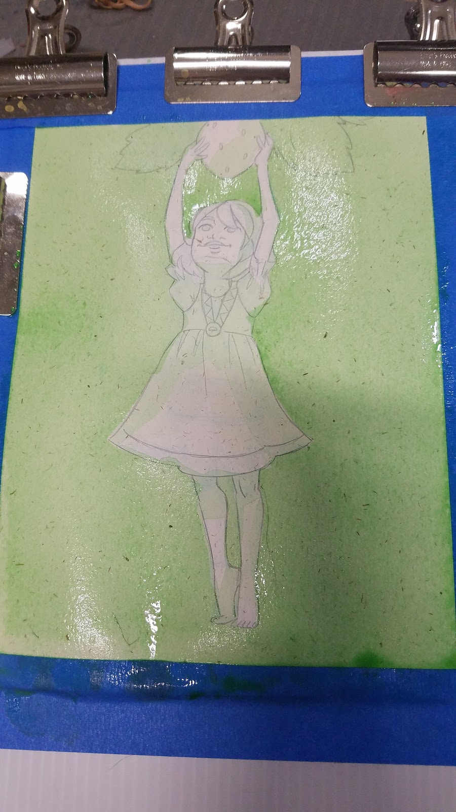
I encountered few issues with penciling either, but if you're like me and like to pencil with a mechanical pencil, beware of the speckles- they can catch on your pencil and tear the paper.
When stretching, the water seemed to stay on the surface, rather than soaking into the paper.
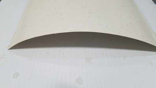
Which led to some buckling as I stretched this illustration.
This isn't that uncommon- the Hemp Heritage Watercolor Paper stretches like any cheap cellulose paper- moderately well and really benefits from the extra support.
Inkjet ink washes out quickly- I was concerned that it might stain the paper, as it has with some papers.
I allowed it to dry fully before applying my initial wash.
If you're enjoying this review of Hemp Heritage Watercolor paper, why not stick around and
located in the Watercolor Basics section? Head on over and check it out, and let me know what you think using the contact form! If there's a topic you'd like to see covered in Watercolor Basics, I'd love to know!
Field Test:
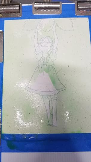
Initial wash didn't go as well as hoped- water sits on surface of the paper, ends up pooling and soaking under the tape.
Washes are somewhat difficult to control on this paper, perhaps due to the extra surface sizing.

When applying a wash, it handles like a very cheap cellulose paper- like Blick Studio watercolor paper.
Despite stretching, paper buckles and bounces like very cheap student grade, and absorbs the water like cardboard- in that water just pools on top.
When wet, everything blends out all over the place- like painting on chipboard or toilet paper, rather than watercolor paper. This reminds me of some other mixed content papers- sure, it blends like cotton rag, but it's difficult to control, like a temperamental cellulose.
This paper also takes A LONG time to dry once it's fully wet.
This paper does not lift easily- which is frustrating given this paper handles water strangely and large washes can be difficult to control.

Once painting begins to get tighter, paper handles a bit better. This is probably because we're not dealing with large amounts of water.
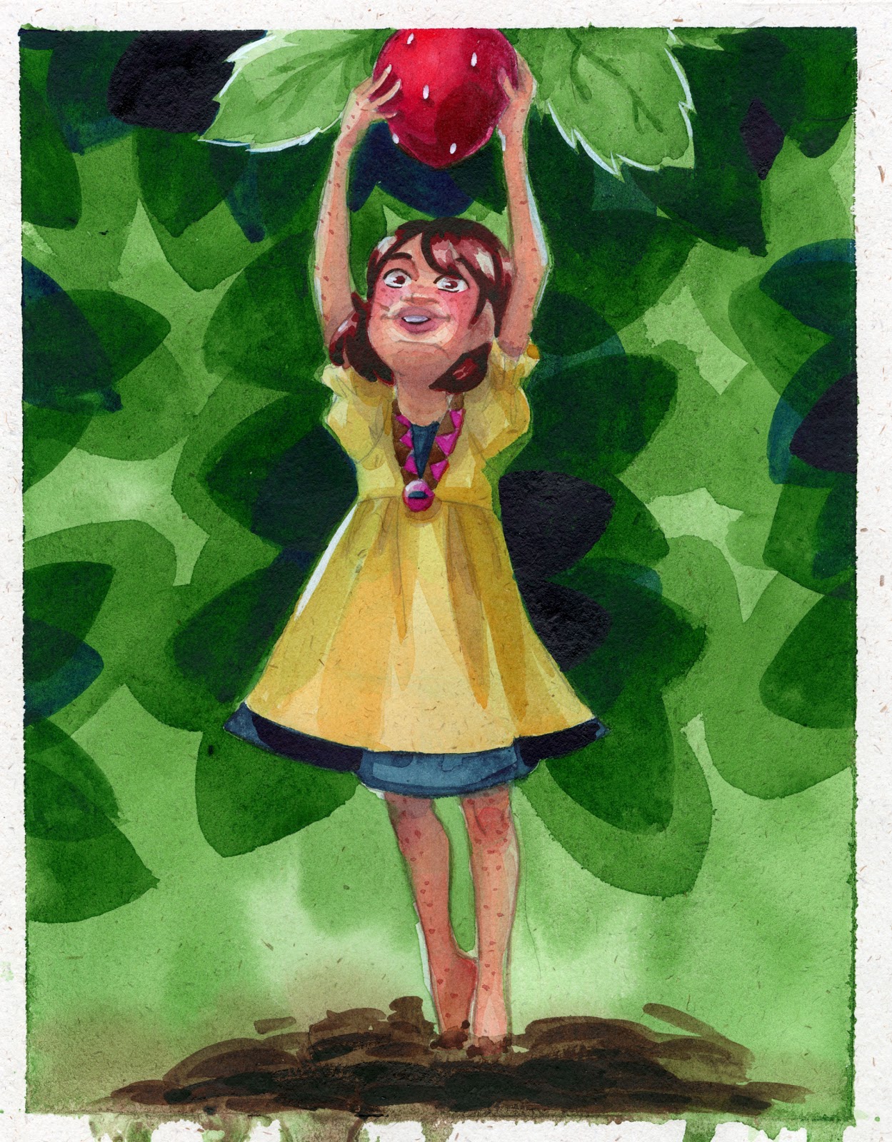
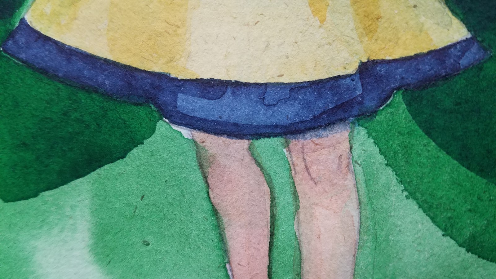
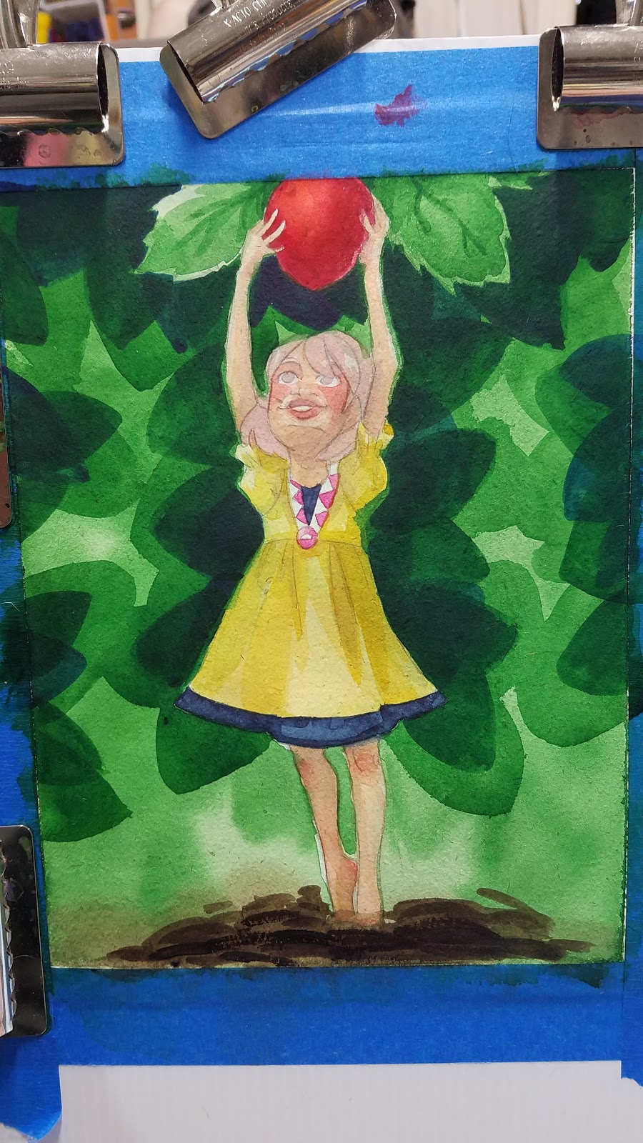
Randomized speckles (some are fairly large chunks) can interfere with small illustrations, comic pages, as they're fairly noticeable. There's a large chunk on Kara's face in this illustration.
Slight tone to paper is almost like painting on a toned paper, which can be fun- there aren't too many toned watercolor papers on the market. Unfortunately, the paper quality is like painting on construction paper.
As you can see, colors feather out wet into wet like they would on cotton rag paper.
Colors dry fairly muted and unimpressive.
You can see the white speckles coming through.
Although lifting is possible on this paper, it's not particularly effective.
With darker colors, weird white flecks appear after the color has dried.
As the painting progressed, I found it difficult to build up contrast with lighter colors, perhaps due to the fact that the paper itself was a natural midtone. For those of you who enjoy sketching on Strathmore's Toned Tan paper, you may enjoy this paper for color pencil work.
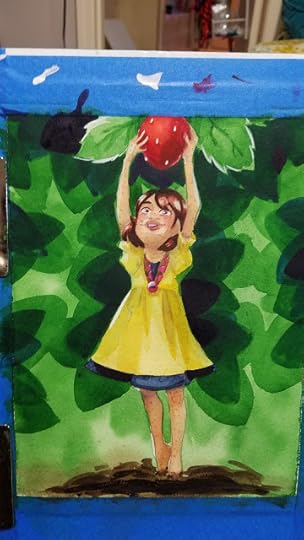

The finished, color corrected scan. Note the seepage at the bottom of the paper- initial washes didn't soak into the paper, just under the tape.
Enjoy my art? Why not check out my beautiful watercolor comic, 7" Kara, now available as a webcomic?

Hate cliffhangers? Pick up the first four chapters, plus a bonus comic, concept art, and additional illustrations from the Nattoshop! Grab Volume 1 today!
The Verdict:
No thanks.
Hemp Heritage watercolor is a pulpy paper that's no fun to paint on.
If you're interested in a 100% recycled watercolor paper for ethical reasons, this is an option, but if you're interested in an interesting watercolor paper with unique properties, this is not the paper for you.
Would I be interested in reviewing other hemp based watercolor papers? Sure! Especially the 100% hemp papers, which eliminates iffy recycled woodpulp.
Second Opinions and Outside Resources:
Moscow Printing Company GSM to lb conversion chart
Sympatico- Why Hemp Clothes Make Sense
Strathmore- Alternative Fibers
Watercolor Paper: Your Substrate of Choice
Will Kemp Art School- How to choose Watercolour Paper
Khadi Papers- About the Paper
Acadia Hemp- Shop Hemp Paper
Reviews on AmazonHenry Li's Supplementary Demo to Lesson 23: White Magnolia on Hemp Paper
Please consider donating to this blog or purchasing from Natto-shop (http://nattosoup.com/shop) if you want me to continue publishing quality content. All materials tested were purchased from my own pocket. Keep on Truckin' Nattosoup is not under any sponsorship.
I'm always interested in trying new things, especially in the world of watercolor. I've tried Yupo (for watercolor, for alcohol markers, and with Pitt Pens) a synthetic paper made from plastic, I've dabbled with a variety of watercolor papers, and I'm always swatching new watercolor sets. A couple years ago, I spotted Hemp Heritage Watercolor paper on Amazon and was intrigued. I've used plastic, cellulose based, and cotton rag papers, as well as papers that are a mix, but I've never used hemp papers.
Hemp is an interesting and intriguing fiber choice that may appeal to many artists. Those who are pro hemp claim that farming it remediates the soil and consumes excess C02, that hemp grows in a variety of climates and consumes little water (source). "Hemp is a sustainable, biodegradable, and durable material that can revolutionize these industries!" (source) that can be used for cloth, paper, and industrial products. Hemp is resistant to mould and mildew and is naturally microbial (source). Hemp grows rapidly and doesn't require pesticides in its production (source). Hemp fibers are more porous than other natural fibers (which might allow for faster dry times) (source). Hemp is extremely fast growing and '1 acre of Hemp produces as much paper as 4.1 acres of trees' (source). Combined with lower water usage, and no need for pesticide, hemp seems like an ideal choice, although the earth environmental scientist in me thinks these all points to hemp being an ideal invasive species. Although hemp papers aren't yet commonly available, a few are making their way onto the market, tempting artists like myself who are used to wood pulp and cotton.
Outside of the US, hemp papers are easier to find. Hemp grown for papermaking is specifically selected to have the highest fiber content and contains none of the active chemicals of other varieties of cannabis (source)
The inclusion of recycled fibers such as recycled wood pulp can make a hemp based paper less desirable for artist use, as it can affect the lifespan of the piece (source) by altering the archival qualities of the paper.
Green Field Paper Company 'creating eco-friendly papers with a purpose since 1992'. Their products include:
Grow a Note Plantable Seed PaperHemp Heritage PaperA Wedding CollectionCustom Plantable PromotionsHOliday Collection for both personal and corporateEnvelopes- plantable envelopes and hemp envelopesBusiness Cards100% recycled gift wrapand Custom Printing
Hemp Heritage Paper includes journals and sketchbooks, stationary and office, fine art papers and pads, blank cards, envelopes, and t-shirts, custom hemp products, and large format cartons and rolls.
Within their fine paper category, Green Field Paper offers Hemp Heritage Sketch Paper, Hemp Heritage Drawing Paper, and Hemp Heritage watercolor paper in two sizes-11"x14" and 8.5"x11", and in watercolor pads 18"x24", 8"x10", and 9"x12".
The Stats:
Acid FreeArchival Quality100% recycled material25% Hemp"No virgin wood fiber"12 sheets per package110# / 300 gsm- approx 140lb
Ok, so what IS this actually made from, if it's only 25% hemp and contains no 'virgin' (unrecycled) wood fiber?
The Green Field Paper company's site's answer to this is "25% Hemp, 75% Post Consumer, 100% Sustainable." which doesn't answer the question at all. The product page offers no insight as to what the remaining 75% is, but it goes on to promote hemp as a fantastic wood alternative.
I'm having difficulty getting a solid answer as to what 75% actually represents, but there are a few clues on the packaging that lead me to assume it's recycled paper pulp. The package brags that it contains no virgin wood fiber- this means unrecycled or first use woodpulp. Given how squirrely the packaging is, and how little information is available online as to the remaining 75%, I can only assume it's 75% recycled wood pulp.
Just say that, Green Field Paper Company.
You guys wouldn't believe how many cellulose based paper go out of their way to hide the fact that they're cellulose based, without claiming to be cotton rag. This is an important distinction and one that's important for a consumer and artist to know pre-purchase.
100% hemp watercolor paper does exist (https://www.thehempshop.co.uk/100-hem...), and given that it's fairly fibrous, and used in textiles, I can assume it handles somewhat like a cross between cotton rag and cellulose, although I haven't had the opportunity to try it out myself. Strathmore makes a hemp paper that is also 25% hemp, and 75% post consumer waste fibers.
Also Available on
EcoChoices
Reviews like this one require a significant amount of investment to write. Money, time, experience are all poured into these reviews, to help you find art supplies that are the right fit for your needs and your abilities. You can help ensure I'll continue reviewing art supplies by pledging $1 a month and joining my Artnerd community on Patreon.

Your monthly pledge is membership to my little community, where I share early access videos, backer exclusive reviews and tutorials, backer exclusive monthly sketchbooks, and artist resources and comics.
Not interested in a commitment, but still enjoy my work? Send me a tip via Ko-Fi.
The Packaging:
For an eco-friendly product, Hemp Heritage Watercolor Paper comes wrapped in shrink plastic, with a paper belly band- not so eco-friendly.
The Front Reads:
Premium Hemp Heritage Fine Art Paper
Hemp
Green Field Paper Company | 8.5x11 (12) sheets per pack
Watercolor
Acid-Free/Archival-Quality/Heavyweight 110#/300GSM
Dual surface: classic laid finish, recommended for watercolor and printmaking. Compatible with inkjet printers
I have a feeling this paper is intended more for prints than for painting, but many of the Amazon reviews mention a difficulty in getting this paper to run through the printer. I tried on both my Canon Pixma Pro and my Dell toner printer- the Pixma Pro had no problem (but it has handled any paper I threw at it), the Dell couldn't pick it up.

The Back Reads:
Green Field Paper CompanyGiven what we recently learned about recycled pulp changing the quality of the paper and reducing its lifespan, I wonder what was added back in to reduce the paper's pH and help make it more archival.
Hemp is a fast-growing alternative to trees that has been cultivated to make textiles and paper for thousands of years. Like the original hemp paper, our Hemp Heritage is made with North American Grown hemp. The surface of each sheet is heavily sized and the result is a premium quality paper that excels for watercolor and printmaking.
Acid-free/ Archival Quality / 100% Recycled / 25% Hemp / Tree-Free: Contains no Virgin Wood Fiber
Green Field Paper Company
Initial Thoughts:
The paper is a light brown in color- quite a bit lighter than Kraft paper, and contains noticeable speckles- reminiscent of a handmade paper, but the paper's surface is very much a machine made paper- hardly any surface texture at all.
I ran this paper through my Canon Pixma Pro 9000 Mark II inkjet printer in order to print the bluelines and encountered no printing issues. That said, the Pixma Pro has never given me trouble with printing on heavier, 140lb watercolor papers, cotton rag papers, or Bristols, so it's not surprising that it could handle something only slightly heavier than most cover stock weights.


I encountered few issues with penciling either, but if you're like me and like to pencil with a mechanical pencil, beware of the speckles- they can catch on your pencil and tear the paper.


When stretching, the water seemed to stay on the surface, rather than soaking into the paper.

Which led to some buckling as I stretched this illustration.

This isn't that uncommon- the Hemp Heritage Watercolor Paper stretches like any cheap cellulose paper- moderately well and really benefits from the extra support.
Inkjet ink washes out quickly- I was concerned that it might stain the paper, as it has with some papers.
I allowed it to dry fully before applying my initial wash.

If you're enjoying this review of Hemp Heritage Watercolor paper, why not stick around and

located in the Watercolor Basics section? Head on over and check it out, and let me know what you think using the contact form! If there's a topic you'd like to see covered in Watercolor Basics, I'd love to know!
Field Test:

Initial wash didn't go as well as hoped- water sits on surface of the paper, ends up pooling and soaking under the tape.

Washes are somewhat difficult to control on this paper, perhaps due to the extra surface sizing.
When applying a wash, it handles like a very cheap cellulose paper- like Blick Studio watercolor paper.
Despite stretching, paper buckles and bounces like very cheap student grade, and absorbs the water like cardboard- in that water just pools on top.


When wet, everything blends out all over the place- like painting on chipboard or toilet paper, rather than watercolor paper. This reminds me of some other mixed content papers- sure, it blends like cotton rag, but it's difficult to control, like a temperamental cellulose.
This paper also takes A LONG time to dry once it's fully wet.


This paper does not lift easily- which is frustrating given this paper handles water strangely and large washes can be difficult to control.


Once painting begins to get tighter, paper handles a bit better. This is probably because we're not dealing with large amounts of water.


Randomized speckles (some are fairly large chunks) can interfere with small illustrations, comic pages, as they're fairly noticeable. There's a large chunk on Kara's face in this illustration.
Slight tone to paper is almost like painting on a toned paper, which can be fun- there aren't too many toned watercolor papers on the market. Unfortunately, the paper quality is like painting on construction paper.
As you can see, colors feather out wet into wet like they would on cotton rag paper.

Colors dry fairly muted and unimpressive.

You can see the white speckles coming through.

Although lifting is possible on this paper, it's not particularly effective.
With darker colors, weird white flecks appear after the color has dried.


As the painting progressed, I found it difficult to build up contrast with lighter colors, perhaps due to the fact that the paper itself was a natural midtone. For those of you who enjoy sketching on Strathmore's Toned Tan paper, you may enjoy this paper for color pencil work.


The finished, color corrected scan. Note the seepage at the bottom of the paper- initial washes didn't soak into the paper, just under the tape.
Enjoy my art? Why not check out my beautiful watercolor comic, 7" Kara, now available as a webcomic?

Hate cliffhangers? Pick up the first four chapters, plus a bonus comic, concept art, and additional illustrations from the Nattoshop! Grab Volume 1 today!
The Verdict:
No thanks.
Hemp Heritage watercolor is a pulpy paper that's no fun to paint on.
If you're interested in a 100% recycled watercolor paper for ethical reasons, this is an option, but if you're interested in an interesting watercolor paper with unique properties, this is not the paper for you.
Would I be interested in reviewing other hemp based watercolor papers? Sure! Especially the 100% hemp papers, which eliminates iffy recycled woodpulp.
Second Opinions and Outside Resources:
Moscow Printing Company GSM to lb conversion chart
Sympatico- Why Hemp Clothes Make Sense
Strathmore- Alternative Fibers
Watercolor Paper: Your Substrate of Choice
Will Kemp Art School- How to choose Watercolour Paper
Khadi Papers- About the Paper
Acadia Hemp- Shop Hemp Paper
Reviews on AmazonHenry Li's Supplementary Demo to Lesson 23: White Magnolia on Hemp Paper
Please consider donating to this blog or purchasing from Natto-shop (http://nattosoup.com/shop) if you want me to continue publishing quality content. All materials tested were purchased from my own pocket. Keep on Truckin' Nattosoup is not under any sponsorship.
September 14, 2017
Masking Frisket and Markers: An Easy Tutorial to Up Your Art Game
Earlier this month, I shared an overview of masking techniques for alcohol markers. I covered several techniques briefly, but wanted to share my most used technique, which involves adhesive masking frisket, in more detail.

This technique has been used multiple times on the Nattosoup Studio Youtube Channel and allows me to mask larger, or more intricate areas quickly and easily. It can be used at the beginning of the marker process or at any point during, and only really requires one specialty product- the frisket itself.
Materials Needed:Masking Frisket (I'm using Grafix Masking Frisket)The Piece You Wish to Mask
Materials Recommended:Permanent Marker (fine tip, ideally)Rubbing AlcoholPaper towelsXActo BladeCutting mat or scrap chipboard (like the back of a sketchbook)Light table or light pad (if you don't have one, and would use it rarely, Crayola makes a decent little light box. I haven't tested this one yet, but it also looks promising)
Masking Frisket is also used by airbrush artists, and is a great technique if you enjoy using aerosolized inks like the Copic Airbrush System (link), or other alcohol marker airbrush options like the Ranger (link) or the (link), or if you enjoy using alcohol inks in misters or straight from the bottle, as well as if you enjoy using Copic Wides to lay down areas of color. I do not recommend using this type of frisket for watercolors, as water reacts with the adhesive and leaves a residue that is difficult to remove.
How to Use Masking Frisket with Markers
If you enjoy alcohol marker tutorials like this, please consider supporting me on Patreon. Your $1 a month pledge helps support the work I do here and on Youtube, and grants you early access to tutorials and reviews, as well as backer exclusives like art assets, monthly sketchbooks, and so much more. Weekly I release Backer Newsletters that compile everything released that week in one place- news, notable Storify stories, early access and backer exclusives, public posts, and 7" Kara updates.
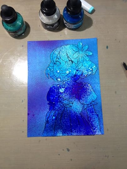
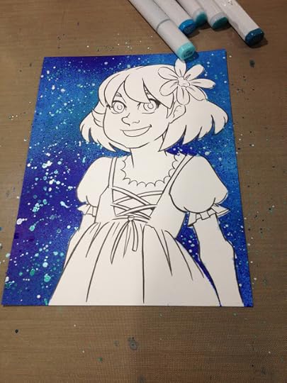
Tutorial: Using Brusho Watercolors with Alcohol Markers
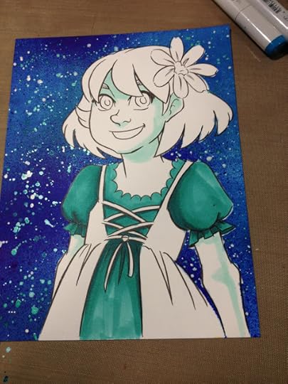
Masking frisket can be used at multiple stages of your marker process. Here you see an early application of masking frisket to mask Kara off from the background. In this photo, I've already applied a layer of alcohol ink (via spray) and am preparing to apply a layer of flicked acrylic ink.
You can see how well the masking frisket protects the masked area in the photo below, where the masking frisket has been removed.
From this point on, I used a reverse mask- I masked everything but a small area of the image, and applied Brusho and water. The bubbling you see in the frisket is just the result of lazy application- once I secured the areas adjacent to the area I wanted to apply Brusho to, ensuring a seal, the rest is just for cover. You could get a similar result, and waste less frisket, if you simply traced the area you want to mask, created
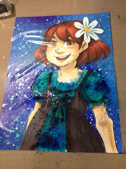
Unfortunately, masking frisket plus water is a bad combination. The water seeps under the plastic and reacts with the adhesive leaving a sticky residue on the paper.

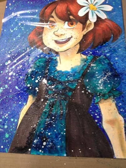
Since there was seepage along her neck, I used Copic Opaque white to cover the blue, then went over it with Copic Marker to better blend it in.
Although the blue is still somewhat visible, the correction job is an improvement over the seepage.
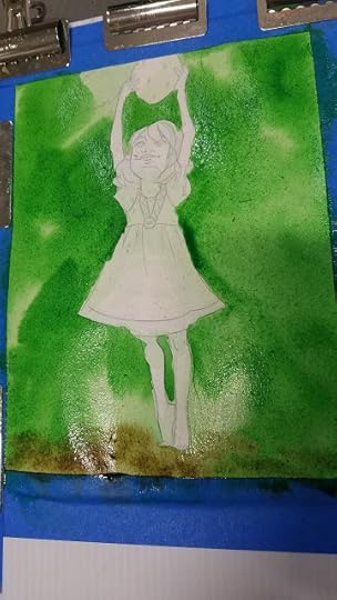
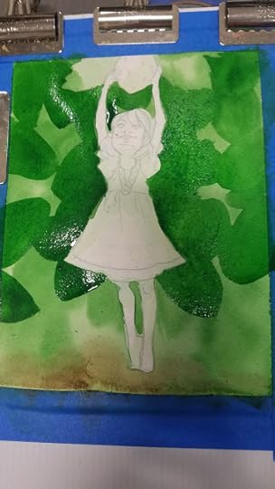
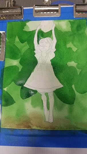
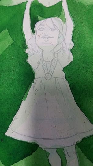
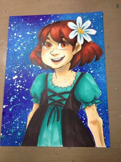
In the below example, I use masking frisket to protect a finished figure from the background. Given Brusho's staining properties, I saved the background for the end rather than risk ruining my markers.
ArtSnacks June 2016 Challenge
Other Pieces that Utilized Masking Frisket
 Finished Artsnacks challenge piece shown in above video. Mixed media.
 Alcohol markers and alcohol spray inks.
 Spectrum Aqua watercolor markers. Dye based.
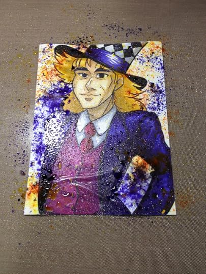
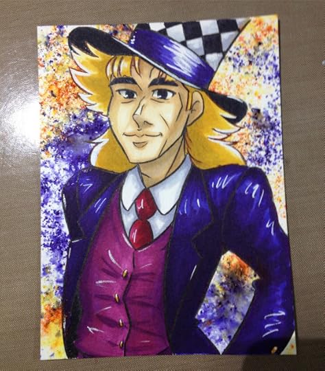
 Alcohol markers, Copic Opaque White, Spray alcohol inks.
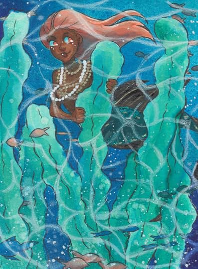
 Alcohol Markers, Brusho
Alcohol Markers, Spray Alcohol Inks, Acrylic Inks
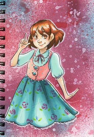
 Alcohol Markers, Color Pencils, Spray Alcohol Inks
If you enjoy my art, make sure you check out my comic, 7" Kara, now available as a webcomic!

You can read 7" Kara at 7inchkara.com or 7inchkara.tumblr.com, or order the first volume through the Nattoshop.
Please consider donating to this blog or purchasing from Natto-shop (http://nattosoup.com/shop) if you want me to continue publishing quality content. All materials tested were purchased from my own pocket. Keep on Truckin' Nattosoup is not under any sponsorship.
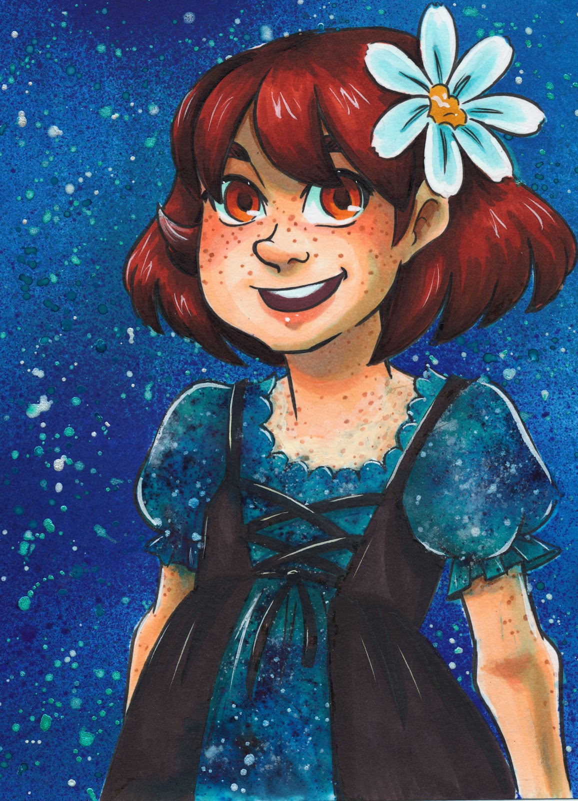
This technique has been used multiple times on the Nattosoup Studio Youtube Channel and allows me to mask larger, or more intricate areas quickly and easily. It can be used at the beginning of the marker process or at any point during, and only really requires one specialty product- the frisket itself.
Materials Needed:Masking Frisket (I'm using Grafix Masking Frisket)The Piece You Wish to Mask
Materials Recommended:Permanent Marker (fine tip, ideally)Rubbing AlcoholPaper towelsXActo BladeCutting mat or scrap chipboard (like the back of a sketchbook)Light table or light pad (if you don't have one, and would use it rarely, Crayola makes a decent little light box. I haven't tested this one yet, but it also looks promising)
Masking Frisket is also used by airbrush artists, and is a great technique if you enjoy using aerosolized inks like the Copic Airbrush System (link), or other alcohol marker airbrush options like the Ranger (link) or the (link), or if you enjoy using alcohol inks in misters or straight from the bottle, as well as if you enjoy using Copic Wides to lay down areas of color. I do not recommend using this type of frisket for watercolors, as water reacts with the adhesive and leaves a residue that is difficult to remove.
How to Use Masking Frisket with Markers
If you enjoy alcohol marker tutorials like this, please consider supporting me on Patreon.
 Your $1 a month pledge helps support the work I do here and on Youtube, and grants you early access to tutorials and reviews, as well as backer exclusives like art assets, monthly sketchbooks, and so much more. Weekly I release Backer Newsletters that compile everything released that week in one place- news, notable Storify stories, early access and backer exclusives, public posts, and 7" Kara updates.
Tutorial: Using Brusho Watercolors with Alcohol Markers
Masking frisket can be used at multiple stages of your marker process. Here you see an early application of masking frisket to mask Kara off from the background. In this photo, I've already applied a layer of alcohol ink (via spray) and am preparing to apply a layer of flicked acrylic ink.
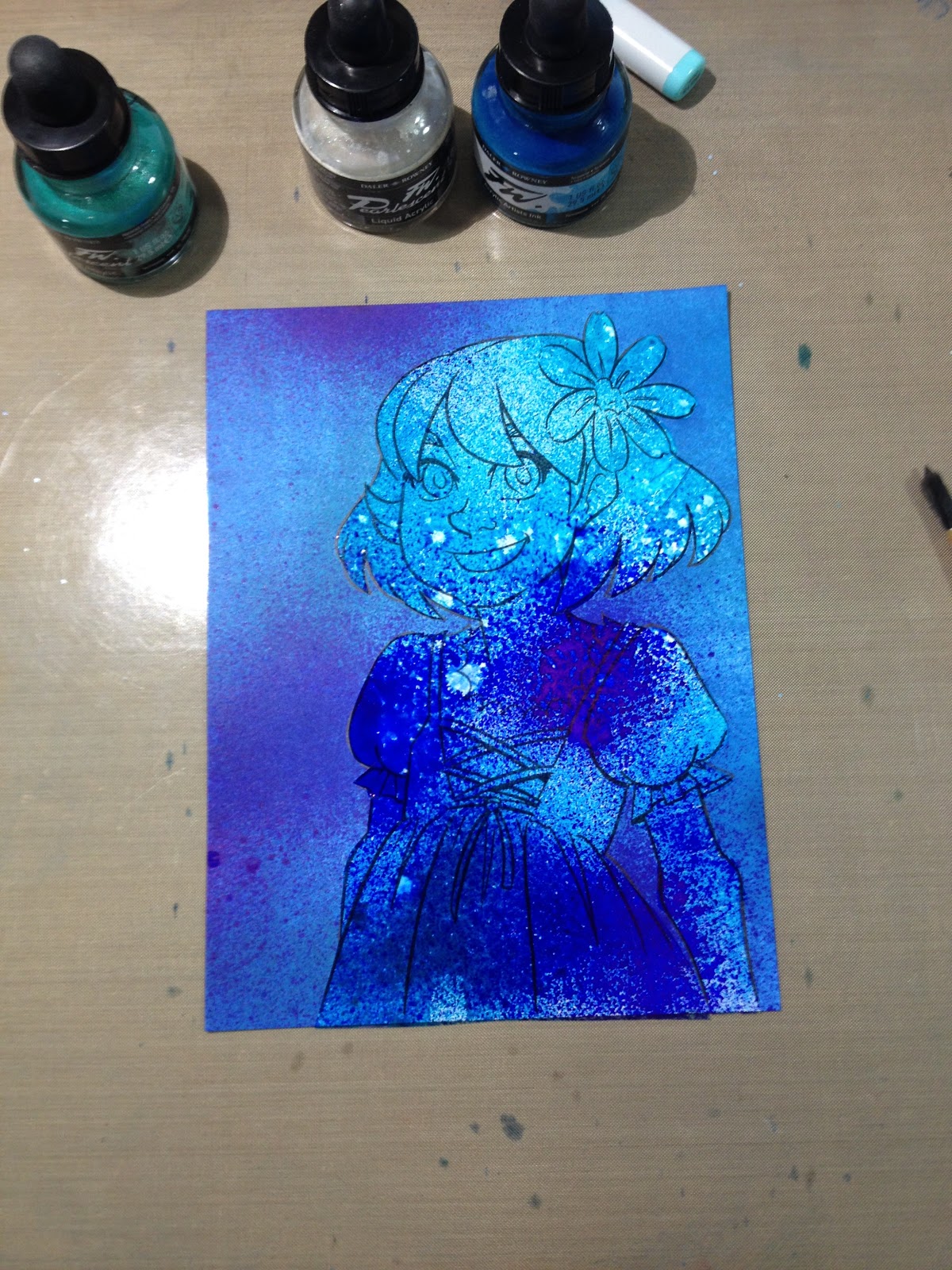
You can see how well the masking frisket protects the masked area in the photo below, where the masking frisket has been removed.

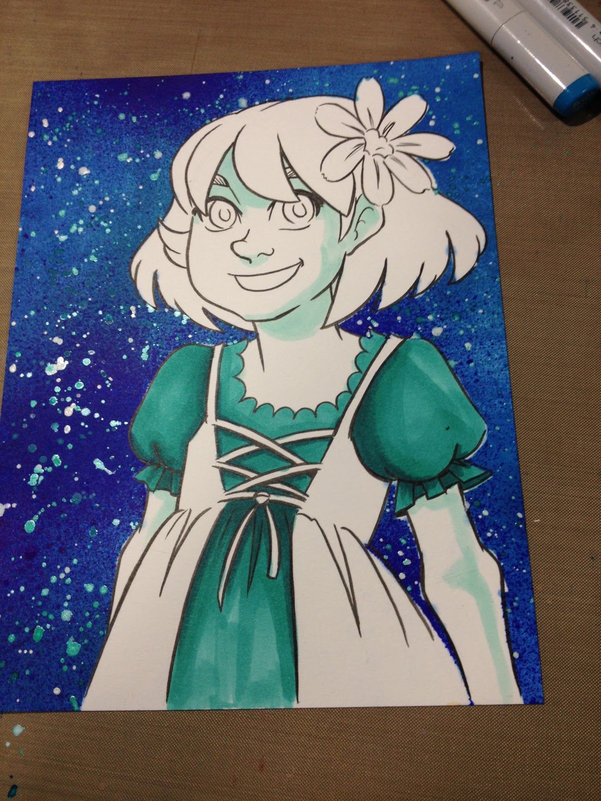
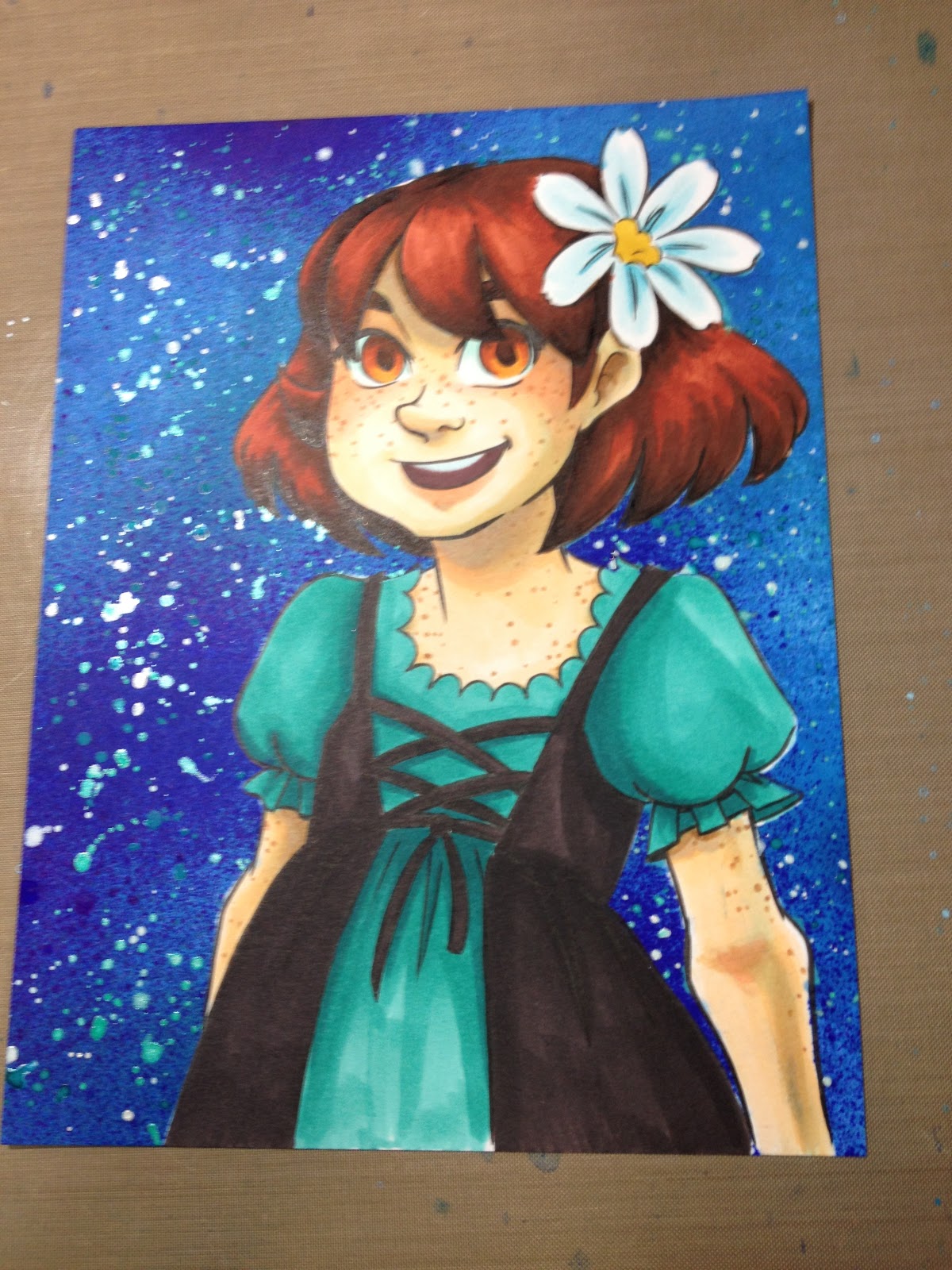
From this point on, I used a reverse mask- I masked everything but a small area of the image, and applied Brusho and water. The bubbling you see in the frisket is just the result of lazy application- once I secured the areas adjacent to the area I wanted to apply Brusho to, ensuring a seal, the rest is just for cover. You could get a similar result, and waste less frisket, if you simply traced the area you want to mask, created
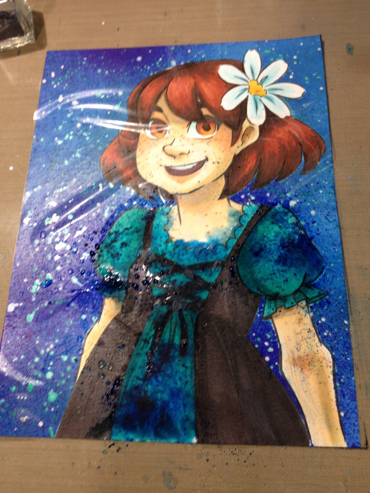

Unfortunately, masking frisket plus water is a bad combination. The water seeps under the plastic and reacts with the adhesive leaving a sticky residue on the paper.
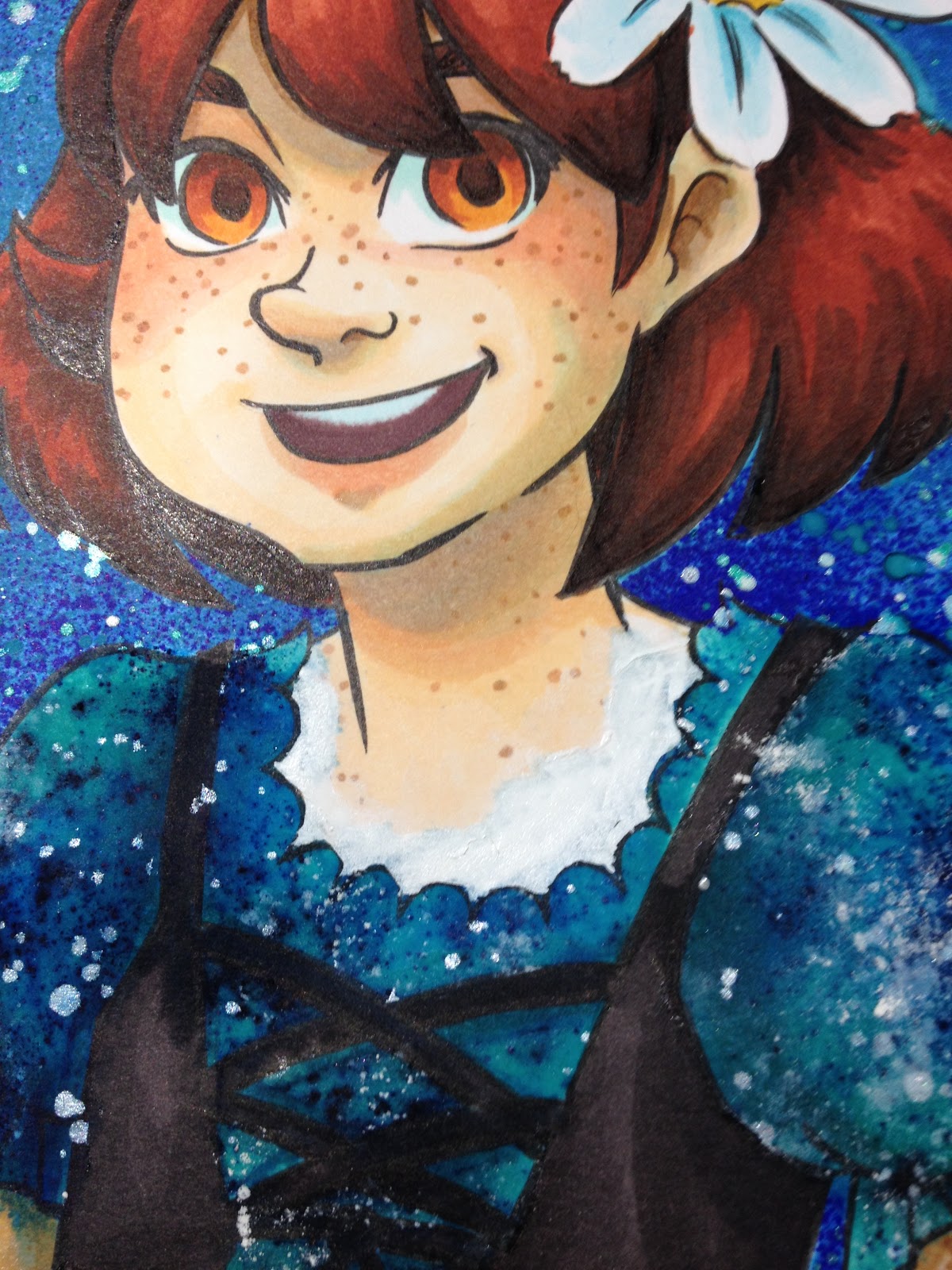
Since there was seepage along her neck, I used Copic Opaque white to cover the blue, then went over it with Copic Marker to better blend it in.


Although the blue is still somewhat visible, the correction job is an improvement over the seepage.
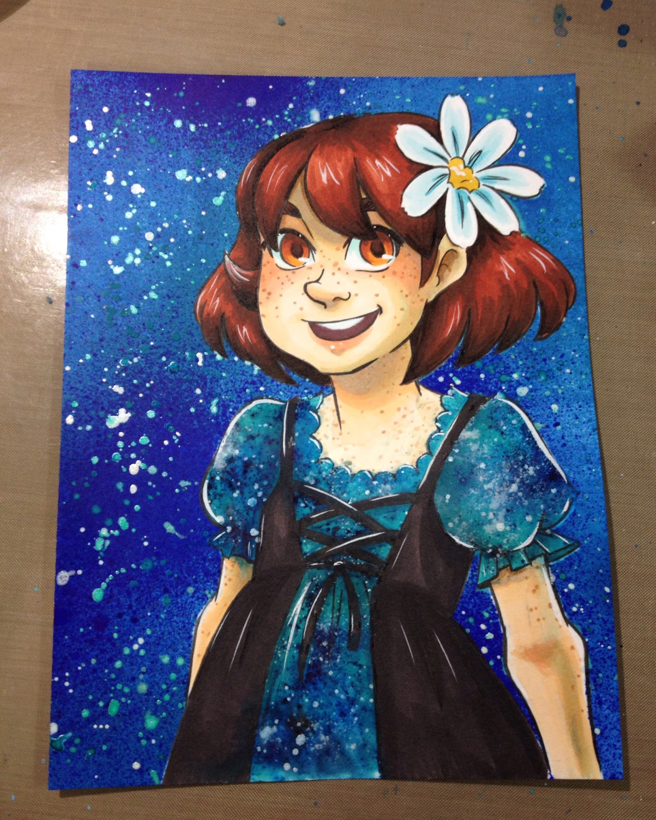

In the below example, I use masking frisket to protect a finished figure from the background. Given Brusho's staining properties, I saved the background for the end rather than risk ruining my markers.
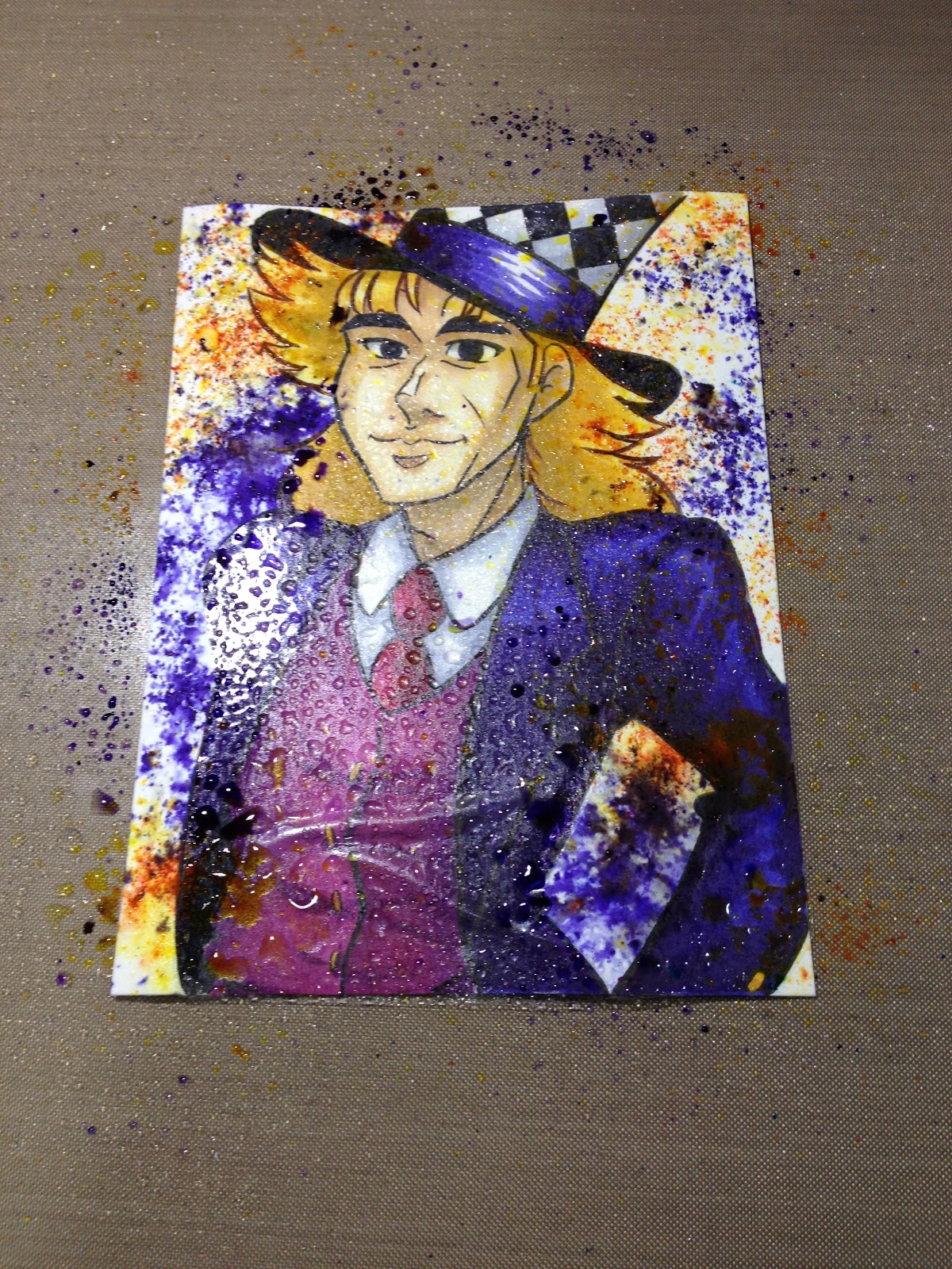

ArtSnacks June 2016 Challenge
Other Pieces that Utilized Masking Frisket
 Finished Artsnacks challenge piece shown in above video. Mixed media.
 Alcohol markers and alcohol spray inks.
  Spectrum Aqua watercolor markers. Dye based.
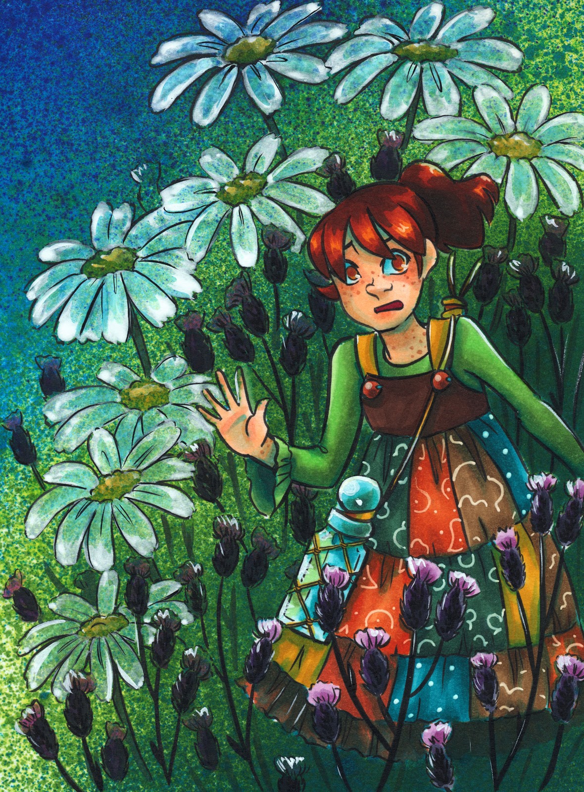 Alcohol markers, Copic Opaque White, Spray alcohol inks.
 Alcohol Markers, Brusho
Alcohol Markers, Spray Alcohol Inks, Acrylic Inks
Alcohol Markers, Brusho
Alcohol Markers, Spray Alcohol Inks, Acrylic Inks Alcohol Markers, Color Pencils, Spray Alcohol Inks
If you enjoy my art, make sure you check out my comic, 7" Kara, now available as a webcomic!

You can read 7" Kara at 7inchkara.com or 7inchkara.tumblr.com, or order the first volume through the Nattoshop.
Please consider donating to this blog or purchasing from Natto-shop (http://nattosoup.com/shop) if you want me to continue publishing quality content. All materials tested were purchased from my own pocket. Keep on Truckin' Nattosoup is not under any sponsorship.
September 10, 2017
Hurricane Harvey Relief Commissions
As you guys might know, I'm originally from Luling, Louisiana, which is just 40 minutes shy of New Orleans across the Mississippi River. During Hurricane Katrina 12 years ago, I evacuated to Orange, TX, and watched in terror as the storm decimated New Orleans and the surrounding metropolitan area. Last week, I returned to Luling to visit my family, and again watched in horror as Hurricane Harvey flooded Houston and the surrounding cities, including Orange, TX.
For those of you who follow me on Twitter, you've seen me become very vocal about Hurricane Harvey news and ways to help those afflicted. I'll never forget Hurricane Katrina, and Harvey was a frightful reminder of how dangerous and unpredictable hurricanes are.
I'm currently offering a special $15+ commission to raise money for Hurricane Harvey (and sadly, possibly Hurricane Irene) relief. If you send me a screenshot of your donation to the H. Harvey relief organization of your choice, I'll create a custom avatar for you. These commissions will be in detailed chibi style, and are bust up. Screenshots can be submitted via email (becca.hillburn@gmail.com) Twitter (@Nattosoup), or Instagram (@Nattosoup), and commissions will be completed ASAP. You can also request multiples (say, all your kids, all your pets, you and your friends) for a $50+ donation.
Your $15+ donation will get you one character/person/pet/portrait. If you'd like a group commission, donate $50+ to the Hurricane Harvey relief organization of your choice.
You can choose between traditional:
 Kuretake Clean Color Real Brush Markers (waterbased)
 Alcohol Marker
Or digital:


If I get enough Hurricane Harvey Relief commissions, I'll host a special commission stream.
These commissions make great Twitter, Facebook, G+, or Instagram avatars, and can also be used as forum and Discord avatars. Get great art (at least a $25 value per commission) and support a great cause at the same time!
I plan on hosting other H. Harvey relief fundraisers, but those are still in the works, and this is a great time to grab an in expensive commission while helping those in need.
Don't have an organization in mind? Check out these resources:
United Way of Houston: https://www.unitedwayhouston.org/flood
National Voluntary Organizations Active in Disaster: https://www.nvoad.org/hurricane-harve...
NYT: Where to Donate to Harvey Victims: https://t.co/6MjxRt76oj
I realized that companies often do donations after a hurricane, so I've written to a few to see if they will. If you can't afford to send donations, contacting companies on behalf of Harvey evacuees may make a difference.
Companies I've contacted:
https://shop.crayola.com/on/demandwar...
Huggies: https://www.huggies.com/en-us/contact-us (re diaper donations: http://www.houstondiaperbank.org/)
Gerber: https://www.gerber.com/contact-us/ema...
CocaCola: https://us.coca-cola.com/help/message/
Would CocaCola please consider donating Dasani bottled water to those who are without clean water in the aftermath of Hurricane Harvey?
@Shell_US: Would Shell consider donating gas or funds to those risking their lives to help with Hurricane Harvey relief and rescue?
It can be difficult to contact Shell Oil easily, but if you can find an address, please consider sending this:
In the aftermath of Hurricane Harvey, would Shell please consider donating gasoline and diesel fuel to the brave first responders in the Cajun and Redneck Navy? They're rescuing people in airboats and other small personal craft, and are paying out of pocket for the gasoline. As you know, the Gulf Coast is currently experiencing a gas crisis with Houston out of commission so the donation of gasoline or funds would be a huge help.
I'm going to host a fundraiser auction in a couple weeks, probably through YouCaring, with 100% of the proceeds going to Hurricane Harvey Disaster Relief, so please keep an eye out for that as well.
Please consider donating to this blog or purchasing from Natto-shop (http://nattosoup.com/shop) if you want me to continue publishing quality content. All materials tested were purchased from my own pocket. Keep on Truckin' Nattosoup is not under any sponsorship.
September 7, 2017
Review: Cotman Watercolors: Watercolor Basics
Over the years, I've given Cotman watercolors a lot of shade. I've snarked about them, snubbed them, used Cotman as the butt of jokes. Sure, I've used Cotman watercolors, but I vastly preferred Winsor and Newton's professional line of watercolors, and nixed the Cotman as soon as funds were available. But are Cotman watercolors really all that bad?
Since I last used Cotman watercolors, I've reviewed a lot of...student grade...watercolors for this blog and on the Nattosoup Studio Youtube channel.
And Cotman came up, and kept coming up, during the five day long watercolor intensive chats I hosted on Twitter. You can check out my Storify if you missed those. While many watercolorists who chimed in had long since replaced their Cotmans with something more professional, a few held steadfast to their pans, and wondered what was so awful about Cotman?
Chagrined, I recorded a special swatchoff video for my Patrons comparing Cotman, Winsor and Newton professional watercolors, and Daniel Smith watercolors, and offered to do a field test, should my Patrons desire it. Of course, they did.
Wanna check out that Swatchoff video? Join the Artnerd community on Patreon today, and gain access not only to that swatchoff, but loads of Early Access videos, backer exclusive content, and even comics and art resources.
For just $1 a month, you can join the community, help support this blog, and get the inside scoop early!
Cotman has several sets available, many of which utilize the same palette box as many Winsor and Newton professional sets, which can cause some confusion when selecting a set. There are nine iterations of Cotman half pan watercolor sets:
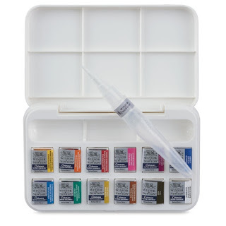 Cotman Brush Set
 Compact Set
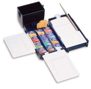 Field Box Set
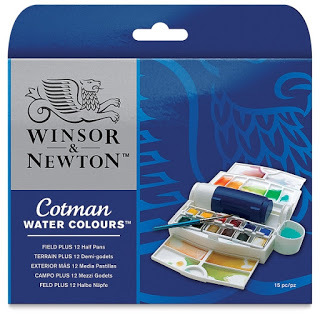 Field Plus Travel Set
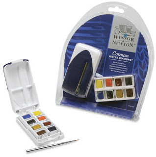 Mini Watercolor Set
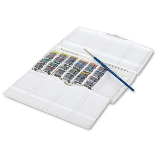 Painting Plus Set of 24
 Pocket Plus Travel Set
 Sketchers Pocket Box Set
 Travel Bag Set
All images were grabbed from DickBlick, for the purposes of education and review. For detailed information about each set, please visit DickBlick's Cotman listing.
The set used in this review the Pocket Plus Set, is still available, but its not the most common iteration of Cotman field sets. I see the Sketchers Pocket Box Set far more often, as well as the Field Plus Travel Set.
There are also tube Cotman sets, which I have not tried, although I have used individual Cotman tubes in the past.
The Skinny on Cotman
The Stats:
The Site40 available colors$26.35 for the Field Plus Travel set on Dick Blick$2.77 for 8ml tube on DickBlick
Cotman is designed and marketed as an affordable range of watercolor and watercolor accessories. This includes papers, tube and half pan watercolors, and synthetic watercolor brushes. The most commonly used binder is gum arabic, followed by dextrine (in my field test video, I wrongly attributed this to glycerin). All of the colors in the Cotman range are Series 1, the least expensive series offered by Winsor and Newton. Most have a permanency rating of A, but a few have a rating of AA. AA is extremely permanent, A is permanent, and B is moderately durable Many Cotman colors are single pigment, but quite a few have two, and even up to three pigments in the mix.
For comparison, Winsor and Newton Professional Water Colours do not have their binders listed and range from Series 1 (inexpensive) to 4 (most expensive), and include several convienance mixes in their range. The Professional colors also range from B-AA in permanence. The professional line also has a lower ratio of multi pigment to single pigment colors than the Cotman line.
For all Winsor and Newton paints, the label will tell you the permanence, opacity, and pigments used for that color.
Of the 50 available colors, 12 colors in the Cotman range are hues. Hues are not necessarily bad- they are often replacements for more toxic pigments (like cadmiums), but the color will not be the same as the one it's replacing. Hues are also used to replace expensive pigments, bringing the overall cost of the paints down. This substitution is very common in student grade watercolors.
Source: To Hue or Not to Hue
Swatches:
 Right: Winsor and Newton, Left: Cotman
Swatched on Fabriano cotton rag watercolor paper
The colors included in the Pocket Plus Travel Set:
Alizarin Crimson Hue
Burnt Sienna
Burnt Umber
Cadmium Red Pale Hue
Cadmium Yellow Hue
Cadmium Yellow Pale Hue
Chinese White
Cobalt Blue Hue
Sap Green
Ultramarine
Viridian Hue
Yellow Ochre
The Field Test:
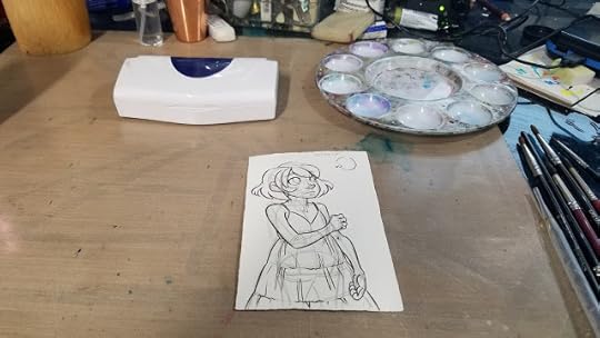
This field test was completed on Fabriano cotton rag watercolor paper. It was inked with a Sailor Mitsuo Aida brushpen.
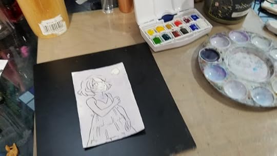
The paper was simply attached to a support via folded over blue painters tape attached at the top and bottom of the paper.
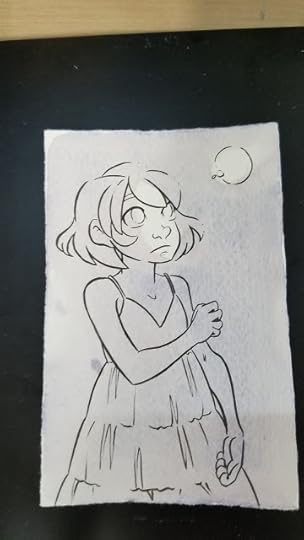
I wanted a dark blue or black for the background, but the Cotman set has neither available, and nothing that immediately presents itself as an option. I ended up mixing both blues, the cooler red, the darker brown, and probably a yellow (to neutralize) to get my initial background wash.
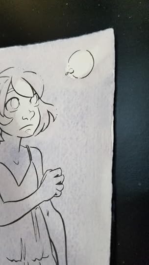
As you can see here, some of the colors in the mix are already sedimenting out.
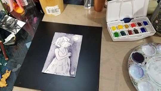
When that dried, it was obviously not dark enough, so I continued to mix, match, and layer.

It really takes A LOT of paint (and mixing) to get darker colors with this particular Cotman set.
As I mixed, I wondered who this selection of colors was intended for? A portrait artist? A landscape artist? It's labeled as a Field and Travel set, but the green and brown options are too weak for that, and it lacks a cool blue like a pthalo blue or an indigo.
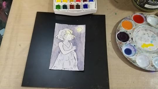
At this stage, I began introducing a glow effect using the cooler yellow.
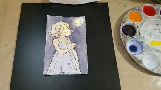
Mixing Kara's skintone should have been straightforward- yellow ochre+scarlet red is my go to combination for Caucasian skintones. Unfortunately, both colors are fairly weak, even after activation, so it took A LOT of paint to get her base skintone down.
After mixing up Kara's skintone, I moved on to her hair. I usually use a convienance color- Venetian Red, as my base, but opted for burnt sienna in this instance. Cotman's burnt sienna is incredibly weak- it really takes a lot of paint to achieve a passable color saturation.

Even working directly from the pan, as shown above, with very little additional water, the color is still quite weak.
I also mixed up a shadow color for Kara's skin. My default is permanent mauve+napthol red, but I'll settle for red violet in a pinch. If you need to mix your own, cool red+cool blue will work in instances such as this.
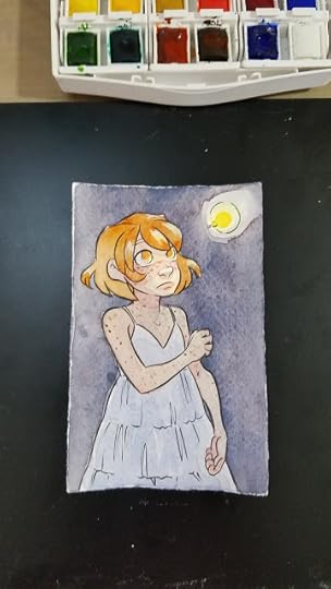
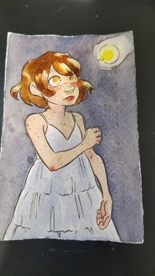
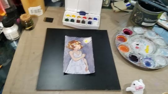
At this point, I knew I needed to build up contrast with the background, as everything was too similar in saturation and tone, so I decided to do another layer of wash in the background. I mixed the wash fairly saturated, and it still goes down weak, chalky, and muddy.
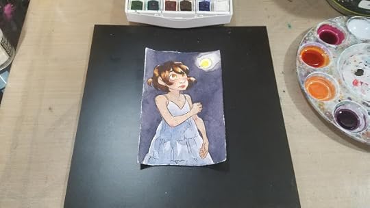
I stepped away from the evening, and allowed the water in my wells to evaporate a little bit.

The next morning, I tightened up a few things- another layer of skincolor with the evaporated mix, another layer of skin shadow with the evaporated mix, tighter details on the firefly, and even some Chinese white in lieu of gouache.

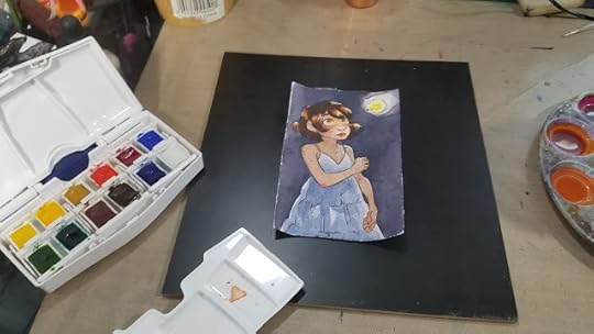
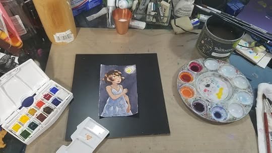
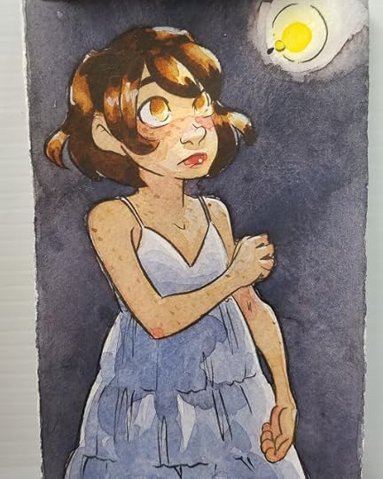
If you like my art, why not check out my beautiful watercolor comic, 7" Kara?

You can read it free online at 7inchkara.com, or get the first four chapters, a bonus comic, and a beautiful concept section from the Nattoshop.
7" Kara is a charming all ages comic that follows the adventures of Lilliputian Kara as she explores the outside world and makes new friends.
Swatches on Dark Paper
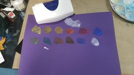

The Verdict:
ChalkyColor separation from blendsDifficult to mix darker colorsColors are mutedPaints feel soapy
Not the worst available, but pretty mediocre for the price. There are better options in that pricerange that will give you better results.
In Jana Bouc's review of Cotman watercolors, she mentions emptying her pans by soaking, and being left with colored water and a lot of white sediment. She does this to salvage the palette itself, which is a fairly nice palette, and well worth reusing. My first thought was 'gross', but I can't help but wonder if we would see a similar result with the Professional pans as well. I'm not rich enough to try it, but if anyone is willing to sacrifice a half pan of each for SCIENCE! let me know!
But Becca, Cotman is Student Grade!
I realize that in some ways, it's unfair to compare Cotman watercolors to Winsor and Newton Professional Watercolors, despite retailers claiming Cotman is held to the same exacting standards. After all, Cotman is...student grade, and Winsor and Newton Professional is...professional grade. That's why, for the majority of this review, I opted NOT to compare Cotman to Winsor and Newton Professional in a side by side comparison- hence the field test.
There are plenty of student grade watercolors on the market, and honestly, most perform similarly to Cotman. This can cause a lot of frustration- many beginner watercolorists have turned away from watercolor because they're trying to replicate professional results with student watercolors. They've been told from the start that it's a poor artist who blames their materials, so they naturally assume the reason they have difficulty mixing colors, or colors separate out, or paints handle more like soap than paint is due to user error. They lack the experience and the guidance to know that Student Grade is code for 'cheap, affordable'
Love watercolor? Why not take my free watercolor course?
Check out my Watercolor Basics series for free watercolor tutorials designed to help get you painting ASAP! Begin your watercolor journey today!
Sadly, compared to the other Student Grade options listed on the Blick Site, Cotman is the pick of the litter, as Student Grade is so often synonymous with 'frustrating garbage'. That doesn't mean there aren't better options out there, though.
Better Alternatives to Winsor and Newton Cotman Watercolors:
Looking for Bold, Saturated Color at a Similar Pricepoint?
Sakura Koi Field Set- 30 color set
Prima Marketing Watercolor Confections- Tropical
Kuretake Gansai Tambi
SoHo watercolors
Looking for A Great Starter Set of Quality Watercolor?
Daniel Smith 6 Color Mixing Set
Winsor and Newton Compact Set (uses the same case as a popular Cotman set, with higher quality watercolors)
Winsor and Newton Field Box Set (uses the same case as the Cotman Field Box set, with higher quality watercolors)
Holbein 12 color 5ml tubes (this is a fantastic deal, Holbein makes amazing watercolors)
Mission Gold 9 Color Starter Set (tubes)
American Journey 6 color beginner set
Looking for a great, compact 12 color set of Quality Watercolor?
American Journey 12 color beginner set
Outside Resources and Second Opinions:
Composition and Permanence Tables for Winsor and Newton
Composition and Permanence Tables for Cotman
Composition and Permanence Tables for Winsor and Newton Professional Water Colour
How to Read the Label on a Winsor and Newton Colour
Wet Canvas- What does Permanence Mean
Loads 'o Lillies and Winsor Newton Cotman Watercolor Review
Wet Canvas: Cotman Colors?
Hue vs True Color
To Hue or Not to Hue
Hue vs True
To Hue or not to Hue
Cotman Reviews on Blick
Art is Fun- Watercolor Paint
Parka Blogs: Review: Winsor and Newton Coton Watercolors Sketchers Box
Please consider donating to this blog or purchasing from Natto-shop (http://nattosoup.com/shop) if you want me to continue publishing quality content. All materials tested were purchased from my own pocket. Keep on Truckin' Nattosoup is not under any sponsorship.
Since I last used Cotman watercolors, I've reviewed a lot of...student grade...watercolors for this blog and on the Nattosoup Studio Youtube channel.
And Cotman came up, and kept coming up, during the five day long watercolor intensive chats I hosted on Twitter. You can check out my Storify if you missed those. While many watercolorists who chimed in had long since replaced their Cotmans with something more professional, a few held steadfast to their pans, and wondered what was so awful about Cotman?
Chagrined, I recorded a special swatchoff video for my Patrons comparing Cotman, Winsor and Newton professional watercolors, and Daniel Smith watercolors, and offered to do a field test, should my Patrons desire it. Of course, they did.
Wanna check out that Swatchoff video? Join the Artnerd community on Patreon today, and gain access not only to that swatchoff, but loads of Early Access videos, backer exclusive content, and even comics and art resources.
For just $1 a month, you can join the community, help support this blog, and get the inside scoop early!
Cotman has several sets available, many of which utilize the same palette box as many Winsor and Newton professional sets, which can cause some confusion when selecting a set. There are nine iterations of Cotman half pan watercolor sets:
 Cotman Brush Set
 Compact Set
 Field Box Set
 Field Plus Travel Set
 Mini Watercolor Set
 Painting Plus Set of 24
 Pocket Plus Travel Set
 Sketchers Pocket Box Set
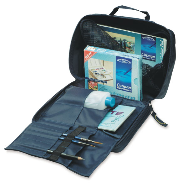 Travel Bag Set
All images were grabbed from DickBlick, for the purposes of education and review. For detailed information about each set, please visit DickBlick's Cotman listing.
The set used in this review the Pocket Plus Set, is still available, but its not the most common iteration of Cotman field sets. I see the Sketchers Pocket Box Set far more often, as well as the Field Plus Travel Set.
There are also tube Cotman sets, which I have not tried, although I have used individual Cotman tubes in the past.
The Skinny on Cotman
The Stats:
The Site40 available colors$26.35 for the Field Plus Travel set on Dick Blick$2.77 for 8ml tube on DickBlick
Cotman is designed and marketed as an affordable range of watercolor and watercolor accessories. This includes papers, tube and half pan watercolors, and synthetic watercolor brushes. The most commonly used binder is gum arabic, followed by dextrine (in my field test video, I wrongly attributed this to glycerin). All of the colors in the Cotman range are Series 1, the least expensive series offered by Winsor and Newton. Most have a permanency rating of A, but a few have a rating of AA. AA is extremely permanent, A is permanent, and B is moderately durable Many Cotman colors are single pigment, but quite a few have two, and even up to three pigments in the mix.
For comparison, Winsor and Newton Professional Water Colours do not have their binders listed and range from Series 1 (inexpensive) to 4 (most expensive), and include several convienance mixes in their range. The Professional colors also range from B-AA in permanence. The professional line also has a lower ratio of multi pigment to single pigment colors than the Cotman line.
For all Winsor and Newton paints, the label will tell you the permanence, opacity, and pigments used for that color.
Of the 50 available colors, 12 colors in the Cotman range are hues. Hues are not necessarily bad- they are often replacements for more toxic pigments (like cadmiums), but the color will not be the same as the one it's replacing. Hues are also used to replace expensive pigments, bringing the overall cost of the paints down. This substitution is very common in student grade watercolors.
Hue often refers to a paint of lesser concentration of pigment, hence, a student or economy grade. Student grade paints in general, have less pigment compared to professional grade paints. They have fillers such as dextrin that are used to bulk out the paint without noticeably affecting the color. This makes the paint more economical and it also provides beginners with an alternative to the more expensive professional paints. You may want to upgrade to professional paints when you become more familiar with watercolor painting and can afford to. This is more economical in the end as these paints will last longer and you use less paint for the same saturation of color.
Hue also refers to a paint that is made up of a combination of other pigments but is close in color to the original. For example, Cadmium Red and Cadmium Red Hue. The paint quality is the same, they are both professional grade. However, Cadmium Red is made with cadmium which is very toxic. Cadmium Red Hue is formulated to look like Cadmium Red but does not contain cadmium and is not as toxic. Some artists choose to use the hue of certain colors to avoid health risks posed by using cadmiums, magnesiums, cobalts, ceruleans, and other harmful pigments.
Source: To Hue or Not to Hue
Swatches:
 Right: Winsor and Newton, Left: Cotman
Swatched on Fabriano cotton rag watercolor paper
The colors included in the Pocket Plus Travel Set:
Alizarin Crimson Hue
Burnt Sienna
Burnt Umber
Cadmium Red Pale Hue
Cadmium Yellow Hue
Cadmium Yellow Pale Hue
Chinese White
Cobalt Blue Hue
Sap Green
Ultramarine
Viridian Hue
Yellow Ochre
The Field Test:

This field test was completed on Fabriano cotton rag watercolor paper. It was inked with a Sailor Mitsuo Aida brushpen.

The paper was simply attached to a support via folded over blue painters tape attached at the top and bottom of the paper.
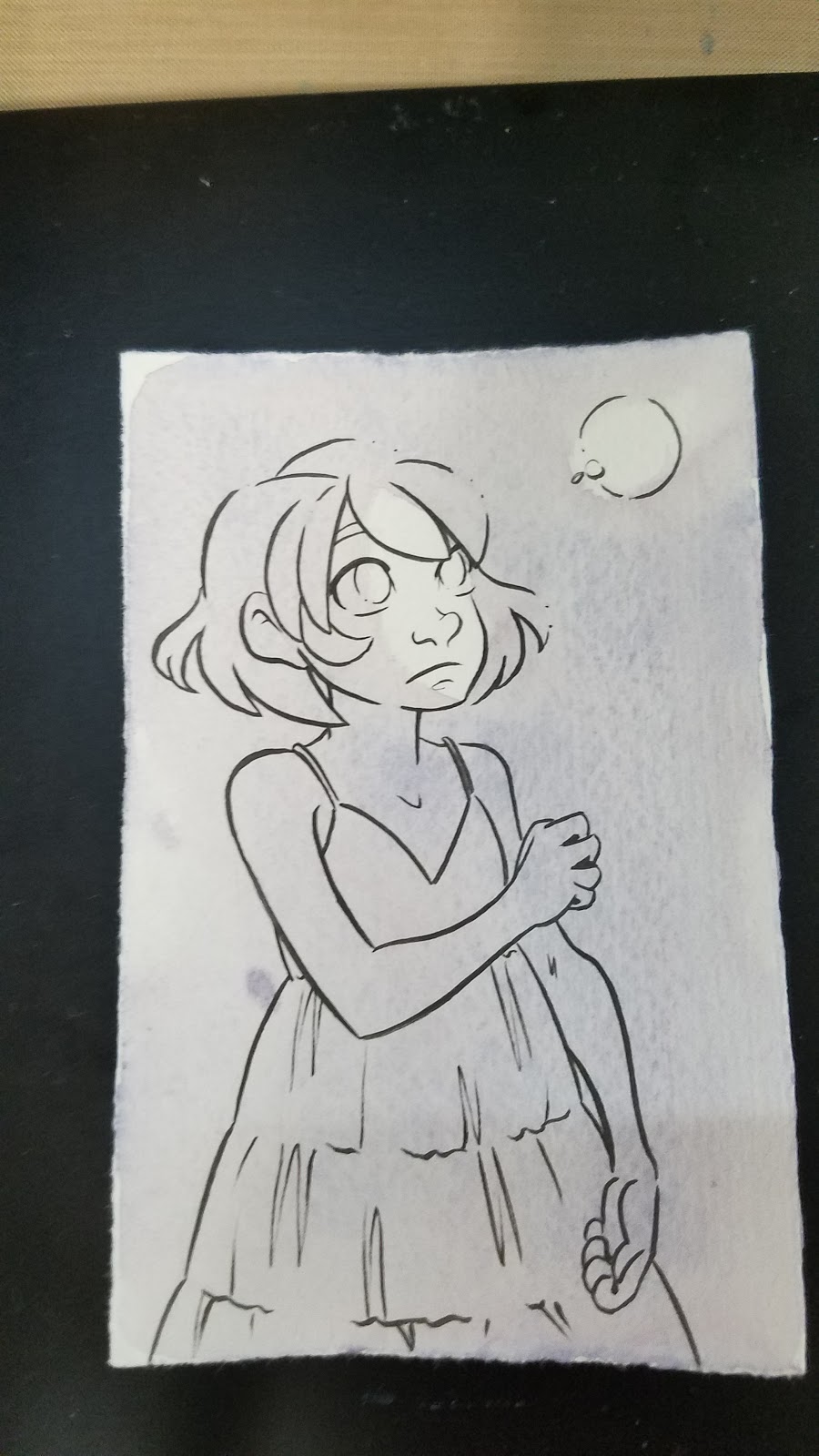
I wanted a dark blue or black for the background, but the Cotman set has neither available, and nothing that immediately presents itself as an option. I ended up mixing both blues, the cooler red, the darker brown, and probably a yellow (to neutralize) to get my initial background wash.

As you can see here, some of the colors in the mix are already sedimenting out.
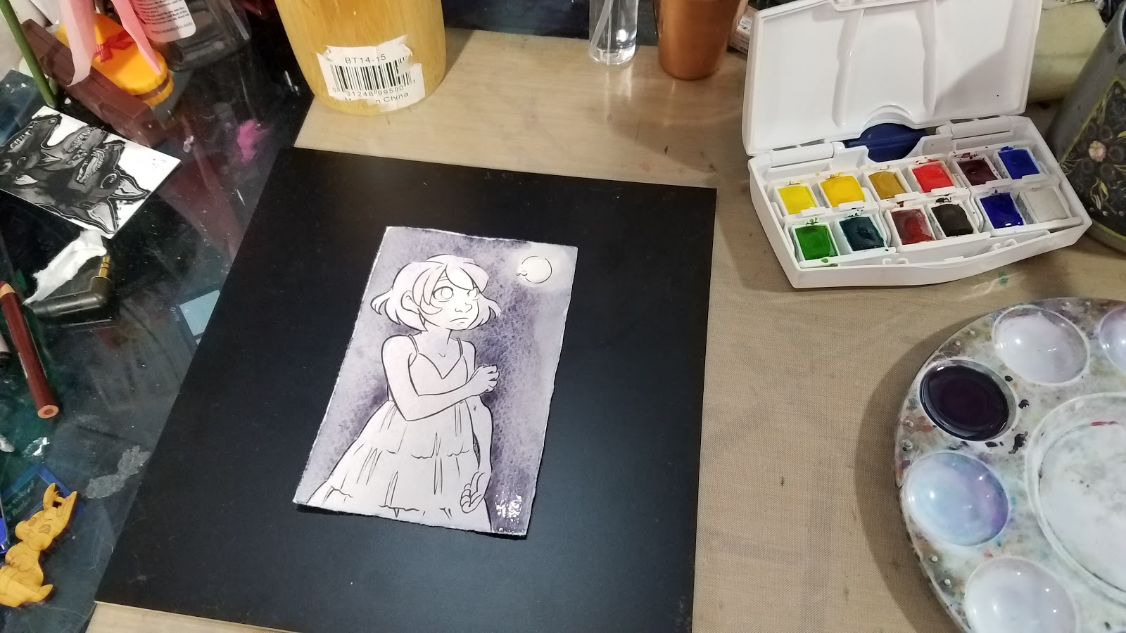
When that dried, it was obviously not dark enough, so I continued to mix, match, and layer.
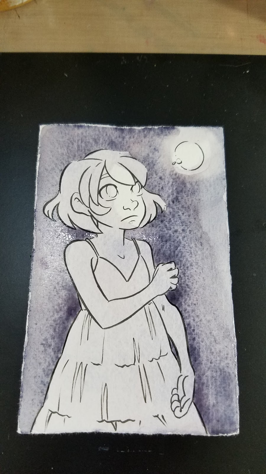
It really takes A LOT of paint (and mixing) to get darker colors with this particular Cotman set.
As I mixed, I wondered who this selection of colors was intended for? A portrait artist? A landscape artist? It's labeled as a Field and Travel set, but the green and brown options are too weak for that, and it lacks a cool blue like a pthalo blue or an indigo.
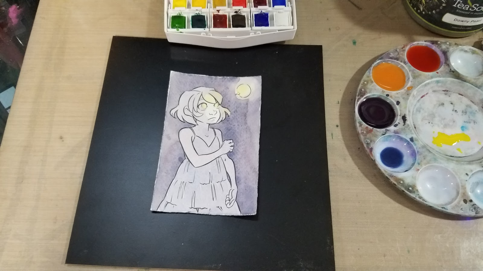
At this stage, I began introducing a glow effect using the cooler yellow.
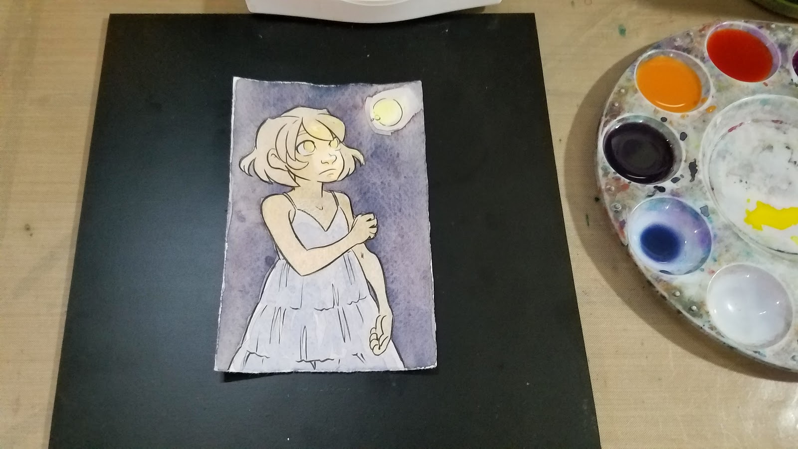
Mixing Kara's skintone should have been straightforward- yellow ochre+scarlet red is my go to combination for Caucasian skintones. Unfortunately, both colors are fairly weak, even after activation, so it took A LOT of paint to get her base skintone down.

After mixing up Kara's skintone, I moved on to her hair. I usually use a convienance color- Venetian Red, as my base, but opted for burnt sienna in this instance. Cotman's burnt sienna is incredibly weak- it really takes a lot of paint to achieve a passable color saturation.
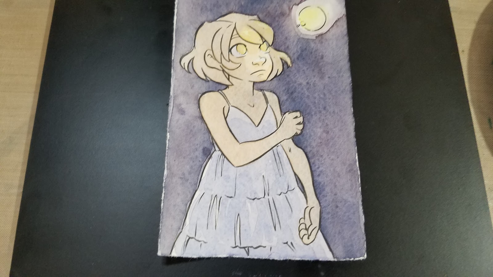
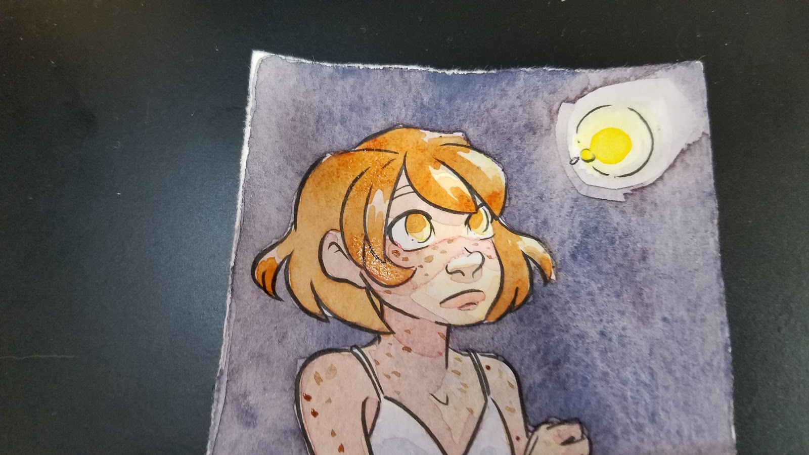
Even working directly from the pan, as shown above, with very little additional water, the color is still quite weak.
I also mixed up a shadow color for Kara's skin. My default is permanent mauve+napthol red, but I'll settle for red violet in a pinch. If you need to mix your own, cool red+cool blue will work in instances such as this.

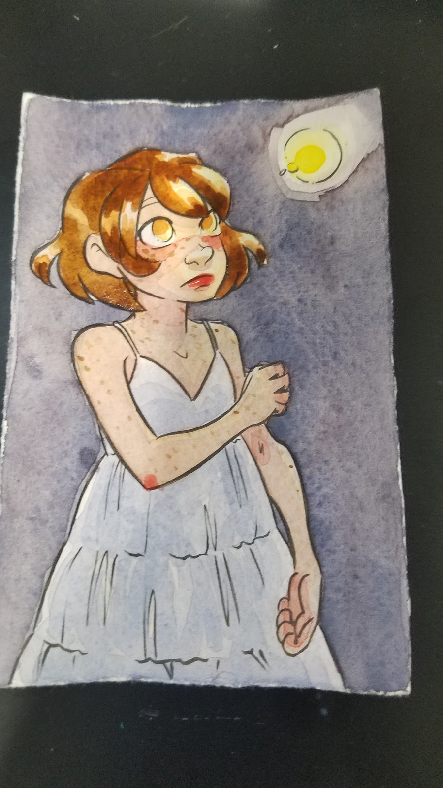
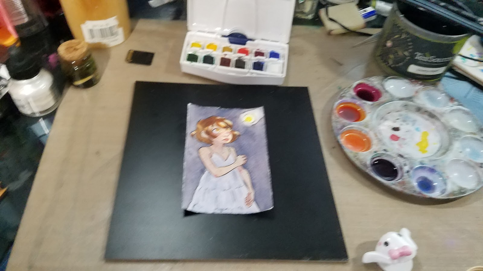
At this point, I knew I needed to build up contrast with the background, as everything was too similar in saturation and tone, so I decided to do another layer of wash in the background. I mixed the wash fairly saturated, and it still goes down weak, chalky, and muddy.
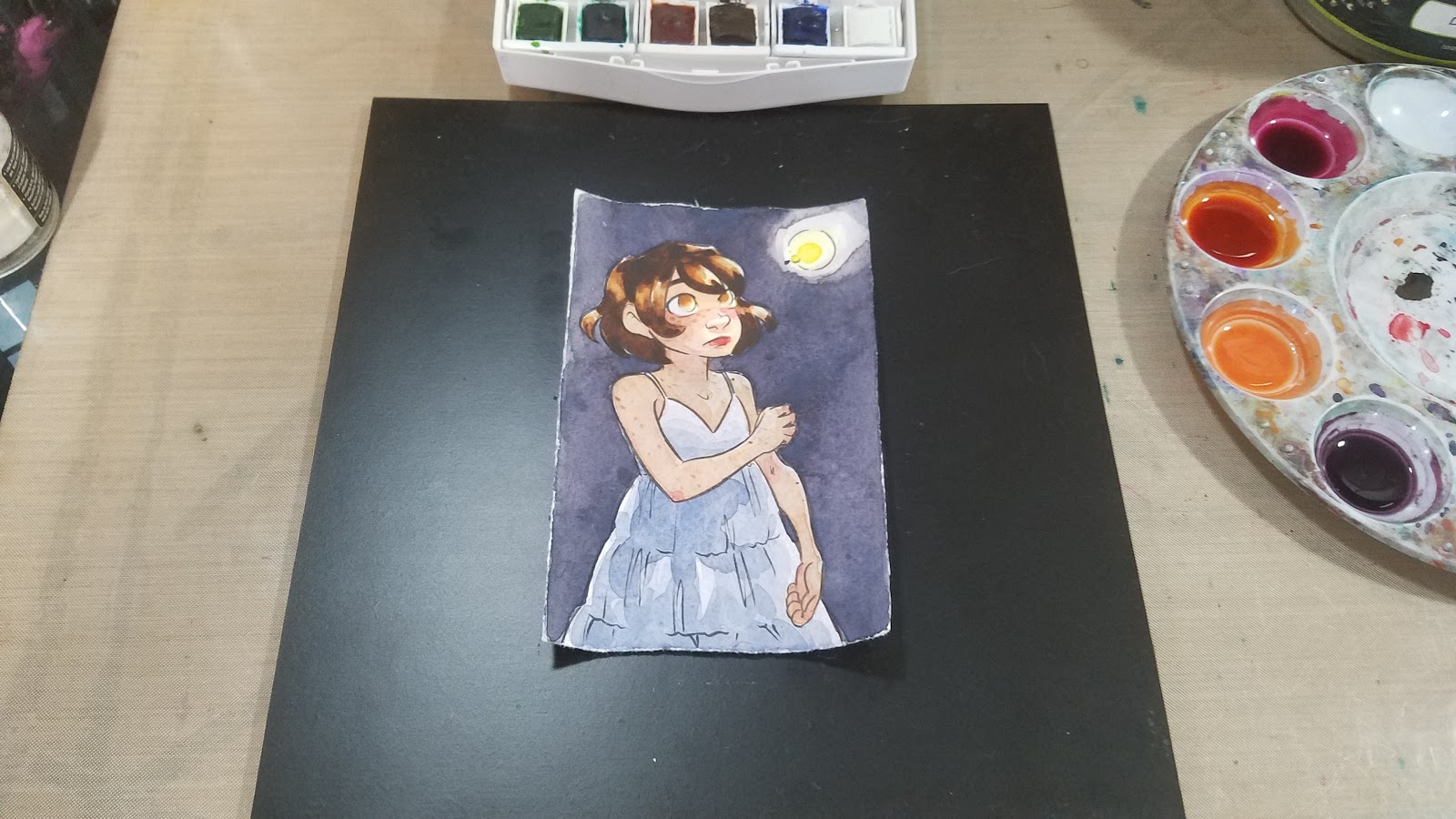
I stepped away from the evening, and allowed the water in my wells to evaporate a little bit.

The next morning, I tightened up a few things- another layer of skincolor with the evaporated mix, another layer of skin shadow with the evaporated mix, tighter details on the firefly, and even some Chinese white in lieu of gouache.
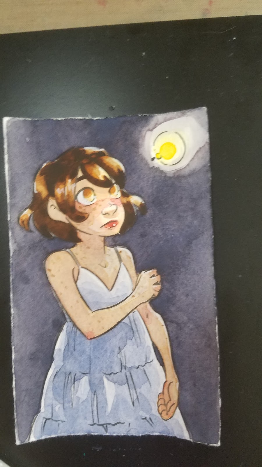


If you like my art, why not check out my beautiful watercolor comic, 7" Kara?

You can read it free online at 7inchkara.com, or get the first four chapters, a bonus comic, and a beautiful concept section from the Nattoshop.
7" Kara is a charming all ages comic that follows the adventures of Lilliputian Kara as she explores the outside world and makes new friends.
Swatches on Dark Paper
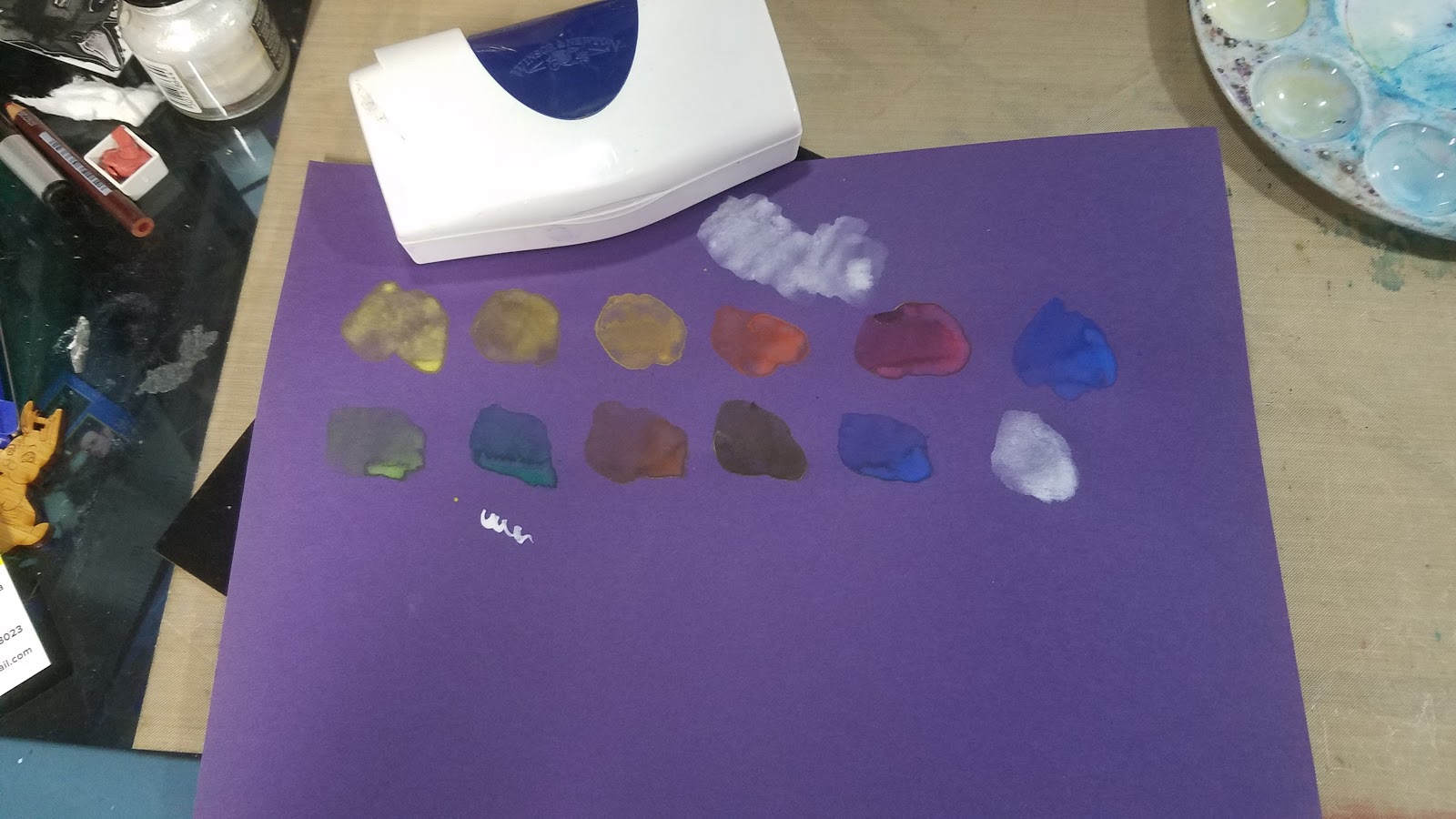
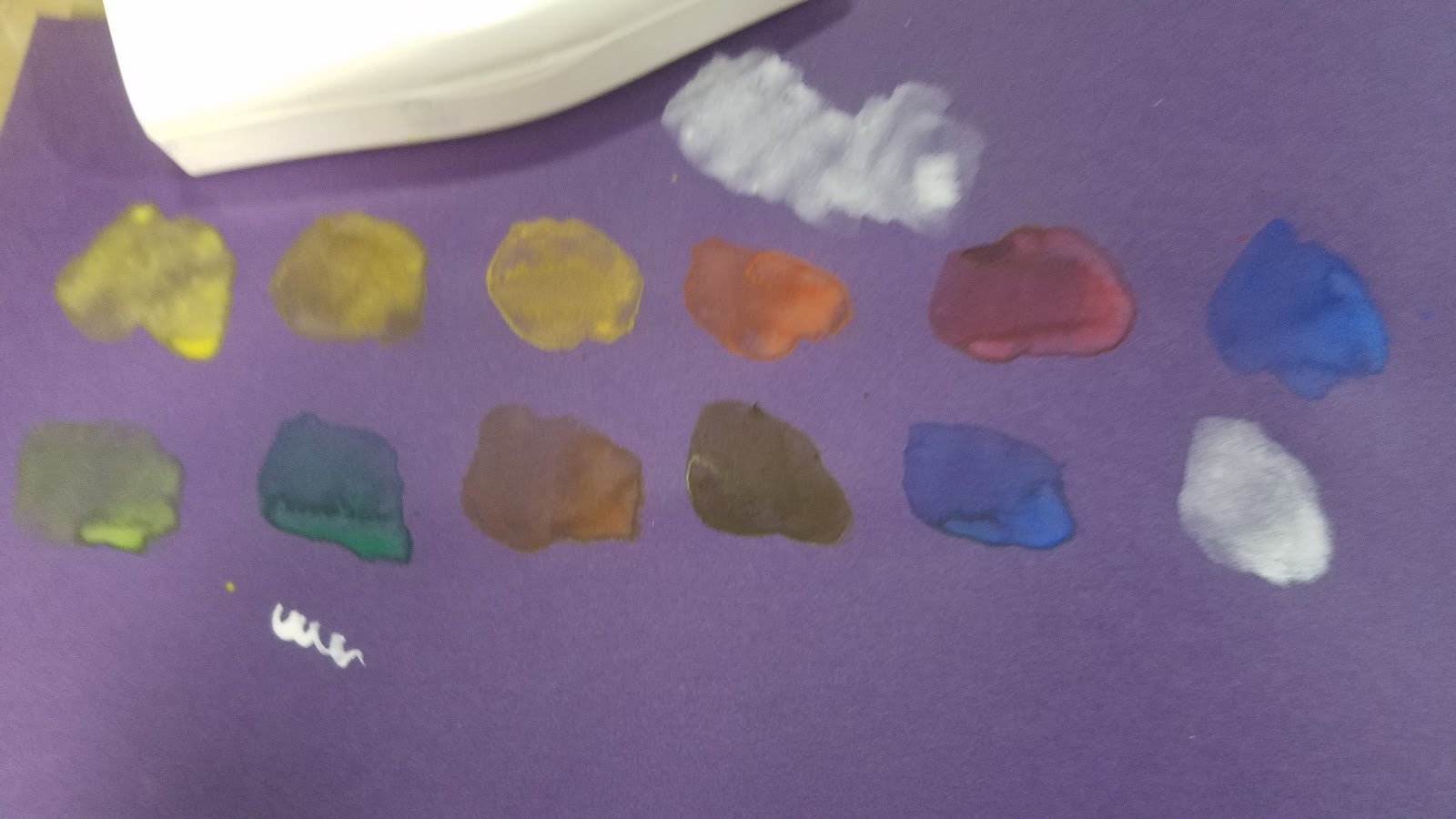
The Verdict:
ChalkyColor separation from blendsDifficult to mix darker colorsColors are mutedPaints feel soapy
Not the worst available, but pretty mediocre for the price. There are better options in that pricerange that will give you better results.
In Jana Bouc's review of Cotman watercolors, she mentions emptying her pans by soaking, and being left with colored water and a lot of white sediment. She does this to salvage the palette itself, which is a fairly nice palette, and well worth reusing. My first thought was 'gross', but I can't help but wonder if we would see a similar result with the Professional pans as well. I'm not rich enough to try it, but if anyone is willing to sacrifice a half pan of each for SCIENCE! let me know!
But Becca, Cotman is Student Grade!
I realize that in some ways, it's unfair to compare Cotman watercolors to Winsor and Newton Professional Watercolors, despite retailers claiming Cotman is held to the same exacting standards. After all, Cotman is...student grade, and Winsor and Newton Professional is...professional grade. That's why, for the majority of this review, I opted NOT to compare Cotman to Winsor and Newton Professional in a side by side comparison- hence the field test.
There are plenty of student grade watercolors on the market, and honestly, most perform similarly to Cotman. This can cause a lot of frustration- many beginner watercolorists have turned away from watercolor because they're trying to replicate professional results with student watercolors. They've been told from the start that it's a poor artist who blames their materials, so they naturally assume the reason they have difficulty mixing colors, or colors separate out, or paints handle more like soap than paint is due to user error. They lack the experience and the guidance to know that Student Grade is code for 'cheap, affordable'
Love watercolor? Why not take my free watercolor course?
Check out my Watercolor Basics series for free watercolor tutorials designed to help get you painting ASAP! Begin your watercolor journey today!
Sadly, compared to the other Student Grade options listed on the Blick Site, Cotman is the pick of the litter, as Student Grade is so often synonymous with 'frustrating garbage'. That doesn't mean there aren't better options out there, though.
Better Alternatives to Winsor and Newton Cotman Watercolors:
Looking for Bold, Saturated Color at a Similar Pricepoint?
Sakura Koi Field Set- 30 color set
Prima Marketing Watercolor Confections- Tropical
Kuretake Gansai Tambi
SoHo watercolors
Looking for A Great Starter Set of Quality Watercolor?
Daniel Smith 6 Color Mixing Set
Winsor and Newton Compact Set (uses the same case as a popular Cotman set, with higher quality watercolors)
Winsor and Newton Field Box Set (uses the same case as the Cotman Field Box set, with higher quality watercolors)
Holbein 12 color 5ml tubes (this is a fantastic deal, Holbein makes amazing watercolors)
Mission Gold 9 Color Starter Set (tubes)
American Journey 6 color beginner set
Looking for a great, compact 12 color set of Quality Watercolor?
American Journey 12 color beginner set
Outside Resources and Second Opinions:
Composition and Permanence Tables for Winsor and Newton
Composition and Permanence Tables for Cotman
Composition and Permanence Tables for Winsor and Newton Professional Water Colour
How to Read the Label on a Winsor and Newton Colour
Wet Canvas- What does Permanence Mean
Loads 'o Lillies and Winsor Newton Cotman Watercolor Review
Wet Canvas: Cotman Colors?
Hue vs True Color
To Hue or Not to Hue
Hue vs True
To Hue or not to Hue
Cotman Reviews on Blick
Art is Fun- Watercolor Paint
Parka Blogs: Review: Winsor and Newton Coton Watercolors Sketchers Box
Please consider donating to this blog or purchasing from Natto-shop (http://nattosoup.com/shop) if you want me to continue publishing quality content. All materials tested were purchased from my own pocket. Keep on Truckin' Nattosoup is not under any sponsorship.


