
Becca Hillburn's Blog, page 13
September 13, 2018
Intro to Comic Craft: Placing Text Digitally
In Monday's post, we talked about selecting a font for your comic or webcomic. Today, we're going to talk about blocking and placing your text within your comic panels.
Before You Start Lettering:
It helps to understand a few things about comic lettering, and how comic pages are read.
For today's homework, I recommend you read (or reread) these tutorials by Nate Piekos.
Better Letterer: Properly Stacking Text in Dialogue BalloonsComic Lettering Tips: The Essentials
Blocking Your Text
Also referred to as 'stacking'
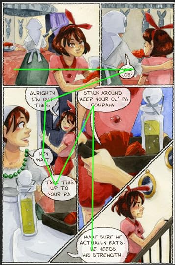
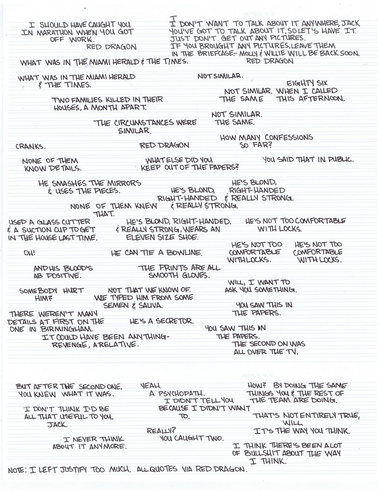
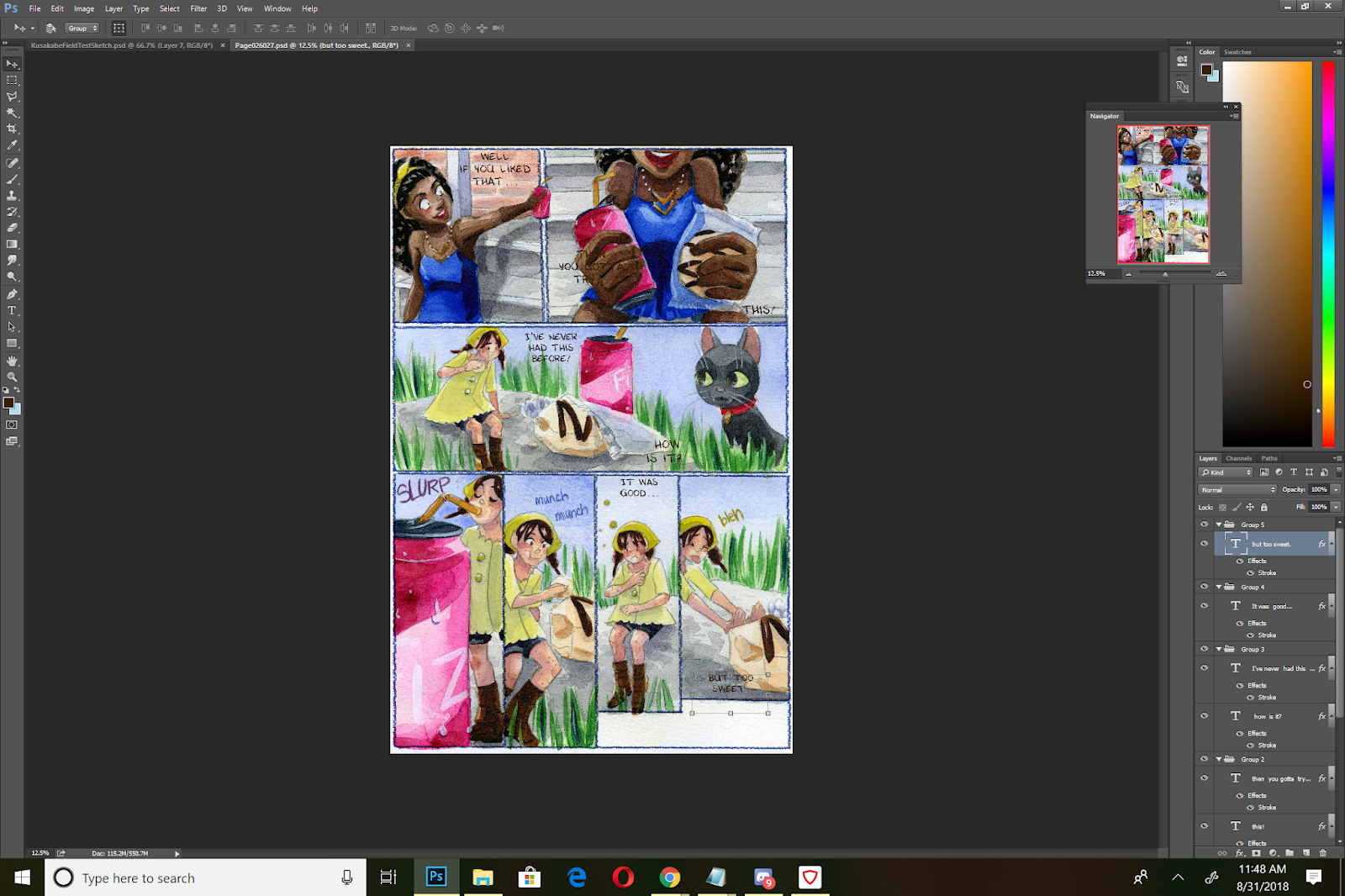
 An example of dialogue blocking, with dialogue taken from The Red Dragon. Original post here
 An example of dialogue in a variety of speech balloons, practicing blocking and creating containing balloons. Original post here.
When creating your blocks of text, you're aiming for:Easily digestable chunks of textText should conform to an oval shape
Placing Your Text:
This to avoid when placing text:
Crossing tailsObscuring actionObscuring facesBlocks of textText hoagiesPlacing long words at the end of your dialogue/speech bubbles
I letter in Photoshop, but you can also use InDesign or Illustrator, or any other graphics program you're comfortable using.


If you find your font is too thin, and there isn't an option to bold your text, you can add a stroke in the Layer Styles menu.

I recommend that you set your stroke to the same color as your font, unless you're trying to achieve a special effect/special connotation.

Throughout my lettering process (placing my text, adding balloons, final editing checks), I move my text several times, so I treat this stage as a rough sketch for lettering.
On a Comic Page:
For my lettering process, I usually roughly place and block my dialogue for the entire chapter, then go back and add my word balloons.
For each panel that contains text, I create a folder. I recommend you name your folders for organization (Panel 1, Panel 2, Panel 3, ect). You can also organize dialogue by character (ex Kara Panel 1, Meldina Panel 2).
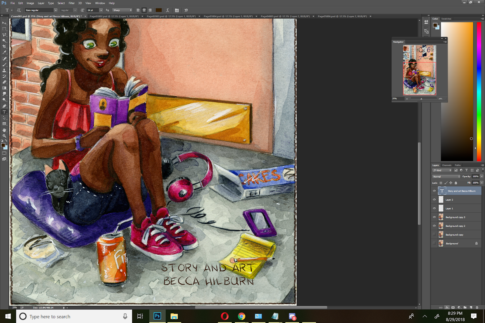
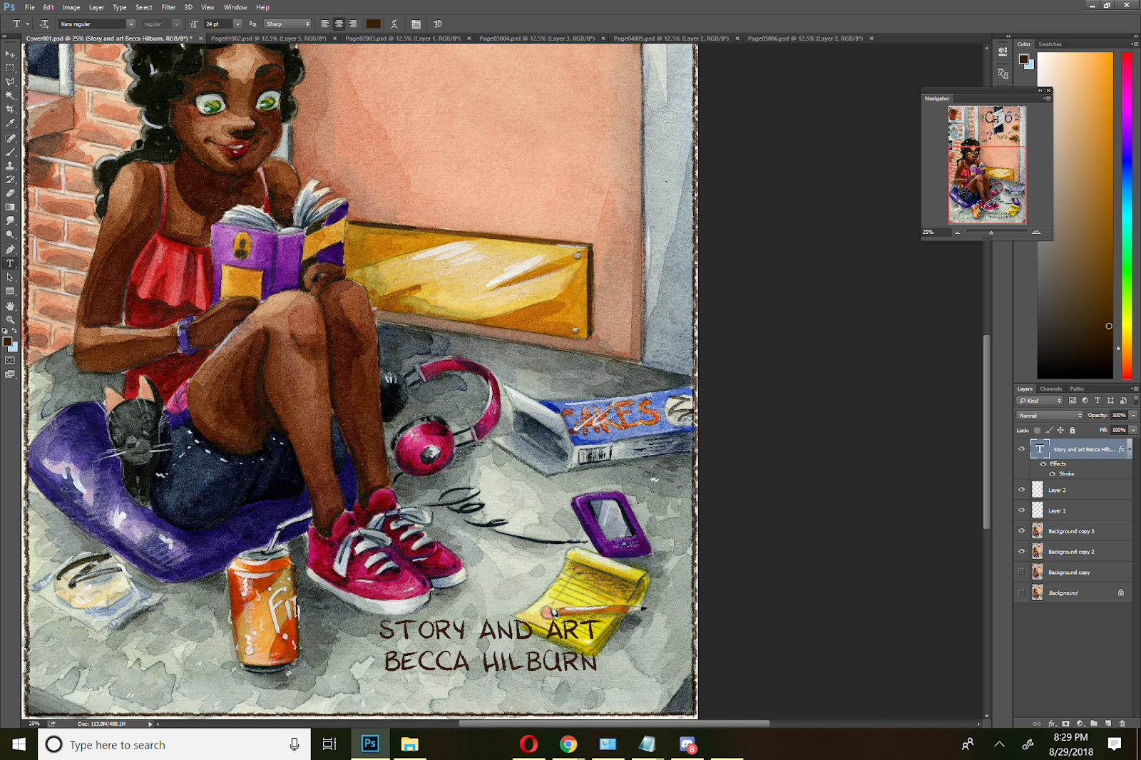
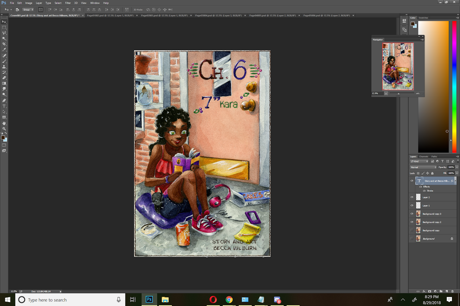
I'm lettering on 15"x11", 600 DPI scans, and I typically letter in sizes from 14-18.
When lettering dialogue in comics, you have approximately five options for text placement:
Each of the four corners of the panel (assuming it's a rectangular panel)
The center of the panel.
Your placement will affect how you format your text. For your upper and lower left hand corners, you want to set it to left alignment, for your upper and lower right hand corners, you want to set it to right alignment, and for your center panels, you want to use center alignment.

You also want to consider the reading flow for the page. For Western comics, readers read from left to right, and you don't want to break that flow.
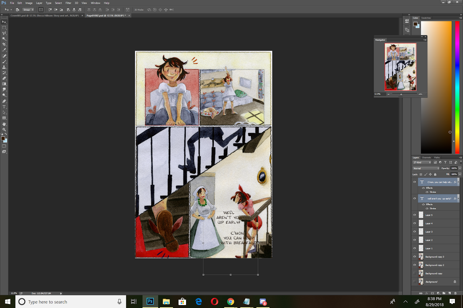
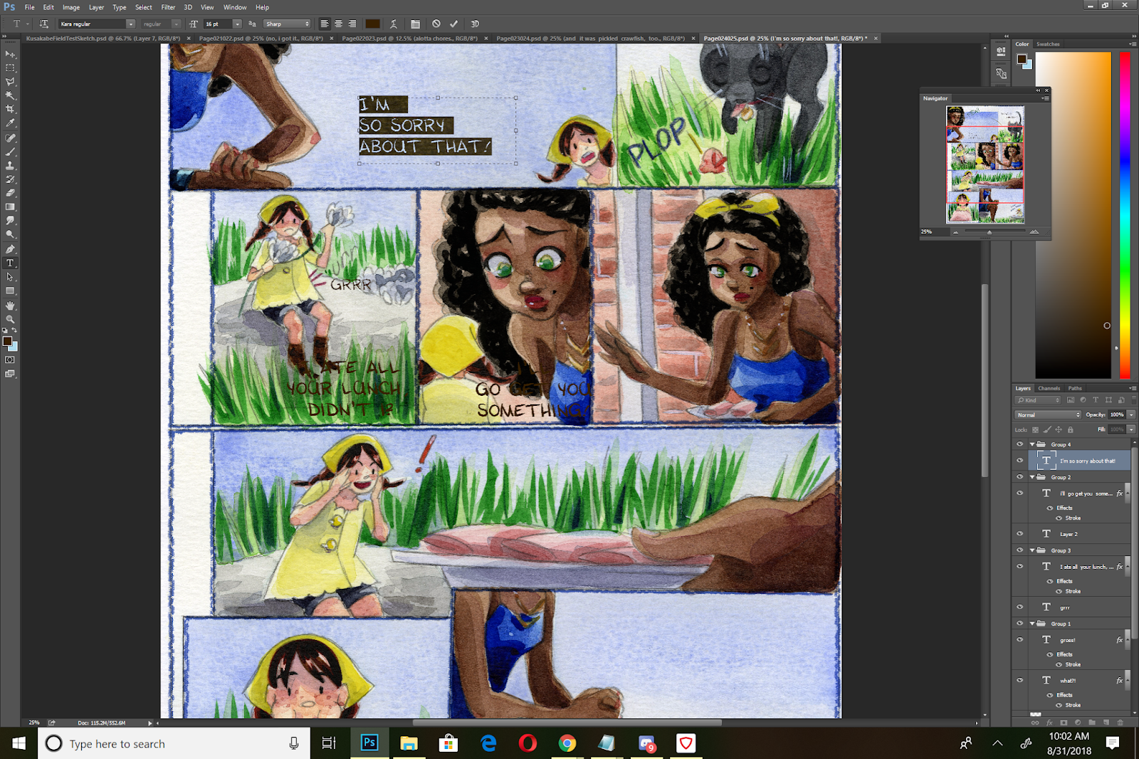
The reading flow for the final version of this page is admittedly, a bit convoluted. If I'd brought the text down in panel 4, it would read more clearly, but would obscure the action of the panel.
In Action:
Initial Placement:


Reevaluation:


On this page I wanted to keep the action clear and uninterrupted, so I placed the dialogue lower in the last panel. Dialogue slows the action of a page, and often breaks the reader's flow, so when possible you want to place it so it won't obscure action or movement.
Adjusting Dialogue for Word Balloons
You will probably have to tweak and adjust your text quite a bit before you hit on something that works.

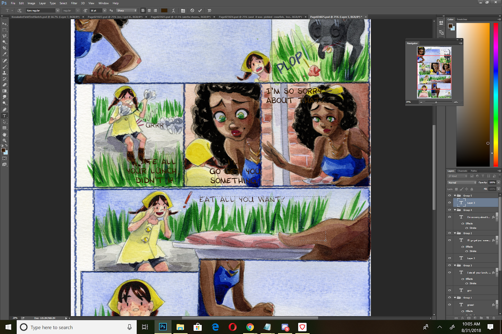
You want to avoid splitting words up, such as this hyphenated example with 'something'.

Longer words need to be on one line.


For darker panels, you may want to do your lettering on a lighter panel, then move it over to the intended panel.

In this example, I'm lettering the dialogue for panel 5 in panel 1, as there is more contrast.

I'm using the visibility as an opportunity to format the dialogue for best fit- I want to place my dialogue in the upper left hand panel, so I need to left align my dialogue. Your alignment (left, right, center), will change how you structure and format your text.


Adjusting Text for Labels
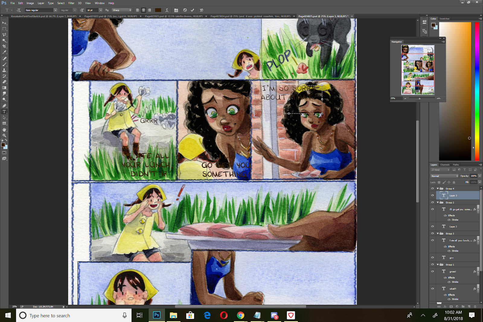
For this panel (3rd panel), we have two considerations- labeling the food, and Naomi's dialogue.
I opt to use the same font for the labels, although this would be an excellent opportunity to switch to a Serif Font (that has a tendency of looking 'official'). Using another font makes the labels stand out as separate text from the dialogue, but in this instance, I'm confident that my word balloons will keep my dialogue distinct.

My labels are difficult to read as is, so I try to place them so they're not obscuring the produce, but are a bit more legible.


Adding Laughter/Adjusting Text for Effect:
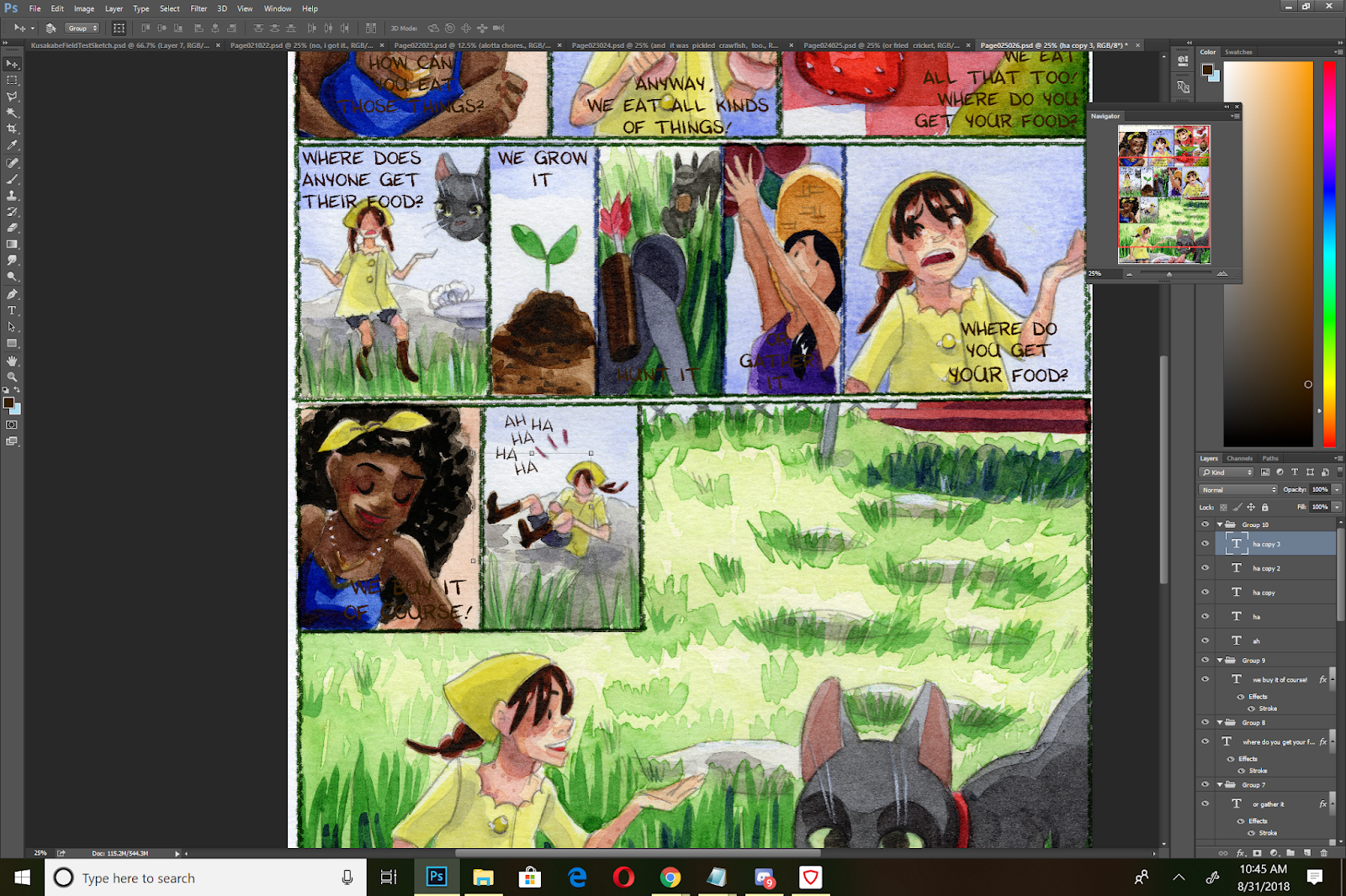
I want Kara's laughter to have a fun, spontaneous feel. Having it lined up would give it a mechanical feel, so I need to skew the individual ha's to make it more spontaneous.
I begin by placing my 'ha's and using the move tool to free transform them slightly.


Page with Completed Dialogue Placement

When Placing Dialogue:
Mostly it's about placing your text blocks in a way that's attractive and understandable for your readers. Keep in mind native reading flow, as well as the flow of the page. Don't cover important areas such as the face, important gestures, or line of action.
In our next installment of Intro to Comic Craft, I'm going to cover adding in word balloons.
Second Opinions and Outside Resources:
I highly recommend you check out Nate Pieko's (Blambot founder and letterer) guides for lettering
Comic fonts for Comic Artists
Blambot
Other Useful Font Resources
DaFont
Google Fonts
More on Lettering:
Guestpost: Selecting and Using Fonts for Webcomics
Pre-Lettering Pages
Relettering and Redoing Word Balloons
Super Easy Lettering Hack
7 Awesome Free Comic Lettering Fonts for Commerical Use and How to Use them
Comic Book Lettering Tips By Patrick Brosseau
Handlettering:
Lettering Practice and Pangrams
When I was 13- Lettering Process Part 2
Lettering Practice- Dialogue and Blocking
A Guide to Hand Lettering Your Strips
Klein Letters: How It All Began
Klein Letters: Lettering, Continued: The 1970's
Klein Letters: Computer Lettering
Klein Letters: Computer Lettering, continued
Klein Letters: Hand Lettering Basics
How To: Cartoon Lettering for Comic Books: Art Techniques
The Art of the Comic Book: Learn to Write and Draw Professional Comic Books: Lettering with Speedball Pens
Text, Type, and Font Basics:
Web Typography 101
4 Key Considerations When Choosing Web Typography
An Introduction to Software for Text Design
Please consider donating to this blog or purchasing from Natto-shop (http://nattosoup.com/shop) if you want me to continue publishing quality content. All materials tested were purchased from my own pocket. Keep on Truckin' Nattosoup is not under any sponsorship.
Before You Start Lettering:
It helps to understand a few things about comic lettering, and how comic pages are read.
For today's homework, I recommend you read (or reread) these tutorials by Nate Piekos.
Better Letterer: Properly Stacking Text in Dialogue BalloonsComic Lettering Tips: The Essentials
Blocking Your Text
Also referred to as 'stacking'
 An example of dialogue blocking, with dialogue taken from The Red Dragon. Original post here
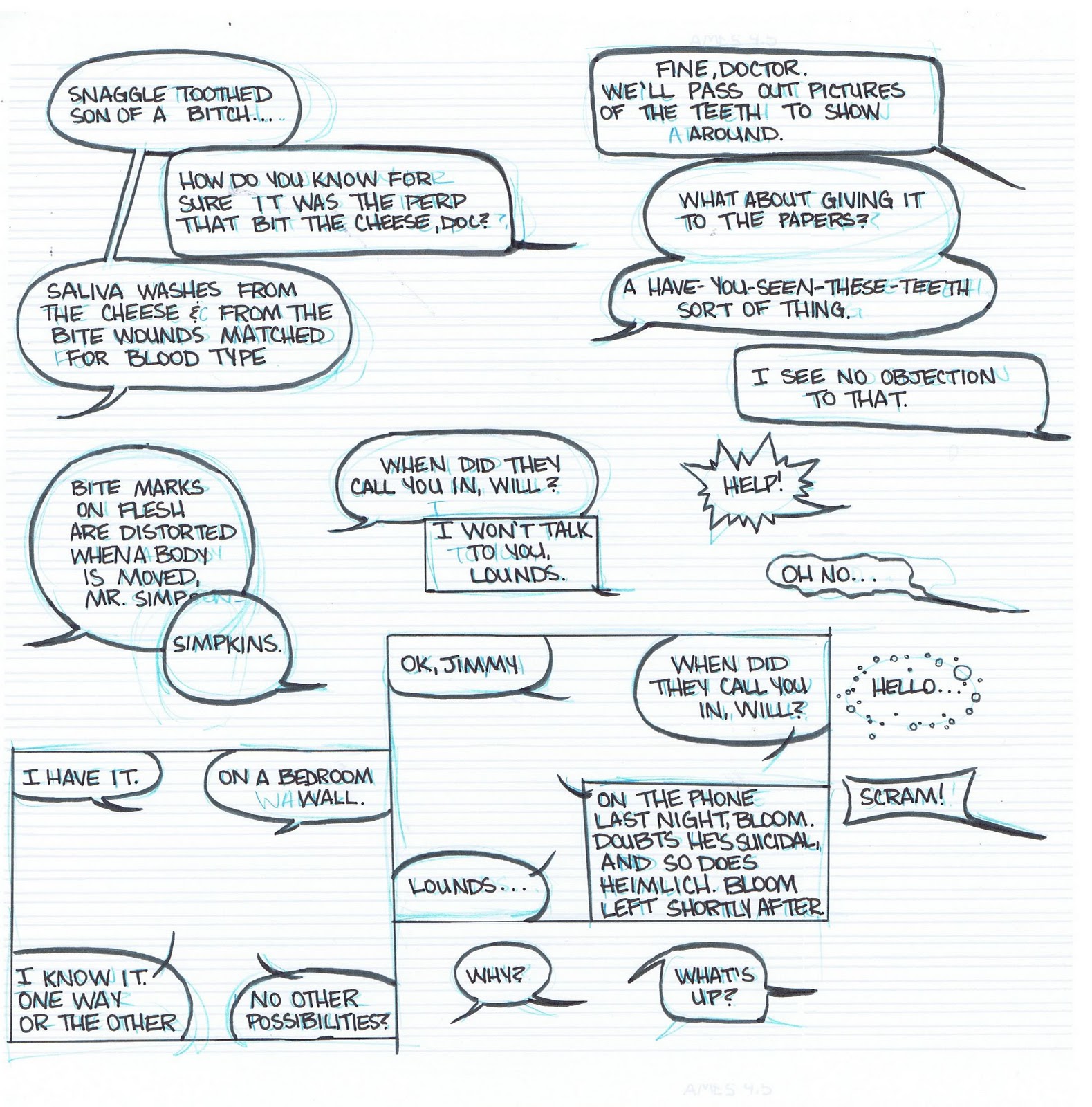 An example of dialogue in a variety of speech balloons, practicing blocking and creating containing balloons. Original post here.
When creating your blocks of text, you're aiming for:Easily digestable chunks of textText should conform to an oval shape
Placing Your Text:
This to avoid when placing text:
Crossing tailsObscuring actionObscuring facesBlocks of textText hoagiesPlacing long words at the end of your dialogue/speech bubbles
I letter in Photoshop, but you can also use InDesign or Illustrator, or any other graphics program you're comfortable using.

If you find your font is too thin, and there isn't an option to bold your text, you can add a stroke in the Layer Styles menu.
I recommend that you set your stroke to the same color as your font, unless you're trying to achieve a special effect/special connotation.
Throughout my lettering process (placing my text, adding balloons, final editing checks), I move my text several times, so I treat this stage as a rough sketch for lettering.
On a Comic Page:
For my lettering process, I usually roughly place and block my dialogue for the entire chapter, then go back and add my word balloons.
For each panel that contains text, I create a folder. I recommend you name your folders for organization (Panel 1, Panel 2, Panel 3, ect). You can also organize dialogue by character (ex Kara Panel 1, Meldina Panel 2).
I'm lettering on 15"x11", 600 DPI scans, and I typically letter in sizes from 14-18.
When lettering dialogue in comics, you have approximately five options for text placement:
Each of the four corners of the panel (assuming it's a rectangular panel)
The center of the panel.
Your placement will affect how you format your text. For your upper and lower left hand corners, you want to set it to left alignment, for your upper and lower right hand corners, you want to set it to right alignment, and for your center panels, you want to use center alignment.
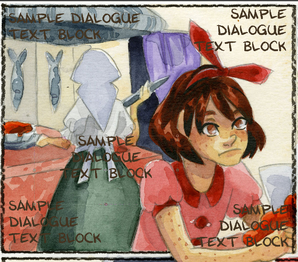
You also want to consider the reading flow for the page. For Western comics, readers read from left to right, and you don't want to break that flow.

The reading flow for the final version of this page is admittedly, a bit convoluted. If I'd brought the text down in panel 4, it would read more clearly, but would obscure the action of the panel.
In Action:
Initial Placement:


Reevaluation:

On this page I wanted to keep the action clear and uninterrupted, so I placed the dialogue lower in the last panel. Dialogue slows the action of a page, and often breaks the reader's flow, so when possible you want to place it so it won't obscure action or movement.
Adjusting Dialogue for Word Balloons
You will probably have to tweak and adjust your text quite a bit before you hit on something that works.
You want to avoid splitting words up, such as this hyphenated example with 'something'.


Longer words need to be on one line.

For darker panels, you may want to do your lettering on a lighter panel, then move it over to the intended panel.
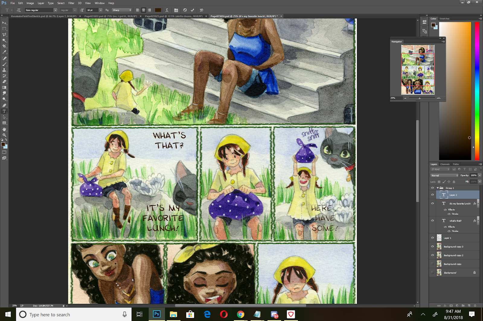
In this example, I'm lettering the dialogue for panel 5 in panel 1, as there is more contrast.
I'm using the visibility as an opportunity to format the dialogue for best fit- I want to place my dialogue in the upper left hand panel, so I need to left align my dialogue. Your alignment (left, right, center), will change how you structure and format your text.

Adjusting Text for Labels
For this panel (3rd panel), we have two considerations- labeling the food, and Naomi's dialogue.
I opt to use the same font for the labels, although this would be an excellent opportunity to switch to a Serif Font (that has a tendency of looking 'official'). Using another font makes the labels stand out as separate text from the dialogue, but in this instance, I'm confident that my word balloons will keep my dialogue distinct.
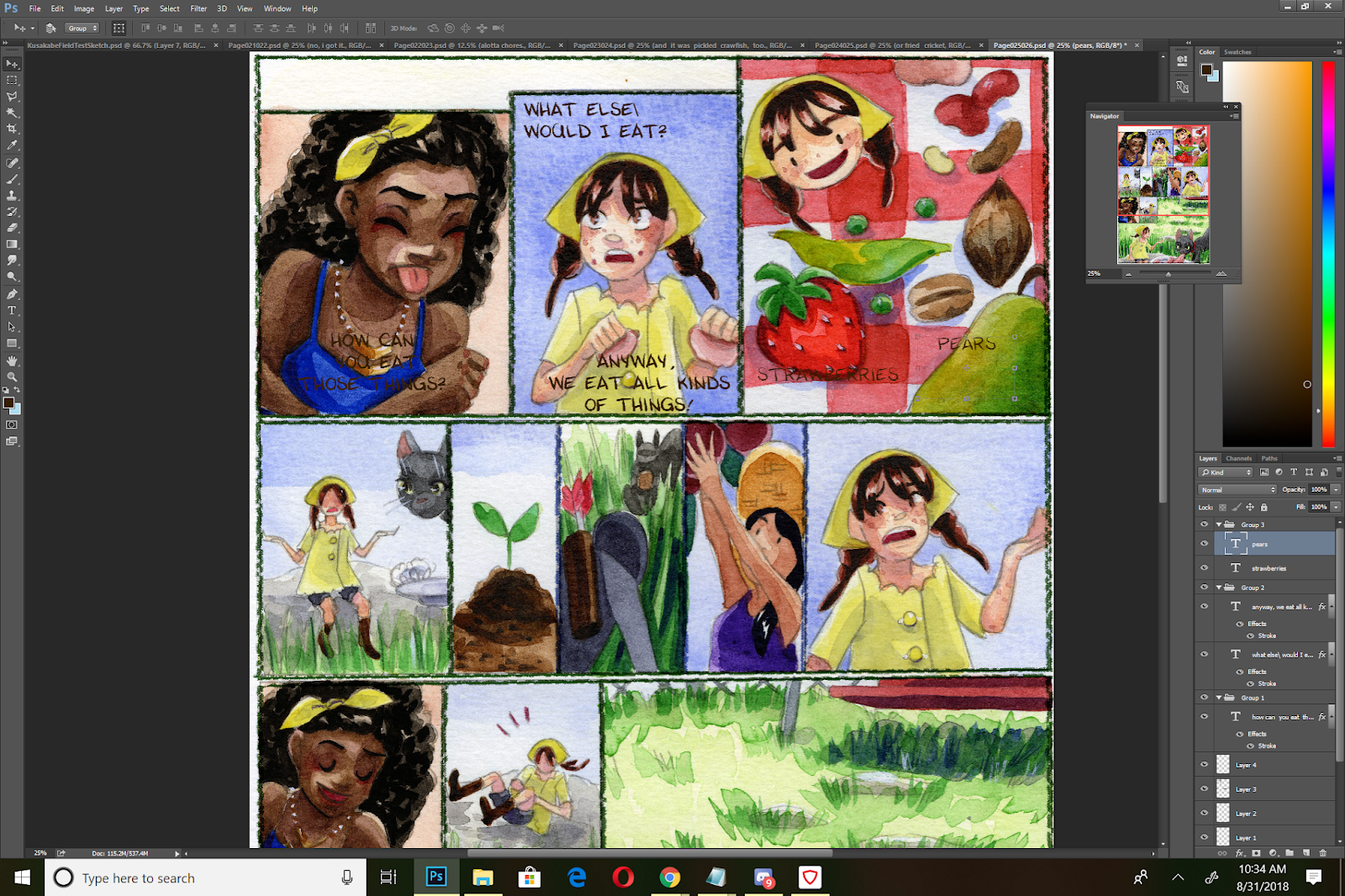
My labels are difficult to read as is, so I try to place them so they're not obscuring the produce, but are a bit more legible.


Adding Laughter/Adjusting Text for Effect:
I want Kara's laughter to have a fun, spontaneous feel. Having it lined up would give it a mechanical feel, so I need to skew the individual ha's to make it more spontaneous.

I begin by placing my 'ha's and using the move tool to free transform them slightly.

Page with Completed Dialogue Placement
When Placing Dialogue:
Mostly it's about placing your text blocks in a way that's attractive and understandable for your readers. Keep in mind native reading flow, as well as the flow of the page. Don't cover important areas such as the face, important gestures, or line of action.
In our next installment of Intro to Comic Craft, I'm going to cover adding in word balloons.
Second Opinions and Outside Resources:
I highly recommend you check out Nate Pieko's (Blambot founder and letterer) guides for lettering
Comic fonts for Comic Artists
Blambot
Other Useful Font Resources
DaFont
Google Fonts
More on Lettering:
Guestpost: Selecting and Using Fonts for Webcomics
Pre-Lettering Pages
Relettering and Redoing Word Balloons
Super Easy Lettering Hack
7 Awesome Free Comic Lettering Fonts for Commerical Use and How to Use them
Comic Book Lettering Tips By Patrick Brosseau
Handlettering:
Lettering Practice and Pangrams
When I was 13- Lettering Process Part 2
Lettering Practice- Dialogue and Blocking
A Guide to Hand Lettering Your Strips
Klein Letters: How It All Began
Klein Letters: Lettering, Continued: The 1970's
Klein Letters: Computer Lettering
Klein Letters: Computer Lettering, continued
Klein Letters: Hand Lettering Basics
How To: Cartoon Lettering for Comic Books: Art Techniques
The Art of the Comic Book: Learn to Write and Draw Professional Comic Books: Lettering with Speedball Pens
Text, Type, and Font Basics:
Web Typography 101
4 Key Considerations When Choosing Web Typography
An Introduction to Software for Text Design
Please consider donating to this blog or purchasing from Natto-shop (http://nattosoup.com/shop) if you want me to continue publishing quality content. All materials tested were purchased from my own pocket. Keep on Truckin' Nattosoup is not under any sponsorship.


September 10, 2018
Intro to Comic Craft: Selecting a Font
While at SCAD, I took a course on handlettering. I realized a couple things while taking handlettering- I hate my own handwriting, even when designing fonts, and it's difficult for me to maintain a font when it's handwritten. Although most of my comics are traditionally drawn, I opt to digitally letter most of my work, and I find that many of the skills taught in this class are relevant and useful in my current work.
Handlettering is a skillset all its own, with tools and techniques to help you achieve consistent lettering, but we won't cover that here on this blog. Instead, we're going to focus on digital lettering techniques.
Over the next four posts, I'll take you through selecting a font for your comic, blocking and placement within your page, creating word balloons, and final cleanup/adding in handdrawn sound effects.
I highly recommend you check out Nate Pieko's lettering tutorials over on the Blambot site- they're excellent, and he's a pro.
For today's homework, I recommend you read Comic Lettering Tips: The Essentials
Digital Lettering Part 1: Selecting a Font:
For 7" Kara, I created a custom font that reflects the tone of the story. This font was created from a handlettered, color pencil base, adjusted in Adobe Illustrator and saved as a vector, and turned into a font using FontForge.
I don't plan on covering font creation on this blog (unless someone is willing to submit a guest post), but I do have some resources available for those interested in creating a custom font.
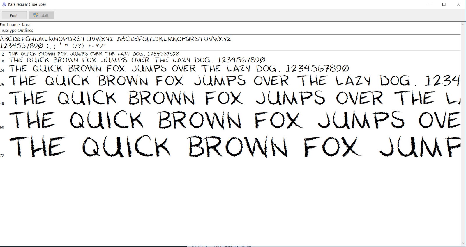
Kara Regular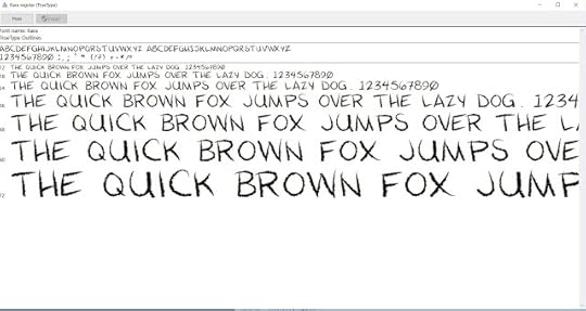
Selecting a Font:
There are different types of fonts to consider:
Fonts for Sound EffectsFonts specially designed for use as sound effects
Fonts for Special EffectsExamples:Mumble fontsCursing fonts (all special characters)WingdingsTypewriter fonts
Design Fonts
Typically used for titles
Fonts for Lettering Dialogue:For other comics, including anthology submissions, I usually turn to Blambot's wonderful library of fonts designed for comic artists. Comics created for comics are kerned properly for comics- other fonts may require adjustment. My favorites for dialogue are:
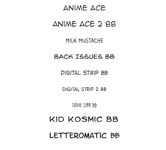 Note: All of these fonts were lettered in the same size- 60pt. Font size can vary greatly between fonts.
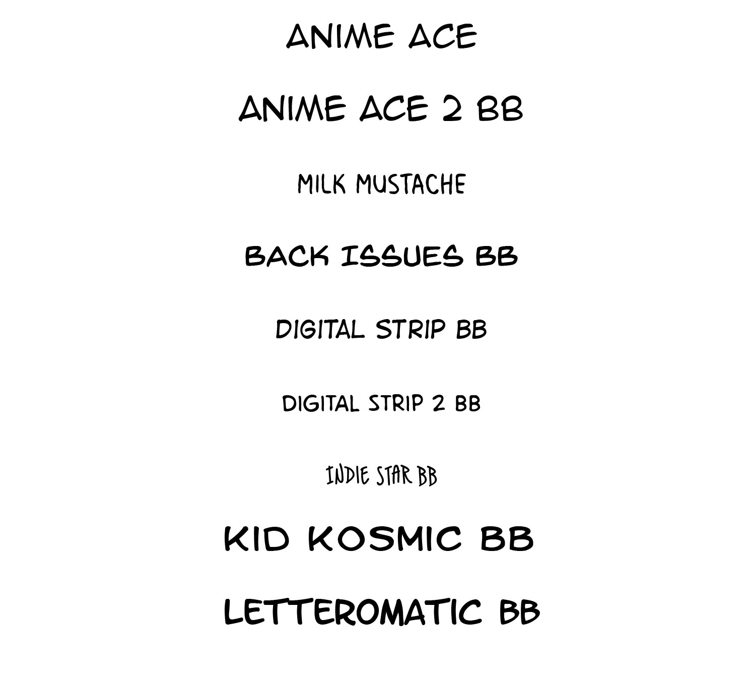
Anime AceManga TempleMilk MustacheAnime Ace 2 BBBack Issues BBDigital Strip BBDigital Strip 2 BBIndie Star BBKid Kosmic BBLetteromatic BBMighty Zeo 2 BBWebletterer BB
For dialogue fonts, you generally want a sans serif font, with the exception being Capital I's, as non serif I's often read as lowercase L's. Dialogue fonts should be easy to read at a glance. Dialogue fonts can be mixed case (upper and lower) or all uppercase.
Make sure the font you select has a license that allows your intended use. Not all fonts allow for display on web, or commercial use, so read carefully! Blambot offers Pro fonts (fonts you pay for) and Free fonts (fonts for indie creators)- you can read more about usage here!
Fonts specifically designed for comics have been kerned and leaded for comics and dialogue. If you're creating a font, or repurposing a non-comics for for comics, you may want to read more about kerning and leading for comics.
Blambot also has amazing lettering tutorials and resources, so if you're interested in learning more about lettering, please check out their wonderful resources.
Second Opinions and Outside Resources:
I highly recommend you check out Nate Pieko's (Blambot founder and letterer) guides for lettering
Comic fonts for Comic Artists
Blambot
Other Useful Font Resources
DaFont
Google Fonts
Fonts.com
Font Creation Resources:
7 Free Tools for Creating Your Own Fonts
Font Creation Software:
FontForge (free, donation suggested)
FontLab Studio ($650)
Raster Font Editor (free)
FontStruct (free)
BitFontMaker (free)
Type light (free)
gbdfed Bitmap Font Editor (free)
Bird Font (free)
Font Creator 11 ($79)
More on Lettering:
Guestpost: Selecting and Using Fonts for Webcomics
Pre-Lettering Pages
Relettering and Redoing Word Balloons
Super Easy Lettering Hack
7 Awesome Free Comic Lettering Fonts for Commerical Use and How to Use them
Comic Book Lettering Tips By Patrick Brosseau
Handlettering:
Lettering Practice and Pangrams
When I was 13- Lettering Process Part 2
Lettering Practice- Dialogue and Blocking
A Guide to Hand Lettering Your Strips
Klein Letters: How It All Began
Klein Letters: Lettering, Continued: The 1970's
Klein Letters: Computer Lettering
Klein Letters: Computer Lettering, continued
Klein Letters: Hand Lettering Basics
How To: Cartoon Lettering for Comic Books: Art Techniques
The Art of the Comic Book: Learn to Write and Draw Professional Comic Books: Lettering with Speedball Pens
Text, Type, and Font Basics:
Web Typography 101
4 Key Considerations When Choosing Web Typography
An Introduction to Software for Text Design
Please consider donating to this blog or purchasing from Natto-shop (http://nattosoup.com/shop) if you want me to continue publishing quality content. All materials tested were purchased from my own pocket. Keep on Truckin' Nattosoup is not under any sponsorship.
Handlettering is a skillset all its own, with tools and techniques to help you achieve consistent lettering, but we won't cover that here on this blog. Instead, we're going to focus on digital lettering techniques.
Over the next four posts, I'll take you through selecting a font for your comic, blocking and placement within your page, creating word balloons, and final cleanup/adding in handdrawn sound effects.
I highly recommend you check out Nate Pieko's lettering tutorials over on the Blambot site- they're excellent, and he's a pro.
For today's homework, I recommend you read Comic Lettering Tips: The Essentials
Digital Lettering Part 1: Selecting a Font:
For 7" Kara, I created a custom font that reflects the tone of the story. This font was created from a handlettered, color pencil base, adjusted in Adobe Illustrator and saved as a vector, and turned into a font using FontForge.
I don't plan on covering font creation on this blog (unless someone is willing to submit a guest post), but I do have some resources available for those interested in creating a custom font.
Kara Regular
Selecting a Font:
There are different types of fonts to consider:
Fonts for Sound EffectsFonts specially designed for use as sound effects
Fonts for Special EffectsExamples:Mumble fontsCursing fonts (all special characters)WingdingsTypewriter fonts
Design Fonts
Typically used for titles
Fonts for Lettering Dialogue:For other comics, including anthology submissions, I usually turn to Blambot's wonderful library of fonts designed for comic artists. Comics created for comics are kerned properly for comics- other fonts may require adjustment. My favorites for dialogue are:
 Note: All of these fonts were lettered in the same size- 60pt. Font size can vary greatly between fonts.
Anime AceManga TempleMilk MustacheAnime Ace 2 BBBack Issues BBDigital Strip BBDigital Strip 2 BBIndie Star BBKid Kosmic BBLetteromatic BBMighty Zeo 2 BBWebletterer BB
For dialogue fonts, you generally want a sans serif font, with the exception being Capital I's, as non serif I's often read as lowercase L's. Dialogue fonts should be easy to read at a glance. Dialogue fonts can be mixed case (upper and lower) or all uppercase.
Make sure the font you select has a license that allows your intended use. Not all fonts allow for display on web, or commercial use, so read carefully! Blambot offers Pro fonts (fonts you pay for) and Free fonts (fonts for indie creators)- you can read more about usage here!
Fonts specifically designed for comics have been kerned and leaded for comics and dialogue. If you're creating a font, or repurposing a non-comics for for comics, you may want to read more about kerning and leading for comics.
Blambot also has amazing lettering tutorials and resources, so if you're interested in learning more about lettering, please check out their wonderful resources.
Second Opinions and Outside Resources:
I highly recommend you check out Nate Pieko's (Blambot founder and letterer) guides for lettering
Comic fonts for Comic Artists
Blambot
Other Useful Font Resources
DaFont
Google Fonts
Fonts.com
Font Creation Resources:
7 Free Tools for Creating Your Own Fonts
Font Creation Software:
FontForge (free, donation suggested)
FontLab Studio ($650)
Raster Font Editor (free)
FontStruct (free)
BitFontMaker (free)
Type light (free)
gbdfed Bitmap Font Editor (free)
Bird Font (free)
Font Creator 11 ($79)
More on Lettering:
Guestpost: Selecting and Using Fonts for Webcomics
Pre-Lettering Pages
Relettering and Redoing Word Balloons
Super Easy Lettering Hack
7 Awesome Free Comic Lettering Fonts for Commerical Use and How to Use them
Comic Book Lettering Tips By Patrick Brosseau
Handlettering:
Lettering Practice and Pangrams
When I was 13- Lettering Process Part 2
Lettering Practice- Dialogue and Blocking
A Guide to Hand Lettering Your Strips
Klein Letters: How It All Began
Klein Letters: Lettering, Continued: The 1970's
Klein Letters: Computer Lettering
Klein Letters: Computer Lettering, continued
Klein Letters: Hand Lettering Basics
How To: Cartoon Lettering for Comic Books: Art Techniques
The Art of the Comic Book: Learn to Write and Draw Professional Comic Books: Lettering with Speedball Pens
Text, Type, and Font Basics:
Web Typography 101
4 Key Considerations When Choosing Web Typography
An Introduction to Software for Text Design
Please consider donating to this blog or purchasing from Natto-shop (http://nattosoup.com/shop) if you want me to continue publishing quality content. All materials tested were purchased from my own pocket. Keep on Truckin' Nattosoup is not under any sponsorship.
September 7, 2018
Intro to Comic Craft: Creating Thumbnails/Iterations Quickly and Easily in Photoshop
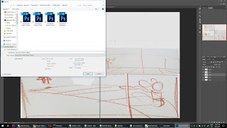
Some writers say it's easier to Rewrite than it is to Write. I've found, in my comic creation process, it's often easier to Redraw (revise, or cleanup) than it is to initially Draw- it's easier to work from an existing sketch, even if its rough, than it is to come up with new iterations on a blank sheet of paper. In today's tutorial, I'm going to show you a quick thumbnail and layout generation technique, using Photoshop- although ANY graphics program should work for this technique.
When to use this method:
When you're working off or without a scriptWhen working from the script isn't quite working for you, or giving you the storytelling you wantWhen there are multiple directions you can go with a story, and you want to feel them out before committingWhen pitching a project to a clientWhen you don't quite have a feel for the project
This method is great for quickly hammering out a variety of compositions or layouts without dedicating significant time to any of them, and without destroying the originals.
Base Sketches:
Saving Versions:
 Creating Iterations:
Using rough transform tools and resizing your base panels, you can create a variety of basic sketches from the elements above:
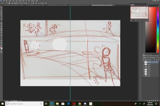
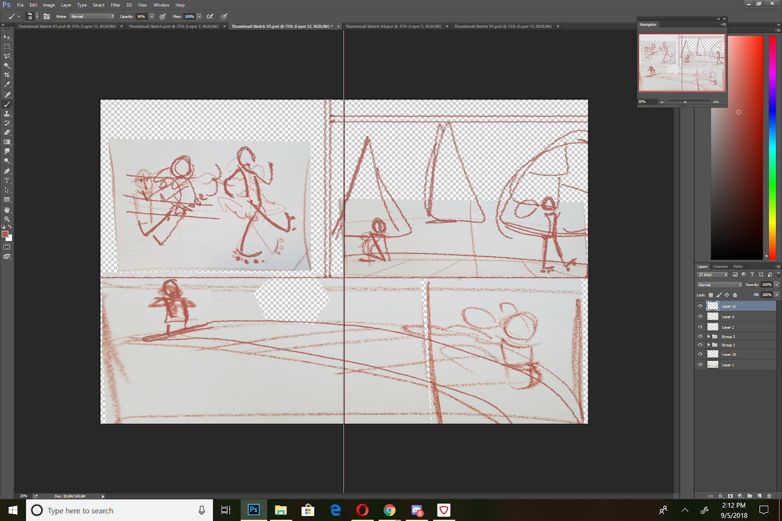
 V1
V1
 V2
V2
 V3
V3
 V4
V4
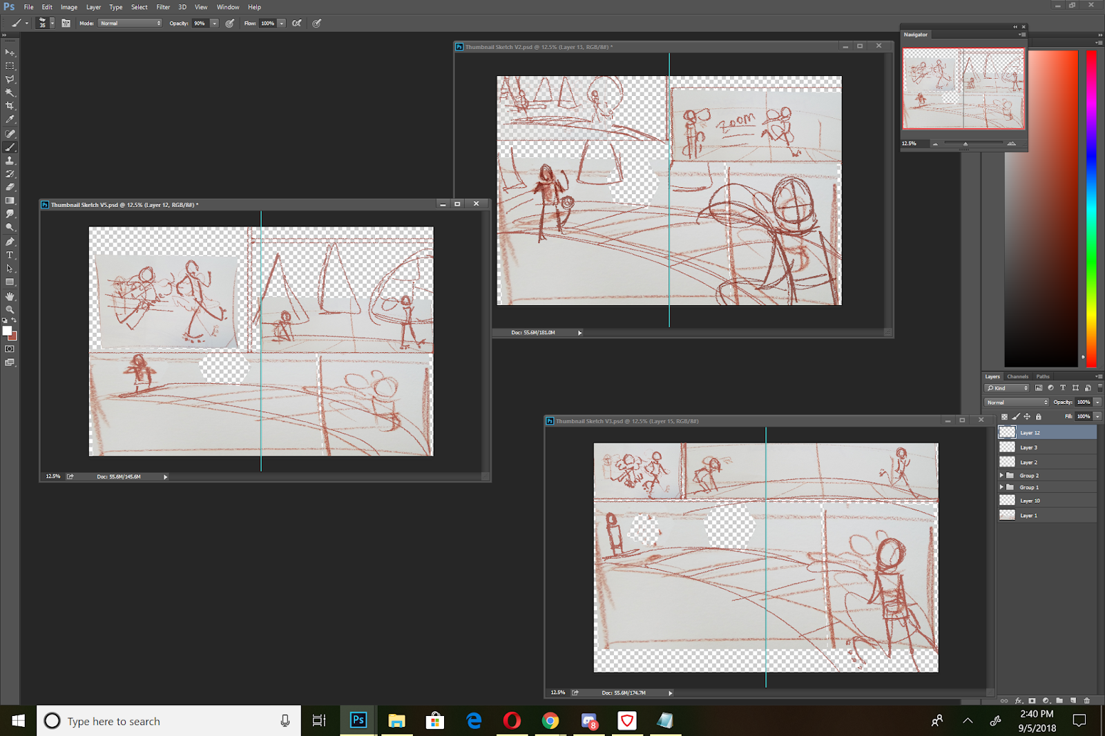
 V5
V5
As you can see, these are REALLY rough. But they also give an idea of panel placement and layout, without a lot of redrawing. I cranked these five out in about ten minutes, and I can spend thirty minutes refining all of them so that they better express the thumbnail, and then choose my best option from there. I can also completely redraw elements using this as a base. I also have the option of refining only the most likely candidates, or passing these by a beta reader to help me select which ones to refine.
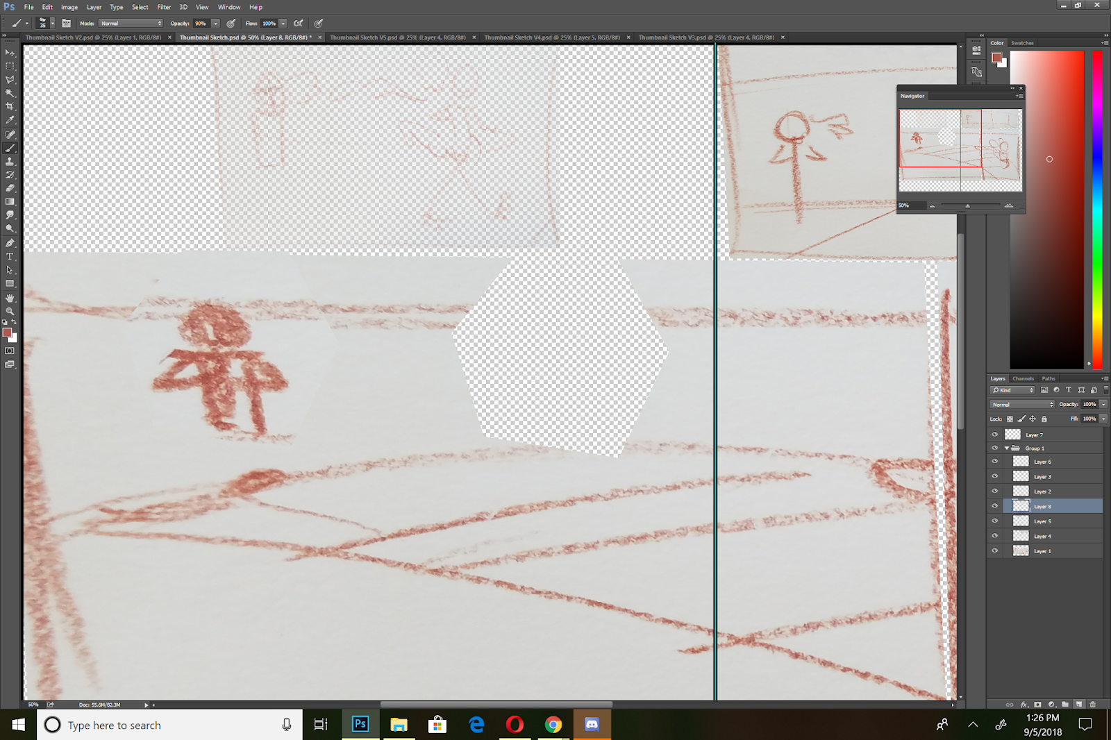
Refining These Sketches Into Thumbnails:
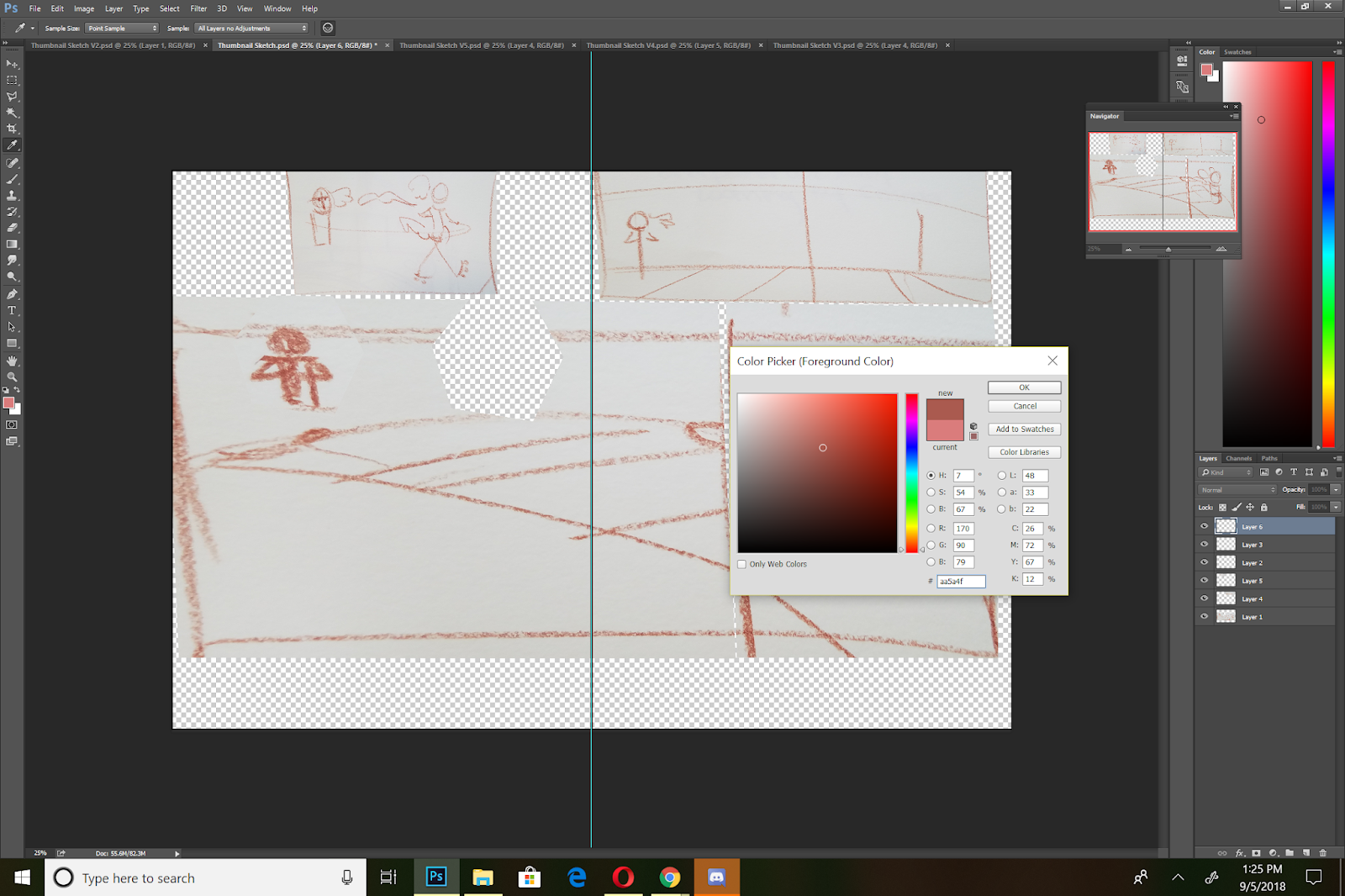
Colorpicking and Selecting a Brush:
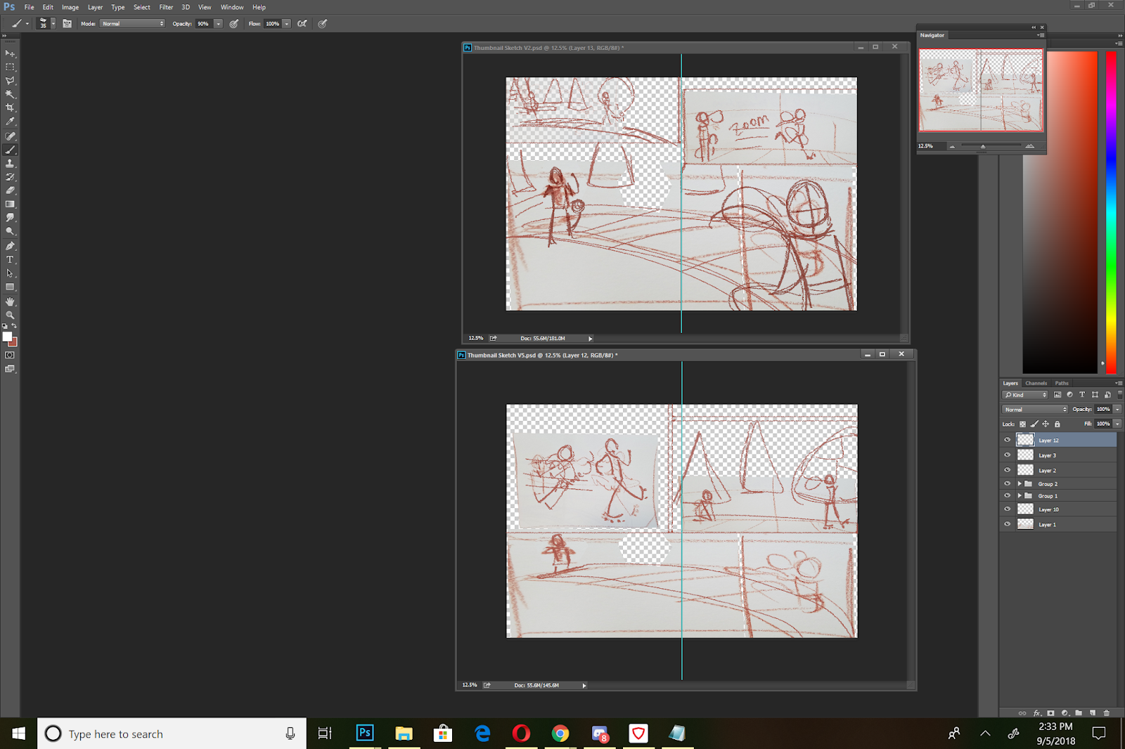
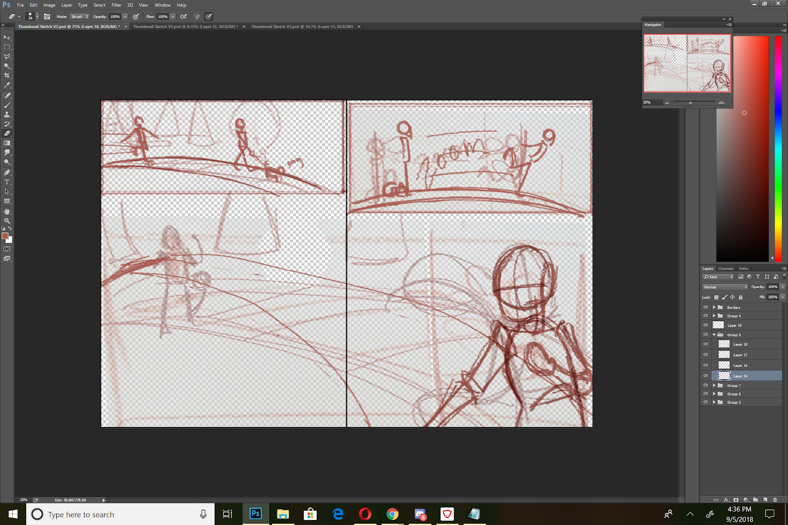
V1: Refinement:
V2 Refinement:
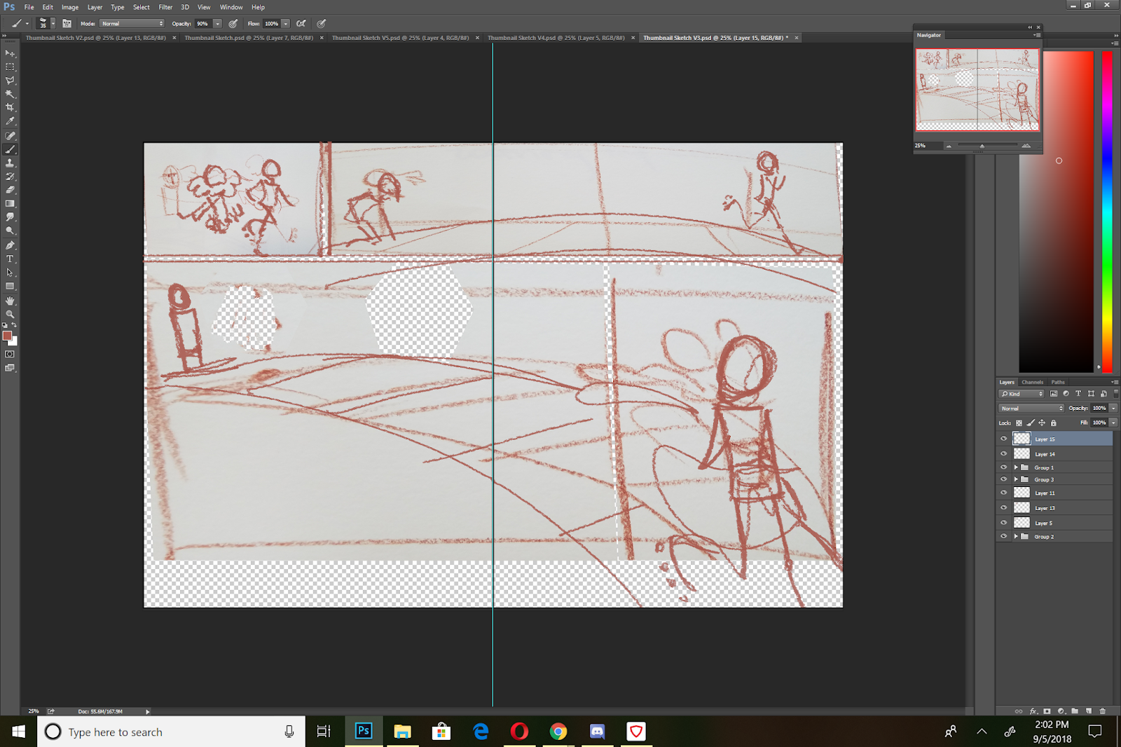
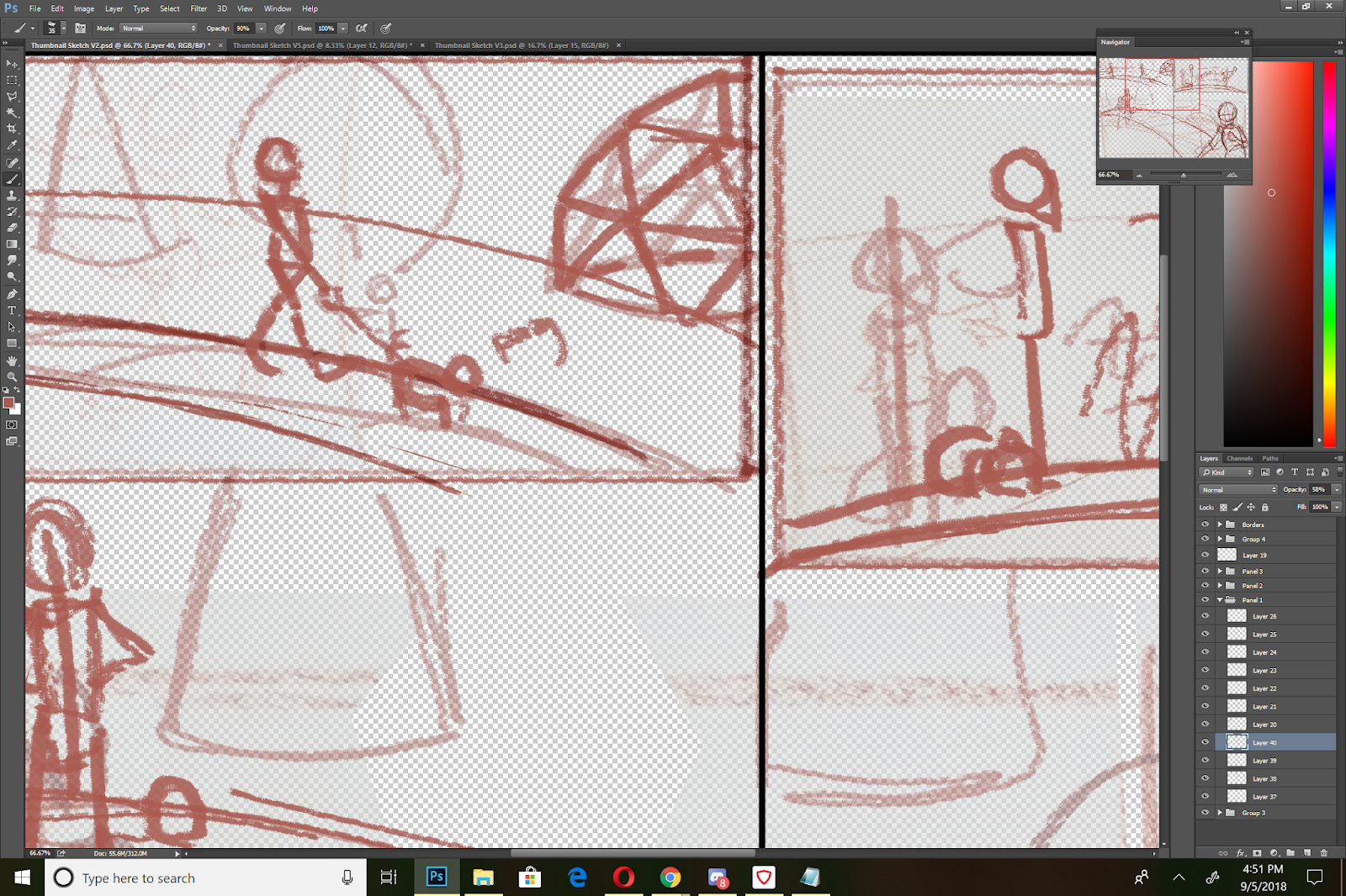
V3: Refinement
V5 Refinement:
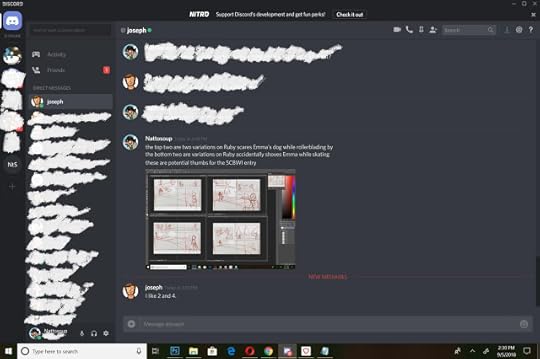
It seems that every version starts to tell a slightly different story, so it's time to get some feedback, decide on the sort of story I want to tell, and select a layout that best tells that story.
Two stories going on here:
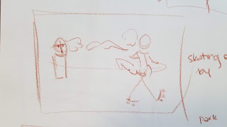
Ruby zooms past Emma, scaring Emma's dog
Ruby, zooming past Emma, accidentally shoves her, causing her to fall
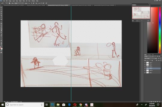
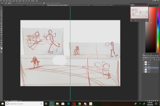
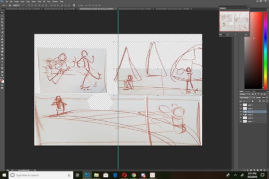
 V1Scaring Dog
 V2Shoving
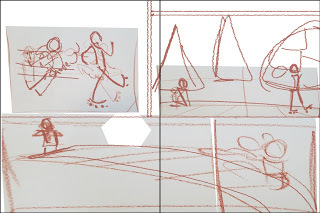 V3Shoving
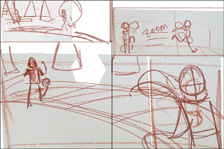
 V5Scaring Dog
Creating a Comparison:
I rescaled all of my options and laid them out on my screen for a quick visual comparison.
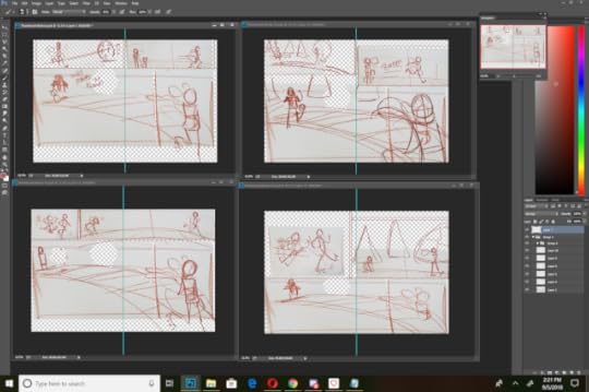
Figure out what works and what doesnt:
My Personal Notes:
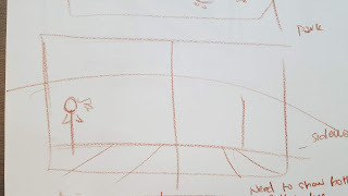
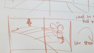
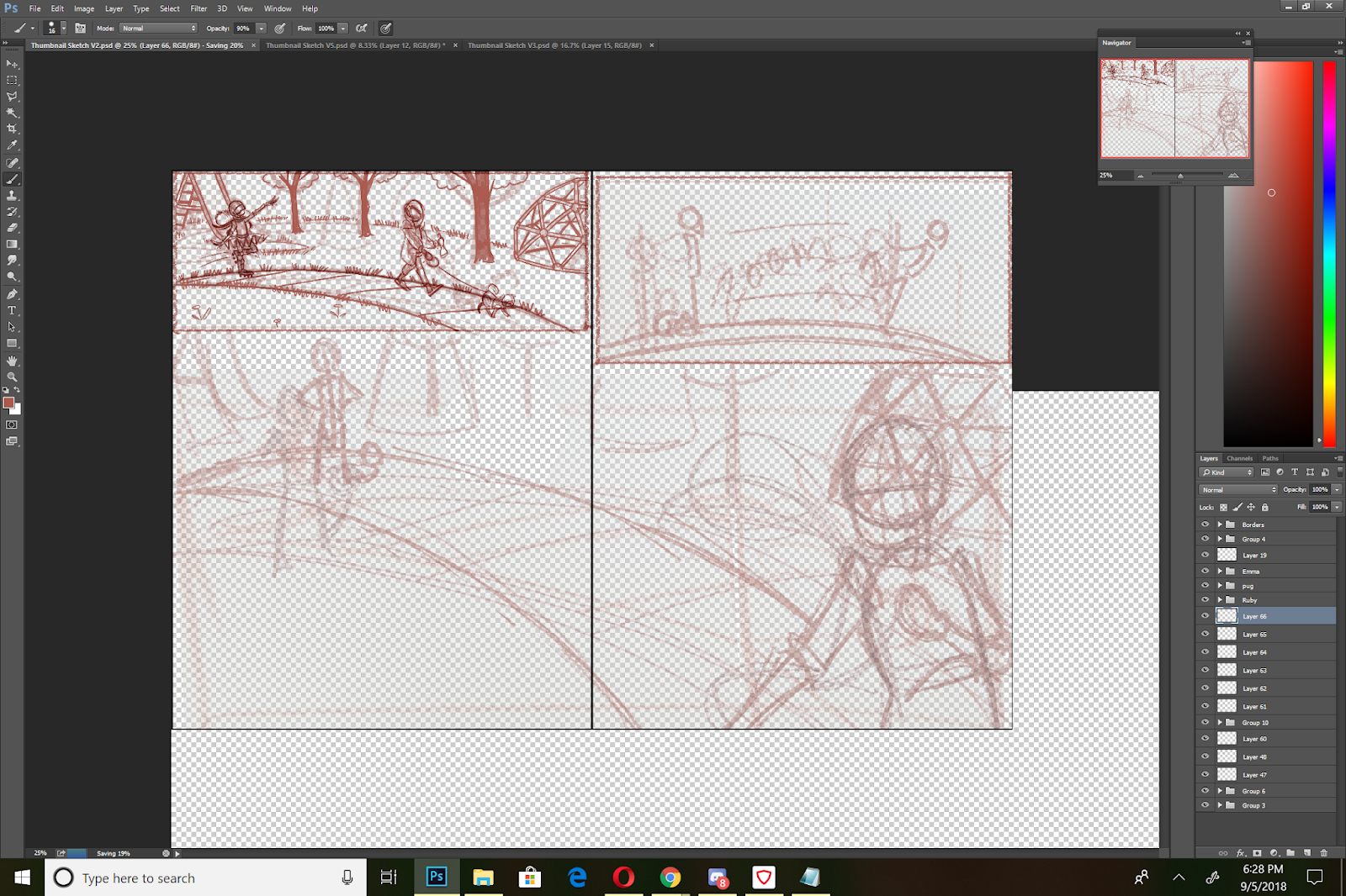
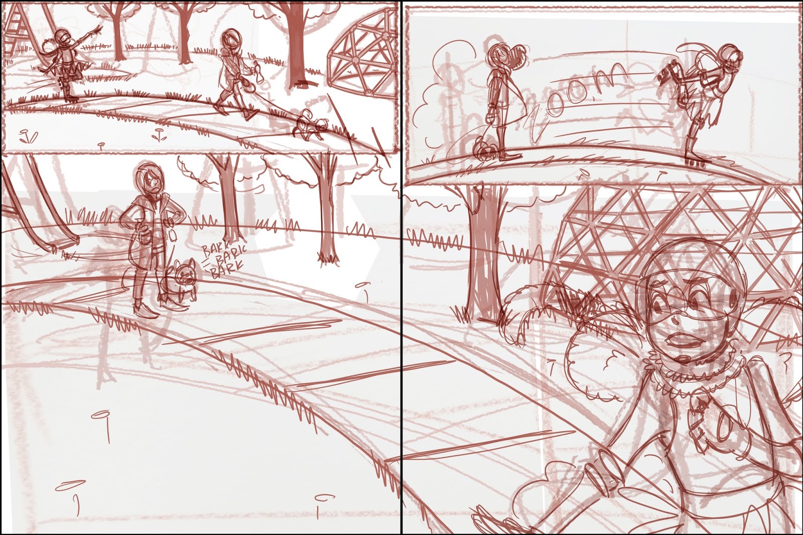
Either story is valid, but the dog story might mean more to kids reading it, and makes more sense considering you're using just one spread to tell a story. For the dog stories, thumbnail 2, with reworking, might be the bset option. It has an establishing shot that shows the setting (a park), the characters (Emma and her dog, Ruby on rollar skates), an action panel (the second), and the result panel (the third, if you drew the dog cowering more).
For the shove storyline, thumbnail 3 might work best, also with some tweaks. Panel 1 shows the action, foregoing establishing setting (which wouldn't be necessary if this were say, mid chapter), but although Panel 2 gives an indication that Ruby has way moved on from the scene of the crime, it breaks the pagebreak. This isn't the biggest problem, since neither character are split by that pagebreak, but it might be best to give panel 1 more room, and do a better job establishing setting in panel 2 and 3. Panel 3 inplies that Ruby realized something is wrong, and did look back to see if Emma was ok, giving her a bit of redemption, since she didn't just hit and run.
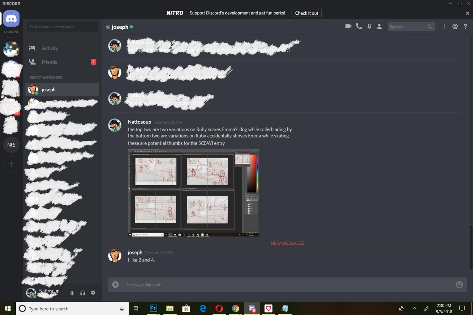
Sending the thumbnails off for critique:
Visually Narrowing Down the Playing Field:
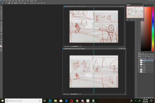
Self Critique:
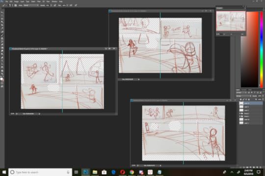
What can I carry into Thumbnail 2 from the other thumbnails?
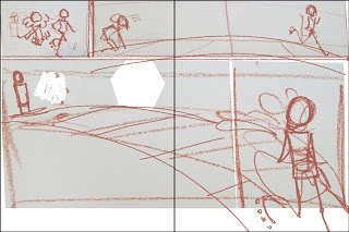
Panel 3, Ruby looking back to see what the commotion is about
Panel 3, dog cowering more, maybe fully behind Emma, paws over his head?
Panel 2: maybe pull in more, show Emma's expression as Ruby passes?
Note: Draw Ruby with her helmet- so she probably can't see or hear very
Am I giving too much space to the third panel?
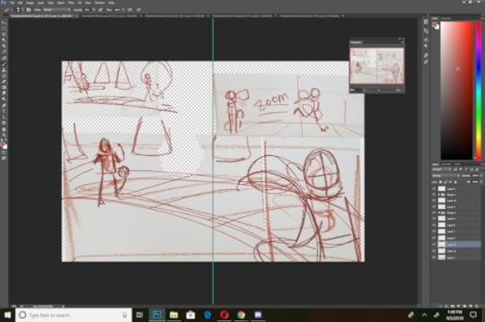
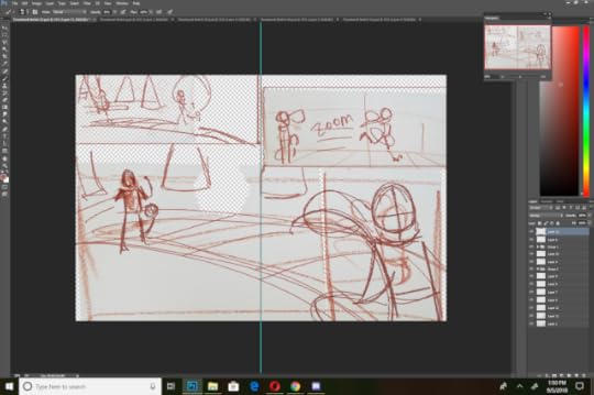
Refinement:
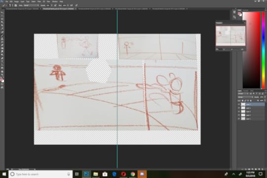
Although this is a thumbnail, I worked at scale, but kept my sketches simplified, as I still plan on refining this in a 'roughs' stage.

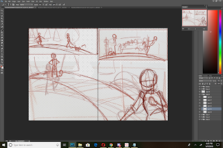
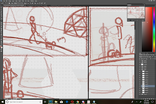
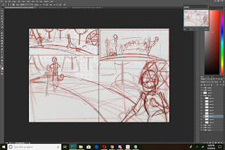
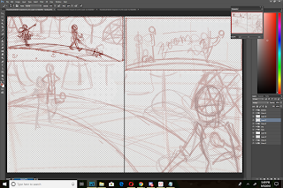
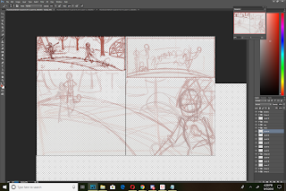
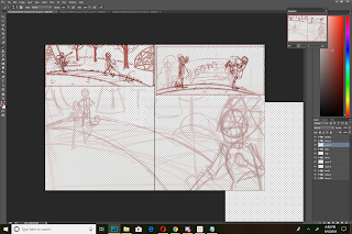

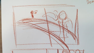
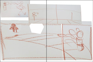
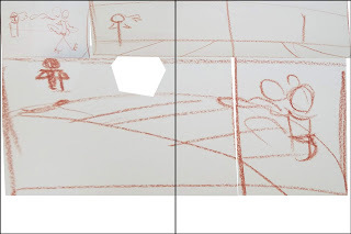
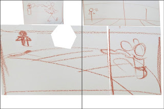
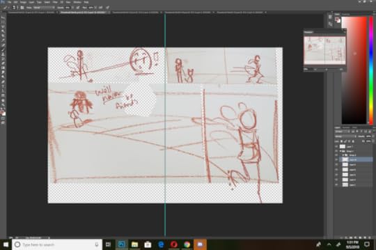
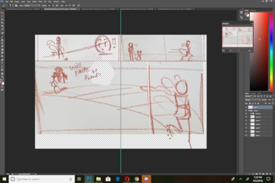
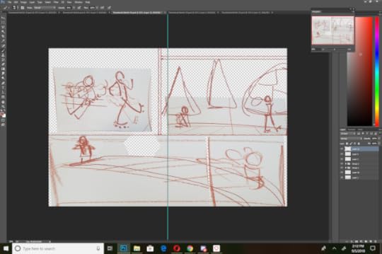
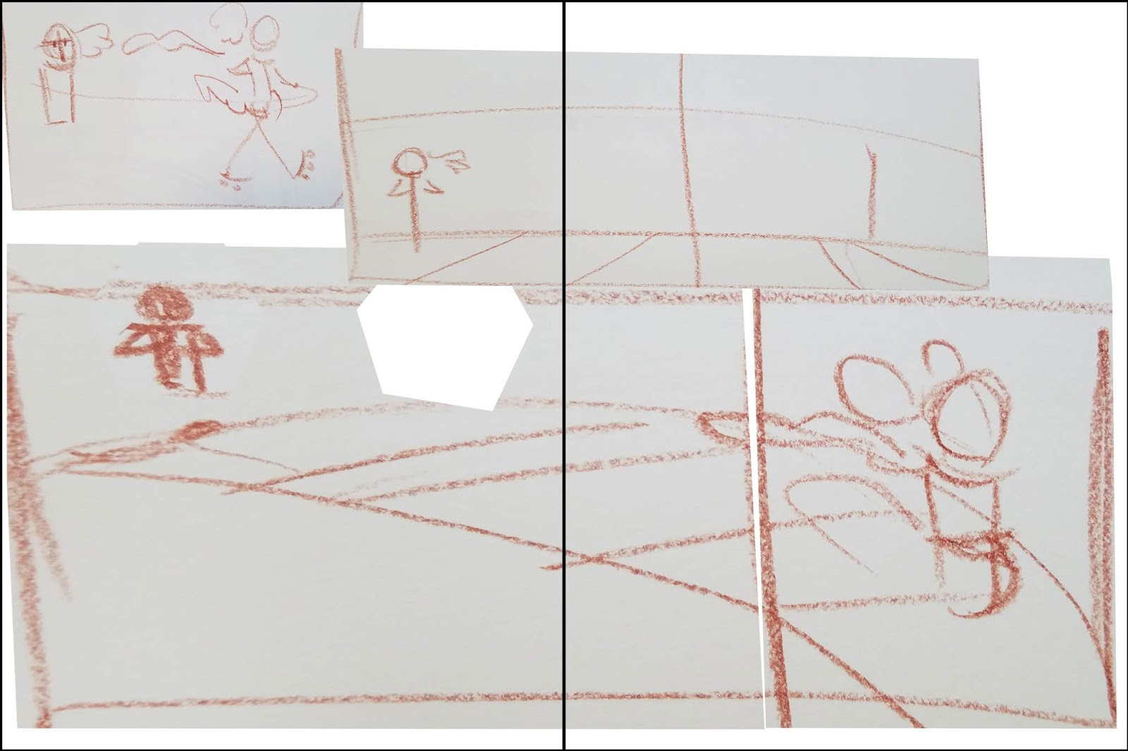
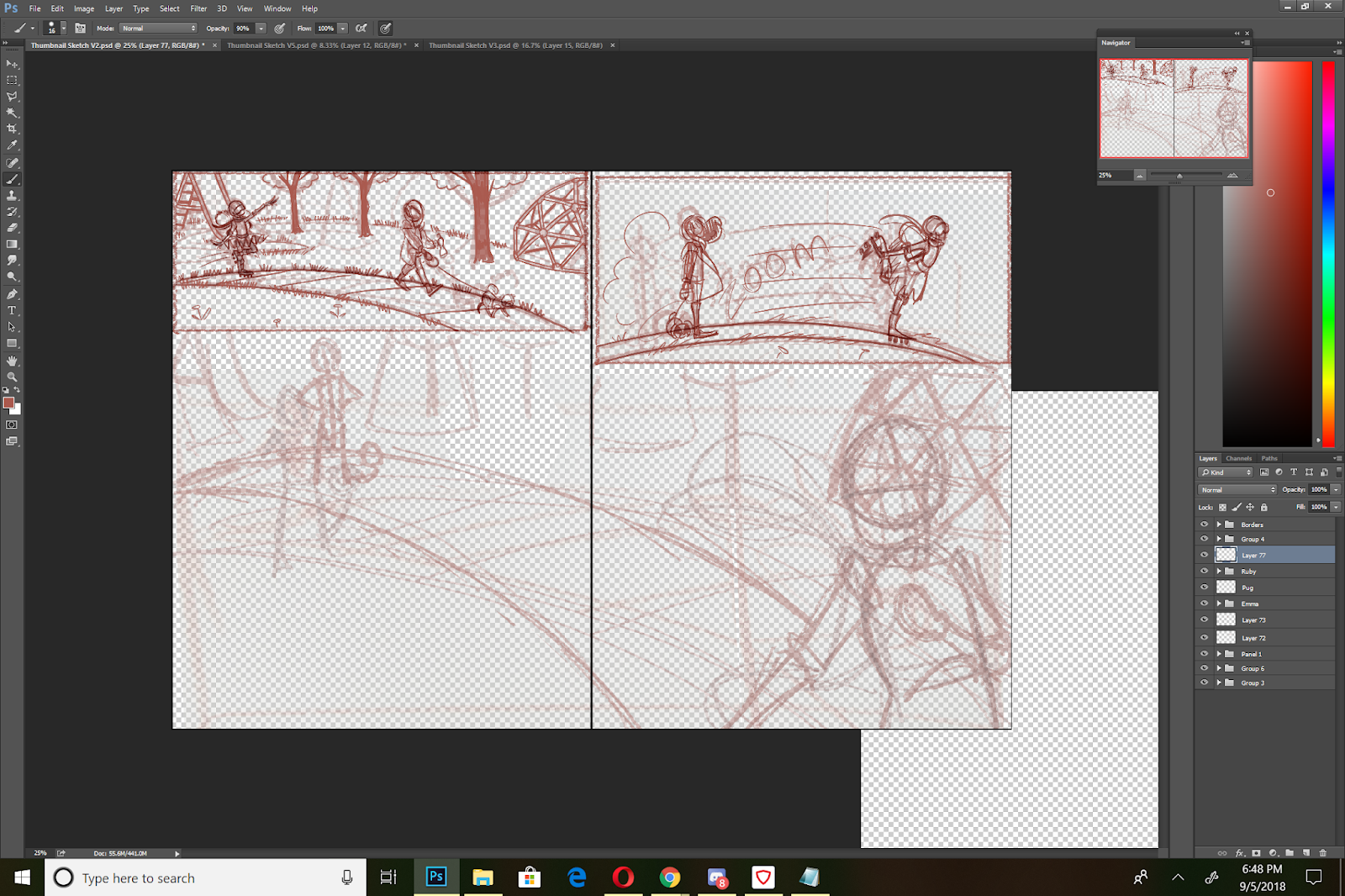
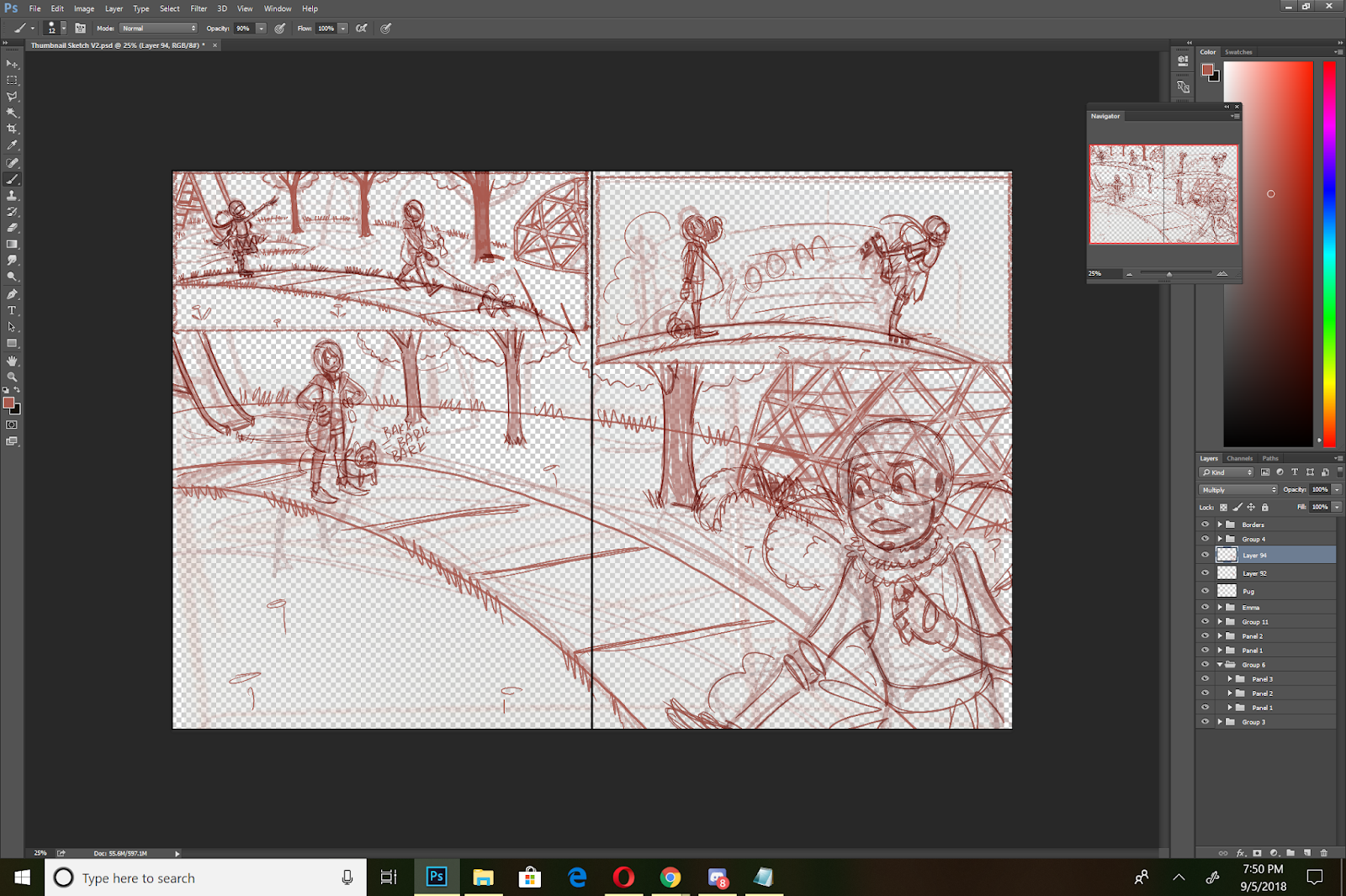
Final Thumbnail:
I resized my thumbnail for print, reducing it from 12"x18" to 7.7"x15", and split the whole image into two halves for the printed blueline roughs stage.
This process allows an artist to work seamlessly from concept to finished rough, but its up to the artist to create opportunities for feedback and self critique.
Please consider donating to this blog or purchasing from Natto-shop (http://nattosoup.com/shop) if you want me to continue publishing quality content. All materials tested were purchased from my own pocket. Keep on Truckin' Nattosoup is not under any sponsorship.
When to use this method:
When you're working off or without a scriptWhen working from the script isn't quite working for you, or giving you the storytelling you wantWhen there are multiple directions you can go with a story, and you want to feel them out before committingWhen pitching a project to a clientWhen you don't quite have a feel for the project
This method is great for quickly hammering out a variety of compositions or layouts without dedicating significant time to any of them, and without destroying the originals.
Base Sketches:


Saving Versions:
 Creating Iterations:
Using rough transform tools and resizing your base panels, you can create a variety of basic sketches from the elements above:
 V1
V1 V2
V2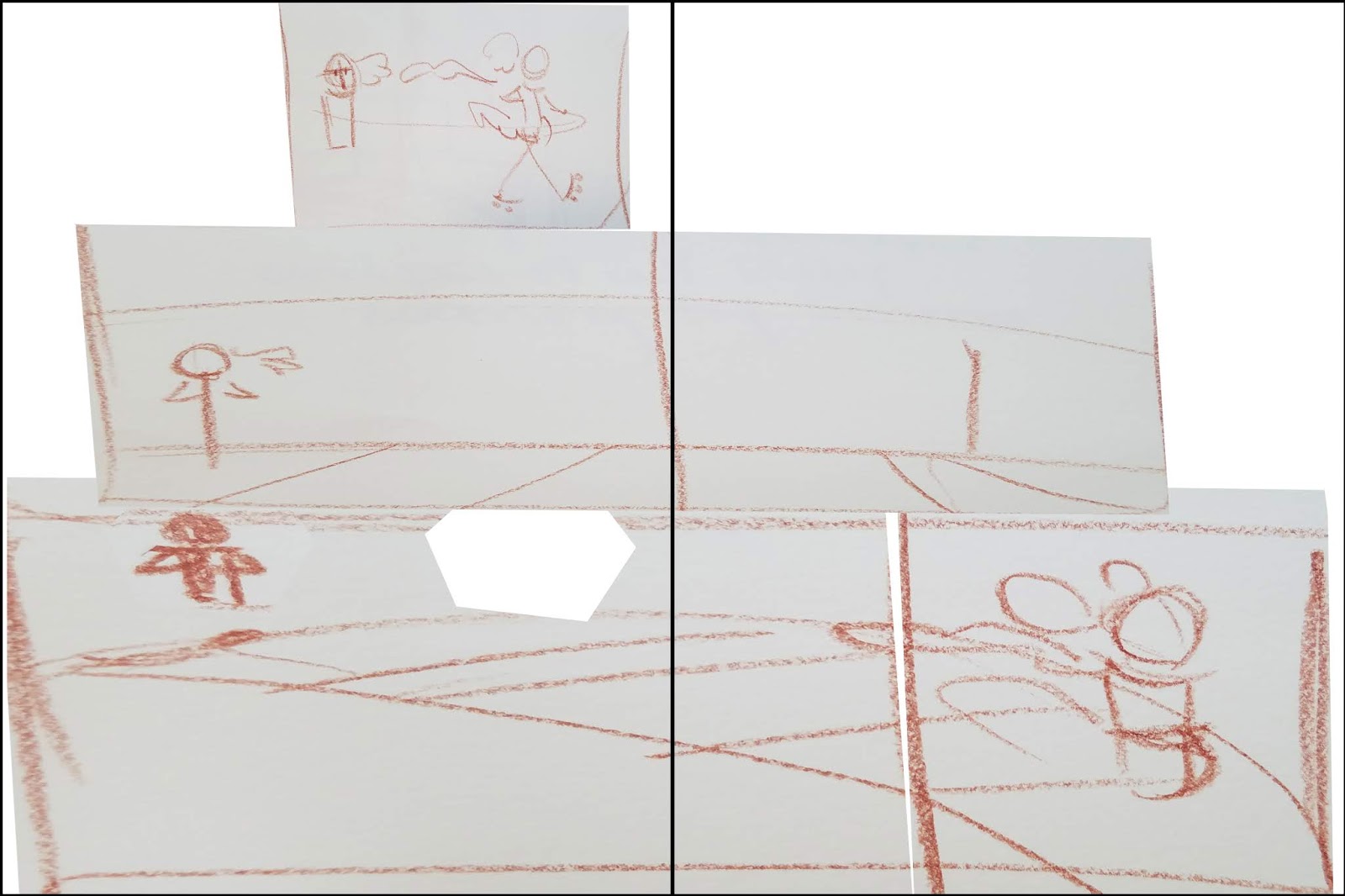 V3
V3 V4
V4 V5
V5As you can see, these are REALLY rough. But they also give an idea of panel placement and layout, without a lot of redrawing. I cranked these five out in about ten minutes, and I can spend thirty minutes refining all of them so that they better express the thumbnail, and then choose my best option from there. I can also completely redraw elements using this as a base. I also have the option of refining only the most likely candidates, or passing these by a beta reader to help me select which ones to refine.
Refining These Sketches Into Thumbnails:
Colorpicking and Selecting a Brush:

V1: Refinement:


V2 Refinement:


V3: Refinement
V5 Refinement:


It seems that every version starts to tell a slightly different story, so it's time to get some feedback, decide on the sort of story I want to tell, and select a layout that best tells that story.
Two stories going on here:
Ruby zooms past Emma, scaring Emma's dog
Ruby, zooming past Emma, accidentally shoves her, causing her to fall
 V1Scaring Dog
 V2Shoving
 V3Shoving
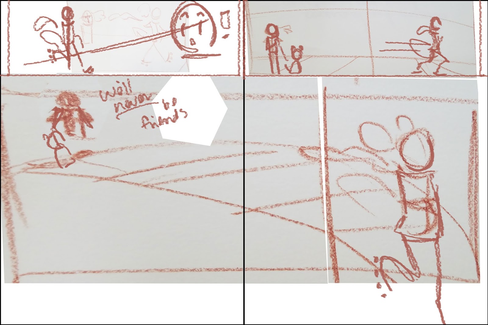 V5Scaring Dog
Creating a Comparison:
I rescaled all of my options and laid them out on my screen for a quick visual comparison.
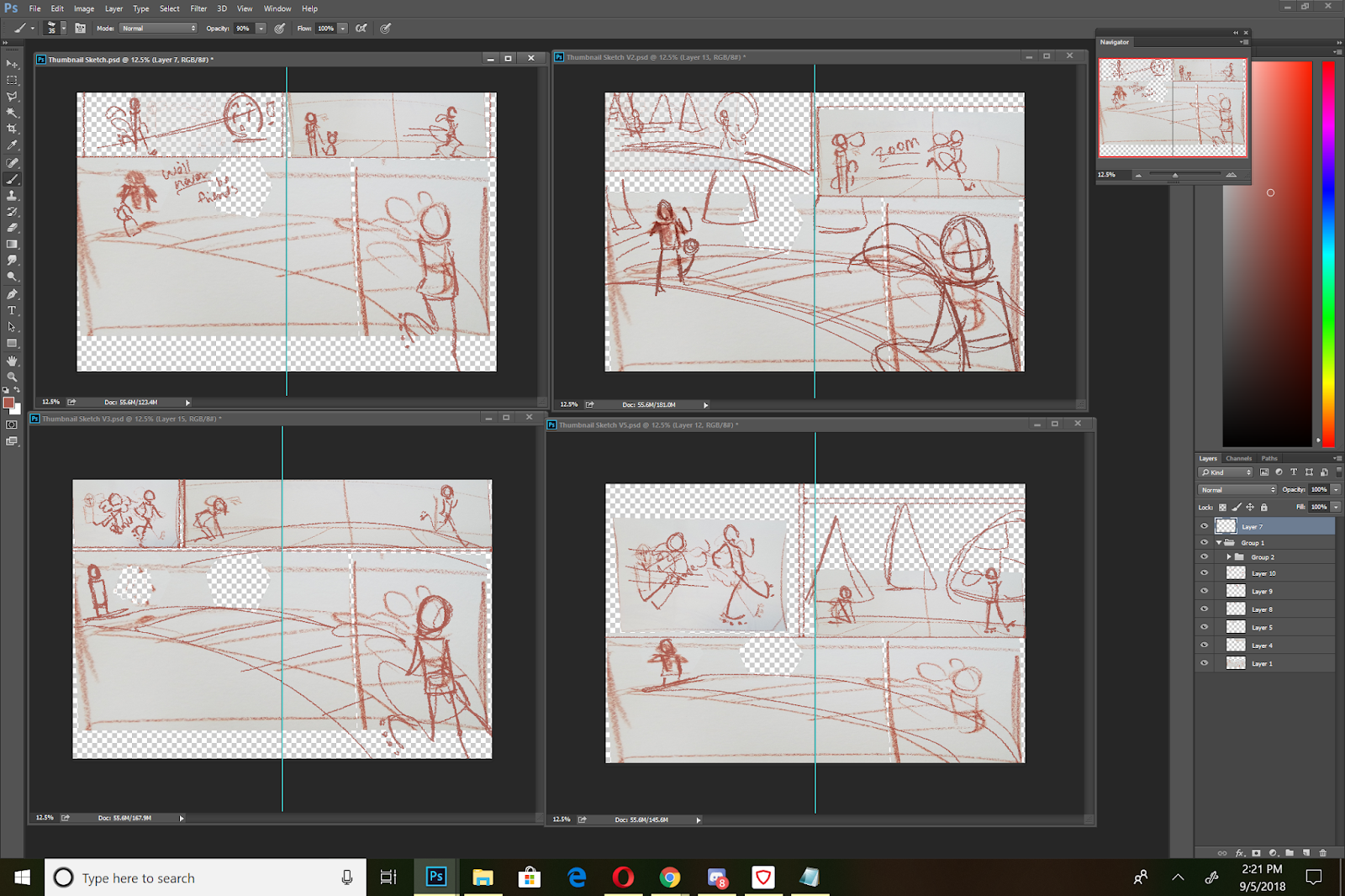
Figure out what works and what doesnt:
My Personal Notes:
Either story is valid, but the dog story might mean more to kids reading it, and makes more sense considering you're using just one spread to tell a story. For the dog stories, thumbnail 2, with reworking, might be the bset option. It has an establishing shot that shows the setting (a park), the characters (Emma and her dog, Ruby on rollar skates), an action panel (the second), and the result panel (the third, if you drew the dog cowering more).
For the shove storyline, thumbnail 3 might work best, also with some tweaks. Panel 1 shows the action, foregoing establishing setting (which wouldn't be necessary if this were say, mid chapter), but although Panel 2 gives an indication that Ruby has way moved on from the scene of the crime, it breaks the pagebreak. This isn't the biggest problem, since neither character are split by that pagebreak, but it might be best to give panel 1 more room, and do a better job establishing setting in panel 2 and 3. Panel 3 inplies that Ruby realized something is wrong, and did look back to see if Emma was ok, giving her a bit of redemption, since she didn't just hit and run.
Sending the thumbnails off for critique:
Visually Narrowing Down the Playing Field:
Self Critique:
What can I carry into Thumbnail 2 from the other thumbnails?
Panel 3, Ruby looking back to see what the commotion is about
Panel 3, dog cowering more, maybe fully behind Emma, paws over his head?
Panel 2: maybe pull in more, show Emma's expression as Ruby passes?
Note: Draw Ruby with her helmet- so she probably can't see or hear very
Am I giving too much space to the third panel?
Refinement:
Although this is a thumbnail, I worked at scale, but kept my sketches simplified, as I still plan on refining this in a 'roughs' stage.


Final Thumbnail:
I resized my thumbnail for print, reducing it from 12"x18" to 7.7"x15", and split the whole image into two halves for the printed blueline roughs stage.
This process allows an artist to work seamlessly from concept to finished rough, but its up to the artist to create opportunities for feedback and self critique.
Please consider donating to this blog or purchasing from Natto-shop (http://nattosoup.com/shop) if you want me to continue publishing quality content. All materials tested were purchased from my own pocket. Keep on Truckin' Nattosoup is not under any sponsorship.
September 3, 2018
Recent Illustrations
Since returning from my two-month con tour, I've tried to focus on a couple things- using older linart and finishing up pieces, and plowing through watercolor field tests for the brands that are mid-review. As always, it takes a while for things to make their way through the pipeline, but I wanted to share a few of my favorite illustrations with you guys, to whet your whistles for things to come.
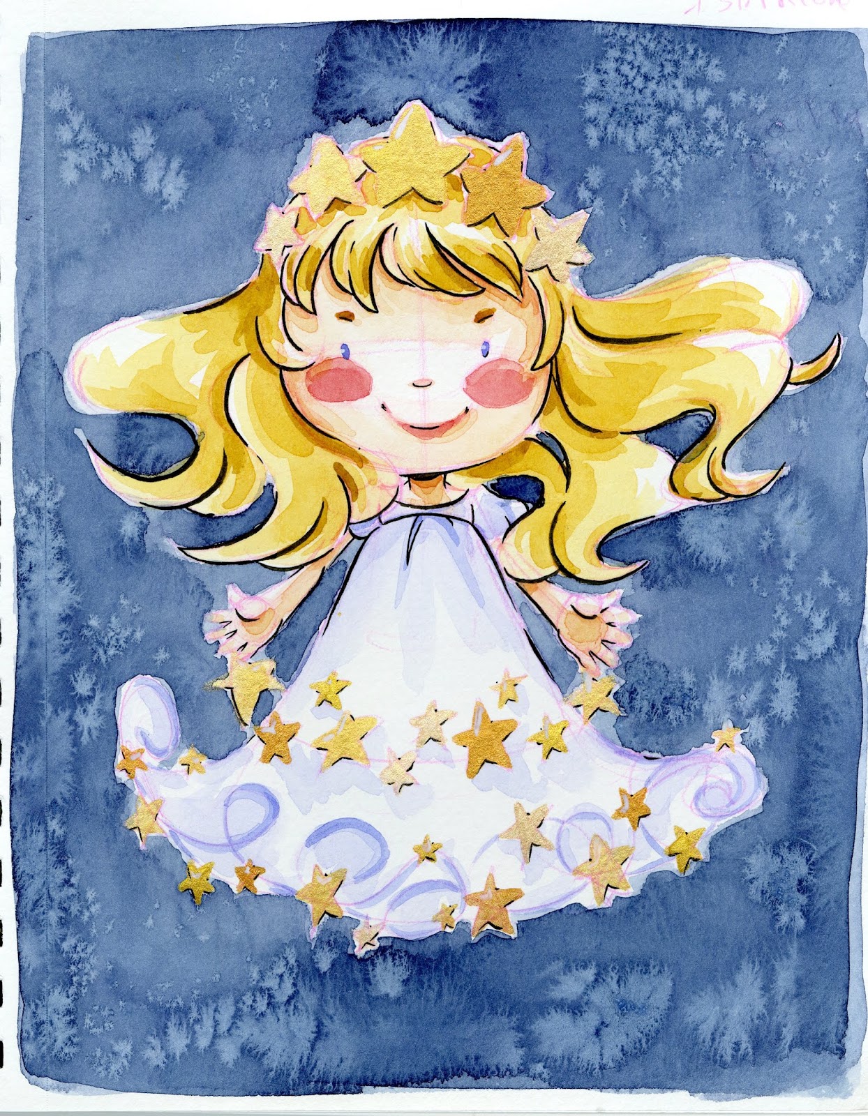
 Kuretake Gansai Tambi Starry Skies Metallic Palette Field Test
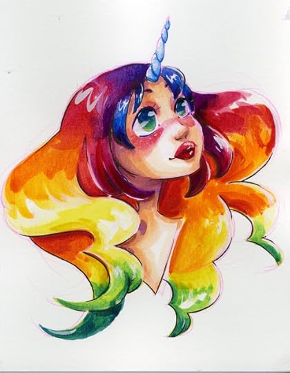 Unicorn Rainbow Hair demonstration
 Boku-Undo Sumi Gansai field test
 Sakura Koi CAC (Creative Artist Colors) Field Test
 Crayola Washables Challenge
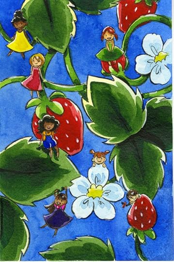
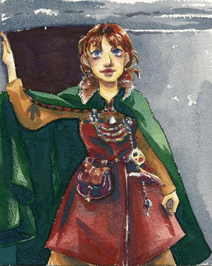
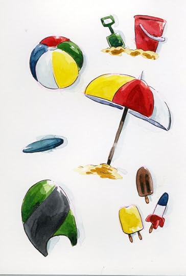 Summer Fun Watercolor Sketches
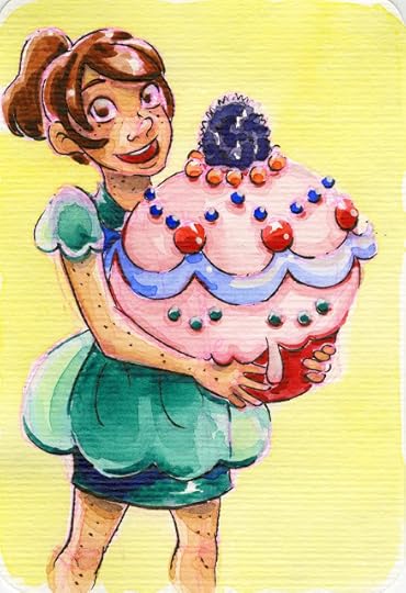
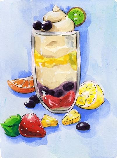
 Tasty Treats Watercolor Sketches
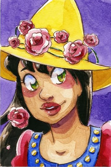
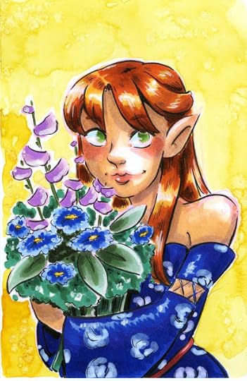 Mixed media- watercolor and alcohol markers over pink lineart
 Mijello Mission Gold Field Test
 Shin Han Professional Watercolors Field Test
 Anthesis Arts Handmade Watercolors- Meadow palette field test
 Turner Watercolors field test
 Derwent Inktense Travel Pans Field TestI just dropped off my hard drive containing the videos for many of these illustrations today, so hopefully I'll have the completed field test videos up and available for my Patrons soon!
Please consider donating to this blog or purchasing from Natto-shop (http://nattosoup.com/shop) if you want me to continue publishing quality content. All materials tested were purchased from my own pocket. Keep on Truckin' Nattosoup is not under any sponsorship.
 Kuretake Gansai Tambi Starry Skies Metallic Palette Field Test
 Unicorn Rainbow Hair demonstration
 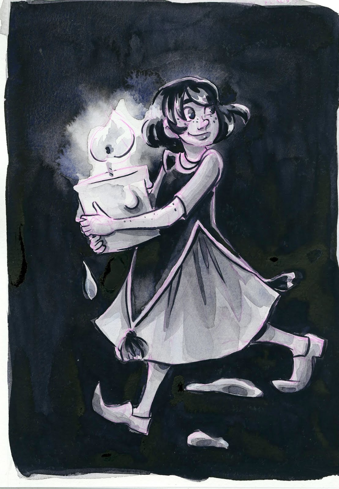 Boku-Undo Sumi Gansai field test
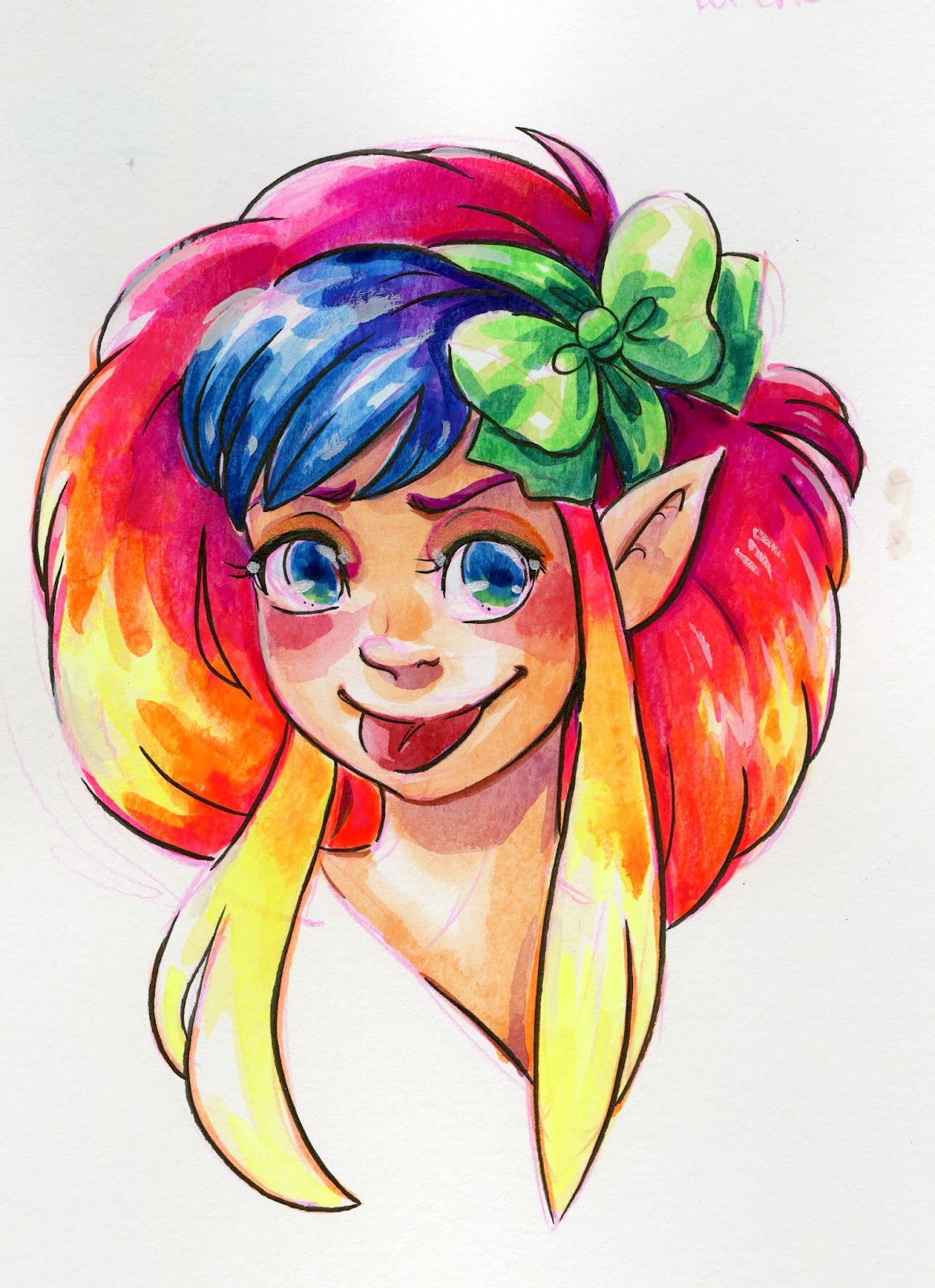 Sakura Koi CAC (Creative Artist Colors) Field Test
 Crayola Washables Challenge
 Summer Fun Watercolor Sketches
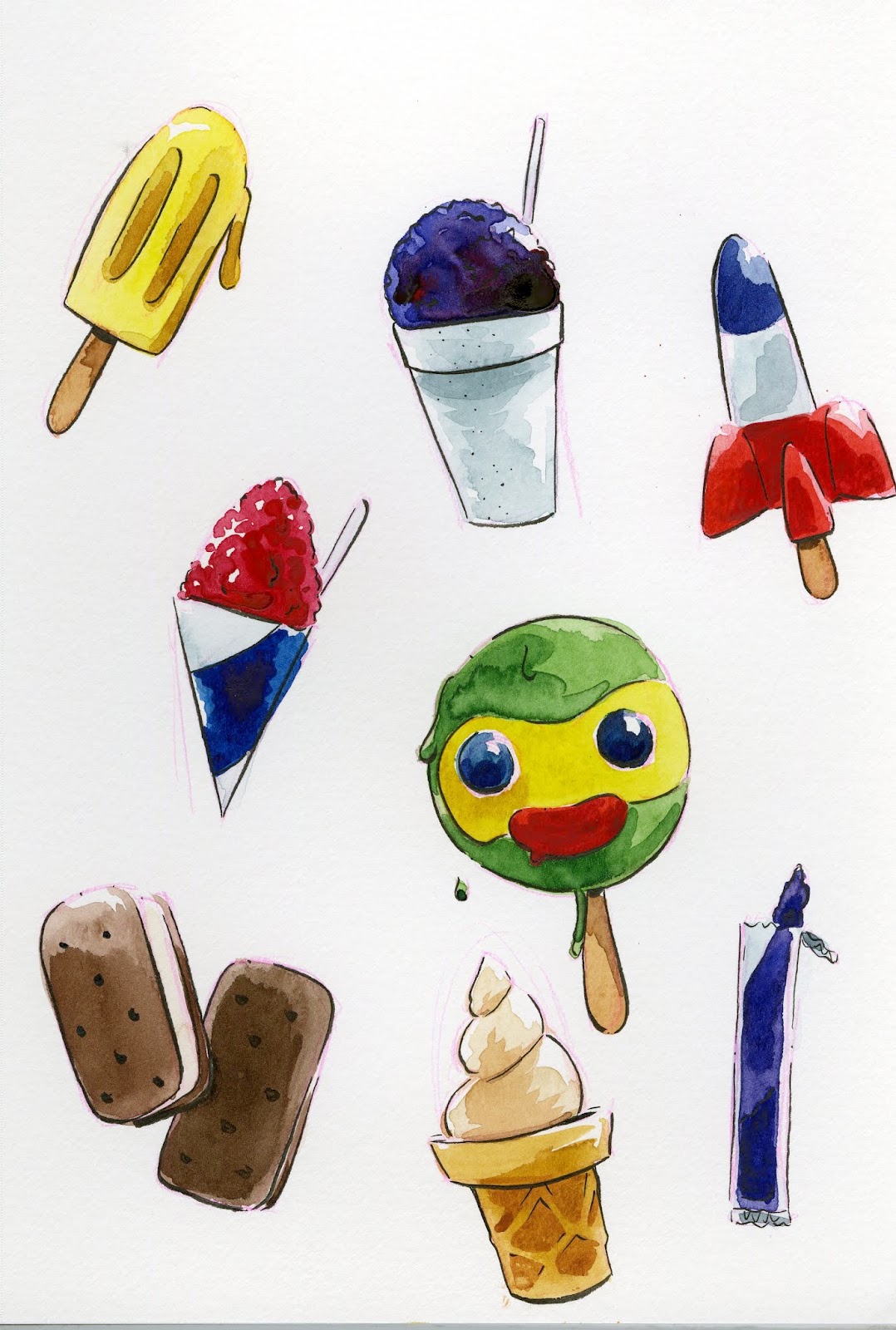 Tasty Treats Watercolor Sketches
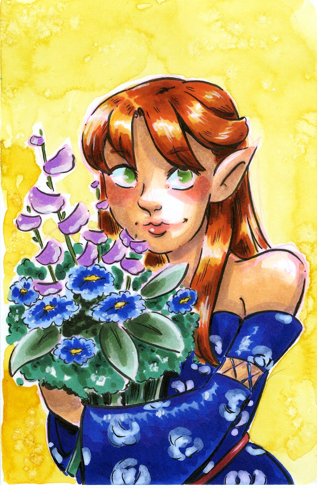 Mixed media- watercolor and alcohol markers over pink lineart
 Mijello Mission Gold Field Test
 Shin Han Professional Watercolors Field Test
 Anthesis Arts Handmade Watercolors- Meadow palette field test
 Turner Watercolors field test
 Derwent Inktense Travel Pans Field TestI just dropped off my hard drive containing the videos for many of these illustrations today, so hopefully I'll have the completed field test videos up and available for my Patrons soon!
Please consider donating to this blog or purchasing from Natto-shop (http://nattosoup.com/shop) if you want me to continue publishing quality content. All materials tested were purchased from my own pocket. Keep on Truckin' Nattosoup is not under any sponsorship.
August 30, 2018
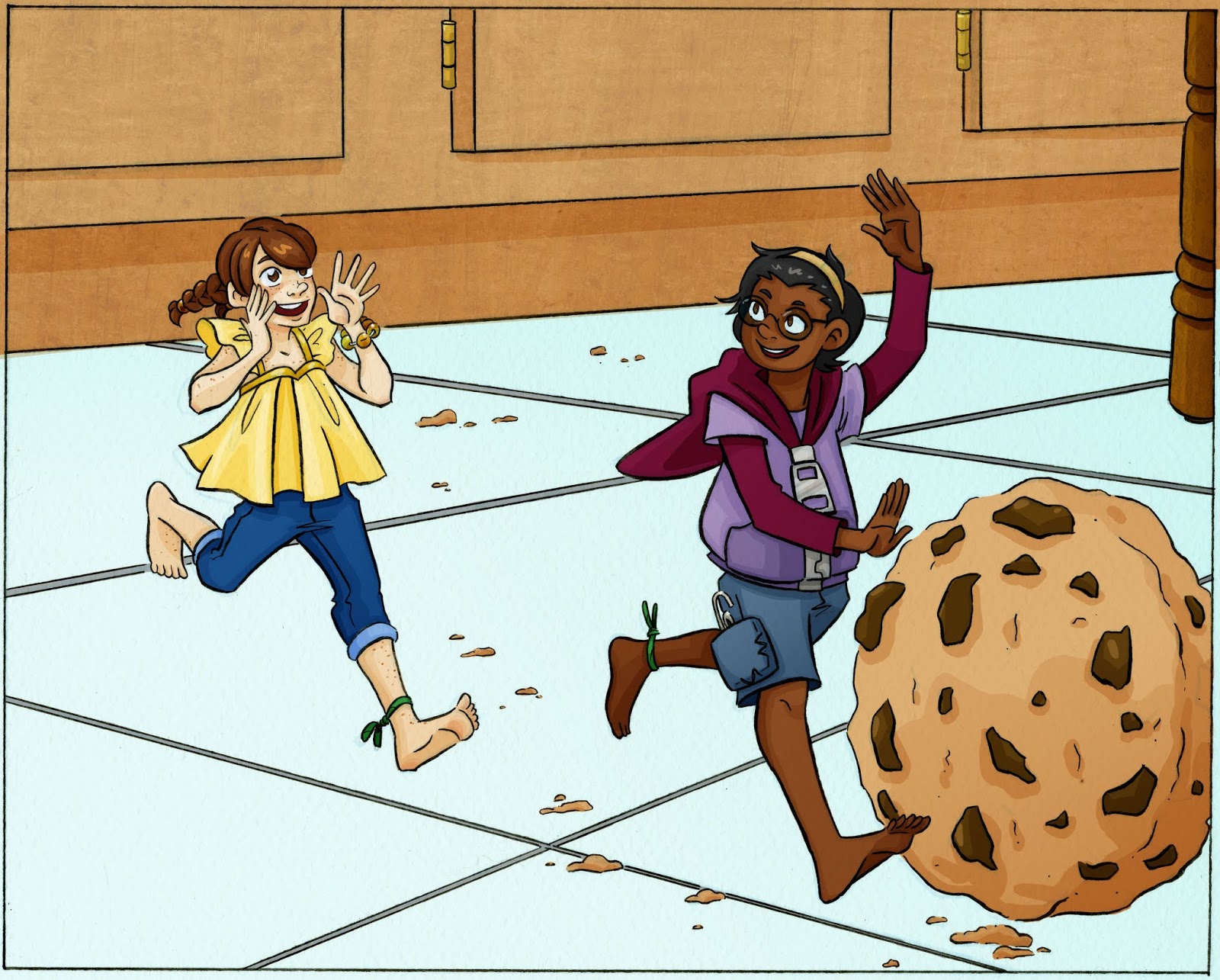
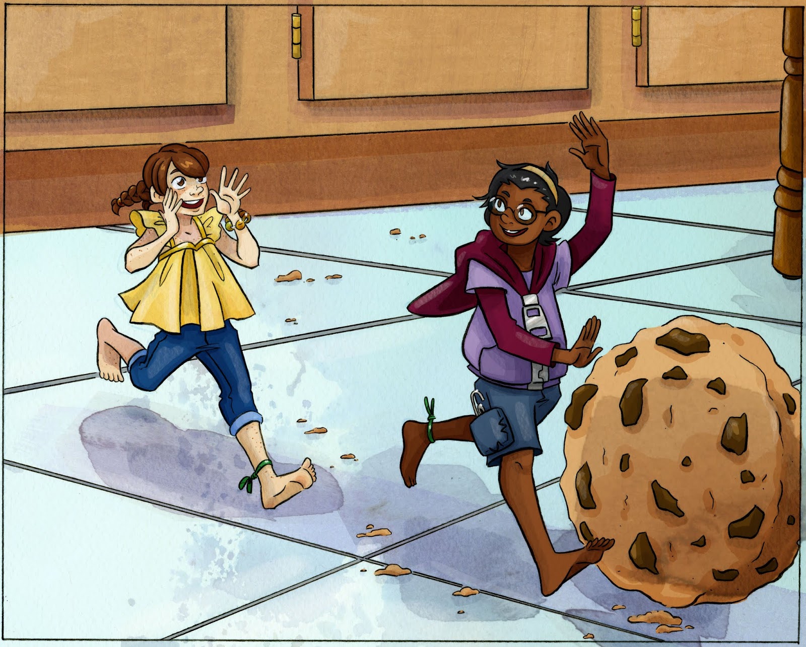
Cookie Roll Commission Process

This illustration was completed as a commission- the customer wanted a digital piece with a watercolor feel, involving his Lilliputian Wangou and Kara playing together. If you are interested in commissioning something, don't hesitate to email me for a quote!
Character Design and Concept:
Although the commissioner already had a design for Wangou, he requested a redesign that would reflect the aesthetics of 7" Kara.
Although this is a digital commission, I do my best brainstorming with a color pencil in hand, so I utilized my sketchbook and tracing paper to hash out a revised design.
Tracing paper allows me to reuse the same framework and devise new clothing options quickly and easily.

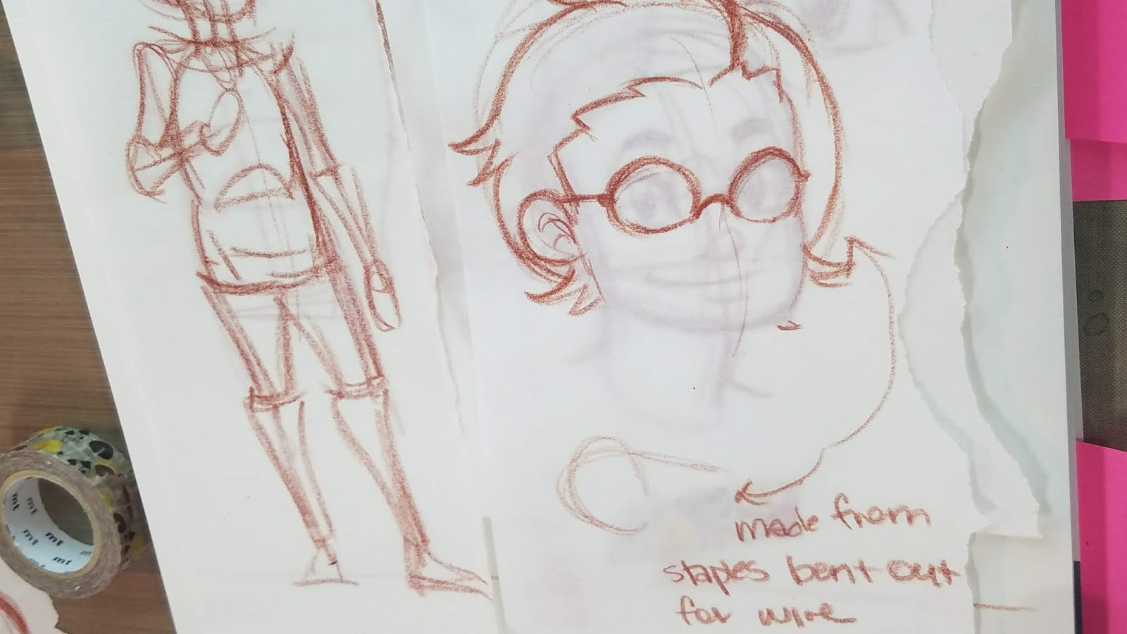


I also sketched out a Kara wireframe, for easy size reference.

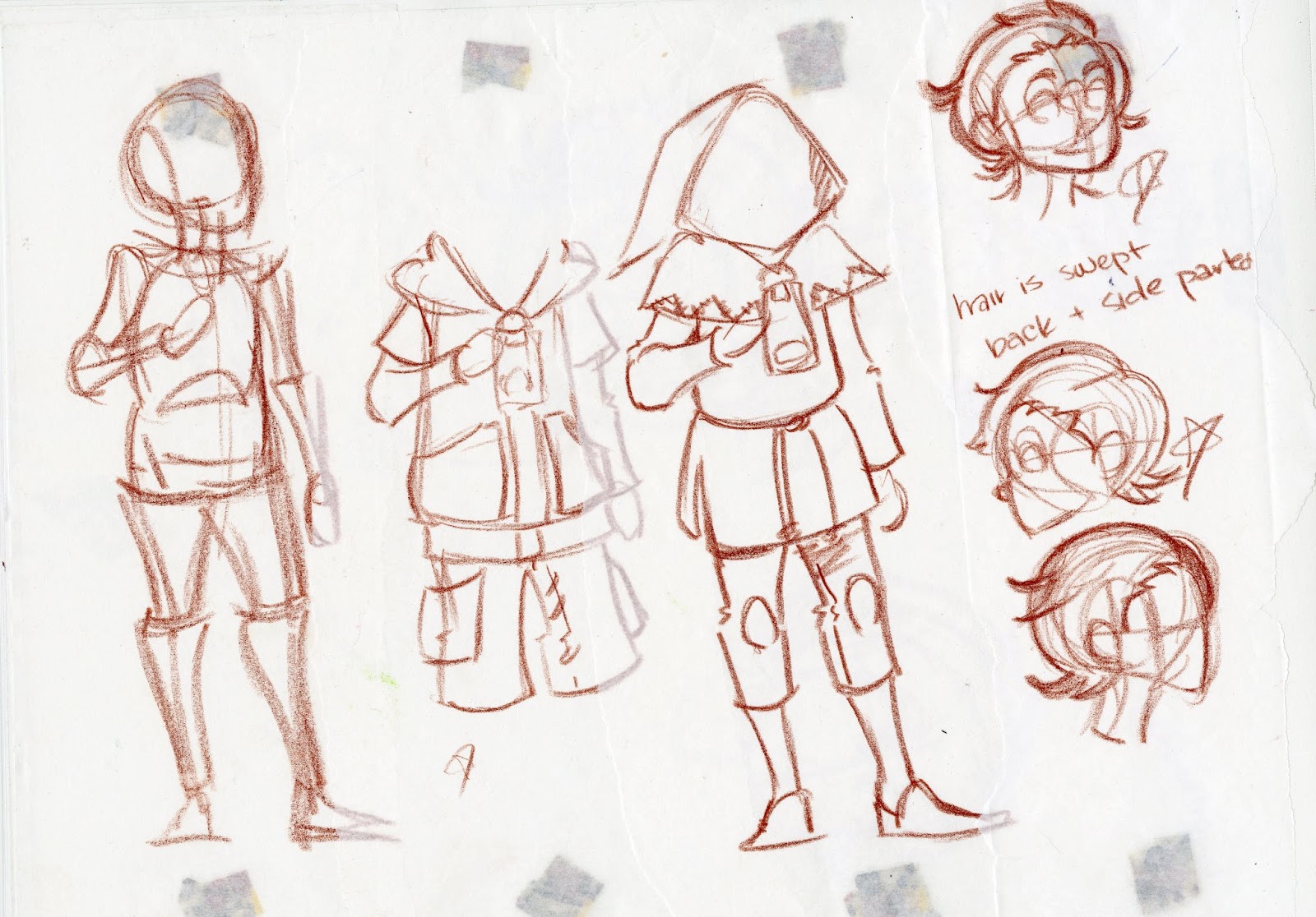
To share this with my customer, I laid out my interations side by side, so they would be easier to parse.

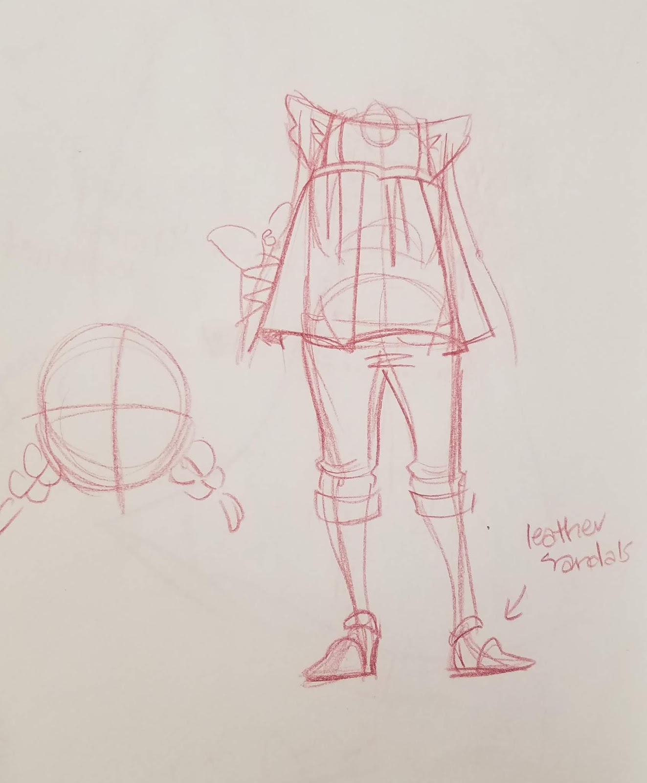
Once I'd hammered out the details, I redrew Wangou in his final design, so I had all my reference handy and condensed.
Final Character Designs:

For Kara, I selected one of the outfits I liked from Chapter 8.
Thumbnails:
When planning illustrations, particularly those that involve a background or movement, I like to generate a few thumbnails, and select my favorite (or allow the customer to choose their preference). This is a great way to play with a variety of ideas with low commitment.
 Wangou handing a cookie down to Kara
 Wangou and Kara rolling a cookie like a hula hoop
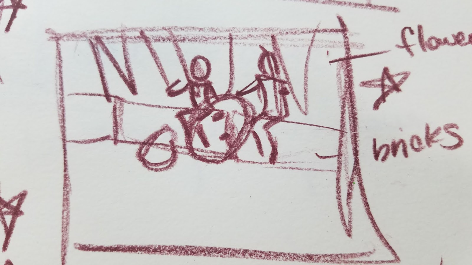 Wangou and Kara sitting on the edge of a sidewalk, eating their cookie
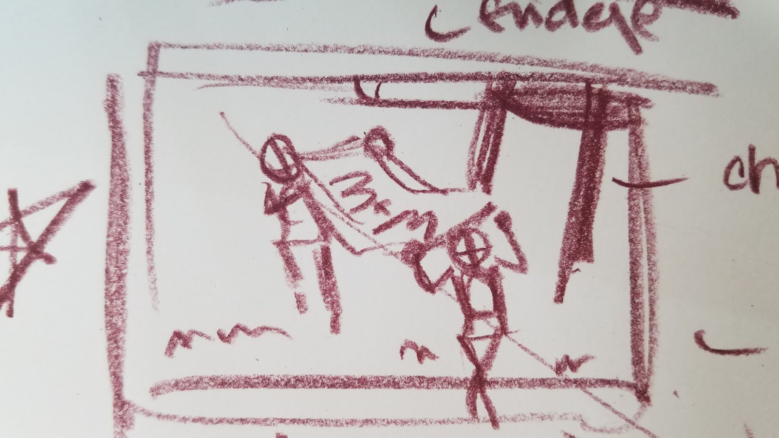 Wangou and Kara stealing a pack of M&M's
 Wangou and Kara sneaking the M&M's down a grate
The customer selected the cookie roll, and I began refining the idea.
Sketch:
The sketch and design process for this commission is very similar to that used in Planning an Illustration in Photoshop, so I recommend you check that post out for an indepth exploration of the process.
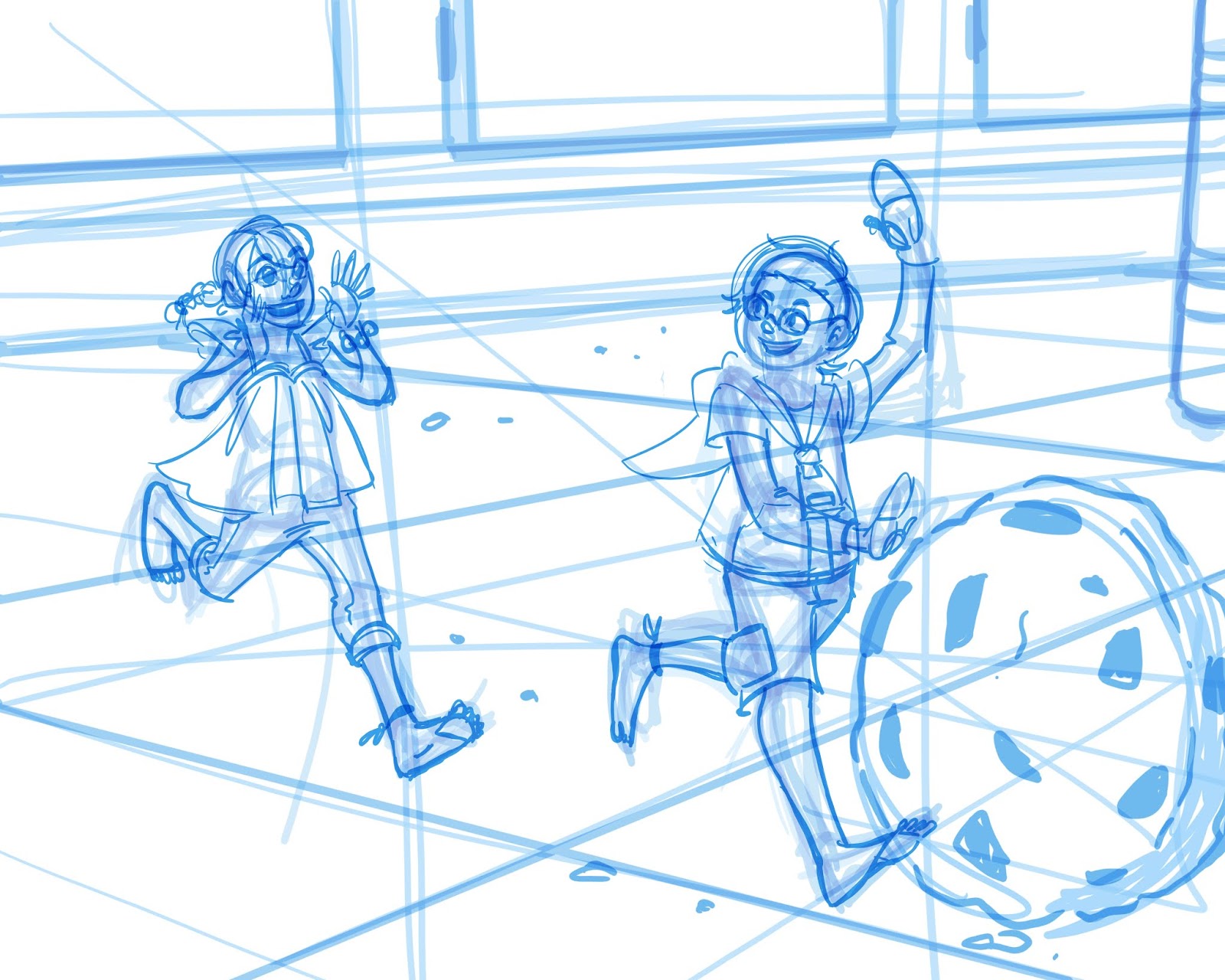
Tight Sketch:
This sketch was converted to bluelines, and printed on Fabriano Studio watercolor paper- which I enjoy using for inks, but cannot recommend for watercolor.
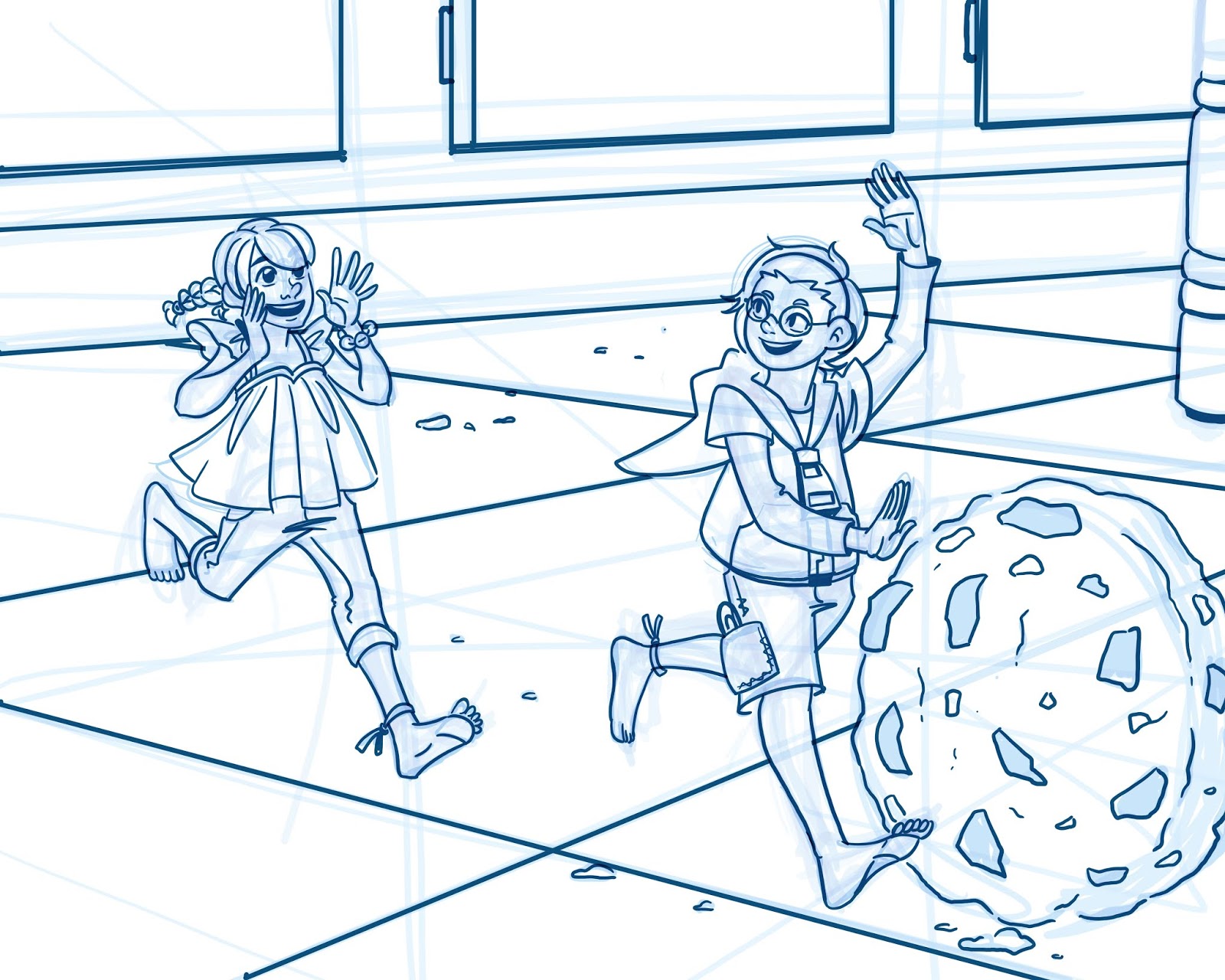
Inks:
 This was inked with a Sakura Pigma FB (a pigment based brushpen) and scanned to preserve the watercolor texture.
Flats:

Digital Shading and Texture:
After flatting this piece, I began by blocking in my shadows, utilizing layers, layer opacity, and multiply mode.
As I worked, I introduced more traditional media scans and textures- papyrus, scanned corn husks, and loads of watercolor splotches and bleeds to add interest and texture.
The Completed Piece
I really enjoyed this opportunity to work in a different medium, and to utilize mixed media techniques to achieve an illustration that pleased my customer. Many artists think traditional media and digital media have to be divorced, but regardless of my end product, I utilize both in the majority of my art and comics. I hope today's post has inspired you to mix up your process, or perhaps try something new!
Please consider donating to this blog or purchasing from Natto-shop (http://nattosoup.com/shop) if you want me to continue publishing quality content. All materials tested were purchased from my own pocket. Keep on Truckin' Nattosoup is not under any sponsorship.

August 27, 2018
Planning an Illustration Using Photoshop

Digital sketching and planning use the same basic concepts as constructive figure drawing and sketching on traditional media. I'll often work with both traditional (thumbnail, inks, final piece) and digital (sketching and cleanup, digital colors, corrections) to create a final illustration. Working mixed media like this allows me the ease of resizing and correction without total redraws.
I often begin with a traditional media thumbnail (or several thumbnails) as it's easier for me to think when I am using pen or color pencil in my sketchbook. Digitization at this stage is lazy- often I'll just take a photo of it with my smartphone, and send it to myself via Discord. This is saved in a commission folder and opened in Photoshop. I'll recenter the sketch, change the size and ratio, and bump the opacity down, and then I'm ready to start sketching. Layers and layer settings are utilized like onion skin to develop sketches and figures, and I work using my Surface Pro 3, as it allows me to run Photoshop and sketch directly on the screen.
This piece was created as a commission- the customer wanted tight inks like I did for my Inktober 2017 series, Lilliputian Living. For today's walkthrough, I'm going to focus on developing the sketch and the figures.
Initial Sketch

My initial thumbnail is tiny- maybe 2"x3". The end piece needs to be about 8"x10", so I scale up my thumbnail and work at that scale.
Blocking in Figures:

I begin with a line of action and a rectangular shape. This rectangle blocks in the torso, the line of action determines movement and gesture.
From there, I use an egg shape to block in the ribcage.
And a bean shape to block in the pelvis.
Once those have been blocked in, I knock the opacity back, and use sticks to block in the limbs, and balls for the head and hands.
Once this is completed, I have a fairly good idea of what the gesture will be, as well as a great starting point for the figures I plan on drawing.
Blocking in Background:

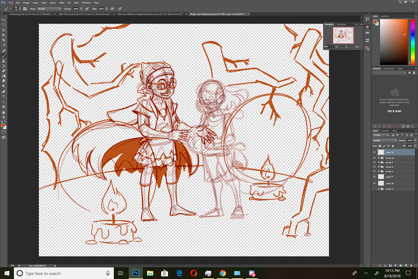
Since the prompt is a mage with his familiar, I thought the setting should be somewhere dark and secretive. Since the mage is Lilliputian, I thought perhaps a hole in the ground, complete with tree roots, would serve as a cave.
So I begin by lightly sketching in the environment, framing the 'live' area with treeroots and dirt.

Next I sketch in my lightsources- two candles- as well as the light they cast.
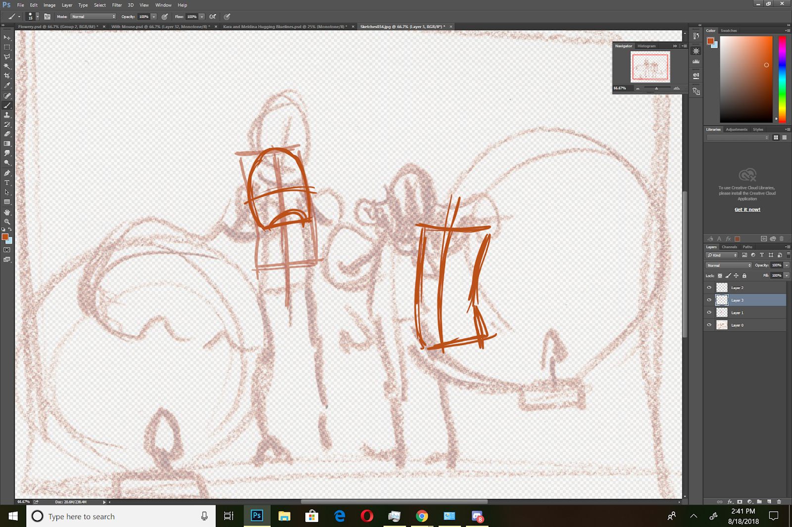
Refining Figures:
Refining Poses and Skeletal Frames:

I reduce the opacity on everyting, and create a new sketch layer.
I redraw my skeletal figures.
And reduce the opacity on everything again.
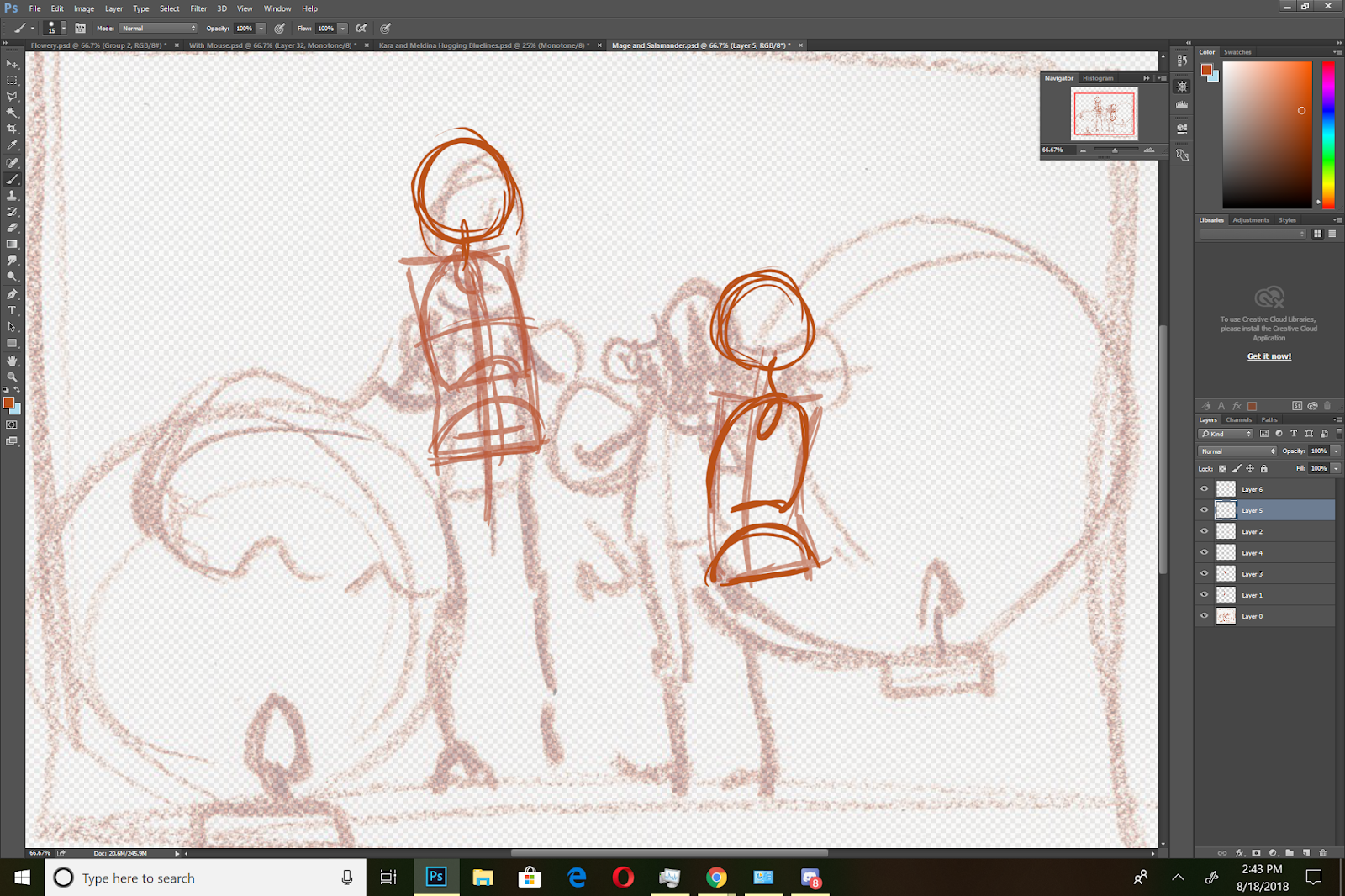
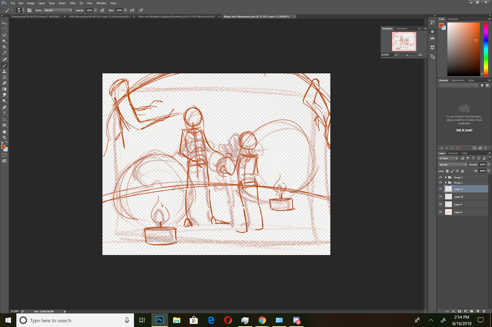
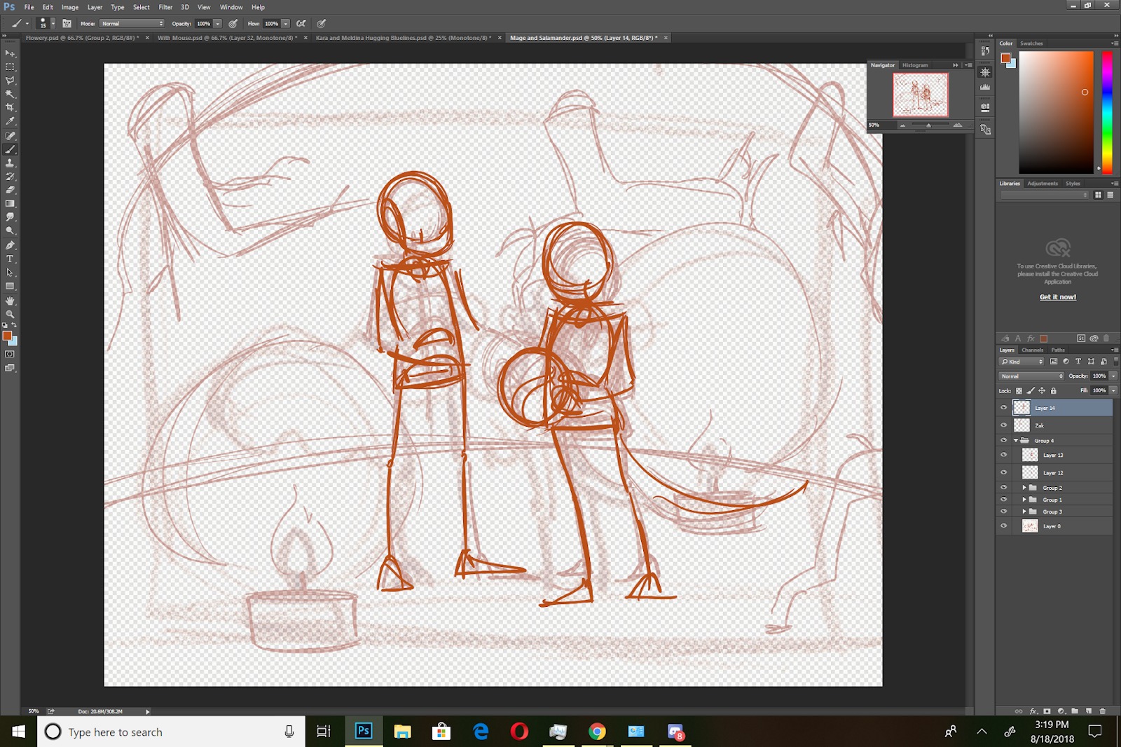
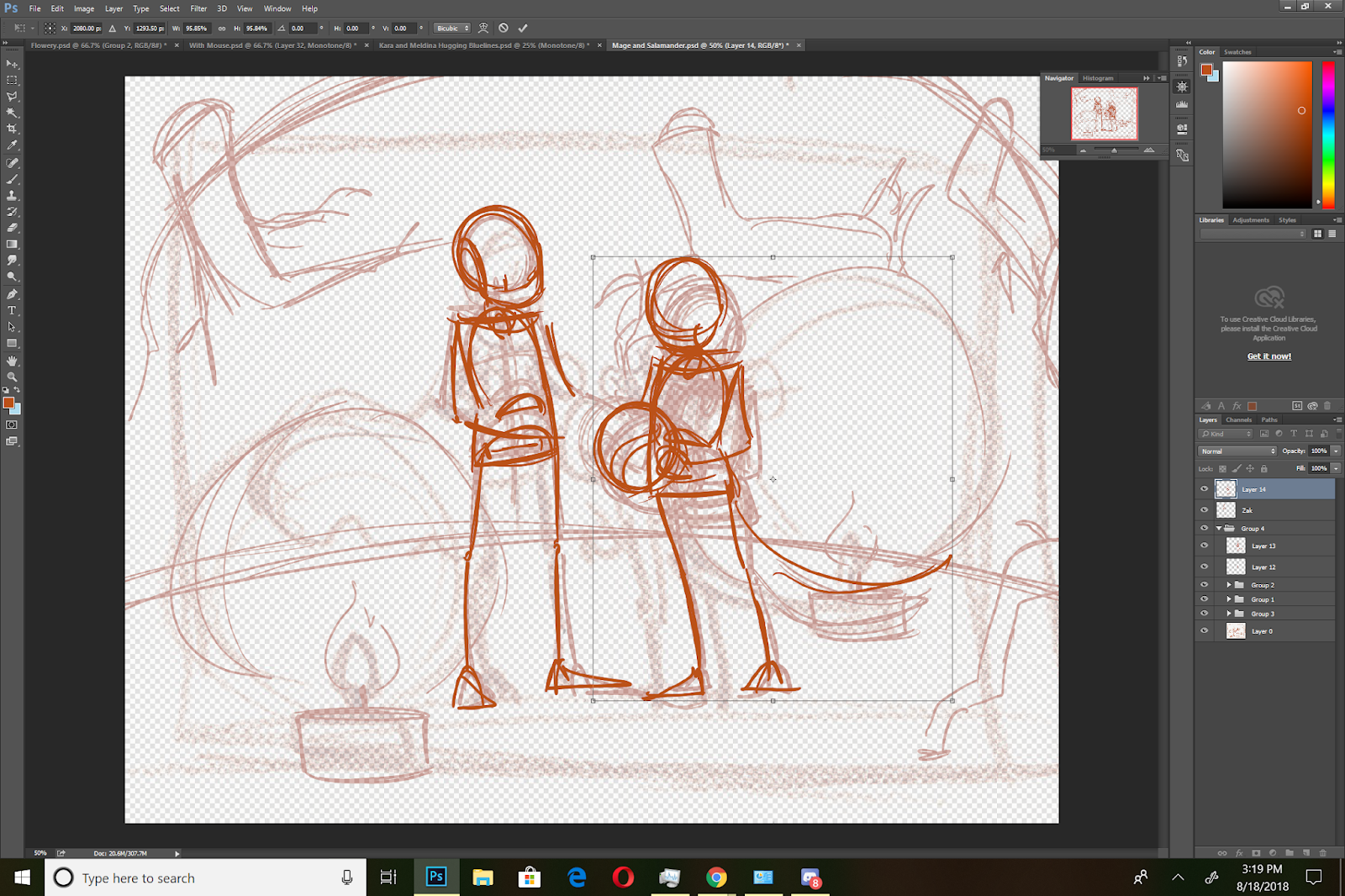
Constructing the Figures:

Using cylindars and spheres, I begin fleshing out the figures around the wireform skeletons.
I also develop the head- starting with a sphere, adding a curved plane for the face, and contouring the shapes.
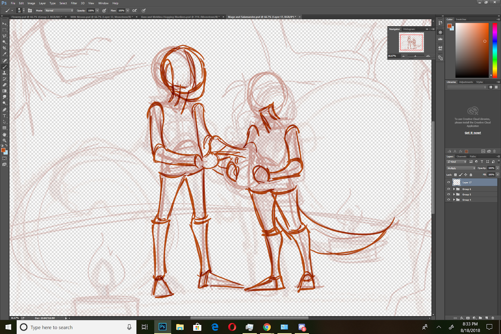
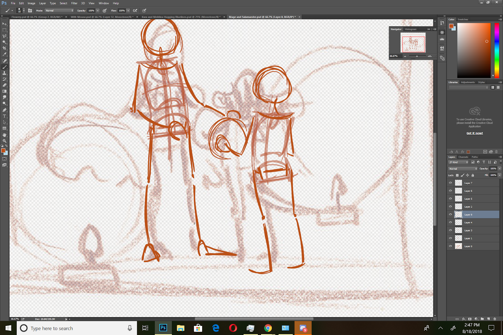
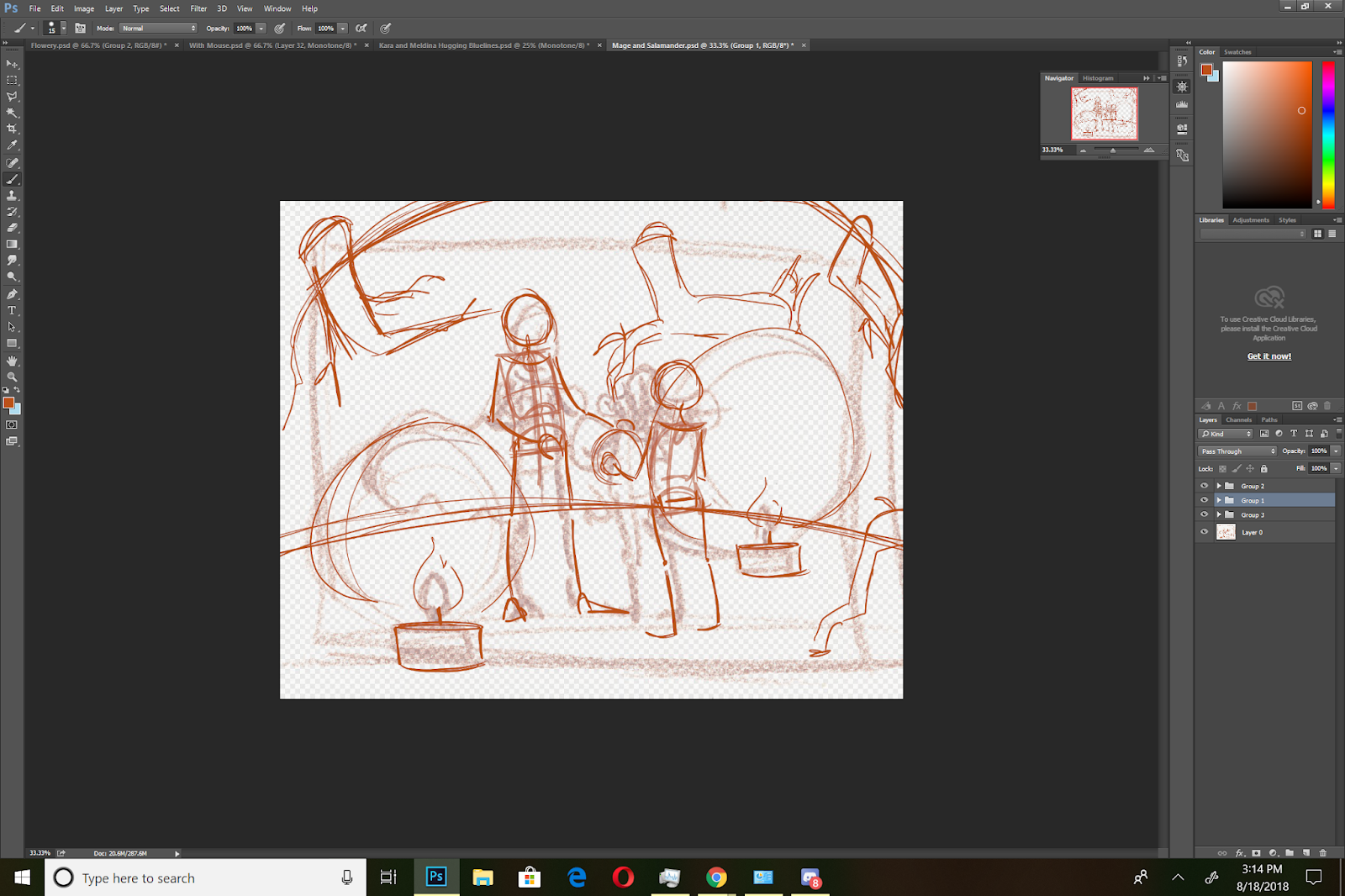
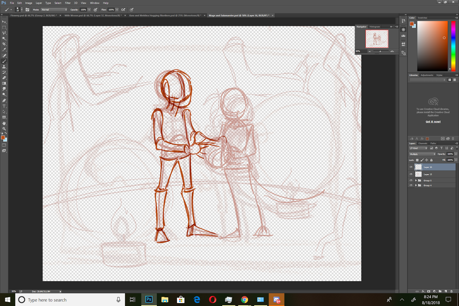
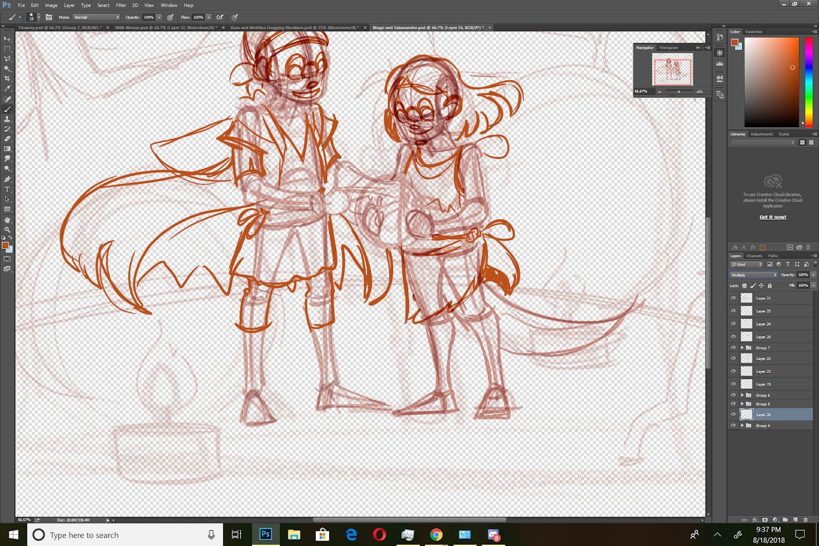
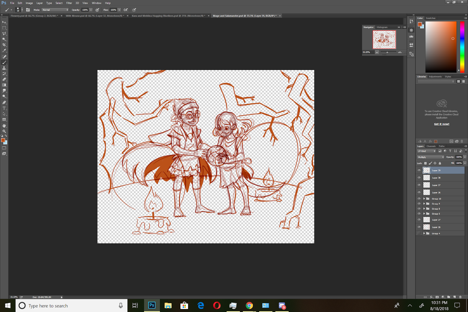
Clothing The Figures:

Once the figures are constructed, I begin roughing in their clothes. These were previously designed, so all I have to do is reference my sketches, and add momentum and movement. The sphere (a marble) that the newt familiar is holding casts a glow and an aura that affects lighting, hair, and clothing.
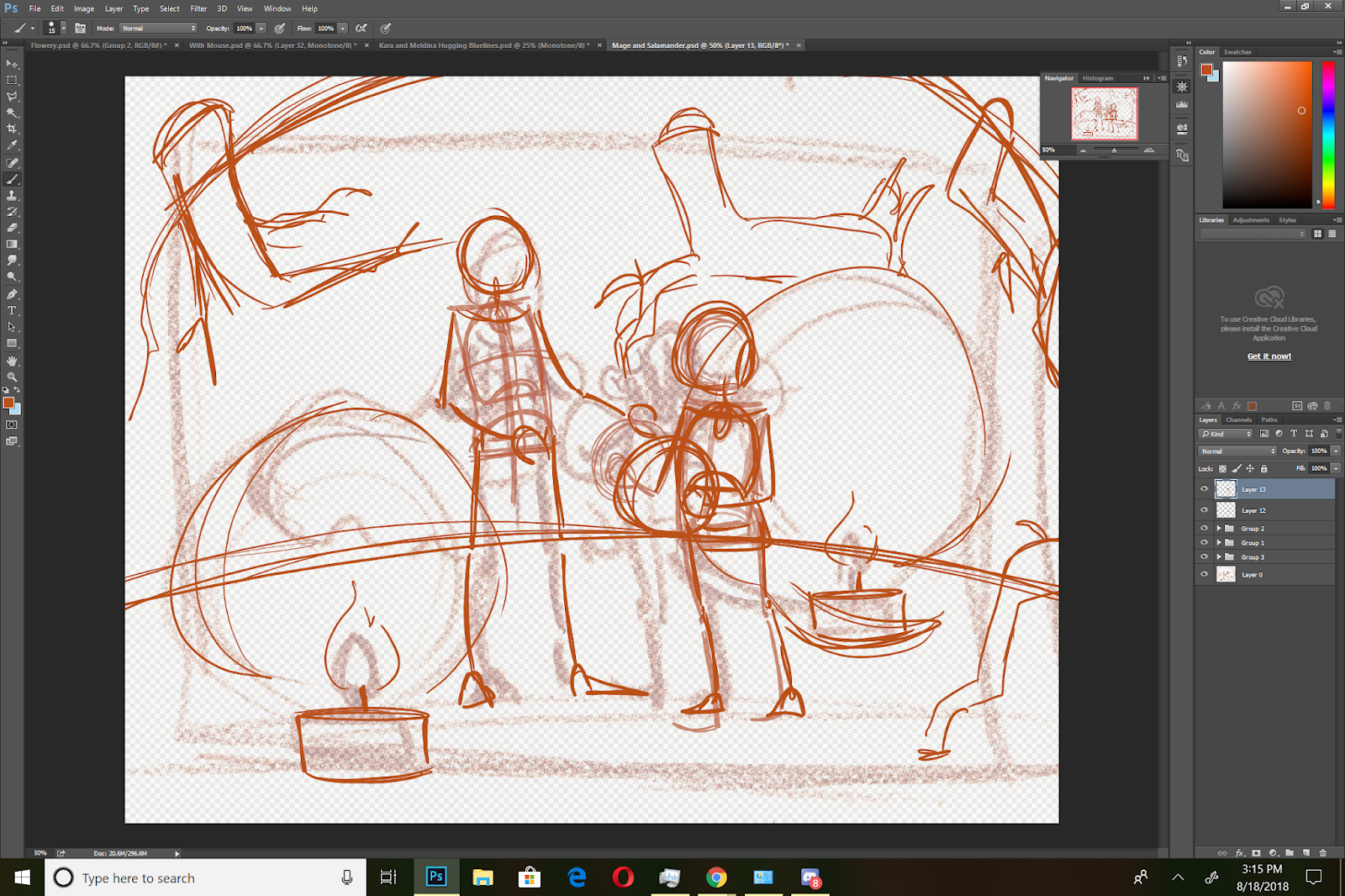
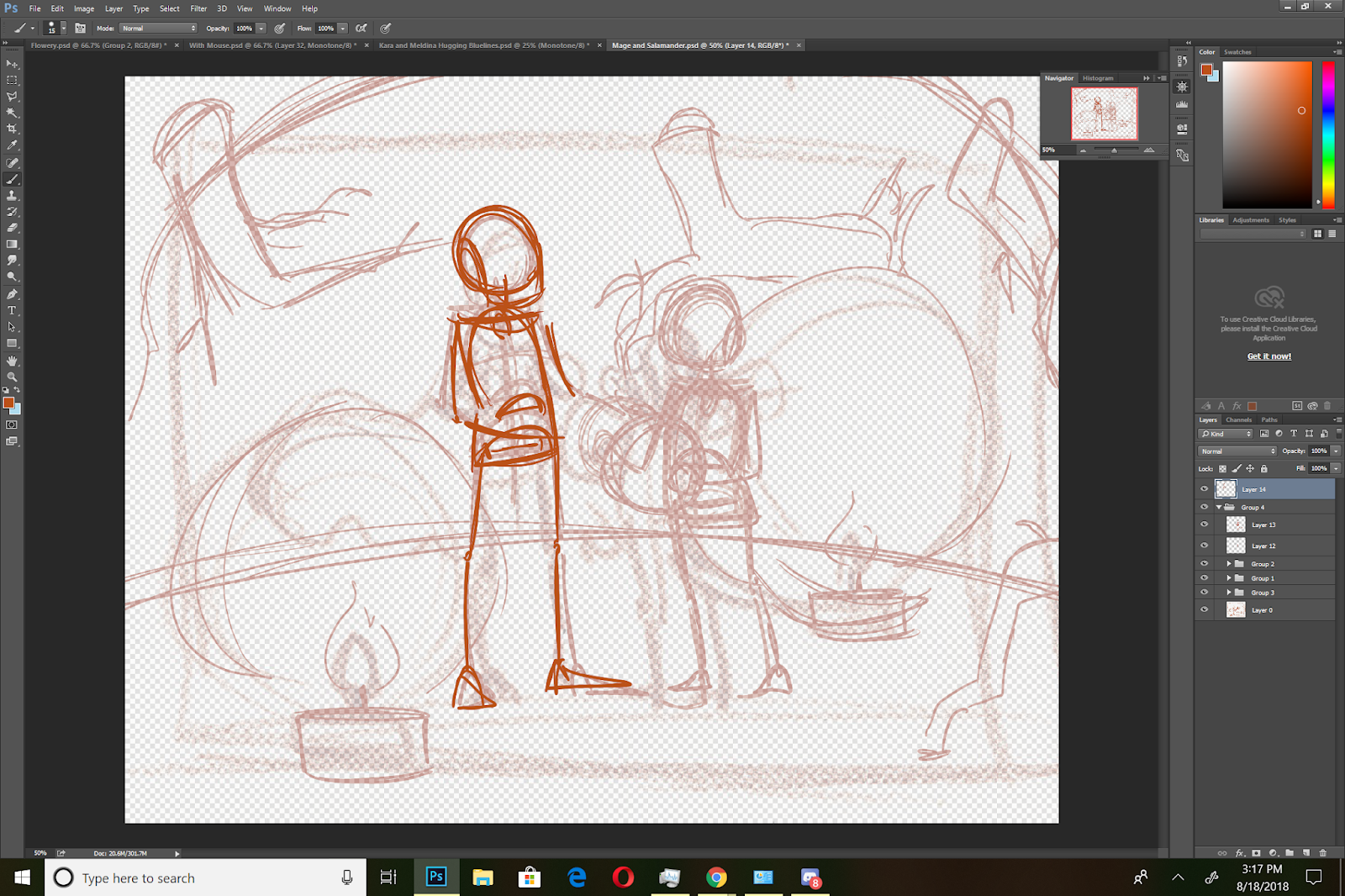
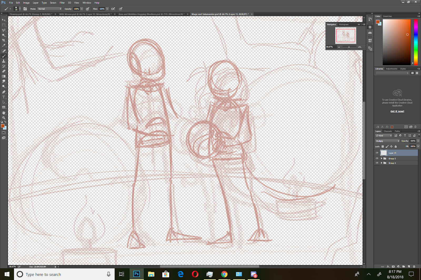
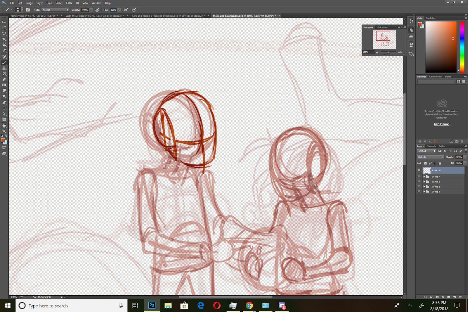
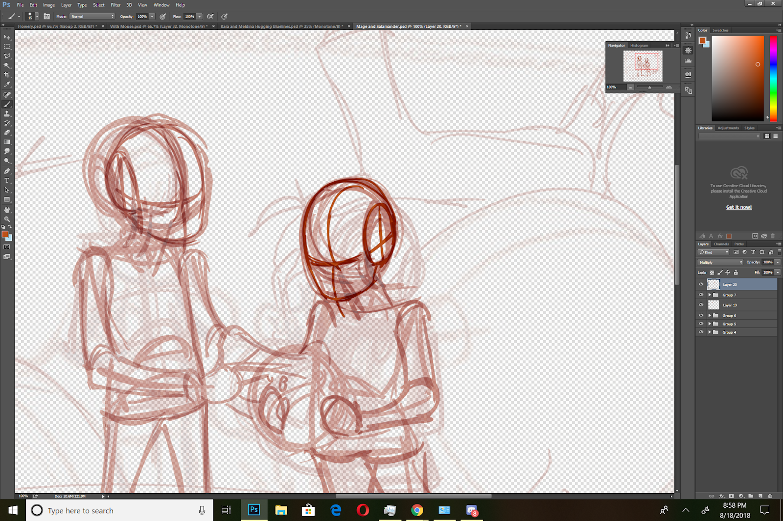
Constructing Hair and Faces:

Once I have the basics sketched in, I can start constructing the hair and faces. When I design illustrations, I always begin with the largest, most gestural things (pose, environment), and work progressively tighter, more detailed, and smaller (hair, clothing details, faces). This helps prevent me from getting bogged down, or putting time into a composition or illustration that doesn't work.
I divide the sphere for the head in half vertically and horizontally, and place three eye widths along the horizontal axis, starting with the 'middle' eye. Halfway between the eyes and the bottom of the face, I place a small oval to represent the nose. Halfway between the nose and the bottom of the face, I sketch in a short hashmark to mark where the mouth will go.
Refining the Background:

Determining Lighting:
For this illustration, I have three light sources- the two candles (foreground and background) and the marble that serves as a crystal ball (middleground). Since this will be an inked illustration, I want to utilize textures and heavy spot blacks to help carry the illustration.
I use the lighting to help determine how I will ink both figures later on.
The Final Sketch:
The Final Inks
 Things to Consider When Working Digitally
Don't work too tight or too detailed-often those fine details get lost when the piece is sized and shared to the web, or printed out. These details can also turn to mud when you print your bluelines onto toothed papers.Sketch out what you need, it's ok to leave fine details for later.Don't black in large areas, especially if you plan on printing bluelines. It's ok to just mark it with an X.
More Information about Constructive Human Anatomy:
Nattosoup's Figure Drawing Resources- Includes tutorials and resources for figure drawing, character design, and figure construction, and facial construction.
Please consider donating to this blog or purchasing from Natto-shop (http://nattosoup.com/shop) if you want me to continue publishing quality content. All materials tested were purchased from my own pocket. Keep on Truckin' Nattosoup is not under any sponsorship.

August 23, 2018
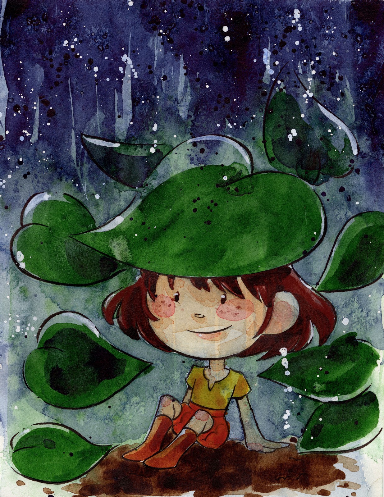
A Pinch of Salt- Simple Salt Tutorial

Sometimes it's fun to keep my watercolor illustrations deceptively simple, and just rely on a few fun techniques! Everyone loves texture, and today's walk-through delivers- salt, drybrush, and splatter add loads of texture to this cute little piece.Rainy Day Girl Watercolor Tutorial
Materials Used:SaltProfessional Grade Watercolors (your choice)Strathmore Watercolor JournalInked Illustration (I recommend inking with Sakura Pigma/Sakura Microns)Blue TapeMounting Surface (I used Gatorboard/ corrugated plastic)
After you've mounted your illustration to your mounting surface (for a piece this small, I really only needed a couple pieces of tape to do so), apply your wash. While your wash is still damp, sprinkle some salt onto your surface (I'm using kosher salt, as it has larger surface area, and creates a more dramatic effect)
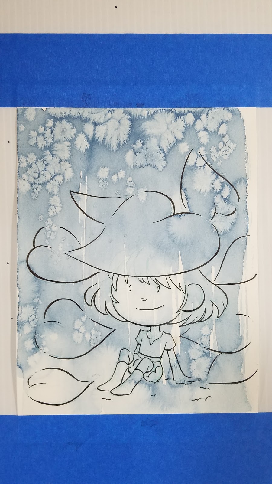
Once that has dried, splatter some paint onto your illustration.

Then begin blocking in your foliage.

For depth, dab in some cool blue or indigo in the shaded areas.

To create the illusion of rain, streak on some indigo
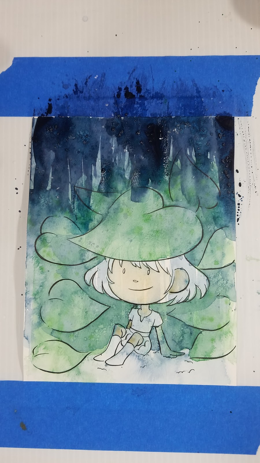
Allow this to dry. Begin blocking in your character color.

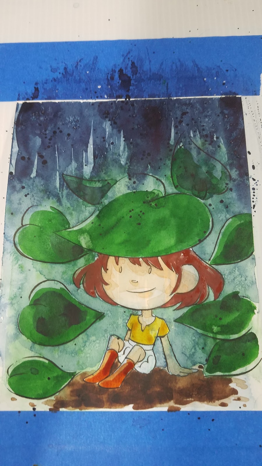
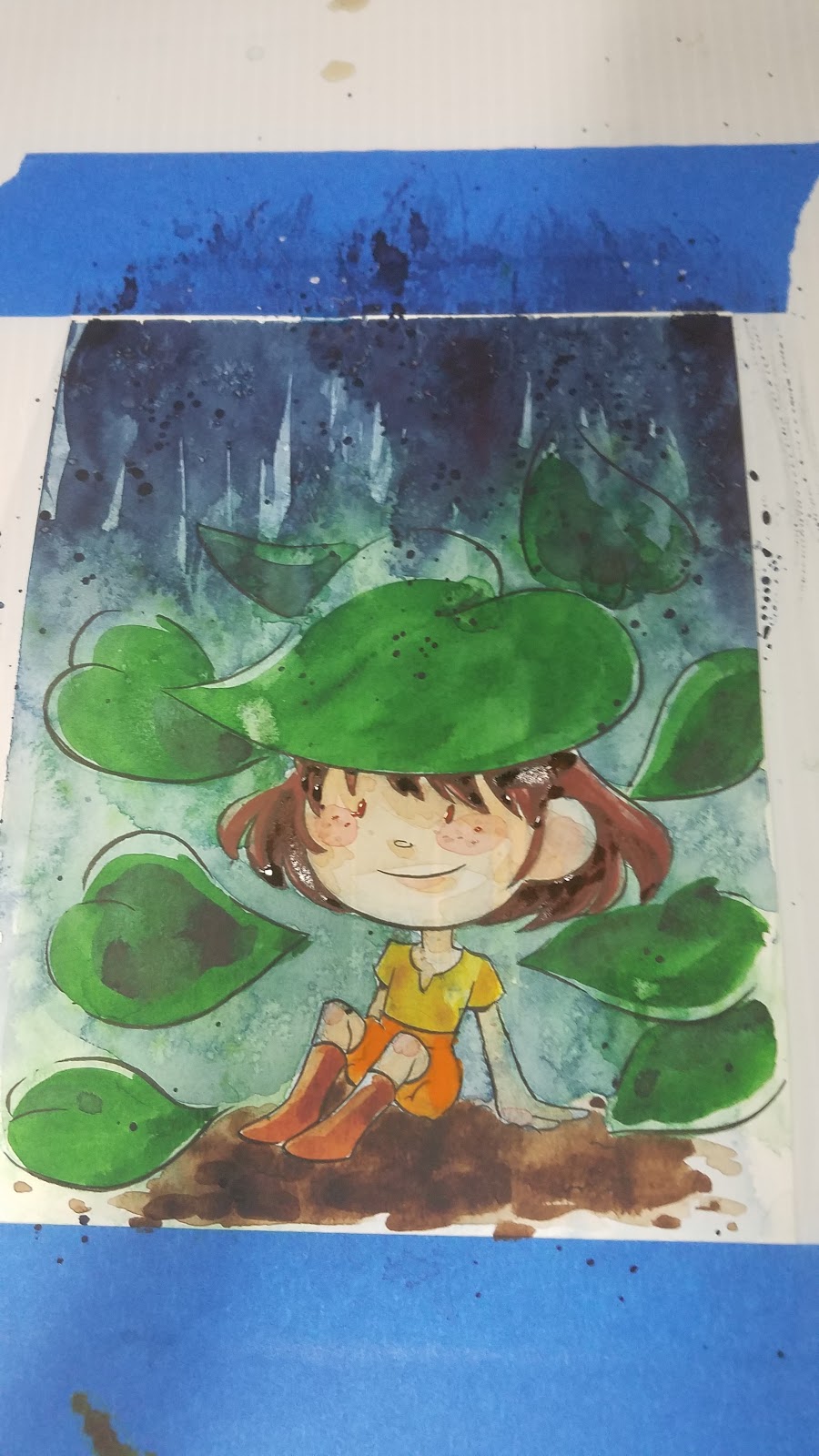
Once this has dried, splatter on some white gouache.

Remove your tape.

These simple techniques really pack a punch, so I recommend limiting your techniques, or keeping your piece simple and light for best results!
If you're looking for more watercolor tips, tricks, and tutorials, check out my Watercolor Basics hubpage! I've got the tutorials you need to get started with watercolor, or to take your watercolor to the next level.
If you love what I do, and you want to help me continue doing it, consider joining my Artnerd community over at Patreon!

Please consider donating to this blog or purchasing from Natto-shop (http://nattosoup.com/shop) if you want me to continue publishing quality content. All materials tested were purchased from my own pocket. Keep on Truckin' Nattosoup is not under any sponsorship.

August 20, 2018
Like a Phoenix- Watercolor Process
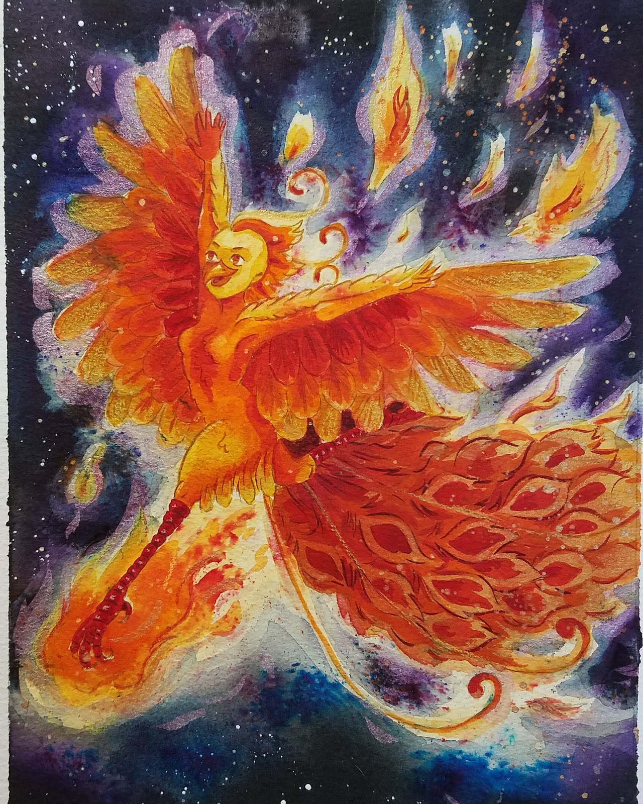
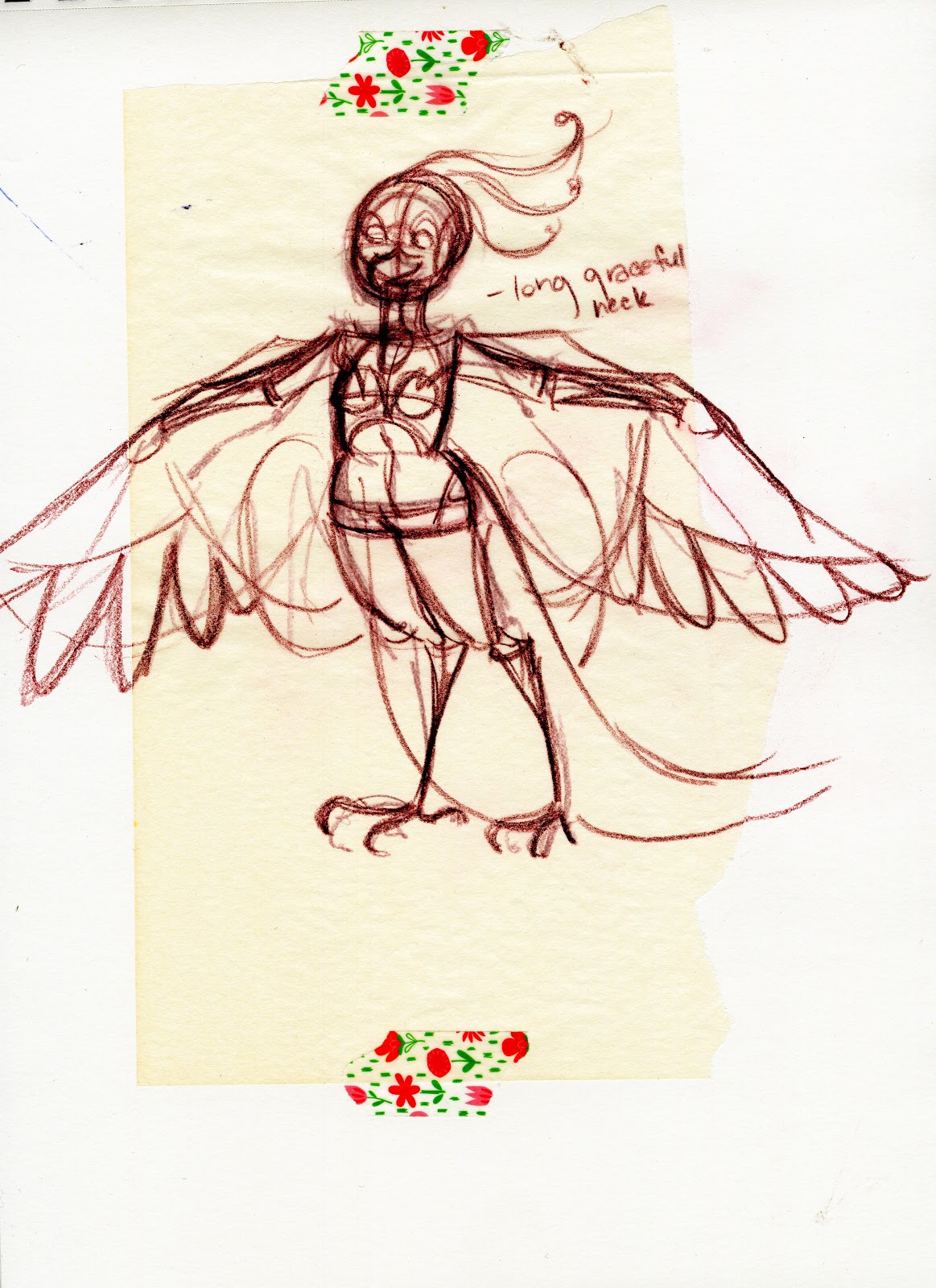
Although the majority of my commissions fall into one of two categories (inexpensive, at con, or inexpensive, after con), on occasion, I do get the pleasure of filling a more elaborate commission. This commission for a phoenix girl was placed at Akaicon 2017, and presented an exciting challenge.
The commissioner wanted a fairly realistic anthro phoenix girl, and gave me plenty of information- she's a gynmist, he provided a facial reference, and while I've drawn anthro commissions in the past, I've never gotten a commission for a more rendered anthro character. I was excited to tackle the challenge head on.
Design and Development:
Initially, I designed the character to be more human- while there were some phoenix traits, it was more figurative than literal in design. I also researched gymnast costumes and poses for something reminiscent of a phoenix.


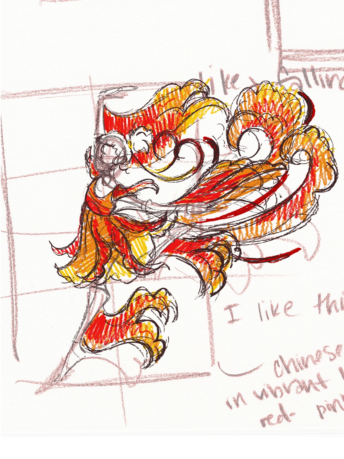
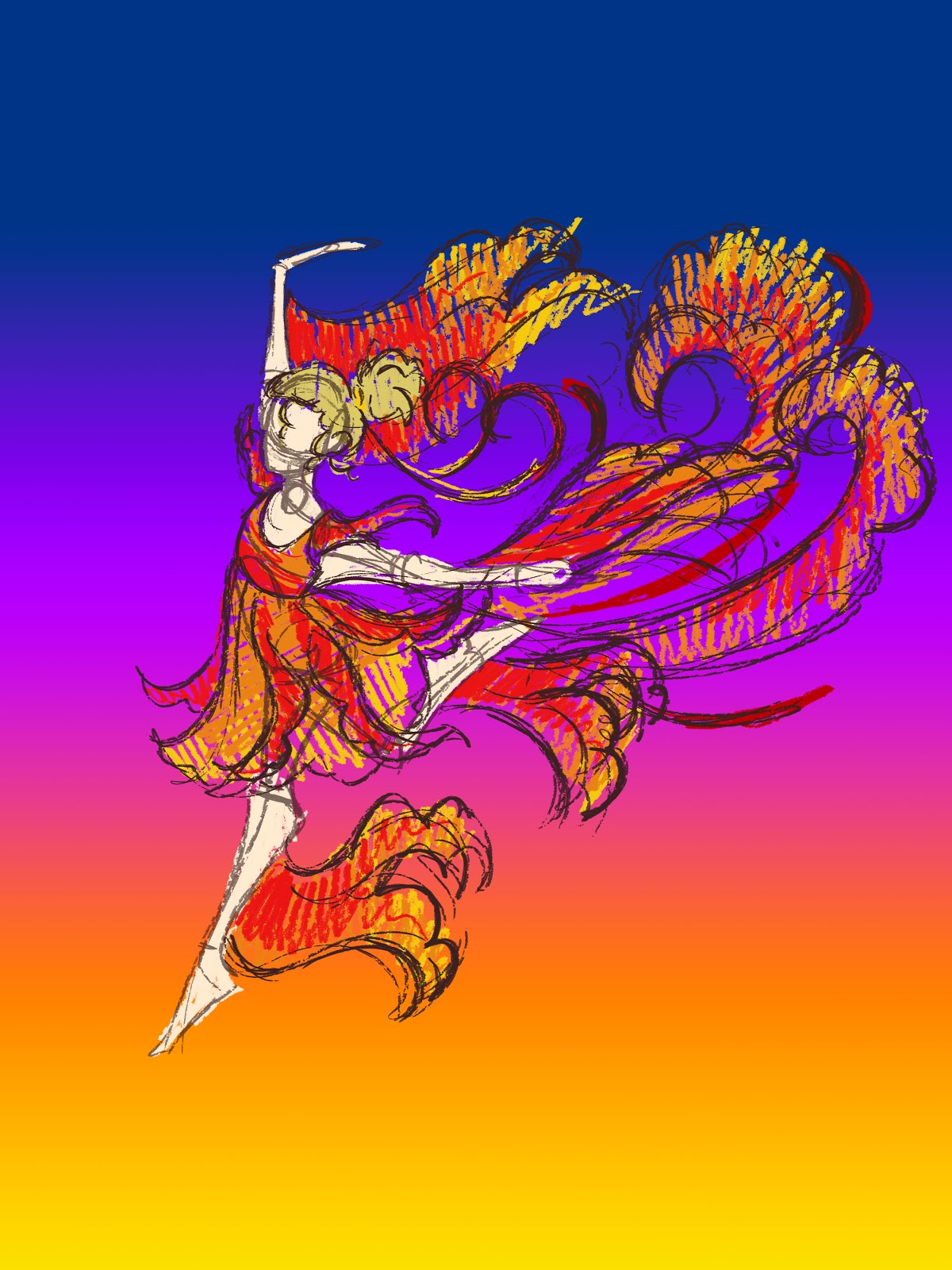
I found a design I really liked, and did a color test, since I knew I would be working with intense colors.
 I also did a background test, just to make sure everything popped.
I sent this off to my commissioner, and he requested that I make the character more anthropomorphic.
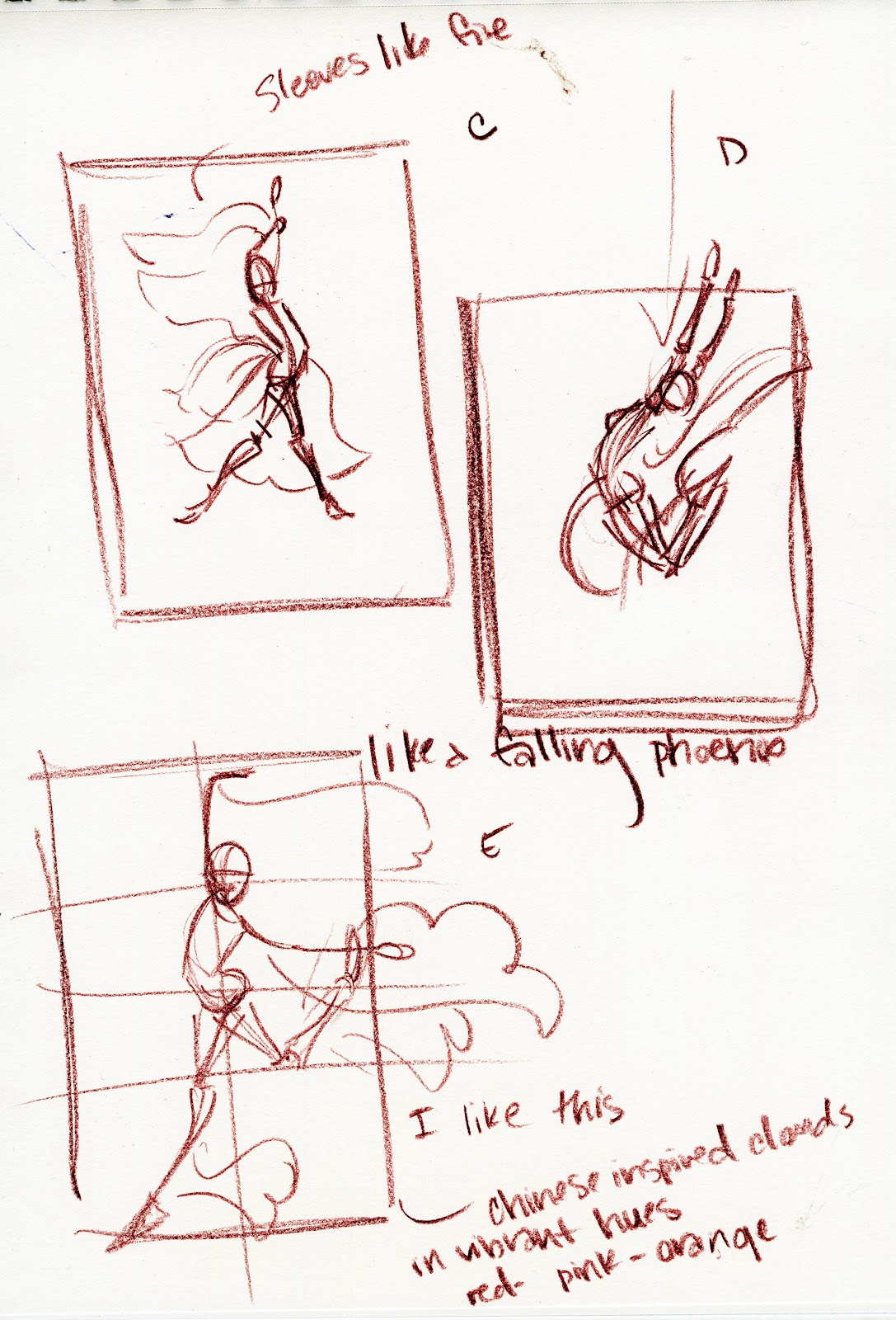
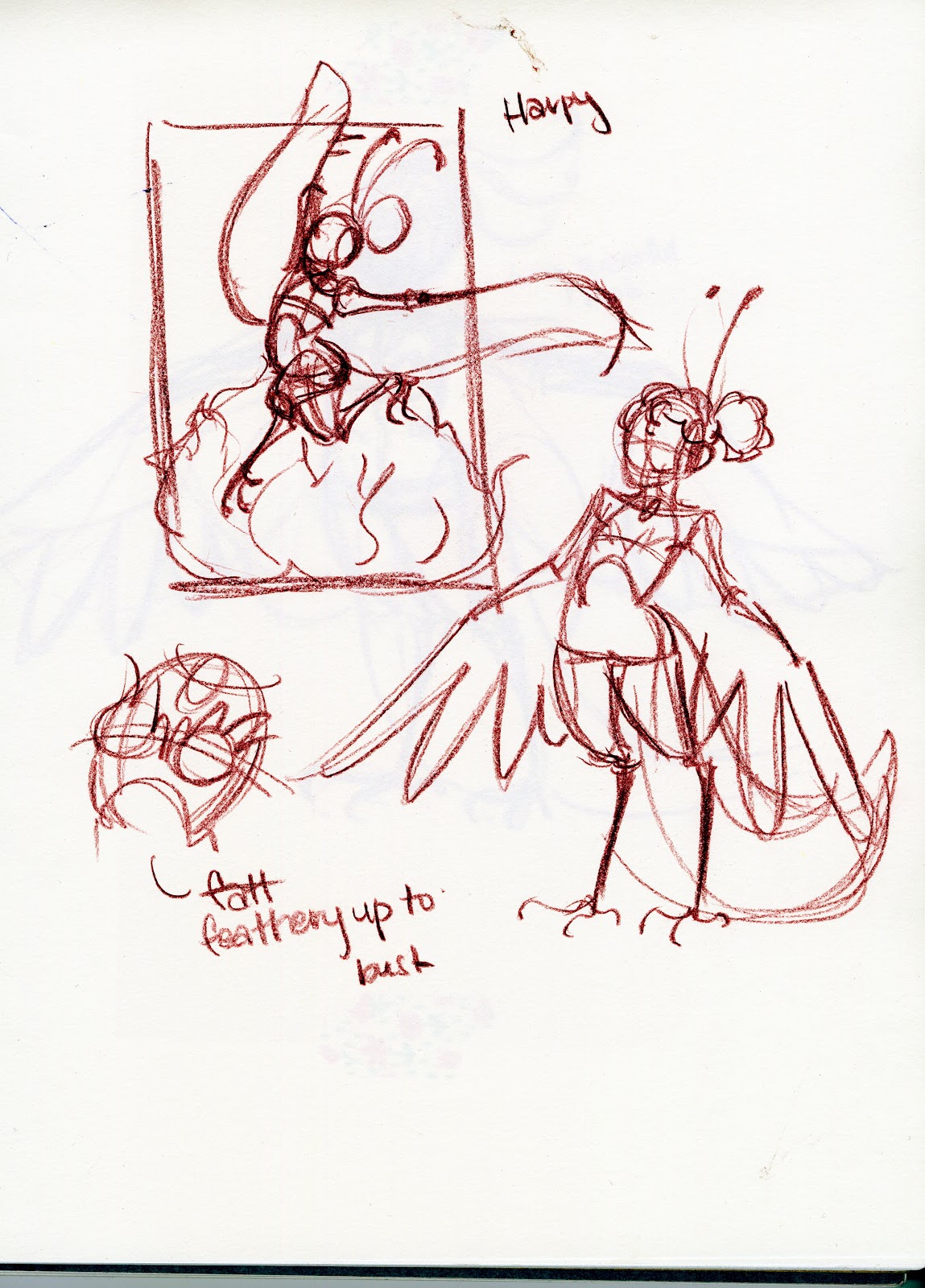
So I tried a few variants to see what might work. One such variant was a harpy design.
And another was fully anthro.
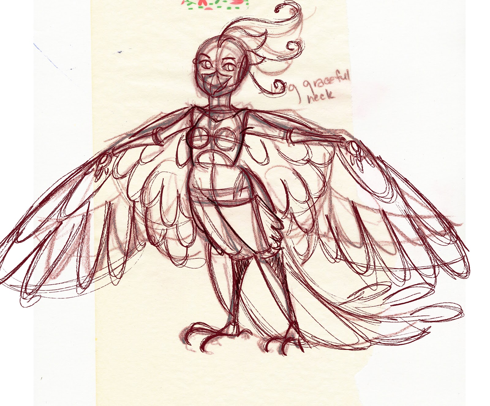
This third design was the preferred design, so I did a color test.
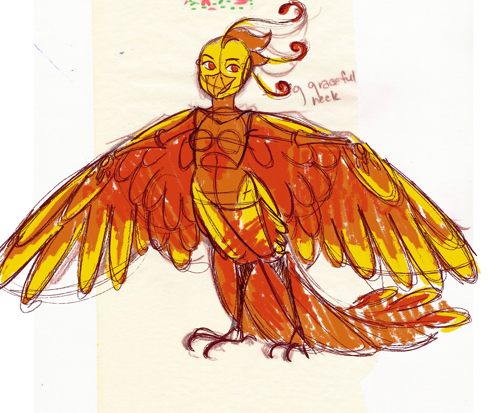
And reworked the gymnast's jump for a phoenix.

Working In Traditional Media
Printing bluelines and penciling:
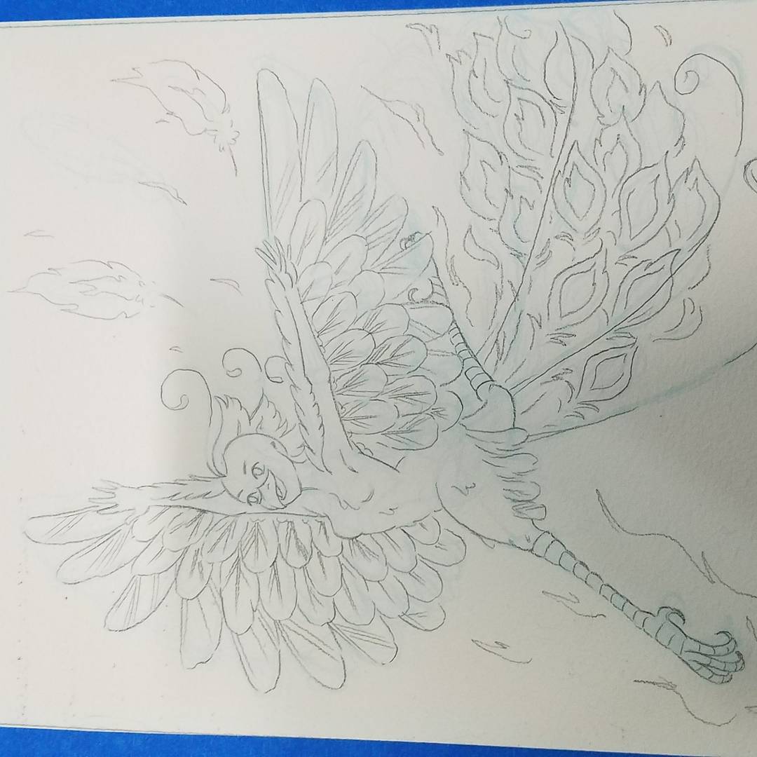

I printed my bluelines on a sheet of Arches 300lb cold press paper, removed from the block.
Applying a toning wash:

Applying watercolor and Brusho for the background:
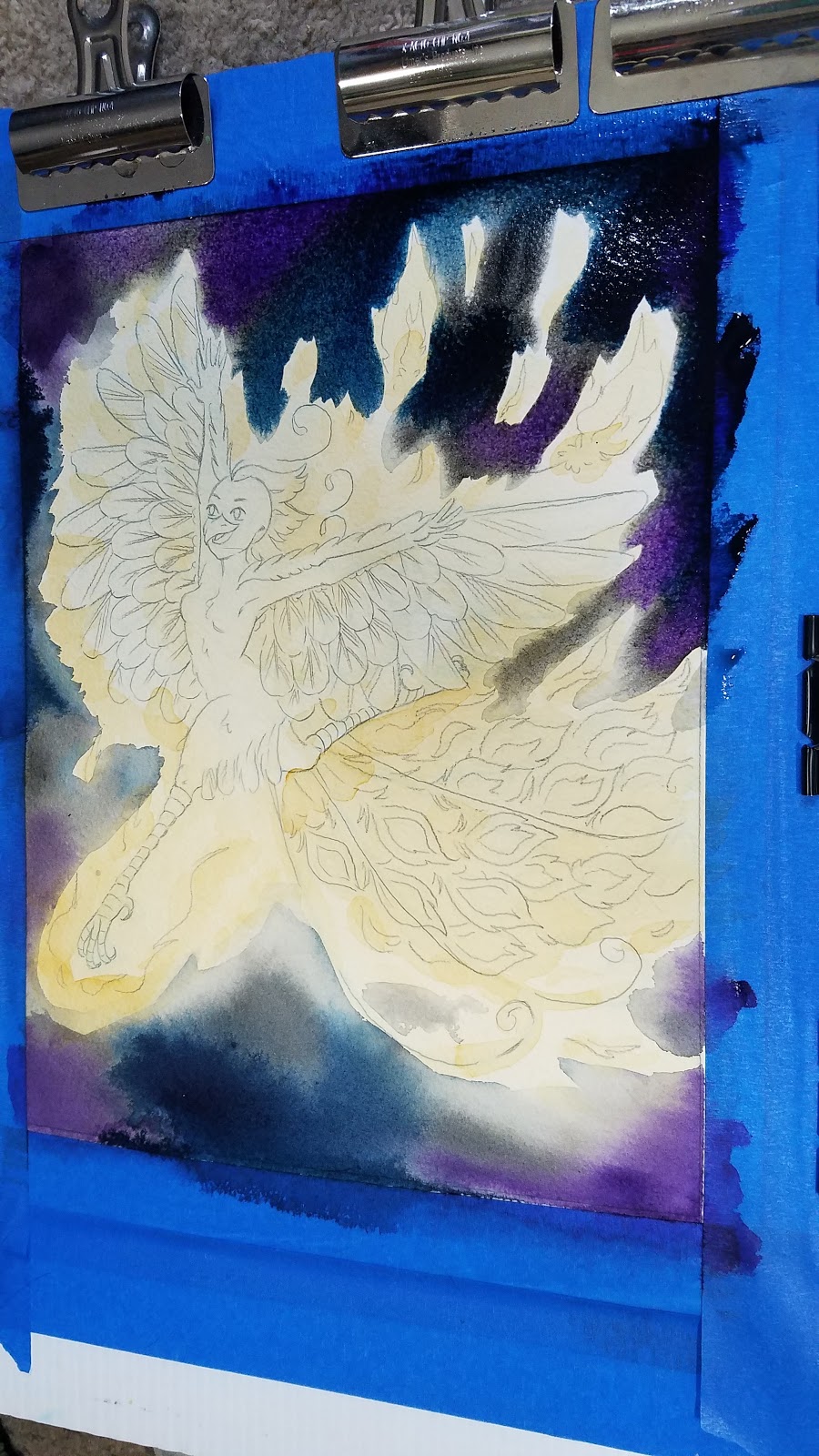
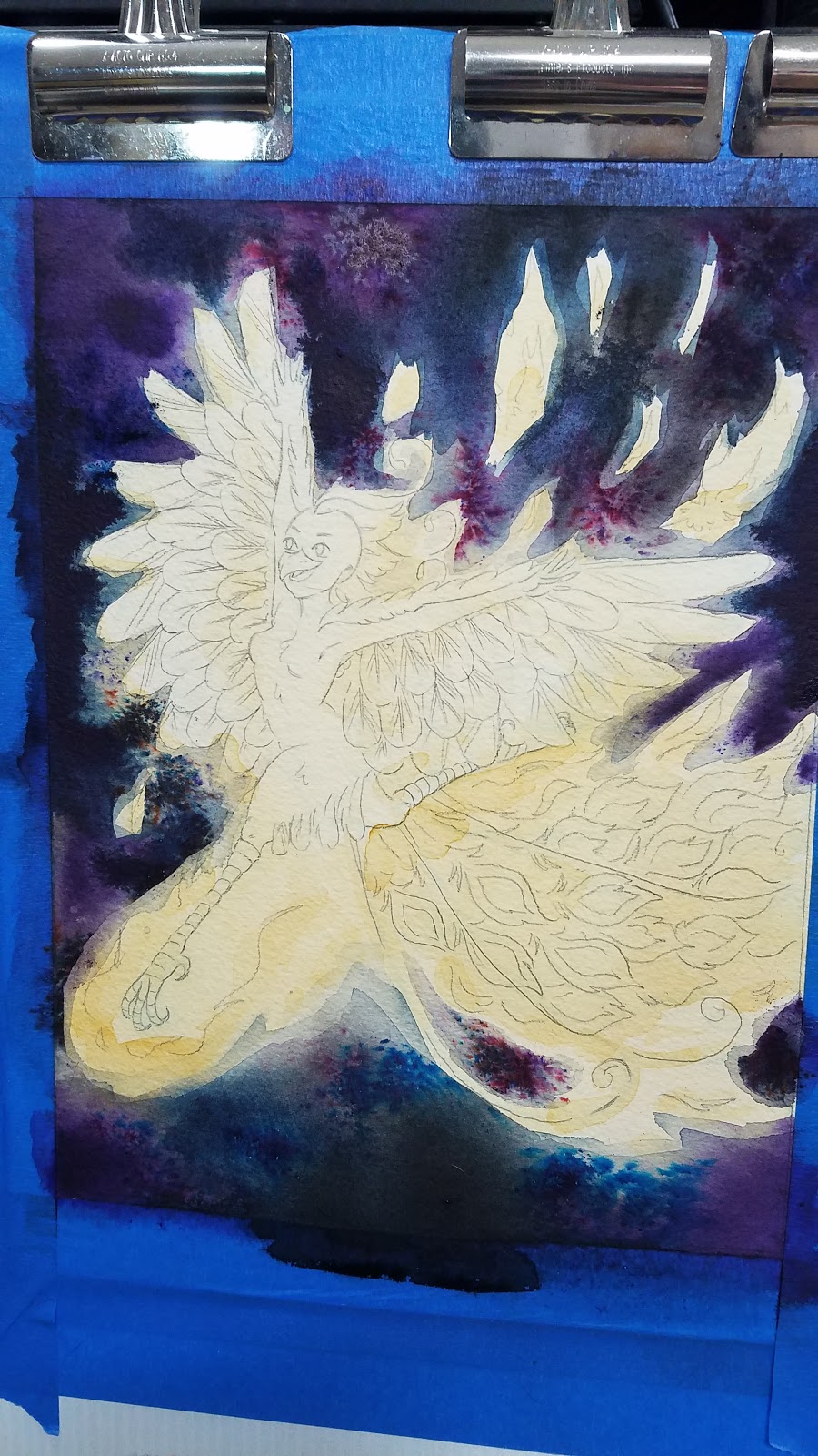

Blocking in color with Brusho for flame:


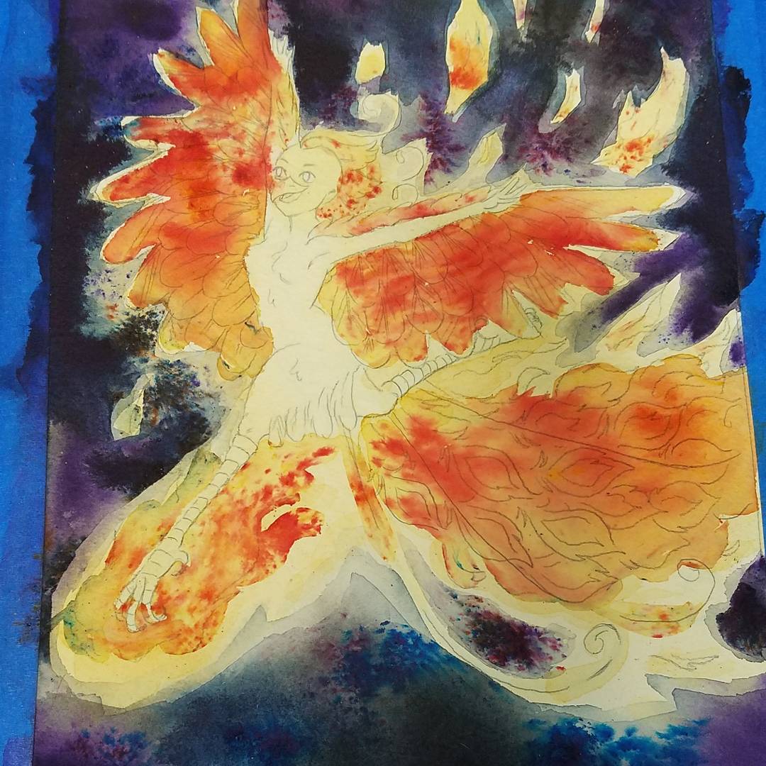
Blocking In Color:


Adding in Details:


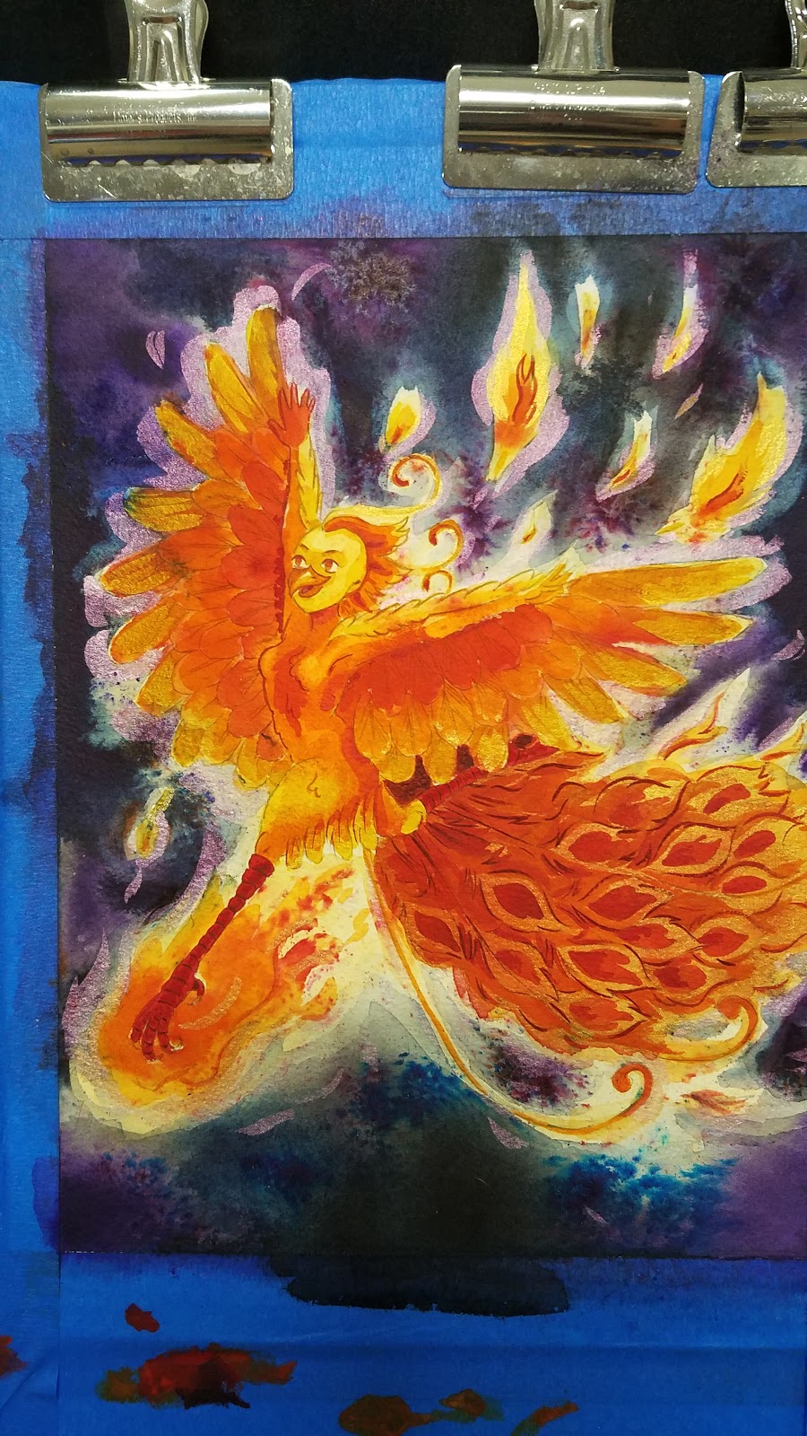

Masking off the background:

I just used cut tracing paper as a simple mask.
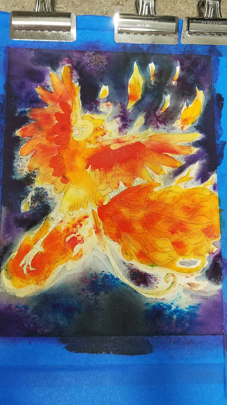
Applying Splatter- Gold, Acrylic Ink:
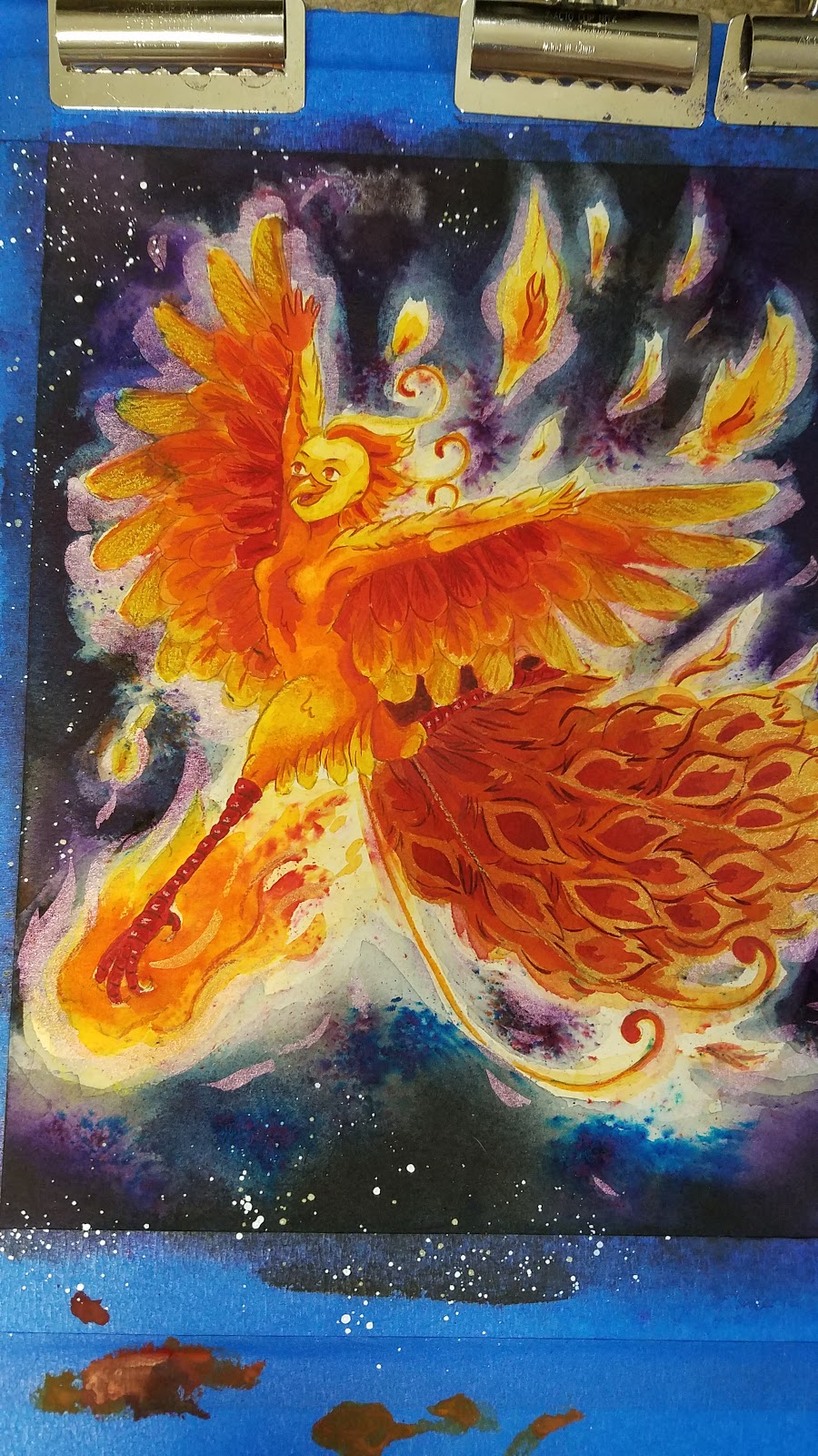
Removing the Blue Tape:

All in all, this commission was a fun opportunity to try a multitude of techniques and materials. This was the first time I'd used Brusho as an under painting, and while I lost a lot of the color burst effects, it still served as inspiration.
I would love to take more commissions like this in the future- either anthro or more detailed, larger watercolor pieces.
If you're interested in commissioning a piece from me, either an original character, a book concept, or even something from reference, don't hesitate to email me for a quote!
Please consider donating to this blog or purchasing from Natto-shop (http://nattosoup.com/shop) if you want me to continue publishing quality content. All materials tested were purchased from my own pocket. Keep on Truckin' Nattosoup is not under any sponsorship.

August 16, 2018
Nashville Comic Class- Making Comics and Zines
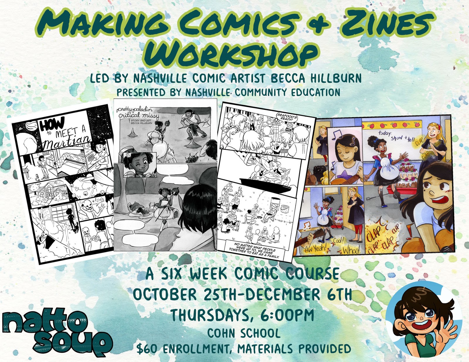
If you've always wanted to take a comics class, led by a professional comic artist with industry, anthology, and self-publishing experience, here's your chance at an amazing opportunity!
I'm leading a 6 week, six class workshop series with Nashville Community Ed this fall! This class will be held at the Cohn School, and it's only $60 for all six classes. Nashville Community Ed has kindly agreed to provide all the materials you'll need for the class.
What Students Can Expect:
A six week intensive comic workshop that will cover everything from planning and scripting your comic to drawing, inking, and assembling the finished minicomic or zine. I plan on teaching everything about the comic process from writing a synopsis to a beat sheet to the basics of constructive human anatomy and perspective to inking and laying out your mini comic. Students of all skill levels are welcome, and I hope to end the class with a zine and mini comic exchange.
More info about the class here.
Check out my six week, six class course outline here to get an idea of what we'll be covering!
Sign Up through the NCE Classes portal!
My credentials:
Masters in Fine Art from SCAD: College of Creative Careers in Sequential Art, Bachelor's of Art in Digital ArtPublished in six comic anthologies (check out which ones here!)Work for hire for Viz Media, Lego, and more29 workshops on comic craft, anatomy basics, watercolor, and alcohol markers led through various community services and conventions ranging from Nashville Public Library to the Alternative Press Expo (check out the list here!)Self-published, self-distributed comic, 7" Kara10 years working on the Nattosoup Studio Art and Process Blog4 years working on Youtube art education4 years working on How to be a Con ArtistMember of SCBWI- Society of Children's Book Writers and Illustrators My Kidlit Art PortfolioMy Webcomic
Want to prep for the class?
Intro to Comic Craft-- Blog -- Youtube
Nattosoup's Zine and Minicomic Resources
Nattosoup's Inking Resources
Drawing and Figure Drawing Resources
Not in Nashville? Can't take the course? Follow along through my Patreon!
Please consider donating to this blog or purchasing from Natto-shop (http://nattosoup.com/shop) if you want me to continue publishing quality content. All materials tested were purchased from my own pocket. Keep on Truckin' Nattosoup is not under any sponsorship.

August 13, 2018
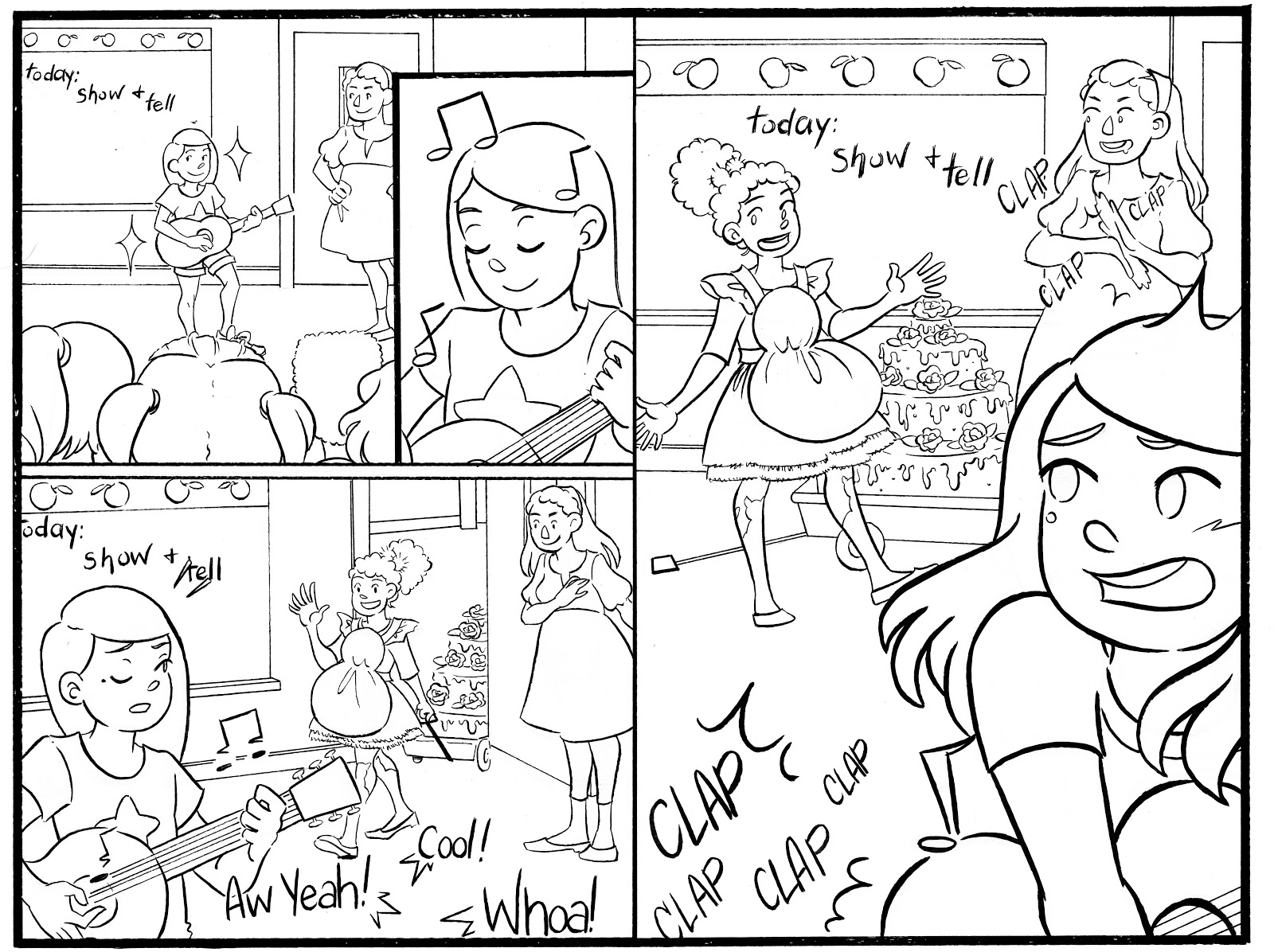
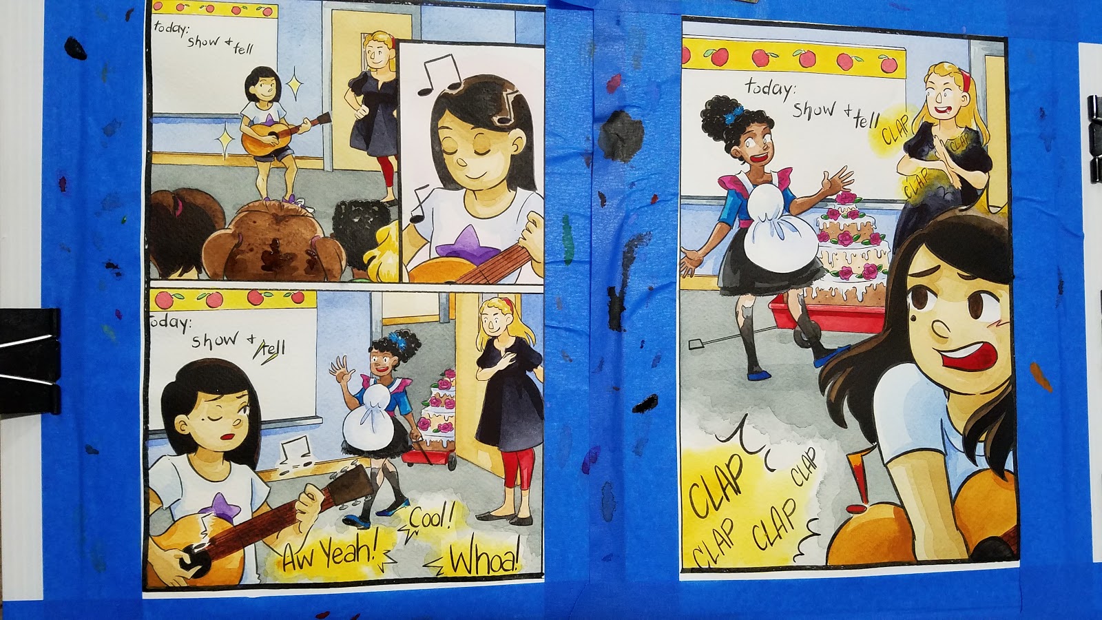
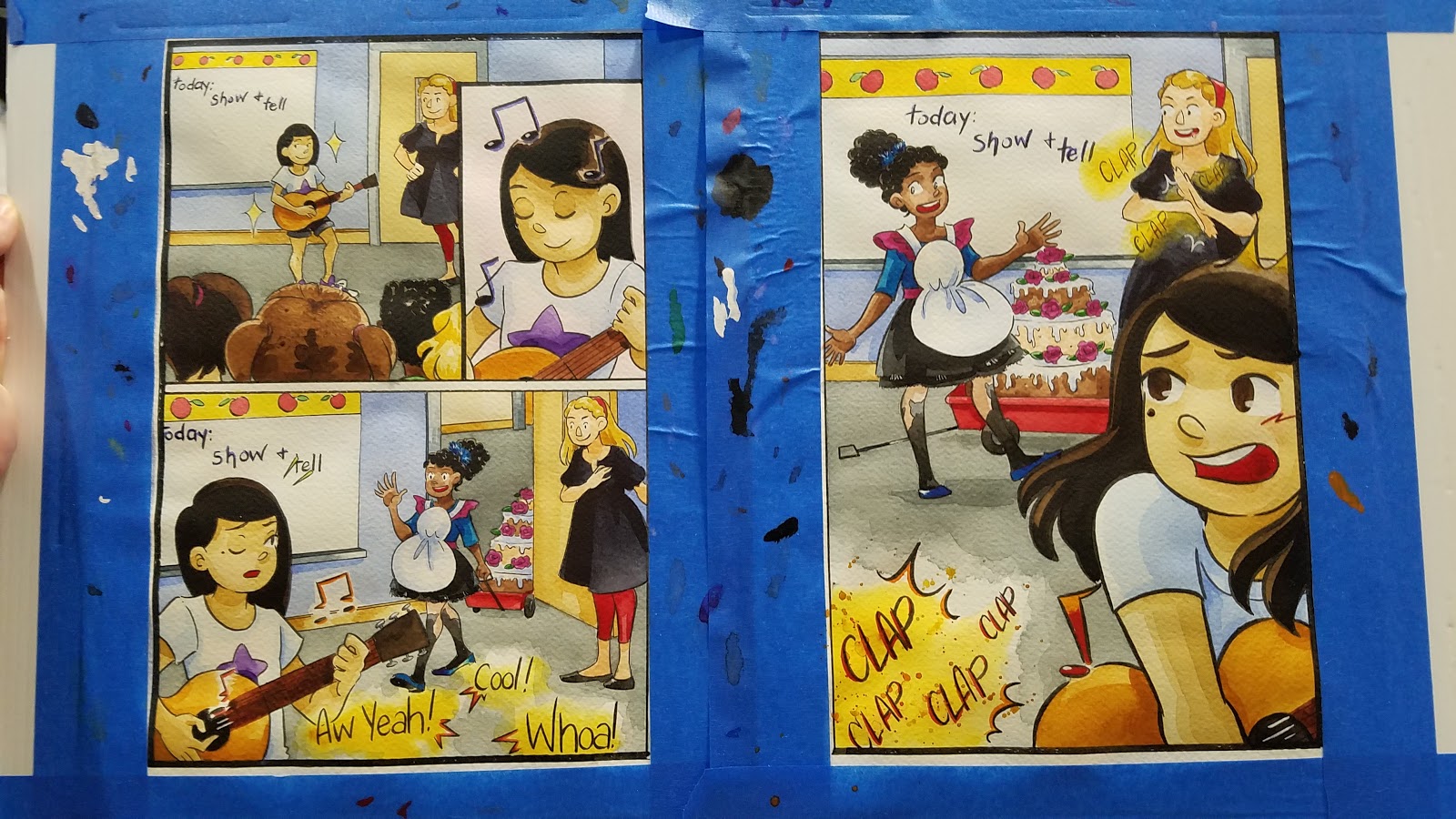
Classroom Conundrum- A Watercolor Process
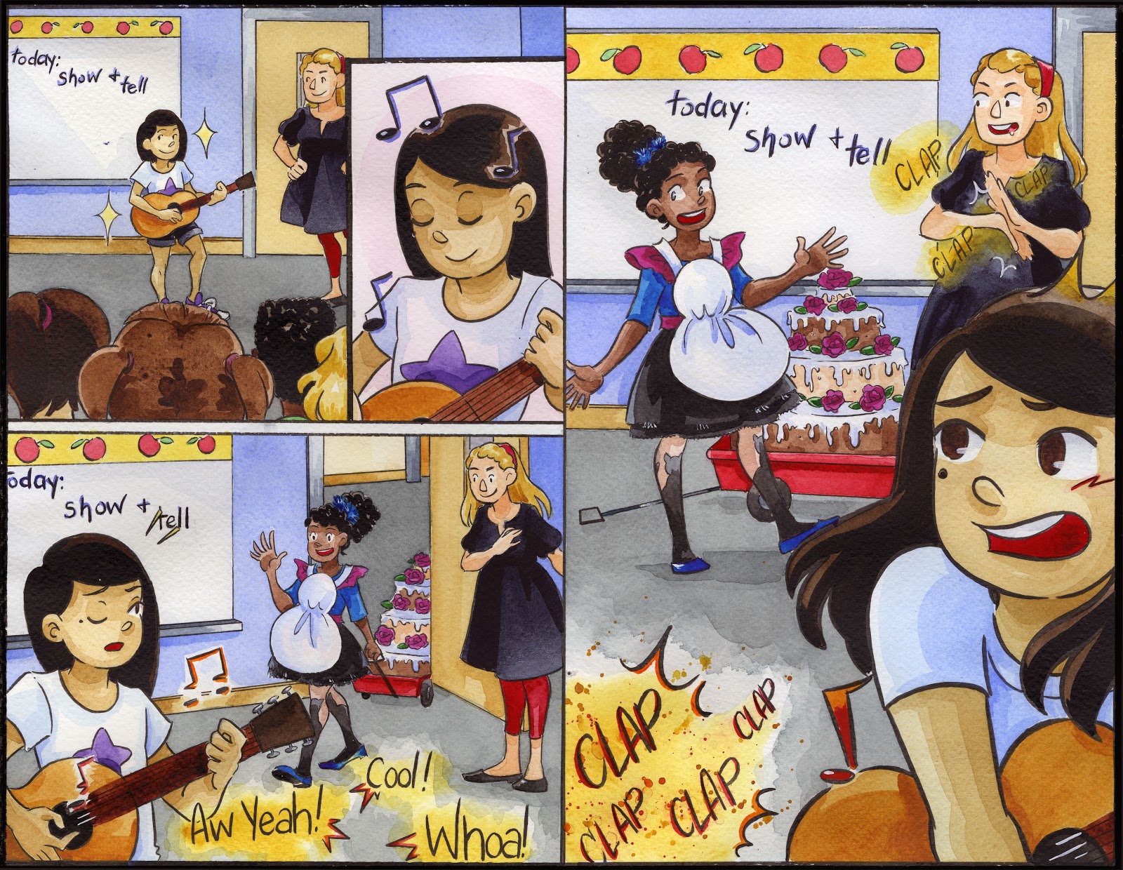
The piece above was created for SCBWI's 2017 Illustrator's Contest. Although it was not selected for a prize, I'm still fairly proud of this piece as it combines multiple things I love. The prompt was provided for us, and while SCBWI Midsouth doesn't seem to have a category for comic artists to participate in (it's Writers or Illustrators), I try to represent comic artists by doing comic submissions.
Before beginning the spread in earnest, I knew a few things- I wanted to do a piece that included linework, and I wanted to explore styles that I don't use often enough. I wanted a piece that could go in my kidlit art portfolio.
Development Process
Brainstorming:
For me, brainstorming usually begins in written form- verbal brainstorming is what comes naturally to me, then visual brainstorming. So I begin with what I know from the prompt- classroom setting, two girls, a rivalry.
Once I established the basics, I branched out a bit, exploring what I know is popular in kidlit art- animal characters.
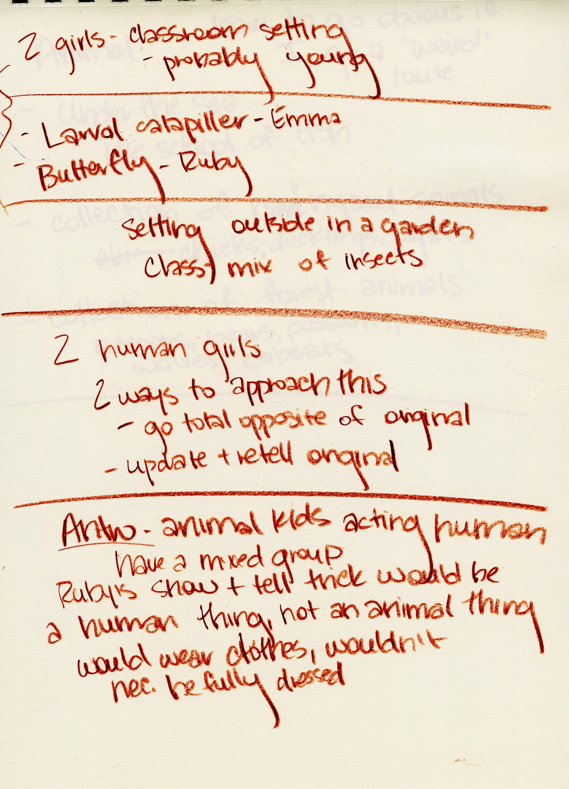

So rather than decide on a direction right away, I decide to do some visual brainstorming, now that I have a starting point.
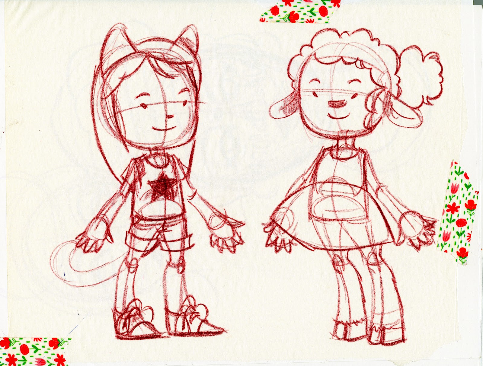
Character Designs:
I opted to do designs for everything I brainstormed, and go from there. I began with a somewhat fleshed out, realistically cartoony style to start, so I could hammer out details.

From there, I decided to do dots for eyes anthro using the more detailed designs as a base template.
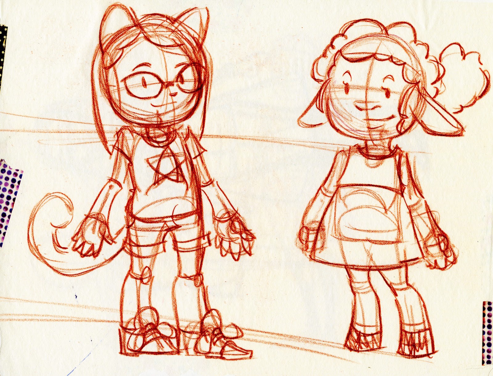
From there, I revisited the human character designs, but went even cartoonier.

And then I opted to do one more pass at the anthro designs, since animal and anthro characters are fairly popular choices for children's book illustrations, and something my portfolio sorely lacks.
Thumbnails and Revision:
While deciding on my final character designs, I started working on my layouts. For me, layouts are like pre-thumbnails- figuring out my pages, my page composition, the story beats- in a very loose, sketchy form.
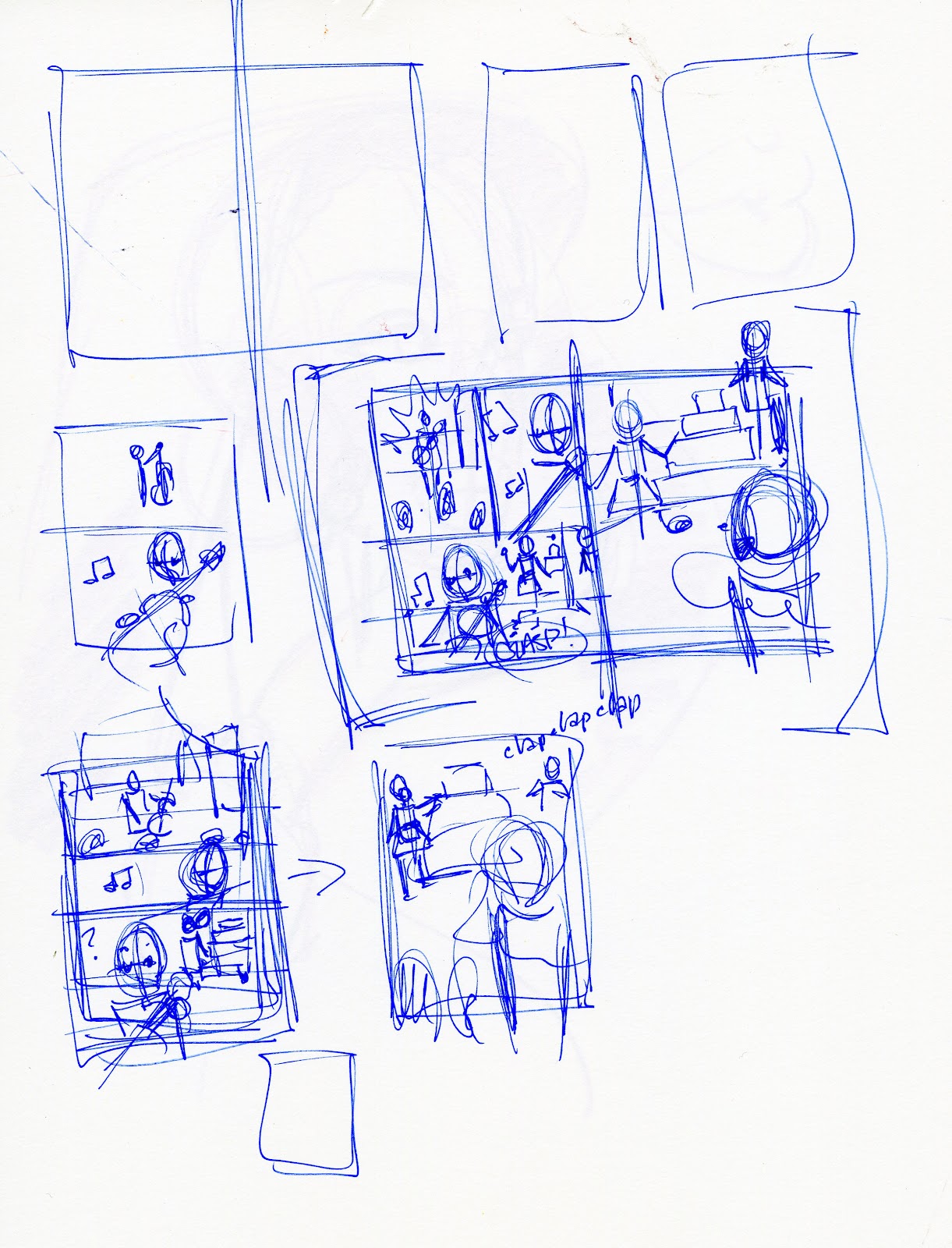
I take the best ideas from my layouts and tighten them up into thumbnails. For this, I'm planning around a double page spread.

Roughs:
Once I've developed a clean thumbnail, I scan it, blow it up to 6x9 (12x9 for both), and print the blue lines out onto cheap copier paper. At this stage, I determine my perspective grids and tighten anatomy.

Digital Corrections:
For this illustration, I decided to revise several things at my digital corrections stage, redrawing Ruby (the girl with the guitar), tweaking outfits and expressions.
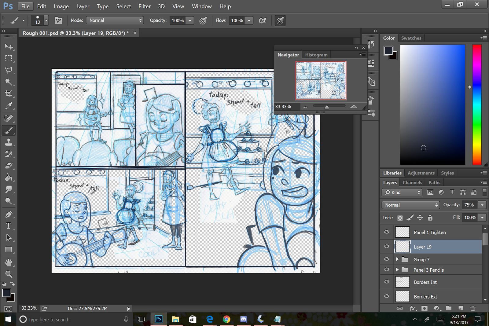
Once I've finished my corrections I'm ready to print my next round of bluelines.
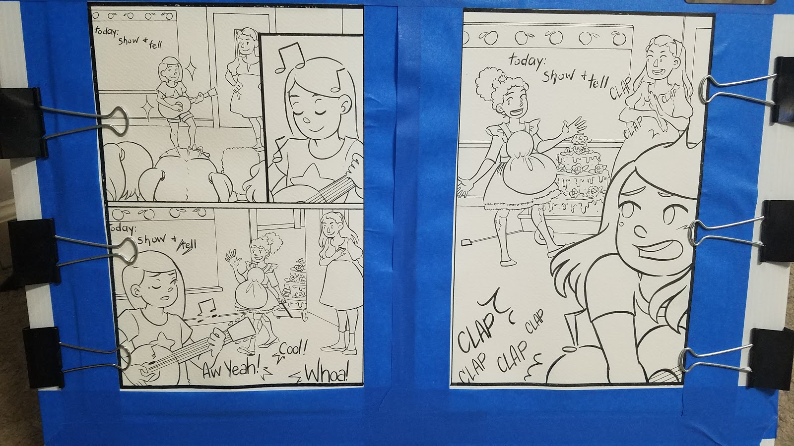
Printed Bluelines and Inked Borders:
For this round of bluelines, I print on Fabriano Studio- a mixed composition paper that takes ink well and has a nice tooth. I pencil my bluelines before inking to further tighten and correct my illustration.
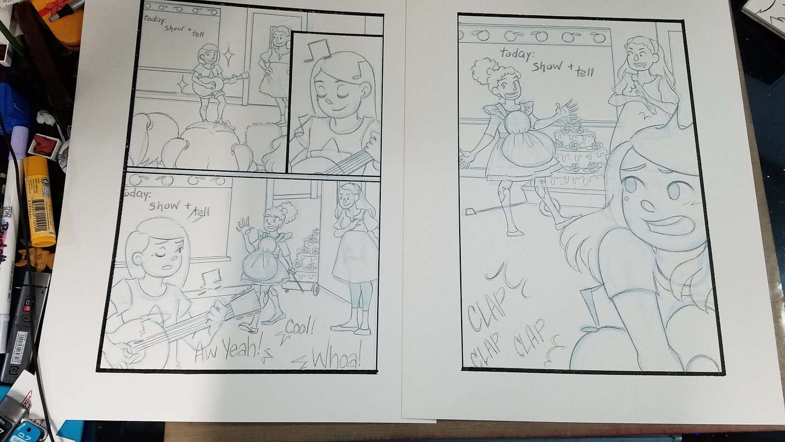
Borders were inked with pigment based, waterproof Sakura Calligraphy pens.
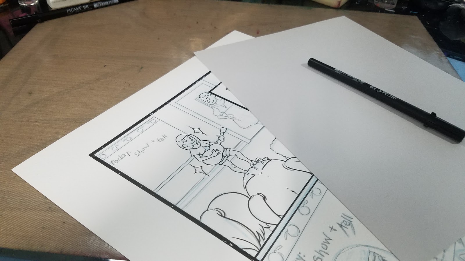
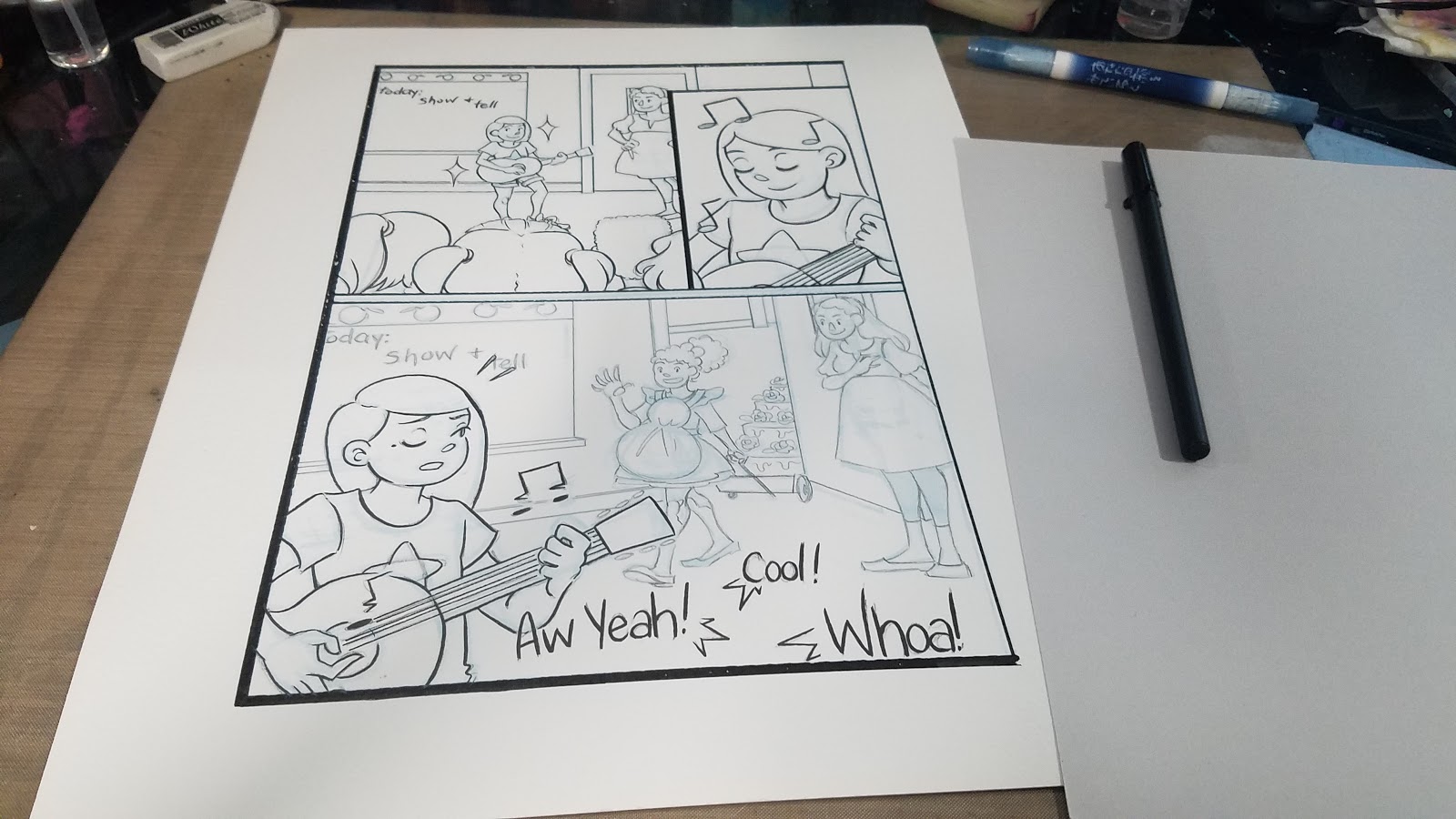
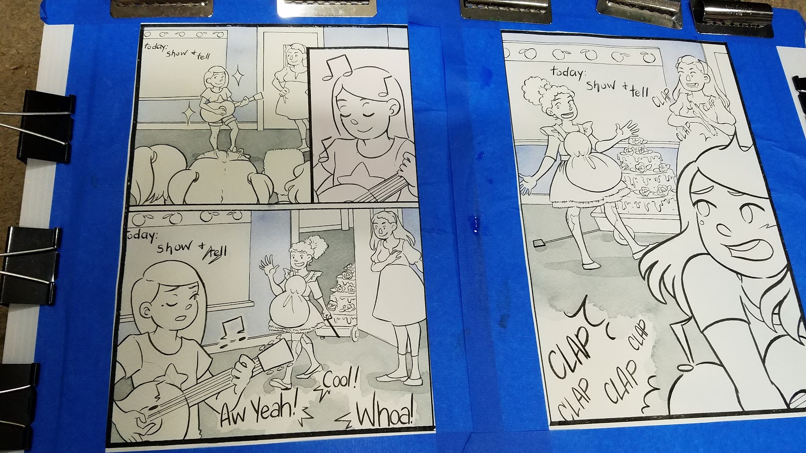
Inks:
These were inked with Sakura Pigma FB, MB, and BB pens- waterproof, pigment based brushpens that are ideal for illustration.

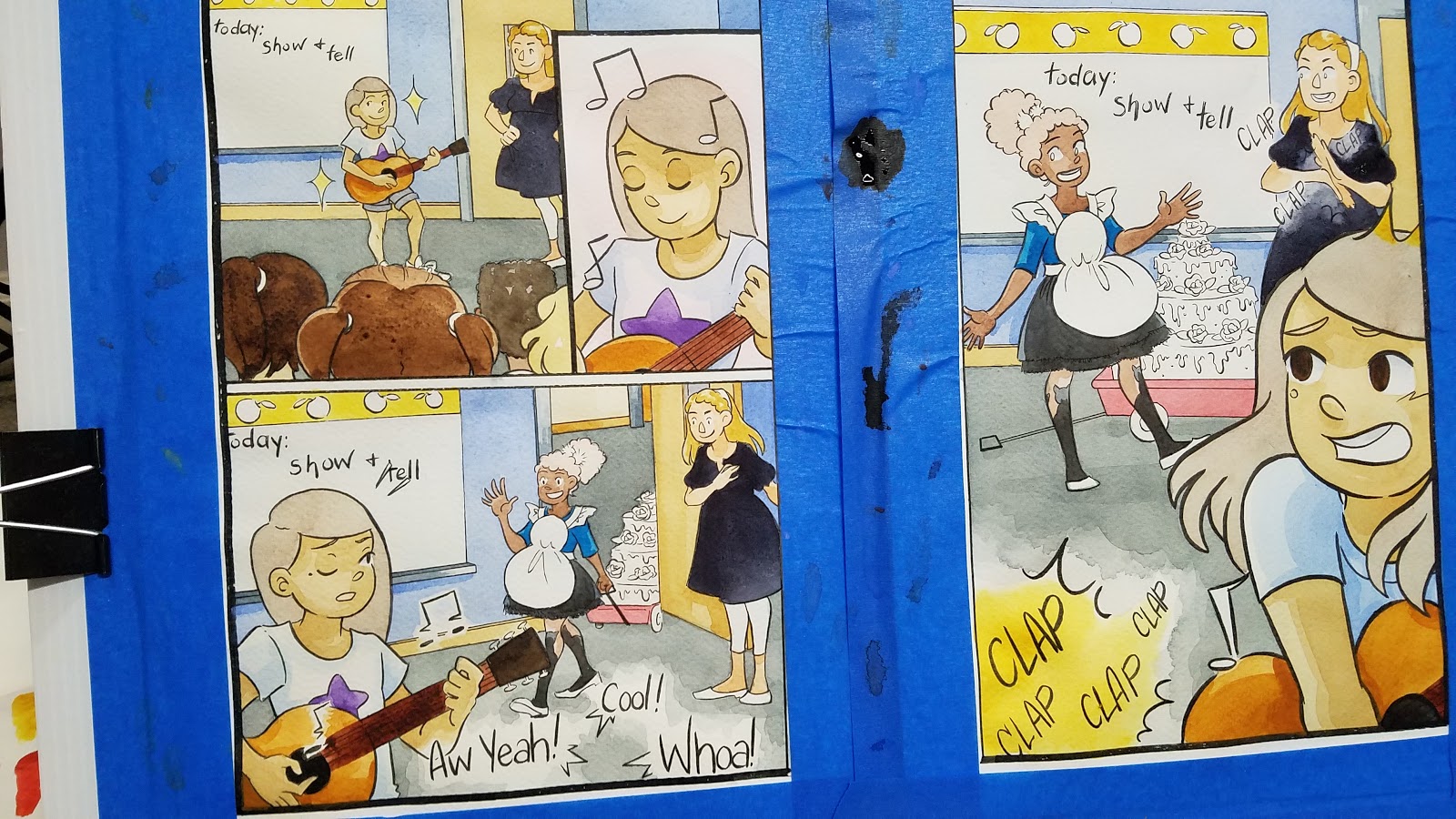
Watercolor:
For this illustration, I wanted to go with something fairly light and simple that wouldn't distract from the linework. I decided to do just a couple layers of watercolor for every object, rather than full rendering.
Stretching:
Blocking In Major Forms:


Adding Tone and Depth:

Removing the Blue Tape:

Finished Scan:

It was fun to plan and execute a double page spread comic unrelated to my work with 7" Kara, but still relevant to the kidlit art I want to create. I enjoy the challenge presented by creating comics based on prompts with a short turnaround time as it prevents me from overthinking too much. I really enjoyed working with this style, and I look forward to pursuing it in the future, as I continue to develop my portfolio.
As a member of SCBWI, I have learned much about the illustration side of kidlit art, and would like to see my area, Midsouth, continue to grow and provide resources for kidlit comic artists like myself. These resources and opportunities are often few and far between, and it would be nice to be part of a community that nurtures this.
If you like the art shown in this piece, I am available for short term projects, as well as longer term projects. Please email me with a project pitch for a quote.
Please consider donating to this blog or purchasing from Natto-shop (http://nattosoup.com/shop) if you want me to continue publishing quality content. All materials tested were purchased from my own pocket. Keep on Truckin' Nattosoup is not under any sponsorship.


