
Becca Hillburn's Blog, page 12
October 15, 2018
General Convention Advice For Comic People
For those of you who don't know me, I'm Becca Hillburn! I'm a kidlit comic artist, with a self published comic, 7" Kara, a longrunning art tutorial and process blog, an art education Youtube channel, and I'm a co founder and co contributor to the convention artist resource blog, How to be a Con Artist. I have almost 10 years of convention experience, and during most of those years I did approximately 6-13 shows per year. I've lead several Artist Alley 101 panels, I share con reviews and recaps on my channel, and I occasionally teach workshops and classes in the Nashville and New Orleans areas. I've made comics for over 20 years, I hold a BA in digital art, and an MFA in comics from SCAD.
At conventions, I sell self published comics, original art, hand assembled mini comics and zines, laser cut wooden charms, and I frequently take commissions to fill at the show, or to mail in after. Over the years, I've honed my craft at selling comics- it can be a bit tricky, but with experience, enthusiasm, and a good product that I really believe in, I feel like I have some valuable insight to share with other comic artists.
Basic Tips:
Figure out your goal, and then gear your table around that specifically. For example, my goal is to sell copies of 7" Kara, so the books and promotion of the books takes up half the table space alone. My signage from price signs to banners feature Kara, most of my original art for sale is of Kara, and many of my mini prints are Kara related. I have a huge portfolio with original pages taking up a massive amount of table space, but it encourages casual passers by to flip, take a moment, and often sparks interest in people who would just pass by. This can be extended to selling commissions, or acrylic charms, or fanart- whatever you're most passionate about, whatever's new and exciting to you, or whatever has the best margins.
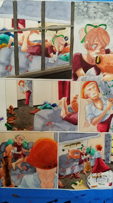
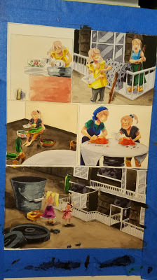
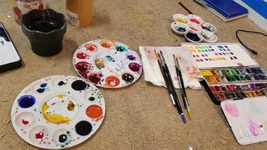
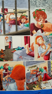
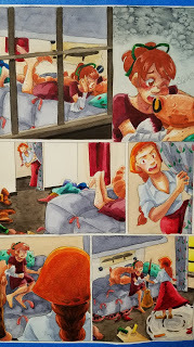
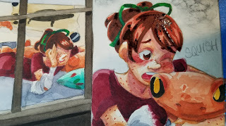
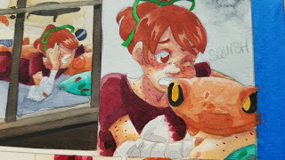
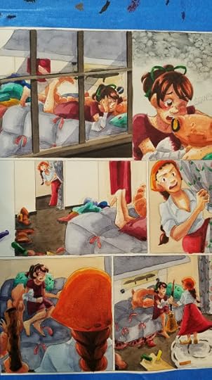
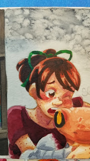
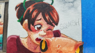
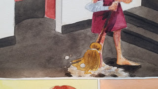
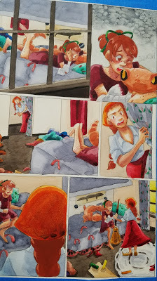
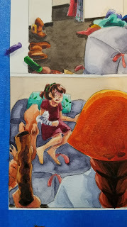
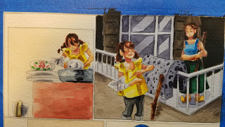
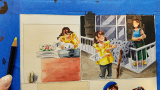
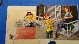
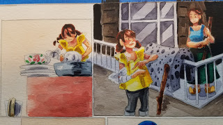
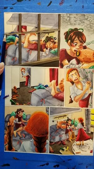
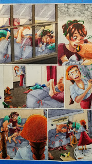
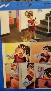
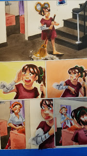
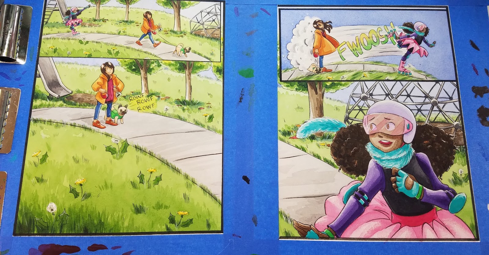
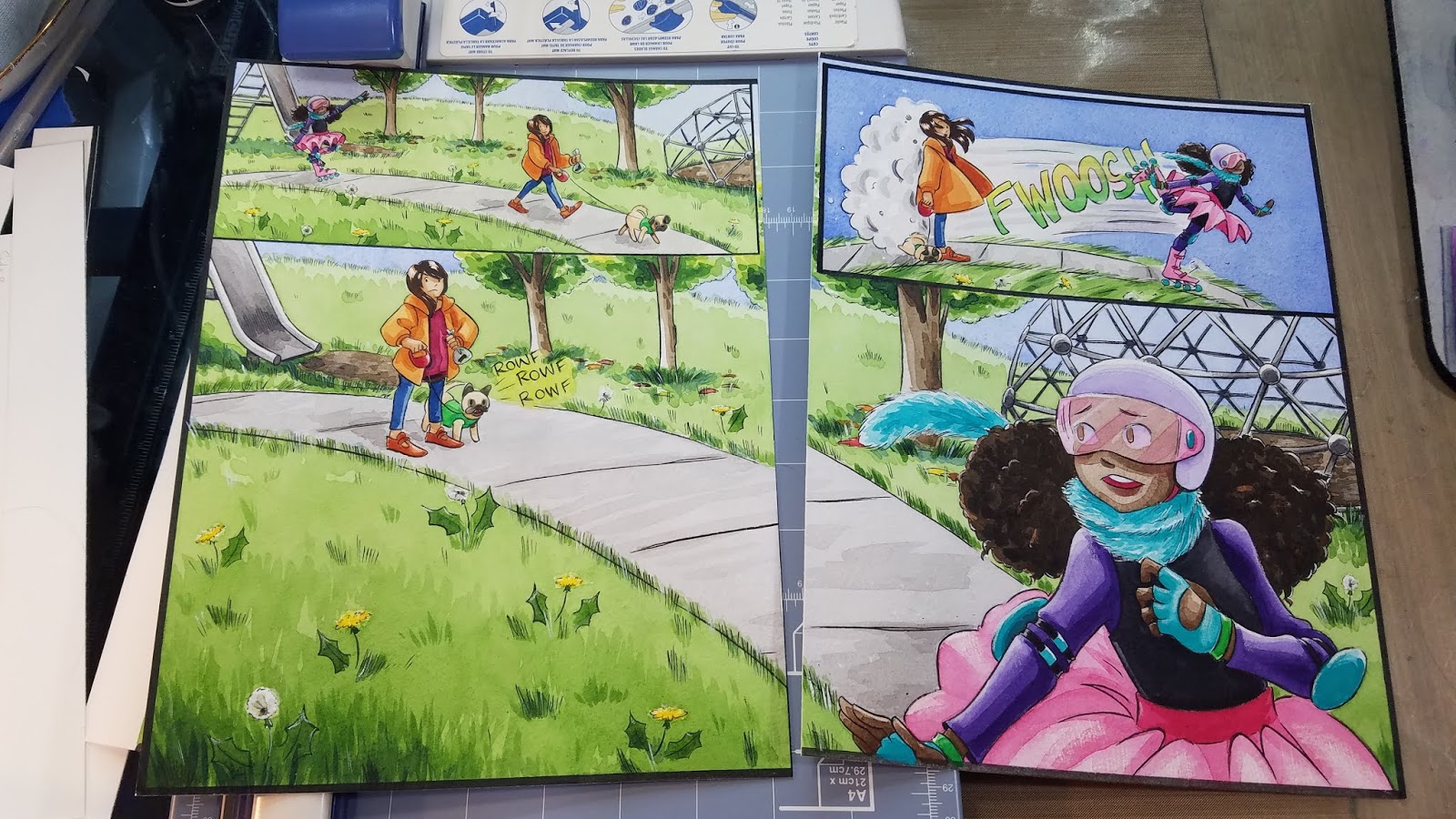
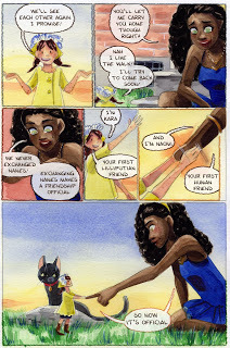
 My table at Handmade and Bound last weekend. The viewer's left side of the table is entirely Kara- Kara original watercolors, 7" Kara volume 1, a portfolio of original comic pages. This takes up a lot of space, but selling copies of 7" Kara is always my focus.
Utilize your local area, or areas around your family/friends, and REALLY work to develop a name and a presence there. So many artists assume the only way to make money as an indie comic creator is to table at SPX or TCAF- the big, oft-discussed, over lauded shows, but I find working locally often provides the most rewarding experience. I get to talk about my comics with people in my local community, promote workshops that I'm presenting through NPL or NEC, and possibly make new friends and contacts. Staying local is much more affordable than traveling for cons, so I can have a lower threshold for profit, and having an active presence encourages other artists in Nashville to create comics, and table at local shows.
I think con culture online, like "everyone has to go to TCAF", "Everyone has to go to AX" creates a really toxic idea that the only cons that are worthwhile are the big, expensive travel shows, and that's definitely not the case. I've done my best sales here in Nashville, which is certainly not a comics or anime capital by any means, but people love the idea of supporting a local artist. That said, I would love to encourage some of my artist friends to join me at a few of my favorite hidden gem shows, and I would adore collective table sharing at some of these events.
Don't try to keep up with other artists in terms of merchandise, make merchandise that reflects your tastes, and the products you're selling. I have a rule that I only make the sort of merchandise I would purchase for myself. This means very limited prints, a focus on comics and minis, and A LOT of original art, but it also means every product I create is something I care about and am invested in, and it reduces the amount of same product competition with other artists.
Promote Before You Go! Utilize social media outlets you already frequent- so if you use Instagram, show examples of your products leading up to the show, create a graphic with a site map and basic information (name of show, location, ticket price, days)
Promote while You're There!

Make sure you use hashtags relevant to the show (the show's name, the city it's in, whether it's family friendly, ect) as well as hashtags relevant to your work and your audience.
Check out other artists' displays for inspiration, but don't rip them off.
Have a Goal Besides A Sales Quota. Besides engaging customers about my products, and talking about 7" Kara, I focus on promoting my educational Youtube channel, my comic as a webcomic, and my services as a teacher, as well as any classes I may be presenting in the near future in that area. I also run a promotion, depending on the show and how busy I am, where if an attendee can prove they're a subscriber to my channel, they get to select a free sticker.
Have a few freebies, but keep them in a central location.
Have lower priced items on the table, for children, people with limited funds, or those who wish to buy something from everyone at the show.
If you wish to drive online engagement and increase your follower counts online, find a way to incentivize that at the show. For example, I am trying to grow my Youtube channel's audience. I frequently ask customers if they are artists, or are interested in learning more about art, and if the answer is affirmative, I show them the back of my postcard, and explain that my Youtube Channel has drawing, marker, and watercolor tutorials, and that I also review art supplies. Depending on the mood, I may then mention that I'm running a special promotion where if they can show me they're a subscriber, they can pick a free sticker. Frequently, people will immediately reach for their phones to subscribe and claim their sticker. I always make a big production of it (OK! NOW PICK YOUR STICK!)
Types of Shows I Frequent:
Anime Conventions
Almost entirely in the South, mainly in Alabama, Louisiana, and Tennessee
What I Sell:
Commissions- at con and mail in. 7" Kara. Wooden Charms. Some Originals. Small handcrafted items such as rings, ribbons, sassy buttons. Stickers
$1k-1.5k is expected
Example Con Recap
MTAC 2018:
Library Conventions
Small, one to two day shows held in libraries, usually organized by devoted librarians who love comics. Examples include NOCAZfest, A2CAF, Imaginacon, and more. Generally admission is very affordable.
What I Sell:
Mini Prints. Stickers. 7" Kara. Minicomics. Wooden Charms. Some Originals.
$150-200
Example Con Recap:
Imaginacon:
Professional Shows
This is mainly ALAAC- The American Library Association Annual Conference, a professional conference that offers tables to writers and artists, and travels around the country. I've tabled twice, and found my second show to be a much better fit.
What I Sell: Stickers. 7" Kara. Other comic anthologies I've participated in, such as 1001 Knights, or LNA: Eat It Up. Mini Prints. Original art. Wooden charms.
$500-1000
Example Con Recap:
ALAAC 2018:
Craft Shows
While some craft shows are very specific about not allowing illustrators to participate (TACA, Porter Flea), others are open to a variety of creators.
What I sell: Stickers. Mini Prints. Original Art. Wooden Charms. 7" Kara.
$100-500
Example Con Recap:
Firefly Artisan Fair:
One Day Events
Free Comic Book Day, many library cons, and some craft shows fall into this category.
What I Sell: Stickers. 7" Kara. Minicomics. Mini prints. Wooden Charms. Original Art. Pre-order and mail in commissions.
$200-500
Example Con Recap:
Free Comic Book Day 2017
My Experiences:
I don't think conventions are for everyone, and I wouldn't recommend them for everyone, but if it weren't for conventions, I would have probably stopped working on 7" Kara, since conventions are where I get to meet people who actually enjoy it, and want to talk to me about the work I do.
For me, anime conventions are where I see the most sales in general, and small library cons are where I see the most 7" Kara or book related sales. Outdoor, family oriented events such as Southern Festival of Books, or the Nashville Cherry Blossom Festival, can be great opportunities to sell books to families, but are dependent on clement weather. My online sales have historically been terrible, augmented by the fact that in many ways, I've allowed my online shop to rot this past year. In a virtual space, I'm not willing or able to really compete with other creators the way I can in physical spaces.
While I wouldn't say cons have been a HUGE conversion for online readers, many of my Patrons first met me at a convention and that's how they found my work. I do pretty well with book sales, especially at small library cons. The reasons for this vary- It could be the fact that the demographic I create for, which is not really online yet, IS at cons, and their parents are definitely willing to buy them books, but it could also be the fact that I've put in over half a decade of conventions in one area, and really try to go the extra mile in presenting a human face- often offering panels and doing sketchbook/portfolio reviews by request. I'm also an ambivert who used to be an extrovert, so I need that human interaction and engagement, and conventions are the only way I get that for my work. If you don't feel they're worth the investment (table cost, equipment cost, display cost, merch cost, ect), that does not make you less of a comic artist, but I think if you go into them with a clear goal that's reasonable (talk to 100 people, give out all my b-cards, encourage people to add me on Instagram) that isn't necessarily sales oriented, you can often make connections and have interactions you wouldn't have online. For someone who creates for a younger demographic, this can be huge- many of us are invisible on Twitter, Instagram, and Youtube, and these in-person interactions are vital to our survival as artists.;
It can be REALLY hard to make sales without fanart on the table- fanart brings people in, and gives them a reason to engage you over your work. If you look at my con recaps, you'll see my table is MOSTLY original art, merchandise, and comics but I do have fanart pieces that rotate, and it's usually the fanart that gets new fans over, and new people commissioning my work. I know many comic people have adverse feelings towards selling fanart, and I respect that, but it really made a difference in my sales. My compromise is to only make fanart for series that I'm actually a fan of, or that have inspired my work in some meaningful way. This allows me to not only attract people who might enjoy my comic, but have fun, interesting conversations with fellow fans. I also limit my fanart to original pieces or to small 4"x6" or 4"x4" mini prints so it does not dominate my table or display.
Conventions are a long game, and are always a work in progress. My first year of tabling was really rough, and entirely a learning experience. I didn't break $500 until three years in (and this was 13 shows a year), then the next year I broke $1,000. Now I hover around $1.5, sometimes below, sometimes above, depending on the type of show.. Every three years, the batch of 15 year olds with money to spend has cycled out, so every three years I basically have to train a new audience to buy commissions. However, there's information available online to help people start tabling, and that wasn't the case when I started, so I feel people newer to conventions have a head start.
I really enjoy doing shows, particularly library shows such as A2CAF, local shows such as MTAC, and family oriented shows such as the Cherry Blossom Festival. I love meeting new people, I adore talking about comics, and I enjoy helping other artists get their start in comics, with art supplies, or at conventions. I want my legacy as an artist to be that I was kind, energetic, passionate, and a fierce defender of comics for kids, and I feel that conventions help me stand out in a sea of other artists with similar hopes and dreams. I do find conventions to be exhausting- a lot of prep before, and a long recovery period that I can ill afford, and I hope to someday strike a balance that allows me to earn a living as a teaching artist and comic artist.
If you found this post to be helpful, inspiring, or informative, you can help support the creation of future content by joining my Artnerd community over on Patreon.
Please consider donating to this blog or purchasing from Natto-shop (http://nattosoup.com/shop) if you want me to continue publishing quality content. All materials tested were purchased from my own pocket. Keep on Truckin' Nattosoup is not under any sponsorship.
At conventions, I sell self published comics, original art, hand assembled mini comics and zines, laser cut wooden charms, and I frequently take commissions to fill at the show, or to mail in after. Over the years, I've honed my craft at selling comics- it can be a bit tricky, but with experience, enthusiasm, and a good product that I really believe in, I feel like I have some valuable insight to share with other comic artists.
Basic Tips:
Figure out your goal, and then gear your table around that specifically. For example, my goal is to sell copies of 7" Kara, so the books and promotion of the books takes up half the table space alone. My signage from price signs to banners feature Kara, most of my original art for sale is of Kara, and many of my mini prints are Kara related. I have a huge portfolio with original pages taking up a massive amount of table space, but it encourages casual passers by to flip, take a moment, and often sparks interest in people who would just pass by. This can be extended to selling commissions, or acrylic charms, or fanart- whatever you're most passionate about, whatever's new and exciting to you, or whatever has the best margins.
 My table at Handmade and Bound last weekend. The viewer's left side of the table is entirely Kara- Kara original watercolors, 7" Kara volume 1, a portfolio of original comic pages. This takes up a lot of space, but selling copies of 7" Kara is always my focus.
Utilize your local area, or areas around your family/friends, and REALLY work to develop a name and a presence there. So many artists assume the only way to make money as an indie comic creator is to table at SPX or TCAF- the big, oft-discussed, over lauded shows, but I find working locally often provides the most rewarding experience. I get to talk about my comics with people in my local community, promote workshops that I'm presenting through NPL or NEC, and possibly make new friends and contacts. Staying local is much more affordable than traveling for cons, so I can have a lower threshold for profit, and having an active presence encourages other artists in Nashville to create comics, and table at local shows.
I think con culture online, like "everyone has to go to TCAF", "Everyone has to go to AX" creates a really toxic idea that the only cons that are worthwhile are the big, expensive travel shows, and that's definitely not the case. I've done my best sales here in Nashville, which is certainly not a comics or anime capital by any means, but people love the idea of supporting a local artist. That said, I would love to encourage some of my artist friends to join me at a few of my favorite hidden gem shows, and I would adore collective table sharing at some of these events.
Don't try to keep up with other artists in terms of merchandise, make merchandise that reflects your tastes, and the products you're selling. I have a rule that I only make the sort of merchandise I would purchase for myself. This means very limited prints, a focus on comics and minis, and A LOT of original art, but it also means every product I create is something I care about and am invested in, and it reduces the amount of same product competition with other artists.
Promote Before You Go! Utilize social media outlets you already frequent- so if you use Instagram, show examples of your products leading up to the show, create a graphic with a site map and basic information (name of show, location, ticket price, days)
Promote while You're There!

Make sure you use hashtags relevant to the show (the show's name, the city it's in, whether it's family friendly, ect) as well as hashtags relevant to your work and your audience.
Check out other artists' displays for inspiration, but don't rip them off.
Have a Goal Besides A Sales Quota. Besides engaging customers about my products, and talking about 7" Kara, I focus on promoting my educational Youtube channel, my comic as a webcomic, and my services as a teacher, as well as any classes I may be presenting in the near future in that area. I also run a promotion, depending on the show and how busy I am, where if an attendee can prove they're a subscriber to my channel, they get to select a free sticker.
Have a few freebies, but keep them in a central location.
Have lower priced items on the table, for children, people with limited funds, or those who wish to buy something from everyone at the show.
If you wish to drive online engagement and increase your follower counts online, find a way to incentivize that at the show. For example, I am trying to grow my Youtube channel's audience. I frequently ask customers if they are artists, or are interested in learning more about art, and if the answer is affirmative, I show them the back of my postcard, and explain that my Youtube Channel has drawing, marker, and watercolor tutorials, and that I also review art supplies. Depending on the mood, I may then mention that I'm running a special promotion where if they can show me they're a subscriber, they can pick a free sticker. Frequently, people will immediately reach for their phones to subscribe and claim their sticker. I always make a big production of it (OK! NOW PICK YOUR STICK!)
Types of Shows I Frequent:
Anime Conventions
Almost entirely in the South, mainly in Alabama, Louisiana, and Tennessee
What I Sell:
Commissions- at con and mail in. 7" Kara. Wooden Charms. Some Originals. Small handcrafted items such as rings, ribbons, sassy buttons. Stickers
$1k-1.5k is expected
Example Con Recap
MTAC 2018:
Library Conventions
Small, one to two day shows held in libraries, usually organized by devoted librarians who love comics. Examples include NOCAZfest, A2CAF, Imaginacon, and more. Generally admission is very affordable.
What I Sell:
Mini Prints. Stickers. 7" Kara. Minicomics. Wooden Charms. Some Originals.
$150-200
Example Con Recap:
Imaginacon:
Professional Shows
This is mainly ALAAC- The American Library Association Annual Conference, a professional conference that offers tables to writers and artists, and travels around the country. I've tabled twice, and found my second show to be a much better fit.
What I Sell: Stickers. 7" Kara. Other comic anthologies I've participated in, such as 1001 Knights, or LNA: Eat It Up. Mini Prints. Original art. Wooden charms.
$500-1000
Example Con Recap:
ALAAC 2018:
Craft Shows
While some craft shows are very specific about not allowing illustrators to participate (TACA, Porter Flea), others are open to a variety of creators.
What I sell: Stickers. Mini Prints. Original Art. Wooden Charms. 7" Kara.
$100-500
Example Con Recap:
Firefly Artisan Fair:
One Day Events
Free Comic Book Day, many library cons, and some craft shows fall into this category.
What I Sell: Stickers. 7" Kara. Minicomics. Mini prints. Wooden Charms. Original Art. Pre-order and mail in commissions.
$200-500
Example Con Recap:
Free Comic Book Day 2017
My Experiences:
I don't think conventions are for everyone, and I wouldn't recommend them for everyone, but if it weren't for conventions, I would have probably stopped working on 7" Kara, since conventions are where I get to meet people who actually enjoy it, and want to talk to me about the work I do.
For me, anime conventions are where I see the most sales in general, and small library cons are where I see the most 7" Kara or book related sales. Outdoor, family oriented events such as Southern Festival of Books, or the Nashville Cherry Blossom Festival, can be great opportunities to sell books to families, but are dependent on clement weather. My online sales have historically been terrible, augmented by the fact that in many ways, I've allowed my online shop to rot this past year. In a virtual space, I'm not willing or able to really compete with other creators the way I can in physical spaces.
While I wouldn't say cons have been a HUGE conversion for online readers, many of my Patrons first met me at a convention and that's how they found my work. I do pretty well with book sales, especially at small library cons. The reasons for this vary- It could be the fact that the demographic I create for, which is not really online yet, IS at cons, and their parents are definitely willing to buy them books, but it could also be the fact that I've put in over half a decade of conventions in one area, and really try to go the extra mile in presenting a human face- often offering panels and doing sketchbook/portfolio reviews by request. I'm also an ambivert who used to be an extrovert, so I need that human interaction and engagement, and conventions are the only way I get that for my work. If you don't feel they're worth the investment (table cost, equipment cost, display cost, merch cost, ect), that does not make you less of a comic artist, but I think if you go into them with a clear goal that's reasonable (talk to 100 people, give out all my b-cards, encourage people to add me on Instagram) that isn't necessarily sales oriented, you can often make connections and have interactions you wouldn't have online. For someone who creates for a younger demographic, this can be huge- many of us are invisible on Twitter, Instagram, and Youtube, and these in-person interactions are vital to our survival as artists.;
It can be REALLY hard to make sales without fanart on the table- fanart brings people in, and gives them a reason to engage you over your work. If you look at my con recaps, you'll see my table is MOSTLY original art, merchandise, and comics but I do have fanart pieces that rotate, and it's usually the fanart that gets new fans over, and new people commissioning my work. I know many comic people have adverse feelings towards selling fanart, and I respect that, but it really made a difference in my sales. My compromise is to only make fanart for series that I'm actually a fan of, or that have inspired my work in some meaningful way. This allows me to not only attract people who might enjoy my comic, but have fun, interesting conversations with fellow fans. I also limit my fanart to original pieces or to small 4"x6" or 4"x4" mini prints so it does not dominate my table or display.
Conventions are a long game, and are always a work in progress. My first year of tabling was really rough, and entirely a learning experience. I didn't break $500 until three years in (and this was 13 shows a year), then the next year I broke $1,000. Now I hover around $1.5, sometimes below, sometimes above, depending on the type of show.. Every three years, the batch of 15 year olds with money to spend has cycled out, so every three years I basically have to train a new audience to buy commissions. However, there's information available online to help people start tabling, and that wasn't the case when I started, so I feel people newer to conventions have a head start.
I really enjoy doing shows, particularly library shows such as A2CAF, local shows such as MTAC, and family oriented shows such as the Cherry Blossom Festival. I love meeting new people, I adore talking about comics, and I enjoy helping other artists get their start in comics, with art supplies, or at conventions. I want my legacy as an artist to be that I was kind, energetic, passionate, and a fierce defender of comics for kids, and I feel that conventions help me stand out in a sea of other artists with similar hopes and dreams. I do find conventions to be exhausting- a lot of prep before, and a long recovery period that I can ill afford, and I hope to someday strike a balance that allows me to earn a living as a teaching artist and comic artist.
If you found this post to be helpful, inspiring, or informative, you can help support the creation of future content by joining my Artnerd community over on Patreon.
Please consider donating to this blog or purchasing from Natto-shop (http://nattosoup.com/shop) if you want me to continue publishing quality content. All materials tested were purchased from my own pocket. Keep on Truckin' Nattosoup is not under any sponsorship.


October 11, 2018
Handmade & Bound 2018

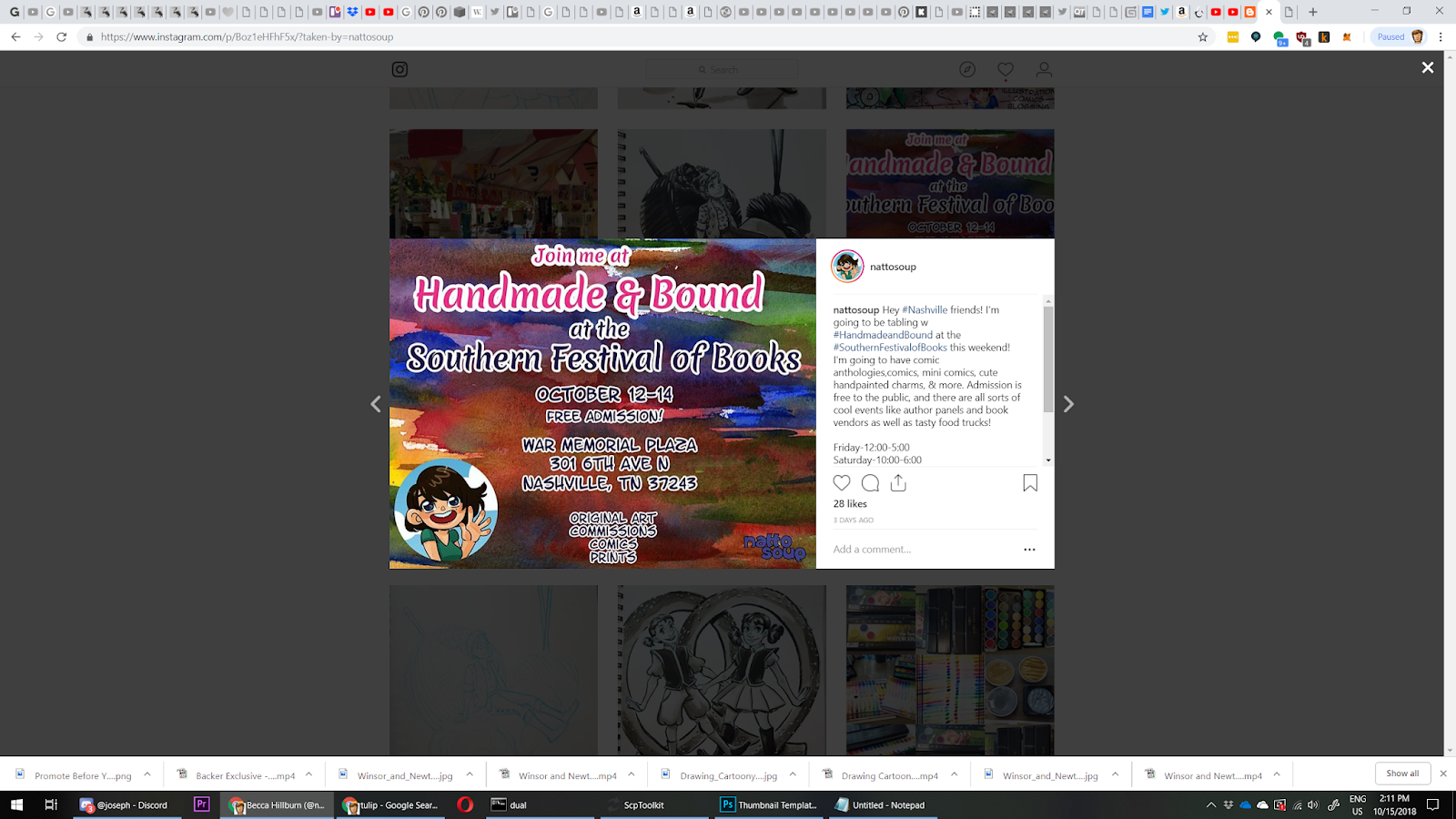
This weekend, I'm going to be at the Southern Festival of Books, tabling with Handmade and Bound!
While this is not my first year tabling at Handmade and Bound, it is my first tabling at the Southern Festival of Books, and I really look forward to experiencing how the show has grown. One big change is that the show is now three days, Friday, Saturday, and Sunday, rather than a single Saturday show, and another is that it's moved from Watkins to the War Memorial Plaza. One thing that hasn't changed is that admission is still free to attendees!
I'm going to have handpainted wooden charms, copies of 7" Kara, copies of anthologies such as 1001 Knights and Ladies Night Eat It Up, original art, and mini comics for sale this weekend, as well as fliers to promote my upcoming Nashville Community Ed class, Making Comics and Zines! There's still time to register if you're in the Nashville area and would like to do so.
I also plan on sharing a full con recap to my Youtube channel, so if you're interested in tabling at this show, not only should you swing by and check it out yourself, but you should keep an eye out for that video!
Please consider donating to this blog or purchasing from Natto-shop (http://nattosoup.com/shop) if you want me to continue publishing quality content. All materials tested were purchased from my own pocket. Keep on Truckin' Nattosoup is not under any sponsorship.

October 8, 2018
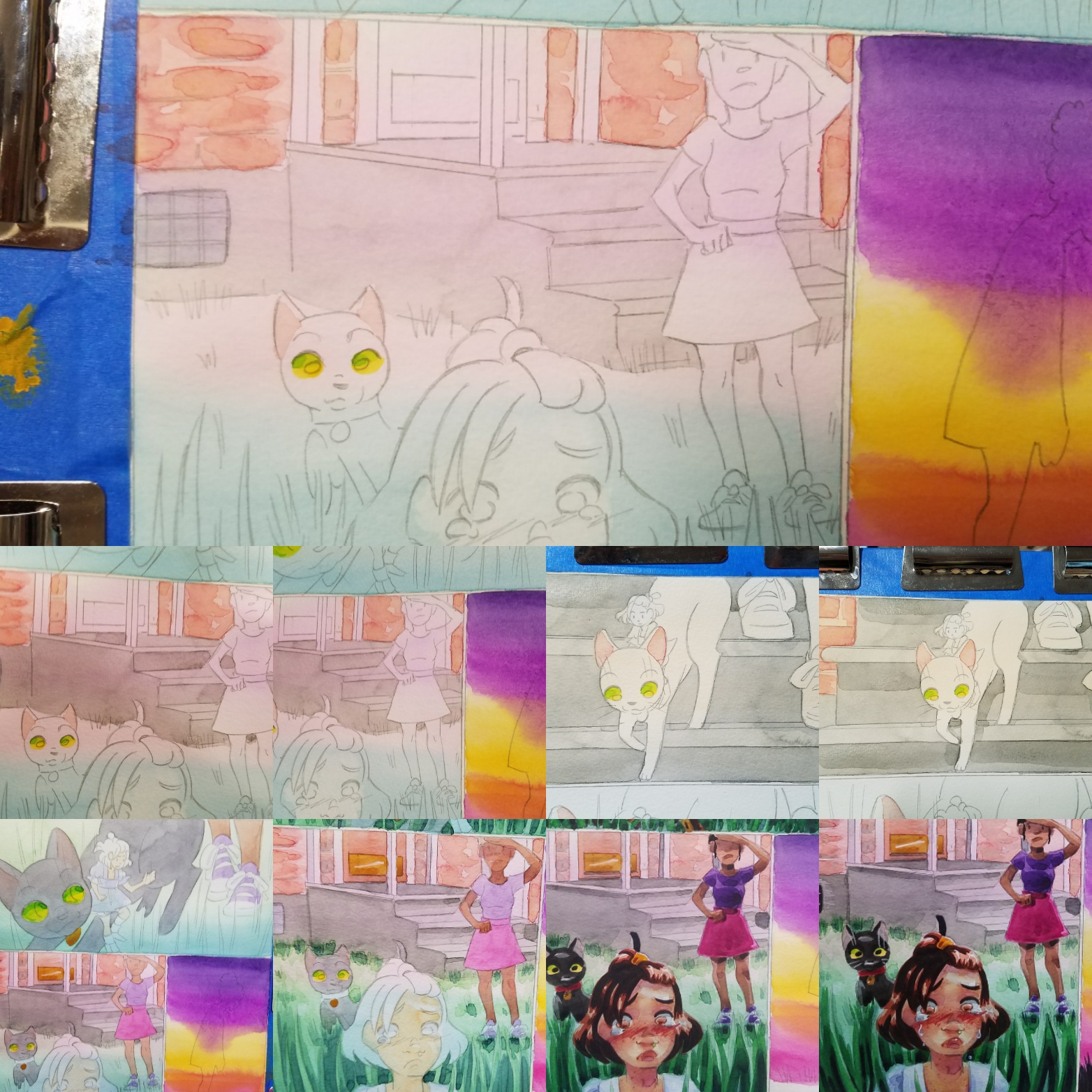
Watercolor Basics: Adding Details and Finishing Touches
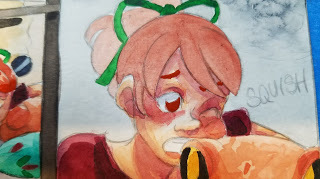
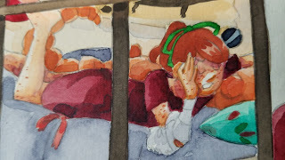
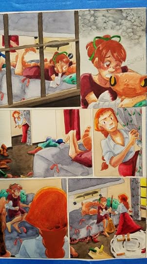
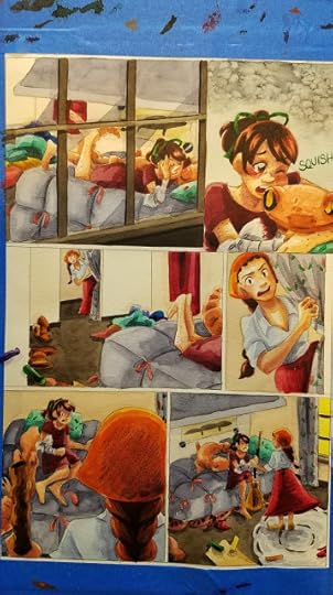
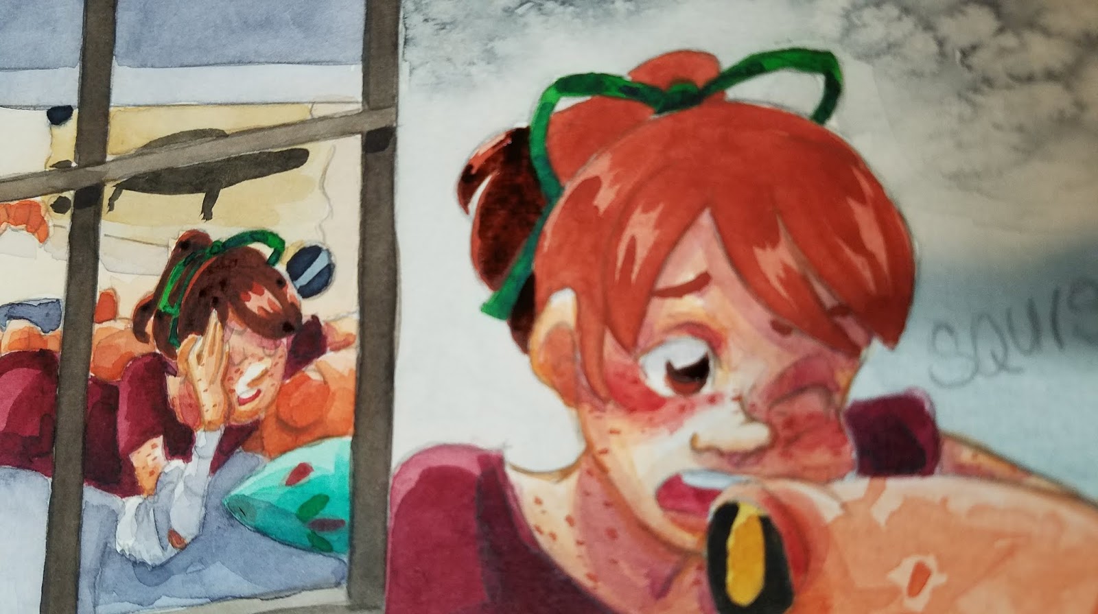
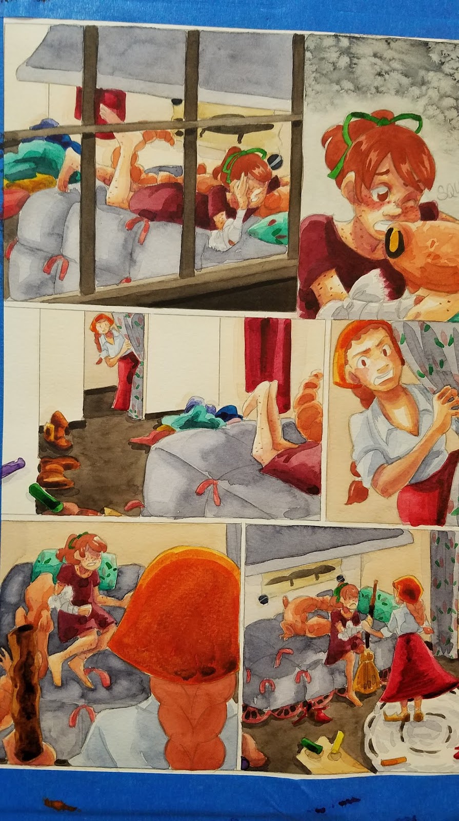
I realize this a little out of the order of operations- we've talked about stitching together spreads, lettering our comics, and dived in to color correction, so it's probably a little strange to return to in progress, stretched pages. I'm currently working on painting Chapter 8 of 7" Kara, and had the opportunity to cover some lost ground.
This is often the stage that really trips people up, mostly because they try to begin it way too early, adding details while they're still applying glazes and shadows. Any heavy application of watercolor paint will be prone to bleeding, reactivation, and running, and while applying a glaze over such an area CAN yield interesting effects, it's often the cause of much frustration for watercolor artists and illustrators.
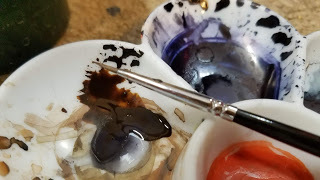
Skin shadows have been added, as well as a general application of my preferred shadow color (Holbein's Neutral Tint, Holbein's Neutral Tint mixed with a dioxine purple).


This is the stage where I start thinking about refining details, working with thick applications of color, using gouache and watercolor pencils. Its the stage where I really have an opportunity to build up contrast, and the stage when the page finally starts to come together.
Much of painting a watercolor comic is simply painting by numbers- mainly fills- but this is an opportunity to use brushwork to add distinctive touches.
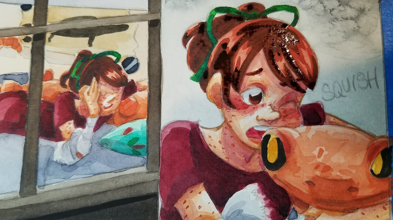
Building Up Hair:

I usually do hair in three or so stages- the base color (excluding white highlights), a midtone, and the shadows.
Base Color:

Adding the First Midtone:

Adding the Second Midtone:

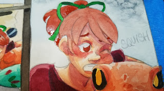
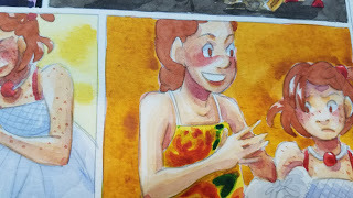
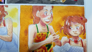
Adding Freckles:
For very fine details, such as eyelashes and freckles, or for delineating forms, I use a size 0 Creative Mark Rhapsody Brush.


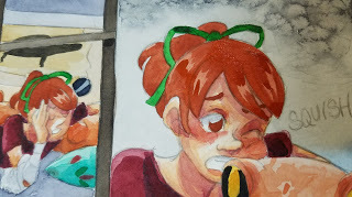
'Inking'- Tightening Up Forms
Using dehydrated or very concentrated watercolor
Particularly useful on skin, especially to cover graphite lines, or help the graphite blend in better.
Before 'inking'

After 'inking'


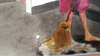
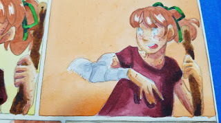
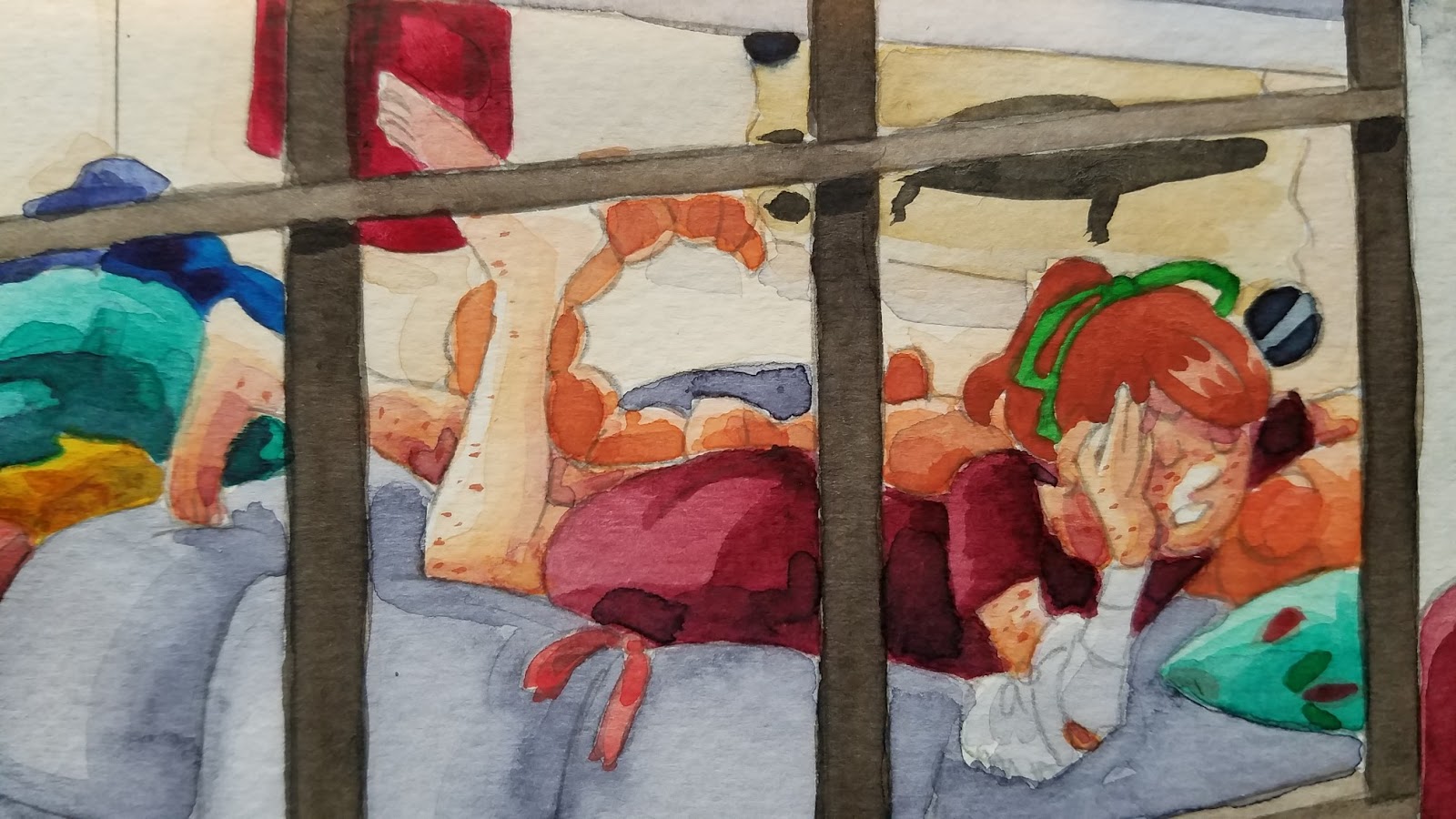
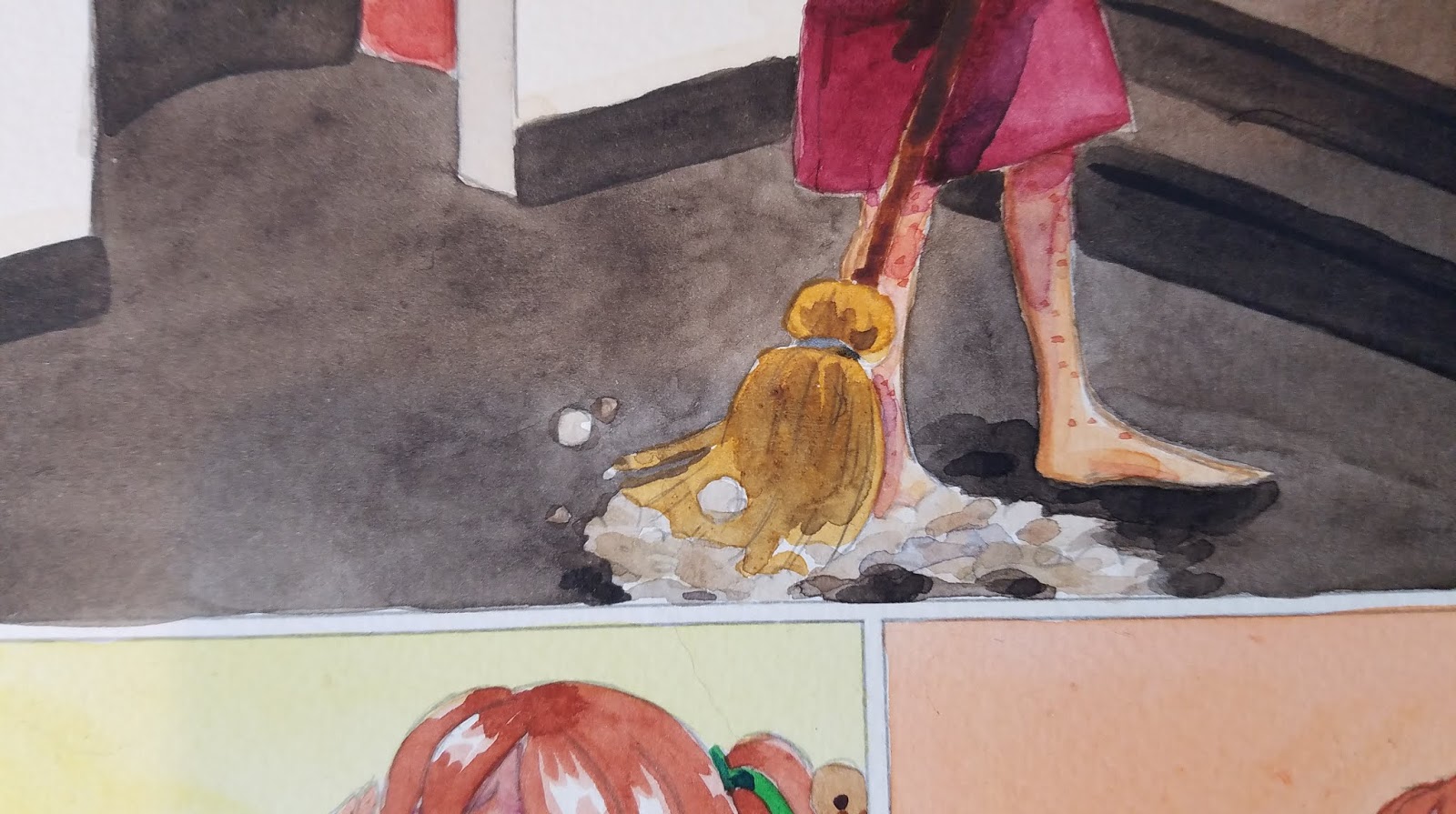
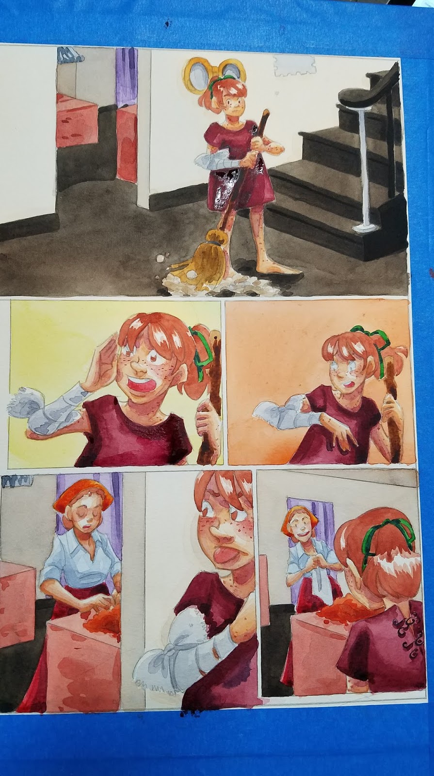
Filling In Tight Areas:
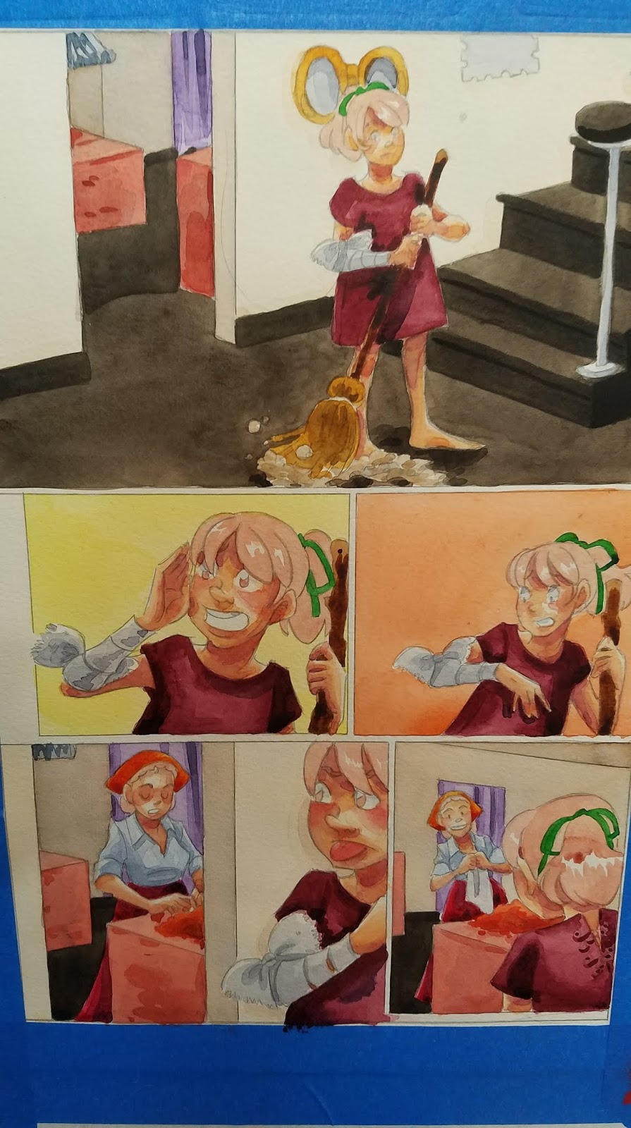
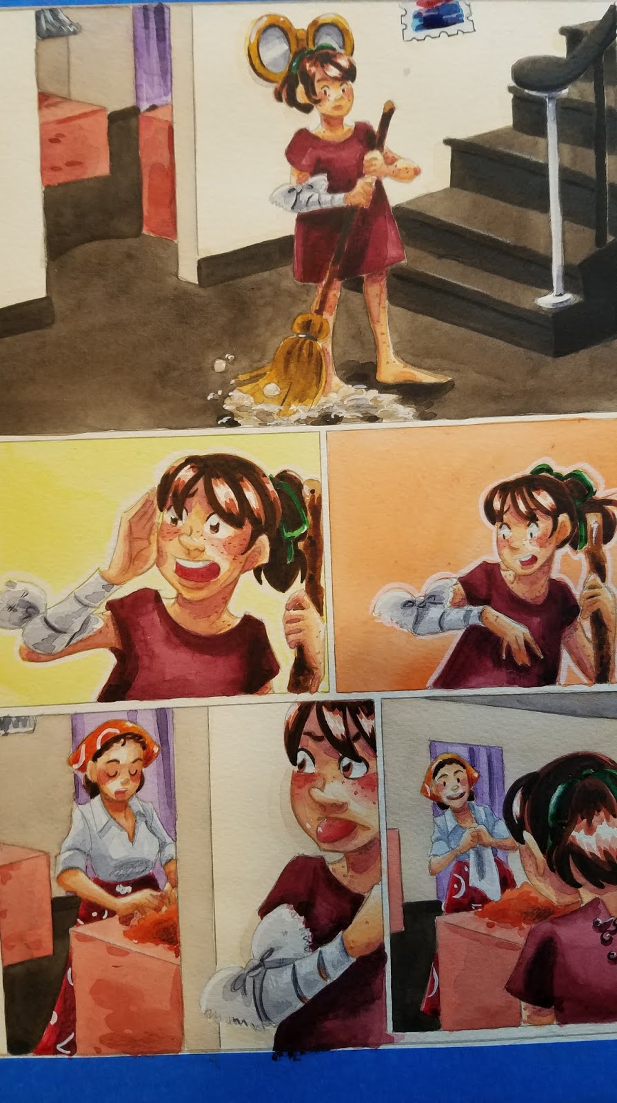
These are usually reserved until the main area has been painted, as often washes will reactivate heavier applications of paint, and the area would have to be repainted anyway. In this example, I left the band on the broom white until the straw had been rendered.

And in this example, I left the straps of her dress white until the skin had been painted.
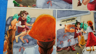
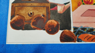
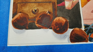
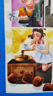
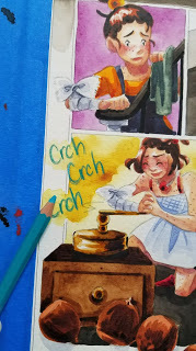
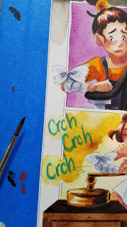
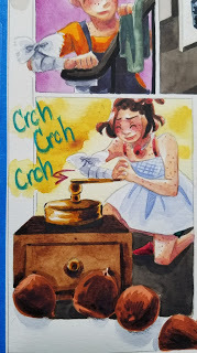
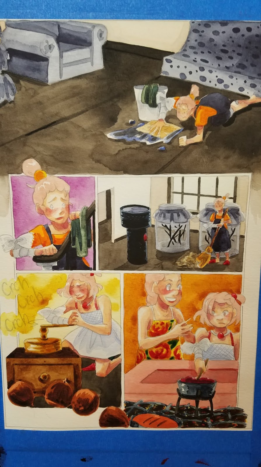
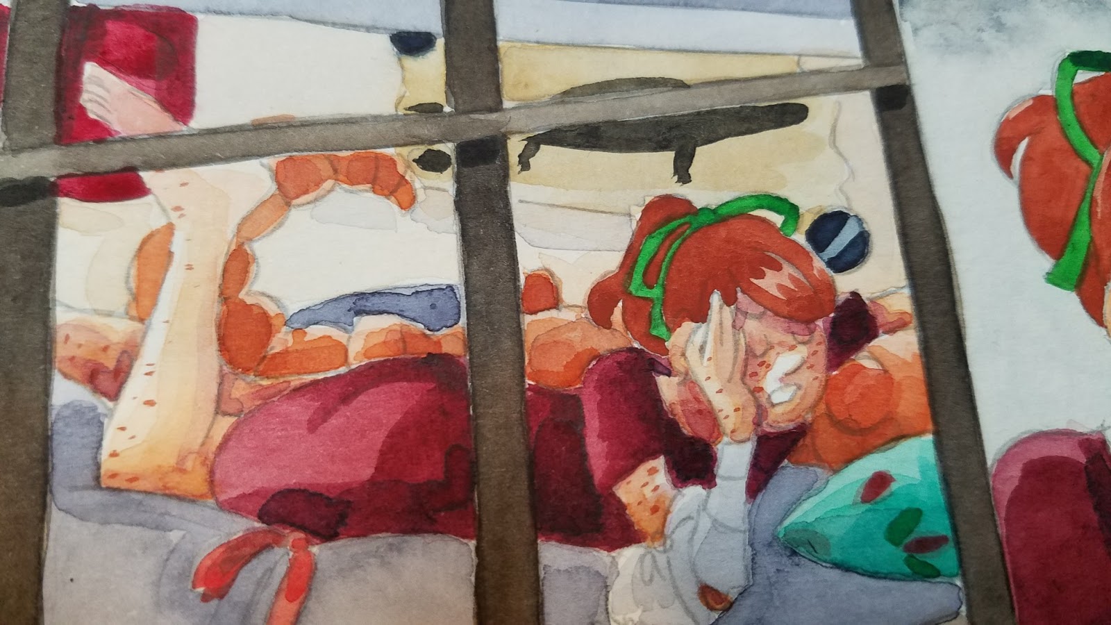
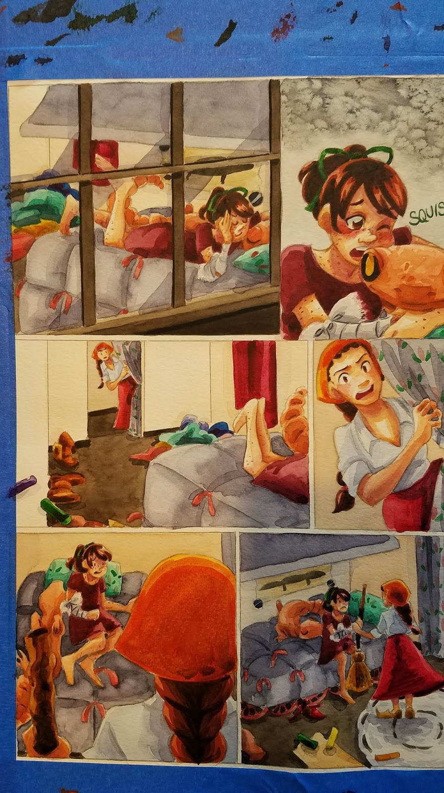
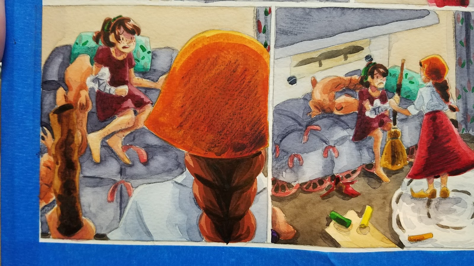
Adding Cast Shadows
The panel borders were left page white for this panel, but I thought a little cast shadow would make this panel feel less static and more like the acorns are tumbling out of the panel.
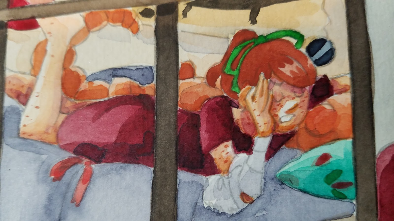
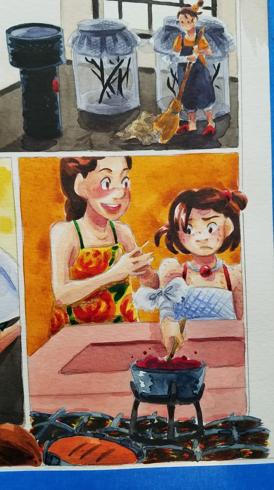
Overpainting/Overglazing
This should be used with extreme discretion, as it can reactivate previously painted areas, causing paint to run. However, that can be used to your advantage (to soften lines, for example). Generally, I do overglazing for adding neutral tint shadows, and may repaint the area if too much color is disturbed, or the color is overly disaturated.
In this example, I use Tyrian purple to add shadows to Kara's dark red dress.

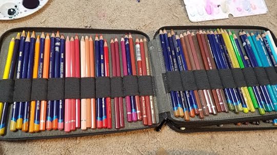
Color Pencils
To Reinforce ShadowsTo Reinforce LineartTo Add DetailTo add HighlightsLettering and Sound EffectsReestablish Lost Color
I prefer Derwent's Inktense and Supracolor II watercolor pencils as they deliver A LOT of pigment and don't chew through prior layers of watercolor
Reinforce Shadows

Reestablish Lost Color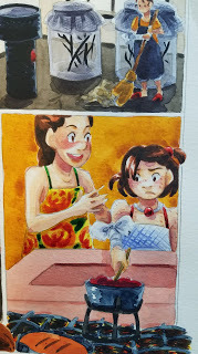

 Lettering and Sound Effects
To add Highlights
White Highlights:
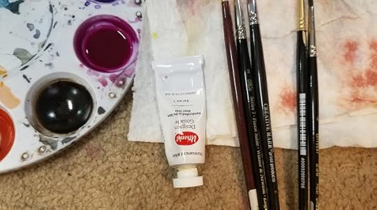
White highlights can be added with white color pencil, white pastel, white watercolor pencil, gouache, or PH Martin's Bleedproof White, or any combination of the above that works well for you.
White Gouache
Gouache is an opaque watercolor that is mixed thickly with water, until it's the consistency of cream.


While fairly basic, all of these techniques go a long way towards a watercolor comic page feeling and looking finished. All of these additions are aimed at either:
Cleaning up lineworkIncreasing legibilityAdding InterestIncreasing ContrastI think of the perfect combination of these elements as 'visual bounce', and this is when I know the page is finished and ready to remove from my stretcher boards.
Please consider donating to this blog or purchasing from Natto-shop (http://nattosoup.com/shop) if you want me to continue publishing quality content. All materials tested were purchased from my own pocket. Keep on Truckin' Nattosoup is not under any sponsorship.
This is often the stage that really trips people up, mostly because they try to begin it way too early, adding details while they're still applying glazes and shadows. Any heavy application of watercolor paint will be prone to bleeding, reactivation, and running, and while applying a glaze over such an area CAN yield interesting effects, it's often the cause of much frustration for watercolor artists and illustrators.
Skin shadows have been added, as well as a general application of my preferred shadow color (Holbein's Neutral Tint, Holbein's Neutral Tint mixed with a dioxine purple).


This is the stage where I start thinking about refining details, working with thick applications of color, using gouache and watercolor pencils. Its the stage where I really have an opportunity to build up contrast, and the stage when the page finally starts to come together.


Much of painting a watercolor comic is simply painting by numbers- mainly fills- but this is an opportunity to use brushwork to add distinctive touches.
Building Up Hair:

I usually do hair in three or so stages- the base color (excluding white highlights), a midtone, and the shadows.
Base Color:


Adding the First Midtone:


Adding the Second Midtone:


Adding Freckles:
For very fine details, such as eyelashes and freckles, or for delineating forms, I use a size 0 Creative Mark Rhapsody Brush.

'Inking'- Tightening Up Forms
Using dehydrated or very concentrated watercolor

Particularly useful on skin, especially to cover graphite lines, or help the graphite blend in better.

Before 'inking'
After 'inking'


Filling In Tight Areas:
These are usually reserved until the main area has been painted, as often washes will reactivate heavier applications of paint, and the area would have to be repainted anyway. In this example, I left the band on the broom white until the straw had been rendered.


And in this example, I left the straps of her dress white until the skin had been painted.


Adding Cast Shadows
The panel borders were left page white for this panel, but I thought a little cast shadow would make this panel feel less static and more like the acorns are tumbling out of the panel.


Overpainting/Overglazing
This should be used with extreme discretion, as it can reactivate previously painted areas, causing paint to run. However, that can be used to your advantage (to soften lines, for example). Generally, I do overglazing for adding neutral tint shadows, and may repaint the area if too much color is disturbed, or the color is overly disaturated.
In this example, I use Tyrian purple to add shadows to Kara's dark red dress.


Color Pencils
To Reinforce ShadowsTo Reinforce LineartTo Add DetailTo add HighlightsLettering and Sound EffectsReestablish Lost Color
I prefer Derwent's Inktense and Supracolor II watercolor pencils as they deliver A LOT of pigment and don't chew through prior layers of watercolor
Reinforce Shadows


Reestablish Lost Color


 Lettering and Sound Effects


To add Highlights


White Highlights:
White highlights can be added with white color pencil, white pastel, white watercolor pencil, gouache, or PH Martin's Bleedproof White, or any combination of the above that works well for you.


White Gouache
Gouache is an opaque watercolor that is mixed thickly with water, until it's the consistency of cream.


While fairly basic, all of these techniques go a long way towards a watercolor comic page feeling and looking finished. All of these additions are aimed at either:
Cleaning up lineworkIncreasing legibilityAdding InterestIncreasing ContrastI think of the perfect combination of these elements as 'visual bounce', and this is when I know the page is finished and ready to remove from my stretcher boards.
Please consider donating to this blog or purchasing from Natto-shop (http://nattosoup.com/shop) if you want me to continue publishing quality content. All materials tested were purchased from my own pocket. Keep on Truckin' Nattosoup is not under any sponsorship.
October 4, 2018
Watercolor Basics: Color Correction
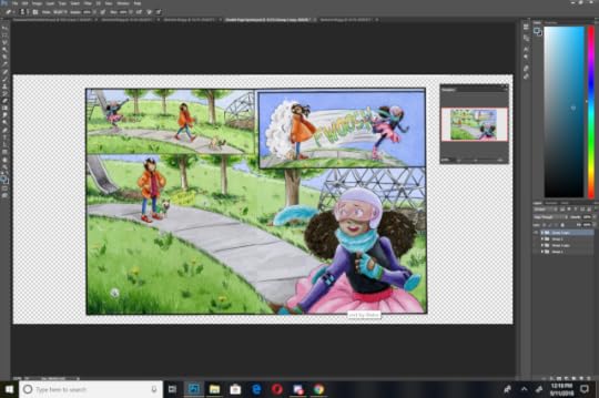
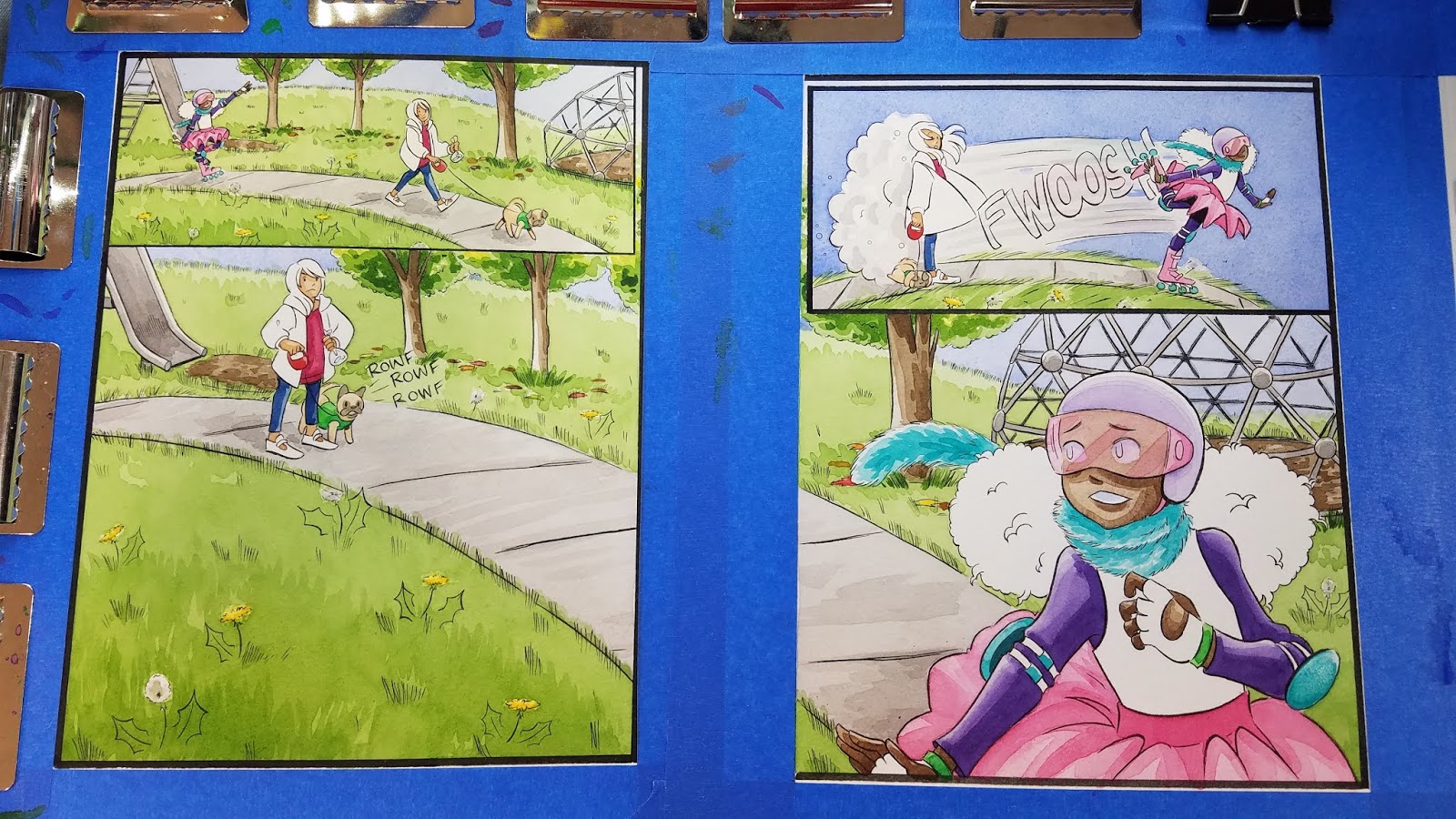
Last week, we talked about methods for stitching together a double page spread in Photoshop. Today we're discussing color correction.
Color correcting watercolors can be challenging. There are ways you can finagle your colors infinitely, or correct just one area, but I'm lazy. I'll show you guys a couple of my favorite methods, and encourage you to find your own!
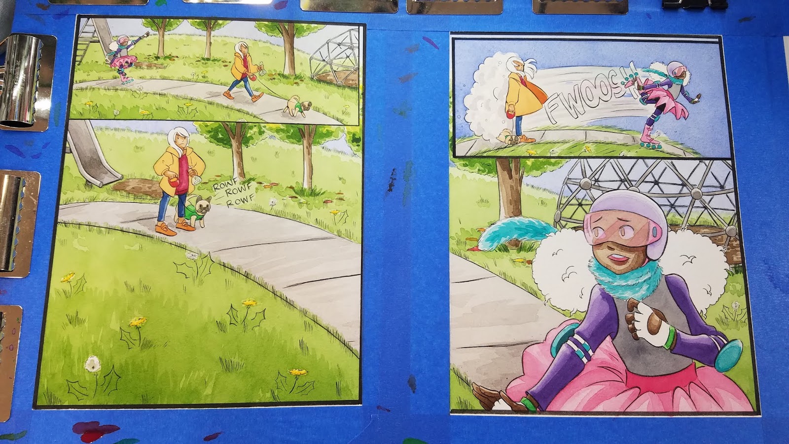
 Uncorrected original
 Stitched and Corrected Digital File
Digital Color Correction
Starting with last week's file, I make a copy of my layer, turn off visibility on the previous layer, and use this new copy for corrections. I basically do this at every major stage- this makes it easy for me to just dump a bunch of changes that didn't work out. As always, I highly recommend you do not alter your originals.

Correction 1: Adjusting Hue/Saturation
My large format Epson scanner tends to scan things a little on the cool side, so I use Hue/Saturation to try and restore the original colors as much as possible.
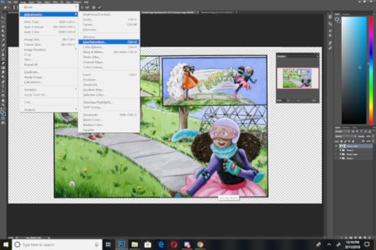
Bumping it a little warmer messes with some of the more saturated colors- her hot pink tutu for example, and I always struggle with maintaining purples using this correction method.
If you'd like to color correct a specific area individually, you can copy that area to another layer and edit from there. For things like a hot pink tutus, or certain purples, this allows you to get a more accurate adjustment.
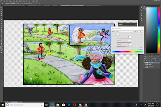
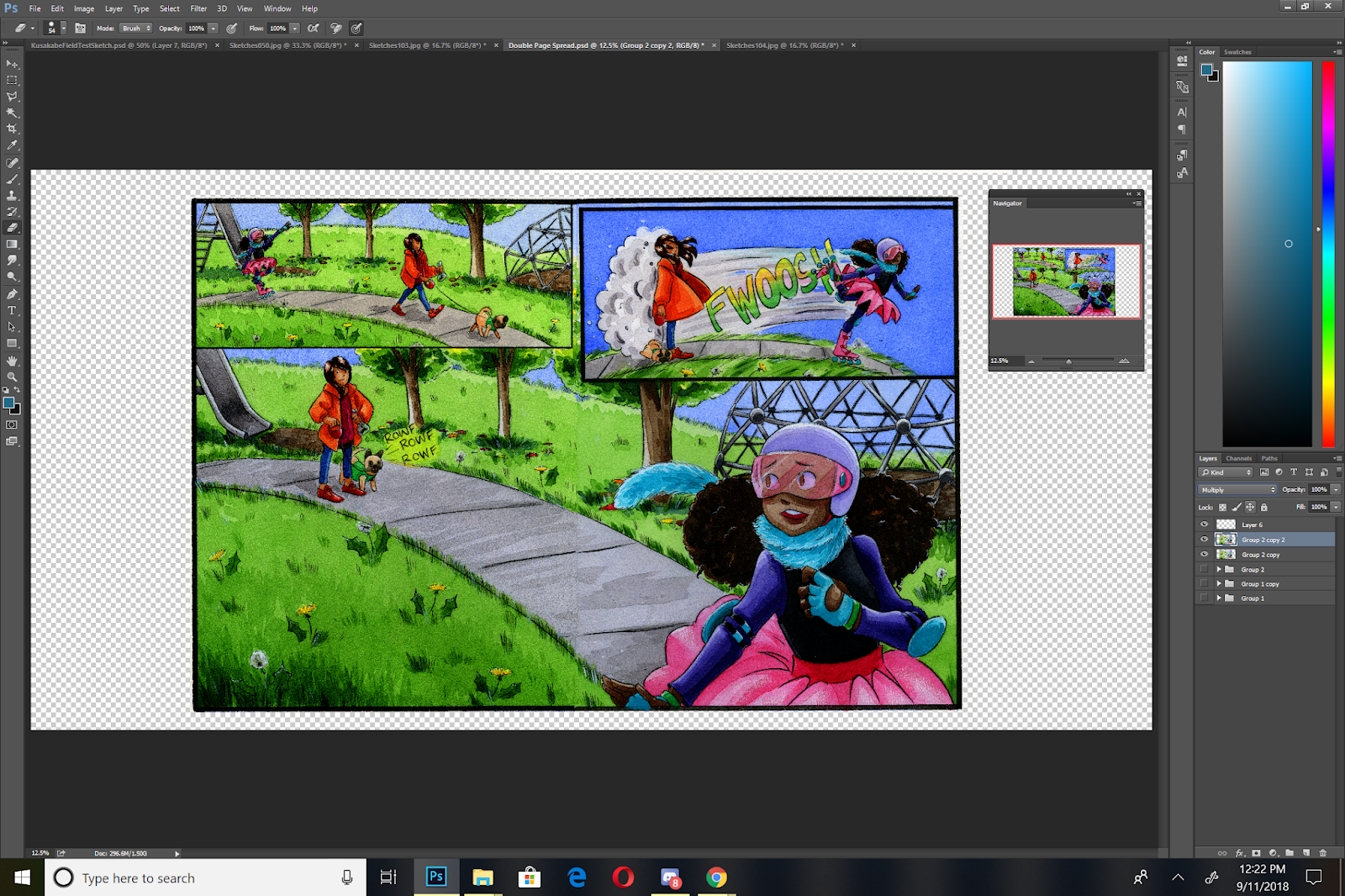
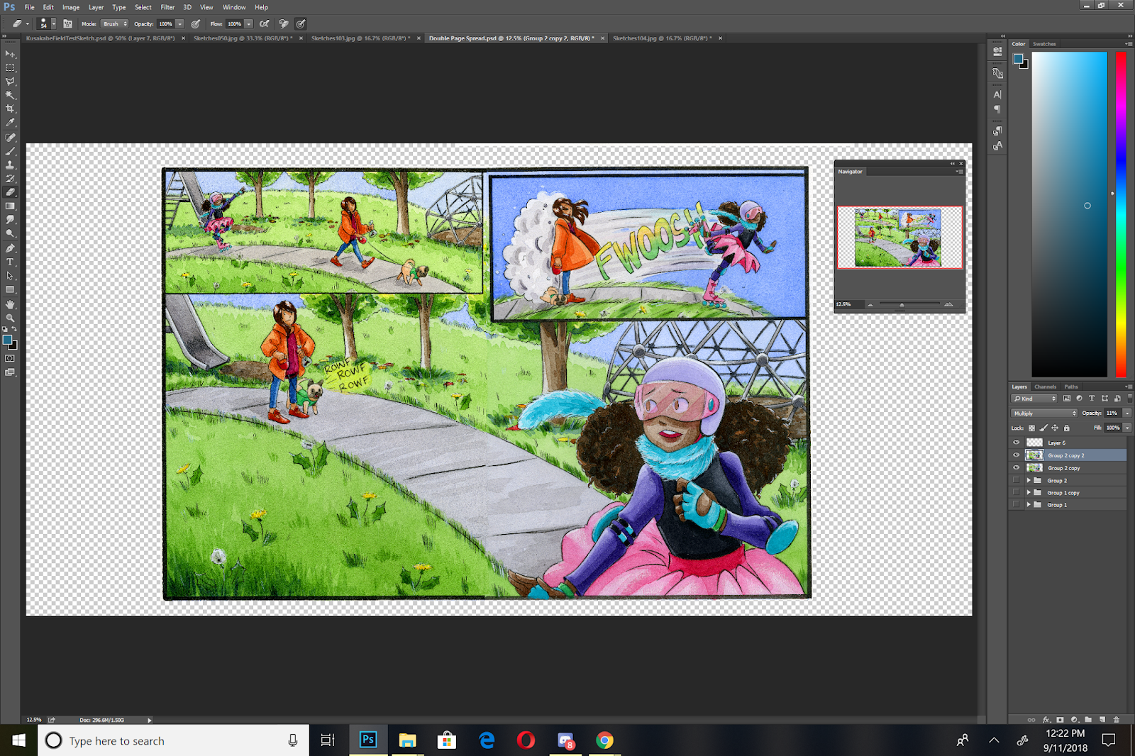
Correction 2: Multiply
I duplicate my adjusted layer

And set that duplicate layer to Multiply, then adjust the opacity until it looks right. My scanner has a tendency to wash my watercolors out, and this helps me regain some of that depth. Even a multiplied layer set to 10% opacity can make a big difference!


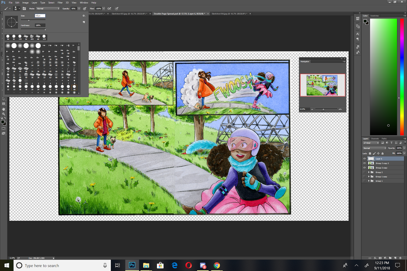
Correction 3: Retouching
I try to keep this correction to a minimum because it can quickly go from 'watercolor with a couple adjustments' to mixed media digital.
In this instance, I'm going to use a digital color pencils brush to reestablish the lines in the sidewalk.


Fixing the Borders:


I use a round brush to retouch my borders, color picking from my black border, creating a new layer, setting that layer to multiply, and then redrawing the border. This can be toggled so it better blends with the existing border.
Cropping
Sometimes I crop before color correction, sometimes I crop after, the only real difference it makes are size considerations.
This part is always one of the most frustrating steps for me- for some reason, I'm always catawampus! If I'm careful to align my scan (and I always am for important pieces), things still seem skewed. Photoshop has tools to help correct that, but often the corrections I need are micro corrections- small adjustments that would make a huge difference, and my happy medium always seems stuck between two of Photoshop's preferred points. So if you've ever noticed that my comic pages are always a bit skewy, now you know why!
Taking a Step Back:

I ended up making some final revisions to fix the sidewalk and the grass, but I covered the basics for that in a prior post.
The Finished Illustration
Please consider donating to this blog or purchasing from Natto-shop (http://nattosoup.com/shop) if you want me to continue publishing quality content. All materials tested were purchased from my own pocket. Keep on Truckin' Nattosoup is not under any sponsorship.
Color correcting watercolors can be challenging. There are ways you can finagle your colors infinitely, or correct just one area, but I'm lazy. I'll show you guys a couple of my favorite methods, and encourage you to find your own!
 Uncorrected original
 Stitched and Corrected Digital File
Digital Color Correction
Starting with last week's file, I make a copy of my layer, turn off visibility on the previous layer, and use this new copy for corrections. I basically do this at every major stage- this makes it easy for me to just dump a bunch of changes that didn't work out. As always, I highly recommend you do not alter your originals.
Correction 1: Adjusting Hue/Saturation
My large format Epson scanner tends to scan things a little on the cool side, so I use Hue/Saturation to try and restore the original colors as much as possible.
Bumping it a little warmer messes with some of the more saturated colors- her hot pink tutu for example, and I always struggle with maintaining purples using this correction method.
If you'd like to color correct a specific area individually, you can copy that area to another layer and edit from there. For things like a hot pink tutus, or certain purples, this allows you to get a more accurate adjustment.
Correction 2: Multiply
I duplicate my adjusted layer
And set that duplicate layer to Multiply, then adjust the opacity until it looks right. My scanner has a tendency to wash my watercolors out, and this helps me regain some of that depth. Even a multiplied layer set to 10% opacity can make a big difference!
Correction 3: Retouching
I try to keep this correction to a minimum because it can quickly go from 'watercolor with a couple adjustments' to mixed media digital.
In this instance, I'm going to use a digital color pencils brush to reestablish the lines in the sidewalk.


Fixing the Borders:


I use a round brush to retouch my borders, color picking from my black border, creating a new layer, setting that layer to multiply, and then redrawing the border. This can be toggled so it better blends with the existing border.
Cropping
Sometimes I crop before color correction, sometimes I crop after, the only real difference it makes are size considerations.
This part is always one of the most frustrating steps for me- for some reason, I'm always catawampus! If I'm careful to align my scan (and I always am for important pieces), things still seem skewed. Photoshop has tools to help correct that, but often the corrections I need are micro corrections- small adjustments that would make a huge difference, and my happy medium always seems stuck between two of Photoshop's preferred points. So if you've ever noticed that my comic pages are always a bit skewy, now you know why!
Taking a Step Back:
I ended up making some final revisions to fix the sidewalk and the grass, but I covered the basics for that in a prior post.
The Finished Illustration

Please consider donating to this blog or purchasing from Natto-shop (http://nattosoup.com/shop) if you want me to continue publishing quality content. All materials tested were purchased from my own pocket. Keep on Truckin' Nattosoup is not under any sponsorship.
October 2, 2018
Inktober 2018
 Inktober 2018 Day 1- House Lilliputians
I'm going to continue my Lilliputian theme from last year, and do more worldbuilding! This time, I'm focusing on communities, holidays, pets, and seasonal ware, and I plan on completing my Inktober in inkwash! As with last year, every day in Inktober will also see a worldbuilding prompt, so if you enjoy the world in miniature, make sure you check out my Instagram for daily updates.
As always, I have loads of amazing resources to help you make your Inktober as successful as possible, particularly if you wish to work in traditional media. This year, I see a lot of artists are opting to integrate watercolor into their Inktober pieces- the entire Watercolor Basics series should be of interest if you're new to the wonderful world of watercolor. If you're interested in brush inking, I have loads of great tutorials on my Youtube channel, and weekly brush inking demonstrations from Mermay to provide some inspiration. If you're interested in nibs, not only do I have helpful nib reviews, to help you find that right nibs for your project, but loads of demonstrations and tutorials!
Robust Inking Toolkit For Artists
Brushpens:
Brushpens Playlist
Brushpen Review Hubpage (written)
Nib and Ink:
Dip Pen Nib Review Playlist
Brush Inking:
Brush Inking Playlist
Watercolor:
Watercolor Basics Hubpage
Watercolor Playlist
I can't stress enough that however you choose to do Inktober (or not do Inktober), the choice is up to you, and is valid. I want to stress that for any artistic challenge you undertake, you do it for yourself first- pick a topic, media, and a pace that works for you, and that you will enjoy. Do Inktober because you want to, find another challenge you'll enjoy more, or just focus on doing what you do- it doesn't matter, because all choices are valid if they're the right choice for you. I will ask that if you are sitting out Inktober this year, you consider acting as an Artist Angel- leaving kind comments on those who are participating in some form. It takes very little energy, and can really make a huge difference to others, especially since many artists feel that their work goes unnoticed.
If you're participating in Inktober, and we aren't already mutuals on the service you plan on sharing your Inktober process to (Instagram, Twitter, Youtube, Tumblr, ect), feel free to message me on that service and let me know- I'd love to cheer on your progress! And please consider following me and doing the same- your encouragement really means a lot to me!
Please consider donating to this blog or purchasing from Natto-shop (http://nattosoup.com/shop) if you want me to continue publishing quality content. All materials tested were purchased from my own pocket. Keep on Truckin' Nattosoup is not under any sponsorship.

September 28, 2018
Intro to Comic Craft Stitching Together a Double Page Spread
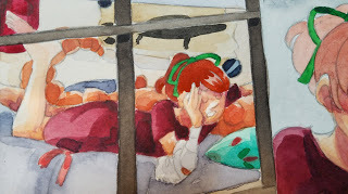
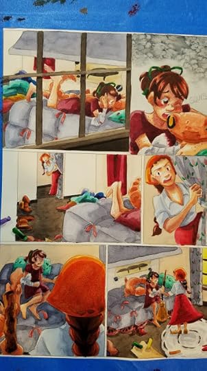
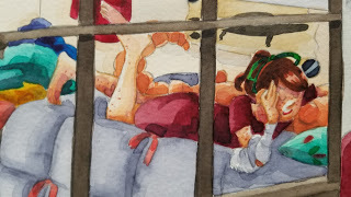
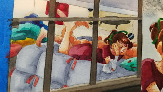
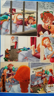
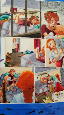
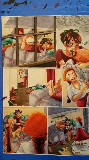
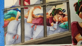
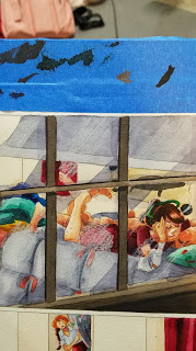
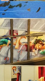
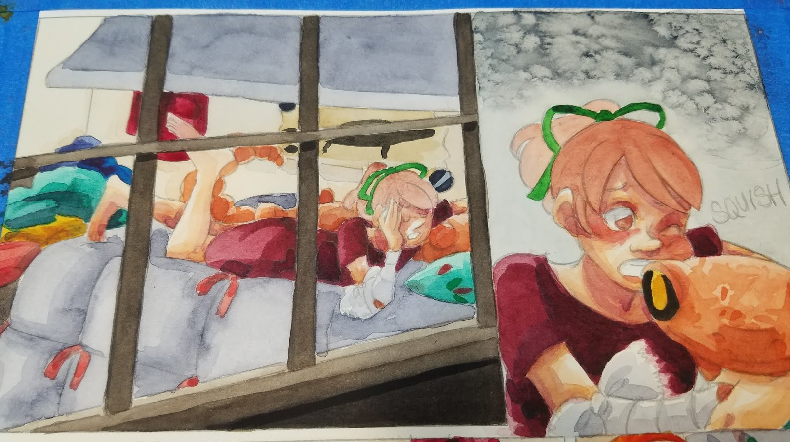
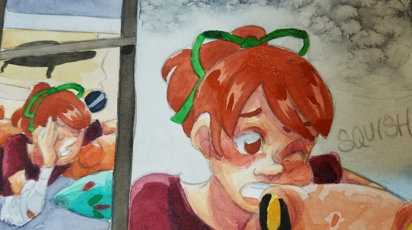
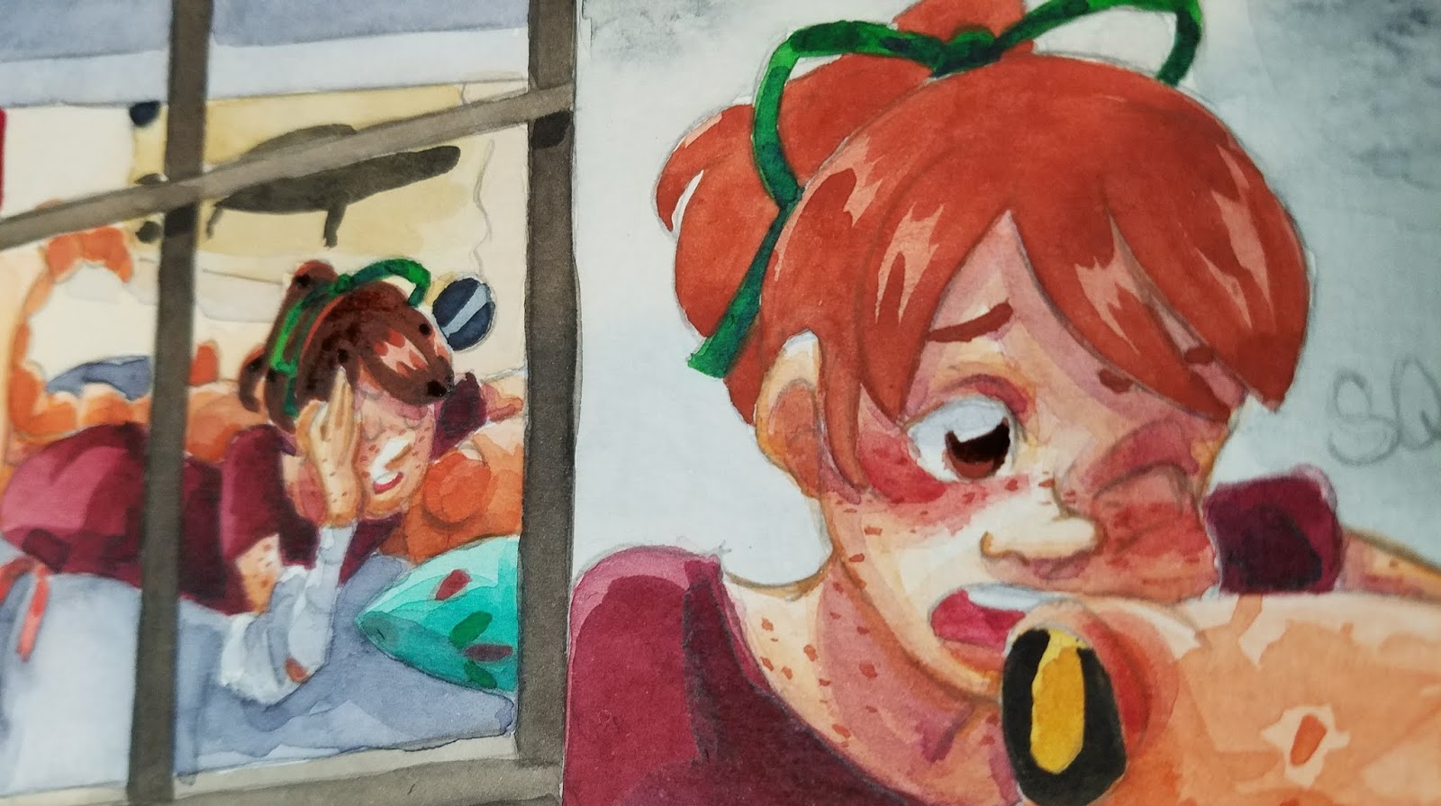
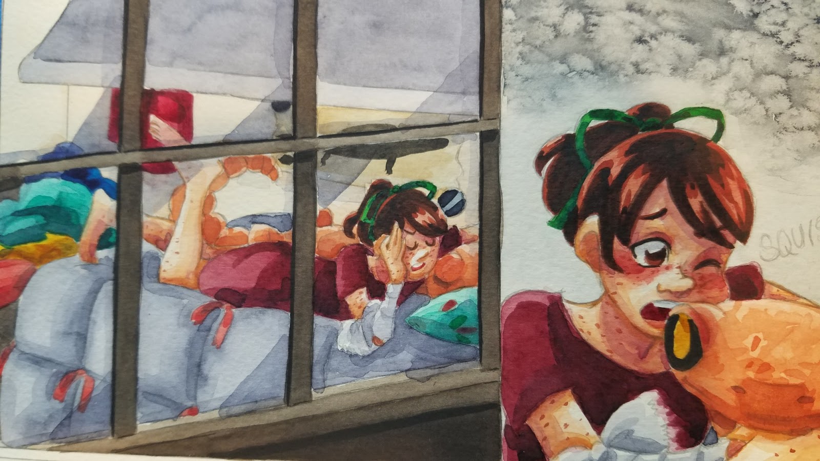
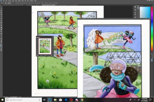
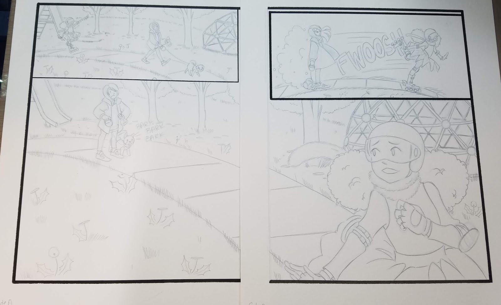
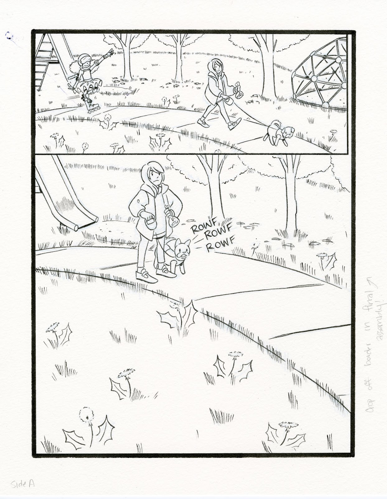
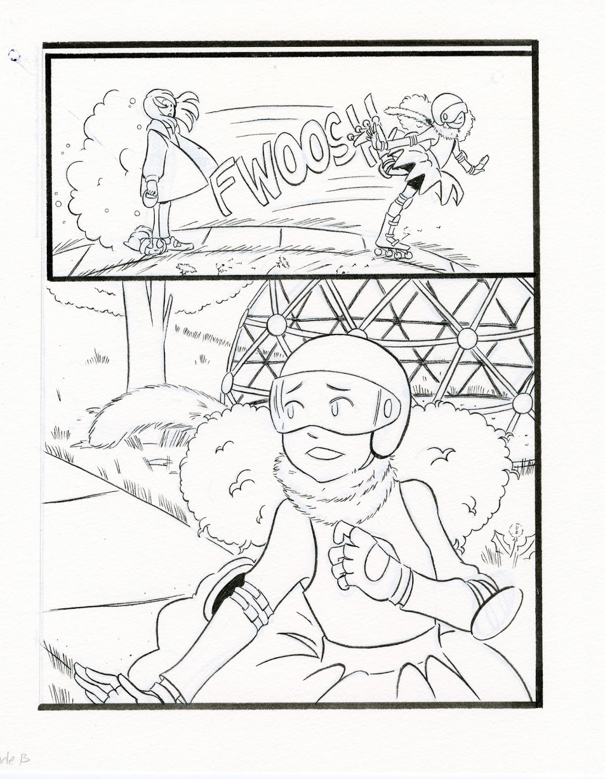
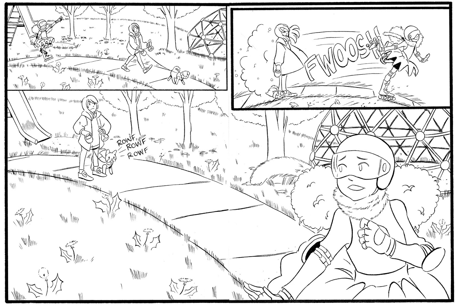
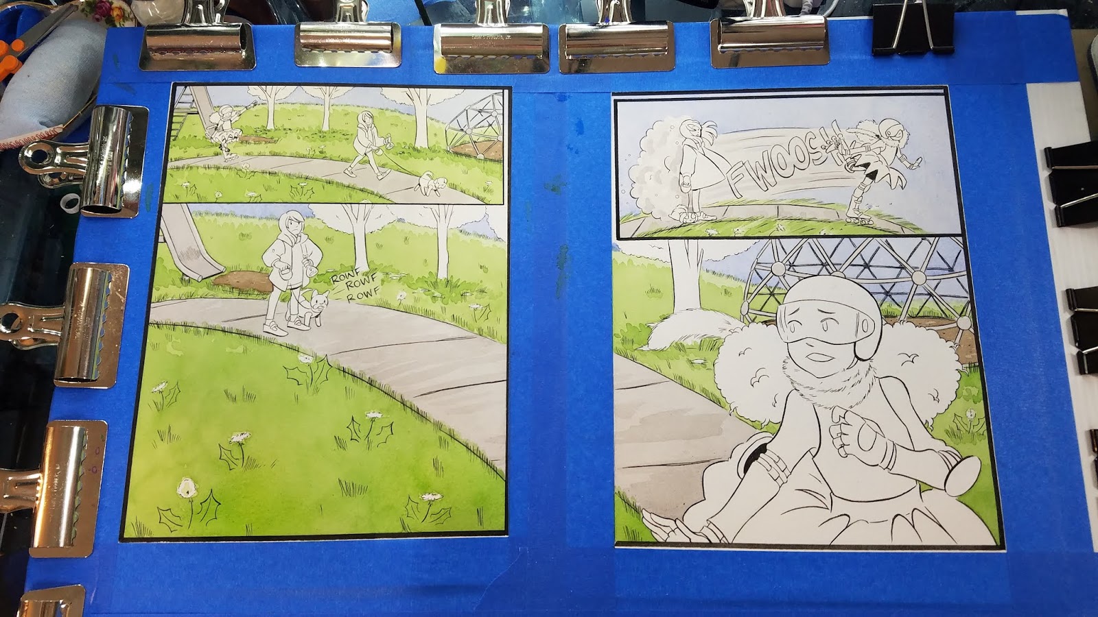
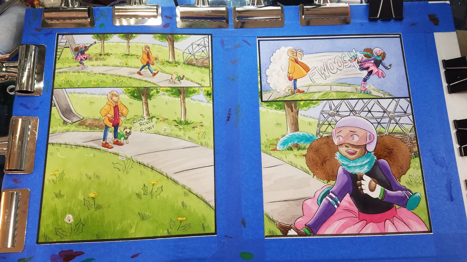
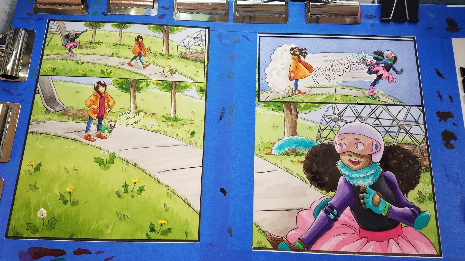
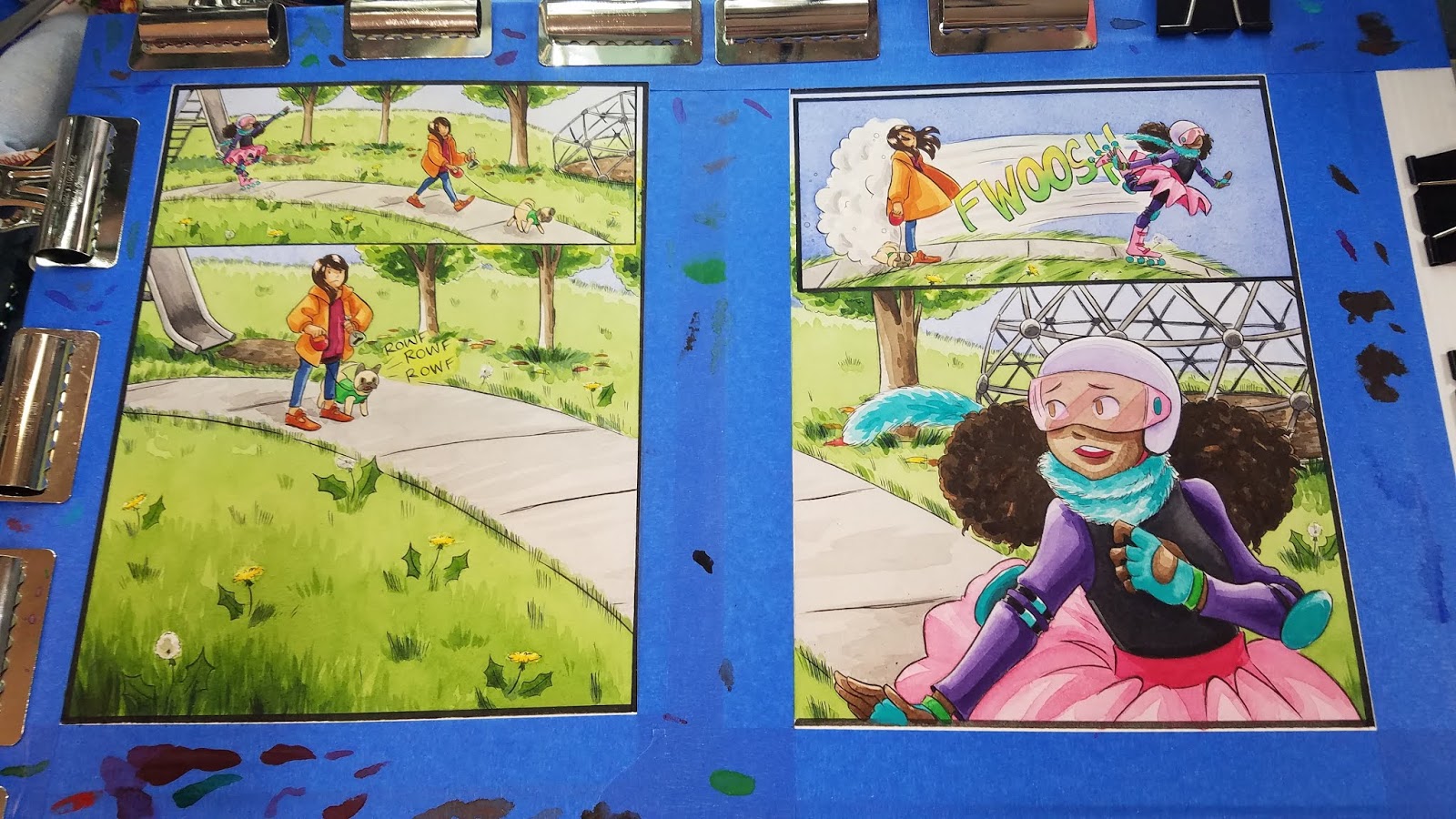
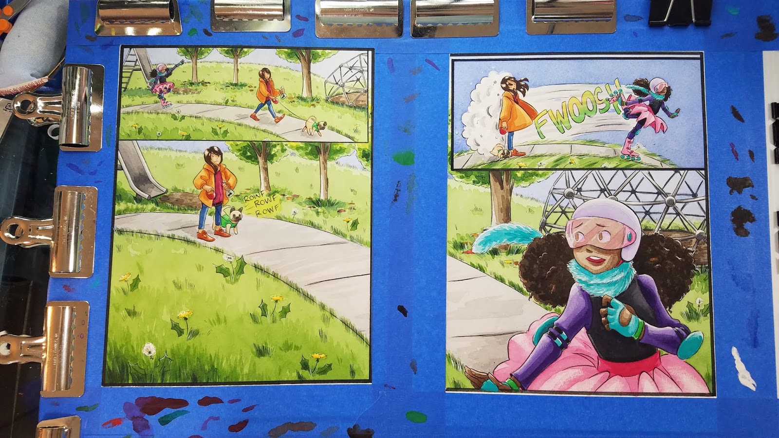
In most comics, a double page spread is fairly unusual. It can really mess up the pagination of your comic, and has to be carefully planned in order to fit. As someone who does kidlit comics and all ages comics though, I like using double page spreads as an opportunity to explore large spaces, large concepts, or create an opportunity for the reader to relax for a moment and get pulled into the world. Some chapters of 7" Kara have multiple double pages spreads (shock and horror, I know!), particularly Chapter 7, when Kara is immersed in Naomi's human world for the first time.
This spread from Chapter 6 began its life as two watercolor pages stretched on one large board- a common situation for my double page spreads. I have a couple videos that demonstrate the process for painting watercolor spreads for those curious- but it only differs from painting regular pages in a couple ways-
1. Your Stretcher Board is double size, so the painting's footprint is HUGE2. Although there's a space between the two pages, you're trying to continue your painting across that gap, so it's easier to stitch together.
This will probably only be relevant to creators who:Work in traditional media Work at a size that would necessitate splitting your spread over two pages
So for this type of spread, this is really a crossover post- a little Watercolor Basics, a little Intro to Comic Craft, but I hope regardless of your camp, you will enjoy!
Painting Pages- Working on a Double Page Comic Spread
Watercolor In Progress: Painting 7 Inch Kara
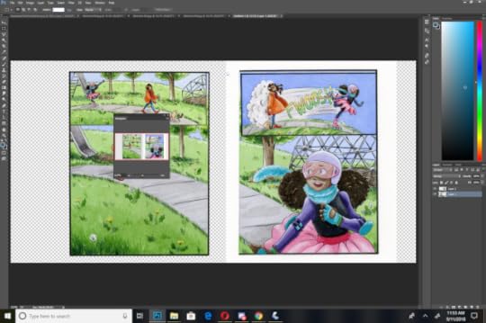
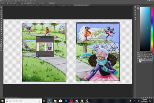
Now that our spread is painted, we need to digitize it and stitch it together for display and sharing as a webcomic page. Generally, for print, I don't worry too much about stitching a spread together- there's usually a fold to hide all but the most glaring errors, and I simply focus on color correcting the pages so they make sense as a continuous image. For web desplay (such as sharing the spread as a webcomic), I keep two considerations in mind:
While these are two pages, they're shared and displayed as one imageI need to remove the center seam, and stitch the pages together so that they are as seamless as possible.
These techniques are also applicable if you have to scan a large image in pieces and need to stitch them together. Photoshop does have a Merge function under Automate, but it doesn't always work well, and sometimes you're doing your stitching manually.
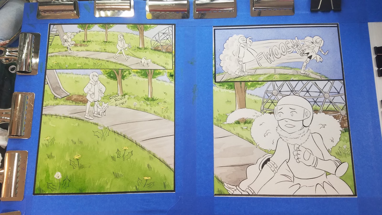
In this example, we're going to begin with a piece that's already nearly assembled- the two individual comic pages have been merged onto one document, the color correction has been completed, and we just need to make a few corrections to finish this piece.
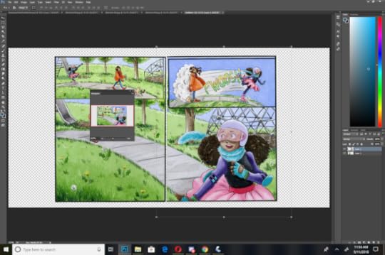
Correcting blemishes/Sewing Pages Together:
Favorite Techniques:
Clone (utilizing the Clone Tool)
Manual Clone- Select the area you want to duplicate on your image, copy and paste it onto a separate layer, erase excess until it blends in.
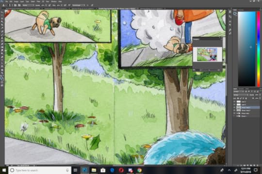
Things to correct: Remove center seam Fix the stairs
When making corrections, do NOT correct the original- always make copies, and hide or lock your originals. This sort of correction can be quite destructive, so you want to protect your originals. Also, always make your corrections on a new layer- you may need to erase or soften edges.
Correcting the center seam is simple- you can either copy and paste areas of grass and drag them over, or you can use the clone tool to clone areas you like to cover the seam. Fixing the stairs is a little more difficult- there's a lot of light and shadow, stairs require more precision than grass, and sloppiness will stand out more.
For the stairs, I used a combination of copying over areas that worked, playing with Multiply, and cloning areas, as well as reestablishing the lines on the stairs using a custom Pencil Color brush.
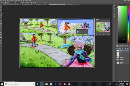
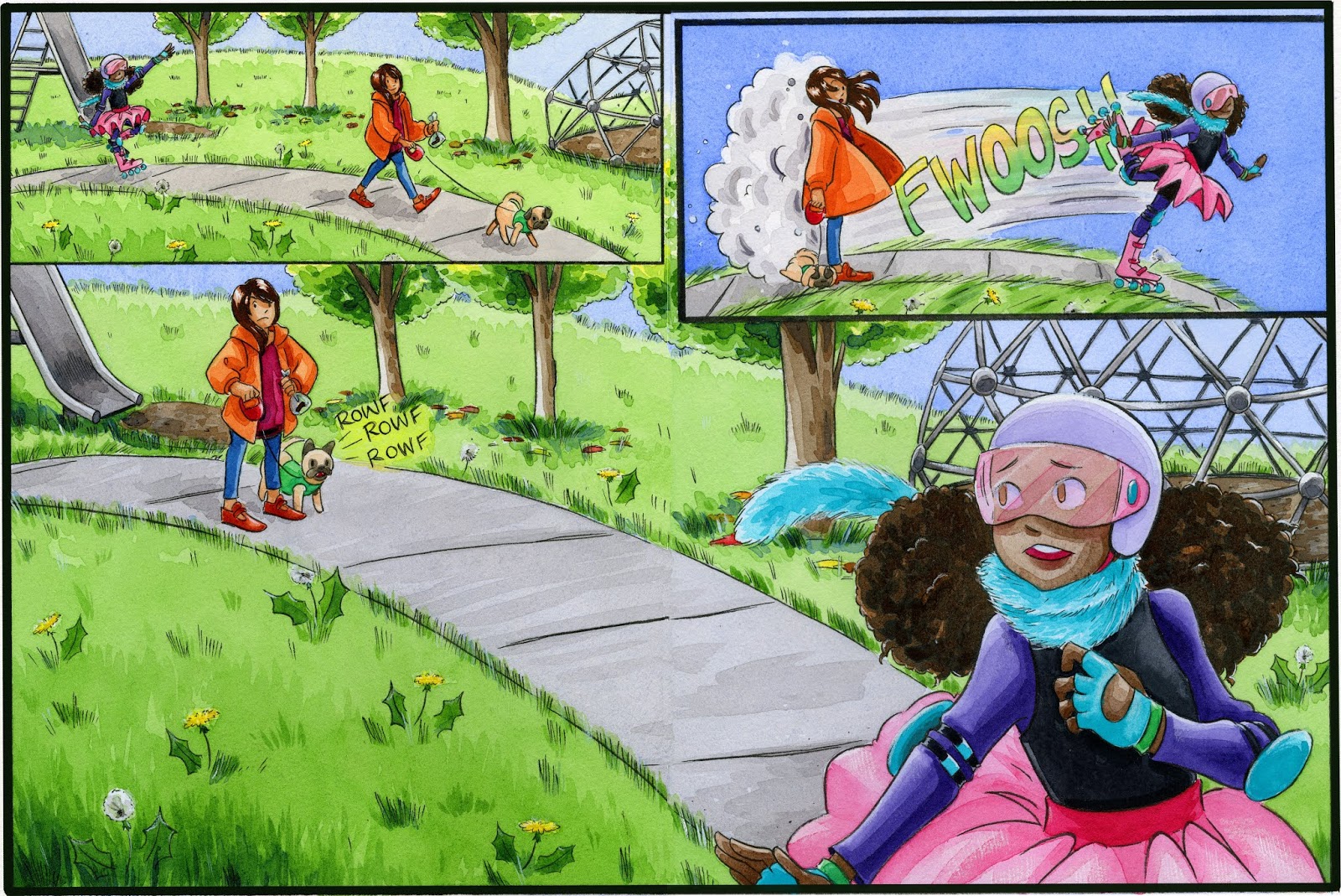
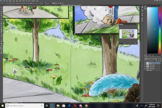
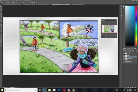
The Finished Spread: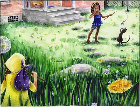
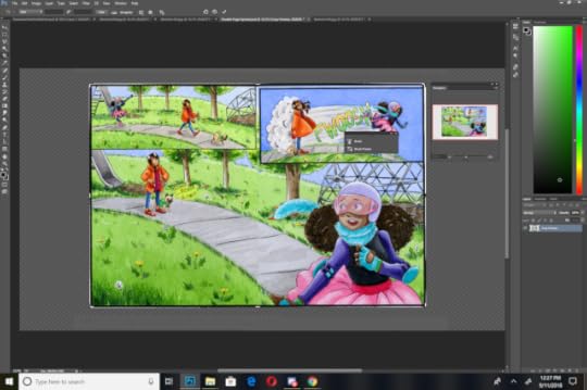
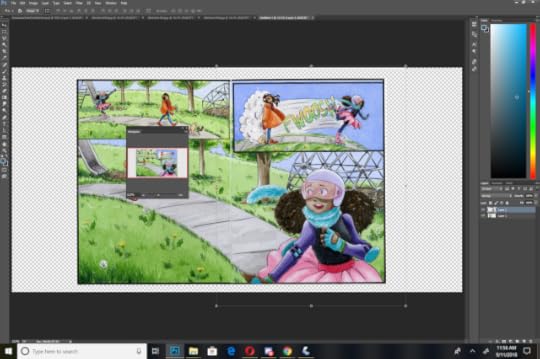
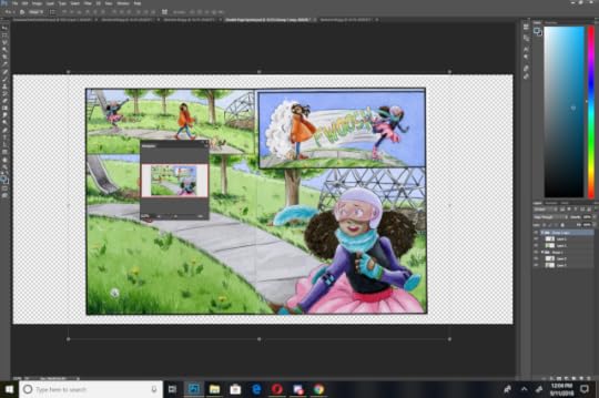
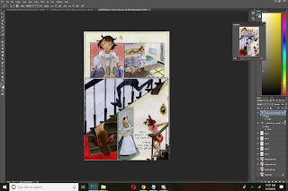
Let's take an in depth look at stitching together a double page spread with my SCBWI 2018 Illustrator's Contest entry.
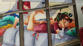
Double Page Spread Painting Progress:
As you can see, most of the process is completed with about a 2" gap between the pages, forcing me to extrapolate information. I wasn't as careful as I should have been- lining up your spread so it's continuous makes it much easier to paint as though it is actually continuous.
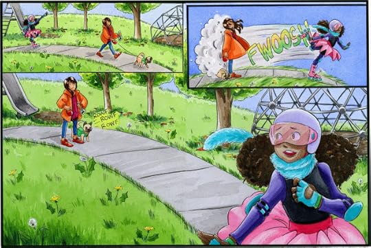
The finished kidlit art comic spread
Opening Our Base Scans:
The first step in stitching together a double page spread is to get your spreads in a single file. I open both spreads and create a new, huge document that's more than large enough to contain both files. This allows me room to reposition my halves.
Make sure you save your original two halves on seperate layers. We will want to work with a file that's one continuous layer at some point, but remember- never alter your originals.
Creating the Master File
We also want to crop the scanned border from around these pages.
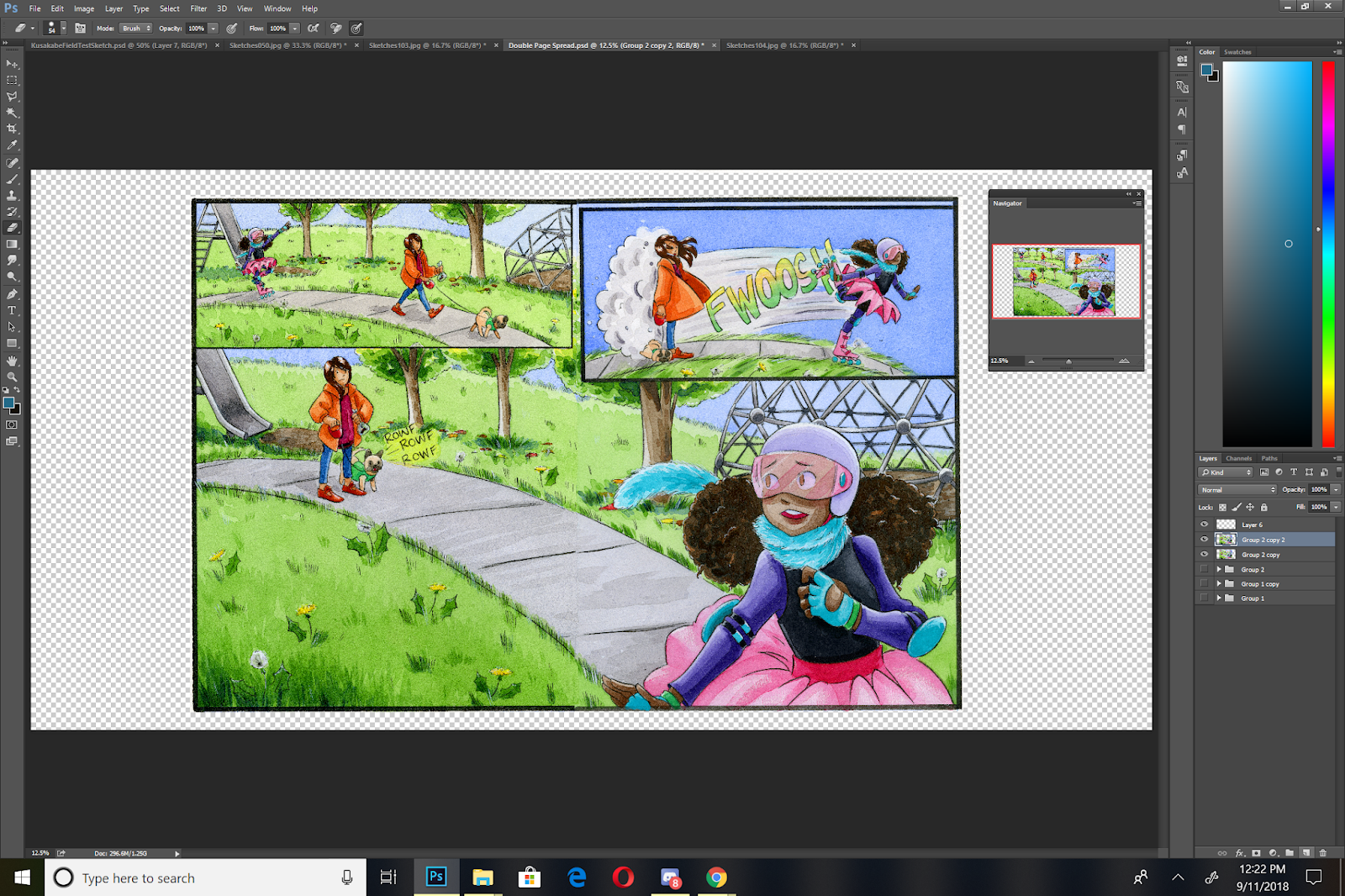
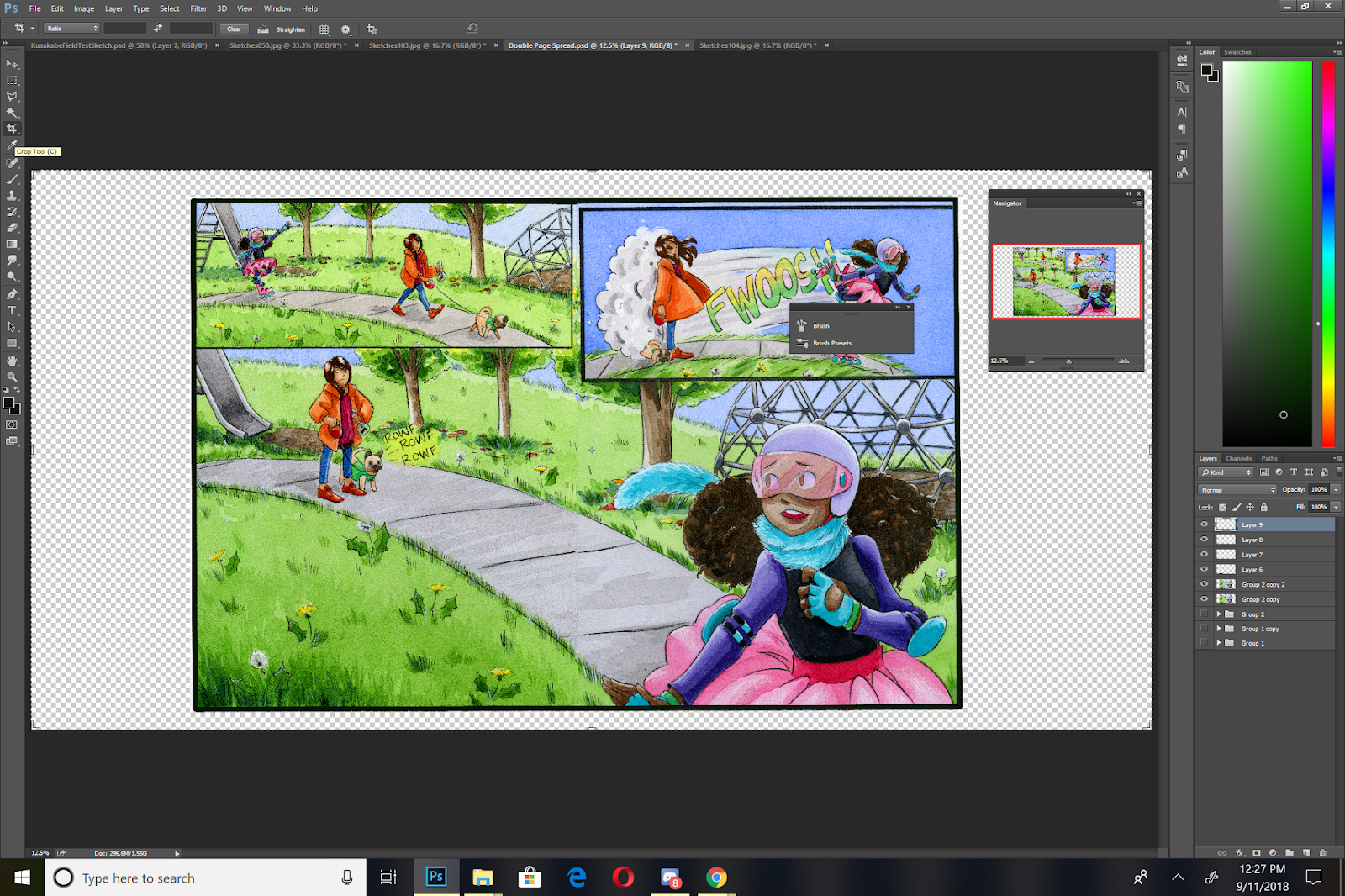
Stitching Pages Together
The black border between the pages was a mistake- I wasn't thinking as I was inking, and I knew I wouldn't be able to correct it without damaging the painting surface, so I opted to wait until post to fix it. For the original, I simply trimmed it out with a paper trimmer, and in Photoshop, I can simply overlay the second half on top.
Although I tried to paint carefully, there's still a noticable difference at the seam that will need some care and correction.

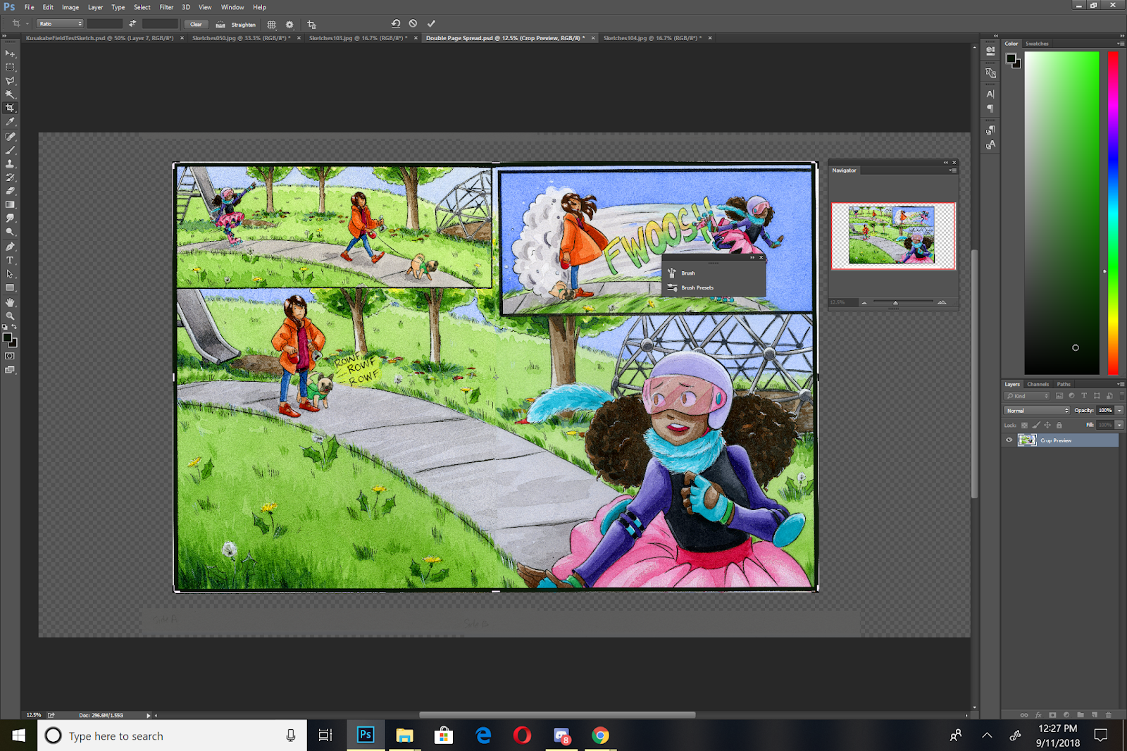
Alignment Corrections
NOTE: You NEVER want to make corrections on the original- only on copies!
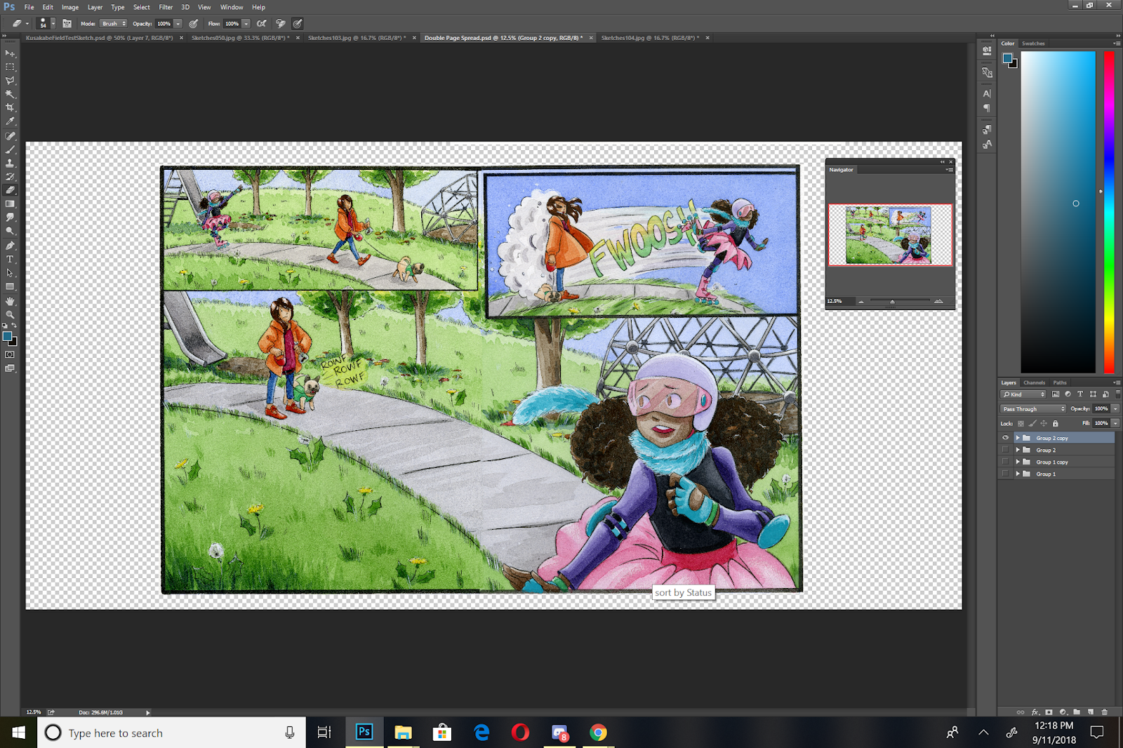
I create a new folder and drag my two halves into it, then copy that folder. I turn off visibility on the original, and merge the folder so the two layers are now one layer.

Now I have the file I'm going to start working with.
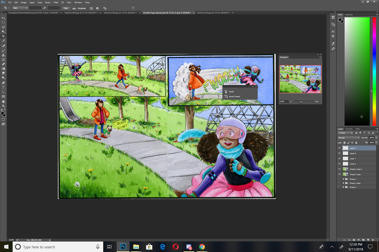
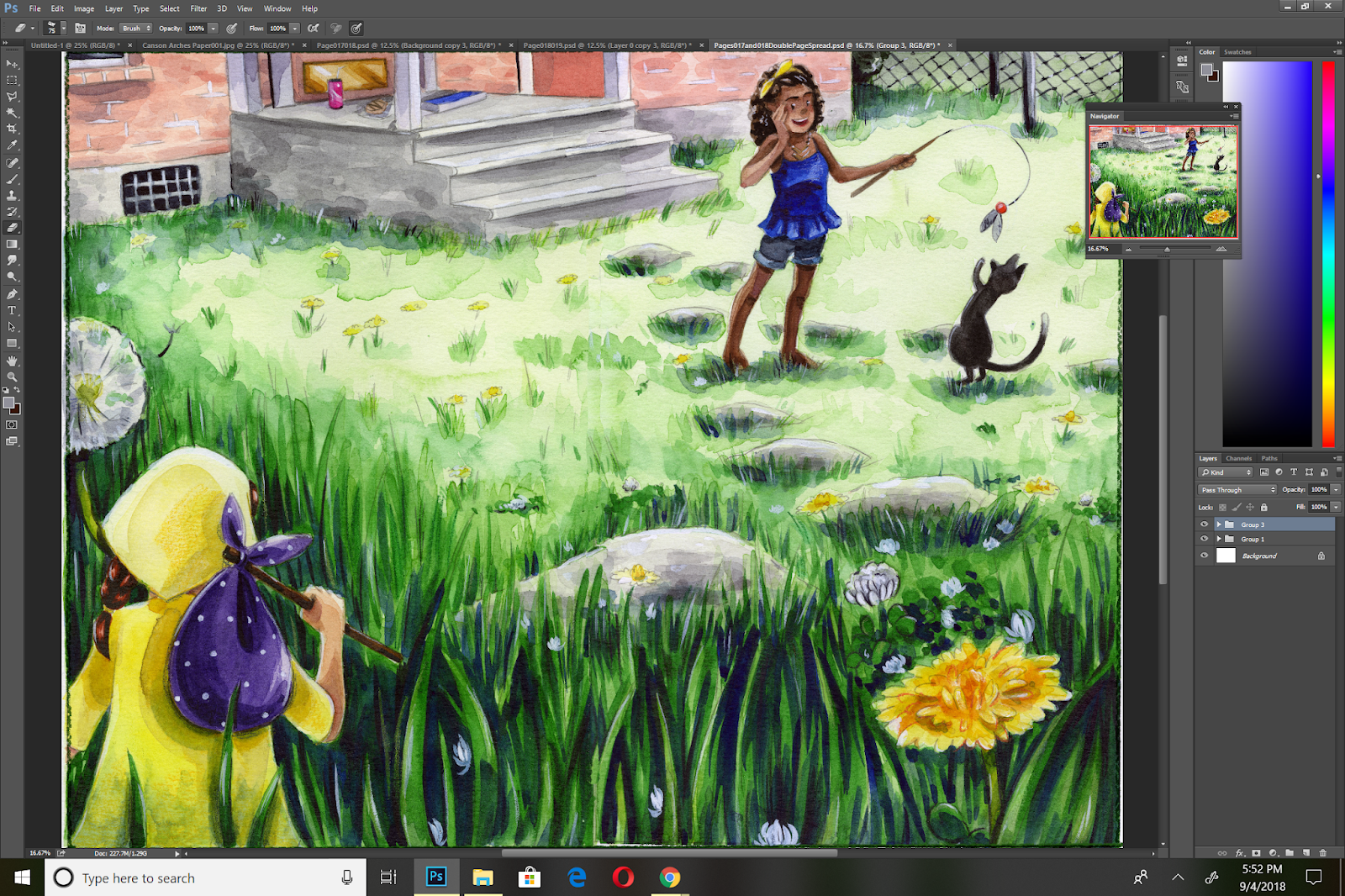
Cloning and Masking
The Clone Tool is great for correcting small areas, the selection tool and copy is great for correcting larger mistakes
I make a copy of my working layer

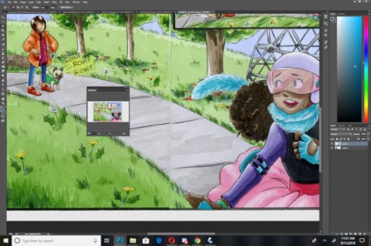
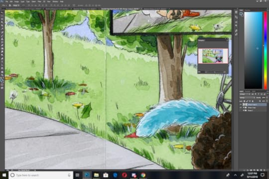
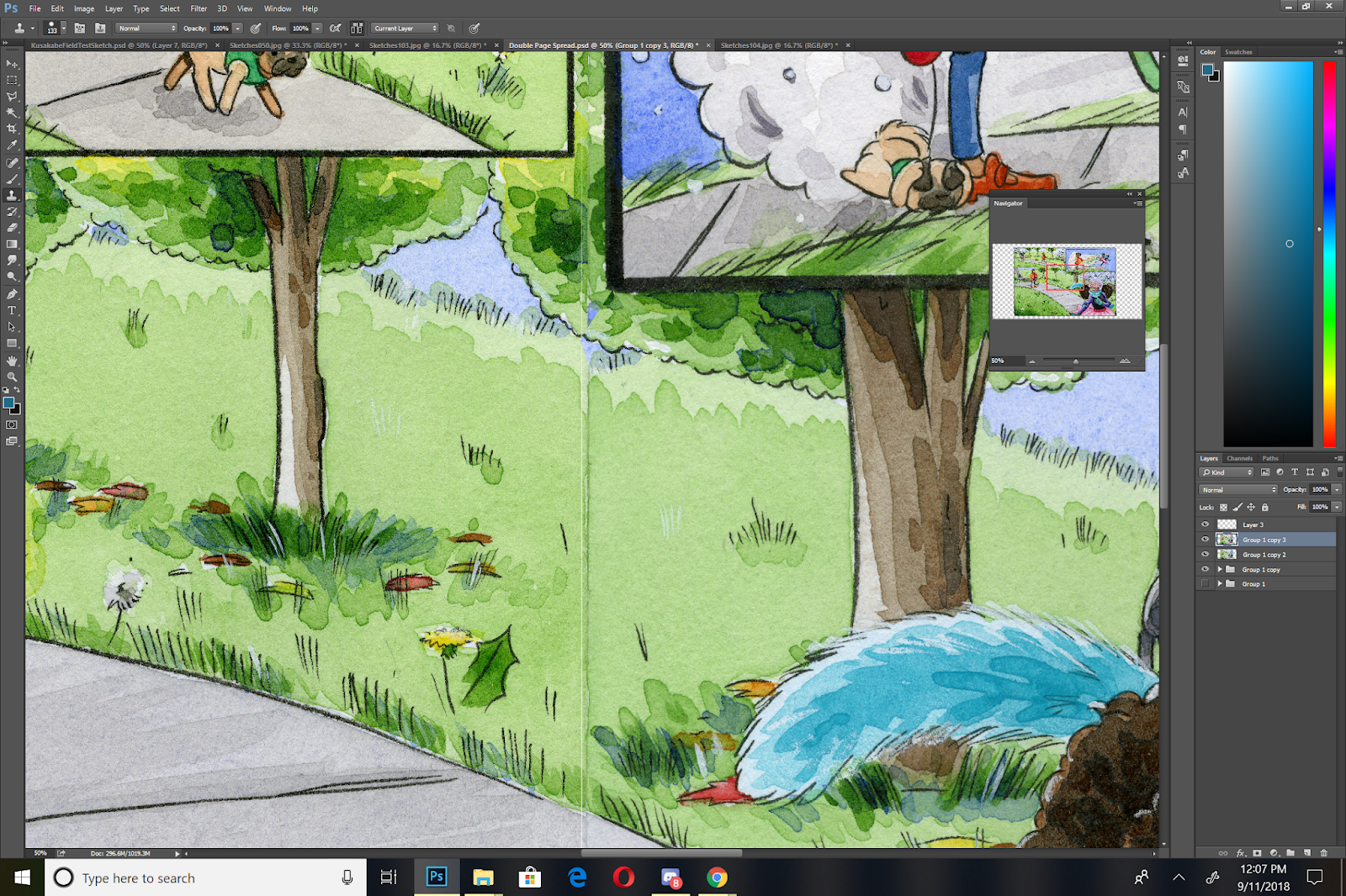
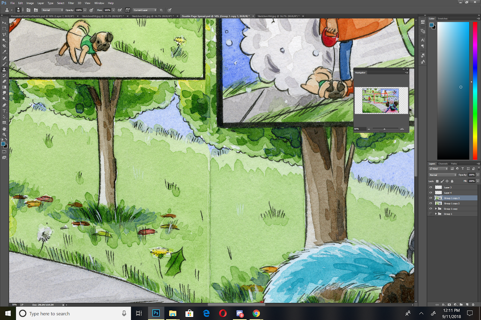
The first thing I want to work on fixing is the tree nearest the viewers- there's a pretty visible gap between the two halves.
This is a pretty simple fix- I select an area on the right half, copy it, and drag it over so that the inked edge meets. I then erase what isn't working- what stands out as 'wrong' to the viewer.
This tree was pretty problematic- normally I would use the clone tool to sorta fill in that gap, but since the area I was working with was narrow but long, I couldn't get enough material for a believable clone. Instead, I copied an area from the right side of the tree, stretched it to patch the area, and erased the excess.
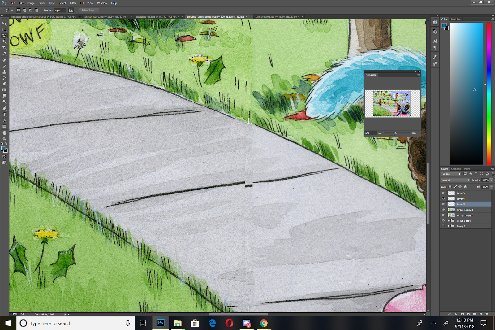
The sidewalk presented the same problem as the stairs from Chapter 6- noticable discrepencies AND lineart that doesn't match up.
I use both strategies- the clone tool and copying sections, to try and improve alignment and make the stitch less noticable.
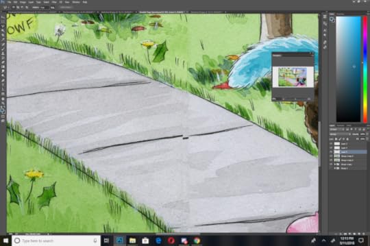

I ended up futzing around with the sidewalk a lot, as it presented quite a challenge to get right.
Now that I have the image mostly stitched together, I can do some color correction and color adjustment, which I'll cover in my next post, as it's a fairly sizable topic.
Stitching an image together takes patience and time, but it isn't a challenging task. I encourage you guys to experiment with your own methods for correction, and share them with me using the handy form in the sidebar to the left!
As always, this post was made possible thanks to the generosity of my Artnerds on patreon.com/nattosoupPatreon! If you enjoy what I do, and find it helpful, why not join us? Artnerds get early access to near-daily videos, as well as backer exclusive comparisons.
Please consider donating to this blog or purchasing from Natto-shop (http://nattosoup.com/shop) if you want me to continue publishing quality content. All materials tested were purchased from my own pocket. Keep on Truckin' Nattosoup is not under any sponsorship.
This spread from Chapter 6 began its life as two watercolor pages stretched on one large board- a common situation for my double page spreads. I have a couple videos that demonstrate the process for painting watercolor spreads for those curious- but it only differs from painting regular pages in a couple ways-
1. Your Stretcher Board is double size, so the painting's footprint is HUGE2. Although there's a space between the two pages, you're trying to continue your painting across that gap, so it's easier to stitch together.
This will probably only be relevant to creators who:Work in traditional media Work at a size that would necessitate splitting your spread over two pages
So for this type of spread, this is really a crossover post- a little Watercolor Basics, a little Intro to Comic Craft, but I hope regardless of your camp, you will enjoy!
Painting Pages- Working on a Double Page Comic Spread
Watercolor In Progress: Painting 7 Inch Kara
Now that our spread is painted, we need to digitize it and stitch it together for display and sharing as a webcomic page. Generally, for print, I don't worry too much about stitching a spread together- there's usually a fold to hide all but the most glaring errors, and I simply focus on color correcting the pages so they make sense as a continuous image. For web desplay (such as sharing the spread as a webcomic), I keep two considerations in mind:
While these are two pages, they're shared and displayed as one imageI need to remove the center seam, and stitch the pages together so that they are as seamless as possible.
These techniques are also applicable if you have to scan a large image in pieces and need to stitch them together. Photoshop does have a Merge function under Automate, but it doesn't always work well, and sometimes you're doing your stitching manually.
In this example, we're going to begin with a piece that's already nearly assembled- the two individual comic pages have been merged onto one document, the color correction has been completed, and we just need to make a few corrections to finish this piece.
Correcting blemishes/Sewing Pages Together:
Favorite Techniques:
Clone (utilizing the Clone Tool)
Manual Clone- Select the area you want to duplicate on your image, copy and paste it onto a separate layer, erase excess until it blends in.
Things to correct: Remove center seam Fix the stairs

When making corrections, do NOT correct the original- always make copies, and hide or lock your originals. This sort of correction can be quite destructive, so you want to protect your originals. Also, always make your corrections on a new layer- you may need to erase or soften edges.
Correcting the center seam is simple- you can either copy and paste areas of grass and drag them over, or you can use the clone tool to clone areas you like to cover the seam. Fixing the stairs is a little more difficult- there's a lot of light and shadow, stairs require more precision than grass, and sloppiness will stand out more.
For the stairs, I used a combination of copying over areas that worked, playing with Multiply, and cloning areas, as well as reestablishing the lines on the stairs using a custom Pencil Color brush.
The Finished Spread:

Let's take an in depth look at stitching together a double page spread with my SCBWI 2018 Illustrator's Contest entry.
Double Page Spread Painting Progress:


As you can see, most of the process is completed with about a 2" gap between the pages, forcing me to extrapolate information. I wasn't as careful as I should have been- lining up your spread so it's continuous makes it much easier to paint as though it is actually continuous.
The finished kidlit art comic spreadOpening Our Base Scans:
The first step in stitching together a double page spread is to get your spreads in a single file. I open both spreads and create a new, huge document that's more than large enough to contain both files. This allows me room to reposition my halves.
Make sure you save your original two halves on seperate layers. We will want to work with a file that's one continuous layer at some point, but remember- never alter your originals.

Creating the Master File
We also want to crop the scanned border from around these pages.
Stitching Pages Together
The black border between the pages was a mistake- I wasn't thinking as I was inking, and I knew I wouldn't be able to correct it without damaging the painting surface, so I opted to wait until post to fix it. For the original, I simply trimmed it out with a paper trimmer, and in Photoshop, I can simply overlay the second half on top.

Although I tried to paint carefully, there's still a noticable difference at the seam that will need some care and correction.


Alignment Corrections
NOTE: You NEVER want to make corrections on the original- only on copies!
I create a new folder and drag my two halves into it, then copy that folder. I turn off visibility on the original, and merge the folder so the two layers are now one layer.


Now I have the file I'm going to start working with.
Cloning and Masking
The Clone Tool is great for correcting small areas, the selection tool and copy is great for correcting larger mistakes

I make a copy of my working layer

The first thing I want to work on fixing is the tree nearest the viewers- there's a pretty visible gap between the two halves.
This is a pretty simple fix- I select an area on the right half, copy it, and drag it over so that the inked edge meets. I then erase what isn't working- what stands out as 'wrong' to the viewer.


This tree was pretty problematic- normally I would use the clone tool to sorta fill in that gap, but since the area I was working with was narrow but long, I couldn't get enough material for a believable clone. Instead, I copied an area from the right side of the tree, stretched it to patch the area, and erased the excess.
The sidewalk presented the same problem as the stairs from Chapter 6- noticable discrepencies AND lineart that doesn't match up.
I use both strategies- the clone tool and copying sections, to try and improve alignment and make the stitch less noticable.

I ended up futzing around with the sidewalk a lot, as it presented quite a challenge to get right.

Now that I have the image mostly stitched together, I can do some color correction and color adjustment, which I'll cover in my next post, as it's a fairly sizable topic.
Stitching an image together takes patience and time, but it isn't a challenging task. I encourage you guys to experiment with your own methods for correction, and share them with me using the handy form in the sidebar to the left!
As always, this post was made possible thanks to the generosity of my Artnerds on patreon.com/nattosoupPatreon! If you enjoy what I do, and find it helpful, why not join us? Artnerds get early access to near-daily videos, as well as backer exclusive comparisons.
Please consider donating to this blog or purchasing from Natto-shop (http://nattosoup.com/shop) if you want me to continue publishing quality content. All materials tested were purchased from my own pocket. Keep on Truckin' Nattosoup is not under any sponsorship.
September 27, 2018
Building Up Color and Contrast: Watercolor Basics
Recently we talked about layering, glazing, and blends as being the foundation for watercolor comic pages. Knowing how to execute and utilize these techniques, as well as having the patience to do so, is a huge part of being able to paint comic pages. Today I want to talk about some of those concepts in a bit more depth- using fills, glazes, and flat planes of color to develop color, contrast, and volume.

Fills, Glazes, and Flat Planes of Color
Useful for defining forms on boxy shapesUseful for creating contrast and defining forms on architectural backgroundsUseful for building up volumeIn the following photos, I build up form and shadow on a small flight of concrete stairs very simply just by adding layers of the same color!
This builds on the cube form tutorial introduced in our Watercolor Basics post. Missed it? Check out that tutorial here. Plane by plane, layer by layer, we're able to build form by creating planes of shadow.
Adding Texture
There are other ways to build up form, value, and contrast. Using paint to create texture is a great way to achieve this goal, while rendering a more believable world.
In these cheap watercolor field tests, a knit texture is used to help create and define form.
In this Distress Marker Opaque White test, layers and saturations of white ink are used to build up a lace texture for an overdress.
In this Spectrum Aqua field test, several textures are utilized, from small half moons on the fish to create scales, to a splatter effect to give the impression of water spray.
And a soft, velvety moss texture is created by utilizing both blends and layers to create verdant transitions.
In this example, we're painting carpet, which is fairly simple and straightforward.
Something to keep in mind:
Each layer should cover less than the lastLet your brush do the workUtilize a variety of marks for visual interest
Other Types of Textures:
Painting Seagrass
Basic Textures-Brings and Stones
Painting Textures-Wood Grain
Painting Textures- Fur
Painting Textures- Glass
Painting Textures- Metal and Metallic
Developing Depth of Color
What do I mean by developing depth of color?
Layers:
Layers of color of varying saturations and intensities can help build up shape and form, as well as create visual interest. This can be achieved through a number of techniques including wet into wet blending (allowing your colors to mix, while wet, on the paper), wet over dry, negative painting, and glazes.
Creating Volume:
Layers of color can be used to create volume, either by developing form through layers of a single color (as demonstrated in my Lighting and Contrast mini series)
Distinguishing Shadow:
In the lighting and contrast mini series, we talked about using a single color to build up form. Shadows are of two varieties- cast shadows (something directly blocking the light) and shadows caused by a lack of light hitting the surface of the object. Lighting and Contrast discusses the second, but it's also important to understand and utilize the first as well.
Cast shadows can utilize a contrasting color to help neutralize the saturation of the initial color (such as a red violet over yellow), or can utilize a neutral color (generally a purplish indigo) for shadow.
Using contrasting and cool colors to push forms back:
Similar to using distinguishing shadow, using contrasting colors to push forms back creates a layer or transition to desaturated color, which feels further away to the viewer. Cool colors have a similar effect.
Delineating and defining form:
This can be done with traditional forms of inking (adding a black or colored ink to your art to create lineart), but it can also be done by 'inking' with your watercolors, adding final details with color pencils or watercolor pencils, or adding details with gouache.
Negative Painting Demonstration:
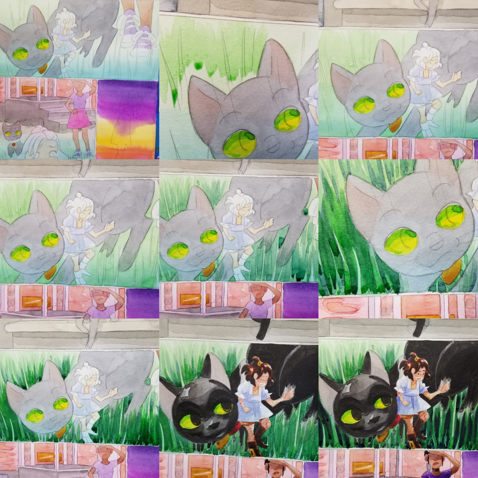
In this example, we're going to use grass, a subject that's always been difficult for me to execute, but is an important, reoccuring theme in 7" Kara.
Before we dive into the still images, here's a demonstration that shows how I think about rendering grass at a macro level. It demonstrates the rendering of grass by using
Fluid 100 Paper Field Test:
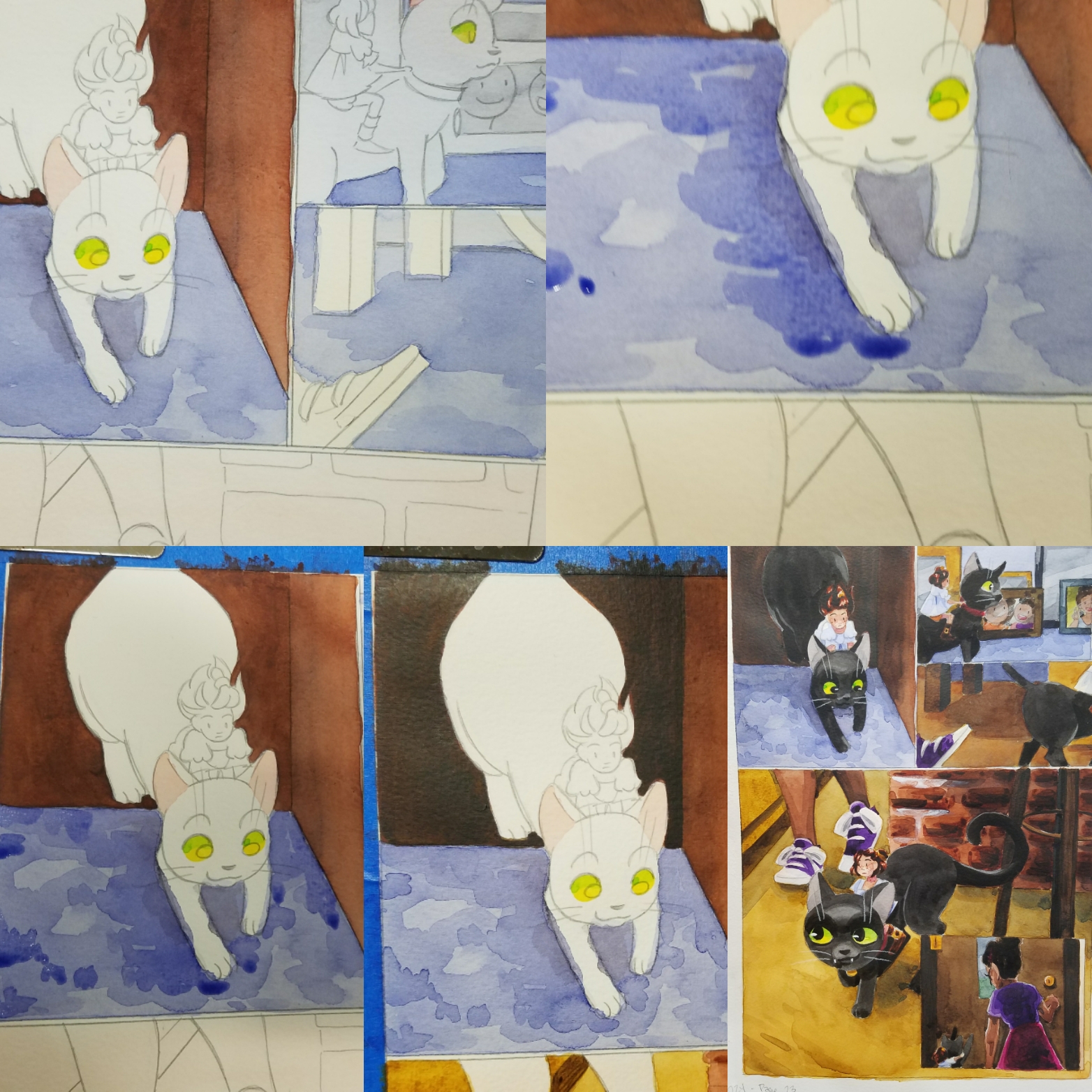
Complex forms such as grass (which is made of up individual blades) or darker objects such as Pancake the kitten benefit from the careful buildup of layers and colors to achieve depth and form. For grass, we start out with a light yellow green, and add progressively blue layers of watercolor until we achieve believably lush grass. For Pancake, we start out with grey and build up progressively dark layers until we have a believable black.
There are various ways you can build forms using watercolor, and there's no single solution to any problem. What's important is that you experiment with watercolor to find methods that work for the sort of stories you wish to tell.
Please consider donating to this blog or purchasing from Natto-shop (http://nattosoup.com/shop) if you want me to continue publishing quality content. All materials tested were purchased from my own pocket. Keep on Truckin' Nattosoup is not under any sponsorship.

September 24, 2018
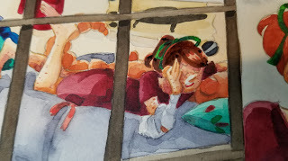
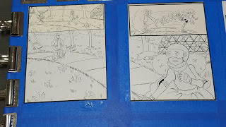
Skate On By- SCBWI Illustrators Contest Process

I've always had digital steps to my traditional process. There's always scanning and resizing, corrections and bluelines done digitally. But this year, I've begun working even more mixed media- with several of my pieces starting life entirely digital, or the majority of my sketching and planning done digitally. The reason for this is simple- it's very easy to correct things digitally. I can easily salvage a head that I liked, but was too small, or too large, reposition a hand that has a beautiful gesture but not quite the intended angle, slide a panel over just a smidge to make room. I've never tried to hide the digital aspects to my process, and I've written about my comic making process extensively over the years.
As an illustrator and member of the Society of Children's Book Writers and Illustrators, I've participated in the Illustrator's contest every year of my membership. Although the contest is aimed at picture book illustration, given the lack of other options, I've always submitted a comic spread. The pieces are judged on their readiness for publication, and I know I'm significantly lowering my chances by submitting a comic spread, as none of the judges have been involved with the kids comics industry. It's still a risk I'm willing to take, as I would prefer to be known for what I love, and I can only hope that someone looking for a comic artist for kids comics will take notice.
The SCBWI Midsouth's Illustrator's contest has a few rules:$20 application fee at registrationMounted on black foamcore or matboardMax size of 18"x12"Can be any medium
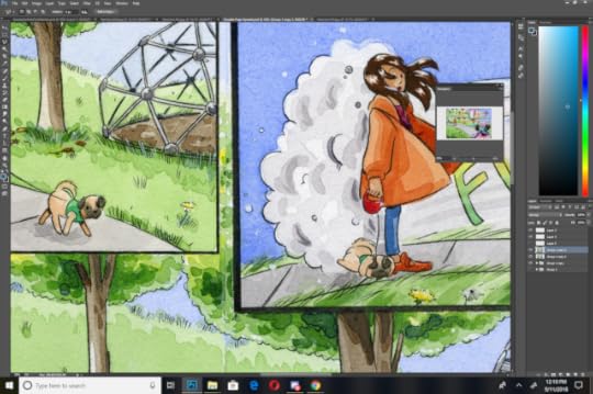
We were given this prompt:
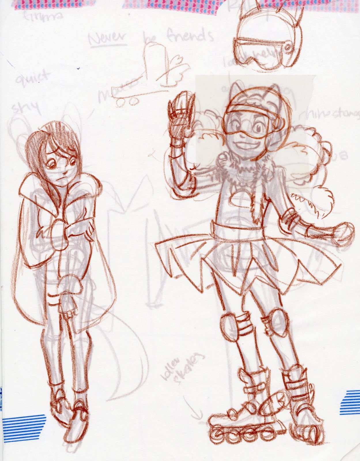
As soon as Emma saw Ruby she knew they would NEVER be friends.
Which is from the picture book Ruby the Copycat , and is a continuation on last year's prompt.
I had a lot of difficulty getting out of last year's mindset, and brainstormed all sorts of options- having the two girls as swamp animals (a bullfrog and a alligator), cat and mouse, and finally settled on humans, as while I'm decent at drawing anthros at conventions, I'm fairly awful at drawing cute animal characters for children's books, and wanted to play to my strengths.
Prior EntriesSwimming Pool MermaidsA Classroom Conundrum
Character Generation:
Original Designs:

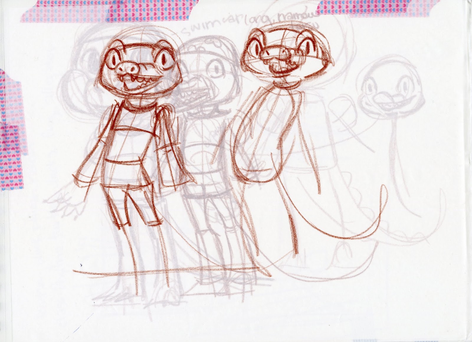

Revision:
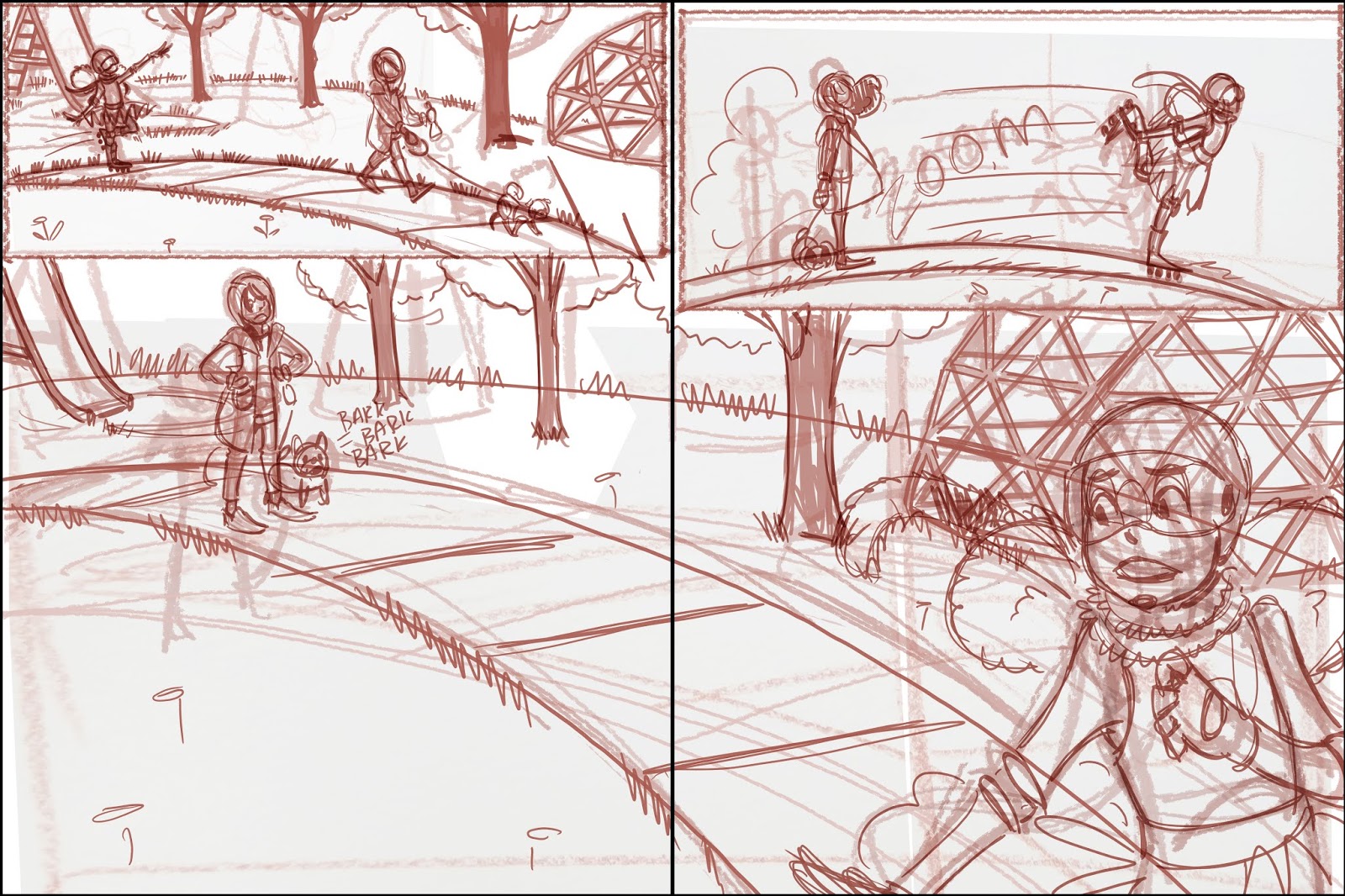
Thumbnail Sketch:

You guys may recognize this thumbnail from my Intro to Comic Craft post on creating rapid iterations of a thumbnail from base sketches.
Tight Thumbnail:
This was completed digitally, converted to bluelines, and printed onto two sheets of printer paper.
Tight Rough:

These were refined with blue lead (Color Eno in soft blue) and graphite, then scanned as a whole.
These were again converted to bluelines, and printed onto Moulin du Roy watercolor paper.
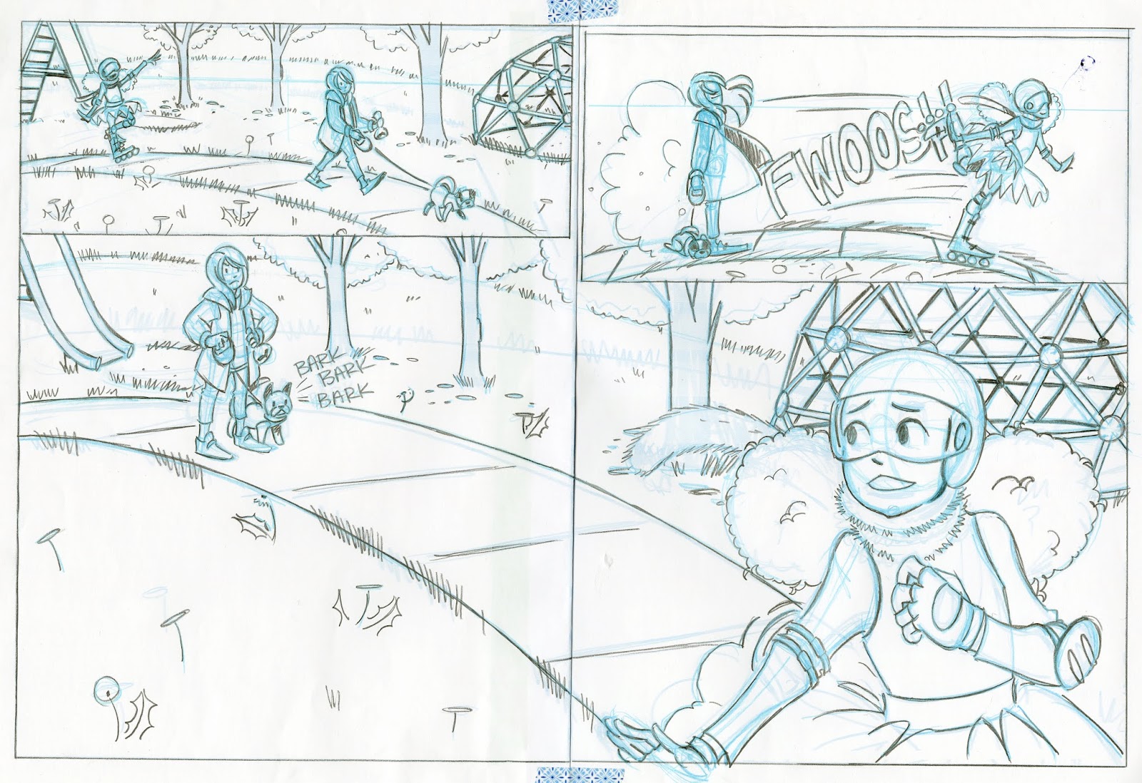
Pencils:
Based on feedback I've gotten from a couple of kidlit comic editors, I've been pushing my non-Kara kidlit comic art towards simple+inked watercolor. Before inking, I needed to pencil this and refine a few details!
Before beginning my pencils, I inked my borders using Sakura's Calligrapher Pens. These pigment based, broad line pens are great for borders on watercolor comics.
 Inks:
Inks:This spread was inked as individual pages. I used a Sakura Pigma FB- one of my favorite small, pigment ink brush pens.

Although this is the final page, I scanned and stitched together the inks so I have the option of playing with this digitally in the future.
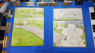
Watercolor: I have a video tutorial for this spread coming up in the future!
Painting spreads always requires special considerations, and considerable space. I use an uncut sheet of 24"x36" gatorboard, and stretch each half individually, trying to place them as close as possible. When painting a spread like this, you want to try and paint the two sides as close to identical as possible, at least around the join, to make stitching the spread together easier.
Toning Individual Panels:
Yellow, Grey, Ultramarine

Blocking in Background and Major Shapes:
I wanted to keep the grass light and cartoony, as I have a tendency of overworking grass and it becoming swampy. I decided to limit my grass to about three layers.
Blocking In The Trees:
Trees are always something I struggle to draw and paint, so I worked closely from photo reference, paying close attention to the lighting in the photos.
For the trees, I worked from yellow-sap green-phtalo blue
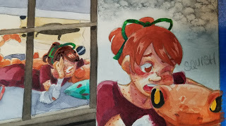
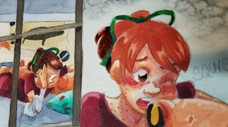
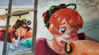
Blocking in the Characters:
I wanted Ruby's design to feel like a little girl who dresses herself, but also a girl with a vision- she envisions herself as an ice skater (hence the tutu).
For Emma, I wanted to depict a more subdued girl- someone who usually keeps to herself, so while I didn't go entirely muted with my color selection, I kept it more primary- a nice orange, a dark red, and bluejeans.
Blocking in and rendering characters is when the piece really starts to come alive!


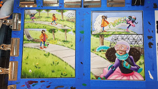
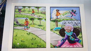
Removing the blue tape and removing the watercolor from the board:

Trimming the watercolor for mounting:
This piece needed to be mounted on a piece of mat or foamcore for submission, so I trimmed the original down (quelle horror, I know), and used double stick tape (even worse, apologize) to adhere it to my matboard (which was recycled from last year- I'm just the worst).
The finished, stitched together scan:

Although a clean, stitched together scan wasn't necessary for submission, as I'm forever building my kidlit art and kidlit comic portfolio, it was certainly necessary for me. I have a tutorial on stitching together a double page spread coming soon as part of my Intro to Comic Craft series!
Please consider donating to this blog or purchasing from Natto-shop (http://nattosoup.com/shop) if you want me to continue publishing quality content. All materials tested were purchased from my own pocket. Keep on Truckin' Nattosoup is not under any sponsorship.

September 20, 2018
NATTO Scholarship Winners 2018
This year, we had the pleasure of selecting three recipients for our NATTO scholarship—a huge increase from last year's sole recipient. We also increased our promotional efforts, contacting podcasts, bloggers, librarians, and teachers to request that they help spread the word. Although we only received 21 applications, we were impressed with the quality of art sent in, and it was difficult to choose just three deserving artists.
However, with Joseph's help, I was able to narrow it down to our three wonderful recipients!

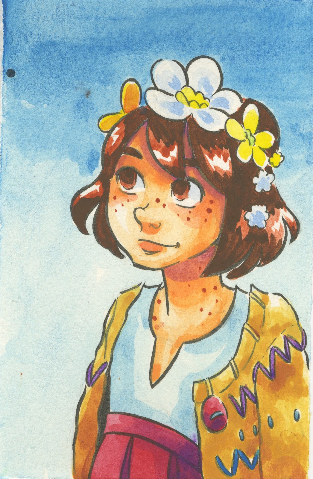
Our first place recipient is Aicha Barry, who hopes to create Dalienation, the personal journal of an extraterrestrial.
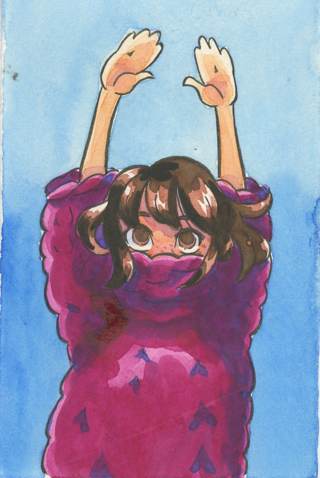
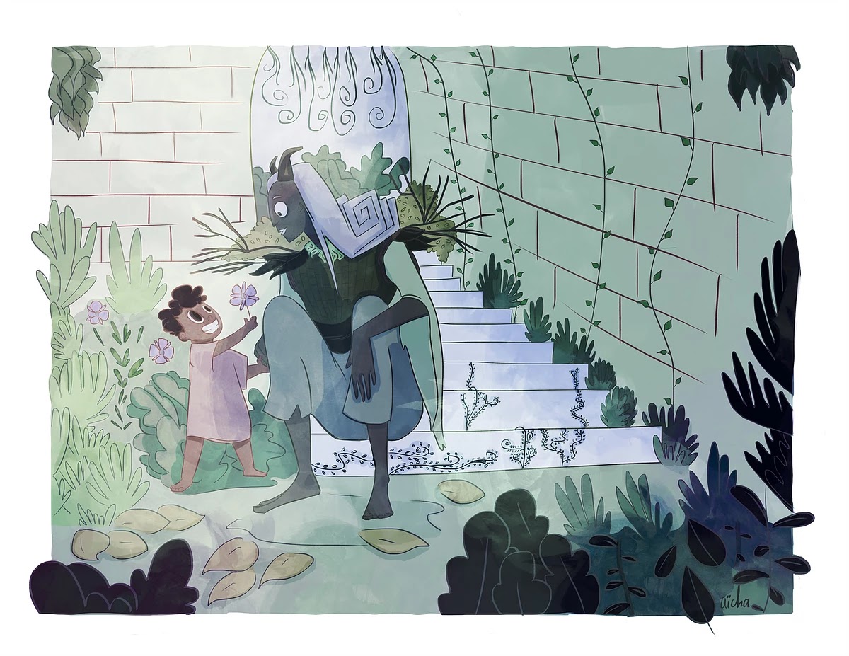 Aicha Barry's lush art.Our second place recipient is Vivian D Pham, who hopes to create Private Messengers, a story of the two delivery agents of children's memories and dreams.
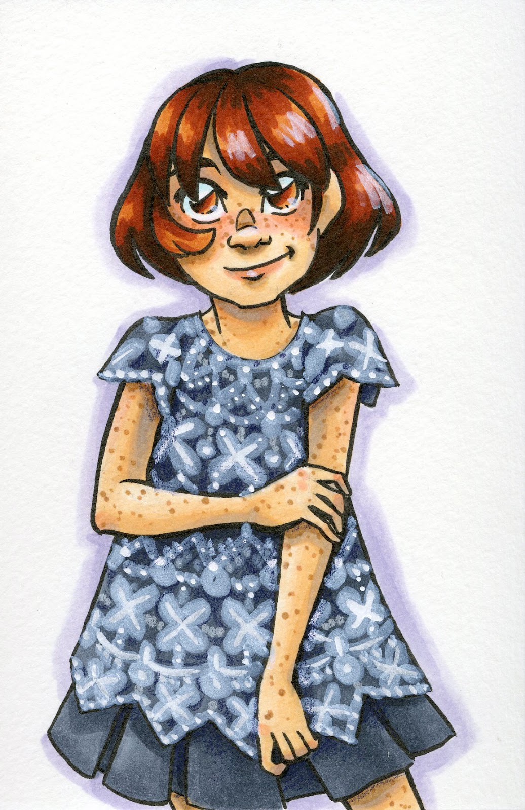
 Vivian Pham's expressive art.Our third place recipient is Danny James Barnfield, who hopes to complete The DEVIL'S HAM, a delightful story about paratrooper pigs kicking Nazi butt.
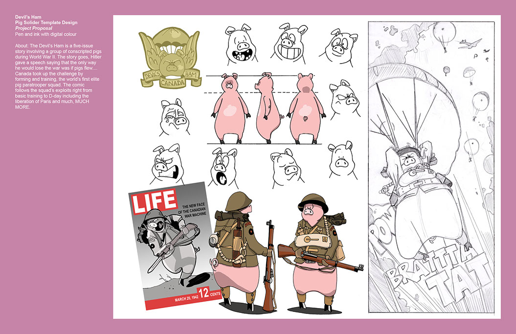 Danny Barnfield's adorable art.We would like to thank all 21 applicants for their wonderful stories and art portfolios, and to congratulate our three recipients! I hope readers will look forward to our upcoming interviews with our finalists.
For those not familiar with the NATTO Scholarship, it is a small arts scholarship funded entirely by Joseph Coco, and hosted by me, Becca Hillburn.
Inspired by Joseph's generosity, Tyler James of ComixLaunch agreed to award Aicha, Vivian, and Danny a ListLaunch course voucher, which aims to aide comic artists and writers in building an engaged audience willing to support their work. Thank you Tyler for helping a new generation of comic artists get a head start on their careers.
Joseph is a developer who works at Vanderbilt in the biomedical informatics department, and has been an invaluable ally to comics for the past half decade, interviewing comic artists of all levels, abilities, and skills in our ongoing series, Up and CONing Artists videos or audio podcast. Not only has he brought attention to unknown artists through his interviews, but he is a huge financial supporter of indie comics, particularly zines and minis, making it rain on comic artists at every convention he attends. He is also instrumental as support staff, providing insight, editorial advice, blog and Youtube suggestions, as well as encouragement to artists particularly in need. I am a kid-lit comic artist and illustrator who has spent 20 years in the thrall of comic craft, sharing my education (an MFA in comics), experience (conventions, comic craft, merch manufacturing, and watercolor), and enthusiasm for almost a decade here on this blog, a half decade on the popular convention resource How to be a Con Artist, and nearly half a decade on Youtube. The NATTO Scholarship is a joint brainchild, formed through a desire to help other artists pursue or continue their art education at a physical school, through workshops, or online.
Please consider donating to this blog or purchasing from Natto-shop (http://nattosoup.com/shop) if you want me to continue publishing quality content. All materials tested were purchased from my own pocket. Keep on Truckin' Nattosoup is not under any sponsorship.

September 17, 2018
Intro to Comic Craft: Text Balloons
In our last Intro to Comic Craft tutorial, we talked about font choice and placement for comics. Today we're covering text balloons.

More on Lettering:
Guestpost: Selecting and Using Fonts for Webcomics
Pre-Lettering Pages
Relettering and Redoing Word Balloons
Super Easy Lettering Hack
Handlettering:
Lettering Practice and Pangrams
Lettering Practice-Dialogue and Blocking
When I was 13- Lettering Process Part 2
Lettering Practice- Dialogue and Blocking
There are a variety of ways to handle lettering and word balloons for comics:
Physically Lettering On the Page
Drawing Your Balloons on the Page, Lettering Digitally
Digitally Lettering and Putting in Balloons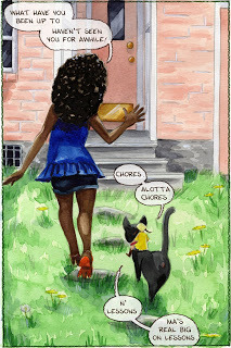
If you don't like the word balloons you've physically drawn on the page, you can also reletter and balloon quite easily.
Relettering and Rewording Word Ballons
My process for creating word balloons is pretty specific to 7" Kara, and is designed to replicate the watercolor look of the page.
Materials Needed:
Color Pencil Brush for Program of ChoiceGraphics Program of Choice (I'm using Photoshop)Watercolor Paper Scan (I have several, I'm using an Arches scan for these pages)
Setting Up Your Workspace:
For this tutorial, you're going to need a program that has a clone tool.
 Comic Page
 Texture Page
Open up your comic page as well as the texture paper you wish to clone onto your comic page. It helps if it's a similar size and format to your comic page, so you may wish to rotate it before you begin.
 Page we're cloning from
 Page we're cloning to
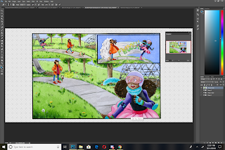
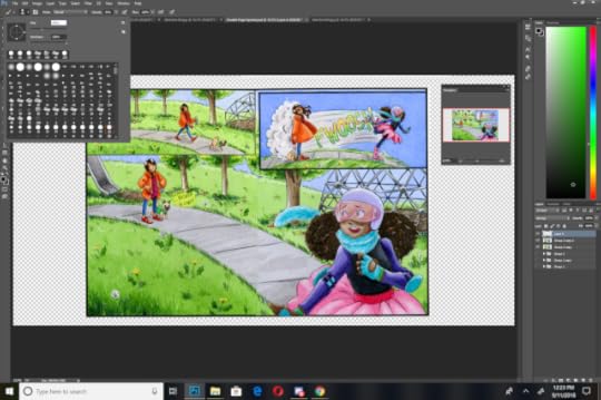
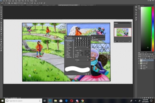
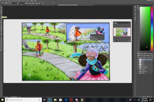
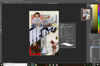
Creating Your Word Balloons
Select the Clone tool, and hold Alt to select the area you wish to clone.

On a new layer, and with the clone tool still selected, but no longer holding Alt, begin cloning your watercolor texture paper onto your comic page. I recommend using a round brush for this.
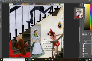

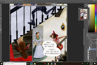
For adjacent balloons like the example above, I put my balloons on separate layers, in case I want to move my text.


I like to bump the opacity back to 80%. Not only does this make my text bubble look like it belongs on the page, but it also allows some of my artwork to shine through without losing legibility. I vary the opacity- muttered things may be knocked back all the way to 65%.
Rather than set the opacity for the individual balloons, I create a folder, put all files relating to those balloons in that folder, and adjust the folder's opacity.
Creating a Border Around Your Balloon:
Depending on your comic, this may be optional- there are many webcomics that opt not to border their balloons.
For my borders, I use a custom color pencil brush set to a fixed width. I border my balloons using a dark brown.
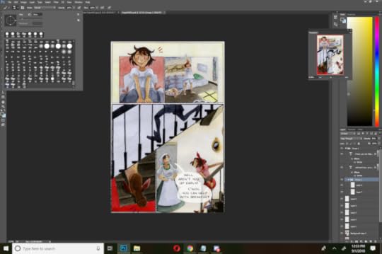
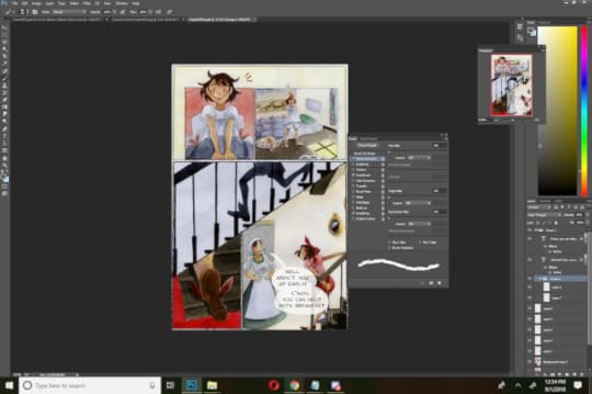
Before adding borders, I create a new layer on top of my text layers, and set it to multiply.
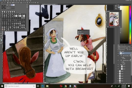
Then I simply begin tracing my balloons. There are many ways to add a border to your text balloons- find the one that works best for you and for your comic's aesthetic!
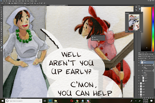
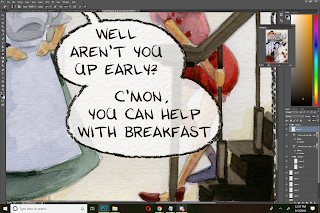
Finished Page:

Pages with Multiple Panels:
When working with multiple panels, or multiple speakers per panel or page, staying organized is key! You may have to make revisions later on, and you want to find your dialogue and attribution, as quickly as possible.
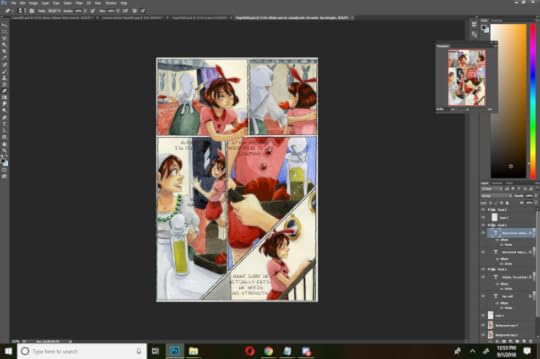
In this example, the page has already had basic dialogue placement, and the dialogue has been sorted into panel specific folders.
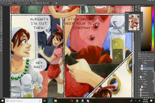
Working panel by panel, I create a speech balloon on a unique layer for each piece of dialogue, using the techniques demonstrated above.
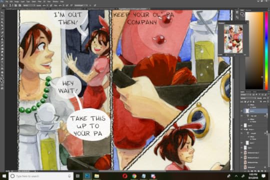
For dialogue with multiple speech balloons, I continue to create each balloon on its own layer. Once all balloons in a sequence are completed, I put them in a folder, and change the opacity on the folder, rather than on the individual balloons.
What If You Run Out Of 'Paper'?

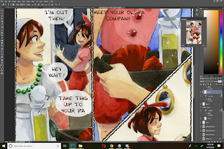
Go back to your cone source (in our case, this Arches scan), reselect your clone area by holding alt)

And you can resume work!
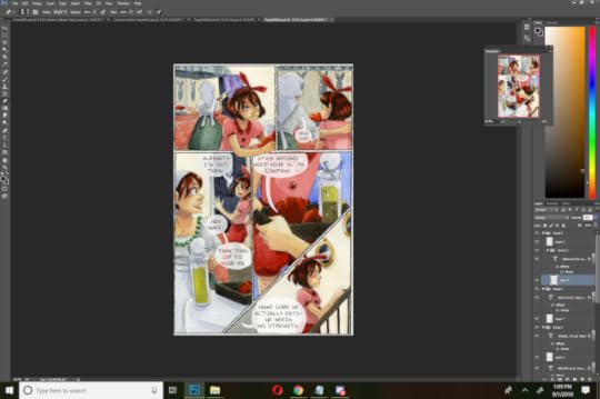
Finished Page:
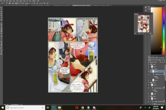
Creating Muttered or Whispered Dialogue
For muttered and whispered dialogue, I handle things a bit differently. I tend to leave my font without a stroke, so it's a bit wispier than fully spoken text.
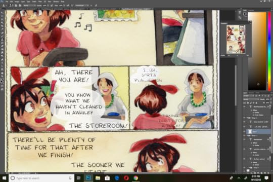

Rather than a round word balloon, I go for a vague shape with sputtered little dots eminating from it. I draw the tail vague as well.
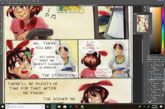
I set the opacity lower than regular text-around 65% rather than 80%, depending on the art in the panel.
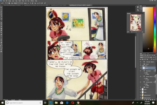
And I leave muttered and whispered balloons unbordered.
Creating Labels That Don't Compete With Dialogue
I handle these somewhat similarly to muttered dialogue. The text is left unbolded or without a stroke- however left as is, it's almost unreadable.
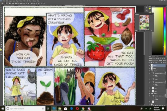
To increase legibility, I need to create a little contrast. To do this, I create a layer of paper texture behind my text.
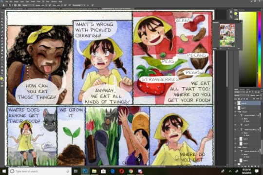
And play with the opacity until it's legible, but not distracting.
Special Effects:
I typically keep my sound effects hand drawn (or retouched digitally), but sometimes I want to give dialogue a special connotation, emphasis, or feel. Often I will break the rounded balloon border with jagged edges, or adjust the color of the border to imply various emotions such as shock, anger, or in this case, happiness.
I used a salmon color, set to multiply, to help give a soft, happy feeling to the final panel on this page, and to imply that this is a special promise.
Recommended Reading and Outside Resources:
Making Word Balloons:
Two Schools of Balloon Making: Layer Vs Stroke
Consistent Balloon Tails
Pointers (Tails)
Formatting Your Word Balloons:
Layering Balloons in a Conversation
Don't Cross Balloon Tails...Ever!
Text Tips and Hacks:
Line and Negative Space in Comics Dialogue
The 94% Line Width Cheat
Wordy Balloons and Reading Order
Balloon Air
Captions and Special Uses:
Captions
Special Balloons
Burst BalloonsThought Balloons
Please consider donating to this blog or purchasing from Natto-shop (http://nattosoup.com/shop) if you want me to continue publishing quality content. All materials tested were purchased from my own pocket. Keep on Truckin' Nattosoup is not under any sponsorship.
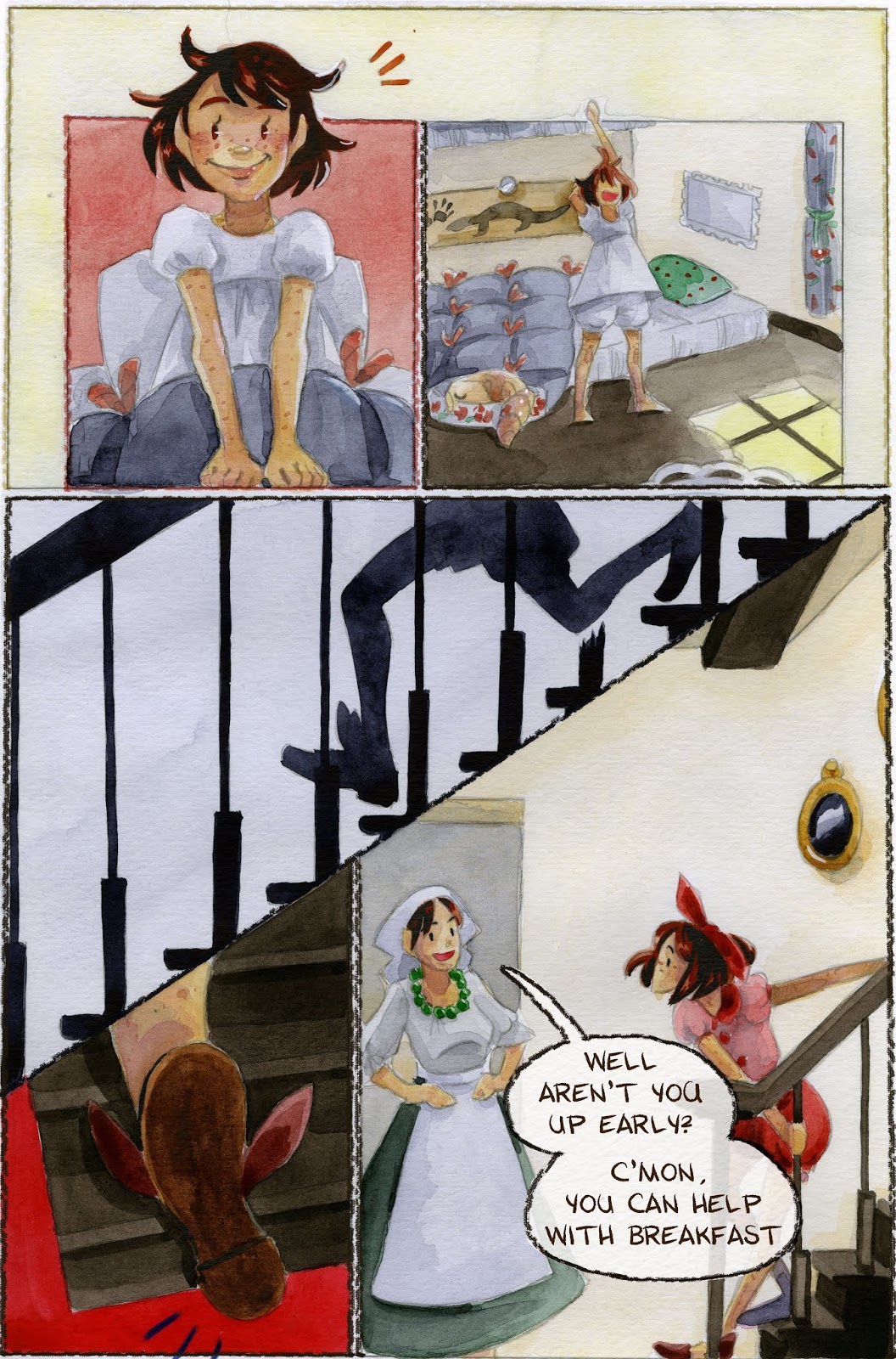


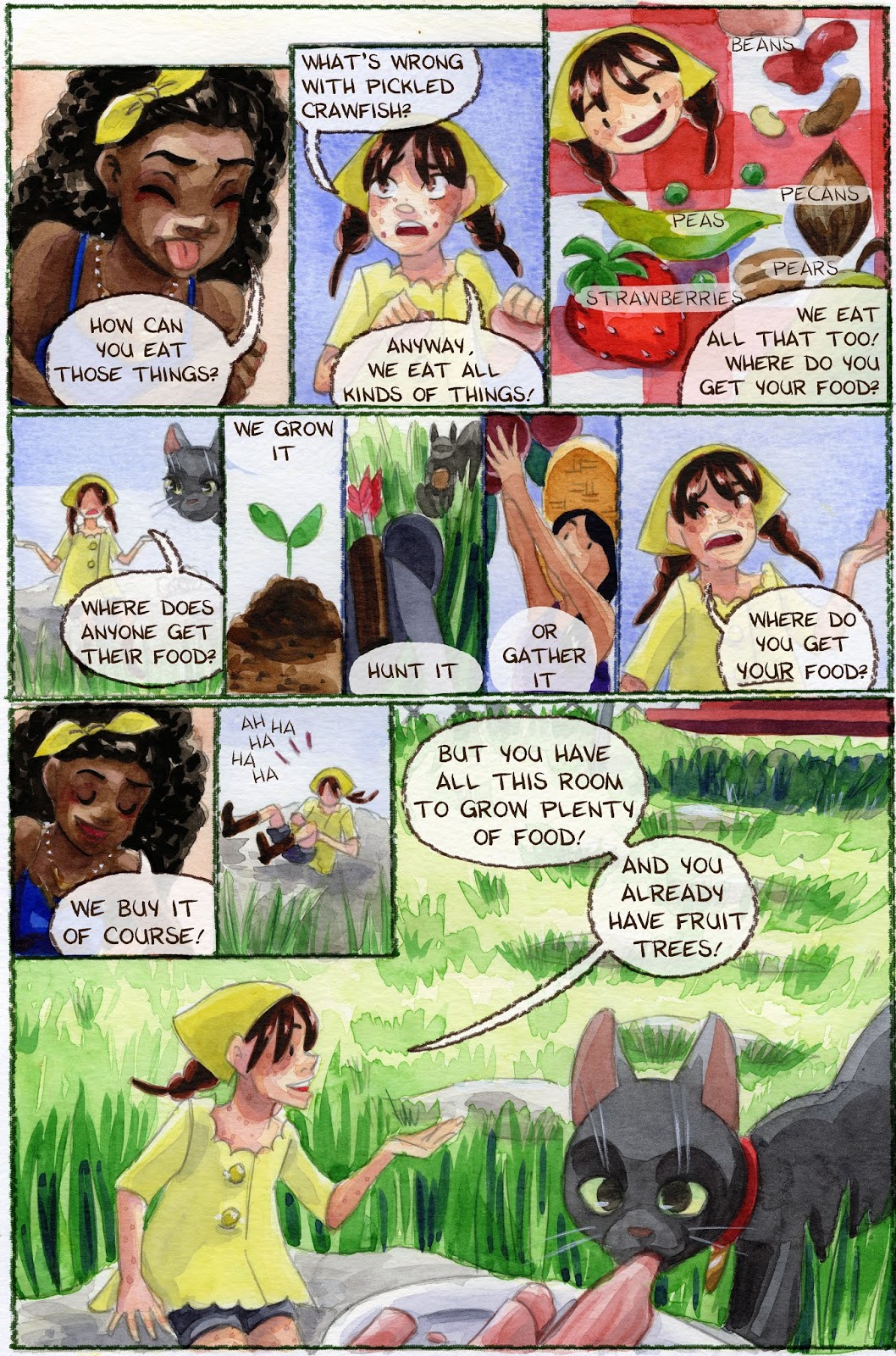

More on Lettering:
Guestpost: Selecting and Using Fonts for Webcomics
Pre-Lettering Pages
Relettering and Redoing Word Balloons
Super Easy Lettering Hack
Handlettering:
Lettering Practice and Pangrams
Lettering Practice-Dialogue and Blocking
When I was 13- Lettering Process Part 2
Lettering Practice- Dialogue and Blocking
There are a variety of ways to handle lettering and word balloons for comics:
Physically Lettering On the Page


Drawing Your Balloons on the Page, Lettering Digitally

Digitally Lettering and Putting in Balloons


If you don't like the word balloons you've physically drawn on the page, you can also reletter and balloon quite easily.
Relettering and Rewording Word Ballons
My process for creating word balloons is pretty specific to 7" Kara, and is designed to replicate the watercolor look of the page.
Materials Needed:
Color Pencil Brush for Program of ChoiceGraphics Program of Choice (I'm using Photoshop)Watercolor Paper Scan (I have several, I'm using an Arches scan for these pages)
Setting Up Your Workspace:
For this tutorial, you're going to need a program that has a clone tool.
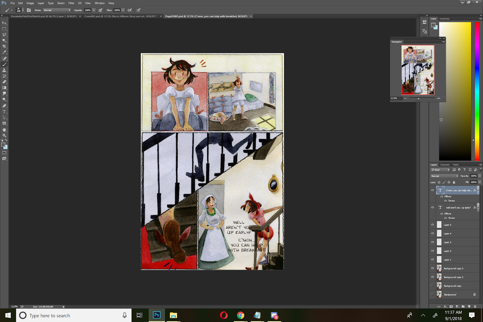 Comic Page
 Texture Page
Open up your comic page as well as the texture paper you wish to clone onto your comic page. It helps if it's a similar size and format to your comic page, so you may wish to rotate it before you begin.
 Page we're cloning from
 Page we're cloning to
Creating Your Word Balloons
Select the Clone tool, and hold Alt to select the area you wish to clone.

On a new layer, and with the clone tool still selected, but no longer holding Alt, begin cloning your watercolor texture paper onto your comic page. I recommend using a round brush for this.

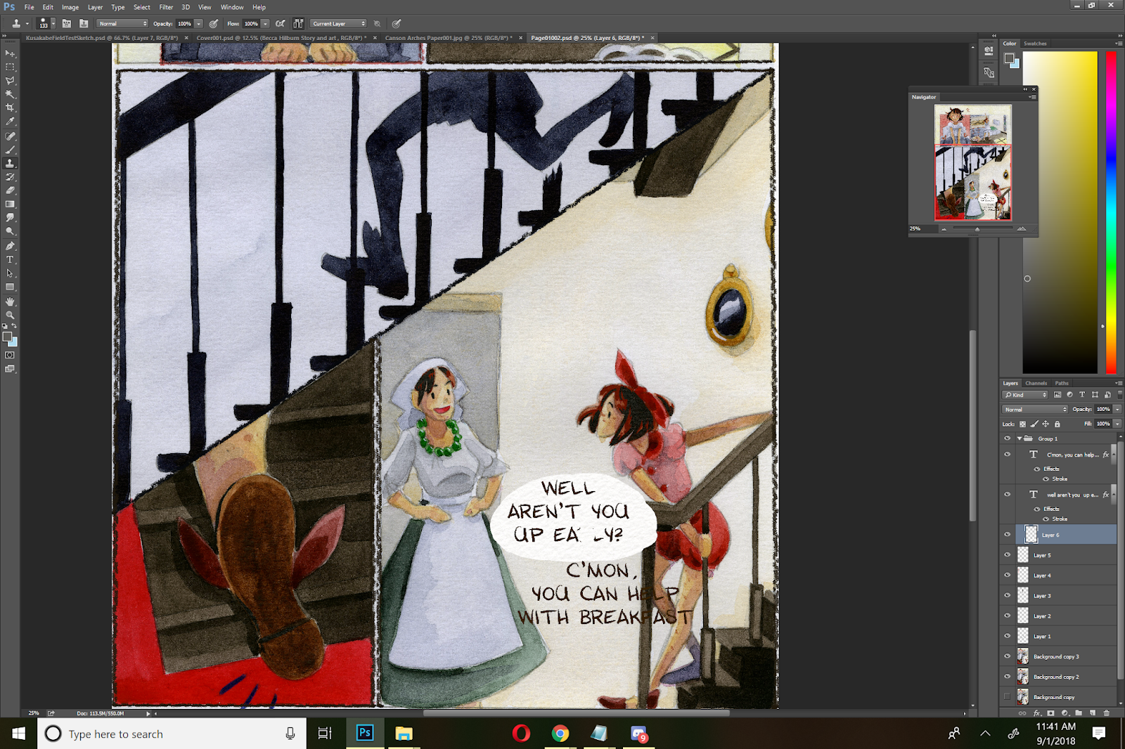
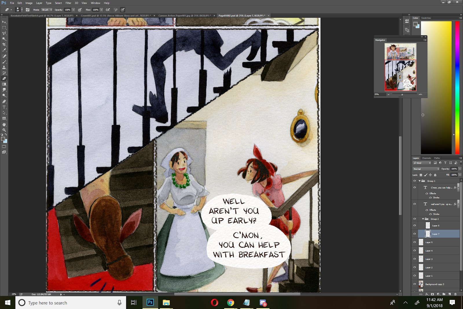
For adjacent balloons like the example above, I put my balloons on separate layers, in case I want to move my text.
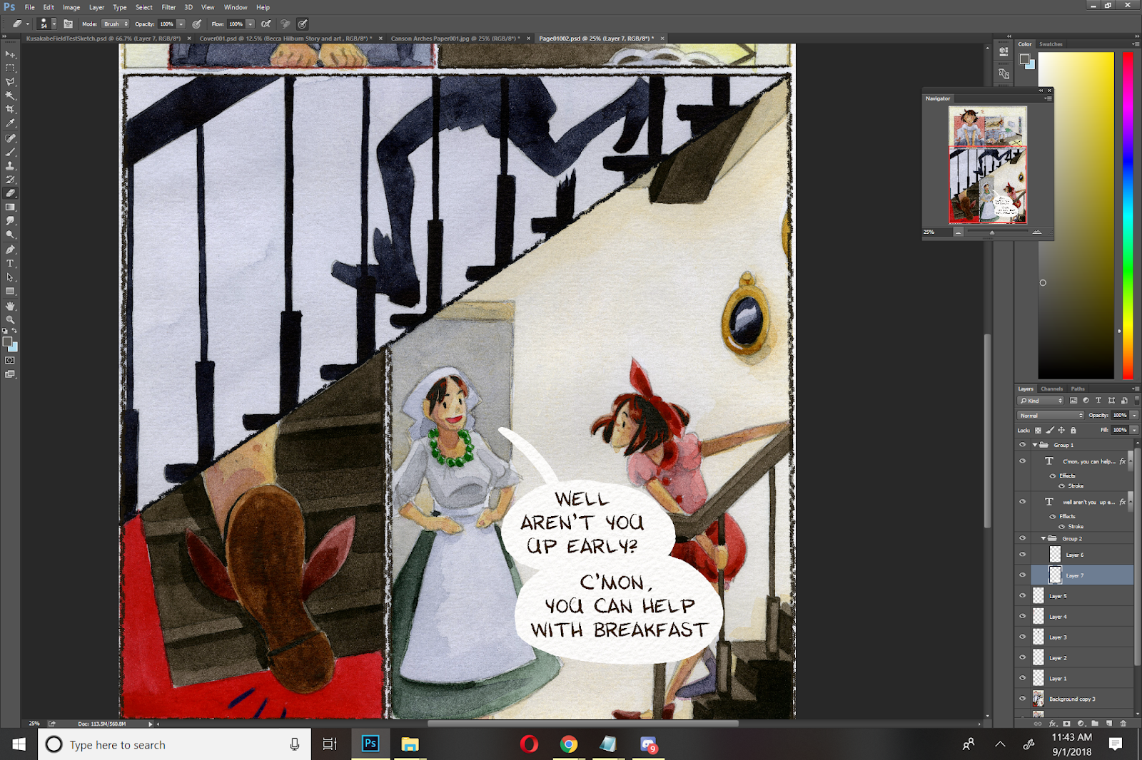
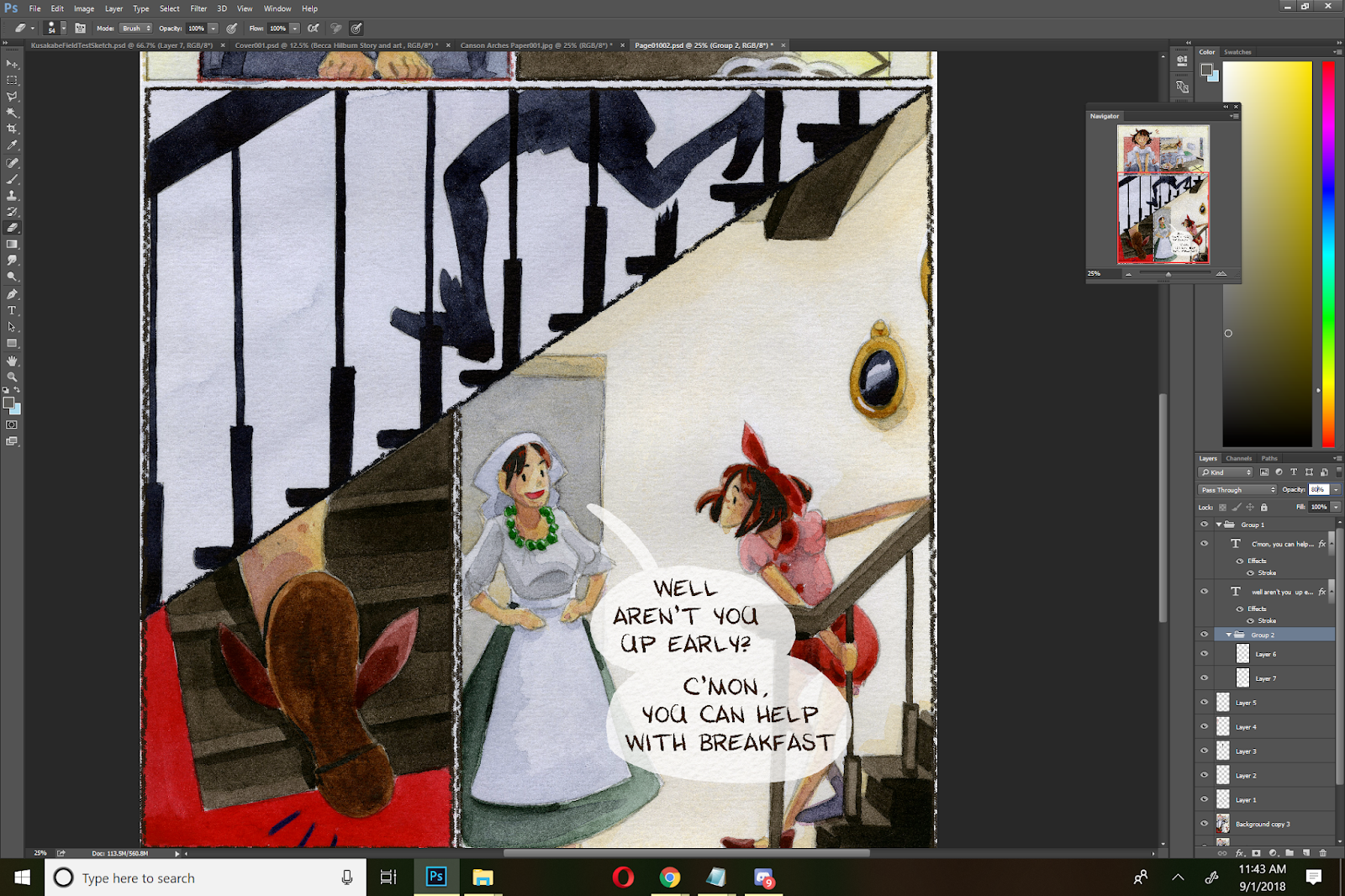
I like to bump the opacity back to 80%. Not only does this make my text bubble look like it belongs on the page, but it also allows some of my artwork to shine through without losing legibility. I vary the opacity- muttered things may be knocked back all the way to 65%.
Rather than set the opacity for the individual balloons, I create a folder, put all files relating to those balloons in that folder, and adjust the folder's opacity.
Creating a Border Around Your Balloon:
Depending on your comic, this may be optional- there are many webcomics that opt not to border their balloons.
For my borders, I use a custom color pencil brush set to a fixed width. I border my balloons using a dark brown.


Before adding borders, I create a new layer on top of my text layers, and set it to multiply.

Then I simply begin tracing my balloons. There are many ways to add a border to your text balloons- find the one that works best for you and for your comic's aesthetic!
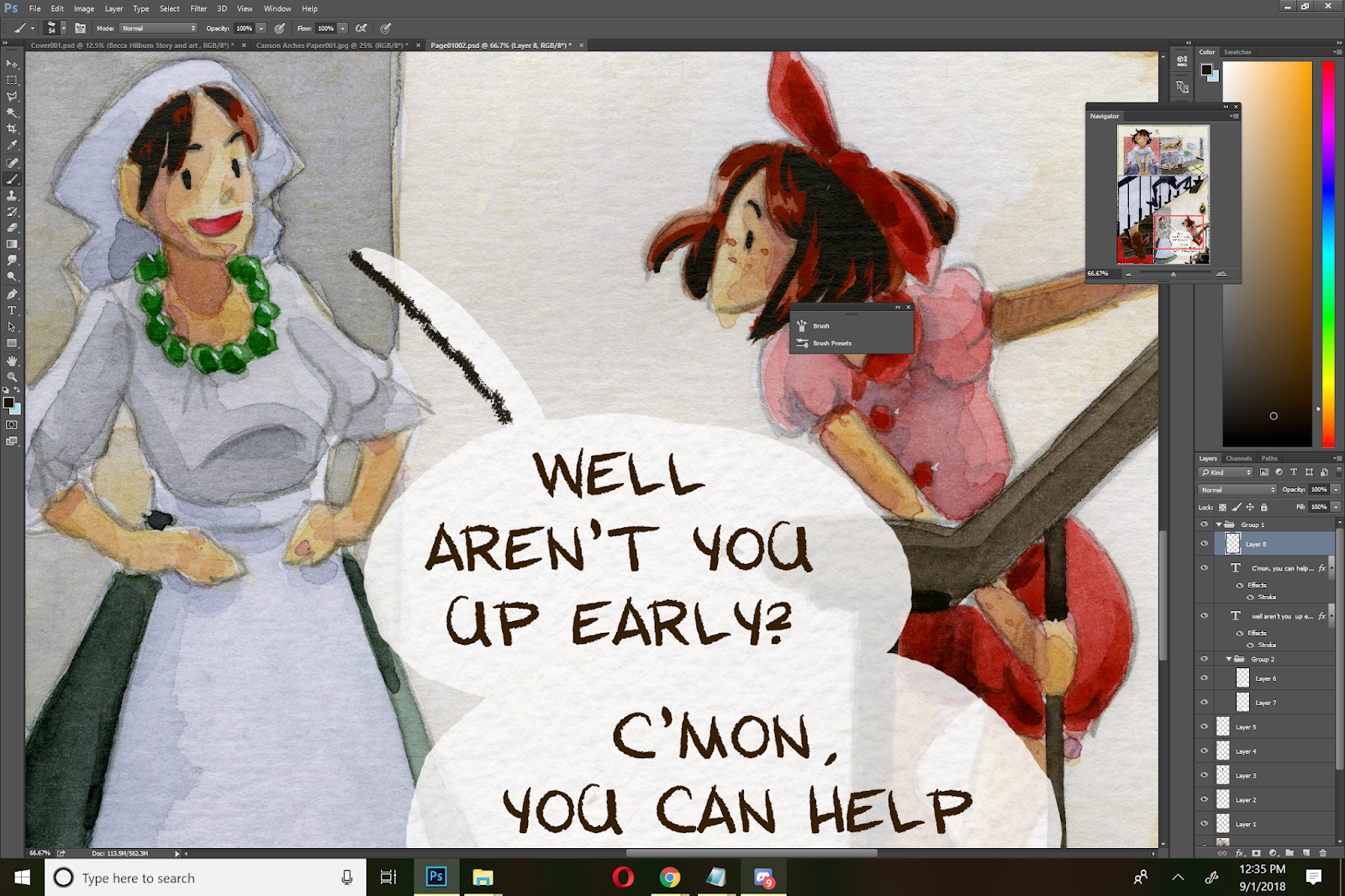

Finished Page:

Pages with Multiple Panels:
When working with multiple panels, or multiple speakers per panel or page, staying organized is key! You may have to make revisions later on, and you want to find your dialogue and attribution, as quickly as possible.

In this example, the page has already had basic dialogue placement, and the dialogue has been sorted into panel specific folders.

Working panel by panel, I create a speech balloon on a unique layer for each piece of dialogue, using the techniques demonstrated above.

For dialogue with multiple speech balloons, I continue to create each balloon on its own layer. Once all balloons in a sequence are completed, I put them in a folder, and change the opacity on the folder, rather than on the individual balloons.
What If You Run Out Of 'Paper'?
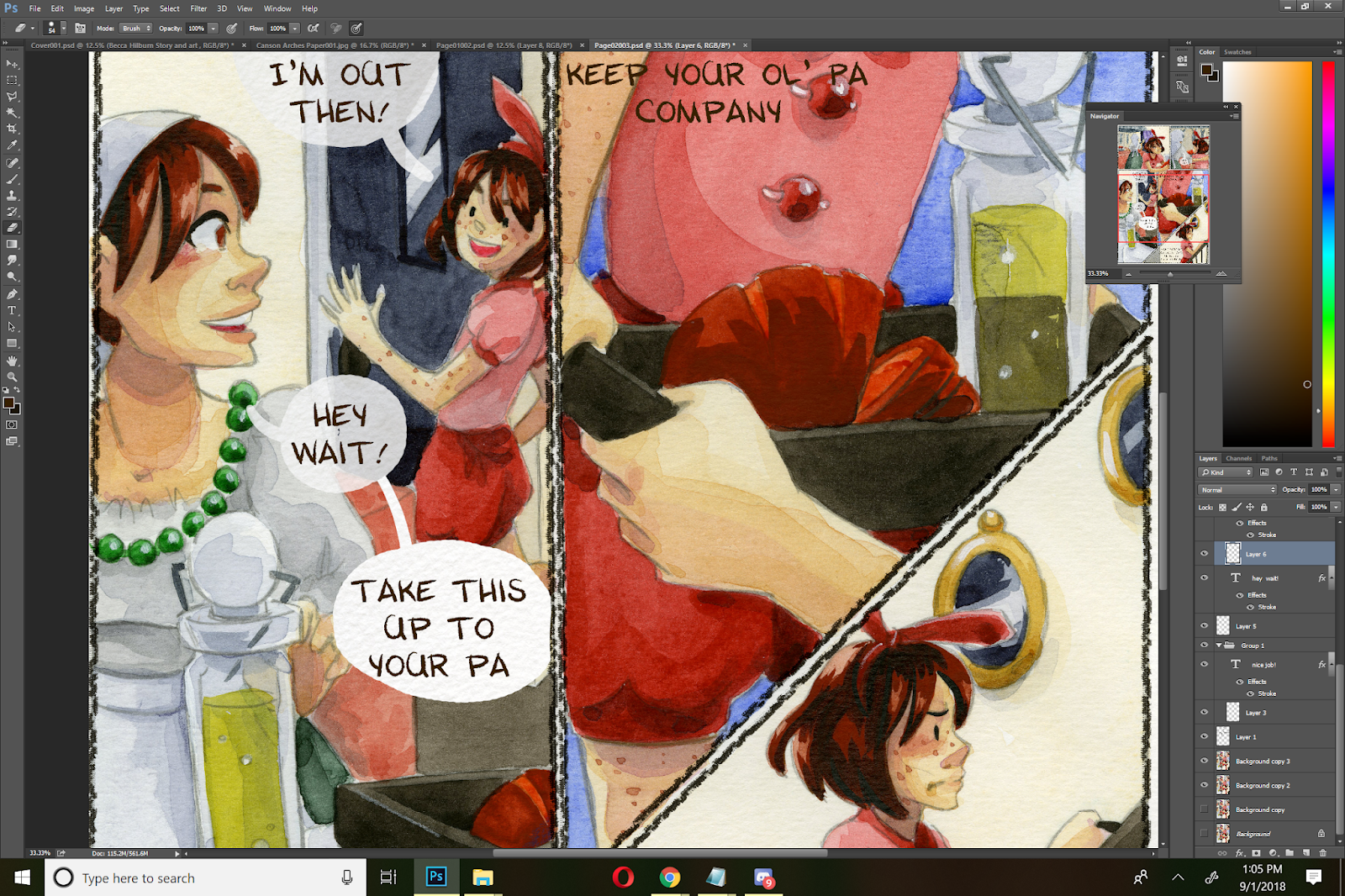
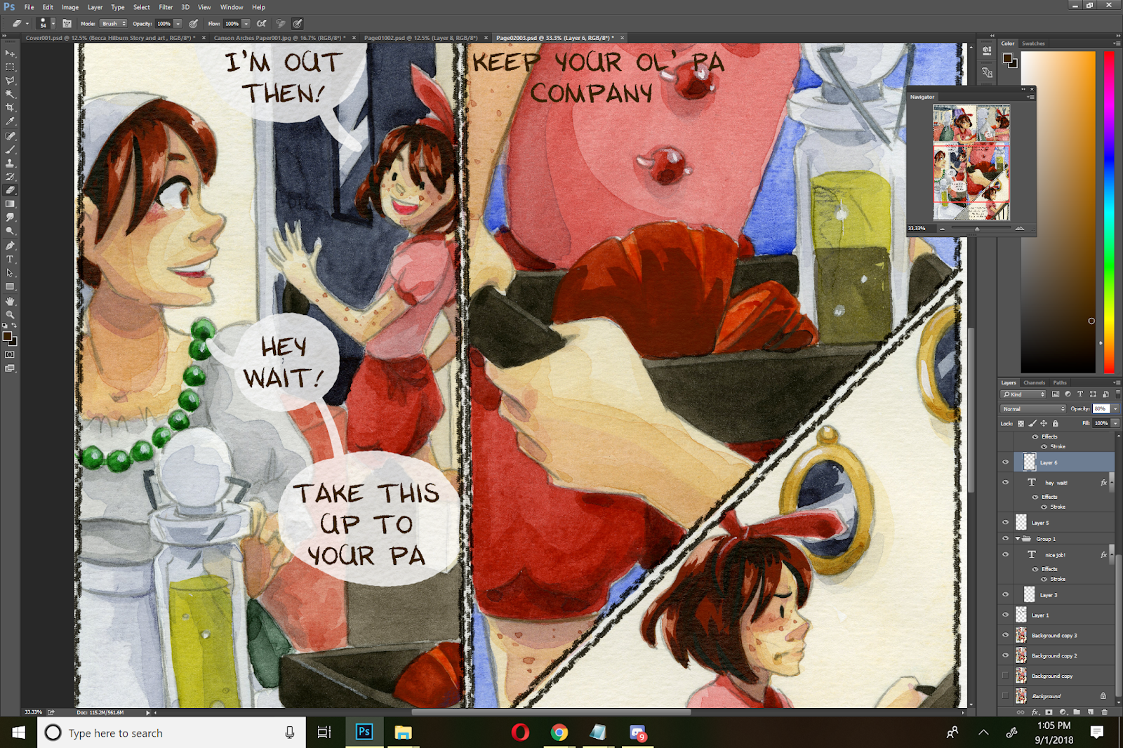
Go back to your cone source (in our case, this Arches scan), reselect your clone area by holding alt)
And you can resume work!

Finished Page:

Creating Muttered or Whispered Dialogue
For muttered and whispered dialogue, I handle things a bit differently. I tend to leave my font without a stroke, so it's a bit wispier than fully spoken text.
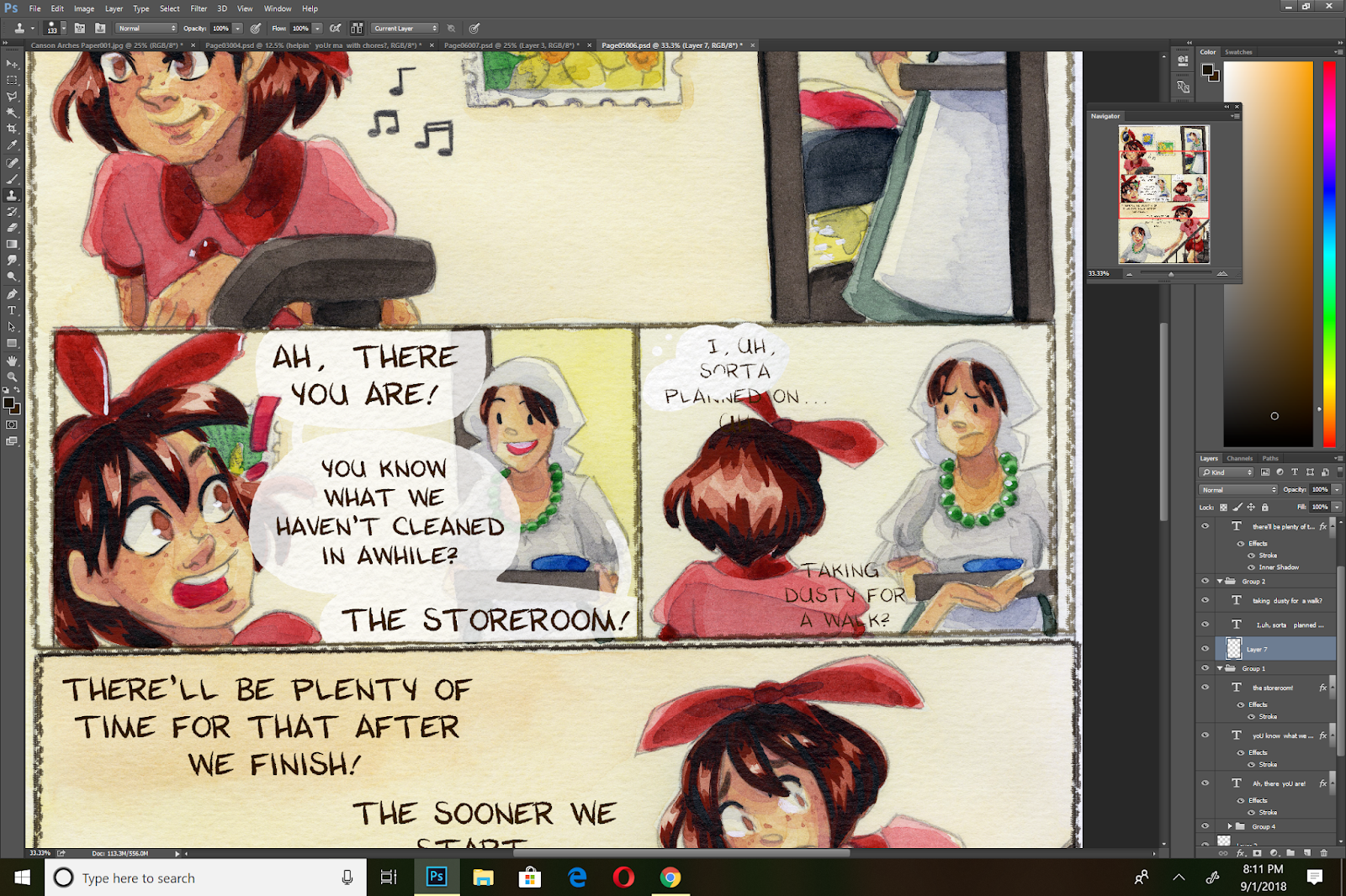
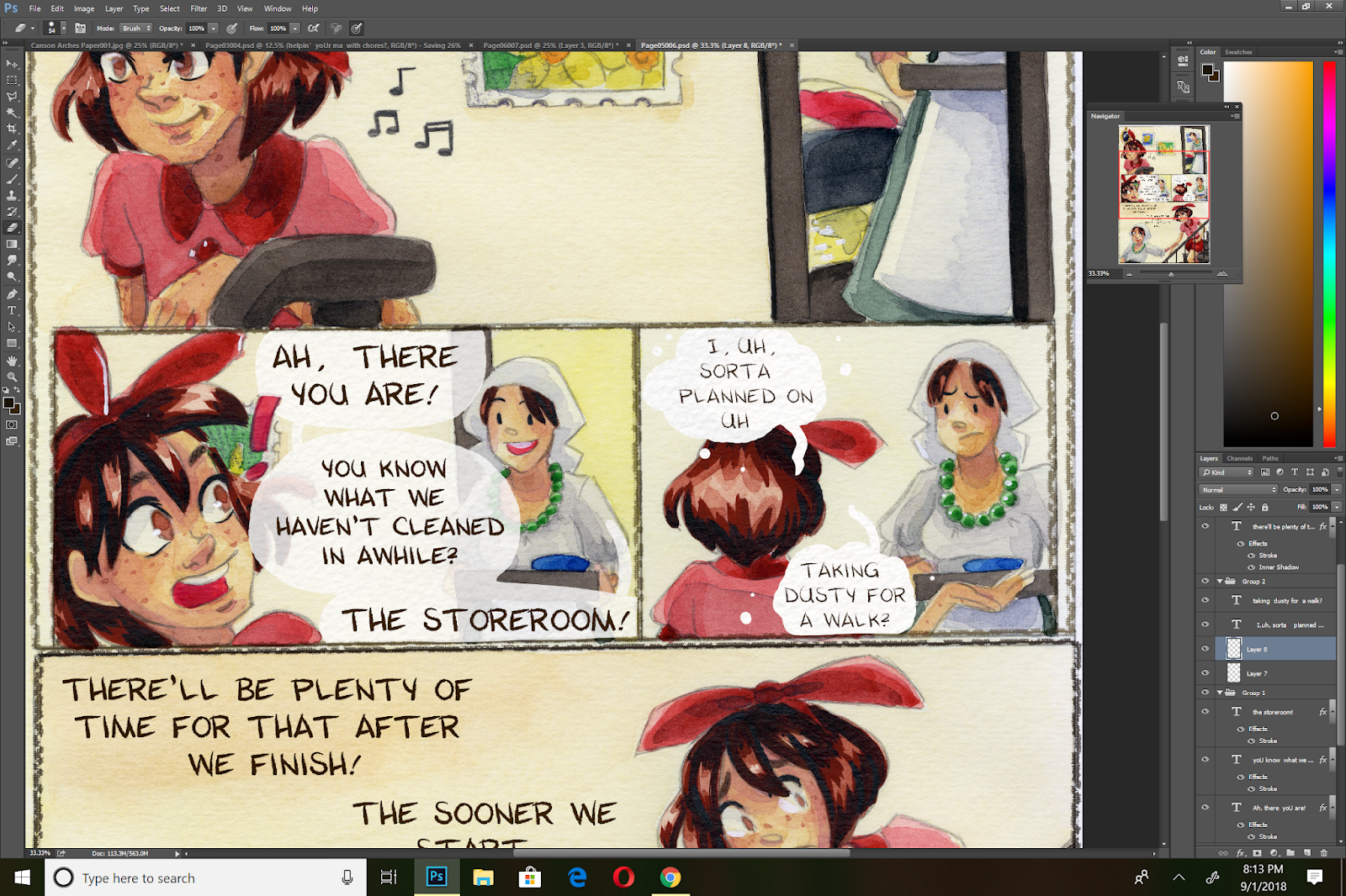
Rather than a round word balloon, I go for a vague shape with sputtered little dots eminating from it. I draw the tail vague as well.

I set the opacity lower than regular text-around 65% rather than 80%, depending on the art in the panel.
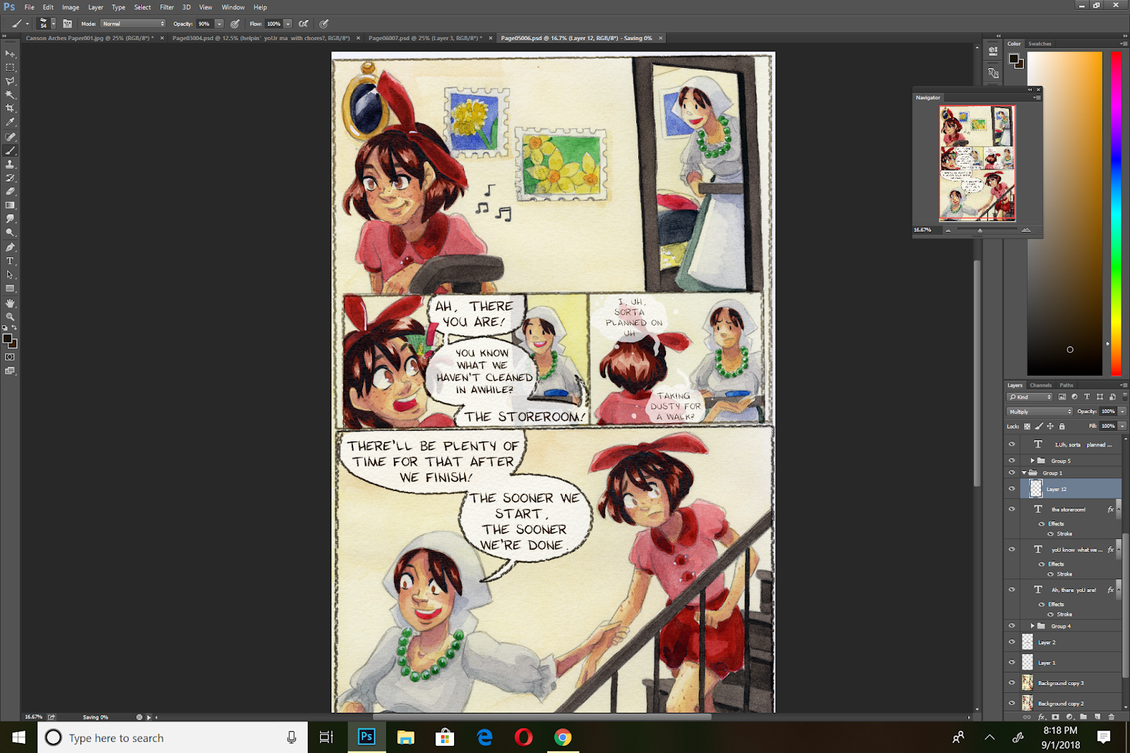
And I leave muttered and whispered balloons unbordered.
Creating Labels That Don't Compete With Dialogue
I handle these somewhat similarly to muttered dialogue. The text is left unbolded or without a stroke- however left as is, it's almost unreadable.
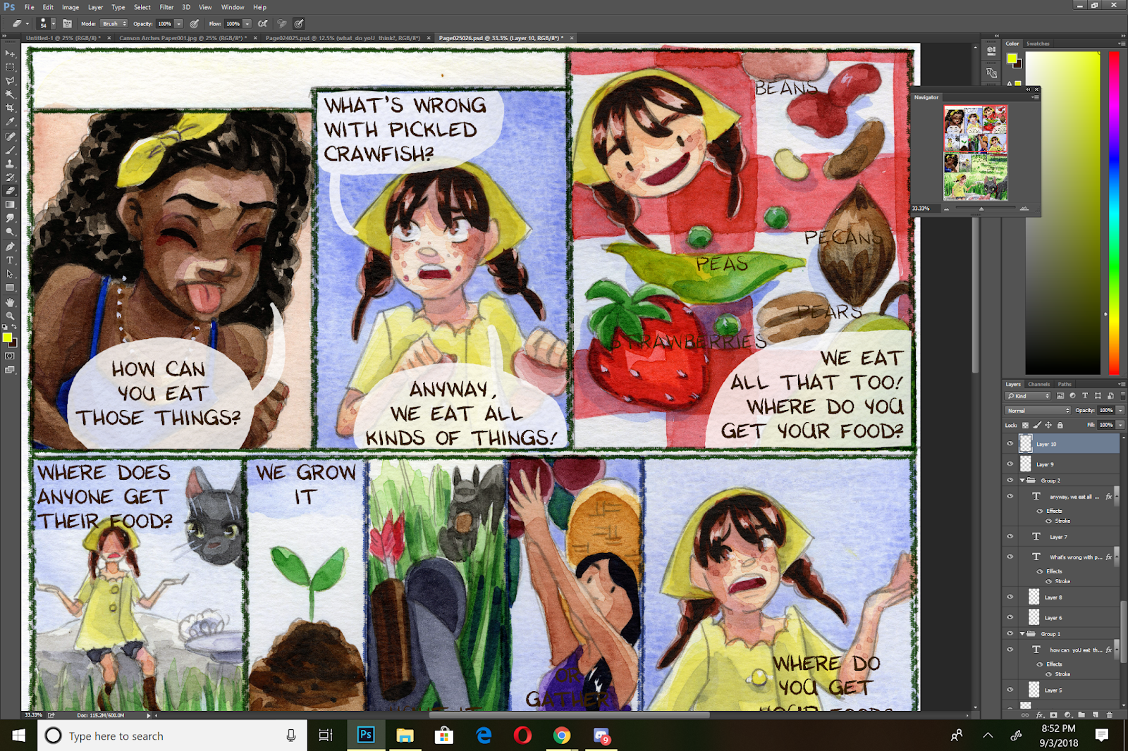
To increase legibility, I need to create a little contrast. To do this, I create a layer of paper texture behind my text.

And play with the opacity until it's legible, but not distracting.

Special Effects:
I typically keep my sound effects hand drawn (or retouched digitally), but sometimes I want to give dialogue a special connotation, emphasis, or feel. Often I will break the rounded balloon border with jagged edges, or adjust the color of the border to imply various emotions such as shock, anger, or in this case, happiness.
I used a salmon color, set to multiply, to help give a soft, happy feeling to the final panel on this page, and to imply that this is a special promise.
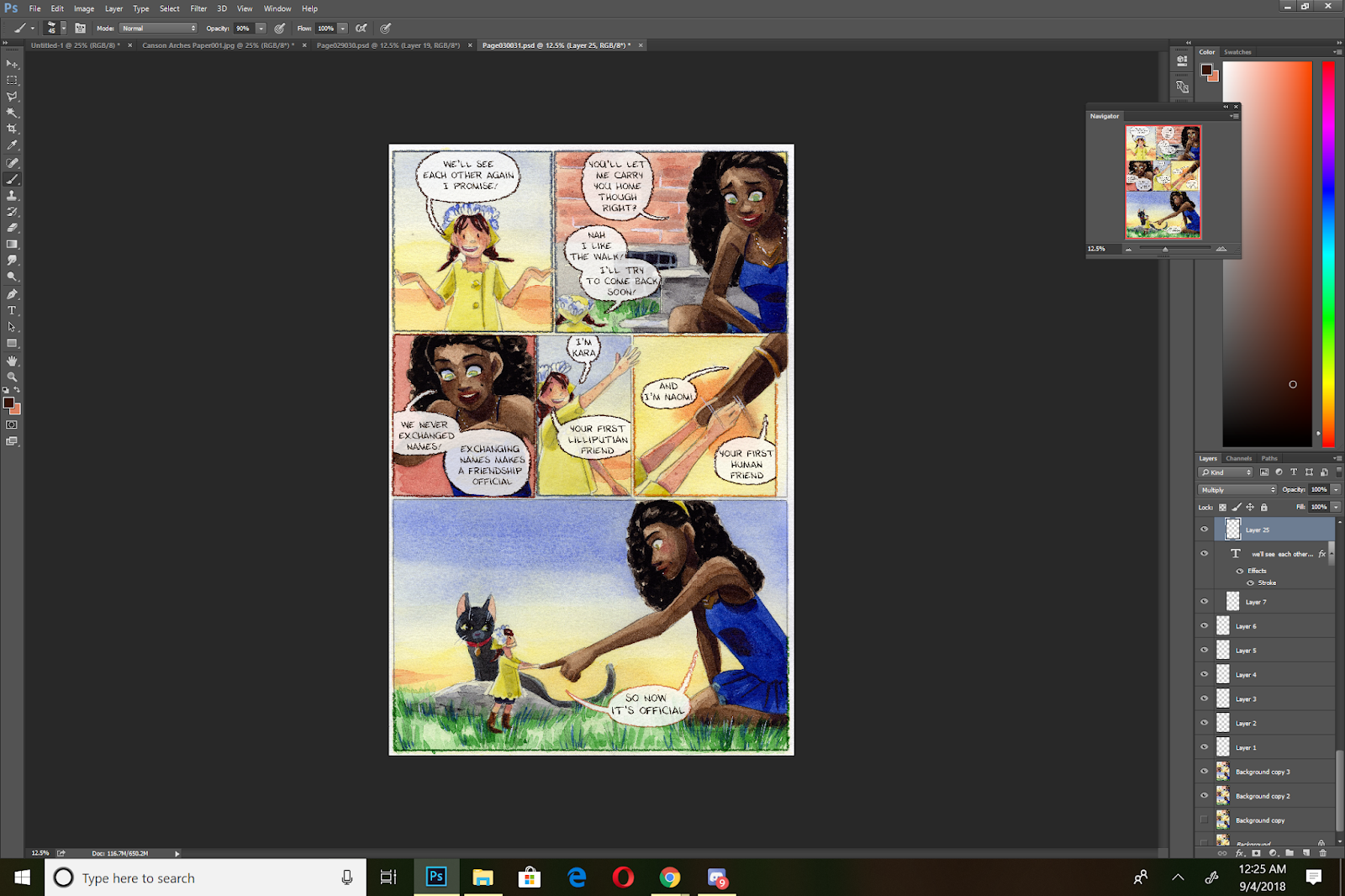
Recommended Reading and Outside Resources:
Making Word Balloons:
Two Schools of Balloon Making: Layer Vs Stroke
Consistent Balloon Tails
Pointers (Tails)
Formatting Your Word Balloons:
Layering Balloons in a Conversation
Don't Cross Balloon Tails...Ever!
Text Tips and Hacks:
Line and Negative Space in Comics Dialogue
The 94% Line Width Cheat
Wordy Balloons and Reading Order
Balloon Air
Captions and Special Uses:
Captions
Special Balloons
Burst BalloonsThought Balloons
Please consider donating to this blog or purchasing from Natto-shop (http://nattosoup.com/shop) if you want me to continue publishing quality content. All materials tested were purchased from my own pocket. Keep on Truckin' Nattosoup is not under any sponsorship.


