
Randy Krum's Blog, page 9
April 16, 2020
9 Ways To Focus A Wandering Mind

As everyone has made the temporary shift to WFH (work from home), many are surrounded by distractions. The 9 ways to focus a wandering mind infographic originally from On Stride Financial in the UK and now published on Headway Capital, offers simple ways to help you refocus.
It’s probably no surprise that the human mind has a tendency to wander. Scientific research has discovered that this trait is almost ubiquitous among humans, and most of us experience it regularly..
Constant mind wandering is a source of frustration for many people. In their study “ A Wandering Mind is an Unhappy Mind ,” researchers found that that experiencing a regular lack of concentration has a negative impact on overall mood and state of mind. In short, people were less happy when their minds wandered.
Luckily, research into ways of combating this phenomenon is also plentiful. And while we may never be able to eliminate our mind’s propensity for wandering, there are lots of simple techniques that can help improve concentration and focus.
Next time you’re feeling a little distracted, try out some of these techniques and see if you can bring your mind back on task.
A little text-heavy design, but the illustrations help with each section. The comprehensive sources help establish the credibility of the information, and the infographic landing page includes clickable links to all of the source material. Nice touch!
Found on Creative Bloq


April 14, 2020
10 Things To Do Before Any Video Interview
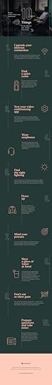
We’re all working from home, and that include job interviews, news interviews, class lectures, webinars, presentations to customers and even just business meetings. The 10 Things to Do Before Any Video Interview infographic from Kickresume is a great last-minute checklist before you turn on your webcam!
In the end, you can take this infographic as a checklist. You can use it to prepare for your job interview or any other video conference call.
And, oh boy, are we going to make many more of those. Sure, it took a global pandemic for companies to recognize the value of working from home but now there’s no going back. Video conference calls are here to stay. (I personally hate it but even I should probably get used to it. Damn.)
Anyway, good luck at your job interview!
I would have preferred more visual elements, but I like that this is a tightly focused infographic with a clear, useful message to a broad audience. This is one of the best uses for an infographic: an informative topic, related to the industry of the publishing company, with a popular, trending topic. This design checks all the boxes.
Designers have to remember that the infographic image file will often be shared by itself, so it always helps to include a few more thins in the footer:
The Infographic Landing Page URL (not just the company home page). This will help readers find the full infographic and the article that went along with it. Don’t make people search for it on your website.
A copyright or Creative Commons statement is always a good idea when you publishing an infographic

April 13, 2020
DataViz Community COVID-19 Resources

Not an infographic today.
Free online classes, discounts on software, extended trial periods, free online data sources, etc. as a result of the COVID-19 pandemic.
As the Organizer for the DFW Data Visualization Meetup Group, I've started this publicly viewable Google Sheet for the local DataViz community listing various resources that companies are making available during the pandemic. Turns out, these are valuable to DataViz designers everywhere, not just DFW, so I'm sharing the link with all of you.
I’ll continue to update this list as I learn about new resources during the pandemic. Please use the submission link in the spreadsheet if you know of any DataViz-related offers or deals I should add!
-Randy

April 9, 2020
Get to Know COVID-19
Made withVisme Infographic Maker
Get To Know COVID-19 is an interactive infographic build on the Visme platform that allows for the inclusion of animation, URL links, interactive content and playable videos.
Of course it’s timely information, but this is also an experiment with embedding the fully interactive infographic here in the blog post. A designer can go overboard, but good use of animation can attract the reader’s attention to important information or better demonstrate data. Below is the static JPG image of the infographic.
I am disappointed that the data included in the infographic isn’t visualized. It’s just shown as text numbers. That doesn’t give the reader any context or visual cues on how to perceive those data values.
What is Coronavirus/COVID-19?According to the World Health Organization (WHO), COVID-19 is a respiratory disease caused by a newly discovered type of coronavirus.
This new strain of virus, also known as SARS-CoV-2, has not been previously identified in humans. It can be transmitted from person to person via respiratory droplets, such as when an infected person coughs or sneezes within 6 feet of contact.
The WHO has declared the virus as a global pandemic and a crisis unlike any other in the 75-year history of the UN.


March 3, 2020
Beards and Face Masks from the CDC
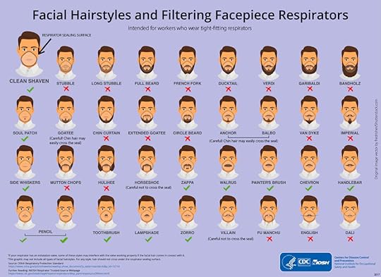
Back in 2017, the U.S. Center for Disease Control and Prevention (CDC) published this infographic on the Facial Hairstyles and Filtering Facepiece Respirators to help men understand that beards can make facemasks ineffective. With the daily news about the Coronavirus (Covid-19) bordering on panic, this infographic has resurfaced, and is being widely republished.
NOTE: According to the CDC, facemasks are NOT recommended to help prevent the current Coronavirus.
From the CDC FAQ:
Does the CDC recommend the use of facemask to prevent COVID-19?
CDC does not recommend that people who are well wear a facemask to protect themselves from respiratory illnesses, including COVID-19. You should only wear a mask if a healthcare professional recommends it. A facemask should be used by people who have COVID-19 and are showing symptoms. This is to protect others from the risk of getting infected. The use of facemasks also is crucial for health workers and other people who are taking care of someone infected with COVID-19 in close settings (at home or in a health care facility).
From the original CDC blog post on November 2, 2017:The month of November is full of fun, interesting, and thought-provoking observances. November is National Raisin Bread Month, Historic Bridge Awareness Month, and Inspirational Role Models Month among so much more. November is also the host month to campaigns like No-Shave November and Movember. Campaigns such as these are working hard to raise money for important causes such as cancer research, education, and awareness. These increasingly popular campaigns are a great way to demonstrate your support … unless you need to wear a tight-fitting respirator for your job.
Don’t despair! We will not completely ruin your plans to compete for facial hair bragging rights. But we’re going to have to get creative about it…
I do love that the CDC is using infographics to spread valuable information in a fun, easy-to-digest way that informs people using visual explanations. They also specifically call out the designer of the beard and moustache vector art they used from ShutterStock, fredrisher

March 2, 2020
Social Media Content Trends for 2020

Social media is predicted to continue to be a big tool for businesses in 2020. Big surprise. The Social Media Content Trends for 2020 and Beyond infographic from MicroCreatives lays out their predictions for upcoming trends.
Before the inception of social media marketing, brands used traditional marketing channels to reach out to and engage with consumers. Online social networks have made communicating with consumers a breeze and marketing easier and highly targeted for brands.
By 2020, more than 5 billion people will use social media platforms—that’s roughly two-thirds of the world’s population. Now is the perfect time to get started with social media marketing if you haven’t been doing so already. If you’re already doing it, how is it going for you so far? Perhaps it’s time to evaluate and update your social media content strategy to stay relevant and get ahead of the competition.
Here are some content trends we anticipate to be popular across social media in 2020 and the coming years. See what could work for your brand and start planning ahead.
Sometimes an infographic is a great way to summarize a larger, in-depth article. This is a good example that keeps the text in the infographic short & sweet because the article contains the longer descriptions.
They definitely missed out on using data visualization for the statistics though! Big mistake! They are completely lost in the text, and have no visual impact on the audience.
Found on prdaily.com

February 3, 2020
Punxsutawney Phil vs. the U.S. National Weather Service
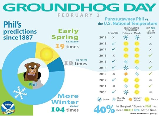
Punxsutawney Phil’s predictions for the coming of Spring on Groundhog Day haven’t been that accurate, and the U.S. National Weather Service is here to prove it with an infographic!
Every February 2, a crowd of thousands gathers at Gobbler’s Knob in Punxsutawney, Pennsylvania, to await a special forecast from a groundhog named Phil. If the 20-pound groundhog emerges and sees his shadow, the United States can expect six more weeks of winter weather according to legend. But, if Phil doesn’t see his shadow, we can expect warmer temperatures and the arrival of an early spring.
Even though he’s been forecasting since 1887, Phil’s track record for the entire country isn’t perfect. To determine just how accurate he is, we’ve compared U.S. national temperatures with Phil’s forecasts. On average, Phil has gotten it right 40% of the time over the past 10 years.
Using real data wins!
For what it’s worth, Phil didn’t see his shadow in 2020, and predicted that Spring would be coming soon!

Punxsutawney Phil vx. the U.S. National Weather Service
Punxsutawney Phil’s predictions for the coming of Spring on Groundhog Day haven’t been that accurate, and the U.S. National Weather Service is here to prove it with an infographic!
Every February 2, a crowd of thousands gathers at Gobbler’s Knob in Punxsutawney, Pennsylvania, to await a special forecast from a groundhog named Phil. If the 20-pound groundhog emerges and sees his shadow, the United States can expect six more weeks of winter weather according to legend. But, if Phil doesn’t see his shadow, we can expect warmer temperatures and the arrival of an early spring.
Even though he’s been forecasting since 1887, Phil’s track record for the entire country isn’t perfect. To determine just how accurate he is, we’ve compared U.S. national temperatures with Phil’s forecasts. On average, Phil has gotten it right 40% of the time over the past 10 years.
Using real data wins!
For what it’s worth, Phil didn’t see his shadow in 2020, and predicted that Spring would be coming soon!
January 29, 2020
Drowning in Plastic
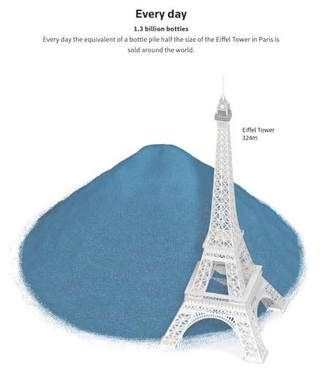
Simon Scarr and Marco Hernandez at Reuters created Drowning in Plastic, visualizing the amount of plastic bottles we consume, recycle and throw away every hour, day, month, year and decade.
Around the world, almost 1 million plastic bottles are purchased every minute. As the environmental impact of that tide of plastic becomes a growing political issue, major packaged goods sellers and retailers are under pressure to cut the flow of the single-use bottles and containers that are clogging the world’s waterways.
Plastic production has surged in the last 50 years, leading to widespread use of inexpensive disposable products that are having a devastating effect on the environment. Images of plastic debris-strewn beaches and dead animals with stomachs full of plastic have sparked outrage.
Polyethylene terephthalate (PET) bottles are commonly used for soft drinks and mineral water, but can also be used in other household or personal care products. Data from Euromonitor International, shows that more than 480 billion of these bottles were sold last year alone. That’s almost 1 million every minute, as shown in the animation at the top of this page. The illustrations below show what that pile of plastic would look like if it was collected over a longer period of time.
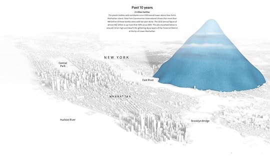
The visuals of massive piles of plastic bottles next to recognizable landmarks helps provide context and scale to readers.
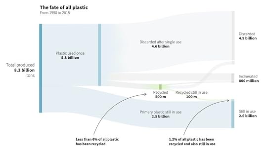
They also provided a nice Sankey Diagram showing the fate of most plastic bottles is to end up in the landfill.
Found on FlowingData

December 30, 2019
How Much Does It Really Cost To Produce Your Favorite TV Show?

How Much Does It Really Cost To Produce Your Favorite TV Show? infographic compares the cost to make the show to their ratings on IMDb. Cashnetusa.com comes to the conclusion that, while Game of Thrones paid out the big bucks and received the huge ratings, it isn’t always necessary. Peaky blinders received great reviews and spent 10 million less per episode!
Our new guide to the cost of producing the best and worst rated shows on TV in 2019 reiterates this sense that it’s not always the size of your production budget that counts, but what you do with it. The costly robots of Westworld are rivalled in ratings by the non-union zombies of The Walking Dead for a third of the price; Lost In Space was just as mediocre as the decidedly more earthbound NCIS: New Orleans.
And in the short-term, with the complete series rating hovering around 9.5 on IMDb, Game of Thrones still manages to top our new table as both the highest rated and highest costing show. But when you consider the bitter taste on the tongues of millions of disappointed HBO subscribers, would a more thought-through finale have been a better investment than all that extra cash? Or are GoT fans just sour because (as experts suggest) they’re going through an end-of-show ‘break-up’?
This infographic design does a lot of things right:
Good scatterplot data visualization to illustrate their data
Data points are clearly identified with data titles using proximity, not connecting lines necessary. This can often be a design challenge!
Sources clearly identified with links so anyone can look into the data
Use of Creative Commons to protect the infographic and encourage sharing
The text on the infographic landing page includes the clickable data source links and a methodology description.
Found on Geekologie.com


