
Randy Krum's Blog, page 10
December 16, 2019
How Does Impeachment Work?
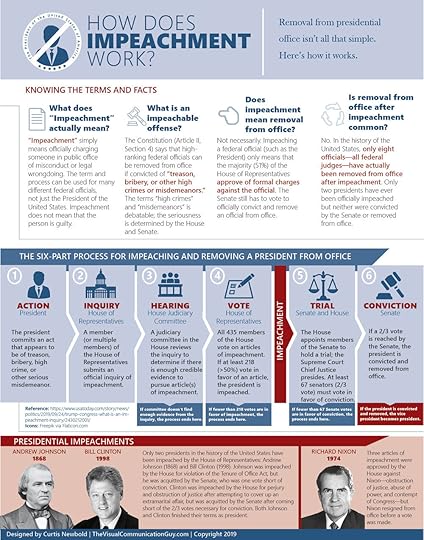
With Impeachment in the news every day lately, Curtis Newbold (The Visual Communication Guy) put together a handy explanation infographic, How Does Impeachment Work? A FREE downloadable PDF is also available from his website.
Considering the recent news of the House launching an official impeachment inquiry against President Donald Trump, it seemed worthwhile to create an infographic that describes the impeachment process.
Many Americans falsely assume that the term “impeachment” means automatic removal from office. That isn’t the case. The term “impeachment” simply means that someone in a high-ranking federal position has been found to have committed a crime or act of treason or bribery that seems serious enough to send that person through trial. If impeachment occurs, only then will the Senate conduct a trial and vote on conviction and removal from office.
As you can see in the graphic, “impeachment” simply means officially charging someone in public office of misconduct or legal wrongdoing. The term and process can be used for many different federal officials, not just the President of the United States. Impeachment does not mean that the person is necessarily guilty. But it does mean that they have been officially accused of some wrongdoing and that the House of Representatives feels there is enough evidence to at least do an investigation.
Here is a quick review of how the process works:
This is a great use of infographics. Take a complicated subject, and try to make it understandable to your audience. Notice that I said “understandable” not “simple”. The main goal of data visualization and infographics is to clarify information, but it is often mis-characterized as simplifying information.
This design still has too much text explanation for my taste. He goes into more details in the blog post that accompanies the infographic, so I think the infographic design could remove more of the explanatory text and draw people to the full article.


November 27, 2019
Official Timeline of Star Trek
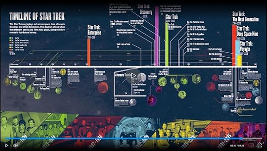
The team at StarTrek.com has released an official infographic video A Timeline Through the Star Trek Universe, Part 1 that includes all of the various TV and Movie series in their inter-connected places on the timeline.
WATCH: A Timeline Through the Star Trek Universe, Part I
The Star Trek saga has boldly traveled through space and time throughout its over fifty year history. Starfleet has visited the distant past, the far future, and even some alternate timelines. Need some context before you dive deep into Star Trek: Discovery and prepare for Star Trek: Picard? We've got you covered in Part One of our video timeline.
Here’s a snapshot of the complete timeline:
Interesting that they call this “Part 1”… Implying that there is much more to come.
From a DataViz design perspective, I’m not a fan of timelines that don’t keep a consistent scale. There’s a huge jump from the Big Bang 13.8 Billion years ago to the year 1900, then the scale is pretty even with 50-year jumps until the year 2150, and then the scale changes again, making the 50-year jumps are much farther apart.
It appears that this is an evolution of an original design project collaboration between Rachel Ivanoff and Jordan Twaddle that was on exhibit at the The Museum of Pop-Culture (MoPOP) in Seattle, Washington in 2016. The new video adds Star Trek: Discovery to the timeline, and video snippets from each of the shows.
Back in 2016, they shared this great animated GIF of the design evolution from the original timeline design process:

I hope they were involved in the development of the new timeline video as well.

November 25, 2019
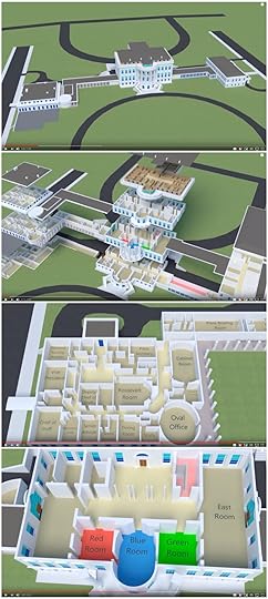
What's Inside the White House?
Visual explanations are a big part of data visualizations, and this video exploration of What’s Inside the White House? by animator Jared Owen gives viewers a great perspective of where the major rooms are located in context with the rest of the building. I would bet that most people don’t know that the Oval Office isn’t in the main, center building.
The White House is full of lots of interesting rooms. A lot of people don't realize that this information is public! Please join me as we take a walk through the different rooms and what they are used for.
Found on Core77

November 8, 2019
The Chart Guide v4.0 - Interview & Giveaway
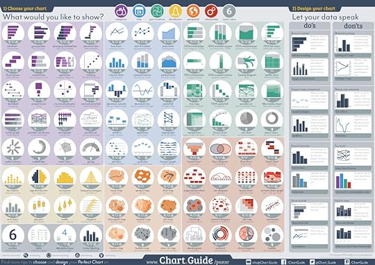
Michiel Dullaert, data visualization expert and trainer from the Netherlands, has updated his Chart Guide poster to version 4! A free PDF is available for download from his website, and introduces a new category, 19 new charts and 4 extra design tips. You can also purchase a full-size printed poster version.
As the November 2019 Giveaway, I have a pair of Chart Guide posters, that will be shipped to one lucky winner. That way you get one for yourself, and one you can give to a friend or coworker.
Register HERE by November 30, 2019 at 11:59pm CT, and the winner will be randomly chosen on December 1st!
This poster shows 84 charts to choose from and includes 16 chart design tips to help you make the Perfect Chart. The poster is available as a big poster or you can download the PDF file for free. Let this ChartGuide poster help you choose and design your Perfect Chart.
You can see his complete write-up about the new version HERE. I was able to ask Michiel a few interview questions about developing the posters:
Cool Infographics: What’s your background and how did you get into visualizing data?
Michiel Dullaert: Years ago I have been working in the boardgame and puzzle industry. Part of my work was discovering new boardgames and puzzles and introduce them to the market. I was working for two different companies, both at the time that a new product of theirs really changed the market. For the boardgame industry I worked for the company that introduced a new type of boardgame (the game of Catan) that made playing boardgames a popular hobby. After that, I worked for a company that created puzzle magazines at the time the Sudoku puzzles was introduced. And here the same happened again, a new type of puzzle that changed the way people would puzzle and talk about puzzles. Both were very nice jobs, with a lot of enthusiastic conversations with customers about new products.
In both companies I was working in the product development. I always had a large personal interest in the data behind the products. So it felt logic to do more with data, and I changed careers. I started working for a large company as an analyst. And it was not long that I found out that my colleagues were not interested in my reports. Although the reports contained interesting information it was shown in large tables and busy charts. People seemed to be not interested and if the looked into the numbers, they did not seem to understand them. My work did not seem to matter. The contrast between my previous jobs and the work as an analyst could not have been bigger. At that time I decided I would try to find a way to make people as enthusiastic about data as they were about boardgames and Sudoku puzzles.
The first step was reading books on the topic of data visualization. Because I was working in the business intelligence field, the most logic choice were the books of Stephen Few. I bought them all and a whole new world opened for me. When Few was in the Netherlands to give a course I felt very lucky I could join. The workshops inspired me to learn more on this topic. So I bought more books and the next year I joined a class of Alberto Caïro. This gave me multiple perspectives on the same topic. The things I learned were applied to my work, and I was getting more and more responses on my visualizations. People actually started to read and understand them.
My manager asked me to explain my choices in visualizations to my colleagues, so they could learn from me. And then I discovered how great it is to teach about data visualisation. I met a couple of UX designers and they inspired me learn more about that topic and to get an UX certification. The knowledge I gained in learning UX helped me in developing my own perspective on good data visualization. And in my workshop I try to inspire others to create such. For these workshops I wanted an overview of charts. Although there were already some great overviews, none of them had the point of view I was teaching in class. So I decided to design my own. That’s how Chart.Guide started.
Cool Infographics: Who is the Chart Guide poster intended for?
Michiel Dullaert: The website and the posters are intended for everyone who makes charts. For me it does not matter if you are working as a data-journalist or a data scientist, a infographic designer, project manager or a financial analyst. As long as you need help or inspiration when making charts or tables, Chart.Guide can help you. Online in the form of the website and offline in the form of the poster. Because I want to inspire as many people as possible I made the PDF of the poster free to download. I know that the poster is used in business departments, newsrooms and in school classrooms.
Cool Infographics: What was your design process for the poster?
Michiel Dullaert: The main source for updates to the poster or website, is the conversations I have with people I teach or work with. If they have a need for certain chart types, or make design mistakes, I try to add that topic.
DPG Chart Chooser
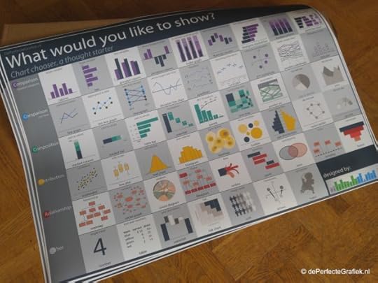
The first poster edition (picture DPG Chart Chooser) was just a collection of charts I created for my students. For each chart a few words on when to use the chart and, more important, it gave advice on what charts were not recommended. On the second edition (the first under the Chart.Guide brand) I added chart design tips. The reason, I saw people choose a good chart but then mess up the design. Last year, I got questions about maps, so I decided to add them on poster edition 4.
Rearranging the layout of the Chart Guide
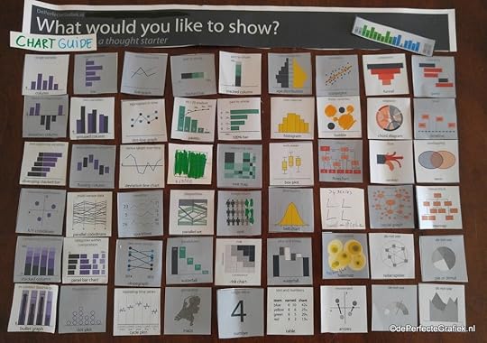
The design process starts with insight I get from conversations I am having. Next step is cutting the old poster and rearranging everything. (see picture ChartGuide rearrange) now, will lead to more insights on the poster in the future. Although it make take some time to transform everything to the screen or paper. I still need to find some time to explain on the website why some charts are “not recommended”.
Cool Infographics: You asked your followers to help choose the design of the new poster. How did that go?
Michiel Dullaert: The poster is made to help people. So it seems to be logic to give them a role in the design process. As a UX designer I like to test my designs before releasing them. Most of these tests are done in class, because I like to observe the users in how they use the new design. The online voting was suggestion of a student. It did give me a lot of useful feedback. Especially when people wrote a lot of text explaining their choice. For future editions I will do the same.
Cool Infographics: How can people follow you for updates?
Michiel Dullaert: People who have downloaded the PDF will get an email when a new poster is available, or when something interesting is added to the website. For this and more chart related inspiration, they can follow me on Twitter: @Chart_Guide or on facebook: /ChartGuide1 .
This helpful reference guide is one of over 25 FREE data visualization guides I maintain links to in the Cool Infographics Tools pages. See them all on the DataViz Reference Guides page, and let me know if I’m missing any.

November 7, 2019
Smartwatch Showdown: Apple Watch vs. Fitbit Versa

In the world of smartwatches, the two big contenders are the Apple Watch and the Fitbit Versa. The Smartwatch Showdown infographic from The Watchstrap is very timely with recent news that Google has just acquired Fitbit.
In the world of wearable gadgets, smartwatches are all the rage at the moment. The smartwatch market is growing by the day, and new and improved devices are constantly being released. This means that picking the right smartwatch can be a real head-scratcher. To help you choose the right device for your needs, we’ve compared two of the hottest smartwatches on the market: the Apple Watch Series 4 and Fitbit Versa!
If you want to find out which of these devices came on top in the end, don’t miss the comprehensive infographic below!
First, this is a great use of infographics in content marketing! The Watchstrap is an online retailer of watch bands, and the infographic is a comparison design without being a sales pitch. It draws in traffic by providing valuable information, which build credibility for their brand.
There are a handful of things I didn’t like about the design itself that could be easily improved to make this a better infographic design:
Too much text. I realize there isn’t much data to work with, but they need to cut down the text in the infographic. Paragraphs of explanation don’t belong in the infographic, they belong on the landing page. The infographic should be short and draw in readers to the website if they want to learn more.
The scale is wrong in the Size & Design section of the infographic. The dimensions of the Apple Watch are larger, but the graphic illustration on the page is smaller. The illustrations should be visually correct to scale.
Eliminate any word wrap when possible. There are a number of list points that have one hanging word wrapping to a second line. This could be avoided by shortening the text or just widening the text box. There’s room in the design without wrapping some of these words.
The URL in the footer should link to the infographic landing page, not the home page of the company site.
Copyright or Creative Commons license is completely missing.
Don’t obscure the source by only listing the home page URL. What’s the link to the research data?

October 22, 2019
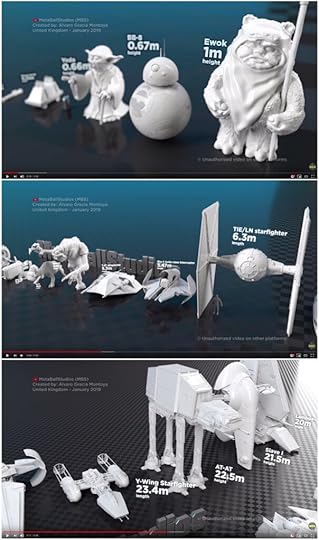
Star Wars Size Comparison Video
The galaxy far far away has items both big and small. The Star Wars Size Comparison Video created by MetaBallStudios brings droids, people and planets together from the Star Wars movies (episode I to VIII, Rogue One and Solo). See how your favorites size up against each other.
Comparison of many things from the Star Wars movies. Only movies from episode I to VIII, Rogue One and Solo. Obviously not everything appears, only the most representative.
Providing scale and context to your audience is one of the key tenets of data visualization, and this video does a fantastic job of giving you the context of the size of everything in the Star Wars universe.
Found on Gizmodo.com.

October 18, 2019
Top Construction Projects in the World

Highlighting some of humanity’s biggest construction achievements is the 10 of the Top Construction Projects in the World informational infographic from 53 Quantum.
Human societies have always looked to build the biggest and best monuments to their ingenuity, resources and craftsmanship. From the Empire State Building, to the Eiffel Tower, and the Great Pyramids of Giza to the Great Wall of China, we’ve always looked to build the biggest and best. Mind blowing historic building projects now litter travel-minded folks bucket lists everywhere, and they make up a huge part of the historic tapestry.
But it’s 2019 now. We need to talk about the Burj Khalifas and Libyan Irrigation projects of the world. For the first time in history, there are societies wealthy, powerful, and most importantly, cohesive enough to build spectacularly huge projects. By working together with our geographical neighbours, we’ve been able to give the world some truly unbelievable, innovative projects. The International Space Station leaps to mind as a collaboration between nations.
With so many stunning projects continually on the go around the planet, we at 53 Quantum thought it’d be an idea to put together a quick infographic of ten of the biggest and best. Of course, there’ll be examples we missed and things we left off, because how do you compare a massive railway restoration and modernisation with a super skyscraper project? Apples and oranges!
Nevertheless, here are ten of the world’s most impressive construction projects.
Although I like the infographic, this design falls short in a few areas.
Where’s the Data Visualization? The biggest missed opportunity in this design is that the data isn’t visualized. You want readers to understand how big or how expensive these projects were, you need a visualization that puts that into context!
Nice illustrations, but that isn’t enough. Most of the impact of the size and scale of these projects is lost because it’s buried in the text.
A map of the locations would be nice.
Is there any logic to the order of these projects in the infographic? Readers will look through the list from top-to-bottom in order. They’re not sorted by cost or on a timeline.
Thanks to David for submitting the link!

October 11, 2019
What Does Big Tech Know About You? Basically Everything
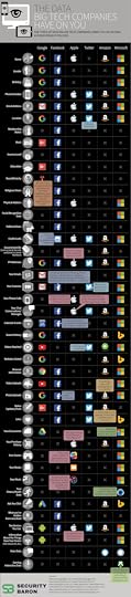
Big tech companies have been spying on us for years. This knowledge isn’t new information, but what could be surprising is exactly to what extent each company does it. Security Baron categories what data six of the biggest tech companies collect from you in The Data Big Companies Have On You infographic, and these are just the ones they admit to collecting on their own privacy pages!
The seemingly endless stream of Facebook privacy scandals of late—including the latest involving users as young as 13 years old—may have you questioning how much the social network and other tech giants actually know about you.
The folks at Security Baron examined the privacy policies of Facebook, Google, Apple, Twitter, Amazon, and Microsoft and put together a handy infographic showing the types of data each company admits to collecting. For Facebook and others, data is money. But just how much these tech giants actually know about you might be surprising.
As you can see in the infographic below, Facebook is particularly data-hungry, even gathering information about your work, income level, race, religion, political views, and the ads you click in addition to more commonly collected data points such as your phone number, email address, location, and the type of devices you use.
"Facebook is unusually aggressive," Security Baron pointed out. "This data can be exploited by advertisers and (hopefully not nefarious) others."
Twitter, in comparison, is "comparatively hands-off," the site notes. The microblogging service, for instance, doesn't collect your name, gender, or birthday (Facebook, Google, and Microsoft all do), but Twitter does know your phone number, email address, time zone, what videos you watch, and more.
Google and Microsoft, meanwhile, are the other big players when it comes to collecting data.
"With Cortana listening in and Gmail seeing all of your emails, the ubiquitous nature of Google and Microsoft gives them access to an uncomfortably large amount of your information," Security Baron wrote.
Check out the full infographic below to see what Facebook, Google, Apple, Twitter, Amazon, and Microsoft may know about you. For tips on securing your digital privacy, check our story, "Online Data Protection 101: Don't Let Big Tech Get Rich Off Your Info.
This is a fairly simple infographic design using a comparison table. I think the use of the icons is particularly effective showing which of Google’s or Microsoft’s apps are collecting the data.
Although the types of data are identified down the left side, I wish there was a way to identify the more sensitive types of data.
Original article can be found at https://www.pcmag.com/

October 8, 2019
Google Ranking Factors 2020: Facts and Myths

Google’s ranking algorithm continues to get more and more complex, and the Ranking Factors 2020: Facts and Myths infographic from Link-Assistant tries to break through some of the misinformation that’s out there.
It seems a little while ago that Google hinted at having 200+ ranking factors. Though in fact, it happened in the year of 2009, and we are heading to 2020 now.
Google has drastically evolved over the past ten years. Today, neural matching — an AI-based method — processes about 30% of all searches , and Google can recognize concepts behind keywords. They have introduced RankBrain , mobile-first indexing, and HTTPS. As we need to adapt to changes and find ways to get atop of SERPs, the topic of ranking factors remains as fresh as ever.
So let's have a look at what ranking factors to consider in 2020, and what ranking myths to leave behind.
I have mixed feelings about this infographics design:
Good:
It’s a concise summary of very complex information that’s laid out in the more detailed, full article.
The infographic is a handy reference sheet and great for use in social media as promotion for the article.
Clean arrangement that’s easy to read from top-to-bottom
Bad:
Almost all text.
Not that there’s much data that could have been visualized with charts, but some visual design elements would have made the infographic easier to read and more enticing to readers.
Text URL to the article! When the infographic gets shared, how are readers supposed to find the article when it’s not linked??? Put it in the footer on the infographic!

October 3, 2019
14 Visual Content Marketing Statistics to Know for 2019

Online marketing with visual content continues to grow and drive tons of traffic. The team at Venngage gathered together the latest data in the 14 Visual Content Marketing Statistics to Know for 2019 infographic and built it using their own tool.
From Nadya Khoja at Venngage:
Two years ago I asked 300 different online marketers to help me figure out how they were using visual content as part of their marketing strategies in 2016 and their predictions for 2017.
This year I wanted to see if there were any changes in how marketers were creating visuals, and what kind of content engagement they were seeing.
I also asked a couple of additional questions to see how the use of various visual formats impacted their blogging strategies.
Conclusion:
The data says it all–visual content isn’t going anywhere any time soon. Not only are more brands leveraging the use for of visuals for various social media platforms, but there is a lot of added benefit when it comes to SEO and organic rankings as well, particularly in Google’s image search results.
And of course, creating engaging visual content is a surefire way to resonate with your audience and communicate your ideas more effectively.
There are a few things to unravel here:
It’s good survey data, but take it with a grain of salt. Venngage is a visual design tool, sharing data about visual content marketing.
The infographic is a fantastic format to summarize the survey results and use in social media to draw in readers to the full article.
The infographic is built using Venngage, so it’s also a great way to showcase what their design tool is capable of. In fact, clicking on the infographic gives you the opportunity to use this design as a template for designing your own infographic.
Sections 5 & 10 are disappointing visually. There are no data visualizations, just a bunch of percentage values shown in text.
I’m not a fan of the bright color scheme, and it’s visually distracting from highlighting insights in the data.
The article still references 2018 data, even though the infographic has been updated with newer data from 2019.


