
Randy Krum's Blog, page 12
April 19, 2019
All the Companies Owned by Disney
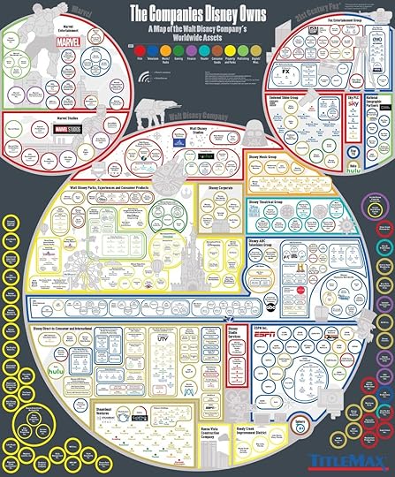
After the acquisition of 21st Century Fox, you can see all of the international holdings of the Disney Company in this massive infographic, The Companies Disney Owns, from TitleMax.
Who owns ESPN? Who owns ABC? Does Disney own Marvel, Lucasfilm, and Pixar? The answer is yes, and more — a lot more. We’ve made a map of the companies owned by Disney along with the wide swath of departments and Walt Disney Company subsidiaries. Massive corporations may be too big to grasp sometimes, but this huge list of assets of the Walt Disney Corporation can help media consumers untangle the great network of the mouse.
This is a large, complicated design, and I think it’s worth some discussion.
I actually like their use of the Mickey shape, with Marvel and Fox as the smaller ears.
I get that complicated is part of the story here, but there needs to be a better hierarchy of parents to subsidiaries. Better use a a font size hierarchy and the line weight and size of the circles isn’t clear enough. People have a hard time visually comparing circle sizes.
Another problem with changing the circle sizes is that readers perceive that to have meaning, like the size of these companies, which isn’t true in this case.
Organization inside the Mickey shape needs some help. These are fairly random shapes and direction of company groupings.
Yellow on white is never a good idea.
Use more company logos. Some of them are here, like ESPN and Hulu, but many more of these companies have logos that would have been appropriate to use.
What are all the company circles on the outside of the Mickey shape? Some explanation is needed.
Choose rounded or square shapes and stick with it. Don’t go all circles and rounded rectangles, and then put those in sharp cornered squares. Also, be consistent with the corner rounding. Don’t let the software change the corner radius for each different shape.
The large image size infographic needs to be even higher resolution. At the highest resolution, the smallest text is still pixelated and unreadable.
My biggest question comes down to why is TitleMax doing this infographic in the first place? I don’t understand how this helps the SEO for TitleMax’s website, marketing or their brand equity. This topic just doesn’t have anything to do with their business.
I also say this about a lot of infographics: you need to include the URL of the original infographic landing page in the infographic itself. People are good about sharing the image, but not including the link, so you need to include the URL so readers can find the original on the TitleMax website.


April 11, 2019
Can I Claim my Lunch on the Go?
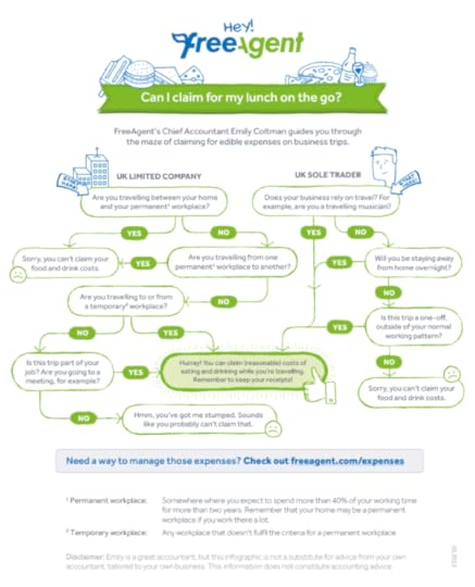
Deciding whether or not to claim your food as an business expense on your taxes can be challenging to figure out. Can I Claim for my Lunch on the Go? infographic from Free Agent can answer some of the tricky questions. NOTE: This is a company based in Scotland, so they are talking specifically about tax laws in the UK!
Free Agent has a handful of helpful infographics that are designed really well. They’re short and very focused. Each one handles just one specific topic which makes them easier to read and understand.
Thanks to Helen for sending in the link!

April 5, 2019
5,000 Year Timeline of Medical Technology

The MedTech Timeline: 5,000 Years of Advances in Healthcare Innovation & Technology infographic from Glow New Media is an impressive collection of our spurious advances in human medical knowledge and technology.
Healthcare has come a long way in 5000 years! We were curious to take a look at the sequence and timing of some of the major advances in medicine which have been made over the history of medicine and clinical innovation. We had some surprises and we're particularly excited to see the acceleration of the pace of innovations. Take a look - we hope you enjoy!
They cheated a little to get the 5,000 years claim. This is mostly a timeline of our medical technology from only the last 450 years.
It’s confusing that they branded the infographic SafeTeam Guardian, which is owned by Glow, and then published it on the Glow website. The footer is missing the URL of the infographic landing page so readers can find the original. If they go to the SafeTeam site, there’s no sign of the infographic anywhere! They wouldn’t have any reason to look on the Glow website.
I appreciate the thorough source citations, but those might have been better listed in the descriptive text of the landing page instead of the infographic itself.
Thanks to Matt for sending in the linK!

April 3, 2019
How the Tech Giants Make Their Billions
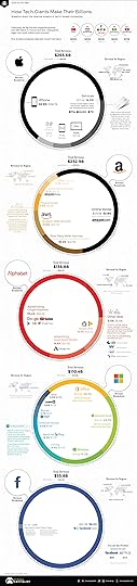
The infographic How the Tech Giants Make Their Billions from VisualCapitalist breaks down how the Big Five major tech companies make their money.
Together, the Big Five tech giants combined for just over $800 billion of revenue in 2018, which would be among the world’s 20 largest countries in terms of GDP. More precisely, they would just edge out Saudi Arabia ($684 billion GDP) in terms of size.
Meanwhile, they generated a total of $139 billion of net income for their shareholders, good for a 17.3% profit margin.
Let’s dig deeper, and see the differences in how these companies generate their revenue.
You are the Customer: In the broadest sense, three of the tech giants make money in the same way: you pay them money, and they give you a product or service.
You are the Product: Both Alphabet and Facebook also generate billions of dollars of revenue, but they make this money from advertising. Their platforms allow advertisers to target you at scale with incredible precision, which is why they dominate the online ad industry.
I have a few thoughts on their use of these doughnut charts:
They tried to use brand color to be relevant to each company, many of the sections are visually hard to differentiate because the colors are too similar.
The thin doughnut thickness allows for all of the data to be shown inside of the rings
I like the color-coded text to match each doughnut segment
Yellow text on a white background is never a good idea, even if it is one of the brand colors. Very hard to read!
There’s an argument to be made that the size of the doughnut charts should be proportional to the total revenue of each company. This infographic stays focused on only breaking down the total revenue of each company, but that visually shows Facebook with $56B in revenue at the same size as Apple with $266B in revenue.

March 18, 2019
What Really Extends Lifespan?
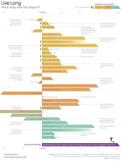
David McCandless from InformationIsBeautiful.net has released his LIve Long: What Really Extends Lifespan? infographic design that explores how much impact different behaviors can have on your life, and how strong the scientific research is to back up the claims.
What’s the best method of life extension? Diet and exercise? Or polygamy and pets? The latest data visualized.
Most of David’s designs are fully transparent with the data, and this design follows that tradition. All of the data and sources used in this design is summarized in this Google spreadsheet.
This design is a good exercise in visualizing uncertainty. The number of years for each activity is not exact, so I think the couple of bars that fade into white are more appropriate. The angled cut at the end of most of the bars seems more artistic. I like the additional aspect the strength of the science behind each claim is color-coded into the bar chart.
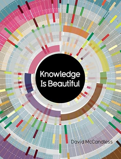
This infographic was originally published in the Knowledge Is Beautiful book, available on Amazon, and should be included in every data visualization designer’s library.

March 14, 2019
The Beauty of Pi
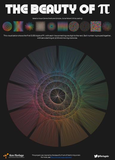
In honor of Pi Day, March 14th (3/14) I wanted to share The Beauty of Pi.
Ken Flerlage has created a very cool series of visualizations of the first 5,000 digits of the mathematical constant Pi using Tableau. All of them are available in this interactive Tableau Public visual called The Beauty of Pi that allows you to download the different visualizations as a Tableau workbook or in different file formats. These downloads are high-resolution and sized nicely if you wanted to print one as a poster.
Ken also published a full blog post about his inspiration and experience creating the visualizations.

Ancient History Family Trees Poster
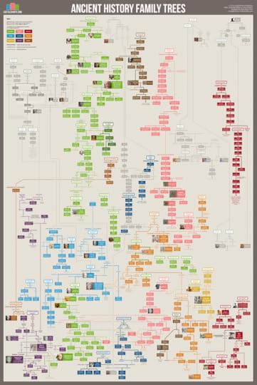
Matt Baker from UsefulCharts has launched a KickStarter campaign to release the fourth poster in his family tree series. The newest poster is the Ancient History Family Trees poster and focuses on the time period between 1600 BCE and 100 CE. It includes historical dynasties (shown in color) as well as a few sections based on legend and/or religious traditions (shown in grey).
Help support Matt launch the new poster on KickStarter by Friday, March 29, 2019!
The full list is as follows:
Armenia (Artaxiad dynasty)
Assyria (Middle and New kingdoms)
Babylon (Chaldean dynasty)
Carthage (Barcid dynasty & its Phoenician roots)
China (Legendary origins; Shang, Zhou, Qin, and Early Han dynasties)
Egypt (Dynasties 18-31; Ptolemaic dynasty)
Greeks (The Iliad; Sparta & Athens; Alexander the Great & the Diadochi)
Hittites (New Kingdom)
India (Ramayana & Mahabharata legends; the Buddha; Nanda & Maurya dynasties)
Palestine (Selected bible characters, Israel & Judah, Maccabees, Herod the Great)
Persia (Median, Achaemenid, and Arsacid dynasties)
Rome (Generals of the republic; Julio-Claudian dynasty)
Syria (Seleucid dynasty)
You can see the new chart up close in Matt’s YouTube video:
You can see the rest of Matt’s posters from UsefulCharts on the Cool Infographics Infographic Posters page where I have links to over 100 posters from designers all over the world! Once this poster is released and available, I’ll add the link to it on the Posters page as well.

March 12, 2019
A Guide to Responsible Drinks in the Workplace
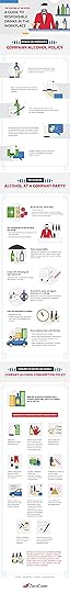
Some companies outright ban alcohol in the office, and others have beer, wine and alcohol stocked in the office for their employees and at company events. ZeroCater has tackled the complicated issues with their infographic, Toasting at The Office: A Guide to Responsible Drinks in the Workplace.
Yes, work events in the office can safely and responsibly include alcohol. In fact, many HR professionals acknowledge that alcohol can have a place at workplace functions. When employees manage their intake and employers set the right tone and company alcohol policy, wine, beer, cider, or cocktails can be a fun inclusion at holiday parties, team-building exercises, and more.
Planning and policy can help alcohol safely be part of workplace events. From holiday parties and team-building events to celebrations and other important occasions, there are times when alcohol is a great addition to a milestone in the workplace. Combine proper planning, solid policy, and responsible employees and management, and alcohol can safely be part of a company function. Put these tips to work in your workplace, and your team can enjoy a tasty beer, wine, or cocktail in the office.
This topic is perfect for an infographic! It’s complicated, and this infographic does a good job of clarifying the issues and recommendations.
This infographic design is mostly text, with a few hidden data points. They completely missed the opportunity to create data visualizations to highlight the statistics they cite in the infographic. I also don’t know where the data comes from. A few organization websites are listed at the bottom, but no reports, articles or research is specifically mentioned. Don’t make me search for your data!
I appreciate that most of the text is short, and balanced with relevant illustrations and icons.
The full infographic above was actually hard to find. The link to the full infographic image file was buried in their embed code for bloggers to repost the infographic. The original landing page on the ZeroCater site is a blog post that breaks the infographic apart into three image files as separate sections. The problem is that these separate image files will get shared by readers, and the designers didn’t include the source information or even the ZeroCater brand in the separate images. That information will be lost to anyone viewing the infographics share on another site.

March 11, 2019
13 Mistakes You’re Making When Cooking Eggs

13 Mistakes You’re Making When Cooking Eggs infographic fromBenjamin at TheEatDown.com helps solve some of the head scratching cooking issues to the staple breakfast food.
Ah, eggs. The breakfast staple that everyone has their own unique way of cooking up.
But despite their everyday use, they are also so easy to get wrong. We’ve taken the 13 biggest crimes against yolks that we see made all too often. Are you guilty of them too? Check out our infographic!
I appreciate an infographic design that shares valuable, useful information with the audience. It doesn’t have to be fancy graphics or complicated data visualizations. These are obviously some simple illustration, but they communicate the information very clearly. very well done!
Thanks to Benjamin for sending in the link!

March 5, 2019
The Evolution of Captain Marvel
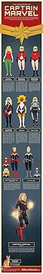
The Evolution of Captain Marvel infographic from HalloweenCostumes.com is a great example of using a popular trending topic that’s also relevant to your business as content marketing. The Captain Marvel movie releases this week, and the evolution of Captain Marvel’s costume is perfect content for an online retailer of costumes!
Carol Danvers debuted in the pages of Marvel Comics more than 50 years ago. In that time she has gained and lost fantastic superpowers and fought alongside many of the iconic superhero teams. She’s also been known as Ms. Marvel, Binary, Warbird, and Captain Marvel. Her upcoming solo film, Captain Marvel, marks her first appearance in the Marvel Cinematic Universe where she is one of the most powerful superheroes—if not the most powerful superhero. That’s because Captain Marvel has unbelievable strength, speed, and can fly. (Even in space!) Plus she can shoot energy from her hands and maybe even travel through time. So that’s pretty cool. How she got there is also pretty cool, so let’s look at how Carol Danvers evolved to become Captain Marvel!
Found on Infographic Journal


