
Randy Krum's Blog, page 63
September 3, 2013
The Racial Dot Map
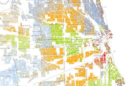
The Racial Dot Map visualizes the 2010 U.S. Census data, where every individual person is represented by a single, color-coded dot. The color coding shows the racial groupings gathered by the census.
This map is an American snapshot; it provides an accessible visualization of geographic distribution, population density, and racial diversity of the American people in every neighborhood in the entire country. The map displays 308,745,538 dots, one for each person residing in the United States at the location they were counted during the 2010 Census. Each dot is color-coded by the individual’s race and ethnicity. The map is presented in both black and white and full color versions.
The map was created by Dustin Cable, a demographic researcher at the University of Virginia’s Weldon Cooper Center for Public Service. Brandon Martin-Anderson from the MIT Media Lab deserves credit for the original inspiration for the project. This map builds on his work by adding the Census Bureau’s racial data, and by correcting for mapping errors.
Each of the 308 million dots are smaller than a pixel on your computer screen at most zoom levels. Therefore, the “smudges” you see at the national and regional levels are actually aggregations of many individual dots. The dots themselves are only resolvable at the city and neighborhood zoom levels.
Each dot on the map is also color-coded by race and ethnicity. Whites are coded as blue; African-Americans, green; Asians, red; Hispanics, orange; and all other racial categories are coded as brown.
The map is an interactive, zoomable map online of the entire country, and allows you to explore any U.S. locations. Chicago is show above.
Since the dots are smaller that screen resolutions where the viewer zooms out, the data is aggregated to pixels at each level of zoom. The Minneapolis-St. Paul metro area is highlighted on the site as an example of the aggregation. You can see the more detailed dot pattern on the right at the higher zoom level.
I would love to see this added as a layer in Google Earth! Wouldn’t that be cool?
Thanks to Renee for sending in the link! Also, found on Wired.
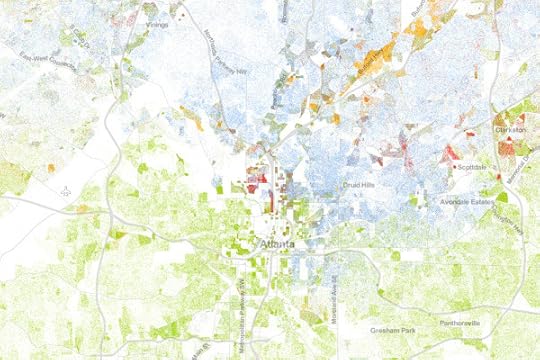
Atlanta:
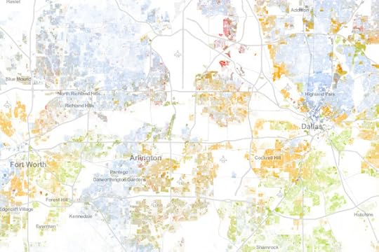
Dallas-Fort Worth:
The entire U.S.


August 30, 2013
Infographic Cookbook - Picture Cook

A new way to take directions for cooking, the Picture Cookbook infographic from Katie Shelly. It is an easy step by step visual explanation design that will get you to the desired tasty product, with very little use of words!
The following recipes are not intended as precise culinary blueprints. Instead they are meant to inspire experimentation, improvisation and play in the kitchen.

Great design work by Katie to create recipes as visual explanations. The hand-drawn style also helps reinforce the flexible methods. They aren’t strict, rigid recipes with sharp images and corners, but instead are more casual which allows for interpretation and change. I love the color-coding for easy navigation within the book too.


Found on Fast Company
Available soon for purchase in print in October 2013. I’ve already pre-ordered my copy.


August 29, 2013
Comic Tribute to Bill Watterson (Calvin & Hobbes)
Calvin & Hobbes is easily my all-time favorite comic, and Bill Watterson was able to beautifully offer thousands of life lessons through the 10 years of C&H comic strips. Freelance cartoonist Gavin Aung Than has designed this fantastic Comic Tribute to Bill Watterson, and posted it on his site, Zen Pencils.
The quote used in the comic is taken from a graduation speech Watterson gave at his alma mater, Kenyon College, in 1990. Brain Pickings has a nice article about it. The comic is basically the story of my life, except I’m a stay-at-home-dad to two dogs. My ex-boss even asked me if I wanted to return to my old job.
My style is already influenced by Watterson, but this is the first time I’ve intentionally tried to mimic his work. It’s been fun poring through Calvin and Hobbes strips the past week while working on this comic and it was a humbling reminder that I still have a long way to go.
The quotes I’ve used in the write-up above are taken from the introduction to The Complete Calvin and Hobbes collection, which sits proudly on my desk.
So, why am I posting this on Cool Infographics? I want to pose the question: Should we consider this to be an infographic?
There’s no numeric data. No charts. No data visualizations. No call to action.
However, there is information. The information source is Bill Watterson’s speech from 1990, and the illustrations do a great job of communicating the message visually. The image layout follows the tall infographic style that is easy to share online.
My own opinion is that “Yes” this is an infographic. What do you think?
Found on LifeHacker
 I miss Calvin & Hobbes…


Consumer Attitudes to SMS Marketing and Texts Alerts

The Consumer Attitudes to SMS Marketing and Texts Alerts infographic is the results of a survey done by Text Marketer. The survey was conducted to find out the consumers’ view on receiving text alerts from companies.
The infographic is based on an exclusive survey of over 1,350 consumers in to their attitudes to SMS marketing.
The results highlight that 84% of customers want to receive appointment reminders, 61% want order confirmations and 89% would like delivery notifications via text; showing there are a lot of ways to market through this channel that customers love.
48% of consumers are also likely to respond to a text from a company they have previously purchased from. Consumers love special offers by text and like to be able to ask questions to companies via text messages.
Since the data is from their own survey research, there are no additional data sources cited. The purpose of the first section is to establish the credibility of the data, but the total number of respondents alone isn’t enough. Surveys like this target specific consumers, and use screener questions to target a specific portion of the population. What type of consumers were surveyed for this report?
The visualizations of the data are clear, and the iPhone illustrations for the results of each question break apart the data nicely. It’s a little hard for readers to understand that the lineup of iPhones is meant to add up to the total of 100% of respondents for each question.
The footer should include a copyright notice, and the URL back to the original infographic landing page so readers can find the full-size version if a link is not available. A link to the source data would increase the credibility of the data too. Instead, the landing page has a link to the home page of Text Marketer as the data source link, which means public access to the numeric data is not available.
Thanks to Mike for sending in the link!


