
Randy Krum's Blog, page 57
December 9, 2013
Google’s 200 Ranking Factors

Google’s 200 Ranking Factors is a very detailed list of the known 200 aspects that Google considers in their ranking formulas. The overall length of the infographic is the major visual feature that catches your attention, and communicates a clear message about Google’s immensely complicated algorithm and how difficult SEO can be. The second level of of the design is the actual details about each and every one of those ranking factors that the audience can read if they want specific information.
Google has confirmed that they use approximately 200 ranking signals in their algorithm. However, they’ve never publicly listed them all. While this infographic is by no means official, it aggregates the best information we have about how Google ranks pages and websites.
The infographic was published on Entrepreneur.com, designed by Single Grain and based on information collected and published by Backlinko.
Found on Holy Kaw! and Search Engine Journal


December 6, 2013
29 Powerful Tools for a Social Media Marketer

A Productive Day in the Life of a Social Media Marketer from Razor Social is a great use of an infographic design within a larger content strategy online. The larger piece is an article that lists out all 29 tools, with links and descriptions, but infographic shows a character using all of the tools throughout the day. So the infographic grabs the attention of the audience and gets shared frequently, with links back to the full article.
The demands on us to market our products and services using social media is constantly increasing and the technology/tools required to support this is also increasing.
We start early morning and we finish late at night. How many of you check your Twitter or Facebook account last thing in the evening and first thing in the morning?
So we thought it would be a good idea to take a look at a very busy day in the life of a Social Media Marketer. During the day there are so many tools and tasks. If you work alone then we certainly wouldn’t expect you to do everything listed here or use all the tools we suggest, but if you are part of a team then you could share out the tasks and tools to make it easier.
A special thanks goes to Donna from Socially Sorted who is my go to person when I want anything visual done. Thanks Donna.
The infographic design does a good job of removing most of the text descriptions and just using icons and logos to represent the various tool. Interested readers can dig into the full article for more information.
The footer is missing the URL link back to landing page with the article. When people post infographics on blogs and social media sites, they aren’t always good about linking back to the original. By including the text URL in the infographic itself, you can make sure all of the readers can find the landing page.


December 4, 2013
50 Incredible Facts About Skin

Did you know that your skin is considered an organ? Or that every 28 days the skin renews itself? These fact and more can be found on the 50 Incredible Facts About Skin infographic brought to you by Beautyflash. You can learn general facts about the skin as well as what you need to keep healthy skin.
Good visuals, minimal text, interesting topic and data, clear sources. Good design all around. The footer should have included the URL link directly to the infographic landing page so readers could find the original full-size version.
Thanks to David for sending in the link!


December 3, 2013
Understanding Healthcare.gov’s Rocky Rollout

Understanding Healthcare.gov’s Rocky Rollout infographic from SEER by Galorath is a very tall infographic design that does a thorough job of examining the Healthcare.gov site rollout.
Galorath Inc. (the SEER Cost, Schedule, Risk Model Developers) watched the healthcare.gov rollout difficulties, the outcries and finger pointing and decided to take a more analytical look. While it is easy to throw stones at stakeholders, this was a huge IT project and there were bound to be challenges. Could it have gone better? Sure. Were there adequate resources? Seems so. Should testing and quality assurance been more rigorous? Yes, but there didn’t appear to be adequate time. Were the requirements firmed up in advance? That could have been a significant contributor.
Although longer than I usually like for infographic designs, this one tackles a fairly complicated topic and breaks it down nicely. The use of icons and minimal text make this design easy for readers to skim through, but read the details they are interested in.
Also available as a large, high-resolution PDF for download.
Thanks to Shell for sending in the link!


December 2, 2013
NFL Concussion Watch 2013
PBS Frontline has published the interactive data visualization, NFL Concussion Watch 2013 to summarize all of the player concussions reported in the NFL.
Every week in the National Football League, a player is sidelined by a head injury. In some cases, their symptoms are clearly visible and they exit the game. Other times, less obvious warning signs can mean a missed diagnosis and a return to the field. Either way, research indicates that the long-term health effects of such injuries — including memory loss, depression and even dementia — can pose problems for players long after retirement.
Concussion Watch is an effort to monitor the NFL’s response to the persistent risk of head injury in professional football. To do so, FRONTLINE will track which players are being removed from games after a hit to the head — and which players are not — and keep score of how long they are kept from the field following a concussion.
I really like the idea of this data visualization, but they messed up the visuals. The circle sizes are supposed to change relative to the values, but they’re not correct. The designer chose to make the circles for 1-3 too large in order to fit the numbers inside the circles, and 4-5 are larger but the same size. The choice of aesthetics over accuracy is a common mistake, and creates a false visual to the readers. It’s the wrong choice. Accuracy of the data visualization is more important than any other part of the design.
In visualizations, the design is supposed to visually compare values to create context and understand for the readers. Because some of these circles are larger than their actual values, this creates the impression that most of the football positions have similar risk, instead of clearly highlighting how less risky some positions truly are.
I do like the design layout that places the circles into their correct player positions. Readers can grasp this layout in a fraction of a second, and understand where the riskiest positions are.
Thanks to Melanie for sending in the link!


November 30, 2013
Cool Infographics 30% Off at Amazon This Weekend ONLY!

This weekend ONLY, Amazon is offering 30% Off any one print book, and you can use this deal to get Cool Infographics at the lowest price yet! The deal ends December 1st at 11:59pm PST. Use the promo code “BOOKDEAL“ at checkout under the “Gift cards & promotional codes” section.
You can read the details and Terms & Conditions here.
When I looked on Saturday, Amazon’s retail price was listed at $25.08 (it changes daily), and with this discount you could get Cool Infographics for only $17.56. That’s the lowest price I’ve seen anywhere!


November 29, 2013
Seven Myths of Email Marketing
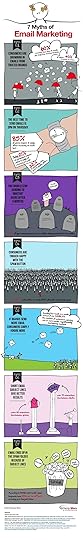
The Seven Myths of Email Marketing infographic from Alchemy Worx addresses many of the misconceptions about email marketing head on.
Many beliefs that email marketers hold true regarding email are simply false, according to research and analysis conducted by my email marketing agency, Alchemy Worx. We analyzed data sourced from our work with customers and industry figures to arrive at our conclusions.
Here are seven such email myths, which are also presented in an infographic at the end of this article.
Great information with fun illustrations that attract viewers. The statistics should be visualized though, instead of just shown in text. Big fonts are not data visualizations, and don’t make the data any easier to understand for the readers.
Footer has good information with full links to the sources, a clear copyright and the company logo. It’s only missing the URL link back to the infographic landing page so readers can find the orignal when people post it without a link back to the Alchemy Worx site.
Thanks to Christine for sending in the link!


November 27, 2013
Thanksgiving Table Setting Diagrams
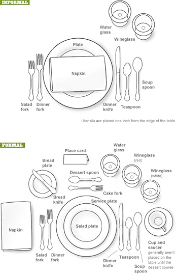
Just in case anyone needs a visual reminder when setting the Thanksgiving dinner table, the Table Setting Diagrams from Dinner-Party-Menu-Ideas.com make it super easy! More of a diagram than an infographic, it’s still a super-useful visual!
Found on lifehacker, Brunch at Saks, and Apartment Therapy
Here’s a more detailed and further designed Thanksgiving Etiquette Table Setting Guide infographic from Adirondack Authority:

Found on Fine Dining Lovers
Both of these designs have an excellent Online Lifespan. These designs are not new, they were originally published in years past. The information presented is long-lasting, and will be relevant to readers every year for many years to come.


November 26, 2013
Thanksgiving Timed Right
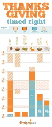
Thanksgiving Timed Right is a timeline infographic from allrecipes.com that helps everyone plan when to start cooking each dish for Thanksgiving dinner. You want everything to make it to the table at the same time right? I especially appreciate the Wine Breaks!
Great idea, and I know many, many people that struggle to figure this out on their own. As an infographic released on the web, it really needs to have the URL back to the original full-size version included in the footer. Many people are going to share this infographic with friends and family, but very few with correct link back to the Fresh Bites Blog where you can find the original.
The topic choice here is fantastic! This design will have an Online Lifespan of many years as people go looking for this information every November.
Also found posted on Scribd by StephanieRobinett


November 25, 2013
How NOT To Look Ugly on a Webcam
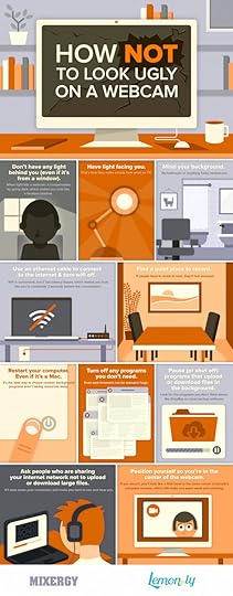
How NOT To Look Ugly on a Webcam from Mixergy and Lemon.ly lays out the top 10 tips for successfully using your webcam.
No matter who you are and how good you look, it’s pretty easy to look terrible on a webcam. We teamed up with our friends at Mixergy to showcase just how NOT to look bad on a webcam with this handy infographic. By just following a few of our easy webcam tips, you’ll look as good as you feel in your next webcam interview. What do you think? Have any other tricks to add?
Nice instructional how-to infographic. There’s no data visualized, just illustrations of the 10 tips. Quick and easy to read. This design also has a long Online Lifespan. The topic is so universal, the infographic will be relevant for years!
The footer should include the text URL link to the infographic landing page on either Mixergy or Lemon.ly so when readers see smaller thumbnail versions posted on Facebook, Pinterest, Twitter, Google+ or blogs without a link, they can still find the original full-size version!
Thanks to @jasongaloob on Twitter for the link!
Cool one here.. @CoolInfographic @rtkrum Big fan of the group that put this out thought you should see it = ) http://t.co/MVmn37DqyB
— jason galoob (@jasongaloob) November 24, 2013
And Guy Kawasaki on Facebook:
Post by Guy Kawasaki.


