
Randy Krum's Blog, page 55
February 4, 2014
Live Events in Washington DC and Florida
If you’re located near Washington, DC or Fort Lauderdale, FL, I’ll be there next week! I have a packed schedule of both public and private events, so check your schedule and join me if you can! I’ll be presenting about data visualization and infographics, and signing books. I look forward to meeting you!
Washington DC
Monday, Feb 10th, 3:00pm CBO (Congressional Budget Office) - private event and book signing
Tuesday, Feb 11th, 12:00pm, Noblis Tech Tuesday - private event and book signing
Tuesday, Feb 11th, 6:30pm, Data Visualization DC Meetup group - PUBLIC presentation, book signing and data drinks!
Register here: http://www.meetup.com/Data-Visualization-DC/events/164211042/
Wednesday, Feb 12th, Greater Washington Board of Trade Morning Star Speaker Series - PUBLIC event
* Discount for Cool Infographics readers - use the code “Cool*Infographics” at checkout to get the member price even if you’re a non-member ($25 discount)!
** No book sales allowed in the Ronald Reagan Building, so you must purchase a book beforehand if you would like me to sign it at the event. You will be offered the chance to buy a book during online registration.
Register here: http://www.bot.org/events/programs/morning-star-speaker-series/randy-krum.aspx
Miami, FL
Thursday, Feb 13th, 11:00am, University of Miami - Guest Lecturer in Alberto Cairo’s Visual Journalism Infographics class
Fort Lauderdale, FL
Thursday, Feb 13th, 6:30pm, sfim@ (South Florida Interactive Marketing Association) - PUBLIC event and networking
Register here: http://www.sfima.com/EventDetail.aspx?id=872
You can always find my current list of upcoming events on the Appearances page!


February 3, 2014
The Beautiful Flow of Pi

Flow Of Life Flow Of Pi. Cristian Ilies Vasile designed this visualization of the first 1,000 digits of the mathematical constant pi using Circos to plot the sequence of digits…in a circular pattern of course!. You can buy a print copy of the poster for $22 from Fine Art America. Cristian has create a few different varieties of the artwork that you can see on his page.
Starting with the first digit “3”, a connecting arc is drawn to each subsequent digit (3.14159265358979323846…). Since the sequence is theorized to be a random sequence, it creates a beautiful visualization that appears evenly distributed among the digits. Check out this explanation by Martin Krzywinski along with some of his own artwork. He demostrates the sequence with this visualization of just the first five digits 3.14159…
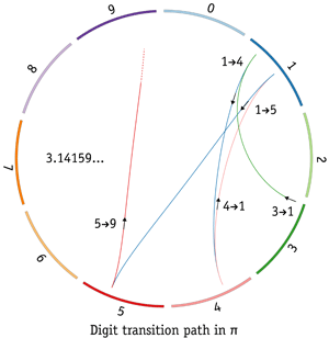
I had not heard of Circos before, so I have now added a link to it on the Cool Infographics Tools page.
Thanks to Matt Baker for posting on Google+


January 30, 2014
Cool Infographics: Best Practices Group on LinkedIn
I am excited to announce the launch of a new LinkedIn Group, Cool Infographics: Best Practices. I have personally been a part of many great discussion groups over the years and believe that this group fills an unmet need. Please accept this invitation to join the group to share your own experiences and wisdom.
There are many groups that share infographics, but I felt that a discussion group dedicated to the craft of infographics and data visualization was missing. This group will feature questions and case studies about how companies are leveraging infographics and data visualization as a communication tool. Any posts that are just links to infographics will be moderated to keep the focus on engaging discussions. Topics and questions from the Cool Infographics book will also be discussed.
Join us in a professional dialogue surrounding case studies and strategies for designing infographics and using them as a part of an overall marketing strategy. We welcome both beginning and established professionals to share valuable tactics and experiences as well as fans of infographics to learn more about this growing field.
-Randy


January 28, 2014
2013 Airline Scorecard Best to Worst

Traveling by airplane can be a stressful situation. Choosing the correct airline can make all the difference. Check out how your favorite airline scores on the 2013 Airline Scorecard; Ranking of Major Carriers in Key Operational Areas, Best to Worst infographic and article from The Wall Street Journal.
In the Middle Seat’s annual scorecard of airline service, tracking seven different key measures of airline performance, Alaska Airlines performed best in 2013 among major carriers. At the top with Alaska was Delta, which for the past two years has posted far better operational results than big competitors. Worst among big airlines? United Airlines and American Airlines, again.
By assigning each airline a specific color, it allows the viewer to clearly distinguish each airline throughout the scorecard. The lines connecting the columns also gives the whole graphic a sense of connectivity and flow, causing the eye to follow each airline.
Even though this visualization is part of a larger article, they did a good job of including the relevant information in the image file itself. This is a big help when the scorecard image gets shared online. It has a clear title, data sources and credit to the WSJ. The URL back to the article would be very helpful, but they didn’t include that in the image.
Found on http://ilovecharts.tumblr.com


January 24, 2014
Famous Movie Quotes as Charts - the Poster
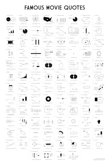
Dr. Nathan Yau, PhD from FlowingData.com has charted the 100 most memorable quotes from American movies, as selected by the American Film Institute, into a data visualization series called Famous Movie Quotes as Charts. He had designed the first handful of them a few years ago, but only recently got back into the project and completed all 100.
These have now been compiled into a beautiful 24”x36” poster available for a limited time before the one-and-ONLY print run for $19.00. Pre-order your copy this week here!
This 24” by 36” poster is printed on 80lb cover with a matte finish, each signed and hand-numbered.
There’s only going to be one printing, so take advantage of the special pre-order price while it lasts.
Shipping February 2014.
Each chart is a clear visualization of the movie quote, and easy for the audience to understand. They are beautiful in their simplicity and can be very funny in their interpretation.
Here’s a link to the big version for all of the detail.


January 17, 2014
Where in the World are the Best Schools and the Happiest Kids?
The best test scores don’t always mean the happiest kids at school. The Best Schools and the Happiest Kids visualizes the results from a worldwide survey of over 500,000 15-year-olds globally.
The Organisation for Economic Co-operation and Development’s triennial international survey compared test scores from 65 countries. Happiness was ranked based on the percentage of students who agreed or disagreed with the statement “I feel happy at school.” Test scores were ranked based on the combined individual rankings of the students’ math, reading, and science scores.
I can’t tell for sure, but it appears that Jake Levy, Data Analyst at BuzzFeed created this data visualization based on the data from OECD survey results. Infographics like these often get shared without the rest of the article, so it’s important to include all of the necessary framing information in the graphics itself. Title, descriptive text, sources, URL, publishing company, copyright, etc.
Thanks to Ron Krate on Google+ for posting


January 15, 2014
Timeline of the Far Future

What’s the future of the human race and our beloved planet Earth? The Timeline of the Far Future from the BBC plots out predicted events for the next 1,000, 1,000,000 and up to 100 Quintillion years into the future!
As it is the beginning of the year we at BBC Future think it’s the perfect time to look ahead.
First, we brought you a prediction of the forthcoming year. Then we brought you a timeline of the near future, revealing what could happen up to around 100 years time. But here’s our most ambitious set of predictions yet – from what could happen in one thousand years time to one hundred quintillion years (that’s 100,000,000,000,000,000,000 years). As the song says, there may be trouble ahead…
They had to use an exponential scale, so each inflection point represents a jump in the timeline scale by a factor of 10. The icons are small, and some are hard to figure out. They had enough space they could have made those larger. The circles are also sized by the magnitude of each event, but these seem to be arbitrary.
It’s worth noting one of the sources in the footer lists Out of Thin Air as a source. This not a claim that they made up the information. It’s actually a book titled Out of Thin Air that some of the information was pulled from. I had to look it up, but it’s a valid reference.
Nice to know that MacBook will still be around for 100,000 years! Definitely looks like we’re in for a rocky ride though…
Thanks to Digital Information World post on Google+


January 14, 2014
Information Destruction Through History

Information Destruction Through History from Global Data Vault explores and quantifies the worst data disasters in history.
Information the most valuable commodity in the world. All human progress depends on the accumulation and preservation of information. When information is lost, human progress suffers. This infographic displays some of the most significant loses of information human civilization has suffered.
The circular timeline shows the data disaster events in chronological order, while also connecting to their geographic locations. The triangles are proportionally sized so readers can visually compare the modern data equivalents between the events. This really helps put the disasters into perspective for the audience.
A great infographic design that tells one story really well, but there are a few things I would recommend to improve the design:
I wouldn’t have any of the triangles run off the page, because the audience will lose perspective on how disastrous those specific events were. Show the full impact of those events to the readers.
Add the URL directly to the infographic landing page so readers can find the original full-size version when people don’t link back correctly
I wouldn’t list Wikipedia as a data source if possible. Track the Wikipedia references back to the original data source to include in the list.
Thanks to Joe for sending in the link!


January 13, 2014
What Does the Colour of Your Car Say About You?

If you think picking a car color was hard before, this infographic could make your decision easier or even harder. The What Does the Colour of Your Car Say About You? infographic published by Motor Click gives meaning to your choice in car color.
The wide variety of colors available has some questioning whether consumers make their selection based on simple preference, or whether or not the color of their vehicle somehow reflects their psychology. Whatever the reason, it cannot be denied that color plays a huge role in sales.
This is a good infographic design that takes information from the following text-only article and makes it visual: The Psychology Behind the Color of Your Car. This design tells one story really well, and only takes a few seconds for the reader to understand. Designed by Attwood Digital.
A couple issues with this design. Obviously from a car company in the UK, the spelling of color/colour is oddly mixed throughout the design. Also the data is a little bit questionable. The article referenced isn’t the original source of information, and that article includes claims and quotes from additional sources. Definitely take this information with a grain of salt. There may be underlying credibility issues.
The footer should include the URL link back to the infographic landing page so the audience can find the original full-size version when they come across it shared on other sites. For example, it’s had over 5,000 views on the Visual.ly site so far, but that submission does not link back to the original on the MotorClick site. So, all of that good traffic to view the infographic is not benefitting the original publisher at all.
Found on Visual.ly


January 9, 2014
Great Danger for the Great White Shark

Most people know of Great White Sharks as a dominant predator, but this powerful shark is actually nearing extinction. The Great Danger for the Great White Shark infographic from Shark Watch SA breaks down the statistics for the few remaining sharks.
The general perception is that the great white shark population is between 3000-5000. Marine biologists conducted a five year study in Gansbaai (a small town in South Africa with the greatest population of great white sharks in the world) that revealed the population to be approximately 50% of the original estimate. This means great white sharks could be closer to extinction than black rhinos…
The data could of been visualized a little better. The infographic uses a little too much text insead of visuals to portray their data. But overall, an eye-catching graphic.
Thanks to Marine Dynamics for sending in the link!


