
Randy Krum's Blog, page 62
September 25, 2013
Your One Month Guide To Beating Clutter

Clutter is everywhere. No matter what we seem to do, it just accumulates. Your One Month Guide To Beating Clutter infographic from Terrys Fabrics gives some helpful hints with a flowchart on how to decide what can be saved vs. tossed. There are also some specific tips based on areas of your home to help minimize clutter.
De-cluttering can sometimes be overwhelming. A room-by-room approach can make the process more manageable. By starting small and keeping up good habits, you can soon work your way towards clutterless bliss.
Thanks to Meilen for sending in the link!


September 23, 2013
The Ecosystem of Linkedin

LinkedIn has reached over 200 million members worldwide, making it the world’s largest professional network. The Ecosystem of LinkedIn infographic from Dynamic Search explains why LinkedIn is a must have tool for everyone.
The Ecosystem of LinkedIn includes how LinkedIn works and what you should really know. What’s the difference between endorsement and recommendation? What about job search, personal or company profile, groups and connections? Below is the infographic that will simplify LinkedIn for you. Are you an employee or business owner? If so, you should have a profile on LinkedIn. Enjoy.
This design does a good job of using illustrations and diagrams to add a visual element to abstract concepts like connections and recommendations. The text descriptions could have been simplified even further to remove more text from the design.
The footer should have included a copyright or Creative Commons license, and the URL link back to the landing page so readers could find the original, full-size version.
Thanks to Nicole for sending in the link!


September 19, 2013
A Visual Guide to What Colors Communicate

When you are designing your blog or website, how do you decide what colors to use? Your choice will make a difference on how others receive and interpret your content. Dustin Stout from dustn.tv has created Color Sets the Tone: A Visual Guide to What Colors Communicate infographic to educate website builders and bloggers on how to communicate to their readers with color.
Did you know that colors communicate? The use of color in your blog design can be an essential part of how your personal brand is perceived. Color usage can either make or break your blog design, and I will show you how to choose your colors wisely by understanding what they communicate.
When new visitors land on your blog, the first things they interpret are colors. Before they read a single character, their brain is registering colors which are subconsciously (or consciously) tied to emotions, states of mind, or [preconceived ideas]. If you do a poor job at putting together the colors in your blog design, it can be detrimental to the growth of your brand.
I’ve come up with an essential guide to what colors communicate, as well as a quick infographic to reference that is free to download!
Simple design that tells one story really well. Quick and easy for readers to digest, and the text associated with each color is really short. Less text is better for infographics.
The footer should include the URL back to the landing page to make it easier for readers to find the full-size original version.
Found on http://dustn.tv/what-colors-communicate/


September 16, 2013
Introducing Cool Infographics, the book

Today I’m excited to introduce my new book, Cool Infographics: Effective Communication with Data Visualization and Design! This project has taken up an enormous portion of my time over the last 12 months and will be available at the end of October 2013 from all major booksellers (print and ebook).
This book is written for anyone that wants to learn how to use infographics and data visualizations more effectively. Whether you design your own or work with a designer, the tactics and tips included will help you create better infographics and effectively publish them online. Using over 100 visual examples from designers all over the world, I explain how companies are successfully using infographics every day. It is an accumulation of knowledge and experience from designing infographics and running the Cool Infographics blog over the last seven years.
Seven major areas are covered in depth:
The Science of Infographics: Why do infographics work? Humans are visual creatures. Any information that we can communicate visually will get more attention, is easier to understand and is more likely to be remembered. Infographics tell stories with data using a combination of data visualizations, images, illustrations and text. Used effectively, infographics can be one of the most powerful forms of communication.
Online Infographics: The use of infographics online has grown exponentially in the last few years. Why are infographics so popular as online content and how are infographics being used successfully by companies? Are you trying to build your brand equity, drive traffic to your website or explain product features to your customers? Different goals require different types of infographics, so make sure you know how to plan your infographics for success.
Infographics and SEO: Why do some infographic go viral and others flop? Infographics and Search Engine Optimization (SEO) go hand in hand, but you have put some effort into releasing an infographic. Issues like keywords, embed code, online lifespan, meta data and landing pages all have an impact on the success of your infographic online. A complete infographic release strategy is outlined that covers the entire process from releasing the infographic to getting posts and links from other sites.
Infographic Resumes: The use of data visualization design to improve job candidate resumes is still new, but is growing rapidly. Good infographic resumes combine the best practices from traditional resume design and viral online infographics. Learn to design a cool infographic resume of your own.
Internal Confidential Infographics: There’s a secret world of data visualizations and infographics being used inside companies using confidential data. Unlike online infographics, these internal designs are often included in presentations or shared as printed handouts. Take the best parts of online infographics, and adapt them for your own use in presentations.
Designing Infographics: Will your infographic pass the 5-second rule? This chapter will help you design great infographics with clear data visualizations, transparent data sources and engaging topics. We look at some best design practices as well as some common mistakes to avoid.
Design Resources: Ready to get started? Designing infographics is a combination of visualizing data, creating custom illustrations, editing images and putting together the complete design. I’ve gathered together the major tools used by infographic designers to help you find the right software for your project. I’ve even included a number of sources for finding data and websites that can be used to design complete infographics.
Pre-order now to get your copy as soon as it’s released!


September 12, 2013
Slather on the Sunscreen: What You Should Know About Skin Cancer

After this infographic, you’ll never think the same of tanning. Slather on the Sunscreen: What You Should Know About Skin Cancer infographic from fourpointsdermatology.com starts with comparing skin cancer to the other types of cancers, educates you on what the symptoms are to look for, then points out the causes of skin cancer, and finally the possible treatments.
“Slather On That Sunscreen: What You Should Know About Skin Cancer” exposes the most commonly diagnosed type of cancer, explaining the three main types of skin cancer and revealing characteristics and statistics for each. Visually explained in the graphic are the symptoms, causes, prevention, and treatment options for skin cancer. With “Slather on That Sunscreen: What You Should Know About Skin Cancer”, Four Points Dermatology is educating viewers that skin cancer prevention can be nearly effortless, and knowing what signs to look for can be life-saving.
Skin cancer incidence has increased 300% since 1994, and shows no sign of slowing down. This infographic was created to educate and encourage people to seek treatment quickly if suspecting of a skin cancer growth. By creating awareness of what symptoms people should be looking for, Four Points Dermatology hopes that the steadily increasing number in cases of skin cancer can be minimized.
Great visuals. Everything from what the symptoms look like, to the causes and preventions are illustrated in a very comprehensible way.
The pie charts with slices that each have a different radius is pretty, but creates a false visualization that doesn’t match the data. Readers see the area of objects when comparing them, and changing the radius, changes the area of each pie slice. By reducing the radius of the smaller values, the area is actually reduced much lower than the actual values.
Thanks to Ramsay for sending in the link!


September 11, 2013
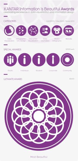
Information is Beautiful Awards Deadline Friday Sep 13th
The deadline for submitting design entries to the Information is Beautiful Awards is this Friday, September 13th. Anyone can enter and the available categories are:
Data journalism
Data visualization
Infographic/information design
Interactive visualization
Motion infographic
Website
The Kantar Information is Beautiful Awards celebrate excellence and beauty in data visualizations, infographics and information art.
Last year we awarded 26 prizes across 6 categories and 8 special awards with entries from more than 20 different countries. The standard was exceptionally high and we really appreciate the effort people put into entering the awards.
The Awards were set up in 2012 by David McCandless, journalist and datavisualizer, in collaboration with Aziz Kami, Creative Director, Kantar.
The Awards are non-profit and community-driven – that means you don’t need to shell out a big wedge of cash to enter your work, and if you’re successful, you won’t need to shell out again for a fancy sit down dinner awards night.


September 10, 2013
Our World Ski Calendar – Seasonal Ski Resorts around the World

Avid Skier? Want to know where to go at anytime during the year? Our World Ski Calendar – Seasonal Ski Resorts around the World infographic from Monarch has all the financial and event information that you need to know to plan a ski trip during any month out of the year!
To celebrate our new ski flights we produced a world ski calendar so you can ski all year round across the world. For each destination we have provided some interesting stats plus individual piste information. Let us know your favourite ski destination by commenting below!
Thanks to Sam for sending in the link!


September 6, 2013
Visualizing the Microsoft-Nokia Deal
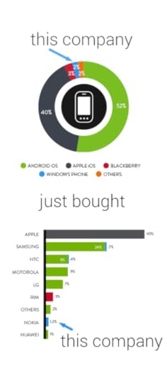
Good data visualization uses visuals to put data into context for the readers, making the information easier to understand. This simple infographic takes a couple charts previously published by Nielsen, and uses them to provide context to the news story of Microsoft acquiring Nokia’s handset devices unit for $7.2 Billion.
Combining data visualization with text and images should make the information easier and faster to understand, and this design does a great job.
Designer unknown. Thanks to Mike Elgan for posting on Google+ and Luke Millar (@ltm) for posting on Twitter.


September 5, 2013
The Monstrous Cost of Work Failure
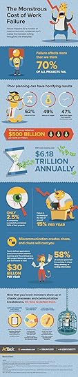
The Monstrous Cost of Work Failure infographic from AtTask looks closely at the cost of failure within companies. How many at-bat attempts does your company take before hitting a homerun?
Projects fail, budgets blow up, fire drills reign and chaos abounds
Work failure plagues all types of teams – from marketers working on a campaign to IT teams deploying a major software system. The root of the problem – impacting 70% of teams – is work chaos. And it can be conquered. Click on the image below to view or download the full graphic and learn more about work failure and how to avoid it.
Fun design with monster characters to help tell the story to readers. The design does a good job telling a 3-part story to the audience:
Introduction - What is the problem?
The Main Event - How big is the impact? How can this effect me?
Call To Action - How do I fix the problem?
Big fonts are not data visualizations, and in this design I would liked to see more of the statistics visualized. Visualization would help put the data into context for the audience. The footer of the design should also include the copyright information and the URL to the original infographic landing page so readers can see the full-size infographic.
Thanks to Matt for sending in the link!


September 4, 2013
The Guide to Star Trek Uniforms

The Gude to Star Trek Uniforms infographic from Costume Supercenter. Make sure you know what uniform your wearing!
When the original Star Trek television series started, male and female officers wore similar outfits. The male Star Trek uniforms consisted of black pants, black boots and a velour shirt with the symbol on the left side. Females wore the same type of shirt, with black boots and tights, and a black skirt, although in some cases they wore black pants. The color of shirt worn identified the branch the crew member belonged to. Those in green shirts worked for command personnel, while beige stood for operations, and blue was for medical personnel only. The velour shirts were changed to nylon shirts starting in the third season. You can find many of the Star Trek Costumes here.
Don’t be the red-shirted ensign!
The footer of the design should include the copyright information and the URL to the original infographic landing page so readers can see the full-size infographic. The Costume Supercenter logo should also be somewhere on the design to connect the infographic to the publishing company.
Found on Visual.ly


