
Randy Krum's Blog, page 58
November 25, 2013
Get Your Head Around Migraines

Migraines are not fun. Not fun at all! Learn how to combat them with tips from the Get Your Head Around Migraines infographic from Napiers.
Migraines impact an estimated 1 in 7 people across the UK and in total about 610,000 suffer from them chronically. Women are more than twice as likely to be affected as men with 18% of all women affected and 8% of men. Symptoms of migraines include visual disturbances to the eyes, intense and throbbing pain on one or both sides of the head, nausea and vomiting, sensitivity to noise, sensitivity to smells and tingling, pins and needles, weakness and/or numbness in limbs.
Migraines are undiagnosed and untreated in at least 50% of patients and less than 50% of migraine sufferers seek medical help. The headaches can be so serve that the World Health Organisation classifies chronic migraines as more disabling than blindness, paraplegia, angina or rheumatoid arthritis but migraines remain the least publically funded of all neurological illnesses when adjusted for economic impact. Severe headaches also leave sufferers at three time’s greater risk of depression than non-sufferers.
This is a long form design, with a lot of detail. Not intended to be digested and understood in only a few seconds, this infographic is meant to be an ongoing information resource. The statistics should have been visualized to make them easier for the readers to understand.
Thanks to Napiers for sending in the link!


November 22, 2013
EFF Encrypt The Web Report

The EFF recently released their Encrypt The Web report and included the cool infographic above.
We’ve asked the companies in our Who Has Your Back Program what they are doing to bolster encryption in light of the NSA’s unlawful surveillance of your communications. We’re pleased to see that four companies—Dropbox, Google, SpiderOak and Sonic.net—are implementing five out of five of our best practices for encryption. In addition, we appreciate that Yahoo! just announced several measures it plans to take to increase encryption, including the very critical encryption of data center links, and that Twitter has confirmed that it has encryption of data center links in progress. See the infographic.
By adopting these practices, described below, these service providers have taken a critical step towards protecting their users from warrantless seizure of their information off of fiber-optic cables. By enabling encryption across their networks, service providers can make backdoor surveillance more challenging, requiring the government to go to courts and use legal process. While Lavabit’s travails have shown how difficult that can be for service providers, at least there was the opportunity to fight back in court.
While not every company in our survey has implemented every recommendation, each step taken helps, and we appreciate those who have worked to strengthen their security. We hope that every online service provider adopts these best practices and continues to work to protect their networks and their users.
Crypto Survey Results
UPDATE, November 20, 2013: Facebook and Tumblr have provided further information to supplement the Encrypt the Web Report. We’re pleased to report that Tumblr is planning to upgrade its web connections to HTTPS this year and implement HSTS by 2014, and Facebook is working on encrypting data center links and implementing STARTTLS.
Great visual table array design that uses the company logos instead of text to make it easier for readers. The color-coding in each cell is also super-easy for readers to follow. It only takes seconds to skim through the design. The data is clearly communicated to the audience!
However, as an infographic released on the web, it’s missing a number of key features.
No title. The infographic image will be shared on other sites, so the image file itself needs to have a title and a short introduction to what readers are seeing.
No date. This information will obviously change over time, and they have already added the update you see in the text above. This infographic should clearly state that this information is current as of 11/20/13 so they can make future updates.
No logo. Someone seeing this infographic posted anywhere else would have no idea that it comes from the EFF. The EFF brand has a lot of positive equity and the infographic would be more believable if readers know if comes from the EFF
No copyright. The EFF would probably release this under Creative Commons, but that needs to be explicitly stated in the infographic itself.
No original URL. The URL link to the original landing page on the EFF site should be included in the footer of the design so readers can find the original full-size version when they see smaller thumbnails posted on other sites.
Thanks to Mervik Haums for posting it on Google+!


November 21, 2013
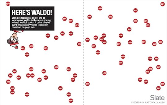
Finding Waldo by Visualizing Patterns
 Graphic by Slate. Illustration by Martin Handford published by Candlewick Press.
Here’s Waldo is a great analysis and article by Ben Blatt on Slate.com about trying to determine a strategy for finding Waldo by visualizing patterns from the Where’s Waldo series of books.
In Chapter 1: The Science of Infographics of my new book, Cool Infographics, I cover that our ability to see patterns is a huge factor in why data visualizations and infographics are so effective. Humans can see patterns and recognize differences where computers can’t. You can read about this topic and more in the Free Sample Chapter available for download.
Illustrator Martin Handford published the first in his beloved series of Where’s Waldo books over 25 years ago.* The books challenge readers to find the titular cartoon man, clad in his trusty red-striped shirt and red-striped hat, as he hides in a landscape of red-striped red herrings. When attempting to find Waldo you can scan the page completely from top to bottom, or you can focus your search around certain landmarks where Waldo seems likely to be hiding (in a castle’s moat, riding a blimp). Neither approach is particularly efficient. Which got me to wondering: What if there’s a better way?
I sought to answer these questions the way any mathematician who has no qualms about appearing ridiculous in public would: I sat in a Barnes & Noble for three hours flipping through all seven Where’s Waldo books with a tape measure.
The map born of my experiment is below.
It may not be immediately clear from looking at this map, but my hunch that there’s a better way to hunt was right. There isn’t one corner of the page where Waldo is always hiding; readers would have already noticed if his patterns were so obvious. What we do see, as highlighted in the map below, is that 53 percent of the time Waldo is hiding within one of two 1.5-inch tall bands, one starting three inches from the bottom of the page and another one starting seven inches from the bottom, stretching across the spread.
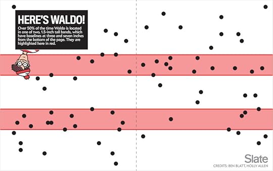
Check out the complete story on Slate.com
Found thanks to a post by Mike Elgan on Google+!


November 20, 2013
The Online Shopping Cart Experience

Online shopping is a convenience that a lot of people take advantage of. But the convenience varies. The Shopping Cart Experience infographic from checkoutoptimization.com finds the optimal situation to make customers happy.
Over the course of the last few years, I have been in and out of the details of conversion rate optimization. My career at a digital marketing agency affords me the privilege of working with some of the top brands in the world. I am equally lucky to know some great entrepreneurs with very small businesses. Among the fascinating things that I get to see every day and across the spectrum is how much of an impact a small improvement at the checkout makes.
Simply, more sales equals more sales. Given finite resources to optimize a thousand different things, I’m awestruck that the shopping cart is not a greater focus. And as sites have changed in incredible ways over the last few years, shopping carts remain unchanged.
In 2009 I thought about this issue and started researching attributes across a number of shopping carts. It was a story of small diversity and great uniformity. I started writing a book on the subject, but I shifted focus to double down and grow a separate business. (Which has been extremely rewarding and I now get to work with a growing group of talented, bright, extremely funny people that are accomplishing amazing things for the world’s coolest brands, but that’s another story.) A couple of months ago, I came back to the idea of checkout optimization, and thought it would be really interesting to compare my 2009 research to the current state of things.
And that’s how this infographic came to be. My hope is that this is useful to anyone curious about shopping cart design patterns, or perhaps someone looking for a standard to measure up against. Let me know what you think, and you want more like this, you can sign up here.
Nice overview of the differences sites choose when setting up checkout pages on e-commerce sites. Some of the subtle visualizations work very well, like the multiple pages shown behind the numbers in the User Friendly section. However, some values aren’t visualized at all, like the percentages for the different merchant features.
The infographic landing page explicitly asks people to repost the infographic with links back to the original page, but sadly, most people don’t do that. The landing page URL should be included in the infographic image itself so readers can find the original when bloggers don’t include the link.
Thanks to Nicholas for sending in the link!


November 18, 2013
17 LinkedIn Profile Must-Haves
17 LinkedIn Profile Must-Haves is a how-to infographic that walks the reader through optimizing their LinkedIn profile page. Published by MarketMeSuite working with Maximize Social Business.com’s Neal Schaffer.
This year has been a big one for LinkedIn. With new features like the Creative Portfolio Display, you now have the ability to visually showcase your professional portfolio. But before diving any deeper with the latest add-ons, does your LinkedIn profile have all the elements that will help you rise to the top? This new infographic has all the tips you need to elevate your LinkedIn profile: 17 LinkedIn Profile Must-Haves! Everyone can use great tips, so please share the LinkedIn love!
Great design using a mock LinkedIn profile as the background. The callouts are clearly connected to the appropriate areas on the profile. There’s a lot of text, but in this case I think most of it is necessary to clearly explain each point. The reader can work off of this infographic without any additional research on other sites.
The statistics at the bottom should have been better visualized. Mixing the 50.5% stat with the profile complete percentage visual from LinkedIn is confusing. Also, it was difficult for me to find the original infographic landing page. The footer should have the URL for readers to find the full-size original version of the infographic. The source list text is too small to read too.
Thanks to Martin Mosler for post on Google+!


November 15, 2013
Two Years Without Steve Jobs: Has Apple Crumbled?

Has Apple Crumbled? is an infographic from WhoIsHostingThis.com that takes a close look at the business and financial results of the last couple of years under Tim Cook’s leadership.
With the passing of Steve Jobs in 2011, many tech industry experts were quick to predict that his company, Apple, Inc., would soon falter without its charismatic founder at the helm. Yet in the years since Jobs’ successor, Tim Cook, has taken the wheel, Apple has not only continued on, but flourished.
The design starts off well, but gets lazy towards the bottom with a number of statistics shown in text only, and not visualized. Readers will perceive these values as less important and visually skim right over them. With a mix of visualized data and text only data, the text only values are perceived as secondary information and often ignored.
I really like the character illustrations. They are minimal, but still easily recognizable. The same goes for the product icons. Minimal but easily recognizable.
The footer does a good job with sources and the company logo, but should have also included the URL link back to the original infographic landing page so readers can find the full-size original version.
Found on MacTrast.com


November 13, 2013
How to Setup Google Authorship in 6 Minutes

How to Setup Google Authorship in 6 Minutes is simple, clear, focused design from Brafton.
Google Authorship helps brand publishers personalize the custom content they post to their websites. Studies show that including an author’s byline and headshot in search engine results pages (SERPs) increases clicks and may eventually improve PageRank.
Brafton’s “Content marketing, meet Authorship” resource outlines everything a savvy marketer must know to benefit from Google technology, and our accompanying infographic makes it even easier to setup Authorship on a given site. (Our downloadable resource includes a print-friendly version of this graphic!) Follow these six steps (in about six minutes) to be on your way to publishing online content using Google Authorship. Don’t forget to read our related blog: Why It’s Time to Embrace Authorship, and download our free resource.
This infographic design keeps it simple for readers by telling one short story really well.
Knowing that the PNG image file of the infographic will be shared on other sites, the design should have included the Brafton logo, a copyright statement, and the URL for readers to follow to find the original, full-size version of the infographic. Not all bloggers are good about linking back to the original landing page.


November 12, 2013
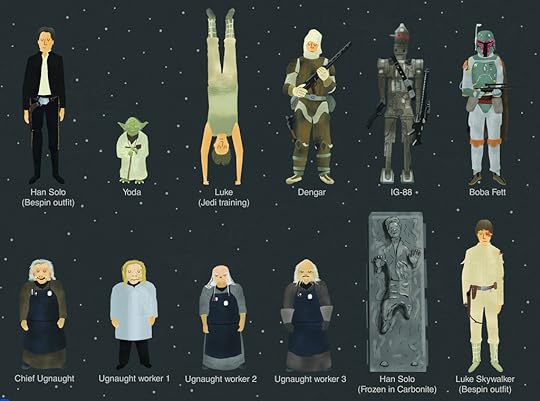
Star Wars Episodes IV-VI Character Poster
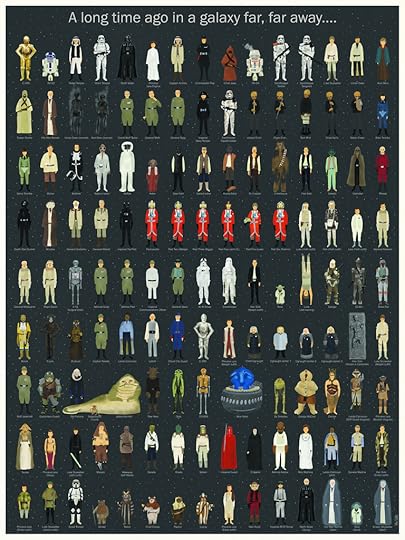
The Star Wars Episodes IV-VI Character Poster from designer Wes Anderson is a fantastic visual tribute to the Star Wars series. The limited run of 500 printed posters sold out in a few days on Spoke Art, but everyone can still admire the design online.
In 1978 my father took me as an excuse to go see that movie about silly robots and spaceships that everybody was talking about. I didn’t get much at that time, since I was very young, but what I do remember well is how much I enjoyed beginning my first geeky action figures collection that came right after the movie. My first figure ever was Luke Skywalker, a figure that got lost over the years. I’m still looking for it on my parent’s attic. Where are you Luke Skywalker?
With the time I became a fan, of course. As homage to that great moment of my life, here’s a new poster featuring (almost) every character of the first Star Wars trilogy in order of appearance. It is of course limited and numbered. If you want a copy, this link will take you to Spoke Art Gallery’s online shop where you can easily order one and receive it at your front door. We gave the mailmen specific orders to be dressed as Storm troopers during delivery, but they didn’t take it so well, so they probably won’t.
Found on Nerd Approved, Technabob, and the Fire Wire blog


November 8, 2013
Apple Release Patterns

Apple Release Patterns is a new personal project of mine, and you can find the full-size original versions on a new, dedicated landing page on the InfoNewt.com site. Every few months Apple releases a new product update or redesign, and the rumors start flying about what the upcoming product will be during the preceding weeks. For better or worse, those speculations are often based on what was released in the same timeframe the prior year.
This data visualization lines up vertical columns for each year, starting with 2007. I decided that anything further back wasn’t really relevant to Apple’s current practices. Each product release is then mapped onto the calendar, showing a pattern (or lack of pattern) to the product releases. If the product announcement was separate from the actual release date, I mapped that date as well.
This data was ripe for a visualization. When I tried to look at the historical dates of product releases, the information was scattered across multiple sites, confusing and difficult to gather. Some information was contradictory, which required further investigation. So, the data topic itself was a good target for a clear, easy-to-understand visualization. However, the design with all of the products was too complicated visually to perceive any defining patterns. So, I created separate versions that break out the products into 3 categories, and those are much easier for readers to see the patterns.
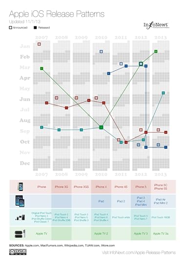
For iOS devices (iPod, iPad, iPhone and AppleTV) you can see the pattern shift in 2011 for most of the products to a Fall timeframe. You can also see a recently consistent announcement date with the product release the following Friday.
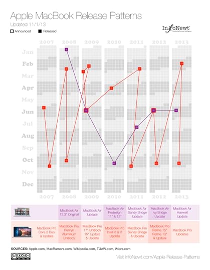
For Apple’s laptop line, the MacBooks, you can see the MacBook Air has become a regular release during the Worldwide Developers Conference (WWDC) in June, and the MacBook Pro gets fairly regular updates twice a year, usually just to update the internal specifications.
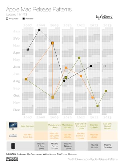
The desktop Mac line doesn’t seem to show much pattern at all. They might get an update each year, but the timing is erratic. Sometimes they are part of WWDC, sometimes part of the Fall iOS events, and sometimes completely on their own.
I’m going to keep updating these on the landing page as Apple releases new products in the future (upcoming iPad Mini 2 Retina and Mac Pro still need to start shipping this year). I want these to become a valuable resource every time the Apple rumor mill heats up about the next product announcement. If you use the embed code on the Apple Release Patterns landing page, your site will also display the updates automatically as they become available.
This is version 1.0. I have some ideas and improvements I want to make in future versions, but I would love to hear your thoughts as well. Post any suggestions or feedback in the comments below.


November 7, 2013
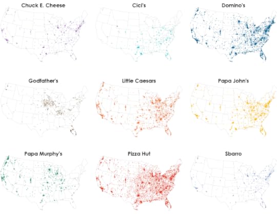
Most Popular Pizza Chains Map Visualization
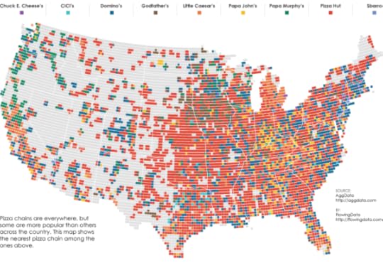
FlowingData has released a fantastic map visualization of the Most Popular Pizza Chains in the United States.
Most of the major pizza chains are within a 5-mile radius of where I live, so I have my pick, but I usually order from whatever place is closest to where I am. So it doesn’t matter if there are more Domino’s locations than Pizza Huts where I live. I just want my feeding time to come sooner rather than later, and if that place happens to be Pizza Hut so be it. (Although, if I’m not in a rush, I’ll go to the local sit-down place.)
This is the point of the map above, which shows the nearest pizza place within a 10-mile radius across the United States. Nice and clean data courtesy of AggData.
You can also see the major chains individually:
Found on LaughingSquid.
Now I’m hungry.


