
Randy Krum's Blog, page 53
April 4, 2014
44 Simple Daily Activities To Enjoy Your Work

Here are 44 Simple Daily Activities To Enjoy Your Work created by OfficeVibe to help keep the motivation high and add some fun back in your work day!
You might think it’s a truism, but most people tend to forget this crucial fact:
You should always make the effort to build good habits that will make you healthier, happier, and more productive over time.
Also, when it comes to new habits, it’s important to remember that these are things to do for long term changes.
This infographic will give you an overview of 44 habits to improve your productivity, your health and the overall quality of your workdays.
A fun infographic for Friday! There is some fantastic information included in here. The topic choice will also have a long Online Lifespan, and has the potential to be relevant to readers for years.
The design is visually very busy. I understand the color-coding of the different activities, and those should be the visual highlight. The illustrations in the background should be less “noisy” with simpler illustrations and fewer colors. I might even consider making the background illustrations grayscale to make the 44 activities stand out even more.
The font choices in the text boxes seems too small, and clicking the image on the infographic landing page doesn’t open up a larger version. I think this was done to allow more of the background illustration to be visible, even though that shouldn’t be the focus of the design. The designer didn’t want all of their background illustration work to be covered up by the important information? This also made the great activity icons too small to understand.
The point scores for each activity were intended to add the element of gamifying these activities, but that gets lost in the overall design. There aren’t any score total categories, so there’s no benefit to the readers from adding up their scores.
The additional text on the infographic landing page is a little out of control. Every one of the 44 activities has a few paragraphs of text on the page providing more details. WAY more information that readers will stick around for, but thankfully they kept that separate from the infographic design.
The infographic should include the URL to the landing page so readers can find this additional information about the activities as well as the original, full-size version of the infographic. They include the URL to the OfficeVibe home page, but there are no links to the infographic there.
Thanks to @JacobShirar on Twitter for sending in the link!


April 2, 2014
The Enterprise Mobility Ecosystem Map
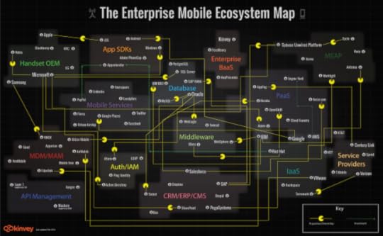
The Enterprise Mobility Ecosystem Map published by Kinvey attempts to make sense of the ownership and acquisitions rapidly taking place within the mobile backend providers. Platforms for authorization, payments, location services and software development kits (SDKs).
Enterprise mobility is a classic IT disruptor. It’s the kind of disruptor that companies like IBM, Oracle and VMware, SAP, Salesforce, etc. were built on. It may look like a peripheral part of IT infrastructure now, but since mobile will be the primary access point to apps and data for many enterprises, many — if not most — new apps are going to be “mobile first.” Thus, the entire IT infrastructure is going to have to become very mobile friendly, very quickly, or else risk becoming a legacy platform.
As a consequence, major IT vendors are partnering with or acquiring companies throughout the mobile stack. Market consolidation and investments have taken place in MDM, API Management, cloud and handset markets. To visualize this activity, we’ve produced the Enterprise Mobile Ecosystem map below.
A network map visualization like this can help companies figure out where their business plays, and how other company acquisitions around them may impact their business. I like that the design is purely informational, and doesn’t add a lot of extra data or information to the design. The message is all about the connections, and doesn’t include things like the size of the companies or the value of the acquisitions. This keeps the infographic focused on telling one story really well.
I would recommend using the company logos in the subway map style design to make it faster and easier for the audience to recognize the companies involved. It’s much harder for the readers to read all of the company names in text to find the companies they recognize.
The Pac-man icons are a nice touch to indicate the direction of ownership or acquisition.


March 31, 2014
Map of the Internet 2.0 Poster
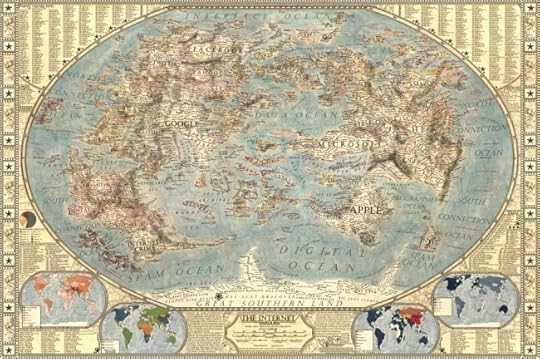
Designer Martin Vargic has released an updated version of his Map of the Internet 2.0 that creates what looks like a vintage-style map. However, this version plots out the major websites and technology companies, with related sites grouped together on the same continent. The sizes of the websites on the map are scaled relative to their number of visitors, so bigger sites show as bigger geographic regions.
Second version of our flagship project, the Map of the Internet.
This conceptual work of cartography treats major internet sites and enterprises such as Google, Yahoo, Microsoft, HP, and Apple like sovereign states, on a classic map of the world. To explain the dominance and relationships of these entities, they were all given a visual hierarchy that gives prominent treatment to companies with the most users (or sites with the most visitors), surrounding them with smaller countries representing related websites and services.
This poster includes one full map of the internet, 4 minimaps showcasing NSA surveillance, most used social networks, most used internet browser, and worldwide internet penetration, list of Alexa Top 500 websites, quick timeline of the Internet History, top software companies and much more!
The map includes more than 250 separate websites/enterprises as sovereign states, and more than 2000 separate labels.
A high-resolution version is available online, and you can also order 24” x 36” printed posters on Zazzle.
This what I call a 2nd level design, which means it’s a highly detailed design that is meant to present a ton of information to the audience. This type of design isn’t trying to communicate a key message in a few seconds, but is intended for readers to zoom-in and explore.
Found on Business Insider


March 27, 2014
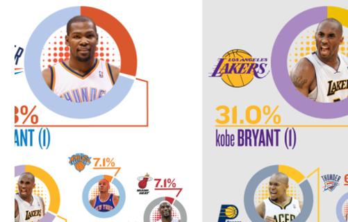
Visualizing NBA Passing Frequency Data
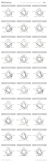
NBA Passing by Andrew Bergmann was designed for NBA.com. By analyzing data gathered by SportVU technology cameras installed in NBA arenas, the line thickness represents the average number of passes per game between specific players.
Here’s a look at how starters on all 30 NBA teams share the basketball.
The thickness of the gray lines on the accompanying chart represents the average number of passes per game between two players.
A very clear picture emerges on which teams distribute the ball more evenly between players, such as the Nets, Bulls and Cavaliers. On the flip side, Chris Paul and Blake Griffin dominate passing for the Clippers, and likewise for Kevin Love and Ricky Rubio of the Timberwolves.
This is a great way to visualize this data set. The visualization method is unique, memorable, and really makes the connections between players easy to understand.
The infographic vaguely lists the data sources at “Stats”, and the original post explains that the data is gathered from the newly installed SportsVU camera systems. However, the actual data is still unavailable for readers to investigate on their own. This design would have been a great opportunity for the data set spreadsheet to be shared with the audience through a public spreadsheet in Google Docs.
Knowing the infographic is going to be shared online, the image file should include the URL back to the original post on NBA.com. Don’t make it hard for readers to fit find the original, full-size version of your infographic.
Found on Flowing Data and Fast Company


March 24, 2014
How Google Glass Works
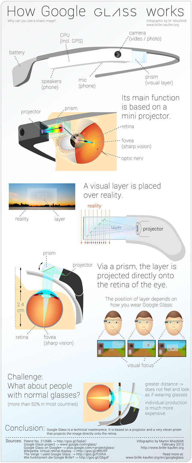
The Google Glass phenomenon has gotten a ton of coverage from the tech press, but how does it work? Creator Martin Missfeldt explains the inner workings in his How Google Glass Works infographic.
How does it work, Google’s new Glass? Why can you see with it a sharp image-layer? How does the image overlay the image of reality? The following infographic illustrates the optical principle - very simple and easy to understand.
Google Glass is a technical masterpiece. It combines numerous functions and features in a very small unit. In addition to phone and camera (photo, video), it offers Internet connection, including GPS.
The core feature of Google Glass is a visual layer that is placed over the reality (“augmented reality”). This layer opens a door to amazing new possibilities. But how does it work? In the Google Glass contains a mini-projector, which projected the layer via a clever, semi-transparent prism directly on the retina in the eye. Because of this the image, even though it is so close to the eye, is sharp and clear. You can move the front part of the Google Glass easily to optimize the focus.
This informative infographic is a great how-to explanation of the science and technology built into Google Glass. Illustrations and images are used in this design to tell the story instead of data visualizations.
A German version of the infographic was also published.
Found on http://www.educatorstechnology.com/2013/05/a-great-visual-guide-on-how-google.html


March 21, 2014
Life Expectancy at Birth
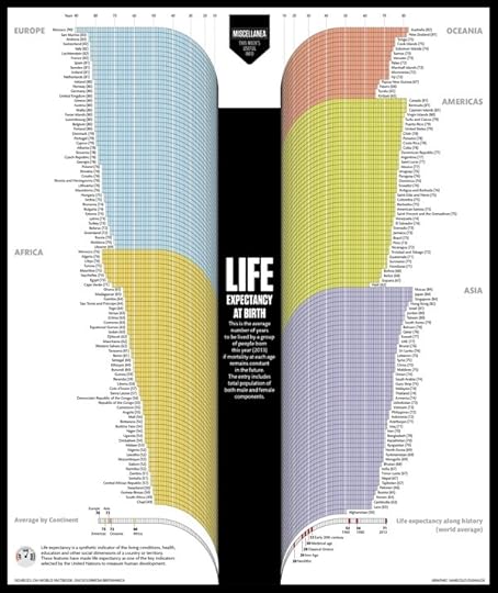
The Life Expectancy at Birth infographic by designer Marcelo Duhalde from Muscat, Oman is a fantastic data visualization of the current life expectancies by country if you were born 2013.
Average number of years to be lived by a group of people born last year (2013) if mortality at each age remains constant in the future. The entry includes total population of both male and female components.
From a design perspective, this infographic tells one story really well. The infographic focuses on communicating one set of data effectively (lifespan) without complicating the design with additional extraneous information. The overall design is very attractive, and grabs the audience’s attention with a big, central visual element. The curving bars are unusual, but have the benefit of condensing the early years so they take less space in the overall design.
At the macro level, it’s obvious there is a big difference between the various countries and continents. The readers are drawn in to compare the details of the different countries they are familiar with. Usually starting with where you live, and then looking to see which countries fare better or worse than your location. Of course the data represents a massive generalization of millions of people, but does tell a great story at that higher level.
The design looks like it’s perfectly sized to be printed as a poster, but I couldn’t find any mention of one. The sources could definitely be more specific than just listing the top level sites that data was gathered from, and the URL to the infographic landing page on Visualizing.org should have been included in the footer information.
Found on PolicyMic


March 18, 2014
The Power of ACC Basketball
The Basketball Staff at CBS Sports has put together a handful of really good data visualizations showing the 29-year history of the NCAA Tournament since the field expanded to 64 teams. The chart above shows Most Wins won in the Tournament by conference, color-coded by round. These aren’t complicated designs, but the story they tell is very powerful.
Go N.C. State Wolfpack! Fantastic win over Xavier tonight! The Big East looks pretty strong too, but there’s nothing like ACC Basketball. These data visualizations tell that story much better than text and numbers. In Texas (Big 12), they just don’t seem to understand the importance of basketball. Football is what you play in the off-season! They have it reversed here in Texas, where football is much more important.
Here is that same data shown as a color-coded table that spells out the Most Tournament Wins by Year by year. This looks like it could have been designed with Conditional Formatting in Microsoft Excel, but it’s done very well. The simple color-coding adds context and makes the entire table easier to understand.
As an infographics design, the PNG image file itself should include a little more information, in case it gets shared online without the rest of the article (like this blog post). It should list CBS Sports as the publisher/designer and the URL back to the original article. I also would have used the conference logos along the y-axis instead of text.
Here’s their chart of overall over that same 29 year period.


March 17, 2014
The State of Infographics at SxSW 2014
[image error]
I post all types of infographics and data visualizations from designers all over the world here on Cool Infographics, and as a recap, I wanted to take stock of the state of infographics and data visualization at this year’s SxSW Interactive conference in Austin, TX.
I’ve been going to SxSW for a few years now, and infographics have been a growing presence in the Interactive portion of the conference every year. You can find hidden sessions about data visualization, visual communication and infographics in different portions of the conference like the new SXsports, Health and Business sessions.
Check the links and search the presentation hashtags on Twitter to find more information and audience comments from each event. I know I didn’t catch everything, so send me links to anything (Events, notes, slides, etc) I missed through the Contact page or the comments and I’ll add appropriate ones into the post!
*Sessions I was able to attend
Official Events:
The Onions of Interactive Infographic Design (#adobesxsw)
Sarah Hunt, Product Manager, Adobe Systems @sarahwhatsup
This session covered the value of creating animated, interactive infographics with HTML your readers care about using Adobe Edge Animate.
Presentation online: http://sarahjustine.com/sneakyfolder/pres
Sports Don’t Look the Same Anymore* (#sportsviz)
John Meyer, Founder, Statographics and CEO, Lemonly @johntmeyer
Meyer examined how infographics, data visualizations, and interactive pieces have changed the landscape for scouts, managers and marketers inside of the game, as well as fans and fantasy players outside the game.
Slides available online at bit.ly/sportsviz
Truth Will Set You Free but Data Will Piss You Off* (#dataethics)
Grace Rodriguez, Founder/President, C2 Create @gracerodriguez
Jake Porway, Executive Director, DataKind @jakeporway @DataKind
Jonathan Schwabish, Government Economist, PolicyViz @jschwabish
Kim Rees, Co-Founder, Periscopic @krees @Periscopic
This session explored the issues and ethics around data visualization—a subject of recent debate in the data visualization community—and suggest how we can use data in tandem with social responsibility.
Storify notes: http://storify.com/gracerodriguez/sxsw-panel-the-truth-may-set-you-free-but-data-wil
The Most Influential Visualizations of All Time (#5vizzes)
Andy Cotgreave, Social Content Mgr, Tableau Software @acotgreave
We’ve chosen the 5 most influential visualizations of all time. Each of the charts in this list instigated change: one helped eradicate cholera, another revolutionized nursing.
Presentation slides: http://www.slideshare.net/TableauSoftware/the-most-influential-vizzes-of-all-time-sxsw
Andy’s summary blog post: http://gravyanecdote.com/uncategorized/sxsw-the-most-influential-visualisations-of-all-time/
Actively Participating in the Big Data Revolution (#DataRev)
Elissa Fink, CMO, Tableau Software @elissafink
In this talk, Elissa will share their stories and offer insights into how we can all become more data-driven, every day
HighOnData Dashboard: http://www.tableausoftware.com/public/highondata
[image error]
The Tyranny of Edward Tufte* (#tuftyranny)
Gabriel Schaffzin, Researcher & Designer & Builder, Skeptic @gabischaffzin
When Edward Tufte tweets mockingly of the leaked NSA slides, he does so as the self-anointed king of presenting evidence. Empiricism’s head cheerleader, he has built an empire on telling everyone—lowly marketer to NASA bigwig—what Truth looks like. And we eat it up.
Presentation slides: http://utopia-dystopia.com/blog/2014/3/8/sxsw-interactive-2014-austin-tx
Scientist to Storyteller: How to Narrate Data (#Sci2Story)
Eric Swayne, Prod Mgr/Analytics Dir, BuzzShift @eswayne
Storify: http://storify.com/40deuce/scientist-to-storyteller-how-to-narrate-data-sci2s
Prezi presentation: https://prezi.com/xkqdi1lq8iix/scientist-to-storyteller-how-to-narrate-your-data/

Visually Turning Complexity into Clarity* (#clarity)
Fernanda Viégas, Research Scientist, Google @viegasf
Graham Roberts, Graphics/Multimedia Editor, The New York Times @Grahaphics
Karl Gude, Graphics Editor in Residence, School of Journalism at Michigan State University @karlgude
Ronnie Lipton, Info Design Author, Trainer, Consult @ronnielipton
We are a unique gathering of professional visual communicators who employ a wide variety of storytelling platforms (print, interactive and motion graphics) and visual tools (maps, graphs, diagrams, video, etc.) to do our jobs. We will explain our process for finding visual stories in the data, discuss the best technologies for doing what we do and illustrate how we build, plan and execute graphics.
Wind Maps: http://hint.fm/wind/
Sketchnotes: https://twitter.com/KKellyMSU/status/443484058043944960/photo/1
Show & Tell: How to Present, Extraordinarily (#ShowTell)
Dan Roam, President, Digital Roam Inc @dan_roam
There are 3 simple rules for making an extraordinary presentation:
Tell the truth
Tell it with a story
Tell the story with pictures
[image error]
Mentor Session: Brian Wallace (#infographs)
Brian Wallace @nowsourcing is the founder of NowSourcing, Inc., a infographic design and social media agency since 2005 serving everyone from startups to the Fortune 500 and everything in between.
Workshop: Pimp Your Pitch: Learn Visual Storytelling (#pitchfix)
Nancy Duarte, Principal, Duarte @nancyduarte
Paul Brown, VP, Duarte @Duarte
Mike Pacchione, Facilitator, Duarte @mpacc
Ryan Orcutt, Assoc Creative Dir, Duarte
This Visual Storytelling workshop will teach you how to create audience empathy, address resistance, heighten emotional appeal, and strengthen your story structure to persuade your audience.
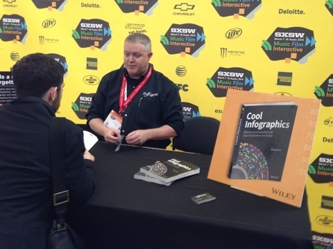
Book Signing, Randy Krum, Cool Infographics* - that’s me! (#coolinfobook)
Randy Krum @rtkrum @Coolinfographic appeared at the SX Bookstore to sign copies of “Cool Infographics: Effective Communication with Data Visualization and Design”
Book Signing, Nate Silver, The Signal and the Noise (#ESPNbrand)
Nate Silver @NateSilver538 appeared at the SX Bookstore to sign copies of “The Signal and the Noise: Why So Many Predictions Fail — but Some Don’t”
Book Signing, Dan Roam, Show & Tell (#ShowTell)
Dan Roam @dan_roam appeared at the SX Bookstore to sign copies of “The Back of the Napkin” and his new book launched at SxSW this year “Show & Tell!”
Book Signing, Nancy Duarte, Resonate* (#pitchfix)
Nancy Duarte @nancyduarte appeared at the SX Bookstore to sign copies of “Resonate: Present Visual Stories that Transform Audiences”.
The SxSW Trade Show Floor
I found three trade show booths this year related to infographics:
Tableau Software booth
Visual.ly booth*
[image error]
Now Sourcing booth*
[image error]
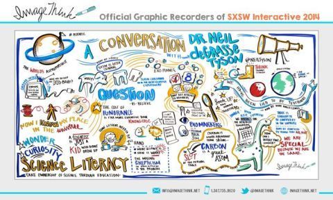
Graphic Recordings of SxSW Interactive Events
ImageThink created a bunch of LIVE graphic recordings from prominent sessions and made them available for everyone to see across from Ballroom A in the Austin Convention Center and online. I hope they eventually post high-resolution versions on their own site after SxSW.
http://sxsw.com/interactive/news/2014/graphic-recordings-2014-sxsw-interactive-content-march-15-update
Unofficial Sessions:
The Attention Economy with Walter, book signing by Ekaterina Walter @Ekaterina, co-author of The Power of Visual Storytelling
“Attention is the new commodity. Visual storytelling is the new currency,” say co-authors Ekaterina Walter and Jessica Gioglio in their new book The Power of Visual Storytelling. The first 100 attendees for Ekaterina’s signing will get a copy of her book. Come chat with Ekaterina about the visualization revolution and her thoughts about SxSW Interactive 2014.
Hosted by Vocus @Vocus
http://www.eventbrite.com/e/wtf-sxsw-visualize-a-powerful-future-tickets-10822280733
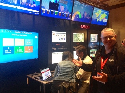
FH Black Box lounge at the Four Seasons (#FHBlackBox)
Fleishman Hillard @Fleishman hosted the Black Box Lounge throughout SxSW Interactive with a massive Social Media Control Center that was visualizing millions of data points and mentions online about SxSW.
http://fleishmanhillard.com/
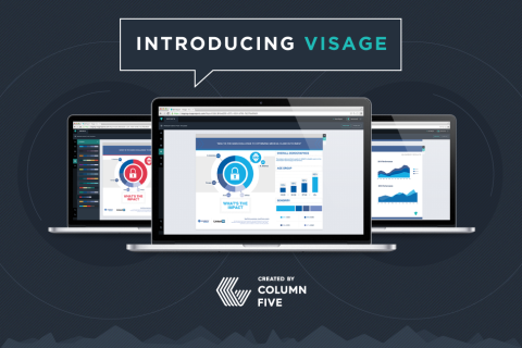
Column Five announced the release of Visage
Column Five @columnfive announced their new interactive data visualization tool, Visage at SxSW.
“Visage is a new Web-based platform that transforms the uninspired data in your reports into beautiful, branded visualizations that make your message more impactful—and make your work look good. The easy-to-use software helps you create high-quality, professional visualizations that are accurate, effective and elegant.”
http://www.columnfivemedia.com/blog/introducing-visage-our-new-visualization-platform
Cool Infographics Meetup
Special thanks to the team at the Fleishman Hillard Black Box Lounge! They allowed me to host the Cool Infographics @Coolinfographic meetup event after my book signing on Monday for anyone that wanted to hang out. It was also an opportunity to meet fans and sign books for people that didn’t have official SxSW badges.
[image error]
Please help add anything I missed by posting in the comments below or sending me a note through the Contact page. I’ll add new content into the post above.


March 13, 2014
How Will You Make Your 2014 Numbers?

A good B2B infographic design, How Will You Make Your 2014 Numbers from Zilliant gives you 3 options to leverage when setting prices. Good luck making your numbers!
Pricing is the most powerful lever a company has to boost profitability, yet it is often the last bastion of guesswork in many companies.
When it comes to setting prices, what we typically see is that B2B companies take one of three distinct approaches: opinion and experience, backward-looking analytics and predictive modeling.
Where does your company fall? Take a peek at this infographic and find out!
I’m definitely seeing a big increase in design requests for B2B infographics that can be used in presentations, brochures and handouts. This design is a great example of showing how their service outperforms the alternatives. The design was sized to fit on standard size paper, so anyone can print it out. The racetrack path also walks the audience through the information in a very specific sequence.
Thanks to Danielle for sending in the link!


March 5, 2014
Hungry Tech Giants
Hungry Tech Giants is a cool infographic from Simply Business that is both zoomable and interactive! To put them into context, the design visualizes 15 years of tech company acquisitions by Apple, Google, Yahoo, Amazon, And Facebook.
2013 was a busy year for tech acquisitions.
With competition in the tech space heating up, Apple, Amazon, Google, Yahoo, and Facebook collectively executed 65 acquisitions in 2013 alone.
Yahoo was the biggest acquirer of 2013, buying a total of 25 companies following the hiring of its new CEO, Marissa Meyer.
Although Meyer is best known for her acquisition of Tumblr, the majority of her deals have bought engineering talent in an effort to build Yahoo as a serious challenger to Google.
Apple also had their biggest ever year for acquisitions in 2013, with ten purchases in total.
To see all of the acquisitions in detail, please visit our interactive microsite.
Each acquisition is appropriately placed on the timeline, and shown as a circle sized to match the total acquisition price. Solid circles shown known prices, and open circles are not sized because the acquisition amount was never released publicly. The circles are also color-coded to represent the different categories.
The interactivity allows you to select which categories to show, and when you hover over any particular acquisition, the acquired company name is shown with a link to the press release or news story announcing the acquisition.
The zooming controls allow you to adjust the date range shown, which helps identify many of the overlapping circles. Clicking on the company logos on the left also brings up the data table which shows all of the known values, dates and includes the links to the press releases. A very good way to establish credibility and make your data sources transparent.
The overall design is meant to be very detailed and allow the audience to dig in and explore the data. At the macro level, the infographic clearly puts Facebook’s $19B acquisition of WhatsApp into context as the largest tech acquisition of all time!
Found on TechCrunch and Cult of Mac!


