
Randy Krum's Blog, page 13
March 4, 2019
Design Thinking vs. Visual Thinking

The team at XPLANE has posted their own explanation of Design Thinking vs. Visual Thinking on their blog along with this great visual infographic explanation.
At XPLANE we pride ourselves on bringing clarity to complexity. We usually do this for clients, but sometimes the need strikes closer to home. This happened recently at a social event when I heard the terms “design thinking” and “visual thinking” used interchangeably (not for the first time—and definitely not for the last). Now, most people who work in business strategy, innovation, or problem-solving can tell you that design thinking and visual thinking are not the same, but not everyone can easily articulate the difference. So in the interest of clarity and some serious cred at your next post-work cocktail hour, here’s a quick explanation of the difference between the two.
Simply put, Design Thinking is a method for problem solving. Visual Thinking, on the other hand, is a set of tools for making intangible or complex ideas visible.
So the next time you hear the term “design thinking,” remember this is the method being used to solve the problem. And the next time you hear “visual thinking,” recall this as the tool kit you draw upon to make that method more effective and efficient. And maybe remember that XPLANE helped you understand the difference between the two.
Some of the best infographics don’t deal with a bunch of numeric data. Instead, they are clear visual explanations of concepts, processes or complex ideas. This is one of those types of infographic designs done really well. It explains one idea very clearly, the difference between Design Thinks and Visual Thinking.
The main thing that XPLANE missed with this design, is that it will be shared on the Internet without the rest of the original blog post text. Very often the image is shared by itself, and companies that are really good at social media will make sure the image includes all of the relevant information. This image is missing a bunch for sharaeability:
Title
Sources
Brand
Copyright
URL back to the blog post


March 1, 2019
Animated DataViz: Top 15 Best Global Brands Ranking (2000-2018)
The Top 15 Best Global Brands Ranking (2000-2018) is an animated data visualization video from TheRankings on YouTube.
Some animated data visualizations are just eye candy, and the better ones use animation to improve understanding or add context to the data. This is a good one where the animation over time helps the audience see the dramatic growth in brand value and how some of today’s top brands skyrocketed to the top of the list only in the last few years. All of the data is pulled from Interbrand.
The music in the video is distracting though, and completely unnecessary. I would just mute it.
I like the logos along the y-axis. The data values would be easier to read with a comma separator for thousands.
You find this shared in social media also as an animated GIF file.

February 27, 2019
US Population Projections by Age Through 2060

I really like this US Population Projections by Age Through 2060 posted on reddit by user mskm203. It was built in Tableau using U.S. Census Data projections. Each year is plotted, and then the sequence is recorded as a video and animated GIF file.
This was submitted as part of a Makeover Monday data visualization redesign challenge.
I would change the age group labels to white text for better readability.
Tableau isn’t the only tool that can create visualization like this. As a challenge, ZingChart took this design as inspirtation and redesigned it using their javascript charting tools and made a few tweaks to the design. You can see that here:

I appreciate the design tweaks from ZingChart like the lines showing the start and end distributions. Fewer stops on the y-axis help reduce the gridlines clutter. Also, shortening the text in the y-axis labels using the scale of Millions. However, I don’t like turning the text labels for each age group 90°, that makes it much harder for readability.
Especially when viewed as a static image, instead of the animation, the lines for the start and end distributions are very helpful.


February 26, 2019
Celebrate the Chinese New Year with 6 Lucky Foods

Celebrate the Chinese New Year with 6 Lucky Foods is an information-loaded infographic from ZeroCater, covering the basics of Chinese New Year, foods considered to bring you luck in the coming year, and a special focus on the lore behind dumplings.
The annual two-week festival of Chinese New Year is upon us! As the Year of the Dog (2018 to 2019) gives way to the Year of the Pig (2019 to 2020), it’s time for family and friends to come together in celebration and exchange wishes for luck, health, and prosperity. Read on to learn how you can celebrate the Chinese New Year with some traditional and delicious foods.
An integral part of the Chinese New Year? Food. Families come together for a special New Year’s Eve Dinner (年夜饭, Nián Yèfàn), also known as a Reunion Dinner (团年饭, Tuán Niánfàn). Special foods are an essential component of the Chinese New Year. They may have particular symbolic meanings in Chinese culture or could be considered lucky if the name of a food sounds similar to Chinese words for luck or wealth. However you share or observe Chinese New Year this year, here are six foods essential to the holiday. We break down what they are, why they’re significant, and how they’re made and served.
No matter where your Chinese New Year adventures take you, as we head into the Year of Pig, “xin nian kuai le” (Mandarin: “shin nee-an kwai le” or the formal “happy new year”), “xin nian hao” (Mandarin: “shin nee-an how” or “good new year”) and in Cantonese, “may you be prosperous in the year ahead,” “gong hei fat choy!”
They way that ZeroCater published this infographic actually makes it harder for readers to share. This is a really long infographic that has been broken apart into smaller images of the separate sections in the blog post. These separate image files will be shared as separate infographics by readers, so they need to include the footer information in each one: Sources, ZeroCater logo, URL, etc.
The full-size infographic is no where to be found in the blog post, it’s only linked to in the embed code.
Even the full infographic above doesn’t include the URL to the original infographic landing page, or any copyright license information.

February 25, 2019
How Artificial Intelligence Is Changing Art
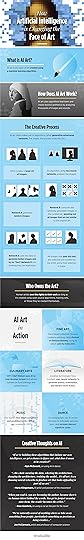
Using Artificial Intelligence to create works of art is a very controversial topic, and Invaluable has tackled explaining the issue with the infographic How Artificial Intelligence Is Changing the Face of Art and a detailed blog post. This issue applies to fine arts, music, writing, dance and even the culinary arts! When can it truly be considered “art”? Who owns the final creative works?
Over the past 50 years, artists have been using computers to generate forms of digital art, but previously had to write the code that specified a set of rules to create the chosen aesthetics. Within the last couple of years, artists have taken AI art to a new level, using algorithms that learn these aesthetics themselves by analyzing thousands of images.
Though many artists fear that relying on machines will hinder the essence of art and could even lead to replacing humans as creators, AI artists feel that machine-generated art is a new opportunity and the process is becoming an art form in itself. Much like famous artists of the past whose work was informed by concurrent social and political issues, artificial intelligence, working in conjunction with humans, has the ability to create art through those experiences as well.
Within the last decade, machine learning has become a growing medium that has permeated a variety of industries and disciplines, including the fine, performing, literary and culinary arts. While some worry that AI will stifle creativity and take jobs away from humans, artists offer a different perspective. By working with the capabilities of artificial intelligence machines, artists can use the technology as a tool for the augmentation of human thought to create what has yet to be imagined.
They also created a good animated GIF infographic to explain how AI can learn to write:

Both infographics are missing some design elements to help with sharing online. When publishing infographics, you have to assume they will be shared without the rest of the longer article they were originally published with.
The URL address back to the original infographic landing page (the blog post) or even the company website
What’s the CTA (Call-To-Action)? What does Invaluable want the readers to do with this information? Even if it’s just “Learn More at Invaluable”.
Include a Copyright or Creative Commons license statement? Ironic that it’s missing since the topic is partially about who owns the creative works created by AI. Infographics are a creative work!
The data sources? The original blog post has links to a number of articles that were used as source material for the infographic (which is great!) but these need to be listed in the infographic itself. If I’m reading the infographic without the rest of the original blog post, why should I believe this information? Why is it credible?
Found on TechiExpert

February 22, 2019
Making America Smarter, Stronger, and Younger
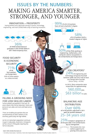
A few years old, but just as relevant today as it was a few years ago. The Making America Smarter, Stronger, and Younger infographic sums up the statistics behind the argument for Immigration that the Deloitte University Press makes. Deloitte believes a thoughtful look at immigration reform will help the U.S. secure and maintain its competitive edge in a world where the most highly skilled have a choice when it comes to where they live and work.
Immigration and immigration reform are perennial topics of debate in the United States. What do the data say about how immigration is shaping the country?
The United States cannot be complacent that the advantages conferred by past immigration will continue into the future as global competition for talent increases. It is clear that this more intense global competition will be fought on many fronts. A thoughtful look at immigration reform—one that balances family and workforce needs—may well hold one of the keys for the United States to gain and maintain a competitive advantage in a world where the most highly skilled have a choice as to where they will live and work.
This infographic serves as a summary and a shareable social media asset that coordinates with the longer article, How immigration is shaping the United States, Issues by the Numbers, May 2013. This is one of the best ways to use an infographic!
The layout is still a little busy with a lot of text, but the design can stand on its own without the supporting article. The URL to the original infographic landing page and the supporting article are missing in the infographic. These should be included so readers can find their way since more people won’t include those links when they share the infographic.
Partially filling shapes to represent percentage values is never a good idea for designers. Your eye sees the area of the filled shape, but designers are only calculating the height of the fill. It’s almost never an accurate visual representation of the data.
Thanks to Courtney for sending in the link!

February 21, 2019
Image File Types Decoded

So many choices when saving your images! The Image File Types Decoded infographic from tekRESCUE does a great job of clarifying the options in this handy infographic!
Information technology can get complicated very quickly, and digital image files are no exception to this rule. You’ve likely come across a few of the different types of image files such as JPEGs, GIFs, PNGs, and others. You’ve also likely wondered what the difference is between all of these different abbreviations. That’s why we’ve put together an infographic comparing some of the most common types of files you’re likely to encounter on and create for the web.
In the graphic, we take a play-by-play look at the different properties of digital images and how the properties relate to each file type. We hope you’ll find the information useful whether you’re an image newbie or a seasoned graphic designer. Skip below the infographic if you prefer to digest the information in text form.
Some of the topics, like Image Compression, are over-simplified for purposes of this infographic. JPG is the king of file compression, but the infographic implies that other file types don’t support compression. That’s not exactly true. They have compression, but it isn’t anywhere as effective as JPG.
Found on Infographic Journal

February 20, 2019
The Charted Sandwich Board
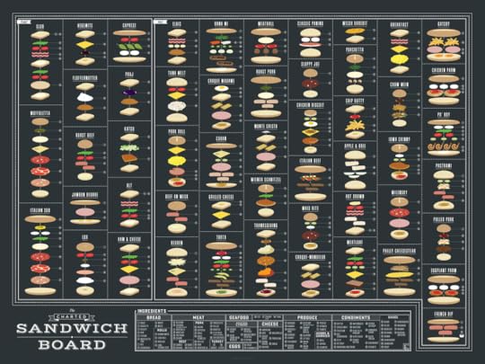
The Charted Sandwich Board is a new infographic poster print just released from the team at Pop Chart in New York City! You can order now, and the prints will begin shipping on March 6, 2019.
Now serving: A savory chart of sandwiches, featuring an internationally inspired menu of over 50 heroes, gyros, and more! From the basic BLT to the waistband-threatening food-pocalypse that is the Gatsby, this delectable, deconstructed diagram makes for delightful decor no matter how you slice it. Order up!
Each sandwich is visually built with an illustration and a numbered indicator for each ingredient referenced in the Ingredients legend.
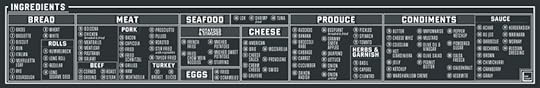
You can can find this one and over 100 more infographic posters on the redesigned Infographics Posters page!


February 18, 2019
Picular: Google Search for Colors
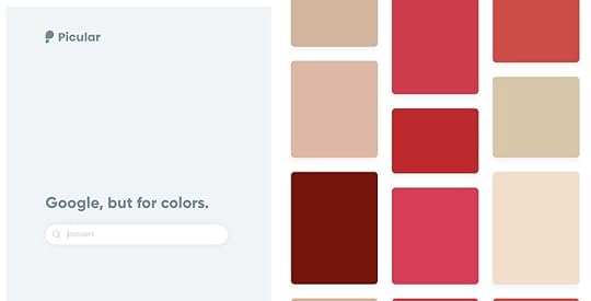
Picular is a new search engine for colors, using Google Image Search to the exact hex color numbers most associated with the keyword you enter into the search.
Search engine for colors: Picular is a rocket fast primary color generator using Google's image search. If you ever needed the perfect yellow hex code from a banana, this is the tool for you.
Putting colors to words: Picular helps designers to easily extract the most relevant colors for a specific context or domain. It helps to understand perception, psychology and aesthetics of a color or tone you’re interested in.
According to Fast Company, “The tool is the brainchild of the Sweden-based digital design studio Future Memories, which now uses the tool on a daily basis. According to the studio, about 15,000 other creatives frequently use the tool to test whether search terms are strongly related to particular colors.”
Found on Boing Boing and Fast Company

February 13, 2019
Can I Use that Picture?
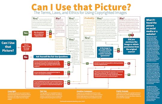
The internet grants us access to lots of images. But how do we know if we have legal or ethical use of the photo? Check out the Can I Use this Picture? flowchart from Curtis Newbold, The Visual Communication Guy before you make your next powerpoint slideshow.
Need to use an image but not sure if you have the legal and ethical right to do so? Understanding the laws for using images can be a bit tricky, especially because there is wiggle room within the laws. And, with the mass distribution of images on the internet, it’s no wonder we’re all asking the the same question over and over again: can I use that picture?
Whether for your business presentation, your school project, or your organization’s brochure, you’ve likely placed in images to make your designs more visually appealing. But did you use the images according to legal and ethical standards?
I created the guide below to help sift through the complexity of it all. The reality is, though, as long as you become familiar with four terms– copyright , fair use , creative commons , and public domain –you’ll have a pretty good idea what you can and can’t do with images. If it’s all new to you, spend most of your time learning the fair use clauses. That’s where the ambiguity in copyright laws exist. As with most laws, the ambiguity is for our benefit, but it sure can make copyright laws fuzzy at times.
My rule above all else? Ask permission to use all images. If in doubt, don’t use the image!
Don’t steal images for use in your designs with Google image search! Make sure you have the appropriate rights to use the images.
If your school or organization is interested, you can buy a printed poster or a high-resolution digital version.
Found on lifehacker.com


