
Randy Krum's Blog, page 15
November 28, 2018
What Will Kill You in 2040
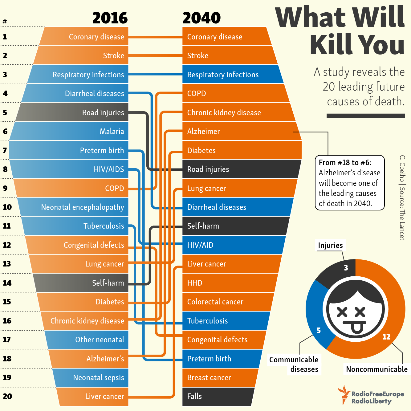
What Will Kill You in 2040 infographic takes the top 20 reasons for death in 2016 and compares them to the predicted top 20 reasons for death in 2040. The top 3 aren't predicted to change, however the rest are all over the board!
The infographic was created by Radio Free Europe Radio Liberty. Their source of information came from an article published in The Lancet (a peer-reviewed general medical journal) called Forecasting life expectancy, years of life lost, and all-cause and cause-specific mortality for 250 causes of death: reference and alternative scenarios for 2016-40 for 195 countries and territories. That's a mouth-full for a title!
The orthogonal lines are hard to follow. Straight lines would have turned this into a slope graph, and made it easier to see which causes of death were increasing or decreasing. Categorizing the causes of death into 3 different categories and color coding them really helps break up the text and makes it a little easier to follow the arrows.
Found on Radio Free Europe


November 20, 2018
Top 10 Tips for Cooking the Perfect Thanksgiving Turkey

The Food Network is using infographics to help highlight some of their most popular cooking help articles. The Food Network Kitchen's Top 10 Tips for Cooking the Perfect Thanksgiving Turkey Infographic is a great summary infographic for the holidays!
Armed with our top 10 turkey tips, you'll come out looking like a pro on Thanksgiving Day. Whether you're hosting your first Thanksgiving dinner or your fiftieth, these indispensable tips will help you turn out a terrific turkey.
You'll notice the infographic is very brief and light on the details. It's a short, easy-to-read summary that leads to a much more detailed, full-length article 10 Tips for Cooking the Perfect Thanksgiving Turkey that goes into detail for every one of these tips.
From a marketing point of view, this is a great use of infographics. The infographic doesn't have to go into exhaustive details. Just a quick summary that leads people to more information on the website.


October 23, 2018
Smartphone Etiquette 2018

It is 2018 and our phones have become intricate to our daily lives. The Smartphone Etiquette 2018 infographic shows the results of a survey done by socilamediatoday.com to see what American's attitudes and behaviors are towards smartphones.
Smartphones have become a key part of our everyday interactive process, offering the entire internet, and our social sphere, at our fingertips at any given moment.
But just how much are you using your mobile device, and how immersive has it become? KDM Engineering interviewed a group of 2,000 Americans to find out, asking questions on how often people check their phones, how they use their devices in the workplace and what's acceptable mobile behavior in public.
The responses will no doubt come as little surprise, though it's certainly impactful to see some of those behavioral trends highlighted in hard data.
You can check out the full results in the infographic below - and of particular note for marketers, look at which notification types users respond to most urgently.
A lot of good statistics here, but way too many of them are just shown as big numbers in text. That doesn't put the information into context for the readers.
Found on socialmediatoday.com


October 10, 2018
4 Ways to Set Up Your Talking Head Shots

When you have something important to say, the last thing you want to stress about is your camera set up. Filmora.io has created the 4 Ways to Set Up Your Talking Head Shots infographic as a tool for aspiring YouTubers. The infographic can be used to help determine which camera set-up to use and the equipment required for it.
A big part of being a YouTuber involves talking to the camera. How you set up your talking-head shot depends on many factors, including how much space you have, what kind of look you’re going for, and how many people you want to fit in one frame. Here are four ways to set up your talking-head shots for YouTube.
Thanks to Erica for sending in the link!


September 27, 2018
City Street Network Orientation

The City Street Network Orientation infographic represents 25 of the United States' largest cities and the direction of their streets. The data is shown by using a polar histogram, which show the direction of the streets (based on their cardinal orientation) and their frequency (the length on the graph). The infographic was created by Geoff Boeing, Urban planning professor at Northeastern University.
Using OpenStreetMap data, Geoff Boeing charted the orientation distributions of major cities:
"Each of the cities above is represented by a polar histogram (aka rose diagram) depicting how its streets orient. Each bar’s directionrepresents the compass bearings of the streets (in that histogram bin) and its length represents the relative frequency of streets with those bearings."
So you can easily spot the gridded street networks, and then there’s Boston and Charlotte that are a bit nutty. Check out Boeing’s other chart for orientation of major non-US cities.
See also Stephen Von Worley’s color-coded maps and Seth Kadish’s charts from 2014 that showed the same thing but used Census data instead of OpenStreetMap.
Found on Flowing Data


September 17, 2018
Animated History of Home Siding Materials
Your browser does not support the HTML5 video tag.
Fixr has published their research of How the Use of Home Siding Materials Has Changed Over 40 Years as this animated data visualization changing the proportions over time.
It's a little odd to watch because it starts out looking like a bad pie chart with cute rounded corners. This is really a simple version of a voronoi diagram where the area of each section represents the proportional values.
The video above was created using the results from the census on exterior finishes of single-family homes. It looks at the historical use of wood, brick, stucco, vinyl, fiber and ‘other’ options starting in 1977 and ending in 2017. The census accounts for up to 1.6 million houses each year and includes homes across the U.S.A., so provides a broad look at how finishes have risen and fallen in popularity over the full period. These changes in popularity not only account for aesthetic fashionability but also availability, cost and practicality. From a trend perspective, each finish dominated a specific decade, in terms of houses completed in that finish. Brick dominated the 70s, wood dominated the 80s, vinyl, which only became available in the 90s, dominated that decade, and stucco and fiber cement dominated the 2000s. ‘Other’ materials also saw their highest use during the late 80s and 90s.


September 14, 2018
Visualization of Hurricane Florence's Path
![]()
Harry Stevens from Axios created a simple but great visualization of Why Hurricane Florence is so unusual — and so dangerous. The DataViz shows what makes the path of Hurricane Florence different than all of the past major hurricanes to hit the Carolinias.


September 4, 2018
Extremely Detailed 2016 Election Map
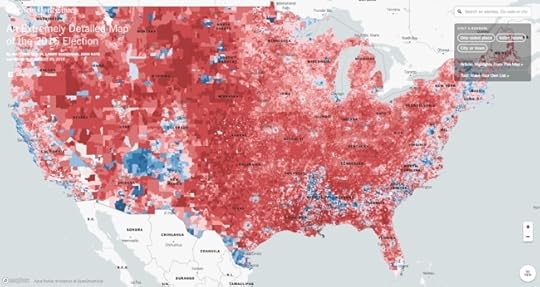
The New York Times has published An Extremely Detailed Map of the 2016 Election, and it's fascinating to explore!
Their full article, Political Bubbles and Hidden Diversity: Highlights From a Very Detailed Map of the 2016 Election, examines some of the more interesting patterns, insights and inconsistencies.
The election results most readers are familiar with are county maps like the ones we produce at The Times on election night. But votes are cast at a much finer unit of geography — in precincts, which may contain thousands of voters but in some cases contain only a handful. Our previous election maps contained results for about 3,100 counties; here we show results for more than 168,000 voting precincts.
The interactivity is really well done, made possible through the integration with MapBox, and you can zoom in to view the data down to the smallest voting precincts. Pop-up information will tell you the exact number of votes at the precinct level.
Here's an animated journey (accelerated) around the country to 14 major cities:
[image error]


August 21, 2018
How America Uses its Land

America's land use is very diverse and scattered throughout the states. By using surveys, satellite images and categorizations the U.S. Department of Agriculture divides the U.S. into six major types of land. Bloomberg took that data, and created the How America Uses its Land infographics. The infographics use the map to show both how much of the country is made up of a certain land use, and where the majority of it is located.
Using surveys, satellite images and categorizations from various government agencies, the U.S. Department of Agriculture divides the U.S. into six major types of land. The data can’t be pinpointed to a city block—each square on the map represents 250,000 acres of land. But piecing the data together state-by-state can give a general sense of how U.S. land is used.
Gathered together, cropland would take up more than a fifth of the 48 contiguous states. Pasture and rangeland would cover most of the Western U.S., and all of the country’s cities and towns would fit neatly in the Northeast.

Found on https://5wvelascoblog.com


August 10, 2018
Giveaway: 5W Information Graphics & Data Visualization Workshop Dallas
This month (August 2018) I'm giving away ONE FREE ticket to attend the 5W Information Graphics and Data Visualization 2-day workshop in Dallas, TX on September 13-14, 2018.
Register on the Giveaways Page by August 31, 2018 to be entered, and the winner will be chosen on September 1st!
Juan and Samuel Velasco currently have workshops scheduled in four cities across the U.S., so I'm jumping on the chance to attend and help promote the workshop in Dallas. I highly recommend you check out the schedule and attend one if they are close to you.


