
Randy Krum's Blog, page 19
November 6, 2017
How Brands Are Using Instagram Stories
Klear analyzed 149 brands in 8 different industries to see How Brands Are Using Instagram Stories to drive sales.
Just last year, brands faced a big issue on Instagram: sharing external links with followers. Can you recall posting about a new blog post on your account and having to direct followers to your bio to click the link? No one cared to take the time to go to your account and check out the content. This wasn’t a convincing nor effective method and the low rate of user responsiveness made this a big loss of interest for marketers.
Although just a few months after the birth of Instagram Stories, came their golden solution to every marketers’ problem.
Instagram introduced a “swipe up” feature, allowing brands to link a URL to their story, creating a “see more” option below the post. Then if users wished to see further content, it was only a swipe away, thus creating greater user compliance. The linking component is only available for verified accounts. For the marketers who can use it, it’s a dream.
We were already aware of the popularity surrounding Instagram Stories, but we wanted to see how brands are utilizing this newer feature. We decided to follow 149 top brands in 8 industries – including Amazon, Adidas, JetBlue, and Coca-Cola – to see what do they share on their stories and where they guide their followers to.
Read more at Klear.com
I like the data, and the clear sequence of sections. The thin doughnut chart is really hard to read and connect the colors to the legend. The stacked bar chart at the end is very busy and hard to read as well.
Found on Marketingprofs.com


October 23, 2017
A Brief History of Printing
The Brief History of Printing infographic by Diginate looks back on over 2000 years of the industry.
There aren't too many industries older than printing (!) - the origins go back to woodblock printing in 200AD!
To try and understand the route that the art of printing has taken through to today's digital formats we thought we'd create an infographic charting it's history, and make some predictions for it's future...
Nice, clean design.
Thanks to Vas for sending in the link!


October 3, 2017
SwissLeaks: the map of the globalized tax evasion
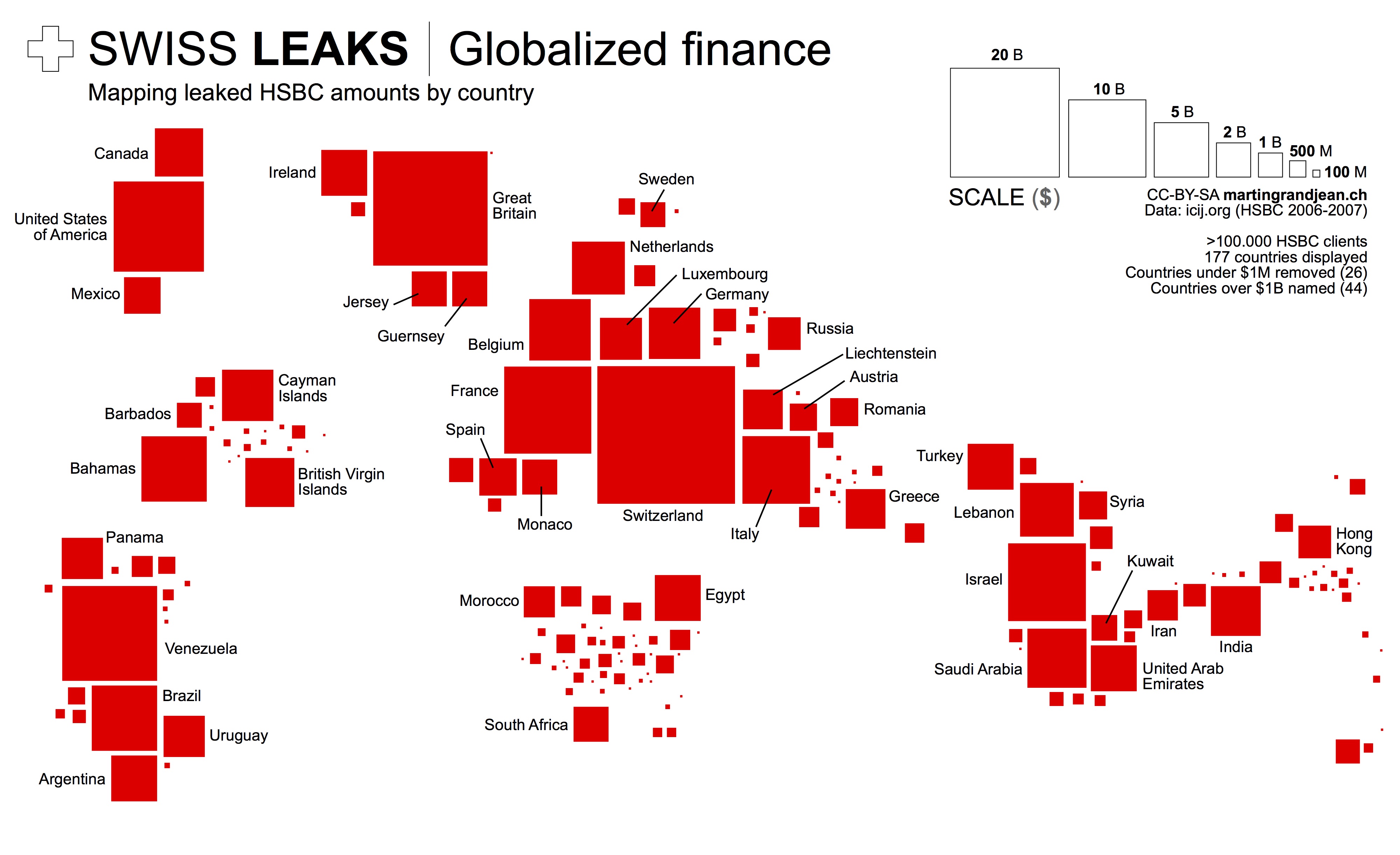
SwissLeaks: the map of the globalized tax evasion infographic from Martin Grandjean shows the countries that were affected the most by the HSBC "Swiss Leaks" data.
HSBC “Swiss Leaks” data shared by the International Consortium of Investigative Journalists reflect the globalization of tax evasion. While billions of dollars are inconceivable, mapping the origin of bank account holders allows an overview. This map is only a small contribution to the understanding of the Swiss Leaks data.
Why this map?
This map does voluntary not strictly stick to the geographical reality. It is a response to too many maps published in the media these days that are made unreadable by regrettable graphic choices: top-ten limited, overlapping points, colored territories (small countries and islands disappear), etc.
What does it show?
The number of affected countries and their diversity is very important. Note the strong presence of the Caribbean. In proportion to their population, South and East Asia are very poorly represented, while the Middle East is over-represented. The strong presence of “tax havens” is explained by the use of intermediates by the holders of bank accounts.
A great example of using the area of the squares to represent the amounts.
Created by Martin Grandjean


September 26, 2017
The Dark Web

We have heard of the dark web. But what is actually sold on it? The Dark Web infographic from Weforum.org reports the revenue totals from 3 categories; illegal drugs, percription drugs, and non-drugs.
We often hear about the dark web being linked to terrorist plots, drug deals, knife sales and child pornography, but beyond this it can be hard to fully understand how the dark web works and what it looks like.
Just like the forest, the dark web hides things well – it hides actions and it hides identities. The dark web also prevents people from knowing who you are, what you are doing and where you are doing it. It is not surprising, then, that the dark web is often used for illegal activity and that it is hard to police.
Off the paths it is almost impossible to find anything – unless you know what you’re looking for – so it feels a bit like a treasure hunt. Because really the only way to find anything in this vast forest is to be told where to look. This is how the dark web works – and it is essentially the name given to all the hidden places on the internet.
So just for a minute imagine that the whole internet is a forest – a vast expanse of luscious green as far as the eye can see. And in the forest are well worn paths – to get from A to B. Think of these paths as popular search engines – like Google – allowing you as the user the option to essentially see the wood from the trees and be connected. But away from these paths – and away from Google – the trees of the forest mask your vision.
Good use of proportional circle sizes to represent the dollar values!
Found on Weforum.org


September 19, 2017
40 Facts About the Psychology of Color

Color has always been a determining factor in a consumer's decision to buy a product. But with today's online shopping market, color decision is even more important than ever. It takes a consumer 90 seconds to make a product assessment and Marketing Profs says that 62%-90% of this judgment is based on product color alone! The 40 Facts About How the Psychology of Color Can Boost Your Website Conversions infographic outlines popular uses for the colors as well as some of the brands that use them. They have also included popular colors for specific shoppers like impulse buyers.
The infographic breaks down the rainbow and explains emotions associated with each hue, as well as in which industries each color is popular, and in which industries each color is not recommended.
For example, white and silver signify perfection, and you can see that in brands like Apple and Ralph Lauren, but many food brands—which prefer characteristics such as energy or excitement—opt for brighter colors.
Furthermore, certain colors speak to the psychology of certain types of buyers, according to the infographic. For example, navy blue and teal are often used to target budget shoppers, whereas pink, rose, and sky blue speak to traditional clothing buyers.
Notice how some of the statistics are visualized and others are just shown in text alone. The non-visualized data is perceived as secondary information or footnotes to the more prominent visualized data.
I also think they overuse the Radial Bar Chart style of visualizing data. I'm not a big fan of these since they are harder for readers to understand the comparisons.
Found on https://www.marketingprofs.com


September 11, 2017
The Super Skin of Superheroes
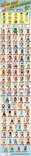
The Super Skin of Superheroes infographic is a fun chart showing the different skin of America's comic book heroes. Some are completely invulnerable, while others are just armored. The real uniqueness of the infographic though, is that is was created by Mcdermatology.com a company that is just really into skin. Talk about making a fun connection between your profession and comics!
If only our dermises could be invulnerable, unbreakable, elastic, metal, or ... better yet, acne free! (It might not be one of the most well-known superhero powers, but have you ever seen Superman with pimples?) Our list of superheros and their powers contains the specific abilities of the most important organ of the body: the skin! Comic-book heroes with naturally or supernaturally enhanced skin can change color, grow to building-sized heights, go invisible, or just take the beating that so many super-powered humans have to deal with when taking down bad guys. From X-Men to Marvel movie favorites like Captain America to DC heroes like Wonder Woman, here are the top super-powered dermises of the comic-book world!
Nerdist.com wrote the article below about the infographic
“Who’s tougher: Superman or the Hulk?” remains the playground question of the ages, right alongside “Who’s stronger: my dad or your dad?” Of course, in comic books (and now, comic book movies), superhero toughness is measured in different ways.
The aforementioned Superman and Hulk literally have invulnerable skin, where someone like Wolverine gives the appearance of being invulnerable due to his healing factor and metal skeleton. Then there are heroes like Iceman and Colossus, who create external skins for themselves that act as a kind of armor, but underneath all that get paper cuts just like the rest of us.
Thankfully, all of us superhero devotees now have this handy infographic chart, created by McDermatology.com, to show the differences in the tough hides of almost every major superhero. Called “The Super Skin of Superheroes: 86 Powerful Dermises of America’s Comic Book Heroes and Heroines,” this chart shows us the different ways characters from DC Comics, Marvel, Image and more are able to get beat up over and over again and pretty much never show a scratch.
There are some curious inclusions and omissions on this chart, however. For example, there are a ton of minor X-Men characters that you’ve probably never heard of, and yet there are no Green Lanterns on the list. Surely a Lantern’s ring-created external force field counts as a second skin as much as Iceman’s ice skin, right? And I’ve been reading Marvel Comics my whole life, and even I had to look up who the heck Machine Teen even was. Nevertheless, this is a fun and well made little chart that is pretty darn accurate.
Found on Nerdist.com


August 28, 2017
The Perfect Temperatures for Beer, Wine, Coffee and More

The Perfect Temperatures for Beer, Wine and Beverages from GB Energy Supply is no longer visible on their site, but I was able to find it on LifeHacker.
I really appreciate infographics that tell one story really well. You want the information to be clear and easy to understand for the audience. Personally, I wish it was also available in Fahrenheit.


August 21, 2017
Eclipse: What You Need To Know

What are your plans to view the eclipse today? The Eclipse: What You Need To Know infographic from Forbes contributor and designer Kevin Anderton.
On August the 21st 2017, there will be a solar eclipse in the sky over the United States. If you are like me, you are planning on enjoying this amazing site and you have probably also heard that there is some danger in viewing it. Here is some information that will help you safely enjoy the eclipse next Monday.


August 9, 2017
Landslide for the "Did Not Vote" Candidate in the 2016 Election!
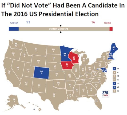
From BrilliantMaps, this is the Did Not Vote Election Map, showing the magnitude if all voting-eligible adults that did not actively vote in the 2016 Presidential election. A Presidential candidate needs 270 Electoral College votes to win. The "Did Not Vote" candidate would have have gathered 41% of the total votes from the voting eligible population, and 471 votes from the Electoral College! A Landslide!
The map above shows what the 2016 US Presidential Election results would have been if votes not cast for Hillary, Trump or one of the third party candidates had gone to fictional candidate “Did Not Vote.”
As a percentage of eligible voters, Clinton received 28.43% (65,845,063) of all votes compared to Trump’s 27.20% (62,980,160) and Did Not Vote’s 44.37%(102,731,399).
Total voter turnout was estimated to be 55.3% of the voting age population and 59.0% of the voting eligible population.
Map created using 270 To Win, based on reddit user Taillesskangaru’s posts here and updated here.
Disclaimer: The map above was accurate as of January 17th, 2017. Totals below were true at the time of writing but may no longer currently be accurate as additional votes and recounts are conducted.
Thanks to Mike Wirth for sharing on Facebook!


July 31, 2017
EARTH, a visualization project

EARTH, by Cameron Beccario, is a beautiful interactive, animated visualization of a few different weather features across the entire globe.
EARTH, by Cameron Beccario, is a near real-time visualization of global weather conditions forecast by supercomputers. This vivid capture depicts intricate, dramatic swirling patterns of wind streamlines reminiscent of oil paintings of the Impressionists.
CAMERON BECCARIO'S creation, Earth. depicts wind patterns on a global scale. The artist began with a wind map of Tokyo, where he lives, and then he took on the world. You can see his animated creation at earth.nullschool.net.

You can spin the globe and zoom in on any area in the World. Opening the setting panel lets you change the data that is being displayed; from wind to ocean waves to particulates in the atmosphere.

To support his project, you can purchase prints of some of the high-resolution images from Point.B Studio
Designed in D3, all of the source code is also available at https://github.com/cambecc/earth. Of course the project was inspired by the Wind Maps visualization by Fernanda Viégas and Martin Wattenberg, that I have posted about before.


![[image error]](https://i.marketingprofs.com/assets/images/daily-chirp/170829-infographic-instagram-stories.jpg)
![[image error]](https://diginatemainsite.s3.amazonaws.com/media/media/images/history_printing_infographic.png)