
Randy Krum's Blog, page 14
February 7, 2019
Time & Space Visualiser
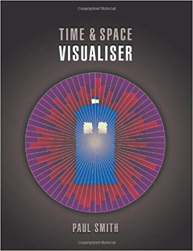
Time & Space Visualiser by Paul Smith from Wonderful Books is the first exploration of both the factual and fictional history of Doctor Who through a range of infographics, presenting information about the show.
As the famous TV series nears its 50th anniversary, this book takes a fresh perspective, visualising information from every aspect of the programme to show there are lots of options beyond lists and tables. Each chart is accompanied by detailed notes discussing the background and context of the areas under examination, how the data was compiled and what it reveals.
The results can therefore be appreciated by those interested in the possibilities of data visualisation while also presenting new angles to Doctor Who devotees who might think they know all there is to know about the show.
You can buy the book at Amazon or Amazon UK..
You can read reviews of this book from Starburst magazine, Kasterborous.com, SFX Magazine, Cathode Ray Tube, and Life, Dr. Who and Combom.
Thanks to Paul Smith for sending in the link to his book!


February 4, 2019
How The World is Getting Better in 6 Charts
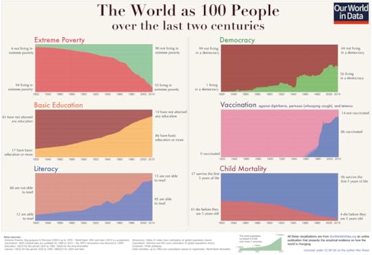
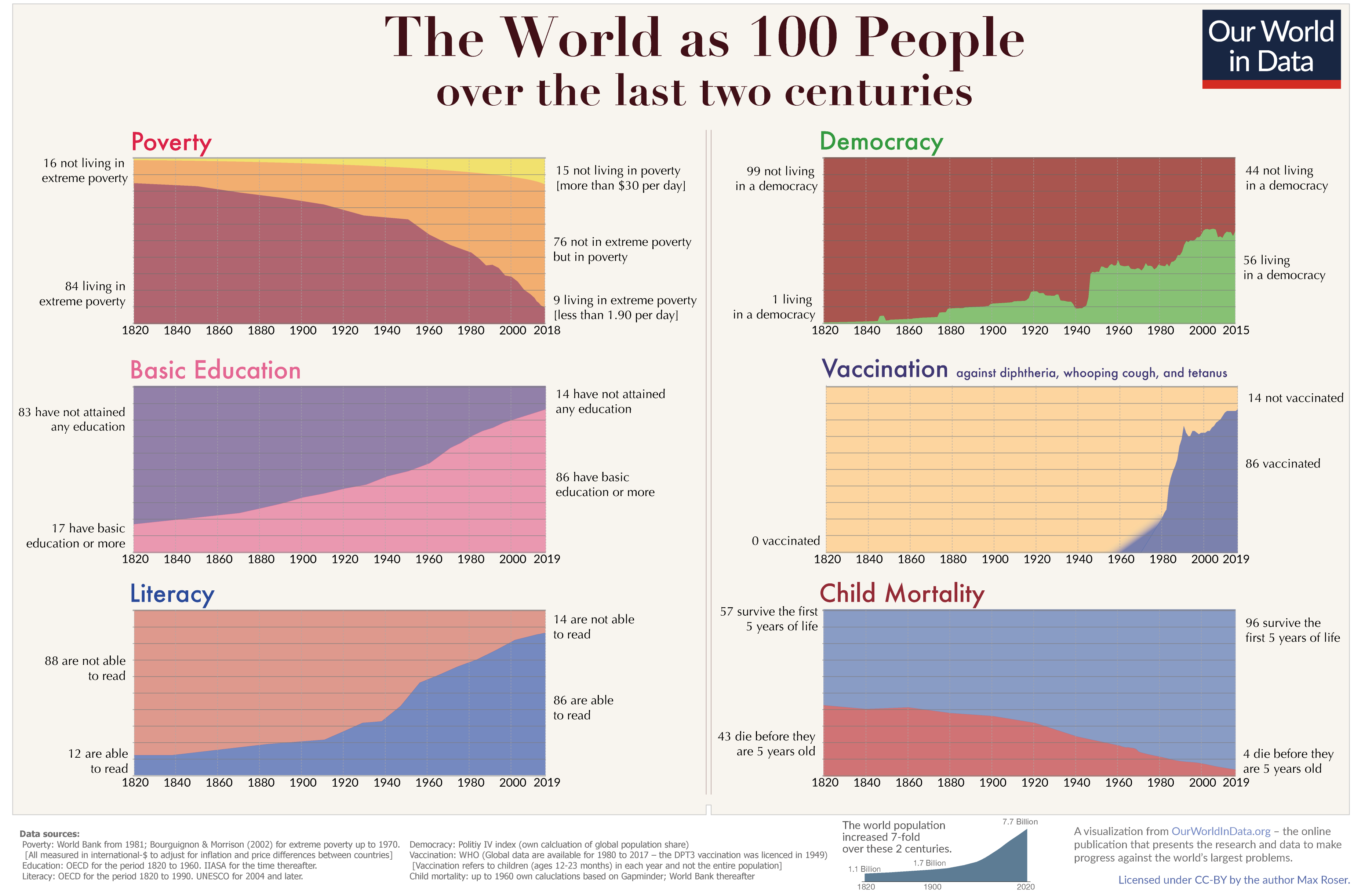
The World as 100 People Over the Last Two Centuries is a good summary from Our World in Data, a website dedicated to capturing the story of human progress in the form of data visualizations, of their much longer article about the history of global living conditions and why it matters that we know it.
For our history to be a source of encouragement we have to know our history. The story that we tell ourselves about our history and our time matters. Because our hopes and efforts for building a better future are inextricably linked to our perception of the past it is important to understand and communicate the global development up to now. A positive lookout on the efforts of ourselves and our fellow humans is a vital condition to the fruitfulness of our endeavors. Knowing that we have come a long way in improving living conditions and the notion that our work is worthwhile is to us all what self-respect is to individuals. It is a necessary condition for self-improvement.
Freedom is impossible without faith in free people. And if we are not aware of our history and falsely believe the opposite of what is true we risk losing faith in each other.
here you can download the 200 year chart in high resolution to print it out.
Well designed charts can tell a very compelling story, and this one was recently shared by Bill Gates on his Twitter Feed and discussed during an interview on CNBC. It has also gained coverage from Forbes, Business Insider, Vox Media, and Marketwatch.
These data sets are shown with fairly simple 100% area charts, and are separate, interactive charts in the full article. The text labels on the left and right of each chart give the reader a clear comparison between life now and 200 years ago. I’m confused by all of the colors though. I would have kept a consistent color scheme for the good vs. bad portions, but the colors they chose don’t make sense to me.
I appreciate how this summary infographic was put together know that people would share it without the rest of the article. Data sources are cited, a Creative Commons license is included, and the URl to their website is easy to find.


January 30, 2019
How Do You Know When It's Time to Rebrand?
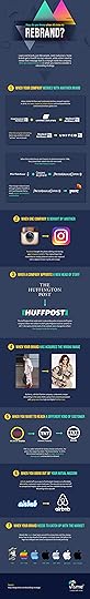
When companies change their logos, it can sometimes be confusing to consumers on why. The old one looked just fine. But there are good reasons to change a brand or logo. How Do You Know When It's Time to Rebrand infographic explains six different reasons why a company would decide to change.
It’s a fact of life that sometimes things have to change. Logos and brands, just like people, also need makeovers. Some logos change after many years, while others change every 10 years or even less.
While some of the most common reasons for rebranding are mergers and acquisitions, other developments such as a change in staff, a new company vision or the need to repair a damaged image also play a role. We will look at all the signs that scream “time to rebrand!” and include recognizable examples for each.
By the end, you should be able to analyze your own situation to see if it is indeed time to consider a rebranding strategy.
I really like this use of an infographic to summarize the highlights of a longer article. Each of the seven different rebranding reasons are shown in the infographic with a visual example and short explanation, but the article on the infographic landing page goes into much more detail. This keep the infographic clean and quick to read.
More information can be found at .
Thanks to Payman for sending in the link!


January 28, 2019
Welcome to Cool Infographics 3.0!
I’m very excited to announce to launch of the Cool Infographics redesign 3.0! For 12 years Cool Infographics has been one of the most popular websites celebrating good infographics and data visualization designs and provides a resource for fans, students, and professionals of infographics and DataViz.
It took 3 months to migrate the all of the content (1,700 pages) from the prior platform to this new design, and we’re still working on making sure all of the resources are properly loaded. I originally launched Cool Infographics in 2007 on the Google’s Blogger platform, and after purchasing the coolinfographics.com URL I launched the first redesign as Cool Infographics 2.0 on the Squarespace 5 platform in 2010. Squarespace then completely rebuilt and relaunched their platform to provide modern web design capabilities, mobile responsiveness, SSL certificates, and much more that make this new design very exciting.
I invite you to check out our new site and let us know what you think on the Contact page.
The Grid
Right away you'll see the new grid format for the home page. We chose this so users can quickly see multiple infographics without much scrolling, and easily click to discover more information and commentary.
SearchOur search functionality is much more user friendly and is now always conveniently available at the top right corner of the page no matter where you find yourself on our site. Search by keywords, tag, topic or date.
NavigationThe main feature of Cool Infographics has always been the infographics, so the navigation on the new design is hidden out of the way in the pop-up hamburger menu in the top left corner. This keeps it out of the way until you need it!
Design ToolsA top destination within the Cool Infographics ecosystem has always been our Design Tools section. We have reorganized this resource by tool type, and we're still loading all of the links for the 200+ tools from our list. This page will be expanding into new categories in the future.
Infographic PostersThe Infographic Posters page is another very popular resource on Cool Infographics, and the new design is a beautiful thumbnail gallery organized by publisher. I've known some of the these infographic poster designers/publishers for years, and we've got over 75 poster links loaded on the page with more to come.
Jobs BoardThe Cool Infographics Jobs Board is FREE for anyone to submit an open position for infographics designers or data visualization designers/developers/specialists to be included on the page. This is a great resource for any designers looking for a new role, so check back often!
Mobile FriendlyOur new format lends itself nicely to a mobile experience whether on your phone or tablet.
More to come...There's much more to come in 2019 and beyond, so stay tuned for more features and announcements!


January 17, 2019
The Visual Compendium of Sitcom Sofas
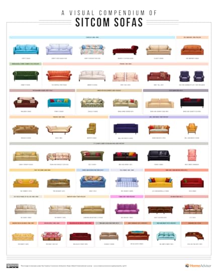
The furniture used on TV shows has become an important piece of set design, and must be unique to each show. HomeAdvisor has put together A Visual Compendium of Sitcom Sofas infographic that nicely lays out some of the most iconic sofas on television.
The sofa, as television producers have long known, is the perfect sitcom prop. It can form the center of a studio stage, symbolize family values, or create a mirror image of the viewer at home. In some sitcoms, the sofa is so important that it is a star in its own right.
The classic sitcom sofa is both welcoming and stylish. It is the anchor for the characters and the audience, just as your own sofa anchors your family through each episode of your daily life. So why not turn to infamous sitcom sofas when looking for inspiration for your next couch?
We’ve created the ultimate sitcom sofa compendium to help you make your choice. The rich variety of the natural world has nothing on the diverse offerings of sitcom sofas. Each couch has evolved with a purpose, however baffling, and reveals underlying truths about its characters’ deep prehistory.
Overall a good design with a fun topic. With hundreds of popular TV shows over the years they left a lot of famous couches out. I appreciate the challenge they faced when choosing which sofas to include.
Found on Nerdist.com


January 16, 2019
50 Amazing Facts About the Moon

The moon is a constant being in our lives. It’s been there for as long as humans can remember, surrounded by facts, myths, and A LOT of celestial space. 50 Amazing Facts About the Moon infographic from Giraffe: childcare and early learning blog condenses all of the need to know information into 50 easy to understand facts.
I love that they attempted to visualize each of the facts as much as possible. The information is appropriate for all ages and the visuals are easy to read. There isn’t a lot of words to clutter the space (no pun intended), as well as a nice balance between using real photos along with graphics.
Found on Infographic Journal


January 11, 2019
Wing Shapes
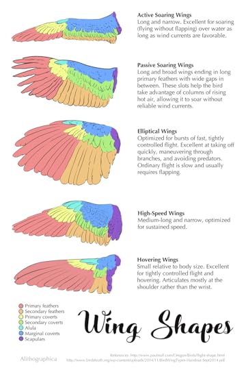
Wing Shapes from Alithographica and designer Jenn Deutscher is a great example of how visual explanations have the potential to be much more effective and easier to understand. This can be especially useful for scientific illustrations.
Since infographics like this are often share without any explanation text, it would be helpful to add an introductory explanation the infographic image itself. The URL of the Alithographica page would also be helpful when people come across this image and want to find the source.


January 10, 2019
The Best DataViz of 2018 from Fast Company
Fast Company has posted a summary of their choices for the 10 best dataviz designs published in 2018, and how they visualized data about our world: The best data viz of 2018 showed us our rapidly changing world.
You’ll notice they chose a number of animated, interactive data visualizations designed specifically for the web, as this trend continues in the industry. I like their choices, and I’ll post more details about a few of them here on Cool Infographics in the coming weeks.


December 6, 2018
What's Your Opinion? The Cool Infographics Website Survey

The Cool Infographics website is headed for a complete redesign and relaunch at the beginning of 2019, and I would really like to hear from you! Would you please answer 10 short questions on the Cool Infographics Website Survey? It should only take a couple minutes.
Survey must be completed by Wednesday, December 12, 2018.


November 29, 2018
Big Data & Infographics eBook Bundle
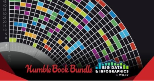
Humble Bundle and Wiley Tech have teamed up to offer the Big Data & Infographics Book Bundle! This is a limited-time offer, and EXPIRES on Monday December 3rd, 2018 at 2pm EDT! I love that this deal is supporting Doctors Without Borders!
HUMBLE BOOK BUNDLE: BIG DATA & INFOGRAPHICS BY WILEY
We've teamed up with Wiley for our newest bundle! Get titles like 101 Design Methods: A Structured Approach for Driving Innovation in Your Organization, Cool Infographics: Effective Communication with Data Visualization and Design, and The Visual Organization: Data Visualization, Big Data, and the Quest for Better Decisions. Plus, your purchase will support Doctors Without Borders!
My book, Cool Infographics, is part of the deal, but I'm not getting a portion of the bundles. No affiliate link, no sponsorship fee, no kickbacks. I didn't even know about the deal until I noticed other people talking about it on Twitter! I'm just excited for my book to be included in the bundle for promotion!
(I did notice they used the dataviz design from my book cover for their promotional graphics)
It is a fantastic collection of books, and you should grab it while it's available! I have most of these on my shelf!


