
Randy Krum's Blog, page 8
February 17, 2021
How to Stop Procrastinating (and Become a Joyful Writer)

You see some people publishing new blog posts every week. Others even publish a whole new book every year. The results of other people’s writing looks simple and effortless, but can become daunting for anyone challenged with writing blog posts, reports, books, articles, etc. The How to Stop Procrastinating (and Become a Joyful Writer) from designer Henneke will ring true to many of us.
As a writer myself, I have run into these challenges when the Cool Infographics Book and writing posts here on the Cool Infographics site.
From Henneke:
We only see the end result of other people’s writing.
We see their finished pieces but we don’t see their resistance to writing.
We don’t notice the despair about a crappy first draft. We don’t see the huge effort of restructuring and revising and editing until the writing flows naturally and the ideas are finally communicated with clarity and flair.
If you’re a procrastinator, you’re not alone.
You’re not the only one who finds writing a challenge, who wrestles to get your ideas on paper.
As psychologist Dr. Christian Jarrett suggests, procrastination isn’t a matter of managing your time better, it’s a matter of managing your emotions.
Your illustrated guide to stop procrastinating …
This infographic is very different than many I have posted on Cool Infographics. It’s hand-drawn illustrations and storytelling format are unique and fresh. She isn’t trying to communicate data, so there aren’t any data visualizations in this design.
From an infographic design standpoint, I think the only thing this one is missing is including the URL to the original infographic landing page. This infographic is part of a larger article, but many people will share the image alone and may not link back to the original. Infographic designs should always include the URL back to the original so when readers find it reposted on social and other sites they can easily find their way back to the original.


November 10, 2020
Instagram in an Instant

The team at S9 has designed this handy infographic guide to Instagram In An Instant that shares facts and data about the growing social media platform.
A helpful infographic that we have worked on that provides lots of information about the image sharing social networking service, Instagram . The piece includes general facts about Instagram, the most followed Instagram users and data about the growth of Instagram along with some marketing tips and hints for businesses.
This is a good rundown of the Instagram service, and most of the data is visualized. There are only a handful of data points that are shown only as text, and readers will consider those to be secondary information.
They did a good job of including the URL to the infographic landing page in the footer of the infographic image. That way when readers find this infographic shared and reposted without a link back to the original on the S9 site, they’ll be able to find it quickly themselves.

October 7, 2020
16 DataViz Shows: Podcasts and Video Series
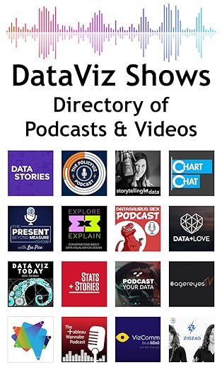
DataViz Shows is a new directory page I just added to the growing library Cool Infographics Tools pages. A number of data visualization designers and professionals have started podcasts or video shows on YouTube that explore the craft of designing data visualizations, visual communication or interviewing people from the data visualization community. I know a lot of these people, and they are publishing some amazing content!
This will be a growing list as more shows get started, so feel free to send me a note if you know of a show that I should consider adding to the list!
One challenge for the list is that there are also many shows about data, data science, analytics, statistics, and even some of the specific tools we use (like Tableau or PowerPoint), and I’m not including those. I’m only including shows in my list that talk about the craft of data visualization design, visual communication, and data storytelling (if not in every episode, at least frequently).
Another challenge for listing podcasts are the links, because you can subscribe through many different podcast apps and services. If the shows have their own website, I’ve linked directly there. Additionally, I’ve tried to provide all of the direct podcast subscription links that I know about.
Here are the initial 16 Podcasts and Video Series on the list. You can see all of the details and links I’ve gathered on the DataViz Shows page.

Data Stories
The PolicyViz Podcast

storytelling with data
Chart Chat Live

Explore Explain
The Present Beyond Measure Show
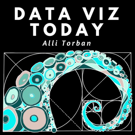
Data Viz Today
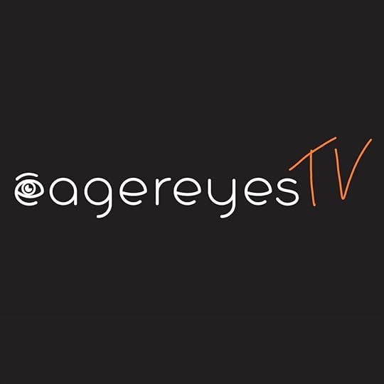
eagereyesTV

VizComm in a Blink

Analytic Stories
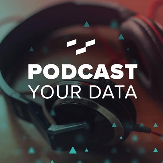
Podcast Your Data
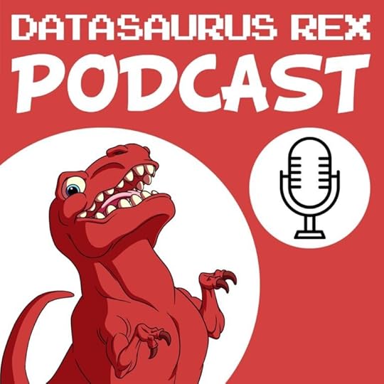
Datasaurus-Rex Podcast
The Tableau Wannabe Podcast
Data + Love

Stats + Stories

ZigZag (Season 2)

September 29, 2020
A Handy Guide to Image Print Resolutions
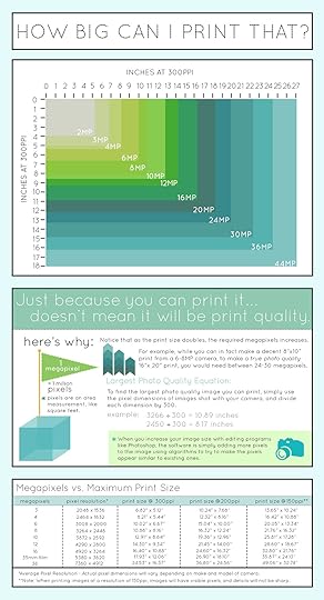
A Handy Guide to Image Print Resolutions infographic is useful when it’s time to take your digital work into the the physical world by printing it (banners, posters, brochures, etc.). Without prior knowledge of megapixels, you might not know how big you can print the image you just found without it looking pixelated. Photobiz skips the technical lesson and gives you the answer with this guide. Follow this infographic, and you’ll never print a pixelated photo again!
Ever tried to print an image that's been saved for the web and noticed that the image quality was significantly downgraded? Or, have you ever tried to enlarge an image taken with an 8 megapixel camera, or even an image taken using a cell phone, to a size of 16"x20"? If you have, you probably know that the culprit lies with the relationship between Image Resolution and Maximum Print Size. To non-photographers, these concepts can sometimes be hard to explain, since it's easy to see that an image looks perfectly fine on a computer screen at 72 pixels per inch (ppi), however if you attempted to print that same image, more than likely the print would have visible JPG artifacting, or visible pixels.
With that said, rather than go through the motions of explaining how megapixels relates to print resolution, we've created this handy infographic that might make it easier to understand that even though you can print something at a certain size, it doesn't guarantee that it will necessarily be print quality. We hope this might help explain the concepts of how image resolution relates to print size in the future, so please feel free to share!
What a great use of an infographic as a visual guide! This is an information infographic that is sharing valuable information without any type of sales pitch or advertisement.
Since infographic images get shared and reposted on the Internet frequently without any accompanying text or links, they should have include the publishers info in the design of the infographic: logo, website, copyright.
Found on thephoblographer.com

September 21, 2020
Visualizing the Social Media Universe in 2020
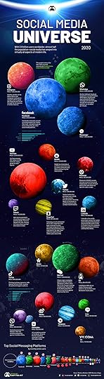
The team at Visual Capitalist has visualized the Social Media Universe in 2020 using circular planets to represent the sizes of the different social platforms. They did a lot of things right with this design, and one major design choice I question.
From Visual Capitalist:
Social media has seeped into virtually all aspects of modern life. The vast social media universe collectively now holds 3.8 billion users, representing roughly 50% of the global population.
With an additional billion internet users projected to come online in the coming years, it’s possible that the social media universe could expand even further.
Let’s take a look at how social networks compare in terms of monthly active users (MAUs)—an industry metric widely used to gauge the success of these platforms.
Here’s what I think they did really well:
Circle sizes! So many people get circle sizes wrong, but they got it right. You have to size circles so the areas are proportional to the data. I even created a reference sheet to teach people Sizing Circles for Data Visualization that you can download as a PDF.
Brand colors. The colors of the planets in the infographic are based on the brand colors of each platform. That helps associate each planet.
White logos and text: There’s so much other color noise in this design, keeping the logos, data values and text in white helps make it more readable.
Defining MAUs (Monthly Active Users) early. You should always define your acronyms at their first use within your design (infographic, report, presentation, etc.) so anyone not familiar with it will understand them from the start.
Zero baseline bar charts. There are a couple small bar charts that provide additional data about Facebook and TikTok. Both of them are simple, clean, one-color designs based on a zero baseline so readers can easily understand them. That also allows for the removal of the axis labels and the data labels on the bars to be enough information for the readers.
Short, simple text descriptions about each service. Keep the infographic simple, and longer explanations are in the article posted along with the infographic.
Here’s the one design choice I question:
Visualizing them as 3D planets. I get the visual metaphor for the “Social Media Universe” but as soon as you visualize them as 3D planets, they really should be sized as proportional 3D spheres instead of 2D circles. That math is a little more complicated. As it is currently designed, the sizes don’t match spheres.
A few other design improvements for infographics:
Don’t obscure your data sources. Don’t just list the top level domain or company where your data came from in the infographic. Readers should be able to easily review and access your data sources. Don’t make people search or hunt for your data.
Missing copyright or Creative Commons. I’m an advocate that Creative Commons is an easier licensing model for publishing infographics, but this infographic doesn’t list any type of copyright at all.
Missing infographic URL. Most people share the infographic JPG image file and tend to neglect linking back to the original. The best thing designers can do is to include the URL for the Infographic Landing Page in the infographic image file itself, so readers from other sites can find their way back to the original.

September 12, 2020
Meet the New "Snake Chart"
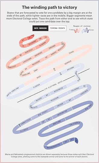
The team at FiveThirtyEight have created a new data visualization they are calling the “Snake Chart” to help show which U.S. states are key to the Presidential election, and how they are currently predicted to swing.
From FiveThirtyEight:
We call this the
July 10, 2020
Everything You Need to Know About TikTok as a Business
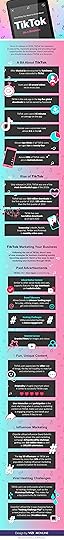
The Everything You Need to Know About TikTok as a Business infographic from VizionOnline is meant as a primer for businesses to understand how they can leverage this new, popular social platform in their marketing.
Here is a useful infographic that we have designed that provides lots of information for businesses about the video sharing social networking service called TikTok. The piece includes some general facts about TikTok and the popularity of the app as well as plenty of TikTok marketing tips that will help you with things including paid advertisements, fun and unique content, influencer marketing and viral hashtag challenges.
This design is a little text-heavy, but I understand that’s important as a guide to help businesses understand the platform.

July 6, 2020
Know Your Risk During COVID-19
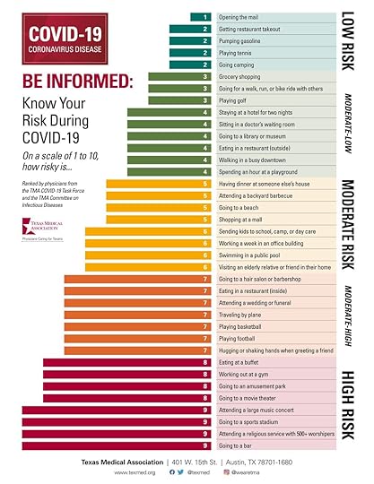
The Know Your Risk During COVID-19 infographic from the Texas Medical Association is one of many new infographics helping people understand their level of risk when leaving home during the pandemic. They published the low resolution image on social media, but you can also download the high resolution PDF.
Be informed. Know your risk. Stay safe.
Ranked by physician experts from the TMA COVID-19 Task Force and the TMA Committee on Infectious Diseases.
It’s a good design; however, they really struggled with how to publish and promote their infographic. They published the infographic on social media (Facebook and Twitter), but didn’t post it on their website. So there was no place for people to link to, find the original or download a high resolution version. They ended up posting links in the comments to the PDF on their website for people that were asking. Very sloppy.
I have an entire chapter about this in the Cool Infographics book, and I teach this as part of the data visualization and infographics courses I teach at SMU. How you publish and promote your infographic is just as important as your design!
Thanks to Erica for sharing!

May 18, 2020
The United Fonts of America
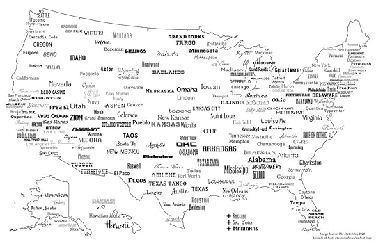
Andy Murdock (Co-Founder of The Statesider) set out to create The United Fonts of America map of all the fonts named after actual locations in the U.S.
Just how many fonts are named for American places?
The answer is 222. That’s not actually the answer, it’s just where I had to stop, because the more I looked the more I found. What started as a quirky challenge to make a US font map during COVID-19 quarantine days started to edge into obsessive-compulsive territory. I’d wake up in the middle of the night thinking, “Did I check to see if there’s a Boise font?” (I did. There isn’t.) I finally found the limit to how many fonts I could use in one place.
Andy’s full post about his design journey is a good read, including the challenges of multiple fonts using the same name over the years. He also has links to all of the fonts included, some free and some paid.
Found on
April 20, 2020
COVID-19 #Coronavirus Infographic Data Pack
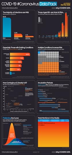
COVID-19 (aka Coronavirus) has obviously been a hot topic recently, especially within the media. But how dangerous is this new virus?
The Covid-19 #Coronavirus Infographic Data Pack on Information is Beautiful gathers the current data around the world (version above is from March 31, 2020) and makes the virus more tangible to understand. The infographic makes comparisons to other diseases when it comes to incubation times and number of deaths, as well as reporting who is dying from it.
Created by David McCandless, Omid Kashan, Fabio Bergamaschi, Dr Stephanie Starling, Univers Labs
From Information Is Beautiful:
We made an infographic of the best COVID-19 / Coronavirus charts floating around, plus some of our own – all with the latest data
We’ll plan to keep it updated every few days.
They have also made all of their data accessible with a Google Sheet link: bit.ly/COVID19-DATA
With so many good and bad COVID-19 charts being published at a frantic pace, I can appreciate the design and effort here to gather some of the best data and the best visualizations together in one place.


