
Randy Krum's Blog, page 3
October 24, 2023
Annular Eclipse

Kennth Field used Nasa’s data to create this Annular Eclipse infographic. The graphic combines the information of where the eclipse had its highest coverage, as well as the time of day it was at its peak. It also shares the direct path of the moon and some basic information on what an eclipse is.
Overall, a beautiful summary with very little verbiage. In only a few seconds, you could tell how obscured the Sun was going to be in your part of the U.S.
Thanks for RJ Andrews for bringing this graphic to our attention!


October 17, 2023
Google Bard VS ChatGPT
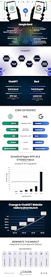
Bard Vs ChatGPT infographic by Zealous System breaks down the specifics and differences between the two AI language models.
ChatGPT, developed by OpenAI, is based on GPT-3.5 architecture and has become a leading AI language model, renowned for its ability to generate human-like text and provide insightful responses. On the other hand, BARD, a language model equipped with advanced natural language understanding and generation capabilities, makes it a formidable competitor in the market.
ChatGPT is better at generating creative text formats, such as poems, code, scripts, musical pieces, email, letters, etc. It is also better at generating different responses to the same prompt, which can make it more engaging to interact with. However, ChatGPT is not as good at answering factual questions as Bard.
Bard is better at answering factual questions, summarizing text, and providing information from the real world. It is also better at following instructions and completing requests thoughtfully. However, Bard is not as good at generating creative text formats as ChatGPT.
This is a fairly general informative infographic design. No specific point, or push to use one over the other. Good information as a comparison infographic using the publicly available information about each tool (which there is very little specific data).
The footer should include some type of copyright (or Creative Commons) license and the URL to get to the infographic landing page (not just the company home page).
Thanks to Mary Logan for the submission!
August 17, 2023
Sankey Creation Tools Directory
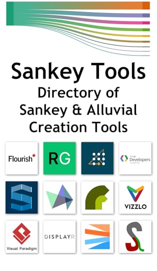
Sankey and Alluvial Diagram Tools is a new directory page I just added to the growing library Cool Infographics Tools pages. The page has links to many free and paid tool to create your own diagrams. I’ve included online tools, programming code and downloadable apps.
This will be a growing list as more tools become available, so feel free to send me a note if you know of a tool that I should consider adding to the list!
August 10, 2023
2023 Flags of the Women's World Cup
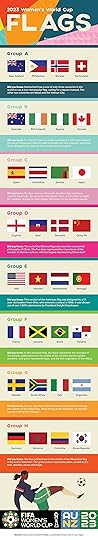
The 2023 Women’s World Cup Flags infographic from UK Featherflags takes a currently popular topic in the news, and makes it relevant to the publishers business of making flags. This is the content they know about best.
From the publisher:
[This infographic] takes a look at the flags for the different countries in the 2023 FIFA women's world cup which is taking place from 20 July to 20 August 2023 and is jointly hosted by Australia and New Zealand.
Check out this handy design to view the flags for the countries in the various groups of the tournament along with some interesting facts.
I like the simple infographics that tell one story really well. Not a lot fo text, and the flag images are the highlight of the infographic design. I love that they included the URL to the infographic landing page in the footer! Many people will share or repost an infographic without providing a link back to the original. This makes it easy for readers to track down the source and learn more if they were interested.
This design is missing a few things:
I prefer to include the publisher’s logo on the infographic somewhere (usually in the footer). This only mentions the publisher’s website in text as part of the subtitle. It’s easy to miss, and that loses the publisher’s benefit of releasing the infographic in the first place.
It’s missing some type of conclusion or call-to-action at the end. What should readers do after reading the infographic? It doesn’t have to be a hard sales pitch. Visit the website, sign up for our newsletter, learn more about flags on our site, etc. What action should the reader take after enjoying the infographic?
Copyright or Creative Commons license.
Thanks to David for submitting the infographic!
July 28, 2023
The History of Barbie
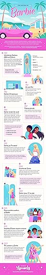
The History of Barbie infographic from the design team at Lemonly does a great job bringing you up to date on Barbie’s history to help you enjoy the new blockbuster movie even more.
From Lemonly:
You know her. You love her. But how well do you know the history of Barbie? Barbie’s many evolutions have taken her to the runway, the White House, and everywhere in between. For more than 60 years, Barbie has held a special place in the hearts and imaginations of children everywhere — and done it all in pink high heels.
To celebrate Barbie’s iconic legacy and the premiere of Greta Gerwig’s blockbuster Barbie movie starring Margot Robbie and Ryan Gosling, we created this infographic to help Barbie fans everywhere learn more about the history of one of the world’s most iconic dolls.
Check out the illustrated timeline of Barbie history below!
This design has more text than I normally like, but it works in this context, explaining each event with only 1-2 sentences. As a timeline, I’m not a fan of the weaving back-and-forth line style that doesn’t spread out the events based on time durations.
You also notice that all of the illustrations are new. They didn’t use any actual product images, movie images or even the official Barbie font to stay clear of any potential copyright or trademark issues.
July 17, 2023
Listen (and Watch) to Real-Time Wikipedia Edits
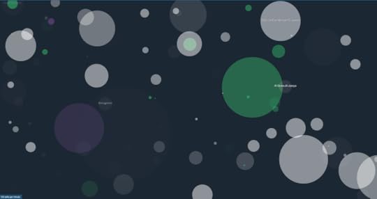
Listen to Wikipedia is a fun visual & audio project that gives life to real-time edits on Wikipedia.
For the visualization, green circles are anonymous edits, purple circles are bots, and white circles are edits by registered users. The size of the circles represent the size (in bytes) of the edit made.
Fro the audio portion, bells are additions and string plucks are subtractions. Pitch changes according to the size of the edit; the larger the edit, the deeper the note.
Listen to Wikipedia was written by Stephen LaPorte and Mahmoud Hashemi, and is open-source. [Github link] This project was built using D3 and HowlerJS. You can read more about their project in their blog post.
June 15, 2023
A Great Chart: How Much Hotter This June Has Been
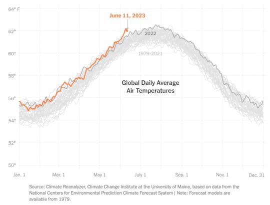
I really like this chart! It hits all of the data visualization design best practices for me. This was published by the NYTimes in the article: Here’s How Much Hotter Than Normal This June Has Been
Here’s what I like:
It’s time series data, so it’s visualized as a line chart
Year-over-year data is easy to compare as overlapping lines for the same Jan-Dec time period
No chart legend! The lines are labeled directly within your field of view in the chart
Using the pre attentive attribute of color, 2023 is highlighted in orange and the rest are gray lines
The chosen orange color isn’t red or green so there isn’t any implication of good or bad
The 2022 line is a darker shade of gray, so it’s also distinguishable, but not the focus
The x-axis labels are only every other month to minimize the text on the page
The is one example of when a non-zero baseline is appropriate so you can see the details
NOTE: This NYTimes article is behind their paywall, so you may not be able to see the original article without a subscription. I have a limited amount of “gift articles” I can share. You can CLICK THIS LINK if you don’t have a subscription and want to see the full article. It will let you see the article until I run out of shares!
June 7, 2023
27+ (Secrets) on How To Create An Awesome Viral Infographic in 2023

So you want to make an awesome infographic, but you aren’t sure where to start. Capsicum Mediaworks has 27 (Secrets) on How To Create An Awesome Viral Infographic in 2023.
This is definitely and example of “Do what I say, not what I do”.
There’s some fantastic information here! Ironically, this is NOT a great infographic. Saving a bunch of text as a JPG file does not make a good infographic. This infographic design goes against some of their own best advice! More visuals, less text. Make it big, not gigantic. Highlight/focus on the important points.
We all know that beautiful infographics are much more interesting as compared to long, plain text. It is the basic human tendency to associate more with anything that explains the same point with more visual appeal and less jargon.
Which is why infographics have become such a big deal.
The pictorial representation of the data, colorful backgrounds, short, to-the-point text, and easy to understand themes, are just some of the reasons why infographics have surpassed other digital marketing strategies in terms of popularity. And they are definitely here to stay.
So if you haven't jumped on this bandwagon yet, it's high time you do!
Found on Capsicum Mediaworks.
May 22, 2023
Visualizing Sick Days
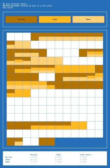
Zach Rottman dealt with the stress of his son bringing home “bugs” from daycare by creating a table on how often the individuals of the household were sick. There are a bunch of advantages you can get from tracking “quantified self” data with visualizations, and I can appreciate this one about kids bringing home sickness from school. Not the kind of homework parents want to be dealing with.
My boy started school, my boy got sick.
As any parent could have told me, we got clobbered. Within three days, my son had Covid, and while he was only mildly sick for a day or two, he (and I) stayed home for ten. Meanwhile, my partner was out of commission for longer than that. Scarcely a week after his return our son brought home some gnarly cold—home again, not sleeping, not eating. Turns out, it’s especially hard to manage a head cold when you don’t know how to blow your nose yet and have a strong and very vocal preference against medicine. The next time it was hand, foot, and mouth disease, then RSV, followed by a slew of mysterious rashes. You get the idea. Most of the time mommy and daddy didn’t fare much better.
So, to distract me from my misery and take on a project that could plausibly be brought to fruition while also tending to a sick one-year-old, I started quantifying the sick days and built a simple web app (myboyissick.com) to see it all.
I do think the rows of 12 squares aren’t easily translatable to days or weeks on the calendar. Not a big deal when you’re designing just for yourself, but I would layout the grid to be more relatable to a calendar format.
Article found on Nightingale.
April 28, 2023
How climate change will affect generations
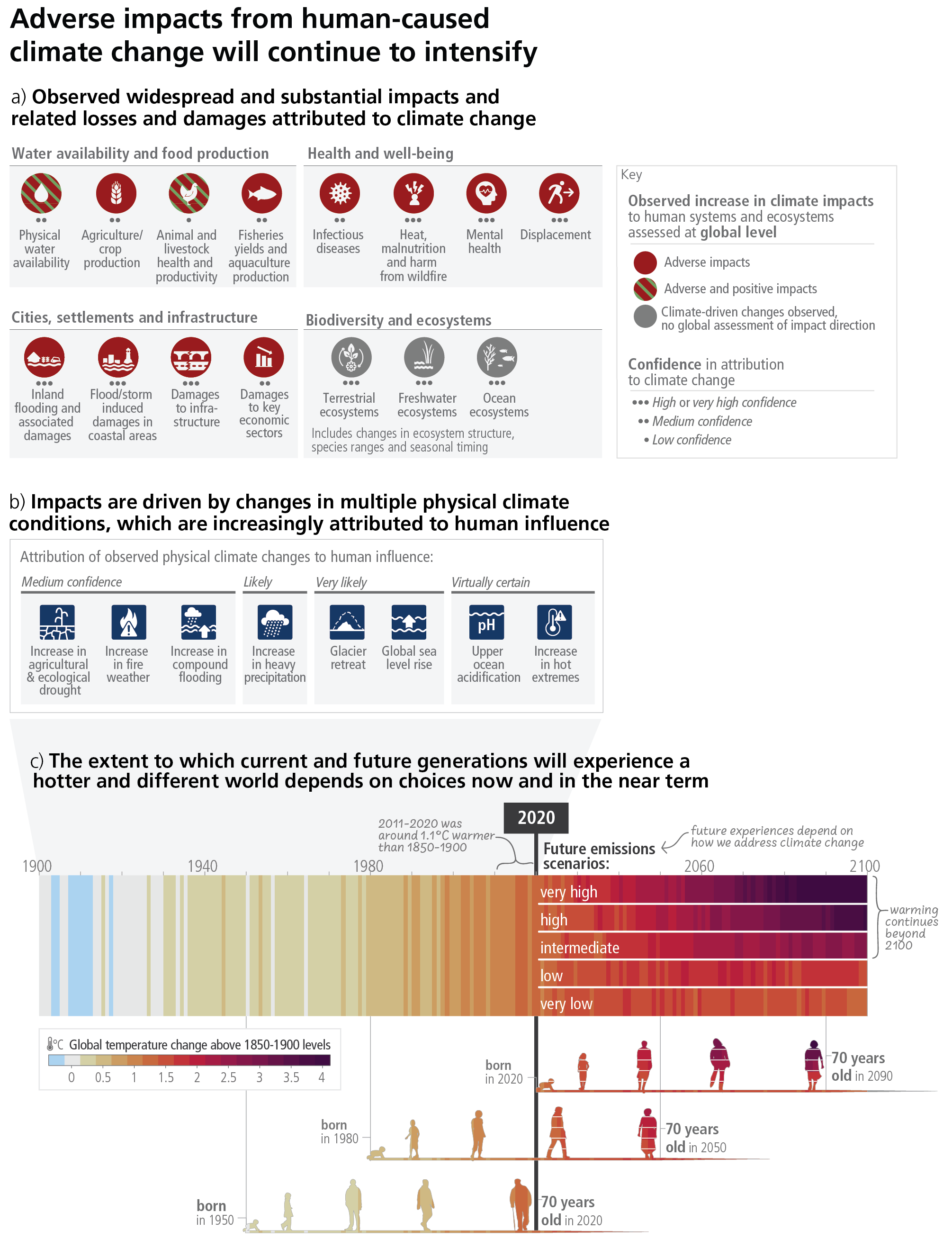
The IPCC released the AR6 Synthesis Report, Climate Change 2023. Featured above is a key graphic from the report uses the color-band visualization method of temperature variance each year, and then adds a new twist with five possible futures stacked within the space of the band. The timeline below the color-bands also shows the impact to people born in different age generations.
The Washington Post did a recent coverage of the report:
The report released Monday emphasizes that overall, the degree of warmth — and the subsequent health of the environment, wildlife and ourselves — can still be altered depending on policies and actions taken today. The current implemented policies would put global temperatures around 3.2 degrees of warming by 2100 — somewhere in the range of the “intermediate” or “high” pathway of future emissions scenarios depicted in the graphic, said NASA climate scientist Alex Ruane, who is a member of the core writing team for the synthesis report and helped with the overall concept and science content of the figure.
Found on The Washington Post


