
Randy Krum's Blog, page 5
September 7, 2022
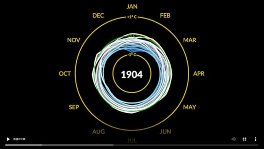
GISTEMP Climate Spiral
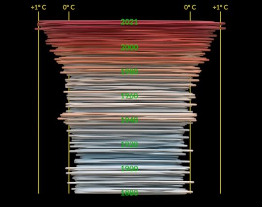
The GISTEMP Climate Spiral is an animated graphic created by NASA Visualization Studio showing the global surface temperature from the industrial revolution until today. TL;DR it’s getting hotter!
The visualization presents monthly global temperature anomalies between the years 1880-2021. These temperatures are based on the GISS Surface Temperature Analysis (GISTEMP v4), an estimate of global surface temperature change. Anomalies are defined relative to a base period of 1951-1980. The data file used to create this visualization can be accessed here.
The Goddard Institute of Space Studies (GISS) is a NASA laboratory managed by the Earth Sciences Division of the agency’s Goddard Space Flight Center in Greenbelt, Maryland. The laboratory is affiliated with Columbia University’s Earth Institute and School of Engineering and Applied Science in New York.
The 'climate spiral' is a visualization designed by climate scientist Ed Hawkins from the National Centre for Atmospheric Science, University of Reading. Climate spiral visualizations have been widely distributed, a version was even part of the opening ceremony of the Rio de Janeiro Olympics.
Check out NASA Visualization Studio for the full video.


August 25, 2022
A Subway Map of Human Anatomy

A Subway Map of Human Anatomy infographic is a good example of bridging the gap between scientific information and a recognizable design. Johnathon Simmons M.D. uses a well-known visualization of the London Underground Subway system and uses that design style with the human body to explain the relationships between all of the systems within us. A Hires version is available on Visual Capitalist to view the intricate details.
We all have bodies, but how many of us truly know our way around them? Plenty of books explain in detail the functions of and relationships between each and every part of our anatomy, but few of them do it in a way the layman — and especially the layman not yet accustomed to the sight of human viscera laid bare — can readily grasp. We need a visualization of the human body, but what kind of visualization can best represent it with a maximum of clarity and a minimum of misleading distortion?
“Most people might imagine an intricate network of blood vessels or the complex neural circuits of the brain,” writes Visual Capitalist’s Iman Ghosh. “Or we might picture diagrams from the iconic medical textbook, Gray’s Anatomy.” But how about a visualization of the body in the style of a classic piece of information design we’ve all seen at least once, the London Underground map? “Created by Jonathan Simmonds M.D., a resident physician at Tufts Medical Center,” Ghosh writes, “it’s a simple yet beautifully intuitive demonstration of how efficiently our bodies work.”
Just as Harry Beck’s original 1933 London Underground map straightened out and color-coded each of the lines then in operation, Simmonds’ anatomical map traces thirteen different “lines” through the body, each of which represents a different system of the body: the nervous system in yellow, for example, the airway system in black, and the lymphatic system in green. “While dashed lines represent deeper structures, sections with ‘transfers’ show where different organ systems intersect,” Ghosh writes. If you’re wondering where to start, she adds, “there’s a helpful ‘You Are Here’ at the heart.”
Looks to be inspired by Sam Loman’s design, Underskin I posted in 2010.
Found on: Open Culture
July 14, 2022
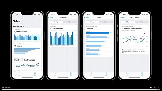
Apple Launches Swift Charts
At the Apple World Wide Developer Conference (WWDC) in June 2022 Apple announced the release of Swift Charts, a programming framework for displaying charts in mobile applications using the Swift language. This framework is what Apple uses in their own apps like Health, Weather, Stocks and more.
This crosses two worlds for me, because there really is a User Experience Design component to chart design, and user experience designers are frequent attendees at my talk about data visualization.
Not a tool for the average data visualizer, this is specifically geared towards programmers building mobile apps. During WWDC they also released a handful of videos focused on Swift Charts and best practices for chart design in mobile apps. One of the videos features Nicholas Felton, a celebrity in the data visualization community, famous for his personal design of the Feltron Reports using his own quantified self data from 2005-2014. I see your printed copies of the Feltron Report on the desk in the video Nicholas! Very subtle!
I think this is the correct viewing order for the four videos:
 Hello Swift Charts
Say hello to Swift Charts — a flexible framework that helps you create charts entirely in SwiftUI that look and feel right at home on all Apple platforms. Discover how you can use compositional syntax to make informative, delightful, and accessible charts with less code. We'll share the building blocks for making visualizations with Swift Charts, and explore how you can change your charts' design with a simple modifier. We'll also take you through the latest updates to Xcode Previews to help you chart a path toward an engaging experience.
 Design an effective chart
Learn how to design focused, approachable, and accessible charts. We'll show you how to design great charts with clear marks, axes, descriptions, interaction, and color and help you create useful experiences for everyone.
 Design app experiences with charts
Learn how you can enhance your app with charts to communicate data with more clarity and appeal. We'll show you when to use charts, how to use them and how they work together in a chart design system.
NOTE: Look for the Feltron Report copies on the desk next to Nicholas!
 Swift Charts: Raise the bar
Dive deep into data visualizations: Learn how Swift Charts and SwiftUI can help your apps represent complex datasets through a wide variety of chart options. We'll show you how to plot different kinds of data and compose marks to create more elaborate charts. We'll also take you through Swift Charts' extensive chart customization API to help you match the style of your charts to your app.
June 28, 2022
Visualizing The Worlds’ Dependency on Russian Oil

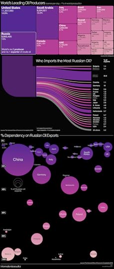
It may not come as a surprise that Russia is one of the World’s top Oil and Natural Gas Producers. But who imports the most from them? Visualizing the World’s Dependency on Russian Oil and Natural Gas infographics from Information is Beautiful shows who the Russian war with Ukraine could be effecting.
Two good infographics that use a variety of data visualization styles. Treemaps, sankey diagrams, and bubble charts. I like how the sankey diagrams are directly connected to the Russia rectangle in the treemap.
May 30, 2022
Why Most Charts Suck - Podcast Interview

Last week I was interviewed by Lea Pica on The Present Beyond Measure podcast! Lea’s podcast covers the intersection of data visualizations and presentations, and we had such a fun conversation!
Listen to the entire interview in your browser or in the podcast player of your choice: Apple Podcasts, Spotify, Stitcher, or Google Podcasts.
From Lea’s description:
Randy dishes about the tyranny of the default, the differences between data visualizations for discovery and communication, and why we shouldn’t always use colors on everything! Randy also talks about building on templates, the problems with numbers, and the scale of visual perception.
To finish off, we get some insight into Randy’s three keys of good data viz; making your charts understandable, memorable, and actionable!
And in this episode, Randy shares all his wisdom regarding making better charts and how to pick the right kind of chart for what you are trying to accomplish!
In This Episode, You’ll Learn…
The real job of a data visualization designer.
Why most charts suck!
The value and power of data story arcs.
Randy’s three keys to good data viz!
The difference between Data Visualizations and Infographics.
About the free resources that are available on the Cool Infographics site.

The Present Beyond Measure podcast is one of over 15 data visualization related podcasts in my directory of DataViz Shows. Check them all out!
May 13, 2022
Visualizing Everyone that has Ever Lived
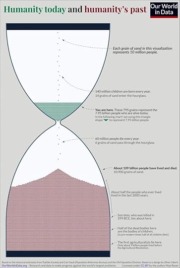
How do you visualize every human that has ever lived in the last 2 million years? Max Roser with Our World in Data had the idea to turn us all into grains of sand within an hourglass, and to equate the passing of people to the passing of time. The Humanity Today and Humanity’s Past infographic highlights a few key points in history and gives us a perspective of just how population growth has exploded over the last 2000 years.
Our pastBefore we look ahead, let’s look back. How many came before us? How many humans have ever lived?
It is not possible to answer this question precisely, but demographers Toshiko Kaneda and Carl Haub have tackled the question using the historical knowledge that we do have.
There isn’t a particular moment in which humanity came into existence, as the transition from species to species is gradual. But if one wants to count all humans one has to make a decision about when the first humans lived. The two demographers used 200,000 years before today as this cutoff.1
The demographers estimate that in these 200,000 years about 109 billion people have lived and died.2
It is these 109 billion people we have to thank for the civilization that we live in. The languages we speak, the food we cook, the music we enjoy, the tools we use – what we know we learned from them. The houses we live in, the infrastructure we rely on, the grand achievements of architecture – much of what we see around us was built by them.
Our presentIn 2022 7.95 billion of us are alive. Taken together with those who have died, about 117 billion humans have been born since the dawn of modern humankind.
This means that those of us who are alive now represent about 6.8% of all people who ever lived.
These numbers are hard to grasp. I tried to bring it into a visualization to put them into perspective.3
It’s a giant hourglass. But instead of measuring the passage of time, it measures the passage of people.
Each grain of sand here represents 10 million people: each year 140 million babies are born. So we add 14 grains of sand to the hourglass. Every year, 60 million people die; this means 6 grains pass through the hourglass and are added to the large number of people who have died.4
As noted on the graphic, this is an updated adaptation of a 2013 visualization by Oliver Uberti .
Found on Daily Infographic
April 7, 2022
The Dirty Bed Cleaning Guide
Keeping your home clean can be a full time job. The Dirty Bed Cleaning Guide by naplab can help you keep track of how often to clean your bed for optimal healthiness!
Your bed and mattress is more filthy than you realize. Within 2 weeks your clean sheets will have nearly 6,000,000 bacteria per square inch². By 3 weeks that number grows to 9.2 million². Learn how often to wash your entire bed setup.
This calendar visualization is a clean, simple, visual reminder that we all need to do more than just throw the sheets into the laundry. It’s effective to visualize the actual frequency of each event across months like this design does.
However, after that, the design gets lazy and all of the statistics below are hidden in text. A big missed opportunity here to create data visualizations for these stats which would make them relevant and meaningful to the audience. The impact of these stats is lost because the design doesn’t put them into visual context for the reader. Most readers of infographics don’t read all of the text from top-to-bottom. They’re only reading an infographic for 5-10 seconds total, and visualizations are must faster to understand.
March 22, 2022
Should You Hate Daylight Saving Time?
Recently the Senate passed a bill that would make Daylight Savings Time (or DST) permanent by unanimous consent. (and its passage even surprised some Senators) But even though we may gripe twice a year about the sudden time changes, would making DST permanent be a good thing?
Back in 2015, Andy Woodruff took a deeper look into DST and mapped out how the time changes affect sunrise and sunset times across the United States. Depending on your preferences you could actually love it or hate it. Andy’s Should You Hate Daylight Savings Time infographic uses “reasonable” Sunrise time at 7:00 AM or earlier and “reasonable” sunset time of 6:00 PM or later. However, you can interact with his maps and create your own “reasonable” times to find out where you stand.
Latitude affects how early or late the sun rises and sets, but what the clock says depends on a location’s longitude within its time zone. The farther east it is, the earlier the sun will rise and set. Considering all this, I want to map sunrise and sunset times in the United States and see how they are affected by daylight saving time. I’ve done so by using a little bit of GIS and the super handy SunCalc JavaScript library by Vladimir Agafonkin.
Let’s map how many days of the year have reasonable sunrise and sunset times with and without daylight saving time. I define “reasonable” times as 7 AM and 6 PM. That’s kind of arbitrary, but assuming roughly half an hour of twilight, it at least puts some light in the sky around the time the average American wakes up (6:30ish based on some cursory poking around) and at the end of the business day. But you can define them differently. Explore the coarsely gridded map below and see the geography of sunrise and sunset with and without daylight saving time.
To summarize, these are the scenarios using my preferred times.

In 2019, Andy created an updated Daylight Saving Time Gripe Assistant Tool so you could evaluate the benefits of DST based on where you live, and your preferences for sunrise and sunset.
NOTE: As you can see in the default preferences of the tool, by far most of the country would benefit from abolishing DST instead of making permanent.
March 21, 2022
Map of the Internet 2021
Map of the Internet 2021 visualizes the most popular websites in the style of an old historical map, created by Martin Vargic at Halcyon Maps. The sizes of the Internet “countries” on the map are based on the their relative web traffic, and clustered by type of website.
After a better part of a year of work, I am excited to show you a brand new Map of the Internet, up to date for the year 2021.
Inspired by design of historical maps, this project aims to concisely, but still comprehensively visualize the current state of the World Wide Web, and document the largest and most popular websites over the period of 2020-2021, along with their countless aspects and features.
This work was originally inspired by the “Map of Online Communities“ by Randall Munroe, and further by my own maps of the internet 1.0, 2.0 and 3.0 previously published in 2014-2015.
The Internet has come a LONG WAY since Randall Munroe’s original design I posted about in 2008.

From Martin Vargic:
Compared to any previous iteration of the Map of the Internet, this new version is many times more detailed and informative. It includes several thousand of some of the most popular websites, represented as distinct "countries", which are grouped together with others of similar type or category, forming dozens of distinct clusters, regions and continents that stretch throughout the map, such as "news sites", "search engines", "social networks", "e-commerce", "adult entertainment", "file sharing", "software companies" and so much more. In the center of it all can be found ISPs and web browsers, which form the core and backbone of the internet as we know it, while the far south is the domain of the mysterious "dark web".


Color schemes of websites are based on the dominant colors of their user interface or logo. To add further detail and provide deeper insight, many features and services provided by these websites, their sections and content categories, as well as distinct content creators, are labeled as cities and towns (which number at well over 10 thousand). Website founders and CEOs are represented as capital cities, while hundreds of the most popular users of social networks and celebrities can be found in the realms of Youtube, Facebook, or Twitter. Mountains, hills, seas and valleys represent a wide variety of aspects of the internet, its culture and computer science overall, while almost a hundred of some of the most important internet and computing pioneers are also featured on the map in the names of underwater ridges.
March 10, 2022
Visualizing Ukraine's Trade
Russia’s invasion of Ukraine is rapidly reshaping both countries’ international relations and it’s especially timely for this Visualizing Ukraine's Trade infographic from Visual Capitalist to take a look into the Ukraine’s top trading partners and products. I really like this visualization, and it intrigues me because it combines a couple different visual formats into one. It takes a little effort to understand everything that’s going on here.
At its heart, this is a Chord Diagram, as displayed in the center circle. The top ten trading partner countries are arranged in descending order down the left side of the circle, and the top 10 products for import and export are arranged along the right side. Weighted lines show the amount of each type of product traded connected with the appropriate country.
The Blue/Yellow color scheme, pulled from the Ukraine flag, works very well to differentiate Imports vs. Exports. It also avoids the overused stoplight colors of Red/Green and the many issues with those colors.
Outside the circle, the visualization changes into a combination of a Nightingale Chart and the Chord Diagram lines are extended to create many Doughnut Chart segments. You can see how the trade numbers with China extend further out than any other country, which is supposed to represent the higher total trade value, and get smaller as you look down the countries. Each individual country adds up to 100% creating its own small doughnut chart segment visualizing the difference between imports and exports.
PROBLEM: One problem I see here, is the Nightingale visualization seems to be calculating the proportional radius distance based on the total trade value. You can see this as China is roughly twice the radius of Germany, because it’s twice the total trade value. This creates a False Visualization, since we see the area of these shapes to represent the values, not the radius. This is more difficult to calculate since we aren’t using simple rectangles here.
There’s a map in the background, that you might miss. Centered on Ukraine, which is highlighted in the center of the visualization, the rest of Europe, Africa and the Middle East can be seen as the background to the entire infographic.
Found on Daily Infographic


