
Randy Krum's Blog, page 6
March 8, 2022
Getting to Aha! Podcast Interview

I was interviewed earlier this month by Darshan Mehta on the Getting to Aha! podcast. You can hear the entire interview on the podcast player of your choice: Apple Podcasts, Spotify, PlayerFM, Stitcher, Amazon Music, and bCast.
In this episode of Getting to Aha!, Darshan Mehta is joined by Randy Krum, Founder & Chief Designer at InfoNewt . They discuss Randy’s aha! journey, his career, the design process for clients’ data insights, simple marketing strategies and psychology, presentation of data, and much more.
KEY TAKEAWAYS👉 Visualize your data because visual information is not only easier and faster to understand, but it's more memorable.
👉 “Go beyond (software) defaults.”
👉 “Focus on one thing that you're trying to communicate, don't try and throw everything into one chart.”
👉 “Try to minimize the text as much as possible and make as much of that communication visual as you can so that they're paying attention to you…”
👉 Make your visuals relevant to the data/message you're trying to pass across and make them memorable for the audience.
👉 “Data visualization design is not about making your charts pretty. It's really about communicating the data.”
👉 Help clients figure out the insights they want to communicate and access the thought processes behind them by walking them through a design process.


February 17, 2022
Seven Summits
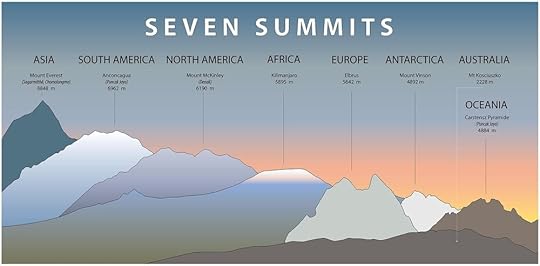
The Seven Summits infographic from World Atlas places the tallest mountain from each continent right next to each other for easy visual context.
The Seven Summits are the highest mountain peaks of each of the seven continents. From the rarified air of the Himalayas to the plains of Africa and polar glaciers of Antarctica, the Seven Summits form a collection of selected peaks stretching to the far reaches of the globe. So far, only 350 people in the world have summited the seven peaks.
The Bass list, named after the American climber Dick Bass who completed the summits in April 1985, forms the most accurate list of the summits. The Bass Seven Summits are Asia's Everest (8,848 m), South America's Aconcagua (6,961 m), North America's Denali (6,194 m), Africa's Kilimanjaro (5,895 m), Europe's Elbrus (5,642 m), Antarctica's Vinson (4,892 m), and Australia's Kosciuszko (2,228 m).
Read more at The Seven Summits - WorldAtlas
January 25, 2022
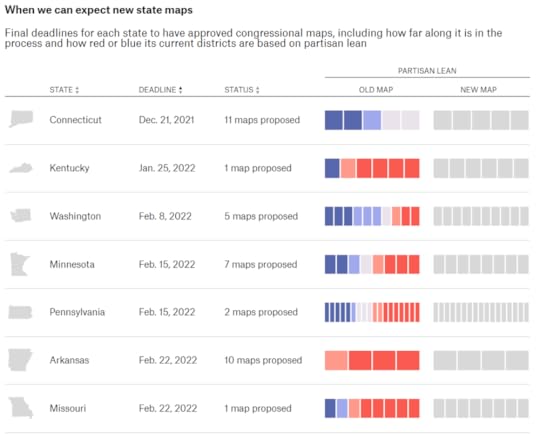
What Redistricting Looks Like in Every State
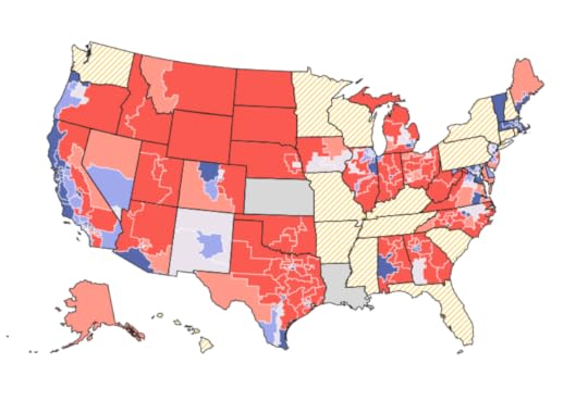
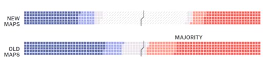
What Redistricting Looks Like in Every State is an updating tracker of proposed congressional maps. This is going to be a popular topic all year, and the interactive map by FiveThirtyEight shows how redistricting benefits Democrats or Republicans in the 2022 midterms and beyond. State and local governments are using information collected from the 2020 census report to redistrict each state. There are multiple states that have not been released yet however the graphic below shows the proposed dates for the next few updates.
I prefer the grid visualization over the map. The map has the same problem as most election maps in that it’s visualizing the real estate area of the districts. This over-emphasizes the the rural areas with more land, but less people. I think the grid visualization does a better job of representing the count of districts that are changing or already have a clear majority.
Visit FiveThirtyEight to interact with the data and check in as the map is updated.
December 17, 2021
False Visualizations: Getting Circles Sizes Wrong
Today’s example of getting it WRONG is The Biggest Unicorns in 2021 infographic from Visual Capitalist. Assuming all of the data is good, all of the circle sizes in this design are wrong and don’t match the data. The circles were sized by changing the diameter instead of changing the area.
Let me show you what I mean:
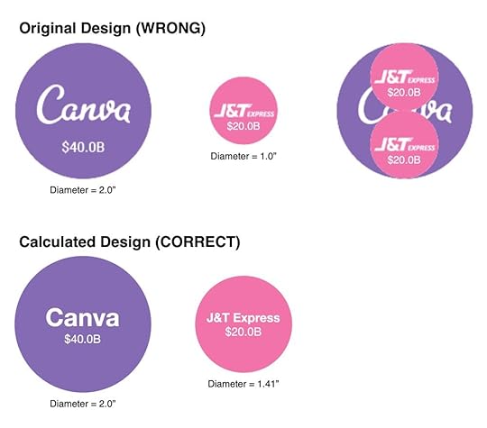
Consider a comparison where the math is easy, Canva at $40.0B is 2x the valuation of J&T Express at $20.B. If I pull those two circles out of the design, you can clearly see that the diameter of two $20.0B circles fits perfectly in the $40.0B circle. This demonstrates that the circles are sized by diameter instead of area. Also, when I adjust the size of the Canva circle in my software to 2” diameter, the J&T Express circle becomes exactly 1” in diameter.
Directly below that I show the correct circles sizes by calculating the correct diameter of the J&T Express circle as 1.414” compared to the same 2” circle for Canva.
I’ve been posting about this problem in data visualization design for 10 years now, but designers still make the mistake of sizing circles by changing the diameter to match the data.
From the Cool Infographics book (2013):
It’s key for data visualization designers to understand that we visually compare the sizes of objects based on their area (not their height).
The problem becomes more difficult when visualizing data by changing the sizes of nonstandard shapes: circles, icons, logos and so on. This is where many designers mistakenly create data visualizations that don’t actually match the data because they don’t do the math required.
This visualization doesn’t match the data at all and becomes a false visual. The reason for this is that you are changing the size of two dimensions to represent one-dimensional data. Unlike rectangles, you can’t keep the width constant and change only the height of a circle. It wouldn’t be a circle anymore.
This is EXACTLY this issue I described in the Bubble Comparison and Nested Bubbles video I contributed to Jon Schwabish’s One Chart at a Time video series.
Sizing Circles for Data Visualization is an easy reference sheet for designers I posted on the InfoNewt website. It’s a free PDF to download so everyone has the information and the formula to calculate the correct circles sizes for using circles in data visualizations and infographics.

November 19, 2021
How to Make Your Next Trade Exhibition COVID Secure
UK Exhibition Stands explores the impact of Covid on the exhibition business as well as tips to stay safe going forward with the How to Make Your Next Trade Exhibition Covid Secure infographic.
Today we have a useful info-graphic design for you that we have created which will teach you how to make your next trade show exhibition COVID-19 secure and safe for your staff and visitors. In this design we are going to provide some facts about the impact that the Coronavirus pandemic has had on the exhibitions industry globally as well as twelve simple tips to help keep your trade show booth as safe as possible and finally some Coronavirus symptoms to keep an eye out for.
Informational infographics like this can be very successful for B2B communications. Infographics like this are mostly visual explanations and illustrations of concepts instead of a lot of data visualizations. This is a quick an effective way to communicate to customers and business partners.
November 4, 2021
How we Spent Our Time at Home

2020 was a year of changes. One example is explained in the infographic, How we Spent Our Time at Home by Nathan Yau at FlowingData.
From FlowingData:
We had to do a lot more from home in 2020. Based on the American Time Use Survey, we spent about 62% of our waking time at home. In contrast, we only spent about 50% in 2019. Above is the breakdown by activity on a weekday.
[image error]
For each year, I counted the total minutes for each activity and divided by total waking time to estimate percentages. For privacy reasons, the where is not provided for when respondents were sleeping, grooming, or doing personal activities. I suspect the total percentage of time spent at home for both years would increase if these times were included.
For a better sense of how everything shifted, above is a different view that shows the percentage of time spent at home, by activity, on a weekday.
With the exception of household activities, which already happened mostly at home, there was an increase in every category. Work from home went up 142%. Education at home more than doubled. Good times.
I really like using the stacked bars of dots to show the breakdown of different activities. There are so many, the use of categorical colors for each different activity is necessary, but does start to get confusing.

October 25, 2021
Nature Timespiral
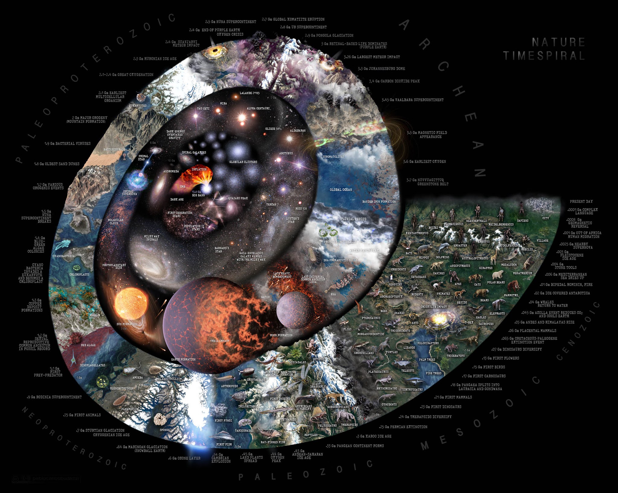
Nature Timespiral is a summary of notable events from the Big Bang to the present day by Pablo Carlos Budassi. The infographic spans 13.7 billion years, each billion being represented by a 90 degree angle on the spiral.
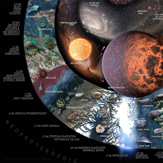
The history of nature from the Big Bang to the present day shown graphically in a spiral with notable events annotated. Every billion years (GA) is represented by 90 degrees of rotation of the spiral. The last 500 million years are represented in a 90-degree stretch for more detail on our recent history. Some of the events depicted are the emergence of cosmic structures (stars, galaxies, planets, clusters, and other structures), the emergence of the solar systems, the Earth and the Moon, important geological events (gases in the atmosphere, great orogenies, glacial periods, etc.), emergence and evolution of hominid species and important events in human evolution.
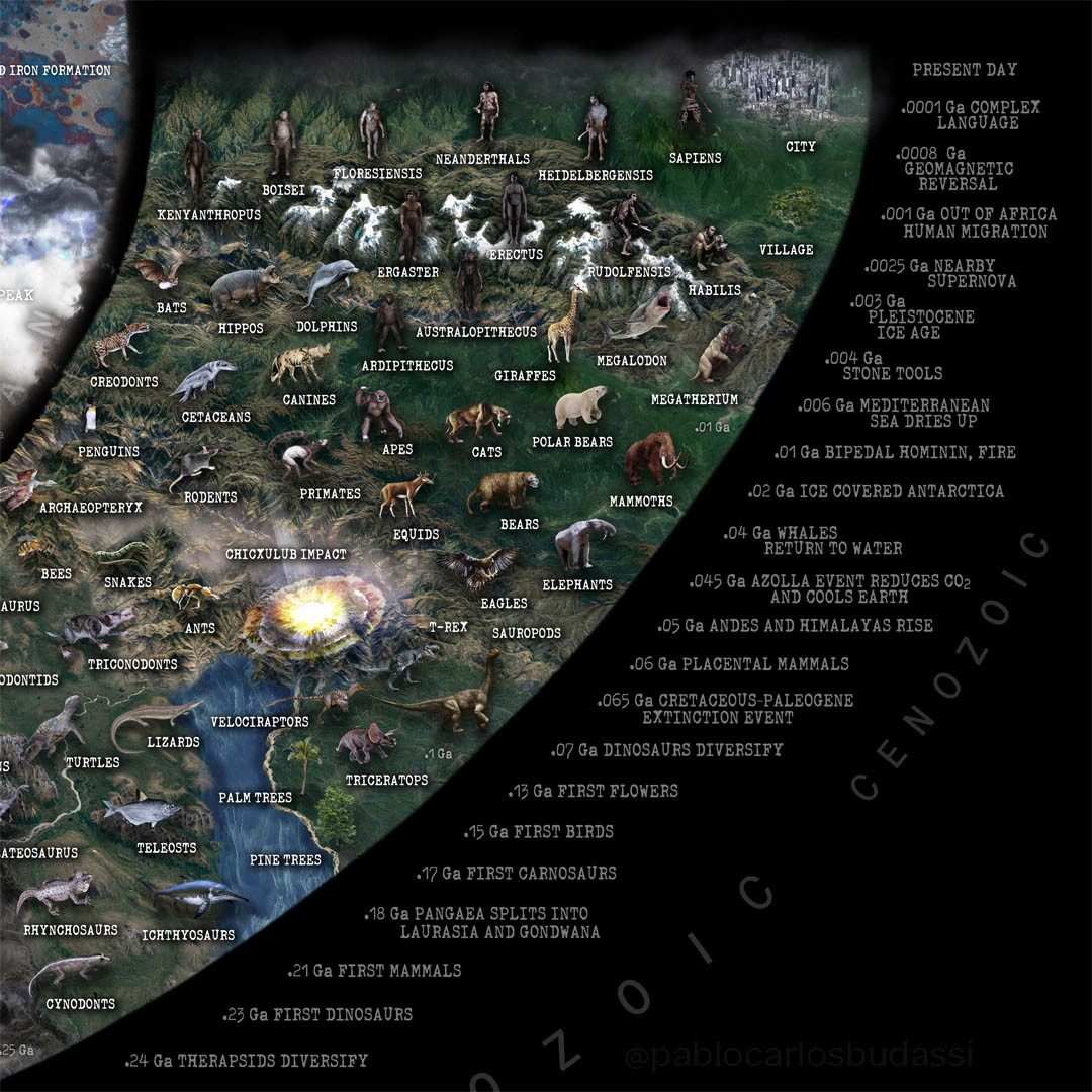
You can buy a high quality poster, print or high-resolution download of the timespiral on Budassi’s website.
Found on My Modern Met

September 24, 2021
Drone Privacy Laws Around the World
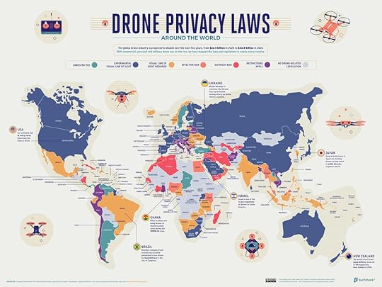
Do you have a drone? If you do, are you aware of your country’s privacy laws? Surfshark has created the Drone Privacy Laws Around the World map by compiling data on drone-related legislation for 210 countries. The counties have been given a category status based on its legislation as of October 2020.
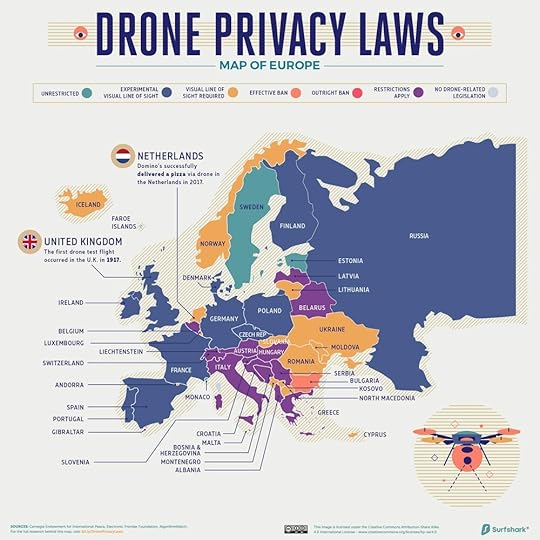
As the use of drones expands around the world -- according to the Federal Aviation Administration, there are currently 1.7 million drones registered in the United States alone -- lawmakers have been faced with new and complex regulatory challenges to protect the privacy of ordinary citizens. The increased prevalence of drones has raised the prospect of pervasive surveillance by governments, companies, and individuals, and lawmakers are struggling to keep up with the advancing technology.
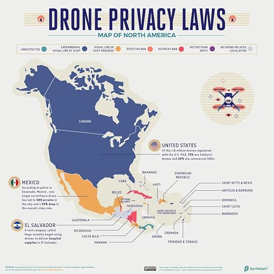
We found that drone regulation in each country generally fell into one of seven categories:
-Outright ban
-Effective ban
-Restrictions Apply (such as drone registration or licensing, additional observers required, no commercial usage etc..)
-Visual line of sight required
-Experimental visual line of sight (experiments where drones fly beyond the line of sight are allowed)
-Unrestricted (when flying away from private property and airports, under 500 ft/150metres height and with drones weighing less than 250g)
-No drone-related legislation
You can visit Surfshark’s website to see a full size version of the map, or each country individually.
Found on ZDNET.com

September 16, 2021
Yesterday, Today, Tomorrow
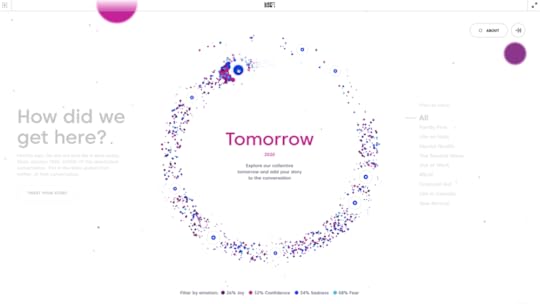
Yesterday, Today, Tomorrow is a data visualization experiment to trace the emotional waves of the pandemic. Most of the Covid data that we are use to seeing hasn’t taken into account the emotional impact of the pandemic. National Film Board of Canada and Jam3 have put together this interactive visual that lets you explore over 600k tweets (organized by an AI) into the feelings of fear, joy, sadness, and confidence.
This is an experiment to make the emotional impact of the pandemic visible. Explore hundreds of thousands of Tweets, organized by sentiment. Follow the curves, layers, and patterns of our collective feelings. What you’ll see is a story of resilience. People making sense, finding solace, and moving forward.
Watching the pandemic through an epidemiologist’s lens and learning concepts like “social distancing” and “herd immunity” keeps us safe. But it ignores our humanity. It’s more important than ever to remember and celebrate that we’re human. Human feelings, to us, are the defining data of this pandemic.
To honour that human story, we used Twitter to trace the social narrative of the pandemic. Analyzing over 70k tweets per month, we used IBM Watson’s AI to map four unique sentiments: fear, joy, sadness, and confidence.
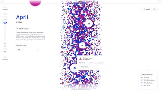
You can explore our circular timeline to see how major events have shaped the conversation, how our shared humanity has expressed itself in common topics, and how feelings have evolved (and continue to evolve) over time. As the outbreak continues, we’ll keep collecting memories and predictions, and mapping the colour and shape of our experience.
This project is about hardship, hope, and the collective experience. Things that have changed, things that haven’t, and things that may still.
This is an unprecedented challenge, but we are resilient — yesterday, today, and tomorrow.
Explore the interactive graphic Yesterday, Today, Tomorrow (nfb.ca), and read more About | Yesterday, Today, Tomorrow | NFB.

September 9, 2021
Visualizing Apple's Release Patterns Accurately Predicted 2021 iPhone Event
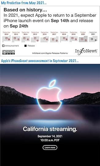
Apple just announced the 2021 iPhone event date of September 14, 2021, which is exactly the date that my Apple Release Patterns visualization graphic predicted when I updated them just before the World Wide Developers Conference (WWDC) in May 2021.
I’ve been visualizing the release date patterns of Apple products for many years now, and the pattern for the iPhone is especially consistent year-over-year. So consistent, that I also release a prediction of the date for the next Apple iPhone event. This year the iPhone Release Pattern nailed it! You can see how consistent they have been since Tim Cook moved the iPhone announcement events to September in 2011 in the longer timeline infographic:
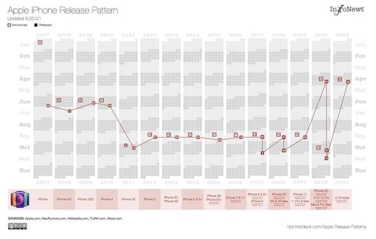
I maintain visual Release Patterns for all of Apple’s major product lines, so you can always figure out “When did they last update that?” before you make that purchase decision.
As humans, we like to see patterns in the data, it helps us understand the world around us. It’s often much easier in a visualization than trying to find a pattern in a table of numbers. As a Discovery tool, data visualization helps us find insights in the data.


