
Randy Krum's Blog, page 7
August 31, 2021
The Best Way to Ice Drinks in a Cooler
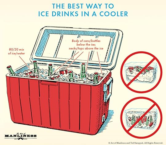
Summer might be wrapping up but we still have time left for a few more BBQ’s! The Art of Manliness shows off The Best Way to Ice Drinks in a Cooler in an easy to read infographic. Store your beverages correctly and don’t let your fun be spoiled by hot drinks or cold hands!
If you’re having a BBQ this summer, you’ll probably ensure your guests’ thirst stays slaked by stocking a big cooler full of soda and beer. While there’s obviously not much to that, there are in fact less and more effective ways of making sure these drinks are cold and accessible.
The less effective way is to place the bottles and cans atop a big mound of ice. They won’t get thoroughly chilled that way. You also don’t want to bury them in the ice; people’s hands will get cold and cut up when they try to dig through the pile to grab a drink.
The more effective method is to fill the cooler with a 80/20 mixture of ice and water. Then put the bottles/cans in so that the body of the vessels sits in the ice, but their tops/necks stick out; this lets your guests grab the drinks without getting their hands wet, cold, and nicked.
What a great use of a simple, easy-to-understand, visual explanation infographic! Definitely falls within my 5-Second Rule! You can understand the key message of the infographic within the first 5 seconds.
Found on The Art of Manliness


August 25, 2021
Voting-Rights Restriction Bills Sankey Analysis
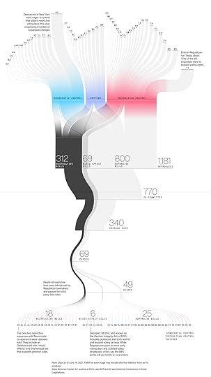
This was released in June, and I want to share it before we get into the next election season this Fall. Republicans Fall Short in Voting-Rights Crackdown While Adding Hassle at Polls is a data visualization showing how the threat of stricter voting rules was reduced down to a few bills that actually passed. Bloomberg shows that the number of expansive bills that were proposed actually outnumbers the amount of restrictive bills, and the bills that did pass still weigh in the favor of expansive. To get an even more in-depth look, the states and bills are color coded to show Democratic vs Republican control.
A nationwide move by Republicans to tighten voting rules in the wake of Donald Trump’s defeat has largely fizzled into a few additional hassles for voters in the next elections, far short of the sweeping changes described by both the GOP and Democratic critics.
In the name of election security, Republican lawmakers passed dozens of new voting restrictions this year, adding hurdles to mail-in voting, reducing local control over elections and targeting innovations used by large urban counties during the coronavirus pandemic, even as Democratic-led states focused on making voting easier.
Republicans say that the changes are needed to restore confidence in elections after President Donald Trump’s false claims that massive fraud cost him a second term. Democrats argue the laws are aimed at suppressing votes from Black and Latino citizens after record-setting turnout, going so far as to label the moves “a new Jim Crow.”
From a DataViz perspective, I think this is a great use of a Sankey Diagram. This is hierarchical data where each level breaks down the detail from the level above.
From a data perspective, I would say this is a very shallow report. The number of bills is interesting anecdotally, but doesn’t take into account the actual content of the bills. Some of these bills might be extremely restrictive/expansive, and some just a little bit. Were the uber-extreme bills passed? You can’t tell from this view of the data. This is very similar to sentiment analysis, and just gives the reader a very top level view of the data.
Visit Bloomberg.com to see more details. You should be able to view the article, even without a Bloomberg subscription. You may need to use a Private or Incognito window.

August 19, 2021
Figures in the Sky: Constellations Around the World
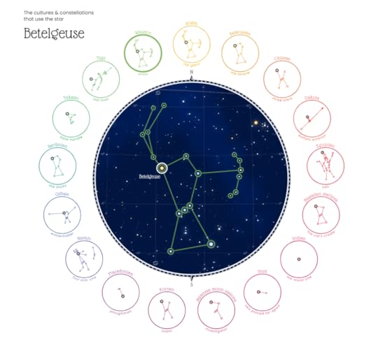
Figures in the Sky: Cultures across the World have seen their myths and legends in the stars is an interactive infographic created by Nadieh Bremer on Visual Cinnamon. The infographic compares 28 different “sky cultures” to see differences and similarities in the shapes they’ve seen in the night sky. Above is an example of the star Betelgeuse, one of the brightest stars in the sky, and how it has been used by 17 of the 28 cultures.
No matter where you are on Earth, we all look up to the same sky during the dark nights. You might see a different section of it depending on your exact location, time & season, nevertheless the stars have fascinated humans across time and continents.
Our own creativity combined with stories about local legends and myths have created a diverse set of different constellations. And even though the stars don't change, people have found many different shapes in the same sky. From humans, to animals, to objects, and even abstract concepts.
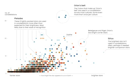
Brightness doesn’t determine all!
Let's look at all 2168 unique stars that are included in at least one constellation across all sky cultures. The chart below shows the stars according to their brightness from left to right, and the number of constellations the star appears in from top to bottom. A general trend is visible: The brighter the star, the more constellations it's included in. This makes sense, since brighter stars just stand out more.
Visit the original post at Figures in the Sky (visualcinnamon.com) to interact with the full design!

August 9, 2021
MacBook Setup Essentials for College Students (2021 UPDATE)

It’s Back To School time of year, and if you’re a college student with a new MacBook, or a parent setting up a new MacBook, the MacBook Setup Essentials for College Students infographic is for you. These are my personal Best Practice suggestions for setting up a MacBook for college students, and I’ve updated all of the directions and screenshots for the current macOS Big Sur 11.4. I’d love to hear your tips in the comments!
MacBook are very popular with college students, but a little planning and configuration is required for the best experience. A student moving away to college might be the first time they have full control over their own computing experience: installing apps, protecting their privacy, creating good passwords, avoiding viruses & malware, and backing up their data.
These are my suggestions for setting up a MacBook, MacBook Air or MacBook Pro for any college student to simplify their computing experience.
I tend to be the Apple tech support for my family and friends, and whether you are new to Apple computers, or an experienced Apple power user, these tips will help you with the initial MacBook setup for any college student going away.
NOTE: Most of these tips are good for any MacBook user, but I’ve tailored them specific to college students.
Unlike many of my other infographic designs, this one doesn’t have any numeric data to work with. It’s a How-To informative infographic with step-by-step instructions and suggestions. That makes it a little more text-heavy than I normally like, but in this case I felt it was appropriate.

July 29, 2021
Interviewed on the Customer Insight Leader podcast

Customer Insight Leader podcast interview with Randy Krum
I was recently interviewed by Paul Laughlin on Episode 42 of the Customer Insight Leader podcast. We covered a wide range of topics from my background leading into data visualization and infographics, visualizing consumer research data, running the Cool Infographics website, and how to show off your data visualizations skills when job hunting.
From Paul’s episode description:
For episode 42 we again venture to the USA and talk with Randy Krum the creator of the famous CoolInfographics website . Randy is a data visualisation designer with his own design agency ( InfoNewt ), teaches a University course and is a published author. His book is “ Cool Infographics: Effective Communication with Data Visualisation and Design ” and he's also active in organising Data Viz Meet-up groups. So, we had plenty to chat about.
In this conversation we explore Randy's career story, including the role for blogs to visually share others' content & showcase your work. We also discuss the continued role for infographics , as well as solely effective data visualisations. Randy shares what has helped him through his career & we consider when firms might choose to bring in an external design agency. Well worth a listen, especially for those interested in the role of visual communication beyond just charts.
I love Paul’s description of his podcast series: “Helping you through the morass of language & hype surrounding Data Science, Analytics & Customer Insight.”

July 15, 2021
Weaving an Infographic Tapestry of Journey Mapping
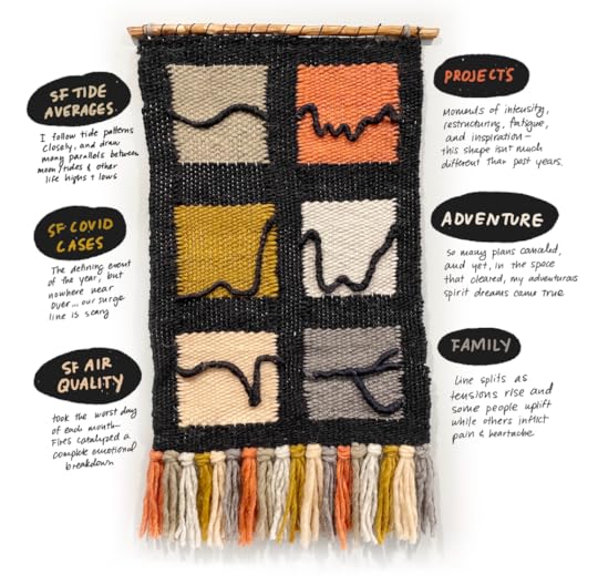
While reflecting on 2020, Catherine Madden graphed 6 different charts that she felt represented her year; and brought them to life within an infographic tapestry! Her categories were 3 personal (relationships, projects, and adventures) and three external (Covid cases, air quality, and average tide heights in San Francisco). See Catherine’s full creative process on her blog, Catherinemadden.com.
From Catherine:
‘Every December, my friend Eugene hosts a gathering among friends, colleagues, and co-learning group members where he guides everyone through a process of reflection. In this process we map out the highs and lows of the past year. I have been able to participate two out of the past three years, and feel so grateful for the simple fact that I have people in my life who similarly value making time for reflection, connection, and art making.
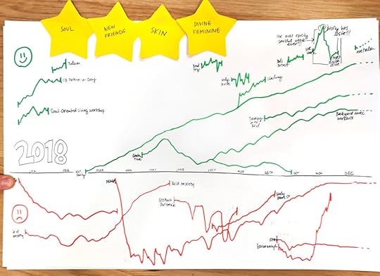
Two years ago, I had a blast creating this simple journey map that started with sticky notes and ended with some sort of layered line chart. Looking back two years later, it’s such a great summary of the highs and lows that felt so intense in the moment but now are distant memories.
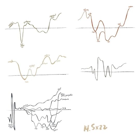
In part two of the activity, each person was encouraged to create some art inspired by the journey. Everyone took a very different direction, and the data storyteller in me wanted to keep some of the structure of the journey map. My first step was to identify a set of categories that felt interesting to me— personal and professional blend together in so many ways that I wanted to look at the year by different dimensions.
I went back to the first set of lines and split them apart into small multiples. This felt like I was onto something. You can see my note for measurements on this page because at this point I realized I needed to do some space planning based on the size of my loom.

Found on Flowing Data

June 22, 2021
Bluetooth in Indoor Positioning Systems
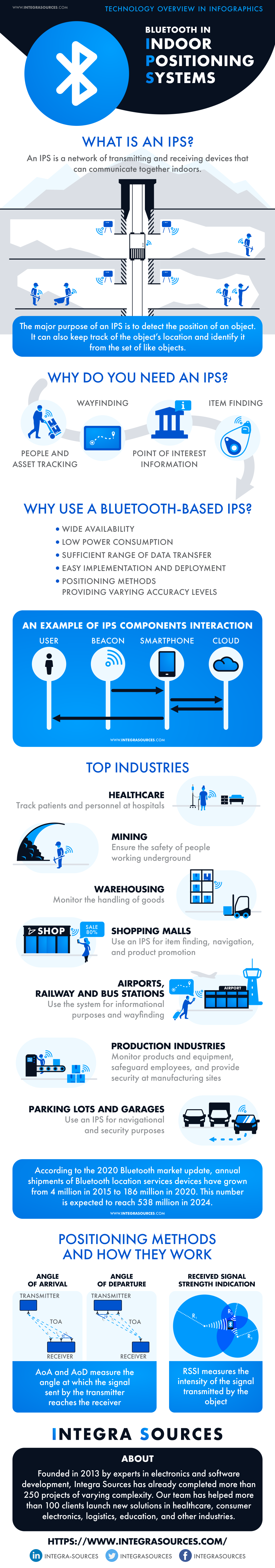
The Bluetooth in Indoor Positioning Systems infographic is an overview summary of Integra Sources’s article about what IPS is and how it is used in different industries.
Many people worldwide regularly use positioning systems. The most popular of them are location services relying on geographic data and satellite navigation (GIS and GNSS). However, these systems only work efficiently outdoors and don’t work so well in enclosed areas. Indoor positioning systems are special solutions that use technologies and methods other than satellite data. Bluetooth is one of these technologies. In this article, we’ll give you a basic idea about indoor positioning systems and describe how Bluetooth positioning services work, what methods they use, and how you can implement them in your project.
In our recent article, we talked about indoor positioning systems with Bluetooth technology. To get a brief overview of this topic, you can check out the infographic below.
The full article can be found here .
Infographics are a great tool for Visual Explanations. In this case the concepts Bluetooth beacons and positioning are illustrated with an isotype system. The text included is fairly minimal and references a much longer, more detailed article write-up about the concept.
Thanks to Anastassiya for sending in the link!

May 5, 2021
65 Bar Glasses and What They're Meant For

The Which Glass for Which Drink? 65 Bar Glasses and What They're Meant For infographic from Wine Cellar Innovations is a fantastic reference for identifying that mystery cocktail glass.
Which type of drinking glass goes with which drink? We’ve made it easy to decide with our giant chart of different types of glasses and their uses, from slender wine glasses to old-fashioned cocktail cups. If you want to update a home bar or wine cellar and have a semi-professional look when you serve your guests drinks, learn about the types of glassware you need for your personal bar. This quick guide will help you find out which types of bar glasses are appropriate for which drink!
We’ve created a comprehensive guide with names of different types of drinking glasses, which type of drink they’re typically used for, and why they may be better for some drinks rather than others.
This type of Informative infographic is one of the most popular for views and sharing because it just provides helpful information without trying to pitch anything.
I was even considering designing a similar infographic myself, but gave up that idea when I saw it had already been so well done. The Online Lifespan of an infographic like this will be decades. This information is evergreen and doesn’t change from year to year, and will bring in viewers for years to come.

April 30, 2021
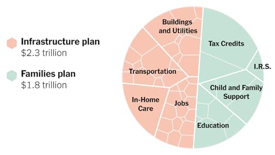
President Biden’s $4 Trillion Economic Plan, in One Chart

The Upshot team at the NY Times designed this data visualization of President Biden’s $4 Trillion Economic Plan, in One Chart.
On one hand, I love this. This is called a Voronoi Treemap, which we don’t see used very often.
The area of each segment is proportionally sized to match the dollar amount, and the total circle adds up to the total of $4 Billion.
It’s a hierarchical structure: Total Circle > 2 major portions > Major categories > Minor segments
The size of each level of the hierarchy conveys meaning, and they are further broken down into smaller segments
On the other hand, this type of data visualization may be too advanced for many readers.
This is NOT a pie chart. Many of the less data-savvy readers will immediately try to read this like a pie chart.
The odd shapes of each section can be confusing
It’s very hard to compare any two segments that are not adjacent. Which is bigger, Transportation or Child and Family Support?
The two major portions are close to 50/50, but aren’t. They are 56/44, so the major dividing line is slightly off center, but many will assume it’s a center split.
One of the nice things about this design, is that they were able to simplify the data that was being displayed to create a thumbnail version for sharing on social media. This version is still true to the data, but doesn’t show the data values for the lowest level of the hierarchy.

March 17, 2021
The Chemistry of Guinness

Happy St. Patrick’s Day with this infographic all about The Chemistry of Guinness.
Chemical educator and Compound Interest blogger Andy Brunning explores the famous beer’s bubbles and bitterness
Originally published in 2015, I love infographics like this that have a long Online Lifespan. Year after year they continue to get views, links, shares, social mentions and more because of the evergreen topic.
Designed by Andy Brunning for Chemical & Engineering News.


