
Menzie David Chinn's Blog, page 30
July 22, 2015
Guest Contribution: ‘Only Tsipras Can “Go to China”’
Today we are fortunate to have a guest contribution written by Jeffrey Frankel, Harpel Professor of Capital Formation and Growth at Harvard University, and former Member of the Council of Economic Advisers, 1997-99. An earlier version was published in Project Syndicate.
Alexis Tsipras, the Greek prime minister, has the chance to play a role for his country analogous to the roles played by Korean President Kim Dae Jung in 1997 and Brazilian President Luiz Inácio Lula da Silva in 2002. Both of those presidential candidates had been long-time men of the left, with strong ties to labor, and were believed to place little priority on fiscal responsibility or free markets. Both were elected at a time of economic crisis in their respective countries. Both confronted financial and international constraints in office that had not been especially salient in their minds when they were opposition politicians. Both were able soon to make the mental and political adjustment to the realities faced by debtor economies. This flexibility helped both to lead their countries more effectively.
The two new presidents launched needed reforms. Some of these were “conservative” reforms (or “neo-liberal”) that might not have been possible under more mainstream or conservative politicians.
But Kim and Lula were also able to implement other reforms consistent with their lifetime commitment to reducing income inequality. South Korea under Kim began to rein in the chaebols, the country’s huge family-owned conglomerates. Brazil under Lula expanded Bolsa Familia, a system of direct cash payments to households that is credited with lifting millions out of poverty.
Mr. Tsipras and his Syriza party, by contrast, spent their first six months in office still mentally blinkered against financial and international realities. A career as a political party apparatchik is probably not the best training for being able to see things from the perspective of other points on the political spectrum, other segments of the economy, or other countries. This is true of a career in any political party in any country but especially one on the far left or far right.
The Greek Prime Minister seemed to think that calling the July 5 referendum on whether to accept terms that had been demanded previously by Germany and the other creditor countries would strengthen his bargaining position. If he were reading from a normal script, he would logically have been asking the Greek people to vote “yes” on the referendum. But he was asking them to vote “no”, of course, which they did in surprisingly large numbers. As a result – and contrary to his apparent expectations — the only people’s whose bargaining position was strengthened by this referendum were those Germans who felt the time had come to let Greece drop out of the euro.
The Greek leadership discovered that its euro partners, predictably, are not prepared to offer easier terms than they had been in June, and in fact are asking for more extensive concessions as the price of a third bailout. Only then, a week after the referendum, did Mr. Tsipras finally begin to face up to reality.
The only possible silver lining to this sorry history is that some of his supporters at home may – paradoxically – now be willing to swallow the bitter medicine that they had opposed in the referendum. One should not underestimate the opposition that reforms will continue to face among Greeks, in light of the economic hardship already suffered. But like Kim dae Jung and Lula, he may be able to bring political support of some on the left who figure, “If my leader now says these unpalatable measures are necessary, then it must be true”. As they say, Only Nixon can go to China.
None of this is to say that the financial and international realities are necessarily always reasonable. Sometimes global financial markets indulge in unreasonable booms in their eagerness to lend, followed by abrupt reversals. That describes the large capital inflows into Greece and other European periphery countries in the first ten years after the euro’s 1999 birth. It also describes the sudden stop in lending to Korea and other emerging market countries in the late 1990s.
Foreign creditor governments can be unreasonable as well. The misperceptions and errors on the part of leaders in Germany and other creditor countries have been as bad as the misperceptions and errors on the part of the less-experienced Greek leaders. For example the belief that fiscal austerity raises income rather than lowering it, even in the short run, was a mistaken perception. The refusal to write down the debt especially in 2010, when most of it was still in the hands of private creditors, was a mistaken policy. These mistakes explain why the Greek debt/GDP ratio is so much higher today than in 2010 — much higher than was forecast.
A stubborn clinging to wrong propositions on each side has reinforced the stubbornness on the other side. The Germans would have done better to understand and admit explicitly that fiscal austerity is contractionary in the short run. The Greeks would have done better to understand and admit explicitly that the preeminence of democracy does not mean that one country’s people can democratically vote for other countries to give them money.
In terms of game theory, the fact that the Greeks and Germans have different economic interests is not enough to explain the very poor outcome of negotiations to date. The difference in perceptions has been central. “Getting to yes” in a bargaining situation requires not just that the negotiators have a clear idea of their own top priorities, but also a good idea of what is the top priority of the other side. We may now be facing a “bad bargain” in which each side is called upon to give up its top priorities. On one side, Greece shouldn’t expect the ECB and the IMF to be willing explicitly to write down the debt they hold. On the other side, the creditors shouldn’t expect Greece to run a substantial primary budget surplus. A “good bargain” would have the creditors stretch out lending terms even further so that Greece doesn’t have to pay over the next few years and would have the Greeks committing to structural reforms that would raise growth.
One hopes that the awful experience of the recent past has led both sides to clearer perceptions of economic realities and of top priorities. Such evolution is necessary if the two sides are to arrive at a good bargain rather than either a bad bargain or a failure of cooperation altogether. The non-cooperative equilibrium is that Greek banks fail and Greece effectively drops out of the euro. This may be even worse than a bad bargain, although I am not sure.
Admittedly, both Kim and Lula had their flaws. Moreover, Korea and Brazil had some advantages that Greece lacks, beyond Syriza’s delay in adapting to realities. They had their own currencies. They were able to boost exports in the years following their currency crises.
But a recurrent theme of the Greek crisis ever since it erupted in late 2009 is that both the Greeks and the Euro creditor countries have been reluctant to realize that lessons from previous emerging market crises might apply to their situation. After all, they said, Greece was not a developing country but rather a member of the euro. (This is the reason, for example, why Frankfurt and Brussels at first did not want Greece to go to the IMF and did not want to write down the Greek debt.) But the emerging market crises do have useful lessons for Europe. If Tsipras were able to shift gears in the way that Kim dae Jung did in Korea and Lula did in Brazil, he would better serve his country.
This post written by Jeffrey Frankel.


July 21, 2015
Messages from the June State Employment Release
According to today’s release, employment and hours downturns in Wisconsin and Kansas continue. The Wisconsin economic downturn continues along several other dimensions (with the labor force now declining).
Figures 1-4 show private nonfarm payroll employment and aggregate hours for California, Kansas, Minnesota and Wisconsin.
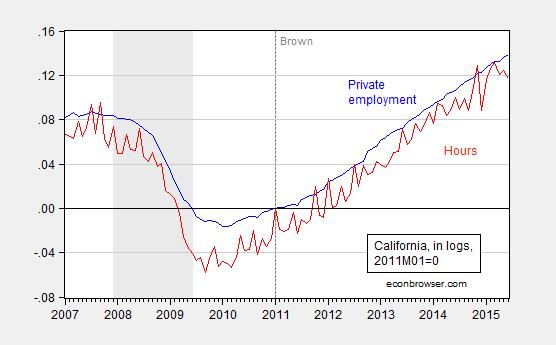
Figure 1: California private nonfarm payroll employment (blue) and aggregate hours (red), seasonally adjusted, in logs, 2011M01=0. NBER recession dates shaded gray. A value of 0.10 means that measure has risen 10% in log terms since 2011M01. Aggregate hours calculated by multiplying employment by average hours, average hours seasonally adjusted by author using ARIMA X-12 executed in EViews. Source: BLS, NBER, and author’s calculations.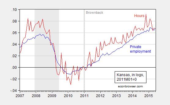
Figure 2: Kansas private nonfarm payroll employment (blue) and aggregate hours (red), seasonally adjusted, in logs, 2011M01=0. NBER recession dates shaded gray. A value of 0.10 means that measure has risen 10% in log terms since 2011M01. Aggregate hours calculated by multiplying employment by average hours, average hours seasonally adjusted by author using ARIMA X-12 executed in EViews. Source: BLS, NBER, and author’s calculations.
[Aside: people who assert without any statistical basis that the significant slowdown in economic activity in Kansas was due to drought should consult this post]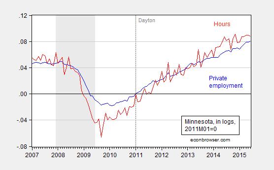
Figure 3: Minnesota private nonfarm payroll employment (blue) and aggregate hours (red), seasonally adjusted, in logs, 2011M01=0. NBER recession dates shaded gray. A value of 0.10 means that measure has risen 10% in log terms since 2011M01. Aggregate hours calculated by multiplying employment by average hours, average hours seasonally adjusted by author using ARIMA X-12 executed in EViews. Source: BLS, NBER, and author’s calculations.
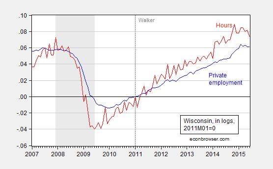
Figure 4: Wisconsin private nonfarm payroll employment (blue) and aggregate hours (red), seasonally adjusted, in logs, 2011M01=0. NBER recession dates shaded gray. A value of 0.10 means that measure has risen 10% in log terms since 2011M01. Aggregate hours calculated by multiplying employment by average hours, average hours seasonally adjusted by author using ARIMA X-12 executed in EViews. Source: BLS, NBER, and author’s calculations.
I estimate aggregate hours as the product of average weekly hours for all private employees and private employment. The hours variable is volatile, even after seasonal adjustment, so I plot a 3 month centered moving average for the four states against the US series in Figure 5.
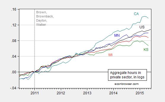
Figure 5: Aggregate hours for Minnesota (blue), Wisconsin (red), Kansas (green), California (teal), and US (black), all 3 month centered moving averages for states, in logs 2011M01=0. A value of 0.10 means that measure has risen 10% in log terms since 2011M01. Source: BLS and author’s calculations.
While Minnesota aggregate hours have flattened, and California has reverted to trend, Wisconsin and Kansas are pretty unambiguously turning downward. For Wisconsin, we know that these establishment data will be drastically revised (likely downward) when the QCEW data are incorporated into the annual benchmark.[1] That takes place early next year. What do we know now?
For Wisconsin we have data from the household survey confirming (1) the establishment series decline in private and overall employment over the last few months, and (2) suggesting a decline in labor force (with the caveat that the state level household survey data are noisy).
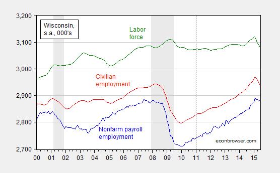
Figure 6: Nonfarm payroll employment (blue), civilian employment (red), and civilian labor force (green), all in 000’s, seasonally adjusted. NBER defined recession dates shaded gray. Source: BLS and NBER.
All these data suggest that there might be some rough times ahead for Kansas and Wisconsin. New coincident indices will come from the Philadelphia Fed on July 24th. (Current release plotted here).
Update, 6:30pm Pacific: In a desperate attempt to explain away the Kansas downturn, Ironman asserts that I have ignored the critically important issue of the downturn in aircraft production. While I do not doubt the negative impact of the decrease of aircraft production, the quantitative magnitude seems to rule this out as the cause of the negative spiral that is Kansas. Figure 7 depicts a decomposition of changes (in 000’s) in private nonfarm payroll employment.
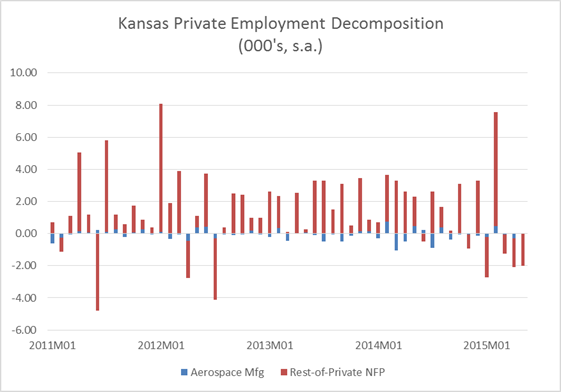
Figure 7: Month-on-month change in aerospace and parts manufacturing (blue), and rest-of-private nonfarm payroll employment (red), in 000’s. Aerospace and parts manufacturing seasonally adjusted (multiplicative) using ARIMA X-12 executed in EViews 9. Source: BLS and author’s calculations.
In addition to the wrong magnitude, the timing is also off for explaining the recent decline in employment. (By the way, real GSP numbers indicate flat durables manufacturing output through end of 2013.)
July 20, 2015
“Spillovers of conventional and unconventional monetary policy: the role of real and financial linkages”
That’s the topic of a conference sponsored and hosted by the Swiss National Bank and co-sponsored with the Bank for International Settlements (BIS), the Dallas Fed, the Centre for Economic Policy Research (CEPR), and the Journal of International Money and Finance.
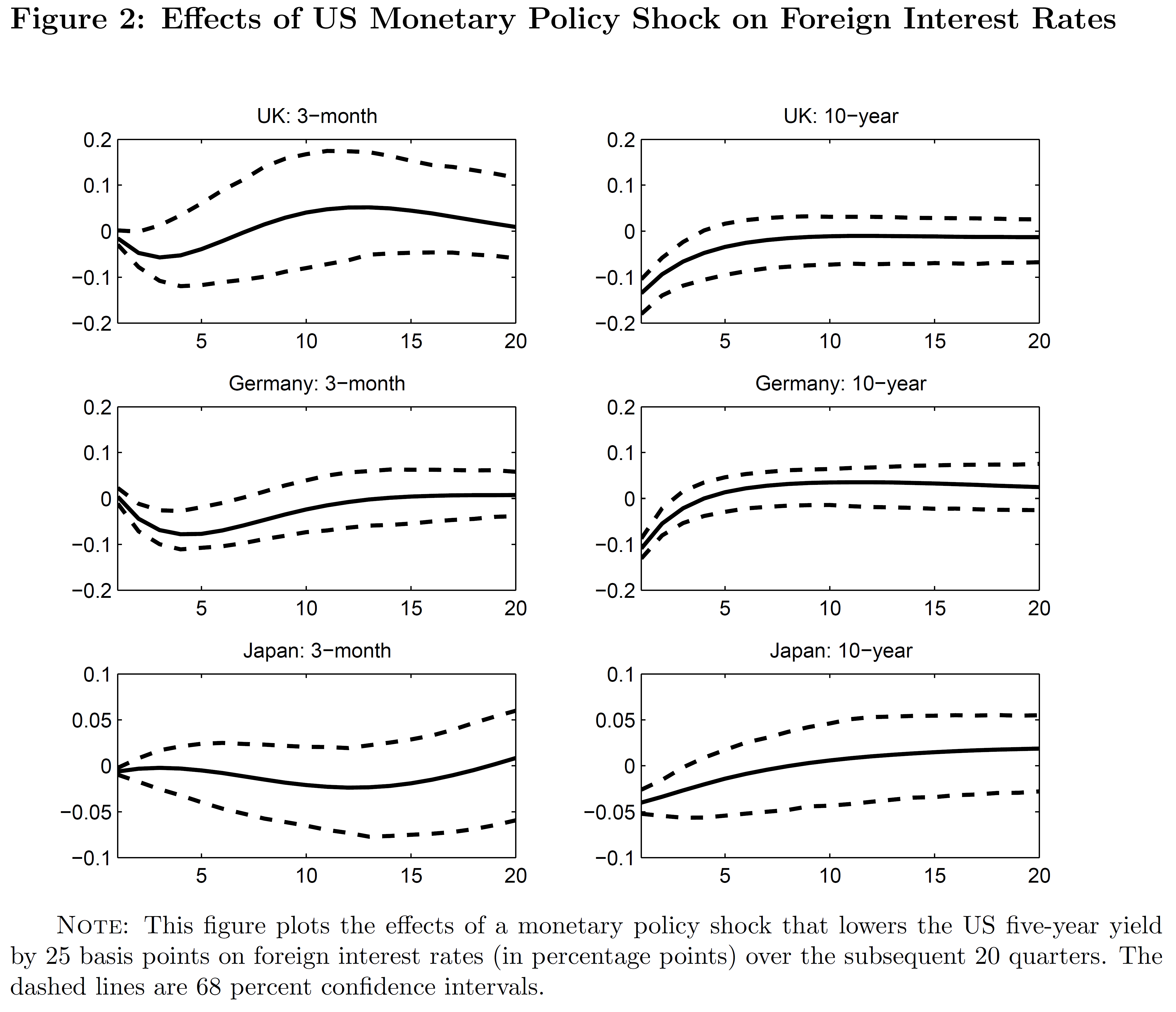
Figure 2: Impulse response function for 25 bp reduction in the 5 year rate. From Rogers, Scotti and Wright (2015).
The links to the papers are here.
Opening remarks: Thomas Jordan
Chairman of the Governing Board, Swiss National Bank
Session I
“Monetary Policy Spillovers and the Trilemma in the New Normal: Periphery Country Sensitivity to Core Country Conditions”
Authors: Joshua Aizenman (USC), Menzie D. Chinn (Wisconsin), and Hiro
Ito (PSU)
Discussant: Atish Rex Ghosh (International Monetary Fund)
Session II
“Short-Term Pain for Long-Term Gain: Market Deregulation and Monetary Policy in Small Open Economies”
Authors: Matteo Cacciatore (HEC Montréal), Romain Duval (IMF), Fabio
Ghironi (University of Washington and CEPR), and Giuseppe Fiori (North
Carolina State University)
Discussant: Giancarlo Corsetti (Cambridge University)
“Self-Oriented Monetary Policy, Global Financial Markets and
Excess Volatility of International Capital Flows”
Authors: Michael B. Devereux (UBC and CEPR) and Giovanni Lombardo
(BIS)
Discussant: Aitor Erce (European Stability Mechanism)
Session III
“What drives the funding currency mix of banks?”
Authors: Signe Krogstrup (Swiss National Bank) and Cédric Tille (Graduate
Institute and CEPR)
Discussant: Adrian van Rixtel (Bank for International Settlements)
“The impact of international swap lines on stock returns of banks in emerging markets”
Authors: Alin Andries (Alexandru Ioan Cuza University of Iasi), Andreas
Fischer (Swiss National Bank and CEPR), and Pɪnar Yeşin (Swiss National
Bank)
Discussant: Andreas Schrimpf (Bank for International Settlements)
Keynote address: Claudio Borio (Bank for International Settlements)
Session IV
“Unconventional Monetary Policy and International Risk Premia”
Authors: John Rogers (Federal Reserve Board), Chiara Scotti (Federal
Reserve Board), and Jonathan Wright (Johns Hopkins University)
Discussant: Julieta Yung (Dallas Fed)
“If the Fed sneezes, who gets a cold?”
Authors: Luca Dedola (ECB and CEPR), Giulia Rivolta (University of
Brescia), and Livio Stracca (ECB)
Discussant: Mark Wynne (Dallas Fed)
Session V
“Trilemma, not Dilemma: Financial Globalisation and Monetary Policy Effectiveness”
Authors: Georgios Georgiadis (ECB) and Arnaud Mehl (ECB)
Discussant: Sandra Eickmeier (Bundesbank)
Organization committee: Raphael Auer, Menzie Chinn, Giancarlo Corsetti, Andrew Filardo, Andreas Fischer, Mark Wynne.
July 19, 2015
Firm-specific factors in rising income inequality
I spent the last two weeks in Boston at the NBER Summer Institute where I learned about a lot of interesting new economic research. Here I describe a new paper by Jae Song, David Price, Fatih Guvenen, Nicholas Bloom, and Till von Wachter on the role of firm-specific factors in rising income inequality.
These researchers constructed from administrative records an amazing matched employer-employee data set covering all U.S. firms and individuals for which W-2 income statements were filed over a 30-year period. The data are summarized in terms of wt(s), which denotes the natural log of the real wage earnings in year t (measured in 2012 dollars) of the person who was in the sth income percentile in year t. For example, the median worker in 1982 received w1982(50) = ln($28,000)= 10.24 (in 2012 dollars), while the median worker in 2012 received w2012(50) = ln($33,600) = 10.42. The log difference is 10.42 – 10.24 = 0.18 implying a percent change of approximately 18%. Although the median worker in 1982 was of course not the same individual as the median worker in 2012, one way that rising inequality is often represented is with a plot of w2012(s) – w1982(s) as a function of s as is done in the blue line in the graph below. As just noted, the height of this line is 0.18 at s = 50, but it is much higher than this for people above the 95th percentile. Someone in the 95th percentile today is earning much more than a person who was in the 95th percentile in 1982, whereas someone in the 5th percentile is only earning a little more than their counterpart in 1982. The upward slope in the blue line as s increases, particularly for high values of s, is one indicator people sometimes look at to measure rising inequality.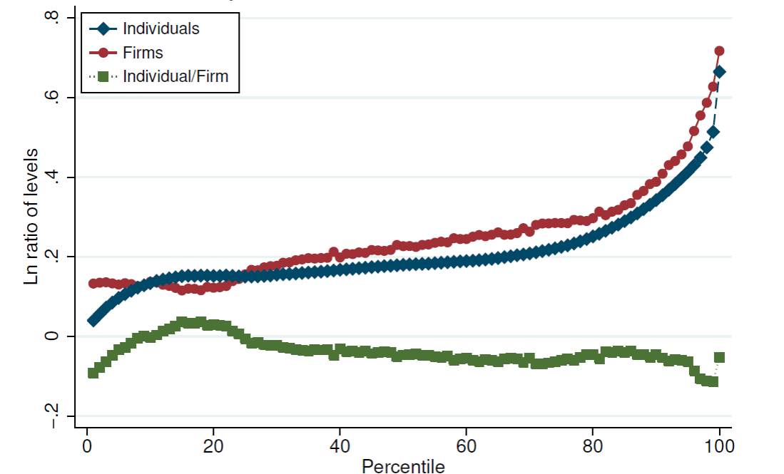
Blue: log change in real wages (vertical axis) of percentile s (horizontal axis) between 1982 and 2012. Green: change attributable to differences between the wage of the individual and the average wage of people working for the same employer as that individual. Red: change attributable to differences between the wages paid by different employers. Source: Song, Price, Guvenen, Bloom and von Wachter (2015).
The authors then looked at how much of this change could be attributed to differences in earnings across people who all work for the same employer. They calculated the difference between wt(s) and the average log earnings of other people who worked for the same employer as did the individual who was in the sth percentile, and examined how those differences changed between 1982 and 2012. This number is represented by the height of the green line in the graph above. It actually slopes down over most of the range. There is a modest contribution to rising inequality of within-firm differences in pay at the very lowest and very highest percentiles, but for the most part differences in pay across individuals working for the same firm have very little to do with rising inequality.
Yet another calculation we could make is look at the average wage of all the people who worked at the same firm in 1982 as did the individual who was in the sth percentile in 1982, and compare that with the average wage of all the people who worked at the same firm as did the individual who was in the sth percentile in 2012. This is plotted as the red line in the graph above. Note that the sum of the heights of the red and green lines equals the height of the blue line for every s by definition. The red line seems to be the whole story. The key question is not whether you’re one of the higher paid people within the establishment for which you’re currently working. The question is instead whether you’re fortunate to be working for one of the establishments that is paying a wage to its average worker that is higher than the average wage at other firms.
The authors conclude:
Contrary to the assertions made by Mishel and Sabadish (2014), Piketty (2013), and others, we find strong evidence that within-firm pay inequality has remained mostly flat over the past three decades…. on average, individuals’ inequality with their coworkers has changed little over the past three decades.
July 18, 2015
Revised Philadelphia Fed Indices
The Philadelphia Fed yesterday posted the results of a revision of both coincident and leading indices, as explained here. The resulting plot for California, Kansas, Minnesota, Wisconsin and the US is shown below.

Figure 1: Coincident indices for Minnesota (blue), Wisconsin (red), Kansas (green), California (teal), and the US (black), all in logs, normalized to 2011M01=0. Observations for 2015M11 are log-levels implied by leading indices. Numbers in [brackets] are ALEC-Laffer-Moore-Williams rankings for 2015. Source: Philadelphia Fed, ALEC, Rich States Poor States, 2015, and author’s calculations.
The 2% cumulative growth gap since 2011M01 between Wisconsin and Minnesota is forecasted to grow to 3% by November 2015.
Notice the negative correlation between ALEC rankings and outlook (and recent performance), which is a manifestation of this pattern. Noah Smith discusses this lack of correlation between ALEC rankings and actual outcomes.
July 16, 2015
Wisconsin Economy Watch 1
Wisconsin employment has now fallen below pre-recession peaks…
Figures released this afternoon indicate the three month change in nonfarm payroll employment and civilian employment have been negative for two and three months respectively. Since the Wisconsin Department of Workforce Development (DWD) memo makes no mention of this, I think it useful to document the negative trends in Wisconsin employment.
Figure 1 depicts nonfarm payroll employment and civilian employment.
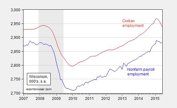
Figure 1: Wisconsin nonfarm payroll employment (blue), and civilian employment (red), both in 000’s, seasonally adjusted. Source: BLS and DWD.
Since the two estimates come from two different surveys (establishment and household, respectively), this adds to the impression of continuing job loss. The most recent concurrence of both series experiencing negative 3 month changes is the last recession. Before that, there was a short period in 2003.
Figure 2 zooms in to recent vintages of the private employment series. While the total NFP series rose slightly, private employment registered a continued decline, even though April figures were revised upward.
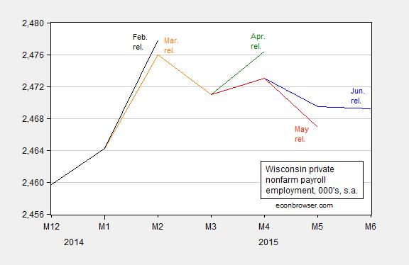
Figure 2: Wisconsin private nonfarm payroll employment from February (black), March (orange), April (green), May (red) and June (blue), all in 000’s, seasonally adjusted. Source: BLS and DWD.
Finally, Figure 3 presents a comparison of US and Wisconsin NFP series (as far as I know, Minnesota’s figures are not yet available).
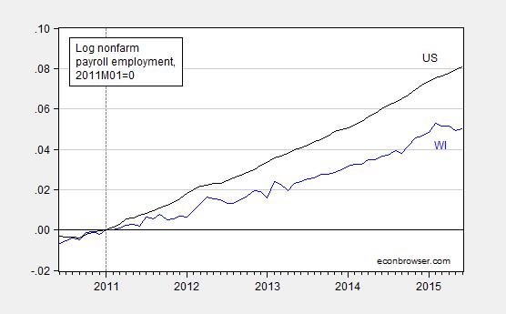
Figure 3: Nonfarm payroll employment (blue), and US (black), seasonally adjusted, in logs normalized 2011M01=0. This means a reading of 0.05 is 5% above the level in January 2011. Source: BLS and DWD.
The Philadelphia Fed coincident indices, which for Wisconsin have been revised downward in recent months, will be released on July 24th. These indices are calculated using in part these employment data.
July 15, 2015
Guest Contribution: “What Europeans think about Europe in the aftermath of the crisis”
Today, we’re fortunate to have a guest contribution by Jeffry Frieden, Stanfield Professor of International Peace at Harvard University, and author of the newly published book Currency Politics: The Political Economy of Exchange Rate Policy (Princeton University Press, 2015). This post is based upon this paper.
The ongoing crisis in the Eurozone has captured the world’s attention and imagination, as everyone wonders how the drama will play itself out. But the most serious crisis in the history of European integration also raises important questions for the longer run. Eventually the European economy will recover, and eventually the Eurozone will resume more or less normal operations.
Will the experience of the crisis have changed the environment within which economic policy is made? The short answer is Yes. Public opinion surveys demonstrate quite clearly that there has been a fundamental shift in attitudes toward European integration and the euro. But this shift may not be what most observers expect.
In a paper presented at a conference sponsored by the Bank of Portugal, I analyzed over ten years of Eurobarometer surveys of public opinion in the member states of the European Union, and in the member states of the Eurozone. The results paint a very clear picture of attitudes toward European integration and the euro, and of their changes over time.
The first thing of note is that in almost every member state, with the exception of the United Kingdom and to a lesser extent Italy, European integration has been and remains quite popular. Figure 1 shows the evolution of positive answers to the question of whether the respondent thinks membership in the EU has been a benefit to his or her country, divided into country groups. Positive attitudes toward the EU have declined a bit since the crisis began, but typically 50 to 70 percent of the population thinks membership in the EU is a good thing and has benefited its country.
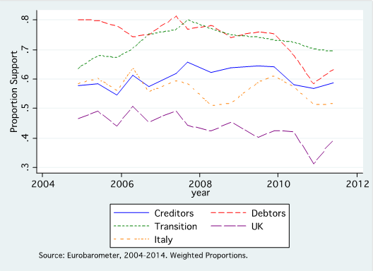
Figure 1: Benefit of EU membership, by region
The same is true, even more so, about the euro. This is demonstrated in Figure 2. Again, among members of the Eurozone (creditors, debtors, and Italy in the figure), support for the euro is between 50 and 70 percent of the population. There has been very little erosion of support with the crisis, and in fact in some countries – such as Greece – support for membership in the Eurozone has actually risen.
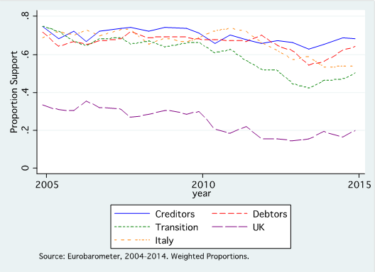
Figure 2: Support for EMU
Trends at the national level obscure significant differences among socio-economic groups within countries. Indeed, there are often greater cleavages within countries than among them. Figure 3 shows patterns of support for EMU among member states of the Eurozone, differentiated between professionals and unskilled workers. As can be seen, professionals in creditor and debtor countries have virtually identical views, as do unskilled individuals in both groups of countries. On the other hand, the two socio-economic groups differ very substantially in their attitudes toward the euro, with unskilled workers about 20 percentage points less positive than professionals. There are similar differences between more highly educated Europeans and those with less education.
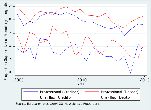
Figure 3: Support for EMU, groups of countries and occupational categories
The most striking finding from a look at European public opinion, however, has to do with changes since the crisis began in 2008. The story is told graphically in Figure 4. This shows the evolution of the proportion of the population that trusts its own national government, and the institutions of the European Union, in both Eurozone creditor and debtor nations. Trends are very similar for trust in the European Central Bank among member states of the Eurozone.
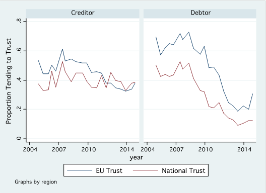
Figure 4: Trust in the EU and national governments, by Eurozone country group
Since the crisis began, trust in both European and national political institutions has collapsed dramatically. In the creditor countries of Northern Europe, there has not been much erosion of trust in national governments, but trust in the EU has declined quite a bit, from a high of over 60 percent before the crisis to below 40 percent. But the real revelation is the extraordinary decline in the troubled debtor nations. National governments are seen as having failed, with trust dropping from over 50 percent to barely 10 percent. European institutions have fallen even farther, from a higher level. Before the crisis, the citizens of these peripheral Eurozone countries trusted the EU substantially more than national governments, with some 70 percent of the population having faith in the EU. By 2014, this had dropped to barely 20 percent.
The crisis of confidence in European and national institutions is pretty much universal, especially in the debtor societies. Figure 5 shows the difference between professionals and unskilled workers. Although there is a slight gap, typically with professionals somewhat more favorable, the more important observation is the massive drop in trust among both groups in debtor societies – and a substantial decline among both groups in the creditors.
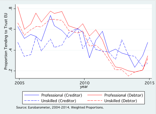
Figure 5: Trust in the EU, by country group and occupational category
Clear messages come through from the analysis of these data. They are of direct relevance to the future of the European Union, and of the euro, and they suggest a range of issues – and potential problems – that the EU and the euro will have to face going forward. I summarize them below.
Support for European integration remains high throughout the EU, and support for EMU remains high throughout the Eurozone.
There are substantial differences in the extent of this support among socio-economic groups. The differences across groups are large, and are quite similar among all member countries. Less skilled and less educated citizens are more skeptical about European integration and the euro; by contrast, the more educated and professional classes are more positive.
The differences among countries in general support for integration and the euro are not as substantial as is sometimes assumed. To be sure, non-members of the Eurozone remain unenthusiastic about EMU. But within the Eurozone, support for the euro is quite strong among all member states. And positive views of European integration more generally are quite widely shared around the Union, with the exception of in the United Kingdom.
However, the crisis has had a massive, and massively negative, impact upon attitudes toward the institutions of the European Union and of the national governments within it. Perhaps surprisingly, the crisis has not had a major effect on overall support for integration and the euro, which remains high. However, the experience of the past eight years has deeply eroded trust in the institutions of the EU and the Eurozone. Europeans, in general, still want the EU to succeed and move forward; those in the Eurozone still want the euro. But they have lost almost all confidence in the ability of European leaders and national governments to manage the problems that have arisen in the past decade.
This loss of trust in European and national institutions is particularly concentrated, as might be expected, among those who have been hardest hit by the crisis. The loss of confidence has been almost complete in the most deeply affected countries, the Eurozone debtors. Across the European Union, in general less skilled and less educated citizens, and those more likely to be unemployed, have come to hold strongly negative views about their own governments, and about the institutions of the European Union. While the data do not allow inferences about a direct relationship between this and the increasing polarization of political positions in many European countries, it is almost certainly the case that the two phenomena are related.
What are the implications of these trends for the future of European integration, and monetary union, over the coming decade? Policymakers at both the national and European level can count upon quite a deep well of support for European integration and for the euro: Europeans appear quite firmly committed to both the broad integration process and the EMU. However, they have little confidence in the ability of existing political leaders to manage both the national and European economies in ways that respond to the concerns of European citizens. This dissatisfaction is particularly concentrated in the more crisis-ridden countries, especially the debtor nations of the Eurozone. Dissatisfaction is also concentrated in those social groups that have suffered most from the crisis: the less educated and less skilled, and the unemployed.
European integration, and EMU, cannot move forward without political support from the public. At this point, such support still exists in general, but there has been such an erosion of trust in policymakers that it is hard to believe that political backing for current policies will be forthcoming for much longer unless conditions improve markedly. And, given the striking differences among socio-economic groups – and especially the great and growing skepticism of the less advantaged among Europeans – it would seem that further progress will also depend upon finding ways to include more Europeans in the gains from integration, and to shelter them from its costs.
This post written by Jeffry Frieden.
July 14, 2015
Wisconsin: Real Wages Are the Same as They Were in January 2011
In my interview with NPR’s Jim Zarolli, the question came up about wage developments. Embarrassingly, I had no opinion, having not looked at the data (I know that doesn’t stop some people from opining; in any case, that question and lots of other stuff didn’t make it into the piece that aired). Well, I looked up the data, and surprisingly the level of real hourly earnings in May 2015 is the same as it was in January 2011(!).
Figure 1 shows the time series for average hourly earnings for all private workers, deflated by the headline CPI. If you think about it, it’s pretty amazing that the real wage is the same even given the dramatic drop in energy prices in recent months.
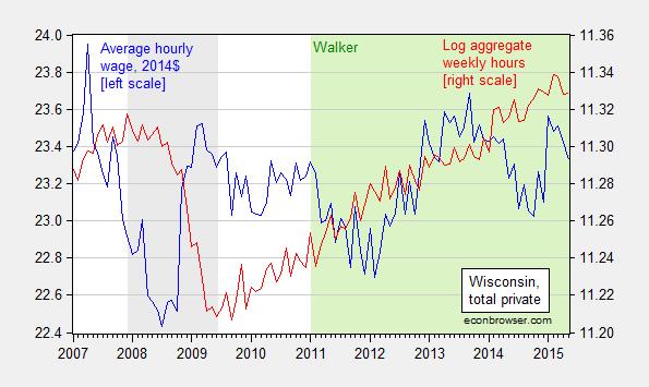
Figure 1: Average hourly earnings in 2014$, deflated by CPI all (blue, left axis), and log aggregate weekly hours, generated by multiplying average weekly hours by number of employees (red, right axis). All data pertain to all workers, private sector. Average hourly earnings and average weekly hours seasonally adjusted using ARIMA X-12 (multiplicative), executed in EViews. Gray shaded area denotes NBER defined recession dates. Green shaded area denotes Governor Walker administration. Source: BLS and author’s calculations.
In contrast to Wisconsin’s real hourly earnings increase of only 0.06% since January 2011, US real hourly earnings have risen 1.8%.
The other series displayed in Figure 1 is a measure of aggregate weekly hours. It’s hard to say given the volatility, but it certainly seems that aggregate hours are declining over the last three months. This is troubling given that data from the household survey validates the conclusion from the establishment survey that employment is declining in Wisconsin.
As an intellectual exercise, it is interesting to ask if Wisconsin can go into a downturn while the US does not. Year-on-year civilian employment growth in Wisconsin did go negative in 1985 and 1998 even while US growth did not (there’s also a short dip in 2004). Hence, it is conceivable that Wisconsin’s path could deviate from the US overall.
Greece: Is Internal Devaluation Enough?
Even if Greek Prime Minister Tsipras is able to maneuver the new agreement through the parliament [0], it’s not clear to me that — even with the aid and reprofiling of debt — Greece will resume growth (see discussion O’Brien/Wonkblog). That’s true even though there has been noticeable adjustment in production costs in Greece.
First, consider unit labor costs in some key euro area countries.
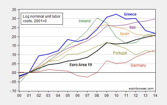
Figure 1: Log nominal unit labor costs (ULC) per hour for euro area 19 (black), Greece (blue), Germany (red), Ireland (green), Spain (orange), Portugal (chartreuse), and Italy (purple), all normalized 2001=0. Source: Eurostat, and author’s calculations.
Greek nominal unit labor costs have declined 10.8% since the peak in 2010 (in log terms). That works out to 2.7% per year increase in competitiveness. Ireland, the canonical example of the flexible adjuster, managed faster adjustment — 13.9% in 3 years, or 4.6% per year.
Since the ULCs are indices, it’s not really possible to make a direct comparison of costs of production. (See Daniel Gros/CEPS for an argument why 1999 is not the right year to normalize on; I normalize on 2001, before North/South Eurozone current account imbalances exploded.) All we know from Figure 1 is that the disadvantage between Greek unit labor costs and German has decreased. (Artus, Gravet/Natxis indicate approximately 12% Greek absolute cost disadvantage relative to Germany in 2013).
So, second, consider one interesting point — despite the comparable adjustments, output has fallen far more in Greece than in Ireland.

Figure 2: Log real GDP for Greece (blue) and for Ireland (green), in billions 2010 prices, quarterly rates. Source: OECD Main Economic Indicators via FRED, and author’s calculations.
Greek real GDP has fallen 31% (log terms) from peak to 2015Q1. Irish GDP fell 13% peak to trough, and as of 2014Q4 only 4% below peak.
How to reconcile the comparable, large decrease in unit labor costs, and the differing paths in output? There are many factors, but I think one key point to keep in mind is that the unit labor cost (or price level) decline is a function of both the slopes of the aggregate demand and aggregate supply curves and the distance from full employment output. Recall this graph (from Blanchard and Johnston) depicting internal adjustment.

Figure 3: Adjustment toward full employment output from negative output gap, in a currency union. Source: Blanchard and Johnston, Macroeconomics.
The graph highlights that a given drop in prices (or unit labor costs) can occur with a flat AS curve with large (negative) output gap, or steep AS curve and small (negative) output gap. In other words just because the price level is falling (or unit labor costs), it doesn’t mean that one is approaching full employment. And in fact, in May, the IMF forecast the 2014 output gap for Greece at -9.3% of potential GDP. The corresponding figure for Ireland was -2.9% (see Krugman for a discussion of costs of adjustment.) In other words, demand deficiency is key to understanding the perversity of the program now being considered. It’s a sort of corollary of the point Charles Wyposz made about the origins of the eurozone crisis, It’s About Demand, not Competitiveness.
These points are consistent with Ashok Mody’s three lessons from IMF research
Update, 11am Pacific: Charles Wyplosz concurs; we’ll be back at negotiations soon, even if this deal is approved by the Greek parliament.
July 13, 2015
Discussing Walker’s Record on the Wisconsin Economy
I was interviewed for an NPR piece run today:
For those who put weight on data, see these graphs.
Wisconsin’s outlook has deteriorated recently
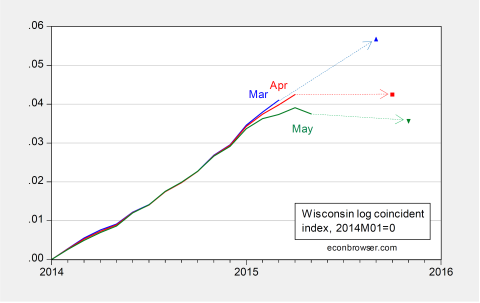
Figure 1: Log coincident index for Wisconsin, from March release (blue), April (red), and May (green), and associated implied forecasted levels. All normalized to 2014M01=0. Source: Philadelphia Fed coincident, leading, and author’s calculations.
The already lackluster BLS (establishment) employment figures for Wisconsin are likely to be revised down
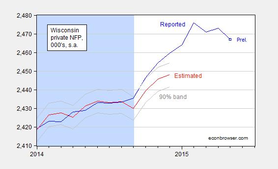
Figure 2: Wisconsin private nonfarm payroll employment (blue), and predicted (red). Light blue shading denotes data used for regression. Source: DWD and author’s calculations.
Real output measures demonstrate Wisconsin growth lags, despite having a high ALEC economic outlook ranking
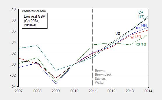
Figure 3: Log Gross State Product for Minnesota (blue), Wisconsin (red), Kansas (green), California (teal), and United States (black), all normalized to 2010=0. 2014 figures are advance. Numbers in [square brackets] are ALEC-Laffer rankings from Rich States, Poor States, 2014. Vertical dashed line at beginning of Brown, Brownback, Dayton and Walker administrations. Source: BEA, ALEC RSPS 2014, and author’s calculations.
Wisconsin ranks dead last for start-ups, despite Governor Walker’s goal of creating thousands of new companies
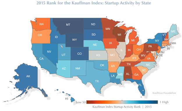
Source: Kauffman Foundation, State and Metro Trends.
Wisconsin’s economic performance since 2011M01 deviates — with statistical significance — from the historical norm, established using a model incorporating long run slower growth of the Wisconsin economy relative to the US economy
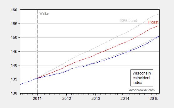
Figure 4: Coincident index for Wisconsin (blue), forecast (red), and 90% confidence band (gray). For forecast, see text. Source: Philadelphia Fed and author’s calculations.
Menzie David Chinn's Blog


