
David Petersen's Blog, page 65
June 25, 2013
Spotlight on Legends of the Guard contributor: Ben Caldwe...
 Spotlight on Legends of the Guard contributor: Ben Caldwell:
David Petersen: Ben, You have worked in animation, toy design and how-to-draw books, and also in comics, what keeps you coming back to sequential storytelling?
Ben Caldwell: While character design and world building are fun -- and easy -- at the end of the day you only get to know these characters and worlds through the stories that revolve around them. When I design characters etc, I’m instinctively building stories around them. Who is the person? Why are they dressed like that? How did they get their hands on a giant cannon made out of butter?
So I always come back to telling stories, although I’m perhaps not as good at it as I’d like. There’s just no
substitute for the visceral connection that you make with your audience through a story.
 As for comics specifically, there are so many unique ways you can play with storytelling in comics that you just can't find in, say, prose or film-making Of course the opposite is also true, but I’m a visual person and when I try to write prose, I find myself trying to describe everything in ridiculous detail. As for film, comics are a unique medium where you can create something with the same bombast, without a budget of millions or limitations of special effects, actors, etc.
The downside is that you are trying to create something without a budget of millions and special effects, actors etc.
David: You tend to work on all-ages material, Your own series Dare Detectives is in the spirit of a great old Saturday Morning cartoon, is the choice of tone a purposeful one? Or is it more a reflex that comes naturally?
 Ben: I have a lot of stories stuck in my head, and a lot of them are definitely NOT all-ages. One particular story I’m doing right now is way too cussin' and violence and anatomically correct drawings to be kid-friendly.
But the all-ages stuff is a lot of fun. Of course, I’m also very contrary, so the fact that so many people are so contemptuous of all-ages books probably motivates me as well. A big part of it comes down to the fact that certain types of stories are, well, not necessarily childish, but certainly not "realistic". So I like to skip the superficial veneer and let ridiculous things be ridiculous, and that makes a lot of adults uncomfortable.*
*These people are stupid. Avoid them.
David: The story you created for Legends of the Guard, can you talk a little about the subject of the story and where the idea came from?
 Ben: I knew I didn't have time for a long story, so I wanted something short and sweet. Or at least short. One thing most of my stories feature is the glory of unintended consequences -- wait, the two things most of my stories feature are the glory of unintended consequences, and a bit of unnecessary theatricality.
One of my favorite bits of mouse guard (outside of the world building) is the intimate nature of the characters, so I wanted to do a small story. So I worked both all that one story by watching my insane twin daughters, and thinking what sort of stupid antics they would come up with to stop villains. The story pretty much wrote itself from there.
David: How do you proceed with a story after you have an idea, what is your process? Script? Thumbnails? Voodoo Magic?
Ben: I used to do full scripts, but I realized no matter how many revisions I did, I would always make further changes at the thumbnail or pencil stage. The fact is that the brain processes information in prose/manuscript form differently than it does images, and comics are essentially a visual medium.
So I usually start with a general breakdown of a plot, punctuated on the one hand with scraps of scenes or dialogue that just pop into my head and work, and on the other hand with a very calculated look at the characters, how they should act/react/interact, and what that means in terms of getting them from the beginning of the story to the end. As I get older, I find my stories being less driven by a pre-ordained plot (except maybe the loosest conceptual idea), and more with getting the characters nailed down, then turning them loose and seeing what happens.
 Procedurally, once I have an outline of the overall plot, I will break it down into scenes. I've done enough GNs and had enough experience with building up and cutting down scenes to fit pre-allotted page counts that I have a pretty good idea of how many pages a particular scene can take without overwhelming the rest of the story. it sounds inartistic, but I like to break things down as hierarchical information. That is, what is the overall gist of scene x? Then, what is the gist of each pair of pages (in comics and children's books, pages should always be worked in pairs, since that is inevitably how the viewer will experience them)? Finally, what is the most important idea for each individual page?
From that I do thumbnails, usually doing a whole scene's worth on a single sheet, so I can see the scene as a whole. Usually I put a note under each page(s) like "Toby punches goons", "he misses, falls into cotton candy machine" etc, before making any drawings. I’ll often drop balloons with rough dialogue in at this stage, just to account for the space that will be needed for lettering later.
 IMPORTANT: I try to pop out the thumbnails as quickly as possible, without over thinking them. First off, it's just too easy to get paralyzed at this stage, and it's important to keep momentum. Second, it's much easier to do something concrete and say "oh wait, the butter cannon sounded awesome, but now that I’m looking at the drawing on the page, a PUDDING cannon is much more logical", instead of staring at a blank sheet and trying to guess ahead of time what will work or not. At this stage there is no such thing as bad ideas, just ideas that can be improved.
As I get older, pencilling gets harder because my drawing has improved like a mazillion percent, but I’ve become even more sensitive to the nuances of expressions, body language etc. cartooning makes it even worse -- if you have a drawing with a hundred lines and one is out of place, who cares? But if you have a drawing with three lines, one out-of-place line is really going to stand out.
Even at the pencilling stage I will find myself reworking certain panels or even scenes. It’s not the sort of thing that makes editors sleep well at night, but at every stage of the storytelling, as you get closer to the final page you might notice new problems that weren't apparent at earlier stages; or to put it more positively, you notice new opportunities to tell a better story.
David: A lot of talk on this blog is about process & materials. Can you share with the readers what art supplies you use for each step of the artwork on a story like this? (paper, pencils, ink, digital program...feel free to list brands.)
Ben: I use generic #2 mechanical pencils, because I hate to pause and sharpen them. At first it was just a matter of convenience, but I found that after I became used to them, I could get a huge range of line weight and sensitivity. But I am obsessed with drawing on laser print paper, particularly Xerox digital Xpressions. So the thumbs were done on that paper, then I printed them slightly larger in blue line (on more laser paper), to do the final "clean" art. In this case, the trick was to keep the final pencil art somewhat loose.
In any case, I was surprised at how closely the final art followed the thumbnails in the MGL story. There are usually a LOT of changes during finalization, either tweaking poses or, as often as not, completely rewriting pages.
 The coloring was all digital (photoshop). I tried to keep the process simple, partly so that it could be standardized and quickly replicated throughout the pages, partly because the simpler that stage is, the more time is left for working/reworking the actual drawings and storytelling that are the guts of the comic. I laid down an antique paper texture for ground, then colored with flat colors at 66% opacity. This way you can easily create solid color with a few strokes, but since it isn't full opacity, there's a certain organic buildup. In a few places, I also used levels to create surreal color shifts.
 David: What does Ben Caldwell like to do when he’s not making comics?
Ben: That’s between me and my parole officer.
David: Thanks for a really fun story Ben. I’m excited for the fans to read it. Where should people go if they want to know more about you and your work?
Ben: You can always follow me on twitter (@bencaldwellart) or my blog (purge theory.blogspot.com), and, when the stars align, you can visit my website www.daredetectives.com. Those are good places to start, because I update them regularly, and I’m going to be making some announcements for future projects soon!
If you want to get your hands physically on my work, short of burgling my house you can buy my sketchbooks online, or find my classics comics, "dare detectives" comics, and how-to-cartoon books at fine bookstores everywhere. I presume shady bookstores also sell them.
Ben's story A Bone To Pick will appear in Legends of the Guardvolume 2 # 1 along with stories by Stan Sakai, Nick Tapalansky & Alex Eckman-Lawn
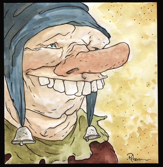
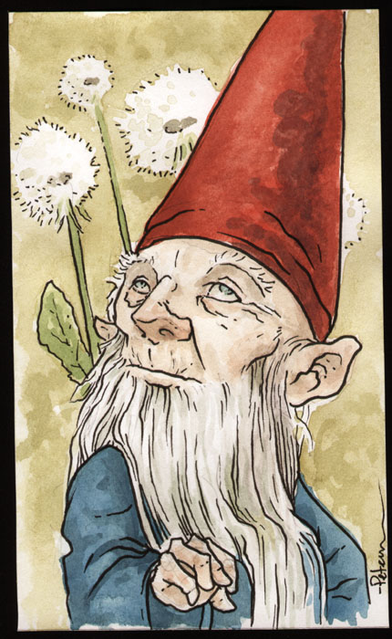 Watercolor Wednesday:Here's another look at last week's two watercolor pieces I offered up for sale. For inspiration I looked up images of old men for fun expressions and wrinkles. First up is a blind gnome...with dandelion puff balls in the background.I went with the Rien Poortvliet costume and colors for this guy.
 The other piece from last week's offerings is some manner of small Fay with a cracked teacup for a hat and a set of his-size silverware ready for a meal.
Upcoming Appearances:San Diego Comic Con: July 17-21Boston Comic Con: August 3-4Baltimore Comic Con: September 7-8New York Comic Con: October 10-13North Carolina Comic Con: November 9-10


June 18, 2013
Legends of the Guard Storytellers:For Volume 2 of Legends...
Legends of the Guard Storytellers:For Volume 2 of Legends of the Guard (Which starts in issue form next Wednesday), I needed to design 12 new mouse storytellers - one for each of the contributors. A few of the artists had already turned in their stories when I started on the mouse designs, but not all, so instead of trying to match most of the mice to a particular story-tone, I just made a variety of characters that seemed interesting and matched them up later.
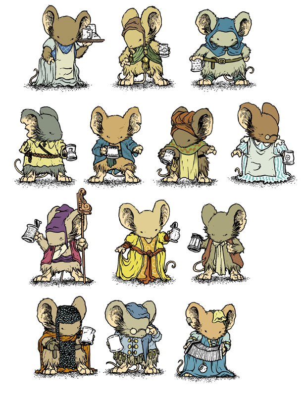 Here are the twelve storytelling mouse characters. Even though this art wasn't required until the Hardcover collection extras were being produced, I wanted a solid character model sheet to use while doing my pages for the series. Not only does each mouse have it's own marking (nicked ears, missing limbs) they also have their own fashion, details, palette, and tankard. For this blogpost, I'll talk about a few of the character's designs.
 They all started as rougher sketches that I tightened up as I found a particular design I liked. Some of the characters started as 'What type of mouse hat haven't I drawn?" or "is there a material I haven't shown a mouse wearing often/yet?". Here is a scan of doodles on printed light blue 'mouse maniquins' and at the top and bottom are the versions I decided to tighten up and pursue as characters.
I had a bit of trouble as I was roughing out new clothes or details to make sure each character would read as a unique mouse and not easily mistaken for a different patron of the June Alley Inn. I knew I'd done a few commissions in the last year (colored for the 2013 sketchbook due out at SDCC this year) that had some character/clothing designs I liked, so I opted to pull those up and re-use them:

 These two I did on my London trip at the start of 2012. Each were inspired by architecture and sculpture I saw while there. So these two became Holton (on the left, who tells Nick Tapalansky & Alex Eckman Lawn's Story) and Alton (on the right, who tells Bill Willingham's story) I sat these two close together in the tavern, but only because of their London design connection
  This commission was to celebrate the engagement of some fans of mine, in fact, originally the ribbon-flag had the date of their happy day. The ladymouse on the balcony I thought had a nice dress that I'd like to draw again, so she became Odella (who tells Justin Gerard's story)
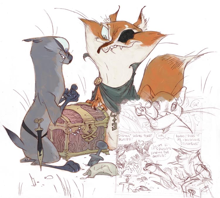
 "A mouse guarding a pumpkin patch" was the request for this piece, and I took not only the design, but the 'guarding' bit as an occupation for him. For Legends of the Guard, he is now Orwin (who tells Ben Caldwell's story)
On two occasions, I used the main character from one of the contributor's stories as the storytellers, so it was a matter of drawing my interpretation of them:
 For Stan Sakai's story, I felt the story might have more impact if the mice would be hearing it directly from who the tale happened to...it added a sincerity to my part of the book that was needed to do justice as a bridge in and out of Stan's story. She was un-named in the story, so I gave her the name Mira.
 Lastly, Rick Geary's story is all told in the first person, so I had no choice but to have the main character also the mouse in the tavern narrating. In this case, Rick supplied me with the character's name: Edwy (as well as a background for his bio for the Hardcover extras page: The Storytellers.
 To help me, I also made a floorplan chart showing where each character would be seated the majority of the book (as well as where each cover painting is hanging in the tavern). The floorplan is a top-down photo of my June Alley Inn model with the characters listed below and assigned a number/letter. The numbering was just to identify the mouse, the letter stood for which issue they told their tale in...this helped me distribute the characters around so we never spend too much time in any one corner of the bar.
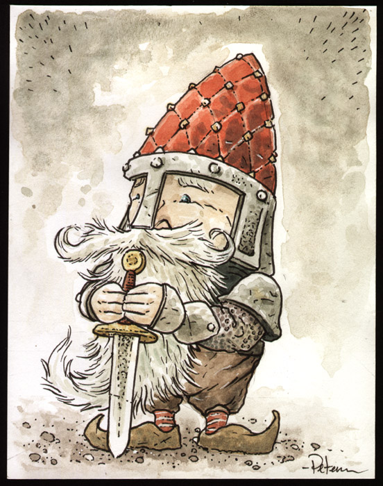 Watercolor Wednesday:
From last week's Watercolor Wednesday paintings: Here is the Knight Gnome. The sketch started life as a carved chess piece, but kept progressing towards 'character' rather than 'inanimate object'. I played off the standard gnome hat as a peaked & studded helm for the diminutive fighter. And now every time I see the final image, I think that he'd make a fun Christmas Tree ornament (though I don't know what connection he would have to the holiday).
 The other piece from last week started as the idea for an 'ugly' mask...but felt like more fun if it really was a character's face. And besides having an unfortunate visage I also don't think he looks too bright...so I dubbed him 'simpleton'
Tomorrow I'll post more paintings in my online store.
Upcoming Appearances:
Albuquerque Comic Expo: June 21-23San Diego Comic Con: July 17-21Boston Comic Con: August 3-4Baltimore Comic Con: September 7-8New York Comic Con: October 10-13North Carolina Comic Con: November 9-10
June 11, 2013
Spotlight on Legends of the Guard contributors: Nick Tapa...
 Spotlight on Legends of the Guard contributors: Nick Tapalansky & Alex Eckman-Lawn
David Petersen: How did you both get in to working in comics? (Nick writing and Alex drawing)
Alex Eckman-Lawn: We actually got into comics together. Nick found a few pinups and art samples of mine on the internet and approached me with a script. We did some preliminary art and a test page or two and the rest is beautiful romantic history.
 Nick Tapalansky: That's not how I remember it at all. I'm pretty sure your mom put you in my cab and I drove you to your uncle's place out west after you got in one little fight while playing basketball outside your school in Philadelphia. Your mom tends to be panicky. You were singing the most annoying song on the way, but somehow we came up with a few good ideas and kept in touch.
David: For folks unaware, you two are the creative team behind Awakening. Tell the readers a bit about that book.
Alex: AWAKENING is a zombie noir story, set in the small town of Park Falls. I tried to use my experiences growing up on the playgrounds of west Philly to inform my portrayal of the streets.
 Nick: Yes, little-known fact: AWAKENING is a philosophical exploration of The Fresh Prince of Bel-Air, set against a heady science v. religion debate.
In all seriousness though, AWAKENING is, like Alex said, a zombie noir. We tossed almost all of your basic zombie tropes out the window and started fresh, giving the story room to breathe with a slower pace. We wanted time to explore questions and ramifications without the constant pressure of SURVIVAL placed on the characters from the beginning, so we began at the start of a year when the first zombies appear. They don't infect with their bites and they don't multiply dramatically by their own doing. It's an inexplicable trickle that slowly builds up as people begin to drop dead and "awaken" in this new, undefined state. That's where the story starts, following a retired cop as he tries to put the pieces together, both for the town and his own life.
Alex: It’s probably worth mentioning that AWAKENING was both mine and Nick’s first comic book ever (or since childhood anyway). To backtrack a bit, AWAKENING is pretty much how we got into working in comics.
 David: A horror book about a potential outbreak of zombies, I would think, is very different from writing and drawing a mouse folktale. Did the process feel different to you guys? Did you approach it differently?
Nick: It didn't feel too different for me, to be honest. Is that weird? I try to think of stories as stories, writing as writing. I'm just putting down what I see, but the process stays pretty static. So when I sat down to work on "Leviathan" I just tried to convey what I saw as best I was able, applying what I'd learned from other shorts, and even AWAKENING. It was the first time I told a story like this though, and it really was a lot of fun.
I think, in terms of process, things change a bit more for Alex, since so much of the atmosphere and tone in a comic relies on the instant visual connection a reader makes with material.
Alex: I definitely did have to approach this story differently, but that’s always exciting for me. Part of the fun of making pictures, for me at least, is getting to try out different visual approaches for different projects.
"Leviathan" was a breath of fresh air for me, especially after all the bleak and spooky stuff I usually tend to do.
David: Nick, describe the Legends of the Guard story and its origins.
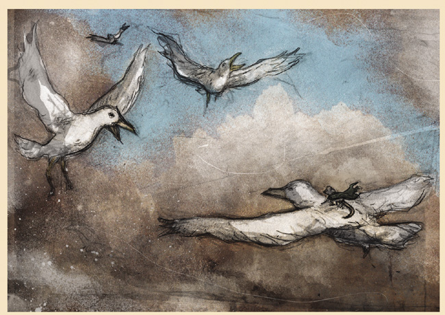
 Nick: "Leviathan" was the product of me being a sarcastic pain in the ass! Back at some old con or another, may have been New York, right when MOUSE GUARD was really just going insane, I joked that I was going to do my own animal guard to ride your coattails to stardom. Somehow we settled on a Whale Guard, and I distinctly remember your sweet, sweet whale impressions. Then you ripped off a piece of cardboard and drew the quick sketch (pictured) signed with your blessing. Pretty sure you also bit it to sign off with your slobber-DNA. I still have that cardboard and fully expect it to buy me a sweet house one day, not to mention produce my own stay-at-home-Petersen clone.
Then at another con, San Diego I think, you asked me to moderate your spotlight panel. During the talk I had another opportunity to chat about my great idea, Whale Guard, and sow the seeds for usurping your fanbase. It's been a slow process, but it finally paid off. When LEGENDS OF THE GUARD's second volume was getting underway, we got the call: "Nick, we want it. We want “Whale Guard.”
David: Did you ever think that joke would have paid off into this short story?
 Nick: Never! Haha! I'm almost sure my first reaction was abject terror, followed immediately by excitement. Not only is it such a robust and well-loved world, but we're in ridiculously great company. I'm gonna have to start joking about more things I want to do.
Alex: I have to admit, I thought Nick was joking when he told me we'd be doing “Whale Guard” for realsies.
David: I remember thinking when I getting ready to ask you guys for a story: "With Legends, I think Nick could play up his whale guard joke and it not seem silly, but grounded and honest for Mouse Guard. Without spoiling anything, what themes or intent did you want to pursue when you started actually writing ‘Leviathan’?
 Nick: I think, for me, it was a matter of scope. The Mouse Guard tend to be brave, selfless mice who stare danger in the eye to protect their fellow mice. They'll fight down other mice, snakes, owls and bats but at some point there are certain dangers even the bravest, most headstrong mouse can't face on their own. Things just get too big, sometimes literally. I wanted to explore that a bit.
I also wanted to bring just a touch of magic to the world, since this was a "tall tale" and it wouldn't impact the main narrative or the realism of your story in the main books. So that was fun, getting to see our little guy, not a guard mouse but an adventurer, in situations you might not typically get to see in MOUSE GUARD thanks to a sprinkle of some fantasy elements.
David: Did you guys work on the story ideas together or is the workload separated strictly into writing and art?
 Alex: I wouldn't say it's STRICTLY separated, but Nick had a clear idea of what he wanted to do with the story so in this case it was pretty much all him.
Nick: Yeah, it does vary from story to story for us. We both try to get our hands pretty dirty in everything.
Alex: Yup, we do a fair amount of back and forth about actual layouts and visual stuff, but I think this story was 100% Tapalansky.
David: Nick do you write scripts with page breakdowns (each page’s panel count described with what goes in them) or do you leave a lot of the pacing and layouts to Alex?
.jpg) Nick: This script wound up being the last one I wrote with panel counts, actually. I wrote all of AWAKENING that way, and the handful of shorts we followed that book with. Alex knew that my scripts were just the best way I saw to do it, not necessarily the actual best way, and played with formats and pacing if he saw better ways to approach what I was trying to pull off. That's the best part of working in comics - the collaboration.
Nick: This script wound up being the last one I wrote with panel counts, actually. I wrote all of AWAKENING that way, and the handful of shorts we followed that book with. Alex knew that my scripts were just the best way I saw to do it, not necessarily the actual best way, and played with formats and pacing if he saw better ways to approach what I was trying to pull off. That's the best part of working in comics - the collaboration.Alex: This is why I like working with this guy. Not everyone feels that way.
Nick: Nowadays I tend to take an approach between screenwriting and full-script comics. I won't label panels with numbers, sizing, or total count on a page (except in specific instances). If an artist wants to take a "panel" and make it into two, there's no problem there. Want to combine actions? Go for it! I couldn't work in the old Marvel Style - I'd feel as claustrophobic and passive as an artist given a super-strict script - but I think this is a middle ground that works. It gives freedom to everyone, and permission to be as involved as possible in every aspect of bringing a story together.
.jpg) Alex: I think the real challenge with this story was just fitting everything into the six pages.
Alex: I think the real challenge with this story was just fitting everything into the six pages.Nick: Oh, totally! Working within a defined page count like that definitely pushed us to trim every bit of fat wherever we could. I like to think we packed each page with possibilities though, in case Tiernan ever gets a chance to pop back up.
David: Alex, how do you approach starting work on a page?
Alex: Well for this story I had Nick's script to work from, so I start by laying out panel shapes in photoshop and doing some ultra rough drawings with my tablet-- just to get placement and shapes down. When I'm happy with everything in this super-rough stage I start actually putting pencil to paper.
 David: Your artwork is ultimately a blend of drawing and textures and photo-collage and digital painting. How do your ideas develop and what is the process for getting to a finished page?
Alex: This is always a hard one to answer. I tend to work a little differently on every project, depending on the subject matter, tone, setting, etc. For "Leviathan" I tried to let the pencils speak the loudest.
There is a bit of photo collage and scanned texture in there as well, especially when we start getting close up to the whales, but this is primarily just pencil and photoshop "painting!"
 I suppose the more technical answer is that I start with a scanned pencil drawing, then paint under and over it, introducing photo elements as I go. It's a kind of push and pull process, until I find a balance I think works.
David: Awakening is a closed ending story that wrapped into a collected softcover back in 2011, so what have you two been working on since and currently?
Nick: We've been quietly busy, but comics take FOREVER sometimes! I just finished writing a new book, just a bit shorter than AWAKENING, that First Second will be publishing in the next year or two. Comics are tons of fun but, like I said, sometimes take a while to make it from our collective brains, through the publishing machine, and into a reader's hands. My editor and I are looking for just the right illustrator for that book, so when that comes together we'll really be off and running.
It's a pretty big departure for me, this book, but it took on a life of its own when I was writing it. It's more of a kids/all-ages title, with a very animated, or even a manga style to the writing. A brave new world from the desk of Tapalansky, and I can't wait until it's finally out!
 In the meantime, I'm working on another exciting graphic novel, which I hope to start pitching this month, and Alex and I are always brainstorming what comes next.
Alex: Yeah, I've got a few bigger projects in the works as well but most of whats actually seen print has been shorts.
I had a piece in The Graphic Canon Part 1- a collection of comic artists and illustrators taking on classic literature and poetry. There's some pretty awesome stuff in there, and I'm proud to have been a part of it!
Nick and I also did a short story for the Perhapanauts gang, which is finally up on their website *LINK*. It's a bit older at this point but it'll be new to all of you!
Nick: And it’s free! Who doesn’t like free comics?
Alex: I also just finished working on a short for Moon Lake Volume 2, coming out through Archaia. I did a whole mess of pinups for that book as well. As always, big stuff is on the way.
David: Thank guys for a fun story for Legends of the Guard. Where can readers find out more about each of you and your work?
 Alex: Thank YOU, Dave! This was a blast to work on and I think both Nick and I are pretty honored to be a part of the MOUSE GUARD story, if even just tangentially.
Nick: It was definitely a great experience! We rarely get to play in other people's sandboxes, but when we do it's always a treat. Especially when the sandbox is as vast and inviting as MOUSE GUARD.
I tend to hang around on Twitter mostly (under the creative handle, @NickTapalansky) and have a secret narcissistic internet fort at nicktapalansky.com/blog, resplendent with info about yours truly and free comics. A Tumblr is imminent, once production gets going on the new book, so feel free to bookmark/follow nicktapalansky.tumblr.com. I do not yet have an Instagram, though I take enough pictures of my food that I should seriously consider it.
Alex: You can find me work on Tumblr: http://dudenukem.tumblr.com, read my innermost thoughts on Twitter, @alexeckmanlawn, and Check out my website here: www.alexeckmanlawn.com
Nick & Alex's Story Leviathan will appear in Legends of the Guardvolume 2 # 1 along with stories by Stan Sakai & Ben Caldwell
 Watercolor Wednesday:
Here's another look at last week's Watercolor Wednesday paintings: As I said in last week's blogpost, I was influenced by being at Spectrum Live and seeing all the folklore creatures. This week's pieces continue in that tradition. First up we have "Nod Longcap" When I grabbed the scrap piece of bristol he would occupy, I thought "It would be fun to do a vertical painting where most of it is the character's hat." The fun facial hair and nervous expression and body language developed on its own.
Watercolor Wednesday:
Here's another look at last week's Watercolor Wednesday paintings: As I said in last week's blogpost, I was influenced by being at Spectrum Live and seeing all the folklore creatures. This week's pieces continue in that tradition. First up we have "Nod Longcap" When I grabbed the scrap piece of bristol he would occupy, I thought "It would be fun to do a vertical painting where most of it is the character's hat." The fun facial hair and nervous expression and body language developed on its own.
The other little fay from last week's Watercolor Wednesday offerings is this minstrel wearing a thimble for a hat. In Mouse Guard I love playing with having them use objects they have hand crafted to their scale so they look no different than human-scale items: swords, mugs, tools, etc....while still having them use items that are raw natural materials that remind us of the mouse-scale: acorn cap snowshoes, pinecone shingles, turtle shell boats. The tiny lute and the thimble gave me that same scale juxtaposition in this piece.
Tomorrow I'll post more paintings in my online store.
Upcoming Appearances:Albuquerque Comic Expo: June 21-23San Diego Comic Con: July 17-21Boston Comic Con: August 3-4Baltimore Comic Con: September 7-8New York Comic Con: October 10-13North Carolina Comic Con: November 9-10
June 4, 2013
Legends of the Guard Vol 2. #3 cover process:With Legends...
 Legends of the Guard Vol 2. #3 cover process:
With Legends Volume 2 in full solicitation swing, I'm back with another Legends cover process post. Last cover I mentioned considering having the main character be a musician...Well, I saved the idea for this cover and made the single musician a trio...a trio that could play so well, they'd call back the dead.
 The cover started with some sketches and research into medieval instruments. After looking at several pages (and even listening to some recordings of people playing the instruments) I settled on bagpipes, an organetto, and something like a rebec. I took some liberties with them and the way they are played for the sake of being from mouse culture rather than man's. The dancing ghosts were also loosely sketched in my sketchbook so I could start to digitally compose a layout.
 With sketches in hand, I worried about this cover and how it was going to work. Simply pasting together the drawings would not give me a full idea of this cover's final appearance or what pitfalls I would have to watch out for. So I did a bit more with tone and effects in the digital composite than I normally would. I played with some stock photos of trees in the background to give a foggy sense of depth.
 The inks were a bit tricky because of the ghost effects...and at several times while inking I worried this cover wouldn't work the way I was proceeding with it, but I just pushed through figuring I'd make sense of it all in color. I inked this on two different sheets of bristol. The first was the 'real world' inks: ground, musician mice, and trees. The other sheet consisted of the mice and some sparkly effects I inked as dots. Before I started inking, I printed out the digital composite twice: one without the ghosts and one with just the ghosts. I added a few mice that were not in my initial rough, but I drew and inked them as I went.
 The flats were rather quick, but took some advanced thought as to arranging the layers of them so I could achieve all the transparencies and ghost effects. I color held the trees and the ghost outlines on different layers. After the flat colors were established for the ground, sky, and musicians, I made some semi-transparent ghostly layers for the spirits' bodies. The ghosts are on multiple layers so that where they overlap there is a density change in their color. I kept the musician color choices fairly muted to make sure they didn't seem too out of place.
Here is a look at the final colors sans-text with all the rendering finished and the effects tweaked:
 Issue 3 of Legends of the Guard volume 2 will feature stories by:
C.P. Wilson III, Cory Godbey, & Eric Canete
 Watercolor Wednesday:
 Ever since getting back from Spectrum Live, I've wanted to play more in the world of gnomes, elves, fay, sprites, cluricauns, and brownies. I tend to do some work in that direction anyhow, but the next few weeks of Watercolor Wednesdays will be firmly planted there. The first up of last week's watercolor pieces was inspired by my design of a Fairy creature for a Mayfair game.
 The other piece from last week I built up rather slowly with lots of layers of watercolor. The worried little fay seemed to be in the middle of telling me his story as I painted him. I figure he's some sort of late night watch who keeps his eyes and ears on the moon and heavens and will-o-wisps and even the humans and their farm beasts in order to make sure the world passes at it's correct pace, in sync with prophetic charts and runic almanacs. He frets a lot, but only jingles his bell soundly when real trouble (cosmic or domestic) puts everything in jeopardy.
Tomorrow I'll post more paintings in my online store.
Upcoming Appearances:
Heroes Con: June 7-9Albuquerque Comic Expo: June 21-23
San Diego Comic Con: July 17-21
Boston Comic Con: August 3-4Baltimore Comic Con: September 7-8New York Comic Con: October 10-13North Carolina Comic Con: November 9-10
May 28, 2013
Game illustrations:For a recent freelance job I was asked...
 Game illustrations:
For a recent freelance job I was asked to do artwork for Mayfair Games on an upcoming game of theirs. I don't know if I'm allowed to say the title of the game (based on internet searches, it has yet to be announced) so I'll hold off on that. I did check with my editor and he said I could share the process images of the artwork.
Roughs: The assignment was to illustrate (and perhaps visually design in some of the cases) three woodland mythological fantasy creatures/races: Elf, Fairy, & Huldra. The Elf I was told to come up with something between Tolkien elves and Rackham elves. The Fairy I was given free reign on except to not make them too 'princessey'. And for the Huldra, a naked female with a tree-hollow of a pack and an ox tail, I was given the leway to make her more of a creature than a woman with some odd features. Below are the roughs I sent off to the Editor. They are pencil sketches with quick digital colors. Each creature was also to get two designs, one of them normal, and one of them 'powerd up'...though I thought of them more as the 'royal' versions.


 Inks: After the editor made some notes on the roughs, I printed them out and taped them to the back of some Strathmore 300 series bristol board to ink them on the lightbox. The art of these measure about 6" x 6", so I switched from my normal pen size of 0.7 down to a 0.25. I worked to add detail and texture, especially on the Elf and Huldra. For the 'royal' additions, I inked those on separate bristol sheets that I laid on top of my finished inks (for registration purposes). That way I could isolate those elements when coloring the final images. For the Huldra's background, I drew a scene in pencil to help me with digitally painting the more detailed foliage.


Colors: Unline my work on Mouse Guard, I used a Wacom tablet to digitally paint these illustrations. I used paintbrushes in photoshop more than falling back on my standard dodge and burn tools for the renderings. All of the linework received a color hold, so none of it will print 100% black....but more of a dark sepia. Below are the final Elf, Fairy, & Huldra.


 Watercolor Wednesday:
 Last week's watercolor piece was highly influenced by the delightful, charming, and beautifully rendered work of Jean Baptise Monge.
Tomorrow I'll post more paintings in my online store.
Upcoming Appearances:
Heroes Con: June 7-9Albuquerque Comic Expo: June 21-23
San Diego Comic Con: July 17-21Baltimore Comic Con: September 7-8New York Comic Con: October 10-13North Carolina Comic Con: November 9-10
May 21, 2013
Questions and Answers:A few of the same questions hit my ...
 Questions and Answers:
A few of the same questions hit my email on a regular basis and today I thought I'd address a few of them here for everyone to read.I figure that if a question is being asked by a few, it's something that may interest the many. If you would like to submit a question for a future Q&A blogpost, email me through the mouseguard.net site or Twitter or Facebook.
 Q: How you handle just a bad day artistically? What has worked & what hasn't?
 A: I don't handle them well, that's for sure. I have two basic approaches 1) Walk Away or 2) Push Through. Depending on the situation I may try either or both of those. To walk away doesn't mean necessarily to give up. It can mean to take a break. In that break I may take a hot shower (something that almost always clears my head and improves my mood) play a game, watch TV or a movie, read a book, go for a bike ride, or it very well might mean quit for the day. The break can serve to purposefully inspire you or it may just be the mental distraction you need to clear your head and get back into a good place. Other times it's just coming back tomorrow and seeing where you stand...but more than a few of those days and you are in serious trouble.
Pushing through can be a tricky one. It means that you are going to force yourself to do bad drawings and work that makes you perhaps madder than you are when considering 'how do I get past this bad artistic day'. It's a "darkest before the dawn" scenario. And it doesn't always work. Trying to draw the character on a new sheet of paper can help (put away the bad drawings) focusing on a new part of the drawing, or if working on a layout, change the camera angle or panel size to something drastically different and see what happens...even if you hate it, by seeing what you hate about it, you may find what you like and need to focus on for a better layout
The only surefire's for me to kick the bad art days (or at least the most reliable) include keeping in touch with other creatives (even if just to verbalize your issues with the work you are unhappy with, if not to also share jpgs of process work), the hot shower mentioned above, and staying fed & rested on a schedule.
Q: What are your thoughts on college or art school for a future in illustration/comics. Are there classes you recommend?
A: First off, to get a job working in illustration or comics (which can sometimes just mean producing work and self-publishing it) no one will ever check to see if you have a degree and if so, what kind. The gates to art employment won't be barred to you because you didn't go to college. The chief criteria for getting work is: can you do the work well...which is to say, can you draw, illustrate, & tell stories well....AND can you prove it. That being said, college and art schools can help you become a better artist. Their programs are designed to do so.Then you get into the debate of structured educational learning of art vs self exploration & study. Both have benefits and detriments. School gives structure, a social web of like-minded creatives to bounce ideas off of, and a forced schedule for getting work done...however, it can also be as good or flawed as the professors who have tenure and it costs a great deal of money. Self study focuses on what you want to learn, costs little, and leaves you more artistic freedom ..but can be tricky to stick with & push yourself hard enough and won't expose you to as much artistic diversity as school.
I started at a community college for two years, and then transferred to a university. At the time of the transfer, I also considered an art school, but decided I wanted to experience the college campus life and not leave all my non artistic studies behind (science, literature, etc.). The two most important classes I took were 2D design (which I've posted about before) and Printmaking (which I've posted on a few times A, B, C) The artistic education was sturdy, and certainly forced me outside of my comfort zone, but I found the lack of illustration classes at my school and the desire of professors to re-mold you into their artistic image a step backwards. So do you need a college degree for this line of work? I think the question needs to be What do you think you need to get your work ready for this line of work?.
Q: What materials do you use?
A: Paper: Strathmore sketchbooks & 300 series bristolDrawing: A 0.5mm mechanical pencil with HB lead & a kneaded eraser
Inking: Copic Multiliners (the 0.7 nib mainly) Dr. Martin's Bombay Black ink and a #1 brush for fills or brushwork
Watercolor: I have a few Sakura portable trays and an assortment of Windsor Newton tubes (especially their Payne's Grey)
Digital Coloring: Photoshop 7.0
 Watercolor Wednesday:
 Last week's watercolor pieces were of inanimate objects. First up is a traffic signal. Mr. Rogers had one in his house, and when I was a kid I thought it would be a cool item to have in your home...not one of those novelty ones, but a real, weathered, street-used traffic signal. Of the three pieces from last week, I painted this last asking myself "what other object that we all see every day would be interesting enough to paint" and my mind flashed to that childhood desire to own one of these.
 The spigot came first in the order of these being painted. I was in my basement laundry room and saw the shut-off valve in the floor joists for the outside spigot and thought the valve looked cool and would be interesting to paint. But when I sat down to draw it, I thought showing a spigot would be more interesting for someone to own than just a valve.
 Last up from last week's pieces is a pair of scissors. My friend Mike Davis (who is the inspiration for Rand) did a lot of college sketchbooks themed around him drawing every day objects over and over: utensils, eyelash curlers, drafting implements, simple hand tools...and I think he did a page on scissors too. Anyhow, that flashed to mind after the spigot painting and I aped his idea to do this pair of scissors.Tomorrow I'll post more paintings in my online store.
2013 Appearances:
Heroes Con: June 7-9Albuquerque Comic Expo June 21-23San Diego Comic Con: July 17-21*more 2013 dates coming*
May 14, 2013
he best laid schemes of mice and men:Today's blogpost was...
 he best laid schemes of mice and men:
Today's blogpost was scheduled to be the process of making a new and oversized print for my appearance at Spectrum Fantastic Art Live 2 this weekend...unfortunately due to illness, I was never able to start on the art for the piece, so it left me with no file to send to the printer and no blogpost to share. Instead I'm going to share the false start on the print as well as this post.
 The plan was do do something larger than our standard 11x17 prints. Ever since seeing my Brave print in person, I wanted to offer Mouse Guard fans a piece with that impact. We settled on 18x24 and had quotes from the printer for that scale. The next trick was to figure out what proportions to draw the art. If I was going to ever re-use the image in a Mouse Guard book, the art had to be twice as wide as tall (the tan area in the diagram) but that left a lot of unused area (red area) on the 18 x 24 paper. I was going to solve this by centering the artwork and using some of the space above and below the print for hand inked lettering, perhaps to look like it was debossed into tilework or carved into stone.
For the main imagery I knew I wanted to flood the background with detail, the mice to be non-violent, and the moment to feel ceremonial:
I looked to the Shorestone Archive Room panels from Black Axe issue #6 for the type of background I wanted to draw, something where the architecture is secondary to the overflowing amount of books and bottles and papers and scrolls and boxes that clutters it.

For the mice, I decided to go with a knighting ceremony vibe...but instead of the kneeling mouse being tapped about the head and neck with a scepter or sword, it would be with an overly large writing quill (a feather), and the mouse would perhaps even be surrendering the weapon. I sketched the two characters and scanned & tinted them to get ready for the final laoyout.

The last step before drawing the piece was to figure out the background. Uninspired by drawing something up, I wanted a framework that was already interesting I could cram full of books and scrolls and artifacts. I built a model using bristol board, basswood, and cardboard. It was while finishing up the model that my already annoying sinus infection and fever got the better of me.

So that is where this piece and blogpost are left. As I type this late Monday night, I am on the mend, but certainly not back to 100%. The deadline to have anything at the printer that could be turned around for Spectrum is long past. I hope to resurrect this piece soon...though I may not do it as a print, but rather as a cover...or perhaps draw it and use it for both. I apologize for not having this ready for Spectrum, I apologize for not having a more insightful blogpost for this week...but I'm glad I was able to share the honest information about plans going awry.
 Watercolor Wednesday:
 The watercolor pieces from last week were a fun family portrait idea. It started with the simple joy of wanting to paint animals in clothes...which I always enjoy. But after I painted the 'father' figure, I didn't want to paint a Rhino for the 'mother'. And in reaction to the editorial info I got when doing my Snowy Valentine children's book, I decided to make an animal family that made no sense. I was told when doing that book that I couldn't have different species in love because it brought up too many questions for kids...the editorial staff seemed very concerned about what the offspring would be like and how a kid's brain could/would process that idea.
 So the alligator mum seemed both a bad match for the rhino, and also a counter-intuitive choice for a motherly figure. Once I had the two adults in the relationship painted...it was time to give them a son.
 The snake seems a little too close in species to the mother figure for me to have made the best example I was trying to make (This is all fun-time pretend stories, animals don't wear clothes, so we can pretend that any species loves another and somehow has a very different species they call 'son') but it was fun to paint a snake as a little boy (if he had a back pocket, I'd have given him a slingshot)
Tomorrow I'll post more paintings in my online store.
2013 Appearances: Spectrum Live: May 17-19
Heroes Con: June 7-9Albuquerque Comic Expo June 21-23San Diego Comic Con: July 17-21*more 2013 dates coming*
May 7, 2013
Legends of the Guard Vol.2 #2 Cover Process: Back again ...
 Legends of the Guard Vol.2 #2 Cover Process:
 Back again with another look at the process for creating the cover for a Legends of the Guard Volume 2 issue. For this cover, I wanted to feature a lot of species of animal and one mouse. Originally the concept was for the mouse to be a musician...but I saved that idea for a different cover...
 So instead of the mouse being a musician, I decided the should be a great speaker...such a great speaker, that with only words they can keep predatory animals at bay. I turned to the Mouse Guard RPG again for a list of animals that are in the mouse territories, but that I may not have drawn before. My final grouping consisted of a coyote, a badger, a bullfrog and a kestral (though I'd also toyed with a drawing of an opossum before scrapping it).
 Scanning the several pages & pieces of paper I drew roughs on, I assembled this digital composite of the cover. The ease of digital process to allow me to scoot and shrink and bump each drawing a bit until I have the composition just the way that works (with the animals in proportion to one another). I tinted each animal to help me as I was making adjustments (and also later for inking) so that I could see where one animal began and the next ended.
 For the inks, I printed out the digital layout on standard copy paper, but taped that to the back of a sheet of 300 series Strathmore bristol. On a lightbox I was able to see the guide printout through the bristol and then ink on the surface of the bristol with Copic Multi-Liner pens (I like the 0.7 nib best). I tried to play a bit with line weight sand line texture to make each area or critter a bit different, but without overly relying on the inks to tell the story so I had some open space to color.
 The colors started with flatting the areas out with base colors. Most of the color choices for each animal were fairly straight forward, except for the coyote, who I made a little more yellow-brown than normal...but did so to avoid the confusion that it was a wolf. The colors for the mouse's attire were meant to echo some of the tones in the animals he was addressing.
Here is another look at the final rendered cover for issue 2 sans-text & logo:
 Issue 2 will feature stories from Rick Geary, Christian Slade, & Jemma Salume
 Watercolor Wednesday:
 Last week's watercolor pieces were D&D style elementals. I started with the tree-guy, but then decided some of the branches looked more like roots...and thought it would be fun to do a series of elementals.
Tomorrow I'll post more paintings in my online store.
2013 Appearances:
Spectrum Live: May 17-19Heroes Con: June 7-9Albuquerque Comic Expo June 21-23San Diego Comic Con: July 17-21*more 2013 dates coming*
May 4, 2013
Free Comic Book Day 2013!!Today was Free Comic Book Day. ...
Free Comic Book Day 2013!!
Today was Free Comic Book Day. In case you were not able to get out and pick up the Archaia offering with a Mouse Guard/Rust cover, here is a video of me reading the story to you.
Mouse Guard: The Tale of Thane & Ilsa from David Petersen on Vimeo.
I've done videos like these for the last two FCBDs and can still be viewed online:
The Tale of the Wise Weaver: https://vimeo.com/34828777
The Tale of Baldwin the Brave: https://vimeo.com/34828956
The Tale of the Thane & Ilsa Story details:
 For this year's story I wanted to continue the tradition of a younger version of a Mouse Guard character being told a morality story. This time around, it's Sadie. I'd drawn Sadie's father Thane once before for a commission, which was later included in a sketchbook. Sadie's Mother I had only listed in the RPG, but I had a real person in mind for what kind of person I'd imagine Sadie's mother to be. A family friend named Bonnie Venn is a renaissance woman. I've known her my whole life and think of her as an unofficial Aunt who I'd see each summer (at their cottage on an inland island lake here in MI). Bonnie can do some of everything, she's a potter, a painter, a mechanic, a business woman, a welder, a decorator, a cook...you name it, and Bonnie is probably good at it, and a really lovely person to boot. That's the kind of woman (mouse) who would have raised Sadie...and taught her to do well at some of everything as well.
So now that I've explained the Isle of Venn & the character of Ilsa, I need only tell you where the story and visuals came from. I had originally thought of a story where Sadie is taught to get in there and play just as hard and well as the boys, but I thought that message was too obvious and predictable. Instead went in the direction of parents trying to explain a better path for what to value in love...I could also make the 'just as good or better than the boys' as a part of explaining Ilsa's (and in turn Sadie's as well) character in the story. I was also inspired by the part in the part in the 6th Harry Potter book where Fleur Delacour, upon seeing her future husband's scars and disfigurement says "What do I care how he looks? I am good-looking enough for both of us...All these scars show is zat my husband is brave!" I thought I'd borrow that sentiment from JK, to examine what the woman who 'has everything' will use as a litmus test for quality of love.
For the visuals, I wanted to do illuminated manuscript illustrations, but stay away from the style of the book of Kells and similar real world examples, since I'd already used those in Mouse Guard for other stories and documents. I looked at Moorish & Islamic illuminations and thought the stylization would give a clear distinction to this story and also make it a bit more of a fairy-tale quality over a historical-document quality.
The original pages are available for sale in my online store: http://mouseguard.bigcartel.com/category/original-pages
Hope you all enjoyed the day, tried new books, encouraged non-comic readers to try something new, and had fun with the new Mouse Guard story: The Tale of Thane & Ilsa!
 Green Brain Free Comic Book Day shirt:
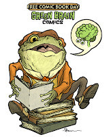
Today in the Headspace Gallery at Green Brain Comics tee shirt artwork was featured & could be purchased as a shirt printed on-demand. The gallery exhibition will be up through August 31st and shirts can be printed on-demand by visiting* Green Brain Comics in Dearborn, MI. For my design, I went with a Mr. Toad style animal character reading not just comics, but graphic novels as well.
*These will not be available by mail-order, but only by purchasing in person at the Dearborn, MI location.
Today was Free Comic Book Day. In case you were not able to get out and pick up the Archaia offering with a Mouse Guard/Rust cover, here is a video of me reading the story to you.
Mouse Guard: The Tale of Thane & Ilsa from David Petersen on Vimeo.
I've done videos like these for the last two FCBDs and can still be viewed online:
The Tale of the Wise Weaver: https://vimeo.com/34828777
The Tale of Baldwin the Brave: https://vimeo.com/34828956
The Tale of the Thane & Ilsa Story details:
 For this year's story I wanted to continue the tradition of a younger version of a Mouse Guard character being told a morality story. This time around, it's Sadie. I'd drawn Sadie's father Thane once before for a commission, which was later included in a sketchbook. Sadie's Mother I had only listed in the RPG, but I had a real person in mind for what kind of person I'd imagine Sadie's mother to be. A family friend named Bonnie Venn is a renaissance woman. I've known her my whole life and think of her as an unofficial Aunt who I'd see each summer (at their cottage on an inland island lake here in MI). Bonnie can do some of everything, she's a potter, a painter, a mechanic, a business woman, a welder, a decorator, a cook...you name it, and Bonnie is probably good at it, and a really lovely person to boot. That's the kind of woman (mouse) who would have raised Sadie...and taught her to do well at some of everything as well.
So now that I've explained the Isle of Venn & the character of Ilsa, I need only tell you where the story and visuals came from. I had originally thought of a story where Sadie is taught to get in there and play just as hard and well as the boys, but I thought that message was too obvious and predictable. Instead went in the direction of parents trying to explain a better path for what to value in love...I could also make the 'just as good or better than the boys' as a part of explaining Ilsa's (and in turn Sadie's as well) character in the story. I was also inspired by the part in the part in the 6th Harry Potter book where Fleur Delacour, upon seeing her future husband's scars and disfigurement says "What do I care how he looks? I am good-looking enough for both of us...All these scars show is zat my husband is brave!" I thought I'd borrow that sentiment from JK, to examine what the woman who 'has everything' will use as a litmus test for quality of love.
For the visuals, I wanted to do illuminated manuscript illustrations, but stay away from the style of the book of Kells and similar real world examples, since I'd already used those in Mouse Guard for other stories and documents. I looked at Moorish & Islamic illuminations and thought the stylization would give a clear distinction to this story and also make it a bit more of a fairy-tale quality over a historical-document quality.
The original pages are available for sale in my online store: http://mouseguard.bigcartel.com/category/original-pages
Hope you all enjoyed the day, tried new books, encouraged non-comic readers to try something new, and had fun with the new Mouse Guard story: The Tale of Thane & Ilsa!
 Green Brain Free Comic Book Day shirt:
Today in the Headspace Gallery at Green Brain Comics tee shirt artwork was featured & could be purchased as a shirt printed on-demand. The gallery exhibition will be up through August 31st and shirts can be printed on-demand by visiting* Green Brain Comics in Dearborn, MI. For my design, I went with a Mr. Toad style animal character reading not just comics, but graphic novels as well.
*These will not be available by mail-order, but only by purchasing in person at the Dearborn, MI location.
April 30, 2013
Raspberry Mouse Print process:Earlier in the month I foun...
 Raspberry Mouse Print process:
Earlier in the month I found that I was headed into C2E2 and the rest of my conventions with only a few copies of a limited edition print on-hand. So, I started work on a new print that I debut at C2E2, but have in my online store and will take to the rest of my conventions until they run out (edition of 300). I Ustreamed the process as I worked, but thought I'd post the process here on my blog as well, which will include new info not covered in the ustream because I continued to work on the piece long after the stream ended.
 Julia liked how my last limited edition print was something the female Mouse Guard fans would find "pretty" while also not being too feminine for the male fans. So I set out with the same goal in mind. I swapped out the flowering branches with raspberry vines and the feathers for an actual bird. I did a rough sketch in my sketchbook and then scanned it. The image to the right is a photoshop corrected version where I had already made some adjustments in the distance between the mouse & the bird's head. Julia also likes the Dark Eyed Junco birds that hop around our back yard, so I used that bird as this mouse's mount.
 With the above photoshopped sketch printed out to actual size (11" x 11" so it will fit onto a 12" x 12" sheet of bristol with a nice 0.5" border all around), I taped the printout to the back of a sheet of strathmore 300 series bristol. On a lightbox, I was able to see the printout to use as a guide as I inked. There wasn't a lot of black areas in this piece, I knew I would rely on color to help move the eye throughout my rather even-weighted lines. The background is also rather sparse, but I wasn't yet aware how that was a problem...I thought the lighter background would allow for a nice amount of breathing room.
 As I colored the scanned inks, I started realizing that the composition wasn't working. There wasn't enough in the background to weight the figures to anything spatially. It was too two dimensional and designey. I was struggling with the color choices too. My original plan was a dark grey mouse with a blue dress, and with a traditionally toned junco. But the grey and blue and more grey and, blue-grey that plan involved was too cool, and led me to this rendering to the right. As I signed off on my Ustream I said that I wanted to add more to the background, and I was sure that would also push the colors in a different direction.
 Back on the original inked piece, I sketched out new raspberries and leaves and vines. I wanted them to overlap and have a bigger sense of depth. It took a few ties in sketching to get a composition that felt like what I was going for without being too heavy handed and cluttered. Even with that concern, the inks look busier than how I knew the final piece would look with all the color and adjusted palate. After a new scan of these inks, I patched in just the new lines (so I didn't need to be as fussy about trying to line up the new scan with the original inks).
 The final image palette came together with a lot of help from Julia. She really didn't like the unconventional coloring on the Junco in my first pass...even though I could show her online reference for similar coloration in juncos, she thought the markings our backyard variety had were superior. After adjusting those colors and the background to something more pale and sky-like, the rest of the adjustments cascaded into easier and easier choices.
As I said at the start of the post, the new print (edition of 300) is now available in the online store
 Free Comic Book Day Plans:
This Saturday I'll be making two local (MI) appearances. From 10-12:30 I'll be at Detroit Comics in Ferndale. From 1pm on I'll be at Green Brain Comics in Dearborn. Both stores will have the Mouse Guard/Rust Free Comic Book Day from Archaia and I'll be signing them (plus brining a few of my convention prints and original art). The artwork from this year's 8 page story will be available in the online store sometime that day.
And check back on the blog on Saturday night for a video of me reading the FCBD story.
Watercolor Wednesday:
 Last week's set of 4 watercolors (which I insisted on breaking up and sending off across the world in different directions) was the result of a visual idea from my past. In 2007-8 I collaborated with glass artist Gary Bolt to make a glass casting of this group of skeleton characters: The King, Knight, Fool, & Villain. The group seemed like they would be fun subjects to watercolor and re-explore.
Tomorrow I'll post more paintings in my online store.
2013 Appearances:
Spectrum Live: May 17-19
Heroes Con: June 7-9
Albuquerque Comic Expo June 21-23
San Diego Comic Con: July 17-21
*more 2013 dates coming*
David Petersen's Blog

- David Petersen's profile
- 339 followers
David Petersen isn't a Goodreads Author
(yet),
but they
do have a blog,
so here are some recent posts imported from
their feed.

