
David Petersen's Blog, page 66
April 23, 2013
Other People's Characters Part II:Last week I addressed f...
 Other People's Characters Part II:
Last week I addressed finding a creative voice when working with other people’s character's specifically licensed characters. This week, I want to touch on what I said was a different category of work, doing pieces for sole creators and or friends. This will again give insight to my thoughts for long-time readers, and offer up a look at perhaps unseen artwork by new blog readers.While some of the message from last week's blogpost rings true here also, there are a few key differences. Left: My piece for Katie Cook's Gronk where I focused on rendering Harli & Kitty being portrayed as real animals while keeping as true to Katie's design of Gronk & Kitteh as possible.
 The first being that I'm generally being asked to contribute to do something for a creator I have a personal relationship with. This means the request is coming from a place of mutual artistic respect. I admire their work, they enjoy mine. So the expectation on their end is that I will do something in my own style, in a way that looks like what they have already seen and enjoy about my work. It also means that I will do something that honors their property is a way that is nothing but respectful.
Right: My piece for Jeremy Bastian's Cursed Pirate Girl didn't come together for me until I talked to him about getting the right balance of distorted anatomy and my flavor of illustration. Knowing Jeremy so well helped give me the freedom to do this piece that way.
 Unlike the pieces from last week where the characters have been owned by multiple companies and have been portrayed in multiple mediums by several different creative teams, these characters and properties are owned by individuals, and they only have one incarnation. There aren't eras to sort through to amalgamate into one version...there is only their work as the reference and your interpretation.
Left: Subtle changes or wardrobe changes can occur between series, so there may need to be some creative choice making over what versions of the characters to show. For Sean Wang's Runners, I knew the piece was to coincide with the 2nd arc taking place on a wintry planet...but I had to balance his character designs with the way I render the textures and materials in question: rocks, snow, alien skin, wrinkles fur cloaks, quilted parkas etc.
 Like I said in last week's post what I decide to focus on for the piece or what I omit is a way of keeping a creative voice while doing this type of work. I try to work with the creator to pick a character or subject from their series that works well with my skill set and perhaps avoid the parts of their book I may not naturally pay homage to as well. I then focus on the parts of that character I think my sensibilities could render well using my style of framing, texture, and line. Right: With Shane Michael-Vidaurri's IRON book, he'd assigned me the tiger character, so that was locked in for me, but then I thought about what it is that makes Shane's work special and original. Shane's peppers his book with inset panels featuring subtle moments like landscapes or branches, or leaves. And I borrowed his palate as well
 Figuring out what the tone of a piece should be is also a way to keep a creative voice. Should it be humorous, action packed, subtle, introspective? Many creators run the gambit of emotional range in their books. And choosing just one mood can be tough when trying to sum up the feel of that book. Left: With the piece I did for Stan Sakai and his book Usagi Yojimbo, I wanted to show Usagi as a well rounded character. Using the seasonal framework allowed me to do four smaller pieces that together become my version of him. In sprint he's lighthearted and doing something as enjoyable as flying a kite. In summer, he's busy training hard. For fall, I featured the beauty of performing a mundane task, and in Winter he's solemnly standing guard in the cold conditions. I tried to bring to the table a printmaker's voice and also use historical Japanese iconography in each season: the cherry blossoms, the koi fish, the cooking pot, the bridge and hat, as well as the kanji for each season.
 Every pinup and cover should feel like it's telling some story in one image, but there is a bigger creative weight on storytelling with interior pages. To honor the sense of storytelling and subject when writing guest material can be as much of a balancing act as just doing art, if not moreso. Right: In my guest strip for Kark Kerchl's Abominable Charles Christopher, I had to think of something that fit into his northern wilds that would be amusing...and I also wanted to include his main character (who rarely interacts with the other animal characters. Karl does a great job of giving a sense of society and perspective to his ACC characters, there is a serious tone in the way the characters think about life. That was my jumping off point for this. How would snails see their progress in the world....then I abstracted it with the chess concept as a reveal for the joke.
 The way the image will be used can also be a method of introducing creativity and a unique voice to an existing property. Left: For the folks over at Transylvania Televison, I did a design for their tee-shirt. They'd used a piece of mine before on a shirt, but It felt more like an illustration placed on a shirt as opposed to a tee-shirt design. This image needed to have a design element so the borders of the image made sense on a shirt...there is no background or horizon line to ground a standing character. Having LeShock dissolve into bats gave enough design strength and also reinforced the monster-movie tone of the show. Otherwise I took all the Muppet cover lessons and applied them here to a puppet character making the coffin and clothing as textured and real as I could and play up the shapes and colors of the puppet himself.
 All of the above examples were pieces I was asked to do. But there have been times where, just for fun, and as a fan, I've decided to do artwork as an unsolicited gift. Right: This piece for Kory Bing's Skin Deep, was a way for me to have fun drawing all her cool character designs while trying to match the tone of her story and work. I deviated a bit more with the interpretations of the characters than I normally would, I just wanted to have fun and play with the characters. I still paid homage to Kory's work by staying very true to the costumes and the details of her characters. Kory had been playing with using stock patterns as backgrounds in her work at the time, so I used that as a way to fill up the space and give the piece some Skin Deep authenticity.
 Watercolor Wednesday:
Last week's watercolors were all of mushrooms. After painting the first piece, and thinking it would be fun to do another, I wondered "what will be an easy way to tell them apart for the purposes of labeling for the store & blog?" The answer I came up with was to paint a different quantity in each piece and name them accordingly. Another note, on the trio, I used rubber cement to mask out the dots on the mushroom cap, something I don't tend to do with these Watercolor Wednesday pieces.


Tomorrow I'll post more paintings in my online store.
2013 Appearances:
C2E2: April 26-28
Spectrum Live: May 17-19
Heroes Con: June 7-9
Albuquerque Comic Expo June 21-23
San Diego Comic Con: July 17-21
*more 2013 dates coming*


April 16, 2013
A Creative Voice with Licensed Characters:Today...
 A Creative Voice with Licensed Characters:
Today’s blogpost topic comes from a fan who asked: “How do you find your POV/voice as an artist when using licensed properties?” This is an interesting question, partly because I didn't have an answer spring to mind when first asked. Another reason was that while I explored an answer, this post would give new readers a look at some of my licensed character cover work. These pieces were all done as work-for-hire and have been published as either covers, posters, trading cards, or as pin-ups in hardcover collections.
 Working with a licensed property means serving a few masters. The publisher has licensed the rights from a rights holder...so in the case of Fraggle Rock, Archaia have the rights to do the comics granted to them by the Henson Company who own the characters. There is editorial at the publisher level, but also at the rights holder level...and sometimes there are some other folks along the way who get a say. So while you have been hired to do original work, hopefully because of the style of work you do in mind, you must stay within the realm of what the publisher and rights holders have in mind.
 My first thought about keeping your own voice is that I'm mindful of the work I take on. Some of that boils down to what I'm offered...but I've also said no to a few cover gigs because I knew my style wasn't going to jive well with their established aesthetic and that it would be more work than I wanted to take on to adapt to that. The things I've done are all things I'm genuinely a fan of and fit well with my work. Henson properties, the Muppets, and TMNT are clearly in my wheelhouse...superheroes and sexy ladies aren't. So right there I've started on a path of keeping my creative voice with job selection. Having the excitement of getting to work on something you've long admired also gets your brain thinking about how to sum up that love in a single image that works for what everyone on the publishing end & owners want, but also keeps your inner fanboy excited.
 Each project and property is a bit different, and not just because of the publishing team and approval process, but because of the subject matter & tone. I look at each one and think of what I like about that property and how I can embrace that, especially if the property has been around long enough to have several incarnations of it exist. For the Muppet covers, I really loved how real the characters felt even though you knew they were puppets. You could see the materials they were made of, they didn't blink or move their eyes, but they felt like real characters. I wanted to draw the Muppets as though I were drawing the puppets, with all the limitations the puppets had, but still make them believable as characters.
 For something like the Turtles, which have been reinvented through movies, animation, games, multiple comic series, and by lots of talented people, I wanted to hone in on the grittiness of the original Eastman & Laird run. I was never a fan of many of the other versions of the Turtles, but I know that most of the TMNT fans were fans of some other version of them. So I did my best to get inspiration from my favorite incarnation, but while never being disrespectful of any of the others. Figuring out how you are going to take on something, what to emphasize and what not to is a big part of the battle and inherently is a method of bringing a voice to the property.
 I then try to bring what it is I do with my work naturally to exemplify what I like about each property. I tend to focus on texture with my inks, so on the Muppets or Fraggles that meant trying to render the fleece and fur and feathers and foam that the characters were made of. In other properties the texture worked its way into the background. With Mouse Guard I try and make the locations and backgrounds as convincing as possible to help ground the premise of walking, talking, sword-wielding mice. The more detail and realism I add to the environments of the Turtles, the Muppets, the Dark Crystal characters, or The Storyteller the more set in their time and location they become, and ultimately the more real as a single-image story.
 I've had good and bad luck with approvals and going through the steps of showing the stages of work to catch any problems. Some pieces slide through with no trouble at every stage, others get nitpicked along the way...and what gets called out and what doesn't can seem arbitrary at times. My worst approval process was with the Muppets & Boom. The Boom editors were always supportive of me, but Disney wouldn't look at my covers until they were pretty far along (ie: when it's painful to make a change because it's almost done now). Disney would also keep Boom on the line for script approval and then make changes late in the game. Changes like swapping out characters for roles...which affected finished covers multiple times. Overall the Muppet covers were fun and rewarding to do, I just learned how to deal with that approval process while still doing the best work I could within their system. The notes Pixar sent over for the Brave poster from Mondo were some of the best notes I've ever gotten. My initial reaction was "oh no, they want me to change things", but after doing a mock-up of what they wanted I could see instantly that it improved the piece so much, it would be artistically negligent to not make the alterations.
 So to sum up, being selective of the properties to work on, honoring what it is you enjoy or feel those properties do well, and then bringing your skill set to the table to show off those characters as best as you can while still playing withn the rules of approvals the publishers and property owners set-up is my answer.
I didn't include examples of work I've done for Usagi Yojimbo, Cursed Pirate Girl, or the Abominable Charles Christopher in this post. That's because unlike the pieces I've shown today, they are owned by a single creator and therefore is a slightly different process of making it and making them happy. Next week I'll focus on those.
To read more about some of these covers and the process behind them here's a list of links:
-Fraggle Rock cover
-TMNT Leonardo cover
-Jim Henson's The Storyteller pinup
-Brave poster for Mondo
-TMNT Splinter cover

Watercolor Wednesday:
I got into a D&D beastie style mood when doing last week watercolors. First up is a half-orc. I imagine that he fancies himself an intellectual and perhaps a decent spell-caster. In my high-school roleplaying group we had a paladin that died. We then used several methods in the game to resurrect reincarnate him...but it was with mixed results....he came back as a goblin. A heated debate started about if he could still use his paladin abilities (as in those days only humans could be paladin. My main gripe was in the game...where my thief had to surrender my hat of disguise so our goblin-paladin could go into towns.
 Second up is some kind of a goblin...I guess I spent my goblin story above while showing the half-orc painting. While painting this goblin I thought of something the Henson creature shop might have made if doing a D&D fantasy style movie. Not too grotesque...but still un-human.
 The last of last week's paintings started as a rushed and quick sketch that became a rather muddy painting. It's a cockatrice...which is a mythical beast which comes into being when a chicken's egg is hatched by a snake. I feel I saved this painting with the action in the background.
Tomorrow I'll post more paintings in my online store.
2013 Appearances:
C2E2: April 26-28
Spectrum Live: May 17-19
Heroes Con: June 7-9
Albuquerque Comic Expo June 21-23
San Diego Comic Con: July 17-21
*more 2013 dates coming*
April 9, 2013
Genres & Diversity of Audience in Comics -or- A ...
 Genres & Diversity of Audience in Comics
 -or- A Comic for Everyone:
I find myself delivering the same message at 80% of the panels I speak on at conventions. I figured it bears repeating here: Comics are a means of telling a story as valid as film, television, prose, poetry, and theater. Any type of story is fair game in comics and can be told with sequential imagery...any genre, any topic, which also means, any audience can be addressed. Comics are not simply superheroes. While the industry could benefit from having a more diverse offering of material, as it stands right now, there is a comic for any and every person willing to try comics. Male, female, very old, very young, any race, creed, or interest, there is a book on the market today for them.
Sequential stories can cover Comedy, Horror, Westerns, Sci-Fi, Adaptations, Talking Animals, Popular Characters, Autobiographical, Historic Fiction, Non-fiction, Fantasy, Romance...basically there is a comic to cover all the any genres or shelves in a bookstore or video store (though that reference is going to go the way of the dodo in a matter of years). I cobbled together this post from slides I've used at a few library/school/educator talks I've done. I limited myself to only three titles per-subject and tried to make sure I had at least read if not also own the material.
It is by no means a complete list of book types or good material within that category...It's more of a 'best of' from my bookshelves. Also note that the categories are broad...'romance' doesn't need to mean 'trashy romance'...just a story about relationships...'horror' can also be 'suspense'..etc. But instead of belaboring the explanations...here are the titles:
 Fantasy:Mouse Guard, Bone, Cursed Pirate Girl
 Comedy:Muppet Show, Dork Tower, Jeremy
 Horror:Nocturnals, Hellboy, Locke & Key
 Historical Fiction:300, Usagi Yojimbo, League of Extraordinary Gentlemen
 Kids:Owly, Tiny Titans, Korgi
 Adventure:The Crogan Series, Little Nemo, Rex Steele
 Pulp:The Rocketeer, Sin City, Blacksad
 Romance:Miki Falls, Blankets, Strangers in Paradise
 Non-Fiction:Treasury of Victorian Murder series, Maus, Bone Sharps, Cowboys, & Thunder Lizards
 Sci-Fi:Runners, Space Girl, Robotika
 Adaptations:Fafhrd & the Grey Mouser, The Oz Books, 20,000 Leagues Under the Sea
 Webcomics*Lackadaisy, Abominable Charles Christopher, Gronk*I used examples of webcomics where the material is still free to view online, but the creators have published quality collections of the comics which makes it easier to curl up with on a Sunday afternoon or loan to a friend.
I encourage you to look through these suggestions and links and try something new you have never tried before. And if you see something you already know and enjoy, suggest it (or lend it) to a friend or relative who isn't a comic reader, but may be interested in the subject matter or genre of the book. Everyone loves stories, so everyone should love comics.
 Watercolor Wednesday:
 Last week I posted three watercolors for sale. I enjoy drawing dragons and thought they'd make for good Watercolor Wednesday material. Here are three metallic dragons: Gold, Silver, & Bronze..
 Tomorrow I'll post more paintings in my online store.
2013 Appearances:
C2E2: April 26-28
Spectrum Live: May 17-19
Heroes Con: June 7-9
Albuquerque Comic Expo June 21-23
San Diego Comic Con: July 17-21
*more 2013 dates coming*
April 2, 2013
Writing Process:'ve told interviewers and fans that I don...
Writing Process:
 've told interviewers and fans that I don’t consider myself to be as much a writer as I am a storyteller. The difference there is that I use images as my primary tool to explain & explore a story, not words. Sure Mouse Guard has dialogue and narration, and even before that I have to write something for myself to draw, but I don’t tend to smith words into the shapes of my imagination. I use them as bracing to hold up the pictures and as notes to remind me of the flash of images as I thought about my next story.
 oday’s blogpost will be about my writing process and also how it evolved. Today I write differently and with a different purpose than I did back in late 2004 when writing Mouse Guard Belly of the Beast. Then I was merely making notes, now I write scripts that help me shape the character's actions. But then and now I did always start with an end goal and an outline of notes. For that first issue I knew my goal was to have introduced the characters, concept of the Guard, and to have shown the real dangers of the natural world to the mice. I then wrote something that would work to that goal.
 t’s similar to something I've heard other writers talk about as ‘know the ending’. But I don’t always know the ending of an issue or chapter when I sit to write it, but I know my goal for writing it. Sometimes they are one in the same: Character X dies and on his deathbed passes the torch to character Y. That was both the goal and ending to the last chapter of winter. But my goal in some issues is to explain a societal nuance or get the reader involved and to care about a character or place...and that is not an ending. Any number of endings could satisfy that goal.
 y next step is to write an outline of steps I think should take me to an end. This is the same with writing the outline for an entire series like Fall, Winter, or Black Axe, or just for getting though one issue. The outline hits all the major steps of the story I want or need to include. I tend to write this rather quickly and without writing too many sub-notes under any given plot point. So some of those points come naturally and are just gut decisions. Other times I play out two (or more) variations of the same story, but with characters or situations taking opposing turns to the other version I've typed. It’s a bit of an exploration process, but also just a way to dump my thoughts one step beyond my head, because just the act of saying them aloud or writing them down give you the instant insight to edit or reject them.
 nowing how to explore those ideas with writing or just brainstorming in the shower (a place I still find inspirational, so I keep a wax pencil & piece of plexiglass nearby for jotting down notes with wet hands) is something I judge by gut reaction. However I also think it stems from playing and running roleplaying games in my younger days. As a player, I was responsible for making my character as interesting as they can be for the GM to have moments to work off of and as a GM, I had to play off players’ decisions. When I ran games, I’d often not prepare a great deal, because I knew with any one choice my players could divert the entire story away from anything I’d thought of and into new and interesting or troublesome territory that I had to make work. Thinking on my feet like that helps with story writing when I write myself into a corner or the story shifts in a direction I didn't plan.
 ow because I write AND draw Mouse Guard, the document I write is different than other comic writers’ text-for-the-artist. Just like theirs, it is meant to inspire and direct the artwork while providing a framework that fits into a larger whole. But the writer me doesn't have to worry as much about ideas getting lost in translation to my artist. Even if I have a good idea while writing, I don’t belabor the description of it, I rely that with just the seed of that inspiration jotted down, I’ll either have the same visuals I imagined when writing (it’s all in my brain after all) or I will have improved on it by leaving room for it to breathe.
 hen I started Mouse Guard I was writing the outlines with no dialogue and then drawing the story only filling in dialogue at the end where it was needed or perhaps making notes on the backs of pages as dialogue occurred to me. Through the Winter 1152 series, I started writing scenes of dialogue, still drawing mostly from outline, but using some character conversations as training wheels to get characters ‘acting’ more meaningfully at the right moments. Now for The Black Axe, I've been writing full on scripts. Not that they would make sense to work from for anyone other than myself, they exist to help me imagine and pace the art. There are no stage directions, location descriptions, page break notes, or emotion cues...just dialogue. The rest comes to me as I layout panels and make handwritten notes on the outline & script as I do so.
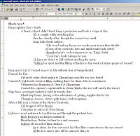
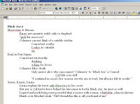
 elow, I've posted examples of the finished outlines used to write scripts for Black Axe #5 & #6. I have not included the scripts themselves, because for the most part they are just the text from the issues. I advise that if you have not yet read any of Black Axe, you avoid looking at the images.
 Watercolor Wednesday:
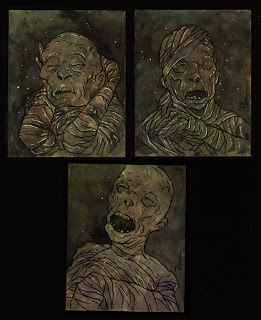
Last week I posted three watercolors for sale.I had a sheet of paper with some watercolor smudges and splashes on it, and instead of scrapping the paper, gave it an equal wash and then painted the mummies in after that dried.
Tomorrow I'll post more paintings in my online store.
2013 Appearances:
C2E2: April 26-28
Spectrum Live: May 17-19
Heroes Con: June 7-9
Albuquerque Comic Expo June 21-23
San Diego Comic Con: July 17-21
*more 2013 dates coming*
 've told interviewers and fans that I don’t consider myself to be as much a writer as I am a storyteller. The difference there is that I use images as my primary tool to explain & explore a story, not words. Sure Mouse Guard has dialogue and narration, and even before that I have to write something for myself to draw, but I don’t tend to smith words into the shapes of my imagination. I use them as bracing to hold up the pictures and as notes to remind me of the flash of images as I thought about my next story.
  oday’s blogpost will be about my writing process and also how it evolved. Today I write differently and with a different purpose than I did back in late 2004 when writing Mouse Guard Belly of the Beast. Then I was merely making notes, now I write scripts that help me shape the character's actions. But then and now I did always start with an end goal and an outline of notes. For that first issue I knew my goal was to have introduced the characters, concept of the Guard, and to have shown the real dangers of the natural world to the mice. I then wrote something that would work to that goal.
 t’s similar to something I've heard other writers talk about as ‘know the ending’. But I don’t always know the ending of an issue or chapter when I sit to write it, but I know my goal for writing it. Sometimes they are one in the same: Character X dies and on his deathbed passes the torch to character Y. That was both the goal and ending to the last chapter of winter. But my goal in some issues is to explain a societal nuance or get the reader involved and to care about a character or place...and that is not an ending. Any number of endings could satisfy that goal.
 y next step is to write an outline of steps I think should take me to an end. This is the same with writing the outline for an entire series like Fall, Winter, or Black Axe, or just for getting though one issue. The outline hits all the major steps of the story I want or need to include. I tend to write this rather quickly and without writing too many sub-notes under any given plot point. So some of those points come naturally and are just gut decisions. Other times I play out two (or more) variations of the same story, but with characters or situations taking opposing turns to the other version I've typed. It’s a bit of an exploration process, but also just a way to dump my thoughts one step beyond my head, because just the act of saying them aloud or writing them down give you the instant insight to edit or reject them.
 nowing how to explore those ideas with writing or just brainstorming in the shower (a place I still find inspirational, so I keep a wax pencil & piece of plexiglass nearby for jotting down notes with wet hands) is something I judge by gut reaction. However I also think it stems from playing and running roleplaying games in my younger days. As a player, I was responsible for making my character as interesting as they can be for the GM to have moments to work off of and as a GM, I had to play off players’ decisions. When I ran games, I’d often not prepare a great deal, because I knew with any one choice my players could divert the entire story away from anything I’d thought of and into new and interesting or troublesome territory that I had to make work. Thinking on my feet like that helps with story writing when I write myself into a corner or the story shifts in a direction I didn't plan.
 ow because I write AND draw Mouse Guard, the document I write is different than other comic writers’ text-for-the-artist. Just like theirs, it is meant to inspire and direct the artwork while providing a framework that fits into a larger whole. But the writer me doesn't have to worry as much about ideas getting lost in translation to my artist. Even if I have a good idea while writing, I don’t belabor the description of it, I rely that with just the seed of that inspiration jotted down, I’ll either have the same visuals I imagined when writing (it’s all in my brain after all) or I will have improved on it by leaving room for it to breathe.
  hen I started Mouse Guard I was writing the outlines with no dialogue and then drawing the story only filling in dialogue at the end where it was needed or perhaps making notes on the backs of pages as dialogue occurred to me. Through the Winter 1152 series, I started writing scenes of dialogue, still drawing mostly from outline, but using some character conversations as training wheels to get characters ‘acting’ more meaningfully at the right moments. Now for The Black Axe, I've been writing full on scripts. Not that they would make sense to work from for anyone other than myself, they exist to help me imagine and pace the art. There are no stage directions, location descriptions, page break notes, or emotion cues...just dialogue. The rest comes to me as I layout panels and make handwritten notes on the outline & script as I do so.
 elow, I've posted examples of the finished outlines used to write scripts for Black Axe #5 & #6. I have not included the scripts themselves, because for the most part they are just the text from the issues. I advise that if you have not yet read any of Black Axe, you avoid looking at the images.


 Watercolor Wednesday:
 Last week I posted three watercolors for sale.I had a sheet of paper with some watercolor smudges and splashes on it, and instead of scrapping the paper, gave it an equal wash and then painted the mummies in after that dried.
Tomorrow I'll post more paintings in my online store.
2013 Appearances:
C2E2: April 26-28
Spectrum Live: May 17-19
Heroes Con: June 7-9
Albuquerque Comic Expo June 21-23
San Diego Comic Con: July 17-21
*more 2013 dates coming*
March 26, 2013
Legends of the Guard Vol.2 #1 Cover Process:The second vo...

Legends of the Guard Vol.2 #1 Cover Process:
The second volume of Legends of the guard will be starting up soon. The first issue is being solicited this month, so let your comic shop know you want a copy. In this post, I wanted to share the process of making the cover for issue one.The inspiration for this cover came from two sources: The Mouse Guard RPG handbook and illustrator J. B. Monge.
 First, I leafed through the 'Denizens of the Territories" chapter in the RPG book to see if there were any species of animal listed there that I hadn't drawn that might be interesting enough for a cover. I landed on 'Salamander' and thought they would be very fun to draw and build a story around. I also had started studying Jean Baptiste Monge's illustrations, specifically his illustrations for fairy folk who had loaded up animals with gear & supplies. In my sketchbook I drew out some ideas for a mouse cave explorer & some Salamanders.
 I scanned the drawings from my sketchbook and mocked up a layout for the cover in Photoshop. Placing the mouse, the background stones and the salamanders on various layers, I could re-size and adjust the placement of each until I was happy with a layout (I also had to make sure there was room for the logo and such). Because so much of this cover would be reliant on the lighting from my inks & the final colors, I laid in a toned background and added some lighting references.
 Using the above digital composite as a guide on a lightbox I inked the cover on Strathmore 300 series bristol. The contour lines came first with a lot of stippling that followed to give all the suggestion of the direction of light. You may also notice that I added a different salamander. In the rough, I'd just copied over my 2nd salamander drawing to remind me I wanted another one in there. While I was inking I sketched up a third salamander and placed the sketch under the bristol to ink him on the final surface.
 Once the inks were done, I scanned them and started the process of coloring by flatting in all the color areas. This step is mainly to establish that different areas are different colors (the fur is different from the coat, is different from the rocks, is different from the salamanders, etc.) While these were not my final colors, I did try and have the mouse's hat echo the color of the salamanders (since the shape of it echoes their tails) and his coat echo the background color.
For the final rendering, I muted a lot of the colors and tried to get more contrasting lighting effects than I normally would. Here's another look at the cover art sans-logo & text.

Legends of the Guard Volume 2 #1 will feature stories from Ben Caldwell, Nick Tapalansky & Alex Eckman-Lawn, and Stan Sakai.
 Watercolor Wednesday:
 The watercolor from last week's Watercolor Wednesday is a piece called "The President of Nothing...Yet".
Tomorrow I'll post more paintings in my online store.
2013 Appearances:
C2E2: April 26-28
Spectrum Live: May 17-19
Heroes Con: June 7-9
Albuquerque Comic Expo June 21-23
San Diego Comic Con: July 17-21
*more 2013 dates coming*
March 19, 2013
Reference Model: Upper Port Sumac:As I described in Black...
 Reference Model: Upper Port Sumac:
As I described in Black Axe #2, Port Sumac is really 2 towns...the lower one down by the water and the upper one, high atop the bluff. For Black Axe #6, I had to show the upper town. I wanted to keep with the stacked, assembled hodge-podge look of lower Port Sumac, but without the emphisis on docks & ship parts. I decided that there are a few buildings that are exposed to the open air, but the rest of the city proper, is inside the grassy loam and accessed through one of the buildings like a gatehouse.
 Instead of designing these from scratch, I resorted to buying several commercial papercraft models.I printed out a few copies of each, but instead of assembling them as instructed, I kitbashed them making them into new buildings that were not someone else's sole design and also gave that look of layered building over time. A few branches from my yard provided the reference for the bases of the Staghorn Sumac plants that form a canopy over the upper town.
 As I built the models, I came up with purposes for them. I needed a tavern for the scene, so that one was obvious, but the other two were thought of as I glued and taped and pasted. The one pictured to the left became the access to the rest of the city. The central opening leads to a secure door, and the bell above acts as a warning bell for the residents outside of the secure walls to get inside when predators are afoot.
 The smallest structure (which only appears in the bird's eye panel of the town) I figure is a gatehouse of sorts. Beyond it is the path by land that leads either down to lower Port Sumac or out into the wider territories. I show Celanawe coming from this direction in the first page of the town.
When it came time to draw each of these structures, I had to fill in the details myself. I didn't want the faces provided on the purchased models, and I needed to compensate for there the joints were from the kitbashing.
 Ultimately, the opening setting for my Free Comic Book Day story for this year takes place here (in the tavern specifically) so this model came in handy...though I had to figure out what the inside of this Weasley-esque building would look like ...but that's a post for later in the year....
 Watercolor Wednesday:
 Just a single piece from last week's Watercolor Wednesday: The Angel of Death. My goal wasn't to make it look evil or particularly scary, more that what it represents is scary. The I took traits for the skull from horse & ram skulls. The white dots inside the cloak are meant to represent stars while outside of the angel the stippling is meant to look like it's casting off darkness.
Tomorrow I'll post more paintings in my online store.
2013 Appearances:
Fabletown Con: March 22-24
C2E2: April 26-28
Spectrum Live: May 17-19
Heroes Con: June 7-9
Albuquerque Comic Expo June 21-23
San Diego Comic Con: July 17-21
*more 2013 dates coming*
March 12, 2013
Runners: "The Big Snow Job" Pinup:I did a pinup for my pa...
 Runners: "The Big Snow Job" Pinup:
I did a pinup for my pal Sean Wang's sci-fi comic "Runners" second arc: The Big Snow Job. Runners is like all the Han, Lando, & Chewbacca adventures you imagined happened in the Star Wars universe. I met Sean after his first arc had been collected and I was just in the middle of Fall 1152 and we clicked as friends pretty quickly. I did a pinup exchange with him back when he first started posting his second arc as a webcomic (you can see that process post here). Sean invited me back to do another piece, but this time in theme with the 2nd arc as he worked toward collecting it as a single volume...which is now being Kickstarted here.
 Here was the process in creating the pinup. I drew out the characters in my sketchbook without really knowing the final composition. This was more a way of re-learning how to draw the characters and in their winter gear. This image is a bit of a photoshop-cheat for sake of the blog...these sketches were stretched over the course of 2-3 pages in my sketchbook and aside less desirable roughs of the character's heads & hands. But when I got a version of everyone that I liked, I scanned them to see if I could piece together a usable layout from it.
 The result of assembling the various drawings in several configurations ended up being a square shaped group shot. To bump it up to a tall comic-sized piece, I added a bottom panel of a plot point from The Big Snow Job: a group of yak-like beasts the crew is interested in smuggling....but ends up being more than they bargained for. The inside-binocular framing and the yaks themselves were taken directly from Sean's pages for the sake accuracy in this layout. The lines you see framing the whole piece represent 'live area' and bleed'. Everything important needs to stay inside the innermost line, but I have the extend the artwork out to the outermost line to guarantee that when this is printed, the art goes beyond where the paper will be trimmed.
 I printed the above layout and used it as a guide on my lightbox as I inked the final art on Starthmore 300 bristol. To tie the yak panel together with the characters above it, I added a pair of binoculars to Ril's hands. Inking a piece like this I focus on making sure each character stands out against whatever is around them. Sometimes that has to do with texture, sometimes it has to do with light on dark shapes (or the reverse), and sometimes just comes down to a strong contour line. I tried to give each character a different line treatment either on their skin or clothing so the mass of body shapes didn't just blend together. The linework was all done with Copic Multiliners and the bottom panel fills were done with a brush.
 To start the coloring process, I layed in flat colors (no shading or texture) on the scanned inkwork. As I've said in all of my past process posts, flatting is a fancy term for establishing color areas that is the equivalent of coloring within the lines. It makes it easier to isolate each part (character A's skin, Character B's glove, Character C's hair..etc...) when it comes time to render the color. I included my layers menu in the screen grab of the flats. I tend to label them all to make life easier on me. The layer marked 'linework' is the scan of the inks. It is set to layer mode "multiply" so that photoshop allows the white areas to become like a transparency and the black linework to be opaque. All other layers are set to layer mode normal. You can see the layers above the linework are the color holds of opaque color on top of the linework, while the layers below the inks are groupings of color groups: skin, clothes, eyes, etc.
The final colors get redered and textured using the dodge and burn tools (terms used in photographic developing that basically mean lighten and darken or over/under expose). I use a textured brush to get that pebbled look to all the colors. Besides the rendering and color holds, this piece has a few other effects. The falling snow is added in digitally (for Mouse Guard I usually do this in ink on paper and then scan and invert the dots and streaks, but for this piece I just painted them in in photoshop). A few characetrs have cold breath coming out of their mouths, and the binoculars got a grain filter added to look more like a digital display screen.
To start the coloring process, I layed in flat colors (no shading or texture) on the scanned inkwork. As I've said in all of my past process posts, flatting is a fancy term for establishing color areas that is the equivalent of coloring within the lines. It makes it easier to isolate each part (character A's skin, Character B's glove, Character C's hair..etc...) when it comes time to render the color. I included my layers menu in the screen grab of the flats. I tend to label them all to make life easier on me. The layer marked 'linework' is the scan of the inks. It is set to layer mode "multiply" so that photoshop allows the white areas to become like a transparency and the black linework to be opaque. All other layers are set to layer mode normal. You can see the layers above the linework are the color holds of opaque color on top of the linework, while the layers below the inks are groupings of color groups: skin, clothes, eyes, etc.
The final colors get redered and textured using the dodge and burn tools (terms used in photographic developing that basically mean lighten and darken or over/under expose). I use a textured brush to get that pebbled look to all the colors. Besides the rendering and color holds, this piece has a few other effects. The falling snow is added in digitally (for Mouse Guard I usually do this in ink on paper and then scan and invert the dots and streaks, but for this piece I just painted them in in photoshop). A few characetrs have cold breath coming out of their mouths, and the binoculars got a grain filter added to look more like a digital display screen.Runners is a really fun and well written and drawn comic. You can read both arcs on Sean's website RunnersUniverse.com for free! BUT, consider going to his Kickstarter where you can get volume 2, and select not only volume 1 as a reward, but also BOTH of my Runner's pieces as prints!: Click here to view the Runner's Kickstarter
Watercolor Wednesday:
 First up from last Wednesday's offerings is a piece titled Applekettle. The word came to me a while back when I needed a name for something, but it ended up being too odd for that purpose. I later used it as the name of the mouse puppetry troupe that put on the marionette show in the 2012 Free Comic Book Day story. This painting was an attempt at a visual of the word...or perhaps the puppetry troupe's logo?
 The second watercolor from last week is simply a radish.
I'll post a new painting in the store next week.
2013 Appearances:
Emerald City: March 1-3
Fabletown Con: March 22-24
C2E2: April 26-28
Spectrum Live: May 17-19
Heroes Con: June 7-9
Albuquerque Comic Expo June 21-23
San Diego Comic Con: July 17-21
*more 2013 dates coming*
March 5, 2013
Reference Model: Haven Guildroom:With Black Axe #6 (the f...
 Reference Model: Haven Guildroom:
With Black Axe #6 (the final issue in that series) having been out for nearly three weeks, I figure it's safe to publish & talk about the model for the Haven Guildroom. If you have not read the issue and are worried about spoilers, it may be time to close this window (but please come back after you've read it!)
 Confession: I made this model twice. The first time is when I was designing the room for the cover image. In the original incarnation the columns that make up the corners were from an attempt to make one full column and then cut into quarters. The result were some sloppy joints and wonkey lines. I'd also built it a bit small so that seeing the detail was harder than it had to be. Months and months later, when it was time to draw issue 6, I knew this model would be important (several pages take place here). So I rebuilt the model using some files I'd saved for the upper columns but also using my artwork from the cover as a skin for one of the walls.I had a better technique for making the upper columns this time too. I used wooden arched ribs or fins that stuck off the column to form a structure I could glue each paper strip of the column to.
 The floor is a pattern from a cathedral window. Like all my models, I try to make each part modular so I can get inside the model better and also reuse parts (two of the walls were mirror images of each other, so I could just swap the 1 piece I made to either side. The walls were also keyed on the top (you can see the slot on the top of each wall) That corresponded with a block on the top of the ceiling that it would go over to keep in aligned and in place. In case you are wondering, the only reason the one column is purple is that my print cartridge was dying on me.
 The Haven Guildroom is a clandestine order that was originally founded to watch over the secrets of the guild founders of four disciplines: Mathematics, Carpentry, Metalsmithing, & Masonry. I tried to add a lot of details to the room that echoed the 4 motif: 4 walls, 4 columns, 4 wrought hinges per door, 4 cupboards per wall. To show how regarded these founders and their teachings and techniques are to the guild, I had a wall dedicated to saint-like carvings of them. Because the Black Axe story is focused on the axe and its forging, the discussion in this room makes it seem as though the Haven Guild is only now a Templar-like group for the axe...but presumably there are secrets they protect for the other founders as well. And with regard to Farrer's secrets...don't expect that all of them have now been explained. I have more in store for future stories.
The Haven Guildroom as it appears in Black Axe #6.
 In two weeks, I'll post the last models I built for Black Axe #6, so if you are enjoying the model posts, there is still one left...if you are sick of the model posts...don't worry, only one more to go.
 Watercolor Wednesday:
 Keeping up with the tradition I mentioned on last week's blog, these Watercolors are redesigns of old characters of mine. First up is Roan a red dragon from a project Jesse Glenn and I started plotting out on my 18th birthday. A while back I posted one of the other dragons from this un-pursued project as a Watercolor Wednesday piece: Loden.
Tomorrow I'll post more paintings in my online store.
2013 Appearances:
Fabletown Con: March 22-24
C2E2: April 26-28
Spectrum Live: May 17-19
Heroes Con: June 7-9
Albuquerque Comic Expo June 21-23
San Diego Comic Con: July 17-21
*more 2013 dates coming*
February 26, 2013
Mondo Poster: Brave process:Last Sunday Mondo released a ...
 Mondo Poster: Brave process:
Last Sunday Mondo released a Brave poster I did for their Oscar themed release night. Mondo has a great reputation for working with talented illustrators & designers and terrific production quality on their prints, so I was thrilled and honored to be asked to participate. I loved Brave and took my nieces to see it at their first Drive-In movie experience last summer. When released after Brave won for Best Animated Film on Sunday, the poster sold out in a few minutes (as Mondo prints tend to do). In this week's blogpost (which preempted the normally scheduled Mouse Guard architectural model, now to-be-seen next week) I'll run through the process of creating the image and the tricks in preparing it for the silkscreen process.
 I started with a rewatching of the movie and planning the concept points to be: a scene that seems 'brave', defining Merida's form by her hair, and getting to draw Mordu the villain bear. I sketched up a design and mocked it up in photoshop. Since the orange hair was a planned focal point, I opted to make the rest of the palette in the blue family. I trimmed the piece out with a designey wreath of the wisps and a border used in the tapestry in the movie. With a silkscreen print, you are limited on colors, so I planned to use colors over again. The orange is also the color of Mordu's dead eye, the brown of the ground is also the details of the border, the tan of the bow is the field of the border.
 So it would be easier for me to separate out the colors onto different layers for the silk screen separations, I inked the components separately. The first up was the darkest screen color, the linework of Merida, Mordu, and the ground. Because the final print size is 24" x 36" I wanted to ink this LARGE to minimize any quality loss when enlarging my scans. The inks are 17" x 24" (and had to be scanned in parts since it wouldn't fit on my scanner all at once. The inking was done with Copic Multiliners, a brush for the fills and a brush with liquid white for making the negative space of Merida's hair.
 The next inked piece was the border. I pieced together two different borders from Pixar to get the design to fit the perimeter of my piece. The animals were all from the tapestry in the movie, and to fill in the tall side bits, I found a few tapestry borders they used in some promotional art for the film. I hand inked the border because I wanted the piece to work as a whole and not seem like parts of it were photoshoped together. I wanted to hand distress the design in a way that ties it together with the inkwork on the characters. This piece is also 17" x 24" and had to be scanned in parts.
 I inked other parts of the piece of smaller pieces of bristol like the darker lines of Merida's hair (seen here with round registration points that match up on the bow). Though I could have just processed the art from Pixar, I decided again to hand ink the Brave logo knotwork for the same reasons I hand inked the border. And that strip in the middle...that's a patch to extend the bottom of the original inks...but I haven't gotten to the reason for that yet....
 At this point I processed all my inked artwork and the assets given to me by Pixar and got my file assembled and ready for approval. Pixar hadn't seen my rough, so the 'finished' version was their first time seeing my piece...and they requested changes. Normally, I've found that suggestions given to an artist on approvals for a licensed property are 80% silly and unnecessary. The folks at Pixar though...were 100% right and helped me make a much better finished product. They requested changing the scale of Merida to Mordu, to nix the wreath of wisps into a few ground wisps, to get Merida up higher than the logo (so she's not standing on it), and eliminating the tangent of the arrow on Mordu's lip. To fix this I was able to do most everything digitally (even drawing in some patch hair on Mordu with a Wacom tablet), but the strip of sticks I mentioned before had to be hand drawn to extend the bottom of the image when everything shifted upwards.
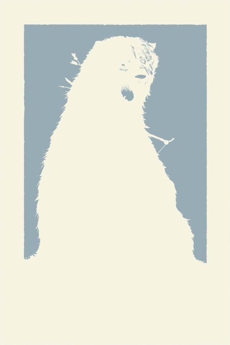 I had a big learning curve on this piece. Not only did I have to re-set my brain to think in terms of limited color, but also about the printing process. The order in which colors are printed and if they need to overlap or not is a real trick to figure out. Colors are generally printed light to dark...but there are exceptions that need to be taken into account there and to make sure there isn't a gap in between colors that butt against each other, the previous color needs to go under the color that will print after it. This is called 'trapping'. I've put together this animated gif of the different layers to simulate what the print looked like as it was silk screened. I hope Mondo will ask me back for another print, as I now feel I have a better handle on the technical process of planning and preparing the art for a silkscreen printing like this.
Here are a few detail images of Mordu & Merida from the final version of the poster:

And another look at the poster in full.
As I said at the start, the poster sold out at Mondo in a few minutes of its release. At a later date, I will have some copies to sell through my store, but I will not do so until I have the prints in-hand. Please do not try and request them in advance, offer to reserve one, or ask when I will release my copies...I'll Tweet and Facebook update when they become available. Watercolor Wednesday: Both last week's and tomorrow's Watercolor Wednesday pieces are exercises in redesign of old characters of mine. First up is something I called Poohbah, which started life as something closer to Genma Saotome in Panda form from Ranma 1/2, and ended as something more like a bear with bunny ears & Mickey Mouse markings. He was a bit of a Hobbes character for a little flying boy named Zippy when I created him (even did some animation in my DOS based Disney Animation Studio program in the 90's). This redesign still holds to the idea that while Poohbah may look like a real creature, he's just full of stuffing.
The 2nd is a redesign of a lizard creature I wanted to do as a puppetry project in the late 90's. These lizard guys would be a party of adventurers in the arctype tradition of fantasy RPGs. I still hope to build some of these puppets some day...
Tomorrow I'll post more paintings in my online store.
2013 Appearances: Emerald City: March 1-3Fabletown Con: March 22-24C2E2: April 26-28Spectrum Live: May 17-19Heroes Con: June 7-9Albuquerque Comic Expo June 21-23San Diego Comic Con: July 17-21*more 2013 dates coming*
February 19, 2013
Monsters & Dames 2013:The Emerald City Comic Con has ...
 Monsters & Dames 2013:
The Emerald City Comic Con has a fantastic Art book they put on every year at their show called: Monsters & Dames. The book features art with...well...Monsters & Dames by the various guests of the convention and the money raised goes to a Seattle Children's Hospital. As I am returning to Emerald City this year, I contributed a piece for the 2013 book. In year's past I've done a Frankenstein's Monster & Bride piece and a Dame riding a dragon. This year I wanted to do something a bit more fairy-tale-ish. So I did my take on Beauty and the Beast.
 I did a lot of looking at other versions of the pair, illustrations by Edmund Dulac and various other golden age illustrators, the animated Disney movie and stage play, and Jean Cocteau's La Belle La Bete 1946 film. The goal was to give something new, and Petersen-ish, but still familiar. I drew a Beauty and a Beast in separate pages in my sketchbook (so if I wanted to redraw or correct one or the other, I could do so without fearing erasing any part of the other) and then assembled them in photoshop. Beauty was inspired by a photo of Anne Hathaway and Beast is an amalgamation of my own illustration tendencies, Disney, and La Bete's wardrobe from the French film. The background is a zoomed in section of iron casting I felt made a nice design and set a mood of both beauty and danger.
 The above digital composition was then printed out so I could tape it to the back of a sheet of Strathmore 300 series bristol. On a lightbox I can see through the bristol to the printed layout and use it as a guide while I ink. This also means that unless there is an area I want to tighten up or correct in pencil before I ink it, there is virtually no pencil on the finished piece to erase afterwards. I inked the linework all with a Copic Multiliner pen (mostly the 0.7 nib) and the ironwork with a brush. The embroidery on Beast's cloak and the lacework of his high collar & cuffs was inked in black though I wanted them to appear lighter in the final color version. At this stage I worried that committing Beauty's face to an almost binary black/white line had taken away the softness and tenderness I worked so hard to get in the rough.
 The finished inked piece was then scanned so I could flat the colors in. Originally I had Beast's clothing in more of a black/navy configuration and Beauty's dress in more of a gold...but I realized that I was being too heavily influenced by the palette of the Disney movie and Cocteau's film (the colorized cover art to the DVD). I swapped out the blues for reds (a color of aggression and passion) and the gold for pale blue (a color of sweetness, calm, and innocence). Even when drawing this piece, I knew the background was going to be in the violet family, and luckily the clothing color alterations didn't force me to change my background color scheme.
 After the color flats are established and I've set the basic palate I render the piece adding shadows, highlights and color transitions. Normally I do this exclusively with the dodge & burn tools in photoshop (using a textured brush) but this time I also used the paintbrush for some color transitions and a feathered lasso to isolate and enhance the color in selected areas. To get back the softness I felt I lost in the inks from the pencils, I focused on rendering the subtlety back into Beauty's face (with a little help of the Anne Hathaway photo for reference on the planes of her face & neck). I added color holds on Beast's embroidery and lace and to the background iron work too. I didn't want the iron to overtake the emotion of Beast's torn feelings to reach out for what he wants while fearing the outcome and internalizing his own self-loathing (at least that's what I saw going on there...)
The Monsters & Dames book will be available at the Emerald City Comic Con for purchase (as well as the original art being auctioned off there) and remaining books are usually offered for sale online through the Emerald City website after the con ends.
 Watercolor Wednesday: For those who missed seeing the Watercolors from last week's Watercolor Wednesday, here's another look at them.
First up: 7 Horcruxes. I'm a big Harry Potter fan. I came across a 7 pointed star design while researching patterns for my Free Comic Book Day story. It occured to me that it would be a great template to make a Horcrux chart. I organized them in the order in which Voldemort made each (starting with the book and rotating clockwise)
 Second up is one of my favorite paintings I've ever done for Watercolor Wednesday...and I'm not quite sure why. It's a heap of coins. I painted this at the same time as the Horcrux piece, so the palate is similar (those are the colors I had wet and going). I looked at some historic ancient coins for inspiration, but for the most part, I let the brush suggest details rather than plan them out.
 Third painting from last week is a bell. I'd planned on this being more of a Christmas themed painting, but didn't get it done and posted in time. The music below the bell is 'God Rest Ye Merry Gentlemen".
Tomorrow I'll post more paintings in my online store.
2013 Appearances:
Emerald City: March 1-3
Fabletown Con: March 22-24
C2E2: April 26-28
Spectrum Live: May 17-19
Heroes Con: June 7-9
Albuquerque Comic Expo June 21-23
San Diego Comic Con: July 17-21
*more 2013 dates coming*
David Petersen's Blog

- David Petersen's profile
- 339 followers
David Petersen isn't a Goodreads Author
(yet),
but they
do have a blog,
so here are some recent posts imported from
their feed.

