
David Petersen's Blog, page 68
December 4, 2012
From the Vault: The Big One:Two of last week's Watercolor...
 From the Vault: The Big One:
Two of last week's Watercolor Wednesday paintings were based on a project called "The Big One" (seen to the left and just below to the right). My friend Mike Davis (character inspiration for Rand) had an idea for a story/setting that paralleled WWII in mood, theme, and technology but was being waged by Elves, Dwarves, Gnomes, Drow, Giants, Orcs, etc. (the Meta-human races of D&D)
 The idea still has some legs in my mind, and while I was painting gnomes and dwarves, & giants in a more fairy tale style for Watercolor Wednesdays, I thought I'd dip back in to the WWII theme for some new and unique pieces.Mike and I started talking about this project right after college gradation (we graduated together from EMU with degrees in Fine Art...though we've been friends since 8th grade).
 Mike is a bit of a miliraty buff and we both like strategy war games (I think we'd been playing Axis and Allies at the time). The concept was his and I just helped him flesh out the factions and what races would represent the various real-world sides of WWII. Elves represented Great Britain and Dwarves were Russia...but after that we started spiraling off into our own fictionalized history and war rather than the direct comparisons of the real events. This triptych was painted on my last sheet of watercolor paper from college and was my first try at showing the major players.
 While elves were my race of choice to play in Dungeons and Dragons, I was more fascinated by what we were doing with the history and culture of our military Dwarves. I was basing their helmets on Naval helmets and liked the idea of a dwarven navy, though I think Mike resisted because Dwarves dislike water in D&D. For this painting I threw them into a blizzard hunkered down and trying to get supplies. By the time I did this painting I felt my artwork wasn't portraying a grity or realistic enough view of this story...it was coming off cartoony and cute.
I started doing research. At that time I was working at Starbucks Coffee, so after my shift ended and I didn't have classes anymore, I could work on painting a fictionalized WWII. Using a lot of photo reference, I did these three paintings for the project.


 Unfortunately niether Mike or I had any idea at the time where to take the story. We had broad strokes, but no characters, no heart for our set up. And as usual, life got in the way...I found another hobby or thing to draw after work and Mike did too. Perhaps some day Mike and I will figure out a direction for The Big One, but until then..it remains in the Vault.
 Holiday Sale Reminder:
In my online store you can use promocode MOUSEGUARD to receive 10% off your order! I'm running this sale through the end of the year, so whether you are buying a gift for a Mouse Guard fan, or something for yourself, If it's still December, you can get a discount. I'll be updating the store with more items as the sale goes on (check Twitter or Facebook for updates)
Watercolor Wednesday:
 The other piece from last week's Watercolor Wednesday was He-Man's arch enemy Skelator. I had a Skelator action figure when I was a kid, but I took him and my He-man figure down the street to an unoccupied house. The house was maintained by a guy we all called "M'Guffy"...though I don't think that was his name at all. Anyhow the house was vacant and kids would play on the lawn and front steps of the house. As I played, I had He-Man put Skelator in 'jail'...which was really the house's mailbox. I guess I went home forgetting to ever pardon Skelator, and when I went back and found him gone I cried. I asked Mr. M'Guffy the next time he came to mow, and he said he'd found the toy and given it to a little boy in HIS neighborhood. What an odd and long story to accompany a single painting...
Tomorrow I'll post a few more paintings in my online store.
2013 Appearances: Emerald City: March 1-3
Fabletown Con: March 22-24
C2E2: April 26-28
Spectrum Live: May 17-19
Heroes Con: June 7-9
San Diego Comic Con: July 17-21
*more 2013 dates coming*


November 27, 2012
Character development over time:This week is a bit of a "...
 Character development over time:
This week is a bit of a "From the Vault" type post...but with less focus on explaining the vaulted project and more on the evolution of developing characters over time. This project was started by my buddy Mike Davis (Real life Rand inspiration...I'll share another project he and I collaborated on after college next week) as a sci-fi comic about a rag-tag group of aliens and one human. I don't have a lot of the early art from this other than my own, so I'll tend to focus on two of the characters you see here: Zubelflex & Cap
 In high school (when this story begins) our normal method character development was started by each of us having a character based on us (I think this is also because we all role played together). Mike's human character was essentially a manga version of himself. And Jesse Glenn (Kenzie) was drawn as a large furry noseless creature called J-Man. Jesse and Mike tried coming up with designs for my character, but ended up with nothing they like or that could be easily re-drawn. So I took a crack at it and came up with this drawing and named him "Zubelflex".
 At some point, I felt the cast needed to be rounded out more. Mike had added in a race of creatures that were somehow supposed to be related to salamanders and he named the lead one Sal and based his personality on our friend Nick...but I thought this group was the perfect place for a character I had drawn on my own several years before called "Cap Transfo". I first drew Cap in 8th grade science class putting together a bit of cartooning I had mimicked from practicing drawing Roger Rabbit & the Loony Tunes characters. He was blue because I only had a blue color pencil in my bag. He was a scientist that had barrel-like attachments to his arms and legs that could shoot fire, launch grappling hooks, or eject buzz saws (think part Inspector Gadget part Gizmo Duck).
Over the course of high school, the characters became more refined. With Jesse as the most accomplished artist of us at the time, we all emulated his style of drawing. I certainly copied his style of drawing eyes from Cats Trio when drawing these characters. Cap became smoother & squatter. I nixed the multi-purpose barrels that his arms formed into in favor of him having a single "tech bucket" device that had a data screen and could shoot fire (I figured it was small a modified ship engine). Sal, Davis, & J-man simply became my interpretations of Mike or Jesse's drawings, and Zubelflex got more gangly and tall. I based Zube's vest on the longer sleeveless liner of my winter trenchcoat (we all wore trechcoats at the time..it's wasn't a cult thing...they were warm and we thought they made us look cool).
At some point, I felt the cast needed to be rounded out more. Mike had added in a race of creatures that were somehow supposed to be related to salamanders and he named the lead one Sal and based his personality on our friend Nick...but I thought this group was the perfect place for a character I had drawn on my own several years before called "Cap Transfo". I first drew Cap in 8th grade science class putting together a bit of cartooning I had mimicked from practicing drawing Roger Rabbit & the Loony Tunes characters. He was blue because I only had a blue color pencil in my bag. He was a scientist that had barrel-like attachments to his arms and legs that could shoot fire, launch grappling hooks, or eject buzz saws (think part Inspector Gadget part Gizmo Duck).
Over the course of high school, the characters became more refined. With Jesse as the most accomplished artist of us at the time, we all emulated his style of drawing. I certainly copied his style of drawing eyes from Cats Trio when drawing these characters. Cap became smoother & squatter. I nixed the multi-purpose barrels that his arms formed into in favor of him having a single "tech bucket" device that had a data screen and could shoot fire (I figured it was small a modified ship engine). Sal, Davis, & J-man simply became my interpretations of Mike or Jesse's drawings, and Zubelflex got more gangly and tall. I based Zube's vest on the longer sleeveless liner of my winter trenchcoat (we all wore trechcoats at the time..it's wasn't a cult thing...they were warm and we thought they made us look cool). That last evolutionary jump was more about simple refining of what was already there (and learning how to draw something consistently at all). But later on...much later on...I thought it would be fun to revisit the characters. Not just revisit them, but redesign them. From high school through college and beyond up to that point, any time I'd drawn them, it was just a slight revision of the style you see above...like I was staying on-model for a client. But I wasn't drawing that cartoonish/animated look any more, and it was time to break free of the old designs. I kept the overall shapes of their anatomy, but tried a new line style and a look of something more like a creature than a cartoon.
 While the Sal above looks more like a creature design, I felt I lost something in him, I also didn't tackle J-Man or Cap. So here is a doodle from a notepad (I was on the phone) where I got back to some of Sal's original charm and versions of Cap & J-Man in this style. J-man with a pipe worked for me instantly...but there was somethin about Cap that looked a little too Ninja Turtle-ish and not pushed far enough away from my high school era shapes and design.
 I looked at a few of Bobby Chiu's demos and took a stab at a digital painting of cap...I don't know that I got away from a blue TMNT, or if the look serves the character...but It was a good excersize in getting far enough away from an original concept to see where the boundaries are.
 Later I gave the same design another shot, but in pencil (with digital colors) I made his head wider, his eyes smaller, and his neck longer (and a few more than his on-model 3 whips of hair). I like this version, but the angle of the eye still makes him look unfriendly compared to past versions.
Now because this project or the characters have never been committed to anything published (I tend to think of stories and characters not really 'existing' until they are made accessible for a fan to see it presented in a completed form...otherwise it's all concepts in flux) There is no happy ending or 'right' or 'final' design to share with you...only the most recent drawings I've done of them and the ideas of direction I'd like to take them if I ever had the time & resources...
 While I love comics, I think the sci-fi series would be even better as a TV or webisode project. The alien characters would all achieved with puppets of different types: Zubelflex: costumed body with an animatronic head (think the 1st TMNT movie or Dinosaurs...but with a skinny furry galoot) J-Man: a Full body puppet with the head operated by the puppeteer's arm (think big bird or Bear in the Big Blue House) & Sal and Cap are hand puppets with digital bunraku used when full body shots of them are needed....and Davis is performed by a human teenager. Of course if that were to happen, a whole other round of visual development would need to happen to realize the characters in 3D and with the materials used to make puppets and the limitations of their types of movements in mind (or to positively look at it, to take advantage of the types of movements & looks puppetry does best).
 Holiday Sale:
In my online store, I've started an online sale that runs through the end of the year! Enter code MOUSEGUARD at checkout to receive 10% off your entire order. I've also added some copies of the RPG Boxed set. In those copies I've opened the sets and signed the rule books, but there aren't many of them, so if you'd like a copy, now is the time.
We have tried our best to get the cheapest shipping rates on everything we can (also accounting for our boxing & packing materials). I know the prices on a few items is high, but I assure you they are as-close-to (and in some cases cheaper) than the best shipping prices we can find.
 Watercolor Wednesday: In case you missed last week's Watercolor Wednesday pieces, here they are for a closer look. The first was a fairy tale type giant. Perhaps he's not even an ogre-ish race of giants, but a human who grew to giant size. And where would you sit if you grew that large? You would want a nice sturdy chair that didn't stand a chance of toppling over. 4 closely growing trees would be the legs of your resting spot. You would also have to commission a talented knitter to make your striped socks in 27XL and a very good hatter to fashion a cap large enough for your crown. Oh, you would also nap in your tree chair when your socks and cap were made...
 Also...a tiki mask in a harvest looking theme (you know...for Thanksgiving last week)
Tomorrow I'll post a few more paintings in my online store.
2013 Appearances: Emerald City: March 1-3
Fabletown Con: March 22-24
C2E2: April 26-28
Spectrum Live: May 17-19
Heroes Con: June 7-9
San Diego Comic Con: July 17-21
*more 2013 dates coming*

November 20, 2012
Better Late Than Never: Usagi Yojimbo Pinup Process:...
 Better Late Than Never: Usagi Yojimbo Pinup Process:
In 2006 I first met Stan Sakai, creator of the long running Usagi Yojimbo comic. Mouse Guard has just hit on a national level and Stan stopped by the Archaia booth at San Diego to offer very kind words and support of my work. His book is a perfect example of the kind of material I wanted Mouse Guard to be: talking animals, historic setting, a bit of humor, grounded in plots that have a weight and sincerity to them. Usagi also has a wide age readership and while it does show the consequences of death, it never glorifies it or shows the goriness it.
Stan asked to swap pinups for each other's books (Stan's appears in Winter Issue 2 and also in the Winter 1152 hardcover)
 For my pinup of Usagi, I decided to go for a four seasons theme. It would allow me to draw the character a few times to show the range of storytelling Stan does...The spring kite flying shows some levity, the summer has a bit of action and focuses on Usagi's training, Fall is about how interesting a mundane task can be, and Winter is all about severity, focus, and mood. I sketched out the four poses on scraps of bristol board. At the time for Mouse Guard, I was trimming down 14" x 17" pieces into 12" x 12" pages, so I had scraps like these all over the studio as scratch pads.
 I don't seem to have the file of the scanned sketches resized in a template for the pinup's final art size...but that's what I did..and then printed it out and inked the piece on bristol board using the printout as a guide behind the bristol on a lightbox.
I checked with a few folks to make sure the kanji for each season was correct before I committed them in ink to the piece. I also wanted each image to look like a Japanese woodcut, so there was a focus to add a decorative element and composition to each 'panel'...the kanji was part of that, but so were the choices for the cherry blossoms, the koi, the scallop pattern on the bowl, and the falling snow
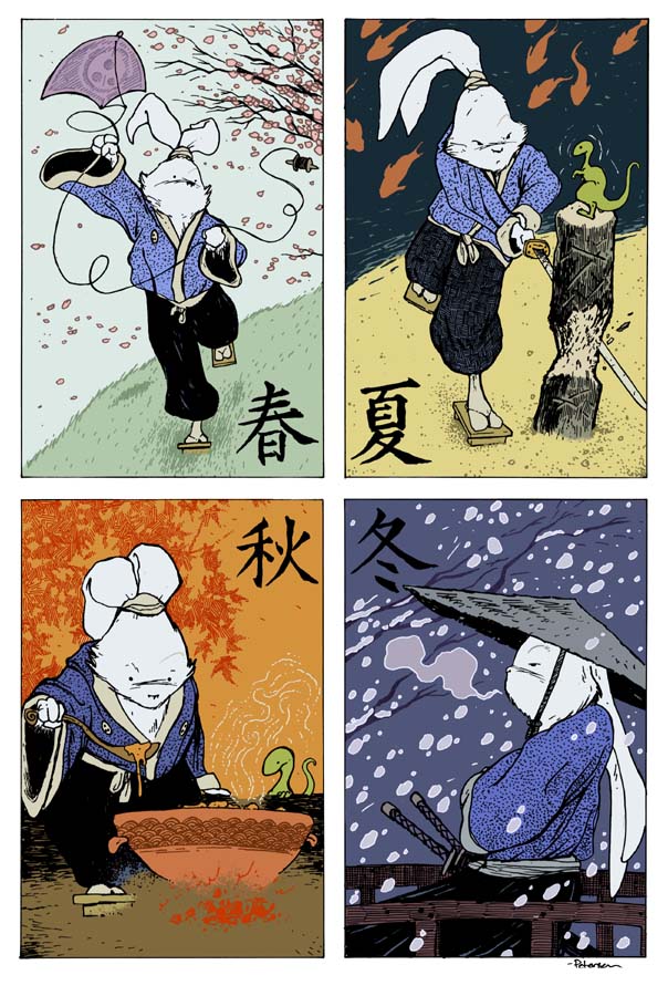 The artwork was scanned in for digital coloring. Here I established the color areas, which is a fancy way for saying, without shading, I colored in the lines. I cheated here a bit and re-created this for today's blogpost. I did not save a version of the file just flatted at that time, so I went back in to the final color file and made this example of what the piece probably looked like before I started the final colors.
The final colors are seen here and were achived using the dodge and burn tools in Photoshop with a textured brush. I probably over rendered and texturized the piece compared to what I would do today, but I think it still holds up pretty well. The pinup appeared on the back of Usagi Yojimbo issue 104.
The artwork was scanned in for digital coloring. Here I established the color areas, which is a fancy way for saying, without shading, I colored in the lines. I cheated here a bit and re-created this for today's blogpost. I did not save a version of the file just flatted at that time, so I went back in to the final color file and made this example of what the piece probably looked like before I started the final colors.
The final colors are seen here and were achived using the dodge and burn tools in Photoshop with a textured brush. I probably over rendered and texturized the piece compared to what I would do today, but I think it still holds up pretty well. The pinup appeared on the back of Usagi Yojimbo issue 104.Watercolor Wednesday:In case you missed last week's Watercolor Wednesday pieces, here they are for a closer look. I started by drawing one of these and I thought "This is Tough Pete, nobody messes with Tough Pete" And I decided he was one of several brothers all named Pete who boxed...or just fought. I then drew and painted Angry Pete and Strong Pete. I had a lot of fun playing with the shapes of their anatomy and making them so odd looking. There was a conscious decision to make each wear primary colored pants and hats...but not the same color on any one Pete. I was torn about the idea of selling these individually or as a group. In the spirit of trying to keep prices down on these, and hoping to make more than 1 person happy with a purchase each week, I opted to split the brothers up....


...perhaps down the road I'll have to paint their rival cousins..three scrapping brothers named Mad Pete, Crazy Pete, and Big Pete. Tomorrow I'll post a few more paintings in my online store.
2013 Appearances: Emerald City: March 1-3
Fabletown Con: March 22-24
C2E2: April 26-28
Spectrum Live: May 17-19
Heroes Con: June 7-9
San Diego Comic Con: July 17-21
*more 2013 dates coming*

November 13, 2012
College Printmaking WorkPlease excuse a third week in-a-r...
 College Printmaking Work
Please excuse a third week in-a-row of blasting you guys with a ton of images. It seems that every so often I run out of things I can blog about because I can't share some of the stuff I'm working on until later. So this week I'm sharing a bunch of my printmaking work from 1997-2000. Printmaking was my major (I started at Mott Community College under Sam Morello, and finished at EMU under Richard Fairfield), and I've done a few posts in the past on Relief printing, Intaglio Printing, & a combo of the two. There seems to be several plates & blocks I remember doing at EMU & Mott that I don't seem to have prints of anymore. But there are still more than enough images here I can bore you all with.
Mott Era:
 The 2nd etching I ever did
 Low on ideas, I mocked up a book cover for what was then titled "1149"(this is the story that will be the 4th Mouse Guard arc titled The Weasel War of 1149)
 Sgt. Pepper style collage of faces from my life at the time including fellow students, friends, family, and professors.
 A quick etching I did as a Mother's Day gift after the studio had been closed down for the semester & the supplies were packed away. Tried to do this with as little cleanup to the studio afterwards as possible.
This was a direct photo rip. I was trying to perfect my technical skills and had also gotten into late night session of playing Axis and Allies with friends.
EMU Era:
 A group of foxes wearing garments. I didn't think I was finished with this print until a group critique where everyone told me I shouldn't do a thing more to it.
 A lot of my EMU prints were on discarded zinc plates. I'd burn away the old etchingwith acid, but hints of light & dark spots and texture would still peek through.
 Wish I had been more diligent with the bone anatomy and cathedral anatomy. I may revisit this composition again as I like the idea of a cathedral full of skeletons bathing in the dusty sun beams
 A direct photo rip of a kid with a cape tied around his neck and holding a fat bunny. The magazine I found the image in was torn and beat up, so I gave the edges of the image some distress.I was flirting with Julia when I was etching this
 a combination of 2 plates. The stones were part of a plateI started my first semester at EMU, the Turtle in my last. I printed them atop of one another for this print.
Lino cut portraits I used as Christmas gift tags that year for some of my family & Julia's.
 A color reduction woodblock from my last summer semester at EMU. I wasn't in town for the class, but finished up the projects on my 1st semester back on campus.
  My feet. In the technique of intaglio woodcuts I've shown before with the Hands series.
 A summer home from school and a block of wood...so I did a big Flint summer friends woodcut (Real life inspirations for Rand, Kenzie, & Lieam are all in this piece)
 A singing mouse I did as a demo to teach a friend how to etch. I don't think I was supposed to let non-registered students use the facilities...but I did.
 I had a Gilligan hat and out of boredom, I did a print of it with a background of the hat repeated in different positions
 Another 'looking around the room for inspiration' piece. These bundled stacks of old silk screens atop the flammable materials cabinet had a nice rhythm of repetitive shapes. (the edge of the drying rack and the old bricks helped too)
 These two were an experiment of scratching (drypoint) an image right into the surface of a plate...but instead of using zinc, I used plexiglass. The prints turned out great, but the downside was the chemicals used to clean the plate of ink dissolved the surface details of the plate, making good multiple reprints impossible.
 Another recycled plate. This time I was trying to recreate a moment I'd had the summer before in CA rebuilding my 1974 VW Beetle. This is in a partial state...the image was never really finished
 And the last two are companions. I told the story on twitter a while back about the left print 'Chickens in the Closet' being about a funny/embarrasing story from Julia's childhood that was told to me early on in our dating. The print on the right is from a story of my childhood where I drilled a hole in the roof to put up an antenna.
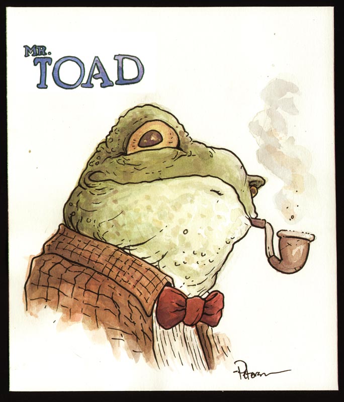
Watercolor Wednesday:
In case you missed last week's Watercolor Wednesday pieces, here's the first I offered up: Mr. Toad from one of my favorite books, Wind in the Willows. I'd love to be able to illustrate a full version of the book someday, but until then I'll just do a fun character piece to satisfy myself.
 The second Watercolor Wednesday piece was one of my own creation. I was trying to channel the sleeping gnomes I drew on my honeymoon 9+ years ago (here & here) I ended up with something a bit more Dwarven than Gnomish I think...but still in that same arena.
Tomorrow I'll post three new pieces in my online store.
2012 Appearances:
Thought Bubble: Nov 17-18
2013 Appearances: Emerald City: March 1-3
Fabletown Con: March 22-24
C2E2: April 26-28
Spectrum Live: May 17-19
Heroes Con: June 7-9
San Diego Comic Con: July 17-21
*more 2013 dates coming*

November 6, 2012
Winter Black & White edition is now AVAILABLE!The lon...
 Winter Black & White edition is now AVAILABLE!
The long awaited Winter B&W edition (I talked about it here), is now available on the Archaia website. I've been getting questions about buying directly from me. I won't have my copies to sell (only about 35) until later (I'm guessing early/mid Dec.). Those will get doodles in them and be more expensive. I'm not taking any requests/reservations for those, they will be 1st come 1st served. I'll also gladly sign & doodle any Winter B&W book you buy from Archaia at any convention or signing you bring it to, so buy from Archaia with confidence that you will get the book you want and can still get it signed and drawn in at a later date.
Unfortunately those will be the only two ways to get one signed & doodled (bringing one to me at a signing or buying one from me) as I will not be doing any mail-order signatures.
Commissions New & Past Due:
I'm running a bit behind this week, so the blogpost will be just a view of some of the commissions I've wrapped up recently. Some of these were past-due from San Diego or Baltimore, one is a personal thank-you/favor for someone, and most are the pieces from the New York Comic Con. I'll be opening a pre-order list later this week in my online store for the Thought Bubble con.


 Watercolor Commissions:
I also wanted to share these past watercolor commissions. Most of these were from New York.


 Watercolor Wednesday:
One of last week's Watercolor Wednesday pieces is from my favorite Stephen King book IT. After re-listening to the audio book (read by Stephen Weber) for the 4th(?) time, I felt it was time for me to try my hand at painting the book's horrific villain Pennywise. I'd drawn him once before in middle school for an illustration project in 8th grade art class (this was around the time the TV movie came out). That piece is long lost, but I suspect the only scary thing about it is how badly it was drawn. This piece may be too creepy for many of my regular blog readers, but I put it up as last weeke's painting as a Halloween treat.
 The other treat from last week was a series of 12 Jack-O-Lanterns that I sold individually (though I think 6 of them were snagged by the same buyer).
Tomorrow I'll post something closer to my normal subject matter in my online store.
2012 Appearances:
Thought Bubble: Nov 17-18
2013 Appearances: Emerald City: March 1-3
Fabletown Con: March 22-24
C2E2: April 26-28
Spectrum Live: May 17-19
Heroes Con: June 7-9
San Diego Comic Con: July 17-21
*more 2013 dates coming*

October 31, 2012


October 30, 2012
Fan Art:I've gotten way behind in sharing Fan Art as I ge...
 Fan Art:
I've gotten way behind in sharing Fan Art as I get it these days. So, I've posted a gallery on Facebook of all the past Fan Art that has been shared on the blog, and Today I'm going to post the rest of everything I've let get past me Fan Art wise. I apologize to the artists for taking so long to share your work. I also apologize if someone's work slipped through the cracks. If that's the case (or you want to share something new), email or mail the fan art to the contact info shown here: http://www.mouseguard.net/contact/
 Amy Crowder
 Amy Stroffolino pipecleaner Lieam
 Ariel G's Tattoo
 Christina Smalley
 Dee Pio
 Derek McLean's Tattoo
 Donnie Chase
 F Bonn
 Fred Portal
 George Bryan
 Henrik Sahlstrom
 Henrik Sahlstrom
 James Harren
 Jamie Cosley
 Jenna Smith
 Jerome Jacinto
 Kayla Richards
 Lauren Gardiner
 Lauren Gardiner
  Laura Wendt
 Maeve Roe
 Matt Minor
 Michael Maher
 Brueh
Brueh Wolfentir
 Rio Taylor
 Roberto Garcia Lombrana
 Robin French
 Ryan Ottley
 Sarah
Sarah Sean McFarland
 Nars
Nars Amanda Rodgers
 Blake Craig
 Felted Kenzie by ??
 Georgia Shaw
 Jeremy Lemastus
 Mayumi Loraine
 Merren Bouth
 Clint Basinger
 Jason Gerstein
 Nichole Stamper
 Tom Beland
 Andy Runton
 Brian Hurtt
 Silly Nate
 Francesco Francavilla
 Morgan Bilicki
 Sheena
 Ryan Cabral
 Thomas Mayer
 Rahb Gee
 Joey Han
 Watercolor Wednesdays:Here's a closer look at last my offerings last week for Watercolor Wednesday. First up is Moshie from Sendak's Where the Wild Things Are. He's always been my favorite of the Wild Things. He misses Max.
 The other is a bird in Renaissance-esque garb...and some kind of hair/fine-feather beard. I don't know...sometimes this stuff just falls out of my brain and onto the paper without me having a clue where it came from.
Tomorrow I'll post more original watercolor paintings for purchase in the online store.
2012 Appearances:
Thought Bubble: Nov 17-18
2013 Appearances: Emerald City: March 1-3
Fabletown Con: March 22-24
C2E2: April 26-28
Spectrum Live: May 17-19
Heroes Con: June 7-9
San Diego Comic Con: July 17-21
*more 2013 dates coming*

October 23, 2012
Ben Folds Five Fraggle-ized:At the New York Comic Con I w...
Ben Folds Five Fraggle-ized:
At the New York Comic Con I was given a great opportunity to present the members of Ben Folds Five Fraggle portraits of themselves. The idea came from MTV Geek who wanted to celebrate the band's recent music video featuring Fraggles and my past Fraggle work and love of all things Henson. The video below can also be found at the band's site or MTV Geek
Get More: Geek: Event Coverage, Full Episodes
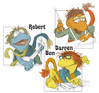 While the MTV Geek video below makes it look like I did the artwork at the show, I actually did it the night before leaving for New York. I was too nervous to try and slap together the art at the show while the band waited. It's hard enough to draw likeness, and even harder when confined by Fraggle features, and most difficult when done on the spot. Here are the pencil sketches with digital color mock-ups I used to do the final paintings.
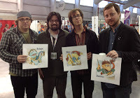 I looked at photos of them online as well as a few performances to try and get a likeness and caricature of them. Unfortunately I didn't get scans of the pieces before I handed them over, but they were all pretty cool guys and were kind enough to gather back together after the interview ended and they were told they could leave, to come back and get a photo with me and their portraits.
Detroit FanFare & Commissions:
This weekend I'll be at Detroit Fanfare in Daerborn, MI. Unfortunately I won't be doing any of the detailed inked commission pre-orders for the show like I planned because of my schedule and what I have due at the moment (the end of Black Axe 6, Black Axe Hardcover epilogue, & Next Year's FCBD cover). However, I will be doing watercolor commissions like the examples below for $120 (single figure, limited detail, & wash background). I'll take about 5 names per day of these per-day.
 Watercolor Wednesday:
In case you missed last week's Watercolor Wednesday paintings, here's another look. First up is the Caterpillar from Alice in Wonderland. All the white was achieved using a gel pen after the paint had dried. From time to time I enjoy doing my take on a classic illustrated character...There have been a number of versions of the Caterpillar so I did a quick google search to see what had been done in the past before I set out to do my own take.
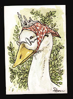 The next is a Mother Goose type goose character. I love fairy tales and children's stories so with this piece (and the next) I was doing my best to evoke the feeling of being read to and peeking over at illustrations by Edmund Dulac and Arthur Rackham.
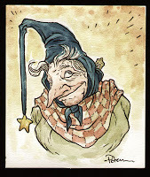
Last is another fairy tale archtype, the old woman who may -or- may not be a witch. For sake of leading you on further, I say she is a witch, but a good one who saves most of her conjuring for unthanked deeds and improving baked goods.
 Tomorrow I'll post more original watercolor paintings for purchase in the online store.
2012 Appearances:
Detroit Fanfare: Oct 26-28
Thought Bubble: Nov 17-18
2013 Appearances: Emerald City: March 1-3
Fabletown Con: March 22-24
C2E2: April 26-28
Spectrum Live: May 17-19
Heroes Con: June 7-9
San Diego Comic Con: July 17-21
*more 2013 dates coming*
At the New York Comic Con I was given a great opportunity to present the members of Ben Folds Five Fraggle portraits of themselves. The idea came from MTV Geek who wanted to celebrate the band's recent music video featuring Fraggles and my past Fraggle work and love of all things Henson. The video below can also be found at the band's site or MTV Geek
Get More: Geek: Event Coverage, Full Episodes
 While the MTV Geek video below makes it look like I did the artwork at the show, I actually did it the night before leaving for New York. I was too nervous to try and slap together the art at the show while the band waited. It's hard enough to draw likeness, and even harder when confined by Fraggle features, and most difficult when done on the spot. Here are the pencil sketches with digital color mock-ups I used to do the final paintings.
 I looked at photos of them online as well as a few performances to try and get a likeness and caricature of them. Unfortunately I didn't get scans of the pieces before I handed them over, but they were all pretty cool guys and were kind enough to gather back together after the interview ended and they were told they could leave, to come back and get a photo with me and their portraits.
Detroit FanFare & Commissions:
This weekend I'll be at Detroit Fanfare in Daerborn, MI. Unfortunately I won't be doing any of the detailed inked commission pre-orders for the show like I planned because of my schedule and what I have due at the moment (the end of Black Axe 6, Black Axe Hardcover epilogue, & Next Year's FCBD cover). However, I will be doing watercolor commissions like the examples below for $120 (single figure, limited detail, & wash background). I'll take about 5 names per day of these per-day.

 Watercolor Wednesday:
In case you missed last week's Watercolor Wednesday paintings, here's another look. First up is the Caterpillar from Alice in Wonderland. All the white was achieved using a gel pen after the paint had dried. From time to time I enjoy doing my take on a classic illustrated character...There have been a number of versions of the Caterpillar so I did a quick google search to see what had been done in the past before I set out to do my own take.
 The next is a Mother Goose type goose character. I love fairy tales and children's stories so with this piece (and the next) I was doing my best to evoke the feeling of being read to and peeking over at illustrations by Edmund Dulac and Arthur Rackham.
Last is another fairy tale archtype, the old woman who may -or- may not be a witch. For sake of leading you on further, I say she is a witch, but a good one who saves most of her conjuring for unthanked deeds and improving baked goods.
 Tomorrow I'll post more original watercolor paintings for purchase in the online store.
2012 Appearances:
Detroit Fanfare: Oct 26-28
Thought Bubble: Nov 17-18
2013 Appearances: Emerald City: March 1-3
Fabletown Con: March 22-24
C2E2: April 26-28
Spectrum Live: May 17-19
Heroes Con: June 7-9
San Diego Comic Con: July 17-21
*more 2013 dates coming*
October 16, 2012
Black Axe Hardcover Jacket art process:This week I wanted...

Black Axe Hardcover Jacket art process:This week I wanted to share the process for the Black Axe hardcover jacked art. The cover was first shown online last week by USA Today's website, but for my blog readers I wanted to go a step further and show what it took to get there. Doing wrap around covers is a trick. The front has to be interesting, the back has to be interesting enough to warrant it being a wrap around cover, the piece has to work as a whole, and the type on the front & spine need to be read clearly. Here's how I tried to tackle those challenges.
 The concept: What to show on the cover was a harder decision to make than it would seem. Obviously Celanawe with the Axe was needed, but who else? Conrad? Em? The only time all three are together, Celanawe doesn't have the Axe. Julia thought the Ferret King Luthebon was an important enough element in this story arc that he needed to be on the cover as well. I had already done two cover-type images with Celanawe & Luthebon...one was the promo image I made for Black Axe back in 09(?) where I drew these character designs for the first time. The other was the cover to Black Axe issue 3. I didn't want to repeat those pieces, but keep in the spirit of them, and sum up the entire series without being a continuity slave. So in a slow moment at the Cinncinati Comic Expo, I doodled up this rough of where the major players should be placed.
 I sketched out the characters separately in my sketchbook along with the scenery & Ildur Hall. I scanned those drawings and assembled them in Photoshop tinting each element a different color to make composing the layout easier. I manipulate the sketches independently because I find it easier to make adjustments if I can just move Conrad in a smidge to the right or Celanawe up a bit, or rotate Em so she's hunched over more. Also it makes it less of a headache to get everything just so while still paying attention to where all the type needs to fit and adjusting for it in necessary.
 Once the layout is just as I want it, I print it out at full size. On Strathmore 300 series Bristol, I ink the piece. The printed out layout is taped onto the back on the bristol, and using a lighbox I'm able to see through the bristol and use the layout as a guide for the inks. As I showed in my Inking Grey blogpost, I saved a lot of the detail of texture and pattern for the inking stage. The briar was hardly roughed in on the layout, and for that work, I let the pen guide me to twist around the forms and making overlapping shapes and density of lines.
 The scanned inkwork is then prepped for color. This work is called flatting because it is focused with blocking in shapes of flat color. In some instances, I purposely went with loud and clashing colors for the flats. To make sure the briar vines wove in and out of each other, I used colors that were not natural for the forms and were very different from one another. This helped me know that I had the same vine the same color after it went under an overlapping vine. It's the same technique I used when coloring pages to Issue 4 and I showcased on the blog in the past
 The last step was the final coloring and rendering (shading and adding highlights using Photoshop's dodge & burn tools) as well as adding color holds to the scenery in the distance and some clothing details on Luthebon and Em. The Black Axe hardcover is slated to ship next Spring (and I'm working as hard as I can to make sure I hit that deadline!)
 Watercolor Wednesday:
In case you missed last week's Watercolor Wednesday paintings, here's another look. First up is Blacksad & Weekly from the French Noir series Blacksad. I'd heard people rave about this series & recommend it to me for years, but I didn't listen fearing it was all hype or people wanting me to read it purely because it was another anthropomorphic book. Well, don't be like me, if you haven't read Blacksad and you enjoy classic cinematic noir detective stories and beautiful artwork, seek out the two volumes Dark Horse has released here in the US. This is my poor attempt to capture what Juanjo Guarnido does effortlessly.
 Second up is the Mask. I discovered this Dark Horse series during it's second arc: The Mask Returns (which was before the Jim Carrey movie) This was the era of my high school comic reading where I started shifting away from mainstream superhero stories and over to things like Hellboy and the Mask. A few months ago I pulled out those issues of the original Mask run as well as Returns and re-read them. It still holds up and, while not as funny as the movie, has a depth and level of dark humor I appreciate more.
Tomorrow I'll post more original watercolor paintings for purchase in the online store.
2012 Appearances:
Detroit Fanfare: Oct 26-28
Thought Bubble: Nov 17-18
2013 Appearances: Emerald City: March 1-3
Fabletown Con: March 22-24
C2E2: April 26-28
Spectrum Live: May 17-19
Heroes Con: June 7-9
San Diego Comic Con: July 17-21
*more 2013 dates coming*

October 9, 2012
Winter 1152 Black & White ed.:Word has it from Archai...
Winter 1152 Black & White ed.:Word has it from Archaia that 60 advance copies of the Winter Black &White limited edition will be available at their booth for the New York Comic Con this weekend! For new blog readers who are unfamiliar with this long overdue title, it's a limited edition black and white slipcased version of the Winter 1152 book.
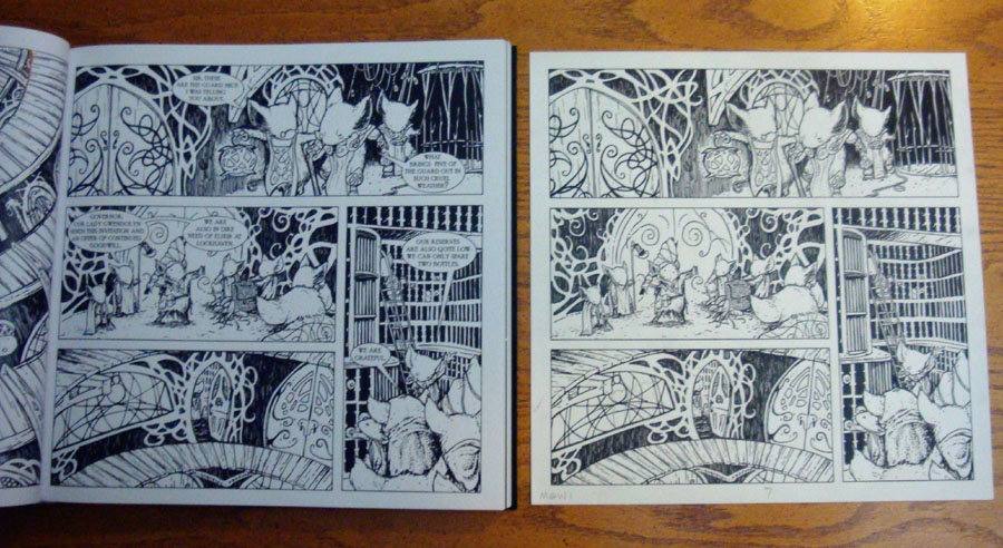 The book is oversized so that the pages match the size of the original artwork used to create Winter 1152. Fans enjoyed seeing my original inked pages at conventions (and peeks here on the blog). I wanted any limited edition book of Mouse Guard to feel special and not a numbered reprint of the exact same material you already own, so the goal with this edition was for you to feel like you are holding a portfolio of all the original pages at their original size and before they were colored digitally.
 Additionally, where I would use an overlay sheet to replicate snow or ice or sleet on the original art, the effect has been printed on vellum. It was the sheer number of these in Winter that has been a major factor in this book taking so long to be printed and available. The Fall 1152 B&W edition, had 1/3 the overlay sheets that Winter has, and the printer became very concerned with how to bind it properly (which I can happily report was solved). The snow effect appears black just as it did on my original overlay sheets that I made using black ink. There was talk about printing it in white, but I preferred the book to continue to feel just as the original art used to make the book appears before scanned and colored.
 The edition is limited to 1,000 copies. As I said, 60 of those (shipped in advance of the entire order) should be for sale at the New York Comic Con this weekend. When the remaining stock arrive in the US, Archaia will have them for sale in their online store. This book was solicited through Diamond (and then canceled due to lateness) in the past, so the only way to purchase this book now is directly at conventions or the Archaia webstore. I know that may be frustrating to some, but our goal was to make it easier for fans all over the world to be able to purchase the book and for it to arrive undamaged. With this system, Archaia & I have more control over that than ever. I will try and do my best to update any info I have on these, as well as what conventions I'll be bringing copies to.
 Reading with Pictures: Probamon!
As part of the Reading with Pictures' Graphic Textbook Kickstarter, I did artwork of a Pokemon-style creature. One of the stories in the upcoming Graphic Textbook is called Probamon (written by Geoffrey Golden & drawn by Nate Pride). It teaches kids about probability with scenarios of Pokemon type monsters dueling it out. As a reward for the Kickstarter, I agreed to draw the card art (because they are also releasing a set of Probamon trading cards) for a creature to be designed by a Kickstarter backer.
 Charlotte Cheng (who contributed this Mouse Guard fan art in the past) was the lucky backer (and will also be drawn with her monster in the story by Nate Pride) and submitted these drawings of a "mushroom bunny" that takes this fungi form to become more stealthy and harvest special berries. So...I took a stab at it.
 This is one of the rare cases where the rough matched the ink-work almost identically (so it's not worth scanning & showing the sketch). I didn't have much to do in terms of re-designing Charlotte's monster, it came down more to refining the shape and details into my own style of working. I tried to give the head less of a mask look and more that the mushroom cap was part of the rabbit's head. I made the nose go away fro the same reason...and the eyes smaller so it looked less like a Warner Bros. style rabbit and more of a creature.
 The colors were taken from Charlotte's concepts as well. I gave the creature a swirling gas breath attack (mentioned as a line of defense generated by eating the berries in Charlotte's art & description) and I liked the nod to the mushroom/hookah/smoke tie in with the Caterpillar from Alice in Wonderland. All of the lines received a color hold to soften the art a bit. The original and a color print of the creature will be making it's way to Charlotte's home soon.
 Watercolor Wednesday:
In case you missed last week's Watercolor Wednesday paintings, here's another look. All three were purely from my own imagination and done for the fun of the imagery. First up is a wealthy king. I struggle with how to draw humans. I either fall into trying to be a slave to reference (and making something stiff and photo-referenced-looking), apeing another artist's style (and doing a bad job of it) or going with something a bit more of an animation design than I planned. The king was an exercise in embracing how I draw naturally while trying to push past the overly simplified animation design.
 Next up is a bearded skull. I like skulls when they aren't being used as imagery for horror, evil, or some type of music/lifestyle. I like them as honest objects that link us to mortality in a healthy way...a scientific way. So I started this painting wanting to include a skull...but then when I got to the jaw area, I just started drawing hair. I imagined the beard on this guy still being magically alive and moving like an octopus moves when it crawls along the bottom of the ocean...all the while dragging it's bone base along with it. The bowler was added to make the painting a bit more humorous and not so macabre.
 And lastly is a new painting of a dragon from a project I started dreaming up with Jesse Glenn (real-life-Kenzie) on my 18th birthday. The dragon's name is Loden and was meant to be an unconventional dragon design that made it more of a land-based beast with body mass more like a rhino than your typical dragon. We figured his little wings wouldn't even get him off the ground (or only with immense strain.
Tomorrow I'll post more original watercolor paintings for purchase in the online store.
2012 Appearances:
Detroit Fanfare: Oct 26-28
Thought Bubble: Nov 17-18
2013 Appearances: Emerald City: March 1-3
Fabletown Con: March 22-24
C2E2: April 26-28
Spectrum Live: May 17-19
Heroes Con: June 7-9
San Diego Comic Con: July 17-21
*more 2013 dates coming*

David Petersen's Blog

- David Petersen's profile
- 339 followers
David Petersen isn't a Goodreads Author
(yet),
but they
do have a blog,
so here are some recent posts imported from
their feed.

