
David Petersen's Blog, page 67
February 12, 2013
Reference Model: Shorestone Interior: Last week I s...
 Reference Model: Shorestone Interior:
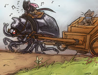
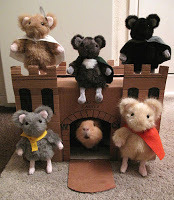
 Last week I showed you the exterior model of Shorestone. To celebrate Black Axe #6's printed release tomorrow, I'm sharing the model I made for the interior of the city of builders. Like last week, there isn't anything spoiler-ish in this post. Everything you see is on page 2 of the issue. So enjoy the post without worry.
 First off, you may be saying "What!?!?! he built this much of a model for what happens on ONE page of the issue!?!?!"...yes. yes I did. At the time, I figured I'd show the interior for more than the one page, but after I finished, I realized that the story had to push on and couldn't linger in this city's thorofare. And as I often come back to locations in the course of Mouse Guard (not to mention the cutaways and guides in the hardcovers) it was more than worth the time to build this model.
 I already had the exterior facade model to butt this up to, and that model being locked in also gave me some detail aesthetic cues to use too. I wanted the city to feel detailed, huge, and organized. I repeated the same window design from the exterior for the archway doors and upper level windows. The floor is detailed tile work (designs taken from cathedral windows and some tiles in an Irish church) to again show the different types of craftsmice working & living here. Shorestone is like a city-sized resume for the mice there.
 The walls and floor are cardboard skinned with printed paper designs. but each build modularly so that I could access the model from different vantage points and also reconfigure it for other parts of the city if necessary. The image to the right is a bit of photo trickery. Locking down my camera on a tripod, I photographed the model walls in 2 different locations on the table. Then in Photoshop, I was able to composite them together into something even more big, echoy, and vast looking than my model.
 The roof section for the main hall I filled it with banners. I'd made reference to a banner from a Legends of the Guard story being hung at Shorestone (eagle eyed fans won't have trouble picking it out), so I figured Shorestone could have hundreds of banners and flags in their possession ..perhaps they display the colors of the various cities, towns, and groups their laborers made structures for.
Finally, Here is how Shorestone's interior looks in ink & digital color on page 2 of Black Axe #6
 Two weeks from now I'll have another model post...hopefully everyone will have had a chance to read the issue..because the next model & post could be spoilerish.
 Watercolor Wednesday: Here's another look at last week's Watercolor Wednesday paintings (for those who are new to Watercolor Wednesday, I post a few original watercolors for sale in my online store each Wednesday. They are affordable and go quickly, so follow me on Twitter or Facebook for the quickest notifications of when they go live) First up is a green man, but in autumn colors.
The second watercolor from last week is some sort of goblin-like fey in a red hood. No particular inspiration for these two, just what came out of the brush on to the paper.
 Third is what started as me trying to emulate Tony DiTerlizzi's expressions on a cliche Leprechaun. I added the scale mail cloak to try and de-cliche him, but I think now it just seems sillier.
Tomorrow I'll post more paintings in my online store.
2013 Appearances:
Emerald City: March 1-3
Fabletown Con: March 22-24
C2E2: April 26-28
Spectrum Live: May 17-19
Heroes Con: June 7-9
Albuquerque Comic Expo June 21-23
San Diego Comic Con: July 17-21
*more 2013 dates coming*


February 5, 2013
Reference Model: Shorestone Exterior:A few weeks ago Blac...
 Reference Model: Shorestone Exterior:
A few weeks ago Black Axe #6 was released digitally on ComiXology and will be in print on-shelves next week (the 13th)! So, you may have already read the issue, but if you are waiting for the print version, this post won't contain any real spoilers and will only show the first page of artwork from the issue.
A new location is visited in the first scene of the issue: Shorestone. I've never shown any part of Shorestone before this, so I had to design its look for these pages. I took what I'd already put in the RPG book and what purpose I needed the city to serve as as my inspiration. Shorestone is a city that is known for builders, workers of stone especially, but also wood and metal.
 I based the overall exterior design on a Romanesque church. The 1/2 hexagon main building facade is cardboard with basswood trim. The entry and towers are chipboard and cardstock clad in printed arch designs. When I got the structures built, I could measure them and make 'faces' or 'skins' for each piece in Photoshop using photos of arches and windows I have in my collections from my travels. The round windows were also printed designs simply glued on to the cardboard.
 To beef up the trim on the towers I added a few layers of cardstock under the printed trim pattern. The 'roof' of the towers was achieved by wadding up aluminum foil and packing it so tightly that I could shape it by kneading it against a hard surface. I wanted the exposed facade of Shorestone to ooze skill and craftsmouseship. I added a lot more detail than I normally would with the repetitive trim patterns, edge trim & buttresses, the varied materials & shapes, and even the scale.
 The roof of the front was also something I added more detail to than I normally would. I figured in a town of craftsmice know for their skill and talents with architecture, they would have a complicated and useful roof. With mouse cities being mostly underground or inside something (trees, rocks, etc) any extra ventilation and light would be welcome. For the model, the little cupola vents were made of basswood scraps (you can often find bags of bigger than craftstick sized pieces at your local hardware or craft store)
Here is the city exterior as it appears on page 1 of Black Axe #6. Having the model certainly helped me figure out the design of the building itself. I was able to design the place faster than I could have ever could have drawn it all just by trying things out. If I thought something was too tall or too short, I could swap out the cardboard for a different piece. I could design 1 detail and repeat it over and over in Photoshop and just have to glue it on. If I'd tried drawing it, I could have ended up spending the same amount of time and only had a single good drawing from 1 angle out of it.
With the subject of my book being the unbelievable caveat that mice walk, talk, use weapons, etc...I need everything else to be as grounded and as real as I can make it seem. Doing models like these are a time-saver for me (honestly!) but also add the weight to Mouse Guard I feel necessary.
 Oh...and the inside of this model? yes, I designed the inside of the entrance to Shorestone...but I also build a model for what lies beyond too.....That's for next week.
 Watercolor Wednesday: In case you missed last week's Watercolor Wednesday pieces, here they are for a closer look. First up is a Monty Python & the Holy Grail themed piece. This is one of my favorite movies and as I still lack the courage to nail liknesses, I opted to depict the knight characters using only their tunic designs.
The other two pieces from last week were a Satyr & a gargoyle...but I don't have too much to add about why or how I painted them...so just enjoy


Tomorrow I'll post more paintings in my online store.
2013 Appearances:
Emerald City: March 1-3
Fabletown Con: March 22-24
C2E2: April 26-28
Spectrum Live: May 17-19
Heroes Con: June 7-9
Albuquerque Comic Expo June 21-23
San Diego Comic Con: July 17-21
*more 2013 dates coming*
January 29, 2013
First time Con Set-up notes:Last week I received and...
 First time Con Set-up notes:
Last week I received and email from an artist who will be setting up at his first convention in March, and was curious if I had any advice about setting up and exhibiting. Friends of mine suggested that this might be a topic and reply worthy of sharing, so here goes. (And I apologize for the lack of visuals that tie into the text...instead, enjoy spot illustrations from the Mouse Guard RPG)
-Pulling the trigger
 First off, I'd like to start by talking about getting to the step of exhibiting at a convention. I would never be where I am now if I hadn't plucked up the courage and reluctantly parted with some cash and set up at the Motor City Comic Con in October of 2004. If you want a career in illustration or storytelling, I recommend exhibiting in an artist alley at least once if only for the experience. Like anything, you learn by doing (not thinking about doing something someday) and even if you are unsuccessful at your first show, or first several shows, hopefully you will have learned and grown...or perhaps you will be successful right out of the gate!
Obviously, if this is your first con, you are going to need to put out a little bit of cash for some supplies like a portfolio some printing, and a table cloth...but I'll get into that stuff as we go along....just keep in mind, you can start small and build your con supplies up with a small budget. And price out a conventions that works for you. There are big expensive shows and smaller shows. There are shows with a comics-only focus and shows that are multi-media extravaganzas or pop-culture themed. Think about your audience and your budget.
 -What is your goal?:
If you are ready to exhibit (or you think you might be) you will want to have a good idea of what you are trying to accomplish. There are lots of different types of jobs in comics: drawing/coloring/inking/writing for a big company & established characters, doing work for hire for private collectors, doing work for hire for several publishers, drawing/coloring/inking/writing your own material, or some combination of all of those. Knowing what your goal in work is can help you direct your attention for what to focus on for your table and conversations with patrons & publishers. The set-up of a creator trying to launch their own book is very different from a creator who is looking to knock out 20 commissions in a weekend, and is also very different from the creator who is selling prints of their own concepts to try and get attention from art directors.
-Your best foot forward:
 Make your booth approachable and nice as possible. You WANT people to come browse your goods and work, so make it easy for them.Gather your BEST work to display in a portfolio or on the table. This is work that shows off who YOU are...not who you can emulate. Just like a good portfolio shows a clear message and focus, so should your table. Some conventions provide a table covering, but it's worth the effort to get your own tablecloth (it can set your table apart and even be a design choice depending on color or material) For the tablecloth, fabric can be cheap at the fabric store if you shop smart, but you can also use a flat bed sheet. And if you can manage have 2 table cloths...one goes on the table under your merchandise, the other is draped over the top of your stuff at the end of the night to prevent things from wandering off while everyone else closes down or before the con opens the next morning.
 -Vertical display space:Try and make sure your work isn't all just flat on the table surface. Either with signs or racks or frames to display some of your work/books/prints/etc. upright, you will want to have something vertical so someone walking down the middle of the aisle can see what you have to offer without having to be directly over your table. You can buy little book easels or plate racks, but it's also easy to copy their design and make your own out of chipboard or cardboard on a budget. Some conventions also provide a backdrop, but most don't. I think IMPhotographics has the best deal on banners for your table, but if you are budget conscious, you can improvise your own. For my first sign, I took a large B&W dithered bitmap file to Kinkos, printed it out on their blueprint copier and mount it to foamcore and displayed it behind me on an easel ($40 total supplies & printing)
-Signage:
 Make sure every bit of info you want people to have is easy to get. Some kind of sign (or banner) saying who you are is a must. Some conventions provide a cardstock name plaque, but not all do. Everything you plan to sell should be marked. You can price everything individually with tags or little signs, or make up a con-menu sign that covers everything (prints: $10, sketchbooks: $15, commissions: $80...). If the work in your portfolio is for sale, make sure the prices are easy to find. Customers should know what the prices of your items are without having to ask.
 -Items at several price points:It's a good plan to have several price point opportunities for customers. Not every person who comes up to you has $40 to spend at your table, but they might part with $20 or $5...or...they might be wanting to spend $200...you never know, so try and offer something for everyone. This also helps in making back your table fees...it's hard to make the investment back selling $1 buttons or $3 comics (even if you sell bunches of them) but several $10 prints and a few original art or commission sales can make a big difference. To vary up the price offerings you can play with the sizes of prints. Most print shops will offer a good deal on 11" x 17" prints, so in addition to offering that poster-size, think about printing 4-6 smaller prints on a single sheet of 11x17 and trimming them down. Items like comics & small prints can be in the $3-5 range, with larger prints & sketchbooks going up to $10-15, and commissions and original art being more than that (figuring out what to price your originals for is a whole other conversation)
-Freebies
 At your first con new business cards printed can be your freebie, but if you have more budget or are further on in your exhibiting you can also try bookmarks, postcards, stickers (though some cons ban them) or buttons once you get a feel for your market and what you are willing pay for free items. The items should have a way to contact you (a URL, an email address, your name, or bare minimum: the title of your project). To prevent blowing through too many of these items you paid for, you can offer them only to people who stopped and showed interest instead of just having them on the table marked 'free'.
 -The right sales approach:Don't be a pushy seller. Everyone's pitch and technique is different and finding your style may come easy or take some trial and error. I advise saying hello and greet everyone who stops by (which also means making eye contact), but don't go too much further pushing unless they show more interest or ask questions. Think of it as having a conversation with the customer rather than a sales pitch. I hate being hit over the head with a full explanation of someone's project & all the prices are & what items are which the minute I walk up to them. You should be proud to talk about your work and to take the opportunity to explain it, but you will turn more people off than you attract doing a hard-sell or carnival barking people over to your table.
-Accept credit card payments if possible:
 A few years ago, you could get by without accepting credit payments, but that has changed. I'm now seeing that I would lose a good number of sales if I didn't accept them. Square is an app and device for android or iOS devices and Paypal offers one too. The benefit about both of these devices is that you can use it on your phone's data plan (not just wifi) and you have no annual/monthly merchant fees. If you don't have a device that can use either the reader or app, but can access your email, you can ask a customer to paypal you the payment on their device and you can confirm the payment was sent by checking your email.
 -Commissioned work:
Figuring out the pros and cons of varied commission policies is a whole post on its own ...but I'd say the best advice I can offer is to plan ahead: What do you charge for them? (Is the amount based on size, a number of figures, media used), What you are willing and not willing to do per commission? (certain subjects/themes off limits? Backgrounds?). As you do more conventions your policies may change, and you may also need to devise a method/order for how/when you accept the requests (first come/first served? limit per customer? new list every day? pre-orders?) You will want to have answers ready (not necessarily written out on a sign) for sizes, options, pricing, etc. when asked and not try to figure it out on-the-spot.
Make sure you have materials you want to use to do commissions (paper, the right pens, pencils, color tools). If you are getting more requests than you planned, consider losing a little profit by overbooking yourself and offering to ship the finished art back to a customer after the convention. Commissions are a great way to build up a client base that may not yet be familiar with your work.
-Copyrighted characters & ideas:
 Strictly speaking, you could be in violation of copyright laws by making a profit on any character/concept/or logo you don't own the rights to. A great deal of artists in Artist Alley do sell prints, commissions, and sketchbooks containing characters they don't own, but most do so at the risk that they could be busted. Some may have arrangements with the publishers of those characters because of their work history/contracts with them, others are just too small of a target for a publisher to take legal action. As an artist whose career is based on a creator owned book, I'm more interested in promoting my own ideas than copyrighted characters, so I'm biased...but my rule-of-thumb is that I won't sell printed material of anything that I don't own the rights to; however if someone commissions me to do a one-of original of a copyrighted character, I'll accept. If your goal is to get work drawing for a big publisher and you need to exhibit some of the work showcasing your understanding & skill at drawing those characters, it's fine to show, but I'd avoid selling it.
 -Dry run table layout:Measure out a place on your dining room table or even on your floor that matches the table space in artist alley. Try a few different table arrangements for all your items. Make sure everything fits and that it's arranged nicely to your liking. Avoid set-ups where your products overlap each other or look cluttered like a second-hand store. Once you have a layout you like, it's easy to snap a photo of it and use the photo as reference during table set-up.
 -Be yourselfDon't try and be someone you are not...and this goes for your artwork too. Offer up information about you or your work or your technique when asked. If someone asks you something you don't have an answer ready for (freelance work, rights questions, price breaks, etc.) It's ok to say "I don't know...let me think about that and get back to you".
Don't be self deprecating or apologize for your work...(especially if you are having your work reviewed by an editor/publisher...just listen and answer the questions you are asked) being humble is one thing...coming off like a sad artist who doesn't belong is another.
Smile, be nice, and enjoy the con & meeting people. It's a fun experience!
 Watercolor Wednesday: In case you missed last week's Watercolor Wednesday pieces, here they are for a closer look. First up is a Moon & Sun pairing. I painted the moon first and then decided it would be fun to do a 'day' companion piece. I went back and forth on whether to sell them individually or as a set. I opted in the end for them to be a set.
Second up are the Beatles in Sgt. Pepper gear. I struggle with drawing humans anyhow and getting likeness is a tricky task to boot, so in my fear of making this simple watercolor wednesday into more work than pleasure, I abstracted the layout so that the Beatles themselves were absent and only their hair & clothing (and John's glasses) remained.
Tomorrow I'll post more paintings in my online store.

2013 Appearances:
Emerald City: March 1-3
Fabletown Con: March 22-24
C2E2: April 26-28
Spectrum Live: May 17-19
Heroes Con: June 7-9
Albuquerque Comic Expo June 21-23
San Diego Comic Con: July 17-21
*more 2013 dates coming*
January 22, 2013
Stained Glass:Last week's post about the 2013 bookplate g...
 Stained Glass:
Last week's post about the 2013 bookplate got me thinking about sharing my experiences working with stained glass, both in real life and illustrated. As I mentioned last week, I've cut glass for my own projects before (many of which I cut in an under-the-stairs cupboard in my post college apartment to keep the glass debris out of my living space) and knowing how glass cuts certainly has aided me when wanting to draw stained glass correctly or make my own patterns. This experience is some of that type that I advise all creatives to pursue: Something out of your direct trade or comfort zone that, in the end, will make you better at your trade for having branched out (even if you fail at it). Working at Materials Unlimited (the Architectural Antique store I was employed by when I started Mouse Guard) helped me a great deal in that regard too. Not only did it push my knowledge at craft and how things were made (and therefore ways things must and must not be repaired) but also a visual vocabulary of aesthetics & design through several centuries and regions....but I'm digressing...back to my feeble attempts at glasswork.
Real Stained Glass Work:
 In college I inherited a great deal of stained glass scraps from a very large window that was removed from my childhood church. The window was taken out in the 60's but the fragments were stored & saved, and parted out. Among the pieces were two round still assembled windows with some disrepair. I wanted to learn how to repair them, so as gifts for family, I started making my own designs out of the other scraps. I bought more glass to get the right colors and textures for my projects, but made sure that almost every new project had some pieces of the church glass in it too. (to the right: a sewing sparrow for my Mother)
I started, rather boldly, with portraits of family members. I used pictures of them and photoshop to try and break their features into simple shapes. Along the way, I had to make changes, cutting what was one piece in my design into two, because the original shape was too complicated to cut by hand from a single piece. Once each piece for the design is cut (scored & carefully cracked is a better way of describing it) they are all edged with an adhesive foil tape. The foil edged pieces are re-assembled like a non-locking jigsaw puzzle, and then soldered together. (below are the portraits of my Father, Mother, and Paternal Grandparents).


After doing a these (and a few more) flat image projects, and not feeling ready to tackle the round windows in need to mending (which also use a lead came in between the glass instead of foil), I started doing more free-form glass pieces. I had a rough pattern for the pieces, but didn't always adhere to it, knowing I'd have to make modifications for the overall form not to be flat. I made a few types of leaf suncatchers (seen below). The first shown is made up of many 5 piece maple-looking leaves and soldered together into a tumbling mass. The second piece shown is a large single leaf where the veins of the leaf are formed by the solder joints and every piece in between was a different color of glass. On that piece it also meant that every joint was an opportunity to have the shape bend in a 3rd dimension.


I have still never gotten around to repairing my round windows (they happily sit on the dining room window ledges...but I have used their design & color scheme in several pieces since...
 Illustrating Stained Glass:
This spot illustration (done for the Mouse Guard RPG hardcover rulebook) is of one of my round church windows. I've also used this design in Jasper Bunny's front door in my children's book Snowy Valentine. In this instance, I didn't have to know much about how glass cut, or what shapes were possible, or what colors would look best, because I was simply copying the design...but having seen that window every day with light pouring through it made me feel much more confident about how to render the color.I've created some window illustrations on my own and others I've used existing windows as jumping off points, modifying what I needed to make the glass special about the subject.
 Season chapter header in the Mouse Guard RPGThe outer edges are based on real windows with new center patterns designed by me for each season
 Muppet Snow White cover for BOOM!This window was a photo edit of an existing window to make a round design(past blogpost on the process for this cover)
 From Winter 1152 Epilogue.A window based on Jane Irwin's pinup from issue 6
 FCBD 2011 coverModified existing design to include painted & fired areas representing the three items from the story: talon sword, shell shield, & snake venom
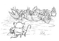
 page from Black Axe #5For this room, I designed eleven past matriarch windows using an arch design from a historic window, but modifying the majority of each window for the matriarch's figure & symbolism
past blogpost with model process
 Jim Henson's The Storyteller pinupThe window serves as a story cue in itself to a Hans Christian Andersen fairy tale called The Tinderbox
past blogpost with process for this pinup
I use stained glass in these covers, pages, and pinups, not just because it looks cool, but because of what else it adds. Stained glass windows evoke a sense of history, of mood and atmosphere, they help me tell a story and add a weight to the importance of the setting. If the glass is more than design and has a subject matter, you know that within the story it appears in, that subject is important...otherwise no one in the fictional world would have taken the time to make a window commemorating it.
 Watercolor Wednesday: Here is another look at last week's Watercolor Wednesday pieces. First up is a crow in shabby clothing. Have I ever mentioned I like talking animals as subjects?
While painting this guy I thought of depression era folks who just carried on and made due with very very little. I came up with a little reason for his checked scarf (it also serves as a way for him to carry his meager lunch) and the two talks of wheat in his hat (his last two bites of food, always saved atop his cap for his son & wife)
The other painting from last week was an apple. Just because. Tomorrow I'll post more paintings in my online store.

2013 Appearances:
Emerald City: March 1-3
Fabletown Con: March 22-24
C2E2: April 26-28
Spectrum Live: May 17-19
Heroes Con: June 7-9
San Diego Comic Con: July 17-21
*more 2013 dates coming*
January 15, 2013
2013 Bookplate:Like last year, I'll be offering a new boo...
 2013 Bookplate:
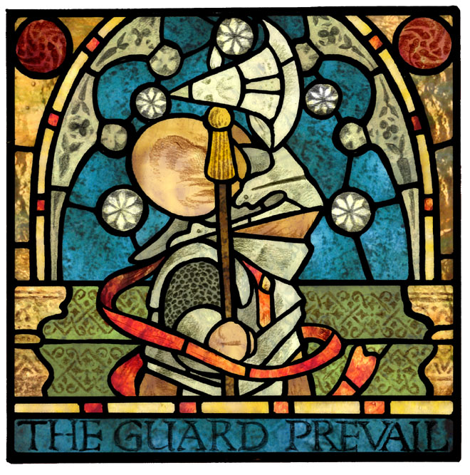
Like last year, I'll be offering a new bookplate this year. For those who aren't familiar, a bookplate is a small decorative card that is pasted into the inside front cover of a book from your personal library that distinguishes itself as yours. For last year's bookplate I did a relief print to create the image. This year I designed a stained glass window. And though I've done stained glass work before, I didn't make a real window to create this image. Here was the process:
 While viewing stained glass in churches and cathedrals on a recent trip to England & Scotland, I got the idea to use that imagery for the 2013 bookplate. When I returned home and started searching for more imagery for inspiration, I found this section of a window in the Church of St Andrew, Temple Grafton, Warwickshire, England of a Templar Knight. I liked the arched & architectural framing around the knight's head & the title at the bottom. So, I essentially stole those elements when making my own design.
 In Photoshop I mocked up the elements from the Templar window that I liked using line tools with a thick stroke to emulate the lead came that holds stained glass windows together. The mouse knight was first sketched in my sketchbook and then added and cleaned up for the digital layout. I added in a few patterns & designs to the layout. I decided the circles around the mouse's head would be stylize stars instead of the Templar's flowers.
 Having working knowledge of cutting glass came in handy. There are certain shapes it is impossible to cut glass into by hand. While inking the lead came design onto bristol (using the digital layout above as a guide on my lightbox) I kept those shapes in mind, breaking complex glass areas into multiple pieces with another came line. To emulate the painted and fired look for the mouse, his armor, & other elements, I returned to the lighbox and on a separate sheet of bristol, drew the 'painted' details in with pencil.
 After scanning both the inked lead came artwork and the penciled 'painted' artwork, I was able to combine them into one image. I kept the 'painted' layer separate from the lead came layer because I wanted to be able to come back and tint and lighten/darken those areas without effecting the lead came layer. With both layers set to 'multiply' (a photoshop layer blending mode that allows new layers beneath these to be visible in the white space) I could start 'coloring' the glass piece...
 But I didn't want to do my standard coloring techniques to emulate the look of glass. I've done that a few times in the comics, but for this piece, I wanted it to look more like a real window than an illustration of one. I took photos of some of the antique stained glass in my home as well as glass scraps I have from my childhood church. Using the photographed swatches, I populated the glass-less voids of my design, tinting, fixing value levels, and adjusting tones as I went.
Here is another look at the final result sans-bookplate text.
 The bookplates will be a signed and numbered edition of 750. I'll be debuting the bookplate with this artwork at my first comic convention of 2013: Emerald City Comic Con in Seattle, WA the 1st-3rd of March. Sometime after that, we will be offering the 2013 bookplate in the online store
 Watercolor Wednesday: In case you missed last week's Watercolor Wednesday pieces, here they are again for a closer look. Both of these were just for the excuse of painting characters that were odd looking and distorted. The one to the left I called the 'Mutton Chop Guru'. Originally I was going to have the pattern in the background originate from his lips like he was exhaling some poetic lines & symbols, but opted for it just to be background instead.
The other guy, simply titled 'newspaper hat' was some amalgamation of characters from Alice in Wonderland, Wind in the Willows, and perhaps a Roald Dahl book or two.
 Tomorrow I'll post more paintings in my online store.
2013 Appearances:
Emerald City: March 1-3
Fabletown Con: March 22-24
C2E2: April 26-28
Spectrum Live: May 17-19
Heroes Con: June 7-9
San Diego Comic Con: July 17-21
*more 2013 dates coming*
January 8, 2013
Cursed Pirate Girl piece:As many of you know, I'm a big s...
 Cursed Pirate Girl piece:
As many of you know, I'm a big supporter of Jeremy Bastian's Cursed Pirate Girl comic series. Jeremy's work is AMAZING! and I was honored when he asked me to contribute a new piece for his hardcover collection with Archaia. The new collcetion has a section at the end called "The Royal Portraiturist". Jeremy wrote quotes as though they were eyewitness descriptions of Cursed Pirate Girls deeds, then Jeremy chose a group of artists to draw those descriptions.
 I was given the description: "This little girl fought, and those fine swordmasters the king bought, the ones said to be unbeatable...well they wee made out to be naught but frilly baboons." Because I was going to be drawing a lot of humans (unusual for me) I started by taking photo reference. I took a picture of my oldest niece Emma as CPG, and multiple photos of myself. Unfortunately, it looks like I deleted the original untouched photos of Emma in her Uggs grimacing at unseen foes & gripping unseen swords. I do have this embarrassing grouping of photos I took of myself reacting like scared "frilly baboon" swordmasters.
 Because Jeremy's characters often have distorted anatomy and exaggerated features, I used the 'Liquify' tool in photoshop to warp the photos I took until I liked the characters that were emerging. I had to alter Emma as well. I made her head much larger in proportion to her body and altered her arm and hands a bit too. The composition of the swordmasters was arrived at by just moving around the various photos until they pieced together in a way that everyone was shown. I drew & inked the final piece based on this distorted layout.
Here is the final inked piece, which I'm very happy with. Because this piece was going to be printed in black and white, I needed to make the piece 'read' without color. To make sense of the figures and their costumes, I focused on strong contour lines to define their outer form and a well distributed group of textures & grey densities. (I've talked about making grey patterns before to help define 2D spaces in my Inking Grey post.) After finishing the piece, I developed some backstories for the various swordmasters and their swords and fighting styles.

Here's a closer look at CPG and the Swordmasters:
 Cursed Pirate Girl herself. I tried not to stray far from Jeremy's design of her
 The Dandy & the Dwarf.
 The Cultist
 The Retired Gruff
Jeremy's hardcover collection of Cursed Pirate Girl is available now at your local comic book shop & bookstore. Jeremy also recently opened an online store for his hand stained prints: http://jeremybastian.bigcartel.com/
 Watercolor Wednesday: In case you missed last week's Watercolor Wednesday pieces, here are all three in one image for a closer look. When I worked in the Ypsilanti antique store called Materials Unlimited I saw a lot of antique keys. Reading the Locke & Key series has awoken my appreciation for the beauty of keys both in their design & fabrication, but also in their symbolism. When I drew them out (and I'd originally intended to draw more than 3) I added ribbons & labels so that I could 'write something clever' on each one. After the three were painted I gave they the attributes of Faith, Hope, & Charity and decided I didn't need to make another single key.
Tomorrow I'll post more of paintings in my online store.
2013 Appearances:
Emerald City: March 1-3
Fabletown Con: March 22-24
C2E2: April 26-28
Spectrum Live: May 17-19
Heroes Con: June 7-9
San Diego Comic Con: July 17-21
*more 2013 dates coming*
January 1, 2013
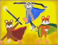
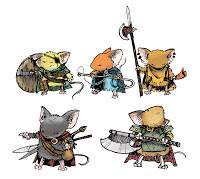
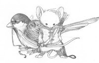
Fan Art: To ring in 2013 today, I wanted to share aw...
Fan Art: To ring in 2013 today, I wanted to share awesome Fan Art!
 Christopher Censullo
 Astrocat
 Astrocat
 Erika Vasos
 Jefferson Bowman
 Jefferson Bowman
 Jefferson Bowman
 Jared Pullen
 Joshua Reinstein
 Kwenron Yutaro
 Kyle Ferrin
 Olivia
 Rebekah
 Nick Pitarra
 Nicholas Burger
 Ron Maxwell
 Gabby F.
 Jolly Otter
.....The following were all sent to me by Michael Lowis of art created by players in his Mouse Guard RPG group of their patrol of characters
Watercolor Wednesday: In case you missed last week's Watercolor Wednesday pieces, here they are for another look: Thirty Six 3" x 3" snowflakes.
Tomorrow I'll post a few more paintings in my online store.
2013 Appearances:
Emerald City: March 1-3
Fabletown Con: March 22-24
C2E2: April 26-28
Spectrum Live: May 17-19
Heroes Con: June 7-9
San Diego Comic Con: July 17-21
*more 2013 dates coming*
 Christopher Censullo
 Astrocat
 Astrocat
 Erika Vasos
 Jefferson Bowman
 Jefferson Bowman
 Jefferson Bowman
 Jared Pullen
 Joshua Reinstein
 Kwenron Yutaro
 Kyle Ferrin
 Olivia
 Rebekah
 Nick Pitarra
 Nicholas Burger
 Ron Maxwell
 Gabby F.
 Jolly Otter
.....The following were all sent to me by Michael Lowis of art created by players in his Mouse Guard RPG group of their patrol of characters


Watercolor Wednesday: In case you missed last week's Watercolor Wednesday pieces, here they are for another look: Thirty Six 3" x 3" snowflakes.

Tomorrow I'll post a few more paintings in my online store.
2013 Appearances:
Emerald City: March 1-3
Fabletown Con: March 22-24
C2E2: April 26-28
Spectrum Live: May 17-19
Heroes Con: June 7-9
San Diego Comic Con: July 17-21
*more 2013 dates coming*
December 25, 2012
Merry Christmas!36 handpainted snowflakes on 3" x 3" bris...
Merry Christmas!
36 handpainted snowflakes on 3" x 3" bristol.
Watercolor Wednesday: In case you missed last week's Watercolor Wednesday pieces, here they are for a closer look. Like the week before, both are fairy tale
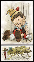
inspired. First up is Pinocchio & the talking cricket. I'd intended to do this less Disney-fied than it came out, but the costume & color palate was so ingrained in me, that I couldn't shed it for anything more original. The talking Cricket (named Jiminy for the Disney version) came as a bonus piece so the two formed a weighted diptych.
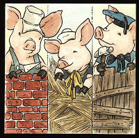 The second piece from last week are the three little pigs. It's no secret that I enjoy drawing talking animals, material textures, & working trades, so doing a take on these guys seemed a natural fit. After the Pinocchio painting I decided not to fight the Disney costumes for these three brothers.
Tomorrow I'll post a blizzard of paintings in my online store.
2013 Appearances:
Emerald City: March 1-3
Fabletown Con: March 22-24
C2E2: April 26-28
Spectrum Live: May 17-19
Heroes Con: June 7-9
San Diego Comic Con: July 17-21
*more 2013 dates coming*
36 handpainted snowflakes on 3" x 3" bristol.
Watercolor Wednesday: In case you missed last week's Watercolor Wednesday pieces, here they are for a closer look. Like the week before, both are fairy tale
inspired. First up is Pinocchio & the talking cricket. I'd intended to do this less Disney-fied than it came out, but the costume & color palate was so ingrained in me, that I couldn't shed it for anything more original. The talking Cricket (named Jiminy for the Disney version) came as a bonus piece so the two formed a weighted diptych.
 The second piece from last week are the three little pigs. It's no secret that I enjoy drawing talking animals, material textures, & working trades, so doing a take on these guys seemed a natural fit. After the Pinocchio painting I decided not to fight the Disney costumes for these three brothers.
Tomorrow I'll post a blizzard of paintings in my online store.
2013 Appearances:
Emerald City: March 1-3
Fabletown Con: March 22-24
C2E2: April 26-28
Spectrum Live: May 17-19
Heroes Con: June 7-9
San Diego Comic Con: July 17-21
*more 2013 dates coming*
December 18, 2012
FCBD 2013 Cover process:This year's Free Comic Book Day o...
 FCBD 2013 Cover process:
This year's Free Comic Book Day offering by Archaia will be an 8" x 8" flipbook (like years 2010 & 2011). My contribution is a Mouse Guard cover for one side and an 8 page story. I had teased a bit of working on this on Twitter, but was told that Archaia preferred to keep it hush-hush until their official announcement last week.
This year's story of mine will follow the tradition of the last two: a morality tale being told to a younger version of a character we know from the Mouse Guard series that helps explain who they grew up to be. Sadie is the mouse who will hear a story this year.
 I don't want to give too much away about the story itself, so I'll skip over that and just say that I had a picture in my head of a beautiful mouse swinging carefree on a swing held by a goose. I looked at the Rococo painting Fragonard's "The Swing" (or "The Happy Accidents of the Swing") for inspiration and to help me imagine the correct body language for the swinging mouse. I sketched the swinger, the goose, and the viewing mouse all separately in my sketchbook and then composited and resized them into this single image. I dropped in ghostly version of the logos to make sure I was keeping my composition in the view-able area.
 Next step was to print out that composited rough at actual size (in this case 12" x 12") and tape it to the back of a sheet of Strathmore 300 bristol. On a lightbox I was able to see the printed image and use it as a guide while I inked the piece. I used Copic Multiliners for almost the entire image (the 0.7 nib mainly) other than the water ripples that I inked with a brush. knowing I planned on using a color hold on the landscape inkwork (to help it recede into the background more subtly) I carefully left a white gap between the foreground subjects and the background. That made it easier to isolate them in the next steps...
 The scanned inkwork is ready to be digitally colored and have its color areas established. Laying out these flat areas of color...or coloring in the lines...is called Color Flatting. Here I kept it close to my final color choices, but since the idea here is just to make the goose's feathers a different color than the sky and the vines a different color than the goose's bill, I could have used any colors: a red feathered duck with a green bill and pink vines. The final color choices can be altered at any time easily once you've established color flats. Part of the reason to flat colors is so you can easily move between different areas when you want to render them or alter the colors without effecting the color or rendering of the part next to it.
The final color rendering is done by adding texture, shading and highlights. I use the Dodge and Burn tools in Photoshop for this and a textured brush to give it the right look as I go. Because this cover has more of a fairy-tale romantic feel, I also designed a new retailer-stamp area that fit the mood (and is based on some stained glass from the antique store I worked in when I started Mouse Guard.
The scanned inkwork is ready to be digitally colored and have its color areas established. Laying out these flat areas of color...or coloring in the lines...is called Color Flatting. Here I kept it close to my final color choices, but since the idea here is just to make the goose's feathers a different color than the sky and the vines a different color than the goose's bill, I could have used any colors: a red feathered duck with a green bill and pink vines. The final color choices can be altered at any time easily once you've established color flats. Part of the reason to flat colors is so you can easily move between different areas when you want to render them or alter the colors without effecting the color or rendering of the part next to it.
The final color rendering is done by adding texture, shading and highlights. I use the Dodge and Burn tools in Photoshop for this and a textured brush to give it the right look as I go. Because this cover has more of a fairy-tale romantic feel, I also designed a new retailer-stamp area that fit the mood (and is based on some stained glass from the antique store I worked in when I started Mouse Guard.Free Comic Book Day is the first Saturday in May each year. I've yet to announce my 2013 FCBD plans, but in any case, tell your retailer now you want the Archaia Mouse Guard flip book, and then take a friend who has never read a comic next May and introduce them to worlds of stories with a free issue of something.
Black Axe Replicas:
 Skelton Crew Studio has started their Mouse Guard weapon replica line (at mouse-scale) with the Black Axe! The Axes are available for pre-order (shipping in January) for $30 through their online store. Axes come with a debossed leather pouch and the first 400 ordered have tags I signed. Israel Skelton did a fantastic job interpreting sculpting, & casting the mythic axe of black. So, as a gift for that Mouse Guard fan in your life, consider a mouse-sized replica of the Black Axe (you can print out a photo and wrap that until the axe arrives)
  As Israel started working on the Axe, he asked for 'control' art, but not only did I not have a perfect & clean master drawing of the axe, I also hadn't drawn it consistently over the course of 3 series. I drew a new piece for Israel to use as a guide for his sculpt. Knowing that some of the stylistic elements of the axe in the comic would need to be more believeable as a 3d object for this project, gave me some license to push my design a bit away from past drawings. The two biggest changes were the barley-twist handle and the slightly more curvy shape of the axe's head. Israel took all of this and ran with it to make a wonderful art object for me and my fans.
Holiday Sale Reminder:
 In my online store you can use promocode MOUSEGUARD to receive 10% off your order! The discount is good on Original art, Shirts, Non- Mouse Guard art pieces, Prints, and the Winter B&W edition. The sale runs through the end of the year, so whether you are buying a gift for a Mouse Guard fan, or something for yourself, If it's still December, you can get a discount. I'll be updating the store with more items as the sale goes on (check Twitter or Facebook for updates)
Watercolor Wednesday: In case you missed last week's Watercolor Wednesday pieces, here they are for a closer look. Both are a bit fairy tale inspired (but not meant to be literal illustrations of) The Beast of Beauty and the Beast and a Sea Hag like the one in Hans Christian Andersen's Little Mermaid.


Tomorrow I'll post a few more fairy tale inspired paintings in my online store.
2013 Appearances:
Emerald City: March 1-3
Fabletown Con: March 22-24
C2E2: April 26-28
Spectrum Live: May 17-19
Heroes Con: June 7-9
San Diego Comic Con: July 17-21
*more 2013 dates coming*
December 11, 2012
Role Playing Game PortraitsA month ago I tweeted an image...
Role Playing Game Portraits
A month ago I tweeted an image of some Role Playing game portraits I did in the early '00s inspired by some Tony DiTerlizi 'Flawed Characters' Portraits from Dragon Magazine around the same time. While looking for something else in a file cabinet, I uncovered the originals of those drawings and a few more to boot! I've re-scanned & colored them for the sake of the blog. Here they are with some commentary:
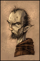
 Dwarven Fighter:My favorite of the bunch. I gave him evidence of some serious injuries (and a dead eye to match) Don't know what function the rings & pins serve on his pauldron straps, but the look cool.
 Elven Rouge & Assassin:I had a backstory for these two, being an arranged couple. The Rouge was a grizzled version of my standard D&D characters (thief with a conscience) and the Assassin is a cold blooded killer that eventually scares the Rogue away. (It's a themed arc-type pairing I'll use in a later story)
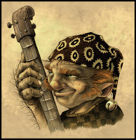 Halfling Bard:Bards get a bad rap, but I think if handled properly, they can be rather cool. Become a minstral that gets in good with the King/Queen and then uses the closeness to his advantage. The $#!+ eating grin on this guy's face makes me think he's already set that plan in motion.
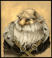
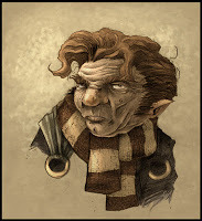
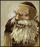 Dwarven Cleric:I don't get sick of drawing craggy old bearded characters. So often you see D&D Clerics as being clean and neat. So this guy got a tangled mess of facial hair and only a few stubby teeth to push the idea of piety and faith being a Cleric's weapon, not fastidiousness.
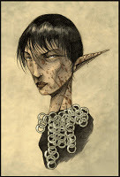
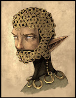 Elven Paladin:After the Elven Assasin drawing I got hung up on doing ringmail with a stencil...but youy can see that it starts to fall apart as a technique rather quickly. I imagined that something horrible happened to her mouth/jaw, so the armor is also cosmetic. And even though back in the 2.0 days of D&D, non-humans couldn't be Paladins, I always liked the idea of non-human holy knights with different deitys and rituals.
 Halfling Mage:This guy looks more run down than flawed & scarred. I don't know if I had a class in mind for him back when I drew him..but after the coloring gave him a bit of a Weasley/Gryffindor looks, I thought it was appropriate he was a mage. It's also fun to imagine a D&D mage that isn't just wearing robes and Gandalf's hat.
I will be offering the original drawings (pencil on 8.5" x 11" paper) of all of the above for sale through my online store later today. Keep an eye on my Twitter feed & Facebook page for more info.
Holiday Sale Reminder:
 In my online store you can use promocode MOUSEGUARD to receive 10% off your order! The discount is good on Original art, Shirts, Non- Mouse Guard pieces, Prints, and the Winter B&W edition. The sale runs through the end of the year, so whether you are buying a gift for a Mouse Guard fan, or something for yourself, If it's still December, you can get a discount. I'll be updating the store with more items as the sale goes on (check Twitter or Facebook for updates)
 Watercolor Wednesday:
Here are last week's Watercolor Wednesday pieces in case you missed them or wanted a closer look. First up is my attempt at a John Bauer style Giant (though he was known for Trolls rather than Giants...I wanted to draw a giant) This is one of my favorite Watercolor Wednesday pieces to-date.
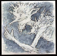 The second piece started as a bad drawing of a Jack Frost like ice-pixie. The trick to turn it from a bad rough drawing into a watercolor I was pleased with had everything to do with defining the edges of the character by painting in the background space around him. The negative shapes between the icy/snowflakey bits and the happy accents that formed them are where the magic happened
Tomorrow I'll post a few more paintings in my online store.
2013 Appearances: Emerald City: March 1-3
Fabletown Con: March 22-24
C2E2: April 26-28
Spectrum Live: May 17-19
Heroes Con: June 7-9
San Diego Comic Con: July 17-21
*more 2013 dates coming*
A month ago I tweeted an image of some Role Playing game portraits I did in the early '00s inspired by some Tony DiTerlizi 'Flawed Characters' Portraits from Dragon Magazine around the same time. While looking for something else in a file cabinet, I uncovered the originals of those drawings and a few more to boot! I've re-scanned & colored them for the sake of the blog. Here they are with some commentary:
 Dwarven Fighter:My favorite of the bunch. I gave him evidence of some serious injuries (and a dead eye to match) Don't know what function the rings & pins serve on his pauldron straps, but the look cool.
 Elven Rouge & Assassin:I had a backstory for these two, being an arranged couple. The Rouge was a grizzled version of my standard D&D characters (thief with a conscience) and the Assassin is a cold blooded killer that eventually scares the Rogue away. (It's a themed arc-type pairing I'll use in a later story)
 Halfling Bard:Bards get a bad rap, but I think if handled properly, they can be rather cool. Become a minstral that gets in good with the King/Queen and then uses the closeness to his advantage. The $#!+ eating grin on this guy's face makes me think he's already set that plan in motion.
 Dwarven Cleric:I don't get sick of drawing craggy old bearded characters. So often you see D&D Clerics as being clean and neat. So this guy got a tangled mess of facial hair and only a few stubby teeth to push the idea of piety and faith being a Cleric's weapon, not fastidiousness.
 Elven Paladin:After the Elven Assasin drawing I got hung up on doing ringmail with a stencil...but youy can see that it starts to fall apart as a technique rather quickly. I imagined that something horrible happened to her mouth/jaw, so the armor is also cosmetic. And even though back in the 2.0 days of D&D, non-humans couldn't be Paladins, I always liked the idea of non-human holy knights with different deitys and rituals.
 Halfling Mage:This guy looks more run down than flawed & scarred. I don't know if I had a class in mind for him back when I drew him..but after the coloring gave him a bit of a Weasley/Gryffindor looks, I thought it was appropriate he was a mage. It's also fun to imagine a D&D mage that isn't just wearing robes and Gandalf's hat.
I will be offering the original drawings (pencil on 8.5" x 11" paper) of all of the above for sale through my online store later today. Keep an eye on my Twitter feed & Facebook page for more info.
Holiday Sale Reminder:
In my online store you can use promocode MOUSEGUARD to receive 10% off your order! The discount is good on Original art, Shirts, Non- Mouse Guard pieces, Prints, and the Winter B&W edition. The sale runs through the end of the year, so whether you are buying a gift for a Mouse Guard fan, or something for yourself, If it's still December, you can get a discount. I'll be updating the store with more items as the sale goes on (check Twitter or Facebook for updates) Watercolor Wednesday:
Here are last week's Watercolor Wednesday pieces in case you missed them or wanted a closer look. First up is my attempt at a John Bauer style Giant (though he was known for Trolls rather than Giants...I wanted to draw a giant) This is one of my favorite Watercolor Wednesday pieces to-date.
 The second piece started as a bad drawing of a Jack Frost like ice-pixie. The trick to turn it from a bad rough drawing into a watercolor I was pleased with had everything to do with defining the edges of the character by painting in the background space around him. The negative shapes between the icy/snowflakey bits and the happy accents that formed them are where the magic happened
Tomorrow I'll post a few more paintings in my online store.
2013 Appearances: Emerald City: March 1-3
Fabletown Con: March 22-24
C2E2: April 26-28
Spectrum Live: May 17-19
Heroes Con: June 7-9
San Diego Comic Con: July 17-21
*more 2013 dates coming*
David Petersen's Blog

- David Petersen's profile
- 339 followers
David Petersen isn't a Goodreads Author
(yet),
but they
do have a blog,
so here are some recent posts imported from
their feed.

