
David Petersen's Blog, page 69
October 2, 2012
"It Matters Not What You Fight..." Tees: The online ...
 "It Matters Not What You Fight..." Tees:
The online store has now been updated with the new shirt design sporting the "It matters not what you fight, but what you fight for" motto. This shirt is available in Men's sizes from Small to 3XL, and in a Ladies cut sizes of Small to Large. There is sizing information on the items in the store. Big thanks to the Hannon Family for modeling the shirts for the blog & store. Mom & Dad Hannon ended up being the best representations of the shirts on adult frames, but all 3 Hannon kids helped out and are proud owners of these new Mouse Guard shirts.
 For the design, I wanted a mouse that was more animated than the last shirt, but still worked standing in space with no background. I also wanted to de-emphasize the weapon in a way that still read as 'mouse with sword comic" but went further into explaining the sentiments of Mouse Guard. I started with a sketch of a mouse holding a ribbon banner that I would later digitally add the text to. When it came time to place the text, I discovered there was no way to make it work without some of the text reading backwards, but with careful placement of the important words, I was able to make it work even with the mirrored text. I printed out that rough & inked the piece (text and all) using the print out as a guide behind my paper on the lightbox. Picking from various pantone & color swatches from my local screen printer, I came up with my color mock and sent the files off to them.
Next weekend (Oct. 11-14) I'll be at the New York Comic Convention in Artist Alley. I'll be at C18 in Artist Alley, but it's worth noting that Artist Alley is not connected to the main exhibitor show floor, and you will have to go to the North Pavilion to find all the artists in Artist Alley. For the show I'll be offering prints, bookplates, shirts, sketchbooks, and original page art for sale. My inked commissions have already all be pre-booked, but I will be doing watercolor commissions like these at the convention for $120 each (first come/first served). And of course, I'll be happy to sign any book I've worked on or do a quick sharpie doodle in your sketchbook (as long as the line is short)

Rand Painting:
As part of an auction to help St. Jude's Children's Hospital, this painting of Rand in the flowers will be up for bidding at the New York convention on Saturday from 8-10pm. So if you are attending the convention, please consider going to the auction and bidding on a lot of great original art from a who's-who's of the artists attending the convention. While I painted this piece earlier this month I streamed the work and you can go back and watch the live streams of the progress on this painting with part 1 and part 2
 Watercolor Wednesday:
 Here are last Week's Watercolor Wednesday pieces for closer inspection, or if you missed seeing them. First up is a pair of Dark Crystal paintings of a Mystic & a Skeksis. I'm a big fan of the Dark Crystal and of Jim Henson's work in general, and since it was his birthday last week, I though this duo would be a good choice for Watercolor Wednesday.
Next up are a few other Fantasy based pieces, a stargazing giant and some furry beast in a red hood. I painted both of these while visiting my Dad & his wife on the west coast of Michigan (a place I've always thought to be rather fantastic)


Tomorrow I'll post more original watercolor paintings for purchase in the online store.
2012 Appearances:
New York Comic Con: Oct 11-14
Detroit Fanfare: Oct 26-28
Thought Bubble: Nov 17-18
*2013 dates coming soon*


September 25, 2012
Inking Video:I cobbled together the video below because o...
 Inking Video:
I cobbled together the video below because of some recent conversations at conventions with aspiring artists and students made me realize I had something to say on the subject of inking greys as a technique. Now, I think if you had witnessed the various times I've shared these thoughts at conventions, you would find the points were made clearer, were more fully explained, and overall more interesting when given in person. Somehow in organizing these ideas, pairing them with images & demos, and keeping them on-track and to the point, I lost something...but forgive me and enjoy/glean whatever you can from this.(I'm also not well versed at setting up and using my tech for this type of project, so excuse the sound)
Here's a direct link: https://vimeo.com/49680379
inking grey from David Petersen on Vimeo.
Recent Commissions:
I put forward these recent commissions* as examples of filling 2-d shapes and compositions with varying textures and patterns of grey as a quieter and less rambley example of what I was trying to get across in the above video.


*Commissions are only available in conjunction with conventions I attend.
Unfortunately I do not have an open list when at home.
 Watercolor Wednesday:In the excitement of the new Hobbit Trailer, I decided last week's first piece should be this Bilbo painting I did for my German publisher's website (though I added the door after I send the scan to them). While I like this painting overall, I don't think this is my definitive Bilbo Baggins...it seems more like a random Halfling from a D&D adventure of my youth.
In keeping with the fantasy theme, I also made available this goblin like beastie and this trollish-horned-beastie. Both were painted quickly after some rough pencil lines were laid down to suggest the overall shape of the head and placement of the features.


Tomorrow I'll post some new Watercolor paintings available for purchase in the online store
2012 Appearances:
New York Comic Con: Oct 11-14
Detroit Fanfare: Oct 26-28
Thought Bubble: Nov 17-18
*2013 dates coming soon*

September 18, 2012
Learning From Copying:These (mostly) Hellboy pieces (from...
 Learning From Copying:
These (mostly) Hellboy pieces (from around 2003-4) are compositional recreations of panels from the comics each done in marker on index cards (and then run through a photoshop filter) and were done purely for the sake of learning. I was trying to improve my compositions (in an abstract 2D design sense) by copying Mignola's big bold shapes (and a Frank Miller Sin City piece for good measure). It was a great tool in getting me to think about defining forms with the space around them, editing an image down to the essentials, forcing horizontals, verticals and diagonal compositions, and visual flow through an image.
 Telling stories in comics has a lot to do with 2D design problem solving. Fitting the subjects into a panel, giving a sense of background, leaving room for the type (to be read in the correct order) and getting the reader's eye to move not only through each panel, but through the page as a whole. And none of that has to do with drawing per se. And that was what I hoped to have as my take-a-way lesson from this exercise. While the was time in my life I wanted desperately to draw like my heroes, when these drawings were made I was trying to learn from them instead.
 Little practice sessions like this where you look to people who are successful in a specific aspect of image or comic making and then personally dissecting it through mimicry is a great way to figure out your own artistic voice. Even in just who you choose to focus on is a statement about you as an artist, and what you take from the copying lesson may be very different from what someone else (or even the subject artist) feels is important about their work.
 The key though, is to stop copying and then apply the gathered information to your own work. You aren't trying to draw like Mike Mignola, or Frank Miller, or Jim Lee... you are trying to see what part of their storytelling or imagemaking you can take as an abstract lesson and apply to your own work. And the lessons learned need to go deeper than "Artist Hero A draws noses/eyes/mouths/hair/hands like this" or "a big jagged shadow is how Hero Artist B would solve this composition". What exaggerated expression or subtlety is the Hero Artist getting from drawing hands/hair/faces that way? Where is that jagged shadow leading your eye in the hero artist's work...and what can you do in your own work to lead your readers eye as you wish?
Putting all their books back on the shelf, and then drawing somewhere isolated (where you are not tempted to look at their work again) will be helpful, keeping in mind things like "what do I like about Artist X's compositions for horizontal panels" or "How can I get action in my work like the action I like in Artist X's pages" or "I like how loose & free/tight & detailed Artist X's work is"... all the while drawing like yourself
 Watercolor Wednesday:
Last week's Watercolor Wednesday pieces were originals of mine (not characters created by or belonging to someone else). Here are better looks at the pieces in case you missed them. The first was a Greenman face. I saw a lot of Greenman variations when I worked at Materials Unlimited, an architectural antique store. The face of a Greenman was used in lots of castings and carvings on mantels and furniture, building ornamentation, even light fixtures. This was my version starting with loose pencils and moving quickly into watercolor shapes & tones.
 The second Watercolor Wednesday piece from last week was a variation on a character from my old unfinished comic with Jesse Glenn called Jesters. This version of Donovan seems to have more in common with the character Clopin from Disney's Hunchback of Notre Dame, but I still see it as Donovan (and a nice way to move the character away from a direct translation of me in my 1995 Halloween costume)
Tomorrow I'll post a new original watercolor piece in my online store and I'll tweet and Facebook update when the new art is available.
2012 Appearances:
New York Comic Con: Oct 11-14
Detroit Fanfare: Oct 26-28
Thought Bubble: Nov 17-18

September 11, 2012
TMNT Micro Series Cover: Fugitoid: This is my last TMNT c...
 TMNT Micro Series Cover: Fugitoid:
 This is my last TMNT cover for a while (though there is a chance I'll do some more of them for IDW down the road). The scheduling was such that this cover was not shown in previews because I couldn't get the artwork done in time for the solicitation deadline, but I was able to schedule it in before the publication deadline. And for a long time, I was told the subject of this micro-series 1 shot was to be kept under wraps (I think everyone assumed it would be Shredder...and this was a surprise) but the cat is out of the bag now, and I can share the process of this cover.
 False Starts: My original sketch for this cover (which I started early) was straight forward...the old Eastman & Laird Fugitoid design in an alien city looking frightened (he is a fugitive droid after all). But I then got word from my editor that there was a new design for the character. He sent over the new design in the form of one of the alternate covers for the issue. I did a new drawing of this Fugitoid and digitally composited him into my old layout. Unfortunately, that wasn't the end of the layout work...
 Everything IDW (comic publisher) approves has to also then go through Nickelodeon (TMNT rights owners). Nick thought the cover was a mis-direct to the audience. In this issue, Fugitoid isn't hiding out on the alien planet, he comes to earth to lay low. So, they wanted a redrawn cover with a Manhattan background. Knowing I was short on time for a redrawn cover, IDW editor Bobby Curnow suggested a salvage job on the layout with Fugitoid stepping through a portal and into New York. I loved the idea and reworked the layout trying to keep as much of my alien planet background as I could while showing a street that clearly was New York (with the Manhattan Bridge in the background).
 Once Nick approved the layout, with a few small change requests, I printed out my layout, and used a lightbox so I could ink the cover on bristol using the printed layout as a guide underneath. One of the changes Nick asked for was to add either a Stone Soldier or Utrom as one of the background aliens. You will notice I altered the tank-tred-car's pilot in the lower right to be a Utrom. To get the portal effect, I inked the portal's edge on a separate sheet of paper. I used a brush (wet & dry) and a pen to get some fine lines and stipples. Doing the effect artwork on an overlay sheet makes it easier to isolate it in the coloring process.
Final colors: It took a while to get the right balance of light/dark, foreground & background push pull, and Fugitoid's leg to look like it was still coming through the portal, but with a good audio book and a night to yourself, you get there in the end. The color choices centered around Fugitoid being in the yellow/orange family, so I wanted to make the background violets & blues as a complimentary contrast to keep him as a focal point amid two complicated backgrounds and a cross-dimensional rift. I have two version of the portal effect layer going here. Both have been inverted so the inkwork is displaying white, but one is blurred out so the effect glows and isn't too crisp and clean looking.
Once Nick approved the layout, with a few small change requests, I printed out my layout, and used a lightbox so I could ink the cover on bristol using the printed layout as a guide underneath. One of the changes Nick asked for was to add either a Stone Soldier or Utrom as one of the background aliens. You will notice I altered the tank-tred-car's pilot in the lower right to be a Utrom. To get the portal effect, I inked the portal's edge on a separate sheet of paper. I used a brush (wet & dry) and a pen to get some fine lines and stipples. Doing the effect artwork on an overlay sheet makes it easier to isolate it in the coloring process.
Final colors: It took a while to get the right balance of light/dark, foreground & background push pull, and Fugitoid's leg to look like it was still coming through the portal, but with a good audio book and a night to yourself, you get there in the end. The color choices centered around Fugitoid being in the yellow/orange family, so I wanted to make the background violets & blues as a complimentary contrast to keep him as a focal point amid two complicated backgrounds and a cross-dimensional rift. I have two version of the portal effect layer going here. Both have been inverted so the inkwork is displaying white, but one is blurred out so the effect glows and isn't too crisp and clean looking. I put in a lot of personal details on this cover. As a big fan of the Eastman & Laird run, I referenced their issues with Fugitoid. I looked to the shapes they made for the skyline of the alien planet, I added a few aliens from their panels (top left & right). The tank-tred-car started as something of theirs, but I thought it needed a pilot, which then became my place to sneak in a Utrom. Even the ground of the alien planet is based on the texture pattern of the alien-wood fence that Fugitoid & the TMNTs find themselves up against when they meet (I always liked how simply that pattern did the job of making the material understandable & foreign at the same time). As a personal touch, I hid a redesigned version of a race (drawn here by me) created by my friend Mike Davis back when we were in high school.
 Watercolor Wednesday:
 Here are last week's Watercolor Wednesday pieces and better look at the pieces in case you missed them. First up was this version of Frankenstein's Monster. I've drawn the Monster several times and I keep coming back to pretty much this design of him: bald, neck bolts, stapled brain cavity access scars, face sewn in places (perhaps from multiple donation subjects) This time I played up some dark bruising under the eyes like one would tend to have after having surgery on the head or face.
The second is a rooster...because I felt like painting a roster with bright colors. And third is an older piece (from 2004-ish) of The Thing. This was the style of watercolor I was doing where I'd outline the color splotches after I painted a loose painting. You can see more of that type of work of mine here.
Tomorrow I'll post a new original watercolor piece in my online store and I'll tweet and Facebook update when the new art is available.

2012 Appearances:
New York Comic Con: Oct 11-14
Detroit Fanfare: Oct 26-28
Thought Bubble: Nov 17-18

September 4, 2012
Baltimore Comic Con Yearbook 2012:This year for the Balti...
 Baltimore Comic Con Yearbook 2012:
This year for the Baltimore Comic Con, Marc Nathan is doing a hardcover sketchbook called the Baltimore comic Con Yearbook. He asked Frank Cho for permission to use Liberty Meadows as a theme for the book. Participating artists were invited to do a piece of original work of Liberty Meadows and encouraged to add their creator-owned characters to the piece as well. I opted to no do a literal Mouse Guard/Liberty Meadows piece, but rather a Liberty Meadows piece that has the hallmarks of a Mouse Guard piece: small adorable creatures in medieval warrior garb cascading over rock piles while riding animals.
 I knew instantly I'd use Truman (the duck) riding Oscar (the wiener dog)...and the rest fell into place..well, sort of. The sketch seemed fine, but once I scanned it and place it in a template for the book's dimensions, I had to rework Truman's sword arm. Doing so meant cutting and pasting his arm in a few places, moving his leg, and replacing the word balloon (as well as a tweak to the length of the sword & scabbard). While drawing this, thought about the balance of copying or imitating someone's work and doing your own take on it. In this case, the character's needed to look like Frank's designs, so I didn't do too much interpretation. I printed out the layout and used a lightbox to lightly transfer the drawing to watercolor paper in pencil.
 The finished piece is in watercolor. I did this because the original is part of an auction for the convention. If I had done the artwork traditionally, the high bidder would get an inked piece, this way that person gets a color one. I also figured that if I was going to try something different (like a full piece in watercolor) this would be a piece I could do it on without creating an inconsistency like if I had done a new Mouse Guard piece this way (though I'm not ruling that out either).The book will be available this weekend at the Baltimore Comic Con, and the original watercolor will be auctioned there as well.
 New Limited Tee Shirt
With a few more conventions left for this year and the holiday season approaching, I saw that quantities of the Mouse & Crow shirt design are running low. So it's time for a new shirt! As with the last design, I plan to only do this print run with this design, and when it runs out, I'll do a new design/color/etc. The image shown here is a digital mock-up with the colors as closely approximated as possible. If everything goes according to plan, I'll debut these at Baltimore this weekend and then make them available in the online store once I get home from the convention. (We will have more sizes available than last time also)
 Watercolor Wednesday: Last week's Watercolor Wednesday piece was this Oz themed piece of the Scarecrow and the Tin Woodsman.Here is a better look at the piece in case you missed it. Brains & Heart...Kenzie & Saxon... Tomorrow I'll post a new original watercolor piece in my online store and I'll tweet and Facebook update when the new art is available.
2012 Appearances:
Baltimore Comic Con: Sept 8-9
New York Comic Con: Oct 11-14
Detroit Fanfare: Oct 26-28
Thought Bubble: Nov 17-18

August 28, 2012
Baltimore Comic Con Program Cover & Process:I was ask...
 Baltimore Comic Con Program Cover & Process:I was asked by Marc Nathan to do the cover of the Baltimore Comic Con program Guide this year! It's huge honor for me and Mouse Guard. The Baltimore show is one of my favorite of the year. It's a show about storytelling and art. It has a very strong artist alley, and is organized by people who really care about a good convention where creators can meet fans and nothing else gets in the way. Here is the final artwork sans-logo & text, but below I run through the process in making the cover image.
 Sketch: I considered doing a Baltimore themed piece (something including a piece of Baltimore architecture or an Oriole) but I opted instead for a pure Mouse Guard piece, and specifically a Black Axe themed piece. I had a rough compsition in my head, but I figured I'd worry about the composition after I had a few figures draw that I could move around in photoshop within the confines of the cover's dimensions. Celanawe and Luthebon were drawn in my sketchbook along with some circles to represent ladybugs (which seem to be a repeating motif for Celanawe with the Axe).
 Composition: Marc warned me that the cover not only needed room for the con-logo and text, but also for lots of signatures. People like to get their program signed, so as I worked on getting the figures in a pleasing arrangement, I also had to leave plenty of sky and open grassy area for signatures. The architecture of Ildur Hall in the background is a photo of the model I built of it. The yellow frame represents the 'bleed' in printing. If the artwork is going to go off the edge of the finished book, the artwork needs to be extended beyond that cut so that there is no chance of a white edge if the cut is a bit off register. I don't intend anything inside that yellow edge to be seen, but I have to extend the artwork out to that point for the bleed.
Inks: The layout seen above is then printed out (at 10.5" x 16") and taped to the back of a sheet of bristol board. On a large lightbox, I can see through the bristol board and use the layout as I ink in the final drawing. I ink with Copic Multi Liners (the 0.7 nib mainly). A lot of the work is done in this stage, I didn't draw in all the blades of grass or the texture on the rock when I was penciling the rough. It's in the inks that I concern myself with the rendering of textures and creating shading and dark spots that draw your eye through the artwork.
 Flat color: After the inks are done, it's time to scan the piece and begin coloring it. This stage is called 'flatting' because you are establishing the breaks of different color areas solely with flat color. In photoshop, the line-work sits on the top most layer with a mode turned on that pretends the black pixels are opaque while the white areas are transparent (like an overhead projector slide from school...or at least when I was in school). All the color layers go below that. For color choices, I was mostly able to just eyedropper up colors from the Black Axe issues where Celanawe, Luthebon, & Ildur Hall appear...but in the rendering stage, I did make adjustments o those colors to make this piece work as a whole on it's own.
Final rendering: Using tools called Dodge & Burn (terms from photographic exposure developing techniques) to lighten and darken the flat colors, I shade highlight and render the image. To push the hall and the hill back away from the figures, I added a color hold to their linework. A color hold is just a term for making the black inkwork a color rather than black (usually a slightly darker color of the thing it is an outline for). So that's the final cover art! I look forward to seeing fans stop by with it at the Baltimore Comic con in a few weeks!
Flat color: After the inks are done, it's time to scan the piece and begin coloring it. This stage is called 'flatting' because you are establishing the breaks of different color areas solely with flat color. In photoshop, the line-work sits on the top most layer with a mode turned on that pretends the black pixels are opaque while the white areas are transparent (like an overhead projector slide from school...or at least when I was in school). All the color layers go below that. For color choices, I was mostly able to just eyedropper up colors from the Black Axe issues where Celanawe, Luthebon, & Ildur Hall appear...but in the rendering stage, I did make adjustments o those colors to make this piece work as a whole on it's own.
Final rendering: Using tools called Dodge & Burn (terms from photographic exposure developing techniques) to lighten and darken the flat colors, I shade highlight and render the image. To push the hall and the hill back away from the figures, I added a color hold to their linework. A color hold is just a term for making the black inkwork a color rather than black (usually a slightly darker color of the thing it is an outline for). So that's the final cover art! I look forward to seeing fans stop by with it at the Baltimore Comic con in a few weeks! Watercolor Wednesday:
Last week's Watercolor Wednesday first piece was an original forest spirit type creature. Here is a better look at the piece in case you missed it. The wrinkles on his face and his small predator eyes were inspired by seeing a photo of an old shark.

The second Watercolor Wednesday piece was a painting of my favorite character from Kory Bing's Skin Deep webcomic (which by chance also has a Kickstarter going to fund printing of her 2nd storyline collection of the series)
Tomorrow I'll post a new original watercolor piece in my online store and I'll tweet and Facebook update when the new art is available.
2012 Appearances:
Baltimore Comic Con: Sept 8-9
New York Comic Con: Oct 11-14
Detroit Fanfare: Oct 26-28
Thought Bubble: Nov 17-18

August 21, 2012
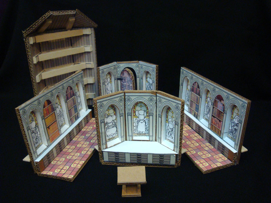
Black Axe #5 Matriarch's Room model:In Black Axe #5 Celan...
 Black Axe #5 Matriarch's Room model:
In Black Axe #5 Celanawe enters a room just off of the Matriarch's office that is a private room of knowledge, memorial, and reflection for the leader of the Mouse Guard. You can see it here to the left in this collage of panels from the issue. This room needed to be special, it needed to be really special. I wanted it to have beauty and mystique. I had vision in my head of floating details, but not a complete room..so...I built a model.
 My first inspiration source was from a visit to Christ's Church in Dublin I made a few years ago. The baptistery was surrounded by stained glass windows of various patron saints. When I was standing in that room in Dublin, I said I wanted to make a room like this for the Guard, but one that featured Matriarchs instead of saints. I photographed the saint windows (and compiled them here into a single image) and kept them in a folder for later inspiration. I also had photos of the floor (which I used a single tile as inspiration for the floor of this room) and the rest of the church (arches of which will appear in Black Axe #6).
 I copied the border and layout design of the saint windows and then went about drawing up stained glass versions of important past Mouse Guard Matriarchs. To make them more unique, I came up with some iconographic symbol of what the were known for during their reign. While I had mentioned Allyson & Laria in past Mouse Guard issues, I needed to come up with more past Matriarchs. Two of them are Easter egg characters from Legends of the Guard volume 1: Ferruin from Jeremy Bastian's story and Moria from Mark Smylie's. The rest were inventions as I drew them, though Dorys is an homage to my paternal Grandmother, who was the inspiration for the Guard being led by strong women in the first place.
 The model itself is modular. Each wall is a separate piece with it's own floor base. All of the surfaces are cardboard with printed 'skins' glued on that I designed in photoshop. The windows are recessed printouts of my above designs. I made a ceiling section out of cardboard, craft sticks, and hot glue. When assembled, the tile sections of the floor match up and the ceiling can be placed on top while still exposing one open end of the room for viewing and reference photos. I will make sure this room gets a nice detailed cutaway section in the extras section of the Black Axe hardcover, so it will be nice to get this model off the shelf again.
*Edit*I've added a video tour of the room as well as it's exterior & construction:http://twitpic.com/am4yfu
*Edit 2*
Also added more photos below of the model from more angles:


Watercolor Wednesday:
 Last week's Watercolor Wednesday was a 2 part-er. The first piece was of the Auror Alastor "Mad Eye" Moody from the Harry Potter books. Here is a better look at the piece in case you missed it. I'm a big Harry Potter Fan (as evidenced by my original Harry Potter themed art collection). The rough for this painting was from a coffee shop sketchbook drawing seen here.
 Because this sold so quickly, I decided to grab an older watercolor I had in the queue: An American Flag I painted in 2003 as part of the art for an invitation to our house-warming/my birthday on the 4th of July. Tomorrow I'll post a new original watercolor piece in my online store and I'll tweet and Facebook update when the new art is available.
2012 Appearances:
Baltimore Comic Con: Sept 8-9
New York Comic Con: Oct 11-14
Detroit Fanfare: Oct 26-28
Thought Bubble: Nov 17-18

August 14, 2012
Black Axe #5 Boat Model:In Black Axe issue #5, Celanawe &...
 Black Axe #5 Boat Model:
In Black Axe issue #5, Celanawe & Conrad decide to return home to the Mouse Territories. Since Conrad's original ship was destroyed in the storm that brought them to the Isle of Ildur (click here for that ship's model) They would have to construct a new one. In this page to the left you can see the final result of the boat and their work in gathering materials and building it. But before I could draw this page (and all subsequent pages with the new boat) I had to design it, which, as so often is the case, meant building a model.
 The boat needed to be made of materials found on the Isle of Ildur and not be too 'worked'. The lumber needed to still look like stick and branches and twigs, not square hewn beams (though I gave myself some wiggle room here since the ferrets may have some spare building supplies around). I also wanted this boat to look very different than Conrad's first ship. For the Legends of the Guard #4 cover, I drew a boat made of a hollow turtle shell, and while I didn't like the idea of copying the boat from that cover, I loved the idea of that shell being the boat's hull.
 Because I wanted to keep all the shell's details right, and because I didn't know how I was going to attach everything else to the shell, I started by making a card-stock shell model. I looked at a few reference photos and started cutting, gluing, snipping, and drawing on some scrap bristol until I had the shape and pattern I wanted. Then the fear set in. I had built a model shell I really liked, and I didn't want to start gluing more parts to it for fear I may not like the final result and not be able to salvage the shell to start over. So everything I made had to be modular and attach and detach from the shell without glue. This also made drawing the panels when the boat is being constructed easier.
 The catamaran like pontoons and the stick trusses secure to the shell with some rubber bands glued to the shell's front and back. The mast, sail, and deck slide in to a bristol board groove along the back edge of the shell's opening. Speaking of which, the sail is modeled after Chinese Junks and has florist's wire along the top ridge so I could bend the sail into shapes like it was caught in a billowing wind or collapsed up for landing in port. When I was a kid I had a wooden model kit of a catamaran and I did my best to replicate the rudder design from memory. Sure I didn't need to make the rudders pivot and work in tandem for sake of the model...but I did.
 Watercolor Wednesday:
Last week's Watercolor Wednesday piece was of the folklore trickster Fir Darrig. Here is a better look at the piece in case you missed it. Fir Darrig is a character I did a few short comic stories of in the past (found in the out-of-print Voices 1 and/or Ye Old Lore of Yore). The paper I did this on already had a mottled parchment-like tone watercolored on it before I started. I used the parchment watercolor piece as the digital background for this piece I did of Fir Darrig as a mock-cover to an eventual collection of his stories I'd like to do. So it only seemed fitting to honor the paper with a real painting of the character. Tomorrow I'll post a new original watercolor piece in my online store and I'll tweet and Facebook update when the art is available.
2012 Appearances:
Baltimore Comic Con: Sept 8-9
New York Comic Con: Oct 11-14
Detroit Fanfare: Oct 26-28
Thought Bubble: Nov 17-18

August 7, 2012
TMNT April Cover Process:My 7th TMNT Micro Series c...
 TMNT April Cover Process:
My 7th TMNT Micro Series cover is the April cover. This cover was tough for me in a few ways. First off, I'm not all that well versed in drawing humans well, and even worse if they are supposed to be pretty ladies. Secondly, April is a character that has been represented a different way with every TMNT reboot/relaunch/media. And even though I have my own favorite idea of who April is, I was having a hard time coming up with a layout interesting enough to be a cover for her issue. I talked to my editor Bobby and we agreed that the old VW bus was an iconic thing from the old comic and the new IDW comic that would serve as a nice prop for April to interact with.
 My first attempt at a cover layout was deemed a bit too boring, and looking back at this, I completely agree. However when I got the email from IDW asking me to rework the layout, I was crushed, because getting me to draw a woman once is hard enough, getting me to do it a 2nd time with the same or better results is rare. Other notes that came in from Nickelodeon were to give April less of a passive pose and more sass, hide/eliminate the VW logo, and give the turtles a bit more visibility through the glass for the reader.
 IDW suggested April twirling the keys on her finger, an idea I liked. But as I said, since I'm not great at lady-drawin', I had to work hard to get the drawing where I wanted it. This is was drawn in my sketchbook. I started drawing her on one side of the paper, but worried I had flaws in the proportions, so I flipped it over and looked at it on a lightbox so I could see the errors and fix them on the clean side of the paper. It means that this drawing is the mirror of what my original drawing started out as, but I found I liked her facing this orientation instead.
 I worked up a drawing of the VW, the turtles, and composited them together with my April drawing. At this stage I fixed a few parts on April's legs and moved her right arm up to where it needs to be so the shoulder is in its socket. To make sure IDW and Nickelodeon knew what my overall color and value sense was for the piece I added a lot of color under-painting to the drawing. Yes, I did that on the first layout I submitted, but that was more to cover the shortcomings of the drawing, this time it was to insure everyone was on the same page so there was less chance of being asked to make unnecessary revisions.
 Like my normal working process, once the layout was approved, I printed it out at full scale and placed it on a lightbox with my Strathmore 300 series bristol taped on top of it. I inked in all the piece with Copic MultiLiners (the 0.7 mostly, but also the 0.3 and a brush tip). I feel that I lost something here with the translation of April's face. It's always a trick to turn a softly rendered pencil drawing into hard inked lines, and since ladies aren't my regular days work, I don't have practice minimizing the softness-loss. It was after I noticed the difference in my pencils to my inks that I stopped myself from over-fiddling with her face any more, and did the cross-hatch pattern on the lower part of the bus to keep myself busy.
The last step was the color stage. I skipped over the flats this time, because they aren't exciting to see (and I've shown plenty of examples in the past). I used the eyedropper tool to pick out colors very close to my color layout sketch so that there would be no surprises as I went along. I tried to soften April's face with a more painterly approach to her color-rendering, but I was worried about over-doing it, because Nickelodeon had asked me 'not to make her nose so red' after approving the sketch. The turtles behind glass were achieved with a few layers in front of their base colors that lighten and mute their tones.
Like my normal working process, once the layout was approved, I printed it out at full scale and placed it on a lightbox with my Strathmore 300 series bristol taped on top of it. I inked in all the piece with Copic MultiLiners (the 0.7 mostly, but also the 0.3 and a brush tip). I feel that I lost something here with the translation of April's face. It's always a trick to turn a softly rendered pencil drawing into hard inked lines, and since ladies aren't my regular days work, I don't have practice minimizing the softness-loss. It was after I noticed the difference in my pencils to my inks that I stopped myself from over-fiddling with her face any more, and did the cross-hatch pattern on the lower part of the bus to keep myself busy.
The last step was the color stage. I skipped over the flats this time, because they aren't exciting to see (and I've shown plenty of examples in the past). I used the eyedropper tool to pick out colors very close to my color layout sketch so that there would be no surprises as I went along. I tried to soften April's face with a more painterly approach to her color-rendering, but I was worried about over-doing it, because Nickelodeon had asked me 'not to make her nose so red' after approving the sketch. The turtles behind glass were achieved with a few layers in front of their base colors that lighten and mute their tones. Watercolor Wednesday:
Last week was the first of my Watercolor Wednesday sales. This is a better look at the piece I offered up last week in case you missed it: A Gotham by Gaslight inspired Batman. Tomorrow I'll post a new original watercolor piece in my online store and I'll tweet and Facebook update when the art is available.
2012 Appearances:
Baltimore Comic Con: Sept 8-9
New York Comic Con: Oct 11-14
Detroit Fanfare: Oct 26-28
Thought Bubble: Nov 17-18

July 31, 2012
New Online Store:Last week I opened up an online store to...
 New Online Store:Last week I opened up an online store to help make purchasing prints, sketchbooks, & tees more streamlined. At a later date, I’ll be transitioning original page art sales into this store as well. Currently the store is stocked with the 2012 Sketchbook, the mouse & crow tee shirt, and the print I released at SDCC.You can follow the link under FOR SALE on mouseguard.net -or-
Just click here for a direct link
Watercolor Commissions:
 At San Diego Comic Con, I started a new type of commission, a single figure watercolor for $120. The inked pieces I normally do at cons were starting to become too labor intensive for me to take multiple names per day, try to finish them all that night in the hotel room, go to bed at 4 am and start up again the next day. These watercolor pieces allow me to take more names, and get more done each night. I'll still do a limited amount of inked commissions, but I'll also tend to have more openings overall because of the watercolor pieces. I only do these at conventions (See my appearance list at the bottom of this post) first come, first served, no pre-orders.
 Inked Commissions:
Baltimore Comic Con is my next convention and for that show I'll do something a bit different with taking names for inked commissions. I'll be only taking a pre-order list through my new online store. In the week before the convention, I'll post 'items' that are pre-orders for commissions for $200. Once the 'items' are sold out, the inked commission list is full. You MUST be at the Baltimore con to pick up your piece. I'll Tweet and Facebook update when the pre-order 'items' go live.
 Watercolor Wednesdays
Starting tomorrow I'm going to be doing something new on Wednesdays (for the next few months at least) by offering up small original watercolors for sale. I can't keep up with a Daily Doodle that some other artists offer, but I've backlogged enough old and new watercolor pieces to keep me going for the next few months. The watercolors are all pieces I did purely for fun and range in subject matter from comics to folklore to children's literature (and at this point won't be mouse related). Since the blog posts on Tuesday, I'll be showing the piece that was offered the previous week, instead of previewing the piece that will go up the next day. I'll tweet & Facebook the link when it is available each Wednsday. (Pieces will be sold through the new online store)
2012 Appearances:
Baltimore Comic Con: Sept 8-9
New York Comic Con: Oct 11-14
Detroit Fanfare: Oct 26-28
Thought Bubble: Nov 17-18

David Petersen's Blog

- David Petersen's profile
- 339 followers
David Petersen isn't a Goodreads Author
(yet),
but they
do have a blog,
so here are some recent posts imported from
their feed.

