
David Petersen's Blog, page 62
January 21, 2014
Jan 2013 Q & A
 This week's post will become a semi-regular topic: Fan/Reader Question and Answer. I put out a call for questions on Facebook and Twitter, and received more than one post's worth, so I'll break this up and post another one in the near future and also then put out a call for more questions.
I apologize in advance that due to the nature of this topic, there will be very little in terms of visuals to spruce up the post.
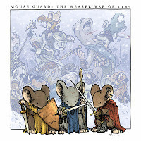
Q: What is your timeline for books on the Weasel Wars?
-Katie Timko Bath

A: I have not yet started writing, plotting, or planning the schedule for my next full Mouse Guard series: The Weasel War of 1149 (which will most likely be an 8 issue arc instead of 6). After I finished Black Axe and Legends Vol 2, I decided the timing was right for me to take a break from Mouse Guard. I have another creator owned project I'm planning on releasing in 2014 as a one-shot 48-64 page graphic novel. Once I finish that project, I will start The Weasel War, but don't expect it to be solicited until I'm several issues into the series...for my sake and yours I don't want to be under the deadline gun every issue.Q: Have you started working on your "taking a break from Mouse Guard" project yet? If so how goes it?
-@almostahermit
A: Speaking of that project, no, I have not started yet. At least not in earnest. Due to various cover work, conventions, and some personal commitments, I have yet to get a real chance to dive in. However, I did sit down with two other creators (on separate occasions) and verbally walk them through the story and each were positive about it and what they thought I'd do with it. That is like a step zero for me, before I start a story, I'll often verbally tell it to a few trusted folks (tightening up the overall flow with each re-telling) and get their knee-jerk reaction. So step zero: check! Now to just do all the rest...and there is a chance I'll not get to it before getting back to more Mouse-work.
Q: What do you DO with all those elaborately constructed models when you're done with them? Do you keep them? Is there an entire replica of the Mouse Guard world in your home?-Barbara Guttmann
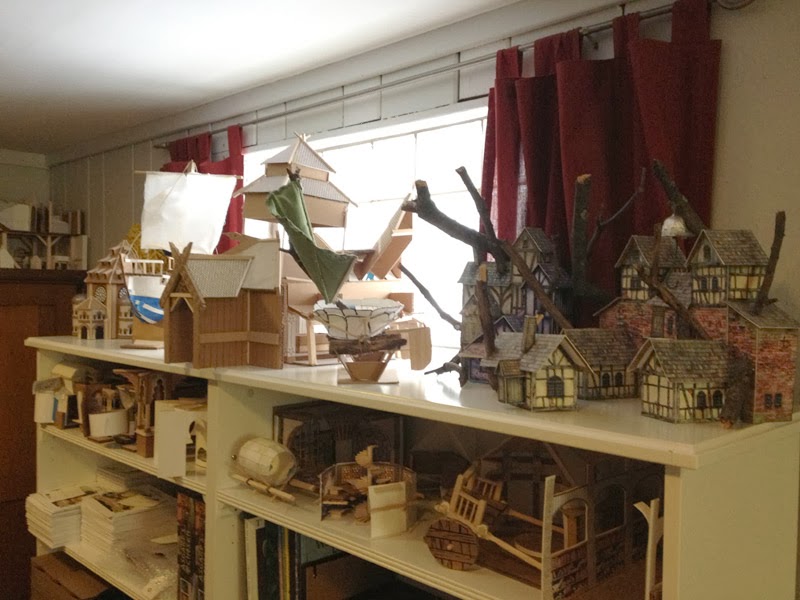 A: Most of the models I build have stood the test of time and are carefully stacked on the tops of the bookshelves in my studio. A few were built rather quickly in the early days, without thought of longevity, so they bit the dust and were scrapped (the gates of Lockhaven, an early model of Gwendolyn's office, and the interior of Sprucetuck are among these). But most of the rest I either made of sturdier stuff or I've gone back and reinforced and improved. After all, I do plan on returning to these location in the Mouse Guard world, and they are super handy as reference. There are a few problems with displaying them in a world of Mouse Guard fashion: 1) As you implied, they would all take up a great deal of space, as it is I've dedicated almost all the spare space I have to storing them stacked and puzzle pieced together. 2) None of them are in the same scale, so putting them next to each other for viewing always seems a bit wonky to me. And 3) None of these are built as display models, they are all made of scrap materials and often they are modular, so there is only 1/2 a room built, and it's all paper glued to cardboard. Someday I'd love to do a few real models of some of my favorite rooms with layed tile floors, cellophane windows, and wood trim.
Q: Will there be Spring & Summer books?-Ben Farrow
A: I started a pattern there with those first two books that implied I was going to round out the year of 1152 (or carry over into 1153). However, the titles of Fall and Winter work as a homonym & metaphor respectively. Fall works as the Autumnal season, but also that there is an uprising with a potential potential fall of the Guard. Winter can be a metaphor for the end of someone's life, and that is a meaning I meant to imply in that book. As for why no Spring or Summer, I don't want to plan out every day of these character's lives (for your sake and mine). I'd rather leave some open space, for you to imagine your own adventures, for me to leave wiggle room for events if need be, and to suggest that not every season of the character's lives have something so important going on, it's worth writing and drawing a book about. When I do get to the 5th book, which is untitled for now, it will pick up with a post-Winter 1152 storyline....and 5 years or so will have elapsed. So there will be more books, but I don't know if any more will necessarily be seasonally titled.
Q: How much of the future direction for Mouse Guard do you already have planned out in your head?-Ronn Dech
A: Currently I have The Weasel War (which will be the 4th Mouse Guard book), a 5th, as-yet-untitled book, a few more of the Free Comic Book Day style stories, and a story about Saxon & Kenzie joining the Guard planned. Beyond that I have several ideas for stories directions already, but haven't spent too much time focusing on developing them since I already have a back log. Not to mention, with each story I write, I seem to open doors to characters, events, locations, and history, that I can spin out into if I ever feel stuck...one such example is I'd like to do a medieval Dickensian-style story set in Copperwood which not only is a good story, but explores all of Copperwood as a city.
Q: Is there any form of religion in the world of Mouse Guard? Midnight's Black Axe "following" could loosely have been called a sort of religious cult worshiping the weapon, but I wondered if any other religious sects push the medieval mice along much like Christianity and paganism were a major driving force in medieval Europe-Kyle Healy
A: For a wide variety of reasons, I have avoided religion in Mouse Guard stories. One of those reasons is that it can get messy both in the story and with fans and/or parents of fans. Perhaps if we change the word "religion" into "belief" in your question I'd say that I could explore that idea more...like a belief in certain superstitions, prophecies, or remedies, but I'd still like to avoid the mice (or any other species at this point) having a deity or dogma they focus on. And while this doesn't reflect my views at all, I think having the mice essentially "alone" with no form of life-line on which they rely but themselves, makes for a more interesting society and story in the books. Any time I deal with something, lets say "supernatural" in Mouse Guard, I'd like to offer no real proof either way to it's true existence, and when you start doing that with real world religions & beliefs, you are making statements I don't wish to make.
Q: Did you have any plans to do stories on the territories as they were before the guard and perhaps the determined mice who helped to start Lockhaven?
-Neil RickmondQ: Are there any plans for a story set in the distant past of the Mouse Guard world?
-Luis Enrique Aguilar
A: Do I have plans to tell those stories, no, but I certainly could mine those bits or use them as settings for a deeper story when one occurs. Each story I do has a purpose beyond just telling an adventure, so if I came up with a good reason to set a story at the founding of Lockhaven or to nail down the pre-history of the Guard, I would certainly do so. Seems like there are at least two fans wanting to know more about that era of the Mouse Guard world. And Jeremy Bastian gave a me an excellent story start of when mice banded together in his Legends of the Guard Volume 1 story.
I'll do another Q&A post next month...so if you submitted a question and don't see it here, you probably will next month.
2014 Appearances:MSU Comics Forum: February 22Emerald City Comic Con: March 28-30C2E2: April 25-27Motor City Comic Con: May 16-18Comicpalooza: May 23-25Phoenix Comic Con: June 5-8Heroes Con: June 20-22San Diego Comic Con: July 23-27Boston Comic Con: August 8-10Baltimore Comic Con: Sept. 5-7NY Comic Con: Oct. 9-12


January 14, 2014
More Torchbearer Beasts
 RPG author Luke Crane put together a group of my monster drawings as a bestiary for his new game Torchbearer. The first set featured a Devil Boar, Sprikken, a Disturbed Spirit, Gruxu, & an Owlbear. I had so much fun doing the set, that Luke and I talked about making this a semi-regular collaboration.
The new monsters in the Petersen Bestiary are available for a FREE download (fun for RPG players as well as for plain fantasy & world-building lovers) here:
at Luke's Site: http://www.burningwheel.com/store/index.php/torchbearer.html
& at DriveThruRPG: http://rpg.drivethrustuff.com/browse.php?manufacturers_id=2183
And the original inked pieces are also available in my online store.
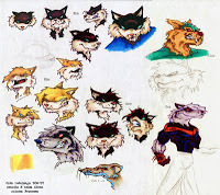
Here is a look at the art for this set of monsters: *update-with background info on each piece*
 "Frogman"
I remember these types of monsters fondly from the 80's D&D cartoon. Neighborhood friends on my block and I would use these as our main bad-guys when playing pretend. Before starting this piece, I looked at a few of the various fantasy game illustrations of them and homogonized them into this. I liked the idea of drawing a mostly read frog head and then playing with the proportions so they didn't look physically as threatening. I then layered in jagged scraps of found-item gear and painfully broken weapons to add the menace these guys need.
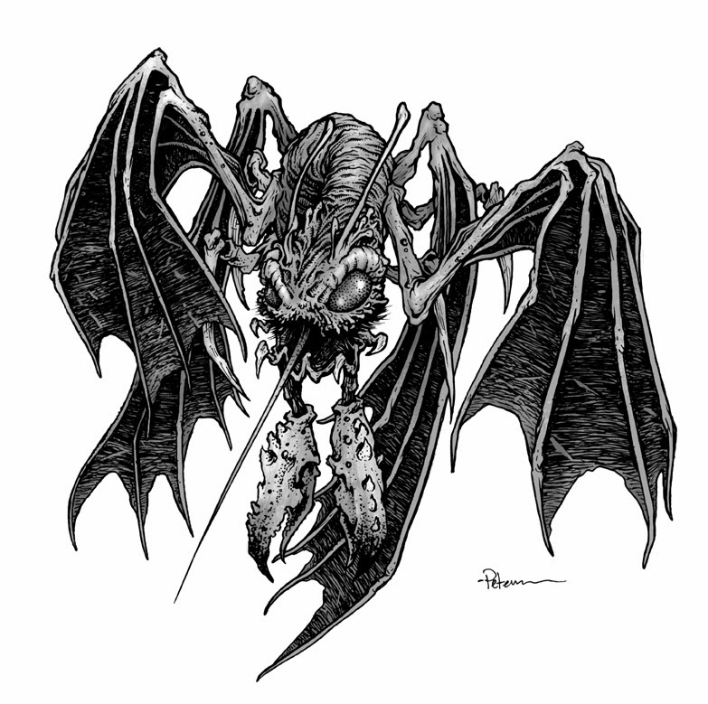 "Strix"
Luke suggested I do my take on a D&D Stirge type creature. The jaw gave me a bit of trouble for a bit because the proboscis is rigid and would need to have a moth close around it. Friends suggested something like the Predator...and I must say I straight forwardly ripped off the design. My main regret with this was the crab/lobster-like claws. Seems like a silly design choice now.
 "Elder Nixie"
The request from Luke was a merman/nixie. I didn't want to do something so humaniod as all that, and so the creaturey-ness of this creature took over completely. I branded it an Elder Nixie to suggest a variant of the nixie species, so that later either I or another illustrator can give Luke a proper nixie/merman. The mouth is an odd form, and I imagine the lower 'jaw' being all soft muscle tissue...it sort of looks like he's eating several squid, but that IS his lower jaw...which dangles like a beard.
 "Cinder Imp"
This was a creature of my own invention. I wanted to do something more fairy-tale looking, but still a good go-to for a GM to use in an adventure. I was influenced in part by the devils from the Jim Henson's Storyteller episode "The Soldier & Death". When deciding not to clad him in clothes, I ran into a problem of how to not show genitals and not make him smooth like a Ken-doll. I opted to pepper his body with stippling to look like ash or the cool spots in a pit of embers.
 "Giant Cyclops"
My goal here was to not replicate Ray Harryhausen's Cyclops at all, but to make this more than a big guy with one eye. A basic human proportion coupled with a ton of texture and extra anatomy in the neck make this a successful deviation from both of my initial anti-goals. The human bone necklace just made for a nice way to end the drawing and provide a sense of scale and horror.
I already have a grouping of creatures in mind that I'd like to feature for the next set. I have not yet drawn them, so there is no release date in-sight, but I'll tease that it will be a themed grouping of beasts.
2014 Appearances:MSU Comics Forum: February 22Emerald City Comic Con: March 28-30C2E2: April 25-27Motor City Comic Con: May 16-18Comicpalooza: May 23-25Phoenix Comic Con: June 5-8Heroes Con: June 20-22San Diego Comic Con: July 23-27Boston Comic Con: August 8-10Baltimore Comic Con: Sept. 5-7NY Comic Con: Oct. 9-12
January 7, 2014
Critiques & Portfolio Reviews
 Because I'm asked to review people's work at conventions, I have some thoughts on portfolio reviews and critiques I'd like to share as we head into the 2014 convention season. Giving or receiving critiques can be hard and when I was first attending conventions as a professional, I wasn't prepared when the portfolios started opening and young artists were asking for my opinion. I'd had my share of very negative and very positive critiques in college and of course, the most constructive were the ones that were a mix: of both: honest but fair. So over the years, I've developed my method and thought process for how I give a critique.
 I start by quietly looking through the entire portfolio in one pass while not engaging the artist much at all. Besides getting an overall impression of the work, I'm also looking for what I see as the stronger and weaker pieces in the portfolio. This way, I can talk to the artists in relative terms about the pieces that need improving by comparing them to their more solid work. I could hold everyone to some absolute high standard, but ultimately, I think the best way to encourage someone and show their their faults without discouraging them, is to point out how techniques they've already applied to some work, could be used to improve all their work.
I developed this approach because of my experience in college being frustrated with some 300 & 400 level professors. Obviously when entering an art program the first few years of classes are to teach you (or re-teach you) the basics and for professors to "break" you of your bad artistic habits, to remold you and open your eyes and get you out of your comfort zone. But by the time you are a junior or senior in a college art program, I felt the professors should stop trying to break you, and focus on your work, and figuring out with you how to make what you are already doing better.
 This is what I strive to do with every review. Not to break them or tell them they need to draw like artist X or shake off what makes them unique. I want to congratulate them on what is working and how to make what they already do better. We talk about contour line, line weight, inking techniques, creating greys, texture, style influences, subjects, and mood. I tailor the advice to the work in the portfolio. Sometimes my comments are about still needing to focus on basics, or perspective or anatomy...but other times, I'm getting in and nit-picking details about storytelling or line weights. As the conversation is ending, I usually give the artist some exercises I think will lead them in the direction they want to go..and those assignments can vary from "draw basic shapes and build up forms from them" to "start making comics"
There is also something to be said for how to prepare a portfolio and how to receive a critique.
 A portfolio should contain a limited selection of your work showcasing the best you have to offer.
It should have a focus that gives the reviewer a sense of your voice as an artist. There is some merit in showing a wide range of all the varied styles, techniques, and mediums you can use, but ultimately, I find this can lead to too wide a variety of artistic voice that doesn't tell me who you are. It's ok to mix in some color and inks, and pencils, but a portfolio shouldn't be a Swiss-army knife of artistic deeds. Show the type of work you want to do: spot illustrations, comic storytelling, children's book illustrations, whatever the case is. And this should all be your best work to-date.
 The best way to receive a review is to listen. Too often I hear the artist who is asking for an opinion, jumping in to self-deprecate, make excuses, or add too much background information. A reviewer can't give you their thoughts and suggestions if you are talking. That's not to say I conduct my reviews being the only one who talks. I ask questions, find out why some pieces were handled certain ways, and try to engage the artist as much as possible. It's totally fine if you disagree with what I or any other reviewer is saying (we may be very wrong about your work), but the only way you really find out if we have anything worth taking to heart is to listen.
 So with all of that in mind, I wish you the best of luck when developing and showing a portfolio. I hope the review leads to you growing and improving as an artist or to getting hired for the work you want to do.
2014 Appearances:MSU Comics Forum: February 22Emerald City Comic Con: March 28-30C2E2: April 25-27Motor City Comic Con: May 16-18Comicpalooza: May 23-25Phoenix Comic Con: June 5-8Heroes Con: June 20-22San Diego Comic Con: July 23-27Boston Comic Con: August 8-10Baltimore Comic Con: Sept. 5-7NY Comic Con: Oct. 9-12
December 31, 2013
Past Commissions
 With new readers & new fans coming to the blog each week, I wanted to share a bunch of my inked 7" x 7" commissions from the past few years. Some of these I've shared before, others I may not have. For those ready to ask, here's the way I handle commissions: I do not have an open list and no not take commission requests by e-mail. I do inked commissions like these in conjunction with conventions only. In the week before a convention, I open up a list in my online store for pickup at the convention.
 Bastian the Hunter
 Battle Corgis
 Frontier Explorer Mice
 The Witch from Brave
 Cartographer Mouse
 Conrad Drinking
 Cursed Pirate Girl & Pook
 A Royal Ferret Couple
 Mouse Naturalist puzzling together a pile of bones
 An anthropomorphic Fox in armor
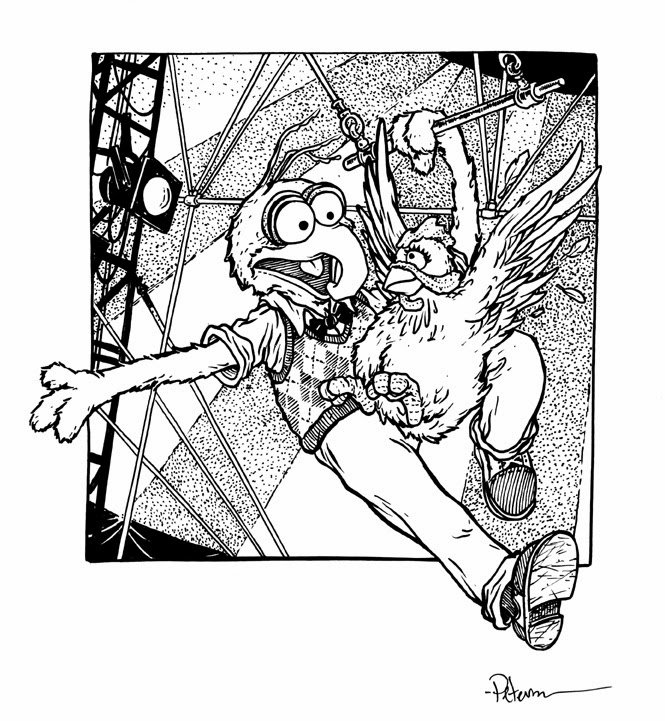 Gonzo & Camilla piece in homage to the Greg Land Birds of Prey #8 cover
 Fall 1152 Cover Homage
 The Half-Blood Prince, Padfoot, & the Boy Who Lived set against the backdrop of the Maurauder's Map
 Mouse Harvest festival
 Isabel, a snail, & lilies of the valley
 Israel: Lockhaven Blacksmith
 Kermit
 Mouse Knitter
 Mouse Library Research
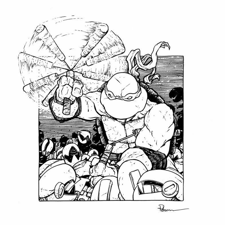 Michelangelo vs Mousers
 Mouse, Bat, & Bee
 A female spiritualist mouse & a bunny
 Axe vs Owl
 Mice smoking Pipes
 Mouse Portrait painter
 Rand & Dandelions
 A mouse wedding at a mouse-sized St. Margaret's Chapel in Edinburgh Scotland
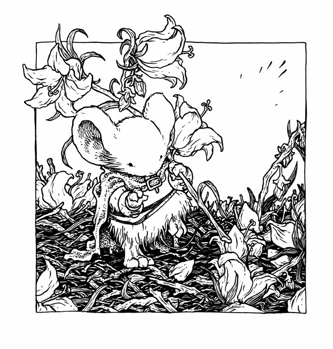 Sienna & Bellflowers
 Mouse Family on a snail
 Stuff of Legend
 The Swedish Chef
.jpg) Tag from Jeremy Bastian's Cursed Pirate Girl
Tag from Jeremy Bastian's Cursed Pirate Girl Thor
Thor Threshold of Adventure
 Yoda
Yoda
 Apothecary Mouse
 Lieam with a flute
2014 Appearances:MSU Comics Forum: February 22Emerald City Comic Con: March 28-30C2E2: April 25-27Motor City Comic Con: May 16-18Comicpalooza: May 23-25Phoenix Comic Con: June 5-8Heroes Con: June 20-22San Diego Comic Con: July 23-27Boston Comic Con: August 8-10Baltimore Comic Con: Sept. 5-7NY Comic Con: Oct. 9-12
December 24, 2013
Blog Index
I've gone through and indexed the blog by adding consistent labels on every relevant post. It will now be much easier to go back and find old posts or discover things you may have missed since I started this blog in 2007. Here is a handy highlight list of posts and categories:
 COVERS:
Muppet Snow White #1
Muppet Snow White #2
Muppet Snow White #3
Muppet Snow White #4
Muppet Peter Pan #4
Muppet Sherlock Holmes #1
Fraggle Rock Vol 2 #1
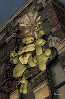
TMNT: Raphael
TMNT: Michelangelo
TMNT: Donatello
TMNT: Leonardo
TMNT: Splinter
TMNT: Casey Jones
TMNT: April O'Neil
TMNT: Fugitoid
Mouse Guard: Black Axe #5
Mouse Guard: Black Axe Hardcover
Mouse Guard: Baltimore Comic Con Program
 Mouse Guard 2013 FCBD
Legends of the Guard Vol 2 #1
Legends of the Guard Vol 2 #2
Legends of the Guard Vol 2 #3
Legends of the Guard Vol 2 #4
Legends of the Guard Vol 2 Hardcover
Skyward
PINUPS
Monsters & Dames '09
 Monsters & Dames '12
Monsters & Dames '13
Iron or the War After
Jim Henson's Storyteller
Usagi Yojimbo
Fish 'N Chips
Runners: Bad Goods
Runners: Snow Job
Gronk
Cursed Pirate Girl
Baltimore Yearbook '12
Bodie Troll
Mythbusters
Confederacy of Unprecedented Fellows
FREELANCE
 Locke & Key: Head Games SE
Ramyan 3392 story
House of Mystery story
Mondo: Brave Poster
Asgard's Chosen Card Art
Torchbearer RPG Chapter Art
Torchbearer Beasts
Little Nemo Page
ILLUSTRATION
Snowy Valentine process part 1
Snowy Valentine process part 2
Snowy Valentine process part 3
 Something New Under the Sun
Eleanor Oddbody
MOUSE GUARD
Pre- Mouse Guard: 1149
Mouse Development
Winter #3 Page Process
 Winter #6 Panel Process
FCBD '10 Page Process
Black Axe #3 Page Process
Black Axe #4 Page Process
Black Axe: Em of Appleloft
FCBD 2009 Print Process
Vulture Print Process
UK Print Process
Peacock Print Process
Raspberry Print Process
Weasel War Print Process
FCBD '11 Story Video
FCBD '12 Story Video
FCBD '13 Story Video
FCBD '11 Story Process
FCBD '12 Story Process
Legends Vol 2 Storyteller Mice
Black Axe Hardcover Extras
2012 Bookplate Process
2013 Bookplate Process
 INFO & ADVICE
Square Format
2-D Design
World Building Video
Drawing Like Yourself
Learning From Copying
Inking Grey Video
1st time Con Setup Notes
Genres & Diversity in Comics
Drawing Other People's Characters Part 1
Drawing Other People's Characters Part 2
FROM THE VAULT
Cats Trio
The Big One
R Wars
Art History Comic
The Space Between Us
Tower
Jesters
LEGENDS OF THE GUARD INTERVIEWS
 Jeremy Bastian
Alex Sheikman
Gene Ha & Lowell Francis
Sean Rubin & Alex Kain
Terry Moore
Jason Shawn Alexander
Katie Cook
Nate Pride
Mark Smylie
Craig Rousseau
Karl Kerschl
Joao Lemos
 Nick Tapalansky & Alex Eckman-Lawn
Ben Caldwell
Rick Geary
Christian Slade
Jemma Salume
Cory Godbey
Charles Paul Wilson III
Eric Canete
Jackson Sze
Justin Gerard
Bill Wilingham
Dirk Shearer
MODELS
Matriarch's Chamber
Ildur Hall
 The Red Snapper
Upper Port Sumac
Lower Port Sumac
The Mariner's Bell
Library Arch
Darkheather part 1
Darkheather part 2
Darkheather part 3
A Ship of Shell & Timber Scrap
Shorestone Exterior
Shorestone Interior
Haven Guildroom
June Alley Inn
PRINTMAKING
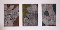 Etching
Intaglio & Relief Combo
College Era Prints
Extinct Print
Anniversary Relief Print
 COVERS:
Muppet Snow White #1
Muppet Snow White #2
Muppet Snow White #3
Muppet Snow White #4
Muppet Peter Pan #4
Muppet Sherlock Holmes #1
Fraggle Rock Vol 2 #1
TMNT: Raphael
TMNT: Michelangelo
TMNT: Donatello
TMNT: Leonardo
TMNT: Splinter
TMNT: Casey Jones
TMNT: April O'Neil
TMNT: Fugitoid
Mouse Guard: Black Axe #5
Mouse Guard: Black Axe Hardcover
Mouse Guard: Baltimore Comic Con Program
 Mouse Guard 2013 FCBD
Legends of the Guard Vol 2 #1
Legends of the Guard Vol 2 #2
Legends of the Guard Vol 2 #3
Legends of the Guard Vol 2 #4
Legends of the Guard Vol 2 Hardcover
Skyward
PINUPS
Monsters & Dames '09
 Monsters & Dames '12
Monsters & Dames '13
Iron or the War After
Jim Henson's Storyteller
Usagi Yojimbo
Fish 'N Chips
Runners: Bad Goods
Runners: Snow Job
Gronk
Cursed Pirate Girl
Baltimore Yearbook '12
Bodie Troll
Mythbusters
Confederacy of Unprecedented Fellows
FREELANCE
 Locke & Key: Head Games SE
Ramyan 3392 story
House of Mystery story
Mondo: Brave Poster
Asgard's Chosen Card Art
Torchbearer RPG Chapter Art
Torchbearer Beasts
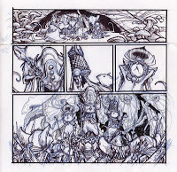
Little Nemo Page
ILLUSTRATION
Snowy Valentine process part 1
Snowy Valentine process part 2
Snowy Valentine process part 3
 Something New Under the Sun
Eleanor Oddbody
MOUSE GUARD
Pre- Mouse Guard: 1149
Mouse Development
Winter #3 Page Process
 Winter #6 Panel Process
FCBD '10 Page Process
Black Axe #3 Page Process
Black Axe #4 Page Process
Black Axe: Em of Appleloft
FCBD 2009 Print Process
Vulture Print Process
UK Print Process
Peacock Print Process
Raspberry Print Process
Weasel War Print Process
FCBD '11 Story Video
FCBD '12 Story Video
FCBD '13 Story Video
FCBD '11 Story Process
FCBD '12 Story Process
Legends Vol 2 Storyteller Mice
Black Axe Hardcover Extras
2012 Bookplate Process
2013 Bookplate Process
 INFO & ADVICE
Square Format
2-D Design
World Building Video
Drawing Like Yourself
Learning From Copying
Inking Grey Video
1st time Con Setup Notes
Genres & Diversity in Comics
Drawing Other People's Characters Part 1
Drawing Other People's Characters Part 2

FROM THE VAULT
Cats Trio
The Big One
R Wars
Art History Comic
The Space Between Us
Tower
Jesters
LEGENDS OF THE GUARD INTERVIEWS
 Jeremy Bastian
Alex Sheikman
Gene Ha & Lowell Francis
Sean Rubin & Alex Kain
Terry Moore
Jason Shawn Alexander
Katie Cook
Nate Pride
Mark Smylie
Craig Rousseau
Karl Kerschl
Joao Lemos
 Nick Tapalansky & Alex Eckman-Lawn
Ben Caldwell
Rick Geary
Christian Slade
Jemma Salume
Cory Godbey
Charles Paul Wilson III
Eric Canete
Jackson Sze
Justin Gerard
Bill Wilingham
Dirk Shearer
MODELS
Matriarch's Chamber
Ildur Hall
 The Red Snapper
Upper Port Sumac
Lower Port Sumac
The Mariner's Bell
Library Arch
Darkheather part 1
Darkheather part 2
Darkheather part 3
A Ship of Shell & Timber Scrap
Shorestone Exterior
Shorestone Interior
Haven Guildroom
June Alley Inn
PRINTMAKING
 Etching
Intaglio & Relief Combo
College Era Prints
Extinct Print
Anniversary Relief Print
December 17, 2013
Little Nemo in Slumberland page process
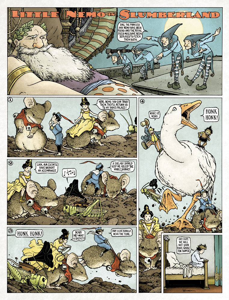 The folks at Locust Moon Comics are putting together a anthology tribute book of Little Nemo in Slumberland called Little Nemo: Dream Another Dream. It's got an incedible list of contributors and they were also kind enough to invite me to join. I felt honored to be asked to do something to tribute the work of Windsor McKay. He attended Michigan Normal School, which later became my alma matter: Eastern Michigan University. Each contributor was asked to do a single page, with the last panel being the traditional gag of Nemo awaking in the real world (usually his bedroom) Here is the process for my page (which is rather large at 16" x 21"!)
Concept/Layout/Pencils:
 I knew for my story I wanted to include animals, and including mice (real looking mice, not Mouse Guard mice) was a given. I wanted to include other characters besides Nemo, like the princess, Flip, the Jungle Imp, and King Morpheus. But beyond that I had nothing. Until I was telling my nieces a silly story that was supposed to be dreamlike where I was chased by sheep with grasshoppers riding on their backs, who wielded slingshots...and that became the starting point of the story for the page that morphed into what you see here. The pencils were all done over the course of several pages in my sketchbooks. Characters and backgrounds (even in the same panel) may have been drawn separately but assembled in Photoshop in this grid template where I also added a stock Nemo logo and all of my text with a font I liked.
Inks:
 Because of the size, I printed each one of those panels out on it's own sheet of paper and taped them all back together and then onto the back of my 16" x 21" sheet of Strathmore 300 series bristol. On a lightbox I was able to see through the bristol and ink the page using my printed out pencils as a guide. I tried to leave a lot of open space and play with pattern more than texture, but as this was supposed to be a David Petersen Nemo and not just me trying to copy Windsor McKay, I added enough of my stippling and linework so that it felt very much like something I would have done. Even though I was working very large, I still opted to use a smaller Copic Multiliner that I normally use. While the page is lager, there are more panels than usual, and this page isn't getting reduced for printing...Locust Moon is publishing this book at the monster size of 16" x 21"!
Color:
The last step was to scan the inked piece (in 2 parts) and then color the whole thing. The coloring techniques I used were similar to all the other pieces I do, where I flat in base colors and them shade and highlight them suing the burn and dodge tools in Photoshop. Because I wanted to have a hybrid of coloring styles though (between the original Nemo strips and my work) I didn't render the piece as deeply as I normally would have leaving a lot of the colors more flat that usual. I added some paper texture and a faint halftone screen to get the piece to feel more in the right printing period for a Little Nemo story.This book is going to be fantastic and is scheduled to be available in early 2014.
2014 Appearances:
MSU Comics Forum: February 22
Emerald City Comic Con: March 28-30
C2E2: April 25-27
Motor City Comic Con: May 16-18
Comicpalooza: May 23-25
Phoenix Comic Con: June 5-8
Heroes Con: June 20-22
San Diego Comic Con: July 23-27
Boston Comic Con: August 8-10
Baltimore Comic Con: Sept. 5-7
NY Comic Con: Oct. 9-12
December 10, 2013
The June Alley Inn Model
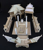
 The Legends of the Guard Volume 2 Hardcover was released in-stores last week, and it occured to me, that I'd never done a proper blogpost of the model of the June Alley Inn. So, at long last, here is a proper tour of the model and my thoughts on it.
I built this model before starting the first volume back in '09 when starting work on the first Legends series.
.jpg)
Since all of my pages were going to occur in a tavern, and I wanted to have a clear idea of what this tavern looked like. I also wanted to establish areas of the tavern that would be easily recognizable, that way, when I was introducing 12 new mice, the reader may be able to help tell them apart not only by their clothes and fur color, but also by where in the tavern they were sitting.
.jpg)
.jpg)
As is my normal custom for designing locations, I work best when building them by hand from scraps of chipboard, cardboard, basswood, and other misc stuff in the studio. I started with the staircase and the bar in the center of the tavern space and built out from there tying to be somewhat symmetrical with regard to the placement of beams and doors.
.jpg) The model is modular. Each wall is free-standing and the floor splits in two with the bar-top and staircase going on one side. This was for several reasons, one it's easier to move and store, but mainly because it's more useful to study and photograph if I can remove walls and get in there at mouse-eye-level.
The model is modular. Each wall is free-standing and the floor splits in two with the bar-top and staircase going on one side. This was for several reasons, one it's easier to move and store, but mainly because it's more useful to study and photograph if I can remove walls and get in there at mouse-eye-level..jpg) The benches and tables were made out of very thin basswood (used for doll house flooring & paneling) and bristol board. The seating was a key aspect to the purpose of the model. I had to arrange the furniture in a way that made room for all the guests, made sense in the environment, and left me with interesting "camera" angles when drawing a lot of panels of talking mice. For both Legends series, I made a master seating plan for where each mouse was sitting
The benches and tables were made out of very thin basswood (used for doll house flooring & paneling) and bristol board. The seating was a key aspect to the purpose of the model. I had to arrange the furniture in a way that made room for all the guests, made sense in the environment, and left me with interesting "camera" angles when drawing a lot of panels of talking mice. For both Legends series, I made a master seating plan for where each mouse was sitting.jpg)
.jpg) Details about how the tavern operated came to me as I built the model. The kitchen would be in the rear, and I gave it two doors so June wouldn't need to walk all the way around the bar when brining customers stew or bread. There was a vacant space under one of the stairwells I thought perfect for firewood storage. another vacancy under the stairs, but behind the bar became cellar stair entry. And to decorate the walls of the tavern I could "hide" the covers from the series as paintings/prints.
Details about how the tavern operated came to me as I built the model. The kitchen would be in the rear, and I gave it two doors so June wouldn't need to walk all the way around the bar when brining customers stew or bread. There was a vacant space under one of the stairwells I thought perfect for firewood storage. another vacancy under the stairs, but behind the bar became cellar stair entry. And to decorate the walls of the tavern I could "hide" the covers from the series as paintings/prints..jpg)
.jpg)
For Legends of the Guard Volume 2, I had thought about showing (either in my tavern pages, the epilogue, or just in the extras) the 2nd floor of the June Alley Inn. I made a model which sat on top of the existing model, was also modular in 2 pieces (mainly for transport & storage) and worked with the existing exterior elevation I'd drawn of the Inn. Once I had the floors in and the stairway cut out, I placed popsicle sticks down as temporary walls until I found a floorplan I liked.

The large room (back of the photo, but front of the inn) was to be June & Alistair's chambers, while some of the other rooms were to be private & communal guest rooms. Ultimately, the plan for including a second floor in Volume 2 was scrapped...but who knows...there may be a Volume 3....
2014 Appearances:MSU Comics Forum: February 22Emerald City Comic Con: March 28-30C2E2: April 25-27Motor City Comic Con: May 16-18Comicpalooza: May 23-25Phoenix Comic Con: June 5-8Heroes Con: June 20-22San Diego Comic Con: July 23-27Boston Comic Con: August 8-10Baltimore Comic Con: Sept. 5-7NY Comic Con: Oct. 9-12
December 3, 2013
Spotlight on Legends of the Guard contributor Dirk Shearer:
Both Issue #4 and the Hardcover of Legends of the Guard come out tomorrow (Archaia, BOOM!, & I apologize for this odd release, due to a printing issue it was unavoidable). Dirk Shearer contributed the epilogue story for the Legends Hardcover. A bit of background before the interview though. I had already planned the focus of the epilogue story to be about June's printmaker husband Alistair (Alley) to tell a story through prints. When thinking of who could draw a story that looked like woodblock prints, I immediately thought of the scratchboard art of Dirk Shearer. He was the perfect fit. Like the epilogue from volume 1, I did a framing piece at the beginning to lead into the story. But enough of that info...on with the interview:David: Dirk, Thank you for doing this interview and for contributing such a great epilogue to the Legends Volume 2 Hardcover! Let’s start with your background in art. Did you start showing an interest in art early? Any formal training?
 Dirk: Dave, it's absolutely my pleasure! I've been a fan of yours for a while, and was stoked to do this.
 I'm one of those "drawing back when tricycles were cool" types, and, being raised by wonderful grandparents who fostered my growth, having a half-sister 4 years older with a more consistent drawing style, along with other family and friends, I was often challenged to do more, which all just kept me interested, growing, and producing. Outside of the people who influenced me, cartoons, animated films, superhero comics, illustrated books, and my interest in the natural world all had quite the influence on my growth as a young artist. For the latter half of my public education, I was friends with another artist who was also big into comics, and simply put, was better than me, which pushed me to spend time on my work to create equally good art.
 David: You are known for your scratchboard work- what drew you to this media for many of your illustrations?
Dirk: Jokingly, but perhaps not, I'd say my fear of painting and strength in value, focusing on the lights and darks. Although I love to view good artwork in color or black and white, my forté has leaned toward drawing than color. I'm improving that with myself, and maybe I'm not as bad at it as I think I am, but it's something I'm always conscious of.
 In middle school I discovered how, in my opinion, good black and white art can be just as relevant and aesthetic as color. Black and white art often carries the stigma of existing due to being a cheaper vehicle over colored work, but when you place Wrightson's artwork from his Frankenstein book next to a Jeffrey Catherine Jones cover piece, Barry Moser's wood engravings or Stephen Gammell's art up to Eric Carle, or Franklin Booth next to Howard Pyle, they stand up! All four of those artists I'd been exposed to by middle school. Heck, Gammell's Scary Stories, which everyone is obligated to love, (I mean it), possibly initiated that interest at a younger age as my cousins and I incessantly stared at his illustrations while reading those stories. It's an honest, damned shame HC removed his illustrations for the 30th anniversary print of Scary Stories.
 Unfortunately, I didn't really jump into executing true black and white until college, when I brought those influences back toward the front of my conscious, Barry Moser's work being the obvious beacon. At the same time, both he and Jae Lee were affecting my view of black and white art like no other artists during those years. I began to cut down on the abstract, cartoony, or ultra-muscled, double-bicep'ed characters, and began digging into mood and atmosphere, often more solemn and introspective. I had a black and white illustration class taught by illustrator/ writer Brian Kane, and this was the one class that I really had the chance to experiment with the scratchboard style. The first two pieces stank, but by the third, I knew I was capable of producing professional work. After graduation, I waited a couple of years before I did anything more with the medium, until I decided to create a little niche for myself at comic conventions. I created a series of Justice League portraits in scratchboard, which led to my first freelance projects with the medium.
David: This isn’t your first panel by panel comic work, but is this the first time doing a comic all in scratchboard?
 Dirk: Multiple editors, publishers, and my own curiosity have been pushing me to do a comic in scratchboard, but I would often get sidetracked with other projects or freelance. When you approached me to do the story in the medium, it was an opportunity to finally jump at trying it out, no matter what size or restrictions the project might give.
David: For the epilogue story, I gave you a seed of it being about a printer who changes the course of mouse events with his humble trade, but you took it from there and put shape to the story with narration & images. How did you approach the writing portion?
Dirk: Ha, the high school kid who sucked at conceptual writing in me would respond with "um... in English, with paper, and a mechanical pencil."
 But seriously, since these panels were done to imitate block printing, I wanted the story to be mostly void of dialogue. For much of block printing's history, and illustration in general, there wasn't dialogue placed over top of the image. I wanted to maintain some of that antiquity in my own way, (unique from say, the too-awesome for words Jeremy Bastian), so I focused my story on a narrative text, with emphasis on the visuals telling the story apart from the text. I've allowed the popular instruction that the art should be able to tell the general story without need of text to sink into my thought process for long enough now that I like to go and prove it sometimes.
David: For your script, you broke down the panels with descriptions and narration for each. Were you just visualizing the pages as you typed? or did you do some thumbnailing to figure out panel shapes or the number of panels per-page?
 Dirk: For my own work, I jump into ideas akin to Kurtzman's style. I allow plot, script, and thumbnail sketches to work organically with one another to create the story- both the artist and storyteller inside work together to complete the work. If I get stuck with a sketch, I move onto writing in an attempt to fill the gap. Eventually, both thumbnails and rough script are finished almost simultaneously. Otherwise, my thumbnail sketches might be too messy to comprehend later, or the images in my head may disappear before I can record them in writing.
Once that script was written, what is your process for developing your roughs/pencils? And how do you transfer that work onto the scratchboard? Is each panel its own piece of scratchboard?
I might create a couple more thumbs to secure my confidence with the page layout. Once I'm satisfied, I'll create a larger sketch, often at print size. Or, I may skip that and go straight to final work size, which in the case of my scratchboards, is a hair larger than print- I don't want to work much larger than print size, lest I lose my smallest line detail.
 I have a couple methods for transferring, depending what seems to be more convenient per image. I start out by drawing my panels on the board with either a tech pen or black colored pencil, and all the straight lines get ruled out. To transfer the drawing, I either 1.) draw it on with those same tools, 2.) trace the drawing onto the board with a ballpoint pen to leave a slight impression, or 3.) my favorite method- I take a little bit of Xylene (paint stripper that one can purchase at hardware stores), and with paper toweldipped in the xylene, lightly rub the back of a black and white laser copy, (reversed), onto the board. The Xylene melts the toner from the copy onto the board, leaving an image that's blacker than the ink of the scratchboard. This is preferred when I'm lazy and don't want to draw everything again onto the board. Watch it, though- too much Xylene and you begin to affect the scratchboard's ink; not enough, and you simply don't transfer the drawing, and it may affect the paper. It's fun, regardless, like silly putty for adults, but with more vapors entering the sinuses. I should probably caution about that part, but I won't.
I had large enough boards to design each page onto one board, with panels for the most part laid out as they were sequentially in the story.
 David: What tools do you use to clear away the black of the scratchboard?
 Dirk: I use the two standard scratchboard tools that you can get from Ampersand- their diamond blade and wide blade. They may have different names than what I just gave, but basically, there's one for small to medium lines, and I use the wide blade to scratch off much wider or areas, similar using a standard crow quill pen nib and a brush when inking. I also use a clay needle tool for my smallest lines. The diamond blade has the most versatility, while the other two take the line widths a little bit further in variety. Sometimes I'll use X-Acto blades, but I often resort back to the aforementioned, eventually. It's all decently cheap.
David: How long (on average) did it take to do the scratchboard work for a single panel?
 Dirk: Longer than I thought, but not much so. Once drawn and transferred, I'd guess that each page took maybe 12-15 hours to complete, some panels requiring more or less time than others.
David: Creating tone in scratchboard is a trick of fooling the eye with optical mixes of line thickness and spacing. Do you have any mental process for how you want to approach making those tonal values as you work?
 Dirk: Before I work on rendering an object in the drawing, I do some preliminary scratches on the side. It helps me to visualize the overall texture, to set the tone of the object, and to work out any kinks when it comes to the next adjacent object or specific part of the drawing. It's not as easy as one might think, because with any hatching where both values (or colors) vary in thickness to create the value or hue in-between, you may also create a variance in graphic appearance. If I create 10 bold black and white lines next to each other, they may produce a space of 50% gray. Placing 20 black and white lines next to each other in the same size space may create an overall similar value, but the former is going to have broader, more noticeable lines, while the other seems finer. That affects the style. I'm always conscious of that, and have a love/hate relationship with the medium as I make those tiny but important decisions.
David: What other projects do you have coming up?
 Dirk: I just finished up a mural for a child grieving center. I'm about to dive head first into a couple architectural concept illustrations for an art space in York, PA; getting ready to start a comics-related art residency with a school in December. I'm preparing for my next season of classes at one of the art galleries near my hometown. All that, along with other, more boring freelance work- color this photo, create that packaging, clip out the giant bear mauling a human in the background of our lovely vacation photo. Oh, and plotting my next personal projects. The life of versatility!
David: Where can fans find out about you and your work and keep up with your projects?
 Dirk: Awesome people can follow me on my Facebook page, ambitiously titled 'Dirk Shearer International Experience Of Visual Entertainment,' on my blog at 'Alone In The Dirkness,' or my Twitter account, '@DirkShearer'. I'll hopefully be getting a website back up in a couple of months, too. I misses it. Dirkshearer.com is now a Japanese food blog. I hear it's dirktastic. In the meantime, my online portfolio can viewed at www.coroflot.com/dirkshearer.
Dirk's story Just a Printer appears in the Hardcover of Legends of the Guard Volume 2 along with stories by Stan Sakai, Nick Tapalansky, Alex Eckman-Lawn, Ben Caldwell, Christian Slade, Rick Geary, Jemma Salume, Eric Canete, C.P. Wilson III, Cory Godbey, Bill Willingham, Jackson Sze, Justin Gerard, &Cliff Monear.I encourage you to pick up the hardcover collection of this new anthology & all this wonderful work.
2014 Appearances:MSU Comics Forum: February 22Emerald City Comic Con: March 28-30C2E2: April 25-27Motor City Comic Con: May 16-18Comicpalooza: May 23-25Phoenix Comic Con: June 5-8Heroes Con: June 20-22San Diego Comic Con: July 23-27Boston Comic Con: August 8-10Baltimore Comic Con: Sept. 5-7NY Comic Con: Oct. 9-12
November 26, 2013
Torchbearer Beasts
 As I mentioned a few weeks ago, Luke Crane (game designer of the Mouse Guard RPG) has put out a new RPG book called Torchbearer. It's his game-design-love-letter to original Dungeons and Dragons. While I was traveling in early October, I did a few monster drawings for myself, but also shared them with Luke. He & his team have constructed a mini-supplement with them where they came up with descriptions and stats for each to be used with the game (but may be equally interesting for non-gamers to read).Luke is calling the supplement the Petersen Beastiary. It can be found on his site: http://www.burningwheel.com/store/index.php/torchbearer.htmlor on DriveThuRPG: http://rpg.drivethrustuff.com/index.php?manufacturers_id=2183
The original inked pieces are up for sale in my online store.
Here is a look at each of the finished illustrations.
 "Devil Boar"
 "Gruxu"
 "Sprikken"
 "Disturbed Spirit"
 "Owlbear"
And it looks like I'll be doing more pieces for the "Petersen Beastiary" down the line. And like these, I'll offer up the originals for sale the day the .PDF is released.
2014 Appearances:MSU Comics Forum: February 22Emerald City Comic Con: March 28-30C2E2: April 25-27Motor City Comic Con: May 16-18Comicpalooza: May 23-25Phoenix Comic Con: June 5-8Heroes Con: June 20-22San Diego Comic Con: July 23-27Boston Comic Con: August 8-10Baltimore Comic Con: Sept. 5-7NY Comic Con: Oct. 9-12
November 19, 2013
Animal Avengers Cover Process
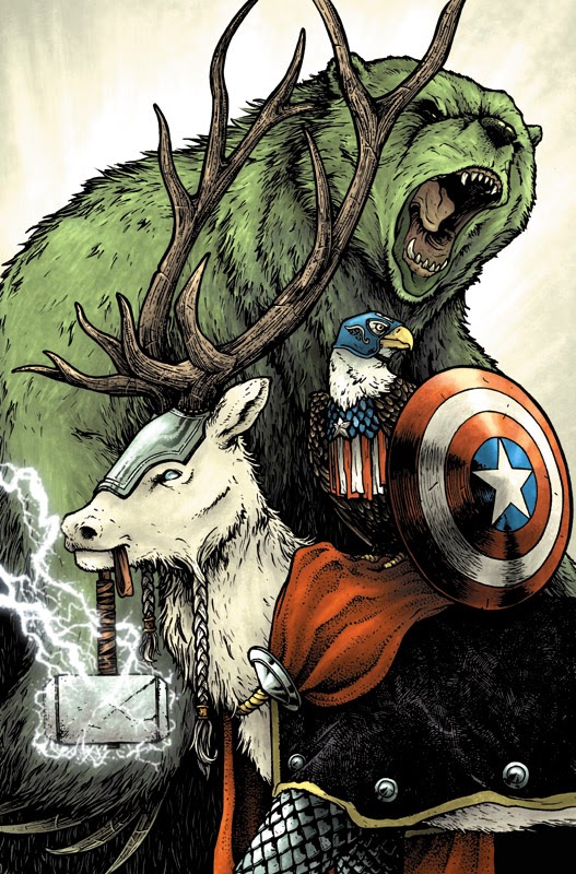 Steven Wacker asked me back to do another Marvel cover! A "second cover!?!" you say..."where was the first?". The first Marvel cover I did has yet to be reveled or announced, so I can't talk about it yet. This time the subject was Avengers as animals, and Steve thought of me. To the left, you can see the final cover artwork (which was revealed by Marvel yesterday) but in today's blogpost, I'm going to run through the process of making the artwork.
First up, Steve gave me open permission to use any animals I wanted for Captain America, Thor, & the Hulk. He'd said I could even do all-mouse versions if I'd like, but I thought it would be more fun to go outside of the mouse world on this one...
 I'd already decided on Cap being a bald eagle (patriotic symbolism and all) when Steve emailed me back (about some deadline detail stuff) offering up "Thor as an elk?"...once I saw that, I couldn't un-think of Elk-Thor. And the last was Hulk who I decided would be like a massive angry grizzly bear. I sketched each of the animals as avengers out on separate pieces of paper and modified their costumes (except Bear-Hulk) to fit the animal frames. The sketches were all assembled in photoshop into the layout you see to the right. I tinted each character so I could easily see where one character ended and the next began. The yellow and orange borders are guides for where the image cuts off, and the logo was a drop-in so that I didn't put anything too important there.
 I printed out that digitally composited layout and taped it to the back of a sheet of Strathmore 300 series bristol. On a lightbox I was able to see through the bristol and use the printout as a guide for inking. I used Copic Multiliners (0.35 & 0.7 nibs) to ink this piece. There is a lot of varying textures in this piece...with a lot of repetition of form. These textures not only establish certain greys and materials, but also help differentiate the characters. The hair details on the bear are inked more heavy-handedly than on the elk. The shapes of the eagle's armor is different than the elk's armored leggings...etc.
 The inks are scanned and I start dropping in flat colors. I tried to stick with established colors for these characters and/or their real animal counterparts. I could see already at this stage, I needed to focus on getting Eagle-Cap to come forward since he was getting lost in Bear-Hulk.
Rendering the characters using the dodge and burn tools, I pushed the texture and the shadows so the characters each could be read apart from one another.
Here is the final art again. This will be featured on the cover of Avengers #24 NOW. I do not yet have a in-store date, but keep checking with Marvel on Twitter for news.
2014 Appearances:MSU Comics Forum: February 22Emerald City Comic Con: March 28-30C2E2: April 25-27Motor City Comic Con: May 16-18Comicpalooza: May 23-25Phoenix Comic Con: June 5-8Heroes Con: June 20-22San Diego Comic Con: July 23-27Boston Comic Con: August 8-10Baltimore Comic Con: Sept. 5-7NY Comic Con: Oct. 9-12
David Petersen's Blog

- David Petersen's profile
- 339 followers
David Petersen isn't a Goodreads Author
(yet),
but they
do have a blog,
so here are some recent posts imported from
their feed.

