
David Petersen's Blog, page 61
April 1, 2014
Harry Potter Art collection
.jpg) No April Fool's Trick...Instead of sharing process or my own artwork this week, I'm going to share part of my original art collection, my Harry Potter themed pieces! I'm a huge fan of the Harry Potter books, J.K. Rowling's writing and the deep world she created (especially considering how easy it is to mess up writing stories with 'magic'). I thought Potter would be a perfect theme for me to ask for when commissioning or art trading with my favorite artists. There are so many characters (generational) as well as locations, memorable scenes, & creatures that I can give the artist a great deal of freedom to play And I'm a big enough fan, that no matter how obscure they get, I'll still be very happy. Here is the collection thus far: (to the left: a print of the Hogwarts' Crest by Joe Dragunas)
No April Fool's Trick...Instead of sharing process or my own artwork this week, I'm going to share part of my original art collection, my Harry Potter themed pieces! I'm a huge fan of the Harry Potter books, J.K. Rowling's writing and the deep world she created (especially considering how easy it is to mess up writing stories with 'magic'). I thought Potter would be a perfect theme for me to ask for when commissioning or art trading with my favorite artists. There are so many characters (generational) as well as locations, memorable scenes, & creatures that I can give the artist a great deal of freedom to play And I'm a big enough fan, that no matter how obscure they get, I'll still be very happy. Here is the collection thus far: (to the left: a print of the Hogwarts' Crest by Joe Dragunas) Hagrid, Ron, Hermione, & Harry by Jon Morris
.jpg) Snape & Harry by Skottie Young
Snape & Harry by Skottie Young.jpg) Hagrid by Brandon Dayton
Hagrid by Brandon Dayton.jpg) Harry playing Quidditch by Duncan Fegredo
Harry playing Quidditch by Duncan Fegredo.jpg) Ron playing Keeper (Weasley is our King...) by Katie Cook
Ron playing Keeper (Weasley is our King...) by Katie Cook .jpg) The "Unabridged" 1st chapter of Order of the Phoenix by Katie Cook
The "Unabridged" 1st chapter of Order of the Phoenix by Katie Cook .jpg) Harry playing Quidditch by Craig Rousseau
Harry playing Quidditch by Craig Rousseau.jpg) Harry years 1-7 sketchcards by Jeremy Treece
Harry years 1-7 sketchcards by Jeremy Treece.jpg) A Dementor by Nate Pride
A Dementor by Nate Pride.jpg) The Gurg (King of the Giants) by Nate Pride
The Gurg (King of the Giants) by Nate Pride.jpg) Voldemort by Dave Guertin
Voldemort by Dave Guertin.jpg) Professor Albus Percival Wulfric Brian Dumbledore by Cory Godbey
Professor Albus Percival Wulfric Brian Dumbledore by Cory Godbey.jpg) Dobby the House Elf by Cory Godbey
Dobby the House Elf by Cory Godbey.jpg) Kreacher (servant to the house of Black) by Justin Gerard
Kreacher (servant to the house of Black) by Justin Gerard.jpg) Rita Skeeter by Paolo Rivera
Rita Skeeter by Paolo Rivera.jpg) Young Sirius Black by Becky Cloonan
Young Sirius Black by Becky Cloonan.jpg) Hogwarts Adjunct Professor: George Harrison by Andrew Robinson
Hogwarts Adjunct Professor: George Harrison by Andrew Robinson.jpg) Luna Lovegood by Chrissie Zullo
Luna Lovegood by Chrissie Zullo.jpg) Hagrid & Buckbeak silhouette art by Jennifer Menken
Hagrid & Buckbeak silhouette art by Jennifer Menken.jpg) Bellatrix Lestrange by Eric Canete
Bellatrix Lestrange by Eric Canete.jpg) A Thestral by Jeremy Bastian
A Thestral by Jeremy Bastian.jpg) Alastor "Mad Eye" Moody by Jeremy Bastian
Alastor "Mad Eye" Moody by Jeremy Bastian.jpg) The Sphinx from the 3rd Tri-Wizard task by Jeremy Bastian
The Sphinx from the 3rd Tri-Wizard task by Jeremy Bastian.jpg) Neville Longbottom kills Nagini by Jeremy Bastian
Neville Longbottom kills Nagini by Jeremy BastianI've also made arrangements for later pieces from:Phil NotoSean RubinStephane Rouxand Matthew Dow Smith
I hope you guys enjoyed the look at these pieces. Not only for perhaps an introduction to some artists work you may not be familiar with, but also to see how a variety of styles, mediums, and layouts can all serve one property or theme. You may have favorites among these, but every one does a great job at capturing some part of the Potter mythos. How amazing would it be to see a Harry Potter anthology graphic novel featuring artwork from the contributors above? WB? JK?
2014 Appearances:C2E2: April 25-27Motor City Comic Con: May 16-18Comicpalooza: May 23-25Phoenix Comic Con: June 5-8Heroes Con: June 20-22San Diego Comic Con: July 23-27Boston Comic Con: August 8-10Baltimore Comic Con: Sept. 5-7NY Comic Con: Oct. 9-12


March 25, 2014
Turtles in Time Cover #1 process

I have been asked back by IDW to do the covers for the new TMNT mini series Turtles in Time! I've done 8 TMNT covers for IDW already and getting this assignment for 4 more is a real treat. The Ninja Turtles were some of my first comics, and what started my mind toward writing and drawing my own stories.
To the left is the finished cover for issue #1, where the turtles are in pre-history.
For today's post, I'll break down my process for creating the cover.
 Sketches: I was given an era for each cover (though issue #3 has been changed a few times) and for the first, it was prehistoric times. With my earlier covers for IDW, each issue focused on a single character, this time, each cover would feature all 4. And what better way to get all four characters into a good prehistoric image than to have the guys riding a dinosaur! I went with a triceratops as a homage to the Triceratons of the turtle's futures. I tried to get something about each turtles personality in each of their poses and reaction to being in the age of dinosaurs.
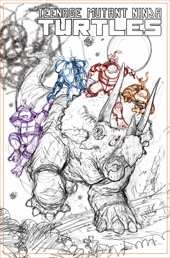 I assembled my rough sketches in photoshop in a cover-template. This allowed me to resize and reposition everyone so the overall layout worked without having to draw it all in one-shot. As I mentioned before, each turtle's personality is shown in their pose: Mike: I see as the fun guy who lightens the mood and rolls with the situation because he has to...and in this he's grabbing on and going for the ride. Raph is aggressively charging forward, weapons ready, about to take the triceratops by the horns if need be. Leo is the only one facing the actual danger (the meteors that ultimately may have caused dino-extinction) and is keeping the family together by gripping Don, who is such a logical and concrete thinker, is loosing his mind over the unrealness of where they are.
 I printed out the above digital composite and taped it to the back of a sheet of 11" x 17" Strathmore 300 series bristol. I placed the bristol and taped layout on my lightbox and used the printed image as a guide to ink the piece on the bristol surface. To ink, I use Copic Multiliners, the 0.7 and 0.35 nibs for this one, and a brush with a bottle of ink for the fills. I was on the fence about the black silhouette ferns in the foreground and thought I'd gone too far with that look when I finished the piece, but my wife Julia said she liked it and to try coloring it as-is and only make changes if the colors weren't working (smart lady!).
 So I went ahead and scanned my inked piece into photoshop (I use an old version for photoshop 7.0...pre-CS) This stage is all about filling in the various ares with their colors...establishing what areas are turtle skin, what areas are dino skin, etc. Because this is not a stage where I'm worried about the shading, I'm only making spaces of flat color, this step is called the flatting stage. I saved this image after I had tweaked the palette closer to what I thought I'd use, but my initial version of the flat colors had the turtles with a brighter green, the dinosaur grey and the sky blue-green. What colors I started with is unimportant when flatting. Once the color areas are all established, it's easy to quickly change the colors of any piece of the image.
The last step was the final rendering and adding special effect color-holds. Here is another look at the final cover:

2014 Appearances:Emerald City Comic Con: March 28-30C2E2: April 25-27Motor City Comic Con: May 16-18Comicpalooza: May 23-25Phoenix Comic Con: June 5-8Heroes Con: June 20-22San Diego Comic Con: July 23-27Boston Comic Con: August 8-10Baltimore Comic Con: Sept. 5-7NY Comic Con: Oct. 9-12
March 18, 2014
2014 Bookplate Process
 For the past two years I have released a 4" x 5" bookplate (You can take a look back at the process for 2012 & 2013). The purpose of a bookplate is to write your name on it and insert it (with photo corners, glue, or tape) inside the front cover of your book (doesn't even have to be a Mouse Guard book) so the book can be identified as coming from your bookshelf. In past years I've done relief printed & stained glass images. This year, I went with an embroidered image. You can see the final plate to the left and in today's blogpost I'll explain the process of creating it.
 I started by thinking of something that would look good as an embroidered scrap from the Mouse Guard world. I'd done a tapestry image for a sketchbook a few years ago, and wanted to play with that imagery again. The tapestry is based on a real quilted wall hanging my friend's mother made for their church and I'd drawn my version as part of a commission (right) and also into the pages of the Black Axe. What I like about the tapestry is that it depicts an unknown past matriarch holding three key tenants of Mouse Guard in front of her: defense (the castle), diplomacy (the scroll), & aggression (the sword). The symbolism is perfect for a balance any matriarch of the Guard would need to strike. These also became the basis for the game the mice play in taverns called "Swords, Diplomacy, & Strongholds" (...though I may shorten that game's name to just "Swords and Strongholds"...)
 There were several false starts for figuring out how to do an embroidered look...everything from photoshop plugins and programs, to web-based cross-stitch pattern makers..and even the idea of really doing some embroidery. But I figured out a trick to get what I wanted manually in photoshop. So I needed a rough sketch to build on to start the work. The rough is just a small pencil drawing on copy paper that is a simplified version of the piece above. The right side of the image isn't well fleshed out because I ended up mirroring the left side since no part of this sketch would be visible in the final piece.
 The process for making everything look like stitching is by making lots of strokes to simulate each thread. The different colors are each on different layers and each have a bevel effect on them. The various filters and programs I found that auto embroidered an image for you made everything too uniform and precise. I went with this manual way (using a wacom to help with making all those tiny digital brush strokes look like hand-drawn lines) so I could give it a more handmade feel...make it less even, a little more worn and imperfect. Upclose, the illusion fades a bit because this technique can only simulate so much (even with added fabric textures applied), but when scaled down to the final print-size, I think the effect is rather convincing.
 Here again is the final image. These will all be signed and numbered limited to an edition of 750. The first convention I'll have this bookplate in-hand for is Emerald City Comic Con in March. After that I'll start offering them through my online store.
2014 Appearances:Emerald City Comic Con: March 28-30C2E2: April 25-27Motor City Comic Con: May 16-18Comicpalooza: May 23-25Phoenix Comic Con: June 5-8Heroes Con: June 20-22San Diego Comic Con: July 23-27Boston Comic Con: August 8-10Baltimore Comic Con: Sept. 5-7NY Comic Con: Oct. 9-12
March 11, 2014
Mondo Poster: The Rescuers
 As you may have seen, Mondo opened a Disney themed gallery show with new posters from a number of great Disney movies (Disney posted all the posters online here). I was asked to do a piece for the 1977 movie The Rescuers. I'd done a Mondo print before of Pixar's Brave, and was honored to be asked back. My Rescuers print, is available for purchase at the gallery and Mondo will release any remaining prints online. Today I'll run through the process for making the artwork for the print.
 It had been a while since I'd seen The Rescuers, and while a few iconic moments came to mind, I felt I should re-watch the movie before drawing up anything. I'm glad I did. I knew I'd wanted to feature the main characters in the dragonfly-powered leaf-boat, but I had somehow forgotten about the scene with the alligators (Brutus & Nero) carrying off kidnapped Penny & her bear or that she was held hostage on a run-down riverboat. I sketched up all of these elements in my sketchbook and on a scrap of paper to try and hone in on what my versions of these things would look like (while still keeping the look of the classic Disney designs).
 From there I did a digital composite of my drawings. I resized characters, changed the spacial relationships between them, and even used the liquify tool to warp some of the lines and features to get the image where I wanted it. Because this piece was ultimately going to be silkscreened, I had to limit the palette to 10 colors, so I was careful, even in this early stage, to be thinking about color usage & using repeating colors. This piece was then sent off to Mondo for approval. With the green light, I printed this off in a large format (took 6 sheets of legal paper to patchwork it back together), taped it to the back of some bristol, and warmed up my light table for the inking stage...
 Because the final silkscreened print is 24" x 36" and I wanted to minimize the loss of line quality when getting enlarged, I inked the piece on 19" x 24" bristol. Some of the elements were inked separately (like the water splash & ripples as well as the title & type). This way, I could isolate them easier from the main illustration for their proper color treatment without having to do a lot of extra work. Even though I have a large scanner, I did have to scan each large sheet of bristol in parts and then edit them back together in photoshop. The pieces were all inked with Copic Multiliners, a brush & ink bottle for the larger black areas.
 To prepare a piece for silkscreening is a lot of work beyond the image-making process. Each color represents a separate screen that ink color is squeegeed through. The order in which the colors print is important, and so is if the colors butt up against each other, or if they overlap. If the seam between the colors isn't being printed over with yet another dark color (like the dark outlines), then the first color needs to be printed under where the edge of the next color will be (this is called "trapping"). I learned quite a bit about this on the Brave poster from last year, but this Rescuers piece was more complicated because my linework was more open and I was relying on color for more of the depth & design. This animated .GIF shows each color layer as if it were being printed in order.
Here are a few detail images of Bianca & Bernard, Brutus, Teddy, Evinrude, Penny, & Nero from the final version of the poster:


And another look at the poster in full.
Later this week, I will have some Artist Copies to sell through my online store ...I'll Tweet and Facebook update when they become available. *UPDATE* My signed artist copies are now up for sale (along with the original art pieces): http://mouseguard.bigcartel.com/produ...
2014 Appearances:Emerald City Comic Con: March 28-30C2E2: April 25-27Motor City Comic Con: May 16-18Comicpalooza: May 23-25Phoenix Comic Con: June 5-8Heroes Con: June 20-22San Diego Comic Con: July 23-27Boston Comic Con: August 8-10Baltimore Comic Con: Sept. 5-7NY Comic Con: Oct. 9-12
March 4, 2014
Hellboy's 20th Anniversary
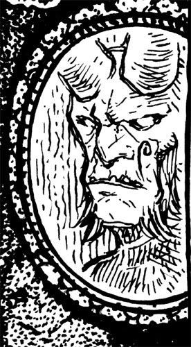
Comic news website Multiversity Comics is helping celebrate Hellboy's 20th anniversary. And with Hellboy being my favorite comic character, and Mike Mignola being so important in my understanding of what comics can be (from both an artistic and professional perspective), I was thrilled when Multiversity asked me to do a piece for the month long-reveal of Hellboy artwork by other comic creators.
 I decided to have Hellboy all dressed up with no where to go...walking down a hallway with painted images of his past in ornate frames covering the walls. Each one is a reference to something from a Hellboy story, and below, I've provided bigger images of each framed image & info on what it references.
 The 'Drinking with Skeletons' from "The Island". I own a page from this story, the page just before this reveal shot when the sailors are still seen as alive. Not only is the reveal panel great (they were dead all along) it also leads to this awesomely quotable dialogue "Don't mess with me, lady. I've been drinking with skeletons"
 The WWII era photo taken the night Hellboy arrived on earth and was adopted by Trevor Bruttenholm. I debated having a more formal portrait of Hellboy's adoptive father on the wall, but felt there were so many other bits to show in 20 years of stories, this tiny one would have to do.
 Baby Alice and the Wee Fairy Folk. This scene is from the one-shot issue The Corpse, but fans who have kept up with Hellboy comics will know that Alice grows up and plays in important role in Hellboy's life before he dies and goes to Hell. Showing Alice as a baby gave reference to both stories in a way showing adult Alice might not have.
 Pandemonium. Capitol City of the Hellboy version of Hell. I love how Mike shows Hell as a place of beauty...and that the hellish nature is in what goes on there and the disorienting feeling of time and space not syncing up properly.
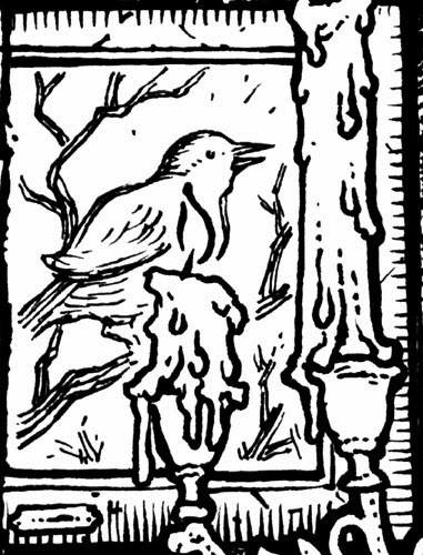 The Bird from "Nature of the Beast". In the story Hellboy is reluctantly hunting down a worm/dragon in a wooded area covered in flowers. When he first arrives, a bird is chirping a song (shown by a word balloon with musical notes) but when the menacing dragon is slithering through the low floral coverage and approaching Hellboy, the bird's word balloon is empty. Birds going suddenly silent is used in prose and film as a warning...and Mike's trick with the balloons to use it here is such a great visual.
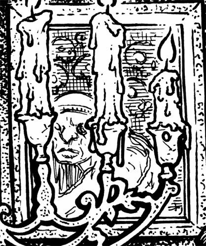 The Baba Yaga. Hidden behind the candelabra Hellboy is holding is the famous witch of Russian folklore with her collection of skull lanterns.
 :Looming over Hellboy's head are the Ogdru Jahad...the seven dragons of the apocalypse destined to destroy the world if unleashed. Hellboy's right hand has the power to un-imprison them.
 Hellboy's Father
 Hellboy's Mother Sarah Hughes, a was a witch & also a descendant of King Arthur.
 Cavendish Hall. The setting of the first Hellboy mini-series. looming over it is Sadu-Hem..the Lovecraftian monster in the series climax.
 This piece is not a direct reference to any specific Hellboy characters or story. Just a few of the impish demons Mike's been drawing in "Hellboy In Hell" carrying around Hellboy's crown (in case he should want to take it up)
 The Troll Witch riding a goat wielding a wooden spoon into battle against an army of trolls. I really like this story for it's folktale quality and it's pacing. And the image of her riding a goat into battle with only a wooden spoon is too great.
 Lastly, this sliver of a painting shows Excalibur set in the stone waiting for the rightful heir of Arthur to pluck it up and command all of England with it.
 Because Hellboy is also one of the subjects celebrated in this year's Comic Con Souvenir book and that is a color-only book, I colored the piece and will submit it with fingers crossed it will make the cut. I'm a big fan of Mike Mignola and a big fan of Hellboy, so getting to celebrate 20 years of that work was an honor and a pleasure.
2014 Appearances:Emerald City Comic Con: March 28-30C2E2: April 25-27Motor City Comic Con: May 16-18Comicpalooza: May 23-25Phoenix Comic Con: June 5-8Heroes Con: June 20-22San Diego Comic Con: July 23-27Boston Comic Con: August 8-10Baltimore Comic Con: Sept. 5-7NY Comic Con: Oct. 9-12
 I decided to have Hellboy all dressed up with no where to go...walking down a hallway with painted images of his past in ornate frames covering the walls. Each one is a reference to something from a Hellboy story, and below, I've provided bigger images of each framed image & info on what it references.
 The 'Drinking with Skeletons' from "The Island". I own a page from this story, the page just before this reveal shot when the sailors are still seen as alive. Not only is the reveal panel great (they were dead all along) it also leads to this awesomely quotable dialogue "Don't mess with me, lady. I've been drinking with skeletons"
 The WWII era photo taken the night Hellboy arrived on earth and was adopted by Trevor Bruttenholm. I debated having a more formal portrait of Hellboy's adoptive father on the wall, but felt there were so many other bits to show in 20 years of stories, this tiny one would have to do.
 Baby Alice and the Wee Fairy Folk. This scene is from the one-shot issue The Corpse, but fans who have kept up with Hellboy comics will know that Alice grows up and plays in important role in Hellboy's life before he dies and goes to Hell. Showing Alice as a baby gave reference to both stories in a way showing adult Alice might not have.
 Pandemonium. Capitol City of the Hellboy version of Hell. I love how Mike shows Hell as a place of beauty...and that the hellish nature is in what goes on there and the disorienting feeling of time and space not syncing up properly.
 The Bird from "Nature of the Beast". In the story Hellboy is reluctantly hunting down a worm/dragon in a wooded area covered in flowers. When he first arrives, a bird is chirping a song (shown by a word balloon with musical notes) but when the menacing dragon is slithering through the low floral coverage and approaching Hellboy, the bird's word balloon is empty. Birds going suddenly silent is used in prose and film as a warning...and Mike's trick with the balloons to use it here is such a great visual.
 The Baba Yaga. Hidden behind the candelabra Hellboy is holding is the famous witch of Russian folklore with her collection of skull lanterns.
  :Looming over Hellboy's head are the Ogdru Jahad...the seven dragons of the apocalypse destined to destroy the world if unleashed. Hellboy's right hand has the power to un-imprison them.
 Hellboy's Father
  Hellboy's Mother Sarah Hughes, a was a witch & also a descendant of King Arthur.
 Cavendish Hall. The setting of the first Hellboy mini-series. looming over it is Sadu-Hem..the Lovecraftian monster in the series climax.
  This piece is not a direct reference to any specific Hellboy characters or story. Just a few of the impish demons Mike's been drawing in "Hellboy In Hell" carrying around Hellboy's crown (in case he should want to take it up)
 The Troll Witch riding a goat wielding a wooden spoon into battle against an army of trolls. I really like this story for it's folktale quality and it's pacing. And the image of her riding a goat into battle with only a wooden spoon is too great.
 Lastly, this sliver of a painting shows Excalibur set in the stone waiting for the rightful heir of Arthur to pluck it up and command all of England with it.
 Because Hellboy is also one of the subjects celebrated in this year's Comic Con Souvenir book and that is a color-only book, I colored the piece and will submit it with fingers crossed it will make the cut. I'm a big fan of Mike Mignola and a big fan of Hellboy, so getting to celebrate 20 years of that work was an honor and a pleasure.
2014 Appearances:Emerald City Comic Con: March 28-30C2E2: April 25-27Motor City Comic Con: May 16-18Comicpalooza: May 23-25Phoenix Comic Con: June 5-8Heroes Con: June 20-22San Diego Comic Con: July 23-27Boston Comic Con: August 8-10Baltimore Comic Con: Sept. 5-7NY Comic Con: Oct. 9-12
February 25, 2014
Usagi CAPS auction piece process
 Stan Sakai & his wife Sharon are very special people. Stan is the creator of Usagi Yojimbo, and Sharon, his wife has been having serious health problems for the past year. CAPS (the Comic Artist Professionals Society) put out a call for original art to auction off to help Stan & Sharon with the medical bills. They have always been a wonderful encouragement to Julia & I with Mouse Guard, and they are such kind and generous folks. I jumped at the chance to do a piece for the auction and to the left, you can see the final inks. Today's post, I'll go through the process of creating it.
 To start I thought back to the issue that Stan mentioned in 2009 when he did a Mouse Guard/Usagi pinup for Winter 1152 #2 (and a question also raised in a panel Stan & I appeared on in Baltimore 2013) How do you feature Guardmice & Usagi in the same image with the heights/sizes being so different? Do you address it? Do you ignore it? Who shrinks or who grows? For this piece my answer was that I should draw Guardmice as they would appear in Stan's world, with as few Mouse Guard trappings as possible. Here are my sketches of Saxon, Kenzie, & Lieam (unused in the final layout) along with Usagi.
 Those sketches were scanned and then assembled together in photoshop along with a background I drew separately after looking up reference for Edo period structures (the time period Usagi is set). Each figure is tinted differently to make it easier for me in this sketch state to see where one figure ends and the background begins. In this digital manipulation stage, I'll also make adjustments to the drawings by making sure eyes are the same size and placed correctly, fixing other proportion issues, and keeping an eye out for bad tangents (contour linework that lines up with some other element in the image which spoils the balance or sense of depth.)
 That digital manipulation is then printed out at 11" x 17" (over the course of patching together several printed sheets on legal paper). I tape the printouts to a sheet of Strathmore 300 series bristol. On my lightbox, I can see through the bristol to the prinout and use it as a guide to ink from. This means I don't have any pencil lines to erase (though I will sometimes tighten up parts of the drawing in pencil on the bristol before inking). The images to the right are a series of photos I took with my phone to send off to a few artists friends to show them my progress on the piece as I worked. I focused on the figures first, then the background.
 In my work I tend to focus on inking in textures to create grey areas, not just focusing on the black maks I'm putting down and how large they are, but how large the white spaces in-between are, and what shapes and patterns they are making. Stan's book is in black and white, so Stan also is very texture heavy in his pages, so it felt right to really play up the patterns and thicknesses and densities of the linework. To the left are several close-up views of the inkwork (all inked with a Copic Multiliner 0.7 nib)
Here again are the final inks. 11" x 17" I sent in for the auction.

I wanted to also add color to this piece. Not for the auction though. I colored it for myself, sent off a high-res to Stan. After this, Dark Horse announced a tribute book titled "The Sakai Project" including most of the CAPS auction pieces will be sold to benefit Stan & Sharon as well. The color version will appear in tha book (slated for release around SDCC) Here is a link to the Dark Horse announcement

The CAPS auctions will be conducted through eBay.com beginning on Thursday, March 6, with a new set of auctions every following Thursday. Each auction, sold under the seller name of "CAPSauction", will be ten days in length with twenty to forty items in each set of auctions. So I don't know when my piece will be up for auction, but with a list of names like Adam Hughes, Arthur Adams, Eric Powell, Matt Groening, Mike Mignola, Jim Steranko, Tim Sale, William Stout, Bill Sienkiewicz, Cameron Stewart, Dan Brereton, Dave Gibbons, Dustin Nguyen, Bill Morrison, Sergio Aragonés, Fabio Moon, Francisco Francavilla, Gene Ha, Geof Darrow, Kevin Eastman, Jeff Smith, Kazu Kibuishi, Paul Chadwick, Richard Corben, Walter Simonson, Charles Vess, J. Scott Campbell (and many many more) it will be exciting to watch & bid on all the auction postings each week.
2014 Appearances:Emerald City Comic Con: March 28-30C2E2: April 25-27Motor City Comic Con: May 16-18Comicpalooza: May 23-25Phoenix Comic Con: June 5-8Heroes Con: June 20-22San Diego Comic Con: July 23-27Boston Comic Con: August 8-10Baltimore Comic Con: Sept. 5-7NY Comic Con: Oct. 9-12
February 18, 2014
Feb 2014 Q & A
 Last month I did a Question and Answer post and put out a call for questions. A lot of questions came in, so I decided to carry them over into this post. I plan on doing these Q & A posts more often, and will put out a call for questions as I'm preparing the next one. But until then, here we go:
Q: When a mouse is forced to combat a snake or larger creature would it be like a human battling a dragon or is my thinking off scale?-Neil Rickmond
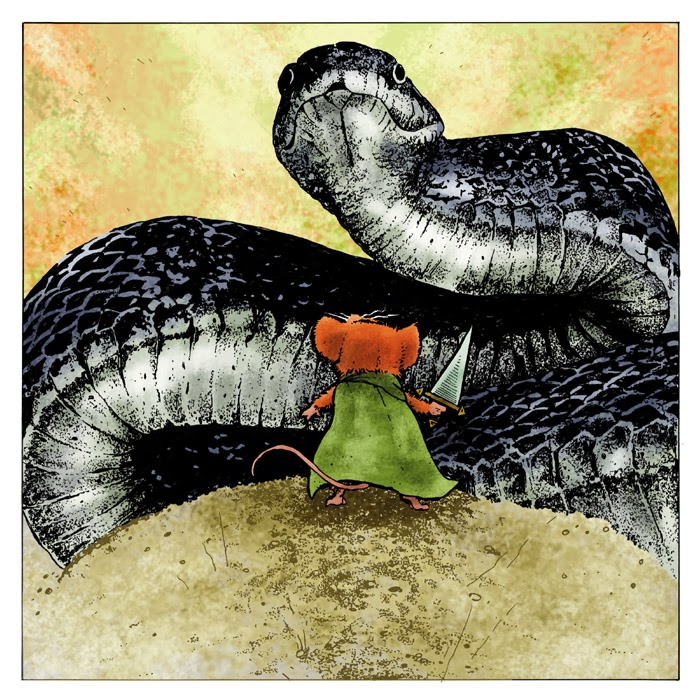
A: Yes, the scale is as accurate as it can be...provided dragons aren't real and so their size varies from fantasy realm to fantasy realm. For that same reason, I find the mouse vs snake story more compelling. Mice are very tiny real creatures and snakes are quick and deadly adversaries...we know this because they exist and we've seen them. Humans are us, and we don't think of ourselves as fragile, like we think of mice...and dragons don't exist, so the idea of that battle is more of excitement, thrill and fantasy, where the mouse and snake battle resonates from a place of our worry for the characters.
Q: Do you think you'll ever be able to up my Mouse Guard "fix" to occur monthly? Possibly by alternating Mouse Guard and Legends of the Guard issues?-Kirk Vangilder
A: Early on when planning solicitation for the Black Axe series, the plan was to do a monthly shedule alternating between Legends and Black Axe. However, I couldn't do it. Black Axe (or any Mouse Guard feature storyline) is a full time job, and Legends is a rather large undertaking as well, so I couldn't manage the full-time project and also take on all my duties with Legends (and that was still with Paul Morrissey as co-editor on Legends) We ended up putting Legends out first and then having me get back to Black Axe. The only way to make a tighter Mouse Guard release schedule work is that I'd need to have almost all the book done before we started soliciting and shipping issues, which would also mean a longer break in between story-lines. This is what I'm hoping to do for the Weasel War of 1149. As a one-man show (who doesn't want to, nor do I think you want me to, pass off any of the duties: writing, drawing, inking, & coloring) it takes a long time to get a book done.
Q: Are you planning to touch more upon the matriarchal structure of the guard in future stories?
-Holy Frickkin Sanjula
 A: This is a hard question to answer without revealing future story-lines. The short answer is yes...I'll start by saying that when I showed the Matriarch's room in Black Axe #5 (and in the extras of the hardcover) with all the stained glass tributes to important Matriarchs, I certainly opened the door for lots of potential stories. I also touched on some of the Matriarch lore in the Role Playing Game text. There I mention how a Matriarch writes the name of her successor down in a sealed envelope only to be opened by her at her own retirement or after her death and a new Matriarch is needed. I'll say this...I know someday I will tell a story where a matriarch other than Gwendolyn is in charge.
Q: Do you have any plans to introduce rats to your world? I love reading about the mice, but rats are a special favorite of mine.
-Malcolm Young
A: Sorry, Malcolm (and to all other lovers of rats), but I don't think I'll ever use rats in Mouse Guard. The Rats I eliminated because I didn't want a "big brother" species that close to the mice. Rats also come with some connotations I'd have to work though: being vicious, and filthy, and an auto-villain, but also as a dweller of rural environments. The species I choose to use tend to feel more woodsy, native, and indigenous to the Mouse Guard world. For this same reason we won't ever see cats or dogs....they imply a human world right around the corner that I don't have in Mouse Guard. However, Bill Willingham asked to have a cat in his Legends story, and it made it in, so perhaps if someone in the future pitches me a good rat story I'll also open that door in Legend form.
Q: Do you use photo references? or any of that kind to make those dynamic angles? -Dean Carantes
 A: Yes, I do. I reference photos of animals (some from Google, some from books, and some I've taken myself) but always try to do my own take on the drawing and inking. For the mice I don't reference much but my own past drawings. I have to draw them so often, and stylized enough to do the things they do (stand on two legs, hold weapons, talk, emote, etc) that I had to kind of design my own mouse. The other species I try and get more accurate because they need to be the realistic setting, backdrop, and threat to my characters. If this all looks too animated or simple, or stylized, the reader won't invest as much concern into the characters. For the locations I used to rely on stock photo reference, but quickly found it limiting for all the angles and design changes I wanted to do, so I started building my own models.
 Q: Which is harder for you to do in a comic, a full, single panel page or a page with a number of panels?
-Aaron Ebertowski
A: Since I do everything on Mouse Guard, there are several different points of view I can have on this question depending on which part of production I'm doing: writing, layouts, pencils/inks, or colors. From my writing point of view, the harder is the single panel page, but mainly because of my 23 page count per issue, I'm giving up a full page for one moment. That moment will need to be worth it to justify cutting away from other moments and scenes. When I'm doing the layouts, a page with a number of panels is the more difficult since I have to puzzle piece together a series of moments (some in tall panels some in wide panels) in a way that fits in the page and still has clear flow for the reader. Once a layout is established and I'm drawing and/or inking, the two are often the same amount of difficulty. Both occupy 11" x 11" on my original pages...and while the multiple panel pages have gutters, that space is negligible. When coloring I can also go either way as to which is harder, and is more dependent on what the content is on each page rather than the size or number of the panels.
2014 Appearances:MSU Comics Forum: February 22Emerald City Comic Con: March 28-30C2E2: April 25-27Motor City Comic Con: May 16-18Comicpalooza: May 23-25Phoenix Comic Con: June 5-8Heroes Con: June 20-22San Diego Comic Con: July 23-27Boston Comic Con: August 8-10Baltimore Comic Con: Sept. 5-7NY Comic Con: Oct. 9-12
February 11, 2014
2014 FCBD Cover Art
 Archaia is once again doing a HARDCOVER release for this year's Free Comic Book Day! And Mouse Guard will be on the cover (making this my fifth straight year of being the cover image for Archaia's FCBD offering). To the left you can see the final art I did for the cover. And for today's blogpost I'll do my best to break down my process...all while trying not to spoil the subject of the story. I can share that this year will follow the tradition of a younger version of a Mouse Guard character being told a morality story that somehow helps shape who they are as Guardmice in the series.
 I started off my process of designing this cover by thinking about the visual lead-in the morality tale would use. In the past I've had stained glass windows, puppets, and book illustrations as the delivery system. The idea of using playing cards struck me as a fun way to get in to a story, but it meant I'd have to design my own cards. These early Swiss playing cards I found in doing some research became my inspiration point for how I'd like to treat my design aesthetic.
 Like readers of my blog will know, I tend to obsess over the details of the Mouse Guard world, and making up playing cards proved to be no exception. I thought that not only may I need to draw these cards again in another story, but also what if I ever wanted to make a real set with real Mousey rules? I won't bore you with the details, but I created a 50-55 card deck (still debating part of it) with what amounts to 5 suits (trades) and 10-11 numbers (objects) along with another card notation thrown in so that if I ever make a game, I'll have more variables to play with.
 With the cards designed, I started on my three main characters. I can't tell you who they are or what the represent, or why they all are holding Black Axes...but I can tell you that they were originally all male, and I changed them to female after a talk with my wife, Julia again about the story. To the right are the sketches of them.
 I scanned those sketches and placed them in a new 12" x 12" document (the size of the original cover art) along with the designs of my cards. I tinted each mouse and the acorn pile just to help me clarify all the rough pencils into the various characters and horizon. When I'm putting together a composite like this, I can play with the scale of the characters, their physical relationship with one another, how close or how far apart they stand, check for tangents, odd negative shapes, etc. It's a great way to work on layout without having to redraw anything or sacrifice the feeling of drawing traditionally.
 Once I get the digital composite layout the way I want it, I'll print it out on regular printer paper (this one took two sheets of legal paper taped together). I tape the printout to the back of a sheet of Strathmore 300 series Bristol (their 12" x 12" pads come in handy) and ink the piece on a lightbox (I have a 24" 18" lightbox and an even larger light table). The inkwork is all done with Copic Multiliners (mostly the 0.35 & 0.7 nibs) with a bit of brush & ink for the larger fill areas. A lot of my inkwork tends to come down to a series of repeating forms (the acorns, the pattern on the acorn caps, the scale-mail armor, the twist of the axe handles...) and textures like cross hatching and stippling that end up forming small positive and negative shapes of repeating forms.
 The last step is to scan the inked piece and color the artwork. I do this all in Photoshop 7.0 (pre-CS). This cover was an endless cycle of changing colors until I arrived at the palette seen here. Color and value are relative to the colors next to them. a midtone can appear dark when next to lights, and then light when next to darks. Greys can look green next to reds and blue next to oranges...this was the case with every change I made for the cover...if I darkened the background, I needed to lighten the mice, if I made the cards more yellow, I need to adjust every character's clothes. Once I had the color choices made, I rendered (added texture, highlights, and shadows) using the dodge & burn tools.
The Archaia FCBD Hardcover featuring this cover, a Mouse Guard story, and several more from Archaia's stock of quality storytellers and titles, will be FREE in comic book stores on May 3 (First Saturday in May). I encourage you to go to FCBD and take a friend who doesn't know about the day ad/or doesn't read comics...because there is a comic out there for everyone, and on May 3rd the first one's free.
2014 Appearances:MSU Comics Forum: February 22Emerald City Comic Con: March 28-30C2E2: April 25-27Motor City Comic Con: May 16-18Comicpalooza: May 23-25Phoenix Comic Con: June 5-8Heroes Con: June 20-22San Diego Comic Con: July 23-27Boston Comic Con: August 8-10Baltimore Comic Con: Sept. 5-7NY Comic Con: Oct. 9-12
February 4, 2014
Updated Tower Portraits
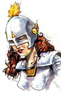
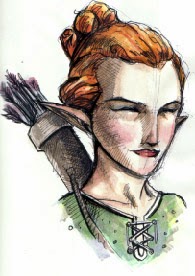
 Annice Quinn:Annice is a Human Bard. In the game, she cab try to distract monsters with music, ultimately giving her better odds at killing the beast. Her original look was supposed to be inspired by Gwyneth Paltrow, but I didn't achieve that lofty goal back then. The red, white, and blue wardrobe was inspired by the bright colorful costume of the Bard class in the 1995 D&D player's Handbook. For the update, I didn't do much in terms of design changes, but focused more on improved artwork. I still have an unsteady time drawing humans, and females especially. I wanted Annice to be pretty, but not come across as sexy or sultry in any way. The updated version keeps the hint of a smile and has an improved sense of texture for both her dress and turban-wrap headpiece.
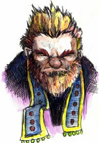
 Dalton MattockDalton is a Dwarven Armorer. In the game, he can take one more wound than every other player because of his superior armor. Dalton's original look was based on a co-worker at Starbucks...who was not a dwarf nor an armorer. So, my old painting was mostly a caricature-portrait head with rather ugly armor as a pedestal for it. For my update, I no longer knew what that co-worker looked like (beyond blurred memory) so I could only base the new portrait on the old. I felt Dalton's hair and beard needed to be less neat to be a proper dwarf, and I added the bags under his eyes to show the exhaustion from lugging around the heavy full plate armor. For his new armor, I gave it a pattern to imply that it was a unique piece of work, and though scaled down, the neck still has the old rivet detail.
 Demtremi O'BallasDemtremi is a Drow Assassin. In the game, instead of just ambushing players to steal treasure like the other characters, he can kill their characters and take it all, making the other player start over from scratch. Demtremi's old portrait is based on my college roomate Nick Kowalcyk. Demtremis was one of Nick's old D&D characters who I think in turn was inspired by the R.A. Salvatore character Drizzt Do'Urden. For his update, I tried to give the assassin a more menacing look, while not making him outright evil. The armor was added to both add visual interest while also look foreign and otherworldly compared to the rest of the characters' clothes and arms.
 Fike the Mox:
Fike is a Human Barbarian. In the game, Fike served as a baseline character with no extra-special abilities or any handicaps (though later we gave him a special bag that allows him to hide 3 treasure cards to they can not be stolen). Fike's original portrait came from me trying to draw a box-headed barbarian build with my friend Mike Davis' hair and beard of the time (the scar was just to show how tough Fike was). Mike tended to name all his RPG characters Mike Fox, and somewhere along the line, we started mocking him calling all his characters Fike Mox. I added a 'the' to imply that Mox was some sort of tribe or region. For the update I just tried my best to make Fike look less goofy and more imposing as a physical specimen.

 Fisher Spasky
Fisher is a Dwarven Berzerker. In the game, he has multiple attacks per turn. Fisher is based on my friend Seyth Mirsma's old D&D character (Seyth helped co-create the rules for Tower). I don't think my original version of Fisher looks anything like Seyth's idea of him, but I used this older portrait as my only starting point for the new one (so he still doesn't look like Seyth's idea of Fisher). I pushed for a more expressive face and some texture details for the fur cloak (a garment I think implies toughness, wealth, and determination). The way his front tuft of hair falls down into his face is something my Father's hair does when he gets worked up.

 Jhan Silverthatch
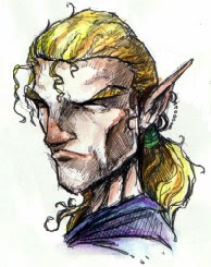
Jhan is an Elven Mage. In the game, he has the widest range of magical spells to choose from. The original portrait of Jhan was based on Seyth's college roommate John. The name Silverthatch was a joke on John's desire to dye his hair silver. For this updated portrait, I did debate giving him premature silver locks, but opted to retain the original design and started coming up with options for where the Silverthatch surname came from...is it a place? a guild? do elves in this bloodline tend to go silver before their time and Jhan hasn't yet? I focused on shifting the facial features away from bing a bad caricature and into looking more like a believable elf.

 Lucas Taver
Lucas is an Elven Thief. In the game he can move quickly and pick what he steals from other players instead of choosing randomly. Lucas was my long-time D&D character. I don't think I played with any one incarnation of him more than twice, but I kept re-making him for new adventures. The original version was meant to look like me in my college days, but for the update, I tried to blend that young David Petersen visage with something that looked like a proper elf from a fantasy realm. The floppy hat was scaled back to feel more manageable for a thief to wear and still go un-noticed. The hat band being of a more reddish color and tying into a knot like that is an homage to my Mouse Guard alter-ego Saxon.

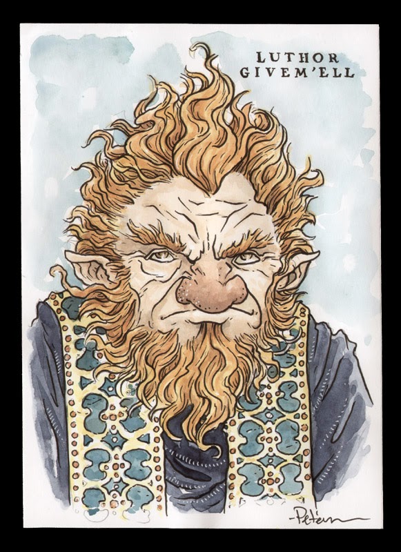
 Luthor Givem'ell
Luthor is a Halfling Battle Mage. In the game he has only offensive spells like Fireball and Lightning as well as a few chances to cast two spells in the same turn.
The original Luthor art probably owes something to anime I was watching at the time. For the update I tried to keep the old hair, but give it more of a curly Halfling texture, though he still looks more Dwarven than Halfling in every other respect. I gave the stole a more elaborate design that somehow felt cultural rather than just a pattern for-the-sake-of pattern
 Madalyne Chevalier:
Madalyne is a Human Paladin. In the game, she has the ability to heal herself more quickly than other players, as well as being a good fighter. Tower was an attempt by Seyth and I to fix our gameplay & design issues with TSR's Dungeon board game. Madalyne the Paladin was a character card from Dungeon we decided to bring over to Tower. The original art was just an elaboration on the Dungeon art, and in that same way, the update is mostly an elaboration on the original. The flourishes added to the armor include designs I found in historic and ren-faire fantasy armor, etched sun-motif patterns, and a peacock feather for her heraldic plume. Madalyne also got an updated name with the addition of the surname Chevalier.


Packus Shortbeard:
Packus is a Dwarven Cleric. In the Game Packus has some cleric spells at his disposal as well as a special 1 use spell that redistributes all the discovered treasure cards equally amongst the players. For his updated portrait, I gave him a bit more of a beard while still keeping it short. His overall facial structure became more traditional Dwarf, and I gave the armor a touch of believeability to the construction. His front tuft of hair as well as his mole stayed for this incarnation.

 Pax Teahille:
Pax is a Halfling Priest. In the game Pax has the widest range of clerical spells and a special spectral sword she can summon twice to help her attacks. The original portrait of Pax was an instance of me looking at a photo of someone to base the drawing on because of my inexperience & comfort drawing women well. For her update, I wanted to make her look more like a Halfling, so I broadened her face and gave her hair a bit more texture. While struggling to draw her features this time around I tried to think of Tony DiTerlizzi drawings I liked. The costume dress was one I always liked from the original version, so I didn't do anything really to update it.

 Quiver Dare:
Quiver is a Gnomish Acrobat. In the game, he can tumble while defending against monsters to lower his chances of being killed by that beast. Quiver is another D&D character of Seyth's. The original portrait was a bit of a caricature (the sideburns mostly) of Seyth, but I don't know why I added the Mike Nesmith-esque wool hat. For the update, I decided to make the hat shaped a bit more like a traditional gnome hat, I kept the diamond pattern tunic because it felt like something a performer-adventurer might wear. The facial structure for Quiver was the biggest change. I wanted him to look less human and more fey-like. I enlarged the nose, sunk the jawline and compacted the eyes/nose/mouth relationship. But I kept the sideburns.

 Rien Draak:
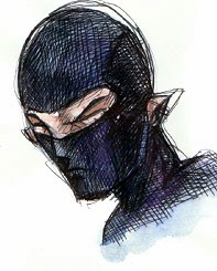
Rien Draak (originally un-named) is a Gnomish Ninja. In the game he has a few spells to help him attack quickly. He also has a hooked rope which allows him to quickly escape rooms with monsters with no penalty. The original character and portrait was Seyth & I scraping the bottom of the barrel for ideas. For the update, because there was nothing Gnomish about my original art, I did the biggest re-design of this series. I approached it with what ninja apparel would look like if it came from Gnomish culture. The folded hood is meant to echo a folded Gnome hat. Since he was un-named in the original, I thought he deserved better. The Rien comes from Rien Poortvliet the Dutch illustrator of the Gnomes Book. Draak is the Dutch word for dragon...to evoke the culture associated with ninjitsu.

 Solae Pathfinder:
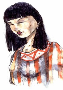
Solae is an Elven Ranger. In the game she has an animal companion that allows her a second attack on a monster at a reduced efficacy. The art for Solae was always meant to show a confident, capeable, and dangerous woman. I didn't want to loose those qualities, but had to figure out how to apply them to a less stylized facial structure. I remembered that when I drew the original I'd looked at photos of Julianne Moore, so I did that again this time, but made sure I was only trying to capture her personality qualities and not her actual facial features. I added a small flourish to the collar of her tunic and had a lot of fun drawing in the texture and drape of her hair.

 Tyne Mossbrook:
Tyne is a Halfling Druid. In the game she has a small mix of magic spells, but also some special seed pods that grow rapidly and ensnare monsters. Tyne was the last character I painted for the original game. I think Seyth and I re-designed her a number of times and I couldn't do the art for her until we had something nailed down. I meant for her not to be a representation of my friend Ann Glenn, but more of a character I could see her play in D&D. For the re-design I widened the face to feel more like a Halfling's, and I added texture and detail to the costume as it stood.

Luke Crane, game designer who wrote the Mouse Guard RPG, visited me last week, he and I discussed what game mechanics were broken with Tower. We made a mental list of what worked and what was broken. He and I hammered out a few ideas on where I could take the game (in design terms) to get it to a place I could release this game (which fans have asked about since the first I shared it.) I don't know when I'll get to that point, but I have a direction, and 15 new character portraits to go with it.
2014 Appearances:MSU Comics Forum: February 22Emerald City Comic Con: March 28-30C2E2: April 25-27Motor City Comic Con: May 16-18Comicpalooza: May 23-25Phoenix Comic Con: June 5-8Heroes Con: June 20-22San Diego Comic Con: July 23-27Boston Comic Con: August 8-10Baltimore Comic Con: Sept. 5-7NY Comic Con: Oct. 9-12
January 28, 2014
Monsters & Dames 2014
 The Emerald City Comic Con puts out an art book each year called "Monsters & Dames"...with the theme matching the title. The book benefits the Seattle Children's Hospital and is a great collection of artwork from many of the guests and artists in artist alley. I've done pieces for 3 of the past books: Beauty & Beast, Frankenstein's Monster & Bride, & A Dame riding a Dragon. To the left you can see this year's piece, and today's blogpost will cover the process for making the artwork.
 The beginning of this piece had a few false starts, including the idea of a monster admiring fairies (dame-fairies), a dame/monster wedding, and a dame walking her pet monster on a leash. I kept playing with monster heads to get me into the right mood for the piece, but none of these were what I wanted. I did like some of what was happening with one of the heads though (middle top), and thought I could make it better...
 Taking that head I liked above, I worked out a better head design and felt I got to play with the monster's personality a bit. It combined a few ideas from the past designs, with a little bit of a Disney tiger mouth/jaw structure. The full figure sketch followed, which gave me a sense of the overall layout and scale of Monster to Dame...and then set about getting a dame pose that worked. The final dame sketch was a hybrid of a few reference photos for the pose, dress, & umbrella. For the beast, I was still undecided on those horns...with or without...
 I composited the sketches in photoshop into a template for the file specs of the piece. The yellow and orange border lines represent the edge of the 'live area' as well as the 'bleed' (or in layman's terms, where you want to keep all the important bits, and where you need to extend the art out to so when the paper is trimmed you don't have an unprinted edge). I tinted the image of the dame to help me make better sense of the lines and figures. And while debating the horns, I dropped in a photo of some real ram horns and liked them so well, I didn't bother redrawing them for the layout.
 I printed out the above composite and taped it to the back of a sheet of Strathmore 300 series bristol. On a lightbox, I was able to see through the bristol and use the printout as a guide to ink by. The inks are all done with Copic Multiliners (the 0.35 & 0.7 nibs mainly) I focused on adding a nice amount of texture while still making sure the outer contours still read well. The bone landscape was roughed in very loosely in the layout, so I did pencil in tighter bones as I inked...referencing dinosaur, large mammal, and human skeletons.
 The inks are then scanned back into photoshop and I start the coloring process. This stage is called 'flatting' because I'm simply establishing the color areas with flat base colors. I had no idea what my overall palate would be for this piece, but in the flatting stage it doesn't really matter, just color in the lines and differentiate areas that are meant to be different colors. I tend to make a new layer for most types of 'things' in my file: "beast fur", " skin", "dress", "sky", "bones", etc. It makes it easier to re-isolate an area when I want to render it or adjust the color overall.
Here again is the final render, which I achieved by using the dodge & burn tools (with the drybrush as my brush to add texture & mottling).
The inks are then scanned back into photoshop and I start the coloring process. This stage is called 'flatting' because I'm simply establishing the color areas with flat base colors. I had no idea what my overall palate would be for this piece, but in the flatting stage it doesn't really matter, just color in the lines and differentiate areas that are meant to be different colors. I tend to make a new layer for most types of 'things' in my file: "beast fur", " skin", "dress", "sky", "bones", etc. It makes it easier to re-isolate an area when I want to render it or adjust the color overall.
Here again is the final render, which I achieved by using the dodge & burn tools (with the drybrush as my brush to add texture & mottling).The Monsters & Dames book will be available at the Emerald City Comic Con for purchase (as well as the original art being auctioned off there) and remaining books are usually offered for sale online through the Emerald City website after the con ends.
Also this year at Emerald City, I'll be debuting an offset print of last year's Beauty & Beast piece and offering more of them for sale in my online store after I return home.
2014 Appearances:MSU Comics Forum: February 22Emerald City Comic Con: March 28-30C2E2: April 25-27Motor City Comic Con: May 16-18Comicpalooza: May 23-25Phoenix Comic Con: June 5-8Heroes Con: June 20-22San Diego Comic Con: July 23-27Boston Comic Con: August 8-10Baltimore Comic Con: Sept. 5-7NY Comic Con: Oct. 9-12
David Petersen's Blog

- David Petersen's profile
- 339 followers
David Petersen isn't a Goodreads Author
(yet),
but they
do have a blog,
so here are some recent posts imported from
their feed.

