
David Petersen's Blog, page 60
June 10, 2014
Recent Commissions
This week I'm sharing some of my recent commissions. This first batch was from C2E2.
 Harry and Hagrid from Book 7: The Deathly Hallows. The commissioner originally requested a moment after this when Hagrid has leapt off the motorbike and Voldemort is in pursuit, but as a composition I felt the moment before when Hagrid is trying to repair the bike & sidecar was more interesting.
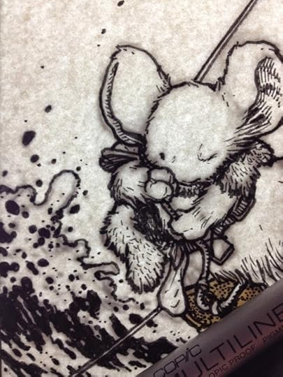
 Process photo while I was inking
 Mrs. Brisby/Frisby and the Owl from Secret of NIMHThis was rather straight forward and only took a little bit of work to modify my style of drawing owls and mice to something more like the animated feature designs. The webbing was almost entirely done by inking in the space between the web rather than going back in with white.
 Process photo while I was inking
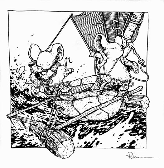
 Hooded Merganser Drake & a MouseThe commissioner hopes to get on my list a total of 3 times for a sequence of images. This being the third where the mouse and duck have discovered and collected an under water treasure.
 Process photo while I was inking
 Baby Emperor Penguins with Saxon and KenzieThe commissioner requested a group of these chubby cute penguins with Saxon and Kenzie in appropriate gear for a visit, with perhaps the penguins giving them a gift (the fish). Unfortunately I didn't take an process photos as I inked the piece.
--------
After C2E2 I had to stop doing commissions for conventions. The plan is to have them canceled through May & June only so I can catch up on work when I'm at home in between a busy con schedule, and so that I don't burn out at cons, so that when I do get home I can get back to work on some tight deadlines. But because I still needed pieces of the 2014 Mouse Guard sketchbook, I started doing pieces in hotel rooms, as I wound down at night at home, etc...with no pressure of them filling a request or being due at any given time. I then sell these at conventions. Below are the results (and they are all spoken for) Alma: A cook.I have a Mouse Guard story with a cook coming up and I needed to design her look and costume. Plus I thought it would be fun to explore the ingredients a mouse cook would have at the ready: Coriander, seeds, wild onions, acorns, berries, carrots, rosemary, peppercorns, etc.
 Process photo while I was inking
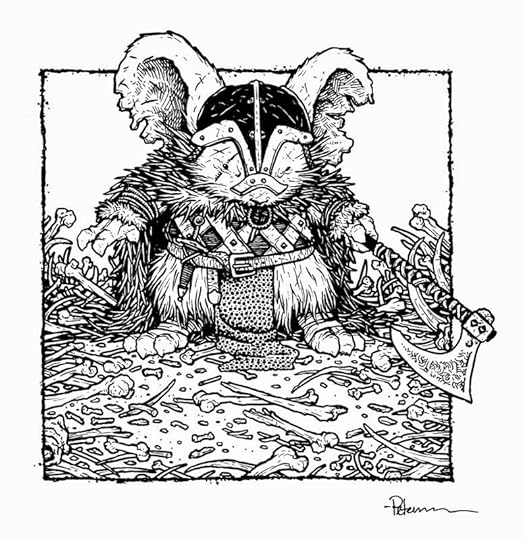 Ragnier: A HunterAgain I needed a character design for a Mouse Guard story, this time a rough, rugged, and battle scarred veteran hunter/warrior. He is scarred and his ears are tattered, his cloak is one of something else's hide, he wears leather and chain armor, and a weapons that can only deal death: an axe. i enjoy drawing bones and thought it was fun to have them not fill the space, but act as a gradient and get more dense near the edges.
 Process photo while I was inking
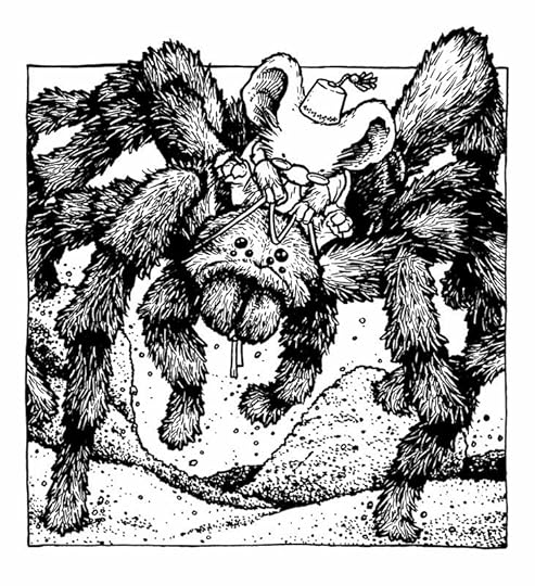 A Mouse with a Fez riding a TarantulaAfter two character designs, I thought I should do something with no purpose and a bit of a story implied. This was just for fun because I don't know that you would ever see a tarantula in Mouse Guard (not the right region). And while I say there is a story, it's an implied story for you to imagine, I have nothing specific in mind.
 Process photo while I was inking
 Midnight with the Black Axe on a pinecone raftIt had been a while since I'd drawn the Fall 1152 villain. This piece was more about pose, and a pattern of large black shapes and large white negative spaces than it was about a typical Mouse Guard panel with detailed background or implied story.
 Process photo while I was inking
 Mouse NurseryI was asked by someone about how mouse children are/would be depicted in the books since real mouse babies are hairless, pink, and not very cute. Real mice do get cute quickly, so I think almost every child portrayal I've done so far synchs up with nature in that way...but It got me thinking how I'd handle a little baby...and then I just wanted to draw a mouse-made crib. Unfortunately, no process photos of this piece.
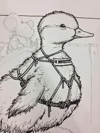
 Mouse & Duckling jousterWhile at a convention and thinking of birds I have yet to draw in Mouse Guard (or for commissions), a duckling came to mind (though I have drawn a gosling). And I thought it might be fun to do an Atari Joust homage and give the mouse a lance.
 Process photo while I was inking
I may have some more pieces like these for my remaining June shows if I have the time.Hopefully I'll be able to open a commission list for SDCC. If I do, I'll post on Facebook and Twitter that I've opened up the list in my online store. The pieces must be picked up at the convention.
2014 Appearances:Special Edition NYC: June 14-15Heroes Con: June 20-22San Diego Comic Con: July 23-27Boston Comic Con: August 8-10Baltimore Comic Con: Sept. 5-7NY Comic Con: Oct. 9-12
 Harry and Hagrid from Book 7: The Deathly Hallows. The commissioner originally requested a moment after this when Hagrid has leapt off the motorbike and Voldemort is in pursuit, but as a composition I felt the moment before when Hagrid is trying to repair the bike & sidecar was more interesting.
 Process photo while I was inking
 Mrs. Brisby/Frisby and the Owl from Secret of NIMHThis was rather straight forward and only took a little bit of work to modify my style of drawing owls and mice to something more like the animated feature designs. The webbing was almost entirely done by inking in the space between the web rather than going back in with white.
 Process photo while I was inking
 Hooded Merganser Drake & a MouseThe commissioner hopes to get on my list a total of 3 times for a sequence of images. This being the third where the mouse and duck have discovered and collected an under water treasure.
 Process photo while I was inking
 Baby Emperor Penguins with Saxon and KenzieThe commissioner requested a group of these chubby cute penguins with Saxon and Kenzie in appropriate gear for a visit, with perhaps the penguins giving them a gift (the fish). Unfortunately I didn't take an process photos as I inked the piece.
--------
After C2E2 I had to stop doing commissions for conventions. The plan is to have them canceled through May & June only so I can catch up on work when I'm at home in between a busy con schedule, and so that I don't burn out at cons, so that when I do get home I can get back to work on some tight deadlines. But because I still needed pieces of the 2014 Mouse Guard sketchbook, I started doing pieces in hotel rooms, as I wound down at night at home, etc...with no pressure of them filling a request or being due at any given time. I then sell these at conventions. Below are the results (and they are all spoken for)
 Alma: A cook.I have a Mouse Guard story with a cook coming up and I needed to design her look and costume. Plus I thought it would be fun to explore the ingredients a mouse cook would have at the ready: Coriander, seeds, wild onions, acorns, berries, carrots, rosemary, peppercorns, etc.
 Process photo while I was inking
 Ragnier: A HunterAgain I needed a character design for a Mouse Guard story, this time a rough, rugged, and battle scarred veteran hunter/warrior. He is scarred and his ears are tattered, his cloak is one of something else's hide, he wears leather and chain armor, and a weapons that can only deal death: an axe. i enjoy drawing bones and thought it was fun to have them not fill the space, but act as a gradient and get more dense near the edges.
 Process photo while I was inking
 A Mouse with a Fez riding a TarantulaAfter two character designs, I thought I should do something with no purpose and a bit of a story implied. This was just for fun because I don't know that you would ever see a tarantula in Mouse Guard (not the right region). And while I say there is a story, it's an implied story for you to imagine, I have nothing specific in mind.
 Process photo while I was inking
 Midnight with the Black Axe on a pinecone raftIt had been a while since I'd drawn the Fall 1152 villain. This piece was more about pose, and a pattern of large black shapes and large white negative spaces than it was about a typical Mouse Guard panel with detailed background or implied story.
 Process photo while I was inking
 Mouse NurseryI was asked by someone about how mouse children are/would be depicted in the books since real mouse babies are hairless, pink, and not very cute. Real mice do get cute quickly, so I think almost every child portrayal I've done so far synchs up with nature in that way...but It got me thinking how I'd handle a little baby...and then I just wanted to draw a mouse-made crib. Unfortunately, no process photos of this piece.
 Mouse & Duckling jousterWhile at a convention and thinking of birds I have yet to draw in Mouse Guard (or for commissions), a duckling came to mind (though I have drawn a gosling). And I thought it might be fun to do an Atari Joust homage and give the mouse a lance.
 Process photo while I was inking
I may have some more pieces like these for my remaining June shows if I have the time.Hopefully I'll be able to open a commission list for SDCC. If I do, I'll post on Facebook and Twitter that I've opened up the list in my online store. The pieces must be picked up at the convention.
2014 Appearances:Special Edition NYC: June 14-15Heroes Con: June 20-22San Diego Comic Con: July 23-27Boston Comic Con: August 8-10Baltimore Comic Con: Sept. 5-7NY Comic Con: Oct. 9-12


June 3, 2014
Turtles in Time Cover #3 process
 In the third issue of IDW's Turtles in Time miniseries, the four brothers find themselves on a pirate ship! When editor Bobby Curnow originally pitched me the 4 issue lineup, the third issue was in a bit of flux for the setting....WWI and the Old West were both tossed around and I had visual ideas for how to handle both,,,(bi-planes and trains!) But when the series solidified, Bobby emailed "PIRATES!". And I was off to doodle and research (even calling on my pal Jeremy Bastian for piratey-tips) for a swashbuckling ninja turtles cover. To the left you can see the finished art, but below I go into the process it took to get there.
 Michelangelo has a lead role in this issue and so I started with his design as a captain keeping in mind with Mike's lighthearted attitude. To fit everyone on the cover, I figured I'd have to have someone up on the rigging and some turtles further back. By this point I'd also looked at lots and lots of photos of ship deck photos to find something I thought I could make work. With the angles of the setting in mind, I drew Don on the rigging with a spyglass (using technology of-the-day) and Raph & Leo squabbling and swordfighting further back. These were all sketched on various sheets of copy paper to keep me loose and unattached to any drawing going poorly (there were two that were not working early on that I pitched and moved on)
 Those pencil drawn elements were all scanned and then assembled in photoshop to come up with the layout of the cover. At this stage, I made a few adjustments where I'd drawn heads too small, replacement hands to patch in, and swords to angle correctly to avoid bad tangents. The colors were added not just to help me see the drawings better (where one character ended and the next began) but also to show my editor and Nickelodeon as to which turtle is which. This is now my secont TMNT cover where I have shown them all without bandannas or their traditional weapons (though for #2, Leo did have a katana) and I found it fun trying to show some of each turtle's personality in other ways...though their bandanna colors do play a part again later on.
 The digital composite, once approved by my editors, was then printed out at roughly 10" x 15" and taped to the back of a sheet of Strathmore 30 series bristol board. I inked with Copic Multiliners on my lightbox. Using a lightbox allows me to see through the surface of the bristol to the printout and use it as a guide instead of pencils on the surface of the bristol. This means less erasing and cleanup when I finish the inks. The stars and moon were inled in black, though I knew I was going to adjust them to be light lines in the color process. While I was inking I realized I'd never drawn pirate garb on Don in my rough, I'd only drawn him in the pose I wanted. So I had to quickly do some last minute design and penciling so I could finish the piece.
 To start the color process means that I must establish color areas. It's a way of isolating parts of a drawing as each being different colors than others. This is called flatting (because you aren't rendering or shading, you are just filling in flat colors. I used a lot of high-saturation basic colors to help me see that I was establishing areas that may be next to each other as different colors. Once I got to this stage of the flatting, I desaturated (removed all color information & turned to greyscale) all the layers (other than the sky, ship and moon which I knew I'd gotten close to final colors for. Like issue #2 of this series, I had to incorporate each turtle's bandanna color into their wardrobe to help the readers quickly establish which turtle is which beyond their body language. The final colors can be seen again below.
Other TMNT in Time Cover Process Posts:Issue 1Issue 2
2014 Appearances:Phoenix Comic Con: June 5-8Special Edition NYC: June 14-15Heroes Con: June 20-22San Diego Comic Con: July 23-27Boston Comic Con: August 8-10Baltimore Comic Con: Sept. 5-7NY Comic Con: Oct. 9-12
May 27, 2014
Table Titans Fanart Process
 Table Titans is a webcomic by Scott Kurtz & Bryan Hurtt (colors by Steve Hammaker). It's about a group of friends playing D&D, and while that may sound like a very narrow story, it's a really fun and accessable comic more about adventure and friendships and personality-types than anything game-specific. It also drives home a point I think is important with RPGs...that the rules are only there as structure so the players and GM can have fun telling a memorable story together. Because I enjoyed the strip so much, I did this piece of fanart for Scott. Today's blogpost I share the process of painting the piece.
 The first step was to sketch out all the characters and come up with a composition that looked good. I decided to have each character appear as their in-game persona because the costumes are more fun. Each character was drawn separately in my sketchbook (each taking up a page). The scanned sketches were then tinted in photoshop and shuffled around until a usable layout appeared. At this stage I was also able to do some digital fixing of my drawings by mirroring the images and making sure the eyes were at the same height on the face, while also making subtle tweaks to get expressions the way I wanted.
 The plan for this piece was to watercolor the characters rather than do my normal inks & digital colors. I printed out the layout and then on a liughtbox traced the lines in pencil onto a sheet of 300 series bristol board. I then start with the light and subtle areas of facial tones in watercolor. I use a travel kit of Sakura Koi Watercolors, and the orange cake is a really good stand alone base for light-skinned color tones (though tinting each with a bit of other tones to mute and offset that orange makes for more realistic colors)
For the rest of the piece I work around usually going from light areas to dark areas, and moving over to dry areas while wet areas dry. Here's a shot of each character in-progress:


 Here is the group after I had done all the watercolor work. And as much as I like painting, and subtlety, I rarely feel like one of my watercolors looks 'finished' without line added. I am a line guy...and fighting it would be silly. So the next step was to go back over the pencils an ink in the line work adding some minor details and textures.
So here again is the finished piece with inkwork. If you enjoyed it and/or like Roleplaying, consider reading Table Titans from the beginning, it's really fun and well made.

2014 Appearances:Phoenix Comic Con: June 5-8Special Edition NYC: June 14-15Heroes Con: June 20-22San Diego Comic Con: July 23-27Boston Comic Con: August 8-10Baltimore Comic Con: Sept. 5-7NY Comic Con: Oct. 9-12
May 20, 2014
TMNT 30th Anniversary Tribute
 For the 30th Anniversary of the Teenage Mutant Ninja Turtles, IDW is doing a special 48 page book featuring new stories by past TMNT artists including a new cover by Eastman & Laird! I was asked by editor Bobby Curnow to do a pinup for the book. I've mentioned before what a special and influential part TMNT played in me understanding storytelling, comics, and wanting to be a creator (it also was the link that started my friendship with the real life-Kenzie to my Saxon: Jesse Glenn). To the left you can see the finished piece, but below are the steps of creating it along with some though process as I worked.
 The newspaper concept wasn't my first idea. I originally was going to do something with the four turtles each lugging along all their earthly possessions (in an abandoned shopping cart, milk crates, patched duffles, etc,) down a sewer tunnel as just around the corner NYC sewer workers were doing work in that branch of their home. It proved to be something I saw more as a story and had a hard time summing it up in a single image. Instead I focused on just drawing each of the turtles in a cool pose where I might be able to group them together well. As I did that the concept of a newspaper came to me and I drew a 'photo' of Shredder too. Each of these are on separate sheets of copy paper, which give me mental freedom to make a mistake and pitch something that's not working because it's not on 'good' paper or bound in a sketchbook.
 I scanned the sketches and composited them in Photoshop into a layout.I asked Bobby if I could use NEW YORK TIMES for the paper, but he advised copying their masthead design could be a legal issue, so I opted to make up my own that felt like the times, but was different. I tried other newspaper names like Sentinel and Journal...but liked Herald best (There was in-fact, a New York Herald which stopped publication in 1924). The type (though much of it is blocked or goes off the edges) was all written like a newspaper article. It was about a crime wave that police had few leads for, but after a botched subway hijacking, police may have found links from "The Foot Clan" to Oroku Saki pinning him as the masked "Shredder" crime boss. The date is an approximation of when Kevin & Pete first created the TMNT (they say it was late Oct. or early Nov.)
 I printed the composited layout you see above onto copy paper (it was larger than one sheet so I had to patch it back together with tape) and then taped it to the back of a sheet of Strathmore 300 series Bristol. I had toyed with not inking any of the newspaper elements of then the Shredder 'picture' and just use my digital type and layout to save me time inking, but I tend to find that when you try and blend type and art together that isn't dialogue or a sound effect, it always sticks out like a sore thumb. So tracing over the printout I was able to hand letter the masthead and all the article, giving it a bit of imperfection as I went to replicate printing errors on newsprint. You will also notice I added heap of dead/unconscious foot soldiers around the TMNT. My original plan was to fade the turtles out to white, but opted to give them a more solid base and help sell the story about the Foot Clan crime wave.
 As I started the 'coloring' stage, I knew I wanted to do something special for this piece celebrating the origins of the TMNT. Back when I discovered the turtles, they all wore red masks, and with Eastman and Laird being heavily influenced by Frank Miller's Ronin, I thought it would be fun to carry that over to spot color accents like in Sin City. The masthead got a bit of red too for balance. For the rest of the cover, I wanted everything to be in greyscale. The newspaper text & Shredder photo I made all grey to help push it back behind the turtles. After a bit of rendering and then applying a faux-halftone screen (to pay homage to the old duo-tone pages from the original TMNT run) the final piece was done and can be seen again below:
2014 Appearances:Comicpalooza: May 23-25Phoenix Comic Con: June 5-8Special Edition NYC: June 14-15Heroes Con: June 20-22San Diego Comic Con: July 23-27Boston Comic Con: August 8-10Baltimore Comic Con: Sept. 5-7NY Comic Con: Oct. 9-12
May 13, 2014
Rocket Raccoon Cover Process
 I was pleasantly surprised in the spring of 2013 to receive an email from Steve Wacker at Marvel seeing if I was interested in doing a Rocket Raccoon cover (this was before I did my Animal Avengers cover). I was given a lot of creative freedom and leeway for the composition. Steve said that it should be a cool shot of Rocket with his guns. I offered up that he could be on an alien planet and I went from there. This is a digital composite of three or four drawings in my sketchbook. I drew Rocket separately from the landscape (towering mushroom-trees). And I drew the guns on a different sheet of paper as well. Working with a piece in sections allows me to quickly scrap something if I don't like it without having to erase around the parts of the drawing I like. Once the sketches were all scanned and pasted together, I threw in a little color to get an idea of the final colors and mood.
 With the above composite printed out and taped to the back of some Strathmore 300 series bristol, I inked the cover on my lightbox. I'd done lots of drawings of anthropomorphic Raccoons in the past with the Cats Trio comic my friends and I did in high school...and I'd even done a more recent inked and colored piece of Rocket Raccoon for a friend's blogsite. This being a cover, I spent a bit more care with the fur textures and tones. I also went a little nuts on the background mushrooms under the mantra "if ten are good then three-thousand are great!". The plan was to recede the background landscape by using a color hold and making the mushrooms seem to be way off in the distance...
 However, when I was coloring the cover, I found that I was doing a lot of pushing and pulling to get Rocket and the ground he was on to come forward. When the background was lighter, the sky had to be light too, and that meant the foreground and Rocket were dark (just by the relative tones, not by me adjusting them). I opted to darken and lower the contrast on the further landscape and make sure Rocket was the lighter focus.
This cover will appear as a variant on the recently announced ROCKET RACCOON #1 written & drawn by Skottie Young! On-Sale This July!
2014 Appearances:Motor City Comic Con: May 16-18Comicpalooza: May 23-25Phoenix Comic Con: June 5-8Special Edition NYC: June 14-15Heroes Con: June 20-22San Diego Comic Con: July 23-27Boston Comic Con: August 8-10Baltimore Comic Con: Sept. 5-7NY Comic Con: Oct. 9-12
May 6, 2014
FCBD 2014: The Axe Trio
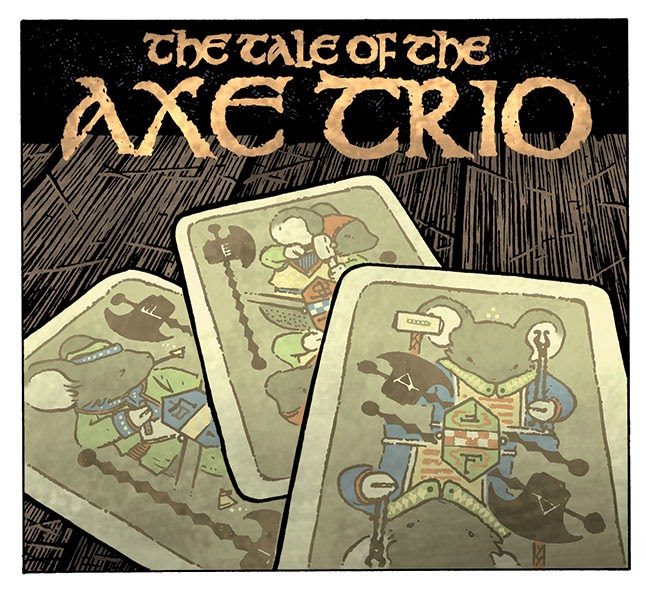
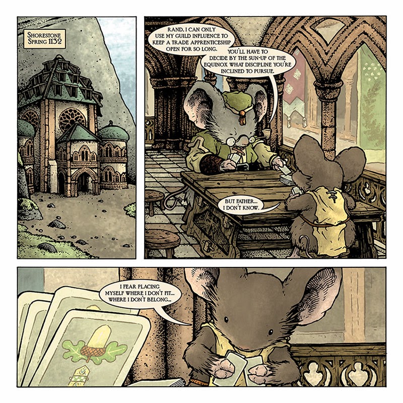
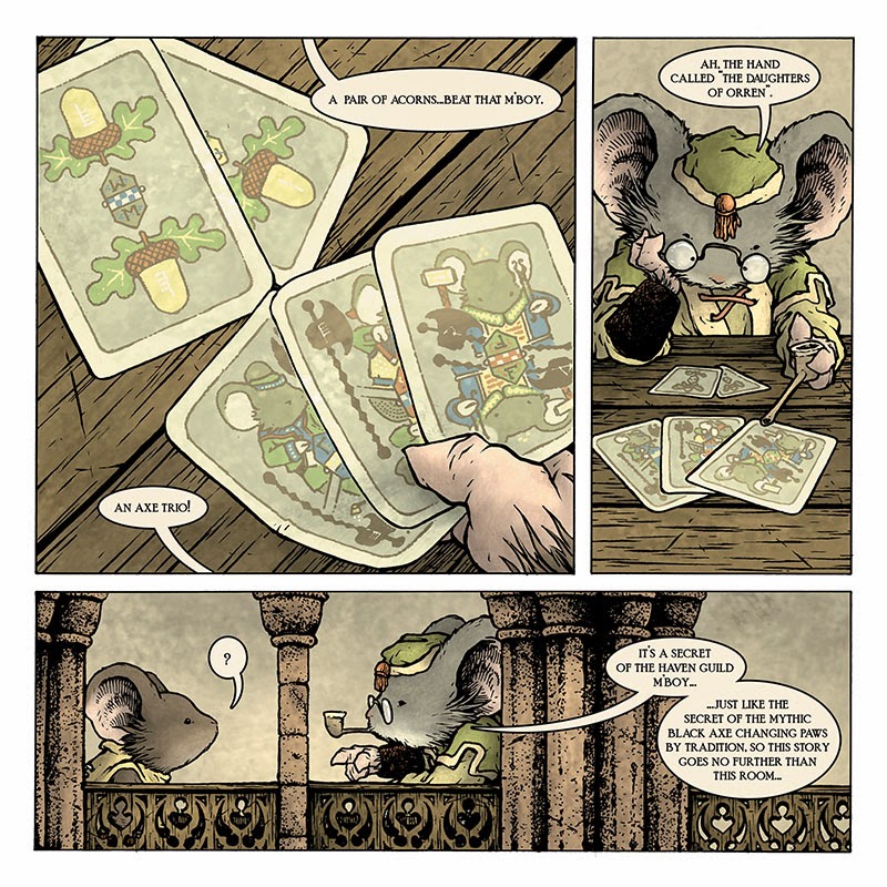
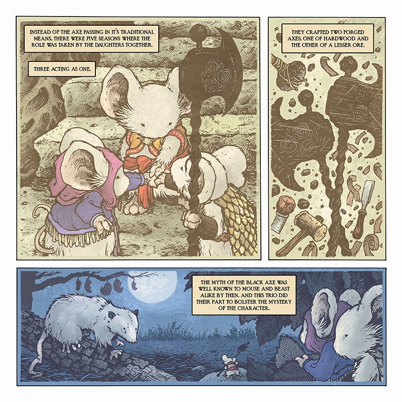
 In case you missed it last Saturday, Archaia released a new Free Comic Book Day Hardcover anthology book. I contributed a cover piece and an 8 page story. This is the 5th year I've done a FCBD story and the 4th in a row of this type. After my first offering, I started the tradition of opening each story with a younger version of a Mouse Guard character being told a morality tale which shows the audience a bit of insight into how that character became who they are as an adult mouse. This year's story is being told to Rand, and it deals with some mythic lore about the history of the Black Axe: The Tale of the Axe Trio:
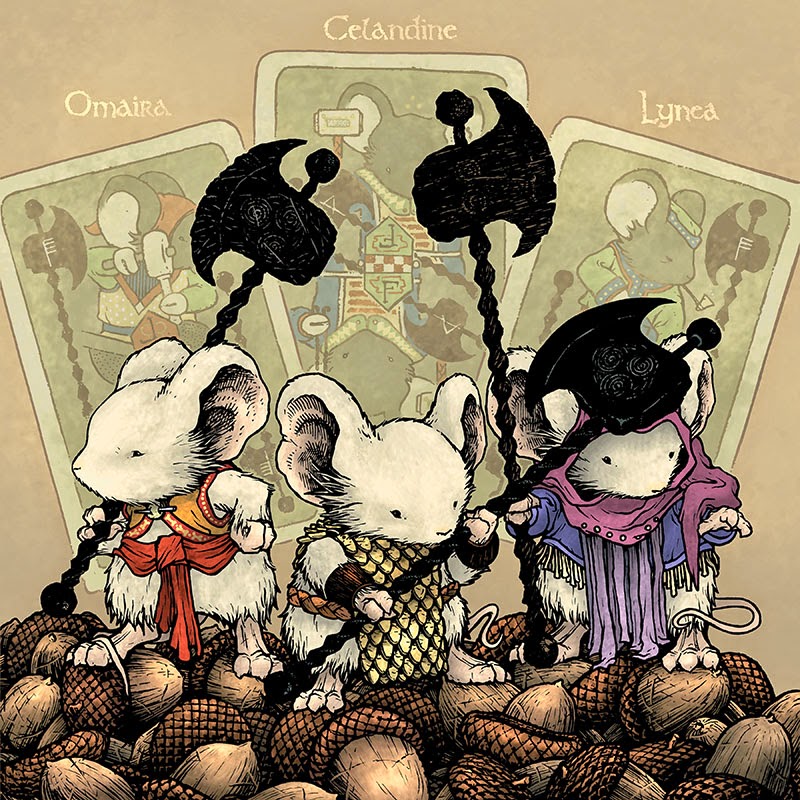


**UPDATE**Story Notes:
As I said at the top of the post, this story is a tale told to Rand. He hasn't been a major player in Fall or Winter, but he will be in the upcoming (and as-of-yet unscheduled) Weasel War of 1149. So, this story gave me the opportunity to introduce readers to him a bit more. At the start of the story we see that as a child he and his father (and mother too) lived in Shorestone, a city I featured in Black Axe and is a building trade craftmouse den as well as having secret ties to the mythic Black Axe itself.
In past years, I used a few objects as lead-ins for the stories: stained glass, marionettes, and storybook style illustrations. This time I chose cards. In my blogpost about the cover, I described the visual influence for these cards. I've got all my notes for how a complete set of them work (with their own versions and counts of suits and numbers) The cards we see for the story are 3 axes (each with a different Haven Guild founder 'suit' and a pair of acorns. The acorns were chosen as the other symbol because I'd already drawn the cover with the characters standing on a pile of acorns and didn't have a way to visually explain it beyond that it looked cool.
As the tale within a tale begins, the readers are introduced to some Black Axe lore. Orren as the 4th wielder of the Axe was covered (in pictogram) in The Black Axe book, but the story of his death and children are new for this story. The location of Nettledown, is from Nate Pride's Legends of the Guard story "The Ballad of Nettledown". I studied Nate's pages to try and be consistent with the visual depiction of the location. And while it's never appeared on a map, I have a suspicion if I ever draw a much older map of the territories, you may find it listed there.
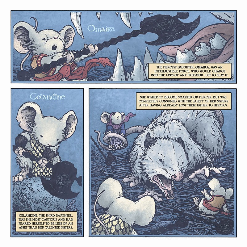
The idea of having three young sibling mice take over the role of the Black Axe was something I'd come up with back when writing the end of Fall 1152. I shared the idea with Mark Smylie over breakfast at the Baltimore convention that year, and we both agreed that while fun, seemed too much like a light hearted children's tale compared to the tone at end of the Fall book. So I stuck it away in my back pocket until the time was right.
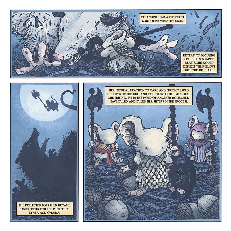
The three sisters are obviously analogs for Kenzie, Saxon, and Rand. Beyond personalities I added a few visual cues: Omaira's tied sash-belt echoes the tied knot of Saxon's cloak, Lynea's hood is ment to remind you of Kenzie's hood in Winter and the long ribbons in front are to symbolize Kenzie's longer slender frame as well as the verticality of his staff, and Celandine's scale armor is symbolic of Rand's shied both in function and shape. Part of my goal was to pre-explain how Rand, as a mouse who mainly ever carries a shield, functioned with a Saxon and a Kenzie.
2014 Appearances:Motor City Comic Con: May 16-18Comicpalooza: May 23-25Phoenix Comic Con: June 5-8Special Edition NYC: June 14-15Heroes Con: June 20-22San Diego Comic Con: July 23-27Boston Comic Con: August 8-10Baltimore Comic Con: Sept. 5-7NY Comic Con: Oct. 9-12
April 29, 2014
Turtles in Time Cover #2 process
 The second issue in the IDW Turtles in Time series will find the four brothers in feudal Japan. The cover required all four turtles again and I decided to have them on horseback to continue the theme of the turtles riding a mount since I'd already had them all on the back of a running triceratops for the first issue. Even though I knew the idea of them on horseback in samurai armor had already been done in the third live-action movie, I felt there was someplace new I could go with it. For today's blogpost, I'll break down my process for creating the final cover art.
 Not knowing how to get all four turtles...on horseback...in armor, into a single composition, I started with just drawing each turtle as they would appear seated on horseback. I then drew horses I thought would match their position. I didn't draw them touching, because I knew this way I could adjust their final positions. In the image to the right you can also see the armor designs...I waited to draw them until I had a rough composite placement of all the turtles and horse (next step). The armor pieces were drawn on a lightbox over top of the resized and placed characters.
 After scanning all the sketches I was able to tint them (to help see which turtle was which...and to see where one horse stopped and the next started) and place together a composition. The background was designed to be very 2D to emulate a bit of Japanese woodblock printing and to not compete with the chaos that is 4 turtles in ornate armor on horseback. I did some research into the armor, but certainly made each suit my own. I tired to match some design qualities to each of the turtles. Leo's armor is the most elaborate and complete. He takes this very seriously. Raph's helmet and headpiece has sharp agressive angles and looks more worn. Don's armor pattern is organized. And Mike's is more flexible & comfortable looking. Each drawing was tinted for an easier who's-who for my editors.
 The inks were done by printing out the digital composite of all my sketches and taping that printout to the back of a sheet of Strathmore Bristol. On a lighbox I'm able to see through the bristol surface to the printout and use that as a guide for inking. This means I don't have to erase pencil on the final image (though I did make a few tightened corrections in pencil before inking the whole piece). I used Copic Multiliners (the 0.7 and 0.35 nibs and a brush tip for the trees). It was tricky to make sure I wasn't adding details to the armor that wouldn't show up when the final piece was reduced for printing. In the inked version, the trees come out much stronger than my vision of the final art, but I needed a solid inked shape to manipulate in color, so it unbalances the inked piece a bit.
 I scanned the inked piece into Photoshop (I use an old version: 7.0 because it still works for me and has all the bells and whistles I need) and started isolating color areas. This is called flatting where you are only painting in areas with flat colors (rather than focusing on shading or lighting effects). These Other than the background, most of these colors are wrong, and were picked on purpose to be garish and wrong. I wanted to make sure I was making all the details on the armor and horse rigging pop. To help me isolate these areas, each color you see is also a different layer (for the most part, a few times different colors are on the same layer if they do not come close to touching) For the final color scheme, I tried to incorporate a touch of each turtle's bandanna color into their armor detail.
Here is the final cover again with all the proper colors rendered and shaded and with all the lighting effects:

2014 Appearances:FCBD: Harrison's Comics: May 3Motor City Comic Con: May 16-18Comicpalooza: May 23-25Phoenix Comic Con: June 5-8Special Edition NYC: June 14-15Heroes Con: June 20-22San Diego Comic Con: July 23-27Boston Comic Con: August 8-10Baltimore Comic Con: Sept. 5-7NY Comic Con: Oct. 9-12
April 22, 2014
Moonflower Mouse Print process:
 Every year I release a new limited edition square Mouse Guard print. The past two years pieces (affectionately nicknamed "Peacock" & "Raspberry") were done with my wife's instructions to make the images "pretty". For this year's print, I continued the "pretty" edict and will be releasing this "Moonflower" print at C2E2, at shows for the rest of the year and in my online store in-between. Today I'll show the process of creating the print image.
 The idea didn't come to me in a dream, but while I was very very tired and taking long blinks at my desk hours after I should have gone to bed. A mouse at night with nigh blooming flowers around her, framed by the moon, and clothed in beaded spider-web silk. I think I also figured there might be a moth in the image, but a few days later when I was starting the drawing, I decided to omit the animal companion. For inspiration I looked at Queen Amidalla's wedding dress and photos of Moonflowers. This series of pencil sketches (digitally composited together) features the same 3 closed blooms copied and mirrored for placement purposes.
 The above digital composite sketch was printed out and taped to the back of a sheet of Strathmore 300 bristol. On my lightbox I was able to ink the piece using the printout as a guide (an image I tweeted of the piece in-progress). I modified each of the closed blooms as I inked them so thery were similar and took up the same space, but had variations of folds and wrinkles. The "beaded spider-web silk" was inked as a series of dotted lines (following a rough pencil web layout I taped to the back of the bristol). It looks a bit funny as an inked image because so many of the details are inked black, though I planned on altering them to all be lighter values in the color version.
 I scanned the inked piece and started flatting in the colors. In this process, I'm less concerned about getting the right color values and more concerned with getting each area colored differently than the other parts around it: mouse fur, clothing, sky, flowers, moon, etc.). In-fact, in this earlier version of my color scheme (when I thought I was getting close to the right colors for each thing) the mouse had yellow toned attire. I was worried doing a cooler overall palate like I'd originally envisioned would feel too monochromatic and not give any sense of depth. But as I was working, Julia came down and convinced me to cool it all down again.
 Here is another look at the final version of the print art. All of the rendering was done with a stock textured Photoshop brush and the Dodge and Burn tools. I used the inkwork to make a new layer of light stars, beading, and the moon's rim.
The edition of prints will be in the 300 range and debut at C2E2 this weekend. I'll have them up in the online store shortly after.
2014 Appearances:C2E2: April 25-27
FCBD: Harrison's Comics: May 3Motor City Comic Con: May 16-18Comicpalooza: May 23-25Phoenix Comic Con: June 5-8Special Edition NYC: June 14-15Heroes Con: June 20-22San Diego Comic Con: July 23-27Boston Comic Con: August 8-10Baltimore Comic Con: Sept. 5-7NY Comic Con: Oct. 9-12
April 15, 2014
Beyond the Western Deep Pinup process
 Alex Kain, who wrote the Legends Vol 1 story "Potential" has been writing a talking-animal webcomic for a few years. The series is called Beyond the Western Deep and is drawn by Rachel Bennett. This year Alex and Rachel are going to be publishing their first collection of the series. The physical book will be first released at the Boston Comic Con in August and available online afterwards (To the left is Rachel's work-in-progress cover)
I contributed a pinup for the collection, and today's blogpost is the process of how I went about making the artwork.
 My first step was to decide what to focus on for a pinup. There are several characters, and while I was tempted to do a piece featuring the less prominent ones, I did in the end decide to feature two of the main cast Quinlan & Dakkan. With the Legends of the Guard connection between Alex and I, I thought it would be nice to have this pair in a tavern setting. Each of the characters and the background were drawn on separate sheets of copy paper, then scanned into Photoshop, tinted, and placed into a template for the pinup's specs. This allows me to shuffle around the pieces individually, resize them if needed, and get my placement just the way I want it. The Celtic knot was a low-res pattern I found online, modified and repeated as top and bottom borders.
 With the layout set, I printed the piece out (on two sheets of legal paper that I taped together) and taped it to the back of a sheet of 12" x 12" Strathmore 300 series bristol. On a lightbox I'm able to see through the bristol to the printout and use it as a guide while I ink. For pens I used Copic Multiliners (the 0.7 & 0.2 nibs). I can't take credit for the character, costume, or tavern design since I really just followed Rachel's work, but I did try to make sure I was drawing my piece with my own voice, my own line quality and texture sensibility.
 The finished inks were then scanned and in Photoshop I started flatting the colors for the piece. Flatting colors is all about establishing color areas. Making one character's fur a different color than the others or than their clothes or than the walls. It's a grown-up version of coloring-within-the-lines. In some cases, I use really garish and wrong colors when I flat because I don't want to get bogged down with color choices when I just need to establish the different areas. In this case though, most of the palate was already there for me in Rachel's art in the series.
 The last step was to render all the color. I added highlights, shadows and texture for the piece using the Dodge and Burn tools with a textured Photoshop brush. A few color holds and special effects layers were added to make the lanterns glow and Quinlan's sash look embroidered.
You can go now and read all of Beyond the Western Deep now for free on the website, but the physical copy (with pinup material etc) will be coming to print at Boston Con.
2014 Appearances:C2E2: April 25-27
FCBD: Harrison's Comics: May 3Motor City Comic Con: May 16-18Comicpalooza: May 23-25Phoenix Comic Con: June 5-8Special Edition NYC: June 14-15Heroes Con: June 20-22San Diego Comic Con: July 23-27Boston Comic Con: August 8-10Baltimore Comic Con: Sept. 5-7NY Comic Con: Oct. 9-12
April 8, 2014
ECCC Commission process
A few weeks ago, I opened up 5 commissions spots for Emerald City Comic Con. My goal was to get all 5 done before we left for Seattle. I managed to get 3 done, and took my portable lightbox to finish the other 2 at the hotel. I sketched all 5 out and printed digital composites of my sketches for each piece then inked them on Bristol a lightbox (using the printout as a guide behind the Bristol). Below you can see process images for each.
Mouse riding a Northern Saw-whet Owl printout of pencils scanned, sized, & tinted
 Inking on the lightbox
 Finished inks!
Groot & Rocket Raccoon: Printout of tinted pencil sketches
 Inking Groot on the lightbox
 More Groot inks (hard to know where to stop with this guy)
 Finished Inks!
TMNT: Donatello & Splinter sparring: Printout composite of tinted sketches, a quick sewer model, & a perspective grid
 Donatello getting inked on the lighbox at the hotel
 Splinter getting inked on the lightbox at the hotel
 Finished inks!
Frenzied Rocket Raccoon: Printout of composite sketch with star-burst stock art background
 Inking Rocket on the lightbox
 Finished inks!
Celanawe & Conrad on a ship of Shell & Timber Scrap: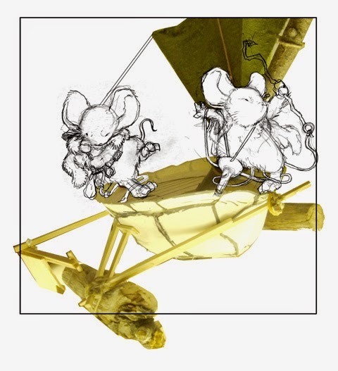 Printout composite sketches of each mouse & model photograph
 Celanawe getting inked on the lightbox at the hotel
 Finished inks!
For those ready to ask, here's the way I handle commissions: I do not have an open list and no not take commission requests by e-mail. I do inked 7" x 7" commissions like these in conjunction with conventions only. In the week before a convention, I open up a list in my online store for pickup at the convention.
2014 Appearances:C2E2: April 25-27
FCBD: Harrison's Comics: May 3Motor City Comic Con: May 16-18Comicpalooza: May 23-25Phoenix Comic Con: June 5-8Special Edition NYC: June 14-15Heroes Con: June 20-22San Diego Comic Con: July 23-27Boston Comic Con: August 8-10Baltimore Comic Con: Sept. 5-7NY Comic Con: Oct. 9-12
Mouse riding a Northern Saw-whet Owl
 printout of pencils scanned, sized, & tinted
 Inking on the lightbox
 Finished inks!
Groot & Rocket Raccoon:
 Printout of tinted pencil sketches
 Inking Groot on the lightbox
 More Groot inks (hard to know where to stop with this guy)
 Finished Inks!
TMNT: Donatello & Splinter sparring:
 Printout composite of tinted sketches, a quick sewer model, & a perspective grid
 Donatello getting inked on the lighbox at the hotel
 Splinter getting inked on the lightbox at the hotel
 Finished inks!
Frenzied Rocket Raccoon:
 Printout of composite sketch with star-burst stock art background
  Inking Rocket on the lightbox
 Finished inks!
Celanawe & Conrad on a ship of Shell & Timber Scrap:
 Printout composite sketches of each mouse & model photograph
 Celanawe getting inked on the lightbox at the hotel
 Finished inks!
For those ready to ask, here's the way I handle commissions: I do not have an open list and no not take commission requests by e-mail. I do inked 7" x 7" commissions like these in conjunction with conventions only. In the week before a convention, I open up a list in my online store for pickup at the convention.
2014 Appearances:C2E2: April 25-27
FCBD: Harrison's Comics: May 3Motor City Comic Con: May 16-18Comicpalooza: May 23-25Phoenix Comic Con: June 5-8Special Edition NYC: June 14-15Heroes Con: June 20-22San Diego Comic Con: July 23-27Boston Comic Con: August 8-10Baltimore Comic Con: Sept. 5-7NY Comic Con: Oct. 9-12
David Petersen's Blog

- David Petersen's profile
- 339 followers
David Petersen isn't a Goodreads Author
(yet),
but they
do have a blog,
so here are some recent posts imported from
their feed.

