Phil Simon's Blog, page 40
August 19, 2019
Looking for Slack for Dummies Case Studies
 Formerly a gaming company called Glitch, Slack rebranded—or pivoted, to use the parlance of Silicon Valley—in 2013. With more than 10 million daily active users, it’s fair to say that Slack has caught fire. In the process, it has spurred clones from Microsoft, Facebook, Google, and more.
Sure, I like to think that I’m doing cool things with the über-useful collaboration tool in the classroom. Still, higher education is simply one industry that can stand to benefit from Slack’s functionality. To that end, I’d love to how you or your organization use Slack for my next book Slack for Dummies.
Click here if you’d like to tell me more and then we can chat about it—maybe even over Slack.
I
Talk to me about how you use Slack.
The post Looking for Slack for Dummies Case Studies appeared first on Phil Simon.


August 17, 2019
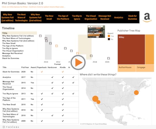
Visualizing My Books
 Now that I’ve announced the new book, I figured that it was time to update my interactive Tableau dashboard from a while back. To be sure, it’s not the fanciest thing out there. I’m no dataviz deity like Ken Flerage.1 Few are, but I digress…
I find it interesting to view the books from a number of different angles—something that all good dashboards allow users to do. On a different level, Tableau is freaking addictive. With the semester starting and writing taking up my of my spare time for the foreseeable future, I don’t know if I’ll be able to noodle with data visualizations for a while.
Enjoy.
The post Visualizing My Books appeared first on Phil Simon.
August 16, 2019
Announcing My Next Book: Slack For Dummies
 For the last two years, I’ve used Slack just about every day. Hands-down the most popular post on my site during that time has been How I Use Slack Inside of the Classroom. Put simply, Slack has become an invaluable tool for me in a number of different capacities. It’s no exaggeration to say that I love using it.
Slack For Dummies
Against this backdrop, I’m pleased to announce that my ninth book will be Slack For Dummies from Wiley. I’m particularly excited that this will be a full-color text. Boom. The publication date is set for late April of 2020. I’ll have more to report on this soon.

As always, I’ll be scribing a post asking for possible case studies. I’m always curious about how progressive organizations are using Slack in innovative ways. It’s folly to think that only large firms use Slack. Hell, maybe it will make Kevin’s shelf in The League if there’s ever a reboot.
This will be the ninth time that I’ve written a book. Nine times…
The post Announcing My Next Book: Slack For Dummies appeared first on Phil Simon.
Announcing My Next Book: Slack for Dummies
For the last two years, I’ve used Slack just about every day. Hands-down the most popular post on my site during that time has been How I Use Slack Inside of the Classroom. Put simply, Slack has become an invaluable tool for me in a number of different capacities. It’s no exaggeration to say that I love using it.

Slack for Dummies
Against this backdrop, I’m pleased to announce that my ninth book will be Slack for Dummies from Wiley. I’m particularly excited that this will be a full-color book. The publication date will be late April of 2020. I’ll have more to report on this soon. As always, I’ll be scribing a post asking for possible case studies. I’m always curious about how progressive organizations are using Slack in innovative ways.
This will be the ninth time that I’ve written a book. Nine times…
The post Announcing My Next Book: Slack for Dummies appeared first on Phil Simon.
August 12, 2019
A Visual Look at Breaking Bad IMDB Ratings
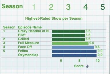 Dashboards really pop when you add an element of interactivity. They allow an obsessed fan to answer questions such as:
Do Breaking Bad fans believe that the show improved over time?
What was the highest- and lowest-rated show per season?
Which season sported the highest and lowest rating?
I was curious about the answers to these questions so I created the following interactive dashboard using IMDB data from from my favorite show.
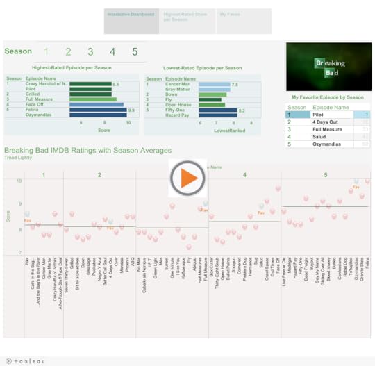
As you can see, at least according to the fans, the show improved over time. When present in this way, it doesn’t take long to identify the lowest-rated episode. Season 3’s Fly certainly polarizes audiences. I can understand why some folks don’t like it but I found it gripping.
Which was the highest-rated season? Reference lines easily answer that question. They are hands down one of my favorite features in Tableau. They easily allow users to compare individual values against a set measure. I can see why so many sites such as 538 add them to their data visualizations.
The post A Visual Look at Breaking Bad IMDB Ratings appeared first on Phil Simon.
August 8, 2019
Visualizing the 2019 Men’s Wimbledon Final
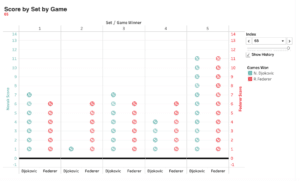 At the gym yesterday, I did my normal Wednesday workout while catching glimpses of the 46th Annual Cherry Pit Spitting Championship on ESPN The Ocho. (Yeah, that’s a thing.) My eyes were one place but my mind was elsewhere. Specifically, I couldn’t stop thinking about how I could represent in Tableau one of the five most exciting tennis matches I’ve ever seen: the 2019 Men’s Final between Djokovic and Federer.
By way of background, early yesterday morning I engaged in some back-and-forth on Twitter with a few other dataviz enthusiasts. Those exchanges confirmed what I long suspected: It’s just more fun to visualize sports data compared to generic business data.
Anyway, back to tennis. Here’s what I came up with:
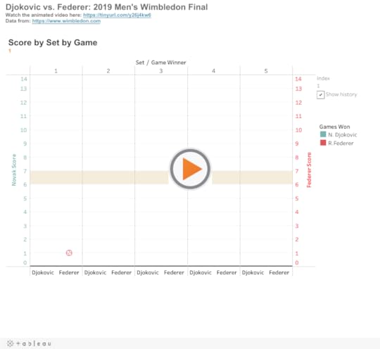
Here it is as an animated video:
No, I wouldn’t put this on the same level as this work of art. Still, doing this exactly the way that I wanted wasn’t as simple as dragging and dropping.1 It took some thought and problem solving. To be sure, I certainly didn’t have the chops to do this a year ago. On a different level, animations demonstrate how tight this each set was—save for the second.
Feedback
What do you think? How would you improve upon this data visualization?
The post Visualizing the 2019 Men’s Wimbledon Final appeared first on Phil Simon.
August 6, 2019
Visualizing My Teaching Schedule
 For years I’ve railed against Gantt charts.1 As someone who’s spent more than a decade helping organizations implement massive systems, I can tell you that they don’t remotely represent the timeline of launching a new ERP or CRM application. I can recall meetings during which I laughed at precise estimates a year or more out. Yep, I’ve seen 800-line project plans that made little sense. How do you know that testing the new system is going to take exactly 34 days?
Yet, in the right context, interactive Gantt charts can clearly display what has happened in the past. Here’s an example of my teaching schedule:
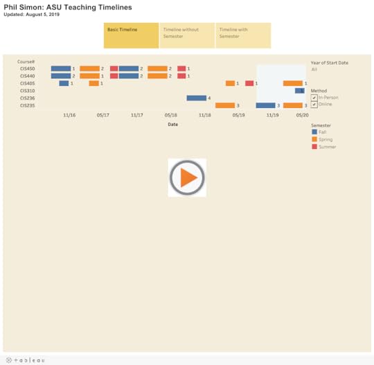
As each dataviz above illustrates, I teach very different types of courses than I did when I started at ASU three years ago. Gone are the 400-level capstone courses—at least for now. In their stead, I now largely teach survey courses designed to expose students to a wide variety of topics.
Simon Says: No one forces us to create confusing visuals.
I think of dataviz programs such as Tableau like e-mail and PowerPoint. The users—not the applications—confuse us. Adding interactivity in the form of filters helps users easily see what they want to see. They can zoom in and out as they like.
Feedback
What say you?
The post Visualizing My Teaching Schedule appeared first on Phil Simon.
August 5, 2019
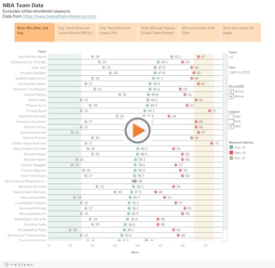
A Visual Look at the Success of NBA Franchises
 Many Tableau articles and tips use the Superstore example. To be sure, it’s a robust dataset that allows for all sorts of comparisons, charts, calculations. At least for me, though, using a generic dataset is not nearly as much fun. Looking back over my career, that’s been a constant: I’ve tried to enjoy myself every time that I’ve decided to teach myself a new application or programming language.
Along these lines, I grabbed some NBA data from Basketball Reference. It didn’t take long for me to discover the following:
The San Antonio Spurs have been crazy consistent over the past 27 years.1
The Knicks generally suck but saw some glimmers of hope throughout the team’s history.
The Vancouver Grizzlies were historically bad.
The best years from the Washington Bullets and Charlotte Bobcats really weren’t that great.
Go nuts in the following interactive Tableau dataviz:
Feedback
What approaches do you use when you’re learning a new tool?
The post A Visual Look at the Success of NBA Franchises appeared first on Phil Simon.
July 31, 2019
Visualizing Game 7 of the 2016 NBA Finals
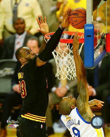 I’ve been watching professional basketball for more 35 years. Without question, though, the most exciting game that I’ve ever seen live was game 7 of the 2016 NBA Finals between the Cleveland Cavaliers and the Golden State Warriors.
There were so many different subplots. LeBron returned home after a four-year stint with the Heat. He was chasing Michael Jordan for number of titles won. The Cavs were trying to become the first team to come back from a 3-1 deficit in the Finals. Cleveland hadn’t exactly seen a great deal of success in the sports world. The league suspended Draymond Green for his repeated shots to opponents’ man zones.
I watched every second of the game at my friend’s house in Vegas along with a small group of hoops aficionados. To call it a close, pressure-filled game is the acme of understatement. LeBron’s absurd block of Andre Iguodala’s layup cemented his status as an all-time great. Kyrie Irving made a clutch shot that closed the door on the Warriors for good.
Tableau Time
I don’t believe that any data visualization can replicate the sheer excitement of watching that game live. Still, as I teach myself Tableau ahead of my forthcoming dataviz class, why not have a little fun in the process and create something akin to ESPN’s awesome GameCast functionality.
Why not have a little fun in the process?
I grabbed the play-by-play data from über-useful Basketball Reference. No, the site’s data didn’t immediately lend itself to instant analysis. Fortunately, I’m stubborn and Tableau Desktop ships with some pretty powerful data-manipulation tools.1 Rather than using a CSV as a normally would, I opted to create and import a JSON file just to see if I could do it.
Here’s an interactive dataviz of that remarkable game:
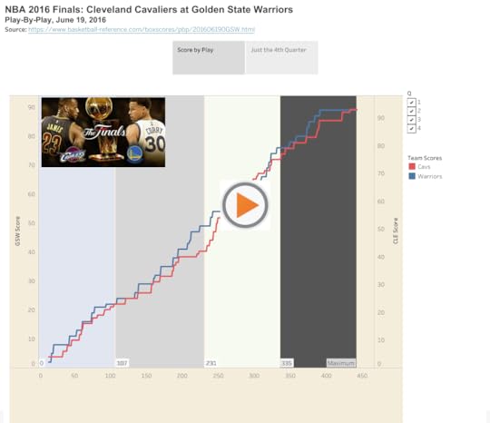
Simon Says: Tableau freaking rocks.
I’m sure that I could have created a simple, static line chart of this data much faster in Excel. After all, I’ve used that application for damn near 30 years.
I’m equally sure, though, that the end result would not have been as interesting and satisfying.2 As I tell my students, it’s imperative that everyone learns new tools—including and especially their professor.
Feedback
What say you?
The post Visualizing Game 7 of the 2016 NBA Finals appeared first on Phil Simon.
July 22, 2019
The Analytics Project that “College Me” Would Do
Note that I originally wrote a version this post for my analytics students on our class WordPress site.
 I’ve taught CIS450: Enterprise Analytics Capstone more than a few times. Still, this is most likely the first time that you’re taking it. What’s more, I’d bet that you haven’t undertaken a project akin to the individual research that you’ll do this semester.
This begs the question: What would I do if I were a 21-year-old student?
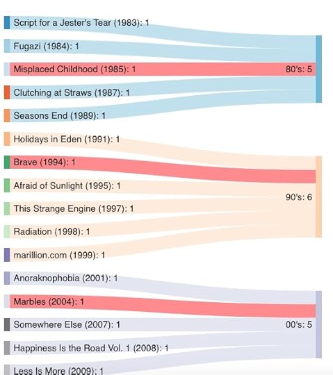
You already know that I’m a huge fan of the English neo-prog band Marillion. Let’s say that I already had my post-graduation job lined up. That is, I wasn’t using the project to show recruiters my knowledge of a specific problem, industry, or the like.
I would scrape tour data from the Marillion site. I don’t know if import.io would work but, if not, then I’d use a Python library such as Beautiful Soup. I would be prepared to investigate some of the other tools that my Marillion-obsessed professor has mentioned.
Once I obtained the data, I would attempt to calculate things such as:
the total number of shows that the band has played by year, month, etc. (and related trends)
the most and least frequently played song (and related trends)
For interviews, I’d try to talk to one of band’s members or even its manager. (As it turns out, I’ve interviewed almost everyone at least once for HuffPo.)
With my data, I’d attempt to answer questions such as:
In what country/venue has the band played the most gigs?
Where does it tend to play longer/shorter sets?
Which prior staples has the band retired? Which have returned after their hiatuses?
Does the band play more frequently upon releasing a new studio album?
Has the band slowed down as its members have aged?
Which band/artist most frequently opened for the band?
What’s more, I would create interactive data visualizations with Tableau. I would promptly publish that dataviz on Tableau Public so recruiters could find it. Here’s a Sankey diagram showing the band’s albums by decade:
I’d demonstrate my findings in a way that would let my professor play around with the data and make his/her own discoveries.
Enjoy some “Sugar Mice.”
The post The Analytics Project that “College Me” Would Do appeared first on Phil Simon.