Visualizing the 2019 Men’s Wimbledon Final
 At the gym yesterday, I did my normal Wednesday workout while catching glimpses of the 46th Annual Cherry Pit Spitting Championship on ESPN The Ocho. (Yeah, that’s a thing.) My eyes were one place but my mind was elsewhere. Specifically, I couldn’t stop thinking about how I could represent in Tableau one of the five most exciting tennis matches I’ve ever seen: the 2019 Men’s Final between Djokovic and Federer.
By way of background, early yesterday morning I engaged in some back-and-forth on Twitter with a few other dataviz enthusiasts. Those exchanges confirmed what I long suspected: It’s just more fun to visualize sports data compared to generic business data.
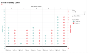
Anyway, back to tennis. Here’s what I came up with:
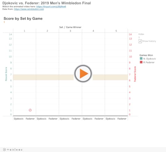
Here it is as an animated video:
No, I wouldn’t put this on the same level as this work of art. Still, doing this exactly the way that I wanted wasn’t as simple as dragging and dropping.1 It took some thought and problem solving. To be sure, I certainly didn’t have the chops to do this a year ago. On a different level, animations demonstrate how tight this each set was—save for the second.
Feedback
What do you think? How would you improve upon this data visualization?
The post Visualizing the 2019 Men’s Wimbledon Final appeared first on Phil Simon.