Phil Simon's Blog, page 42
April 1, 2019
Thoughts on Facebook’s Mistaken Deletions
No, this is not an April Fool’s joke.
 It’s easy to miss key events in a non-stop newscycle. I do all the time. Odds are that you may not have caught the Business Insider piece titled Years of Mark Zuckerberg’s old Facebook posts have vanished. The company says it ‘mistakenly deleted’ them. From the article:
On multiple occasions, years-old public posts made by the 34-year-old billionaire chief executive that were previously public and reported on by news outlets at the time have since vanished, Business Insider has found. That includes all of the posts he made during 2007 and 2008.
Reached for comment, a Facebook spokesperson said the posts were “mistakenly deleted” due to “technical errors.”
Yeah, right.
Read the whole piece with a critical eye and you’ll be aghast.
You don’t need to Facebook’s CTO to understand that the company routinely backs up user data. After all, it’s in the freaking data business. Sure, Facebook stores untold petabytes of user data but data storage has never been cheaper.
If this is true, then is it any wonder that Facebook is mired in so many privacy scandals?
Beyond that, Facebook embraced cloud computing since at least 2011. I find it impossible to believe that only one copy of key company announcements exists and Facebook’s techies cannot retrieve them. I’m let with more questions than answers:
Even if you accept the company’s incredulous explanation, what does that say about the way that it handles key pieces of information?
If it can’t keep tabs on its own posts, is it any wonder that they company is mired in privacy scandals?
Simon Says
Six months ago I quit Facebook after more than eleven years as a daily active user. It wasn’t an easy decision but the time was right. As for regrets, patently false statements by company bigwigs such as these make me feel better and better about my decision.
Feedback
What say you?
The post Thoughts on Facebook’s Mistaken Deletions appeared first on Phil Simon.


March 25, 2019
Is your organization embracing interactive dataviz tools?
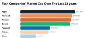 Not that long ago, The Economist ran a story visualizing disruption among tech firms. Many things stood out—not the least of which was the extent to which IBM has fallen from its halcyon days.
In a similar vein, I recently saw this neat interactive data visualization on the subreddit data is beautiful:
Antiquated chart generation and distribution processes make no sense today.
Click here to see it there.
Thoughts
Ask yourself how many static reports one would have to create to replicate the one above. Think for a moment about how much time it would require. Imagine then having to e-mail those as standalone graphs in a spreadsheet to your manager whose inbox is already overflowing. In 2019, this antiquated process makes no sense me either.
 Put differently, the days of boring, static pie and bar charts are coming to an end. You can credit the new breed of exciting data-visualization tools. The usual suspects include d3, Tableau, PowerBI, Sisense, and others.1
On a related note, the dataviz above dovetails nicely with a presentation that a group of my CIS235 students gave last week on data visualization—a subject near and dear to my heart. The team discussed the importance of interactivity in contemporary dataviz. I nodded violently in agreement. It’s a point that I make in just about every talk that I give about The Visual Organization.
Simon Says
At a high level, there are two types of organizations these days:
Those that are actively using interactive tools.
Those that are clinging to antiquated ones.
I suspect that the former are bridging the IT-business divide far better than the latter.
Feedback
Is your organization embracing the present and future or dataviz? Or is it stuck in the past?
The post Is your organization embracing interactive dataviz tools? appeared first on Phil Simon.
March 17, 2019
Business Intelligence: The Tools Change but the Concepts Don’t
 From the mid-90s to the mid-aughts, I wrote oodles of reports for my employers and then clients using the most prevalent business-intelligence tools of the time.
For those of you old enough to remember, I’m talking about Crystal Reports, Cognos PowerPlay and Impromptu, Microsoft Access, and even ReportSmith. Brass tacks: As long as you intimately knew the database tables and entity relationship diagram, then you could pretty much write whatever report you wanted.1
That remains true today, although the tools have certainly changed. Case in point: Tableau and Microsoft PowerBI have largely replaced the reporting stalwarts from early in my career.
I started exploring Tableau when researching The Visual Organization and it’s certainly improved since then. I remain particularly fond of Tableau Public and have even published my student teaching evaluations there. The site easily allows anyone to publish and view creative data visualizations in all sorts of areas. I tell students in my analytics course to do the same. Why not have recruiters come to you?
Early Impressions on Microsoft’s Latest BI Foray
As for PowerBI, I had not noodled with it too much until recently. The impetus: This semester I’m teaching CIS405: Business Intelligence. About a year ago, the faculty committee finally replaced Cognos Insights with Microsoft’s more contemporary application.2
 It turns out that creating a simple, interactive dataviz with PowerBI is pretty straightforward—as long as you know your data. Much like Tableau, PowerBI allows users to create dashboards and multi-tab data visualizations. Yes, just like with Tableau, you can publish your work on the Web.
I could find a vanilla sales dataset and go to work. That just doesn’t interest me. Because I enjoy analyzing data from the Golden State Warriors, I downloaded Steph Curry’s 2014-15 game log from the über-useful site Sports Reference and started dragging and dropping:
You can more or less do the same things with both Tableau and PowerBI.
It’s interesting to note that this year Curry hit precisely the same number of threes at home and on the road although he needed about five percent more field-goal attempts (FGA) when away. Also note that he shattered his record the following year.
It turns out that the two BI/dataviz tools are very comparable.3 Yeah, there are little differences. For the most part, though, it appears that you can more or less do the same things with both applications.
One bone of contention with PowerBI: Microsoft’s offering classified most of the fields in my dataset as text, not integers as they are. To be fair, it’s not hard to change field data types. (See video on the right.) You don’t need to run a Python script. Still, one would think that a pristine dataset of basketball stats with a mere 82 records wouldn’t require much tweaking at all. Maybe Microsoft is fixing that as we speak.
Simon Says The rules of data are remarkably consistent.
I’m sure that new business-intelligence tools will come and go over the next decade. I’d bet that the fundamentals of data, however, remain remarkably constant. GIGO and its ilk aren’t going anywhere.
Feedback
What say you?
The post Business Intelligence: The Tools Change but the Concepts Don’t appeared first on Phil Simon.
March 15, 2019
Having More Fun with Python in the Classroom
 In a few hours, I’ll give my second of three Python lectures for CIS235. As usual, I update my deck with new dates and other class-specific information. Still, what else could I do to shake things up a little?
I decided to have a little fun with my slides by invoking some Python code from PowerPoint. I wrote a simple script that shows text in lieu of traditional bullet points by using Python’s powerful time module.
No, mine isn’t the world’s most powerful Python script, but it demonstrates more of what the increasingly popular programming language can do.
Ideally, this small script will make at least a few students today think about more than just completing their Python homework assignments. Perhaps some of them will now want to noodle with Python on the side and increase their skills before they take proper courses on the subject next year.
Simon Says
First, a pox on those who criticize PowerPoint. Second, professors can make any topic engaging. Python is no exception and neither is data governance.
Feedback
What say you?
The post Having More Fun with Python in the Classroom appeared first on Phil Simon.
March 6, 2019
Three Books that I Recommend to My Analytics Students
In my analytics capstone class, we use Analytics: The Agile Way. Indeed, I wrote that book in 2017 primarily because the existing text was lacking. No, my book isn’t short, but one can hardly cover everything that analytics students need to know in a 300-page text.
To this end, I liberally—and legally—incorporate excerpts from other thoughtful tomes during my 13-week course. Here they are.
Everything Is Miscellaneous
 I certainly didn’t fully appreciate metadata when I was a senior at Carnegie Mellon. Sure, my own book devotes a few pages to “data about data.” Still, in this regard, it doesn’t hold a candle to David Weinberger’s Everything Is Miscellaneous: The Power of the New Digital Disorder.
I usually give students the book’s prologue—titled “Information in Space.” I specifically want the students to think about difference between the physical and digital worlds. It’s particularly important for them to recognize that you can put a physical item in one location—and one location only. This is true with albums, books, and products in brick-and-mortar stores. That same limitation, though, doesn’t exist in the digital world. If I want to label this post with two categories and six tags, I can do so. This dramatically increases findability.
Superforecasters
 In theory, many of us can access largely the same data. Strangely, though, most experts aren’t terribly accurate at making predictions. The obvious question is, Why?
Enter Superforecasting: The Art and Science of Prediction, Philip E. Tetlock’s excellent book answering that very question. As we cover in my course, descriptive analytics are critical in understanding the past, but the holy grail many data-driven organizations is predicting. Tetlock adroitly summarizes the potential benefits of curiosity and ignorance. Those who believe that they already understand the subtext of complex business, geopolitical, and social issues often find themselves grossly wrong. Confirmation bias is alive and well.
The Signal and the Noise
 In keeping with the prediction motif, students will need to refine models over time when turning data into analytics. Those who believe that this process is linear are in for a rude awakening.
Nate Silver’s epic Why So Many Predictions Fail—but Some Don’t discusses the benefits of oft-maligned Bayes’ Theorem. No, it may not be perfect, but there’s a reason that it just won’t die. I am especially fond of Silver’s examples and his use of iterative methods to improve model accuracy—a key point in my own book.
Simon Says
Note how these books focus on concepts and not tools such as Python. Of course, the latter matter, but properly framing a question and thinking about methodology are more important at the start than just reflexively analyzing data.
Feedback
What say you?
The post Three Books that I Recommend to My Analytics Students appeared first on Phil Simon.
March 5, 2019
How Data and Metadata Can Thwart Contract Cheating
 Three years into my teaching career, I’m approaching 1,000 students taught. Even if I assume that 99 percent of them honestly did their own work,1 that means that about ten students have cheated in some way.
Catching cheaters is the raison d’etre of sites such as Turnitin. Up until now, they have examined students’ previous submissions. To wit, if there’s a reasonable chance that David’s midterm paper resembles others in Turnitin’s database, then the site provides a probability that he has submitted work that isn’t his own.
Is there a major problem with this retrospective approach? You betcha. Ours is an era of rampant contract cheating. On a personal level, at least two of my students in my analytics class clearly turned in work that they contracted others to do. Note to prospective cheaters: Correlation coefficients cannot be 2.0.
The intelligent use of data and metadata can at least partially combat writers-for-hire.
Only analyzing previous student submissions for duplication represents ignores arguably the real problem: contract cheating. Still, perhaps not an entirely insolvable one. Maybe it just requires adopting data-oriented mind-set.
Learning from Other Data-Driven Organizations
Just think about how the use of data has helped overcome other thorny business challenges. For a long time now, algorithms have helped companies predict which shows and movies we are likely watch and how to sign efficient but undervalued baseball players. Is it that far of a stretch, then, that the intelligent use of data and metadata can at least partially combat writers-for-hire? I don’t think so either, and that is exactly what the new Turnitin feature Authorship Investigate purports to do:
Turnitin’s new tool also examines writing style. Not whether the writer is fond of references to Shakespeare, but whether the papers routinely use a single space or a double space after a period. Or whether they rely on the Oxford comma. The company works with experts in forensic linguistics for clues about clues.
Sounds promising, but I don’t believe for a minute that this Authorship Investigate will eliminate contract cheating altogether. Much like hacking, I don’t see a foolproof solution. Like it or not, students are often quite creative in how they circumvent traditional detection methods.2
Make no mistake, though: Even a simple Word document contains a great deal of revealing metadata. If authorities can use metadata to apprehend a serial killer, then is reducing cheating that far of a stretch?
Simon Says: Contract cheaters beware
The real question to me isn’t, Why would Turnitin start using this type of data? Rather, as is the case with so many organizations, What took it so long?
Feedback
What say you?
The post How Data and Metadata Can Thwart Contract Cheating appeared first on Phil Simon.
March 4, 2019
The Beauty of Structured Data
 Like many people, I read Stephen Covey’s The 7 Habits of Highly Effective People when it came out. Although I understood the bestseller’s popularity, I found it a tad simplistic. Strangely, though, one of his suggestions stuck with me over the years:
No, this isn’t always possible. Exhibit A: Slack started as a video game. Exhibit B: YouTube began as a dating site. Countless other startups have tried to “pivot”—although relatively few are successful. When it comes to data collection and analysis, though, Covey’s rule holds up in spades.
Analyzing structured data remains far easier than analyzing its unstructured counterpart.
Sure, powerful tools such as Open Refine are constantly improving their ability to make sense of unstructured data. Natural language processing continues to make strides. Ditto for robust Python libraries. Make no mistake, though: Analyzing structured data remains far easier than analyzing its unstructured counterpart—and I don’t see that changing anytime soon.
Cases in Point: Turning Unstructured Data More Structured
When I started teaching each of my courses, I noticed that my predecessors by and large used survey tools that asked students to provide unstructured data. This was a problem. For instance, to collect peer feedback on capstone projects, students needed to enter the names of their teammates. Sure, this was easy for the students, but this immediately made my data corralling an unnecessarily complex exercise. In my larger classes, simply determining student averages took two hours. This I would not abide.
Let’s say that a six-person team consisted of Steve, Steven, Ian, Mark, Pete, and Lucy.1 Allowing them to enter their teammates’ names and scores in free-form text fields resulted in chaos. Problems ran the gamut. Some people referred to Pete as Peter. International students often go by nicknames. The surveys allowed for typos. You get my point.
I quickly reconfigured the surveys in future semesters to make student-response data structured. Now they need to select from team-specific drop-downs.2 Typos have gone the way of the dodo. Determining average student peer feedback merely requires creating a pivot table. I then upload their scores to Canvas and voilà! The entire process takes me maybe ten minutes.3
 This hardly makes me exceptional. In a similar vein, Nextdoor made its data-collection process far more structured when confronted with a racial-profiling issue. (For more on this, see Analytics: The Agile Way.) Many other examples abound.
Simon Says
In my analytics class, students undertake semester-long individual research projects. To be sure, the scope of these projects varies immensely. During the early stages, some students take my advice to heart. Sadly, others ignore nuggets such as these—usually at their peril.
Regardless, sometimes the data arrives in a messy format—something that many of my more experienced pupils have already discovered over their careers. To the extent that we can control survey design and data collection, though, a little extra thought and time typically pays massive dividends down the road.
Feedback
What say you?
The post The Beauty of Structured Data appeared first on Phil Simon.
February 22, 2019
Calling Bullshit on Elizabeth Holmes’ Ignorance
 One of my favorite books of 2018 was Bad Blood by John Carreyrou. In a nutshell, the Wall Street Journal reporter’s riveting text details Theranos’ massive fraud. Led by borderline psychopath and notorious micromanager Elizabeth Holmes, the company bilked investors and partners hundreds of millions of dollars.
I blew through Bad Blood in a little over a day, horrified at the extent of criminal activity that took place. Equally fascinating to me, Holmes and Ramesh “Sunny” Balwani cultivated a workplace predicated on intimidation. Yes, he and Holmes used illegal surveillance methods and showed no regard for the law, let alone ethics.
Against this backdrop, I found the following Nightline interview with the disgraced ex-CEO to be utterly incredulous:
Read Bad Blood and you’ll quickly understand that nothing occurred at Theranos without Holmes’ explicit approval. The term micromanager is entirely apropos. The very idea that she was blissfully unaware of anything at her baby doesn’t come close to passing the smell test.
Critical thinking is more important than ever.
Sure, CEOs such as Steve Jobs (Holmes’ idol) perpetuated their own reality-distortion fields. Ditto for Elon Musk and his companies.1 At least those iconic leaders, though, were/are generally trying to do something good. As Theranos imploded and even to this day, Holmes reportedly remains oblivious to the consequences of her actions. Case in point: She wants to start a new company and is attempting to raise funds in Silicon Valley. Good luck with that.
I for one cannot wait for Alex Gibney’s forthcoming HBO documentary. Here’s the trailer:
Simon Says
As part of the W. P. Carey curriculum, my students will soon learn about Enron and its brethren from nearly 20 years ago if they haven’t yet already. As I tell my them from day one of my courses, ours is a particularly chaotic world. Critical thinking is more important than ever—and I demand it. All students should take claims with a grain of salt and, in Holmes’ case, an industrial-sized bag of it.
Brass tacks: If you can’t to the time, don’t do the crime.
Feedback
What say you?
The post Calling Bullshit on Elizabeth Holmes’ Ignorance appeared first on Phil Simon.
Appearance on Bloomberg’s Works for Me Podcast
 I recently appeared on Bloomberg’s Works for Me Podcast with Francesca Levy. I discuss some of the points in Message Not Received such as the three-message rule. I also discussed how tools such as Slack are fundamentally better than e-mail for business communication although for some reason that didn’t make the final edit.
Levy asked me if things had changed much in the corporate world since the book’s 2015 publication. The short answer is a little. E-mail continues to be a major problem for overwhelmed employees. On the positive side, Slack and its brethren have made substantial progress.
Click here to listen to the podcast or check it out below.
The post Appearance on Bloomberg’s Works for Me Podcast appeared first on Phil Simon.
February 18, 2019
My Ideal Speaking Client
 A few weeks ago, I flew to the midwest United States to give a keynote talk on my most recent book. The process went so smoothly that I wanted a write a post what turned out to be my ideal speaking client.
Decisiveness
The folks at this organization did not dilly-dally. The decision makers had clearly read both my book and my Working with Me page. I was their guy and management wanted to pull the trigger fairly quickly. In other words, my client did not string me along for months on end.
Flexibility on Dates and Travel
Based on my teaching schedule this semester, with rare exception, I can only speak on Tuesdays and Thursdays.1 Against that backdrop, my client worked with me to find a suitable date.
Beyond dates, I prefer a business-class seat for any flight over an hour. I’ve sat on the tarmac in the middle seat in coach for two hours and it’s just not pleasant. Again, my client accommodated my request.
Rates and Initial Payment
I’m not the cheapest speaker out there but my rates are certainly consistent with those in my cohort. I threw out a number that felt right and my client didn’t try to nickel-and-dime me.
I don’t consider a speaking gig finalized until two things happen:
I receive a signed contract.
I receive a payment of 50 percent of my fee within fifteen days of the former.
True to form, my client promptly issued payment. As a result, I booked my travel the very same day.
Pre-Talk Communication
I don’t just show up to give a canned talk. I’m a big believer in tweaking the content to meet the needs of my clients. Again, this went off without a hitch.
Second Payment
Although my standard contract calls for the second payment within 30 days after I speak, I was surprised to find that check in my mailbox a few days before I was supposed to leave. My client also reimbursed me for the plane ticket to boot.
Additional Travel Flexibility
The day that I was supposed to fly to the midwest looked ominous because of the polar vortex. My client didn’t want me sitting at the airport for five hours and possibly arriving at 2 a.m. on the day that I was supposed to speak—and neither did I.
Video from Vice.
As a result, my contact and I decided to reschedule the talk for the following week. Lest you think that this was trivial, rescheduling meant getting on the calendars of the top 25 people at the organization.
Hospitality
I’m happy to take a Lyft2 to and from the hotel and airport. Still, it’s just easier if my client arranges for ground transportation ahead of time—and that’s exactly what happened here. No, I don’t need a limo, but a nice, clean car with a friendly driver makes the travel more enjoyable.
 As is my custom, I brought two signed copies of the new book for my client: one for my primary contact and one for the CEO. I was pleased to see some swag from the company including a branded winter hat. The latter couldn’t have been more timely because I forgot to bring my own.
Remaining Expenses and Follow-Up
I submitted my expenses as soon as I returned home. (Thank you Expensify.) Four days later, I found the final check in my mailbox along with a heartfelt thank-you note from my primary contact.
Simon Says
For each speaking gig, I want to do the best job possible for my client. When an organization treats me this well, though, how can I not want to go above and beyond? If only all of my gigs went as smoothly as this one.
Feedback
What say you?
The post My Ideal Speaking Client appeared first on Phil Simon.