Harry S. Dent Jr.'s Blog, page 53
May 8, 2018
This Bubble Is All About Supply, Not Demand
I recently emailed you about how this latest real estate bubble looks just like the last one. It’s surged about the same, this time peaking a little higher, and has run for about as long.
But what’s driving this bubble is totally different than what drove the last one.
The first bubble was thanks to Baby Boomers flooding the market as they surged through their peak home-buying years in unprecedented numbers. They were helped along with the most liberal lending standards in history. Remember the days of subprime, variable rates, and NINJA loans?
It was quite simply a case of excess demand outstripping even strong, rising supply. Both drove prices to extremes that few can afford.
Eventually, defaults on those insane loans overwhelmed the market, sending the whole house of cards tumbling.
This time around, the situation is the opposite…
Supply (rather than demand) is driving this bubble. Baby Boomers have long since passed their peak home-buying cycle and Millennials don’t have the job and income growth the Boomers had. Besides, they’re more gun-shy after witnessing the largest real estate losses in more than a century, when housing collapsed between 2006 and 2012. Oh, and they’re facing tighter lending standards and the burden of student loans.
You would never suspect we are in a bubble looking at this chart.
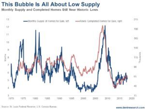
Back in 2008, both new-home completions and months-supply-in-inventory were at all-time highs, and demand still outstripped supply.
Builders were solidly behind that bubble, but on a lag, even after sales peaked in late 2005 and prices started to fall after early 2006.
New homes completed peaked at 199,000 a month in June 2008. Inventory peaked at just over 14-month’s supply just before that.
When the bubble finally burst, new homes fell to 35,000 in 2013 and inventory fell to just under four months’ worth. That was an 82.4% fall in home completions and a 73% fall in months’ supply – the highest on record.
Home prices dropped on average 34% while houses in the bubbliest areas lost more than 50% of their value. The Great Depression only saw 26% declines on average.
But, like I said: this time it’s not demand driving the bubble, but supply.
Homeowners aren’t selling. Baby Boomers are holding onto the homes they bought into the last cycle as people do until they retire or die.
And buyers are cash-strapped.
Even near the top of this bubble, inventory is around five months and new homes completed are only 65,000 a month – not that far from the record lows.
That is what’s driving higher prices!
And it’s the worst on the low-end of the market. The supply of homes under $100,000 is 21% lower than a year ago. For homes under $250,000, it’s 8% lower.
The median new-home price now averages $326,888 compared to the overall median home-price of $250,400 for existing houses. That means more people are having to pay more than they can afford, especially those who can least afford to do so!
The trends are clearly showing, this time, that high-end real estate is starting to collapse first: from Manhattan to Toronto to London to Singapore. That may be the catalyst for the property burst I’m forecasting.
The rich will be hit the worst in the end, the poor will be the first to default!
This is the second and final real estate bubble we’ll see for some time. And it’s very likely to end up with losses closer to 50% on average.
This is definitely NOT the time to buy. Rather, it’s an excellent time to sell and then rent until the worst of this collapse is over! Especially on the high-end.

Harry
Follow Me on Twitter @harrydentjr

The post This Bubble Is All About Supply, Not Demand appeared first on Economy and Markets.


May 7, 2018
Top 20 Small Towns Home to Millionaires
I came across some interesting data recently…
If you’re thinking of retiring or moving to a smaller area that still has some affluence, maybe a few good restaurants, here are 20 small towns that have a high percentage of millionaires.
Millionaires are only 4% of households in the U.S. with an overall median income of $59,039.
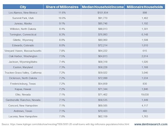
Out of these 20 small towns, 18 of them are above the country’s median income. That’s impressive considering smaller towns typically have lower living costs and the lowest percentage of millionaires. These towns have 7% or higher.
Some of these, like Concord, New Hampshire, are close to major cities (Boston).
But look at Los Alamos, New Mexico! 11.6% of that town’s population has millionaire status and the town’s median income sits at a whopping $101,934.
Now we know where millionaires go to live!
Harry
Follow Me on Twitter @harrydentjr

The post Top 20 Small Towns Home to Millionaires appeared first on Economy and Markets.
May 4, 2018
The Problem With Lending Tesla Money
Bonds are an interesting financial animal.
With stocks, investors become part owners of a company, albeit usually at a very, very small level. We benefit as the company earns more revenue and profit, hopefully sending some of the cash back to us in the form of dividends, or using the funds to grow the company or, these days, buy back stock.
And if the company is successful, we hope that other people will recognize it and bid up the shares, handing us capital gains.
Bonds entitle the owners to guaranteed cash flow.
We don’t care how the company performs, as long as it makes enough to pay the bills, giving us our interest payments and our eventual return of principal.
If the company is ultimately successful, or even simply viewed as successful by other investors, doesn’t matter at all. We just want our money.
With that in mind, companies that issue bonds, along with their promise to pay it back, are evaluated on a sliding scale from “most likely to pay” to “probably going to default.” And they pay an interest rate equivalent with their repayment risk.
This makes high-yield bonds, or those issued by companies with a questionable ability to pay, something of a puzzle.
Clearly bond buyers want to receive their interest and principal, but they’re willing to invest at the very limit of reasonable, often giving money to companies and even governments that are moving quickly in the wrong financial direction.
The trick is to buy enough bonds from different issues to offset the risk of any one of them failing to pay. That’s harder to do with interest rates at such low levels (thank you, Federal Reserve), and might lead to very ugly outcomes.
Recently Tesla (Nasdaq: TSLA) reported production issues with its new Model 3 and the company’s stock dropped more than 6%. The stock recovered from that fall, but then Tesla hosted a weird earnings call on Wednesday.
CEO Elon Musk told investors not to buy Tesla shares if they can’t stomach volatility. He also refused to answer what he called “boring bonehead questions” from Wall Street analysts, including one about the Model 3.
Shares of the company had been a bit higher based on the narrower-than-expected loss, but after the unexpected outburst from Musk, Tesla promptly lost $2 billion in market cap.
During the earlier dip, Tesla’s bonds that mature in 2025 dropped in value, with the yield moving from 6.8% to 7.7%, showing that bond buyers are also nervous.
But even with yields on Tesla bonds a bit higher than earlier in the year, it doesn’t make sense. The interest rate is too low for a company in this condition.
Tesla burned $915 million in the fourth quarter, while increasing the company debt from $5.97 billion at the end of 2016 to $9.46 billion at the end of 2017. The company burned $1 billion in the first quarter of this year. It owes bondholders just under $10 billion.
So the company bleeds money and bond investors might give them more cash? Hmm.
I’ve written about the problems with Tesla before.
What happens when Tesla’s competitors, like Jaguar with its new I-Pace, start putting cars on the road later this year?
Those other guys have lots of money from profitable operations, and they make cars by the millions across their product lines, not just tens of thousands each quarter.
And then there’s WeWork, the private, hipster working space company that rents office space by the desk that started up in 2010.
WeWork has received billions in capital from its backers such as Softbank, but now it wants to raise money in the debt markets, presumably to stop diluting its investors.
The firm just sold $700 million worth of seven-year bonds at 7.875%. To place the bonds, WeWork had to disclose its financial condition, which wasn’t pretty.
Over the past year the company increased its revenue to $866 million, but its costs soared to $1.8 billion, for a loss of just under $1 billion.
To make things look better, WeWork adjusted its earnings to account for a new category of spending it calls “community adjustment.”
The rest of the world calls the items in this bucket marketing expenses, buildout expenses, etc., but for WeWork, they were just pesky items that shouldn’t be considered when deciding if the firm made a profit.
Building out work space is like building anything else. It starts to age the minute its finished. Unless WeWork finds a lot more hipsters willing to join its business platform and then stay for years, it’s hard to see how the company will be around in a few years to pay off its debt.
As for governments, we don’t have to look for banana republics overseas that issue bonds, we can simply look to the Land of Lincoln: Illinois.
The state recently passed a budget, which is good, but it doesn’t address its $250 billion pension mess with anything more than a token payment.
Over the last several years Illinois has refused to pay its backlog of bills on things from Medicaid to lottery winners, and the state has slashed its spending on infrastructure and education.
Yet the pension monster keeps growing, and will eventually consume so much of the budget there won’t be room for anything else.
But somehow Illinois was able to sell bond buyers $500 million of new debt, with the 2043 maturity yielding 4.88% (just over 8% on a taxable equivalent basis).
Anyone buying debt issued by Illinois should look to Detroit and Puerto Rico for examples of how this will go. First, the state will claim that it stands ready to make good on all of its outstanding liabilities, and then state officials will say something like, “clearly there must be adjustments.”
Eventually they’ll ask for bondholders to come to the negotiating table in good faith, before finally petitioning a bankruptcy judge to punish those vulture bondholders while preserving payments to the working man retirees.
Maybe Tesla, WeWork, Illinois, and others will make good on their debts. Maybe not. But 7% to 8% isn’t enough of a payout to take the risk.
In the low-interest rate world created by the Fed, it’s better to stick with much higher credits, foregoing an extra percentage point or two of income, and be more assured of getting your money as promised.


The post The Problem With Lending Tesla Money appeared first on Economy and Markets.
Even Steve Ballmer Says There’s No Way in Hell
Former Microsoft CEO, and Founder of the nonprofit USAFacts (www.usafacts.org), Steve Ballmer, was on CNBC early in April arguing that the best he could see for real GDP growth was 1.5%!
He reasons that population growth is 0.3% and real GDP per capita growth has been 1.2%. Together, that gives us 1.5% growth.
That’s not even close to the 3% to 4% growth rates the White House and economists keep forecasting!
My math gives me a similar result: slowing growth rather than booming growth like we’ve been promised.
Workforce growth is projected to be zero for many years to come, and even negative in the next several years.
Productivity rates have been 0.5% and falling.
How do you get 4% growth out of that?! Especially now that we’re at or near full employment?
Quite simply, you don’t!
Any way you add up the numbers, there’s no way to get sustainable, real growth rates of 3% to 4% over the coming years or decade.
Yet the stock market has bought into the growth scenario due to tax cuts that won’t see substantial investment in real expansion.
We’re running at a below-average 78% capacity… and that’s up from a very low 75.5% in March 2017. We don’t need more.
And already, according to some surveys I’ve seen, many companies are using the tax cut benefits to increase profits above wage increases or expansion!
The bond markets haven’t bought into this new growth scenario as much. They’re typically more realistic.
I see five reasons why the promised growth won’t come to light. I discussed them in the May issue of Boom & Bust, which you can find here if you haven’t read it yet. Today, I’ll share one of those reasons with you…
Generational Cycles of Productivity: Zero or Negative Rates Ahead
A growing population or, more accurately, a growing workforce is one way to grow economically.
The other is increasing productivity – the same workers produce and earn more.
Well, it’s a no-go for us on both fronts.
The trends here have been falling since late 2003. Productivity is now as low as 0.5% and will fall further into around 2019 or 2020.

The logic here should be obvious. New workers become more productive after they enter the workforce around age 20. They grow because they’re eager to learn and advance, but also as they bring new technologies into the mainstream.
Eventually though, that productivity peaks. Older people become increasingly more resistant to change and tend to get stuck in their ways.
The chart shows the peaks in productivity of the Bob Hope generation in the fourth quarter of 1962, at 5.1%. Then it shows the peak in productivity of the Baby Boomer generation in the third quarter of 2013, at 4.4%.
The lowest point in productivity was at -0.7% in 1980.
We can expect to hit a similar low point again around 2020. That’s a 5.5%-plus differential in one generation cycle!
That’s how much of a difference the aging of a generation makes!
To read about the other four reasons we won’t see that promised 3% to 4% growth, read the latest issue of Boom & Bust.
Harry
Follow ne on Twitter @harrydentjr

The post Even Steve Ballmer Says There’s No Way in Hell appeared first on Economy and Markets.
May 2, 2018
Is Inflation Moving Higher? Does It Matter?
Treasury yields climbed higher a couple weeks ago, while Treasury volatility really took a leap.
The long-term Treasury yield didn’t quite make it to the March high of 3.23%, but the 10-year Treasury did hit 3.04%, marking the first time it’s surpassed 3% since December of 2013.
That might seem like a milestone of some sort, but it’s not that big a deal.
The bond market isn’t worried about either the economy overheating or inflation taking off. In fact, we’ve yet to see much evidence of consumer inflation whatsoever.
The GDP numbers for the first quarter of 2018 were out last Friday morning. This sort of data release is usually a market mover, but didn’t cause much of a stir.
Before Friday’s GDP release, an updated release of the Atlanta Fed’s GDPNow model forecast showed a seasonally adjusted annual rate for the quarter at 2.0%, unchanged from the previous estimate.
Good news is that first-quarter GDP number came in a little better than expected at 2.3%. The price index moved up 2% on the expectation of a 2.4% rise, and consumer spending was up 1.1%, as expected. Compared to the 2.9% growth during the fourth quarter of 2017, it wasn’t a great number.
After the release, yields continued to edge lower.
On Monday, the March personal income and outlays came out. Income and spending are important, but the Fed’s preferred inflation measure (the personal consumption expenditure price index, or the PCE price index) is included in this report.
Oddly enough, the PCE price index was unchanged on the month but somehow, on the year, it jumped to the Fed target of 2%. Core PCE was up 0.2% as expected on the month, and moved from 1.6% to 1.9% on the year.
Personal income was up 0.3% on the month, which was less than expected, and spending was up 0.4%, also as expected. Rising inflation has already been priced into yields. I bet that if the PCE price index disappoints, yields could fall once again.
Even though the PCE price index jumped sharply on the year and close to the Fed target, the market didn’t really buy into the data and yields moved lower Tuesday. Frankly, the data looks a little sketchy, and I’ll wait until more inflation data comes out before getting too worried about a significant or persistent jump in inflation.
We’ll see what the Fed thinks Wednesday afternoon at the conclusion of its policy meeting – the Federal Open Market Committee. I doubt if the committee will raise rates again, but investors will see if there’s any significant change in the outlook.
Ahead of the Fed decision, the April Institute for Supply Management’s (ISM) Manufacturing Index will be out. That’s been a consistent market mover as a forward-looking survey of the state of U.S. manufacturing. The outcome is closely watched by the Fed and investors.
Friday kicks off with the April jobs report, and wages will once again be scrutinized. The markets won’t be convinced that inflation will be an issue until wages climb.
As I mentioned earlier, volatility is up. And that’s good for those of us who profit off the Treasury space! That’s what I do in Treasury Profits Accelerator. With a slew of market-moving data releases and a Fed meeting on the horizon, there will likely be opportunities to profit!

The post Is Inflation Moving Higher? Does It Matter? appeared first on Economy and Markets.
May 1, 2018
We Should Rank the News
Erik Hagerman might be your hero.
He’s 53 and lives on a pig farm in rural Ohio.
Alone.
But that’s not what makes him special. Immediately after the 2016 presidential election, Mr. Hagerman turned off all access to current events.
Other than following the Cleveland Cavaliers basketball team (which he watches on mute), his only touch with daily life outside of his immediate surroundings is reading weather reports and following real estate listings.
The New York Times called Mr. Hagerman the most ignorant man in America. And he likes it that way.
Hagerman used to follow the news. As a corporate leader at Nike, he was just as plugged in as the next guy. But he chose to check out of corporate life a while back to focus on art, and then he checked out altogether. The fact that, because of his wealth, he got to choose this course, makes him controversial.
I don’t agree with him. Hiding from current events means avoiding information, thoughts, and conversations that can shape your views as a citizen. His actions make him unqualified to vote, and yet he can do so if he wants.
But I totally get why he wants to block out the world!
I avoid President Trump’s tweets, as well as the rejoinders and analysis from newscasters. I’m much more interested in actions and policies.
I skim most of the stories in the papers, skipping over the veiled editorializing that passes for news. Mr. Hagerman chose to check out because he was distraught over Trump’s election. I want to check out because I’m tired of reporters – in print and on the air – foisting their opinions on me.
Maybe we should take a different tack.
As consumers, we have the power to sway opinions. We rank restaurants on Yelp!, service providers on Google Reviews, and we get hounded by everyone from auto dealers to doctors to complete surveys.
We should develop an app with a ranking system for news stories. Not a simple up/down, or one through five, but a real ranking system.
We could evaluate stories in real time on three positive metrics – new information, relevance to topic, and probability that the information will add to our understanding – on a scale from one (not very useful or new) to nine (totally awesome information). Then we could add a fourth category, political slant, where total bias gets you a zero and even-handed or no bias gets a nine.
As I read news stories online, I could simply add my ranking afterward. Perhaps the news is old (1), but the topic is on point (8) and adds a dimension to the conversation (8), and yet the writing is heavily tilted politically (1). The score would be 1881.
You might be thinking this leads to bias by the reader, but we can handle that. If the readers are a reflection of the nation, then normalizing the results should eliminate bias. The reported score would be the median, not the average.
Then we could take it a step farther, posting each number in a color to reflect dispersion (how far the answers strayed from the median). We could use green for tightly clustered results, showing most people agree, and then rising red as answers disperse from the median, showing dissension.
After just a few hundred readers, each story should have a ranking that accurately tells the rest of us if the news piece is worth our time, and what to watch out for, along with a mixture of color to let us know how much readers agree on the review.
New information is big and quick, so a high first number should grab our attention. If the second and third numbers are high, then we can take our time and circle back, giving the article more thought. If the last number is low, then we know to read with a skeptical eye.
I’m not sure how this would make us any money. Maybe it doesn’t. But perhaps, in this politicized environment where shouting seems to be the only volume, such an app would help me maintain my sanity.
Otherwise, I might end up living on a pig farm in rural Ohio.

The post We Should Rank the News appeared first on Economy and Markets.
April 30, 2018
20 Cities Facing the Greatest Real Estate Risk
Guess where the greatest real estate gains have been since the Great Recession and the massive QE surge?
Florida and California… surprise, surprise!
California real-estate prices have exploded because there’s very limited supply there and Florida prices shot to the moon thanks to that states high domestic and international migration.
But here’s a real surprise…
Property prices in Detroit and Flint, Michigan have also enjoyed massive appreciation! In fact, Detroit takes the number one spot, with prices gaining 193% while prices in Flint are up 169%!
The boom in those two cities is thanks to them starting from such a low point and rising from the ashes.
Look at this chart of the top 20 cities for appreciation…
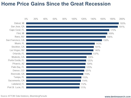 As you can see, nine of the top 20 biggest gainers were in Florida with Cape Coral/Ft. Myers third with prices up 173%. That area got incredibly overbuilt and then slammed during the bubble and crash. We know because my wife has relatives there. Tampa, my recent hometown, is up 115%. Port St. Lucie, in #20 spot, is still up 111%. That’s a lot for real estate in six years or so.
Miami is second in Florida at 143%. But the hottest areas like South Beach, Sunny Isles, and Brickell/downtown are roughly double what they were in the last bubble! It’s so insane that my wife and I decided not to move back there when her caretaking in Tampa was done.
Six of the biggest gainers were in California, topped, of course, by San Jose (Silicon Valley area) at 191%. These six were all in the Northern part of the state, around or near San Francisco.
The lowest gainers were Sacramento, with property prices up only 114% (one hour from San Francisco, where prices were up 158% after already being the most expensive city in the U.S.), and Stockton and Modesto, both of which are up strongly for more boring valley cities due to residents commuting to San Francisco.
Both major cities in Nevada were on this list with Las Vegas prices up 140% and Reno up even higher at 166%.
And, of course, property prices in Phoenix are up 124%, not quite as bubbly as last time.
Prices in Denver are up 121%, much bubblier this time compared to the last bubble. Even Dallas has more exposure to a crash this time around. As does much of Texas due to the fracking bubble.
These numbers may seem fantastic, but they present significant danger!
I always say this: The greater the bubble, the greater the burst… and the bubbles tend to occur in the most attractive cities for lifestyle or migration. Not in Omaha (sorry Warren Buffet).
Manhattan would be high on this list if it were broken out as a sector of New York City.
These places, where prices have blasted past levels set during the previous bubble, are in for a world of hurt. If you’re an owner and/or an investor in one of these areas, be very worried!
My best indicator of overvaluation continues to be:
What was your house or office building worth in January 2000 when this bubble first accelerated and became a bubble?
That’s where you can expect prices to fall back to!
This is the second and last real estate bubble. It’s as bad as, if not worse than, the first bubble in most areas.
We’ll see a deeper downturn and deeper crash in most areas when this final bubble bursts between later 2018 and 2019. And this downturn will likely take something like six years to bottom as the last one did. But these top 20 “appreciators” are going to suffer the worst.
The question to ask yourself now is this: How much do you love your real estate? Enough to go down with it?
Harry
Follow Me on Twitter @harrydentjr

The post 20 Cities Facing the Greatest Real Estate Risk appeared first on Economy and Markets.
April 27, 2018
Don’t Listen to Everything This Guy Says
One of my least favorite people in the media today is the Oracle of Omaha! And that’s the problem. It’s not that he isn’t possibly one of the best investment managers in history… or that he’s an extremely intelligent and wealthy person…
It’s that we, as human beings, tend to deify people.
And that’s a huge problem.
Yes, he may be unimaginably wealthy and he has been super successful, but that does NOT mean he knows everything there is to know about the economy and political policy! And people are listening to him as if he understands it all!
Well, in my latest video, I issue a stark warning about listening to Warren Buffett. Listen now.
Harry
Follow Me on Twitter @harrydentjr

The post Don’t Listen to Everything This Guy Says appeared first on Economy and Markets.
Stupid Rich People Will Suffer Most in the Coming Market Crash
What’s the difference between a bull stock market crash like 1987 or 2000 to 2002 or 2008 to 2009 and a bear-market bubble crash?
After the latter, stocks and most financial assets don’t get back to their previous highs for 24 to 25 years.
If you had bought stocks in late 1929, you would have suffered an 89% crash, at worst, and it would have taken you 24 years – until 1953 – to claw back those losses! And that’s if you hadn’t panicked and sold at or on the way down to the bottom, which most investors do.
If you were invested during the next demographic peak in late 1968, you would have suffered a 70% loss on the Dow (adjusted for inflation) and it would have taken you 25 years – until 1993 – to breakeven again.
You face the same scenario now, only it is more like the 1929 to 1932 final bubble crash. That means you’re staring down the barrel of 80%-plus losses.
The thing is, while a lot of people lose jobs in a bubble crash like 1929 to 1932, it’s the rich who suffer the biggest losses. That’s because they typically benefit the most from the bubble and have the most financial assets (outside of the home they own) to lose!
The top 1% are more entrepreneurial and have more volatile businesses and net worth, which is why households fall in and out of that group frequently. The top 5% to 10% of professionals have more steady jobs, incomes and net worth. I call that the “sweet spot,” adjusted for risk.
So, the top 1% will see many businesses failures and loss of business wealth during a crash as well… on top of what they’ll lose in the markets.
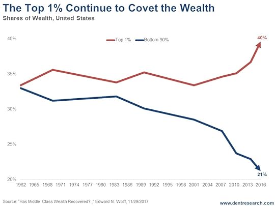
Since 1983, the top 1% has climbed from 34% of financial asset ownership to 40% (and I’ve seen some studies say that it’s closer to 50%). The bottom 90% have fallen from 32% financial asset ownership to 21%. How much can the latter lose when they don’t have many financial assets to begin with?
For a broader view, look at this chart, which shows the top 10% versus the top 20%.
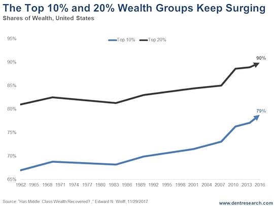
The top 20% control 90% of the financial assets while the top 10% controls only 79%. That means the bottom 80% control only 10%!
The whole wealth curve is exponentially skewed, much more than income…
So, there are no two ways about it: When this bubble finally bursts for good, and wealth is destroyed for a long time, it will be the richest that lose the most!
And they’re the ones who tend to feel less vulnerable. Stupid rich people.
Harry
Follow me on Twitter @harrydentjr

The post Stupid Rich People Will Suffer Most in the Coming Market Crash appeared first on Economy and Markets.
April 25, 2018
The Case Against Index Funds
You have to love John Bogle, the founder of the mutual fund family Vanguard.
By eliminating active management and pioneering passive indexing, Bogle has saved his investors untold billions of dollars in fees, all while boosting their returns as well.
Even Warren Buffett – arguably the greatest active manager in history – has given his seal of approval to Bogle’s approach. Buffett has repeatedly said that most investors should simply buy and hold an S&P 500 index fund and forget about trying to pick individual stocks.
Bogle was a true revolutionary, and the index funds he popularized are fantastic long-term investments. Except they’re not… or at least not always.
Index funds essentially win by not losing. Because they tend to trade infrequently, they avoid excessive taxes and trading costs. That’s a major plus.
Index funds also tend to have management fees that are a fraction of their actively-managed competitors, and every dollar saved in management fees is effectively a dollar gained in returns.
All of this explains why index funds are hard to beat in long bull markets and why Buffett embraced them.
But bear markets and markets that are showing a rotation or change in leadership are a completely different story. These are the times when a value strategy beats the pants out of an index fund.
Remember, most index funds tend to be cap weighted, meaning that the largest companies by market capitalization have the largest weighting in the index.
Apple – with a market value of $840 billion – has the largest weight in the S&P 500 at just shy of 4%. The FAANGs – Facebook, Amazon, Apple, Netflix and Google – the large-cap tech stocks that have really pushed the market higher in recent years, collectively make up about 12% of the S&P 500. And if you toss in Microsoft, that number pushes above 15%.
In an equally-weighted index, these six names would make up a little over 1% of the total. But in a cap-weighted index, they make up a staggering 15%.
Now, all of that is fine and good… so long as today’s trends continue indefinitely into the future.
But when has that ever happened?
At the peak of the 1990s internet bubble, tech stocks made up a mind-boggling 35% of the S&P 500. But when investors dumped expensive tech stocks and rotated into traditional value sectors in the following decade, tech’s weighting fell to less than 15%.
It’s back up to 25% today.
In 1990, the financial sector was about 8% of the S&P 500. During the mortgage financing orgy of the 2000s, the sector exploded higher to become 22% of the S&P 500, only to collapse and fall right back down to 8% during the Great Recession.
Nobody had any interest in energy stocks in 2000. They barely made up 5% of the S&P 500. They exploded to 16% in 2008, only to slide right back down to about 7% today.
The problem with putting money into an index fund is that you’re always overweighting the most expensive and overbought stocks.
In 2000, you should have sold expensive tech stocks and loading up on cheap financial and energy stocks. (A lot of smart value investors did exactly that, by the way, and made out like bandits even while the broader market was falling.)
Likewise, in 2000 you should have exited expensive banking and energy stocks and looked to rotate back into unloved tech.
But index investors stayed overweighted on the aging leaders… and effectively rode them all the way down.
I can’t say for sure that we’re on the verge of another major change in market leadership. But I can say that the market overall is expensive and very much due for a deeper correction or bear market. And tech stocks have once again become a very crowded trade, while energy and materials stocks are cheap and under-owned.
The problem with a pure value strategy is that cheap stocks can continue to get cheaper, sometimes for years. You’re unlikely to call the bottom with any precision. That’s just the cold, hard truth of investing.
But by focusing on value stocks that are trending higher, you don’t have to play the dangerous game of catching the proverbial falling knife.
By staying ahead of everyone else, you can also keep your own personal bull market going, and going, and going.
This is exactly what I talk about in my new free presentation, “Our Never-Ending Bull Market Discovery.” Thousands of readers have already signed up. Don’t miss out!


The post The Case Against Index Funds appeared first on Economy and Markets.