
Aperture's Blog, page 182
April 10, 2014
Notes on The Next Great Copyright Act

We asked Eugene Mopsik, executive director of the American Society of Media Photographers (ASMP), to provide us with some of his thoughts on The Next Great Copyright Act conference at the Berkeley Center for Law & Technology, last weekend. The copyright act in discussion was originally proposed by Maria Pallante, the Register of the U.S. Copyright Office, and calls for a comprehensive revision of U.S. copyright law. The conference brought together scholars, policymakers, and representatives of various stakeholders groups to consider what changes they would propose for the act. Eugene spoke at the event, and we highly recommend reading his talk from the conference here.
“…visual artists, and in particular, photographers are without reasonable remedies for the myriad of infringements occurring every hour, primarily through digital display and transmission. Freelance photographers create the largest numbers of copyrighted works, yet they are the group that is the least able to access the protections theoretically afforded by the Copyright Act. The primary reasons for that inequity are the extremely high cost of federal court litigation; the typically low amounts in controversy, when compared to the costs of litigation; the fact that most freelance professional photographers earn comparatively modest incomes; and the fact that many infringers are aware of this situation and use it to their advantage. These factors coupled with the disruption to business and the emotional stress of litigation are simply more than most sole proprietors can afford.”
—from Eugene Mopsik’s talk at the symposium.
Last week I had the privilege of participating in a symposium on The Next Great Copyright Act. The symposium was a forum for the discussion of changes that might be considered in the current Copyright Act to bring it up-to-date with current, and future practice in the digital space. In attendance on the user side were members of the library, museum, and university communities. On the creator side there were members of the motion picture, music, publishing, and visual arts communities. I was the sole participant from the photography community and I delivered comments on Remedies and Enforcement under the copyright law.
What did I learn? The user community wants information to be free and unfettered, and the creators want reasonable compensation for use. There was lots of discussion around these positions, but this is what it comes down to. Most participants freely acknowledge that visual artists, in particular photographers, are in an unenviable position. Without persistent attribution—attribution that cannot be easily removed from image files—it is next to impossible to track and monetize usage in the digital environment. Identifying information is easily stripped from image files and in fact is done so by default on upload to many platforms. Many people believe that what appears on the Internet is free and available for use—household and commercial. It is very difficult to communicate the value of an image that only exists in digital form having no tangible substance.
Through what other means can rights holders be compensated? The idea of extended collective licensing for secondary usage was discussed, which would require some form of legislation or a consent decree from the justice department. Ultimately it would probably require the ISP’s or platforms such as Google and Pinterest to bear the expense for the display and transmission of the images on their sites and services. A number of trade associations in the imaging space are currently exploring this option. At times it seems as though everyone has figured out how to make money from photographs except for photographers.
It was apparent to me that the prevailing sentiment amongst the user community is that the pendulum has swung too far in favor of the rights holder and that now it is time for the users to assert their rights. Users want an expansion of Fair Use and the elimination or reduction of Statutory Damages. Unfortunately, most images are not registered prior to infringement and therefore are not eligible for statutory damages under any circumstances. If Fair Use continues its expansion through the courts, it will become increasingly difficult for rights holders to create an income stream from their works, and impossible to maintain exclusive licenses and model releases. Who will pay the creators?
There has to be a balance. As always, the “truth” lies somewhere in the middle between the rights of the creators and users. Ultimately creators seek fair and reasonable compensation for the use of their works. By and large, they are not interested in being punitive; they simply want to make a living. As I said in my comments, we need justice, not simply more legislation. Ultimately, it was great to have both sides of the equation in the same room and engaged in civil discourse. The road to a fair and equitable revised Copyright Act will be long and bumpy, but I believe we will get there.
—
Eugene Mopsik is the executive director of the American Society of Media Photographers (ASMP)
The post Notes on The Next Great Copyright Act appeared first on Aperture Foundation NY.


Call for Entries is Now Closed!
The entry period for the 2014 Aperture Summer Open is now closed! Many thanks to everyone who has submitted work. Be sure to check back soon for more details on selected works, and the upcoming Summer Open exhibition.
The post Call for Entries is Now Closed! appeared first on Aperture Foundation NY.
April 4, 2014
Erik Kessels on Hans Eijkelboom
In anticipation of the PhotoBook Review 006 coming out in late April, we are posting our final dispatch from the PhotoBook Review Issue 005. Under the column “Out of Print SOS!”, Erik Kessels celebrates an early work by Hans Eijeklboom.

One of the most remarkable people I have come to know during the last few years is the Dutch artist and photographer Hans Eijkelboom. People might know his work from the 2007 Aperture book Paris–New York–Shanghai, which contains numerous typologies of people that Eijkelboom photographed in these cities. But there’s much more to Eijkelboom’s work. Since the 1970s he has used photography as a vehicle for his conceptual art. One of my favorite series involves photographs Eijkelboom took in different people’s houses. He rang doorbells in the afternoon, while husbands and fathers were likely absent, still at work. Together with the wife and the children that answered the door, Eijkelboom photographed himself with them, as if he was the head of the household. He did this with several families, and there is no occasion in which he looks out of place. Eijkelboom is a master at exploring and questioning identity.
A similar project from this period is called In de Krant, which translates to Being in the Newspaper. For ten consecutive days Eijkelboom contrived a way to get a picture of himself in the same newspaper. The artist tracked a local press photographer and snuck into the frame whenever he would photograph. We see images of demonstrations, accidents, shop openings, and other locally “interesting” events. Eijkelboom succeeded at his self-appointed task; for this period, you could always find the artist in the background of some newspaper image. It was a performance that was recorded, daily and accidentally, by someone who did not know what was going on.
The newspaper pages with these photographs where brought together in a publication in 1978. Perhaps a few hundred copies were made. A project with such a strong concept and with such a great sense of humor needs to be released again to be seen by a new generation of artists and photographers. It shows that a great idea for a work will always transcend its moment.
—
Erik Kessels is a cofounder and creative director of the communications agency KesselsKramer. He also works as an artist, curator, and publisher in the fields of vernacular and contemporary photography.
The post Erik Kessels on Hans Eijkelboom appeared first on Aperture Foundation NY.
April 3, 2014
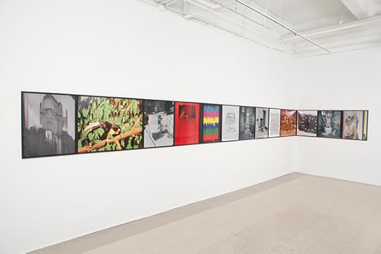
Expanding on Kitsch
Christopher Schreck speaks with Sara Cwynar about her recent exhibition Flat Death at Rosenwald-Wolf Gallery, University of the Arts, Philadelphia.
All images courtesy of the artist and Rosenwald-Wolf Gallery, University of the Arts, Philadelphia. © Sara Cwynar
All images courtesy of the artist and Rosenwald-Wolf Gallery, University of the Arts, Philadelphia. © Sara Cwynar
All images courtesy of the artist and Rosenwald-Wolf Gallery, University of the Arts, Philadelphia. © Sara Cwynar
All images courtesy of the artist and Rosenwald-Wolf Gallery, University of the Arts, Philadelphia. © Sara Cwynar

All images courtesy of the artist and Rosenwald-Wolf Gallery, University of the Arts, Philadelphia. © Sara Cwynar
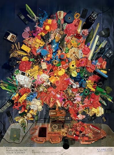
Blending elements of photography, sculpture, collage, and design, Sara Cwynar’s work explores the processes by which images and objects acquire, change, and lose their meaning over time. In her most recent series, “Flat Death,” the New York—based artist reimagines vernacular images as dense arrangements of found objects. By employing various analog and digital methods of intervention, she produces striking, highly textured imagery that confirms the expressive potential of seemingly archaic materials through the subtle subversion of photographic tropes.
In addition to her recent second monograph, Kitsch Encyclopedia, Cwynar will follow her current exhibition at Rosenwald-Wolf Gallery, Philadelphia with her first solo showing in New York. Flat Death will open at Foxy Production on Friday, April 4th.
Christopher Schreck: Until recently, you were a staff graphic designer at the New York Times Magazine, where you produced the same brand of imagery you’re dealing with in your work. How would you say that experience has informed your practice?
Sara Cwynar: Working at the Times was a really formative experience for me. Producing content for commercial and editorial purposes gave me a much better understanding of the way images work, how they’re affected by context and time. Commercial imagery is really about reflecting a particular moment—some images might stand the test of time, but many become dated almost immediately after they’re made. But I also feel like that’s become complicated by the fact that there seems to be a lot of nostalgia in design and photography right now. There’s a lot of combing through image archives for inspiration, talking about how cool and kitschy and funny these old images are to us now. What’s interesting is that people often don’t seem to think about how the images they’re currently making will inevitably share the same fate. It’s something I try to build into my work now. I like the idea of my pictures embracing that process, of retaining this sense of bad taste, while still being contemporary.
CS: It’s interesting, because while it’s a given that commercial images are both driven and ultimately superseded by these cycles of fashion, it seems to me that artworks often function the same way.
SC: Exactly! I’m very interested in the idea that the highly produced art images we see in galleries are subject to the same degradation in value and taste as anything else—that they can become just another item we use and leave behind. It’s something I actively try to build into my images, where they look at first like simple recastings of throwaway imagery, but then, upon closer inspection, reveal themselves as being something else entirely, almost like a trompe l’œil painting.
All the images we make are subject to some sort of change in value and reading as soon as we put them out into the world. It’s really clear when you look at how images circulate online: they enter the stream and end up in unpredictable places. For example, when you see my pictures at reduced sizes on a screen, you really can’t tell what’s going on. They just look like the original, mundane images, so people might not realize they’re really looking at an intricately composed artwork. If you look at how my work has progressed, my images have been getting denser and denser, and that’s in part because I wanted to make them harder to read in passing, online. My earlier “Color Study” pieces flipped around the internet too easily. There was no reason to think you weren’t getting the full experience of the work by viewing it on the computer—which is fine, since not everyone is in New York and can see the works in person. It’s a different way of experiencing the work. It’s hard to get much information out of a 600-pixel-wide jpeg. So in moving forward, I’ve wanted to make sure that what you’re seeing online is not the whole story.
All images courtesy of the artist and Rosenwald-Wolf Gallery, University of the Arts, Philadelphia. © Sara Cwynar
CS: You seem to be asserting a more pronounced materiality in this body of work: rather than using straight shots or scans as in previous series, many of these latest images were composed like mosaics, with separate sheets connected with colored tape. In other instances, you’ve layered post-it notes or stickers directly onto the print’s surface before re-photographing it. What led you to experiment with these new techniques?
SC: One of the major themes in my work is this idea of construction, which speaks not only to the way I physically combine objects and rebuild images, but also to how photography uses framing to create narratives, and how we as viewers draw meaning from those narratives. I see these new techniques as a literal way of reinforcing these ideas.
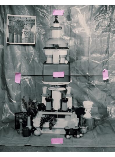
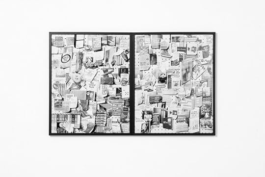
With some of these new pieces, I scan the original found image and use InDesign to make a much larger, segmented version of the file. Once that was printed out and arranged on the studio floor, I then re-build the images with various objects and shoot the piece from above. Working this way, I was able to get much deeper into the details and the tones of the original printed matter.
Incorporating these different techniques further confuses what’s already a complicated viewing experience, where each image initially reads as a kind of collage, but upon closer inspection is revealed to be a photograph of a still-life arrangement, a single image rather than multiple parts. The tiling approach allowed me to introduce another imaging technology into the process: these pictures now go from found pieces of printed matter to digital files, to low-quality laser prints, and back to high-quality analog film negatives before they are finally printed.
CS: As you’re composing these still-life arrangements, are you selecting items thematically? Do you expect your audience to find—or to invent—associations between those particular objects or images?
SC: What ties them together isn’t necessarily their specific content, but rather that they show how content and function can change or be lost over time. I think a lot about how these images were once the height of style, or that these objects once served a particular function. They will inevitably lose their relevance and get left behind, but they never physically go away. They’re still around, clogging up household junk drawers and remaining in our collective psyches, and that’s what I’m looking to as my source material.
I’m working with this huge, democratic archive that’s waiting there to be drawn from, making still-lifes from the debris I’ve collected, and re-presenting it all in a contemporary art context. Having said that, it’s also possible that certain aspects of the content might work its way into my pictures. I am drawn to the modernist idealism you find in mid-century printed matter: this sense of optimism that seems foreign, even naïve to us today. If you look through old issues of Life or National Geographic, it’s palpable, and it really captures something about the culture at that time. The same goes for book covers. I like to think that in reconstructing those images, my work might somehow retain that tone, because the truth is that I love this material. The items may be considered “tasteless,” but they genuinely appeal to my own taste, and I like the idea that by resurrecting them as subjects for art, I’m putting them back in “good taste,” so that others might find value in them again.
All images courtesy of the artist and Rosenwald-Wolf Gallery, University of the Arts, Philadelphia. © Sara Cwynar
CS: Your first New York solo show opens at Foxy Production later this week. What can audiences expect from this new set of images?
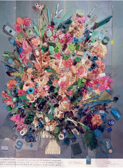
SC: I really wanted the work in this show to span the tropes of the photographic canon, so I worked with a much broader range of imagery: there are commercial still-lifes, floral arrangements, nature photographs, tourist landmarks, encyclopedia images, printing tests, images from how-to manuals, and, for the first time, portraits. I think it’s a much more comprehensive overview of the medium. I’ve also been experimenting with new ways of approximating the tones of the original printed matter. In the “Display Stand” pictures, for instance, I isolate individual sections of the original image and construct still-lifes of those details using other objects. I then shoot those arrangements, shrink the photos down to 4×6 quick prints, and place them on top of the original image before making the final photograph, combining up to thirty different still-lifes to produce a single work.
—
Christopher Schreck is a New York based writer and poet.
The post Expanding on Kitsch appeared first on Aperture Foundation NY.
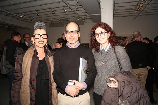
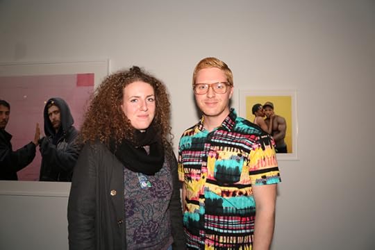
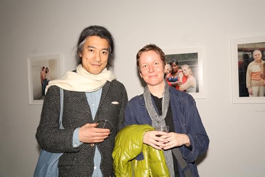
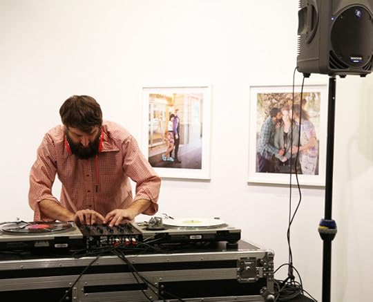
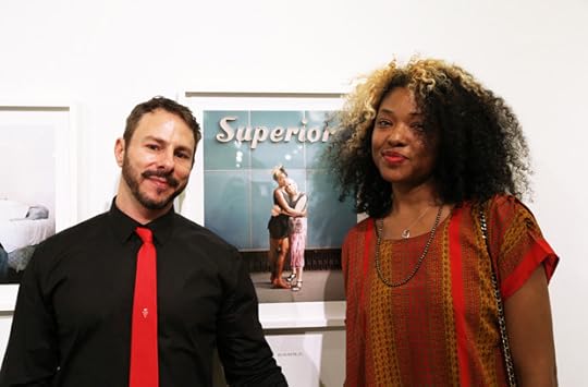
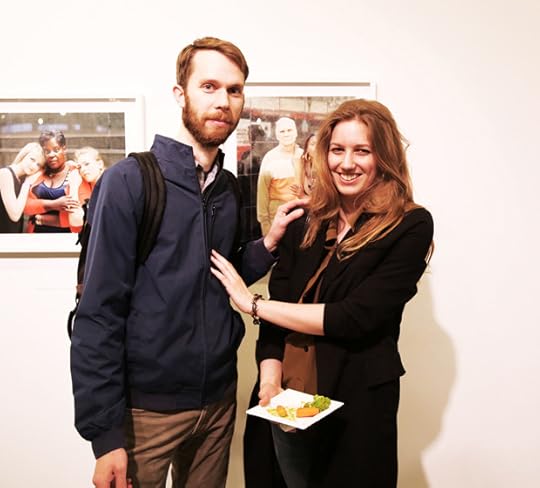
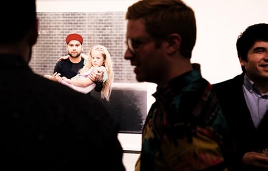
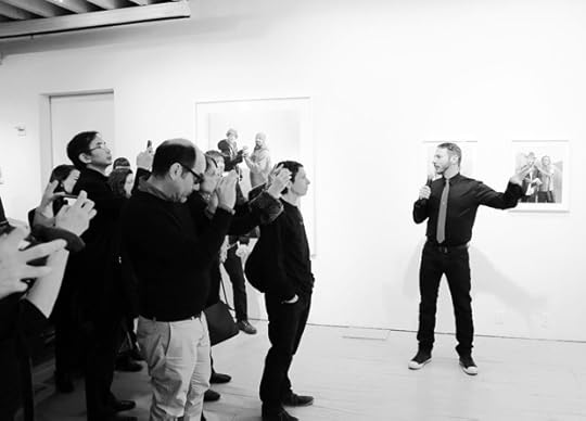
Touching Strangers Launch at Aperture Gallery
On Wednesday, April 2, 2014 Aperture members, Kickstarter backers, and special guests joined Richard Renaldi for the private launch of the Touching Strangers photobook and exhibition at Aperture Gallery. The evening included an exhibition walkthrough with Richard Renaldi, a performance by Queen Esther and J. Walter Hawkes, and DJ sets by Chris Newmyer.

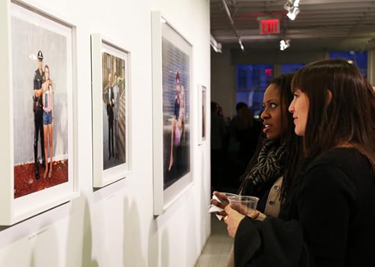


Touching Strangers: Photographs by Richard Renaldi is on view April 3 – May 15, 2014 at Aperture Gallery in New York.
Membership at Aperture is about seeing it first. Engage with our talented photographers and publishers at a variety of events like these by becoming an Aperture Member today! For more information, e-mail membership@aperture.org.
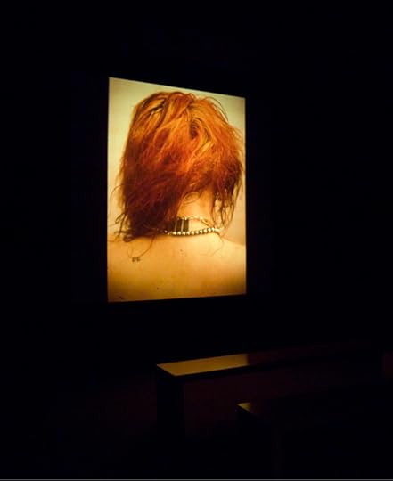
— Touching Strangers
$45.00
 Jeromy and Matthew, Columbus, Ohio, 2011
$1,500.00
The post Touching Strangers Launch at Aperture Gallery appeared first on Aperture Foundation NY.
April 1, 2014
Songs Left Out of Nan Goldin’s Ballad of Sexual Dependency
To mark the third printing of Nan Goldin’s Ballad of Sexual Dependency we are featuring this piece by Greil Marcus on the soundtrack to Goldin’s original slideshow presentation of the work. Originally printed in Aperture #197 Winter 2009.
We have also assembled a YouTube playlist based on the soundtrack for Goldin’s slideshow, listen here.
Nan Goldin, Ballad of Sexual Dependency, Multi-part slide projection with soundtrack, Courtesy the Museum of Fine Arts, Houston; Thomas R. DuBrock, photographer
I’ve always been seduced by the title of Nan Goldin’s slide show about her life and that of her friends from the mid-seventies through the mid-eighties, in and around Boston, Berlin, the Lower East Side. “The Ballad of Sexual Dependency”—it comes from The Threepenny Opera, but I didn’t know that when I first encountered Goldin’s work: more than seven hundred color photographs, running in sequences, each image present for three or four seconds, replaced seamlessly by another, with songs from opera, Top 40, downtown New Wave dance clubs, and obscure blues records playing alongside, most often in excerpts of a minute or more—pictures, as they move through the 40 minutes or so of the piece, in which the primary image can seem to be that of a single person lying on a bed—or two people on a bed, neither acknowledging the other.
But to me “The Ballad of Sexual Dependency” was a pop title. I imagined hearing it announced on the radio as the latest hit, and I was seduced by its unlikeliness. “The Ballad of Sexual Dependency.” “The Ballad of Non-Hodgkins Lymphoma.” “The Ballad of Stratigraphic Geology”—I’d listen to anything with a title like that.
Goldin was born in Washington, D.C., in 1953; two central events I her life, as she tells it, took place in 1965, when she was 11. Her eighteen year old sister lay down on the tracks of a commuter train; in Goldin’s words, “In the week of mourning that followed, I was seduced by an older man. During this period of greatest pain and loss, I was simultaneously awakened to intense sexual excitement.” Goldin began taking pictures when she was 18; sold only through a gallery as an art work, in the collection of museums, never available to the public except at film festivals or when a museum chooses to present it, “The Ballad of Sexual Dependency” is, Goldin says, “the history of a re-created family”—and the mission of her new family was to give itself over to “that part of your brain that is only satisfied by love, heroin, or chocolate”; to embrace what she called “a disbelief in the future”; to pursue an escape from the dependencies of ordinary life—on convenience, stability, and predictability—and to seek instead dependency on each other.
What’s most uncanny—uncanny and sometimes disturbing, displacing, confusing—about Goldin’s pictures, about the whole work, is its intimacy. Not necessarily sexual intimacy, though in all versions of “The Ballad of Sexual Dependency” there is repeated nudity and in some there are sequences of sex pictures that are convincing in a way that sex rarely is in photos. What’s uncanny is the way Goldin and the people in her pictures seem to have no borders of privacy, the way their rooms seem to have no walls.
Like anyone in front of a camera, they pose happily for moments of ease or friendship or let’s-remember-this-day, but in moments of sex, misery, estrangement, or despair they don’t seem to be posing at all. There’s no sense of voyeurism. You’re pulled in. Everyone is a witness to everyone else.
Nan Goldin, Ballad of Sexual Dependency, Multi-part slide projection with soundtrack, Courtesy the Museum of Fine Arts, Houston; Thomas R. DuBrock, photographer
The images don’t flash by; they float. And from Charlotte Rae singing the title song to Petula Clark and “Downtown,” from Maria Callas’s “Casta Diva” to the Velvet Underground’s “I’ll Be Your Mirror,” from Dionne Warwick and “Don’t Make Me Over” to “You Don’t Own Me,” which in Klaus Nomi’s version sounds just like “Don’t Make Me Over,” in those songs and all or parts of 28 more, the music makes the sequence of photos of people alone, together, having sex, dressing for parties, shooting up, embracing, separating, into a drama that moves from isolation to friendship to romance to a repeated isolation greater than the isolation with which the story began.
The images and the music are often attached to each other with a literalism that in other hands might be killing. As you see women who’ve been beaten up, women with black eyes, bruised breasts, a slashed wrist opened up like a flower—and all this almost at the start, before you’ve seen anyone who might have left most of these marks—that is, men—you hear the Creatures’ “Miss the Girl.” You hear Siouxsie Sioux singing “You didn’t miss the girl, you hit the girl, you hit her with the force of steel.” Then comes Yoko Ono’s “She Hits Back” and pictures of women with guns, a female body builder, all proud, strong, empowered.
The approach is corny in description but not as you watch. The brief time on the screen for each image, long enough for each to register, not long enough for any one image to claim the territory of another, the music slipping from one selection to the other, make it all into a movie. It’s a movie made entirely of stills, but the music creates the illusion of a dramatic inevitability—with every cut, you feel as if you’re part of a 40-minute tracking shot. The literalism of the pairings of songs and images dissolves—because it’s not a matter of the way, in a song, the music allows the words the singer is singing to transcend their banality. Here the images are the music, and the songs are the words.
That’s most true at the very end. You’ve heard Ennio Morricone’s “The Good, the Bad and the Ugly” and seen a man on a horse, one with a snake, one with a huge blade. You’ve heard James Brown’s “It’s a Man’s Man’s Man’s World” and seen body builders, boxers, men covered with hair, a guy masturbating in a car who looks as if he has his hands around a knife. You’ve watched women getting dressed up to the Velvet Underground’s “All Tomorrow’s Parties,” then seen them alone and half-naked as it fades, as if all tomorrow’s parties have already happened, and life is nothing more than going to the same party over and over and over again— and then, finally, all the pictures yield to death.
You see an older man in a coffin, and a blonde woman, who you’ve come to know from the start, pass in front of it; then you see her in her own coffin. AIDS isn’t depicted, drug overdoses aren’t shown—what’s at stake is a rhythm, the rhythm of connection, isolation, and memory. So Goldin shows a painting on a wall; a heart-shaped frame holding a portrait of a couple; a framed picture of hearts and before it a vase of flowers and a medicine bottle; an empty bed with tangled sheets; a bedroom wall spattered with blood; and then tombstones, a whole forest of mausoleums, then the coffins, and, the very last image, a crude painting on a door of two skeletons fucking standing up.
And all the while, from the first image of this final sequence to the last, you are swept up in lightness, in the syncopation of “Memories Are Made of This,” Dean Martin’s number one hit from 1955. “Sweet, sweet, the memories you gave to me/ You can’t beat, the memories you gave to me,” murmurs the chorus. The simplest chord changes on an acoustic guitar, the bass counting off the last notes with a cadence that spells “That’s all she wrote” more clearly than the actual words ever could—there’s room for the listener, for anyone the song might speak for. And it endows everyone you’ve seen with dignity.
The filmmaker Dennis Potter, with his movies of people bursting into miming performances of great pop songs from all across the 20th century—in “Pennies from Heaven,” “The Singing Detective,” in “Lipstick on Your Collar”—caught how this worked in 1975, talking to Michael Sragow, then the film critic for the San Francisco Examiner.
“I think we all have this little theatre on top of our shoulders, where the past and the present and our aspirations and our memories are simply and inexorably mixed. What makes each one of us unique is the potency of the individual mix.
“We can make our lives only when we know what our lives have been. And drama is about how you make the next moment. It’s like when you’re watching a sporting event, like a soccer game here; when it’s going on, you don’t know what’s going to happen. But all the rules are laid down.
“I don’t make the mistake that high culture mongers do of assuming that because people like cheap art, their feelings are cheap, too. When people say, ‘Oh listen, they’re playing our song,’ they don’t mean, ‘Our song, this little cheap tinkling, syncopated piece of rubbish is what we felt when we met.’ What they saying is ‘That song reminds us of the tremendous feeling we had when we met.’ Some of the songs I use are great anyway but the cheaper songs are still in the direct line of descent from David’s Psalms. They’re saying, ‘Listen, the world isn’t quite like this, the world is better than this, there is love in it,’ ‘There’s you and me in it’ or ‘The sun is shining in it.’
“So called dumb people, simple people, uneducated people, have as authentic and profound a depth of feeling as the most educated on earth. And anyone who says different is a fascist.”
That is precisely what “The Ballad of Sexual Dependency” says.
Nan Goldin, Ballad of Sexual Dependency, Multi-part slide projection with soundtrack, Courtesy the Museum of Fine Arts, Houston; Thomas R. DuBrock, photographer
I was inspired by Goldin’s soundtrack—I wanted to play her game. So I thought I’d construct my own version, “The songs left out of “The Ballad of Sexual Dependency.’” The Pet Shop Boys’ “Rent,” say. Mott the Hoople “I Wish I Was Your Mother,” which to me caught the will to connect that is Goldin’s true subject more painfully than anything she used herself. The threat in Elvis Costello’s “I Want You,” for the sequence of pictures of men alone, brooding, the posture of each suggesting he’s trying to decide whether or not to kill someone. The Supremes’ “Stop! In the Name of Love,” The Miracles “The Love I Saw in You Was Just a Mirage.” Bobby Bland’s “Lead Me On.”
But that was from memory. Watching the work again, I realized that of course it is what it is. Coming in fragments that fade almost as soon as they appear, can it really be said that anything was left out, that anything’s missing? It’s an obnoxious conceit. The soundtrack is a collection of Goldin’s friends, just as the photos are. The songs are characters as much as the people we see.
But when I remembered the piece, when watched it in my head, and then when I watched it again for real—there was still one song that did, for me, cry to be included—or maybe it was that that one song itself cried out to be included, to be given a home in Goldin’s world.
Because there’s a certain hipster cool that “The Ballad of Sexual Dependency” never surrenders. Because something is missing— some sense of tragedy, something that no song Goldin choses can account for—and what that is can be found in a single note of Lonnie Mack’s “Why.” That’s the song that got me started thinking about the songs that were left out—as if there were more than one.
It’s 1963: Lonnie Mack is 22, he’s pudgy, dorking-looking, really, but he’s had two big instrumental guitar hits, “Memphis” and “Wham!”, so he gets to make an album: “The Wham! of that Memphis Man.” Tucked inside is—along with Sam Cooke’s “A Change Is Gonna Come” and Percy Sledge’s “When a Man Loves a Woman” and the Five Keys’ “Dream On”—the greatest deep soul record ever made: Mack’s own “Why.”
The song is a staircase. After each verse, where he tells us about the woman who left him, it’s the climb of the chorus to the roof, where the singer throws himself off. It’s the surge of intensity, of terror—the singer terrorizing the listener, but more than that the singer terrorizing himself. It’s almost inhuman, how much pain he’s discovered—and the way he’s discovered that he can make it real, something he can all but hold in his hands.
The first chorus comes. “Why,” he sings. And then he screams the word, and it’s nearly unbearable, how far he goes with the single syllable. As James Agee said of the last shots of Charlie Chaplin’s “City Lights,” it’s enough to shrivel the heart. Mack cuts back with the next line, softly: “Why did you leave me this way.” But the echo is there.
The second verse. “Now I’m standing”—and the last word is drawn out, shuddering—“By my window/ I decided”—again drawn out so far—“What I would do”—and you’re sure he’s going to kill himelf—“I would never/ Tell anybody/ How much/ I loved/ You.”
And then the second chorus, the spoken “Why,” then again the same word screamed, then the quiet “Why did you leave me this way”—and then something really terrible: the looming possibility that the singer might go all the way. What if he did? Would he still be standing? Would you? There is a guitar solo. It’s magnificent, but it’s a pause, because what you’re really hearing hasn’t happened yet. It’s what you’re wishing for, what you’re afraid of, the final chorus.
Do it! No, don’t! Please, please, do it! No, no, no!
He brings you back into his drama, and you relax. He tells you he’s writing a letter; it’s stained with tears from his eyes. You can almost savor the coming repetition in the next verse: you can experience again something that you have already gotten through, stood up to, not broken under.
And then the levees break.
Again there is the first “Why,” almost crooned. Then the second, exploding as before. Then the next line, and you can feel the ground shaking beneath the singer’s feet, beneath yours. And then, even out of this maelstrom, the shock of a long, wordless scream, a cry of anguish so extreme you have to close your eyes in shame over witnessing it, because this man is now before you, begging you to save him. And then more, farther, deeper, the now long and tangled line “You know you left me—alone and so empty” twisted into a knot that can never be untangled, that is left behind in the wreckage of the singer’s future. And then, finally, it’s over. Or rather the track ends, and “The Wham! Of That Memphis Man” goes back to another bouncy guitar instrumental.
No, of course it wasn’t left out. It doesn’t belong in “The Ballad of Sexual Dependency.” But there is a need, an absence—a cover- up that art enacts that only art can expose, a criticism of art that only art can make.
—
Greil Marcus is a music journalist, cultural critic, and author of the upcoming The History of Rock ‘n’ Roll in Ten Songs (Yale University Press, 2014).
The post Songs Left Out of Nan Goldin’s Ballad of Sexual Dependency appeared first on Aperture Foundation NY.
March 31, 2014
The Myth of Vivian Maier
Madeline Coleman on Finding Vivian Maier, a new documentary opening in U.S. theaters on Friday, March 28.

Vivian Maier self-portrait from John Maloof and Charlie Siskel’s Finding Vivian Maier. Courtesy of the Maloof Collection.

Woman at the NY Public Library still from John Maloof and Charlie Siskel’s Finding Vivian Maier. Courtesy of the Maloof Collection.
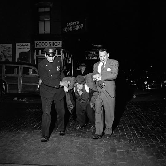
Man being dragged by cops at night still from John Maloof and Charlie Siskel’s Finding Vivian Maier. Courtesy of the Maloof Collection.
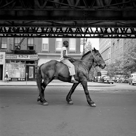
African-American Man on Horse NYC still from John Maloof and Charlie Siskel’s Finding Vivian Maier. Courtesy of the Maloof Collection.
The new documentary Finding Vivian Maier offers less satisfying conclusions than the title might imply. Coproduced and directed by Charlie Siskel and John Maloof, it follows the latter’s quixotic search for information about Maier, the woman whose photographs he discovered at an auction in 2007. This visually conventional documentary unravels the life of a secret street photographer, a native New Yorker who grew up in France and died destitute in a Chicago hospital in 2009 after decades working as a nanny to families in that city’s suburbs. She had no children of her own. She never married, had no known lovers or friends. What Maier did have, however, was a camera. She took hundreds of thousands of pictures on the streets of Chicago and on solo trips around the world, none of which she ever published or exhibited. Finding Vivian Maier is an overt bid for Maier’s inclusion in the photographic canon, but its depiction is too simple for such an elusive subject.
The film is structured through interviews with families Maier worked for, testimonies from photographers Mary Ellen Mark and Joel Meyerowitz, and selections from Maier’s photographs and films. Maloof, an earnest, neatly coiffed young man in black-framed glasses who speaks directly into the camera throughout the film, is an amateur historian who first discovered a crate of Maier’s photographs while searching for historical photos of Chicago. When he drew rave reviews from Flickr users after scanning and posting some of these found negatives to the site, he went on the hunt for more. Using Maier’s name, which he had learned from the auction house when he bought the initial box, he was able to amass countless crates and suitcases of negatives; prints; undeveloped rolls of both color and black-and-white film; reels of 8 and 16 mm film; and sundry other belongings. Maloof is in thrall to the photographs and films he uncovered, and they are affecting: Maier was a talented street photographer with an eye for geometry, texture, hilarity, and pathos. She sometimes photographed the children she cared for and took many self-portraits, capturing her own serious image—well-loved Rolleiflex strung around her neck—in shop windows, mirrors, and shadows. One of the few things we do know about Maier is that for decades she never went anywhere without a camera.
Maloof, who admits to not having been particularly interested in photography prior to his discovery of Maier’s work, has campaigned tirelessly to get his collection into museums. He doesn’t seem to have succeeded in that yet, but thanks to his efforts, Maier’s work has now been shown widely in galleries across the U.S. and Europe; her print sales are managed by Howard Greenberg Gallery in New York. But it’s hard to separate the success of these exhibitions from the irresistible myth of the artist’s story: toiling in obscurity for decades until finally, after death, her work is discovered and her genius revealed.
This is where things get complicated. Despite his apparent devotion to Maier’s work, Maloof and his co-director Siskel have devoted the majority of the film to often-damning first-person testimony from the photographer-nanny’s employers. All of them describe her as mysterious and eccentric; some loved her, but some recount a hard and even abusive caretaker, a hoarder who amassed stacks of old newspapers and once force-fed a picky eater by choking her until she swallowed. Maier is remembered as doggedly secretive, bolting the door to her quarters and never revealing anything about her past to the families she lived with.
Through these interviews, the filmmakers put forth the hypothesis that anyone acting as Maier did must have been traumatized or abused. Why else would she avoid physical contact with men and choose to live alone? Who wouldn’t want the good life? At odds with this interpretation is the fact that Maier was political and fiercely independent, taken with documenting the homeless and the poor, as well as interviewing and tape-recording people waiting in line at the grocery store about current events. When one young woman is unable to answer her questions, Maier scolds her: “Well, you should have an opinion—women are supposed to be opinionated, I hope?”
With her insatiable appetite for documentation, newspapers, and politics, Maier was clearly obsessed with understanding her time. And yet despite Maloof’s desire to place her in the canon, this documentary is curiously absent historical and art historical context. (The only time she’s discussed in relation to other mid-century street photographers is in the short interviews with Mary Ellen Mark and Joel Meyerowitz.) There’s no discussion of women’s conditions at the time, although Maier’s options, when she arrived in Chicago in the 1950s, must have been severely limited: she was a single, working-class woman in her thirties with no money, family, or higher education. She rejected the obligation to marry and have babies at a time when such a decision would have been highly unusual. Her story is ripe for a feminist or even queer reading. With a subject who knew it was all about context, the filmmakers owe her that much.
In one of the film reels included in Finding Vivian Maier, Maier tried her hand at her own narrative documentary. She shows a headline on a newspaper: a local babysitter has been killed by her employer. Maier, fascinated, retraces her steps. Film rolling, she visits the store where the girl found the fatal job posting, and follows the newspaper account until finally she arrives at a funeral home. She lingers on the hearses pulling up outside. Throughout Maloof and Siskel’s documentary, the photographer is depicted as an unenviable, isolated, and lonely figure—an unheralded artist, but also an object of pity. This film of hers tells a different story: “there but for the grace of God go I.” After all, Maier survived.
—
Madeline Coleman is a copy editor at Aperture Foundation.
The post The Myth of Vivian Maier appeared first on Aperture Foundation NY.
March 26, 2014
Changing Paris
Mary Panzer reviews the Charles Marville exhibition at the Metropolitan Museum of Art, on view until May 4, 2014.

Charles Marville. Banks of the Bièvre River at the Bottom of the rue des Gobelins (Fifth Arrondissement) ca. 1862. © Musée Carnavalet / Roger-Viollet
Charles Marville (1813–79) has long been familiar to historians of photography and French architecture for his rich images of 1850s and 1860s Paris, much of which vanished during the massive redesign of the city organized by Baron Haussmann under Napoleon III. In many ways his success as a documentary photographer long made him nearly invisible as an innovator and artist. The current exhibition at New York’s Metropolitan (a collaborative effort by the National Gallery of Art in Washington; and the National Gallery of Canada, Ottawa) is the first large show devoted to Marville’s work, presenting a generous selection of original prints to contemporary audiences.
Marville was a successful illustrator who took up photography in the early 1850s and worked constantly until the end of this life. A year into his photographic career he began working for Louis-Désiré Blanquart-Evrard, whose Imprimerie Photographique was the first successful photography publisher in France. Marville’s skillful use of paper negatives (which allowed for multiple reproductions) rapidly turned him into the publisher’s main photographer. In 1861, he was appointed official photographer for the Louvre and recorded works of painting and sculpture, as well the institution’s architecture. He also photographed for sculptors and architects who sought records of their own work and of the structures that inspired them, including the historic Chartres Cathedral.
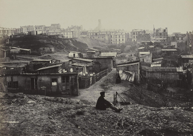
Most importantly, Marville worked for the city of Paris from 1862 to 1879: he documented neighborhoods slated for destruction, such as the tanneries on the banks of the Bièvres River; narrow, crumbling streets, some populated by fleeting figures; and epic scenes of destroyed government buildings, like the Hôtel de Ville. His pictures narrate urban transformation and the construction of all manner of new structures: the Opera, the expansive Bois de Boulougne park, as well as street lamps and public urinals (these may now strike us as antiquated but were then considered beacons of modernity). The exhibition also includes Marville’s documentation of the rough neighborhoods that emerged beyond the old city limits, home to the workers and migrants from the countryside who could not afford Haussmann’s modern city. These are the most surprising, and difficult, of the pictures on view. The Carrières d’Amérique (America Quarries) on a hill on the outskirts of the city, now Montmartre, was then a location for thieves, political dissidents, and gypsies—an ideal site for Haussmann’s cleansing plan.
Charles Marville. Top of the rue Champlain, View to the Right (Twentieth Arrondissement) 1877–78. © Musée Carnavalet / Roger-Viollet

Charles Marville. Urinal, Jennings System, plateau de l’Ambigu 1876. © Musée Carnavalet / Roger-Viollet
What makes Marville’s work finally “visible” after remaining hidden in plain sight for over 150 years? Partly, we benefit from post-modernist enthusiasm for all kinds of photographic practices, including Marville’s commercial work. More importantly, we have learned about the way photographers have worked for the archive, creating images to serve posterity rather than solely for exhibition. The diligent, creative researchers who worked on this exhibition, led by Sarah Kennel of the National Gallery in Washington, have uncovered evidence that tells more than ever before about Marville’s assignments from Haussmann. What had been viewed as a clinical record of a rotting city slated for destruction, or a nostalgic look at structures about to vanish, had an altogether different purpose. From Françoise Reynaud, Curator of Photographs at the Musée Carnavalet, Paris, source for many images on view, we learn that Marville’s views of “Old Paris” were commissioned by Haussmann himself, who declared near the start of his modernization project that “the City of Paris must disregard nothing, forget nothing, neglect nothing of its past.” What had been considered visual proof of the need to destroy old buildings and modernize sewers turns out to be a diligent argument for their preservation—at least in the form of photographs.
Here, Haussmann follows the example of the 1851 Commission des Monuments Historiques, in which the French government selected five photographers to survey the nation’s architectural patrimony to determine the need for preservation and restoration. All of these photographers—Gustave Le Gray, August Mestral, Édouard Baldus, Henri Le Secq, and Hippolyte Bayard—have been celebrated for their artistic use of the camera; the project itself was highly romantic, a mournful retrospective focused on the ruins of an ancient civilization. Their salted paper prints, made with paper negatives, were rendered softly—a formal quality that intensified the celebration of the past. Marville himself had used this technology to great effect in his early work. A decade later, however, when he began his Paris survey, his images were meant to support progress and change and preserve the old city in a useful, accurate, and permanent form. Glass plate negatives, capable of rendering vast amounts of intricate detail, provided the right form for his enterprise; the crispness of the resulting albumen prints were widely associated with objectivity and modernity. This evolution is evident in the exhibition: the ninety-eight prints and three albums are organized chronologically and provide a rich, sensuous account of the transformation in photographic medium.
Revisiting Marville elicits questions of the more celebrated Eugène Atget, who carried his own, smaller, view camera through the same streets at another time of civic transformation—the turn of the twentieth century and its first two decades. Did Atget use Marville’s work as a guide? The Met addresses this question with an adjacent small show from the collection, Paris as Muse, in which work by Marville and Atget hangs alongside that of Daguerre, Stieglitz, Kertész, Brassaï, Ilse Bing, Henri Cartier-Bresson, and Man Ray. Seen together, these shows correct our view of Atget as a lone artistic genius, at the same time that they elevate Marville from servant to Haussmann to a sympathetic interpreter of the present, with an eye toward posterity.

Eugène Atget. Boulevard de Strasbourg Corsets, Paris 1912. Gilman Collection, Purchase, Ann Tenenbaum and Thomas H. Lee Gift, 2005
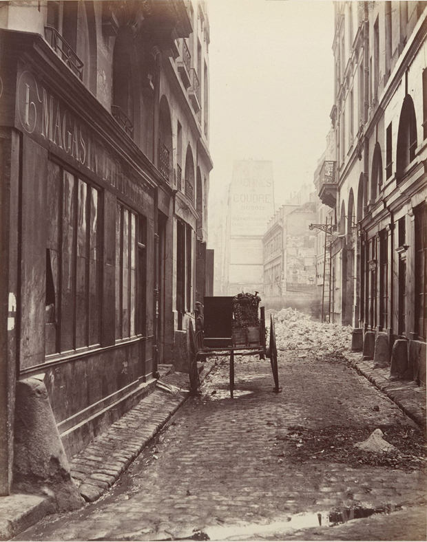
Charles Marville. Rue Estienne from the rue Boucher (First Arrondissement) 1862–65. The Metropolitan Museum of Art, New York
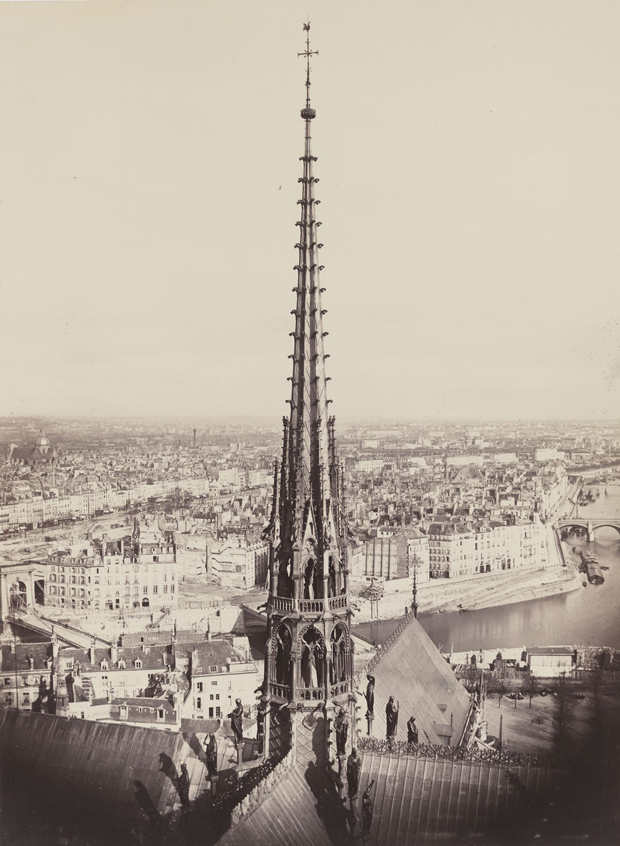
Charles Marville. Spire of Notre Dame, Viollet-le-Duc, Architect 1859–60. The AIA/AAF Collection, Prints and Photographs Division, Library of Congress, Washington D.C.
–
Mary Panzer is a photography writer and historian. She lives in New York.
The post Changing Paris appeared first on Aperture Foundation NY.
The Collectors: Matt Wolf
On the occasion of Matt Wolf’s newest documentary Teenage we are republishing this brief musing by Wolf on his favorite photograph, originally printed in The Collectors column from Aperture magazine, #212 (Fall 2013).
Sommertag auf einer Berliner Dachwiese—das Radio sorgt für Unterhaltung (Summer day on a rooftop lawn, with a radio for entertainment), Berlin, 1926. Photographer unknown © 2005 bpk—Bildagentur für Kunst, Kultur und Geschichte, Berlin
I’ve always been obsessed with images of women listening to records. My favorites are scenes from Fassbinder films. At the conclusion of his first feature, Love Is Colder Than Death (Liebe ist kälter als der Tod, 1969), a female gangster lies on the floor in a stark white bedroom in front of a turntable. The motif repeats in his 1975 television movie Fear of Fear (Angst vor der Angst). A housewife named Margot suffers from inconsolable postpartum depression. In the film’s climax, she locks her oldest daughter out of the apartment, lies on the floor, and blares a pop record.
I recently finished making a film called Teenage about the birth of youth culture. In that process, I saw thousands of archival images, including this remarkable photograph of 1920s German teenagers listening to the radio on a green roof. The photographer is unknown, but I found the image in an incredible book called Wir wollen eine andere Welt (We want another world) by Fred Grimm. When Fred learned about my film last year, he sent me his book, and it hugely inspired me.
In the early twentieth century, young people endured incredible oppression from their parents, governments, and the police. Pop culture and friends were their refuge, and teenagers struggled to create their own private world. This image is like a dream, and it conveys the transporting, hypnotic power of music.
—
Matt Wolf is the director of Wild Combination (2008), about the avant-garde cellist and disco producer Arthur Russell, and Teenage, which premiered at this year’s Tribeca Film Festival. He is a 2010 Guggenheim Fellow.
The post The Collectors: Matt Wolf appeared first on Aperture Foundation NY.
March 21, 2014
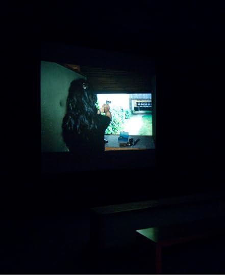
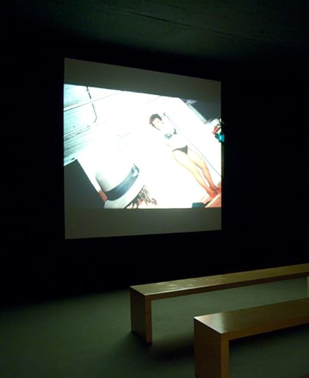
Matthew Pillsbury: City Stages (Video)
On March 10, 2014, we joined Matthew Pillsbury for a walk-through of his exhibition City Stages, followed by a signing of his recent monograph of the same name. Over the past decade, Pillsbury has built several extensive bodies of work—Screen Lives, Time Frame, and City Stages—that deal with different facets of contemporary metropolitan life and the passage of time. Working with black-and-white 8-by-10 film and long exposures, Pillsbury captures a range of psychologically charged experiences in the urban environment, from isolation—tuned into the omnipresent screens of our tablets, laptops, televisions, and phones—to crowded museums, parades, cathedrals, and even protests. The City Stages monograph and exhibition gather selections from all three bodies of work for the first time, spanning ten years of the artist’s output.
View “Matthew Pillsbury: City Stages” Part 2 and Part 3 on Vimeo.
The post Matthew Pillsbury: City Stages (Video) appeared first on Aperture Foundation NY.
Aperture's Blog

- Aperture's profile
- 21 followers

