
Aperture's Blog, page 184
February 20, 2014
Dawoud Bey: The Portrait in Context

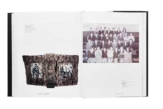
Bey, Demarco, South Shore High School, 2003
In Dawoud Bey’s portraits, he depicts both individuals and communities. Through series such as Class Pictures, Character Project, and most recently, The Birmingham Project, Bey explores collective individuality while guiding viewers through social and historical spaces.
Join Bey for a workshop on how to create effective portraits within a community context. The workshop will begin at Aperture, with an introductory review of students’ portfolios. In addition to providing personalized feedback and tasks for improvement, Bey will present his own work and experiences as an artist. The discussion will present conceptual and practical strategies for making new work, followed by a full-day site visit to a church, school, community center, or shelter where students will work directly with subjects to photograph them in the context of their shared environment and community. Students should have a strong working knowledge of their cameras, as well as basic working knowledge of artificial lighting.
Topics for discussion will include:
• What is your interest in the subject(s)?
• What is it you want to say about your subject(s)?
• What is the relationship between the subject(s) and the space you photograph them in?
• How do you establishing narrative in the photographic portrait?
• How to collaborate with and direct your subject(s)?
• Location setup and lighting: what works and how to do it
Dawoud Bey (born in New York, 1953) began his career as a photographer in 1975 with a series of photographs called Harlem, USA, which was later exhibited in his first one-person exhibition at the Studio Museum in Harlem in 1979. He has since had numerous exhibitions worldwide at such institutions as the Art Institute of Chicago; Barbican Centre in London; Cleveland Museum of Art; Los Angeles County Museum of Art; Detroit Institute of Arts; High Museum of Art, Atlanta; GA; National Portrait Gallery, London; and the Whitney Museum of American Art, New York, among many others. The Walker Art Center, Minneapolis, organized a mid-career survey of his work, Dawoud Bey: Portraits 1975-1995, which then traveled to institutions throughout the United States and Europe. A major publication of the same title was also published in conjunction with that exhibition. Class Pictures was published by Aperture in 2007, and a traveling exhibition of this work toured to museums throughout the country from 2007 to 2011.
Tuition: $500 ($450 for currently enrolled photography students and Aperture members at the Dual/Friend level and above)
Contact education@aperture.org with any questions.
Image: DeMarco, South Shore High School, Chicago, 2003
“I like when people look at this picture of me and be like, ‘Oh, he looks like he’ll do something bad like this.’ Some people might be like, ‘Oh, he looks like a bad kid,’ or . . . like, ‘I can picture him beatin’ up somebody or taking something from somebody,’ whereas that’s not me at all. I guess there is a certain look, ’cause I’ve experienced it before. Like, teachers in school, they’re like, ‘Oh, I thought you was a bad kid, but you’re all right,’ you know.’Cause I like to prove people wrong so I can make me look better in the end. ’Cause as they get to know me, then they’ll see—like I said, I’m a funny person—and they’ll see I’m a funny person.”
Refund / Cancellation Policy for Aperture Workshop
All fees are non-refundable if you should choose to withdraw from a workshop less than one month prior to its start date unless we are able to fill your seat. In the event of a medical emergency, please provide a physician’s note stating the nature of the emergency, and Aperture will issue you a credit that can be applied to future workshops. Aperture reserves the right to cancel any workshop up to one week prior to the start date if the workshop is under-enrolled, in which case a full refund will be issued. A minimum of eight students is required to run a workshop.
The post Dawoud Bey: The Portrait in Context appeared first on Aperture Foundation NY.


Announcing the finalists for the 2014 Aperture Portfolio Prize!

Matt Eich, Elvis the Zebra, 2007.
We’re pleased to announce the five finalists for the 2014 Aperture Portfolio Prize! This year, Aperture’s editorial and limited-edition print staff reviewed more than seven hundred portfolios. Our challenge was to select one winner and four honorable mentions from this overwhelming response. Out of the following exceptional finalists, one will be selected as the winner of the 2014 Aperture Portfolio Prize, receiving a cash prize and exhibition at Aperture Gallery in New York:
Matt Eich
Amy Elkins
Davide Monteleone
Max Pinckers
Sadie Wechsler
Stay tuned for the announcement of the winner in March! We will then also reveal all of the finalists’ portfolios and statements here on aperture.org. In the meantime, check out past Portfolio Prize winners.
The post Announcing the finalists for the 2014 Aperture Portfolio Prize! appeared first on Aperture Foundation NY.
February 13, 2014
Mark Oppenheimer on Adam Broomberg and Oliver Chanarin, Holy Bible

Adam Broomberg and Oliver Chanarin, Holy Bible, MACK Books / Archive of Modern Conflict, London, 2013, Designed by Adam Broomberg and Oliver Chanarin

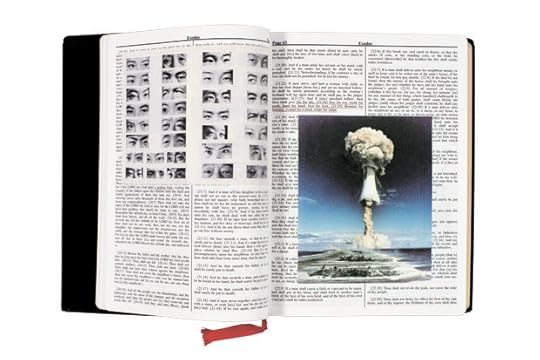
Adam Broomberg and Oliver Chanarin, Holy Bible, MACK Books / Archive of Modern Conflict, London, 2013, Designed by Adam Broomberg and Oliver Chanarin
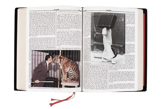
Adam Broomberg and Oliver Chanarin, Holy Bible, MACK Books / Archive of Modern Conflict, London, 2013, Designed by Adam Broomberg and Oliver Chanarin
Thank God for human forgetfulness: it makes literature out of cliché (itself the son of literature). In several places, the King James Bible records Jesus as having said that a house divided against itself cannot stand (or some variation thereof). When Abraham Lincoln gave his “House Divided” speech in 1858, upon accepting his party’s nomination for U.S. Senate, most of his listeners would have recognized the biblical allusion. Lincoln’s appropriation of the line marked him as a typically literate man of his time, not as some great stylist. Today, however, ignorant of the biblical referent, the modern reader credits Lincoln not with being derivative, but with being profound. For that matter, how many lovers of Faulkner think that the titular cry “Absalom, Absalom!” is an invention of the Mississippi bard, rather than a reworking of the biblical King David’s lament for his son?
So the question is: can the Bible be a cliché if we don’t really know it? Alas for Adam Broomberg and Oliver Chanarin, I think the answer is not really. In their work Holy Bible, they have taken photographs from the Archive of Modern Conflict, the London art repository and publisher, and imposed them on scattered pages of a complete, gilt-edged text of the King James Bible, perfect-bound with a sewn red-ribbon bookmark, just like your Victorian ancestors’ family treasure. The photographs—most of them violent, dissonant, or rancorous, from the lynched men to the naked, hunchbacked woman—correspond to passages underlined in red on the same or the facing page. The red underlining is itself an echo of the practice, in kitschier Bible editions, of printing the words of Jesus in red. But the collagists’ real aim is to make us see with fresh eyes many hackneyed phrases from the Bible. So, for example, the oft-repeated phrase “and it came to pass” is always paired with a photograph of something in the realm of legerdemain or masquerade: a circus act in progress, a close-magic practitioner doing a card trick, children in their Halloween costumes. I suppose that we are meant to think anew about the casual assumption that God can just snap his/her/its fingers and, magically, things will come to pass.
But is the audience for this book not the jaded, secular art world, whose members a) do not believe this stuff anyway, and b) would scarcely recognize “and it came to pass” as biblical, in the King James idiom, as opposed to just Renaissance diction of indeterminate origin? The same audience will not be particularly provoked, either, to see Jesus’s dictum, in a parable in Matthew 22:14, that “many are called, but few are chosen” paired with a picture of a white-jacketed official performing a prostate examination—or is it a prison-entry body-cavity search?—on a bent, naked man. I hardly need tell you that passages from Revelation, the last book of the Bible, are illustrated with a color photograph of the World Trade Center in flames. The cliché here is not the underlined passages, “worship the beast and his image,” but the reliance on the too-familiar, if still horrible, image.
Holy Bible is not particularly curious about religion; the basic message, adumbrated by Adi Ophir’s lucid essay, pasted into the back, is that God is violent. But it is visually sumptuous, at times arresting. “[D]elivered my soul from the lowest hell,” in Psalm 86:13, is illustrated, on the recto page, by a lovely Jewess—it’s the right word; address indignant mail to me—with a broad, Breck-Girl smile, seemingly indifferent to the yellow star she has been forced to wear. When the artists choose erotic snapshots, they choose well, favoring the erotically down-market and amateur. Elsewhere they show us black men at (polyester) leisure, scrawny white boys huffing aerosol, and a contemporary white supremacist exhausted, sleeping by his Nazi flag, as if the march has ended and at last he can take a break from Sieg Heil-ing. Nazis claimed to be Christian, but were of course pagan; this volume is supposed to be about God, but it really is about all of us.
*This title also appears as part of the short list for the Paris Photo–Aperture Foundation PhotoBook Awards.
—
Mark Oppenheimer writes the Beliefs column for the New York Times and is author of the e-book Dan Savage: The First Gay Celebrity (2012).
The post Mark Oppenheimer on Adam Broomberg and Oliver Chanarin, Holy Bible appeared first on Aperture Foundation NY.
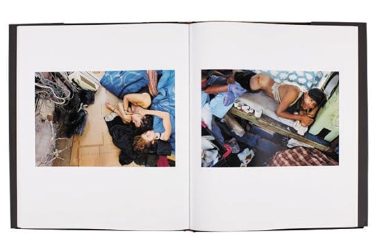
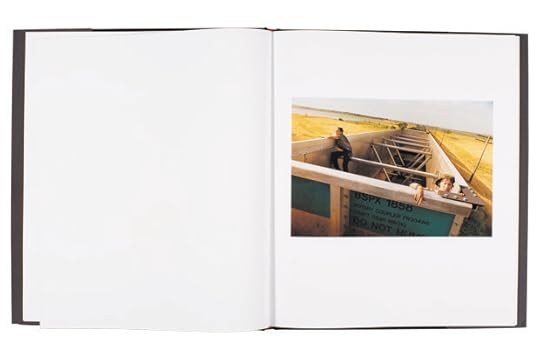
Danny Lyon on Mike Brodie, A Period of Juvenile Prosperity
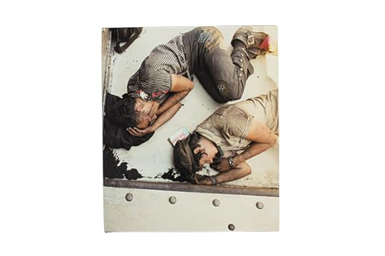
Mike Brodie, A Period of Juvenile Prosperity, Twin Palms Publishers, Santa Fe, NM, 2013, Designed by Jack Woody
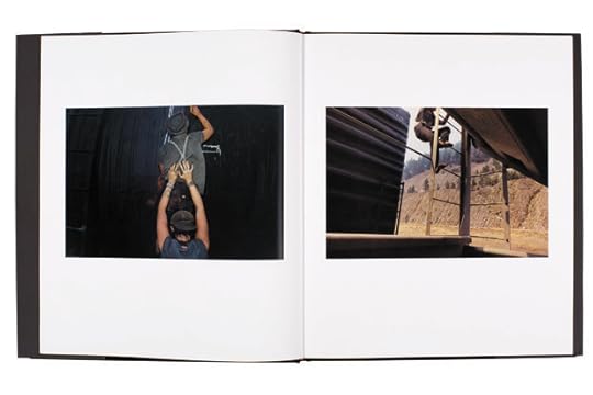
Mike Brodie, A Period of Juvenile Prosperity, Twin Palms Publishers, Santa Fe, NM, 2013, Designed by Jack Woody
Mike Brodie, A Period of Juvenile Prosperity, Twin Palms Publishers, Santa Fe, NM, 2013, Designed by Jack Woody
Mike Brodie, A Period of Juvenile Prosperity, Twin Palms Publishers, Santa Fe, NM, 2013, Designed by Jack Woody
Great photography touches the soul. In 2003, Mike Brodie was a teenager in Pensacola, Florida, living with his mother; his father was far off in Arizona, doing ten years in prison.
Young Mike and his friend Savannah figured out the simple scam of stealing books from Barnes and Noble and reselling them on Amazon. One day Savannah stole some photography books. The Bikeriders, which was reissued that year by Chronicle Books, was kept by Brodie. They gave away one by Mary Ellen Mark; Savannah wanted to keep the book by Sebastião Salgado; and the dog ate the book by Steve McCurry.
That same year Brodie received a Polaroid SX-70 from a friend and made a picture of his BMX. Like so many, Brodie was blown away by the picture that magically appeared. Deciding high school had no more to offer, he told his mother he was leaving home for a life of rail-hopping. There, he took on the tag The Polaroid Kidd. When it was no longer possible to get film for the SX-70, he bought a Nikon F3 for $290 and started to make pictures on negative film. (I once explained to Mike that an F3 was a single-lens reflex and he did not know what that term meant. He did know the term “range finder,” and understood that with the SLR he could perfectly compose his pictures.)
This year, ten years after Brodie hit the rails, Twin Palms, Jack Woody’s small publishing house in Santa Fe, New Mexico, published Brodie’s A Period of Juvenile Prosperity, a collection of sixty-one prints made with the Nikon. The cover, which Jack designed using a detail of one of the train photographs, looks like a cross between Charlie Chaplin’s Tramp and Rimbaud’s A Season in Hell. We see two street children upside down and asleep, as if rotating in a heavenly constellation of filth. The image of the sleeping children, one a boy, one a boy/ girl, is held in place by the five steel rivets of a railcar as it rockets across America. Brodie, Nikon in hand, loaded with Kodak Portra color negative film, made the picture by leaning over the edge of the steel car. During four years of shooting with his Nikon, Brodie produced two hundred rolls of film, which were developed at Wal-Mart and Walgreens, “wherever they had twenty-four-hour service.” He carried the negs with him until he had a bundle of rolls, then returned to his mother’s apartment in Pensacola, where he scanned each negative into his computer using a Nikon scanner he purchased on eBay. When I asked him if he ever printed any, he said that he eventually stole a HP printer that could do 13 x 19 in. prints. The negs were terribly scratched, which is fitting for a record of children that proudly wear their wounds and tattoos on their sleeves for all to see, a finger in the eye of all us Americans happily comatose in our materialism. Brodie thinks his train-hopping family were scions of the anarcho/crust punk movement that began in the mid-1980s.
Brodie leapt into the life of picture- making as if he was the first to do it. He was doing what he loved, and he did it compulsively. The book, which he sequenced with Jack Woody in Santa Fe, is the story of rail-hoppers, who after many miles (Brodie has been to forty-eight states by train) settle down in the domestic bliss of a squat. This book is as powerful a record of America in need of a bath and our lust for the road as has ever been done.
When the camera and subject are moving at the same speed, the result is called a pan. In motion pictures it is called a tracking shot. Many of Brodie’s pictures are made in motion. Brodie’s use of color is always subdued. He almost never shoots in sunlight. The endpapers of this wonderful book are a double-page spread from the rear of a train as it speeds around a corner.
In the first picture we see one of Brodie’s train-jumping heroes as he stares down at a train from an overpass. Over his shoulder is slung a sack of veggies, freshly picked from a dumpster. The boy is covered with grime. A late-model black sedan is behind him on the overpass, its fog lights on, because, as if the scene wasn’t gloomy enough, everything is enveloped in fog. Only this car looks like it is about to flip over, because young Brodie has turned his Nikon on a forty-five-degree angle, dividing this two-part vision of travel with a line that crosses the picture diagonally. The picture is perfect. The kid is a natural.
We follow the images in a sort of “how-to” train-jumping sequence. (Don’t try this; you might get killed.) In another pan, a boy/girl clutching a guitar case runs along the blurred gravel roadbed. Far behind, another figure runs along the tracks. Are they getting on or off? And where is Mike? It’s even harder to work a camera than to hold on to a guitar, so let’s assume he is perched on the train. The blurs are thrilling. The only thing approaching focus is somewhere down those tracks, perfectly parallel, stretching to infinity.
There are no captions on these pictures. We never learn anyone’s name, and worse, we do not know if they are in Idaho or Canada, or where they are. There is a beautifully written afterword that Brodie wrote in Santa Fe. In it he briefly lays out his difficult life growing up, the outline of how he made the work, and his early retirement from photography to become a diesel mechanic. He says he is looking for a job, just not in photography.
And he just might have retired the pan on his way out. Shot straight down (again) from what must be the roof of a speeding train, we see the cars coupling, the parallel tracks beneath. This picture is a sort of Lewis Hine for the LGBT crowd. Hanging like a monkey from the car is one of Mike’s little savages—what is he wearing?—a black lace nightgown trailing in the wind. The ground streaks by, giving this solid picture an immense sense of speed and flight, coupled, so to speak, with the bravery and fragility of human existence.
We are left with some mysteries. One young man appears in many pictures wearing a shirt with vertical black stripes. This is his family, Brodie’s family, and a very small group of people. They end up off the rails, in a sort of domesticity of filth. There is a revolting shot of a rat, and, in a picture of someone’s blue jeans soaking in a bathtub, we see that cleanliness, though not next to godliness, is something like sex: most of us seek it, it’s just a matter of how often. The group seems less exciting once they have settled down. Maybe I miss the rails. There is one showstopper, though, as a young woman shaves part of her hair with an electric trimmer, and we see her in the mirror. What, in another group, might have been mascara running from her eye, are long dark tattoos. The phony menu hanging in the squat offers things like “Toast a poot” and “Shit Toes.”
Ah, youth. Thank God America is always able to produce a generation that can offer our self-satisfied selves “Shit Toes” for lunch.
*This title also appears as part of the short list for the Paris Photo–Aperture Foundation PhotoBook Awards.
—
Danny Lyon’s writing appears regularly on his blog at dektol.wordpress.com. His newest book, The Seventh Dog, will be published by Phaidon in 2014. Aperture will reissue The Bikeriders in spring 2014.
The post Danny Lyon on Mike Brodie, A Period of Juvenile Prosperity appeared first on Aperture Foundation NY.
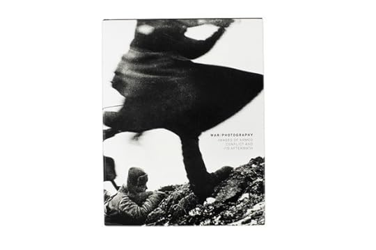
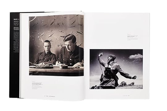
Vicki Goldberg on Anne Wilkes Tucker and Will Michels with Natalie Zelt, War/Photography: Images of Armed Conflict and Its Aftermath
Anne Wilkes Tucker and Will Michels with Natalie Zelt, War Photography: Images of Armed Conflict and Its Aftermath, Museum of Fine Arts, Houston / Yale University Press, 2012, Designed by Julie Savasky and DJ Stout, Pentagram
Anne Wilkes Tucker and Will Michels with Natalie Zelt, War Photography: Images of Armed Conflict and Its Aftermath, Museum of Fine Arts, Houston / Yale University Press, 2012, Designed by Julie Savasky and DJ Stout, Pentagram
Anne Wilkes Tucker and Will Michels with Natalie Zelt, War Photography: Images of Armed Conflict and Its Aftermath, Museum of Fine Arts, Houston / Yale University Press, 2012, Designed by Julie Savasky and DJ Stout, Pentagram
“It makes no difference what men think of war. . . .
War endures. As well ask men what they think of stone.
War was always here. Before man was, war waited for him. The
ultimate trade awaiting its ultimate practitioner.”
—Cormac McCarthy, Blood Meridian
I challenge anyone to look through this book without both wincing and admiring, sometimes when confronting the same image. War photographs can plunge us into a kind of purgatory, a state of pain that comes with the promise that we, far from the hell out there, need not suffer eternally. War/Photography, the catalog for the enormous show (almost five hundred photographs and objects) that originated at the Museum of Fine Arts, Houston, curated by Anne Wilkes Tucker and Will Michels with Natalie Zelt, inflicts a good deal of pain: photographs like Greg Marinovich’s of a South African hacking at a man who’s consumed in flames, or Patrick Chauvel’s of soldiers in Bangladesh publicly executing prisoners by repeatedly bayoneting them. And there are admirable, remarkable, sometimes beautiful photographs as well: Christophe Agou’s view through the ragged cross-shaped bars of a shattered window to the bare bones of the towers destroyed on 9/11, and Edward Steichen’s elegant picture of soldiers relaxing and sleeping on a flight deck during World War I.
The book is handsomely designed and produced and, at six hundred pages, is as stuffed with useful and surprising information as a detective’s file cabinet—and heavy enough to flatten your lap. Uncommon facts proliferate. There were many photographs before and during the supposedly almost unphotographed Falklands War. Official German photographers in World War I took color photographs. More than half the population of Great Britain saw a film that included actual footage of the Battle of the Somme while that battle was still going on. And more.
Uncommon photographs multiply as well: the grave of a Mexican prisoner in 1913, still alive enough to reach an arm up from the earth after he’d been buried. The track of a Japanese torpedo racing toward American ships at Pearl Harbor in 1941. A parachutist in 1962 falling into another man’s parachute on the way down. A Khmer guerilla in Cambodia awaiting surgery from medical personnel standing knee-deep in swamp water. And more. And more.
If you cannot see an exhibition during its tour, the catalog offers a vague feeling that you have done so. With war photographs (and movies), one of photography’s most persistent specters is especially prevalent (and dangerous): the insidious sense that we have absorbed the experience, that we know what such conflict is like. Technology is working hard to intensify this notion, as soldiers’ photographs from the field catapult to prominence on the web, and automated photography—aerial photographs from unmanned planes and earth-based images from cameras attached to soldiers’ helmets—zeroes in on dangerous and gruesome encounters.
Every catalog adds to Malraux’s museum without walls, but the catalog’s greatest power is its ability to fill in contextual blanks. If photographs tell but do not explain, catalogs do both. War/Photography does this hugely and often grandly. If occasionally uneven, it fulfills the curators’ stated hopes by providing a platform for discussion of conflict and conflict photography.
The exhibition and book’s premise is complex: that it is important to comprehend not only the intention and purpose of war images, but also their distribution and their effects. Effects are particularly hard to pin down, but the ubiquity of such images since the advent of the illustrated press, plus the ongoing popularity of war movies, testify to their persistence and their strength. Part of War/Photography’s premise inheres in its structure: it looks at the genre comprehensively, not the (mere) history of individual wars or individual photographers, but “the arc of war—from instigation, to recruitment, embarkation, and training, to ‘the fight’ and ‘the fog’ of war, to its aftermath, with prisoners and executions, the wounded and refugees, to war’s end, memorials, and remembrance.” All such photographs are universally recognized as having to do with war, but this is a much more inclusive definition than the common term “war photography,” and the slice across time and place in each category produces some intriguing hints that all wars are both the same and entirely different.
Anne Wilkes Tucker’s introductory essays to each section thoughtfully and authoritatively address the images and issues in that section. John Stauffer’s and Bodo Von Dewitz’s contributions are particularly brilliant and revelatory.
Stauffer, who writes about the effects of images in the Crimean War and the American Civil War, has a logical explanation for which of Roger Fenton’s two pictures of The Valley of the Shadow of Death in the Crimea came first. He also writes that though the British had a virtual lust for images of that conflict, far more, millions in fact, were published in the illustrated press in America, despite the fact that the U.S. was not engaged in that war. What’s more, “England was comparatively free of censorship, which helps explain why the correspondents and public opinion played a crucial role in the war’s outcome.” The other combatants, who had a clearer idea of the power of the press, rigorously controlled it. Government restrictions on publication had been around a long time, but the burgeoning media carved a wide new path for influence to flow along. The mid-nineteenth century gave birth to the mass media, the mass audience, and the image era, all of which grew up fast, eventually reaching maturity—and decadence. They are still growing before our eyes.
Bodo Von Dewitz writes about photography’s influence in Germany during and after World War I. Traditionally, that war is considered rather photograph-poor due to early censorship, restrictions on professional access, and the frequent reliance on staged images when action pictures were hard to get. But in fact, Von Dewitz writes, “countless millions” of photographs were produced by soldier amateurs, sent home as postcards and greeting cards, kept in albums, sold in bookshops in the field, and exhibited on the home front. In postwar Germany, many books were published with war photographs, giving rise to “an unprecedented, intensive journalistic examination of wartime experiences.”
The amateur images were variously interpreted, or slanted and used as propaganda (in an early indication of the questionable authority of photographs as documents). The media’s reinterpretation of these wartime memories generated “the building blocks for the rise of the National Socialist movement, which ultimately resulted in the Nazi dictatorship and its politics of re-armament and war”—a breathtaking claim for the power of photographs. No exhibition has the space to include such history, a persuasive argument for this catalog and catalogs in general.
All photography books change the object in one way or another. Paper and color are different, even if minimally, and scale cannot be reproduced. Reducing the scale of a work of art alters its effect, a fact rendered especially meaningful now that photographs have laid claim to grandeur.
The Houston exhibition juxtaposed two pictures of the identical subject but of quite different sizes: Seamus Murphy’s black-and-white image of a dead Taliban soldier in Afghanistan (20 x 24 in.) and Luc Delahaye’s color photograph of the very same corpse (43 1⁄8 x 93 1⁄4 in.). The book necessarily reduces them, replicating the ratio of one to the other as closely as possible, yet the experience of Delahaye’s oversize image simply cannot be reproduced on the page.
Its scale introduces another factor. Murphy’s picture, though it too is large enough to suggest the photographer expected it to be displayed in an art context, retains elements of a captured or photojournalistic image. The dead man’s feet are nearly at the bottom edge of the picture and the body stretches back toward a wide, deserted landscape. In Delahaye’s photograph, the body lies parallel to and precisely in the center of an elongated frame, and only a brief expanse of ground, not enough to call a landscape, frames the figure and serves to emphasize its centrality. This formal, classicizing composition calls upon the histories of painting and sculptured relief; composition, muted color, and ambitious scale adamantly insist that a war photograph can be conceived from its inception as a work of art. Time, the market, and museums may have lightly tossed many war photographs into the amorphous category of art, and many a photographer, Murphy included, has given a rough picture an artistic twist, but few who were on the battlefield have claimed the mantel so decisively as Delahaye.
Both book and show carefully point out faked and staged photographs, as well as their origins and uses. Staged: the Kaiser was photographed visiting the front during World War I, but he never got there. No German soldier crouched in the muddy swamp of the front lines would have recognized the clean and tidy trench their ruler inspected; it was constructed for the occasion. Faked: Wesley David Archer’s Just as he left the burning plane (ca. 1933), a harrowing picture of a pilot falling through the air while his plane does its own death dive, was long accepted as a war document but later discovered to have been ginned up with a model airplane and doubtless a toy human, too.
Manipulated war photographs, often distrusted by the military, served governments, their agencies, and activists as morale builders and propaganda. The public apparently accepted some degree of manipulation, such as added scenery, but still believed in photography’s essential truthfulness. Would that we could discover whether news editors knew (or cared) which photographs they published were staged.
It seems a characteristic of our species that we will wage war forever. What’s more, as representations of war have mushroomed, they have stoked the appetite for them, which seems to be in no more danger of being slaked than war is of being stopped. It would pay us to understand our hunger for war’s images and to understand how those images have affected history and culture. These are big questions. This catalog hints at and poses them indirectly and asks us to discuss them, perhaps even to come up with answers—which could turn out to be as scorching as the photographs themselves.
—
Vicki Goldberg’s latest book is The White House: The President’s Home in Photographs and History (Little, Brown and Co., 2011), which features two hundred and fifty photographs, from the 1840s–2010, of the house; the presidents; their families, guests, and pets; and their relations with the media and involvement with technology. The exhibition War/Photography opened at the Brooklyn Museum on November 8, 2013.
The post Vicki Goldberg on Anne Wilkes Tucker and Will Michels with Natalie Zelt, War/Photography: Images of Armed Conflict and Its Aftermath appeared first on Aperture Foundation NY.
Darius Himes in Conversation with Dana Faconti (Blind Spot)
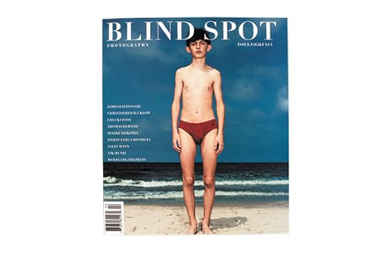
Kim Zorn Caputo, editor-in-chief, Blind Spot, Issue Eight, New York, Fall/Winter 1996
Kim Zorn Caputo, editor-in-chief, Blind Spot, Issue Eight, New York, Fall/Winter 1996
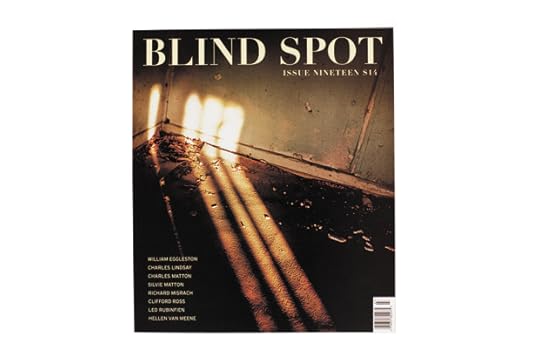
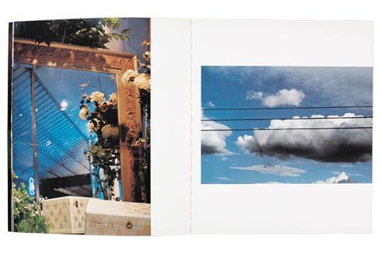
Kim Zorn Caputo, editor-in-chief, Blind Spot, Issue Nineteen, New York, Summer 2001

Kim Zorn Caputo, editor-in-chief, Blind Spot, Issue Nineteen, New York, Summer 2001
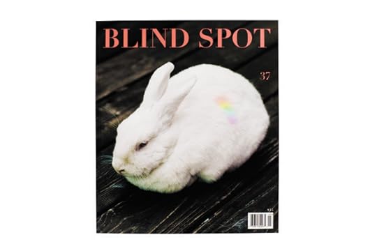
Kim Zorn Caputo, editor-in-chief, Blind Spot, Issue Thirty-Seven, New York, Spring/Summer 2008
Kim Zorn Caputo, editor-in-chief, Blind Spot, Issue Thirty-Seven, New York, Spring/Summer 2008
I was living abroad when I first saw an issue of Blind Spot. I had recently completed my BFA in photography and was isolated from any art community. In reading the magazine, I felt like I had discovered a secret treasure trove. I still feel that way when I get a new issue.
Darius Himes: The mission of Blind Spot has always been to showcase unseen work by both well-know and unknown photographers. How has that mission grown and developed over the years?
Dana Faconti: We still aim to present new work, or work that has been overlooked for one reason or another, and it remains a priority to maintain a balance of established and emerging artists. When Blind Spot appeared in 1993, there were far fewer venues for artists working with photography to present their work, which made the impact of this mission profound. Twenty years later, the Internet and new printing technologies have proliferated on-demand books, websites, and small imprints; the number of outlets for photographers has increased greatly. The terrain for a small imprint like Blind Spot to engage new generations of image consumers is much more challenging now. We’ve responded to this by expanding our programming to include events, books, and online content, and by turning the magazine over to artist guest editors who provide distinct views on the role of photography within contemporary art. Artists remain at the center of what we do, and it’s particularly gratifying when they respond positively to our work. Ed Ruscha once said, “I was being forgetful while searching for a copy of Blind Spot. I looked for a good while then discovered it was on a shelf labeled Absolutely Most Unique in Any Storm at Sea.”
DH: Blind Spot is a very trim operation, accomplishing a great deal with modest resources. You perform the roles of publisher, editor, designer, production manager—among various other positions. What has been your approach to design—and has it changed over the last ten years?
DF: I was hired at Blind Spot fourteen years ago to be the assistant to the founding editor and publisher, Kim Zorn Caputo, and to be responsible for overseeing the nuts and bolts of our tiny operation—customer service, distribution, and the like. Having recently graduated from Parsons School of Design with a degree in photography and a focus in graphic design, Kim immediately made use of my layout skills and had me work on the issues with her. (She had previously worked with various designers, including Tony Arefin, J. Abbott Miller, and Tony Morgan.) The issues we produced together featured pieces of contemporary short fiction by writers like Dave Eggers, Jonathan Franzen, Joyce Carol Oates, and Lynne Tillman, and were very much under Kim’s art direction, which favored the use of multiple display typefaces and a lot of full-spread and full-bleed images.
When I took over the magazine I simplified the design and let go of the written components. For me, Blind Spot’s strength was in presenting beautifully produced images, and I wanted to refine the layout to better serve this purpose. At the same time, I was given the task of setting up a non-profit to take over the publishing of Blind Spot. That work led me, in 2007, to bring on Susan Barber as our art director; Su is responsible for creating the present design of the magazine. She’s an incredible designer with a deep appreciation of art and photography, and she works closely with the guest editors to adapt the format to their curatorial needs. I continue to oversee production, which is work I’ve always enjoyed.
DH: Very high production value is a distinguishing aspect of the magazine. The choice of paper stock and the standard of reproductions are superb. Why is that so integral to the experience of the magazine?
DF: The production value of Blind Spot is something I inherited from Kim. The magazine was begun as a side project while Kim was co-running a custom photography lab, Lexington Labs. Kim set out with the intention, strongly influenced by the magazine’s first associate editor, Vik Muniz, not just to create a magazine, but also to collaborate with the editors, designers, and contributing artists on making a piece of art. For Kim, that meant the publication warranted the same level of quality as the exhibition prints she was making for the artists that patronized the lab. Despite how financially difficult it has been to maintain this quality, especially since we produce the magazine and all of our publications in the United States, I remain committed to it.
DH: You’ve begun working with guest editors, inviting noted figures to work with the set parameters of the magazine. Have you enjoyed the process? Has that opened doors to seeing the magazine in a new light?
DF: Blind Spot has always been artist-driven. Vik was instrumental in shaping the publication at its inception, and the decision to turn the magazine over to artist guest editors was an organic development that now seems inevitable. The first issue with the coeditor role formalized was issue thirty-five, published in 2007. I had long been a fan of Jason Fulford’s work, so I asked Jason who he was excited about and he sent me a long and interesting list. From there I began looking for artists that I felt were pushing the medium or particular ideas about it that could be explored through the curation of an issue. I’ve largely given the guest editors complete freedom—with the exception that the trim size and page count remain the same. Taryn Simon was the first guest editor who wanted to change the layout of the pages. This was difficult for me at first but I was ultimately pleased with the resulting issue, and it opened things up for subsequent editors to work more freely within the format.
I’m careful to invite artists whose work I deeply admire, like Walead Beshty, Marco Breuer, Moyra Davey, Zoe Leonard, Tim Davis, Liz Deschenes, and James Welling, while also maintaining Blind Spot’s commitment to giving opportunities to exciting younger artists like Jodie Vicenta Jacobson, Arthur Ou, and Matthew Porter and Hannah Whitaker, who worked together on an issue. The guest editors have all been incredibly generous with their time and vision, and it’s been an extremely enjoyable process. To celebrate the magazine’s twentieth anniversary, I’ve invited Vik back to edit the fall issue, and Barney Kulok will coedit it. Their issue will draw from the magazine’s twenty-year archive, as well as introduce new and unpublished work.
—
Darius Himes is a director of Fraenkel Gallery. He was a cofounder of Radius Books and the first editor of the photo-eye Booklist, a journal dedicated to photography books. His first title, Publish Your Photography Book (Princeton Architectural Press), coauthored with Mary Virginia Swanson, will be reissued in a second edition in the spring of 2014. He lives and works in San Francisco but considers himself a global citizen.
The post Darius Himes in Conversation with Dana Faconti (Blind Spot) appeared first on Aperture Foundation NY.
Alan Rapp in Conversation with Hans Gremmen
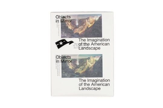
Hans Gremmen, ed., Objects in Mirror: The Imagination of the American Landscape, Fw: *Amsterdam, 2012, Designed by Hans Gremmen
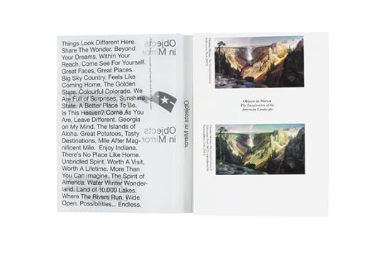
Hans Gremmen, ed., Objects in Mirror: The Imagination of the American Landscape, Fw: *Amsterdam, 2012, Designed by Hans Gremmen

Cara Phillips, Singular Beauty, Fw: *Amsterdam, 2012, Designed by Hans Gremmen

Cara Phillips, Singular Beauty, Fw: *Amsterdam, 2012, Designed by Hans Gremmen
Hans Gremmen and Dieuwertje Komen, Commonness, Fw: *Amsterdam, 2010, Designed by Hans Gremmen

Hans Gremmen and Dieuwertje Komen, Commonness, Fw: *Amsterdam, 2010, Designed by Hans Gremmen
Contemporary photobooks that treat ephemeral, elusive, and subtly unsettling subjects require designers who can work beyond familiar conventions. This extends from obvious design issues such as the sequence of images and the composition of pages into production factors, where the craft tradition of books resides. Amsterdam-based designer Hans Gremmen combines proficiency in these fields with critical inquiry. Books he has designed do not exude the air of authority normally associated with the printed document, but instead convey contingency, ambiguity, and disjuncture. Whether in the compilation of test, prep, and misprinted posters by renowned artists and designers (Serendipity), a book bound in office grip clips (Singular Beauty), or a silkscreened bookwrap that is damaged by its removal (Libero), many of Gremmen’s projects question the status of the printed book itself. In our interview, Gremmen used the word unheimlich to describe the alluring and repellent qualities of Cara Phillips’s images of cosmetic surgery spaces; one way that this freighted German word is translated is uncanny, which is the twilight zone where these works reside.
Alan Rapp: When approaching a book project, do you try to get at the core of the work alone, or with exposure to or input from the photographer?
Hans Gremmen: I never instantly have an idea or direction for a book. To get to the core of the work asks for a different approach with every project. But there is a valuable moment that I am always very careful with: the moment I first see the work. I prefer to go into this stage unprepared, not knowing what the project is about (except maybe for a title). I do this because it mimics the experience of many of the book’s future readers and viewers. As soon as you have background info, you look at the work differently. [The first look] is a unique moment. I try to get rough prep material, contact sheets and things like that, and I need time to digest all the information. In the next meeting with the photographer (usually after a few weeks), we begin to talk about how I see things, and whether that is in line with the ideas of the photographer.
AR: What are the main design and production techniques you employ? Do you think of yourself as a designer with a consistent approach, belonging to a certain school or tradition of design?
HG: I have a printing background. Before I went to an arts academy, I trained for four years to do graphic production work: printing, typesetting, prepress, etc. I understand the printing process inside out, and—as a designer—look for ways to use and influence that process to get what I want. My designs stay close to this practical and physical part of the production: paper, ink, print sheets, and binding are my main tools. For me this connection between design and printing is logical, but it also fits in a design tradition in the Netherlands, I think. In the 1950s and ’60s designers such as Otto Treumann and Willem Sandberg made very print-based work, as do my own teachers, like Jaap van Triest, Karel Martens, and Roger Willems.
AR: You have said that in making the photobook you create a “new autonomy.” What are the conditions today that permit this independence of the medium? Given the complex streams and flows of visual culture, what does this autonomy mean to you?
HG: What I meant by that is that a book follows its own rules. The basics of the book (cover/front/back/spine/pages) are given, but you can choose to change and manipulate these, which will affect the work and how people will experience the work. Within visual culture this is not a strange phenomenon. Just think of the movies: if you go to a movie you accept that you are entering a world for a few hours, one that will follow its own logic. Maybe plants will begin to speak, maybe a dwarf will sing a song in a red room; it is all possible.
AR: What did you respond to first when formulating the design concept for Cara Phillips’s Singular Beauty? Clinical spaces where female beauty is manipulated are the subject of the book, and Phillips’s images of them are coldly dramatic. Why employ an all-type cover and bind the block with grip clips?
HG: When I saw Cara’s work I was instantly drawn into these strange rooms and machines. The way she uses the light makes the work unheimlich; it gets under your skin. But what is actually in the photographs is very hardcore medical equipment. So I instantly knew what kind of book it shouldn’t be. This book shouldn’t be a coffee-table book, with perfect paper and perfect binding. That would focus too much on the surface layer of the work. I wanted the book to also have a slightly uncomfortable feeling. Therefore I chose this rough binding, something you could also see as very clinical: staples. Stainless steel at its best. On the front I placed the title very large simply because I needed a counterpoint for all the fragile decisions I made (thin paper, see-through captions, regular typography). The back cover has a large image. For me a cover is a three-dimensional object, with a front, a back, and a spine. A cover should be part of the total concept of the book.
AR: Another example is Petra Stavast’s Libero, in which the design concept extends to the production and packaging. At what point do you as the designer really start calling the shots in fabrication? And how often do you have the budget latitude to do this?
HG: I am always very much involved in the fabrication of a book. By doing so, I can often produce the book more inexpensively than initially budgeted. In the case of Libero I used the maximum number of pages that fit on a sheet of a mid-size book. I found a way in printing that I could push the normal page–per–sheet ratio up by half a centimeter on each side. This may sound like a marginal difference, but it makes the book more in the mid-size range, without losing the intimacy of a small(er) book. And it does not cost any extra money because no extra plates and paper are needed. It is the same process, only used more economically. I work with printers that I know very well, which allows me to get into these kinds of discussions. The puzzle of making it all fit is something that both I and they enjoy. And in the end, it makes for a far more engaging photobook.
—
Alan Rapp is senior editor of architecture and design at the Monacelli Press.
The post Alan Rapp in Conversation with Hans Gremmen appeared first on Aperture Foundation NY.
Editor’s Note: Darius Himes
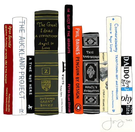
Jane Mount, Ideal Bookshelf #634 Darius Himes, idealbookshelf.com
Whenever there is a cultural statement involving the “death” of something, you can be assured that a proliferation and rebirth of that very thing is already happening in the nooks and crannies of popular culture. The renaissance is usually spearheaded by artists, and while it doesn’t have the same mass-market reach, it is usually far more culturally satisfying. Vinyl is still around, television didn’t kill radio, college kids now want to become organic farmers, many stores within a few blocks of my flat sell working typewriters, the production process for books has never been more accessible, and you’re reading this on newsprint.
Interestingly enough, newsprint, despite the shuttering of long-standing newspapers around the world, seems to be having its heyday right now. I realized earlier this summer that I had been unwittingly collecting examples of newsprint for the past year: the ANT!FOTO Manifesto (Böhm/Kobayashi, 2013), the state-by-state LBM Dispatch of Alec Soth and Brad Zellar (Little Brown Mushroom, 2012–13), the newspaper supplement to IMA magazine (“Japanese Art Photographers 107,” 2012), Louie Palu’s Mira Mexico, numerous publisher catalogs (JRP-Ringier, Radius Books, MACK), and, obviously, The PhotoBook Review are all printed on a material declared “dead” by popular media.
Change, as the saying goes, is the one constant of this world. I like that sentiment quite a lot. While changes to global society, our national culture, and neighborhood communities continue unabated—think “river of life”— those changes provide rich opportunities for artists to express themselves through ever-evolving mediums. Change represents potential—positive potential, I would argue.
The printed medium is so perfectly universal, I get ridiculously excited thinking about it, and about its future. This has been said over and over, but the conveyance of ideas, both written and visual, through the printed form is here to stay. As Joan Fontcuberta wrote in PBR 003’s Editor’s Note, “As if the irresistible rise of online journals and e-books was to lay waste in two days to print, a technology that has endured for centuries.” Have we forgotten that the right to education, and therefore literacy—the ability to read and gain collected, collective knowledge—arose from the same foment that led to the invention of photography itself? There is no causal relationship, but they are both part of the new level of consciousness that humanity finds itself struggling to adjust to. I’m already sentimental about the future developments in store for humanity in an age where universal education, literacy—including visual literacy—and access to knowledge are not merely considered rights, but have been fully implemented. Did anyone think the application on a global scale of those lofty ideals would take less than a few generations, perhaps a couple hundred years, to implement and adjust?
My ideal bookshelf (illustrated above) is a mix of photography, art, and books about ideas. These are books that have sustained me from the moment they entered my life. They have nourished my intellect and my emotions. Open Secrets, published jointly by Fraenkel Gallery and Matthew Marks Gallery, New York, was a book I discovered just after college. Perfectly balancing works on paper, this book interleaved photographs, drawings, and prints in a way that resounded with a sensibility that had yet to be fully developed in me. I felt the same expansiveness when I discovered the exhibition catalog In Quest of the Absolute, published in 1996 by Peter Blum Edition. Here was a book and an exhibition that was published in direct response to—in conversation with the ideas of—an earlier show at the Los Angeles County Museum of Art titled The Spiritual in Art. This notion of a conversation over the decades and centuries between artists and writers is something that excites me deeply—something that the current interest in photobooks past and present so clearly taps into. The essays Mortimer Adler wrote for his masterful two-volume A Syntopicon: An Index to the Great Ideas are a perfect illustration of this point. By surveying the great books of the Western tradition, Adler delineates precisely how particular ideas—Art, Duty, Love, Matter, Time, Will—have been defined over millenia, and how writers and thinkers have responded to each other through their texts. The writer Ananda K. Coomaraswamy—the first curator of what was then called Oriental Arts at the Museum of Fine Arts, Boston, and one of the true great polymaths of the nineteenth and twentieth centuries—complemented Adler’s work decades earlier through his prolific writings on art, philosophy, and traditional, sacred society seen through the lens of the world’s great cultures, including not only early Christian civilization, but the great societies of the East, which gave rise to Indian and Islamic culture.
Books are the perfect vehicle for that conversation. The book is a physical site of learning that, in turn, sparks the imagination, the world of ideas. This applies to both text and imagery. The photograph, and by extension the photobook, allows the reader’s intellect and imagination to come into play nearly equally.
The central task of producing a book is to manifest in physical form an abstract vision in one’s mind. The production process is one of coming up against the realities of manufacturing. All of us in the publishing industry—from artists to editors to designers—have dreams of what our books could be and what they should contain; we then have to come to terms with what is and is not possible or affordable.
This issue of The PhotoBook Review includes a focus on the physical production of books. The central piece offers the collected wisdom from more than a dozen book-printing professionals around the world. We broke the production process down into three digestible parts: choosing materials, preparing files for reproduction, and the experience of being on press.
As I’m writing this, I have just returned from the New York Art Book Fair, where evidence of the love of books’ form is plentiful. Examples ranged from MIT Press’s Various Small Books (a survey of photography books responding to Ed Ruscha’s small photo-conceptual artist’s books) to Aaron Canipe’s Eden, a humble, saddle-stitched book of photographs in homage and response to Robert Adams’s book of the same title. What The PhotoBook Review hopes to further and facilitate is that conversation among artists and photographers that was so abundantly evident at MoMA PS1. I hope you enjoy this issue.
—
Darius Himes is a director of Fraenkel Gallery. He was a cofounder of Radius Books and the first editor of the photo-eye Booklist, a journal dedicated to photography books. His first title, Publish Your Photography Book (Princeton Architectural Press), coauthored with Mary Virginia Swanson, will be reissued in a second edition in the spring of 2014. He lives and works in San Francisco but considers himself a global citizen.
The post Editor’s Note: Darius Himes appeared first on Aperture Foundation NY.
Protected: Artist Talk: Sandy Kim (Video)
This post is password protected. To view it please enter your password below:
Password:
The post Protected: Artist Talk: Sandy Kim (Video) appeared first on Aperture Foundation NY.
Artist Talk: Sandy Kim (Video)
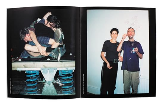
On Tuesday, February 4, Aperture Foundation, in collaboration with the Department of Photography at Parsons The New School for Design, presented a talk with artist Sandy Kim. A self-identified “spark plug,” Kim authors images as provocative as they are insightful. Her subjects are her friends, and they revel in the casual pleasures of youthful antagonism. For all the impatience and abuses depicted in Kim’s photographs, the radiant glow of humor, creativity, and possibility shines through. During the event, Kim discussed her images and fielded questions from the audience.
Sandy Kim holds a BFA in graphic design from the Academy of Art University, San Francisco. Immersed in San Francisco’s vibrant music scene, Kim gained international exposure for her intimate portraits of the band Girls. Her work has since been featured in publications such as Purple Fashion, FADER, New Yorker, New York Times, Vogue Italia, Pitchfork, Nylon, Guardian, Elle, Wired, and Rolling Stone, among many others. She lives in New York.
The post Artist Talk: Sandy Kim (Video) appeared first on Aperture Foundation NY.
Aperture's Blog

- Aperture's profile
- 21 followers

