
Aperture's Blog, page 168
December 24, 2014
Isabel Stevens on Chris Marker’s “Petite Planète”
By Isabel Stevens
In an online-only story for Aperture magazine #217, Winter, “Lit,” a look at the little-known series of travel book series directed by Chris Marker.


Throughout his 60-year career, Chris Marker combined words and images like no one else: in sci-fi photo-films (La Jetée), epistolary cine-travelogues (Letter from Siberia), essay films (A Grin Without a Cat), photobooks (Coréennes, Les Dépays, Staring Back), a CDrom (“Immemory”), a virtual world (“Second Life”), a television series (The Owl’s Legacy) and multi-screen installations (Zapping Zone, Silent Movie). Into his 90s, he was ever abreast with the latest technology, even creating YouTube shorts (such as his voyage through film history, “Kino,” posted under the pseudonym Kosinski). Rewind to the start of his career though, and in parallel to his nascent experiments with moving images, he also used montage for a more commercial endeavor: a series of travel books.
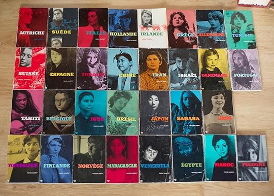
Little has been written about the “Petite Planète” guides Marker initiated and directed from 1954-58 while working at the Paris-based publisher Éditions du Seuil. Exhibited at Whitechapel Gallery’s recent Marker retrospective in London, the collection of 19 books, each dedicated to a different country, are normally referenced and then passed over in favor of his early films—1956’s Sunday in Peking, 1958’s Letter from Siberia, or Statues Also Die, Marker’s collaboration with Alain Resnais, a blistering 1952 tirade against colonialism.
In the green Michelin Guides of the 1950s, travellers were enticed to visit holiday locations, from the Cote d’Azur to Italy, by picturesque pencil landscapes on the covers and detailed descriptions on everything from ancient sites to restaurants within. In contrast, the “Petite Planète” books featured a close-up of a woman’s face on the cover (each a native of the country) and would finish with an exuberantly colored– but hardly accurate or practical– illustrated map on its back spread.
“Not a guidebook, not a history book, not a propaganda brochure, not a traveller’s impressions, but instead equivalent to the conversation we would like to have with someone intelligent and well versed in the country that interests us” was Marker’s interpretation. Nearly a decade after World War II, foreign locales seemed tantalizingly within reach, Éditions du Seuil introduced the books rather charmingly as “the world for everyone”. The series cemented Marker’s interest in the essay format and in collaboration—he commissioned a different writer for each book and gathered photography from a variety of sources. While Marker didn’t author any of the essays himself, one can see his influence on their unusual subjects from the violence of history (Spain) to the melancholy of the Atlantic (Portugal). The books on Japan and Greece—countries that would feature into his later work—are two of the most idiosyncratic. As the focus began to include more far-flung destinations (Greece, Tunisia), the layouts become more adventurous, with imagery integrated into the text in exciting and radical ways. Each spread differs from its predecessor. Illustrations creep over the essays, which are broken up with quotes, poems, and song lyrics. Above all, the books demonstrate Marker’s sophisticated pairings of words and pictures, with photographs used at varying sizes throughout: taking over spreads, jostling against blocks of text or color, and arranged in lively sequences of small images. Marker, in a rare instance when the media-shy artist discussed his work, called the “Petite Planète” books “ersatz cinema.”
The photography is often startling, particularly as Marker leaves tourist agencies behind and starts to incorporate his own photographs as well as those of contemporary figures: Henri Cartier-Bresson, Inge Morath, Robert Capa, David Seymour, Elliot Erwitt, his friend the filmmaker Agnes Varda (who started out as a photographer), and William Klein. Unusual street photography features heavily: shop windows made abstract with multiple reflections (one courtesy of Brassai); lonely nighttime city squares, busy restaurants, and pavements with people bursting into the frame from William Klein; unaware and entirely ordinary passers-by caught mid-gesture by Cartier-Bresson; and haphazard snapshots of architectural snippets scavenged from photo agencies such as Roger-Viollet.
Often the selections show Marker’s whimsical side: a man in a crowded Irish street with a white rabbit on his head, another later on with a monkey perched on his shoulders, signs in the Greek mountains pointing to nowhere, people napping on benches. And then there are the faces, an obsession he never grew out of. The most beautiful film in the world, according to Marker, was Carl Theodore Dreyer’s 1928 The Passion of Joan of Arc with its torrent of close-ups of Maria Falconetti’s face. The ghostly women that stare out from the Petite Planète book covers no doubt sowed the seeds for his later photobook and exhibition Staring Back.
Marker still contributed photographs to the “Petite Planète” books into the early 60s, even after he stopped directing them (the series continued until 1981, but the confrontational female cover stars were replaced with bland travel photography in the 1970s ). The female subject of Marker’s 1964 film, The Koumiko Mystery, fronts the first edition on Japan. Looking through the various books, one can often guess which photographs he authored: overlooked statues were a perennial favorite subject, as were melancholy-looking passersby absorbed by something beyond the frame. Later, similar divorced onlookers would populate Staring Back. Amid the cornucopia of high and low culture, fragments of paintings, films, and advertisements, a familiar motif in “Petite Planète” is that of people with their backs to the camera starring at paintings, transfixed like the onlookers gazing at African artworks in Statues Also Die or like Madeleine with Carlotta’s portrait in another of Marker’s favorite films, Hitchcock’s Vertigo (1958).
Despite the fact that Marker later dismissed all his pre-1962 work as rudimentary, the series provided a vital playground for Marker, and not just one that funded his filmic travelogues. References to the books turn up in surprising places in the artist’s biography. Look closely at Alain Resnais’s 1956 portrait of Paris’s Bibliotheque Nationale Toute la mémoire du monde and the book being admitted into this labyrinthine archive of words and images is a fake “Petite Planète.” The country? Mars. When William Klein couldn’t find a U.S. publisher for Life is Good for you and New York, he came to Éditions du Seuil after being impressed by the “Petite Planète” series. Three pages into the photobook, published by Éditions in 1956 after Marker threatened to quit if they refused, just before the title page, you’ll see the sub-heading “Album Petite Planète 1.”
Isabel Stevens works at Sight & Sound and writes on film and photography. She thanks Chris Darke, Tamsin Clark, Richard Bevan and Richard Hollis for all their help with the article.
The post Isabel Stevens on Chris Marker’s “Petite Planète” appeared first on Aperture Foundation NY.


December 23, 2014
Larry Sultan “Here and Home” at LACMA
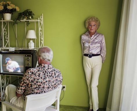
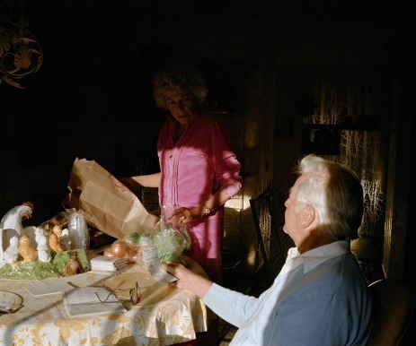
Larry Sultan, My Mother Posing for Me, from the series "Pictures from Home," 1984. All photos: © The Estate of Larry Sultan. Photo courtesy the estate of Larry Sultan
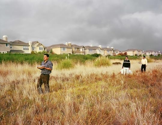
Canal District, San Rafael, from the series "Homeland," 2006
Discussion, Kitchen Table, from the series "Pictures from Home," 1985
Larry Sultan and Mike Mandel, Untitled, from the series "Evidence," 1977, printed 2013. © The Estate of Larry Sultan and Mike Mandel. Photo courtesy the estate of Larry Sultan
Larry Sultan and Mike Mandel, Untitled, from the series "Evidence," 1977, printed 2013. © The Estate of Larry Sultan and Mike Mandel. Photo courtesy the estate of Larry Sultan
Sharon Wild, from the series "The Valley," 2001
Boxers, Mission Hills, from the series "The Valley," 1999
The first retrospective of the work of iconic California photographer Larry Sultan, “Here and Home,” features more than 200 photographs and five major series’, displaying his keen eye for subversive detail, framing, and context which made him one of the most genre-pushing purveyors of the medium. Sultan died suddenly five years ago, after producing more than 30 years of photographs that mostly centered around long-term projects that explored authorship, Conceptualism, and California identity and culture.
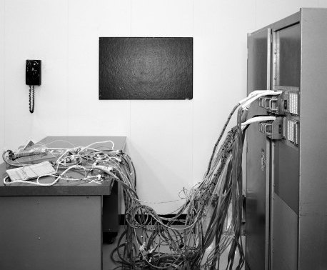
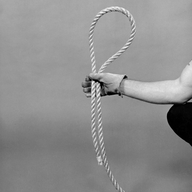
His “Evidence” series, made with Mike Mandel from 1975-77 , repurposed internal imagery science, industry, and government as art photography. The 59 black-and-white archival photographs– of a canyon explosion, of an abstracted head in a hardhat, of bare footprints across a wet stone ground– are reconsidered as scenes of life captured by an auteur: it is widely considered one of the first Conceptual photography projects. In his solo work, Sultan looked closely at Southern California, where he grew up, as well as Northern California where he studied and later taught. His interest in place, reflected in the exhibition title, is perhaps nowhere as apparent as in “Pictures from Home,” for which he photographed his aging parents for years among the furnishings of their California-kitsch home and on their impossibly green lawn. But beyond sense of place, Sultan measured the distance between photographer and subject, and the objective space the photographer continually takes up and cedes. “What drives me to continue this work is difficult to name,” he wrote in a statement on the work in 1992. “It has more to do with love than with sociology, with being a subject in the drama rather than a witness. And in the odd and jumbled process of working everything shifts; the boundaries blur, my distance slips, the arrogance and illusion of immunity falters.”
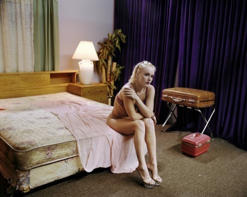
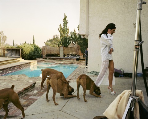
Later photographs look more objectively at place, as in “Homeland,” in which he posed migrant workers in the in-between places of suburban life, and “The Valley,” a documentation of the suburban homes where pornography is filmed. In the later, he often obscures the most provocative action, or the obvious, in favor of highlighting the obliquely personal, such as a sloppy floral arrangement left by the home’s actual tenants. As he said in a 1990 interview with BOMB of the series, “All the photographs raise the issue of voyeurism—it’s unavoidable. I mean, no one believes in photographs, right? We’re much too sophisticated. Yet, in fact, we do.”
“Here and Home” is on view through March 22.
The post Larry Sultan “Here and Home” at LACMA appeared first on Aperture Foundation NY.
December 22, 2014
Words vs. Images
The following note first appeared in Aperture magazine #217, Winter 2014, “Lit.” Subscribe here to read it first, in print or online.
What kind of pressure does photography place on the written word today? Aperture recently spoke with contemporary fiction writers Teju Cole, Mary Gaitskill, Rivka Galchen, Tom McCarthy, and Lynne Tillman about photography and the role of the image in their writing process.
Tom McCarthy

Maxime du Camp, The Great Sphinx and the Pyramids of Giza, Egypt, 1852 © HIP/Art Resource, New York
I’ve become very interested recently in the idea of the negative and how this photographic concept is relevant to fiction. Almost the very first image in my next novel, Satin Island, is of a picture looming into view from noxious liquid in a darkroom, like some kind of fish approaching through murky water; I use it as a metaphor for thinking or remembering. So the mechanism of photography stands for me as a kind of analogue for what it is to bring data, memories, or whatever into a coherent image— and ultimately, for what it is to write.
In my novel Remainder, which is all about trying to reproduce an ideal, if mundane, scenario (walking down a staircase, exchanging words with a neighbor, etc.), the hero is, in a sense, making a print of a negative of something that was never based on reality. The negative really is a negative. It’s a memory of something that never existed. So, like a photographer, he’s trying to bring this reality of the image out of the darkroom. He’s trying to actualize this picture, or world, from the darkroom of his mind—and it never quite goes right.
Like many writers, I take lots of photographs and work from them. When I was writing Remainder, I walked around Brixton in South London (this was back in 2000) with a camera and a Dictaphone. I photographed the texture of the sidewalk, the reflections in puddles, the letters from the gas and electricity holes, and other markings in the street. But I was also recording running commentary, because ultimately, as a writer, you’re dealing with words. Even if those words carry or generate images, words are still your currency. So I was using the Dictaphone to say, “Here in the street is this, and you can see the a and r of airports reversed in this puddle.” I typed it all up, word for word, even the “umms” and “ahs” and repetitions, and pinned it all to my wall—the photographs as well. More recently, with C, my last novel, which is set a hundred years ago, I looked at lots of old photographs—of Alexandria, Egypt, and London in the 1920s—and again transcribed them, turned them into words. I was reading Flaubert’s accounts of going up the river in Egypt with the photographer Maxime du Camp, an amazing piece of writing. Flaubert says, “this is all fake; we’re just in some panorama.” There’s one passage detailing the bright sunlight falling on the black skin of their servants against this silvery rock. It’s an incredibly photographic description.
Perhaps in the end the difference between image and word isn’t relevant. Because ultimately it’s all scriptural: things such as light or ink mark and are recorded on surfaces, and that’s an event of writing. I also don’t think there’s a massive categorical distinction between digital and analog photography, or digital writing on a laptop and writing on a typewriter or by hand. We live in what Michel de Certeau calls the “scriptorium.” Everything is written. We’re within a set of networks of archiving, recording, transmitting, and making visible, or hiding and eavesdropping. This is totally anticipated in Greek literature and Hamlet. The advent of the NSA or of the Internet doesn’t change that. It just builds on a situation that’s already there. I recognize this is a very writerly vision, because everything else ultimately becomes inscription. So yes, maybe for me, photography is a branch of writing.
Tom McCarthy’s novels include Remainder (2006), Men in Space (2007), and C (2010), which was shortlisted for the Man Booker prize. His next novel, Satin Island, is forthcoming from Knopf in February 2015. McCarthy writes on literature and art for the New York Times, the London Review of Books, and Artforum, among other publications.
Mary Gaitskill
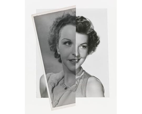
John Stezaker, She (Film Portrait Collage) II, 2008. Courtesy the artist and Petzel, New York
I take pictures with my phone if it’s something beautiful and I want to remember it, or if it’s something interesting. Recently I was having a very emotionally fraught conversation with someone—we were quarreling, actually—and then the quarrel sort of ended and I went for a walk down the road to clear my mind while he took a shower. We were staying at someone’s house in the country and there were these incredibly beautiful animals, which I thought were cows. One of them was staring at me and when I stared back it trotted up to the fence. It was a bull, a very young bull. There were two of them. They were beautiful, bulls with the eyes of Bambi, blue eyes. And there was also a little miniature donkey in the field, which came up to check me out too, and I was so excited by this. I went back to the house, and I said, “You’ve got to come out; there’s these beautiful animals.” So we completely forgot about the quarrel, and I took pictures of the animals, which were sweet but also primal. Something like that I like to keep on my phone.
I have some books of photography, mostly books that people gave to me. One of them is a book of photographs of Nabokov and his family that I like very much. I get pleasure out of looking at pictures of him and of his wife and relatives. I like looking at pictures of women, actually. What I like to do most with photographs of people is to cover one half of the face with my hand and look at it, and then do the same with the other half. Most of the time one side of the face wears a different expression than the other. The face is usually bifurcated. It’s rare that you have somebody who looks the same on both sides of their face— I think Hitler actually does look the same, or maybe it was Stalin; it was some psychopathic leader. In some people the difference is really extreme; it looks like two different personalities. If I look at photographs of myself, there is some version of this going on. One side of my face looks quite young, wholesome, like a cheerleader, and then the other half looks positively lunar, like someone who is not part of the world. Many people are like that. They have a strong personality show up in one half of their face and another personality show up in the other half. It’s weird. But it’s weirder or at least more unusual when there is no difference— at least in my casual explorations of photographs.
For my novel Veronica, I made a puzzling underuse of photographs. I don’t know why. Considering the narrator is a model, I don’t think there are any descriptions of what she looks like in pictures. I think there’s one instance in which she describes herself in a picture with another woman, but she mostly describes the other woman. It seems like she might have a picture of herself, framed and up on a wall, and I kept thinking I should put that in there, but it just intuitively never interested me. It’s kind of odd. For research on being photographed, I went on stories I heard from women who had been models, but the better stories were from stylists and assistants who would describe things more bluntly. I also had the experience of being photographed by a fashion photographer; it was a book-jacket photograph taken by a former fashion photographer—he was the most bullying person I’ve ever had my picture taken by, just incredibly aggressive. He wanted to constantly keep me off balance. It’s a very good picture, though, so it works. He did a good job. Maybe he was looking for tension and drama in the picture, and I do look frightened and horrified—what’s funny is that people who don’t know what happened think I look frightening or intimidating! I guess fear can be frightening. But I would never work with him again.
I don’t especially feel pressured as a writer by the presence of images. I guess this is because I’m a very visual person and tend to express ideas and feelings with images, sometimes kooky images. The thing I dislike about a lot of images, say, online or otherwise present in culture, is that they tend to be flat and unimaginative, yet they have a strong visceral impact— and because they’re so omnipresent, people expect to be “talked to” in that language and it seems like they aren’t as open to a more individual vision. It even seems scary and weird to them maybe. But maybe that’s always been true. I don’t know.
Mary Gaitskill is the author of the novels Two Girls, Fat and Thin (1991) and Veronica (2005), which was nominated for the 2005 National Book Award. She is also the author of the story collections Bad Behavior (1988); Because They Wanted To (1997), which was nominated for the PEN/Faulkner Award in 1998; and Don’t Cry (2009).
Teju Cole
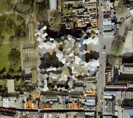
Mishka Henner, Noordeinde Palace, The Hague, South Holland, 2011. Courtesy the artist
In a response to a recent article on “seeing machines” by a contemporary photographer I really like (Trevor Paglen), another contemporary photographer I really like (Mishka Henner) wrote something intriguing. Paglen’s piece was about the expanded reality of photography in the present time. So much of this photography, Paglen argued, was about a given machine following a certain script to do a particular kind of seeing. In his thoughtful response, which agreed with and tried to think through the implications of Paglen’s arguments, Henner described the result as follows: “a world with no auteurs, one where style and the single viewpoint are irrelevant, and where poetry and lyricism are mere follies.”
This caught my attention. I am ready to let the auteurs go, and in the age of Instagram and drone photography, the single viewpoint has indeed been taken off its pedestal. But: are “poetry and lyricism” truly “mere follies”? I hope I’m not misreading Henner here. I do feel that his work with Google Maps, like Paglen’s on secret sites and the American security apparatus, are part of the great work being done that help us visualize the New World Order. My question, then, is: what about the old world order? This still lives on in quite a powerful way inside all of us. It’s not all motherboards and circuits and optical recognition software. We may be on our way to becoming androids, but we are not there yet: we still have a hunger for poetry and lyricism, an intense hunger that is difficult to satisfy. I think this, in part, is why Paglen and Henner and other photographers don’t limit their works to the theoretical. Yes, they have great ideas. But they turn these ideas into prints, editions, shows, books. Many of them still center their work on the tactile elements of paper, ink, and binding. The stuff could be really far out conceptually, but much of it still ends up in a frame on the wall of a gallery. And I think that’s great.
So that’s what I think of when I take or look at photographs: I want images that address the predicaments of the present moment, in a political sense, but that also allow for poetry and lyricism. In any case, those things may not be necessarily divorced from each other: paper has to come from somewhere; the equipment used to make a camera is made from materials that are traded on the world market, including materials that come from conflict zones. Machines have lyricism (once we learn to see it) and poetry comes at a cost (if we are willing to admit it). The connection this has to my writing? I try to apply those same goals (of politics and poetry) to the written word, too. So, we may be awash in images and words these days, but poetry still matters. It is still as elusive as it ever was, and, just as ever, it is still worth chasing down.
Paglen’s text and Henner’s response can be read here: blog.fotomuseum.ch/2014/03/ii-seeing-...
Teju Cole is a photographer and the author of two works of fiction, Every Day Is for the Thief (2014) and Open City (2011), for which he won the PEN/Hemingway Award. Cole wrote the introductory essays for On Street Photography and the Poetic Image, by Alex Webb and Rebecca Norris Webb, and Touching Strangers, by Richard Renaldi, both published by Aperture.
Lynne Tillman
Found photographs. Courtesy Lynne Tillman
Found photographs. Courtesy Lynne Tillman
I started writing my new novel, Men and Apparitions, because it’s said we live in “a glut of images” and also because of the belief that there’s a crisis in art photography, with cellphones and everyone taking pictures all the time. I began to think: What does that mean? How would you narrate that story? How do you make characters who are based in images, in some sense, or whose lives seem to be based on images?
My protagonist in the novel, Zeke, is a cultural anthropologist, an ethnographer, not a photographer himself. His field is photography, family photography in particular. As a child I was very interested in our family photographs. My father shot a lot of 8mm films, too, before I was born, and I would take out the projector when I was eight or nine, very young, and all by myself watch these home movies, which, as I think about it now, seems funny. In part it was because I was the baby of the family and quite a bit younger than my sisters, so there was an already established family I’d entered. Seeing these films, I guess, gave me some sense of family history. I am not using these for the book, but I’ve found some family albums at flea markets and borrowed friends’ found photographs. In the novel, I do want to do some analyses of photographs.
Zeke, my character, goes off theoretically in some wild directions—the novel form allows me to do everything I can think of. It allows me to be unaccountable, also—unaccountable to so-called “facts.” Some of what Zeke thinks about photography and cultural anthropology is credible, and, I think, there’s some interesting theory about images, but some of what he comes up with is wack. If I were writing a straight essay, I couldn’t do that, and it wouldn’t be as much fun to write.
I don’t usually take photographs for what I’m writing. But if I go to an art exhibition and I think that I’ll want to remember something, I’ll take a picture of the work if I can, or of the way the work has been installed, if the security guards let me (though never with a flash), as an aide-memoire. But I don’t do that for writing. I still might write notes, use words to remember, because I’m working with words. They’re my medium. Mostly I rely on my memory—it’s a memory game I play with myself, and sometimes lose.
To photograph is to step out of the moment. When we photograph, we are objectifying. We look at something, shoot, and it becomes a kind of object. It may be a picture of an event, a tree, a person. But in the end you have a representation, just that. It is an abstraction. I think photography, like writing, is a translation, from the impossible Real to the page. I think of translation and representation as being close kin. Taking a photograph, like a selfie, is a way to record a moment, and to proclaim Being, which writing also does, in a sense. People think writing, especially fiction, has been subsumed, even vanquished, by picture making. But fiction is another form of image making. Words are images too. I’m hoping to finish the novel at the end of this fall. If not, I’ll shoot myself. I will use a camera.
Lynne Tillman is a novelist, short-story writer, and critic, whose most recent book, her second collection of essays, What Would Lynne Tillman Do?, was published last spring. She is currently working on a novel titled Men and Apparitions.
Rivka Galchen
Karl May as“Old Shatterhand,” n.d. © Jan Sagl/Anzenberge
I don’t particularly think of photography as an inspiration or as a constraint. And yet photography is so enormously powerful and pervasive, to think it has no effect would be like thinking the shape of a guitar doesn’t affect the sounds made with it. Even though I love both personal and professional photographs, I don’t use them as part of my writing process. It’s as if they obliterate something for me. I did once take some video footage for a piece that I was writing about an annual festival in Germany around the work of Karl May, who wrote many adventure tales in the late nineteenth century about a German among Native Americans in the American West, even though he had lied about having ever visited America. But I didn’t use the video footage, or the snapshots. My notes had done the essential culling, a kind of thinking, and the images just flooded that thinking away.
Photographs, though, are better at communicating some things that I once would have tried to put into words. When I want to communicate with my family, say, in a postcard kind of I’m-thinking-of-you way, I just send a smartphone photo of, probably, my daughter. Words now gravitate to where they’re most ideal, in a certain way, and this has pushed language toward two different, not very related places: the contract and the joke. There are no pictogram contracts. Of course words are still good at ordinary communication, but they are irreplaceably good, at least for now, in the contract and, well, maybe joke is not quite the right label, but in a very particular kind of entertainment. For example, think of how often headlines in the Onion rely on a kind of half-rhyme with some clichéd phrase, like, “Loved Ones Recall Local Man’s Cowardly Battle with Cancer”—the effect here can only be produced by the way we process language.
Where does all this leave the novel? The novel must remain ideal for something, right? Though I don’t think we know what, yet. It seems best to keep our noses down and let the abstractions reveal themselves in time. Prognostications can be fun, but are best understood as fictions. If I were going to guess where the novel will go, and what it will become uniquely capable of, it seems to me that it may drift toward more genuinely private spaces and, at the same time, more political spaces. Private in the sense of inner dialogue; political in the sense of legal language, or nation naming… it’s telling how a bill on, say, small dairy farms, requires four hundred pages not just of pork but also fine specification. Novels can play with the way language has moved into these realms, or they can rebel, but, either way, language is their medium, and where the medium has moved matters. The form will surely continue to document the external world, as it always has, but that aspect may become less essential. Though maybe the pressure the image has placed on literature, compressing the field into a smaller country, will paradoxically allow for an opening up into something unforeseen, an unexpected vastness. It’ll feel like those dreams of terraforming Mars.
Rivka Galchen is the author of the novel Atmospheric Disturbances (2008), and a collection of short stories, American Innovations (2014).
The post Words vs. Images appeared first on Aperture Foundation NY.
December 19, 2014
Prajna Desai: “Constructing Worlds” at Barbican Art Gallery
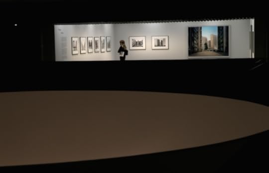
Thomas Struth installation images, Barbican Art Gallery © Chris Jackson / Getty Images
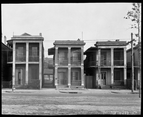
Walker Evans, Frame Houses. New Orleans, Louisiana, 1936
Library of Congress, Prints & Photographs Division, FSA/OWI Collection © Walker Evans Archive, the Metropolitan Museum of Art

Julius Shulman, Case Study House #22, 1960 (Architect: Pierre Koenig) © J. Paul Getty Trust. Used with permission. Julius Shulman Photography Archive, Research Library at the Getty Research Institute
Nadav Kander, Chongqing IV (Sunday Picnic), Chongqing Municipality, 2006. © Nadav Kander, courtesy Flowers Gallery
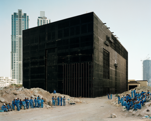
Bas Princen, Cooling Plant, Dubai, 2009. Courtesy Bas Princen
The 18 photographers in “Constructing Worlds” collectively represent how “photography which takes architecture as its subject matter has the ability to communicate wider truths about society,” according to the show’s curatorial statement. The exhibition is organized across two levels of linked solo displays, each contributing to a chronology that begins in the 1930s and ends in 2012. The format makes for luxurious, immersive viewing. Navigating a sequence of independent displays that propel one through time gives the sense of having travelled smoothly through history, ending up in the present day looking into the future.
The show aptly begins with Berenice Abbott and Walker Evans. Although both were attracted to architecture, Evans ultimately forged a new photographic approach to architecture’s relationship with its surroundings and the people that inhabit it. He focused on the design and composition of building facades in small towns tucked away in the American Deep South still reeling from the Depression-era economy. The profusion of detail in his tight, frontal shots of timber churches, gas stations, storefronts, and frame houses in which buildings and figures stand in stark contrast to one another are all captured with deadpan candour. Ironically, Evans’ intentionally blunt commentary, which happened to make various types of buildings a primary expressive device, ended up excoriating the effects of modern society in vernacular America. Its new products, insistence on variety, and false sense of abundance had made of life something cruel, unfair, and without charm, his photographs seem to say.
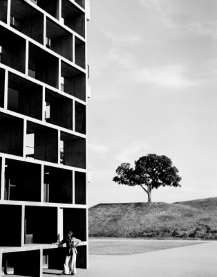
The following displays verify this view of photography as more than a document. Julius Schulman’s postwar color photographs– advertisements for a new variety of residential buildings designed by Richard Neutra, Charles and Ray Eames, and Pierre Koenig in California– revisit a central lesson from Evans. These intimate, transparent images of the buildings draw attention away from the artist’s sensibilities to the subject of architecture as an agent of social change and cultural identity. Elsewhere, Lucien Hervé exposes the meta qualities of Le Corbusier’s architecture, and both Stephen Shore’s and Thomas Struth’s concentrate on ordinary architecture including nondescript streets: all appear as witting or unwitting heirs to Evans’s work. However, they somehow seem to lack Evans’s empathy with the human protagonist. People in this work appear either rarely or not at all.
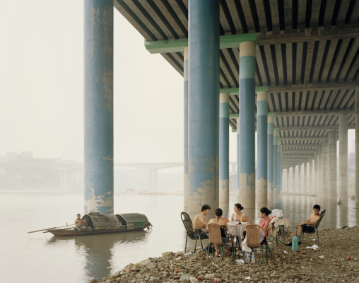
Up through Struth, this narrative of photography’s relationship with architecture proceeds so seamlessly that the show’s second half feels bewilderingly confused. Suddenly, in the midst of highly formalist work by Hélène Binet, Hiroshi Sugimoto, and Luisa Lambri, we confront photographs of hot zones: sites of titanic economic power, new post-revolution cities, post post-colonial cities, and post-apocalyptic war zones. These types of scenes are present in work by four of the most dramatic photographers featured in this section, namely Simon Norfolk, Nadav Kander, Iwan Baan, and Bas Princen. In tone and subject, their work serves to dramatize the show by its overtly political stance, and rightly so.
In Simon Norfolk’s Former Soviet-era ‘Palace of Culture’, Kabul, 2001-2002, for example, bombed out structures in Kabul are bathed in golden light. In Nadav Kander’s Chongqing XI, Chongking Municipality, 2007, and Fengjia III (Monument to Progress and Prosperity), Chongking Municipality, 2007, an incomplete bridge and a lone building that resembles a defunct Transformer respectively serve to frame industrialized China, as if positing the evolution of a somewhat eerie if sublime new landscape. Elsewhere, Iwan Baan’s images of squatters in an aborted and abandoned commercial complex in downtown Caracas attempt to record how ordinary people, originally evicted from their own homes, used the aftereffects of the 1994 Venezuelan banking crisis to their advantage. Torre David façade, 2011 and Small businesses like this can be found throughout the building, 2011, offer a sampling of the condition Baan’s images reveal.
When juxtaposed with the curatorial premise, this body of work seems less related with architecture and architect per se than with existing political or social conditions: the structures depicted seem to be more of products than agents. In Hervé’s photographs of Corbusier’s buildings, for example, people ambling across a building look like quirks in an otherwise abstracted geometry. On the other hand, the upscale residents in Schulman’s pictures of designer homes are as integral to the architectural design and its social value as actors are to a theatrical stage set.
But in Kander, Baan, and, to a lesser degree, in the work of Princen, context is everything. For this reason, including these photographers, despite their sophistication, feels like a compulsion to “color” the exhibition with a somewhat forced global history. Unlike say, Sugimoto, Lambri, or Binet, and their rather modish fascination with architectural form and its aura, this newer work is fueled by the desire to tell a story about the future world fallen into ruin even while it’s being constructed.
Their inclusion also cleaves the exhibition along undeniably racial lines. The new cities of world are not filled with the typically crass but shiny building projects that mainstream media represents of developments in Dubai or Cairo. Rather, in this show, these cities appear populated by the wreckages or ghosts of an architectural imagination that is variously arrogant, jerry-built, and gone awry in every instance, possibly because it lacks the traditional impetus of Western architectural thinking, its goals, and its dazzling names. This is the conclusion to draw if one believes that the subject of the photographs by Norfolk, Kander, Baan, and Princen, is in fact buildings and architecture, rather than a picture of a world gone mad.
The post Prajna Desai: “Constructing Worlds” at Barbican Art Gallery appeared first on Aperture Foundation NY.
December 18, 2014
When to Hold ’Em and When to Fold ’Em A Conversation with Alec Soth
This interview was originally published in issue 007 of The PhotoBook Review.
In June 2014, I had the opportunity to visit with photographer, publisher, and increasingly multidisciplinary artist Alec Soth at his home base in Minneapolis, courtesy of the McKnight Foundation—a longtime patron of Soth’s work, including his most recent project, the LBM Dispatch. In addition to getting a tour of Soth’s Little Brown Mushroom headquarters, we also talked about the nature of an evolving photographic practice, the challenge to find new forms for his work, and the sustainability of the current pace of photobook publishing. What follows is an edited version of an e-mail conversation that took place after that visit, touching base with Soth as he traveled variously to Georgia, the San Juan Islands, Connecticut, Arkansas, and other places in between. The main topic on my mind: what happens next?
—Lesley A. Martin
Lesley A. Martin: Mr. Soth, you have shown a true commitment to an evolving public output—even when it was apparent that you would much prefer to be hermitted away someplace. Nevertheless, via books from established publishers, posts on your blog and Instagram, publishing yourself and others via the Little Brown Mushroom imprint, or, most recently, hosting workshops about storytelling for the storytelling-indisposed, you have continued to push beyond prior applauded forms. How do you choose the form for a particular body of work and when do you know it’s time to move on, to leave old forms behind? In other words: how do you know when to hold ’em and when to fold ’em?
Alec Soth: It really depends on the projects. I do a lot of smallish side projects: zines, online slideshows, that sort of thing. This sort of activity is analogous to a band playing in the garage: it is meant to be quick, dirty, and a bit out of control. These should be ended fairly abruptly to avoid scrubbing away their essential spirit. My larger projects are more like studio albums. These projects take years. Generally I work on them until I’m sick of them, and then work some more.
LAM: You have had a longstanding relationship with Steidl and now MACK Books—ostensibly exactly where a photographer might want to be. Why, then, did you start your imprint, Little Brown Mushroom, and why, as you have tentatively speculated, do you think that it might be entering a different phase for your own publishing?
AS: Little Brown Mushroom is the garage I’m talking about. Or a sandbox. It is a place to play with others. But it isn’t a business, nor do I want it to be a business. I don’t want to worry too much about spreadsheets and market penetration. But for my larger projects, I want to work with someone who understands that kind of stuff. I want those projects to be seen widely.
LAM: Do you think there is, inherently, a natural and possibly limited lifespan to this current creative boom of the self- or indie-published photobook? What are the downsides to success in this arena—for yourself and for the community at large?
AS: I think there will always be books, but they will become increasingly expensive. I also think there will always be people doing cheap, alternative printing, but my sense is that this will lose some steam over time. Success is always problematic. It is too easy to become comfortable and repetitive. It’s too easy to stop taking chances.
LAM: Right. I’m also going to assume the continued existence of books; but there is a whole other level of the activity that has come to surround the photobook and photobook-making. At the point when we have festivals or fairs in every city, every country has a regional book about photobooks of that country, and there is an actual PhotoBook Museum—then what? How does or can this make sense, moving forward?
AS: There is more than a little irony about our desire to fix the moment permanently. But it’s probably just best to enjoy it for what it is (or was) and not expect it to continue on in the same way. But there will be new, great moments. New communities. I’m particularly excited about what is happening at the intersection between photography and performance, for example. There is so much new, uncharted territory.
LAM: I’d like to also ask you to talk a little bit more about what you’re doing with the LBM Camp for Socially Awkward Storytellers. First, why a summer camp? And second, is this where all that fun in the garage or the sandbox leads? At a certain point, do you pass the keys to the garage to others? Third, this idea of bringing people together and working together is a particularly social way of approaching the act of storytelling. Do you see the future of storytelling—and perhaps of bookmaking—as a collaborative act?
AS: I’ve always been interested in storytelling, but the fact of the matter is I’m a lousy storyteller. I remember having to speak at my brother’s wedding. I was so nervous that I wrote everything out. And then my voice trembled so badly that nobody could understand anything I said. I was attracted to photography and the photobook because it allowed me to approach storytelling in an oblique way. I still love this about the medium. But over the years, I’ve also been pushed and shoved into the role of public speaking. After giving countless slideshow talks about my work, I started to see the creative potential of the form. In order to learn more about it, I created the Camp for Socially Awkward Storytellers. Fifteen artists from around the world came to my studio and essentially taught me about the huge potential of this medium.
Does that mean I see my future as being a collaborative artist? Not at all. I’ve just spent three years working on a project with a writer; it was one of the great experiences of my life, but I’m dying to get back to work alone on something. That said, I have no idea how my new work will eventually be presented. While I invariably first find myself thinking about the pages of a book, I could see myself giving a performance or doing a site-specific installation. I don’t have any definitions just yet, which is part of the fun.
But broadly speaking I’ve been thinking about this by analogy to the world of music. Most photography nowadays functions like most music: free online. I’m a fan of this and have always engaged in things like blogs, Tumblr, and Instagram. But this streaming flow seems to make more physical, tactile experiences all the more important. This, I think, is part of the reason photobooks, like vinyl records, have become more popular of late. People want to touch something. But people also want an experience. This is where traditional exhibitions as well as more temporary installations and performances come into play. A traditional exhibition is like going to the symphony; a pop-up show is like going to a rave.
LAM: Is this also possibly another way in which contemporary practice might be moving away from the photobook as a primary vehicle? I know that anytime you have “Photography Plus” (Photography + Sculpture, Photography + Video, Photography + Painting), it’s hard and probably less appropriate to try to contain it in a book.
AS: I don’t think that the practice is moving away from the photobook—I just think the tent is getting bigger. To use the music analogy again, the fact that people are buying more vinyl records doesn’t mean they’ll download less free digital music or attend fewer concerts. In many ways, the multiplicity of distribution platforms is simply the result of the medium’s success. So stop worrying already!
_____
Alec Soth’s work has been the subject of many exhibitions, including The Space Between Us, a major retrospective presented at Jeu de Paume, Paris, and Fotomuseum Winterthur, Switzerland, 2008; and From Here to There, Walker Art Center, Minneapolis, 2010. Among Soth’s monographs are Sleeping by the Mississippi (Steidl, 2004) and Broken Manual (Steidl, 2010). In 2008 Soth started his own publishing company, Little Brown Mushroom. He is a member of Magnum Photos. alecsoth.com
Jason Polan is an illustrator who has been published in the New Yorker and the New York Times, among others. He is founder of the Taco Bell Drawing Club. jasonpolan.com
The post When to Hold ’Em and When to Fold ’Em
A Conversation with Alec Soth appeared first on Aperture Foundation NY.
The Future of Photography
“We’re held to highly professional expectations, which really means we get the chance to feel the excitement of seeing our contributions play out and impact the foundation’s work.”
— Max Campbell, Digital Media Work Scholar, July 2014–January 2015
Hundreds of young professionals, photographers, editors, scholars, and publishers have gotten their start at Aperture Foundation, including artists Gregory Crewdson and Taryn Simon; curator of photography at the San Francisco Museum of Modern Art, Corey Keller; and associate curator at the Whitney Museum of American Art, Christopher Lew, as well as the publisher of Aperture’s book program, Lesley A. Martin.
Aperture mentors young professionals by giving them substantive work experience both at our Chelsea offices and through other opportunities, such as visits to public and private collections as well as to artists’ studios, and informational luncheons with photographers and scholars.
Click above to hear from 2004–5 Editorial and Development Aperture Work Scholar Christopher Lew, who now champions young and emerging artists at the Whitney Museum.
Your generous end-of-year gift will create a transformative opportunity for a young professional to embark on his or her career!
Click here to make your tax-deductible donation.
Visit aperture.org/join to learn about other ways to get involved.
Sincerely, thank you for your support.
With best wishes,

Chris Boot
Executive Director
Download Aperture’s Winter Appeal letter
The post The Future of Photography appeared first on Aperture Foundation NY.
December 17, 2014
Duane Michals at the Carnegie Museum
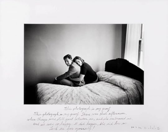
Duane Michals, This Photograph Is My Proof, 1967. Courtesy the artist and DC Moore Gallery

Duane Michals, 'Magritte with Hat,' 1965. Carnegie Museum of Art, Pittsburgh; Courtesy of the Artist and DC Moore Gallery.
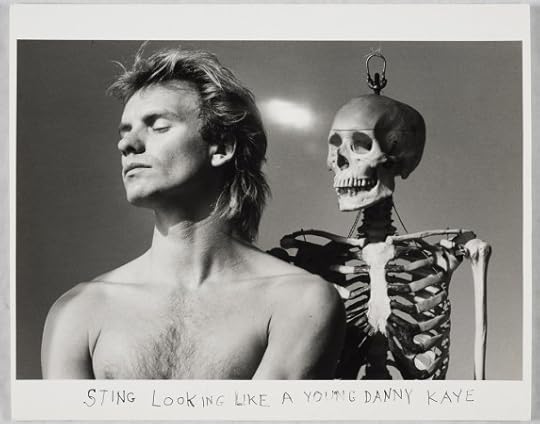
Duane Michals, 'Sting Looking Like a Young Danny Kaye,' 1982. Courtesy of DC Moore Gallery and the artist.
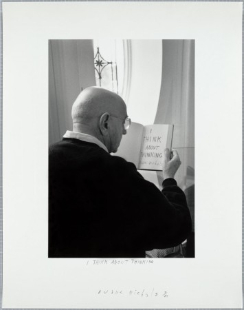
Duane Michals, 'I Think about Thinking,' 2000. Courtesy the artist and DC Moore Gallery.
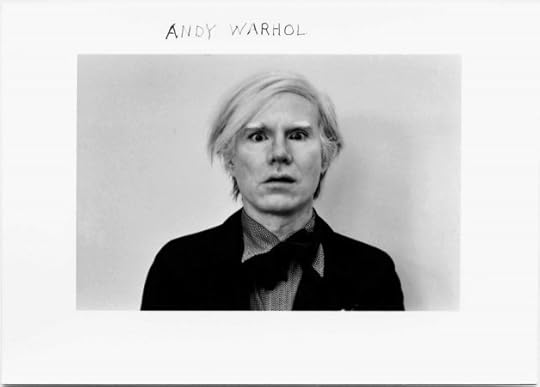
Duane Michals, 'Andy Warhol,' 1972. Carnegie Museum of Art, Pittsburgh. Courtesy the artist and DC Moore Gallery.

A new exhibition at Pittsburgh’s Carnegie Museum of Art, aptly titled Storyteller, explores the whimsical and innovative photography of Duane Michals. In his fifty-year-long career, Michals has photographed celebrities, artists, writers, and everyday scenes—a stolen kiss, a grandfather’s deathbed—and infused them with a quality of wonder only made possible with the camera. The self-taught photographer’s career in commercial photography informed his sly, narrative style; he is now perhaps best-known for his original use of photo-sequencing to tell short photographic tales, first used in his 1970 book Sequences, as well as for his use of handwritten texts, which intimately adorn his images. His sequences present simple scenes of subtle magic: in unfolding sets of images, a man awakes a sleeping woman with a kiss, or a child watches his grandfather go to heaven (or, rather, an elderly man outfitted with angel wings progressively creeps toward a window, then disappears in the final shot).
In empathetic and often funny photographs, Michals’s portraits reveal his keen eye for both the personality and work of artists ranging from Joseph Cornell to Andy Warhol to René Magritte. His depictions often imagine these figures as they might realize their own artworks, while reflecting Michals’s idiosyncratic style: a smirking Magritte wears a bowler hat, his image overlaid with a double exposure of another hat; Joseph Cornell, hunched over against a window, appears as if he were a strip of paper sliced by light; and a preening, shirtless Sting stands alongside a skeleton (the caption reads, “STING LOOKING LIKE A YOUNG DANNY KAYE”). Michals’s portraiture goes beyond capturing resemblance, offering something more like a glimpse of the spirit of both sitter and subject—with an ample dose of humor and mutual understanding.
Storyteller: The Photographs of Duane Michals is on view at the Carnegie Museum of Art, Pittsburgh, through February 16, 2015.
The post Duane Michals at the Carnegie Museum appeared first on Aperture Foundation NY.
December 15, 2014
Robin Schwartz: Amelia and the Animals (Video)
On Monday, December 1, we joined Robin Schwartz and her daughter, Amelia Paul Forman, for a talk and book signing of Amelia and the Animals, Schwartz’s second monograph featuring the collaborative photographic series dedicated to documenting her adventures with her daughter among animals. Work by Schwartz was also on view for the evening in Aperture’s bookstore.
 Amelia & The Animals
 $39.95
The post Robin Schwartz: Amelia and the Animals (Video) appeared first on Aperture Foundation NY.
December 12, 2014
Office Romance with Kathy Ryan (Video)
Office Romance is Kathy Ryan’s photographic love song to life at her office. Mostly shot on the sixth floor of the landmark Renzo Piano-designed New York Times building, where she works as director of photography at The New York Times Magazine, Ryan captures moments of luminous beauty in her daily routine. She welcomed us there to explore the architecture, the light, and to discuss how Office Romance began, first on her Instagram feed.
Office Romance $29.95
The post Office Romance with Kathy Ryan (Video) appeared first on Aperture Foundation NY.
December 11, 2014
At the 2014 FotoFocus Biennial
By Michael Famighetti
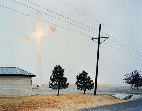
Taio Onarato and Nico Krebs, Biggest Cross in Texas, 2005 from The Great Unreal. Courtesy RaebervonStenglin, Zurich and Peter Lav Gallery, Copenhagen

Taiyo Onarato and Nico Krebs, Red Glow, 2006 from The Great Unreal. Courtesy RaebervonStenglin, Zurich and Peter Lav Gallery, Copenhagen

Bruce Conner, REPORT, 1963-67. Courtesy Michael Kohn Gallery and Conner Family Trust

Nicolas Provost, STARDUST, 2010. Courtesy Tim Van Laere Gallery, Antwerp, Belgium

David Benjamin Sherry, Crown Of The Continent, Montana 2011, 2012. Courtesy of artist and Salon 94, New York
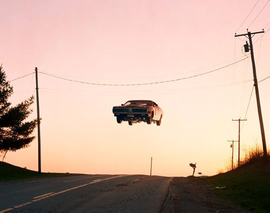
Matthew Porter, Airport Road, 2009. Courtesy of M+B Gallery, Los Angeles

Vivian Maier, Self-portrait, Chicago, July 27, 1971. Photographer's collection stamp signed by John Maloof with date, print date, and edition number in ink
on print verso.
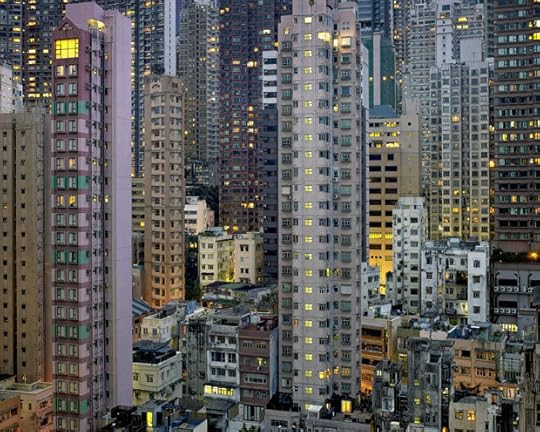
Michael Wolf, Night #20, 2007. Courtesy of the artist and Bruce Silverstein Gallery, New York.
Barbara Probst, Exposure #106: N.Y.C., Broome & Crosby Streets, 04.17.13, 2:29 p.m., 2013. Courtesy of the artist and Murray Guy, New York

Jason Evans, Untitled, from the series “NYLPT,” 2008. Courtesy of the photographer

Philip-Lorca diCorcia, Head #23, 2001. Courtesy of the artist and David Zwirner, New York/London.

Olivo Barbieri, site specific_Istanbul #4, 2011. Courtesy of the artist and Yancey Richardson Gallery, New York.
Many buildings in downtown Cincinnati, a bastion of weathered 19th-century architecture, are covered with trompe l’oeil paintings. This provided an apt backdrop for a festival of photography, especially one anchored by an exhibition of the Swiss duo Taio Onarato and Nico Krebs, whose playful mixed-media works play with photographic illusion, perception, and tropes of the American road trip. This second edition of FotoFocus, a biennial founded by photographer and avid photography enthusiast, Thomas Schiff, was organized by New York–based independent curator Kevin Moore, and took a non-thematic approach to offer a broad range of photography throughout the city.
Vacant storefronts were rented by the Biennial, held from October 1 to November 8, and renovated—or as in Moore’s words “white-cubed”—then transformed into clean exhibition spaces. David Benjamin Sherry, an LA–based photographer, uses a view camera to photograph iconic vistas in the Western landscape, which are then output in intense, psychedelic color (achieved in an analog darkroom). These images were displayed alongside his key references: well-known images by modernist American photographers from Edward Weston to Frederick Sommer to Minor White. Just down the street, a Vivian Maier exhibition had been staged in another quaint storefront. By now Maier’s story is as famous, if not more so, than her images: working in obscurity during her lifetime, she was employed as a nanny in Chicago while actively producing a remarkable body of photographic work. Her work came to widespread recognition around 2007 and is currently embroiled in a legal dispute regarding who holds the rights to her photographs, now posthumously printed, editioned, and sold. (Maier was also the subject of this year’s popular documentary film Finding Vivian Maier.)
Two conversant exhibitions, “Screenings” at Michael Lowe Gallery and “Stills” at Lightborne Studios, explored the relationships between still photography and the moving image, and included a broad range of work presented in two spaces. “Screenings” included classics of experimental film, such as Len Lye’s “Trade Tattoo” (1937); Bruce Conner’s “Report” (1967); and Peter Roeh’s hypnotic films from the 1960s that rewire footage from commercials as well as more recent works by Moyra Davey and Rainer Ganahl.
A series of conversations with artists and curators rounded out the programming: Jeff Rosenheim, the Metropolitan Museum of Art’s head of photography, presented his research on Civil War photography with evangelical passion; whereas, the following night, filmmaker John Waters, an avid photography collector, and author of cinema’s best satire of art-world praise heaped on a young talent, Pecker, performed a prurient stand-up routine structured around his back catalog of films. During its brief run, FotoFocus drew over 61,000 visitors, making clear that there is an appetite for photography within the city—one created and sated by the Biennial.
The Cincinnati Museum of Art concurrently opened “Eyes on the Street,” the museum’s first photography exhibition curated by Brian Sholis (a former Aperture editor), which runs through January 5. The smart, tightly executed show meant to expand the often-limited idea of what defines the genre of street photography. Instead of the usual midcentury characters associated with the genre such as Garry Winogrand, “Eyes on the Street” took a more capacious approach to exploring how photography—and the moving image—shapes our experience of public space. Well-known projects like Philip-Lorca DiCorcia’s “Heads” and Paul Graham’s diptychs and triptychs from his series “The Present” refer back to more familiar conventions of the genre, Jill Magid’s video work, made with help of London’s CCTV system, explore the ways in which cameras record and police everyday interactions, raising questions about the balance between public safety and individual privacy. Sholis’s exhibition title is borrowed from Jane Jacobs’s classic 1961 book The Death and Life of Great American Cities, which argued that the citizen’s own gaze was essential to maintaining urban health.
Some of the work in this exhibition depicts urban spaces that disregard traditional notions of street life: Olivo Barbieri’s series “Site Specific” and Michael Wolf’s images of dizzying high-rises in Asia point to the kind of large-scale, grand-planning that Jacobs famously challenged. However, James Nares’s hypnotic video Street elegantly captures life on New York’s sidewalks unfolding in infinite gestural variety. This is the activity that Jacobs praised—the small interactions of the everyday—and the chaos that classic street photographers like Winogrand sought to organize within their viewfinders. Nares’s film underscores the exhibition’s idea that the street is too rich and complex a location to be reduced to a singular genre of image making.
_____
Michael Famighetti is editor of Aperture magazine.
The post At the 2014 FotoFocus Biennial appeared first on Aperture Foundation NY.
Aperture's Blog

- Aperture's profile
- 21 followers

