
Emily Henderson's Blog, page 49
June 18, 2024
5 Design & Styling Rules That Are Worth Breaking (If You Want an Unforgettable Home)
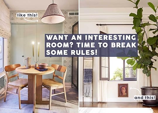
Today’s story starts as many do around the hallowed halls of EHD writers and editors: We see a photo we like, we share it with another person and suddenly, it becomes a blog post. The photo in question? This one from Jersey Ice Cream Co (also, see below). My eyes instantly went to the curtains; hung on a low wooden built-in drapery rod, and hovering at least 8 inches off the ground. This, of course, goes against every rule ever written here and elsewhere about how to hang curtains, but it quickly charmed me nonetheless.
Sure, the rest of the room was also incredibly darling with a color palette that felt well-worn and comfortable. Maybe the “off” curtains only work because the rest of the space was “on.” But it got me thinking…what other rules am I willing to let slide if the room can carry that kind of sidestepping of design edicts? I scrolled around, looked through my saved folders, surfed through my favorite publications and designers’ profiles, and landed on five plus a few wild cards.
First, let’s talk about “rules.” Look, I’ve been in the design writing game for 13 years. I’ve written about every guideline imaginable. And good design principles are good design principles, especially if you’re not a professional interiors game. But as anyone who recognizes my byline might know about me, I tend to be a bit of a contrarian at times. Not because I like a fight (or don’t believe in the rules) but because above all else, I hold interesting and rooms in high esteem. And sometimes, interesting means not going by the book. To be unforgettable, you must first be different from everything around you, even in subtle ways.
If you’re interested in the same thing as me—rooms that fight the mold and kind of do their own thing but still make it work—keep reading friends.
The Rule: Hang Your Curtains High, Wide, And LongRule followers head here: You’re Hanging Curtains All Wrong
Generally speaking, poorly hung curtains can ruin a room. I’m one of the first people to admit that. But sometimes, a designer comes along and says “I see your rules and raise you my own. I do what I want.” And you know…you look at the space and think “Yeah, I guess you do.” I love that kind of design bravado, whether I’d do it in my own home or not.
View this post on InstagramA post shared by Tara Mangini & Percy Bright (@jerseyicecreamco)
Above is the photo that sparked this post. Whispy, floating gingham curtains that I’d never in a lifetime think to hang this way. I’m not necessarily telling everywhere here to run out and copy this look, because broken design rules can be very hard to pull off, but as I mentioned at the start of this post, it works because 1: the curtain rods seem like a handcrafted detail that make sense for the architecture of the home, and 2: everything else is just right. When everything is “just right,” I personally think a space needs a little funk thrown in. These curtains are that funk.
View this post on InstagramA post shared by Studio Shamshiri (@studioshamshiri)
Curtain panels that end at the window sill? I’d never, ever dare. But Studio Shamshiri makes their own rules and that kind of confidence makes you a believer. The key here, I think, is that the curtain panels and sheers are fully inset into the window, so the hem of the panel kisses the sill of the window. I’m not sure I’d be as convinced this was a viable option if that wasn’t the case. Or would I…
View this post on InstagramA post shared by ANOTHER HUMAN (@anotherhumandesign)
Guess I was wrong. I earmarked this photo because I would have either put up cafe curtains, put up Roman shades, or taken draperies to the floor (only to be smooshed by the bench seating and likely also get dirty from dining). It’s what amateur designers like me do: overthink things to not break the rules. But Another Human Design was all like “nonsense, put up the curtains” and well, it works. Perhaps because the design scheme of the dining nook is already unconventional with its color palette. If it was going to be bold already, keep making bold decisions down to the curtains.
The Rule: Area Rugs Should Be Large Enough that At Least Your Furniture Legs Rest On ItRule followers head here: How To Choose The Right Rug Size For Your Living Room – 5 Formulas Guaranteed to Work (+ 36 Shoppable Picks) & Design Mistake #2: The ‘Too Small Rug’
Of all the design rules I’ve held closest to my chest, rug size is tops. Furniture legs should *always* at the very least rest on a rug in a living room set up; better yet if the rug is large enough to house all pieces…right?!? While I generally still very much agree with this mostly because it can be very grounding for a space and make it look larger, these rooms help me see there are always exceptions.
View this post on InstagramA post shared by The Design Files (@thedesignfiles)
I feel like I could easily start each of my paragraphs with the statement “I’d never think to do this.” And while I won’t write that over and over again, just know, I’m thinking it. Especially here, in a room that ran on The Design Files. I’m not entirely sure why the designer didn’t shift things forward to rest on the rug, but frankly, I really like it. It makes the sofa stand-alone, and being that it’s quite sculptural (and likely very expensive), that’s something you want to do. Suddenly, the couch is both seating *and* art.
View this post on InstagramA post shared by domino (@dominomag)
A look I don’t see often enough that I really love is lots of smaller rugs essentially quilting a floor together. I notice it often in English designs (which tend to break a lot of rules, actually), and for the most part, it comes off charming, and casual, and carries with it a certain je ne sais quoi that’s hard to pull off with a proper rule-following area rug size. This rule-breaking room was found on Domino, and is the home of fashion stylist Sarah Corbett-Winder.
View this post on InstagramA post shared by Nicola Harding & Co (@nicolahardingandco)
Big armchairs, small rug. Not a combo I’d bet on working, but the fact that everything here is fairly eclectic, the slightly too-petite rug adds to the quirk. Nicole Harding Design shared a caption on this photo that mentioned “homemaking” as a focus of their design philosophy and I think that might be the key to this whole thing (the image and all rule-breaking in general): imperfect moments make a home. Anyone who has the money to hire a designer can certainly have a picture-perfect house with all the details just so, but it takes a bit of bending to feel more personal, collected, and warm.
View this post on InstagramA post shared by House & Garden Magazine (@houseandgardenuk)
Same story here in this dining room by Anna Marie Rhodes (via House & Garden). The grout lines are imperfect, the ceilings have a slight dip in them, the fireplace isn’t exactly square. It’s an old home with a lot of life journaled in its history book so a correctly sized rug under that table might actually feel more wrong than right.
View this post on InstagramA post shared by domino (@dominomag)
One of my favorite things to see is the inside of creative people’s homes. They have good taste, they often tinker with the interiors themselves rather than hiring someone, and they always break the rules. Being creative pretty much inherently calls for that. Rikke Baumgarten is a Creative Director and also the owner of this home I found on Domino that skirted rug laws (and also coffee table laws, too). And look, I’d love to see that same rug two to three times its size, but then maybe, it would compete with the ceiling.
The Rule: Your Light Fixture Should Be Centered Over Your Dining TableRule followers head here: Our Dining Room “Rules” Cheat Sheet
Here’s a rule I’ve had to break many a time based solely on the fact that I have no control over my junction boxes as a renter, and I almost never can get my table centered under a light fixture. I drove myself mad trying to find a solution in my last dining room, but now, I kind of don’t care. Having things off-center can oftentimes make your eye work a bit harder, faced with something it didn’t expect to have to make sense of. And that’s what creates interest. So yeah, go ahead and maybe don’t fight so hard to center your lighting fixtures over a table.
View this post on InstagramA post shared by domino (@dominomag)
While I’ve never had a choice in the matter, this dining room from Domino (the Milan home of fashion designer Federica Viero) seems to have deliberately shifted where that amazing pendant hung from. The move makes me stare longer, and wonder what else might be off (like the decor pieces on the right side of the table instead of in the traditional center, or the art hidden behind the palm fronds).
View this post on InstagramA post shared by domino (@dominomag)
The more I look at this breakfast nook by Meet West, the more I wonder if the off-centeredness of that pendant is a trick of the camera or not. It very well could be centered on the whole setup rather than the table. But either way, I’m into it.
View this post on InstagramA post shared by Architectural Digest (@archdigest)
I’ve loved this Studio Ashby kitchen since the first time I saw it in Arch Digest. The designer mentioned how much the homeowner pushed them to go outside the box. So many of Studio Ashby’s rooms I admire are linear, clean but interesting, rule-following yet innovative, but this one feels looser to me. Maybe it’s the meandering mural backsplash tile, or possibly, the off-center pendant over the table (ding ding ding!).
The Rule: Art Should Be Hung At Eye Level (About 57-60″ From The Ground Up)Rule followers head here: How to Hang Art Correctly
Something I learned by digging around for this section: Great rooms often do not have art hung any which way. Probably because rooms like the one below have art that was acquired (not bought online because it looked nice like I tend to do), and likely was hung by a professional. So…I only found one example but I still wanted to show it. Let’s take a look:
View this post on InstagramA post shared by The Design Files (@thedesignfiles)
The modern piece in the above home from The Design Files is hung well above that 60-ish inch mark from the ground up that I’ve so often written about in my career. But it’s all I can look at in this room, in a good way. My guess is it’s hung as high as it is because there is a sculpture underneath it and it’s giving that room to breathe, but even without that point, I’d be intrigued by it. As I’ve mentioned a few times, when things are purposefully off in a room’s design, it tends to be magnetic to your eyes. They go straight there, which is a good technique if you really want someone looking at a thing, like an art piece.
The Rule: Gallery Walls Should Be Evenly Spaced & Have A Finished ArrangementRule followers head here: How To Actually Make A Gallery Wall: Our No-Fail Formula We Use Every Time (+ Our Favorite Original Art Resources)
It’s no secret I’m a gallery wall aficionado. I had one in my old dining room and bedroom, and now in my current living room and bedroom. And I’d probably have more if I had more wall space.
View this post on InstagramA post shared by Joe Schmelzer (@treasurbite)
There are a few things to talk about regarding the art in this office by David Brian Sanders (shot by an old colleague of mine Joe Schmelzer). First off, the spacing looks like the pieces were hung by someone who kept switching between their left eye open and their right eye open, never the two at the same time. AND I DO NOT MEAN THAT AS AN INSULT. I’m fairly in love with it. Some of the frames look like they even might be touching, and ::gasp:: what kind of design vigilante would dare to do such a thing? I thought it worked at first because all the photos and the frames themselves were so similar and consistency is key to pulling off something a little funky. But then BOOM, I realized the random colorful print. And that actually is why I think this *actually* works. Because it was never meant to take itself as seriously as a series of black and whites in coordinating frames would normally.
View this post on InstagramA post shared by Adam Spychala (@didyouseeadam)
Ugh, what a great place. The home of artist Adam Spychala has this amazing gallery wall that starts in a single layer above the sofa and builds up to a peek on the far right side of the space and it’s freaking fantastic. The whole left side might be perceived as “unfinished” to some, but that someone would be an absolute square who doesn’t appreciate the looseness of some artistic rooms. 
View this post on InstagramA post shared by Brian Patrick Flynn (@bpatrickflynn)
The same can be said for Brian Patrick Flynn’s ridiculously gorgeous entryway. Packed to the gills with art, mirrors, prints, objects…but then left with room to grow above the doorframe on the left.
View this post on InstagramA post shared by ELLE DECOR (@elledecor)
Some of you may think this isn’t a gallery wall, and you know, you’d be right. But it’s still a grouping of art that’s worth discussing, particularly the scale. With art arrangements, I tend to like to see a good balance of sizes. One large anchor, a few other pieces just a bit smaller, and maybe even a few small or oddly-shaped frames thrown into the mix. But this room by Studio Mellone from Elle Decor throws that out the window with an overscale painting and then four considerably smaller frames hung much lower in comparison (and on the floor). I think this helps to shake up the seriousness of the room and not be so precise.
A Few Rule-Breaking Wild CardsThere were two images I saved during my research, hoping a category would pop up for them but that never happened. But, I do think they loosely break some rules of their own so I wanted to include them:
View this post on InstagramA post shared by Octavia Dickinson (@octaviadickinson)
If I’ve learned anything about myself and my design style leanings in the last few years it’s that I love to look at rooms like this, but I actually prefer something a bit more modern and streamlined to live in. Regardless, I just love how these shelves are not styled. They are purely useful for storing mugs, dinnerware, teapots, vases, and cookbooks. It’s loose and free and I’m jealous of that kind of unencumbered placement enacted by designer/homeowner Octavia Dickinson. We’re drilled on “shelfie styling” and for good reason (most of us need some visual order in our lives) but don’t forget that sometimes, undone is just done enough.
View this post on InstagramA post shared by Summer Thornton (@summerthorntondesign)
POW! Now, quite opposite of that last rustic home is this clean-as-a-whistle library by Summer Thornton. It’s a study in opposites and juxtaposition of traditional and classic decor and architecture and contemporary art that steals the show. The hot pink and white work stands as a beacon of the unexpected, and again…something I’d never dare to do.
So, how are we all feeling right now? Bold? Brazen? Scared? Shaking our heads and clutching our pearls? If today was a lesson in anything, it’s that we don’t have to be so rigid to have a beautiful home. I think if we follow an 80/20 (or 90/10 if you’re just getting started) rule-to-rule-breaking ratio, we will all have homes with just a bit more “human” in them. None of us are perfect and that’s what makes us all so beautiful. The same should apply to our homes.
Until next time,
Your friend in breaking rules, Arlyn
Opening image credits: Left: Design by Arlyn Hernandez, Styling by Emily Edith Bowser, Photo by Veronica Crawford | Right: Photo by David Tsay | From: A Spanish Living Room
The post 5 Design & Styling Rules That Are Worth Breaking (If You Want an Unforgettable Home) appeared first on Emily Henderson.


June 17, 2024
DESIGN NEWS! 9 Product Launches That Will Make Your Heart, Eyes (And Home!) Very Happy

We wanted to start the week with happy and pretty news! I know I always feel a surge of inspiration when I see a new decor product line drop. It’s not because I need new and/or more things but because it’s a beautiful expression of someone’s (or a team’s) creativity. It feeds me! From there I might hit add to cart depending on whether something is a perfect fit for my home or maybe it just helps get me out of a design rut. Basically, it’s a positive regardless:) So here are 8 awesome and recent product launches our team has been pretty excited about. Ok, let’s get inspired, shall we?
West Elm x RHODE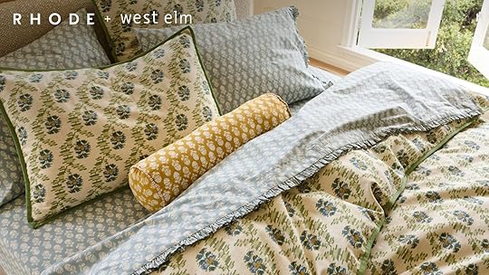
I don’t think I need to even explain why I was so excited to see this collab. Look at those sweet patterns! I get feed a lot of RHODE ads on Instagram and even before I see that it’s them I think “Man, that’s a cute dress and I love that print.” So when I saw this collab pop up I knew it would be awesome before I even saw that full collection. Here are a handful of the pieces/some of my favorites.

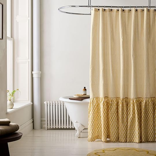
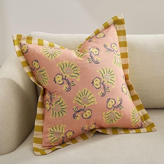
Jawahar Duvet Cover & Shams | Thistle Shower Curtain | Toulon Stripe Pillow Cover
This duvet and sham set is perfect if you are looking for a slightly modernized floral pattern. It’s a little more graphic but still holds the inherent sweetness of this type of pattern. Then I don’t know if you read my decor trend prediction post I wrote a few months ago but statement shower curtains were on the list. So when I saw this shower curtain with its large ruffle and pattern mix I was VERY happy. How cute is it? It also comes in blue in case that works better for you. But if you just want a little pattern punch then no pillow is cuter than this one! That trim is SO GOOD and I love love those colors.

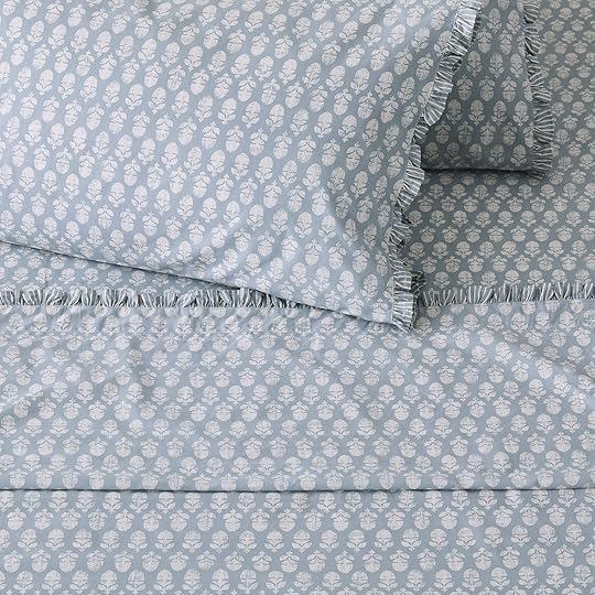

Salad Plate Sets + Dinner Plate Sets | Thistle Sheet Set | Wide Stripe Lacquer Tray
They even did some plates! That salad plate has my heart but the two stacked on top of each other would make maybe the sweetest place setting I’ve seen in a minute. So happy and fun. Then these are the sheets that are in the bedding photos above! The thistle print is both trendy and classic, the blue is a VERY EHD light denim blue (so we absolutely approve), and the little ruffle is such a cute detail. Finally, we love almost nothing more than a great tray. Top that with a graphic print and we are in heaven. This blue and white stripe tray is so versatile stylistically and would add the perfect design accent. Here’s a post I wrote to show you the power of a little pattern.
Lulu And Georgia x Carly Cushnie

Lulu and Georgia are at it again with another truly incredible furniture collab with designer Carly Cushnie! It’s soft, elegant, and very cool. She really leaned into beautiful shapes and very special details. We would expect nothing less from this collaboration:)

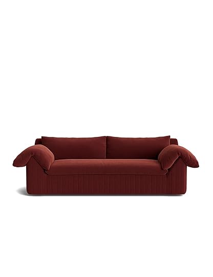
Leon Accent Chair | Yucca Sofa
Speaking of special details, get a load of this fringe! This chair is so fun and organic and will make a big design statement. Then this sofa looks soooo comfortable! And given that I have Ginny’s Belmont Sofa and think it’s very comfy and the Fabienne sofas in Em’s living room are also very comfy, I have no doubt that this sofa is also incredibly cozy to sit on.


Ceiba Bench | Kapok Dining Chair | Sabal Console Table
So not only are the softer goods awesome, but so are the wooden pieces! Look at these guys! That bench with the ball details and velvet bench top would look incredible in an entry or at the end of a bed. Then the rattan dining chair is so beautiful and versatile. Rattan is never a bad choice. And the stripes on that burl wood console table are very much me! The mix of the classic burl and a more graphic neutral pattern is just chef’s kiss.
Semihandmade x Leanne Ford
Our girl is back at it again with her first beautiful Semihandmade cabinet collection. Meaning these aren’t just fronts for IKEA cabinets anymore. They are the whole cabinet shebang!


This collection was meant to be small due to its very careful curation. There are three profiles – Shaker, Slab, and Frame (a brand-new design for SHM) that are offered in an aged White Oak front in a whitewash stain or a beautiful paper-white painted front (based on Leanne’s favorite shade of white — Shoji by Sherwin-Williams). Leanne and the Semihandmade team worked extremely hard to create the perfect white wash stain and sealant formula for their white oak cabinets and the results are clear in these stunning photos.
I also really love the hardware options as well! So if you are looking for custom cabinetry, we highly recommend checking out Leanne’s new collaboration.
New Mitchell Black Murals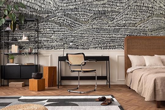
Emily wanted me to make sure that I included these new awesome murals from Mitchell Black. Actually, she just ordered some samples for the river house which is VERY exciting. As you’ll see in a moment, the movement in these is just beautiful and they all pretty much look handpainted which I also adore.


Up The Wall Wallpaper Mural | Tangle Wallpaper Mural | Washed Wallpaper Mural
The first one on the left might be one of my favorites. I mean look at it in the sample photo above. It seems like it could be visually a bit over stimulating but the colors and pattern somehow are both exciting yet calming. Then if you are more of a neutral lover then the middle option is a great pick for you! It’s just cool and feels really versatile if you ever want to change up the decor in your space. The green paper on the right is also SO cool and beautiful. Man, that movement! It truly looks hand-drawn. Most of these if not all of these wallpapers come in other color options too!


Stacked Wallpaper Mural | Shagreen Waves Wallpaper Mural | Looping Current Wallpaper Mural
Ya, of course, I love the pattern on the far left. How could I not?! It really falls into Em’s quiet neutral wallpaper category perfectly. But for two more graphic options the blue paper and loop design paper are pretty awsome. They are a bolder statement but in the right space either would look SO cool!
Parachute x le FLEUR*

This might be the coolest collab on this list because it was designed with Tyler the Creator. Yes, THAT Tyler the Creator. His preppy fashion brand has now collaborated with one of our favorite bedding companies, Parachute, for the happiest pastel-infused bedding on the market.


Linen Venice Set | Alpaca Fringe Throw | Camo Linen Pillowcase Set
These are the three colors offered and although it’s subtle, the sheets have what they call a Digi Leopard print. They even have what looks to be a VERY cozy alpaca fringe throw, sphere pillow, and cute slippers amongst the bedding. I just think this is such a cool collab in colors that we typically don’t get together.
Backdrop’s New Murals

I nearly passed out when I saw this new line of wall murals by Xavier Donnell for Backdrop. I know they aren’t necessarily perfect for every home (trust me, I already tried to find a place in mine) but regardless they are true pieces of art.

Take this mural which was inspired “the legendary road to Rome”. It’s just stunning. I’m in love with the colors of this version (it also comes in a more neutral colorway). It’s warm but calling and has so much dimension. I’m actually having a hard time describing why I love it so much! It really just makes my heart happy.


Ascendance – Dusk | Painted Sky – Air
But also GET OUT OF HERE with these too!! They just evoke so much emotion, don’t they?! The Ascendance has a chokehold on me. The way that Xavier paints is just so rich and layered. What an honor it would be to have this in your home. Then if you are looking for clouds, I’m not sure there is a prettier option than this one on the right. They are perfect.
New Article Furniture
If you’ve been paying attention even a little bit then you know Article is a go-to brand of ours. They have beautiful, high-quality pieces that are priced great and get to you fast. They are the best. Take a look at Kaitlin’s basement, Gretchen’s bedroom, and Emily’s back porch for the most recent evidence of all this. So when I saw they came out with some new pieces I was extremely excited! Come see.

Muhly White Oak Sideboard | Torme Smoked Oak Media Unit
Look at these awesome cabinets! Both Scandi-inspired and both come in the other finish so you’ve got options, baby. I love the detail of the inset pulls (looks so custom) of the sideboard but then I am so drawn to the clean and slightly chunky lines of the media unit. Either way, you can’t go wrong.


Muhly White Oak Dining Table For 6 | Markham Large Brass Table Lamp
How good are those legs on that new dining table!? This table is both organic and postmodern and really is the perfect style chameleon. It would work with so many different homes. Plus it’s the perfect “not too big” but “not too small” dining table size. 10/10. Then do not sleep on Article’s lighting. I know they are mostly known for their furniture but their decor and especially lighting is great! I mean look at that cute new lamp!
Spoonflower’s Metallic Wallpaper Line
In case you didn’t know Spoonflower makes some pretty awesome metallic wallpapers! I too was more on the curious side but after looking through them and also having Emily really love them in person (there might be a special project with said wallpaper) I was convinced. There are truly so many options in so many different styles but here are 9 that I really liked.
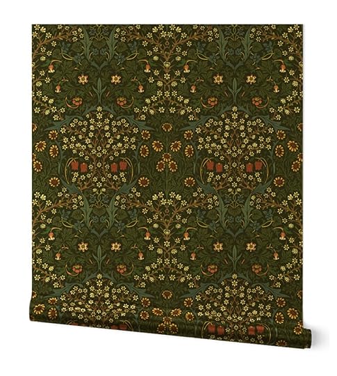


Blackthorn | Scenic Trees Landscape Tapestry | Hunt Scene In Muted Red on Tan
William Morris is a classic brand and their patterns are iconic so getting to see some of them (like the one on the far left) in a metallic wallpaper is pretty cool. Another beloved motif at EHD is trees:) So this middle one, in that gold metallic, is a great way to spice up a classic look. I also love that silver metallics are an option at Spoonflower and how cute is the one on the right?? The pop of red is so good.
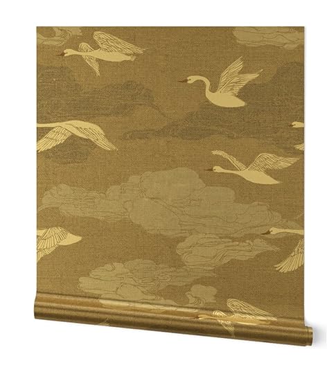
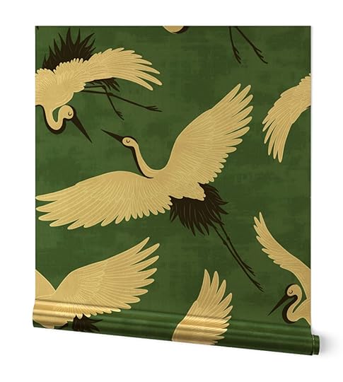

The Wild Swans | Cranes | Flower Tiger
These three are in the “Wild Glamour” category which is a fitting name. Those bird papers look so elegant and I think could work in a lot of different types of rooms. But for an even bigger statement, these tigers are so beautiful and were made to be in gold, don’t you think??
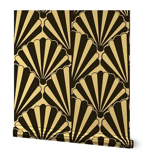
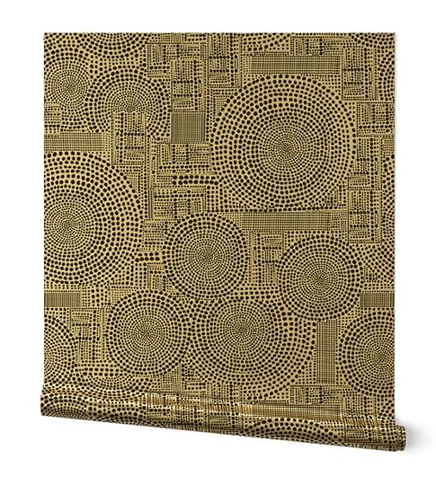

Art Deco Shell Black & White | Abstract Geometric Circle Black and White Print | Art Deco Sunset And Leaves
Lastly, we have the Art Decor category. I was really drawn to these three options. That shell paper screams “ART DECO” to me and definitely belongs in a gold metallic. The other two also feel so good in gold and would bring so much fun style to a room. There are honestly so many options that you will have a hard time choosing a favorite too.
Minna’s First Fabric And Wallpaper Collection

Lastly, we have Minna’s new fabric and wallpaper collection! I am a big fan of Minna and all of their textiles. So I was so happy to see these hand-painted, sustainably printed fabrics and wallpapers all designed by the founder herself! Let’s have a look.

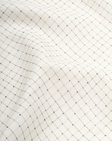

Terrace Fabric Earth | Painted Grid Fabric Moonlight | Tower Fabric Sand
This first one really spoke to me when I saw it. I love a cool set of shapes and this color palette is highly varied but works so cohesively together. Then the delicate lines of the second is so good but not at all boring. Do you see the colors?! And for our warm-toned color lovers, how beautiful is the last one on the right? I love the tone variation and the soft modernness it has. Go check all of them out!
Pretty awesome, right?! Well, I hope this little boost of visual serotonin made your Monday a little brighter and maybe your home a little more complete:)
Love you, mean it.
The post DESIGN NEWS! 9 Product Launches That Will Make Your Heart, Eyes (And Home!) Very Happy appeared first on Emily Henderson.
DESIGN NEWS! 8 Product Launches That Will Make Your Heart, Eyes (And Home!) Very Happy
We wanted to start the week with happy and pretty news! I know I always feel a surge of inspiration when I see a new decor product line drop. It’s not because I need new and/or more things but because it’s a beautiful expression of someone’s (or a team’s) creativity. It feeds me! From there I might hit add to cart depending on whether something is a perfect fit for my home or maybe it just helps get me out of a design rut. Basically, it’s a positive regardless:) So here are 8 awesome and recent product launches our team has been pretty excited about. Ok, let’s get inspired, shall we?
West Elm x RHODEI don’t think I need to even explain why I was so excited to see this collab. Look at those sweet patterns! I get feed a lot of RHODE ads on Instagram and even before I see that it’s them I think “Man, that’s a cute dress and I love that print.” So when I saw this collab pop up I knew it would be awesome before I even saw that full collection. Here are a handful of the pieces/some of my favorites.
Jawahar Duvet Cover & Shams | Thistle Shower Curtain | Toulon Stripe Pillow Cover
This duvet and sham set is perfect if you are looking for a slightly modernized floral pattern. It’s a little more graphic but still holds the inherent sweetness of this type of pattern. Then I don’t know if you read my decor trend prediction post I wrote a few months ago but statement shower curtains were on the list. So when I saw this shower curtain with its large ruffle and pattern mix I was VERY happy. How cute is it? It also comes in blue in case that works better for you. But if you just want a little pattern punch then no pillow is cuter than this one! That trim is SO GOOD and I love love those colors.
Salad Plate Sets + Dinner Plate Sets | Thistle Sheet Set | Wide Stripe Lacquer Tray
They even did some plates! That salad plate has my heart but the two stacked on top of each other would make maybe the sweetest place setting I’ve seen in a minute. So happy and fun. Then these are the sheets that are in the bedding photos above! The thistle print is both trendy and classic, the blue is a VERY EHD light denim blue (so we absolutely approve), and the little ruffle is such a cute detail. Finally, we love almost nothing more than a great tray. Top that with a graphic print and we are in heaven. This blue and white stripe tray is so versatile stylistically and would add the perfect design accent. Here’s a post I wrote to show you the power of a little pattern.
Semihandmade x Leanne FordOur girl is back at it again with her first beautiful Semihandmade cabinet collection. Meaning these aren’t just fronts for IKEA cabinets anymore. They are the whole cabinet shebang!
This collection was meant to be small due to its very careful curation. There are three profiles – Shaker, Slab, and Frame (a brand-new design for SHM) that are offered in an aged White Oak front in a whitewash stain or a beautiful paper-white painted front (based on Leanne’s favorite shade of white — Shoji by Sherwin-Williams). Leanne and the Semihandmade team worked extremely hard to create the perfect white wash stain and sealant formula for their white oak cabinets and the results are clear in these stunning photos.
I also really love the hardware options as well! So if you are looking for custom cabinetry, we highly recommend checking out Leanne’s new collaboration.
New Mitchell Black MuralsEmily wanted me to make sure that I included these new awesome murals from Mitchell Black. Actually, she just ordered some samples for the river house which is VERY exciting. As you’ll see in a moment, the movement in these is just beautiful and they all pretty much look handpainted which I also adore.
Up The Wall Wallpaper Mural | Tangle Wallpaper Mural | Washed Wallpaper Mural
The first one on the left might be one of my favorites. I mean look at it in the sample photo above. It seems like it could be visually a bit over stimulating but the colors and pattern somehow are both exciting yet calming. Then if you are more of a neutral lover then the middle option is a great pick for you! It’s just cool and feels really versatile if you ever want to change up the decor in your space. The green paper on the right is also SO cool and beautiful. Man, that movement! It truly looks hand-drawn. Most of these if not all of these wallpapers come in other color options too!
Stacked Wallpaper Mural | Shagreen Waves Wallpaper Mural | Looping Current Wallpaper Mural
Ya, of course, I love the pattern on the far left. How could I not?! It really falls into Em’s quiet neutral wallpaper category perfectly. But for two more graphic options the blue paper and loop design paper are pretty awsome. They are a bolder statement but in the right space either would look SO cool!
Parachute x le FLEUR*This might be the coolest collab on this list because it was designed with Tyler the Creator. Yes, THAT Tyler the Creator. His preppy fashion brand has now collaborated with one of our favorite bedding companies, Parachute, for the happiest pastel-infused bedding on the market.
Linen Venice Set | Alpaca Fringe Throw | Camo Linen Pillowcase Set
These are the three colors offered and although it’s subtle, the sheets have what they call a Digi Leopard print. They even have what looks to be a VERY cozy alpaca fringe throw, sphere pillow, and cute slippers amongst the bedding. I just think this is such a cool collab in colors that we typically don’t get together.
Backdrop’s New MuralsI nearly passed out when I saw this new line of wall murals by Xavier Donnell for Backdrop. I know they aren’t necessarily perfect for every home (trust me, I already tried to find a place in mine) but regardless they are true pieces of art.
Take this mural which was inspired “the legendary road to Rome”. It’s just stunning. I’m in love with the colors of this version (it also comes in a more neutral colorway). It’s warm but calling and has so much dimension. I’m actually having a hard time describing why I love it so much! It really just makes my heart happy.
Ascendance – Dusk | Painted Sky – Air
But also GET OUT OF HERE with these too!! They just evoke so much emotion, don’t they?! The Ascendance has a chokehold on me. The way that Xavier paints is just so rich and layered. What an honor it would be to have this in your home. Then if you are looking for clouds, I’m not sure there is a prettier option than this one on the right. They are perfect.
New Article FurnitureIf you’ve been paying attention even a little bit then you know Article is a go-to brand of ours. They have beautiful, high-quality pieces that are priced great and get to you fast. They are the best. Take a look at Kaitlin’s basement, Gretchen’s bedroom, and Emily’s back porch for the most recent evidence of all this. So when I saw they came out with some new pieces I was extremely excited! Come see.
Muhly White Oak Sideboard | Torme Smoked Oak Media Unit
Look at these awesome cabinets! Both Scandi-inspired and both come in the other finish so you’ve got options, baby. I love the detail of the inset pulls (looks so custom) of the sideboard but then I am so drawn to the clean and slightly chunky lines of the media unit. Either way, you can’t go wrong.
Muhly White Oak Dining Table For 6 | Markham Large Brass Table Lamp
How good are those legs on that new dining table!? This table is both organic and postmodern and really is the perfect style chameleon. It would work with so many different homes. Plus it’s the perfect “not too big” but “not too small” dining table size. 10/10. Then do not sleep on Article’s lighting. I know they are mostly known for their furniture but their decor and especially lighting is great! I mean look at that cute new lamp!
Spoonflower’s Metallic Wallpaper LineIn case you didn’t know Spoonflower makes some pretty awesome metallic wallpapers! I too was more on the curious side but after looking through them and also having Emily really love them in person (there might be a special project with said wallpaper) I was convinced. There are truly so many options in so many different styles but here are 9 that I really liked.
Blackthorn | Scenic Trees Landscape Tapestry | Hunt Scene In Muted Red on Tan
William Morris is a classic brand and their patterns are iconic so getting to see some of them (like the one on the far left) in a metallic wallpaper is pretty cool. Another beloved motif at EHD is trees:) So this middle one, in that gold metallic, is a great way to spice up a classic look. I also love that silver metallics are an option at Spoonflower and how cute is the one on the right?? The pop of red is so good.
The Wild Swans | Cranes | Flower Tiger
These three are in the “Wild Glamour” category which is a fitting name. Those bird papers look so elegant and I think could work in a lot of different types of rooms. But for an even bigger statement, these tigers are so beautiful and were made to be in gold, don’t you think??
Art Deco Shell Black & White | Abstract Geometric Circle Black and White Print | Art Deco Sunset And Leaves
Lastly, we have the Art Decor category. I was really drawn to these three options. That shell paper screams “ART DECO” to me and definitely belongs in a gold metallic. The other two also feel so good in gold and would bring so much fun style to a room. There are honestly so many options that you will have a hard time choosing a favorite too.
Minna’s First Fabric And Wallpaper CollectionLastly, we have Minna’s new fabric and wallpaper collection! I am a big fan of Minna and all of their textiles. So I was so happy to see these hand-painted, sustainably printed fabrics and wallpapers all designed by the founder herself! Let’s have a look.
Terrace Fabric Earth | Painted Grid Fabric Moonlight | Tower Fabric Sand
This first one really spoke to me when I saw it. I love a cool set of shapes and this color palette is highly varied but works so cohesively together. Then the delicate lines of the second is so good but not at all boring. Do you see the colors?! And for our warm-toned color lovers, how beautiful is the last one on the right? I love the tone variation and the soft modernness it has. Go check all of them out!
Pretty awesome, right?! Well, I hope this little boost of visual serotonin made your Monday a little brighter and maybe your home a little more complete:)
Love you, mean it.
The post DESIGN NEWS! 8 Product Launches That Will Make Your Heart, Eyes (And Home!) Very Happy appeared first on Emily Henderson.
June 16, 2024
The Link Up: Em’s 3-Step Simple And Effective Skincare Routine, Mal’s Cute “Good For Walking” Sandals, And Maybe The Coolest Tree House We’ve Ever Seen
Happy Sunday everyone and Happy Father’s Day! We hope that if you are lucky enough to spend it with your dad or father figure it’s a truly great day:) And what a week it’s been for the EHD team! The Portland crew is all done shooting the river house (empty), Jess got her BEAUTIFUL new custom bed from Buildlane (THANK YOU!) so she will never again sleep on the floor, and Mal is officially an LA resident again!!! Lots of gratitude all around. So to keep this happy feeling going, let’s get to these links…
This week’s house tour is maybe the most colorful house we’ve ever linked up! It’s nearly impossible to describe but will put a smile on your face so you just have to go see it for ourself. Do that here!
From Emily: I have frustratingly famously dry skin. I also hate traveling with full-sized bottles (I’m a carry-on gal) so when I’m on trips I let my skincare routine totally fall off (so dumb). Recently after I came back from a 5-day vacation, where I only put on basic moisturizer and SPF and my skin was extremely unhappy (blotchy, bad texture, and so dry). So I bought these glass capsules full of hyaluronic acid and peptides, and it’s been an absolute noticeable difference. But one thing that I’ve been told over and over is that if I don’t exfoliate enough (with a mild exfoliant) then the moisturizer or serum can’t even get into my skin. So I used these Pixi glow pads first and then followed it up with the serum, then my Summer Friday’s Cloud Dew and my skin is SO HAPPY. It’s extremely soft and smooth, totally clear, the bad texture is gone. Even Alyssa, my hair and makeup artist, was like “Woah, your skin is really happy”. I do not like a long nighttime skincare routine (I admire all of you who can do it) but this combination is easy to stick to: exfoliant + serum + moisturizer.
From Caitlin: I had a blast reading this piece in Dwell about a family who built a fully-permitted, fox-shaped, treehouse-meets-ADU in their backyard – BY THEMSELVES. From scratch. (And we’re talking scratch here – like, “hand-milled shingles with an 1800s saw blade” and “design custom lighting with a woodland theme” kind of scratch here.) You can see a few more photos of their process and of the finished project on Instagram here – I just really admire it when people go for it, you know?
From Jess: Never did I think I’d be recommending a protein drink but here we are! I’m really trying to up my protein (it’s not easy…at least for me) so when I came across these coffee protein drinks called Slate at Erewhon (don’t judge me!) I thought I would give them a try. They are plant-based, have almost no sugar plus lots of other things I liked. Oh and have 20g of protein per can:) I put them over ice and honestly really like them. I’ve only had the mocha and salted caramel flavors from my energy variety pack but so far it’s been great getting my caffeine for the day and a boost of protein in at the same time.
From Gretchen: I mentioned it last week, and I meant it–I need some new shoes!! Do I have 8 million pairs already? Yup. I sure do. But I wear my shoes to death and there are quite a few pairs that simply cannot be resurrected. For everyday shoes, I need ones that I can slip on and off easily at work. Because of this I usually gravitate toward a Birkenstock or a simple sandal (like this cute pair I just bought from Target). But sometimes I want my toes covered, you know? Sometimes I want to feel a little more “put together” without the need for a heel or a blister-inducing back-strap. So I went hunting for some polished-looking slide-on shoes and found these adorable, backless Mary Janes from Madewell! I love the material, the color (name something Spiced Olive and I’m in), plus the M.J. style is just so cute! But these are even better because they’re like mullet ballet flats, with business up front, and a slip-on-and-go (blister-free) party in the back. Score!
From Mallory: As the days are heating up, I’ve been reaching for sandals for the first few days this season and I was reminded just how much I love these summer sandals. I have them in a darkish brown and I’m thinking of purchasing them in a nude or bone because I always end up wearing them on warm summer days!! They’re SO comfortable so you can walk for long periods of time in them with no problem and they’re velcro which is ideal because I just don’t have the time or the energy for a buckle. Highly recommend if you’re in the market for some new summer sandals!
From Arlyn: It’s a prerequisite to have at least two chambray shirts in your closet as an EHD writer. I’m kidding (sort of), but my go-to button-down recently croaked so I had to replace it as it’s something I grab basically every week. I used to have a super soft one from Loft years ago, and I was so happy to find a similar one on sale. Their sizing is generous, so keep that in mind but it’s roomy without being baggy, has a split hem with a slightly longer back to cover my tushy in leggings, and feels so light in the summer heat that suddenly hit LA.
As always, thank you for reading! See ya tomorrow. xx
Opening Image Credits: Design by Jess Bunge | Styled by Emily Bowser | Photo by Sara Ligorria-Tramp | From: Jess’ Communal Patio Reveal – Beautiful Outdoor Furniture, Some Great Flea Finds, And Of Course… A DIY Dad Project
The post The Link Up: Em’s 3-Step Simple And Effective Skincare Routine, Mal’s Cute “Good For Walking” Sandals, And Maybe The Coolest Tree House We’ve Ever Seen appeared first on Emily Henderson.
June 15, 2024
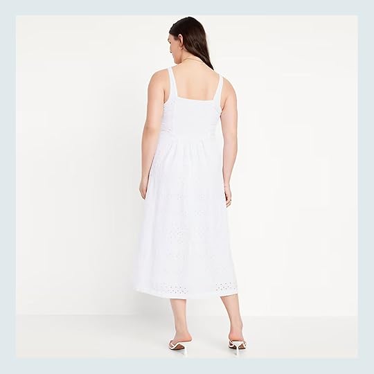
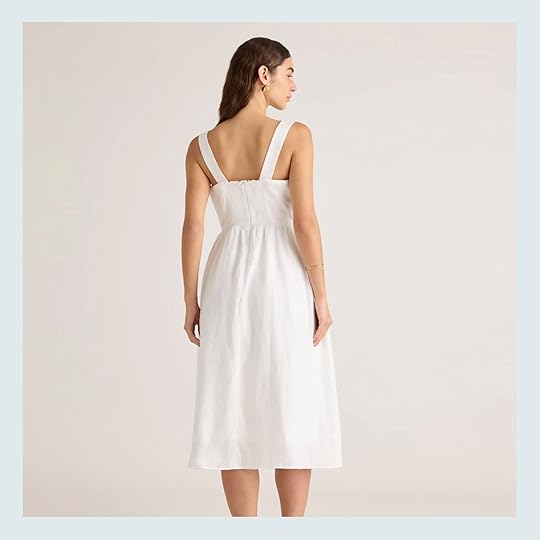
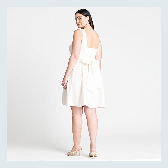
18 Summer-Approved And VERY CUTE White Dresses Under $150 (There’s Something For Everyone)

Earlier this week, when we were brainstorming our Saturday fashion post (cause not every Saturday can be a swimsuit spread where we get to go on an international trip to shoot:)) Caitlin suggested we do an affordable white dress post. Why? Well, Caitlin is a HUGE team white dress gal and gave me a whole list of reasons why they are acutally the best dress option:
For whatever reason I feel like they need the least accessorizing??? White dresses kinda feel like the only thing you need and can still look pulled together with 0 other effort or accessories lol.They go with everything! Tons of shoes and bags and accessory options (if you want some accessories:)) – they can always feel different.You just kinda feel nice when you’re in a white dress – Clean? Breezy? Pulled together? Like someone who has their life together enough to wear an all-white outfit, you know?When you inevitably spill or stain, I actually think they’re easier to keep clean – kind of like hotel sheets for the bod lol. A good detergent (or a little bleach) and some correctly applied bluing liquid (this video on keeping whites white will change your life) is all you need!They’re my fav and you can wear them year-round (F the rules about Labor Day, honestly) – they’re just so much harder to find in the winter! I love pairing my heavier white dresses with tights and a sweater (this easy styling hack rocks), and you can layer your lighter-weight dresses by throwing a skirt on top (so like, the dress is your “shirt” and the skirt is your “bottom.” Added bonus: extra warmth!)Anyway, they rock and if you like dresses, a white one will change your life!!!Those are some pretty compelling arguments if you ask me! And if I think about the times I have worn a pretty white summer dress, there is this inherent feeling of sophistication (which I’ll take as much as I can get, ha). So with all of Caitlin’s excellent points in mind, here are 18 really awesome white dresses that are all under $150 (ok, aside from two) but most are under $100!
Crinkle Gauze Embroidered Mini Dress – $44

Nothing says summer to me more than an eyelet detail! But I really love the subletness of it for this dress. The sleeves and hem are so elegant but the gauzy fabric gives it that easy breezy vibe you want in the summer. I just think this is such a pretty yet modest option, especially for that price. Oh, and it comes in two other colors!
Cassie Button-Front Midi Dress – $148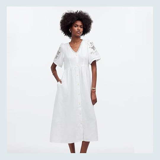
Another detailed sleeved cutie! I really adore a midi length and with the button-up style (AND POCKETS) I feel like you would instantly be transported to Italy once you slipped it on. Also, that type of embroidery totally reminds my of my mom’s clothes from the 70s that I always adored. This dress just looks so pretty and easy to wear. Dress it up, dress it down. It also comes in black if that’s more your speed and plus sizes.
Eyelet Tie Front Maxi Dress – $70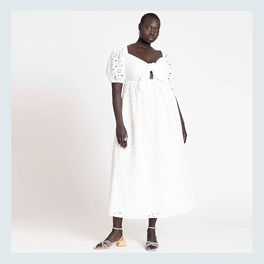
But maybe you want to feel a little dressier? Enter this beauty! Full eyelet, adorable puff sleeves, and a very sweet tie-front. There’s nothing not to love here. Think how pretty (and sultry) dropping those sleeves off the shoulder would be?! This dress also comes in orange if you want more of a bold statement and ranges from size 14 -32!
Fit & Flare Eyelet Midi Dress – $50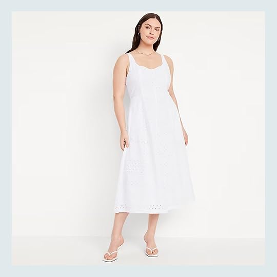
How pretty is the structure of this dress?! It’s simple, timeless but extra special with the eyelet fabric. It also looks like you could still wear a normal bra which I am always rooting for:) This cutie comes in a bunch of different fabrics (not other eyelet colors though) and sizes up to 4x!
Amelia Shirtdress – $138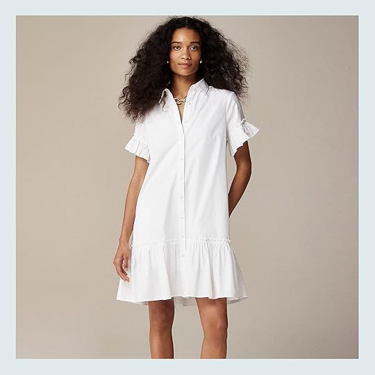
Ugh, those ruffles! I think this shirtdress would be a perfect office option but equally as perfect for a fun brunch. It’s a J. Crew bestseller so I am not alone in thinking this is an excellent dress (I also love how they styled it with a chunky gold chain necklace). Some reviewers said they even have two! It does come in two other prints that are a little more expensive, FYI, and the sizing goes up to 3x:)
Mila Dress – $145
A classic look that I will never tire of. I love the chic simplicity of this dress and how seemingly beautiful it drapes. The perfect amount of an oversized sleeve too. A true staple! The sizing is unfortunately limited and only goes up to large.
Crinkle Gauze Swing Dress – $21
A truly perfect throw-on-and-go little dress! The neckline is so pretty and fun with that little ruffle…and you bet it has pockets! I also really love those flutter sleeves which keep things nice and breezy up in those parts. This also has some very cute other color options and sizes up to 4x.
Asymmetric Button-Front Cover-Up Tunic -$90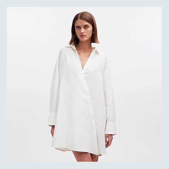
I don’t think I’ve ever seen a cooler shirtdress. GET OUTTA HERE! And it’s under $100!? Perfect for work, perfect for boppin around town looking like the chicest person alive, no notes.
Mini Vest Dress – $35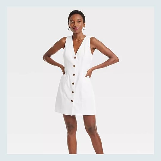
I want to be this girl! Simple and effortless in her chic style. This is another versatile piece that could easily be dressed up or down. My friend owns a vintage version that looks almost identical and I always think, “Man, I want to look like that!” And the even better news is that it sizes up to 4x and comes in black too!
One-Shoulder Midi Dress – $158
I know this little number is more on the dressed up side but if you are going on vacation (not like camping, of course) then you should absolutely consider this dress if you are shopping for new things. Just imagine you strolling the streets of a Greecian island. Can you see it?! Or sipping a crisp glass of white wine in an Italian square. Perfetta!!
Linen-Blend Shift Mini Dress – $39
This regal cutie is very much in the same world as the dress above. Clean lines, relatively modest, and very “effortless cool girl”. It’s also looks regular bra-approved! In terms of sizing, it’s offered in regular, tall, and petit. It also comes in black.
Embroidered Tank Mini Dress – $108
How good is that neckline?? Well, we aren’t the only ones that think that because this baby is a bestseller! I don’t have much more to say aside from that I think it’s just so cute.
Halter Neck O-Ring Poplin Midi Dress – $55

I’m a gal that loves a halter so this dress is speaking my language. That o-ring detail is so cute and makes it look much more expensive than it is! And who doesn’t love an elastic waistband? Another great dress for vacations or fun events at home! It comes in three other colors too:)
100% European Linen Fit & Flare Midi Dress – $80
A very sweet vintage feel with this one, no? I love that square neckline and how simple and clean it is. Plus it has pockets so another point should be been added. It does come in a few other colors and a print!
Bow Back Mini Dress – $78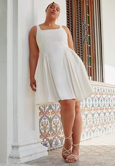

I adore this drop-waist style so much. Truly! So when I saw this one I had to include it. The lifestyle shot really sold it for me. It’s definitely more dressy with that bow in the back but there are events all summer long so I doubt that will be a problem:) Hey, even a nice dinner will suffice! It’s just a special dress and what’s even better is that the sizes range from 14 to 32.
Dipped-Waist Sweetheart Maxi Dress – $120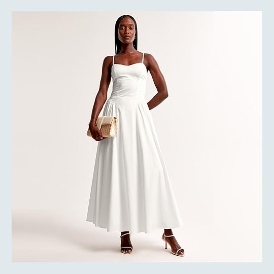

For some smaller sizes in a very similar style, I found this one and loved it just as much! The longer length is so good and how sweet is that sweetheart neckline? What’s even better about this one is that it’s offered in some other colors too:)
Clio Dress – $138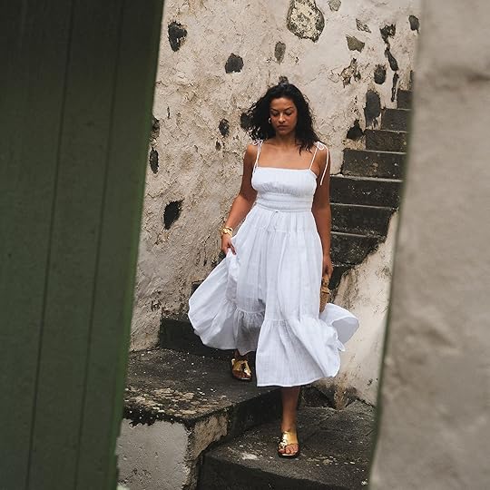

Vacation is calling again with this one! It’s such a romantic-looking dress, right?? And sure, it doesn’t lend itself to a regular bra but you could easily wear a strapless or pasties if that’s your preference:) I just love it and this beauty sizes up to 3x and comes in other colors. Yes, yes, yes!
Gap × DÔEN Eyelet Midi Dress – $158
And for our grand finale, we have the Gap x DÔEN collab eyelet dress. DÔEN is such an incredible brand but affordable it is not. So this collab (while on the higher end of “affordable”) is much more approachable! This eylet dress is a great representation of the sweet romantic style DÔEN is known for. I love the tiers, the ruffled trim around the neckline and straps, as well as the little tie at the top. So cute and so versatile.
Did you find one you like? I hope so! Caitlin really drove a hard bargain so you might see me walking around in a white dress very soon:) Have a great rest of your Saturday!
Love you, mean it.
Opening Image Credits: Photos by Veronica Crawford | From: 51 Affordable Spring Dresses (& 1 Awesome Jumper I Couldn’t Resist)
The post 18 Summer-Approved And VERY CUTE White Dresses Under $150 (There’s Something For Everyone) appeared first on Emily Henderson.
June 14, 2024
Our Lake Arrowhead House Has Been An Airbnb For 3 Years Now – Here’s How It’s Going (And Why It’s So Special)
This last time we were in Arrowhead over Memorial Day Charlie, while playing with his toys from when he was four, said “I feel both happy and sad right now”. Elliot agreed and we explained the concept of nostalgia to them. Some of the best memories of our lives were created living here (both before and during lockdown). We moved to Oregon 3 years ago and listed our Arrowhead house to rent, leaving it in the hands of a very competent and wonderful property management team (To Dwell Here). I always knew I wanted to do this, but Brian was nervous about giving the home that we loved so much over to strangers. Well, after the first few months, he turned from being nervous to being thrilled as we saw our risky investment start to be a good one. We are endlessly grateful to have been able to do all that in the first place! It was always part of the plan that this would be a long-term investment property and we’d have to first suffer through a lot of financial nausea with occasional barfing to feel any sort of relief. We would have to spend money to someday, hopefully, break even or make money (obviously the appreciation of the house will help, too). Some people play the stock market, but as a design content creator I play the real estate market to varying degrees of success and failings (read this post about when I lost dough on a super high-end flip). But to have such a successful year in the first year was a real thrill.
And Yet That Didn’t Remain Our Trajectory…The first year (fall of 2021 – summer 2022) it was rented every weekend and many full weeks even in the spring and fall. People still weren’t back in the office and many schools still weren’t open (or were very lax) so people could happily and easily pop up to the mountains and get out of the city. Who didn’t want a change of scenery? Also, people were likely excited about staying in our specific house (thank you). There were also very few luxury houses that were designed like this up there at the time. So if aesthetics mattered greatly to you, you might have found yourself in a bit of a desert until recently…and now there are like 15 dope houses to choose from.
But…It’s No Longer 2021 (Thankfully For All The Reasons!)
 photos by sara ligorria-tramp | from: mountain house kitchen reveal
Our house isn’t inexpensive as it’s meant to comfortably house 3 families (three king suites and a bunk room) which means that people likely need to plan way more in advance, and coordinating multiple families is hard. Three-day weekends or holiday breaks, sure. And of course, you can rent on your own but it’s clearly more affordable to go in with more than one family. So as kids got back into school and grownups went back to hybrid work, schedules were less flexible and rentals were way less during the weekdays or off months. This is not a complaint because wow are we thankful to all be in such a safer position now!
So Many Pretty Houses (But None Like This LOL)
 photos by sara ligorria-tramp | from: downstairs guest bed and bath reveal
As I said, Arrowhead has had an explosion of really beautifully designed houses (mostly managed by To Dwell Here). I think overall this is great for the town as I’m a huge proponent of “a rising tide lifts all boats”. There is room enough for all of us. The more people that know how wonderful Arrowhead is the better for all of us long term – we love this town so much and want people to come and love it too. I used to be terrified that it was going to become crowded and congested with people moving up from LA so I never mentioned where we were for like 3 years, but ultimately the cliffside curvy drive makes it unattractive to commute (especially in the winter) and the likelihood of it “exploding” is low. Regardless, I definitely think that the more robust inventory might convince a potential return renter to have a different experience at a different house (which I totally get).
 from: how i spent my summer vacation (a.k.a the best summer ever)
The lake is private so beyond the Lake Arrowhead Queen (vintage-style cruise) and the ski school (that books charters), short-term renters don’t have a lot of lake/boat access. We live close to the lake and with Airbnb passes you can walk around the lake and play at the beach (which is awesome, shallow, safe, buoyed off, and has a playground). We are just a 15-minute walk to the lake (through a forest which we love) or a 3-minute drive to Tavern Bay. So from our property even without access to a boat, you can enjoy lake life. Yes, I’m plugging:)
With All the Awesome Houses Up There Why Rent Ours?? photo by sara ligorria-tramp | from: mountain house primary bed reveal
I never really needed to promote the house – it was just always booked non-stop. We had to buy a second larger washer and dryer to turn around the house in less than a day because we were that slammed. But things have naturally dipped a tiny bit and I think it’s mostly because of the fantastic inventory up there (i.e. competition). So I figured I’d take this time to pitch this house to you, and convince you why we love it so much even when I go without Brian to drive the boat, ha.
We Have A Flat Enclosed Back Yard (With A Tiny Stream) photo by sara ligorria-tramp | from: mountain house upper deck reveal
 from: all the “hows”, “whys” and “how much’s” of the turf at the mountain house + introducing my landscape designer – brian henderson
While there are so many houses on the lake (very few rentable, but some are) they are almost always very vertical houses that don’t have a yard (just decks). Now that’s fine for many renters but if you are a family with multiple kids, you can feel a bit trapped without anywhere to let them just play outside (and then you have to get in the car and find something to do, etc). We have spent so many hours with blankets on the shady grass, with the kids catching frogs. It’s just so easy. It’s not big but it’s kind of the perfect size and we play so much out there.
We Back Up To 50 Acres Of Family Camp For Hiking And Fort Making from: how i spent my summer vacation (a.k.a the best summer ever)
While it’s not technically our property, we are allowed to respectfully hike around and build temporary forts just outside our yard. Our kids love it so much and we feel so safe letting them wander and play as they know the property so well now. So if you want to go on walks in nature without having to drive to a hiking trail then we got you. Again, I walk/run through the forest most mornings to my morning jump in the lake (and so can you:)). It’s incredible and spoiled me to the point of buying a cold plunge for our house. And if you are scared of the 50 acres, know that it has barriers – it’s not like your kid could get lost – there are cabins around the perimeter on all sides.
We Have EPIC Sledding In Our Back Yard In The WinterIn winter this is a destination for snow (under two hours from LA is crazy), but again many houses (most) are very vertical with no yard = no place to play. The acreage behind us has many cleared paths that when the snow comes become the most incredible sledding hills – WITHOUT HAVING TO GET INTO YOUR CAR. Most parents of young kids will know the importance of that last part. Some of you can be sledding while others nap. Someone can be making lunch while others are making a snowman. A flat backyard with seemingly unlimited sledding hills right outside is priceless in the winter (and we arrange driveway clearing, don’t worry). It’s sooooooo dreamy (and then we cold plunge in the lake in the winter and all your problems are solved!).
We Have A Play Attic For Kids
 from: our kid’s attic playroom – update (and mini-reveal) + The five parenting fails/mistakes i made
The kids go upstairs to the play attic we put in and stay there for hours. It was stocked with toys, costumes, a toy “store” and a crafting table (but no longer stocked with crafting supplies because we were spending a decent amount of money a week restocking it). Point is, they have a designated space without screens to play. You’ll be shocked at how long they’ll hang out there because they think it’s their secret clubhouse.
We Have a Bunk Room That Sleeps 6 And More… before the new bunk beds:) | photo by sara ligorria-tramp | from: mountain house kid’s shared room reveal
I’ve never shot it professionally, but we have 2 twin over full bunk beds that sleep six – all so comfortable. Then even better the floor is huge and can sleep 4-6 more on the most cushiest carpet ever (it has memory foam underneath). Sure you could bring a blow-up mattress, but you really don’t need to (we even have sound machines!). This 4th of July we’ll have 7 kids in there and they are so excited.
We Have KID GEAR: High Chair, Baby Gate, And Pack N’ Play AND TOYS!! photo by sara ligorria-tramp | from: mountain house family room reveal
I once had two under two, and then two toddlers – it was SO. MUCH. GEAR. So while we might not be able to predict and meet all of your needs we have one high chair, one pack ‘n play, and a baby gate. The house is honestly so kid-friendly (besides having stairs) and all rugs and sofas are now medium-toned fabric. OH, and it comes with bins of games, legos, magnatiles. AND YOU KNOW how much kids love other people’s toys even if they are old Legos or marble runs. There are so many kid books to read (and our kids get super nostalgic for when we lived up there and now read their favorite books to each other or to us – CUE THE CRYING EMOJI).
We Have The Best Property Management Team With Incredible Customer Service And Goodie Bags photo by sara ligorria-tramp | from: mountain house upstairs guest room
Y’all, I can’t say enough good things about To Dwell Here. As I said, we just stayed there for Memorial Day and I got to show up like a guest. I was so impressed with how Marie and her team pampered us as they do all guests – cute wine, shopping bag, smores ingredients (we have two firepits), and really chic QR codes with all the information. TBH we spend a decent amount a month on these guest goodie bags and I think they make a huge difference. Alexa (one of her employees and our kid’s favorite former babysitter) lives on the street currently so if/when any guests need anything she is there (she’s also sweet enough to answer questions like restaurant recommendations).
I swear they take WAY better care of our house than we would if we lived there (doing seasonal maintenance like spraying for spiders, repainting the decks that chip off, keeping the BBQ propane tanks full, managing our hot tub and pond maintenance). Of course, we pay for it all, but they are so dialed in that it feels extremely streamlined and well executed. We share a decent percentage of the rental dough as we should and they are super reasonable in negotiations (for instance since Mondays/Tuesdays are typically harder to rent out they are authorized to give big discounts to stay an extra day or two rather than it staying empty for no money). Marie makes really great common sense business decisions and runs her business so professionally which I admire a lot. We feel very confident in her hands and have never once needed to question her decisions – they are exactly what I would have done.
So aside from the hammock, hot tub, and fire pit, we have three indoor gas fireplaces, a generator, in case power goes out, and live on such a quiet street. We are on North Shore by Tavern Bay and there isn’t any commerce around here which is likely the only criticism of the house – it’s 12 minutes to the market. But we love how quiet and safe it is, with no traffic and only minimum congestion on Saturdays near Tavern Bay Beach Club.
It’s So Quiet, Peaceful, And Surrounded By Trees
 photos by sara ligorria-tramp | from: mountain house upper deck reveal
There are a lot of mountain houses that feel cramped or near too much action/slammed against neighbors, which in my opinion defeats the purpose of the getaway. I love how open and spacious this house is, with not a ton of “stuff” that you have to remember where it goes and surrounded by so much nature (but so close to the lake). I know I’m biased. My emotional connection to this house is extremely high and I know there is no way that all of you will love it like I do, but I hope if you ever want to stay here that you’ll really, really enjoy every square inch of it.
Is It Still Profitable? photo by sara ligorria-tramp | from: mountain house primary bath reveal
 Luckily, the answer to that is yes! But if you’re looking to Airbnb a home for yourself there are some things to note: like some years will be busier/more profitable than others. Because our mortgage is low here (comparatively), we don’t need to book the entire month for it to pay for itself. Many months are still pretty full. But I’m a huge energy person and I want happy energy in this house which comes from people enjoying it. We have zero intention of ever selling it so it is not like we chose between selling at its recent peak or renting it out. The options were to rent it out or keep it empty all year. We are SO HAPPY that while we get to have this home, other people can enjoy and appreciate it as well as having it create another form of revenue to support our projects up here in Portland. Oh, and that we still get to enjoy it 2-4 times a year. It’s been a real win/win we are just so grateful for.
If you made it this far it means that you are likely a real reader or a new reader who appreciates my long-windedness so I want to give you a 10% discount (which might not sound like a lot but with the PM cut it’s the best we can do). Email through Airbnb and Marie can arrange a discount for your booking:)
Opening Image Credits: Photo by Sara Ligorria-Tramp | From: Mountain House Reveal: Our Light-Filled Neutral & Textural Living Room
The post Our Lake Arrowhead House Has Been An Airbnb For 3 Years Now – Here’s How It’s Going (And Why It’s So Special) appeared first on Emily Henderson.
June 13, 2024
My Outdoor Spaces Over The Years With Some Thoughts And Feelings (WHERE HAS TIME GONE????)

Literally everyone I know is zhushing up their outdoor areas right now getting ready to entertain (or just enjoy) for summer. I get texts from most of my friends with a “Wait, where do you buy cool outdoor furniture?” and I tell them the usual suspects (which I’ll list at the end). I’m doing the area around the pool and the river house’s back patio as we speak. I figured we weren’t alone and that likely many of you are looking for ideas and inspiration, too (and where to shop that ships fast). I feel like I have some solid experience on how to do it and figured I’d walk you through some of my older spaces (some from 10 years ago!), for a little bit of a show and tell (with a heavy dollop of nostalgia:)) ALSO LOOK AT THOSE BABIES!! HOW AM I GOING TO SURVIVE THEM GOING INTO 3RD AND 5TH GRADE??????? Good lord, I’m so grateful that I have been able to spend so much time with them while they are still little. The fact that they’ll be out of the house in less than 10 years is just insane and unacceptable.
The Glendale Deck: Our First Home photo by tessa neustadt | from: glendale patio reveal
This was in Glendale, up on Adams Hill for those of you who know LA. The view was awesome and we were so grateful to even get in the real estate market, but there was like 30 cement stairs to even get into the front door, and the deck faced west (so VERY hot in the afternoon with no natural shade). Nothing to complain about, but having this be the only outdoor space was very challenging with two kids under two. The first time we styled it, it was for one of my first Target partnership, which feels like forever ago now.
 photo by tessa neustadt | from: glendale patio reveal
We did the best we could to make it as usable as possible despite the heat and sun. The umbrellas helped obviously. But I never felt comfortable leaving the kids out there without me which was one of the reasons we moved to our next home (yard).
 photo by tessa neustadt | from: glendale patio reveal
We created a little play area with turf and a playhouse, which was nice but honestly, we took the kids to the park most days instead (down 30 stairs with two car seats and so much gear, it wasn’t easy).
 photo by tessa neustadt | from: glendale patio reveal
It was a cute little area though and little toddler Charlie and I did hang out here a lot in the mornings while I drank coffee. Now it seems like I sure did buy a lot of landfill for one toddler, but at the time I was just desperate to create an area that was dedicated to playing outside. I have an odd association with this area as it is what pushed Brian into therapy, which dramatically helped our marriage (it was a dumb fight but unveiled our resentment cycle which had come to a head). You can read about Brian’s therapy journey (in his own words, obviously) HERE.

 photos by tessa neustadt | from: glendale patio reveal
We also learned that we aren’t “cover the patio furniture” people (LA makes it hard because you can be outside all year so you don’t even think about it and then you remember after it rains). That playhouse was pretty much rotted by the following year so…
 photo by tessa neustadt | from: glendale patio reveal
Goodness, we have both grown up!! As we should! But a bit confronting:) I want to squeeze that Charlie toddler so bad right now- THOSE CHEEKS!!!
The Glendale Deck: Round Two photo by zeke reulas | from: giving new life to our old wood deck
I think this was for our Wood Naturally partnership (do you guys remember when I was the literal spokesperson for “Soft Wood” and talked about pine and doug fir for two years?). We refinished the deck under that partnership (I think they were facing market threats from hardwood – i.e. oak/walnut, and from composite wood so just like the National Coalition of milk has a lobby group that creates ad campaigns like “Got milk,” so does the soft wood coalition of America – FASCINATING stuff). I switched the chairs (Target) and coffee table (DWR) and just pared it back a bit and liked it more. As much as I like an eclectic style in photos I prefer a fairly restrained color palette for liveability (dare I say even things that match).
 photo by zeke reulas | from: giving new life to our old wood deck
I do have opinions about outdoor rugs. I think there is a time and place for an outdoor rug (specifically if you have an ugly cement floor or broken tiles, etc) and/or great for crawling babies and toddlers as it’s less hot and splintery. In this case, I think that this rug looks really good because it’s such a big deck and helps define the conversation area, but most outdoor rugs really don’t last very long unless you are vigilant about storing and power washing. It’s just one of those things that can become a burden and landfill if you don’t take care of them (the wear and tear is real).
 photo by zeke reulas | from: giving new life to our old wood deck
I was obsessed with that dining table and chairs (table from DWR and chairs from Serena and Lily, still available in navy). I do feel like there is a hole in the market for patterned outdoor upholstery (nothing crazy, but a simple stripe like that is so powerful and yet not too trendy). Patterned fabric is also more forgiving than solids (but you can keep it light which I still prefer). But so many of the “outdoor” or “summer” patterns are OOF, not great (think loud tropical or dated ikat). A patterned sectional or sofa set in a stripe like that would sell like crazy, IMHO.
Our Second Home: The Los Feliz Patio photo by tessa neustadt | from: the finished patio (with the tile!)
My team joked that this was “America’s patio” because it was ALL OVER THE INTERNET (which was great for business). This was before things could go viral on social media (I think this was 2017 so just when stories were beginning and a lot of the algorithms), but it was everywhere – every press outlet, all over Pinterest, etc. Don’t get me started on how much I miss my life/brain before predicting the algorithms dominated so much of our content creation. It can be truly maddening, y’all. Anyway, this patio was so incredible mostly because of that awesome tile. It was and still is such and I miss parts of that life so much (namely sitting out here with my best friend who lived literally next door and drinking wine while the kids played for hours). How stunning are those climbing roses???

 photos by tessa neustadt | from: the finished patio (with the tile!)
I loved this version of the patio the best visually (again a Target partnership) but I preferred more comfortable chairs because we spent HOURS here on the weekends with the kids playing in the yard.
 photos by tessa neustadt | from: the finished patio (with the tile!)
So pretty. I think this has to be my favorite outdoor space I’ve done, again mostly because of the tile (which is why I splurged and obsessed over the sunroom tile at the farmhouse).
The Los Feliz Kids Castle/Playhouse: Round One photo by sara ligorria-tramp | from: building our backyard castle with wood naturally
Geez, I’m getting oddly emotional looking at these photos (I think the kids moving up grades and school being out, another year behind us is not helping). I am so nostalgic for them being toddlers, despite how much more work they were. Look at little Birdie!

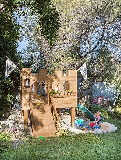 photos by tessa neustadt | from: building our backyard castle with wood naturally
Anyway, we had this castle/playhouse custom designed and built (because it was a partnership with the national softwood lobby so we couldn’t get something readymade and I wanted to make it more editorial and interesting in hopes of giving the great numbers via exposure). In lieu of a sandbox (that Brian was adamantly against) we put in a pea gravel “pebble pit” underneath that became the future home of a family of coyotes while we moved to Arrowhead full-time for lockdown. LOL.
The Los Feliz Kids Castle/Playhouse: Round Two photo by sara ligorria-tramp | from: our backyard evolution – the changes i didn’t tell you about and how the trees are doing after the 2017 massacre
I couldn’t paint it originally because of my partnership with Wood Naturally, but once that contract expired I painted it the same color as our house trim which I loved (and we took all the stuff out because everything got ruined so only really stocked it full of stuff if we were having a birthday party). I still have those “H’ flags that we had custom-made out of Sunbrella fabric (as you do). Then we moved to the mountain house full time (and put this house up for sale, which was such an odd time of life, during Covid and taking this huge leap, leaving LA permanently).
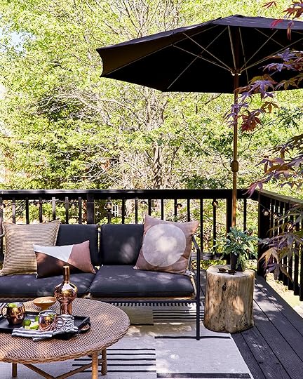
The Mountain House Upper Deck photo by sara ligorria-tramp | from: mountain house upper deck reveal
I LOVED how this deck turned out and it still looks almost identical to how we styled it (we planted the Japanese maples in the yard as we wouldn’t have watered them up here enough). This was in partnership with Sunbrella and Blu Dot – that furniture is still so rad. It’s really comfortable, super high quality, and I love the mixed finishes.

 photos by sara ligorria-tramp | from: mountain house upper deck reveal
While we rarely sat up here (down below is just so nice, plus it’s easier as it’s near the kitchen). But when I do sit up here it’s really wonderful and I’m happy to report that everything is still in pristine condition.
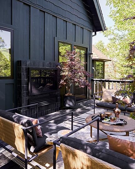 photo by sara ligorria-tramp | from: mountain house upper deck reveal
 photo by sara ligorria-tramp | from: mountain house upper deck reveal
 photo by sara ligorria-tramp | from: mountain house upper deck reveal
This was the summer we put down turf after a year of our then-new pups tearing up our bark yard:) I’m so glad we still have this house and we still go at least 2-3 times a year.
Our FarmhouseNow this house has so much outdoor space, it’s a real embarrassment of riches and we are so grateful. As I’ve mentioned before, I have long-term plans to rent it out as a retreat space for wellness/design retreats (that I’d run), as well as for family reunions, small weddings or events, or corporate retreats or even just multiple families who want to have a “farm” vacation with little kids. This wouldn’t be til after the kids graduate from high school so we basically have 10 years to finish the entire property which sounds about right. So I started with the kitchen patio because it was a partnership with Sunbrella that had a pretty tight deadline.
The Farmhouse Kitchen Patio photo by kaitlin green | from: farmhouse back patio reveal
I really like this, but admittedly it could pop more. I feel like the pretty herringbone brick gets lost in these photos and doesn’t have the impact that it does in person. And the slatted wood gets a little too mixed with the herringbone brick. We don’t sit here very often mostly because sitting under the tree in the backyard is just nicer (and we don’t have the umbrella here all the time so it’s either rainy or too sunny). It’s shady here in the evening so we’ll see this summer where we gravitate. I chose the wood and metal because I liked the casual bistro vibe and it would be easy to fold up in the winter (and it was available at the time that I had to order and shoot, and allowed me to use Sunbrella as the cushions). I suppose that maybe had I chosen something more comfortable and more substantial I think we might sit here more often? But mostly it is because the kids are usually playing on the sports court or near the pool so it’s nice to be back there with them.
 photo by kaitlin green | from: farmhouse back patio reveal
I think it also just needs more color? More graphic or bold plants?? Again, in person, I wouldn’t really change much but this is making me miss my Los Feliz Patio:) I do like that these can stay out year-round and fold up easily for when we need more seating in the back (which we have a lot).

 photos by kaitlin green | from: farmhouse back patio revealThe Farmhouse Front Porch: Round One
 photo by kaitlin green | from: farmhouse front porch reveal
The front porch is also in the calmer vein and I’ve added a lot bigger plants since we shot this.
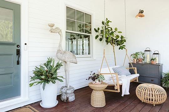 photo by kaitlin green | from: farmhouse front porch reveal
The vibe here is super sweet and casual, in hopefully a Scandi farmhouse way:)
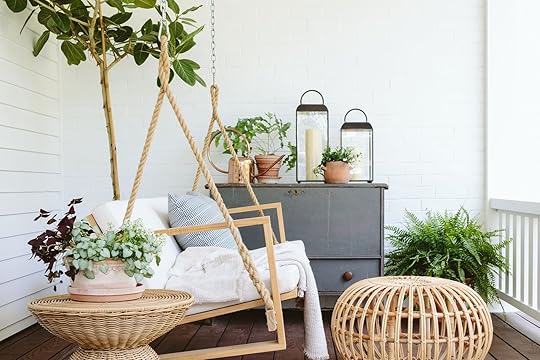 photo by kaitlin green | from: farmhouse front porch revealThe Farmhouse Front Porch: Round Two
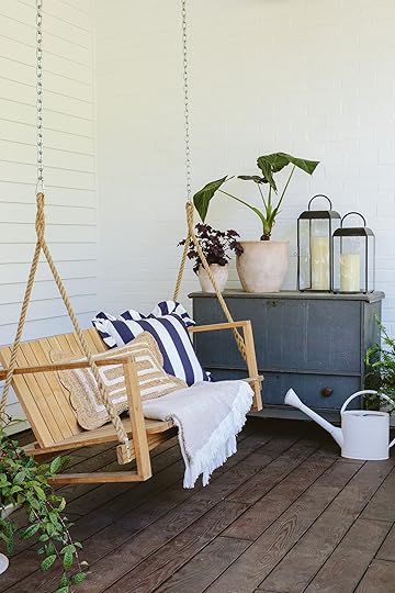 photo by kaitlin green | from: a fun fast post about sweet new spring decor
I recently took off the white Sunbrella cushion to expose the wood and I honestly am not sure what way I like it more.

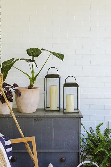 photos by kaitlin green | from: a fun fast post about sweet new spring decorThe OG Portland Project
 photo by sara liggoria-tramp | from: two reveals, one post: the portland outdoor living spaces and a lot of styling tips
Cheers to whoever remembers this project. The OG Portland flip that I did with my brother and the same contractor, JP, had two huge outdoor spaces (upper deck and lower patio shown here). I believe we worked with Article on this for the most part and it turned out so functional and classic.
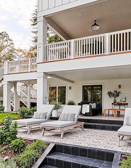 photo by sara liggoria-tramp | from: two reveals, one post: the portland outdoor living spaces and a lot of styling tips
The tile is from Cle, in a really fun Moroccan pattern which I felt worked even though the house was more traditional.
 photo by sara liggoria-tramp | from: two reveals, one post: the portland outdoor living spaces and a lot of styling tips
 photo by sara liggoria-tramp | from: two reveals, one post: the portland outdoor living spaces and a lot of styling tips
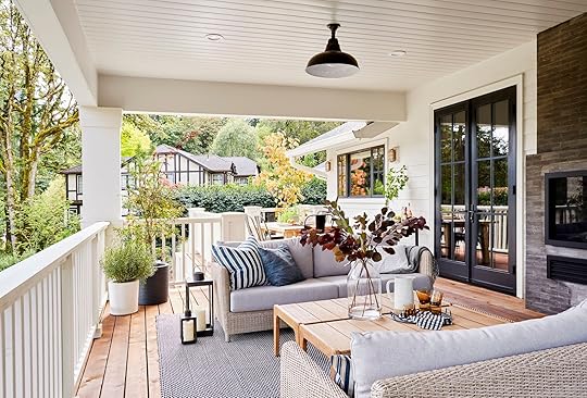 photo by sara liggoria-tramp | from: two reveals, one post: the portland outdoor living spaces and a lot of styling tips
The upper deck had two matching sofas as well, with double coffee tables (I guess that could be a hack if you can’t find one big enough?) and a cute little dining area off the kitchen.
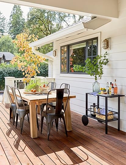 photo by sara liggoria-tramp | from: two reveals, one post: the portland outdoor living spaces and a lot of styling tipsBack To The Farmhouse
The most recent outdoor space we did was the pool area at our house and of course, our back porch (that we revealed a couple of weeks ago).
 photo by kaitlin green | from: farmhouse soake pool reveal
My goodness I love that vibe and it’s grown in so much more now (both good and bad, we have a crazy clover situation that is taking over!). Kaitlin really captured the vibe. And if you are wondering if we still use that Soake pool, the answer is ALL THE TIME. During winter it was a hot tub and the kids played after school with their friends even in the rain. And now it’s cooled down to be in the 70s and is super refreshing when it’s hot out. Big fan.
 photo by kaitlin green | from: farmhouse soake pool reveal
I love how this pool area turned out (and it was just in two magazines – Thank you Better Homes and Gardens and Country Living!). The Neighbor chaise lounges are so pretty, and we use this area so much so there are really no improvements needed here (but I might move the Adirondack chairs somewhere else, we’ll see).
The Farmhouse Back Porch photo by kaitlin green | from: farmhouse back deck reveal
I clearly have a color palette  White, blue wood, pink (copper), and green – all day every day! Article sponsored this porch and we’ve used it a lot since we finished. I even napped during the day out here a couple of Saturdays ago (very unlike me, but man it was nice).
 photo by kaitlin green | from: farmhouse back deck reveal
We’ve started eating out here most nights, playing games, or me just reading magazines. If you are looking for even more inspiration check out Emily Bowser’s backyard, The Bay House deck, and Jess’ communal apartment patio makeover. If you have a small patio (more like a balcony) Jess and Caitlin both redid theirs and they are super cute.
My List of Best/My Favorite Outdoor Furniture Stores That Are Relatively Fast, Not Crazy Expensive, But Not Super Cheap:Article – While they might be lower on stock this time of year (due to demand) they can usually come within a couple weeks and the quality and style is excellent. Super long-lasting, easy to work with other styles, etc. Big Fan. You can even opt to pay more to have them put everything together and take the boxes with you (DO IT).
Wayfair + AllModern – A huge variety, also comes super fast, and between the two they have a TON. We just ordered a lot from AllModern for the pool area refresh and it all is arriving in under two weeks and it’s looking GOOOOOOD.
Pottery Barn, West Elm, CB2, Crate & Barrel – I hate to lump them all, but they are all GREAT and have so many different styles so I feel like it’s very specific to your style. Now I’m not sure if they can deliver in under 2 weeks so definitely check that.
Ikea and Target – for the most affordable but still really good these two rule, always. Amazon has some good stuff, obviously, but you are weeding through a lot.
For splurgier, I like Neighbor, Business & Pleasure, Room & Board, and Blu Dot – all so awesome, and I’ve been known to order from Frontgate and Ballard Designs for the more traditional styles. Terrain and Anthropologie have more stylish and splurgy pieces as well that I love. Lulu and Georgia never disappoints (and Sara Sherman Samuel’s newest collection looks dope).
I know I probably just named every major retailer, but if you needed a place to start you should be good to go
Opening Image Credits: Photo by Zeke Reulas | From: Giving New Life To Our Old Wood Deck
The post My Outdoor Spaces Over The Years With Some Thoughts And Feelings (WHERE HAS TIME GONE????) appeared first on Emily Henderson.
June 12, 2024
Rethinking Wood Paneling For Your Walls…Should You Go Modern?? (These Ideas Are Going To Convince You Should)

I don’t think it’s a surprise to anyone that EHD loves wood…A LOT. I myself can’t get enough which is why I’ve had to implement a “no more wood” rule in my living room when it comes to decor. I need to make sure it feels layered with more than one material:) You also may have just seen the big design pivot Emily made for the river house library. Since they had enough leftover ceiling clad, they decided that they should use it on the walls and boy was that the right decision!
But I want to be clear that in this post we won’t be talking about the power of classic wall cladding or wainscotting despite how beautiful and style-appropriate they are in certain homes. Nope, we are going in a different direction today. I have been pinning and saving some extremely inspiring “modern” ideas for putting wood on your walls. If you’ve been following my style evolution then you know my obsession is European mid-century modern design. I love the boldness, the simplicity, the details, the tones, the colors, you name it. So that is more of the direction we will be headed today. Hope you’re hungry for some sugar because this eye candy is real good.
View this post on InstagramA post shared by Mid-Century Home (@midcenturyhome)
Let’s start out both simple and BOLD. Slats have been a DIY favorite for a minute (more in the “accent” capacity). Sometimes I see it and love it and sometimes it’s well, not my favorite, feeling it’s a little overdone. However, the way this architecture firm, Kennedy Nolan, played with scale and direction has my heart nearly exploding. It’s absolute artistry. I love how cool and inspiring it is while still feeling warm and welcoming. So for anyone who is wanting the wood slat look take a page out of their book. Really think about how you can mix and match not only the wood’s orientation but also the widths. It clearly will create something very special.
View this post on InstagramA post shared by Pernille Lind Studio (@pernille_lind_studio_)
Ok, this one is a little more on the farmhouse/organic side but I love the slight variation in tone of the individual slats that Pernille Lind Studio did for this back kitchen. That feels very tricky to do well because I’m sure it’s easy to veer into a zebra look. However, if you keep the other colors and tones of the room in the same world (like how all of the tones in this space are fairly dark – ie walls and appliances), the varied slats create a very special and layered look.
View this post on InstagramA post shared by Yellowtrace (@yellowtrace)
Ok, here we go! Now I’m pretty positive that this is a wall of cabinets by Furora Studio but you can’t tell me that this wouldn’t be equally as cool if this wood paneling were flush to the wall. It’s 70s-inspired, it’s chic, it’s simple, and to me, perfect. I also just love the idea of playing more with darker wood wall panels that don’t fully go up to the ceiling, like a very cool spin on wainscotting. I would absolutely do this in a home if I owned a home:) SOMEDAY!
View this post on InstagramA post shared by Michael Sinclair (@michaelsinclair)
This application is one of my favorites. It’s so simple but stunningly rich and gives the space so much texture. The fact that there isn’t any art on the walls and you don’t miss it shows how special this design is. I just love everything about it and think it’s very timeless.
View this post on InstagramA post shared by Giampiero Tagliaferri (@giampiero.tagliaferri)
View this post on InstagramA post shared by Carl Larsson (@theartreporter)
My heart stopped when I saw this paneling. It’s SO GOOD and from my understanding, original from 1939! The two-tone stain and the larger scale 3-D squares make this home look and feel even more special than it already is. It’s understandable that committing to such a bold and likely expensive treatment for your walls is intimidating but if you are up for it, I think the reward is wildly worth it as you can see. Can you imagine something like this on my ceiling??? The only downside is all that work might make it the project that causes my dad to fully disown me and change his number…never to be seen again.
View this post on InstagramA post shared by Laplace (@luislaplace)
View this post on InstagramA post shared by Q’Rated Edition Interior (@qratededition)
Now, if the two-tone look isn’t exactly your style but you love the 3-D idea, then this home by Laplace could be the inspiration you are looking for. The way they modernized classic wall moulding is so genius! It still gives that stunning dimension but uses the most sleek, clean application. Using the same wood as the walls, as well as the large-scale pieces, also lets your eye relax while staying excited at the same time. No notes.
View this post on InstagramA post shared by Mike Moser (@mikemoserstudio)
Geometric shapes forever! This walnut square pattern wall is everything to me. Being the only actual wall in the room (the rest are windows) it was such an opportunity for something spectacular and that’s what Mike Moser did. Even the small detail of alternating the grain orientation makes it come even more to life. I also hope I can do something like this one day.
View this post on InstagramA post shared by Pernille Lind Studio (@pernille_lind_studio_)
But of course, you don’t have to choose a huge room to try out some modern wood paneling. Take this beautiful little bathroom by Pernille Lind Studio. Can you tell I’m a fan? So while the construction of this cabinetry/wall feature is extremely practical, I love not only the exposed framing but the shift in wood grain direction in the small center section. What a little but impactful detail that I am in love with. I also love the wall color and the toilet and the scones and everything else but that’s not what this post is about;)
View this post on InstagramA post shared by STUDIO MUKA (@studio.muka)
But if you love a good old-fashioned (circle 1950s and on) large-scale paneled look then this home from Studio Muka is right up your alley. The tone is warm, the seams are flawless and it’s easy on the eyes, to say the least. I also really love the mix of styles with that big antique portrait against the MCM wooden walls. Just perfect.
View this post on InstagramA post shared by Giulio Ghirardi (@giulioghirardistudio)
View this post on InstagramA post shared by domino (@dominomag)
View this post on InstagramA post shared by Pauline Borgia Studio (@pauline.borgia)
So these three examples are not wall treatments but they are three very cool examples of how you can use and play with wood in your own home. I just had to share! I know wood isn’t cheap at the moment but it’s so worth it if you can afford to have it be a feature in your home. Plus, good wood lasts forever:)
What do y’all think? Have any favorites? Any plans to make any big wood statements in your home? If nothing else I hope this post provided a healthy design dose of beautiful inspiration.
Love you, mean it.
Opening Image Credits: Design by A 1000x Better | Photo by Michael P.H. Clifford | From: Moody California Casual Design – The Rise Of Walnut Wood (And How To Use It)
The post Rethinking Wood Paneling For Your Walls…Should You Go Modern?? (These Ideas Are Going To Convince You Should) appeared first on Emily Henderson.
June 11, 2024
Starting Fresh: How To Choose Basic Home Essentials With Lots of Personality
Wanna hear something funny? If we were playing a game of “never have I ever” and someone said “never have I ever moved cross country twice in two months” I’d have to put a finger down! Yup – you heard that right!! I moved from LA to NYC and then immediately back to LA. Now if you’re wondering why, there are really only a few reasons that would cause someone to move over 3,000 miles away TWICE: 1. couldn’t deal with the cold, 2. had death in the family, or 3. went through a breakup. Luckily out of those awesome options mine was lucky number 3!!
I could get into all the drama but afterall this is a design blog which is a pretty weird place to dive into all of that. So, instead we’re gonna chat about DESIGN! I’m currently back on the west coast and found a cute new apartment in Los Feliz (Emily’s old neighborhood!!) that I’m about to move into. I have a ton of items from my last place, but some of the crusty ones with weird memories are going bye bye, and I’m seeing this as a great opportunity to find personality pieces that really speak to me. I want to really hone in on buying cute, quality basics that I LOVE and will last for a long time versus just filling it up with ugly crap that will eventually get replaced.
That being said, I’m currently in the market for some elevated basics (ya know kitchen stuff, bathroom stuff, bedding and whatnots) that aren’t boring. I also have a strange situation happening where a large chunk of my stuff is chillin in storage on the east coast so it doesn’t totally make sense to ship back plates/whatevers that I don’t necessarily love, so long story short it’s time to purge the not so great items and upgrade them to be a bit better. If you’re also on the hunt for kitchen, bath, and bedding upgrades – you’ve come to the right place!! (sidenote: I’m gonna throw some pics of my last apartment throughout this post to give ya a sense of my style!!)
 Kitchen
Starting out in the kitchen: I’ve had this set of grey target plates for years now but I’m planning on donating them in New York so I can get some new, special-feeling everyday plates. Yesterday I went to at a restaurant called Mirate in my new neighborhood and they had the COOLEST plates ever. My whole family went “WOW THESE ARE SO CUTE AND COOL” when them on the table. In fact, we loved them so much I took this photo because I knew I wanted to track them down and buy them for myself when I got home (spoiler alert that’s exactly what I did):

SO cute right?! I actually went to an italian restaurant in NYC that had some plates from the same brand (they’re #2 linked below) and everyone freaked out about them as well. They’re gorgeous and hand painted so they’re really special and I’ve been thinking about this brand for quite some time (which is how I know I’ll love them long time), so I ended up splurging on a set of 12 of these (I couldn’t find a set with less and yes I am planning on having LOTS of dinner parties so I justified it in my mind). These are 7.5 inch plates which in my opinion makes more sense to buy a larger amount of than a 10+ inch plate because these can be used as appetizer/dessert/share plates whereas a larger dinner plate can only be used for one thing (read: dinner lol). Anyway, since I splurged on these guys, I wanted to get a more affordable set of dinner plates that would be cute underneath these for a dinner party/will be easy to use on the day to day. I ended up finding these and thought they were perfect! Plus from my research, $49 for 6 seemed to be a pretty reasonable price (only $8 per plate). Again, I really don’t want to have to rebuy everyday plates for a veeerrry long time (well unless they chip or break and in that case I’m very glad I don’t have vintage plates because this white, simple set will be very easy to buy more of if needed). Here are some more fun dishes if you want to upgrade your boring everyday plates

1. Cafe Dinner Plates (Set of 6) | 2. Puebla Stoneware Dinner Plates | 3. Pearl Dinner Plates (Set of 4) | 4. Talavera-Style Bread & Butter Plates (Set of 12) | 5. Beatriz Dinner Plates (Set of 4)| 6. Splatter Enamel Dinner Plates (Set of 4) | 7. Striped Dinner Plate | 8. “L’amore” Fil Rouge Plate | 9. Ceramic Plates with Lip (Set of 6)
I upgraded my water glasses a while ago to these incredibly beautiful glasses. So transparently, yield design co was my first-ever influencer partnership on my own personal channel and I was gifted a set of 2 of these, but then I loved them so much I bought 2 more sets. Whenever I have friends over they comment on how cool they are and then they go home and purchase them for themselves too. The reason I’m so passionate about these glasses is because they’re double walled so you can actually put scalding hot tea or coffee in them and they won’t burn your hands – it’s VERY cool. I love the look and feel of them too (I have them in the amber color if you’re wondering, but I also LOVE the cobalt):


They’re certainly a splurge, but I’ve yet to break one (maybe because they’re double-walled?) But yes, I’m very passionate about the design of these. They also come in an espresso size, a 12 oz (which is what I have) and a 16 oz if you wanna go bigger. See the glass on nightstand below for scale

BUUUUT these cool colorful glasses that I own are in storage on the east coast, so for the meantime I purchased a set of 4 of these glasses for $20 because A. they’re affordable and B. it’s nice to have a clear glass for pretty colored cocktails and such. Or maybe I’m the only person that thinks it’s weird to drink colorful drinks out of colorful glasses…comment below. Since I already splurged on the ones above I didn’t want to go too fancy, so the clean, these new simple clear ones are nice and have great lines. Here are some other cute and cool drinking glass options I considered:

1. Tall Highball Glasses (Set of 4) | 2. Hobnail Drinking Glasses (Set of 6) | 3. Tortoiseshell Old Fashioned Glass | 4. Organic Old-Fashioned Glasses (Set of 4) | 5. Handmade Drinking Glass | 6. Embossed Vintage-Style Glassware
Bathroom
Let’s move into the bathroom shall we?? The first thing I gotta buy for my new bathroom is TOWELS. But WHAT towels do I purchase?? I’ve had these for years and am absolutely obsessed with them, but they’re getting a little gross and need to be DEEPLY cleaned, plus half of them are in storage I think? Needless to say it’s time I buy some fresh towels. My bathroom is full of cute green vintage tile (I’ll show you sooooon!!) so I need to find something that goes with green and white or is green and white. I want something super plush and fluffy but isn’t just basic white (or if it’s white I want it to have a special/fun detail on it). Here are some of the fun & cute towels I had my eyes on:

1 Striped Bath Towel | 2. Cotton Bath Set | 3. Blue & Ivory Terry Bath Towel | 4. Scalloped Cotton Bath Towels | 5. Patterened Turkish Cotton Towels | 6. Heavyweight Turkish Cotton Towel Set
BedroomLastly, I’m on the hunt for some cute, good quality bedding. I typically really like a clean, white classic bed with some pops in the bed blanket/pillows, but similarly to the towels I want sheets/a duvet that has something that makes it a bit more special. Also, I’m thinking about doing a pinstripe or subtle pattern on the sheets this time since all my EHD gals have convinced me how good they can look from many past makeovers, but TBD. Here’s some fun, design forward bedding I’m looking at:

1. Belgian Linen Comforter Cover | 2. Ruched Wheat Comforter Set | 3. Micro-Print Organic Cotton Percale Sheet Set | 4. Washed Linen Hardcore Sheet Bundle | 5. Tufted Grid Duvet Cover | 6. Scallop Sateen Duvet Cover
And with that – my post comes to an end!! I can’t wait to show you all more of my apartment & stay tuned for some more fun design posts about it!! See ya in the comment section
xx,
Mal
*Design by Mallory Wackerman
**Styled by Emily Bowser
***Photos by Veronica Crawford
The post Starting Fresh: How To Choose Basic Home Essentials With Lots of Personality appeared first on Emily Henderson.
June 10, 2024
Bored Of Your Ugly Hamper? Here’s Where to Buy Those Home Basics You’ll Actually Want to Look At

I’m about to air out my dirty laundry (pun very much intended). Last week, my husband and I got into a bit of a tiff over clothes (not) being put away, and hampers, and laundry baskets. I’ll spare everyone the details of who might have said something along the lines of “looks like a bomb went off over there” (it was me), and move on to the brass tacks of today’s post: hampers. BUT NOT JUST HAMPERS, good-looking hampers, for those of us who don’t have room to tuck these away into a large walk-in closet and would rather invest in something that has to sit in your bathroom or bedroom that isn’t an eye sore.
BUT WAIT, THERE’S MORE!
I’m all about the caps today, clearly, but while I was scanning my bedroom the other night, glaring at my slightly collapsed and fairly ugly hamper, I caught a view of my slightly crooked (thanks toddler!) and fairly ugly floor fan, too. This got me thinking…what other basic utility items that most of us need to live with can maybe get an aesthetic upgrade? Hampers, floor and table fans…kitchen trash cans! Oh, and step stools! As I sit here, writing this, I just came up with a few more categories, but maybe that’s a subject for another post on another day.
A subject for this post, though, besides aesthetic basics (that sounded obnoxious), is the ever-present idea to make everything in our home, even things like our spray bottles and brooms, beautiful. We’re all so quick to want to hide our TVs, trash cans, hampers, and the like, but they’re things we need and use every single day. Who are we hiding them from, exactly? The trash can police? The laundry design-law enforcement? Will our tastemaker labels be stripped from us if a guest (or, gasp, an Instagram follower) were to catch a glimpse of some bulky grey basket of clothes? OF COURSE NOT.
BUT (there goes the caps lock again), if you’re anything like me, you get that little internal glow and glee when you swap something basic out in your home for a version with some design intent behind it. You delight in throwing your delicates into the hamper. Grabbing that mini food processor from the cabinet above the fridge is suddenly just incrementally more pleasurable on your beautiful step stool. It might seem inconsequential, but for us design lovers, it’s those tiny moments that all add up to having a home we feel good about; that fuel us and fill us and make us feel proud. And that, my friends, is not inconsequential in the least.
So, all that said, let’s take a look at some of the beauts I dug up from my search!
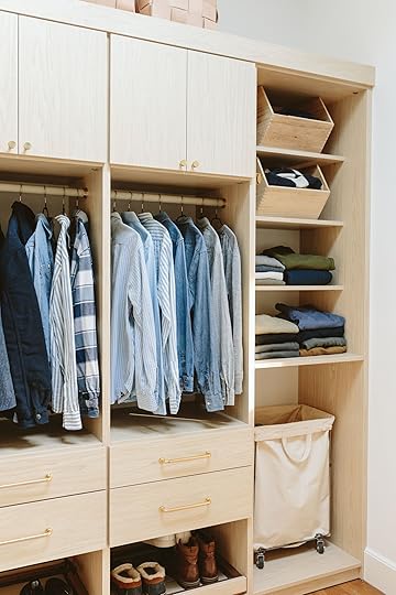 photo by kaitlin green | from: primary closet reveal! our functional and beautiful scandinavian farmhouse dream closetHampers Pretty Enough To Not Hamper Your Decor
First up, the inspiration for this whole post. The humble hamper. I’ve owned so many hampers in my time as a laundering adult. And honestly, I’ve hated every single one of them. The cheap plastic basket-type ones were ugly (and always hurt my hand if I had to dig around looking for something. The prettier wicker ones always broke, with shards of rattan poking me and my clothes. Anything with a liner was always a disaster because eventually, the liner always stretched out and would just end up all helter-skelter. And don’t get me started on anything without handles, especially when your laundry room is on another level from your bedrooms. I cannot stand the constant clothes shuffle between hamper and laundry basket.
When my daughter was born, I bought a fairly cheap canvas hamper bag with sturdy handles at H&M (it’s no longer available…I checked). It looked fairly decent, was roomy, and was flexible (so it’s easy to stuff into closets and corners) without being floppy. I didn’t know then how much I’d end up loving that hamper, especially because it was so easy just to thread my arms through the handles, take it to my washing machine, dump it in, and move on with my life. I hold all hampers up to that standard of hampering, tbh. I found a few that are similar below, plus a few other pretties.

1. Tava Handwoven Rattan Divided Hamper | 2. Aquanova Laundry Basket | 3. Mercado Hamper – Large | 4. Felt Double Hamper Charcoal | 5. Steele Tall Canvas Storage and Laundry Basket | 6. Laundry Bag Hamper | 7. Birch + Leather Hamper | 8. Brabantia Bo 23.7 Gallon Laundry Hamper | 9. Canvas Natural Laundry Hamper Tote
The canvas hamper from Crate & Barrel above (#5) is probably the closest to my daughter’s GOAT hamper. It also comes in a dark charcoal and I’m tempted to just get one of each color for myself and my husband. #9 is also similar but a bit taller and I’m really into the waxed paper receptacles from Uashmama (#6) because you can buy multiple in a variety of very good colors and snap them together. Great for organizing bed linens from clothing, or darks and lights, or delicates and regular cycle. The brand even shows them used for recyclables and other uses beyond clothing. I’m also very intrigued by the Brabantia one (#8) that’s hard-sided but pretty sleek-looking. There are some nice-looking trash cans below from the same brand, in case you’re brand-loyal across your home. Oh, and #1 has two compartments with a divider, which could be good for the other two people, or for all the same reasons I loved #6.
 photo by sara ligorria-tramp | from: inside all our (super organized) drawers & cabinets in the mountain house kitchenClassy (Not Trashy) Kitchen Trash Cans
Trash cans are a necessary evil for most of us. While I do love the idea of having smaller trash cans tucked away in a cabinet, I also am realistic with myself that A: we don’t have the space, and B: I’m kind of nervous about open bins. Do they not attract bugs? Just all…topless like that? Anyhow, I grew up in a time when trash cans were strictly utilitarian. Stainless steel options didn’t exist, and it was just that white or black plastic thing with either a step mechanism that was always broken or that little flappy thing you pushed to throw stuff away similar to a fast-casual restaurant. And they were usually bought at the grocery store or like, The Home Depot or something.
Thankfully, we’ve come a LONG way (and yes, so have the prices…). Some of these below are downright good-looking, let alone passable. And they come in fun colors, too! If you’re going to have your trash can on display in your kitchen, it might as well bring you some joy, amiright?
1. Brabantia Bo Touch Top Can – 16 Gallons | 2. Brabantia Bo Touch Top Can – 9.5 Gallons | 3. Brabantia 8 Gallon NewIcon Step On Trash Can | 4. Beni 60 Liter/16 Gallon Kitchen Trash/Recycling Trash Can | 5. Betty Retro Steel Step On Trash Can – 8 Gallons | 6. Lacquered Metal Kitchen Trash Can | 7. Kitchen Trash Can | 8. Rectangular Step Can – 45 Liters | 9. 45L Rectangular Step Trash Can
Let’s all pause to applaud for that adorable powdery blue step can from Brabantia (#3). Same goes for #1. And I’m loving the retro vibes of #5 from Wayfair. During my research for this post, I discovered the website Happimess which is where I found #4, but they have so many others and it’s a great resource overall for storage items like dish racks, containers, and the like. I didn’t think to look for a trash can in a spot like Zara Home, but they found me, and are very cute indeed! Probably more for a smaller household or not a super high-traffic kitchen. And I’ve Ioved my Simplehuman (#8) can for the last six years, so I’m recommending a larger version since mine fills up fairly quickly.
 design by arlyn hernandez | styled by emily edith bowser | photo by veronica crawford | from: arlyn’s rental kitchen reveal just might have you wishing you had brown—or even cherry— cabinets (yes, really)Stepping Up the Basic Step Stool
By now, you may have noticed my rather cheesy subheads here, but the step stools I found are anything but. A few of them are downright works of art and worthy of side table status. Honestly. While I’m perfectly content with the cheap wood step stool I bought from Amazon in my kitchen above, I could see a toddler-free time in my life where maybe something more artistic could be thrilling. Let’s peruse.

1. Wood Kitchen Step Stool Natural – Hearth & Hand with Magnolia | 2. Blu Dot Jut Step Stool | 3. Design House Stockholm Step Ladder | 4. Ferm Living Up Step Stool | 5. Dajlien Step Stool | 6. Teak Step Stool | 7. 3 – Step Aluminum Step Ladder | 8. Lucano Step Stool | 9. Case Altura Step Stool
I opted to stick with step stools and step ladders here, from as short as the one from IKEA (#5) that provides just a boost to the tall, leggy wood version from Design Within Reach (#3). The stool from Target (#1) lets you fold up the bottom step for easier storage, which is nice, and the vibrant red one from Pottery Barn (#8) also tucks away. I’m very into #4 from Lumens for a happy modern family ranch vibe, and #2 and #9 are both so beautiful that I would use them as decor when I’m not using them for a leg up. And of course, the Serena & Lily one (#6) that Emily has had in her kids’ bathrooms in the past.
Cool (& Cooling) Table & Floor FansI’ve never had a nice-looking fan. Similar to the trash cans of my childhood, fans had one purpose and one purpose only: to blow air around a room and keep it cool. I’ve always been a fan-on person when I sleep, even in the dead of winter so a floor or table fan is always a fixture in my bedroom. That’s a lot of years with a fan I care nothing to look at. Was I cool? Yes. Was I *cool*? No! If you’re in my same predicament, you can change that now:
1. Stadler Form 3D Air Circulator | 2. The Windmill Smart Whisper | 3. Dyson Purifier Cool Formaldehyde TP09 Purifying Fan | 4. Junior Vornado Fan | 5. Rowenta Urban Cool Tower Fan | 6. Portable Fan | 7. Smart Tower Fan – Pilot Pro S | 8. Stadler Form Fan Otto | 9. Dreo Pedestal 8-Speed Fan
From retro (#4) to industrial (#8) to fun and funky (#6), there’s a lot here to work with. Most fans go the ultra-modern route, a la Dyson (#3) or Dreo (#7 and #9). The Printworks one (#6) is so cute and comes in a few other color combos that were hard to narrow down for this roundup, tbh. The tower fans from Crate & Barrel (#5) and Dreo (#7, again) aren’t necessarily anything new, but at least they have a little flair and some cool tech features. And the steely blue of #2 from Wayfair was hard to resist (plus it’s supposed to be super quiet if that’s what you’re looking for)!
Now that we’re all caught up on good-looking hampers, step stools, trash cans and fans, did you see anything you liked? I’m very much eyeing up a few of those new hampers and when my current tower fan takes one too many tumbles at the grubby hands of my tiny human, I just may have to upgrade to something on my list here.
Before signing off, just a quick reminder: It’s okay to have some ugly yet useful things in your house. It’s also okay to want those useful things to be not-so-ugly. You do you. Whatever makes you happy, even if it’s a sculptural step ladder.
Until next time, friends…
The post Bored Of Your Ugly Hamper? Here’s Where to Buy Those Home Basics You’ll Actually Want to Look At appeared first on Emily Henderson.
Emily Henderson's Blog

- Emily Henderson's profile
- 10 followers

