
Emily Henderson's Blog, page 53
May 9, 2024
After Years Of Sleeping On The Floor, Jess Designed Her Dream Bed And Is Mixing TWO Fabrics

Surprise! Caitlin and I didn’t make our bedroom finish date deadline which was ummmm two weeks ago. But I promise it’s for very exciting reasons and two of those reasons are in the blog post:) So last time we spoke I told you about my harrowing journey to find my incredible vintage nightstands. Locking those down really needed to happen before I could finalize my custom bed measurements. That’s right, after 13 years of not owning a true bed frame, your friend Jess got to customize her dream one. If you are wondering if I’ve been sleeping on the floor for all those years, that’s not 100% true. In NY I had one of the cheap metal frames, in Melbourne, we were on the floor, and for the first year in LA, I temporarily got to borrow a frame until I moved into my studio where I got a cheap platform with a drawer. But as long as I’ve been in my “new” place (3 years, 5 months, and 18 days), it’s been me on the ground. It’s been fun and it’s been real but it hasn’t been real fun (one of Les Bunge’s favorite farewell lines). So after reading all of that, I’m sure you can only assume that I am OVER THE MOON that the wonderful Buildlane (an awesome custom furniture design company for designers) offered to build me a bed. Grateful doesn’t even begin to cut it.
Ok, so while my initial design inspiration was from the daybed at the apartment my dad was renting while living in Paris, I have ZERO photos. This daybed had two or three thin cushions stacked on top of each other. The look was so chic. The colors were also warm but quiet – golds, tans, browns, and creams. Since I can’t show you, here are some stunning photos I found that have also been very inspirational…
View this post on InstagramA post shared by PION Studio (@pionfotografia)
View this post on InstagramA post shared by PION Studio (@pionfotografia)
The photo on the left has an overall vibe that I very much love and connect to. Plus, look at those accent chairs and how those two colors look so good together. Happy but cool:) On the right photo, if you click the arrow to the third slide you’ll see that incredible banquette from the Hint restaurant at the Puro Hotel in Kraków. I just can’t get enough of the texture play and how the light hits those colors. My bedroom gets similar dappling light so I have more than one important reason to get this bed in my room asap.

Here is the official plan from Buildlane. Their portal is so easy to use and you get plans like these to confirm that everything is how you imagined it. I know this bed is simple and pretty similar to a lot of what you can see on the market but getting to customize every last inch with fabric I love is beyond special. Here is the overall idea:

I knew I wanted a low, rectangle headboard, slipcover look, and two front pleats. I also knew I wanted to mix linen and velvet. And while I can’t predict the future, this bed is meant to be versatile and stay with me maybe forever. I didn’t want to design something so specific that it would only ever work in my current bedroom and with the current style/color palette. I want it to grow with me as my style and or homes evolve. So before we get into the fabrics I have one more surprise:)
There’s A Bench Too!
After I posted my nightstand journey, the amazing and wonderful Katy Skelton emailed me to thank me for mentioning her incredible new nightstands (trust me the pleasure was all mine). Since I had found nightstands already she very generously offered to gift me her Farren bench if I was interested. I think I started typing “YES!” before I finished reading her email. Here’s the thing about Katy’s work, they are forever pieces. Emily still has her Safari bench from 2016 with no plans of ever letting that baby go. Her lighting is also so special and I’ve seen firsthand the beautiful high quality (Emily has also used it many times). Remember this little room I designed? The sconce next to the wall mirror is one of my all-time favorites. 10000/10.
Then to my delight, Katy accepted COM fabric (customer’s own material) for the bench so my wheels really started turning.
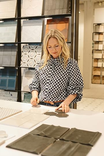
Shopping At Kravet
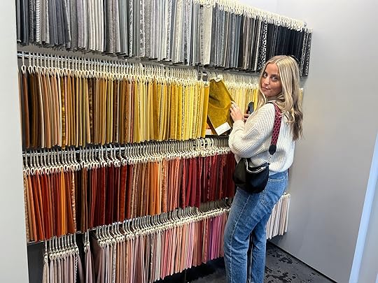
Then came the fabric shopping. Buildlane introduced me to Kravet (the marketing team, not the brand. I, of course, knew about Kravet!) in hopes of us working together. Spoiler, they did! I first went on their site and was so excited and overwhelmed by their seemingly endless amount of options. I promise you will find what you are looking for there. It’s impossible not to. But since I am a total noob at fabric sourcing and really wanted to them in person, I was able to grab Catilin and Mal for a little trip to their showroom at the Pacific Design Center. Mal did unfortunately get stuck in the elevator for about 10 minutes so we went for a delicious lunch after to make up for it:)
Ok, THE FABRICS!

 there’s definitely not a twinkle in my eye;)
I got to work pretty quickly with my handy scanner (my version of picking out things for a wedding registry, ha). As you can see the linen section was incredible (and only a part of it). I decided to go more of a classic linen than something more textured.
Then came the velvets. The phrase, “like a kid in a candy store” comes to mind when I look at this photo. But see? Endless.
The Bed Fabric Selections
Here’s what I pulled for the bed. I pretty immediately said no to anything too brown/cognac because I didn’t want it to be too similar to my sofa. I’m trying to branch out:)
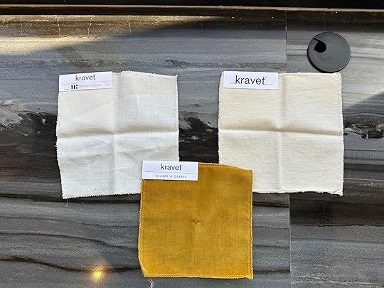
I really fell in love with . It’s happy but not too bright and super luxe in person. Then came the linen face-off. Both were beautiful, medium to thick weight, but (in Sweeting-Ivory) was more of the tone I wanted. Thankfully, I had Caitlin and Mal to support my decision. Plus, as a girl who remembers the first iteration of Queer Eye and the excitement of that time, the idea that I could have a Thom Filicia fabric was just too good to be true. I also just put together that one is called Honey and the other is called Sweeting. Meant to be? I think so. Ok, bed, DONE.
The Bench Fabric Selections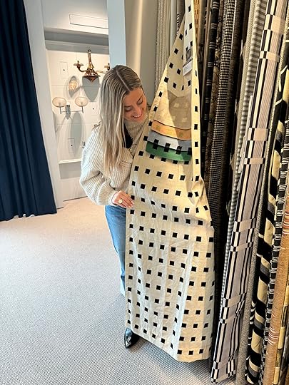
In true Jess fashion, I wanted to go for a pattern but nothing too bold. I first found (yes, Kravet carries all of Kelly’s fabrics:)). I was in love but wanted to find at least one colorful option which is when I saw by Gaston y Daniela (one of my new favorite companies for fabrics). Green is a part of the color palette and this one would contrast nicely with the gold and cream fabrics so it was also pretty perfect.
The Final Four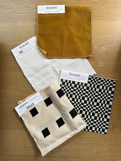
Here they are! The four fabrics I decided on. Curious why BOTH Kelly Wearstler and Gaston y Daniela are on there? Well, after talking it over with Julie (EHD Alum, dear friend, and design confidant) when I got home we both loved the idea of the green check fabric going on the side dowels of the bench and the black and white fabric being the main bench. The shapes are similar but different and the pattern scales are perfectly varied. SUCCESS!
Here is a terrible rendering of that idea…

I promise the fabrics in person together are so good! Well, they would have been so good but bad news was on it’s way…
The Bench Pivot
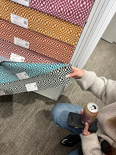
That dreamy Kelly Wearstler fabric is back-ordered for way longer than I can wait. So after a moment (or two) of sadness, I hit the site to see what other options I could come up with…
New Bench Options
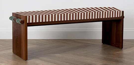
The thin stripes on the left were really pretty on the site but I wasn’t 100% and my duvet also has thin stripes so I nixed that one. I was actually really into on the right, but this combo is more limiting for the future. And ultimately, it didn’t create the feeling I wanted in the room.
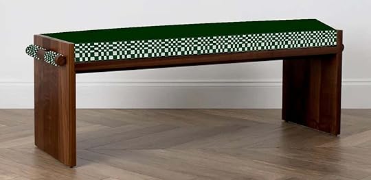

I also thought about just going for it with the green fabric or maybe slightly toning it a little down with a green velvet top. But again, it just wasn’t going to work with the other things I have planned in the room but it’s truly so beautiful in person.
Updated Bench Selections
So after consulting Julie once again, I decided to go with a washed linen that has the same tone as the cream in the green pattern. It’s going to be simple and chic and really what I want (plus versatile for the future!) If you are concerned about the two different linens (bed and bench) next to each other, I’m going to have a colorful end of blanket that will visually break them up:)
Well, that’s it for me today. I again feel so lucky to have these kinds of opportunities and then get to share them with you. If you are a designer that needs custom furniture, use Buildlane, trust me. And for endless beautiful fabric (and wallpaper) options, Kravet is your go-to. I can’t WAIT to sleep in my big girl bed and gracefully put on my shoes as I sit atop my new bench. Caitlin is up next with an update and as soon as we have a clearer deadline you will know!
Love you, mean it.
The post After Years Of Sleeping On The Floor, Jess Designed Her Dream Bed And Is Mixing TWO Fabrics appeared first on Emily Henderson.


May 8, 2024
River House – How To Choose The Right Overhead Lighting In A Huge, Tall Room With Vaulted Ceilings

The wrong lighting can really kill the experience of a room. Think of being at a restaurant at night when the lights are really bright…it’s such a bummer and can/does (IMHO) ruin the vibe. So yes, I’m EXTREMELY specific and picky about the right lighting for the right rooms in our home. Right now overhead lights are being TAKEN DOWN on social media (with the hilarious latest “don’t use your ‘big light'” trend). But the right overhead light is extremely important to, you know, see to be able to do things. This room – the river house living room – became an exercise in how to plan and choose lighting for a large living room with very high wood vaulted ceilings.
Our Specific Needs/Wants/Restrictions:1. We need enough light that you can have cozy even lighting in the winter months (when it’s dark at 4:30 pm and the sun doesn’t come up til after the kids eat breakfast).
2. Lights that work on an angled vaulted ceiling (so the pendants had to either be on a chain or with a canopy that allowed for angled hanging).
3. A diffused bottom so you aren’t staring at a bulb.
4. We have these gorgeous wood ceilings and didn’t want to put in recessed lighting, but we also knew that four pendants would be really awesome (and they are).
5. We wanted them to drop low enough to look intentional, but not too low or intersecting with the window in a bad way.
6. Big enough that it feels like the right scale for the room (not dinky). Four small pendants would look just dumb in here, IMHO.

The room is big (about 22′ x 28′) and not having any lighting on this pretty Stuga wood ceiling would be lovely, but I was definitely fearful that in the winter lamplight just wouldn’t be enough. So Max and I agreed that four big pendants were the way to go. It would evenly light the room (versus one big chandelier from the middle that would compete too much with the fireplace), feel appropriate for the size of the room, and obviously be an awesome design element.


If you are wondering what those red things are in the ceiling they are sprinkler covers (which we have since painted to color match the ceiling). We used Stuga’s Drift wood on the ceiling and it’s super beautiful.
For this project, we pitched the lighting partner that we wanted for each fixture in each room. Essentially, designing the room with whatever dream lighting we wanted and going after each partner to see if we could make it happen. For these pendants, I shopped around for a while, but kept coming back to this Conical pendant because it checked all the boxes.

I love how simple it is, which we knew would pop off the wood ceiling well without being too busy. But it’s not just a shade – the metal rods and stem add some architectural interest, making it look really high-end and quality (and not builder-grade).
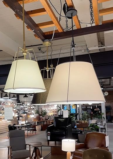

And yes, I love that there is a diffused bottom (and yet it has multiple bulbs if we wanted it to be BRIGHT).
The good news is that it comes in multiple sizes, customizable stem lengths and multiple finishes, so we had to spend HOURS figuring out what size, finish, and length we wanted.
Choosing The Right Length Of Drop:
This is where elevations (drawings) are nice to have, but won’t always be exactly what you want either. So my brother had to get up on scaffolding and hold a stick with markings on it so we could see how it would FEEL if the lights came down at different lengths.
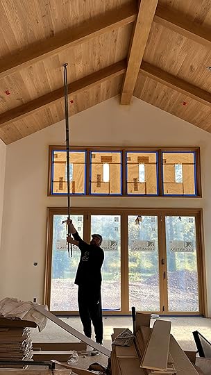

We specifically didn’t want them to obstruct too much of the top windows – so they needed to land at the perfect place. We settled on the lowest drop length possible (47″).
 But Which Size??? 16″ 24″ Or 30″??
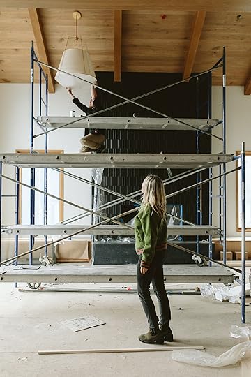
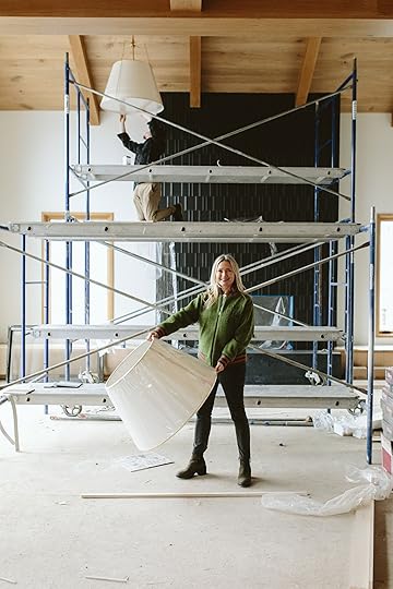
This was HARD. The room is huge, the ceiling is big. It can handle big pendants but we also didn’t want to make them feel overwhelming or block the wood too much. The entire art direction of this house is more minimal, not super eclectic and wild. The wood, light, and windows with that view are what the focus should be. Not every fixture – and yet in a house of this budget you can’t have boring/basic fixtures.
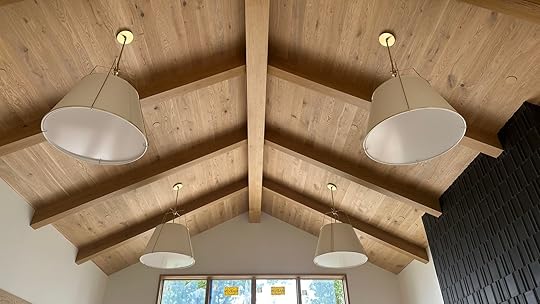
We went with 30″ in the white with the satin brass stems. Turns out 30″ was the perfect size as these look incredible, and much smaller could look dinky and dumb.


When I first walked in after they installed I was so relieved at how happy I was – we NAILED the size, scale, and drop of these light fixtures. My gut was screaming, “YES! YES! YES!”

The bottom of the fixture (I’m not sure what it is made out of, maybe some sort of plastic or fiberglass) creates such a soft diffused light underneath, which is awesome because the fixture has 3 bulbs (so ample light if you want to go bright) plus we obviously put everything on a dimmer. Literally, they could not be more soft, ambient, and ample light in this room.

You’ll notice that the stems hang straight off the vaulted lights because we chose a canopy for a vaulted ceiling (meaning it has a piece of hardware letting things hang straight down off an angled ceiling).
Staring at these photos I honestly don’t know how these could be better in any way for this room. They’ll have nice soft light (but also bright should they want it) for the darker months or for cleaning at night. The simplicity of the design of these lights is in line with what we are going for and doesn’t compete with the fireplace at all. Also, they are graphic and simple, pop off the beautiful wood while tonally working with the warmth of the wood. The scale is perfect. The design is spot on, letting everything else shine (but not being boring). It’s a real pat on the back moment when things turn out as you had hoped. And not everything has or does, so I’m a big fan of pointing out and celebrating when all your obsessing over the order before you place it actually pays off.
A huge thanks to Rejuvenation for making such lovely high-quality fixtures that you can customize to your needs/wants. The Conical, 30″ fixtures (with 47″ drop), in white and brass, are going to be used and loved forever.
Architect: Annie Usher
Interior Designers: Emily Henderson and Max Humphrey
Contractor: JP Macy of Sierra Custom Construction
Pretty Photos by Kaitlin Green
The post River House – How To Choose The Right Overhead Lighting In A Huge, Tall Room With Vaulted Ceilings appeared first on Emily Henderson.
May 7, 2024
This Color Trend Will Give Your Home DTE: Double-Take Energy (+ 42 Of Our Favorite Shopping Picks)
Last month, I wrote a post that seemed to resonate with quite a bit of you in which I tried to name a style I think is ripe for the takeover of the ubiquitous Modern Farmhouse. I called it “Warm Modern Beach Bungalow” but since then, I’ve thought of a few more names that might be better suited to the look:
Modern Mid-Century ModernWarm California ModernismModern Australian CabinHappy Lake House ModernFolks, this naming of styles business is NOT easy. But it’s a good thing we’re not here for that today.
Instead, I’m narrowing in on one portion of Happy Modern California Australian Lake House (ha…not it) that can be, and should be, translated into homes of nearly any style: Primary colors. The internet as a whole has talked extensively about the unexpected red theory, but I’m here to expand on that. Frankly, I think it should be the unexpected primary color theory (Even Em with this Instagram reel). In short, a quick and calculated punch of a single primary color in small doses can seriously up the cool factor of any room and make it feel more complete, interesting, and even memorable.
 design by emily henderson | photos by sara ligorria-tramp | from: living room update – again – our new sofa, my dream floral chaise and the pop of red i always wanted in my life
You may or may not have had certain immediate visual references pop into your head when I mentioned primary colors: Fisher Price, Mondrian, Marimekko, any mid-century designer, MoMa…anything else? And I get it. I’m not particularly fond of red, blue, and yellow in their full potencies all appearing in the same space. It’s like having three type-A personalities in a friend group. It’s too much. They all try to take control. And then no one wins.
That’s not to say you can’t use them together in some combination. I tried to think through some guidelines for using primary colors in a room where you want to add that signature “omg, why didn’t I think of that!” vibe and here’s what I came up with:
Primary Rules for Using Primary Colors: Use in small doses: The whole point of having a surprise primary color moment is to be just that: a surprise. An unexpected flash of something new. This specific design tool doesn’t work if say, you paint your whole room fire engine red. You can certainly do that, but it would just give you a different emotion and result. If you want to employ paint, try an interior door, your window frames, or the inside of an archway. That kind of thing. Otherwise, opt for one to three moments with that color in small packages, like a throw blanket, an armchair, or a vase, for instance.Mix two primary colors max: Remember those type-A friends? They’re like alphas in the animal kingdom, only one per crew. The same goes for primary colors. Pick your moment, and, like #1 said, keep it targeted. I do, however, think you can mix up to two primary colors in the same room and still get the effect we’re going for here. (Caveat: just to clarify, I’m not saying you can never mix all three primary colors together in one room. Of course, you can. Some design styles are based in that. But for the sake of the surprise one gets by the power of a primary, I say keep it to two and let any other colors you use in your room be muted, moody, or neutral. Or green. Green always works, too.) If you’re scared, start with yellow: Think about it…yellow is closest to beige, which is a safe, non-scary neutral. So…yellow is essentially a neutral, which means it’s the easiest place to dive into primary colors. Plus, psychologically, a bright primary shade of yellow can incite happiness, excitement, enthusiasm, confidence, and hope.Okay, before we do some serious shopping, I’m going to walk through some examples to get you primed and ready.
 design by emily henderson design | photo by tessa neustadt | from: the griffith park dining nook reveal + get the look
The Griffith Park project from many years ago immediately won over my heart when I saw it, and it’s 99% due to that red pendant light. It’s lovely otherwise, but that makes it such a star. It’s daring, unexpected, and magnetic.
 design by arlyn hernandez | photo by sara ligorria-tramp | from: reveal: arlyn’s bright & happy rental living room makeover
I’ve had my cobalt blue sectional for about six years now, and it injected so much energy and joy into my mostly neutral living room. I’m not sure a darker, moodier blue would have been able to do the same thing. Primary blue, all the way here.
 design by arlyn hernandez | photo by charles dundas-shaw | from: feel good reveal!! arlyn surprised her parents with a much-needed flash makeover…in two weeks
Okay, so this isn’t primary yellow. It’s mustard but I think the saturation level keeps it in line with what we’re going for. Honestly, I think this works in any instance where you expect a piece of furniture or decor to be a particular color and then BAM, it’s not. It’s red. or bright blue. Or bright yellow. In my parents’ low-light townhouse, choosing a color like this was just the thing to bring some life and excitement to all the drab beige on the walls.
Now, from the internet:
Red, Blue & Yellow In ActionView this post on InstagramA post shared by Finnish Design Shop (@finnishdesignshop)
I mean, COME ON! Does this not make your stomach flutter and make you immediately stop in your tracks? This would be a beautiful modern kitchen had the designer picked a non-red chair, surely, but the fact that they did, well…wow.
View this post on InstagramA post shared by Fenton & Fenton (@fenton_and_fenton)
These amazing barstools from Fenton & Fenton have the same effect. They give this island area DTE: double take energy. Wait, did I just invent a new acronym?
View this post on InstagramA post shared by noo.ma (@nooma_design)
I recognize that this isn’t a “home” per se. It’s more catalog than anything else, but still, what would have been a calm, neutral (kind of forgettable) space suddenly buzzes with creativity.
View this post on InstagramA post shared by Clever (@getclever)
I’m just going to say it: Every neutral space needs a strategic play from a primary color. It just takes up so much visual space. This blue desk in this home tour from Clever expands in my eyes, making it feel grand in a room that has very little going on in it. Honestly, it pulls some serious weight that just wouldn’t be possible if the desk were a wood tone.
View this post on InstagramA post shared by Mirko Gentile (@akindofhome)
I’ve shared this image in a previous post and thought it would be perfect to boomerang back for this one. When I cover the rug (and even the pitcher) with my hand, I see a quiet, soft little nook. And yes, there is always room for those peaceful moments in our homes. But when I move my hand away and reveal the zap of blue, all of my insides start buzzing (in a good way) without being overwhelmed in the same way a pattern would.
View this post on InstagramA post shared by GOODMOODS (@goodmoods)
I wanted to show this kitchen as an example of a space that perfectly employs yellow and electric blue. The yellow is the main primary hue, and the impact that that blue stool (and yeah, even the handle of the glass pitcher on the island countertop) is undeniable. It’s the drizzle of acid every rich dish needs to cut through the density of fat. A palette cleanser…for the eyes!
View this post on InstagramA post shared by The Design Files (@thedesignfiles)
Especially when partnered with warm wood tones, yellow totally reads as a safe neutral, don’t you think? It gives us just enough interest to be able to pull it out visually and draw the eye, but not enough that you miss any other moment in the room.
Shopping For Primary ColorsWhile I was working on the below product round-ups, I took note of how I found all the items. Some of these were serendipitous meetings. Some were from brands I knew were primary-color-friendly (Areaware, Design Within Reach, Blu Dot, Bend Goods, Schoolhouse). Others, well, I had to get creative with how I searched for them. Here are some of the terms I used for each color to get the right shades (just add the type of product you’re looking for):
Blue: ultramarine, cobalt blue, International Klein blue, electric blue, primary blue
Red: Bright red, cherry red, Chinese red, scarlet, candy apple red, primary red
Yellow: Canary yellow, electric yellow, golden yellow, lemon yellow, vivid yellow, primary yellow
Now, let’s look at everything I found. I had to leave A LOT on the cutting room floor (a.k.a. my secret Pinterest board). Oh goodness, I edited out so many beautiful things, but I know how overwhelming it can be to see hundreds of products. For ease of perusing and also shopping, I broke down the products into four categories: furniture, lighting, decor, and kitchen/dining.
First up is furniture. Apart from the bed (#9…very similar to the one I have in my own bedroom and LOVE), I opted for smaller-scale pieces. Things like barstools, side tables, and accent chairs. I was very tempted to pull large sofas (::cough:: like mine ::cough::) but at this point, a colored sofa is a bit expected. A bright red shelving unit or vintage electric blue dining chairs? Not so much.

1. Collins Bar Stool | 2. HAY Color Cabinet – Floor | 3. Wave Table in Electric Blue | 4. Hide Side Table by Hem in Ultramarine | 5. Method Lounge Chair | 6. Don’t Leave Me Side Table | 7. TON 18 Bentwood Caned Chair in Persimmon | 8. Open Hands Stool | 9. Nabiha Platform Bed in Citronella Velvet | 10. Pluma Stool by Areaware in Yellow | 11. New Order Bookshelf – Double Low in Red | 12. 1970s French Mullca Stacking D Back Dining Chair Blue – Set Of Four
Next is probably my favorite way to bring in a primary color (especially red): lighting! This is the best place to start if you’re tempted by primaries but scared of going too far. Truly, there is only good that can come from adding a red table lamp or bright blue sconce to your home. Go ahead…be bold. Live your life. Pick the yellow lamp.
I’m thoroughly obsessed with the pendant from Doco (#2), as well as the table lamp from Design Within Reach (#6). That floor lamp (#9) would be as welcome in an amazingly hip office space as my daughter’s bedroom. It’s so cool, modern and interesting, it reads more art piece than light source (which to me is the key to not crossing over into tired trend territory in just a few months or years).
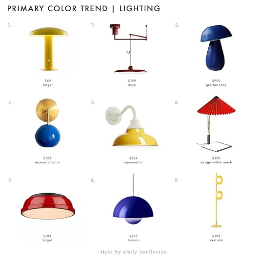
1. 11″ Suillius Contemporary Bohemian Rechargeable/Cordless Iron LED Mushroom Table Lamp | 2. Tizio Pendant Lamp | 3. Cobalt Blue Mushroom Table Lamp by Nicholas Bijan Pourfard | 4. Loa Sconce with Mediterranean Blue Shade | 5. Carson 12″ Wall Sconce With White Base | 6. Matin Table Lamp | 7. Golden Lighting Duncan 2-Light Flush Mount | 8. Flowerpot VP7 Pendant in Cobalt Blue | 9. Rocky Floor Lamp (49″)
If lighting is my favorite way to introduce primary colors, then decor is the easiest way, because it’s the least permanent (that’s a bit of a duh moment but worth saying). I’d love to see bright yellow wall hooks (#2) in an entryway, a crisp red quilt on a bed (#6), a cobalt blue throw (#9) draped on a neutral sofa. At the very least, switch out your taper candles with a highlighter blue or red for some serious DTE.
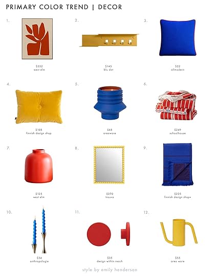
1. Sculpt Framed Wall Art | 2. Hall Pass Wall Shelf with Hooks | 3. Lombard Wool Blend Throw Pillow | 4. Dot Soft Cushion, Yellow | 5. Strata Plant Vessel | 6. Shelburne Cotton Coverlet | 7. Omar Strong Coral Vase | 8. The Sunniest Yellow Bobbin Style Mirror | 9. Untitled Ap10 Throw, 150 X 200 Cm, Electric Blue | 10. High Shine Spiral Taper Candles, Set of 2 | 11. Brodie Wall Hook Medium Apple Red | 12. Tango Watering Can
And finally, some personality for the kitchen or dining room. I don’t have room on my counters for it, but boy do I wish I could get that paper towel roll holder (#5)! The center of my dining table might soon be met with that red splatter enamelware tray ()—plus, it’s $34!—and never once have I thought about having red silverware (#7)…until now. AND DON’T GET ME STARTED ON THAT KETTLE (#1). GOOD LORD!

1. Great Jones x Fellow Kettle | 2. Outline Baskets | 3. | 4. Dansk Købenstyle Casserole | 5. Spool Paper Towel Holder | 6. Cotton Blend Square Napkin | 7. Sabre 4 Piece Bistro Flatware Set | 8. Zero Japan Butter Dish | 9. Beatriz Dinner Plates, Set of 4
So……………..have I convinced you yet? Did anything make your fingers itch to add to cart? I want SO MANY things, but primary colors take a great deal of restraint. It’s about picking the few moments where they shine the brightest and have the most impact. It’s a good thing we have multiple rooms in our homes… 
Until next time…stay (strategically) colorful, friends.
Opening Image Credits: Left: Design By Arlyn Hernandez | Photo By Sara Ligorria-Tramp | From: Arlyn’s Bright & Happy Rental Living Room Makeover | Right: Lead Design by Ginny Macdonald | Associate Designer Mel Burstin | Photo by Tessa Neustadt for EHD | From: The Griffith Park Dining Nook Reveal + Get The Look
The post This Color Trend Will Give Your Home DTE: Double-Take Energy (+ 42 Of Our Favorite Shopping Picks) appeared first on Emily Henderson.
May 6, 2024
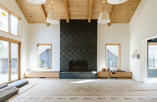
How We Built Two Tiled Fireplaces And What We Learned
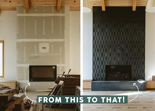
A tiled fireplace is (hopefully) a “live with forever” design element – she’s a permanent lady. So today I’m going to walk you through what we learned about this whole process – You’d think that you just frame it out, drywall, and slap tile on top of it, but there are decisions that you have to make to ensure it looks well executed. LET’S GO.
Wait, Where Are We In The House?
We built two different tiled fireplaces – one in the living room and one in the dining room. The dining room was meant to be an indoor-outdoor fireplace, shared with the kitchen/bbq patio, but for whatever reason it ended up being a normal fireplace backed up to another normal fireplace (IDK all the whys of these decisions as I wasn’t as heavily involved).
So Many Decisions – Starting With Location And Size
Once again we went through the conundrum of where to put the TV and fireplace in the living room (which is a very casual family room as well) and the collective choice, was to put the TV on the fireplace, flanked by windows. I was for this plan so as to not have dueling focal points. My brother wanted a big TV, visible from the kitchen as well, and this layout made sense. Annie, the architect, drew it up and laid it out. Max flanked it with benches, and while it will be painful to put a TV on this beautiful tile, for functional reasons we stand by this being a great choice for the overall design of the first floor, especially considering the layout and flow that’s the best for their family (sports are a real thing here and I know they aren’t alone).
Size and Scale
While this tiled fireplace was meant to go floor to ceiling we obviously explored stopping it and having it be drywall above, or giving it a mantle. Ultimately, the decision was to make it a statement/focal point and give it a bench. The firebox sits about 17″ from the ground, butting up to the surface of the hearth/bench. It’s bordered with about 26″ of tile on either side. The outlet for the TV sits about 80″ up from the ground.
A Fun Max Mockup…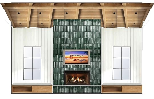
At one point we had chosen the green tile here (literally no clue why we changed to black, I think someone’s color comfort level felt challenged?). Max did this mockup (he was pushing for grids on the windows and walls being paneled, which we didn’t end up doing). His Bachelor in Paradise photos in the render cracked us all up.
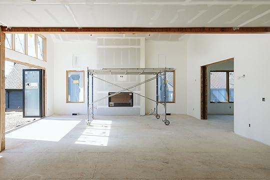
Now I’m obviously not going to get into how they framed it all out – this wasn’t DIY’d and our awesome contractor, JP of Sierra Custom Construction managed the subs to execute it perfectly. But essentially it was framed, wired for a Frame TV to be able to hang on it without cords, the firebox was inserted and then everything was drywalled.


In case you are wondering, Ken also built an in-wall sound system behind the drywall (all so new to me and again, I wasn’t involved) which seems both smart and makes me nervous (high tech in a house always makes me hesitant). And FYI we kept extra tile in case any future owner doesn’t want the TV on the fireplace – they’d have to do some tile repair work but it’s doable to hide the wires.
Hearth And Bench Decisions
We knew that we’d flank the fireplace with benches but figuring out how to end them into the fireplaces was the question. Do we build a hearth that the benches die into? Do we take the tile to the floor? Put the firebox closer to the floor? We ended up choosing to add a hearth that sits proud of the bench (“proud” is a fancy word that means “sticks out further”:)). And our stone installer had to make sure that the two integrated really seamlessly.
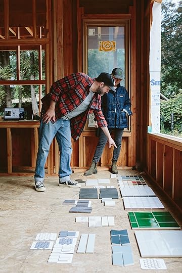
Time To Choose Tile
You know what the tile is at this point but let’s back up. Max and I chose the tile with my brother and SIL together, which is admittedly a lot of cooks in the Ann Sacks tile kitchen. Some of the time we were making VERY different meals, LOL, but other times we all chose the exact same tile (winner, winner). This black tile was one of them. While it could have been a color, we all knew that no one would get sick of this powerful black fireplace with this incredible texture.
A Note From Max: We knew the fireplace in the living room was a focal point. It’s floor to ceiling, and it had to serve a couple of functions: being the fireplace, of course, and being the TV-watching wall. Generally, when I do TVs on fireplaces, I go with a dark tile, so when the TV is off, it’s a black box on a dark wall rather than a really contrasty dark box on a light wall; it sort of just fades away and doesn’t call attention to itself. As a TV watcher myself in the golden age of television, I also don’t try to hide TVs, but it’s my job to make them look as nice as possible. With this specific fireplace, we wanted a large format tile because there’s a tall ceiling. It wasn’t so interesting that Katie and Ken would get sick of it, yet it’s still interesting. That narrowed things down to a texturey geometric tile. I love the Ann Sacks-made collection (MADE collections means made in Portland) because of its handmade quality and how each tile is a little bit different by the nature of all things handmade. The peak and valley pattern has an almost landscape vibe, and the vertical lines draw your eyes up. The finish is a matte finish with a lot of depth to it.

This tile from Ann Sacks has such an incredible texture and dimension – the light catches it and creates a reflective pattern.
And the Winners Are…
As you can see we went with the chalkboard matte Modern Field Tile, in Peaks and Valleys, from Ann Sacks. It’s so beautiful and powerful in person. Just three design enthusiasts holding pretty tile (that’s Annie Usher, the architect on the left, then Max then me :))
The Dining Room Fireplace Tile…
The dining room fireplace tile is definitely on the subtle side for me, and it looks awesome and so appropriate for this house. Again, the view out the dining windows is all green and blue from the trees and river, so this fireplace is meant to ground the corner and add texture and dimension (and heat, vibe) but is not meant to be the wow factor here, the view is.
Grout Color And Size
1. Pewter | 2. Dove Gray | 3. Chateau | 4. Delorean Gray
The black fireplace was easy for grout- we didn’t want to add any more lines, ensuring that the tile was what your eye saw (not the grout lines). So we chose the darkest black – EASY PEEZY. But this tile was a lot trickier. Too dark would make it look like a super graphic grid, but too light and you lose the whole thing. We ended up going with #4 (bottom right) called Delorean Gray by Custom Building Products and went with a 1/8th grout line (basically the thinnest you can get without butting them up against each other).
To Stack Or Stagger?
For this house, we mostly stacked (you’ll see one stagger at some point). My philosophy is the same as using quartz – that in a midcentury, post-modern, or contemporary house you can stack OR stagger (I like stagger in more traditional homes) but if you have a vintage home or a more traditional style house then a stagger is great. I will say that staggering is way more forgiving because the vertical grout lines can look random which means that you can cut off a tile on either side if you need to.
The Pitfall To Avoid With Stacking
Ok, so one thing we had to troubleshoot was making sure that the tile fit perfectly across the front without cutting any off awkwardly on the side. These are the details that many people won’t notice, but take the design next level. You’d think it was just math (and it is) but until you know the exact grout size it can be hard to execute on paper – there are variables that you might not be able to account for. So you need to think about it twice: once in the drawing stage and once when it’s framed. We realized that we would be a couple of inches short so before they drywalled they furred out the framing to make sure that these corner pieces would fit perfectly, no tile would be smaller.
How To End The Tile On The Corners
Ok, so you have a few different options to finish off a corner:
1. a trim piece like a pencil trim
2. A finished edge on one side so that the non-finished edge dies into the glazed/finished edge
3. a mitered edge, where they cut both tiles on a 45-degree angle – which can’t be done with a lot of types of tile, TBH due to fragility and what they are made out of
4. adding a metal Schluter (a thin piece that goes under one side of the tile and looks finished off)
5. Order corner piece tiles like we did from Ann Sacks – truly a luxury of ordering from them as this is something they offer but many tile manufacturers don’t. In-person, this detail slays.

The same rule applies to the interior of the firebox. We did a corner piece for this fireplace and a black Schluter for the living room fireplace (which you can barely see).
Choosing Stone For The Bench

You have to design it all at once on paper beforehand obviously, and we chose flanking benches and a larger hearth made of stone that matched the tile. Of course, we thought about making the hearth all tile but didn’t like the idea of it being on the flat/seat part of the hearth because the tile is 3D (not flat), and integrating stone on top felt more complicated than necessary so we waterfalled the stone on the top and front of the new hearth for a cleaner look. We chose Caesarstone Black Tempal which looked really organic and has some movement to it (and we have it in other areas of the house so we could use part of those slabs).

For the dining room, we continued the wood bench around the fireplace to look integrated, and yes this is fine for this particular firebox since it’s a direct vent and has glass.
How They Look Right Now
Y’all. They are so pretty. Simple, striking, and timeless IMHO. Obviously, for this entire house we went with more of a textural story, bringing in color in the furniture and decor. The light hitting the fireplace is just so pretty and understated yet super striking. As a reminder, this tile is the Modern Field Tile from Ann Sacks and does come in many colors and glosses.

 Dining Room
The dining fireplace turned out so pretty with the wood and view/light – it’s all so soothing and calm but feels really beautifully executed. The texture of the fireplace feels really elevated and rich, yet subtle.

I feel like what I learned the most is that elements like this need to be thought about very closely twice – once in the rendering and square footage/ordering process and then again in the field once everything is framed and you have the tile on hand. Could a different designer choose the grout color before seeing the tile installed? Maybe. But I promise seeing the house coming together and experiencing a space changes a lot of those smaller decisions – decisions that do make a difference. I’m so happy with how both of these turned out and a big kudos to Annie, Max, and JP for the execution.
Architect: Annie Usher
Interior Designers: Emily Henderson and Max Humphrey
Contractor: JP Macy of Sierra Custom Construction
*Photos by Kaitlin Green
The post How We Built Two Tiled Fireplaces And What We Learned appeared first on Emily Henderson.
May 5, 2024
The Link Up: Em’s New Favorite Quilt, The Spray That’s Protecting Jess’s Hair From The Sun, And A Pleated Skort We LOVE
Happy Sunday everyone. You might have noticed that we didn’t have a new post on Wednesday. Our fearless leader, Emily, got a 24-hour stomach flu so we took a day off. But we hope you enjoyed her Garnet Hill bed refresh a little bit longer. But truly, how good is that quilt?! Em genuinely loves it and how it’s big enough for a king-size bed (most vintage ones she’s come across or bought aren’t). So now that we are all better, here are this week’s links:
This week’s house tour is none other than writer and sex educator Ericka Hart and
her partner, Ebony Donnley’s home. In its rightful spot on the cover of Domino’s newest virtual issue, this minimal/maximalist, intentionally designed, jewel-toned beauty, did not come to be without some unacceptable obstacles. But the way they rewrote some of the history of their home while taking great care while renovating is nothing short of beautiful. Go see all of their beautiful spaces and read about their journey!
From Emily: Y’all our outdoor furniture came in under 10 days from ordering, in one truck and we upgraded to white-glove service (full assembly, boxes GONE) so I just want to give Article a big shout-out for incredible customer service AGAIN. Yes, they are a consistent partner of ours that I love, but I was just so impressed with the speed and service of the delivery (and of course the quality) and am so excited to show you the back porch that we are shooting next week. Anyway, it’s always refreshing when furniture companies have such smooth coordination, logistics, delivery, and service. And while this was for a partnership, the dudes on the truck don’t know that I work with the marketing department directly, and this has always been my experience with them. So shout out to Article’s speed and service (I don’t know any other medium to high-end furniture company that delivers so quickly with any bumps or confusion, FYI).
From Mallory: A small business to support coming your way!! I walked into a store the other day and just auto-pilot picked up the first candle I saw and gave it a whiff and immediately FREAKED OUT and bought 2. That candle my friends was Cliffwalk by Minot. This small company is woman-owned and is absolutely killing the candle game right now IMHO. Give it as a gift to a friend or yourself. If ya wanna smell something nice, do it!!
Don’t let Mother’s Day catch you by surprise! It’s in ONE WEEK everyone. If you need some gifting inspiration here is our 2024 gift guide that Jess and Caitlin put together via real mom requests! There are a ton of options that cover every budget (starting with $0) and will undoubtedly make your mom or mother figure feel special:)
From Jess: As someone who has watched one season of The Bachelor or The Bachelorette since 2009 (?) I was not really aware of or particularly cared about Tyler Cameron. So the judgmental designer side of me was not about to watch his new design/reno show, Going Home with Tyler Cameron, just because he was hot and popular. But naturally, I was out of things to watch earlier this week and thought I’d see if I was right to have no interest. Well, joke’s on me because I loved it. I thought the storytelling was really wonderful, the production was well done, the cast’s chemistry was awesome, and because at my core I’m a total sap, I cried many times. The designs are very neutral coastal but it is set in his hometown of Jupiter, Florida so that makes sense for that area’s aesthetic. All in all, I highly recommend the show because it’s totally entertaining and full of heart but know that you should have some tissues ready. Ok, fine, it also didn’t hurt that he’s not terrible to look at but honestly, that was just a bonus:)
Also From Jess: I made sure to give you a non-hair product first! So as you might remember we are headed to Mexico in just about a week. My favorite country with some of my favorite people – I couldn’t be more excited and grateful. However, I couldn’t let all that sunshine and ocean/pool water mess with all of my hard haircare work which is why I purchased a bottle of Aveda’s Sun Care Protective Hair Veil – a recommendation from my trusted/favorite TikTok hairdresser. A gal’s gotta protect her blonde and fight against unnecessary dryness:) Plus it smells awesome because it’s Aveda. There is one on Amazon for about half the price but with all of the fake dupe products on Amazon, I was too wary of that one. But of course do what you want!
From Caitlin: About to utter a phrase that hasn’t left my lips since the late 90s: SKORTS ROCK. Why did we let these fall out of fashion for so long? I grabbed this pleated version for under $30 (I think it’s technically for pickleball or sports) and honestly, it’s changed the way I look at all the other skirts in my closet. I like that it doesn’t look like a skort (no shorts visible in the back!), but mainly, I just feel so much more free and comfortable when I’m wearing it – I’m not worried about bending over, or the wind blowing it up, or creepy dudes catchin’ too much of a peek. It’s a great basic, especially for the price point! Let’s make this a skort summer, yeah?
From Arlyn: Welcome to my new obsession, also called “Arlyn, you’re very, very late to these:” Stasher bags! For years, I had a horrific disposable plastic bag habit. Then, I found some silicone bags from the early days that were fairly cheap but they were so floppy and had this annoying plastic bar that you had to slide on to close and weren’t very user-friendly. Those still sit in a cabinet somewhere. Then, I just started using my glass storage containers whenever I could but I found that I really needed the ease and freezer-friendly nature of a bag. I found a sale on Stasher brand bags last month (no longer runner, sadly) and decided to stock up on a few sets. Finally. And OMG I UNDERSTAND THE HYPE. I LOVE these things. They’re so easy to close, sturdy but flexible, don’t leak, easy to clean, and just all-around wonderful. I suggest a mix of flat Stasher bags for sandwiches, snacks, etc., and some bowl sets for basically everything you can think of!
From Gretchen: EHD is heading out on a team retreat (to Mexico!!!) very soon and OF COURSE, I had my eye on something new to wear. While on a recent Old Navy shopping trip with Em, I also found some killer pieces–namely a bright blue linen set. The shorts pull on and hit just right at the waist, and the long sleeve shirt drapes so well. Old Navy occasionally offers pieces in “tall” which is perfect for my 5’9″ frame. This bright cerulean is not my typical go-to color, but the minute it touched my pale skin and turned it (slightly) tan, it was a definite yes for me. It’s a great vacation color but I like it so much that I think it might just have to be the color I wear all summer.
That’s all from us today. Sending all of our love and see you tomorrow. xx
Opening Image Credits: Photo by Kaitlin Green | From: My Bed Restyled: Chambray All Day (Including The Most Beautiful Fresh Irish Chain-Inspired Quilt)
The post The Link Up: Em’s New Favorite Quilt, The Spray That’s Protecting Jess’s Hair From The Sun, And A Pleated Skort We LOVE appeared first on Emily Henderson.
May 4, 2024
Get The Look for Less – 14 Pieces Under $250, All On Sale This Weekend
So we’ve likely been living under a rock but until this year we didn’t really know about Wayfair’s Way Day. It’s basically their Black Friday so there are tons of really good deals. We were able to preview a bunch of those deals and realized that there were a lot of items that looked like affordable options of pieces we’ve used in our designs. So today we decided to not only help you sort through the site but also to give you a good ole fashion “look for less” post. This is not sponsored FYI. Just a little sale service if you will. Let’s jump right on in.
Oversized Arched Wood Full Length Mirror
 left: photo by sara ligorria-tramp, design by julie rose, from: suzanne’s bedroom reveal | right: oversized arched wood full length mirror
We all love this Rejuvenation floor-length mirror so so much and have used it in many projects. I’ve seen it in person and it’s truly awesome. But just because something is awesome doesn’t mean it fits within a budget. That’s why when I saw this big beauty for only $250 I was very impressed. It’s the same height, though a little thinner, but a great affordable option. It also comes in gold!
Walsh Velvet Side Chair (Set of 2)
 left: design by taylor jacobson, photo by david tsay, from:
styled
| right: walsh velvet side chair (set of 2)
left: design by taylor jacobson, photo by david tsay, from:
styled
| right: walsh velvet side chair (set of 2)As with everything, if you can afford the original, especially when it comes to vintage, please buy the original! However, if you can’t and you love the look of say, these Cesca dining chairs, then the affordable version is a nice option. The seats come in a few different colors but I personally love that green:)
Handmade Glass Table Vase

 left: photo by sara ligorria-tramp, from: jess’ kitchen reveal | middle: handmade glass table vase | right: sara ligorria-tramp, from: mountain house dining room reveal
If you can’t tell we LOVE this style of glass vase. It’s the perfect way to add a hint of color with a bold shape. I love my amber-toned one from West Elm and how pretty is that blue one on Em’s dining table? But the softness of the beige glass from Wayfair is so pretty and neutral, making it the perfect option for your home or a great gift.
Mid-Century Metal Dining Chair Weave Seat (Set of 2)
 left: photo by sara ligorria-tramp, from: portland project dining room reveal | right: mid-century metal dining chair weave seat (set of 2)
The wishbone chair has seen so many iterations and knockoffs. The shape and silhouette are just so pretty. The chairs that were in the Portland Project dining room are stunners from Room & Board and carry an understandably hefty price tag per chair. But if you can’t swing those then check out these similar dining chairs that cost about $100 per chair. Same vibe, a much lower price point.
Otley Accent Cabinet
 left: design by dee murphy, styled by velinda hellen, photo by sara ligorria-tramp, from: dee murphy’s home tour is giving us all wallpaper envy | right: otley accent cabinet
Dee Murphy’s built-ins are pretty iconic, are they not?? So while a standing cabinet isn’t the same thing, this pretty one from Wayfair totally captures the energy with those simple lines and brass hardware. Add in your favorite styling pieces and you’re ready to go!
Steel Adjustable Single Curtain Rod
 photo by sara ligorria-tramp, from: a quick update: the changes i’ve made to my la living room | right: steel adjustable single curtain rod
I am such a fan of French curtain rods. Emily had them at her old LA home, I had them in my last living room and they are just inherently elegant. So these ones from Wayfair are really affordable and come in a ton of other metal options.
Handmade Pot Planter
 left: photo by kaitlin green, from: farmhouse primary bedroom reveal | right: handmade pot planter
Footed planters are so versatile which is why we have used them in countless projects (including all of Emily’s homes). They can really range in price from very expensive to budget-friendly and this is a great budget-friendly option that also comes in a couple of other wood tones. You can’t go wrong here!
Distressed Table Lamp
 left: design by brady tolbert, photo by sara ligorria-tramp | right: distressed table lamp
A ceramic textured lamp is one of those staple pieces. It’s, of course, functional but it adds that neutral texture most rooms are yearning for. We use them all of the time. So when I saw this lamp I was immediately in love with the clean pattern and modern brass finial. And with the cream shade, it’s going to give off the softest, prettiest light.
Steel Tray Top End Table
 left: lead design by ginny macdonald for ehd, assisted by mel burstin photo by tessa neustadt for ehd, from: griffith park living room reveal | right: steel tray top end table
Another staple! The black metal side table. This $48 one is so cute. It’s just another wildly versatile piece that you’ll be able to use forever in different rooms.
Metal Arched Bathroom/Vanity Mirrors (Set of 2)
 left: photo by kaitlin green, from: farmhouse primary bathroom reveal | right: metal arched bathroom/vanity mirrors (set of 2)
Ok, so no, these aren’t medicine cabinets like Emily’s custom ones (that she frequently jokes she could now but readymade given that they are finally on the market) but these are awesome arched mirrors for under $200 for two. Not too bad, right!? They also come in black and silver:)
3 Drawer Sideboard With Fluted Glass Doors
 left: photo by sara ligorria-tramp, design by velinda hellen, from: sara’s living and dining room reveal | right: 3 drawer sideboard with fluted glass doors
We love a pill shape, and this sideboard is very much in the same world as Sara’s old bar cabinet. For under $250, you get cute fluted glass doors, 3 drawers, and a total statement piece. You could use this in your dining room or living room. Dealer’s choice! You’ll be set either way.
Handmade Pot Planter
 left: photo by kaitlin green, from: farmhouse front porch reveal | right: handmade pot planter
Readers always ask where Emily gets her tall outdoor pots. She usually finds them at local nurseries which helps very few of us:) So when I saw this tall guy, I thought “Perfect, this is really similar to Em’s”! It’s under $45 and comes in three darker colors if white isn’t your thing.
Console Table
 design by sarah zachary, photo by sara ligorria-tramp, from: how to add the right amount of color for every room in your house (plus a killer house tour) | right: console table
I know that a ton of you guys have issues with your entryways and a console table is a great solution. It’s simple, adds function, and you can throw some baskets underneath for things like shoes. I loved this one because it’s solid wood so is sturdy, has a natural texture but looks modern. A great Wayfair find! (and sorry, this one is technically $260).
Upholstered Lounge Chair
 left: lead design by ginny macdonald for ehd, assisted by mel burstin photo by tessa neustadt for ehd, from: griffith park sunroom reveal | right: upholstered lounge chair
If you’re asking yourself, “Isn’t that the Target chair Em has?” Well, it is practically the same one and Em has always been a huge fan of it. But during Way Day sale, this one is $50 cheaper and comes in other colorways. I say win-win! The more affordable options the better”
Hope this was helpful and fun! If you are in need of any furniture then checking out this sale is definitely worth your time.
Love you, mean it.
Opening Image Credits: Lead Design by Ginny Macdonald | Associate Designer Mel Burstin | Photo by Tessa Neustadt for EHD | From: Griffith Park Sunroom Reveal
The post Get The Look for Less – 14 Pieces Under $250, All On Sale This Weekend appeared first on Emily Henderson.
May 3, 2024
What I Tell My Friends To Read, Watch And Listen To: A “Best Of” April Media (Online Gossip Included)

I consume a lot of media, but all in the form of articles and podcasts. Some of my “best friends” are Dr. Becky, Kara Swisher, Brene, Dax and Monica, Derik Thompson, etc. So when I hang out with my actual friends (or Brian, poor Brian) all I do is talk about what absolutely fascinating (IMHO) thing I learned about media, tech, psychology, parenting, etc that I couldn’t stop thinking about. Today I figured I’d share them here, in a very conversational way with all my online friends
This month Jonathan Haidt (social psychologist) made the rounds on all my favorite podcasts with his new book “The Anxious Generation“. I’m not the expert (he is) but I think we all know that social media is causing massive mental health problems in teen girls specifically (well, all children, all humans, actually). He offers solutions that we happen to be aligned with and what we are doing with our group of friends (it takes a community to all agree on terms so that kids don’t feel totally left out). So yes, buy that book but if you are like me and love podcasts then you can catch him on Plain English (one of my favorite weekly podcasts that I look forward to) and Joe Rogan (who I don’t listen to but I’m so glad that Jonathan Haidt was on it because it reached a lot of men and therefore dads who can learn this valuable knowledge and bring it to the parenting table). The gist of it? We should be parenting more on all things digital and parenting way less outside of the house (aka, if you are going to helicopter and be paranoid about shit – it shouldn’t be about them roaming free in the neighborhood, we should be far more careful of them having freedom on screens and social media). But he offers solutions which I LOVE and am FULLY BEHIND.
The Rise and Fall of Ruby FrankeOOF, this story killed me and I feel such compassion for her kids. A Mormon mom Vlogger with 6 kids, Ruby documented her more disciplined/questionable way of parenting for a large YouTube audience. Then it became very tragic as she became highly influenced by her “mentor” who I think is the real criminal here. Both are now in jail and the dad is trying to get custody. Her children will be scarred forever and I can’t stop thinking about some of the stuff that she put them through in the name of punishment – truly wild and oddly sick. But I also have a lot of compassion for her (she seems genuinely remorseful after months away from this terrible other woman and may not ever be able to see her kids until they are adults when it is on their terms). Such a tragedy. She grew up very conservative, likely conditioned to perhaps not have independent thoughts or to think critically. Like was her brain fully formed when she got married and started having babies? (at 18 I think). I don’t think I would be mentally well either. Anyway, it was depressing but obviously, I can relate to the Mormon and influencer part of it so I found it gripping (and to be clear, also very very very tragic and sad and I’m glad that justice was served).
Brenne Brown With Esther Perel On Unlocking UsTwo powerhouse females that I admire SO MUCH came together and I could have listened to them talk for days. Brenne took a year off social media and the podcast (I was devastated about that for a while) and she has some thoughts on how humans are attempting to survive in a world that we are just not built for anymore (i.e. Tech, AI, and just too much, too fast). Ester Perel is a relationship expert and she has some incredible insights per usual. I don’t want to spoil it, so please give it a listen.
Unlocking Us On The Dangers Of Putting Young Girls In Social MediaYes, this is absolutely a theme for me – as someone who lives a public life on social media I simply can’t consume enough content about the dangers it is for kids and what we can do to protect them and raise them to be mentally well citizens. This one was about the NY Times article about all the mom-created Instagram accounts for their young daughters and all the nefarious and creepy shit that happens afterward (and sadly many of the moms know this and likely need the $$ so continue to do so – it’s sad on many levels). My daughter is obsessed with cheer so this hit home and boy do I wish that the cheer industry would be more like swim team and calm it down on the sexualization of girls with these costumes and makeup (admittedly it is fun to wear, but grown men are a huge online audience – GROSS). We do let our kids be in the occasional blog post or pig-feeding video but we will not be putting or letting them be in any kind of consistent content. You can read the article here or listen to the podcast anywhere you listen to Unlocking Us.
Armchair Expert With A Certified SOCIOPATH!!!!!I can’t STOP talking about or thinking about this podcast episode. Patric is a professor and author, a happily married mother of two and is indeed a diagnosed sociopath. She talks about how she knew she was different, what happens in her brain, what she does to cope with it in order to live in society (and not in prison). Also, I guess 5% of us are sociopaths? The biggest takeaway was that in her brain (and others with anti-social emotional behavior) there is this intense pressure to do something deviant or destructive and it builds up and builds up until you do. Hearing how she learned to handle this (and not destroy her life) is just fascinating. You HAVE to listen to this.
Music – Listen And See: AJRI took my 10-year-old son to the AJR concert this week in Portland and if they are coming to your city, GO! It was Charlie’s first big stadium concert, he knew so many of the songs and the smile of wonder on his tween face made me tear up (like a real mom – when did happy tears start flowing so freely?????). While I wasn’t that into their music a few months ago I made an effort to listen and learn the songs so we could be on the same page, share this interest and it totally paid off. We have Olivia Rodrigo and Imagine Dragon tickets this summer and this mom is absolutely loving these magical years of parenting (you know before they get really “independent”). ALSO, Charlie is learning to play the drums and seeing a drummer rock out I think was really inspiring (so the lesson here to me is exposure = inspiration).
WatchI barely watched any TV this month, except teen romance movies with my daughter (truly magical). Love is Blind was awesome per usual, as was One Day (despite me complaining that their meet-cute did not warrant their friendship, the ending was I mean…I don’t want to spoil it but MY GOD). But watching To All The Boys I’ve Loved Before with Birdie was the highlight.
Enjoy everyone and see you tomorrow with more design content. xx
Opening Image Credits: Photo by Sara Ligorria-Tramp | From: My Girls Weekend at The Ojai Valley Inn
The post What I Tell My Friends To Read, Watch And Listen To: A “Best Of” April Media (Online Gossip Included) appeared first on Emily Henderson.
May 2, 2024
Scandinavian Folk Art Furniture Trend…Are We All About To Start Painting Our Casegoods??

Before we start, I have a confession to make: I’ve never been a big fan of painted wooden furniture. Lacquer? All day. A colored stain? Yes, please. But paint? It’s always felt like a bridge too far for my vintage-loving heart, which has always prioritized preserving and maintaining the original finish of my case goods. Paint, in my mind, was for walls and art. NOT ANYMORE.
Over the last few weeks, we’ve shared a few of our favorite upcoming trends with you. Arlyn walked us through the bright, modern successor she believes will replace the now-ubiquitous Modern Farmhouse look; Jess broke down tips to get this new moody, artful, California-inspired style in your own home. And today, I’d like to throw a third design style into the ring from FAR left field: I am wholeheartedly convinced that we are departing the English cottage era and entering a Scandinavian Folk Art Revival period. I know, I know – it sounds a little out there at first blush, but take a peek before you make up your mind!
Doin’ It the Scandinavian WayWe’re obviously going to start with a little design history…but it’ll be fun to learn about, because the history, in this case, looks like it stepped STRAIGHT OUT OF 2024. I’m sorry, nothing that is hundreds of years old has any business looking like it was plucked out of an Elle Decor spread. See for yourself – (You can click through to see more using the little arrow on the right, just above the chair, BTW.)
View this post on InstagramA post shared by Ben Pentreath (@benpentreath)
These shots were grabbed a few weeks ago by Ben Penreath (a design legend in his own right!) at the Open Air Museum in Copenhagen. The preserved structures that dot the property are hundreds of years old, and as you can tell, they each share a beautifully consistent design vernacular. They’re warm, charming, and collected – bright but not garish; whimsical but not twee; hand-crafted but not slapdash. This is the kind of Scandinavian style that my inner maximalist can get on board with!
There are a few hallmarks, too, that make Scandinavian folk art easy to spot: cheery, near-primary colors, often in unexpected combinations; simple, geometric adornment; nature-inspired motifs (especially flowers, leaves, or animals), sometimes painted in conjunction with a mythological or folk tale reference. It all just looks so sweet, home-y, and somehow, perfectly on trend – so let’s break down how to use it in 2024, shall we?
Tip 1: Desaturate The PaletteView this post on InstagramA post shared by Annabel Grimshaw Interior Design (@annabelgrimshawdesign)
Make no mistake: you’re about to see a lot of colorful furniture. What you’re not going to see? A loud, overstated, or overwhelming palette. Despite being painted, these pieces aren’t stealing attention – they’re adding to each room in a harmonious, charming way. The hand-painting on these built-ins just makes them feel more finished, doesn’t it?
View this post on InstagramA post shared by Brittany Jepsen — The House That Lars Built (@houselarsbuilt)
BRB, adding “custom-painted fridge cabinet” to my new list of requirements for my future dream home. The floral motif could lean granny in a different space, but the geometric inlays and brass hardware keep it feeling modern. On that note…
Tip 2: Bring In An Antique-Inspired FloralView this post on InstagramA post shared by Isabella Worsley (@isabellaworsley)
Ring a bell? IT SHOULD – we saw some similar bed nooks earlier at the museum in Copenhagen! (You can scroll back up – I’ll wait.)
I was first drawn to this room because of the genius space planning, but this hand-painted floral is the cherry on top. There’s so much going on here – Curves! Stripes! Ditsy florals! Big florals! Contrasting colors! Printed wallpaper! – but it still feels calm, restful, and simple. IT’S SO COOL, GUYS.
View this post on InstagramA post shared by Kristen Elizabeth Design (@kristenelizabethdesign)
You know what else is cool? Actual antiques! I love the cabinet that Reath Design pulled for this room – do you see how the simple yellow in the floral speaks to the ultra-modern canopy bed and antique geometric rug? (They’re playing design chess, not just checkers!)
Tip 3: Geometric Pattern? Guaranteed WinView this post on InstagramA post shared by Robert Kime (@robertkime)
Settle in for a surprise: this little harlequin number was painted around 1780. Nearly 250 years ago – as America was starting out – a hipster craftsperson sat down in Northern Italy and chose this bright, happy color palette. Isn’t that fun to think about? A lot of the time, I think we imagine the design of the past in neutral tones – I’m sure it’s partly influenced by the media we consume – but that’s not true at all! Historical design is MUCH more vibrant than we give it credit for.
View this post on InstagramA post shared by Argyle Design (@argyledesign.co)
We’re continuing our world tour with a quick stop in Kenya. Soak it all in: the painted bed frame, the striped nightstand, the woven carpet, the show-stopping canopy, the beautiful beams…and the fan in the corner. Did you even notice? I didn’t! There are only three things on the floor in this room, and I didn’t even clock one of them. (Let the serve as a testament to the power of an interesting paint job.)
Tip 4: Add A Lil’ WhimsyView this post on InstagramA post shared by Tess Newall
(@tessnewallstudio)
Did I slander “twee” earlier? Is it too late to apologize? THIS IS TOO CUTE. I literally can’t even look at this cabinet – it’s going to give me baby fever. Please hold while I re-calibrate by reminding myself that this art art also dons the walls of Bemelman’s Bar, a venue that has bestowed on me the single most brutal hangover of my life. (I’m nauseous just thinking about it. Baby fever cured!)
View this post on InstagramA post shared by Hotel Peter & Paul (@hotelpeterandpaul)
Whimsy isn’t limited to childlike illustration, though. I know this armoire (from the Hotel Peter and Paul in New Orleans – check it out, the design is AWESOME) gleans its inspiration more from trompe l’oeil than folk art…but I’M MAKING THE RULES HERE, and I think it’s relevant.
This painted furniture trend is in its infancy – you’re in early – and I’m not sure how it’ll shake out and develop as it’s interpreted and re-interpreted in different homes, styles, and aesthetics. I do know that this armoire contains the cornerstones, though – a desaturated palette, a geometric line, and a dash of unexpected charm. I wouldn’t be too mad to see pieces like this sweeping the nation!
Tip 5: When In Doubt, Combine A Circle + StripeAlright – you’re kind of on board and you’re thinking of taking a can of paint to an aging piece of furniture…WHAT DO YOU PAINT?
View this post on InstagramA post shared by The Maximalist Dreamer (@themaximalistdreamer)
View this post on InstagramA post shared by Beata Heuman (@beataheuman)
If you’re feeling totally stuck, “a circle and a line” is the correct answer. Any hue, any layout, any configuration – they’re all winners. To steal a phrase from the EHD handbook – this look really IS simple and special.
You know that clip of Oprah, where she’s yelling about everyone getting a car? That’s how I feel about these painted pieces – there really IS a fit for everyone. Do you want to maintain the farmhouse aesthetic you’ve grown to love? A piece like this will slide right in…
View this post on InstagramA post shared by Leah O’Connell Design (@leahoconnelldesign)
Swoon. It really brings such a nice harmony to the kitchen, doesn’t it? But maybe you’re a modern gal, who’d prefer a 21st-century interpretation, like this new, custom, 1790s-meets-1990s piece from Reath Design…
View this post on InstagramA post shared by Cindy Greene (@cindygreenenyc)
It’s the perfect piece for that space. But it’s not about shoving any old painted cabinet or armoire or dresser into your home – it’s about finding the right piece that works with your life, your taste, and your style.
Now that we’ve reviewed the case, WHAT SAY YOU? Do you buy into Scandinavian Folk Art, or is something larger at play? Have you also felt the siren song of painted furniture? Are you surprised by your reaction? Or, perhaps the most pressing question: have I finally lost my mind? Let’s chat about it all – it’ll be a welcome reprieve from my currently-fruitless, borderline-endless searches for “painted (insert item here)” on Facebook Marketplace. SEE YA DOWN THERE! xx
Opening Image Credits: Photo by Tessa Neustadt | From: Our Modern English Tudor Living Room
The post Scandinavian Folk Art Furniture Trend…Are We All About To Start Painting Our Casegoods?? appeared first on Emily Henderson.
April 30, 2024
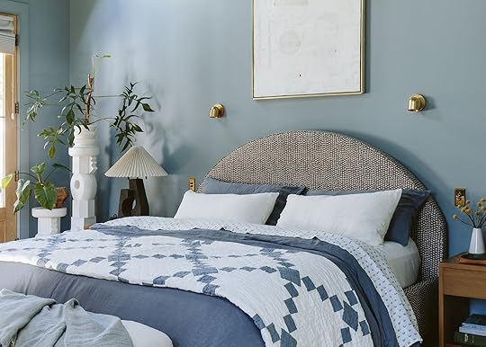
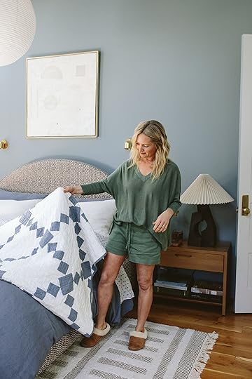
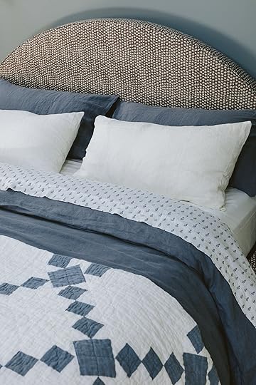
My Bed Restyled: Chambray All Day (Including The Most Beautiful Fresh Irish Chain-Inspired Quilt)
Fun fact: my very first lead styling job ever was for the Garnet Hill catalog (after assisting on it for years). I remember viscerally how nervous I was to be in charge and have full responsibility, everyone waiting on me to arrange the perfect flowers, and me scrambling to look like I knew what I was doing. I styled for them for years (the famous Steven Whitehead was the soft stylist), and therefore my loyalty to this brand and my knowledge of the product is extreme. I know the quality of their bedding first-hand so when they reached out to partner on their new linens I was delighted not only with the colors but also the prints and patterns (look at that quilt!).
Linen Sham (in Washed Indigo) | Linen Sham (in Ivory) | Linen Sheets (in Blue Floral) | Linen Duvet Cover (in Washed Indigo) | Linen Quilt (in Blue/White) | Linen Throw (in Amalfi Blue)
We restyled my bed with their new linen colors (of which they have many, this cypress or sage green is awesome, too – more on that below), printed sheets, and the most beautiful heirloom-quality Irish Chain-inspired quilt. I LOVE that quilt.
Bonus: the geniuses at Garnet Hill tweaked this duvet cover’s proportions to create a tighter, plusher fit. If you’ve ever slept with a duvet, you might know that it starts to slide around a bit in there, despite the ties! But this cover was so brilliantly designed – it looks polished and tailored straight out of the package (and even after a good night’s sleep), no hassle required.
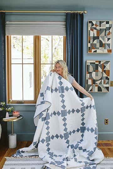
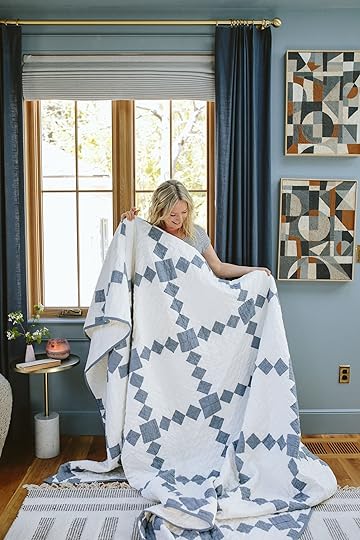
I actually bought a dark blue antique Irish quilt that I love, but it’s a little precious for daily use, not big enough for snuggling and it’s too bold for this room. This modern quilt’s denim-y color actually works perfectly and is hand-stitched (not printed!) and is such a pretty shade of blue.
That level of care and attention to detail is present in all the linen you’re seeing. Garnet Hill sources the finest flax from Europe where it’s grown by experts with low-to-no irrigation. It is GMO free, too. If you’re looking for bedding that has sustainability baked in from the start, it’s here! These are the types of pieces worth investing in and bringing into your home.

Linen Oversized V-Neck Sweater (in Sage!)| Coastal Linen Shorts (in Sage)
They also sent me some of their new linen clothes, which I happily created a monochrome look with and have actually worn a number of times since this shoot (that sweater looks really simple, but it drapes beautifully and is so lightweight making it a really nice spring nighttime layer).
If you’re interested in trying out a matching set but you don’t want to get something trendy, this combo is a GREAT choice. The shorts also have the perfect amount of leg room (plus an adjustable, flexible waistband) and they’ll be easy to mix-and-match all summer (and beyond! How perfect will that sweater be for fall?).
You can see the soft-washed linen on that quilt (and the pretty hand-stitching) in this close up.
If you’ve never slept in linen before, it is super breathable and temperature-regulating. I recommend it to ALL hot sleepers, or to any folks whose homes feel a little warmer at night. (Caitlin, from my team, doesn’t have air conditioning and she swears by linen bedding.)
If you are new to the linen game, start with a throw (a nice layer that feels grounding without being too hot) or a quilt.

But not all linen is created equally (and not everyone loves the feeling of linen, so make sure it’s your vibe with a smaller piece first!)! Some pieces need to be “broken in,” but Garnet Hill’s linen is INCREDIBLY soft.
They garment wash it (I don’t know how many times, but it feels like a lot) so it comes with that buttery, textured, casual look that I LOVE. It also gets softer with each wash, so your bed will continue to get more and more comfortable over time.

Linen Blanket (in Amalfi Blue) | Linen Blanket (in Bronze)
I appreciate that they make their bed throws big enough to fit at the end of the bed AND long enough to cover both sides. I love the frayed edges, the two different herringbone textures on both sides, and how soft and drape-y it is. (These come in throw, double/queen, and king sizes, BTW, so there’s a perfect blanket for every space.)
I swear this is the coziest corner that gets the most action during photo shoots – I’m a big night and weekend reader but it’s usually in bed. I need to use this space more, don’t you think? Maybe someday I’ll have more time for reading during the day, draped in my softest linen blanket
Linen Shirt (in Sky Blue Chambray) | Linen Beach Dress (in Sea Salt)
Here I’m wearing a chambray linen shirt (which yes, is very nice, drapey, loose, and cooling) and a white beach dress which is super cute (but this shade is a little sheer without nude undergarments, so more of a swim cover-up for me). The striped version is VERY pretty. (I am wearing a small in all of the clothing, and find that it fits true-to-size. It feels great on the skin, too.) The pieces I picked make me feel like a Nancy Meyers character, donning all simple, effortless, comfortable, throw-and-go goodness.

As you have probably noticed washed linen is also extremely beautiful to look at (which is why it’s so popular amongst stylists). It always looks good, straight out of the dryer. It’s just so lightweight and floppy in a really good way. Linen just adds a lot of life and depth to your bed – if your current setup feels a little flat, swapping in a new texture like this can breathe some new life into every part of your room.
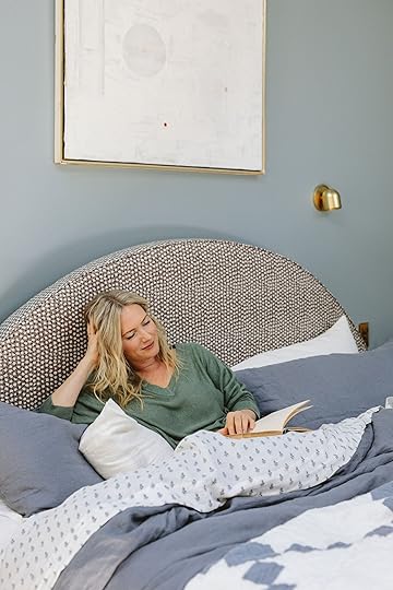
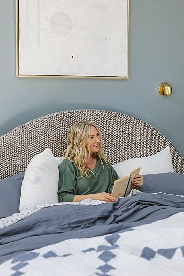
A big thanks to Garnet Hill for letting me play linen stylist in my bed for a few hours. It’s a total honor and a full-circle partnership for me – it’s been a blast to reflect on the journey (from my updated, soft, warm-weather-ready bed).
These new linen pieces are so pretty and lightweight, yet high quality with really sweet prints and patterns. If you are a linen lover, head over here and see what else they are offering.
This post was sponsored by Garnet Hill but all words and opinions are all mine
*Photos by Kaitlin Green
The post My Bed Restyled: Chambray All Day (Including The Most Beautiful Fresh Irish Chain-Inspired Quilt) appeared first on Emily Henderson.
April 29, 2024
Moody California Casual Design – The Rise Of Walnut Wood (And How To Use It)

When I was talking to Mal and Gretch about this stunning home I’m about to show you, they joked that it was like the dark side of the California casual style. We all laughed but then I thought, “That’s actually pretty spot on!” It’s organic and textured with a lot of cool vintage pottery. It has that same earthy vibe that a traditional California Casual home has…just darker:) Now, this isn’t the first time we’ve talked about the gaining popularity of darker woods. Kitchens have been the room where this “trend” has really taken off but the ever-talented, Kirsten Blazek of A 1000x Better, shows how unbelievably modern yet soft this richer-toned wood can be and how it can be used in other types of spaces. Fun fact! This is her bestie’s home:) Oh and if you haven’t picked up her new book, A 1000 X Better: A Rebel by Design, which is not only perfect as a decor piece but has so many great tips on how to design more sustainably! Ok, but back to this home. Let’s get into why this dark wood works so beautifully.
Clean Lines Mixed With A LOT Of Wood Grain
My god this shot is beautiful! So when you lean into using a lot of lines in a design you want to be careful it doesn’t feel too modern or too trendy (unless that’s the look you want). What Kirsten did here to offset that was not only to bring in large custom pieces with some 70s-inspired curves but to choose wood with a grain that had the most beautiful movement.

I could stare at it for days! This wood-on-wood custom millwork is absolutely jaw-dropping. Also note that most of the decor pieces are darker, with only a few contrasting pieces, to let your eye be at ease and take in all of the elements.
Repetitive Shapes
Another awesome design choice she made was using the same shape and style of the desk base as the shelf brackets.
Intentionally repeating elements, like shapes, in any design is great but here it helps to nail the vintage design style and steers it far away from “trend”. These are also a perfect contrast/break from the lines on the walls.
Letting In Some Light
Another way I feel this space works so well is that we have a couple of walls without cladding or heavy dark wood. It helps give the room a little bit of airiness/negative space. This also gives it that more casual vibe that the “California Casual” style is all about.
Mixing Materials
We love some material variety and this green tile and terrazzo flooring are the dream duo for this 70s design. That rich green square tile (controversial due to grout lines, I know) is so good my heart hurts. It’s moody, goes beautifully with walnut wood (it’s nature indoors!), and bounces the light around so the whole space feels a bit lighter.
Also, please note the choice to have a pony wall to not only expose the wood paneling on the back wall but it’s the perfect framed moment for that piece of art and wildly cool pendant for an awesome view from the office.
Speaking of lighting, even the mirror scones have a touch of wood. Refined yet organic and so good.
Organic Decor
As I hinted at before, another great way to enhance the moody vibe is to choose decor pieces that have a textured, darker color palette. And for this design, it made even more sense to lean hard into MCM pottery and textured oil paintings since that was the time period these spaces were inspired by!
P.S. That slated pocket door is perfection.
I just went to an incredible flea market with the best MCM ceramics so I picked up a couple of pieces for myself. They can work with any style and visually add soul to a room. I might be biased:) I mean look at how cool this brown ceramic disc looks above the laundry room sink! Because it’s tone on tone with the wood it’s like a special surprise that adds instant depth.

Here the other view from the laundry room:)
A Hint Of Whimsy
Another great way to balance out a heavily linear design is to add some bold whimsy. I love that she chose this, at first, unassuming pretty foliage wallpaper. But then you see the eyes! It’s so fun and unexpected as well as adds a beautiful contrast in style to the wood. I also love that it’s on the ceiling too:)
I am a forever fan of Kirsten and hope y’all are inspired by her, her book (got get it!), and feel more confident in using darker woods if you’ve been thinking about it.
Love you, mean it.
*Design by A 1000x Better
**Photos by Michael P.H. Clifford
The post Moody California Casual Design – The Rise Of Walnut Wood (And How To Use It) appeared first on Emily Henderson.
Emily Henderson's Blog

- Emily Henderson's profile
- 10 followers

