
Emily Henderson's Blog, page 56
April 9, 2024
Gretchen’s First MOTO Reveal: A Tiny Bedroom Comes Alive With The Perfect Pieces From Article (And Fabric On The Walls??)

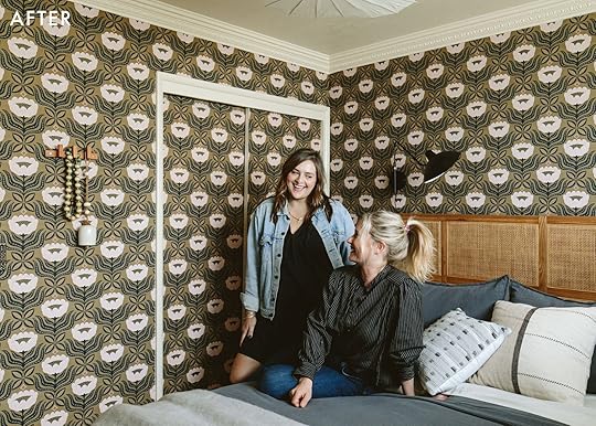
What do you get when you combine 32 yards of fabric, a beautiful bedroom bundle from Article and the world’s best boss? My very first Makeover Takeover reveal!! If you read my post from yesterday, you know how quickly this bedroom came together. Personally, I love a deadline (Em too), and though this one came at us like a 90 mph fastball, I really do think we hit it out of the park! (Insert softball emoji here) What’s so wonderful about Em–besides gifting me with an incredible opportunity such as this–is that she really let me take the reins on the design process, but stepped up for me big time when I desperately needed her eye. So when it came time for the shoot, she styled, Kaitlin photographed and I teared up in the corner as we brought my dream bedroom to life. I couldn’t be more excited to share this finished space with you all! Are you ready for the breakdown? Here we go!

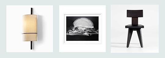
Headboard | Bed Frame | Mattress
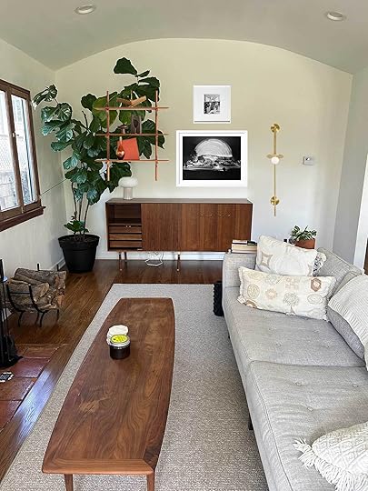
It’s not too difficult for a bed to be the focal point in any room, let alone a 9′ x 10′ box, but thankfully she’s no eyesore! I’m still pinching myself knowing that THIS is the bed I come home to every night. From the headboard to the mattress to the bedding (to the window, to the wallllll)–it’s all Article! As if they weren’t already one of my favorite places to shop for furniture (and a tried and true EHD favorite for pieces that are beautifully designed, well made, and at amazing price points), now you can literally fulfill EVERY SINGLE ONE of your bedroom needs in one convenient place. And I did!

Article has partnered with Leesa to supply you a great mattress to go atop your beautiful new bed frame. And to no one’s surprise, it’s extremely comfortable! I feel like I could recreate that classic infomercial, where the lady jumps on the bed next to a stemmed glass of red wine and it doesn’t budge one iota. Now I’m not gonna do that with this bed, mostly because I prefer a pinot gris (or in this case, an empty coffee mug), so you’ll just have to trust me on this one. It’s firm yet soft, and hugs just right without swallowing you whole. It has three layers of memory foam, each one designed to keep you cool and supported. After sleeping on the same full-size mattress I’ve had for years and years, this queen mattress makes me feel like just that–A QUEEN.


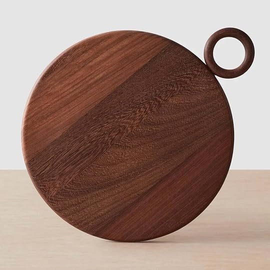
Next up is the frame. I knew I wanted to incorporate this oak Pactera bed frame as soon as I saw it (the white version is also so crisp). My place has decent storage, but sadly no real spot for linens. The fact that this bed is as beautiful as it is sturdy and has hidden storage drawers, is unreal. Positioned at the front of the bed are two huge drawers, and inside them I can fit all of my extra towels, sheets, and blankets. I love that they disappear completely, tucking away into the frame’s wide base, only to be clocked by me. The added lip around the perimeter of the frame is such a nice design touch, too and more importantly, functional. Making my bed in the morning really just requires stuffing the duvet into the sides of the frame and yet somehow every time it comes out looking so polished!


Gauze Charcoal Duvet Cover | Gauze Charcoal Sham Set | Sheet Set | Left Throw Pillow | Right Throw Pillow
Speaking of bedding…Article really NAILED IT! No surprises that their new bedding launch is as good as the furniture we know and love them for. Their bedding comes in three fabrications: the delightful crinkly gauze I picked, a super soft cotton, and a classic breezy linen. Before choosing the fabric for the walls (and yes…I will get to that!) I decided on the Leni gauze bedding in charcoal. I talked about it in the Link Up a few weekends ago, but I really can’t say enough about my love for it. I just feel so dang fancy sliding into a bedding set this beautiful and high quality. And technically what you’re seeing isn’t really a set, but rather a collection of styles, which just goes to show how well their colors and materials mix and match. I snagged an extra set of gauze-y shams in taupe and cotton sheets in light taupe, too. Top it off with two cute throw pillows and this fuzzy, tasseled blanket (yes y’all Article does decor too!) and celloooo–you’ve got a bed! (Hands up if you caught either one of my School Of Rock references)
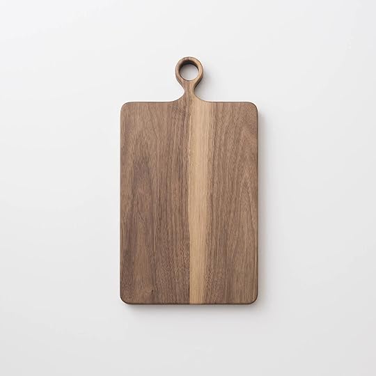
But the real show stopper is the headboard, obvi. It was a much harder decision for me to make, only because they have too many great options to choose from and I was really going back and forth on the direction of the room. In the end this one beat out the rest because the wood tone matched the other pieces so perfectly without being all from the same line. The woven rattan detailing makes it feel so high-end and lux, and I really love that it mounts to the wall. It hangs on a French cleat so I know it’s super secure, but I can also nudge it one way or the other, should I want to shift my bed a bit.


Gauze Taupe Sham Set | Headboard | Swing-Arm Sconce
Another fantastic feature of the headboard are the built-in nightstands. With my room being so small, adding nightstands into the mix could’ve made it feel clunky. Instead, the integrated shelves take up zero floor space and give me a great resting spot for my phone, a cup ‘o joe, or whatever book I’m reading–I mean, I haven’t attended book club in months, but that’s only because I had no place to set it down! I promise that’s the only reason!!
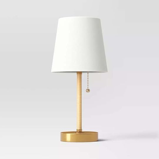
Because they’re still on the smaller side, I opted for this beautiful swing-arm sconce to keep the surface clear. I like that it provides a bit of asymmetry to the space and replaces the need for art above the bed–which I did try, but just felt like too much going on with the “wallpaper”. It’s also a plug-in so no wiring required! The mushroom lamp sitting on the other side of the bed (the previous photo) is one I stole from Em’s prop room just for the shoot, and will be going back because the sconce gives off plenty of light. But like, how cute?!

White Double Planter | Dresser | Table Lamp
That said, I’m super happy this other mushroom lamp is staying because it gives off a really nice glow and the gold shade connects well with the greenish gold of the wall fabric (I’m so close to talking about this, keep reading).
But the dresser??! Again, if you saw yesterday’s post, you’d know this was the one piece I absolutely had to have. We used nightstands from the same Vireo line in Kaitlin’s bedroom makeover, and when I realized they had the same style in a 6-drawer lowboy, I lost it. I have way too many clothes and until I get that problem under control, a dresser in addition to my closet is necessary. Whether I move or stay here for years, this is a piece that I know will be with me for GOOD. I can see it working so beautifully in my living room as a sideboard when I graduate from clothes-hoarding, that is. It just feels so timeless. The soft closing drawers are a mega bonus, but the design of the drawer pulls is my favorite element.

The one piece of art hanging in the room is something I painted. At my last apartment, someone left it in our communal free pile. It had a weird, black plastic light mounted to the top and looked like an early-stage art project left to die. I had a vision and snagged it, even though my neighbor-friends were like “Gretch, babe, that’s trash”. I’ve painted on it a few times, and I’m still not sure it’s “done” but I really love what it adds to the space, breaking up the uniformity of the wall and picking up some of the pink-ier tones in the room. References to both of my cherished apartments are hidden inside and I love looking at it as I fall asleep, reminded of the gratitude I have for those designs. There’s even a scrap of the current wall fabric pasted on the left side of it…

From Left To Right: Vintage | Planter | Planter (Old) | Footed Bowl (Local) | Planter | Box (vintage) | Planter (local) | Planter (local)
Okay wait, first the window and then we’ll talk wall fabric–I mean it!! This transom window (a word I learned recently, thanks Em!) surprisingly lets in a lot of light. But unfortunately, it looks directly into my neighbor’s kitchen and the awkward eye contact happened enough for me to hop on the internet and order this window film. It’s made to look like reeded glass and diffuses the light beautifully. I also don’t need anything to block the light because I truly sleep like the dead, so just a bit of privacy control was enough for me.
When Em came by to see the progress of space, she suggested I extend the window ledge to display some of my plants. Love!! So I headed to my local Ace Hardware, snagged a board, cut it to size, painted it to match, and drilled it into the sill. Done. Then Em helped me pick out a few fresh plants for the shoot and I’ll be damned if I can’t keep them alive, because they’re just too perfect!

Okay you’ve made it!! It’s fabric time. This wallpaper isn’t wallpaper, but rather wallfabric, as I’ve lovingly coined it. It’s something I’ve added to many of my past rentals, and I like to think it’s my signature. I will argue ’til the day I die that it’s absolutely the best way to “wallpaper” a room because it is 100% renter-friendly and a process you can do completely solo without the need to rip your hair out along the way. Now I will admit, I’m a TEASE, because the fully-fledged, step-by-step process post won’t be coming at you until next week. But I will give you this: in my humble opinion, it’s miles better than traditional paste-up or peel-and-stick wallpaper because clean-up is a breeze–any residue left behind simply doesn’t exist–and it’s sooo much less wasteful. If I move, get bored of it, or realize it belongs somewhere else, all I need to do is peel it down and give it a wash before I’m ready to start again. And by then the opportunities are endless–wallfabric another room or sew an outfit or a bedspread or a pillow or CURTAINS. Now who can say that about sticky paper?

But to immediately contradict myself, I am thinking about ordering a peel-and-stick version of the same design to line my drawers and closet shelves, because it’s slightly easier to clean. I worked with Spoonflower to find this fabric and they offer all (we’re talking literally millions) of their designs in both fabric and wallpaper of every kind. And to them I said, “Hey, how ’bout one more application?” and they said “Sure!” and I said, “Thanks, guys!”


Anyway, I am super proud of this room and extremely grateful to be given the chance to express myself with such incredible pieces. To have a room in my new place fully designed feels so fulfilling and is driving me to rethink and refresh the other rooms in my apartment. So stay tuned! And come back next week to read all about that wallfabric process. If you have any questions about it, I’ll make sure to answer them over there!

The hugest of thank you’s to Article for partnering on this project. Every single item is an absolute hit and I am tickled as pink as the flowers on my walls to be surrounded by such beauty. To the readers, thanks for following along! To Kaitlin, the photographic magic you capture is unmatched and these are photos I will cherish forever and ever. And to Emily, just wow. The things you’ve introduced me to, the projects you’ve brought to me, and the gifts you’ve bestowed, leave me speechless. Thank you for your ongoing love, support and trust throughout this process! You are so cool.


Sincerely, Gretch
*Design by Gretchen Raguse (me!)
**Styled by Gretchen Raguse and Emily Henderson
*** Photos by Kaitlin Green
The post Gretchen’s First MOTO Reveal: A Tiny Bedroom Comes Alive With The Perfect Pieces From Article (And Fabric On The Walls??) appeared first on Emily Henderson.


April 8, 2024
Introducing Gretchen’s Bedroom MOTO: A Dream Partnership, Three Moodboards & A Million Fabric Samples
I write this, truthfully, on the other side of the finish line, and the race to get here has been a bit of a blur! Three months ago I moved into a new place after living four years in a spot I loved dearly, but had inevitably outgrown. The laundry was shared and paid for in quarters, the floors so creaky they could wake the neighbors, and the paint? Well, it covered just about every hinge, knob, and hard surface in all 600 sq ft.
But I made the most of it and loved that apartment despite its many quirks. So many wonderful opportunities came my way because of it–a feature in Apartment Therapy and this J-O-B with E-H-D to name a few. And although I’m so grateful for my time lived (aka decorating) in that space, I couldn’t ignore the nagging feeling inside me that it was time for something new. Fresh blank walls, a challenge or two—plenty of room for a design project.
Cut to early December, my dear friend Janet and I are curled up sipping coffee on her comfy couch, looking around her sweet new home (a true craftsman with thoughtful updates and a touch of that “DIY” charm I love so much). I couldn’t help but envision a home like this for myself—but on my budget, that dream would have to be a little less “three floors and a mortgage” for now. I mention to her my desire to move apartments soon and she takes note of my checklist:
A space bigger than my current spot. One that isn’t inherently “modern” or “out-of-the-box-brand-new”. Read: charm. A PLACE WITH A WASHER & DRYER IN-UNIT PLEASE DEAR GOD. And I wouldn’t say no to a dishwasher. Wood floors throughout would also be ideal. Any kind of outdoor space, a plus. And hell—a second bedroom would sure make a nice studio space! Read: a place for all my collected crap.
Well it was as if we’d manifested it right there on that couch, because 5 minutes into my drive home, Janet sends me this text:

I followed the link to the listing and (metaphorically) sh*t myself. Not only did it have EVERY last thing on my wishlist but it was in my price range and funky in all the right ways (do you smell a project or three, because I did!) Spoiler alert: it’s mine now and the projects? Honey, they start today! Introducing: Baby’s First MOTO…my bedroom!


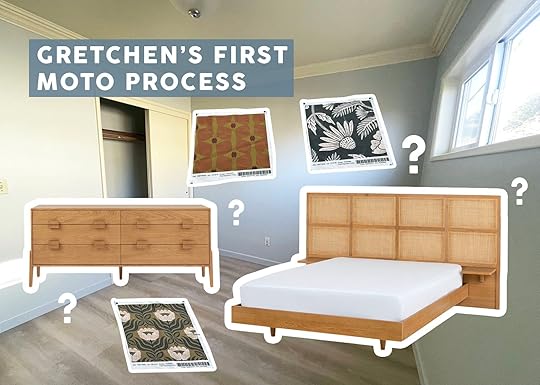
When Article reached out asking about a potential bedroom makeover, someone jumped at the opportunity right away. And it wasn’t me. Emily threw my name into the hat faster than I could say “Yes, please!” And approx. 30 seconds after seeing that Slack message come through, I had put together a deck with three potential design directions. What can I say? I was excited. I’m pretty sure I mocked these up before officially accepting her offer, and thankfully it still worked out in my favor! The only problem was it needed to be ready to publish in 10 weeks and I had big ideas (and a full-time job).

My first moodboard began with an extremely pared-back color palette and a quiet, calm vibe. I love this bed TERRIBLY, but quickly discovered it was too large for my >100 sq ft room. If you have a larger space, don’t skip this one! The reason I loved it so much was its integrated storage drawer, hidden away in the front of the bed.

My second design took a turn for the vibrant. Inspired by my beloved arched headboard I used in my last place, I knew Article sold an upgraded version of my DIY. An arched, paneled headboard done in green velvet with the nightstands built in? YUM. But I realized I was wasting an opportunity to lean into a new look, and instead pulled together a room that landed somewhere in between the two moodboards.

In the refined design, you may notice that the dresser stuck around. It was the first thing I was absolutely sure of. The lines are too goooood and the amount of storage was just what I needed. The woven rattan headboard felt like a perfect balance of the two from before–sophisticated lines, with built-in nightstands, but with the feeling it could be a timeless treasure, just like I knew the dresser would be. And luckily, I found a different bed frame with storage drawers that integrated perfectly and didn’t overwhelm the room.
I had barely started playing with accessories and additional elements. I snuck in a few Emily Henderson x Rugs USA options, but couldn’t get a larger rug to work in the actual space. In the first two boards, I included old pendant lights I had on hand from IKEA, but ended up choosing this sleek, black swing-arm sconce.

I had one non-negotiable when designing the space: Fabric on the walls. No, this wouldn’t be some Trading Spaces straw on the walls reveal, it was actually going to look good and I knew that for two reasons. 1) I’ve become a bit of a pro at this technique, having experimented with it in multiple rooms at my last place, perfecting each step along the way. And 2) because I already did it and it does actually look good. But the reveal post comes tomorrow, and for now, my process of getting there will have to suffice!
In yet another freakishly manifested destiny, days after moving forward with the Article pitch, Spoonflower reached out to see if Em had any spaces that could benefit from their vast selection of wallpaper. Well, my ears perked up, because I for one, knew Spoonflower for their infinite fabric options. This could be my “in” for enough fabric to cover the room. So together Em (and Caitlin) and I floated the idea: fabric as wallpaper–and they agreed!
[image error]I sent for a “few” samples, a little embarrassing to say how many in total, but more than 10 and less than the 1,000,000+ options they have on their site. When the samples arrived, I held them up against my new Article furniture and took a photo of each one. My phone crashed.

Just kidding. But there were so many!! And at this point, I needed to recruit Em to help me narrow them down. We eliminated a bunch right off the bat for various reasons: wrong colors, repeats that didn’t work well, a too-small pattern that would likely read as polka-dots on the wall. Suddenly we were down to three, so I mocked them up on my iPad.
Option One: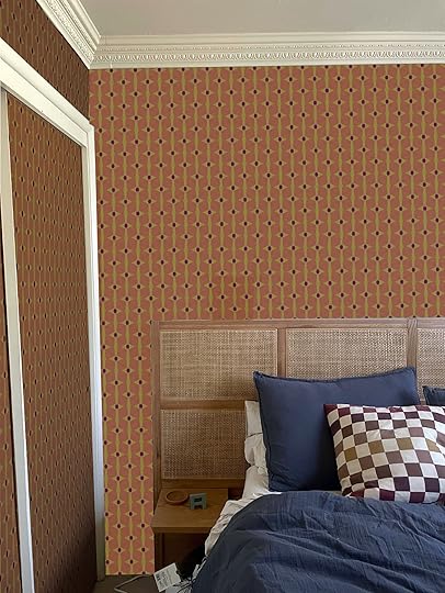 Option Two:
 Option Three:
Large – Baysan – Turtle/Midnight Blue Fabric

We both had a favorite, and thankfully we were on the same page! Then Kaitlin, our photographer, stopped by and also chose that one. Even my mom agreed it was the best of the three. Can you guess which one made the cut? Come back tomorrow to find out and see the whole room reveal  Thanks for sticking with me through this novel!
Sincerely, Gretch
*Design by Gretchen Raguse (me!)
The post Introducing Gretchen’s Bedroom MOTO: A Dream Partnership, Three Moodboards & A Million Fabric Samples appeared first on Emily Henderson.
April 7, 2024
The Link Up: Em’s Favorite New Eye Serum, Jess’ Magical $8 Hair Brush Tool, And A Design Book We Can’t Wait To Get Our Hands On
Happy Sunday everyone. On the EHD side of things, it was a pretty special week and you’ll see why tomorrow. Let’s just say if you are familiar with the term “MOTO” then that’s our clue. Aside from that we are very happy to have Emily back from her spring break and are pretty excited that we all get to see each other in a month for our team retreat. Grateful is an understatement. Ok, let’s link!

 left photo by alex zarour | right photo by michael clifford
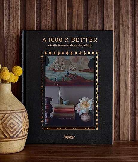
From Emily: Today I’m so proud to help share a book by a good friend of the blog, A 1000 X Better. 2 1/2 years ago Kirstin and I were talking on the phone about the potential of her future book (while I was in the middle of promoting my last one), and I’m pretty sure I told her not to do it UNLESS she felt “called” or “compelled”. I selfishly wanted her to do it because her designs are incredibly creative, bold, and risky in a way that is riveting to witness. These are rooms that I want to stare at for hours to notice all the details. So Kirsten, a HUGE CONGRATS from the EHD team to you. We know what it takes to put out a book and we hope everyone who is into design, bold/risky/beautiful design, buys this book. Happy Publishing Month!!! Go buy it HERE!!! Officially available April 9th (so only 2 days!!)
This week’s house tour epitomizes how a small space can have BIG style! This Jersey City apartment transports you to Italy with the most wonderful vintage furniture and soft cozy hues. Also, peep the painted door panels because that is definitely an emerging trend:) Enjoy!
Also From Emily: Admittedly, I was influenced by Gen Z tweens selling out Summer Fridays stuff on TikTok. To be clear I’m not on TikTok but I read multiple newsletters about youth trends because I find it WILD (my favorites are After School by Casey Lewis and Link in Bio by Rachel Karten). Anyway, after hearing about the craze I, as a 44-year-old mom, decided that I too wanted in on how these 12-year-olds are staying moist and wrinkle-free (LOLOLOLOLOLOL). So I tried the Rich Cushion Cream Ultra Plumping Moisturizer and lordy it is moisturizing (think more affordable La Mer). I’m not sure what 12-year-old’s skin needs that level of moisture but my historically dry skin loves it and I crave it around 7 pm every day when my face has been too exposed to the world. So I went on to try the Jet Lag Overnight Eye Serum and I LOVE IT. I have a partnership with them coming up which I gladly accepted because I’m already very into their product (also vegan, cruelty-free, etc which means they are foregoing a lot of international markets that require animal testing – which are huge markets for beauty… that’s all to say if you have the budget to support these smaller brands go for it).
Also, not for nothing but the Sephora Savings Sale just started on Friday for the Rouge members who get 20% off select beauty and 30% Sephora collection until April 15th. If you are A VIB or Insider the sale starts on Tuesday the 9th. It’s honestly the best time to do some restocking of your most used products/is a good time to try something new since it’ll be a little discounted.
From Jess: Y’all the newest edition to my haircare arsenal is this hairbrush cleaning tool set and it was only $8!!!! Why didn’t I know this existed?? So I don’t know about you but my brush will quickly fill up with what looks like dust bunnies (gross). I know it’s a mix of skin cells, dust, etc. but regardless it’s been A PAIN to properly get all of that off my brushes…until now. I usually just use the little rake and it quickly grabs that hard-to-remove “dust bunnies” and of course hair. For a full deep clean, you should also soak your brush but I’ve yet to do that. Baby steps:) I primarily use this boar bristle hair brush but it looks like between the three different combs, there is something for every type of brush. I hope these are as oddly satisfying and life-changing for you as it was for me!

 photos by mark weinberg | styled by getteline rene
In case you’ve been waiting, our Fountain and Rowena rugs are BACK IN STOCK!!!
From Gretchen: I have an issue with my bathroom lighting. I’ve touched on it before in the link-up, where I found a battery-operated overhead light to use in my shower, but the real problem is that my only genuine light source is a blinding vanity light–the kind with three, bare bulbs that burn away your retinas if you dare glance at them directly. I’m not super eager to swap out the fixture just yet, because the design direction of the room is unfolding somewhat slowly. I thought about DIY-ing a cover to diffuse it a little, but recently came across a different fixture that used chrome-dipped bulbs behind clear glass, avoiding the need to look away. I realized they were exactly what I needed! I ran to Amazon and bought this perfect pack of three. They look great and I can stare at them as long as I want! They come in gold, too. A great, simple fix until I eventually find a replacement fixture.
From Mallory: I’ve been very into Rumble boxing for the last year and a half (shoutout to ‘stina in Weho for being the best instructor ever) and I finally decided to invest in some cool boxing gloves so I don’t have to keep renting them. These were so stylish and made me feel like a total badass. I added them to cart immediately and then started exploring this brand Modest Vintage Player a bit more and fell IN LOVE. Their whole mission is “to create the most beautiful, yet functional, athletic goods & accessories” and their products are so fun. My dream is to have one of their leather punching bags and I just might get this jump rope and medicine ball at some point…If you have a home gym that you want to look pretty or if you just want more aesthetic workout gear check them out!!
From Caitlin: On a scale of 9 to 10, how boring am I? The answer is TEN, because I am using this week’s link to tell you all about an EMAIL APP. And it’s not just any email app – it’s one that I spend THIRTY DOLLARS a month on. That’s not even a typo. The kicker? It’s SO WORTH IT. (The other kicker? I used to think it was overhyped! Or a scam! I was so naive!) The product in question? Superhuman, the world’s greatest email client. I signed up last month and the results are in: I sent more than TWO TIMES as many emails as normal in HALF THE TIME! Basically, they’ve created an interface that keeps me focused, on track, and FLYING through my inbox at unprecedented rates (no mouse necessary – your hands never need to leave the keyboard!). I can never go back! If you also have an email-based job, this will be a total game-changer for you. The first month is free and it’s SO worth the trial. (PS. If you like these kinds of recommendations, I have a calendar app that’ll blow your mind! Let me know…)
From Arlyn: In a world of microplastic fears (it’s always something), I made an effort to change out my plastic cutting boards for something else. I have two wood cutting boards, but I like a non-wood surface for some things like meat, onions, garlic and also for a quick fruit chop for snack time. After some research, I landed on these from Public Goods made from compressed paper and wood fiber. They’ve been great so far and I’m so happy with them! The silicone corners keep it steady, the hole makes it easy to move it around (or hang it), and it even has a “moat” for reserve juices.
Thanks for hanging with us today and see you all tomorrow! xx
Opening Image Credits: Design by Kirsten Blazek | Photo by Michael P.H. Clifford for A 1000 X Better: A Rebel by Design
The post The Link Up: Em’s Favorite New Eye Serum, Jess’ Magical $8 Hair Brush Tool, And A Design Book We Can’t Wait To Get Our Hands On appeared first on Emily Henderson.
April 6, 2024
The Sisterhood Of The Traveling $30 Target Dress (So Does It Work For Everyone??)

I sang this dress’ praises a few weeks ago as I was planning my spring break packing list. I’m happy to report that not only did I wear this 3 nights during spring break (in Kauai, 70 degrees at night after long days of being in the sun and with sticky sunscreen), but I saw TWO different women in Hawaii wearing it too. It got me thinking, is this dress great on most people? Could it be the sisterhood of the traveling dress? Gretchen had already bought it, so I told the rest of the team they could grab one and we’d do an experiment to see if perhaps this is the perfect spring/summer dress???? And FYI I’ve washed it 3 times, hung dry or spun dry, and it has held up and drapes really well – not all wrinkled or misshaped which sometimes you can get with a really affordable dress. I think there is enough poly in it to give it that seersucker look (at least the green stripe) which makes it look great without steaming. Definitely a dress you’d happily wear after eating a huge burrito or dealing with normal bloat, FYI. It’s sooo comfortable. Ok, ladies – what did you think?????
But first I’ll remind you of my initial thoughts…
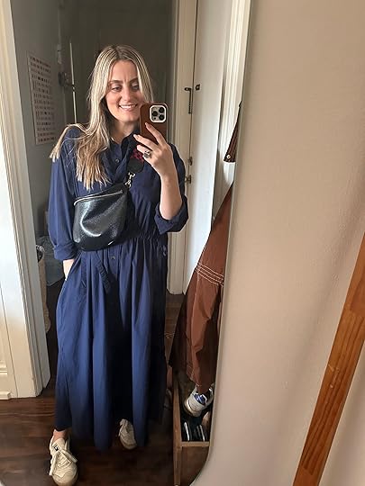
The Green Striped One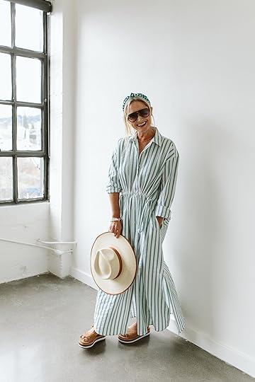
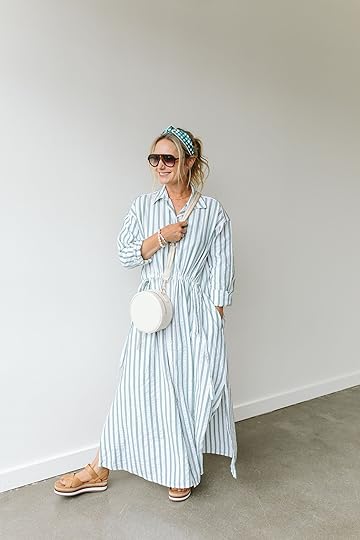 photos by kaitlin green | from: 12 cute, comfy easy-to-wear spring break outfits
Headband | Sunglasses | Dress | Purse | Bracelet (similarish) | Sandals
From my fashion post: “This dress is the real winner of the season. It’s from Target and while I love the idea of Target clothes I do find that sometimes their cuts aren’t great on me or the fabric is just meh. This is lightweight (looks heavier than it is), has a seersucker vibe that lends itself to being casual, doesn’t need to be steamed, and has that cute gathering detail at the front but nothing on the back so it gives you a sense of the waist with extreme waist comfort!!!!! Might be too warm for extreme humidity, but it’s absolutely coming with me for nighttime casual dinners. I’m so comfortable and I feel really cute (add a trendy bag to take it down a notch in the mom category).”

This dress! I saw it at Target a few days before Em styled it for her Spring Break Outfits post, but they only had the dark blue version in my size. I tried it on and I liked it well enough, but knew I would LOVE the green stripe, so I went ahead and ordered it. To my pleasant surprise, Em showed up to the shoot with said green dress and I felt so validated by my decision!
I love the way it drapes, with slits along the sides for a leg to peek out, plus the front waist is cinch-able, so I can pull a little shape but keep the back hanging loose. And POCKETS!!! I tried it in both L and XL but opted to keep the bigger size because it’s slightly longer and reviews say it’ll shrink some in the wash. I paired it with my other “new favorite” Madewell jacket and some old (un-linkable) favorites: a round canvas Baggu bag, vintage wooden sandals and some brown sunnies!
The Blue Striped One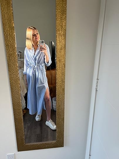
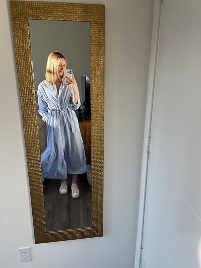
Dress | Gold Layered Necklace | Sneakers
This dress is SO comfy and I was stoked when I found out it has POCKETS!!! The blue and white pinstripe is a classic pattern I’ve always loved and I’ll always love this look with gold accessories. I’m wearing a small and I pulled the lil strings on the side tighter to give it a little more shape (love that this adjusts BTW). Plus this lil slit was cute – wanted to show off my janky little ankle that I sprain all the time (this is its good side). I feel like Gwenette Paltrow on vacation which is not a bad thing to feel like for only $30!!
The White One
Dress | Sunglasses | Clogs (similar) | Purse | Bandana (similar)
I’m gonna be real: I did not think I was going to like this dress on my body! The sizing chart left a lot to be desired – my measurements ranged from “medium” to “XXL” – so I figured that parts of the dress would cling to my hips and bust. NOT SO, MY FRIENDS! I split the difference and ordered the XL and I am SO STOKED with the fit. I love the drape (it’s hard to find things that actually drape without bunching up somewhere!) and I’m so glad I got it in white! It’s been SO FUN to dress up and down and probably the only piece in my closet that feels appropriate for a museum and a beach, which is a pretty tall order. I’m wearing it with some clogs here, but I also LOVE it with a baseball hat and sneakers, some flat sandals and big glasses, or with a few pops of color. More than anything, this dress makes me feel a little cooler than I am, which is really all that matters:) it’s nice to wear things that actually make you feel good about yourself, you know?! (PS. This color/fabric will come rumpled and you will need to steam it. Still worth it. I promise!!)
The Navy One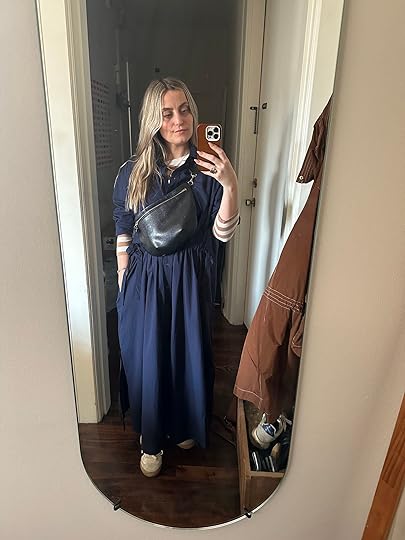
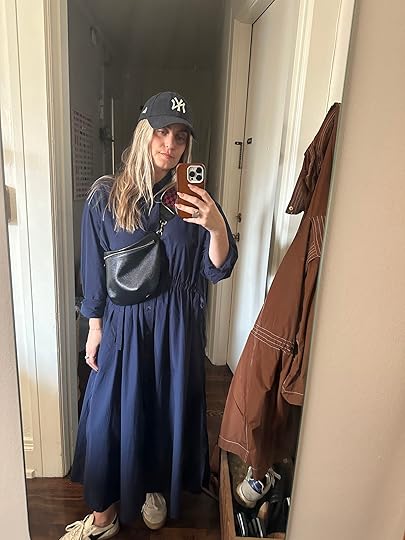
Dress | Purse (similar) | Purse Strap (similar) | Striped Top (similar) | Sneakers | Yankees Hat
Dare I say I chose the least “springy” option but I just felt like it suited me best. Actually, the navy fabric is a little thinner than the green stripe one! So here is what I’ll say, I think this is a super cute and unbelievably comfortable dress. However, I don’t think it’s totally my style but hopefully, the way I styled it does it justice if it’s yours! I wanted to really mix it up in a classic “EHD style” way and throw a striped long-sleeved shirt under it. I know it’s still chilly in a lot of places so this could be an easy way to make it a little warmer and fun. And while you can surely dress this cutie up, I liked the idea of pairing it with a cool, casual sneaker. I also wanted to add a little structure and pattern so I threw on my beloved Clare V fanny pack with its checkered strap. TBF, it’s the only purse I wear these days so it really wasn’t a choice as much as my only option but I stand by it:) I also wanted to show you what it looked like without the striped top and then with a classic baseball hat. Three casual looks, one throw-on-and-go, easy breezy dress. I’m in a medium but we were told it shrinks a good amount so I would consider sizing up!
So there you have it! All our thoughts that will hopefully help you decide whether you were on the purchase fence or simply looking for a great, comfy, affordable spring dress. xx
Opening Image Credits: Photos by Kaitlin Green at Sunroom Studio | From: 12 Cute, Comfy Easy-To-Wear Spring Break Outfits
The post The Sisterhood Of The Traveling $30 Target Dress (So Does It Work For Everyone??) appeared first on Emily Henderson.
April 5, 2024
Struggling With How to Fill A Big, Empty Wall? We Help 4 Readers (& You!) Figure It Out

What’s that saying? Those who can, do; those who can’t, teach? Well, friends, I have a giant wall in my primary bedroom that I’ve been stumped on for the whole year we’ve lived here. So instead of figuring out what to do there, I’m going to use my brain power to help YOU figure out what to do, instead! Procrastination at its finest. (In all honestly, I *do* have some ideas but it would cost more than I want to or have to spend for a temporary rental solution, so, I’m holding off.)
For this week’s installment of Fix It Friday, we’re tackling the—dun, dun, dun…—big, empty wall. ::someone screams somewhere:: We’ve all been haunted by a stretch of wall in limbo at some point in our decorating pursuits, correct? So we put out a call to the people to send us your empty walls for us to sort through and dream up solutions.
The requests ran the gamut from people who were just looking for some art advice, and for others who were as lost on what to do as me my first time in Amsterdam trying to find the right train back to the airport (woof!). And I get it. The options for what to do on an empty wall are, in truth, endless. I sat and brainstormed general ideas for not more than four minutes and came up with the following (meaning, if I sat for longer, there would have been even more ideas, so, yeah…there’s a lot one can do).
Here’s what I came up with, in case anyone here just needs a bit of a jumping-off point:
Large-scale art (1-2 pieces)Large floor or wall mirrorConsole table with mirror or artShelves or shelving unitWallpaperMolding or millworkBuilt-ins ($$$)Gallery wallLarge-scale furniture piece (storage armoire, China cabinet, bookcases, etc.)Peg rail/rail/hooksGallery wall hung from art railPedestal + vase + artChair + lamp/side table + artBenchPlant wallFaux fireplace mantel (or real built-in gas fireplace)See what I mean? SO. MUCH. TO. DO!
Now, some of these are very large investments that would involve a proper designer to draft out (I’m not that person). And besides, in the name of “Fix It Friday,” these should be quickish tackle-it-yourself types of solutions. So as fun as it would be to sit and try my hand at designing some custom built-in for a parents’ playroom or the dining room of a killer flat in London (you know who you are), I opted to pick homes that were more universal in their needs for everyone reading here.
Before diving into some inspiration and the reader’s home, I do want to say one thing (don’t I always?): You don’t have to fill every wall. Some walls can just…breathe. Especially if you already have a lot of art or furniture, having an empty stretch of wall might be what your room or space needs, honestly. Have it fill a purpose for you (storage, adding color through art, etc.) or leave it be.
Okay, let’s look at a few photos from the EHD archive. The funny thing, none of these are big blank walls. Obviously. Because literally every single wall in a room starts as a big blank wall before any design is done. But they all felt like they *could* have been blank walls if not for the solutions already enacted on them. Get me? From large-scale art, to many gallery walls, to peg rails over a bench, to a whole built-in, here’s some inspiration for you:

 left: design and photo by keyanna bowen, from: blue walls be gone! key’s totally transformed office reveal – maybe the most dramatic before & after ever (?) | right: design by caitlin higgins, styled by emily edith bowser, photo by sara ligorria-tramp, from: the reveal we’ve all been waiting for! caitlin’s mostly thrifted, postmodern regency deco living room
 design by ginny macdonald | photo by zeke ruelas | from: ginny’s dining room reveal
 photos by sara ligorria-tramp | left: design by emily henderson, from: living room update – again – our new sofa, my dream floral chaise and the pop of red i always wanted in my life | right: design by velinda hellen design, styled by emily edith bowser, from: velinda’s first freelance client reveal: molding the ‘builder-grade budget’ + where they saved & splurged
 left: design by emily henderson and sarah weldon, styled by emily henderson and emily edith bowser, photo by steven mcdonald, from: the prettiest green and pink kitchen remodel that we completed in 7 weeks | right: design by jess bunge, photo by sara ligorria-tramp, from: makeover takeover: jess’ long awaited (small space) living room reveal
Alright, let’s look at some reader homes and walk through some of the ideas I’ve cooked up that don’t involve custom work (which is always an option but not really the vibe of Fix It Friday). First up is a wall next to a kitchen, next to a living room, next to a staircase with no real purpose.
The Pass-Through Limbo Wall
From the reader: “I recently moved into an old Victorian and have a large wall in the middle. You see it as soon as you walk in the home. It is in the living room and divides the kitchen and stairway. Dimensions: 8ft wide x 8ft 10” high. I would love a large piece of artwork to fill the space and bring color into the house. Would like to stay around $1,000.”
I’ve worked with many a wall just like this in my time and they can be tricky. You don’t want to put anything too bulky there since it’s a pass-through area. Our reader specifically requested art to add color into what looks like a fairly neutral home, so that’s just what I did. Now, choosing art for someone else, especially something this size, is a strange exercise. I’m going based solely on looks (plus, I don’t have much to work from in terms of color palette because I’m not seeing much of the home). But, as we’ve discussed time and again on this blog, art is hyper-subjective and personal. I doubt this reader will buy this exact thing, but maybe they’ll like the idea of a frame canvas (which is my favorite for a wall like this).

Because the budget was $1,000 and very large art is incredibly expensive, I opted to fill the wall with two other things to get away with a slightly smaller piece (though this one from Minted is sold in a size up to 48″x70″). A picture light makes the art feel extra special and purposeful. Like this was meant as a momentary pause for the viewer. The bench underneath adds some depth and also offers the functionality of being somewhere to pause to put on shoes (the entrance is nearby) or even place something down when you need a hand. I went with something a little modern just looking at the kitchen and couch in this great room area, though the staircase and detailing to the right feels more in line with the Victorian she mentioned so she could always find something a bit more traditional.
Bench | Framed Canvas | Picture Sconce
I did go over budget here. With a discount running on Minted for the art, all three pieces together are around $1,650. I figured she could use this as a jumping-off point and find a vintage bench for less, or even a less expensive piece of art (you wouldn’t believe what you could find at HomeGoods sometimes, as much as I don’t recommend building your collection from there).
The Above-Credenza Limbo Wall
From the reader: “I desperately need help figuring out what to do with this wall! Finishing this project would really help this room look complete. The house is a small 1920s Spanish bungalow. My style is California-Neutral-Scandi. I am a big concert-goer and I’ve thought about incorporating a vintage print of the Hollywood Bowl, my favorite place in LA, into a frame wall, but I’m really open to anything. My budget is around $3-4k.”
As soon as I saw that barrel ceiling, my heart swelled. I had a (sort of) similar setup in my last home, so it was nostalgic. Let me show you the other side to get a sense of the reader’s style:

With such a large window, I think the opposite wall needs something to balance it. I originally thought of suggesting she get rid of the credenza (relocate it somewhere else, rather), and do a large, open shelving system. That or a huge leaning floor mirror with an arched top to echo the window and bounce the light everywhere. I still think that’s one of the best options. BUT, I decided to work with what she had and came up with two ways to do it.
The first involves shifting the furniture piece directly in the middle of the wall and adding a large framed vintage print of the Hollywood Bowl, which she mentioned wanting. Now that I look at the below, I think this could be much larger, considering the window size. Maybe even the full width of the credenza. BUT, I’m going to stick to my guns here for this explanation. I wanted to bring some lighting to this wall to really make it a feature, so I found these cool yet simple sconces. These are hardwired, so she’d have to get junction boxes installed, or find something she liked that were plug-in. Because I felt the right side needed something more, I adding in a sculptural side chair.

Sconce | Hollywood Bowl Print | Side Chair
I was itching to add some shelving and do something a little more off-center, so I threw in a second, albeit similar, option. Here, I left the credenza where it was and balanced it with a linear, vertical wall sconce to the vignette itself, rather than the furniture piece, was centered. The shelving unit speaks to the mid-century pieces she has (ignore that there is a tree behind it…my Photoshop skills have limitations, people), and can collect pretty things. I used the same art print from the top in a smaller size, and added in an additional vintage print above to fill up the vertical space. I’m thinking the tree can either spin to put the bulk of the leaves in front of the window, or this whole thing can flip-flop with the tree on the right, the sconce on the left, and the furniture shifted right.

Wall Shelf | Vintage Print | Wall Sconce
The Dining Room Limbo Wall
From the reader: “I have a big wall I’ve been wanting to do a gallery wall on to add some color to our all-green everything dining ‘nook.’ Fun facts: We took an old headboard from an EH DIY (used for a guest room pre-kiddos in 2018) and made it into a bench for the dining nook you see in the photos. We get so many compliments on it. Measurements: Above the ‘headboard’ bench the wall measures 12.18′ wide by 4.8′ high on the short wall and 7.15′ high on the tall part of the wall. I would love a colorful gallery wall where I could include some of my kid’s art (3 and 1). The space is adjacent/open to the living room, so we’d want it to tie in with that.”
This one is so fun. Both because of the repurposed DIY (genius!) and because I’m inclined to always help a parent with littles out. I haven’t yet reached the stage with my daughter where we’re hanging her art (she only just started scribbling and coloring), but as soon as we do, I know just what I’m going to do…beautiful frames where swapping out art (or storing art) is super easy.
Below are the adjacent rooms she mentioned, and I feel like we can bring in a touch more color:


A gallery wall can quickly become visually overwhelming, so I opted for larger, fewer pieces, including a handful of frames for family photos or kid masterpieces. The frames you see below with the grommets in the corner as from this company called Wexel Art and they’re great. They’re single-pane plexi with tiny magnets to attach your art. Got something new to hang? Just move the magnets, replace the art, put the magnets back on and BOOM, done! It’s amazing. They come in tons of sizes, too. To round it out, I picked two more Blockshop prints because she mentioned loving their stuff, a hanging canvas from Upton (such wonderful stuff if you haven’t checked out that storefront), and a big, anchoring 3D piece for some interest. I kept everything mostly neutral since I know crayon and marker art can get…colorful.
The key here is staggering the pieces so they mostly follow the angle of the ceiling to fill the space and make the impact I think she wants to make. I was also thinking of suggesting they move the location of the sconce to the art wall and continue the art onto the wall where the sconce is now. That, or change up the light fixture to something with an even longer arm to act more as a chandelier. I think it could be very cool (maybe something like this if budget allows).
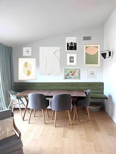

Top Row: White 3D Art | Black & White Blockprint | Floating Frame | Bottom Row: Floating Frame | Honey & White Blockprint | Hanging Canvas
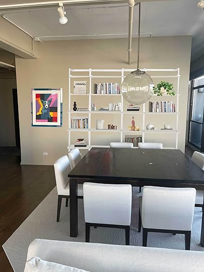
Another Dining Room Limbo Wall (That’s Also A Pass-Through Wall)
From the reader: “I live in a loft condo in Chicago that is flooded with light and uninterrupted city views from floor-to-ceiling windows. The first floor has a living/ dining/ kitchen open floor plan combo great room. Because I have a corner unit, there is really only one true ‘decorating’ wall in the space, next to the dining table. When my husband and I bought our home, this wall had giant bookshelves that were too visually heavy for the otherwise airy space. Now that we removed them, we have the opposite issue with this big blank wall! The wall currently has my beloved ‘Blue Dog’ artwork on it, but the scale is not right for the space. The wall measures about 15 feet long by 10 feet tall. It is a moderate traffic wall, as we use this pathway to get between the hallway to the left of the wall and our den/tv room behind it and balcony doors next to it (on the right). There is about 3 feet of clearance between the wall and the dining chairs. For further scale references, the table is 5×5 square and the sofas are 9 feet long.”
I was really hoping for a scenario where I could recommend a wall of shelving. It’s the closest to “built-in” as we’re getting today since it’s an impactful nearly full-wall installation, but with an off-the-shelf product. This reader mentioned this being the only “decorating” wall in the whole of the living areas, so I wanted to provide lots of opportunity for their books, plants, a bar if they please, and other pretty things. Since it’s a pass-through area, whatever we put here had to be streamlined and not overly bulky. Not to mention they already removed bookcases from this wall.
Yes, they could just turn this into an art wall, and build around the piece they already had, but I felt like it could be more. I decided to take their existing framed art and shift it left (I also thought of putting a pedestal under it with a plant or vase, but didn’t want things to get too cluttered). With the remaining wall space, I found a modular and flexible shelving system from Room & Board. There are a ton of options for configurations, but I kept it simple here. This one is 80″ which should be just enough to fill this stretch of wall. It’s only 12 inches deep, so it shouldn’t interfere with the dining room furniture or with passersthrough. I gotta say, I’m into it and hopefully the reader will be, as well.

And that’s it for today! I hope something here got you to pause, think about your own blank wall and say to yourself “Oh! Maybe I can do something like that!” Even if that inspiration came from my initial laundry list of options. It really is endless, but I suggest you think about what you need or want to accomplish functionally in your space and start there. But also, just looking at something pretty is just fine, too.
We have a few more Fix It Fridays (FIFs, as I call them to myself) on the docket, but please let us know in the comments if there are small, tangible areas in your home you could use our help with. Until next time…
Opening Image Credits: Design by Velinda Hellen Design | Lead Designer: Julie Rose | Styling by Emily Edith Bowser | Photos by Sara Ligorria-Tramp | From: A Kitchen Makeover That Focused On Small Changes For A BIG Impact (Julie And Velinda Did It Again!)
The post Struggling With How to Fill A Big, Empty Wall? We Help 4 Readers (& You!) Figure It Out appeared first on Emily Henderson.
Struggling With A Big, Empty Wall? We Help 4 Readers (& You!) Figure Out The Best Ways to Fill It
What’s that saying? Those who can, do; those who can’t, teach? Well, friends, I have a giant wall in my primary bedroom that I’ve been stumped on for the whole year we’ve lived here. So instead of figuring out what to do there, I’m going to use my brain power to help YOU figure out what to do, instead! Procrastination at its finest. (In all honestly, I *do* have some ideas but it would cost more than I want to or have to spend for a temporary rental solution, so, I’m holding off.)
For this week’s installment of Fix It Friday, we’re tackling the—dun, dun, dun…—big, empty wall. ::someone screams somewhere:: We’ve all been haunted by a stretch of wall in limbo at some point in our decorating pursuits, correct? So we put out a call to the people to send us your empty walls for us to sort through and dream up solutions.
The requests ran the gamut from people who were just looking for some art advice, and for others who were as lost on what to do as me my first time in Amsterdam trying to find the right train back to the airport (woof!). And I get it. The options for what to do on an empty wall are, in truth, endless. I sat and brainstormed general ideas for not more than four minutes and came up with the following (meaning, if I sat for longer, there would have been even more ideas, so, yeah…there’s a lot one can do).
Here’s what I came up with, in case anyone here just needs a bit of a jumping-off point:
Large-scale art (1-2 pieces)Large floor or wall mirrorConsole table with mirror or artShelves or shelving unitWallpaperMolding or millworkBuilt-ins ($$$)Gallery wallLarge-scale furniture piece (storage armoire, China cabinet, bookcases, etc.)Peg rail/rail/hooksGallery wall hung from art railPedestal + vase + artChair + lamp/side table + artBenchPlant wallFaux fireplace mantel (or real built-in gas fireplace)See what I mean? SO. MUCH. TO. DO!
Now, some of these are very large investments that would involve a proper designer to draft out (I’m not that person). And besides, in the name of “Fix It Friday,” these should be quickish tackle-it-yourself types of solutions. So as fun as it would be to sit and try my hand at designing some custom built-in for a parents’ playroom or the dining room of a killer flat in London (you know who you are), I opted to pick homes that were more universal in their needs for everyone reading here.
Before diving into some inspiration and the reader’s home, I do want to say one thing (don’t I always?): You don’t have to fill every wall. Some walls can just…breathe. Especially if you already have a lot of art or furniture, having an empty stretch of wall might be what your room or space needs, honestly. Have it fill a purpose for you (storage, adding color through art, etc.) or leave it be.
Okay, let’s look at a few photos from the EHD archive. The funny thing, none of these are big blank walls. Obviously. Because literally every single wall in a room starts as a big blank wall before any design is done. But they all felt like they *could* have been blank walls if not for the solutions already enacted on them. Get me? From large-scale art, to many gallery walls, to peg rails over a bench, to a whole built-in, here’s some inspiration for you:
left: design and photo by keyanna bowen, from: blue walls be gone! key’s totally transformed office reveal – maybe the most dramatic before & after ever (?) | right: design by caitlin higgins, styled by emily edith bowser, photo by sara ligorria-tramp, from: the reveal we’ve all been waiting for! caitlin’s mostly thrifted, postmodern regency deco living roomdesign by ginny macdonald | photo by zeke ruelas | from: ginny’s dining room revealphotos by sara ligorria-tramp | left: design by emily henderson, from: living room update – again – our new sofa, my dream floral chaise and the pop of red i always wanted in my life | right: design by velinda hellen design, styled by emily edith bowser, from: velinda’s first freelance client reveal: molding the ‘builder-grade budget’ + where they saved & splurgedleft: design by emily henderson and sarah weldon, styled by emily henderson and emily edith bowser, photo by steven mcdonald, from: the prettiest green and pink kitchen remodel that we completed in 7 weeks | right: design by jess bunge, photo by sara ligorria-tramp, from: makeover takeover: jess’ long awaited (small space) living room revealAlright, let’s look at some reader homes and walk through some of the ideas I’ve cooked up that don’t involve custom work (which is always an option but not really the vibe of Fix It Friday). First up is a wall next to a kitchen, next to a living room, next to a staircase with no real purpose.
The Pass-Through Limbo WallFrom the reader: “I recently moved into an old Victorian and have a large wall in the middle. You see it as soon as you walk in the home. It is in the living room and divides the kitchen and stairway. Dimensions: 8ft wide x 8ft 10” high. I would love a large piece of artwork to fill the space and bring color into the house. Would like to stay around $1,000.”
I’ve worked with many a wall just like this in my time and they can be tricky. You don’t want to put anything too bulky there since it’s a pass-through area. Our reader specifically requested art to add color into what looks like a fairly neutral home, so that’s just what I did. Now, choosing art for someone else, especially something this size, is a strange exercise. I’m going based solely on looks (plus, I don’t have much to work from in terms of color palette because I’m not seeing much of the home). But, as we’ve discussed time and again on this blog, art is hyper-subjective and personal. I doubt this reader will buy this exact thing, but maybe they’ll like the idea of a frame canvas (which is my favorite for a wall like this).
Because the budget was $1,000 and very large art is incredibly expensive, I opted to fill the wall with two other things to get away with a slightly smaller piece (though this one from Minted is sold in a size up to 48″x70″). A picture light makes the art feel extra special and purposeful. Like this was meant as a momentary pause for the viewer. The bench underneath adds some depth and also offers the functionality of being somewhere to pause to put on shoes (the entrance is nearby) or even place something down when you need a hand. I went with something a little modern just looking at the kitchen and couch in this great room area, though the staircase and detailing to the right feels more in line with the Victorian she mentioned so she could always find something a bit more traditional.
Bench | Framed Canvas | Picture Sconce
I did go over budget here. With a discount running on Minted for the art, all three pieces together are around $1,650. I figured she could use this as a jumping-off point and find a vintage bench for less, or even a less expensive piece of art (you wouldn’t believe what you could find at HomeGoods sometimes, as much as I don’t recommend building your collection from there).
The Above-Credenza Limbo WallFrom the reader: “I desperately need help figuring out what to do with this wall! Finishing this project would really help this room look complete. The house is a small 1920s Spanish bungalow. My style is California-Neutral-Scandi. I am a big concert-goer and I’ve thought about incorporating a vintage print of the Hollywood Bowl, my favorite place in LA, into a frame wall, but I’m really open to anything. My budget is around $3-4k.”
As soon as I saw that barrel ceiling, my heart swelled. I had a (sort of) similar setup in my last home, so it was nostalgic. Let me show you the other side to get a sense of the reader’s style:
With such a large window, I think the opposite wall needs something to balance it. I originally thought of suggesting she get rid of the credenza (relocate it somewhere else, rather), and do a large, open shelving system. That or a huge leaning floor mirror with an arched top to echo the window and bounce the light everywhere. I still think that’s one of the best options. BUT, I decided to work with what she had and came up with two ways to do it.
The first involves shifting the furniture piece directly in the middle of the wall and adding a large framed vintage print of the Hollywood Bowl, which she mentioned wanting. Now that I look at the below, I think this could be much larger, considering the window size. Maybe even the full width of the credenza. BUT, I’m going to stick to my guns here for this explanation. I wanted to bring some lighting to this wall to really make it a feature, so I found these cool yet simple sconces. These are hardwired, so she’d have to get junction boxes installed, or find something she liked that were plug-in. Because I felt the right side needed something more, I adding in a sculptural side chair.
Sconce | Hollywood Bowl Print | Side Chair
I was itching to add some shelving and do something a little more off-center, so I threw in a second, albeit similar, option. Here, I left the credenza where it was and balanced it with a linear, vertical wall sconce to the vignette itself, rather than the furniture piece, was centered. The shelving unit speaks to the mid-century pieces she has (ignore that there is a tree behind it…my Photoshop skills have limitations, people), and can collect pretty things. I used the same art print from the top in a smaller size, and added in an additional vintage print above to fill up the vertical space. I’m thinking the tree can either spin to put the bulk of the leaves in front of the window, or this whole thing can flip-flop with the tree on the right, the sconce on the left, and the furniture shifted right.
Wall Shelf | Vintage Print | Wall Sconce
The Dining Room Limbo WallFrom the reader: “I have a big wall I’ve been wanting to do a gallery wall on to add some color to our all-green everything dining ‘nook.’ Fun facts: We took an old headboard from an EH DIY (used for a guest room pre-kiddos in 2018) and made it into a bench for the dining nook you see in the photos. We get so many compliments on it. Measurements: Above the ‘headboard’ bench the wall measures 12.18′ wide by 4.8′ high on the short wall and 7.15′ high on the tall part of the wall. I would love a colorful gallery wall where I could include some of my kid’s art (3 and 1). The space is adjacent/open to the living room, so we’d want it to tie in with that.”
This one is so fun. Both because of the repurposed DIY (genius!) and because I’m inclined to always help a parent with littles out. I haven’t yet reached the stage with my daughter where we’re hanging her art (she only just started scribbling and coloring), but as soon as we do, I know just what I’m going to do…beautiful frames where swapping out art (or storing art) is super easy.
Below are the adjacent rooms she mentioned, and I feel like we can bring in a touch more color:
A gallery wall can quickly become visually overwhelming, so I opted for larger, fewer pieces, including a handful of frames for family photos or kid masterpieces. The frames you see below with the grommets in the corner as from this company called Wexel Art and they’re great. They’re single-pane plexi with tiny magnets to attach your art. Got something new to hang? Just move the magnets, replace the art, put the magnets back on and BOOM, done! It’s amazing. They come in tons of sizes, too. To round it out, I picked two more Blockshop prints because she mentioned loving their stuff, a hanging canvas from Upton (such wonderful stuff if you haven’t checked out that storefront), and a big, anchoring 3D piece for some interest. I kept everything mostly neutral since I know crayon and marker art can get…colorful.
The key here is staggering the pieces so they mostly follow the angle of the ceiling to fill the space and make the impact I think she wants to make. I was also thinking of suggesting they move the location of the sconce to the art wall and continue the art onto the wall where the sconce is now. That, or change up the light fixture to something with an even longer arm to act more as a chandelier. I think it could be very cool (maybe something like this if budget allows).
Top Row: White 3D Art | Black & White Blockprint | Floating Frame | Bottom Row: Floating Frame | Honey & White Blockprint | Hanging Canvas
Another Dining Room Limbo Wall (That’s Also A Pass-Through Wall)From the reader: “I live in a loft condo in Chicago that is flooded with light and uninterrupted city views from floor-to-ceiling windows. The first floor has a living/ dining/ kitchen open floor plan combo great room. Because I have a corner unit, there is really only one true ‘decorating’ wall in the space, next to the dining table. When my husband and I bought our home, this wall had giant bookshelves that were too visually heavy for the otherwise airy space. Now that we removed them, we have the opposite issue with this big blank wall! The wall currently has my beloved ‘Blue Dog’ artwork on it, but the scale is not right for the space. The wall measures about 15 feet long by 10 feet tall. It is a moderate traffic wall, as we use this pathway to get between the hallway to the left of the wall and our den/tv room behind it and balcony doors next to it (on the right). There is about 3 feet of clearance between the wall and the dining chairs. For further scale references, the table is 5×5 square and the sofas are 9 feet long.”
I was really hoping for a scenario where I could recommend a wall of shelving. It’s the closest to “built-in” as we’re getting today since it’s an impactful nearly full-wall installation, but with an off-the-shelf product. This reader mentioned this being the only “decorating” wall in the whole of the living areas, so I wanted to provide lots of opportunity for their books, plants, a bar if they please, and other pretty things. Since it’s a pass-through area, whatever we put here had to be streamlined and not overly bulky. Not to mention they already removed bookcases from this wall.
Yes, they could just turn this into an art wall, and build around the piece they already had, but I felt like it could be more. I decided to take their existing framed art and shift it left (I also thought of putting a pedestal under it with a plant or vase, but didn’t want things to get too cluttered). With the remaining wall space, I found a modular and flexible shelving system from Room & Board. There are a ton of options for configurations, but I kept it simple here. This one is 80″ which should be just enough to fill this stretch of wall. It’s only 12 inches deep, so it shouldn’t interfere with the dining room furniture or with passersthrough. I gotta say, I’m into it and hopefully the reader will be, as well.
And that’s it for today! I hope something here got you to pause, think about your own blank wall and say to yourself “Oh! Maybe I can do something like that!” Even if that inspiration came from my initial laundry list of options. It really is endless, but I suggest you think about what you need or want to accomplish functionally in your space and start there. But also, just looking at something pretty is just fine, too.
We have a few more Fix It Fridays (FIFs, as I call them to myself) on the docket, but please let us know in the comments if there are small, tangible areas in your home you could use our help with. Until next time…
Opening Image Credits: Design by Velinda Hellen Design | Lead Designer: Julie Rose | Styling by Emily Edith Bowser | Photos by Sara Ligorria-Tramp | From: A Kitchen Makeover That Focused On Small Changes For A BIG Impact (Julie And Velinda Did It Again!)
The post Struggling With A Big, Empty Wall? We Help 4 Readers (& You!) Figure Out The Best Ways to Fill It appeared first on Emily Henderson.
April 4, 2024
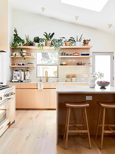
9 Easy Breezy Ways To Make Your Kitchen Counter Look Better

It’s truly so easy for the kitchen counter to become a prime dumping ground spot as well as a “stuff haven.” I mean, unless you have endless easily accessible storage, it can just swiftly look overcrowded! Or hey, maybe you have a nearly empty countertop and are looking for some easy-to-execute idea to make it look more intentional…and pretty:) This post is for everyone!
But let’s first start with a good cleaning. That could mean physically removing crumbs and old grime and/or clearing out clutter. Is there a stack of mail you need to go through? Do you have one or more small appliances you hardly ever use that would be better tucked away in a cabinet? Whatever it is, decluttering is key. While there is always the exception, I think we all function better when our spaces are calm and neat. Now onto the pretty stuff!
#1: Serving Boards design by velinda hellen design | styled by emily bowser | photo by sara ligorria-tramp | from: velinda’s first freelance client reveal: molding the ‘builder-grade budget’ + where they saved & splurged
Beautiful and potentially practical! It’s no shock that this is the first rec because pretty serving boards can be found in a ton (all??) of our kitchen reveals. They are perfect for adding texture, dimension, and can also easily cover outlets or hide cords. Plus when they are leaning against the wall they take up almost no space! Nothing not to love:)

 left: design by jess bunge for ehd, photo by sara ligorria-tramp, from: jess’ kitchen reveal | right: photo by zeke ruelas, from: modern deco kitchen reveal
So here are our tips:
We recommend using two boards as an easy no-fail number but one beautiful big board or even three can work too.Vary the sizes, shapes, tones, and even materials (peek my striped marble and little wood pairing above).Mix up the orientation too! One vertical and one horizontal.We love vintage boards and you can find ones at great prices.Just to be clear these are more display boards than the hardworking, everyday boards for actual cutting and chopping. However, if you have a beautiful cutting board, show it off!Here are some great options:

Mango Wood Cheese Board | Tikal Wood Serving Board | Walnut Cutting Board

Modern Wood Board | Large Double Handle Wood Serve Board | Antique Vintage European Bread Cheese Board
#2: Decant design by velinda hellen for ehd | photo by sara ligorria-tramp | from: velinda’s tiny kitchen makeover takeover
Can decanting seem a little unnecessary? Sure. In no world do we think everyone needs to buy matching containers to transfer all of their already “contained” products. However, for your counter, if visual clutter stresses you out or you prefer a more streamlined look and color palette then this is a great idea.
 design by arlyn hernandez | styled by emily bowser | photo by veronica crawford | from: arlyn’s rental kitchen reveal
Know that you can start really small and just decant something like your dish soap like Arlyn did above. I actually have that dispenser too (from Target) and it’s been great. The neon tones of a dish soap bottle can be pretty distracting, no? I actually put my dispenser in my sink since it’s large and that gives me more counterspace.
 photos by sara ligorria-tramp | left: design by barrett prendergast, styled by emily bowser, from: how to make “a cook’s” kitchen – it’s not just about the appliances | right: design by corre marie, styled by velinda hellen, from: the new design rules
But maybe you have coffee pods that could use a pretty home next to your coffee machine or you could decant a few pastas (or protein powders) that would look lovely in a pretty container. I have a bunch in my kitchen and I love them.
Fun Fact! Foods like pasta, rice, nuts, etc. can act as additional patterns and textures if you opt for clear glass containers.
Here are some handpicked ones:
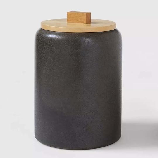
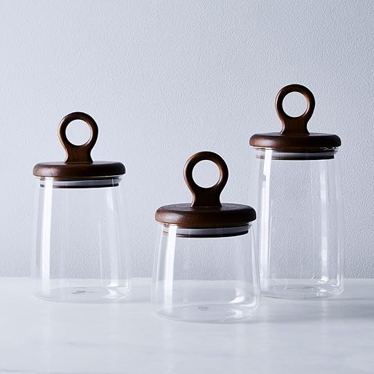
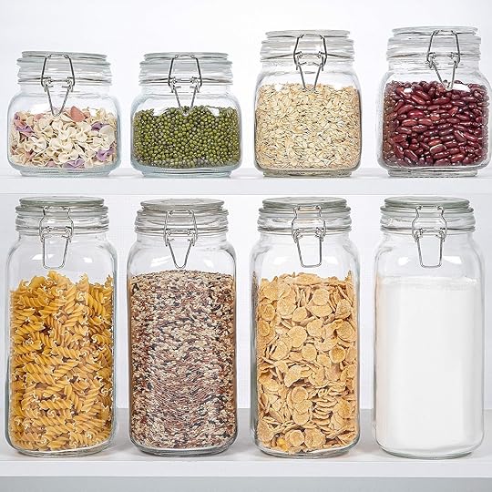
Stoneware Tilley Food Storage Canister | Dansk Niklas Airtight Containers | Glass Food Storage Jars with Airtight Clamp Lids
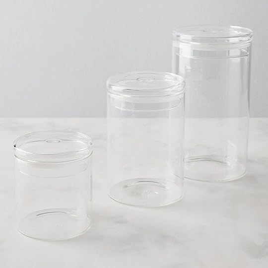


Essential Glass Storage Container | Airtight Food Jars with Bamboo Wooden Lids | Stoneware Canister with Wood Lid Cream
#3: Get a Tray
 left: photo by zeke ruelas, from: modern deco kitchen reveal | middle: photo by sara ligorria-tramp, from: portland project kitchen | right: design by arlyn hernandez | styled by emily bowser | photo by veronica crawford | from: arlyn’s rental kitchen reveal
We might love trays more than we love serving boards. MAYBE. They are good for everything! They are the zone makers of the kitchen countertop. We tend to use them for corraling decanted oils and everyday kitchen tools and coffee stations but they could also easily work for collecting things like mail or important papers.
Here are some very pretty options:


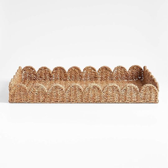
Acacia Modern Serving Platter | Oslo Wood Tray | Scallop Natural Woven Fiber Tray


Footed Marble Countertop Tray | Forest Stripe Tray | Marble Rectangle Tray
#4: Don’t Forget Art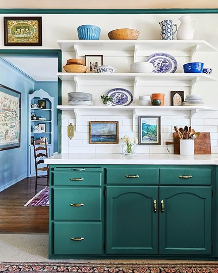
 photos by sara ligorria-tramp | left: design by allison pierce, styling by velinda hellen & erik staalberg, from: working with what you’ve got – an $8k budget kitchen makeover with a lot of bintage charm | right: design by jess bunge for ehd, from: jess’ kitchen reveal
This one is highly personal in terms of style but don’t deprive your kitchen of some art. What a perfect opportunity to add your personality to your space! If you can’t make any wall holes, you can either lean them or hang them on tile with removable adhesive (as long as they aren’t too heavy). If you can’t tell we love a little vintage piece which you can find for such affordable prices at a flea market or thrift store.
But for online options, here are some we love:


Desert Sketch Framed Wall Art | Hold Tight Baby – Art Print | CLEMENTINE #3 Art Print


Cheetah Framed Wall Art | Vintage Framed Canvas Art | Landscape Collage 101
#5: If Needed Upgrade Your Basics
 left: photo by tessa neustadt, from: la kitchen reveal | right: design by velinda hellen design | styled by emily bowser | photo by sara ligorria-tramp | from: the 3 best ways to save $$$ on your kitchen reno (+ our ehd alumns’ first reveal as a new boutique team)
Look. If you have perfectly great basics like a utensil holder, paper towel holder, a pinch bowl (if you use one), etc then ignore this section. OR maybe look around your house to see if a wide-top vase you already have could be your new utensil holder. No need to spend any money! That’s all to say, if you’ve been wanting to add to or switch up the style of your kitchen, getting a couple of new pieces (or new to the room) could change the whole look and feel of your space. It’s truly wild what one swap can do. Consider the material, shape, and pattern to add in the look you’re going for.
For new suggestions, check these cuties out:


Terrafirma Utensil Holder | Black Kitchen Utensil Holder | Tiburon Pitcher


Wood and Marble Paper Towel Holder | Simple Wood Paper Towel Holder | Toyon Travertine And Brass Paper Towel Holder


Scallop Edge Pinch Bowls | The Salt Sphere | Mini Snack Bowl Set
#6: Add Lighting
 left: design by emily bowser, photo by sara ligorria-tramp, from: emily bowser’s kitchen reveal | middle: photo by kaitlin green, from: farmhouse kitchen reveal | right: design by cassandra laValle, photo by ellie lillstrom, from: cassandra laValle’s basement kitchen reveal
Don’t think your kitchen couldn’t also use some mood lighting. It can! Plus it will look and feel great, in the evening especially. We love love love a little mini lamp if you have the space. It’s another opportunity to add some style and character that is a little unexpected. Even a pretty under-cabinet light can do the trick if you don’t have counter space.


Mini Rattan Wrap Stick Table Lamp | Seine Portable Table Lamp | Battery-Operated Rotatable Magnetic Light
#7: Use Your Walls
 design by emily bowser | photos by sara ligorria-tramp | from: emily bowser’s kitchen reveal
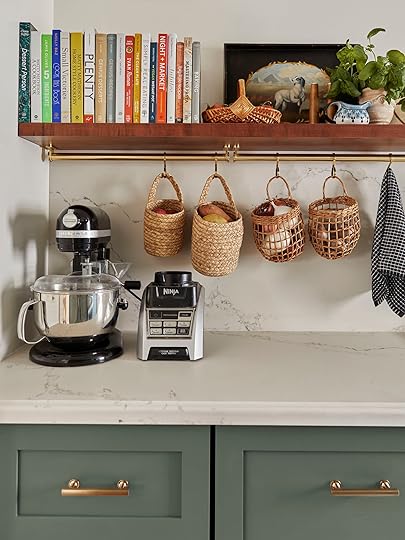
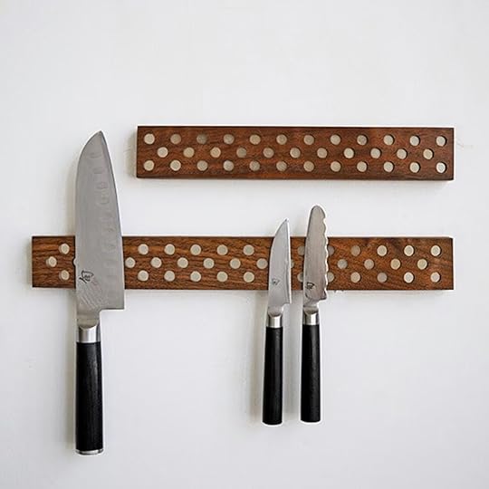
Not all of us are blessed to have ample counter space so this is when we need to look to the walls! Not only is hanging things like knives and pots on the wall functional, but it can also be pretty. The EHD alum proves that through all of their kitchens (the ones that are in this section:)) Bower’s kitchen above is exhibit A!
 design by velinda hellen for ehd | photo by sara ligorria-tramp | from: velinda’s tiny kitchen makeover takeover
Then Velinda even got a little creative by using what I believe is a towel rack and attached it to her (very low) ceiling. Genius! Also, those knives look so beautiful on the tiled backsplash. The subtle light blue and silver tones are so pretty together.
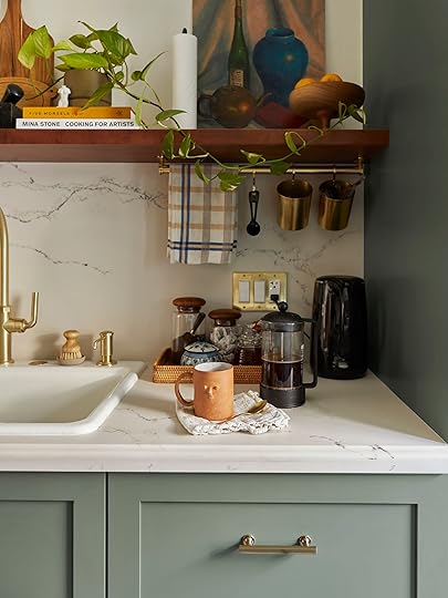 design and photo by sara ligorria-tramp | styled by emily bowser | from: how sara’s new galley kitchen actually looks in the everyday and how it functions for their needs
And finally, Sara took another approach by placing her rails under her shelf! So while they aren’t used for knives or pots, they are helping to clear up some useful counter space.
Here are some great options to help your counter space crowding:

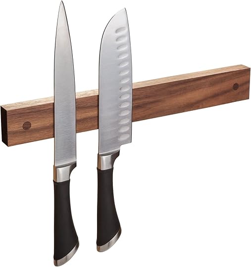
Magnetic Knife Holder | Contemporary Magnetic Knife Bar | Powerful Magnetic Knife Strip
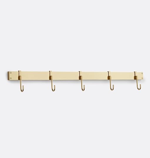


Emery Pot Rack Bar | Copper Pot Rail | Enclume Copper Wall Rack
#8: Add An Accessory Or Two
 left: photo by tessa neustadt, from: la kitchen reveal | right: photo by sara ligorria-tramp, from: portland project kitchen
So maybe you are mostly happy with the look of your countertops but it could use a little zhushing. I’m not talking anything major but let me tell you a nice vase can go a long way! You don’t even need to fill it with flowers necessarily but that’s always an option! My dad says “You should always have something living in your house ” when talking about flowers. Of course, one could argue that cut flowers aren’t exactly “living,” at least not for long, but it’s a nice sentiment that I follow 50% of the time…maybe. But you know what does live on forever? A great vase! See how much they add to these kitchens?
 photo by kaitlin green | from: farmhouse kitchen reveal
One other fun accessory that’s also pretty useful is a cookbook stand. Em is a huge fan and I have to agree. It’s a nice tall decor piece (varying heights with accessories is ideal) that really makes you look like a great cook even if you may be more of a novice. They are great in a corner but can really go anywhere you’d like. No rules as long as it’s away from an open flame:)
Here are our pretty picks:
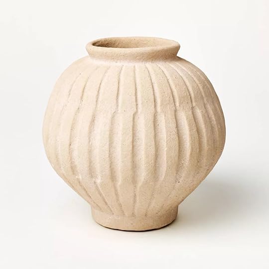

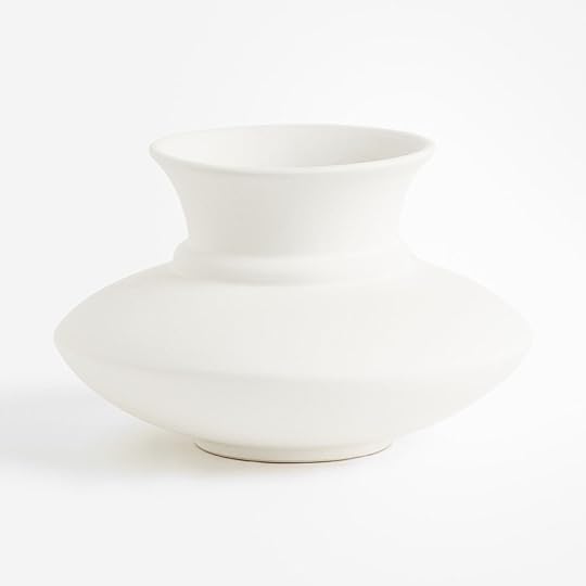
Tall Carved Ceramic Vase | Aria Looped Vase | Low Stoneware Vase

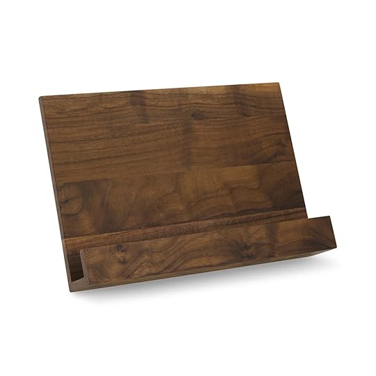
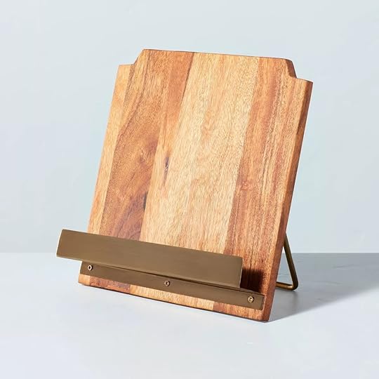
Black Metal Tabletop Frame Easel Stand | Walnut Cookbook Stand | Wood Cookbook Holder with Metal Ledge
#9: Books!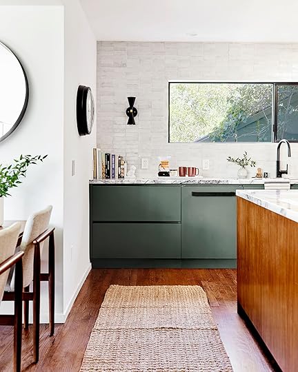
 photos by sara ligorria-tramp | left: design by asom home, styled by velinda hellen, emily edith bowser, and julie rose, from: tour this eclectic midcentury modern house designed by asom home | right: design by carly waters, styled by velinda hellen
You’ve made it to the end! And it’s as easy as it sounds. All you need are your favorite cookbooks (or get some:)) and show them off. If you want a really minimalist neutral look then you should A.) Not display your cookbooks or B.) Choose ones that are in a simple, neutral color palette. I know the second one may sound silly and I’m not telling anyone to avoid colorful cookbooks. But if you want a totally neutral-toned kitchen, maybe keep the brightly colored ones in a cabinet:)
The first easy way to display your cookbooks (aside from a stand:)) is to place them in ascending order where the tallest one is on the wall and a pretty bookend is next to the shortest one. This makes them easily accessible and cute decor.
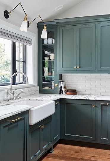 photo by sara ligorria-tramp | from: portland project kitchen
Don’t worry if you only have a few. See how pretty that stack of three is in the Portland Project kitchen??
 design by nine arrows | styling by emily bowser & erik staalberg | photo by sara ligorria-tramp | from: the new design rules
But if you prefer a horizontal stack, maybe throw a cute vase on top to create a sweet little vignette when you aren’t using them:)
Hope this was helpful and even a little inspiring to tackle a project you’ve been potentially wanting to get done:) Happy styling (and cooking)!
Love you, mean it.
Opening Image Credits: Design by Rosa Beltran | Styled by Velinda Hellen | From: The New Design Rules
The post 9 Easy Breezy Ways To Make Your Kitchen Counter Look Better appeared first on Emily Henderson.
April 3, 2024
My “Kitchen Kid Clutter Drop Zone” Problem, SOLVED (ish)

When we designed the house and put the kitchen here (because it’s the best southern light) we knew that we were asking for kid clutter. My genius plan to train the kids to go around the house to the mudroom (expertly executed by locking the kitchen door and giving them candy each time they dropped their stuff in the mudroom) lasted approximately 2 days. Not because they didn’t want the candy or because they couldn’t be trained but because they, like many kids, would hold it all day if you know what I mean, and getting inside IMMEDIATELY was the priority. Plus when it’s raining this entrance just makes more sense. Also, if they did drop everything in the mudroom, in the morning when we are scrambling to get them out the door, they would have to go backtrack to get their stuff, walk around the house, and blah blah. We are always scrambling so adding inefficiencies doesn’t make sense. That’s all to say that this is our defacto kids drop zone and it’s not just them – twice a week we have anywhere between 4 and 7 kids over to play. So this area has to work MUCH HARDER than other areas in the house to help my sanity.
How We Styled It For The Reveal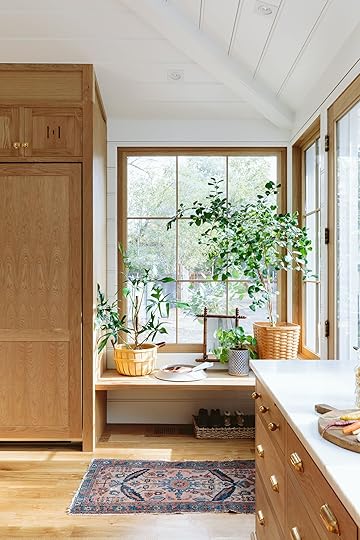 from: farmhouse kitchen reveal
When we styled it for the OG photo shoot a year or so ago, I styled it to be pretty also not knowing how much use it would get. You see since the outside was under construction until last June we couldn’t even ask them to go around the house to the mudroom (and the plants helped mask the construction out the window). But yeah, that big plant quickly died (under my sister’s watch, sorry Katy to publicly out you LOL) and while I loved the other stuff there, we needed the space for backpacks and coats.
The Kid Clutter Problem SOLVED (LOL, It’s Never Solved But BETTER)
Coat Rack | Switch Plate | Wall Shelf
So here’s what we did – First, we hung those hooks into the fridge cabinet (which I was terrified to do, TBH). I bought this vertical hook set last year from Target for the front entry but since no one uses that door, I stored it and then installed it here. The lower ones are great for the kids and since there are multiple we can really load it up (and we do). The shelf is for their Gabb watches which they pop off as soon as they are home, stick them on their chargers, and the last thing they put on before they leave the house. The bench is now for their bags (no pretty tray for mail, that happens in the pantry and our vintage secretary).

These three baskets have SAVED US. Two are for shoes and one is for our day-to-day sports stuff that we are ALWAYS scrambling to find (basketball shoes, cheer shoes, ultimate frisbee gloves, frisbees, basketball, cleats, etc). Does that mean that the kids always put things away in the right spots? NOPE. But they are so much better. And when I go to put things away I can re-org the sports stuff which sets us up for a better week (when we had just one basket it was all too mixed up).

Coat Rack | Hat | Purse | Gabb Watch | Wall Shelf | Duffle Bag (unavailable) | Planter | Baskets | Rug
Now obviously it doesn’t look like that – there are usually 4-6 coats on the rack and big bulky backpacks on the bench, but the kids had those at school and I’m a stylist so there was no way I was going to style with ugly coats and hats. Sorry!
Here is what it looked like before I did this all:


On the left is what it looked like on a random Sunday and on the right was the clean version later that day. I was NOT set up for success, y’all.


I thought that the coats blocking the window might bug me, but it doesn’t AT ALL (we clearly have a lot of light in here). The only thing that still happens is that longer coats can knock the kid’s Gabb watches off their chargers easily. But with a few cord tacos and velcro stickers, the chargers stay in place without falling off or looking messy.

The plant pot is a recent Target purchase (SO CUTE) and the new to me vintage rug actually goes in the hallway but I wanted to show it off because it’s so beautiful (thank you Sheba from Blue Parakeet!). All in all it’s a solid 60% better. I still have to remind the kids to put their shoes in the basket, and not just throw their coats on the bench but it’s just so much less of a thing. And if you are wondering if we are glad that our mudroom is where it is, we sure are – we need it for all of our pasture boots on that porch (full of mud and literal shit) and its where the kids dry off and hang their towels after getting out of the hot tub.

While the first shot is more eligible to be in a magazine and is more fun for your eye to look at, the third is far more functional for our family. CLUTTER PROBLEM (mostly) SOLVED.
*Photos by Kaitlin Green
The post My “Kitchen Kid Clutter Drop Zone” Problem, SOLVED (ish) appeared first on Emily Henderson.
April 2, 2024
Rules For Picking a Coffee Table (+ 69 Of Our Favorites for Every Space – The 2024 UPDATE)


Well, it’s been two long years since we’ve given this pretty helpful post an update/overhaul so it was time! Picking out a coffee table is something that you think you just instinctually know how to do… until it’s you actually need to buy one. That’s why we made this post so you don’t have to guess what size, shape, or type you need to make the perfect sofa match. Hope you love the new picks. xx
The coffee table. So functional, so often an afterthought. Sofas get all the living room glory, and sure they keep us comfortable. But the coffee table is the workhorse of the living room. It holds our drinks, remote controls, beloved tech devices, treasured trinkets, and, for better or worse, our take-out dinners at the end of a long day. It occasionally doubles as a stool (which we’re not endorsing, for legal reasons, but we won’t deny having done on occasion), a desk, or a craft table. With such a big, diverse job, you’d surmise that it would be one of the first furniture pieces you thought about when moving into a new place and/or re-decorating… except it’s usually not.
How many hours do we put into choosing the perfect sofa, the perfect rug, the perfect chairs for our living room…only to throw in a hand-me-down coffee table that used to belong to Aunt Susan? (bless her heart). Okay, we don’t all go down the who-cares-about-a-coffee-table route. Plenty of you have definitely belabored the choice of a table, we’re sure, but regardless of what side of those scenarios you find yourself, you might need some guidance or inspiration in the coffee table shopping department. What size and shape go with what sofa size and shape? It might feel like a shot in the dark, but fear not, we’re here to help. We’ve put together a shopping guide with all the best coffee tables we could find—round, square, rectangular, oval!—and a few rules to keep in mind (with a diagram!) when choosing a coffee table.
First up: rules. While you can, of course, go with whatever shape and size you like, to have an ideal relationship between your coffee table and sofa, here are some general things to keep in mind: Your coffee table should be at least half the length of your sofa (but no more than roughly ⅔ the length) and should sit at about the same height as the seat, give or take 4 inches (i.e., if your sofa is 90-inches long and 20-inches tall, you should look for something, no matter the shape, that’s around 45 to 54 inches wide and 16 to 24 inches tall). However, if you have a sectional with a chaise, and your table is going within the open L-shape that sofa shape creates, that 1/2 to 2/3 guideline applies better to just the length of the horizontal seat, rather than the full length of the sofa. Here’s a quick graphic to show you what we mean, as well as a breakdown of ideal shapes by sofa configuration:

For more living room-specific tips, see this post where we broke down tons of super helpful tips like how much space you need around a table, rug size rules, lighting guidelines and more.
Once you figure out the right size and shape, after that, it’s more about making the right design choice for your space. Rectangular and oval-shaped coffee tables can almost be interchanged, depending on what kind of flow you’re looking for—same goes with round and square. Let’s break it down a bit further (with the bonus of our favorite shopping picks):
Rectangular photo by tessa neustadt | from: mel’s living room reveal
Consider a rectangle (or oval but more on this shape later) if you have a standard sofa (or an extra-long sofa with a chaise) so everyone can have easy access to their coffee, cocktail, or late-night snack of choice. This is also a great choice if you have a narrow space with minimal walk-around clearance. If you’re a household with more remotes or tech cords than you can count, think about getting a table with some functional but still sleek drawers like #1, #7, or #11. Oh, and if you regularly eat in front of your TV (whether by choice or because you don’t actually have a formal dining area), a lift-top coffee table is super useful for not having to hunch over your plate (#15 and #20).
HOT TIP: This goes for all coffee table shapes, but a coffee table is a great way to make a visual statement! So consider choosing a contrasting material, color and/or pattern to the other pieces in your living room.
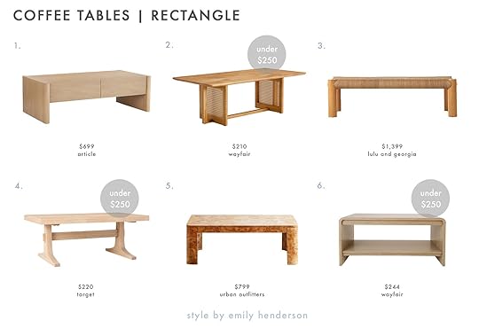
1. Torme White Oak Coffee Table | 2. Tariffville Rectangle Coffee Table | 3. Lerner Coffee Table | 4. Pedestal Wood Coffee Table | 5. Cora Burl Wood Coffee Table | 6. Patmos Coffee Table

7. Mathus Coffee Table | 8. Elemental Layers Coffee Table | 9. Estate Travertine and Metal Rectangular Coffee Table | 10. Clarkin Coffee Table | 11. Bios Coffee Table | 12. ÄSPERÖD

13. Tingsley Coffee Table | 14. Elowen Coffee Table | 15. Naya Pop-Up Coffee Table | 16. Nemus Coffee Table | 17. Willem Coffee Table | 18. Horseshoe Coffee Table | 19. Woodson Coffee Table | 20. Mid-Century Pop-Up Coffee Table | 21. Brisa Burl Wood Coffee Table
Square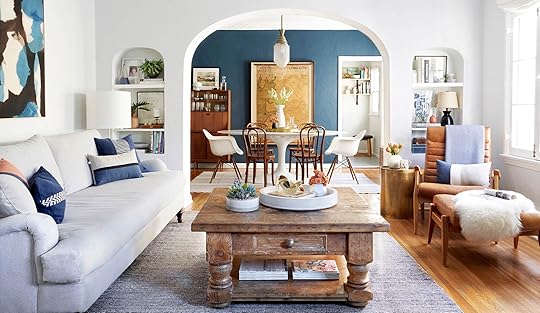 photo by zeke Ruelas for ehd | from: ginny’s living room reveal
If you have a large comfy sectional or the traditional conversational setup with a sofa and a couple of chairs (kind of like Ginny’s living room above), a square table is a great choice. It fits perfectly in the L-shape nook of your sectional or the big space in the middle of your chat zone. The best part of a square table? You get the most styling space bang for your buck. Who doesn’t love a well-styled coffee table vignette? Plus ones like #5, #10, #14, #15, ams #17 have an extra shelf!
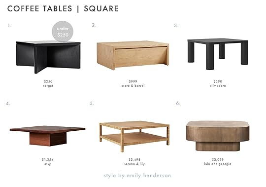
1. River Heights Square Wooden Coffee Table | 2. Vander Natural Wood Square Storage Coffee Table | 3. Patricio Coffee Table | 4. Pedestal Coffee Table | 5. Balboa Rattan Coffee Table | 6. Sunako Coffee Table

7. Kanta Marble Coffee Table | 8. Enyo Square Travertine Table | 9. Flash Table | 10. Profile Coffee Table | 11. Bovisio Smoked Glass Coffee Table | 12. Couture Nicoletta Square Marble Coffee Table

13. Culver Square Coffee Table | 14. Chadwick Mid-Century Square Coffee Table | 15. Grooved Wood Square Coffee Table | 16. The Dean Coffee Table | 17. LIATORP | 18. Yoko Coffee Table
Round photo by sara ligorria-tramp | from: reveal: arlyn’s bright & happy rental living room makeover
For anyone living in a small space where every piece of furniture counts, think about cutting corners (literally) and going with something round. It’s also a good choice to pair with a sectional or sofa with a chaise since it’s a good “nook” shape, i.e. it fits into a little nook of space nicely like in my (Arlyn’s) living room. They also work great because their shape beautifully contrasts the rectangular shape of a sofa. It’s a win-win!
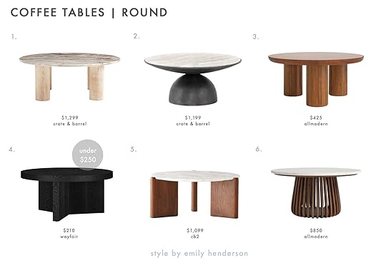
1. Homage Marble and White Oak Wood Round Coffee Table | 2. Dev Taupe Marble and Grey Metal Round Coffee Table | 3. Aicha Coffee Table | 4. Casmera Coffee Table | 5. Santoro White Quartz Coffee Table | 6. Kendall Coffee Table

7. BORGEBY | 8. Zenaide Coffee Table | 9. Gweneth Round Coffee Table | 10. Burl Rotating Coffee Table | 11. Repaso Ebonized Ash Wood Round Coffee Table | 12. Noria Coffee Table | 13. Drum Storage Coffee Table | 14. Shaker Coffee Table | 15. Cap Ivory Cement Coffee Table
Oval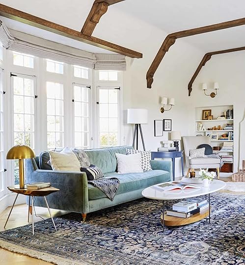 photo by tessa neustadt | from: experimenting in my living room: trying to find “the” rug
Oval is a good call if you have some small humans running around and want to attempt to avoid any face-to-table sharp-edge encounters (round is also good for this). If your living room is a high-traffic area (like, do you have to walk through it to get to another space like the kitchen or dining room?), a more sinuous shape helps with visual flow, as well. It accomplishes the same look as a rectangle but softens a really angular or modern sofa. The classic mixed marble and wood design (#10) is a favorite around here (check it out in Emily’s old living room here). The thin legs keep it light and floaty (which balances the heavier wood at the bottom). Of course, the Aluminum Flat Leg Coffee Table (#13) and the brass table from Brady’s living room (#15) are perfect if you love a modern design classic. However, if you’re into making a bit more of a statement, check out the table from West Elm at #3; it has a postmodern-inspired vibe that could add a serious cool factor to a simple, stripped-back living space.

1. Osiris Coffee Table | 2. Tony Coffee Table | 3. Organic Modular Table | 4. Lenia Walnut Oval Coffee Table | 5. Mariko Oval Coffee Table With Cane Front Drawers | 6. Michale Solid Wood Coffee Table

7. Clairemont Ebonized Oak Wood Oval Coffee Table with Shelf | 8. Henderson Coffee Table | 9. Nova

10. Thomas Bina Olivia Coffee Table | 11. Lippa Oval Coffee Table | 12. Bordeaux Gold Metal Marble Oval Coffee Table | 13. Aluminum Flat Leg Coffee Table | 14. Nero White Marble and Brass Base Oval Coffee Table | 15. Gaultier Coffee Table
So…what else do you wish you had guidelines for? We’ve done a handful of posts with tons of rules by room, but how would you want us to drill down deeper? What do you struggle with regularly while decorating that you want some signature EHD how-to post action on? As always, let us know in the comments.
Since you’re already riding high on design guidelines, here are some more posts that might be helpful:
Design Mistakes: Hanging Curtains All WrongLiving Rules to KnowDining Room RulesBedroom Design RulesMy Top 3 Design Rules. Ever.Check out more HEREOpening Image Credit: Photo by Tessa Neustadt for EHD | From: How to Add Style to a Neutral Living Room
The post Rules For Picking a Coffee Table (+ 69 Of Our Favorites for Every Space – The 2024 UPDATE) appeared first on Emily Henderson.
April 1, 2024
The Affordable Bathroom 2024 Decor Trend That We Are Loving Right Now
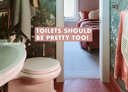
I feel like I’m always behind on trends compared to other people. As you know I’m a bit risk-averse when it comes to hard finishes (tile, flooring, etc). But the other day I was looking at World of Interiors (an awesome European magazine that always has fresh and cool trend ideas) and I saw a shot/idea of a beautiful bathroom with a pillow on the toilet. I was intrigued and wondered if this is the next big trend. Part of me felt like it was a bit silly, but then I realized that it could be a great affordable way to bring in texture and softness in an otherwise hard seat. But what makes a pillow right for a toilet? While there seems to be a big toilet-specific pillow hole in the market I went on the hunt. Today I’ll show you what “toilet pillows” I’m into with the rules around what really works as your official “toilet pillow” should you want to dabble in this trend.
 Toilet Pillows: Things To Consider/Good To Knows
The shape and style are important of course, but also consider the size of the person’s behind, their bathroom habits (length of stay, specific back problems that might need a special foam firmness), and definitely get wipeable fabric – Sunbrella is great, but skip velvet, boucle or knits with a chunky open weave. Leather might have a nice patina as rogue liquids splash onto it over time but might not be everyone’s cup of tea.
The Simple Square Or Rectangle Pillow (In Durable Outdoor Fabric)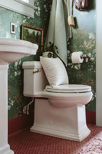
Here’s my case: The bowl is round and the shape of the toilet is more sculptural, so I thought that a square pillow would pop off it nicely and add dimension and contrast, but in a simple way. The shape of the toilet is more detailed, so a square balances it, with its clean lines. I love the subtle stripe against the floral wallpaper.

A smaller rectangle was maybe a better scale for our toilet – helping it feel more balanced. Bonus points for these two because they are Sunbrella, so again, should there be any toilet accidents near the fabric it could easily be wiped or washed. I like how these recede and don’t call attention away from the pretty wallpaper and tile.
Striped Lumbars
I actually really love these – the pattern pops and the longer lower shape of these lumbar pillows could in fact be really supportive to your guests (especially for older folks who need more back support). This feels more fun and eclectic but still something you could use in other rooms should you like to move your pillows around like I do (you also might want a dedicated toilet pillow if you have kids, specifically boys with their toilet habits that might be a bit unpredictable). A busy pattern could also be more forgiving over time.
Make It Playful And Round?
I wanted to lean into the roundness of the bowl and combine another big pillow trend (round or sphere pillows). I think this is actually super fun – the pom poms are so playful and pick up on the other round elements in the room (the toilet paper, the shape of the shower head, etc). If this white scares you (I get that) I’d go for a more earthy color and lean into the colors that might “go” better with toilet-related things.

I loved this one because it picked up on the gold in the vintage frame/painting above the toilet. I like how tailored this pillow is, with the piping and the single-button tuft in the middle. This just looks like a pillow you are supposed to sit on (of course you need to remove the pillows before you actually go) and the seriousness of it makes me smile.
The Perfect Sphere
I bought this pillow from Lulu and Georgia for our bedroom, but I think I like it up here just as much. The smaller scale lets the shape of the toilet shine, it helps your eye dance around while it moves over the curves. It also feels like a nice pillow to hold, should you need something to squeeze during the more intense morning routines.
A Bohemian Fringed Lady
While I love this pillow, it doesn’t feel right here as the toilet pillow. I think something about the longer fringed tassels feels gross to me, could pick up on germs, rogue splashes, etc. While some of these pillows really elevate the room, this feels like a big messy miss to me.
A Semi-Circle Rainbow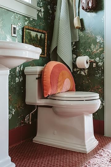
I LOVE the shape of this 1/2 circle on the toilet. It clearly rests easily, and the lines of the rainbow seem to really mimic the base of the toilet (the bowl shape almost finishes the circle). If this one came in a more muted color palette I could see it really selling the idea (and selling out, pillow designers please take note). Now that I think about it, I think a leather strapped back cushion, actually attached to the toilet could be a super chic way to explore this trend.
Make It Personal
As you know, I’m a memory hoarder so putting our wedding photo on a pillow was something I did years ago and makes me smile every time I see it. Admittedly, it’s been hard to work this pillow into many of our rooms because it’s rather specific (I think it might embarrass Brian TBH). But up here in the guest bath, on this toilet, it feels like the perfect way to celebrate our love and marriage with our guests. Hopefully, it will make Bob and Suz smile the next time they are up and adding that personal touch certainly makes this trend feel more sentimental and custom.
Like all decor, this trend isn’t for everyone, but to me, it just seemed like a big “why not” and now that we have this toilet pillow I’ll be bringing them into each of our bathroom designs, making sure that the pillow works with the style of the bathroom, the shape of the toilet, the scale of the bowl and considering daily habits. I’m very curious if this trend is going to take off (Europe is always first to these things) and if yes, then perhaps companies should start adding toilet-specific pillows into their inventory. I’m pretty into it.
So how do you feel about this toilet trend??? Are you into it???
xx Emily (…And Happy April Fools’ Day :))
*Photos by Kaitlin Green
The post The Affordable Bathroom 2024 Decor Trend That We Are Loving Right Now appeared first on Emily Henderson.
Emily Henderson's Blog

- Emily Henderson's profile
- 10 followers

