
Emily Henderson's Blog, page 2
October 9, 2025
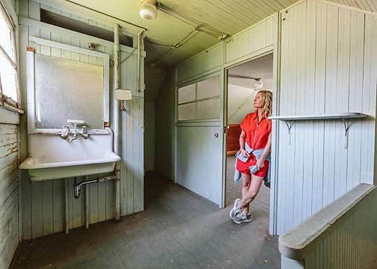
How Much Will It Cost To Remove Asbestos And Lead Paint From Our Guest Cottage (+ What I’m Willing To Do Myself To Save Money)
OK, lead and asbestos info coming at you – and before you click away, I know this stuff might sound boring, but it’s actually riveting because I can see all the dollars we are saving. I’m GIDDY. In past gut renovations, I would have just relied on our professional contractor to hire the experts to do the work needed, and listen, typical GCs don’t offer up budget or DIY ideas. You aren’t going to skimp on stuff like foundation or ask the homeowner to DIY asbestos (especially on a public project) because you have to guarantee the work long-term. ARCIFORM, for instance, is a high-end company, and for our huge renovation, they hired the best of the best in Portland, which meant the most expensive subs that guaranteed very high-quality work that lasts forever (but it sure did add up). That was great for this home (hard to swallow at times, but I’m grateful that it’s done right and in the past). Now, for the guest cottage, we just don’t want to spend money if we don’t really need to. And by project managing myself (no GC), I’m learning SO MUCH. I’m getting multiple quotes and asking the experts what they would recommend we try to tackle ourselves versus hiring out. I was surprised by what the answers were re lead paint and asbestos, and today I’m sharing.
Now I feel compelled to give the disclaimer that obviously I am not an expert in toxic home substances, and the internet might recommend you not do these things yourself (what we are DIY-ing is legal, btw). And yet, all the subs that toured our guest cottage gave us the exact same advice on where we could easily save by doing it ourselves and would be just as good/safe as if they did it. So this is all anecdotal, and I’m taking no legal responsibility because I’m not giving ANY advice here, just telling you what I learned and what we are thinking about doing.
Asbestos – How Much We Have And How Much It’s Going To Cost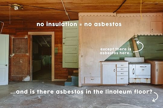
The good news was that our house is so old that there is no insulation, which is usually where there is A TON of asbestos. Our inspection report indicated that there might be asbestos in the linoleum floor (which is over the original wood we want to refinish in the main room) as well as the ducting near the stove (around 12 feet). So it’s pretty minimal. But still, I would never have considered doing asbestos abatement myself (keep reading). I had 3 abatement companies come, inspect, and submit quotes.
Company A – John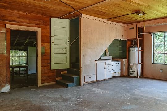
The first company came in at $7,130. Around $4k to remove the asbestos in the flooring and $2,250 for the ducting, then with a bunch of prep and legal fees. I didn’t love this quote, obviously, but having never done this before, I didn’t know if it was market rate or not. Thank goodness I continued to get quotes.
Company B – Leon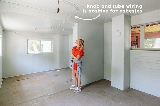
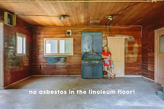
This company asked us if we wanted to test for asbestos and levels of lead, which cost $450 in lab tests (we didn’t know the cost when I agreed, whoops). While that does seem like a lot, he recommended it because he wasn’t convinced it was underneath the linoleum. Turns out the floor came back NEGATIVE FOR ASBESTOS!!! INCREDIBLE. His cost for removing it in the ducting was only $995! He did, however, say that there was asbestos around all the knob and tube wiring, which would cost $1,595 for him to remove. But he was very clear that we could do this ourselves and that most people don’t hire out for this (more on that below). But if we just did the ducting, it would be $995.
 Company C – Barry
At this point, knowing that the flooring wasn’t asbestos, I had Barry only quote for the ducting. They came back at $1,782 for the same job as Leon (although Leon charged $450 in lab fees, and I’m assuming they make some money off of that).
Our Decision For Asbestos Abatement And What We Are Going To DIY Ourselves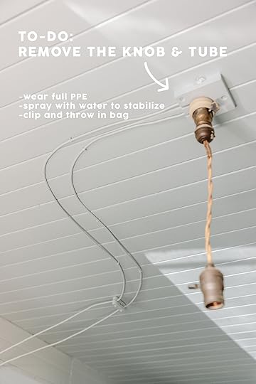
I think it’s pretty clear that we went with Leon, company B, at $995 (having already spent $450 on the testing labs), and then he walked me through how to safely get rid of the knob and tube that has encapsulated asbestos around it, so that we could save that $1,595. He said to gear up in full PPE (hazmat suit, mask, etc), spray water on it with a spray bottle to stabilize it (and reduce the chance of loose fibers/particles), clip it with clippers, and throw it in a bag. Now, I need to look into where I legally dump this, but he said it was very much DIY-able, and most people do this themselves.
Now Onto Lead Paint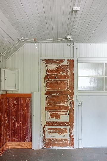

A fascinating and frightening historical fact about lead paint, which is no joke. Banned in the late 70s, most paint before then had a decent amount of lead in it (which made it durable), but lead is lead; it’s toxic in every form. But I guess that the reason they even realized that it can be so poisonous specifically for kids’ brain development is because kids were gnawing on window sills and eating the chipped paint from window sills off the floor, because lead paint is oddly sweet. WHAT???? But most houses built before the 1970s have lead paint likely underneath fresher paint, but it’s universally accepted that it’s only dangerous if it’s “disturbed” (i.e. flaking off), consumed directly by breathing in dust, eating flakes of it, or in water/soil (which is why you don’t sand blast it off – it actually makes it much more dangerous). Again, I’m not giving advice here, just passing on my research (which involves both deep internet and asking like 6 contractors/experts I know with a lot of knowledge and experience). We are safely and legally abating it, don’t worry.
Where Is The Lead?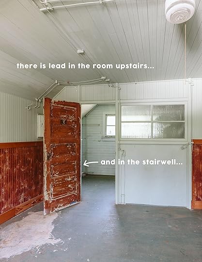
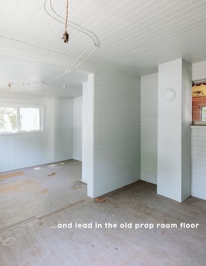
The good news is that we don’t have very much paint in the house. Most of the rooms are paneled with wood or just have open beams. So it’s mostly the stairs and the room upstairs (and the floor of the prop room). If it were on a bunch of old gross drywall, we might remove it all and just replace it, but since it’s all on good wood paneling, we aren’t demo-ing it out.
First And Only Quote For Lead Paint Abatement
Company B (The same as above, Leon) gave me interesting insight. He said that sometimes in these really old homes, they couldn’t afford lead paint (it was the fancier, more durable paint back then), and there was a chance that there wasn’t enough lead in the paint to even worry about. He tested it at a lab (that was included in the same $450 fee, above), and it came back to have twice as much that is legal, which isn’t that much, actually (the legal amount is 5000 ppm, ours had 10k ppm – parts per million). It’s pretty minimal. He also reminded me of what the internet told me – that lead is really only dangerous if consumed directly by breathing in dust, flakes, or eating it. Leon said we could totally do this ourselves, but gave me the quote anyway. He quoted $4,495 to stabilize and prime over all the lead paint.
I asked Leon multiple times how he would do it versus a normal DIY homeowner, and he said the process was the EXACT same. You gear up in PPE, then “stabilize” it by scraping off any loose paint, perhaps sanding with a block sander, then prime over it to encapsulate it. So we’d be doing the exact same process; he’d obviously be faster at it, but it’s not a highly skilled job nor requires fancy tools. He honestly just thought we should do it ourselves and save the $4,495. I agreed with Leon 
If we had hired the first asbestos removal guy ($7,130), added on the knob and tube asbestos removal (which he didn’t quote for but Leon did at $1,595), and then hired out to remove the lead paint ($4,495) plus the $450 testing fee, we’d be at a whopping $13,670.
Total Cost We Are Paying
We are only hiring Leon to remove the ducting asbestos for $995 + the already-spent lab fee = $1,445. We will (safely) be doing the lead paint stabilizing and the knob and tube abatement on our own, and we are so glad that we got multiple quotes instead of just hiring the first company who assumed the flooring had asbestos without testing. Now, of course, there will be some purchases of supplies (PPE, spray bottle, scrapers, primer, etc), but pretty minimal, we hope. Also, this isn’t something I’m going to let my team help me with just because I feel a little weird subjecting them to known toxic materials, even if we are safe with PPE. So they’ll help film an intro and set up a time-lapse then take off (I mean, it’s pretty boring stuff to film anyway).
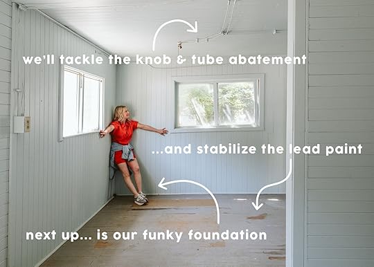
Next up are the foundation quotes, which are coming back with some pretty good news, THANK GOD. I’m waiting on one more before comparing them all and showing you what we are doing.
If anyone has experience doing either of these projects themselves and can give any tips, let me know in the comments!
*Photo by Kaitlin Green


October 8, 2025
12 Really Good Small Online Decor Shops To Make Your Home Unique

When I originally thought of this online decor shops post, it was because A. I just shot my house, and getting to show off all of the special things I’ve collected over the years makes me SO happy, and I want others to feel the same about the things in their homes. B. Both Pierce & Ward and A1000xBetter were/are doing special sales (sorry, the P&W one is over), and C. I adore a list of cool places to shop because my mind tends to go blank when I’m trying to think of shops on the spot. Fair warning, these aren’t going to be the most affordable places to pick up cool decor. Running a small business isn’t cheap, as I’m sure you could imagine, so understandably, they have to sell pieces that will make them a profit, and their inventories aren’t endless, like big box stores tend to be. Etsy is always a great online place to score more deals. And don’t get me wrong, I also love a big box store. Big box doesn’t equal bad design! However, if you style your home with exclusively pieces from those types of stores, you will still have a very pretty home, but it won’t truly be unique to you. You need pieces that are vintage, pieces that were hunted and found from flea markets, local stores, cool online shops, and family heirlooms, if possible! I also didn’t think this would be a companion piece to Arlyn’s whimsy article this week, but as I was choosing pieces, there are A LOT of really wonderful whimsical pieces. So please bookmark, pin, maybe purchase if you want, but above all, enjoy!
Roan Iris


Opal Wall Vessel | Ceramic Berry Colander Bowl | Standing Iron Toilet Paper Holder


Lidded Red Travertine Petal Box | Petal Wire Basket | Small Ceramic Bow Vase
What You’ll Find:Roan Iris is a family-run shop out of Montana that is full of very beautiful decor, including a lot of easy-on-the-eyes utilitarian pieces. My dad’s girlfriend was the one who introduced us to it when my dad wrote his cabin tour post. That brass wall vessel was a big hit with you guys:) It’s such a beautiful site to get to spend some time on. And if you happen to be in Bozeman, Montana, then you can stop by their brick-and-mortar!
Pierce & Ward


Dome Box | Abra Deep Blue Swirl Scallop Bowl | Cake Stand


King Cake Ceramic Catchall | Pivot Portable Lamp | Ribbed Beeswax Candle
What You’ll Find:What won’t you find at Pierce & Ward?? If you happen to be in LA, they also have a magical shop in Los Feliz, but if you aren’t, their site has plenty of amazing treasures. Caitlin and I actually just went to their warehouse sale, and Caitlin scored BIG TIME! Since I just shot my apartment (she says again:)) I clearly didn’t need anything and was extremely proud of the restraint I showed, ha. Actually, if you are an Instagram user, make sure to follow your favorite shops/designers. You never know when they are going to want to clear out their inventory. I got to go to the Lawson-Fenning Warehouse sale a few years ago and got so many wonderful things! But back to P&W. They most certainly aren’t cheap (the pieces above are on their more affordable side), but even if you just get something small, your home will be injected with personality. And in case you haven’t heard, they also have a much more affordable collection collaboration with West Elm I have one of their West Elm pillows in my living room (thanks to Emily Bowser) and a ring box from their LA shop. A little something from each spot!


Antique Gilt Frame Hand-Painted Engraving | Vintage Handmade Stoneware Vase | Lambswool Small Blanket


Antique EM and Co. Ironstone Compote | Gold and Red Trim Antique English Banker Box | Vintage Oil Abstract Landscape
What You’ll Find:Restoration House Shop is a beautiful, vintage-filled shop that’s owned by Kennesha Poe-Buycks. We got to meet her a few years ago, and she is absolutely wonderful! The prices are great too. But because there’s so much vintage, you’ll want to check back often to see what’s new and snag it quickly if you love it. That’s the beauty and curse of vintage…once it’s gone, that’s likely it:) The style absolutely leans more traditional/antique/rustic. But regardless of your style, go check it out!
Oblist


Jolene Wall Lamp | Dolores Bowl | Lydion Blanco Hueso


The Walls are Listening Sculpture | Brutalist Sculpture | Candleholder La Chose 2
What You’ll Find:Oblist is a STUNNING shop that’s owned by a husband-wife team out of Paris. The pieces are impossibly unique, on the more modern side, and what isn’t vintage is mostly made to order, which is in line with their push toward less waste and overall sustainability. This site is one of the priciest ones (again, the pieces I chose above are in their most affordable range), but it’s definitely worth a look to get inspired.
Hoppe Shoppe


Handblown Glass Oil & Vinegar Cruet | Vintage Sterling Silver Salt and Pepper Shakers | Yuta Segawa Miniature Vases


Vintage Textured Oblong Vase | Herbarium Glass Dome Flower Bud Vase |
What You’ll Find:Hoppe Shoppe is actually a woman-owned, Portland-based shop that I accidentally found online and loved! Their style is the perfect mix of modern and vintage. The color palette is definitley on the neutral side, but the shape and textures are so special. Even this little matchbox is incredible.
Leif


Landis Checkered Wool Pillow | Cimiez Ceramic Vase | Eugenie Print


Paige Block Print Pillow | Recycled Wool Throw | Lacquered Picture Frame
What You’ll Find:Leif is special to me because not only did I get a print from them for my last apartment, but they have a store in Brooklyn, which, if you know me, is one of the loves of my life. Also, another woman-owned shop! But why they are actually special is all the wonderful things they sell. Whimsy is the name of the game here, and color is everywhere. As you can see from the small assortment above, sweet and simple are the perfect descriptors, and you will undoubtedly find a special piece here.
Glassette


Nothing To See Here Ice Bucket | Shape of Water 03 Photography Print | La Pittura Ceramic Jug


Salt Pig Speckled Blue and White Glaze | Crinkle Photo Frame Set | Stripes Velvet Cushion Cover
What You’ll Find:I have been singing the praises of Glassette for a couple of years now, mostly of their art, but man, there is so much more! Joy and, of course, whimsy, would be the perfect words to describe this brand. The shapes, the colors, the patterns, all fun yet elevated. I think it’s impossible not to have an inspiring time on this site, so even if you don’t need anything, just go see for yourself.
Casa di Lavalle


Luisa Vase | Petite Dinner Taper Candles | Mini Yellow Handmade Ceramic Lamp


Vintage Yellow Bistro Butter Knife | Ceramic Stripe Trinket Dish | Antique Tole Dogwood Candle Holder Pair
What You’ll Find:Casa di Lavalle is the beautiful baby of longtime blogger, Cassandra LaValle (formerly Coco Kelley). Her taste is impeccable, and if I lived in Seattle, I would live in this store. For now, I’ll just have to look/shop online:) But like others on this list, she sources vintage and beautiful handmade goods that you’ll want one of each of. I mean, remember her basement kitchen? She knows what she’s doing.
The Tin Bin

 What You’ll Find:
If you love folk/primitive decor, then you will love The Tin Bin. It’s another family-owned shop out of Lancaster, PA, and while they have a lot of very sweet things, their lighting is what I love. That double candle sconce is what introduced me to them via Pinterest. They are charming, soulful, and reasonably priced, which isn’t easy to come by for a small business.
&Jacob


 What You’ll Find:
&Jacob has my heart for many reasons, and you will see a couple of very special pieces in my living room reveal:) Their playful shapes and mix of natural materials are so good. I got to go to their showroom in Mexico City a few years ago (I think I did everything a few years ago, according to this post lol), and it was so special. The people who worked there were so kind, especially since I didn’t realize their showroom isn’t technically open to the public…whoops! While I’m not sure about shipping to the US at the moment, the pieces are priced so fairly. That Mad Tea Party cake stand is insane! I might have to start baking to justify the purchase.
House & Parties


Japanese Silk Lantern Bar Lamp | Vintage Opaline Glass Vase | Martini Table


Vintage Saint Louis Pink Stripe Decanter | Taper Holder Bud Vase | Linen Lantern
What You’ll Find:House & Parties is super new to me and was also a Pinterest find. Man, I really hope AI doesn’t take over Pinterest because it’s always been such an incredible resource. Anyway, if you love color and vintage/vintage-inspired pieces, look no further. Even just looking at those six items above makes me so happy, but that Japanese Silk Lantern Bar Lamp is out-of-this-world good.
Claude Home


Roma Wall Lamp | Maré Snuff Bottle | Willow Floor Lamp


Flower Vase 03 | Awning Sconce | Vessel No. II
What You’ll Find:Dare I say that Claude Home may be my favorite on this list?? Anytime an Instagram post pops up, I immediately save it. The designs are so so special, and interesting, and chic, and someday I will shop from them to decorate my home. You’ll need a large budget for most everything, but if you have it, please support them because what they are doing is amazing. Regardless, just go peruse.
A 1000x Better Instagram Pop Up Shop
 What You’ll Find:
Last but not least, we have a pop-up online/local shop here in Pasadena! We’ve showcased the stunning work of Kirsten Blazek and her design firm A 1000x Better many, many times here on the blog (like here, here, and here, to name a few). I also had the total pleasure of meeting Kirsten a few years ago…JUST KIDDING! It was this year at the Pasadena Showcase House with Arlyn, and as I expected, she was wonderful. Here’s the info about the sale:
“Kirsten will be launching her own pop-up shop in Pasadena, where she will be dropping a limited collection of furnishings and accessories every Saturday at 9:00 am PST via Instagram. Beginning on October 11th, the drop will feature a curated selection of Kirsten’s favorite pieces from her staging inventory, including furnishings, accessories, home decor, and more. Buyers will have the opportunity to purchase the pieces via Instagram for local pickup.”
So while it’s not exactly “a shop” and it’s only half online, I had to let the LA people know! Kirsten’s taste is too good to share:)
That’s all I have for you today. I know there are so many more awesome online decor shops, so please drop them in the comments!
Love you, mean it.
Opening Image Credits: Design by Kirsten Blazek | Photo by Michael P. H. Clifford
October 7, 2025
The River House’s Cozy But Modern Dining Room Reveal!

Welcome to the river house dining room reveal – such a warm and inviting landing spot with the prettiest views, a cozy fireplace, and a painting that my brother still doesn’t know if he’s into (but he hasn’t taken it down yet!!). It’s adjacent to the kitchen, with a shared color palette, and I layered it to be so warm and textural.
 The Tile
Three years ago, Max and I picked out the tile from Ann Sacks, a really simple but textural, smaller brick tile that we stacked horizontally to create a big, quiet focal point with even a mid-century vibe. My sister in law likes neutrals and didn’t want to go bold at all, and fell in love with this simplicity (and didn’t want to take away from the view).

We couldn’t decide on the grout color – for good reason, grout is a stressful decision because it changes the look of the tile and the room, and is really hard to reverse. We ended up choosing the top right – a medium gray with slightly green undertones that created depth and a pattern, but not too dark or stark. Remember that choosing a lighter grout can work, but often you lose the idea of the stacking grid effect – so it can look more like a wall of texture rather than a more graphic geometric pattern. We wanted the pattern

One of my most favorite details is how Ann Sacks sells these corner pieces so that you don’t have to miter the edges – see below. It’s just so pretty!

You’ll notice that the tile is exactly the width of the fireplace, meaning no awkward, smaller pieces on either end. This was due to JP (our contractor) doing the math with the tiler (grout size has to be factored in) and essentially building out the structure underneath to make sure that it was exactly 19 across. These details make such a difference to those of us/you with a design eye.

Faux Tree & Planter | Artwork | Rug
We finished off the interior box with black Schluter that you can’t really see. Oh, and no, I don’t know what brand the firebox is, and yes, it was legal to put it on wood (they passed full inspections, so I think the specs of that box were fine!).
The piece of art is actually a collage of a really famous painting called “Portrait of Hanne Wilhelm Hansen” by Vilhelm Lundstrøm. An artist in LA recreates these with paper collages, and she gifted me one years ago that I have been hoarding for the right place. The colors are so perfect in here!! We used a command strip, so we didn’t drill into the tile or anything. My brother and SIL were on the fence about it – I think they like it as a piece of art, but it just didn’t feel like them and felt a bit intense in here, which I fully understood. I told them to live with it for a bit and, let’s just say, it’s still there!
The Layout
Chairs | Table (no longer available) | Vase | Mug (similar) | Rug
Anne Usher, the architect, designed and laid out the room with bench seats along the window and a fireplace – not only for warmth, but to add some design elements so it wasn’t just a box with windows. So then furnishing it was pretty dang simple. At the time that rug was in my collection and pulled the greens from the living room (which I can’t wait to show you), and used our 9×12 here. Then I was slow-moving to get them a table and chairs, so Katie found this table from Rejuvenation on clearance (and was available for local pickup). She sent me a link, and I said, “Go for it”.
The Dining Chairs
I found these chairs online that checked all our boxes:
Upholstered seats and back – Not only did they want for comfort reasons, but this room needed softness and texture to make it feel warm and inviting.Large scale and sturdy – My brother does NOT like chairs that are giving fragile or dinky, these needed to be side and comfy (but we didn’t want all armchairs either).Kid-friendly, i.e., not a light fabric – The color also had to work with the stools and the furniture in the living room, since it’s a big open space.There is a real hole in the market for colorful dining chairs, but I think that’s mostly for design-forward folks (meaning, maybe there is a hole for a reason – because most people are scared of that level of color commitment. At one point, I almost just had them buy my green dining chairs from Crate and Barrel (with a different rug), but I loved the backs on these, adding a pretty line and shape. They bought 8 of them, but didn’t want all 8 out on a normal day, so they have two in the family room that they can bring in here when needed.
The Window Shades
We partnered with Decorview on the entire house for window treatments, and everyone was excited to use their motorized shades in here. The style of the entire house is pretty minimal, so we chose a soft, warm texture that worked well with the wood and wall color. They are all on one remote that is so easy to open and close (which they do, daily).
The Light Fixtures
We worked with Rejuvenation on the light fixtures and chose this lovely linear and graphic chandelier that gave them ample light (no recessed lights in here) but wasn’t so busy that it would take away from the views behind it. Fun fact is that at first we had clear glass shades because I thought that would allow us to see the view even more, but it actually looked much busier (I think the bulbs inside and all the reflection were just distracting in this case). Once we swapped out the glass (Rejuvenation’s customer service was very nice), all of us said it was so much better.


The sconces are actually vanity lights that can go horizontal or vertical, but since we had such a slim area, we thought they would look great here (and they do). Both fixtures are in the unlaquered brass, so they’ll patina a bit over time in a good way, but look pretty quiet in the room. At one point, I regretted not doing a contrasting finish (like black metal) for both, but now that the entire project is done, it really just feels simple and seamless, holistically. This look isn’t right for all styles of house, mind you (a more traditional house might want more contrast in finishes), but for this style, I love how all the finishes are simple, leaving the attention to the wood and views.

Bowls | Napkins | Plates | Placemat (no longer available) | Glasses | Wine Glasses | Flatware
The Bench Seat!
Pollack Fabric | Pillows Left to Right: Blue Fringe | Stripe Tassel (similar) | Gold Velvet | Long Lumbar (from Room Service sofa) | Gold | Blue (similar) | Big Stripe
This house has a hilarious amount of bench seats. And we even nixed two upstairs. Was this one needed? Not really, but boy is it fun to sit there and stare out the window, plus for me it was an opportunity to add some color and pattern (otherwise the room would have been just wood and cream). So I was really glad that they designed them into the plan. I used this opportunity to push Pollack fabric on them – the velvets are just so beautiful in patterns that really edged up the room. Then I styled them with pretty simple pillows to add even more texture and warmth.

Pollack Fabric | Cream Pillow | Gold Velvet | Blue Fringe (similar)
I love how they turned out! Oh, and yes, all of the bench seats are in fact storage drawers. I didn’t want them to have hardware so that they would just read more simple (and not just look like dressers all over their house), but fun fact – it’s a push mechanism that your heel hits perfectly and you accidentally open them all. the. time. I hope this is more funny than annoying

Vase | Bowls | Napkins | Plates | Placemat (no longer available) | Glasses | Wine Glasses | Flatware
We thought this was a pretty opportunity to set the table and add a lot more color, texture, and warmth. They ended up keeping everything (most were from World Market and Crate and Barrel) so they could recreate when they had nicer dinners.
The faux tree in the corner is excellent (from West Elm!) and added a bit of softness and color on the left. The room really connects so well with the kitchen and the living room – all the finishes, colors, and textures share similarities, but it still feels customized and special.

You can see here how it all flows together with the kitchen. Designing open spaces from scratch is actually a lot harder because of this. You don’t want everything to match (so boring), but it needs to make sense together. I love how all the lights work together, the colors (green island, green rug), and the pops of black in the lights and charcoal seating.
Don’t forget to play with the sliders to see how it looked before we furnished and styled it
 .slider-info-384963.bafg-slider-info .bafg-slider-title { font-size: 22px ; } .slider-info-384963.bafg-slider-info .bafg-slider-description { } .slider-info-384963.bafg-slider-info .bafg_slider_readmore_button { text-align: center; } .slider-info-384963.bafg-slider-info .bafg_slider_readmore_button:hover { }
I personally think that all the fabrics, colors, and styling really made this room come alive. I was definitely worried at a certain point that we didn’t make enough strong, bold choices (which we didn’t really), but now that it’s all done, I am reminded that a neutral palette is so easy to layer on to make it what you want.
Dining Room Resources:
Tile: Ann Sacks
Benches: Custom
Bench Fabric: Pollack
Main Wall Color: Alabaster by Sherwin-Williams
Sconces and Chandelier: Rejuvenation
Faux Tree: West Elm
Chairs: AllModern
Rug: Rugs USA
Window Shades: Decorview
Windows by Marvin Windows and Doors
Flooring: Stuga
*Architect: Anne Usher
**General Contractor: JP Macy of Sierra Custom Construction
***Interior Designers: Emily Henderson (me!) and Max Humphrey
****Styling: Emily Henderson (me!)
*****Photos by Kaitlin Green
October 6, 2025
Design Hot Take: Let’s Stop Chasing “Chic” & Instead Go For Whimsy (A.K.A. Joy)

HOLD IT RIGHT THERE! Before you keep reading, pause, close your eyes, and picture something in your home that brings you immense joy. A vase with a funny little pattern. A wall color you were nervous about but did anyway. A bowl you always pull out for your nighttime ice cream treat after a long day. The throw pillow you do a double-take for every time you walk by it.
Did you come up with anything? If your answer was yes, you’re doing this “home decoration” thing right. If you struggled to conjure something, then today’s post is here to help.
Here’s the thing. In good times and bad (and, let’s all be real, this is BAD TIMES), the spaces we live in are supposed to be adding value to our lives—function, comfort, and joy. But so often, I find that that last part—the joy—is being sacrificed in the name of “chic” or frankly, just being paralyzed by a decision that makes you nervous.
For example, you’re in a store, staring at a selection of drinking glasses. You see the knobby, blue-tinted glass goblets that make your heart pitter-patter right next to the sensible clear glasses. You hem and haw, worrying that maybe the blue isn’t just the right tone to match whatever you’ve got displayed on your open shelves. Or possibly, you worry that in a few months or years, you’ll tire of the blue. Or, even foolishly, you wonder if those cups might say something about you to guests that you’re not trying to convey: You’re not chic and elegant. So you grab the safe choice. And then, you do that over and over again in your home, until you’re left with a place that could be literally anyone’s. That you exist in without feeling anything.
So today, I’m here to release you. From the grip of “good taste” so that you can lean into “your” taste. Prior to starting to write this piece, I took to my Instagram and asked the folks over there what they were too nervous to do in their own homes; something they wished for but scared them. Many of the answers were the same across the board and involved taking risks with paint and wallpaper. They all wanted some whimsy, but whimsy felt like too big a risk.

Listen. This is your home. When we take care of our souls and spirits via the home around us, we’re better for it. We should all have the privilege of coming home and smiling when you see that painted ceiling or that funky wallpaper. It may seem superficial, but that kind of joy is so much more important than we realise. Try not to feel a blip of merriment when flipping the honey bee-engraved light switch to your bathroom in the morning. Or when setting out cheeky little cocktail on a pasta-shaped napkin. Grab the green splattered enamel mug instead of the boring white ceramic one. Be bold. You owe it to yourself to be entertained by where you live.
Case in point, the UNBELIEVABLE mosaic floor below. I saw this a few weeks back and stopped dead in my (thumb) tracks. To my memory, the caption where I originally came across it read something like “Imagine picking a plain square tile when *this* exists.” Of course, many of us have to choose the plain square tile due to budget constraints. Every bit of whimsical inspiration I have below is a custom (read: expensive) choice, likely. I totally get that. But when you get the chance to sit it out or dance, I hope you dance. I MEAN, when you get the chance to pick the boring safe option or the fun, awe-inspiring thing, I hope you pick the fun, awe-inspiring thing. (#IYKYK)
View this post on InstagramA post shared by
Suzanne M A N U F A C T U R E
Before continuing on to more beautiful, fun and jazzy things, here is a very scientific list of warning signs you’ve found something that sparks joy in your life:
You gaspYour breath catches in your throatYou worry someone else will beat you to it, and you’re in a blind panic until it’s officially yoursYour heart beat escalatesYou giggle, smile or get dreamy-eyedYou feel light and happy, like a kid againYou forget that the country feels like a nuclear power plant on the verge of meltdown, even if just for a momentOkay, now that you’ve got the list, let me show you some of the things that check *my* boxes, because yes, every person is going to have a different reaction to things. Joy comes in many forms, and what makes me happy may not do the same for you, and vice versa.
View this post on InstagramA post shared by Œuvres sensibles, Sarah Espeute (@sarahespeute)
View this post on InstagramA post shared by Œuvres sensibles, Sarah Espeute (@sarahespeute)
I have long admired these absolutely amazing hand-embroidered place setting tablecloths by Sarah Espuete. How can you look at these and not smile? They are, however, WILDLY expensive (I’m talking upwards of $3,500 for some of her one-of-a-kind creations), and I’m sure at that price, I’d be a ball of stress during any meal time that it would be ruined by oil, wine, smashed mac and cheese to ever want to put it out. Honestly, I’d probably just hang it on the wall as art and call it a day. She does sell napkins in this style for about $200 per set, which may be what I settle for at some point in my life when I feel like spending $200 on dinner napkins.
View this post on InstagramA post shared by Nicole Cole | Interior Design (@vestigehome)
View this post on InstagramA post shared by nengiren (@nengiren)
So many of my friends or followers commented on wishing they had the nerve to paint their trim or doors (or ceilings) a dramatic, contrasting color like Vestige Home’s bedroom at left. While I’m not downplaying the fact that paint and time have no expense, what’s the worst that can happen? You regret it and…paint it back? Well worth the risk, I think.
And as for the embroidered art at right by Indonesia-based embroidery artist Nengiren, just another example of the kind of piece I’d have in my home that I’d just love to look at and giggle at.
View this post on InstagramA post shared by Constanza Collarte (@collarteinteriors)
View this post on InstagramA post shared by Maison C. (@maison.c.studio)
Why pick a standard spindle staircase (or even more character-devoid black metal “modern farmhouse” staircase) when you could do THIS! There were so many unbelievable staircase railings I pinned that I couldn’t share because they weren’t available to pull from Instagram, but my goodness, the (custom/costly) options will absolutely blow your mind. Dare to do something different. Like Maison C. Studio’s beloved Coven wallpaper at right.
View this post on InstagramA post shared by Architectural Digest (@archdigest)
View this post on InstagramA post shared by Plain English Design (@plainenglishdesign)
Both of these rooms are images I go back to again and again, never getting old to my eye, always causing the flame in the center of my chest to flicker like fire dancing in a cool breeze. Find things for your home that make you feel like that.
View this post on InstagramA post shared by Nicole Fuller (@nicolefullerinteriors)
The stained glass border window trim…ARE YOU KIDDING ME? Just a true delight.
As I said, I recognize that everything above is $$$$$. I’m no fool. There are plenty of things we can add to our homes that can bring joy without bringing bankruptcy. Are some things worth saving for? Yes! But sometimes, you need a lil’ something for less than the price of a Chipotle dinner for four to get excited about. That said, keep reading, friend.

1. Snail Orb Decorative Object | 2. | 3. Twisted Taper Candles – Blue | 4. Dear Bestie Ceramic Vase | 5. Bee Door Knocker | 6. Bolga Woven Fan | 7. Marble Decorative Box | 8. Stud Muffin | 9. Catania Glass Olive Oil Cruet | 10. Isabella Bee Switch Plate | 11. Lemon Squeezer, Fish | 12. Pasta Cocktail Napkins, Set of 4
A brass snail orb?!? A fish-shaped citrus squeezer sized for a single slice of lemon? A cobalt blue muffin tin? GIVE ME ALL OF IT. These are all the tiny little luxuries or curiosities that make simple tasks sweeter, happier, funnier. Why get standard tapers when you can get powdery blue, twisted tapers? Go ahead and pick the bumblebee door knocker (something I’ve wanted for the better part of a decade and will be the first thing I buy when I buy a home one day). For the low, low price of a gallon of gas in Southern California, you can make yourself smile.

1. Caraway Tea Kettle | 2. Elm Wood Stool | 3. Coloured Knob in Celadon & Bird Backplate in Polished Brass | 4. Bistrot Solid, Burgundy | 5. Cisco And The Sun Stoneware Butter Box | 6. Merritt Green Scalloped Oval Petite Gallery Wall Mirror | 7. Zani Wall Sconce | 8. Modern Wool Lumbar Pillow Cover | 9. Ceramic Glyndon – Garlic | 10. Small Stash Jar in Saffron | 11. Ice Cream Bowl Set in La Sirène | 12. Bird Quilted Blanket
Got a little bit more to spend? Have a birthday or holiday coming up? Just tired of a boring utensil holder you’ve never really liked and ready to show the world your undying love of garlic and ladles? Say it with me: GIVE YOURSELF SOME JOY. I bought myself those East Fork ice cream bowls in a darker midnight blue last year, and I’m still madly in love with them every time I see them and use them. Put your salt in a punchy yellow stash jar and electrify the dulldrums of daily meal prepping.

1. Pink Petal Murano Wall Sconces | 2. Danish Floral Flat-Weave Wool Rug | 3. Jack Chair in Windowpane Raisin | 4. Jane Round Upholstered Storage Nightstand | 5. Cotton and Linen Patchwork Bedspread x Collagerie | 6. Hill Valley Toile Wallpaper | 7. Gambit 8 Mosaic Zellige in Plum + Purple Iris + Portuguese Blue | 8. Geo Urn Vase Amber & Lilac | 9. French Retro Style Chandelier with Three-Color Dimming | 10. Hand Woven Cotton Cord Chandelier | 11. Marcus Samuelsson Colorblock Cabinet (36″) | 12. Woven Linen Curtain Cottage Collection Sweet Pea Burgundy
Hey there, big spender. Skip the standard white linen curtains and get THESE BURGUNDY SWEET PEA curtains. Oh, and go see the surprising interior of this blue cabinet designed by renowned chef Marcus Samuelsson for West Elm. I currently have that Hill Valley toile from Hygge & West sitting in a closet awaiting install when I can spare the time, and I just know how happy it’s going to make me when I use the powder room it’s slated for. And I’m on the email list for that gorgeous quilt from Zara Home when it drops. It may just go on my Christmas list.
—
Have you been inspired to inject joy into your home yet? Are you ready to be true to your heart’s decorating desires? If not now, then when? Go ahead. Be brave.
Until next time, friends.
Opening Image Credits: Left courtesy Gotain | Right courtesy Claude Home
October 5, 2025
The Link Up: Em’s Most Favorite PJs Are 50% Off, Marlee’s Great Hair Accessory, And Our New Celebrity Crush

Happy Sunday, everyone. While you won’t get our gift guides till November, fear not, they are in the works! Emily and the PDX team also did a very fun holiday shoot that you’ll get a sneak peek of down below:) That’s all for today, so let’s get into these links.
This week’s house tour is SUCH a treat!! It’s a spread of Reath Design’s newest home, and it’s as wonderful as you’d expect. Cozy, whimsical, and so much pattern.

From Emily: My new favorite Pajamas are 50% off (literally no idea why, they are brand new – GO GET THEM!!). I am an absolute matching pajama expert, mostly because I’m VERY specific about exactly how these should feel – extremely soft, lightweight, breathable. I want to feel like l am naked in bed, to barely notice I have them on. I also think I have some sensory issues, but if I can feel the elastic around my waist or feel the seams anywhere, those pajamas are dead to me. Over the years, my favorites have been J.Crew and The Gap (with Target coming in as GREAT for its affordability, and equally as soft, but they don’t last as long and will pill after about a year). I recently bought a set of these cute burgundy-patterned PJs from The Gap for our holiday shoot (in their trademark Modal fabric – whatever it is, it’s HEAVEN), and immediately bought 3 sets of them so that I don’t have to search for these right before bed. The J.Crew ones I bought 2 years ago are still going strong, but they are a bit stretched out now, and I love this burgundy pattern, so it felt like time. Anyway, if you are in the market or you want to stock up for Christmas, snag these. I wish so badly they made family PJs for everyone – my kids would LOVE these, too.
From Marlee: Me and all my friends are obsessed with this brand of hair accessories, Chunks – they make these really fun clips that are the cutest colors + designs, and I love funking up a basic outfit with a fun clip. They’re super high quality and hold all my hair no problem (it’s super long right now). So cute!!
From Gretchen: Recently, I’ve been loving my super simple, dual-sided eyebrow pencil from Maybelline. I wasn’t always a huge eyebrow-filler-inner, but lately I’ve been liking the look of a fuller, darker brow–especially when I opt out of wearing eye makeup, which is often these days. Throwing on a brow still makes me feel somewhat done-up, but with little effort because this pencil is so forgiving. I spend two seconds coloring in them in, and two more seconds blending them out. I like the teardrop-shaped tip, one you don’t have to sharpen but just roll up and down. It has a nice amount of pigment and draws on easily. The rounded spoolie on the other end is great too! It blends super well and softens the harsher pencil lines on the inner brow to look nice and natural. Soft-brown is my go-to color!
From Mallory: My birthday just passed, and every year we make Alison Roman’s clam pasta to celebrate because it’s my absolute favorite. If you’re looking for an easy and delicious dinner, make this one!!
From Arlyn: What can anyone here tell me about Rothy’s? I’ve had my eye on a pair of Mary Jane flats from them for a while, but anything over the $100 mark leaves me with analysis paralysis. I like the look of them. I know people online mention they are comfortable, but…are they worth it? Spending nearly $200 after tax for a pair of shoes that are essentially recycled plastic makes me wonder how long they’ll last. I was also enticed by these leather ballet flats from Nisolo, which are leather and a little lower in price point, though not by much. I’ve been wearing my Nisolo huaraches for like six years straight and am happy with them, so perhaps that’s all I need to tell myself. BUT, if anyone has experience with Rothy’s fit, durability, comfort, or sizing, please…let ya girl know, okay?
From Caitlin: My cat hasn’t been doing too well lately (we need all the good vibes we can get!), and lately, I’ve found myself waking up in the middle of the night to check on her with little hope of returning to sleep. Around 3 AM on Tuesday morning, I popped on Apple’s new romantic drama All of You in hopes of taking my mind off things…and it worked, because I HAVE A NEWFOUND CRUSH ON BRETT GOLDSTEIN!!! If you’re into cinematic shots of a man just…well, yearning, I guess, this will be right up your alley. (Like, did you love Paul Mescal in Normal People? If so, drop what you’re doing and sprint to your television.) Just trust me on this one. But watch it alone, because it’s a weeper – then come back here so we can both gab about how Brett is such a good romantic lead!!!
From Jess: I went to my go-to place for jeans this past week, Everlane, and found the most wonderful, comfortable, cool wide-leg pair. They are mid-rise, have a cool extra side panel, and again, are so comfortable! They aren’t really selling them on the site (styling-wise), so know they are so much better in person. I would maybe consider sizing down too:)
Thank you for spending a little time with us today, and see you tomorrow! xx
Opening Image Credits: Photo by Kaitlin Green | Architect: Anne Usher | General Contractor: JP Macy of Sierra Custom Construction | Interior Designers: Emily Henderson and Max Humphrey | Styling: Emily Henderson | From: BIG REVEAL DAY: My Brother’s “River House” Textured, Modern Kitchen Is Done!!!
October 4, 2025
The Internet Made Me Buy It – 12 Honest Reviews

The internet giveth, and the internet taketh away (mostly, my money and my inability to make confident, independent decisions). One minute, I’m innocently scrolling my Instagram feed. The next, I’ve convinced myself that a snail-based serum is the one thing standing between me and glowing skin. Or that I need a new perfume that smells like summer. Or that my whole personality might actually hinge on owning the perfect water bottle. (It’s kind of terrifying to imagine how many things in our homes have been dictated by an algorithm. Don’t think about it too much.)
But you know what the craziest part is? Sometimes the algorithm’s right! Sometimes, its recommendations are actually worth the hype. That said, I’ve also fallen for stuff that now lives in a drawer, untouched, collecting dust and/or guilt – my goal here is to help you avoid making those same mistakes.
So today’s post isn’t a haul or a guide. It’s a reckoning: a review of the viral things I bought because the Internet wouldn’t shut up about them. Think of it like a Link Up, but one that also tells you what not to buy. We’re considering this as a new series (I just bought some pillow covers that I will happily talk smack about, if given the option…), so let us know what you think! Shall we?
Sambas
I don’t know if “the internet” made me buy these so much as, uh, every single person walking the streets of LA. I’ve had my Sambas for over a year and they’re a great daily sneaker that have since been put through the ringer – we’re talking sandy beach walks in coastal Oregon; muddy, lush rainforests of Tropical North Queensland; weekly 8 mile treks through the flea market.
The good news: other than their scraped soles and creased toes, they essentially look new. They come in a ton of colors. They’re on-trend enough to wear with pretty much anything. The bad news: I find Sambas to be an absolute pain – both literally and metaphorically – to break in. WHERE WAS THE DISCOURSE ABOUT THIS? No one warned me!!! But the pain was worth it in the end, and you can take my perfectly molded Sambas from my cold, dead hands.
Verdict: The internet is right about these.
TikTok’s Favorite Water Bottle
Oh man. I WANT TO LOVE HER, I DO. I grabbed this kettlebell-shaped replacement last December after leaving my go-to bottle on the other side of the world. I loved its irreverent shape; I loved that it came in a rainbow of punchy hues (I sprung for the above, but it was a tough choice!); I loved the built-in handle. Yet I’ve rarely used this bottle over the past 9 months for one reason alone: I do not want to be responsible for the twist-off lid.
I’m a woman who forgot she was carrying a 40 oz. bottle. I was schlepping two and a half pounds of water, and I just left it somewhere. Why did I think I’d be responsible enough to care for a tiny cap? I’m supposed to keep track of this tiny item every time I take a sip? NOT HAPPENING, SISTER. I should have just gotten another ThermoFlask, TBH.
Verdict: It’s a high-quality water bottle for those who don’t suffer from crippling ADHD.
A Clare V. Bag
I am here to report – with great regret – that Clare V.’s bags are, tragically, worth the price tag. There are many imitators out there (I own and love this knockoff crossbody, for example), but nothing compares to the texture, drape, and ease of a Clare V. piece. The bags have this natural, cool-girl slouchiness that other leather producers can’t imitate.
I grabbed the Petit Moyen as a birthday gift to myself in 2022 – it was a fraught decision, but I thought it was a bit more timeless than some of her trendier pieces – and it’s a joy to wear. Clare V.’s bags aren’t cheap, but they do live up to their hype.
Verdict: They’re even better IRL, somehow. Why was I cursed with expensive taste?
Snail Mucin
If you’re into skincare, I have little doubt that you’re familiar with COSRX’s viral Snail Mucin. It’s heralded as a secret moisturizing weapon – a key pre-moisturizer step that soothes angry skin, improves texture, and locks in moisture. For a while, I believed the hype! And then, I pulled the Snail Mucin from my routine, and…nothing changed. It wasn’t doing anything.
I swapped the essence for a cheaper moisturizing rice milk (!!!) recommended by my local Korean beauty store. And it makes a huge difference – prepping my skin with a few pumps of his milk keeps my moisturizer locked in for 48 hours! Snail Mucin could never. (I can’t believe I fell for it.)
Verdict: Overhyped! There’s better Korean beauty out there. (But it is also pretty novel and fun, so no one will fault you for adding it to your rotation.)
Le Bon Shoppe Socks
Earlier this year, the EHD team took a trip to The Carly, a fabulous boutique rental property in Oregon’s wine country. One morning, while making breakfast in our sweats, I glanced down at our feet – we were all wearing these socks from Le Bon Shoppe.
If you’re not familiar, Le Bon Shoppe is an LA-based brand that’s taken the world by storm over the past two years. And it’s well-deserved, because these are the best fashion socks I’ve ever worn. (The best cozy socks are fleece-lined from Columbia, obviously. But I live in LA where it’s 80 degrees in October, so fashion socks it is!) ANYWAY – these are light, cheery, and they wash up like a dream. I’ll never go back.
Verdict: These are the only socks I’ve worn for a year. The internet was spot on.
Dieux Eye Serum
Here’s a nice story: In my early 20s, I went to a (straight and male) friend’s apartment to watch The Bachelor. During a commercial break, he looked at my baby crow’s lines and told me that I should start Botox. MY STRAIGHT MALE FRIEND SAID THAT TO ME. I didn’t even know men were looking that closely!!!! It gave me a complex, and I’ve been obsessed with eye cream ever since.
This Auracle gel takes “eye cream” to the next level. It’s deeply rich, moisturizing, and so smoothing that I’ve started using it on my marionette lines. It doesn’t ball up, and it keeps the area moisturized ALL DAY. Dieux is a (relatively) new brand that found its home with the TikTok crowd, so let this be a formal stamp of approval from someone who’s tried more eye creams than I can remember.
Verdict: It’s so good, I forget that I’m insecure!
Bondi Beach Dry Shampoo
If you’re an avid reader, you know where I fall on this beauty influencer-beloved dry shampoo. THE HYPE IS REAL, thankfully. I swear on my life: this dry shampoo totally transformed my fine, thin, grease-prone hair. I used to wash my hair daily – now I can go FIVE DAYS between washes. (To be fair, my scalp feels kind of icky by that point – having clean hair just feels good! – but you’d visually never be able to guess that my hair had gone so long sans-wash.)
I love this dry shampoo so much that I have stashes on both coasts. I buy two at a time. If I were an Egyptian king, this would be entombed with me. If they ever stop selling it, I will buy out every bottle on eBay. AND it smells like Rosemary, if you’re into that.
Verdict: Everyone else in this category should give up. Nothing can compare to Bondi Boost.
Birkenstock Big Buckle Sandals
The call is coming from inside the house, folks – even I am susceptible to Emily Henderson’s #emfluence. She’s been wearing these big buckle sandals for years, and she’s had nothing but good things to say…so naturally, when my mom offered to buy me a pair of Birks as a thank-you gift earlier this summer, these were the ones I picked.
WHY DID I WAIT SO LONG?! They’re so comfortable. They’re SO cute. The arch support is a godsend. And they’re Birkenstocks, so you know they’ll last forever (I’m still wearing my 20-year-old Boston clogs from high school!). So let this be a lesson to you (and me): Emily knows quality footwear.
Verdict: It wasn’t so much “the internet” as “my boss,” but these were worth every penny.
Vacation Sunscreen Perfume
For two summers, the ads for Vacation’s sunscreen-scented perfume have followed me around the internet. They’re on TikTok. They’re on Instagram. They were even here, on the blog, as I tried to write blog posts. This year, I caved.
And OH MAN, IT’S A GOOD ONE. I typically prefer super fresh scents (my go-to was previously Clean’s Warm Cotton, for those who want to smell like fresh laundry), but there’s something complex, nostalgic, and fun here. I’ve recently been pairing a spritz with my Santal-scented deodorant (it’s natural and aluminum-free, to boot!) and have literally never gotten more compliments about smelling good.
Verdict: The internet is correct about this solely because of the ego boost it’s given me.
The Madewell Bandana
For years, I have tried to be the cool, effortless type of woman who can tie a bandana around her neck. Here’s the honest truth: I don’t have the build for it. When a bandana hits this neck, my huge dome and tiny chin are accentuated, and I look like some sort of thumb, or like the girl with the green ribbon, or like the friendly worm from Richard Scarry’s Busy Town.
All that to say: most of my Madewell bandanas are worn in my hair or tied around the strap of a bag. And honestly…I think they’re a little too expensive to justify that use case. (Cotton bandanas are about $15, silk about $69. Pricey, no?) Instead, I’d suggest sourcing your bandanas at your local estate sale or thrift store. (I’ve found Hermes scarves at estate sales for less than the price of one Madewell bandana – you never know!)
Verdict: They’re cute; I’ve had several for over a decade. But if you can find better pricing elsewhere, take it!
Starface Pimple Patches
Okay, okay. I don’t want to say that the internet is wrong about the Starface patches, per se, but I’d argue that they are highly overrated. (it could also be argued that I am about 20 years removed from the target demographic, so take my opinion with a grain of salt.)
I’m thrilled that Starface has normalized acne treatments; I love seeing confident teens who no longer feel held back by unexpected breakouts. But I’m going to be honest with you: these just don’t work as well as the COSRX version (which makes sense, seeing as COSRX invented the entire “zit patch” category). If building community is the goal, it’s nice to be in the in crowd sometimes! – Starface patches are great. But if you’re trying to clear a zit the night before a big event, turn to something with more history.
Verdict: These are not intended for 34-year-old women.
At the end of the day, I don’t know if the internet is making me a better shopper or just a more suggestible one with extremely moisturized under-eyes. But I suppose that’s part of the charm of being influenced by your algorithm – it’s about finding the gems, making peace with the flops, and telling yourself that next time you won’t be seduced by good branding and one million glowing reviews. (You will. I will. It’s fine.)
And now, I need to ask: Have you tried any of these? Did you like this format? Will you give me free rein to write a home decor version of this so I can talk smack on those pillow covers? LET’S CHAT. See you in the comments… xx
Opening Image Credits: Photo by Kaitlin Green | From: My Current Favorite Lightweight Trousers On My Body
October 3, 2025
Life Update 2025 – What The Heck Are We Up To Over Here????

This one is for those who want the “hot goss(ip)” – all things behind the curtain and under the hood in the life/business categories. Remember when that’s what blogs were? We just blabbed, stream of consciousness, and people had long attention spans and would read every word? All hail long form content!!!! Anyway, we have finished a few big things (my brother’s house, our outdoor kitchen/garages), so there is a bit of a “what’s next” floating around both internally and externally. The funny thing about being a home design content creator (versus fashion or food) is that you need new rooms to always be designing, new projects to always be announcing and launching. It’s pretty wild and yet just part of the job. Every year, the landscape in digital media feels different – both emotionally, professionally, and financially (not to mention politically) and navigating it is truly a version of The Hunger Games (competing against the algorithms, not each other). And listen, digital/social media isn’t uniquely affected by huge tech and societal swings, it’s just part of the game that frankly I’m grateful I still get to play, but sometimes don’t know what weapon I’m even supposed to hold. But I figured for those who might care (or are just super curious), I’d talk through all the things we are thinking. Here’s what’s up:
The Guest House/Carriage House photo by kailtin green | from: guest cottage exterior
As a reminder, this is the 1850s original farmhouse on our property that needs to be restored. This project is moving forward, but has already slowed down due to waiting on foundation quotes. Well, that and I’m terrified at how much it’s going to cost. The first quote came in, and Brian and I looked at each other like, “Are we really doing this?”. We knew it would be a lot of course (and I we are still on the fence about sharing real numbers, TBH) but it’s made us reconsider how we are doing it, and frankly, we have to figure out the best way to pay for this project. We really want to be as smart about this as possible, and I’m genuinely excited to get my hands dirty, experiment, and learn. So we are still going to do it, don’t worry, but it’s not this super easy, fast process for many reasons – both personal and financial. As many of you pointed out, restoring this 1850s fixer won’t necessarily be the best “investment” in regards to resale, but if I can use it as a project house for our business and create content that drives more business, then it could still be worth the investment. It’s certainly a risk (isn’t everything?). I think getting through the first round of major non-exciting expenses will help, and I have to remind myself that we can get a line of credit, pay slowly over time, and leverage my job to help offset the labor costs that we can’t do ourselves. But here’s the official update: We recently went to the Oregon Historical Society to get as much info as possible, and the guy who was helping us hurt his back and has all the info in his locked work computer, so we are waiting and dying to find out. We have 4 foundation quotes coming in, and our asbestos and lead abatement quotes are already in the works. I love my job, and if money were no object, I would be making these big financial decisions much faster, trust me. I am learning so much about the process, though, with the quotes, methods, and “best practices” thus far being so different (and often contradictory). Who do we trust???? Anyway, I’m so glad that we pursued many more foundation repair quotes because the first one was the most terrifying (and I loved the guy so much), and crossing fingers that doing less work is the right move.
More Personal Posts Or Brian’s Substack? photo by kailtin green | from: farmhouse pickleball court reveal
I’ve wanted to write about more personal things (not design-related), so Brian and I have been seriously considering a Substack for over a year now. In fact, we’ve written so many articles already, we shot photos and promo videos for it, and we aren’t settled on the name, but we are so close (What do you think about “The Belly Flop”?). He’s taking the lead on this, and he’s in the final stages of editing his book, so we’ve been in a holding pattern for a bit. He would write about more male-driven topics – i.e., lead parenting, marriage, masculinity in 2025, what it’s like to be married to me, lol, and I’d write more about the insides of this nutty business, Mormonism, sex, social media, motherhood, etc. There are many times when I think “just publish it on the blog like you used to” because I know these juicier posts would do really well here, but unfortunately there are people out there who would weaponize our vulnerabilities, insecurities (and successes) and take things out of context, so having them behind a small paywall makes us feel safer (all of that can and will still happen here of course, but less so). The anxiety that I feel when I almost publish a more personal post is just not worth it to my mental health any longer, so they get stuck in “drafts”. We know that we have perspectives that are relatable and valuable, especially Brian’s, honestly. Would love any feedback on that (and know that for long-time readers who have left positive comments, I can give out coupon codes to read for free). Anyway, it’s happening soon one way or another, so just dropping it here first.
Design Coaching – What’s Up With Pete And Chrissy’s Kitchen? from: design coaching update
This was our first foray into coaching someone else through their remodeling stress. We hoped to be there to bounce ideas off or weigh in to help avoid problems. Now turns out Chrissy and Pete were pretty dang capable (and had great design sense/taste), so we kept checking in like “do you need anything from us?” and while we did help problem solve their layout, they honestly did such a great job without needing too much from us. As predicted, there are things outside our control that have affected the timing of the reveal – but they are like 90% done and it looks awesome (we seriously can’t believe they DIY’d so much themselves). Pete has taken a 2-month job in Kentucky, and the whole family (yes, three kids) is headed out there for a bit. They get back in December, but I would never put a huge shoot on a parent’s calendar in December, especially when the house is decorated for Christmas. So our plan is to shoot in January and reveal asap after that. We started a second design coaching client this week – another kitchen in our neighborhood by a reader that honestly just made it too hard to say no to (and the proximity to our house makes it so easy). I’m really enjoying these, and am learning what works content-wise and where our help is most needed. Which brings me to…
Fast Budget Styling Makeovers In 2026 – YES!!! photo by kailtin green | from: a one day makeover for my friend – a teen basement with colorful gallery wall using what they already had
I joke all the time that my dream job, once I “retire” (likely never), is to do quick, budget restyling makeovers. These rooms would be already “good” or even “pretty good,” but they need my help to make them better. We’d need total creative control (of course), on their budget, and in a few days. Think speed shopping, easy DIYs, thrifting, shopping their home – real people, real money, real time. They’ll give initial ideas/needs/wants of course, but then that’s it – we get to do our thing and “Ta Da!” I’ve done this with so many of my friends as favors over the years on weekends, and it’s incredibly fun, so why not try doing this on the blog? We wouldn’t get paid, but we’d shoot it all and turn it into hopefully fun content here. We are starting our first one soon, and we’ll see how it goes My hope is that they are a low lift, but high impact, and they can be consistent. More to come soon.

 photos by sara ligorria-tramp | styled by emily bowser | left from: jess’ office reveal | right from: caitlin’s living room reveal
Ok, you guys are being super patient here, but you also have to remember that people have personal lives that they may not be sharing, which affects their design time and reveal schedule. But I get the excitement to see what they’ve done – I want to, too!!! Good news, Jess shot her living room and bedroom last week!! Caitlin’s is scheduled for October. Gretch has a super fun guest room update coming soon, too. Its all in the works! Just takes time and resources (we have a new program to help get them executed more swiftly).
Kaitlin’s Bathrooms photo by kailtin green | from: kaitlin’s living room reveal
They are ALLLLMOST done, I promise. This one falls more in the design coaching category – We are just helping Kaitlin out with product and any design advice she needs (as well as publishing and creating content). She has great taste and style, and she hired my brother’s company, Afore, to execute it all. They are able to use the bathrooms now, just waiting on the glass doors to go in and the skylights to be finished. They are looking extremely cute and just so “her”. We are shooting mid-October for a reveal asap after that.
The Rest Of The River House – Are We Done?? photo by kailtin green | from: river house family room reveal
Yes! and …. no. We still have to reveal a few of the rooms that I’m so excited to show you (living room, game room, and dining room), and we haven’t touched Frank’s room (their 7-year-old son) or the pantry, which we still want to do (and Frank is definitely like, “what about me??”). Both are great January projects. Technically, they have a basement to turn into a rompous room/gym, and we’ve never shot the front of the house, which has a huge patio so there might be some more River House reveals in the future (and honestly they are just really fun for us because we have complete creative/shopping freedom to spend someone else’s money:))
The Future Of The Blog (And Some Drama) photo by kailtin green
We are currently in the beginning process (again) of redesigning and rebuilding this site. Last year, we had some pretty devastating hacking that occurred over and over and over, which was a massive problem for many readers and cost tens of thousands in security repairs for my IT team. So behind the scenes, my IT team rebuilt the site without redesigning it for it to be safer, but it had to happen really FAST so no time to redesign or rebrand. Basically, I was told that our former version of WordPress (the blog platform) was so old that it was like having a vintage car that you can’t find the parts for, and it was so easy to hack. So we did a fast and dirty rebuild, migrated everything over with the intent of a full redesign/rebrand in 2026. As my team knows, this is not my strength (which is why I let it go for so many years) – it’s just so intimidating, daunting, expensive, and frankly, the way media is going, it’s hard to know how much to invest in a “website”. But during our retreat, we brainstormed the site, how to make it the best for daily readers, and how to make it the most useful and reader-friendly for people just dropping in when they need help with design, renovation, or shopping. It really helped to narrow it down, hone in on priorities, and then organize the site based on that. I’m finally so excited about it. Turns out that while daily readers like process posts, the new person who lands here randomly will rarely seek them out. So we had to cull through so much data to know what really needs to stay, how to categorize, etc. It’s not going to necessarily change the content much, just where it lives permanently after it’s not that day’s post. We are also optimizing more for efficient renovation guides and clear shopping for those just in search of the best counter stool. A huge thanks to Paul and Flywheel Agency for helping us navigate it all the last 8 years, and to my team who hold my hand and give me confidence through all the stuff that is just not my strength. But sites as big as ours aren’t built in a few weeks for a few thousand dollars – nope. They take months and months and cost more than you’d ever want to know So, crossing fingers you’ll love it!!! (Obviously very open to suggestions/ideas!!)
Portland has been in the news a lot lately due to Trump calling it “war-ravaged” and “like living in hell,” and subsequently calling in the national guard to help quell some ICE protests. I’m not here to talk politics, but you should know that there was nothing violent happening in Portland that warranted this action last week. And sure, in 2020 (before we lived here), there were some serious problems with protests. But it’s not a thing right now (at least wasn’t when he announced it). Trump has admitted to looking at outdated footage that isn’t accurate or current. Everyone in Portland was honestly so confused about what he was talking about. My friends drove by the ICE building to see for themselves and sent photos of 8 peaceful protestors (this was on Monday). I’m not saying its perfect here, but no where is. Our public schools are underfunded, our small business taxes are high, and yes, we’re also suffering from the nationwide housing crisis. But Portland is such an incredible place to live, raise our kids, in a vibrant community full of creativity and acceptance, near world renowned nature, and still with big city culture. Living here is wonderful and beautiful, and I sincerely hope that this activation doesn’t actually cause the violence that he hoped to quell, misguided as it was.
Media – What A Mystery You Are!!!??We know that every few years things change, and you really have to embrace it or you’ll spiral into an existentialist pit where you question your relevancy and purpose while crying in the shower (for instance). AI and TikTok disrupted our lives so fast, like in one year, things drastically changed. And listen, we’ve been here before. Magazines were killed by blogs, blogs were killed by Pinterest and Instagram, and Instagram was almost killed by TikTok (turns out too many consumers like me don’t want to be on TikTok, so thank god there is still a huge audience and brand money on IG). We are still here and thriving (thanks to you and my team). But now with AI scraping all our years of educational design content (not to mention my two books – and yes I’m part of that lawsuit) our numbers are being challenged because what used to be a big “Google hit” (like how high to hang your curtains) is now being answered by an AI bot before they scroll down to find the original writer of the content. And people are more easily entertained on their phone than on a website. All things I get!! It is what it is, and we saw it coming and have diversified enough to be a healthy, robust business. And honestly, I’m just still so grateful to be here doing this, while raising my kids, and if I only got to do 50% of what I’m doing now for the rest of my life, I’d still feel lucky. I tell myself all the time that after the kids go to college, I really think I have a third act in me, but right now, the opportunity cost of trying to grow the business, while not seeing my kids, is just too great and not worth it.
But What About Product Lines?? photo by kailtin green
I’ve loved doing the rug and sofa line. They really pushed my team and me to grow in ways that were so fun. New muscles to flex, etc. And will always pursue the right opportunity should we feel compelled – both emotionally and financially, or if we see a clear hole in the market. But it’s not always seamless behind the scenes (lol). With the sofa line, we had to move the entire operations from Mexico in April when the first tariffs were announced, making them now in Texas. This obviously created a decent amount of stress (not to mention shifting the revenue while trying not to raise the prices). I flew down multiple times to tweak and approve, tweak and approve, and I’m so grateful that they were patient with me and they did an incredible job. I’m so proud of them and so grateful for my team’s talents. With the latest high percentage tariff gauge on upholstered furniture, I guess we are as grateful as ever that they are American-made. That’s all to say that we are continuing to expand the line and see where it goes! We are in talks with another rug manufacturer whom we love, and hoping it’s a good fit for all, but if it’s not, that will be ok, too. The world is full of so many opportunities, some we earn from and others we learn from (ideally both).
 photo by kailtin green | from: farmhouse pickleball court reveal
Meanwhile, on the Henderson family front, Brian and the kids are healthy and thriving, which is honestly all that matters. Most nights and weekends are us doing sports, playing pickleball, or watching Survivor after dinner. They are truly my favorite people to hang out with, which I honestly didn’t predict (I knew I’d love my kids, but I didn’t know that we’d have so much fun together). Elliot is my life-buddy (I won’t say best friend because it’s too cringey, but y’all, we are totally best friends). We have so much in common, and we really, really get each other, which makes parenting pretty enjoyable right now. Recently, we were both sick all weekend, and we binged “My Life With The Walter Boys”. I was secretly like “this is my favorite day ever – being sick with her was so cozy and comfortable” and then got nervous that I was being a little Munchausen-y (if you haven’t watched Unknown Caller yet – OOF). Charlie worships Brian (in the best way possible), and they connect in ways that I only get to admire (sports, comedies, and so many farts), but Charlie and I play chess every day, and no one can tuck him in like a burrito like I can. So thankfully no serious drama here yet The kids are unhappy with our family media policies, and frankly, if you asked them, they would love more sugar. LOL. Brian and I just celebrated 25 years together (19 years married), which is increasingly incomprehensible. How is that even possible?
That’s the update. As always, THANK YOU for being here and hope you’re excited for what’s coming up. xx
October 2, 2025
Our Expert Rules For Putting A Bed In Front Of A Window

Usually, when a bed is placed in front of a window, it’s because that was well, the only logical option. And while it’s usually not the most ideal placement because it can cause some headboard limitations, window treatment trickiness, etc., it doesn’t mean it can’t look awesome. Actually, I am currently helping two dear friends put together their new room, and placing the bed in front of the window was our only choice. This means I have been thinking about this whole “bed in front of a window” topic A TON, and figured I might as well put it to use and write a whole post about the things to think about and some general rules of thumb.
I broke it down into different types of window situations – a standard window, a floor-to-ceiling window, an off-centered window, flanking windows that are too close together, and finally, an elevated height window. Let’s get into it…
The “Standard” Height Window photo by veronica crawford | from: our bedroom update (also how i feel about having a tv in the bedroom)
“Standard” is likely is subjective term with new build codes vs older homes that are all different, but it’s a window that has a decent amount of wall above and below it (but is too low for a headboard to sit under it), sits in the center of the wall, and requires you to really think about the height of your headboard to make sure you don’t block all of your precious light.
What Emily did in her old LA primary bedroom was pretty perfect. She chose a low spindle bed, which lets all the pretty light through (and as you know, she wants ALL the pretty light, all the time). But if you want an upholstered bedframe, that’s ok too! But here’s our rules of thumb for this situation:
Don’t cover more than the bottom third of the window, even better if it only blocks the bottom quarter. The standard height for the low headboard is 14 to 24 inches, measuring from the top of the mattress.Of course, every window is different, so the ideal measurements will likely vary for each of you. Another thing to consider is if your window doesn’t actually bring in a ton of light, like in my friend’s place. We went a little higher (covering about a third of the window) since there’s not a ton of light that comes in, and they want it to feel really cozy and almost cave-like. It’s your home, so design it to work for how you want to really live!
View this post on InstagramA post shared by Pierce & Ward (@pierceandward)
I wanted to add this example because it was a really fun and creative way to frame the window without blocking it…all you need is a custom bed. Easy breezy:)
The Floor-to-Ceiling Window photo by kaitlin green | from: river house guest room
Tall ceilings with tall windows obviously give you some more headboard height flexibility. However, with big windows like that, they are naturally the center of attention! So you also probably don’t want to block a ton of it with a really tall headboard. I would still consider keeping the headboard height to the bottom third. It will make your room feel taller, too!
HOT TIP: If you love the look of drapes behind your bed, make sure you have enough to pull your bed out from the wall to give those curtains some room to open and close easily. You’ll both be happier.
The Off-Center Window design by jess bunge for ehd | photo by sara ligorria-tramp | from: the feel-good modern romantic bedroom makeover
Ah, yes. The dreaded off-center window. Why not make designing a little more challenging, right? I actually had the pleasure of designing the bedroom above for my other friends/neighbors, and the off-center window was tricky to deal with. If you look, the windows are fairly low to the ground, so covering at least part of the window was unavoidable. But what worked about this setup was that the headboard only blocked the bottom third, and since we had a double window situation, the second window let in a lot more light. Had it just been that single window behind the bed, I would have chosen a lower headboard since they loved all the natural light.
If you want more ideas to deal with off-center windows, Arlyn wrote this great post!
View this post on InstagramA post shared by Pierce & Ward (@pierceandward)
But then here is another off-center, but smaller window, with a tall headboard. But here, the shape of the headboard is what really makes it work. The side that’s over the window is slanted, so it blocks less of the window. It looks so intentional and whimsical, but then again, this is a Pierce & Ward design, so of course it’s incredibly special:) But luckily, more and more unique headboards like this are coming onto the market. Have you seen this one by Jeremiah Brent yet??
The Overlapping “Framing” Windows photo by tessa neustadt for ehd
The more windows, the better, right? Well, if your bedroom requires you to place your bed between two slightly oversized ones, there’s just more to consider in the headboard department. First off, it depends on how much a headboard would overlap them. Maybe it’s no big deal, and drapes would cover just as much as a headboard would, width-wise. If that’s the case, the height doesn’t matter! However, if you’re headboard is wider, you have a couple of options:
Choose a low-height headboard…easy.Choose a headboard with a shape that comes in on the side (ie, arches, pyramids, etc.)
 photos by david tsay | from: silver lake hills primary bedroom
This is a slight example of choosing a non-rectangular shape. Even that little curve cutout gives the illusion of a less bulky headboard and lets in a teeny bit more light. Hey, every little bit counts. It’s all in the details.
Or remember Em’s custom bed she designed for the farmhouse guest room? She purposely chose an arch to get the height she wanted, but without blocking the windows on either side too much.
View this post on InstagramA post shared by Reath Design (@reathdesign)
But maybe you just want to go for a spindle. The way Reath Design played with the bedframe scale is really fun, and the headboard could be as tall as they wanted because so much light comes through those metal poles.
View this post on InstagramA post shared by domino (@dominomag)
Another option, if you have enough space, is to more or less ignore the space in between the windows entirely and go more “dramatic” with a long, low headboard that spans both windows. Always make sure you’re not blocking the majority of the window, and you’ll have a stunning statement bed. But again, pull that bed far enough away from the window wall to give room for any window treatments.
The Slightly Elevated Window design by brady tolbert | photo by tessa neustadt | from: brady’s bedroom makeover
Lastly, we have the “high off the ground” window. This can be the best of all the situations because you might not need to block your window at all. Above, Brady DIY an incredible headboard so that it could perfectly sit under his window while also spanning the width of the wall. It’s so good.
 design by brady tolbert | photo by tessa neustadt | from: brady’s bedroom makeover
Something to consider, though, are your window treatments with this kind of look. A Roman shade is likely the move. Given where his bathroom door is, he couldn’t have brought his bed forward enough for drapes. It’s perfect as is, but it’s also a reminder that a pretty roman shade is a great option when beds are in front of windows. I think that’s what my friends are going to do…because I said so:)
View this post on InstagramA post shared by domino (@dominomag)
My last example is a really awesome one that was recently published in Domino. I love this bedroom and love how they made a wall of drapes to make it feel more custom (this home is a rental). I also love the super low headboard that hardly comes above the room’s window sills. It gives the maximum amount of light and undoubtedly makes the room feel even taller. Plus, let’s be honest, I’m sure once the summer hits, there’s an AC unit in one of those windows, so this lower headboard is ideal for having the space for that. Nothing like that sweet NYC no-central air living:)
This is where I leave you. Hope this was helpful. Hope this makes you even excited to have to put your bed in front of a window. And if you have any questions, just comment below.
Love you, mean it.
Opening Image Credits: Photo by Veronica Crawford | From: Our Bedroom Update (Also How I Feel About Having A TV In The Bedroom)
October 1, 2025
BIG REVEAL DAY: My Brother’s “River House” Textured, Modern Kitchen Is Done!!!

Welcome to my brother’s new River House modern kitchen reveal. She is open, minimal, textural, and hyper-functional for their family of four. We LOVE how it turned out, and when you walk through the house, it flows so well with the design as a whole. The colors, textures, and minimalism keep everything calm while the styling and furniture pop. Let’s give you a tour (and see the family in action).

Now this kitchen was a design collaboration (like the rest of the house) between myself (I’m the sister), Max Humphrey (local designer), and Anne Usher (architect). My job was to be involved where there were partners – the tile, plumbing, and lighting, which meant that I was pretty hands-off with appliances and cabinetry. But this was a clunky way to do it because everything affects everything, design-wise, and you can’t have different chefs making different entrees for the same meal. That’s all to say that Max and Anne deserve a lot of credit for the layout, overall flow (Annie killed it), and some of the hard finishes. I took over with some of the other elements (and all the styling, stone, hardware, and lighting). Heck, maybe this collaboration worked because it turned out pretty darn great. At a certain point, I became so emotionally invested that, despite not being a “hired designer,” I wanted to see every room through to the end since it was such a huge part of my life for so many years.

Bar Stools | Stacked Bowls | Vase (unavailable) | Cake Stand | Cutting Board
The kitchen lives in the middle of the first floor, open to the living/family room, dining room, and game room. So choosing the hard finishes required us to see the design as a whole to make sure that we weren’t designing a fun house.
On Choosing Tile…
Runner | Drawer Pulls | Cabinet Latch | Tile | Range
We chose this super beautiful, creamy Ann Sacks tile from the new Studio McGee line. We didn’t have the furniture locked down when we were choosing tile or stone, and Katie and Ken are pretty risk-averse when it comes to tile colors/patterns, so as you can see, the main finishes are pretty safe (if not still so beautiful). We knew from day one that they wanted a whole wall of tile to create that beautiful texture and reflection, so the overall impact is soft, quiet, and really pretty. You don’t turn the corner and scream at the boldness from color, which is good (they aren’t bold tile folk, TBH).

Also, within view, you have two huge tiled fireplaces (living and dining), so the tile really needed to work with the other choices. Now that it’s all done, I love the calm simplicity of it (especially with the green stone countertops). The ultimate vision and intent of the house remains clear – warm minimalism, with a Pacific Northwest bent.
A Non-Boring, But Still “Safe” Tile Layout
We laid out the tile in what I dubbed a “double stack stagger”, where two tiles are horizontally stacked on top of each other, but then staggered 1/2 way over two more stacked tiles (hard to explain, just see above). It was slightly more midcentury and a bit unexpected. We went through all the options (the horizontal or vertical stack or the traditional stagger/running bond), and this felt like a really great complement to the other tiled fireplaces in the room. Katie and Ken were nervous, but I felt that it was such a safe risk, so I pushed, and they agreed. We chose a really neutral grout, Platinum by Prism, that added some dimension without too much busyness (but not a bright white). I LOVE how we put it behind the hanging cabinets (which Max designed) so you can see the tile through the glass. It’s subtle but so pretty.
The Pendant Lights
I was so excited to finally use Blueprint lighting. I’ve been a fan for a while, but since my house is so vintage, it didn’t feel as right there. But this kitchen felt simple enough that adding some more sculptural pendants, almost like art, over the island was the right move. These are called the Montera pendants, which have a lot of different metal and enamel color options from both the shades and the stems. We chose Slate, which at times reads way more blue, which was the intent (other times, like in these photos, they are more gray). The black sconces over the bar are from Rejuvenation and complement the Blueprint pendants really nicely, while pulling in the hits of black we have around the kitchen.

I love how the more delicate shape of the shade contrasts against all the hard lines of the wood, and the reflection of the shiny metal pops so well off the wood. Once they were up, I actually decided that black stems and canopies would be better and ordered them to replace the gold. It felt like they were just disappearing too much. But as the room came together (and as we kept putting off calling the electrician back), we decided that these look great.
 The Bar + Coffee Bar
Upper Bowls | Middle Bowls | Mugs | Espresso Machine | Drawer Pulls | Cabinet Knobs | Appliance Pulls | Plates | Vase (unavailable) | Runner
They have a separate cabinet run for the bar (that opens to the kitchen patio) and houses their coffee situation. It also has drawer fridges and a pebble ice machine (like brother, like sister). The window is from LaCantina Doors, and I had nothing to do with it, but it’s pretty dang awesome.

As you can see, we chose unlacquered brass hardware from Rejuvenation, in handles, knobs, latches, and appliance pulls. Once again, their selection and custom options can really make your project look special. We were hoping to reduce contrast here by choosing the brass, but I think black could have looked hot, too. I just love how the brass patinas, even in a contemporary house like this.
The Brass Faucets + Purified Water
Planter | Faucet | Sink | Berry Basket
The faucet is a Purist Kohler pull-out bar faucet (in Vibrant Brushed Moderne Brass) for washing veggies and for drinking water. Over here, they have the Culligan water filtration system, inside the cabinet below, that gives them extremely purified water (all the things are filtered out, including microplastics). Listen, Portland doesn’t have the best water, so I’m jealous of this and might get it for myself now (especially after all the very recent microplastic reporting). It was a super easy install for them (harder for me, as we have less clearance in our cabinets, so stay tuned on that). The faucet comes in a lot of finishes, and Kohler has so many different styles, but we thought that this one was contemporary and transitional – not hyper-modern but fit stylistically really well.

The kitchen faucet is so gorgeous. It’s Kohler, in the same Vibrant Brushed Moderne Brass finish, single-hole pull-down. It can have a regular water flow or a more shower-like spray. It’s a one-and-done faucet for those who want a lot of function in a really simple shape.
The Green Leathered Stone Countertops
Pasta Bowls | Ramen Bowls | Plates | Pasta Bowls (similar) | Glasses | Small Bowls | Wide Bowls
I wrote about the process of choosing the stone here, but with the tile being a creamy white and the cabinets being wood, I was desperate to bring in some color and something punchy. We had Caesarstone on board to trade the countertops (which is a super durable choice that Ken and Katie were excited about), but I was just so worried that without color in here, this kitchen would simply put, look boring (and I told them that). So I found this green stone from Elmar, and thankfully, they were on board (nervous, but they trusted me). It felt so perfect since the green of all the trees outside was a huge part of the interior color palette.
We had the stone leathered, which enhanced a lot of the veining and gave it more of a matte textural finish. Be warned that it needs to be sealed IMMEDIATELY afterwards because theirs wasn’t, and there was an immediate ring from a sub that no one took responsibility for, but was very expensive to remove. Not sure why it wasn’t sealed when they leathered it before it was on site, but it was one of those dumb blame game situations that is unfortunate during a remodel. And I felt so responsible because I was the one who forced natural stone on them, but you can barely see it now, thank goodness.
The counter stools are from CB2 and are pretty much perfect in here (which is why I forced them to buy them). Since you mostly stare at these stools from the back, they needed to be interesting, and that mixed leather/metal finish is just so architecturally striking (not to mention being comfortable, and family-friendly since it’s a dark fabric).

The biggest debate that we had at the beginning of the design was whether you want to face the river/view while washing dishes or eating at the island. It’s really just a personal preference. At one point, Anne even tried the sink cabinet run at the window with the kitchen island behind it, where the range wall is. Lots of opinions on this one! I LOVE how Anne ultimately designed the layout, and having spent a lot of time in the house, sitting at that dining table is just so special, and the kitchen is so close and so inviting.
Wait, Where Do You Keep The Food???I totally forgot to mention that there is a big walk-in pantry in that hallway where they have a second small fridge, their built-in microwave and steam oven, and tons of cabinets and drawers for food. We’ll shoot it eventually, I promise You’ll see the dining room soon. But for now, let’s get to those before and after sliders

It’s a real case for keeping hard finishes simple, and the power of styling and decorating. I can’t stress this enough – you don’t want to redo the hard finishes, but it’s so easy to switch out almost everything else based on your style shifting.
.slider-info-384524.bafg-slider-info .bafg-slider-title { font-size: 22px ; } .slider-info-384524.bafg-slider-info .bafg-slider-description { } .slider-info-384524.bafg-slider-info .bafg_slider_readmore_button { text-align: center; } .slider-info-384524.bafg-slider-info .bafg_slider_readmore_button:hover { }
I’ll show you the living room soon, but know that you can see the TV from the kitchen, should there be a big game on – you can even cook while watching the new season of The Bachelorette that we are all VERY excited by.
.slider-info-384527.bafg-slider-info .bafg-slider-title { font-size: 22px ; } .slider-info-384527.bafg-slider-info .bafg-slider-description { } .slider-info-384527.bafg-slider-info .bafg_slider_readmore_button { text-align: center; } .slider-info-384527.bafg-slider-info .bafg_slider_readmore_button:hover { }
It’s a super easy to live in, easy to keep clean, dreamy kitchen for this family, and I feel so lucky and grateful to be part of it (and hang out here).


Kitchen Resources:
Plumbing: Kohler
Water Filtration System: Culligan
Windows: LaCantina Doors
Tile/Stone: Ann Sacks
Cabinetry: Custom
Main Wall Color: Alabaster by Sherwin-Williams
Pendants: Blueprint Lighting
Sconces and Hardware: Rejuvenation
Stools: CB2
Flooring: Stuga
*Architect: Anne Usher
**General Contractor: JP Macy of Sierra Custom Construction
***Interior Designers: Emily Henderson (me!) and Max Humphrey
****Styling: Emily Henderson (me!)
*****Photos by Kaitlin Green
September 30, 2025
5 Under-The-Radar Trends To Try NOW Before They Become Oversaturated (Thanks Social Media)

Fall is trend season. And while we’ve already chatted a bit about fall-specific trends (and followed that up with some supplemental shopping), I’m ready to look a bit more forward into next year and beyond. One of my favorite things to do as a design editor is to forecast, and, tooting my own horn, I happen to be pretty good at it. In my decade-plus, I’ve pinpointed decor trends as long as a few years out, which frankly, feels pretty rewarding. I get that few have the bandwidth to hear about something that’s going to be huge—I swear!!—in 2029, so instead, I’ll tighten the slack a bit and just peer into 2026.
What’s bubbling up to the surface that’s interesting, inspiring, or comforting? What’s right in front of our eyes but under-the-radar enough that your house doesn’t look like a rip-off of every content creator online right now? Well…the following five things, I believe.
The tricky thing about writing an article on decor themes, items, and motifs that haven’t quite yet “hit” but I’m betting will become more mainstream is that there aren’t many pictures to support my cause. “Look, I can’t prove it or show you, but my gut is telling me…this is the next big thing!” Sure, Arlyn…
And while I do believe what you’re about to read includes all things with legs based on what I’m noticing on the high-end of the market (where it all starts), what I’m seeing percolate in stores and design trade shows, it doesn’t really…matter?? If you love it, DO IT. The only thing I think trends give us is accessibility. Suddenly, that obscure material or color you love can be picked up at your next swing through IKEA, for example. And because fashions come and go so quickly these days, it’ll feel free again when everyone has moved on and you’re still into it. Live your truth, babies, whether on trend or not. Deal?
Okay, let’s dive in.
#1: TealView this post on InstagramA post shared by Nicola Harding & Co (@nicolahardingandco)
I’m starting with the most obvious trend: the color teal. I’d say no one has come out and just outright said teal is in, but that would be a lie. WGNS, an international trend forecasting company, named “Transformative Teal” the color of the year for 2026. Now, every paint company around also comes out with their own color, and so far, only one other has picked a blue-green tone (Behr’s Hidden Gem). It makes sense; we’ve all loved and used blue and green respectively to the point that we probably don’t even know how to make it feel new anymore. Enter: an efficient combo of both colors! It’s been about 20 years since we last saw teal (or, as we referred to it then—peacock blue) rise to the top of the color pack, but I’ve gotta say, I’m ready for it. Just look how powerful and dreamy it looks in this seating nook by Nicola Harding & Co.
View this post on InstagramA post shared by Reath Design (@reathdesign)
It can feel so refreshing, like a well-timed breath mint, like in this bedroom by one of my favorites, Reath Design. Note to self: Mix teal with buttery yellows, creams, and rust.
View this post on InstagramA post shared by Zoffany (@zoffanyfw)
While I’ve seen teal being used more and more on walls and surface materials such as tile, never underestimate the power of upholstery. Sure, an armchair (especially these days when everything costs a fortune) is an investment, but it’s far less permanent than tile or stone and a great way to sprinkle in a daring color without it being overly in-your-face. Bonus points for some fringe, like this punchy little number by Lauren Doyle Grant.
View this post on InstagramA post shared by Sarah Storms | New Jersey based Interior Designer (@styledbystorms)
The above photo, a design by Sarah Storms, actually showcases a whopping THREE trends I’m going to be discussing today, but I’ll save the non-teal talking points for later as to not give anything away. Anyhow, I’m a big fan of how well teal works with warm woodtones. As we move more into browns and darker wood hues, it’s easy for a jewel-tone like this one to really be a star if you’re after a design that feels friendly, yet elevated, yet saturated.
View this post on InstagramA post shared by RUE (@ruemagazine)
If you’re sitting here thinking teal has to be all moody, I hope this image from Rue Magazine designed by Jenny Keenan Design proves otherwise. In a room that gets great light, it can feel downright effervescent. Pair it with white and brass for a crisp aesthetic.
View this post on InstagramA post shared by Lauren Doyle Grant (@laurengrantdesign)
Another one by Lauren Grant Design, I do really love teal in a bathroom paired with rich woods and plenty of spa whites and grays.
View this post on InstagramA post shared by Architectural Digest (@archdigest)
You’ll have to scroll one photo over in the above carousel for the example I want to point out, but it’s a good one (again, with another trend I’m going to talk about if you keep reading). This kitchen in a home by Atelier LK via Architectural Digest is contemporary without feeling austere due in great part to the teal cabinetry.
View this post on InstagramA post shared by Owl Interior Design (@owldesignlondon)
Another great bathroom example, here by Owl Design London. It’s a cool monochrome look broken up by a variety of textures.
View this post on InstagramA post shared by the materialist (@thematerialist.co)
And finally, teal in a more organic, low-fi application. Try it on some bedding or even just a throw to punch up a neutral color palette, as seen here in a bedroom I found on The Materialist Co.
#2: Vintage Glass Chandeliers & SconcesMoving on to one of my favorite home categories: Lighting. Metal, linen, and even paper have been all the rage for a few years, but more and more, I’ve been noticing vintage Italian glass chandeliers and sconces coming into the picture, and I LOVE IT. They’re so romantic and posh. Let’s look at a few.
View this post on InstagramA post shared by smac studio (@smac_studio)
One of the beautiful things about this type of lighting is the soft colors that can be incorporated, like the rainbow-like combination here in a space by Smac Studio. It’s quiet yet speaks volumes and is definitely eye-catching in a way only a few things in a room can be. Has it always been there? Is it new? It’s a lighting enigma.
View this post on InstagramA post shared by Hali Rugs | Est. 1979 (@halirugs)
Again, by Smac Studio, the same design of the chandelier in the previous kitchen shows up in hushed pink in a stately wall sconce.
View this post on InstagramA post shared by Designandart (@designartobject)
Once you look past that INSANE jade green island, you start noticing some of the other details of this fancy kitchen by Constanze Ladner, like the beautiful glass sconce on the left wall. Something opaque or metal would have been expected (and still lovely), but the smoky glass is a delightful, surprising moment.
View this post on InstagramA post shared by Arent & Pyke (@arentpykestudio)
Wow, that sconce. Gorgeous. That vintage piece has the ability to cut through all the newness of this bathroom by the Australian firm Arent & Pyke. Stately and textural without screaming.
View this post on InstagramA post shared by Arent & Pyke (@arentpykestudio)
Arent & Pyke at it again (with some teal via the desk in the mix, too!). The caption for this image notes that this is a 1970s Mangiarotti chandelier, and it’s amazing to me how something that’s 50+ years old can still come off so modern.
View this post on InstagramA post shared by Architectural Digest (@archdigest)
Glass lighting fixtures aren’t just for fancy and elaborate rooms. They can add some serious tension (in a good way, like I wrote about here) to earthy rooms and design aesthetics as seen here in Arch Digest.
#3: Lacquer & High Gloss FinishesAnd so we reach one of the trends I’ve hinted at twice already in the above photos, though it’s seen more than the two times I mentioned it. High-gloss is coming, people! After years and years of matte finish everything, lacquer is back. Honestly, this one kind of crept up on me, but it wasn’t until I was perusing East Fork looking for something that I noticed their new gloss finish. I thought, “Hmm…is this a thing?” The more I dove into it, the more and more I started to see it kind of everywhere, specifically in product. For example:
View this post on InstagramA post shared by EAST FORK (@eastforkpottery)
View this post on InstagramA post shared by BIEKE CASTELEYN (@biekecasteleyn)
And….
View this post on InstagramA post shared by Doco (@docosus)
I’ve even been noticing it a lot on finishes like tile, cabinetry, and wall paint:
View this post on InstagramA post shared by ATELIER HA (@atelierha)
While this isn’t a shopper post per se, I did want to drive my point home with this little round-up of high-gloss-finish product, from coffee tables to lamps to dressers and sideboards. It’s everywhere, all in candy colors. If it weren’t for the fact that lacquer scratches very easily, I’d be all over this. I’d say stick to one to two high-gloss pieces per spa for maximum impact.

Top Row, From Left: No Handle Design Shiny Drawer Accent Chest | Bruno Coffee Table | Metal Table Lamp
Bottom Row, From Left: Simple Style Sideboard | Visby Side Table | Wright Rectangular 48″ Lacquer Sideboard
On the total opposite side of the spectrum from high-gloss modern lighting and furniture, we have Arts & Crafts style. This “trend” may or may not hit as widely as something like the color teal, but I’m telling you, it’s brewing. I think it’s an answer to all the curvy and glam looks we’ve been seeing the last few years, which is funny, because that’s loosely why Arts & Crafts came to be in the first place both in furniture and in architecture. After the Victorian era and the industrialization of furniture making, this style was an answer to mass production and ornateness (from around 1880 to 1920). It was seen as a return to quality craftsmanship and the beauty of wood in simple forms. Arts & Crafts celebrated joinery and wood itself.
I’m lucky enough to live in a part of California where both Arts & Crafts and Craftsman homes still stand and I have to tell you, they are a site to behold. For those new to this, Craftsman (and Mission) styles were the American offshoot of the British-born Arts & Crafts style. Mission is a leg of Craftsman, and Craftsman is a leg of Arts & Crafts (i.e, all Mission is Arts & Crafts, but not all Arts & Crafts is Mission). They all have similar spirits with streamlined works where wood reigned supreme.
View this post on InstagramA post shared by NINA FARMER (@ninafarmerinteriors)
This is an Arts & Crafts home that designer Nina Farmer (another favorite of mine) worked on for a client in Massachusetts. You can see more of it on her profile, but it’s so beautiful, particularly that staircase railing. The sleek, humble, and special warmth of A&C works well in modernday homes because it’s easy to mix in with flashier silhouettes. It’s very grounding.
View this post on InstagramA post shared by Interior designer – Antonia Stewart (@antoniastewartltd)
A&C furniture often had special little details like the hearts in the chair highlighted above in a room by Antonia Stewart.
View this post on InstagramA post shared by Madeline Stuart (@madelinedstuart)
This room, by Madeline Stuart, just glows! It includes a mix of English, French, Chinese, and American Arts & Crafts pieces against the foundation of A&C architecture (look to the left to see the gorgeous joinery around the mantel of the fireplace). It’s so calming, has so much heart, and is built to last a lifetime.
View this post on InstagramA post shared by Lichen [Lī-ken] (@lichennyc)
How good would this chair be in a subtly designed room? You can see that Arts & Crafts lacked ornamentation, unlike what came before it, but it was still distinct and artful in its own way.
View this post on InstagramA post shared by Stickley Furniture (@stickleyfurniture)
Stickley Furniture is the best-known example of American Craftsman-Mission furniture, and it has a long heritage of exquisite craftsmanship. I used to think Stickley pieces were boring, not a fan of the vertical slats common to this style of furniture, but I’ve grown to really appreciate them. The above is a gorgeous 125th anniversary bench by the company that features rare intricate inlays. It’s an heirloom piece (with a price to match).
#5: Wallpaper BordersSomewhere, in some universe, my mother is still removing all the wallpaper borders in my childhood home. Wallpaper borders (and painted/stenciled borders) were such a staple of 1990s decorating, but well…they’re back. Gone are the blueberry bush branches, chickens and English rose gardens, though. Much of what we’re seeing is geometric, slender, and punchy. Think more “trim” than a six-inch ceiling belt like the days of yore. I gotta say, I love it in the right space.
View this post on InstagramA post shared by Ottoline (@ottolinedevries)
You can find wallpaper borders in a handful of places like Etsy and Rebel Walls, but the best ones are from UK companies, like Ottoline de Vries (above).
View this post on InstagramA post shared by C o m m o n R o o m ~ (@commonroom.co)
I’m especially fond of these slender borders around windows and doors. It’s kind of like a fun ribbon detail that draws the eyes up and around a room. This one above is by Common Room, again, out of the UK.
View this post on InstagramA post shared by Susie Atkinson (@studio_atkinson)
I know the last few examples I’ve shown are fairly British, layered and graphic like this character-filled space from Studio Atkinson’s account, but today’s wallpaper borders could also be amazing in a simpler, stark modern space.
View this post on InstagramA post shared by Children’s Wallpaper & Kids Decor (@atelierflorentine)
I do suspect scallops have reached a fever pitch, but a little wallpaper border in the shape is still very, very cute, especially if just in one small area like a reading nook, as above by Atelier Florentine.
View this post on InstagramA post shared by Susie Atkinson (@studio_atkinson)
And finally, these thin borders can certainly be used to create the illusion of molding. Take a look at the second photo of the carousel from Studio Atkinson above for some inspiration.
—
This is where I leave you. Five trends-in-the-making deep, feeling ready for fresh ideas (even if many—or most—are call backs to styles of eras past). As always, I’d love to hear what you’re thinking after getting down to this point. I know not everything is for everyone, but if it were that way, how boring would design and decorating be, am I right? Let’s have some fun. Until next time…
Opening Image Credits: Design by Emily Henderson | Photo by Kaitlin Green | From: Kaitlin’s 70s Inspired, Colorful And Cool Living Room Revealed (Y’all, I’m So Jealous)
Emily Henderson's Blog

- Emily Henderson's profile
- 10 followers

