
Emily Henderson's Blog, page 7
August 22, 2025
Can You Mix Cabinet Front Styles In The Same Kitchen?
While I myself have yet to remodel a kitchen, I have been privy to many other people remodeling theirs. And especially if you don’t have a design background or a hired designer, all of the basic decisions and budget balancing can be A LOT to manage. Then all of that decision fatigue doesn’t always leave enough space for the more custom or creative things you could implement. One of those creative (and potentially, budget-friendly) decisions is mixing cabinet front styles. I’m of course not suggesting that every other door is a different style. But if you have uppers, a little cabinet nook, etc., you might be able to switch it up a little, making your kitchen that much more unique to you. Let me show you what I really mean.
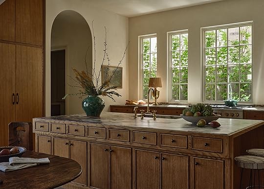
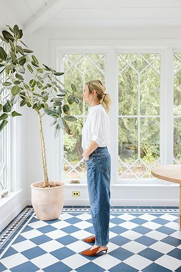
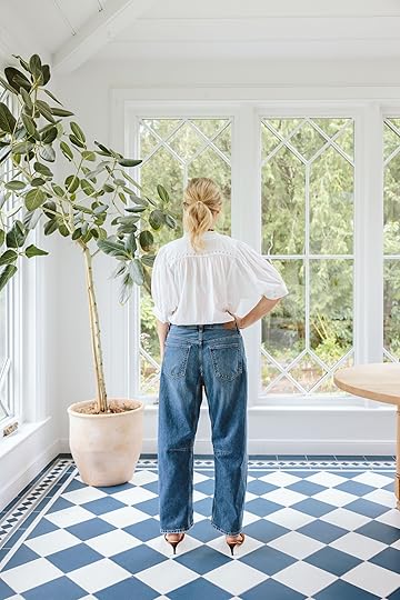
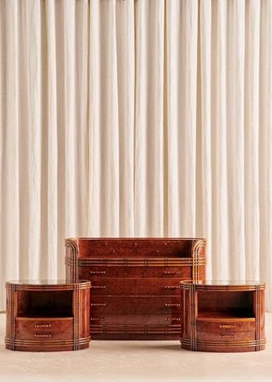
 design by shane & pierce | photos by michael p.h. clifford | from: why you should choose bigger art (as proven by a beautiful italian-inspired new build)
Recently, I wrote about this house above and all its amazing uses of large-scale art. I did also happen to mention the mixing of cabinet front styles. The island and main cooking counter both have a thinly beaded cabinet front, while the tall cabinets (probably fridges?) on either side of the kitchen have flat panels. It’s kinda subtle until you clock it, and then it just makes the kitchen all the more interesting. This kitchen is what inspired this whole post! Here are some more examples/options if you are in the kitchen remodel idea market:)
View this post on InstagramA post shared by domino (@dominomag)
View this post on InstagramA post shared by domino (@dominomag)
I feel that this is the most common/classic “style mixing” combo – Shaker cabinets + flat drawer fronts. It’s classic, a little fun for the eye, and I wonder if it’s an “easy” way to save money. Flat panel cabinet fronts are generally more affordable than any of the other, more decorative options. Of course, it depends on the material you want to use:)
It’s actually what Emily did in her kitchen!
View this post on InstagramA post shared by domino (@dominomag)
Next, we have this really beautiful example of painted beadboard cabinet fronts and natural wood flat panel drawer fronts. It’s in the same “traditional” world as the shaker cabinets/flat panel drawers, but a little more noticeable. It’s a really warm and inviting version of “modern traditional”.
View this post on InstagramA post shared by Sarah Sherman Samuel (@sarahshermansamuel)
View this post on InstagramA post shared by Sarah Sherman Samuel (@sarahshermansamuel)
Guess who is also a fan of a similar combo, the kitchen cabinet front lover and designer, Sarah Sherman Samuel! In two separate kitchens, she implemented this delightful beadboard and mini shaker combo. Beadboard for the upper cabinets and the mini shaker for the lower cabinets and drawers. She also played with a totally different style for the island, but that’s not what we are currently focusing on:) Also, how sweet are those little cutout holes on the uppers in the kitchen on the left? Another little idea to remind you is an option.
View this post on InstagramA post shared by Reath Design (@reathdesign)
Another very common option is that the island cabinetry is different than the wall cabinetry. It’s also an easy way to bring in another cabinet color or wood tone…also like Em did in her farmhouse kitchen:)
View this post on InstagramA post shared by Zoe Feldman (@zoefeldmandesign)
Oh, I love this example. The fronts of “most” of the wall cabinets and the island are the same. But those top cabinets along the wall are so stunning and balance the whole design. The brass talks to the hardware, and the darker tones talk to the darker island. I mean, Zoe Feldman Design never misses. I doubt this “saved” any money, but it’s special and also draws your eye up.
View this post on InstagramA post shared by Merete Coleman (@metacoleman_)
If you are someone who wants to get a little more decorative with your fronts but are afraid of your kitchen looking “too much”, go simple on some of them like Meta did! Similar to the flat drawer/shaker cabinet combo, but instead going for plain raised panel drawers/decorative raised panel cabinet fronts.
View this post on InstagramA post shared by Vogue Living (@vogueliving)
I love the subtle mix of this one since at first you think it’s just the two-toned wall of flat panel cabinets (so beautiful), but then you look at the island (in the same wood as the wall’s lowers) and they have a modern raised panel. It’s so simple but makes this space feel so intentional and special.
View this post on InstagramA post shared by domino (@dominomag)
Maybe you just love a singular type of front (like a flat panel), but you really mix up the hardware and color so the uppers and lowers feel very different, but still cohesive. I know a color this bold is too much for some, but wow, is it beautiful to at least just look at. The addition of that rich tiled backsplash is amazing. The before, if you scroll to the next slide is WILD.
View this post on InstagramA post shared by Architectural Digest (@archdigest)
Such an elegant example of mixing modern and a more traditional/rustic vibe. The paneled wall cabinetry is warm yet fresh, and then that amazing modern island creates the perfect tension. However, the handles are the same, so that also blends them together effortlessly.
This post isn’t meant to put any pressure on an already high-pressure project. But if you are looking for ideas and inspiration that don’t necessarily require a super custom job, I hope this is helpful…and fun.
Love you, mean it.
Opening Image Credits: Design by Shane & Pierce | Photo by Michael P.H. Clifford | From: Why You Should Choose Bigger Art (As Proven By A Beautiful Italian-Inspired New Build)


August 21, 2025
What Are We Really Doing With Our Guest Cottage? Is There A Budget? And Other Burning Questions Answered
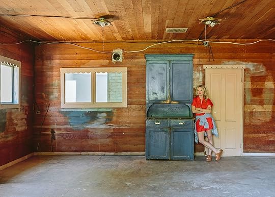
A few people keep asking the same questions about this project, which made me realize that I don’t think I’ve talked about them. Maybe this project came out of nowhere, like, there is another house on the property? A guest cottage?? So it seems like all the whats, who for, whys, and hows (and how muchs) need to be addressed. So today I’ll do my best to answer the macro questions with the answers as of now – knowing that, of course, they might change and shift as time goes on, our family grows, or new circumstances arise.
What Are You Going To Use This House For? Like WHY????
The best answer is that since we aren’t sure, we want it to be a big flex space that one could live in if needed (thus calling it the guest cottage). Upstairs could be my office, the canning room could be a music room for the kids’ band (i.e., drumset), maybe a game/rompus room for the kids, and yes, a guest bedroom. In 10 years, we might be fully renting out the property, which might change every room. If a family or loved one ever needed to move in we also want it to be fully functioning home, but since it’s not for our family to live in, its, in fact, an “extra home” on the property, we aren’t going to treat it with the same level of amenities that we would if we lived in it. For example, it will have a functional kitchen, but it will be small and super efficient (not a huge fridge and no beloved pebble ice machine, lol). It will have one full bathroom and maybe a 1/2 bath upstairs (toilet + sink). If it were for us, we’d likely do two full baths and a powder. It won’t be “bare bones” per se, but since I’m not thinking about how we live there or how our family of four + 2 pups would need to flow through it every day, it will be whatever is most cost-effective and makes sense. The kids want it to be their teen hangout space, which I would typically laugh at, but we have ALLLLL the kids over here all the time, which we love, so part of me is thinking maybe we do make it a big bonus area for them so I keep them nearby (under my watch) as much as possible. Elliot wants a gymnastics room, Charlie wants a gaming room (they both know they are dreaming), Brian wants a speakeasy, LOL. But what about me?? I also don’t have a dedicated office, so the upstairs could work well for my Portland crew to meet, so they don’t have to be in my house (which sounds fine at first, but it’s not ideal to be inside your boss’s home all the time). In fact, we rarely “work” here – we shoot here all the time and will meet in person if we aren’t on a team Zoom, but since it’s in my home and kids/dogs are around, if they need to be working on their computer prepping content, they always do it at home. In a way, this works because it’s very hybrid (which I think is ideal), but there are days when I think working together in more of an office setting would add to collective creativity. So, since we don’t know, we’ll make it functional but not design any room specifically with built-ins, or we won’t change the layout because we simply don’t know what it will be used for.
Are You Changing The Layout?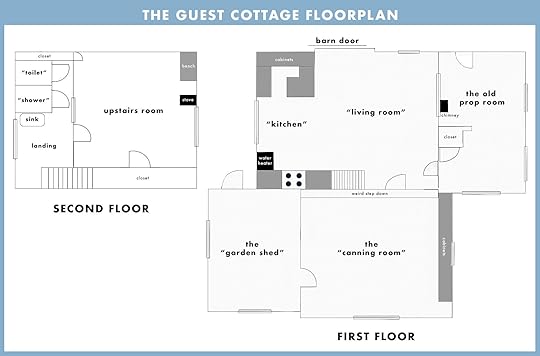
Nope. We do not want to move any walls. The only one I’m trying to figure out is the interior room (the “living room”) that looks out to the chimney in the other (old prop) room. Curious if we open that up, close it, or just embrace that oddity. We want to add the full bath on the first floor (especially if anyone older needed to stay with us – those stairs would be dangerous), but we hope to do it under the stairs where some of the existing kitchen cabinets are (tbd).
Do You Have A Budget?I’ve done enough projects to know that this could cost a lot – $500k easily. Remember, it needs a completely new foundation, all new electrical, plumbing, HVAC, sewer tie-in, engineering, a roof, windows, and it has asbestos, mold, and pests. She’s not in good shape. So the answer is that no, we don’t have that budget. So we are going to hustle hard to book whatever partnerships make sense for this restoration and do it slowly over time, creating content we hope will be really enjoyable and engaging along the way (which is the business). We will spend/splurge on the stuff that we HAVE to (foundation) or design elements that we are extremely excited by (i.e., maybe hiring an artist for stained glass window panes or doing that custom English-inspired metal and glass door behind the sliding door that a lot of you mentioned in the comments). Essentially, this won’t be a super budget story because, by nature of the extent of work, it’s going to add up. But I’m not wiring for sconces, I’m not ripping out the old wood floor to put in new pretty herringbone flooring – we’ll be very specific about how we spend the money and really, really try to use everything that is worth salvaging in the house. We won’t add “good to haves,” only “need to haves” (don’t quote me on that). Like all things in life, we’ll strive for a balance, and it will be full of trade-offs.
What Will You Attempt To DIY Versus Hire Out???
This is the first project that we aren’t hiring a General Contractor (as of now) to save money. I really, really, really want to learn the entire process, and we aren’t in a rush because we don’t need to live here. So I will absolutely be hiring my brother when it makes sense (or just asking his advice help ALLLLL the time). So I’m going to try to project manage this on my own, get multiple quotes for everything, hire the subs by myself (good luck to me!), etc. I will not be doing this totally on my own – I have Gretchen, Brian, my brother, who I can lean on when it makes sense, and I might be recruiting other friends/experts. I have NOT reached out to all the “restoration coaches” that emailed (I’m so sorry – I’ve been secretly out of town so much!!).
Here’s What We ARE NOT Doing Ourselves:New Foundation, LOL.ElectricalPlumbingSewer Work (Again, lol)HVACAsbestos RemovalNew RoofSiding RepairReframing Windows (I might have a guy for this, though)Critter RemovalCabinetryEngineeringI mean, all the obvious stuff, right??? I’m sure it’s way more. The more relevant list is likely below.
Here’s What We Are Going To Attempt To DIY In-House:DemoRefinishing the Walls (Including taking out a million staples???)Lead Paint Abatement (Likely with paint, but TBD based on experts’ opinions)Laminate Flooring Demo (If this has asbestos, then we might hire out)Refinishing FlooringTile (I’d love to even try to hand-make the tile)Some Finish Electrical (Installing light fixtures once J boxes are in)PaintWhat Style Are You Going for?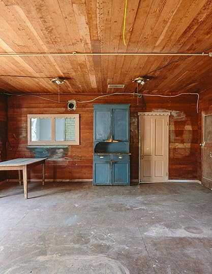
I don’t know! Definitely vintage, cozy, vibey, and heavily inspired by what it was before (it’s so charming). I’m always drawn to Scandinavian and Victorian (together), but no, this house won’t just be a smaller version of our house. But it won’t be this wild departure, either. I love living in our house so much – the whole thing flows so well, it doesn’t feel busy at all, and it’s easy to maintain and feel fresh/clean. But I’d love to make this guest house really vibey and colorful. Still comfortable and easy to live in, but I can’t, for instance, add wallpaper anywhere because there is pretty paneling on every surface – including the ceiling. I know you guys might be sick of hearing me say “simple but special,” so maybe I’ll have to rebrand that for a bit, but it’s still what I love to live inside. Just more color, whimsy, unexpected patterns on fabrics, and maybe more fun?? I also really don’t want to fall into the cottage core or granny-core trends. Yes, Scandinavian is less “in” right now, “Old World England,” aka hyper traditional, is way more du jour, but I still prefer a pared-back warm vibe. And I’ll always love modern art :) What it won’t be is hyper post-modern, and yes, you can expect some Room Service furniture in there as we expand the line.
What Is Your Timeline?Listen, I like to move fast because it’s fun and I love this part of my job so much, but we have to spread this out to pay for it. And listen! I’m so excited that for the first time, I don’t have to rush. A renovation usually involves someone trying to get back into the room to live in it, it’s usually so disruptive to our lives, but not this one. I guess I’d be psyched if the kids have it by mid-junior high, but knowing me, it will be before that. When I get a bee in my bonnet…
Are You Looking For Partners?Not yet, but I approach every new job, new project on a case-by-case basis. And I have to know the rough timeline before I can pitch them and guarantee my deliverables. For now, I fantasize about what partners would be right for this particular project (a list of what we need and what we want is happening), and then I pitch them (which is a lengthy process, sometimes taking months). Since I want to do a lot more hands-on work here, maybe there is a larger home renovation brand that I could pitch for a longer-term partnership to be our go-to source. Maybe there is an online platform that wants more video content that we can produce in-house. I’m looking more at macro partners, not tile or lighting. At this point, I know what I need to do to stay healthy as a business while depleting our resources through content creation/renovation. It really has to feel right in this vintage home and be something that I’m excited about, design-wise (or just really, really make sense).
What’s Next?
Well, fixing the foundation is first (and will likely take months). I received the first quote, which was a lot, but we kind of knew that (I will be talking openly about some of the financials where appropriate). Looking for more quotes now to really make sure that we are hiring the right crew. Meanwhile, the blog posts will be more about the beginning stages of the design process and solving all the quandaries. The articles will be based on what is actually coming up as a problem to solve or a design conundrum worth bringing to you. I’m sooooo open to all your ideas, feedback, and questions. We will likely treat social and YouTube differently, but my hope is to continue the Thursday guest cottage cadence. Even if it’s just an update with the latest electrical quotes or some design inspiration that I’m obsessed with.
I’d really like to hear your ideas on what you’d love to see. Here are my hopes:
To learn this whole process and thus teach.While it’s not going to be a “budget” restoration (not sure that really exists), we will be trying to save money on all the boring things; it’s not going to be a luxury house. And decor-wise, we’ll lean into vintage and clever ideas.To learn more about the history and lean into that (we have an appointment at the Oregon Historical Society soon!).We are also doing a lot of decorating makeovers, knowing that this project will be in the restoration stage for a while, so if this isn’t your thing, don’t worry – it’s all a balance. Thanks so much for reading :)
*Photos by Kaitlin Green
August 20, 2025
How We Turned Our Run-Down Tennis Court Into A Pickleball Court (Spoiler – It Was Quite The Process)

I definitely didn’t envision a pickleball court here when we bought the property 4 1/2 years ago. Sure, I knew we’d make improvements to the broken tennis court we inherited, but I don’t think I had even heard of this “pickleball” then (now the #1 growing sport and so much fun, TBH). The whole thing is just ridiculous, and we are wildly grateful to have been able to do this. And after last weekend’s second annual pickleball tournament (a fun “party board” neighborhood school fundraiser), it was incredibly rewarding to see it so well-loved/used by lots of friends/neighbors (and formidable teams that slayed us). Let’s back up because it didn’t happen overnight.
2019 – When We Closed On The Property
She was charming and rustic. We loved the idea of a sports court and naively thought we could just resurface this one, although it was HUGE (tennis courts are massive, but this one was even much larger with tons of space all around it). The asphalt was broken everywhere, with tons of weeds growing through all the cracks.

But there was such a sense of play and fun just having it there. We envisioned years of kids playing here with their friends and a lot of parties. I barely thought about this area, as I was super focused on designing the house, all the insides. Brian certainly had dreams over here – not of a pickleball court but of a sports court for basketball, rollerblading, etc.
But then we learned the reality – that no one will just resurface broken asphalt. It will only continue to crack because the foundation is so poor, and no one wants that on their company’s reviews.

So, unfortunately (for the budget), we had to demo out the entire court or keep it. The only positive of this was that we needed gravel for an access road up the hill, so they brought in a huge truck that turned the broken pieces of asphalt into our gravel road (not total regrind, but a layer of it in addition to even more gravel that we had to pour).


Once it was all dirt, we poured new concrete, 1/2 the size. I still felt that it was too big, but Brian, envisioning so many middle-aged dad pickup games and years of our kids playing horse, thought it was the perfect size.

It looked so much better, and I certainly could not complain. At first, the fresh concrete was just so pleasing to look at (which, spoiler, gets dirty with months of annual rain). But in my mind, to myself, I would say, “It just looks like a parking lot”. But it wasn’t painted/finished yet, and I thought maybe that was it? But the longer we lived with it, the more we really wished we had more greenery, more softness, and we didn’t want to invest in finishing it if it wasn’t the right size. So we put it off.

Meanwhile, the tennis wall was not in the best shape, flanked by a very old fence that was in even worse shape (super broken and covered in blackberries and ivy). We didn’t mind all these things at first and played on the court a TON (including our first pickleball tournament last summer). But I felt that I had done wrong by the property by having too much hardscape and just craved softness.


I had no idea how to do this, but Dennis’ 7 Dees did. We hired them to remove a big chunk of it so that we could make that space softer, but still usable. It was gone in 2 days and I was so relieved. I knew we’d add some stonework for paths and places to hang, but the big block of hardscape would be gone in favor of lots of greenery – trees, shrubs, evergreens, and perennials.
Updating The Broken Fencing
But then, in the middle of this all, other things kept popping up…all of a sudden, what didn’t bother us before became such an eyesore – that broken “fencing” that flanked the wall covered in blackberry and ivy. My brother was like, “What are you going to do about the fence and the tennis wall?” And Brian and I both were in denial, saying, “It’s fine, it’s fine!”. But as you can see above, it was not fine. The only reason to wait to fix it was financial (but it HAD to be fixed soon). So we asked ourselves the hard and privileged question: if we are going to fix it in 2 years, are we sure we shouldn’t just pull the bandaid off now, while we are already in construction? We feared this would cost like $15k to do it right (you guys, fencing is CRAZY expensive). We were in the middle of the garage redo and the landscaping, and while I’m still not ready to fully add it all up, it was a lot, and this tennis wall fence just wasn’t a priority. But “future Emily” imagined taking the photos of this stunning landscape with this janky wall in the background, and it would have ruined the shots. She was like, “Don’t be shortsighted, make it look better now”. So I asked my brother, “What if we gave your framing team a $4k bandaid budget – don’t rip out the posts and re-pour the footings, don’t do it the ‘best’ or ‘right’ way, just make it look better for $4k.” They understood the brief and said that in two days it could be “better”. They took off the rotted wood and replaced it, but the structure, including the posts and footings (which were old and in OK shape), remained. The plan was to just nail gun-ready-made off-the-rack vertical planks of doug fir to the existing posts and rails. GREAT.

But of course, we needed to choose how the fence was going to be finished, and I had an idea that it should be stained green to kind of “go away” and match the tennis wall. It was surrounded by trees, so maybe a dark green would just disappear? We tested a bunch of colors above, and I had a clear winner.
But when I showed my genius decision to Brian, he did NOT agree. He thought it should just be stained a natural fence color, which was hilariously irritating to me after testing so many greens. I was sure of myself on this one, but Brian was EXTREMELY sure that it was a bad idea. So we compromised after some awkwardness around my team, LOL, and agreed to leave it natural wood. We’d wait til it grays out like the rest of the split rail fence, and if it bothers me, we can readdress it next summer.


But the bright “orange” of the fresh doug fir fencing was bumming me out, so while I was out of tow,n Ken and Brian came up with the idea to use a slight gray stain to cut the orange and make it look more grayed out. The sample on the left had one coat on the top of the plank, 2 on the bottom.

I had to approve this from my shoot in California, BTW, but I agreed that the top staining was fine – just one coat of a gray stain to cut the orange. You can also see above how messed up the tennis wall was, which we didn’t really notice until the new fencing was up (WHERE IS THE END OF THE STRING??).
Surfacing The Pickleball Court


Finally, we were ready to hire the professional resurfacers to make it look like a finished sports court. We got a few quotes (all between $10-12k) and went with the nicer, more communicative team (a father and son who were lovely). It took about a week – they have to level it, acid wash, sand?, paint, dry, paint dry, paint lines, dry, etc. I wasn’t in town to take photos, but Brian sent me the screenshots above. Oh, and we chose just to do one green and white striping (you can choose to make “the kitchen” an alternative color like blue or a different green, but we felt like this was the least loud).
Resurfacing The Tennis Wall

But THEN once the court was done, the tennis wall looked even WORSE. It was so filthy, and when we tried to power wash it, all the paint started flaking off and taking layers of the plywood with it. It was probably 30-40 years old and just in terrible condition. This was not in the plan, but it was so clear that it had to be done – it was now a glaring problem.
 Choosing Paint Color
As I was getting repair quotes, I chose the paint color, which was a whole thing – do I match the green paint of the court (which I liked, but is definitely a “sports court” color) or do I pull one of the darker green colors from the barn mural (SW Rosemary)? Up close, the colors could look bad if they clashed, but from a distance (which is how you experience the wall within the yard), I did NOT want that brighter green color. From a distance, the darker green on the mural looked pretty great with the court color, but up close, they weren’t the match that I would typically choose.

I let Brian make the decision because I didn’t feel confident about either. We both agreed that since you see this wall color more (it’s a huge vertical wall), it was more important if it were pretty and cohesive with the property than matching the court floor. Rosemary by Sherwin-Williams, it was :) It didn’t look perfect with the green floor, but it didn’t offend us either.
Redoing The WallKaitlin had a recommendation for a fence repair guy she had just used, who she said was speedy and affordable. I texted him photos and told him that we were on a budget, and he quoted me $2,700 to take off the wood, screw in new wood, and paint. He could do it within 2 weeks, which was in time for our neighborhood pickleball tournament (the work only took 2 1/2 days).


Again, we went the cheaper route and left the original posts in (which everyone agrees are in OK shape, but not great). We toyed around with putting a basketball hoop directly on the wall, which would require much more reinforcement (the one Brian wanted was 300 LBS with a big arm, so the wall would have to be super strong). I let Brian make this decision – I did not care and thought the hoop we had was fine. Ultimately, we are sticking with the movable hoop and no hoop on the wall (for now).
The Finished Pickleball Court: FINALLY SHE IS DONE!!!
There she is :) While I didn’t have any pickleball court dreams 5 years ago, we are so excited that it’s done, and happy to say that the kids (and us) use it a lot. We had 4 weeks of “Camp Hendo” here this summer, where a bunch of kids came over and played with a local teen supervisor (shout out to Jay) while I attempted to work inside (I’ve locked myself in the new garage a few times, lol). They are all between 9-11 and get along really well, so it was great, and having lots of kids playing here. It made me extremely happy to hear all the screams and kid antics.

The two green paint tones together are totally fine – again, I likely wouldn’t combine the two in a room inside, but they work well enough as they do share some of the same undertones.

My only real regret: the shed is the biggest eyesore in all these shots (doesn’t really bother me in person) and I’m considering moving it, but it’s full of ALLLLLLL the sports stuff, basketballs, rackets, balls, corn hole, roller blades, etc, and really works here functionally. I ordered a waterproof resin shed because I just really didn’t want a rotten wood shed in 3 years with everything inside being gross and ruined (I couldn’t find any waterproof wood sheds, just water-resistant and similar to outdoor wood furniture, it just can’t last without being covered, and you can’t really cover a shed). I probably should have shopped around more – maybe a resin with brown wood grain? Doesn’t sound awesome, but it might be the right solution. Then, we could move this behind the fence by the barn to hold more yard tools, etc.

The pickleball net is easily movable, btw, for basketball games or roller blading. You just lift a lever and roll it on wheels.

As you can see, we shot this a month after painting the court, and it’s already getting dirty (we used the blower, but didn’t power wash before this shoot). Doesn’t really bother us in person, but in these shots, I wish we had cleaned it up more. Whoops.


The awkwardness of the gazebo being 1/2 on the court is there, and we could have reduced the court more, but there wouldn’t be room for the full pickleball court experience. You honestly barely notice or think about it (this was on me, btw, not Dennis’ 7 Dees).

The barn animals (see in the back) love watching us play on the court. It’s hilarious. This view is really so pretty – the setting is pretty insane.


Jury is still out for me if the wood fence should be a green stain, but I’m not motivated to try to win that one with Brian, as he is still strongly team “wood” (and he is likely right). So we are leaving it for now, but maybe I’ll AI it and see what it looks like green :)

Oh, and shout out to my pendants that finally arrived (after we shot the kitchen). The copper ties in perfectly with all our sconces on the house (they are so pretty). Look at those beautiful corbels :) I think in this shot, you can really see how the greens just kinda work together. Not your typical yard, that’s for sure.

And while I wouldn’t say it’s subtle, LOLOLOLOLOL, all the planting that Dennis’ 7 Dees did really did soften the extreme “court-ness” of the court. There is obviously a lot of hardscape still, but all the shrubs, trees, and plants mask it a lot, and it looks gorgeous in person.

What do you think? Should the wood fence/wall be stained green???? Or if that shed weren’t so dark, would it just be simple and natural?

It should be noted that despite being the only family that has a pickleball court (because it’s highly unusual, obviously), we got seriously schooled in the tournament. People are GOOD at this and play all the time. Most of our neighborhood tennis courts have been converted now, and I’m now motivated to get better and better. If you haven’t played, you should know it’s so much easier than tennis (thus the obsession), but I’ve also had two friends with pickleball injuries, so warm up!

So are we done with yard work??? YES, FOR NOW!!!! There are some areas of the property that are super overgrown and unused (the fruit grove, the back pasture full of blackberries, the areas flanking the driveway, the big hillside by the new gravel access road) but we are so happy to call it done for now and let the rest come together slowly over time (or not). I truly don’t feel like we deserve this property at times – we feel really, really, really grateful and lucky for it all. In fact, now that there isn’t construction, we are thinking about seeing if any blog readers want to house/animal sit next spring and summer when we know we’ll be out of town for big chunks of time. Still working on how to do that logistically (we aren’t going to Airnb it or anything) but I want to share it as much as possible (that still makes sense for our family) and feels like that could be a win/win for any city dwellers wanting to hang out with some pigs and alpacas in the summer. I’m also thinking of how to do a mountain house reader event version here – it’s just tricky since we actually live here, but a bus tour of this house and the river house would be so fun (plus, The Carly?). I’ll likely wait til the guest cottage is done for a larger design event, but just know that the wheels are turning.

Like all things you heavily invest in, you just pray that you’ll actually use it and look back years later as worth it. The pickleball tournament last weekend gave us a lot of hope that it’s fun for so many people (not just athletes who play tennis) and that as long as we continue to open our house, it will get a ton of use. We are doing another school party board fundraiser situation in September that is an outdoor movie night, projected on the tennis wall (Lilo and Stitch:)) So by god this yard is getting used and abused, just how we want it to :)
*Landscaping by Dennis’ 7 Dees
***Pretty Photos by Kaitlin Green
August 19, 2025
Design Hot Take: Can Designers Stop Trying to Hide Everything Useful?
What came first: The TV or the designer hatred for the TV? Hello friends, and welcome to this week’s installment of Arlyn’s Curmudgeony Design Takedown. Today’s episode? My lack of tolerance for hiding the things in our homes that we need and very regularly use just because they aren’t “aesthetic.” That black remote control? ::Gasp:: The cable modem? MAKE THAT THING INVISIBLE INSIDE A RATTAN BOX STAT! I’m not mad at the desire to have utilitarian things that look nice and surprisingly displayable, but loving design and a beautiful room don’t have to also come with a degree from MacGyver University for how to disguise everything in sight to look like a vintage oil painting or woven basket.
For anyone reading this who is saying, “Arlyn, it’s all about reducing visual clutter,” to that I say: “Yes, I agree, but also, you probably only think that because you read it in an article I wrote a decade ago.” While I get anxiety spikes when things are out of place, cluttered, or untidy, I also prefer my home to work effortlessly without barriers I’ve created for myself in the name of Pretty. Cable management is one thing, but no one should have to sacrifice proper lighting (#TheBigLight) or being able to change the channel because a faux stack of books covering your cable box is blocking the signal.
Who are we doing this all for? Ourselves? Our visitors? We can’t bear to look at a thermostat? A doorbell chime box? Honestly, I think this all hit a fever pitch when images of homes, both by designers and amateurs alike, became a huge part of our everyday vernacular. As someone who has produced hundreds, if not thousands, of luxury home magazine features, I know how much is edited out because cords and light switches are as hated by art directors as they are by designers. This created an aesthetic culture where we all got used to seeing houses without functional things like outlets, and now assume we also need to find a way to Photoshop them out, except in real life. [Side story: I was watching an episode of House Hunters last night, and the featured homebuyer was a woman who made financial empowerment content for social media. She kept saying her home needed to be “aesthetic” and was hyper-focused on white countertops and black hardware because she claims it’s what she needed for her audience to see her as successful. My eyes are only just coming forward from the back of my head.]
Phew! Now that I’ve gotten that off my chest, let’s explore all the “designer disguises” that I find mostly unnecessary, and no one should be pressured into thinking is necessary, either:
Designer Disguise #1: TVs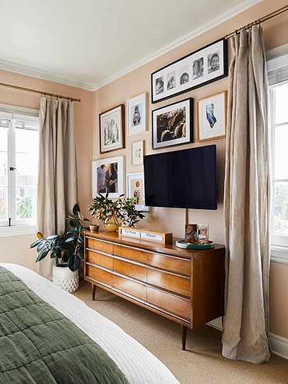 i have fallen victim to making my tv “blend in” with a gallery wall in my bedroom (and now my living room). It’s not hidden by any means, but art sure does fill the wall around the flat panel nicely, at least. If anything, it kind of showcases it more than it hides it.
Let’s start with the most polarizing topic: The television. I’ve written on this specific subject in the past and got a ton of opposing feedback. Many agreed with me that a TV is not a thing that needs to be hidden. It’s a part of our lives, and just because it’s a “big black box” doesn’t mean it’s hideous and should be banished. Others brought up some good points about not liking the distraction, and that it’s helpful to put it away behind cabinetry or art or some other concoction when not in use to focus on other things like connecting with loved ones, reading, or conversation. I’ll accept that, because I know that we all have different lifestyles and media tolerances.
But more and more, it just feels like this thing that many of us use daily is some kind of smear on an otherwise beautiful space. Mind you, TVs are smaller and more inconspicuous than ever before. The freestanding furniture-like Sony set that graced my parents’ living room when I was a kid is a far cry from the flat panels of today, and yet we’re obsessed with faking people and ourselves that one simply does not exist in our living rooms.
View this post on InstagramA post shared by A L B I O N N O R D (@albionnord)
By far, my most pressing question to all of us here today, whether you’ve thought about hiding your TV or hate the idea, is as follows: Why are we putting so much pressure on ourselves for design/styling perfectionism? I know that our homes are our sanctuaries, and they should make us feel at peace. Visual clutter really can raise our anxiety levels, but are we jumping through performative hoops to make ourselves feel better, or because the Internet slash the design industry, the big “They,” told us we need to hide all these non-decorative things away from the world if we want to be perceived as having good taste, or better yet, chic (the highest podium finish of all the home style qualifies, evidently)?
Designer Disguise #2: Cable Boxes And RemotesView this post on InstagramA post shared by Taylor (@thekohlective)
It should come as no surprise that any accoutrement to the hideous television would also need to be shrouded in secrecy, concealed from our delicate eyes. Does the above basket solution look cleaner and tidier than the open crate with cables popping out of it? Yes, sure. A spaghetti-like knot of cords would inspire anyone to find a solution, but the sheer number of videos on the Internet dedicated to cutting holes in baskets and boxes to preserve a pristine shelfie or mantel is dizzying. As long as there isn’t a mess of long cords spiraling from it, collecting dust bunnies, a cable box, or some remotes even just set in a tray on a shelf or atop a book or two is good enough for me.
Designer Disguise #3: Kitchen Appliances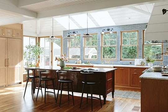 of course, em’s farmhouse kitchen is a literal dream, but it does feel like a “designer” kitchen can no longer include visible appliances, except a feature range.
I preface this section with the fact that I very much like the way a seamless kitchen with panel-ready appliances looks. But it’s such a funny thing that someone decided to think up one day. “How do we hide the very things in this space we need the most?” Refrigerator and freezer? Make them guess! Dishwasher? Just open drawers and cabinets until you find it. Obviously, the people who live in a home with this type of kitchen are familiar with and learn where everything is, so none of this is a real concern. However, let’s ponder for a moment the question I keep bringing up: Why are we even doing this?
Designer Disguise #4: Air Vents & Door ChimesView this post on InstagramA post shared by New Dimension Hardwood Floors (@new_dimension_hardwood_floors)
To me, there is a difference between making something look better/sleeker, like good-looking air vents, for instance, and covering up something because you’ve been led to believe it’s ugly. I had this thought recently while reading the newsletter sent out by Apartment Therapy’s Design Director Danielle Blundell. She’s a longtime work peer whom I respect greatly, but in the latest email blast, a reader asked her for her advice on covering her doorbell chime box in her rental. In an attempt to provide a solution, she recommended putting a piece of art on a hinge to cover it up. Sure, that works, but it’s the kind of thing that reminds me of how it has felt to be in a mid- to plus-size body most of my adult life. So much guidance on how to dress your body to essentially cover yourself up as best you can to trick people into thinking you’re somehow thinner than you are, rather than nurturing a culture of acceptance and self-love. “Cover it up!” is the name of the game. Maybe the doorbell chime box is totally fine and can just…remain visible, hm?

Left to right: Nickel Door Chime | Knock Doorbells Steens Resonator Door Chime | Satin Brass Builder Chime Door Chime
I can get down with a replacement of a cheapo, white plastic chime with something more stately like the above, but hiding it away in shame is just not something I think we should be putting our energies into.
Designer Disguise #5: Any Kind Of Tech InterfaceView this post on InstagramA post shared by Abigail Sykes (@our.argonne.home)
I’ve written so many stories in my past (by request) for other outlets about how to hide your thermostat, your electrical boxes (sure, these are fairly ugly), and all those kinds of things. My answers were always along the lines of what Danielle suggested for the reader’s doorbell chime. It usually involves a hinge and a piece of art. It’s kind of the go-to. Sure, looking at a pretty piece of art is always going to be better than looking at a digital read-out, but for thermostats in particular, I urge you to leave them alone. After some research, it has come to my attention that they do not work as well at recording ambient temperature when the airflow is restricted, as it would be behind a canvas, etc. Meaning, the temperature control is hindered, and that’s a thermostat’s main purpose.
Designer Disguise #6: Cords & OutletsView this post on InstagramA post shared by Michele Koken (@mbkdesign_)
This one is funny to me. I think a tucked-away outlet inside a drawer is genius as a charging station, but as soon as we get into faux painting (above) or offset drawers that you need to keep open when the outlet is in use, that’s where you lose me. Not to take anything away from an artist or woodworker who could create something like the above—it’s very, very well done—but how scratched up will that be from outlet prongs not exactly meeting their entry points? Perhaps this is a prime example of form over function. There are many beautiful outlet covers out there. Do we really need to be playing hide-and-seek with them?
View this post on InstagramA post shared by Lustig Custom Cabinets Est. 1925 (@lustigcabinets)
The same applies to cords. As I’ve mentioned, I’m not against managing cables from becoming tangled messes. If you have the means and the will, running cables behind the walls is totally fine. But I have a secret to share: Your house will never be as cord-free as that professionally photographed and retouched home you admire because many, if not all, of the lamp cords and the like have been deleted from the final image. Let us embrace the reality of our homes, lamp cords and all.
Bonus Designer Disguise #7: Family Photos a way i’ve found to showcase simple, imperfect snapshots of my life and loved ones is these square prints, organized in a neat grid.
And finally, a little bonus, because I don’t necessarily think this is a “designer” thing more than it is a “styled and photographed magazine home” thing. From experience, many family photos are often removed from houses featured in print for privacy reasons, but do me a favor and take a look at all the gorgeous rooms you have saved in your bookmarks and Pinterest folders. How many of them have family photos? A little corner table with rows of petite frames with abuela, cousins, best friends’ babies? Gallery walls of non-descript or aesthetic abstract art, yes, but hallways full of mismatched frames with 4″x6″ prints are a thing of the past. I want to know who lives in a home when I see it. I want to see their life, their family, their memories. Find a way to display them in a way that feels tidy, if you must, but can we please start decorating with family photos again?
—
Friends, I’ve reached the end of my complaints. I love a beautiful home as much as the next person; after all, I’ve made my living writing about beautiful homes. Don’t bite the hand that feeds you, and all of that. But something I won’t do is just accept a bizarre status quo I don’t perfectly align with to salvage some illusion of having perfect taste and an even more pristine home. Release yourself from the need for flawlessness. Leave your remote on the coffee table. Print out that photo from your family vacation and put it on your console table. Have outlets you can see and use, and not have to hunt for. You deserve it.
Until next time…
Opening Image Credits: Design by Mel Burstin | Photo by Tessa Neustadt | From: Mel’s Living Room Reveal
August 18, 2025
FINALLY! A Bathroom Remodel Plan For The Two 90s Bathrooms In Kaitlin’s Home
Well, I guess this is where I formally introduce myself to you, EHD readers! You’ve seen many photos I’ve taken, you’ve seen my basement, bedroom and living room makeovers that our girl, Emily, has so graciously helped us design, and you may have seen small bits of my face in some of the photos/videos from team retreats—I’m more of a behind-the-camera-gal than in front of it. While I’m not an official EHD employee, it’s been so fun to be a part of this team.
 us! in todos santos, mexico last spring before sweet marlee joined the team.
 Back in 2021, my family and I made the big move from the Eastside of Portland to the Westside for more space/more yard/slower lifestyle, etc. All the same reasons a lot of young parents move to the ‘burbs. Around that same time, a mutual friend of both Emily and I, Max Humphrey, introduced the two of us. The Hendersons’ rental house (while the farmhouse was being renovated) was in my neighborhood. Because we lived so close, Max thought Emily and I should be friends :) While she’s no longer up the street from me, she’s just a short 7-minute door-to-door drive away. It’s been a pretty great little partnership/friendship these past few years.
Emily has given a little bit of a rundown of our home in previous reveals, but as a refresher, our home was built in 1962, and we are the second owners. The previous owners made a few (somewhat questionable) updates, likely in the 90s/early 2000s. But we still did a pretty large and necessary remodel when we moved in. We pretty much painted everything white to start, and slowly, with the help of Emily, have been adding in more color and character.
 The Bathrooms
Though we made some pretty major changes early on, money and patience ran dry, and we were okay, or more like had to be okay, putting bathrooms on the back burner, knowing very well that someday they would need some serious love.
The Primary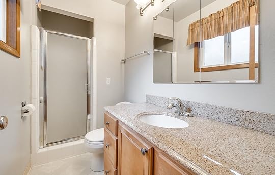
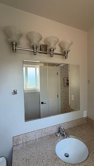
Here’s what the primary bathroom looked like on the day we bought the house. And truly, before our contractors demo’d it a couple of weeks ago, it still looked pretty much exactly like this 4 years later! I had zero desire to do an “in the meantime” quick makeover. I didn’t want to replace hardware, paint the cabinets, hang a new towel bar–I didn’t want to waste a single dollar on bettering this space. (I’m the boring penny-pincher in my family, can you tell?) Honestly, aside from being small, it’s fine. Does the off-center light fixture, shower tile grout that never actually comes clean, and peeling linoleum flooring drive us insane? Of course. But our previous 1905 Eastside home had one small bathroom downstairs and off the kitchen, so an “en suite”, small as it is, felt and still feels very luxurious. I knew that once we saved up, our “someday” remodel would come eventually, so investing any time into this space felt unnecessary.
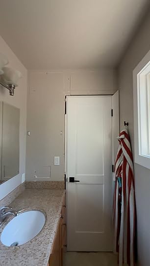
Here are a few more photos before demo really started:
 The Kids’
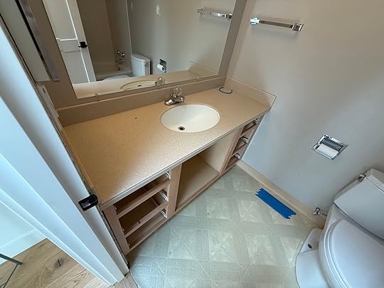
On the other side of our bathroom wall is my daughters’ bathroom–equally hideous and luxurious. I say luxurious, again, because I shared a very small bathroom with my parents and brother growing up, so what a treat it is for my daughters to have their own. This space has also not been touched in 4 years. Between bath times when my girls were little, playing nail salon, and doing the mad morning-dash to get off to school, I’ve actually spent a lot more time in this bathroom than my own. The urge to do a few of those small updates in this bathroom came… and then, eventually, dissipated. In the end, the linoleum is still the linoleum, and the off-center lighting will still be off-center. The time and resources for the small updates just didn’t make sense to me.

If it’s not super obvious from these photos, these bathrooms are tiny. Because it’s not financially an option to expand the overall footprint, the best we can do is make them more functional and more pretty. In comes Miss Henderson :)
AllModern reached out to Emily about a partnership a few months ago, and we all felt like this could be the perfect opportunity to finally do some updating. They have a great selection of bathroom items, from vanities to lighting to plumbing–a bit of a one-stop shop.
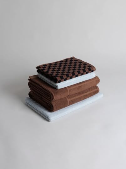
To be very honest with you, bathrooms stump me, design-wise. Everything feels (and is!) SO permanent. I had a hard time really knowing what I even wanted for our primary bathroom. I pulled images of so many amazing pieces from AllModern’s site, but couldn’t get a cohesive design going that felt like us. But then, late one night during a doom scroll, I saw my friend and incredible prop stylist/designer here in Portland, Karie Higgins, posted a photo of a beautiful bathroom with a BAINA towel in it. This led me to BAINA’s website, where I fell in love with the color scheme of one of their stack of towels, and the rest is history.
Once I’d decided on colors I liked, everything else started to fall into place. I found this gorgeous white oak vanity and paired it with this medicine cabinet.
I was also pretty sold on both the floors and the shower being blue square tile. I immediately pulled out all the samples I’d gathered when we redid our fireplace and ordered a bunch more. We eventually landed on this pretty light blue tile that Fireclay generously gifted. We’ll be using 2×2 squares on the floor and 4×4 squares in the shower.
Here’s the moodboard I sent to Emily a couple of months ago. Honestly, I was just hoping she wouldn’t hate it—because by that point, I was completely sold on the whole thing. Good news: she loved it too.
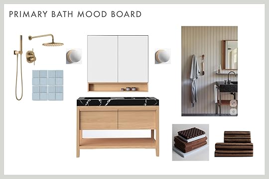
Medicine Cabinet | Vanity | Tile | Checkered Towels | Striped Towels
Moving on to the kids’ bath…
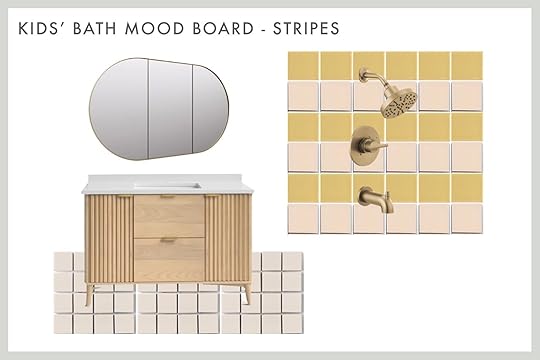
Making decisions for their bathroom felt a bit easier than for ours. We knew we didn’t want to go too “little girl” in here. My daughters are almost 5 and 8, so it would be pretty easy to get carried away and design for their ages now. We still wanted it to be fun, but hopefully, a bathroom they’ll enjoy when they’re in their teens, as well.
We found this pretty vanity and paired it with a big built-in mirror/medicine cabinet.
Fireclay was kind enough to gift us tile for both the primary bath and for our girls’ bathroom. We’re going with this gorgeous 2×2 creamy-colored square tile for the floor and will be doing a 4×4 pattern for the bathtub walls in this fun, warm yellow and pale pink. While the tile was ordered with the intention of doing a checkered pattern, we know I love checkered, I am wondering if a stripe would be pretty instead?

Medicine Cabinet | Vanity | Wall Tile (yellow and pink) | Floor Tile
Medicine Cabinet | Vanity | Wall Tile (yellow and pink) | Floor Tile
And, that’s where we stand today! Demo began a few weeks ago, and the crew (thanks, Afore!) is plugging along. Tile should be starting in the next week or so. Excited to share the finished product with you all in the coming weeks :)
Opening Image Credits: Photo by Kaitlin Green | From: Kaitlin’s 70s Inspired, Colorful And Cool Living Room Revealed (Y’all, I’m So Jealous)
August 17, 2025
The Link Up: Em’s Gateway Fall Sweater, Caitlin’s Pottery Etsy Shop, And The Easiest Way To Clean Your Washing Machine
Happy Sunday, everyone. What feels like the end of summer is upon us, which always catches us a little off guard. With that said, we’ll be running into every swimmable body of water at least until Labor Day to soak up every last second. Does anyone have any last-minute fun summer plans?
This week’s house tour is “the epitome of Spanish architecture during Hollywood’s Golden Age” and was thoughtfully restored by Alexander Design. It’s the dreamiest California organic, MCM style, and you have to go see all of the details, especially the living room’s ceiling!
From Emily: This sweater felt like my gateway fall piece – chunky, layerable, classic, cropped with good details. And that cuff – she’s goooooood. It feels so high-quality and well-made. It took me a while to get into Abercrombie, but once I tried things on, I realized that many pieces are, in fact, for me.
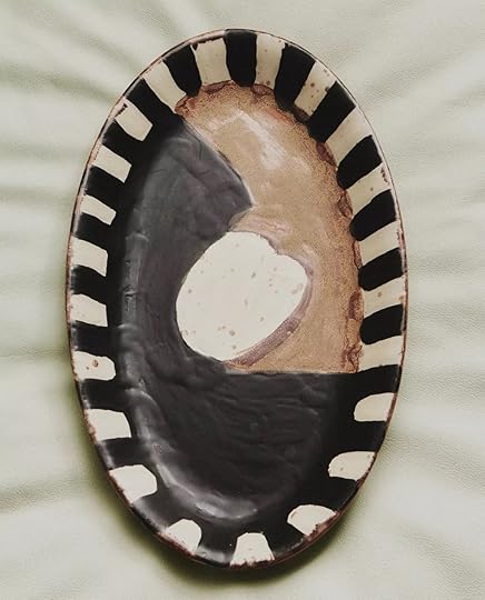
From Caitlin: I’ve been on the hunt for some vintage or handmade kitchen ceramics – spice jars, cruets, all that jazz – and I stumbled upon the CUTEST sugar jar I’ve ever laid eyes on. (You can go peek. I’ll wait.) ISN’T THAT THE MOST DARLING LITTLE THING YOU’VE EVER SEEN? The houses! The trees! The scallops! The finishing! MY HEART IS EXPLODING. Don’t even get me started on the pitcher, the pour-over coffee maker, or the Christmas mug. There’s something so endearing about these sweet pieces, you know? You can tell that human hands made them with love – they’re just too freakin’ cute. (PS. If you throw one of them in your cart for a few days, you’ll likely score a 30% off coupon code. It worked for me!)
From Jess: I know this top won’t be for everyone (and the sizing is less than inclusive, UGH), but it’s the only thing I’ve bought in the past couple of weeks, and I’m in love. This sheer mesh tank top is going to joyfully take me through the rest of this VERY hot weather (aka until November). With my black bralette, I can totally dress this up or down, oh, and it’s reversible! So I can choose between a high neck and a scoop. I got the graphite color because I wanted a softer tone. I found this brand through Instagram, I think, and haven’t tried anything else, but I’m definitely interested.
From Mallory: I finished my 1 month living room makeover (photos are being edited and everything is coming to you VERY soon) and initially I had planned to put up a gallery wall over the sofa but we started putting it up and realized we hated it…so 1 week prior to shooting I had to find something huge to go above the sofa that wasn’t 10 thousand bucks. WELL, I COULDN’T BELIEVE IT BUT I FOUND THE PERFECT THING. It’s this absolutely gorgeous tapestry from the coolest Etsy shop based in Australia (shoutout to the seller and dhl express international shipping because she made this thing show up in 3 days for only $40, which saved my living room shoot). Huge art is so hard to find, and I felt like this pricing was reasonable considering it comes with mounting hardware and takes up SO much space. Bye bye blank walls!! If you’re looking for a large tapestry for a fairly reasonable price in comparison to other tapestries and art this size, check this Etsy shop out!
From Arlyn: I’ve got a not-very-sexy but super useful product for you today: washing machine cleaner tablets. We don’t have a front loader, but our top loader still gets so musty and mildewy smelling. I often run vinegar or bleach cycles to try to squash that, but I find these Affresh pods work best. You just throw one in, run a hot water/heavy cleaning cycle, and boom, much cleaner and better-smelling machine. They also make these for garbage disposals and dishwashers.
From Marlee: The dreamiest summer scent! I picked up this perfume from a cute little shop last winter and recently rediscovered it after it got lost in one of my bajillion bags for months. This is like if vanilla went frolicking through the woods and then stumbled upon a magical beach at sunset…You know? Not only is the smell gorgeous, so is the packaging – it’s one of those items that I where every time I use it, it feels like the first time I took it out of its packaging. It never loses its novelty! It’s totally gender-neutral, not too sweet, not artificial-smelling, and I get so many compliments on it.
Also From Marlee: Okay, maybe this is common knowledge, but I was recently put on to this stain remover bar that has absolutely changed my life. AND for less than $3! Huh?!? (Look for it at your local Ace!) Get an old toothbrush wet and scrub it on the bar, then scrub it into literally any stain – it even helped with an oil stain that had been on a sweatshirt for years (it didn’t go away completely, but much less noticeable)! This thing has made me become absolutely insufferable at Goodwill – the opportunities are endless when you know you can get that stain out at home…
From Gretchen: I’ve shared it before, and I’m more than happy to share it again…my Fenty Match Stix Contour Skinstick is the hardest-working item in my makeup kit. I don’t know what magic Rihanna put into this formula, but I know better than to question it. It is just so creamy, buildable, and blendable that it’s basically impossible to get wrong. I use this more as a bronzer, less of a “contour,” but slapping it on is just so quick and easy. I scribble some on my cheekbones, draw a couple of lines near my hairline, and hit each side of my nose with the lightest touch, before blending it all out with a big, fluffy brush. The color, Mocha, is perfection for me. The product sort of melts into my face, making my skin look so naturally tan and glowy. I’ve repurchased this Skinstick a solid three times because I can’t be without it, but trust me when I say it lasts me months and months. Ulta is doing a promotion through 8/23 with Fenty products; Spend $50 and get a free makeup bag. While I’d say grabbing two of these sticks to secure the gift bag would not be a mistake, I can also HIGHLY recommend the Fenty Cream Blush in Rosé Latte. Another super creamy, perfectly pigmented product that blends so well and gives your cheeks that perfect rosy tone.
Before you leave us today, we wanted to turn the attention to our friend Mark Weinberg. He was our incredible photographer on both of our Rugs USA shoots, and we couldn’t have asked for a more talented and kind person to work with. We just found out that he was diagnosed with a brain tumor. There is a GoFundMe to help pay for the surgery and recovery if you have any ability to donate. Thank you so much<3
Thanks for spending a little time with us today, and see you tomorrow. xx
Opening Image Credits: Styled by Getteline Rene | Photo by Mark Weinberg | From: It’s Here! Our First EHD Collection With Rugs USA (+ Why Now? And Why This?)
August 16, 2025
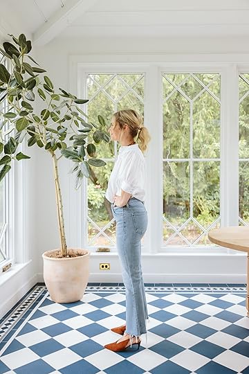
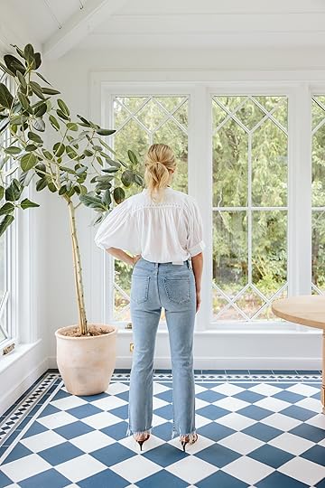
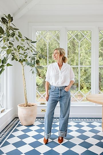
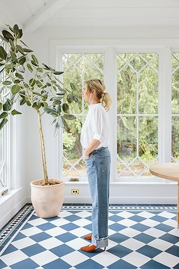
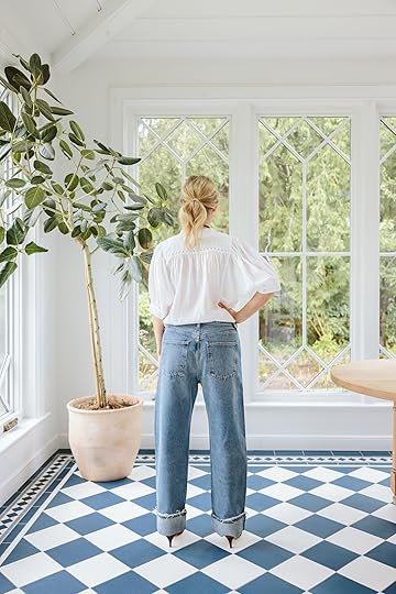
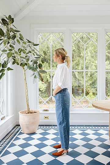
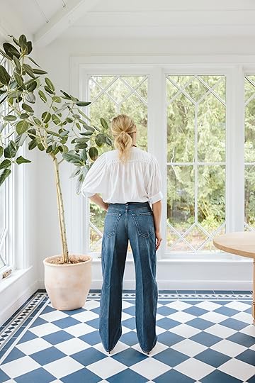
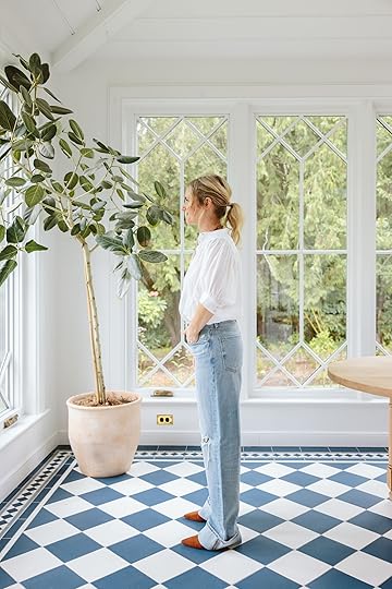
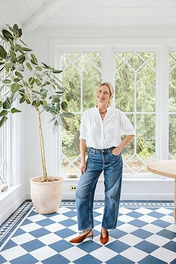
I Tried On All Your Favorite Trendy Jeans. Here Are My Thoughts…

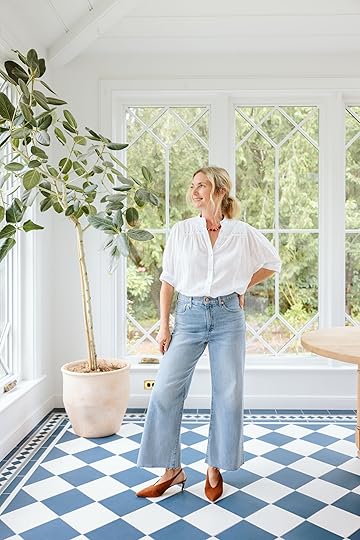
We did a call-out for all your favorite trendy jeans, and so many of you suggested the same pairs over and over and over – it was quite compelling, and my team perked up. So while I was out of town, they ordered them in my size (don’t worry – we returned what I didn’t keep) and when I got home, they greeted me with a fun jean try-on. As we know, loose and baggy is still ruling supreme, skinny jeans being an immediate negative style indicator (controversial, I know, and a real bummer), and yet, as an apple-shaped lady, this is so challenging for me. It’s my dumb non-expert opinion that baggy jeans look best with smaller, more fitted tops (cropped or body suit preferred), playing with proportions, etc, but it’s just not what I’m comfortable in (both physically and not how I feel like I look best). For me, I’m not wearing a big boxy blousy top over big boxy baggy jeans, so I’m not having my moment, and that’s ok (I literally don’t take this stuff seriously, it’s just fun! But I’m not alone, it likely won’t be for long, and there are a few silhouettes that are actually working for me (the last one is my favorite). Here you go:
Quince – Bella Stretch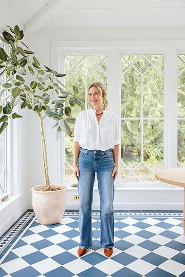
Blouse | Necklace | Jeans (size 26) | Shoes
I’ve been skeptical about Quince, very curious how they are disrupting the market by likely duping other brands (who are likely duping the OG designers/makers, so… ) but the price point is crazy low and the quality seems to be very high. The verdict: I really loved how soft these were with the perfect amount of stretch, but not too stretchy that it felt like they’d lose their shape in hours. And for $50, I was like, wait, what? FIFTY DOLLARS?? They felt extremely high quality to me for that price.

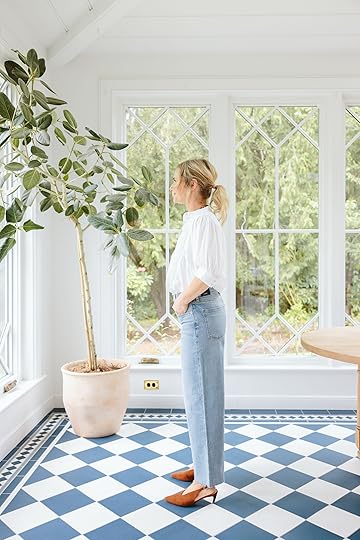
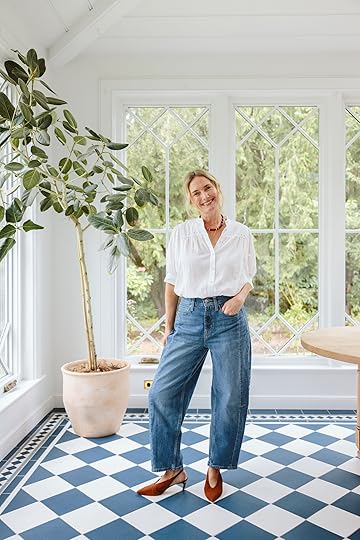
Blouse | Necklace | Jeans (size 26) | Shoes
I tried on both the 26 and 27 and kept the 26 (size down, I’m typically between a 27-28 depending on the week). The blue wash is really great, and the fit is mid-rise. I only kept three pairs of jeans, and this is one of them (three sounds like a lot, but you’ll see).
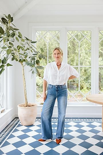
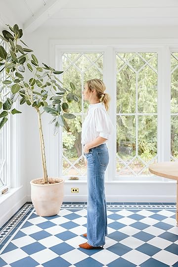
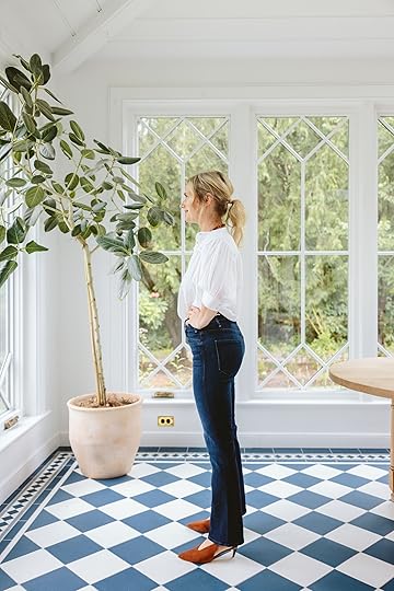
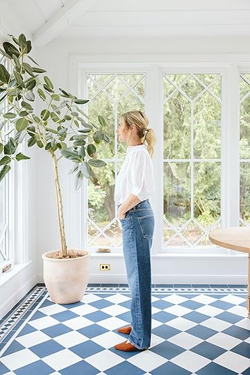
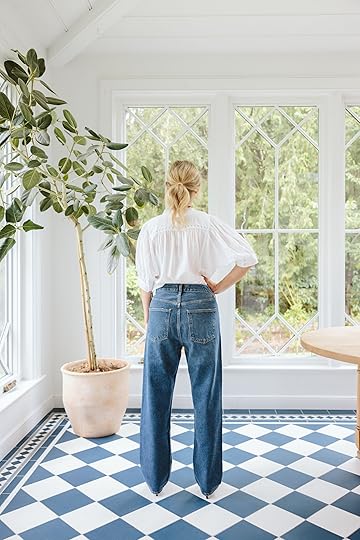
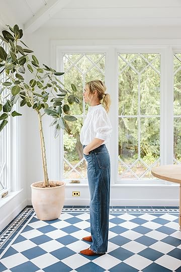
Pistola – Lennon High Rise Crop

Blouse | Necklace | Jeans (size 27) | Shoes
Pistola has become a favorite brand for me, and I loved these jeans because I felt good in them. They are a slimmer cut but not “skinny” (I don’t think?). They are so comfortable, an easy wear and fit my lifestyle (which is very casual).
Blouse | Necklace | Jeans (size 27) | Shoes
I probably wouldn’t tuck a shirt this far since they are higher rise and I’m shorter torsoed, but at this price point (a little over $100), I felt like they were a solid investment.
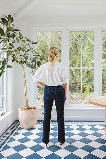
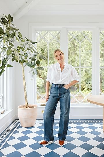
Mother – Hustler

Blouse | Necklace | Jeans (size 27) | Shoes
A LOT of you said this was a favorite of yours (and admittedly looks so good with those shoes). These fit great, with the signature Mother Stretch, and the dark wash is certainly flattering.
Blouse | Necklace | Jeans (size 27) | Shoes
With Mother, I always wore them post partum because they were so flattering and stretchy at the waist. “Bit of stretch, excellent quality, normal-sized pockets”. I really liked these and felt good in them (but was unsure that they are too “skinny”???).
La Ligne – Marilyn Mid-Rise Barrel

Blouse | Necklace | Jeans (size 26) | Shoes
Admittedly, these are very cool – a lot of you sent this rec to me, and I hadn’t heard of them. They are dual-toned, the front being lighter than the back, and have a cool side seam and great tailoring. If I had a job in a big city that I had to go into an office for and look cool, I would 100% have kept these, but at this price point, I didn’t think I’d wear them enough to justify the cost.

Blouse | Necklace | Jeans (size 26) | Shoes
The verdict: These are rad, but too much of an investment for my lifestyle! I didn’t keep them, but if you are looking to invest and want something really cool (that still looks polished), we all agreed these were rad.
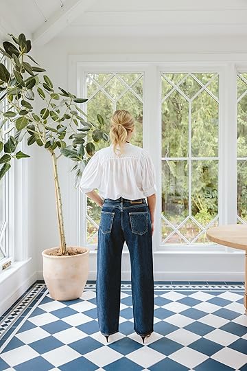
AGOLDE – Fran Low Slung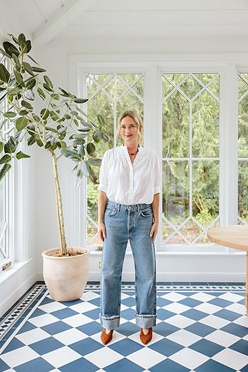
Blouse | Necklace | Jeans (size 27) | Shoes
Yeah, I liked these… The color is perfect, the wash is perfect, and the straight leg is still flattering. They are another pair that so many people swore by, but they are $$$. I didn’t keep them (they weren’t a “hell yes” at the time), but now that I’m staring at the photos, I’m really into them!!
Blouse | Necklace | Jeans (size 27) | Shoes
Most people said to size down and wear high-waisted – I’m wearing my normal size, and if I had kept would likely have exchanged it for a smaller size. They are rad, but I just don’t love this baggy of a pant on me, and if it’s not a “hell yes” it’s a “no”. My younger team loved these BTW :)
AGOLDE – 90s Straight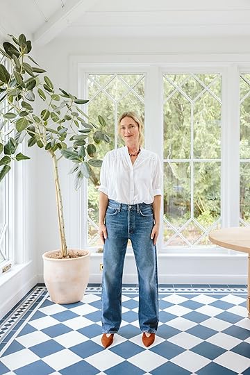

Blouse | Necklace | Jeans (size 27) | Shoes
I loved the wash on these (medium with some darker areas), but I didn’t know how to style the hem that came in really fast at the end (so I think you are supposed to just let it be awkward and baggy at the bottom?).
Blouse | Necklace | Jeans (size 27) | Shoes
I love Agolde – a definite favorite denim brand when I want to splurge (and I love their shorts a ton). I think this is just a style preference, and I’m not loving this on me :) I also want to say fashion is very perplexing right now, and I’m not seeing a lot of people, even when we went to New York, who looked like they had a clear personal style. Just a lot of people “wearing clothes,” mostly athleisure (everywhere) or just baggy jeans and a square neck tank top (and socks). Brian and I talked about it a TON while we were there. I actually felt silly wearing an “outfit”. It’s almost like the tourists wore the outfits, and the locals just look like they put on clothes. I didn’t expect to see a bunch of Carrie Bradshaws everywhere, but we left super uninspired. So I think younger fashion is still leaning away from trying to look good, which I think does track with what we wore in the 90s??
J. Crew Factory – Wide Leg Crop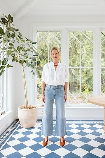
Blouse | Necklace | Jeans (size 27) | Shoes
These were so cute for those who love wider legs, and the length is perfectly cropped. They are solidly tailored (and looked so cute with those shoes). A great light denim, with the right amount of stretch and a great price point.

Blouse | Necklace | Jeans (size 27) | Shoes
I think these could totally be office jeans, too – they do have a raw hem, but they are clean otherwise, and the tailoring is great.
Old Navy – Barrel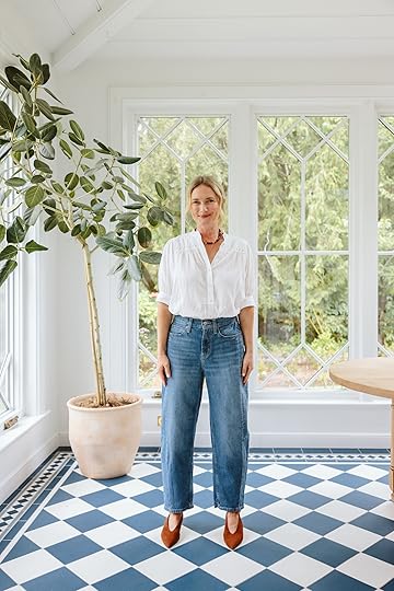
Blouse | Necklace | Jeans (size 4) | Shoes
For $30, I was super impressed with these. I think we have another year with barrel jeans (the good ones, maybe longer). This price point is solid, and these feel really high quality.

Blouse | Necklace | Jeans (size 4) | Shoes
If you don’t want to invest too much into this trend, these (or the Madewell ones below) would be a great way in. You just can’t beat the price.
Madewell – Balloon Jeans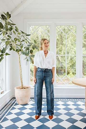
Blouse | Necklace | Jeans (size 26) | Shoes
Ok, none of you recommended these, but I was recently at Madewell and they said that these are flying off the shelves – their new “balloon” pants. They feel more “barrel-light,” still with that rounded shape and slight tapering, but less exaggerated.
Blouse | Necklace | Jeans (size 26) | Shoes
They are too high-waisted for me (and they are fitted at the waist, FYI), but curious what you guys think? Sorry, we didn’t steam them:)
Madewell – Low Slung Baggy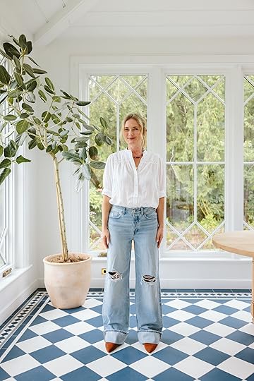

Blouse | Necklace | Jeans (size 25) | Shoes
I really wanted to keep these – they are pretty dang cute! But they are so long that I would need to wear them with high heels and I just know that I don’t need them enough to spend the money because I don’t really wear jeans/high heels enough (again, I work from home so the only time I splurge on new clothes that are non-work from home clothes is for fancier shoots).

Blouse | Necklace | Jeans (size 25) | Shoes
Definitely size down on these and wear heels or be ok with the Gumby look. I could also try the petite version because the waist, slight drop crotch, color, wash, and hem are all awesome.
Madewell – The Darted Barrel
Blouse | Necklace | Jeans (size 26) | Shoes
While I’ve shown you these for months now, these are still my favorite barrel jeans that I think are flattering on those of us who don’t love a massive bottom. I have them in this wash (size 26) when I want to be a big slouchier, and also in the cream in a size 25 (which is fitted and feels cute).
Blouse | Necklace | Jeans (size 26) | Shoes
These are a 10/10 for me – comfortable, on trend, but still flattering and just so easy to wear without a crazy high price point.
So I kept the Quince, the Pistola, and the Old Navy – all of these felt like I’d wear them a lot (for my lifestyle) and weren’t too splurgy. But I am eyeing those low-slung Baggy Fran jeans now…Fashion is hard!!! I find that I get so stuck in my comfortable rut, and for the most part, I’m ok with it until I have the occasion or shoot where I want to show that I have a point of view – less about what is “in” and more about representing my personal style. I think moving away from NY and LA (and living in the suburbs … on a mini-farm…) has drained my daily desire to wear anything that isn’t comfortable and casual :) Or maybe that’s just getting older. Turning 46 in a couple weeks, folks … xx
*Photos by Kaitlin Green
August 15, 2025
The 12 Fall Decor Collections We Are SO Excited About (+ Our Favorite Picks From Each)

There are so many things to love about fall, but as a design-obsessed person, I’m never not waiting with bated breath for the fall decor collections to drop. There’s often a cozy aesthetic with warm neutrals, but the shapes, the patterns, the new materials are always exciting to me. So since we haven’t really done a post like this in a while, we thought we’d share our favorite fall decor collections (so far) and 6 picks from each one. If nothing else, this post can serve as a feast for the eyes and inspiration. Let’s start with a real star in the “collections” game…
Lulu and Georgia
 photos via lulu and georgia
An EHD-favorite and for good reason. Lulu and Georgia toes the classic/trend-forward line pretty effortlessly if we do say so ourselves. Whenever they tease a new collection, we know we are going to be impressed and likely want one (or two) of everything. This collection was no different. If you are a neutral-toned lover who loves bold yet vintage-inspired shapes, then this is for you. Let me show you.

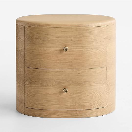
Keshan Nightstand | Montreal Velvet Pillow | Phaedra Floor Lamp
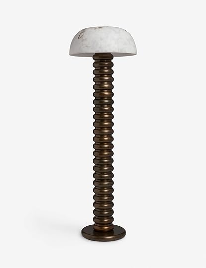
Take this nightstand. It has a classic feel, yet those legs and travertine top make it feel “now.” Plus, who doesn’t love a micro knob and TWO drawers? That beautiful bolster pillow definitely leans more “traditional” but also in a fresh way. I love that color combo, and it also comes in a lumbar and square. Now for that floor lamp! I don’t think I could love it more. It’s chunky but interesting, plays with materials like that dark bronze, and is just cool. It also comes in a table lamp version.
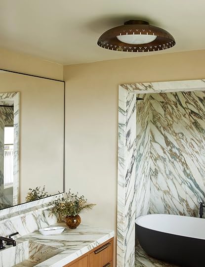 photo via lulu and georgia
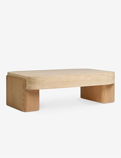
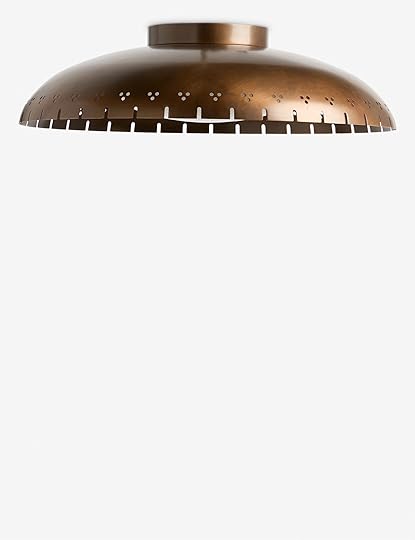
Midora Coffee Table | Omero Flush Mount Light | Pamina Dining Chair
If I know anything from my own designing experience is that coffee table shopping is hard. So when there’s a great one out there, it needs to be recognized…like this one. It’s organic brutalism at its finest, but because the tones are lighter, it doesn’t feel too bulky. Then, if you’ve been reading my posts for a minute, you know I love vintage-inspired lighting and circle cut-outs. So that flush mount and dining chair are right up my style alley. How good is that cut-out?!
CB2We’re always excited to see with CB2 is cooking up, too, and of course, we we very happy with their offering this fall:)


Marlon Warm White and Black Twisted Leather Round Throw Pillow | Fiora Hand-Knotted Light Brown New Zealand Wool Area Rug | Melrose Oak Side Table
We LOVE circle pillows and love it even more when brands do something a little extra special with them, like this twisted trim leather one. It’s so versatile style-wise and fun without being “too loud”. Then this rug felt like a really fun departure for them! It feels a little more in line with their Goop collabs of the past, and I am very excited by it. Moody, delicate, orante, yet still neutral. Oh, then these little side tables are simply perfect (sold separately, too). Modern shape with fun details on the feet, and in a light and super versatile wood tone. Give me more dark bronze accents!
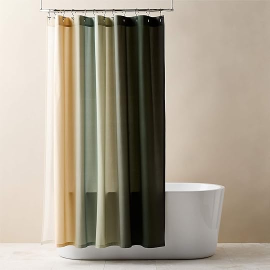

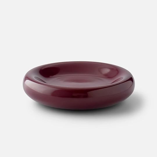
Ciel Organic Cotton Sateen Green Ombre Shower Curtain | Duo Aged Brass Wall Sconce Taper Candle Holder | Felena Brown Handblown Glass Decorative Bowl
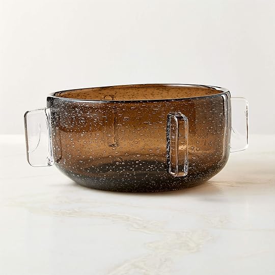
If you can believe it, that isn’t the only shower curtain on this list, which makes me extremely happy. Shower curtains should be beautiful! This one is more modern with the prettiest ombre (is ombre coming back??). It also comes in a warm-toned option. This next piece is perfect for those who want beautiful sconces but are either renting or can’t/don’t want to add junction boxes to their walls. This taper candle wall sconce is the perfect solution. I love those curves, it’d be like a sculpture on your wall, and it also comes in a darkened brass:) Oh, and I had to include this glass decorative bowl. It will look like you bought it from a cool, small maker abroad.
Crate and BarrelNow, let’s talk about CB2’s older sibling.
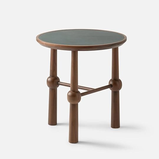
Crossroads Oak Dining Side Chair | Etta Silk Wool Blend Throw Pillow | Figure Tadelakt Drink Table
After experiencing Emily’s dining chairs in her sunroom, I have full confidence in Crate’s dining chair game (not that I didn’t before:)). This chair not only has that very cool frame with interesting joinery, but that light tan velvety seat makes it feel even more luxurious/versatile. When I saw that pillow, not only did I love it, but I knew the EHD readers would too, ha. It’s blue but soft and heavily pattered in a vintage/graphic way. SO cute. But it does also come in two other colorways and a larger size, too. Then, a very easy way to inject a little playfulness is a fun drink table like this one. It’s definitely on the modern side, so for someone with a more traditional style, adding in a piece like this would instantly freshen things up. We love a little style contrasting.

Adriel Rushed Woven Dining Side Chair | Coveteur King Canopy Bed | Anneli Charging Nightstand
Yes, another dining chair because it was too good not to include. It’s modern and classic at the same time, and the texture of the woven material will bring any dining set up to life. Then I think most people dream of a canopy bed at least once in their lives, and this one might be the chicest one out there. It’s so beautiful yet so simple. No notes. Finally, this nightstand is not only stunning with that slight curve and inset double drawers, but it’s also a charging nightstand. There aren’t many really beautiful charging nightstands on the market, so I’m pumped this was a part of their fall drop.
Schoolhouse
Peggy Curio Cabinet | Yves Cast Metal Catch All | Ann Occasional Table
Get outta here with that INCREDIBLE curio cabinet. It’s typically a piece I only see as a vintage piece, so to see an updated, more modern version is so wonderful. I wish I needed this. Then this catchall is an extension of the Clare V collab they did. I love that new color so much. Oh, and how perfect is that end table? The shape and detailing are so amazing, and I love that the top is leather. Adds even more warmth and texture.
Eaton Side Table | Night Vista Framed Print by Melissa Lakey | Swell 20″ Flush Mount
While I love a lot of side table storage, this single, slightly floating drawer version is really getting me. It’s chic and simple, and I love it. This art print is also so special. The colors are incredibly inviting, and there’s so much movement. And what does Schoolhouse do well if not a utilitarian light, and that flush mount is an excellent example of that! It also comes in a light cream color.
West ElmAnd as I hoped, West Elm continues to step it up.

Deco Blossom Shower Curtain | Nala Table Lamp | Norre Entryway Bench
This is the other shower curtain. A different style, but just as wonderful. That green is so good. What’s also so good I could cry is that table lamp. I am currently looking around my apartment, seeing if I could squeeze it in anywhere (the odds are against me). It honestly might be a contender for my favorite product of the year. Now the site says it’s a “green marble,” so not sure if it’s actually a light blue or not (I hope so). It also comes in a classic cream travertine color. Oh, now let’s chat about that awesome entry bench that doubles as storage. Yep, the top lifts up to help reduce any visual clutter. It could also go behind a sofa and look very cool.


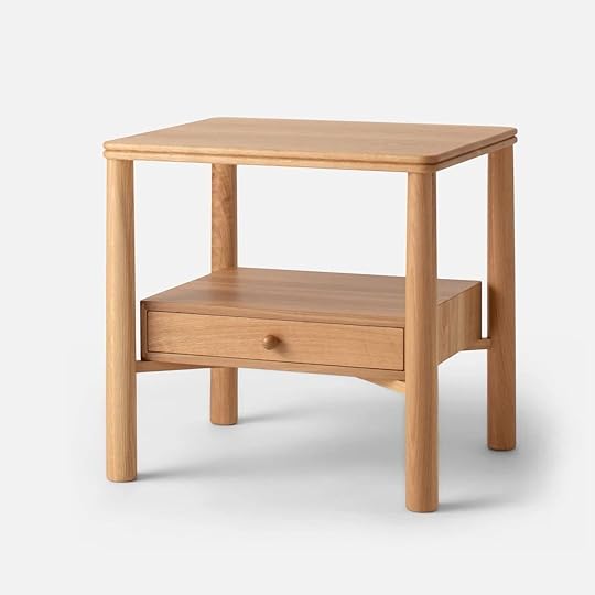
Damien Spike Dip Bowl | Louis Table Lamp | Siobhan Oak Nightstand
I (and everyone here) are big proponents of the statement bowl (big or small). This cool dip bowl is, of course, food safe, but could also be a great catchall. I mean, it’s so cool! And bonus, it does have a “Halloween” vibe in case you like to use your everyday decor as holiday decor too:) Then the cute lamps just keep coming. Now, this IS a green lamp and I love it too. It’s simple but fun, and that slightly oversized shade makes it look very “I know a cool design piece when I see it.” Lastly, another truly great nightstand. It’s very “simple but special”, so versatile, and has those micro knobs we love. 10/10.
SezaneWell, this was an exciting one when it hit my inbox. We love Sezane’s clothes and now also love their decor. They’ve had some on their site before, but I think they took this section down to revamp…until now:)


Tango Lamp | Linen and Velvet Canvas Cushion | Oval Tray
I mean, that is a GREAT lamp. Sculptural, interesting, and will give off a really pretty, soft glow. There is also an all white option. They also have a ton of great pillows. These velvet and linen ones are pretty special, though. Do I need them? MAYBE. And of course, we are always looking for a great tray, and this oval one is most definitely that. There’s even more on the site!

Chest of Drawers and Pair of Bedside Tables (vintage) | Set of 4 Flat Plates | Turquoise Blue Chair Art Print
Looking for vintage?? They now have that too. Look at that incredible bedroom set. The detailing! Normally, I’m not a fan of a matching set, but if it’s as good as this, I’m in. But back to their new things, how sweet are those plates? So whimsical and just a hint of a blue trim for a little color. And of course, I have to mention the art, like this wonderful blue chair print. They have both new and vintage, and it’s all good. Such a great new resource for great pieces.
Zara HomeZara Home can’t keep doing this to me. I WANT IT ALL.


Painted Stoneware Tray | Swivel Accent Chair | Set of Stitching Cotton Napkins (Set of 4)
Starting off strong with this stoneware tray that I’m pretty positive I’m buying. I would happily hang that on my wall. Graphic and neutral. Did you also know that Zara sells furniture? I did buy a little stool that I love, which wasn’t very expensive, but I can’t say all of their furniture pieces are affordable. I can say, however, they all look very cool and chic, like this chair. Speaking of cool and chic, these cloth napkins are just so good. Those colors! I will also be adding those to cart.

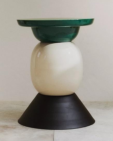
Salt and Pepper Shaker Set | Cotton Bedspread Squares | Shiny Matte Side Table
But don’t be fooled, Zara Home also does color. I adore this salt and pepper shaker set. It’s fun and very unexpected. A little sculpture for your table or kitchen. Then how amazing is that bedspread? I know it’s not for everyone, but if you love graphic patterns and rich color, my lord, this could be an amazing addition to your bedroom. Oh, and let’s not forget this incredibly fun side table. Another really great option if you are looking to add a little bit of a modern touch to your space, or to help you go full out. It’s up to you! The moral of the story is, don’t sleep on Zara Home.
H&MAnother brand to remember for great, affordable decor. Emily has shopped there for forever, I’ve shopped there, we all have shopped at, and love H&M Home.


Velvet Cushion Cover with Fringe | Fabric-Covered Table Lamp | 2-Pack Round Seat Cushions
This velvet fringe pillow cover is only $20! And looks like it could easily be from CB2. Also, that brown is so rich and beautiful, but it comes in cream and tan, too. Oh, an incredibly cool lamp for under $100? Yes, please! Another lamp I want but don’t have the space for. Then, if you want to add a little pattern to a bench or even your floor, I LOVE these striped round seat cushions. A black and brown combo is always so chic, but if you want color, they also come in a pink and maroon combo.


Metal-Framed Lounge Chair | Marble Serving Board | Patterned Wool-blend Throw
H&M doesn’t sell very much furniture, but after seeing this chair, I’m pretty excited to see more. They are also the best place for affordable marble stone pieces like this footed serving board. Perfect for the kitchen, a coffee table, a credenza, a desk, you name it! And a good throw for under $50 is not easy to come by. This one is pretty perfect. I know it’s particularly trendy right now, but man, I love a dark brown.
Rejuvenation


Lorna LED Pendant | Carol Hand-Knotted Rug | Fairfield Modular Shelving
The main collection drop that Rejuvenation just did was this beautiful lighting collection with Roll & Hill. This is the pendant, but there are so many incredible variations of it that you have to see. Rejuvenation also does rugs so well. Em has used them many times. I love this warm brick color with the gray-blue accents. Plus, I love a mini fringe:) And if you’re looking for a truly beautiful tall wall shelf, this one could be it. The ones on the market lean super modern, so I love that this one is more traditional.

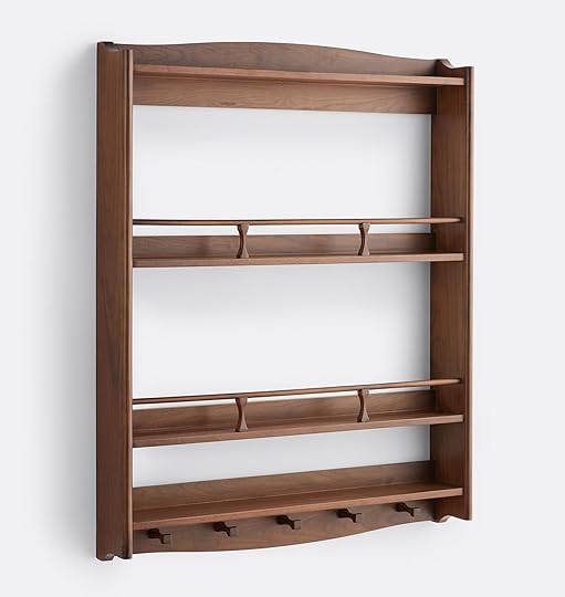
Beauford LED Table Lamp | Winchester Plate Shelf | Hudson Appliance Pull
A cordless little vintage-inspired lamp that can go anywhere in your home? Yes! It’s so sweet and also comes in two other finishes. Then, if you want to add more charm to your kitchen or dining area, look into a plate shelf like this one. It’s beautiful, functional, and a piece you’ll keep forever. Finally, they launched this dreamy appliance pull. It comes in 4 other finishes and, of course, has a drawer pull and matching knob.
Design Within Reach
If you caught our “What You Bought Last Month” post, then you know Design Within Reach was a big winner. So naturally, I thought, let’s see what’s new this fall with them…

F300 Lounge Chair | Tavolo a Dischi Dining Table | Danbury Dining Table
What I love about Design Within Reach is its range. First, you have this amazing futuristic chair by Pierre Paulin in 1965, then a 1963 dining table designed by Carlo De Carli and inspired by Eero Saarinen’s iconic Pedestal Table. The third piece is a totally different style in that it’s an interpretation of the classic farmhouse table by British designer Matthew Hilton this year. The pieces are special, classic, and high quality (which is reflected in their pricing).
New Canaan Low Bookshelf | Land Storage Credenza | Muecke Dining Table
These three pieces were all designed within the last year, but clearly are heirloom pieces. They all feel modern, yet if you told me they were designed decades ago, I’d believe you. I adore that dining table and hope to one day own something similar. The credenza is a masterpiece, and the low bookshelf is beautiful and versatile.
McGee & Co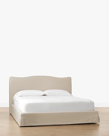

Henrietta Bed | View of St Catherine’s Hill Near Guildford By Charles Claude Pyne | Heathcliff Bench
Well, if you want a beautiful modern traditional bed, then this McGee & Co. one might be perfect for you. The simplified but elegant shape is so pretty, and the tone of the fabric can work with so many great color palettes. Art can be another story. It’s not easy to find good AND affordable options. This one, while not cheap, is a great price for the size (but there’s a smaller option too for even less). You also want to make sure not all of your art pieces are vertical rectangles. Mix it up! And if you want a beautiful wood bench, here you go. Those bobbin-style legs are perfect.


Ashburn Marble End Table | Hortensia Wall Tapestry | Holloway Floor Lamp
For a side table that feels a little more “ornate” but still has clean lines, how great is this one? The curved legs and big ball lean a little more modern, and I love it. If, like me, you’ve dreamt of a beautiful wall tapestry, they really made a great vintage-inspired one. I tend to prefer ones that are primarily full of foliage, so you know I love this one. Lastly, this is such a good floor lamp. Traditional, clean, with just the right amount of detail. Plus, it’s going to give off a lot of pretty soft light.
Pottery Barn


Aldon Rectangular Coffee Table | Palermo Hanging Cachepot | Kona Single Wide Sink Vanity
Pottery Barn knows their buyer and always produces beautiful things…like this coffee table. I really like the added panel on the sides of the legs. It’s rustic, modern, and there are so many great pieces in this same collection. I then fell hard for that terra cotta hanging cachepot. To my understanding, they are meant for growing plants that are in their less pretty original pots and are watertight. This one comes in a cream and black color, too. And for those looking for a modern rustic sink vanity, I really love this one. It has both open and closed storage, is simple but not boring, and the sink/countertop are included.
Modern Farmhouse Tall Storage Cabinet | Parker Leather Task Floor Lamp | Summerville 4-Drawer Dresser
Storage is a HOT commodity, and this tall storage cabinet is a beautiful way to get your hands on more of it. Like most of Pottery Barn’s items, it’s clean and could go in a beach house, a farmhouse, or an apartment in Europe. This puppy is versatile and will (hopefully) make your life more organized. Now the floor lamp may look like you’ve seen it before, but that leather shade is such a game-changer. It adds so much warmth. Finally, that dresser gave me SUCH flashbacks to my childhood bedroom. I’m pretty sure I had something almost identical, which really makes me laugh. It’s a beautiful piece that would be amazing in a traditional-style home.
Room ServiceAnd well, of all the fall decor collections we are actually the most excited about ours:)

Oscar | Baby Barb | Milo Sectional
Emily has already said, but Oscar is so comfortable. Well, she used the word sinkable, and that’s so true. We made sure they were all as comfortable as possible (while maintaining their shape), but if you want to melt into your sofa, that’s the one. Baby Barb and Barb were my true babies. They were inspired by a vintage chair I fell in love with, and now they can live in your home. They are also very comfortable. Milo (which comes in a sectional or sofa) is also so great and SO versatile. It’s a fairly classic shape, but those chunky feet make it feel special.

I also am so in love with the colors and fabrics. That blush color in person is stunning. The Suz (Mal’s baby) is such a wonderful Art Deco-inspired chair that swivels! Then we have our beautiful Alice that are heading into Emily’s home very soon:) I almost put all of the pieces in, but go to this post to check the rest out. It’s a total freaking dream to finally have launched these, and we just couldn’t be prouder.
There are, of course, more wonderful fall decor collections to come, but what do we think? Is this also your favorite “collection season”?
Love you, mean it.
Opening Image Credits: Photo via Lulu and Georgia
August 14, 2025
Our Guest Cottage Inspection Report – WHAT IS WRONG WITH HER???
Ok, first off, yes, I think we are calling it The Guest Cottage now. Too many people were confused about “carriage house”, wondering where this is, why it is, what it is – and everyone gets “guest cottage,” aka on our property, but not where we live, and she is old. As a reminder, we hired Tom Island, Portland’s best and most likable and enthusiastic older home inspector (or any home), to tell us what is wrong with our guest cottage. He was the original inspector when we closed on the house, and we LOVED his level of experience, expertise, and enthusiasm about our vintage property (he’s a former builder, so just a wealth of knowledge). Now, I’d say that most of what he wrote on the inspection report wasn’t a huge surprise – everything needs to be fixed or replaced – like EVERYTHING, but we do have good news at the end!!!
WAIT, WATCH THE QUICK YOUTUBE!!!Yes, you are going to get the inspection here, but it’s WAY more fun watching on YouTube. It’s quick and fun, I promise :)
Now for the written report. We just screengrabbed block by block with Tom’s notes in blue.
The Roofing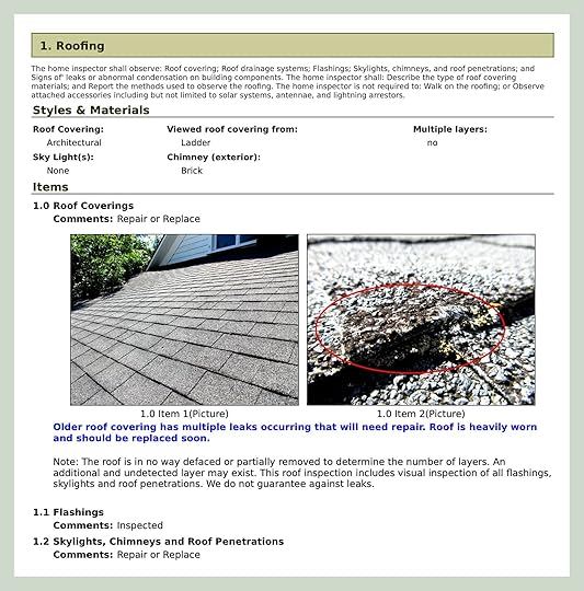
The roof doesn’t actually look bad from the outside on parts of it, but over the canning room, it really is and certainly leaks a lot. My hope would be to repair, not totally replace (naturally). So we’ll see.

On the inside, you can see mold growth and lead damage (and we felt it too in the winter). It was gnarly in here!!!
The Chimney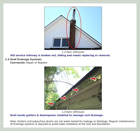
Non-functioning chimney should go – but what if we like how it looks? It appears his report says it’s unsafe, and “falling”. And yeah, no gutters, so we have a real water management problem.
The Siding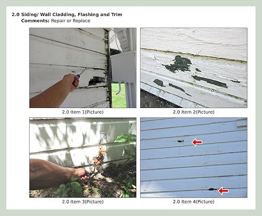
While these photos look bad, he told us in person that the siding really doesn’t need to be replaced. Besides the rotting, the wood is strong and sure, has some holes. Since it would be so expensive to fix ll of it, our hope is just to replace what HAS to be and repaint to match.

He’s very serious in the report, but in person, he was like “yes, it needs help, but this is such great old siding that we should just fix it. We would need to custom mill the wood to replace it, which is very expensive (he said either $150 a linear foot or $15 a linear foot – somehow my brain didn’t clock the decimal placement, lol).
The Windows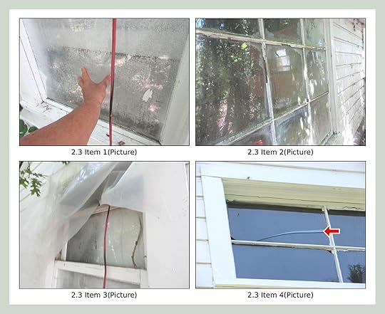
We all love old windows and wavy glass, but these are in bad shape. If they aren’t cracked or missing, the wood is totally broken or rotting.
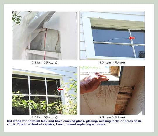
My goal/plan would be to replace the windows where they are, not move or add. The house is nicely lit, and yes, I even love the awkward window on the second floor. We actually might reduce the windows in the canning room because the big one looks out to a tall fence 2 feet away (so it provides no light and is quite the eyesore). Plus, that might be the music room (Charlie is such a good drummer, if I can brag a bit about my son), so less glass, more insulation is probably better if we do that.
The Breezeway/Covered Walkway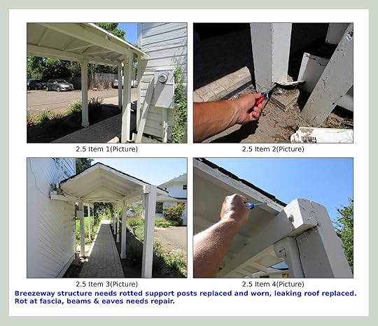
I think what he is saying is that the whole thing really should be replaced (ARCIFORM also told us this over and over), but we were like, so what? It’s old and rickety? It’s not like our children sleep under it. The biggest issue is that the rain from it pours onto the siding, rotting out the house. So we will definitely make some adjustments to that, and sure, if we have to replace the whole thing, we wil,l but my goal would be to repair, not replace.
Ants!
We’ve got some friendly carpenter ants. I’m not sure if you demo this out first or get a pest control person on the job – we will figure it out.
The Plumbing
Tom didn’t know how old the plumbing was, but close to 100 years old. It’s rusted through and needs to be ripped out and replaced.
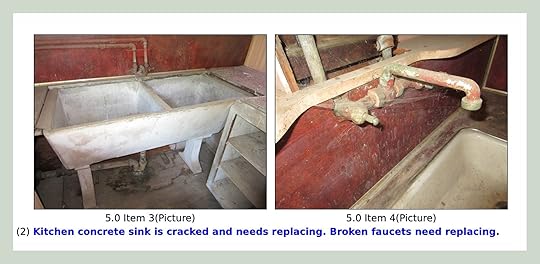
Yes, the sink does need replacing, LOL. BTW, it’s a Kohler sink! I forgot Kohler had been around that long!!

My favorite quote of the inspection: “Upstairs bathroom needs new toilet”. INDEED. That’s the hole in the floor. I don’t know when there was a toilet (maybe in the 1940s?) and when it was removed (or the more daunting question…why????). The shower is wood, likely because only the wealthy could afford tile at the time. As you can imagine, it didn’t hold up well, and I’m not even sure we are going to put in a shower up here, but if we do, should we make our own tile? Collect enough vintage??? METHINKS YES.

Yeah, he wasn’t impressed with the state of the pipes..it’s all got to goooooooo.

He thought the water heater was from the 80s, which made me think, did someone live here when I was a child??? Seems so much older than that!
The Electrical
Ok, so we think the house got knob and tube electricity in the 1920s or 1940s (Isn’t that wild? Less than 100 years ago, people in rural America didn’t have indoor lighting, and now our lives are outsourced to AI robots???? TECHNOLOGY IS UNFATHOMABLE). So there is some hodgepodge electrical from that time and then after.

You see, knob and tube (the exterior conduits on the ceiling – not really shown here) isn’t grounded or safe. So then in the 60s they added extension cords on the ceiling, you know, with a staple gun! Needless to say, all has to go, and the house has to be rewired. I’ll write more about this later as I learn about it, but I really don’t want to gut this house. My hope is that we can either just lift up certain boards (which I heard is a thing) or use pretty conduit for the basic light fixtures and outlets (also a thing). Or maybe it’s a combo. More on that later (also, HELP).
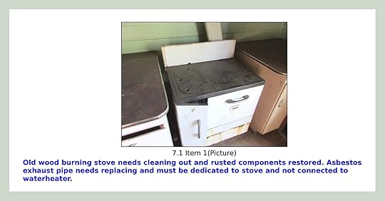
Everyone is charmed by this stove, and I am, too, in theory. But it’s not like it’s cute (no offense, stove). Yes, it’s awesome that you can open it and heat it with wood burning inside of it, but it screams “I’m going to burn your house down,” and again, it’s not like it’s this cute “could have come from Downton Abbey” stove. Tom just said it needs cleaning out, but that stove isn’t staying. And no, neither is the asbestos.
The Foundation
The long and the short of it is that the entire foundation needs fixing, replacing, or just pouring in the first place.
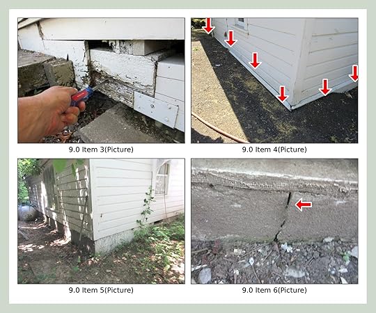
The house was built over time, and some of the “rooms” had a tiny crawl space and others were just wood on dirt, and for others, a slab was poured. It all has to be dealt with. Does anyone know a hot foundation brand to work with? LOL.

Yeah, more foundation shame. They really cobbled together these houses, putting wood on a brick on a stone – like that weird TikTok trend where women are standing on a can of pickles on a box of something in a high heel?? That’s how this house was built.

Here’s the official diagnosis:

We weren’t surprised and yet totally bummed. We don’t know much, but we know that “need to replace foundation” sounded like tens of thousands (or more). And not something we can’t DIY. More on that soon.
SO WHAT IS THE GOOD NEWS????
Well, Tom actually said all the wood was in pretty great shape (and the house is like 100% wood). The posts and beams that hold the house up are strong (old growth FTW), and the flooring and ceiling wood are so long and clear (high quality). He was impressed with how strong the house was; she’s a 200-year-old Olympic athlete! WE don’t need to gut it and replace all the wood, just fix the foundation and everything else, but the structure can remain mostly intact (he thinks). Of course, we are hiring an engineer along with a foundation contractor and have to get it permitted, so praying that they don’t make us take off all the interior side or exterior siding to fix everything. Tom really didn’t think we needed to. Just spot repair as needed – not an overhaul. Of course, he said that about our main house here that we ended up gutting, but that’s because we had to open up the walls – it was actually a lot grosser in this house (drywall and plaster crumbling everywhere), besides the gorgeous windows. He even thinks that the flooring underneath the gross laminate asbestos flooring is really pretty long wood planks that could be salvaged.
A huge thanks to Tom Island for his report. If you are in Portland (or surrounding areas, he lives in the Willamette Valley) and want an inspector with a lot of house-building experience (and a lover of older homes), he’s really incredible. And his wife follows – Hi!! :)
*** Oh, and for those of you who reached out about restoration coaching, I haven’t gotten back to anyone yet!!! I’ve been so slammed traveling, then catching up, then traveling again with kids before summer is over. Still no update on the paranormal investigator, but I did get a home spiritual counselor that could be fun to talk to. We have an appointment at the Oregon Historical Society soon to hopefully better understand who lived here, when they built it, how it was used, what the neighborhood was like -anything :)
Opening Image Credits: Photos by Kaitlin Green | Left From: Before Exterior Tour | Right From: Before Interior Tour
August 13, 2025
Want To Paint Your Concrete Floor? Read This First (Here’s What We Did)
When we first started “fixing up the garages” (that’s a real understatement, I know), one of the few things that we knew we could salvage was the concrete floor of the first bay (where our prop shelves live). The second bay (where our sofas now live:)) would need to be poured because it was rotten wood + dirt. For most of the renovation, I was so budget-focused (this was not a budget project, mind you), I tried very hard not to spend more than needed. So I was like “just leave it concrete, maybe seal it, but that’s it”. No fancy epoxy or garage floor company for us. But then, of course, when it’s all done, the pine was on the walls, and it was so pretty, the gross rust-covered floor popped, and I changed my tune. So today I’ll show you what we did and why.
Ok, this was the OG prop storage garage and floor. I think the darkness was wet. We don’t know how old the concrete was, maybe 10-20 years, but it was FINE. Like, not incredible, but not worth demo-ing out and repouring. It had some cracks, and it wasn’t super level, but it was FINE.
See? For a garage, it was “ok”. Now, of course, when you are redoing a garage, you have so many other options – Epoxies, fancier finishes with flex, or even rubber squares? But all of them cost $5k + and it just wasn’t where we wanted to put any money.
This floor (in the other bay) had to be poured with new concrete. Now the reason I bring this up is because we actually treated the two differently – something I typically wouldn’t do, but it truly wasn’t important enough to me to spend the time and money. You’ll see.
So for the sofa bay, Ken poured new concrete. GREAT. It looked really pretty. And just needed to be sealed. We used a satin polyurethane that he just rolled on and called it a day.
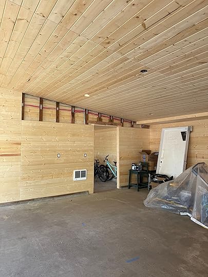
But for the prop garage, which had a lot more stains and rust marks (and cracks), we decided that we needed more coverage. Something to cover the stains and make it look as fresh as possible.
But of course, we were in a rush. It was Thursday, and the IKEA task rabbits were coming on Tuesday to install the closets (that once installed couldn’t be moved). I did a dumb thing – I thought I was choosing a transparent stain from Sherwin-Williams and quickly chose a deep blue. But then I realized…
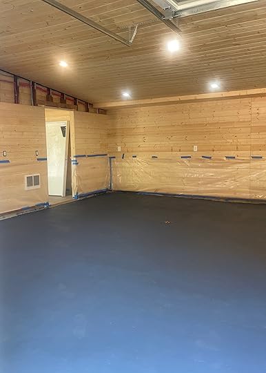
I actually chose a concrete paint that was opaque (aka not transparent, not a stain, a full paint color). Now I like the color, don’t get me wrong. But it was way too intense and jarring. I walked in and immediately called my brother (this was only one coat, thank goodness) and said, “I’m so sorry, I was wrong”.
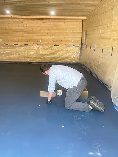
We just wanted it to look like a clean garage floor appropriate gray cement color. But you can’t just choose “gray,” there are a lot of bad, cold, clinical-looking grays, and our garage is pretty! So we sampled many, taking into account the wood on the walls and the green of the cabinet fronts.
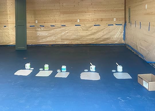
Left to Right: Mega Greige | Rushing River | Felted Wool | Elephant Ear | Illusive Green
You have to pretend the floor isn’t blue and that the color would connect the wood to the green cabinets. They are all neutrals and all warmer grays (a couple even taupier).
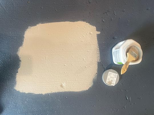
SW Mega Greige | SW Rushing River

SW Felted Wool | SW Elephant Ear
And that there was the winner – Illusive Green. FTW! It had a slightly green undertone, which looked great with the cabinets and the wood, and yet was still super neutral, letting the cabinets be the star. And by the way, we used Sherwin-Williams color-match concrete paint. Two coats, and each took about 3-4 hours to dry (no long curing session).
I mean, sure, it just looks gray here, but I promise a bad gray could have looked flat, sad, depressing, and this gray does complement the green nicely.

It’s full coverage, and should be easy to clean. Super low maintenance and stuck really easily.

In that shot, you can see the undertones more, and how they complement the cabinets and wood. It was the cheapest option (besides just leaving it). My brother acid-washed it first just to clean it and get all the gunk up so that it would stick, and then the darker blue paint essentially just became a primer for this paint color. So that’s how we painted our concrete floor with . Non-spon, Ken has just become great friends with the crew at the local SW, so he was psyched to use the product they recommended. Thanks, Ken!!
Pretty Images by Kaitlin Green | From: My New Prop Garage Reveal – Including IKEA Shelving (Non-Spon) And A Lot Of Vintage Collections
Emily Henderson's Blog

- Emily Henderson's profile
- 10 followers

